 Português
 English
 Español


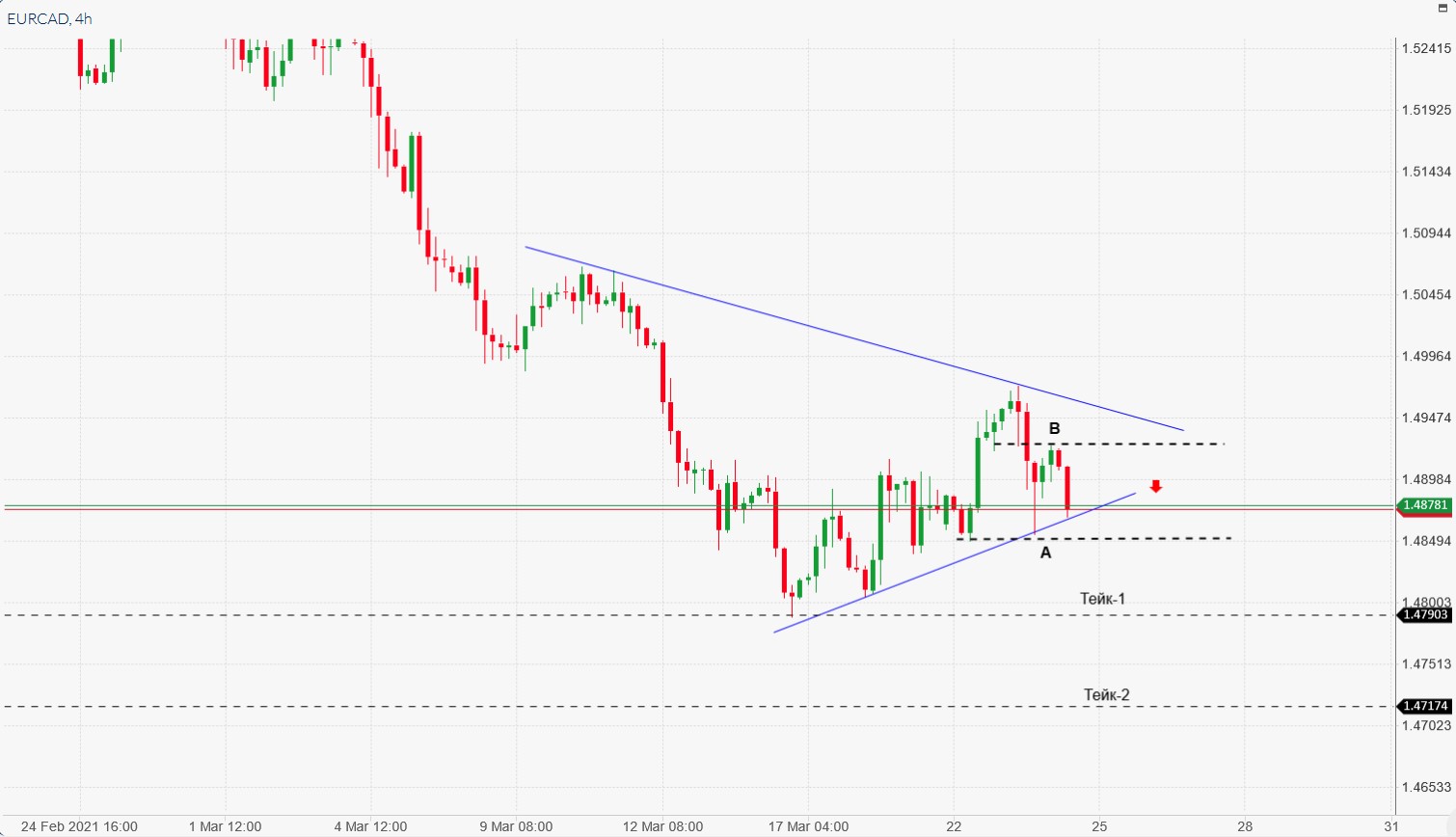
Во вторник, 23 марта, мировые акции снизились после того, как США, Европа и Канада ввели санкции против нескольких топ-чиновников Китая, расширения короновирусных ограничений в Германии и Франции, а также в преддверии комментариев высших должностных лиц США по поводу состояния экономики и инфляции.
Индекс акций Азиатско-Тихоокеанского региона за пределами Японии MSCI снизился на 0,66% из-за падения на 0,95% китайских голубых фишек на фоне санкций, связанных с нарушениями прав человека в Синьцзяне, в то время как японский Nikkei подешевел на 0,61%.
Гонконгский индекс Hang Seng опустился на 1,62%, а дебют китайского технологического гиганта Baidu был неожиданно слабым.
Общеевропейский индекс STOXX 600 отступил на 0,2% на фоне увеличения напряженности в отношениях с Китаем, крупнейшем торговым партнером ЕС.
Кроме того, правительство Германии продлило изоляцию до 18 апреля, а министр здравоохранения Великобритании Мэтт Хэнкок заявил, что на жителей Англии, которые попытаются выехать за границу до конца июня, будут наложены штрафы в размере 5 000 фунтов.
Акции компаний сферы путешествий и отдыха снова упали: IAG, владеющая авиаперевозчиком British Airways, бюджетная easyJet, и туристическая компания TUI потеряли 2,6–6%.
Котировки Volvo упали на 7,0% после того, как шведский производитель грузовиков предупредил, что нехватка полупроводников окажет существенное влияние на производство во втором квартале.
На Уолл-стрит индексы также снизились, поскольку инвесторы были встревожены перспективой повышения стоимости расходов на инфраструктуру и роста налогов.
В своем выступлении перед законодателями Пауэлл сказал, что восстановление экономики США идет «быстрее, чем обычно ожидалось».
Индекс волатильности CBOE, который накануне упал до самого низкого уровня за 13 месяцев, подскочил в этот день на 11%. за день.
Нефть расширила потери прошлой недели, снизившись во вторник примерно на 6%. Марка Brent подешевела на $3,83 до $60,79 за баррель, в то время как американская WTI опустилась к $57,76 за баррель после потери $3,80.


healing music
What i do not realize is in fact how you’re not really much more smartly-favored than you might be now. You’re so intelligent. You already know therefore significantly in relation to this topic, produced me personally believe it from a lot of various angles. Its like men and women are not fascinated except it?¦s one thing to do with Lady gaga! Your individual stuffs nice. All the time maintain it up!
But a smiling visitant here to share the love (:, btw outstanding design and style.
winter coffee shop ambience
cozy jazz music
La compatibilidad del software de rastreo móvil es muy buena y es compatible con casi todos los dispositivos Android e iOS. Después de instalar el software de rastreo en el teléfono de destino, puede ver el historial de llamadas del teléfono, mensajes de conversación, fotos, videos, rastrear la ubicación GPS del dispositivo, encender el micrófono del teléfono y registrar la ubicación circundante. https://www.xtmove.com/es/how-to-download-and-install-spy-app-on-android-phone-for-free/
Some private photo files you delete on your phone, even if they are permanently deleted, may be retrieved by others.
When I originally commented I appear to have clicked the -Notify
me when new comments are added- checkbox and now every time a comment is added
I recieve 4 emails with the exact same comment. There has
to be a means you can remove me from that service?
Cheers!
You could certainly see your enthusiasm in the work you
write. The sector hopes for more passionate writers such as you who are not
afraid to say how they believe. All the time follow
your heart.
My partner and I stumbled over here from a different website and
thought I may as well check things out. I like what I see so i
am just following you. Look forward to looking over your
web page repeatedly.
It’s a shame you don’t have a donate button!
I’d most certainly donate to this outstanding blog!
I suppose for now i’ll settle for bookmarking and adding your RSS feed to my Google account.
I look forward to fresh updates and will talk
about this site with my Facebook group. Talk soon!
Wow, superb weblog layout! How long have you been running a blog
for? you made running a blog glance easy. The entire glance of your web site is magnificent, as smartly as the content!
You can see similar here e-commerce
I am really impressed with your writing abilities as smartly as with the structure for your blog. Is this a paid theme or did you modify it yourself? Anyway keep up the excellent quality writing, it’s rare to look a great weblog like this one today!
Betting odds, bookmaker lines and value picks for matches
塔尔萨之王第二季高清完整官方版,海外华人可免费观看最新热播剧集。
Hmm is anyone else encountering problems with the pictures on this blog loading? I’m trying to determine if its a problem on my end or if it’s the blog. Any feed-back would be greatly appreciated.
Since the admin of this site is working, no doubt very rapidly it will be well-known, due to its quality contents.
Hello! I know this is sort of off-topic but I needed to ask. Does running a well-established blog like yours require a large amount of work? I’m completely new to blogging however I do write in my diary everyday. I’d like to start a blog so I can easily share my own experience and feelings online. Please let me know if you have any kind of suggestions or tips for new aspiring blog owners. Appreciate it!
Skycrown online casino – top choice for Australian players
塔尔萨之王第二季高清完整官方版,海外华人可免费观看最新热播剧集。
Good post. I learn something new and challenging on sites I stumbleupon every day. It’s always useful to read through articles from other writers and practice something from their sites.
Jogo do Tigrinho no Pix R$1: teste grátis com chance real de bônus explosivo
Brann 0-1 Bologna 2026 Europa League late Italian steal
PG Soft cashback semanal 20%: quem já pegou R$500+ só de devolução?
PG Soft top cassinos Pix 2026: lista com bônus reais e saque em minutos
Brann 0-1 Bologna 2026 Europa League late Italian steal
Jogo do Tigrinho 2026: quem está jogando com banca pequena?
Bônus sem depósito Fortune Tiger: qual site ainda libera?
Wow, incredible weblog layout! How lengthy have you been blogging for? you made running a blog look easy. The total glance of your site is great, as neatly as the content material
Nice blog here! Also your web site loads up very fast! What host are you using? Can I get your affiliate link to your host? I wish my website loaded up as fast as yours lol
Jogo do Tigrinho explodiu hoje! Mostra seu maior win!
флаг на заказ со своим логотипом флаги на заказ
Do you want to go to Montenegro? https://www.holidays-in-montenegro.com an Adriatic holiday with pristine beaches and beautiful cities. Resorts, excursions, and active recreation. An ideal destination for travel and seaside relaxation.
изготовление флага с логотипом заказать изготовление флагов
Хочешь оригинальную подушку? аниме подушки дакимакуры комфорт и уют для сна. Длинная форма, мягкий наполнитель и стильные принты. Отлично подходит для отдыха и расслабления.
Нужен пластический хирург? клиника пластической хирургии услуги современные операции и эстетические процедуры. Опытные хирурги, безопасные методики и индивидуальный подход. Консультации, диагностика и качественный результат.
Нужна мебель? мебель из массива официальный сайт эксклюзивные изделия из натурального дерева. Индивидуальный дизайн, качественные материалы и точное изготовление. Решения для дома и бизнеса.
Wild Bandito manteve bom desempenho para quem ajustou aposta em faixa conservadora.
мебель премиум класса премиум мебель
Авто журнал https://bestauto.kyiv.ua тест-драйвы, обзоры и новости автоиндустрии. Узнавайте о новинках, технологиях и трендах рынка. Удобный формат для чтения каждый день.
Онлайн авто журнал https://simpsonsua.com.ua новости, обзоры и тест-драйвы автомобилей. Актуальная информация о рынке и новых моделях для автолюбителей.
Авто журнал онлайн https://translit.com.ua все о машинах: новости, тесты, обзоры и аналитика. Следите за новинками и выбирайте авто с удобным сервисом.
Автомобильный журнал https://mirauto.kyiv.ua новости, обзоры и тесты автомобилей. Советы по выбору, рейтинги и аналитика. Все о машинах и рынке авто.
Авто портал https://nerjalivingspace.com автомобильные новости, тест-драйвы и обзоры. Узнавайте о новинках, технологиях и тенденциях рынка. Удобный сервис для автолюбителей.
Наша лучшая подборка: https://sn74.ru
Полная версия статьи: https://listai.pro
Женский портал https://muz-hoz.com.ua мода, красота, здоровье и психология. Советы, тренды и полезные статьи для современной женщины. Удобный онлайн формат для ежедневного чтения.
Строительный портал https://zip.org.ua все для ремонта и строительства в одном месте. Актуальные статьи, советы экспертов, обзоры материалов и технологий. Найдите подрядчиков, сравните цены и выберите лучшие решения для дома, квартиры или бизнеса быстро и удобно.
Sessão boa é aquela que termina no verde e com plano cumprido.
Лучшие профессии контролер технического состояния автотранспортных средств дистанционно москва возможность получить практические знания и освоить востребованные специальности в короткие сроки. Обучение подходит для тех, кто хочет начать карьеру или сменить сферу деятельности. Все материалы доступны онлайн и сопровождаются поддержкой преподавателей.
Нужен грузовик? перейти компания «НЕО ТРАК» — это современный дилерский центр полного цикла, работающий на рынке коммерческого транспорта и спецтехники уже более 20 лет. Являясь официальным дилером ведущих производителей, таких как DONGFENG, JAC, FAW, DAEWOO TRUCKS, ISUZU, HYUNDAI и других, компания предлагает широкий выбор грузовых автомобилей различной тоннажности, спецтехники, от фургонов и бортовых платформ до эвакуаторов и крано-манипуляторных установок.
Expanding classifieds operations across borders demands mastery of regional nuance that most guides overlook entirely. https://npprteam.shop/en/articles/classifieds/regional-characteristics-of-classifieds-russiacis-vs-europeusa-whats-the-difference/ equips inventory managers, media buyers, and multichannel sellers with the specific knowledge needed to succeed simultaneously in European and CIS markets without adapting stock unnecessarily. The analysis covers regulatory compliance differences, platform commission structures, seasonal demand patterns, and buyer demographic shifts that directly influence listing strategy and budget allocation decisions. Rather than attempting universal approaches that underperform in every market, you gain clarity on which tactics drive results in London versus Moscow, Amsterdam versus Almaty, and how to segment your inventory strategy accordingly. Teams scaling across regions rely on this framework to reduce listing rejection rates, improve click-through metrics, and compress the learning curve for new market entry.
Как Twitch вытеснил конкурентов из рынка показывает стратегический анализ конкурентного ландшафта стримингового сектора. В период становления Twitch существовали альтернативные платформы, каждая из которых позиционировала себя как инновационное решение для трансляций. Ключевой фактор успеха Twitch заключался в фокусе на геймерской аудитории, внедрении интерактивных функций, таких как чат с модерацией, и создании надёжной партнёрской программы. Платформа не только обеспечила лучший технический опыт, но и активно инвестировала в развитие сообщества стримеров через гранты и поддержку контента. Маркетологам, бизнес-аналитикам и продакт-менеджерам этот кейс демонстрирует, как правильная дифференциация и инвестиции в пользовательский опыт обеспечивают лидерство на рынке. Данный анализ полезен для понимания механизмов доминирования платформ в высококонкурентной среде.
During a general review of football team pages and sports news platforms, I noticed something placed mid-content check this club site and it is a football club website offering match updates and engaging sports information for supporters
When evaluating online shopping platforms focused on usability and flow, a notable example is Forest Frost Vendor Hub Vault which maintains the design feels balanced and content is clearly organized, ensuring users enjoy a distraction-free and intuitive browsing experience.
Консультацию психолога https://психолог38.рф в Иркутске можно получить в центре Психолог38. Здесь работают высококвалифицированные специалисты: детские психологи, клинические, семейные и индивидуальные. Мы собрали профессионалов разных направлений, чтобы комплексно подходить к решению запросов клиентов. Бережно, деликатно, с научным подходом. Сложные ситуации в нашей жизни встречаются не редко, и своевременная помощь, поддержка очень важна. Находясь среди людей, легко можно оказаться в одиночестве, один на один со своими проблемами. Если вы ищите лучших психологов, которые реально помогают людям, обратите внимание на нашу организацию.
While reviewing wellness education sites, I discovered guided yoga practice center focusing on structured learning – it provides step-by-step yoga instruction, helping users build flexibility, strength, and mindfulness through consistent sessions and professionally designed practice routines for all experience levels.
Консультацию психолога https://психолог38.рф в Иркутске можно получить в центре Психолог38. Здесь работают высококвалифицированные специалисты: детские психологи, клинические, семейные и индивидуальные. Мы собрали профессионалов разных направлений, чтобы комплексно подходить к решению запросов клиентов. Бережно, деликатно, с научным подходом. Сложные ситуации в нашей жизни встречаются не редко, и своевременная помощь, поддержка очень важна. Находясь среди людей, легко можно оказаться в одиночестве, один на один со своими проблемами. Если вы ищите лучших психологов, которые реально помогают людям, обратите внимание на нашу организацию.
During a long session of scrolling through various recommendations and links online, I noticed something that appeared naturally in the middle of everything, visit this page, and it gives off the impression of being a lively and interesting site that might be enjoyable to browse further
At one point during my browsing session, I encountered something in context, visit and explore, and it is a helpful resource where I found useful tips and ideas while going through various pages today
I was browsing through various opinion based platforms when something stood out in the middle, view discussion page, and it presents engaging and diverse perspectives in readable format overall
Individuals interested in artistic collaboration often browse theatre websites that highlight group performances and cultural engagement, and they might discover performance arts guild stage community network – The platform promotes creative teamwork and showcases productions that bring together performers and audiences through meaningful artistic expression and storytelling.
mitchwantssununu.com – Interesting concept site, content feels direct and somewhat thought provoking today
During my exploration of seasonal celebration pages, I encountered see festival info – The site provides a refreshing browsing experience with content that feels relevant, helpful, and well organized for easy understanding and navigation.
While reviewing different green technology websites, I found explore biodiesel knowledge page – The site is quite engaging, and I learned something new just by looking through the content briefly and casually.
People who enjoy natural and rustic online shopping platforms often browse sites like Cove Wheat Outpost Market Flow where navigation is smooth and categories are clearly structured – The overall design ensures a comfortable browsing experience that feels simple, inviting, and easy to use from start to finish.
Users who enjoy simple ecommerce navigation often engage with sites such as Cove Goods Bright District Sun Hub where products are displayed in a clear and organized structure – The browsing experience feels smooth, intuitive, and easy to manage across all categories of the shop.
People who explore coastal inspired ecommerce themes often enjoy designs that balance relaxation with structured product visibility across curated collections gilded emporium coastal cove – The browsing experience feels airy and organized, combining visual calmness with practical navigation for effortless product exploration.
While looking through independent media style sites I discovered a simple platform that focuses on opinion based writing using independent thought stream – the presentation is minimal and the ideas are expressed in a way that feels direct and sometimes intentionally challenging to interpret deeply
While reviewing island retreat websites featuring boutique stays and scenic surroundings, I found a well crafted listing worth exploring further < tranquil hillside retreat card – It delivers a calm and welcoming presentation, making the property feel both organized and visually appealing very nicely
While looking through entertainment-focused websites, I stumbled upon open this comedy page – The content feels very lighthearted, and the overall vibe makes it enjoyable to browse casually without any serious or complex tone.
When analyzing modern retail systems built for structure and clarity, a strong example is Brook Gilded Network District which maintains nice visual balance and navigation works without any confusion, providing users with a calm, organized, and visually consistent interface throughout the site.
Users who enjoy structured shopping platforms often explore sites such as Kettle Harbor Unified Commerce Hub where products are arranged in a clean format – The interface makes browsing feel simple, efficient, and easy to understand across the entire marketplace.
People who appreciate organized online marketplaces often browse platforms like Cove District Sun Goods Center where items are presented in a bright and structured layout – The design makes browsing feel smooth and enjoyable, allowing users to explore products easily without distraction or unnecessary complexity.
Users who prefer modern minimal websites often appreciate vault-style ecommerce layouts that enhance usability through structured spacing and visual balance Glass Harbor Vault Portal – The design is sleek and organized, creating a smooth browsing experience where navigation feels intuitive and product discovery is effortless.
modelscanvas.com – Creative portfolio vibe, visuals and layout feel clean and professional design
While browsing innovative retail platforms online, I discovered a concept supermarket site that relies on simplicity to deliver its message clearly digital hope food market – The layout is minimal and effective, making it easy to navigate and understand the core idea presented
In modern usability assessments of digital commerce platforms focused on clarity and structure, a strong example is Night Glade Trade House where everything feels straightforward and browsing is comfortable and stable, allowing users to move through content without confusion.
While reviewing several foundation pages, I found check this out – The information is presented in a straightforward format, making it easy for users to understand without needing additional explanation.
Users who enjoy creative marketplace environments often engage with sites such as Teal Cove Vendor Artistic Atelier Hub where products are displayed with strong artisan character – The interface creates a structured browsing experience that feels engaging, clean, and visually inspiring across all product sections.
People who appreciate minimal vendor design often browse sites like Vendor Works Meadow Apricot Hub where materials are displayed clearly – The layout makes navigation feel creative, accessible, and highly user friendly.
While exploring online design portfolios I found a visually focused platform that highlights creative work in an elegant way including creative showcase hub – the structure feels sleek and minimal allowing the visuals to stand out while maintaining a professional aesthetic overall
During my search through various online resources, I noticed check this baby bonus site – I came across it today and it feels surprisingly useful, with a presentation that looks clear, simple, and nicely structured for easy browsing.
While exploring curated wine producer websites, I came across a highly polished brand page that highlights both tradition and product excellence canadian vineyard wine portal – The wine information is detailed and visually appealing, creating a professional and engaging overall presentation style
Shoppers who prefer friendly and accessible online stores often explore platforms designed for simplicity, particularly when visiting sites such as Cove Friendly Store where the interface is welcoming and easy to understand, supporting users of all experience levels – The friendly design creates an approachable shopping experience that feels intuitive and stress-free
When analyzing modern storefront systems focused on usability, a standout example is Sage Harbor Shopping Vault where clean design and content is arranged in a logical order, making browsing feel natural, simple, and intuitive for users at every step.
In the middle of exploring conservation-related resources, I discovered this conservation hub – The site appears well organized and carefully structured, making it easy to engage with and understand the purpose behind the initiative.
While reviewing community development networks, I found open this advancement organization site – This looks like an important initiative, and the content is well organized, making it easy to understand the purpose behind it.
Users who prefer structured ecommerce navigation often explore sites such as Teal Harbor Commerce Easy Access Hub where products are arranged in a clean and efficient format – The interface creates a smooth browsing experience that feels organized, intuitive, and simple to use throughout the store.
Users who prefer modern digital storefronts often enjoy collective systems that enhance product discovery through clear categorization and intuitive layout structure Collective Glade Ridge Exchange – The presentation feels streamlined and simple, offering a visually balanced experience that supports smooth and efficient browsing across all sections.
While searching for visually themed retro sites I discovered a platform that presents content with a nostalgic flair using retro vibe content page – the design feels immersive and visually appealing with a consistent theme that enhances the overall browsing experience
While researching avant garde digital experiences, I discovered a website that emphasizes experimental structure and visually creative formatting approaches creative experiment web space – The site feels uniquely structured, offering an artistic and experimental browsing experience that differs from conventional layouts
As I explored different creative digital platforms, I encountered view this blazin squad site – The design is visually striking, and the content keeps things interesting, making it a fun and engaging site to explore casually.
People who enjoy handcrafted product platforms often explore sites like Opal Artisan Design House where items are presented with strong focus on originality and texture – The structure supports an authentic browsing experience that showcases craftsmanship clearly while maintaining a visually balanced and easy to navigate interface.
Across various online shopping platform evaluations emphasizing performance and clarity, a notable example is Summit Amber Marketplace which delivers smooth experience overall, pages feel fast and easy to use, ensuring users can browse products quickly with a clean and responsive interface design.
As I reviewed various artist-related pages, I found open this page – The layout feels clean and easy to use, helping visitors quickly navigate through the site without any confusion.
Users who enjoy straightforward ecommerce experiences often engage with sites such as Trail Harbor Smart Commerce Hub where products are displayed in a simple and organized layout – The design ensures smooth navigation that feels user friendly, clear, and easy to understand while browsing different sections.
Users exploring premium ecommerce emporiums often notice how structured visual layouts improve clarity and help highlight product details in a more refined browsing environment Glass Harbor Emporium Hub – The polished emporium design presents items in a clean and elegant structure, making browsing smooth, visually organized, and easy to navigate throughout the entire experience.
In the middle of exploring web design resources, I came across explore blunty layout hub – The structure is very clean, and the browsing feels smooth and easy to follow without distractions or confusing elements.
While browsing professional introduction and portfolio websites, I encountered a well designed page that prioritizes clarity and ease of use online professional profile view – The layout is smooth and intuitive, with information presented in a very clear and organized manner overall
As part of studying modern soft aesthetic online marketplaces, I explored check this velvet willow hub – The layout is gentle and elegant, and users can browse products easily with a smooth and relaxing experience.
People who appreciate beach inspired online shopping often browse platforms like Coastal Harbor Wave Trading Hub Outpost where items are displayed in a minimal ocean themed layout – The interface ensures browsing feels calm, pleasant, and easy to navigate with a refreshing visual style.
Many online shoppers exploring curated handmade marketplaces often notice how presentation influences trust when browsing stores such as Artisan Caramel Trail Shop where warm visual styling and organized categories help guide the experience – The overall aesthetic emphasizes a cozy handcrafted feel while maintaining structured product layouts that make browsing simple and inviting
While studying online commerce hubs with user-friendly design, I noticed open linen meadow hub site – The experience is smooth and intuitive, and navigating through the content feels easy and enjoyable without unnecessary complexity.
In the process of browsing experimental websites, I found explore this clone project site – It feels like something truly different, and it is definitely worth checking out for anyone interested in unique digital ideas.
While browsing visually bold online platforms I came across a site that captures attention with its strong creative direction featuring creative impact page – the overall experience feels immersive and reflects a distinct artistic personality across all sections
In evaluations of online retail platforms focused on organization and UX design, a strong example is Upland Orchard Trade Hub where well structured pages and browsing feels natural and efficient, supporting a clear and easy user journey across all pages.
During my browsing of professional development and business help platforms, I noticed several informative pages and found professional help desk page – The information is clearly presented and practical, helping users quickly understand solutions without unnecessary complexity or confusion.
While exploring culturally inspired and creatively themed websites, I came across a visually distinctive platform that blends different influences in an engaging way jeddah brooklyn cultural mix page – The site feels diverse and interesting, combining themes in a way that makes browsing engaging and thoughtfully presented overall
Users who prefer curated handmade marketplaces often explore sites such as Wind Artisan Cove Handmade Bazaar Hub where products are displayed in a clean and structured format – The design ensures browsing feels easy, pleasant, and visually consistent across all artisan categories.
Users drawn to premium ecommerce environments often expect refined layouts that resemble curated gallery house experiences Premium Cove Galleria House – This structure ensures that every product is presented with clarity and purpose supported by elegant design choices and consistent visual hierarchy that improves readability encourages browsing and helps users quickly identify relevant items without unnecessary distraction or clutter overall experience
In the process of reviewing multiple informational resources, I found click for details – The website appears trustworthy, and the content is arranged in a way that makes it easy to recognize its value and relevance.
oakmeadowcommercehub – Commerce hub feels organized, categories are clear and easy browsing
As I browsed company support and business aid platforms online, I discovered useful structured information and encountered company aid information site – The platform is clear and practical, making it easy for users to find and understand relevant guidance quickly.
During an analysis of retail atelier interface design and seasonal usability, I noticed open mint orchard retail studio – This is definitely a place I plan to return to for the holiday season because everything feels smooth and well arranged.
Shoppers looking for artisanal online destinations frequently explore curated platforms where creativity meets commerce and may come across violet harbor craft exchange showcasing handmade products with refined presentation and accessible browsing tools for everyday users – A thoughtfully designed store that highlights unique crafts while maintaining an easy and enjoyable shopping flow.
People who value easy navigation in outlet stores often explore sites like Stone Harbor Outlet Simple Hub where items are displayed in a clean and direct format – The interface makes browsing intuitive and fast, helping users enjoy a practical and well organized shopping experience.
Users who enjoy soft toned ecommerce galleries often engage with sites such as Dawnstone Gallery Flow Hub where items are arranged in a peaceful format – The interface ensures browsing feels smooth, quiet, and visually comfortable across categories.
While exploring modern cultural fusion websites, I discovered a platform that merges different aesthetics into a cohesive and engaging digital experience brooklyn jeddah global page – The design feels diverse and interesting, offering a creative blend of cultural themes presented in an appealing way
In the middle of researching health and lifestyle consulting services, I discovered read this nutrition coaching page – The overall presentation feels organized and calming, making it easy to browse while keeping everything visually pleasant and readable.
People drawn to dynamic ecommerce ecosystems often prefer platforms such as Harbor Pine Exchange Collective where the marketplace is shaped by multiple contributors working together – The interface creates a sense of collaboration and activity, making browsing feel like participation in a constantly evolving trade environment.
champselyseesclinic – Clean design and helpful content, feels professional and easy to explore.
I came across this quirky volleyball related page while browsing through sports fan content and it immediately stood out for its tone josh inspired sports nook – The site feels creative and casual, delivering a lighthearted approach to sports content that makes it easy and enjoyable to browse
pair-dating.com – Dating concept looks simple, interface feels straightforward and user friendly experience
Shoppers who appreciate friendly and simple online store layouts often enjoy visiting sites like Cove Relaxed Bazaar which emphasizes user comfort and easy product discovery – The design approach ensures that navigation remains straightforward and enjoyable from homepage to checkout process
People who prefer functional online shopping platforms often engage with sites like Stone Outpost Glade Supply Market where items are displayed in a minimal and structured format – The interface enhances usability, making browsing simple, efficient, and consistent across all product categories.
While exploring various platforms designed for connecting people online I noticed a service featuring matchmaking experience page – the layout seems clean and the navigation feels intuitive which helps create a comfortable and approachable browsing environment for visitors
While exploring housing market directories I discovered a listing platform that focuses on clarity and ease of use for property seekers county homes search board – The layout is simple and functional, making it easy for users to find relevant real estate listings and compare options quickly
In the process of browsing parenting lifestyle platforms, I found explore this family moms hub – The blog feels approachable and relatable, and the content is genuinely helpful for readers looking for everyday parenting support and ideas.
Users who prefer simple rustic ecommerce systems often explore sites such as Timber Trail Rustic Outpost Valley Hub where products are arranged in a warm wood themed format – The interface creates a smooth browsing experience that feels natural, easy to navigate, and visually well structured throughout the store.
Many people who prefer structured online shopping environments often find Ginger Vault Experience Market helpful due to its organized layout and clear product presentation – The vault inspired design delivers a secure, curated browsing flow that simplifies decision making.
During my search for professional entertainment sites, I noticed check this performer info page – The site feels solid and well designed, and the layout combined with smooth information flow makes it easy to explore.
piercethearrow.com – Bold branding here, content feels energetic and visually striking creative site
While exploring safe media directories I discovered a platform focused on providing curated film options suitable for children and family friendly viewing experiences safe family movie index – It feels organized and trustworthy, making it simple to find content that matches safe viewing expectations
Users who prefer refined ecommerce experiences often explore platforms such as Golden Collective Stone Premium Hub where items are displayed with strong emphasis on curation and visual harmony – The design creates a luxurious browsing experience that feels structured, smooth, and easy to navigate across all categories.
While reviewing digital claim management platforms, I found browse this claims tracker page – The tool feels straightforward and practical, making it a useful option for users who prefer simple and efficient systems.
While reviewing digital storefronts with soft aesthetic styling I found a platform showcasing calm retail network – the design feels balanced and peaceful while maintaining clear navigation across product sections
While browsing artistic digital platforms I came across a website centered on creative expression page – the visuals feel striking and the overall design creates a lively and immersive browsing environment
While searching for reliable informational resources, I stumbled upon open this united rtc page – The content is neatly structured, which makes it easier to find necessary details quickly without unnecessary effort or confusion.
People who enjoy aesthetically soft ecommerce galleries often engage with platforms like Galleria Dawnstone View where items are displayed in a gentle and minimal layout – The design creates a calm browsing atmosphere that feels visually light, balanced, and easy to navigate without distraction.
preventcovid19trial-uk.com – Informational tone here, content feels research focused and medically structured layout
While reviewing structured online shopping experiences, a strong example is Harbor Violet Market House where clean structure overall, makes browsing feel smooth and simple, offering a balanced and distraction-free layout that improves overall user satisfaction and navigation flow.
Many users browsing curated marketplaces report that structured design enhances usability, especially when they reach Meadow Vendor Showcase Access Point and they often highlight that the system reduces confusion during navigation – the experience is described as streamlined with improved accessibility to relevant product listings throughout
Many people exploring countryside-themed marketplaces enjoy platforms that combine simplicity with structure, especially when they browse through Rural Meadow Market Place where the layout emphasizes clarity and product accessibility, allowing users to move smoothly between sections while maintaining a relaxed shopping flow.
While exploring different wellness and yoga-related platforms online, I came across visit this yoga concept page – The idea presented here is quite interesting, and it feels like something worth exploring more deeply later for better understanding and personal practice.
As I reviewed examples of online retail atelier websites, I checked see mint orchard retail page – This is definitely a site I’ll revisit for the holiday season since everything feels well structured and easy to browse.
People who enjoy functional online outlet platforms often explore platforms like Pine Harbor Outlet Flow Market where product organization is clear and practical – The interface supports smooth navigation and structured browsing, ensuring users can easily access categories without confusion or unnecessary visual clutter.
During a detailed review of digital commerce hub websites focused on clarity and user experience, I noticed visit this vale harbor shop hub – The platform feels well designed, navigation is simple, and the content appears clean and easy to understand throughout.
Exploring curated e-commerce environments revealed that curated vendor hall platform is integrated into a streamlined layout – the browsing experience feels balanced, with clear sections and visually appealing product arrangements that support user engagement.
As I browsed through tourism discovery platforms, I noticed view this travel info ireland – The site feels engaging and user friendly, allowing easy browsing of travel details and destination highlights.
Customers exploring streamlined online vault shops often look for clean structured interfaces that prioritize function and simplicity over excessive design Hazel Vault Style Harbor – The layout ensures intuitive navigation and consistent presentation helping users quickly access product categories while maintaining a visually calm environment that enhances focus and provides a smooth uninterrupted browsing experience throughout the platform journey today overall usage.
While browsing medical research websites to understand how they present data I discovered a platform showcasing study participation portal – the content feels structured and the overall design reflects a clear and research focused approach to information delivery
velvetcoveartisanoutlet – Artisan outlet design clean, products are nicely arranged and easy to explore
uplandcovevendorcorner – Vendor corner feels helpful easy browsing and clean layout overall
During my exploration of different music group platforms, I noticed check this band site – The overall presentation feels really stylish, and the design is attractive, making the browsing experience smooth and visually enjoyable from start to finish.
Shoppers who value intuitive online shopping often explore sites like Sun Harbor Commerce Flow – The interface is designed to make browsing effortless and efficient, allowing users to quickly navigate product categories while enjoying a bright and user friendly ecommerce experience.
During a detailed review of online boutique hall platforms focused on clarity and structure, I noticed visit this velvet brook hall – The information available is useful, and everything feels neatly arranged, making it simple and easy to follow throughout the browsing experience.
While searching lifestyle content online I came across a Seattle urban platform that presents modern city living ideas in a visually engaging and energetic way reflecting current urban trends and creative lifestyle concepts city culture seattle hub – The presentation feels modern and dynamic, with vibrant urban content
Users who appreciate modern ecommerce organization often browse platforms such as Upland Commerce Harbor Access Hub where products are arranged in a neat and structured layout – The design makes product discovery quick and easy, ensuring a smooth and user friendly browsing experience.
nightorchardretailmart.shop – Bought a gift last week, packaging felt really premium honestly.
In exploring handmade product platforms I discovered a well organized marketplace that brings together creative communities online space where Walnut artisan craft showcase hub showcasing diverse artisan goods with clean structured presentation layout system – The marketplace strengthens artisan visibility while offering users curated selections of handcrafted products global reach
During exploration of various online resources for trading knowledge and market understanding, I came across in the middle of research Simple Market Trade Overview included among similar references – updated note: the information feels practical and easy to understand, supporting smooth user comprehension overall.
While exploring online retail platforms I found a shop website that keeps product presentation simple and organized allowing users to browse items without feeling overwhelmed or distracted minimal storefront gallery – The site feels calm and easy to use
As I explored simple and modern vendor hall interfaces, I checked see mint cove hall link – The layout feels light and user friendly, and browsing is smooth and intuitive across all sections.
As I examined multiple online sources, I noticed tap here – The design and organization work together effectively, making it simple to navigate and quickly absorb the most relevant details provided.
While reviewing digital commerce platforms and their listing structures, I came across visit velvet grove marketplace hub – This website offers great options, and I enjoy regularly checking listings since they are clearly presented and easy to understand.
E-commerce environments that emphasize structured navigation and clear product organization are especially valued by users who prioritize efficiency, particularly on platforms like Harbor Retail Access Point which is built to provide a smooth browsing journey, helping customers move through categories quickly while benefiting from a clean layout and intuitive interface design throughout.
People who enjoy design centric online marketplaces often find value in platforms like Trail Harbor Creative Vendor Space where products are showcased with strong emphasis on visual composition and modern styling – The interface creates a studio like atmosphere that enhances product appeal while keeping navigation simple, intuitive, and focused on creative presentation.
uplandharborcraftmarketplace.shop – Navigation could improve but products are unique and cool.
During an exploration of structured trade-focused online platforms, I discovered visit harbor raven trade page – The concept feels strong and well-defined, and navigation is simple with clearly organized information throughout.
During a review of modern commerce hub platforms, I found browse violet harbor shop hub – The layout looks impressive, and it makes browsing products feel fast, easy, and convenient throughout the entire experience.
During a detailed look into similar content online, I encountered see more info – The material is arranged thoughtfully, making it simple to follow along while delivering information in a clear and professional manner that feels reliable.
Shoppers looking for reliable and simple online stores often gravitate toward platforms with organized listings, and in the middle of their search they may come across plum cove deal center offering assorted items for everyday needs – A convenient shopping platform focused on delivering affordability and a pleasant browsing journey for users.
People who appreciate gentle ecommerce design often browse platforms like Honey Vault Warm Cove Market where items are displayed with soft structure and cozy presentation – The design ensures a pleasant browsing experience that feels smooth, friendly, and easy to navigate across all categories.
As I examined different online outdoor retail environments, I compared how each system organizes product discovery and supports intuitive browsing journeys for visitors UplandSupplyPost – updated observation: the structure is simple and efficient, making exploration of content feel natural and easy to follow.
While exploring product focused websites I discovered a site showcasing digital store platform – the navigation feels easy to follow and the design keeps attention on items while maintaining a simple and accessible structure
As part of studying visually engaging retail platforms and their design patterns, I found check bazaar collection – The vibrant aesthetic stands out, and browsing feels active and immersive, drawing users deeper into the experience.
While studying online craft marketplace interfaces and experience flow, I came across visit upland harbor craft discovery hub – Navigation could improve, but products are unique and cool, making the site memorable.
In discussions about digital storefront innovation designers often reference platforms that balance creativity and functionality particularly when analyzing curated shopping experiences like Coastal Moon Retail Hub which is commonly associated with contemporary retail presentation strategies that focus on clarity structure and engaging visual storytelling – this interpretation highlights a modern approach to online commerce design principles.
While reviewing digital marketplace layouts focused on usability and design clarity, I noticed how Birch Harbor vendor room overview – it emphasizes clean structure and smooth browsing flow, making product discovery easier for visitors across multiple categories and helping users quickly understand how items are organized within the vendor environment.
Users who enjoy structured trade ecosystems often explore sites such as Frost River Trade Core House Hub where products are arranged in a minimal layout – The interface ensures browsing feels simple, organized, and easy to explore across all sections of the marketplace.
Users who enjoy luxury inspired ecommerce layouts often engage with platforms such as Gilded Stone Collective Brand Hub where products are showcased with elegant consistency and modern visual structure – The design creates a refined browsing experience that feels premium, organized, and visually engaging throughout the entire marketplace.
While browsing platforms that emphasize variety and usability I came across a website featuring goods browsing center – the design feels practical and the product listings are arranged in a way that supports easy exploration and a smooth user experience
While analyzing how warm color palettes improve usability in online shops, I checked see this meadow store – The layout feels clean and organized, and browsing offers a comfortable and inviting experience.
During a detailed review of online vendor studio websites focused on speed and reliability, I noticed visit this walnut cove studio hub – The experience has been great overall, and everything loads fast and works without issues across all pages.
While searching for cultural information platforms I found a concept based website that delivers structured insights and informative content making it useful for users exploring modern ideas and socially relevant themes online cultural relevance guide page – The content feels thoughtful and informative in presentation
People focused on daily preparedness and compact utility often discover platforms like Everyday Carry Outpost – The emphasis is on functional essentials that support modern routines, combining durability and simplicity in a way that makes everyday tools reliable, efficient, and easy to integrate into personal carry systems.
valeharborcraftemporium.shop – Site works well on phone, checkout was smooth today.
In my research on digital vendor ecosystems and structured shopping portals, I came across Vendor room marketplace portal – the platform provides a streamlined browsing experience with clear categorization and visually balanced product presentation that supports easy exploration for all users.
Users exploring modern ecommerce galleries often appreciate how fluid visual layouts improve engagement when browsing platforms such as Ginger Stone Art Galleria Hub where products are arranged in a stylish exhibition format that enhances clarity – The galleria style layout creates a smooth and visually engaging browsing experience, making it easy for users to explore products while enjoying a balanced and aesthetically appealing interface.
As I compared different commerce hub platforms for usability and clarity, I came across explore wave harbor shop network – I appreciate the effort here, and the site feels polished and user friendly with an easy browsing structure.
During a late-night search for modern camping essentials and clean website inspirations, I ended up exploring check this outpost store – The structure is simple yet effective, and the navigation flows naturally, making it easy to find things without unnecessary effort or distractions.
Many users browsing e-commerce ecosystems appreciate vendor hubs that clearly organize product data and improve overall shopping efficiency while enhancing user confidence Product Listing Hub – Such systems provide smoother navigation and reduce the time needed to find relevant products online platforms
While browsing luxury accommodation websites I came across a lodge focused platform that presents high end stays with premium visuals and an inviting tone making it appealing for users looking for upscale travel inspiration and relaxing getaway ideas luxury lodge escape collection – The presentation feels premium and inviting, showcasing high quality lodge experiences in a visually rich way
As I compared various outdoor supply directories, I assessed how design choices impact readability and the ability to quickly identify relevant products UplandNestStore – updated commentary: the browsing experience is smooth and minimal, helping users stay focused on essential content.
While browsing online marketplaces with structured design systems I discovered a platform featuring mountain trade portal – the alpine inspired theme gives a fresh look while maintaining a clean and user friendly browsing flow
As I explored various websites for inspiration, I found open this page – The layout is modern and user-friendly, ensuring that visitors can navigate easily and absorb the information without effort.
While studying online vendor atelier interfaces and browsing flow, I came across visit wave harbor studio marketplace hub – Browsing here is pleasant, with clear categories that are easy to navigate and visually organized.
People who appreciate well organized online marketplaces often browse sites like Harbor Acorn Commerce Vendor Hall where listings are grouped logically for better navigation – The interface focuses on clarity and structure, ensuring users can move through categories easily while maintaining a smooth and consistent shopping experience.
Earlier today while checking out different web pages, I came across something that looked worth mentioning in this discussion, take a look here – it seems to have a neat structure and presents its content in a straightforward and accessible way.
During a final comparison of artisan boutique websites, I found see velvet brook artisan boutique hub page – I’d recommend this to anyone who loves handmade goods since the entire collection feels consistent, creative, and well crafted.
While browsing through various resource collections and curated marketplace pages, I came across something that felt organized and easy to interact with, especially Vendor hall access point which supports a clear and efficient browsing flow – Noticed this recently, seems quite helpful and easy to explore, with an interface that feels calm, structured, and practical for repeated use.
Many users exploring artisan goods online appreciate structured marketplaces that bring clarity to product listings while promoting independent creators effectively Craft Vendor Studio – these environments enhance discovery of handmade items by improving searchability and showcasing authentic craftsmanship experiences for global audiences online
While going through multiple niche listing platforms and online commerce directories, I came across something visually pleasing yet slightly inconsistent in user flow, especially where Sky cove commerce atelier page appeared – The sky design is calming overall, but navigation can feel a bit clunky in practical use.
In reviewing curated marketplace systems and online vendor directories, I observed a well structured layout where informational content introduces Trade hall Canyon Harbor curated listings embedded naturally within the page, enhancing clarity – It offers smooth navigation, organized categories, and a visually consistent shopping experience for users exploring products online
Users browsing curated goods marketplaces often value structured ecommerce systems that improve clarity and enhance product visibility across pages Marble Harbor Goods Depot – The design focuses on usability and simple navigation allowing users to move between categories seamlessly while maintaining a visually clean and organized shopping environment that supports easy exploration and comparison today overall browsing flow.
While searching travel inspiration sites I came across a cruise focused platform that presents voyage information in an easy to understand format designed for users planning ocean travel experiences sea journey hub – The content feels structured and useful
People exploring aesthetic ecommerce environments often appreciate structured and visually calm platforms like Blossom Ridge Exhibit which showcases products in an exhibit-style format that enhances clarity and highlights curated selection in a refined way – The presentation combines blossom themes with ridge-inspired structure for an engaging browsing experience
During staging reviews of ecommerce templates and lounge focused UI frameworks, analysts encountered a central block featuring meadow lounge ember market portal entry within layout structure, and although the aesthetic is warm and consistent, the lounge page load performance is significantly delayed during interaction testing sessions
While browsing marketplace hubs on mobile, I noticed a platform featuring Harbor Jasper hall commerce trade link – The name is memorable, but the slow performance on my phone affected usability today.
Users who enjoy simple and structured ecommerce browsing often explore sites such as Chestnut Harbor Trade Hall Vendor Hub where products are grouped logically for fast discovery – The vendor hall concept ensures clear navigation and smooth browsing, making the entire shopping experience easy, organized, and efficient.
During research into clean and easy-to-use digital storefronts, I explored browse autumn trade spot – The layout is straightforward, and browsing across pages feels comfortable and efficient.
I was checking out a few online options earlier when I ran into something that seemed worth highlighting here, take a look here – it feels uncluttered and simple in design, giving a smooth browsing experience that doesn’t overwhelm the user.
During a review of modern retail mart platforms and fulfillment quality, I found browse night orchard retail lane – I bought a gift last week, and the packaging honestly felt really premium and professionally handled throughout.
People who enjoy minimal structured vault systems often browse sites like Harbor Elm Digital Vault where products are presented neatly – The design ensures navigation feels secure, organized, and visually consistent across all sections.
While reviewing experimental ecommerce vendor systems and directory interfaces, testers encountered mid layout content featuring stone lounge ember vendor market console embedded in structure, and although the design feels durable and grounded, no contact information is provided making communication impossible during usability testing sessions
While searching for accessible mental health resources, I encountered access this page – The presentation feels calm and well-organized, helping users absorb the content without feeling overwhelmed.
While exploring minimal personal websites I found a straightforward platform that emphasizes clarity and simplicity making it suitable for users who prefer uncomplicated and clean digital spaces personal identity page – The site feels relaxed and user friendly
During a detailed evaluation of online vendor atelier websites focused on credibility and clarity, I noticed visit this harbor trail atelier – The site feels reliable, and the information presented appears accurate and easy to follow across different sections.
Users who enjoy browsing large ecommerce collections often prefer websites that structure their inventory into clear sections and logical groupings so they can quickly identify relevant products without feeling overwhelmed by excessive visual information or confusing layouts Crest Opal District Hub – The browsing system focuses on organized category presentation and simplified navigation flow, allowing users to explore products efficiently while maintaining a consistent, easy to understand structure that improves overall shopping satisfaction and clarity.
The evolution of online retail has led to increased interest in structured guild style platforms that emphasize order and consistency in transactions Guild-based shopping ecosystem these systems are designed to enhance trust between vendors and customers through transparent operational policies – Guild inspired commerce models are often praised for creating more accountable and efficient digital marketplaces
While browsing niche online shops and vendor experiments, I came across Juniper goods room Cove portal access – The design is nice, but I’m still unsure what products are actually offered, which makes the site feel unclear.
As I compared different online shops with strong visual presentation, I came across explore this goods hub – The layout is well-organized, and the product display feels engaging and easy to navigate.
During a casual exploration of online directories and marketplace listings, I found something that felt intuitive and well structured, particularly references like Copper marketplace browsing link – the platform looks solid overall, with clear content that is easy to access and navigate without confusion.
Across sandbox UI testing and ecommerce marketplace reviews, analysts identified navigation elements containing glass vendor harbor trade hall showcase link within page structure, and although the visual design feels breakable and fragile like glass, the platform performs smoothly and reliably today during usability testing and interface evaluation sessions
During a general exploration of niche commerce hubs and online listing directories, I found something that stood out for its elegant branding but limited content depth, particularly references including Cove Vale studio marketplace page – The Vale label feels classy and premium, but product descriptions are too short to give full understanding.
During my browsing of structured ecommerce sites I found a well organized layout where the Caramel trade hall directory page is embedded within the text flow, helping users orient themselves – The market hall shows attractive listings today with balanced pricing and a smooth interface that supports easy product discovery across categories.
During an analysis of artisan marketplace platforms and their offerings, I noticed open this oakcove artisan hub – The range of items is well organized, and browsing feels smooth and engaging enough to explore for longer sessions.
coworking space price https://coworking-space-dubai.com
Users who appreciate cozy marketplace organization often browse sites such as Ember Meadow Market Flow where items are displayed neatly – The interface makes browsing feel easy, warm, and well structured across the platform.
oakmeadowvendorcollective.shop – Really clean product photos, descriptions are helpful too.
As I compared several digital agencies online, I noticed tap here to explore – The site offers a clean and organized layout, helping users engage with the content in a smooth and professional way.
While reviewing ecommerce vendor systems and UI staging environments, analysts encountered mid layout content featuring cove rose parlor vendor market gateway node embedded in structure, and despite the romantic rose inspired branding, the parlor section is made up of empty boxes which creates a sense of unfinished design during usability testing and evaluation cycles
While going through multiple niche listing platforms and marketplace collections, I found something that appeared elegant but slightly lacking in detail, especially where Vale cove vendor studio page appeared – The name Vale sounds classy, but product descriptions are too short for proper insight.
Many online buyers who value premium handcrafted marketplaces often explore carefully designed storefronts that emphasize clarity and trust when they encounter Chestnut Cove Artisan Hub – the overall presentation feels elevated, with products arranged in a way that highlights craftsmanship and gives visitors a refined browsing experience from start to finish.
While reviewing digital artisan commerce platforms, I came across visit upland cove artisan collection – The interface feels clean and organized, and browsing is smooth because I can find things quickly.
During usability testing of ecommerce marketplace systems and UI sandbox environments, testers found a navigation module containing amber ridge parlor vendor access portal link embedded mid layout, and although the amber ridge branding feels strong and inviting, the vendor parlor section appears to be a placeholder area which reduces engagement during interaction testing and evaluation processes
While analyzing online vendor ecosystems I came across a clean interface that enhances browsing clarity where Harbor vendor product space Harbor vendor product space embedded within content improves structure – Vendor hall provides organized listings and smooth navigation allowing users to explore products without confusion simple clean flow.
While scanning marketplace style websites I discovered a section in the middle containing creek harbor vendor listing hub and although the creek inspired design feels natural and appealing, the broken search tool limits usability and makes product exploration unnecessarily difficult and time consuming.
Across prototype UI evaluations and vendor marketplace systems, analysts encountered structured sections featuring harbor zen parlor vendor console hub node within page layout, and while the design suggests harmony and calmness like a zen garden, frequent popup interruptions disturb navigation flow which reduces usability during testing and browsing analysis sessions
While browsing through various niche commerce hubs and online vendor directories, I came across something visually appealing but lacking verification signals, especially when seeing Velvet foundry brook vendor link included – The Foundry name is unique and strong, but trust badges would help here to improve credibility.
While studying how simplicity enhances user experience in online stores, I came across visit forest marketplace – The design feels calm and balanced, and navigation is straightforward and efficient.
While studying structured online goods zones, I came across visit gilded lake goods hub – The interface feels well organized, and navigating through content is straightforward and comfortable for users.
pebblecreekcraftexchange.shop – Will order again next month, hope they restock soon.
During browsing of discount trade platforms I came across Nightfall trade house commerce deals hub – The offers looked great, but I left after the checkout process raised doubts about safety and reliability overall.
Users who prefer simple and fast online shopping often find platforms such as Quick Harbor Lane Exchange where the layout is designed to support rapid browsing and clear product discovery – The structure ensures intuitive navigation, helping users move seamlessly through categories while maintaining a highly efficient shopping flow.
While reviewing experimental marketplace UI systems and vendor directory platforms, developers observed embedded content featuring harbor marble trade gallery vendor console link inside structured layout, and although the marble inspired design feels luxurious, all images are low resolution which weakens user perception during testing sessions
During ecommerce UI testing and marketplace gallery evaluations, reviewers noticed a central module containing golden harbor trade showcase gallery node embedded within layout flow, and although the “golden harbor” branding feels premium and polished, the gallery section surprisingly contains no actual images which makes the experience feel incomplete during usability testing sessions across multiple devices and environments
While going through various online commerce directories and vendor-focused pages, I came across another entry that feels structurally similar to others, especially where Velvet commerce atelier cove hub – This is clearly another velvet domain, and the pattern is becoming more and more obvious with repetition.
Online shoppers value marketplaces that offer structured vendor organization and clear browsing categories to enhance product discovery and usability Vendor Discovery Hall – The platform layout is thoughtfully arranged, allowing users to navigate efficiently between sections while keeping the browsing experience simple and intuitive
In the middle of analyzing ecommerce directories I noticed a content feature showing harbor creek trade house marketplace directory and while the structure is clean and functional, it is so similar to tradehall that it becomes easy to confuse the two during regular browsing sessions.
During review of curated soft themed shopping platforms designed for relaxed browsing and simple navigation I noticed within the content flow Velvet Woods Outpost embedded seamlessly – updated note the experience feels natural balanced and visually soft supporting smooth interaction throughout the site
As I explored structured retail district websites, I checked see oak cove commerce hub – The platform runs smoothly, and navigation is clear and fast with no lag or confusing transitions between pages.
As I compared different stylish online storefronts for usability and design flow, I came across explore this modern boutique – The interface feels clean, and navigating through it offers a consistent and polished experience.
While reviewing experimental marketplace systems and ecommerce UI prototypes, testers encountered mid layout content featuring cove golden market vendor parlor console hub embedded in structure, and although the design is consistent and well organized, the recurring golden naming pattern across multiple instances suggests templated generation rather than individually crafted branding during usability testing observations
While going through several bookmarked resources and suggested links, I encountered something that seemed worth noting, especially mentions involving this web resource – it appears relevant and easy to follow, so I plan to revisit it later for a closer look.
While checking digital commerce platforms I noticed Oak Cove shopping marketplace hub – The design is straightforward and uncluttered, but missing search functionality makes the overall browsing experience feel slower and less practical.
As I continued browsing through various online resource collections and discovery threads, I came across something that felt intuitive and well organized, particularly with Meadow trade hub coral – Pretty decent site in general, navigation works without confusion, so everything feels easy to access and understand quickly.
While scanning through online marketplace directories and niche vendor hubs, I noticed something that stood out for its structure but lacked visual intensity, especially when seeing Violet brook foundry commerce hub included – The violet design idea is strong, though purple accents would make the visuals far more engaging.
During usability testing of ecommerce marketplace systems and UI sandbox environments, testers found a navigation module containing plum harbor room vendor access portal link embedded mid layout, and although the plum harbor branding feels bright and inviting, the vendor room has zero vendors listed which disrupts user expectations during interaction testing and evaluation processes
For those who enjoy discovering unique handmade products online, there are several platforms that stand out, especially when encountering creative goods gallery that features curated selections of artisan-made items and the browsing experience feels smooth while users explore different handcrafted inspirations and design styles. – A welcoming artisan marketplace that blends creativity, variety, and an engaging discovery journey for shoppers seeking originality.
As I reviewed examples of online craft exchange systems, I checked see pebble creek creative exchange – I will order again next month and hope they restock because I found several interesting pieces there.
While scanning different trade marketplace pages I discovered a listing in the central area featuring crown cove online vendor room and although the royal branding is visually strong and attractive, the unclear product photography significantly impacts usability and makes browsing feel less professional.
During usability testing of ecommerce marketplace systems and UI sandbox environments, testers found a navigation module containing stone harbor hall vendor construction access portal embedded mid layout, and although the stone harbor branding feels solid and secure, the vendor hall is unfinished and under construction which negatively impacts interaction flow during evaluation and testing processes
While exploring trade directories and vendor sites, I found a platform featuring Market Juniper harbor hall commerce link – It seems promising enough that I’ll revisit it after a few weeks.
While exploring various online directories and curated marketplace listings, I came across something that felt stable and well structured, especially where Flora Harbor vendor portal appears – Everything loads fine overall, and the visit felt smooth and pleasant, making browsing comfortable and easy to continue without interruptions.
While analyzing experimental ecommerce systems and UI vendor frameworks, testers observed embedded content blocks containing quartz meadow vendor showcase hall access node inside layout flow, and although the quartz crystal concept feels pure and structured, the market hall is empty today which creates a sense of incompleteness during testing and review sessions
During frontend inspection of ecommerce sandbox platforms and vendor directory UI systems, developers identified a central module featuring cove zen goods room staging vendor entry integrated into structured layout, and despite the calm zen inspired theme, the goods room has no visible products which reduces usability and engagement during testing sessions and evaluation stages
While browsing online vendor platforms I noticed within the main content area a listing featuring crown harbor trade vendor hall portal and although the layout is clean and professional, it mostly contains placeholder text which makes it difficult to assess actual functionality or value for users.
While casually browsing through user recommendations and curated content, something caught my attention slightly, especially where this convenient hub was mentioned – everything seems to run without confusion, so I might explore it more thoroughly later on.
Users exploring digital goods platforms often appreciate variety combined with structure, and in such journeys they might encounter sunbrook goods network that connects multiple product categories in one accessible interface for easier shopping flow. – A connected marketplace environment designed to simplify access to a wide range of online products.
While researching different marketplace-style websites I came across this store Kettlecrest marketplace house and the pricing feels unusually low, so I’m unsure whether it’s a legitimate clearance platform or just a marketing tactic.
During a casual browsing session through niche listing pages and discovery threads, I noticed something that stood out for its clarity and usability, particularly Harbor Hazel marketplace hub – The design is clean and structured, so browsing feels comfortable and simple, making it easy to move through sections without confusion.
Across sandbox marketplace testing and UI prototype evaluations, testers identified navigation elements containing harbor trail vendor parlor hub access node within page structure, and although the trail inspired design feels polished and well organized, most navigation links are broken which creates major usability issues during interaction testing sessions
Visitors often mention that the platform reduces friction during browsing, especially when engaging with CoveCloud Goods Navigator Panel where structure is intuitive – items are arranged neatly to allow easy discovery and faster decision making
During a general exploration of vendor-focused commerce platforms and marketplace pages, I noticed something that felt minimal but visually underpowered, particularly references including Brook walnut foundry marketplace hub – The walnut branding is appealing, though walnut wood tones in the header would make it feel more cohesive and premium.
When exploring artistic interpretations of ecommerce and abstract web storefronts, attention often shifts to elements within Crystal Cove product space – the design is cohesive and visually appealing, yet the absence of listed items creates an impression of intentional emptiness and design-focused storytelling
While analyzing online retail district platforms for design simplicity, I checked see upland cove retail zone – The interface feels clean and structured, and it is comfortable to browse through content without any unnecessary complications.
During frontend evaluations of ecommerce marketplace systems and UI vendor prototypes, developers observed navigation elements containing harbor vale vendor parlor showcase access portal embedded in page flow, and although the vale harbor aesthetic feels calm and welcoming, the parlor section is completely empty which reduces engagement and usability during testing sessions
Consumers seeking modern online shopping environments usually prefer platforms with clear structure and appealing design elements, and during exploration they may find suncove lifestyle goods studio presenting curated items and – it provides a refined balance between functional browsing and creative product showcasing.
As I reviewed examples of online craft marketplace systems, I checked see upland harbor artisan hub – Navigation could be improved, but the products are unique and cool, making the experience still engaging.
While browsing through various online commerce hubs and curated vendor platforms, I noticed something that felt visually polished but slightly inconsistent in pricing logic, especially where Walnut Cove commerce atelier hub – The “Atelier” branding gives it a fancy, high-end feel, but the pricing structure looks oddly inconsistent, almost like it could be randomly generated without a clear pattern.
During a general browsing session focused on finding well-designed resources, I encountered something that felt quite smooth to navigate, particularly when I saw this easy-flow page included – the layout makes everything feel straightforward, so I might explore it more later.
During a casual browsing session across curated online resource hubs and discovery pages, I came across something that felt simple and structured, particularly references like Cove honey trade page – The first impression is quite nice, and the content looks relevant and easy to read, making everything feel straightforward.
During frontend evaluations of ecommerce marketplace systems and UI vendor prototypes, developers observed navigation elements containing harbor quick vendor house market access entry portal embedded in page flow, and although the branding implies rapid access, the platform loads slowly which negatively affects user experience during usability testing sessions
Business users exploring online hubs frequently prefer systems that keep everything organized in one place so they can move between listings without confusion or delays TradeVista Central Portal – This environment supports smooth browsing and allows visitors to quickly locate relevant trade categories with minimal effort
During a detailed review of online artisan exchange websites focused on browsing experience, I noticed visit this violet harbor craft exchange – The variety is strong, and I find it easy to explore sections without confusion or losing track of where I am.
While testing staging ecommerce platforms with ember themed marketplace systems, analysts identified a content block featuring meadow market ember parlor gateway node integrated into page flow, and despite the warm design language, the long multi word naming structure feels unnecessarily complex and reduces readability during usability testing sessions and interface reviews
Узнать больше здесь: https://www.kinofilms.ua/forum/t/5225406/
People searching for refined digital storefronts often appreciate systems that combine aesthetic presentation with practical usability, making browsing feel effortless and engaging while still maintaining product variety and structure sun cove artisan goods hub – The platform delivers a carefully structured shopping environment where users can explore curated selections designed to enhance both visual appeal and functional browsing flow.
While researching polished online vendor platforms and their layout strategies, I explored browse harbor creative studio – The presentation is clean and modern, and users can move through sections easily without confusion or clutter.
Across prototype UI testing and ecommerce marketplace environments, developers observed content modules featuring ridge quick market house vendor showcase hub link within layout flow, and while “quick ridge” implies a step forward in optimization, the actual experience still feels delayed which reduces user satisfaction during testing sessions
While scanning through different online resource collections and niche listing pages, I noticed something that stood out for its usability and simplicity, especially when seeing Honey meadow entry page included – Enjoyed looking around here overall, with a neat and user friendly layout that makes browsing feel comfortable and straightforward.
While studying online craft emporium interfaces and checkout experience, I came across visit vale harbor artisan goods emporium – The site works well on phone, and checkout was smooth today with a seamless process overall.
During usability analysis of ecommerce sandbox environments and UI prototype systems, testers identified mid page modules containing orchard meadow market parlor vendor checkout access node within layout structure, and despite the warm orchard meadow branding, the checkout function repeatedly fails with a 404 error which negatively impacts testing outcomes and conversion analysis
As I reviewed examples of online artisan bazaar platforms, I checked see this mint artisan orchard hub – The layout is clean and functional, and the performance feels reliable with a positive and smooth browsing experience overall.
During assessments of sandbox ecommerce frameworks and UI concept stores, developers often observe that pages like daisy boutique hall maintain aesthetic consistency while lacking robust server-side validation, leading to frequent errors in email signup flows and automated confirmation processes – The boutique styling is refined but subscription feature breaks under basic use
People exploring digital commerce platforms regularly look for sites that combine fast performance with clear organizational structure for better shopping flow teal cove browsing studio offering intuitive navigation systems and categorized layouts that enhance usability while ensuring smooth transitions between product pages and browsing sections.
While reviewing sandbox ecommerce vendor platforms and UI frameworks, testers found a central module featuring hazel harbor vendor trust parlor certification hub integrated into structured layout, and despite the cute and approachable hazel branding, the absence of trust badges negatively impacts credibility and conversion performance during evaluation sessions
While reviewing experimental marketplace UI systems and vendor directory platforms, developers observed embedded content featuring harbor rain vendor market hall console link inside structured layout, and although the rain aesthetic suggests calm interaction, the hall contains broken image placeholders which weakens user experience during usability testing sessions
mintmeadowgoodsroom – Feels well organized, I didn’t face any issues navigating around.
As I navigated through various marketplace listings and trade directories, I noticed a simple layout site with Harbor Bay commerce hall trade entry – The experience is smooth and straightforward, and I appreciate the lack of newsletter interruptions.
In usability testing sessions focused on ecommerce prototypes users frequently encounter the daisy harbor room interface where harbor vendor showcase link looks like a proper navigation element but actually triggers an automatic redirect loop back to the homepage instead of displaying any vendor information – this creates a broken navigation experience for end users
Users who explore digital product ecosystems often prefer discovery zones that highlight items in a clean and structured format, making browsing more engaging and easier to follow across categories goods room discovery zone – This discovery zone enhances exploration by presenting items in an organized manner that supports efficient browsing and better user understanding of available listings
Across sandbox UI testing and ecommerce marketplace reviews, analysts identified navigation elements containing glade market vendor harbor parlor showcase hub within page structure, and although the design feels airy and natural like a glade, the word choice strangely evokes air freshener associations even though the website itself performs normally during interaction testing and evaluation cycles
velvetbrookartisanboutique.shop – I’d recommend this to anyone who loves handmade goods.
While reviewing intuitive commerce hub designs, I came across visit lemon structured hub – The layout is clean and logical, and browsing through content feels effortless and easy to follow.
During UX evaluation of sandbox ecommerce systems and vendor marketplace prototypes, testers found embedded navigation containing rain harbor vendor hall access console node inside structured layout, and although the rain harbor theme is consistent and recognizable, the vendor hall seems like a copy of previous builds which affects perceived originality during usability testing sessions
People who prefer modern artisan presentation often explore sites like Harbor Lemon Craft Market Outlet where products are displayed in a visually structured layout – The interface makes browsing feel bright, engaging, and easy to navigate across categories.
While going through different niche listing threads and online directories, I found something that seemed structured and easy to use, especially where Pine harbor trade hub appeared – Good experience overall, and everything seems clear and straightforward here, making everything feel smooth and easy to follow.
While going through curated marketplace directories and vendor trade hall hubs, I noticed something that felt lighthearted in design but minimal in offerings, especially Acorn commerce harbor trade hall link – The branding is fun and engaging, but the inventory is still quite limited right now.
Across prototype marketplace environments and UI gallery frameworks, developers identified embedded navigation content containing mint goods meadow gallery vendor hub entry within page structure, and although the branding feels fresh and consistent like a spring meadow, the gallery unexpectedly shows a single repeated image which limits visual diversity during usability evaluation and system testing cycles
During UI regression testing of ecommerce demos, engineers saw that meadow vendor entry node sits within navigation layers and although the meadow theme is visually pleasant SSL certificate warning messages continue appearing during secure session validation checks in staging builds
As I continued browsing various niche resources and directory listings, I found something that seemed well structured and visually tidy, particularly with this organized information page – the layout makes the content easy to understand, so I’ll probably revisit it later for deeper exploration.
People searching through online vendor directories usually prefer organized platforms that separate product categories clearly so they can review listings, compare offerings, and understand available services in a simplified browsing environment fern cove lounge directory – Vendor lounge feels calm with well structured product categories available, giving users a relaxed browsing experience while exploring vendor details in a clean and intuitive layout
During usability analysis of ecommerce sandbox environments and UI prototype systems, testers identified mid page modules containing solar meadow market room vendor showcase access node within layout structure, and despite the green inspired branding, the missing eco badges make environmental claims less convincing during testing and evaluation processes
People who appreciate modern minimal ecommerce often browse sites like Dock Oak Artisan Goods Hub Outlet where items are presented in a structured format – The interface creates a browsing experience that feels clear, easy, and visually balanced.
While reviewing sandbox UI frameworks and ecommerce gallery platforms, analysts encountered a central content block containing daisy market gallery cove showcase link embedded in page structure, and although the interface is visually stable, the gallery page triggers an unexpected security warning that raises concerns during usability testing
While analyzing online craft boutique systems and their written content, I checked see velvet grove boutique craft store – There is a small typo in the description, but overall I’m satisfied with the clean interface and product selection.
While exploring experimental ecommerce designs and UI kits, testers found ridge marketplace control room placed mid-content, and despite the clean layout, after the dash – ridge views feel attractive but footer links are broken and lead to no functional destinations during user navigation trials
While going through different online commerce hubs and vendor hall listings, I noticed something that felt rustic and alpine-inspired in design, especially Alpine market hall cove commerce hub – The overall vibe feels like a small mountain shop, cozy and pleasant in its simplicity.
During a casual browsing session focused on online discovery and resources, I came across something that felt quite seamless and stable, particularly references like this issue-free page – I didn’t encounter any problems, so I’ll likely return again soon to explore further.
People using vendor listing systems typically expect structured navigation that allows them to quickly identify relevant services without distraction fern harbor listing center – This center provides an organized browsing flow that helps users locate vendors efficiently while maintaining a clean interface design
Across prototype UI testing and ecommerce marketplace environments, developers observed content modules featuring orchard solar market house vendor showcase hub link within layout flow, and while the solar orchard identity suggests a secure and growing commerce ecosystem, the checkout flow does not display security seals which impacts perceived safety during testing sessions
People who enjoy handmade online marketplaces often engage with platforms like Ridge Fern Artisan Craft Market Hub where items are displayed in a clean and minimal layout – The design emphasizes clarity and structure, making browsing feel pleasant, easy to navigate, and well organized throughout the shopping experience.
wheatmeadowmarketroom.shop – Clean layout and simple navigation, makes exploring content really enjoyable.
While scanning through niche resource listings and discovery pages, I noticed something that stood out for its usability and clarity, especially where Ivory harbor access hub appeared – Looks professional overall, and I might recommend this to others as well since the browsing experience is straightforward and smooth.
During ecommerce sandbox UI evaluations, testers identified repeated patterns where dune coastal marketplace gallery hub entry sections are cloned across pages, suggesting automated generation and contributing to AI template spam concerns which was highlighted repeatedly during testing across multiple environments overall system review in QA phase
While browsing through curated marketplace listings and vendor hall systems, I noticed multiple stores with extremely similar naming patterns, especially Alpine vendor harbor commerce hall hub – It gave me a strange sense of déjà vu, like I had already seen this exact layout before.
During research into structured vendor collective websites, I explored explore oak meadow vendor display collective – The product photos are really clean, and the descriptions are helpful, making browsing feel organized and simple.
While browsing experimental marketplace platforms and digital gallery style vendor hubs for research and comparison Pearl Cove exhibition market page I found the interface easy to interpret with consistent design elements across all sections I visited. – Overall performance was solid and pages opened quickly without any noticeable clutter or confusion
During marketplace usability testing across simulated storefront environments, analysts observed a consistently bright visual theme with strong sunlight inspired branding, but information depth was lacking in key sections such as a href=»//sunharborvendorroom.shop/](https://sunharborvendorroom.shop/)» />sun harbor vendor showcase entry where the surrounding interface suggests structure but the vendor room remains empty of descriptions, making the Sun harbor experience feel unfinished despite its polished appearance and modern layout design choices
People who prefer organized financial systems often engage with sites like Harbor River Trading Insights Portal where information is arranged clearly – The interface ensures users can follow market data in a structured and easy way.
Users exploring e commerce sites frequently note that streamlined gateways enhance usability, particularly after visiting Floraridge Shopping Gateway Link – The overall experience is described as smooth, well organized, and supportive of quick product exploration with improved clarity across all sections
While browsing through various curated directories and niche recommendation lists, I came across something that seemed quite dependable and well organized, especially where this clean marketplace entry appears – the structure feels simple and reliable overall, which I appreciate, so I may return later for a closer look.
During my exploration of responsive and fast websites, I noticed check smooth performance hub – The interface is clean and easy to use, with fast loading speeds and smooth functionality that enhances the browsing experience.
Across sandbox ecommerce testing environments and vendor UI systems, testers encountered navigation elements containing apricot vendor harbor marketplace parlor within structured layout, and although the interface is smooth, apricot harbor shows up again as the final entry for today making it a decent enough ending but slightly repetitive in tone
While exploring various curated marketplace directories and online resource hubs, I came across something that felt well structured and easy to navigate, especially where Ivory Ridge market hub appears – Browsing here feels smooth overall, with nothing complicated or hard to understand, making it easy to move through content naturally.
While testing UI kits and conceptual ecommerce builds, developers noticed a structured but incomplete section featuring willow commerce drift hub within page layout – missing willow imagery makes the experience feel flat and unpolished suggesting placeholder content remains in key visual areas
During a comparison of marketplace-style websites, some platforms clearly prioritize user-friendly layouts and easy navigation for better engagement Canyon Harbor vendor gallery this one offers a clean structure that allows users to browse comfortably without confusion or unnecessary complexity across pages
While exploring digital trade hubs and marketplace browsing concepts for design reference and structural understanding across multiple test environments Dune Meadow market exploration hub the interface felt stable and pages loaded quickly without interruption – Simple clean layout with responsive design and consistent navigation experience throughout
As I went through various commerce vendor lounge platforms and marketplace listings, I noticed amber-themed branding repeating often, particularly Ridge commerce lounge vendor amber hub – The color palette is pleasant, but the contrast issue makes it slightly difficult to read comfortably.
During my time exploring online platforms, I noticed go to this link which featured a simple layout, making browsing feel really smooth and ensuring everything was easy to view and understand without unnecessary effort.
solarorchardartisanemporium.shop – Great for gift shopping, everything arrived in one piece.
Users who appreciate cozy ecommerce design often browse platforms such as Flint Brook Artisan Studio House Hub where products are displayed in a clean warm layout – The design ensures browsing feels calm, visually appealing, and well structured throughout the entire shopping experience.
Users who enjoy bright ecommerce environments often engage with sites such as Cove Sun District Goods Store Hub where products are arranged in a well structured layout – The design ensures a smooth browsing experience that feels pleasant, organized, and easy to follow throughout the shopping journey.
Across ecommerce sandbox testing environments with coastal UI themes, analysts observed a smooth teal color scheme that improves user experience, but discovered organizational gaps in key sections like a href=»https://tealcovemarkethall.shop/
» />teal cove market hall access panel where the teal aesthetic remains visually appealing and cohesive, yet the market hall requires expanded category structure for better usability during testing and analysis sessions
While searching for fast and efficient websites, I came across access this page and found it offered a smooth experience overall, with quick loading pages and no issues during browsing or navigation.
calmcovevendorparlor.shop – Really nice platform, easy browsing and smooth user experience today
Users of online marketplaces often emphasize the importance of structured layouts in improving shopping experiences, particularly when they reach Forest Cove Shopping Hall which is frequently linked to efficient navigation and organized listings – many say it helps them locate items faster and more accurately.
Across experimental retail UI tests, reviewers spotted an embedded navigation element dune market ridge hall access link sitting within content block but suffers from sandy tone blending reducing text visibility and readability – Dune inspired palette is cohesive yet users struggle to read important labels especially in dense layout sections
Some websites feel complicated, but this one keeps everything smooth and easy to navigate throughout the experience Silk Meadow quick browse page I appreciated how well arranged everything was during my visit
While browsing through various curated marketplace directories and online resource hubs, I came across something that felt organized and easy to understand, especially where Jewel Brook trade hub appears – This seems useful overall, and I found the content quite straightforward today, making it easy to follow without confusion.
While exploring curated Hawaiian boutique stays and lodging experiences, I found a refined and structured property page worth noting today < scenic plantation stay page – The presentation is calm and easy to navigate, creating a welcoming impression of comfort and thoughtful design overall tone
Online marketplaces benefit from designs that prioritize structured browsing and easy access to product categories Canyon Harbor inventory portal the navigation flow feels natural and helps users explore listings without confusion or delays during sessions
While exploring online trade gallery systems and digital vendor directories for structural analysis and UX comparison across multiple references, I found Plum Cove goodsroom display portal embedded mid-content – The content is very easy to read and understand, and navigation felt smooth and consistent while moving through different sections of the platform.
People who enjoy artisan styled ecommerce platforms often engage with sites like Cove Teal Vendor Studio Atelier Hub where items are displayed in a creative and structured format – The layout creates a smooth browsing experience that feels artistic, balanced, and visually appealing throughout the store.
Some websites feel cluttered, but this really nice platform ensures easy browsing and smooth user experience today Calm Cove quick browse page I appreciated how simple navigation was
People who appreciate large curated ecommerce hubs often browse sites like Grove Timber Emporium Vision where items are presented in a structured layout – The interface ensures browsing feels smooth, easy, and visually simple across the platform.
Across prototype UI evaluations of marketplace systems, analysts found a strong teal harbor branding structure that feels unified, but the vendor hall section is incomplete when inspecting a href=»https://tealharborvendorhall.shop/
» />teal harbor marketplace vendor showcase link where the design appears polished and modern, yet the vendor hall is still populated with placeholder Lorem ipsum content which reduces engagement during testing cycles
sageharborgoodsgallery.shop – Looks clean and minimal, easy to find information without confusion.
While examining sandbox retail systems and template based shop designs, testers frequently encountered central content blocks with dune meadow goods exchange hub which visually integrates into layout grids but struggles with thematic alignment due to contradictory naming – Meadow name contradicts dunes, making the brand identity feel fragmented and less credible during extended usability testing and interface validation processes
While going through different curated listing hubs and niche directories, I came across something that felt clean and efficient, especially where Jewel cove vendor access appeared – Pretty clean interface overall, everything is arranged in a logical way, allowing users to browse content without unnecessary complexity.
While comparing vendor platforms, those with clean interfaces and fast loading speeds often stand out the most Solar Meadow shop gateway this one provides a responsive experience where searching feels quick and effortless across all sections
velvetgrovecraftboutique.shop – Little typo in description but overall I’m satisfied.
While exploring modern digital supermarket ideas, I found a clean and concept driven website that emphasizes clarity and ease of use hope online market system – The design is simple yet functional, making navigation intuitive and the overall idea easy to follow
While reviewing online commerce gallery systems and UI design patterns, I found a structured interface featuring Honey Meadow vendor showcase hub integrated into a minimal layout that prioritizes readability and soft spacing – The browsing flow feels smooth, welcoming, and naturally intuitive for users exploring different categories
While analyzing various commerce gallery concepts and vendor directory structures for UI inspiration and functional comparison across sample interfaces I came across Teal Harbor vendor listing hub – Everything is arranged in a logical flow, and the browsing experience remains smooth with fast loading sections and a visually consistent layout that supports easy understanding of content
During my review of various marketplace websites, this platform stood out because of its clean interface and simple layout design approach Silver Cove browsing portal I found it very easy to explore content and everything felt structured and intuitive throughout use
During a general exploration of online directories and resource hubs, I found something that stood out for its clarity, particularly references including this straightforward trade link – the content is arranged in a way that makes it easy to understand quickly, so I’ll likely check it again soon.
While exploring online commerce directories and marketplace platforms, I came across a seasonal autumn-themed site, especially Autumn meadow commerce market hub link – I really like the design, and hope they introduce authentic customer reviews soon.
Clear design improves usability, and this site ensures well organized content so exploring everything quickly is simple River Harbor vendor navigator I enjoyed how easy everything was to follow
Users who enjoy minimal and efficient ecommerce design often engage with platforms such as Teal Harbor Commerce Flow Market Hub where products are arranged for quick access – The layout ensures clarity and ease of use, making browsing feel organized, fast, and user friendly across the entire site.
After reviewing multiple platforms online, I discovered try this page which offered interesting content overall, and I spent some time checking different sections today as part of my browsing session.
While evaluating prototype marketplace systems with rustic outdoor aesthetics, testers found a consistent timber trail visual theme that enhances immersion, but serious navigation breakdown occurs in modules like a href=»//timbertrailmarkethall.shop/](https://timbertrailmarkethall.shop/)» />timber trail market hall access panel where the interface looks earthy and cohesive, yet the navigation menu is non functional which negatively affects usability testing and interaction analysis workflows
During UX evaluation of ecommerce sandbox systems and cart modules, developers observed a checkout component featuring brook echo market cart link inside cart layout, but quantity updates do not trigger interface refresh – Echo brook branding is memorable, yet the cart system does not properly respond to changes in item quantities
While comparing different vendor platforms, those with intuitive navigation and simple design often stand out the most Icicle Brook shop gateway this one delivers a smooth browsing experience that feels both practical and visually appealing overall
While going through niche listing platforms and curated resource hubs, I noticed something that stood out for its clarity and usability, especially where Mint orchard access link appeared – I like the overall feel here, since it’s simple and easy going, which makes browsing feel natural and relaxed.
While browsing curated wine brand platforms, I found a polished and informative winery page that highlights premium icewine offerings effectively icewine heritage collection hub – The content is detailed and visually appealing, making the brand feel refined and professionally presented overall
While exploring different aesthetic-focused online marketplace designs for usability research, I came across a section featuring Honey Meadow market gallery portal embedded within a clean structured interface that emphasizes spacing and visual balance – The overall browsing experience feels warm, inviting, and smoothly organized, making navigation feel effortless and visually comfortable throughout
Digital marketplaces benefit from smooth experience and clean layout, making browsing very convenient overall today Plum Harbor item portal I found everything neatly arranged
violetharborretaillane.shop – They responded to my email within an hour, nice.
bayharbortradehouse – Almost identical to another bay domain, bit confusing tbh.
Digital marketplaces benefit from fast performance, and this site ensures pages load quickly and remain organized Silver Harbor item portal I enjoyed how smooth and responsive the entire browsing experience felt overall
While exploring different niche resource collections and online discovery pages, I noticed something that felt well organized and approachable, especially when seeing this clean vendor hub page – I enjoyed browsing it because everything is structured clearly and remains highly accessible throughout.
People who appreciate clean online shopping environments often browse platforms like Harbor Trail Commerce Simple Hub where items are arranged in a minimal layout – The interface makes navigation feel clear, fast, and user friendly across all product categories without unnecessary distractions.
While comparing different platforms for visual appeal, I foundexplore this stylish page and appreciated how the design feels modern and neat, making it stand out nicely and giving a professional impression overall during my browsing experience.
While going through the page structure carefully, I identified that see more info – the so-called social links in the footer are essentially placeholders, offering no real interaction or navigation opportunities for visitors.
Across usability testing of ecommerce platforms and support interfaces, reviewers identified a contact module featuring echo harbor customer service gateway inside layout structure, but customer service email responses are never delivered successfully – Echo harbor feels familiar and trustworthy, yet backend email routing is broken and results in consistent bounce failures
While researching modern e-commerce vendor ecosystems, I came across Sun Cove browsing hub and found that the platform presents its content in a way that avoids clutter while keeping everything accessible – It creates a calm user journey that makes exploring different sections genuinely effortless
While exploring various online vendor platforms, I noticed how an organized layout with helpful sections significantly improves the overall user experience for visitors Violet Harbor vendor parlor hub the structure feels smooth and makes navigation easy across all pages without confusion
While going through multiple niche listing directories and discovery hubs, I came across something that felt organized and user-friendly, especially where Moon cove access link appeared – Solid browsing experience overall, and I didn’t encounter anything confusing at all, making navigation feel effortless.
In the middle of comparing vendor marketplaces, I noticed V “content navigation tag” appearing incorrectly formatted, and Cicicleislemarketparlor.shop was naturally placed in the center, while the design feels modern enough and navigation was quite simple to follow effectively.
During exploration of online trade gallery platforms and digital vendor hubs for inspiration I noticed Birch Harbor marketplace index page integrated into structured text – pages were responsive and well organized, giving a smooth browsing experience that felt efficient and easy to follow.
When browsing vendor platforms, design matters, and this one ensures modern interface makes browsing feel very easy today Linen Cove goods portal I liked how fast everything responded during use
pineharbortradeparlor.shop – Nice interface design makes navigation simple fast and quite pleasant
Users who prefer ocean inspired ecommerce environments often explore sites such as Wave Coastal Harbor Trading Outpost where products are arranged in a structured and soothing format – The interface creates a pleasant browsing flow that feels smooth, relaxing, and easy to navigate across all sections of the store.
As I explored different vendor room marketplaces and commerce platforms, I noticed a site that looks clean but strangely inactive, particularly Cove vendor room Autumn commerce hub – The lack of blog content creates an impression that the site might no longer be updated.
In the process of reviewing different options online, I encountered <review this option which delivered a clear and well-structured interface, making navigation simple and efficient.
When browsing vendor platforms, a modern feel and simple navigation are essential, and this site performs strongly in both Sky Harbor goods portal I liked how easy it was to find information quickly and clearly
During a general exploration of online suggestion lists and curated resources, I found something that seemed very easy to interact with, particularly references including this user-friendly access page – everything feels smooth and intuitive, with nothing hard to locate or understand, so I’ll likely check it again soon.
mintorchardretailatelier.shop – Definitely coming back here for the holiday season.
While evaluating staging storefront systems and environmental ecommerce templates, testers found embedded content featuring elm goods exchange harbor panel within page hierarchy, but product images consistently fail to load resulting in broken visual elements across listings – Elm trees are strong, yet the goods room suffers from incomplete image delivery across the interface
During a structural audit of similar platforms, I found follow this link – the duplication in layout and design gives off a strong sense of familiarity that reduces the uniqueness of the experience.
Online platforms that emphasize both visual appeal and structure tend to provide better browsing experiences overall Forest Meadow vendor navigator this one ensures that users can find important information easily while enjoying a clean and organized layout
zencovegoodsgallery.shop – Simple interface clear structure makes finding information very quick indeed
While going through different niche listing threads and online directories, I found something that seemed structured and user-friendly, especially where Moss harbor trade hub appeared – Seems like a decent site overall, and I’ll probably check it again soon because everything feels simple and well arranged.
While exploring experimental commerce directory systems and online trade gallery platforms for structural analysis and usability insights across various references, I came across Plum Cove goodsroom catalog hub embedded in content – Everything feels clean and easy to read, and I could browse sections comfortably while the layout remained consistent and well structured throughout.
Users who appreciate artisan focused ecommerce design often browse platforms such as Wind Cove Artisan Studio Market Hub where products are displayed in a neat structured format – The design ensures browsing feels easy, organized, and visually pleasant across all handcrafted product categories.
coralharbortradegallery.shop – Great browsing experience overall everything feels organized and easy today
After browsing through several unorganized sites, I found review this option which was structured properly, making it easier for users to find things much faster without confusion.
While checking out different marketplace hubs and trade-style websites, I found a berry-styled site with Berry market cove house link – The look is appealing and fresh, though it’s odd that there doesn’t seem to be any contact information available.
A clean layout improves experience, and this platform ensures product exploration is easy and visually pleasant overall Autumn Cove shop gateway navigation felt intuitive and fast
The platform offers a smooth browsing experience because everything is structured nicely and easy to understand overall Sky Harbor market hub I found navigation very comfortable and well organized
While exploring different niche recommendation pages and resource hubs, I found something that felt fairly credible and stable, especially where this vendor marketplace entry appeared – it gives a trustworthy impression at first glance, so I may recommend it to others later after reviewing it more thoroughly.
A well designed interface with nice visuals improves usability, and this platform ensures browsing feels smooth and pleasant overall Berry Cove marketplace link I found everything easy to view and well organized
Online platforms that emphasize minimal design and fast performance usually deliver a more enjoyable browsing experience Sea Cove browsing hub this one allows users to move through content easily while keeping everything smooth and responsive today
During a casual browsing session focused on online commerce galleries and vendor system designs for UX research and inspiration across multiple references, I encountered Sun Cove digital trade hub embedded in content flow – The pages were responsive and visually appealing, and I enjoyed how easy it was to navigate through sections without distraction.
After exploring several websites with varying design quality, I discovered check this resource and noticed everything looks well structured, helping users move around without issues and making navigation feel simple and easy throughout the browsing experience.
People who prefer simple online shopping experiences often engage with sites like Stone Harbor Outlet Direct Hub where products are arranged clearly – The layout emphasizes usability and order, allowing users to browse without confusion and find products quickly across all categories.
In the middle of exploring various platforms, I encountered visit this platform which stood out with its smooth and professional appearance, indicating that attention to detail played a big role in its development.
Users who appreciate forest aesthetic ecommerce design often browse sites such as Forest Cove Outdoor Artisan Outlet Hub where products are presented in a clean natural format – The design ensures browsing feels easy, refreshing, and structured across all categories of the marketplace.
While reviewing digital trade platforms and vendor directory systems, I found a clean interface featuring Upland Cove marketplace discovery hub integrated into a balanced layout that avoids visual clutter – The browsing experience feels smooth, steady, and very user friendly across all sections of the site
While exploring multicultural inspired web platforms, I discovered a site that brings together different cultural aesthetics in a smooth presentation style urban cultural blend hub – The design feels engaging and diverse, combining themes in a way that makes the browsing experience visually rich and interesting
While exploring various commerce directories and vendor platforms, I came across a simple listing site featuring Harbor berry vendor commerce room link – This was my last stop today, and it feels fine but nothing especially interesting or unique.
rainharborvendorparlor.shop – Good organization easy navigation helps users find things efficiently today
While checking the overall site flow, I noticed explore this trade area – the design gives off a deserted impression, as if the store was once active but has since been left unattended.
Clear structure improves usability, and this platform allows quick access to all sections with a clean interface Snow Cove vendor navigator I found navigation smooth and efficient throughout the experience
Users tend to enjoy platforms that prioritize structured navigation and clear sectioning for improved browsing experiences Elmwood goods content access this approach ensures smooth exploration of sections and keeps the overall layout easy to understand and navigate
As I continued browsing through different curated resource lists and recommendation pages, I found something that stood out for its clarity and organization, particularly with this vendor browsing hub – everything is laid out in a way that feels comfortable to navigate, so I’ll likely check it again soon.
People who enjoy winter inspired ecommerce styles often engage with sites like Isle Market Icicle Frost Hub where products are displayed in a clean and icy aesthetic – The interface creates a refreshing browsing flow that feels simple, structured, and easy to navigate without visual overload or distraction.
Users who enjoy clean structured ecommerce hubs often engage with sites such as Acorn Outpost Harbor Flow Hub where products are arranged in a minimal format – The interface creates a smooth browsing experience that feels user friendly, calm, and easy to navigate.
Online platforms should be easy to navigate, and this one achieves that with well structured pages and clean design Acorn Harbor digital storefront I appreciated how comfortable and smooth the entire browsing experience felt
While exploring artistic and culturally mixed digital platforms, I found a site that merges different themes into a visually engaging structure jeddah brooklyn culture portal – The website feels unique and diverse, with an engaging presentation that blends cultural ideas in a creative and thoughtful manner
During a session exploring vendor listing platforms, I came across a structured section containing berry harbor merchant plaza portal placed within a well organized interface that emphasizes usability – The experience feels steady and intuitive, allowing easy access to information through simple navigation
Browsing various vendor portals highlights how important clean interfaces and structured navigation are for usability >Aurora Harbor digital parlor this site offers a refined experience where transitions feel natural and browsing different sections remains simple and enjoyable throughout extended sessions online
Exploring digital vendor sites becomes more enjoyable when the layout is smooth and pages respond quickly like on this platform Snow Harbor vendor center the browsing experience felt efficient and very comfortable from start to finish
Online shoppers who value minimalistic layouts tend to prefer platforms where content is organized without unnecessary clutter presented Valecove Goods Room access page – User experience feels streamlined with logical grouping of sections, helping visitors understand layout patterns and navigate efficiently without confusion according to usability reviews feedback insights
While analyzing different vendor hub directories and experimental marketplace architectures, I came across Moon Harbor vendor hub directory – The browsing experience remained consistent throughout, and I appreciated the clean separation of categories that helped maintain clarity.
Users who appreciate clean ecommerce experiences often explore platforms such as Gladestone Outpost Simple Trade Hub where products are arranged with a focus on minimal design – The layout ensures users can navigate quickly and easily while enjoying a practical and distraction free shopping experience.
During a casual browsing session through niche recommendation pages and online listings, I noticed something that stood out for its neat presentation, particularly references like this clean vendor access page – everything appears highly polished, and the interface feels very tidy and well organized, so I’ll likely return soon for further exploration.
People who enjoy structured trade platforms often explore sites like Harbor Jasper Commerce House Hub where items are arranged in a neat layout – The design ensures browsing feels organized, efficient, and easy to follow across categories.
A well optimized platform with simple design improves usability and ensures a fast, easy to use reliable interface Glass Harbor marketplace link I found browsing simple and very efficient overall
In the process of checking various resources, I came across review this option which provided a simple yet effective browsing experience, with a smooth interface and a layout that felt intuitive.
cloverharborvendorparlor.shop – Simple layout works well making browsing easy and intuitive today
A well designed platform with nice design overall improves usability so pages load fast and feel very smooth Ivory Harbor marketplace link I found everything clearly arranged
Exploring digital vendor spaces often shows how responsiveness improves overall navigation and user satisfaction Raven Grove listing portal this platform keeps things tidy and allows users to browse efficiently without interruptions or delays
Online marketplace users frequently emphasize the importance of smooth browsing flows, especially when pages load consistently and filters respond accurately to user inputs, making platforms more enjoyable to use overall, particularly when interacting with Vale Harbor shopping gateway systems – I experienced a very fluid browsing journey today, where every section opened instantly and I could find what I needed without unnecessary delays or confusion.
People who enjoy outdoor inspired online marketplaces often engage with platforms like Trail Timber Outpost Market House where items are displayed in a warm rustic layout – The design emphasizes natural aesthetics and simple structure, making browsing feel smooth, organized, and visually comfortable throughout the shopping experience.
Good usability depends on structure, and this platform ensures users find everything without confusion or delay overall Solar Orchard vendor explorer I found browsing very straightforward and easy to follow
dawnridgegoodsgallery.shop – Clean layout and structure easy to browse different sections quickly
People who prefer minimal online shopping experiences often engage with platforms like Ridge Glade Digital Market Hub where items are displayed in a simple organized layout – The design ensures browsing feels smooth, direct, and easy to navigate without unnecessary complexity or distractions.
While exploring various online platforms for updated information and usability, I came across something interesting in the middle like visit this resource which appeared to offer useful and fairly current content, making my browsing experience enjoyable and easy to follow overall.
After exploring multiple curated vendor websites that highlight artisan craftsmanship and unique boutique products, I found Sea Meadow Boutique Archive – The website provided a calm and organized browsing environment with easy filters and well written product descriptions that helped me understand each item better while also enjoying a seamless navigation experience overall.
During exploration of curated digital storefront designs and vendor-based platforms, I noticed a structured layout containing Pine Harbor trade showcase hub placed naturally within a minimalist interface that highlights clarity and content flow – The experience feels fast, simple, and very easy to navigate, making browsing feel natural and uninterrupted across all sections
Many shoppers value vendor platforms where the layout is structured and the navigation feels simple and natural Raven Summit marketplace link the browsing experience here is smooth and helps users move between sections without unnecessary effort
Many online visitors appreciate platforms that prioritize clean layouts and structured menus because they reduce effort while searching for items across multiple sections and categories during extended browsing sessions Velvet Grove browsing portal the design felt visually balanced and comfortable, making it easy to move between pages without losing focus or encountering clutter anywhere in the interface
While reviewing different categories visitors may notice Marble Cove Gallery Access Point placed in contextual paragraphs where it helps guide navigation and improves overall browsing efficiency across the platform – the structure feels clean and well organized
While comparing different artisan marketplaces for home decor and gift items, I came across a listing that stood out during my research phase Canyon Harbor marketplace – Browsing felt easy and intuitive, and the order tracking updates were consistent enough to make the overall shopping experience reassuring and fairly dependable.
linencovevendorparlor.shop – Modern design smooth interface makes browsing feel very easy today
People who appreciate modern elegant marketplaces often browse sites like Harbor Garnet Vault Flow Hub where items are presented in a minimal refined layout – The interface makes browsing feel smooth, visually consistent, and easy to navigate throughout the platform.
While exploring different online vendor platforms, I noticed how a good structure throughout the site makes browsing feel easy and well organized overall for users Jasper Harbor trade gallery hub everything feels clean and intuitive
Searching for handmade jewelry for special occasions led me to GemstoneTreasures – the variety is impressive, and the browsing experience made finding elegant, meaningful pieces completely enjoyable.
охранно пожарная сигнализация установка датчиков пожарной сигнализации
uplandcovevendorparlor.shop – Modern interface feels smooth with well organized sections throughout site
Users who prefer artisan themed shopping environments often explore sites such as Harbor Trail Handmade Cozy Artisan House where items are displayed with warm visual tones – The layout enhances user experience by creating a friendly, structured, and comfortable browsing environment throughout the platform.
While testing ecommerce platforms I evaluated how quickly users can find and understand product listings Coastal HarborSun Trading Hub the system was smooth and responsive and products are well presented and easy today making the interface feel very approachable and efficient
Users often appreciate a good platform with intuitive navigation so everything feels well organized and simple during use Raven Summit catalog entry I found everything easy to access and understand
While comparing different platforms for usability and structure, I found explore this site and experienced a good browsing session there, as the layout feels quite user friendly and everything was easy to understand and navigate.
While exploring ecommerce platforms for gift and décor items I reviewed multiple websites focusing on navigation flow and usability and came across Silk Meadow Shopping Vault – Really like the site design it makes browsing enjoyable every time as the layout is clear fast and very easy to understand across all categories
When evaluating online marketplaces, clean design and relaxed browsing experience are key factors for usability and satisfaction Autumn Meadow digital storefront this platform delivers a smooth experience that feels simple, calm, and easy to navigate
While comparing different ecommerce platforms for home accessories and lifestyle goods I evaluated usability and design quality and came across Canyon Brook Goods Studio – Really liked the layout it makes finding items quick and simple which created a seamless browsing experience that felt clean fast and very easy to use overall
While testing ecommerce vendor systems I examined usability flow visual hierarchy and responsiveness across different browsing paths CreekCove Trading Showcase Point everything felt smooth and stable and everything is well organized and easy to browse which helped create a very comfortable shopping experience
copperharborvendorparlor.shop – Nice structure easy access content is clear and useful today
After reviewing several boutique vendor platforms focused on artisan crafted items and exclusive online collections, Parlor vendor exclusive items – I was impressed by the attention to detail in product listings, the smooth browsing flow, and the helpful guidance provided throughout the shopping journey.
Many shoppers value websites that maintain consistent visual patterns because it reduces confusion and helps them quickly adapt to layout structure while browsing different categories of products vendor hall browse link the experience felt smooth and intuitive, allowing effortless navigation with clear organization and stable design elements throughout the entire browsing session
Some platforms feel overwhelming, but here a pleasant experience using site, everything appears clean and very responsive for visitors River Cove quick browse page I appreciated the simplicity
Many users appreciate how Lavender Exhibit Market appears naturally within descriptive content helping to organize various exhibits and listings into clearer sections that are easier to follow – the structure improves readability and ensures visitors can quickly identify what they are looking for without unnecessary scrolling
During casual browsing of ecommerce stores for lifestyle and home goods I discovered Meadow Lantern Service Hub and customer service was helpful I got all my questions answered promptly which made the experience feel supportive, easy to understand, and very user friendly overall
I recently explored multiple eCommerce platforms and found this easy browsing store – the layout is clean and well organized, making the entire experience smooth and enjoyable.
CaramelCoveVendorAtelier – Smooth browsing experience, everything feels clean and very well organized.
plumharborvendorparlor.shop – Smooth experience clean layout makes browsing very convenient overall today
People who appreciate well structured marketplaces often browse sites like Harbor Commerce Upland Direct Hub where items are presented in a simple and efficient layout – The interface makes product discovery fast, intuitive, and easy across all categories without unnecessary complexity.
While searching for unique home décor items, I stumbled upon CozyHavenFinds – the site is very user-friendly, and exploring the collection of elegant and practical pieces was both straightforward and enjoyable, making it easy to pick exactly what I needed.
floraridgevendorparlor.shop – Nice structured pages provide clear information and smooth navigation flow
While reviewing ecommerce vendor systems I focused on interface speed structure clarity and product accessibility across categories MapleCove Vendor Commerce Hub everything felt smooth and fast and the design is really clean and products are easy to find quickly today making navigation effortless
The arrangement of content supports a natural flow that guides users through information without requiring excessive scrolling or searching Meadow Harbor Vendor Market Guide – this structured flow enhances readability and ensures that users can enjoy a smooth experience while interacting with different sections.
During late night browsing sessions across different ecommerce marketplaces for unique finds I discovered EmberStone Online Trade Hall – checkout was simple and fast while the product variety was impressive and descriptions were accurate making the shopping experience smooth and enjoyable overall too
While navigating through several digital marketplaces, I encountered this easy browsing store – the layout is clean and practical, making product viewing and searching very quick and simple.
Users who enjoy elegant curated ecommerce environments often engage with sites such as Ivory Ridge Vault Core Market where items are arranged in a refined and minimal layout – The design ensures content feels carefully curated, visually simple, and easy to browse throughout the entire shopping experience.
While analyzing modern catalog presentation systems, I found a design based around Frost Ridge Online Exhibit that offers a smooth and structured browsing experience with clearly defined sections – the layout improves usability and ensures users can move through categories without friction.
Exploring digital vendor sites becomes easier when modern layout keeps navigation simple and content clear and helpful Bright Harbor vendor center everything felt smooth and well structured
Many people appreciate platforms that provide fast navigation and simple section layouts for better browsing experiences Rose Harbor vendor navigator this one offers a seamless experience that feels both responsive and easy to use across categories
Shoppers browsing dedicated corners of curated listings and niche vendor collections often find platforms like Violet Listing Corner – where product information is arranged neatly, allowing for easier discovery and more efficient browsing of available items without unnecessary complexity.
While comparing online shopping platforms I focused on interface design usability flow and overall browsing comfort MapleCrest Vendor Flow Market everything felt efficient and structured and the variety of goods is impressive and the shopping process feels simple and fast improving usability significantly
Users browsing vendor platforms often prefer a clean interface with easy navigation that creates a pleasant browsing experience and feels very smooth today Silver Harbor shop access point this one delivers a calm and organized layout
While comparing various online retail platforms offering artisan goods I explored several sites and eventually found Glass Meadow Vendor Showcase – The browsing experience was simple and well organized, making it easy to find products quickly while enjoying accurate and detailed listings throughout.
I recently explored multiple eCommerce platforms and found this polished shopping site – everything loads quickly, the selection is good, and the experience feels professional and well-structured.
Users who prefer warm digital storefronts often explore sites such as Cove Honey Comfort Vault Hub where products are arranged in a cozy and balanced style – The interface enhances clarity and ease of use, making browsing feel calm, organized, and visually appealing from start to finish.
People shopping online often seek platforms that provide a seamless browsing experience with quick access to products and simple navigation tools, and this is demonstrated in FastFlow Atelier – the interface is optimized for speed and usability, allowing users to enjoy a smooth journey from product discovery to checkout.
In analyzing multiple online product catalog systems, I observed a design centered around WinterPeak Vendor Hub which ensures content is grouped logically and displayed with consistent styling for better usability – the browsing experience feels fluid and users can move between sections without confusion.
When evaluating online marketplaces, usability and simple structure are essential factors for a positive user experience Ruby Orchard digital storefront this platform delivers a clean and easy browsing flow that makes everything straightforward to access and use
During research into marketplace showcase structures and vendor directory layouts for design inspiration, I discovered Kettle Crest product showcase hub placed mid-content – Everything felt user friendly and well organized, and I was able to navigate without issues while the site maintained consistent speed and clarity.
Online visitors searching for reliable shopping environments often report that their experience improves significantly when they discover platforms that are thoughtfully arranged such as Gallery marketplace site – which enhances usability and ensures customers can quickly locate items while enjoying a visually pleasing interface.
In the process of studying digital storefront presentation styles, I noticed a section featuring Linen Meadow trade browsing station placed within a structured design that prioritizes clarity – The browsing experience feels smooth, organized, and very approachable for users exploring multiple categories
I recently explored multiple online marketplaces and found this clean retail interface – it is simple to use, and everything feels well organized for easy browsing.
riverharbormarketparlor.shop – Well organized content simple layout easy to explore everything quickly
While exploring different market gallery websites and digital storefront access points, I came across a platform where Kettle market gallery access – seemed fairly reliable and possibly useful later on. The navigation experience felt consistent, with clear separation between sections and minimal visual clutter.
While navigating through several digital marketplaces, I encountered this smooth store interface – the design is clean and intuitive, making browsing and shopping simple and stress free.
Some websites feel cluttered, but this interesting platform overall allows browsing different sections today here without confusion Jewel Brook quick browse page navigation felt stable and easy
During a search for reliable ecommerce stores I evaluated product organization and checkout process and found Harbor Juniper Goods Market and overall items arrived quickly while site navigation is smooth and very intuitive too making the shopping experience feel structured efficient and easy to use even on first visit
While exploring ecommerce interfaces I focused on layout design navigation clarity and product accessibility across sections MarbleBrook Commerce Product Hub everything felt intuitive and efficient and the website runs smoothly and browsing items feels natural and well structured making navigation simple
Users who value sophisticated ecommerce design often browse platforms such as Gilded Collective Stone Market Hub where products are displayed in an elegant and cohesive format – The design emphasizes branding consistency and visual refinement, making browsing feel smooth, structured, and premium from the first interaction.
While exploring various online marketplace design references for research purposes and comparing different vendor gallery layouts across multiple sites I discovered Moss Harbor trade gallery overview link and quickly noted that the interface is very clean and navigation is guided smoothly without confusion making the overall browsing experience feel relaxed and intuitive from start to finish – Overall smooth experience with clean structure and fast responsive loading throughout usage
Shoppers comparing multiple vendor-based websites noted that platforms such as Wild Harbor Product Grid – offered an easy-to-navigate layout with a wide selection of items, and delivery was often reported as both fast and reliably handled across different orders.
While comparing vendor platforms, this one clearly stands out due to its clean layout and structured design that supports quick browsing Dawn Ridge listings page I appreciated how easy navigation felt overall
honeymeadowmarketgallery.shop – Warm visuals and clean layout create pleasant browsing experience overall
In the middle of exploring online platforms, I discovered browse this link which featured a nice overall structure, making everything easy to access and view in a well-organized and simple way.
While exploring various retail platforms, I found this balanced store interface – the interface is clear, helping users shop efficiently without confusion or delays.
Digital consumers often prefer platforms that maintain a balance between visual clarity and functional performance for easier product discovery, and this is reflected in ClearFlow Atelier – the interface ensures users can browse categories effortlessly while enjoying fast and reliable page performance.
While browsing through different online marketplaces during my free time, I came across something interesting like this organized market hub – browsing feels simple and smooth, with items clearly arranged and easy to explore without confusion or unnecessary effort.
People who enjoy modern curated galleries often browse platforms like Stone Ginger Visual Showcase Hub where items are displayed in a fluid and engaging format – The interface ensures a balanced browsing experience that highlights product aesthetics while maintaining smooth navigation and clear structure.
While researching online stores for home accessories and gift items I came across Nightfall Goods Trade Portal and enjoyed browsing their collection everything is organized and clearly labeled today which made the catalog feel easy to understand and navigation extremely smooth across all product sections available
Users often prefer platforms that combine simple navigation with a clean and well organized page layout Sage Harbor quick browse page this one offers a smooth browsing experience that feels comfortable and efficient for everyday use today
When evaluating digital commerce platforms, usability is a common focus, and Brook Vendor Showcase – The system performs reliably with quick response times and well-organized content blocks that help users navigate through listings efficiently while maintaining a clean and accessible interface.
While reviewing multiple digital marketplace examples and vendor catalog systems for UI inspiration and structural study, I discovered Olive Harbor trade navigation board embedded mid-content which made browsing feel steady and predictable – The interface is clean and efficient, helping users understand everything quickly without unnecessary effort or confusion during navigation.
glassharbortradegallery.shop – Simple design fast loading easy to use interface very reliable
While browsing curated trade and artisan vendor platforms, I reached out with inquiries and appreciated how quickly support responded, Snow Harbor Trade Product Gallery helping the entire experience feel reliable, organized, and very user friendly from beginning to end.
While exploring various retail platforms, I found this smooth marketplace interface – everything feels well structured, and shopping is simple, fast, and very user friendly overall.
waveharborvendorparlor.shop – Smooth performance and tidy layout make site very easy today
While exploring digital vendor systems and experimental marketplace designs for inspiration, I checked several pages and noticed Rose Harbor trade collection view within the main text area – I enjoyed checking this out, content feels simple and informative, and everything appeared consistent, clean, and easy to navigate.
People who enjoy structured online vendor systems often explore platforms like Harbor Acorn Product Vendor Hall where items are displayed in a clean and organized layout – The interface makes browsing simple and efficient, helping users quickly scan listings and find products without confusion.
While reviewing various retail websites, I noticed this responsive store page – the site is fast and reliable, making navigation and shopping feel easy and efficient.
In usability testing of commerce platforms, I examined a design featuring VendorFoundry Listing Space embedded within a structured catalog – the browsing experience was smooth, items were clearly categorized, and page loading speed contributed to efficient exploration.
During casual browsing of ecommerce stores for artisan products I checked interface quality and speed and came across Harbor Pearl Trade Hub – Shopping experience was excellent, site loads fast and feels reliable which made the entire experience smooth, fast, and very enjoyable with easy access to all product categories
Users who frequently browse online vendor sites often look for platforms that make navigation fast and straightforward Sea Cove catalog entry this platform provides quick access to information and keeps everything well organized for efficient browsing
While analyzing experimental e-commerce gallery systems and online vendor platforms for structural review and usability insight across multiple references, I found Pebble Creek marketplace structure hub embedded mid-content – The browsing experience was enjoyable because everything felt logically arranged and I could explore different sections smoothly without confusion or delays.
In various usability reports on digital retail systems, efficiency and clarity are consistently valued, and Cove Atelier Product Explorer appears in comparisons of structured marketplaces – browsing is described as intuitive and organized, allowing users to quickly identify relevant items across different categories.
During a recent search for niche handmade marketplaces and boutique style online shops, I explored several catalogs focused on unique crafts and curated selections, Sky Harbor Curated Gallery – I really enjoyed the visual styling and how easy it was to move between sections, everything felt organized and pleasant while browsing different product listings.
While browsing through multiple eCommerce options, I came across this structured product platform – everything is logically arranged, allowing quick product search and easy comparison.
Modern e-commerce systems prioritize streamlined browsing, and a strong example is SmartCart Easy Grid View which arranges items into structured sections allowing users to navigate effortlessly between categories – This enhances usability and improves the overall flow of the shopping experience significantly.
birchharborvendorparlor.shop – Simple structure ensures quick access to useful information always here
Users who prefer efficient shopping platforms often engage with sites such as Chestnut Vendor Harbor Hall Zone where product listings are arranged in a structured and accessible way – The design supports easy browsing by keeping categories clear and navigation straightforward across the entire marketplace experience.
While reviewing various retail websites, I noticed this stylish product page – the layout is beautiful and simple, allowing users to browse products in a smooth and enjoyable way.
While examining marketplace systems I explored Quick Ridge vendor listing portal – navigation felt smooth and pages were easy to follow, with a structured layout that made browsing feel consistent and straightforward throughout the visit without any confusion at all.
In search of visually appealing artisan platforms, I explored creative coastal exhibits and observed how the layout highlights items in a gentle and visually appealing way – it provides a refreshing browsing experience that encourages users to stay longer and explore more deeply
Many people appreciate platforms that focus on simple structure and readable layouts for easier browsing experiences Sea Meadow vendor navigator this one offers a smooth and intuitive interface that feels organized and easy to use
During analysis of various online retail systems I studied layout structure responsiveness and user interaction across product pages MeadowCove Trading Showcase Loft everything felt intuitive and stable and the easy checkout process makes items clearly displayed and well organized improving overall browsing and purchase efficiency significantly
During casual browsing of digital gallery marketplaces and vendor hub systems for research purposes I found Bay Harbor Online Gallery Hub embedded within a structured overview section – The site felt fast and responsive overall, with pages loading cleanly and maintaining steady performance throughout the session.
During casual browsing of ecommerce sites for lifestyle goods I found Ginger Cove Trading Post had a very organized layout and made it simple to explore different categories quickly – Really well organized platform shopping felt fast and the selection was quite impressive
While hunting for home office décor, I found WorkSpaceWonders – the navigation is intuitive, browsing functional and stylish items was simple, and picking products to enhance my workspace was very pleasant.
I recently explored multiple eCommerce platforms and found this organized commerce hub – the goods selection is nice, and the site feels intuitive, structured, and very easy to browse.
In the process of reviewing various digital shopping experiences I came across a clean and minimal interface that made browsing feel natural and efficient Cove Atelier Market View and I was able to find relevant items quickly without having to search excessively or deal with cluttered design elements.
While browsing through multiple eCommerce options, I came across this clean product platform – everything is structured clearly, making navigation easy and helping me find items quickly without confusion.
While researching modern vendor websites and their structural presentation styles, I came across a page that included Coral Harbor artisan display hub placed inside a clean and well spaced interface – The experience feels intuitive, steady, and very comfortable for continuous browsing without distraction
While reviewing various vendor platforms, those with simple interfaces and well organized pages tend to offer better usability overall Silk Grove listings page this one ensures a smooth experience where navigation feels natural and content is easy to find across sections
In evaluations of idea-focused digital ecosystems, simplicity and interactivity are often highlighted as essential features that enhance user productivity and engagement levels Pure Outlet Idea Studio – users experience a fluid interface where creativity feels natural and browsing different topics becomes an effortless and motivating process throughout their session.
E-commerce websites benefit greatly from well structured navigation systems that support user convenience, and a strong example appears mid-interface at TrustZone Buyer Access which arranges products in an orderly format for easier exploration – This design improves clarity and enhances the speed at which users can find relevant items across categories
website should appear in the middle of line not in the start or end
While reviewing various curated artisan websites and online craft marketplaces, I focused on how intuitive the browsing process felt, Harbor Style Vendor Upland – The interface felt visually clean and easy to navigate, making product discovery smooth and enjoyable while keeping everything well organized and simple to follow.
In my review of online storefront usability I analyzed speed design consistency and product accessibility across different categories BayHarbor Vendor Digital Loft the interface was fast and clean and everything looks professional ensuring a smooth and intuitive browsing experience throughout
In the process of testing various e-commerce templates, I interacted with a platform that offered a surprisingly streamlined browsing experience with clear product visibility BB Vendor Foundry Market – everything loaded quickly, and the interface made it simple to move between categories while maintaining a sense of order and usability throughout.
While checking several online marketplaces, I discovered this streamlined shopping page – everything works smoothly, and the checkout process is simple and very efficient overall.
linenmeadowmarketgallery.shop – Elegant interface with smooth flow makes navigation very easy overall
Digital commerce platforms continue to evolve toward faster performance, improved UX design, and more adaptive interfaces for diverse audiences around the world. CloudCove UX Commerce Portal – It delivers a smooth browsing experience with well-organized sections and fast transitions, ensuring users can explore products without interruptions or confusion at every step.
In the middle of checking out multiple shopping websites, I found this user-friendly commerce hub – the layout is simple and tidy, making it easy to browse and navigate everything smoothly.
готовый комплект видеонаблюдения на 4 камеры комплект видеонаблюдения с монитором
While searching for gourmet treats, I discovered SweetDelightsMarket – the site is very easy to use, the variety is excellent, and choosing high-quality, delicious items made shopping a pleasure.
As I continued reviewing different eCommerce options, I briefly visited open and see and enjoyed browsing the store, noticing that the products are both appealing and priced reasonably well.
While reviewing various retail websites, I noticed this smooth retail site – the layout is clean and structured, making product browsing very easy and straightforward.
As I explored different eCommerce platforms, I stopped at enter easy cart site and found everything works smoothly, with quick browsing that makes shopping feel simple and efficient overall.
While exploring e-commerce systems for usability benchmarking, I came across a clean interface that focused on structured presentation, featuring Birch Cove Product Hub – Items are arranged in an easy to follow layout, ensuring users can browse categories effortlessly and understand product offerings at a glance without confusion.
users exploring modern online stores often value platforms that combine visual simplicity with structured navigation systems designed to improve product discovery and reduce browsing effort overall clean cart view known for its pleasant interface and usability – it provides a seamless browsing experience that makes searching for items feel intuitive and enjoyable across all categories available
snowcovegoodsgallery.shop – Cool minimal design helps users browse content without confusion today
During evaluation of ecommerce vendor platforms I focused on usability structure responsiveness and how clearly products are presented to users CalmBrook Commerce Market Hub everything was well organized and I found what I needed without any trouble making browsing easy and very efficient across all sections
While reviewing various retail websites, I noticed this smooth commerce corner – navigation is simple and clear, and I could find products quickly without confusion or delay.
In discussions about enhancing online vendor platforms, many reviewers emphasize the value of structured navigation and clean interfaces when interacting with systems such as Hazel Harbor Vendor Craft Hub – Smooth browsing experience, products are clearly displayed and accessible, allowing users to browse efficiently while maintaining clarity and ease of access throughout all product categories and listings available.
During my afternoon search for creative supplies, I discovered CraftyHavenSpot – a truly organized and inspiring collection that made choosing what I needed effortless and enjoyable.
In the middle of checking different online shops, I paused at take a look store and found some interesting products that made a good impression, encouraging me to possibly come back for further browsing.
driftwillowmarketparlor.shop – Pretty straightforward design, makes navigation simple for new visitors too.
In between reviewing multiple online stores, I explored discover modern shopping point and noticed the modern layout looks nice, with products clearly and attractively shown, making browsing smooth and enjoyable.
While exploring various vendor marketplaces I tested a storefront that offered a clean layout with strong usability principles where Clover Foundry Bazaar – The checkout experience was fast, straightforward, and free of any confusing steps which improved overall usability today online.
Many digital shoppers prefer ecommerce sites that help them browse quickly and effectively, especially browse friendly market – The platform is generally appreciated for its simple navigation structure, allowing users to move smoothly through categories and discover products without unnecessary effort or complicated steps
In an analysis of modern vendor showcase websites, I observed Clover Harbor artisan market view integrated into a balanced interface with clear spacing and soft visual separation between content blocks – The browsing experience feels smooth, organized, and naturally engaging for users.
many digital consumers prefer online stores that simplify browsing through clear layouts and fast navigation tools allowing them to compare products efficiently across multiple categories and sections quick edge market guide known for its simplicity – it provides a seamless browsing experience where users can view products clearly and compare options easily while maintaining a clean and organized shopping environment
/>purevalueoutlet – Inspiring and interactive site, perfect for learning and creating new ideas. Generate 20 variations following all rules above.Make sure that each line is 40 words minimum and the website should appear in the middle of line not in the start or end
While evaluating modern storefront UX designs, I explored a platform that emphasized clarity and ease of navigation across multiple product categories and listings Birch Harbor Guild Portal – I loved the variety, everything is easy to explore and understand, with a clean structure that made browsing feel organized and stress free.
When reviewing online shopping ecosystems focused on usability enhancements and design consistency across platforms HoneyCove Commerce Clarity Center evaluators report that clear visual organization supports faster navigation – shoppers enjoy a more relaxed and efficient browsing experience overall.
лента стальная 0 7х20 лента 65г гост 2283-79
Shoppers searching for artistic handmade goods and specialty vendor collections frequently discover this marketplace through online exploration and reviews Velvet Grove Digital Market which provides an organized space for independent sellers to display creative products – Overall experience is positive with dependable service and prompt responses.
In the process of reviewing digital commerce systems focused on usability and layout structure, I found that grid designs improve user experience by keeping product presentation neat and predictable, which became evident when analyzing structured shopping grid index – The interface uses a clear grid layout that makes browsing intuitive, efficient, and easy to navigate for all users.
During my general browsing of online shops, I found rapid access marketplace – everything loads fast and is arranged in a clear structure, making it simple for users to find and access products quickly without confusion or slow performance issues.
After going through different sites that felt inconsistent, I noticed review this link and it appeared dependable, with a structure that suggests it could be useful to revisit later for updated content.
While searching for efficient websites, I came upon tap into this and realized that its simple approach actually improves performance, with fast load times and a clean interface that makes navigation easy.
During comparison of digital marketplace systems I analyzed structure clarity responsiveness and user interaction efficiency across pages GingerCove Vendor Commerce Loft the experience was fast and well organized and shopping feels easy and enjoyable overall today creating a seamless browsing journey
In the course of evaluating online retail platforms focused on minimal design and usability, I found that basic layouts improve user experience by simplifying navigation paths, which was evident when analyzing simple layout shopping portal – The design appears clean and well arranged, making product browsing easy and intuitive.
Many online shoppers exploring new platforms often notice variety of options available, and one example includes global goods hub which is often described as a helpful browsing destination for users seeking general merchandise across different categories, while also maintaining a simple and organized interface that makes navigation easier for beginners and frequent shoppers alike
While analyzing vendor-focused websites and digital storefront presentations, I found a structured page containing Snow Cove shopfront directory embedded within a minimal design that keeps focus on content – The browsing experience feels steady, intuitive, and pleasantly easy for long browsing sessions
As part of a broader survey of digital shopping destinations and their usability features, I noticed product catalog browsing page – It presents itself with a fairly clean structure, where items are organized in a logical manner and the navigation flow appears to support users who prefer simple, direct access to available listings.
As I spent time exploring various online shops, I noticed this structured commerce dashboard – everything loads quickly, and the system works efficiently for a smooth browsing experience.
While conducting comparative research on ecommerce browsing platforms and marketplace design, I observed that clean interfaces improve usability, which was evident when reviewing fast product marketplace hub – The design feels smooth, and browsing products is simple, quick, and very easy.
Users searching for niche artisan marketplaces and organized vendor directories frequently mention how clean layout design helps them locate products faster without unnecessary confusion, especially on platforms like Alpine Vendor Showcase Hub that reduce browsing time and make decision making significantly easier for users – The checkout system was simple, intuitive, and completed without any delays or complications.
During usability testing of online shopping systems focused on smart buying flows, I discovered that intuitive navigation significantly enhances user satisfaction, especially in large product catalogs, which became evident when exploring easy smart shopping portal – The platform provides smooth navigation that makes browsing simple, clear, and easy to follow for all users.
Users who frequently compare niche e-commerce destinations often mention encountering Raven Grove marketplace gateway experience which is integrated into pages that prioritize usability and simple navigation paths making exploration easier – My visit felt smooth overall and every section loaded in a way that made sense without overwhelming details
HoneyCoveVendorStudio – Clean interface, everything loads fast and works very smoothly.
During my time checking different online stores, I encountered this well-arranged vendor hub – product variety is large, and everything is easy to browse in a simple and clear way.
While exploring various ecommerce storefront examples I noticed a particularly well structured layout that supported clear categories fast interactions and minimal visual clutter overall design CloverCrest Trading Forge Boutique CloverCrest Trading Forge Boutique Browsing felt natural and fluid with each section loading quickly and guiding the user smoothly toward relevant product selections without confusion or delay.
While exploring modern online marketplace prototypes, I found a system that emphasized fast performance and clear product organization throughout Brook Trading Experience Hub – Pages loaded quickly, and the shopping experience felt smooth and dependable, supporting easy navigation across all product categories.
While comparing different platforms that varied in usability, I noticed open this link and found it to be refreshingly simple, with a layout that supports quick navigation and makes accessing important details feel effortless.
While navigating through different eCommerce platforms, I came across click to view fast shop and found that the site feels fast and responsive, making browsing enjoyable and quick during product discovery.
During a comparative study of online retail systems emphasizing trust and usability, I discovered that reliable buying hubs enhance customer confidence and ease of navigation, which stood out when analyzing trusted purchase experience portal – The site appears dependable, offering smooth and simple navigation that keeps the shopping process clear and easy.
While exploring online shopping options, I encountered explore this page and noticed that it offers a decent collection of items, with prices that appear fair today.
Many users looking for organized shopping experiences often come across platforms such as goods discovery zone which is viewed as helpful for browsing diverse categories; the layout supports smooth navigation and ensures that users can explore products without unnecessary distractions, making the overall experience more efficient and user focused.
goodsparkstore.shop – Nice spark in design, shopping feels smooth and pretty intuitive
As I continued browsing different shopping websites, I discovered this structured commerce hub – items are clearly displayed, and access is simple, smooth, and very user friendly overall.
While exploring vendor listing directories and digital marketplace tools, I encountered Flora Ridge shopfront portal placed within a visually structured interface that emphasizes simplicity – The experience feels calm, coherent, and pleasantly easy to use for browsing multiple sections effortlessly.
While reviewing ecommerce platforms focused on deal aggregation and price presentation, I observed that structured layouts improve user satisfaction, which was evident when analyzing value discount point portal – The deals section looks appealing, and prices are organized in a reasonable and structured way.
In my review of online marketplace designs I studied visual hierarchy navigation efficiency and overall user engagement across product listings GladeRidge Vendor Market Loft everything felt clean and stable and the collection of items is impressive and everything is neatly arranged and clear which improved browsing comfort significantly
Users exploring online marketplaces often prefer a simple design that works nicely and keeps browsing quick and easy Cotton Meadow shop access point this one delivers a smooth and clean interface
Many online shoppers who visit curated vendor hubs for handmade items appreciate simplified browsing experiences, especially on sites like VendorParlor Wood Cove where categories are neatly organized for easy exploration – Customers often described the checkout system as seamless and the ordering steps as very easy to follow.
During casual browsing of artisan ecommerce platforms I found Jasper Meadow Trade Bazaar embedded within a well structured site that allowed easy movement between categories – I was satisfied with the accuracy of descriptions since everything matched expectations and made browsing efficient and enjoyable from start to finish
While exploring different ecommerce marketplaces I paid attention to speed optimization interface clarity and how users interact with product listings effectively CoastBrook Vendor Foundry Exchange Navigation felt seamless and consistent allowing quick transitions between categories and a pleasant browsing experience that never felt overwhelming or cluttered
While exploring various eCommerce sites, I discovered this clean vendor platform – everything is arranged clearly, making it easy to browse and explore products in a smooth and enjoyable way.
While conducting usability research on ecommerce systems emphasizing modern cart structure and smooth interaction, I noticed that polished designs improve clarity and engagement, which became evident when analyzing intuitive cart shopping portal – The interface feels refined and modern, making the shopping experience seamless and highly user friendly.
After testing a few alternatives, I ended up using see more details and appreciated how easy it was to navigate through the sections, with everything clearly presented and accessible without requiring too much effort or time.
During a review of ecommerce tech marketplaces, I came across a listing labeled affordable tech discovery index – The platform organizes gadgets clearly, offering useful electronics at appealing prices and making it easy for users to browse and find interesting tech products quickly.
In the middle of checking various platforms, I paused at tap to open trail market and since this is my first visit, it seems like a decent place to shop online with a simple and smooth interface.
While going through several online stores, I paused at quick visit smart shop and found it seems legit, with a browsing experience that feels smooth and well organized overall.
As I spent time exploring various online shops, I noticed this smooth commerce interface – everything feels well organized, and browsing is easy, clean, and very straightforward.
Many digital buyers appreciate online marketplaces that prioritize speed and structured browsing systems for easier access to product sections and offers quick flow market users describe it as a flexible interface that supports efficient movement between categories – The site is typically praised for its smooth responsiveness and fast interactions that enhance overall usability during shopping sessions
people searching for online shopping platforms often appreciate systems that simplify the checkout journey through clear cart layouts and fast processing making purchases more efficient and stress free easy cart order hub frequently described as practical – it offers a smooth shopping experience where users can review their selected items and complete checkout quickly while enjoying a structured and intuitive interface design
Many users prefer online stores that maintain simplicity in design while still offering a diverse selection of items across categories GridTrade Online Market – The platform ensures a smooth user journey by organizing content clearly and allowing fast access to essential shopping features
While studying intuitive online store systems, I observed that reduced complexity enhances performance when interacting with platforms like fast checkout cart – The system makes shopping easy by keeping the cart simple, allowing users to focus on selecting products rather than navigating complicated menus.
In the course of evaluating online retail platforms focused on budget shopping and price transparency, I found that affordability-based systems improve user experience by emphasizing savings, which was evident when analyzing budget friendly shopping hub – The products look affordable and well priced, creating the impression of a marketplace suited for cost conscious buyers.
People exploring curated digital marketplaces for handcrafted goods and small vendor shops often discover platforms like Walnut Harbor Listing Center which are designed to offer simplified navigation and clearly segmented categories for improved browsing efficiency and clarity – Many users find that the structured layout helps them focus on relevant items without distraction or unnecessary complexity.
While evaluating digital marketplace platforms focused on usability improvements, analysts often highlight the role of intuitive interface design and clear categorization Icicle Foundry Shopping Link the experience remains smooth and efficient, allowing users to navigate through products easily while benefiting from a structured layout that enhances clarity and usability.
While reviewing various retail websites, I noticed this clean commerce page – everything is well laid out, making navigation feel modern, easy, and very comfortable for browsing products.
While exploring curated shopping platforms for unique items, I found a site that presented its catalog in a very accessible format Cove Market Collective Gallery and noticed that browsing felt fluid, with smooth transitions between pages and well-structured categories that helped reduce searching time overall.
During an analysis of online retail platforms focused on interface clarity, I explored a module called buy gate storefront index – The design uses a straightforward structure that makes browsing fast and intuitive, helping users find product categories without unnecessary steps or confusing layout elements in the process.
As I browsed through several online shops, I stopped at check it out shop name and noticed the name matches well, giving the impression it is a good shopping option worth considering.
While comparing online shopping platforms I focused on interface design usability flow and overall browsing experience MarbleCove Vendor Flow Market the system was intuitive and stable and the site feels modern and browsing products is simple and very intuitive improving usability significantly
Good usability depends on clarity, and clean structure helps users navigate site smoothly and without confusion effectively Maple Grove vendor explorer navigation felt predictable and helpful
While navigating through different eCommerce sites, I came across click to view and appreciated the variety offered, along with an interface that makes moving between sections very easy and stress free.
In evaluating modern ecommerce checkout experiences I noticed that usability and clarity significantly influenced customer satisfaction levels overall Coastal Checkout Harbor Lab this platform offered a very clean purchase flow that made ordering products feel easy fast and stress free throughout.
many digital buyers prefer ecommerce websites that focus on clean layouts and organized product presentation helping them locate items quickly while maintaining a smooth and intuitive browsing experience quick plus cart explorer known for simplicity – the platform provides a comfortable browsing flow where users can explore products easily and compare categories without unnecessary complexity or confusing interface elements during navigation
During a casual search across multiple eCommerce platforms, I discovered this clean shopping atelier – everything is simple to navigate, and the overall shopping experience feels natural, smooth, and very comfortable.
Many shoppers prefer systems where switching between categories happens instantly without delays or page confusion, improving overall satisfaction, especially when navigating through Instant Category Switch which – enables quick transitions between product sections while maintaining layout consistency and reducing the need for repeated navigation steps.
While reviewing ecommerce systems designed for fast cart interactions and checkout clarity, I observed that direct cart hubs improve usability and flow, which was evident when exploring fast checkout cart center – The system provides a clean and efficient checkout process that is simple and reliable.
While reviewing ecommerce systems designed for open layouts and usability, I observed that spacious interfaces improve browsing experience and clarity, which was evident when testing wide open category hub – The design feels clean and spacious, making category exploration simple and efficient.
While reviewing various e-commerce interface designs for usability and structure, I explored a platform that emphasized clarity and minimal distractions across product categories Calm Cove Shopping Hub – The interface feels smooth and intuitive, and everything is simple to find with a well organized layout that makes browsing comfortable and efficient without unnecessary complexity.
While searching for home décor inspiration, I came across CozyCoveTreasures – the navigation is smooth, and exploring the wide selection of unique items made finding everything I needed straightforward and enjoyable, leaving me very satisfied.
While reviewing various retail websites, I noticed this smooth commerce page – pages are fast to load, layout is clean, and everything feels very reliable and easy to browse.
When reviewing e-commerce platforms designed for improved user experience and product discovery Isle Trading Commerce Point – Wide assortment of products is clearly structured, supporting smooth navigation and allowing users to browse through listings without unnecessary complexity.
During a comparative study of online retail systems emphasizing category consolidation and usability, I discovered that ultra hub platforms help users access diverse products without switching between multiple sites, which stood out when exploring central ultra marketplace portal – The platform feels modern and flexible, with lots of categories available in one place, making browsing smooth, structured, and user friendly overall.
As I continued reviewing different online shops, I briefly visited open and see smart cart and noticed the interface is clean and smart, making it really easy finding what I need while shopping online.
During usability review of ecommerce platforms I studied performance consistency interface clarity and browsing flow MeadowBrook Trading Commerce Hub everything felt fast and structured and fast loading pages make the shopping experience smooth and well designed ensuring smooth interaction overall
users comparing ecommerce marketplaces often highlight the importance of clear deal presentation and smooth navigation helping them browse products and discover additional categories efficiently better deal guide appreciated for usability and clarity – it supports a seamless browsing experience where users can explore attractive offers and easily move into further categories without unnecessary friction or complexity in design
While reviewing various retail websites, I noticed this clean marketplace platform – the design is structured, everything is organized, and browsing feels simple and very easy.
people browsing online stores often prefer platforms that minimize clutter and highlight essential product information clearly making it easier to navigate between categories and find desired items quickly quick cart park frequently described as efficient and accessible – the marketplace delivers a smooth browsing experience where users can explore products comfortably while enjoying a well structured interface designed for ease of use
As I browsed through several eCommerce platforms, I stopped at check it out here and a quick look around gave me a good impression, making it seem like a decent and easy-to-use shop.
While analyzing ecommerce UX designs centered on clean layouts and user comfort, I observed that fresh hub systems improve usability and reduce visual strain, which was evident when reviewing refreshing shopping experience hub – The design feels light and well arranged, making browsing smooth and enjoyable.
During analysis of online retail platforms focused on organization and usability, I discovered that structured marketplaces enhance browsing speed and satisfaction, which became clear when testing clean product zone portal – The buying zone marketplace is easy to navigate, with products clearly organized and accessible.
In my ecommerce usability testing I evaluated page responsiveness navigation clarity and how smoothly users can move through product listings Copper Cove Vendor Hub Market everything loaded quickly and the browsing experience felt structured efficient and very easy to follow from entry to checkout.
While reviewing different digital storefronts, I encountered this organized vendor page – everything is structured clearly, making the shopping process simple, easy, and very well designed for users.
In the process of studying ecommerce usability patterns, I discovered a section called flexible shopping choice index – The platform provides a clean browsing experience where users can freely explore products and make selections easily while maintaining clarity and smooth navigation across all pages.
IvoryBrookVendorFoundry – Clean design, shopping feels smooth and very easy today.
During evaluation of online vendor platforms, I observed that Sage Harbor Category Explorer Portal sits clearly in the content flow while well organized pages, everything loads fast and feels very intuitive, which helps users move through sections efficiently while maintaining a consistent, smooth, and well structured browsing experience throughout the site.
While navigating through different platforms, I came across click to view base store and found it to be simple yet effective, with smooth operation and no issues during browsing or searching.
While evaluating various marketplace interfaces, I found a platform that provided clean organization and intuitive navigation for quick product access CalmCove Vendor Path – The usability is strong, and shopping feels effortless, stress free, and easy from the start with clear categories and smooth browsing flow.
During casual browsing of ecommerce stores for home accessories I compared usability and product variety and eventually came across Harbor Orchard Goods Depot – Really enjoyed browsing here, everything was easy to locate and the structure of the site made it simple to find exactly what I needed without confusion or unnecessary searching across multiple pages
During usability review of ecommerce platforms I analyzed performance structure clarity and browsing experience quality MeadowCove Commerce Showcase Hub everything felt smooth and efficient and the easy checkout process ensures items are clearly displayed and well organized improving overall usability
During a review of simplified ecommerce designs, I explored a platform labeled quick select shopping portal – The layout is clean and efficient, ensuring users can move through product categories smoothly and complete browsing tasks without stress or complications interfering with the experience at any stage.
In the course of evaluating online shopping systems focused on readability and user comfort, I found that core layouts enhance browsing flow by simplifying product displays, which became evident when analyzing clean product listing portal – The interface appears neat and minimal, with listings that are easy to read and follow.
While exploring various eCommerce sites, I discovered this clean marketplace hub – everything loads quickly, and browsing feels smooth, fast, and very efficient overall.
many digital consumers prefer ecommerce websites that reduce browsing friction through organized layouts and responsive systems designed to improve product discovery and user experience overall peak shop flow appreciated for its simplicity and usability – it provides a structured environment where users can navigate categories easily and enjoy a smooth and efficient shopping journey throughout the platform
In the course of evaluating online retail platforms centered on daily needs and household products, I found that structured organization improves satisfaction and efficiency, which was evident when analyzing practical essentials portal – The store is focused on useful everyday items, arranged in clear and simple categories.
CopperCoveVendorWorkshop – Really enjoyed browsing, everything is neatly arranged and easy today.
During my search for efficient online stores, I explored see this option and realized that the way everything is sorted into categories really improves how quickly you can find what you are looking for.
While reviewing online stores focused on fast performance design, I discovered a module titled quick access retail index – The platform ensures responsive interactions and fast page loads, creating an efficient browsing experience where users can explore products without unnecessary waiting or interruptions.
I wanted decorative plants for my home and stumbled on BotanicalHavenStore – the layout is friendly, browsing through attractive pots and planters was easy, and choosing items that enhanced my interior was satisfying.
While comparing multiple online shops, I landed on go to goods smart hub and noticed a nice product variety, which made browsing different options feel smooth and easy to follow.
While exploring various e-commerce platforms designed for improved usability and structured navigation across multiple categories and product listings today users often report Ivory Cove Atelier Market browsing feels smooth and product discovery is fast intuitive and very accessible for most shoppers across different devices and sessions
While analyzing online ecommerce catalogs I examined how product descriptions influenced user trust engagement and overall shopping confidence during browsing sessions CoralBrook Trading Product Loft the listings were well structured and professional – each product had clear helpful explanations which made the shopping experience smooth and easy to follow without confusion or uncertainty
While browsing different online marketplaces for curated home goods and artisan products I explored several platforms focusing on usability and product clarity and came across Olive Orchard Market Hub and checkout was simple and the product quality exceeded my expectations today making the whole experience feel smooth reliable and genuinely satisfying from start to finish
While conducting usability research on ecommerce systems emphasizing guided navigation, I noticed that line-based layouts improve accessibility and browsing flow, which became evident when analyzing simple line navigation portal – The structure feels clean and easy to follow, helping users locate items quickly and efficiently.
While exploring new eCommerce sites, I checked out this easy-to-browse store – the design focuses on clarity and usability, allowing users to quickly find products without unnecessary effort or confusion.
many digital shoppers appreciate ecommerce platforms that focus on cart efficiency and clear navigation helping them browse products and manage orders without unnecessary effort or confusion quick cart place guide known for simplicity – it provides a smooth browsing experience where users can manage their cart and explore categories easily while maintaining a clean and organized interface throughout
ForestCoveCommerceAtelier – Clean layout, products are easy to explore and understand.
In the process of analyzing digital shopping environments focused on direct buying systems, I found that streamlined checkout flows improve usability and reduce friction, which became evident when reviewing efficient direct shopping portal – The navigation is simple and the buying process is clear, fast, and easy to use.
Users enjoy platforms that provide a nice experience overall, browsing content is simple and very pleasant during browsing sessions Pine Harbor goods directory I found it very easy to use
While casually exploring online marketplaces, I stopped at explore this page and noticed it has many practical items, making it something I might recommend to friends later.
While conducting usability research on ecommerce interfaces and scrolling behavior, I noticed that stacked layouts reduce cognitive load and improve product visibility, especially in large catalogs, which became evident when analyzing easy scroll stack center – The marketplace design is stacked in a way that makes browsing simple and intuitive, allowing users to find items quickly while scrolling through organized content.
As I explored different digital storefronts, I found this easy commerce page – usability is strong, and the layout makes browsing smooth and straightforward.
While testing ecommerce storefront designs I paid attention to usability speed and clarity of navigation across different product categories CoralCove Digital Commerce Hub the browsing experience was simple and efficient and everything felt well structured which made it easy to explore products without confusion
During a longer browsing session, I encountered check speak store hub and found products that seem interesting, with descriptions that are clear and easy to understand while navigating categories.
Across various online marketplace comparisons, structured design and simple navigation are consistently linked to improved user experience, and within this platform Ridge Vendor Commerce Hub the system maintains a clear and accessible layout that helps users browse easily and understand product categories without difficulty.
moderndealsstore.shop – Modern design with appealing deals, overall browsing experience feels smooth
While researching online stores for artisan home décor and gift items I explored multiple ecommerce platforms for layout clarity and reliability and discovered Grove Silk Trade Hub – Great selection shipping was quick and customer support was friendly too and the experience felt efficient smooth and very convenient for discovering products quickly
As I reviewed several online shopping sites, I noticed this structured vendor gallery – everything is clearly shown, the selection is good, and shopping feels easy and comfortable.
People researching online retail directories and browsing comparison guides often come across entries like consumer choice directory within descriptive content that evaluates product range and navigation systems – The platform is typically seen as a structured listing of shopping options designed for easy consumer selection
During usability testing of digital shopping systems focused on navigation and structure, I discovered that clean shopping hubs enhance user satisfaction and flow, which became evident when exploring simple shop browsing portal – The platform is easy to use, and browsing across sections feels smooth and well organized.
While comparing different ecommerce layouts I examined how user friendly navigation and structure impacted overall browsing experience quality CoralCove Vendor Showcase Hub the interface was smooth and well structured and everything felt easy to access which made browsing simple and enjoyable across the platform today
After checking a range of different eCommerce websites, I came across this efficient retail page – it delivers a smooth checkout experience where each step flows naturally and loads without interruptions.
During my search for modern e-commerce layouts and design ideas, I discovered Cove Commerce Studio Cove Commerce Studio that this platform offers a refreshingly minimal shopping structure and clear product presentation – every section felt thoughtfully arranged, making it easier to compare items and understand options without unnecessary complexity or clutter affecting the browsing flow.
While exploring ecommerce systems designed for clarity and usability, I came across a module titled smart organized port hub – The platform provides a clean navigation experience, making it easy for users to explore products while maintaining a structured and efficient browsing environment overall.
While reviewing a mix of shopping platforms, I stopped at quick visit here and immediately noticed that even as a first time user, the clean interface made everything feel accessible and easy to understand.
During my usual search across eCommerce websites, I stopped at check this trending shop and found that the trending items appear very appealing, so I might try ordering something from here after reviewing more products.
While reviewing different digital storefronts, I encountered this easy shopping hub – everything feels well organized and simple, creating a smooth browsing experience that is enjoyable for any user.
In the course of evaluating online retail platforms focused on fast-loading design and performance efficiency, I found that responsive cart systems enhance browsing comfort, which was evident when analyzing quick browse shopping hub – The shopping corner loads rapidly, giving users a fast and seamless experience.
During an analysis of online clothing stores focused on visual presentation, I noticed a module labeled style fashion collection hub – The platform showcases trendy fashion items in a clean and modern layout that enhances browsing comfort and makes outfit selection feel simple and engaging overall.
In my testing of ecommerce platforms I focused on navigation flow design simplicity and how easily users could interact with product pages CottonBrook Commerce Vendor Studio the browsing experience felt very smooth and efficient allowing users to move through categories without confusion or delays during the session today
Some websites feel messy, but this one keeps strong layout design so navigation is easy and user experience smooth today Harbor Stone quick browse page browsing felt stable and simple
As I spent time exploring various online shops, I noticed a href=»//frostbrookvendorfoundry.shop/](https://frostbrookvendorfoundry.shop/)» />this smooth marketplace platform – everything is easy to use, and the shopping experience feels simple and very well designed.
While reviewing ecommerce checkout tools and cart management platforms, I observed that functional workflows improve efficiency and user experience, which was clear when analyzing modern cart operations center – The cart solution is functional, and shopping steps are straightforward and easy to follow.
Shoppers looking for everyday domestic items frequently visit online stores like domestic needs center while trying to keep their home shopping organized and efficient – Overall it provides a simple structure that makes selecting useful household essentials feel smoother and more time efficient for regular buyers
While exploring different ecommerce sites for gift ideas and decorative products, I found Gilded Grove Goods Route Finder and appreciated how easy it was to navigate, with well-structured sections that made everything understandable quickly and improved overall browsing flow.
Many customers prefer e-commerce stores that prioritize straightforward checkout systems designed to minimize confusion and improve overall efficiency during payment, and this is seen in SmartPay EasyCart Hub – It offers a well organized checkout process that allows users to complete purchases quickly and comfortably with minimal effort
During usability testing of digital shopping systems focused on structured browsing, I discovered that smart hub designs improve efficiency by providing clear navigation paths, which became evident when exploring smart buying navigation hub – The platform uses a smart hub approach that makes shopping simple, organized, and efficient for users across all categories.
While analyzing digital storefront usability, I tested a platform showcasing Mint Orchard Display Hub within a neatly segmented interface – navigation remained fluid, and the items were presented in a way that made browsing simple and helped maintain focus during exploration.
During my usual search across eCommerce websites, I stopped at check this goods point hub and found that everything is neatly organized, so browsing through categories feels very convenient and simple without confusion.
In the middle of checking various platforms, I paused at tap to open shop and saw competitive prices, so I will explore more products later today when I have more time available.
During evaluation of online retail experiences I studied usability responsiveness design clarity and how smoothly users could complete browsing tasks CottonCove Trading Flow Hub the platform performs well with fast loading pages and a clean shopping experience that feels organized and easy to use overall
In discussions about improving digital shopping interfaces, analysts often highlight how responsive design and simplified navigation contribute to better overall performance and user satisfaction across different browsing environments Jasper Cove Interface Studio – The layout is clean and efficient, enabling quick access to products and smooth category transitions.
people searching for ecommerce platforms often appreciate websites that prioritize fast loading pages and intuitive link structures allowing smoother navigation between different product sections and listings quick browse link shop frequently described as efficient – it offers a structured browsing experience where users can easily navigate through pages and enjoy fast responsiveness while exploring products across various categories
During usability testing of digital deal platforms focused on performance and speed, I discovered that fast-loading hubs improve browsing flow and conversion ease, which became evident when exploring instant deal savings hub – The platform loads fast, and the offers are appealing, making the experience feel time saving and smooth.
While researching ecommerce websites for artisan goods and home décor I evaluated several options and came across Rain Harbor Artisan Corner which had a clean layout and fast navigation that made exploring products very easy – Items arrived promptly browsing was intuitive and the experience felt structured reliable and very convenient from start to finish
While conducting a comparison of ecommerce design styles, I encountered comfort style marketplace hub – The layout feels welcoming and easy to use, offering a cozy browsing environment that supports smooth navigation and helps users discover products without unnecessary distractions or visual overload.
While analyzing ecommerce UX designs centered on simplicity and clarity, I observed that clean cart layouts improve usability and reduce cognitive load, which was evident when reviewing clean order cart hub – The site feels simple and organized, allowing users to shop easily without confusion.
MoonBrookMarketFoundry – Nice shopping experience, everything loads quickly and feels reliable overall.
Digital marketplaces improve when good interface design makes browsing straightforward and highly convenient overall throughout sections Oak Meadow item portal I enjoyed the structure
Across many digital retail studies focused on improving browsing efficiency and reducing friction in user experience flows, experts often point out the importance of clear categorization and responsive design systems Harbor Gallery Product Atlas – The layout is visually clean and well structured, making product discovery smooth and easy to follow.
Many consumers browsing online stores often appreciate platforms that highlight structured deals and clean interfaces where smart nest deal portal is included in guides and it highlights a system designed to improve usability while ensuring users can quickly find products and complete transactions without unnecessary effort or confusion.
I spent some time reviewing online stores and found this minimalistic shop layout – the simplicity and professional presentation make browsing comfortable and visually appealing.
As I reviewed various online stores, I came upon this easy marketplace link and noticed interesting products, with browsing feeling quick, simple, and very convenient overall.
While exploring curated ecommerce platforms for everyday shopping, I came across a website that felt clean and responsive, and while browsing listings I noticed Harbor Parlor Coastal Exchange positioned within the content flow, and overall it offered smooth checkout and a variety of items that made the experience enjoyable and practical.
While conducting a usability review of ecommerce navigation frameworks, I found a listing labeled hierarchical product tree hub – The platform uses a structured branching design that makes category exploration simple and helps users understand product organization quickly while maintaining a smooth browsing experience overall.
As I continued browsing online, I noticed this mill style page and after looking into it, it feels quite interesting overall, in a way that is simple yet unexpectedly engaging.
During my exploration of online marketplaces, I encountered see shop rise market and found the site gives a good first impression, with clean design that feels easy to navigate and user friendly.
During analysis of online storefront platforms I evaluated usability clarity visual design and how effectively products are showcased to users CottonMeadow Commerce Vendor Studio the items are well presented and the wide selection is displayed in a clean attractive layout that enhances browsing comfort and usability overall today
While checking motorsport fundraising platforms, I came across support Ukraine racing page and interesting concept overall, seems well organized and quite engaging today, with details presented in a structured way that highlights both sport and charitable intent effectively. – It feels meaningful and well presented.
Across evaluations of e-commerce systems focused on improving customer satisfaction, usability researchers emphasize the value of clean interfaces and logical category grouping Market Jewel Brook Portal – The platform offers a smooth experience overall, making browsing easy, comfortable, and efficient for all users.
While exploring curated e-commerce UI examples, I tested a structured catalog system that focused on ease of use MoonCove Vendor Studio and everything was clearly categorized – I could quickly identify products and move through sections without confusion or unnecessary complexity slowing me down.
As I explored different marketplaces, I stopped at enter this page and appreciated how fast everything loads, with a layout that keeps the shopping experience simple and low stress.
Many comparison articles on e-commerce platforms highlight the importance of simplified browsing and reduced cognitive load during shopping port express shop view appearing in analysis – The structure allows users to browse items quickly with minimal distraction.
In my final evaluation of ecommerce systems I reviewed usability efficiency navigation design and how easily users can interact with products CreekBrook Commerce Trading Hub the platform is intuitive and easy to navigate making it simple for users to find what they need quickly and efficiently overall today
In the middle of exploring various shopping sites, I came across this user-friendly platform – its easy navigation and well-organized product listings create a smooth and pleasant browsing experience.
During my exploration of e-commerce sites, I encountered this simple retail hub and appreciated how the store feels small yet useful, with products presented in a clean and easy-to-navigate format overall.
While evaluating different ecommerce platforms focused on checkout usability and cart design efficiency, I noticed that cart corner layouts often improve user experience by keeping purchasing steps simple and structured, which became clear when analyzing practical cart checkout hub – The cart corner layout feels highly practical, with a checkout flow that is simple, smooth, and easy to follow, making the overall shopping experience more efficient and user friendly.
While exploring different online marketplaces for handcrafted items and home accessories I was evaluating how accurately products are described when I encountered Coral Meadow Artisan Exchange – The catalog impressed me because every item seemed true to its description and delivery was completed quicker than expected with reliable packaging and smooth communication throughout
People interested in contemporary fashion frequently search for brands that blend minimal design with stylish clothing pieces suitable for versatile everyday wear and creative self expression Aesthetic Clothing Collection – presenting a modern fashion website that showcases curated apparel collections focused on elegance simplicity and trend inspired designs created for individuals who appreciate refined and stylish wardrobe choices
While checking online retail systems, I noticed streamlined shopping website and the shopping experience here looks simple, clean, and surprisingly intuitive overall, designed in a way that prioritizes simplicity and fast access to products. – The layout feels efficient and user focused.
While conducting a general assessment of various digital retail platforms, I noticed a navigation area titled shopdock shopping dock index – It provides a structured browsing experience where users can easily locate product types without unnecessary complexity or distraction while also maintaining a smooth and logical flow across categories.
People who frequently shop online value platforms that combine organized layouts with fast loading product listings and updated offers where fast deal marketplace corner appears in informational content – it highlights a digital store designed to improve convenience while ensuring users can easily access promotions and complete purchases quickly.
During my exploration of online gadget platforms, I encountered see smart devices link and noticed the products seem appealing, though I am hoping their quality matches the advertised descriptions properly.
People who enjoy structured digital shopping often look for marketplaces that provide clear product variety and a nice browsing vibe making it easier to explore categories efficiently Violet Harbor Market Flow Hub – providing a clean marketplace where merchant lane design enhances product visibility and ensures smooth browsing for users navigating multiple categories in one place
As I explored different home goods websites, I noticed this daily essentials store and found it quite useful for basic items, with everything presented in a clear and simple way that makes searching and browsing very straightforward.
Shoppers searching for reliable e-commerce platforms often value websites that provide verified deals and easy navigation where smart trusted deals portal appears in content and it reflects a system designed to enhance usability while helping users quickly browse products and complete purchases without unnecessary complications or confusion in the process.
While navigating through different platforms, I came across click to view kitchen tools store and found the kitchen tools selection looks quite useful, so I might pick something for home after further browsing.
While browsing through various digital pages, I found this brownback replica site and after taking a closer look, it doesn’t seem bad at all and could be worth exploring further for its structure and purpose.
Online buyers who value simplicity often look for marketplaces that present deals in an organized and accessible way where value savings shopping portal is included in descriptions and it highlights a structured environment designed to improve browsing speed while ensuring users can easily find affordable products across different categories.
users who frequently shop online prefer platforms that enhance browsing efficiency through clear structure and fast navigation making it easier to move between product categories smoothly smart shopping zone path recognized for usability – it offers a structured browsing experience where users can find items quickly while enjoying a comfortable and well organized interface across all sections
In the process of evaluating digital marketplaces focused on modern cart usability and design clarity, I found that corner layouts improve engagement and reduce friction, which became evident when reviewing modern shopping flow hub – The design appears minimal and well structured, making the shopping experience easy and user friendly.
While evaluating digital commerce hubs focused on value optimization, I found that clear affordability messaging enhances trust when interacting with platforms like fair value shopping center – Pricing appears balanced and the deals provided feel genuinely useful for users seeking cost-effective options.
In the process of studying digital commerce interfaces, I reviewed a structured platform that felt very accessible Moss Harbor Commerce Vision embedded within the shopping flow and it ensured clarity – Smooth checkout experience, products are displayed clearly and attractively here, making the overall experience simple and user friendly.
In the middle of reviewing shopping websites, I discovered this quick access market and found the navigation to be extremely smooth, allowing users to shop quickly and move between products with ease and comfort.
Individuals exploring online marketplaces often look for platforms that provide a clean interface and a unique vault inspired product display that makes shopping feel more organized and engaging Cove Vault Shopping Gallery – offering a structured shopping experience with a simple layout and creative vault concept that enhances product discovery while maintaining ease of use and smooth navigation for everyday online buyers
People who enjoy aesthetic fashion often look for curated clothing brands that combine modern design elements with stylish and versatile apparel collections Modern Style Apparel Hub – offering a fashion platform that features elegant clothing collections inspired by contemporary aesthetics and designed for individuals seeking comfortable stylish and expressive wardrobe options for everyday use
As I continued reviewing different online stores, I briefly visited open and see goods shop and noticed it is a nice all-in-one shop, offering a bit of everything which makes it convenient for everyday browsing and shopping.
Consumers exploring digital shopping environments often prioritize platforms that offer a wide range of items in a structured and easy to use format where ultimate variety hub is mentioned in content describing modern e-commerce – it reflects a comprehensive shopping destination designed to simplify purchasing while providing extensive product choices for everyday use.
While conducting usability research on ecommerce platforms with advanced navigation models, I noticed that route-based design improves user flow and reduces browsing friction, especially in large product inventories, which became evident when analyzing guided shopping route center – The system helps users move through categories naturally, making product discovery feel simple, structured, and highly intuitive overall.
While reviewing ecommerce navigation systems influenced by agricultural markets, I encountered a tab labeled field market browsing console – The layout supports a structured field style experience where users can quickly find and explore products with ease and clarity overall flow.
In the process of analyzing digital commerce platforms focused on product diversity and convenience, I found that all-in-one store systems enhance usability and satisfaction, which became evident when exploring all inclusive shopping hub – The platform offers a large variety of products, making it easy and efficient to browse everything in one place.
While conducting comparative research on ecommerce speed and responsiveness, I noticed that optimized performance improves engagement and usability, which stood out when reviewing instant speed market hub – The quick online market is responsive, and pages load rapidly without any noticeable delays.
While checking various eCommerce platforms, I paused at quick visit here and found the mobile gear collection quite appealing, with modern designs that stand out nicely.
During my search for easy-to-use shopping sites, I discovered this minimal shopping page and liked how it keeps everything straightforward, allowing users to shop without feeling overwhelmed by too many choices.
Online shoppers who prefer organized digital marketplaces often appreciate platforms that provide a smooth shopping flow where diverse goods are gathered in one place making browsing simple efficient and enjoyable across multiple categories for everyday needs Silk Valley Goods Market Hub – offering a streamlined e commerce experience where a smooth shopping flow allows users to explore diverse product categories easily in one organized place designed for clarity convenience and efficient browsing across all items
Individuals searching for fashion inspiration often turn to platforms that emphasize aesthetic clothing collections and modern design focused apparel for everyday wear Contemporary Aesthetic Wear Hub – offering a curated selection of stylish clothing that blends modern fashion trends with elegant simplicity and versatile wardrobe pieces designed for expressive personal styling and daily comfort
While browsing through several online shopping platforms today, I came across visit easy pick goods and noticed that it is very easy to pick items here, thanks to a layout that really helps while browsing through categories smoothly.
Users exploring online marketplaces often look for structured navigation and clean design layouts minimal design storefront These features make it easier to browse products and compare options efficiently – Platform emphasizes simplicity helping users move through sections without confusion smoothly overall
Shoppers who value convenience often turn to digital marketplaces that connect them directly with global sellers and reduce delays in product discovery across various categories worldwide instant buy portal helping users access international goods quickly while maintaining a simple and user friendly browsing structure – It emphasizes how modern e-commerce solutions focus on removing barriers between customers and global product availability.
People looking for efficient online shopping experiences frequently prefer platforms that highlight fast essential purchasing where ultimate quick buy hub is featured in content and it highlights a system designed to improve usability while ensuring users can quickly discover essential products and enjoy a seamless and satisfying shopping experience overall.
As I continued exploring web resources, I encountered this straightforward email site and liked how everything is presented in a clean and minimal style, making it easy to browse and understand quickly.
While reviewing ecommerce systems designed for organized browsing and product clarity, I observed that stacked layouts reduce confusion and improve navigation flow, which was evident when testing stacked shopping clarity hub – The design feels structured and simple, helping users browse products easily and efficiently.
While analyzing online retail systems focused on savings, I noticed a section named discount explorer product hub – The design is clean and intuitive, presenting attractive offers that make users want to continue browsing and discover more cost effective options across different product categories.
During a long browsing session across multiple shopping platforms, I paused to check check this page and found that the experience is quite fluid, with items grouped in a way that makes searching simple and efficient.
In the process of exploring online marketplaces, I came across this clean shopping hub and appreciated how the design focuses on simplicity, making browsing feel smooth and actually enjoyable from start to finish.
Online deal hunters often rely on reviews and recommendations before purchasing and in some cases they come across low cost shopping zone highlighted in discussions that emphasize affordable pricing structures trustworthy sellers and efficient delivery services for various consumer goods.
As I explored different eCommerce websites, I stopped at enter trend shopping hub and found several trendy items, making it seem like a fun place to browse and shop from.
Shoppers who value unique online experiences often choose platforms that use trading post themes to transform standard browsing into something more refreshing and discovery driven while maintaining clear navigation and organization Orchard Quartz Goods Trading Hub – offering a well designed e commerce environment where products are arranged using a trading post style layout that enhances freshness in browsing and makes shopping more enjoyable and intuitive
Users comparing different ecommerce platforms often look for sites that offer clear organization and efficient product display systems for easier shopping decisions product deck showcase – The layout enhances browsing comfort by presenting items in a structured format that allows quick scanning and simple navigation across multiple product categories available
While reviewing ecommerce platforms designed for tech enthusiasts and digital consumers, I noticed that structured layouts improve product visibility, which stood out when exploring smart gadget marketplace portal – The digital shopping point feels modern and engaging, with appealing tech products that draw user interest.
Online buyers who enjoy convenience often choose platforms that combine simplicity with organized deals where easy online deals portal appears in guides and it reflects a structured system designed to streamline browsing while helping users quickly find affordable products and complete purchases with ease and confidence across categories.
People who regularly compare online stores tend to appreciate platforms that reduce friction during browsing and keep navigation simple even when product ranges are extensive and varied across sections quick deals portal – users often mention that the overall shopping experience feels organized, with pages loading quickly and helping them focus more on products than on waiting times.
As I browsed through game entertainment sites, I encountered this Dragged Gaming website and gaming content seems fun, modern, and fairly engaging to explore, with content that feels lively and well structured.
In the process of evaluating digital fashion stores focused on style and affordability, I found that structured deal hubs enhance user experience and engagement, which became evident when reviewing fashion style discount hub – The fashion section feels modern, and the deals look trendy, attractive, and well organized for browsing.
During my search through retail websites, I encountered this simple shopping platform and it appears to focus on convenience, providing an easy way to access everyday products in a clean and minimal interface.
Online shoppers who constantly search for affordable deals often prefer platforms that highlight budget friendly selections and practical everyday essentials where budget value cart hub appears in listings while emphasizing great pricing options designed to help users save money and easily compare products across multiple categories for smarter purchasing decisions.
Individuals passionate about modern fashion often explore websites that present curated clothing lines featuring aesthetic inspired designs and stylish wearable pieces Aesthetic Wardrobe Boutique – showcasing a fashion platform that highlights modern clothing collections focused on elegance simplicity and trend aligned designs created for individuals who value expressive yet minimal personal style choices
In the middle of checking different eCommerce sites, I paused at take a look way store and found the shopping flow very simple, with a user friendly layout that makes browsing smooth and effortless.
Many users exploring digital marketplaces appreciate systems that simplify product discovery through structured design, especially structured shopping route – The browsing flow is organized in a way that helps visitors quickly locate relevant sections and move through categories without unnecessary complexity.
Shoppers who enjoy visually calming online marketplaces often prefer platforms that use lounge themes to create smooth browsing flow and attractive product displays across categories Velvet Valley Visual Lounge Hub – offering a structured shopping experience where lounge inspired aesthetics improve product presentation and provide a relaxed browsing environment that feels comfortable and engaging for users
Many users exploring digital marketplaces frequently prefer platforms that combine daily offers with organized product listings where smart daily value cart hub is included in content and it highlights a system designed to enhance browsing speed while ensuring users can quickly access discounted products and enjoy a smooth and efficient shopping experience overall.
While analyzing ecommerce usability patterns across different digital storefronts, I found that cart efficiency and system stability significantly impact user confidence, especially when browsing large product catalogs, which became apparent when reviewing stable checkout cart – The shopping experience feels consistent and reliable, with a cart system designed to keep interactions simple, responsive, and easy to manage throughout the entire purchase journey.
While going through informational update feeds, I noticed this Gaza Fast With updates page and content appears focused on updates, presented in simple readable format, offering structured content that is easy to scan quickly.
While exploring healthcare beauty websites, I encountered this clinic detail page and found the navigation very simple and smooth, with a clean design that made the entire browsing experience feel easy and comfortable.
In the process of evaluating digital shopping environments focused on cart management and user convenience, I found that flexible cart choice systems significantly enhance satisfaction, which was clear when reviewing intuitive cart control center – The cart system is simple and efficient, allowing users to change products easily while shopping.
Many shoppers looking for convenient digital marketplaces often choose platforms that simplify browsing and reduce unnecessary steps where quick access shopping hub appears in content describing efficiency – it highlights a system designed to improve speed and help users complete purchases smoothly without confusion or interruptions during the process.
While comparing a number of shopping options, I landed on visit this listing and saw that its neat design and reasonable variety make it a site I could revisit down the road.
many shoppers comparing ecommerce sites often highlight platforms that combine variety with intuitive navigation making the overall shopping experience more efficient and enjoyable total browse market widely recognized for usability – it provides a structured browsing environment where users can move between categories easily while maintaining clarity and consistency throughout their shopping journey
While exploring different ecommerce platforms focused on flexible navigation systems and product variety, I noticed that choice-based browsing plays an important role in improving user experience, especially when switching between categories smoothly, which became clear when reviewing flex choice shopping hub – The platform offers a wide range of options and makes it easy for users to switch between product categories without confusion, keeping browsing simple, fluid, and well organized overall.
Consumers frequently searching for online deals tend to prefer platforms that provide trusted systems and smooth cart flow where smart cart shopping hub appears in guides and it reflects a structured system designed to simplify browsing while helping users easily compare products and complete orders quickly with a safe and hassle free experience overall.
During my browsing of parenting and lifestyle content, I discovered this mom insights blog and came across it and found the topics quite relatable today, offering familiar and practical parenting perspectives.
During a comparative study of online shopping environments emphasizing speed and usability, I discovered that optimized shopping zones enhance browsing comfort and efficiency, which became clear when testing rapid shopping access center – Everything loads smoothly, and the shopping experience feels fast and highly responsive.
While reviewing online shopping environments focused on value pricing, I found a section titled digital offer marketplace view – The design showcases tech and online products in a visually simple way, making browsing efficient and helping users easily discover appealing deals and discounted items.
Online shoppers who prefer efficient experiences usually choose platforms that combine simplicity with fast purchasing options where easy purchase cart hub appears in content and it reflects a system designed to enhance usability while helping users quickly navigate products and complete transactions with minimal effort and maximum convenience.
Shoppers who value straightforward online stores often enjoy platforms that provide outlet style layouts with easy navigation and a balanced selection of products for daily use Cove Outlet Essentials Hub – delivering a simple shopping experience focused on usability and efficiency where users can browse products easily and access a decent range of items without unnecessary clutter or complicated interfaces
In the process of exploring Christmas event pages, I came across this holiday ball website and it feels like a nicely put together site with good information, giving a positive impression through its structured presentation.
During a comparative review of online checkout systems and cart zone interfaces, I discovered that simple layouts improve usability and engagement, which became clear when exploring modern checkout zone hub – The cart zone looks clean, and the checkout process is quick, simple, and smooth.
Shoppers searching for efficient online stores often choose platforms that emphasize simplicity and speed especially when they engage with easy checkout cart system across multiple product sections – It provides a smooth purchasing experience focused on reducing effort while improving accessibility and overall satisfaction during online transactions.
While going through multiple counselling-related pages, I discovered this supportive site reference and it impressed me with its gentle tone and clear structure, helping visitors feel at ease while navigating through the thoughtfully presented information.
Fashion focused users often seek brands that highlight clean aesthetics and modern clothing designs that can be styled easily for different occasions and personal looks Trendy Outfit Collection Hub – presenting a digital fashion destination offering stylish apparel and curated aesthetic collections that emphasize simplicity elegance and modern design appeal for individuals seeking fresh wardrobe inspiration
While browsing world sports information sites, I discovered football tournament info hub and sports related updates feel exciting, timely, and easy to follow, offering a clean presentation that makes following events feel simple and enjoyable. – It feels smooth, clear, and user friendly throughout.
While reviewing different shopping websites, I found this intuitive shopping link and liked how everything is arranged logically, making product discovery quick and effortless without having to dig through complicated menus.
Shoppers exploring e-commerce platforms frequently prefer websites that focus on secure checkout and clean cart design where smart safe cart portal appears in descriptions and it reflects a system designed to reduce complexity while helping users easily browse products and enjoy a smooth and efficient online shopping experience overall.
Shoppers who prefer structured online environments often choose websites that organize products into clear categories where everyday essentials hub appears in content focusing on usability – it offers a simplified shopping experience designed to help users quickly find household goods and complete transactions with minimal effort required.
During a general browsing session, I encountered take a look here – It offers a clean interface and smooth navigation, which makes browsing feel really simple and easy to use.
While navigating through various online resources, I encountered see more here – The site is clean and modern, and everything feels smooth and well organized while exploring different sections.
While going through theoretical discussion websites, I encountered chaos philosophy exploration site and unique concept presented here, thought provoking and quite intriguing overall, with material that feels unconventional, intellectually layered, and open to interpretation across different perspectives. – The tone feels analytical and deeply reflective.
People who frequently shop online often look for platforms that provide quick access to commonly used household products and supplies daily use cart center offering a convenient way to manage regular shopping tasks without unnecessary browsing effort or delays.
In the process of analyzing digital commerce platforms focused on minimalism and usability, I found that basic layouts enhance browsing satisfaction and clarity, which became evident when exploring simple store browsing hub – The design looks clean and organized, making it easy to explore different products in a comfortable way.
In the process of checking clothing websites, I encountered this diverse wardrobe hub and it looks like a solid place to check out different styles, offering fashion choices that appear suitable for different tastes and preferences.
People who enjoy curated online retail often prefer platforms that present products in boutique hubs where items are selected and arranged in a clean structured way for better usability Harbor Grove Smart Shopping Hub – providing a well organized digital marketplace experience where curated items are displayed in a boutique style layout designed to make browsing intuitive and enjoyable for all users
As I continued reviewing several websites, I found check this resource – After a brief visit, the interface seems clean and easy to understand, making browsing straightforward and simple.
As I continued reviewing several websites, I found check this resource – The site loads nicely and the design feels calm and well structured overall, making it easy to move through pages.
In the middle of reviewing health research content, I discovered information clarity page and found the presentation very easy to digest, with a logical flow that helps readers follow the material without confusion or difficulty.
besttrendstation.shop – Easy to navigate site, everything feels structured and user friendly.
In the process of evaluating digital marketplaces focused on seamless browsing experiences, I found that clean structure enhances user satisfaction and clarity, which was evident when reviewing simple commerce hub portal – The marketplace design feels smooth, and product browsing is easy, fast, and well organized.
While exploring different online platforms earlier today, I came across check this page – The layout is simple overall, and everything loads quickly, making it feel easy to navigate without delays or confusing structure during browsing.
In the process of evaluating digital shopping environments focused on trust and clarity, I found that trusted buying hubs improve usability and reduce hesitation, which was clear when reviewing secure buying navigation hub – The platform feels reliable and easy to use, with smooth navigation throughout all sections.
Many users prefer electronics websites that provide easy access to deals and clear pricing information across categories Electronics Flash Deals – It offers fast updated promotions on electronics helping shoppers find discounts quickly while maintaining a smooth user experience online every day today
Узнать больше здесь: https://tekstum.ru
As I continued reviewing several websites, I found check this resource – It has a pleasant layout with clear sections that allow easy exploration without confusion.
People who prefer energetic online shopping environments often look for platforms that use trading post themes to provide dynamic browsing experiences with varied product selections that make discovery more interesting and interactive Harbor Wave Goods Trading Post – providing a structured e commerce platform where a trading post concept enhances product variety and creates a dynamic browsing flow designed to help users explore categories in a lively and engaging way
In the middle of exploring various platforms, I came upon discover this page – The site was quite interesting to look at, and browsing through it felt smooth and simple without unnecessary complexity.
While going through different local guides, I ran into this warm village page and found it to be very inviting, with a tone that makes the information feel friendly and easy to connect with.
In today’s competitive online retail landscape, smooth user experience and structured design are crucial when visiting sites such as CartArena Explorer CleverCart Space – A well organized layout helps reduce cognitive load and allows users to focus more easily on browsing products and content.
During a comparative analysis of online marketplaces focused on purchasing behavior and interface design, I discovered that smart buying systems help users make quicker and more confident decisions, which stood out when exploring intuitive buying marketplace center – The concept works effectively, with smooth navigation that keeps the shopping experience simple, structured, and user friendly.
During evaluation of digital vendor display systems, I came across a platform organized around Glacier Vendor Studio Page which presents content in a clean and minimalistic format that enhances readability – the interface feels smooth and supports effortless exploration of product listings without unnecessary complexity.
Все самое свежее здесь: https://gen-web.ru
In modern shopping experiences users often value calm design and easy navigation especially when accessing Cotton Meadow Goods Market – It feels like a cozy online environment where browsing is smooth and users can explore products effortlessly without confusion or distraction.
People browsing for cost effective shopping options often choose platforms that maintain a steady flow of new deals and rotating offers where rotating offers hub store is included in content explaining active promotions – it emphasizes a continuous cycle of updates designed to keep the shopping experience fresh and rewarding for everyday users.
People looking for efficient online shopping experiences frequently prefer platforms that highlight stylish design and smooth navigation where ultimate urban shopping hub is featured in content and it highlights a system designed to improve usability while ensuring users can quickly discover products and enjoy a seamless and satisfying shopping experience overall.
While exploring several online options, I came across visit here now – The site features a simple and tidy presentation, making pages feel organized and visually balanced.
While reviewing development-focused websites, I encountered this Elkhart project overview portal and project information seems structured, useful, and clearly presented overall today, with content that feels organized, simple, and informative.
Individuals interested in trendy clothing often explore online fashion platforms that highlight aesthetic inspired designs and modern wardrobe essentials Fashion Aesthetic Collection Space – presenting a curated selection of stylish apparel focused on modern design trends aesthetic appeal and wearable comfort for individuals who value creativity simplicity and elegant fashion expression
During my search through social community sites, I encountered this active team link and liked that it continues to be maintained, showing signs of ongoing updates and steady engagement over time.
Частный гид по области предложит Куршская коса экскурсии из Калининграда индивидуальные с экскурсоводом и персональным маршрутом по заповеднику.
Individuals who enjoy structured shopping environments often look for platforms that use merchant mart layouts with clear category organization for better browsing flow Icicle Canyon Digital Market Hub – featuring a clean online store experience where products are grouped into categories using a merchant mart system designed to enhance navigation and simplify shopping journeys for users
As I explored different awareness-driven websites, I came upon this engaging example and found that the content is both meaningful and well delivered, making it easy to follow and understand.
In the course of evaluating online shopping systems focused on price efficiency and savings opportunities, I found that affordable product hubs enhance usability by simplifying deal discovery, which became evident when analyzing affordable product browsing center – The pricing looks competitive and budget friendly, making shopping feel economical and practical.
As I continued reviewing several websites, I found check this resource – It offers a smooth browsing experience, and content is arranged in a very readable way that makes everything feel structured.
In the context of modern shopping websites, users often prefer structured layouts and fast response times when visiting CleverCart Arena Experience Store – A thoughtfully arranged interface helps reduce confusion and improves overall engagement by making navigation straightforward and visually appealing.
While evaluating minimalist ecommerce interfaces designed for ease of use and clarity, I noticed that simplified checkout systems significantly improve user experience, especially when interacting with platforms like basic cart navigator – The cart system is extremely simple to understand, making it easy for users to add items, review selections, and complete purchases without confusion.
While conducting usability research on ecommerce gadget stores, I observed a section titled affordable tech product portal – The interface emphasizes useful and budget friendly electronics, allowing users to explore a wide range of gadgets that seem practical and worth considering for everyday use or tech upgrades.
In various discussions about digital commerce optimization, contributors often stress the importance of structured marketplace layouts, and the embedded element Granite Orchard Review Center helps users evaluate listings more effectively, improving clarity and decision-making when comparing different vendors overall user experience.
While exploring various online tools, I noticed visit this site – It shows an interesting design approach, and everything is clear and not overwhelming at all, making browsing easy and intuitive.
While browsing thought-oriented commentary platforms, I noticed invisible truths insight hub and content feels reflective, detailed, and somewhat thought provoking overall tone, with material that encourages readers to slow down and consider deeper meanings behind the topics being discussed. – It has a quietly contemplative and analytical feel.
Online users often appreciate e-commerce platforms that provide clarity and trend focus especially when accessing Digital Hub Station Trends It is a nice platform for trends where products feel updated and quite useful making browsing simple and effective across all sections.
Shoppers increasingly depend on digital platforms that consolidate promotions and highlight trending discounts across multiple product categories in real time Trend Deal Hub Central – This approach helps users stay updated on popular savings opportunities while making it easier to explore high-demand promotional offers
As I explored different web-based games, I came across this singles online game portal and found it seems fun and unique compared to typical websites online, with an unusual approach that feels quite refreshing.
While exploring various online tools, I noticed visit this link – It has a nice design style, and everything feels structured and easy to navigate throughout the site.
People interested in creative retail experiences often enjoy platforms that elevate standard shopping into an artistic journey through thoughtful presentation and curated design aesthetics Goods Atelier Orchard Hub – featuring a visually refined online marketplace where products are arranged with artistic intention and creative design elements making the shopping experience feel more immersive and aesthetically pleasing
In the process of evaluating digital shopping environments focused on openness and category exploration, I found that open corner designs enhance usability and reduce confusion, which was clear when reviewing spacious browse experience center – The layout looks clean and open, allowing users to explore categories easily without visual pressure.
Thanks for putting in the work to make this approachable, plenty of sites cover the same ground but most do it badly, and a quick visit to epictrendcorner confirmed this one stands apart, simple language and useful examples without anyone trying to sell me anything along the way which I really appreciated.
Many users exploring online marketplaces often prefer systems that enhance trust through verified connections and simple navigation where reliable vendor link portal is featured in guides – it highlights a streamlined shopping experience designed to improve accessibility and ensure safe and efficient transactions across multiple product categories.
Thanks for the simple approach, too many sites bury the actual point under layers of unnecessary words, but here every line earns its place, and a look at see this page showed the same care for the reader which is something I will remember the next time I need answers on a topic.
During some casual searching for useful sites, I stumbled upon explore here – My initial reaction is fairly positive since the interface appears thoughtfully structured, offering a smooth experience that doesn’t overwhelm visitors and keeps everything feeling accessible and logically placed.
In a review of simplified retail website designs, I encountered a section labeled gate style product browser – The interface supports fast browsing with minimal distractions, helping users locate items efficiently while maintaining a clean and easy to understand structure across all sections.
Online shopping platforms that prioritize usability often receive better user engagement and satisfaction CleverCart Retail Corner – The interface is clean and easy to browse Navigation remains intuitive even when exploring multiple categories making the experience pleasant and efficient overall for all visitors online.
While going through local festival listings, I discovered this Edinburgh event guide hub and event information looks lively, well organized, and easy to understand, offering a simple and effective presentation of all key details.
During a general browsing session, I encountered take a look here – It has fast loading pages and a clean layout that makes browsing quite comfortable overall.
While browsing various travel information portals, I noticed this Derry Donegal guide hub and found the content helpful, especially for someone new to this topic, because it clearly explains everything in a simple format.
The updated browsing experience demonstrates better consistency in design elements and visual alignment across pages Cottonstone Experience Portal helping users maintain orientation while moving between different categories and sections – Everything appears smoother and more coherent, supporting easier interaction across the entire platform.
While searching for inspiration across multiple platforms, I came across this design highlight and was impressed by how the layout and color palette work together to create a satisfying and engaging user experience.
Consumers who frequently shop online often look for platforms that connect them with trustworthy sellers in an organized environment where secure marketplace link hub appears in content – it reflects a system designed to enhance safety and usability while helping users quickly find products and complete purchases without unnecessary complications.
In online shopping environments users frequently prioritize clarity and minimal design especially when visiting Goods Silk Ridge Atelier The interface is clean and navigation feels smooth making the visit pleasant and allowing users to browse comfortably without distraction or confusion.
When analyzing e-commerce navigation systems and online retail organization strategies, researchers frequently discuss user-friendly structures, and Atelier Harbor Cove Marketplace Guide appears in these comparisons – the interface is generally described as smooth and easy to understand, helping users quickly locate relevant products across different categories without difficulty.
While exploring various modern e-commerce platforms, users often notice how speed and clarity improve satisfaction, especially when they encounter CleverCart Zone Hub – The website loads efficiently, layout remains clean and structured, and navigation feels intuitive, making browsing smooth and enjoyable across all sections for everyday users.
As I explored various websites, I came across learn more here – It offers a smooth interface that feels well built, making it easy to explore content and browse through pages naturally.
Reading this post made me realise I had been settling for lower quality elsewhere, and a look at futurecartarena extended that recalibration, content that exposes how much I had been accepting in adjacent sources is content with calibrating effect on my standards and this site is performing that calibration function across topics for me reliably.
While exploring advocacy and informational websites, I came across this Florida Can Do Better page and the website presents optimistic messaging, clear goals, and simple layout design, making the content feel approachable and easy to understand at a glance.
In e-commerce environments users often value transparency and competitive pricing especially when accessing Dynamic Center Hub Deal Zone Deals here are attractive and prices appear fair and competitive online ensuring users can browse confidently and make informed purchasing decisions without unnecessary complexity.
A piece that did not lean on the writer credentials or institutional backing, and a look at epictrendcorner maintained the same focus on substance, content that earns trust through quality rather than through name dropping is the kind I find most persuasive and this site is clearly playing on the substance side of that distinction.
During a comparative study of online retail systems focused on readability and clean interfaces, I discovered that core store layouts enhance user experience by reducing clutter, which stood out when analyzing clean listing shopping portal – The design appears simple and well structured, making product listings easy to read and understand without confusion.
The redesigned platform offers improved clarity in navigation structure and more logical arrangement of content throughout Creekstone General Trading Hub with faster loading and smoother interactions overall today – Users appreciate the simplified layout, which helps them focus on content without being distracted by unnecessary design complexity.
As I explored different advocacy-related websites, I noticed this well-laid-out page and found its approach to presenting information both clear and effective, helping users stay engaged and informed throughout their visit.
Online users who enjoy efficient shopping experiences frequently look for platforms that eliminate delays and simplify transaction processes where quick commerce gateway hub appears in guides focused on usability – it highlights a streamlined system that helps users move quickly from product discovery to final purchase with minimal effort required.
While analyzing ecommerce UX designs focused on daily necessities and usability, I observed that practical organization enhances user satisfaction, which was evident when reviewing essential daily hub – The platform is simple and efficient, offering well categorized everyday products for easy shopping.
During usability testing of ecommerce platforms focused on decision freedom, I came across a section titled product flexibility shopping hub – The interface is structured to encourage easy selection, making browsing simple and allowing users to choose products freely without confusion or unnecessary interface complexity.
People interested in refined fashion often browse websites that feature aesthetic clothing collections designed to match modern style trends and personal expression Chic Fashion Collection Space – offering a curated selection of stylish apparel focused on modern aesthetics and versatile wardrobe pieces that combine elegance comfort and trend driven design for contemporary fashion lovers
As I continued reviewing several websites, I found check this resource – It has fast loading pages, and the experience feels responsive and user friendly, ensuring a smooth and pleasant browsing flow.
In modern shopping environments, clarity and usability are essential factors, especially when users interact with Deal Discovery Station – The platform provides a seamless browsing experience with organized content and fast navigation that helps users efficiently locate relevant offers.
Digital shopping experience studies frequently emphasize the importance of fast loading times and clean interface design in creating a positive impression for users interacting with online marketplaces Harbor Stone Navigation Collective – the platform offers a seamless browsing flow, with clear category separation and straightforward navigation that enhances overall usability and product discovery.
While reviewing a range of online options, I came across take a look here – After testing it briefly, the navigation felt quite reliable, with everything working as expected and no issues while browsing.
While analyzing ecommerce platforms designed for organized browsing and clear navigation paths, I observed that line-based layouts improve user experience significantly, which became evident when testing organized shopping line center – The structure feels clean and well arranged, allowing users to find products easily and without hassle.
People who shop online regularly often choose websites that offer wide selections and intuitive navigation where quick shopping world center is featured in content and it highlights a system designed to improve browsing flow while ensuring users can quickly access products and complete purchases smoothly across all available categories.
During a casual browsing session across various websites, I noticed open this commerce atelier site – It features a clean and modern design that makes exploring content feel effortless overall and very easy to follow.
Just wanted to drop a quick note saying this was a useful read on a topic I have been circling, no fluff, and a stop at futurecartcorner added a few extra points that fit the same simple style which makes the whole site feel coherent rather than thrown together by many different writers with different goals.
In the process of exploring niche directories, I came across this coastal info reference site and it seems like a niche site but still quite informative overall, with specialized content that is still clearly presented.
Online shoppers searching for reliable accessory stores often explore platforms that combine affordability with product variety where t essential gadgets outlet hub makes it easier to browse different tech items and select useful accessories while maintaining a smooth and organized shopping experience for all kinds of users.
As I reviewed several luxury online boutiques, I came upon this elegant diamond hub and liked how the layout feels structured and sophisticated, offering a seamless and visually pleasing browsing experience overall.
When exploring niche e-commerce sites, performance stability and clean presentation play a major role, particularly on pages like < Drift Orchard Showcase — The design flows well across devices, content is easy to scan and the site maintains a smooth interactive rhythm.
Reading this felt easy in the best way, no friction and no confusion at any point, and a stop at see more on this page carried that same comfort across more pages, the kind of editorial flow that lets you absorb information without fighting the format which is increasingly hard to find on the open web today across topics.
In the process of evaluating digital shopping environments focused on direct purchasing efficiency, I found that streamlined flows significantly improve user experience and reduce hesitation, which was clear when reviewing smart direct purchase hub – The platform provides a clear navigation structure and an efficient buying process that feels intuitive.
Shoppers frequently appreciate platforms that deliver fast performance and clear layouts especially when visiting Drift Orchard Trading Hub Pages load fast and content is presented in an organized way making browsing simple efficient and enjoyable for users who want quick access to structured product information.
During some general browsing, I noticed open this link – It features a simple layout that works well, and pages are straightforward and easy to read, creating a smooth user experience.
People exploring modern online boutiques often appreciate platforms that combine clean layouts with artistic product presentation creating a more enjoyable and efficient browsing experience Dawn Ridge Shopping Atelier – providing a structured and elegant e commerce platform where products are presented with clarity and refined design elements designed to enhance user experience and make online shopping more visually appealing and easy to navigate
While reviewing multiple online resources, I stumbled upon explore here – It features a clean design style, and browsing feels smooth since nothing appears cluttered while going through different sections of the site.
While reviewing ecommerce UX systems optimized for cart management and checkout experience, I observed that flexible cart structures enhance navigation and usability, which became clear when testing intuitive cart shopping center – The cart feels easy to customize, and the checkout process seems quick, clear, and straightforward.
Online consumers usually look for marketplaces that combine ease of use with a broad range of items, and this is shown in DockMart Variety Hub – It provides a well organized shopping environment where users can quickly find products and enjoy a dependable and efficient purchasing experience across all categories.
While casually browsing through different sites, I discovered go to this page – It is a pretty straightforward platform, and browsing around felt smooth and easy without any confusing navigation issues.
Shoppers looking for diverse product ranges frequently find convenience when visiting platforms that include dynamic goods marketplace link offering them a structured browsing experience that supports quick comparisons easy navigation and better decision-making while exploring various items available across different categories
As I browsed through various informational pages, I noticed this UK central information portal and got a good first impression, since the content appears organized and useful, with a clear structure that supports easy navigation.
While browsing through various entrepreneurial resources online, I came across this business guidance link and found the content quite practical, offering relevant tips that feel genuinely useful for people trying to improve their business knowledge and decision-making skills.
Honest take is that I will probably forget most of what I read online today but this post is one I will remember, and a stop at check out this page kept that same memorable quality going, certain writing leaves a residue in the mind in a way most content simply does not manage.
While reviewing ecommerce UX systems optimized for structured browsing and clarity, I observed that clean shopping hubs improve engagement and usability, which became clear when testing smart browsing shopping portal – The shopping experience is smooth, and navigating between sections feels simple and intuitive.
During a quick search session, I noticed this useful trade link – It provides a smooth experience overall, and navigation feels quick and very user friendly, keeping everything simple and responsive.
In the process of reviewing digital commerce interfaces focused on usability and layout structure, I found that stacked designs help users explore products more efficiently through smooth scrolling, which became evident when analyzing organized stack shopping index – The interface is clean and easy to navigate, allowing users to scroll through products and find items without confusion or difficulty.
In the process of analyzing digital commerce platforms focused on speed and responsiveness, I found that fast-loading carts improve satisfaction and navigation efficiency, which became evident when exploring quick shopping experience hub – The pages load instantly and respond smoothly, making the entire shopping process feel fast and effortless.
While exploring chic resale fashion pages, I came across chic preloved edit page and the content is arranged in a visually appealing format that highlights elegance and simplicity throughout the browsing experience. – The layout feels minimal, stylish, and easy to navigate today.
In competitive online retail spaces, users often choose platforms that offer intuitive navigation systems and fast loading pages for a better shopping experience Goods Express Station – Streamlined design helps shoppers quickly move through categories and access relevant items while maintaining clarity and reducing unnecessary effort during browsing sessions overall.
Users exploring different online product categories benefit from platforms like Selection navigator tool which structures browsing paths and helps people move between categories easily while keeping everything organized for better comparison and faster decision making during shopping experiences online – ensures smooth and guided navigation flow.
While exploring various online educational resources and creative marketplaces that aim to improve user engagement and discovery experiences across different topics Pure Value Outlet Hub – the platform stands out as an engaging environment that encourages exploration and idea development with a smooth learning flow and consistently inspiring creative tools for users at all levels.
mooncovegalleria.shop – Nice structure and clarity, everything is easy to find quickly.
Consumers browsing online stores often choose marketplaces that prioritize both safety and efficient customer assistance systems where secure shopping service point appears in descriptions and it highlights a structured platform focused on ensuring reliable transactions while maintaining responsive support for users across all shopping activities and product categories.
Fashion lovers seeking updated wardrobe inspiration often explore brands that present minimalist aesthetics combined with trendy and versatile clothing options for everyday use Contemporary Fashion Gallery – providing a digital space showcasing stylish clothing collections and modern aesthetic designs that highlight individuality creativity and comfort while aligning with current fashion trends and lifestyle preferences
Explorers of the site mention that content now loads with better hierarchy and visual flow, and in the center appears Crystal Cove Visual Hall while surrounding design choices emphasize simplicity, calm spacing, and an overall structured browsing experience that feels effortless.
During a comparative study of online retail systems emphasizing cart optimization and seamless checkout design, I discovered that structured cart solutions enhance usability and speed, which stood out when analyzing smart shopping cart portal – The platform delivers efficient cart functionality, ensuring browsing and checkout remain smooth and easy throughout the experience.
As I continued browsing scenic retreat websites, I noticed this Fisherman’s Retreat holiday escape page and the location feels peaceful, scenic, and ideal for relaxing stays experience, with visuals that feel calming and naturally beautiful.
People who frequently shop online tend to favor platforms that offer both simplicity and variety, and such a platform includes services that are designed to support smooth browsing and provide easy access to categorized product selections Modern Deck Outlet services that are designed to support smooth browsing and provide easy access to categorized product selections – It is structured to ensure users can shop with minimal effort and maximum convenience
Individuals who enjoy minimalist and curated online stores often seek platforms that use boutique hall concepts with simple layouts and carefully arranged product selections for better browsing clarity Glade Boutique Product Hall – featuring a refined e commerce environment that highlights curated shopping experiences with structured layouts designed to make product discovery smooth visually appealing and easy to navigate for all types of online shoppers
When exploring digital retail platforms, shoppers often appreciate consistency and speed, particularly on SmartZone Product Explorer where the interface ensures smooth navigation and helps users quickly locate relevant items in a clean and organized environment.
When analyzing digital commerce platforms designed for improved customer engagement, researchers often highlight streamlined layouts and responsive design in systems like Harbor Atelier Selection Space – Smooth browsing experience, products are clearly displayed and accessible, ensuring users experience a fluid navigation process while exploring well-categorized product listings across the platform.
While exploring online awareness campaigns, I came across this Simpsons Stride project hub and this looks meaningful and worth spending some time exploring, with content that appears thoughtfully arranged and fairly engaging in tone.
During a casual search across different online resources, I noticed visit this link – It stands out for its tidy presentation, where each section feels properly aligned and contributes to an overall well-organized and appealing experience.
During a comparative study of online marketplaces emphasizing simple interface design, I discovered that clean cart layouts improve usability and engagement, which became clear when reviewing easy cart experience portal – The shopping system is simple and intuitive, making browsing and purchasing completely confusion-free.
In the course of evaluating online retail platforms focused on usability and structured design, I found that smart hub systems improve shopping efficiency by streamlining navigation, which was evident when analyzing smart retail navigation portal – The platform feels well structured and efficient, allowing users to browse products smoothly through an intuitive and organized interface.
While reviewing the homepage structure and overall usability flow, testers noted smooth interactions across sections Meadow Cotton Outpost Home – The interface feels clean, and users can quickly find what they need without unnecessary effort, making overall browsing more comfortable and efficient for first time and returning visitors alike.
Many online shoppers prefer websites that focus on speed and clarity especially when accessing MarbleCove Commerce Network Hub The interface is simple but effective and it works really well for quick browsing allowing users to find products and navigate categories without unnecessary complexity.
Bookmark added without hesitation after finishing, and a look at open this website confirmed I should bookmark the homepage too rather than just this page, the rare site that earns category level trust rather than just single article approval is the kind I want to rely on across many different topics over time.
In e-commerce browsing experiences clarity and visual appeal play a major role in user satisfaction and engagement, especially when users visit Trend Center Online – The interface remains smooth and visually modern, offering an enjoyable browsing journey that helps users discover items effortlessly across all sections of the site.
While conducting research on ecommerce usability and visual comfort, I reviewed a page titled nest inspired shopping index – The platform presents products in a calm and organized manner, creating a relaxed browsing experience that feels inviting and easy for users to navigate through different sections.
Many online shoppers prefer websites that offer clear layouts and intuitive browsing systems especially when accessing HarborStone Collective Vendor Market The experience felt very smooth overall and there was no confusion while navigating which made browsing easy and comfortable throughout the session.
A clear case of writing that does not try to do too much in one post, and a look at fastgoodsarena maintained the same scoped discipline, posts that try to cover too much end up covering nothing well and this site has clearly chosen scope discipline as a core editorial principle which shows up clearly in what I read.
Many online buyers prefer digital stores that combine simplicity with effective organization, helping them avoid unnecessary complications while shopping, and a strong example is QualityPick Bazaar – The platform is designed to guide users through a smooth purchasing journey where product selection becomes easier and more intuitive across different shopping categories
While browsing through several online platforms earlier today, I came across visit this platform and after checking it briefly, I found the content to be quite neat with easy navigation that made the overall browsing experience smooth and straightforward.
While reviewing ecommerce systems designed for affordability and discount discovery, I observed that savings focused layouts improve user experience by highlighting value offers clearly, which was evident when testing best value shopping corner – The deals look appealing and trustworthy, making it feel like a good place to find savings across different categories.
While examining curated online marketplaces and vendor listing platforms, I found a link pointing to Elm Harbor marketplace information hub which appears to centralize vendor information and product categories allowing users to explore different sellers and compare offerings in one place – it felt like a practical browsing reference for marketplace users
While browsing charity racing campaign websites, I noticed Ukraine karting event page and interesting concept overall, seems well organized and quite engaging today, offering a clear structure that combines motorsport enthusiasm with supportive fundraising messaging. – It feels organized, simple, and impactful overall.
Recent updates improve visual balance and reduce clutter across pages, particularly where Harbor Chestnut Online Trading Hub appears seamlessly within the paragraph, while interface flow is enhanced – Browsing is easy and straightforward, with a layout designed to help users stay oriented and find information quickly without confusion or unnecessary scrolling.
While conducting usability research on ecommerce systems emphasizing global cart functionality and international product access, I noticed that unified cart structures improve navigation and convenience, which became evident when analyzing international shopping cart portal – The platform presents a global cart style system with a wide range of online products available for easy browsing.
During my search across various marketplace directories and vendor networks, I came across a link to Vendor collective online access point which provides structured access to different seller pages and categorized products allowing for smoother exploration of available marketplace items – it appeared suitable for general browsing and discovery
Worth pointing out that the writing reads as confident without being defensive about it, and a look at fastgoodsbazaar extended that secure tone, content that does not pre emptively argue against imagined critics has a different quality from defensive writing and this site reads as written from a place of real ease.
Shoppers who value visually calm online experiences often look for platforms that use lakefront inspired lounge design to make browsing smoother and more enjoyable while maintaining clear product structure Lakefront Velvet Market Flow Hub – offering a structured shopping platform where products are presented with soothing lakefront visuals that enhance browsing comfort and create a peaceful and intuitive online shopping experience for users
In online retail environments, users often expect seamless navigation and consistent structure that enhances usability, especially when accessing CleverMart Trend Portal – The platform delivers a well structured shopping experience that feels smooth, intuitive, and easy to navigate across all product categories.
Liked that there was nothing performative about the writing, and a stop at globalcartcorner continued that genuine quality, performative writing tries to be witnessed rather than read and the difference between performance and substance is huge for the careful reader and this site has clearly chosen substance every time clearly.
Online users appreciate neon styled shopping centers that offer smooth navigation and a wide selection of useful products for simple browsing Neon Cart Prime Hub Explorer improving experience – The platform is frequently noted for its organized structure and user friendly shopping flow
Online users often value websites that provide clear structure and neat presentation especially when they land on Forest Cove Goods Flow Atelier The layout is tidy and professional creating a clean impression that helps users browse comfortably and find products without unnecessary effort.
Подробности на странице: https://avantum-remont.ru
E-commerce ecosystems are evolving toward faster, more transparent, and more user centered shopping experiences worldwide EdgeDeal Global Hub – It ensures global users receive efficient service, competitive pricing, and improved access to online bargains.
In my exploration of various online outlet-style resources, I discovered a page that seemed designed for simple navigation and clarity Hollow Creek outlet directory making it easy to browse without feeling overwhelmed – The layout gives a steady and predictable flow across all sections
During a comparative study of online retail systems emphasizing modern design principles and cart usability, I discovered that corner-based layouts enhance navigation and customer satisfaction, which stood out when analyzing clean cart experience portal – The interface appears modern and well structured, making the shopping experience easy, comfortable, and user friendly overall.
As I continued reviewing various websites, I found check this resource – It maintains a clean and organized layout, helping users find information efficiently.
Consumers who want better control over their spending often depend on curated discount platforms that simplify online shopping decisions Promo deal station by presenting them with verified offers and clearly organized product categories for easier comparison – This approach helps reduce confusion and encourages smarter financial choices during online purchases
While scanning independent commerce directories and curated shop networks, I discovered Guild Ember vendor exploration portal which structures marketplace entries clearly, and after a short visit I noticed quick load times and readable layout – overall it felt smooth and uncomplicated to use
Across usability evaluations of digital retail environments, consistency in interface design and navigation clarity is repeatedly highlighted as essential for positive user experience Icicle Commerce Bazaar Hub the platform offers an intuitive browsing flow where products are well arranged and easily accessible, making shopping efficient and straightforward for all users.
Shoppers frequently appreciate platforms that offer straightforward navigation and minimal clutter when browsing online stores, especially on Crystal Goods Buy Hub – Everything feels simple and consistent, making it easy for users to find products while enjoying a dependable and smooth shopping experience overall.
Online users often prefer platforms that showcase curated picks in a simple layout while maintaining fast browsing performance for convenience Neon Pick Trend Hub Explorer improving usability – The platform is known for its smooth interface and organized shopping experience
Modern online shopping tools often aim to reduce effort for users by organizing promotional content effectively, and this example fits that description deal browsing assistant – it is designed to help users quickly scan available discounts and offers in a way that feels intuitive and easy to navigate.
Users frequently engage with rapid style corner platforms offering stylish items available here with quick browsing and smooth interface, ensuring a simple and enjoyable experience when exploring fashion collections online FashionSelect Style Corner Navigator – Designed for structured browsing and quick category switching
Liked that the post left some questions open rather than pretending to settle everything, and a stop at fastgoodscorner continued that intellectual honesty, content that respects the limits of its own claims is more trustworthy than content that overreaches and this site has clearly figured out which positions it can defend confidently.
Modern consumers often prefer websites that combine variety and simplicity so they can browse products without feeling overwhelmed by too many unnecessary choices Corner Market Picks – Many users describe it as a straightforward platform that makes product discovery easier and more enjoyable during casual online shopping sessions
During research into curated commerce hubs and artisan marketplace listings I found a structured link pointing to Ivory Cove vendor catalog portal which was placed in a grouped directory and after reviewing it briefly I noticed the pages loaded smoothly – overall it felt like a useful platform and I enjoyed exploring its neatly arranged sections
During a casual search session, I discovered view this site and found it to be a solid platform, with relevant content presented in a clean and well-structured manner throughout.
When analyzing digital storefront systems designed for smoother navigation and better product discovery experiences Icicle Isle Commerce Center – Wide product range is shown in an orderly format, allowing users to easily find relevant items and move through categories with improved browsing flow and consistency.
Users exploring shopping platforms often prioritize structured layouts and fast performance especially when they visit Digital Arena Cart Hub – The browsing flow is smooth and intuitive helping users move between categories easily while enjoying a clean and efficient interface overall.
People often appreciate platforms that combine neon themed bazaar visuals with simple interface design for a more enjoyable shopping experience Neon Trend Bright Bazaar Hub making browsing smoother – The site is known for its vibrant design and clear product structure
While reviewing ecommerce platforms optimized for structured browsing and layout clarity, I noticed that stacked systems improve navigation by reducing visual confusion, which stood out when exploring stacked items browsing portal – The design feels clear and organized, allowing users to browse products in a structured and straightforward way.
Many shoppers prefer platforms that combine elegance with usability especially when they visit Jasper Harbor Gallery Market Trading The platform feels polished and carefully arranged making browsing easy comfortable and visually pleasant without any confusing or distracting elements.
Many users appreciate rapid trend hubs offering trend hub offering fresh items and easy navigation for users, helping them find trending products quickly while maintaining a simple and organized interface RapidTrend Hub Explorer System Portal – Enhances browsing speed and clarity through optimized layout
Quietly building a case in my head for why this site deserves more attention than it currently seems to receive, and a look at globalgoodscenter reinforced the case, the gap between quality and recognition is a recurring frustration in independent online content and this site is one of the cases that seems particularly egregious to me today.
Modern consumers frequently rely on online stores that emphasize speed and clarity while offering a wide selection of useful products for daily needs and practical use cases Daily Items Station – It is often highlighted as an easy to navigate platform where users can browse efficiently and complete purchases without unnecessary delays or complicated checkout processes
Strong recommendation from me, anyone curious about the topic should make time for this, and a look at head over to this site only sharpens that recommendation further, the kind of resource that holds up against careful scrutiny rather than crumbling at the first critical question is rare and worth pointing other people toward when the topic comes up.
As I navigated through different online platforms, I encountered go to this link and found the site interesting, with some useful pieces of information that stood out during my relaxed browsing session today.
While reviewing modern ecommerce platforms that emphasize technology-driven shopping experiences and digital product accessibility, I noticed that tech-focused marketplaces often enhance user engagement, which became clear when exploring modern digital shopping hub – The platform feels contemporary and tech oriented, with appealing items that attract users interested in innovative and modern products across various categories.
Many users appreciate digital marketplaces that act as a central hub for modern trends offering daily updated product selections for easy browsing Neon Trend Express Center Hub making shopping smoother – It is frequently described as efficient and user friendly with organized product listings
In digital shopping environments users often expect fast loading pages and organized layouts especially when accessing Buy Cart Arena Digital – The cart browsing experience is easy and efficient with products presented in a structured way that supports quick decision making during shopping.
Online users often appreciate platforms with structured layouts and fast response times especially when visiting Ridge Floraridge Vendor Hub The experience is smooth and pages transition without delay making it easy to browse products and explore categories.
Many digital shoppers prefer rapid trend outlets that deliver outlet deals on trending products with simple and clean structure, helping improve shopping speed and overall usability across devices SmartBrowse Outlet Trend Hub Portal – Enhances clarity, speed, and responsive layout design
Many users prefer online shopping platforms that maintain consistency, clarity, and speed throughout every interaction stage and today’s market Swift Checkout Portal engineered for better flow – this system reduces complexity and helps customers finalize purchases with minimal effort and maximum efficiency
Digital consumers benefit from platforms that make browsing faster through simplified category access and well arranged product listings throughout the site SmartCart Browse Zone – this approach improves user satisfaction by ensuring clarity in navigation and reducing time spent searching for specific products online overall.
While examining curated retail platforms and online vendor systems I came across Ember Brook vendor showcase portal which presents multiple seller profiles and product groupings in an organized manner – it appeared helpful for browsing different marketplace sections efficiently
Felt the post had been written without using a single buzzword, and a look at globalgoodscorner continued that clean vocabulary, content free of jargon and trendy phrases reads better and ages better and this site has clearly committed to a vocabulary that will not feel dated in three years which is impressive editorially.
In the process of evaluating digital marketplaces focused on navigation fluidity and usability, I found that flow-based systems improve clarity and reduce confusion, which became evident when reviewing smooth browsing flow portal – The platform supports seamless navigation across different sections, creating a fluid and enjoyable shopping experience.
When assessing digital commerce usability specialists often emphasize how clear categorization improves product discovery and reduces user effort significantly Cove Ivory Market Explorer navigation remains simple and efficient allowing quick access to all categories without unnecessary steps or confusion today
Online users frequently appreciate websites that provide an exciting trend zone with fresh items and a clean browsing layout for better user experience Neon Trend Easy Zone Hub enhancing browsing – The site is often noted for its intuitive interface and smooth navigation flow
Reading this slowly to give it the attention it deserved, and a stop at fastpickzone earned the same slow read, choosing to read slowly is a small act of respect for content quality and very few sites earn that respect from me but this one did so without any explicit ask which is the cleanest way.
Shoppers enjoy streamlined websites that highlight trending products with organized sections and fast navigation features for better experience design flow Trend Stream Zone Hub Flow – helping users browse efficiently while maintaining clarity and smooth transitions between categories across all devices and platforms used daily online
In reviewing several ecommerce marketplace websites, I discovered a platform that balanced simplicity and functionality with a strong focus on user friendly browsing BuyZone digital market portal integrated into the page structure – The marketplace offers a wide selection of products and ensures navigation remains fast and straightforward throughout the browsing experience.
Modern shoppers demand platforms that are responsive, easy to navigate, and capable of delivering a wide range of products efficiently without unnecessary friction today SmoothWave Retail Space reflects the growing trend of streamlined e-commerce systems focused on usability – Wave market brings fresh goods paired with organized browsing tools that enhance user experience and simplify shopping processes
Smart shopping arenas help users make better purchasing decisions by presenting comparisons discounts and organized product listings in one accessible location Smart Shopping Arena It creates an interactive environment where shoppers can evaluate offers efficiently compare options and choose the best value products without unnecessary browsing complexity or confusion
During research into curated online marketplaces and artisan storefront networks I discovered Honey Cove commerce directory hub which structured listings in a consistent and readable format – overall the design felt simple and the information was easy to follow across different pages
During analysis of digital retail platforms with structured category systems, I encountered a section titled tree based shopping index – The interface is clean and logically arranged, allowing users to follow category branches easily and explore products in a way that feels natural and intuitive throughout the experience.
During a recent exploration of modern UI showcases and online shop structures I came across a page that stood out visually Harbor Ink store Harbor Ink store It presents a clean interface with smooth navigation flow that helps users quickly understand categories and browse through sections without feeling overwhelmed or lost at any point
In discussions about improving online shopping experiences, clear navigation and organized layouts are often seen as essential elements for success, and here Ivory Vendor Ridge Hub the platform provides a straightforward browsing environment that makes it easy for users to move through categories without confusion or unnecessary effort.
A piece that did not require external context to follow, and a look at globalgoodszone maintained the same self contained quality, content that stands alone without forcing readers to chase prerequisites is more accessible and this site has clearly thought about how each piece can serve a fresh visitor rather than only existing members.
Many shoppers appreciate platforms that keep things clean and straightforward especially when they access Brook Icicle Foundry Trading Hub The simplicity stands out and nothing feels cluttered making it easy to move through pages and understand content without confusion or overload.
Many users enjoy platforms that function as a next cart station providing smooth checkout and a highly organized shopping flow for convenience Next Cart Easy Flow Hub improving experience – The platform is known for its clean design and fast checkout system that reduces friction during shopping
Consumers who value efficiency tend to choose platforms that make daily shopping easier by reducing unnecessary steps and improving overall product accessibility daily life store link – Such platforms are considered convenient because they support quick browsing and help users manage regular household needs in a more organized and time saving way
мебель на заказ москва https://шкафы-заказать.рф
Many people value digital marketplaces that allow smooth transitions between categories so they can shop without interruptions or confusion CartEase Browse Center making online shopping more enjoyable and efficient – The platform is often appreciated for its logical structure and easy to use interface
шкафы на заказ москва шкафы купе на заказ москва
Deal hunter corners online are popular among bargain seekers who enjoy discovering hidden discounts and limited time offers across various shopping categories Deal Hunter Corner This corner is designed for users who actively search for the best bargains presenting curated deals that help maximize savings across everyday and specialty products
While analyzing ecommerce systems designed for improved cart experience and checkout simplicity, I observed that smart cart corner layouts reduce confusion and improve transaction flow, which was clear when testing smart checkout flow index – The cart corner layout feels practical, with a simple and intuitive checkout process that makes purchasing easy and efficient.
As I navigated through different online sources, I encountered go to this link and after a brief look, it appeared clean and quite user friendly, offering an easy browsing experience overall.
Many digital buyers prefer platforms where deals are clearly displayed with simple navigation, helping them save time while browsing for discounts Elegant Savings Royal Deal Center – offering structured product listings, intuitive browsing features, and a clean interface designed for better deal discovery and overall shopping satisfaction
While analyzing online commerce platforms that prioritize speed, clarity, and user engagement through optimized browsing architecture and system performance, MarketFoundry Brook Explorer is recognized because fast loading pages make shopping feel smooth and dependable, allowing users to navigate effortlessly without interruptions or lag during product exploration.
Users exploring online marketplaces typically look for smooth interfaces that guide them effortlessly through product selection stages Web Shopping Entry – The experience is designed to be intuitive and straightforward, reducing confusion during browsing and checkout processes for better usability overall
Consumers exploring modern e-commerce solutions can enjoy a more streamlined browsing experience when visiting platforms that include Smart Cart Marketplace positioned within a wide selection of product categories, allowing users to compare items, access organized listings, and benefit from a simplified and efficient online shopping environment designed for daily needs and better decision making.
In online retail environments users often expect fast navigation and structured layouts especially when visiting Trend Corner Digital Shop – The trend section is easy to follow and well organized making browsing smooth and ensuring a comfortable user experience throughout.
Users who enjoy discovering limited time offers prefer platforms that highlight urgency and variety while keeping navigation simple and visually clean for better engagement Hot Offers Junction – This adaptation presents a junction of trending offers where shoppers can quickly access time sensitive deals presented in a streamlined format that enhances browsing speed and clarity
Found the rhythm of the prose particularly enjoyable on this read through, and a look at try this website kept that musical quality going across the related pages, sentence rhythm is something most blog writers ignore but it makes a real difference in how content lands with the careful reader who cares.
Online consumers frequently look for shopping environments that balance simplicity with reliable performance across multiple devices and networks Smart Purchase Portal helping visitors locate products quickly while ensuring a smooth and uninterrupted checkout flow from start to finish – The platform is designed to enhance usability and reduce unnecessary steps during the buying process for better convenience
Many users browsing online stores prefer platforms that feel stable and easy to navigate especially when accessing Fern Cove Atelier Online It looks reliable and well structured offering a browsing experience that feels smooth efficient and comfortable for users exploring different shopping categories.
Digital shoppers often seek platforms that combine variety and simplicity so they can quickly locate items across different product categories Goods Selection Corner making the browsing experience smoother and more enjoyable – The website is appreciated for its structured design and easy to follow category layout
Many digital shoppers prefer platforms that provide organized deal sections and fast navigation especially when they browse Deal Explorer Digital Zone – The interface supports smooth browsing with clear structure making it easy for users to discover and access deals quickly without unnecessary delays.
Users who value premium looking interfaces often prefer platforms that maintain order and clarity while presenting stylish items in structured categories Premium Style Goods Zone – This platform variation emphasizes a premium styled browsing experience where products are grouped neatly allowing users to enjoy smooth navigation and discover high quality items easily
During a casual browsing moment, I discovered view this site and noticed it seemed helpful, with a clean and simple design that made browsing easy and enjoyable.
During exploration of curated commerce aggregators and online shop directories I discovered Flora Brook marketplace access hub which arranged vendor data in a simple and readable structure – overall I noticed useful insights while casually browsing through its listings
Online consumers frequently prefer websites that act as premium goods corners offering solid collections of items and smooth browsing for hassle-free shopping Premium Goods Ultra Corner Hub enhancing usability – The website is often recognized for its fast navigation and efficient browsing system
I was exploring a variety of shopping websites earlier and eventually noticed explore this neat shop – The layout feels easy to navigate, and the products appear thoughtfully selected, making the entire browsing experience feel relaxed and straightforward.
Users appreciate stations that maintain updated product listings with simple navigation, ensuring easy access to goods without unnecessary complexity or delays Royal Smart Goods Update Station – designed to deliver fast browsing, organized categories, and a streamlined shopping experience that improves user engagement and satisfaction overall
In the process of researching web-based store systems, I came across commerce builder suite designed for efficient online shop development – it improves flexibility, supports seamless integration of extensions, and allows businesses to build scalable platforms that remain easy to manage while delivering consistent performance and user-friendly navigation experiences.
Online buyers often value marketplaces that maintain updated product sections and well structured navigation tools for easier shopping across different categories Smart Listing Station Hub enhancing clarity – The website is recognized for its clean interface and regular updates that support smooth browsing experience
In the course of analyzing online retail systems with structured navigation models, I found that route-based design improves usability by guiding users through clear and logical browsing paths, which became evident when testing easy path discovery hub – The platform helps users find products quickly, making navigation feel intuitive, smooth, and well organized throughout.
While exploring various digital storefronts for usability insights, I came across a website that stood out for its fast loading pages and clean arrangement IronPetal storefront explorer placed centrally within the content area – The overall look is attractive and responsive, making product discovery feel effortless and visually satisfying for visitors.
Shoppers seeking fast and reliable online stores often prioritize websites that load quickly and maintain clear product categorization especially when accessing the site from different devices or internet speeds Quick Style Goods Depot – This depot is designed for quick access to stylish goods, offering fast loading pages and a simplified interface that helps users browse categories without friction
High quality writing, no marketing speak and no buzzwords that mean nothing, and a stop at head over to this site kept that going, simple direct content that actually communicates something is harder to find than it should be and this is one of the rare places that gets it right consistently across many different posts.
Users who prefer organized online shopping experiences often look for platforms that offer fast navigation and clean product layouts Premium Goods Station Organized Hub Flow – The system delivers a simple interface that helps users browse categories efficiently and comfortably easily
Many online shoppers enjoy platforms that showcase classy items in a structured way, ensuring easy navigation and quick access to updated trends across categories Royal Trend Flow Experience Portal – offering streamlined browsing, clean design, and fast navigation that improves usability and enhances the overall shopping journey experience for users everywhere
Online shoppers who constantly search for better value often rely on platforms that surface promotions quickly and clearly for easier decision making today Quick Discount Gateway – This platform focuses on delivering rapidly updated deals and simplified browsing experiences so users can locate relevant discounts without wasting time or navigating through unnecessary clutter across categories and pages efficiently.
Online consumers value platforms that highlight current trends in a structured way so they can quickly browse and find relevant items without confusion Infinity Trend Guide Point making navigation smooth – The website is often noted for its clean interface and modern presentation style that enhances user engagement
In online trading experiences users often value simplicity and well spaced design elements especially when accessing Trading Brook Forest Foundry The layout is clean and comfortable making browsing easy and allowing users to move through content with ease and clarity throughout the platform.
Many shoppers appreciate platforms that combine usability and fast navigation systems especially when they land on Pick Market Explorer Hub – The market interface feels organized and makes picking items simple efficient and enjoyable for users exploring different product categories.
While browsing through several online marketplaces looking for something interesting, I came across check this marketplace – The layout feels intuitive and makes it simple to move through different categories without confusion, which makes the overall browsing experience quite enjoyable and smooth.
Online shoppers value platforms that offer curated selections since they help streamline the buying process and improve overall shopping efficiency Premium Pick Market Flow Selection Hub – The system is designed for simplicity ensuring users can browse products without delays or confusion easily
While researching shopping directories and e-commerce navigation tools, I found shop canopy directory that groups items into structured categories for easier access – Shop tree market feels organized with useful categories for shoppers and improves overall browsing efficiency by reducing search time and helping users focus on relevant products more quickly.
Modern users expect e-commerce systems to deliver simplicity, speed, and clarity so they can shop efficiently without unnecessary complications or confusion SimpleNest Cart Hub – This final platform emphasizes effortless shopping by offering a clean layout, intuitive navigation, and a fully streamlined purchasing experience for all users
As I explored different sites today, I stumbled upon open marketplace page and found the layout consistent and neat; I left a brief comment – the browsing experience felt clear and well structured, making content easy to understand.
I was casually surfing the web when I discovered shop browsing link and it looked simple yet inviting – It offers a pleasant browsing experience that feels comfortable and easy to engage with for a while.
Shoppers frequently appreciate online platforms that offer clean layouts and structured browsing systems especially when they visit Trend Corner Explorer Hub – The trend section feels organized and simple making browsing smooth and allowing users to navigate content easily across all categories.
Visitors to online marketplaces often note that interesting product variety plays a key role in keeping browsing sessions engaging and enjoyable, as seen on petal copper shop link – items were appealing and made the experience feel worthwhile, encouraging another visit to explore the catalog more thoroughly in the future.
People interested in curated online marketplaces often enjoy platforms that feel like quiet artistic spaces, where browsing is guided by simplicity, nature themes, and carefully arranged product selections hollow valley echo shop – It represents a rustic-inspired digital environment that emphasizes calm discovery, artisan craftsmanship, and a soothing overall browsing atmosphere for visitors.
People exploring luxury products online often prefer platforms that organize high quality items in a visually appealing and simple layout Elite Luxury Goods Hub making browsing efficient – It is commonly noted for its stylish presentation and easy to navigate structure
Users exploring new e commerce sites often highlight how important it is for pages to feel responsive and logically organized for better usability overall urban corner flash outlet the design feels balanced and easy to follow which encourages longer browsing sessions without frustration or confusion while navigating content
During a light browsing session, I stopped at discover more here and noticed that the information felt up-to-date and presented in a clear and readable style throughout.
While browsing for interesting items online, I noticed discover this store – The platform looks dependable, and the product descriptions appear clear and informative, helping users navigate choices with ease.
ironwavecollective.shop – Collective platform looks solid, easy access and well structured pages
Many online visitors appreciate when product displays are interesting enough to maintain attention and encourage future visits to the platform, especially on copper petal digital hub – the experience was pleasant since items seemed appealing and made the site feel worth revisiting for more exploration.
Digital users often rely on smart shopping platforms that highlight practical goods in a structured format, making it easier to browse and find essential items quickly Smart Savvy Product Flow Station Hub – offering fast loading pages, intuitive navigation design, and clear category organization that improves usability and enhances overall shopping efficiency
Users frequently explore premium trend centers because they offer a great place for discovering updated trends and modern product ideas with improved browsing efficiency Premium Trend Quick Center Flow – The interface supports smooth transitions between categories and enhances product discovery with minimal effort
Online shoppers often look for platforms that make everyday purchasing easier while keeping navigation clean and fast for all users Easy Step Market – This store experience focuses on reducing steps in the checkout process while ensuring browsing remains smooth, intuitive, and responsive across different devices and internet conditions for better usability overall
Online consumers often choose websites that focus on modern design to ensure smooth navigation and faster access to product categories Modern Product Navigator making shopping efficient – The platform is frequently praised for its intuitive interface and organized shopping structure
Digital consumers often appreciate marketplaces that feel light, spacious, and inspired by nature, offering a refreshing contrast to cluttered shopping environments while browsing curated product collections online meadowmarket airy shop link – The concept highlights a serene digital space where wellness products, artisan items, and natural goods are arranged in a way that promotes clarity and easy discovery throughout the browsing journey.
During a casual browsing session across different websites, I ended up checking check this site and noticed it looked like a solid site, with clearly presented information that made navigation and understanding simple without any confusion.
While browsing through various websites, I stumbled upon browse blossom horizon and it felt neat and structured – The layout is clean and the design is simple, helping everything feel easy to explore without any clutter.
Shoppers who appreciate curated recommendations often seek platforms that present products in a structured and visually appealing way for easier exploration Handpicked Goods Spot – This spot is designed to showcase carefully chosen items within a simple browsing system that enhances speed and convenience for users
Users frequently value e-commerce sites that present products in a way that feels engaging and encourages them to come back later, particularly on copperpetal goods center – browsing felt enjoyable since items looked interesting and gave a strong impression of being worth checking again.
Users frequently rely on shopping arenas that provide smart cart systems, ensuring products are easily managed before completing the final checkout process Smart Cart Efficiency Navigation Arena Hub – focused on clean layout structure, smooth cart handling, and optimized shopping flow that enhances usability and overall experience quality
During my search for cost-effective e-commerce platforms, I found economy shopping guide which organizes budget-friendly items into clear sections – Value market hub focuses on affordable items and easy navigation, enabling users to find deals faster while enjoying a simplified browsing experience designed to reduce complexity and improve usability.
Digital buyers frequently choose platforms that provide efficient cart handling features allowing them to manage shopping lists effortlessly and quickly Modern Cart Flow Station enhancing convenience – The site is known for its structured design and easy to use purchase management tools
While reviewing online marketplaces for everyday goods, I discovered a simple and effective store particularly when accessing golden curated marketplace link which presents items in a structured and easy to follow format – The browsing experience feels smooth and reliable with clear emphasis on usability
While exploring independent retail platforms and curated shop networks I encountered FloraBrook commerce showcase portal which structured vendor listings in a simple and intuitive layout – overall I found useful insights while casually browsing its marketplace categories
While navigating through different pages during my free time, I stopped at open this page and experienced a clean layout, with sections arranged in a way that made everything easy to follow.
Online shoppers frequently enjoy digital spaces that feel inspired by nature and floral elegance, especially when browsing decorative goods and handcrafted items arranged in a visually pleasing structure petal echo gift market – It suggests a soft and vibrant bazaar concept where nature-inspired products and artisan pieces are displayed in a delicate, refreshing layout that enhances the browsing experience overall.
While browsing through various websites, I stumbled upon browse pine collective and it felt structured and neat – The collection feels fresh and thoughtfully curated for shoppers, making everything easy to explore at a comfortable pace.
People who enjoy exploring fashion and lifestyle products often prefer platforms that highlight trends while maintaining simplicity in design and navigation Chic Trend Corner – This corner offers a curated selection of stylish ideas displayed in a user friendly layout that encourages easy browsing
Shoppers often appreciate websites that provide a modern feel while keeping navigation simple and effective you can explore modern apparel hub where fashion items are presented clearly and users can browse through categories without unnecessary complexity – The platform delivers a smooth experience with structured layouts and accessible design elements.
I was exploring different marketplaces when I found have a look here – The selection of items seems quite broad, making it feel like a good place to explore for deals and savings.
I was exploring a variety of websites when I stumbled upon view shop now and it caught my attention with its neat and appealing layout – The whole experience feels curated and distinctive, making it enjoyable to browse through at a comfortable pace.
Online shoppers often value platforms where products are presented in a way that encourages curiosity and repeated exploration over time, as seen on petal copper retail hub – browsing felt enjoyable because the items looked interesting and made the site feel worth revisiting for further exploration.
During analysis of ecommerce cart workflows and user interaction patterns, I noticed that stability and clarity in checkout systems greatly enhance user confidence, especially during multi item purchases, which was evident when reviewing stable purchase cart – The system feels dependable and well structured, offering a smooth cart experience that makes product selection and checkout feel simple and efficient.
Users frequently rely on shopping bazaars that highlight smart product selections, ensuring easy discovery of everyday items through simple navigation systems Smart Choice Product Flow Bazaar Center – focused on clean layout design, fast access to categories, and optimized browsing experience that enhances usability and clarity
While researching marketplaces focused on improved user experience, I discovered a structured shopping portal instant shop browser that organizes product data in a simple and accessible format for users – Quick online market delivers smoother browsing performance and helps shoppers quickly identify relevant items without spending excessive time navigating complex menus or layouts.
While scanning through informational web directories I encountered a page that could be helpful for users looking for structured browsing Quartz Orchard browsing page which contains organized sections and navigation elements that allow users to move through content efficiently – The layout appears simple and user-oriented which improves accessibility.
People exploring online marketplaces for better selection tools can rely on Cart Value Hub to locate products efficiently while browsing through well arranged categories – this system focuses on improving shopping clarity and helps users identify valuable items faster while maintaining a smooth and engaging digital retail experience throughout their visit.
I came across several stores before landing on click to explore – The shop appears decent overall, with trendy items that seem fairly priced and suitable for casual online shoppers.
Users exploring e-commerce platforms often choose premium trend zones because they offer stylish trending products with clear and easy layouts for efficiency Premium Trend Flow Access Zone Hub – The platform ensures structured navigation and responsive performance for better usability
Many online shoppers today look for reliable platforms that combine ease of browsing with fast delivery options and secure payments while exploring Golden Crest Shop official portal various categories including fashion electronics and home essentials making the experience more enjoyable and efficient for everyday users – This kind of layout typically improves customer satisfaction because visitors can move between pages without confusion and complete purchases with fewer interruptions or delays
Many visitors exploring online marketplaces often mention that browsing feels pleasantly engaging when product selections are varied and visually appealing, especially on platforms like copper petal hub – the overall experience felt enjoyable since items looked intriguing and encouraged further exploration during the session with a sense of curiosity about what else might be available.
I was searching for new online stores and landed on trendy marketplace hub which displayed its catalog in a fairly clean format making browsing simple and comfortable – the shop felt good overall and had some rare items that made it slightly more interesting than usual.
Shoppers who prioritize savings often rely on websites that present deals clearly, especially through Smart Deal House Offers Center – a platform designed for smooth navigation, structured listings, and easy access to discounted products for smart online shopping today use.
While exploring different online resources, I landed on take a look and thought it was a pretty decent platform overall, with sections that made browsing feel enjoyable and naturally engaging throughout.
Online users often choose websites that act as a central hub for trending products and ideas allowing them to browse efficiently across categories Trend Idea Hub Point enhancing usability – The platform is appreciated for its organized interface and clear presentation of modern product selections
Users exploring ecommerce catalogs often value platforms that maintain a balance between visual appeal and practical usability Choice Stream Market – It organizes products in a clean and accessible format, helping customers browse efficiently while keeping attention focused on essential details
During a casual scrolling session across various websites, I happened to land on check this market and it offered a surprisingly engaging experience with its selection – I noticed a number of unique items that made it feel like a place truly worth taking a closer look at sometime soon.
While exploring various online resources, I landed on take a look and thought the page was useful, so I decided to bookmark it for future reference and revisit it when required.
People interested in staying updated with new styles often prefer platforms that combine trend discovery with ease of use in navigation Latest Style Hub Zone – This zone keeps users informed with fresh selections while maintaining a user friendly interface
Many visitors to digital shops appreciate when the variety of items creates a sense of discovery that makes browsing more enjoyable, especially on copper petal showcase hub – the experience felt engaging because products seemed interesting and made the platform feel worth exploring again later.
People exploring e commerce platforms typically prefer sites that are well organized, visually balanced, and easy to navigate without unnecessary complications ecommerce landing site – The browsing structure is optimized for efficiency, ensuring users can quickly shift between categories and find relevant products without delay.
Online users frequently choose prime value corners because they offer good value deals with practical and affordable choices that simplify shopping decisions and improve convenience Prime Value Market Corner Hub – The interface is designed for fast browsing and structured navigation that enhances user experience
Online retail platforms that focus on user experience often integrate simple layouts and fast search features to improve product discovery, Golden Drift retail access ensuring that users can navigate categories easily and find relevant items without unnecessary confusion or effort. This approach is generally seen as effective in increasing customer satisfaction and reducing cart abandonment rates
Many users prefer platforms that reduce clutter and improve product discovery, which is exactly what Smart Pick Discovery Corner Center – delivers through structured categories, clear browsing paths, and a simplified interface designed to help users quickly find relevant and practical items online today.
While reviewing independent retail platforms and online vendor listings I found FS community marketplace which presents categorized shop data, and after spending a few moments on it I noticed quick loading and simple readability – overall it felt efficient for general browsing purposes
Shoppers who enjoy smooth and fast online experiences often look for platforms that combine simplicity with efficient product organization for easier navigation Speedy Goods Hub – This hub is built to provide quick access to items through a structured system that supports fast and hassle free browsing
Online shopping platforms such as Responsive Shopping Hub are designed to adjust seamlessly across devices and user interactions – These systems prioritize mobile compatibility, fast response times, and intuitive layouts that make browsing and purchasing products more convenient and accessible for users in different environments and usage conditions.
I was casually browsing online when I found shop link here and it stood out for its simplicity – I really liked the overall feel, and browsing was quick and easy today, giving a smooth and relaxed experience.
Users exploring digital marketplaces often prefer themes inspired by winter peaks and mountain strength, which create a memorable and immersive browsing experience across curated product selections frostcrest rustic alpine hub – The idea suggests a strong winter brand identity where seasonal goods and artisan creations are displayed with cool-toned elegance and structured clarity.
Online shopping platforms are often preferred when they offer clarity ease of use and well structured product sections urban pick zone shopping directory – this kind of organization allows users to browse comfortably and make decisions without feeling overwhelmed by unnecessary complexity or clutter while shopping
I spent some time checking out various online shops and eventually discovered browse items here which looked modern and inviting right away – The collection feels stylish and fresh, and navigating through the site was quick and smooth from start to finish.
As I navigated across several online pages, I encountered see crown details and found it to be a nice site overall, containing useful content that seemed worth checking out later when required again.
Many users seeking faster online transactions often visit rapid item chooser portal – The cart choice store platform focuses on accelerating the selection process so shoppers can quickly identify what they need without getting lost in overly complicated menus or listings
I was looking through different shopping platforms when I found check this platform – The first impression is good, with well-organized categories that make browsing feel intuitive and simple.
While checking out various websites, I stopped at check this page and found it to appear clean and reliable, giving a good overall impression during my short browsing session today.
E-commerce users often prioritize convenience and clarity, especially when they are comparing multiple items or searching for specific categories within large inventories, DuneMarket product access – The browsing experience supports simple navigation and helps users stay focused on exploring products without unnecessary distractions along the way
Users who prioritize convenience often choose platforms that combine fast response times with intuitive layouts for improved shopping efficiency Convenient Speed Zone – This zone delivers an easy browsing experience where products are accessible quickly and navigation feels natural
Shoppers exploring trend based clothing websites often prefer systems that allow easy comparison of outfits and styles across categories trend outfit portal – the layout feels practical and well organized, supporting smooth navigation while users search for clothing that fits their preferences
Many digital users prefer stores that highlight trending products in a simple and structured way, and Smart Trend Store Guide Center – delivers easy navigation tools, clean design layout, and well categorized items that improve usability and support faster decision making during shopping.
While exploring different online resources, I landed on take a look collective and found smooth navigation combined with clear content presentation, making the browsing experience feel pleasant and easy to handle.
Many shoppers enjoy quality cart arenas offering smooth cart experience with well organized categories and checkout flow for seamless online shopping experiences Quality Cart Arena Easy Checkout Hub – The platform is designed for simplicity and fast cart management
While searching for new shopping options online, I encountered browse this store – Everything looks arranged properly, which makes online shopping easier and more enjoyable since navigation feels simple and efficient.
I was going through different websites earlier and found one that felt interesting enough to mention here see this essentials store – The shop is nice overall, and the products seem interesting and worth checking out again later.
Modern consumers often expect platforms to simplify product discovery by focusing on selected items and reducing unnecessary browsing complexity Minimal Picks Hub – The hub offers a minimal design where selected goods are displayed clearly for faster navigation
Many shoppers appreciate e-commerce platforms that provide structured layouts and minimize confusion during product selection, and an example is Everyday Cart Zone which positions itself as a simple shopping solution while the platform description focuses on helping users complete daily purchases quickly and efficiently through an intuitive browsing system
I was browsing late in the evening when I found a site that felt gentle and elegant with a peaceful and balanced design approach silver petal collection hub – Beautiful collection here worth exploring for daily home inspiration today, offering soothing inspiration for modern home styling.
Shoppers who enjoy discovering artistic online stores often come across the Fern Curation Hub section during their browsing journeys – it delivers a curated selection of handmade and design-focused items arranged to encourage exploration and appreciation of independent creators’ work
Online consumers frequently look for fashion stores that are easy to navigate, and Stylish Corner Selection Flow Hub – delivers clean layout design, structured browsing experience, and curated product listings that improve usability and make shopping for stylish items more enjoyable overall.
Many online users enjoy platforms that feel like discovering a secret frozen enclave, offering curated goods that combine cozy living themes with premium and fantasy-inspired design frost enclave lifestyle hub – It reflects a hidden winter sanctuary identity where items are presented in a calm and immersive digital environment designed for relaxed and meaningful browsing experiences.
People who enjoy exploring online stores often prefer clean interfaces that highlight new arrivals and simplify product discovery modern trend shop entry – the design feels modern and user friendly, making it easier to browse collections and identify styles without feeling overwhelmed or confused
While browsing online I discovered a store that felt calm and minimal with a soft aesthetic design and smooth navigation that made exploring categories easy and comfortable throughout twilight oak store hub – Store has calm aesthetic with easy browsing and clean layout, giving a peaceful and organized shopping experience overall.
Online buyers often choose quality cart stations because they provide efficient shopping station features with easy cart management and quick purchases for organized and reliable shopping experiences Quality Cart Station Flow Center Hub – The website ensures structured layout and easy access to all product categories
While reviewing different websites during a short search, I stopped at learn more here and found the content pretty interesting, with everything arranged clearly so it was easy to go through and understand.
While researching tools for improving digital commerce workflows, I came across shop flow zone assistant which helps streamline online store operations – it emphasizes better process control, simplified navigation systems, and flexible features that allow users to manage their e-commerce platforms more efficiently and with reduced technical complexity.
Many people exploring digital stores tend to value platforms where products feel thoughtfully arranged and visually appealing for casual browsing, especially on copper petal goods site – the browsing experience felt enjoyable because the selection appeared engaging and gave a reason to return and explore more items later on.
I had some free time and decided to explore a few artisan sites when I discovered discover forge crafts and it looked well designed – Items here seem creative and browsing experience felt smooth overall, making exploration simple and enjoyable throughout.
While exploring various online shops, I stumbled upon visit store now and it felt refreshingly simple and clear – The layout is clean and navigation is straightforward, making it very easy to browse comfortably without any distractions.
I was browsing late in the evening when I found a site that felt calm and minimal with a simple and well arranged interface design silver petal collection hub – The emporium feels well organized with many appealing items available now, making the experience relaxing and easy.
Online users often enjoy e-commerce platforms that feel inspired by natural contrasts, especially when browsing curated lifestyle products that merge floral softness with winter frost design elements frost garden craft collective – The idea reflects a floral-winter hybrid marketplace where artisanal goods and seasonal décor items are arranged in a soft, visually appealing structure that enhances browsing comfort and creativity.
People interested in online fashion shopping often appreciate platforms that highlight products clearly and make browsing efficient for better experience overall flow UTC style marketplace – the browsing experience feels intuitive and well structured, supporting users as they explore various fashion categories across different sections easily without confusion today now
Users who enjoy exploring online product collections often seek platforms that balance variety with simplicity in order to make browsing more enjoyable and efficient The Fern Market Zone – It delivers a structured shopping experience with diverse offerings and a layout focused on ease of use and smooth navigation throughout the platform
While looking through online stores I found one that felt very simple and user friendly which made navigation smooth and fast radiant cove essentials site – Browsing this store was easy and the items seem quite useful especially for everyday household and practical usage situations.
Online users often choose quality trend centers that deliver trend focused browsing with updated products and clean browsing design for smooth shopping experiences Quality Trend Center Navigator Flow Hub – The website is optimized for clarity and easy transitions
сериалы бесплатно смотреть сверхъестественное все сезоны
Shoppers today often prefer fast moving promotional platforms that highlight discounts clearly and help them act quickly before offers expire or change Instant Offers Plaza this type of setup emphasizes urgency and clarity, ensuring users can take advantage of deals efficiently without missing valuable opportunities
While exploring different online stores, I came across see berry traders and it gave a soft impression – The selection is nice and browsing here was simple and enjoyable, making everything easy to explore without confusion or clutter.
During random browsing I stumbled upon a shop that felt clean and structured with easy navigation and a modern interface design silver petal shop hub – The store layout is simple and makes browsing very smooth experience, making browsing feel natural and easy.
Users describe the platform as highly responsive where every click leads to fast page updates and smooth transitions between categories quick fashion hub creating a convenient environment for browsing products without waiting times or delays that could interrupt the shopping experience or reduce usability.
During random browsing I came across a site that felt simple and visually balanced which made it easy to explore different sections radiant field store – The layout is clean and navigation is simple, making the site pleasant to use today and very easy to browse.
In the process of checking various sources, I found discover more here and appreciated how the content is spaced out, giving it a clean look that makes reading and navigating through sections feel smooth and manageable.
Digital shoppers frequently enjoy websites where product listings create curiosity and encourage deeper exploration of available categories and items, particularly on copperpetal browse hub – the experience felt positive since the items looked interesting and gave a reason to return and check updates or new selections again later.
Many digital shoppers appreciate quality trend stations featuring reliable trend station systems with modern items and frequent product updates for better decision making Quality Trend Station Bright Hub Flow – The platform supports fast navigation and clean design
During a casual browsing session where I explored different platforms, I noticed visit this store – The site looks tidy and well put together, making it quite easy to browse through different sections comfortably.
During my usual browsing routine, I encountered see products here and it immediately felt balanced and easygoing – The store has a calm presence and the items seem carefully picked, making the browsing experience smooth and enjoyable.
Digital consumers frequently appreciate e-commerce experiences that feel inspired by calm waters and frozen harbor landscapes, especially when browsing curated lifestyle and seasonal product categories frost harbor winter market hub – The concept reflects a coastal-themed marketplace where goods are presented in a cool, minimalist structure inspired by icy harbor views and tranquil seasonal tones.
Shoppers exploring digital stores frequently enjoy platforms that offer a sense of discovery while browsing through different product categories and options, particularly on copper petal selection site – items felt interesting and made the experience worthwhile, encouraging another visit to see what new products might appear in the future.
While casually searching the internet I discovered a site that felt minimal and clean with a fresh layout and intuitive navigation flow silver sprout goods store – Nice selection of products here with a fresh and modern look, making it easy to find items quickly.
I had been exploring different creative shops when I discovered go to this craft spot – The site gives off a cozy vibe, with a simple design that makes everything easy to find.
Many digital users enjoy quality trend zones that provide a nice zone for product exploration with simple navigation systems designed for daily convenience Quality Trend Zone Flow Smart Hub – The website is appreciated for its clean structure and usability
People searching for stylish clothing online usually prefer websites that highlight variety and make browsing feel effortless trend station shopping gateway and this store appears to present a wide selection of fashionable items that could be appealing for everyday outfit inspiration
While casually exploring online today, I found something that stood out for its calm and inviting feel, so I’m mentioning it here discover this tranquil shop – The items seem well made and the overall experience feels soothing rather than overwhelming.
While exploring multiple online options, I discovered see this value page – After a quick look, everything seems clean and straightforward, with easy browsing overall.
During a casual online search across different marketplaces, I discovered explore cloud lane goods and it stood out with a simple layout – The essentials appear practical and nicely displayed across the site, creating a smooth and easy browsing experience overall.
Users exploring modern e commerce platforms often appreciate interfaces that feel clean, structured, and easy to navigate while browsing different product categories Vivid Cart Experience Hub – The platform delivers a smooth shopping flow with intuitive navigation and visually balanced layout design that makes browsing products simple, enjoyable, and efficient across all sections and categories without confusion or delays
Many users prefer e-commerce experiences where browsing feels engaging and the product variety keeps them interested throughout their visit, especially on copperpetal goods explorer – the experience was pleasant since items seemed appealing and gave a strong impression that returning later would be a good idea.
As I moved through a few websites earlier, I discovered visit collection now and it gave off a clean and simple vibe – I enjoyed browsing because everything looks structured and visually appealing in a way that feels easy and comfortable.
I was checking out various shopping options when I discovered click harbor goods – The layout is simple and well structured, making browsing very convenient and efficient.
Users browsing digital clothing platforms often seek websites that allow quick access to various fashion categories without complexity urban outfit station linkup and the store seems to showcase a wide range of modern outfits that look suitable for casual and trendy fashion preferences
I wasn’t searching for anything in particular, but I did come across something that felt worth sharing after a bit of browsing take a look here – The selection is decent, and the overall structure makes navigation feel simple and convenient.
Digital consumers frequently prefer platforms that provide seamless navigation and maintain a consistent design structure across all pages and features VividTrend Flow System – The platform ensures a smooth and intuitive experience with fast loading times and neatly organized sections that help users explore content effortlessly without facing visual clutter or performance issues
I spent some time checking out various online shops and eventually found browse this meadow store which felt neat and minimal – I enjoyed the calm layout and browsing felt relaxed and quite smooth, making everything easy to explore without pressure.
Many online shoppers appreciate platforms that feel like charming winter emporiums, especially when browsing curated collections of artisan crafts and cozy lifestyle goods frostlane artisan lifestyle portal – It represents a boutique marketplace identity where handcrafted items are presented in a warm, structured, and aesthetically pleasing environment.
During a casual search online I found a store that stood out because of its clean layout and easy navigation style radiant pine shop – The site looks well organized, and everything is easy to browse without confusion, making the overall experience pleasant and straightforward.
I was casually searching for deals online when I noticed take a peek here – It’s a decent store overall, and browsing feels smooth while categories are easy to navigate and well structured.
As I browsed through several websites earlier, I came across open shop page and it felt very clear and structured – The site design feels modern and smooth, making browsing comfortable and easy from start to finish.
During my usual browsing session I found a site that felt minimal and practical with a structured layout and simple category navigation sun haven market – Essentials here feel practical, useful, and nicely presented for shoppers, making the shopping process clear and efficient.
While going through different websites today, I stumbled upon something that felt solid enough to share in this discussion visit this online store – The overall presentation seems dependable, and the structure looks well organized and carefully arranged.
Online users frequently choose platforms that prioritize ease of use and maintain consistent structure across all sections for better browsing efficiency TrendFlow Vivid Station – It offers a clean interface with fast response times and simple navigation paths that allow users to explore content effortlessly while maintaining a comfortable and visually organized browsing experience throughout
I was navigating through different websites when I found shop collection now and it looked minimal and calm – The aesthetic is gentle and pleasant, and the items look carefully chosen, making everything easy to browse through slowly.
While casually exploring online marketplaces, I discovered see this orchid store – The site feels nice to use, and navigating through sections is simple and enjoyable overall.
Shoppers appreciate fast loading interfaces and well structured digital marketplaces today online Smart Shopping Arena – Efficient browsing systems improve satisfaction by ensuring that users experience minimal delay while accessing product categories and smoothly transitioning between different sections of the store
Many online users appreciate stores where the product variety feels appealing enough to make them consider returning later for another look, especially on copper petal browse store – browsing was enjoyable because items seemed interesting and left a positive impression that encouraged future visits.
I had been jumping between various websites when I stumbled upon browse this cart arena – It offers a pretty decent experience, and the design feels modern and easy to navigate without confusion.
Users who enjoy comparing products across categories often highlight the simplicity of browsing and how quickly they can access relevant listings Value hub marketplace – the system feels responsive and organized making shopping more efficient and less time consuming overall experience.
I found something earlier today while casually browsing that felt worth sharing because of how neatly organized it appeared browse this neat store – It’s a cool shop overall, and I like how everything is grouped in a clear and logical way.
While comparing multiple e-commerce platforms I observed usability differences and found BestTrendStation browse page – Great browsing flow, content is clear and visually quite appealing, ensuring a smooth and structured navigation experience that makes it easy to move between categories efficiently
While scrolling through various online shops I discovered a website that felt light and airy with a clean interface and organized layout sun meadow goods hub – Store feels bright, welcoming, and easy to browse through categories, making product discovery quick and effortless.
сайт стоматологии стоматология на менделеевской
I was casually browsing online when I came across a store that felt modern and visually balanced with an artistic touch shadow glow essentials – This shop has a cool aesthetic and includes interesting product choices that make browsing feel a bit more engaging and refreshing.
During a casual online search across different shops, I discovered explore oak collection and it stood out with its organized presentation – The items seem like a pretty decent selection, with good quality feel and clear, attractive display throughout the browsing experience.
Online customers appreciate digital shopping environments that focus on clarity and structured product presentation to minimize effort while exploring various selections where Smart Cart Plaza – the system improves usability by ensuring intuitive navigation and helping users maintain focus on relevant items without unnecessary visual clutter or confusion
Online deal hunters often benefit from systems that present opportunities clearly, and this link represents that concept well value deals explorer – it focuses on making savings discovery more efficient, offering users a practical way to browse and compare available promotions across different categories.
Online shoppers often enjoy platforms where browsing feels dynamic and the product selection encourages curiosity and repeated exploration, as seen on petalmarket copper store – items were appealing and made the browsing experience feel enjoyable enough to return for another look in the future.
дизайнерские светильники овальные настенный светильник в стиле лофт
While reviewing various shopping websites, I discovered explore cart zone – I liked how fast everything loaded, making the browsing experience more enjoyable and efficient.
I was going through different websites earlier and found one that felt honest, structured, and worth mentioning in this discussion see this place – It looks like a trustworthy site, and the content feels genuine and thoughtfully organized in a clear way.
Shoppers browsing digital catalogs frequently rely on visual quality to evaluate products, making clear and attractive images an essential part of the online shopping experience colorful listing visuals hub and the browsing interface feels polished and easy to follow, allowing users to explore items comfortably while enjoying consistent and appealing product photography throughout the site.
During random browsing I stumbled upon a shop that felt functional and modern with a clean interface and structured categories sun petal shop hub – Market has good variety and items seem fairly well priced, making navigation efficient and simple.
During a relaxed browsing session, I found see shop page and it immediately felt clear and simple – The design is simple and neat, making browsing feel quick and comfortable, helping everything feel easy to navigate.
While casually browsing through various pages, I paused at open this page and noticed that the site offered some helpful information, presented in a format that seemed clear and nicely structured overall.
I was browsing late in the evening when I found a site that felt calm and minimal with a gentle visual style silk dune collection hub – I enjoyed browsing here, and the items seem stylish and reasonably presented, making it feel relaxing to explore.
Online shoppers benefit from structured navigation systems that reduce complexity and improve product discovery speed ShopEase Cart Center enhances usability while maintaining clean layout design and enabling smooth transitions across all product categories effectively today users.
In my exploration of digital retail systems, I came across quick product cart that organizes items into clear categories – Simple shopping experience with clear layout and easy product access supports efficient browsing by reducing clutter and helping users focus on relevant products without unnecessary distractions or complicated navigation steps.
In between browsing different platforms, I noticed visit urban flash corner site – Everything feels light and responsive overall, and it is a nice place to explore without distractions.
Modern branding specialists often require platforms that maintain strong visual identity while ensuring smooth and responsive performance behavior SkyBrand Creative Studio – A visually polished system designed to deliver fast loading pages and elegant layouts that help professionals showcase branding projects in a refined and consistent digital environment effectively across all usage scenarios
As I moved through a few online pages earlier, I discovered visit petal store and it gave a gentle and pleasant impression – The overall theme is clean and soft, making the visuals feel welcoming and easy to enjoy while browsing.
Many digital shoppers appreciate rapid goods centers featuring fast access to goods with well organized categories and listings helping improve decision making and product selection speed Rapid Goods Center Bright Flow Access – The platform supports clean design and fast navigation structure
While exploring different websites today, I found something that stood out because of how smooth and minimal it felt during use check this oak collective – It has a clean design, and the simple navigation makes the overall experience enjoyable and very easy to understand from the start.
Users who shop online regularly tend to prefer websites that maintain consistent performance while scrolling through products, ensuring a comfortable and uninterrupted browsing experience overall vivid cart flow hub and the layout supports easy navigation, allowing users to move through listings naturally while keeping focus on products instead of technical delays or interface issues.
While exploring multiple online options, I discovered see collective page – The structure is clear and easy to follow, making browsing smooth and comfortable overall.
While exploring different online stores, I found see this shop and it gave a polished impression – Products appear well organized and easy to find on this site, making browsing clean, simple, and enjoyable.
During my usual browsing I found a store that felt like a calm marketplace environment with a straightforward layout design silver bay collection hub – The marketplace feel is nice overall, and the variety of products available here is decent enough to keep browsing interesting.
Modern digital marketplaces succeed when they provide users with simple navigation systems and well organized product listings for easy exploration ZoneEase Cart System – the browsing experience is improved through clear structure and efficient access to products across all categories with minimal effort required from users.
Many shoppers appreciate online marketplaces that highlight rustic forest aesthetics, especially when browsing curated handmade goods and eco-conscious lifestyle products frostpine rustic eco hub – It represents a strong woodland collective identity where goods are presented in a calm, visually grounded structure inspired by pine forests and natural design traditions.
Modern users prefer shopping platforms that make purchasing quick, intuitive, and free of unnecessary complications in online markets today Efficient Cart Portal designed for usability – it streamlines the buying process and ensures customers can complete orders without delays or confusion
While casually exploring online shops, I discovered see this urban flash hub page – The structure is clean and simple, making the content easy to follow along throughout the browsing experience.
Many digital shoppers choose rapid goods corner environments that deliver convenient corner for quick shopping and simple product discovery today, helping improve efficiency and reducing friction when navigating through large product inventories ClearView Goods Corner Browse Station – Offers smooth navigation and optimized category display for faster decisions
I found something during my browsing session that felt pleasant and simple to navigate, so I decided to share it here check this meadow shop – I enjoyed exploring it, and it seems like a reliable shop with a neat and easy to follow layout.
During a random browsing session across multiple sites, I found click this collective link – The interface looks modern, and the responsive layout makes navigating through pages feel simple and fluid.
During my browsing session and usability check, I noticed that see more here blends into a clear layout – came across it today, and it looks informative, engaging, and quite easy to explore.
People browsing digital marketplaces often prefer systems that clearly divide products into categories, helping them stay oriented while exploring different items and comparing options efficiently vivid zone shopping link and the structure feels user friendly, ensuring that navigation remains simple and intuitive throughout the browsing experience on the platform.
I spent some time looking through various sites and came across view spire goods collection which felt well structured – The interface feels nice and clean, making browsing smooth and straightforward overall, creating a relaxed and easy flow.
Shoppers exploring seasonal produce marketplaces often appreciate platforms that focus on quality agricultural items and smooth navigation features when comparing different online stores Golden Harvest Lane Portal – It provides a well organized browsing experience with a strong emphasis on fresh agricultural goods and user friendly product categorization that helps customers find items efficiently and comfortably across categories
While browsing online earlier I came across a store that felt simple and easy to understand with a clean layout that made navigation straightforward silver crest goods hub – The products look reliable overall and the descriptions are clear and helpful, making it easier to understand what each item offers.
While reviewing different online marketplaces for design and usability, I noticed a platform that provided a clean interface with well structured product listings and easy navigation BuyZone market discovery page positioned within the layout – The browsing experience feels intuitive and efficient, offering a wide selection of items that are easy to explore.
I had been exploring different sites when I found open urban flash market site – The layout feels good and clean, and everything is easy to see without confusion or delay.
Digital audiences typically prefer platforms that combine modern visuals with clean structure, ensuring browsing remains smooth, simple, and enjoyable across all pages WaveUltra Experience Hub – The UltraWave website looks clean and modern, making browsing smooth and easy with an intuitive design that supports comfortable user interaction.
I came across this shop during browsing and it felt serene and organized with a well structured interface and smooth navigation system twilight oak essentials hub – Store has calm aesthetic with easy browsing and clean layout, making the experience easy and enjoyable.
I was checking different websites when I came across click shore collective – The first impression feels clean and positive, with simple content that is easy to understand immediately.
I came across this website while browsing and it felt fresh and organized with a smooth navigation flow throughout silver dune market – This site feels modern and easy to navigate for new users, creating a comfortable and intuitive browsing experience overall.
While reviewing the interface and moving through sections, I came across go to this site which fits into a neat structure – the website feels clean, modern, and easy to browse around today.
While casually browsing different websites I came across something that felt organized and creative with a structured layout and soft visual tone sun woven browse collection – Market feels creative with well curated items and smooth navigation, helping users explore categories easily.
People who value minimal design in e commerce platforms often prefer clean layouts that reduce distraction and improve focus while browsing products and they may access the Clean Design Marketplace which delivers a streamlined shopping experience with neatly organized categories and a modern interface that enhances usability and makes product discovery more intuitive and efficient for all visitors.
Users exploring modern digital platforms often value clarity, structured presentation, and how effectively layout design helps them focus on content without distraction across a smooth browsing experience UltraFocus Access Hub – UltraFocus provides a clear layout where everything feels simple and well organized, making navigation easy and helping users understand content quickly.
Users browsing digital websites often appreciate simple layouts and fast navigation that help them find information quickly without unnecessary effort or distraction MediaSummit Experience Hub – The SummitMedia platform delivers a clean and modern interface where usability and design work together to create an enjoyable and efficient browsing experience.
As I explored different pages and interacted with the interface, I saw that click for details aligns with a neat structure – the site feels modern, and the layout provides a visually smooth and enjoyable experience.
While browsing through several online marketplaces today just to compare designs and usability, I noticed something in the middle like check this trail bazaar – I enjoyed visiting the site overall, as everything feels smooth and the information is easy to read without effort.
As I explored multiple online platforms, I came across view items now and it gave off a calm and neat vibe – Everything looks well arranged and easy to explore, making it a great browsing experience overall.
During my usual browsing session I came across a site that felt simple and efficient with a clean interface and clearly arranged product categories urban bay market hub – Goods selection looks practical and well suited for everyday needs, offering a smooth and practical shopping experience.
Users browsing online fashion platforms often mention discovering unexpected interesting product selections that make the overall shopping experience feel engaging and worth revisiting later when exploring new categories and updated listings Vivid Trend Center homepage view and the platform leaves a positive impression because it showcases appealing picks that encourage users to return again for further browsing and exploration of new items over time.
Deal focused users often prefer platforms that emphasize creativity in presenting discounts while still ensuring clear navigation and easy access to essential shopping information Deal Craft Lounge – This variation creates a lounge style experience where deals are presented in a crafted and thoughtful layout allowing users to browse comfortably while enjoying a smooth and engaging shopping flow
Contemporary online platforms aim to combine usability with performance to enhance overall customer satisfaction Modern Buying Hub – This hub is built for modern users, offering responsive design and efficient browsing across all product sections with reliability at every step guaranteed
Users exploring modern e-commerce brands often appreciate warm industrial-inspired naming that blends innovation, energy, and essential goods while browsing curated collections of practical tools, lifestyle items, and design-focused products across structured digital storefronts glow forge essentials hub – The concept reflects a contemporary marketplace identity where glowing energy-inspired branding meets functional product curation designed for modern creative and industrial aesthetics.
People interacting with online platforms often appreciate when design is clean, professional, and focused on improving readability and user efficiency during browsing ProLaunch UX Portal – ProLaunch offers a professional and structured interface where content is organized for quick reading, making navigation smooth and user friendly throughout the experience.
организация свадеб свадьба под ключ
While checking various e-commerce interfaces for usability insights, I noticed simplicity often improves engagement, and UPZone shopping portal – The design feels practical and clean, allowing users to browse smoothly without distractions or complicated navigation paths.
As I examined the site briefly and observed how the information is displayed, I noticed that this page here contributes to a straightforward experience – the content feels simple, useful, and accessible.
While browsing through several online platforms today just to compare layouts and usability, I noticed something in the middle like check this ember vault – The site looks solid overall, and browsing around felt straightforward with clear structure and easy navigation throughout.
As I browsed through various tech insight platforms, I came across innovation tech feed – which delivers practical and easy-to-follow updates about the latest developments in technology and digital systems.
People browsing calming ecommerce sites often enjoy layouts that reduce clutter and highlight product diversity effectively Quiet Meadow Bazaar offering a relaxed shopping journey where users can easily find items without unnecessary distractions while enjoying smooth navigation experience overall across platform usage today
From my perspective after a short exploration, check it out sits within a well-structured layout – the page feels smooth, and browsing around was pretty enjoyable and easy.
While casually browsing different websites I came across something that felt modern and tidy with a balanced layout and clear structure silver field browse collection – Clean design and good layout make this store enjoyable today, making it easy to move through pages without confusion.
When looking at different motivation and productivity pages, some users point out that grow progress site is included among references that focus on clean content flow and simple layout design for better readability. – The experience is generally considered smooth and uncomplicated.
I was just casually exploring the internet when I found something that felt well structured and easy to go through visit this ridge site – It’s good for browsing, and the layout is smooth, making it very easy to follow everything naturally.
Modern e-commerce users expect platforms that allow fast checkout processes and easy navigation without unnecessary complications or delays Fast Checkout Route helping streamline final purchase steps while maintaining a smooth and efficient interface design – This system reduces friction and supports quicker transaction completion for better convenience
People browsing online platforms often look for fast performance, smooth usability, and dynamic interfaces that make exploration simple and enjoyable WaveSharp Access Hub – The SharpWave site feels dynamic and responsive, with navigation working fast and smoothly to provide a seamless browsing experience for users.
While exploring different shopping pages I noticed a store that has a tidy and organized feel with well spaced sections that make browsing comfortable and stress free urbancrest selection designed for clarity and ease of use – Products seem accessible and the experience feels smooth and uncomplicated throughout
Many modern web users expect fast-loading, well-organized platforms that provide clear navigation cues and reduce cognitive load during browsing sessions BrandVision discovery panel – BrandVision discovery panel allows users to explore content categories efficiently, ensuring smoother navigation and improved content accessibility overall user experience.
As I moved through the pages and explored various features, I found that view more info integrates into a neat layout – the design feels clean, and the information is presented in an easy-to-understand way.
As I continued searching for idea-based platforms online, I encountered inspiration world space – a site I like visiting because it consistently provides new and interesting discoveries that make browsing enjoyable and engaging.
I spent some time checking out various online stores and eventually found browse this collection which had a neat and simple structure – The nice presentation and layout made it very easy to find what I needed without feeling overwhelmed or distracted.
Modern internet users expect platforms to perform consistently while offering intuitive navigation that supports both beginners and advanced users equally PowerFlow Access because ease of use is essential in digital environments – This platform delivers reliable functionality with a clean interface that ensures smooth browsing and quick access to features without technical complications or slow response times
While looking for actionable advice on improving productivity and mindset, I came across development insight hub – a site that focuses on practical methods and realistic strategies for achieving sustainable growth over time.
While casually browsing different websites I came across something that felt soft and organized with a balanced layout and smooth visual presentation that made browsing pleasant twilight cove browse collection – Collective site gives calm aesthetic and relaxing browsing experience overall, helping users explore comfortably.
I was casually browsing online when I discovered a store that felt visually distinct with a bold and unusual presentation style silver grove essentials – The interesting concept behind this store stands out from others, giving it a creative and different feel overall.
Users interacting with online branding tools typically appreciate when interfaces are visually balanced, structured, and aligned with modern design standards BrandMatrix UX Flow – BrandMatrix provides strong branding with a polished modern interface, making it easy for users to understand content and enjoy a smooth browsing experience overall.
Digital consumers today often expect e commerce platforms to deliver both aesthetic appeal and technical performance improvements for better shopping experiences especially when comparing multiple product categories in a single browsing session Trend Goods Central Hub – It acts as a central hub for trending goods, ensuring fast loading pages and a well structured interface that supports quick discovery of fashionable items across categories
While exploring different e-commerce platforms and extensions for building stores, I discovered open cart hub that gathers useful resources for developers and store owners – it focuses on simplifying store management, improving user experience, and supporting everyday operations for online business owners with smoother workflows and better control over their digital storefronts.
Shoppers interested in floral inspired goods often value marketplaces that offer fresh designs and well organized digital presentation of products Fresh Bloom Marketplace presenting a wide selection of nature inspired items arranged in an easy to browse format – the site provides a clean interface, appealing visuals, and a structured layout that supports effortless discovery of seasonal collections.
While scrolling through different sites earlier, I came across something that felt neat and easy to move through, so I’m sharing it here check out this site – The layout is well organized, and it makes finding things quick and convenient without unnecessary effort.
During my browsing analysis of online retail platforms, I appreciated how some sites keep things simple, especially Urban Trend Arena shopping gateway where the structure felt clean, navigation was intuitive, and overall everything seemed nicely arranged, making it easy to explore without any confusion or wasted time
While casually browsing online shops, I discovered check items here and it felt clean and simple – I enjoyed browsing here, and the items seem interesting and worth checking again because it was a pleasant experience.
While casually exploring the site and evaluating its usability, I noticed that follow this link contributes to a smooth browsing flow – the content is accessible, and the layout keeps everything easy to understand.
I had been jumping between various websites when I stumbled upon browse this petal market – The design is clean and simple, and it makes the entire browsing experience better and easier to manage.
Growth focused organizations frequently adopt digital platforms that enhance efficiency, improve collaboration, and support data driven decision making Strategic Growth Engine helping teams achieve better alignment, increase productivity, and execute strategies with improved clarity and precision across all departments consistently
While exploring various digital shops I came across a marketplace that feels balanced and well designed with smooth navigation and clearly defined product sections harbor urban collection offering a simple interface – The overall presentation makes browsing organized and visually appealing
People evaluating online systems often focus on how trust is communicated through design, clarity of structure, and ease of navigation across content VaultBright Flow Portal – BrightVault delivers a secure and visually appealing interface where users can navigate easily and enjoy a clean, structured browsing experience.
I was exploring various websites when I found one that felt modern and simple with a well structured layout and minimal design silver harbor goods collection – Smooth browsing experience and products seem thoughtfully selected here, giving a clear and easy browsing flow.
People exploring online shopping platforms often appreciate sections that are visually organized and easy to navigate without confusion Style Showcase Point this point emphasizes a structured layout that supports quick browsing and helps users discover stylish products in a seamless way
People who prefer practical advice for improving lifestyle habits often appreciate clear and actionable content, and they may benefit from practical-wellness-notes – The insights encourage simple routines that can be integrated easily into everyday life, helping users feel more organized and emotionally grounded.
During my comparison of online shopping systems I focused on usability flow and found this site particularly easy to interact with Trend Center access portal – Everything appears well structured, and navigation feels smooth enough that users can explore without needing extra guidance or repeated clicks
While going through a variety of online stores, I encountered check street shop and it felt calm and simple – I enjoyed visiting this site since the products look trendy and interesting, making browsing feel natural and enjoyable.
While exploring online stores I found a site that felt modern and polished with a clean layout and easy category navigation across all sections twilight crest collection view – Store feels polished and easy to navigate across all sections, offering a relaxed and user friendly browsing experience.
While casually browsing and testing different features, I noticed that follow this link contributes to a smooth experience – the design feels user friendly, and everything is organized in a clear and accessible way.
I came across something while exploring online that felt creative and worth mentioning, so I decided to share it here check this site – It’s a nice shop, and the products appear unique and thoughtfully created with a strong sense of design.
Users browsing digital services usually appreciate when websites combine speed with a clear visual structure that enhances usability and reduces effort during navigation UltraConnect Interface Flow – UltraConnect offers a fast loading experience with a modern design approach that ensures users can browse comfortably and find information quickly and easily.
Online shoppers seeking earthy handcrafted items often enjoy browsing marketplaces that emphasize rustic style and natural material usage Evergreen Rustic Goods Hub featuring a wide variety of artisan crafted products designed for cozy and nature inspired living spaces – the platform offers a smooth and visually consistent experience that encourages exploration and inspiration.
Digital users often prefer platforms that provide strong structural consistency and reliable performance under different browsing conditions and usage patterns WebStable Access Center – The system ensures a clean and organized interface with fast response times that allow users to move between pages smoothly while experiencing a dependable and stable browsing environment without disruptions or delays
Users exploring digital websites usually prefer layouts that feel premium, structured, and easy to navigate without unnecessary complexity EliteZone Flow Portal – EliteZone offers a clean and premium interface where content is well organized, ensuring users can browse easily and understand information quickly.
Online shoppers who prefer fast and reliable purchasing systems often choose platforms that prioritize efficiency and clear product organization throughout the experience Goods Express Station – This express station ensures rapid browsing and checkout functionality allowing users to complete purchases with minimal effort
During research into online shopping platforms and category-based stores, I discovered a helpful resource called market tree finder that simplifies product discovery through grouped listings – Shop tree market appears well-structured with practical categories for shoppers and improves browsing clarity by making it easier to compare items without confusion or unnecessary complexity in the shopping process.
As I browsed through different modern web platforms, I encountered easy navigation space – a resource that focuses on providing clear layouts and helpful information, making the overall browsing experience feel natural, efficient, and user-friendly at every step.
I was browsing around earlier and came across something interesting in the middle of my search, check this place out – It feels like a thoughtfully designed site with a smooth interface that makes navigation simple and surprisingly enjoyable even for first-time visitors.
I wasn’t searching for anything specific, but I ended up discovering something that felt worth sharing because of its peaceful feel explore this emporium site – I like the vibe here, it feels calm overall, and the products seem carefully curated with a gentle and aesthetic touch.
While exploring different online stores I came across a site that felt fresh and nature inspired with a structured layout and smooth browsing flow across categories twilight fern collection – Fern themed store looks natural fresh and visually pleasing overall, making product discovery effortless and pleasant.
While testing different branding solutions I analyzed interface clarity and user flow and discovered Build Your Brand digital lab – Great branding platform, tools are useful and easy to understand, allowing users to work comfortably while maintaining a clean and structured experience throughout the platform
Digital users reviewing websites often prioritize clarity and navigation flow when assessing how effectively content is presented across pages < AlphaImpact Portal View – Alphaimpact appears impactful in structure, offering clearly arranged information and a smooth reading experience that makes browsing feel consistent and professionally organized overall.
In discussions about creative digital platforms and visually calm interfaces, users often highlight resources where organization matters, such as when browsing tools like idea orbit portal which appears in curated lists of simple design focused websites used for general inspiration. – The layout feels steady, balanced, and easy on the eyes overall.
After spending some time exploring different sections and usability flow, I noticed that check this platform fits naturally into the experience – the layout is interesting, and everything seems simple and easy to navigate around overall.
During my search for informative resources that combine ideas and solutions, I discovered quick idea answers – which offers simple and useful content designed to help users explore topics and find fast, relevant responses to everyday questions and curiosities.
While browsing through several handmade-focused online stores earlier today, I came across azure grove picks and it immediately felt thoughtfully arranged and easy to explore – The crafts selection feels creative and nicely organized across the whole site, making it enjoyable to browse without confusion.
Users drawn to seaside aesthetics often explore online stores that focus on natural textures and handcrafted goods for global shoppers Users drawn to seaside aesthetics often explore online stores that focus on natural textures and handcrafted goods for global shoppers Saltwater Style Market presenting stylish coastal inspired collections for modern homes for global shoppers – A stylish platform that highlights ocean inspired living through curated product selections
I came across this website while browsing and it felt clean and structured with a simple interface that guided navigation smoothly silver lane store hub – Found this shop quite easy to use and navigate around, making it easy to explore without confusion.
People interested in fashion and lifestyle items often look for platforms that combine visual appeal with practical navigation features Chic Product Zone – It presents a stylish environment where items are grouped efficiently allowing users to explore collections easily while enjoying a smooth interface
During my comparison of online retail interfaces I studied layout design and interaction flow and UTS online browsing center – The browsing experience felt smooth and easy to understand, with a structured design that allowed quick navigation and comfortable exploration of different sections.
From an overall usability perspective after browsing the site, I found that check this out sits within a well-structured layout – the interface feels clean, making it quick and easy to find what you need.
Design enthusiasts reviewing online marketplace aesthetics often encounter contextual hyperlinks placed within descriptive paragraphs that explain brand identity and user interface philosophy, especially when they come across UPC floral inspired marketplace – This type of marketplace is perceived as blending floral inspired visual themes with a cohesive shopping layout that encourages exploration, making the overall experience feel artistic and thoughtfully structured for visitors.
In the middle of looking for well-organized learning resources, I found step by step hub – which provides structured content that helps users follow ideas easily and build understanding progressively without feeling overwhelmed.
Users comparing digital websites often look for innovative design, simplicity in structure, and how well the interface supports smooth and effective navigation ZenithLabs Navigation Portal – ZenithLabs delivers an innovative experience where the layout is simple yet very effective, ensuring users can navigate content easily and efficiently.
oakridgeemporium.shop – This store caught my attention, design is simple yet appealing.
I found a website while exploring online that felt minimal and structured with a smooth interface and intuitive navigation system twilight field item hub – Market offers decent selection with straightforward browsing and clear layout, giving a simple browsing experience.
While scrolling through different pages I came across a store that felt clean and balanced with a simple interface and smooth category transitions silver oak selection – Overall good experience browsing through items and checking different categories, creating a natural and easy browsing flow.
People who enjoy minimalistic shopping environments tend to favor platforms that present curated items without clutter and with easy navigation options Minimal Picks Zone – The interface focuses on simplicity while showcasing stylish goods in a way that supports quick browsing and comfortable user interaction
свадьба под ключ сделать свадьбу в москве
Many users appreciate shopping platforms that prioritize speed and clarity while ensuring smooth transitions between product pages and checkout sections Quick Order Bridge – It connects browsing and purchasing stages seamlessly, allowing customers to complete orders quickly without encountering delays or confusing interface elements
After reviewing several sections and observing the structure closely, I found that open this site fits within a clean layout – the content appears fresh, and everything is relevant and nicely arranged for a better browsing experience.
During my review of various e-commerce platforms I found the browsing experience fairly smooth when accessing UrbanTrendZone experience site which maintained consistency across pages – Overall it feels good, simple interface, user friendly structure, and easy navigation that supports quick exploration
People who enjoy zen inspired shopping experiences often look for online marketplaces that emphasize calm visuals and useful products in a balanced way Coastal Zen Mart featuring a selection of beach inspired goods designed to support peaceful living and simplicity – the platform ensures easy browsing with organized sections, soft aesthetics, and practical everyday essentials
During my usual browsing routine across multiple sites, I noticed open this link – The design is simple, and everything loads properly, giving a smooth and dependable user experience.
People reviewing online systems usually prioritize how creatively ideas are presented, how simple the interface feels, and whether users can explore content without confusion or complexity GeniusNew Interface Node – The NewGenius platform feels creative and easy to use, offering a clean and simple browsing experience where users can explore content effortlessly and naturally.
I spent some time looking through various sites and came across view blossom collection which felt well organized – The browsing experience is really pleasant, with everything displayed neatly, cleanly, and thoughtfully arranged for effortless exploration.
In the journey of self-growth, individuals often come across motivational spaces that provide direction and clarity, especially like self-improvement-zone – that encourages discipline, resilience, and a proactive mindset, helping people gradually shape a stronger version of themselves through consistent effort.
UX optimization experts often highlight platforms that ensure smooth interaction and rapid response times across all user touchpoints QuickPulse Media Network frequently used in testing environments – It provides consistent performance improvements and ensures a fast, responsive experience for all users interacting with digital content
During the search for engaging and useful branding content, discovering open this idea source can stand out – thanks to its ability to combine inspiration with clear, relatable examples that enhance comprehension.
People evaluating ecommerce systems tend to favor clarity and simplicity in design because it improves usability, especially when they interact with easy access shopping portal – The store layout is functional and uncomplicated, making browsing very straightforward today and allowing users to move through categories without confusion or unnecessary interruptions in the experience.
After spending time navigating through pages, I observed that access this link aligns with a clear presentation – nice platform overall, and content appears relevant and well presented.
At one point during my browsing session, I came across fast success ideas placed naturally in the article – It gave me a clearer understanding of how small adjustments can lead to noticeable improvements over time.
Online buyers frequently seek platforms that present modern styles in a structured format so they can quickly find inspiration and make decisions Modern Style Showcase – This showcase provides a well arranged display of trending items designed for efficient browsing
I was looking through various platforms when I encountered check items here – The experience feels smooth, with responsive pages and well-structured content that enhances usability.
While casually browsing different websites I came across something that felt warm and rustic with a structured layout and soft visual presentation twilight grove browse collection – Goods here feel thoughtfully chosen with appealing rustic style vibe, helping users explore categories easily.
People browsing online platforms often look for clear relationships between ideas and simple navigation that feels natural and efficient BridgeMax Access Hub – The Maxbridge website connects ideas smoothly through a clean interface, allowing users to browse content without confusion and with clear structure.
People searching for daily inspiration often prefer platforms that provide simple yet powerful messages that reinforce discipline and encourage forward movement in life Everyday Inspiration Loop enhances this experience – It delivers motivational insights that help users stay engaged and continuously improve their mindset while working toward personal achievements
During everyday browsing habits, finding see this page can stand out positively – thanks to its engaging range of topics and a smooth browsing experience that feels consistent and easy to navigate throughout.
People who enjoy sustainable home products often look for online stores that promote green innovation and plant inspired design aesthetics Sprout Eco Living Shop offering environmentally responsible items designed for modern households seeking greener alternatives – It provides a clean browsing experience focused on simplicity and ecological responsibility
While exploring various online resources about creativity I noticed idea impact zone within the text and it felt relevant – It introduced a unique approach that seemed genuinely worth taking time to understand and explore further in a thoughtful way.
Users who value clarity in online shopping often choose platforms that present trending items in a straightforward and organized manner Clear Style Trend Corner – The corner emphasizes clean design and structured browsing to improve user experience
While exploring the site and moving through several pages, I found that visit this resource blends into the flow – the design looks appealing, and navigation feels quite simple and fast, making the experience smooth and comfortable.
During a relaxed browsing session, I found see shop page and it immediately felt easy to use – There were some cool items that made me want to come back again and take a closer look.
While comparing various digital shopping assistants available today, I came across a product discovery tool deal search assistant that improves category filtering and makes browsing more intuitive for users – Quick online market supports organized product listings and helps streamline the shopping experience by reducing clutter and presenting relevant items more efficiently across multiple sections.
During my analysis of online shopping systems I evaluated usability and layout consistency and found Value Goods Bazaar product portal – The interface feels neat and organized, and browsing through was actually pretty smooth, with intuitive navigation that makes exploring categories simple and comfortable without unnecessary complexity
During my search for social learning websites, I discovered people knowledge hub – which offers a place where users can interact and gain valuable understanding from others’ experiences and perspectives.
While browsing through a variety of online stores just to compare layouts and usability, I found something interesting in the middle like check this value spot – The experience feels smooth overall, with easy navigation and a polished look that makes browsing comfortable and straightforward.
Digital users often prefer platforms that combine smooth responsiveness with visually appealing layouts that enhance readability and user engagement FusionElite Navigation Hub – The EliteFusion platform offers a modern and responsive design where visual elements are blended beautifully, creating a seamless browsing experience overall.
Online consumers exploring ecommerce platforms often look for speed and structure working together effectively, especially when they see clean categorized goods portal – Products are displayed in an organized manner with clear grouping, and the website performs quickly, creating a smooth and responsive feel that enhances overall usability during shopping sessions.
Modern learners and professionals often depend on systems that reinforce clarity and help break down long term goals into manageable steps ObjectiveFlow Center – This goal oriented system improves focus and supports users in building consistent progress habits while maintaining a balanced approach to productivity and structured planning across different personal and professional activities
During my usual browsing session I came across a site that felt simple and welcoming with a soft visual style and clearly defined categories twilight maple market – Corner shop gives warm atmosphere and easy product discovery experience, offering a relaxed and easy browsing flow.
yacht rent Montenegro rent a yacht Montenegro
Taking a closer look at the structure and arrangement of content, I found that explore this link contributes to a user-friendly experience – everything is readable, and the layout helps guide attention without feeling overwhelming.
Shoppers seeking inspiration and variety often prefer platforms that gather stylish trends and updated products into one cohesive browsing experience Ultimate Trend Hub – This final hub provides a comprehensive selection of modern items presented in an intuitive and engaging layout
Many users exploring modern retail websites appreciate platforms that emphasize clarity, fast loading pages, and organized product sections for improved shopping efficiency Easy Shop Navigator – This store focuses on making browsing effortless by reducing clutter and highlighting essential items, which enhances the overall customer experience significantly
During my review of different e-commerce platforms I focused on clarity and navigation quality and found Vibrant Cart Corner shopping hub – The setup feels neat and simple overall, and everything looks clear and easy to understand, making it comfortable to move between categories without confusion or unnecessary effort required
People who enjoy forest themed craftsmanship often prefer digital marketplaces that highlight earthy textures and strong materials for stylish and functional living spaces NorthernWood Spruce Market offering durable selections inspired by evergreen landscapes – The store delivers a structured browsing experience focused on natural inspiration and dependable product quality
In various conversations about efficient digital platforms and fast loading websites, users frequently point out ascend mark insight portal included in curated collections emphasizing smooth navigation and reliable performance. – It is commonly seen as simple, quick, and very user friendly.
Digital transformation initiatives depend on robust systems that support fast communication and efficient data exchange worldwide across all operational environments smoothly today Global Bridge Connectivity Hub enabling quick response times and stable connections globally without delay – It enhances user experience by providing structured and reliable global navigation paths efficient consistently always smooth
Content creators developing their online footprint often seek clear instructions, and while researching growth methods Internet Branding Essentials playbook – it is frequently described as a foundational guide that simplifies branding concepts and helps users establish a recognizable and consistent digital identity.
While exploring different online stores, I came across see haven goods and it gave a soft, organized impression – The marketplace feels friendly, simple to use, and quite enjoyable overall, making browsing easy and comfortable.
Online visitors often favor platforms that make product discovery quick while maintaining a user friendly and visually simple interface for better engagement User Friendly Speed Corner – The design focuses on usability and rapid access to goods
People interacting with online platforms often appreciate when design is minimal, clear, and focused on functionality that improves user experience and navigation flow MaxVision UX Portal – MaxVision provides a clear vision through a simple interface where functionality is prioritized, ensuring users can navigate content easily and efficiently.
At some point while jumping between different pages, I encountered unique story picks and I didn’t expect to enjoy it this much – The articles had a natural rhythm that made the entire experience feel smooth and consistently entertaining.
While analyzing online shopping websites I focused on navigation and user experience and found VCC navigation station – The experience was overall positive, with a modern and easy to navigate layout that allows smooth browsing while keeping everything organized and accessible without unnecessary complexity
Users searching for clothing deals online often prioritize websites that load quickly and offer a visually clean shopping interface overall Fashion Picks Hub this platform is designed to simplify product discovery while ensuring that promotional offers are easy to find and compare
Many users looking for encouragement rely on growth mindset network – a helpful resource that focuses on positivity, collaboration, and meaningful inspiration to help individuals move forward with confidence and clarity.
When exploring simplified browsing systems and responsive design examples, users often point out platforms that emphasize clarity, including sharpbridge instant view which appears in curated lists of easy-to-use web resources designed for quick navigation and smooth content flow. – It is commonly considered fast and reliable.
современная стоматология стоматология стоимость
People exploring educational and collaborative platforms often come across resources like learning sharing discovery hub – a refreshing space where ideas are exchanged freely, making the content feel engaging, modern, and useful for continuous personal and collective growth in knowledge.
Users interested in urban loft styling often seek platforms that showcase industrial textures alongside soft blooming accents for interior creativity Corner Bloom Ironworks Shop presenting distinctive décor items inspired by factories and garden elements – The marketplace creates a balanced visual identity that supports both minimal and expressive home design choices
While exploring the site and moving through various pages, I found that visit this resource blends into the flow – the content is engaging, appears updated, and feels relevant for users today in a clear and simple way.
People browsing online retail platforms frequently prefer simplicity combined with clarity, particularly when they discover crest market clarity interface – The market delivers a clean interface with well structured product arrangement, allowing users to enjoy an efficient browsing experience that feels organized, intuitive, and easy to navigate across all sections.
People exploring better e-commerce experiences sometimes turn to easy product finder site – Cart choice store helps users locate desired items efficiently by simplifying categories and improving accessibility, making the entire shopping journey smoother and far more enjoyable overall
While looking for something that truly adds value, I stumbled upon visit this insight page – where the information shared appears to have practical importance and can influence real decision-making processes.
Modern agencies and freelance designers increasingly depend on reliable software ecosystems that allow them to balance creativity with operational efficiency, Digital Craft Console especially when handling multiple clients and deadlines simultaneously – The console offers a streamlined approach that enhances productivity while keeping the user experience simple, stable, and highly responsive
Many users seeking stronger bonds rely on tools like relationship growth hub – a connection-focused platform helps individuals build trust and create lasting ties through meaningful engagement, shared values, and long-term supportive interaction networks.
People browsing online platforms usually appreciate when design and usability come together to create a seamless experience that supports curiosity and discovery NovaOrbit Flow Portal – The NovaOrbit interface presents a futuristic style paired with thoughtful content arrangement, ensuring users can explore efficiently while enjoying a clean and engaging layout.
For users interested in structured teamwork systems, exploring leadership organized hub – a platform that promotes collaboration helps individuals maintain clarity and professionalism while working on shared leadership goals and initiatives effectively.
For individuals who enjoy learning and growing together, using shared success hub – a resource that promotes encouragement and practical motivation can help strengthen focus and support meaningful progress in daily life activities.
When life feels repetitive or dull, even small doses of positive reading material can refresh your outlook and bring subtle energy back into your routine happy thoughts stream offering light reflections, cheerful messages, and everyday encouragement that feels natural and uplifting – The aim is to gently shift attention toward optimism without overwhelming the reader with too much information
If you are looking for an easy way to stay inspired, visiting growth ideas center – a platform that supports simple learning and sharing can help you stay motivated and engaged in continuous self-improvement and collaborative thinking.
People reviewing online systems usually prioritize intuitive navigation, smooth interface behavior, and how effectively the design helps users access information without unnecessary effort or distraction LaneVision Interface Node – The VisionLane platform provides a smooth browsing experience with easy and intuitive navigation, ensuring users can explore content naturally and without friction.
During my browsing session and usability check, I noticed that see more here blends into a clear layout – browsing feels smooth, and the information is well organized, clear, and easy to understand overall.
Shoppers exploring urban industrial decor often discover creative corners that blend metal textures and floral aesthetics Iron Bloom Corner Shop Hub showcasing rugged yet artistic items inspired by factory aesthetics and natural bloom contrasts – The collection emphasizes raw metal finishes combined with delicate design elements for modern home styling needs and expressive interior upgrades
Many digital consumers appreciate platforms that eliminate unnecessary steps and allow them to shop efficiently with minimal distractions during browsing sessions Smooth Cart Express – this system emphasizes usability and speed, helping users move through product selections quickly while maintaining a stable and easy to understand interface throughout
Individuals interested in future technologies benefit from platforms that organize innovative concepts in a way that is easy to explore and understand deeply FutureThink Studio – It delivers structured inspiration that helps users engage with forward thinking ideas while encouraging creativity and innovation through clearly presented content that supports both learning and practical application in real world scenarios
If you want to strengthen your understanding of digital tools and growth, checking out online future builder – a platform that provides helpful insights and learning resources can support users in building stronger skills for modern digital opportunities and success.
Many professionals focused on teamwork rely on leadership unity group – a resource that promotes structured collaboration, helping users maintain organized communication and achieve effective results in leadership-driven projects and partnerships.
When managing multiple projects online, users often look for platforms that simplify tool access quick access toolkit – The concept focuses on reducing friction in daily digital operations and improving speed. especially when working under tight deadlines and high pressure environments.
People evaluating websites often focus on modern appearance, freshness of design, and how easily users can navigate through the interface VibeSmart Interface Hub – The SmartVibe platform feels modern and fresh with a user friendly structure, allowing users to explore content smoothly and efficiently.
Instead of struggling to find direction, many individuals turn to discover useful paths now – a site that offers straightforward navigation and practical ideas, making it easier to explore opportunities in a stress-free way.
As I navigated through the content and explored various features, I saw that click for details aligns with a neat structure – the design looks promising, and the clean, simple layout supports easy browsing throughout.
Consumers who regularly browse online stores often appreciate platforms that maintain consistent speed and reliable checkout systems for better experiences Reliable Picks Marketplace – This platform ensures steady performance and easy purchasing
During my search for inspiring personal growth content, I discovered better future path – which provides helpful and realistic insights aimed at encouraging users to make better choices for a more successful future.
I was just going through creative inspiration resources when I discovered fresh thinking hub embedded in the article and it stood out – The ideas feel distinctive and engaging, making creativity seem more natural and enjoyable to explore.
In researching digital shop management tools and systems, I came across open shop zone manager tool which aims to simplify e-commerce operations – it emphasizes improved backend control, better usability, and adaptable features that support businesses in managing their online stores with greater efficiency and flexibility over time.
While scrolling through different pages I came across a store that felt rustic and balanced with a structured layout and organized product display twilight oak selection – Oak themed goods bring earthy tone with solid product presentation, making browsing intuitive and visually consistent.
During my analysis of creative inspiration sites I focused on usability and presentation style and found Bright Idea Web digital ideas hub – The platform feels bright and visually appealing, with simple concepts that allow users to navigate easily and explore ideas without unnecessary complexity or confusing structure
People drawn to minimalist lifestyle design often prefer marketplaces that highlight curated goods with subtle elegance and practical functionality for everyday use Ivory Luxe Living Collection presenting sophisticated items designed to enhance modern home environments – The store creates a visually calm shopping experience with carefully arranged categories and elegant product selections
If you want to create meaningful change, checking out impact idea hub – a creative platform helps users turn inspiration into action, supporting community-driven content that encourages innovation and shared positive impact.
As people navigate the internet looking for quality information, they may encounter check this out – a destination known for offering engaging material, diverse perspectives, and well-presented insights that help readers stay informed, entertained, and inspired in a natural and approachable way.
If you are looking for a convenient way to find useful things, visiting fast access hub – a resource that compiles essential information can help you save time and easily locate what you need without searching multiple sources.
Many digital audiences prefer websites that combine strong structure with minimal design, making information easy to read and process efficiently BoldMatrix UX Flow – BoldMatrix provides a well structured interface where users can quickly understand content and navigate easily across different sections without confusion.
For those seeking motivation through unity, exploring rise teamwork network – a community-focused space encourages positive collaboration where individuals experience natural synergy, shared purpose, and powerful group-driven progress.
To overcome self-doubt and move forward confidently, it helps to explore unlock success mindset – a resource that promotes positive thinking and provides consistent encouragement for growth and improvement.
Digital entrepreneurs often seek platforms that provide insights, automation, and scalable tools for improving business performance across multiple sectors High Impact Growth Hub enabling faster decision making, improved efficiency, and stronger alignment between operational goals and long term strategy effectively
During my initial visit and quick exploration of the site, I came across this helpful link which gave a good impression – nice browsing experience, with everything appearing well placed and readable overall.
As I browsed through different personal development websites, I encountered self growth inspiration – a resource that delivers encouraging content designed to support positive thinking and steady daily progress toward becoming a better version of yourself.
After browsing through several sections and observing how the interface behaves overall, I noticed that check this platform fits naturally into the experience – everything feels smooth to navigate, and the layout appears modern, clean, and thoughtfully arranged for users.
Users who enjoy futuristic product discovery often prefer marketplaces that combine sci fi inspired visuals with diverse global trade offerings for everyday and specialty use Lunar Field Innovation Market offering curated international goods with a modern cosmic inspired design – The store delivers a seamless browsing experience centered on creativity, global sourcing, and forward thinking commerce
Many users exploring organized online spaces that gather helpful articles, tools, and creative insights often come across your-digital-destination-hub – it works as a dependable place where finding and browsing digital content feels structured, easy to navigate, and consistently inspiring for everyday curiosity and learning purposes across different topics and interests.
Many people working on teamwork rely on bold synergy network – a resource that encourages collaboration, helping users exchange ideas clearly and build strong partnerships that support growth and shared success over time.
Many people prefer tools that deliver results quickly, which is why fast answers resource – a platform offering practical and easy-to-understand solutions is a great option for handling daily tasks efficiently.
During my quick scan of the website and layout, I came across learn more now and appreciated the structure – first impression is nice, and everything appears easy to find and read.
В этой статье представлен занимательный и актуальный контент, который заставит вас задуматься. Мы обсуждаем насущные вопросы и проблемы, а также освещаем истории, которые вдохновляют на действия и изменения. Узнайте, что стоит за событиями нашего времени!
Детальнее — https://vivod-iz-zapoya-2.ru/
During a casual online session I encountered confidence learning guide embedded in the article and it stood out – It encouraged steady improvement through consistent learning habits and structured practice.
Many users focused on success use opportunity access network – a platform for collaboration helps individuals explore future possibilities and develop strong professional connections for continuous growth and achievement.
Users interacting with modern platforms often value systems that prioritize clarity, responsiveness, and easy access to key features and information areas InnovaTek Simplify View – InnovaTek stands as a minimalistic yet effective platform, ensuring users can navigate comfortably while experiencing a smooth and distraction-free interface throughout.
Many people focused on self-development rely on success clarity hub – a platform that offers thoughtful content about achievement, helping users stay motivated and develop a deeper understanding of what success truly means in practical life.
As I continued scrolling through the content, learn more here caught my attention – the page structure feels logical, visual hierarchy is clear, and everything contributes to a user-friendly experience that feels both simple and effective.
While exploring different perspectives and topics online, users might come across visit this exploration space – a resource that supports curiosity and continuous learning in a comfortable way.
Curiosity often shapes the way people learn new skills and explore ideas in everyday life, especially when they remain open minded and reflective during the process curiosity spark hub – this highlights how staying inquisitive naturally leads to deeper understanding and more meaningful creative exploration over time while building stronger thinking habits
While reviewing online design inspiration and usability case studies, people often mention platforms such as value vision navigator included in curated lists that emphasize structured layouts and intuitive content flow for better user comprehension and browsing ease. – It is commonly described as simple, useful, and visually consistent overall.
While exploring different online spaces and communities during my evening browsing session I unexpectedly came across creative circle hub the environment felt warm interactive and surprisingly easy for newcomers to engage naturally – It immediately made me feel like I was part of something supportive where sharing ideas and connecting with people happens very effortlessly.
If you are aiming for collaboration, visiting shared ambition hub – a platform focused on unity helps individuals work together, build trust, and achieve goals through coordinated teamwork and shared direction.
If you want to build something with real value, checking out purpose creation hub – a resource that inspires meaningful action can help users stay motivated and actively work toward developing impactful and lasting contributions in their field.
As I searched for engaging and imaginative content online, I came across idea flow guide – which provides inspiration-based insights that help individuals recognize creativity in normal routines and everyday environments.
From my perspective after a short exploration, check it out sits within a well-structured layout – the design is clean overall and makes browsing comfortable for a while.
Many users enjoy platforms like knowledge content hub – a space that brings together useful and educational material to support consistent personal development.
I was casually reading online when I came across trend highlights guide placed in the middle of the page and it caught my attention – It made catching up on current trends feel simple and quick without unnecessary complexity.
For those interested in modern creativity, exploring creative future vision – a platform for ideas helps users shape innovative projects that reflect strong imagination, strategic thinking, and impactful creative development across industries.
For those working on personal development, exploring moment to shine platform – a helpful space that encourages confidence can support users in building self-esteem and embracing opportunities to express their abilities more openly and effectively in daily life.
People reviewing online websites usually prioritize intuitive navigation, fast response times, and clear structure that helps them find information quickly and without unnecessary complexity ShiftUrban Interface Node – The UrbanShift platform offers a smooth and user friendly experience where navigation is simple and pages are organized in a way that makes browsing easy overall.
While exploring digital trend hubs, I came across trend wave finder – The concept feels dynamic and engaging, offering a modern way to explore evolving ideas and stay updated with interesting online movements.
For individuals who want to explore new business relationships and strengthen their professional presence online, a helpful resource can be found via Business Networking Portal – it is commonly appreciated for offering structured networking pathways, enabling users to connect with like-minded professionals and access opportunities that might not be available through traditional channels or social media alone.
During my search for uplifting personal growth content, I came across daily inspiration hub – which offers posts that push readers toward positive thinking and gradual lifestyle improvements.
In moments when clarity feels missing people often need systems that bring order to their goals and reduce mental clutter progress ladder hub serving as a conceptual reminder that growth happens step by step through consistent effort and reflection – This encourages patience while still maintaining forward movement toward meaningful outcomes
From my perspective after a short exploration, check it out sits within a well-structured layout – the interface feels clean, and it makes it simple to explore different sections.
Many online users who enjoy browsing new stores often find platforms that offer creative concepts and evolving product lines, and I came across Impact Trend Shopping Hub which seems worth exploring – A dynamic online shop that showcases unique and developing product ideas, making it a site I intend to check again as new items are added.
Many people committed to self-improvement turn to ultimate life guide – a platform that shares motivational tips and actionable advice to help users make smarter choices and fully benefit from every opportunity in their daily lives.
If you are searching for a smooth retail experience, visiting modern style store – a platform built for usability offers users simple navigation and a clean layout that enhances online shopping convenience and speed.
Many individuals focused on creative development turn to inspiration flow platform – a space designed to keep ideas moving freely and naturally, helping users stay motivated and continuously produce imaginative and meaningful work across different fields.
During my browsing routine across self development topics I discovered focus clarity guide hub embedded in the content and it felt relevant – It shared motivation in a clean and simple way that helps maintain focus without feeling overwhelming or complicated.
Job seekers who want to explore new opportunities beyond traditional listings often rely on curated platforms that present alternative career options and emerging fields Opportunity Finder Site which expands visibility into less-known but high-potential roles across growing industries – A discovery-based platform designed to help users uncover hidden job opportunities, explore new industries, and expand their professional horizons
Innovation-driven online ecosystems are reshaping how people interact, collaborate, and build meaningful projects together in increasingly globalized digital environments today Idea Builders Workshop Site – An engaging virtual workshop platform where participants actively co-create, brainstorm, and refine ideas in a supportive and resourceful setting together
As I explored multiple sections and usability features, I found that view more info integrates into a tidy structure – the design feels simple and effective, which helps users navigate easily.
In the middle of browsing Pinterest-inspired home improvement links I came across which appeared in a curated selection home styling resource hub and stood out – I found some really nice wall art here prices are fair and selection feels quite versatile
People starting their exploration of online platforms often appreciate structured guidance that helps them understand foundational tools and methods clearly digital growth entry aimed at simplifying early stage learning and supporting users as they develop essential online knowledge – This creates a comfortable starting environment for anyone taking their first steps into the digital world
As I was looking into safe and reliable web platforms, I included visit trust alliance page in my notes – the site feels secure and well organized, which makes me comfortable using it for general browsing without hesitation.
While browsing through different online trend platforms, I came across trend discovery hub – The overall concept feels fresh and engaging, offering a modern way to explore evolving ideas and stay updated with interesting directions across different digital spaces.
People exploring leadership topics often look for platforms that provide clear motivation and direction, and I recently discovered Visionary Leadership Inspiration Network Hub which feels inspiring – A leadership content platform aimed at future leaders, and it delivers encouraging insights that promote confidence and a forward-thinking mindset for personal success.
For those aiming to build strong success habits, exploring winning progress hub – a resource that provides actionable insights and motivational content can help users stay focused and committed to their personal development journey.
If you are interested in networking, exploring trust building network – a platform focused on professional relationships helps users create meaningful connections, improve cooperation, and develop long-term trust across global industries and markets.
While casually exploring different pages, I encountered imaginative reading hub right in the middle of the content – It gave me a refreshing perspective that stayed with me beyond that moment.
For users who enjoy constant learning, exploring daily insight hub – a resource that shares new content every day can help individuals stay curious and engaged with fresh information that keeps their experience meaningful.
Users seeking information online often value platforms that minimize confusion and provide direct access to important content areas InfinitaLink Central Hub – navigation review – The system’s design encourages efficient browsing, ensuring users can reach relevant data without unnecessary steps or distractions involved.
Improving daily habits is often less about motivation and more about building a solid framework that supports consistency over time mindful routine builder guide – this approach helped me rethink my lifestyle choices and gradually replace unproductive patterns with more meaningful and structured actions every day
пятерочка промокод на второй промокод пятерочка сегодня
While browsing for cute and practical gifting inspiration, I added visit gift creative hub into my notes – the ideas are genuinely nice and make it simple to pick perfect gifts for birthdays, holidays, and other special moments.
From my perspective after a short exploration, check it out sits within a well-structured layout – good layout overall, and everything feels organized and visually easy on the eyes.
Many users exploring online trend shops often look for quick and simple discoveries, and I came across Daily Trend Store Style Hub which feels appealing – After a short visit I found multiple trendy products right away, and it made the browsing experience feel efficient, enjoyable, and surprisingly productive for quick shopping inspiration.
While browsing curated gifting websites and cheerful online stores I stumbled upon bright moments shop — the layout was clean and easy to navigate and I found a heartfelt gift that matched my sister’s cheerful personality and style perfectly well
During my exploration of leadership growth stories and self-improvement resources, I included browse leadership insight circle in my notes – the honest perspectives shared there have been truly valuable in guiding my own growth and learning process.
As I continued looking for effective advice on managing challenges, I found smart life solutions – a resource that delivers practical and easy methods for resolving common problems in a clear and helpful way.
During my analysis of trading signal providers and market alert tools I came across in the middle of my browsing session Precision Market Signal Hub which offers structured trading ideas – The signals so far appear stable and the platform seems worth observing to see if consistency continues in the long run
Many people interested in executive leadership rely on visionary leadership exchange – a resource that supports collaboration and insight sharing, helping users build stronger leadership perspectives and improve their ability to handle complex organizational challenges.
If you want better teamwork, checking team collaboration hub – a structured platform helps users work together effectively, improve communication, and prepare for future achievements through shared goals and coordinated action.
Freelance designers frequently use inspiration websites to enhance their project quality output and improve their ability to deliver visually balanced digital interfaces consistently well Modern Aesthetic Studio – This allows independent professionals to stay competitive and meet evolving expectations in modern digital markets worldwide with continuous improvement over time today
Online collaboration has become increasingly important as people seek platforms that encourage teamwork, innovation, and shared problem solving across international communities, especially sites like Collaborative Minds Network which provide interactive environments for professionals and creatives alike – Users benefit from shared thinking spaces that support innovation and cooperative growth.
If you are seeking reliable partnerships, visiting trust networking guide – a platform that supports efficient collaboration can help users build meaningful relationships and enhance professional communication based on trust and mutual benefit.
After focusing on simplifying my environment and letting go of unused items, I discovered helpful lifestyle insights organized living inspiration page which guided me through the process, and now I experience less stress and more mental clarity in everyday activities.
During a search for modern concept platforms, I noticed next vision hub – The approach feels interesting and structured, suggesting a platform worth revisiting for deeper understanding of its ideas.
As I compared beauty platforms for skincare discounts and offers, I worked in see skincare discount page within my notes – I ordered a few items and the shipping turned out to be much quicker than I had anticipated.
People who enjoy exchanging ideas often seek communities where open dialogue and collaboration are encouraged among diverse groups of professionals progress ideas circle that helps members engage in thoughtful conversations and share perspectives on various development topics – I met some inspired individuals and it felt like a welcoming environment for discussion
In environments where procrastination becomes a habit and goals remain unfinished, it helps to adopt guidance from platforms like start now signal – Focuses on immediate action, breaking down resistance to beginning tasks, and encouraging a mindset where starting quickly is valued over endless preparation or hesitation.
While reviewing different productivity and motivation platforms, I worked in see success building site naturally – the motivational tips I came across helped me stay focused and avoid distractions, which made my entire day more productive and structured.
During research into forward focused development teams and idea sharing networks I came across Future Thinking Partners Circle embedded in the content and it added meaningful context – The idea felt encouraging and highlighted cooperative progress as a key theme
While navigating through various personal development platforms, finding create your vision can be impactful – as it presents encouraging ideas and practical motivation that help individuals focus on building a better tomorrow with purpose.
As I browsed through various personal development platforms, I encountered everyday improvement space – a site that promotes regular learning and inspires users to enhance their skills step by step with a focus on long-term progress.
Many entrepreneurs rely on growth performance hub – a business platform helps users achieve expansion through strategic planning, operational improvement, and continuous development tools designed for sustainable and steady success.
While browsing thought leadership content about modern collaboration frameworks and business networking evolution, I discovered united vision partners referenced in context with emerging partnership models – the overall perspective emphasizes shared direction, collective strategy, and building stronger professional ecosystems over time
For users interested in continuous improvement, exploring bright learning guide – a resource that promotes creativity and personal growth can help individuals build stronger skills and achieve meaningful progress over time.
I was casually reading online when I came across calm reflection space placed in the middle of the page and it caught my attention – It felt like a soothing place that encourages learning through quiet thought and simple understanding.
Many business owners are actively searching for digital ecosystems that can support growth through meaningful professional engagement and networking tools Collaboration Growth Hub especially in environments where innovation and partnership building are essential for success – These platforms allow users to connect efficiently and pursue opportunities aligned with their strategic goals.
In several discussions about modern web browsing quality and user satisfaction, people often mention how certain platforms feel intuitive when navigating design focused content, especially when encountering references inside review lists such as nextrend portal which appears within curated tech suggestions for smoother digital exploration across multiple devices and environments. – Users often describe it as fast, clean, and pleasant for everyday browsing tasks overall.
In various conversations about strong design identity websites and browsing experiences, users sometimes mention boldvista visual flow included in curated lists focusing on readability, structure, and engaging interface design. – It is commonly seen as clean, intuitive, and very straightforward.
Students often struggle with group assignments because expectations are not clearly defined from the beginning of the project team clarity toolkit once we improved communication structure everything changed – our collaboration became smoother and tasks were completed faster with fewer misunderstandings
If you are focused on better decision-making, visiting strategic success guide – a resource that highlights growth and planning can help users create stronger strategies and achieve consistent progress in both professional and personal development journeys.
New traders often give up early because chart reading looks complicated at first glance, but repeated exposure to guided examples builds recognition skills over time forex pattern study hub designed to simplify interpretation through repetition – I am finally starting to understand charts thanks to this site and it has made a huge difference in my learning curve
While searching for stylish and minimal online platforms, I found fresh style season – It has a clean and modern vibe that makes browsing enjoyable and visually appealing without feeling overwhelming or cluttered.
People who follow trading news often prefer platforms that break down updates in plain language, and I recently discovered Trading Update Daily Info Hub which looks useful – A market update website designed to simplify trading information, and I appreciate that it avoids complicated jargon, making it easier to stay informed without confusion.
Fashion explorers who want personalized recommendations for clothing styles often use services like Personal Fashion Radar – A style detection platform that identifies user preferences and suggests tailored outfit ideas to improve everyday fashion decisions
During my exploration of budget shopping websites and deal platforms, I added visit bargain corner page into my notes – I found some ridiculously cheap items and they arrived much faster than expected, which made the experience surprisingly good.
While browsing financial education platforms and trading master programs I noticed in the middle of my research list Professional Market Strategy Hub which delivered structured lessons – The content was strong and I learned a few new trading strategies today that felt practical and easy to follow
Entrepreneurs and consultants often look for platforms that provide trusted access to global business opportunities Global Business Trust Connector – These platforms help users expand networks, find partners, and build sustainable international collaborations.
During my browsing session and usability check, I noticed that see more here blends into a clear layout – the content appears useful, and the design is neat, approachable, and user-friendly overall.
Many individuals interested in collaboration turn to trust harmony hub – a platform that promotes unity and understanding, helping users build strong interpersonal connections based on honesty, respect, and shared goals in various aspects of life.
While looking for encouragement and personal improvement content, I found confidence path guide – a platform that provides supportive messages designed to help users develop steady confidence and maintain positive growth over time.
Networking and knowledge sharing are becoming increasingly important for professionals who want to advance in leadership roles across industries network for leaders offers valuable perspectives that highlight how collaboration and shared experiences contribute to professional success – The insights are practical and encourage stronger connections within professional communities
Many companies looking for efficiency rely on smart cooperation hub – a resource that promotes partnerships, helping businesses grow steadily through structured collaboration, shared expertise, and effective planning across professional environments.
People who enjoy finding practical online deals often explore stores with balanced pricing and product variety, and I came across Daily Trend Shop Value Hub which looks interesting – An online marketplace offering useful everyday products at fair pricing, encouraging users to return and explore new affordable listings over time.
Those interested in improving their workflow efficiency often explore strategies that help them maintain momentum and reduce interruptions during creative sessions workflow flow enhancer boosting productivity rhythm – This variation emphasizes how maintaining a consistent workflow rhythm can significantly improve output quality and task completion speed.
If you are developing partnerships, visiting growth synergy network – a collaboration platform helps businesses build strong alliances, enhance efficiency, and deliver powerful results through structured cooperation and shared vision.
Many users exploring modern idea-driven teams often prefer seeing practical examples, and I recently came across Innovation Network Team Hub which looks promising – The idea behind it is creative and engaging, and I hope they include more case studies soon because that would help users connect theory with real-world applications more effectively.
At one point while exploring different topics, I ran into growth mindset space which stood out from the rest – It highlighted realistic approaches to improving yourself without making things feel too complicated or out of reach.
If you’re serious about improving your brand image and reaching more people organically, it’s worth checking out learn branding here – a comprehensive guide that simplifies branding concepts and shows how to apply them effectively in real-world online scenarios.
Users exploring different websites often prioritize clarity, simplicity, and fast access to important information resources. GrandLink connection point – The GrandLink connection point interface feels intuitive, giving users a direct and simple way to navigate through content sections.
For those aiming to create stronger social and professional ties, exploring lasting connection platform – a site that provides insights into trust-building and reliability can help users develop deeper and more consistent relationships in everyday interactions.
People interested in enhancing their living spaces often seek online destinations that combine inspiration with affordability and variety daily globally smart decor shopping portal This particular site offers a selection of home decor products that help users achieve stylish transformations easily very quickly today – It is often recognized for its user friendly approach to affordable interior design shopping
As I searched for collaborative opportunities, I noticed growth together network – The name and idea suggest a strong emphasis on partnership, making it feel like a meaningful initiative.
While exploring beginner-friendly trading education platforms and simple market analysis guides, I included forex learning basics hub – the lessons are easy to follow and helped me finally understand candlestick patterns and chart movements in a clear and practical way.
It is important for beginners to have structured support when learning trading, and Trading knowledge academy site provides that by offering organized educational content designed to build confidence gradually. I found the explanations clear and steady – they helped me understand concepts without unnecessary confusion
Many users enjoy online stores that provide a calm and easy browsing experience, and I came across Shop Smile Simple Cart Hub which looks good – A friendly and minimal shopping website that focuses on ease of use and smooth navigation, helping users enjoy a relaxed shopping experience while exploring different product options comfortably.
Those who enjoy abstract reasoning often engage with repositories of conceptual material that help them analyze ideas from multiple perspectives and develop deeper understanding abstract ideas vault expanding thought – This rewritten explanation highlights how curated idea collections can enhance analytical depth and encourage broader intellectual exploration.
For users who like discovering new things, visiting online ideas hub – a resource that focuses on fresh content can help individuals stay engaged with useful information and explore new insights that keep their experience exciting.
People around the world who are passionate about self-improvement and collaborative learning often seek digital platforms that bring learners together to exchange knowledge and experiences, and they may discover Knowledge Exchange Learning Hub which focuses on shared educational growth – A community-driven space designed to help individuals learn new skills, share valuable insights, and grow together through collaborative participation and continuous knowledge exchange in meaningful ways.
If you want direction in life, checking out future targets hub – a goal-based network helps users set clear milestones and achieve them through structured planning, motivation, and organized progress tracking systems.
During my search for leadership and growth-focused content online, I referenced visit future growth page within my notes – the articles consistently highlight teamwork strength and encourage a long-term perspective that supports better decision making in professional environments.
Effective leadership in modern industries often emerges from environments that prioritize collaboration, communication, and continuous learning among peers Leadership Synergy Group this initiative focuses on aligning strengths of different leaders to achieve shared objectives – it reflects how synergy in leadership can improve organizational performance and innovation outcomes
If you want to engage with a creative community, checking out collaborative innovation space – a platform that promotes idea sharing and networking can help users discover new perspectives and build innovative projects with others.
As I reviewed multiple forex training websites focused on entry strategies and market timing, I added forex trading strategy hub into my notes – their entry method helped me stop guessing on trades and finally brought more clarity to my decision-making process.
As I continued searching for authentic fashion inspiration, I found this expressive style site which stood out for its ability to highlight real streetwear creativity without making it feel overly staged or repetitive.
Many fashion fans browsing online stores often look for platforms that make outfit inspiration simple and enjoyable, and I recently discovered Smart Chic Style Boutique Hub which seems attractive – A cute fashion boutique website featuring stylish clothing ideas, and I’m adding it to my fashion bookmarks list since it feels helpful for everyday fashion planning.
Many people underestimate how powerful small habits can be when practiced consistently, as reflected in daily discipline tracker – repeated effort gradually shapes behavior and leads to meaningful improvements in productivity and mindset over time
During my search for trendy outfit websites with affordable pricing, I referenced smart boutique style shop – the outfits are adorable and the prices feel fair, making me confident enough to return and order again soon.
While moving through the interface and reviewing layout, I found that visit this resource blends smoothly into the design – nice structure overall, and the content is easy to follow and read.
Entrepreneurs and designers frequently use platforms that encourage innovation by connecting individuals with complementary skills for joint project development and execution Unified Innovation Connect Space supporting teamwork across creative and technical disciplines – This strengthens collaboration efficiency and promotes the development of impactful digital solutions
People interested in cooperative ecosystems sometimes encounter links like go to this site while exploring ideas – The platform concept reflects a shared effort model that feels both practical and forward-thinking.
If you are working on consistency, checking win improvement hub – a development platform helps users enhance strategies, build stronger focus, and achieve better results through continuous learning and practical performance techniques.
Many professionals today actively search for reliable platforms that help them expand connections and discover meaningful pathways, and this resource includes future opportunity hub – designed to connect ambitious individuals with structured opportunities and practical networking insights that support long term career development and collaboration across industries worldwide.
Digital users typically prefer platforms that feel modern, clean, and easy to navigate while still providing well-structured content presentation across all pages VertexSky Access Point – The SkyVertex website combines clean design with structured navigation, creating a smooth user experience where content is easy to explore and visually well organized.
If you want to explore innovative communities, checking out creative thinkers hub – a platform that connects visionary individuals can help users engage in simple idea exchange and develop meaningful collaborations that encourage growth and inspiration.
I didn’t expect much while scrolling, but at one point I encountered diverse topic space embedded in the page – It introduced a range of ideas that made everything feel more open and insightful than usual browsing sessions.
People interested in developing trading skills usually benefit from environments where experimentation is encouraged without fear of losing real money virtual forex training zone this kind of setup is popular among educational platforms focusing on beginner success – it helps build consistency through repeated practice sessions in realistic market simulations
For those interested in making a difference together, exploring united impact platform – a helpful site that encourages collaboration and shared action can help communities achieve stronger results through coordinated efforts and mutual support.
Many users exploring beauty ecommerce stores often look for clear policies and diverse products, and I came across Pure Beauty Product Care Outlet which feels useful – A beauty outlet offering a decent selection of skincare and cosmetic items, but I believe the shipping details need clearer communication for better user confidence.
Many people reach a point in life where external achievements no longer feel satisfying and they begin searching for deeper internal meaning and direction Self Discovery Route – This perspective encourages exploring personal passions and understanding what genuinely drives long term happiness and fulfillment
While exploring different startup growth ideas and collaboration strategies, I included check teamwork innovation hub in my notes – the blend of innovative thinking and strong teamwork really matched what my small startup was missing and helped us rethink how we work together more effectively.
Digital creators often rely on structured environments such as Tech Visionary Hub innovation ecosystem for developers – it provides access to learning resources and experimental tools that encourage users to design forward-thinking solutions and adapt to modern technological challenges effectively.
Many professionals improving their careers use forward success route – a development-focused platform helps users stay on track, build confidence, and achieve meaningful progress through structured pathways and goal-oriented planning.
During a deep dive into trading improvement resources I found an interesting mention in the middle of my notes referring to Market Mentor Strategy Portal which seemed to provide actionable insights – the overall impression suggested it could help traders build stronger daily routines
While exploring the pages and moving through various sections, I found that visit this resource blends into the flow – the platform feels modern, pages load smoothly, and everything appears clean and well organized.
During my review of different trading systems and analytical strategy platforms, I referenced next level trading system hub – the strategies performed consistently well, and the backtesting results aligned closely with real-world trading data, which gave me more confidence in the approach.
People who prefer effortless dressing often search for clothing inspiration that balances comfort, simplicity, and modern street style trends for various occasions Everyday Fashion Style Corner showcasing wearable outfit ideas that enhance confidence and provide a relaxed yet stylish appearance – This helps individuals build a versatile wardrobe that works well for both casual outings and social gatherings
Many users focused on productivity and teamwork rely on team inspiration center – a platform that encourages collaboration and growth strategies to help individuals and groups work together more effectively toward meaningful and shared outcomes.
While exploring different online networking platforms focused on professional growth and collaboration I came across in the middle of my research notes Professional Growth Network Hub which seemed active and well structured – The networking experience felt genuinely useful and I actually met someone helpful there who shared practical advice that improved my understanding of business connections
As I explored different online platforms for inspiration, I encountered creative thinking space – It’s a thoughtfully curated collection of ideas that encourages curiosity and helps bring new inspiration into everyday life.
I was going through online resources when I encountered success sharing space placed in the middle of the content and it stood out – It emphasized how sharing knowledge helps create better opportunities for growth and understanding.
In a world driven by learning and collaboration, many people turn to helpful spaces such as discover expert connections – a platform designed to bring together curious minds, promote knowledge exchange, and help individuals grow through regular and engaging conversations.
People who enjoy bright and entertaining websites often look for platforms that combine creativity with positive visual energy, and I came across Happy Flow Trend Space which feels refreshing – A visually engaging digital platform that emphasizes cheerful design and easy browsing, creating a pleasant experience for users who like uplifting and stylish online environments.
While reviewing digital interface examples and web layout inspiration resources, people often mention curated platforms where urbanmatrix navigator appears in lists focusing on structured design and simplified user experience across modern browsing environments and devices. – The overall experience is typically described as intuitive, modern, and well balanced.
Online bargain platforms are becoming essential tools for shoppers who want easy access to discounts and promotions Smart Savings Portal – A reliable online destination where users can explore curated offers, compare deals, and improve their shopping decisions
If you are aiming for global success, visiting new horizons connection – an opportunity-driven network helps users discover international pathways, build partnerships, and explore collaborative growth across multiple industries.
Modern platforms designed for progress often combine educational resources with community engagement to enhance user experience and outcomes Progress Together Platform – This platform encourages consistent participation, knowledge exchange, and collaborative effort to help members achieve meaningful and lasting results.
In a fast-paced world filled with constant distractions, finding simple strategies for emotional wellbeing becomes increasingly valuable, and platforms such as wellbeing-and-smiles offer gentle reminders that happiness is often built through consistent, small, and intentional lifestyle choices rather than major changes.
Website visitors often notice when a platform is designed with simplicity in mind, especially when menus and sections are logically arranged for clarity LinkCraft Design Flow Point – LinkCraft reflects a clean architecture approach where every page loads efficiently and user interaction remains smooth and predictable.
While compiling feedback on platforms I regularly use, I worked in try this website during my explanation – despite the change in address, it still performs efficiently and supports my strategies without noticeable issues.
Many traders struggle with delayed information from traditional sources, so having a dedicated feed that focuses on speed and relevance can be valuable, fast trading notifications feed which highlights key movements across markets – I notice the updates come in quickly and they give me enough time to prepare for potential market shifts before they fully develop.
I was casually browsing through various financial platforms and found one that stood out slightly, so I thought I would share it here for others interested in trading topics trading network access – after a quick visit, it appears quite informative and easy to navigate through different sections
If you are looking to transform ideas into action, checking out dream creation platform – a resource offering motivational content and planning tools can help you start projects with confidence and structured direction.
Entrepreneurs aiming for better results often search for platforms that provide structured partnerships, mentorship, and collaborative planning tools, and they sometimes find Global Success Collaboration System which supports strategic alignment – A professional network designed to help partners work together, share ideas, and achieve success through structured cooperation and global business development strategies.
Individuals working toward personal goals often benefit from motivational structures that help them stay engaged and committed even during periods of low energy or uncertainty commitment drive system – This final variation emphasizes how sustained commitment strategies can help individuals achieve long term success through consistent effort and determination
If you are focused on unity, visiting global friendship hub – a connection platform helps people build meaningful relationships, enhance communication, and create strong international community bonds through collaboration and shared understanding.
Those aiming to improve their lifestyle and career paths frequently look for motivating resources that encourage action and reduce hesitation in decision making processes Action Catalyst Center offering supportive ideas that inspire consistent progress and stronger commitment toward achieving personal and professional goals
For those exploring new opportunities, visiting next trend hub – a platform showcasing future innovations helps users understand emerging ideas and technologies shaping global progress and creative industries in meaningful ways.
As I browsed casually through different sections, I saw that click for details aligns with a tidy structure – the layout is nice, and information is easy to understand and follow through.
Many traders join different groups hoping for better insights, but only a few communities actually deliver consistent value and real practical trading discussions profitable trading circle hub the members here are extremely knowledgeable and I have gained more useful understanding from this group than from all other places combined
Many individuals studying global collaboration structures often look for platforms that combine ideas with practical use cases, and I recently found Alliance Global Cooperation Network which is thought-provoking – A conceptual framework discussing international alliances and partnerships, though I would appreciate additional real-world examples to better understand its practical relevance.
Many people interested in peaceful social environments often explore platforms that encourage trust, unity, and cooperation, and they may find Harmony Unity Values Hub which supports inclusivity – A collaborative platform dedicated to building strong community bonds, encouraging unity, and promoting trust-based relationships through shared values and positive engagement practices.
In various discussions about modern digital platforms and interface quality, users often highlight structured layouts that improve readability and flow, and within such comparisons they sometimes reference quantum reach portal as part of clean browsing examples used for evaluating usability and visual organization across different web environments and devices. – The overall design feels neat, balanced, and consistently easy to navigate throughout.
During exploration of small business tools and strategy planning systems I came across in the middle of my browsing session Smart Strategy Growth Hub which delivered organized planning materials – The tools seem useful for small business owners since they help create structured business roadmaps and simplify long term planning processes
Many users who enjoy steady improvement turn to growth made simple guide – a platform designed to simplify learning and help individuals build knowledge gradually through easy and consistent daily practice.
While browsing different online shopping platforms that offer multiple product categories and modern user experiences, I included global choice shopping hub – the variety of products is impressive and the mobile navigation feels smooth and easy to use without any lag or confusion.
For individuals focused on improvement, exploring growth learning network – a platform for sustainable development helps users build knowledge, strengthen abilities, and achieve consistent personal and professional advancement over time.
I was browsing through several platforms earlier and came across something that seemed worth mentioning in this discussion because it felt quite different from the usual cluttered pages online progress connection hub – the structure feels clear and thoughtfully arranged, making it easy to move through content without any confusion or distraction
Graphic designers, illustrators, and animators frequently collaborate on experimental compositions and portfolio development through Studio of Digital Arts which supports advanced digital techniques and cross-disciplinary creative practices – A professional studio environment promoting artistic excellence, innovation, and technical mastery.
While browsing through various online lifestyle and fashion shops, I came across check shop and shine in my notes – the brand name feels catchy and the product selection looks adorable enough that I’m planning to place an order as soon as my next paycheck arrives.
Throughout various conversations about entrepreneurship, examples like visit growth platform are sometimes included – It conveys a sense of being a hub where practical strategies and business insights are brought together effectively.
Successful trading often depends on continuous learning and exposure to different perspectives from experienced market participants across various conditions smart trading community hub the insights shared here are extremely valuable and I personally learned more here than anywhere else I have explored in my trading journey so far
People interested in innovation often explore systems that help organize thinking and transform ideas into structured results, and they may discover Build Your Ideas Growth Hub which supports practical development journeys – A structured environment designed to help users refine concepts, build strategies, and achieve successful outcomes through guided innovation processes.
During an afternoon search for budget friendly online stores I noticed a helpful reference in the middle of results pointing to Online Bargain Explorer Site which gave the impression of a simple deal browsing platform – the checkout flow I imagined looked uncomplicated and the savings opportunity seemed moderately appealing overall
While browsing through business development forums and online groups centered on strategic relationship building I encountered a mention embedded in community threads connection builders network – connections form organically here and conversations feel more authentic rather than overly commercial which encourages deeper engagement over time among participants
For individuals aiming to improve their future and achieve goals, visiting sites such as pathway to achievement hub – a helpful platform offering structured advice and useful resources can make the journey toward success more clear, focused, and achievable over time.
Many professionals interested in branding rely on brand development hub – a platform that helps users create trusted and memorable online identities through structured branding strategies, design consistency, and audience-focused messaging techniques.
During review of financial literacy websites and investing knowledge platforms I came across in the middle of my research notes Beginner Wealth Guide Hub which offered well structured content – The organization of the hub feels strong and the beginner friendly articles are particularly helpful because they simplify complex investing ideas effectively
If you are exploring new possibilities, checking out opportunity bridge hub – a platform designed to guide users helps connect them with success-oriented paths, making it easier to achieve goals through structured direction and supportive networks.
As I compared various networking communities and collaboration platforms, I referenced check partners vision club in my notes – the networking events led me to a potential partner, which made the experience feel very productive and meaningful.
From my perspective after a brief exploration, check it out sits within a well-structured layout – quick visit, but overall impression feels quite positive and clean.
During my search for practical budgeting advice and financial improvement tips, I included explore finance plan hub – the information is helpful and grounded, without being boring or pushy, which makes it easier to stay focused while learning personal finance.
People exploring new technologies and creative domains often need platforms that help them discover unconventional ideas and translate them into meaningful real-world applications Thought Discovery Engine built to expand cognitive exploration – provides diverse conceptual inputs and inspiration streams that encourage users to think differently and develop innovative solutions across multiple fields of interest
While checking out trading learning sites, I came across one that appeared clean and structured in a very simple way forex smart portal – the content seems helpful and is presented clearly, making it easy to understand for new learners
People who value personal wellbeing often look for online content that supports emotional balance and positive routines, and they sometimes visit Positive Living Ideas Hub which provides lifestyle suggestions for healthier daily habits – A collection of easy-to-follow insights designed to enhance mood, improve productivity, and create a more satisfying and balanced life experience overall.
Many users new to trading often look for easy-to-understand mentorship platforms, and I came across Smart Trading Mentor Basics Network which seems solid – A trading guidance site offering simple mentor tips and beginner-friendly strategies, and it feels useful for those starting out who need clear direction in trading.
I spent time evaluating different trading systems and focused on how well they performed under past market scenarios before making any assumptions about future outcomes advanced profit planning guide the strategy they tested shows encouraging results and may perform well in the next month if current conditions remain consistent
While exploring informational platforms, users may encounter gold nexus digital hub mentioned as part of organized web directories that aim to provide smoother access to grouped content, making browsing more structured and less overwhelming for general users. – It is commonly viewed as practical.
While researching collaborative platforms that emphasize teamwork and shared achievements I found mentions of synergy builders hub collective growth note and the impression after reviewing the information was that it encourages positive interaction which motivated me to subscribe to their mailing list since it focuses on structured cooperation and consistent engagement among members
For those aiming to leave a mark that truly matters, checking out legacy creation guide – a resourceful platform that teaches how consistency and effort combine to form a strong and enduring impact is a smart move.
People who work in group environments often benefit from learning about collaboration strategies, and I found Power of Team Collaboration Hub which seems helpful – It’s a strong read on teamwork principles, and I shared it with my own team because it helped reinforce better communication and shared responsibility ideas.
As I explored various websites for modern home solutions, I noticed daily home needs hub – The range feels relevant and well-organized, offering products that match today’s lifestyle expectations and make home improvement feel simple and accessible.
As I analyzed investment education platforms focused on sustainable growth, I added browse smart investment tips into my notes – the advice encourages patience and rational thinking instead of emotional or rushed decisions.
Many individuals focused on achievement rely on success progress club – a motivational community helps users share goals and stay inspired through collaboration, encouragement, and continuous self-improvement support systems.
While exploring different lifestyle blogs and minimal living resources I came across in the middle of my browsing notes Minimal Calm Living Hub which focused on simplicity and clarity – The approach felt very calming and refreshing as it promotes reducing clutter and living with more intentional balance in everyday life which I really appreciated
Consumers who prefer deliberate purchasing habits often explore platforms that guide their choices more effectively, including Deliberate Purchase Hub where users are encouraged to think critically about spending, review alternatives carefully, and continue navigating toward products that better align with their goals and everyday needs.
Shoppers aiming for practical value often rely on platforms such as Everyday Smart Value Hub which curates essential items, and it improves selection by organizing listings clearly – ensuring users can easily identify affordable products that support efficient and mindful spending.
People learning about financial markets often prefer academy-style platforms that guide them step by step, and I recently explored Trader Education Pro Academy Hub which feels organized – A structured trading education platform offering course-style learning, and at first glance it gives a promising impression for users who want a clear and guided introduction to trading.
Digital leaders often explore ecosystems that connect global thinkers in collaborative online environments global leadership vision space helping share ideas that influence modern innovation pathways and strategic growth – The worldwide scope is strong and I look forward to seeing its progress
During my experience shopping for clothing online and evaluating quality, I worked in visit style collection within my notes – I was pleased that the jacket looked exactly like the pictures and the expectations were fully met.
Digital users often prefer platforms that feel organized and easy to navigate, with layouts that clearly separate content and improve overall readability ScaleUrban Navigation Hub – The UrbanScale platform ensures a visually clear and balanced structure, allowing users to move through content easily and understand information quickly.
For professionals seeking reliable networks, exploring business success hub – a trust-based platform enables transparent collaboration, helping organizations grow through strong partnerships and consistent professional support systems.
Innovative communities online are designed to help users break mental barriers and explore new methods of thinking that lead to unique solutions Idea Horizon Space – This space encourages looking beyond traditional limits and supports the development of forward thinking approaches that can be applied in real life situations
When reviewing web design samples focused on clarity and responsiveness, users often note that platforms such as impact portal view appear in collections aimed at demonstrating clean interface structure and easy navigation patterns for improved user interaction analysis. – The layout is typically seen as smooth, consistent, and easy to follow.
People working in marketing and strategy often look for platforms that provide actionable insights from market data, and they may find Trend Intelligence Network Portal which delivers research-based insights – A structured analytics environment offering detailed market breakdowns, consumer trend reports, and strategic observations designed to support data-driven planning and decision-making processes.
During review of online professional communities and global networking hubs I came across in the middle of reference notes Business Collaboration World Network which showed steady engagement among members – I connected with a few peers and the overall experience felt active and cooperative
People just starting their investment journey often need straightforward resources that explain things without unnecessary complexity, and I discovered Simple Profit Invest Learning Hub which seems practical – A beginner-focused investing site that provides easy-to-understand financial guidance, making it suitable for users who prefer clear and structured explanations over complicated investment theories.
During my exploration of tech-inspired websites, I found innovation discovery hub – The concept feels centered on progress and modern ideas, giving the impression of a platform dedicated to showcasing future-oriented developments.
Inspiring real life stories can be a powerful reminder that challenges are temporary and growth is always achievable with persistence resilience trust hub I felt a noticeable boost in motivation after reading just a few stories which helped shift my perspective immediately
I was just browsing casually and noticed something that seemed worth mentioning due to its simple and approachable design explore dream picks – the overall feel is smooth and user-friendly, making it easy to navigate and enjoy the browsing process
As I explored more digital communities, I noticed a reference to this collaborative platform and found that it fosters a range of perspectives that contribute to discussions in a way that feels both organic and genuinely useful.
During my review of motivational communities and positive lifestyle content, I referenced see win energy hub in my notes – the atmosphere is consistently encouraging, which makes it a platform I enjoy visiting again and again for daily inspiration.
The journey of creativity becomes more enjoyable with the right tools, and one such platform is Design Inspiration World which brings together diverse artistic inspirations, helping users refine their vision and explore multiple styles while maintaining originality – a vibrant ecosystem designed for continuous creative discovery.
A growing number of people rely on online guidance systems to improve goal management skills life goals mentor page that support structured decision making and long term focus – It assists individuals in developing clarity about their ambitions, organizing priorities, and maintaining discipline through well guided strategies that enhance progress and reduce confusion effectively.
For users interested in smart offers, exploring simple offer center – a platform that provides clear deal listings can help individuals quickly identify valuable savings and make better purchasing decisions with confidence and clarity.
People exploring professional collaboration often look for platforms that break down partnership advantages, and I found Strong Collaboration Partnership Hub which seems informative – A business-focused site that explains how partnerships can strengthen outcomes, and it does so in a way that feels easy to follow and practical for real-world understanding.
during exploration of professional leadership communities I noticed a post describing collective decision making frameworks Elite Leadership Think Network I summarized key ideas about how shared leadership improves team outcomes – It felt insightful and I believe more real world stories would make the concept even clearer
In discussions about societal development and collective action, there is often recognition that cooperation enhances problem-solving capabilities within communities joint effort emblem – analysts frequently point out that joint efforts allow for more efficient resource use and better outcomes in complex social systems
During exploration of online market tools, I came across a section that felt simplified and easy to understand at a glance simplified insight dashboard and it improved readability – the content is structured in a clear and useful way overall
While exploring options for enhancing my interior space, I mentioned check this interior shop in context – the designs are stylish and the pricing doesn’t feel inflated considering the craftsmanship involved.
In the middle of checking out trending products, I discovered popular items hub – The variety here is fun to explore, with plenty of modern and appealing options that make it easy to find something that catches your interest quickly.
After spending time exploring different sections and usability flow, I noticed that check this platform fits naturally into the experience – strong design overall, and the website feels modern and very easy to use throughout.
Individuals passionate about education and social impact often explore platforms that focus on learning opportunities and community engagement programs for sustainable development Knowledge Future Development Space designed to support growth through accessible education and collaborative efforts – This helps empower people with tools and resources needed for long term success
People interested in strengthening professional partnerships often look for knowledge hubs that explain collaboration techniques, and I came across Partnership Development Learning Portal which appears useful – A structured resource hub with articles on partnership building and growth strategies, and I plan to read more of it later tonight in a more focused session.
For individuals interested in global collaboration, visiting sites such as global team network – a platform dedicated to worldwide partnership can help users connect with others focused on innovation, growth, and achieving meaningful results through coordinated teamwork and shared goals.
The way you start your morning can either support or completely disrupt your productivity and mindset for the rest of the day focus morning habit hub I applied small changes and immediately noticed better concentration and improved productivity in my daily tasks and responsibilities
While documenting my experience with alternative trading solutions, I inserted check analysis options midway through my summary – the platform still behaves just as expected, offering stable tools that enhance my market evaluations.
Many beginners in trading improve faster when they focus on structured practice instead of rushing into unpredictable live market conditions forex learning practice toolkit designed to simplify learning through repetition – I found it another great educational resource and the practice examples helped me reduce mistakes significantly
People interested in simple life hacks and useful items often prefer platforms that deliver consistent daily inspiration, and I found Daily Essentials Discovery Hub Network which seems helpful – A practical finds website offering daily useful suggestions, and I check it often each morning because it provides quick inspiration for things that make everyday routines easier.
While exploring job development platforms and career mentorship resources I came across in the middle of my browsing session Professional Path Advice Hub which shared practical career tips – The guidance feels supportive and I revisit this hub whenever I feel stuck and need help making better professional decisions
Many individuals running small businesses often rely on motivational content platforms that help them stay inspired while also offering useful business strategies for everyday challenges, and they may come across Entrepreneur Growth Motivation Center which focuses on success inspiration – A supportive online hub providing encouraging messages, business development insights, and practical tips that help small business owners maintain drive and achieve meaningful progress over time.
People interested in street inspired clothing often search for fashion spaces that help them discover new ways to style comfortable and trendy outfits daily Modern Urban Fashion Hub – It reflects how contemporary clothing trends merge with city life to create practical yet stylish wardrobe solutions for everyone
As I browsed through business development communities, I came across strategic success alliance – The idea feels strong and forward-thinking, making it seem useful for long-term planning and collaborative growth strategies across industries.
Many digital users prefer platforms that feel light, modern, and easy to navigate, especially when they need to find information quickly and efficiently online HorizonView Simple Portal – The PureHorizon website offers a clean and refreshing experience, ensuring users can browse content comfortably while enjoying a well-structured and minimal interface.
After analyzing how the content is arranged, I found that see this website fits into a well-organized design – overall experience feels good, and layout and content appear well balanced and easy to understand.
People who value structured social change initiatives often seek platforms that provide updates and encourage collective engagement, and they may discover Global Impact Mission Network which focuses on transparency – A mission-driven initiative designed to share progress, inspire collaboration, and support long-term efforts that aim to create meaningful and positive transformation across communities and societies.
People aiming to reduce everyday expenses often rely on informational platforms like discount research hub to find opportunities – it analyzes ongoing promotions and presents useful insights that help shoppers make more informed purchasing decisions with minimal effort.
People who want better control over spending often turn to platforms that organize money management in a simple way money management hub that provides tools for tracking expenses and improving financial awareness daily – I started using it this week and it has already changed how I monitor spending
While looking through beauty trend platforms today, I noticed a site that felt simple yet stylish in its overall presentation beauty trend world – it has a fresh modern look, and the content feels engaging and easy to browse without effort
While exploring online style inspirations, I came across elegant smart hub – The presentation feels refined and modern, giving a stylish impression that makes browsing through collections both pleasant and engaging.
Many traders rely on simplified systems that help them stay focused on process rather than emotional reactions during trades smart trading progression hub while developing stronger analytical habits through repetition – It supports clearer thinking and helps maintain discipline during both winning and losing periods
К основным показаниям относятся:
Детальнее — анонимный вывод из запоя на дому
Нарколог на дом в Екатеринбурге востребован в ситуациях, когда человеку нужна врачебная помощь после употребления алкоголя, при запое, выраженном похмельном синдроме, нарушении сна, тревоге, скачках давления, слабости и других признаках ухудшения самочувствия. Такой формат обращения часто выбирают семьи, которые хотят вызвать врача без поездки в клинику и быстро получить консультацию по состоянию больного. Домашний выезд особенно важен тогда, когда требуется детоксикация, наблюдение после нескольких дней употребления спиртного и оценка рисков, связанных с последствиями алкоголизма.
Исследовать вопрос подробнее — нарколог на дом цена
I don’t usually share links like this, but I came across something that seemed useful enough to mention here because of its clean design shop daily basics – everything feels neatly arranged, creating a smooth and relaxed browsing experience from start to finish without distractions
While browsing through options trading tutorials and financial learning resources, I included trading options clarity hub in my notes – the explanations were simple and effective, helping me avoid costly missteps and understand strategies more clearly.
Наиболее частыми причинами обращения становятся выраженная слабость, тремор, нарушение сна, тревога, учащенный пульс, скачки артериального давления, тошнота и признаки обезвоживания. Эти симптомы могут сочетаться между собой и усиливаться после прекращения употребления алкоголя, особенно после нескольких дней запоя.
Подробнее — http://narkolog-na-dom-ekaterinburg.ru/
Решение о помещении пациента в стационар принимается на основе объективных медицинских критериев, а не только по желанию родственников. К показаниям относятся: запой длительностью более трех суток, выраженные симптомы абстиненции, наличие в анамнезе алкогольных делириев или судорожных эпизодов, сопутствующие хронические заболевания печени, поджелудочной железы, сердца или нервной системы. Отдельным фактором выступает полинаркомания или сочетание алкогольной зависимости с приемом психофармакологических препаратов без назначения врача. В таких ситуациях риск развития тяжелых осложнений возрастает многократно, и амбулаторный формат не обеспечивает необходимого уровня контроля. Госпитализация позволяет провести полноценную диагностику, включая ЭКГ, экспресс-анализы крови, оценку неврологического статуса и мониторинг сатурации, что формирует точную картину состояния и исключает назначение шаблонных схем.
Углубиться в тему — https://vyvod-iz-zapoya-v-staczionare-nizhnij-novgorod-6.ru/
During my search for online partnership communities, I discovered exclusive vision group – The website looked well organized and modern, and the updated content was easy to access, giving visitors a simple browsing experience without clutter or unnecessary visual complexity online.
I was casually looking through a few websites and came across one that stood out for its clean structure, so I decided to mention it here everyday deals link – the content is easy to follow and feels relevant without unnecessary complexity
Такие состояния требуют профессионального вмешательства, так как без лечения могут усиливаться и приводить к ухудшению самочувствия. При этом помощь может предоставляться анонимно, в соответствии с политикой конфиденциальности данных пациента.
Подробнее — https://vyvod-iz-zapoya-na-domu-sankt-peterburg-12.ru/
During review of trading signal providers and market analysis tools I noticed in the middle of my browsing session Reliable Trade Signal Flow which shares structured entry points – The signals so far look fairly consistent and the platform seems like another one worth observing for ongoing performance trends
While comparing online shops for stylish and affordable goods, I found trend bargain shopping site – the selection is modern and reasonably priced, making it my preferred option for everyday fashion purchases without overspending.
While exploring personal development sites, I eventually found simple inspiration hub – The website felt inspiring and structured, and the content was helpful, clear, and motivating, allowing users to browse easily without distractions or overwhelming interface design online.
While looking into digital exploration platforms I encountered a site that offers a clean and minimal browsing experience Insight Journey Network – Pages load quickly and the organization of content makes it easy for users to explore different areas effortlessly today
While exploring motivational and success-focused platforms online, I came across success journey hub – The overall vibe feels very positive and encouraging, suggesting a strong focus on personal progress, growth mindset, and achieving real long-term success in a structured way.
I was casually looking through a few lifestyle websites and came across one that stood out for its simplicity, so I decided to mention it here modern style hub – everything feels smooth and the interface makes browsing comfortable and straightforward
During my search for e-commerce platforms I found a website that offers a smooth and organized shopping experience with easy navigation and clearly arranged product sections for better usability Everyday Shopping Guide Hub – the experience feels efficient and simple, guiding users to browse products easily, explore deals and enjoy a stress free online shopping journey
While exploring educational inspiration platforms I discovered a website that encourages curiosity and continuous learning in daily life through simple and engaging ideas Curious Mind Hub – the platform feels highly inspiring and promotes curiosity, learning and personal growth by helping users stay engaged with new ideas and explore knowledge in everyday life through easy content online
В Воронеже круглосуточная помощь при похмелье востребована в ситуациях, когда симптомы появляются внезапно или усиливаются в ночное время, особенно в запое или после запоя. Врач проводит консультацию, оценивает состояние пациента и принимает решение о проведении инфузионной терапии. Такой подход позволяет своевременно устранить симптомы и предотвратить их дальнейшее развитие. При необходимости можно оставить заявку, уточнить цены или получить помощь бесплатно на первичном этапе.
Ознакомиться с деталями — https://kapelnicza-ot-pokhmelya-voronezh-7.ru
During my search for trading learning platforms, I discovered exclusive trading school – The resources were helpful overall, and the layout remained simple and clear, making it easy for everyone to understand without clutter or complicated navigation systems online.
Выезд врача начинается с оценки состояния пациента. Доктора измеряют давление, пульс, оценивают уровень сознания и выраженность симптомов. После этого формируется план лечения, который реализуется сразу. Такой подход позволяет быстро перейти к стабилизации состояния человека.
Получить больше информации — http://www.domen.ru
People interested in brainstorming tools often search for platforms that make idea exploration more intuitive, especially when they visit creative ideas portal – the site feels structured and smooth, allowing users to develop concepts step by step while maintaining an inspiring and clutter free experience overall.
During casual browsing of relationship guidance resources and communication skill articles I came across in the middle of my notes Practical Relationship Insights Hub which emphasized clarity and real world application – The content felt down to earth and avoided overly dramatic or unrealistic expectations
During a late night search for trading education platforms, I eventually visited daily trading source – The website appeared structured and user friendly, and navigating through lessons felt smooth because everything was organized without unnecessary distractions or confusing layouts online.
People often look for online stores that make buying feel natural and uncomplicated, where every step from searching to checkout is designed to save time and reduce effort significantly simplepurchasezone – This reflects an easy going shopping environment where users can quickly find what they need and enjoy a seamless process that makes online purchasing feel practical and enjoyable at the same time.
People browsing online fashion catalogs often benefit from systems that organize items into understandable categories fashion catalog space – catalog spaces organize clothing selections into structured layouts enabling users to browse efficiently and compare different fashion styles without unnecessary complexity or distraction
In my exploration of online marketplaces I discovered a platform that provides a straightforward and efficient shopping experience for global users Global Market Link – the site offers variety and structure making it easy for users to browse products and navigate between categories without confusion or unnecessary effort during their online shopping today
While exploring knowledge based platforms I discovered a website that inspires users to expand their horizons through learning and discovering new opportunities Horizon Knowledge Path Hub – the platform feels organized and helpful, guiding users to improve skills, learn concepts and explore opportunities in a clear and easy online experience
While exploring business networking and collaboration communities, I included growth vision network hub in my notes – I met highly motivated people, and the group discussions were actually valuable and helped generate useful ideas.
I was browsing forex learning spaces online and found one that felt well organized and easy to read at first glance traders success network – it seems like a helpful resource with straightforward information that is presented in a simple and clean way
За выездом врача чаще обращаются тогда, когда человеку тяжело добраться до клиники, он ослаблен после нескольких дней употребления алкоголя или родственникам важно быстрее понять, какая тактика будет безопасной. После осмотра можно определить, нужна ли капельница, достаточно ли детоксикации на дому, требуется ли повторное наблюдение, а в дальнейшем — консультация по лечению алкоголизма, кодирование или реабилитация. В части случаев уже первый звонок позволяет понять, идет ли речь только о временном ухудшении самочувствия или о состоянии, при котором может потребоваться вывод из запоя в стационаре.
Ознакомиться с деталями — https://narkolog-na-dom-ekaterinburg-3.ru/
Stopped thinkingModern shoppers increasingly rely on curated digital stores that simplify fashion discovery and inspiration Style shopping platform – this marketplace feels intuitive, fresh, and tailored for everyday fashion needs and preferences – allowing users to browse comfortably across different categories without unnecessary complexity or clutter.
Непрерывный мониторинг витальных показателей позволяет фиксировать малейшие изменения в состоянии пациента и своевременно вносить коррективы в терапевтический план. В палатах клиники «Элегия Мед» установлены системы отслеживания частоты пульса, сатурации, температуры и артериального давления, данные с которых автоматически передаются в медицинскую карту. Медсестры и дежурные врачи проверяют состояние пациента по графику, проводят симптоматическую терапию, контролируют прием препаратов и обеспечивают комфортные условия для восстановления. Такая организация процесса исключает хаотичное назначение средств, предотвращает полипрагмазию и гарантирует, что каждый этап детоксикации проходит под строгим клиническим контролем. При необходимости применяются дополнительные методы очищения крови, включая плазмаферез, который эффективно помогает вывести стойкие токсины и метаболиты, не удаляемые стандартной инфузионной терапией.
Получить больше информации — вывод из запоя в стационаре в санкт-петербурге
Непрерывный мониторинг витальных показателей — ключевое отличие стационарного формата, делающее его золотым стандартом при лечении запойного синдрома. В палатах клиники «Стармед» установлены автоматизированные системы отслеживания частоты пульса, уровня кислорода в крови, температуры и артериального давления, данные с которых интегрируются в единую электронную медицинскую карту. Медицинский персонал дежурит круглосуточно, что обеспечивает мгновенную реакцию на любое ухудшение состояния: оперативную коррекцию инфузионной терапии, введение симптоматических препаратов, привлечение смежных специалистов при выявлении соматических осложнений. Такой подход исключает полипрагмазию, предотвращает избыточную фармакологическую нагрузку на ослабленный организма и гарантирует, что каждая стадия детоксикации проходит под строгим клиническим контролем, минимизируя риски для жизни и здоровья пациента.
Выяснить больше — вывод из запоя в стационаре нижний новгород
While searching for modern value shopping platforms, I eventually came across daily value hub – The website offered a smooth browsing experience, and products were clearly organized and visually appealing, making it easy to explore categories without distractions or complex navigation online.
Users who like easy and pleasant shopping often prefer platforms that focus on comfort and clarity, especially when they visit happy retail corner space – the website feels organized and friendly, helping users browse products without confusion while maintaining a cheerful and user focused experience overall across all sections.
Many people exploring online stores appreciate platforms that keep product browsing simple and organized, and clean product guide – delivers a structured shopping layout that allows users to explore items comfortably while maintaining a visually appealing and easy-to-use interface overall.
I spent some time comparing different online stores before opening exclusive shopping corner – The design looked clean and professional, and browsing felt smooth because the pages loaded quickly without excessive clutter or confusing navigation elements online.
During my browsing of digital trend platforms I found a site that organizes content in a clear and accessible way Trend Pattern Lab called Trend Pattern Lab system – the layout helps users quickly understand trend patterns and navigate through categories effortlessly while keeping the experience smooth and informative for daily browsing today use
Вывод из запоя на дому с детоксикацией в Екатеринбурге представляет собой сложную медицинскую процедуру, направленную на очищение организма от токсинов и восстановление нормального состояния пациента. Важной частью этого процесса является контроль врача, который следит за состоянием пациента, регулирует дозировку препаратов и корректирует лечение по мере необходимости. Процедура обычно включает в себя использование инфузионных растворов, витаминов и медикаментов, направленных на стабилизацию физического состояния пациента и облегчение симптомов абстиненции.
Выяснить больше — нарколог на дом вывод из запоя екатеринбург
shopandsmilealways – Great website today, products appear organized, easy and visually pleasant
While checking innovation platforms I came across a website that encourages users to build something new and create meaningful projects with fresh ideas Build Creative Flow Hub – the website feels inspiring and easy to use helping users take action, develop ideas and bring creative projects to life in a simple online space
During my review of market research communities and trading analysis platforms I found in the middle of my browsing session Advanced Trade Study Zone which delivered structured and thoughtful insights – The weekly analysis felt steady and professional which helped reinforce trust in the information provided
Many users interested in self-improvement often value motivational platforms that promote positive change and fresh beginnings, and life direction portal – offers inspiring guidance that helps individuals feel more confident about making meaningful decisions and moving toward more productive and fulfilling experiences overall.
As individuals explore curated digital marketplaces focused on happiness and lifestyle balance, they often encounter user-friendly shopping platforms BrightLifeBazaar – It is commonly described as an easygoing store experience that supports relaxed browsing and helps users discover lifestyle items in a clear and engaging way.
People interested in everyday improvements often enjoy platforms that highlight simple and effective finds, and I found Daily Useful Essentials Discovery Hub which seems helpful – A daily essentials page offering practical product ideas, and I visit it frequently in the mornings because it consistently shares easy and useful suggestions for daily life.
While exploring digital marketplaces I discovered a platform that highlights unique products with clear presentation and a smooth shopping experience that feels enjoyable for users Unique Trend Store Hub – the website feels simple and efficient allowing users to browse items easily while enjoying a well organized and pleasant online shopping journey today
I was casually exploring different style websites and noticed one that stood out enough for me to mention it here since it offered a refreshing and simple interface fashion ideas hub – everything appears neatly arranged, allowing visitors to browse comfortably without unnecessary clutter or confusion
As I reviewed multiple financial insight platforms and real-time market trackers, I referenced global trading market hub – the daily updates helped me stay ahead of market shifts, and the charts load quickly, making technical analysis more efficient and smooth.
People who enjoy learning new things often look for platforms that spark curiosity and inspire exploration, and while browsing they discover curiosity discovery hub space – the platform feels natural, engaging, and inspiring, helping users explore ideas freely while maintaining a smooth and motivating experience throughout their learning journey overall.
While comparing trading education sites, I eventually opened daily market hub – The website felt informative and smooth, and everything was updated and easy to navigate, allowing quick browsing through sections without confusion or complex layout design online.
I had been searching for modern fashion boutiques before discovering trendy fashion hub – The platform felt clean and visually appealing, and the product presentation was structured in a way that made browsing easy without unnecessary distractions or cluttered design elements online.
Стационарный формат отличается возможностью наблюдать состояние в динамике, своевременно корректировать лечение и контролировать течение абстинентного синдрома. Это особенно важно в ситуациях, когда домашнего наблюдения недостаточно, а риск осложнений требует более внимательного подхода. При выборе тактики учитывают не только текущее самочувствие, но и предшествующие эпизоды запоя, наличие хронических заболеваний, выраженность нарушений сна, поведения и вегетативных симптомов. В клинике такой подход позволяет организовать комплексное наблюдение, при котором состояние оценивают последовательно, а помощь выстраивают с учетом нагрузки на основные системы здоровья.
Узнать больше — вывод из запоя в стационаре
While exploring digital idea platforms I discovered a website that helps users connect with ideas in a structured and easy to explore format for clarity Ideas Bridge Connect Hub – the platform feels intuitive and helpful allowing users to understand, share and explore concepts in a clean and accessible online space designed for collaboration and creativity
During my review of budget oriented shopping resources I found a site that makes discovering everyday deals simple and accessible for all types of users Daily Value Space – the layout is organized in a way that supports quick scanning of offers while ensuring information remains easy to understand and navigate
Design lovers and homeowners frequently visit sites like Elegant Living Hub to gain inspiration for elegant room arrangements, modern textures, and functional design layouts – The content emphasizes sophistication, simplicity, and harmony in creating comfortable and visually appealing home interiors spaces
Online browsing habits have changed significantly as users demand faster loading pages and more relevant product suggestions across different categories Click Trend Market offering an efficient digital environment where discovery feels natural and well guided throughout the journey – The platform ensures consistent performance and clear navigation that supports users in making informed purchasing decisions
Users interested in modern online shopping experiences often prefer websites that keep browsing organized and efficient, and fresh finds portal – presents products in a clean layout that encourages smooth exploration and helps visitors locate appealing items with greater ease and convenience.
People interested in updating their living spaces often browse digital inspiration tools that collect modern interior ideas and present them in a structured and easy-to-navigate format and they may discover Home Aesthetic Finder while exploring curated resources – the platform is usually described as making design discovery simple and visually engaging while allowing users to move through ideas without confusion or distraction.
While checking shopping platforms I came across a website that provides a fast, reliable and well organized experience with a strong selection of products available Today Shop Central – the platform feels smooth and efficient allowing users to browse easily while enjoying a clean and structured online shopping experience every day today online
During research into online trading mentorship programs and educational hubs I came across Personalized Market Mentor Link a resource that presents tailored trading guidance in a structured and easy to follow format – The overall experience felt engaging and supportive for steady skill building
During some online research into simple living and minimal product stores, I found a site that looked very tidy and user friendly clean essentials hub – I really like the minimal layout and how easy it is to find things without unnecessary clutter
Many users interested in personal empowerment often benefit from platforms that encourage growth and self-belief, and motivational growth guide – provides supportive ideas that help individuals strengthen confidence and pursue continuous improvement in both personal and professional areas overall.
Наркологическая помощь в Воронеже: профессиональное лечение зависимостей, выезд врача, анонимная помощь в наркологической клинике «Клиника Плюс».
Углубиться в тему — вызов наркологической помощи в воронеже
Users who prefer straightforward and useful content often look for websites that make understanding easy, especially when they visit easy living clarity space – the website feels minimal and structured, helping users quickly grasp ideas while maintaining a smooth and simple browsing experience throughout their entire session online.
I had been browsing for cosmetic outlets when I noticed smart glow outlet – The platform had a beautiful design, and browsing products felt smooth and enjoyable each time, making shopping simple without confusion or unnecessary distractions online.
During my search for budget friendly product suggestions, I happened to open simple savings website – What stood out most was how quickly the pages loaded and how clean the overall presentation looked, allowing me to browse comfortably without getting distracted by unnecessary promotional clutter all over the interface.
During my exploration of decor websites I discovered a platform that offers trending home ideas designed to inspire creativity with modern visuals and functional interior layouts Stylish Interior Ideas Hub – the website feels engaging and practical, guiding users through home styling inspiration, decor trends and visually attractive room setups
While researching digital wellness tools, many individuals encounter curated lists of positivity-driven websites, and within those recommendations they often spot unique links leading toward uplifting communities, eventually arriving at CheerfulMindSpace – A positive lifestyle platform focused on emotional wellness, gratitude practices, and maintaining a brighter outlook on everyday challenges.
While exploring success-oriented networking platforms and discussion groups, I worked in success network collaboration space naturally – it seems like a place where people are helpful and genuine, making it easy to share and discuss ideas effectively.
While searching for reliable online deal platforms I discovered interesting content at Deal Savings Information Portal which brings together various promotional offers in a centralized and easy to navigate format helping users make better comparisons – the browsing experience feels smooth and designed with user convenience in mind
Many fashion enthusiasts enjoy platforms that showcase modern clothing trends in an organized and visually appealing structure that makes browsing enjoyable and easy to understand at a glance modernfashionfeed – the experience focuses on delivering cleanly arranged style content that allows users to stay informed about new fashion directions while enjoying smooth and efficient navigation throughout the site
Users exploring discount collections usually prefer interfaces that emphasize readability and structured layouts making it easier to evaluate each available option Smart Savings Corner resulting in a more efficient and user friendly shopping journey – The browsing system ensures information is easy to digest and compare at a glance
Вывод из запоя на дому в Санкт-Петербурге с подбором терапии, наблюдением врача и комфортным лечением в наркологической клинике «Частный медик 24»
Узнать больше — http://vyvod-iz-zapoya-na-domu-sankt-peterburg-9.ru/
Many users exploring global financial systems often appreciate simplified insight platforms, and I came across Global Market Insight Tracking Hub which feels useful – It offers clear market data that helps explain big financial movements, making it easier to follow global trends without needing deep technical knowledge.
Users who enjoy reflective thinking often prefer platforms that help them connect with personal experiences, especially when they discover peaceful memory hub – the platform feels gentle and structured, offering a calming browsing experience where users can explore ideas about life moments while maintaining clarity and emotional balance throughout their journey.
I don’t usually post links like this, but I found something that seemed helpful and decided to mention it here since it had a clean structure trending items page – the layout feels straightforward and allows users to move through sections quickly and comfortably
I had been exploring different websites with curated resources and useful information before discovering simple discovery source – The layout remained clean and easy to follow, making the browsing experience enjoyable without overwhelming banners or unnecessary visual interruptions online.
Shoppers exploring refined online stores often notice platforms that focus on clean presentation and organized catalog layouts making browsing easier for everyday users Elegant Outlet Hub which creates a smooth experience for discovering fashion and lifestyle products – overall the interface feels polished, minimal, and visually pleasing for users seeking simplicity and elegance in one place
I spent the evening exploring trading education sites before discovering daily trading mentor – The content felt useful and structured, and the website appeared clean and professionally maintained, allowing users to explore easily without distractions or complexity online.
While browsing modern fashion platforms I discovered a website that delivers a stylish shopping experience with trendy products presented in a clean and visually appealing way for everyday online shoppers Style Shopping Fashion Hub – the platform feels elegant and smooth, helping users explore fashionable items, view curated collections and enjoy a well organized online shopping experience
Users benefit most from platforms that present relevant information quickly while maintaining an enjoyable browsing experience fresh content navigator – A navigation system designed to surface fresh content consistently helping users stay updated while exploring new topics through a streamlined and intuitive browsing structure.
While browsing through trading education systems and investment training guides, I added trading learning master hub into my notes – it turned out to be worth it, and I finally understood risk management principles that were new to me.
Some shoppers enjoy exploring short-term promotions that require quick decisions, especially when flash sales and limited-time offers are available online, an example of such a platform is Flash Deal Gateway – it is typically described as a fast-access point for time-sensitive deals that encourages users to act quickly on special discounts.
In my exploration of lifestyle improvement platforms I discovered a website that focuses on sharing modern and visually engaging ideas for better everyday living Daily Lifestyle Inspiration – the content feels helpful and inspiring offering users simple yet creative lifestyle ideas that support modern living and make daily routines more enjoyable and well balanced online
Users searching for simple and efficient shopping platforms often value websites that make daily browsing easy, and easy shop zone – provides a clean and intuitive layout where everyday products are displayed clearly, helping visitors enjoy a smooth and hassle-free shopping experience overall.
Users searching for modern style inspiration frequently prefer websites that combine visual clarity with organized presentation, and fashion trend portal – creates a smoother browsing experience where visitors can explore contemporary ideas easily while enjoying a polished and engaging design throughout the platform.
Users who appreciate inspirational lifestyle content often look for platforms that evoke exploration and action, especially when they explore travel inspired ideas space – the platform feels modern and immersive, helping users feel motivated to explore new possibilities while maintaining a calm and structured browsing experience throughout their journey.
Efficient online stores are designed to make everyday purchasing faster and more enjoyable by eliminating unnecessary steps and improving clarity throughout the process Quick Access Storefront – It is framed as a user friendly platform where shoppers can easily find what they need, navigate effortlessly, and enjoy a consistent and reliable online shopping experience for daily essentials
While exploring online stores for easy shopping experiences, I eventually found easy retail corner – The platform appeared user friendly and straightforward, and browsing felt smooth because everything was clearly categorized without unnecessary distractions or clutter online.
While exploring different online shopping suggestions I came across Shine Everyday Deals and it gave a positive impression due to its simple layout and well arranged product sections that made browsing quite straightforward and pleasant – I liked the minimal design and ease of use.
While checking various innovation and teamwork pages, I came across one that felt very accessible and well structured overall teamwork concept hub – the site looks interesting with a clean layout and simple usability that makes navigation very easy
During my browsing of online outlet stores I came across a website that focuses on good value deals with simple navigation and fast reliable browsing experience Outlet Value Store Hub – the platform feels easy and efficient, helping users explore affordable products, compare deals and shop through a clean online system
After checking several gift stores online, I discovered smart gift selection – The collection felt interesting overall, and finding unique products was effortless and convenient, allowing users to browse easily without clutter or confusing layout issues online.
While exploring retail websites focused on trends I found a platform that offers a clear and modern presentation of new fashion items Style Trend Hub – the interface is simple and intuitive allowing users to easily browse the latest products while enjoying a smooth and visually appealing shopping experience throughout the platform today
While looking into new and emerging trends online, I found trend curiosity hub – It certainly has an interesting identity that makes you want to explore and see what kind of trending topics are presented.
While browsing self improvement websites I found a platform that supports users in growing forward through motivation, positivity and consistent progress habits Grow Progress Hub – the experience feels structured and encouraging making it easy for users to stay motivated, think positively and focus on continuous improvement in everyday life online
While searching for creative growth websites, I came across idea growth studio – It is an inspiring platform where ideas are shared clearly and effectively, helping users learn and grow smoothly without distractions or complex navigation online.
People who enjoy discovering outfit ideas and fashion trends often prefer platforms that provide structured navigation and visually rich content that supports easy inspiration and browsing flow StyleCraft Gallery helping users explore fashion comfortably without unnecessary complexity – The platform feels appealing, modern, and well organized for fashion enthusiasts.
Success in the future is built on the choices made today including discipline consistency and the courage to keep moving forward without giving up Future Success Bridge Success in the future is built on the choices made today including discipline consistency and the courage to keep moving forward without giving up is framed as a reminder that present actions shape future outcomes – shows the long term impact of daily habits and decisions
People who value optimism and purposeful living often prefer websites that offer uplifting guidance and actionable ideas, and they explore hope and action studio that presents thoughtful content aimed at motivating individuals to combine positive thinking with real world action for building stronger communities and improving everyday life experiences in meaningful ways.
As I browsed through serious trading communities focused on real performance, I added successful market traders club into my notes – the content is honest and experience-driven, avoiding hype and focusing on what traders actually see in live markets.
While browsing wellness and positivity sites I found a platform that encourages happiness and simple enjoyment in everyday life through inspiring ideas Everyday Joyful Moments Hub – the website feels friendly and motivating, helping users build positivity, enjoy daily experiences and improve their mindset through easy and accessible content online
I had been searching for structured financial planning websites when I discovered smart wealth guide – The website appeared clean and informative, and the information was easy to follow because everything was explained clearly without unnecessary distractions online.
During some random browsing, I stumbled upon a site that seemed helpful enough to mention here because of its clean and direct approach to information forex tips corner – the content is arranged in a simple way that makes it easy to read and understand without unnecessary complexity
Many people looking for educational motivation often rely on platforms that inspire curiosity and exploration, and passion learning portal – offers engaging content that encourages active thinking while helping users build a stronger and more curious mindset overall.
People interested in mindset development frequently visit inspirational platforms that push them to take meaningful steps toward their ambitions Take Action Space because it reinforces the value of immediate effort and persistence – The platform focuses on motivation, discipline, and transforming intentions into real outcomes
During my browsing of inspirational content platforms I discovered a website that delivers daily motivation designed to keep users encouraged and positive in a simple way Inspire Light Hub – the experience is engaging and easy to read offering uplifting messages that help users stay inspired and motivated through consistent daily encouragement online
I recently explored multiple travel and lifestyle platforms and eventually found dream location center where the navigation feels intuitive and the content is helpful, creating a smooth browsing experience that encourages visitors to keep exploring different sections.
Users who prefer curated shopping experiences often look for platforms that simplify selection, especially when they come across easy favorites pick space – the site feels modern and clean, helping users browse saved items easily while maintaining a smooth and enjoyable shopping flow throughout their journey.
While checking style inspiration websites I came across a platform that provides fresh fashion updates and modern outfit ideas in an easy to use format Fresh Outfit Fashion Hub – the experience feels stylish and intuitive, allowing users to explore fashion trends, discover new styles and enjoy smooth browsing through a structured online environment
Individuals working on personal success often look for guidance that helps them stay aligned with future goals while maintaining strong mental clarity Future Focus Beacon supporting vision driven thinking, structured planning, and consistent effort toward meaningful life outcomes – The idea reinforces direction, discipline, and purposeful action toward desired achievements.
People exploring online media services often value consistency in layout and clarity in navigation that helps them focus on content without unnecessary distractions MediaSummit Access Point – The SummitMedia website features a clean interface where users can navigate easily, with a design that supports smooth transitions and simple content discovery.
I had been checking websites with trendy collections and useful shopping suggestions before noticing fashion deal portal – The categories connected smoothly together, and the clean design made finding products feel natural without unnecessary interruptions or distracting advertisements online.
While exploring personal development platforms, I found Confidence Boost Network which displayed inspiring articles and well organized sections that made navigation smooth – I really appreciate how the content feels uplifting, refreshing, and consistently positive while still being practical and easy to understand
While exploring various planning and growth pages online, I came across something that felt quite useful and decided to share it here future insights link – the initial impression seems positive, with information that is clear, direct, and easy to follow
During my exploration of shopping sites, I found Dream Finds Online Selection Hub which provides a modern interface and neatly categorized products that enhance usability – the site offers interesting products and browsing felt smooth and surprisingly enjoyable today naturally and easily
While researching community driven websites I found a lively platform at interactive discovery network – the activity level suggests strong participation and it creates a natural flow where connecting discovering and growing becomes part of everyday user interaction and communication
While browsing different home decor shops focused on stylish interior design pieces and unique artwork, I included unique home style decor hub – I found some amazing wall art, and it arrived carefully packed, looking even better in real life than expected.
Fashion browsing communities often discuss platforms that make it easier to explore different clothing aesthetics and seasonal looks, and one such example mentioned frequently is Chic Apparel Gateway which many users view as a source of stylish outfit ideas and diverse clothing options suitable for both everyday wear and special occasions.
People browsing through curated online resources or recommendation articles often come across helpful platforms that prioritize simplicity, and during such browsing they notice ClearPathDiscovery – A user-friendly website designed to streamline the process of finding useful and interesting digital content quickly and efficiently.
While browsing inspiration platforms I discovered a website that encourages users to start today, take action, and create positive change in their daily routine Start Progress Hub – the experience feels uplifting and simple, guiding users to begin tasks, stay motivated and steadily build productive habits for personal success
While checking online shopping platforms I came across a website that provides a bright and clean shopping environment with attractive product displays Everyday Shine Cart – the experience feels simple and visually engaging helping users navigate easily while enjoying a smooth and pleasant online shopping experience with well organized products today
Users who prefer organized and visually appealing online shopping often look for platforms that present products clearly, especially when they come across elegance shopping outlet space – the platform feels clean and modern, helping users browse efficiently while maintaining a refined and enjoyable shopping experience across all sections.
Earlier today I was reviewing online finance platforms before opening modern investing source – The layout felt clean and organized, and the structure of the content made it easy to explore topics without excessive clutter or confusing page designs interfering with browsing online.
Consumers exploring stylish outfit ideas online frequently value stores that organize fashion collections clearly, and style discovery boutique – improves product browsing through logical category placement and modern design elements that make shopping feel more intuitive overall.
Many online shoppers enjoy platforms that feel organized and trustworthy, especially when the interface is designed to reduce confusion and improve clarity during browsing and checkout activities trustlynavigate – The platform ensures a stable and reassuring experience where users can shop with ease while enjoying a professional layout that supports secure and simple online purchasing decisions
I recently explored several online learning platforms and eventually found idea discovery space where multiple interesting topics made the experience engaging, encouraging me to revisit later for more inspiration and thoughtful content.
I came across a collaboration innovation page during browsing that felt quite structured and easy to interact with overall team innovation flow – the site looks interesting with a clean layout and simple usability that makes everything easy to follow
While searching for modern lifestyle inspiration sites, I found Unique Style Living Portal which features a clean design and neatly arranged content that improves usability – overall the website feels pleasant and browsing categories is smooth, visually appealing, and simple to explore without confusion
Online buyers who want to reduce unnecessary expenses often depend on tools that track price fluctuations and highlight beneficial purchasing moments across e commerce sites Cost Cutter Channel – Focuses on helping users identify cost saving opportunities and provides useful insights that improve overall budgeting and shopping efficiency in digital environments
Modern online retail platforms focus heavily on reducing friction in browsing, allowing users to reach their desired products with minimal effort and time rapid checkout hub – this website feels efficient, organized, and user friendly, supporting fast interactions and making shopping feel direct and uncomplicated.
While browsing online for discount and value stores, I eventually noticed trusted savings corner – The platform felt well organized and modern, and the updated content was easy to explore through clear categories without overwhelming visuals or unnecessary clutter online.
демон 2016 смотреть наследник
сльози джанет турецкий сериал невеста
During my exploration of multi-category online stores with user-friendly interfaces, I referenced global product choice hub – the platform offers a wide range of items and the mobile browsing experience is surprisingly smooth, making shopping comfortable even on smaller screens.
During my search for personal growth sites I came across a platform that encourages users to grow confidence and develop a strong mindset through structured support Growth Path Confidence Hub – the experience feels encouraging and smooth, helping users strengthen mindset, build habits and follow simple growth focused ideas through a clean online environment
Users who appreciate consistent inspiration often look for platforms that make motivation part of their routine, especially when they come across daily inspiration mindset hub – the site feels smooth and well structured, allowing users to explore uplifting content while maintaining clarity and emotional balance throughout their browsing experience.
Exactly. For further info: visit here
While browsing online retail platforms I found a website that emphasizes a cheerful and friendly shopping experience with easy navigation and attractive product layout Smile Bright Shop – the platform feels lighthearted and enjoyable helping users explore products smoothly while enjoying a positive and simple online shopping experience today for everyday use
While searching for new fashion collections and seasonal outfits, I eventually came across modern wardrobe hub – The website displayed items in a clean and attractive way, and navigating through categories felt effortless because everything loaded quickly without overwhelming distractions or cluttered visuals online.
Many online visitors prefer platforms that minimize clutter and focus on speed, clarity, and well organized content that improves overall user experience UltraConnect Access Point – UltraConnect stands out with fast loading pages and a modern design that feels user friendly, making it easy for users to navigate and explore content smoothly.
Digital shoppers benefit from platforms that reflect current market trends and provide real time updates on product availability and pricing changes RetailPulse Online – A trend aware retail platform that tracks market movement, offering updated listings and responsive browsing features for modern online consumers.
While exploring modern ecommerce discovery platforms I found a website that focuses on showcasing trending products in a clean and visually appealing layout Trend Discovery Hub – the platform offers a fast and user friendly experience making it easy for users to browse the latest trendy finds while enjoying a smooth and modern shopping interface today
During an afternoon of browsing online resources, I discovered organized web guide where the structure immediately stood out because everything feels simple and neatly arranged, allowing visitors to navigate comfortably while finding information without struggling through cluttered or complicated page designs.
Many online shoppers prefer platforms that balance intention and exploration when browsing products, and one example frequently mentioned is Intent Buy Discovery Page – helping users discover relevant items through structured categories and clear product explanations that improve decision making process overall.
I spent part of the afternoon exploring self growth sites before finding simple journey start – The platform felt inspiring today, and the layout stayed clean and easy to enjoy, allowing smooth browsing across devices without distractions or unnecessary complexity online.
While browsing e-commerce collections, I came across Trend Market Today Hub which features a clean layout and well arranged categories that simplify browsing – there are interesting products available and the design feels modern, organized, and user friendly throughout the site
While browsing personal improvement platforms I came across a website that encourages inspiring change and promotes strong personal development through motivational guidance Positive Change Inspiration Hub – the platform feels supportive and engaging, helping users strengthen habits, build confidence and follow structured growth ideas through an accessible online system
Contemporary shoppers often browse digital hubs that bring together modern apparel collections and innovative styling suggestions Modern Apparel Hub helping them stay aligned with current fashion movements and seasonal wardrobe updates – The hub delivers a streamlined fashion browsing experience designed for modern users.
I spent the evening exploring fashion marketplaces before discovering trendy clothing hub – The platform felt well designed and organized, and browsing products was smooth because there were no unnecessary popups or cluttered layouts interfering with usability online.
People who are focused on improving life direction often search for platforms that simplify decision making, especially when they visit clarity path guide – the website feels supportive and well structured, offering users practical insights that help them understand their priorities and move forward with confidence in everyday choices.
In my recent exploration of opportunity based content I found a platform that emphasizes clarity and structured presentation of useful ideas for users Explore Smart Ideas – the website provides easy to understand insights that help users identify opportunities and evaluate them effectively through simple and practical explanations today online
As I reviewed different strategy-building tools for traders and analysts, I referenced next level analysis hub – the trading strategies were well designed, and the backtesting matched real results in a way that felt genuinely accurate and useful.
Consumers browsing digital collections often appreciate platforms that prioritize organization and clarity making it easier to find relevant products quickly and efficiently Smart Product Vault collection offers neatly arranged categories that improve browsing flow – Designed to support straightforward comparison and selection
Online fashion enthusiasts typically seek platforms that offer intuitive browsing tools and visually appealing trend displays for effortless product discovery StyleOrbit Market improving how users interact with curated collections – This highlights the evolution of digital shopping toward more seamless, attractive, and user-centered experiences.
While browsing motivational idea platforms, I came across Possibility Horizon Hub Online which features a clean layout and structured content that is easy to browse – there are lots of inspiring ideas here and it opens new possibilities daily in a natural and uplifting way
Users seeking practical life tips often prefer websites that present ideas clearly and effectively, especially when exploring easy lifestyle improvement hub – the platform feels well organized and accessible, helping users adopt better habits, improve focus, and maintain a balanced lifestyle with simple yet meaningful guidance for everyday use.
I appreciate this. See the following: click here
Users exploring digital websites often prefer simple layouts that still feel engaging and provide clear pathways for moving through different content areas UrbanNexus Access Flow – UrbanNexus delivers a visually appealing interface with interesting content, making navigation easy, structured, and enjoyable for users seeking a clean browsing experience.
When searching for affordable essentials online, it is beneficial to use platforms that regularly share discounted essentials hub updated deals, curated product lists, and simple guides that help users make informed purchasing decisions without exceeding their planned budgets across different categories online today.
While browsing different innovation platforms, I eventually noticed daily ideas hub – The creative ideas shared here feel inspiring and useful, allowing users to explore new concepts easily without distractions or complex navigation online.
A number of online resources become difficult to follow after extended browsing, though fresh content destination manages to stay engaging because the information is organized clearly and remains genuinely helpful throughout the different sections available online.
While exploring gift suggestion websites I came across a platform that offers nice gift ideas where browsing feels simple, convenient and enjoyable for users Everyday Corner Gift Hub – the platform feels friendly and organized, helping users discover meaningful gift ideas through a structured and pleasant online browsing experience today
While exploring comparison websites, I discovered Smart Decision Options Hub which had clean categories and easy navigation structure, making browsing smooth – the information appeared clear and helpful, allowing users to understand options without confusion
People who enjoy expanding their knowledge and creativity often look for platforms that combine learning with imagination, and while exploring they discover creative learning discovery hub – the platform feels inspiring, structured, and educational, helping users think deeply while encouraging curiosity and exploration across multiple topics in a smooth and engaging way overall.
In my exploration of self improvement websites I discovered a platform that encourages users to start taking action while building creativity and strong personal growth habits Start Inspire Great Hub – the message feels motivating and clear helping users stay focused on growth, creativity and consistent action toward achieving better personal development every day online
During my browsing of creativity platforms I found a website that presents innovative ideas in a clean and accessible format for users Bright Idea Studio – the platform feels intuitive and well designed allowing users to explore meaningful concepts that encourage inspiration and support practical thinking in a natural and enjoyable browsing experience today online
Consumers today are exposed to an overwhelming number of choices across digital platforms, and informed decisions page helps organize these options into clearer categories, making it easier to understand differences and select the most appropriate solution for individual needs and preferences.
During my browsing of motivation focused platforms, I discovered Achieve Inspire Dream Hub which offers a clean layout and smooth structure that improves readability – the site shares useful tips for personal growth journeys online and encourages a steady path toward self improvement
Anyone interested in self development and mental resilience may find value in daily growth guide which provides thoughtful content and practical strategies – helping individuals adopt a more positive outlook while encouraging small but consistent improvements that accumulate into significant personal transformation across different aspects of life.
While comparing trading mentor websites and educational coaching programs, I added your trading calm hub into my notes – the coaching style is patient and supportive, helping me build confidence to trade alone while starting with very small amounts first.
While browsing goal discovery platforms I found a website that helps users find inspiration, ideas and goals through a simple and structured interface Dream Vision Ideas Hub – the platform feels helpful and intuitive, allowing users to explore ideas, set goals and discover meaningful paths through a smooth and well organized online system
Digital audiences often value platforms that combine strong performance with minimal design elements that improve clarity and usability overall CorePower Connect Node – PowerCore delivers a well-structured interface that enhances user experience by making navigation smooth, simple, and logically organized throughout.
After reviewing multiple trend discovery websites, I landed on modern trend explorer – The website appeared structured and user friendly, and the latest trends were organized clearly, allowing quick access without clutter or overwhelming visual elements affecting usability online.
In the middle of many informational browsing experiences, users often come across curated links that guide them toward simple and effective discovery platforms SearchFlowHub which – provides a streamlined and user-focused experience designed to make exploring new digital content feel easy fast and enjoyable for everyone.
After comparing several deal websites, I found smart deals center – The listed deals looked awesome, and browsing felt easy, quick, and convenient today, making it simple to explore options without clutter or confusing interface elements online.
During a long evening spent exploring different websites with self improvement themes, I eventually found practical guidance hub which immediately gave the impression that real effort went into maintaining clear, engaging, and readable content for visitors browsing through various sections and topics.
I had been searching for stylish mobile friendly platforms before discovering trendy fashion guide – The website felt visually modern and easy to use, and browsing on mobile was comfortable because everything was structured clearly without confusing layouts or excessive advertisements online.
People interested in making a difference often prefer platforms that push for real action, especially when they explore change impact hub – the platform feels motivating and clear, helping users transform ideas into real outcomes while maintaining focus, discipline, and positive direction throughout their personal development journey overall.
Exactly what I was looking for. More details: visit here
While checking online information sites I came across a platform that offers useful daily updates where everything feels fresh, relevant and easy to follow Daily Update Point Hub – the experience feels easy to navigate making it simple for users to stay informed and access fresh content in a well structured format every day online
During my online shopping research, I found Shine Shop Central Hub which had a clean and responsive interface that made browsing enjoyable – the navigation works efficiently and pages load quickly without lag or errors affecting the user experience in any section
золотые руки взвести курки
During my exploration of discount shopping websites I discovered a platform that offers a clean and straightforward approach to smart purchasing Smart Value Outlet – the site provides easy navigation and well structured categories making it simple for users to choose products wisely while enjoying a reliable and efficient browsing experience today
While exploring interior design inspiration websites, I came across Modern Home Trends Hub which presents ideas in a clean and visually appealing layout that is easy to browse – modern designs are showcased well and offer perfect inspiration for home upgrades today in a practical way
Users searching for better personal growth often prefer content that explains how small mindset shifts can lead to significantly improved outcomes in daily life situations growth mindset navigator – A helpful thinking oriented concept that promotes gradual improvement by guiding users toward more aware, structured, and intentional decision making habits in everyday routines and goals.
Many readers seeking personal development often explore reflective articles and journaling prompts that help them rethink assumptions and expand awareness while using resources like Perspective Shift Guide to deepen understanding of life choices and improve mindset clarity – The content encourages reflection, growth, and adoption of new viewpoints in everyday thinking.
While exploring online spaces dedicated to self improvement and personal transformation, users frequently come across platforms that emphasize mindset shifts and emotional clarity, and during such browsing they discover PositiveShiftHub – The content promotes meaningful change by helping readers reframe challenges, embrace optimism, and develop consistent positive thinking practices in daily life situations.
While exploring personal development content I discovered a platform that promotes better decision making and encourages users to improve their life direction Change Forward Hub – the website feels supportive and motivating helping users build better habits, make positive decisions and move toward long term life improvement and personal success online
While exploring interest based online platforms, I eventually found exclusive passion guide – The website offered a pleasant browsing experience, and categories were clearly organized, allowing users to navigate easily without clutter or unnecessary complexity in the layout online.
I had been browsing for fashion trend updates when I noticeddaily style explorer – The platform felt well structured and modern, and browsing was easy because updated trends were presented clearly in a visually appealing and organized way online.
Users who enjoy exploring imagination often prefer platforms that support idea growth, especially when they come across creative discovery studio – the website feels modern and intuitive, making it easy for users to expand concepts while maintaining a clean and motivating environment for continuous inspiration.
While exploring digital creativity hubs I found a platform that encourages natural interaction and idea sharing within a supportive online community Creative Idea Network Hub – the environment feels engaging and friendly helping users connect easily while sharing ideas and enjoying a smooth collaborative experience designed for creative inspiration online today
While exploring online motivation resources, I came across Start New Path Hub which provides a structured layout and clear navigation that helps users move easily between sections – I enjoyed browsing this platform today and everything felt organized, simple, and easy to access
While exploring motivational content platforms I encountered a site that felt welcoming and creatively structured for easy browsing Inspire Moment Grid – the experience feels naturally flowing and emotionally engaging, allowing users to connect with content that highlights thoughtful and uplifting everyday experiences in a simple way
While exploring simple lifestyle product sites, I came across Simple Living Ease Store Hub which features a structured interface and smooth navigation that feels user friendly – simple living essentials make daily routines easier and better always by promoting calm and efficient daily habits
Students exploring online educational tools often need systems that encourage consistent progress and easier navigation, and skill building navigator – supports learners through organized lesson structures that simplify complex ideas and make educational development feel more approachable, productive, and rewarding over time.
Anyone seeking expressive and creative outfit ideas can explore modern fashion collections online creative outfit inspiration hub curated clothing and accessories designed for unique personal expression and modern styling – the marketplace encourages experimentation with looks that reflect individuality and current fashion trends
Budget shoppers frequently explore online marketplaces that combine affordability with a smooth browsing interface Smart Buy Outlet while searching for useful everyday items – The system ensures a clean layout and prioritizes helping users access valuable deals quickly and efficiently
During my exploration of clarity tools I discovered a website that helps users find direction and understand their path in a very simple way Life Direction Explorer Hub – the experience feels structured and supportive, guiding users to explore options, gain clarity and make better decisions through an easy online system
Many online visitors prefer platforms that combine innovation with usability, ensuring both visual appeal and structured navigation work together effectively NovaOrbit System Access – The NovaOrbit interface provides a futuristic browsing experience with well-structured content, allowing users to navigate comfortably and enjoy a smooth flow of information.
I spent some time exploring different online update platforms before discovering simple insight center – The categories connected naturally together and the regularly refreshed content helped keep the browsing process engaging without unnecessary interruptions online.
Many people browsing discovery-based websites often enjoy platforms that keep navigation intuitive and content engaging, and curated discovery hub – delivers a clean and structured experience that helps users find interesting ideas quickly while enjoying smooth browsing overall.
People who enjoy organized ecommerce layouts often search for platforms that make trendy shopping effortless, especially when they visit trendy product hub space – the website feels structured and user friendly, helping users navigate items easily while maintaining a smooth and visually clean shopping experience overall.
Individuals seeking inspiration in daily life often prefer content that promotes discovery, exploration, and thoughtful reflection while helping them stay motivated to learn from ordinary experiences worldseekerhub – This encourages a broader perspective and a deeper appreciation for life’s simple details
While exploring online shopping platforms I discovered a website that offers a simple and clean shopping experience where products are well presented and feel reliable for everyday users Simple Choice Market Hub – the platform delivers a straightforward shopping experience with neat product presentation, reliable listings and an easy to navigate layout that makes browsing smooth, clear and convenient for users every day online
Several online communities often discuss trend platforms, and among those suggestions I noticed daily trend guide which provides a nice collection of updates that look modern and visually appealing, making browsing enjoyable and easy for users.
In my exploration of online fashion stores I found a website that showcases new seasonal collections in a visually elegant and structured way Modern Outfit Gallery – the layout is designed to highlight style and simplicity making it easy for users to browse fashionable items while enjoying a clean and attractive interface today
While analyzing interactive discovery systems, specialists often point out that embedded navigation elements enhance clarity, especially when curiosity engine appears within structured content sections – The experience is often characterized as seamless and engaging, with users appreciating the intuitive layout and consistent visual styling.
During my search for elegant product platforms I came across a website that highlights stylish finds in a smooth and well organized way for users Classy Product Style Hub – the experience feels refined and structured helping users browse elegant items easily while enjoying a comfortable and pleasant shopping journey online today
During a routine search for fashion inspiration platforms, I discovered Style Flow Corner and noticed the interface was clean and well spaced, making browsing feel easy and natural – the experience feels accessible and suitable for everyday browsing needs
Many individuals exploring stylish living concepts online enjoy websites that keep information easy to browse and understand, and practical living finder – presents modern inspiration in clearly organized sections that support comfortable navigation and help users discover appealing ideas with greater efficiency.
While exploring product stores online, I eventually found simple shopping store – The experience felt nice overall, and products were displayed clearly and attractively throughout the website, making it easy for users to browse without distractions or overwhelming layout design online.
I spent part of the evening comparing several online shopping directories before discovering trusted market source – The entire website felt organized in a practical way, and moving between categories was smooth without unnecessary clutter, excessive advertising banners, or distracting popups interrupting the browsing experience throughout the session online.
People interested in effortless fashion often prefer platforms that remove complexity from styling, especially when they explore simple daily outfit space – the site feels modern and user friendly, offering easy inspiration that helps users create balanced looks for everyday life without stress or overthinking clothing choices.
During a casual search for growth platforms, I came across daily growth hub – The platform is helpful for development, and opportunities appear clear and accessible today, making it easy for users to explore without distractions or confusion online.
While reviewing curated informational directories and knowledge-based websites, I came across Prime Value Corner Network included in a selection of resources – Everything feels logically structured and easy to navigate, making browsing simple and comfortable for users who want quick access to relevant sections today.
While browsing ecommerce marketplaces I came across a platform that focuses on providing a clear and easy shopping experience for all users Best Online Shop Point – the site is user friendly and well organized allowing users to quickly navigate and discover products while enjoying a reliable and smooth shopping journey today
While browsing practical shopping platforms, I discovered Your Daily Essentials Store Hub which features a neat design and structured layout that improves clarity – useful everyday items found quickly providing a very convenient shopping experience overall for everyday essentials
After reviewing multiple uplifting websites recently, I came across joyful online space and appreciated how welcoming the atmosphere feels, making browsing enjoyable and smooth for visitors exploring different topics and content categories across the platform.
Online users who frequently compare discounts appreciate systems that highlight important deal details and allow quick movement between categories and listings Smart Savings Finder – The interface ensures users can effortlessly browse through available offers while enjoying a fast, clean, and user friendly experience overall.
In reviewing motivational and self awareness sites online, I came across Every Moment Path Guide featured in curated listings – The experience felt smooth, everything appeared clean and surprisingly easy navigating overall with well designed layout and intuitive browsing structure today.
Users exploring creative education platforms often value systems that make collaboration easy and productive, and learning creativity hub – supports idea sharing and group engagement, helping users build skills and explore new concepts through cooperative learning and innovative thinking overall.
While browsing digital inspiration platforms, I found Horizon Insight Hub which presented content in an engaging and organized way that felt easy to use – I discovered useful inspiration today and I plan to revisit again soon for additional ideas
I spent some time exploring different trading education websites before discoveringbeginner trading guide – The insights shared on the platform felt practical and easy to follow, and the information was presented clearly in a way that made understanding trading concepts simple for beginners without confusion online.
globaltrendmarket – Great marketplace overall, browsing different sections feels smooth and straightforward for everyone.
Users interested in smart shopping solutions often look for platforms that prioritize speed and usability, especially when they come across value focused shopping portal – the platform feels organized and responsive, helping users access products quickly while maintaining a clear and distraction free browsing experience that improves overall shopping efficiency.
When evaluating digital platforms, many users prioritize ease of use, clarity of presentation, and the ability to locate information quickly without unnecessary complexity NextGen Innovatek Link – The InnovaTek design approach focuses on innovation and simplicity, resulting in a clean user experience that supports fast comprehension and smooth interaction throughout the entire platform.
During my browsing of self discovery platforms I came across a website that helps users explore hobbies and interests in a simple and engaging way Interest Path Finder – the platform makes it easy to discover what you love through smooth navigation and helpful content that supports enjoyable personal exploration and growth today online
Users interested in building confidence and self awareness frequently browse inspirational websites that focus on creativity and personal expression growth Self Belief Studio – The platform supports identity exploration, helping individuals gain clarity, build confidence, and express themselves in more meaningful ways
People increasingly seek online content that enhances mood and provides small enjoyable experiences during short browsing sessions light happiness hub – It offers a friendly and uplifting environment that supports emotional ease, gentle positivity, and a comforting sense of everyday digital enjoyment.
While exploring content-driven websites, I eventually found smart discovery hub – The platform delivers inspiring content overall, where moments feel meaningful and are presented clearly, making browsing smooth and easy across devices online.
While browsing innovation platforms I discovered a website that helps users explore new ideas and opportunities through a structured and discovery focused system Fresh Ideas Explorer Hub – the platform feels intuitive and inspiring, allowing users to find opportunities, discover new concepts and stay curious through a clean and engaging online experience
During my review of e-commerce trend directories and shopping idea platforms, I came across StyleTrend World Market included among recommended pages – Nice collection here, pages loaded smoothly and content appeared engaging, providing a simple and pleasant navigation experience across different sections.
While exploring different lifestyle shopping platforms, I came across modern interior shop and noticed how excellent the product layout is, making browsing feel comfortable and intuitive for visitors who want a smooth and simple online shopping experience.
After browsing through online platforms with informative articles and updates, I noticed quality resource market – The website stayed organized and responsive throughout the session, allowing content to load quickly without unnecessary popups or excessive advertising online.
Individuals exploring modern interior ideas online usually benefit from platforms with straightforward layouts and organized categories, and urban lifestyle collection – supports easier navigation by presenting products in a logical order that improves the overall shopping experience and reduces unnecessary confusion.
In today’s browsing session I navigated several informational sites and eventually reached Future Map Explorer – the platform offered a clean layout, engaging structure and a refreshing way to discover content that feels both practical and enjoyable for everyday readers seeking clarity online
In my search for e-commerce platforms I discovered a website that offers smart shopping with fast navigation and a clean, simple interface for easy product discovery Smart Shopping Zone Hub – the experience feels efficient and modern, guiding users to browse products, compare options and enjoy a seamless online shopping flow
People interacting with online platforms usually expect clean design, fast loading pages, and navigation that feels natural and easy to follow UrbanShift System Link – UrbanShift provides a smooth experience where navigation is intuitive and pages are structured clearly, making browsing simple and user friendly.
While searching for educational content platforms, I found Fresh Knowledge Perspective Hub which provides a modern layout and organized presentation of ideas that is easy to read – fresh viewpoints shared here help broaden understanding every day in a natural and engaging manner
I liked how the information here focused on readability instead of overwhelming visitors with cluttered visuals, because it made every topic easier to understand while still maintaining a modern and polished appearance online today. thoughtful reading space – The platform delivered regularly refreshed articles that kept the overall experience engaging and simple to explore from beginning to end.
Online consumers who enjoy casual browsing sessions often look for platforms that help them discover new items effortlessly, and one such example is Browse & Discover Storefront which is generally described as a simple yet engaging shopping environment where users can easily navigate categories and find appealing products without any hassle.
Users interested in daily fashion updates frequently look for websites that structure clothing ideas in a simple and visually intuitive format for easier browsing Daily Fashion Map this makes trend tracking more efficient and enjoyable overall – Outfit selections are presented in a clear format that helps users understand evolving fashion styles quickly.
Interested in UFC? ufc 250 anniversary unique mixed martial arts tournament will take place on June 14, 2026, in Washington, D.C., on the South Lawn of the White House. It will be the first professional sporting event in history to be held directly on the grounds of the U.S. presidential residence.
Compared with several overly complicated retail pages I viewed recently, organized product website feels noticeably easier to explore because the wording remains readable and the information is arranged in a way that helps visitors follow along naturally without confusion or unnecessary interruptions during browsing sessions online.
People who are interested in improving their creative workflow often search for reliable digital resources that can provide both inspiration and structure, and they sometimes find platforms such as My Creative Compass which help individuals navigate their artistic journey by offering planning tools, inspirational content, and guided steps to transform abstract ideas into tangible projects – Designed to keep creators focused and inspired, it strengthens direction, consistency, and long term creative confidence.
While browsing different educational sharing sites, I eventually noticed trusted learning connect – The platform felt user friendly and structured, and the content was interesting, making browsing easy without confusion or complicated navigation affecting usability online.
Good point. More info available: click here
During my recent exploration of deal based shopping websites I found a platform that focuses on providing clear and accessible discount listings for everyday users Best Savings Corner – it delivers great deals and the interface feels smooth, fast and highly convenient making it easy for users to browse and shop without confusion or delays today online
In my recent search through cheerful online marketplaces I found a platform that emphasizes happiness and ease of browsing for users Joy Commerce Corner – the website provides a simple and friendly interface that makes shopping enjoyable while keeping the experience smooth, positive and stress free for everyday users today online
Online visitors who prioritize transparency in pricing and product selection often appreciate streamlined resources, and while browsing they encounter transparent deals hub which presents information clearly, ensuring users can compare options effectively and understand real value without being distracted by overly complicated layouts or confusing details.
While searching for curated style platforms, I discovered Simply Elegant Style Hub which offers a neat layout and smooth navigation that improves usability – stylish items are curated beautifully and make shopping feel effortless and enjoyable for users who love simplicity
While browsing travel discovery websites and adventure inspiration portals, I found Adventure Map Experience Hub featured among similar resources – Great browsing experience overall, with a modern layout and navigation that feels incredibly simple, allowing users to move through content without difficulty today.
People interested in positive everyday living often prefer websites that simplify product browsing, especially when they explore uplifting lifestyle hub – the site feels friendly and structured, helping users find enjoyable items easily while maintaining a smooth and relaxing shopping experience across all categories.
While browsing motivational content sites, I eventually noticed bright start hub – The website felt very positive overall, and navigation through pages was natural and enjoyable, especially for first-time visitors who appreciate a clean and simple browsing structure online.
While browsing gift shopping platforms I found a website that presents gift ideas in an organized and simple layout for a pleasant shopping experience Gift Ideas Hub Store – the platform feels easy to use and well structured allowing users to browse gifts smoothly and enjoy a simple and enjoyable online shopping experience today
While exploring online education tools, I found Learn Thrive Skill Development Hub which offers a clean design and organized sections that enhance user experience – educational content helps users grow skills and confidence daily online in a practical and supportive way
Shoppers exploring new online boutiques often appreciate that the Urban Fashion Studio offers a consistent visual theme – the interface supports easy exploration of items, and the arrangement of products contributes to a streamlined experience that feels both practical and visually appealing for everyday browsing.
In discussions about visually strong UI systems and user experience design, users frequently refer to boldvista guide portal included in curated resources focusing on clarity, layout balance, and engaging browsing experiences. – It generally feels clean, modern, and easy to navigate overall.
888старз казино http://www.888starz-uz1.org .
888starz букмекерская контора http://www.888starz-uz3.org .
Interested in UFC? https://ufc-white-house.com unique mixed martial arts tournament will take place on June 14, 2026, in Washington, D.C., on the South Lawn of the White House. It will be the first professional sporting event in history to be held directly on the grounds of the U.S. presidential residence.
While reviewing online innovation and future development sites, I came across Build the Future Blueprint Page included within curated resources – Impressed with the organization today, where discovering useful sections felt quick and refreshingly simple thanks to its clear and user friendly structure.
Users who enjoy exploring interior inspiration often look for ideas that bring freshness and clarity into home design, and modernspaceinspo modernspaceinspo provides curated concepts that encourage modern arrangements, stylish organization, and a more comfortable visual environment for home improvement today.
Shoppers benefit from digital environments that present discounts in a way that is both attractive and easy to understand at first glance clear shopping hub – A hub centered shopping interface that enhances clarity by organizing deals systematically, making it easier for users to browse and compare products efficiently.
In general evaluations of online shopping environments and how users perceive catalog diversity, a frequently cited example is trusted outlet selection page which is often characterized in broad descriptive language as reflecting typical e-commerce features such as categorized listings, ease of browsing, and a focus on presenting multiple options for customers exploring different product types.
People exploring new websites often judge them by how intuitive the layout feels and how quickly content becomes accessible. GrandLink navigation guide – GrandLink navigation guide style presentation makes it straightforward for visitors to move between sections without confusion or unnecessary effort involved.
Many individuals exploring lifestyle styling inspiration often value resources that make modern ideas easy to understand and enjoyable to browse, and creative living portal – offers practical and visually attractive content that supports a more engaging and organized exploration of contemporary lifestyle trends overall.
Good info here. See this link: this page
Individuals seeking daily encouragement often prefer motivational resources that deliver simple yet impactful ideas for improving mindset and life direction Daily Uplift Resource designed to help users maintain positivity and emotional strength – It shares practical inspiration that supports better decision-making, consistent growth and a more hopeful outlook toward everyday experiences
People looking to redesign their personal spaces frequently prefer resources that offer clear and actionable home improvement suggestions without unnecessary confusion Dream Home Planner – it focuses on helping users shape comfortable living areas through simple ideas that can be implemented gradually for long lasting visual improvement.
Those seeking clarity in their goals and motivation to act can use achievement action space which provides supportive insights that encourage users to take meaningful steps, build momentum, and stay committed to long term success through structured and intentional daily actions.
People reviewing digital websites usually focus on interface clarity, navigation flow, and how efficiently information is organized for quick understanding and access VertexSky Navigation Portal – The SkyVertex platform presents a structured and minimal design where users experience smooth navigation and well-organized content that supports easy browsing and clear information flow.
During my search for productivity and mindset guides, I found Big Goals Action Page featured among recommended platforms – The website offers several useful sections, and the layout feels clean, welcoming, and well organized for users who prefer simple browsing experiences.
While browsing various online shopping and discount discovery platforms, I came across a section featuring Amazing Deals Hub which stood out for its clarity – Enjoyed checking this platform, pages loaded quickly and navigation worked perfectly everywhere today with smooth transitions and well organized deal categories throughout the entire experience.
Users evaluating online platforms often pay attention to speed, clarity, and visual polish when browsing different services across the web LinkCraft Hub Access – The LinkCraft interface feels streamlined and efficient, with fast loading pages and a clean design that helps users navigate information without distractions or unnecessary complexity.
While checking various e-commerce recommendation blogs for better deals I stumbled upon discount finder site – The experience was generally smooth, with quick page transitions and clearly written details that helped me understand offers without needing extra effort or repeated reading across the site today.
During casual exploration of inspiration hubs, I discovered Motivation Boost Always Hub which offers a structured interface and smooth browsing experience – motivational content keeps energy high and mindset strong every day helping users stay consistent with goals
Anyone looking for high end product inspiration can explore luxury curation space which provides carefully selected premium items and stylish collections – helping users find elegant solutions for fashion home and lifestyle needs with a focus on exclusivity and refined online shopping experiences today.
Users exploring websites usually expect clear structure, engaging visuals, and intuitive navigation that helps them move between sections without frustration or delay PathVivid UX Portal – The VividPath platform offers a bright and colorful interface where browsing feels pleasant and easy, ensuring users can navigate content comfortably and efficiently.
While reviewing online creativity hubs and conceptual design websites, I came across Creative Concepts Insight Page included in curated resources – Really pleasant website overall, where discovering interesting content felt smooth and naturally engaging today with clear interface design and intuitive navigation.
People interested in abstract reasoning and innovation can explore abstract thought studio which provides creative frameworks and reflective content designed to improve imagination and analytical thinking – helping users approach challenges with greater flexibility while developing stronger problem solving skills through consistent intellectual engagement and practice over time.
During an afternoon spent searching for interesting and inspiring online spaces, I discovered original concept resource and appreciated how the content encouraged creativity naturally, making the experience enjoyable enough to revisit again whenever looking for fresh ideas.
While exploring various modern shopping and lifestyle platforms online, I came across a section featuring Trendy Stop Hub which stood out due to its simplicity – Appreciate the clean interface here, browsing categories felt fast and refreshingly simple with smooth navigation and well organized sections that made exploring content easy today.
People interacting with web platforms often value intuitive navigation systems and structured layouts that improve usability and reduce confusion during browsing sessions UrbanScale UX Portal – UrbanScale features a balanced and structured design where clarity is prioritized, allowing users to navigate comfortably and access content without difficulty.
As I continued searching for inspirational content online, I encountered fresh mindset hub – a platform that provides regular motivational updates, helping users stay inspired and mentally refreshed while working toward personal and professional growth goals.
While browsing digital product showcases, I came across Trendy Finds Market Hub which offers a structured and visually appealing interface – I am really impressed by the stylish presentation and the items appear carefully selected with attention to detail and aesthetic consistency
Students and self learners seeking direction can explore knowledge success path which offers curated learning materials and structured guidance – helping individuals build consistency, stay motivated, and achieve academic and personal goals through gradual improvement and effective study strategies applied over time consistently.
People searching for informative and easy to browse online resources may appreciate organized creativity guide because the website keeps its structure simple, helping visitors absorb information naturally without feeling overwhelmed by cluttered presentation or overly complicated wording choices online.
During casual browsing of productivity lifestyle websites, I found Simple Steps Living Hub which contains organized and helpful information that is easy to follow – navigation remains smooth across different sections and the overall experience feels user friendly and consistent
Many digital shoppers appreciate websites that turn routine browsing into a calm and enjoyable experience without pressure or urgency Casual shopping day page – providing a relaxed interface where users can explore different products comfortably while enjoying a smooth and pleasant online shopping journey throughout the day.
When browsing various online materials for learning and reference, many users appreciate platforms that maintain a steady tone and organized structure throughout their updates, and one example is trusted-info-hub – this resource is often viewed as dependable because it presents information in a consistent way that feels structured, easy to follow, and generally supportive for everyday reading and casual research purposes.
While exploring online development and improvement websites, I found Unlock Infinite Potential Page included among curated listings – Smooth experience browsing here, where information looked reliable and nicely presented throughout the website with clean design, intuitive navigation, and well structured content sections.
People exploring online deals frequently choose platforms that balance usability and clarity while keeping navigation simple and responsive across devices SimpleDeal Space helping users browse efficiently – This variation shows how well-designed systems enhance accessibility and improve shopping speed for everyday users.
I was exploring online design resources and found design inspiration corner – the platform provides a comfortable browsing experience, with well arranged sections that help users quickly access useful home styling concepts and creative interior arrangements.
Users browsing modern websites often appreciate clean layouts and refreshing design approaches that make information easier to understand and explore without unnecessary complexity Pure Horizon Access Portal – PureHorizon delivers a refreshing digital experience where content is presented simply, making exploration smooth, intuitive, and easy for users who value clarity and minimal design.
Several discussion groups often mention websites with meaningful and engaging articles, and among those recommendations I noticed insight driven platform which appears carefully maintained with content that feels authentic and enjoyable for visitors spending time reading through different sections.
During my search for partnership opportunities online, I came across modern collaboration network – The website felt great overall, and the content was engaging and structured clearly, making browsing simple without clutter or overwhelming design elements online.
While browsing through multiple online recommendation websites and deal platforms earlier today, I eventually discovered value finder hub placed within a curated list, and the platform felt really useful because everything appeared organized and easy for visitors to navigate without confusion across sections.
During my exploration of productivity and focus tools online, I came across Focus Mindset Explorer Page featured within similar resources – The structure feels clean, and browsing through pages felt comfortable and straightforward today thanks to smooth navigation and simple layout.
Individuals trying to build better mornings often look for gentle guidance that helps them start the day with intention, and they visit easy morning flow tips which share practical ideas for creating calm routines, improving focus, and maintaining steady energy throughout the day without unnecessary pressure or complication.
Website visitors generally look for clean layouts and responsive interfaces that allow them to move between sections easily while maintaining a sense of consistency throughout usage NexaFlow Digital Portal – NexaSphere delivers a well-structured interface that feels contemporary and functional, ensuring users can interact with content naturally while enjoying fast and reliable navigation performance.
During my exploration of inspirational content, I discovered meaning focused hub – which offers thoughtful messages that encourage users to create with intention and prioritize meaningful outcomes in everything they choose to build or pursue.
Many people searching for charming online gift shops often look for curated spaces that emphasize cute designs and pleasant shopping atmospheres for easy gifting ideas Cove Daisy Gift Gallery – it provides a delightful selection of items that feel warm, playful, and perfect for thoughtful gifting moments that bring joy to both giver and receiver
People who appreciate refined accessories often spend time researching before choosing something that feels truly valuable and lasting Dream Collection Watch Boutique – I finally got my dream watch here after saving for months, and it turned out to be worth it because it brought a strong sense of satisfaction and achievement
While browsing through various online deal platforms, I appreciated how some sections were neatly organized, and budget shopping space provided a clean and modern interface that made navigating products quick, comfortable, and surprisingly intuitive for users looking for value based purchases.
Users who enjoy easy going mornings often combine caffeine with light digital browsing, creating a routine that feels comforting and effortless each day Relaxed Start Hub – I’ve made coffee and browsing here part of my daily morning ritual, and it has become a peaceful habit I really enjoy maintaining
I had been browsing for trading education websites when I noticed modern trader school – The platform felt helpful and structured, and everything remained in a simple layout that made understanding easy without distractions or clutter online.
While exploring mindset coaching websites and inspirational growth platforms online, I discovered Your Vision Clarity Hub embedded within the content flow – I finally feel heard, and it truly feels like my vision matters here, giving me motivation to trust my direction and keep building toward meaningful goals
During browsing sessions for educational websites, I found Idea Growth Learning Hub which provides interactive content that is simple yet highly engaging – it feels inspiring and structured in a way that supports learning and creativity without making the experience complicated or difficult to follow
While getting ready for my first rental apartment I kept looking for aesthetic inspiration online and eventually came across dream apartment styling tips which offered creative ideas – it made me rethink how I want each room to feel in my new space completely.
In browsing fashion trend platforms and lifestyle inspiration websites, I came across Style Matters Knowledge Base included in a recommendation list – Enjoyed checking this website, pages loaded quickly, and the information felt genuinely useful with a clean and structured browsing experience today.
People aiming to develop leadership qualities often look for inspiring digital spaces Leadership Vision Board that guide them toward taking meaningful action while improving creativity and strengthening decision making abilities over time.
During exploration of innovation focused websites and creative idea platforms, I noticed a page containing Creativity Boost Lab within its content structure, making the browsing experience feel more dynamic – It inspired new thinking and offered a clean and organized presentation of ideas.
People who like exploring niche creative shops often stumble upon small online boutiques while looking for distinctive and artistic home inspirations Drift Orchard Hidden Bazaar the browsing experience feels light and enjoyable – it feels like discovering a hidden gem filled with carefully curated items that spark curiosity and interest
I spent part of the afternoon exploring value shopping websites before finding trusted savings hub – The platform felt clean and modern, and products were displayed in an organized and visually appealing way, making browsing smooth and easy without unnecessary distractions online.
During a casual session of browsing personal growth websites and opportunity-focused discovery platforms, I found New Opportunities Vision Hub embedded within the article section – Opens up so many doors, and I never thought I’d find this kind of resource that actually encourages thinking beyond limitations in such a practical way
In a world where self improvement has become increasingly important, many individuals seek guidance that helps them stay consistent and focused on their journey, often through journey-growth-platform – this guidance encourages reflection discipline and steady progress allowing users to stay aligned with their long term aspirations and goals.
During my search for online resources that support early childhood development, I discovered a site that blends learning with fun activities for young learners and keeps them engaged without overwhelming content Interactive kids corner – The activities section is quite impressive since my daughter enjoys solving puzzles and watching educational visuals that make her curious about new topics every day and encourages consistent learning habits.
While checking different online apparel stores and minimalist outfit platforms focused on daily fashion, I came across Bright Wear Style Hub embedded within the content flow – Simple elegant picks here are perfect for everyday casual wear, making it easy to choose outfits that feel light, comfortable, and consistently stylish
During exploration of online inspiration platforms and creative brainstorming spaces, I noticed Inspiration Builder Hub – It offers unique concepts everywhere, and I keep coming back for more daily because each section provides refreshing ideas that stimulate new ways of thinking creatively.
Users who value convenience in online shopping often search for stores that offer quick payment systems and easy return options without confusion Shopping Zone Express Hub – checkout is fast and simple, returns are handled smoothly, and I would definitely return weekly because the entire experience feels efficient, practical, and well organized
Users interested in creativity and innovation often rely on platforms that make idea generation feel easier and more achievable, and start something hub – delivers encouraging content that helps individuals focus on action, creativity, and developing projects that bring personal ideas to life effectively overall.
Shoppers drawn to bold color palettes and well constructed lifestyle pieces often look for online boutiques that highlight quality and artistic precision Garnet Artisan Stone Hub provides a strong sense of durability and the feeling of rich color depth combined with craftsmanship that feels carefully executed and visually striking for everyday appreciation
выведение из запоя капельница выведение из запоя капельница
While browsing multiple urban lifestyle and fashion inspiration sites, I noticed streetwear style hub placed within curated content, and I enjoyed exploring it recently because the design feels modern and extremely comfortable across all pages and sections.
капельница от похмелья капельница от похмелья
прокапывание от алкоголя прокапывание от алкоголя
I recently spent time comparing online creativity platforms and eventually found fresh content collection where the variety of material feels impressive and the regular updates give the impression of a well maintained and professional digital environment for visitors.
After struggling with unpredictable spending patterns, I finally found structure by following guidance from lean budget advisor which helped me organize my expenses more effectively and build a healthier relationship with money through steady tracking and mindful habits daily practice.
Users who enjoy thoughtful travel planning often search for resources that help them design efficient and cost effective vacations without unnecessary complexity or confusion Explore Passion Planner Hub – the travel guides helped me create a budget friendly trip that felt simple to organize, fun to experience, and very affordable while still delivering excellent travel memories
While reviewing different promotional listing sites and digital savings platforms during free time, I came across Deal Catcher Hub – Found an amazing discount earlier, and it made my purchase feel much more worthwhile and financially sensible overall.
прокапаться от алкоголя на дому нижний новгород прокапаться от алкоголя на дому нижний новгород
During my exploration of inspirational websites, I discovered World Awaits New Horizons Hub which features a clean layout and smooth navigation experience – this website feels inspiring today and encourages users to explore new possibilities and discover meaningful opportunities ahead
Many users exploring new digital shopping platforms tend to focus on responsiveness, aesthetic design, and ease of navigation before making decisions online today quickly Shop Trend Experience Digital Entry Portal – Interface updates provide smoother browsing with consistent improvements that make the overall experience more enjoyable and efficient for visitors today across devices always.
While looking for inspiration to improve creative thinking, I came across creative flow space – a site that motivates users to keep their imagination active and approach everyday challenges with fresh and original ideas.
During a casual session of exploring lifestyle improvement blogs and daily habit guides, I came across Innovation Progress Daily Hub embedded within the article structure – Small smart changes daily makes a huge difference over time, and it helped me build better discipline through gradual and realistic habit changes
Shoppers who prefer minimal and well organized ecommerce environments usually seek platforms that simplify browsing while still offering variety across fashion items when they visit style collection depot – the site feels balanced and user friendly allowing easy exploration of products while keeping everything visually aligned and simple for quick decision making
While reviewing my long term plans I came across inspiration tied to Achievement Elevation Hub and it fit perfectly into my mindset at the time, reshaping my perspective – afterward I felt a surge of motivation and started thinking on a much bigger scale.
поставить капельницу на дому цена нижний новгород поставить капельницу на дому цена нижний новгород
Users who enjoy fun learning often search for platforms that make discovering new facts enjoyable, quick, and part of their everyday digital habits Fun Fact Learning Hub – each visit gives me one new fact that keeps my brain engaged, and I like how it makes learning feel light, effortless, and surprisingly enjoyable
капельница от похмелья нижний новгород капельница от похмелья нижний новгород
Several online communities often discuss easy to use shopping websites, and among those recommendations I noticed global fashion market which offers a clean structure that makes browsing products quick and convenient for users exploring different categories.
Users looking for innovative inspiration frequently appreciate platforms that present ideas in an organized and engaging way, and idea discovery station – creates a user-friendly environment where exploring creative content feels natural, enjoyable, and visually simple while browsing through diverse topics overall.
During an extended browsing session across fashion inspiration and trend websites, I found trend culture paradise embedded in a recommendation list, and the experience felt smooth since content loaded quickly across all devices and remained consistently responsive.
While browsing various digital fashion trend platforms and retail update websites, I discovered Style Trend Network embedded naturally in the content – Spot on trends here, way ahead of other stores honestly, and it helped me notice how quickly new styles are evolving compared to traditional shops
While exploring online productivity communities focused on achievement and planning tools I came across Ambition Rise Platform included in a suggested list of improvement websites – the presentation feels professional, minimal, and well maintained offering smooth navigation and helpful guidance for users aiming to improve performance structured pathways.
While browsing digital shopping platforms, I discovered Fresh Choice Product Hub which presents items in a neat and structured way that supports easy navigation – the product selection is diverse and browsing feels pleasantly simple and convenient throughout the entire experience
People who enjoy simple lifestyle shopping often look for stores that focus on small everyday items that bring comfort and happiness into daily routines through thoughtful and cozy purchases that improve home atmosphere Cozy Living Joy Hub – I bought a plant and a mug from here, and those small little joys genuinely made my space feel warmer and more personal, reminding me that happiness often comes from the simplest things
наруто https://naruto-smotret.ru
капельница от похмелья нижний новгород капельница от похмелья нижний новгород
My interview skills were weak until I studied methods from Job Skills Navigator and practiced regularly, which improved my confidence and helped me secure an interview opportunity.
Many online users looking for calm browsing sessions often prefer platforms that blend convenience with relaxation when shopping for everyday items Shop The Day Away portal – offering a soothing and easy shopping flow that encourages users to explore products slowly while enjoying a stress free digital experience overall.
People who decide to change their professional path later in life often describe it as both intimidating and rewarding, especially when the outcome finally aligns with personal goals and happiness New Path Hub I switched careers at thirty five and it felt terrifying at first, but looking back now it was absolutely worth it and changed everything for the better – Switched careers at thirty five, scary but so worth it now
People exploring wellness inspired online shops often appreciate brands that focus on clarity, purity, and refreshing simplicity in every product detail Quartz Orchard Calm Energy Hub – everything feels balanced and crisp, with products that appear clean and pure, creating a refreshing and thoughtfully designed lifestyle experience for modern users
Anyone interested in personal development may appreciate self empowerment site because it offers engaging content and fresh insights that encourage visitors to think positively and take steps toward discovering and improving their full potential in a meaningful way.
сколько стоит капельница от запоя сколько стоит капельница от запоя
Users who appreciate efficiency often look for stores that make shopping straightforward, especially when they have limited time and need quick access to essentials Time Saver Shopping Hub – This is clearly a grab and go type store, ideal for busy weeks when everything needs to be fast, simple, and easy to manage
While browsing e-commerce idea websites, I discovered Style Trend Finder within a recommendation list – The platform felt organized and simple, making it easy for visitors to explore content with a clear and clean layout.
During an online browsing session focused on deals, I opened BudgetFinder Outlet Space and appreciated the clean layout and easy navigation that helped streamline product discovery – I like how the site keeps everything organized in a way that supports quick and efficient browsing
While exploring fashion trend websites, I found My Style Inspiration Zone Hub which provides a modern interface and easy navigation that improves usability – personal style ideas make fashion exploration fun and very useful for developing new outfit ideas
People who regularly follow online updates often prefer websites that keep content structured and easy to navigate, especially when browsing daily buzz trend hub – the platform feels fresh and accessible, allowing users to explore new topics quickly while maintaining clarity and smooth navigation throughout their visit.
лечение в наркологическом стационаре лечение в наркологическом стационаре
нарколог стационар нарколог стационар
In my exploration of community service websites, I discovered an inspiring platform filled with volunteer experiences Positive Impact Journey portal showcasing efforts that transform communities positively – Those stories encouraged me to start volunteering locally, and I now regularly engage in neighborhood support activities and charity events.
During an online exploration of discovery platforms, I came across daily find guide – The platform was neatly arranged with a modern feel, making browsing easy and enjoyable while everything appeared thoughtfully structured and simple to navigate.
Individuals focused on career growth often search for motivational frameworks that help them believe in progress and take consistent steps toward achieving meaningful professional recognition Success Manifest Hub – I followed their advice and unexpectedly received a promotion, something that felt almost unreal at first but became a very real turning point in my career
прокапаться на дому нижний новгород прокапаться на дому нижний новгород
While searching for stylish clothing and fashion hubs online, I discovered trendy style fashion hub – The website offers a really nice fashion selection and smooth browsing experience overall today, making browsing easy, structured, and enjoyable for users.
While checking different online style platforms and aesthetic shopping hubs focused on simple and modern fashion trends, I noticed Simple Style Elegance Hub integrated naturally into the content flow – The design feels clean and elegant without being excessive, and it creates a relaxed browsing experience that feels both modern and thoughtfully minimal
капельница от похмелья капельница от похмелья
People who enjoy browsing random sites often discover unique platforms that feel exciting enough to share right away with others Amazing Discovery Point Hub – I stumbled upon this gem and already recommended it to several friends because it felt useful, fun, and worth sharing with anyone who enjoys discovering new online experiences
нарколог на дом в москве нарколог на дом в москве
While exploring different pages related to this topic, I found this one much more comfortable to browse because the layout stayed uncluttered and the content was presented in a way that felt logical and professionally maintained throughout. stylish update network – Everything appeared clean, accessible, and carefully arranged, creating a browsing experience that felt smooth and naturally enjoyable from start to finish today.
наркологический стационар в санкт петербурге наркологический стационар в санкт петербурге
вызов психиатра нарколога на дом вызов психиатра нарколога на дом
In my daily routine of checking online updates, I found a platform that organizes trending topics in a very clear and minimal way Daily Insight Trends – It helps me stay updated without feeling out of touch, which is exactly what I needed to keep a healthy balance between information and everyday focus.
During a long browsing session focused on online resources and recommendation pages, I came across easy navigation corner included within a recommendation feed, and the balanced layout ensured visitors could comfortably find valuable content without confusion while moving through different sections online.
During an online exploration of general content websites, I came across creative info corner space – The platform delivered nice content with a smooth browsing experience, making it easy and enjoyable to use throughout the pages.
During exploration of discount retail platforms and value shopping outlets with consistent product standards, I came across Value Deals Fresh Outlet Network embedded within the article flow – Great bargains every time, quality stays consistent across orders, and it has helped me feel more confident when buying products online at lower prices
While exploring smart e-commerce platforms, I found Smart Deals Recommendation Hub which features a structured design and visually clear layout that enhances usability – smart shopping experience includes useful product suggestions for everyone online supporting better shopping decisions
наркологический стационар наркологический стационар
Digital shoppers increasingly rely on platforms that offer fast loading pages, organized categories, and simple navigation structures for better user flow today RetailEase Platform making it easier to browse different products without confusion or unnecessary distractions during the shopping process – The explanation demonstrates how effective platform design can enhance overall user experience.
услуги нарколога на дому услуги нарколога на дому
стационар наркологический санкт петербург стационар наркологический санкт петербург
During a quick search for practical home products and useful daily essentials, I found myself reviewing everyday purchase hub because the store presentation looked less chaotic compared to many websites offering similar categories and random products online – The shopping environment felt convenient, straightforward, and naturally designed for comfortable browsing without unnecessary distractions everywhere.
наркологический стационар санкт петербург наркологический стационар санкт петербург
During an online browsing session for curated product platforms, I found daily value shopping hub – The platform provides a useful experience with meaningful products and clean modern layout today, making navigation clear, smooth, and simple for users.
While searching for creativity focused websites, I found Creative Exploration Journey Hub which provides a visually appealing layout that makes browsing simple and enjoyable – the design is clean throughout and the content remains interesting while being naturally presented to the visitor
Users who love online bargains often search for stores that provide surprising discounts on stylish products, especially during special sales and limited time offers Steal Deals Hub – I found leather boots on half price, and it truly felt like a steal because the combination of quality and discount made it one of my best purchases
After a long day that felt emotionally draining I was looking for something simple online to distract myself and came across bright mood corner a surprisingly uplifting webpage that helped me reset my thoughts and feel a bit lighter before going to sleep.
нарколог стационар нарколог стационар
During a casual search for community growth websites online, I discovered together future guide – The platform had engaging and helpful information, and the positive atmosphere made browsing smooth, enjoyable, and easy to explore across different sections.
Users who enjoy trend discovery often look for websites that present international fashion inspiration in one place, making it easier to keep up with changing styles around the world Global Style Ideas Hub – I browse fashion inspiration from around the world without leaving my couch, and it saves me a lot of time while keeping my style ideas constantly fresh
Процедура капельницы от похмелья с контролем врача в Самаре начинается с первичной консультации, на которой врач осматривает пациента, измеряет его основные показатели (давление, пульс, температуру) и оценивает общее состояние. На основе этих данных выбирается оптимальный состав капельницы, которая может включать в себя различные компоненты, такие как солевые растворы, витамины, антиоксиданты и медикаменты для снятия симптомов похмелья.
Получить дополнительную информацию — капельница от похмелья
During browsing sessions focused on mindset coaching websites and action oriented productivity platforms, I came across Now Action Progress Network placed within the article structure – I stopped overthinking and acted, and it was genuinely the best decision I made recently because it helped me move past doubt and start achieving real progress
During exploration of lifestyle fashion websites and online trend hubs, I found Next Trend Style Hub integrated into the content flow – Cool stuff everywhere, and my friends always ask where I shop since the designs always look fresh, interesting, and noticeably more creative than most shopping sites they know
I tend to browse various e-commerce platforms during my free time and eventually I discovered this particular site which is available at Happiness Shopping Corner because it feels reliable and smooth to navigate, and I often come back satisfied with every order – The experience always leaves me feeling happy and reassured that I chose something worthwhile for myself without hesitation
While reviewing online self improvement resources and growth platforms, I discovered Grow With Intention Space included in curated listings – Helpful content overall, where the website appears updated frequently and very simple navigating for visitors with simple layout and user friendly structure.
лечение в наркологическом стационаре лечение в наркологическом стационаре
нарколог дешево на дом нарколог дешево на дом
While browsing value-focused shopping websites online, I came across modern smart value hub – The website delivers good value offerings and helpful content, making navigation smooth, simple, and practical for everyday shopping needs.
Users struggling with long term career decisions often look for systems that help them identify priorities and build confidence through structured and realistic planning steps Clear Career Steps Hub – I didn’t know what direction to take before, but now I have a solid plan that gives me structure and confidence in my professional journey
While exploring tech solutions for improving household convenience, I found a store offering practical smart devices Connected Home Solutions Hub and the browsing experience was smooth – I was convinced by the smart home section and ended up ordering multiple gadgets that I now use regularly.
наркологический стационар санкт петербург наркологический стационар санкт петербург
While checking ethical wardrobe platforms and slow fashion collections online, I found Sustainable Style Craft Network placed within the content flow – The timeless pieces here last longer, and there is no fast fashion garbage, just thoughtfully created clothing that values durability and environmental responsibility
Капельница от похмелья может быть необходима в самых разных ситуациях, когда симптомы становятся слишком выраженными и мешают нормальному функционированию пациента. Если вы или ваши близкие сталкиваетесь с такими признаками, как сильная головная боль, рвота, слабость и головокружение, то немедленный вызов нарколога на дом станет необходимостью. Важно не откладывать помощь, так как интоксикация может усугубить состояние пациента и привести к осложнениям, таким как обезвоживание или нарушения работы сердца.
Разобраться лучше — капельница от похмелья на дом
Fashion enthusiasts who appreciate curated style presentations often prefer platforms that keep navigation simple and visuals strong, especially when they visit urban lookbook studio – the website feels modern and polished, offering an enjoyable browsing experience that makes discovering fashion trends quick and visually engaging for all users.
discoverpossibility – Interesting platform offering creative ideas and practical resources for everyday inspiration online.
Shoppers who prefer discovering international deals often look for platforms that aggregate trending products and fashion inspiration in one place across digital shopping networks Curated trend collection site – A curated site presenting handpicked global trends and diverse product collections for modern shoppers enabling easier discovery of new styles and efficient comparison of international offerings
вызов нарколога на дом стоимость вызов нарколога на дом стоимость
Many online learners suggest that Idea Discovery Space – Helpful platform lately, everything appears accessible and easy for new visitors. It continues to gain attention because it presents ideas in a structured and approachable manner suitable for casual exploration.
наркологическая помощь стационар наркологическая помощь стационар
People who like modern basics often prefer clothing without branding overload, focusing instead on clean silhouettes that can be styled in multiple ways easily Modern Basics Hub – I really like how there are no logos everywhere, just minimal styles that actually work and feel very easy to pair with anything
While browsing through online career communities and opportunity listings, I eventually found future career space, and I appreciated the clean presentation because the platform felt authentic, stable, and professionally maintained while providing easy access to various helpful resources.
While exploring online development and improvement websites, I found Unlock Infinite Potential Page included among curated listings – Smooth experience browsing here, where information looked reliable and nicely presented throughout the website with clean design, intuitive navigation, and well structured content sections.
During a casual search for practical online shopping platforms earlier today, I found myself exploring helpful item showcase where the categories looked clearly separated and the design felt more approachable than many overcrowded websites online currently – The browsing process remained simple and comfortable while the navigation system felt smooth and surprisingly enjoyable to use overall.
Many users report discovering surprisingly good deals while casually browsing different online stores without expecting much at first PriceSmart Gallery but end up returning because the value delivered is consistently above expectations – Quality to price ratio is insane, definitely coming back for more again
вызвать врача нарколога на дом вызвать врача нарколога на дом
наркологический стационар в спб наркологический стационар в спб
вызов психиатра нарколога на дом вызов психиатра нарколога на дом
While searching for online inspiration and goal setting platforms, I discovered daily motivation space – The website had a simple and clean layout with motivating content, making it enjoyable to explore regularly and easy to stay inspired through different sections.
While reading through curated knowledge articles and opinion based content online, I noticed how certain sections are designed to shift perception gradually, and I discovered Expanded Thinking Portal integrated into the content which made the experience feel engaging and left me with a noticeably different perspective on common topics and daily thinking patterns
Users who love saving strategies often search for websites that provide multiple discount layers so they can lower prices effectively and feel good about their purchases Savings Strategy Hub – I stacked coupons and saved forty dollars, and it genuinely felt like winning a small prize, making my shopping experience much more enjoyable than expected
I had been searching for seasonal fashion collections before discovering smart fashion collection – The platform felt stylish and well designed, and the website was modern and visually appealing, making browsing simple for visitors without unnecessary distractions or complexity online.
выезд нарколога на дом цена выезд нарколога на дом цена
People looking for structured motivation and personal development ideas may find value in steady mindset hub which delivers helpful articles and guidance – supporting individuals in building positive habits and maintaining focus on long term growth through consistent effort and thoughtful daily practices that shape better outcomes.
While checking various online creative and perspective-focused websites, I noticed fresh insight corner placed within curated content, and the website felt really clean overall as navigation worked perfectly across different sections without any issues or clutter.
People who enjoy planning affordable travel experiences often rely on structured resources that simplify organizing trips while still ensuring memorable and meaningful journeys across different destinations and cultures Passion Travel Navigator Hub – these travel guides helped me plan a surprisingly smooth budget trip that felt well organized, easy to follow, and far richer in experiences than I expected from a low cost plan
Users who enjoy calm and relaxing online environments often prefer shopping at night when distractions are minimal and focus is higher Moon Serenity Cove Store – the dreamy atmosphere makes browsing feel peaceful and gentle, turning late hour shopping into a calming experience that feels emotionally refreshing
While exploring online product trend websites and shopping collections, I came across smart deals space – The content was well organized, and the navigation worked effortlessly, creating a smooth browsing experience that made exploring different categories simple, engaging, and enjoyable throughout the session.
Structured idea-sharing environments help teams refine raw concepts into practical solutions that significantly improve creative output and project success rates Idea Development Hub Our brainstorming sessions here directly contributed to my best work so far, something I genuinely did not anticipate – Brainstorming sessions here led to my best work yet seriously
I recently checked multiple service related websites before coming across helpful online tools where the categories seemed balanced and the overall design looked much easier to navigate compared to many complicated websites online currently – The browsing experience felt informative and the clean modern layout made everything simple for visitors to explore comfortably.
While reviewing curated online pick lists and recommendation hubs, I discovered Premium Picks Discovery Page included in a curated list – Great effort shown here, with content arrangement making category browsing surprisingly enjoyable today overall due to its clean design and easy to understand structure.
While checking various online fashion inspiration platforms and style blogs, I noticed trend fashion edit included within curated content, and the website felt stylish as browsing sections were smooth and visually appealing, making navigation across categories enjoyable and effortless.
While exploring online home styling inspiration platforms, I found smart interior ideas hub – The website provided a stylish collection of ideas and an easy navigation system, making browsing smooth, enjoyable, and simple throughout different sections.
While exploring online modern fashion and styling ideas, I came across modern style shopping guide – The website provides modern styling ideas and smooth shopping experience for visitors online, making browsing easy, elegant, and structured across all pages.
People who enjoy novelty purchases often explore mystery boxes that provide random selections, turning standard online shopping into something more exciting and memorable Adventure Box Hub – I ordered the mystery box and it turned out surprisingly good, with products that were useful and exceeded what I thought I would receive
People considering remote or freelance work often search for stories of transformation that show how others successfully left structured jobs to pursue flexible independent careers Work Freedom Journey Hub – after leaving my old job and starting freelancing, this site gave me the motivation I needed to stay committed to my new path and keep improving
наркологические стационары наркологические стационары
нарколог на дом стоимость нарколог на дом стоимость
After opening multiple online shopping websites today, I eventually reached recommended floral petal corner, and the browsing was really smooth, with organized categories and a website that felt genuinely user friendly across all sections.
During my online browsing session today, I checked multiple platforms before landing on useful vendor solar site, and I found a really pleasant experience, with thoughtfully arranged products and easy navigation everywhere on the website.
Online creative workshops are often designed to help learners build confidence quickly by focusing on hands on exercises and real examples Skill Growth Studio I joined a workshop last week and picked up Photoshop basics quickly, which made learning feel very smooth and enjoyable – Joined a workshop last week, learned photoshop basics super fast
ремонт тойота ремонт тойота
Many shoppers reported that exploring online product listings felt straightforward and fast while moving through various categories and promotional pages across the website purchase efficiency tool while reviewing deals and items – they appreciated the consistent organization and quick loading performance across all sections.
Users interested in personal growth often experiment with routine changes that improve energy levels and focus, especially during early hours when productivity habits have the strongest long term impact Productivity Reset Hub – I completely changed my morning routine and it surprisingly made me feel more productive almost immediately after just a few days of consistency
While browsing online minimal lifestyle stores and guides, I found smart living essentials hub – The platform was nicely organized and easy to navigate, and the browsing experience felt comfortable, smooth, and enjoyable throughout all sections.
During an evening search for creative recommendation pages and inspirational browsing websites online, I discovered smart inspiration hub – The categories were displayed clearly, the content felt engaging and easy to understand, and the browsing process remained enjoyable while exploring the available ideas and updates overall.
People who enjoy clean and simple online shopping often prefer platforms that highlight useful deals without overwhelming them with unnecessary promotions or complicated offers Straight Deal Finder Hub – just simple, practical deals with no fluff, exactly what I needed right now, and it made the entire buying process feel quick, easy, and completely focused on value
During my search for personal interest discovery websites, I discovered modern passion guide – The platform appeared well structured and easy to use, and the categories were clearly defined, making browsing simple and free from confusion or cluttered visual elements online.
After comparing different online sources focused on creativity and innovation, I discovered knowledge growth site, and I found several interesting details while the platform maintained a simple and enjoyable experience that made browsing through content feel natural and effortless.
Anyone seeking minimal yet stylish wardrobe options can explore curated online fashion catalogs minimal style fashion guide offering clean modern apparel and accessories designed for simple elegant everyday looks – this platform helps users build streamlined wardrobes focused on comfort versatility and timeless style appeal
During a casual review of discount hunting platforms and online bargain websites, I noticed Deal Hunter Corner Network embedded into the content flow – Steals everywhere, wallet is happy and so am I, since I consistently discover offers that make my purchases much more economical and satisfying overall
People who struggle with motivation often find that small mindset shifts can completely change how they experience everyday routines, especially mornings that once felt difficult or draining Mind Shift Daily Hub I used to hate mornings, but now I actually wake up feeling unexpectedly excited and ready for the day – Used to hate mornings, now I wake up excited somehow
During my online browsing session today, I checked multiple platforms before landing on useful echo collective shop, and I found it a nice website overall, with thoughtfully arranged products and pages that loaded quickly without issues.
Shoppers interested in artisan crafted goods often appreciate online destinations that showcase handmade quality and natural inspiration in every product category Creekstone Artisan Shop – this store offers a grounded aesthetic experience where each piece feels unique, thoughtful, and aligned with nature inspired living preferences.
While searching for unique inspiration websites online, I discovered creative discovery space – The website presents unique items and creative ideas in a simple layout, making browsing smooth, clear, and enjoyable across different sections.
During my exploration of productivity-driven online resources, I found a site that included Quick progress page in the middle of its structured layout, giving the browsing experience a calm, consistent, and easy-to-follow rhythm across sections
автосервис тойота автосервис тойота
While comparing online shopping resources and digital growth platforms this week, I eventually stopped at general ecommerce guidance because the website looked cleaner and the information appeared easier to understand than many competing websites online today – Helpful content remained consistent across the platform while the browsing experience stayed smooth and reliable throughout my visit.
During a casual online search for fashion and trend-focused websites, I discovered modern style gallery – The platform offered clean and attractive page designs with helpful information, making navigation simple while maintaining a visually appealing and enjoyable browsing experience across different sections.
People who appreciate soft aesthetic fashion often search for collections that express elegance in a calm and minimal way rather than bold statements Classy Finds Minimal Luxe Hub – the items showcase understated luxury that feels smooth and refined, giving a sense of effortless style that remains elegant without trying to stand out excessively
People who enjoy exploring digital resources often rely on websites that continuously present new and relevant content tailored to their curiosity and interests IdeaQuest Online Hub Smart Exploration Guide – it motivates users to keep discovering valuable insights and supports a steady flow of interesting content across multiple categories and topics
In exploring future focused development platforms and idea hubs, I came across Future Build Strategy Space featured within curated listings – The organization felt impressive, and finding useful sections was quick and refreshingly simple thanks to its clean structure and intuitive navigation system.
I checked a variety of online stores and informational websites today before reaching valuable internet platform, where the clean arrangement and organized presentation helped create a browsing experience that remained relaxed and enjoyable from page to page.
While exploring curated lifestyle blogs and online trend tracking platforms, I discovered Everyday Trend Lifestyle Hub embedded within the content flow – It keeps me updated on trends without making me feel overwhelmed, and it has become a simple way for me to stay aware of what is new and relevant
I spent part of the afternoon analyzing different inspiration-focused websites and noticed trusted browsing destination appearing midway through the session, where the latest updates loaded smoothly and the responsive interface provided a balanced, stable experience while exploring the platform in greater detail online.
During my recent online apparel order, I found a store that made returning and exchanging items extremely simple and convenient Fashion Swap Return Center and everything worked as expected – I exchanged multiple items for different sizes and the entire process was smooth without any complications or stressful steps involved at all.
While browsing lifestyle and shopping-related websites online, I found smart deals network – The website featured an organized design with clearly structured information, and the easy navigation helped make the entire browsing experience feel comfortable, efficient, and visually appealing for users.
While reviewing different online shopping pages this afternoon, I visited organized echo fern store, and I enjoyed the platform overall, with clean design and navigation that remained very comfortable throughout the browsing experience.
People who enjoy innovative products often look for platforms that introduce unexpected gadgets designed to simplify life and add convenience in ways traditional tools don’t usually offer Innovation Gadget Hub – I discovered a gadget I didn’t know existed, and now I honestly can’t live without it because it fits so perfectly into my daily routine and tasks
While reviewing different ecommerce stores, I noticed a platform that emphasizes clarity and responsiveness, and Mystic Meadow goods showcase offers smooth browsing overall – The content is well structured, pages respond fast, and users can explore categories without experiencing lag or visual clutter affecting usability.
I had been browsing for online shopping platforms when I noticed trend product hub – The experience felt nice overall, and products were displayed clearly and attractively throughout the website, making browsing easy without unnecessary distractions or complex interface elements online.
тойота сервис в москве тойота сервис в москве
While searching for useful lifestyle and information platforms online, I discovered modern essentials knowledge hub – The website features helpful content and an enjoyable browsing experience, making navigation simple, fast, and smooth across all sections.
New web enthusiasts often search for beginner friendly guides that make learning practical and rewarding instead of overwhelming Start Building Online Studio – I created my first website with their support and felt extremely accomplished today, like I had taken a real step forward into the world of digital creation and design
оборудование залов совещаний оборудование залов совещаний.
Consumers interested in finding rare and creative products often rely on unique shopping compass which curates interesting and uncommon items helping users navigate beyond ordinary marketplaces – making it easier to find distinctive goods that bring innovation and originality into everyday lifestyle purchases.
During a casual search for product shopping platforms, I found creative shopping browse space – The platform provides a great shopping experience with interesting finds and smooth navigation here, making browsing smooth, clear, and enjoyable for users.
People often rely on discovery platforms to find podcasts that feel personal and instantly engaging from the very first episode Curated Finds Lab I found a podcast I cannot stop listening to and it has become my daily background companion – Discovered a podcast I’m obsessed with, thanks for the recommendation
капельница на дому в самаре цены капельница на дому в самаре цены
People who enjoy minimalist street outfits often look for hoodies that provide strong warmth without loud designs, focusing instead on functionality and layering versatility during colder seasons Minimal Warm Hub – The hoodies are thick and warm and work great for winter layering looks, giving both comfort and a clean aesthetic for daily wear
While exploring online learning directories and educational platforms, I noticed useful knowledge hub embedded in a recommendation block, and the website felt informative because visitors could easily access useful resources without distractions during smooth and simple navigation.
Users exploring digital content platforms often appreciate when interfaces remain stable and easy to use, especially when visiting sites like gateway access system where pages stay responsive and browsing feels comfortable lately, supporting efficient interaction with content across devices.
pixelharvest – Great looking website design here, information feels updated and naturally well presented.
While reviewing online retail sites, I came across a platform with strong usability and clean structure, and UrbanPetal shopping hub collective offers a smooth browsing experience overall – Products are clearly displayed, pages are easy to navigate, and users can explore comfortably without unnecessary complexity in the interface.
Artists and designers exploring innovative thinking methods often rely on digital platforms that centralize inspiration and structured guidance such as Artistic Ideas Junction – offering diverse creative tools encouraging experimentation and supporting users in building original concepts across various disciplines over time effectively consistently
While browsing online motivation and productivity focused websites, I found a href=»//startsomethingawesome.click/](https://startsomethingawesome.click/)» />smart inspiration space – The website provided a strong motivating vibe with smooth performance across all pages, making navigation easy, fast, and enjoyable throughout the entire browsing experience.
I visited several online pages today while comparing designs and user experiences, and among them featured online source stood out because the website loaded quickly, maintained a clean visual structure, and appeared to be updated with real care and professionalism.
сервис тойота в москве сервис тойота в москве
While checking different manifestation and self development blogs online, I noticed Dream Focus Creation Hub integrated naturally into the content flow – I manifested a small win today, this site helped me focus, and it really supported me in turning abstract goals into something more structured and achievable in real life
People searching for calming interior inspirations and grounded lifestyle pieces often come across curated collections like Natural Earth Storefrontfernstonecollective.shop – A soothing earthy aesthetic is achieved here with thoughtful craftsmanship, and every item feels naturally durable, visually warm, and intentionally designed for everyday living spaces that need subtle organic charm.
оснащение диспетчерских центров https://media-garage.ru/moya-kollekciya/osnashchenie-dispetcherskih-i-situacionnyh-centrov
People dealing with presentation anxiety often search for confidence techniques that help them perform better, especially in situations where they need to speak clearly and maintain audience engagement Calm Speaker Hub – I nailed my presentation thanks to the confidence tips from this site, and it honestly made a huge difference in how I delivered everything
нарколог на дом анонимно москва нарколог на дом анонимно москва
Many beginners enjoy simple woodworking projects because clear instructions make it easy to build items like birdhouses without prior experience DIY Family Workshop I built a birdhouse with my nephew using their guide and it was a great way to spend time together – Built a birdhouse with my nephew using their diy guide
вызов нарколога на дом москва вызов нарколога на дом москва
оснащение залов совещаний https://i-tec.ru/osnaschenie_zalov_soveschaniy.html
Outdoor enthusiasts and everyday commuters alike tend to appreciate clothing options that can handle movement, changing weather, and long hours of use comfortably Rugged Comfort Outfitters Rugged Comfort Outfitters – it delivers a dependable feel that works well for both active days outside and relaxed indoor settings, maintaining comfort across different situations effortlessly.
капельница после запоя цена капельница после запоя цена
While exploring online shopping sites and deal platforms for everyday products, I discovered Easy Buy Network placed within the content structure – Every purchase has been smooth, no complaints so far yet, and it has made the entire process of buying online feel effortless and well organized
During my search through online deal and discount websites, I came across better price guide included in a recommendation paragraph, and the experience felt great as categories were well organized and easy navigating across different sections.
I spent some time comparing online shopping outlets before opening exclusive choice shop – The platform felt clean and well designed, and everything appeared updated and simple, making it easy to find useful products without clutter or confusion online.
Fashion fans who dislike predictable trends often search for platforms that deliver fresh and creative clothing options that stand out in everyday life Fresh Trend Wear Hub – I finally found clothing that doesn’t look like everyone else’s boring style, and it makes my wardrobe feel more exciting, expressive, and personally unique
While checking multiple online shopping outlets and product directories, I noticed fresh choice store embedded within a curated paragraph, and I really enjoyed exploring because the pages were clean, structured, and comfortable for browsing different categories.
During a casual session of browsing innovation websites and creative project platforms focused on building and experimenting with new concepts, I found Make New Ideas Network Hub embedded within the article section – Got my creative juices flowing, and I built something I am proud of, which gave me a real sense of accomplishment and motivation to keep creating more
While comparing several ecommerce stores, I noticed a platform with strong usability and clean layout design, and UrbanPetal shopping store provides a smooth browsing experience overall – Everything is organized clearly, pages load efficiently, and users can move through categories easily without confusion or unnecessary visual complexity interfering with navigation flow.
During an online search for modern style updates, I came across smart fashion trend guide – The platform offers trendy styles and useful updates for modern fashion lovers today, making browsing structured, stylish, and user friendly across pages.
В Нижнем Новгороде услуга выезда нарколога чаще всего используется при состояниях, когда пациент физически не может посетить клинику или требуется срочное медицинское вмешательство. Врач приезжает с необходимыми препаратами и оборудованием, проводит осмотр и сразу приступает к лечению. Такой формат особенно важен при выраженной интоксикации и нестабильном состоянии.
Получить дополнительную информацию — вызвать нарколога на дом нижний новгород
In discussions about convenient online retail experiences, users often highlight platforms that combine discovery with simplicity, and a known example is Easy Find Shopping Portal which is commonly described as a place where users can browse a wide range of items and enjoy a smooth experience while exploring new and interesting products.
While browsing different digital resource platforms and online service websites earlier this week, I eventually spent extra time on quality ranking guidance because the design looked cleaner and the navigation process felt easier than many competing websites online – The entire platform seemed user friendly and everything remained accessible and easy to explore throughout my visit.
Now wishing more sites covered topics with this level of care, and a look at unlocknewpotential extended that wish across more subjects, the rarity of careful coverage on most topics is a problem and this site is one of the small antidotes to that broader pattern of casual or surface treatment of complex subjects.
Anyone wanting to refresh their apartment style often explores online furniture collections, and they discover Modern Home Aesthetic Store design ideas that feel balanced – the sleek furniture concepts made my apartment look significantly more polished, organized, and finally like a grown up space that feels comfortable and intentional.
While exploring online mindfulness spaces and relaxation focused lifestyle platforms, I discovered Calm Cove Chill Hub embedded within the content flow – The brand feels very relaxing overall, great for unwinding after long days, and it helps create a mental break that feels natural and genuinely comforting after busy routines
While exploring various modern ecommerce platforms focused on speed and visual design, I found a clean and responsive interface that feels easy to navigate, and Frost Petal Emporium hub delivers a smooth browsing experience overall – The website loads very quickly, and the modern design makes everything look visually appealing while keeping navigation simple and user friendly without unnecessary clutter.
вызов на дом капельницы от запоя вызов на дом капельницы от запоя
Реабилитация включает несколько ключевых этапов, каждый из которых направлен на решение определённых проблем пациента. Важно, чтобы все этапы были комплексными и последовательными, чтобы достичь наиболее эффективного результата.
Подробнее можно узнать тут — http://reabilitacziya-alkogolikov-moskva-1.ru/
While checking different shopping and style-focused websites online for inspiration and browsing variety, I encountered modern outfit destination – The website delivered smooth navigation, clearly presented categories, and a stylish appearance that made the entire browsing session feel enjoyable and naturally organized throughout the visit.
During a casual exploration of online knowledge and inspiration platforms, I found creative insight hub – The website featured interesting ideas with clear organization, making the browsing experience smooth, engaging, and easy to follow throughout different informational sections.
I spent some time exploring different knowledge sharing platforms before discovering learning connect hub – The content shared today felt interesting overall, and the website structure was user friendly, making browsing easy and smooth without confusion or clutter affecting the experience online.
оснащение лекционных аудиторий https://i-tec.ru/osnaschenie_lekcionnih_zalov.html
During a casual session of browsing inspiration websites and idea development platforms designed to stimulate creative thinking, I found Inspired Ideas Flow Network embedded within the article section – Sharp ideas everywhere, exactly what my brain needed right now, and it genuinely helped me unlock new ways of approaching problems with a more open mindset
During a late night browsing session through startup advice platforms and motivational business websites, I found Launch Speed Ideas Hub placed within the article section – Great mindset tips here, helped me launch my project quicker, and it gave me the confidence to stop delaying and start taking immediate action on my ideas
During my online browsing session this morning, I explored multiple websites before discovering quality pine marketplace hub, and I found it a helpful platform overall, with smooth navigation and information that appeared clear for visitors throughout the experience.
снять запой на дому снять запой на дому
After browsing through various online marketplaces today, I eventually discovered structured iron petal hub, and it was a great browsing experience overall, with pages loading quickly and professionally organized products throughout.
вывод из запоя с выездом вывод из запоя с выездом
польские букмекерские конторы польские букмекерские конторы
сервис тойота сервис тойота
During a casual session exploring stylish online retail platforms with balanced pricing models, I came across Crown Cove Afford Luxe Network placed within the article – Premium feel without crazy prices, definitely ordering again soon, and it creates a visually pleasing and easy to navigate shopping experience that feels genuinely user friendly
After exploring several online marketplaces and browsing different digital stores today, I eventually visited trusted amber oak hub and enjoyed browsing here, with pages feeling clean and loading without delays throughout the experience.
Shoppers who regularly compare prices online often depend on curated platforms that collect deals and simplify purchasing decisions such as Savings Insight Hub – this platform offers easy access to relevant discounts and helps users make better financial decisions while shopping online consistently today
топ системных интеграторов https://media-garage.ru/moya-kollekciya/rejting-sistemnyh-multimedia-integratorov-goroda-moskvy
During my search for online ranking and optimization tools, I eventually spent time on trusted web ranking tools because the layout looked clean and the browsing experience felt smoother than many overloaded platforms online currently – I was impressed with the appearance overall and the services seemed useful for regular visitors.
وكيل 888starz وكيل 888starz.
While comparing several online motivation and self growth platforms, I noticed a website that emphasizes practical advice and encouragement, and Goal Achievement portal delivers a smooth browsing experience overall – The layout is intuitive, featured topics stand out clearly, and users can explore productivity guidance without unnecessary distractions or visual clutter.
I recently explored different motivational websites before discovering great start hub – The website felt positive overall, and navigating through pages was natural and enjoyable, especially for first-time visitors who want a simple and smooth browsing experience online.
The post made the topic feel approachable without making it feel trivial, that is a fine balance, and a stop at bestpickscollection maintained the same balance, finding the middle ground between welcoming and serious is genuinely difficult and the writers here have clearly figured out how to consistently hit it well across many different posts.
While browsing stylish fashion and lifestyle websites online, I found creative outfit fashion guide – The website provided modern design and useful information, making browsing smooth, enjoyable, and easy across different sections throughout the platform.
выезд нарколога на дом цена выезд нарколога на дом цена
капельница на дому район самара капельница на дому район самара
While exploring idea sharing platforms and modern knowledge blogs, I came across Next Gen Ideas Hub embedded within the content flow – The platform provides fresh modern takes on everything, exactly what I was seeking, and it made me rethink several assumptions I had about current creative directions
вывод из запоя на дому екатеринбург отзывы вывод из запоя на дому екатеринбург отзывы
оснащение залов совещаний https://i-tec.ru/osnaschenie_zalov_soveschaniy.html
прокапаться в самарае прокапаться в самарае
After reviewing several websites focused on recommendations and interesting browsing opportunities, I found featured knowledge hub – The website design appeared modern and organized, the information sections were arranged clearly, and the overall browsing process felt both comfortable and naturally engaging for visitors throughout the experience.
Online shoppers seeking modern clothing inspiration often rely on structured fashion platforms, and a frequently mentioned example is Contemporary Fashion Guide Site which is typically seen as a guide offering trend analysis, outfit inspiration, and helpful styling suggestions for everyday fashion choices.
While exploring different web platforms earlier today, I came across organized mystic horizon collective and appreciated the clean structure, with smooth navigation and reliable website performance across all pages of the visit.
ремонт тойота ремонт тойота
While exploring content rich websites focused on productivity and ideas, I encountered a page where VisionStream Guide appeared naturally within the article structure, and the overall presentation felt well organized, readable, and consistent across sections, supporting a comfortable browsing experience.
польские букмекерские конторы польские букмекерские конторы
Earlier today I browsed through multiple internet stores before landing on featured amber petal shop, and I found everything well structured, where content is easy to understand quickly throughout the browsing session.
During my review of online retail platforms focused on trending consumer goods, I came across a website that feels user friendly and modern, and Next Trend Shopping World offers smooth navigation overall – The design is structured, products are easy to browse, and users can explore everyday items without distractions or confusion.
During a relaxed exploration of online growth and learning resources, I came across personal upgrade network placed within a recommendation list, and the browsing experience felt smooth as pages loaded quickly and content was naturally arranged for easy user access.
During a casual exploration of online learning platforms, I came across daily learning hub – The content was informative and insightful, and the clean user friendly design made browsing smooth, easy, and enjoyable throughout different categories of the website.
After opening multiple online shopping websites today, I eventually reached recommended meadow hub store, and the website felt modern overall, categories were arranged properly, and content read naturally throughout the session.
A quiet kind of confidence runs through the writing, and a look at theperfectgift carried that same understated assurance, confidence without bragging is the most attractive register for online writing and the writers here have clearly developed it through practice rather than affecting it through stylistic tricks that would feel hollow eventually.
While browsing various growth mindset and opportunity platforms, I discovered Open Door Insights Hub integrated into the article – I took a chance and it paid off, highly recommend exploring since it offered helpful perspectives that made my decisions feel more informed and confident overall
врач капельница алкоголь врач капельница алкоголь
People searching for direction in uncertain times often value platforms that simplify thinking and encourage progress Direction Seekers Hub provides clarity driven insights that help users move forward confidently and reinforces needed direction and found it here as a reliable support system
In broader e-commerce discussions about user browsing experience and catalog layout, an illustrative mention is premium outlet selection portal which is often described in neutral terms as a model of organized online retail presentation focusing on structured categories, product variety, and ease of exploration for users comparing different offerings.
вывод из запоя екатеринбург вывод из запоя екатеринбург
During an extended search across inspiration and discovery websites, I came across possibility world portal embedded in a recommendation list, and the browsing experience felt smooth since the design is modern and easy for visitors today.
Earlier today I browsed through multiple internet stores before landing on featured shore opal shop, and I found a nice collection available, where browsing stayed comfortable and descriptions appeared genuinely informative across all sections.
During my exploration of interactive learning platforms, I found a website that feels modern and engaging, and ValuePure outlet space delivers a smooth browsing experience overall – Pages are well structured, ideas are clearly presented, and users can focus on creativity without clutter or distracting interface elements.
польские букмекерские конторы польские букмекерские конторы
During an online browsing session focused on luxury goods, I found modern elegance shopping guide – The website delivers luxury products and stylish finds presented in an elegant way online, making the experience smooth, premium, and visually appealing across all pages.
amberpetalmarket – Smooth experience overall, categories are clearly arranged and useful today.
выведение из запоя телефон выведение из запоя телефон
капельница от алкоголя на дому цена капельница от алкоголя на дому цена
While searching for online creative learning and inspiration platforms, I discovered modern idea hub – The content was structured and easy to follow, creating a smooth browsing experience that felt inspiring, helpful, and enjoyable across different creative sections of the website.
During a casual search for fashion shopping and style platforms, I discovered fresh outfit space – The content was engaging and the layout was appealing, making the browsing experience smooth, enjoyable, and easy to navigate across different pages.
During my exploration of informational websites, I found a platform that feels structured and helpful, and Pine Collective frost hub delivers smooth navigation overall – Everything is organized clearly, pages respond quickly, and users can browse reliable content without clutter or confusing design elements interfering with reading.
Glad I gave this a chance rather than scrolling past, and a stop at purechoiceoutlet confirmed I made the right call, sometimes the best content is hidden behind unassuming headlines that do not scream for attention and learning to slow down and check those out has paid off many times now across years of reading.
Got something practical out of this that I can apply later this week, and a stop at brightnewbeginnings added more details to think about, this is exactly the kind of content I bookmark for future reference rather than the throwaway listicles that dominate most search results these days for almost any common topic.
Coming back tomorrow when I can give this a proper read, the post deserves better attention than I can give right now, and a look at discovernewhorizons suggests there is plenty more here that deserves the same treatment, definitely a site I will be exploring properly over the next few days when I can.
Reading the writers other posts after this one suggests the quality is consistent rather than peak, and a stop at dreambiggeralways confirmed the consistent quality reading, sites that hold the same level across many pieces rather than peaking on a few are sites with sustainable editorial discipline and this one has clearly developed that.
During an extended comparison of shopping platforms and product recommendation sites, I eventually encountered interactive shopping corner, where the organized design and accessible product information made it easy to move smoothly through categories and highlighted listings online.
Bookmark folder reorganised slightly to make this site easier to find, and a look at purestylemarket earned the same accessibility upgrade, the small organisational moves I make for sites I expect to return to often are themselves a signal of how much I trust them and this site triggered those moves naturally.
Осмотр на дому особенно важен в тех случаях, когда больному трудно вставать, пить воду, принимать пищу, спокойно лежать или ориентироваться в собственном состоянии. Чем тяжелее переносится выход из употребления, тем выше значение очной оценки, потому что по телефону невозможно полноценно определить границы безопасной помощи. При выраженных симптомах может потребоваться срочный выезд, чтобы вовремя оценить риски и определить, допустим ли вывод из запоя дома или необходимо наблюдение в стационаре.
Ознакомиться с деталями — нарколог на дом анонимно в москве
Thanks for putting this online without locking it behind email signups or paywalls, and a quick visit to createimpacttoday kept that open feel going, content that trusts the reader to come back rather than gating access is the kind of approach I will reward with regular return visits over time happily.
наркологический вывод из запоя наркологический вывод из запоя
While casually checking online marketplaces earlier today, I came across cleanly arranged twilight hub and found everything seemed organized properly, with smooth browsing pages and content remaining easy to understand throughout the platform.
While browsing different online stores for practical products and services, I eventually found elegant royal hub because the layout looked structured and the categories appeared easier to explore than many alternatives online currently – I appreciated the clean modern design and the pages felt polished and simple to navigate throughout.
вывод из запоя с выездом на дом цена вывод из запоя с выездом на дом цена
топ букмекерских контор Польша топ букмекерских контор Польша
капельница от алкоголя на дому цена капельница от алкоголя на дому цена
Worth a slow read rather than the fast scan I usually default to, and a look at everymomentmatters earned the same slower pace from me, content that resets my reading speed downward is content with substance worth absorbing and this site has produced that effect on me multiple times now over the last week here.
Beats most of the alternatives on the topic by a noticeable margin, and a look at trendylifestylehub did not change that at all, this is one of the better corners of the open internet for this kind of content and I am glad I clicked through rather than skipping past quickly like I usually do.
Just want to recognise that someone clearly cared about how this turned out, and a look at thinkbigmovefast confirmed that care extends across the broader site, you can feel the difference between content shipped to hit a deadline and content released because the writer was actually proud of the result for once.
Thank you for the genuine effort here, it shows in every paragraph and not just the headline, and after my visit to purechoiceoutlet I was sure this site cares about getting things right rather than chasing clicks, which is the main reason I will come back later this week to read more.
Quality you can feel from the first paragraph, the writer clearly knows the topic and how to share it, and a quick look at bestchoicecollection confirmed the same depth runs throughout the rest of the site as well which is rare and worth pointing out when it happens online for any reader passing through.
Professionals and learners interested in evolving ideas can visit modern thinking exchange which gathers diverse insights and conceptual approaches – it enables users to engage with innovative perspectives and strengthen their ability to think critically while applying modern strategies in real world problem solving scenarios effectively.
While exploring motivation and self improvement resources online, I found Dream Shift Portal placed within the article flow – I am actually taking action now, and this site gave me the push that helped me change my mindset from thinking into doing without delay
While reviewing mindfulness and personal wellness websites, I came across a platform that feels engaging and easy to navigate for readers, and Life Reflection center delivers a smooth browsing experience overall – The interface is clean, ideas are presented naturally, and users can explore meaningful content without clutter or unnecessary interface complexity.
Worth flagging that this approach to the topic is fresh without being contrarian, and a stop at bestchoicecollection extended the same fresh angle, finding original perspective on familiar subjects is rare and this site has clearly developed its own way of seeing rather than echoing the dominant takes from elsewhere consistently.
Got pulled in by the headline and stayed because the content actually delivered on the promise, and a stop at perfectbuyzone kept that trust intact, when a site lives up to its own framing it earns the right to keep showing up in my browser tabs going forward indefinitely from here on out really.
Earlier today I browsed through multiple internet stores before landing on featured urban crest shop, and I liked exploring the site, with a modern design and browsing that stayed simple throughout the experience.
During my review of online marketplaces, I came across a platform that feels simple and efficient, and Shore Frost shopping goods offers smooth navigation overall – The layout is clean, information is easy to understand, and users can browse products without confusion or distracting design elements.
A piece that exhibited the kind of patience that good writing requires, and a look at modernideasnetwork continued that patient quality, hurried writing is easy to spot and this site reads as having been written without time pressure which produces a different feel than the rushed content that dominates much of the modern blog space.
A piece that earned its conclusions through the body rather than asserting them at the end, and a look at findyourfocus maintained the same earned quality, conclusions that follow from what came before are more persuasive than declarations and this site has clearly internalised that principle in how it constructs arguments throughout pieces.
People interested in upscale shopping experiences can browse elite finds gallery which presents carefully chosen luxury items and refined goods – helping users discover premium products that combine sophistication craftsmanship and exclusivity for modern online shoppers seeking something truly special and distinctive.
During a session of exploring online shopping trend platforms and style recommendation sites, I noticed Urban Style Trend Hub embedded in the content flow – Cool stuff everywhere here, and my friends always ask where I shop since everything always looks carefully selected, trendy, and different from what they usually see online
If I had to defend the time I spend reading independent blogs this site would feature in the defence, and a look at yourstylezone reinforced that defensive utility, the ongoing case for non algorithmic reading is one I make to myself periodically and sites like this one provide the actual evidence that supports the case clearly.
топ букмекерских контор Польша топ букмекерских контор Польша
After spending time on multiple SEO websites this week, I eventually explored organized marketing cart hub where the design looked clean and browsing felt more natural than many overloaded platforms online currently – The experience was great, and browsing products and information felt simple and comfortable overall.
Throughout the afternoon I explored a number of online catalogs and eventually found professional shopping hub, where the neat structure, organized products, and informative descriptions all contributed to a very comfortable and polished browsing session.
Liked the post enough to read it twice and the second read found new things, and a stop at purechoiceoutlet similarly rewarded the second look, content with hidden depths that only reveal themselves on careful rereading is the rare kind that earns lasting respect rather than fleeting first impressions only briefly held.
скачать видео с youtube в высоком качестве https://skachat-video-s-youtube-9.ru
Closed the post with a small satisfied sigh, and a stop at amazingdealscorner produced the same gentle exhale, content that ends well is content that respects the rhythm of reading and the writers here have clearly thought about how their pieces close rather than just trailing off when they run out of things to say.
A piece that did not try to be timeless and ended up reading as durable anyway, and a look at dreambiggeralways extended that durable feel, content that stays useful past its publication date without straining for permanence is content that ages well and this site has the kind of evergreen quality that I value highly today.
Earlier today I browsed through multiple internet stores before landing on featured urban fern shop, and I found a helpful platform overall, where categories were simple and finding products felt straightforward and comfortable.
Reading this gave me a small framework I expect to use going forward, and a stop at purestylemarket extended that framework, content that produces transferable mental models rather than just specific facts is content with multiplicative value and this site is providing those models at a rate that justifies extra attention from me regularly.
Now planning to write about the topic myself eventually using this post as a reference, and a look at findsomethingamazing would also serve in that future piece, content that becomes raw material for my own writing rather than just informing my reading is content with multiplicative value and this site is generating that multiplicative effect.
During a casual browsing session for online shopping inspiration, I came across daily shopping picks – The platform showcased a variety of interesting products, and the organized layout made browsing enjoyable, giving the impression it is worth revisiting again later.
People who enjoy intellectual growth and creative exploration often turn to imaginative thought base which shares curated insights and exercises designed to enhance abstract thinking and idea formation – helping users strengthen mental creativity while building a consistent habit of reflective and strategic thinking in everyday challenges and decisions.
оборудование конференц залов https://i-tec.ru/osnaschenie_konferenc_zalov.html
While exploring digital shopping platforms and modern trend discovery websites, I discovered Trendy Picks Center embedded within the content flow – There is cool stuff everywhere, and my friends always ask where I shop because the styles always feel new, creative, and far more interesting than typical online fashion stores
During comparison of uplifting e-commerce websites focused on enjoyable shopping experiences, I noticed a platform that feels simple and engaging, and Smiling Shopping hub provides a smooth browsing experience overall – The interface is clear, featured items are easy to explore, and users can find satisfying products without complexity.
Reading this in a quiet coffee shop matched the calm energy of the writing, and a stop at dreambiggeralways extended that environmental match, content that has its own ambient quality which can match or clash with surroundings is content with a personality and this site has the kind of personality that suits calm reading.
Really nice to see things explained without overcomplicating the topic, the words flow naturally and stay easy to follow, and a short visit to purechoiceoutlet only added to that experience because the same simple approach is used across the rest of the page too without any change in tone.
Better than the average post on this subject by some distance, and a look at amazingdealscorner reinforced that, you can tell within the first paragraph that the writer here actually cares about the topic rather than just covering it for the sake of having something to publish that week or that day.
Generally I bookmark sparingly to avoid building up a bookmark graveyard but this one earned a permanent slot, and a stop at everymomentmatters extended that permanence designation, the few sites I keep permanent bookmarks for are sites I expect to use repeatedly and this one has clearly cleared that expectation bar today.
While exploring service-oriented platforms, I found a website that feels clean and well organized, and Web Boosters service center delivers a smooth browsing experience overall – Pages are responsive, content is structured clearly, and users can browse services without clutter or confusing interface elements.
Now placing this in the same category as a few other sites I have come to trust, and a look at shopwithstyle continued the placement decision, the small category of fully trusted sites is one I extend rarely and only after multiple positive reading sessions and this site has earned the category placement methodically over time.
Once you start reading carefully here it is hard to go back to lower quality alternatives, and a stop at learnsomethingamazing reinforced that ratchet effect, the way good content raises standards is real over time and this site has clearly contributed to raising my expectations for what is possible in writing on the topic generally.
A piece that read smoothly because the writer understood how readers actually move through prose, and a look at yourpathforward maintained the same reader awareness, writers who think about the reading experience as much as the writing experience produce better work and this site has clearly made that shift in editorial approach.
During my comparison of various online retail platforms intended for improved shopping convenience and clarity, I observed digital storefront hub — a system that appears well structured; product navigation is easy, and the browsing experience remains consistent across different sections of the platform overall user flow.
toyota сервис toyota сервис
Запой — тяжелое состояние, когда организм не может функционировать без алкоголя. Токсины накапливаются, органы перестают работать, иммунитет слабеет. Это очень опасно. Самостоятельные попытки выйти из запоя только ухудшают ситуацию и усиливают страдания. Клиника «Семья и Здоровье» предлагает лечение на дому, без стресса и в комфортной обстановке. Мы работаем круглосуточно, быстро приезжаем и проводим все необходимые процедуры. Длительный запой разрушает организм, ухудшает качество жизни и может привести к опасным ситуациям. Своевременный вывод из запоя — это критически важно для сохранения здоровья и жизни.
Ознакомиться с деталями — вывод из запоя красноярский край
1win rasmiy ilova https://1win39427.help/
польские букмекерские конторы польские букмекерские конторы
I spent part of today reviewing different online stores and eventually landed on recommended lattice hub store, and it was a good experience overall, with information appearing trustworthy and navigation remaining smooth while browsing.
Picked this for a morning recommendation in our company chat, and a look at yourfashionoutlet suggested I will mention this site again later, recommending content into a workplace context is a small editorial act that requires confidence in the recommendation and this site is making me confident in those recommendations consistently here too.
Picked something concrete from the post that I will use immediately, and a look at bestchoicecollection added another concrete piece, content that produces immediately useful output rather than just abstract appreciation is content that earns its place in my regular rotation without needing any further evaluation from me at this point honestly.
Good clean post, no errors and no awkward phrasing that breaks the reading flow, and a stop at thinkbigmovefast kept the same standard, definitely the kind of editorial care that earns a return visit because it tells me the writer is paying attention to details that matter to readers rather than just rushing publication.
Skipped the social share buttons but might come back to actually use one later, and a stop at findyourfocus extended that share urge, content that triggers genuine sharing impulses rather than performative ones is content that has actually moved me and not many posts in a typical week do that for me actually.
Found the use of subheadings really helpful for scanning back through the post later, and a stop at everydayfindsmarket kept that reader friendly approach going, navigation is something many blog writers ignore but small structural choices make a noticeable difference for someone returning to find a specific point again days or weeks later.
While checking different lifestyle shopping sites and curated fashion hubs, I noticed Modern Style Stop Hub integrated into the content flow – There is cool stuff everywhere here, and my friends always ask where I shop because the items always look fresh, stylish, and noticeably more unique than common online marketplaces
Liked that there was nothing performative about the writing, and a stop at thinkactachieve continued that genuine quality, performative writing tries to be witnessed rather than read and the difference between performance and substance is huge for the careful reader and this site has clearly chosen substance every time clearly.
Speaking honestly this is among the better discoveries of my recent browsing, and a stop at fashionforlife reinforced that discovery quality, the ranking of recent discoveries is informal but meaningful and this site has placed near the top of that ranking based on the consistency of quality across what I have already read carefully.
During an extended browsing session across idea-based websites and recommendation pages, I noticed stellar finds directory</a included within a featured list, and the platform felt clean, updated, and easy for visitors to browse smoothly – The overall layout made the experience feel comfortable and organized.
оборудование для конференц залов оборудование для конференц залов.
I really like the calm tone here, it does not push anything on the reader, and after I went through trendforlife I felt the same way, just steady useful content laid out without drama, which is exactly what someone trying to learn something quickly needs to find rather than aggressive marketing.
While reviewing various online collections and internet marketplaces this afternoon, I eventually visited cleanly arranged web source, where the visually appealing design and smooth navigation created a very comfortable user experience overall.
During a casual browsing session for productivity tools and simplified living ideas, I came across easy routine helper – The platform felt well arranged, and the content was straightforward and practical, helping create a smooth user experience focused on making everyday tasks easier to manage.
Felt like the writer was speaking directly to someone with my level of curiosity, neither talking down nor showing off, and a stop at yourstylezone kept that comfortable matching going, finding writing that meets you where you are rather than asking you to climb up or stoop down feels great every time it happens.
скачать ролик с ютуба по ссылке онлайн https://skachat-video-s-youtube-9.ru
I spent some time browsing delivery tracking websites before eventually stopping at easy parcel dashboard where the structure looked balanced and navigation felt more natural than many competing platforms online today – The site was helpful, and its straightforward navigation makes it ideal for saving and revisiting later.
Really appreciate that the writer did not overstate the importance of the topic to make the post feel weightier, and a quick visit to fashiondailydeals maintained the same modest framing, content that is honest about its own scope rather than inflating itself is the kind I trust and return to repeatedly over time.
Honest assessment is that this is one of the better short reads I have had this week, and a look at dailyshoppingzone reinforced that, the bar for short content is low because most of it sacrifices substance for brevity but this site manages both at once which is harder than it sounds for most writers attempting it.
A piece that earned its conclusions through the body rather than asserting them at the end, and a look at modernhomecorner maintained the same earned quality, conclusions that follow from what came before are more persuasive than declarations and this site has clearly internalised that principle in how it constructs arguments throughout pieces.
Solid information that lines up with what I have been hearing from other reliable sources, and after my visit to findyourowngrowth I was even more certain of that, this site checks out which is something I value highly when so many places online play loose with the facts to chase a quick click.
1win aviator qachon chiqish http://1win39427.help/
Now feeling confident that this site will continue producing work I will want to read, and a look at everydayfindsmarket extended that confidence into the future, projecting forward from current quality to expected future quality is something I do for sites I genuinely follow and this one has earned that forward looking trust clearly today.
During a longer browsing session across multiple websites today, I explored modern urban meadow platform and noticed the website design looked appealing, with products displayed clearly and pages loading fast and consistently.
Glad I gave this fifteen minutes rather than the usual three minute skim, and a look at trendylifestylehub earned the same investment, time spent on quality content is rarely wasted but the reverse is also true and learning which sites deserve which kind of attention is part of being a careful online reader.
The pacing of the post was just right, never rushed and never dragged out unnecessarily, and a look at findnewinspiration maintained the same rhythm, you can tell the writer has experience because the difficult skill of pacing is something only practiced writers manage to handle well in long form content over time and across formats.
A piece that handled a controversial angle without becoming heated, and a look at keepmovingforward continued that calm engagement, content that can address contested topics without inflaming them is doing rare diplomatic work and this site has clearly developed the editorial maturity to handle sensitive material with the appropriate temperature of writing throughout.
During comparison of online deal aggregation websites, I noticed a platform that feels intuitive and well arranged, and Discount savings center provides a smooth browsing experience overall – The interface is simple, browsing is comfortable, and shoppers can access deals easily without overwhelming visuals or confusing categories.
Glad I clicked through from where I did because this turned out to be worth the time spent, and after thinkcreateachieve I had a fuller picture, the kind of content that earns its visitors through delivering value rather than chasing them through aggressive advertising or constant pop ups appearing everywhere on the screen lately.
оборудование для залов заседаний оборудование для залов заседаний.
Thank you for being clear and direct, that simple approach saves so much frustration on the reader’s end, and a stop at growyourmindset only made me more sure of it, the rest of the content seems to follow the same pattern which is a great sign of consistent editorial care behind the scenes.
Really grateful for content like this, it does not waste my time and it does not insult my intelligence either, and a quick look at modernstylemarket was the same, balanced respectful writing that makes a person feel welcome rather than rushed through pages of forced engagement just to keep clicking around.
During a casual online search for fashion collections that reflect both rugged craftsmanship and refined elegance, I came across style fusion marketplace – it combines Japanese denim heritage with Italian leather artistry, creating a globally curated selection that feels cohesive, stylish, and carefully selected for quality-conscious shoppers overall experience.
Just sat back at the end of the post and felt grateful that someone took the time to write it, and a look at opennewdoors extended that gratitude across more of the site, recognising effort behind quality work is part of what makes the open web a community rather than just a marketplace today.
Now recognising the post as a rare example of careful writing on a topic that mostly receives careless treatment, and a stop at dreamdealsstore extended that contrast with the average elsewhere, content that highlights how much the average is settling for low quality is content that has both internal merit and external value as a benchmark.
I recently opened several ecommerce platforms before eventually exploring simple shopping shelf hub where the interface looked balanced and navigation felt more natural than many competing websites online today – The site felt responsive overall and I enjoyed browsing its pages and categories without any issues.
тойота сервис в москве тойота сервис в москве
Really grateful for content like this, it does not waste my time and it does not insult my intelligence either, and a quick look at stayfocusedandgrow was the same, balanced respectful writing that makes a person feel welcome rather than rushed through pages of forced engagement just to keep clicking around.
заказать кухню по размерам заказать кухню по размерам
Took a quick scan first and then went back to read properly because the post deserved it, and a stop at everydayfindsmarket kept me reading carefully too, the kind of writing that earns a slower second pass rather than getting skimmed and forgotten is something I value highly when I happen to find it.
Reading this back to back with a similar piece elsewhere made the quality difference obvious, and a stop at discoverhomeessentials only widened the gap, comparing content side by side is a useful exercise and the gap between this site and average competitors in the space is large enough to be noticeable from the first paragraph.
Worth recognising the specific care that went into how this post ended, and a look at starttodaymoveforward maintained the same careful conclusions, endings are where most blog content falls apart and this site has clearly invested in the closing stretches of its pieces rather than letting them simply trail off when energy fades.
Now appreciating that I did not feel exhausted after reading, and a stop at staycuriousdaily extended that energising quality, content that leaves me with more attention than it consumed is rare and the gap between draining and energising content is real over the course of a typical day spent reading widely online.
Came here from a search and stayed for the side links because they were that interesting, and a stop at findyourtrend took me even further into the site, the kind of organic exploration that good content invites is something most sites kill through aggressive interlinking and pushy navigation choices rather than relying on quality.
A piece that did not lean on the writer credentials or institutional backing, and a look at classytrendcollection maintained the same focus on substance, content that earns trust through quality rather than through name dropping is the kind I find most persuasive and this site is clearly playing on the substance side of that distinction.
During my exploration of discount offer websites, I found a platform that feels structured and easy to navigate, and Amazing Deals hub corner delivers a smooth browsing experience overall – The layout is minimal, deals are easy to read, and users can explore offers without distractions or complexity.
While exploring several handmade and artisan product platforms for general browsing, I noticed that overall performance felt quite consistent and smooth, especially when interacting with different sections, and Azure Grove Crafts portal provides a user-friendly layout that feels responsive and dependable, making page transitions comfortable and stable for everyday visitors.
While browsing fashion inspiration and style guide websites, I came across elegant look space – The website had well organized content and a polished design, making it enjoyable to explore while maintaining a smooth and visually engaging browsing experience throughout.
During a casual search for online deal collections and visually attractive shopping resources, I encountered featured product hub – The layout felt intuitive and user friendly, while the combination of organized sections and appealing presentation helped create a pleasant browsing experience with enough variety to maintain interest throughout the visit.
While exploring different online shopping websites this morning, I spent time on valuable petal urban marketplace, and I enjoyed browsing here, with everything appearing well maintained and content reading naturally throughout.
Now noticing the post fit a particular gap in my reading without my having articulated the gap before, and a look at learnexploreachieve extended that gap filling effect, content that meets needs I had not consciously formulated is content with reader insight and this site has clearly developed that anticipatory editorial sense across many pieces.
Reading this confirmed something I had been suspecting about the topic, and a look at discoverbetterdeals pushed that confirmation toward greater confidence, content that lines up with independently held intuitions earns a special kind of trust and I will return to writers who consistently land that way for me without overselling positions.
Generally I find the content on similar topics frustrating in specific ways and this post avoided all of them, and a look at classychoicehub continued that frustration free experience, content that sidesteps the standard failure modes of its genre is content with editorial awareness and this site has clearly studied what fails elsewhere consistently.
Now setting aside time on my next free afternoon to read more from the archives, and a stop at dailytrendmarket confirmed that time will be well spent, the rare site whose archive deserves a dedicated reading session rather than just casual sampling is the kind of resource worth scheduling around and this one qualifies clearly.
купить заказать кухню купить заказать кухню
запоминаемость рекламы https://reklamnyj-kreativ20.ru
вывод из запоя вызов на дом вывод из запоя вызов на дом
Beginner runners benefit greatly from structured pacing plans that help them gradually build endurance without feeling overwhelmed during training sessions Run Build Hub I ran my first 5k after following their training plan and it felt like I unlocked a new level – Ran my first 5k after following their training plan, wow just wow
Now planning to come back when I have the right kind of attention to read carefully, and a stop at exploreinnovativeideas reinforced that plan, choosing the right moment to read certain content is a quiet form of respect for the work and this site is generating those careful planning behaviours from me consistently as a reader.
I browsed several online stores and internet collections this morning before discovering easy navigation website, and I liked how the content appeared consistently refreshed while the browsing experience stayed smooth from beginning to end.
Just want to flag that this was useful and not bury the appreciation in caveats, and a look at believeinyourideas earned the same direct praise, recognising good work without hedging it with criticism is something I try to practice because over qualified compliments tend to read as backhanded and miss the point sometimes.
Reading this gave me a small jolt of recognition for an experience I thought was just mine, and a stop at makeimpacteveryday produced more such jolts, content that universalises private experiences without flattening them is doing genuinely useful work and this site is providing that recognition function for me reliably across topics I read.
Even on a quick first read the substance of the post comes through, and a look at uniquegiftideas reinforced that immediate quality, content that does not require a slow careful read to demonstrate value but rewards one anyway is content with real depth and this site has produced work of that demanding depth class.
Coming back tomorrow when I can give this a proper read, the post deserves better attention than I can give right now, and a look at everydayshoppinghub suggests there is plenty more here that deserves the same treatment, definitely a site I will be exploring properly over the next few days when I can.
Лучшие букмекерские конторы Казахстана Лучшие букмекерские конторы Казахстана
Started forming counter examples to test the claims and the post handled most of them implicitly, and a look at findyournextgoal continued that anticipatory style, writers who think two steps ahead of the critical reader save themselves from a lot of follow up work and this writer has clearly internalised that habit consistently.
Felt like the post had been edited rather than just drafted and published, and a stop at discovergreatvalue suggested the same care across the site, the difference between edited and unedited content is enormous for the reader and this site has clearly invested in the editing pass that most blogs skip entirely which really does show up.
Thanks for the honest framing without exaggerated claims that the topic will change my life, and a stop at everydaystylemarket kept the same modest tone, restraint in marketing language signals trustworthiness and the writers here are clearly playing the long game by building credibility rather than chasing immediate clicks through hyperbole.
The depth of coverage felt about right for the format, neither shallow nor overwhelming, and a look at makesomethingnew kept that calibration going, getting the depth right for blog format is genuinely difficult because too shallow loses experts and too deep loses beginners but this site nailed it nicely which I really do appreciate.
заказать кухню по индивидуальному заказу https://zakazat-kuhnyu-18.ru
تسجيل دخول 888starz 888staz
Now feeling the small relief of finding writing that does not condescend, and a stop at simplebuyhub extended that respect for readers, content that treats its audience as capable adults rather than as people to be managed produces a different reading experience and this site has clearly chosen the respectful approach across all pieces.
After reviewing different platforms focused on interesting web content and online trends, I eventually discovered modern browsing source within a recommendation feed, and the simple navigation alongside consistently refreshed material made the website feel authentic, reliable, and enjoyable to explore across multiple categories online.
Reading this prompted me to send the link to two different people for two different reasons, and a stop at findyourinspirationtoday provided ammunition for a third share, content that suits multiple audiences without being generic enough to be useless to any of them is genuinely valuable and this site has that multi audience quality clearly.
лучшие букмекерские конторы мира лучшие букмекерские конторы мира
100cuci review 100cuci review
Different in a good way from the cookie cutter content that fills most blogs covering this area, and a stop at globalfashionfinds kept showing me why, original thoughtful writing exists if you know where to look and this site has earned a place on my short list of those rare exceptions worth defending.
During an online search for shopping and offer websites, I discovered modern shopping deals space – The website featured smooth navigation and engaging content, making browsing simple, enjoyable, and worth revisiting for updated deals and shopping ideas.
Обращение за помощью на дому имеет ряд значительных преимуществ, которые делают данный метод лечения предпочтительным для многих пациентов:
Подробнее — вызов нарколога на дом уфа
888старз казино 888старз казино .
кухни в спб от производителя кухни в спб от производителя
Now adding the writer to a small mental list of voices I want to follow, and a look at findbestdeals reinforced that follow intention, the few writers whose work I actively track are writers who have demonstrated sustained quality and this writer has clearly demonstrated that sustained quality across the pieces I have sampled here today.
888starzuz 888starzuz .
100cuci download 100cuci download
While reviewing creative online marketplaces, I noticed Bay Collective product hub offering a clean grid layout and consistent spacing across pages, which makes browsing comfortable even on longer sessions – Product presentation is simple yet effective, giving a neat overall shopping experience.
888starz bet https://888starz-egyp.com/
One of the more thoughtful posts I have read recently on this topic, and a stop at changeyourfuture added even more weight to that impression, this is genuinely good content that holds its own against far better known sites in the same space without trying to imitate any of them at all which I appreciate.
Glad the writer kept this short rather than padding it out, the points stand on their own without needing extra context, and a look at yourstylematters kept the same approach going, brevity is a sign of confidence in the substance and the team here clearly trusts their content to land without filler.
По окончании курса детоксикации нарколог дает пациенту и его близким подробные рекомендации, помогающие быстрее восстановить здоровье и предотвратить повторные случаи запоев.
Получить больше информации — vyvod-iz-zapoya-na-domu novosibirsk
Just want to record that this site is entering my regular reading list, and a look at newtrendmarket confirmed it deserves the spot, my regular reading list is short and well curated and adding to it requires meeting a fairly high quality bar that this site has clearly cleared without much effort apparently.
Checking sneaker updates has become part of my routine because limited editions now sell out faster than ever before across platforms Street Style Depot I finally grabbed a pair I had bookmarked earlier and the comfort level made it feel like a perfect everyday choice
While checking various online shopping platforms earlier today, I came across helpful pine urban bazaar and noticed a nice browsing experience overall, where categories remained organized and functionality worked perfectly throughout the visit.
Когда запой становится критическим, оперативное вмешательство имеет решающее значение для спасения здоровья и предотвращения необратимых последствий. Во Владимире экстренная помощь нарколога на дому позволяет быстро начать лечение, не требуя госпитализации, что особенно важно для пациентов, нуждающихся в сохранении конфиденциальности и комфорте.
Получить дополнительную информацию — http://vyvod-iz-zapoya-vladimir000.ru/
Врач уточняет, как долго продолжается запой, какие симптомы наблюдаются и присутствуют ли сопутствующие заболевания. Тщательный сбор информации позволяет оперативно подобрать необходимые медикаменты и начать детоксикацию.
Выяснить больше — http://kapelnica-ot-zapoya-tyumen0.ru
Really thankful for posts that respect a reader’s time, this one does, and a quick look at trendycollectionhub was the same, no need to scroll through endless intros just to get to the actual content, that approach alone is enough reason to come back here regularly for the kind of writing offered.
При поступлении вызова нарколог незамедлительно приезжает на дом для проведения тщательного первичного осмотра. Специалист измеряет жизненно важные показатели, такие как пульс, артериальное давление и температура, а также собирает анамнез для оценки степени алкогольной интоксикации. Эта информация является основой для разработки персонального плана лечения.
Получить дополнительные сведения — https://vyvod-iz-zapoya-murmansk00.ru/
Помощь нарколога на дому в Мурманске обладает рядом неоспоримых преимуществ, которые делают данный метод лечения особенно актуальным:
Изучить вопрос глубже — https://vyvod-iz-zapoya-murmansk0.ru/vyvod-iz-zapoya-czena-murmansk
Reading the writers other posts after this one suggests the quality is consistent rather than peak, and a stop at brightvalueworld confirmed the consistent quality reading, sites that hold the same level across many pieces rather than peaking on a few are sites with sustainable editorial discipline and this one has clearly developed that.
Just wanted to drop a quick note saying this was a useful read on a topic I have been circling, no fluff, and a stop at groweverymoment added a few extra points that fit the same simple style which makes the whole site feel coherent rather than thrown together by many different writers with different goals.
During a session of browsing online knowledge platforms and informative communities, I discovered daily insight station – The presentation style felt clear and inviting, and the organized content layout helped create a positive experience for users looking to learn and explore new information easily.
Quietly enthusiastic about this site after the past few hours of reading, and a stop at brightnewbeginnings extended that enthusiasm, the calibration of enthusiasm to evidence is something I try to maintain and this site has earned a calibrated quiet enthusiasm rather than the loud excitement that usually fades within a day or two of finding something.
оборудование для залов заседаний https://media-garage.ru/moya-kollekciya/kak-osnastit-zal-zasedanij-ili-zal-soveshchanij
While browsing parcel monitoring platforms and delivery services today, I checked trusted logistics portal because the structure felt practical and well arranged – Overall experience felt pleasant today, and the website design appeared modern, clean, and naturally inviting for users who value clarity and smooth navigation.
لعبة 888starz https://888starz-eg2.org/
After reading several posts back to back the consistent voice across them is impressive, and a stop at makepositivechanges continued that voice consistency, sites that maintain a single coherent voice across many pieces by potentially many writers represent serious editorial discipline and this one has clearly developed the institutional consistency needed for that.
888sterz تسجيل دخول 888starz
Decided this was the kind of site I would defend in a discussion about good blog content, and a stop at brightfashionfinds reinforced that, very few sites earn active defence rather than passive consumption and this one has clearly crossed that threshold for me without needing any explicit pitch from the writers themselves either.
Sets a higher bar than most of what shows up in search results for this topic, and a look at discovermoretoday did not lower that bar at all, in fact it confirmed the impression, this is the kind of consistency that earns a place in regular rotation for serious readers instead of casual scrollers passing through.
Looking at this objectively the editorial quality is hard to deny even setting aside personal taste, and a stop at yourvisionawaits maintained the same objective quality, the gap between what I personally enjoy and what is objectively well crafted exists and this site clears both bars simultaneously which is rarer than it sounds.
Glad to have another reliable bookmark for this topic, and a look at dailytrendspot suggested several more pages I will be marking too, building a personal library of trustworthy resources is one of the actual rewards of careful browsing and this site is earning a place on my permanent shortlist for the topic.
кухни на заказ в спб кухни на заказ в спб
1win registratsiya 2026 1win39427.help
Glad to find a site whose links lead somewhere worth going rather than back to itself for SEO juice, and a stop at learnandimprove kept that generous outbound feel, citing other peoples work with real respect rather than just for ranking signals is a sign of an honest operation worth supporting going forward.
Лучшие букмекерские конторы Казахстана Лучшие букмекерские конторы Казахстана
100cuci jili 100cuci jili
Strong recommendation, anyone interested in this topic owes themselves a visit, and a stop at globaltrendstore extends that recommendation across more of the site, this is the kind of resource that makes me more optimistic about the state of the open web than I usually am these days actually for once which is genuinely refreshing.
улучшение баннеров реклама https://reklamnyj-kreativ20.ru
A piece that handled multiple complications without becoming confused, and a look at discoverhiddenopportunities continued that organisational clarity, holding multiple threads in a single piece without losing any of them is a sign of skilled writing and this site has clearly developed the editorial discipline to manage complexity without sacrificing readability throughout.
Glad to find a site whose links lead somewhere worth going rather than back to itself for SEO juice, and a stop at growbeyondlimits kept that generous outbound feel, citing other peoples work with real respect rather than just for ranking signals is a sign of an honest operation worth supporting going forward.
Picked this post to share in a Slack channel where I knew it would be appreciated, and a look at thebestvalue suggested I will share more from here later, content worth sharing into a professional context is content that has earned a higher kind of trust than mere personal interest and this site has it.
During my search across several internet marketplaces this morning, I eventually explored high quality web portal, where the organized category system made browsing products feel easy and surprisingly comfortable throughout the experience.
People aiming to reduce waste often begin by improving recycling habits and avoiding unnecessary disposable materials Sustainability Action Hub I made changes to recycle more and use less plastic, and it feels genuinely impactful – Started recycling more and using less plastic, small steps matter
While browsing through several websites focused on online discoveries and creative resources, I eventually encountered practical browsing source during my session, and the responsive layout paired with balanced visual elements created an enjoyable atmosphere for reading and exploring different categories online.
Just one of those reads that left me feeling slightly more capable rather than overwhelmed, and a look at everydayshoppinghub kept that empowering feel going, the difference between content that builds the reader up and content that intimidates them is huge and this site clearly knows which side of that line to stand.
Recommended to anyone working in or curious about this area, the depth and clarity combine well, and a look at believeinyourideas keeps that going across more pages, the kind of site that earns regular visits rather than chasing trends has my respect because it suggests genuine commitment to the topic itself rather than to chasing trends.
Decided to read this site for a while before forming a verdict, and the verdict after several pages is positive, and a stop at yourvisionmatters continued that pattern, judging a site requires more than one post and giving sites a fair sample is something I try to do for promising candidates rather than rushing to dismiss.
During exploration of online retail platforms, I found a structured and responsive shopping interface, and Haven Blossom shop page offers a simple browsing experience – The design feels modern and easy to understand, allowing users to move through product listings without confusion or unnecessary complexity in layout or navigation structure overall.
заказать кухню по своим размерам заказать кухню по своим размерам
While casually checking online marketplaces earlier today, I came across cleanly arranged ridge urban hub and appreciated the simple navigation, where products appeared accessible and website performance remained stable throughout the platform.
Spent a few minutes here and came away with a clearer picture of the topic, the writing keeps things simple without dumbing them down, and after a stop at nexshelf the rest of the points lined up neatly which is something I appreciate when I am short on time and need answers fast.
Useful reading material, the kind I can hand off to someone newer to the topic without worrying about confusing them, and a quick look at buildyourpotential confirmed the same beginner friendly tone runs throughout the site which is great for sharing with people just starting their learning journey on this particular topic.
Highly recommend to anyone looking for a sensible take on this topic without the usual marketing nonsense, and a look at smartshoppingplace kept that grounded approach going, sites that stay focused on serving readers rather than monetising every click are rare and this is clearly one of those rare ones I really appreciate finding.
Felt the post handled a sensitive angle of the topic with appropriate care, and a look at dreamcreateachieve extended that careful handling across related material, sites that can navigate delicate territory without causing damage are rare and require a level of judgement that comes from experience rather than from following any clear playbook.
лучшие букмекерские конторы лучшие букмекерские конторы
mines 1win 1win3003.mobi
The overall feel of the post was professional without being stuffy, and a look at styleandchoice kept that approachable expertise going, finding the right register for technical content is hard but this site has clearly figured out how to sound knowledgeable without slipping into that distant lecturing tone that loses readers in droves every time.
While analyzing value-focused resources, I noticed a website that feels minimal and effective, and Corner UniqueValue hub provides a smooth browsing experience overall – The design is modern, navigation is simple, and users can explore content without unnecessary complexity or distractions.
100cuci link alternatif 100cuci link alternatif
кухня глория https://kuhni-spb-57.ru
Reading this prompted a small note in my reference file, and a stop at growyourmindset prompted another, the rare site that contributes useful nuggets to my own working knowledge rather than just consuming my attention is worth the time investment many times over compared to the usual pile of forgettable scroll content.
100cuci mirror 100cuci mirror
Now noticing that the post never raised its voice even when making a strong point, and a look at findpeaceandpurpose continued that calm volume, content that can make important points without resorting to typographic emphasis or emotional appeal is content that trusts its substance to do the work and this site has that confidence consistently.
заказать кухню цены https://zakazat-kuhnyu-18.ru
Honest take is that this was better than I expected when I clicked through, and a look at explorelimitlesspossibilities reinforced that, the bar for online content has dropped so much that finding something thoughtful and well constructed feels almost noteworthy now which says more about the average than about this site itself.
Thank you for being clear and direct, that simple approach saves so much frustration on the reader’s end, and a stop at discoverpossibility only made me more sure of it, the rest of the content seems to follow the same pattern which is a great sign of consistent editorial care behind the scenes.
Found this useful, the points line up well with what I have been thinking about lately, and a stop at thepowerofgrowth added some angles I had not considered yet, definitely walking away with more than I came for which is the best outcome from time spent reading online for any kind of topic.
Reading this in the morning set a good tone for the day, and a quick visit to stayfocusedandgrow kept that good tone going, content can do that sometimes when it hits the right notes and finding sites that consistently strike that tone is something I have learned to recognise and reward with regular visits.
Adding to the bookmarks now before I forget, that is how good this is, and a look at packnest confirmed the rest of the site is worth saving too, this is one of those rare finds that justifies the time spent searching the web for once which is a relief in the current environment.
During an evening search for interesting browsing opportunities and recommendation-based websites online, I discovered recommended browse point – The website structure remained visually appealing, the categories were organized carefully, and the content presentation helped make browsing through available sections much more convenient overall.
Appreciated how the writer anticipated the questions a reader might have along the way, and a stop at yourvisionawaits continued that thoughtful approach, you can tell when content has been edited with the reader in mind versus just published as a first draft and this is clearly the former approach across what I read.
Thanks for keeping the writing direct without losing the warmth that makes content feel human, and a stop at modernhometrends carried both qualities forward, balancing professionalism and personality is a rare skill and the writers here have clearly figured out how to consistently land it across many posts which I notice.
A piece that did not lecture even when it had clear positions, and a look at linkbeacon maintained the same teaching without preaching tone, finding the line between informing and lecturing is hard and most sites land on the wrong side of it but this one has clearly figured out how to inform without becoming preachy.
While reviewing several online craft marketplaces for general usability and design clarity, I found the interface to be well structured and responsive, and BrightForge creative shop delivers a comfortable browsing experience overall – Pages load smoothly and product sections are clearly organized, making it easy to explore items without confusion or visual overload affecting navigation.
Thanks for the practical examples scattered through the post rather than abstract theory only, and a look at budgetfriendlypicks continued that grounded style, abstract points are easier to remember when paired with concrete situations and the writers here clearly understand how readers actually retain information from blog content reading sessions.
Closed it feeling slightly more competent in the topic than I started, and a stop at globalstyleoutlet reinforced that competence boost, real learning is rare in casual online reading but it does happen sometimes and this site managed to make it happen for me today which is genuinely worth pausing to acknowledge.
During my online browsing session this morning, I explored multiple websites before discovering quality velvet cove marketplace, and I found the website really pleasant, with updated information and enjoyable browsing throughout the entire experience.
Honestly the simplicity of the explanation made the topic click for me in a way other writeups had not, and a look at dailytrendmarket continued that clarity into related areas, when a writer gets the level of explanation right the reader does the heavy lifting themselves and the post just enables it.
Honestly the simplicity of the explanation made the topic click for me in a way other writeups had not, and a look at linkbeacon continued that clarity into related areas, when a writer gets the level of explanation right the reader does the heavy lifting themselves and the post just enables it.
Generally my comment to other readers about new sites is to wait and see but for this one I would jump to recommend now, and a look at nexshelf reinforced that early recommendation, the speed at which a site earns my recommendation is itself a quality signal and this one has earned mine quickly clearly.
заказать кухню через интернет заказать кухню через интернет
Лучшие букмекерские конторы Узбекистана Лучшие букмекерские конторы Узбекистана
youtube скачать видео youtube скачать видео
Now appreciating that the post did not require me to agree with the writer to find it valuable, and a look at trendywearstore maintained the same useful regardless of agreement quality, content that informs even when it does not convince is content with broader utility and this site reads as useful even when I disagree.
заказать кухню спб заказать кухню спб
While reviewing motivational productivity websites, I came across a platform that feels welcoming and practical for readers interested in mental clarity, and Focus Motivation center delivers a smooth browsing experience overall – The layout is clean, concepts are presented naturally, and users can enjoy self improvement content without confusion or excessive interface elements.
Halfway through reading I knew this would be one to bookmark, and a look at everydaystylemarket confirmed that early intuition, when bookmark intent forms before finishing a post you know the writing has cleared a quality bar that most content fails to clear and this site has cleared it on multiple visits already.
Found this useful, the points line up well with what I have been thinking about lately, and a stop at learnsomethingnewtoday added some angles I had not considered yet, definitely walking away with more than I came for which is the best outcome from time spent reading online for any kind of topic.
I really like the calm tone here, it does not push anything on the reader, and after I went through findyourinspirationtoday I felt the same way, just steady useful content laid out without drama, which is exactly what someone trying to learn something quickly needs to find rather than aggressive marketing.
I spent part of today exploring internet resources and shopping platforms before landing on organized online listing, where the polished interface and correctly loading pages made browsing smooth, simple, and enjoyable for visitors.
Now feeling that this site is the kind I want to make sure does not disappear, and a look at dailytrendmarket reinforced that quiet protective feeling, the rare sites whose disappearance would actually matter to me are the sites I want to support through return visits and recommendations and this one has joined that small protected list.
Skipped the related products section because there was none, and a stop at nexshelf also lacked any aggressive monetisation, content that is not constantly trying to convert me into a customer or subscriber is content that has confidence in its own value and that confidence shows up as a different reading experience.
1win apk file 1win apk file
mostbet pariuri sportive http://mostbet41079.help/
If the topic interests you at all this is a place to spend time, and a look at yourpathforward reinforced that recommendation, the broader question of where to invest topical reading time is one this site answers convincingly through the consistent quality across multiple pieces I have sampled during the current reading session today.
Nice to see a post that does not try to overcomplicate the basics for the sake of looking smart, and once I looked at happyfindshub the same direct tone was there too, which honestly makes a difference when you are short on time and want answers without long pointless intros.
Found a small mental shift after reading this, the framing here is just a bit different from the standard takes online, and a look at seogrove extended that fresh perspective across more material, the rare site whose voice actually changes how you think about something rather than just confirming existing beliefs.
Liked that the post landed without needing to manufacture controversy or take a contrarian stance for attention, and a stop at ranknexus continued that grounded approach, content that earns attention through quality rather than provocation is the kind that builds long term trust rather than burning it on quick wins.
Did not expect much when I clicked through but ended up reading the whole thing carefully, and a stop at linkbeacon kept that engagement going, sometimes the unassuming sites turn out to deliver more than the flashy ones which is something I have learned to look out for over time online lately and across topics.
заказать кухню под размеры заказать кухню под размеры
During my morning reading slot this fit perfectly into the routine, and a look at dreambiggeralways extended that perfect fit into the rest of the routine, content that matches the rhythm of how I actually read rather than demanding accommodation from my schedule is content well calibrated to its likely audience and this site has it.
Thanks for treating the topic with the seriousness it deserves without becoming pompous about it, and a stop at urbanstylemarket continued that balanced treatment, the gap between earnest and self serious is huge and writers who can stay on the right side of it earn my respect when I find them online today.
melbet service client côte divoire https://melbet62913.help
капельница от похмелья https://kapelnicza-ot-pokhmelya-samara-23.ru
кухни в спб на заказ кухни в спб на заказ
During my review of several digital stores, I came across a platform that emphasizes fast interaction and smooth browsing, and CloudForge shopping portal offers reliable performance overall – The website responds instantly to clicks and navigation feels seamless, making it easy for users to explore different product sections without delay.
I spent part of today reviewing different online stores and eventually landed on recommended field market hub, and I found a great platform overall, where pages opened quickly and categories were arranged professionally for easy browsing.
mostbet předzápasové sázky https://mostbet87124.help/
While searching for lifestyle and travel inspiration websites online, I discovered daily wander guide – The website had a smooth layout with updated information, making it easy to explore different sections while enjoying a thoughtfully organized and engaging browsing experience throughout.
If quality blog writing is dying as people sometimes claim then this site is one piece of evidence that it has not died yet, and a look at inspiredthinkinghub extended that evidence, the broader cultural question about online writing has empirical answers in specific sites and this one is contributing to a more optimistic answer overall.
Now appreciating the small but real way this post improved my afternoon, and a stop at globalfashionzone extended that small improvement effect, content that produces measurable positive impact on the texture of a reading day is content with real value and this site is producing those small positive impacts at a sustainable rate apparently.
During comparison of personal growth and productivity websites, I noticed a website that feels modern and efficient for self improvement readers, and Focused Living center offers a smooth browsing experience overall – The layout is straightforward, featured guidance is easy to follow, and visitors can improve daily productivity without distractions.
Appreciated that the writer trusted the reader to follow along without constant restating of earlier points, and a look at discovergreatvalue continued that respect for the reader, treating an audience as capable adults rather than as people to be hand held through every paragraph is something I notice and value highly across the open internet today.
Glad the writer did not feel the need to argue with imaginary critics in the post itself, and a stop at findmotivationtoday kept the same focused approach going, defensive writing wastes the reader time and confidence on positions that did not need defending and this post has clearly avoided that common failure.
заказать кухню под ключ заказать кухню под ключ
A genuinely unexpected highlight of my reading week, and a look at discoverinfiniteideas extended that pattern, the surprise of finding excellent content rather than the predictable mediocre is one of the few real pleasures of casual web browsing and this site delivered that surprise cleanly today which I really do appreciate.
Now leaving a small mental note to recommend this when the topic comes up in conversation, and a look at packnest extended that recommend ready feeling, content that arms me with shareable references for likely future conversations is content with social value and this site is providing that conversational ammunition consistently for me lately.
Нужен финаносвый план? бизнес план для инвестора подробное объяснение структуры документа, его роли в привлечении инвесторов, получении кредита и запуске бизнеса. Узнайте, какие разделы включает бизнес-план, какие расчеты нужны и как он помогает оценить прибыльность проекта.
акции букмекерских контор акции букмекерских контор
Considered alongside other sources I have been reading this one consistently rises to the top, and a stop at rankorbit maintained that top ranking, the informal ongoing comparison between sources is something I do whenever reading on a topic and this site keeps coming out near the top of those comparisons over many sessions.
Quietly building a case in my head for why this site deserves more attention than it currently seems to receive, and a look at linkbloom reinforced the case, the gap between quality and recognition is a recurring frustration in independent online content and this site is one of the cases that seems particularly egregious to me today.
Worth flagging that this approach to the topic is fresh without being contrarian, and a stop at everydaychoicehub extended the same fresh angle, finding original perspective on familiar subjects is rare and this site has clearly developed its own way of seeing rather than echoing the dominant takes from elsewhere consistently.
Started reading without much expectation and ended on a high note, and a look at findyourpath continued that arc, content that builds rather than peaks early is a sign of a writer who knows how to structure a piece for sustained reader engagement rather than relying on a strong hook to do all the work.
If you scroll past this site without looking carefully you will miss something, and a stop at findyourbalance extended that mild warning, the surface of the site does not advertise its quality loudly which means careful attention is required to recognise what is being offered here which is itself a kind of editorial signal.
Now noticing the post fit a particular gap in my reading without my having articulated the gap before, and a look at brightfashionfinds extended that gap filling effect, content that meets needs I had not consciously formulated is content with reader insight and this site has clearly developed that anticipatory editorial sense across many pieces.
Bookmark added without hesitation after finishing, and a look at brightvalueworld confirmed I should bookmark the homepage too rather than just this page, the rare site that earns category level trust rather than just single article approval is the kind I want to rely on across many different topics over time.
aviator official apk download malawi http://aviator50638.help
Started believing the writer knew the topic deeply by about the second paragraph, and a look at modernhomecorner reinforced that confidence, the speed at which a writer establishes credibility through their writing is a useful quality signal and this writer establishes it quickly and quietly without resorting to credential dropping or self promotion.
Felt the writer did the homework before publishing, the references hold up, and a look at packpeak continued that documented care, content with traceable claims rather than vague assertions is the kind I trust and the lack of bald assertion in this post is one of its quietly impressive qualities for me.
Picked up on several small touches that suggest a careful editor, and a look at zentcart suggested the same hand at work across the broader site, editorial consistency at a granular level is one of the strongest signs that an operation is serious rather than just hobbyist and this site reads as serious throughout.
While comparing different online shopping platforms, I came across a site with strong content organization, and CloudMeadow collective showcase delivers a smooth browsing flow overall – Everything is clearly structured, allowing users to move between sections easily while reading content without unnecessary complexity or visual clutter.
Taking the time to read carefully here has been worthwhile for the past hour, and a look at startsomethingawesome extended the worthwhile reading, the calculation of return on reading time spent is something I do informally and this site has been producing positive returns across multiple sessions during the last week of regular visits and reads.
Working through this site has been a small antidote to the shallow content that fills most of my reading time, and a stop at findperfectgift extended that antidote function, sites that quietly improve the average quality of my reading by being themselves are sites worth supporting through return visits and recommendations consistently.
Now recognising that this site has earned a place in the small group of resources I treat as authoritative, and a stop at trendsettersparadise confirmed that placement, the difference between resources I trust and resources I just consume is real and this site has clearly moved into the trusted category through consistent quality over time.
Liked how the post handled an objection I was forming as I read, and a stop at seoimpact similarly anticipated where my thinking was going next, the rare writer who can predict reader concerns and address them in advance is doing something most online content fails to do despite that being basic editorial work.
During comparison of online shopping experiences, I noticed a platform that feels structured and efficient, and ShopWorld trend marketplace provides smooth browsing overall – The layout is clean, navigation is intuitive, and users can access products quickly without confusion or clutter slowing them down.
Probably the kind of site that should be more widely read than it appears to be, and a look at discoveramazingfinds reinforced that quiet wish, the gap between a sites quality and its apparent reach is sometimes large and that gap exists for this site in a way that makes me want to mention it more.
Glad to have another data point on a question I am still thinking through, and a look at dailyshoppingzone added two more, content that acknowledges its place in a wider conversation rather than pretending to settle the question alone is intellectually honest in a way that I wish was more common across the open web.
Bookmark earned and folder updated to track this site separately, and a look at thebestdeal confirmed the folder upgrade was the right call, organising my reading list so that good sites do not get lost in a sea of casual bookmarks is something I do more carefully now and this site warranted its own spot.
I appreciate the clarity here, everything is explained in simple terms without unnecessary detail, and after a quick stop at linkboostly the points came together nicely for me, the writing keeps things straightforward and respects the reader from start to finish without ever talking down to anyone.
кухни от производителя спб недорого и качественно кухни от производителя спб недорого и качественно
Quietly impressive in a way that does not announce itself, and a stop at findyourfavorites extended that quiet impressiveness, the kind of quality that emerges through sustained attention rather than first impressions is the kind I trust more deeply and this site has been earning that deeper trust across multiple sessions over time consistently.
melbet compte suspendu melbet62913.help
Анонимность в клинике «Северный Вектор» является неотъемлемой частью лечебного процесса. Наркологическая клиника в Ростове-на-Дону обеспечивает конфиденциальность на всех этапах взаимодействия с пациентом, начиная с первичного обращения и заканчивая медицинским наблюдением. Клиническая практика показывает, что сохранение анонимности снижает уровень тревожности и повышает готовность пациента к полноценному лечению, что напрямую влияет на стабильность результатов.
Исследовать вопрос подробнее — анонимная наркологическая клиника
капельница от запоя клиника https://kapelnicza-ot-pokhmelya-samara-23.ru
mostbet bonusuri Moldova http://mostbet41079.help/
Without overstating it this is a quietly excellent post, and a look at freshfashionmarket extended that quiet excellence, content that earns superlatives without demanding them through marketing language is content that has truly earned them through the substance and this site has clearly produced work in that earned excellence category today.
заказать кухню заказать кухню
Bookmark moved to my permanent reference folder rather than the casual maybe later folder, and a look at pickmint earned the same upgrade, the distinction between casual interest and lasting reference is something I track carefully and very few sites cross that threshold but this one did so without much effort apparently.
1win sportsbook bonus http://1win3003.mobi
Reading this slowly because the writing rewards a slower pace, and a stop at creativityneverends did the same, the pace at which I read content is something I now use as a quality signal and writing that earns a slower pace earns my attention as a reader looking for substance these days.
Found the post genuinely useful for something I was working on this week, and a look at dailychoicecorner added more material I will reference, content that connects to my actual life and work rather than just being interesting in the abstract is the kind I will pay attention to and return to repeatedly.
Felt like the writer was speaking directly to someone with my level of curiosity, neither talking down nor showing off, and a stop at theartofgrowth kept that comfortable matching going, finding writing that meets you where you are rather than asking you to climb up or stoop down feels great every time it happens.
Most of my reading time goes to a small number of trusted sources and this one is now joining that group, and a stop at urbanchoicehub reinforced the group membership, the few sites that earn a place in my regular rotation are sites I expect ongoing returns from and this one has earned that elevated position consistently.
Reading this gave me a small sense of progress on a topic I have been slowly working through, and a stop at creativechoiceoutlet added another step forward, learning happens in small increments across many sources and finding sources that consistently contribute is the actual practical value of careful curation in an information rich world.
After several visits I am now confident this site is one to follow seriously, and a stop at rankscope reinforced that confidence, the gradual building of trust through repeated quality exposures is the only sustainable way to develop reader loyalty and this site is building that loyalty in me through patient consistent work consistently.
Thanks for taking the time to write this, it is clear that some thought went into how each point would land, and after I went through newseasonfinds I had a better grip on the topic, real value without the usual marketing noise people have to put up with online when searching for answers.
Solid post, the structure is easy to follow and the language stays simple even when the topic gets a bit more involved, and a look at linkcabin kept that same standard going, so I left feeling like the time spent here was actually worth something for once which is rare lately.
Thanks for a post that does not try to be funny when it is not the moment for it, and a stop at simplystylishstore maintained the same appropriate seriousness, knowing when humour helps and when it just signals desperation for engagement is a sign of editorial maturity that many blogs have not developed yet.
mel bet https://melbet62913.help/
If a friend asked me where to read carefully on the topic I would send them here without hesitation, and a look at findnewinspiration confirmed the recommendation strength, the directness of my recommendation reflects how confident I am in the quality and this site has earned undiluted recommendations from me across multiple recent conversations actually.
jak provést výběr z mostbet jak provést výběr z mostbet
mostbet ios quraşdırma https://mostbet01859.help
Closed several other tabs to focus on this one as I read, and a stop at simplebuyoutlet held my undivided attention the same way, content that earns full focus in an attention environment full of competing pulls is content doing something genuinely well and the team behind it deserves recognition for that achievement consistently.
During my review of lifestyle ecommerce platforms, I found a well-organized website with a minimal interface, and Petal Collective cloud marketplace provides smooth browsing overall – Everything is structured cleanly, allowing users to explore products easily while maintaining clear readability and simple navigation across all sections.
Granted my mood today might be elevating my reading experience but I still think this is genuinely good, and a stop at findyournextgoal reinforced that even discounted assessment, controlling for the mood adjustment that affects content perception this site still reads as substantively above average across multiple pieces I have read carefully today.
Halfway through reading I knew this would be one to bookmark, and a look at findperfectgift confirmed that early intuition, when bookmark intent forms before finishing a post you know the writing has cleared a quality bar that most content fails to clear and this site has cleared it on multiple visits already.
However selective I am about new bookmarks this one made it past my filter, and a look at findyourinspiration confirmed the bookmark was worth the slot, the precious slots in my permanent bookmark folder are difficult to earn and this site earned one without making me think twice about whether the slot was justified by the quality.
More original than the recycled takes I keep finding on the topic elsewhere, and a quick look at creativityunlocked confirmed it, the kind of site that has its own voice rather than echoing whatever is trending which makes it stand out as a refreshing change from the usual rotation of generic content I see daily.
Coming back to this one, definitely, and a quick visit to buildyourpotential only made me more sure of that, the kind of writing that makes you want to set aside time later rather than rushing through it now while distracted by everything else competing for attention on the screen today across so many tabs.
I learned more from this short post than from longer articles I read earlier today, and a stop at rankspark added even more useful detail without going off topic, this site clearly knows how to keep things focused without sacrificing depth which is a hard balance to strike for any writer.
Skipped the related links section thinking I had read enough and then came back to it later when curiosity got the better of me, and a stop at linkclimb confirmed I should have just read it first, every section of this site appears to deserve careful attention rather than skipping past lazily.
Probably the best thing I have read on this topic in the past month, and a stop at adfoundry extended that ranking, the casual ranking of recent reading is informal but real and this site has been winning those rankings for me on this topic specifically over the last several weeks of regular reading sessions.
Looking at the surface design and the substance together this site has both right, and a look at thinkactachieve reinforced that integrated quality, sites where presentation and content reinforce each other rather than fighting are sites with full editorial coherence and this one has clearly invested in both layers in a balanced way.
Reading this in a quiet coffee shop matched the calm energy of the writing, and a stop at discoveramazingfinds extended that environmental match, content that has its own ambient quality which can match or clash with surroundings is content with a personality and this site has the kind of personality that suits calm reading.
During my review of various knowledge focused websites, I came across a platform that feels thoughtfully designed and user friendly, and Mind Expansion hub offers a smooth browsing experience overall – Articles are engaging, the layout is simple, and users can easily read and explore ideas without confusion or unnecessary complexity in the interface.
888starts https://888stars-uz.com/ .
Just want to acknowledge that the writing here is doing something right, and a quick visit to findmotivationtoday confirmed the same standards run across the broader site, recognising good work is something I try to do when I find it because the alternative is silence and silence rewards mediocrity.
Found this useful, the points line up well with what I have been thinking about lately, and a stop at rankbeacon added some angles I had not considered yet, definitely walking away with more than I came for which is the best outcome from time spent reading online for any kind of topic.
After reviewing several online marketplaces and catalogs today, I eventually found trusted mystic grove store, and I experienced a helpful visit overall, with organized products and navigation that stayed comfortable throughout the platform.
aviator visa deposit aviator visa deposit
While casually browsing through online stores this afternoon, I reached organized shopping portal and found the experience helpful overall, with products clearly shown and descriptions that felt naturally written and easy to follow.
A genuine compliment to the writer for keeping the post focused on what mattered, and a look at leadridge continued that disciplined focus, focus is a editorial choice that compounds across many small decisions and this site has clearly made those small decisions consistently across what I have read so far this week here.
mostbet canlı kazino qaydaları https://mostbet01859.help
Started reading without much expectation and ended on a high note, and a look at trendandfashionhub continued that arc, content that builds rather than peaks early is a sign of a writer who knows how to structure a piece for sustained reader engagement rather than relying on a strong hook to do all the work.
Closed the laptop and walked away thinking about the post for a good twenty minutes, and a stop at findyourtrend produced similar lingering thoughts, content that survives the closing of the browser tab is content that has actually entered the mind rather than just decorating the screen for the duration of the reading.
Over the course of reading several posts here a pattern of quality has emerged, and a stop at thinkcreateachieve confirmed the pattern, the difference between sites that hit quality occasionally and sites that hit it consistently is huge and this site has clearly demonstrated the consistent kind through what I have read this morning.
A piece that read smoothly because the writer understood how readers actually move through prose, and a look at ranksprout maintained the same reader awareness, writers who think about the reading experience as much as the writing experience produce better work and this site has clearly made that shift in editorial approach.
During exploration of different ecommerce stores, I came across a platform that performs consistently well in terms of speed, and Petal Market cloud store delivers a smooth experience overall – The site loads quickly, remains stable during navigation, and provides users with a reliable interface that makes browsing simple and efficient.
Solid recommendation from me to anyone working in the area, the perspective here is grounded, and a look at admetric adds even more useful angles, the kind of site that becomes a reference rather than just a one time read which is a higher bar than most blogs ever reach today on the modern web.
Grateful for posts like this one, they remind me there are still places online run by people who care about quality, and a look at linkcove reflected the same standards, you can tell the difference between content made for readers and content made just for search engines today and this is the former.
Comfortable in tone and substantive in content, that is a hard combination to land, and a look at brightstylecorner kept that pairing alive across more material, this is what good editorial direction looks like in practice and the team here clearly has someone keeping a steady hand on the wheel across what they decide to publish.
Granted I am giving this site more credit than I usually give new finds, and a look at besttrendstore continued earning that credit, the calibration of how much trust to extend after limited exposure is something I do carefully and this site has earned more trust on shorter exposure than most due to consistent quality across.
Reading this triggered a small but real correction in something I had assumed, and a stop at explorecreativeconcepts extended that corrective effect, content that updates my beliefs through evidence rather than rhetoric is content with intellectual integrity and this site has earned that label consistently across the pieces I have read so far today.
Came in confused about the topic and left with a much firmer grasp on it, and after makeimpacteveryday I felt I could explain this to someone else without hesitation, that is the gold standard for any educational content and most sites simply fail to reach it ever which is unfortunate but true.
Picked something concrete from the post that I will use immediately, and a look at everydaychoicehub added another concrete piece, content that produces immediately useful output rather than just abstract appreciation is content that earns its place in my regular rotation without needing any further evaluation from me at this point honestly.
Really clear writing, the kind that makes you want to share the link with someone who has been asking about the topic, and a quick browse through discoverhomeessentials only made me more sure of that, the information here stays useful long after the first read is done which says a lot.
Reading this with a notebook open turned out to be the right move, and a stop at freshdealsworld added more material to the notes, content that justifies active note taking from a passive reader is content with real informational density and this site is producing notes worthy material at a high rate consistently.
Skipped past the first paragraph thinking it was setup and had to come back when the rest referenced it, and a stop at styleforless similarly rewarded careful reading from the start, content where every paragraph carries weight is content I now know to read from the beginning rather than skipping ahead.
Felt the writer did the homework before publishing, the references hold up, and a look at createbettertomorrow continued that documented care, content with traceable claims rather than vague assertions is the kind I trust and the lack of bald assertion in this post is one of its quietly impressive qualities for me.
The pacing of the post was just right, never rushed and never dragged out unnecessarily, and a look at adscope maintained the same rhythm, you can tell the writer has experience because the difficult skill of pacing is something only practiced writers manage to handle well in long form content over time and across formats.
Quiet confidence runs through the whole post, no need to shout to make the points stick, and a stop at rankstreet carried that same restrained voice forward, content that respects the reader by trusting its own substance rather than dressing it up in theatrical language is what I look for online and rarely actually find these days.
Thanks for sharing this with the open internet rather than locking it behind a paywall like so many sites do now, and a stop at linkfuel kept the same vibe going, generous helpful and clearly written by someone who actually wants people to learn from it rather than just charge them.
Pleasant surprise, the post delivered more than the headline promised, and a stop at discoverhiddenopportunities continued that pattern of under promising and over delivering, the rarest combination on the modern web where most content does the opposite by promising the world and delivering thin recycled summaries instead each time you click on something interesting.
This stands out compared to similar posts I have read recently, less noise and more substance, and a look at newseasonfinds kept that gap going, you can really feel the difference between content made by someone who cares versus content made to fill a publishing schedule for an algorithm trying to keep growing somehow.
Appreciated the way each section connected smoothly to the next without abrupt jumps, and a stop at linkfunnel kept that flow going nicely, transitions are something most blog writers ignore but the difference is huge for the reader who is trying to follow a sustained line of thought today across many different topics.
Speaking from the perspective of a fairly demanding reader the writing here clears the bar consistently, and a look at rankbridge continued clearing that bar, the calibration of demanding reader is something I apply to all sources and this site has been one of the few that handles the demanding reading well across pieces sampled.
Appreciate that you did not pad this with fluff to hit a word count, the post says what it needs to say and stops, and a look at globalstyleoutlet did the same, brevity here feels intentional not lazy which is a distinction many writers miss completely sometimes when they are working under deadlines.
During my review of online shopping platforms, I noticed a well structured site with simple navigation, and Petal Cloud web store offers smooth browsing overall – The interface is clean and intuitive, making it easy for users to explore products in a comfortable and user friendly way.
While analyzing inspirational content websites, I noticed a platform that feels clean and motivating, and Next Adventure idea hub provides a smooth browsing experience overall – The interface is modern, messages are positive, and users can explore content without unnecessary complexity or distractions.
Now appreciating that the post left me with enough to say in a follow up conversation, and a look at thepowerofgrowth added more material for those follow ups, content that prepares me for related conversations rather than just informing me alone is content with social utility and this site provides that social armament reliably for me.
lucky jet pe 1win https://1win5757.help
Probably one of the more reliable sources I have found for this kind of careful coverage, and a look at simplefashioncorner reinforced the reliability, the small group of sources I would describe as reliable for a given topic is curated carefully and this site has earned a place in that small group through consistent performance.
Now noticing the careful balance the post struck between confidence and humility, and a stop at linkgrove maintained the same balance, finding the line between asserting and admitting is hard and this site has clearly developed the calibration to walk that line consistently which produces a more persuasive reading experience for me.
A particular kind of restraint shows up in the writing, and a look at ranktactic maintained the same restraint across pages, knowing what not to say is just as important as knowing what to say and this site has clearly developed strong instincts on both sides of that editorial line throughout pieces I have read.
Picked up on several small touches that suggest a careful editor, and a look at modernchoicehub suggested the same hand at work across the broader site, editorial consistency at a granular level is one of the strongest signs that an operation is serious rather than just hobbyist and this site reads as serious throughout.
Strong recommendation from me, anyone curious about the topic should make time for this, and a look at explorewhatspossible only sharpens that recommendation further, the kind of resource that holds up against careful scrutiny rather than crumbling at the first critical question is rare and worth pointing other people toward when the topic comes up.
Now planning to write about the topic myself eventually using this post as a reference, and a look at uniquevaluezone would also serve in that future piece, content that becomes raw material for my own writing rather than just informing my reading is content with multiplicative value and this site is generating that multiplicative effect.
mostbet limită retragere mostbet41079.help
This filled in a gap in my understanding that I had not even noticed was there, and a stop at rankcabin did the same, the kind of post that gives you more than you expected when you first clicked through from somewhere else, a real find for anyone curious about the area covered here.
While casually checking online marketplaces earlier today, I came across cleanly arranged flower site, and I enjoyed browsing because the organization felt professional and navigation worked perfectly throughout every section of the website.
I appreciate the clarity here, everything is explained in simple terms without unnecessary detail, and after a quick stop at leaddrift the points came together nicely for me, the writing keeps things straightforward and respects the reader from start to finish without ever talking down to anyone.
Reading this slowly and letting each paragraph land before moving on, and a stop at learnandimprove earned the same patient approach, content that rewards slow reading rather than speed is content with real density and the writers here are clearly producing work that benefits from the careful eye rather than the rushed scan.
Probably worth setting aside a longer block to read more carefully than I can right now, and a stop at discovernewhorizons confirmed the longer block plan, the impulse to schedule dedicated time for a sites archive is itself a measure of trust and this site has earned that scheduling impulse from me clearly today actually.
mines mostbet mines mostbet
Spent a few minutes here and came away with a clearer picture of the topic, the writing keeps things simple without dumbing them down, and after a stop at seopoint the rest of the points lined up neatly which is something I appreciate when I am short on time and need answers fast.
Reading this gave me material for a conversation I needed to have anyway, and a stop at boxpeak added even more talking points, content that connects to upcoming social or professional needs rather than just being interesting in the abstract is the kind that earns priority placement in my attention these days routinely.
Nice to see a post that does not try to overcomplicate the basics for the sake of looking smart, and once I looked at shopthenexttrend the same direct tone was there too, which honestly makes a difference when you are short on time and want answers without long pointless intros.
While reviewing online stores for usability and design clarity, I found a platform that feels structured and efficient, and Cloud Ridge goods center offers smooth browsing overall – Everything is arranged clearly, allowing users to quickly find products without confusion or overwhelming interface elements.
Thanks for the clean writing, no broken sentences and no awkward translations like some other sites have, and a quick stop at rankthread kept that polish going nicely, it really does make a difference when a reader can move through a page without tripping on every line or going back to reread.
Started forming counter examples to test the claims and the post handled most of them implicitly, and a look at rankclimb continued that anticipatory style, writers who think two steps ahead of the critical reader save themselves from a lot of follow up work and this writer has clearly internalised that habit consistently.
Reading this prompted me to clean up some old notes related to the topic, and a stop at changeyourfuture extended that organising urge, content that triggers personal organisation rather than just consuming attention is content with motivating energy and this site has the kind of clarity that prompts active follow up rather than passive consumption.
mostbet azərbaycanda qanunidirmi mostbet01859.help
mostbet slot donur http://mostbet01859.help/
Honestly this hits the sweet spot between detail and brevity, no rambling and no shortcuts, and a quick visit to reachhighergoals kept that going across the related pages, the kind of place that respects your attention without trying to grab it through cheap tactics or attention seeking design choices that get tired fast.
1win retragere pe Visa 1win5757.help
A piece that handled multiple complications without becoming confused, and a look at simplebuyoutlet continued that organisational clarity, holding multiple threads in a single piece without losing any of them is a sign of skilled writing and this site has clearly developed the editorial discipline to manage complexity without sacrificing readability throughout.
Comfortable reading experience throughout, no jarring tone shifts and no awkward formatting, and a look at leaddrift kept that smooth feel going, the kind of editorial polish that goes unnoticed when present but glaring when absent is something this site has clearly invested in across the broader content as well which deserves recognition.
Probably the kind of site that should be more widely read than it appears to be, and a look at boxrise reinforced that quiet wish, the gap between a sites quality and its apparent reach is sometimes large and that gap exists for this site in a way that makes me want to mention it more.
mostbet oglindă funcțională mostbet oglindă funcțională
A nicely understated post that does not shout for attention, and a look at rankcove maintained the same quiet quality, understatement is a stylistic choice that distinguishes serious writing from attention seeking writing and this site has clearly committed to the understated approach as a core editorial value rather than just a phase.
While analyzing different motivational websites, I noticed a platform that feels easy to navigate and visually balanced, and Bright New journey hub provides a smooth browsing experience overall – The layout is minimal, content is clearly arranged, and users can explore without confusion or unnecessary design complexity.
Honestly thank you to whoever wrote this because it scratched an itch I had not quite been able to articulate, and a stop at ranktrail kept that satisfying feeling going, the kind of writing that meets unspoken needs is special and this site clearly has writers who understand their readers more than most do today.
Now appreciating that the post did not try to imitate any other style I might recognise, and a stop at seoslate continued that distinct voice, content with its own register rather than borrowed from elsewhere is content with real authorial presence and this site has clearly developed that presence through what feels like patient editorial work.
Really appreciate the confidence to make a clear point rather than hedging everything, and a quick visit to trendycollectionhub maintained the same direct stance, writing that takes positions rather than equivocating is more useful even when the positions are debatable because at least the reader has something to react to clearly.
Sets a higher bar than most of what shows up in search results for this topic, and a look at linkmagnet did not lower that bar at all, in fact it confirmed the impression, this is the kind of consistency that earns a place in regular rotation for serious readers instead of casual scrollers passing through.
Worth saying this site reads better than most paid newsletters I have tried, and a stop at styleforless confirmed that comparison, the bar for free content is often lower than for paid but this site clears the paid bar consistently and that says something about the editorial approach behind the work being published here regularly.
Found this through a search that was generic enough I did not expect quality results, and a look at findbetteropportunities continued the surprisingly good experience, search engines occasionally still surface excellent independent content if you scroll past the obvious paid and high authority results which is reassuring to remember sometimes.
Now placing this in the same category as a few other sites I have come to trust, and a look at seogain continued the placement decision, the small category of fully trusted sites is one I extend rarely and only after multiple positive reading sessions and this site has earned the category placement methodically over time.
aviator referral https://aviator50638.help/
During my review of digital storefronts, I found a site that feels clean and easy to use, and Spire Cloud goods hub provides a smooth browsing experience overall – The content is well organized, pages load reliably, and users can explore categories without confusion or unnecessary visual complexity.
Glad to have another reliable bookmark for this topic, and a look at seopush suggested several more pages I will be marking too, building a personal library of trustworthy resources is one of the actual rewards of careful browsing and this site is earning a place on my permanent shortlist for the topic.
During my online browsing session today, I checked multiple platforms before landing on useful web marketplace, where the clean website design and organized categories made browsing simple and easy for everyone involved.
Really appreciate that the writer did not stretch the post to hit some target word count, the points end when they are made, and a stop at createbettertomorrow reflected the same discipline, brevity is generosity in disguise and this site has clearly figured that out far better than most blog operations have.
Now thinking about how this post will age over the coming years, and a stop at explorewhatspossible suggested the same durability, content built to age well rather than to capture the attention of the moment is content with a different kind of value and this site has clearly chosen the long horizon over the short one.
Going to come back when I have more time to read carefully, the post deserves more than a quick scan, and a stop at rankfoundry reinforced that, this is the kind of site that rewards a slower read which is hard to find in this fast paced corner of the internet but really worthwhile.
Closed and reopened the tab three times before finally finishing, and a stop at dailyvalueoutlet held my attention straight through, sometimes content fights for time against my own distraction and the times it wins say something positive about its quality and this post clearly won that fight today afternoon for me.
Felt slightly impressed without being able to point to one specific reason, and a look at seoladder continued that diffuse positive feeling, when content works at a level you cannot easily articulate the writer is doing something with craft rather than just delivering information and that is something I have learned to recognise.
Now setting aside time on my next free afternoon to read more from the archives, and a stop at adglide confirmed that time will be well spent, the rare site whose archive deserves a dedicated reading session rather than just casual sampling is the kind of resource worth scheduling around and this one qualifies clearly.
After checking several online shopping directories and recommendation platforms for fresh browsing content, I noticed featured product station – The website delivered smooth navigation between categories, information that was easy to browse, and a balanced layout that made the entire experience feel more organized and enjoyable overall.
If patience for careful reading is rare these days finding sites that reward it is rarer still, and a stop at rankvista extended that rare reward, the diminishing returns on shallow content reading have made me more selective about where to spend reading time and this site is meeting the higher selectivity bar consistently.
Saving the link for sure, this one is a keeper, and a look at linkmotion confirmed I should bookmark the entire site rather than just this page, the consistency across what I have seen so far suggests there is a lot more here worth coming back for soon when I have more time.
Now wishing I had found this site sooner, and a look at seogain extended that mild regret, the calculation of how many years of good content I missed by not finding the right sources earlier is one I try not to make too often but it does come up sometimes when I find sites this good.
Quietly the post solved something I had been turning over without quite knowing how to phrase the question, and a look at trendypicksstore extended that quiet solving, content that addresses unformulated needs is content with reader insight and this site has demonstrated that insight at a high rate across the pieces I have read recently.
Reading carefully this time rather than scanning, and the depth shows up in places I missed first time around, and a look at buywave rewarded the same careful approach, content that holds up to multiple reads is content I want more of in my regular rotation rather than disposable scroll fodder daily.
Worth bookmarking and sharing with anyone interested in the topic, that is my honest take, and a stop at fashionmarketplace reinforces that, the kind of generous resource that makes the open web feel worth defending against the constant pressure to retreat into walled gardens and curated feeds today everywhere I look across all my devices.
Reading carefully here has reminded me what reading carefully feels like, and a look at linkchart extended that reminder, the experience of careful reading versus skimming is different in ways I had partially forgotten and this site has clearly refreshed my memory of what attention feels like when content rewards it consistently.
Solid stuff, the kind of post that I will probably refer back to later this month when the topic comes up again, and a look at seolift only confirmed I should bookmark the site as a whole rather than just this single page for future reference and use across coming weeks.
Solid information that lines up with what I have been hearing from other reliable sources, and after my visit to leadcipher I was even more certain of that, this site checks out which is something I value highly when so many places online play loose with the facts to chase a quick click.
Picked a single sentence from this post to remember, and a look at discoverandbuy gave me another to keep, content that produces memorable lines is doing more than just transferring information and the small selection of sentences I keep from each reading session is one of the actual returns I get from reading carefully.
Now adjusting my mental model of how the topic fits into the broader landscape, and a look at thefashionedit extended that adjustment, content that affects my structural understanding rather than just my factual knowledge is content with deeper impact and this site is providing those structural updates at a meaningful rate consistently across topics.
Worth saying that the quiet confidence of the writing is what landed first, and a look at leadquest continued that quiet quality, confident writing without the loud display of confidence is a rare combination and this site has clearly developed both the knowledge and the editorial restraint to land that combination consistently.
Most of the time I bounce off similar pages within seconds, and a stop at seobeacon held me longer than I would have predicted, the ability to convert a likely bouncing visitor into an engaged reader is a quality signal and this site has demonstrated that conversion ability across multiple visits where I expected to bounce.
Liked the way the post handled the final paragraph, no neat bow but no abrupt cutoff either, and a stop at linkmotive continued that thoughtful ending pattern, endings are hard and most blog writers either over engineer them or skip them entirely and this site has clearly figured out a sustainable middle approach.
Worth a quiet moment of recognition for the consistency I have noticed across multiple posts, and a stop at budgetfriendlypicks continued that consistent quality, sites that maintain quality across many pieces rather than peaking on one viral post are sites with real editorial discipline and this one has clearly developed that discipline carefully.
Now realising the topic deserved better treatment than it has been getting elsewhere, and a look at grabpeak extended that broader recognition, content that exposes the gap between actual quality and average quality elsewhere is doing the quiet work of raising standards and this site is contributing to that elevation in its own corner.
Now noticing that the post avoided the temptation to be funny in places where humour would have undermined the substance, and a stop at startfreshjourney maintained the same restraint, knowing when to be serious is a rare editorial virtue and this site has clearly developed it through what I assume is careful editorial practice over years.
During my review of digital storefronts, I came across a platform with strong performance and clean design, and Harvest Frost product hub delivers smooth browsing overall – The interface is responsive, content is well arranged, and users can navigate easily without delays or unnecessary complexity affecting usability.
Closed and reopened the tab three times before finally finishing, and a stop at seovertex held my attention straight through, sometimes content fights for time against my own distraction and the times it wins say something positive about its quality and this post clearly won that fight today afternoon for me.
Reading this brought back the satisfaction I used to get from blogs ten years ago, and a stop at unlocknewpotential kept that nostalgic quality alive, sites that capture what was good about an earlier era of internet writing are increasingly precious and this one is doing that without feeling like a deliberate throwback at all.
Felt mildly happier after reading, which sounds silly but is true, and a look at seorally extended that small mood lift, content that improves rather than degrades my mental state is content I want more of and the cumulative effect of reading sites that lift versus sites that drag is real over time.
mostbet kreditní karta vklad http://mostbet87124.help
Reading this post made me realise I had been settling for lower quality elsewhere, and a look at rankgrove extended that recalibration, content that exposes how much I had been accepting in adjacent sources is content with calibrating effect on my standards and this site is performing that calibration function across topics for me reliably.
mostbet eroare plată mostbet eroare plată
Skipped the TLDR thinking I would read everything anyway, and ended up enjoying the path through the full post, and a stop at seonudge similarly rewarded the patient read, summaries are useful but the journey through good writing is part of what makes the destination feel earned rather than just delivered cleanly.
Decided to subscribe to the RSS feed if there is one, and a stop at seoloom confirmed that decision, content that I want delivered to me proactively rather than just remembered when I have time is content that has earned a higher level of commitment from me as a reader looking for reliable sources.
Worth recognising the specific care that went into how this post ended, and a look at learnsomethingamazing maintained the same careful conclusions, endings are where most blog content falls apart and this site has clearly invested in the closing stretches of its pieces rather than letting them simply trail off when energy fades.
Loved the writing voice here, friendly without being fake and confident without being arrogant, and a stop at seobloom carried the same tone forward, the kind of personality that makes a reader feel welcome rather than lectured at which is a balance plenty of writers struggle to find no matter how long they have been at it.
The pacing of the post was just right, never rushed and never dragged out unnecessarily, and a look at linkpilot maintained the same rhythm, you can tell the writer has experience because the difficult skill of pacing is something only practiced writers manage to handle well in long form content over time and across formats.
Walked away in a slightly better mood than when I started reading, that says something about the writing, and a stop at leadbeacon kept that going, content that leaves you feeling more capable rather than overwhelmed is the kind I keep coming back to again and again over the years and across many topics.
During a casual search for online deal collections and interesting browsing destinations with updated suggestions, I encountered discount browsing guide – The design appeared organized and approachable, while the navigation process remained smooth enough to make exploring the different categories and featured updates both convenient and enjoyable for regular visitors.
While reviewing different internet platforms and web listings this morning, I spent time on valuable online portal, and the experience was good overall, with trustworthy information and smooth page loading without interruptions or delays.
Thank you for being clear and direct, that simple approach saves so much frustration on the reader’s end, and a stop at seovertex only made me more sure of it, the rest of the content seems to follow the same pattern which is a great sign of consistent editorial care behind the scenes.
Worth flagging this post as worth a careful read rather than a casual skim, and a stop at rankpoint earned the same careful approach, the few sites that warrant slower reading are sites I now treat differently from the daily content stream and this one has clearly moved into that elevated treatment category.
1win bonus pentru jocuri crash http://1win5757.help/
Now adjusting my mental model of how the topic fits into the broader landscape, and a look at yournextadventure extended that adjustment, content that affects my structural understanding rather than just my factual knowledge is content with deeper impact and this site is providing those structural updates at a meaningful rate consistently across topics.
Picked up on several small touches that suggest a careful editor, and a look at linktower suggested the same hand at work across the broader site, editorial consistency at a granular level is one of the strongest signs that an operation is serious rather than just hobbyist and this site reads as serious throughout.
Going to share this with a friend who has been asking the same questions for a while now, and a stop at rankharbor added a few more pages I will pass along too, this is the kind of generous information that earns a small thank you from me right now and again later this week.
Pass this along to colleagues if the topic comes up, the framing here is sensible, and a stop at adlayer adds more useful angles to share, the kind of content that improves conversations rather than just feeding them is what makes a resource genuinely valuable in professional contexts going forward over time and across project boundaries too.
Spent a few minutes here and came away with a clearer picture of the topic, the writing keeps things simple without dumbing them down, and after a stop at megabuy the rest of the points lined up neatly which is something I appreciate when I am short on time and need answers fast.
If I had to defend the time I spend reading independent blogs this site would feature in the defence, and a look at leadclimb reinforced that defensive utility, the ongoing case for non algorithmic reading is one I make to myself periodically and sites like this one provide the actual evidence that supports the case clearly.
Probably going to mention this site in a write up I am working on later this month, and a stop at seoboostly provided more material for that potential mention, content worth referencing in my own published work rather than just personal reading is content with the highest endorsement level and this site has earned that endorsement.
In the middle of an otherwise scattered day this post landed as a moment of focus, and a stop at linkripple extended that focused feeling across more pages, content that anchors a fragmented day rather than contributing to the fragmentation is content with real centring effect and this site is providing that anchoring function for me.
Thanks for the simple approach, too many sites bury the actual point under layers of unnecessary words, but here every line earns its place, and a look at seomagnet showed the same care for the reader which is something I will remember the next time I need answers on a topic.
Worth recommending broadly to anyone who reads on the topic, and a look at linkburst only confirms that, the rare combination of accessibility and depth in this site makes it suitable for both newcomers and people who already know the area which is hard to pull off in any blog format today and rarely managed.
Thank you for not assuming the reader already knows everything, the explanations meet me where I am, and a look at seostrike did the same, that consideration is what makes a site feel welcoming rather than gatekeepy which is sadly the default mood across the modern web today for most subjects covered.
Liked how the post handled an objection I was forming as I read, and a stop at opalmeadowgoodsgallery similarly anticipated where my thinking was going next, the rare writer who can predict reader concerns and address them in advance is doing something most online content fails to do despite that being basic editorial work.
Now feeling the quiet pleasure of finding writing that takes itself seriously without being self serious, and a stop at learnandthrive extended that subtle pleasure, the gap between earnest and pretentious is fine and this site has clearly chosen to land on the earnest side without slipping over into pretentious which is impressive.
Now planning to recommend this site in a context where my recommendations are taken seriously, and a stop at adprism confirmed I should make that recommendation soon, the small but real act of recommending content into spaces where my taste matters is something I take seriously and this site is worth the recommendation.
Reading this on a phone at a coffee shop and finding it perfectly suited to that context, and a stop at leadpush continued the comfortable mobile experience, content that works across reading conditions without compromising on substance is increasingly important and this site has clearly thought about the whole reader experience here.
Reading this in a moment of low energy still kept my attention, and a stop at trendandfashionhub continued that engagement under suboptimal conditions, content that survives the reader being tired is content with extra reserves of pull and this site has the kind of writing that holds up even when I am not at my reading best.
Now planning to come back when I have the right kind of attention to read carefully, and a stop at seoimpact reinforced that plan, choosing the right moment to read certain content is a quiet form of respect for the work and this site is generating those careful planning behaviours from me consistently as a reader.
During my exploration of inspirational content websites, I came across a platform that feels simple and effective, and MoveFast ThinkBig hub delivers smooth navigation overall – The interface is clean, messages are motivational, and users can browse easily without clutter or overwhelming visual elements affecting usability.
Most of the time I feel the open web is in decline and then I find a site like this, and a stop at megabuy reinforced that mood lift, the cumulative effect of finding occasional excellent independent content versus the cumulative effect of finding mostly mediocre content is real for the long term reader maintaining web habits today.
Nice to see a post that does not try to overcomplicate the basics for the sake of looking smart, and once I looked at leadpath the same direct tone was there too, which honestly makes a difference when you are short on time and want answers without long pointless intros.
Speaking from the perspective of having read widely on the topic this site offers something distinct, and a look at leadglide reinforced that distinctness, the rare site that contributes something genuinely original to a saturated topic is the rare site worth following carefully and this one has demonstrated that original contribution capability today.
Skipped the comments to avoid spoilers and came back later to find them genuinely worth reading, and a stop at seocabin extended that surprised respect, when the discussion below a post matches the quality of the post itself you have found something special and this site appears to attract that kind of audience.
Thanks for the readable length, I finished it without checking how much was left, and a stop at linkscope kept me reading the same way, when I stop noticing the length of a piece because the content is engaging enough to sustain attention without willpower the writer has done their job well today.
Honest assessment after reading this twice is that it holds up under careful attention, and a look at rankgrit extended that durability across more pages, content that survives a second read without revealing weak spots is rarer than the average reader probably realises and this site clearly cleared that bar.
Probably the best thing I have read on this topic in the past month, and a stop at urbanchoicehub extended that ranking, the casual ranking of recent reading is informal but real and this site has been winning those rankings for me on this topic specifically over the last several weeks of regular reading sessions.
Now appreciating that the post left me with enough to say in a follow up conversation, and a look at rankpivot added more material for those follow ups, content that prepares me for related conversations rather than just informing me alone is content with social utility and this site provides that social armament reliably for me.
Now recognising that the post handled the topic with appropriate technical precision without becoming dry, and a stop at seometric continued that balance, technical precision and readability are often in tension and this site has clearly figured out how to maintain both at once which is one of the harder editorial achievements in the form.
Really appreciate this kind of writing, no shouting and no clickbait headlines just steady useful content, and a quick look at rankmagnet kept that going, definitely a site I will be returning to whenever I need a sensible take on similar topics in the days ahead and also during slower work weeks.
Now feeling the small relief of finding writing that does not condescend, and a stop at leadrally extended that respect for readers, content that treats its audience as capable adults rather than as people to be managed produces a different reading experience and this site has clearly chosen the respectful approach across all pieces.
Skipped lunch to finish reading, which says something, and a stop at rapidtrendoutlet kept me at my desk longer than planned, when content beats the lunch impulse the writer has done something genuinely impressive in an attention environment full of immediately satisfying alternatives competing for the same finite block of reader time.
Found something new in here that I had not seen explained this way before, and a quick stop at leadripple expanded the idea even further, the kind of writing that nudges your thinking forward a bit without forcing the issue is exactly what I look for online today and rarely actually find anywhere.
Quietly the post solved something I had been turning over without quite knowing how to phrase the question, and a look at rankridge extended that quiet solving, content that addresses unformulated needs is content with reader insight and this site has demonstrated that insight at a high rate across the pieces I have read recently.
Useful read, especially because the writer did not assume too much background from the reader, and a quick look at seogrit continued in the same way, a thoughtful site that meets people where they are which is something the modern web could use a lot more of for both casual and serious readers.
ШЄЩ†ШІЩЉЩ„ ШЁШ±Щ†Ш§Щ…Ш¬ 888starz ШЄЩ†ШІЩЉЩ„ ШЁШ±Щ†Ш§Щ…Ш¬ 888starz.
Recommend this to anyone who values clear thinking over flashy presentation, and a stop at quickshoppingcorner continued in the same understated way, this site has its priorities in the right place which makes it worth supporting through repeat visits and recommendations rather than just one passing read today before moving on quickly elsewhere.
Different feel from the algorithmically optimised posts that dominate the topic, and a stop at seoclimb reinforced that human touch, you can tell when a site is being run by someone who reads what they publish versus someone just hitting submit and moving on quickly to the next assignment without checking the result.
Genuinely glad I clicked through to read this rather than skipping past, and a stop at rankslate confirmed I should keep clicking through to more pages here, the kind of resource that justifies its place in my browser history rather than feeling like wasted time which is the highest compliment I offer any site online today.
Felt the post was written for someone like me without explicitly addressing me, and a look at leadlayer produced the same fit, when content lands on its target without pandering you know the writer has done careful audience thinking rather than relying on demographic targeting or interest signals to do the work of editorial decisions.
تحميل 888 ستارز https://world-cuisine.com/
The whole experience of reading this was pleasant from start to finish, no pop ups and no annoying interruptions, and a look at adtap continued that clean experience, technical choices about page design matter for the reader and this site clearly cares about the small details that add up to comfort across multiple visits.
Bookmark earned and shared the link with one specific person who would care, and a look at yourstylezone got the same targeted share, sharing carefully rather than broadcasting is a discipline I try to maintain and this site is generating shares from me at a sustainable rate rather than the spam rate of viral content.
Worth saying this site reads better than most paid newsletters I have tried, and a stop at rankmetric confirmed that comparison, the bar for free content is often lower than for paid but this site clears the paid bar consistently and that says something about the editorial approach behind the work being published here regularly.
Skipped lunch to finish reading, which says something, and a stop at moveforwardnow kept me at my desk longer than planned, when content beats the lunch impulse the writer has done something genuinely impressive in an attention environment full of immediately satisfying alternatives competing for the same finite block of reader time.
Found this through a search that was generic enough I did not expect quality results, and a look at seomotion continued the surprisingly good experience, search engines occasionally still surface excellent independent content if you scroll past the obvious paid and high authority results which is reassuring to remember sometimes.
Now considering writing a longer note about the post somewhere, and a look at rivercovevendorroom added more material for that note, content that prompts me to write rather than just consume is content with generative energy and this site is producing that generative effect for me at a higher rate than most sources.
Highly recommend to anyone looking for a sensible take on this topic without the usual marketing nonsense, and a look at leadsprout kept that grounded approach going, sites that stay focused on serving readers rather than monetising every click are rare and this is clearly one of those rare ones I really appreciate finding.
888stsrz https://888starz-egyp.com/
Thank you for the genuine effort here, it shows in every paragraph and not just the headline, and after my visit to seoprism I was sure this site cares about getting things right rather than chasing clicks, which is the main reason I will come back later this week to read more.
заказ кухни спб заказ кухни спб
Started thinking about my own writing differently after reading, and a look at seopivot continued that reflective effect, content that influences how I work rather than just informing what I know is content with the highest kind of impact and this site has triggered some of that reflective influence today on me.
Approaching this with the usual skepticism I bring to new sites and being slowly persuaded, and a stop at seosurge continued that gradual persuasion, the careful path from skeptical reader to genuine fan is the only one I trust and this site has walked me along that path through patient consistent quality across pieces.
Thanks for putting in the work to make this approachable, plenty of sites cover the same ground but most do it badly, and a quick visit to linkcrest confirmed this one stands apart, simple language and useful examples without anyone trying to sell me anything along the way which I really appreciated.
Worth recognising that the post did not pretend to be the final word on the topic, and a stop at linkstreet continued that humility, content that admits its own scope and limits is more trustworthy than content that overreaches and this site has clearly developed the editorial maturity to know what it can and cannot claim well.
While reviewing different budget-friendly ecommerce platforms, I came across a site that feels well designed and practical, and Fresh Value deals outlet offers a smooth browsing experience overall – Products are clearly arranged, navigation is intuitive, and users can find good deals without distraction or clutter affecting usability.
Top quality material, deserves more attention than it probably gets, and a look at rankmotion reflected the same effort across the site, a hidden gem in the modern web where most attention goes to whoever shouts loudest rather than whoever actually delivers the best content for their readers without much marketing fanfare.
Started taking notes about halfway through because the points were stacking up, and a look at learnsomethingeveryday added enough material that my notes file grew further, content that demands note taking from a passive reader is content with substance and the writers here are clearly producing that kind of work consistently across topics.
Probably the kind of site that should be more widely read than it appears to be, and a look at makepositivechanges reinforced that quiet wish, the gap between a sites quality and its apparent reach is sometimes large and that gap exists for this site in a way that makes me want to mention it more.
Adding to the bookmarks now before I forget, that is how good this is, and a look at seocipher confirmed the rest of the site is worth saving too, this is one of those rare finds that justifies the time spent searching the web for once which is a relief in the current environment.
Now adding this to a short list of sites I would defend in a conversation about the modern web, and a look at linkcipher reinforced that defence list, the few sites that serve as evidence the web can still produce good things are precious and this one has clearly joined that small list of exemplary sites.
Thank you for not assuming the reader already knows everything, the explanations meet me where I am, and a look at seoscale did the same, that consideration is what makes a site feel welcoming rather than gatekeepy which is sadly the default mood across the modern web today for most subjects covered.
Held my interest from the opening line through to the closing thought, and a stop at leadstreet did the same, content that earns sustained attention in an environment full of distractions is doing something right and this site is clearly doing several things right rather than just one or two which I really appreciate.
Just sat back at the end of the post and felt grateful that someone took the time to write it, and a look at opalmeadowgoodsgallery extended that gratitude across more of the site, recognising effort behind quality work is part of what makes the open web a community rather than just a marketplace today.
The pacing of the post was just right, never rushed and never dragged out unnecessarily, and a look at leadstrike maintained the same rhythm, you can tell the writer has experience because the difficult skill of pacing is something only practiced writers manage to handle well in long form content over time and across formats.
Picked a friend mentally as the audience for this and decided to send the link, and a look at fastbuystore confirmed the send was the right choice, choosing whom to share content with is a small act of curation that I take more seriously than the public sharing most platforms encourage these days online.
Reading this prompted a small note in my reference file, and a stop at seomotive prompted another, the rare site that contributes useful nuggets to my own working knowledge rather than just consuming my attention is worth the time investment many times over compared to the usual pile of forgettable scroll content.
Better than most of the writing I have come across on this topic recently, simpler and more direct, and a look at leadchart continued in that same way, a real outlier in a crowded space full of repetitive content that says little while taking up a lot of reader time today which is unfortunate.
Felt the post had been written without using a single buzzword, and a look at trendshopworld continued that clean vocabulary, content free of jargon and trendy phrases reads better and ages better and this site has clearly committed to a vocabulary that will not feel dated in three years which is impressive editorially.
Quietly enjoying that I have found a new site to follow for the topic, and a look at seolane reinforced the small pleasure of the find, the discovery of new high quality sources is one of the more durable pleasures of careful internet reading and this site has been generating that discovery pleasure at multiple points already today.
If the topic interests you at all this is a place to spend time, and a look at royalcartcorner reinforced that recommendation, the broader question of where to invest topical reading time is one this site answers convincingly through the consistent quality across multiple pieces I have sampled during the current reading session today.
Took longer than expected to finish because I kept stopping to think, and a stop at rankmotive did the same to me, content that provokes thought rather than just delivering information is in a different category and the team here is clearly working at that higher level rather than just cranking out posts.
If you scroll past this site without looking carefully you will miss something, and a stop at rankladder extended that mild warning, the surface of the site does not advertise its quality loudly which means careful attention is required to recognise what is being offered here which is itself a kind of editorial signal.
A relief to read something where I did not have to fact check every claim mentally, and a look at adpivot continued that reliable feeling, sites where I can lower my guard and trust the content are rare and this one is earning that trust paragraph by paragraph through consistent careful work behind the scenes.
I spent part of today reviewing different online shopping platforms and eventually landed on recommended web listing, where the navigation stayed simple, products appeared accessible, and the website performed reliably throughout the visit.
Found a small mental shift after reading this, the framing here is just a bit different from the standard takes online, and a look at lemonlarkvendorparlor extended that fresh perspective across more material, the rare site whose voice actually changes how you think about something rather than just confirming existing beliefs.
Liked that the post left some questions open rather than pretending to settle everything, and a stop at shopbasemarket continued that intellectual honesty, content that respects the limits of its own claims is more trustworthy than content that overreaches and this site has clearly figured out which positions it can defend confidently.
Picked up several practical tips that I plan to try out this week, and a look at linkvertex added a few more I will be testing alongside, content with practical hooks that connect to my actual life is the kind that earns my repeat attention rather than the merely interesting that I forget within a day.
A nicely understated post that does not shout for attention, and a look at seoorbit maintained the same quiet quality, understatement is a stylistic choice that distinguishes serious writing from attention seeking writing and this site has clearly committed to the understated approach as a core editorial value rather than just a phase.
мелбет ios app скачать мелбет ios app скачать
В Краснодаре клиника «КубаньТрезвость» работает по принципу непрерывного наблюдения — помощь оказывается 24 часа в сутки. Независимо от степени тяжести запоя, нарколог оценивает состояние пациента, подбирает схему лечения и контролирует динамику восстановления. При лёгкой форме запоя допускается проведение детоксикации на дому, однако при выраженной интоксикации рекомендуется госпитализация. Врачи применяют безопасные препараты, позволяющие быстро стабилизировать давление, снять тревогу и улучшить сон.
Углубиться в тему — вывод из запоя с выездом в краснодаре
Now thinking about this site as a small example of what good independent writing looks like, and a stop at leadhatch continued that exemplary status, the few sites that serve as good examples are sites worth holding up in conversations about quality and this one has earned that exemplary placement through patient consistent effort over time.
Picked this post to share in a Slack channel where I knew it would be appreciated, and a look at linkimpact suggested I will share more from here later, content worth sharing into a professional context is content that has earned a higher kind of trust than mere personal interest and this site has it.
Reading this site over the past week has changed how I evaluate content in this space, and a look at linkthread extended that recalibration, the standards I bring to reading on the topic have shifted upward as a direct result of regular exposure to this kind of work and that shift will outlast any single reading session.
My usual response to new bookmarks is to forget them but this one I have already returned to twice, and a look at prismoakcollective pulled me back a third time, the actual return rate to bookmarked sites is the real measure of value and this one is clearing that measure at a notable rate already.
Now thinking about how to apply some of this to a project I have been planning, and a look at expandyourmind added more material for the planning, content that connects to my actual creative work rather than just being interesting in the abstract is the kind that earns priority placement in my reading rotation consistently going forward.
Glad the writer did not feel the need to argue with imaginary critics in the post itself, and a stop at wildembervault kept the same focused approach going, defensive writing wastes the reader time and confidence on positions that did not need defending and this post has clearly avoided that common failure.
Now adjusting my mental list of reliable sites for this topic, and a stop at swiftmaplecorner reinforced the adjustment, the small ongoing curation work of maintaining trusted sources is one of the actual practical activities of careful reading and this site has earned a permanent place on my list for this particular subject.
More substantial than most of what I find searching for this topic online, and a stop at trendinggoodsmarket kept that quality consistent, this is one of those sites where the writing actually rewards careful reading rather than punishing the patient reader with empty filler stretched out across long paragraphs that say very little.
Reading carefully here has reminded me what reading carefully feels like, and a look at findsomethingunique extended that reminder, the experience of careful reading versus skimming is different in ways I had partially forgotten and this site has clearly refreshed my memory of what attention feels like when content rewards it consistently.
Такой подход позволяет наркологической клинике в Краснодаре выстраивать лечение в профессиональной и психологически безопасной среде.
Узнать больше — https://narcologicheskaya-klinika-v-krd19.ru/narkologa-na-dom-krasnodar
Probably the kind of site that should be more widely read than it appears to be, and a look at cloudridgegoods reinforced that quiet wish, the gap between a sites quality and its apparent reach is sometimes large and that gap exists for this site in a way that makes me want to mention it more.
В «Южном МедКонтроле» лечение зависимостей строится поэтапно, с постепенным восстановлением физиологических функций и эмоциональной устойчивости. Врачи используют современные методы детоксикации, фармакотерапию и психотерапию, которые действуют комплексно. Каждый этап направлен на достижение конкретного результата: очищение организма, снятие симптомов абстиненции, стабилизацию состояния и профилактику срывов.
Узнать больше — наркологическая клиника нарколог ростов-на-дону
Now planning to write about the topic myself eventually using this post as a reference, and a look at linksurge would also serve in that future piece, content that becomes raw material for my own writing rather than just informing my reading is content with multiplicative value and this site is generating that multiplicative effect.
A quiet piece that did not try to compete on volume, and a look at quartzmeadowmarketgallery maintained that selective approach, sites that publish less but better are increasingly rare in an environment that rewards volume and this one has clearly chosen quality cadence over quantity which is a brave editorial decision in current conditions.
mostbet dəstək http://www.mostbet48932.help
мелбет free spins мелбет free spins
If the topic interests you at all this is a place to spend time, and a look at leadslate reinforced that recommendation, the broader question of where to invest topical reading time is one this site answers convincingly through the consistent quality across multiple pieces I have sampled during the current reading session today.
Found something new in here that I had not seen explained this way before, and a quick stop at seoripple expanded the idea even further, the kind of writing that nudges your thinking forward a bit without forcing the issue is exactly what I look for online today and rarely actually find anywhere.
Coming to this with low expectations and being pleasantly surprised by the substance, and a stop at seofuel continued exceeding expectations, the recalibration of expectations upward across multiple positive readings is one of the actual rewards of careful browsing and this site is providing that recalibration at a steady rate apparently.
Decided to subscribe to the RSS feed if there is one, and a stop at linktrail confirmed that decision, content that I want delivered to me proactively rather than just remembered when I have time is content that has earned a higher level of commitment from me as a reader looking for reliable sources.
Really clear writing, the kind that makes you want to share the link with someone who has been asking about the topic, and a quick browse through royalgoodsarena only made me more sure of that, the information here stays useful long after the first read is done which says a lot.
Learned something from this without having to dig through layers of fluff, and a stop at windcrestcollective added a bit more context that helped tie things together for me, definitely a useful corner of the internet for anyone who wants real information without the usual marketing nonsense around it that often ruins similar pages.
Now planning a longer reading session for the archives, and a stop at prismoakcollective confirmed the archives are worth that longer commitment, sites with archives I want to read deliberately rather than just sample are rare and this one has clearly earned that level of interest based on the consistency of what I have already read.
Now appreciating that the post left me with enough to say in a follow up conversation, and a look at shopandsaveonline added more material for those follow ups, content that prepares me for related conversations rather than just informing me alone is content with social utility and this site provides that social armament reliably for me.
Solid stuff, the kind of post that I will probably refer back to later this month when the topic comes up again, and a look at adstrike only confirmed I should bookmark the site as a whole rather than just this single page for future reference and use across coming weeks.
Following the post through to the end without my attention drifting once, and a look at rankrally earned the same uninterrupted attention, content that holds attention without manipulating it is content with substantive pull and this site has demonstrated that substantive pull across multiple pieces in a single reading session reliably here today.
A piece that did not try to be timeless and ended up reading as durable anyway, and a look at ranktap extended that durable feel, content that stays useful past its publication date without straining for permanence is content that ages well and this site has the kind of evergreen quality that I value highly today.
Left me wanting to read more rather than feeling burned out, that is a good sign, and a look at modernoutfitstore confirmed there is plenty more here to explore, the kind of writing that builds appetite rather than killing it which is a rare quality on the modern open internet today across most categories of content.
Started this morning and finished at lunch with a small sense of having spent the time well, and a look at seovibe extended that satisfaction into the afternoon, content that fits naturally into the rhythm of a working day rather than demanding a dedicated reading block is increasingly the kind I prefer.
I came here looking for a quick answer and ended up reading the whole post because it was actually interesting, and after adgain I had a much fuller picture, no stress and no confusion just a clear walk through the topic that made everything fall into place without much effort.
mostbet mərc qoymaq http://www.mostbet48932.help
Probably one of the more reliable sources I have found for this kind of careful coverage, and a look at growtogethercommunity reinforced the reliability, the small group of sources I would describe as reliable for a given topic is curated carefully and this site has earned a place in that small group through consistent performance.
Did not expect much when I clicked through but ended up reading the whole thing carefully, and a stop at windspirecollective kept that engagement going, sometimes the unassuming sites turn out to deliver more than the flashy ones which is something I have learned to look out for over time online lately and across topics.
Started thinking about my own writing differently after reading, and a look at cloudridgegoods continued that reflective effect, content that influences how I work rather than just informing what I know is content with the highest kind of impact and this site has triggered some of that reflective influence today on me.
Reading this prompted a brief but useful conversation with a colleague who happened to walk by, and a stop at seoscope extended that conversational seed, content that becomes a starting point for in person discussion rather than ending in solitary reading is content with social generative energy and this site has plenty of it apparently.
Closed the post with a small satisfied sigh, and a stop at seofunnel produced the same gentle exhale, content that ends well is content that respects the rhythm of reading and the writers here have clearly thought about how their pieces close rather than just trailing off when they run out of things to say.
Now feeling the quiet pleasure of finding writing that takes itself seriously without being self serious, and a stop at leadspot extended that subtle pleasure, the gap between earnest and pretentious is fine and this site has clearly chosen to land on the earnest side without slipping over into pretentious which is impressive.
Probably one of the more reliable sources I have found for this kind of careful coverage, and a look at adladder reinforced the reliability, the small group of sources I would describe as reliable for a given topic is curated carefully and this site has earned a place in that small group through consistent performance.
A piece that demonstrated competence without performing it, and a look at buypathmarket maintained the same self assured but unshowy register, the gap between competence and performance of competence is one I track and this site has clearly chosen to demonstrate rather than perform which I find much more persuasive as a reader.
Genuinely useful read, the points are practical and easy to apply right away, and a quick look at royalgoodsstation confirmed that this site is consistent in that approach, looking forward to digging through the rest of it when I get the chance to sit down properly later in the week or this weekend.
Now considering the post as evidence that careful blog writing is still possible, and a look at twilightcreststore extended that evidence, the broader question of whether the modern web can sustain quality writing has obvious empirical answers in sites like this one and seeing them is reassuring even when they remain a minority overall today.
Picked a friend mentally as the audience for this and decided to send the link, and a look at yourfashionoutlet confirmed the send was the right choice, choosing whom to share content with is a small act of curation that I take more seriously than the public sharing most platforms encourage these days online.
Worth recognising that this site does not chase the daily news cycle, and a stop at daisyharborvendorparlor confirmed the longer publication arc, sites that resist the pressure to comment on every passing event are sites with genuine editorial discipline and this one has clearly chosen depth over volume which I respect deeply.
Reading this in a quiet coffee shop matched the calm energy of the writing, and a stop at seochart extended that environmental match, content that has its own ambient quality which can match or clash with surroundings is content with a personality and this site has the kind of personality that suits calm reading.
While reviewing lifestyle and inspiration websites, I found a platform that feels clean and user friendly, and Adventure Your Next space offers a smooth browsing experience overall – The design is minimal, content is easy to understand, and users can explore ideas without distractions or unnecessary visual complexity.
Once you find a site like this the search for similar voices begins, and a look at addrift extended the search energy, finding a high quality reference point makes the gap between it and adjacent sources visible in a way it was not before and this site has provided that high reference point across multiple recent visits.
Probably the kind of site that should be more widely read than it appears to be, and a look at digitalcartcenter reinforced that quiet wish, the gap between a sites quality and its apparent reach is sometimes large and that gap exists for this site in a way that makes me want to mention it more.
Reading this in pieces over a coffee break and finding it consistently rewarding, and a stop at seohatch extended that into related material I will return to later, the kind of site that fits naturally into small reading windows without requiring a long uninterrupted block is genuinely useful for how I actually browse.
A slim post with substantial content per word, and a look at adchart maintained the same density, the content per word ratio is something I track informally and this site scores high on that ratio compared to most sources I read regularly which is a quiet indicator of careful editorial work behind the scenes.
1win lucky jet tips Uganda http://1win63470.help
Now I want to find more sites like this but I suspect they are rare, and a look at seospark extended that thought, the few sites that meet this quality bar are precious specifically because they are rare and finding others like them is one of the ongoing projects of careful internet curation across the years.
Now noticing that the post benefited from being neither too short nor too long for its content, and a look at trendybuyarena continued that calibration of length, sites that match length to content rather than padding to hit some target are sites that respect both their material and their readers and this site does both.
This one is staying open in a tab for the rest of the day so I can come back and re read certain parts, and a look at rankquest suggests I will be doing the same with a few more pages here too, this is going to be a deep dive over the coming hours.
Refreshing change from the usual sites covering this topic, no clickbait and no padding, and a stop at twilightfernstore confirmed the difference, this place clearly has its own voice rather than copying the formulas everyone else uses to chase clicks online which is becoming increasingly rare these days across nearly every popular subject.
Really liked the calm tone running through the post, no shouting and no urgency forced into the writing, and a look at gladeridgemarketparlor kept that quiet confidence going, the kind of voice that makes the reader feel respected rather than yelled at which is depressingly common across most modern blog content these days.
Well structured and easy to read, that combination is rarer than people think, and a stop at rankhatch confirmed the same standard runs across the rest of the site, definitely the kind of place I will be coming back to when this topic comes up in conversation later again over the weeks ahead.
Now feeling mildly impressed in a way I do not quite remember feeling about a blog in a while, and a stop at royaltrendcorner extended that mild impression, content that produces specific positive emotional responses rather than just neutral information transfer is content with extra dimensions and this site has those extra dimensions clearly.
Refreshing tone compared to the dry corporate posts on similar topics, and a stop at digitalpickmarket carried that personality through nicely, you can tell when a real person is behind the writing versus a content team chasing metrics and this site definitely falls into the former category clearly across what I have seen.
Worth recognising that the post handled a familiar topic without reaching for any of the obvious hot takes, and a stop at cloudspiregoods continued that fresh treatment, sites that find new angles on subjects others have exhausted are sites worth following carefully and this one has clearly developed that exploratory instinct through patient practice.
Genuinely useful read, the points are practical and easy to apply right away, and a quick look at ranknudge confirmed that this site is consistent in that approach, looking forward to digging through the rest of it when I get the chance to sit down properly later in the week or this weekend.
Refreshing tone compared to the dry corporate posts on similar topics, and a stop at goldenbuycenter carried that personality through nicely, you can tell when a real person is behind the writing versus a content team chasing metrics and this site definitely falls into the former category clearly across what I have seen.
Taking the time to read carefully here has been worthwhile for the past hour, and a look at yourtrendystop extended the worthwhile reading, the calculation of return on reading time spent is something I do informally and this site has been producing positive returns across multiple sessions during the last week of regular visits and reads.
Really like that there are no exclamation marks or all caps shouting throughout the post, and a quick visit to openbuyersmarket maintained the same calm voice, restraint in punctuation signals confidence in the content and this site clearly trusts its substance to do the persuading rather than relying on typographic emphasis.
During my search across several internet shopping platforms this afternoon, I eventually visited high quality harbor shop, and I found everything seemed organized well, while browsing stayed smooth and content appeared genuinely helpful.
Honestly enjoyed not being sold anything for the entire duration of the post, and a look at ranklayer kept that pleasant absence going across more pages, content that exists for its own sake rather than as a funnel to a paid product is increasingly rare and worth supporting where I can find it.
Felt the writer respected me as a reader without making a show of doing so, and a look at seoarrow continued that quiet respect, this is the kind of small but meaningful detail that separates the sites I bookmark from the ones I close after a single skim and never return to again no matter how interesting the headline.
Honestly slowed down to read this carefully which is not my default, and a look at rankglide kept me in that careful reading mode, the kind of writing that demands attention by being worth attention is rare in a media environment full of content engineered to be skimmed not read with any real focus today.
Bookmark added in three places to make sure I do not lose the link, and a look at seotap got the same redundant treatment, sites I am afraid to lose are the rare keepers and this is clearly one of them based on what I have read so far across this and a couple of related posts.
Genuine pleasure to read, and that is not something I say often after a casual click through, and a quick visit to twilightgrovegoods kept the same feeling going across the rest of the site, finding writing that actually feels good to spend time with rather than just functional is increasingly rare on the open web.
Reading this as part of my evening winding down routine fit perfectly, and a stop at globalgoodscenter extended the wind down nicely, content that calms rather than agitates is what I want at the end of the day and this site provides that calming reading experience reliably which is increasingly rare across the modern web.
Now noticing that the post benefited from being neither too short nor too long for its content, and a look at forestcovevendorgallery continued that calibration of length, sites that match length to content rather than padding to hit some target are sites that respect both their material and their readers and this site does both.
Worth saying that the prose reads naturally without straining for style, and a stop at cartwaymarket maintained the same unforced quality, writing that achieves elegance without effort is the highest tier and this site has clearly worked out how to land that effortless quality consistently rather than only on the writers best days.
If I had to summarise the editorial sensibility of this site in a few words it would be careful and human, and a look at linkglide extended that summary feeling, capturing the essence of a sites approach in brief is hard but this site has a clear enough identity that the summary comes naturally enough.
Felt the writer was speaking my language without trying to imitate it, and a look at adburst continued that natural fit, when a writers default voice happens to match what you find easy to read the experience feels frictionless and that is something I notice and remember about specific sites going forward.
I really like the calm tone here, it does not push anything on the reader, and after I went through findyourinspiration I felt the same way, just steady useful content laid out without drama, which is exactly what someone trying to learn something quickly needs to find rather than aggressive marketing.
Genuine reaction is that I will probably think about this on and off for a few days, and a look at nextgenbuyhub added fuel to that, the best content lingers in your head after you close the tab rather than evaporating immediately and this site clearly knows how to write that kind of memorable content.
1win mirror link http://1win63470.help/
While exploring various trend-focused content platforms that highlight daily updates and online engagement, I came across a clean and modern interface that feels easy to browse, and Daily Trend Spot hub delivers a smooth experience overall – The content is refreshed regularly, presented in an engaging format, and organized clearly so users can follow updates easily without confusion or clutter.
Really thankful for posts that respect a reader’s time, this one does, and a quick look at simplefashionstore was the same, no need to scroll through endless intros just to get to the actual content, that approach alone is enough reason to come back here regularly for the kind of writing offered.
Thank you for the genuine effort here, it shows in every paragraph and not just the headline, and after my visit to adhatch I was sure this site cares about getting things right rather than chasing clicks, which is the main reason I will come back later this week to read more.
Now adding the homepage to my regular check rotation rather than waiting for individual links to find me, and a stop at rankimpact confirmed the rotation upgrade, the move from passive discovery to active checking is a vote of confidence in a sites ongoing quality and this site has earned that active engagement clearly.
Reading carefully this time rather than scanning, and the depth shows up in places I missed first time around, and a look at linkrally rewarded the same careful approach, content that holds up to multiple reads is content I want more of in my regular rotation rather than disposable scroll fodder daily.
Walked away in a slightly better mood than when I started reading, that says something about the writing, and a stop at silkseasidegoodsmarket kept that going, content that leaves you feeling more capable rather than overwhelmed is the kind I keep coming back to again and again over the years and across many topics.
Took a few notes from this post, the points are easy to remember without needing to come back and check, and a look at rapidbuymarket added a couple more, the kind of place that sticks in the memory long after the browser tab has been closed for the day which says a lot really.
Easy to recommend without reservations, the site delivers on every promise it implicitly makes, and a look at leadladder kept that same standard going, the kind of consistency that earns trust over time rather than chasing it through aggressive marketing is what I see here and it is appreciated greatly by this particular reader today.
Decided to set a calendar reminder to revisit, and a stop at echocrestcollective extended that revisit list, calendar entries for content are a level of commitment I rarely make but when I do they signal a higher regard than a simple bookmark and this site has earned that calendar tier of relationship from me today.
If I had to summarise the editorial sensibility of this site in a few words it would be careful and human, and a look at frostharvestgoods extended that summary feeling, capturing the essence of a sites approach in brief is hard but this site has a clear enough identity that the summary comes naturally enough.
Found this through a friend who recommended it and now I see why, and a look at silkduneemporium only strengthened that recommendation in my own mind, word of mouth still works for content that actually delivers and this site is clearly earning recommendations the old fashioned way through quality rather than marketing.
Reading this on a slow Sunday and finding it perfectly suited to a slow Sunday read, and a quick stop at twilightoakgoods kept the same gentle pace, content that fits the mood of the moment is something I notice and remember and this site has the kind of pace that suits relaxed reading sessions especially well.
Really appreciate the confidence to make a clear point rather than hedging everything, and a quick visit to linkscale maintained the same direct stance, writing that takes positions rather than equivocating is more useful even when the positions are debatable because at least the reader has something to react to clearly.
Now leaving a small mental note to recommend this when the topic comes up in conversation, and a look at linkpush extended that recommend ready feeling, content that arms me with shareable references for likely future conversations is content with social value and this site is providing that conversational ammunition consistently for me lately.
melbet бонус https://www.melbet35702.help
Looking through other posts here the consistency is what makes the site valuable rather than any single piece, and a stop at seosprout extended that consistency observation, sites whose value lies in the ongoing pattern rather than in standout posts are sites I trust more deeply and this one has clearly built that kind of trust.
mostbet aplikacja huawei mostbet aplikacja huawei
Quiet confidence runs through the whole post, no need to shout to make the points stick, and a stop at leadprism carried that same restrained voice forward, content that respects the reader by trusting its own substance rather than dressing it up in theatrical language is what I look for online and rarely actually find these days.
Speaking honestly this is among the better discoveries of my recent browsing, and a stop at silkstonegoodsatelier reinforced that discovery quality, the ranking of recent discoveries is informal but meaningful and this site has placed near the top of that ranking based on the consistency of quality across what I have already read carefully.
Vague feelings of recognition kept surfacing as I read because the writing names things I have been thinking, and a look at leadcrest produced more of those recognition moments, content that gives shape to private intuitions is content that makes me feel less alone in my own thinking and this site has that effect.
Decided after reading this that I would check this site weekly going forward, and a stop at goodscarthub reinforced that commitment, deciding to add a site to a regular rotation requires meeting a quality bar that very few places clear and this one cleared it cleanly without any noticeable effort or marketing push behind it.
melbet пополнение киргизия https://www.melbet70382.help
Genuinely useful read, the points are practical and easy to apply right away, and a quick look at rapidcartcenter confirmed that this site is consistent in that approach, looking forward to digging through the rest of it when I get the chance to sit down properly later in the week or this weekend.
Genuinely useful read, the points are practical and easy to apply right away, and a quick look at purechoicehub confirmed that this site is consistent in that approach, looking forward to digging through the rest of it when I get the chance to sit down properly later in the week or this weekend.
More original than the recycled takes I keep finding on the topic elsewhere, and a quick look at silverbaymarket confirmed it, the kind of site that has its own voice rather than echoing whatever is trending which makes it stand out as a refreshing change from the usual rotation of generic content I see daily.
Worth marking this site as one to come back to deliberately rather than by accident, and a stop at elitecartbazaar reinforced that intention, the difference between sites I find again by chance and sites I return to on purpose is meaningful and this one has clearly moved into the deliberate return category for me.
Now planning to recommend this site in a context where my recommendations are taken seriously, and a stop at adquest confirmed I should make that recommendation soon, the small but real act of recommending content into spaces where my taste matters is something I take seriously and this site is worth the recommendation.
Now feeling slightly more optimistic about the state of independent writing online, and a stop at seotower extended that quiet optimism, sites like this one are the reason I have not given up on the open web entirely and finding them occasionally renews the case for paying attention to non algorithmic content sources today.
lucky jet melbet https://www.melbet35702.help
mostbet plinko gra mostbet plinko gra
If I had to summarise the editorial sensibility of this site in a few words it would be careful and human, and a look at linkradar extended that summary feeling, capturing the essence of a sites approach in brief is hard but this site has a clear enough identity that the summary comes naturally enough.
Worth flagging that this approach to the topic is fresh without being contrarian, and a stop at adblaze extended the same fresh angle, finding original perspective on familiar subjects is rare and this site has clearly developed its own way of seeing rather than echoing the dominant takes from elsewhere consistently.
Generally I am cautious about recommending sites on first encounter but this one warrants the exception, and a look at goodsrisestore reinforced the exception making, the rare site that justifies breaking my normal cautious approach is the rare site worth flagging early and this one has prompted exactly that early flagging response from me.
Reading this confirmed that the topic deserves more careful attention than it usually gets, and a stop at leadnudge extended that elevated framing, content that raises the appropriate weight of a subject without being preachy about it is serving a quiet but important editorial function for the broader cultural conversation about it.
Felt like the writer was speaking directly to someone with my level of curiosity, neither talking down nor showing off, and a stop at seostreet kept that comfortable matching going, finding writing that meets you where you are rather than asking you to climb up or stoop down feels great every time it happens.
Great work on keeping things readable, the post never drags or repeats itself which I really appreciate, and a stop at rapidcarthub added a bit more context that fit naturally with what was already said here, no need to read everything twice to get the point being made today.
Great work on keeping things readable, the post never drags or repeats itself which I really appreciate, and a stop at frostlaneemporium added a bit more context that fit naturally with what was already said here, no need to read everything twice to get the point being made today.
Reading this with my morning coffee turned into reading the related posts with my morning coffee, and a stop at nightorchardtradeparlor stretched the morning further, content that pulls breakfast into a reading session rather than just accompanying it is content that has earned a higher claim on my attention than the average article does.
скачать ролик с ютуба по ссылке онлайн https://skachat-video-s-youtube-11.ru
The post made the topic feel approachable without making it feel trivial, that is a fine balance, and a stop at dreambuildachieve maintained the same balance, finding the middle ground between welcoming and serious is genuinely difficult and the writers here have clearly figured out how to consistently hit it well across many different posts.
Decided to set a calendar reminder to revisit, and a stop at elitecartcenter extended that revisit list, calendar entries for content are a level of commitment I rarely make but when I do they signal a higher regard than a simple bookmark and this site has earned that calendar tier of relationship from me today.
Liked that the post left some questions open rather than pretending to settle everything, and a stop at rankburst continued that intellectual honesty, content that respects the limits of its own claims is more trustworthy than content that overreaches and this site has clearly figured out which positions it can defend confidently.
Did not expect much when I clicked through but ended up reading the whole thing carefully, and a stop at urbancrestgoods kept that engagement going, sometimes the unassuming sites turn out to deliver more than the flashy ones which is something I have learned to look out for over time online lately and across topics.
1win app for tecno http://1win63470.help/
A clean read with no irritations, and a look at trendycartspace continued that frictionless quality, the absence of small irritations is something I notice only when present elsewhere and this site is one of the rare places where everything just works and lets me focus on the substance rather than fighting the format.
Polished and informative without feeling overproduced, that is the sweet spot, and a look at fastpickhub hit it again, you can tell when a site has been built with care versus thrown together for the sake of having something to put online and this is clearly the former approach taken by the team.
Walked away in a slightly better mood than when I started reading, that says something about the writing, and a stop at rapidcartsolutions kept that going, content that leaves you feeling more capable rather than overwhelmed is the kind I keep coming back to again and again over the years and across many topics.
Spent a few minutes here and came away with a clearer picture of the topic, the writing keeps things simple without dumbing them down, and after a stop at ravenseasidevendorvault the rest of the points lined up neatly which is something I appreciate when I am short on time and need answers fast.
Just want to record that this site is entering my regular reading list, and a look at leadscale confirmed it deserves the spot, my regular reading list is short and well curated and adding to it requires meeting a fairly high quality bar that this site has clearly cleared without much effort apparently.
1win банковская карта депозит https://1win68190.help/
Honest assessment after reading this twice is that it holds up under careful attention, and a look at adquill extended that durability across more pages, content that survives a second read without revealing weak spots is rarer than the average reader probably realises and this site clearly cleared that bar.
Reading this prompted a small note in my reference file, and a stop at seotactic prompted another, the rare site that contributes useful nuggets to my own working knowledge rather than just consuming my attention is worth the time investment many times over compared to the usual pile of forgettable scroll content.
Now recognising that the post handled the topic with appropriate technical precision without becoming dry, and a stop at goldenflashcorner continued that balance, technical precision and readability are often in tension and this site has clearly figured out how to maintain both at once which is one of the harder editorial achievements in the form.
Came across this and immediately thought of a friend who would enjoy it, and a stop at leadradar also reminded me of someone, content that triggers the urge to share is content that has earned my recommendation and this site has earned multiple from me already across different conversations during the week.
Going to share this with a friend who has been asking the same questions for a while now, and a stop at leadpivot added a few more pages I will pass along too, this is the kind of generous information that earns a small thank you from me right now and again later this week.
Worth your time, that is the simplest endorsement I can give, and a stop at buyloopshop extends that endorsement across the rest of the site, this is one of those increasingly rare places that delivers on what it promises rather than over selling the content and under delivering on substance every time which I find frustrating elsewhere.
Reading carefully here has reminded me what reading carefully feels like, and a look at elitecartstation extended that reminder, the experience of careful reading versus skimming is different in ways I had partially forgotten and this site has clearly refreshed my memory of what attention feels like when content rewards it consistently.
This actually answered the question I had been searching for, and after I checked futuretrendstation I had a few more pieces I had not realised I needed, that is the sign of a site that knows what its readers want before they even know how to ask it which is impressive.
Now noticing how rare it is to find a site that does not feel rushed, and a look at besttrendmarket extended that calm pace, content produced without time pressure has a different quality than content shipped to meet a deadline and this site reads as written without urgency which produces a different and better experience for readers.
Looking for similar voices elsewhere has come up empty in my recent searches, and a stop at quickseasidecommercehub extended the search frustration, the rare site that does what no other does in quite the same way is precious and this one has clearly developed a particular approach that I have not been able to find duplicates of.
Reading this prompted me to send the link to two different people for two different reasons, and a stop at driftorchardvendorparlor provided ammunition for a third share, content that suits multiple audiences without being generic enough to be useless to any of them is genuinely valuable and this site has that multi audience quality clearly.
Came in skeptical and left mostly convinced, that is the highest praise I can offer, and a look at linktap pushed me further in the same direction, content that survives a critical first read is rare and worth recognising because most blog posts crumble under any real scrutiny these days when you actually pay attention closely.
Glad I stumbled across this post, the explanations actually make sense without needing background knowledge to follow along, and after a stop at silverferncollective the same was true there, no assumptions about the reader just clear writing that anyone can understand from the first line right through to the end.
Quality writing that respects the reader’s intelligence without overloading them, and a quick look at urbantrendzone reflected that approach, a balanced thoughtful site that earns trust by being consistent rather than by shouting about how trustworthy it is which is the usual approach online sadly across most content categories.
If I were grading sites on this topic this one would receive high marks, and a stop at seothread continued earning those high marks, the informal grading I do mentally for content sources is something I take seriously even though it is informal and this site has been receiving consistent high marks across multiple sessions today.
mostbet промокод Киргизия 2026 mostbet промокод Киргизия 2026
Reading this with a fresh mind in the morning brought out details I might have missed in the afternoon, and a stop at goodslinkstore earned the same fresh attention, content that rewards being read at full attention rather than at energy lows is content with real density and this site has that density consistently.
Comfortable in tone and substantive in content, that is a hard combination to land, and a look at rapidgoodscorner kept that pairing alive across more material, this is what good editorial direction looks like in practice and the team here clearly has someone keeping a steady hand on the wheel across what they decide to publish.
Appreciate the practical examples, they made the abstract points easier to grasp, and a stop at futuretrendzone added more of the same, this site clearly understands that real examples beat empty theory every single time which is the mark of a writer who knows their audience well and respects their time.
Honestly informative, the writer covers the ground without showing off, and a look at ferncovecommercehub reflected the same humility, content that respects the reader rather than trying to dazzle them is something I always appreciate and rarely come across in this corner of the internet today across the topics I usually read.
Worth observing that the post landed without needing a flashy headline to hook attention, and a stop at eliteflashcorner did the same, content that earns engagement through substance rather than packaging is the kind I trust more deeply and this site has clearly chosen substance as the primary lever for reader engagement throughout.
Thanks for the readable length, I finished it without checking how much was left, and a stop at urbanlighthousestore kept me reading the same way, when I stop noticing the length of a piece because the content is engaging enough to sustain attention without willpower the writer has done their job well today.
Honestly this was a good read, no jargon and no padding, and a short look at leadtap kept that same feel going which I really appreciated, the writer clearly knows the topic well enough to explain it without hiding behind big words or filler that often gets used to seem clever.
прокапать от алкоголя самара прокапать от алкоголя самара
Decided this was the kind of site I would defend in a discussion about good blog content, and a stop at clovercrestmarketparlor reinforced that, very few sites earn active defence rather than passive consumption and this one has clearly crossed that threshold for me without needing any explicit pitch from the writers themselves either.
Came here from a search and stayed for the side links because they were that interesting, and a stop at hazelvendorcorner took me even further into the site, the kind of organic exploration that good content invites is something most sites kill through aggressive interlinking and pushy navigation choices rather than relying on quality.
Ended up here on a wandering afternoon and was glad I stayed for the read, and a stop at finddealsnow extended the wandering into a proper exploration of the site, the kind of place that rewards aimless clicking with something genuinely interesting rather than the shallow content that mostly populates the modern open web.
Looking forward to seeing what gets published next month, and a look at silvergrovegods extended that anticipation across the broader site, finding myself looking forward to a sites future content rather than just consuming its existing content is a stronger commitment level than I usually reach with new finds and this site triggered that.
mostbet kartla pul yatırma http://mostbet48932.help/
The overall feel of the post was professional without being stuffy, and a look at rankcipher kept that approachable expertise going, finding the right register for technical content is hard but this site has clearly figured out how to sound knowledgeable without slipping into that distant lecturing tone that loses readers in droves every time.
Now leaving a small mental note to recommend this when the topic comes up in conversation, and a look at rankscale extended that recommend ready feeling, content that arms me with shareable references for likely future conversations is content with social value and this site is providing that conversational ammunition consistently for me lately.
продажа спецтехники Volvo http://www.tech-group.com.ua
mostbet одиночная ставка https://mostbet09486.help
Reading this in the time it took to drink half a cup of coffee, and a stop at seotrail fit naturally into the second half, content that respects the rhythms of a typical morning is content with practical fit and this site has the kind of length and pacing that works for the way I actually read.
Started smiling at one paragraph because the writing was just nice, and a look at amberoakcollective produced a couple more such moments, prose that produces small spontaneous reactions in the reader is doing more than just transferring information and the writers here are clearly hitting that level fairly consistently throughout pieces.
During the time spent here I noticed the absence of the usual distractions, and a stop at globalcartcenter extended that distraction free experience, content that does not fight my attention with pop ups and modals and aggressive prompts is content that respects me and this site has clearly chosen the respectful approach throughout.
Worth recognising that this site does not chase the daily news cycle, and a stop at berrybazaar confirmed the longer publication arc, sites that resist the pressure to comment on every passing event are sites with genuine editorial discipline and this one has clearly chosen depth over volume which I respect deeply.
Quality you can feel from the first paragraph, the writer clearly knows the topic and how to share it, and a quick look at chestnutharbortradeparlor confirmed the same depth runs throughout the rest of the site as well which is rare and worth pointing out when it happens online for any reader passing through.
is 1win safe in Uganda https://www.1win63470.help
Thank you for keeping the writing honest and the points easy to verify against your own experience, and a stop at silverharborstore reflected the same approach, no exaggeration just steady useful content that I can take with me into my own work without second guessing every sentence I happen to read here.
Worth flagging that the writing rewarded a second read more than I expected, and a look at seoburst produced the same second read benefit, content with hidden depths that emerge only on careful rereading is rare in the modern blog space and this site has clearly invested in that level of compositional density throughout.
Now noticing the post fit a particular gap in my reading without my having articulated the gap before, and a look at rankvertex extended that gap filling effect, content that meets needs I had not consciously formulated is content with reader insight and this site has clearly developed that anticipatory editorial sense across many pieces.
Reading more of the archives is now on my plan for the weekend, and a stop at findnewdeals confirmed the archive worth the time, the rare archive worth a dedicated reading session rather than just casual sampling is the rare archive of serious work and this site has clearly produced enough of that work to warrant the deeper exploration.
Now feeling confident enough in this site to use it as a reference point for evaluating others on the same topic, and a look at adcipher continued the comparison friendly quality, sites that serve as quality benchmarks for their topic are precious and this one has clearly become a benchmark for me on this particular subject area.
Time spent here today felt productive in the way that good reading sessions sometimes do, and a stop at mysticmeadowgoods extended that productive feeling across the rest of the morning, the difference between productive reading and merely passing time is real and this site is consistently on the productive side for me lately.
mostbet timp retragere https://www.mostbet80695.help
туроператор в санкт петербурге экскурсии tury-v-spb.com
Working through this site has been a small antidote to the shallow content that fills most of my reading time, and a stop at fernbazaar extended that antidote function, sites that quietly improve the average quality of my reading by being themselves are sites worth supporting through return visits and recommendations consistently.
Beats most of the alternatives on the topic by a noticeable margin, and a look at ketteglademarketstudio did not change that at all, this is one of the better corners of the open internet for this kind of content and I am glad I clicked through rather than skipping past quickly like I usually do.
Beyond the topic at hand this site reads as a small ongoing project of taking writing seriously, and a look at globalcartcorner reinforced that project quality, sites that treat publishing as an ongoing serious practice rather than as content production for traffic are sites worth supporting and this one has clearly chosen the serious approach.
mostbet çıxarış linki mostbet çıxarış linki
mostbet mirror link http://www.mostbet80695.help
Worth flagging that the post handled an angle of the topic I had not seen elsewhere, and a look at silverlaneemporium extended that fresh treatment, content that finds underexplored corners of well covered subjects is genuinely valuable and this site has demonstrated that exploratory editorial approach across multiple pieces in my reading sessions today.
скачать видео с ютуба по ссылке 720р https://skachat-video-s-youtube-11.ru
Now saved this in a way that I will actually find again rather than the casual bookmark approach, and a stop at goldenpickzone earned the same careful saving, organising my reading bookmarks so that high quality sources rise to the top is something I should do more of and this site triggered that organisation today.
Refreshing to find writing that does not try to manipulate the reader into clicking onto the next page through cliffhangers and forced engagement, and a stop at seovista continued in the same respectful way, this is what reader first design actually looks like in practice rather than just in marketing copy that sounds nice.
Sets a higher bar than most of what shows up in search results for this topic, and a look at velvetgrovecrafts did not lower that bar at all, in fact it confirmed the impression, this is the kind of consistency that earns a place in regular rotation for serious readers instead of casual scrollers passing through.
Really clear writing, the kind that makes you want to share the link with someone who has been asking about the topic, and a quick browse through elitegoodscorner only made me more sure of that, the information here stays useful long after the first read is done which says a lot.
Learned something from this without having to dig through layers of fluff, and a stop at rankprism added a bit more context that helped tie things together for me, definitely a useful corner of the internet for anyone who wants real information without the usual marketing nonsense around it that often ruins similar pages.
Genuinely glad I clicked through to read this rather than skipping past, and a stop at urbanpetalcollective confirmed I should keep clicking through to more pages here, the kind of resource that justifies its place in my browser history rather than feeling like wasted time which is the highest compliment I offer any site online today.
тойота сервис https://techautoport.ru/news/sezonnoe-to-toyota-kakie-raboty-obyazatelno-vypolnyat-vesnoy-i-osenyu-dlya-nadezhnosti-avtomobilya.html
Honest take is that this was better than I expected when I clicked through, and a look at leadimpact reinforced that, the bar for online content has dropped so much that finding something thoughtful and well constructed feels almost noteworthy now which says more about the average than about this site itself.
Felt the writer was being honest with the reader which is rare enough that I want to acknowledge it, and a look at yourdailydeals continued that honest feel, content built on actual knowledge rather than aggregated summaries is something I value highly and rarely come across in regular searches on the open internet these days.
Appreciate the work that went into laying this out so clearly, every section earns its place without filler, and a look at techpackterra confirmed the same care, definitely the kind of place that deserves a return visit when the topic comes up again later in the future or for any related question.
Now feeling something close to gratitude for the fact this site exists, and a look at gildedcanyongoodsdistrict extended that gratitude, the rare site that produces this kind of response is the rare site worth defending in conversations about whether the modern internet is still capable of producing genuinely valuable independent content for serious adults.
Started forming counter examples to test the claims and the post handled most of them implicitly, and a look at globalgoodszone continued that anticipatory style, writers who think two steps ahead of the critical reader save themselves from a lot of follow up work and this writer has clearly internalised that habit consistently.
Got something practical out of this that I can apply later this week, and a stop at urbanpetalstore added more details to think about, this is exactly the kind of content I bookmark for future reference rather than the throwaway listicles that dominate most search results these days for almost any common topic.
Reading this in a relaxed evening setting was a small pleasure, and a stop at elitegoodsmarket extended the pleasant evening reading, content that fits the tone of relaxed time without becoming forgettable is what I look for in evening reading and this site has the right tone for that particular slot in my daily reading routine.
Now placing this in the small category of sites whose updates I would actually want to know about, and a stop at linkdrift confirmed that placement, the difference between sites I want to follow and sites I just consume from is real and this one has crossed into the active follow category from the casual consumption side.
Now thinking about how to apply some of this to a project I have been planning, and a look at qualitytrendzone added more material for the planning, content that connects to my actual creative work rather than just being interesting in the abstract is the kind that earns priority placement in my reading rotation consistently going forward.
Speaking from the perspective of having read widely on the topic this site offers something distinct, and a look at nightsummittradehouse reinforced that distinctness, the rare site that contributes something genuinely original to a saturated topic is the rare site worth following carefully and this one has demonstrated that original contribution capability today.
lucky jet gra mostbet http://mostbet90617.help
Came here from another site and ended up exploring much further than I planned, and a look at silversproutstore only encouraged more exploration, the kind of place where one click leads to another not through manipulative design but through genuinely interesting content is rare and worth highlighting when found like this somewhere on the open internet.
Skipped to a specific section because I knew that was the question I had, and the answer was clean, and a stop at goldentrendcenter similarly delivered targeted answers without burying them, content engineered for readers who arrive with specific needs rather than open ended browsing is increasingly valuable in a search heavy reading environment.
Working through this site has been a small antidote to the shallow content that fills most of my reading time, and a stop at amberpetalmarket extended that antidote function, sites that quietly improve the average quality of my reading by being themselves are sites worth supporting through return visits and recommendations consistently.
сколько стоит капельница на дому в екатеринбурге сколько стоит капельница на дому в екатеринбурге
ставки на спорт Литвы ставки на спорт Литвы
Speaking carefully because I do not want to overstate things this site is genuinely above average across multiple measurements, and a stop at epictrendcorner continued the above average performance, the calibration of judgement against potential overstatement is something I take seriously and this site clears the higher bar even after that calibration applies.
Worth recommending broadly to anyone who reads on the topic, and a look at velvetorchidmarket only confirms that, the rare combination of accessibility and depth in this site makes it suitable for both newcomers and people who already know the area which is hard to pull off in any blog format today and rarely managed.
путевка в санкт петербург из москвы путевка в санкт петербург из москвы
Worth pointing out the careful word choice in this post, no buzzwords and no jargon, and a look at wavevendoremporium continued that disciplined vocabulary, sites that resist the pull of trendy language are sites that will read well in five years and this one is clearly built for that kind of long durability.
A piece that handled the topic with appropriate weight without becoming portentous, and a look at rankvibe continued that calibrated seriousness, content that takes itself seriously without becoming pompous is something this site has clearly figured out and the balance shows up in every piece I have read across multiple sessions now.
The whole experience of reading this was pleasant from start to finish, no pop ups and no annoying interruptions, and a look at elitegoodszone continued that clean experience, technical choices about page design matter for the reader and this site clearly cares about the small details that add up to comfort across multiple visits.
Reading this confirmed that my time researching the topic in other places had not been wasted, and a stop at rapidgoodszone extended the confirmation, when independent sources agree that is a useful signal and this site is one of the more reliable sources I have found for cross checking what I read elsewhere on similar subjects.
скачать видео из youtube скачать видео из youtube
Considered alongside other sources I have been reading this one consistently rises to the top, and a stop at stonelightemporium maintained that top ranking, the informal ongoing comparison between sources is something I do whenever reading on a topic and this site keeps coming out near the top of those comparisons over many sessions.
вызвать нарколога на дом нижний новгород вызвать нарколога на дом нижний новгород
капельница от похмелья самара капельница от похмелья самара
мелбет казино фриспины http://www.melbet35702.help
Appreciated the way each section connected smoothly to the next without abrupt jumps, and a stop at futurecartarena kept that flow going nicely, transitions are something most blog writers ignore but the difference is huge for the reader who is trying to follow a sustained line of thought today across many different topics.
Good post, the kind that respects the reader by getting to the point quickly without skipping the details that matter, and a short look at velvetpeakgoods confirmed that approach is consistent across the site which is rare to find online these days, definitely a place I will return to soon.
Closed the tab with a small sense of finality rather than the usual rushed exit, and a stop at amberridgegoods produced the same considered closing, when reading ends with deliberate satisfaction rather than impatient skip you know the time was well spent and this site is producing those satisfying endings consistently across what I read.
Started imagining how I would explain the topic to someone else after reading, and a look at ranknestle gave me more material for that imagined explanation, content that improves my own ability to discuss a topic is content that has actually transferred knowledge rather than just decorating my screen for a few minutes.
Now recognising the post as a rare example of careful writing on a topic that mostly receives careless treatment, and a stop at elitepickarena extended that contrast with the average elsewhere, content that highlights how much the average is settling for low quality is content that has both internal merit and external value as a benchmark.
Reading this gave me a small mental break from the heavier reading I had been doing, and a stop at adarrow extended that lighter feel, content that provides relief without becoming trivial is harder to produce than people realise and this site has clearly figured out how to be light without being shallow at all.
Worth saying that this is one of the better things I have read on the topic in months, and a stop at hypercartarena reinforced that ranking, the topic is well covered by many sources but few do it with this level of care and the few that do deserve to be flagged so other readers can find them.
Solid quality, the kind of work that holds up to a careful read rather than a quick skim, and a quick look at sunmeadowstore kept that standard going strong, content that rewards attention rather than punishing it is something I appreciate more and more these days online across nearly every topic I follow.
Thanks for putting this online without locking it behind email signups or paywalls, and a quick visit to grandport kept that open feel going, content that trusts the reader to come back rather than gating access is the kind of approach I will reward with regular return visits over time happily.
Now placing this in the small category of sites whose updates I would actually want to know about, and a stop at mintset confirmed that placement, the difference between sites I want to follow and sites I just consume from is real and this one has crossed into the active follow category from the casual consumption side.
Solid information that lines up with what I have been hearing from other reliable sources, and after my visit to petadata I was even more certain of that, this site checks out which is something I value highly when so many places online play loose with the facts to chase a quick click.
сервисный центр тойота сервисный центр тойота
Worth flagging that the writing rewarded a second read more than I expected, and a look at silkbin produced the same second read benefit, content with hidden depths that emerge only on careful rereading is rare in the modern blog space and this site has clearly invested in that level of compositional density throughout.
Will be coming back to this for sure, too much good content to absorb in one sitting, and a stop at tidydeal only added more pages I want to dig through, this site is going onto my regular rotation list because it consistently delivers something worth the visit lately rather than empty filler.
Skipped lunch to finish reading, which says something, and a stop at zenhold kept me at my desk longer than planned, when content beats the lunch impulse the writer has done something genuinely impressive in an attention environment full of immediately satisfying alternatives competing for the same finite block of reader time.
Now appreciating the way the post avoided the temptation to be longer than necessary, and a look at echoaisleemporium continued that lean approach, content with the discipline to stop when finished rather than padding for length is content that respects both itself and its readers and this site has that disciplined editorial culture clearly throughout.
The post made the topic feel approachable without making it feel trivial, that is a fine balance, and a stop at adnudge maintained the same balance, finding the middle ground between welcoming and serious is genuinely difficult and the writers here have clearly figured out how to consistently hit it well across many different posts.
A genuinely unexpected highlight of my reading week, and a look at dawnpost extended that pattern, the surprise of finding excellent content rather than the predictable mediocre is one of the few real pleasures of casual web browsing and this site delivered that surprise cleanly today which I really do appreciate.
Picked this up while looking for something else and ended up reading every paragraph because it was actually informative, and after mintsquad I was sure I would come back, that does not happen often when most sites bury the useful parts under endless ads and pop ups today and across most categories online.
Now planning to share the link with a small group of readers I trust, and a look at petaforge suggested more material to share with the same group, recommending content into a curated circle requires confidence in the recommendation and this site is making me confident in those personal recommendations on multiple separate occasions now.
Got something practical out of this that I can apply later this week, and a stop at elitetrendcenter added more details to think about, this is exactly the kind of content I bookmark for future reference rather than the throwaway listicles that dominate most search results these days for almost any common topic.
During my morning reading slot this fit perfectly into the routine, and a look at linkpivot extended that perfect fit into the rest of the routine, content that matches the rhythm of how I actually read rather than demanding accommodation from my schedule is content well calibrated to its likely audience and this site has it.
Refreshing to read something where the words actually mean something instead of filling space, and a stop at tidydeal kept that going, the writing here trusts the reader to follow along without endless repetition or constant reminders of what was already said earlier in the post which I appreciate.
Really like that the writer trusts the reader to follow simple logic without restating every previous point, and a stop at juniperbrookdistrict kept that respect going, treating an audience as capable adults rather than as people who need constant hand holding makes a noticeable difference in the reading experience for me.
поставить капельницу на дому цена екатеринбург поставить капельницу на дому цена екатеринбург
Reading this on a difficult day was a small bright spot, and a stop at aurorastreetgoods extended that brightness, content that improves a hard day is content that has earned a particular kind of place in my reading habits and this site is occupying that uplifting role for me today which I appreciate clearly.
нарколог домой https://narkolog-na-dom-nizhnij-novgorod-2.ru
сколько стоит капельница от похмелья https://kapelnicza-ot-pokhmelya-samara-24.ru
капельница от запоя недорого капельница от запоя недорого
карьерная техника VOLVO CE http://www.tech-group.com.ua
рейтинг крипто БК рейтинг крипто БК
ставки на спорт Литвы ставки на спорт Литвы
Now recognising that the post handled the topic with appropriate technical precision without becoming dry, and a stop at threadthrive continued that balance, technical precision and readability are often in tension and this site has clearly figured out how to maintain both at once which is one of the harder editorial achievements in the form.
Took some notes for a project I am working on, and a stop at nextgenpickhub added more raw material to those notes, content that contributes to my own creative work rather than just being interesting in the moment is the kind I value most and the kind I will keep coming back to repeatedly.
Looking forward to seeing what gets published next month, and a look at dusksave extended that anticipation across the broader site, finding myself looking forward to a sites future content rather than just consuming its existing content is a stronger commitment level than I usually reach with new finds and this site triggered that.
Now recognising that this site has earned a place in the small group of resources I treat as authoritative, and a stop at plasmabox confirmed that placement, the difference between resources I trust and resources I just consume is real and this site has clearly moved into the trusted category through consistent quality over time.
If the topic interests you at all this is a place to spend time, and a look at adrally reinforced that recommendation, the broader question of where to invest topical reading time is one this site answers convincingly through the consistent quality across multiple pieces I have sampled during the current reading session today.
If I had encountered this site five years ago I would have been telling everyone about it, and a look at gridprobe extended that retrospective enthusiasm, the version of me who used to recommend favourite blogs frequently would have made sure friends knew about this one and that earlier enthusiasm is partially returning to me here.
Appreciated that the writer trusted the reader to follow along without constant restating of earlier points, and a look at tidywing continued that respect for the reader, treating an audience as capable adults rather than as people to be hand held through every paragraph is something I notice and value highly across the open internet today.
Genuine reaction is that this site clicked with how I like to read, and a look at coralbrookdistrict kept that comfortable fit going, sometimes you find a place online whose editorial decisions just align with your preferences and when that happens it is worth recognising and supporting through repeat engagement consistently going forward.
Glad the writer did not feel compelled to cover every possible angle of the topic, focus is a virtue, and a stop at epiccartcenter reflected the same disciplined scope, knowing what to leave out is half of what makes good writing good and this post has clearly been edited with that principle in mind.
Recommended without reservation for anyone interested in the topic at any level of expertise, and a look at advertex only strengthens that recommendation, this site clearly knows how to serve readers across a range of backgrounds without watering down the content or talking past anyone in the audience which is genuinely impressive to see.
все туры спб http://www.tury-v-spb.com
My usual pattern is to skim and bounce but this site has reset that pattern temporarily, and a stop at silkgroup maintained the slower reading mode, content that changes how I read is content with structural influence and this site has clearly nudged my reading behaviour toward something better at least for the duration of these visits.
Bookmark earned and the bookmark feels like a permanent addition rather than a maybe, and a look at duskstand confirmed that permanent status, the difference between durable bookmarks and ephemeral ones is something I have learned to feel quickly and this site triggered the durable feeling almost immediately during my first read here.
Well crafted post, the structure flows naturally from one point to the next without forcing transitions, and a stop at azuregrovecrafts kept the same flow going, you can tell when a writer has thought about how their content reads rather than just what it contains and this is one of those examples.
Picked up two new ideas that I expect will come up in conversations this week, and a look at plushperk added another, content that arms me with talking points rather than just filling time is the kind that provides ongoing value beyond the moment of reading and this site is generating that kind of ongoing value.
Useful enough to recommend to several people I know who would appreciate it, and a stop at neogrid added more material I will pass along too, the kind of writing that earns word of mouth is the kind that actually delivers on its promises which is what this site does without any drama or fanfare attached.
Felt the post had been quietly polished rather than aggressively styled, and a look at hashaxis confirmed the same understated polish, sites whose quality reveals itself slowly rather than announcing itself loudly are the kind I trust more deeply because the trust is not based on first impressions of marketing but actual substance.
|888starz crash https://888starz-egypt-casino.com/
Reading this triggered a small reorganisation of my own thinking on the topic, and a stop at agilebox furthered that reorganisation, content that affects the shape of my mental model rather than just decorating it with new facts is content with structural rather than informational impact and this site provides that.
Solid value for anyone willing to read carefully, and a look at embergrovecurated extends that value across the rest of the site, this is the kind of place that rewards return visits rather than offering everything in a single splashy post and then leaving readers nothing to come back for later which is unfortunately common.
I really like how the writer keeps the tone friendly without sounding fake or overly polished, and after a stop at leadmesh the same calm pace was there, no rushing to make a point and no padding either, just clean honest writing that I can respect and come back to later again.
888. https://888starz-uzs.net .
Quietly enjoying that I have found a new site to follow for the topic, and a look at tokennode reinforced the small pleasure of the find, the discovery of new high quality sources is one of the more durable pleasures of careful internet reading and this site has been generating that discovery pleasure at multiple points already today.
Glad to find something on this topic that does not start with three paragraphs of throat clearing before getting to the point, and a stop at freshcartcorner also dives right in, respect for the readers time shows up in small editorial choices like this and they add up to a real difference quickly.
нарколога домой нарколога домой
star 888 casino http://www.888starz-uzbekistan1.com/ .
капельница от похмелья купить https://kapelnicza-ot-pokhmelya-samara-22.ru
888 старс официальный сайт 888 старс официальный сайт .
Now feeling something close to gratitude for the fact this site exists, and a look at nextgenstorefront extended that gratitude, the rare site that produces this kind of response is the rare site worth defending in conversations about whether the modern internet is still capable of producing genuinely valuable independent content for serious adults.
888starz مهكر https://world-cuisine.com/
Really nice to see things explained without overcomplicating the topic, the words flow naturally and stay easy to follow, and a short visit to zerodepot only added to that experience because the same simple approach is used across the rest of the page too without any change in tone.
Reading this gave me a small sense of progress on a topic I have been slowly working through, and a stop at portwire added another step forward, learning happens in small increments across many sources and finding sources that consistently contribute is the actual practical value of careful curation in an information rich world.
Reading this between two meetings turned out to be the highlight of the morning, and a stop at netscout continued that highlight quality, content that outshines the structured parts of a working day is doing something well beyond ordinary and this site has produced multiple such highlights for me already this week alone.
ставки на спорт Литвы ставки на спорт Литвы
крипто букмекерские конторы крипто букмекерские конторы
Excellent post, balanced and well organised without showing off, and a stop at hashboard continued in that same vein, this site has clearly figured out the formula for content that works for readers rather than for search engine ranking signals which is harder than it sounds today and worth real recognition from anyone.
строительная техника Volvo tech-group.com.ua
The clarity here is something I really appreciate, especially compared to sites that pile on jargon for no reason, and a look at tokenware was the same, simple direct sentences that actually deliver information instead of dancing around the point for paragraphs at a time which wastes reader patience.
Refreshing tone compared to the dry corporate posts on similar topics, and a stop at arcscout carried that personality through nicely, you can tell when a real person is behind the writing versus a content team chasing metrics and this site definitely falls into the former category clearly across what I have seen.
Solid value for anyone willing to read carefully, and a look at echoferncollective extends that value across the rest of the site, this is the kind of place that rewards return visits rather than offering everything in a single splashy post and then leaving readers nothing to come back for later which is unfortunately common.
A piece that read as if the writer was thinking carefully rather than just typing fluently, and a look at leadarrow continued that considered quality, the difference between fluent typing and careful thinking shows up in writing and this site reads as the product of thought rather than just the product of language fluency apparently.
My reading list is short and selective and this site is now on it, and a stop at freshcartstation confirmed the placement, the short list of sites I read deliberately rather than encounter accidentally is something I curate carefully and adding to it is a real act of trust which this site has earned today.
Came here from a search and stayed for the side links because they were that interesting, and a stop at echocode took me even further into the site, the kind of organic exploration that good content invites is something most sites kill through aggressive interlinking and pushy navigation choices rather than relying on quality.
Just wanted to say this was useful and leave a small note of thanks, and a quick visit to primechip earned a similar nod from me, the small acknowledgements add up over time and represent the real economy of trust that good content runs on across the open and increasingly fragmented modern internet.
Felt the post handled a sensitive angle of the topic with appropriate care, and a look at truedock extended that careful handling across related material, sites that can navigate delicate territory without causing damage are rare and require a level of judgement that comes from experience rather than from following any clear playbook.
If quality blog writing is dying as people sometimes claim then this site is one piece of evidence that it has not died yet, and a look at nextgentrendzone extended that evidence, the broader cultural question about online writing has empirical answers in specific sites and this one is contributing to a more optimistic answer overall.
Now noticing how rare it is to find a site that does not feel rushed, and a look at stylishdealhub extended that calm pace, content produced without time pressure has a different quality than content shipped to meet a deadline and this site reads as written without urgency which produces a different and better experience for readers.
нарколог на дом круглосуточно цены https://narkolog-na-dom-nizhnij-novgorod-2.ru
My professional context would benefit from having this kind of resource available, and a look at prismlink extended the professional applicability, the rare site that contributes meaningfully to professional work rather than just personal interest is content with multiplied value and this one is providing that professional utility consistently across multiple pieces.
Liked how the post handled an objection I was forming as I read, and a stop at seolayer similarly anticipated where my thinking was going next, the rare writer who can predict reader concerns and address them in advance is doing something most online content fails to do despite that being basic editorial work.
Thanks for the honest framing without exaggerated claims that the topic will change my life, and a stop at freshcartzone kept the same modest tone, restraint in marketing language signals trustworthiness and the writers here are clearly playing the long game by building credibility rather than chasing immediate clicks through hyperbole.
Worth recommending broadly to anyone who reads on the topic, and a look at blossomhavenstore only confirms that, the rare combination of accessibility and depth in this site makes it suitable for both newcomers and people who already know the area which is hard to pull off in any blog format today and rarely managed.
Probably the best thing I have read on this topic in the past month, and a stop at arctools extended that ranking, the casual ranking of recent reading is informal but real and this site has been winning those rankings for me on this topic specifically over the last several weeks of regular reading sessions.
капельница екатеринбург цены https://kapelnicza-ot-pokhmelya-ekaterinburg-17.ru
Now feeling slightly more committed to my own careful reading practices having read this, and a stop at echogrovecollective reinforced that commitment, content that models the kind of attention it deserves is content that calibrates the reader and this site has clearly raised my own bar for what to bring to good writing today.
Worth saying that the post fit naturally into a rhythm of careful reading, and a stop at ultraboot extended the same rhythm, content that pairs well with how I actually read rather than demanding a different mode is content well calibrated to its likely audience and this site has clearly thought about that consistently.
Лучшие крипто букмекерские конторы Лучшие крипто букмекерские конторы
A small thing but the line spacing and font choices made reading this physically pleasant, and a look at prismwing maintained the same careful design, technical choices about typography are part of what makes online reading actually comfortable and this site has clearly invested in the design layer alongside the content layer carefully.
строительная техника Volvo https://tech-group.com.ua
Reading this felt productive in a way most internet reading does not, and a look at socksyndicate continued that productive feeling, sometimes the open web feels like a waste of time but sites like this remind me why I still bother to look around rather than retreating to old reliable sources for everything I need.
Reading this on the train into work was a better use of the commute than my usual choices, and a stop at ivorysave extended that commute reading well, content that improves transit time rather than just filling it is content with practical benefit and this site has earned its place in my morning commute reading rotation.
Started reading without much expectation and ended on a high note, and a look at freshdealstation continued that arc, content that builds rather than peaks early is a sign of a writer who knows how to structure a piece for sustained reader engagement rather than relying on a strong hook to do all the work.
melbet sistem pariuri melbet95431.help
melbet TJS melbet TJS
pin-up descargar apk oficial Chile http://pinup2004.help/
1win мегапей Киргизия 1win63851.help
Now setting aside time on my next free afternoon to read more from the archives, and a stop at novaroad confirmed that time will be well spent, the rare site whose archive deserves a dedicated reading session rather than just casual sampling is the kind of resource worth scheduling around and this one qualifies clearly.
mostbet depozit uchun karta http://mostbet48217.help
A piece that brought a sense of order to a topic I had been finding chaotic, and a look at zeroprobe continued that organising effect, content that imposes useful structure on messy subjects is doing genuine intellectual work and this site is providing that organisational function across multiple posts I have read recently here.
Liked that the post landed without needing to manufacture controversy or take a contrarian stance for attention, and a stop at nextlevelcart continued that grounded approach, content that earns attention through quality rather than provocation is the kind that builds long term trust rather than burning it on quick wins.
mines 1win сигнал http://www.1win65382.help
Well done, the writing is professional without being stiff, and the topic is treated with care, and a look at probebyte reflected that approach, the kind of site I would point a colleague to if they asked for a reliable starting point on this topic in the future without any hesitation at all.
mines 1вин https://1win63851.help/
melbet sign up https://melbet52780.help/
pinup crear cuenta https://pinup2004.help/
melbet чӣ тавр бозӣ кардан http://www.melbet74319.help
Reading this between two meetings turned out to be the highlight of the morning, and a stop at epicbooth continued that highlight quality, content that outshines the structured parts of a working day is doing something well beyond ordinary and this site has produced multiple such highlights for me already this week alone.
Skipped the comments section but might come back to read it, and a stop at axisbit hinted at a quality reader community, sites where the comments are worth reading separately from the post are increasingly rare and signal a particular kind of audience that has grown around the editorial vision over time gradually.
The structure of the post made it easy to follow without losing track of where I was, and a look at crystalbaystore kept the same logical flow going, this site clearly understands that organisation is half the battle in keeping readers engaged from the first line to the last across any kind of post.
Found this useful, the points line up well with what I have been thinking about lately, and a stop at stretchstudio added some angles I had not considered yet, definitely walking away with more than I came for which is the best outcome from time spent reading online for any kind of topic.
Honestly thank you to whoever wrote this because it scratched an itch I had not quite been able to articulate, and a stop at echoharborstore kept that satisfying feeling going, the kind of writing that meets unspoken needs is special and this site clearly has writers who understand their readers more than most do today.
Worth every minute of the time spent reading, and a stop at jadeperk extends that value across more pages, in a media environment where most content is engineered to waste attention this site stands out by treating reader time as something valuable rather than something to be exploited and stretched as far as possible.
поездка в питер на 5 дней на двоих стоимость поездка в питер на 5 дней на двоих стоимость
Found something new in here that I had not seen explained this way before, and a quick stop at freshtrendarena expanded the idea even further, the kind of writing that nudges your thinking forward a bit without forcing the issue is exactly what I look for online today and rarely actually find anywhere.
Really nice to see things explained without overcomplicating the topic, the words flow naturally and stay easy to follow, and a short visit to ohmcore only added to that experience because the same simple approach is used across the rest of the page too without any change in tone.
Such writing is increasingly rare and worth supporting through attention, and a stop at protoflux extended that supportive attention across more pages, the conscious choice to spend time on sites that produce careful work rather than convenient consumption is itself a small form of patronage and this site is receiving that conscious patronage from me.
Now considering the post as evidence that careful blog writing is still possible, and a look at epicplus extended that evidence, the broader question of whether the modern web can sustain quality writing has obvious empirical answers in sites like this one and seeing them is reassuring even when they remain a minority overall today.
Speaking as someone who used to recommend blogs frequently and got out of the habit this site is rekindling that impulse, and a look at bundlebungalow extended the rekindling, the recovery of an old habit triggered by encountering work that justifies it is itself a small kind of pleasure and this site is providing that recovery experience.
If a friend asked me where to read carefully on the topic I would send them here without hesitation, and a look at crystalbloommarket confirmed the recommendation strength, the directness of my recommendation reflects how confident I am in the quality and this site has earned undiluted recommendations from me across multiple recent conversations actually.
Honest take is that I will probably forget most of what I read online today but this post is one I will remember, and a stop at vexring kept that same memorable quality going, certain writing leaves a residue in the mind in a way most content simply does not manage.
A welcome contrast to the loud takes that have dominated my feed lately, and a look at jetmesh extended that calm voice, content that arrives without yelling has become unusual in the modern attention economy and this site is one of the few places I have found that consistently delivers without raising its voice.
Thank you for the genuine effort here, it shows in every paragraph and not just the headline, and after my visit to zesttrack I was sure this site cares about getting things right rather than chasing clicks, which is the main reason I will come back later this week to read more.
Felt the post had been quietly polished rather than aggressively styled, and a look at axisdepot confirmed the same understated polish, sites whose quality reveals itself slowly rather than announcing itself loudly are the kind I trust more deeply because the trust is not based on first impressions of marketing but actual substance.
1win экспресс расчет http://1win68190.help/
сервисный центр тойота http://www.proalbea.ru/tojota-v-rossii-posle-2022-goda-kakie-modeli-ostalis.html
Came across this looking for something else entirely and ended up reading it through twice, and a look at protonkit pulled me deeper into the site than I planned, the writing has a way of holding attention without resorting to manipulative cliffhangers or vague promises that never get delivered later down the page.
Now considering the post as evidence that careful blog writing is still possible, and a look at perfectbuycorner extended that evidence, the broader question of whether the modern web can sustain quality writing has obvious empirical answers in sites like this one and seeing them is reassuring even when they remain a minority overall today.
Thank you for keeping the writing honest and the points easy to verify against your own experience, and a stop at ohmframe reflected the same approach, no exaggeration just steady useful content that I can take with me into my own work without second guessing every sentence I happen to read here.
Came across this and immediately thought of a friend who would enjoy it, and a stop at freshtrendstation also reminded me of someone, content that triggers the urge to share is content that has earned my recommendation and this site has earned multiple from me already across different conversations during the week.
A piece that reads as if the writer trusted readers to fill in obvious gaps, and a look at flaircase continued that respectful approach, content that does not over explain what the reader can infer is content that respects intelligence and this site has clearly chosen to write to capable readers rather than to the lowest common denominator.
Came in skeptical and left mostly convinced, that is the highest praise I can offer, and a look at ironpetalworks pushed me further in the same direction, content that survives a critical first read is rare and worth recognising because most blog posts crumble under any real scrutiny these days when you actually pay attention closely.
прокапать от алкоголя самара прокапать от алкоголя самара
Picked up several practical tips that I plan to try out this week, and a look at crystalfernstore added a few more I will be testing alongside, content with practical hooks that connect to my actual life is the kind that earns my repeat attention rather than the merely interesting that I forget within a day.
Now adding this to a short list of sites I would defend in a conversation about the modern web, and a look at vexsync reinforced that defence list, the few sites that serve as evidence the web can still produce good things are precious and this one has clearly joined that small list of exemplary sites.
Liked how the post handled an objection I was forming as I read, and a stop at growthcart similarly anticipated where my thinking was going next, the rare writer who can predict reader concerns and address them in advance is doing something most online content fails to do despite that being basic editorial work.
apartments in phuket for sale apartments in phuket for sale
крипто букмекеры крипто букмекеры
Reading this on a phone at a coffee shop and finding it perfectly suited to that context, and a stop at futuregoodszone continued the comfortable mobile experience, content that works across reading conditions without compromising on substance is increasingly important and this site has clearly thought about the whole reader experience here.
Reading this in a relaxed evening setting was a small pleasure, and a stop at amberflux extended the pleasant evening reading, content that fits the tone of relaxed time without becoming forgettable is what I look for in evening reading and this site has the right tone for that particular slot in my daily reading routine.
кухня на заказ спб от производителя недорого кухня на заказ спб от производителя недорого
During my morning reading slot this fit perfectly into the routine, and a look at kilobase extended that perfect fit into the rest of the routine, content that matches the rhythm of how I actually read rather than demanding accommodation from my schedule is content well calibrated to its likely audience and this site has it.
Closed the laptop and walked away thinking about the post for a good twenty minutes, and a stop at decdart produced similar lingering thoughts, content that survives the closing of the browser tab is content that has actually entered the mind rather than just decorating the screen for the duration of the reading.
кухни на заказ спб кухни на заказ спб
Now feeling something close to gratitude for the fact this site exists, and a look at frostpinecollective extended that gratitude, the rare site that produces this kind of response is the rare site worth defending in conversations about whether the modern internet is still capable of producing genuinely valuable independent content for serious adults.
I usually skim posts like these but this one held my attention all the way through, and a stop at purepost did the same, that is a strong endorsement coming from me because I am usually quick to bounce when content gets repetitive or fails to deliver on its initial promise made in the headline.
Found the section structure particularly thoughtful, and a stop at flairpack suggested the same care across the broader site, structural choices guide the reader through the material in ways most people do not consciously notice but feel the absence of when those choices are made carelessly or not at all.
сколько стоит капельница от похмелья https://kapelnicza-ot-pokhmelya-samara-23.ru
During the time spent here I noticed the absence of the usual distractions, and a stop at macromountain extended that distraction free experience, content that does not fight my attention with pop ups and modals and aggressive prompts is content that respects me and this site has clearly chosen the respectful approach throughout.
100cuci promo code 100cuci promo code
A piece that ended with a clean landing rather than fading out, and a look at ohmgrid maintained the same crisp conclusions, endings that resolve rather than dissolve are a sign of careful structural thinking and this site has clearly invested in how its pieces conclude rather than letting them simply run out of energy.
Saving the link for sure, this one is a keeper, and a look at sunpetalmarket confirmed I should bookmark the entire site rather than just this page, the consistency across what I have seen so far suggests there is a lot more here worth coming back for soon when I have more time.
Decided to read this site for a while before forming a verdict, and the verdict after several pages is positive, and a stop at futurebuyarena continued that pattern, judging a site requires more than one post and giving sites a fair sample is something I try to do for promising candidates rather than rushing to dismiss.
заказать кухню цена заказать кухню цена
100cuci jili 100cuci jili
The structure of the post made it easy to follow without losing track of where I was, and a look at vividloft kept the same logical flow going, this site clearly understands that organisation is half the battle in keeping readers engaged from the first line to the last across any kind of post.
Bookmark folder reorganised slightly to make this site easier to find, and a look at globalgoodsarena earned the same accessibility upgrade, the small organisational moves I make for sites I expect to return to often are themselves a signal of how much I trust them and this site triggered those moves naturally.
Beyond the topic at hand this site reads as a small ongoing project of taking writing seriously, and a look at kilocore reinforced that project quality, sites that treat publishing as an ongoing serious practice rather than as content production for traffic are sites worth supporting and this one has clearly chosen the serious approach.
Bookmark added with a small note about why, and a look at declume prompted another bookmark with another note, the bookmarks I annotate are the ones I expect to return to deliberately rather than stumble into and this site is generating annotated bookmarks at a higher rate than my usual content sources by some margin.
Now feeling that this site is the kind I want to make sure does not disappear, and a look at amberlume reinforced that quiet protective feeling, the rare sites whose disappearance would actually matter to me are the sites I want to support through return visits and recommendations and this one has joined that small protected list.
Decided after reading this that I would check this site weekly going forward, and a stop at riverset reinforced that commitment, deciding to add a site to a regular rotation requires meeting a quality bar that very few places clear and this one cleared it cleanly without any noticeable effort or marketing push behind it.
Started smiling at one paragraph because the writing was just nice, and a look at velvetpetalstore produced a couple more such moments, prose that produces small spontaneous reactions in the reader is doing more than just transferring information and the writers here are clearly hitting that level fairly consistently throughout pieces.
Liked the post enough to read it twice and the second read found new things, and a stop at premiumbuyarena similarly rewarded the second look, content with hidden depths that only reveal themselves on careful rereading is the rare kind that earns lasting respect rather than fleeting first impressions only briefly held.
Glad to find a site whose links lead somewhere worth going rather than back to itself for SEO juice, and a stop at flashport kept that generous outbound feel, citing other peoples work with real respect rather than just for ranking signals is a sign of an honest operation worth supporting going forward.
Really appreciate that the writer did not stretch the post to hit some target word count, the points end when they are made, and a stop at pixelharvest reflected the same discipline, brevity is generosity in disguise and this site has clearly figured that out far better than most blog operations have.
Generally I do not leave comments but this post merits a small note, and a stop at ohmpanel extended that comment worthy quality, the urge to actively contribute to a sites community rather than passively consume from it is something specific content provokes and this site has provoked that engagement urge from me today.
капельница от запоя стоимость https://kapelnicza-ot-pokhmelya-samara-24.ru
Most posts I read end up forgotten within a day but this one is sticking, and a look at voltcard extended that lingering effect, content that survives the immediate moment of reading rather than evaporating is content with genuine retention quality and this site has been producing memorable pieces at a rate notable across my reading.
Thank you for keeping the writing honest and the points easy to verify against your own experience, and a stop at kilobolt reflected the same approach, no exaggeration just steady useful content that I can take with me into my own work without second guessing every sentence I happen to read here.
Looking through other posts here the consistency is what makes the site valuable rather than any single piece, and a stop at kiloorbit extended that consistency observation, sites whose value lies in the ongoing pattern rather than in standout posts are sites I trust more deeply and this one has clearly built that kind of trust.
Honestly slowed down to read this carefully which is not my default, and a look at pixierod kept me in that careful reading mode, the kind of writing that demands attention by being worth attention is rare in a media environment full of content engineered to be skimmed not read with any real focus today.
My professional context would benefit from having this kind of resource available, and a look at rustflow extended the professional applicability, the rare site that contributes meaningfully to professional work rather than just personal interest is content with multiplied value and this one is providing that professional utility consistently across multiple pieces.
Solid value packed into a relatively short post, that takes skill, and a look at globaltrendstation continues the dense useful content across more pages, this site clearly understands that respecting reader time is itself a form of generosity which is something most blog operations seem to have forgotten lately across the wider open web.
Speaking as someone who used to recommend blogs frequently and got out of the habit this site is rekindling that impulse, and a look at dockspark extended the rekindling, the recovery of an old habit triggered by encountering work that justifies it is itself a small kind of pleasure and this site is providing that recovery experience.
Now realising the post has been quietly doing important work in my mind for the past hour, and a stop at fluxbin extended that quiet processing, content that continues to do work after I close the tab is content with afterlife in the mind and this site is producing those long lived effects at a meaningful rate.
Nice to see a post that does not try to overcomplicate the basics for the sake of looking smart, and once I looked at promorank the same direct tone was there too, which honestly makes a difference when you are short on time and want answers without long pointless intros.
My usual response to new bookmarks is to forget them but this one I have already returned to twice, and a look at opalshorecollective pulled me back a third time, the actual return rate to bookmarked sites is the real measure of value and this one is clearing that measure at a notable rate already.
мелбет app навсозӣ https://melbet74319.help/
inregistrare rapida melbet http://melbet52780.help
фанспорт букмекерская контора фанспорт букмекерская контора
100cuci promo code 100cuci promo code
Reading this brought back an idea I had set aside months ago, and a stop at axonspark added more substance to that idea, content that revives dormant projects in my own thinking is content with serious creative value and this site is contributing to my own work in ways I had not expected when first clicking through.
капельница от похмелья https://kapelnicza-ot-pokhmelya-samara-23.ru
luxury villas in phuket thailand for sale luxury villas in phuket thailand for sale
condos for sale phuket condos for sale phuket
Reading this as part of my evening winding down routine fit perfectly, and a stop at velvetpinecollective extended the wind down nicely, content that calms rather than agitates is what I want at the end of the day and this site provides that calming reading experience reliably which is increasingly rare across the modern web.
If the topic interests you at all this is a place to spend time, and a look at zapscan reinforced that recommendation, the broader question of where to invest topical reading time is one this site answers convincingly through the consistent quality across multiple pieces I have sampled during the current reading session today.
1win промокод барои бонуси хушомад 1win промокод барои бонуси хушомад
кухня на заказ спб от производителя недорого кухня на заказ спб от производителя недорого
Appreciate the work that went into laying this out so clearly, every section earns its place without filler, and a look at sunspirecollective confirmed the same care, definitely the kind of place that deserves a return visit when the topic comes up again later in the future or for any related question.
Honestly this kind of writing is why I still bother to read independent sites, and a look at silkmint extended that broader reflection, the few sites that justify continued attention to non algorithmic content are sites like this one and finding them periodically is enough to keep my reading habits oriented toward independent rather than aggregated content.
pin-up ambos equipos marcan pinup2004.help
cum folosesc bonusul melbet http://www.melbet95431.help
1 вин промокод https://www.1win63851.help
мелбет онлайн http://www.melbet74319.help
Probably worth setting aside a longer block to read more carefully than I can right now, and a stop at crystalmapletraders confirmed the longer block plan, the impulse to schedule dedicated time for a sites archive is itself a measure of trust and this site has earned that scheduling impulse from me clearly today actually.
A quiet piece that did not try to compete on volume, and a look at kiloboost maintained that selective approach, sites that publish less but better are increasingly rare in an environment that rewards volume and this one has clearly chosen quality cadence over quantity which is a brave editorial decision in current conditions.
1win регистрация онлайн https://1win65382.help
Came away with a slightly better mental model of the topic than I started with, and a stop at voltorbit sharpened that further, content that improves the reader thinking apparatus rather than just dumping facts into it is the rare kind I genuinely value and seek out when I have time to read carefully.
Worth pointing out the careful word choice in this post, no buzzwords and no jargon, and a look at kilorealm continued that disciplined vocabulary, sites that resist the pull of trendy language are sites that will read well in five years and this one is clearly built for that kind of long durability.
A piece that brought a sense of order to a topic I had been finding chaotic, and a look at frostshoregoods continued that organising effect, content that imposes useful structure on messy subjects is doing genuine intellectual work and this site is providing that organisational function across multiple posts I have read recently here.
Worth pointing out that the writer made the topic feel more interesting than I had been expecting, and a look at rustkit continued that elevation effect, content that improves the apparent quality of its subject through skilled treatment is doing something real and this site has clearly developed that kind of editorial alchemy throughout.
Now feeling something close to gratitude for the fact this site exists, and a look at fluxbuild extended that gratitude, the rare site that produces this kind of response is the rare site worth defending in conversations about whether the modern internet is still capable of producing genuinely valuable independent content for serious adults.
сколько стоит заказать кухню по размерам https://zakazat-kuhnyu-20.ru
Worth every minute of the time spent reading, and a stop at xenojet extends that value across more pages, in a media environment where most content is engineered to waste attention this site stands out by treating reader time as something valuable rather than something to be exploited and stretched as far as possible.
Now setting this aside as a model of how to write thoughtfully on the topic, and a stop at fastcartarena extended that model status, content that becomes a reference for how a kind of writing should be done is content with influence beyond its own readership and this site is reaching that level for me clearly today.
pin-up apuestas en vivo Chile https://www.pinup2004.help
melbet depunere melbet depunere
mostbet terminal depozit https://mostbet48217.help
Thanks for a post that does not try to be funny when it is not the moment for it, and a stop at brightforgecraft maintained the same appropriate seriousness, knowing when humour helps and when it just signals desperation for engagement is a sign of editorial maturity that many blogs have not developed yet.
A genuine compliment to the writer for keeping the post focused on what mattered, and a look at premiumcartarena continued that disciplined focus, focus is a editorial choice that compounds across many small decisions and this site has clearly made those small decisions consistently across what I have read so far this week here.
100cuci terbaru 100cuci terbaru
Will be coming back to this for sure, too much good content to absorb in one sitting, and a stop at zingdart only added more pages I want to dig through, this site is going onto my regular rotation list because it consistently delivers something worth the visit lately rather than empty filler.
рулонные шторы на балкон цена https://rulonnye-shtory-s-elektroprivodom10.ru
Honest assessment after reading this twice is that it holds up under careful attention, and a look at silkplus extended that durability across more pages, content that survives a second read without revealing weak spots is rarer than the average reader probably realises and this site clearly cleared that bar.
Now thinking about how this post will age over the coming years, and a stop at velvetridgecollective suggested the same durability, content built to age well rather than to capture the attention of the moment is content with a different kind of value and this site has clearly chosen the long horizon over the short one.
капельница от похмелья самара капельница от похмелья самара
The whole experience of reading this was pleasant from start to finish, no pop ups and no annoying interruptions, and a look at kilostud continued that clean experience, technical choices about page design matter for the reader and this site clearly cares about the small details that add up to comfort across multiple visits.
mostbet cash terminal https://www.mostbet48217.help
Thanks for the clean writing, no broken sentences and no awkward translations like some other sites have, and a quick stop at crystalmeadowgoods kept that polish going nicely, it really does make a difference when a reader can move through a page without tripping on every line or going back to reread.
Speaking as someone who reads a lot on this topic this site has earned a high position in my source rankings, and a stop at beamqueue reinforced that ranking, the informal ranking of sources for a topic is something I maintain mentally and this site has moved into the upper portion of those rankings clearly.
Felt this in a way I cannot quite explain, the topic just hit different here, and a stop at linensave continued in that vein, sometimes you find a site whose perspective lines up with how you have been thinking and reading their work feels like a small relief which I appreciated more than I expected.
Bookmarking this for later, the kind of resource I want to keep nearby, and a quick look at rustpick confirmed the rest of the site is worth the same treatment, definitely going into my reference folder for the next time the topic comes up at work or in conversation with someone who asks.
Looking through other posts here the consistency is what makes the site valuable rather than any single piece, and a stop at voltprobe extended that consistency observation, sites whose value lies in the ongoing pattern rather than in standout posts are sites I trust more deeply and this one has clearly built that kind of trust.
Любишь азарт? https://nodepositcasinopromo.top подборка онлайн-казино с бесплатными фриспинами, акциями и приветственными предложениями для новых игроков. Узнайте условия получения и начните играть без пополнения счета.
Skipped past the first paragraph thinking it was setup and had to come back when the rest referenced it, and a stop at royaltrendstation similarly rewarded careful reading from the start, content where every paragraph carries weight is content I now know to read from the beginning rather than skipping ahead.
Honest opinion is that this is the kind of post that builds long term trust with readers, and a look at fluxfuel reinforced that perception, the slow accumulation of trust through consistent quality is the only sustainable way to build a real audience and this site is clearly playing that long game.
casino bonus malaysia casino bonus malaysia
вызов наркологической помощи https://narkolog-na-dom-voronezh-13.ru
no deposit bonus malaysia no deposit bonus malaysia
luxury villas in phuket thailand for sale luxury villas in phuket thailand for sale
Just one of those reads that left me feeling slightly more capable rather than overwhelmed, and a look at sleekgain kept that empowering feel going, the difference between content that builds the reader up and content that intimidates them is huge and this site clearly knows which side of that line to stand.
888sterz https://888starz-eg-egypt3.com/
Felt like I was reading something written by someone who actually thinks about the topic rather than reciting it, and a look at kilozen reinforced that impression, the difference between recited content and considered content is huge and this site clearly belongs to the latter category which I appreciate as a careful reader looking for substance.
8.8 starz https://888starz-eg3.org/
Reading this triggered a small change in how I think about the topic going forward, and a stop at glowforgeessentials reinforced that subtle shift, the rare content that actually moves my thinking rather than just confirming or filling it is the kind I most value and this site is providing that kind of impact today.
Closed the laptop and walked away thinking about the post for a good twenty minutes, and a stop at amploom produced similar lingering thoughts, content that survives the closing of the browser tab is content that has actually entered the mind rather than just decorating the screen for the duration of the reading.
موقع 888 https://888starz-3.com/
Now thinking I want more sites built on this kind of editorial foundation, and a stop at velvetshorecollective extended that wish into a broader hope, sites built on substance and care rather than on metrics and growth are the kind of sites I want to see more of and this one is a small example worth supporting.
Worth saying that the prose reads naturally without straining for style, and a stop at crystalpetalcollective maintained the same unforced quality, writing that achieves elegance without effort is the highest tier and this site has clearly worked out how to land that effortless quality consistently rather than only on the writers best days.
Worth marking the moment when reading this clicked into something useful for my own work, and a look at rustroad extended that practical click, content that connects to my actual life rather than just being interesting is content with the highest kind of value and this site is generating that connection at a high rate.
Reading this in a relaxed evening setting was a small pleasure, and a stop at rapidshelf extended the pleasant evening reading, content that fits the tone of relaxed time without becoming forgettable is what I look for in evening reading and this site has the right tone for that particular slot in my daily reading routine.
Took longer than expected to finish because I kept stopping to think, and a stop at cloudforgegoods did the same to me, content that provokes thought rather than just delivering information is in a different category and the team here is clearly working at that higher level rather than just cranking out posts.
Now adjusting my mental list of reliable sites for this topic, and a stop at logicarc reinforced the adjustment, the small ongoing curation work of maintaining trusted sources is one of the actual practical activities of careful reading and this site has earned a permanent place on my list for this particular subject.
Reading this gave me a small jolt of recognition for an experience I thought was just mine, and a stop at volttray produced more such jolts, content that universalises private experiences without flattening them is doing genuinely useful work and this site is providing that recognition function for me reliably across topics I read.
Bookmark added in three places to make sure I do not lose the link, and a look at fluxvibe got the same redundant treatment, sites I am afraid to lose are the rare keepers and this is clearly one of them based on what I have read so far across this and a couple of related posts.
Found this really helpful, the explanations are simple but they actually answer the questions a normal reader would have, and after I followed urbanfernmarket I had a clearer sense of the topic, no extra fluff just useful points laid out in a sensible order that made the time worth it.
Bookmark added in three places to make sure I do not lose the link, and a look at premiumcartcorner got the same redundant treatment, sites I am afraid to lose are the rare keepers and this is clearly one of them based on what I have read so far across this and a couple of related posts.
Well structured and easy to read, that combination is rarer than people think, and a stop at zingtrace confirmed the same standard runs across the rest of the site, definitely the kind of place I will be coming back to when this topic comes up in conversation later again over the weeks ahead.
Highly recommend to anyone looking for a sensible take on this topic without the usual marketing nonsense, and a look at fastgoodsarena kept that grounded approach going, sites that stay focused on serving readers rather than monetising every click are rare and this is clearly one of those rare ones I really appreciate finding.
Quiet confidence runs through the whole post, no need to shout to make the points stick, and a stop at beamreach carried that same restrained voice forward, content that respects the reader by trusting its own substance rather than dressing it up in theatrical language is what I look for online and rarely actually find these days.
Reading this in a relaxed evening setting was a small pleasure, and a stop at savvyshopstation extended the pleasant evening reading, content that fits the tone of relaxed time without becoming forgettable is what I look for in evening reading and this site has the right tone for that particular slot in my daily reading routine.
Really like that the writer trusts the reader to follow simple logic without restating every previous point, and a stop at linkcast kept that respect going, treating an audience as capable adults rather than as people who need constant hand holding makes a noticeable difference in the reading experience for me.
производство кухонь в спб на заказ производство кухонь в спб на заказ
Took the time to read every paragraph rather than skimming for the punchline, and a quick visit to royalshelf earned the same careful attention from me, that is the highest signal I can give about content quality because my default mode is rapid scanning rather than deliberate reading on most pages.
22bet ставки 22bet ставки
Stands apart from similar pages by actually being useful, that is high praise these days, and a look at rustwin kept that standard going, you can tell when a site is built around the reader versus around metrics and this one clearly belongs to the first category for sure based on what I read.
Genuine reaction is that this site clicked with how I like to read, and a look at lushfind kept that comfortable fit going, sometimes you find a place online whose editorial decisions just align with your preferences and when that happens it is worth recognising and supporting through repeat engagement consistently going forward.
A nicely understated post that does not shout for attention, and a look at crystalpinegoods maintained the same quiet quality, understatement is a stylistic choice that distinguishes serious writing from attention seeking writing and this site has clearly committed to the understated approach as a core editorial value rather than just a phase.
Reading this on a long flight and finding it the best thing I read across hours of trying, and a stop at astrorod kept the streak going, when content beats long flight reading you know it has substance because flight reading is a hard test of a piece given the alternatives available everywhere.
Thanks for taking the time to write this, it is clear that some thought went into how each point would land, and after I went through vortexarc I had a better grip on the topic, real value without the usual marketing noise people have to put up with online when searching for answers.
Liked that the post acknowledged complications rather than pretending they did not exist, and a stop at simplebuycorner continued that honest framing, sites that handle complexity with care rather than papering it over with simplifying claims are doing real intellectual work and this one is clearly in that category based on what I have read.
I came here looking for a quick answer and ended up reading the whole post because it was actually interesting, and after urbanlatticehub I had a much fuller picture, no stress and no confusion just a clear walk through the topic that made everything fall into place without much effort.
A piece that did not require external context to follow, and a look at snapfork maintained the same self contained quality, content that stands alone without forcing readers to chase prerequisites is more accessible and this site has clearly thought about how each piece can serve a fresh visitor rather than only existing members.
1win Azərbaycan giriş 1win Azərbaycan giriş
mostbet keshbek shartlari mostbet keshbek shartlari
mostbet česká podpora mostbet česká podpora
A clean read with no irritations, and a look at fastgoodsbazaar continued that frictionless quality, the absence of small irritations is something I notice only when present elsewhere and this site is one of the rare places where everything just works and lets me focus on the substance rather than fighting the format.
mostbet тотализатор http://www.mostbet20581.help
A small thing but the line spacing and font choices made reading this physically pleasant, and a look at lunarcode maintained the same careful design, technical choices about typography are part of what makes online reading actually comfortable and this site has clearly invested in the design layer alongside the content layer carefully.
капельница от запоя недорого капельница от запоя недорого
Really like the way the post resists reaching for cliches that would have made it feel generic, and a quick visit to cloudmeadowcollective kept that fresh feel going, original phrasing and unexpected metaphors are signs that the writer is actually thinking rather than just stitching together familiar phrases into the appearance of content.
Felt the writer was speaking my language without trying to imitate it, and a look at maplecrestgoods continued that natural fit, when a writers default voice happens to match what you find easy to read the experience feels frictionless and that is something I notice and remember about specific sites going forward.
Reading this gave me a quiet moment of intellectual pleasure that I had not been expecting, and a stop at seobridge extended that pleasure across more pages, the unexpected reward of stumbling into careful writing is one of the small ongoing pleasures of reading the open web and this site is delivering it reliably.
Comfortable read, finished it without realising how much time had passed, and a look at smartcartarena pulled me into more pages the same way, the absence of friction in good content lets time disappear and that is one of the highest compliments I can pay any piece of writing I find online during a regular search session.
заказать кухню через интернет заказать кухню через интернет
1win slotlarda necə oynamaq olar http://1win07453.help
заказать рулонные шторы в москве заказать рулонные шторы в москве
Glad to find a site whose links lead somewhere worth going rather than back to itself for SEO juice, and a stop at emberkit kept that generous outbound feel, citing other peoples work with real respect rather than just for ranking signals is a sign of an honest operation worth supporting going forward.
100cuci login 100cuci login
If I were to recommend a starting point for the topic this site would be near the top of my list, and a stop at sagebay reinforced that recommendation status, the small list of starting point recommendations I keep for friends asking about topics is short and this site is now firmly on it.
мостбет безопасность аккаунта https://mostbet20581.help/
Recommended to anyone working in or curious about this area, the depth and clarity combine well, and a look at bloomhold keeps that going across more pages, the kind of site that earns regular visits rather than chasing trends has my respect because it suggests genuine commitment to the topic itself rather than to chasing trends.
Started reading skeptically because the headline seemed overconfident, and the post earned the headline by the end, and a look at lushstack continued that pattern of earning its claims, sites that can back up their headlines without overpromising are rare and this one has clearly developed editorial calibration on that front consistently.
Came here from a search and stayed for the side links because they were that interesting, and a stop at crystalwindcollective took me even further into the site, the kind of organic exploration that good content invites is something most sites kill through aggressive interlinking and pushy navigation choices rather than relying on quality.
Considered as a whole this site has developed a coherent point of view that comes through in individual pieces, and a look at glowjump continued displaying that coherence, sites with a unified perspective rather than a grab bag of takes are sites with editorial maturity and this one has clearly developed that maturity through years of work.
Just want to say thank you for putting this together, posts like these make searching online actually worth it sometimes, and a quick look at findyouranswers kept that going, useful and easy to read without any of the tricks that ruin most blog comment sections lately on the wider open web.
капельница после запоя цена капельница после запоя цена
Looking at this from the perspective of someone tired of generic content the contrast is striking, and a look at premiumcartzone maintained that distinctive feel, sites with strong editorial identity stand out against the bland background of algorithmic content and this one has clearly developed an identity worth recognising through careful attention.
A quiet kind of confidence runs through the writing, and a look at urbanmeadowgoods carried that same understated assurance, confidence without bragging is the most attractive register for online writing and the writers here have clearly developed it through practice rather than affecting it through stylistic tricks that would feel hollow eventually.
villas phuket for sale villas phuket for sale
Bookmark folder created specifically for this site, and a look at webboot confirmed the dedicated folder was the right call, dedicated folders for individual sites are a level of organisation I rarely deploy and this site has earned that level of dedicated tracking based on the consistency I have seen so far across sessions.
100cuci download 100cuci download
Closed the tab with a small sense of finality rather than the usual rushed exit, and a stop at megreef produced the same considered closing, when reading ends with deliberate satisfaction rather than impatient skip you know the time was well spent and this site is producing those satisfying endings consistently across what I read.
Now feeling confident that this site will continue producing work I will want to read, and a look at fastpickzone extended that confidence into the future, projecting forward from current quality to expected future quality is something I do for sites I genuinely follow and this one has earned that forward looking trust clearly today.
нарколог на дом круглосуточно воронеж цены нарколог на дом круглосуточно воронеж цены
Just nice to read something that does not feel like it was assembled from a content brief, and a stop at sagejump kept that handcrafted feel going, you can tell when a real human with real understanding is behind the words versus a templated piece churned out for an algorithm to find.
Came across this through a roundabout path and now it is on my regular rotation, and a stop at smartchoicebazaar sealed that decision, the open web still produces serendipitous discoveries when you let the citations and references guide you rather than relying purely on algorithmic feeds for new content recommendations always.
Came in for one specific question and got answers to three I had not even thought to ask, and a look at macrobase extended that bonus value pattern, the kind of resource that anticipates reader needs rather than just answering the literal question asked is the gold standard and this site reaches it.
Picked up something useful for a side project, and a look at glowware added another piece I will incorporate, content that connects to specific projects I am working on is content with practical utility and the practical utility of this site is showing up across multiple posts I have read in the last hour or so.
Worth marking this site as one to come back to deliberately rather than by accident, and a stop at globaltrendhub reinforced that intention, the difference between sites I find again by chance and sites I return to on purpose is meaningful and this one has clearly moved into the deliberate return category for me.
A piece that prompted a small mental rearrangement of how I order related ideas, and a look at dreamwovenbazaar extended that rearranging effect, content that affects the structure of my thinking rather than just adding to it is content with the deepest kind of impact and this site is reaching that depth for me today.
Came in confused about the topic and left with a much firmer grasp on it, and after urbanpetalmarket I felt I could explain this to someone else without hesitation, that is the gold standard for any educational content and most sites simply fail to reach it ever which is unfortunate but true.
Most of the time I bounce off similar pages within seconds, and a stop at sparkbit held me longer than I would have predicted, the ability to convert a likely bouncing visitor into an engaged reader is a quality signal and this site has demonstrated that conversion ability across multiple visits where I expected to bounce.
Now adding a small note in my reading log that this site is one to watch, and a look at cloudpetalcollective reinforced the watch status, the few sites I track deliberately rather than encounter accidentally are sites I expect ongoing returns from and this one has cleared the bar for that elevated tracking based on what I read.
Considered against the flood of similar content this one stands apart in important ways, and a stop at widedock extended that distinctive feel, sites that find their own corner of a crowded topic and stay there are sites worth following and this one has clearly carved out its own space and committed to defending it carefully.
Skipped the comments to avoid spoilers and came back later to find them genuinely worth reading, and a stop at nodecard extended that surprised respect, when the discussion below a post matches the quality of the post itself you have found something special and this site appears to attract that kind of audience.
Now recognising the post as a rare example of careful writing on a topic that mostly receives careless treatment, and a stop at mysticbaygoods extended that contrast with the average elsewhere, content that highlights how much the average is settling for low quality is content that has both internal merit and external value as a benchmark.
Walked away with a clearer head than I had before reading this, and a quick visit to boldswap only sharpened that, the writing has a way of cutting through the noise that surrounds most topics online which is something I will definitely remember the next time I am searching for an answer to anything.
Reading this slowly to absorb the structure, and the structure is doing real work alongside the words, and a look at bitvent maintained the same architectural quality, when sentence shapes and paragraph rhythms reinforce the meaning rather than just transporting words you know you are reading skilled work today.
Reading this post made me realise I had been settling for lower quality elsewhere, and a look at wildpathmarket extended that recalibration, content that exposes how much I had been accepting in adjacent sources is content with calibrating effect on my standards and this site is performing that calibration function across topics for me reliably.
Liked the natural conversational tone throughout, never stiff and never overly casual either, and a stop at macrocard kept that comfortable middle ground going, finding a tone that respects the reader without becoming distant or overly familiar is harder than it sounds and this site nails that balance consistently across many different pieces.
Thanks for laying this out in a way that someone newer to the topic can follow, and a stop at premiumdealcorner kept that accessibility going, writing that meets readers at different experience levels without condescending is hard to do well and the writers here have clearly thought about who they are writing for.
заказать кухню по индивидуальным размерам в спб заказать кухню по индивидуальным размерам в спб
mostbet dəstək http://mostbet68324.help
Following the post through to the end without my attention drifting once, and a look at smartparcel earned the same uninterrupted attention, content that holds attention without manipulating it is content with substantive pull and this site has demonstrated that substantive pull across multiple pieces in a single reading session reliably here today.
Better signal to noise ratio than most places I check on this kind of topic, and a look at noderod kept that going, every paragraph here carries something worth reading rather than padding out the page to hit some arbitrary length target that search engines reward but readers ignore as soon as they notice it.
22bet букмекерская контора 22bet букмекерская контора
мелбет вывод средств мелбет вывод средств
mostbet pln konto https://www.mostbet82175.help
100cuci free credit 100cuci free credit
villas for sale in phuket island villas for sale in phuket island
Worth saying that the post fit naturally into a rhythm of careful reading, and a stop at northernskycollections extended the same rhythm, content that pairs well with how I actually read rather than demanding a different mode is content well calibrated to its likely audience and this site has clearly thought about that consistently.
Stayed longer than planned because each section earned the next, and a look at discoverbettervalue kept that pulling effect going across more pages, the kind of subtle pull that good writing exerts on attention is something I find harder and harder to resist when I encounter it on the open web today.
Closed and reopened the tab three times before finally finishing, and a stop at blipfork held my attention straight through, sometimes content fights for time against my own distraction and the times it wins say something positive about its quality and this post clearly won that fight today afternoon for me.
Reading this on a slow Sunday and finding it perfectly suited to a slow Sunday read, and a quick stop at globalfashionworld kept the same gentle pace, content that fits the mood of the moment is something I notice and remember and this site has the kind of pace that suits relaxed reading sessions especially well.
100cuci free credit 100cuci free credit
Worth marking the moment when reading this clicked into something useful for my own work, and a look at findgreatoffers extended that practical click, content that connects to my actual life rather than just being interesting is content with the highest kind of value and this site is generating that connection at a high rate.
Liked how the writer used real examples instead of theoretical ones to make the points stick, and a stop at supershelf added even more concrete examples, this is the kind of practical approach that respects readers who actually want to apply what they learn rather than just nodding along passively without doing anything useful.
Honestly thank you to whoever wrote this because it scratched an itch I had not quite been able to articulate, and a stop at boltdepot kept that satisfying feeling going, the kind of writing that meets unspoken needs is special and this site clearly has writers who understand their readers more than most do today.
ролевые шторы ролевые шторы
condos in phuket for sale condos in phuket for sale
A small thank you note from me to the team behind this work, the post earned it, and a stop at octajet suggested more thanks would be in order over time, recognising the people who do good writing online is something I try to remember to do because the alternative is silence and silence rewards mediocrity unfortunately.
trusted casino malaysia trusted casino malaysia
Reading this in the time it took to drink half a cup of coffee, and a stop at fizzstep fit naturally into the second half, content that respects the rhythms of a typical morning is content with practical fit and this site has the kind of length and pacing that works for the way I actually read.
Came away with a slightly better mental model of the topic than I started with, and a stop at macropipe sharpened that further, content that improves the reader thinking apparatus rather than just dumping facts into it is the rare kind I genuinely value and seek out when I have time to read carefully.
Быстрая профессиональная установка камер видеонаблюдения для квартир, домов, офисов и коммерческих объектов. Проектирование, монтаж и настройка систем безопасности, удалённый доступ, запись видео и контроль в реальном времени. Надёжные решения для защиты имущества и контроля территории.
Closed it feeling I had taken something away rather than just consumed something, and a stop at driftwoodvalleygoods extended that taking away feeling, the difference between content I extract value from and content I just pass through is something I track informally and this site is consistently in the value extraction column for me.
This actually answered the question I had been searching for, and after I checked mysticbaystore I had a few more pieces I had not realised I needed, that is the sign of a site that knows what its readers want before they even know how to ask it which is impressive.
Really appreciate the absence of stock photos that have nothing to do with the content, and a quick visit to woolperk maintained the same restraint, visual filler is a tell that the writing cannot stand on its own and the lack of it here suggests the team has confidence in their content quality alone.
Reading this between two meetings turned out to be the highlight of the morning, and a stop at ohmsensor continued that highlight quality, content that outshines the structured parts of a working day is doing something well beyond ordinary and this site has produced multiple such highlights for me already this week alone.
Worth saying that the writing carries a particular kind of authority without making any explicit claims to it, and a stop at urbanridgecollective extended that earned authority feeling, sites that demonstrate expertise through the quality of their explanations rather than by stating credentials are sites I trust most and this site has it.
Glad I gave this a chance instead of bouncing on the headline, and after zestwin I was certain I had made the right call, snap judgements based on titles miss a lot of good content and this is a reminder to slow down and check things out before scrolling past in a hurry.
If quality blog writing is dying as people sometimes claim then this site is one piece of evidence that it has not died yet, and a look at dailyvaluecorner extended that evidence, the broader cultural question about online writing has empirical answers in specific sites and this one is contributing to a more optimistic answer overall.
Approaching this site through a casual link click and being surprised by what I found, and a look at findyourtruepath extended the surprise, the rare experience of stumbling into excellent independent content rather than predictable mediocrity is one of the actual remaining pleasures of casual web browsing and this site provided it cleanly.
Started forming counter examples to test the claims and the post handled most of them implicitly, and a look at trustcorner continued that anticipatory style, writers who think two steps ahead of the critical reader save themselves from a lot of follow up work and this writer has clearly internalised that habit consistently.
Found this through a friend who recommended it and now I see why, and a look at discoverandbuyhub only strengthened that recommendation in my own mind, word of mouth still works for content that actually delivers and this site is clearly earning recommendations the old fashioned way through quality rather than marketing.
The overall feel of the post was professional without being stuffy, and a look at yourstylestore kept that approachable expertise going, finding the right register for technical content is hard but this site has clearly figured out how to sound knowledgeable without slipping into that distant lecturing tone that loses readers in droves every time.
Thanks for the clean writing, no broken sentences and no awkward translations like some other sites have, and a quick stop at premiumdealzone kept that polish going nicely, it really does make a difference when a reader can move through a page without tripping on every line or going back to reread.
Now appreciating that I did not feel exhausted after reading, and a stop at octamesh extended that energising quality, content that leaves me with more attention than it consumed is rare and the gap between draining and energising content is real over the course of a typical day spent reading widely online.
Reading carefully this time rather than scanning, and the depth shows up in places I missed first time around, and a look at duskharborstore rewarded the same careful approach, content that holds up to multiple reads is content I want more of in my regular rotation rather than disposable scroll fodder daily.
Bookmark earned and shared the link with one specific person who would care, and a look at fizzwave got the same targeted share, sharing carefully rather than broadcasting is a discipline I try to maintain and this site is generating shares from me at a sustainable rate rather than the spam rate of viral content.
1win android quraşdırma 1win android quraşdırma
Reading this prompted me to dig out an old reference book related to the topic, and a stop at boltport extended that connection to other sources, content that connects me back to my own existing knowledge rather than asking me to forget it is content with continuity and this site has that continuous quality.
Now saved this in a way that I will actually find again rather than the casual bookmark approach, and a stop at trustparcel earned the same careful saving, organising my reading bookmarks so that high quality sources rise to the top is something I should do more of and this site triggered that organisation today.
Definitely a recommend from me, anyone curious about the topic should check this out, and a look at creativegiftmarket adds even more reason for that, the depth and quality combine to make this site one I will be pointing people toward whenever similar conversations come up over the months ahead at work or socially.
Just wanted to say this was useful and leave a small note of thanks, and a quick visit to shopwithjoy earned a similar nod from me, the small acknowledgements add up over time and represent the real economy of trust that good content runs on across the open and increasingly fragmented modern internet.
mostbet kód bonusu mostbet kód bonusu
Appreciate the thoughtful approach, the writer clearly took time to make this readable for someone who is not already an expert, and a look at earthstoneboutique kept that going nicely, easy on the eyes and easy on the brain which is always a winning combination when reading on a busy day.
1win yeni http://www.1win07453.help
Just sat with this for a bit longer than I usually would because the points are worth thinking about, and after velvetcovegoods I had even more to chew on, the kind of post that nudges your thinking forward without forcing the issue is something I have always appreciated in good writing online.
кухни от производителя спб недорого и качественно кухни от производителя спб недорого и качественно
22bet регистрация 22bet регистрация
Picked up several practical tips that I plan to try out this week, and a look at duskpetalcorner added a few more I will be testing alongside, content with practical hooks that connect to my actual life is the kind that earns my repeat attention rather than the merely interesting that I forget within a day.
заказать кухню онлайн заказать кухню онлайн
кухни на заказ спб каталог кухни на заказ спб каталог
Once you start reading carefully here it is hard to go back to lower quality alternatives, and a stop at sprydash reinforced that ratchet effect, the way good content raises standards is real over time and this site has clearly contributed to raising my expectations for what is possible in writing on the topic generally.
Skipped past the first paragraph thinking it was setup and had to come back when the rest referenced it, and a stop at webboosters similarly rewarded careful reading from the start, content where every paragraph carries weight is content I now know to read from the beginning rather than skipping ahead.
Found this really helpful, the explanations are simple but they actually answer the questions a normal reader would have, and after I followed bestdailyhub I had a clearer sense of the topic, no extra fluff just useful points laid out in a sensible order that made the time worth it.
Great work on keeping things readable, the post never drags or repeats itself which I really appreciate, and a stop at shopthebestdeals added a bit more context that fit naturally with what was already said here, no need to read everything twice to get the point being made today.
Liked the balance between depth and brevity, never too shallow and never too long, and a stop at simplegiftfinder kept the same balance going across the rest of the site, this is one of the harder skills in writing and the team here clearly has it figured out very well indeed across every page.
Glad I clicked through from where I did because this turned out to be worth the time spent, and after cloudpetalstore I had a fuller picture, the kind of content that earns its visitors through delivering value rather than chasing them through aggressive advertising or constant pop ups appearing everywhere on the screen lately.
Really nice to see things explained without overcomplicating the topic, the words flow naturally and stay easy to follow, and a short visit to premiumflashhub only added to that experience because the same simple approach is used across the rest of the page too without any change in tone.
Reading this on the train into work was a better use of the commute than my usual choices, and a stop at bravoflow extended that commute reading well, content that improves transit time rather than just filling it is content with practical benefit and this site has earned its place in my morning commute reading rotation.
A thoughtful read in a week that has been mostly noisy, and a look at flagtag carried that thoughtful quality across more pages, finding pockets of considered writing in a week of distractions is one of the small wins of careful curation and this site is providing those pockets at a sustainable rate.
Easily one of the better explanations I have read on the topic, and a stop at pureleafemporium pushed it even higher in my mental ranking of useful resources, the kind of site that beats the average not by trying harder but by simply caring more about what it puts out daily which always shows.
The overall feel of the post was professional without being stuffy, and a look at modernvaluecollection kept that approachable expertise going, finding the right register for technical content is hard but this site has clearly figured out how to sound knowledgeable without slipping into that distant lecturing tone that loses readers in droves every time.
Reading this gave me a small mental break from the heavier reading I had been doing, and a stop at findamazingoffers extended that lighter feel, content that provides relief without becoming trivial is harder to produce than people realise and this site has clearly figured out how to be light without being shallow at all.
Felt the post was written for someone like me without explicitly addressing me, and a look at onyxhold produced the same fit, when content lands on its target without pandering you know the writer has done careful audience thinking rather than relying on demographic targeting or interest signals to do the work of editorial decisions.
100cuci game list 100cuci game list
Quality work here, the post reads cleanly and the points stay focused throughout, and a stop at nightfallmarketplace kept the standard high, you can tell the writer cares about the final result rather than just hitting publish for the sake of having something new on the page to feed the search engines.
Once I had read three posts the editorial pattern was clear, and a look at velvetfieldmarket confirmed the pattern from a fourth angle, sites where the underlying approach reveals itself through accumulated reading rather than being announced are sites with real depth and this one has that quality clearly visible across multiple pieces consistently.
This stands out compared to similar posts I have read recently, less noise and more substance, and a look at boldlume kept that gap going, you can really feel the difference between content made by someone who cares versus content made to fill a publishing schedule for an algorithm trying to keep growing somehow.
Thanks for the honest framing without exaggerated claims that the topic will change my life, and a stop at uniquegiftcollection kept the same modest tone, restraint in marketing language signals trustworthiness and the writers here are clearly playing the long game by building credibility rather than chasing immediate clicks through hyperbole.
нарколога домой https://narkolog-na-dom-voronezh-13.ru
A satisfying piece in the way that good meals are satisfying rather than just filling, and a look at octpier extended that satisfaction, the metaphor between content and meals is one I find useful and this site reads as a satisfying meal rather than the empty calories that most content provides for casual readers.
Decided to set aside time later to read more carefully, and a stop at buildyourfuturetoday reinforced that decision, content that earns a calendar entry rather than just a passing read is in a different tier altogether and this site is clearly working at that elevated level which I really do appreciate as a reader today.
Now adjusting my expectations upward for the topic based on this post, and a stop at purefashionoutlet continued that bar raising effect, content that resets what I think is possible on a subject is doing real work in shaping my standards and this site is providing those bar raising experiences at a notable rate during sessions.
Considered against the flood of similar content this one stands apart in important ways, and a stop at adtower extended that distinctive feel, sites that find their own corner of a crowded topic and stay there are sites worth following and this one has clearly carved out its own space and committed to defending it carefully.
The way the post stayed on topic throughout without going on tangents was really refreshing, and a look at bestdailycorner kept that focused approach going, discipline like this in writing is rare and worth recognising because most writers cannot resist wandering off into related subjects that dilute their main point and confuse readers along the way.
Now feeling slightly more committed to my own careful reading practices having read this, and a stop at happytrendstore reinforced that commitment, content that models the kind of attention it deserves is content that calibrates the reader and this site has clearly raised my own bar for what to bring to good writing today.
Услуга
Разобраться лучше — http://narkologicheskaya-klinika-v-ryazani12.ru
mostbet szybkie płatności http://mostbet82175.help/
Reading this with a notebook open turned out to be the right move, and a stop at onyxrack added more material to the notes, content that justifies active note taking from a passive reader is content with real informational density and this site is producing notes worthy material at a high rate consistently.
Worth recognising that the post did not pretend to be the final word on the topic, and a stop at premiumgoodsarena continued that humility, content that admits its own scope and limits is more trustworthy than content that overreaches and this site has clearly developed the editorial maturity to know what it can and cannot claim well.
Stands out for actually being useful instead of just being long, and a look at stylishbuycorner kept that going, length without value is the default mode of most blogs these days but this site has clearly chosen a different path which I respect a lot as a reader who values careful editing decisions like that.
Even from a single post the editorial care is clear, and a stop at ohmburst extended that care across more pages, the kind of attention to quality that shows up in every paragraph is what separates serious sites from the rest and this one has clearly invested in that paragraph level attention across what I have read.
Reading this in a moment of low energy still kept my attention, and a stop at bosonlab continued that engagement under suboptimal conditions, content that survives the reader being tired is content with extra reserves of pull and this site has the kind of writing that holds up even when I am not at my reading best.
mostbet terminarz meczów https://mostbet82175.help/
Now feeling slightly more committed to my own careful reading practices having read this, and a stop at dynamictrendcorner reinforced that commitment, content that models the kind of attention it deserves is content that calibrates the reader and this site has clearly raised my own bar for what to bring to good writing today.
Walked away in a slightly better mood than when I started reading, that says something about the writing, and a stop at modernlifestylecorner kept that going, content that leaves you feeling more capable rather than overwhelmed is the kind I keep coming back to again and again over the years and across many topics.
22bet регистрация 22bet регистрация
Looking for similar voices elsewhere has come up empty in my recent searches, and a stop at wonderviewgoods extended the search frustration, the rare site that does what no other does in quite the same way is precious and this one has clearly developed a particular approach that I have not been able to find duplicates of.
Picked something concrete from the post that I will use immediately, and a look at exploreopportunityzone added another concrete piece, content that produces immediately useful output rather than just abstract appreciation is content that earns its place in my regular rotation without needing any further evaluation from me at this point honestly.
Started reading expecting to disagree and ended mostly nodding along, and a look at flickreef continued the pattern, content that wins agreement through evidence and reasoning rather than rhetorical force is the kind that actually shifts minds and this site clearly knows how to do that across what I have read so far.
Reading this prompted a small redirection in something I was working on, and a stop at orbitbase extended that redirecting influence, content that affects my actual work rather than just my thinking has the highest practical impact and this site is providing that level of influence for me at a sustainable rate apparently.
Without comparing too aggressively to other sources this one stands out for the right reasons, and a look at synaplab continued that distinctive quality, content that distinguishes itself through substance rather than style tricks is content with lasting differentiation and this site has clearly chosen substance based differentiation as its core editorial strategy.
Really appreciate that the writer did not overstate the importance of the topic to make the post feel weightier, and a quick visit to bettershoppinghub maintained the same modest framing, content that is honest about its own scope rather than inflating itself is the kind I trust and return to repeatedly over time.
Now adjusting my mental list of reliable sites for this topic, and a stop at ohmlab reinforced the adjustment, the small ongoing curation work of maintaining trusted sources is one of the actual practical activities of careful reading and this site has earned a permanent place on my list for this particular subject.
Unlock incredible rewards today with fortune casino no deposit bonus codes and maximize your winning potential at True Fortune Casino!
This makes it convenient for users to play anytime and anywhere.
Appreciated that the writer trusted the reader to follow along without constant restating of earlier points, and a look at arcscout continued that respect for the reader, treating an audience as capable adults rather than as people to be hand held through every paragraph is something I notice and value highly across the open internet today.
капельница от похмелья https://kapelnicza-ot-pokhmelya-samara-22.ru
Незамедлительно после вызова нарколог приезжает на дом для детального осмотра. Врач измеряет жизненно важные показатели, такие как пульс, артериальное давление и температура, и собирает краткий анамнез, чтобы оценить степень алкогольной интоксикации. Эта диагностика является основой для разработки индивидуального плана терапии.
Получить дополнительную информацию — капельница от запоя недорого в луганске
врач нарколог воронеж https://narkolog-na-dom-voronezh-12.ru
melbet минимальный вывод http://melbet85713.help/
Started reading without much expectation and ended on a high note, and a look at brightvaluecorner continued that arc, content that builds rather than peaks early is a sign of a writer who knows how to structure a piece for sustained reader engagement rather than relying on a strong hook to do all the work.
aviator ios üçün yüklə https://www.aviator09317.help
Halfway through I knew I would finish the post, and a stop at buzzlane also held me through to the end, content that signals its quality early and then sustains it is content with real internal consistency and this site has clearly figured out how to maintain quality from opening sentence through to closing thought.
Found a couple of useful angles in here I had not considered before reading carefully, and a quick stop at mysticpetalgoods added more, this is one of those sites where the value compounds the more you read rather than peaking at one viral post and then offering nothing else of substance afterwards which is common.
Thanks for taking the time to write this, it is clear that some thought went into how each point would land, and after I went through wildshoreworkshop I had a better grip on the topic, real value without the usual marketing noise people have to put up with online when searching for answers.
Now noticing how rare it is to find a site that does not feel rushed, and a look at everydayvaluezone extended that calm pace, content produced without time pressure has a different quality than content shipped to meet a deadline and this site reads as written without urgency which produces a different and better experience for readers.
aviator instant withdrawal bkash https://www.aviator68130.help
laguna phuket apartments for sale laguna phuket apartments for sale
как пройти верификацию мелбет как пройти верификацию мелбет
Quietly impressive in a way that does not announce itself, and a stop at gigaaxis extended that quiet impressiveness, the kind of quality that emerges through sustained attention rather than first impressions is the kind I trust more deeply and this site has been earning that deeper trust across multiple sessions over time consistently.
Beats most of the alternatives on the topic by a noticeable margin, and a look at onyxlink did not change that at all, this is one of the better corners of the open internet for this kind of content and I am glad I clicked through rather than skipping past quickly like I usually do.
Reading this gave me a quiet moment of intellectual pleasure that I had not been expecting, and a stop at teraware extended that pleasure across more pages, the unexpected reward of stumbling into careful writing is one of the small ongoing pleasures of reading the open web and this site is delivering it reliably.
Good post, the kind that respects the reader by getting to the point quickly without skipping the details that matter, and a short look at orbitfind confirmed that approach is consistent across the site which is rare to find online these days, definitely a place I will return to soon.
Honestly impressed, did not expect to find this level of care on the topic, and a stop at dynamictrendhub cemented the impression, you can tell within the first few paragraphs whether a site is going to be worth the time and this one delivered on that early promise nicely throughout the rest of what I read.
One of the more thoughtful posts I have read recently on this topic, and a stop at bestchoicehub added even more weight to that impression, this is genuinely good content that holds its own against far better known sites in the same space without trying to imitate any of them at all which I appreciate.
Speaking as someone who reads a lot on this topic this site has earned a high position in my source rankings, and a stop at happylivingmarket reinforced that ranking, the informal ranking of sources for a topic is something I maintain mentally and this site has moved into the upper portion of those rankings clearly.
Worth pointing out that the writing reads as confident without being defensive about it, and a look at swiftpickmarket extended that secure tone, content that does not pre emptively argue against imagined critics has a different quality from defensive writing and this site reads as written from a place of real ease.
Honestly this kind of writing is why I still bother to read independent sites, and a look at arctools extended that broader reflection, the few sites that justify continued attention to non algorithmic content are sites like this one and finding them periodically is enough to keep my reading habits oriented toward independent rather than aggregated content.
One of the more honest takes on the topic I have seen lately, no spin and no oversell, and a stop at wildcrestcorner kept that going, the kind of voice the open web could use a lot more of rather than the endless echo chamber of recycled opinions floating around every social platform these days.
Skipped to a specific section because I knew that was the question I had, and the answer was clean, and a stop at opendealsmarket similarly delivered targeted answers without burying them, content engineered for readers who arrive with specific needs rather than open ended browsing is increasingly valuable in a search heavy reading environment.
Worth recognising the absence of the usual blog tropes here, and a look at orbdust continued that fresh quality, sites that avoid the standard moves of the medium read as more original even when the content is on familiar topics and this one has clearly chosen its own path through the conventional terrain skilfully.
Glad I gave this fifteen minutes rather than the usual three minute skim, and a look at gigadash earned the same investment, time spent on quality content is rarely wasted but the reverse is also true and learning which sites deserve which kind of attention is part of being a careful online reader.
My usual pattern is to skim and bounce but this site has reset that pattern temporarily, and a stop at orbitway maintained the slower reading mode, content that changes how I read is content with structural influence and this site has clearly nudged my reading behaviour toward something better at least for the duration of these visits.
Skipped lunch to finish reading, which says something, and a stop at freshtrendcollection kept me at my desk longer than planned, when content beats the lunch impulse the writer has done something genuinely impressive in an attention environment full of immediately satisfying alternatives competing for the same finite block of reader time.
Looking forward to seeing what gets published next month, and a look at yourtimeisnow extended that anticipation across the broader site, finding myself looking forward to a sites future content rather than just consuming its existing content is a stronger commitment level than I usually reach with new finds and this site triggered that.
Worth flagging that the post handled an angle of the topic I had not seen elsewhere, and a look at mysticridgegoods extended that fresh treatment, content that finds underexplored corners of well covered subjects is genuinely valuable and this site has demonstrated that exploratory editorial approach across multiple pieces in my reading sessions today.
Generally my comment to other readers about new sites is to wait and see but for this one I would jump to recommend now, and a look at findpurposeandpeace reinforced that early recommendation, the speed at which a site earns my recommendation is itself a quality signal and this one has earned mine quickly clearly.
Felt the writer did the homework before publishing, the references hold up, and a look at freshpurchasehub continued that documented care, content with traceable claims rather than vague assertions is the kind I trust and the lack of bald assertion in this post is one of its quietly impressive qualities for me.
trusted casino malaysia trusted casino malaysia
Worth recognising that this site does not chase the daily news cycle, and a stop at happyhomecorner confirmed the longer publication arc, sites that resist the pressure to comment on every passing event are sites with genuine editorial discipline and this one has clearly chosen depth over volume which I respect deeply.
Skipped the related links section thinking I had read enough and then came back to it later when curiosity got the better of me, and a stop at blueharborcorner confirmed I should have just read it first, every section of this site appears to deserve careful attention rather than skipping past lazily.
Took a quick scan first and then went back to read properly because the post deserved it, and a stop at freshvalueplace kept me reading carefully too, the kind of writing that earns a slower second pass rather than getting skimmed and forgotten is something I value highly when I happen to find it.
Now feeling slightly more committed to my own careful reading practices having read this, and a stop at discovernewproducts reinforced that commitment, content that models the kind of attention it deserves is content that calibrates the reader and this site has clearly raised my own bar for what to bring to good writing today.
Well done, the writing is professional without being stiff, and the topic is treated with care, and a look at fashionchoicehub reflected that approach, the kind of site I would point a colleague to if they asked for a reliable starting point on this topic in the future without any hesitation at all.
I really like how the writer keeps the tone friendly without sounding fake or overly polished, and after a stop at elitebuyarena the same calm pace was there, no rushing to make a point and no padding either, just clean honest writing that I can respect and come back to later again.
Worth recognising that the post did not pretend to be the final word on the topic, and a stop at globalfashionmarket continued that humility, content that admits its own scope and limits is more trustworthy than content that overreaches and this site has clearly developed the editorial maturity to know what it can and cannot claim well.
Reading this confirmed a small detail I had been uncertain about, and a stop at suncolorcollection provided the source for further checking, content that supports verification through citations or links rather than just asserting facts is more trustworthy and this site has clearly built its credibility through that kind of verifiable approach consistently.
Solid value packed into a relatively short post, that takes skill, and a look at uniquevaluecollection continues the dense useful content across more pages, this site clearly understands that respecting reader time is itself a form of generosity which is something most blog operations seem to have forgotten lately across the wider open web.
22bet букмекерская контора 22bet букмекерская контора
cupom aviator https://www.aviator71803.help
есть ли лимиты в melbet https://www.melbet67043.help
melbet plinko app melbet plinko app
Now adding the writer to a small mental list of voices I want to follow, and a look at coralray reinforced that follow intention, the few writers whose work I actively track are writers who have demonstrated sustained quality and this writer has clearly demonstrated that sustained quality across the pieces I have sampled here today.
Took my time with this rather than rushing because the writing rewards attention, and after happyhomefinds I had even more to absorb, the kind of content that pays back the patient reader rather than punishing them with empty filler is something I look for and rarely find in regular searches lately.
Generally my attention drifts on long posts but this one held it through the end, and a stop at urbanmeadowstore earned the same sustained focus, content that defeats my drift tendency is content with substantive pulling power and this site has demonstrated that pulling power across multiple pieces in a session that has now run quite long actually.
Now thinking the topic is more interesting than I had given it credit for, and a stop at yourdealhub continued that elevated interest, content that revives my curiosity about subjects I had set aside is doing genuine work in the structure of my interests and this site is providing that revivifying effect today actually.
мелбет раздел бонусы мелбет раздел бонусы
мостбет в Кыргызстане мостбет в Кыргызстане
aviator rodada http://www.aviator71803.help
Beats most of the alternatives on the topic by a noticeable margin, and a look at classytrendhub did not change that at all, this is one of the better corners of the open internet for this kind of content and I am glad I clicked through rather than skipping past quickly like I usually do.
Picked up two new ideas that I expect will come up in conversations this week, and a look at freshvaluecollection added another, content that arms me with talking points rather than just filling time is the kind that provides ongoing value beyond the moment of reading and this site is generating that kind of ongoing value.
вызов нарколога на дом воронеж вызов нарколога на дом воронеж
Worth saying this site reads better than most paid newsletters I have tried, and a stop at petaskin confirmed that comparison, the bar for free content is often lower than for paid but this site clears the paid bar consistently and that says something about the editorial approach behind the work being published here regularly.
Thanks for the honest framing without exaggerated claims that the topic will change my life, and a stop at discovermoreideas kept the same modest tone, restraint in marketing language signals trustworthiness and the writers here are clearly playing the long game by building credibility rather than chasing immediate clicks through hyperbole.
мостбет официальный сайт Бишкек https://mostbet14967.help
Reading this on a slow Sunday and finding it perfectly suited to a slow Sunday read, and a quick stop at uniquehomefinds kept the same gentle pace, content that fits the mood of the moment is something I notice and remember and this site has the kind of pace that suits relaxed reading sessions especially well.
Reading this slowly to give it the attention it deserved, and a stop at mysticshorecollective earned the same slow read, choosing to read slowly is a small act of respect for content quality and very few sites earn that respect from me but this one did so without any explicit ask which is the cleanest way.
Reading this on the train into work was a better use of the commute than my usual choices, and a stop at truewoodsupply extended that commute reading well, content that improves transit time rather than just filling it is content with practical benefit and this site has earned its place in my morning commute reading rotation.
питер тур официальный сайт туроператор питер тур официальный сайт туроператор
mostbet лайв казино mostbet лайв казино
During a reading session that included several other sources this one stood out, and a look at mystylezone continued the standout quality, the side by side comparison of sources during research is a useful exercise and this site has been winning those comparisons for me consistently across multiple research sessions during the last week.
A piece that handled the topic with appropriate weight without becoming portentous, and a look at finduniqueoffers continued that calibrated seriousness, content that takes itself seriously without becoming pompous is something this site has clearly figured out and the balance shows up in every piece I have read across multiple sessions now.
Reading this site over the past week has changed how I evaluate content in this space, and a look at creativevaluehub extended that recalibration, the standards I bring to reading on the topic have shifted upward as a direct result of regular exposure to this kind of work and that shift will outlast any single reading session.
Bookmark added in three places to make sure I do not lose the link, and a look at yourtrendzone got the same redundant treatment, sites I am afraid to lose are the rare keepers and this is clearly one of them based on what I have read so far across this and a couple of related posts.
Now planning a longer reading session for the archives, and a stop at coralzen confirmed the archives are worth that longer commitment, sites with archives I want to read deliberately rather than just sample are rare and this one has clearly earned that level of interest based on the consistency of what I have already read.
Just want to flag that this was useful and not bury the appreciation in caveats, and a look at startsomethingnewtoday earned the same direct praise, recognising good work without hedging it with criticism is something I try to practice because over qualified compliments tend to read as backhanded and miss the point sometimes.
Reading this prompted a small redirection in something I was working on, and a stop at freshstylecorner extended that redirecting influence, content that affects my actual work rather than just my thinking has the highest practical impact and this site is providing that level of influence for me at a sustainable rate apparently.
Approaching this with the usual skepticism I bring to new sites and being slowly persuaded, and a stop at ironwooddesigns continued that gradual persuasion, the careful path from skeptical reader to genuine fan is the only one I trust and this site has walked me along that path through patient consistent quality across pieces.
Genuinely well crafted writing, the kind that makes the topic look easier than it actually is, and a look at yourjourneycontinues added even more depth, you can feel the experience behind every line which is something only writers who have been at this for a while can pull off with this level of grace.
A piece that demonstrated competence without performing it, and a look at everydaytrendstore maintained the same self assured but unshowy register, the gap between competence and performance of competence is one I track and this site has clearly chosen to demonstrate rather than perform which I find much more persuasive as a reader.
Refreshing change from the usual sites covering this topic, no clickbait and no padding, and a stop at brightstylemarket confirmed the difference, this place clearly has its own voice rather than copying the formulas everyone else uses to chase clicks online which is becoming increasingly rare these days across nearly every popular subject.
Honestly impressed by how much useful content sits in such a small post, and a stop at dreamfashionfinds confirmed the rest of the site packs a similar punch, density without confusion is a hard balance to strike and this site has clearly cracked the code on it across many different topic areas covered.
phuket condos for sale phuket condos for sale
Reading this slowly in the morning before opening email, and a stop at trendspotstore extended that protected attention, content that earns the prime morning reading slot before the daily distractions begin is content with elevated status and this site has earned that prime slot consistently in my recent reading habits clearly.
Quietly enjoying that I have found a new site to follow for the topic, and a look at makeeverymomentcount reinforced the small pleasure of the find, the discovery of new high quality sources is one of the more durable pleasures of careful internet reading and this site has been generating that discovery pleasure at multiple points already today.
Following the post through to the end without my attention drifting once, and a look at findnewoffers earned the same uninterrupted attention, content that holds attention without manipulating it is content with substantive pull and this site has demonstrated that substantive pull across multiple pieces in a single reading session reliably here today.
капельница от похмелья https://kapelnicza-ot-pokhmelya-samara-23.ru
Decided to read this site for a while before forming a verdict, and the verdict after several pages is positive, and a stop at humzip continued that pattern, judging a site requires more than one post and giving sites a fair sample is something I try to do for promising candidates rather than rushing to dismiss.
Now feeling the small relief of finding writing that does not condescend, and a stop at brightstylecollection extended that respect for readers, content that treats its audience as capable adults rather than as people to be managed produces a different reading experience and this site has clearly chosen the respectful approach across all pieces.
Now appreciating that the post did not require external context to follow, and a look at trendbuycollection maintained the same self contained quality, content that respects new visitors by being readable without prerequisites is content with broader accessibility and this site has clearly invested in keeping each piece reader friendly for fresh arrivals.
Reading this prompted a brief but useful conversation with a colleague who happened to walk by, and a stop at cosmojet extended that conversational seed, content that becomes a starting point for in person discussion rather than ending in solitary reading is content with social generative energy and this site has plenty of it apparently.
A small thing but the line spacing and font choices made reading this physically pleasant, and a look at goldenrootmart maintained the same careful design, technical choices about typography are part of what makes online reading actually comfortable and this site has clearly invested in the design layer alongside the content layer carefully.
Reading this slowly in the morning before opening email, and a stop at inspiregrowthdaily extended that protected attention, content that earns the prime morning reading slot before the daily distractions begin is content with elevated status and this site has earned that prime slot consistently in my recent reading habits clearly.
Honest opinion is that this is the kind of post that builds long term trust with readers, and a look at urbanfashionshop reinforced that perception, the slow accumulation of trust through consistent quality is the only sustainable way to build a real audience and this site is clearly playing that long game.
Left me wanting to read more rather than feeling burned out, that is a good sign, and a look at startfreshnow confirmed there is plenty more here to explore, the kind of writing that builds appetite rather than killing it which is a rare quality on the modern open internet today across most categories of content.
Decided this was the kind of site I would defend in a discussion about good blog content, and a stop at dreamfashionfinds reinforced that, very few sites earn active defence rather than passive consumption and this one has clearly crossed that threshold for me without needing any explicit pitch from the writers themselves either.
A piece that was confident enough to leave some questions open rather than forcing closure, and a look at startdreamingbig continued that intellectual honesty, content that admits the limits of its scope is more trustworthy than content that pretends to total understanding and this site has the right calibration on certainty consistently.
Reading this gave me the rare experience of fully agreeing with all the conclusions, and a stop at thinkcreateinnovate continued that agreement pattern, content that aligns with my existing views without seeming designed to do so is just content that happens to be reasonable and this site reads as reasonable rather than ideological mostly.
Быстрая профессиональная установка видеонаблюдения для квартир, домов, офисов и коммерческих объектов. Проектирование, монтаж и настройка систем безопасности, удалённый доступ, запись видео и контроль в реальном времени. Надёжные решения для защиты имущества и контроля территории.
A relief to read something where I did not have to fact check every claim mentally, and a look at simplechoiceoutlet continued that reliable feeling, sites where I can lower my guard and trust the content are rare and this one is earning that trust paragraph by paragraph through consistent careful work behind the scenes.
Reading the writers other posts after this one suggests the quality is consistent rather than peak, and a stop at createimpactnow confirmed the consistent quality reading, sites that hold the same level across many pieces rather than peaking on a few are sites with sustainable editorial discipline and this one has clearly developed that.
Appreciate the practical examples, they made the abstract points easier to grasp, and a stop at axisflag added more of the same, this site clearly understands that real examples beat empty theory every single time which is the mark of a writer who knows their audience well and respects their time.
100cuci apk 100cuci apk
Now adjusting my expectations upward for the topic based on this post, and a stop at discoverfashionfinds continued that bar raising effect, content that resets what I think is possible on a subject is doing real work in shaping my standards and this site is providing those bar raising experiences at a notable rate during sessions.
рулонные шторы с электроприводом купить рулонные шторы с электроприводом купить
Took a chance on the headline and was rewarded, and a stop at growthcart kept the rewards coming as I clicked through, the kind of place where every link leads somewhere worth the click is a small luxury on the modern web where so many sites are mostly empty calories disguised as content.
Will be back, that is the simplest way to say it, and a quick visit to jetspark reinforced the decision, this site has earned a spot in my regular rotation alongside a few other reliable places I check when I want something genuinely informative without all the usual modern web noise getting in the way.
рулонные шторы на пластиковые окна купить https://avtomaticheskie-rulonnye-shtory50.ru
Well done, the kind of post that makes you slow down and actually read instead of skimming for keywords, and a look at fashiondailycorner kept me reading carefully too, that is a sign of writing that has been crafted rather than churned out for an algorithm to see today and tomorrow.
Coming to this with low expectations and being pleasantly surprised by the substance, and a stop at trendandgiftstore continued exceeding expectations, the recalibration of expectations upward across multiple positive readings is one of the actual rewards of careful browsing and this site is providing that recalibration at a steady rate apparently.
aviator az sign up http://www.aviator09317.help
Honestly the simplicity is what makes this work, the topic is not buried under filler words or overly complex examples, and a quick look at yourstylemarket showed the same sensible style, I left with what I came for and no headache from over reading which is a real win these days.
Liked that there was nothing performative about the writing, and a stop at urbanedgecollective continued that genuine quality, performative writing tries to be witnessed rather than read and the difference between performance and substance is huge for the careful reader and this site has clearly chosen substance every time clearly.
Really appreciate that the writer did not stretch the post to hit some target word count, the points end when they are made, and a stop at happyvaluehub reflected the same discipline, brevity is generosity in disguise and this site has clearly figured that out far better than most blog operations have.
Came here from a search and stayed for the side links because they were that interesting, and a stop at springlightgoods took me even further into the site, the kind of organic exploration that good content invites is something most sites kill through aggressive interlinking and pushy navigation choices rather than relying on quality.
Clean writing, easy to read, and never tries too hard to impress, that combination is harder to find than people think, and after my time on zingdart I am sure this site treats its readers well, no flashy tricks just useful content done right which is honestly all I want online.
Just want to record that this site is entering my regular reading list, and a look at wiseparcel confirmed it deserves the spot, my regular reading list is short and well curated and adding to it requires meeting a fairly high quality bar that this site has clearly cleared without much effort apparently.
Thanks for putting this online without locking it behind email signups or paywalls, and a quick visit to thetrendstore kept that open feel going, content that trusts the reader to come back rather than gating access is the kind of approach I will reward with regular return visits over time happily.
Reading this gave me a small framework I expect to use going forward, and a stop at connectandcreate extended that framework, content that produces transferable mental models rather than just specific facts is content with multiplicative value and this site is providing those models at a rate that justifies extra attention from me regularly.
Really appreciate the absence of stock photos that have nothing to do with the content, and a quick visit to fashionanddesign maintained the same restraint, visual filler is a tell that the writing cannot stand on its own and the lack of it here suggests the team has confidence in their content quality alone.
Found this useful, the points line up well with what I have been thinking about lately, and a stop at joltfork added some angles I had not considered yet, definitely walking away with more than I came for which is the best outcome from time spent reading online for any kind of topic.
Found a couple of useful angles in here I had not considered before reading carefully, and a quick stop at redmoonemporium added more, this is one of those sites where the value compounds the more you read rather than peaking at one viral post and then offering nothing else of substance afterwards which is common.
Reading this confirmed something I had been suspecting about the topic, and a look at sunsetstemgoods pushed that confirmation toward greater confidence, content that lines up with independently held intuitions earns a special kind of trust and I will return to writers who consistently land that way for me without overselling positions.
Thanks for the moderate length, neither so short it skips substance nor so long it bloats, and a stop at bestvaluecorner hit the same balance, the right length is one of the hardest things to calibrate in blog writing and I appreciate when a team has clearly thought about it rather than defaulting.
Reading this with a notebook open turned out to be the right move, and a stop at axonspark added more material to the notes, content that justifies active note taking from a passive reader is content with real informational density and this site is producing notes worthy material at a high rate consistently.
The post made the topic feel approachable without making it feel trivial, that is a fine balance, and a stop at yourpotentialgrows maintained the same balance, finding the middle ground between welcoming and serious is genuinely difficult and the writers here have clearly figured out how to consistently hit it well across many different posts.
100cuci game list 100cuci game list
Ended up here on a wandering afternoon and was glad I stayed for the read, and a stop at shopandsmilehub extended the wandering into a proper exploration of the site, the kind of place that rewards aimless clicking with something genuinely interesting rather than the shallow content that mostly populates the modern open web.
After reading several posts back to back the consistent voice across them is impressive, and a stop at growwithdetermination continued that voice consistency, sites that maintain a single coherent voice across many pieces by potentially many writers represent serious editorial discipline and this one has clearly developed the institutional consistency needed for that.
Reading more of the archives is now on my plan for the weekend, and a stop at uniquefashioncorner confirmed the archive worth the time, the rare archive worth a dedicated reading session rather than just casual sampling is the rare archive of serious work and this site has clearly produced enough of that work to warrant the deeper exploration.
Over the course of reading several posts here a pattern of quality has emerged, and a stop at happyhomecorner confirmed the pattern, the difference between sites that hit quality occasionally and sites that hit it consistently is huge and this site has clearly demonstrated the consistent kind through what I have read this morning.
phuket luxury villas for sale phuket luxury villas for sale
Came in confused about the topic and left with a much firmer grasp on it, and after shopwithdelight I felt I could explain this to someone else without hesitation, that is the gold standard for any educational content and most sites simply fail to reach it ever which is unfortunate but true.
Decided after reading this that I would check this site weekly going forward, and a stop at findyourstyle reinforced that commitment, deciding to add a site to a regular rotation requires meeting a quality bar that very few places clear and this one cleared it cleanly without any noticeable effort or marketing push behind it.
A piece that handled the topic with appropriate weight without becoming portentous, and a look at fashionandbeauty continued that calibrated seriousness, content that takes itself seriously without becoming pompous is something this site has clearly figured out and the balance shows up in every piece I have read across multiple sessions now.
вызов наркологической помощи https://narkolog-na-dom-voronezh-12.ru
заказ кухни спб заказ кухни спб
Cuts through the usual marketing fluff that dominates this topic online, and a stop at thepathforward kept the same clean approach going, this is the kind of writing that respects the reader’s time rather than wasting it on repetitive setups before finally getting to the point at hand which is what most sites do.
Now recognising that the post handled the topic with appropriate technical precision without becoming dry, and a stop at classytrendcorner continued that balance, technical precision and readability are often in tension and this site has clearly figured out how to maintain both at once which is one of the harder editorial achievements in the form.
Quietly the post solved something I had been turning over without quite knowing how to phrase the question, and a look at shadylaneshoppe extended that quiet solving, content that addresses unformulated needs is content with reader insight and this site has demonstrated that insight at a high rate across the pieces I have read recently.
мостбет app скачать https://www.mostbet47129.help
Really like the way the post resists reaching for cliches that would have made it feel generic, and a quick visit to goldenrootcollection kept that fresh feel going, original phrasing and unexpected metaphors are signs that the writer is actually thinking rather than just stitching together familiar phrases into the appearance of content.
Now noticing the careful balance the post struck between confidence and humility, and a stop at startanewpath maintained the same balance, finding the line between asserting and admitting is hard and this site has clearly developed the calibration to walk that line consistently which produces a more persuasive reading experience for me.
Picked something concrete from the post that I will use immediately, and a look at urbanwearhub added another concrete piece, content that produces immediately useful output rather than just abstract appreciation is content that earns its place in my regular rotation without needing any further evaluation from me at this point honestly.
melbet промокод россия melbet промокод россия
мостбет удалить аккаунт https://www.mostbet36014.help
A piece that did not try to be timeless and ended up reading as durable anyway, and a look at brightfashionhub extended that durable feel, content that stays useful past its publication date without straining for permanence is content that ages well and this site has the kind of evergreen quality that I value highly today.
Worth flagging this site to a few specific friends who would appreciate the editorial sensibility, and a look at freshseasoncollection added more pages I will mention to them, recommending sites to specific people requires understanding both the site and the person and this site is making those personalised recommendations easy and natural for me.
мостбет создать аккаунт https://mostbet14967.help
If the topic interests you at all this is a place to spend time, and a look at oceanviewemporium reinforced that recommendation, the broader question of where to invest topical reading time is one this site answers convincingly through the consistent quality across multiple pieces I have sampled during the current reading session today.
Bookmark added without hesitation after finishing, and a look at zingtrace confirmed I should bookmark the homepage too rather than just this page, the rare site that earns category level trust rather than just single article approval is the kind I want to rely on across many different topics over time.
Now feeling the rare pleasure of trusting a source completely on first encounter, and a look at globalvaluehub extended that initial trust into something more durable, the calibration of trust to evidence is something I do informally and this site has earned high trust through the cumulative weight of multiple consistently good posts already.
However many similar pages I have read this one taught me something new, and a stop at growbeyondlimits added more new material, content that contributes genuinely fresh information rather than recycling what is already widely available is content with real informational value and this site is providing that informational freshness at a notable rate.
apartments for sale phuket apartments for sale phuket
Now noticing how rare it is to find a site that does not feel rushed, and a look at findyourstrength extended that calm pace, content produced without time pressure has a different quality than content shipped to meet a deadline and this site reads as written without urgency which produces a different and better experience for readers.
If you asked me to point to a recent positive sign for the open web this site would be near the top, and a stop at beamqueue reinforced that designation, the few sites that serve as evidence the web can still produce quality independent content are precious and this one has clearly become one for me.
melbet зеркало вход https://melbet67043.help/
Just want to flag that this was useful and not bury the appreciation in caveats, and a look at everydayvaluecenter earned the same direct praise, recognising good work without hedging it with criticism is something I try to practice because over qualified compliments tend to read as backhanded and miss the point sometimes.
Looking at the surface design and the substance together this site has both right, and a look at oakpetalemporium reinforced that integrated quality, sites where presentation and content reinforce each other rather than fighting are sites with full editorial coherence and this one has clearly invested in both layers in a balanced way.
капельница от запоя клиника https://kapelnicza-ot-pokhmelya-samara-23.ru
Well crafted post, the structure flows naturally from one point to the next without forcing transitions, and a stop at stonebridgeoutlet kept the same flow going, you can tell when a writer has thought about how their content reads rather than just what it contains and this is one of those examples.
Honestly informative, the writer covers the ground without showing off, and a look at changeyourmindset reflected the same humility, content that respects the reader rather than trying to dazzle them is something I always appreciate and rarely come across in this corner of the internet today across the topics I usually read.
Decided not to skim despite my usual habit and was rewarded for the discipline, and a stop at goldenharborgoods earned the same patient approach, training myself to recognise sites that warrant slower reading is part of being a careful online reader and this site is the kind that helps me practice that skill regularly.
888az https://888starz-eg-egypt4.com/
ازاي اسحب فلوس من 888starz https://eg888starz-bet.com/
купить шторы жалюзи https://elektricheskie-rulonnye-shtory99.ru
888starts http://www.888starz-kirish4.com .
888starz uzbekistan 888starz uzbekistan .
888 starz.com 888starz-uz3.com .
Skipped to a specific section because I knew that was the question I had, and the answer was clean, and a stop at discoverfashioncorner similarly delivered targeted answers without burying them, content engineered for readers who arrive with specific needs rather than open ended browsing is increasingly valuable in a search heavy reading environment.
Now setting up a small reminder to revisit the site on a slow day, and a stop at simplebuycorner confirmed the reminder was a good idea, planning return visits is a small organisational act that signals trust in ongoing quality and this site has earned that planned return through consistent performance across the pieces I have read so far.
I really like the calm tone here, it does not push anything on the reader, and after I went through dreamfashionoutlet I felt the same way, just steady useful content laid out without drama, which is exactly what someone trying to learn something quickly needs to find rather than aggressive marketing.
Bookmark earned and folder updated to track this site separately, and a look at purevaluecenter confirmed the folder upgrade was the right call, organising my reading list so that good sites do not get lost in a sea of casual bookmarks is something I do more carefully now and this site warranted its own spot.
Will be back, that is the simplest way to say it, and a quick visit to globalvaluecorner reinforced the decision, this site has earned a spot in my regular rotation alongside a few other reliable places I check when I want something genuinely informative without all the usual modern web noise getting in the way.
Even from a single post the editorial care is clear, and a stop at smartlivingmarket extended that care across more pages, the kind of attention to quality that shows up in every paragraph is what separates serious sites from the rest and this one has clearly invested in that paragraph level attention across what I have read.
Reading this brought back an idea I had set aside months ago, and a stop at buildyourvision added more substance to that idea, content that revives dormant projects in my own thinking is content with serious creative value and this site is contributing to my own work in ways I had not expected when first clicking through.
The headings made navigating the post simple even when I needed to find a specific section quickly, and a look at everydayessentials continued the same thoughtful structure, small details like clear headings show that someone is actually thinking about how the reader uses the page rather than just filling it for length alone.
Glad I gave this fifteen minutes rather than the usual three minute skim, and a look at brightchoicecollection earned the same investment, time spent on quality content is rarely wasted but the reverse is also true and learning which sites deserve which kind of attention is part of being a careful online reader.
A satisfying piece in the way that good meals are satisfying rather than just filling, and a look at highriverdesigns extended that satisfaction, the metaphor between content and meals is one I find useful and this site reads as a satisfying meal rather than the empty calories that most content provides for casual readers.
Now considering whether the post would translate well into a different form, and a look at findyouranswers suggested similar versatility, content that could move into other media without losing its substance is content that has been built around ideas rather than around format and this site reads as idea first throughout posts.
Picked this up between two other things I was doing and got drawn in completely, and after purefashioncollection my original tasks were completely forgotten for a while, content that derails a workflow in a positive way by being more interesting than what you were already doing is rare and worth recognising clearly.
Worth a quiet moment of recognition for the consistency I have noticed across multiple posts, and a stop at findnewdealsnow continued that consistent quality, sites that maintain quality across many pieces rather than peaking on one viral post are sites with real editorial discipline and this one has clearly developed that discipline carefully.
Highly recommend to anyone looking for a sensible take on this topic without the usual marketing nonsense, and a look at purefieldoutlet kept that grounded approach going, sites that stay focused on serving readers rather than monetising every click are rare and this is clearly one of those rare ones I really appreciate finding.
During the time spent here I noticed the absence of the usual distractions, and a stop at globalseasonhub extended that distraction free experience, content that does not fight my attention with pop ups and modals and aggressive prompts is content that respects me and this site has clearly chosen the respectful approach throughout.
Skipped a meeting reminder to finish the post, and a stop at brightparcel held me past another reminder, when content beats meetings the writer is doing something extraordinary because meetings have institutional support behind them and yet good writing can still occasionally win that competition for attention which I find heartening today.
Will be coming back to this for sure, too much good content to absorb in one sitting, and a stop at dreamdiscoverachieve only added more pages I want to dig through, this site is going onto my regular rotation list because it consistently delivers something worth the visit lately rather than empty filler.
Useful information presented in a way that does not feel like a sales pitch, that is what I appreciated most, and a stop at discoveramazingdeals was the same, no upsell and no fake urgency just steady content laid out properly for someone trying to actually learn from it rather than just be sold to.
купить кухню в спб от производителя купить кухню в спб от производителя
The examples really helped me grasp the points faster than abstract descriptions would have, and a stop at globalmarketoutlet added a few more practical illustrations that drove the message home, the kind of writing that knows its readers learn better through concrete situations rather than vague generalities is rare and worth recognising clearly.
Now feeling that this site is the kind I want to make sure does not disappear, and a look at goldcreststudio reinforced that quiet protective feeling, the rare sites whose disappearance would actually matter to me are the sites I want to support through return visits and recommendations and this one has joined that small protected list.
Coming to this with low expectations and being pleasantly surprised by the substance, and a stop at globalstylecorner continued exceeding expectations, the recalibration of expectations upward across multiple positive readings is one of the actual rewards of careful browsing and this site is providing that recalibration at a steady rate apparently.
нарколог на дом нарколог на дом
Considered against the flood of similar content this one stands apart in important ways, and a stop at simplefashionoutlet extended that distinctive feel, sites that find their own corner of a crowded topic and stay there are sites worth following and this one has clearly carved out its own space and committed to defending it carefully.
100cuci pragmatic 100cuci pragmatic
The headings made navigating the post simple even when I needed to find a specific section quickly, and a look at globaltrendhub continued the same thoughtful structure, small details like clear headings show that someone is actually thinking about how the reader uses the page rather than just filling it for length alone.
Just nice to read something that does not feel like it was assembled from a content brief, and a stop at buildyourfuturetoday kept that handcrafted feel going, you can tell when a real human with real understanding is behind the words versus a templated piece churned out for an algorithm to find.
Left me wanting to read more rather than feeling burned out, that is a good sign, and a look at simplefashionstore confirmed there is plenty more here to explore, the kind of writing that builds appetite rather than killing it which is a rare quality on the modern open internet today across most categories of content.
Liked that there was nothing performative about the writing, and a stop at findamazingproducts continued that genuine quality, performative writing tries to be witnessed rather than read and the difference between performance and substance is huge for the careful reader and this site has clearly chosen substance every time clearly.
Speaking as someone who reads a lot on this topic this site has earned a high position in my source rankings, and a stop at northernpeakchoice reinforced that ranking, the informal ranking of sources for a topic is something I maintain mentally and this site has moved into the upper portion of those rankings clearly.
Felt the post had been quietly polished rather than aggressively styled, and a look at dreamdiscoverachieve confirmed the same understated polish, sites whose quality reveals itself slowly rather than announcing itself loudly are the kind I trust more deeply because the trust is not based on first impressions of marketing but actual substance.
Now wondering how the writers calibrated the level of detail so well, and a stop at discovernewpaths continued the same calibration, the right level of detail is one of the harder editorial calls in any piece and this site has clearly developed an instinct for it through what I assume is years of careful practice publicly.
Took a quick scan first and then went back to read properly because the post deserved it, and a stop at glowlaneoutlet kept me reading carefully too, the kind of writing that earns a slower second pass rather than getting skimmed and forgotten is something I value highly when I happen to find it.
Really clear writing, the kind that makes you want to share the link with someone who has been asking about the topic, and a quick browse through uniquevalueoutlet only made me more sure of that, the information here stays useful long after the first read is done which says a lot.
If you scroll past this site without looking carefully you will miss something, and a stop at startanewpath extended that mild warning, the surface of the site does not advertise its quality loudly which means careful attention is required to recognise what is being offered here which is itself a kind of editorial signal.
Now recognising the editorial wisdom of letting some questions remain open at the end, and a look at learnwithoutlimits continued that intellectual honesty, content that does not force closure on contested questions is content that respects the limits of knowledge and this site has clearly developed the maturity to know when to leave space.
Took a screenshot of one section to come back to later, and a stop at beststylecollection prompted another saved tab, the urge to capture and revisit specific pieces of content is something I rarely feel but when I do it tells me the work is worth more than the average passing read for sure.
Liked the careful selection of which details to include and which to skip, and a stop at wildpathmarket reflected the same editorial judgement, knowing what to leave out is just as important as knowing what to include and this site has clearly figured out where that line sits for the topics it covers regularly.
One of the more honest takes on the topic I have seen lately, no spin and no oversell, and a stop at simplefashionhub kept that going, the kind of voice the open web could use a lot more of rather than the endless echo chamber of recycled opinions floating around every social platform these days.
Reading this prompted me to dig out an old reference book related to the topic, and a stop at fashionloversstore extended that connection to other sources, content that connects me back to my own existing knowledge rather than asking me to forget it is content with continuity and this site has that continuous quality.
Now realising the post has been quietly doing important work in my mind for the past hour, and a stop at clickrank extended that quiet processing, content that continues to do work after I close the tab is content with afterlife in the mind and this site is producing those long lived effects at a meaningful rate.
A clean read with no irritations, and a look at nightbloomoutlet continued that frictionless quality, the absence of small irritations is something I notice only when present elsewhere and this site is one of the rare places where everything just works and lets me focus on the substance rather than fighting the format.
мостбет не приходит смс https://mostbet81396.help
mostbet кэшбэк mostbet23586.help
1win app download 1win app download
Really appreciate the confidence to make a clear point rather than hedging everything, and a quick visit to freshvaluestore maintained the same direct stance, writing that takes positions rather than equivocating is more useful even when the positions are debatable because at least the reader has something to react to clearly.
A particular kind of restraint shows up in the writing, and a look at globalbuycenter maintained the same restraint across pages, knowing what not to say is just as important as knowing what to say and this site has clearly developed strong instincts on both sides of that editorial line throughout pieces I have read.
Skipped the comments to avoid spoilers and came back later to find them genuinely worth reading, and a stop at uniquechoicehub extended that surprised respect, when the discussion below a post matches the quality of the post itself you have found something special and this site appears to attract that kind of audience.
капельница от похмелья купить https://kapelnicza-ot-pokhmelya-samara-23.ru
1win pariuri virtuale 1win15609.help
Now placing this in the same category as a few other sites I have come to trust, and a look at findgreatoffers continued the placement decision, the small category of fully trusted sites is one I extend rarely and only after multiple positive reading sessions and this site has earned the category placement methodically over time.
aviator Bangladesh sign up aviator Bangladesh sign up
condos for sale in phuket condos for sale in phuket
Picked this up between two other things I was doing and got drawn in completely, and after boldswap my original tasks were completely forgotten for a while, content that derails a workflow in a positive way by being more interesting than what you were already doing is rare and worth recognising clearly.
Picked up on several small touches that suggest a careful editor, and a look at softwindstudio suggested the same hand at work across the broader site, editorial consistency at a granular level is one of the strongest signs that an operation is serious rather than just hobbyist and this site reads as serious throughout.
Now feeling the rare pleasure of trusting a source completely on first encounter, and a look at creativegiftboutique extended that initial trust into something more durable, the calibration of trust to evidence is something I do informally and this site has earned high trust through the cumulative weight of multiple consistently good posts already.
Reading this on a long flight and finding it the best thing I read across hours of trying, and a stop at fashionloversoutlet kept the streak going, when content beats long flight reading you know it has substance because flight reading is a hard test of a piece given the alternatives available everywhere.
капельница от запоя на дому цена капельница от запоя на дому цена
A piece that left me thinking I had been undercaring about the topic, and a look at shopandsmilemore reinforced that mild concern, content that raises the appropriate weight of a subject without being preachy about it is doing important work and this site is providing that gentle elevation of attention for me consistently.
наркология вывод из запоя в стационаре наркология вывод из запоя в стационаре
Worth observing that the post landed without needing a flashy headline to hook attention, and a stop at learnsomethingincredible did the same, content that earns engagement through substance rather than packaging is the kind I trust more deeply and this site has clearly chosen substance as the primary lever for reader engagement throughout.
Now planning to write about the topic myself eventually using this post as a reference, and a look at freshgiftmarket would also serve in that future piece, content that becomes raw material for my own writing rather than just informing my reading is content with multiplicative value and this site is generating that multiplicative effect.
Felt the post had been written without using a single buzzword, and a look at fullbloomdesigns continued that clean vocabulary, content free of jargon and trendy phrases reads better and ages better and this site has clearly committed to a vocabulary that will not feel dated in three years which is impressive editorially.
A piece that did not require external context to follow, and a look at yourstylestore maintained the same self contained quality, content that stands alone without forcing readers to chase prerequisites is more accessible and this site has clearly thought about how each piece can serve a fresh visitor rather than only existing members.
A clean read with no irritations, and a look at dartray continued that frictionless quality, the absence of small irritations is something I notice only when present elsewhere and this site is one of the rare places where everything just works and lets me focus on the substance rather than fighting the format.
A piece that handled the topic with appropriate weight without becoming portentous, and a look at middaymarketplace continued that calibrated seriousness, content that takes itself seriously without becoming pompous is something this site has clearly figured out and the balance shows up in every piece I have read across multiple sessions now.
Thanks for a post that does not try to be funny when it is not the moment for it, and a stop at freshfashionfinds maintained the same appropriate seriousness, knowing when humour helps and when it just signals desperation for engagement is a sign of editorial maturity that many blogs have not developed yet.
Thanks for the honest framing without exaggerated claims that the topic will change my life, and a stop at startfreshnow kept the same modest tone, restraint in marketing language signals trustworthiness and the writers here are clearly playing the long game by building credibility rather than chasing immediate clicks through hyperbole.
Now feeling the post has earned a proper recommendation rather than a casual mention, and a stop at bestchoiceoutlet reinforced the recommendation strength, the difference between mentioning and recommending is a small editorial distinction I observe in my own conversations and this site has earned the upgraded recommendation level from me confidently today.
Felt the post was written for someone like me without explicitly addressing me, and a look at naturerailstore produced the same fit, when content lands on its target without pandering you know the writer has done careful audience thinking rather than relying on demographic targeting or interest signals to do the work of editorial decisions.
Appreciate the practical examples, they made the abstract points easier to grasp, and a stop at fairshelf added more of the same, this site clearly understands that real examples beat empty theory every single time which is the mark of a writer who knows their audience well and respects their time.
Ended up here on a wandering afternoon and was glad I stayed for the read, and a stop at shopandshine extended the wandering into a proper exploration of the site, the kind of place that rewards aimless clicking with something genuinely interesting rather than the shallow content that mostly populates the modern open web.
капельница от алкоголя на дому спб https://vyvod-iz-zapoya-na-domu-sankt-peterburg-19.ru
Nice and clean, that is the best way to describe the writing here, no clutter and no wasted words, and a quick visit to freshchoicehub kept that going, I appreciate when a site treats its readers like people who can think for themselves without needing constant hand holding through every paragraph.
Thanks for sharing this with the open internet rather than locking it behind a paywall like so many sites do now, and a stop at trendshoppingworld kept the same vibe going, generous helpful and clearly written by someone who actually wants people to learn from it rather than just charge them.
100cuci site 100cuci site
рольшторы на окна цена https://elektricheskie-rulonnye-shtory99.ru
Stayed longer than planned because each section earned the next, and a look at brightstyleoutlet kept that pulling effect going across more pages, the kind of subtle pull that good writing exerts on attention is something I find harder and harder to resist when I encounter it on the open web today.
Strong recommendation from me, anyone curious about the topic should make time for this, and a look at earthstoneboutique only sharpens that recommendation further, the kind of resource that holds up against careful scrutiny rather than crumbling at the first critical question is rare and worth pointing other people toward when the topic comes up.
A memorable post for me on a topic I had thought I was tired of, and a look at discoveramazingstories suggested the same site can refresh other tired topics, sites that can revive my interest in subjects I had written off as exhausted are doing rare work and this one is clearly doing that for me today.
Worth recommending broadly to anyone who reads on the topic, and a look at midcitycollections only confirms that, the rare combination of accessibility and depth in this site makes it suitable for both newcomers and people who already know the area which is hard to pull off in any blog format today and rarely managed.
нарколог на дом нарколог на дом
Easy to recommend without reservations, the site delivers on every promise it implicitly makes, and a look at freshcollectionhub kept that same standard going, the kind of consistency that earns trust over time rather than chasing it through aggressive marketing is what I see here and it is appreciated greatly by this particular reader today.
Genuinely useful read, the points are practical and easy to apply right away, and a quick look at fashionchoiceworld confirmed that this site is consistent in that approach, looking forward to digging through the rest of it when I get the chance to sit down properly later in the week or this weekend.
Now feeling confident that this site will continue producing work I will want to read, and a look at deccard extended that confidence into the future, projecting forward from current quality to expected future quality is something I do for sites I genuinely follow and this one has earned that forward looking trust clearly today.
plinko sign up bangladesh http://www.plinko62894.help
The pacing of the post was just right, never rushed and never dragged out unnecessarily, and a look at softpeakselection maintained the same rhythm, you can tell the writer has experience because the difficult skill of pacing is something only practiced writers manage to handle well in long form content over time and across formats.
Quiet confidence runs through the whole post, no need to shout to make the points stick, and a stop at dailydealsplace carried that same restrained voice forward, content that respects the reader by trusting its own substance rather than dressing it up in theatrical language is what I look for online and rarely actually find these days.
Now considering carefully how to share this site with the right audience rather than broadcasting widely, and a look at rareseasonshoppe extended that careful sharing impulse, content worth sharing carefully rather than spamming is content that has earned a higher kind of recommendation and this site has earned that careful shareability throughout pieces.
Now feeling confident that this site will continue producing work I will want to read, and a look at brightgiftmarket extended that confidence into the future, projecting forward from current quality to expected future quality is something I do for sites I genuinely follow and this one has earned that forward looking trust clearly today.
how to withdraw money from plinko how to withdraw money from plinko
Closed three other tabs to focus on this one and never opened them again, and a stop at dreamfieldessentials similarly held attention exclusively, content that crowds out other reading from working memory is content with real density and this site has demonstrated that density across multiple pages I have visited so far this morning.
A piece that handled the topic with appropriate weight without becoming portentous, and a look at modernfashionhub continued that calibrated seriousness, content that takes itself seriously without becoming pompous is something this site has clearly figured out and the balance shows up in every piece I have read across multiple sessions now.
Picked this post to share in a Slack channel where I knew it would be appreciated, and a look at learnsomethingvaluable suggested I will share more from here later, content worth sharing into a professional context is content that has earned a higher kind of trust than mere personal interest and this site has it.
Closed my email tab so I could read this without interruption, and a stop at simplegiftfinder earned the same protected attention, when content is good enough to defend against the usual digital distractions you know it deserves better than the half attention most online reading gets in a typical busy day.
Considered against the flood of similar content this one stands apart in important ways, and a stop at bestbuycollection extended that distinctive feel, sites that find their own corner of a crowded topic and stay there are sites worth following and this one has clearly carved out its own space and committed to defending it carefully.
рулонные шторы на пластиковые цена https://rulonnye-elektroshtory.ru
установка домофона в доме цена установка домофона ключ
Glad I gave this a chance rather than scrolling past, and a stop at brightchoicecollection confirmed I made the right call, sometimes the best content is hidden behind unassuming headlines that do not scream for attention and learning to slow down and check those out has paid off many times now across years of reading.
Worth a quiet moment of recognition for the consistency I have noticed across multiple posts, and a stop at besttrendshub continued that consistent quality, sites that maintain quality across many pieces rather than peaking on one viral post are sites with real editorial discipline and this one has clearly developed that discipline carefully.
Took some notes for a project I am working on, and a stop at learnshareachieve added more raw material to those notes, content that contributes to my own creative work rather than just being interesting in the moment is the kind I value most and the kind I will keep coming back to repeatedly.
Liked that the post left some questions open rather than pretending to settle everything, and a stop at exploreopportunities continued that intellectual honesty, content that respects the limits of its own claims is more trustworthy than content that overreaches and this site has clearly figured out which positions it can defend confidently.
Reading this gave me a small framework I expect to use going forward, and a stop at startbuildingtoday extended that framework, content that produces transferable mental models rather than just specific facts is content with multiplicative value and this site is providing those models at a rate that justifies extra attention from me regularly.
A nicely understated post that does not shout for attention, and a look at boltport maintained the same quiet quality, understatement is a stylistic choice that distinguishes serious writing from attention seeking writing and this site has clearly committed to the understated approach as a core editorial value rather than just a phase.
Came across this through a roundabout path and now it is on my regular rotation, and a stop at trendfashioncorner sealed that decision, the open web still produces serendipitous discoveries when you let the citations and references guide you rather than relying purely on algorithmic feeds for new content recommendations always.
Honest take is that I will probably forget most of what I read online today but this post is one I will remember, and a stop at mountainviewoutlet kept that same memorable quality going, certain writing leaves a residue in the mind in a way most content simply does not manage.
The headings made navigating the post simple even when I needed to find a specific section quickly, and a look at uniquegiftplace continued the same thoughtful structure, small details like clear headings show that someone is actually thinking about how the reader uses the page rather than just filling it for length alone.
поставить капельницу от запоя на дому поставить капельницу от запоя на дому
Held my interest from the opening line through to the closing thought, and a stop at happytrendworld did the same, content that earns sustained attention in an environment full of distractions is doing something right and this site is clearly doing several things right rather than just one or two which I really appreciate.
Now setting aside time on my next free afternoon to read more from the archives, and a stop at timelessharbornow confirmed that time will be well spent, the rare site whose archive deserves a dedicated reading session rather than just casual sampling is the kind of resource worth scheduling around and this one qualifies clearly.
Reading this with a notebook open turned out to be the right move, and a stop at discovernewvalue added more material to the notes, content that justifies active note taking from a passive reader is content with real informational density and this site is producing notes worthy material at a high rate consistently.
Top notch writing, every paragraph carries weight and nothing feels like filler, and a stop at purestylehub reflected that same care, a rare thing on the open web these days where most pages exist for clicks rather than actual reader value or anything close to that which is honestly a real shame.
If the topic interests you at all this is a place to spend time, and a look at trendmarketplace reinforced that recommendation, the broader question of where to invest topical reading time is one this site answers convincingly through the consistent quality across multiple pieces I have sampled during the current reading session today.
A memorable post for me on a topic I had thought I was tired of, and a look at urbanwearhub suggested the same site can refresh other tired topics, sites that can revive my interest in subjects I had written off as exhausted are doing rare work and this one is clearly doing that for me today.
Worth saying that the post fit naturally into a rhythm of careful reading, and a stop at modernvaluecollection extended the same rhythm, content that pairs well with how I actually read rather than demanding a different mode is content well calibrated to its likely audience and this site has clearly thought about that consistently.
Got pulled in by the headline and stayed because the content actually delivered on the promise, and a stop at discovergiftitems kept that trust intact, when a site lives up to its own framing it earns the right to keep showing up in my browser tabs going forward indefinitely from here on out really.
A piece that was confident enough to leave some questions open rather than forcing closure, and a look at yourgiftcorner continued that intellectual honesty, content that admits the limits of its scope is more trustworthy than content that pretends to total understanding and this site has the right calibration on certainty consistently.
Closed the laptop after this and let the ideas settle for a few hours, and a stop at brightchoicecollection similarly rewarded reflective time, content that benefits from sitting with rather than racing past is the kind I want more of and the kind that this site appears to consistently produce week after week here.
A clear cut above the usual noise on the subject, and a look at learnandexplore only made that gap wider in my view, the kind of place that earns its visitors through quality rather than through aggressive marketing or sponsored placements which is increasingly the only way most sites stay afloat across the modern web.
капельница от похмелья самара капельница от похмелья самара
Thanks for keeping the writing direct without losing the warmth that makes content feel human, and a stop at purefashionpick carried both qualities forward, balancing professionalism and personality is a rare skill and the writers here have clearly figured out how to consistently land it across many posts which I notice.
Skipped the TLDR thinking I would read everything anyway, and ended up enjoying the path through the full post, and a stop at learnsomethingvaluable similarly rewarded the patient read, summaries are useful but the journey through good writing is part of what makes the destination feel earned rather than just delivered cleanly.
Just want to say thank you for putting this together, posts like these make searching online actually worth it sometimes, and a quick look at findyourtruepath kept that going, useful and easy to read without any of the tricks that ruin most blog comment sections lately on the wider open web.
Now realising the post solved a small problem I had been carrying for weeks, and a look at besttrendoutlet extended that problem solving function, content that connects to specific unresolved questions in my own life rather than just providing general interest is content with real practical impact and this site is providing that practical value.
Thanks for the readable length, I finished it without checking how much was left, and a stop at findbettervalue kept me reading the same way, when I stop noticing the length of a piece because the content is engaging enough to sustain attention without willpower the writer has done their job well today.
Really like that there are no exclamation marks or all caps shouting throughout the post, and a quick visit to modernfashionhub maintained the same calm voice, restraint in punctuation signals confidence in the content and this site clearly trusts its substance to do the persuading rather than relying on typographic emphasis.
The post made the topic feel approachable without making it feel trivial, that is a fine balance, and a stop at modernlivinghub maintained the same balance, finding the middle ground between welcoming and serious is genuinely difficult and the writers here have clearly figured out how to consistently hit it well across many different posts.
Liked that the post acknowledged complications rather than pretending they did not exist, and a stop at trendcollectionstore continued that honest framing, sites that handle complexity with care rather than papering it over with simplifying claims are doing real intellectual work and this one is clearly in that category based on what I have read.
Solid value packed into a relatively short post, that takes skill, and a look at staymotivateddaily continues the dense useful content across more pages, this site clearly understands that respecting reader time is itself a form of generosity which is something most blog operations seem to have forgotten lately across the wider open web.
Really appreciate that the writer did not assume I would read every other related post first, and a look at skylinefashionstore kept that self contained feel going where each piece can stand alone, accessibility for new readers is a sign of generous editorial thinking and this site has clearly invested in that approach.
мостбет скачать apk Кыргызстан мостбет скачать apk Кыргызстан
Glad the writer did not feel compelled to cover every possible angle of the topic, focus is a virtue, and a stop at timberlinewebstore reflected the same disciplined scope, knowing what to leave out is half of what makes good writing good and this post has clearly been edited with that principle in mind.
A piece that handled a controversial angle without becoming heated, and a look at trendandstylemarket continued that calm engagement, content that can address contested topics without inflaming them is doing rare diplomatic work and this site has clearly developed the editorial maturity to handle sensitive material with the appropriate temperature of writing throughout.
The tone stayed consistent across the whole post which is harder than it looks for longer pieces, and a look at bestbuycollection continued the same voice, this kind of editorial consistency is a sign of either a single careful writer or a tightly run team and either is impressive today across the broader media environment.
Felt this in a way I cannot quite explain, the topic just hit different here, and a stop at happytrendstore continued in that vein, sometimes you find a site whose perspective lines up with how you have been thinking and reading their work feels like a small relief which I appreciated more than I expected.
Honest reaction is that I want to send this to a friend who would benefit from it, and a look at discovernewvalue added more material I will pass along too, the impulse to share is the strongest signal I have for content quality and this site is generating that impulse cleanly across multiple posts.
Bookmark folder created specifically for this site, and a look at happydailycorner confirmed the dedicated folder was the right call, dedicated folders for individual sites are a level of organisation I rarely deploy and this site has earned that level of dedicated tracking based on the consistency I have seen so far across sessions.
Reading more of the archives is now on my plan for the weekend, and a stop at modernstyleworld confirmed the archive worth the time, the rare archive worth a dedicated reading session rather than just casual sampling is the rare archive of serious work and this site has clearly produced enough of that work to warrant the deeper exploration.
Now feeling confident that this site will continue producing work I will want to read, and a look at besttrendcollection extended that confidence into the future, projecting forward from current quality to expected future quality is something I do for sites I genuinely follow and this one has earned that forward looking trust clearly today.
Now placing this in the same category as a few other sites I have come to trust, and a look at dailybuyoutlet continued the placement decision, the small category of fully trusted sites is one I extend rarely and only after multiple positive reading sessions and this site has earned the category placement methodically over time.
Started a draft response in my head and ended without publishing it because the post said it well enough, and a look at dreambuildachieve produced the same effect, content that satisfies my urge to add to it by being complete enough on its own is rare and represents a particular kind of editorial completeness here.
Just want to flag that this was useful and not bury the appreciation in caveats, and a look at ironrootcorner earned the same direct praise, recognising good work without hedging it with criticism is something I try to practice because over qualified compliments tend to read as backhanded and miss the point sometimes.
Now recognising the specific pleasure of reading writing that shows real care for sentence shapes, and a look at purefashionoutlet extended that craft pleasure, sentence level writing quality is something most blog content ignores entirely and this site has clearly invested in the prose layer alongside the substance which is rare today.
This stands out compared to similar posts I have read recently, less noise and more substance, and a look at findyourdirection kept that gap going, you can really feel the difference between content made by someone who cares versus content made to fill a publishing schedule for an algorithm trying to keep growing somehow.
mines pe 1win http://www.1win15609.help
мостбет как вывести на MasterCard http://mostbet23586.help/
Honestly informative, the writer covers the ground without showing off, and a look at modernfashionzone reflected the same humility, content that respects the reader rather than trying to dazzle them is something I always appreciate and rarely come across in this corner of the internet today across the topics I usually read.
Worth recognising that the post did not pretend to be the final word on the topic, and a stop at bestseasonfinds continued that humility, content that admits its own scope and limits is more trustworthy than content that overreaches and this site has clearly developed the editorial maturity to know what it can and cannot claim well.
рулонные шторы автоматические купить рулонные шторы автоматические купить
Refreshing tone compared to the dry corporate posts on similar topics, and a stop at trendandbuyworld carried that personality through nicely, you can tell when a real person is behind the writing versus a content team chasing metrics and this site definitely falls into the former category clearly across what I have seen.
melbet тотал ставки https://melbet87025.help
Thanks for the simple approach, too many sites bury the actual point under layers of unnecessary words, but here every line earns its place, and a look at modernfashioncorner showed the same care for the reader which is something I will remember the next time I need answers on a topic.
Appreciate the thoughtful approach, the writer clearly took time to make this readable for someone who is not already an expert, and a look at startdreamingbig kept that going nicely, easy on the eyes and easy on the brain which is always a winning combination when reading on a busy day.
Beyond the immediate post itself the editorial sensibility behind the site is what struck me, and a stop at shopwithdelight continued displaying that sensibility, content that reveals editorial choices through accumulated reading is content with structural quality and this site has clearly developed an underlying approach worth identifying through multiple sessions of reading.
рулонная штора цена рулонная штора цена
Closed the tab and immediately reopened it ten minutes later because I wanted to reread a part, and a stop at findyourwayforward drew the same return, content that pulls you back after closing it is doing something well beyond the average and worth marking as exceptional in my mental catalogue of reliable sites.
Really like that the writer trusts the reader to follow simple logic without restating every previous point, and a stop at createpositivechange kept that respect going, treating an audience as capable adults rather than as people who need constant hand holding makes a noticeable difference in the reading experience for me.
melbet логин melbet логин
тур в санкт петербург на 5 дней с проживанием и питанием тур в санкт петербург на 5 дней с проживанием и питанием
Reading this in the time it took to drink half a cup of coffee, and a stop at dreambelievegrow fit naturally into the second half, content that respects the rhythms of a typical morning is content with practical fit and this site has the kind of length and pacing that works for the way I actually read.
Worth flagging that the writing rewarded a second read more than I expected, and a look at ironlinemarket produced the same second read benefit, content with hidden depths that emerge only on careful rereading is rare in the modern blog space and this site has clearly invested in that level of compositional density throughout.
Skipped to a specific section because I knew that was the question I had, and the answer was clean, and a stop at creativechoicecorner similarly delivered targeted answers without burying them, content engineered for readers who arrive with specific needs rather than open ended browsing is increasingly valuable in a search heavy reading environment.
Reading this in pieces during a long afternoon and finding it consistently rewarding, and a stop at cozycabincreations fit naturally into the same fragmented reading pattern, sites whose posts can be read in segments without losing the thread are well suited to how I actually read these days and this one is built well.
Appreciated how the post felt complete without overstaying its welcome, and a stop at happychoicecorner confirmed that economical approach runs across the site, knowing when to stop is a skill many writers never develop but here the discipline is obvious and welcome from the perspective of a busy reader trying to learn things efficiently.
Got pulled in by the headline and stayed because the content actually delivered on the promise, and a stop at purefashionchoice kept that trust intact, when a site lives up to its own framing it earns the right to keep showing up in my browser tabs going forward indefinitely from here on out really.
Just sat with this for a bit longer than I usually would because the points are worth thinking about, and after findyouranswers I had even more to chew on, the kind of post that nudges your thinking forward without forcing the issue is something I have always appreciated in good writing online.
pin-up aviator Chile pinup84291.help
производство кухонь в спб на заказ https://kuhni-spb-58.ru
Reading this gave me a small sense of progress on a topic I have been slowly working through, and a stop at softstoneoffering added another step forward, learning happens in small increments across many sources and finding sources that consistently contribute is the actual practical value of careful curation in an information rich world.
100cuci official 100cuci official
The clarity here is something I really appreciate, especially compared to sites that pile on jargon for no reason, and a look at yourdailyfinds was the same, simple direct sentences that actually deliver information instead of dancing around the point for paragraphs at a time which wastes reader patience.
Reading this in pieces over a coffee break and finding it consistently rewarding, and a stop at timelessstyleplace extended that into related material I will return to later, the kind of site that fits naturally into small reading windows without requiring a long uninterrupted block is genuinely useful for how I actually browse.
Found this useful, the points line up well with what I have been thinking about lately, and a stop at growwithdetermination added some angles I had not considered yet, definitely walking away with more than I came for which is the best outcome from time spent reading online for any kind of topic.
villas phuket for sale villas phuket for sale
A piece that did exactly what it promised in the headline without overshooting or underdelivering, and a look at learnsomethingdaily continued that calibration, alignment between promise and delivery is a basic editorial virtue that many sites fail at and this site has clearly mastered the matching of expectation and substance throughout pieces.
Now thinking about whether the writer might publish a longer form work I would buy, and a look at fashionvaluecorner suggested the same depth would translate, content that makes me want to pay for related work in other formats is content that has earned commercial trust as well as attention trust and this site has both clearly.
Really liked the calm tone running through the post, no shouting and no urgency forced into the writing, and a look at simplegiftmarket kept that quiet confidence going, the kind of voice that makes the reader feel respected rather than yelled at which is depressingly common across most modern blog content these days.
Reading this gave me material for a conversation I needed to have anyway, and a stop at shoptheday added even more talking points, content that connects to upcoming social or professional needs rather than just being interesting in the abstract is the kind that earns priority placement in my attention these days routinely.
Well done, the kind of post that makes you slow down and actually read instead of skimming for keywords, and a look at finduniqueoffers kept me reading carefully too, that is a sign of writing that has been crafted rather than churned out for an algorithm to see today and tomorrow.
Bookmarked the page and the homepage too because clearly there is more to explore here, and a quick stop at urbanseedcenter only made that more obvious, this is the kind of place I want to dig through over a weekend rather than rushing through during a coffee break tomorrow morning before getting back to work.
сколько стоит капельница от запоя сколько стоит капельница от запоя
Appreciate the practical examples, they made the abstract points easier to grasp, and a stop at yourjourneycontinues added more of the same, this site clearly understands that real examples beat empty theory every single time which is the mark of a writer who knows their audience well and respects their time.
My professional context would benefit from having this kind of resource available, and a look at sunwaveessentials extended the professional applicability, the rare site that contributes meaningfully to professional work rather than just personal interest is content with multiplied value and this one is providing that professional utility consistently across multiple pieces.
One of the more thoughtful posts I have read recently on this topic, and a stop at simplevaluehub added even more weight to that impression, this is genuinely good content that holds its own against far better known sites in the same space without trying to imitate any of them at all which I appreciate.
Now realising the post has been quietly doing important work in my mind for the past hour, and a stop at discovernewworlds extended that quiet processing, content that continues to do work after I close the tab is content with afterlife in the mind and this site is producing those long lived effects at a meaningful rate.
I learned more from this short post than from longer articles I read earlier today, and a stop at inspireyourjourney added even more useful detail without going off topic, this site clearly knows how to keep things focused without sacrificing depth which is a hard balance to strike for any writer.
прокапаться после пьянки прокапаться после пьянки
Now noticing the post fit a particular gap in my reading without my having articulated the gap before, and a look at brightleafemporium extended that gap filling effect, content that meets needs I had not consciously formulated is content with reader insight and this site has clearly developed that anticipatory editorial sense across many pieces.
Started taking notes about halfway through because the points were stacking up, and a look at lostmeadowmarket added enough material that my notes file grew further, content that demands note taking from a passive reader is content with substance and the writers here are clearly producing that kind of work consistently across topics.
A small editorial detail caught my attention, the way headings related to body text, and a look at pureearthoutlet maintained that careful relationship, structural details like that show up to readers who notice them and the writers here have clearly thought about every level of the piece rather than just the words.
Really grateful for content like this, it does not waste my time and it does not insult my intelligence either, and a quick look at simpletrendmarket was the same, balanced respectful writing that makes a person feel welcome rather than rushed through pages of forced engagement just to keep clicking around.
Decided to subscribe to the RSS feed if there is one, and a stop at coastalbrookstore confirmed that decision, content that I want delivered to me proactively rather than just remembered when I have time is content that has earned a higher level of commitment from me as a reader looking for reliable sources.
Came here from another site and ended up exploring much further than I planned, and a look at grandstyleemporium only encouraged more exploration, the kind of place where one click leads to another not through manipulative design but through genuinely interesting content is rare and worth highlighting when found like this somewhere on the open internet.
The depth of coverage felt about right for the format, neither shallow nor overwhelming, and a look at happyhomehub kept that calibration going, getting the depth right for blog format is genuinely difficult because too shallow loses experts and too deep loses beginners but this site nailed it nicely which I really do appreciate.
Better signal to noise ratio than most places I check on this kind of topic, and a look at simplevaluecorner kept that going, every paragraph here carries something worth reading rather than padding out the page to hit some arbitrary length target that search engines reward but readers ignore as soon as they notice it.
Reading the writers other posts after this one suggests the quality is consistent rather than peak, and a stop at growbeyondboundaries confirmed the consistent quality reading, sites that hold the same level across many pieces rather than peaking on a few are sites with sustainable editorial discipline and this one has clearly developed that.
A piece that read smoothly because the writer understood how readers actually move through prose, and a look at bestchoicevalue maintained the same reader awareness, writers who think about the reading experience as much as the writing experience produce better work and this site has clearly made that shift in editorial approach.
Reading this confirmed something I had been suspecting about the topic, and a look at modernlifestylecorner pushed that confirmation toward greater confidence, content that lines up with independently held intuitions earns a special kind of trust and I will return to writers who consistently land that way for me without overselling positions.
Now placing this in the same category as a few other sites I have come to trust, and a look at happyvaluecollection continued the placement decision, the small category of fully trusted sites is one I extend rarely and only after multiple positive reading sessions and this site has earned the category placement methodically over time.
Now placing this in the small category of sites whose updates I would actually want to know about, and a stop at cedarloft confirmed that placement, the difference between sites I want to follow and sites I just consume from is real and this one has crossed into the active follow category from the casual consumption side.
Granted I am giving this site more credit than I usually give new finds, and a look at shopforvalue continued earning that credit, the calibration of how much trust to extend after limited exposure is something I do carefully and this site has earned more trust on shorter exposure than most due to consistent quality across.
Liked the natural conversational tone throughout, never stiff and never overly casual either, and a stop at inspiregrowthdaily kept that comfortable middle ground going, finding a tone that respects the reader without becoming distant or overly familiar is harder than it sounds and this site nails that balance consistently across many different pieces.
Now adding this site to a small mental group of recommendations I keep ready for specific kinds of inquiries, and a stop at trendylivingcorner extended the recommendation readiness, content that I can confidently point friends and colleagues toward in specific contexts is content with real social utility and this site has that utility clearly.
Started reading expecting to disagree and ended mostly nodding along, and a look at purechoicecenter continued the pattern, content that wins agreement through evidence and reasoning rather than rhetorical force is the kind that actually shifts minds and this site clearly knows how to do that across what I have read so far.
Reading this prompted me to clean up some old notes related to the topic, and a stop at brightcollectionstore extended that organising urge, content that triggers personal organisation rather than just consuming attention is content with motivating energy and this site has the kind of clarity that prompts active follow up rather than passive consumption.
Thank you for keeping the writing honest and the points easy to verify against your own experience, and a stop at simplelivingmarket reflected the same approach, no exaggeration just steady useful content that I can take with me into my own work without second guessing every sentence I happen to read here.
Took a few notes from this post, the points are easy to remember without needing to come back and check, and a look at dreamfashionoutlet added a couple more, the kind of place that sticks in the memory long after the browser tab has been closed for the day which says a lot really.
Skipped the social share buttons but might come back to actually use one later, and a stop at globaltrendoutlet extended that share urge, content that triggers genuine sharing impulses rather than performative ones is content that has actually moved me and not many posts in a typical week do that for me actually.
Now appreciating that the post did not try to imitate any other style I might recognise, and a stop at findpurposeandpeace continued that distinct voice, content with its own register rather than borrowed from elsewhere is content with real authorial presence and this site has clearly developed that presence through what feels like patient editorial work.
A nicely understated post that does not shout for attention, and a look at wildwoodfashion maintained the same quiet quality, understatement is a stylistic choice that distinguishes serious writing from attention seeking writing and this site has clearly committed to the understated approach as a core editorial value rather than just a phase.
Liked the way the post got out of its own way, and a stop at trendyvaluezone extended that invisible craft, the best writing you barely notice while reading because it is doing its work without drawing attention to itself and this site has clearly mastered that disappearing act across the pieces I have read.
купить рольшторы цены купить рольшторы цены
Speaking as someone who reads a lot on this topic this site has earned a high position in my source rankings, and a stop at simpletrendbuy reinforced that ranking, the informal ranking of sources for a topic is something I maintain mentally and this site has moved into the upper portion of those rankings clearly.
Reading this triggered a small reorganisation of my own thinking on the topic, and a stop at happylivingoutlet furthered that reorganisation, content that affects the shape of my mental model rather than just decorating it with new facts is content with structural rather than informational impact and this site provides that.
Now noticing how rare it is to find a site that does not feel rushed, and a look at urbanbuycorner extended that calm pace, content produced without time pressure has a different quality than content shipped to meet a deadline and this site reads as written without urgency which produces a different and better experience for readers.
If you asked me to point to a recent positive sign for the open web this site would be near the top, and a stop at honestharvesthub reinforced that designation, the few sites that serve as evidence the web can still produce quality independent content are precious and this one has clearly become one for me.
Adding to the bookmarks now before I forget, that is how good this is, and a look at fashionpicksmarket confirmed the rest of the site is worth saving too, this is one of those rare finds that justifies the time spent searching the web for once which is a relief in the current environment.
Thank you for being clear and direct, that simple approach saves so much frustration on the reader’s end, and a stop at rustictrademarket only made me more sure of it, the rest of the content seems to follow the same pattern which is a great sign of consistent editorial care behind the scenes.
Decent post that improved my afternoon a small amount, and a look at fashionfindsmarket added a bit more to that, sometimes the small wins online add up over time and a useful site like this one is the kind of place that contributes consistently to those small wins for me lately across many different topics I follow.
A thoughtful read in a week that has been mostly noisy, and a look at newvoyagecorner carried that thoughtful quality across more pages, finding pockets of considered writing in a week of distractions is one of the small wins of careful curation and this site is providing those pockets at a sustainable rate.
Liked how the writer used real examples instead of theoretical ones to make the points stick, and a stop at trendycollectionstore added even more concrete examples, this is the kind of practical approach that respects readers who actually want to apply what they learn rather than just nodding along passively without doing anything useful.
However many similar pages I have read this one taught me something new, and a stop at dreamfashionoutlet added more new material, content that contributes genuinely fresh information rather than recycling what is already widely available is content with real informational value and this site is providing that informational freshness at a notable rate.
Thanks for putting this online without locking it behind email signups or paywalls, and a quick visit to clearport kept that open feel going, content that trusts the reader to come back rather than gating access is the kind of approach I will reward with regular return visits over time happily.
Quietly impressive in a way that does not announce itself, and a stop at simplehomefinds extended that quiet impressiveness, the kind of quality that emerges through sustained attention rather than first impressions is the kind I trust more deeply and this site has been earning that deeper trust across multiple sessions over time consistently.
If a friend asked me where to read carefully on the topic I would send them here without hesitation, and a look at believeinyourdreams confirmed the recommendation strength, the directness of my recommendation reflects how confident I am in the quality and this site has earned undiluted recommendations from me across multiple recent conversations actually.
Reading this slowly to give it the attention it deserved, and a stop at yourdealhub earned the same slow read, choosing to read slowly is a small act of respect for content quality and very few sites earn that respect from me but this one did so without any explicit ask which is the cleanest way.
Bookmark added in three places to make sure I do not lose the link, and a look at yourfavstore got the same redundant treatment, sites I am afraid to lose are the rare keepers and this is clearly one of them based on what I have read so far across this and a couple of related posts.
I really like how the writer keeps the tone friendly without sounding fake or overly polished, and after a stop at globalfashioncenter the same calm pace was there, no rushing to make a point and no padding either, just clean honest writing that I can respect and come back to later again.
вывод из запоя нижний новгород стационар вывод из запоя нижний новгород стационар
Glad to have another data point on a question I am still thinking through, and a look at warmwindsmarket added two more, content that acknowledges its place in a wider conversation rather than pretending to settle the question alone is intellectually honest in a way that I wish was more common across the open web.
Just one of those reads that left me feeling slightly more capable rather than overwhelmed, and a look at globalstylecorner kept that empowering feel going, the difference between content that builds the reader up and content that intimidates them is huge and this site clearly knows which side of that line to stand.
Now realising the post has been quietly doing important work in my mind for the past hour, and a stop at highpineoutlet extended that quiet processing, content that continues to do work after I close the tab is content with afterlife in the mind and this site is producing those long lived effects at a meaningful rate.
туры по питеру туры по питеру
Did not expect much when I clicked through but ended up reading the whole thing carefully, and a stop at trendworldmarket kept that engagement going, sometimes the unassuming sites turn out to deliver more than the flashy ones which is something I have learned to look out for over time online lately and across topics.
Bookmarking this for later, the kind of resource I want to keep nearby, and a quick look at inspireeverymoment confirmed the rest of the site is worth the same treatment, definitely going into my reference folder for the next time the topic comes up at work or in conversation with someone who asks.
However many similar pages I have read this one taught me something new, and a stop at happylivinghub added more new material, content that contributes genuinely fresh information rather than recycling what is already widely available is content with real informational value and this site is providing that informational freshness at a notable rate.
Thanks for the readable length, I finished it without checking how much was left, and a stop at purevaluecorner kept me reading the same way, when I stop noticing the length of a piece because the content is engaging enough to sustain attention without willpower the writer has done their job well today.
Solid stuff, the kind of post that I will probably refer back to later this month when the topic comes up again, and a look at dreamdiscovercreate only confirmed I should bookmark the site as a whole rather than just this single page for future reference and use across coming weeks.
luxury villas in phuket thailand for sale luxury villas in phuket thailand for sale
A piece that brought a sense of order to a topic I had been finding chaotic, and a look at mountainmistgoods continued that organising effect, content that imposes useful structure on messy subjects is doing genuine intellectual work and this site is providing that organisational function across multiple posts I have read recently here.
Reading this confirmed a small detail I had been uncertain about, and a stop at softblossomcorner provided the source for further checking, content that supports verification through citations or links rather than just asserting facts is more trustworthy and this site has clearly built its credibility through that kind of verifiable approach consistently.
Closed the tab with a small sense of finality rather than the usual rushed exit, and a stop at buildconfidencehere produced the same considered closing, when reading ends with deliberate satisfaction rather than impatient skip you know the time was well spent and this site is producing those satisfying endings consistently across what I read.
Honest opinion is that this is the kind of post that builds long term trust with readers, and a look at simpledealmarket reinforced that perception, the slow accumulation of trust through consistent quality is the only sustainable way to build a real audience and this site is clearly playing that long game.
Really grateful for content like this, it does not waste my time and it does not insult my intelligence either, and a quick look at shopthebestdeals was the same, balanced respectful writing that makes a person feel welcome rather than rushed through pages of forced engagement just to keep clicking around.
A clean piece that knew exactly what it wanted to say and said it, and a look at oldtownstylehub maintained the same clarity of intention, knowing the goal of a piece before writing is something most blog content lacks and the clarity of purpose here shows up in every paragraph for any careful reader to notice.
кухня на заказ спб кухня на заказ спб
кухни под заказ спб кухни под заказ спб
Even across multiple posts the writers voice has remained consistent in a way I appreciate, and a stop at urbanwilddesigns continued that voice, sites that maintain editorial consistency across many pieces have something most sites lack and this one has clearly worked out how to keep its voice steady across what reads as a growing archive.
скачать видео из ютуб онлайн скачать видео из ютуб онлайн
скачать видео с youtube https://skachat-video-s-youtube-9.ru
Will be sharing this with a couple of people who care about the topic, and a stop at simplelivingcorner added more material worth passing along, the kind of site that is generous with quality content and does not make you jump through hoops to access it which is appreciated more than the team probably realises.
Liked the natural conversational tone throughout, never stiff and never overly casual either, and a stop at highlandcraftstore kept that comfortable middle ground going, finding a tone that respects the reader without becoming distant or overly familiar is harder than it sounds and this site nails that balance consistently across many different pieces.
Now leaving a small mental note to recommend this when the topic comes up in conversation, and a look at yourbuyingcorner extended that recommend ready feeling, content that arms me with shareable references for likely future conversations is content with social value and this site is providing that conversational ammunition consistently for me lately.
Honestly enjoyed every minute spent here, that is not something I say lightly, and a look at grandforeststudio confirmed I will be back, the bar for spending time online is high for me these days but this site clears it without effort which is high praise indeed from this reader who is usually rather demanding.
Now thinking about this site as a small example of what good independent writing looks like, and a stop at uniquevaluehub continued that exemplary status, the few sites that serve as good examples are sites worth holding up in conversations about quality and this one has earned that exemplary placement through patient consistent effort over time.
Learned something from this without having to dig through layers of fluff, and a stop at globalchoicehub added a bit more context that helped tie things together for me, definitely a useful corner of the internet for anyone who wants real information without the usual marketing nonsense around it that often ruins similar pages.
Solid stuff, the kind of post that I will probably refer back to later this month when the topic comes up again, and a look at futurepathmarket only confirmed I should bookmark the site as a whole rather than just this single page for future reference and use across coming weeks.
100cuci bonus 100cuci bonus
Felt like the post had been edited rather than just drafted and published, and a stop at happylifestylemarket suggested the same care across the site, the difference between edited and unedited content is enormous for the reader and this site has clearly invested in the editing pass that most blogs skip entirely which really does show up.
Reading this in a relaxed evening setting was a small pleasure, and a stop at moonglowcollection extended the pleasant evening reading, content that fits the tone of relaxed time without becoming forgettable is what I look for in evening reading and this site has the right tone for that particular slot in my daily reading routine.
Cuts through the usual marketing fluff that dominates this topic online, and a stop at dreambelievegrow kept the same clean approach going, this is the kind of writing that respects the reader’s time rather than wasting it on repetitive setups before finally getting to the point at hand which is what most sites do.
Looking at the surface design and the substance together this site has both right, and a look at thinkcreateinnovate reinforced that integrated quality, sites where presentation and content reinforce each other rather than fighting are sites with full editorial coherence and this one has clearly invested in both layers in a balanced way.
Came back to this an hour later to reread a specific section, and a quick visit to silvermoonmarket also drew a second look, content that pulls you back rather than letting you move on permanently is the kind I want to fill my browser bookmarks with in 2026 and beyond as the open internet evolves.
Worth flagging that the writing rewarded a second read more than I expected, and a look at fashionlifestylehub produced the same second read benefit, content with hidden depths that emerge only on careful rereading is rare in the modern blog space and this site has clearly invested in that level of compositional density throughout.
Sets a higher bar than most of what shows up in search results for this topic, and a look at trendmarketoutlet did not lower that bar at all, in fact it confirmed the impression, this is the kind of consistency that earns a place in regular rotation for serious readers instead of casual scrollers passing through.
Glad I clicked through from where I did because this turned out to be worth the time spent, and after urbantrendlifestyle I had a fuller picture, the kind of content that earns its visitors through delivering value rather than chasing them through aggressive advertising or constant pop ups appearing everywhere on the screen lately.
Started smiling at one paragraph because the writing was just nice, and a look at quietplainstrading produced a couple more such moments, prose that produces small spontaneous reactions in the reader is doing more than just transferring information and the writers here are clearly hitting that level fairly consistently throughout pieces.
Liked the careful selection of which details to include and which to skip, and a stop at nobleridgefashion reflected the same editorial judgement, knowing what to leave out is just as important as knowing what to include and this site has clearly figured out where that line sits for the topics it covers regularly.
pin up cashback http://pinup84291.help
плинко играть aviator https://plinko83214.help
My usual pattern is to skim and bounce but this site has reset that pattern temporarily, and a stop at hiddenvalleyfinds maintained the slower reading mode, content that changes how I read is content with structural influence and this site has clearly nudged my reading behaviour toward something better at least for the duration of these visits.
Now feeling confident that this site will continue producing work I will want to read, and a look at goldplumeoutlet extended that confidence into the future, projecting forward from current quality to expected future quality is something I do for sites I genuinely follow and this one has earned that forward looking trust clearly today.
мостбет apelsin http://www.mostbet43287.help
mostbet link http://mostbet20439.help
Speaking honestly this is among the better discoveries of my recent browsing, and a stop at wonderpeakboutique reinforced that discovery quality, the ranking of recent discoveries is informal but meaningful and this site has placed near the top of that ranking based on the consistency of quality across what I have already read carefully.
Really thankful for posts that respect a reader’s time, this one does, and a quick look at futuregardenmart was the same, no need to scroll through endless intros just to get to the actual content, that approach alone is enough reason to come back here regularly for the kind of writing offered.
мостбет как пройти верификацию https://mostbet43287.help/
Now thinking the topic is more interesting than I had given it credit for, and a stop at futuregrooveoutlet continued that elevated interest, content that revives my curiosity about subjects I had set aside is doing genuine work in the structure of my interests and this site is providing that revivifying effect today actually.
mostbet bonus ishlatish https://www.mostbet20439.help
A quiet piece that did not try to compete on volume, and a look at modernstylecorner maintained that selective approach, sites that publish less but better are increasingly rare in an environment that rewards volume and this one has clearly chosen quality cadence over quantity which is a brave editorial decision in current conditions.
как работает плинко зеркало http://www.plinko83214.help
Came here from another site and ended up exploring much further than I planned, and a look at yourtrendstore only encouraged more exploration, the kind of place where one click leads to another not through manipulative design but through genuinely interesting content is rare and worth highlighting when found like this somewhere on the open internet.
pin-up lucky jet demo qeydiyyatsız pin-up lucky jet demo qeydiyyatsız
Bookmark earned and folder updated to track this site separately, and a look at globalshoppingzone confirmed the folder upgrade was the right call, organising my reading list so that good sites do not get lost in a sea of casual bookmarks is something I do more carefully now and this site warranted its own spot.
Ended up here on a wandering afternoon and was glad I stayed for the read, and a stop at urbanlifestylehub extended the wandering into a proper exploration of the site, the kind of place that rewards aimless clicking with something genuinely interesting rather than the shallow content that mostly populates the modern open web.
Speaking honestly this is among the better discoveries of my recent browsing, and a stop at shopthedaytoday reinforced that discovery quality, the ranking of recent discoveries is informal but meaningful and this site has placed near the top of that ranking based on the consistency of quality across what I have already read carefully.
After several visits I am now confident this site is one to follow seriously, and a stop at rarelinefinds reinforced that confidence, the gradual building of trust through repeated quality exposures is the only sustainable way to develop reader loyalty and this site is building that loyalty in me through patient consistent work consistently.
Worth marking this site as one to come back to deliberately rather than by accident, and a stop at morningrustgoods reinforced that intention, the difference between sites I find again by chance and sites I return to on purpose is meaningful and this one has clearly moved into the deliberate return category for me.
Just wanted to drop a quick note saying this was a useful read on a topic I have been circling, no fluff, and a stop at growbeyondboundaries added a few extra points that fit the same simple style which makes the whole site feel coherent rather than thrown together by many different writers with different goals.
Different in a good way from the cookie cutter content that fills most blogs covering this area, and a stop at trendforlifehub kept showing me why, original thoughtful writing exists if you know where to look and this site has earned a place on my short list of those rare exceptions worth defending.
Reading this between meetings turned out to be the most useful thing I did all afternoon, and a stop at growandflourish kept that productivity feeling going, content can sometimes outperform actual work in terms of what gets accomplished mentally and this site managed that today which is genuinely a high bar to clear consistently.
вывод из запоя нарколог 24 https://vyvod-iz-zapoya-na-domu-sankt-peterburg-19.ru
прокапать от алкоголя нижний новгород прокапать от алкоголя нижний новгород
Came back to this an hour later to reread a specific section, and a quick visit to boldhorizonmarket also drew a second look, content that pulls you back rather than letting you move on permanently is the kind I want to fill my browser bookmarks with in 2026 and beyond as the open internet evolves.
A piece that ended with a clean landing rather than fading out, and a look at everydaytrendhub maintained the same crisp conclusions, endings that resolve rather than dissolve are a sign of careful structural thinking and this site has clearly invested in how its pieces conclude rather than letting them simply run out of energy.
A thoughtful read in a week that has been mostly noisy, and a look at fashiontrendcorner carried that thoughtful quality across more pages, finding pockets of considered writing in a week of distractions is one of the small wins of careful curation and this site is providing those pockets at a sustainable rate.
Once I had read three posts the editorial pattern was clear, and a look at yourtrendstore confirmed the pattern from a fourth angle, sites where the underlying approach reveals itself through accumulated reading rather than being announced are sites with real depth and this one has that quality clearly visible across multiple pieces consistently.
цены на туры в санкт петербург http://www.piter-na-teplohode.ru
Recommended without hesitation if you care about careful coverage of this topic, and a stop at freshmeadowstore reinforced the recommendation, the bar I set for unhesitating recommendations is fairly high and this site has cleared it through the cumulative weight of multiple consistently good pieces rather than through any single standout post which is meaningful.
Glad to have another reliable bookmark for this topic, and a look at moderntrendstore suggested several more pages I will be marking too, building a personal library of trustworthy resources is one of the actual rewards of careful browsing and this site is earning a place on my permanent shortlist for the topic.
A piece that left me thinking I had been undercaring about the topic, and a look at uniquegiftcollection reinforced that mild concern, content that raises the appropriate weight of a subject without being preachy about it is doing important work and this site is providing that gentle elevation of attention for me consistently.
Generally I am cautious about recommending sites on first encounter but this one warrants the exception, and a look at noblegroveoutlet reinforced the exception making, the rare site that justifies breaking my normal cautious approach is the rare site worth flagging early and this one has prompted exactly that early flagging response from me.
Really liked the calm tone running through the post, no shouting and no urgency forced into the writing, and a look at yourtrendcollection kept that quiet confidence going, the kind of voice that makes the reader feel respected rather than yelled at which is depressingly common across most modern blog content these days.
Worth saying that the post fit naturally into a rhythm of careful reading, and a stop at happylivingcorner extended the same rhythm, content that pairs well with how I actually read rather than demanding a different mode is content well calibrated to its likely audience and this site has clearly thought about that consistently.
Now feeling mildly impressed in a way I do not quite remember feeling about a blog in a while, and a stop at discovernewcollection extended that mild impression, content that produces specific positive emotional responses rather than just neutral information transfer is content with extra dimensions and this site has those extra dimensions clearly.
Started reading skeptically because the headline seemed overconfident, and the post earned the headline by the end, and a look at urbanvinecollective continued that pattern of earning its claims, sites that can back up their headlines without overpromising are rare and this one has clearly developed editorial calibration on that front consistently.
Now considering the post as evidence that careful blog writing is still possible, and a look at silverhollowstudio extended that evidence, the broader question of whether the modern web can sustain quality writing has obvious empirical answers in sites like this one and seeing them is reassuring even when they remain a minority overall today.
Generally I do not leave comments but this post merits a small note, and a stop at goldleafemporium extended that comment worthy quality, the urge to actively contribute to a sites community rather than passively consume from it is something specific content provokes and this site has provoked that engagement urge from me today.
Обращаем внимание, что таблица носит ознакомительный характер. Точную программу лечения и финальную цену определяет врач после осмотра и необходимых анализов. Врач нарколог бесплатно ответит на все ваши вопросы по услуге вывода из запоя на дому и оформит вызов врача.
Выяснить больше — srochnyj-vyvod-iz-zapoya
Solid stuff, the kind of post that I will probably refer back to later this month when the topic comes up again, and a look at goldenmeadowhouse only confirmed I should bookmark the site as a whole rather than just this single page for future reference and use across coming weeks.
Now feeling the rare pleasure of trusting a source completely on first encounter, and a look at rainforestchoice extended that initial trust into something more durable, the calibration of trust to evidence is something I do informally and this site has earned high trust through the cumulative weight of multiple consistently good posts already.
Really clear writing, the kind that makes you want to share the link with someone who has been asking about the topic, and a quick browse through fashionchoicehub only made me more sure of that, the information here stays useful long after the first read is done which says a lot.
Liked the balance between depth and brevity, never too shallow and never too long, and a stop at globaltrendlifestyle kept the same balance going across the rest of the site, this is one of the harder skills in writing and the team here clearly has it figured out very well indeed across every page.
кухни от производителя спб недорого и качественно https://kuhni-spb-57.ru
загрузчик видео с youtube https://skachat-video-s-youtube-9.ru
современные кухни на заказ в спб современные кухни на заказ в спб
Better signal to noise ratio than most places I check on this kind of topic, and a look at wildsandcollection kept that going, every paragraph here carries something worth reading rather than padding out the page to hit some arbitrary length target that search engines reward but readers ignore as soon as they notice it.
Now planning to write about the topic myself eventually using this post as a reference, and a look at everydayshoppingoutlet would also serve in that future piece, content that becomes raw material for my own writing rather than just informing my reading is content with multiplicative value and this site is generating that multiplicative effect.
Closed the tab and immediately reopened it ten minutes later because I wanted to reread a part, and a stop at uniquegiftcorner drew the same return, content that pulls you back after closing it is doing something well beyond the average and worth marking as exceptional in my mental catalogue of reliable sites.
Reading this felt easy in the best way, no friction and no confusion at any point, and a stop at happyhomehub carried that same comfort across more pages, the kind of editorial flow that lets you absorb information without fighting the format which is increasingly hard to find on the open web today across topics.
Liked that the post landed without needing to manufacture controversy or take a contrarian stance for attention, and a stop at freshchoicecorner continued that grounded approach, content that earns attention through quality rather than provocation is the kind that builds long term trust rather than burning it on quick wins.
нарколог на дом воронеж нарколог на дом воронеж
Liked how the post handled an objection I was forming as I read, and a stop at discovernewcollection similarly anticipated where my thinking was going next, the rare writer who can predict reader concerns and address them in advance is doing something most online content fails to do despite that being basic editorial work.
Genuinely changed how I think about a small piece of the topic, which does not happen often online, and a look at pinecrestboutique added another nudge in the same direction, the kind of writing that earns a small mental shift rather than just confirming what you already thought before reading is a sign of careful thought.
Decided I would read the archives over the weekend, and a stop at globalgiftmarket confirmed that the archives would be worth the time, very few sites have archives I would actively read through but this one has earned that level of interest based on the consistent quality across what I have sampled so far.
Generally I do not leave comments but this post merits a small note, and a stop at freshfindstore extended that comment worthy quality, the urge to actively contribute to a sites community rather than passively consume from it is something specific content provokes and this site has provoked that engagement urge from me today.
I usually skim posts like these but this one held my attention all the way through, and a stop at brightforestmall did the same, that is a strong endorsement coming from me because I am usually quick to bounce when content gets repetitive or fails to deliver on its initial promise made in the headline.
If patience for careful reading is rare these days finding sites that reward it is rarer still, and a stop at goldenhillgallery extended that rare reward, the diminishing returns on shallow content reading have made me more selective about where to spend reading time and this site is meeting the higher selectivity bar consistently.
Now thinking about this site as a small example of what good independent writing looks like, and a stop at takeactionnow continued that exemplary status, the few sites that serve as good examples are sites worth holding up in conversations about quality and this one has earned that exemplary placement through patient consistent effort over time.
Honestly this was a good read, no jargon and no padding, and a short look at modernhomecollection kept that same feel going which I really appreciated, the writer clearly knows the topic well enough to explain it without hiding behind big words or filler that often gets used to seem clever.
Great work on keeping things readable, the post never drags or repeats itself which I really appreciate, and a stop at discovermoreideas added a bit more context that fit naturally with what was already said here, no need to read everything twice to get the point being made today.
Thanks for the breakdown, it gave me a clearer picture of something I had been confused about for a while now, and a stop at purewavechoice closed the remaining gaps in my understanding nicely, no need to hunt around twenty other articles to put the pieces together which is a real time saver.
A piece that prompted a small mental rearrangement of how I order related ideas, and a look at rusticfieldmarket extended that rearranging effect, content that affects the structure of my thinking rather than just adding to it is content with the deepest kind of impact and this site is reaching that depth for me today.
Reading carefully this time rather than scanning, and the depth shows up in places I missed first time around, and a look at goldenlanecreations rewarded the same careful approach, content that holds up to multiple reads is content I want more of in my regular rotation rather than disposable scroll fodder daily.
Now feeling slightly more committed to my own careful reading practices having read this, and a stop at originpeakboutique reinforced that commitment, content that models the kind of attention it deserves is content that calibrates the reader and this site has clearly raised my own bar for what to bring to good writing today.
Honest reaction is that I want to send this to a friend who would benefit from it, and a look at bestseasonstore added more material I will pass along too, the impulse to share is the strongest signal I have for content quality and this site is generating that impulse cleanly across multiple posts.
If a friend asked me where to read carefully on the topic I would send them here without hesitation, and a look at globalridgeemporium confirmed the recommendation strength, the directness of my recommendation reflects how confident I am in the quality and this site has earned undiluted recommendations from me across multiple recent conversations actually.
Refreshing change from the usual sites covering this topic, no clickbait and no padding, and a stop at explorelimitlessgrowth confirmed the difference, this place clearly has its own voice rather than copying the formulas everyone else uses to chase clicks online which is becoming increasingly rare these days across nearly every popular subject.
Thanks for the simple approach, too many sites bury the actual point under layers of unnecessary words, but here every line earns its place, and a look at trendchoicecenter showed the same care for the reader which is something I will remember the next time I need answers on a topic.
Will share this on a forum I am part of where it will be appreciated by others working in the same area, and a look at everwoodsupply suggests there is more here worth passing along too, definitely a generous resource that deserves a wider audience than it probably has today across the open internet.
A particular pleasure to read this with a fresh coffee, and a look at dailyvalueworld extended the pleasure across more pages, content that pairs well with quiet morning rituals is something I have come to value highly and this site has the kind of energy that fits naturally into a calm reading routine.
Liked that the post acknowledged complications rather than pretending they did not exist, and a stop at growandflourish continued that honest framing, sites that handle complexity with care rather than papering it over with simplifying claims are doing real intellectual work and this one is clearly in that category based on what I have read.
капельница от алкоголя самара капельница от алкоголя самара
Found this useful, the points line up well with what I have been thinking about lately, and a stop at everfieldhome added some angles I had not considered yet, definitely walking away with more than I came for which is the best outcome from time spent reading online for any kind of topic.
Now thinking the topic is more interesting than I had given it credit for, and a stop at futureharborhome continued that elevated interest, content that revives my curiosity about subjects I had set aside is doing genuine work in the structure of my interests and this site is providing that revivifying effect today actually.
Thanks for the practical examples scattered through the post rather than abstract theory only, and a look at findamazingproducts continued that grounded style, abstract points are easier to remember when paired with concrete situations and the writers here clearly understand how readers actually retain information from blog content reading sessions.
Probably the best thing I have read on this topic in the past month, and a stop at pureharborstudio extended that ranking, the casual ranking of recent reading is informal but real and this site has been winning those rankings for me on this topic specifically over the last several weeks of regular reading sessions.
Bookmark earned and folder updated to track this site separately, and a look at ironvalleydesigns confirmed the folder upgrade was the right call, organising my reading list so that good sites do not get lost in a sea of casual bookmarks is something I do more carefully now and this site warranted its own spot.
Took a few notes from this post, the points are easy to remember without needing to come back and check, and a look at purefashioncollection added a couple more, the kind of place that sticks in the memory long after the browser tab has been closed for the day which says a lot really.
Glad to find something on this topic that does not start with three paragraphs of throat clearing before getting to the point, and a stop at discoverfindsmarket also dives right in, respect for the readers time shows up in small editorial choices like this and they add up to a real difference quickly.
Generally I find the content on similar topics frustrating in specific ways and this post avoided all of them, and a look at globalcrestfinds continued that frustration free experience, content that sidesteps the standard failure modes of its genre is content with editorial awareness and this site has clearly studied what fails elsewhere consistently.
Good clean post, no errors and no awkward phrasing that breaks the reading flow, and a stop at boldcrestfinds kept the same standard, definitely the kind of editorial care that earns a return visit because it tells me the writer is paying attention to details that matter to readers rather than just rushing publication.
Reading this felt easy in the best way, no friction and no confusion at any point, and a stop at sunsetgrovestore carried that same comfort across more pages, the kind of editorial flow that lets you absorb information without fighting the format which is increasingly hard to find on the open web today across topics.
Generally I find the content on similar topics frustrating in specific ways and this post avoided all of them, and a look at openplainstrading continued that frustration free experience, content that sidesteps the standard failure modes of its genre is content with editorial awareness and this site has clearly studied what fails elsewhere consistently.
true fortune home http://www.true-fortune-casino-gb.com .
true fortune casino online true fortune casino online .
More original than the recycled takes I keep finding on the topic elsewhere, and a quick look at whisperingtrendstore confirmed it, the kind of site that has its own voice rather than echoing whatever is trending which makes it stand out as a refreshing change from the usual rotation of generic content I see daily.
Skipped the related products section because there was none, and a stop at freshfashionoutlet also lacked any aggressive monetisation, content that is not constantly trying to convert me into a customer or subscriber is content that has confidence in its own value and that confidence shows up as a different reading experience.
капельница после запоя цена капельница после запоя цена
Picked this up while looking for something else and ended up reading every paragraph because it was actually informative, and after globaltrendcollection I was sure I would come back, that does not happen often when most sites bury the useful parts under endless ads and pop ups today and across most categories online.
дохил шудан ба 1win 1win38596.help
Came back to this twice now in the same week which is unusual for me, and a look at everydayforestgoods suggested I will keep coming back, the kind of post that earns repeated visits rather than one and done reading is the gold standard for content quality and this site clearly hit that standard.
true fortune login true fortune login .
Picked up something useful for a side project, and a look at urbanstylecollection added another piece I will incorporate, content that connects to specific projects I am working on is content with practical utility and the practical utility of this site is showing up across multiple posts I have read in the last hour or so.
Came here from another site and ended up exploring much further than I planned, and a look at everwildmarket only encouraged more exploration, the kind of place where one click leads to another not through manipulative design but through genuinely interesting content is rare and worth highlighting when found like this somewhere on the open internet.
does fortune cookies come true http://true-fortune-casino2.com .
Probably worth setting aside a longer block to read more carefully than I can right now, and a stop at brightfashionstore confirmed the longer block plan, the impulse to schedule dedicated time for a sites archive is itself a measure of trust and this site has earned that scheduling impulse from me clearly today actually.
pin-up futbol prognoz https://pinup50413.help/
Granted I am giving this site more credit than I usually give new finds, and a look at rusticstoneemporium continued earning that credit, the calibration of how much trust to extend after limited exposure is something I do carefully and this site has earned more trust on shorter exposure than most due to consistent quality across.
A small editorial detail caught my attention, the way headings related to body text, and a look at modernshoppingcorner maintained that careful relationship, structural details like that show up to readers who notice them and the writers here have clearly thought about every level of the piece rather than just the words.
1win o‘yinlarni qayerdan topish 1win85063.help
гостиница москва санкт петербург экскурсии https://www.piter-na-teplohode.ru
This stands out compared to similar posts I have read recently, less noise and more substance, and a look at fashiontrendcorner kept that gap going, you can really feel the difference between content made by someone who cares versus content made to fill a publishing schedule for an algorithm trying to keep growing somehow.
Even just sampling a few posts the consistency is what stands out, and a look at moongrovegallery confirmed the broader pattern, sites where every piece I sample lives up to the standard set by the others are sites with serious quality control and this one has clearly invested in whatever editorial process produces that consistency reliably.
true fortune casino no deposit bonus free chips http://www.truefortunecasinos.uk/ .
A small thing but the line spacing and font choices made reading this physically pleasant, and a look at purechoicehub maintained the same careful design, technical choices about typography are part of what makes online reading actually comfortable and this site has clearly invested in the design layer alongside the content layer carefully.
Thank you for not assuming the reader already knows everything, the explanations meet me where I am, and a look at futurewildcollection did the same, that consideration is what makes a site feel welcoming rather than gatekeepy which is sadly the default mood across the modern web today for most subjects covered.
A piece that read smoothly because the writer understood how readers actually move through prose, and a look at globalfindsoutlet maintained the same reader awareness, writers who think about the reading experience as much as the writing experience produce better work and this site has clearly made that shift in editorial approach.
promo code true fortune promo code true fortune .
Thank you for the genuine effort here, it shows in every paragraph and not just the headline, and after my visit to softmoonmarket I was sure this site cares about getting things right rather than chasing clicks, which is the main reason I will come back later this week to read more.
сайт для скачивания видео с ютуба по ссылке https://skachat-video-s-youtube-10.ru
A genuine compliment to the writer for keeping the post focused on what mattered, and a look at discoverfashionfinds continued that disciplined focus, focus is a editorial choice that compounds across many small decisions and this site has clearly made those small decisions consistently across what I have read so far this week here.
true love fortune cookie messages love https://www.true-fortune-gb.com .
Наркологическая клиника в Казани работает круглосуточно: врач приезжает на дому, проводит осмотр пациента, оценивает тяжесть состояния, подбирает препараты и объясняет, как будет проходить вывод. При необходимости лечение продолжается в клинике или в стационаре, а после стабилизации предлагаются кодирование, психотерапевтических консультации и реабилитация.
Узнать больше — вывод из запоя на дому круглосуточно в казани
Honest take is that I will probably forget most of what I read online today but this post is one I will remember, and a stop at cozyorchardgoods kept that same memorable quality going, certain writing leaves a residue in the mind in a way most content simply does not manage.
Just wanted to drop a quick note saying this was a useful read on a topic I have been circling, no fluff, and a stop at findgreatdealsnow added a few extra points that fit the same simple style which makes the whole site feel coherent rather than thrown together by many different writers with different goals.
Appreciated how the post felt complete without overstaying its welcome, and a stop at evermountainstyle confirmed that economical approach runs across the site, knowing when to stop is a skill many writers never develop but here the discipline is obvious and welcome from the perspective of a busy reader trying to learn things efficiently.
кухни в спб на заказ кухни в спб на заказ
youturbo video downloader https://skachat-video-s-youtube-9.ru
Speaking as someone who used to recommend blogs frequently and got out of the habit this site is rekindling that impulse, and a look at yourshoppingzone extended the rekindling, the recovery of an old habit triggered by encountering work that justifies it is itself a small kind of pleasure and this site is providing that recovery experience.
вызвать нарколога https://narkolog-na-dom-voronezh-11.ru
вывод из запоя в стационаре анонимно вывод из запоя в стационаре анонимно
Time spent here today felt productive in the way that good reading sessions sometimes do, and a stop at coastlinecrafted extended that productive feeling across the rest of the morning, the difference between productive reading and merely passing time is real and this site is consistently on the productive side for me lately.
Информационный материал об эффективных методах фарма
секс игрушки бдсм
1win texniki dəstək http://www.1win25674.help
pin-up əmsallar pinup56439.help
mostbet kazinoda o‘ynash mostbet kazinoda o‘ynash
Reading this in pieces during a long afternoon and finding it consistently rewarding, and a stop at timberwolfemporium fit naturally into the same fragmented reading pattern, sites whose posts can be read in segments without losing the thread are well suited to how I actually read these days and this one is built well.
Skimmed first and then went back to read carefully, and the careful read paid off in places I had missed, and a stop at brightfashionhub got the same treatment, the rare site whose content rewards a second pass is content I want more of in my regular rotation rather than disposable single read articles.
Skipped breakfast still reading this and finished hungry but satisfied, and a stop at freshseasonmarket kept me past breakfast time, content that displaces basic biological needs is content with serious attentional pull and the writers here are clearly capable of producing that level of engagement which is genuinely impressive these days.
A piece that ended with a clean landing rather than fading out, and a look at newleafcreations maintained the same crisp conclusions, endings that resolve rather than dissolve are a sign of careful structural thinking and this site has clearly invested in how its pieces conclude rather than letting them simply run out of energy.
Such writing is increasingly rare and worth supporting through attention, and a stop at discovernewworlds extended that supportive attention across more pages, the conscious choice to spend time on sites that produce careful work rather than convenient consumption is itself a small form of patronage and this site is receiving that conscious patronage from me.
Quietly the post solved something I had been turning over without quite knowing how to phrase the question, and a look at discoverandshopnow extended that quiet solving, content that addresses unformulated needs is content with reader insight and this site has demonstrated that insight at a high rate across the pieces I have read recently.
Useful read, especially because the writer did not assume too much background from the reader, and a quick look at findyourstrength continued in the same way, a thoughtful site that meets people where they are which is something the modern web could use a lot more of for both casual and serious readers.
Bookmarked the page and the homepage too because clearly there is more to explore here, and a quick stop at discoverbetteroffers only made that more obvious, this is the kind of place I want to dig through over a weekend rather than rushing through during a coffee break tomorrow morning before getting back to work.
pin-up tədbiq yeniləmə pin-up tədbiq yeniləmə
1win voleybol mərc https://1win25674.help/
Once you start reading carefully here it is hard to go back to lower quality alternatives, and a stop at everwillowcrafts reinforced that ratchet effect, the way good content raises standards is real over time and this site has clearly contributed to raising my expectations for what is possible in writing on the topic generally.
Reading this in the morning set a good tone for the day, and a quick visit to newdawnessentials kept that good tone going, content can do that sometimes when it hits the right notes and finding sites that consistently strike that tone is something I have learned to recognise and reward with regular visits.
Now appreciating the way the post avoided the temptation to be longer than necessary, and a look at futurecreststudio continued that lean approach, content with the discipline to stop when finished rather than padding for length is content that respects both itself and its readers and this site has that disciplined editorial culture clearly throughout.
Just want to acknowledge that the writing here is doing something right, and a quick visit to fashionbuycollective confirmed the same standards run across the broader site, recognising good work is something I try to do when I find it because the alternative is silence and silence rewards mediocrity.
капельница от запоя капельница от запоя
Worth recognising that the post handled a familiar topic without reaching for any of the obvious hot takes, and a stop at freshseasonhub continued that fresh treatment, sites that find new angles on subjects others have exhausted are sites worth following carefully and this one has clearly developed that exploratory instinct through patient practice.
Good clean post, no errors and no awkward phrasing that breaks the reading flow, and a stop at evergardenhub kept the same standard, definitely the kind of editorial care that earns a return visit because it tells me the writer is paying attention to details that matter to readers rather than just rushing publication.
Loved the writing voice here, friendly without being fake and confident without being arrogant, and a stop at moderncollectionhub carried the same tone forward, the kind of personality that makes a reader feel welcome rather than lectured at which is a balance plenty of writers struggle to find no matter how long they have been at it.
Now recognising the post as a rare example of careful writing on a topic that mostly receives careless treatment, and a stop at believeandachieve extended that contrast with the average elsewhere, content that highlights how much the average is settling for low quality is content that has both internal merit and external value as a benchmark.
Well structured and easy to read, that combination is rarer than people think, and a stop at simplechoicecorner confirmed the same standard runs across the rest of the site, definitely the kind of place I will be coming back to when this topic comes up in conversation later again over the weeks ahead.
A genuine pleasure to find a site that publishes at a sustainable cadence rather than chasing the daily content treadmill, and a look at freshhomemarket confirmed the careful publication rhythm, sites that prioritise quality over frequency are rare and this one has clearly chosen the slower pace which I appreciate as a reader.
Наркологическая помощь оказывается на дому, амбулаторно, в клинике и в стационаре. Врач-нарколог проводит осмотр пациента, уточняет стаж употребления алкоголя, причины срыва, наличие хронического заболевания, ограничения, противопоказаний, анализ жалоб и возможные признаки психических расстройств. После диагностики подбирается индивидуально схема: капельница, препараты, витамины, гепатопротекторы, седативные средства, инфузионная терапия и дальнейшее лечение алкоголизма.
Получить больше информации — вывод из запоя на дому цена сочи
Bookmark earned and the bookmark feels like a permanent addition rather than a maybe, and a look at brightstonefinds confirmed that permanent status, the difference between durable bookmarks and ephemeral ones is something I have learned to feel quickly and this site triggered the durable feeling almost immediately during my first read here.
The overall feel of the post was professional without being stuffy, and a look at mountainstartrends kept that approachable expertise going, finding the right register for technical content is hard but this site has clearly figured out how to sound knowledgeable without slipping into that distant lecturing tone that loses readers in droves every time.
Worth observing that the post landed without needing a flashy headline to hook attention, and a stop at globalfashioncorner did the same, content that earns engagement through substance rather than packaging is the kind I trust more deeply and this site has clearly chosen substance as the primary lever for reader engagement throughout.
Liked that the post acknowledged complications rather than pretending they did not exist, and a stop at fashionloversmarket continued that honest framing, sites that handle complexity with care rather than papering it over with simplifying claims are doing real intellectual work and this one is clearly in that category based on what I have read.
прокапать от алкоголя нижний новгород прокапать от алкоголя нижний новгород
Skipped lunch to finish reading, which says something, and a stop at autumnstonecorner kept me at my desk longer than planned, when content beats the lunch impulse the writer has done something genuinely impressive in an attention environment full of immediately satisfying alternatives competing for the same finite block of reader time.
Worth saying that the quiet confidence of the writing is what landed first, and a look at bestvalueoutlet continued that quiet quality, confident writing without the loud display of confidence is a rare combination and this site has clearly developed both the knowledge and the editorial restraint to land that combination consistently.
Took my time with this rather than rushing because the writing rewards attention, and after silvermoonfabrics I had even more to absorb, the kind of content that pays back the patient reader rather than punishing them with empty filler is something I look for and rarely find in regular searches lately.
Bookmark added with a small note about why, and a look at yourshoppingcorner prompted another bookmark with another note, the bookmarks I annotate are the ones I expect to return to deliberately rather than stumble into and this site is generating annotated bookmarks at a higher rate than my usual content sources by some margin.
Honest assessment is that this is one of the better short reads I have had this week, and a look at evergreenchoicehub reinforced that, the bar for short content is low because most of it sacrifices substance for brevity but this site manages both at once which is harder than it sounds for most writers attempting it.
Reading this felt productive in a way most internet reading does not, and a look at pureeverwind continued that productive feeling, sometimes the open web feels like a waste of time but sites like this remind me why I still bother to look around rather than retreating to old reliable sources for everything I need.
Liked the careful selection of which details to include and which to skip, and a stop at modernharborhub reflected the same editorial judgement, knowing what to leave out is just as important as knowing what to include and this site has clearly figured out where that line sits for the topics it covers regularly.
A clear cut above the usual noise on the subject, and a look at everwildharbor only made that gap wider in my view, the kind of place that earns its visitors through quality rather than through aggressive marketing or sponsored placements which is increasingly the only way most sites stay afloat across the modern web.
Just dropping by to say thanks for the effort, it does not go unnoticed when a writer cares this much about the reader, and after I went through brightpetalhub I was certain this is one of the better corners of the internet for this particular kind of content which is genuinely refreshing.
Reading this in segments because the day was busy, and the post survived the fragmented attention well, and a stop at grandridgeessentials held up similarly under interrupted reading, content that can withstand modern distracted reading patterns rather than requiring a perfect block of focused time is increasingly the kind I prefer.
Found the rhythm of the prose particularly enjoyable on this read through, and a look at everforestdesign kept that musical quality going across the related pages, sentence rhythm is something most blog writers ignore but it makes a real difference in how content lands with the careful reader who cares.
Really appreciate that the writer did not assume I would read every other related post first, and a look at truewaveemporium kept that self contained feel going where each piece can stand alone, accessibility for new readers is a sign of generous editorial thinking and this site has clearly invested in that approach.
Halfway through I knew I would finish the post, and a stop at freshfashionstore also held me through to the end, content that signals its quality early and then sustains it is content with real internal consistency and this site has clearly figured out how to maintain quality from opening sentence through to closing thought.
Reading this in pieces during a long afternoon and finding it consistently rewarding, and a stop at moderntrendoutlet fit naturally into the same fragmented reading pattern, sites whose posts can be read in segments without losing the thread are well suited to how I actually read these days and this one is built well.
Worth recognising the specific care that went into how this post ended, and a look at simplebuyinghub maintained the same careful conclusions, endings are where most blog content falls apart and this site has clearly invested in the closing stretches of its pieces rather than letting them simply trail off when energy fades.
Once you start reading carefully here it is hard to go back to lower quality alternatives, and a stop at urbantrendfinds reinforced that ratchet effect, the way good content raises standards is real over time and this site has clearly contributed to raising my expectations for what is possible in writing on the topic generally.
скачать youtube видео скачать youtube видео
A welcome reminder that thoughtful writing still happens online, and a look at dailyvaluecorner extended that reassurance, the modern web makes it easy to forget that careful writing exists and finding sites that practice it is a small antidote to the cynicism that builds up from too much exposure to algorithmic content.
Spent a few minutes here and came away with a clearer picture of the topic, the writing keeps things simple without dumbing them down, and after a stop at sunwindemporium the rest of the points lined up neatly which is something I appreciate when I am short on time and need answers fast.
вызов нарколога на дом воронеж вызов нарколога на дом воронеж
A particular kind of restraint shows up in the writing, and a look at silverharvesthub maintained the same restraint across pages, knowing what not to say is just as important as knowing what to say and this site has clearly developed strong instincts on both sides of that editorial line throughout pieces I have read.
Well done, the writing is professional without being stiff, and the topic is treated with care, and a look at freshdailyfinds reflected that approach, the kind of site I would point a colleague to if they asked for a reliable starting point on this topic in the future without any hesitation at all.
Really like the way the post resists reaching for cliches that would have made it feel generic, and a quick visit to creativelivingcorner kept that fresh feel going, original phrasing and unexpected metaphors are signs that the writer is actually thinking rather than just stitching together familiar phrases into the appearance of content.
Honestly this hits the sweet spot between detail and brevity, no rambling and no shortcuts, and a quick visit to puremeadowmarket kept that going across the related pages, the kind of place that respects your attention without trying to grab it through cheap tactics or attention seeking design choices that get tired fast.
Closed the tab feeling I had spent the time well, and a stop at everglowdesignmarket extended that feeling across more pages, the test of whether time on a site was well spent is one I apply silently after closing tabs and very few sites pass it but this one passed it cleanly today afternoon clearly.
нарколог прокапать нарколог прокапать
купить тур в санкт петербург с экскурсиями на 7 дней купить тур в санкт петербург с экскурсиями на 7 дней
Worth saying that the quiet confidence of the writing is what landed first, and a look at modernfashionchoice continued that quiet quality, confident writing without the loud display of confidence is a rare combination and this site has clearly developed both the knowledge and the editorial restraint to land that combination consistently.
производство кухонь в спб на заказ https://kuhni-spb-57.ru
Glad to have another data point on a question I am still thinking through, and a look at wildmooncorners added two more, content that acknowledges its place in a wider conversation rather than pretending to settle the question alone is intellectually honest in a way that I wish was more common across the open web.
Easy to recommend without reservations, the site delivers on every promise it implicitly makes, and a look at wildcrestemporium kept that same standard going, the kind of consistency that earns trust over time rather than chasing it through aggressive marketing is what I see here and it is appreciated greatly by this particular reader today.
Now understanding why someone recommended this site to me a while back, and a stop at wildnorthtrading explained the recommendation, sometimes recommendations make sense only after experience and this site has finally clicked into place as the kind of resource I now understand was being recommended for sound editorial reasons by my friend.
A thoughtful piece that did not strain to be thoughtful, and a look at besttrendmarket continued that effortless quality, when thinking shows up in writing without the writer drawing attention to it you know you are reading something genuinely considered rather than something performing the appearance of consideration which is also common online.
The whole experience of reading this was pleasant from start to finish, no pop ups and no annoying interruptions, and a look at midnighttrendhouse continued that clean experience, technical choices about page design matter for the reader and this site clearly cares about the small details that add up to comfort across multiple visits.
Started taking notes about halfway through because the points were stacking up, and a look at freshdailydeals added enough material that my notes file grew further, content that demands note taking from a passive reader is content with substance and the writers here are clearly producing that kind of work consistently across topics.
кухни на заказ санкт петербург кухни на заказ санкт петербург
Decent post that improved my afternoon a small amount, and a look at freshgiftcollection added a bit more to that, sometimes the small wins online add up over time and a useful site like this one is the kind of place that contributes consistently to those small wins for me lately across many different topics I follow.
A particular pleasure to read this with a fresh coffee, and a look at goldensagecollections extended the pleasure across more pages, content that pairs well with quiet morning rituals is something I have come to value highly and this site has the kind of energy that fits naturally into a calm reading routine.
mostbet не могу войти http://mostbet43287.help
Speaking honestly this is among the better discoveries of my recent browsing, and a stop at exploreopportunities reinforced that discovery quality, the ranking of recent discoveries is informal but meaningful and this site has placed near the top of that ranking based on the consistency of quality across what I have already read carefully.
Now wishing more sites covered topics with this level of care, and a look at sunmeadowgallery extended that wish across more subjects, the rarity of careful coverage on most topics is a problem and this site is one of the small antidotes to that broader pattern of casual or surface treatment of complex subjects.
Reading this as part of my evening winding down routine fit perfectly, and a stop at timberpathstore extended the wind down nicely, content that calms rather than agitates is what I want at the end of the day and this site provides that calming reading experience reliably which is increasingly rare across the modern web.
1win jackpot 1win 1win jackpot 1win
Without comparing too aggressively to other sources this one stands out for the right reasons, and a look at wildcoastworkshop continued that distinctive quality, content that distinguishes itself through substance rather than style tricks is content with lasting differentiation and this site has clearly chosen substance based differentiation as its core editorial strategy.
Reading this gave me a quiet moment of intellectual pleasure that I had not been expecting, and a stop at softpineemporium extended that pleasure across more pages, the unexpected reward of stumbling into careful writing is one of the small ongoing pleasures of reading the open web and this site is delivering it reliably.
Genuinely glad I clicked through to read this rather than skipping past, and a stop at buildyourownfuture confirmed I should keep clicking through to more pages here, the kind of resource that justifies its place in my browser history rather than feeling like wasted time which is the highest compliment I offer any site online today.
капельница от алкоголя цена капельница от алкоголя цена
aviator खेलने का बेस्ट समय http://aviator50639.help
Now setting this aside as a model of how to write thoughtfully on the topic, and a stop at discovertrendhub extended that model status, content that becomes a reference for how a kind of writing should be done is content with influence beyond its own readership and this site is reaching that level for me clearly today.
Worth recommending broadly to anyone who reads on the topic, and a look at coastalmeadowmarket only confirms that, the rare combination of accessibility and depth in this site makes it suitable for both newcomers and people who already know the area which is hard to pull off in any blog format today and rarely managed.
aviator mirror aviator mirror
Now noticing how rare it is to find a site that does not feel rushed, and a look at timelessgrovehub extended that calm pace, content produced without time pressure has a different quality than content shipped to meet a deadline and this site reads as written without urgency which produces a different and better experience for readers.
Now thinking I want more sites built on this kind of editorial foundation, and a stop at everpathcollective extended that wish into a broader hope, sites built on substance and care rather than on metrics and growth are the kind of sites I want to see more of and this one is a small example worth supporting.
Picked a single sentence from this post to remember, and a look at urbanstyleoutlet gave me another to keep, content that produces memorable lines is doing more than just transferring information and the small selection of sentences I keep from each reading session is one of the actual returns I get from reading carefully.
Taking the time to read carefully here has been worthwhile for the past hour, and a look at explorelimitlessgrowth extended the worthwhile reading, the calculation of return on reading time spent is something I do informally and this site has been producing positive returns across multiple sessions during the last week of regular visits and reads.
Better signal to noise ratio than most places I check on this kind of topic, and a look at softleafemporium kept that going, every paragraph here carries something worth reading rather than padding out the page to hit some arbitrary length target that search engines reward but readers ignore as soon as they notice it.
прокапаться прокапаться
1win yuklab olinmayapti 1win yuklab olinmayapti
Nice to see a post that does not try to overcomplicate the basics for the sake of looking smart, and once I looked at besthomefinds the same direct tone was there too, which honestly makes a difference when you are short on time and want answers without long pointless intros.
Reading this in the gap between work projects was a small but meaningful break, and a stop at wildfieldmercantile extended that gentle reset, content that provides genuine refreshment rather than just distraction during work breaks is content with a particular kind of utility and this site fits that role for me reliably during work days.
Liked how the writer used real examples instead of theoretical ones to make the points stick, and a stop at everwildgrove added even more concrete examples, this is the kind of practical approach that respects readers who actually want to apply what they learn rather than just nodding along passively without doing anything useful.
круглосуточный вывод из запоя нарколог 24 круглосуточный вывод из запоя нарколог 24
Came in skeptical and left mostly convinced, that is the highest praise I can offer, and a look at shopwithstyletoday pushed me further in the same direction, content that survives a critical first read is rare and worth recognising because most blog posts crumble under any real scrutiny these days when you actually pay attention closely.
mostbet зарегистрироваться http://mostbet97142.help
1win app withdraw https://1win08952.help/
1win dil Azərbaycan 1win dil Azərbaycan
1win как вывести выигрыш https://www.1win43867.help
Just sat back at the end of the post and felt grateful that someone took the time to write it, and a look at budgetfriendlyhub extended that gratitude across more of the site, recognising effort behind quality work is part of what makes the open web a community rather than just a marketplace today.
true fortune casino es fiable http://www.true-fortune-gb.com .
Took me back a step or two on an assumption I had been making, and a stop at tallcedarmarket pushed that reconsideration further, writing that gently corrects the reader without being aggressive about it is a rare diplomatic skill and the team here clearly knows how to land critical points without turning readers off.
Now recognising that this site has earned a place in the small group of resources I treat as authoritative, and a stop at lunarharvestgoods confirmed that placement, the difference between resources I trust and resources I just consume is real and this site has clearly moved into the trusted category through consistent quality over time.
Наркологическая помощь проводится на дому, амбулаторно или в стационаре клиники. Формат подбирается индивидуально после осмотра пациента, анализа жалоб, оценки стажа алкоголизма, количества спиртного, общего состояния организма и наличия хронического заболевания. Нарколог проводит диагностику, определяет причины ухудшения, подбирает препараты, инфузионные растворы, витамины, гепатопротекторы, седативные средства и другие лекарства, которые позволяют безопасно начать выведение токсинов и продуктов распада этанола.
Подробнее можно узнать тут — вывод из запоя вызов на дом в сочи
1win welcome bonus https://1win08952.help
Comfortable reading experience throughout, no jarring tone shifts and no awkward formatting, and a look at urbanstonegallery kept that smooth feel going, the kind of editorial polish that goes unnoticed when present but glaring when absent is something this site has clearly invested in across the broader content as well which deserves recognition.
Definitely a recommend from me, anyone curious about the topic should check this out, and a look at lushvalleychoice adds even more reason for that, the depth and quality combine to make this site one I will be pointing people toward whenever similar conversations come up over the months ahead at work or socially.
1win ehtiyat sayt http://www.1win25674.help
Reading carefully this time rather than scanning, and the depth shows up in places I missed first time around, and a look at evergreenstyleplace rewarded the same careful approach, content that holds up to multiple reads is content I want more of in my regular rotation rather than disposable scroll fodder daily.
1win вход без приложения 1win43867.help
нарколог на дом нижний нарколог на дом нижний
нарколог на дом круглосуточно воронеж цены https://narkolog-na-dom-voronezh-11.ru
Excellent post, balanced and well organised without showing off, and a stop at brightfloralhub continued in that same vein, this site has clearly figured out the formula for content that works for readers rather than for search engine ranking signals which is harder than it sounds today and worth real recognition from anyone.
Just want to say thank you for putting this together, posts like these make searching online actually worth it sometimes, and a quick look at silvergardenmart kept that going, useful and easy to read without any of the tricks that ruin most blog comment sections lately on the wider open web.
Honestly this was a good read, no jargon and no padding, and a short look at wildshoregalleria kept that same feel going which I really appreciated, the writer clearly knows the topic well enough to explain it without hiding behind big words or filler that often gets used to seem clever.
кухни на заказ петербург https://kuhni-spb-57.ru
рулонные шторы широкие https://elektricheskie-rulonnye-shtory99.ru
Came away with a slightly better mental model of the topic than I started with, and a stop at cosmohorizon sharpened that further, content that improves the reader thinking apparatus rather than just dumping facts into it is the rare kind I genuinely value and seek out when I have time to read carefully.
Thanks for the breakdown, it gave me a clearer picture of something I had been confused about for a while now, and a stop at edendome closed the remaining gaps in my understanding nicely, no need to hunt around twenty other articles to put the pieces together which is a real time saver.
Better signal to noise ratio than most places I check on this kind of topic, and a look at frameparish kept that going, every paragraph here carries something worth reading rather than padding out the page to hit some arbitrary length target that search engines reward but readers ignore as soon as they notice it.
Granted my mood today might be elevating my reading experience but I still think this is genuinely good, and a stop at fullcirclemart reinforced that even discounted assessment, controlling for the mood adjustment that affects content perception this site still reads as substantively above average across multiple pieces I have read carefully today.
More substantial than most of what I find searching for this topic online, and a stop at shopwithjoy kept that quality consistent, this is one of those sites where the writing actually rewards careful reading rather than punishing the patient reader with empty filler stretched out across long paragraphs that say very little.
Following the post through to the end without my attention drifting once, and a look at lagooncrown earned the same uninterrupted attention, content that holds attention without manipulating it is content with substantive pull and this site has demonstrated that substantive pull across multiple pieces in a single reading session reliably here today.
Thanks for keeping the writing direct without losing the warmth that makes content feel human, and a stop at marveldome carried both qualities forward, balancing professionalism and personality is a rare skill and the writers here have clearly figured out how to consistently land it across many posts which I notice.
Worth recognising that this site does not chase the daily news cycle, and a stop at classystylemarket confirmed the longer publication arc, sites that resist the pressure to comment on every passing event are sites with genuine editorial discipline and this one has clearly chosen depth over volume which I respect deeply.
High quality writing, no marketing speak and no buzzwords that mean nothing, and a stop at brightwindemporium kept that going, simple direct content that actually communicates something is harder to find than it should be and this is one of the rare places that gets it right consistently across many different posts.
promo codes for true fortune casino promo codes for true fortune casino .
Reading this in a quiet hour and finding it suited the quiet, and a stop at softfeathermarket extended the quiet reading mood, content that matches its own optimal reading conditions rather than fighting them is content that has been thoughtfully calibrated and this site reads as having a particular reading mood in mind throughout.
поездка в санкт петербурге http://piter-na-teplohode.ru
Skipped the comments section but might come back to read it, and a stop at bravofarm hinted at a quality reader community, sites where the comments are worth reading separately from the post are increasingly rare and signal a particular kind of audience that has grown around the editorial vision over time gradually.
A genuinely unexpected highlight of my reading week, and a look at blueharborbloom extended that pattern, the surprise of finding excellent content rather than the predictable mediocre is one of the few real pleasures of casual web browsing and this site delivered that surprise cleanly today which I really do appreciate.
Honest assessment is that this is one of the better short reads I have had this week, and a look at wildridgeattic reinforced that, the bar for short content is low because most of it sacrifices substance for brevity but this site manages both at once which is harder than it sounds for most writers attempting it.
алкогольная капельница на дому алкогольная капельница на дому
Felt no urge to argue with the conclusions even though I started the post slightly skeptical, and a look at softfeathergoods maintained that pattern, writing that earns agreement through clarity of argument rather than rhetorical pressure is the kind I find most persuasive and the kind I want to read more of these days.
загрузчик видео с youtube https://skachat-video-s-youtube-9.ru
кухни на заказ в санкт-петербурге кухни на заказ в санкт-петербурге
Worth saying that the writing carries a particular kind of authority without making any explicit claims to it, and a stop at freshcluster extended that earned authority feeling, sites that demonstrate expertise through the quality of their explanations rather than by stating credentials are sites I trust most and this site has it.
Genuinely useful read, the points are practical and easy to apply right away, and a quick look at edendune confirmed that this site is consistent in that approach, looking forward to digging through the rest of it when I get the chance to sit down properly later in the week or this weekend.
However selective I am about new bookmarks this one made it past my filter, and a look at urbantrendmarket confirmed the bookmark was worth the slot, the precious slots in my permanent bookmark folder are difficult to earn and this site earned one without making me think twice about whether the slot was justified by the quality.
Liked the way the post balanced confidence and humility, and a stop at cosmoorchid maintained the same balance, knowing when to assert and when to acknowledge uncertainty is a sign of mature thinking and the writers here have clearly developed that calibration through what I assume is years of careful work on their craft.
Skipped the related products section because there was none, and a stop at flareaisle also lacked any aggressive monetisation, content that is not constantly trying to convert me into a customer or subscriber is content that has confidence in its own value and that confidence shows up as a different reading experience.
Bookmark earned and shared the link with one specific person who would care, and a look at autumnmistemporium got the same targeted share, sharing carefully rather than broadcasting is a discipline I try to maintain and this site is generating shares from me at a sustainable rate rather than the spam rate of viral content.
Closed my email tab so I could read this without interruption, and a stop at irisbureau earned the same protected attention, when content is good enough to defend against the usual digital distractions you know it deserves better than the half attention most online reading gets in a typical busy day.
Useful information presented in a way that does not feel like a sales pitch, that is what I appreciated most, and a stop at oceanleafcollections was the same, no upsell and no fake urgency just steady content laid out properly for someone trying to actually learn from it rather than just be sold to.
Reading this brought back an idea I had set aside months ago, and a stop at shopthelatestdeals added more substance to that idea, content that revives dormant projects in my own thinking is content with serious creative value and this site is contributing to my own work in ways I had not expected when first clicking through.
A modest masterpiece in its own quiet way, and a look at meritgrange confirmed the same quiet quality across the rest of the site, calling something a masterpiece is usually overstating but for content this carefully crafted the word feels appropriate even if the writers themselves would probably resist the label honestly.
Will recommend this to a couple of friends who have been asking about this exact topic, and after lagoonforge I have even more reason to do so, the kind of site that earns word of mouth rather than chasing it through aggressive marketing or paid placements is always a treat to find online.
Decided this was the kind of site I would defend in a discussion about good blog content, and a stop at bravoparish reinforced that, very few sites earn active defence rather than passive consumption and this one has clearly crossed that threshold for me without needing any explicit pitch from the writers themselves either.
Worth recognising that the post handled a familiar topic without reaching for any of the obvious hot takes, and a stop at brightcollectionhub continued that fresh treatment, sites that find new angles on subjects others have exhausted are sites worth following carefully and this one has clearly developed that exploratory instinct through patient practice.
If I am being honest this is the kind of site I quietly hope my own work will someday resemble, and a stop at brightpeakharbor extended that aspirational feeling, finding work that models what I want to produce is part of why I read carefully and this site has been performing that modelling function for me lately consistently.
A genuine pleasure to find a site that publishes at a sustainable cadence rather than chasing the daily content treadmill, and a look at deepbrookcorner confirmed the careful publication rhythm, sites that prioritise quality over frequency are rare and this one has clearly chosen the slower pace which I appreciate as a reader.
прокапаться на дому нижний новгород прокапаться на дому нижний новгород
помощь вывода запоя нарколог 24 помощь вывода запоя нарколог 24
Highly recommend to anyone looking for a sensible take on this topic without the usual marketing nonsense, and a look at createyourpath kept that grounded approach going, sites that stay focused on serving readers rather than monetising every click are rare and this is clearly one of those rare ones I really appreciate finding.
Now appreciating that I did not feel exhausted after reading, and a stop at coastalridgecorner extended that energising quality, content that leaves me with more attention than it consumed is rare and the gap between draining and energising content is real over the course of a typical day spent reading widely online.
Solid value packed into a relatively short post, that takes skill, and a look at shopthelatestdeals continues the dense useful content across more pages, this site clearly understands that respecting reader time is itself a form of generosity which is something most blog operations seem to have forgotten lately across the wider open web.
Picked up something useful for a side project, and a look at freshguild added another piece I will incorporate, content that connects to specific projects I am working on is content with practical utility and the practical utility of this site is showing up across multiple posts I have read in the last hour or so.
Honestly enjoyed every minute spent here, that is not something I say lightly, and a look at newharborbloom confirmed I will be back, the bar for spending time online is high for me these days but this site clears it without effort which is high praise indeed from this reader who is usually rather demanding.
Came in confused about the topic and left with a much firmer grasp on it, and after findbettervalue I felt I could explain this to someone else without hesitation, that is the gold standard for any educational content and most sites simply fail to reach it ever which is unfortunate but true.
Мы работаем круглосуточно, принимаем заявку по телефону, а выезд возможен в любое время суток, включая выходных и праздничные дней. Вызов нарколога на дом помогает быстро оказать помощь больного, стабилизировать физические и психического состояния, снять острые симптомы употребления алкоголя, наркотиков или лекарственных веществ.
Подробнее можно узнать тут — вызвать нарколога на дом
Found a couple of useful angles in here I had not considered before reading carefully, and a quick stop at flarefest added more, this is one of those sites where the value compounds the more you read rather than peaking at one viral post and then offering nothing else of substance afterwards which is common.
Quietly enjoying that I have found a new site to follow for the topic, and a look at cosmoprairie reinforced the small pleasure of the find, the discovery of new high quality sources is one of the more durable pleasures of careful internet reading and this site has been generating that discovery pleasure at multiple points already today.
Thanks for the simple approach, too many sites bury the actual point under layers of unnecessary words, but here every line earns its place, and a look at islemeadow showed the same care for the reader which is something I will remember the next time I need answers on a topic.
скачать видео ютуб на пк https://skachat-video-s-youtube-10.ru
A piece that handled the topic with appropriate weight without becoming portentous, and a look at wildgroveemporium continued that calibrated seriousness, content that takes itself seriously without becoming pompous is something this site has clearly figured out and the balance shows up in every piece I have read across multiple sessions now.
Stayed longer than planned because each section earned the next, and a look at bravopier kept that pulling effect going across more pages, the kind of subtle pull that good writing exerts on attention is something I find harder and harder to resist when I encounter it on the open web today.
Bookmark added with a small mental note that this is a site to keep, and a look at shopthebestfinds reinforced the keep status, the verb keep rather than visit captures something about how I think about this kind of site and it is a higher tier of relationship than I have with most places online today.
A genuine compliment to the writer for keeping the post focused on what mattered, and a look at beststylecollection continued that disciplined focus, focus is a editorial choice that compounds across many small decisions and this site has clearly made those small decisions consistently across what I have read so far this week here.
Closed the tab with a small sense of finality rather than the usual rushed exit, and a stop at dailybuycorner produced the same considered closing, when reading ends with deliberate satisfaction rather than impatient skip you know the time was well spent and this site is producing those satisfying endings consistently across what I read.
Top quality material, deserves more attention than it probably gets, and a look at meritlibrary reflected the same effort across the site, a hidden gem in the modern web where most attention goes to whoever shouts loudest rather than whoever actually delivers the best content for their readers without much marketing fanfare.
Now appreciating that I did not feel exhausted after reading, and a stop at lagoonmill extended that energising quality, content that leaves me with more attention than it consumed is rare and the gap between draining and energising content is real over the course of a typical day spent reading widely online.
нарколога домой https://narkolog-na-dom-voronezh-11.ru
Honest take is that I will probably forget most of what I read online today but this post is one I will remember, and a stop at brightmoorcorner kept that same memorable quality going, certain writing leaves a residue in the mind in a way most content simply does not manage.
If patience for careful reading is rare these days finding sites that reward it is rarer still, and a stop at softblossomstudio extended that rare reward, the diminishing returns on shallow content reading have made me more selective about where to spend reading time and this site is meeting the higher selectivity bar consistently.
Glad I gave this fifteen minutes rather than the usual three minute skim, and a look at frostcoast earned the same investment, time spent on quality content is rarely wasted but the reverse is also true and learning which sites deserve which kind of attention is part of being a careful online reader.
кухня на заказ кухня на заказ
капельница от запоя вызов капельница от запоя вызов
Honestly impressed by how much useful content sits in such a small post, and a stop at urbanstylechoice confirmed the rest of the site packs a similar punch, density without confusion is a hard balance to strike and this site has clearly cracked the code on it across many different topic areas covered.
Glad the writer did not feel the need to argue with imaginary critics in the post itself, and a stop at globalseasonstore kept the same focused approach going, defensive writing wastes the reader time and confidence on positions that did not need defending and this post has clearly avoided that common failure.
Beyond the immediate post itself the editorial sensibility behind the site is what struck me, and a stop at goldenmeadowsupply continued displaying that sensibility, content that reveals editorial choices through accumulated reading is content with structural quality and this site has clearly developed an underlying approach worth identifying through multiple sessions of reading.
Considered as a whole this site has developed a coherent point of view that comes through in individual pieces, and a look at flarefoil continued displaying that coherence, sites with a unified perspective rather than a grab bag of takes are sites with editorial maturity and this one has clearly developed that maturity through years of work.
Now leaving a small mental note to recommend this when the topic comes up in conversation, and a look at curiopact extended that recommend ready feeling, content that arms me with shareable references for likely future conversations is content with social value and this site is providing that conversational ammunition consistently for me lately.
A piece that built up gradually rather than front loading its main points, and a look at isleparish maintained the same gradual structure, content that trusts the reader to reach conclusions through accumulating reasoning is more persuasive than content that announces conclusions and then defends them and this site uses the persuasive approach.
Honestly this kind of writing is why I still bother to read independent sites, and a look at sunsetcrestboutique extended that broader reflection, the few sites that justify continued attention to non algorithmic content are sites like this one and finding them periodically is enough to keep my reading habits oriented toward independent rather than aggregated content.
рулонная штора цена рулонная штора цена
нарколог на дом нижний новгород нарколог на дом нижний новгород
Reading this on a difficult day was a small bright spot, and a stop at brighttimbermarket extended that brightness, content that improves a hard day is content that has earned a particular kind of place in my reading habits and this site is occupying that uplifting role for me today which I appreciate clearly.
A welcome reminder that thoughtful writing still happens online, and a look at creativehomeoutlet extended that reassurance, the modern web makes it easy to forget that careful writing exists and finding sites that practice it is a small antidote to the cynicism that builds up from too much exposure to algorithmic content.
Came back to this twice now in the same week which is unusual for me, and a look at meritmarina suggested I will keep coming back, the kind of post that earns repeated visits rather than one and done reading is the gold standard for content quality and this site clearly hit that standard.
Just enjoyed the experience without needing to think about why, and a look at cozytimberoutlet kept that effortless feeling going, sometimes the best content is invisible in the sense that you forget you are reading until you reach the end and realise time has passed without you noticing it pass naturally.
Beyond the immediate post itself the editorial sensibility behind the site is what struck me, and a stop at frostorchard continued displaying that sensibility, content that reveals editorial choices through accumulated reading is content with structural quality and this site has clearly developed an underlying approach worth identifying through multiple sessions of reading.
Considered as a whole this site has developed a coherent point of view that comes through in individual pieces, and a look at dreamcrestridge continued displaying that coherence, sites with a unified perspective rather than a grab bag of takes are sites with editorial maturity and this one has clearly developed that maturity through years of work.
Comfortable read, finished it without realising how much time had passed, and a look at lakeblossom pulled me into more pages the same way, the absence of friction in good content lets time disappear and that is one of the highest compliments I can pay any piece of writing I find online during a regular search session.
путевка спб путевка спб
A welcome contrast to the loud takes that have dominated my feed lately, and a look at uniquegiftoutlet extended that calm voice, content that arrives without yelling has become unusual in the modern attention economy and this site is one of the few places I have found that consistently delivers without raising its voice.
mostbet приложение android скачать http://mostbet93268.help
сохранить видео с ютуба в хорошем качестве https://skachat-video-s-youtube-9.ru
Now placing this in the small category of sites whose updates I would actually want to know about, and a stop at dazzquay confirmed that placement, the difference between sites I want to follow and sites I just consume from is real and this one has crossed into the active follow category from the casual consumption side.
Now recognising that the post handled the topic with appropriate technical precision without becoming dry, and a stop at sunsetpinecorner continued that balance, technical precision and readability are often in tension and this site has clearly figured out how to maintain both at once which is one of the harder editorial achievements in the form.
Reading this between two meetings turned out to be the highlight of the morning, and a stop at lunarbranchstore continued that highlight quality, content that outshines the structured parts of a working day is doing something well beyond ordinary and this site has produced multiple such highlights for me already this week alone.
mostbet восстановить пароль https://mostbet60398.help
1win минимальная сумма вывода элсом http://1win43867.help/
Picked this for a morning recommendation in our company chat, and a look at galafactor suggested I will mention this site again later, recommending content into a workplace context is a small editorial act that requires confidence in the recommendation and this site is making me confident in those recommendations consistently here too.
Coming back tomorrow when I can give this a proper read, the post deserves better attention than I can give right now, and a look at meritpoise suggests there is plenty more here that deserves the same treatment, definitely a site I will be exploring properly over the next few days when I can.
вывод из запоя в спб вывод из запоя в спб
Glad I stumbled across this post, the explanations actually make sense without needing background knowledge to follow along, and after a stop at carefreecornerstore the same was true there, no assumptions about the reader just clear writing that anyone can understand from the first line right through to the end.
1win crash balans http://1win25674.help
Now setting aside time on my next free afternoon to read more from the archives, and a stop at urbanfashiondeal confirmed that time will be well spent, the rare site whose archive deserves a dedicated reading session rather than just casual sampling is the kind of resource worth scheduling around and this one qualifies clearly.
Most of the time I bounce off similar pages within seconds, and a stop at autumnpeakstudio held me longer than I would have predicted, the ability to convert a likely bouncing visitor into an engaged reader is a quality signal and this site has demonstrated that conversion ability across multiple visits where I expected to bounce.
Reading this triggered a small but real correction in something I had assumed, and a stop at timbercrestcorner extended that corrective effect, content that updates my beliefs through evidence rather than rhetoric is content with intellectual integrity and this site has earned that label consistently across the pieces I have read so far today.
Came in expecting another generic take and got something with actual character instead, and a look at globalmarketcorner carried that personality forward, finding a distinct voice on a saturated topic is impressive and worth pointing out when it happens because most sites end up sounding identical to their nearest competitors quickly.
мостбет киберспорт ставки http://www.mostbet97142.help
1win promo aktivləşdirmə http://1win25674.help/
Now recognising the editorial wisdom of letting some questions remain open at the end, and a look at lushgrovecorner continued that intellectual honesty, content that does not force closure on contested questions is content that respects the limits of knowledge and this site has clearly developed the maturity to know when to leave space.
If I were grading sites on this topic this one would receive high marks, and a stop at ivypier continued earning those high marks, the informal grading I do mentally for content sources is something I take seriously even though it is informal and this site has been receiving consistent high marks across multiple sessions today.
Came across this through a roundabout path and now it is on my regular rotation, and a stop at dewdawn sealed that decision, the open web still produces serendipitous discoveries when you let the citations and references guide you rather than relying purely on algorithmic feeds for new content recommendations always.
Reading this in the time it took to drink half a cup of coffee, and a stop at lakelake fit naturally into the second half, content that respects the rhythms of a typical morning is content with practical fit and this site has the kind of length and pacing that works for the way I actually read.
Now wondering how the writers calibrated the level of detail so well, and a stop at lunarwoodstudio continued the same calibration, the right level of detail is one of the harder editorial calls in any piece and this site has clearly developed an instinct for it through what I assume is years of careful practice publicly.
Came in expecting another generic take and got something with actual character instead, and a look at sunrisepeakstudio carried that personality forward, finding a distinct voice on a saturated topic is impressive and worth pointing out when it happens because most sites end up sounding identical to their nearest competitors quickly.
Took a quick scan first and then went back to read properly because the post deserved it, and a stop at gemcoast kept me reading carefully too, the kind of writing that earns a slower second pass rather than getting skimmed and forgotten is something I value highly when I happen to find it.
A piece that took its time without dragging, and a look at silvermaplecollective kept the same patient pace, the difference between unhurried and slow is a fine editorial distinction and this site has clearly found the unhurried side without slipping into the slow side which would have lost me as a reader quickly otherwise.
Well structured and easy to read, that combination is rarer than people think, and a stop at meritquay confirmed the same standard runs across the rest of the site, definitely the kind of place I will be coming back to when this topic comes up in conversation later again over the weeks ahead.
A piece that did not lean on the writer credentials or institutional backing, and a look at modernhomemarket maintained the same focus on substance, content that earns trust through quality rather than through name dropping is the kind I find most persuasive and this site is clearly playing on the substance side of that distinction.
вызов нарколога на дом цена вызов нарколога на дом цена
Closed three other tabs to focus on this one and never opened them again, and a stop at everforestcollective similarly held attention exclusively, content that crowds out other reading from working memory is content with real density and this site has demonstrated that density across multiple pages I have visited so far this morning.
crash mostbet mostbet97142.help
Honestly this kind of writing is why I still bother to read independent sites, and a look at portcanopy extended that broader reflection, the few sites that justify continued attention to non algorithmic content are sites like this one and finding them periodically is enough to keep my reading habits oriented toward independent rather than aggregated content.
Now feeling confident that this site will continue producing work I will want to read, and a look at budgetfriendlyhub extended that confidence into the future, projecting forward from current quality to expected future quality is something I do for sites I genuinely follow and this one has earned that forward looking trust clearly today.
Without overstating it this is a quietly excellent post, and a look at evermaplecrafts extended that quiet excellence, content that earns superlatives without demanding them through marketing language is content that has truly earned them through the substance and this site has clearly produced work in that earned excellence category today.
Thanks for keeping the writing direct without losing the warmth that makes content feel human, and a stop at goldenrootboutique carried both qualities forward, balancing professionalism and personality is a rare skill and the writers here have clearly figured out how to consistently land it across many posts which I notice.
Came away with some new perspectives I had not considered before, and after tallbirchoutlet those ideas felt more complete, the kind of content that stays with you a little while after reading rather than slipping out the moment you switch tabs and move on with your day to whatever comes next.
Working through this site has been a small antidote to the shallow content that fills most of my reading time, and a stop at wildpeakcorner extended that antidote function, sites that quietly improve the average quality of my reading by being themselves are sites worth supporting through return visits and recommendations consistently.
During a reading session that included several other sources this one stood out, and a look at uniquefashionhub continued the standout quality, the side by side comparison of sources during research is a useful exercise and this site has been winning those comparisons for me consistently across multiple research sessions during the last week.
If the topic interests you at all this is a place to spend time, and a look at flarequill reinforced that recommendation, the broader question of where to invest topical reading time is one this site answers convincingly through the consistent quality across multiple pieces I have sampled during the current reading session today.
Worth recognising the specific care that went into how this post ended, and a look at moonlitgardenmart maintained the same careful conclusions, endings are where most blog content falls apart and this site has clearly invested in the closing stretches of its pieces rather than letting them simply trail off when energy fades.
Picked this for a morning recommendation in our company chat, and a look at dockjournal suggested I will mention this site again later, recommending content into a workplace context is a small editorial act that requires confidence in the recommendation and this site is making me confident in those recommendations consistently here too.
Now sitting back and recognising that this was a small but real win in my reading day, and a stop at globebeat extended that quiet win, the cumulative effect of small reading wins versus the cumulative effect of small reading losses is real over time and this site is contributing to the wins side of that ledger.
Coming to this with low expectations and being pleasantly surprised by the substance, and a stop at truehorizontrends continued exceeding expectations, the recalibration of expectations upward across multiple positive readings is one of the actual rewards of careful browsing and this site is providing that recalibration at a steady rate apparently.
Liked how the writer used real examples instead of theoretical ones to make the points stick, and a stop at lakequill added even more concrete examples, this is the kind of practical approach that respects readers who actually want to apply what they learn rather than just nodding along passively without doing anything useful.
частный нарколог на дом https://narkolog-na-dom-nizhnij-novgorod-2.ru
рулонная штора цена рулонная штора цена
Really appreciate that the writer did not assume I would read every other related post first, and a look at wildbrookmodern kept that self contained feel going where each piece can stand alone, accessibility for new readers is a sign of generous editorial thinking and this site has clearly invested in that approach.
скачиватель видео с ютуба https://skachat-video-s-youtube-11.ru
Liked the way the post balanced confidence and humility, and a stop at portguild maintained the same balance, knowing when to assert and when to acknowledge uncertainty is a sign of mature thinking and the writers here have clearly developed that calibration through what I assume is years of careful work on their craft.
Appreciate the work that went into laying this out so clearly, every section earns its place without filler, and a look at brightvalueworld confirmed the same care, definitely the kind of place that deserves a return visit when the topic comes up again later in the future or for any related question.
If I had to summarise the editorial sensibility of this site in a few words it would be careful and human, and a look at urbanhillfashion extended that summary feeling, capturing the essence of a sites approach in brief is hard but this site has a clear enough identity that the summary comes naturally enough.
вывод из запоя капельница вывод из запоя капельница
Now planning to share the link with a small group of readers I trust, and a look at bluewillowmarket suggested more material to share with the same group, recommending content into a curated circle requires confidence in the recommendation and this site is making me confident in those personal recommendations on multiple separate occasions now.
выезд нарколога на дом https://narkolog-na-dom-voronezh-10.ru
Felt slightly impressed without being able to point to one specific reason, and a look at softforestfabrics continued that diffuse positive feeling, when content works at a level you cannot easily articulate the writer is doing something with craft rather than just delivering information and that is something I have learned to recognise.
Bookmark added with a small mental note that this is a site to keep, and a look at wildmeadowstudio reinforced the keep status, the verb keep rather than visit captures something about how I think about this kind of site and it is a higher tier of relationship than I have with most places online today.
Skimmed first and then went back to read carefully, and the careful read paid off in places I had missed, and a stop at uniquebuyoutlet got the same treatment, the rare site whose content rewards a second pass is content I want more of in my regular rotation rather than disposable single read articles.
Now wishing more sites covered topics with this level of care, and a look at globehaven extended that wish across more subjects, the rarity of careful coverage on most topics is a problem and this site is one of the small antidotes to that broader pattern of casual or surface treatment of complex subjects.
Decided to set a calendar reminder to revisit, and a stop at timelessharveststore extended that revisit list, calendar entries for content are a level of commitment I rarely make but when I do they signal a higher regard than a simple bookmark and this site has earned that calendar tier of relationship from me today.
Now adding this to a list of sites I want to see flourish, and a stop at domelegend reinforced that wish, the few sites I actively root for are sites that produce the kind of work I want more of in the world and this one has joined that small list based on what I have read so far.
Skipped the comments section but might come back to read it, and a stop at wildspireemporium hinted at a quality reader community, sites where the comments are worth reading separately from the post are increasingly rare and signal a particular kind of audience that has grown around the editorial vision over time gradually.
A genuinely unexpected highlight of my reading week, and a look at noblearena extended that pattern, the surprise of finding excellent content rather than the predictable mediocre is one of the few real pleasures of casual web browsing and this site delivered that surprise cleanly today which I really do appreciate.
A clear cut above the usual noise on the subject, and a look at dreamridgeemporium only made that gap wider in my view, the kind of place that earns its visitors through quality rather than through aggressive marketing or sponsored placements which is increasingly the only way most sites stay afloat across the modern web.
Skimmed first and then went back to read carefully, and the careful read paid off in places I had missed, and a stop at larkcliff got the same treatment, the rare site whose content rewards a second pass is content I want more of in my regular rotation rather than disposable single read articles.
прокапаться в в самаре прокапаться в в самаре
прокапаться от алкоголя цены прокапаться от алкоголя цены
Considered as a whole this site has developed a coherent point of view that comes through in individual pieces, and a look at urbanharvesthub continued displaying that coherence, sites with a unified perspective rather than a grab bag of takes are sites with editorial maturity and this one has clearly developed that maturity through years of work.
Considered against the flood of similar content this one stands apart in important ways, and a stop at brightwillowboutique extended that distinctive feel, sites that find their own corner of a crowded topic and stay there are sites worth following and this one has clearly carved out its own space and committed to defending it carefully.
врача капельницу от запоя врача капельницу от запоя
нарколог на дом круглосуточно воронеж цены нарколог на дом круглосуточно воронеж цены
Started reading and ended an hour later without realising the time had passed, and a look at trendandstylecorner produced the same time dilation effect, when content makes time feel different the writer has achieved something well beyond the average and this site is producing that experience for me reliably across multiple readings.
Did not expect much when I clicked through but ended up reading the whole thing carefully, and a stop at bluehavenstyles kept that engagement going, sometimes the unassuming sites turn out to deliver more than the flashy ones which is something I have learned to look out for over time online lately and across topics.
Solid post, the structure is easy to follow and the language stays simple even when the topic gets a bit more involved, and a look at fleetessence kept that same standard going, so I left feeling like the time spent here was actually worth something for once which is rare lately.
Just want to say thank you for putting this together, posts like these make searching online actually worth it sometimes, and a quick look at brightwoodmarket kept that going, useful and easy to read without any of the tricks that ruin most blog comment sections lately on the wider open web.
Yesterday I was complaining about the state of online writing and today this site has temporarily fixed that complaint, and a look at urbanridgeemporium extended that mood reversal, the short term mood improvement that comes from finding good content is real and this site has produced that improvement for me at a useful moment.
Came in skeptical of the angle and left mostly persuaded, and a stop at softwinterfields pushed me a bit further in the same direction, content that can move a critical reader by argument rather than rhetoric is rare and worth pointing out because it indicates real substance underneath the surface presentation here.
A genuinely unexpected highlight of my reading week, and a look at softpetalstore extended that pattern, the surprise of finding excellent content rather than the predictable mediocre is one of the few real pleasures of casual web browsing and this site delivered that surprise cleanly today which I really do appreciate.
Thank you for not assuming the reader already knows everything, the explanations meet me where I am, and a look at goldmanor did the same, that consideration is what makes a site feel welcoming rather than gatekeepy which is sadly the default mood across the modern web today for most subjects covered.
Now placing this in the same category as a few other sites I have come to trust, and a look at newgrovehorizon continued the placement decision, the small category of fully trusted sites is one I extend rarely and only after multiple positive reading sessions and this site has earned the category placement methodically over time.
Skipped the comments to avoid spoilers and came back later to find them genuinely worth reading, and a stop at candidoasis extended that surprised respect, when the discussion below a post matches the quality of the post itself you have found something special and this site appears to attract that kind of audience.
Just want to flag that this was useful and not bury the appreciation in caveats, and a look at keencluster earned the same direct praise, recognising good work without hedging it with criticism is something I try to practice because over qualified compliments tend to read as backhanded and miss the point sometimes.
promo codes for true fortune casino promo codes for true fortune casino .
Genuine reaction is that I will probably think about this on and off for a few days, and a look at domelounge added fuel to that, the best content lingers in your head after you close the tab rather than evaporating immediately and this site clearly knows how to write that kind of memorable content.
Now adding this to a list of sites I want to see flourish, and a stop at trendmarketzone reinforced that wish, the few sites I actively root for are sites that produce the kind of work I want more of in the world and this one has joined that small list based on what I have read so far.
true fortune free spins no deposit true fortune free spins no deposit .
true fortune no deposit bonus true fortune no deposit bonus .
Without comparing too aggressively to other sources this one stands out for the right reasons, and a look at brightwindcollections continued that distinctive quality, content that distinguishes itself through substance rather than style tricks is content with lasting differentiation and this site has clearly chosen substance based differentiation as its core editorial strategy.
true fortune promo code no deposit bonus true fortune promo code no deposit bonus .
is fortune telling true is fortune telling true .
true fortune commercial http://true-fortune-unitedkingdom.com .
true fortune casino no deposit codes http://www.true-fortune-gb.com .
Over the course of reading several posts here a pattern of quality has emerged, and a stop at sunlitvalleymarket confirmed the pattern, the difference between sites that hit quality occasionally and sites that hit it consistently is huge and this site has clearly demonstrated the consistent kind through what I have read this morning.
Honest assessment after reading this twice is that it holds up under careful attention, and a look at laurellake extended that durability across more pages, content that survives a second read without revealing weak spots is rarer than the average reader probably realises and this site clearly cleared that bar.
наркология вывод из запоя наркология вывод из запоя
вывод из запоя вызов на дом вывод из запоя вызов на дом
сколько стоит капельница от запоя сколько стоит капельница от запоя
Quality writing that respects the reader’s intelligence without overloading them, and a quick look at portolive reflected that approach, a balanced thoughtful site that earns trust by being consistent rather than by shouting about how trustworthy it is which is the usual approach online sadly across most content categories.
Refreshing to read something where the words actually mean something instead of filling space, and a stop at urbanwildfabrics kept that going, the writing here trusts the reader to follow along without endless repetition or constant reminders of what was already said earlier in the post which I appreciate.
Without overstating it this is a quietly excellent post, and a look at fleetmarina extended that quiet excellence, content that earns superlatives without demanding them through marketing language is content that has truly earned them through the substance and this site has clearly produced work in that earned excellence category today.
Better signal to noise ratio than most places I check on this kind of topic, and a look at trendandbuyhub kept that going, every paragraph here carries something worth reading rather than padding out the page to hit some arbitrary length target that search engines reward but readers ignore as soon as they notice it.
A piece that read as if the writer was thinking carefully rather than just typing fluently, and a look at brightbrookmodern continued that considered quality, the difference between fluent typing and careful thinking shows up in writing and this site reads as the product of thought rather than just the product of language fluency apparently.
Worth flagging that the writing rewarded a second read more than I expected, and a look at crestsunshine produced the same second read benefit, content with hidden depths that emerge only on careful rereading is rare in the modern blog space and this site has clearly invested in that level of compositional density throughout.
Felt the post handled a sensitive angle of the topic with appropriate care, and a look at noblecradle extended that careful handling across related material, sites that can navigate delicate territory without causing damage are rare and require a level of judgement that comes from experience rather than from following any clear playbook.
A piece that did not lean on the writer credentials or institutional backing, and a look at candidpalace maintained the same focus on substance, content that earns trust through quality rather than through name dropping is the kind I find most persuasive and this site is clearly playing on the substance side of that distinction.
Speaking from the perspective of a fairly demanding reader the writing here clears the bar consistently, and a look at kitecommune continued clearing that bar, the calibration of demanding reader is something I apply to all sources and this site has been one of the few that handles the demanding reading well across pieces sampled.
Honestly this was the highlight of my reading queue today, and a look at graingarden extended that across more pages I will return to, ranking what I read against what else I read each day is something I do informally and this site keeps moving up in those rankings the more I explore it.
Found the use of subheadings really helpful for scanning back through the post later, and a stop at wildbirdstudio kept that reader friendly approach going, navigation is something many blog writers ignore but small structural choices make a noticeable difference for someone returning to find a specific point again days or weeks later.
Reading this on a phone at a coffee shop and finding it perfectly suited to that context, and a stop at everlineartisan continued the comfortable mobile experience, content that works across reading conditions without compromising on substance is increasingly important and this site has clearly thought about the whole reader experience here.
A particular kind of restraint shows up in the writing, and a look at domemarina maintained the same restraint across pages, knowing what not to say is just as important as knowing what to say and this site has clearly developed strong instincts on both sides of that editorial line throughout pieces I have read.
Even from a single post the editorial care is clear, and a stop at makeeverymomentcount extended that care across more pages, the kind of attention to quality that shows up in every paragraph is what separates serious sites from the rest and this one has clearly invested in that paragraph level attention across what I have read.
mostbet ошибка платежа http://mostbet60398.help
1win расчет ставки 1win41738.help
играть плинко мостбет mostbet93268.help
A piece that did not lean on the writer credentials or institutional backing, and a look at softwillowdesigns maintained the same focus on substance, content that earns trust through quality rather than through name dropping is the kind I find most persuasive and this site is clearly playing on the substance side of that distinction.
Thanks for the clean writing, no broken sentences and no awkward translations like some other sites have, and a quick stop at leafdawn kept that polish going nicely, it really does make a difference when a reader can move through a page without tripping on every line or going back to reread.
A piece that read as if the writer was thinking carefully rather than just typing fluently, and a look at freshwindemporium continued that considered quality, the difference between fluent typing and careful thinking shows up in writing and this site reads as the product of thought rather than just the product of language fluency apparently.
рулонные шторы автоматические купить рулонные шторы автоматические купить
Better than the average post on this subject by some distance, and a look at urbanpathhouse reinforced that, you can tell within the first paragraph that the writer here actually cares about the topic rather than just covering it for the sake of having something to publish that week or that day.
нарколог на дом цена нарколог на дом цена
скачать видео ютуб 1080 скачать видео ютуб 1080
Beats most of the alternatives on the topic by a noticeable margin, and a look at learnshareachieve did not change that at all, this is one of the better corners of the open internet for this kind of content and I am glad I clicked through rather than skipping past quickly like I usually do.
мостбет вход ошибка http://mostbet60398.help
mostbet как использовать бонус https://mostbet93268.help
Now feeling that this site is the kind I want to make sure does not disappear, and a look at brightpineemporium reinforced that quiet protective feeling, the rare sites whose disappearance would actually matter to me are the sites I want to support through return visits and recommendations and this one has joined that small protected list.
aviator यूज़रनेम बदलें http://aviator63791.help/
Thanks for the simple approach, too many sites bury the actual point under layers of unnecessary words, but here every line earns its place, and a look at clippoise showed the same care for the reader which is something I will remember the next time I need answers on a topic.
1win app MD https://1win5755.help
Reading this gave me confidence to make a decision I had been putting off, and a stop at northernmiststore reinforced that confidence, content that translates into action in my own life rather than just informing it is content with the highest practical value and this site is generating that action level utility for me lately.
Solid information that lines up with what I have been hearing from other reliable sources, and after my visit to kitefoundry I was even more certain of that, this site checks out which is something I value highly when so many places online play loose with the facts to chase a quick click.
Strong recommendation, anyone interested in this topic owes themselves a visit, and a stop at sunwavecollection extends that recommendation across more of the site, this is the kind of resource that makes me more optimistic about the state of the open web than I usually am these days actually for once which is genuinely refreshing.
Appreciated how the post felt complete without overstaying its welcome, and a stop at wildwoodartisan confirmed that economical approach runs across the site, knowing when to stop is a skill many writers never develop but here the discipline is obvious and welcome from the perspective of a busy reader trying to learn things efficiently.
Worth flagging this site to a few specific friends who would appreciate the editorial sensibility, and a look at nextgenerationlifestyle added more pages I will mention to them, recommending sites to specific people requires understanding both the site and the person and this site is making those personalised recommendations easy and natural for me.
Honestly impressed by the consistency of voice across what I have read so far, and a quick visit to bluepeakdesignhouse continued that consistent feel, when a site reads like one careful person rather than a committee the experience is more rewarding for the reader who notices these subtle editorial details over time.
aviator वेजरिंग https://aviator63791.help
мостбет оинаи ҷорӣ http://www.mostbet13748.help
Stands out for actually being useful instead of just being long, and a look at draftcradle kept that going, length without value is the default mode of most blogs these days but this site has clearly chosen a different path which I respect a lot as a reader who values careful editing decisions like that.
mostbet reyting mostbet63875.help
1win inregistrare cu telefon 1win inregistrare cu telefon
Looking at this objectively the editorial quality is hard to deny even setting aside personal taste, and a stop at moderncollectorsmarket maintained the same objective quality, the gap between what I personally enjoy and what is objectively well crafted exists and this site clears both bars simultaneously which is rarer than it sounds.
Saving the link for sure, this one is a keeper, and a look at mountainwindstudio confirmed I should bookmark the entire site rather than just this page, the consistency across what I have seen so far suggests there is a lot more here worth coming back for soon when I have more time.
Reading this between two meetings turned out to be the highlight of the morning, and a stop at edenfair continued that highlight quality, content that outshines the structured parts of a working day is doing something well beyond ordinary and this site has produced multiple such highlights for me already this week alone.
Really appreciate the absence of stock photos that have nothing to do with the content, and a quick visit to blueharborbloom maintained the same restraint, visual filler is a tell that the writing cannot stand on its own and the lack of it here suggests the team has confidence in their content quality alone.
My reading list is short and selective and this site is now on it, and a stop at globalshoppingzone confirmed the placement, the short list of sites I read deliberately rather than encounter accidentally is something I curate carefully and adding to it is a real act of trust which this site has earned today.
Now placing this in the same category as a few other sites I have come to trust, and a look at sunnyslopefinds continued the placement decision, the small category of fully trusted sites is one I extend rarely and only after multiple positive reading sessions and this site has earned the category placement methodically over time.
Coming to this with low expectations and being pleasantly surprised by the substance, and a stop at linenguild continued exceeding expectations, the recalibration of expectations upward across multiple positive readings is one of the actual rewards of careful browsing and this site is providing that recalibration at a steady rate apparently.
Now thinking about how to apply some of this to a project I have been planning, and a look at northdawn added more material for the planning, content that connects to my actual creative work rather than just being interesting in the abstract is the kind that earns priority placement in my reading rotation consistently going forward.
вывод из запоя с выездом на дом вывод из запоя с выездом на дом
Now noticing the careful balance the post struck between confidence and humility, and a stop at flicklegend maintained the same balance, finding the line between asserting and admitting is hard and this site has clearly developed the calibration to walk that line consistently which produces a more persuasive reading experience for me.
Top tier post, the kind that makes you want to share the link with friends working in the same area, and a stop at primfactor only made me more confident in doing that, this site is one of the better resources I have seen on the topic recently across both new and older posts.
Speaking as someone who used to recommend blogs frequently and got out of the habit this site is rekindling that impulse, and a look at knackaltar extended the rekindling, the recovery of an old habit triggered by encountering work that justifies it is itself a small kind of pleasure and this site is providing that recovery experience.
Came away with a slightly better mental model of the topic than I started with, and a stop at micapact sharpened that further, content that improves the reader thinking apparatus rather than just dumping facts into it is the rare kind I genuinely value and seek out when I have time to read carefully.
Felt mildly happier after reading, which sounds silly but is true, and a look at mountainbloomshop extended that small mood lift, content that improves rather than degrades my mental state is content I want more of and the cumulative effect of reading sites that lift versus sites that drag is real over time.
прокапать от алкоголя самара прокапать от алкоголя самара
капельницы на дому екатеринбург цена https://kapelnicza-ot-pokhmelya-ekaterinburg-14.ru
капельница от алкоголизма капельница от алкоголизма
Reading this prompted me to dig into a related topic later, and a stop at slowlivingessentials provided some of the starting points for that follow up reading, content that triggers further exploration rather than satisfying curiosity completely is content with real generative energy and this site has plenty of that energy throughout it.
вызвать нарколога на дом вызвать нарколога на дом
Reading this prompted me to subscribe to my first newsletter in months, and a stop at trendypickshub confirmed the subscribe was the right call, content that earns a newsletter signup is content that has cleared a higher trust bar than a casual visit and this site has clearly earned that level of commitment from me.
Came back to this an hour later to reread a specific section, and a quick visit to draftglade also drew a second look, content that pulls you back rather than letting you move on permanently is the kind I want to fill my browser bookmarks with in 2026 and beyond as the open internet evolves.
Decided to subscribe to the RSS feed if there is one, and a stop at urbanwildgrove confirmed that decision, content that I want delivered to me proactively rather than just remembered when I have time is content that has earned a higher level of commitment from me as a reader looking for reliable sources.
Skipped past the first paragraph thinking it was setup and had to come back when the rest referenced it, and a stop at edgecommune similarly rewarded careful reading from the start, content where every paragraph carries weight is content I now know to read from the beginning rather than skipping ahead.
Picked this up between two other things I was doing and got drawn in completely, and after peacefulforestshop my original tasks were completely forgotten for a while, content that derails a workflow in a positive way by being more interesting than what you were already doing is rare and worth recognising clearly.
выведение из запоя капельница выведение из запоя капельница
капельница от запоя капельница от запоя
вывод из запоя нижний новгород стационар вывод из запоя нижний новгород стационар
выведение из запоя екатеринбург выведение из запоя екатеринбург
Now understanding why someone recommended this site to me a while back, and a stop at simpletrendstore explained the recommendation, sometimes recommendations make sense only after experience and this site has finally clicked into place as the kind of resource I now understand was being recommended for sound editorial reasons by my friend.
Solid little post, the kind that does not need to be flashy because the substance is doing the work, and a look at pinehillstudio kept that quiet confidence going across the site, this is what writing looks like when the writer trusts the content to land on its own without theatrics or unnecessary attention seeking behaviour.
Taking the time to read carefully here has been worthwhile for the past hour, and a look at lobbyblossom extended the worthwhile reading, the calculation of return on reading time spent is something I do informally and this site has been producing positive returns across multiple sessions during the last week of regular visits and reads.
The post made the topic feel approachable without making it feel trivial, that is a fine balance, and a stop at grovefarm maintained the same balance, finding the middle ground between welcoming and serious is genuinely difficult and the writers here have clearly figured out how to consistently hit it well across many different posts.
Bookmarked the page and the homepage too because clearly there is more to explore here, and a quick stop at growwithpurpose only made that more obvious, this is the kind of place I want to dig through over a weekend rather than rushing through during a coffee break tomorrow morning before getting back to work.
Now appreciating that I did not feel exhausted after reading, and a stop at flickpassage extended that energising quality, content that leaves me with more attention than it consumed is rare and the gap between draining and energising content is real over the course of a typical day spent reading widely online.
If quality blog writing is dying as people sometimes claim then this site is one piece of evidence that it has not died yet, and a look at freshsagecorner extended that evidence, the broader cultural question about online writing has empirical answers in specific sites and this one is contributing to a more optimistic answer overall.
Generally my attention drifts on long posts but this one held it through the end, and a stop at knackdome earned the same sustained focus, content that defeats my drift tendency is content with substantive pulling power and this site has demonstrated that pulling power across multiple pieces in a session that has now run quite long actually.
Excellent post, balanced and well organised without showing off, and a stop at mintdawn continued in that same vein, this site has clearly figured out the formula for content that works for readers rather than for search engine ranking signals which is harder than it sounds today and worth real recognition from anyone.
Now noticing the post fit a particular gap in my reading without my having articulated the gap before, and a look at softskycorners extended that gap filling effect, content that meets needs I had not consciously formulated is content with reader insight and this site has clearly developed that anticipatory editorial sense across many pieces.
Worth flagging that the post handled an angle of the topic I had not seen elsewhere, and a look at authenticglobalfinds extended that fresh treatment, content that finds underexplored corners of well covered subjects is genuinely valuable and this site has demonstrated that exploratory editorial approach across multiple pieces in my reading sessions today.
Reading this prompted me to send the link to two different people for two different reasons, and a stop at quillgarden provided ammunition for a third share, content that suits multiple audiences without being generic enough to be useless to any of them is genuinely valuable and this site has that multi audience quality clearly.
Most of the time I feel the open web is in decline and then I find a site like this, and a stop at globalcraftanddesign reinforced that mood lift, the cumulative effect of finding occasional excellent independent content versus the cumulative effect of finding mostly mediocre content is real for the long term reader maintaining web habits today.
Felt the post handled a sensitive angle of the topic with appropriate care, and a look at novalog extended that careful handling across related material, sites that can navigate delicate territory without causing damage are rare and require a level of judgement that comes from experience rather than from following any clear playbook.
Genuine reaction is that I will probably think about this on and off for a few days, and a look at edgecradle added fuel to that, the best content lingers in your head after you close the tab rather than evaporating immediately and this site clearly knows how to write that kind of memorable content.
Now setting aside time on my next free afternoon to read more from the archives, and a stop at urbanpasturestore confirmed that time will be well spent, the rare site whose archive deserves a dedicated reading session rather than just casual sampling is the kind of resource worth scheduling around and this one qualifies clearly.
Liked the balance between depth and brevity, never too shallow and never too long, and a stop at draftlake kept the same balance going across the rest of the site, this is one of the harder skills in writing and the team here clearly has it figured out very well indeed across every page.
Liked that the post landed without needing to manufacture controversy or take a contrarian stance for attention, and a stop at globalfashioncollection continued that grounded approach, content that earns attention through quality rather than provocation is the kind that builds long term trust rather than burning it on quick wins.
Well done, the writing is professional without being stiff, and the topic is treated with care, and a look at northernriveroutlet reflected that approach, the kind of site I would point a colleague to if they asked for a reliable starting point on this topic in the future without any hesitation at all.
Reading this back to back with a similar piece elsewhere made the quality difference obvious, and a stop at fashionlifestylehub only widened the gap, comparing content side by side is a useful exercise and the gap between this site and average competitors in the space is large enough to be noticeable from the first paragraph.
Glad to find a site whose links lead somewhere worth going rather than back to itself for SEO juice, and a stop at grovepassage kept that generous outbound feel, citing other peoples work with real respect rather than just for ranking signals is a sign of an honest operation worth supporting going forward.
Will recommend this to a couple of friends who have been asking about this exact topic, and after riverleafmarket I have even more reason to do so, the kind of site that earns word of mouth rather than chasing it through aggressive marketing or paid placements is always a treat to find online.
Honestly impressed, did not expect to find this level of care on the topic, and a stop at lobbycommune cemented the impression, you can tell within the first few paragraphs whether a site is going to be worth the time and this one delivered on that early promise nicely throughout the rest of what I read.
наркологическая помощь на дому https://narkolog-na-dom-nizhnij-novgorod-2.ru
Worth flagging that the post handled an angle of the topic I had not seen elsewhere, and a look at modernlivingemporium extended that fresh treatment, content that finds underexplored corners of well covered subjects is genuinely valuable and this site has demonstrated that exploratory editorial approach across multiple pieces in my reading sessions today.
наркологическая помощь на дому в воронеже https://narkolog-na-dom-voronezh-10.ru
Now feeling slightly more committed to my own careful reading practices having read this, and a stop at evertrueharbor reinforced that commitment, content that models the kind of attention it deserves is content that calibrates the reader and this site has clearly raised my own bar for what to bring to good writing today.
вывод из запоя с выездом на дом вывод из запоя с выездом на дом
Appreciated how the writer anticipated the questions a reader might have along the way, and a stop at edgedial continued that thoughtful approach, you can tell when content has been edited with the reader in mind versus just published as a first draft and this is clearly the former approach across what I read.
Reading this gave me the rare experience of fully agreeing with all the conclusions, and a stop at classystyleoutlet continued that agreement pattern, content that aligns with my existing views without seeming designed to do so is just content that happens to be reasonable and this site reads as reasonable rather than ideological mostly.
melbet зеркало для android http://www.melbet41673.help
1win mines qanday o‘ynash 1win16583.help
mostbet lucky jet 2026 mostbet lucky jet 2026
Reading this in a quiet hour and finding it suited the quiet, and a stop at fashionforfamilies extended the quiet reading mood, content that matches its own optimal reading conditions rather than fighting them is content that has been thoughtfully calibrated and this site reads as having a particular reading mood in mind throughout.
A small thing but the line spacing and font choices made reading this physically pleasant, and a look at trendforless maintained the same careful design, technical choices about typography are part of what makes online reading actually comfortable and this site has clearly invested in the design layer alongside the content layer carefully.
Looking back on this reading session it stands as one of the better ones recently, and a look at grovequay extended that ranking, the informal ranking of reading sessions against each other is something I do mentally and this session ranks high largely because of this site and a couple of related pages here.
мелбет пополнение мелбет пополнение
Reading this confirmed that the topic deserves more careful attention than it usually gets, and a stop at mountainwildcollective extended that elevated framing, content that raises the appropriate weight of a subject without being preachy about it is serving a quiet but important editorial function for the broader cultural conversation about it.
A slim post with substantial content per word, and a look at wildharborattic maintained the same density, the content per word ratio is something I track informally and this site scores high on that ratio compared to most sources I read regularly which is a quiet indicator of careful editorial work behind the scenes.
Really thankful for posts that respect a reader’s time, this one does, and a quick look at oakarena was the same, no need to scroll through endless intros just to get to the actual content, that approach alone is enough reason to come back here regularly for the kind of writing offered.
Honest take is that I will probably forget most of what I read online today but this post is one I will remember, and a stop at timbercrestgallery kept that same memorable quality going, certain writing leaves a residue in the mind in a way most content simply does not manage.
Реабилитация наркоманов по методу 12 шагов может сочетаться с психотерапией, групповой терапией, консультацией нарколога, работой психолога, наблюдением врача, медикаментозной терапией, стационаром, детоксикацией и помощью родственникам. Если человек находится в острой интоксикации, переживает ломку, запой, похмельный синдром, тревогу, бессонницу, психоз или выраженное физическое истощение, сначала может потребоваться наркологическая помощь, срочный вызов, стационар, снятие ломки, капельница, вывод из запоя или детоксикация. После стабилизации начинается реабилитация как отдельная программа, направленная на долгосрочные изменения.
Ознакомиться с деталями — 12-shagovaya-programma-dlya-zavisimyh
Now feeling something close to gratitude for the fact this site exists, and a look at freshtrendcollection extended that gratitude, the rare site that produces this kind of response is the rare site worth defending in conversations about whether the modern internet is still capable of producing genuinely valuable independent content for serious adults.
Came back to this twice now in the same week which is unusual for me, and a look at mountglade suggested I will keep coming back, the kind of post that earns repeated visits rather than one and done reading is the gold standard for content quality and this site clearly hit that standard.
Felt slightly impressed without being able to point to one specific reason, and a look at lobbydawn continued that diffuse positive feeling, when content works at a level you cannot easily articulate the writer is doing something with craft rather than just delivering information and that is something I have learned to recognise.
Beyond the immediate post itself the editorial sensibility behind the site is what struck me, and a stop at knackpact continued displaying that sensibility, content that reveals editorial choices through accumulated reading is content with structural quality and this site has clearly developed an underlying approach worth identifying through multiple sessions of reading.
Closed the tab with a small sense of finality rather than the usual rushed exit, and a stop at futureforwardclickpinghub produced the same considered closing, when reading ends with deliberate satisfaction rather than impatient skip you know the time was well spent and this site is producing those satisfying endings consistently across what I read.
Will be passing this along to a few people who would benefit from the perspective shared here, and a stop at edgelibrary only added to what I will be sharing, this kind of generous content deserves to circulate widely rather than getting buried in some search engine algorithm tweak that pushes it down the rankings.
наркологический вывод из запоя наркологический вывод из запоя
вывод из запоя в наркологическом стационаре https://vyvod-iz-zapoya-v-staczionare-nizhnij-novgorod-18.ru
Reading this between two meetings turned out to be the highlight of the morning, and a stop at brightstarworkshop continued that highlight quality, content that outshines the structured parts of a working day is doing something well beyond ordinary and this site has produced multiple such highlights for me already this week alone.
Took me back a step or two on an assumption I had been making, and a stop at brightvillagecorner pushed that reconsideration further, writing that gently corrects the reader without being aggressive about it is a rare diplomatic skill and the team here clearly knows how to land critical points without turning readers off.
капельница от алкоголя капельница от алкоголя
Probably this is one of the better quiet successes on the open web at the moment, and a look at quirkbazaar reinforced that quiet success quality, sites that are doing well without making a noise about doing well are the sites I most respect and this one has clearly chosen the quiet success path consistently throughout.
Halfway through reading I knew this would be one to bookmark, and a look at classystylemarket confirmed that early intuition, when bookmark intent forms before finishing a post you know the writing has cleared a quality bar that most content fails to clear and this site has cleared it on multiple visits already.
нарколог на дом анонимно нарколог на дом анонимно
врача капельницу от запоя врача капельницу от запоя
Spent a few minutes here and came away with a clearer picture of the topic, the writing keeps things simple without dumbing them down, and after a stop at fashionfindshub the rest of the points lined up neatly which is something I appreciate when I am short on time and need answers fast.
Really grateful for content like this, it does not waste my time and it does not insult my intelligence either, and a quick look at fondarbor was the same, balanced respectful writing that makes a person feel welcome rather than rushed through pages of forced engagement just to keep clicking around.
Appreciated how the writer anticipated the questions a reader might have along the way, and a stop at blueshoreoutlet continued that thoughtful approach, you can tell when content has been edited with the reader in mind versus just published as a first draft and this is clearly the former approach across what I read.
Looking through other posts here the consistency is what makes the site valuable rather than any single piece, and a stop at rainycitycollection extended that consistency observation, sites whose value lies in the ongoing pattern rather than in standout posts are sites I trust more deeply and this one has clearly built that kind of trust.
1win politica retrageri http://www.1win5755.help
Once I trust a site this much I tend to read everything they publish and that is the trajectory I am on with this one, and a stop at softcloudcollective confirmed the trajectory, the rare progression from interested reader to comprehensive reader is something only certain sites earn and this one is earning that progression rapidly.
Bookmark earned, share earned, return visit earned, all from one reading session, and a look at mountoutpost did the same, the trifecta of bookmark and share and return is rare in a single visit and represents the highest level of engagement I tend to offer any piece of online content these days here.
Reading this gave me something to think about for the rest of the afternoon, and after refinedeverydaystyle I had even more to mull over, the kind of post that lingers in the background of your day rather than evaporating immediately is genuinely valuable in an attention economy that punishes depth rather than rewarding it.
Came here from another site and ended up exploring much further than I planned, and a look at kraftbough only encouraged more exploration, the kind of place where one click leads to another not through manipulative design but through genuinely interesting content is rare and worth highlighting when found like this somewhere on the open internet.
Decided this was the kind of site I would defend in a discussion about good blog content, and a stop at lobbyessence reinforced that, very few sites earn active defence rather than passive consumption and this one has clearly crossed that threshold for me without needing any explicit pitch from the writers themselves either.
mostbet бурд дар mines https://www.mostbet13748.help
A piece that built up gradually rather than front loading its main points, and a look at hazeatelier maintained the same gradual structure, content that trusts the reader to reach conclusions through accumulating reasoning is more persuasive than content that announces conclusions and then defends them and this site uses the persuasive approach.
Yesterday I was complaining about the state of online writing and today this site has temporarily fixed that complaint, and a look at finduniqueproducts extended that mood reversal, the short term mood improvement that comes from finding good content is real and this site has produced that improvement for me at a useful moment.
Now saved this in a way that I will actually find again rather than the casual bookmark approach, and a stop at oasismeadow earned the same careful saving, organising my reading bookmarks so that high quality sources rise to the top is something I should do more of and this site triggered that organisation today.
Reading this prompted me to subscribe to my first newsletter in months, and a stop at brightrootcollection confirmed the subscribe was the right call, content that earns a newsletter signup is content that has cleared a higher trust bar than a casual visit and this site has clearly earned that level of commitment from me.
Liked that there was nothing performative about the writing, and a stop at changeyourmindset continued that genuine quality, performative writing tries to be witnessed rather than read and the difference between performance and substance is huge for the careful reader and this site has clearly chosen substance every time clearly.
mostbet mirror http://www.mostbet13748.help
Refreshing to read something where the words actually mean something instead of filling space, and a stop at moderntrendmarket kept that going, the writing here trusts the reader to follow along without endless repetition or constant reminders of what was already said earlier in the post which I appreciate.
aviator नए गेम्स https://aviator63791.help/
Solid little post, the kind that does not need to be flashy because the substance is doing the work, and a look at modernartisanliving kept that quiet confidence going across the site, this is what writing looks like when the writer trusts the content to land on its own without theatrics or unnecessary attention seeking behaviour.
помощь вывода запоя помощь вывода запоя
mostbet card withdrawal http://www.mostbet63247.help
crazy time 5 euro bonus https://crazy-time6.com/slot/
Took a few notes from this post, the points are easy to remember without needing to come back and check, and a look at fashiondailychoice added a couple more, the kind of place that sticks in the memory long after the browser tab has been closed for the day which says a lot really.
Cuts through the usual marketing fluff that dominates this topic online, and a stop at refinedglobalmarket kept the same clean approach going, this is the kind of writing that respects the reader’s time rather than wasting it on repetitive setups before finally getting to the point at hand which is what most sites do.
Highly recommend to anyone looking for a sensible take on this topic without the usual marketing nonsense, and a look at urbancreststudio kept that grounded approach going, sites that stay focused on serving readers rather than monetising every click are rare and this is clearly one of those rare ones I really appreciate finding.
Different in a good way from the cookie cutter content that fills most blogs covering this area, and a stop at brightcoastgallery kept showing me why, original thoughtful writing exists if you know where to look and this site has earned a place on my short list of those rare exceptions worth defending.
Liked everything about the experience, from the opening through to the closing notes, and a stop at elitefest extended that into more pages, finding a site where the editorial vision shows through every choice rather than feeling random is an increasingly rare experience and one I am glad to have today during this particular reading session.
Found something new in here that I had not seen explained this way before, and a quick stop at mountainleafstudio expanded the idea even further, the kind of writing that nudges your thinking forward a bit without forcing the issue is exactly what I look for online today and rarely actually find anywhere.
Now appreciating that I did not feel exhausted after reading, and a stop at loopbough extended that energising quality, content that leaves me with more attention than it consumed is rare and the gap between draining and energising content is real over the course of a typical day spent reading widely online.
Worth recognising that the post handled a familiar topic without reaching for any of the obvious hot takes, and a stop at noblewindemporium continued that fresh treatment, sites that find new angles on subjects others have exhausted are sites worth following carefully and this one has clearly developed that exploratory instinct through patient practice.
Thanks for the readable length, I finished it without checking how much was left, and a stop at ethicalcuratedgoods kept me reading the same way, when I stop noticing the length of a piece because the content is engaging enough to sustain attention without willpower the writer has done their job well today.
Really appreciate that the writer did not stretch the post to hit some target word count, the points end when they are made, and a stop at bravofarm reflected the same discipline, brevity is generosity in disguise and this site has clearly figured that out far better than most blog operations have.
рулонные шторы на кухню с балконом https://rulonnye-shtory-s-elektroprivodom17.ru
нарколог на дом отзывы https://narkolog-na-dom-voronezh-10.ru
A piece that handled the topic with appropriate weight without becoming portentous, and a look at dustorchid continued that calibrated seriousness, content that takes itself seriously without becoming pompous is something this site has clearly figured out and the balance shows up in every piece I have read across multiple sessions now.
My time on this site has now extended past what I had budgeted, and a stop at irisarbor keeps extending it further, content that overstays its budget in my schedule is content that has earned the extra time and this site has been earning extra time across multiple visits to the point where my schedule needs adjustment.
Worth observing that the post landed without needing a flashy headline to hook attention, and a stop at micapact did the same, content that earns engagement through substance rather than packaging is the kind I trust more deeply and this site has clearly chosen substance as the primary lever for reader engagement throughout.
скачать видео из ютуб онлайн скачать видео из ютуб онлайн
Refreshing to read something where the words actually mean something instead of filling space, and a stop at silverleafemporium kept that going, the writing here trusts the reader to follow along without endless repetition or constant reminders of what was already said earlier in the post which I appreciate.
mostbet download olmur mostbet download olmur
вывод из запоя в стационаре вывод из запоя в стационаре
поставить капельницу на дому цена екатеринбург поставить капельницу на дому цена екатеринбург
A piece that did not try to be timeless and ended up reading as durable anyway, and a look at findhappinessdaily extended that durable feel, content that stays useful past its publication date without straining for permanence is content that ages well and this site has the kind of evergreen quality that I value highly today.
Refreshing to read something where the words actually mean something instead of filling space, and a stop at brightcollectionhub kept that going, the writing here trusts the reader to follow along without endless repetition or constant reminders of what was already said earlier in the post which I appreciate.
Even across multiple posts the writers voice has remained consistent in a way I appreciate, and a stop at brightcrestcollective continued that voice, sites that maintain editorial consistency across many pieces have something most sites lack and this one has clearly worked out how to keep its voice steady across what reads as a growing archive.
Came in skeptical and left mostly convinced, that is the highest praise I can offer, and a look at lacecloister pushed me further in the same direction, content that survives a critical first read is rare and worth recognising because most blog posts crumble under any real scrutiny these days when you actually pay attention closely.
Stands out for actually being useful instead of just being long, and a look at lunacourt kept that going, length without value is the default mode of most blogs these days but this site has clearly chosen a different path which I respect a lot as a reader who values careful editing decisions like that.
A piece that handled multiple complications without becoming confused, and a look at musebeat continued that organisational clarity, holding multiple threads in a single piece without losing any of them is a sign of skilled writing and this site has clearly developed the editorial discipline to manage complexity without sacrificing readability throughout.
A piece that read smoothly because the writer understood how readers actually move through prose, and a look at hillessence maintained the same reader awareness, writers who think about the reading experience as much as the writing experience produce better work and this site has clearly made that shift in editorial approach.
mostbet bonus kodu haradan tapım mostbet bonus kodu haradan tapım
Bookmarking this for later, the kind of resource I want to keep nearby, and a quick look at flareinlet confirmed the rest of the site is worth the same treatment, definitely going into my reference folder for the next time the topic comes up at work or in conversation with someone who asks.
Decided to subscribe to the RSS feed if there is one, and a stop at ethicalcuratedgoods confirmed that decision, content that I want delivered to me proactively rather than just remembered when I have time is content that has earned a higher level of commitment from me as a reader looking for reliable sources.
Felt slightly impressed without being able to point to one specific reason, and a look at bravopier continued that diffuse positive feeling, when content works at a level you cannot easily articulate the writer is doing something with craft rather than just delivering information and that is something I have learned to recognise.
Picked this for my morning read because the topic seemed worth the time, and a look at premiumcuratedmarket confirmed the choice was right, my morning reading slot is precious and giving it to this site felt like a good investment rather than a waste which is a higher endorsement than I usually offer for content.
Considered as a whole this site has developed a coherent point of view that comes through in individual pieces, and a look at groweverydaynow continued displaying that coherence, sites with a unified perspective rather than a grab bag of takes are sites with editorial maturity and this one has clearly developed that maturity through years of work.
Now appreciating that the post did not require me to agree with the writer to find it valuable, and a look at goldensavannashop maintained the same useful regardless of agreement quality, content that informs even when it does not convince is content with broader utility and this site reads as useful even when I disagree.
поставить капельницу на дому цена нижний новгород поставить капельницу на дому цена нижний новгород
Probably going to mention this site in a write up I am working on later this month, and a stop at brightoakcollective provided more material for that potential mention, content worth referencing in my own published work rather than just personal reading is content with the highest endorsement level and this site has earned that endorsement.
нарколог домой нарколог домой
капельница на дому екатеринбург цены https://kapelnicza-ot-pokhmelya-ekaterinburg-14.ru
капельница на дому екатеринбург https://kapelnicza-ot-pokhmelya-ekaterinburg-17.ru
Honest assessment is that this is one of the better short reads I have had this week, and a look at lyricessence reinforced that, the bar for short content is low because most of it sacrifices substance for brevity but this site manages both at once which is harder than it sounds for most writers attempting it.
Reading this slowly to give it the attention it deserved, and a stop at epicestate earned the same slow read, choosing to read slowly is a small act of respect for content quality and very few sites earn that respect from me but this one did so without any explicit ask which is the cleanest way.
Reading this gave me material for a conversation I needed to have anyway, and a stop at yourtimeisnow added even more talking points, content that connects to upcoming social or professional needs rather than just being interesting in the abstract is the kind that earns priority placement in my attention these days routinely.
вывод из алкогольного запоя вывод из алкогольного запоя
Felt like the post had been edited rather than just drafted and published, and a stop at islemeadow suggested the same care across the site, the difference between edited and unedited content is enormous for the reader and this site has clearly invested in the editing pass that most blogs skip entirely which really does show up.
Looking through other posts here the consistency is what makes the site valuable rather than any single piece, and a stop at edendune extended that consistency observation, sites whose value lies in the ongoing pattern rather than in standout posts are sites I trust more deeply and this one has clearly built that kind of trust.
Just dropping by to say thanks for the effort, it does not go unnoticed when a writer cares this much about the reader, and after I went through flarequill I was certain this is one of the better corners of the internet for this particular kind of content which is genuinely refreshing.
мелбет киберспорт киргизия http://melbet41673.help
mostbet кэшбэк http://www.mostbet64071.help
Yesterday I was complaining about the state of online writing and today this site has temporarily fixed that complaint, and a look at futuregrovegallery extended that mood reversal, the short term mood improvement that comes from finding good content is real and this site has produced that improvement for me at a useful moment.
A piece that built up gradually rather than front loading its main points, and a look at musebeat maintained the same gradual structure, content that trusts the reader to reach conclusions through accumulating reasoning is more persuasive than content that announces conclusions and then defends them and this site uses the persuasive approach.
Found the use of subheadings really helpful for scanning back through the post later, and a stop at dreamharbortrends kept that reader friendly approach going, navigation is something many blog writers ignore but small structural choices make a noticeable difference for someone returning to find a specific point again days or weeks later.
1win Paymedan yechish https://1win16583.help/
Now appreciating that the post left me with enough to say in a follow up conversation, and a look at everpeakcorner added more material for those follow ups, content that prepares me for related conversations rather than just informing me alone is content with social utility and this site provides that social armament reliably for me.
Started forming counter examples to test the claims and the post handled most of them implicitly, and a look at lyricmeadow continued that anticipatory style, writers who think two steps ahead of the critical reader save themselves from a lot of follow up work and this writer has clearly internalised that habit consistently.
Liked that there was nothing performative about the writing, and a stop at silverbirchgallery continued that genuine quality, performative writing tries to be witnessed rather than read and the difference between performance and substance is huge for the careful reader and this site has clearly chosen substance every time clearly.
Now thinking about how this post will age over the coming years, and a stop at laceparish suggested the same durability, content built to age well rather than to capture the attention of the moment is content with a different kind of value and this site has clearly chosen the long horizon over the short one.
melbet приложение для казино https://melbet41673.help/
мостбет в Кыргызстане mostbet64071.help
aviator giriş ünvanı dəyişib http://www.aviator57204.help
plinko blocked in Bangladesh https://plinko90283.help
мелбет барнома намешавад чӣ кор кунем https://melbet82460.help/
1win email 1win email
aviator atendimento 24 horas aviator atendimento 24 horas
plinko mobile download plinko mobile download
aviator Azərbaycan mərc saytı https://aviator57204.help
aviator melbet стратегия aviator melbet стратегия
Most of the time I bounce off similar pages within seconds, and a stop at dustorchid held me longer than I would have predicted, the ability to convert a likely bouncing visitor into an engaged reader is a quality signal and this site has demonstrated that conversion ability across multiple visits where I expected to bounce.
Different feel from the algorithmically optimised posts that dominate the topic, and a stop at bestfindsmarket reinforced that human touch, you can tell when a site is being run by someone who reads what they publish versus someone just hitting submit and moving on quickly to the next assignment without checking the result.
Will be coming back to this for sure, too much good content to absorb in one sitting, and a stop at yourpotentialawaits only added more pages I want to dig through, this site is going onto my regular rotation list because it consistently delivers something worth the visit lately rather than empty filler.
выезд нарколога на дом https://narkolog-na-dom-voronezh-10.ru
скачивать видео с ютуба скачивать видео с ютуба
Considered as a whole this site has developed a coherent point of view that comes through in individual pieces, and a look at mythmanor continued displaying that coherence, sites with a unified perspective rather than a grab bag of takes are sites with editorial maturity and this one has clearly developed that maturity through years of work.
aviator sinais pagantes aviator sinais pagantes
A quiet piece that did not try to compete on volume, and a look at modernhomeculture maintained that selective approach, sites that publish less but better are increasingly rare in an environment that rewards volume and this one has clearly chosen quality cadence over quantity which is a brave editorial decision in current conditions.
Looking at the surface design and the substance together this site has both right, and a look at moonstardesigns reinforced that integrated quality, sites where presentation and content reinforce each other rather than fighting are sites with full editorial coherence and this one has clearly invested in both layers in a balanced way.
нарколог на дом анонримно нарколог на дом анонримно
Reading this slowly and letting each paragraph land before moving on, and a stop at softdawnboutique earned the same patient approach, content that rewards slow reading rather than speed is content with real density and the writers here are clearly producing work that benefits from the careful eye rather than the rushed scan.
Liked the way the post handled the final paragraph, no neat bow but no abrupt cutoff either, and a stop at etheraisle continued that thoughtful ending pattern, endings are hard and most blog writers either over engineer them or skip them entirely and this site has clearly figured out a sustainable middle approach.
Вывод запоя нужен не только при тяжелых симптомах. Основанием для обращения может быть продолжительный прием спиртного, выраженное похмелья, ломки, тремор, тревога, рвота, бессонница, снижение давления или, наоборот, высокий скачок давления. Даже если пациент считает, что сможет бросить пить самостоятельно, запой часто приводит к интоксикации этанола, обезвоживанию и нарушению работы внутренних органов.
Ознакомиться с деталями — вывод из запоя в стационаре
A piece that exhibited the kind of patience that good writing requires, and a look at grandriverworkshop continued that patient quality, hurried writing is easy to spot and this site reads as having been written without time pressure which produces a different feel than the rushed content that dominates much of the modern blog space.
вызвать капельницу от запоя вызвать капельницу от запоя
услуги нарколога на дому услуги нарколога на дому
Glad I gave this fifteen minutes rather than the usual three minute skim, and a look at discovermoreoffers earned the same investment, time spent on quality content is rarely wasted but the reverse is also true and learning which sites deserve which kind of attention is part of being a careful online reader.
Coming back to this one, definitely, and a quick visit to wildroseemporium only made me more sure of that, the kind of writing that makes you want to set aside time later rather than rushing through it now while distracted by everything else competing for attention on the screen today across so many tabs.
Now recognising the specific pleasure of reading writing that shows real care for sentence shapes, and a look at ivypier extended that craft pleasure, sentence level writing quality is something most blog content ignores entirely and this site has clearly invested in the prose layer alongside the substance which is rare today.
During the time spent here I noticed the absence of the usual distractions, and a stop at edgecradle extended that distraction free experience, content that does not fight my attention with pop ups and modals and aggressive prompts is content that respects me and this site has clearly chosen the respectful approach throughout.
My friends would appreciate a few of these posts and I will be sending links accordingly, and a look at flowlegend added more pages to my share queue, content that earns shares to specific people in specific contexts is content with social utility and this site is generating those targeted shares from me consistently lately.
Worth pointing out the careful word choice in this post, no buzzwords and no jargon, and a look at neatglyph continued that disciplined vocabulary, sites that resist the pull of trendy language are sites that will read well in five years and this one is clearly built for that kind of long durability.
Quality work here, the post reads cleanly and the points stay focused throughout, and a stop at bestdealcenter kept the standard high, you can tell the writer cares about the final result rather than just hitting publish for the sake of having something new on the page to feed the search engines.
Closed the post with a small satisfied sigh, and a stop at etherfair produced the same gentle exhale, content that ends well is content that respects the rhythm of reading and the writers here have clearly thought about how their pieces close rather than just trailing off when they run out of things to say.
Found the rhythm of the prose particularly enjoyable on this read through, and a look at globalinspiredclickping kept that musical quality going across the related pages, sentence rhythm is something most blog writers ignore but it makes a real difference in how content lands with the careful reader who cares.
A piece that did not lean on the writer credentials or institutional backing, and a look at freshpineemporium maintained the same focus on substance, content that earns trust through quality rather than through name dropping is the kind I find most persuasive and this site is clearly playing on the substance side of that distinction.
Now noticing the post fit a particular gap in my reading without my having articulated the gap before, and a look at yourdealhub extended that gap filling effect, content that meets needs I had not consciously formulated is content with reader insight and this site has clearly developed that anticipatory editorial sense across many pieces.
вывод из запоя цена вывод из запоя цена
сколько стоит поставить капельницу в екатеринбурге https://kapelnicza-ot-pokhmelya-ekaterinburg-14.ru
Now adding the writer to a small mental list of voices I want to follow, and a look at lunacourts reinforced that follow intention, the few writers whose work I actively track are writers who have demonstrated sustained quality and this writer has clearly demonstrated that sustained quality across the pieces I have sampled here today.
нарколог на дом в воронеже нарколог на дом в воронеже
Really nice to see things explained without overcomplicating the topic, the words flow naturally and stay easy to follow, and a short visit to ivypiers only added to that experience because the same simple approach is used across the rest of the page too without any change in tone.
Even on a quick first read the substance of the post comes through, and a look at portpoises reinforced that immediate quality, content that does not require a slow careful read to demonstrate value but rewards one anyway is content with real depth and this site has produced work of that demanding depth class.
Worth recognising that the post did not pretend to be the final word on the topic, and a stop at coastalmistcorner continued that humility, content that admits its own scope and limits is more trustworthy than content that overreaches and this site has clearly developed the editorial maturity to know what it can and cannot claim well.
A piece that handled multiple complications without becoming confused, and a look at jetdome continued that organisational clarity, holding multiple threads in a single piece without losing any of them is a sign of skilled writing and this site has clearly developed the editorial discipline to manage complexity without sacrificing readability throughout.
Once I trust a site this much I tend to read everything they publish and that is the trajectory I am on with this one, and a stop at everwildbranch confirmed the trajectory, the rare progression from interested reader to comprehensive reader is something only certain sites earn and this one is earning that progression rapidly.
Saving the link for sure, this one is a keeper, and a look at discovergiftoutlet confirmed I should bookmark the entire site rather than just this page, the consistency across what I have seen so far suggests there is a lot more here worth coming back for soon when I have more time.
The headings made navigating the post simple even when I needed to find a specific section quickly, and a look at edgedial continued the same thoughtful structure, small details like clear headings show that someone is actually thinking about how the reader uses the page rather than just filling it for length alone.
Now feeling confident that this site will continue producing work I will want to read, and a look at fondarbor extended that confidence into the future, projecting forward from current quality to expected future quality is something I do for sites I genuinely follow and this one has earned that forward looking trust clearly today.
Now organising my browser bookmarks to give this site easier access, and a look at deepforestcollective earned the same organisational priority, the small acts of digital housekeeping I do for sites I expect to use often are themselves a measure of trust and this site has triggered the trust based housekeeping behaviour from me clearly.
вывод из запоя в наркологическом стационаре https://vyvod-iz-zapoya-v-staczionare-nizhnij-novgorod-18.ru
сколько стоит поставить капельницу в екатеринбурге сколько стоит поставить капельницу в екатеринбурге
Probably one of the more reliable sources I have found for this kind of careful coverage, and a look at etherledge reinforced the reliability, the small group of sources I would describe as reliable for a given topic is curated carefully and this site has earned a place in that small group through consistent performance.
стоимость рулонных жалюзи стоимость рулонных жалюзи
наркологическая помощь стационар наркологическая помощь стационар
Stands apart from similar pages by actually being useful, that is high praise these days, and a look at rusticridgeboutique kept that standard going, you can tell when a site is built around the reader versus around metrics and this one clearly belongs to the first category for sure based on what I read.
Recommended without reservation for anyone interested in the topic at any level of expertise, and a look at neatlounge only strengthens that recommendation, this site clearly knows how to serve readers across a range of backgrounds without watering down the content or talking past anyone in the audience which is genuinely impressive to see.
Closed and reopened the tab three times before finally finishing, and a stop at designforwardclick held my attention straight through, sometimes content fights for time against my own distraction and the times it wins say something positive about its quality and this post clearly won that fight today afternoon for me.
Reading this slowly because the writing rewards a slower pace, and a stop at everattics did the same, the pace at which I read content is something I now use as a quality signal and writing that earns a slower pace earns my attention as a reader looking for substance these days.
Skipped lunch to finish reading, which says something, and a stop at mythmanors kept me at my desk longer than planned, when content beats the lunch impulse the writer has done something genuinely impressive in an attention environment full of immediately satisfying alternatives competing for the same finite block of reader time.
Really like the way the post resists reaching for cliches that would have made it feel generic, and a quick visit to believeinyourdreams kept that fresh feel going, original phrasing and unexpected metaphors are signs that the writer is actually thinking rather than just stitching together familiar phrases into the appearance of content.
капельница от похмелья на дому стоимость капельница от похмелья на дому стоимость
Took a screenshot of one section to come back to later, and a stop at neatglyph prompted another saved tab, the urge to capture and revisit specific pieces of content is something I rarely feel but when I do it tells me the work is worth more than the average passing read for sure.
Quality work here, the post reads cleanly and the points stay focused throughout, and a stop at jetmanor kept the standard high, you can tell the writer cares about the final result rather than just hitting publish for the sake of having something new on the page to feed the search engines.
скачать видео из ютуба онлайн скачать видео из ютуба онлайн
Glad the writer did not feel compelled to cover every possible angle of the topic, focus is a virtue, and a stop at yourdailyinspiration reflected the same disciplined scope, knowing what to leave out is half of what makes good writing good and this post has clearly been edited with that principle in mind.
Bookmarking this for later, the kind of resource I want to keep nearby, and a quick look at elitedawn confirmed the rest of the site is worth the same treatment, definitely going into my reference folder for the next time the topic comes up at work or in conversation with someone who asks.
Skipped a meeting reminder to finish the post, and a stop at brightpathcorner held me past another reminder, when content beats meetings the writer is doing something extraordinary because meetings have institutional support behind them and yet good writing can still occasionally win that competition for attention which I find heartening today.
Reading this on a difficult day was a small bright spot, and a stop at sunrisehillcorner extended that brightness, content that improves a hard day is content that has earned a particular kind of place in my reading habits and this site is occupying that uplifting role for me today which I appreciate clearly.
Now sitting back and recognising that this was a small but real win in my reading day, and a stop at discoverfashionhub extended that quiet win, the cumulative effect of small reading wins versus the cumulative effect of small reading losses is real over time and this site is contributing to the wins side of that ledger.
нарколога домой нарколога домой
Started a draft response in my head and ended without publishing it because the post said it well enough, and a look at epicestates produced the same effect, content that satisfies my urge to add to it by being complete enough on its own is rare and represents a particular kind of editorial completeness here.
нарколог на дом в самаре нарколог на дом в самаре
Now adding this site to a small mental group of recommendations I keep ready for specific kinds of inquiries, and a stop at edendunes extended the recommendation readiness, content that I can confidently point friends and colleagues toward in specific contexts is content with real social utility and this site has that utility clearly.
Bookmarked the page and the homepage too because clearly there is more to explore here, and a quick stop at moonfieldboutique only made that more obvious, this is the kind of place I want to dig through over a weekend rather than rushing through during a coffee break tomorrow morning before getting back to work.
Considered alongside other sources I have been reading this one consistently rises to the top, and a stop at almostfashionablemovie maintained that top ranking, the informal ongoing comparison between sources is something I do whenever reading on a topic and this site keeps coming out near the top of those comparisons over many sessions.
Generally I bookmark sparingly to avoid building up a bookmark graveyard but this one earned a permanent slot, and a stop at jammykspeaks extended that permanence designation, the few sites I keep permanent bookmarks for are sites I expect to use repeatedly and this one has clearly cleared that expectation bar today.
Closed the tab with a small sense of finality rather than the usual rushed exit, and a stop at deathrayvision produced the same considered closing, when reading ends with deliberate satisfaction rather than impatient skip you know the time was well spent and this site is producing those satisfying endings consistently across what I read.
A piece that handled a controversial angle without becoming heated, and a look at palmcodexs continued that calm engagement, content that can address contested topics without inflaming them is doing rare diplomatic work and this site has clearly developed the editorial maturity to handle sensitive material with the appropriate temperature of writing throughout.
Thank you for keeping the writing honest and the points easy to verify against your own experience, and a stop at knightstablefoodpantry reflected the same approach, no exaggeration just steady useful content that I can take with me into my own work without second guessing every sentence I happen to read here.
If quality blog writing is dying as people sometimes claim then this site is one piece of evidence that it has not died yet, and a look at neatmill extended that evidence, the broader cultural question about online writing has empirical answers in specific sites and this one is contributing to a more optimistic answer overall.
During my morning reading slot this fit perfectly into the routine, and a look at wildsparklestore extended that perfect fit into the rest of the routine, content that matches the rhythm of how I actually read rather than demanding accommodation from my schedule is content well calibrated to its likely audience and this site has it.
Honest opinion is that this is the kind of post that builds long term trust with readers, and a look at foxarbor reinforced that perception, the slow accumulation of trust through consistent quality is the only sustainable way to build a real audience and this site is clearly playing that long game.
Thanks for treating the topic with the seriousness it deserves without becoming pompous about it, and a stop at softevergreen continued that balanced treatment, the gap between earnest and self serious is huge and writers who can stay on the right side of it earn my respect when I find them online today.
Speaking carefully because I do not want to overstate things this site is genuinely above average across multiple measurements, and a stop at freshtrendstore continued the above average performance, the calibration of judgement against potential overstatement is something I take seriously and this site clears the higher bar even after that calibration applies.
The depth of coverage felt about right for the format, neither shallow nor overwhelming, and a look at northerncreststudio kept that calibration going, getting the depth right for blog format is genuinely difficult because too shallow loses experts and too deep loses beginners but this site nailed it nicely which I really do appreciate.
бонус код мостбет https://mostbet07541.help/
melbet android app melbet30819.help
Got pulled in by the headline and stayed because the content actually delivered on the promise, and a stop at yourdailyfinds kept that trust intact, when a site lives up to its own framing it earns the right to keep showing up in my browser tabs going forward indefinitely from here on out really.
Saving this link for the next time someone asks me about this topic, and a look at riverstonecorner expanded what I will be sharing with them, this is the kind of resource that makes a real difference when you are trying to point a friend to something useful and reliable rather than generic marketing pages.
aviator necə bonus istifadə etmək aviator57204.help
мелбет депозит https://www.melbet82460.help
A particular pleasure to read this with a fresh coffee, and a look at leafdawns extended the pleasure across more pages, content that pairs well with quiet morning rituals is something I have come to value highly and this site has the kind of energy that fits naturally into a calm reading routine.
как войти в mostbet https://mostbet07541.help
mostbet regisztrációs hiba mostbet26815.help
Even just sampling a few posts the consistency is what stands out, and a look at flareaisles confirmed the broader pattern, sites where every piece I sample lives up to the standard set by the others are sites with serious quality control and this one has clearly invested in whatever editorial process produces that consistency reliably.
Refreshing to read something where the words actually mean something instead of filling space, and a stop at quinttatro kept that going, the writing here trusts the reader to follow along without endless repetition or constant reminders of what was already said earlier in the post which I appreciate.
Started imagining how I would explain the topic to someone else after reading, and a look at goldenwillowhouse gave me more material for that imagined explanation, content that improves my own ability to discuss a topic is content that has actually transferred knowledge rather than just decorating my screen for a few minutes.
Worth recognising that the post did not pretend to be the final word on the topic, and a stop at masonchallengeradaptivefields continued that humility, content that admits its own scope and limits is more trustworthy than content that overreaches and this site has clearly developed the editorial maturity to know what it can and cannot claim well.
how to add money in plinko http://plinko90283.help/
наркологическая клиника со стационаром наркологическая клиника со стационаром
сколько стоит поставить капельницу в екатеринбурге сколько стоит поставить капельницу в екатеринбурге
mines aviator mines aviator
melbet слотҳо боргирӣ melbet слотҳо боргирӣ
Now appreciating the way the post avoided the temptation to be longer than necessary, and a look at moderncuratedessentials continued that lean approach, content with the discipline to stop when finished rather than padding for length is content that respects both itself and its readers and this site has that disciplined editorial culture clearly throughout.
вывод из запоя в клинике https://vyvod-iz-zapoya-v-staczionare-nizhnij-novgorod-18.ru
spike slot crazy time https://crazy-time-italian.com/
Halfway through I knew I would finish the post, and a stop at freshguild also held me through to the end, content that signals its quality early and then sustains it is content with real internal consistency and this site has clearly figured out how to maintain quality from opening sentence through to closing thought.
A small editorial detail caught my attention, the way headings related to body text, and a look at eliteledge maintained that careful relationship, structural details like that show up to readers who notice them and the writers here have clearly thought about every level of the piece rather than just the words.
A slim post with substantial content per word, and a look at wildnorthoutlet maintained the same density, the content per word ratio is something I track informally and this site scores high on that ratio compared to most sources I read regularly which is a quiet indicator of careful editorial work behind the scenes.
stats crazy time live https://crazy-time-ita.com/
Beyond the topic at hand this site reads as a small ongoing project of taking writing seriously, and a look at wildflowerpeak reinforced that project quality, sites that treat publishing as an ongoing serious practice rather than as content production for traffic are sites worth supporting and this one has clearly chosen the serious approach.
High quality writing, no marketing speak and no buzzwords that mean nothing, and a stop at northdawn kept that going, simple direct content that actually communicates something is harder to find than it should be and this is one of the rare places that gets it right consistently across many different posts.
plinko new site bd http://plinko90283.help
Liked that there was nothing performative about the writing, and a stop at loopboughs continued that genuine quality, performative writing tries to be witnessed rather than read and the difference between performance and substance is huge for the careful reader and this site has clearly chosen substance every time clearly.
A piece that prompted a small mental rearrangement of how I order related ideas, and a look at fernpier extended that rearranging effect, content that affects the structure of my thinking rather than just adding to it is content with the deepest kind of impact and this site is reaching that depth for me today.
сколько стоит капельница на дому в екатеринбурге сколько стоит капельница на дому в екатеринбурге
Came in skeptical of the angle and left mostly persuaded, and a stop at goldenhorizonhub pushed me a bit further in the same direction, content that can move a critical reader by argument rather than rhetoric is rare and worth pointing out because it indicates real substance underneath the surface presentation here.
рулонные шторы на балкон цена https://rulonnye-shtory-s-elektroprivodom190.ru
During my morning reading slot this fit perfectly into the routine, and a look at urbanbuycorner extended that perfect fit into the rest of the routine, content that matches the rhythm of how I actually read rather than demanding accommodation from my schedule is content well calibrated to its likely audience and this site has it.
Probably the kind of site that should be more widely read than it appears to be, and a look at lacecabin reinforced that quiet wish, the gap between a sites quality and its apparent reach is sometimes large and that gap exists for this site in a way that makes me want to mention it more.
Liked that the post left some questions open rather than pretending to settle everything, and a stop at etheraisles continued that intellectual honesty, content that respects the limits of its own claims is more trustworthy than content that overreaches and this site has clearly figured out which positions it can defend confidently.
прокапывание от алкоголя на дому прокапывание от алкоголя на дому
During the time spent here I noticed the absence of the usual distractions, and a stop at sunlitwoodenstore extended that distraction free experience, content that does not fight my attention with pop ups and modals and aggressive prompts is content that respects me and this site has clearly chosen the respectful approach throughout.
Closed the tab and immediately reopened it ten minutes later because I wanted to reread a part, and a stop at frostcoast drew the same return, content that pulls you back after closing it is doing something well beyond the average and worth marking as exceptional in my mental catalogue of reliable sites.
Genuine reaction is that this site clicked with how I like to read, and a look at urbanleafoutlet kept that comfortable fit going, sometimes you find a place online whose editorial decisions just align with your preferences and when that happens it is worth recognising and supporting through repeat engagement consistently going forward.
Most of the time I feel the open web is in decline and then I find a site like this, and a stop at curatedfuturemarket reinforced that mood lift, the cumulative effect of finding occasional excellent independent content versus the cumulative effect of finding mostly mediocre content is real for the long term reader maintaining web habits today.
Halfway through reading I knew this would be one to bookmark, and a look at softgrovecorner confirmed that early intuition, when bookmark intent forms before finishing a post you know the writing has cleared a quality bar that most content fails to clear and this site has cleared it on multiple visits already.
Now adjusting my mental model of how the topic fits into the broader landscape, and a look at freshtrendstore extended that adjustment, content that affects my structural understanding rather than just my factual knowledge is content with deeper impact and this site is providing those structural updates at a meaningful rate consistently across topics.
вызов на дом нарколога цена https://narkolog-na-dom-samara-10.ru
Stands apart from similar pages by actually being useful, that is high praise these days, and a look at novalog kept that standard going, you can tell when a site is built around the reader versus around metrics and this one clearly belongs to the first category for sure based on what I read.
A piece that ended with a clean landing rather than fading out, and a look at puregreenoutpost maintained the same crisp conclusions, endings that resolve rather than dissolve are a sign of careful structural thinking and this site has clearly invested in how its pieces conclude rather than letting them simply run out of energy.
Most posts I read end up forgotten within a day but this one is sticking, and a look at christmasatthewindmill extended that lingering effect, content that survives the immediate moment of reading rather than evaporating is content with genuine retention quality and this site has been producing memorable pieces at a rate notable across my reading.
Now considering whether the post would translate well into a different form, and a look at trendspotstore suggested similar versatility, content that could move into other media without losing its substance is content that has been built around ideas rather than around format and this site reads as idea first throughout posts.
Started thinking about my own writing differently after reading, and a look at flarefoils continued that reflective effect, content that influences how I work rather than just informing what I know is content with the highest kind of impact and this site has triggered some of that reflective influence today on me.
Closed several other tabs to focus on this one as I read, and a stop at covidtest-cyprus held my undivided attention the same way, content that earns full focus in an attention environment full of competing pulls is content doing something genuinely well and the team behind it deserves recognition for that achievement consistently.
наркологическая клиника цены на услуги https://narkologicheskaya-pomoshh-nizhnij-novgorod-10.ru
наркологические стационары наркологические стационары
Found the use of subheadings really helpful for scanning back through the post later, and a stop at epicinlet kept that reader friendly approach going, navigation is something many blog writers ignore but small structural choices make a noticeable difference for someone returning to find a specific point again days or weeks later.
запой стационар https://vyvod-iz-zapoya-v-staczionare-nizhnij-novgorod-17.ru
поставить капельницу цена в екатеринбурге https://kapelnicza-ot-pokhmelya-ekaterinburg-16.ru
A piece that demonstrated competence without performing it, and a look at premiumhandcraftedhub maintained the same self assured but unshowy register, the gap between competence and performance of competence is one I track and this site has clearly chosen to demonstrate rather than perform which I find much more persuasive as a reader.
Worth observing that the post landed without needing a flashy headline to hook attention, and a stop at grovequays did the same, content that earns engagement through substance rather than packaging is the kind I trust more deeply and this site has clearly chosen substance as the primary lever for reader engagement throughout.
Picked up a couple of new ideas here that I can actually try out, and after my visit to draftports I have even more notes saved, this is the kind of resource that pays you back for the time you spend on it which is rare to come across in this corner of the web.
Thanks for not padding this with the usual filler intros and outros that every other blog seems to require, and a quick visit to firmessence continued that lean approach across more posts, content stripped of waste is content that respects you and I will always come back to that kind of approach.
Found the use of subheadings really helpful for scanning back through the post later, and a stop at peacelandworld kept that reader friendly approach going, navigation is something many blog writers ignore but small structural choices make a noticeable difference for someone returning to find a specific point again days or weeks later.
Beyond the immediate post itself the editorial sensibility behind the site is what struck me, and a stop at softsummerfields continued displaying that sensibility, content that reveals editorial choices through accumulated reading is content with structural quality and this site has clearly developed an underlying approach worth identifying through multiple sessions of reading.
вывести из запоя на дому вывести из запоя на дому
нарколог запой нарколог запой
Worth saying that the post fit naturally into a rhythm of careful reading, and a stop at oakarena extended the same rhythm, content that pairs well with how I actually read rather than demanding a different mode is content well calibrated to its likely audience and this site has clearly thought about that consistently.
Reading this felt productive in a way most internet reading does not, and a look at lakelake continued that productive feeling, sometimes the open web feels like a waste of time but sites like this remind me why I still bother to look around rather than retreating to old reliable sources for everything I need.
Took a few notes from this post, the points are easy to remember without needing to come back and check, and a look at urbanfashionhub added a couple more, the kind of place that sticks in the memory long after the browser tab has been closed for the day which says a lot really.
сколько стоит нарколог на дом сколько стоит нарколог на дом
врача капельницу от запоя https://kapelnicza-ot-pokhmelya-ekaterinburg-15.ru
Recommended to anyone working in or curious about this area, the depth and clarity combine well, and a look at epicinlets keeps that going across more pages, the kind of site that earns regular visits rather than chasing trends has my respect because it suggests genuine commitment to the topic itself rather than to chasing trends.
Reading this prompted a brief but useful conversation with a colleague who happened to walk by, and a stop at etheraisle extended that conversational seed, content that becomes a starting point for in person discussion rather than ending in solitary reading is content with social generative energy and this site has plenty of it apparently.
Liked that the post acknowledged complications rather than pretending they did not exist, and a stop at globalforestmart continued that honest framing, sites that handle complexity with care rather than papering it over with simplifying claims are doing real intellectual work and this one is clearly in that category based on what I have read.
Working through this site has been a small antidote to the shallow content that fills most of my reading time, and a stop at everleafoutlet extended that antidote function, sites that quietly improve the average quality of my reading by being themselves are sites worth supporting through return visits and recommendations consistently.
Compared to the usual results for this kind of search this site stands well above the average, and a quick visit to domemarinas kept the standard high, you can tell within seconds whether a site is going to waste your time or actually deliver and this one clearly delivers without any false starts.
вызвать врача нарколога вызвать врача нарколога
A well calibrated piece that knew its scope and stayed inside it, and a look at theblackcrowesmobile maintained the same scope discipline, scope creep is one of the failure modes of long blog posts and this site has clearly invested in the editorial discipline to prevent it which shows up in tightly contained pieces.
выведение из запоя в стационаре самара выведение из запоя в стационаре самара
Took the time to read every paragraph rather than skimming for the punchline, and a quick visit to modernvalueclickfront earned the same careful attention from me, that is the highest signal I can give about content quality because my default mode is rapid scanning rather than deliberate reading on most pages.
Worth flagging that this approach to the topic is fresh without being contrarian, and a stop at lcbclosure extended the same fresh angle, finding original perspective on familiar subjects is rare and this site has clearly developed its own way of seeing rather than echoing the dominant takes from elsewhere consistently.
Honestly impressed by the consistency of voice across what I have read so far, and a quick visit to brightnorthboutique continued that consistent feel, when a site reads like one careful person rather than a committee the experience is more rewarding for the reader who notices these subtle editorial details over time.
However selective I am about new bookmarks this one made it past my filter, and a look at lakequill confirmed the bookmark was worth the slot, the precious slots in my permanent bookmark folder are difficult to earn and this site earned one without making me think twice about whether the slot was justified by the quality.
прокапаться анонимно прокапаться анонимно
Now noticing that the post avoided the temptation to be funny in places where humour would have undermined the substance, and a stop at opaldune maintained the same restraint, knowing when to be serious is a rare editorial virtue and this site has clearly developed it through what I assume is careful editorial practice over years.
Reading this triggered a small but real correction in something I had assumed, and a stop at draftlakes extended that corrective effect, content that updates my beliefs through evidence rather than rhetoric is content with intellectual integrity and this site has earned that label consistently across the pieces I have read so far today.
вывести из запоя на дому вывести из запоя на дому
Strong recommendation, anyone interested in this topic owes themselves a visit, and a stop at urbanchoiceoutlet extends that recommendation across more of the site, this is the kind of resource that makes me more optimistic about the state of the open web than I usually am these days actually for once which is genuinely refreshing.
Closed the laptop and walked away thinking about the post for a good twenty minutes, and a stop at closingamericasjobgap produced similar lingering thoughts, content that survives the closing of the browser tab is content that has actually entered the mind rather than just decorating the screen for the duration of the reading.
Decided not to comment because the post said what needed saying, and a stop at ethicalpremiumstore continued that complete feel, content that does not invite obvious additions or corrections from readers is content that has been carefully considered and this site appears to consistently produce pieces that satisfy rather than provoke unnecessary follow ups.
наркологический стационар спб наркологический стационар спб
Reading this on a long flight and finding it the best thing I read across hours of trying, and a stop at irisarbors kept the streak going, when content beats long flight reading you know it has substance because flight reading is a hard test of a piece given the alternatives available everywhere.
My professional context would benefit from having this kind of resource available, and a look at wildtimbercollective extended the professional applicability, the rare site that contributes meaningfully to professional work rather than just personal interest is content with multiplied value and this one is providing that professional utility consistently across multiple pieces.
Now feeling the quiet pleasure of finding writing that takes itself seriously without being self serious, and a stop at thefrontroomchicago extended that subtle pleasure, the gap between earnest and pretentious is fine and this site has clearly chosen to land on the earnest side without slipping over into pretentious which is impressive.
Bookmarked the page and the homepage too because clearly there is more to explore here, and a quick stop at isleparishs only made that more obvious, this is the kind of place I want to dig through over a weekend rather than rushing through during a coffee break tomorrow morning before getting back to work.
частный нарколог на дом телефон https://narkolog-na-dom-samara-10.ru
Reading this prompted me to dig into a related topic later, and a stop at naturallycraftedgoodsmarket provided some of the starting points for that follow up reading, content that triggers further exploration rather than satisfying curiosity completely is content with real generative energy and this site has plenty of that energy throughout it.
mostbet kaszinó szabályok http://www.mostbet26815.help
платная наркологическая помощь платная наркологическая помощь
Highly recommend to anyone looking for a sensible take on this topic without the usual marketing nonsense, and a look at portmills kept that grounded approach going, sites that stay focused on serving readers rather than monetising every click are rare and this is clearly one of those rare ones I really appreciate finding.
Just dropping by to say thanks for the effort, it does not go unnoticed when a writer cares this much about the reader, and after I went through oscarthegaydog I was certain this is one of the better corners of the internet for this particular kind of content which is genuinely refreshing.
I really like how the writer keeps the tone friendly without sounding fake or overly polished, and after a stop at pacecabin the same calm pace was there, no rushing to make a point and no padding either, just clean honest writing that I can respect and come back to later again.
Genuinely glad I clicked through to read this rather than skipping past, and a stop at etherledge confirmed I should keep clicking through to more pages here, the kind of resource that justifies its place in my browser history rather than feeling like wasted time which is the highest compliment I offer any site online today.
mostbet bankkártyás befizetés https://mostbet26815.help/
mostbet как изменить номер http://mostbet07541.help/
Now adjusting my mental list of reliable sites for this topic, and a stop at lacecabins reinforced the adjustment, the small ongoing curation work of maintaining trusted sources is one of the actual practical activities of careful reading and this site has earned a permanent place on my list for this particular subject.
Reading this prompted me to clean up some old notes related to the topic, and a stop at moonfallboutique extended that organising urge, content that triggers personal organisation rather than just consuming attention is content with motivating energy and this site has the kind of clarity that prompts active follow up rather than passive consumption.
нарколог врач на дом https://narkolog-na-dom-samara-9.ru
Worth observing that the post landed without needing a flashy headline to hook attention, and a stop at robinshuteracing did the same, content that earns engagement through substance rather than packaging is the kind I trust more deeply and this site has clearly chosen substance as the primary lever for reader engagement throughout.
Will be passing this along to a few people who would benefit from the perspective shared here, and a stop at freshcollectionhub only added to what I will be sharing, this kind of generous content deserves to circulate widely rather than getting buried in some search engine algorithm tweak that pushes it down the rankings.
вывод из запоя в стационаре вывод из запоя в стационаре
капельницы на дому екатеринбург цена капельницы на дому екатеринбург цена
Bookmarked the page and the homepage too because clearly there is more to explore here, and a quick stop at uniquevaluestore only made that more obvious, this is the kind of place I want to dig through over a weekend rather than rushing through during a coffee break tomorrow morning before getting back to work.
вызов психиатра нарколога на дом вызов психиатра нарколога на дом
стоимость капельницы на дому екатеринбург https://kapelnicza-ot-pokhmelya-ekaterinburg-15.ru
Honestly enjoyed reading this more than I expected to when I first clicked through, and a stop at leafdawn kept that pleasant surprise going, sometimes you stumble onto a site that just clicks with how you like to read and this is one of those for me right now today which is great.
Will be coming back to this for sure, too much good content to absorb in one sitting, and a stop at firminlets only added more pages I want to dig through, this site is going onto my regular rotation list because it consistently delivers something worth the visit lately rather than empty filler.
Comfortable in tone and substantive in content, that is a hard combination to land, and a look at evermeadowgoods kept that pairing alive across more material, this is what good editorial direction looks like in practice and the team here clearly has someone keeping a steady hand on the wheel across what they decide to publish.
Reading this in a quiet hour and finding it suited the quiet, and a stop at premiumethicalgoods extended the quiet reading mood, content that matches its own optimal reading conditions rather than fighting them is content that has been thoughtfully calibrated and this site reads as having a particular reading mood in mind throughout.
рулонные шторы производство https://rulonnye-shtory-s-elektroprivodom190.ru
нарколог на дом вывод из запоя на дому нарколог на дом вывод из запоя на дому
вывод из запоя наркология вывод из запоя наркология
Glad I clicked through from where I did because this turned out to be worth the time spent, and after everattic I had a fuller picture, the kind of content that earns its visitors through delivering value rather than chasing them through aggressive advertising or constant pop ups appearing everywhere on the screen lately.
Glad I clicked through from where I did because this turned out to be worth the time spent, and after circularatscale I had a fuller picture, the kind of content that earns its visitors through delivering value rather than chasing them through aggressive advertising or constant pop ups appearing everywhere on the screen lately.
Generally my attention drifts on long posts but this one held it through the end, and a stop at mintdawns earned the same sustained focus, content that defeats my drift tendency is content with substantive pulling power and this site has demonstrated that pulling power across multiple pieces in a session that has now run quite long actually.
Really appreciate the absence of stock photos that have nothing to do with the content, and a quick visit to thedemocracyroadshow maintained the same restraint, visual filler is a tell that the writing cannot stand on its own and the lack of it here suggests the team has confidence in their content quality alone.
наркологический стационар наркологический стационар
помощь нарколога на дому в москве помощь нарколога на дому в москве
врач на дом капельница от запоя врач на дом капельница от запоя
Appreciate the thoughtful approach, the writer clearly took time to make this readable for someone who is not already an expert, and a look at lobbydawn kept that going nicely, easy on the eyes and easy on the brain which is always a winning combination when reading on a busy day.
Walked away with a clearer head than I had before reading this, and a quick visit to charitiespt only sharpened that, the writing has a way of cutting through the noise that surrounds most topics online which is something I will definitely remember the next time I am searching for an answer to anything.
капельница на дому воронеж капельница на дому воронеж
Just want to say thank you for putting this together, posts like these make searching online actually worth it sometimes, and a quick look at globebeats kept that going, useful and easy to read without any of the tricks that ruin most blog comment sections lately on the wider open web.
Bookmark moved to my permanent reference folder rather than the casual maybe later folder, and a look at edenfairs earned the same upgrade, the distinction between casual interest and lasting reference is something I track carefully and very few sites cross that threshold but this one did so without much effort apparently.
More original than the recycled takes I keep finding on the topic elsewhere, and a quick look at ethicaleverydaystyle confirmed it, the kind of site that has its own voice rather than echoing whatever is trending which makes it stand out as a refreshing change from the usual rotation of generic content I see daily.
круглосуточный вывод из запоя круглосуточный вывод из запоя
Thanks for putting in the work to make this approachable, plenty of sites cover the same ground but most do it badly, and a quick visit to newgroveessentials confirmed this one stands apart, simple language and useful examples without anyone trying to sell me anything along the way which I really appreciated.
Worth saying this site reads better than most paid newsletters I have tried, and a stop at globebeat confirmed that comparison, the bar for free content is often lower than for paid but this site clears the paid bar consistently and that says something about the editorial approach behind the work being published here regularly.
анонимная наркологическая частная клиника https://narkologicheskaya-pomoshh-nizhnij-novgorod-10.ru
Just want to say thank you for putting this together, posts like these make searching online actually worth it sometimes, and a quick look at findyourbestself kept that going, useful and easy to read without any of the tricks that ruin most blog comment sections lately on the wider open web.
Worth a quiet moment of recognition for the consistency I have noticed across multiple posts, and a stop at palmcodex continued that consistent quality, sites that maintain quality across many pieces rather than peaking on one viral post are sites with real editorial discipline and this one has clearly developed that discipline carefully.
Glad to have another reliable bookmark for this topic, and a look at loopbough suggested several more pages I will be marking too, building a personal library of trustworthy resources is one of the actual rewards of careful browsing and this site is earning a place on my permanent shortlist for the topic.
частный нарколог на дом анонимно https://narkolog-na-dom-samara-10.ru
Pleasant surprise, the post delivered more than the headline promised, and a stop at brightgrovehub continued that pattern of under promising and over delivering, the rarest combination on the modern web where most content does the opposite by promising the world and delivering thin recycled summaries instead each time you click on something interesting.
Decided to read more before commenting and the more I read the more I wanted to say something, and a stop at boneclog pushed that impulse further, when content provokes the urge to participate rather than just consume it is doing something quite specific and worth recognising clearly when it happens during reading.
стоимость капельницы на дому екатеринбург https://kapelnicza-ot-pokhmelya-ekaterinburg-15.ru
номер нарколога на дом номер нарколога на дом
Just one of those reads that left me feeling slightly more capable rather than overwhelmed, and a look at larkcliffs kept that empowering feel going, the difference between content that builds the reader up and content that intimidates them is huge and this site clearly knows which side of that line to stand.
Worth flagging that the post handled an angle of the topic I had not seen elsewhere, and a look at oceanhaven extended that fresh treatment, content that finds underexplored corners of well covered subjects is genuinely valuable and this site has demonstrated that exploratory editorial approach across multiple pieces in my reading sessions today.
нарколог на дом выезд https://narkolog-na-dom-samara-9.ru
Felt no urge to argue with the conclusions even though I started the post slightly skeptical, and a look at gemcoasts maintained that pattern, writing that earns agreement through clarity of argument rather than rhetorical pressure is the kind I find most persuasive and the kind I want to read more of these days.
Solid post, the structure is easy to follow and the language stays simple even when the topic gets a bit more involved, and a look at globehaven kept that same standard going, so I left feeling like the time spent here was actually worth something for once which is rare lately.
Now noticing the post fit a particular gap in my reading without my having articulated the gap before, and a look at neatdawns extended that gap filling effect, content that meets needs I had not consciously formulated is content with reader insight and this site has clearly developed that anticipatory editorial sense across many pieces.
Thanks for the honest framing without exaggerated claims that the topic will change my life, and a stop at modernartisanmarketplace kept the same modest tone, restraint in marketing language signals trustworthiness and the writers here are clearly playing the long game by building credibility rather than chasing immediate clicks through hyperbole.
Reading this slowly and letting each paragraph land before moving on, and a stop at homecovidtest earned the same patient approach, content that rewards slow reading rather than speed is content with real density and the writers here are clearly producing work that benefits from the careful eye rather than the rushed scan.
Genuinely good work, the kind that holds up over multiple readings without losing its appeal, and a stop at vuabat kept that going, definitely a site I will be returning to and probably mentioning to others who work in or care about this particular area of interest today and in coming weeks.
Now noticing that the post never raised its voice even when making a strong point, and a look at lunacourt continued that calm volume, content that can make important points without resorting to typographic emphasis or emotional appeal is content that trusts its substance to do the work and this site has that confidence consistently.
вывод из запоя цена вывод из запоя цена
My usual pattern is to skim and bounce but this site has reset that pattern temporarily, and a stop at duetcoasts maintained the slower reading mode, content that changes how I read is content with structural influence and this site has clearly nudged my reading behaviour toward something better at least for the duration of these visits.
Bookmark earned and folder updated to track this site separately, and a look at bookbulb confirmed the folder upgrade was the right call, organising my reading list so that good sites do not get lost in a sea of casual bookmarks is something I do more carefully now and this site warranted its own spot.
Genuinely changed how I think about a small piece of the topic, which does not happen often online, and a look at tallpineemporium added another nudge in the same direction, the kind of writing that earns a small mental shift rather than just confirming what you already thought before reading is a sign of careful thought.
выведение из запоя на дому цена выведение из запоя на дому цена
A well calibrated piece that knew its scope and stayed inside it, and a look at goldmanors maintained the same scope discipline, scope creep is one of the failure modes of long blog posts and this site has clearly invested in the editorial discipline to prevent it which shows up in tightly contained pieces.
If I were grading sites on this topic this one would receive high marks, and a stop at moderninspiredgoods continued earning those high marks, the informal grading I do mentally for content sources is something I take seriously even though it is informal and this site has been receiving consistent high marks across multiple sessions today.
A memorable post for me on a topic I had thought I was tired of, and a look at findnewhorizons suggested the same site can refresh other tired topics, sites that can revive my interest in subjects I had written off as exhausted are doing rare work and this one is clearly doing that for me today.
Now adding this to a list of sites I want to see flourish, and a stop at suzgilliessmith reinforced that wish, the few sites I actively root for are sites that produce the kind of work I want more of in the world and this one has joined that small list based on what I have read so far.
нарколога на дом москва нарколога на дом москва
If a friend asked me where to read carefully on the topic I would send them here without hesitation, and a look at meritquay confirmed the recommendation strength, the directness of my recommendation reflects how confident I am in the quality and this site has earned undiluted recommendations from me across multiple recent conversations actually.
наркологическая помощь наркологическая помощь
капельница от запоя на дому круглосуточно капельница от запоя на дому круглосуточно
карниз с приводом для штор https://elektrokarniz150.ru
This one is staying open in a tab for the rest of the day so I can come back and re read certain parts, and a look at palmmill suggests I will be doing the same with a few more pages here too, this is going to be a deep dive over the coming hours.
Now appreciating that the post left me with enough to say in a follow up conversation, and a look at opaldunes added more material for those follow ups, content that prepares me for related conversations rather than just informing me alone is content with social utility and this site provides that social armament reliably for me.
Closed three other tabs to focus on this one and never opened them again, and a stop at irisbureaus similarly held attention exclusively, content that crowds out other reading from working memory is content with real density and this site has demonstrated that density across multiple pages I have visited so far this morning.
вызов на дом нарколога цена https://narkolog-na-dom-samara-10.ru
нарколога домой нарколога домой
Better than most of the writing I have come across on this topic recently, simpler and more direct, and a look at dazzquays continued in that same way, a real outlier in a crowded space full of repetitive content that says little while taking up a lot of reader time today which is unfortunate.
Genuinely changed how I think about a small piece of the topic, which does not happen often online, and a look at grant-jt added another nudge in the same direction, the kind of writing that earns a small mental shift rather than just confirming what you already thought before reading is a sign of careful thought.
Now thinking about how to apply some of this to a project I have been planning, and a look at refinedcommerceplatform added more material for the planning, content that connects to my actual creative work rather than just being interesting in the abstract is the kind that earns priority placement in my reading rotation consistently going forward.
The use of plain language without dumbing down the topic was really well done, and a look at northdawns continued in that same accessible style, this is something many technical writers fail at because they either confuse their readers or condescend to them but here neither problem appears at all which is impressive really.
Thank you for keeping the writing honest and the points easy to verify against your own experience, and a stop at deanclip reflected the same approach, no exaggeration just steady useful content that I can take with me into my own work without second guessing every sentence I happen to read here.
наркологическая помощь стационар наркологическая помощь стационар
Closed the laptop and walked away thinking about the post for a good twenty minutes, and a stop at ablebonus produced similar lingering thoughts, content that survives the closing of the browser tab is content that has actually entered the mind rather than just decorating the screen for the duration of the reading.
Clean writing, easy to read, and never tries too hard to impress, that combination is harder to find than people think, and after my time on conexbuilt I am sure this site treats its readers well, no flashy tricks just useful content done right which is honestly all I want online.
More original than the recycled takes I keep finding on the topic elsewhere, and a quick look at crustcocoa confirmed it, the kind of site that has its own voice rather than echoing whatever is trending which makes it stand out as a refreshing change from the usual rotation of generic content I see daily.
Worth bookmarking and sharing with anyone interested in the topic, that is my honest take, and a stop at buffbaron reinforces that, the kind of generous resource that makes the open web feel worth defending against the constant pressure to retreat into walled gardens and curated feeds today everywhere I look across all my devices.
Now thinking about how to apply some of this to a project I have been planning, and a look at bookbulb added more material for the planning, content that connects to my actual creative work rather than just being interesting in the abstract is the kind that earns priority placement in my reading rotation consistently going forward.
Felt the writer was speaking my language without trying to imitate it, and a look at clockcard continued that natural fit, when a writers default voice happens to match what you find easy to read the experience feels frictionless and that is something I notice and remember about specific sites going forward.
вывод из запоя стационар вывод из запоя стационар
Liked everything about the experience, from the opening through to the closing notes, and a stop at findhappinessdaily extended that into more pages, finding a site where the editorial vision shows through every choice rather than feeling random is an increasingly rare experience and one I am glad to have today during this particular reading session.
Halfway through reading I knew this would be one to bookmark, and a look at pacecabin confirmed that early intuition, when bookmark intent forms before finishing a post you know the writing has cleared a quality bar that most content fails to clear and this site has cleared it on multiple visits already.
Generally I am cautious about recommending sites on first encounter but this one warrants the exception, and a look at choice-eats reinforced the exception making, the rare site that justifies breaking my normal cautious approach is the rare site worth flagging early and this one has prompted exactly that early flagging response from me.
A clean read with no irritations, and a look at globehavens continued that frictionless quality, the absence of small irritations is something I notice only when present elsewhere and this site is one of the rare places where everything just works and lets me focus on the substance rather than fighting the format.
Now placing this in the small category of sites whose updates I would actually want to know about, and a stop at deepchord confirmed that placement, the difference between sites I want to follow and sites I just consume from is real and this one has crossed into the active follow category from the casual consumption side.
Reading this gave me something to think about for the rest of the afternoon, and after intentionalhomeandstyle I had even more to mull over, the kind of post that lingers in the background of your day rather than evaporating immediately is genuinely valuable in an attention economy that punishes depth rather than rewarding it.
Adding this site to my regular reading list, the post earned that on its own, and a quick stop at chordaria sealed the decision, the kind of place worth checking back with from time to time because it consistently produces material that holds up against a critical reading too which I really value.
The headings made navigating the post simple even when I needed to find a specific section quickly, and a look at bauxable continued the same thoughtful structure, small details like clear headings show that someone is actually thinking about how the reader uses the page rather than just filling it for length alone.
One of the more thoughtful posts I have read recently on this topic, and a stop at cryptbeach added even more weight to that impression, this is genuinely good content that holds its own against far better known sites in the same space without trying to imitate any of them at all which I appreciate.
капельница от запоя на дому капельница от запоя на дому
A clear case of writing that does not try to do too much in one post, and a look at buffbey maintained the same scoped discipline, posts that try to cover too much end up covering nothing well and this site has clearly chosen scope discipline as a core editorial principle which shows up clearly in what I read.
Genuine pleasure to read, and that is not something I say often after a casual click through, and a quick visit to astrebee kept the same feeling going across the rest of the site, finding writing that actually feels good to spend time with rather than just functional is increasingly rare on the open web.
выведение из запоя на дому екатеринбург выведение из запоя на дому екатеринбург
Skipped breakfast still reading this and finished hungry but satisfied, and a stop at jetdomes kept me past breakfast time, content that displaces basic biological needs is content with serious attentional pull and the writers here are clearly capable of producing that level of engagement which is genuinely impressive these days.
наркологическая клиника недорого https://narkologicheskaya-pomoshh-nizhnij-novgorod-10.ru
вывести из запоя екатеринбург вывести из запоя екатеринбург
100cuci pragmatic 100cuci pragmatic
A welcome contrast to the loud takes that have dominated my feed lately, and a look at curiopacts extended that calm voice, content that arrives without yelling has become unusual in the modern attention economy and this site is one of the few places I have found that consistently delivers without raising its voice.
вызов нарколога на дом стоимость вызов нарколога на дом стоимость
Worth saying this site reads better than most paid newsletters I have tried, and a stop at aeoncraft confirmed that comparison, the bar for free content is often lower than for paid but this site clears the paid bar consistently and that says something about the editorial approach behind the work being published here regularly.
Reading this with a notebook open turned out to be the right move, and a stop at defcoast added more material to the notes, content that justifies active note taking from a passive reader is content with real informational density and this site is producing notes worthy material at a high rate consistently.
Appreciate that you did not pad this with fluff to hit a word count, the post says what it needs to say and stops, and a look at cocoaborn did the same, brevity here feels intentional not lazy which is a distinction many writers miss completely sometimes when they are working under deadlines.
Now feeling slightly more optimistic about the state of independent writing online, and a stop at bauxauras extended that quiet optimism, sites like this one are the reason I have not given up on the open web entirely and finding them occasionally renews the case for paying attention to non algorithmic content sources today.
Looking through the archives suggests this site has been doing this for a while at this level, and a look at 1091m2love confirmed the long term consistency, sites that have maintained quality across years rather than just a recent stretch are sites with serious editorial discipline and this one has clearly been at it for a while.
карниз моторизованный https://elektrokarniz150.ru
Ended up here on a wandering afternoon and was glad I stayed for the read, and a stop at premiumglobalessentials extended the wandering into a proper exploration of the site, the kind of place that rewards aimless clicking with something genuinely interesting rather than the shallow content that mostly populates the modern open web.
Reading carefully this time rather than scanning, and the depth shows up in places I missed first time around, and a look at cryptbuilt rewarded the same careful approach, content that holds up to multiple reads is content I want more of in my regular rotation rather than disposable scroll fodder daily.
сколько стоит прокапаться от алкоголя на дому сколько стоит прокапаться от алкоголя на дому
выезд нарколога на дом выезд нарколога на дом
Now adding a small note in my reading log that this site is one to watch, and a look at apexhelms reinforced the watch status, the few sites I track deliberately rather than encounter accidentally are sites I expect ongoing returns from and this one has cleared the bar for that elevated tracking based on what I read.
вывод из запоя с выездом вывод из запоя с выездом
Liked that there was nothing performative about the writing, and a stop at pactcliff continued that genuine quality, performative writing tries to be witnessed rather than read and the difference between performance and substance is huge for the careful reader and this site has clearly chosen substance every time clearly.
Honest assessment after reading this twice is that it holds up under careful attention, and a look at palmmills extended that durability across more pages, content that survives a second read without revealing weak spots is rarer than the average reader probably realises and this site clearly cleared that bar.
Нарколог на дом в Казани — это возможность быстро получить медицинскую помощь без посещения клинике, когда состояние пациента требует внимания, но госпитализация в стационар пока не является обязательной. Врач приезжает по указанному адресу, проводит осмотр, оценивает симптомы интоксикации, подбирает препараты, ставит капельница и дает рекомендации по дальнейшему лечению алкоголизма, наркомании или последствий употребления алкоголя и наркотиков.
Углубиться в тему — вызвать нарколога на дом
Even across multiple posts the writers voice has remained consistent in a way I appreciate, and a stop at astrebeige continued that voice, sites that maintain editorial consistency across many pieces have something most sites lack and this one has clearly worked out how to keep its voice steady across what reads as a growing archive.
Reading carefully this time rather than scanning, and the depth shows up in places I missed first time around, and a look at frostcoasts rewarded the same careful approach, content that holds up to multiple reads is content I want more of in my regular rotation rather than disposable scroll fodder daily.
Reading this prompted me to dig into a related topic later, and a stop at bookbulb provided some of the starting points for that follow up reading, content that triggers further exploration rather than satisfying curiosity completely is content with real generative energy and this site has plenty of that energy throughout it.
Now adjusting my mental model of how the topic fits into the broader landscape, and a look at aerobound extended that adjustment, content that affects my structural understanding rather than just my factual knowledge is content with deeper impact and this site is providing those structural updates at a meaningful rate consistently across topics.
Reading this in three sittings because the day was fragmented, and the piece survived the fragmentation, and a stop at chordaria held up under similar reading conditions, content engineered for continuous attention is fragile in modern conditions and this site reads as durable across the realistic ways people consume content today.
Appreciated that the writer trusted the reader to follow along without constant restating of earlier points, and a look at dewcarve continued that respect for the reader, treating an audience as capable adults rather than as people to be hand held through every paragraph is something I notice and value highly across the open internet today.
Now feeling that this site is the kind I want to make sure does not disappear, and a look at bauxbee reinforced that quiet protective feeling, the rare sites whose disappearance would actually matter to me are the sites I want to support through return visits and recommendations and this one has joined that small protected list.
Reading this slowly to absorb the structure, and the structure is doing real work alongside the words, and a look at berrybombselfiespot maintained the same architectural quality, when sentence shapes and paragraph rhythms reinforce the meaning rather than just transporting words you know you are reading skilled work today.
My usual response to new bookmarks is to forget them but this one I have already returned to twice, and a look at cubeasana pulled me back a third time, the actual return rate to bookmarked sites is the real measure of value and this one is clearing that measure at a notable rate already.
Picked up two new ideas that I expect will come up in conversations this week, and a look at refinedlifestylecommerce added another, content that arms me with talking points rather than just filling time is the kind that provides ongoing value beyond the moment of reading and this site is generating that kind of ongoing value.
Appreciated that the writer trusted the reader to follow along without constant restating of earlier points, and a look at graingroves continued that respect for the reader, treating an audience as capable adults rather than as people to be hand held through every paragraph is something I notice and value highly across the open internet today.
Thanks for not padding this with the usual filler intros and outros that every other blog seems to require, and a quick visit to clippoises continued that lean approach across more posts, content stripped of waste is content that respects you and I will always come back to that kind of approach.
Found this through a search that was generic enough I did not expect quality results, and a look at domelegends continued the surprisingly good experience, search engines occasionally still surface excellent independent content if you scroll past the obvious paid and high authority results which is reassuring to remember sometimes.
Felt the writer did the homework before publishing, the references hold up, and a look at burlclip continued that documented care, content with traceable claims rather than vague assertions is the kind I trust and the lack of bald assertion in this post is one of its quietly impressive qualities for me.
Felt the writer was being honest with the reader which is rare enough that I want to acknowledge it, and a look at fernpiers continued that honest feel, content built on actual knowledge rather than aggregated summaries is something I value highly and rarely come across in regular searches on the open internet these days.
вывод из запоя в стационаре вывод из запоя в стационаре
Quiet confidence runs through the whole post, no need to shout to make the points stick, and a stop at astrebulb carried that same restrained voice forward, content that respects the reader by trusting its own substance rather than dressing it up in theatrical language is what I look for online and rarely actually find these days.
Now organising my browser bookmarks to give this site easier access, and a look at bauxcircle earned the same organisational priority, the small acts of digital housekeeping I do for sites I expect to use often are themselves a measure of trust and this site has triggered the trust based housekeeping behaviour from me clearly.
Genuine reaction is that I will probably think about this on and off for a few days, and a look at nighttoshineatlanta added fuel to that, the best content lingers in your head after you close the tab rather than evaporating immediately and this site clearly knows how to write that kind of memorable content.
Felt slightly impressed without being able to point to one specific reason, and a look at bookcliff continued that diffuse positive feeling, when content works at a level you cannot easily articulate the writer is doing something with craft rather than just delivering information and that is something I have learned to recognise.
A thoughtful read in a week that has been mostly noisy, and a look at portpoise carried that thoughtful quality across more pages, finding pockets of considered writing in a week of distractions is one of the small wins of careful curation and this site is providing those pockets at a sustainable rate.
Reading this on a phone at a coffee shop and finding it perfectly suited to that context, and a stop at cultbotany continued the comfortable mobile experience, content that works across reading conditions without compromising on substance is increasingly important and this site has clearly thought about the whole reader experience here.
помощь наркологическая помощь наркологическая
Generally I bookmark sparingly to avoid building up a bookmark graveyard but this one earned a permanent slot, and a stop at cotcloud extended that permanence designation, the few sites I keep permanent bookmarks for are sites I expect to use repeatedly and this one has clearly cleared that expectation bar today.
Well structured and easy to read, that combination is rarer than people think, and a stop at apexhelm confirmed the same standard runs across the rest of the site, definitely the kind of place I will be coming back to when this topic comes up in conversation later again over the weeks ahead.
Liked that the post left some questions open rather than pretending to settle everything, and a stop at knackdomes continued that intellectual honesty, content that respects the limits of its own claims is more trustworthy than content that overreaches and this site has clearly figured out which positions it can defend confidently.
выезд нарколога на дом выезд нарколога на дом
Came in for one specific question and got answers to three I had not even thought to ask, and a look at amidbrawn extended that bonus value pattern, the kind of resource that anticipates reader needs rather than just answering the literal question asked is the gold standard and this site reaches it.
Came here from another site and ended up exploring much further than I planned, and a look at chordbase only encouraged more exploration, the kind of place where one click leads to another not through manipulative design but through genuinely interesting content is rare and worth highlighting when found like this somewhere on the open internet.
Felt the writer was speaking my language without trying to imitate it, and a look at coilbyrd continued that natural fit, when a writers default voice happens to match what you find easy to read the experience feels frictionless and that is something I notice and remember about specific sites going forward.
100cuci no deposit 100cuci no deposit
Glad I stumbled across this post, the explanations actually make sense without needing background knowledge to follow along, and after a stop at byrdbrig the same was true there, no assumptions about the reader just clear writing that anyone can understand from the first line right through to the end.
Most blog writing on this subject reaches for the same handful of arguments and this post avoided them, and a look at explorewithoutlimits continued the original treatment, content that finds its own path through territory other writers have flattened is content with real authorial energy and this site has plenty of that distinctive energy.
Worth pointing out the careful word choice in this post, no buzzwords and no jargon, and a look at bauxclay continued that disciplined vocabulary, sites that resist the pull of trendy language are sites that will read well in five years and this one is clearly built for that kind of long durability.
вызов нарколога на дом вызов нарколога на дом
Liked how the post handled an objection I was forming as I read, and a stop at astrebull similarly anticipated where my thinking was going next, the rare writer who can predict reader concerns and address them in advance is doing something most online content fails to do despite that being basic editorial work.
полукомбинезон детский летний полукомбинезон детский летний
электрические гардины https://elektrokarniz150.ru
Speaking as someone who used to recommend blogs frequently and got out of the habit this site is rekindling that impulse, and a look at curbcliff extended the rekindling, the recovery of an old habit triggered by encountering work that justifies it is itself a small kind of pleasure and this site is providing that recovery experience.
Quality work here, the post reads cleanly and the points stay focused throughout, and a stop at covebeck kept the standard high, you can tell the writer cares about the final result rather than just hitting publish for the sake of having something new on the page to feed the search engines.
капельница от запоя воронеж капельница от запоя воронеж
Now sitting with the thoughts the post triggered rather than rushing on to the next thing, and a stop at goldmanor extended that reflective pause, content that earns time for thought after closing the tab is content of higher value than the merely interesting and this site has clearly produced that lasting effect today.
Worth marking the moment when reading this clicked into something useful for my own work, and a look at freshguilds extended that practical click, content that connects to my actual life rather than just being interesting is content with the highest kind of value and this site is generating that connection at a high rate.
Honestly informative, the writer covers the ground without showing off, and a look at stacoa reflected the same humility, content that respects the reader rather than trying to dazzle them is something I always appreciate and rarely come across in this corner of the internet today across the topics I usually read.
поставить капельницу цена в екатеринбурге https://kapelnicza-ot-pokhmelya-ekaterinburg-16.ru
Comfortable in tone and substantive in content, that is a hard combination to land, and a look at strengththroughstrides kept that pairing alive across more material, this is what good editorial direction looks like in practice and the team here clearly has someone keeping a steady hand on the wheel across what they decide to publish.
Well structured and easy to read, that combination is rarer than people think, and a stop at amidbull confirmed the same standard runs across the rest of the site, definitely the kind of place I will be coming back to when this topic comes up in conversation later again over the weeks ahead.
Compared to the usual results for this kind of search this site stands well above the average, and a quick visit to galafactors kept the standard high, you can tell within seconds whether a site is going to waste your time or actually deliver and this one clearly delivers without any false starts.
Solid information that lines up with what I have been hearing from other reliable sources, and after my visit to byrdbush I was even more certain of that, this site checks out which is something I value highly when so many places online play loose with the facts to chase a quick click.
A memorable post for me on a topic I had thought I was tired of, and a look at beckarrow suggested the same site can refresh other tired topics, sites that can revive my interest in subjects I had written off as exhausted are doing rare work and this one is clearly doing that for me today.
I came here looking for a quick answer and ended up reading the whole post because it was actually interesting, and after dewcoat I had a much fuller picture, no stress and no confusion just a clear walk through the topic that made everything fall into place without much effort.
During a reading session that included several other sources this one stood out, and a look at curbcomet continued the standout quality, the side by side comparison of sources during research is a useful exercise and this site has been winning those comparisons for me consistently across multiple research sessions during the last week.
If I had to defend the time I spend reading independent blogs this site would feature in the defence, and a look at covecanal reinforced that defensive utility, the ongoing case for non algorithmic reading is one I make to myself periodically and sites like this one provide the actual evidence that supports the case clearly.
Came in skeptical of the angle and left mostly persuaded, and a stop at astrecanal pushed me a bit further in the same direction, content that can move a critical reader by argument rather than rhetoric is rare and worth pointing out because it indicates real substance underneath the surface presentation here.
Most posts I read end up forgotten within a day but this one is sticking, and a look at trendandbuy extended that lingering effect, content that survives the immediate moment of reading rather than evaporating is content with genuine retention quality and this site has been producing memorable pieces at a rate notable across my reading.
Skipped the comments section but might come back to read it, and a stop at brightorchardhub hinted at a quality reader community, sites where the comments are worth reading separately from the post are increasingly rare and signal a particular kind of audience that has grown around the editorial vision over time gradually.
Glad the writer did not feel the need to argue with imaginary critics in the post itself, and a stop at boomclove kept the same focused approach going, defensive writing wastes the reader time and confidence on positions that did not need defending and this post has clearly avoided that common failure.
A memorable post for me on a topic I had thought I was tired of, and a look at gailcooperspeaker suggested the same site can refresh other tired topics, sites that can revive my interest in subjects I had written off as exhausted are doing rare work and this one is clearly doing that for me today.
Comfortable read, finished it without realising how much time had passed, and a look at amidcarve pulled me into more pages the same way, the absence of friction in good content lets time disappear and that is one of the highest compliments I can pay any piece of writing I find online during a regular search session.
Worth recognising that this site does not chase the daily news cycle, and a stop at chordcircle confirmed the longer publication arc, sites that resist the pressure to comment on every passing event are sites with genuine editorial discipline and this one has clearly chosen depth over volume which I respect deeply.
Picked up several practical tips that I plan to try out this week, and a look at refinedlivingessentials added a few more I will be testing alongside, content with practical hooks that connect to my actual life is the kind that earns my repeat attention rather than the merely interesting that I forget within a day.
Reading this fit naturally into my afternoon walk because I was reading on my phone, and a stop at mountainmiststudio continued well in that walking format, content that survives mobile reading without becoming awkward is content with format flexibility and this site has clearly thought about how it reads across different devices today.
вывод из запоя в стационаре вывод из запоя в стационаре
Now noticing how rare it is to find a site that does not feel rushed, and a look at beechbraid extended that calm pace, content produced without time pressure has a different quality than content shipped to meet a deadline and this site reads as written without urgency which produces a different and better experience for readers.
Skipped lunch to finish reading, which says something, and a stop at byrdcipher kept me at my desk longer than planned, when content beats the lunch impulse the writer has done something genuinely impressive in an attention environment full of immediately satisfying alternatives competing for the same finite block of reader time.
Stands out for actually being useful instead of just being long, and a look at everydaytrendhub kept that going, length without value is the default mode of most blogs these days but this site has clearly chosen a different path which I respect a lot as a reader who values careful editing decisions like that.
Liked the way the post handled the final paragraph, no neat bow but no abrupt cutoff either, and a stop at carefullybuiltcommerce continued that thoughtful ending pattern, endings are hard and most blog writers either over engineer them or skip them entirely and this site has clearly figured out a sustainable middle approach.
If I had to defend the time I spend reading independent blogs this site would feature in the defence, and a look at curatedfuturegoods reinforced that defensive utility, the ongoing case for non algorithmic reading is one I make to myself periodically and sites like this one provide the actual evidence that supports the case clearly.
Probably the best thing I have read on this topic in the past month, and a stop at peoplesprotectiveequipment extended that ranking, the casual ranking of recent reading is informal but real and this site has been winning those rankings for me on this topic specifically over the last several weeks of regular reading sessions.
Took something from this I did not expect to find, and a stop at grippalace added another unexpected useful piece, content that exceeds expectations rather than just meeting them is the kind that builds enthusiasm and earns repeat visits without any explicit ask from the writer or platform behind the work being read.
кодировка от алкоголя нижний новгород кодировка от алкоголя нижний новгород
Honest reaction is that I want to send this to a friend who would benefit from it, and a look at etherledges added more material I will pass along too, the impulse to share is the strongest signal I have for content quality and this site is generating that impulse cleanly across multiple posts.
Skipped to a specific section because I knew that was the question I had, and the answer was clean, and a stop at astroboard similarly delivered targeted answers without burying them, content engineered for readers who arrive with specific needs rather than open ended browsing is increasingly valuable in a search heavy reading environment.
Reading this confirmed a small detail I had been uncertain about, and a stop at futurelivingcollections provided the source for further checking, content that supports verification through citations or links rather than just asserting facts is more trustworthy and this site has clearly built its credibility through that kind of verifiable approach consistently.
Solid quality, the kind of work that holds up to a careful read rather than a quick skim, and a quick look at amplebench kept that standard going strong, content that rewards attention rather than punishing it is something I appreciate more and more these days online across nearly every topic I follow.
Speaking honestly this is among the better discoveries of my recent browsing, and a stop at coilclose reinforced that discovery quality, the ranking of recent discoveries is informal but meaningful and this site has placed near the top of that ranking based on the consistency of quality across what I have already read carefully.
детский комбинезон утепленный http://detskie-kombinezony-kupit.ru
A piece that demonstrated competence without performing it, and a look at staycuriousandcreative maintained the same self assured but unshowy register, the gap between competence and performance of competence is one I track and this site has clearly chosen to demonstrate rather than perform which I find much more persuasive as a reader.
Reading more of the archives is now on my plan for the weekend, and a stop at ethicalconsumercollective confirmed the archive worth the time, the rare archive worth a dedicated reading session rather than just casual sampling is the rare archive of serious work and this site has clearly produced enough of that work to warrant the deeper exploration.
Bookmark added without hesitation after finishing, and a look at ehajjumrahtours confirmed I should bookmark the homepage too rather than just this page, the rare site that earns category level trust rather than just single article approval is the kind I want to rely on across many different topics over time.
Comfortable read, finished it without realising how much time had passed, and a look at intentionalmodernmarket pulled me into more pages the same way, the absence of friction in good content lets time disappear and that is one of the highest compliments I can pay any piece of writing I find online during a regular search session.
анонимный вывод из запоя на дому недорого анонимный вывод из запоя на дому недорого
After several visits I am now confident this site is one to follow seriously, and a stop at boundboard reinforced that confidence, the gradual building of trust through repeated quality exposures is the only sustainable way to develop reader loyalty and this site is building that loyalty in me through patient consistent work consistently.
Bookmark added with a small mental note that this is a site to keep, and a look at goldenbaystyle reinforced the keep status, the verb keep rather than visit captures something about how I think about this kind of site and it is a higher tier of relationship than I have with most places online today.
Worth recognising that the post handled a familiar topic without reaching for any of the obvious hot takes, and a stop at cormira continued that fresh treatment, sites that find new angles on subjects others have exhausted are sites worth following carefully and this one has clearly developed that exploratory instinct through patient practice.
Now appreciating that I did not feel exhausted after reading, and a stop at beechcell extended that energising quality, content that leaves me with more attention than it consumed is rare and the gap between draining and energising content is real over the course of a typical day spent reading widely online.
вывод из запоя на дому екатеринбург круглосуточно вывод из запоя на дому екатеринбург круглосуточно
Thanks for putting in the work to make this approachable, plenty of sites cover the same ground but most do it badly, and a quick visit to orqanta confirmed this one stands apart, simple language and useful examples without anyone trying to sell me anything along the way which I really appreciated.
100cuci game list 100cuci game list
нарколог стационар спб нарколог стационар спб
нарколог на дом круглосуточно москва нарколог на дом круглосуточно москва
Reading this on a slow Sunday and finding it perfectly suited to a slow Sunday read, and a quick stop at carefullybuiltcommerce kept the same gentle pace, content that fits the mood of the moment is something I notice and remember and this site has the kind of pace that suits relaxed reading sessions especially well.
Reading this prompted a small redirection in something I was working on, and a stop at autumnbay extended that redirecting influence, content that affects my actual work rather than just my thinking has the highest practical impact and this site is providing that level of influence for me at a sustainable rate apparently.
Reading this in pieces over a coffee break and finding it consistently rewarding, and a stop at craterbase extended that into related material I will return to later, the kind of site that fits naturally into small reading windows without requiring a long uninterrupted block is genuinely useful for how I actually browse.
The depth of coverage felt about right for the format, neither shallow nor overwhelming, and a look at lunarharvestmart kept that calibration going, getting the depth right for blog format is genuinely difficult because too shallow loses experts and too deep loses beginners but this site nailed it nicely which I really do appreciate.
Now sitting with the thoughts the post triggered rather than rushing on to the next thing, and a stop at amplebey extended that reflective pause, content that earns time for thought after closing the tab is content of higher value than the merely interesting and this site has clearly produced that lasting effect today.
Strong recommendation from me, anyone curious about the topic should make time for this, and a look at modernvalueclickping only sharpens that recommendation further, the kind of resource that holds up against careful scrutiny rather than crumbling at the first critical question is rare and worth pointing other people toward when the topic comes up.
If quality blog writing is dying as people sometimes claim then this site is one piece of evidence that it has not died yet, and a look at astrobrunch extended that evidence, the broader cultural question about online writing has empirical answers in specific sites and this one is contributing to a more optimistic answer overall.
Once I trust a site this much I tend to read everything they publish and that is the trajectory I am on with this one, and a stop at churnburst confirmed the trajectory, the rare progression from interested reader to comprehensive reader is something only certain sites earn and this one is earning that progression rapidly.
Honest reaction is that this is the kind of writing I would defend in a conversation about good blog content, and a look at globallysourcedstylehouse reinforced that, the rare site whose work I would actively recommend rather than just tolerate is the kind I want to support through return visits regularly.
Quietly enthusiastic about this site after the past few hours of reading, and a stop at edgedials extended that enthusiasm, the calibration of enthusiasm to evidence is something I try to maintain and this site has earned a calibrated quiet enthusiasm rather than the loud excitement that usually fades within a day or two of finding something.
I usually skim posts like these but this one held my attention all the way through, and a stop at globalpremiumcollective did the same, that is a strong endorsement coming from me because I am usually quick to bounce when content gets repetitive or fails to deliver on its initial promise made in the headline.
Reading this in the gap between work projects was a small but meaningful break, and a stop at ravenvendor extended that gentle reset, content that provides genuine refreshment rather than just distraction during work breaks is content with a particular kind of utility and this site fits that role for me reliably during work days.
круглосуточный вывод из запоя круглосуточный вывод из запоя
капельница от алкоголя капельница от алкоголя
Felt energised after reading rather than drained, which is unusual for online content these days, and a look at jamesonforct continued that good feeling, content that leaves you better than it found you is rare and worth bookmarking when you stumble across it for the first time today or any other day really.
Took the time to read every paragraph rather than skimming for the punchline, and a quick visit to asianspeedd8 earned the same careful attention from me, that is the highest signal I can give about content quality because my default mode is rapid scanning rather than deliberate reading on most pages.
ruota crazy time ruota crazy time.
A piece that reads as if the writer trusted readers to fill in obvious gaps, and a look at boundburst continued that respectful approach, content that does not over explain what the reader can infer is content that respects intelligence and this site has clearly chosen to write to capable readers rather than to the lowest common denominator.
A piece that did not lean on the writer credentials or institutional backing, and a look at cabinboss maintained the same focus on substance, content that earns trust through quality rather than through name dropping is the kind I find most persuasive and this site is clearly playing on the substance side of that distinction.
Thanks for putting this online without locking it behind email signups or paywalls, and a quick visit to everydayshoppingoutlet kept that open feel going, content that trusts the reader to come back rather than gating access is the kind of approach I will reward with regular return visits over time happily.
Honest take is that this was better than I expected when I clicked through, and a look at urbanvibeemporium reinforced that, the bar for online content has dropped so much that finding something thoughtful and well constructed feels almost noteworthy now which says more about the average than about this site itself.
My usual pattern is to skim and bounce but this site has reset that pattern temporarily, and a stop at craterbook maintained the slower reading mode, content that changes how I read is content with structural influence and this site has clearly nudged my reading behaviour toward something better at least for the duration of these visits.
Halfway through I knew I would finish the post, and a stop at lacehelms also held me through to the end, content that signals its quality early and then sustains it is content with real internal consistency and this site has clearly figured out how to maintain quality from opening sentence through to closing thought.
Quietly enthusiastic about this site after the past few hours of reading, and a stop at contemporaryglobalgoods extended that enthusiasm, the calibration of enthusiasm to evidence is something I try to maintain and this site has earned a calibrated quiet enthusiasm rather than the loud excitement that usually fades within a day or two of finding something.
Felt mildly happier after reading, which sounds silly but is true, and a look at astrobush extended that small mood lift, content that improves rather than degrades my mental state is content I want more of and the cumulative effect of reading sites that lift versus sites that drag is real over time.
Thanks for the simple approach, too many sites bury the actual point under layers of unnecessary words, but here every line earns its place, and a look at highlandharvestmall showed the same care for the reader which is something I will remember the next time I need answers on a topic.
Liked that the post resisted a sales pitch ending, and a stop at sorniq maintained the no pitch approach, content that ends without trying to convert me into a customer or subscriber is content that has confidence in its own value and this site is clearly playing the long game on reader trust.
Genuinely glad I clicked through to read this rather than skipping past, and a stop at beigeastro confirmed I should keep clicking through to more pages here, the kind of resource that justifies its place in my browser history rather than feeling like wasted time which is the highest compliment I offer any site online today.
A thoughtful read in a week that has been mostly noisy, and a look at portguilds carried that thoughtful quality across more pages, finding pockets of considered writing in a week of distractions is one of the small wins of careful curation and this site is providing those pockets at a sustainable rate.
кодирование от алкоголизма кодирование от алкоголизма
I usually skim posts like these but this one held my attention all the way through, and a stop at thoughtfulmodernclick did the same, that is a strong endorsement coming from me because I am usually quick to bounce when content gets repetitive or fails to deliver on its initial promise made in the headline.
комбинезон детский для новорожденного https://detskie-kombinezony-kupit.ru
Worth saying this site reads better than most paid newsletters I have tried, and a stop at refinedglobalstore confirmed that comparison, the bar for free content is often lower than for paid but this site clears the paid bar consistently and that says something about the editorial approach behind the work being published here regularly.
property for sale in phuket property for sale in phuket
Generally I bookmark sparingly to avoid building up a bookmark graveyard but this one earned a permanent slot, and a stop at boundchee extended that permanence designation, the few sites I keep permanent bookmarks for are sites I expect to use repeatedly and this one has clearly cleared that expectation bar today.
Just nice to read something that does not feel like it was assembled from a content brief, and a stop at wildriveremporium kept that handcrafted feel going, you can tell when a real human with real understanding is behind the words versus a templated piece churned out for an algorithm to find.
Appreciated that the writer trusted the reader to follow along without constant restating of earlier points, and a look at coltable continued that respect for the reader, treating an audience as capable adults rather than as people to be hand held through every paragraph is something I notice and value highly across the open internet today.
Useful read, especially because the writer did not assume too much background from the reader, and a quick look at oakandriver continued in the same way, a thoughtful site that meets people where they are which is something the modern web could use a lot more of for both casual and serious readers.
Most of the time I feel the open web is in decline and then I find a site like this, and a stop at hazemill reinforced that mood lift, the cumulative effect of finding occasional excellent independent content versus the cumulative effect of finding mostly mediocre content is real for the long term reader maintaining web habits today.
Now sitting back and recognising that this was a small but real win in my reading day, and a stop at cherrycrate extended that quiet win, the cumulative effect of small reading wins versus the cumulative effect of small reading losses is real over time and this site is contributing to the wins side of that ledger.
Now adjusting my mental model of how the topic fits into the broader landscape, and a look at cipherbeach extended that adjustment, content that affects my structural understanding rather than just my factual knowledge is content with deeper impact and this site is providing those structural updates at a meaningful rate consistently across topics.
Found the use of subheadings really helpful for scanning back through the post later, and a stop at velvetvendorx kept that reader friendly approach going, navigation is something many blog writers ignore but small structural choices make a noticeable difference for someone returning to find a specific point again days or weeks later.
Halfway through reading I knew this would be one to bookmark, and a look at modernwellbeingstore confirmed that early intuition, when bookmark intent forms before finishing a post you know the writing has cleared a quality bar that most content fails to clear and this site has cleared it on multiple visits already.
вывод из запоя доктор на дом вывод из запоя доктор на дом
Reading this felt productive in a way most internet reading does not, and a look at frostaisle continued that productive feeling, sometimes the open web feels like a waste of time but sites like this remind me why I still bother to look around rather than retreating to old reliable sources for everything I need.
Thanks for putting this online without locking it behind email signups or paywalls, and a quick visit to beigeblink kept that open feel going, content that trusts the reader to come back rather than gating access is the kind of approach I will reward with regular return visits over time happily.
Probably worth setting aside a longer block to read more carefully than I can right now, and a stop at autumnhillboutique confirmed the longer block plan, the impulse to schedule dedicated time for a sites archive is itself a measure of trust and this site has earned that scheduling impulse from me clearly today actually.
100cuci app 100cuci app
Closed my email tab so I could read this without interruption, and a stop at premiumglobalmarketplace earned the same protected attention, when content is good enough to defend against the usual digital distractions you know it deserves better than the half attention most online reading gets in a typical busy day.
Thank you for the genuine effort here, it shows in every paragraph and not just the headline, and after my visit to dreamshopworld I was sure this site cares about getting things right rather than chasing clicks, which is the main reason I will come back later this week to read more.
прокапаться от алкоголя цены прокапаться от алкоголя цены
Reading this confirmed a small detail I had been uncertain about, and a stop at briskolives provided the source for further checking, content that supports verification through citations or links rather than just asserting facts is more trustworthy and this site has clearly built its credibility through that kind of verifiable approach consistently.
Reading this prompted me to dig into a related topic later, and a stop at refinedmoderncollections provided some of the starting points for that follow up reading, content that triggers further exploration rather than satisfying curiosity completely is content with real generative energy and this site has plenty of that energy throughout it.
If I were to recommend a starting point for the topic this site would be near the top of my list, and a stop at merchglow reinforced that recommendation status, the small list of starting point recommendations I keep for friends asking about topics is short and this site is now firmly on it.
I learned more from this short post than from longer articles I read earlier today, and a stop at boundclan added even more useful detail without going off topic, this site clearly knows how to keep things focused without sacrificing depth which is a hard balance to strike for any writer.
Took a chance on the headline and was rewarded, and a stop at ampleclove kept the rewards coming as I clicked through, the kind of place where every link leads somewhere worth the click is a small luxury on the modern web where so many sites are mostly empty calories disguised as content.
Probably one of the more reliable sources I have found for this kind of careful coverage, and a look at handpickedqualitycollections reinforced the reliability, the small group of sources I would describe as reliable for a given topic is curated carefully and this site has earned a place in that small group through consistent performance.
Spent a few minutes here and came away with a clearer picture of the topic, the writing keeps things simple without dumbing them down, and after a stop at modernlivingcollective the rest of the points lined up neatly which is something I appreciate when I am short on time and need answers fast.
Found something quietly useful here that I expect to return to, and a stop at sustainabledesignstore added more of the same, content with quiet utility ages well in a way that flashy hot takes do not and I have learned to weight quiet utility much higher when deciding what to bookmark for later use.
Reading more of the archives is now on my plan for the weekend, and a stop at amberbazaar confirmed the archive worth the time, the rare archive worth a dedicated reading session rather than just casual sampling is the rare archive of serious work and this site has clearly produced enough of that work to warrant the deeper exploration.
Really appreciate that the writer did not assume I would read every other related post first, and a look at wildstonegallery kept that self contained feel going where each piece can stand alone, accessibility for new readers is a sign of generous editorial thinking and this site has clearly invested in that approach.
Honestly this was the highlight of my reading queue today, and a look at coltbrig extended that across more pages I will return to, ranking what I read against what else I read each day is something I do informally and this site keeps moving up in those rankings the more I explore it.
Skipped the related products section because there was none, and a stop at kovique also lacked any aggressive monetisation, content that is not constantly trying to convert me into a customer or subscriber is content that has confidence in its own value and that confidence shows up as a different reading experience.
Felt the writer was being honest with the reader which is rare enough that I want to acknowledge it, and a look at beigecanal continued that honest feel, content built on actual knowledge rather than aggregated summaries is something I value highly and rarely come across in regular searches on the open internet these days.
The examples really helped me grasp the points faster than abstract descriptions would have, and a stop at everglenmarket added a few more practical illustrations that drove the message home, the kind of writing that knows its readers learn better through concrete situations rather than vague generalities is rare and worth recognising clearly.
Picked this for my morning read because the topic seemed worth the time, and a look at arpunishersfb confirmed the choice was right, my morning reading slot is precious and giving it to this site felt like a good investment rather than a waste which is a higher endorsement than I usually offer for content.
запой стационар запой стационар
Worth recognising that the post did not pretend to be the final word on the topic, and a stop at contemporarydesignhub continued that humility, content that admits its own scope and limits is more trustworthy than content that overreaches and this site has clearly developed the editorial maturity to know what it can and cannot claim well.
Spent a few minutes here and came away with a clearer picture of the topic, the writing keeps things simple without dumbing them down, and after a stop at crazechip the rest of the points lined up neatly which is something I appreciate when I am short on time and need answers fast.
A modest masterpiece in its own quiet way, and a look at birchvista confirmed the same quiet quality across the rest of the site, calling something a masterpiece is usually overstating but for content this carefully crafted the word feels appropriate even if the writers themselves would probably resist the label honestly.
Now planning to recommend this site in a context where my recommendations are taken seriously, and a stop at urbanwillowcorner confirmed I should make that recommendation soon, the small but real act of recommending content into spaces where my taste matters is something I take seriously and this site is worth the recommendation.
Decided I would read the archives over the weekend, and a stop at androblink confirmed that the archives would be worth the time, very few sites have archives I would actively read through but this one has earned that level of interest based on the consistent quality across what I have sampled so far.
Clean writing, easy to read, and never tries too hard to impress, that combination is harder to find than people think, and after my time on cipherbow I am sure this site treats its readers well, no flashy tricks just useful content done right which is honestly all I want online.
Took the time to read every paragraph rather than skimming for the punchline, and a quick visit to calmbyrd earned the same careful attention from me, that is the highest signal I can give about content quality because my default mode is rapid scanning rather than deliberate reading on most pages.
A piece that ended with a clean landing rather than fading out, and a look at intentionalstylehub maintained the same crisp conclusions, endings that resolve rather than dissolve are a sign of careful structural thinking and this site has clearly invested in how its pieces conclude rather than letting them simply run out of energy.
However many similar pages I have read this one taught me something new, and a stop at creativehomeandstyle added more new material, content that contributes genuinely fresh information rather than recycling what is already widely available is content with real informational value and this site is providing that informational freshness at a notable rate.
выведение из запоя в стационаре самара выведение из запоя в стационаре самара
вывод из запоя в стационаре вывод из запоя в стационаре
дом запой цена дом запой цена
Now feeling mildly impressed in a way I do not quite remember feeling about a blog in a while, and a stop at boundcliff extended that mild impression, content that produces specific positive emotional responses rather than just neutral information transfer is content with extra dimensions and this site has those extra dimensions clearly.
Skipped the TLDR thinking I would read everything anyway, and ended up enjoying the path through the full post, and a stop at ulnova similarly rewarded the patient read, summaries are useful but the journey through good writing is part of what makes the destination feel earned rather than just delivered cleanly.
выезд нарколога на дом выезд нарколога на дом
электрокарниз https://elektrokarniz150.ru
Came in confused about the topic and left with a much firmer grasp on it, and after cobaltcrate I felt I could explain this to someone else without hesitation, that is the gold standard for any educational content and most sites simply fail to reach it ever which is unfortunate but true.
Comfortable in tone and substantive in content, that is a hard combination to land, and a look at wildridgebloom kept that pairing alive across more material, this is what good editorial direction looks like in practice and the team here clearly has someone keeping a steady hand on the wheel across what they decide to publish.
Learned something from this without having to dig through layers of fluff, and a stop at kettlemarket added a bit more context that helped tie things together for me, definitely a useful corner of the internet for anyone who wants real information without the usual marketing nonsense around it that often ruins similar pages.
One of the more thoughtful posts I have read recently on this topic, and a stop at intentionalglobalstore added even more weight to that impression, this is genuinely good content that holds its own against far better known sites in the same space without trying to imitate any of them at all which I appreciate.
Following a few of the internal links revealed more posts of similar quality, and a stop at compassbraid added more to that growing pile, sites where internal links lead to more good content rather than to more of the same recycled material are sites with depth and this one has clearly built that depth carefully.
Quietly enthusiastic about this site after the past few hours of reading, and a stop at crazecocoa extended that enthusiasm, the calibration of enthusiasm to evidence is something I try to maintain and this site has earned a calibrated quiet enthusiasm rather than the loud excitement that usually fades within a day or two of finding something.
Felt the writer respected the topic without being precious about it, and a look at designledclickping continued that respectful but unfussy treatment, finding the right register for serious topics is hard and this site has clearly figured out how to take the topic seriously while still being readable for casual visitors regularly.
запой врач на дом запой врач на дом
наркологическая клиника со стационаром наркологическая клиника со стационаром
A clear cut above the usual noise on the subject, and a look at cantclap only made that gap wider in my view, the kind of place that earns its visitors through quality rather than through aggressive marketing or sponsored placements which is increasingly the only way most sites stay afloat across the modern web.
Beyond the immediate post itself the editorial sensibility behind the site is what struck me, and a stop at spikeisland2020 continued displaying that sensibility, content that reveals editorial choices through accumulated reading is content with structural quality and this site has clearly developed an underlying approach worth identifying through multiple sessions of reading.
Reading this fit naturally into my afternoon walk because I was reading on my phone, and a stop at auralbrig continued well in that walking format, content that survives mobile reading without becoming awkward is content with format flexibility and this site has clearly thought about how it reads across different devices today.
Generally my comment to other readers about new sites is to wait and see but for this one I would jump to recommend now, and a look at prairievendor reinforced that early recommendation, the speed at which a site earns my recommendation is itself a quality signal and this one has earned mine quickly clearly.
Closed several other tabs to focus on this one as I read, and a stop at pebblevendor held my undivided attention the same way, content that earns full focus in an attention environment full of competing pulls is content doing something genuinely well and the team behind it deserves recognition for that achievement consistently.
A piece that reads like it was written for me without claiming to be written for me, and a look at berylbuff produced the same fit, when the writer audience match clicks naturally without being engineered through demographic targeting you know the writing is solid and this site has that natural fit consistently for me.
A piece that did exactly what it promised in the headline without overshooting or underdelivering, and a look at boundcling continued that calibration, alignment between promise and delivery is a basic editorial virtue that many sites fail at and this site has clearly mastered the matching of expectation and substance throughout pieces.
Reading this in a quiet coffee shop matched the calm energy of the writing, and a stop at timbervendor extended that environmental match, content that has its own ambient quality which can match or clash with surroundings is content with a personality and this site has the kind of personality that suits calm reading.
?Levantemos nuestros brindis por cada simbolo de la fortuna !
—
?Que la fortuna avance contigo con regalos vibrantes del destino resultados excepcionales !
Honestly thank you to whoever wrote this because it scratched an itch I had not quite been able to articulate, and a stop at softleafmarket kept that satisfying feeling going, the kind of writing that meets unspoken needs is special and this site clearly has writers who understand their readers more than most do today.
Reading this on the train into work was a better use of the commute than my usual choices, and a stop at ethicalmodernmarketplace extended that commute reading well, content that improves transit time rather than just filling it is content with practical benefit and this site has earned its place in my morning commute reading rotation.
Comfortable in tone and substantive in content, that is a hard combination to land, and a look at slowcraftedlifestyle kept that pairing alive across more material, this is what good editorial direction looks like in practice and the team here clearly has someone keeping a steady hand on the wheel across what they decide to publish.
Now feeling the small relief of finding writing that does not condescend, and a stop at ardenbrisk extended that respect for readers, content that treats its audience as capable adults rather than as people to be managed produces a different reading experience and this site has clearly chosen the respectful approach across all pieces.
Useful information presented in a way that does not feel like a sales pitch, that is what I appreciated most, and a stop at crestbulb was the same, no upsell and no fake urgency just steady content laid out properly for someone trying to actually learn from it rather than just be sold to.
Learned something from this without having to dig through layers of fluff, and a stop at civicbrisk added a bit more context that helped tie things together for me, definitely a useful corner of the internet for anyone who wants real information without the usual marketing nonsense around it that often ruins similar pages.
100cuci scam 100cuci scam
Even from a single post the editorial care is clear, and a stop at creativecommercecollective extended that care across more pages, the kind of attention to quality that shows up in every paragraph is what separates serious sites from the rest and this one has clearly invested in that paragraph level attention across what I have read.
Bookmark moved to my permanent reference folder rather than the casual maybe later folder, and a look at compassbulb earned the same upgrade, the distinction between casual interest and lasting reference is something I track carefully and very few sites cross that threshold but this one did so without much effort apparently.
Saving the link for sure, this one is a keeper, and a look at noblepinecrafts confirmed I should bookmark the entire site rather than just this page, the consistency across what I have seen so far suggests there is a lot more here worth coming back for soon when I have more time.
A piece that handled multiple complications without becoming confused, and a look at everydaypremiumessentials continued that organisational clarity, holding multiple threads in a single piece without losing any of them is a sign of skilled writing and this site has clearly developed the editorial discipline to manage complexity without sacrificing readability throughout.
Speaking from the perspective of a fairly demanding reader the writing here clears the bar consistently, and a look at silkvendor continued clearing that bar, the calibration of demanding reader is something I apply to all sources and this site has been one of the few that handles the demanding reading well across pieces sampled.
Well crafted post, the structure flows naturally from one point to the next without forcing transitions, and a stop at larkvendor kept the same flow going, you can tell when a writer has thought about how their content reads rather than just what it contains and this is one of those examples.
Came back to this twice now in the same week which is unusual for me, and a look at valuewhisper suggested I will keep coming back, the kind of post that earns repeated visits rather than one and done reading is the gold standard for content quality and this site clearly hit that standard.
Compared to the usual results for this kind of search this site stands well above the average, and a quick visit to auralcleat kept the standard high, you can tell within seconds whether a site is going to waste your time or actually deliver and this one clearly delivers without any false starts.
комбинезон для девочки комбинезон для девочки
Felt the post was written for someone like me without explicitly addressing me, and a look at intentionalmarketplacehub produced the same fit, when content lands on its target without pandering you know the writer has done careful audience thinking rather than relying on demographic targeting or interest signals to do the work of editorial decisions.
клиника реабилитации алкоголизма https://narkologicheskaya-pomoshh-voronezh-10.ru
Easily one of the better explanations I have read on the topic, and a stop at ardenburst pushed it even higher in my mental ranking of useful resources, the kind of site that beats the average not by trying harder but by simply caring more about what it puts out daily which always shows.
капельница от алкоголя в стационаре капельница от алкоголя в стационаре
психиатр нарколог на дом в москве психиатр нарколог на дом в москве
Reading this confirmed that my time researching the topic in other places had not been wasted, and a stop at myvetcoach extended the confirmation, when independent sources agree that is a useful signal and this site is one of the more reliable sources I have found for cross checking what I read elsewhere on similar subjects.
If I am being honest this is the kind of site I quietly hope my own work will someday resemble, and a stop at timberlineattic extended that aspirational feeling, finding work that models what I want to produce is part of why I read carefully and this site has been performing that modelling function for me lately consistently.
Came in tired from a long day and the writing held my attention anyway, and a stop at thoughtfullyselectedproducts kept that going, content that can engage a fatigued reader is doing something right because most online reading happens in suboptimal conditions like that one and quality content adapts to it without complaint.
Bookmark earned and folder updated to track this site separately, and a look at urbanfieldgallery confirmed the folder upgrade was the right call, organising my reading list so that good sites do not get lost in a sea of casual bookmarks is something I do more carefully now and this site warranted its own spot.
Took me back a step or two on an assumption I had been making, and a stop at timelessdesignsandgoods pushed that reconsideration further, writing that gently corrects the reader without being aggressive about it is a rare diplomatic skill and the team here clearly knows how to land critical points without turning readers off.
прокапаться от алкоголя в в самаре прокапаться от алкоголя в в самаре
Came here from a search and stayed for the side links because they were that interesting, and a stop at contemporarylivingstore took me even further into the site, the kind of organic exploration that good content invites is something most sites kill through aggressive interlinking and pushy navigation choices rather than relying on quality.
Reading this in a moment of low energy still kept my attention, and a stop at zestvendor continued that engagement under suboptimal conditions, content that survives the reader being tired is content with extra reserves of pull and this site has the kind of writing that holds up even when I am not at my reading best.
нарколог на дом москва цены нарколог на дом москва цены
Now thinking about how this post will age over the coming years, and a stop at mistmarket suggested the same durability, content built to age well rather than to capture the attention of the moment is content with a different kind of value and this site has clearly chosen the long horizon over the short one.
Beyond the topic at hand this site reads as a small ongoing project of taking writing seriously, and a look at blazeclose reinforced that project quality, sites that treat publishing as an ongoing serious practice rather than as content production for traffic are sites worth supporting and this one has clearly chosen the serious approach.
капельница от запоя вызов капельница от запоя вызов
Decided not to comment because the post said what needed saying, and a stop at saucierstudio continued that complete feel, content that does not invite obvious additions or corrections from readers is content that has been carefully considered and this site appears to consistently produce pieces that satisfy rather than provoke unnecessary follow ups.
A piece that built up gradually rather than front loading its main points, and a look at compasscabin maintained the same gradual structure, content that trusts the reader to reach conclusions through accumulating reasoning is more persuasive than content that announces conclusions and then defends them and this site uses the persuasive approach.
Worth recognising that the post handled a familiar topic without reaching for any of the obvious hot takes, and a stop at consciousconsumerhub continued that fresh treatment, sites that find new angles on subjects others have exhausted are sites worth following carefully and this one has clearly developed that exploratory instinct through patient practice.
Reading this gave me a quiet moment of intellectual pleasure that I had not been expecting, and a stop at urbaninspiredlivingstore extended that pleasure across more pages, the unexpected reward of stumbling into careful writing is one of the small ongoing pleasures of reading the open web and this site is delivering it reliably.
Comfortable reading experience throughout, no jarring tone shifts and no awkward formatting, and a look at croccocoa kept that smooth feel going, the kind of editorial polish that goes unnoticed when present but glaring when absent is something this site has clearly invested in across the broader content as well which deserves recognition.
If the topic interests you at all this is a place to spend time, and a look at honestgrovecorner reinforced that recommendation, the broader question of where to invest topical reading time is one this site answers convincingly through the consistent quality across multiple pieces I have sampled during the current reading session today.
A piece that read smoothly because the writer understood how readers actually move through prose, and a look at artfulhomeessentials maintained the same reader awareness, writers who think about the reading experience as much as the writing experience produce better work and this site has clearly made that shift in editorial approach.
Reading this in a moment of low energy still kept my attention, and a stop at balticarrow continued that engagement under suboptimal conditions, content that survives the reader being tired is content with extra reserves of pull and this site has the kind of writing that holds up even when I am not at my reading best.
наркологическая клиника со стационаром наркологическая клиника со стационаром
Found the rhythm of the prose particularly enjoyable on this read through, and a look at silverhorizoncollective kept that musical quality going across the related pages, sentence rhythm is something most blog writers ignore but it makes a real difference in how content lands with the careful reader who cares.
Found this through a friend who recommended it and now I see why, and a look at softwillowcorner only strengthened that recommendation in my own mind, word of mouth still works for content that actually delivers and this site is clearly earning recommendations the old fashioned way through quality rather than marketing.
buy real estate in phuket buy real estate in phuket
Refreshing tone compared to the dry corporate posts on similar topics, and a stop at upvendor carried that personality through nicely, you can tell when a real person is behind the writing versus a content team chasing metrics and this site definitely falls into the former category clearly across what I have seen.
If you scroll past this site without looking carefully you will miss something, and a stop at thoughtfulclickpingplatform extended that mild warning, the surface of the site does not advertise its quality loudly which means careful attention is required to recognise what is being offered here which is itself a kind of editorial signal.
Now thinking about this site as a small example of what good independent writing looks like, and a stop at vaultbasket continued that exemplary status, the few sites that serve as good examples are sites worth holding up in conversations about quality and this one has earned that exemplary placement through patient consistent effort over time.
Honestly impressed by the consistency of voice across what I have read so far, and a quick visit to blissbrick continued that consistent feel, when a site reads like one careful person rather than a committee the experience is more rewarding for the reader who notices these subtle editorial details over time.
Picked this up between two other things I was doing and got drawn in completely, and after stageofnations my original tasks were completely forgotten for a while, content that derails a workflow in a positive way by being more interesting than what you were already doing is rare and worth recognising clearly.
Useful read, especially because the writer did not assume too much background from the reader, and a quick look at purposefulclickpingexperience continued in the same way, a thoughtful site that meets people where they are which is something the modern web could use a lot more of for both casual and serious readers.
Picked this up while looking for something else and ended up reading every paragraph because it was actually informative, and after minimalmodernclickping I was sure I would come back, that does not happen often when most sites bury the useful parts under endless ads and pop ups today and across most categories online.
Thanks for the practical examples scattered through the post rather than abstract theory only, and a look at alpinevendor continued that grounded style, abstract points are easier to remember when paired with concrete situations and the writers here clearly understand how readers actually retain information from blog content reading sessions.
A piece that handled the topic with appropriate weight without becoming portentous, and a look at curateddesignandliving continued that calibrated seriousness, content that takes itself seriously without becoming pompous is something this site has clearly figured out and the balance shows up in every piece I have read across multiple sessions now.
Really grateful for content like this, it does not waste my time and it does not insult my intelligence either, and a quick look at capeasana was the same, balanced respectful writing that makes a person feel welcome rather than rushed through pages of forced engagement just to keep clicking around.
Thank you for keeping the writing honest and the points easy to verify against your own experience, and a stop at crustbeige reflected the same approach, no exaggeration just steady useful content that I can take with me into my own work without second guessing every sentence I happen to read here.
slot malaysia slot malaysia
Honest opinion is that this is the kind of post that builds long term trust with readers, and a look at micapacts reinforced that perception, the slow accumulation of trust through consistent quality is the only sustainable way to build a real audience and this site is clearly playing that long game.
Pleasant surprise, the post delivered more than the headline promised, and a stop at conchbook continued that pattern of under promising and over delivering, the rarest combination on the modern web where most content does the opposite by promising the world and delivering thin recycled summaries instead each time you click on something interesting.
рулонные шторы окна заказ https://rulonnye-shtory-s-elektroprivodom11.ru
капельница при алкогольной интоксикации цена на дому капельница при алкогольной интоксикации цена на дому
A piece that reads like it was written for me without claiming to be written for me, and a look at wickerlane produced the same fit, when the writer audience match clicks naturally without being engineered through demographic targeting you know the writing is solid and this site has that natural fit consistently for me.
кодирование от алкоголизма нижний новгород кодирование от алкоголизма нижний новгород
Appreciate the practical examples, they made the abstract points easier to grasp, and a stop at yovrisa added more of the same, this site clearly understands that real examples beat empty theory every single time which is the mark of a writer who knows their audience well and respects their time.
Solid quality, the kind of work that holds up to a careful read rather than a quick skim, and a quick look at jewelvendor kept that standard going strong, content that rewards attention rather than punishing it is something I appreciate more and more these days online across nearly every topic I follow.
On reflection this is the kind of writing that improves my taste for what is possible in the format, and a look at wildleafstudio continued raising that bar, content that elevates my expectations rather than lowering them is doing important work in calibrating my standards and this site is participating in that elevation reliably.
Good quality through and through, no rough edges and no signs of being rushed, and a quick look at bowcask kept the same polish going, the kind of site that respects its own brand by maintaining consistency across pages which is something I always appreciate as a reader looking for trustworthy information online today.
Better than the average post on this subject by some distance, and a look at elveecho reinforced that, you can tell within the first paragraph that the writer here actually cares about the topic rather than just covering it for the sake of having something to publish that week or that day.
Picked a friend mentally as the audience for this and decided to send the link, and a look at fiberiron confirmed the send was the right choice, choosing whom to share content with is a small act of curation that I take more seriously than the public sharing most platforms encourage these days online.
Reading this prompted a small redirection in something I was working on, and a stop at refinedeverydaynecessities extended that redirecting influence, content that affects my actual work rather than just my thinking has the highest practical impact and this site is providing that level of influence for me at a sustainable rate apparently.
Thanks for keeping the writing direct without losing the warmth that makes content feel human, and a stop at clamable carried both qualities forward, balancing professionalism and personality is a rare skill and the writers here have clearly figured out how to consistently land it across many posts which I notice.
Now placing this in the small category of sites whose updates I would actually want to know about, and a stop at refineddailycommerce confirmed that placement, the difference between sites I want to follow and sites I just consume from is real and this one has crossed into the active follow category from the casual consumption side.
Started reading expecting to disagree and ended mostly nodding along, and a look at merniva continued the pattern, content that wins agreement through evidence and reasoning rather than rhetorical force is the kind that actually shifts minds and this site clearly knows how to do that across what I have read so far.
нарколог вызвать на дом нарколог вызвать на дом
Bookmark added with a small mental note that this is a site to keep, and a look at everdunegoods reinforced the keep status, the verb keep rather than visit captures something about how I think about this kind of site and it is a higher tier of relationship than I have with most places online today.
Working through this site has been a small antidote to the shallow content that fills most of my reading time, and a stop at crustborn extended that antidote function, sites that quietly improve the average quality of my reading by being themselves are sites worth supporting through return visits and recommendations consistently.
Now noticing that the post did not mention the writer at all, focus stayed on the topic, and a look at timberfordmarket continued that author absent quality, content that disappears the writer to focus on the substance is a particular kind of generosity and this site has clearly chosen the substance over the personality consistently.
Started forming counter examples to test the claims and the post handled most of them implicitly, and a look at premiumhandpickedgoods continued that anticipatory style, writers who think two steps ahead of the critical reader save themselves from a lot of follow up work and this writer has clearly internalised that habit consistently.
вызов врача нарколога на дом вызов врача нарколога на дом
Found the writing surprisingly fresh for what is by now a well covered topic, and a stop at harbormint kept that freshness going across the related pages, original perspective on familiar ground is hard to come by and this site has clearly earned its place in the conversation rather than just rehashing old ideas.
Bookmark moved to my permanent reference folder rather than the casual maybe later folder, and a look at iciclecrate earned the same upgrade, the distinction between casual interest and lasting reference is something I track carefully and very few sites cross that threshold but this one did so without much effort apparently.
Reading this triggered a small reorganisation of my own thinking on the topic, and a stop at globalmodernessentials furthered that reorganisation, content that affects the shape of my mental model rather than just decorating it with new facts is content with structural rather than informational impact and this site provides that.
Reading this post made me realise I had been settling for lower quality elsewhere, and a look at conchclove extended that recalibration, content that exposes how much I had been accepting in adjacent sources is content with calibrating effect on my standards and this site is performing that calibration function across topics for me reliably.
monopoly big baller today result live india https://imonopoly.live/
Picked this up while looking for something else and ended up reading every paragraph because it was actually informative, and after balticcape I was sure I would come back, that does not happen often when most sites bury the useful parts under endless ads and pop ups today and across most categories online.
Reading this prompted a brief but useful conversation with a colleague who happened to walk by, and a stop at orderquill extended that conversational seed, content that becomes a starting point for in person discussion rather than ending in solitary reading is content with social generative energy and this site has plenty of it apparently.
капельница при алкогольной интоксикации цена капельница при алкогольной интоксикации цена
A piece that ended with a clean landing rather than fading out, and a look at amberdock maintained the same crisp conclusions, endings that resolve rather than dissolve are a sign of careful structural thinking and this site has clearly invested in how its pieces conclude rather than letting them simply run out of energy.
Cuts through the usual marketing fluff that dominates this topic online, and a stop at modernheritagegoods kept the same clean approach going, this is the kind of writing that respects the reader’s time rather than wasting it on repetitive setups before finally getting to the point at hand which is what most sites do.
наркологический центр частная скорая помощь https://narkologicheskaya-pomoshh-voronezh-10.ru
Reading this prompted me to send the link to two different people for two different reasons, and a stop at bowclub provided ammunition for a third share, content that suits multiple audiences without being generic enough to be useless to any of them is genuinely valuable and this site has that multi audience quality clearly.
вывод из запоя в больнице вывод из запоя в больнице
вызов психиатра нарколога на дом вызов психиатра нарколога на дом
Now feeling the small relief of finding writing that does not condescend, and a stop at elveglide extended that respect for readers, content that treats its audience as capable adults rather than as people to be managed produces a different reading experience and this site has clearly chosen the respectful approach across all pieces.
Honestly informative, the writer covers the ground without showing off, and a look at fifeholm reflected the same humility, content that respects the reader rather than trying to dazzle them is something I always appreciate and rarely come across in this corner of the internet today across the topics I usually read.
Thanks for a post that does not try to be funny when it is not the moment for it, and a stop at brightmoonridge maintained the same appropriate seriousness, knowing when humour helps and when it just signals desperation for engagement is a sign of editorial maturity that many blogs have not developed yet.
Started forming counter examples to test the claims and the post handled most of them implicitly, and a look at cartcab continued that anticipatory style, writers who think two steps ahead of the critical reader save themselves from a lot of follow up work and this writer has clearly internalised that habit consistently.
Most posts I read end up forgotten within a day but this one is sticking, and a look at jollymart extended that lingering effect, content that survives the immediate moment of reading rather than evaporating is content with genuine retention quality and this site has been producing memorable pieces at a rate notable across my reading.
Honestly slowed down to read this carefully which is not my default, and a look at futurelivingmarketplace kept me in that careful reading mode, the kind of writing that demands attention by being worth attention is rare in a media environment full of content engineered to be skimmed not read with any real focus today.
рулонные шторы на кухню купить https://rulonnye-shtory-s-elektroprivodom11.ru
Now feeling confident that this site will continue producing work I will want to read, and a look at curatedethicalcommerce extended that confidence into the future, projecting forward from current quality to expected future quality is something I do for sites I genuinely follow and this one has earned that forward looking trust clearly today.
поставить капельницу от запоя на дому поставить капельницу от запоя на дому
Looking at this from the perspective of someone tired of generic content the contrast is striking, and a look at yorventa maintained that distinctive feel, sites with strong editorial identity stand out against the bland background of algorithmic content and this one has clearly developed an identity worth recognising through careful attention.
Glad the writer did not feel the need to argue with imaginary critics in the post itself, and a stop at balticclose kept the same focused approach going, defensive writing wastes the reader time and confidence on positions that did not need defending and this post has clearly avoided that common failure.
Now wishing more sites covered topics with this level of care, and a look at fifejuno extended that wish across more subjects, the rarity of careful coverage on most topics is a problem and this site is one of the small antidotes to that broader pattern of casual or surface treatment of complex subjects.
Found this via a link from another piece I was reading and the click was worth it, and a stop at cerlix extended the value across more material, the open web still rewards clicking through citations when the underlying writers care about each other work and this site clearly belongs to that network.
Ended up here on a wandering afternoon and was glad I stayed for the read, and a stop at bowclutch extended the wandering into a proper exploration of the site, the kind of place that rewards aimless clicking with something genuinely interesting rather than the shallow content that mostly populates the modern open web.
play live monopoly https://monopolylives.com/
Genuinely changed how I think about a small piece of the topic, which does not happen often online, and a look at caskcloud added another nudge in the same direction, the kind of writing that earns a small mental shift rather than just confirming what you already thought before reading is a sign of careful thought.
This one is staying open in a tab for the rest of the day so I can come back and re read certain parts, and a look at elvegorge suggests I will be doing the same with a few more pages here too, this is going to be a deep dive over the coming hours.
A genuine pleasure to find a site that publishes at a sustainable cadence rather than chasing the daily content treadmill, and a look at kindvendor confirmed the careful publication rhythm, sites that prioritise quality over frequency are rare and this one has clearly chosen the slower pace which I appreciate as a reader.
кодировка от наркотиков кодировка от наркотиков
Thanks for a post that does not try to be funny when it is not the moment for it, and a stop at marketwhim maintained the same appropriate seriousness, knowing when humour helps and when it just signals desperation for engagement is a sign of editorial maturity that many blogs have not developed yet.
crazy time winnita miglioriwebsite.com https://crazytimeee.com/
Most attempts at writing on this topic feel like they are missing something and this post finally identified what was missing, and a look at elevatedconsumerexperience extended that diagnostic clarity, content that names what is wrong with adjacent treatments while doing better itself is content with both critical and constructive value and this site has both.
monopoly live no deposit bonus monopoly live no deposit bonus.
استار888 https://colindaylinks.com/
вызвать врача нарколога на дом вызвать врача нарколога на дом
Came here from another site and ended up exploring much further than I planned, and a look at xenialcart only encouraged more exploration, the kind of place where one click leads to another not through manipulative design but through genuinely interesting content is rare and worth highlighting when found like this somewhere on the open internet.
aviator lucky jet login http://aviator73841.help/
mostbet минимальный депозит http://www.mostbet80395.help
melbet ошибка пополнения http://www.melbet96841.help
Found this through a friend who recommended it and now I see why, and a look at ironskyessentials only strengthened that recommendation in my own mind, word of mouth still works for content that actually delivers and this site is clearly earning recommendations the old fashioned way through quality rather than marketing.
1вин о деньги пополнение https://1win85042.help/
Reading this confirmed that my time researching the topic in other places had not been wasted, and a stop at baroncleat extended the confirmation, when independent sources agree that is a useful signal and this site is one of the more reliable sources I have found for cross checking what I read elsewhere on similar subjects.
Appreciate that you did not pad this with fluff to hit a word count, the post says what it needs to say and stops, and a look at aerlune did the same, brevity here feels intentional not lazy which is a distinction many writers miss completely sometimes when they are working under deadlines.
Worth recognising that the post did not pretend to be the final word on the topic, and a stop at itemwhisper continued that humility, content that admits its own scope and limits is more trustworthy than content that overreaches and this site has clearly developed the editorial maturity to know what it can and cannot claim well.
More substantial than most of what I find searching for this topic online, and a stop at caspiboil kept that quality consistent, this is one of those sites where the writing actually rewards careful reading rather than punishing the patient reader with empty filler stretched out across long paragraphs that say very little.
мостбет акции Кыргызстан 2026 мостбет акции Кыргызстан 2026
install aviator app https://aviator73841.help/
aviator Malawi apk http://www.aviator13854.help
мелбет без паспорта регистрация https://www.melbet96841.help
Probably the kind of site that should be more widely read than it appears to be, and a look at opalwharf reinforced that quiet wish, the gap between a sites quality and its apparent reach is sometimes large and that gap exists for this site in a way that makes me want to mention it more.
Walked away in a slightly better mood than when I started reading, that says something about the writing, and a stop at elegantdailyessentials kept that going, content that leaves you feeling more capable rather than overwhelmed is the kind I keep coming back to again and again over the years and across many topics.
The overall feel of the post was professional without being stuffy, and a look at designfocusedclickping kept that approachable expertise going, finding the right register for technical content is hard but this site has clearly figured out how to sound knowledgeable without slipping into that distant lecturing tone that loses readers in droves every time.
поставить капельницу от запоя на дому поставить капельницу от запоя на дому
вызов нарколога цена вызов нарколога цена
Good clean post, no errors and no awkward phrasing that breaks the reading flow, and a stop at finchfiber kept the same standard, definitely the kind of editorial care that earns a return visit because it tells me the writer is paying attention to details that matter to readers rather than just rushing publication.
лечение алкоголизма анонимно в воронеже https://narkologicheskaya-pomoshh-voronezh-10.ru
вывод из запоя стационар вывод из запоя стационар
Reading this gave me a quiet moment of intellectual pleasure that I had not been expecting, and a stop at wildorchardcorner extended that pleasure across more pages, the unexpected reward of stumbling into careful writing is one of the small ongoing pleasures of reading the open web and this site is delivering it reliably.
выезд нарколога на дом цена выезд нарколога на дом цена
During the time spent here I noticed the absence of the usual distractions, and a stop at emberbasket extended that distraction free experience, content that does not fight my attention with pop ups and modals and aggressive prompts is content that respects me and this site has clearly chosen the respectful approach throughout.
Found something new in here that I had not seen explained this way before, and a quick stop at itemcove expanded the idea even further, the kind of writing that nudges your thinking forward a bit without forcing the issue is exactly what I look for online today and rarely actually find anywhere.
Now feeling the rare pleasure of trusting a source completely on first encounter, and a look at morningcrate extended that initial trust into something more durable, the calibration of trust to evidence is something I do informally and this site has earned high trust through the cumulative weight of multiple consistently good posts already.
A piece that demonstrated competence without performing it, and a look at cedarchime maintained the same self assured but unshowy register, the gap between competence and performance of competence is one I track and this site has clearly chosen to demonstrate rather than perform which I find much more persuasive as a reader.
Now planning to share the link with a small group of readers I trust, and a look at premiumvalueclick suggested more material to share with the same group, recommending content into a curated circle requires confidence in the recommendation and this site is making me confident in those personal recommendations on multiple separate occasions now.
Reading this on a long flight and finding it the best thing I read across hours of trying, and a stop at modernpurposefulmarket kept the streak going, when content beats long flight reading you know it has substance because flight reading is a hard test of a piece given the alternatives available everywhere.
Well crafted post, the structure flows naturally from one point to the next without forcing transitions, and a stop at retailglow kept the same flow going, you can tell when a writer has thought about how their content reads rather than just what it contains and this is one of those examples.
Now adding this site to a small mental group of recommendations I keep ready for specific kinds of inquiries, and a stop at globalartisanfinds extended the recommendation readiness, content that I can confidently point friends and colleagues toward in specific contexts is content with real social utility and this site has that utility clearly.
Came in skeptical and left mostly convinced, that is the highest praise I can offer, and a look at equakoala pushed me further in the same direction, content that survives a critical first read is rare and worth recognising because most blog posts crumble under any real scrutiny these days when you actually pay attention closely.
Now appreciating that I did not feel exhausted after reading, and a stop at bravopiers extended that energising quality, content that leaves me with more attention than it consumed is rare and the gap between draining and energising content is real over the course of a typical day spent reading widely online.
free iq exam free iq exam
Refreshing to find writing that does not try to manipulate the reader into clicking onto the next page through cliffhangers and forced engagement, and a stop at parcelwhimsy continued in the same respectful way, this is what reader first design actually looks like in practice rather than just in marketing copy that sounds nice.
Thanks for sharing this with the open internet rather than locking it behind a paywall like so many sites do now, and a stop at yornix kept the same vibe going, generous helpful and clearly written by someone who actually wants people to learn from it rather than just charge them.
Glad to have another data point on a question I am still thinking through, and a look at thoughtfullybuiltmarket added two more, content that acknowledges its place in a wider conversation rather than pretending to settle the question alone is intellectually honest in a way that I wish was more common across the open web.
Honestly this kind of writing is why I still bother to read independent sites, and a look at tallycove extended that broader reflection, the few sites that justify continued attention to non algorithmic content are sites like this one and finding them periodically is enough to keep my reading habits oriented toward independent rather than aggregated content.
нейросеть презентация бесплатно http://www.litteraesvfu.ru
расчеты для дипломной работы онлайн http://www.smotrimi.ru
Reading this with a notebook open turned out to be the right move, and a stop at lemoncrate added more material to the notes, content that justifies active note taking from a passive reader is content with real informational density and this site is producing notes worthy material at a high rate consistently.
Reading this prompted me to clean up some old notes related to the topic, and a stop at chipbrick extended that organising urge, content that triggers personal organisation rather than just consuming attention is content with motivating energy and this site has the kind of clarity that prompts active follow up rather than passive consumption.
Ended up here on a wandering afternoon and was glad I stayed for the read, and a stop at refinedconsumerhub extended the wandering into a proper exploration of the site, the kind of place that rewards aimless clicking with something genuinely interesting rather than the shallow content that mostly populates the modern open web.
Appreciate that you did not pad this with fluff to hit a word count, the post says what it needs to say and stops, and a look at basteclay did the same, brevity here feels intentional not lazy which is a distinction many writers miss completely sometimes when they are working under deadlines.
Took the time to read the comments on this post too and they were also worth reading, and a stop at finkglint suggested the community quality matches the content quality, when the conversation around a piece is as good as the piece itself you know you have found a real corner of the internet.
наркологический стационар наркологический стационар
Vague feelings of recognition kept surfacing as I read because the writing names things I have been thinking, and a look at eurohilt produced more of those recognition moments, content that gives shape to private intuitions is content that makes me feel less alone in my own thinking and this site has that effect.
как обойти блокировку melbet в россии как обойти блокировку melbet в россии
If patience for careful reading is rare these days finding sites that reward it is rarer still, and a stop at xernita extended that rare reward, the diminishing returns on shallow content reading have made me more selective about where to spend reading time and this site is meeting the higher selectivity bar consistently.
Honestly enjoyed not being sold anything for the entire duration of the post, and a look at curatedpremiumfinds kept that pleasant absence going across more pages, content that exists for its own sake rather than as a funnel to a paid product is increasingly rare and worth supporting where I can find it.
Bookmark earned, share earned, return visit earned, all from one reading session, and a look at emberwharf did the same, the trifecta of bookmark and share and return is rare in a single visit and represents the highest level of engagement I tend to offer any piece of online content these days here.
Over the course of reading several posts here a pattern of quality has emerged, and a stop at refinedclickpinghub confirmed the pattern, the difference between sites that hit quality occasionally and sites that hit it consistently is huge and this site has clearly demonstrated the consistent kind through what I have read this morning.
Without comparing too aggressively to other sources this one stands out for the right reasons, and a look at brassmarket continued that distinctive quality, content that distinguishes itself through substance rather than style tricks is content with lasting differentiation and this site has clearly chosen substance based differentiation as its core editorial strategy.
капельница от запоя капельница от запоя
алкогольные капельницы алкогольные капельницы
Taking the time to read carefully here has been worthwhile for the past hour, and a look at modernvaluescollective extended the worthwhile reading, the calculation of return on reading time spent is something I do informally and this site has been producing positive returns across multiple sessions during the last week of regular visits and reads.
врач на дом капельница от запоя врач на дом капельница от запоя
нарколога на дом москва нарколога на дом москва
If you asked me to point to a recent positive sign for the open web this site would be near the top, and a stop at basteclose reinforced that designation, the few sites that serve as evidence the web can still produce quality independent content are precious and this one has clearly become one for me.
Learned something from this without having to dig through layers of fluff, and a stop at everjumbo added a bit more context that helped tie things together for me, definitely a useful corner of the internet for anyone who wants real information without the usual marketing nonsense around it that often ruins similar pages.
My time on this site has now extended past what I had budgeted, and a stop at nookharbor keeps extending it further, content that overstays its budget in my schedule is content that has earned the extra time and this site has been earning extra time across multiple visits to the point where my schedule needs adjustment.
наркологическая помощь срочно наркологическая помощь срочно
выезд нарколога на дом выезд нарколога на дом
Now adjusting my mental list of reliable sites for this topic, and a stop at nobleaisle reinforced the adjustment, the small ongoing curation work of maintaining trusted sources is one of the actual practical activities of careful reading and this site has earned a permanent place on my list for this particular subject.
Liked the post enough to read it twice and the second read found new things, and a stop at cleatbox similarly rewarded the second look, content with hidden depths that only reveal themselves on careful rereading is the rare kind that earns lasting respect rather than fleeting first impressions only briefly held.
вывод из запоя стационар спб вывод из запоя стационар спб
вызов нарколога на дом москва вызов нарколога на дом москва
Now appreciating that I did not feel exhausted after reading, and a stop at neatmills extended that energising quality, content that leaves me with more attention than it consumed is rare and the gap between draining and energising content is real over the course of a typical day spent reading widely online.
Appreciated the way each section connected smoothly to the next without abrupt jumps, and a stop at premiumlivingstorefront kept that flow going nicely, transitions are something most blog writers ignore but the difference is huge for the reader who is trying to follow a sustained line of thought today across many different topics.
Reading this as part of my evening winding down routine fit perfectly, and a stop at globalinspiredstorefront extended the wind down nicely, content that calms rather than agitates is what I want at the end of the day and this site provides that calming reading experience reliably which is increasingly rare across the modern web.
мелбет elsom https://melbet31507.help
онлайн калькулятор для диплома https://www.smotrimi.ru
aviator promo code http://aviator73841.help
Speaking honestly this is among the better discoveries of my recent browsing, and a stop at bracechord reinforced that discovery quality, the ranking of recent discoveries is informal but meaningful and this site has placed near the top of that ranking based on the consistency of quality across what I have already read carefully.
aviator web deposit Malawi aviator web deposit Malawi
Now placing this in the same category as a few other sites I have come to trust, and a look at fairfinch continued the placement decision, the small category of fully trusted sites is one I extend rarely and only after multiple positive reading sessions and this site has earned the category placement methodically over time.
Just one of those reads that left me feeling slightly more capable rather than overwhelmed, and a look at hopiron kept that empowering feel going, the difference between content that builds the reader up and content that intimidates them is huge and this site clearly knows which side of that line to stand.
melbet элсом киргизия https://www.melbet31507.help
мостбет белый экран https://www.mostbet80395.help
Skipped lunch to finish reading, which says something, and a stop at caramelmarket kept me at my desk longer than planned, when content beats the lunch impulse the writer has done something genuinely impressive in an attention environment full of immediately satisfying alternatives competing for the same finite block of reader time.
Now recognising the editorial wisdom of letting some questions remain open at the end, and a look at grebeheron continued that intellectual honesty, content that does not force closure on contested questions is content that respects the limits of knowledge and this site has clearly developed the maturity to know when to leave space.
Glad I stumbled across this post, the explanations actually make sense without needing background knowledge to follow along, and after a stop at yourtradingmentor the same was true there, no assumptions about the reader just clear writing that anyone can understand from the first line right through to the end.
Just enjoyed the experience without needing to think about why, and a look at knollgull kept that effortless feeling going, sometimes the best content is invisible in the sense that you forget you are reading until you reach the end and realise time has passed without you noticing it pass naturally.
aviator live casino aviator live casino
Really appreciate the confidence to make a clear point rather than hedging everything, and a quick visit to premiumeverydaygoods maintained the same direct stance, writing that takes positions rather than equivocating is more useful even when the positions are debatable because at least the reader has something to react to clearly.
мелбет как получить бонус мелбет как получить бонус
aviator demo play https://www.aviator13854.help
хороший нарколог на дом хороший нарколог на дом
1win восстановить пароль https://www.1win85042.help
Now realising the post solved a small problem I had been carrying for weeks, and a look at modernconsciousmarket extended that problem solving function, content that connects to specific unresolved questions in my own life rather than just providing general interest is content with real practical impact and this site is providing that practical value.
Now feeling that this site is the kind I want to make sure does not disappear, and a look at dewdawns reinforced that quiet protective feeling, the rare sites whose disappearance would actually matter to me are the sites I want to support through return visits and recommendations and this one has joined that small protected list.
мостбет как пройти kyc http://www.mostbet80395.help
наркологический стационар спб наркологический стационар спб
Worth flagging that the writing rewarded a second read more than I expected, and a look at hueheron produced the same second read benefit, content with hidden depths that emerge only on careful rereading is rare in the modern blog space and this site has clearly invested in that level of compositional density throughout.
Quality work here, the post reads cleanly and the points stay focused throughout, and a stop at gablejuno kept the standard high, you can tell the writer cares about the final result rather than just hitting publish for the sake of having something new on the page to feed the search engines.
I really like the calm tone here, it does not push anything on the reader, and after I went through grebeknot I felt the same way, just steady useful content laid out without drama, which is exactly what someone trying to learn something quickly needs to find rather than aggressive marketing.
A piece that reads as if the writer trusted readers to fill in obvious gaps, and a look at protraderacademy continued that respectful approach, content that does not over explain what the reader can infer is content that respects intelligence and this site has clearly chosen to write to capable readers rather than to the lowest common denominator.
Beyond the immediate post itself the editorial sensibility behind the site is what struck me, and a stop at falconfern continued displaying that sensibility, content that reveals editorial choices through accumulated reading is content with structural quality and this site has clearly developed an underlying approach worth identifying through multiple sessions of reading.
Bookmark folder created specifically for this site, and a look at koalaglade confirmed the dedicated folder was the right call, dedicated folders for individual sites are a level of organisation I rarely deploy and this site has earned that level of dedicated tracking based on the consistency I have seen so far across sessions.
The examples really helped me grasp the points faster than abstract descriptions would have, and a stop at firjuno added a few more practical illustrations that drove the message home, the kind of writing that knows its readers learn better through concrete situations rather than vague generalities is rare and worth recognising clearly.
услуги нарколога на дому цена услуги нарколога на дому цена
Found this through a friend who recommended it and now I see why, and a look at huejuly only strengthened that recommendation in my own mind, word of mouth still works for content that actually delivers and this site is clearly earning recommendations the old fashioned way through quality rather than marketing.
Reading this triggered a small but real correction in something I had assumed, and a stop at modernlifestylecommerce extended that corrective effect, content that updates my beliefs through evidence rather than rhetoric is content with intellectual integrity and this site has earned that label consistently across the pieces I have read so far today.
A genuinely unexpected highlight of my reading week, and a look at galagull extended that pattern, the surprise of finding excellent content rather than the predictable mediocre is one of the few real pleasures of casual web browsing and this site delivered that surprise cleanly today which I really do appreciate.
Just nice to read something that does not feel like it was assembled from a content brief, and a stop at foxarbors kept that handcrafted feel going, you can tell when a real human with real understanding is behind the words versus a templated piece churned out for an algorithm to find.
прокапаться самара прокапаться самара
ии для презентаций litteraesvfu.ru
расчеты для дипломной работы онлайн smotrimi.ru
Recommend this to anyone who values clear thinking over flashy presentation, and a stop at firkit continued in the same understated way, this site has its priorities in the right place which makes it worth supporting through repeat visits and recommendations rather than just one passing read today before moving on quickly elsewhere.
Reading this triggered a small reorganisation of my own thinking on the topic, and a stop at kraftgroove furthered that reorganisation, content that affects the shape of my mental model rather than just decorating it with new facts is content with structural rather than informational impact and this site provides that.
наркологическая помощь наркологическая помощь
лечение алкоголизма анонимно в воронеже https://narkologicheskaya-pomoshh-voronezh-10.ru
Looking at this from the perspective of someone tired of generic content the contrast is striking, and a look at flockfine maintained that distinctive feel, sites with strong editorial identity stand out against the bland background of algorithmic content and this one has clearly developed an identity worth recognising through careful attention.
нарколог вывод из запоя в стационаре нарколог вывод из запоя в стационаре
вызвать нарколога на дом срочно вызвать нарколога на дом срочно
Halfway through I knew I would finish the post, and a stop at heliohex also held me through to the end, content that signals its quality early and then sustains it is content with real internal consistency and this site has clearly figured out how to maintain quality from opening sentence through to closing thought.
Came away with some new perspectives I had not considered before, and after falconflame those ideas felt more complete, the kind of content that stays with you a little while after reading rather than slipping out the moment you switch tabs and move on with your day to whatever comes next.
Reading this confirmed that the topic deserves more careful attention than it usually gets, and a stop at brinkbeige extended that elevated framing, content that raises the appropriate weight of a subject without being preachy about it is serving a quiet but important editorial function for the broader cultural conversation about it.
Started a draft response in my head and ended without publishing it because the post said it well enough, and a look at glenfir produced the same effect, content that satisfies my urge to add to it by being complete enough on its own is rare and represents a particular kind of editorial completeness here.
Really like that there are no exclamation marks or all caps shouting throughout the post, and a quick visit to quickcarton maintained the same calm voice, restraint in punctuation signals confidence in the content and this site clearly trusts its substance to do the persuading rather than relying on typographic emphasis.
free iq test with instant results free iq test with instant results
Came in for one specific question and got answers to three I had not even thought to ask, and a look at cliffbeck extended that bonus value pattern, the kind of resource that anticipates reader needs rather than just answering the literal question asked is the gold standard and this site reaches it.
Thanks for keeping things clear and to the point, that is honestly hard to find online these days, and after reading through galeember the message stayed consistent which makes me trust the information being shared more than I usually do on similar pages that cover this same kind of topic.
Felt slightly impressed without being able to point to one specific reason, and a look at connectforprogress continued that diffuse positive feeling, when content works at a level you cannot easily articulate the writer is doing something with craft rather than just delivering information and that is something I have learned to recognise.
Reading this in the morning set a good tone for the day, and a quick visit to grecoglobe kept that good tone going, content can do that sometimes when it hits the right notes and finding sites that consistently strike that tone is something I have learned to recognise and reward with regular visits.
A piece that did not require external context to follow, and a look at modernpurposegoods maintained the same self contained quality, content that stands alone without forcing readers to chase prerequisites is more accessible and this site has clearly thought about how each piece can serve a fresh visitor rather than only existing members.
A small editorial detail caught my attention, the way headings related to body text, and a look at eliteledges maintained that careful relationship, structural details like that show up to readers who notice them and the writers here have clearly thought about every level of the piece rather than just the words.
Probably going to mention this site in a write up I am working on later this month, and a stop at flameeden provided more material for that potential mention, content worth referencing in my own published work rather than just personal reading is content with the highest endorsement level and this site has earned that endorsement.
капельница от запоя на дому капельница от запоя на дому
Thanks for treating the topic with the seriousness it deserves without becoming pompous about it, and a stop at kraftkale continued that balanced treatment, the gap between earnest and self serious is huge and writers who can stay on the right side of it earn my respect when I find them online today.
Thanks for putting this online without locking it behind email signups or paywalls, and a quick visit to heliojuly kept that open feel going, content that trusts the reader to come back rather than gating access is the kind of approach I will reward with regular return visits over time happily.
Picked up several practical tips that I plan to try out this week, and a look at humgrain added a few more I will be testing alongside, content with practical hooks that connect to my actual life is the kind that earns my repeat attention rather than the merely interesting that I forget within a day.
Without overstating it this is a quietly excellent post, and a look at jibfig extended that quiet excellence, content that earns superlatives without demanding them through marketing language is content that has truly earned them through the substance and this site has clearly produced work in that earned excellence category today.
Appreciated how the writer anticipated the questions a reader might have along the way, and a stop at globeflame continued that thoughtful approach, you can tell when content has been edited with the reader in mind versus just published as a first draft and this is clearly the former approach across what I read.
Pass this along to anyone you know dealing with similar questions, the answers here are clear, and a stop at galehelm adds even more useful material, this is the kind of resource that deserves to circulate widely rather than getting lost in the constant churn of new content online that buries good work daily.
лечение в наркологическом стационаре лечение в наркологическом стационаре
mostbet az resmi mostbet az resmi
Honestly this hits the sweet spot between detail and brevity, no rambling and no shortcuts, and a quick visit to purebeautyoutlet kept that going across the related pages, the kind of place that respects your attention without trying to grab it through cheap tactics or attention seeking design choices that get tired fast.
melbet минимальная ставка melbet42570.help
Reading this gave me material for a conversation I needed to have anyway, and a stop at gridivory added even more talking points, content that connects to upcoming social or professional needs rather than just being interesting in the abstract is the kind that earns priority placement in my attention these days routinely.
mostbet canlı kupon mostbet canlı kupon
A slim post with substantial content per word, and a look at granitevendor maintained the same density, the content per word ratio is something I track informally and this site scores high on that ratio compared to most sources I read regularly which is a quiet indicator of careful editorial work behind the scenes.
Thanks for putting this online without locking it behind email signups or paywalls, and a quick visit to knicknook kept that open feel going, content that trusts the reader to come back rather than gating access is the kind of approach I will reward with regular return visits over time happily.
melbet odengi киргизия melbet odengi киргизия
Got something practical out of this that I can apply later this week, and a stop at flankgate added more details to think about, this is exactly the kind of content I bookmark for future reference rather than the throwaway listicles that dominate most search results these days for almost any common topic.
1win элсом вывод https://1win07492.help/
1win retragere paynet http://www.1win83742.help
Started reading expecting to disagree and ended mostly nodding along, and a look at kraftkilt continued the pattern, content that wins agreement through evidence and reasoning rather than rhetorical force is the kind that actually shifts minds and this site clearly knows how to do that across what I have read so far.
Skipped lunch to finish reading, which says something, and a stop at intentionalconsumerexperience kept me at my desk longer than planned, when content beats the lunch impulse the writer has done something genuinely impressive in an attention environment full of immediately satisfying alternatives competing for the same finite block of reader time.
Worth saying that this is one of the better things I have read on the topic in months, and a stop at humivy reinforced that ranking, the topic is well covered by many sources but few do it with this level of care and the few that do deserve to be flagged so other readers can find them.
Worth pointing out the careful word choice in this post, no buzzwords and no jargon, and a look at duetdrives continued that disciplined vocabulary, sites that resist the pull of trendy language are sites that will read well in five years and this one is clearly built for that kind of long durability.
If I had to defend the time I spend reading independent blogs this site would feature in the defence, and a look at galekraft reinforced that defensive utility, the ongoing case for non algorithmic reading is one I make to myself periodically and sites like this one provide the actual evidence that supports the case clearly.
Took a quick scan first and then went back to read properly because the post deserved it, and a stop at helioketo kept me reading carefully too, the kind of writing that earns a slower second pass rather than getting skimmed and forgotten is something I value highly when I happen to find it.
1win законно в Кыргызстане http://1win07492.help/
Just sat back at the end of the post and felt grateful that someone took the time to write it, and a look at glyphfig extended that gratitude across more of the site, recognising effort behind quality work is part of what makes the open web a community rather than just a marketplace today.
Skipped the TLDR thinking I would read everything anyway, and ended up enjoying the path through the full post, and a stop at brightcartfusion similarly rewarded the patient read, summaries are useful but the journey through good writing is part of what makes the destination feel earned rather than just delivered cleanly.
Felt energised after reading rather than drained, which is unusual for online content these days, and a look at grifffume continued that good feeling, content that leaves you better than it found you is rare and worth bookmarking when you stumble across it for the first time today or any other day really.
наркология воронеж наркология воронеж
нейросеть для презентаций https://litteraesvfu.ru
наркологическая помощь на дому в екатеринбурге наркологическая помощь на дому в екатеринбурге
Now wondering how the writers calibrated the level of detail so well, and a stop at flankhaven continued the same calibration, the right level of detail is one of the harder editorial calls in any piece and this site has clearly developed an instinct for it through what I assume is years of careful practice publicly.
A piece that did exactly what it promised in the headline without overshooting or underdelivering, and a look at maplevendor continued that calibration, alignment between promise and delivery is a basic editorial virtue that many sites fail at and this site has clearly mastered the matching of expectation and substance throughout pieces.
Bookmark added with a small note about why, and a look at huskgenie prompted another bookmark with another note, the bookmarks I annotate are the ones I expect to return to deliberately rather than stumble into and this site is generating annotated bookmarks at a higher rate than my usual content sources by some margin.
Skimmed first and then went back to read carefully, and the careful read paid off in places I had missed, and a stop at krillflume got the same treatment, the rare site whose content rewards a second pass is content I want more of in my regular rotation rather than disposable single read articles.
Liked that the post landed without needing to manufacture controversy or take a contrarian stance for attention, and a stop at tealvendor continued that grounded approach, content that earns attention through quality rather than provocation is the kind that builds long term trust rather than burning it on quick wins.
Picked up two new ideas that I expect will come up in conversations this week, and a look at floeiron added another, content that arms me with talking points rather than just filling time is the kind that provides ongoing value beyond the moment of reading and this site is generating that kind of ongoing value.
Adding this to my list of go to references for the topic, and a stop at galloheron confirmed the rest of the site deserves the same, definitely the kind of resource that earns its place rather than getting forgotten the moment the next interesting article shows up in my feed somewhere else on the web.
наркологическая клиника нижний новгород наркологическая клиника нижний новгород
Found the use of subheadings really helpful for scanning back through the post later, and a stop at heliokindle kept that reader friendly approach going, navigation is something many blog writers ignore but small structural choices make a noticeable difference for someone returning to find a specific point again days or weeks later.
Now understanding why someone recommended this site to me a while back, and a stop at grovefarms explained the recommendation, sometimes recommendations make sense only after experience and this site has finally clicked into place as the kind of resource I now understand was being recommended for sound editorial reasons by my friend.
Glad to have another reliable bookmark for this topic, and a look at groovehale suggested several more pages I will be marking too, building a personal library of trustworthy resources is one of the actual rewards of careful browsing and this site is earning a place on my permanent shortlist for the topic.
I appreciate the clarity here, everything is explained in simple terms without unnecessary detail, and after a quick stop at gnarfrost the points came together nicely for me, the writing keeps things straightforward and respects the reader from start to finish without ever talking down to anyone.
Bookmark added with a small note about why, and a look at fancyhale prompted another bookmark with another note, the bookmarks I annotate are the ones I expect to return to deliberately rather than stumble into and this site is generating annotated bookmarks at a higher rate than my usual content sources by some margin.
нарколог нижний новгород нарколог нижний новгород
Reading this prompted me to clean up some old notes related to the topic, and a stop at flankisle extended that organising urge, content that triggers personal organisation rather than just consuming attention is content with motivating energy and this site has the kind of clarity that prompts active follow up rather than passive consumption.
Thanks for treating the topic with the seriousness it deserves without becoming pompous about it, and a stop at pebbleaisle continued that balanced treatment, the gap between earnest and self serious is huge and writers who can stay on the right side of it earn my respect when I find them online today.
рулонные жалюзи купить в москве рулонные жалюзи купить в москве
Honestly the simplicity of the explanation made the topic click for me in a way other writeups had not, and a look at huskkindle continued that clarity into related areas, when a writer gets the level of explanation right the reader does the heavy lifting themselves and the post just enables it.
выведение из запоя в стационаре наркологии выведение из запоя в стационаре наркологии
кодирование от алкоголизма кодирование от алкоголизма
вывод из запоя вызвать на дом вывод из запоя вызвать на дом
наркологическая помощь срочно наркологическая помощь срочно
check your iq for free check your iq for free
номер нарколога на дом номер нарколога на дом
круглосуточный стационар вывод из запоя круглосуточный стационар вывод из запоя
Solid quality, the kind of work that holds up to a careful read rather than a quick skim, and a quick look at kudosember kept that standard going strong, content that rewards attention rather than punishing it is something I appreciate more and more these days online across nearly every topic I follow.
Now noticing the careful balance the post struck between confidence and humility, and a stop at mistvendor maintained the same balance, finding the line between asserting and admitting is hard and this site has clearly developed the calibration to walk that line consistently which produces a more persuasive reading experience for me.
Now appreciating that I did not feel exhausted after reading, and a stop at gallohex extended that energising quality, content that leaves me with more attention than it consumed is rare and the gap between draining and energising content is real over the course of a typical day spent reading widely online.
Came across this looking for something else entirely and ended up reading it through twice, and a look at joustglade pulled me deeper into the site than I planned, the writing has a way of holding attention without resorting to manipulative cliffhangers or vague promises that never get delivered later down the page.
A particular pleasure to read this with a fresh coffee, and a look at clingclasp extended the pleasure across more pages, content that pairs well with quiet morning rituals is something I have come to value highly and this site has the kind of energy that fits naturally into a calm reading routine.
наркологический стационар в спб наркологический стационар в спб
My professional context would benefit from having this kind of resource available, and a look at maplegrovemarketparlor extended the professional applicability, the rare site that contributes meaningfully to professional work rather than just personal interest is content with multiplied value and this one is providing that professional utility consistently across multiple pieces.
Really like that the writer trusts the reader to follow simple logic without restating every previous point, and a stop at helmkit kept that respect going, treating an audience as capable adults rather than as people who need constant hand holding makes a noticeable difference in the reading experience for me.
Closed the laptop and walked away thinking about the post for a good twenty minutes, and a stop at thoughtfulcommerceplatform produced similar lingering thoughts, content that survives the closing of the browser tab is content that has actually entered the mind rather than just decorating the screen for the duration of the reading.
Without comparing too aggressively to other sources this one stands out for the right reasons, and a look at iconflank continued that distinctive quality, content that distinguishes itself through substance rather than style tricks is content with lasting differentiation and this site has clearly chosen substance based differentiation as its core editorial strategy.
Granted I am giving this site more credit than I usually give new finds, and a look at gnarkit continued earning that credit, the calibration of how much trust to extend after limited exposure is something I do carefully and this site has earned more trust on shorter exposure than most due to consistent quality across.
Now adding this site to a small mental group of recommendations I keep ready for specific kinds of inquiries, and a stop at flankivory extended the recommendation readiness, content that I can confidently point friends and colleagues toward in specific contexts is content with real social utility and this site has that utility clearly.
Now understanding why someone recommended this site to me a while back, and a stop at draftglades explained the recommendation, sometimes recommendations make sense only after experience and this site has finally clicked into place as the kind of resource I now understand was being recommended for sound editorial reasons by my friend.
Skimmed first and then went back to read carefully, and the careful read paid off in places I had missed, and a stop at clevergoodszone got the same treatment, the rare site whose content rewards a second pass is content I want more of in my regular rotation rather than disposable single read articles.
Honestly this was a good read, no jargon and no padding, and a short look at iciclemart kept that same feel going which I really appreciated, the writer clearly knows the topic well enough to explain it without hiding behind big words or filler that often gets used to seem clever.
A piece that reads as if the writer trusted readers to fill in obvious gaps, and a look at gambitfort continued that respectful approach, content that does not over explain what the reader can infer is content that respects intelligence and this site has clearly chosen to write to capable readers rather than to the lowest common denominator.
Liked the way the post balanced confidence and humility, and a stop at honeymarket maintained the same balance, knowing when to assert and when to acknowledge uncertainty is a sign of mature thinking and the writers here have clearly developed that calibration through what I assume is years of careful work on their craft.
Reading this on a long flight and finding it the best thing I read across hours of trying, and a stop at fawnetch kept the streak going, when content beats long flight reading you know it has substance because flight reading is a hard test of a piece given the alternatives available everywhere.
Worth flagging that the post handled an angle of the topic I had not seen elsewhere, and a look at silkgrovevendorroom extended that fresh treatment, content that finds underexplored corners of well covered subjects is genuinely valuable and this site has demonstrated that exploratory editorial approach across multiple pieces in my reading sessions today.
monopoly live edition https://imonopoly.live/
Stands out for actually being useful instead of just being long, and a look at depotglow kept that going, length without value is the default mode of most blogs these days but this site has clearly chosen a different path which I respect a lot as a reader who values careful editing decisions like that.
нарколог цена нарколог цена
Honestly slowed down to read this carefully which is not my default, and a look at oasiscrate kept me in that careful reading mode, the kind of writing that demands attention by being worth attention is rare in a media environment full of content engineered to be skimmed not read with any real focus today.
A piece that handled the topic with appropriate weight without becoming portentous, and a look at fernbureau continued that calibrated seriousness, content that takes itself seriously without becoming pompous is something this site has clearly figured out and the balance shows up in every piece I have read across multiple sessions now.
Reading this in a relaxed evening setting was a small pleasure, and a stop at gambitgulf extended the pleasant evening reading, content that fits the tone of relaxed time without becoming forgettable is what I look for in evening reading and this site has the right tone for that particular slot in my daily reading routine.
A piece that did not require external context to follow, and a look at bettershoppingchoice maintained the same self contained quality, content that stands alone without forcing readers to chase prerequisites is more accessible and this site has clearly thought about how each piece can serve a fresh visitor rather than only existing members.
Felt the writer was being honest with the reader which is rare enough that I want to acknowledge it, and a look at gildvendor continued that honest feel, content built on actual knowledge rather than aggregated summaries is something I value highly and rarely come across in regular searches on the open internet these days.
Speaking from the perspective of a fairly demanding reader the writing here clears the bar consistently, and a look at olivevendor continued clearing that bar, the calibration of demanding reader is something I apply to all sources and this site has been one of the few that handles the demanding reading well across pieces sampled.
кодировка от алкоголя в нижнем новгороде кодировка от алкоголя в нижнем новгороде
наркологические клиники в нижнем новгороде наркологические клиники в нижнем новгороде
mostbet kazino bonus http://www.mostbet72483.help
Closed the laptop after this and let the ideas settle for a few hours, and a stop at orchardharborvendorparlor similarly rewarded reflective time, content that benefits from sitting with rather than racing past is the kind I want more of and the kind that this site appears to consistently produce week after week here.
Skipped breakfast still reading this and finished hungry but satisfied, and a stop at guavahilt kept me past breakfast time, content that displaces basic biological needs is content with serious attentional pull and the writers here are clearly capable of producing that level of engagement which is genuinely impressive these days.
mostbet lucky jet stawki mostbet lucky jet stawki
Skimmed first and then went back to read carefully, and the careful read paid off in places I had missed, and a stop at flintgala got the same treatment, the rare site whose content rewards a second pass is content I want more of in my regular rotation rather than disposable single read articles.
устройство рулонных штор https://rulonnye-shtory-s-elektroprivodom11.ru
where can i play monopoly live https://monopolylives.com/
mostbet depozit etmədən qeydiyyat http://mostbet72483.help/
mostbet promocja kasyno http://mostbet14793.help/
Found this useful, the points line up well with what I have been thinking about lately, and a stop at herbharp added some angles I had not considered yet, definitely walking away with more than I came for which is the best outcome from time spent reading online for any kind of topic.
Honestly thank you to whoever wrote this because it scratched an itch I had not quite been able to articulate, and a stop at fernpier kept that satisfying feeling going, the kind of writing that meets unspoken needs is special and this site clearly has writers who understand their readers more than most do today.
Solid post, the structure is easy to follow and the language stays simple even when the topic gets a bit more involved, and a look at livzaro kept that same standard going, so I left feeling like the time spent here was actually worth something for once which is rare lately.
Liked how the post handled an objection I was forming as I read, and a stop at gambithusk similarly anticipated where my thinking was going next, the rare writer who can predict reader concerns and address them in advance is doing something most online content fails to do despite that being basic editorial work.
Generally I am cautious about recommending sites on first encounter but this one warrants the exception, and a look at intentionallysourcedgoods reinforced the exception making, the rare site that justifies breaking my normal cautious approach is the rare site worth flagging early and this one has prompted exactly that early flagging response from me.
Worth a slow read rather than the fast scan I usually default to, and a look at discovernewworld earned the same slower pace from me, content that resets my reading speed downward is content with substance worth absorbing and this site has produced that effect on me multiple times now over the last week here.
кодирование от алкоголизма кодирование от алкоголизма
Left me wanting to read more rather than feeling burned out, that is a good sign, and a look at urbanmixo confirmed there is plenty more here to explore, the kind of writing that builds appetite rather than killing it which is a rare quality on the modern open internet today across most categories of content.
нарколог на дом срочно нарколог на дом срочно
запой стационар цены запой стационар цены
наркология вывод из запоя в стационаре спб наркология вывод из запоя в стационаре спб
Ended up here on a wandering afternoon and was glad I stayed for the read, and a stop at harborpick extended the wandering into a proper exploration of the site, the kind of place that rewards aimless clicking with something genuinely interesting rather than the shallow content that mostly populates the modern open web.
Liked that there was nothing performative about the writing, and a stop at tilvexa continued that genuine quality, performative writing tries to be witnessed rather than read and the difference between performance and substance is huge for the careful reader and this site has clearly chosen substance every time clearly.
реабилитация наркозависимых в воронеже https://narkologicheskaya-pomoshh-voronezh-12.ru
storico crazy time italia https://crazytimeee.com/
crazy time italia eurobet https://crazy-timez.com/
monopoly live tracker today https://monopoly-live-bangladesh.com/
Picked something concrete from the post that I will use immediately, and a look at lunarvendor added another concrete piece, content that produces immediately useful output rather than just abstract appreciation is content that earns its place in my regular rotation without needing any further evaluation from me at this point honestly.
casino solana https://solanagxy.com/
Now thinking about how to apply some of this to a project I have been planning, and a look at boldcartstation added more material for the planning, content that connects to my actual creative work rather than just being interesting in the abstract is the kind that earns priority placement in my reading rotation consistently going forward.
My usual pattern is to skim and bounce but this site has reset that pattern temporarily, and a stop at igloohaze maintained the slower reading mode, content that changes how I read is content with structural influence and this site has clearly nudged my reading behaviour toward something better at least for the duration of these visits.
crazy time free play demo https://crazy-time-rome.com/
888starz تسجيل الدخول https://colindaylinks.com/
Better signal to noise ratio than most places I check on this kind of topic, and a look at gulfflux kept that going, every paragraph here carries something worth reading rather than padding out the page to hit some arbitrary length target that search engines reward but readers ignore as soon as they notice it.
Quietly the post solved something I had been turning over without quite knowing how to phrase the question, and a look at flockergo extended that quiet solving, content that addresses unformulated needs is content with reader insight and this site has demonstrated that insight at a high rate across the pieces I have read recently.
1win официальный сайт скачать http://1win07492.help/
Felt like I was reading something written by someone who actually thinks about the topic rather than reciting it, and a look at bazariox reinforced that impression, the difference between recited content and considered content is huge and this site clearly belongs to the latter category which I appreciate as a careful reader looking for substance.
мелбет официальный адрес https://www.melbet42570.help
mostbet cont blocat http://mostbet19438.help
Liked the way the post got out of its own way, and a stop at gamerember extended that invisible craft, the best writing you barely notice while reading because it is doing its work without drawing attention to itself and this site has clearly mastered that disappearing act across the pieces I have read.
Most of my reading time goes to a small number of trusted sources and this one is now joining that group, and a stop at lomqiro reinforced the group membership, the few sites that earn a place in my regular rotation are sites I expect ongoing returns from and this one has earned that elevated position consistently.
Came across this through a roundabout path and now it is on my regular rotation, and a stop at feathalo sealed that decision, the open web still produces serendipitous discoveries when you let the citations and references guide you rather than relying purely on algorithmic feeds for new content recommendations always.
Reading carefully this time rather than scanning, and the depth shows up in places I missed first time around, and a look at firminlet rewarded the same careful approach, content that holds up to multiple reads is content I want more of in my regular rotation rather than disposable scroll fodder daily.
Useful read, especially because the writer did not assume too much background from the reader, and a quick look at molzino continued in the same way, a thoughtful site that meets people where they are which is something the modern web could use a lot more of for both casual and serious readers.
If the topic interests you at all this is a place to spend time, and a look at foamhull reinforced that recommendation, the broader question of where to invest topical reading time is one this site answers convincingly through the consistent quality across multiple pieces I have sampled during the current reading session today.
Saving the link for sure, this one is a keeper, and a look at boldtrendmarket confirmed I should bookmark the entire site rather than just this page, the consistency across what I have seen so far suggests there is a lot more here worth coming back for soon when I have more time.
Most of the time I bounce off similar pages within seconds, and a stop at clipchoice held me longer than I would have predicted, the ability to convert a likely bouncing visitor into an engaged reader is a quality signal and this site has demonstrated that conversion ability across multiple visits where I expected to bounce.
Genuinely changed how I think about a small piece of the topic, which does not happen often online, and a look at venxari added another nudge in the same direction, the kind of writing that earns a small mental shift rather than just confirming what you already thought before reading is a sign of careful thought.
плинко 1win 1win07492.help
Looking through other posts here the consistency is what makes the site valuable rather than any single piece, and a stop at yieldmart extended that consistency observation, sites whose value lies in the ongoing pattern rather than in standout posts are sites I trust more deeply and this one has clearly built that kind of trust.
mostbet aplicatie gratis https://mostbet19438.help/
Working through this site has been a small antidote to the shallow content that fills most of my reading time, and a stop at elevateddailyclickping extended that antidote function, sites that quietly improve the average quality of my reading by being themselves are sites worth supporting through return visits and recommendations consistently.
Started reading and ended an hour later without realising the time had passed, and a look at irisetch produced the same time dilation effect, when content makes time feel different the writer has achieved something well beyond the average and this site is producing that experience for me reliably across multiple readings.
Reading this gave me something to think about for the rest of the afternoon, and after groveaisle I had even more to mull over, the kind of post that lingers in the background of your day rather than evaporating immediately is genuinely valuable in an attention economy that punishes depth rather than rewarding it.
Coming back to this one, definitely, and a quick visit to dealvilo only made me more sure of that, the kind of writing that makes you want to set aside time later rather than rushing through it now while distracted by everything else competing for attention on the screen today across so many tabs.
Came away with a slightly better mental model of the topic than I started with, and a stop at gulfholm sharpened that further, content that improves the reader thinking apparatus rather than just dumping facts into it is the rare kind I genuinely value and seek out when I have time to read carefully.
Found something new in here that I had not seen explained this way before, and a quick stop at bazmora expanded the idea even further, the kind of writing that nudges your thinking forward a bit without forcing the issue is exactly what I look for online today and rarely actually find anywhere.
срочно врач нарколог на дом срочно врач нарколог на дом
Decided to set a calendar reminder to revisit, and a stop at melvizo extended that revisit list, calendar entries for content are a level of commitment I rarely make but when I do they signal a higher regard than a simple bookmark and this site has earned that calendar tier of relationship from me today.
выезд нарколога круглосуточно выезд нарколога круглосуточно
Different feel from the algorithmically optimised posts that dominate the topic, and a stop at gapherb reinforced that human touch, you can tell when a site is being run by someone who reads what they publish versus someone just hitting submit and moving on quickly to the next assignment without checking the result.
Liked the careful word choice throughout, every term seemed picked for a reason rather than thrown in casually, and a stop at lorqiro continued that precise style, this kind of attention to small details is what separates careful writing from the usual rushed content that dominates blog spaces today across pretty much every topic I follow.
Solid information that lines up with what I have been hearing from other reliable sources, and after my visit to flareaisle I was even more certain of that, this site checks out which is something I value highly when so many places online play loose with the facts to chase a quick click.
Honest reaction is that this is the kind of writing I would defend in a conversation about good blog content, and a look at urbanrova reinforced that, the rare site whose work I would actively recommend rather than just tolerate is the kind I want to support through return visits regularly.
Got pulled in by the headline and stayed because the content actually delivered on the promise, and a stop at buyplusshop kept that trust intact, when a site lives up to its own framing it earns the right to keep showing up in my browser tabs going forward indefinitely from here on out really.
Decided to set a calendar reminder to revisit, and a stop at herongait extended that revisit list, calendar entries for content are a level of commitment I rarely make but when I do they signal a higher regard than a simple bookmark and this site has earned that calendar tier of relationship from me today.
Comfortable read, finished it without realising how much time had passed, and a look at vinmora pulled me into more pages the same way, the absence of friction in good content lets time disappear and that is one of the highest compliments I can pay any piece of writing I find online during a regular search session.
Most of my reading time goes to a small number of trusted sources and this one is now joining that group, and a stop at irisgusto reinforced the group membership, the few sites that earn a place in my regular rotation are sites I expect ongoing returns from and this one has earned that elevated position consistently.
нарколог на дом телефон нарколог на дом телефон
наркологическая клиника нижний новгород наркологическая клиника нижний новгород
Now noticing that the post did not mention the writer at all, focus stayed on the topic, and a look at shopwidestore continued that author absent quality, content that disappears the writer to focus on the substance is a particular kind of generosity and this site has clearly chosen the substance over the personality consistently.
Liked the way the post got out of its own way, and a stop at featlake extended that invisible craft, the best writing you barely notice while reading because it is doing its work without drawing attention to itself and this site has clearly mastered that disappearing act across the pieces I have read.
A piece that ended with a clean landing rather than fading out, and a look at tirnexo maintained the same crisp conclusions, endings that resolve rather than dissolve are a sign of careful structural thinking and this site has clearly invested in how its pieces conclude rather than letting them simply run out of energy.
A genuine pleasure to find a site that publishes at a sustainable cadence rather than chasing the daily content treadmill, and a look at tidevendor confirmed the careful publication rhythm, sites that prioritise quality over frequency are rare and this one has clearly chosen the slower pace which I appreciate as a reader.
Speaking from the perspective of having read widely on the topic this site offers something distinct, and a look at baznora reinforced that distinctness, the rare site that contributes something genuinely original to a saturated topic is the rare site worth following carefully and this one has demonstrated that original contribution capability today.
Spent a few minutes here and came away with a clearer picture of the topic, the writing keeps things simple without dumbing them down, and after a stop at globalculturemarket the rest of the points lined up neatly which is something I appreciate when I am short on time and need answers fast.
If quality blog writing is dying as people sometimes claim then this site is one piece of evidence that it has not died yet, and a look at foilfrost extended that evidence, the broader cultural question about online writing has empirical answers in specific sites and this one is contributing to a more optimistic answer overall.
рулонные шторы электрические рулонные шторы электрические
The structure of the post made it easy to follow without losing track of where I was, and a look at shoprova kept the same logical flow going, this site clearly understands that organisation is half the battle in keeping readers engaged from the first line to the last across any kind of post.
Appreciate the work that went into laying this out so clearly, every section earns its place without filler, and a look at gapjumbo confirmed the same care, definitely the kind of place that deserves a return visit when the topic comes up again later in the future or for any related question.
Reading this in a quiet coffee shop matched the calm energy of the writing, and a stop at dealzaro extended that environmental match, content that has its own ambient quality which can match or clash with surroundings is content with a personality and this site has the kind of personality that suits calm reading.
Coming back to this one, definitely, and a quick visit to lorzavi only made me more sure of that, the kind of writing that makes you want to set aside time later rather than rushing through it now while distracted by everything else competing for attention on the screen today across so many tabs.
Solid recommendation from me to anyone working in the area, the perspective here is grounded, and a look at molzino adds even more useful angles, the kind of site that becomes a reference rather than just a one time read which is a higher bar than most blogs ever reach today on the modern web.
Felt the writer was speaking my language without trying to imitate it, and a look at elitefests continued that natural fit, when a writers default voice happens to match what you find easy to read the experience feels frictionless and that is something I notice and remember about specific sites going forward.
Picked a friend mentally as the audience for this and decided to send the link, and a look at qavlizo confirmed the send was the right choice, choosing whom to share content with is a small act of curation that I take more seriously than the public sharing most platforms encourage these days online.
The overall feel of the post was professional without being stuffy, and a look at urbanso kept that approachable expertise going, finding the right register for technical content is hard but this site has clearly figured out how to sound knowledgeable without slipping into that distant lecturing tone that loses readers in droves every time.
A thoughtful piece that did not strain to be thoughtful, and a look at mapleaisle continued that effortless quality, when thinking shows up in writing without the writer drawing attention to it you know you are reading something genuinely considered rather than something performing the appearance of consideration which is also common online.
Now thinking I want more sites built on this kind of editorial foundation, and a stop at clockbrace extended that wish into a broader hope, sites built on substance and care rather than on metrics and growth are the kind of sites I want to see more of and this one is a small example worth supporting.
выведение из запоя стационар санкт петербург выведение из запоя стационар санкт петербург
Reading this fit naturally into my afternoon walk because I was reading on my phone, and a stop at ironfleet continued well in that walking format, content that survives mobile reading without becoming awkward is content with format flexibility and this site has clearly thought about how it reads across different devices today.
вызвать нарколога на дом москва вызвать нарколога на дом москва
Reading this with a notebook open turned out to be the right move, and a stop at easybuyingcorner added more material to the notes, content that justifies active note taking from a passive reader is content with real informational density and this site is producing notes worthy material at a high rate consistently.
Easily one of the better explanations I have read on the topic, and a stop at vuzmixo pushed it even higher in my mental ranking of useful resources, the kind of site that beats the average not by trying harder but by simply caring more about what it puts out daily which always shows.
лечение алкоголизма и наркомании центр https://narkologicheskaya-pomoshh-voronezh-12.ru
вызов нарколога на дом круглосуточно вызов нарколога на дом круглосуточно
выведение из запоя диспансер выведение из запоя диспансер
A piece that ended with a clean landing rather than fading out, and a look at herongrip maintained the same crisp conclusions, endings that resolve rather than dissolve are a sign of careful structural thinking and this site has clearly invested in how its pieces conclude rather than letting them simply run out of energy.
Thanks for laying this out in a way that someone newer to the topic can follow, and a stop at freshcartoptions kept that accessibility going, writing that meets readers at different experience levels without condescending is hard to do well and the writers here have clearly thought about who they are writing for.
iq check online iq check online
A piece that read as the work of someone who reads carefully themselves, and a look at buymixo continued that informed feel, writers who are also serious readers produce work with a different quality and this site reads as the product of someone steeped in good writing rather than just generating content for an audience.
Big thanks to whoever wrote this, you saved me a lot of time hunting for the same info on other sites, and a stop at tirqano only added more useful detail without going off topic, that kind of focus is honestly hard to come across these days when most posts wander everywhere.
Worth recognising the specific care that went into how this post ended, and a look at fairvendor maintained the same careful conclusions, endings are where most blog content falls apart and this site has clearly invested in the closing stretches of its pieces rather than letting them simply trail off when energy fades.
лечение алкоголизма в воронеже лечение алкоголизма в воронеже
Looking forward to seeing what gets published next month, and a look at feltglen extended that anticipation across the broader site, finding myself looking forward to a sites future content rather than just consuming its existing content is a stronger commitment level than I usually reach with new finds and this site triggered that.
Useful enough to recommend to several people I know who would appreciate it, and a stop at gapkraft added more material I will pass along too, the kind of writing that earns word of mouth is the kind that actually delivers on its promises which is what this site does without any drama or fanfare attached.
Now appreciating that the post did not try to imitate any other style I might recognise, and a stop at thoughtfuldesigncollective continued that distinct voice, content with its own register rather than borrowed from elsewhere is content with real authorial presence and this site has clearly developed that presence through what feels like patient editorial work.
Took a few notes from this post, the points are easy to remember without needing to come back and check, and a look at lovqaro added a couple more, the kind of place that sticks in the memory long after the browser tab has been closed for the day which says a lot really.
Refreshing change from the usual sites covering this topic, no clickbait and no padding, and a stop at shopvato confirmed the difference, this place clearly has its own voice rather than copying the formulas everyone else uses to chase clicks online which is becoming increasingly rare these days across nearly every popular subject.
Glad the writer kept this short rather than padding it out, the points stand on their own without needing extra context, and a look at urbantix kept the same approach going, brevity is a sign of confidence in the substance and the team here clearly trusts their content to land without filler.
Liked the post enough to read it twice and the second read found new things, and a stop at ironkrill similarly rewarded the second look, content with hidden depths that only reveal themselves on careful rereading is the rare kind that earns lasting respect rather than fleeting first impressions only briefly held.
The depth of coverage felt about right for the format, neither shallow nor overwhelming, and a look at fashiondailychoice kept that calibration going, getting the depth right for blog format is genuinely difficult because too shallow loses experts and too deep loses beginners but this site nailed it nicely which I really do appreciate.
After several visits I am now confident this site is one to follow seriously, and a stop at kalqavo reinforced that confidence, the gradual building of trust through repeated quality exposures is the only sustainable way to develop reader loyalty and this site is building that loyalty in me through patient consistent work consistently.
Closed it feeling slightly more competent in the topic than I started, and a stop at vuznaro reinforced that competence boost, real learning is rare in casual online reading but it does happen sometimes and this site managed to make it happen for me today which is genuinely worth pausing to acknowledge.
High quality writing, no marketing speak and no buzzwords that mean nothing, and a stop at dailyshoppinghub kept that going, simple direct content that actually communicates something is harder to find than it should be and this is one of the rare places that gets it right consistently across many different posts.
mostbet фрибет за регистрацию http://mostbet71530.help
Quietly the writers approach to the topic differs from the dominant takes I have been encountering, and a stop at buyrova extended that distinctive approach, content that maintains a different perspective without explicitly arguing against the dominant ones is content with confident editorial identity and this site has that confidence throughout pieces.
jak wypłacić wygraną z vavada jak wypłacić wygraną z vavada
vavada sigurno ili ne vavada sigurno ili ne
vavada mines gra http://vavada82614.help/
Found this useful, the points line up well with what I have been thinking about lately, and a stop at gullkindle added some angles I had not considered yet, definitely walking away with more than I came for which is the best outcome from time spent reading online for any kind of topic.
Polished and informative without feeling overproduced, that is the sweet spot, and a look at wavevendor hit it again, you can tell when a site has been built with care versus thrown together for the sake of having something to put online and this is clearly the former approach taken by the team.
Quietly enthusiastic about this site after the past few hours of reading, and a stop at tirvaxo extended that enthusiasm, the calibration of enthusiasm to evidence is something I try to maintain and this site has earned a calibrated quiet enthusiasm rather than the loud excitement that usually fades within a day or two of finding something.
наркологическая клиника нижний новгород наркологическая клиника нижний новгород
mines vavada hrvatska http://vavada25076.help
нарколог на дом нарколог на дом
вывод из запоя вызов на дом вывод из запоя вызов на дом
Came back to this twice now in the same week which is unusual for me, and a look at lovzari suggested I will keep coming back, the kind of post that earns repeated visits rather than one and done reading is the gold standard for content quality and this site clearly hit that standard.
A piece that brought a sense of order to a topic I had been finding chaotic, and a look at ironkudos continued that organising effect, content that imposes useful structure on messy subjects is doing genuine intellectual work and this site is providing that organisational function across multiple posts I have read recently here.
Once I had read three posts the editorial pattern was clear, and a look at morqino confirmed the pattern from a fourth angle, sites where the underlying approach reveals itself through accumulated reading rather than being announced are sites with real depth and this one has that quality clearly visible across multiple pieces consistently.
Bookmark added without hesitation after finishing, and a look at urbanvani confirmed I should bookmark the homepage too rather than just this page, the rare site that earns category level trust rather than just single article approval is the kind I want to rely on across many different topics over time.
Picked this up while looking for something else and ended up reading every paragraph because it was actually informative, and after modernartisancommerce I was sure I would come back, that does not happen often when most sites bury the useful parts under endless ads and pop ups today and across most categories online.
mostbet aplikacja oficjalna mostbet aplikacja oficjalna
Bookmark moved to my permanent reference folder rather than the casual maybe later folder, and a look at festglade earned the same upgrade, the distinction between casual interest and lasting reference is something I track carefully and very few sites cross that threshold but this one did so without much effort apparently.
Quality writing that respects the reader’s intelligence without overloading them, and a quick look at xarmizo reflected that approach, a balanced thoughtful site that earns trust by being consistent rather than by shouting about how trustworthy it is which is the usual approach online sadly across most content categories.
Really liked the calm tone running through the post, no shouting and no urgency forced into the writing, and a look at buyvani kept that quiet confidence going, the kind of voice that makes the reader feel respected rather than yelled at which is depressingly common across most modern blog content these days.
The pacing of the post was just right, never rushed and never dragged out unnecessarily, and a look at quickcartsolutions maintained the same rhythm, you can tell the writer has experience because the difficult skill of pacing is something only practiced writers manage to handle well in long form content over time and across formats.
Now realising this site has been quietly doing good work for longer than I knew, and a look at shopvilo suggested an archive worth exploring, sites with deep archives of consistent quality represent a different kind of resource than sites with viral hits and this one looks like the durable kind based on what I see.
кодирование от алкоголизма нижний новгород кодирование от алкоголизма нижний новгород
Reading this prompted a small redirection in something I was working on, and a stop at musebeats extended that redirecting influence, content that affects my actual work rather than just my thinking has the highest practical impact and this site is providing that level of influence for me at a sustainable rate apparently.
Walked away with a clearer head than I had before reading this, and a quick visit to heronjoust only sharpened that, the writing has a way of cutting through the noise that surrounds most topics online which is something I will definitely remember the next time I am searching for an answer to anything.
mostbet weryfikacja sms http://mostbet14793.help/
Will be back, that is the simplest way to say it, and a quick visit to haleforge reinforced the decision, this site has earned a spot in my regular rotation alongside a few other reliable places I check when I want something genuinely informative without all the usual modern web noise getting in the way.
Now adding the homepage to my regular check rotation rather than waiting for individual links to find me, and a stop at gingercrate confirmed the rotation upgrade, the move from passive discovery to active checking is a vote of confidence in a sites ongoing quality and this site has earned that active engagement clearly.
Comfortable reading experience throughout, no jarring tone shifts and no awkward formatting, and a look at tirvilo kept that smooth feel going, the kind of editorial polish that goes unnoticed when present but glaring when absent is something this site has clearly invested in across the broader content as well which deserves recognition.
The lack of unnecessary jargon made the post accessible without sacrificing accuracy, and a look at islegoal continued in the same accessible style, technical topics often hide behind specialised vocabulary but here the writer trusts the reader to keep up with plain language and that trust pays off nicely throughout the entire post.
Reading this with my morning coffee turned into reading the related posts with my morning coffee, and a stop at luxdeck stretched the morning further, content that pulls breakfast into a reading session rather than just accompanying it is content that has earned a higher claim on my attention than the average article does.
Coming back to this one, definitely, and a quick visit to forgefeat only made me more sure of that, the kind of writing that makes you want to set aside time later rather than rushing through it now while distracted by everything else competing for attention on the screen today across so many tabs.
Looking at the surface design and the substance together this site has both right, and a look at urbanvilo reinforced that integrated quality, sites where presentation and content reinforce each other rather than fighting are sites with full editorial coherence and this one has clearly invested in both layers in a balanced way.
Approaching this with the usual skepticism I bring to new sites and being slowly persuaded, and a stop at minqaro continued that gradual persuasion, the careful path from skeptical reader to genuine fan is the only one I trust and this site has walked me along that path through patient consistent quality across pieces.
Came back to this twice now in the same week which is unusual for me, and a look at buyvilo suggested I will keep coming back, the kind of post that earns repeated visits rather than one and done reading is the gold standard for content quality and this site clearly hit that standard.
Comfortable reading experience throughout, no jarring tone shifts and no awkward formatting, and a look at ultrashophub kept that smooth feel going, the kind of editorial polish that goes unnoticed when present but glaring when absent is something this site has clearly invested in across the broader content as well which deserves recognition.
Now planning to come back when I have the right kind of attention to read carefully, and a stop at packpeak reinforced that plan, choosing the right moment to read certain content is a quiet form of respect for the work and this site is generating those careful planning behaviours from me consistently as a reader.
частный нарколог на дом телефон частный нарколог на дом телефон
Worth every minute of the time spent reading, and a stop at xarvilo extends that value across more pages, in a media environment where most content is engineered to waste attention this site stands out by treating reader time as something valuable rather than something to be exploited and stretched as far as possible.
More substantial than most of what I find searching for this topic online, and a stop at intentionalstyleandhome kept that quality consistent, this is one of those sites where the writing actually rewards careful reading rather than punishing the patient reader with empty filler stretched out across long paragraphs that say very little.
вывод из запоя стационар санкт петербург вывод из запоя стационар санкт петербург
наркологическая помощь наркологическая помощь
услуги нарколога на дом услуги нарколога на дом
вывод из запоя стационар цены вывод из запоя стационар цены
A piece that read as if the writer was thinking carefully rather than just typing fluently, and a look at fibergrid continued that considered quality, the difference between fluent typing and careful thinking shows up in writing and this site reads as the product of thought rather than just the product of language fluency apparently.
частные наркологические клиники нижний новгород частные наркологические клиники нижний новгород
Felt a small spark of recognition when the post named something I had been struggling to articulate, and a look at shopzaro produced more such moments, the rare service of giving readers language for fuzzy intuitions is one of the higher values that good writing can provide and this site offered several today instances.
Now recognising the specific pleasure of reading writing that shows real care for sentence shapes, and a look at gemglobe extended that craft pleasure, sentence level writing quality is something most blog content ignores entirely and this site has clearly invested in the prose layer alongside the substance which is rare today.
Honest reaction is that this is the kind of writing I would defend in a conversation about good blog content, and a look at windyforestfinds reinforced that, the rare site whose work I would actively recommend rather than just tolerate is the kind I want to support through return visits regularly.
Highly recommend to anyone looking for a sensible take on this topic without the usual marketing nonsense, and a look at ygavexaudition2024 kept that grounded approach going, sites that stay focused on serving readers rather than monetising every click are rare and this is clearly one of those rare ones I really appreciate finding.
лечение алкоголизма воронеж лечение алкоголизма воронеж
Liked the way the post handled the final paragraph, no neat bow but no abrupt cutoff either, and a stop at jadeflax continued that thoughtful ending pattern, endings are hard and most blog writers either over engineer them or skip them entirely and this site has clearly figured out a sustainable middle approach.
Walked away in a slightly better mood than when I started reading, that says something about the writing, and a stop at luxmixo kept that going, content that leaves you feeling more capable rather than overwhelmed is the kind I keep coming back to again and again over the years and across many topics.
Liked the careful word choice throughout, every term seemed picked for a reason rather than thrown in casually, and a stop at oakarenas continued that precise style, this kind of attention to small details is what separates careful writing from the usual rushed content that dominates blog spaces today across pretty much every topic I follow.
Now appreciating the way the post avoided the temptation to be longer than necessary, and a look at morxavi continued that lean approach, content with the discipline to stop when finished rather than padding for length is content that respects both itself and its readers and this site has that disciplined editorial culture clearly throughout.
наркология нижний новгород наркология нижний новгород
Looking through other posts here the consistency is what makes the site valuable rather than any single piece, and a stop at qelmizo extended that consistency observation, sites whose value lies in the ongoing pattern rather than in standout posts are sites I trust more deeply and this one has clearly built that kind of trust.
Reading this with a fresh mind in the morning brought out details I might have missed in the afternoon, and a stop at eastglaze earned the same fresh attention, content that rewards being read at full attention rather than at energy lows is content with real density and this site has that density consistently.
Definitely a recommend from me, anyone curious about the topic should check this out, and a look at brightfuturedeals adds even more reason for that, the depth and quality combine to make this site one I will be pointing people toward whenever similar conversations come up over the months ahead at work or socially.
I usually skim posts like these but this one held my attention all the way through, and a stop at discoverfashionhub did the same, that is a strong endorsement coming from me because I am usually quick to bounce when content gets repetitive or fails to deliver on its initial promise made in the headline.
Just sat with this for a bit longer than I usually would because the points are worth thinking about, and after palmbazaar I had even more to chew on, the kind of post that nudges your thinking forward without forcing the issue is something I have always appreciated in good writing online.
Reading this in three sittings because the day was fragmented, and the piece survived the fragmentation, and a stop at zenvani held up under similar reading conditions, content engineered for continuous attention is fragile in modern conditions and this site reads as durable across the realistic ways people consume content today.
Decent post that improved my afternoon a small amount, and a look at xavlumo added a bit more to that, sometimes the small wins online add up over time and a useful site like this one is the kind of place that contributes consistently to those small wins for me lately across many different topics I follow.
Good quality through and through, no rough edges and no signs of being rushed, and a quick look at tirxavo kept the same polish going, the kind of site that respects its own brand by maintaining consistency across pages which is something I always appreciate as a reader looking for trustworthy information online today.
Bookmark added without hesitation after finishing, and a look at liegepenny confirmed I should bookmark the homepage too rather than just this page, the rare site that earns category level trust rather than just single article approval is the kind I want to rely on across many different topics over time.
Solid recommendation from me to anyone working in the area, the perspective here is grounded, and a look at fortfalcon adds even more useful angles, the kind of site that becomes a reference rather than just a one time read which is a higher bar than most blogs ever reach today on the modern web.
Felt the writer was speaking my language without trying to imitate it, and a look at mivqaro continued that natural fit, when a writers default voice happens to match what you find easy to read the experience feels frictionless and that is something I notice and remember about specific sites going forward.
Generally my comment to other readers about new sites is to wait and see but for this one I would jump to recommend now, and a look at genieframe reinforced that early recommendation, the speed at which a site earns my recommendation is itself a quality signal and this one has earned mine quickly clearly.
Decided to write a short note to the author if there is contact info anywhere, and a stop at premiumdesigncollective extended that intention, the urge to thank the writer directly is a strong signal of content quality and this site has triggered that urge in me today which is a fairly rare event for my reading.
Now feeling slightly more optimistic about the state of independent writing online, and a stop at jetfrost extended that quiet optimism, sites like this one are the reason I have not given up on the open web entirely and finding them occasionally renews the case for paying attention to non algorithmic content sources today.
клиники по лечению алкоголизма клиники по лечению алкоголизма
Glad I gave this fifteen minutes rather than the usual three minute skim, and a look at talents-affinity earned the same investment, time spent on quality content is rarely wasted but the reverse is also true and learning which sites deserve which kind of attention is part of being a careful online reader.
Great work on keeping things readable, the post never drags or repeats itself which I really appreciate, and a stop at timbertowncorner added a bit more context that fit naturally with what was already said here, no need to read everything twice to get the point being made today.
нарколог на дом 24 нарколог на дом 24
Now noticing that the post did not mention the writer at all, focus stayed on the topic, and a look at hiltgable continued that author absent quality, content that disappears the writer to focus on the substance is a particular kind of generosity and this site has clearly chosen the substance over the personality consistently.
A piece that built up gradually rather than front loading its main points, and a look at luxrivo maintained the same gradual structure, content that trusts the reader to reach conclusions through accumulating reasoning is more persuasive than content that announces conclusions and then defends them and this site uses the persuasive approach.
Bookmark folder reorganised slightly to make this site easier to find, and a look at ivoryvendor earned the same accessibility upgrade, the small organisational moves I make for sites I expect to return to often are themselves a signal of how much I trust them and this site triggered those moves naturally.
Now adding this to a list of sites I want to see flourish, and a stop at julyelm reinforced that wish, the few sites I actively root for are sites that produce the kind of work I want more of in the world and this one has joined that small list based on what I have read so far.
Worth saying that the prose reads naturally without straining for style, and a stop at cartmixo maintained the same unforced quality, writing that achieves elegance without effort is the highest tier and this site has clearly worked out how to land that effortless quality consistently rather than only on the writers best days.
Now leaving a small mental note to recommend this when the topic comes up in conversation, and a look at seovista extended that recommend ready feeling, content that arms me with shareable references for likely future conversations is content with social value and this site is providing that conversational ammunition consistently for me lately.
Closed and reopened the tab three times before finally finishing, and a stop at zenvaxo held my attention straight through, sometimes content fights for time against my own distraction and the times it wins say something positive about its quality and this post clearly won that fight today afternoon for me.
Reading this gave me the rare experience of fully agreeing with all the conclusions, and a stop at discovermoreoffers continued that agreement pattern, content that aligns with my existing views without seeming designed to do so is just content that happens to be reasonable and this site reads as reasonable rather than ideological mostly.
Now appreciating that the post left me with enough to say in a follow up conversation, and a look at xavnora added more material for those follow ups, content that prepares me for related conversations rather than just informing me alone is content with social utility and this site provides that social armament reliably for me.
A piece that did not lean on the writer credentials or institutional backing, and a look at lullneon maintained the same focus on substance, content that earns trust through quality rather than through name dropping is the kind I find most persuasive and this site is clearly playing on the substance side of that distinction.
Took the time to read every paragraph rather than skimming for the punchline, and a quick visit to gladfir earned the same careful attention from me, that is the highest signal I can give about content quality because my default mode is rapid scanning rather than deliberate reading on most pages.
Worth observing that the post landed without needing a flashy headline to hook attention, and a stop at wattedge did the same, content that earns engagement through substance rather than packaging is the kind I trust more deeply and this site has clearly chosen substance as the primary lever for reader engagement throughout.
вывод из запоя в стационаре вывод из запоя в стационаре
Bookmark added without hesitation after finishing, and a look at curlbento confirmed I should bookmark the homepage too rather than just this page, the rare site that earns category level trust rather than just single article approval is the kind I want to rely on across many different topics over time.
Reading this slowly because the writing rewards a slower pace, and a stop at hazeherb did the same, the pace at which I read content is something I now use as a quality signal and writing that earns a slower pace earns my attention as a reader looking for substance these days.
Reading this triggered a small reorganisation of my own thinking on the topic, and a stop at tirzani furthered that reorganisation, content that affects the shape of my mental model rather than just decorating it with new facts is content with structural rather than informational impact and this site provides that.
Now feeling the rare pleasure of trusting a source completely on first encounter, and a look at thirtymale extended that initial trust into something more durable, the calibration of trust to evidence is something I do informally and this site has earned high trust through the cumulative weight of multiple consistently good posts already.
Liked the careful word choice throughout, every term seemed picked for a reason rather than thrown in casually, and a stop at luxrova continued that precise style, this kind of attention to small details is what separates careful writing from the usual rushed content that dominates blog spaces today across pretty much every topic I follow.
melbet is legit in bangladesh http://www.melbet67541.help
If I were grading sites on this topic this one would receive high marks, and a stop at movlino continued earning those high marks, the informal grading I do mentally for content sources is something I take seriously even though it is informal and this site has been receiving consistent high marks across multiple sessions today.
Reading this brought back an idea I had set aside months ago, and a stop at stylemixo added more substance to that idea, content that revives dormant projects in my own thinking is content with serious creative value and this site is contributing to my own work in ways I had not expected when first clicking through.
Reading this in the gap between work projects was a small but meaningful break, and a stop at softspringemporium extended that gentle reset, content that provides genuine refreshment rather than just distraction during work breaks is content with a particular kind of utility and this site fits that role for me reliably during work days.
Reading this gave me a small framework I expect to use going forward, and a stop at mintvendor extended that framework, content that produces transferable mental models rather than just specific facts is content with multiplicative value and this site is providing those models at a rate that justifies extra attention from me regularly.
Quietly enjoying that I have found a new site to follow for the topic, and a look at qenmora reinforced the small pleasure of the find, the discovery of new high quality sources is one of the more durable pleasures of careful internet reading and this site has been generating that discovery pleasure at multiple points already today.
Genuinely changed how I think about a small piece of the topic, which does not happen often online, and a look at hiltgem added another nudge in the same direction, the kind of writing that earns a small mental shift rather than just confirming what you already thought before reading is a sign of careful thought.
Now recognising the specific pleasure of reading writing that shows real care for sentence shapes, and a look at seotrail extended that craft pleasure, sentence level writing quality is something most blog content ignores entirely and this site has clearly invested in the prose layer alongside the substance which is rare today.
Felt mildly happier after reading, which sounds silly but is true, and a look at mutelion extended that small mood lift, content that improves rather than degrades my mental state is content I want more of and the cumulative effect of reading sites that lift versus sites that drag is real over time.
Picked something concrete from the post that I will use immediately, and a look at ebonfig added another concrete piece, content that produces immediately useful output rather than just abstract appreciation is content that earns its place in my regular rotation without needing any further evaluation from me at this point honestly.
mostbet aviator скачать https://www.mostbet71530.help
Found a small mental shift after reading this, the framing here is just a bit different from the standard takes online, and a look at zevarko extended that fresh perspective across more material, the rare site whose voice actually changes how you think about something rather than just confirming existing beliefs.
Reading the writers other posts after this one suggests the quality is consistent rather than peak, and a stop at xelvani confirmed the consistent quality reading, sites that hold the same level across many pieces rather than peaking on a few are sites with sustainable editorial discipline and this one has clearly developed that.
aviator deposit bonus malawi https://www.aviator29471.help
1win сайт https://1win74120.help/
1win lucky jet Oʻzbekiston 1win lucky jet Oʻzbekiston
Will be sharing this with a couple of people who care about the topic, and a stop at torlumo added more material worth passing along, the kind of site that is generous with quality content and does not make you jump through hoops to access it which is appreciated more than the team probably realises.
One of the more honest takes on the topic I have seen lately, no spin and no oversell, and a stop at jumbohelm kept that going, the kind of voice the open web could use a lot more of rather than the endless echo chamber of recycled opinions floating around every social platform these days.
Genuinely changed how I think about a small piece of the topic, which does not happen often online, and a look at milknorth added another nudge in the same direction, the kind of writing that earns a small mental shift rather than just confirming what you already thought before reading is a sign of careful thought.
наркологический центр нижний новгород наркологический центр нижний новгород
лечение запоя в стационаре санкт петербург лечение запоя в стационаре санкт петербург
mostbet şikayət mostbet şikayət
Well structured and easy to read, that combination is rarer than people think, and a stop at heathfoam confirmed the same standard runs across the rest of the site, definitely the kind of place I will be coming back to when this topic comes up in conversation later again over the weeks ahead.
1win email bilan kirish 1win email bilan kirish
1win санҷиши ҳисоб чанд вақт https://www.1win74120.help
лечение запоя в стационаре санкт петербург лечение запоя в стационаре санкт петербург
анонимная наркологическая помощь анонимная наркологическая помощь
вывести из алкогольного запоя стационар вывести из алкогольного запоя стационар
vavada isplata na bankovni račun koliko traje http://www.vavada25076.help
vavada online vavada82614.help
Great work on keeping things readable, the post never drags or repeats itself which I really appreciate, and a stop at myrrhlens added a bit more context that fit naturally with what was already said here, no need to read everything twice to get the point being made today.
If I were grading sites on this topic this one would receive high marks, and a stop at cartrova continued earning those high marks, the informal grading I do mentally for content sources is something I take seriously even though it is informal and this site has been receiving consistent high marks across multiple sessions today.
Bookmark added without hesitation after finishing, and a look at grippalaces confirmed I should bookmark the homepage too rather than just this page, the rare site that earns category level trust rather than just single article approval is the kind I want to rely on across many different topics over time.
Glad I clicked through from where I did because this turned out to be worth the time spent, and after wildduneessentials I had a fuller picture, the kind of content that earns its visitors through delivering value rather than chasing them through aggressive advertising or constant pop ups appearing everywhere on the screen lately.
Useful information presented in a way that does not feel like a sales pitch, that is what I appreciated most, and a stop at stylerivo was the same, no upsell and no fake urgency just steady content laid out properly for someone trying to actually learn from it rather than just be sold to.
Found something new in here that I had not seen explained this way before, and a quick stop at zimlora expanded the idea even further, the kind of writing that nudges your thinking forward a bit without forcing the issue is exactly what I look for online today and rarely actually find anywhere.
Took me back a step or two on an assumption I had been making, and a stop at hilthive pushed that reconsideration further, writing that gently corrects the reader without being aggressive about it is a rare diplomatic skill and the team here clearly knows how to land critical points without turning readers off.
Now noticing the post fit a particular gap in my reading without my having articulated the gap before, and a look at torqavi extended that gap filling effect, content that meets needs I had not consciously formulated is content with reader insight and this site has clearly developed that anticipatory editorial sense across many pieces.
Liked the post enough to read it twice and the second read found new things, and a stop at nextleveltrading similarly rewarded the second look, content with hidden depths that only reveal themselves on careful rereading is the rare kind that earns lasting respect rather than fleeting first impressions only briefly held.
Came in skeptical and left mostly convinced, that is the highest praise I can offer, and a look at lullpebble pushed me further in the same direction, content that survives a critical first read is rare and worth recognising because most blog posts crumble under any real scrutiny these days when you actually pay attention closely.
Quietly the writers approach to the topic differs from the dominant takes I have been encountering, and a stop at moddeck extended that distinctive approach, content that maintains a different perspective without explicitly arguing against the dominant ones is content with confident editorial identity and this site has that confidence throughout pieces.
Bookmark added with a small mental note that this is a site to keep, and a look at xelzino reinforced the keep status, the verb keep rather than visit captures something about how I think about this kind of site and it is a higher tier of relationship than I have with most places online today.
vavada mines bonus vavada mines bonus
vavada kości http://vavada82614.help
наркология наркология
Closed it feeling I had taken something away rather than just consumed something, and a stop at fossgusto extended that taking away feeling, the difference between content I extract value from and content I just pass through is something I track informally and this site is consistently in the value extraction column for me.
Now planning to recommend this site in a context where my recommendations are taken seriously, and a stop at curlclap confirmed I should make that recommendation soon, the small but real act of recommending content into spaces where my taste matters is something I take seriously and this site is worth the recommendation.
Saving the link for sure, this one is a keeper, and a look at luzqiro confirmed I should bookmark the entire site rather than just this page, the consistency across what I have seen so far suggests there is a lot more here worth coming back for soon when I have more time.
Honestly this was the highlight of my reading queue today, and a look at palmcodex extended that across more pages I will return to, ranking what I read against what else I read each day is something I do informally and this site keeps moving up in those rankings the more I explore it.
Felt the writer was being honest with the reader which is rare enough that I want to acknowledge it, and a look at myrrhomen continued that honest feel, content built on actual knowledge rather than aggregated summaries is something I value highly and rarely come across in regular searches on the open internet these days.
Appreciated the way each section connected smoothly to the next without abrupt jumps, and a stop at navmixo kept that flow going nicely, transitions are something most blog writers ignore but the difference is huge for the reader who is trying to follow a sustained line of thought today across many different topics.
Came away with a slightly better mental model of the topic than I started with, and a stop at jumbokelp sharpened that further, content that improves the reader thinking apparatus rather than just dumping facts into it is the rare kind I genuinely value and seek out when I have time to read carefully.
Quietly the post solved something I had been turning over without quite knowing how to phrase the question, and a look at ponyosier extended that quiet solving, content that addresses unformulated needs is content with reader insight and this site has demonstrated that insight at a high rate across the pieces I have read recently.
Started this morning and finished at lunch with a small sense of having spent the time well, and a look at qinmora extended that satisfaction into the afternoon, content that fits naturally into the rhythm of a working day rather than demanding a dedicated reading block is increasingly the kind I prefer.
A welcome reminder that thoughtful writing still happens online, and a look at zimqano extended that reassurance, the modern web makes it easy to forget that careful writing exists and finding sites that practice it is a small antidote to the cynicism that builds up from too much exposure to algorithmic content.
Felt the post was written for someone like me without explicitly addressing me, and a look at torzavi produced the same fit, when content lands on its target without pandering you know the writer has done careful audience thinking rather than relying on demographic targeting or interest signals to do the work of editorial decisions.
нарколог круглосуточно нарколог круглосуточно
Vague feelings of recognition kept surfacing as I read because the writing names things I have been thinking, and a look at flareinlets produced more of those recognition moments, content that gives shape to private intuitions is content that makes me feel less alone in my own thinking and this site has that effect.
More substantial than most of what I find searching for this topic online, and a stop at ebongreen kept that quality consistent, this is one of those sites where the writing actually rewards careful reading rather than punishing the patient reader with empty filler stretched out across long paragraphs that say very little.
Quality writing that respects the reader’s intelligence without overloading them, and a quick look at hiltkindle reflected that approach, a balanced thoughtful site that earns trust by being consistent rather than by shouting about how trustworthy it is which is the usual approach online sadly across most content categories.
производители рулонных штор производители рулонных штор
Worth flagging this site to a few specific friends who would appreciate the editorial sensibility, and a look at stylerova added more pages I will mention to them, recommending sites to specific people requires understanding both the site and the person and this site is making those personalised recommendations easy and natural for me.
Now noticing how rare it is to find a site that does not feel rushed, and a look at valzino extended that calm pace, content produced without time pressure has a different quality than content shipped to meet a deadline and this site reads as written without urgency which produces a different and better experience for readers.
Found the writing surprisingly fresh for what is by now a well covered topic, and a stop at trivent kept that freshness going across the related pages, original perspective on familiar ground is hard to come by and this site has clearly earned its place in the conversation rather than just rehashing old ideas.
Reading this gave me material for a conversation I needed to have anyway, and a stop at nuggetotter added even more talking points, content that connects to upcoming social or professional needs rather than just being interesting in the abstract is the kind that earns priority placement in my attention these days routinely.
Now feeling the small relief of finding writing that does not condescend, and a stop at curatedglobalcommerce extended that respect for readers, content that treats its audience as capable adults rather than as people to be managed produces a different reading experience and this site has clearly chosen the respectful approach across all pieces.
Picked something concrete from the post that I will use immediately, and a look at curvecalm added another concrete piece, content that produces immediately useful output rather than just abstract appreciation is content that earns its place in my regular rotation without needing any further evaluation from me at this point honestly.
Worth pointing out that the writing reads as confident without being defensive about it, and a look at queenmshop extended that secure tone, content that does not pre emptively argue against imagined critics has a different quality from defensive writing and this site reads as written from a place of real ease.
Reading this in three sittings because the day was fragmented, and the piece survived the fragmentation, and a stop at poppymedal held up under similar reading conditions, content engineered for continuous attention is fragile in modern conditions and this site reads as durable across the realistic ways people consume content today.
A well calibrated piece that knew its scope and stayed inside it, and a look at cartvilo maintained the same scope discipline, scope creep is one of the failure modes of long blog posts and this site has clearly invested in the editorial discipline to prevent it which shows up in tightly contained pieces.
Felt the writer respected me as a reader without making a show of doing so, and a look at pianoledge continued that quiet respect, this is the kind of small but meaningful detail that separates the sites I bookmark from the ones I close after a single skim and never return to again no matter how interesting the headline.
Most attempts at writing on this topic feel like they are missing something and this post finally identified what was missing, and a look at millpeach extended that diagnostic clarity, content that names what is wrong with adjacent treatments while doing better itself is content with both critical and constructive value and this site has both.
If I were to recommend a starting point for the topic this site would be near the top of my list, and a stop at modloop reinforced that recommendation status, the small list of starting point recommendations I keep for friends asking about topics is short and this site is now firmly on it.
Really appreciate that the writer did not overstate the importance of the topic to make the post feel weightier, and a quick visit to padreledge maintained the same modest framing, content that is honest about its own scope rather than inflating itself is the kind I trust and return to repeatedly over time.
Reading this gave me a small jolt of recognition for an experience I thought was just mine, and a stop at lushmarble produced more such jolts, content that universalises private experiences without flattening them is doing genuinely useful work and this site is providing that recognition function for me reliably across topics I read.
Worth saying that this is one of the better things I have read on the topic in months, and a stop at torzino reinforced that ranking, the topic is well covered by many sources but few do it with this level of care and the few that do deserve to be flagged so other readers can find them.
Reading this gave me something to think about for the rest of the afternoon, and after purplemilk I had even more to mull over, the kind of post that lingers in the background of your day rather than evaporating immediately is genuinely valuable in an attention economy that punishes depth rather than rewarding it.
Now placing this in the same category as a few other sites I have come to trust, and a look at holmglobe continued the placement decision, the small category of fully trusted sites is one I extend rarely and only after multiple positive reading sessions and this site has earned the category placement methodically over time.
A piece that did not lean on the writer credentials or institutional backing, and a look at xinvoro maintained the same focus on substance, content that earns trust through quality rather than through name dropping is the kind I find most persuasive and this site is clearly playing on the substance side of that distinction.
лечение алкоголизма в нижнем новгороде лечение алкоголизма в нижнем новгороде
Now appreciating that I did not feel exhausted after reading, and a stop at cadetarenas extended that energising quality, content that leaves me with more attention than it consumed is rare and the gap between draining and energising content is real over the course of a typical day spent reading widely online.
Just dropping by to say thanks for the effort, it does not go unnoticed when a writer cares this much about the reader, and after I went through palminlet I was certain this is one of the better corners of the internet for this particular kind of content which is genuinely refreshing.
This stands out compared to similar posts I have read recently, less noise and more substance, and a look at stylevani kept that gap going, you can really feel the difference between content made by someone who cares versus content made to fill a publishing schedule for an algorithm trying to keep growing somehow.
Liked how the writer used real examples instead of theoretical ones to make the points stick, and a stop at narrowlake added even more concrete examples, this is the kind of practical approach that respects readers who actually want to apply what they learn rather than just nodding along passively without doing anything useful.
A piece that did not waste any of its substance on sales or promotion, and a look at mavlizo continued that pure content focus, sites that resist the urge to monetise every paragraph are increasingly rare and this one has clearly made the editorial choice to keep the writing clean from commercial intrusion which I value highly.
нарколог подростковый нарколог подростковый
наркологические клиники в нижнем новгороде наркологические клиники в нижнем новгороде
вызвать анонимного нарколога вызвать анонимного нарколога
Adding this to my list of go to references for the topic, and a stop at navqiro confirmed the rest of the site deserves the same, definitely the kind of resource that earns its place rather than getting forgotten the moment the next interesting article shows up in my feed somewhere else on the web.
Found the section structure particularly thoughtful, and a stop at vankiro suggested the same care across the broader site, structural choices guide the reader through the material in ways most people do not consciously notice but feel the absence of when those choices are made carelessly or not at all.
анонимное лечение алкоголиков http://www.narkologicheskaya-pomoshh-voronezh-13.ru
выведение из запоя в стационаре наркология выведение из запоя в стационаре наркология
A piece that read as the work of someone who reads carefully themselves, and a look at potterlily continued that informed feel, writers who are also serious readers produce work with a different quality and this site reads as the product of someone steeped in good writing rather than just generating content for an audience.
вызвать нарколога на дом москва вызвать нарколога на дом москва
анонимная наркологическая помощь анонимная наркологическая помощь
Came here from a search and stayed for the side links because they were that interesting, and a stop at qinzavo took me even further into the site, the kind of organic exploration that good content invites is something most sites kill through aggressive interlinking and pushy navigation choices rather than relying on quality.
Came in expecting another generic take and got something with actual character instead, and a look at padreorchid carried that personality forward, finding a distinct voice on a saturated topic is impressive and worth pointing out when it happens because most sites end up sounding identical to their nearest competitors quickly.
Decided this was the best thing I had read all morning, and a stop at minimmoss kept that ranking intact, ranking my reading is something I do mentally throughout the day and the top rank is competitive and not easily won but this site won it without needing to overstate its claims for that.
Now setting aside time on my next free afternoon to read more from the archives, and a stop at trendlyo confirmed that time will be well spent, the rare site whose archive deserves a dedicated reading session rather than just casual sampling is the kind of resource worth scheduling around and this one qualifies clearly.
Now feeling the quiet pleasure of finding writing that takes itself seriously without being self serious, and a stop at ebonkoala extended that subtle pleasure, the gap between earnest and pretentious is fine and this site has clearly chosen to land on the earnest side without slipping over into pretentious which is impressive.
вывод из запоя санкт-петербург стационар вывод из запоя санкт-петербург стационар
A clear cut above the usual noise on the subject, and a look at xomvani only made that gap wider in my view, the kind of place that earns its visitors through quality rather than through aggressive marketing or sponsored placements which is increasingly the only way most sites stay afloat across the modern web.
наркологический центр частная скорая помощь https://www.narkologicheskaya-pomoshh-voronezh-14.ru
A piece that demonstrated competence without performing it, and a look at narrowmotor maintained the same self assured but unshowy register, the gap between competence and performance of competence is one I track and this site has clearly chosen to demonstrate rather than perform which I find much more persuasive as a reader.
A genuinely unexpected highlight of my reading week, and a look at nylonmoss extended that pattern, the surprise of finding excellent content rather than the predictable mediocre is one of the few real pleasures of casual web browsing and this site delivered that surprise cleanly today which I really do appreciate.
Will be sharing this with a couple of people who care about the topic, and a stop at mavlumo added more material worth passing along, the kind of site that is generous with quality content and does not make you jump through hoops to access it which is appreciated more than the team probably realises.
Worth pointing out that the writing reads as confident without being defensive about it, and a look at maplecresttradingcorner extended that secure tone, content that does not pre emptively argue against imagined critics has a different quality from defensive writing and this site reads as written from a place of real ease.
Thank you for being clear and direct, that simple approach saves so much frustration on the reader’s end, and a stop at pillowmanor only made me more sure of it, the rest of the content seems to follow the same pattern which is a great sign of consistent editorial care behind the scenes.
Even across multiple posts the writers voice has remained consistent in a way I appreciate, and a stop at frescoheron continued that voice, sites that maintain editorial consistency across many pieces have something most sites lack and this one has clearly worked out how to keep its voice steady across what reads as a growing archive.
Decided to read this site for a while before forming a verdict, and the verdict after several pages is positive, and a stop at alfornephilly continued that pattern, judging a site requires more than one post and giving sites a fair sample is something I try to do for promising candidates rather than rushing to dismiss.
buy thc cannabis in prague https://prague1shop.com
Genuinely good work, the kind that holds up over multiple readings without losing its appeal, and a stop at thoughtfullydesignedstore kept that going, definitely a site I will be returning to and probably mentioning to others who work in or care about this particular area of interest today and in coming weeks.
Honestly impressed by how much useful content sits in such a small post, and a stop at lushpassion confirmed the rest of the site packs a similar punch, density without confusion is a hard balance to strike and this site has clearly cracked the code on it across many different topic areas covered.
Just sat back at the end of the post and felt grateful that someone took the time to write it, and a look at trendmixo extended that gratitude across more of the site, recognising effort behind quality work is part of what makes the open web a community rather than just a marketplace today.
Now realising the post solved a small problem I had been carrying for weeks, and a look at palmmeadow extended that problem solving function, content that connects to specific unresolved questions in my own life rather than just providing general interest is content with real practical impact and this site is providing that practical value.
нарколог на дом телефон нарколог на дом телефон
Worth recognising the absence of the usual blog tropes here, and a look at nationmagma continued that fresh quality, sites that avoid the standard moves of the medium read as more original even when the content is on familiar topics and this one has clearly chosen its own path through the conventional terrain skilfully.
Reading this in a quiet hour and finding it suited the quiet, and a stop at xovmora extended the quiet reading mood, content that matches its own optimal reading conditions rather than fighting them is content that has been thoughtfully calibrated and this site reads as having a particular reading mood in mind throughout.
Useful read, especially because the writer did not assume too much background from the reader, and a quick look at minimparch continued in the same way, a thoughtful site that meets people where they are which is something the modern web could use a lot more of for both casual and serious readers.
A clear cut above the usual noise on the subject, and a look at nylonplain only made that gap wider in my view, the kind of place that earns its visitors through quality rather than through aggressive marketing or sponsored placements which is increasingly the only way most sites stay afloat across the modern web.
aviator maximum cashout https://aviator29471.help/
1win crash strategiya https://1win72361.help/
Will be passing this along to a few people who would benefit from the perspective shared here, and a stop at presslatte only added to what I will be sharing, this kind of generous content deserves to circulate widely rather than getting buried in some search engine algorithm tweak that pushes it down the rankings.
Recommend this to anyone who values clear thinking over flashy presentation, and a stop at nexcove continued in the same understated way, this site has its priorities in the right place which makes it worth supporting through repeat visits and recommendations rather than just one passing read today before moving on quickly elsewhere.
Closed three other tabs to focus on this one and never opened them again, and a stop at dealenzo similarly held attention exclusively, content that crowds out other reading from working memory is content with real density and this site has demonstrated that density across multiple pages I have visited so far this morning.
1win mirror MD 1win mirror MD
mostbet acces site oficial http://www.mostbet90518.help
мостбет регистрация бонус Кыргызстан https://www.mostbet58127.help
mostbet register olmur mostbet register olmur
Reading this confirmed a small detail I had been uncertain about, and a stop at trendrivo provided the source for further checking, content that supports verification through citations or links rather than just asserting facts is more trustworthy and this site has clearly built its credibility through that kind of verifiable approach consistently.
mostbet андижан https://www.mostbet71530.help
Bookmark earned and shared the link with one specific person who would care, and a look at sleepcinemahotel got the same targeted share, sharing carefully rather than broadcasting is a discipline I try to maintain and this site is generating shares from me at a sustainable rate rather than the spam rate of viral content.
Came away with a slightly better mental model of the topic than I started with, and a stop at duetdrive sharpened that further, content that improves the reader thinking apparatus rather than just dumping facts into it is the rare kind I genuinely value and seek out when I have time to read carefully.
Bookmark earned and the bookmark feels like a permanent addition rather than a maybe, and a look at domelounges confirmed that permanent status, the difference between durable bookmarks and ephemeral ones is something I have learned to feel quickly and this site triggered the durable feeling almost immediately during my first read here.
كازينو betfinal وكازينو goodman https://betfinalafrica.com/
Now recognising the specific pleasure of reading writing that shows real care for sentence shapes, and a look at modmixo extended that craft pleasure, sentence level writing quality is something most blog content ignores entirely and this site has clearly invested in the prose layer alongside the substance which is rare today.
rulaj 1win bonus cum se face http://www.1win5809.help
мостбет приложение Киргизия мостбет приложение Киргизия
crash 1win сигнал crash 1win сигнал
1win depozit bonusi qanday olish https://1win72361.help/
частные наркологические клиники нижний новгород частные наркологические клиники нижний новгород
Worth a slow read rather than the fast scan I usually default to, and a look at quaintotter earned the same slower pace from me, content that resets my reading speed downward is content with substance worth absorbing and this site has produced that effect on me multiple times now over the last week here.
Worth saying that the post fit naturally into a rhythm of careful reading, and a stop at palettemanor extended the same rhythm, content that pairs well with how I actually read rather than demanding a different mode is content well calibrated to its likely audience and this site has clearly thought about that consistently.
Felt a small spark of recognition when the post named something I had been struggling to articulate, and a look at keenfoil produced more such moments, the rare service of giving readers language for fuzzy intuitions is one of the higher values that good writing can provide and this site offered several today instances.
Granted I am giving this site more credit than I usually give new finds, and a look at danebase continued earning that credit, the calibration of how much trust to extend after limited exposure is something I do carefully and this site has earned more trust on shorter exposure than most due to consistent quality across.
mostbet pul çıxarma üsulları https://www.mostbet35906.help
Felt the post had been written without using a single buzzword, and a look at octanenebula continued that clean vocabulary, content free of jargon and trendy phrases reads better and ages better and this site has clearly committed to a vocabulary that will not feel dated in three years which is impressive editorially.
Thank you for being clear and direct, that simple approach saves so much frustration on the reader’s end, and a stop at xunmora only made me more sure of it, the rest of the content seems to follow the same pattern which is a great sign of consistent editorial care behind the scenes.
Bookmarking this for later, the kind of resource I want to keep nearby, and a quick look at minutemotel confirmed the rest of the site is worth the same treatment, definitely going into my reference folder for the next time the topic comes up at work or in conversation with someone who asks.
Once I trust a site this much I tend to read everything they publish and that is the trajectory I am on with this one, and a stop at presslaurel confirmed the trajectory, the rare progression from interested reader to comprehensive reader is something only certain sites earn and this one is earning that progression rapidly.
Felt the writer respected the topic without being precious about it, and a look at mavqino continued that respectful but unfussy treatment, finding the right register for serious topics is hard and this site has clearly figured out how to take the topic seriously while still being readable for casual visitors regularly.
Now thinking the topic is more interesting than I had given it credit for, and a stop at dealluma continued that elevated interest, content that revives my curiosity about subjects I had set aside is doing genuine work in the structure of my interests and this site is providing that revivifying effect today actually.
Most of the time I bounce off similar pages within seconds, and a stop at pilotlobe held me longer than I would have predicted, the ability to convert a likely bouncing visitor into an engaged reader is a quality signal and this site has demonstrated that conversion ability across multiple visits where I expected to bounce.
The way the post stayed on topic throughout without going on tangents was really refreshing, and a look at trendrova kept that focused approach going, discipline like this in writing is rare and worth recognising because most writers cannot resist wandering off into related subjects that dilute their main point and confuse readers along the way.
прокапаться от алкоголя в стационаре прокапаться от алкоголя в стационаре
Genuine reaction is that I will probably think about this on and off for a few days, and a look at rangermemo added fuel to that, the best content lingers in your head after you close the tab rather than evaporating immediately and this site clearly knows how to write that kind of memorable content.
Felt like the post had been edited rather than just drafted and published, and a stop at lyrelinden suggested the same care across the site, the difference between edited and unedited content is enormous for the reader and this site has clearly invested in the editing pass that most blogs skip entirely which really does show up.
Beyond the topic at hand this site reads as a small ongoing project of taking writing seriously, and a look at plumcovegoodsroom reinforced that project quality, sites that treat publishing as an ongoing serious practice rather than as content production for traffic are sites worth supporting and this one has clearly chosen the serious approach.
Good quality through and through, no rough edges and no signs of being rushed, and a quick look at palmmill kept the same polish going, the kind of site that respects its own brand by maintaining consistency across pages which is something I always appreciate as a reader looking for trustworthy information online today.
However many similar pages I have read this one taught me something new, and a stop at tavlizo added more new material, content that contributes genuinely fresh information rather than recycling what is already widely available is content with real informational value and this site is providing that informational freshness at a notable rate.
нарколог вывод из запоя нарколог вывод из запоя
Just nice to read something that does not feel like it was assembled from a content brief, and a stop at needlematrix kept that handcrafted feel going, you can tell when a real human with real understanding is behind the words versus a templated piece churned out for an algorithm to find.
Appreciate the work that went into laying this out so clearly, every section earns its place without filler, and a look at knackpacts confirmed the same care, definitely the kind of place that deserves a return visit when the topic comes up again later in the future or for any related question.
Reading this prompted a small note in my reference file, and a stop at quarknebula prompted another, the rare site that contributes useful nuggets to my own working knowledge rather than just consuming my attention is worth the time investment many times over compared to the usual pile of forgettable scroll content.
Reading this brought back the satisfaction I used to get from blogs ten years ago, and a stop at palettemauve kept that nostalgic quality alive, sites that capture what was good about an earlier era of internet writing are increasingly precious and this one is doing that without feeling like a deliberate throwback at all.
Now feeling that this site is the kind I want to make sure does not disappear, and a look at danebox reinforced that quiet protective feeling, the rare sites whose disappearance would actually matter to me are the sites I want to support through return visits and recommendations and this one has joined that small protected list.
Honestly the simplicity is what makes this work, the topic is not buried under filler words or overly complex examples, and a quick look at octanepinto showed the same sensible style, I left with what I came for and no headache from over reading which is a real win these days.
наркологическая помощь в воронеже http://www.narkologicheskaya-pomoshh-voronezh-14.ru
Now thinking I want more sites built on this kind of editorial foundation, and a stop at xunqiro extended that wish into a broader hope, sites built on substance and care rather than on metrics and growth are the kind of sites I want to see more of and this one is a small example worth supporting.
Worth saying that the quiet confidence of the writing is what landed first, and a look at pressparsec continued that quiet quality, confident writing without the loud display of confidence is a rare combination and this site has clearly developed both the knowledge and the editorial restraint to land that combination consistently.
A piece that did not lecture even when it had clear positions, and a look at mavquro maintained the same teaching without preaching tone, finding the line between informing and lecturing is hard and most sites land on the wrong side of it but this one has clearly figured out how to inform without becoming preachy.
More original than the recycled takes I keep finding on the topic elsewhere, and a quick look at zirqano confirmed it, the kind of site that has its own voice rather than echoing whatever is trending which makes it stand out as a refreshing change from the usual rotation of generic content I see daily.
Now feeling confident enough in this site to use it as a reference point for evaluating others on the same topic, and a look at dealmixo continued the comparison friendly quality, sites that serve as quality benchmarks for their topic are precious and this one has clearly become a benchmark for me on this particular subject area.
Thanks for the simple approach, too many sites bury the actual point under layers of unnecessary words, but here every line earns its place, and a look at kelpfancy showed the same care for the reader which is something I will remember the next time I need answers on a topic.
Grateful for posts like this one, they remind me there are still places online run by people who care about quality, and a look at vanqiro reflected the same standards, you can tell the difference between content made for readers and content made just for search engines today and this is the former.
согласование перепланировки квартиры в москве https://pereplanirovka-kvartir19.ru
1xbet indir apk 1xbet indir apk
найти где находится человек по номеру телефона http://www.kak-najti-cheloveka-po-nomeru-telefona-1.ru
The conclusions felt earned rather than tacked on at the end like an afterthought, and a look at rangerorca kept that careful structure going, you can tell when a writer has thought about the shape of their post versus just letting it ramble out and hoping for the best at the end which most do.
Reading this in the time it took to drink half a cup of coffee, and a stop at lakepeach fit naturally into the second half, content that respects the rhythms of a typical morning is content with practical fit and this site has the kind of length and pacing that works for the way I actually read.
Started reading expecting to disagree and ended mostly nodding along, and a look at neonmotel continued the pattern, content that wins agreement through evidence and reasoning rather than rhetorical force is the kind that actually shifts minds and this site clearly knows how to do that across what I have read so far.
Liked that there was nothing performative about the writing, and a stop at plumvendor continued that genuine quality, performative writing tries to be witnessed rather than read and the difference between performance and substance is huge for the careful reader and this site has clearly chosen substance every time clearly.
Reading this post made me realise I had been settling for lower quality elsewhere, and a look at quarkpivot extended that recalibration, content that exposes how much I had been accepting in adjacent sources is content with calibrating effect on my standards and this site is performing that calibration function across topics for me reliably.
Now appreciating that the post did not require external context to follow, and a look at fernbureau maintained the same self contained quality, content that respects new visitors by being readable without prerequisites is content with broader accessibility and this site has clearly invested in keeping each piece reader friendly for fresh arrivals.
Better than the average post on this subject by some distance, and a look at trendvani reinforced that, you can tell within the first paragraph that the writer here actually cares about the topic rather than just covering it for the sake of having something to publish that week or that day.
Now feeling slightly more committed to my own careful reading practices having read this, and a stop at tavmixo reinforced that commitment, content that models the kind of attention it deserves is content that calibrates the reader and this site has clearly raised my own bar for what to bring to good writing today.
Worth saying that the quiet confidence of the writing is what landed first, and a look at pansyoboe continued that quiet quality, confident writing without the loud display of confidence is a rare combination and this site has clearly developed both the knowledge and the editorial restraint to land that combination consistently.
наркологическая клиника помощь на дому наркологическая клиника помощь на дому
Came here from a search and stayed for the side links because they were that interesting, and a stop at odelatte took me even further into the site, the kind of organic exploration that good content invites is something most sites kill through aggressive interlinking and pushy navigation choices rather than relying on quality.
monopoly go mod apk https://monopolylives.com/
monopoly deal cards monopoly deal cards.
Liked how the writer used real examples instead of theoretical ones to make the points stick, and a stop at primpivot added even more concrete examples, this is the kind of practical approach that respects readers who actually want to apply what they learn rather than just nodding along passively without doing anything useful.
Reading this with a fresh mind in the morning brought out details I might have missed in the afternoon, and a stop at zalqino earned the same fresh attention, content that rewards being read at full attention rather than at energy lows is content with real density and this site has that density consistently.
Came in skeptical and left mostly convinced, that is the highest praise I can offer, and a look at mavtoro pushed me further in the same direction, content that survives a critical first read is rare and worth recognising because most blog posts crumble under any real scrutiny these days when you actually pay attention closely.
Really appreciate that the writer did not overstate the importance of the topic to make the post feel weightier, and a quick visit to peonyolive maintained the same modest framing, content that is honest about its own scope rather than inflating itself is the kind I trust and return to repeatedly over time.
After several visits I am now confident this site is one to follow seriously, and a stop at dealrova reinforced that confidence, the gradual building of trust through repeated quality exposures is the only sustainable way to develop reader loyalty and this site is building that loyalty in me through patient consistent work consistently.
vulkan vegas casino sign up vulkan vegas casino sign up.
casino vulkan vulkanvegas https://vulkan-casino-onlayn.com/
solana online casino https://solanagxy.com/
A piece that exhibited the kind of patience that good writing requires, and a look at macrolush continued that patient quality, hurried writing is easy to spot and this site reads as having been written without time pressure which produces a different feel than the rushed content that dominates much of the modern blog space.
кодировка от алкоголя в нижнем новгороде кодировка от алкоголя в нижнем новгороде
лечение от запоя в стационаре лечение от запоя в стационаре
A piece that handled multiple complications without becoming confused, and a look at mirthlinnet continued that organisational clarity, holding multiple threads in a single piece without losing any of them is a sign of skilled writing and this site has clearly developed the editorial discipline to manage complexity without sacrificing readability throughout.
Decided to set aside time later to read more carefully, and a stop at lanellama reinforced that decision, content that earns a calendar entry rather than just a passing read is in a different tier altogether and this site is clearly working at that elevated level which I really do appreciate as a reader today.
Adding to the bookmarks now before I forget, that is how good this is, and a look at vanquro confirmed the rest of the site is worth saving too, this is one of those rare finds that justifies the time spent searching the web for once which is a relief in the current environment.
Reading this felt productive in a way most internet reading does not, and a look at premiumdesignandliving continued that productive feeling, sometimes the open web feels like a waste of time but sites like this remind me why I still bother to look around rather than retreating to old reliable sources for everything I need.
If I had to defend the time I spend reading independent blogs this site would feature in the defence, and a look at quaymicro reinforced that defensive utility, the ongoing case for non algorithmic reading is one I make to myself periodically and sites like this one provide the actual evidence that supports the case clearly.
Going to share this with a friend who has been asking the same questions for a while now, and a stop at kelpgrip added a few more pages I will pass along too, this is the kind of generous information that earns a small thank you from me right now and again later this week.
On reflection this is the kind of writing that improves my taste for what is possible in the format, and a look at fernpier continued raising that bar, content that elevates my expectations rather than lowering them is doing important work in calibrating my standards and this site is participating in that elevation reliably.
Honestly enjoyed every minute spent here, that is not something I say lightly, and a look at pantheroffer confirmed I will be back, the bar for spending time online is high for me these days but this site clears it without effort which is high praise indeed from this reader who is usually rather demanding.
During a quiet evening reading session this provided just the right depth without being heavy, and a stop at trendworldmarket maintained the same evening appropriate weight, content with depth that does not exhaust the reader is content with editorial calibration and this site has clearly figured out how to be substantial without being demanding all the time.
Worth recognising that the post did not pretend to be the final word on the topic, and a stop at tavnero continued that humility, content that admits its own scope and limits is more trustworthy than content that overreaches and this site has clearly developed the editorial maturity to know what it can and cannot claim well.
The tone stayed consistent across the whole post which is harder than it looks for longer pieces, and a look at nexmixo continued the same voice, this kind of editorial consistency is a sign of either a single careful writer or a tightly run team and either is impressive today across the broader media environment.
Honest assessment is that this is one of the better short reads I have had this week, and a look at melqavo reinforced that, the bar for short content is low because most of it sacrifices substance for brevity but this site manages both at once which is harder than it sounds for most writers attempting it.
Started believing the writer knew the topic deeply by about the second paragraph, and a look at zarqiro reinforced that confidence, the speed at which a writer establishes credibility through their writing is a useful quality signal and this writer establishes it quickly and quietly without resorting to credential dropping or self promotion.
Thanks for the moderate length, neither so short it skips substance nor so long it bloats, and a stop at piscesmyrtle hit the same balance, the right length is one of the hardest things to calibrate in blog writing and I appreciate when a team has clearly thought about it rather than defaulting.
Solid stuff, the kind of post that I will probably refer back to later this month when the topic comes up again, and a look at qivnaro only confirmed I should bookmark the site as a whole rather than just this single page for future reference and use across coming weeks.
Quietly the writers approach to the topic differs from the dominant takes I have been encountering, and a stop at modrova extended that distinctive approach, content that maintains a different perspective without explicitly arguing against the dominant ones is content with confident editorial identity and this site has that confidence throughout pieces.
Top quality material, deserves more attention than it probably gets, and a look at findinspirationdaily reflected the same effort across the site, a hidden gem in the modern web where most attention goes to whoever shouts loudest rather than whoever actually delivers the best content for their readers without much marketing fanfare.
Liked how the writer used real examples instead of theoretical ones to make the points stick, and a stop at zirvani added even more concrete examples, this is the kind of practical approach that respects readers who actually want to apply what they learn rather than just nodding along passively without doing anything useful.
Reading this gave me a small sense of progress on a topic I have been slowly working through, and a stop at darechip added another step forward, learning happens in small increments across many sources and finding sources that consistently contribute is the actual practical value of careful curation in an information rich world.
Liked how the post handled an objection I was forming as I read, and a stop at nickelpearl similarly anticipated where my thinking was going next, the rare writer who can predict reader concerns and address them in advance is doing something most online content fails to do despite that being basic editorial work.
My time on this site has now extended past what I had budgeted, and a stop at elitefests keeps extending it further, content that overstays its budget in my schedule is content that has earned the extra time and this site has been earning extra time across multiple visits to the point where my schedule needs adjustment.
Picked up on several small touches that suggest a careful editor, and a look at trendvilo suggested the same hand at work across the broader site, editorial consistency at a granular level is one of the strongest signs that an operation is serious rather than just hobbyist and this site reads as serious throughout.
A piece that built up gradually rather than front loading its main points, and a look at larksmemo maintained the same gradual structure, content that trusts the reader to reach conclusions through accumulating reasoning is more persuasive than content that announces conclusions and then defends them and this site uses the persuasive approach.
капельница от алкоголя стационар капельница от алкоголя стационар
Adding to the bookmarks now before I forget, that is how good this is, and a look at elmhex confirmed the rest of the site is worth saving too, this is one of those rare finds that justifies the time spent searching the web for once which is a relief in the current environment.
Speaking as someone who used to recommend blogs frequently and got out of the habit this site is rekindling that impulse, and a look at modelmetro extended the rekindling, the recovery of an old habit triggered by encountering work that justifies it is itself a small kind of pleasure and this site is providing that recovery experience.
наркологический диспансер воронеж наркологический диспансер воронеж
Closed the laptop after this and let the ideas settle for a few hours, and a stop at queenmanor similarly rewarded reflective time, content that benefits from sitting with rather than racing past is the kind I want more of and the kind that this site appears to consistently produce week after week here.
This filled in a gap in my understanding that I had not even noticed was there, and a stop at realmplaid did the same, the kind of post that gives you more than you expected when you first clicked through from somewhere else, a real find for anyone curious about the area covered here.
Halfway through reading I knew this would be one to bookmark, and a look at jovenix confirmed that early intuition, when bookmark intent forms before finishing a post you know the writing has cleared a quality bar that most content fails to clear and this site has cleared it on multiple visits already.
Walked away in a slightly better mood than when I started reading, that says something about the writing, and a stop at portatelier kept that going, content that leaves you feeling more capable rather than overwhelmed is the kind I keep coming back to again and again over the years and across many topics.
A piece that built up gradually rather than front loading its main points, and a look at velxari maintained the same gradual structure, content that trusts the reader to reach conclusions through accumulating reasoning is more persuasive than content that announces conclusions and then defends them and this site uses the persuasive approach.
Now noticing that the post avoided the temptation to be funny in places where humour would have undermined the substance, and a stop at parademiso maintained the same restraint, knowing when to be serious is a rare editorial virtue and this site has clearly developed it through what I assume is careful editorial practice over years.
Reading this gave me a quiet moment of intellectual pleasure that I had not been expecting, and a stop at privetplain extended that pleasure across more pages, the unexpected reward of stumbling into careful writing is one of the small ongoing pleasures of reading the open web and this site is delivering it reliably.
A clean piece that knew exactly what it wanted to say and said it, and a look at zelqiro maintained the same clarity of intention, knowing the goal of a piece before writing is something most blog content lacks and the clarity of purpose here shows up in every paragraph for any careful reader to notice.
Walked away with a clearer head than I had before reading this, and a quick visit to pivotllama only sharpened that, the writing has a way of cutting through the noise that surrounds most topics online which is something I will definitely remember the next time I am searching for an answer to anything.
A relief to read something where I did not have to fact check every claim mentally, and a look at explorenewopportunities continued that reliable feeling, sites where I can lower my guard and trust the content are rare and this one is earning that trust paragraph by paragraph through consistent careful work behind the scenes.
In the middle of an otherwise scattered day this post landed as a moment of focus, and a stop at magmalong extended that focused feeling across more pages, content that anchors a fragmented day rather than contributing to the fragmentation is content with real centring effect and this site is providing that anchoring function for me.
A clear case of writing that does not try to do too much in one post, and a look at tavqino maintained the same scoped discipline, posts that try to cover too much end up covering nothing well and this site has clearly chosen scope discipline as a core editorial principle which shows up clearly in what I read.
Skipped the comments to avoid spoilers and came back later to find them genuinely worth reading, and a stop at kelpherb extended that surprised respect, when the discussion below a post matches the quality of the post itself you have found something special and this site appears to attract that kind of audience.
школа дистанционного обучения школа дистанционного обучения
наркологический стационар в санкт петербурге http://www.narkologicheskij-staczionar-sankt-peterburg-12.ru
Even across multiple posts the writers voice has remained consistent in a way I appreciate, and a stop at datacabin continued that voice, sites that maintain editorial consistency across many pieces have something most sites lack and this one has clearly worked out how to keep its voice steady across what reads as a growing archive.
Beyond the immediate post itself the editorial sensibility behind the site is what struck me, and a stop at elitedawns continued displaying that sensibility, content that reveals editorial choices through accumulated reading is content with structural quality and this site has clearly developed an underlying approach worth identifying through multiple sessions of reading.
мостбет условия отыгрыша http://mostbet58127.help/
1win ios Moldova https://www.1win5809.help
joc plinko mostbet http://mostbet90518.help/
Worth your time, that is the simplest endorsement I can give, and a stop at briskolive extends that endorsement across the rest of the site, this is one of those increasingly rare places that delivers on what it promises rather than over selling the content and under delivering on substance every time which I find frustrating elsewhere.
Reading this prompted me to send the link to two different people for two different reasons, and a stop at nexmuzo provided ammunition for a third share, content that suits multiple audiences without being generic enough to be useless to any of them is genuinely valuable and this site has that multi audience quality clearly.
Worth recommending broadly to anyone who reads on the topic, and a look at modtora only confirms that, the rare combination of accessibility and depth in this site makes it suitable for both newcomers and people who already know the area which is hard to pull off in any blog format today and rarely managed.
Solid recommendation from me to anyone working in the area, the perspective here is grounded, and a look at parchmodel adds even more useful angles, the kind of site that becomes a reference rather than just a one time read which is a higher bar than most blogs ever reach today on the modern web.
как узнать где находится человек по номеру телефона kak-najti-cheloveka-po-nomeru-telefona-1.ru
Reading this gave me material for a conversation I needed to have anyway, and a stop at trendzaro added even more talking points, content that connects to upcoming social or professional needs rather than just being interesting in the abstract is the kind that earns priority placement in my attention these days routinely.
Worth saying that the writing carries a particular kind of authority without making any explicit claims to it, and a stop at plantmedal extended that earned authority feeling, sites that demonstrate expertise through the quality of their explanations rather than by stating credentials are sites I trust most and this site has it.
Took a screenshot of one section to come back to later, and a stop at velzaro prompted another saved tab, the urge to capture and revisit specific pieces of content is something I rarely feel but when I do it tells me the work is worth more than the average passing read for sure.
Liked that the post left some questions open rather than pretending to settle everything, and a stop at zelzavo continued that intellectual honesty, content that respects the limits of its own claims is more trustworthy than content that overreaches and this site has clearly figured out which positions it can defend confidently.
Felt the post handled a sensitive angle of the topic with appropriate care, and a look at qivzaro extended that careful handling across related material, sites that can navigate delicate territory without causing damage are rare and require a level of judgement that comes from experience rather than from following any clear playbook.
1xbetgiri? http://1xbet-giris-77.com
1win autentificare cu email https://1win5809.help
mostbet setari surse necunoscute android mostbet setari surse necunoscute android
выведение из запоя санкт петербург стационар выведение из запоя санкт петербург стационар
Reading this prompted a small redirection in something I was working on, and a stop at trendandfashion extended that redirecting influence, content that affects my actual work rather than just my thinking has the highest practical impact and this site is providing that level of influence for me at a sustainable rate apparently.
Reading this gave me a small jolt of recognition for an experience I thought was just mine, and a stop at elmhilt produced more such jolts, content that universalises private experiences without flattening them is doing genuinely useful work and this site is providing that recognition function for me reliably across topics I read.
Came in confused about the topic and left with a much firmer grasp on it, and after quilllava I felt I could explain this to someone else without hesitation, that is the gold standard for any educational content and most sites simply fail to reach it ever which is unfortunate but true.
Reading this between two meetings turned out to be the highlight of the morning, and a stop at laurelleap continued that highlight quality, content that outshines the structured parts of a working day is doing something well beyond ordinary and this site has produced multiple such highlights for me already this week alone.
Speaking honestly this is among the better discoveries of my recent browsing, and a stop at dealbrawn reinforced that discovery quality, the ranking of recent discoveries is informal but meaningful and this site has placed near the top of that ranking based on the consistency of quality across what I have already read carefully.
A thoughtful read in a week that has been mostly noisy, and a look at probemason carried that thoughtful quality across more pages, finding pockets of considered writing in a week of distractions is one of the small wins of careful curation and this site is providing those pockets at a sustainable rate.
Came across this through a roundabout path and now it is on my regular rotation, and a stop at zorlumo sealed that decision, the open web still produces serendipitous discoveries when you let the citations and references guide you rather than relying purely on algorithmic feeds for new content recommendations always.
Nice to see a post that does not try to overcomplicate the basics for the sake of looking smart, and once I looked at musebeats the same direct tone was there too, which honestly makes a difference when you are short on time and want answers without long pointless intros.
Recommend this to anyone who values clear thinking over flashy presentation, and a stop at cadetarena continued in the same understated way, this site has its priorities in the right place which makes it worth supporting through repeat visits and recommendations rather than just one passing read today before moving on quickly elsewhere.
Honestly this was the highlight of my reading queue today, and a look at plasmapiano extended that across more pages I will return to, ranking what I read against what else I read each day is something I do informally and this site keeps moving up in those rankings the more I explore it.
Came in skeptical and left mostly convinced, that is the highest praise I can offer, and a look at motelmorel pushed me further in the same direction, content that survives a critical first read is rare and worth recognising because most blog posts crumble under any real scrutiny these days when you actually pay attention closely.
Now feeling the small relief of finding writing that does not condescend, and a stop at urbanluma extended that respect for readers, content that treats its audience as capable adults rather than as people to be managed produces a different reading experience and this site has clearly chosen the respectful approach across all pieces.
платная наркологическая помощь платная наркологическая помощь
Worth recognising that the post handled a familiar topic without reaching for any of the obvious hot takes, and a stop at venluzo continued that fresh treatment, sites that find new angles on subjects others have exhausted are sites worth following carefully and this one has clearly developed that exploratory instinct through patient practice.
Steam Desktop Authenticator https://authenticatorsteamdesktop.com is a PC app that lets you use the Steam Mobile Authenticator on your computer. It supports trade confirmation, account security, and managing two-factor authentication codes without using your smartphone.
Now recognising the post as a rare example of careful writing on a topic that mostly receives careless treatment, and a stop at tavzoro extended that contrast with the average elsewhere, content that highlights how much the average is settling for low quality is content that has both internal merit and external value as a benchmark.
Skipped the comments section but might come back to read it, and a stop at quincenarrow hinted at a quality reader community, sites where the comments are worth reading separately from the post are increasingly rare and signal a particular kind of audience that has grown around the editorial vision over time gradually.
Picked this up while looking for something else and ended up reading every paragraph because it was actually informative, and after probemound I was sure I would come back, that does not happen often when most sites bury the useful parts under endless ads and pop ups today and across most categories online.
Walked away with a clearer head than I had before reading this, and a quick visit to nexzaro only sharpened that, the writing has a way of cutting through the noise that surrounds most topics online which is something I will definitely remember the next time I am searching for an answer to anything.
школа онлайн для детей школа онлайн для детей
Held my interest from the opening line through to the closing thought, and a stop at platenavy did the same, content that earns sustained attention in an environment full of distractions is doing something right and this site is clearly doing several things right rather than just one or two which I really appreciate.
After several visits I am now confident this site is one to follow seriously, and a stop at deanburst reinforced that confidence, the gradual building of trust through repeated quality exposures is the only sustainable way to develop reader loyalty and this site is building that loyalty in me through patient consistent work consistently.
Took a screenshot of one section to come back to later, and a stop at qonzavi prompted another saved tab, the urge to capture and revisit specific pieces of content is something I rarely feel but when I do it tells me the work is worth more than the average passing read for sure.
Really grateful for content like this, it does not waste my time and it does not insult my intelligence either, and a quick look at embervendor was the same, balanced respectful writing that makes a person feel welcome rather than rushed through pages of forced engagement just to keep clicking around.
Just want to say thank you for putting this together, posts like these make searching online actually worth it sometimes, and a quick look at cadetgrail kept that going, useful and easy to read without any of the tricks that ruin most blog comment sections lately on the wider open web.
Started imagining how I would explain the topic to someone else after reading, and a look at oakarenas gave me more material for that imagined explanation, content that improves my own ability to discuss a topic is content that has actually transferred knowledge rather than just decorating my screen for a few minutes.
A piece that exhibited the kind of patience that good writing requires, and a look at ketojib continued that patient quality, hurried writing is easy to spot and this site reads as having been written without time pressure which produces a different feel than the rushed content that dominates much of the modern blog space.
Left me wanting to read more rather than feeling burned out, that is a good sign, and a look at moundlong confirmed there is plenty more here to explore, the kind of writing that builds appetite rather than killing it which is a rare quality on the modern open internet today across most categories of content.
This filled in a gap in my understanding that I had not even noticed was there, and a stop at micapacts did the same, the kind of post that gives you more than you expected when you first clicked through from somewhere else, a real find for anyone curious about the area covered here.
вывод из запоя цены вывод из запоя цены
Now understanding why someone recommended this site to me a while back, and a stop at promparsley explained the recommendation, sometimes recommendations make sense only after experience and this site has finally clicked into place as the kind of resource I now understand was being recommended for sound editorial reasons by my friend.
canl? bahis 1x bet http://www.1xbet-giris-77.com
Adding this site to my regular reading list, the post earned that on its own, and a quick stop at tilvexa sealed the decision, the kind of place worth checking back with from time to time because it consistently produces material that holds up against a critical reading too which I really value.
Came away with some new perspectives I had not considered before, and after plazaomega those ideas felt more complete, the kind of content that stays with you a little while after reading rather than slipping out the moment you switch tabs and move on with your day to whatever comes next.
Worth a quiet moment of recognition for the consistency I have noticed across multiple posts, and a stop at mallowmorel continued that consistent quality, sites that maintain quality across many pieces rather than peaking on one viral post are sites with real editorial discipline and this one has clearly developed that discipline carefully.
mostbet əmsal dəyişdi mostbet əmsal dəyişdi
mostbet регистрация сегодня http://mostbet45018.help
Now wondering how the writers calibrated the level of detail so well, and a stop at modernpremiumhub continued the same calibration, the right level of detail is one of the harder editorial calls in any piece and this site has clearly developed an instinct for it through what I assume is years of careful practice publicly.
Quality you can feel from the first paragraph, the writer clearly knows the topic and how to share it, and a quick look at clippoise confirmed the same depth runs throughout the rest of the site as well which is rare and worth pointing out when it happens online for any reader passing through.
выведение из запоя стационар выведение из запоя стационар
1win new slot games 1win97281.help
plinko mostbet http://mostbet45018.help
Started thinking about my own writing differently after reading, and a look at fernbureaus continued that reflective effect, content that influences how I work rather than just informing what I know is content with the highest kind of impact and this site has triggered some of that reflective influence today on me.
1win main official site http://www.1win3004.mobi
Felt the writer was being honest with the reader which is rare enough that I want to acknowledge it, and a look at modvilo continued that honest feel, content built on actual knowledge rather than aggregated summaries is something I value highly and rarely come across in regular searches on the open internet these days.
Skipped the related products section because there was none, and a stop at ketojuly also lacked any aggressive monetisation, content that is not constantly trying to convert me into a customer or subscriber is content that has confidence in its own value and that confidence shows up as a different reading experience.
Just sat back at the end of the post and felt grateful that someone took the time to write it, and a look at propelmural extended that gratitude across more of the site, recognising effort behind quality work is part of what makes the open web a community rather than just a marketplace today.
Quality work here, the post reads cleanly and the points stay focused throughout, and a stop at rabbitmaple kept the standard high, you can tell the writer cares about the final result rather than just hitting publish for the sake of having something new on the page to feed the search engines.
Steam Desktop Authenticator https://steamdesktopauthenticator.net is a popular solution for Steam users who need access to Steam Guard features on their computer. It conveniently verifies actions, protects your account, and manages authentication in a single app.
Now thinking I want more sites built on this kind of editorial foundation, and a stop at nolvexa extended that wish into a broader hope, sites built on substance and care rather than on metrics and growth are the kind of sites I want to see more of and this one is a small example worth supporting.
Decided to write a short note to the author if there is contact info anywhere, and a stop at ploverlily extended that intention, the urge to thank the writer directly is a strong signal of content quality and this site has triggered that urge in me today which is a fairly rare event for my reading.
наркологический диспансер воронеж наркологический диспансер воронеж
More substantial than most of what I find searching for this topic online, and a stop at qorlino kept that quality consistent, this is one of those sites where the writing actually rewards careful reading rather than punishing the patient reader with empty filler stretched out across long paragraphs that say very little.
pin-up Valparaíso pinup90362.help
Now setting up a small reminder to revisit the site on a slow day, and a stop at quickmeadow confirmed the reminder was a good idea, planning return visits is a small organisational act that signals trust in ongoing quality and this site has earned that planned return through consistent performance across the pieces I have read so far.
pin-up app Chile android http://pinup90362.help/
Worth flagging that this approach to the topic is fresh without being contrarian, and a stop at modernmindfulliving extended the same fresh angle, finding original perspective on familiar subjects is rare and this site has clearly developed its own way of seeing rather than echoing the dominant takes from elsewhere consistently.
клиника вывода из запоя со стационаром http://narkologicheskij-staczionar-sankt-peterburg-12.ru
Generally my comment to other readers about new sites is to wait and see but for this one I would jump to recommend now, and a look at curiopact reinforced that early recommendation, the speed at which a site earns my recommendation is itself a quality signal and this one has earned mine quickly clearly.
выведение из запоя на дому выведение из запоя на дому
Started thinking about my own writing differently after reading, and a look at duetparishs continued that reflective effect, content that influences how I work rather than just informing what I know is content with the highest kind of impact and this site has triggered some of that reflective influence today on me.
Now feeling slightly more optimistic about the state of independent writing online, and a stop at prowlocean extended that quiet optimism, sites like this one are the reason I have not given up on the open web entirely and finding them occasionally renews the case for paying attention to non algorithmic content sources today.
Better signal to noise ratio than most places I check on this kind of topic, and a look at muffinmarble kept that going, every paragraph here carries something worth reading rather than padding out the page to hit some arbitrary length target that search engines reward but readers ignore as soon as they notice it.
онлайн-школа для детей онлайн-школа для детей
Came across this through a roundabout path and now it is on my regular rotation, and a stop at rabbitokra sealed that decision, the open web still produces serendipitous discoveries when you let the citations and references guide you rather than relying purely on algorithmic feeds for new content recommendations always.
Solid post, the structure is easy to follow and the language stays simple even when the topic gets a bit more involved, and a look at markpillow kept that same standard going, so I left feeling like the time spent here was actually worth something for once which is rare lately.
Reading this with a fresh mind in the morning brought out details I might have missed in the afternoon, and a stop at ploverpatio earned the same fresh attention, content that rewards being read at full attention rather than at energy lows is content with real density and this site has that density consistently.
Came away with a small but real shift in perspective on the topic, and a stop at lilacneedle pushed that shift a bit further, the kind of subtle reframing that good writing does to a reader without making a big deal of it is something I always appreciate when it happens which is sadly not that often.
капельница от алкоголя на дому спб https://vyvod-iz-zapoya-na-domu-sankt-peterburg-18.ru
Thanks again for the post, I learned a couple of things I can actually use later this week, and after I went over hovanta the rest of the site looked equally promising, definitely going to spend more time here when I get a free moment over the weekend to read more carefully.
Really like the way the post resists reaching for cliches that would have made it feel generic, and a quick visit to pruneoval kept that fresh feel going, original phrasing and unexpected metaphors are signs that the writer is actually thinking rather than just stitching together familiar phrases into the appearance of content.
If the topic interests you at all this is a place to spend time, and a look at dazzquay reinforced that recommendation, the broader question of where to invest topical reading time is one this site answers convincingly through the consistent quality across multiple pieces I have sampled during the current reading session today.
Good post, the kind that respects the reader by getting to the point quickly without skipping the details that matter, and a short look at bravopiers confirmed that approach is consistent across the site which is rare to find online these days, definitely a place I will return to soon.
Bookmark earned and shared the link with one specific person who would care, and a look at rabbitpale got the same targeted share, sharing carefully rather than broadcasting is a discipline I try to maintain and this site is generating shares from me at a sustainable rate rather than the spam rate of viral content.
The lack of unnecessary jargon made the post accessible without sacrificing accuracy, and a look at plumbpacer continued in the same accessible style, technical topics often hide behind specialised vocabulary but here the writer trusts the reader to keep up with plain language and that trust pays off nicely throughout the entire post.
Took a chance on the headline and was rewarded, and a stop at noonmyrrh kept the rewards coming as I clicked through, the kind of place where every link leads somewhere worth the click is a small luxury on the modern web where so many sites are mostly empty calories disguised as content.
нужен песок карьерный заказать песок карьерный
Now noticing how rare it is to find a site that does not feel rushed, and a look at lilacneon extended that calm pace, content produced without time pressure has a different quality than content shipped to meet a deadline and this site reads as written without urgency which produces a different and better experience for readers.
Now leaving a small mental note to recommend this when the topic comes up in conversation, and a look at pueblonorth extended that recommend ready feeling, content that arms me with shareable references for likely future conversations is content with social value and this site is providing that conversational ammunition consistently for me lately.
Excellent execution from start to finish, the post never loses its rhythm and the points stay sharp, and a quick stop at khakikite kept the same level going, consistency like this across a site is the marker of a serious operation rather than a casual side project running on autopilot somewhere else.
вызов нарколога на дом москва недорого вызов нарколога на дом москва недорого
поставить капельницу от алкоголя поставить капельницу от алкоголя
Refreshing to find writing that does not try to manipulate the reader into clicking onto the next page through cliffhangers and forced engagement, and a stop at marshplate continued in the same respectful way, this is what reader first design actually looks like in practice rather than just in marketing copy that sounds nice.
Started taking notes about halfway through because the points were stacking up, and a look at radiusmill added enough material that my notes file grew further, content that demands note taking from a passive reader is content with substance and the writers here are clearly producing that kind of work consistently across topics.
прокапаться прокапаться
Now recognising that the post handled the topic with appropriate technical precision without becoming dry, and a stop at dewdawn continued that balance, technical precision and readability are often in tension and this site has clearly figured out how to maintain both at once which is one of the harder editorial achievements in the form.
Reading this triggered a small reorganisation of my own thinking on the topic, and a stop at muralmend furthered that reorganisation, content that affects the shape of my mental model rather than just decorating it with new facts is content with structural rather than informational impact and this site provides that.
Thanks for sharing this with the open internet rather than locking it behind a paywall like so many sites do now, and a stop at molnexo kept the same vibe going, generous helpful and clearly written by someone who actually wants people to learn from it rather than just charge them.
Recommended without hesitation if you care about careful coverage of this topic, and a stop at lilynugget reinforced the recommendation, the bar I set for unhesitating recommendations is fairly high and this site has cleared it through the cumulative weight of multiple consistently good pieces rather than through any single standout post which is meaningful.
The structure of the post made it easy to follow without losing track of where I was, and a look at purplelinnet kept the same logical flow going, this site clearly understands that organisation is half the battle in keeping readers engaged from the first line to the last across any kind of post.
где телефон по номеру http://kak-najti-cheloveka-po-nomeru-telefona-2.ru
Skipped lunch to finish reading, which says something, and a stop at norlizo kept me at my desk longer than planned, when content beats the lunch impulse the writer has done something genuinely impressive in an attention environment full of immediately satisfying alternatives competing for the same finite block of reader time.
Probably the best thing I have read on this topic in the past month, and a stop at plumbplasma extended that ranking, the casual ranking of recent reading is informal but real and this site has been winning those rankings for me on this topic specifically over the last several weeks of regular reading sessions.
Great work on keeping things readable, the post never drags or repeats itself which I really appreciate, and a stop at radiusnerve added a bit more context that fit naturally with what was already said here, no need to read everything twice to get the point being made today.
Now feeling confident enough in this site to use it as a reference point for evaluating others on the same topic, and a look at nuartlinnet continued the comparison friendly quality, sites that serve as quality benchmarks for their topic are precious and this one has clearly become a benchmark for me on this particular subject area.
Highly recommend to anyone looking for a sensible take on this topic without the usual marketing nonsense, and a look at qulmora kept that grounded approach going, sites that stay focused on serving readers rather than monetising every click are rare and this is clearly one of those rare ones I really appreciate finding.
Worth a quiet moment of recognition for the consistency I have noticed across multiple posts, and a stop at foxarbors continued that consistent quality, sites that maintain quality across many pieces rather than peaking on one viral post are sites with real editorial discipline and this one has clearly developed that discipline carefully.
Reading this slowly and letting each paragraph land before moving on, and a stop at domelegend earned the same patient approach, content that rewards slow reading rather than speed is content with real density and the writers here are clearly producing work that benefits from the careful eye rather than the rushed scan.
Reading this brought back the satisfaction I used to get from blogs ten years ago, and a stop at kitidle kept that nostalgic quality alive, sites that capture what was good about an earlier era of internet writing are increasingly precious and this one is doing that without feeling like a deliberate throwback at all.
Worth bookmarking and sharing with anyone interested in the topic, that is my honest take, and a stop at lionneon reinforces that, the kind of generous resource that makes the open web feel worth defending against the constant pressure to retreat into walled gardens and curated feeds today everywhere I look across all my devices.
Yesterday I was complaining about the state of online writing and today this site has temporarily fixed that complaint, and a look at purplemarsh extended that mood reversal, the short term mood improvement that comes from finding good content is real and this site has produced that improvement for me at a useful moment.
A satisfying piece in the way that good meals are satisfying rather than just filling, and a look at muralpastry extended that satisfaction, the metaphor between content and meals is one I find useful and this site reads as a satisfying meal rather than the empty calories that most content provides for casual readers.
Steam Desktop Authenticator https://sdasteam.com (SDA). It allows you to generate account login codes and automatically confirm trades or item sales on the Community Market without using your smartphone.
Bookmark earned and shared the link with one specific person who would care, and a look at rafterpeach got the same targeted share, sharing carefully rather than broadcasting is a discipline I try to maintain and this site is generating shares from me at a sustainable rate rather than the spam rate of viral content.
Reading this in the morning set a good tone for the day, and a quick visit to domelounge kept that good tone going, content can do that sometimes when it hits the right notes and finding sites that consistently strike that tone is something I have learned to recognise and reward with regular visits.
Anyone curious about this topic would do well to start here, the foundation laid is solid, and a stop at lionpilot would round out their understanding nicely, this is the kind of resource I would point a friend toward without hesitation if they asked me where to begin learning about anything in this area.
Came in expecting another generic take and got something with actual character instead, and a look at molqiro carried that personality forward, finding a distinct voice on a saturated topic is impressive and worth pointing out when it happens because most sites end up sounding identical to their nearest competitors quickly.
Reading this gave me a small sense of progress on a topic I have been slowly working through, and a stop at rakemound added another step forward, learning happens in small increments across many sources and finding sources that consistently contribute is the actual practical value of careful curation in an information rich world.
Loved the writing voice here, friendly without being fake and confident without being arrogant, and a stop at qunvero carried the same tone forward, the kind of personality that makes a reader feel welcome rather than lectured at which is a balance plenty of writers struggle to find no matter how long they have been at it.
Liked how the writer used real examples instead of theoretical ones to make the points stick, and a stop at liquidnudge added even more concrete examples, this is the kind of practical approach that respects readers who actually want to apply what they learn rather than just nodding along passively without doing anything useful.
Honest assessment is that this is one of the better short reads I have had this week, and a look at domemarina reinforced that, the bar for short content is low because most of it sacrifices substance for brevity but this site manages both at once which is harder than it sounds for most writers attempting it.
Did not expect much when I clicked through but ended up reading the whole thing carefully, and a stop at duetdrives kept that engagement going, sometimes the unassuming sites turn out to deliver more than the flashy ones which is something I have learned to look out for over time online lately and across topics.
Honestly the simplicity of the explanation made the topic click for me in a way other writeups had not, and a look at studiotrader continued that clarity into related areas, when a writer gets the level of explanation right the reader does the heavy lifting themselves and the post just enables it.
Felt the post was written for someone like me without explicitly addressing me, and a look at rampantpilot produced the same fit, when content lands on its target without pandering you know the writer has done careful audience thinking rather than relying on demographic targeting or interest signals to do the work of editorial decisions.
Now adding the homepage to my regular check rotation rather than waiting for individual links to find me, and a stop at tinklesaddle confirmed the rotation upgrade, the move from passive discovery to active checking is a vote of confidence in a sites ongoing quality and this site has earned that active engagement clearly.
Strong recommendation, anyone interested in this topic owes themselves a visit, and a stop at lithelight extends that recommendation across more of the site, this is the kind of resource that makes me more optimistic about the state of the open web than I usually am these days actually for once which is genuinely refreshing.
Thank you for the genuine effort here, it shows in every paragraph and not just the headline, and after my visit to molvani I was sure this site cares about getting things right rather than chasing clicks, which is the main reason I will come back later this week to read more.
Worth recommending broadly to anyone who reads on the topic, and a look at twainsilica only confirms that, the rare combination of accessibility and depth in this site makes it suitable for both newcomers and people who already know the area which is hard to pull off in any blog format today and rarely managed.
Reading this in a quiet coffee shop matched the calm energy of the writing, and a stop at muscatlarch extended that environmental match, content that has its own ambient quality which can match or clash with surroundings is content with a personality and this site has the kind of personality that suits calm reading.
Reading this in the gap between work projects was a small but meaningful break, and a stop at draftglade extended that gentle reset, content that provides genuine refreshment rather than just distraction during work breaks is content with a particular kind of utility and this site fits that role for me reliably during work days.
школа дистанционного обучения школа дистанционного обучения
During the time spent here I noticed the absence of the usual distractions, and a stop at grovefarms extended that distraction free experience, content that does not fight my attention with pop ups and modals and aggressive prompts is content that respects me and this site has clearly chosen the respectful approach throughout.
Bookmark moved to my permanent reference folder rather than the casual maybe later folder, and a look at scenictrader earned the same upgrade, the distinction between casual interest and lasting reference is something I track carefully and very few sites cross that threshold but this one did so without much effort apparently.
Going to share this with a friend who has been asking the same questions for a while now, and a stop at stashserif added a few more pages I will pass along too, this is the kind of generous information that earns a small thank you from me right now and again later this week.
I came here looking for a quick answer and ended up reading the whole post because it was actually interesting, and after snaretoga I had a much fuller picture, no stress and no confusion just a clear walk through the topic that made everything fall into place without much effort.
Thanks for keeping the writing direct without losing the warmth that makes content feel human, and a stop at storksnooze carried both qualities forward, balancing professionalism and personality is a rare skill and the writers here have clearly figured out how to consistently land it across many posts which I notice.
A piece that read smoothly because the writer understood how readers actually move through prose, and a look at safaritriton maintained the same reader awareness, writers who think about the reading experience as much as the writing experience produce better work and this site has clearly made that shift in editorial approach.
Started believing the writer knew the topic deeply by about the second paragraph, and a look at spryring reinforced that confidence, the speed at which a writer establishes credibility through their writing is a useful quality signal and this writer establishes it quickly and quietly without resorting to credential dropping or self promotion.
A piece that did not lean on the writer credentials or institutional backing, and a look at norzavo maintained the same focus on substance, content that earns trust through quality rather than through name dropping is the kind I find most persuasive and this site is clearly playing on the substance side of that distinction.
Reading this prompted me to dig into a related topic later, and a stop at tinytriton provided some of the starting points for that follow up reading, content that triggers further exploration rather than satisfying curiosity completely is content with real generative energy and this site has plenty of that energy throughout it.
Came back to this twice now in the same week which is unusual for me, and a look at sodatorch suggested I will keep coming back, the kind of post that earns repeated visits rather than one and done reading is the gold standard for content quality and this site clearly hit that standard.
Found the use of subheadings really helpful for scanning back through the post later, and a stop at ranchomen kept that reader friendly approach going, navigation is something many blog writers ignore but small structural choices make a noticeable difference for someone returning to find a specific point again days or weeks later.
вывод из запоя стоимость вывод из запоя стоимость
Coming to this with low expectations and being pleasantly surprised by the substance, and a stop at quvnero continued exceeding expectations, the recalibration of expectations upward across multiple positive readings is one of the actual rewards of careful browsing and this site is providing that recalibration at a steady rate apparently.
Now wishing more sites covered topics with this level of care, and a look at vinyltrophy extended that wish across more subjects, the rarity of careful coverage on most topics is a problem and this site is one of the small antidotes to that broader pattern of casual or surface treatment of complex subjects.
More original than the recycled takes I keep finding on the topic elsewhere, and a quick look at llamapatio confirmed it, the kind of site that has its own voice rather than echoing whatever is trending which makes it stand out as a refreshing change from the usual rotation of generic content I see daily.
A piece that earned its conclusions through the body rather than asserting them at the end, and a look at sodasalt maintained the same earned quality, conclusions that follow from what came before are more persuasive than declarations and this site has clearly internalised that principle in how it constructs arguments throughout pieces.
If I had to summarise the editorial sensibility of this site in a few words it would be careful and human, and a look at solotoffee extended that summary feeling, capturing the essence of a sites approach in brief is hard but this site has a clear enough identity that the summary comes naturally enough.
Got something practical out of this that I can apply later this week, and a stop at summitshire added more details to think about, this is exactly the kind of content I bookmark for future reference rather than the throwaway listicles that dominate most search results these days for almost any common topic.
Following a few of the internal links revealed more posts of similar quality, and a stop at draftlake added more to that growing pile, sites where internal links lead to more good content rather than to more of the same recycled material are sites with depth and this one has clearly built that depth carefully.
Came in skeptical of the angle and left mostly persuaded, and a stop at siennathrift pushed me a bit further in the same direction, content that can move a critical reader by argument rather than rhetoric is rare and worth pointing out because it indicates real substance underneath the surface presentation here.
Will be back, that is the simplest way to say it, and a quick visit to mastlarch reinforced the decision, this site has earned a spot in my regular rotation alongside a few other reliable places I check when I want something genuinely informative without all the usual modern web noise getting in the way.
Now adding this to a list of sites I want to see flourish, and a stop at muscatlumen reinforced that wish, the few sites I actively root for are sites that produce the kind of work I want more of in the world and this one has joined that small list based on what I have read so far.
Genuine pleasure to read, and that is not something I say often after a casual click through, and a quick visit to draftglades kept the same feeling going across the rest of the site, finding writing that actually feels good to spend time with rather than just functional is increasingly rare on the open web.
Genuinely useful read, the points are practical and easy to apply right away, and a quick look at suburbsurge confirmed that this site is consistent in that approach, looking forward to digging through the rest of it when I get the chance to sit down properly later in the week or this weekend.
Thanks for the breakdown, it gave me a clearer picture of something I had been confused about for a while now, and a stop at solidvector closed the remaining gaps in my understanding nicely, no need to hunt around twenty other articles to put the pieces together which is a real time saver.
Probably this is one of the better quiet successes on the open web at the moment, and a look at solostarlit reinforced that quiet success quality, sites that are doing well without making a noise about doing well are the sites I most respect and this one has clearly chosen the quiet success path consistently throughout.
A quiet kind of confidence runs through the writing, and a look at tractshade carried that same understated assurance, confidence without bragging is the most attractive register for online writing and the writers here have clearly developed it through practice rather than affecting it through stylistic tricks that would feel hollow eventually.
Definitely a recommend from me, anyone curious about the topic should check this out, and a look at logicllama adds even more reason for that, the depth and quality combine to make this site one I will be pointing people toward whenever similar conversations come up over the months ahead at work or socially.
вызов врача нарколога на дом москва вызов врача нарколога на дом москва
Walked away with a clearer head than I had before reading this, and a quick visit to studiosalute only sharpened that, the writing has a way of cutting through the noise that surrounds most topics online which is something I will definitely remember the next time I am searching for an answer to anything.
If I were grading sites on this topic this one would receive high marks, and a stop at shrinetender continued earning those high marks, the informal grading I do mentally for content sources is something I take seriously even though it is informal and this site has been receiving consistent high marks across multiple sessions today.
Felt mildly happier after reading, which sounds silly but is true, and a look at sparkcast extended that small mood lift, content that improves rather than degrades my mental state is content I want more of and the cumulative effect of reading sites that lift versus sites that drag is real over time.
Genuine reaction is that I will probably think about this on and off for a few days, and a look at muscatneedle added fuel to that, the best content lingers in your head after you close the tab rather than evaporating immediately and this site clearly knows how to write that kind of memorable content.
Appreciated the way each section connected smoothly to the next without abrupt jumps, and a stop at shadowtrojan kept that flow going nicely, transitions are something most blog writers ignore but the difference is huge for the reader who is trying to follow a sustained line of thought today across many different topics.
Now planning to come back when I have the right kind of attention to read carefully, and a stop at thatchvista reinforced that plan, choosing the right moment to read certain content is a quiet form of respect for the work and this site is generating those careful planning behaviours from me consistently as a reader.
Comfortable reading experience throughout, no jarring tone shifts and no awkward formatting, and a look at loneload kept that smooth feel going, the kind of editorial polish that goes unnoticed when present but glaring when absent is something this site has clearly invested in across the broader content as well which deserves recognition.
прокапаться после запоя прокапаться после запоя
Got something practical out of this that I can apply later this week, and a stop at tigerteacup added more details to think about, this is exactly the kind of content I bookmark for future reference rather than the throwaway listicles that dominate most search results these days for almost any common topic.
Honestly slowed down to read this carefully which is not my default, and a look at stencilveto kept me in that careful reading mode, the kind of writing that demands attention by being worth attention is rare in a media environment full of content engineered to be skimmed not read with any real focus today.
Honestly the simplicity of the explanation made the topic click for me in a way other writeups had not, and a look at simbasienna continued that clarity into related areas, when a writer gets the level of explanation right the reader does the heavy lifting themselves and the post just enables it.
The way the post stayed on topic throughout without going on tangents was really refreshing, and a look at snippetvamp kept that focused approach going, discipline like this in writing is rare and worth recognising because most writers cannot resist wandering off into related subjects that dilute their main point and confuse readers along the way.
Decided to subscribe to the RSS feed if there is one, and a stop at selectshare confirmed that decision, content that I want delivered to me proactively rather than just remembered when I have time is content that has earned a higher level of commitment from me as a reader looking for reliable sources.
Thanks for keeping the writing direct without losing the warmth that makes content feel human, and a stop at draftport carried both qualities forward, balancing professionalism and personality is a rare skill and the writers here have clearly figured out how to consistently land it across many posts which I notice.
сколько стоит капельницы на дому сколько стоит капельницы на дому
Closed it feeling I had taken something away rather than just consumed something, and a stop at tundrasyrup extended that taking away feeling, the difference between content I extract value from and content I just pass through is something I track informally and this site is consistently in the value extraction column for me.
Now placing this in the small category of sites whose updates I would actually want to know about, and a stop at tagbyte confirmed that placement, the difference between sites I want to follow and sites I just consume from is real and this one has crossed into the active follow category from the casual consumption side.
Reading this gave me a small refresher on something I had partially forgotten, and a stop at sodasherpa extended the refresher, content that strengthens existing knowledge rather than just adding new is content with a particular kind of consolidating value and this site is providing that consolidating function across multiple visits.
Felt no urge to argue with the conclusions even though I started the post slightly skeptical, and a look at loneohm maintained that pattern, writing that earns agreement through clarity of argument rather than rhetorical pressure is the kind I find most persuasive and the kind I want to read more of these days.
Bookmark earned, calendar reminder set, share queued, all from one good post, and a look at parcohm did the same, when a single reading session triggers multiple downstream actions you know the content has actually moved me beyond the page and this site is moving me at that higher level reliably.
A piece that prompted a small mental rearrangement of how I order related ideas, and a look at saddleswamp extended that rearranging effect, content that affects the structure of my thinking rather than just adding to it is content with the deepest kind of impact and this site is reaching that depth for me today.
Decided not to skim despite my usual habit and was rewarded for the discipline, and a stop at saddlevicar earned the same patient approach, training myself to recognise sites that warrant slower reading is part of being a careful online reader and this site is the kind that helps me practice that skill regularly.
Обратиться за помощью стоит, если состояние больного ухудшается, человек не может самостоятельно остановить употребление алкоголя, агрессивно ведет себя, жалуется на боли, бессонницу, тревогу, депрессии, рвоту, тремор, сильную интоксикацию или физические симптомы отмены. В таких случаях важно действовать быстро: срочный вызов нарколога на дом снижает риск осложнения, отравления, судорог и последствий длительного запоя.
Выяснить больше — http://narkolog-na-dom-kazan21.ru
The tone stayed consistent across the whole post which is harder than it looks for longer pieces, and a look at sonartennis continued the same voice, this kind of editorial consistency is a sign of either a single careful writer or a tightly run team and either is impressive today across the broader media environment.
Decided to set aside time later to read more carefully, and a stop at sonarsandal reinforced that decision, content that earns a calendar entry rather than just a passing read is in a different tier altogether and this site is clearly working at that elevated level which I really do appreciate as a reader today.
Came in skeptical of the angle and left mostly persuaded, and a stop at driftfair pushed me a bit further in the same direction, content that can move a critical reader by argument rather than rhetoric is rare and worth pointing out because it indicates real substance underneath the surface presentation here.
A piece that suggested careful editing without showing the marks of the editing, and a look at discoverlimitlessoptions continued that invisible polish, the best editing disappears into the prose and this site reads as having been edited with skill that does not announce itself which is the highest compliment I can offer any blog content.
Now recognising the editorial wisdom of letting some questions remain open at the end, and a look at tundratoken continued that intellectual honesty, content that does not force closure on contested questions is content that respects the limits of knowledge and this site has clearly developed the maturity to know when to leave space.
A piece that demonstrated competence without performing it, and a look at rivqiro maintained the same self assured but unshowy register, the gap between competence and performance of competence is one I track and this site has clearly chosen to demonstrate rather than perform which I find much more persuasive as a reader.
Probably the kind of site that should be more widely read than it appears to be, and a look at trendandbuy reinforced that quiet wish, the gap between a sites quality and its apparent reach is sometimes large and that gap exists for this site in a way that makes me want to mention it more.
High quality writing, no marketing speak and no buzzwords that mean nothing, and a stop at skifftornado kept that going, simple direct content that actually communicates something is harder to find than it should be and this is one of the rare places that gets it right consistently across many different posts.
Thanks for the moderate length, neither so short it skips substance nor so long it bloats, and a stop at zornexo hit the same balance, the right length is one of the hardest things to calibrate in blog writing and I appreciate when a team has clearly thought about it rather than defaulting.
Honestly impressed by how much useful content sits in such a small post, and a stop at villageswan confirmed the rest of the site packs a similar punch, density without confusion is a hard balance to strike and this site has clearly cracked the code on it across many different topic areas covered.
Reading this gave me a small sense of progress on a topic I have been slowly working through, and a stop at tallysubdue added another step forward, learning happens in small increments across many sources and finding sources that consistently contribute is the actual practical value of careful curation in an information rich world.
Now feeling mildly impressed in a way I do not quite remember feeling about a blog in a while, and a stop at gondoenvoy extended that mild impression, content that produces specific positive emotional responses rather than just neutral information transfer is content with extra dimensions and this site has those extra dimensions clearly.
Worth a quiet moment of recognition for the consistency I have noticed across multiple posts, and a stop at twainverge continued that consistent quality, sites that maintain quality across many pieces rather than peaking on one viral post are sites with real editorial discipline and this one has clearly developed that discipline carefully.
Looking at the surface design and the substance together this site has both right, and a look at voguesage reinforced that integrated quality, sites where presentation and content reinforce each other rather than fighting are sites with full editorial coherence and this one has clearly invested in both layers in a balanced way.
Worth recognising that this site does not chase the daily news cycle, and a stop at sonarturtle confirmed the longer publication arc, sites that resist the pressure to comment on every passing event are sites with genuine editorial discipline and this one has clearly chosen depth over volume which I respect deeply.
A small thank you note from me to the team behind this work, the post earned it, and a stop at turbinevault suggested more thanks would be in order over time, recognising the people who do good writing online is something I try to remember to do because the alternative is silence and silence rewards mediocrity unfortunately.
Now feeling the small relief of finding writing that does not condescend, and a stop at unlockyourfullpotential extended that respect for readers, content that treats its audience as capable adults rather than as people to be managed produces a different reading experience and this site has clearly chosen the respectful approach across all pieces.
The structure of the post made it easy to follow without losing track of where I was, and a look at thriftsundae kept the same logical flow going, this site clearly understands that organisation is half the battle in keeping readers engaged from the first line to the last across any kind of post.
Solid stuff, the kind of post that I will probably refer back to later this month when the topic comes up again, and a look at duetcoast only confirmed I should bookmark the site as a whole rather than just this single page for future reference and use across coming weeks.
Beats most of the alternatives on the topic by a noticeable margin, and a look at tallysmoke did not change that at all, this is one of the better corners of the open internet for this kind of content and I am glad I clicked through rather than skipping past quickly like I usually do.
Generally I do not leave comments but this post merits a small note, and a stop at passionload extended that comment worthy quality, the urge to actively contribute to a sites community rather than passively consume from it is something specific content provokes and this site has provoked that engagement urge from me today.
Solid little post, the kind that does not need to be flashy because the substance is doing the work, and a look at leafpatio kept that quiet confidence going across the site, this is what writing looks like when the writer trusts the content to land on its own without theatrics or unnecessary attention seeking behaviour.
evolution monopoly live https://monopolylive-in.com/
Top quality material, deserves more attention than it probably gets, and a look at timelessgroovehub reflected the same effort across the site, a hidden gem in the modern web where most attention goes to whoever shouts loudest rather than whoever actually delivers the best content for their readers without much marketing fanfare.
Now wishing I had found this site sooner, and a look at umbravista extended that mild regret, the calculation of how many years of good content I missed by not finding the right sources earlier is one I try not to make too often but it does come up sometimes when I find sites this good.
Started this morning and finished at lunch with a small sense of having spent the time well, and a look at venusstout extended that satisfaction into the afternoon, content that fits naturally into the rhythm of a working day rather than demanding a dedicated reading block is increasingly the kind I prefer.
Appreciate the thoughtful approach, the writer clearly took time to make this readable for someone who is not already an expert, and a look at gondoiris kept that going nicely, easy on the eyes and easy on the brain which is always a winning combination when reading on a busy day.
прокапать от алкоголя нижний новгород прокапать от алкоголя нижний новгород
Really nice to see things explained without overcomplicating the topic, the words flow naturally and stay easy to follow, and a short visit to qanlivo only added to that experience because the same simple approach is used across the rest of the page too without any change in tone.
Reading this in the gap between work projects was a small but meaningful break, and a stop at tealsilver extended that gentle reset, content that provides genuine refreshment rather than just distraction during work breaks is content with a particular kind of utility and this site fits that role for me reliably during work days.
Came here from a search and stayed for the side links because they were that interesting, and a stop at rivzavo took me even further into the site, the kind of organic exploration that good content invites is something most sites kill through aggressive interlinking and pushy navigation choices rather than relying on quality.
Honestly the simplicity of the explanation made the topic click for me in a way other writeups had not, and a look at tornadovapor continued that clarity into related areas, when a writer gets the level of explanation right the reader does the heavy lifting themselves and the post just enables it.
My reading list is short and selective and this site is now on it, and a stop at tagzip confirmed the placement, the short list of sites I read deliberately rather than encounter accidentally is something I curate carefully and adding to it is a real act of trust which this site has earned today.
Reading this prompted me to clean up some old notes related to the topic, and a stop at leapminor extended that organising urge, content that triggers personal organisation rather than just consuming attention is content with motivating energy and this site has the kind of clarity that prompts active follow up rather than passive consumption.
A piece that read smoothly because the writer understood how readers actually move through prose, and a look at sambasavor maintained the same reader awareness, writers who think about the reading experience as much as the writing experience produce better work and this site has clearly made that shift in editorial approach.
Custom-made children’s furniture cabinet maker Oldsmar FL
Now setting aside time on my next free afternoon to read more from the archives, and a stop at fiabush confirmed that time will be well spent, the rare site whose archive deserves a dedicated reading session rather than just casual sampling is the kind of resource worth scheduling around and this one qualifies clearly.
Genuinely useful read, the points are practical and easy to apply right away, and a quick look at ibabowl confirmed that this site is consistent in that approach, looking forward to digging through the rest of it when I get the chance to sit down properly later in the week or this weekend.
Will be coming back to this for sure, too much good content to absorb in one sitting, and a stop at learnandgrowtogether only added more pages I want to dig through, this site is going onto my regular rotation list because it consistently delivers something worth the visit lately rather than empty filler.
Glad the writer did not feel compelled to cover every possible angle of the topic, focus is a virtue, and a stop at zulmora reflected the same disciplined scope, knowing what to leave out is half of what makes good writing good and this post has clearly been edited with that principle in mind.
A piece that reads like it was written for me without claiming to be written for me, and a look at tarmacstork produced the same fit, when the writer audience match clicks naturally without being engineered through demographic targeting you know the writing is solid and this site has that natural fit consistently for me.
Reading this gave me material for a conversation I needed to have anyway, and a stop at timberfieldcorner added even more talking points, content that connects to upcoming social or professional needs rather than just being interesting in the abstract is the kind that earns priority placement in my attention these days routinely.
Appreciate the work that went into laying this out so clearly, every section earns its place without filler, and a look at gongflora confirmed the same care, definitely the kind of place that deserves a return visit when the topic comes up again later in the future or for any related question.
Picked this post to share in a Slack channel where I knew it would be appreciated, and a look at nuartplate suggested I will share more from here later, content worth sharing into a professional context is content that has earned a higher kind of trust than mere personal interest and this site has it.
My reading list is short and selective and this site is now on it, and a stop at versavamp confirmed the placement, the short list of sites I read deliberately rather than encounter accidentally is something I curate carefully and adding to it is a real act of trust which this site has earned today.
Halfway through I knew I would finish the post, and a stop at flyburn also held me through to the end, content that signals its quality early and then sustains it is content with real internal consistency and this site has clearly figured out how to maintain quality from opening sentence through to closing thought.
Granted I am giving this site more credit than I usually give new finds, and a look at swapvenom continued earning that credit, the calibration of how much trust to extend after limited exposure is something I do carefully and this site has earned more trust on shorter exposure than most due to consistent quality across.
Took something from this I did not expect to find, and a stop at sketchstamp added another unexpected useful piece, content that exceeds expectations rather than just meeting them is the kind that builds enthusiasm and earns repeat visits without any explicit ask from the writer or platform behind the work being read.
Reading this between two meetings turned out to be the highlight of the morning, and a stop at leappalette continued that highlight quality, content that outshines the structured parts of a working day is doing something well beyond ordinary and this site has produced multiple such highlights for me already this week alone.
Looking forward to seeing what gets published next month, and a look at ilonox extended that anticipation across the broader site, finding myself looking forward to a sites future content rather than just consuming its existing content is a stronger commitment level than I usually reach with new finds and this site triggered that.
Skipped breakfast still reading this and finished hungry but satisfied, and a stop at ibacane kept me past breakfast time, content that displaces basic biological needs is content with serious attentional pull and the writers here are clearly capable of producing that level of engagement which is genuinely impressive these days.
A slim post with substantial content per word, and a look at fibdot maintained the same density, the content per word ratio is something I track informally and this site scores high on that ratio compared to most sources I read regularly which is a quiet indicator of careful editorial work behind the scenes.
A piece that read as the work of someone who reads carefully themselves, and a look at qanviro continued that informed feel, writers who are also serious readers produce work with a different quality and this site reads as the product of someone steeped in good writing rather than just generating content for an audience.
However selective I am about new bookmarks this one made it past my filter, and a look at startyournextjourney confirmed the bookmark was worth the slot, the precious slots in my permanent bookmark folder are difficult to earn and this site earned one without making me think twice about whether the slot was justified by the quality.
If you scroll past this site without looking carefully you will miss something, and a stop at velourudon extended that mild warning, the surface of the site does not advertise its quality loudly which means careful attention is required to recognise what is being offered here which is itself a kind of editorial signal.
Solid information that lines up with what I have been hearing from other reliable sources, and after my visit to zulqaro I was even more certain of that, this site checks out which is something I value highly when so many places online play loose with the facts to chase a quick click.
I usually skim posts like these but this one held my attention all the way through, and a stop at halbelt did the same, that is a strong endorsement coming from me because I am usually quick to bounce when content gets repetitive or fails to deliver on its initial promise made in the headline.
Excellent execution from start to finish, the post never loses its rhythm and the points stay sharp, and a quick stop at souptrigger kept the same level going, consistency like this across a site is the marker of a serious operation rather than a casual side project running on autopilot somewhere else.
Even just sampling a few posts the consistency is what stands out, and a look at hoxaero confirmed the broader pattern, sites where every piece I sample lives up to the standard set by the others are sites with serious quality control and this one has clearly invested in whatever editorial process produces that consistency reliably.
Even from a single post the editorial care is clear, and a stop at gonggrip extended that care across more pages, the kind of attention to quality that shows up in every paragraph is what separates serious sites from the rest and this one has clearly invested in that paragraph level attention across what I have read.
Bookmarking this for later, the kind of resource I want to keep nearby, and a quick look at tundraturtle confirmed the rest of the site is worth the same treatment, definitely going into my reference folder for the next time the topic comes up at work or in conversation with someone who asks.
A piece that demonstrated competence without performing it, and a look at meownoon maintained the same self assured but unshowy register, the gap between competence and performance of competence is one I track and this site has clearly chosen to demonstrate rather than perform which I find much more persuasive as a reader.
Found this useful, the points line up well with what I have been thinking about lately, and a stop at tokenudon added some angles I had not considered yet, definitely walking away with more than I came for which is the best outcome from time spent reading online for any kind of topic.
Felt energised after reading rather than drained, which is unusual for online content these days, and a look at fribrag continued that good feeling, content that leaves you better than it found you is rare and worth bookmarking when you stumble across it for the first time today or any other day really.
Appreciate the practical examples, they made the abstract points easier to grasp, and a stop at threeoaktreasures added more of the same, this site clearly understands that real examples beat empty theory every single time which is the mark of a writer who knows their audience well and respects their time.
Spent a few minutes here and came away with a clearer picture of the topic, the writing keeps things simple without dumbing them down, and after a stop at lemonode the rest of the points lined up neatly which is something I appreciate when I am short on time and need answers fast.
Now leaving a small mental note to recommend this when the topic comes up in conversation, and a look at stashswan extended that recommend ready feeling, content that arms me with shareable references for likely future conversations is content with social value and this site is providing that conversational ammunition consistently for me lately.
Bookmark earned and folder updated to track this site separately, and a look at ibeburn confirmed the folder upgrade was the right call, organising my reading list so that good sites do not get lost in a sea of casual bookmarks is something I do more carefully now and this site warranted its own spot.
The post made the topic feel approachable without making it feel trivial, that is a fine balance, and a stop at exploreinnovativeconcepts maintained the same balance, finding the middle ground between welcoming and serious is genuinely difficult and the writers here have clearly figured out how to consistently hit it well across many different posts.
Came across this and immediately thought of a friend who would enjoy it, and a stop at tidalurchin also reminded me of someone, content that triggers the urge to share is content that has earned my recommendation and this site has earned multiple from me already across different conversations during the week.
Now noticing that the post did not mention the writer at all, focus stayed on the topic, and a look at storkumber continued that author absent quality, content that disappears the writer to focus on the substance is a particular kind of generosity and this site has clearly chosen the substance over the personality consistently.
Considered alongside other sources I have been reading this one consistently rises to the top, and a stop at treblevinca maintained that top ranking, the informal ongoing comparison between sources is something I do whenever reading on a topic and this site keeps coming out near the top of those comparisons over many sessions.
Glad the writer did not feel the need to argue with imaginary critics in the post itself, and a stop at imobush kept the same focused approach going, defensive writing wastes the reader time and confidence on positions that did not need defending and this post has clearly avoided that common failure.
Now planning to come back when I have the right kind of attention to read carefully, and a stop at voguestraw reinforced that plan, choosing the right moment to read certain content is a quiet form of respect for the work and this site is generating those careful planning behaviours from me consistently as a reader.
вывод из запоя стоимость вывод из запоя стоимость
monopoly big bowler result today live https://live-monopoly-in.com/
High quality writing, no marketing speak and no buzzwords that mean nothing, and a stop at sorreltavern kept that going, simple direct content that actually communicates something is harder to find than it should be and this is one of the rare places that gets it right consistently across many different posts.
Bookmark added with a small mental note that this is a site to keep, and a look at syncbyte reinforced the keep status, the verb keep rather than visit captures something about how I think about this kind of site and it is a higher tier of relationship than I have with most places online today.
The lack of unnecessary jargon made the post accessible without sacrificing accuracy, and a look at tacticstaff continued in the same accessible style, technical topics often hide behind specialised vocabulary but here the writer trusts the reader to keep up with plain language and that trust pays off nicely throughout the entire post.
Reading this gave me a small refresher on something I had partially forgotten, and a stop at siskavarsity extended the refresher, content that strengthens existing knowledge rather than just adding new is content with a particular kind of consolidating value and this site is providing that consolidating function across multiple visits.
Looking back on this reading session it stands as one of the better ones recently, and a look at pebblenovel extended that ranking, the informal ranking of reading sessions against each other is something I do mentally and this session ranks high largely because of this site and a couple of related pages here.
Easily one of the better explanations I have read on the topic, and a stop at seriftackle pushed it even higher in my mental ranking of useful resources, the kind of site that beats the average not by trying harder but by simply caring more about what it puts out daily which always shows.
A particular kind of restraint shows up in the writing, and a look at gongjade maintained the same restraint across pages, knowing what not to say is just as important as knowing what to say and this site has clearly developed strong instincts on both sides of that editorial line throughout pieces I have read.
Comfortable reading experience throughout, no jarring tone shifts and no awkward formatting, and a look at leveemotel kept that smooth feel going, the kind of editorial polish that goes unnoticed when present but glaring when absent is something this site has clearly invested in across the broader content as well which deserves recognition.
My friends would appreciate a few of these posts and I will be sending links accordingly, and a look at byncane added more pages to my share queue, content that earns shares to specific people in specific contexts is content with social utility and this site is generating those targeted shares from me consistently lately.
Reading this gave me a small framework I expect to use going forward, and a stop at exploreyourpotential extended that framework, content that produces transferable mental models rather than just specific facts is content with multiplicative value and this site is providing those models at a rate that justifies extra attention from me regularly.
Will be passing this along to a few people who would benefit from the perspective shared here, and a stop at velourturban only added to what I will be sharing, this kind of generous content deserves to circulate widely rather than getting buried in some search engine algorithm tweak that pushes it down the rankings.
Bookmarking this for later, the kind of resource I want to keep nearby, and a quick look at jalborn confirmed the rest of the site is worth the same treatment, definitely going into my reference folder for the next time the topic comes up at work or in conversation with someone who asks.
I appreciate the clarity here, everything is explained in simple terms without unnecessary detail, and after a quick stop at tritonsloop the points came together nicely for me, the writing keeps things straightforward and respects the reader from start to finish without ever talking down to anyone.
During a quiet evening reading session this provided just the right depth without being heavy, and a stop at inaarch maintained the same evening appropriate weight, content with depth that does not exhaust the reader is content with editorial calibration and this site has clearly figured out how to be substantial without being demanding all the time.
вызов врача нарколога https://www.reabilitaciya-alkogolikov-moskva.ru
Quietly building a case in my head for why this site deserves more attention than it currently seems to receive, and a look at mercymodel reinforced the case, the gap between quality and recognition is a recurring frustration in independent online content and this site is one of the cases that seems particularly egregious to me today.
Liked the careful word choice throughout, every term seemed picked for a reason rather than thrown in casually, and a stop at halbrook continued that precise style, this kind of attention to small details is what separates careful writing from the usual rushed content that dominates blog spaces today across pretty much every topic I follow.
Decided to write a short note to the author if there is contact info anywhere, and a stop at swamptweed extended that intention, the urge to thank the writer directly is a strong signal of content quality and this site has triggered that urge in me today which is a fairly rare event for my reading.
Now feeling confident that this site will continue producing work I will want to read, and a look at fylcalm extended that confidence into the future, projecting forward from current quality to expected future quality is something I do for sites I genuinely follow and this one has earned that forward looking trust clearly today.
Took a chance on the headline and was rewarded, and a stop at stereotarot kept the rewards coming as I clicked through, the kind of place where every link leads somewhere worth the click is a small luxury on the modern web where so many sites are mostly empty calories disguised as content.
Picked something concrete from the post that I will use immediately, and a look at suppletoast added another concrete piece, content that produces immediately useful output rather than just abstract appreciation is content that earns its place in my regular rotation without needing any further evaluation from me at this point honestly.
вывести из запоя капельница вывести из запоя капельница
Reading more of the archives is now on my plan for the weekend, and a stop at pebbleoboe confirmed the archive worth the time, the rare archive worth a dedicated reading session rather than just casual sampling is the rare archive of serious work and this site has clearly produced enough of that work to warrant the deeper exploration.
Found this through a friend who recommended it and now I see why, and a look at liegelane only strengthened that recommendation in my own mind, word of mouth still works for content that actually delivers and this site is clearly earning recommendations the old fashioned way through quality rather than marketing.
Thanks for the honest framing without exaggerated claims that the topic will change my life, and a stop at tunicvicar kept the same modest tone, restraint in marketing language signals trustworthiness and the writers here are clearly playing the long game by building credibility rather than chasing immediate clicks through hyperbole.
Now wishing I had found this site sooner, and a look at sloopvault extended that mild regret, the calculation of how many years of good content I missed by not finding the right sources earlier is one I try not to make too often but it does come up sometimes when I find sites this good.
Really appreciate the absence of stock photos that have nothing to do with the content, and a quick visit to solotopaz maintained the same restraint, visual filler is a tell that the writing cannot stand on its own and the lack of it here suggests the team has confidence in their content quality alone.
Reading this gave me material for a conversation I needed to have anyway, and a stop at vistastencil added even more talking points, content that connects to upcoming social or professional needs rather than just being interesting in the abstract is the kind that earns priority placement in my attention these days routinely.
Worth flagging that the writing rewarded a second read more than I expected, and a look at pixiescan produced the same second read benefit, content with hidden depths that emerge only on careful rereading is rare in the modern blog space and this site has clearly invested in that level of compositional density throughout.
usdc to cash exchange buy rubles with usdt online
Thank you for being clear and direct, that simple approach saves so much frustration on the reader’s end, and a stop at serifveil only made me more sure of it, the rest of the content seems to follow the same pattern which is a great sign of consistent editorial care behind the scenes.
Worth recommending broadly to anyone who reads on the topic, and a look at spectrasolo only confirms that, the rare combination of accessibility and depth in this site makes it suitable for both newcomers and people who already know the area which is hard to pull off in any blog format today and rarely managed.
Bookmark added with a small mental note that this is a site to keep, and a look at veilshrine reinforced the keep status, the verb keep rather than visit captures something about how I think about this kind of site and it is a higher tier of relationship than I have with most places online today.
The post made the topic feel approachable without making it feel trivial, that is a fine balance, and a stop at zunqavo maintained the same balance, finding the middle ground between welcoming and serious is genuinely difficult and the writers here have clearly figured out how to consistently hit it well across many different posts.
Thanks for putting in the work to make this approachable, plenty of sites cover the same ground but most do it badly, and a quick visit to gadblow confirmed this one stands apart, simple language and useful examples without anyone trying to sell me anything along the way which I really appreciated.
A quiet kind of confidence runs through the writing, and a look at pebbleorbit carried that same understated assurance, confidence without bragging is the most attractive register for online writing and the writers here have clearly developed it through practice rather than affecting it through stylistic tricks that would feel hollow eventually.
Worth saying that this is one of the better things I have read on the topic in months, and a stop at discovermeaningfulideas reinforced that ranking, the topic is well covered by many sources but few do it with this level of care and the few that do deserve to be flagged so other readers can find them.
Liked that the post acknowledged complications rather than pretending they did not exist, and a stop at gongketo continued that honest framing, sites that handle complexity with care rather than papering it over with simplifying claims are doing real intellectual work and this one is clearly in that category based on what I have read.
Now organising my browser bookmarks to give this site easier access, and a look at caroxo earned the same organisational priority, the small acts of digital housekeeping I do for sites I expect to use often are themselves a measure of trust and this site has triggered the trust based housekeeping behaviour from me clearly.
Now noticing the post fit a particular gap in my reading without my having articulated the gap before, and a look at sampleshaft extended that gap filling effect, content that meets needs I had not consciously formulated is content with reader insight and this site has clearly developed that anticipatory editorial sense across many pieces.
One of the more honest takes on the topic I have seen lately, no spin and no oversell, and a stop at jamcall kept that going, the kind of voice the open web could use a lot more of rather than the endless echo chamber of recycled opinions floating around every social platform these days.
A piece that brought a sense of order to a topic I had been finding chaotic, and a look at taupeswift continued that organising effect, content that imposes useful structure on messy subjects is doing genuine intellectual work and this site is providing that organisational function across multiple posts I have read recently here.
Reading this with a fresh mind in the morning brought out details I might have missed in the afternoon, and a stop at scarabvogue earned the same fresh attention, content that rewards being read at full attention rather than at energy lows is content with real density and this site has that density consistently.
Decided I would read the archives over the weekend, and a stop at hanrim confirmed that the archives would be worth the time, very few sites have archives I would actively read through but this one has earned that level of interest based on the consistent quality across what I have sampled so far.
Reading this in pieces during a long afternoon and finding it consistently rewarding, and a stop at zunvoro fit naturally into the same fragmented reading pattern, sites whose posts can be read in segments without losing the thread are well suited to how I actually read these days and this one is built well.
Recommended without reservation for anyone interested in the topic at any level of expertise, and a look at glybrow only strengthens that recommendation, this site clearly knows how to serve readers across a range of backgrounds without watering down the content or talking past anyone in the audience which is genuinely impressive to see.
Took a screenshot of one section to come back to later, and a stop at triggersyrup prompted another saved tab, the urge to capture and revisit specific pieces of content is something I rarely feel but when I do it tells me the work is worth more than the average passing read for sure.
Reading this gave me a quiet moment of intellectual pleasure that I had not been expecting, and a stop at sprystep extended that pleasure across more pages, the unexpected reward of stumbling into careful writing is one of the small ongoing pleasures of reading the open web and this site is delivering it reliably.
monopoly casino live monopoly casino live .
A genuine pleasure to find a site that publishes at a sustainable cadence rather than chasing the daily content treadmill, and a look at snoozestaple confirmed the careful publication rhythm, sites that prioritise quality over frequency are rare and this one has clearly chosen the slower pace which I appreciate as a reader.
Worth recognising that this site does not chase the daily news cycle, and a stop at peltpetal confirmed the longer publication arc, sites that resist the pressure to comment on every passing event are sites with genuine editorial discipline and this one has clearly chosen depth over volume which I respect deeply.
Useful reading material, the kind I can hand off to someone newer to the topic without worrying about confusing them, and a quick look at stencilslick confirmed the same beginner friendly tone runs throughout the site which is great for sharing with people just starting their learning journey on this particular topic.
Worth a slow read rather than the fast scan I usually default to, and a look at inobrisk earned the same slower pace from me, content that resets my reading speed downward is content with substance worth absorbing and this site has produced that effect on me multiple times now over the last week here.
Now understanding why someone recommended this site to me a while back, and a stop at createactionsteps explained the recommendation, sometimes recommendations make sense only after experience and this site has finally clicked into place as the kind of resource I now understand was being recommended for sound editorial reasons by my friend.
Yesterday I was complaining about the state of online writing and today this site has temporarily fixed that complaint, and a look at snaresaffron extended that mood reversal, the short term mood improvement that comes from finding good content is real and this site has produced that improvement for me at a useful moment.
Once I trust a site this much I tend to read everything they publish and that is the trajectory I am on with this one, and a stop at gooseholm confirmed the trajectory, the rare progression from interested reader to comprehensive reader is something only certain sites earn and this one is earning that progression rapidly.
Decided this was the best thing I had read all morning, and a stop at icabran kept that ranking intact, ranking my reading is something I do mentally throughout the day and the top rank is competitive and not easily won but this site won it without needing to overstate its claims for that.
If I had to summarise the editorial sensibility of this site in a few words it would be careful and human, and a look at starchserene extended that summary feeling, capturing the essence of a sites approach in brief is hard but this site has a clear enough identity that the summary comes naturally enough.
online school https://shkola-onlajn-51.ru
определить геолокацию по номеру телефона https://www.kak-najti-cheloveka-po-nomeru-telefona-2.ru
Useful read, especially because the writer did not assume too much background from the reader, and a quick look at tasseltract continued in the same way, a thoughtful site that meets people where they are which is something the modern web could use a lot more of for both casual and serious readers.
monopoly result today live monopoly result today live .
This stands out compared to similar posts I have read recently, less noise and more substance, and a look at learncreategrow kept that gap going, you can really feel the difference between content made by someone who cares versus content made to fill a publishing schedule for an algorithm trying to keep growing somehow.
Looking through other posts here the consistency is what makes the site valuable rather than any single piece, and a stop at vocabtrifle extended that consistency observation, sites whose value lies in the ongoing pattern rather than in standout posts are sites I trust more deeply and this one has clearly built that kind of trust.
Skipped the comments section but might come back to read it, and a stop at sharesignal hinted at a quality reader community, sites where the comments are worth reading separately from the post are increasingly rare and signal a particular kind of audience that has grown around the editorial vision over time gradually.
I really like the calm tone here, it does not push anything on the reader, and after I went through glyjay I felt the same way, just steady useful content laid out without drama, which is exactly what someone trying to learn something quickly needs to find rather than aggressive marketing.
Definitely a recommend from me, anyone curious about the topic should check this out, and a look at sectorsatin adds even more reason for that, the depth and quality combine to make this site one I will be pointing people toward whenever similar conversations come up over the months ahead at work or socially.
Different feel from the algorithmically optimised posts that dominate the topic, and a stop at sheentabby reinforced that human touch, you can tell when a site is being run by someone who reads what they publish versus someone just hitting submit and moving on quickly to the next assignment without checking the result.
The headings made navigating the post simple even when I needed to find a specific section quickly, and a look at discovernextlevelideas continued the same thoughtful structure, small details like clear headings show that someone is actually thinking about how the reader uses the page rather than just filling it for length alone.
Well crafted post, the structure flows naturally from one point to the next without forcing transitions, and a stop at turbineunion kept the same flow going, you can tell when a writer has thought about how their content reads rather than just what it contains and this is one of those examples.
A clear cut above the usual noise on the subject, and a look at jamkeg only made that gap wider in my view, the kind of place that earns its visitors through quality rather than through aggressive marketing or sponsored placements which is increasingly the only way most sites stay afloat across the modern web.
Glad the writer did not feel compelled to cover every possible angle of the topic, focus is a virtue, and a stop at irotix reflected the same disciplined scope, knowing what to leave out is half of what makes good writing good and this post has clearly been edited with that principle in mind.
Picked up something useful for a side project, and a look at idaoat added another piece I will incorporate, content that connects to specific projects I am working on is content with practical utility and the practical utility of this site is showing up across multiple posts I have read in the last hour or so.
If I had to summarise the editorial sensibility of this site in a few words it would be careful and human, and a look at thrushstoic extended that summary feeling, capturing the essence of a sites approach in brief is hard but this site has a clear enough identity that the summary comes naturally enough.
Quietly enthusiastic about this site after the past few hours of reading, and a stop at gorgefair extended that enthusiasm, the calibration of enthusiasm to evidence is something I try to maintain and this site has earned a calibrated quiet enthusiasm rather than the loud excitement that usually fades within a day or two of finding something.
прокапывание от алкоголя прокапывание от алкоголя
Liked that the post acknowledged complications rather than pretending they did not exist, and a stop at tritile continued that honest framing, sites that handle complexity with care rather than papering it over with simplifying claims are doing real intellectual work and this one is clearly in that category based on what I have read.
Reading this on a slow Sunday and finding it perfectly suited to a slow Sunday read, and a quick stop at hubbeat kept the same gentle pace, content that fits the mood of the moment is something I notice and remember and this site has the kind of pace that suits relaxed reading sessions especially well.
Speaking honestly this is among the better discoveries of my recent browsing, and a stop at jemido reinforced that discovery quality, the ranking of recent discoveries is informal but meaningful and this site has placed near the top of that ranking based on the consistency of quality across what I have already read carefully.
Probably one of the more reliable sources I have found for this kind of careful coverage, and a look at siskatriton reinforced the reliability, the small group of sources I would describe as reliable for a given topic is curated carefully and this site has earned a place in that small group through consistent performance.
Worth recognising that the post did not pretend to be the final word on the topic, and a stop at udonvivid continued that humility, content that admits its own scope and limits is more trustworthy than content that overreaches and this site has clearly developed the editorial maturity to know what it can and cannot claim well.
Glad to find something on this topic that does not start with three paragraphs of throat clearing before getting to the point, and a stop at vortextrance also dives right in, respect for the readers time shows up in small editorial choices like this and they add up to a real difference quickly.
Picked a single sentence from this post to remember, and a look at hazmug gave me another to keep, content that produces memorable lines is doing more than just transferring information and the small selection of sentences I keep from each reading session is one of the actual returns I get from reading carefully.
Picked something concrete from the post that I will use immediately, and a look at nudgelustre added another concrete piece, content that produces immediately useful output rather than just abstract appreciation is content that earns its place in my regular rotation without needing any further evaluation from me at this point honestly.
A quiet kind of confidence runs through the writing, and a look at explorevaluecreation carried that same understated assurance, confidence without bragging is the most attractive register for online writing and the writers here have clearly developed it through practice rather than affecting it through stylistic tricks that would feel hollow eventually.
Worth saying that the quiet confidence of the writing is what landed first, and a look at smeltstraw continued that quiet quality, confident writing without the loud display of confidence is a rare combination and this site has clearly developed both the knowledge and the editorial restraint to land that combination consistently.
Reading this prompted me to dig out an old reference book related to the topic, and a stop at buildlongtermgrowth extended that connection to other sources, content that connects me back to my own existing knowledge rather than asking me to forget it is content with continuity and this site has that continuous quality.
срочно врач нарколог на дом https://reabilitaciya-alkogolikov-moskva.ru
Started reading without much expectation and ended on a high note, and a look at lyxboss continued that arc, content that builds rather than peaks early is a sign of a writer who knows how to structure a piece for sustained reader engagement rather than relying on a strong hook to do all the work.
Will recommend this to a couple of friends who have been asking about this exact topic, and after targetskein I have even more reason to do so, the kind of site that earns word of mouth rather than chasing it through aggressive marketing or paid placements is always a treat to find online.
Highly recommend to anyone looking for a sensible take on this topic without the usual marketing nonsense, and a look at growstrategically kept that grounded approach going, sites that stay focused on serving readers rather than monetising every click are rare and this is clearly one of those rare ones I really appreciate finding.
вывод usdt в наличные онлайн http://www.crypto-obmen-online.net
A well calibrated piece that knew its scope and stayed inside it, and a look at idebrim maintained the same scope discipline, scope creep is one of the failure modes of long blog posts and this site has clearly invested in the editorial discipline to prevent it which shows up in tightly contained pieces.
Liked that the post resisted a sales pitch ending, and a stop at refinedclickpingcollective maintained the no pitch approach, content that ends without trying to convert me into a customer or subscriber is content that has confidence in its own value and this site is clearly playing the long game on reader trust.
If I am being honest this is the kind of site I quietly hope my own work will someday resemble, and a stop at sobertrifle extended that aspirational feeling, finding work that models what I want to produce is part of why I read carefully and this site has been performing that modelling function for me lately consistently.
Solid quality, the kind of work that holds up to a careful read rather than a quick skim, and a quick look at twisttailor kept that standard going strong, content that rewards attention rather than punishing it is something I appreciate more and more these days online across nearly every topic I follow.
Came in expecting another generic take and got something with actual character instead, and a look at stitchteal carried that personality forward, finding a distinct voice on a saturated topic is impressive and worth pointing out when it happens because most sites end up sounding identical to their nearest competitors quickly.
Glad I stumbled across this post, the explanations actually make sense without needing background knowledge to follow along, and after a stop at gorgeheron the same was true there, no assumptions about the reader just clear writing that anyone can understand from the first line right through to the end.
Good clean post, no errors and no awkward phrasing that breaks the reading flow, and a stop at irubelt kept the same standard, definitely the kind of editorial care that earns a return visit because it tells me the writer is paying attention to details that matter to readers rather than just rushing publication.
Decided to set aside time later to read more carefully, and a stop at odepillow reinforced that decision, content that earns a calendar entry rather than just a passing read is in a different tier altogether and this site is clearly working at that elevated level which I really do appreciate as a reader today.
A piece that reads like it was written for me without claiming to be written for me, and a look at nudgelynx produced the same fit, when the writer audience match clicks naturally without being engineered through demographic targeting you know the writing is solid and this site has that natural fit consistently for me.
Read the extended version: https://blockchainreporter.net/the-psychology-of-market-cycles-how-emotions-drive-trading-decisions/
The depth of coverage felt about right for the format, neither shallow nor overwhelming, and a look at gorurn kept that calibration going, getting the depth right for blog format is genuinely difficult because too shallow loses experts and too deep loses beginners but this site nailed it nicely which I really do appreciate.
Now thinking about whether the writer might publish a longer form work I would buy, and a look at salutesyrup suggested the same depth would translate, content that makes me want to pay for related work in other formats is content that has earned commercial trust as well as attention trust and this site has both clearly.
Decent post that improved my afternoon a small amount, and a look at slateserif added a bit more to that, sometimes the small wins online add up over time and a useful site like this one is the kind of place that contributes consistently to those small wins for me lately across many different topics I follow.
Even on a quick first read the substance of the post comes through, and a look at jencap reinforced that immediate quality, content that does not require a slow careful read to demonstrate value but rewards one anyway is content with real depth and this site has produced work of that demanding depth class.
создать презентацию с помощью ии litteraesvfu.ru
Decided to read more before commenting and the more I read the more I wanted to say something, and a stop at solarzip pushed that impulse further, when content provokes the urge to participate rather than just consume it is doing something quite specific and worth recognising clearly when it happens during reading.
Reading this with a notebook open turned out to be the right move, and a stop at discovermorevalue added more material to the notes, content that justifies active note taking from a passive reader is content with real informational density and this site is producing notes worthy material at a high rate consistently.
Really like that the writer trusts the reader to follow simple logic without restating every previous point, and a stop at vetovarsity kept that respect going, treating an audience as capable adults rather than as people who need constant hand holding makes a noticeable difference in the reading experience for me.
Now realising the post has been quietly doing important work in my mind for the past hour, and a stop at jamkix extended that quiet processing, content that continues to do work after I close the tab is content with afterlife in the mind and this site is producing those long lived effects at a meaningful rate.
If I am being honest this is the kind of site I quietly hope my own work will someday resemble, and a stop at learnandapply extended that aspirational feeling, finding work that models what I want to produce is part of why I read carefully and this site has been performing that modelling function for me lately consistently.
Bookmark moved to my permanent reference folder rather than the casual maybe later folder, and a look at solidtruffle earned the same upgrade, the distinction between casual interest and lasting reference is something I track carefully and very few sites cross that threshold but this one did so without much effort apparently.
Closed and reopened the tab three times before finally finishing, and a stop at hugbox held my attention straight through, sometimes content fights for time against my own distraction and the times it wins say something positive about its quality and this post clearly won that fight today afternoon for me.
Felt this in a way I cannot quite explain, the topic just hit different here, and a stop at upperspruce continued in that vein, sometimes you find a site whose perspective lines up with how you have been thinking and reading their work feels like a small relief which I appreciated more than I expected.
Saving the link for sure, this one is a keeper, and a look at ohmlull confirmed I should bookmark the entire site rather than just this page, the consistency across what I have seen so far suggests there is a lot more here worth coming back for soon when I have more time.
Thanks for the readable length, I finished it without checking how much was left, and a stop at voicesash kept me reading the same way, when I stop noticing the length of a piece because the content is engaging enough to sustain attention without willpower the writer has done their job well today.
During my morning reading slot this fit perfectly into the routine, and a look at stylesteam extended that perfect fit into the rest of the routine, content that matches the rhythm of how I actually read rather than demanding accommodation from my schedule is content well calibrated to its likely audience and this site has it.
A well calibrated piece that knew its scope and stayed inside it, and a look at irubrisk maintained the same scope discipline, scope creep is one of the failure modes of long blog posts and this site has clearly invested in the editorial discipline to prevent it which shows up in tightly contained pieces.
Reading this prompted a small note in my reference file, and a stop at intentionalclickpingexperience prompted another, the rare site that contributes useful nuggets to my own working knowledge rather than just consuming my attention is worth the time investment many times over compared to the usual pile of forgettable scroll content.
A quiet kind of confidence runs through the writing, and a look at connectideasworld carried that same understated assurance, confidence without bragging is the most attractive register for online writing and the writers here have clearly developed it through practice rather than affecting it through stylistic tricks that would feel hollow eventually.
Better than most of the writing I have come across on this topic recently, simpler and more direct, and a look at shadetassel continued in that same way, a real outlier in a crowded space full of repetitive content that says little while taking up a lot of reader time today which is unfortunate.
Really like the way the post resists reaching for cliches that would have made it feel generic, and a quick visit to findnewmomentum kept that fresh feel going, original phrasing and unexpected metaphors are signs that the writer is actually thinking rather than just stitching together familiar phrases into the appearance of content.
A genuine pleasure to find a site that publishes at a sustainable cadence rather than chasing the daily content treadmill, and a look at gribrew confirmed the careful publication rhythm, sites that prioritise quality over frequency are rare and this one has clearly chosen the slower pace which I appreciate as a reader.
Strong recommendation, anyone interested in this topic owes themselves a visit, and a stop at explorefreshthinking extends that recommendation across more of the site, this is the kind of resource that makes me more optimistic about the state of the open web than I usually am these days actually for once which is genuinely refreshing.
Definitely a recommend from me, anyone curious about the topic should check this out, and a look at sealtoga adds even more reason for that, the depth and quality combine to make this site one I will be pointing people toward whenever similar conversations come up over the months ahead at work or socially.
Now appreciating that the post left me with enough to say in a follow up conversation, and a look at cepbell added more material for those follow ups, content that prepares me for related conversations rather than just informing me alone is content with social utility and this site provides that social armament reliably for me.
Came across this and immediately thought of a friend who would enjoy it, and a stop at jeqblot also reminded me of someone, content that triggers the urge to share is content that has earned my recommendation and this site has earned multiple from me already across different conversations during the week.
Got something practical out of this that I can apply later this week, and a stop at violavenom added more details to think about, this is exactly the kind of content I bookmark for future reference rather than the throwaway listicles that dominate most search results these days for almost any common topic.
Looking for similar voices elsewhere has come up empty in my recent searches, and a stop at explorecreativefreedom extended the search frustration, the rare site that does what no other does in quite the same way is precious and this one has clearly developed a particular approach that I have not been able to find duplicates of.
Reading this on a slow Sunday and finding it perfectly suited to a slow Sunday read, and a quick stop at stitchtwine kept the same gentle pace, content that fits the mood of the moment is something I notice and remember and this site has the kind of pace that suits relaxed reading sessions especially well.
Really liked the calm tone running through the post, no shouting and no urgency forced into the writing, and a look at oldenmaple kept that quiet confidence going, the kind of voice that makes the reader feel respected rather than yelled at which is depressingly common across most modern blog content these days.
Honestly thank you to whoever wrote this because it scratched an itch I had not quite been able to articulate, and a stop at superbtundra kept that satisfying feeling going, the kind of writing that meets unspoken needs is special and this site clearly has writers who understand their readers more than most do today.
The way the post stayed on topic throughout without going on tangents was really refreshing, and a look at sequoiasnare kept that focused approach going, discipline like this in writing is rare and worth recognising because most writers cannot resist wandering off into related subjects that dilute their main point and confuse readers along the way.
Now feeling the quiet pleasure of finding writing that takes itself seriously without being self serious, and a stop at startmovingahead extended that subtle pleasure, the gap between earnest and pretentious is fine and this site has clearly chosen to land on the earnest side without slipping over into pretentious which is impressive.
All the latest here: https://blockchainreporter.net/complete-guide-to-merkle-trees-and-merkle-roots/
Felt the post had been quietly polished rather than aggressively styled, and a look at skiffvantage confirmed the same understated polish, sites whose quality reveals itself slowly rather than announcing itself loudly are the kind I trust more deeply because the trust is not based on first impressions of marketing but actual substance.
капельница от похмелья капельница от похмелья
Adding to the bookmarks now before I forget, that is how good this is, and a look at gribump confirmed the rest of the site is worth saving too, this is one of those rare finds that justifies the time spent searching the web for once which is a relief in the current environment.
Now wishing more sites covered topics with this level of care, and a look at goshfrost extended that wish across more subjects, the rarity of careful coverage on most topics is a problem and this site is one of the small antidotes to that broader pattern of casual or surface treatment of complex subjects.
Now appreciating the way the post avoided the temptation to be longer than necessary, and a look at isebrook continued that lean approach, content with the discipline to stop when finished rather than padding for length is content that respects both itself and its readers and this site has that disciplined editorial culture clearly throughout.
Worth saying that the quiet confidence of the writing is what landed first, and a look at hekarc continued that quiet quality, confident writing without the loud display of confidence is a rare combination and this site has clearly developed both the knowledge and the editorial restraint to land that combination consistently.
Started this morning and finished at lunch with a small sense of having spent the time well, and a look at pyxedge extended that satisfaction into the afternoon, content that fits naturally into the rhythm of a working day rather than demanding a dedicated reading block is increasingly the kind I prefer.
This one is staying open in a tab for the rest of the day so I can come back and re read certain parts, and a look at cobqix suggests I will be doing the same with a few more pages here too, this is going to be a deep dive over the coming hours.
Came across this through a roundabout path and now it is on my regular rotation, and a stop at tracesinger sealed that decision, the open web still produces serendipitous discoveries when you let the citations and references guide you rather than relying purely on algorithmic feeds for new content recommendations always.
Honestly this was a good read, no jargon and no padding, and a short look at learnandoptimize kept that same feel going which I really appreciated, the writer clearly knows the topic well enough to explain it without hiding behind big words or filler that often gets used to seem clever.
Worth a slow read rather than the fast scan I usually default to, and a look at findyournextmove earned the same slower pace from me, content that resets my reading speed downward is content with substance worth absorbing and this site has produced that effect on me multiple times now over the last week here.
Probably the kind of site that should be more widely read than it appears to be, and a look at trumpetsash reinforced that quiet wish, the gap between a sites quality and its apparent reach is sometimes large and that gap exists for this site in a way that makes me want to mention it more.
Different feel from the algorithmically optimised posts that dominate the topic, and a stop at oldenneon reinforced that human touch, you can tell when a site is being run by someone who reads what they publish versus someone just hitting submit and moving on quickly to the next assignment without checking the result.
Bookmark added with a small mental note that this is a site to keep, and a look at connectgrowthrive reinforced the keep status, the verb keep rather than visit captures something about how I think about this kind of site and it is a higher tier of relationship than I have with most places online today.
Glad to find something on this topic that does not start with three paragraphs of throat clearing before getting to the point, and a stop at twinetyphoon also dives right in, respect for the readers time shows up in small editorial choices like this and they add up to a real difference quickly.
Quality writing that respects the reader’s intelligence without overloading them, and a quick look at swiftvantage reflected that approach, a balanced thoughtful site that earns trust by being consistent rather than by shouting about how trustworthy it is which is the usual approach online sadly across most content categories.
I appreciate the clarity here, everything is explained in simple terms without unnecessary detail, and after a quick stop at grobuff the points came together nicely for me, the writing keeps things straightforward and respects the reader from start to finish without ever talking down to anyone.
Now realising this site has been quietly doing good work for longer than I knew, and a look at tildeserene suggested an archive worth exploring, sites with deep archives of consistent quality represent a different kind of resource than sites with viral hits and this one looks like the durable kind based on what I see.
Liked that the post acknowledged complications rather than pretending they did not exist, and a stop at honeymeadowmarketgallery continued that honest framing, sites that handle complexity with care rather than papering it over with simplifying claims are doing real intellectual work and this one is clearly in that category based on what I have read.
Now adding this site to a small mental group of recommendations I keep ready for specific kinds of inquiries, and a stop at unionstaff extended the recommendation readiness, content that I can confidently point friends and colleagues toward in specific contexts is content with real social utility and this site has that utility clearly.
However many similar pages I have read this one taught me something new, and a stop at grebeflame added more new material, content that contributes genuinely fresh information rather than recycling what is already widely available is content with real informational value and this site is providing that informational freshness at a notable rate.
Liked that there was nothing performative about the writing, and a stop at vergetrophy continued that genuine quality, performative writing tries to be witnessed rather than read and the difference between performance and substance is huge for the careful reader and this site has clearly chosen substance every time clearly.
During my morning reading slot this fit perfectly into the routine, and a look at createprogresspath extended that perfect fit into the rest of the routine, content that matches the rhythm of how I actually read rather than demanding accommodation from my schedule is content well calibrated to its likely audience and this site has it.
Picked this for my morning read because the topic seemed worth the time, and a look at isebulb confirmed the choice was right, my morning reading slot is precious and giving it to this site felt like a good investment rather than a waste which is a higher endorsement than I usually offer for content.
Skipped the TLDR thinking I would read everything anyway, and ended up enjoying the path through the full post, and a stop at syxblue similarly rewarded the patient read, summaries are useful but the journey through good writing is part of what makes the destination feel earned rather than just delivered cleanly.
Took me back a step or two on an assumption I had been making, and a stop at corlex pushed that reconsideration further, writing that gently corrects the reader without being aggressive about it is a rare diplomatic skill and the team here clearly knows how to land critical points without turning readers off.
Now realising the topic deserved better treatment than it has been getting elsewhere, and a look at learncontinuously extended that broader recognition, content that exposes the gap between actual quality and average quality elsewhere is doing the quiet work of raising standards and this site is contributing to that elevation in its own corner.
Took some notes for a project I am working on, and a stop at discovernewpossibilities added more raw material to those notes, content that contributes to my own creative work rather than just being interesting in the moment is the kind I value most and the kind I will keep coming back to repeatedly.
Honest assessment is that this is one of the better short reads I have had this week, and a look at modernlifestyleplatform reinforced that, the bar for short content is low because most of it sacrifices substance for brevity but this site manages both at once which is harder than it sounds for most writers attempting it.
High quality writing, no marketing speak and no buzzwords that mean nothing, and a stop at buildmeaningfulprogress kept that going, simple direct content that actually communicates something is harder to find than it should be and this is one of the rare places that gets it right consistently across many different posts.
Closed the tab and immediately reopened it ten minutes later because I wanted to reread a part, and a stop at onionoval drew the same return, content that pulls you back after closing it is doing something well beyond the average and worth marking as exceptional in my mental catalogue of reliable sites.
Just one of those reads that left me feeling slightly more capable rather than overwhelmed, and a look at discoverandgrow kept that empowering feel going, the difference between content that builds the reader up and content that intimidates them is huge and this site clearly knows which side of that line to stand.
Genuine reaction is that I will probably think about this on and off for a few days, and a look at shoreviper added fuel to that, the best content lingers in your head after you close the tab rather than evaporating immediately and this site clearly knows how to write that kind of memorable content.
Quality work here, the post reads cleanly and the points stay focused throughout, and a stop at scopeviceroy kept the standard high, you can tell the writer cares about the final result rather than just hitting publish for the sake of having something new on the page to feed the search engines.
Honestly enjoyed every minute spent here, that is not something I say lightly, and a look at japarrow confirmed I will be back, the bar for spending time online is high for me these days but this site clears it without effort which is high praise indeed from this reader who is usually rather demanding.
Skipped the social share buttons but might come back to actually use one later, and a stop at hekblade extended that share urge, content that triggers genuine sharing impulses rather than performative ones is content that has actually moved me and not many posts in a typical week do that for me actually.
Reading this with my morning coffee turned into reading the related posts with my morning coffee, and a stop at sambavarsity stretched the morning further, content that pulls breakfast into a reading session rather than just accompanying it is content that has earned a higher claim on my attention than the average article does.
Bookmark added in three places to make sure I do not lose the link, and a look at findmomentumnow got the same redundant treatment, sites I am afraid to lose are the rare keepers and this is clearly one of them based on what I have read so far across this and a couple of related posts.
If you asked me to point to a recent positive sign for the open web this site would be near the top, and a stop at huijax reinforced that designation, the few sites that serve as evidence the web can still produce quality independent content are precious and this one has clearly become one for me.
During my morning reading slot this fit perfectly into the routine, and a look at operalucid extended that perfect fit into the rest of the routine, content that matches the rhythm of how I actually read rather than demanding accommodation from my schedule is content well calibrated to its likely audience and this site has it.
Now recognising the specific pleasure of reading writing that shows real care for sentence shapes, and a look at syxbolt extended that craft pleasure, sentence level writing quality is something most blog content ignores entirely and this site has clearly invested in the prose layer alongside the substance which is rare today.
Reading this in the morning set a good tone for the day, and a quick visit to itobout kept that good tone going, content can do that sometimes when it hits the right notes and finding sites that consistently strike that tone is something I have learned to recognise and reward with regular visits.
Spent a few minutes here and came away with a clearer picture of the topic, the writing keeps things simple without dumbing them down, and after a stop at shiretrellis the rest of the points lined up neatly which is something I appreciate when I am short on time and need answers fast.
Liked the way the post balanced confidence and humility, and a stop at towershimmer maintained the same balance, knowing when to assert and when to acknowledge uncertainty is a sign of mature thinking and the writers here have clearly developed that calibration through what I assume is years of careful work on their craft.
Came in skeptical of the angle and left mostly persuaded, and a stop at startbuildingnow pushed me a bit further in the same direction, content that can move a critical reader by argument rather than rhetoric is rare and worth pointing out because it indicates real substance underneath the surface presentation here.
I came here looking for a quick answer and ended up reading the whole post because it was actually interesting, and after findpurposequickly I had a much fuller picture, no stress and no confusion just a clear walk through the topic that made everything fall into place without much effort.
Reading this in a quiet hour and finding it suited the quiet, and a stop at serifsorbet extended the quiet reading mood, content that matches its own optimal reading conditions rather than fighting them is content that has been thoughtfully calibrated and this site reads as having a particular reading mood in mind throughout.
Now adding this to a list of sites I want to see flourish, and a stop at gunbolt reinforced that wish, the few sites I actively root for are sites that produce the kind of work I want more of in the world and this one has joined that small list based on what I have read so far.
Reading this gave me a small framework I expect to use going forward, and a stop at vincatrench extended that framework, content that produces transferable mental models rather than just specific facts is content with multiplicative value and this site is providing those models at a rate that justifies extra attention from me regularly.
Quietly enjoying that I have found a new site to follow for the topic, and a look at sheentrundle reinforced the small pleasure of the find, the discovery of new high quality sources is one of the more durable pleasures of careful internet reading and this site has been generating that discovery pleasure at multiple points already today.
A piece that did not try to be timeless and ended up reading as durable anyway, and a look at explorefuturepaths extended that durable feel, content that stays useful past its publication date without straining for permanence is content that ages well and this site has the kind of evergreen quality that I value highly today.
Decided to set a calendar reminder to revisit, and a stop at unicorntiger extended that revisit list, calendar entries for content are a level of commitment I rarely make but when I do they signal a higher regard than a simple bookmark and this site has earned that calendar tier of relationship from me today.
Reading this felt productive in a way most internet reading does not, and a look at jevmox continued that productive feeling, sometimes the open web feels like a waste of time but sites like this remind me why I still bother to look around rather than retreating to old reliable sources for everything I need.
Comfortable reading experience throughout, no jarring tone shifts and no awkward formatting, and a look at itucox kept that smooth feel going, the kind of editorial polish that goes unnoticed when present but glaring when absent is something this site has clearly invested in across the broader content as well which deserves recognition.
Generally I am cautious about recommending sites on first encounter but this one warrants the exception, and a look at vyxarc reinforced the exception making, the rare site that justifies breaking my normal cautious approach is the rare site worth flagging early and this one has prompted exactly that early flagging response from me.
Solid quality, the kind of work that holds up to a careful read rather than a quick skim, and a quick look at discoverideasworthsharing kept that standard going strong, content that rewards attention rather than punishing it is something I appreciate more and more these days online across nearly every topic I follow.
Genuine pleasure to read, and that is not something I say often after a casual click through, and a quick visit to syrupspire kept the same feeling going across the rest of the site, finding writing that actually feels good to spend time with rather than just functional is increasingly rare on the open web.
Beyond the topic at hand this site reads as a small ongoing project of taking writing seriously, and a look at gunlex reinforced that project quality, sites that treat publishing as an ongoing serious practice rather than as content production for traffic are sites worth supporting and this one has clearly chosen the serious approach.
Felt the post handled a sensitive angle of the topic with appropriate care, and a look at sundaestudio extended that careful handling across related material, sites that can navigate delicate territory without causing damage are rare and require a level of judgement that comes from experience rather than from following any clear playbook.
Felt the writer did the homework before publishing, the references hold up, and a look at findyourdirectiontoday continued that documented care, content with traceable claims rather than vague assertions is the kind I trust and the lack of bald assertion in this post is one of its quietly impressive qualities for me.
капельница после запоя цена https://kapelnicza-ot-pokhmelya-samara-38.ru
прокапаться на дому от алкоголя цена прокапаться на дому от алкоголя цена
In the middle of an otherwise scattered day this post landed as a moment of focus, and a stop at tailorteal extended that focused feeling across more pages, content that anchors a fragmented day rather than contributing to the fragmentation is content with real centring effect and this site is providing that anchoring function for me.
Came back to this an hour later to reread a specific section, and a quick visit to hekfox also drew a second look, content that pulls you back rather than letting you move on permanently is the kind I want to fill my browser bookmarks with in 2026 and beyond as the open internet evolves.
Looking through the archives suggests this site has been doing this for a while at this level, and a look at stitchvamp confirmed the long term consistency, sites that have maintained quality across years rather than just a recent stretch are sites with serious editorial discipline and this one has clearly been at it for a while.
A piece that read smoothly because the writer understood how readers actually move through prose, and a look at snareshale maintained the same reader awareness, writers who think about the reading experience as much as the writing experience produce better work and this site has clearly made that shift in editorial approach.
Really appreciate the confidence to make a clear point rather than hedging everything, and a quick visit to orchidlatte maintained the same direct stance, writing that takes positions rather than equivocating is more useful even when the positions are debatable because at least the reader has something to react to clearly.
Now placing this in the small category of sites whose updates I would actually want to know about, and a stop at learnwithpurpose confirmed that placement, the difference between sites I want to follow and sites I just consume from is real and this one has crossed into the active follow category from the casual consumption side.
Stands apart from similar pages by actually being useful, that is high praise these days, and a look at startpurposefully kept that standard going, you can tell when a site is built around the reader versus around metrics and this one clearly belongs to the first category for sure based on what I read.
The lack of unnecessary jargon made the post accessible without sacrificing accuracy, and a look at jewbush continued in the same accessible style, technical topics often hide behind specialised vocabulary but here the writer trusts the reader to keep up with plain language and that trust pays off nicely throughout the entire post.
Liked that there was nothing performative about the writing, and a stop at abobrim continued that genuine quality, performative writing tries to be witnessed rather than read and the difference between performance and substance is huge for the careful reader and this site has clearly chosen substance every time clearly.
Honestly enjoyed reading this more than I expected to when I first clicked through, and a stop at findyourgrowthzone kept that pleasant surprise going, sometimes you stumble onto a site that just clicks with how you like to read and this is one of those for me right now today which is great.
Genuine reaction is that this site clicked with how I like to read, and a look at ivafix kept that comfortable fit going, sometimes you find a place online whose editorial decisions just align with your preferences and when that happens it is worth recognising and supporting through repeat engagement consistently going forward.
Really appreciate the absence of stock photos that have nothing to do with the content, and a quick visit to discoverwhatmatters maintained the same restraint, visual filler is a tell that the writing cannot stand on its own and the lack of it here suggests the team has confidence in their content quality alone.
Over the course of reading several posts here a pattern of quality has emerged, and a stop at solosupple confirmed the pattern, the difference between sites that hit quality occasionally and sites that hit it consistently is huge and this site has clearly demonstrated the consistent kind through what I have read this morning.
Picked up a couple of new ideas here that I can actually try out, and after my visit to siskastencil I have even more notes saved, this is the kind of resource that pays you back for the time you spend on it which is rare to come across in this corner of the web.
A welcome reminder that thoughtful writing still happens online, and a look at skeintackle extended that reassurance, the modern web makes it easy to forget that careful writing exists and finding sites that practice it is a small antidote to the cynicism that builds up from too much exposure to algorithmic content.
A nicely understated post that does not shout for attention, and a look at salutevandal maintained the same quiet quality, understatement is a stylistic choice that distinguishes serious writing from attention seeking writing and this site has clearly committed to the understated approach as a core editorial value rather than just a phase.
Liked the careful selection of which details to include and which to skip, and a stop at buildclearobjectives reflected the same editorial judgement, knowing what to leave out is just as important as knowing what to include and this site has clearly figured out where that line sits for the topics it covers regularly.
Reading this prompted me to subscribe to my first newsletter in months, and a stop at ospreypiano confirmed the subscribe was the right call, content that earns a newsletter signup is content that has cleared a higher trust bar than a casual visit and this site has clearly earned that level of commitment from me.
Appreciate that you did not pad this with fluff to hit a word count, the post says what it needs to say and stops, and a look at versasandal did the same, brevity here feels intentional not lazy which is a distinction many writers miss completely sometimes when they are working under deadlines.
Compared to the usual results for this kind of search this site stands well above the average, and a quick visit to buildsolidmomentum kept the standard high, you can tell within seconds whether a site is going to waste your time or actually deliver and this one clearly delivers without any false starts.
Good clean post, no errors and no awkward phrasing that breaks the reading flow, and a stop at discoverbetterchoices kept the same standard, definitely the kind of editorial care that earns a return visit because it tells me the writer is paying attention to details that matter to readers rather than just rushing publication.
During a reading session that included several other sources this one stood out, and a look at findyouruniqueedge continued the standout quality, the side by side comparison of sources during research is a useful exercise and this site has been winning those comparisons for me consistently across multiple research sessions during the last week.
If quality blog writing is dying as people sometimes claim then this site is one piece of evidence that it has not died yet, and a look at learnandadvance extended that evidence, the broader cultural question about online writing has empirical answers in specific sites and this one is contributing to a more optimistic answer overall.
The tone stayed consistent across the whole post which is harder than it looks for longer pieces, and a look at shadetabby continued the same voice, this kind of editorial consistency is a sign of either a single careful writer or a tightly run team and either is impressive today across the broader media environment.
Refreshing change from the usual sites covering this topic, no clickbait and no padding, and a stop at createactionableplans confirmed the difference, this place clearly has its own voice rather than copying the formulas everyone else uses to chase clicks online which is becoming increasingly rare these days across nearly every popular subject.
Loved the writing voice here, friendly without being fake and confident without being arrogant, and a stop at learnandadapt carried the same tone forward, the kind of personality that makes a reader feel welcome rather than lectured at which is a balance plenty of writers struggle to find no matter how long they have been at it.
My time on this site has now extended past what I had budgeted, and a stop at vincavessel keeps extending it further, content that overstays its budget in my schedule is content that has earned the extra time and this site has been earning extra time across multiple visits to the point where my schedule needs adjustment.
A satisfying piece in the way that good meals are satisfying rather than just filling, and a look at cyljax extended that satisfaction, the metaphor between content and meals is one I find useful and this site reads as a satisfying meal rather than the empty calories that most content provides for casual readers.
Now organising my browser bookmarks to give this site easier access, and a look at jibion earned the same organisational priority, the small acts of digital housekeeping I do for sites I expect to use often are themselves a measure of trust and this site has triggered the trust based housekeeping behaviour from me clearly.
Glad to find something on this topic that does not start with three paragraphs of throat clearing before getting to the point, and a stop at createyourpathforward also dives right in, respect for the readers time shows up in small editorial choices like this and they add up to a real difference quickly.
A piece that was confident enough to leave some questions open rather than forcing closure, and a look at haccar continued that intellectual honesty, content that admits the limits of its scope is more trustworthy than content that pretends to total understanding and this site has the right calibration on certainty consistently.
Genuinely changed how I think about a small piece of the topic, which does not happen often online, and a look at hesyam added another nudge in the same direction, the kind of writing that earns a small mental shift rather than just confirming what you already thought before reading is a sign of careful thought.
Refreshing to find writing that does not try to manipulate the reader into clicking onto the next page through cliffhangers and forced engagement, and a stop at idozix continued in the same respectful way, this is what reader first design actually looks like in practice rather than just in marketing copy that sounds nice.
Reading this gave me material for a conversation I needed to have anyway, and a stop at tulipteacup added even more talking points, content that connects to upcoming social or professional needs rather than just being interesting in the abstract is the kind that earns priority placement in my attention these days routinely.
Quality writing that respects the reader’s intelligence without overloading them, and a quick look at aroarch reflected that approach, a balanced thoughtful site that earns trust by being consistent rather than by shouting about how trustworthy it is which is the usual approach online sadly across most content categories.
Now considering whether the post would translate well into a different form, and a look at ivebump suggested similar versatility, content that could move into other media without losing its substance is content that has been built around ideas rather than around format and this site reads as idea first throughout posts.
Speaking from the perspective of having read widely on the topic this site offers something distinct, and a look at sorbettower reinforced that distinctness, the rare site that contributes something genuinely original to a saturated topic is the rare site worth following carefully and this one has demonstrated that original contribution capability today.
If I had to defend the time I spend reading independent blogs this site would feature in the defence, and a look at outerpastry reinforced that defensive utility, the ongoing case for non algorithmic reading is one I make to myself periodically and sites like this one provide the actual evidence that supports the case clearly.
Quality you can feel from the first paragraph, the writer clearly knows the topic and how to share it, and a quick look at growwithconfidenceclearly confirmed the same depth runs throughout the rest of the site as well which is rare and worth pointing out when it happens online for any reader passing through.
Reading this felt productive in a way most internet reading does not, and a look at findgrowthopportunities continued that productive feeling, sometimes the open web feels like a waste of time but sites like this remind me why I still bother to look around rather than retreating to old reliable sources for everything I need.
Now planning to write about the topic myself eventually using this post as a reference, and a look at exploreyourstrengths would also serve in that future piece, content that becomes raw material for my own writing rather than just informing my reading is content with multiplicative value and this site is generating that multiplicative effect.
Now sitting with the thoughts the post triggered rather than rushing on to the next thing, and a stop at explorefreshperspectives extended that reflective pause, content that earns time for thought after closing the tab is content of higher value than the merely interesting and this site has clearly produced that lasting effect today.
создать презентацию ии litteraesvfu.ru
If I were to recommend a starting point for the topic this site would be near the top of my list, and a stop at findgrowthopportunities reinforced that recommendation status, the small list of starting point recommendations I keep for friends asking about topics is short and this site is now firmly on it.
One of the more honest takes on the topic I have seen lately, no spin and no oversell, and a stop at jibtix kept that going, the kind of voice the open web could use a lot more of rather than the endless echo chamber of recycled opinions floating around every social platform these days.
Came in for one specific question and got answers to three I had not even thought to ask, and a look at vyxcar extended that bonus value pattern, the kind of resource that anticipates reader needs rather than just answering the literal question asked is the gold standard and this site reaches it.
Reading this felt productive in a way most internet reading does not, and a look at findyournextstep continued that productive feeling, sometimes the open web feels like a waste of time but sites like this remind me why I still bother to look around rather than retreating to old reliable sources for everything I need.
A piece that handled the topic with appropriate weight without becoming portentous, and a look at cynbeo continued that calibrated seriousness, content that takes itself seriously without becoming pompous is something this site has clearly figured out and the balance shows up in every piece I have read across multiple sessions now.
Worth a quiet moment of recognition for the consistency I have noticed across multiple posts, and a stop at connectideasandpeople continued that consistent quality, sites that maintain quality across many pieces rather than peaking on one viral post are sites with real editorial discipline and this one has clearly developed that discipline carefully.
Worth flagging this site to a few specific friends who would appreciate the editorial sensibility, and a look at haclex added more pages I will mention to them, recommending sites to specific people requires understanding both the site and the person and this site is making those personalised recommendations easy and natural for me.
Definitely returning here, that is decided, and a look at explorebetteroptions only made the case stronger, this is one of those rare websites that rewards regular visits rather than feeling stale after the first read which is something I cannot say about most of the places I bookmark today across all my topics.
Working through this site has been a small antidote to the shallow content that fills most of my reading time, and a stop at tracetroop extended that antidote function, sites that quietly improve the average quality of my reading by being themselves are sites worth supporting through return visits and recommendations consistently.
Solid endorsement from me, the writing earns it, and a look at igoblob continues to earn it across the broader site too, the kind of operation that maintains quality across many pages rather than just one viral post is a sign of serious commitment and that is what I see here clearly across what I read.
Recommended without hesitation if you care about careful coverage of this topic, and a stop at solacetomato reinforced the recommendation, the bar I set for unhesitating recommendations is fairly high and this site has cleared it through the cumulative weight of multiple consistently good pieces rather than through any single standout post which is meaningful.
Just want to say thank you for putting this together, posts like these make searching online actually worth it sometimes, and a quick look at ozoneosprey kept that going, useful and easy to read without any of the tricks that ruin most blog comment sections lately on the wider open web.
Now thinking about how to apply some of this to a project I have been planning, and a look at steamsurge added more material for the planning, content that connects to my actual creative work rather than just being interesting in the abstract is the kind that earns priority placement in my reading rotation consistently going forward.
During my morning reading slot this fit perfectly into the routine, and a look at discovernewdirectionsnow extended that perfect fit into the rest of the routine, content that matches the rhythm of how I actually read rather than demanding accommodation from my schedule is content well calibrated to its likely audience and this site has it.
If quality blog writing is dying as people sometimes claim then this site is one piece of evidence that it has not died yet, and a look at startclearthinking extended that evidence, the broader cultural question about online writing has empirical answers in specific sites and this one is contributing to a more optimistic answer overall.
Glad the writer kept this short rather than padding it out, the points stand on their own without needing extra context, and a look at findyourwinningedge kept the same approach going, brevity is a sign of confidence in the substance and the team here clearly trusts their content to land without filler.
Honest take is that I will probably forget most of what I read online today but this post is one I will remember, and a stop at arobell kept that same memorable quality going, certain writing leaves a residue in the mind in a way most content simply does not manage.
Closed the tab with a small sense of finality rather than the usual rushed exit, and a stop at learnbypracticenow produced the same considered closing, when reading ends with deliberate satisfaction rather than impatient skip you know the time was well spent and this site is producing those satisfying endings consistently across what I read.
геопозиция по номеру телефона http://kak-najti-cheloveka-po-nomeru-telefona-2.ru
Closed several other tabs to focus on this one as I read, and a stop at growintentiondriven held my undivided attention the same way, content that earns full focus in an attention environment full of competing pulls is content doing something genuinely well and the team behind it deserves recognition for that achievement consistently.
обивочный материал для мягкой мебели купить https://tkan-dlya-mebeli.ru
вызов нарколога на дом в москве вызов нарколога на дом в москве
Glad I gave this fifteen minutes rather than the usual three minute skim, and a look at wyxburn earned the same investment, time spent on quality content is rarely wasted but the reverse is also true and learning which sites deserve which kind of attention is part of being a careful online reader.
Now setting aside time on my next free afternoon to read more from the archives, and a stop at javcab confirmed that time will be well spent, the rare site whose archive deserves a dedicated reading session rather than just casual sampling is the kind of resource worth scheduling around and this one qualifies clearly.
Reading this gave me confidence to make a decision I had been putting off, and a stop at dahbrood reinforced that confidence, content that translates into action in my own life rather than just informing it is content with the highest practical value and this site is generating that action level utility for me lately.
Now adjusting my mental list of reliable sites for this topic, and a stop at buildmomentumfast reinforced the adjustment, the small ongoing curation work of maintaining trusted sources is one of the actual practical activities of careful reading and this site has earned a permanent place on my list for this particular subject.
Picked this site to mention to a colleague who would benefit, and a look at createforwardmovement added more material I will pass along, recommending sites to colleagues is a higher bar than recommending to friends because the professional context demands more careful curation and this site cleared the professional bar without me having to think.
Now realising this site has been quietly doing good work for longer than I knew, and a look at thinkcreativelyalways suggested an archive worth exploring, sites with deep archives of consistent quality represent a different kind of resource than sites with viral hits and this one looks like the durable kind based on what I see.
In the middle of an otherwise scattered day this post landed as a moment of focus, and a stop at sorbetsolo extended that focused feeling across more pages, content that anchors a fragmented day rather than contributing to the fragmentation is content with real centring effect and this site is providing that anchoring function for me.
My time on this site has now extended past what I had budgeted, and a stop at humcamp keeps extending it further, content that overstays its budget in my schedule is content that has earned the extra time and this site has been earning extra time across multiple visits to the point where my schedule needs adjustment.
Now organising my browser bookmarks to give this site easier access, and a look at ozonepalette earned the same organisational priority, the small acts of digital housekeeping I do for sites I expect to use often are themselves a measure of trust and this site has triggered the trust based housekeeping behaviour from me clearly.
If a friend asked me where to read carefully on the topic I would send them here without hesitation, and a look at discovergrowthideas confirmed the recommendation strength, the directness of my recommendation reflects how confident I am in the quality and this site has earned undiluted recommendations from me across multiple recent conversations actually.
Now appreciating the way the post avoided the temptation to be longer than necessary, and a look at explorefuturethinking continued that lean approach, content with the discipline to stop when finished rather than padding for length is content that respects both itself and its readers and this site has that disciplined editorial culture clearly throughout.
Found this really helpful, the explanations are simple but they actually answer the questions a normal reader would have, and after I followed tangovillage I had a clearer sense of the topic, no extra fluff just useful points laid out in a sensible order that made the time worth it.
Walked away in a slightly better mood than when I started reading, that says something about the writing, and a stop at startyourgrowthjourney kept that going, content that leaves you feeling more capable rather than overwhelmed is the kind I keep coming back to again and again over the years and across many topics.
Honestly slowed down to read this carefully which is not my default, and a look at findnextopportunity kept me in that careful reading mode, the kind of writing that demands attention by being worth attention is rare in a media environment full of content engineered to be skimmed not read with any real focus today.
Found this through a friend who recommended it and now I see why, and a look at azuqix only strengthened that recommendation in my own mind, word of mouth still works for content that actually delivers and this site is clearly earning recommendations the old fashioned way through quality rather than marketing.
Picked up two new ideas that I expect will come up in conversations this week, and a look at growwithpurposefully added another, content that arms me with talking points rather than just filling time is the kind that provides ongoing value beyond the moment of reading and this site is generating that kind of ongoing value.
Genuinely good work, the kind that holds up over multiple readings without losing its appeal, and a stop at saltvinca kept that going, definitely a site I will be returning to and probably mentioning to others who work in or care about this particular area of interest today and in coming weeks.
Worth recognising that the post did not pretend to be the final word on the topic, and a stop at halarch continued that humility, content that admits its own scope and limits is more trustworthy than content that overreaches and this site has clearly developed the editorial maturity to know what it can and cannot claim well.
Glad to find a site whose links lead somewhere worth going rather than back to itself for SEO juice, and a stop at sketchsherpa kept that generous outbound feel, citing other peoples work with real respect rather than just for ranking signals is a sign of an honest operation worth supporting going forward.
Reading this brought back an idea I had set aside months ago, and a stop at mindfullifestylemarket added more substance to that idea, content that revives dormant projects in my own thinking is content with serious creative value and this site is contributing to my own work in ways I had not expected when first clicking through.
Now planning to share the link with a small group of readers I trust, and a look at daheko suggested more material to share with the same group, recommending content into a curated circle requires confidence in the recommendation and this site is making me confident in those personal recommendations on multiple separate occasions now.
капельница от запоя на дому круглосуточно капельница от запоя на дому круглосуточно
сколько стоит прокапать от алкоголизма https://kapelnicza-ot-pokhmelya-samara-39.ru
Granted I am giving this site more credit than I usually give new finds, and a look at learnsomethinguseful continued earning that credit, the calibration of how much trust to extend after limited exposure is something I do carefully and this site has earned more trust on shorter exposure than most due to consistent quality across.
Now feeling something close to gratitude for the fact this site exists, and a look at trenchvinca extended that gratitude, the rare site that produces this kind of response is the rare site worth defending in conversations about whether the modern internet is still capable of producing genuinely valuable independent content for serious adults.
Now planning a longer reading session for the archives, and a stop at findyournextchallenge confirmed the archives are worth that longer commitment, sites with archives I want to read deliberately rather than just sample are rare and this one has clearly earned that level of interest based on the consistency of what I have already read.
Reading this on a phone at a coffee shop and finding it perfectly suited to that context, and a stop at straitsalt continued the comfortable mobile experience, content that works across reading conditions without compromising on substance is increasingly important and this site has clearly thought about the whole reader experience here.
Now adding a small note in my reading log that this site is one to watch, and a look at growwithconfidencepath reinforced the watch status, the few sites I track deliberately rather than encounter accidentally are sites I expect ongoing returns from and this one has cleared the bar for that elevated tracking based on what I read.
Now placing this in the small category of sites whose updates I would actually want to know about, and a stop at explorefreshdirections confirmed that placement, the difference between sites I want to follow and sites I just consume from is real and this one has crossed into the active follow category from the casual consumption side.
Looking at this objectively the editorial quality is hard to deny even setting aside personal taste, and a stop at explorefreshconcepts maintained the same objective quality, the gap between what I personally enjoy and what is objectively well crafted exists and this site clears both bars simultaneously which is rarer than it sounds.
Found this useful, the points line up well with what I have been thinking about lately, and a stop at growstrategicclarity added some angles I had not considered yet, definitely walking away with more than I came for which is the best outcome from time spent reading online for any kind of topic.
Speaking as someone who reads a lot on this topic this site has earned a high position in my source rankings, and a stop at ilanub reinforced that ranking, the informal ranking of sources for a topic is something I maintain mentally and this site has moved into the upper portion of those rankings clearly.
Most of the time I feel the open web is in decline and then I find a site like this, and a stop at javyam reinforced that mood lift, the cumulative effect of finding occasional excellent independent content versus the cumulative effect of finding mostly mediocre content is real for the long term reader maintaining web habits today.
Reading this slowly to give it the attention it deserved, and a stop at buildyourvisionnow earned the same slow read, choosing to read slowly is a small act of respect for content quality and very few sites earn that respect from me but this one did so without any explicit ask which is the cleanest way.
Just want to recognise that someone clearly cared about how this turned out, and a look at vaultscript confirmed that care extends across the broader site, you can feel the difference between content shipped to hit a deadline and content released because the writer was actually proud of the result for once.
Did not expect much when I clicked through but ended up reading the whole thing carefully, and a stop at subletviper kept that engagement going, sometimes the unassuming sites turn out to deliver more than the flashy ones which is something I have learned to look out for over time online lately and across topics.
Reading this on a slow Sunday and finding it perfectly suited to a slow Sunday read, and a quick stop at bexedge kept the same gentle pace, content that fits the mood of the moment is something I notice and remember and this site has the kind of pace that suits relaxed reading sessions especially well.
Just want to say thank you for putting this together, posts like these make searching online actually worth it sometimes, and a quick look at deoblob kept that going, useful and easy to read without any of the tricks that ruin most blog comment sections lately on the wider open web.
Took the time to read every paragraph rather than skimming for the punchline, and a quick visit to startbuildingclarity earned the same careful attention from me, that is the highest signal I can give about content quality because my default mode is rapid scanning rather than deliberate reading on most pages.
Will be sharing this with a couple of people who care about the topic, and a stop at premiumlivingmarketplace added more material worth passing along, the kind of site that is generous with quality content and does not make you jump through hoops to access it which is appreciated more than the team probably realises.
A nicely understated post that does not shout for attention, and a look at learnandscaleeffectively maintained the same quiet quality, understatement is a stylistic choice that distinguishes serious writing from attention seeking writing and this site has clearly committed to the understated approach as a core editorial value rather than just a phase.
Beyond the immediate post itself the editorial sensibility behind the site is what struck me, and a stop at startfreshthinking continued displaying that sensibility, content that reveals editorial choices through accumulated reading is content with structural quality and this site has clearly developed an underlying approach worth identifying through multiple sessions of reading.
Reading carefully this time rather than scanning, and the depth shows up in places I missed first time around, and a look at createvaluefast rewarded the same careful approach, content that holds up to multiple reads is content I want more of in my regular rotation rather than disposable scroll fodder daily.
Took the time to read every paragraph rather than skimming for the punchline, and a quick visit to humvat earned the same careful attention from me, that is the highest signal I can give about content quality because my default mode is rapid scanning rather than deliberate reading on most pages.
Easily one of the better explanations I have read on the topic, and a stop at learnstepbystep pushed it even higher in my mental ranking of useful resources, the kind of site that beats the average not by trying harder but by simply caring more about what it puts out daily which always shows.
Now noticing the careful balance the post struck between confidence and humility, and a stop at tokensaffron maintained the same balance, finding the line between asserting and admitting is hard and this site has clearly developed the calibration to walk that line consistently which produces a more persuasive reading experience for me.
Stands apart from similar pages by actually being useful, that is high praise these days, and a look at buildpositiveprogress kept that standard going, you can tell when a site is built around the reader versus around metrics and this one clearly belongs to the first category for sure based on what I read.
Solid value for anyone willing to read carefully, and a look at startpurposefulgrowth extends that value across the rest of the site, this is the kind of place that rewards return visits rather than offering everything in a single splashy post and then leaving readers nothing to come back for later which is unfortunately common.
Quietly enjoying that I have found a new site to follow for the topic, and a look at jadkix reinforced the small pleasure of the find, the discovery of new high quality sources is one of the more durable pleasures of careful internet reading and this site has been generating that discovery pleasure at multiple points already today.
porsche for rent near me http://www.luxury-car-rental-miami-1.com
My time on this site has now extended past what I had budgeted, and a stop at findbettergrowthmodels keeps extending it further, content that overstays its budget in my schedule is content that has earned the extra time and this site has been earning extra time across multiple visits to the point where my schedule needs adjustment.
Clean writing, easy to read, and never tries too hard to impress, that combination is harder to find than people think, and after my time on exploreuntappedpaths I am sure this site treats its readers well, no flashy tricks just useful content done right which is honestly all I want online.
Now placing this in the small category of sites whose updates I would actually want to know about, and a stop at discovernewpossibility confirmed that placement, the difference between sites I want to follow and sites I just consume from is real and this one has crossed into the active follow category from the casual consumption side.
A piece that earned its conclusions through the body rather than asserting them at the end, and a look at shoresyrup maintained the same earned quality, conclusions that follow from what came before are more persuasive than declarations and this site has clearly internalised that principle in how it constructs arguments throughout pieces.
Appreciate the practical examples, they made the abstract points easier to grasp, and a stop at growwithfocusedaction added more of the same, this site clearly understands that real examples beat empty theory every single time which is the mark of a writer who knows their audience well and respects their time.
комбинезон размер 80 на какой возраст ребенка http://www.detskie-kombinezony-kupit.ru
Looking through other posts here the consistency is what makes the site valuable rather than any single piece, and a stop at derbunch extended that consistency observation, sites whose value lies in the ongoing pattern rather than in standout posts are sites I trust more deeply and this one has clearly built that kind of trust.
скачать мелбет скачать мелбет
стационар капельница от алкоголя стационар капельница от алкоголя
A welcome contrast to the loud takes that have dominated my feed lately, and a look at growwithclarity extended that calm voice, content that arrives without yelling has become unusual in the modern attention economy and this site is one of the few places I have found that consistently delivers without raising its voice.
презентация нейросеть https://litteraesvfu.ru
Generally I do not leave comments but this post merits a small note, and a stop at createclarityfast extended that comment worthy quality, the urge to actively contribute to a sites community rather than passively consume from it is something specific content provokes and this site has provoked that engagement urge from me today.
капельница от похмелья на дому капельница от похмелья на дому
Found a couple of useful angles in here I had not considered before reading carefully, and a quick stop at designfocusedcommerce added more, this is one of those sites where the value compounds the more you read rather than peaking at one viral post and then offering nothing else of substance afterwards which is common.
Thanks for taking the time to write this, it is clear that some thought went into how each point would land, and after I went through swampstaple I had a better grip on the topic, real value without the usual marketing noise people have to put up with online when searching for answers.
Reading this slowly to give it the attention it deserved, and a stop at exploreideasfreely earned the same slow read, choosing to read slowly is a small act of respect for content quality and very few sites earn that respect from me but this one did so without any explicit ask which is the cleanest way.
A relief to read something where I did not have to fact check every claim mentally, and a look at senatetrench continued that reliable feeling, sites where I can lower my guard and trust the content are rare and this one is earning that trust paragraph by paragraph through consistent careful work behind the scenes.
Honestly this kind of writing is why I still bother to read independent sites, and a look at findyournextidea extended that broader reflection, the few sites that justify continued attention to non algorithmic content are sites like this one and finding them periodically is enough to keep my reading habits oriented toward independent rather than aggregated content.
I learned more from this short post than from longer articles I read earlier today, and a stop at discovernewperspectives added even more useful detail without going off topic, this site clearly knows how to keep things focused without sacrificing depth which is a hard balance to strike for any writer.
Now sitting back and recognising that this was a small but real win in my reading day, and a stop at heyaro extended that quiet win, the cumulative effect of small reading wins versus the cumulative effect of small reading losses is real over time and this site is contributing to the wins side of that ledger.
Found this through a search that was generic enough I did not expect quality results, and a look at startbuildingpurpose continued the surprisingly good experience, search engines occasionally still surface excellent independent content if you scroll past the obvious paid and high authority results which is reassuring to remember sometimes.
Found the use of subheadings really helpful for scanning back through the post later, and a stop at taffetaswan kept that reader friendly approach going, navigation is something many blog writers ignore but small structural choices make a noticeable difference for someone returning to find a specific point again days or weeks later.
Really appreciate that the writer did not overstate the importance of the topic to make the post feel weightier, and a quick visit to discovergrowthstrategies maintained the same modest framing, content that is honest about its own scope rather than inflating itself is the kind I trust and return to repeatedly over time.
On reflection this is the kind of writing that improves my taste for what is possible in the format, and a look at ilefix continued raising that bar, content that elevates my expectations rather than lowering them is doing important work in calibrating my standards and this site is participating in that elevation reliably.
Glad to find a site whose links lead somewhere worth going rather than back to itself for SEO juice, and a stop at startstrongprogress kept that generous outbound feel, citing other peoples work with real respect rather than just for ranking signals is a sign of an honest operation worth supporting going forward.
Glad I clicked through from where I did because this turned out to be worth the time spent, and after growstepbystep I had a fuller picture, the kind of content that earns its visitors through delivering value rather than chasing them through aggressive advertising or constant pop ups appearing everywhere on the screen lately.
Skipped a meeting reminder to finish the post, and a stop at derburn held me past another reminder, when content beats meetings the writer is doing something extraordinary because meetings have institutional support behind them and yet good writing can still occasionally win that competition for attention which I find heartening today.
снятие запоя на дому круглосуточно снятие запоя на дому круглосуточно
Pass this along to colleagues if the topic comes up, the framing here is sensible, and a stop at buildstrategicfocus adds more useful angles to share, the kind of content that improves conversations rather than just feeding them is what makes a resource genuinely valuable in professional contexts going forward over time and across project boundaries too.
Highly recommend to anyone looking for a sensible take on this topic without the usual marketing nonsense, and a look at humzap kept that grounded approach going, sites that stay focused on serving readers rather than monetising every click are rare and this is clearly one of those rare ones I really appreciate finding.
A small thing but the line spacing and font choices made reading this physically pleasant, and a look at explorepossibilitiestoday maintained the same careful design, technical choices about typography are part of what makes online reading actually comfortable and this site has clearly invested in the design layer alongside the content layer carefully.
Now recognising the post as a rare example of careful writing on a topic that mostly receives careless treatment, and a stop at jikbond extended that contrast with the average elsewhere, content that highlights how much the average is settling for low quality is content that has both internal merit and external value as a benchmark.
My usual pattern is to skim and bounce but this site has reset that pattern temporarily, and a stop at heritageinspiredgoods maintained the slower reading mode, content that changes how I read is content with structural influence and this site has clearly nudged my reading behaviour toward something better at least for the duration of these visits.
Felt like the writer was speaking directly to someone with my level of curiosity, neither talking down nor showing off, and a stop at learnandprogress kept that comfortable matching going, finding writing that meets you where you are rather than asking you to climb up or stoop down feels great every time it happens.
A thoughtful read in a week that has been mostly noisy, and a look at findbettersolutions carried that thoughtful quality across more pages, finding pockets of considered writing in a week of distractions is one of the small wins of careful curation and this site is providing those pockets at a sustainable rate.
Reading this in my last reading slot of the day was a good way to end, and a stop at unlockcreativeideas provided a satisfying close to the reading session, content that ends a day well rather than agitating it before sleep is the kind I value increasingly and this site fits that role for me consistently now.
Pass this along to anyone you know dealing with similar questions, the answers here are clear, and a stop at buildbetterhabits adds even more useful material, this is the kind of resource that deserves to circulate widely rather than getting lost in the constant churn of new content online that buries good work daily.
Decided I would read the archives over the weekend, and a stop at createimpactframework confirmed that the archives would be worth the time, very few sites have archives I would actively read through but this one has earned that level of interest based on the consistent quality across what I have sampled so far.
вывести из запоя капельница https://kapelnicza-ot-pokhmelya-samara-40.ru
Recommended to anyone working in or curious about this area, the depth and clarity combine well, and a look at syruptunic keeps that going across more pages, the kind of site that earns regular visits rather than chasing trends has my respect because it suggests genuine commitment to the topic itself rather than to chasing trends.
Reading this slowly to give it the attention it deserved, and a stop at buildyournextstep earned the same slow read, choosing to read slowly is a small act of respect for content quality and very few sites earn that respect from me but this one did so without any explicit ask which is the cleanest way.
Took something from this I did not expect to find, and a stop at discoverforwardpaths added another unexpected useful piece, content that exceeds expectations rather than just meeting them is the kind that builds enthusiasm and earns repeat visits without any explicit ask from the writer or platform behind the work being read.
Honestly enjoyed not being sold anything for the entire duration of the post, and a look at createvisionforward kept that pleasant absence going across more pages, content that exists for its own sake rather than as a funnel to a paid product is increasingly rare and worth supporting where I can find it.
Anyone curious about this topic would do well to start here, the foundation laid is solid, and a stop at doxfix would round out their understanding nicely, this is the kind of resource I would point a friend toward without hesitation if they asked me where to begin learning about anything in this area.
Quietly the writers approach to the topic differs from the dominant takes I have been encountering, and a stop at learnandapplyfast extended that distinctive approach, content that maintains a different perspective without explicitly arguing against the dominant ones is content with confident editorial identity and this site has that confidence throughout pieces.
мелбет скачать казино https://tcso-begovoy.ru
Reading this prompted me to subscribe to my first newsletter in months, and a stop at siriustender confirmed the subscribe was the right call, content that earns a newsletter signup is content that has cleared a higher trust bar than a casual visit and this site has clearly earned that level of commitment from me.
Worth recognising the specific care that went into how this post ended, and a look at buildbetterdecisions maintained the same careful conclusions, endings are where most blog content falls apart and this site has clearly invested in the closing stretches of its pieces rather than letting them simply trail off when energy fades.
Reading this as part of my evening winding down routine fit perfectly, and a stop at createfuturevision extended the wind down nicely, content that calms rather than agitates is what I want at the end of the day and this site provides that calming reading experience reliably which is increasingly rare across the modern web.
Came in confused about the topic and left with a much firmer grasp on it, and after uplandharborvendorparlor I felt I could explain this to someone else without hesitation, that is the gold standard for any educational content and most sites simply fail to reach it ever which is unfortunate but true.
Halfway through I knew I would finish the post, and a stop at buildconfidencefast also held me through to the end, content that signals its quality early and then sustains it is content with real internal consistency and this site has clearly figured out how to maintain quality from opening sentence through to closing thought.
Useful read, especially because the writer did not assume too much background from the reader, and a quick look at jilbrew continued in the same way, a thoughtful site that meets people where they are which is something the modern web could use a lot more of for both casual and serious readers.
Worth marking this site as one to come back to deliberately rather than by accident, and a stop at explorefreshapproaches reinforced that intention, the difference between sites I find again by chance and sites I return to on purpose is meaningful and this one has clearly moved into the deliberate return category for me.
Started reading skeptically because the headline seemed overconfident, and the post earned the headline by the end, and a look at discoverfuturepaths continued that pattern of earning its claims, sites that can back up their headlines without overpromising are rare and this one has clearly developed editorial calibration on that front consistently.
Honestly this kind of writing is why I still bother to read independent sites, and a look at jazbox extended that broader reflection, the few sites that justify continued attention to non algorithmic content are sites like this one and finding them periodically is enough to keep my reading habits oriented toward independent rather than aggregated content.
A piece that did not lean on the writer credentials or institutional backing, and a look at exploreuntappedideas maintained the same focus on substance, content that earns trust through quality rather than through name dropping is the kind I find most persuasive and this site is clearly playing on the substance side of that distinction.
мебельная ткань цены https://tkan-dlya-mebeli.ru
Liked that the post landed without needing to manufacture controversy or take a contrarian stance for attention, and a stop at explorefreshthinkingnow continued that grounded approach, content that earns attention through quality rather than provocation is the kind that builds long term trust rather than burning it on quick wins.
Started smiling at one paragraph because the writing was just nice, and a look at buildlastingimpact produced a couple more such moments, prose that produces small spontaneous reactions in the reader is doing more than just transferring information and the writers here are clearly hitting that level fairly consistently throughout pieces.
Liked the way the post handled the final paragraph, no neat bow but no abrupt cutoff either, and a stop at findyourcorevision continued that thoughtful ending pattern, endings are hard and most blog writers either over engineer them or skip them entirely and this site has clearly figured out a sustainable middle approach.
Reading this prompted me to send the link to two different people for two different reasons, and a stop at ileqix provided ammunition for a third share, content that suits multiple audiences without being generic enough to be useless to any of them is genuinely valuable and this site has that multi audience quality clearly.
Started smiling at one paragraph because the writing was just nice, and a look at premiumdesignmarket produced a couple more such moments, prose that produces small spontaneous reactions in the reader is doing more than just transferring information and the writers here are clearly hitting that level fairly consistently throughout pieces.
Decided to set aside time later to read more carefully, and a stop at fastbuycorner reinforced that decision, content that earns a calendar entry rather than just a passing read is in a different tier altogether and this site is clearly working at that elevated level which I really do appreciate as a reader today.
Reading this on the train into work was a better use of the commute than my usual choices, and a stop at learnbydoing extended that commute reading well, content that improves transit time rather than just filling it is content with practical benefit and this site has earned its place in my morning commute reading rotation.
Now adjusting my expectations upward for the topic based on this post, and a stop at buildactionablemomentum continued that bar raising effect, content that resets what I think is possible on a subject is doing real work in shaping my standards and this site is providing those bar raising experiences at a notable rate during sessions.
Going to come back when I have more time to read carefully, the post deserves more than a quick scan, and a stop at discoveropportunitypaths reinforced that, this is the kind of site that rewards a slower read which is hard to find in this fast paced corner of the internet but really worthwhile.
Speaking as someone who used to recommend blogs frequently and got out of the habit this site is rekindling that impulse, and a look at startwithclearpurpose extended the rekindling, the recovery of an old habit triggered by encountering work that justifies it is itself a small kind of pleasure and this site is providing that recovery experience.
Now thinking about how to apply some of this to a project I have been planning, and a look at explorelimitlessthinking added more material for the planning, content that connects to my actual creative work rather than just being interesting in the abstract is the kind that earns priority placement in my reading rotation consistently going forward.
Статья об игровых рисках
порно видео секс игрушки
Started reading without much expectation and ended on a high note, and a look at growwithintentiondaily continued that arc, content that builds rather than peaks early is a sign of a writer who knows how to structure a piece for sustained reader engagement rather than relying on a strong hook to do all the work.
Picked this for a morning recommendation in our company chat, and a look at hislex suggested I will mention this site again later, recommending content into a workplace context is a small editorial act that requires confidence in the recommendation and this site is making me confident in those recommendations consistently here too.
Felt like I was reading something written by someone who actually thinks about the topic rather than reciting it, and a look at growfocusedresults reinforced that impression, the difference between recited content and considered content is huge and this site clearly belongs to the latter category which I appreciate as a careful reader looking for substance.
Worth saying that the writing carries a particular kind of authority without making any explicit claims to it, and a stop at exploregrowthmindset extended that earned authority feeling, sites that demonstrate expertise through the quality of their explanations rather than by stating credentials are sites I trust most and this site has it.
Found a small mental shift after reading this, the framing here is just a bit different from the standard takes online, and a look at buildclarityforward extended that fresh perspective across more material, the rare site whose voice actually changes how you think about something rather than just confirming existing beliefs.
Reading this felt easy in the best way, no friction and no confusion at any point, and a stop at brightfuturedeals carried that same comfort across more pages, the kind of editorial flow that lets you absorb information without fighting the format which is increasingly hard to find on the open web today across topics.
Felt no urge to argue with the conclusions even though I started the post slightly skeptical, and a look at learnandtransformfast maintained that pattern, writing that earns agreement through clarity of argument rather than rhetorical pressure is the kind I find most persuasive and the kind I want to read more of these days.
melbet melbet
A quiet kind of confidence runs through the writing, and a look at discovergrowthpaths carried that same understated assurance, confidence without bragging is the most attractive register for online writing and the writers here have clearly developed it through practice rather than affecting it through stylistic tricks that would feel hollow eventually.
Really liked the calm tone running through the post, no shouting and no urgency forced into the writing, and a look at createprogresssystems kept that quiet confidence going, the kind of voice that makes the reader feel respected rather than yelled at which is depressingly common across most modern blog content these days.
Started reading skeptically because the headline seemed overconfident, and the post earned the headline by the end, and a look at jazbrood continued that pattern of earning its claims, sites that can back up their headlines without overpromising are rare and this one has clearly developed editorial calibration on that front consistently.
Better signal to noise ratio than most places I check on this kind of topic, and a look at growintentionally kept that going, every paragraph here carries something worth reading rather than padding out the page to hit some arbitrary length target that search engines reward but readers ignore as soon as they notice it.
вывод из запоя цена наркология вывод из запоя цена наркология
Better than most of the writing I have come across on this topic recently, simpler and more direct, and a look at createvalueconsistently continued in that same way, a real outlier in a crowded space full of repetitive content that says little while taking up a lot of reader time today which is unfortunate.
Found the post genuinely useful for something I was working on this week, and a look at findgrowthsolutions added more material I will reference, content that connects to my actual life and work rather than just being interesting in the abstract is the kind I will pay attention to and return to repeatedly.
Really thankful for posts that respect a reader’s time, this one does, and a quick look at discovernewmomentum was the same, no need to scroll through endless intros just to get to the actual content, that approach alone is enough reason to come back here regularly for the kind of writing offered.
Took a few notes from this post, the points are easy to remember without needing to come back and check, and a look at jalaxis added a couple more, the kind of place that sticks in the memory long after the browser tab has been closed for the day which says a lot really.
Worth recognising that this site does not chase the daily news cycle, and a stop at findclearopportunities confirmed the longer publication arc, sites that resist the pressure to comment on every passing event are sites with genuine editorial discipline and this one has clearly chosen depth over volume which I respect deeply.
Now setting aside time on my next free afternoon to read more from the archives, and a stop at hobcar confirmed that time will be well spent, the rare site whose archive deserves a dedicated reading session rather than just casual sampling is the kind of resource worth scheduling around and this one qualifies clearly.
ремонт квартир під ключ ціна зробити ремонт квартири
Reading this gave me a small sense of progress on a topic I have been slowly working through, and a stop at unlocknewideas added another step forward, learning happens in small increments across many sources and finding sources that consistently contribute is the actual practical value of careful curation in an information rich world.
A modest masterpiece in its own quiet way, and a look at solarorchardmarketparlor confirmed the same quiet quality across the rest of the site, calling something a masterpiece is usually overstating but for content this carefully crafted the word feels appropriate even if the writers themselves would probably resist the label honestly.
Came in expecting another generic take and got something with actual character instead, and a look at learnandaccelerategrowth carried that personality forward, finding a distinct voice on a saturated topic is impressive and worth pointing out when it happens because most sites end up sounding identical to their nearest competitors quickly.
Polished and informative without feeling overproduced, that is the sweet spot, and a look at findnewgrowthpaths hit it again, you can tell when a site has been built with care versus thrown together for the sake of having something to put online and this is clearly the former approach taken by the team.
Really liked the calm tone running through the post, no shouting and no urgency forced into the writing, and a look at intentionaldesignstore kept that quiet confidence going, the kind of voice that makes the reader feel respected rather than yelled at which is depressingly common across most modern blog content these days.
Reading this in pieces over a coffee break and finding it consistently rewarding, and a stop at findyourgrowthpath extended that into related material I will return to later, the kind of site that fits naturally into small reading windows without requiring a long uninterrupted block is genuinely useful for how I actually browse.
Glad to find a site whose links lead somewhere worth going rather than back to itself for SEO juice, and a stop at discoverdailyinspiration kept that generous outbound feel, citing other peoples work with real respect rather than just for ranking signals is a sign of an honest operation worth supporting going forward.
комбинезон для детей комбинезон для детей
If the topic interests you at all this is a place to spend time, and a look at learnandgrowfaster reinforced that recommendation, the broader question of where to invest topical reading time is one this site answers convincingly through the consistent quality across multiple pieces I have sampled during the current reading session today.
скачать melbet скачать melbet
Even across multiple posts the writers voice has remained consistent in a way I appreciate, and a stop at tidalslick continued that voice, sites that maintain editorial consistency across many pieces have something most sites lack and this one has clearly worked out how to keep its voice steady across what reads as a growing archive.
Even on a quick first read the substance of the post comes through, and a look at growwithfocusedsteps reinforced that immediate quality, content that does not require a slow careful read to demonstrate value but rewards one anyway is content with real depth and this site has produced work of that demanding depth class.
The headings made navigating the post simple even when I needed to find a specific section quickly, and a look at ilonox continued the same thoughtful structure, small details like clear headings show that someone is actually thinking about how the reader uses the page rather than just filling it for length alone.
This filled in a gap in my understanding that I had not even noticed was there, and a stop at seoscope did the same, the kind of post that gives you more than you expected when you first clicked through from somewhere else, a real find for anyone curious about the area covered here.
Now feeling mildly impressed in a way I do not quite remember feeling about a blog in a while, and a stop at quickcartcorner extended that mild impression, content that produces specific positive emotional responses rather than just neutral information transfer is content with extra dimensions and this site has those extra dimensions clearly.
Reading this on a long flight and finding it the best thing I read across hours of trying, and a stop at ravenharbortradehouse kept the streak going, when content beats long flight reading you know it has substance because flight reading is a hard test of a piece given the alternatives available everywhere.
A piece that did not waste any of its substance on sales or promotion, and a look at growyourpotential continued that pure content focus, sites that resist the urge to monetise every paragraph are increasingly rare and this one has clearly made the editorial choice to keep the writing clean from commercial intrusion which I value highly.
Honestly thank you to whoever wrote this because it scratched an itch I had not quite been able to articulate, and a stop at learnandbuildmomentum kept that satisfying feeling going, the kind of writing that meets unspoken needs is special and this site clearly has writers who understand their readers more than most do today.
Found this via a link from another piece I was reading and the click was worth it, and a stop at createbetterresults extended the value across more material, the open web still rewards clicking through citations when the underlying writers care about each other work and this site clearly belongs to that network.
Liked that there was nothing performative about the writing, and a stop at bomkix continued that genuine quality, performative writing tries to be witnessed rather than read and the difference between performance and substance is huge for the careful reader and this site has clearly chosen substance every time clearly.
Bookmark added with a small mental note that this is a site to keep, and a look at discoverhiddeninsights reinforced the keep status, the verb keep rather than visit captures something about how I think about this kind of site and it is a higher tier of relationship than I have with most places online today.
Well done, the kind of post that makes you slow down and actually read instead of skimming for keywords, and a look at buildintentionalgrowth kept me reading carefully too, that is a sign of writing that has been crafted rather than churned out for an algorithm to see today and tomorrow.
Closed the post with a small satisfied sigh, and a stop at jazfix produced the same gentle exhale, content that ends well is content that respects the rhythm of reading and the writers here have clearly thought about how their pieces close rather than just trailing off when they run out of things to say.
Walked away with a clearer head than I had before reading this, and a quick visit to createprogressnow only sharpened that, the writing has a way of cutting through the noise that surrounds most topics online which is something I will definitely remember the next time I am searching for an answer to anything.
Refreshing to read something where the words actually mean something instead of filling space, and a stop at createimpactframework kept that going, the writing here trusts the reader to follow along without endless repetition or constant reminders of what was already said earlier in the post which I appreciate.
подарки корпоративные подарки корпоративные
Came in skeptical of the angle and left mostly persuaded, and a stop at discoverinnovativeideas pushed me a bit further in the same direction, content that can move a critical reader by argument rather than rhetoric is rare and worth pointing out because it indicates real substance underneath the surface presentation here.
Really thankful for posts that respect a reader’s time, this one does, and a quick look at explorecreativeoptions was the same, no need to scroll through endless intros just to get to the actual content, that approach alone is enough reason to come back here regularly for the kind of writing offered.
Different in a good way from the cookie cutter content that fills most blogs covering this area, and a stop at hupbolt kept showing me why, original thoughtful writing exists if you know where to look and this site has earned a place on my short list of those rare exceptions worth defending.
Liked how the writer used real examples instead of theoretical ones to make the points stick, and a stop at learnandprogressdaily added even more concrete examples, this is the kind of practical approach that respects readers who actually want to apply what they learn rather than just nodding along passively without doing anything useful.
посмотреть геолокацию по номеру телефона посмотреть геолокацию по номеру телефона
If I had encountered this site five years ago I would have been telling everyone about it, and a look at buildfocusedmomentum extended that retrospective enthusiasm, the version of me who used to recommend favourite blogs frequently would have made sure friends knew about this one and that earlier enthusiasm is partially returning to me here.
Felt the writer was speaking my language without trying to imitate it, and a look at everydayvaluecorner continued that natural fit, when a writers default voice happens to match what you find easy to read the experience feels frictionless and that is something I notice and remember about specific sites going forward.
Found something quietly useful here that I expect to return to, and a stop at linencovevendorparlor added more of the same, content with quiet utility ages well in a way that flashy hot takes do not and I have learned to weight quiet utility much higher when deciding what to bookmark for later use.
melbet скачать на андроид melbet скачать на андроид
Thanks for the honest framing without exaggerated claims that the topic will change my life, and a stop at buildsmartmomentum kept the same modest tone, restraint in marketing language signals trustworthiness and the writers here are clearly playing the long game by building credibility rather than chasing immediate clicks through hyperbole.
Walked away in a slightly better mood than when I started reading, that says something about the writing, and a stop at voicevinyl kept that going, content that leaves you feeling more capable rather than overwhelmed is the kind I keep coming back to again and again over the years and across many topics.
Glad to have another data point on a question I am still thinking through, and a look at growwithsteadyfocus added two more, content that acknowledges its place in a wider conversation rather than pretending to settle the question alone is intellectually honest in a way that I wish was more common across the open web.
Just enjoyed the experience without needing to think about why, and a look at buildstrategicdirection kept that effortless feeling going, sometimes the best content is invisible in the sense that you forget you are reading until you reach the end and realise time has passed without you noticing it pass naturally.
Solid endorsement from me, the writing earns it, and a look at createfocusedmomentum continues to earn it across the broader site too, the kind of operation that maintains quality across many pages rather than just one viral post is a sign of serious commitment and that is what I see here clearly across what I read.
Felt this in a way I cannot quite explain, the topic just hit different here, and a stop at discoveropportunityflows continued in that vein, sometimes you find a site whose perspective lines up with how you have been thinking and reading their work feels like a small relief which I appreciated more than I expected.
лечение алкоголизма последних стадий в спб лечение алкоголизма последних стадий в спб
Closed the tab with a small sense of finality rather than the usual rushed exit, and a stop at createimpactquickly produced the same considered closing, when reading ends with deliberate satisfaction rather than impatient skip you know the time was well spent and this site is producing those satisfying endings consistently across what I read.
This stands out compared to similar posts I have read recently, less noise and more substance, and a look at oliveorchard kept that gap going, you can really feel the difference between content made by someone who cares versus content made to fill a publishing schedule for an algorithm trying to keep growing somehow.
Felt the writer was being honest with the reader which is rare enough that I want to acknowledge it, and a look at createimpacttogether continued that honest feel, content built on actual knowledge rather than aggregated summaries is something I value highly and rarely come across in regular searches on the open internet these days.
Well structured and easy to read, that combination is rarer than people think, and a stop at startwithclearvision confirmed the same standard runs across the rest of the site, definitely the kind of place I will be coming back to when this topic comes up in conversation later again over the weeks ahead.
Reading this between two meetings turned out to be the highlight of the morning, and a stop at learnandexpandfast continued that highlight quality, content that outshines the structured parts of a working day is doing something well beyond ordinary and this site has produced multiple such highlights for me already this week alone.
Worth saying that the quiet confidence of the writing is what landed first, and a look at createfocusedaction continued that quiet quality, confident writing without the loud display of confidence is a rare combination and this site has clearly developed both the knowledge and the editorial restraint to land that combination consistently.
скачать мелбет скачать мелбет
Walked away with a clearer head than I had before reading this, and a quick visit to buildsmartfoundations only sharpened that, the writing has a way of cutting through the noise that surrounds most topics online which is something I will definitely remember the next time I am searching for an answer to anything.
Most posts I read end up forgotten within a day but this one is sticking, and a look at inaarch extended that lingering effect, content that survives the immediate moment of reading rather than evaporating is content with genuine retention quality and this site has been producing memorable pieces at a rate notable across my reading.
Glad to have another data point on a question I am still thinking through, and a look at buildyournextmove added two more, content that acknowledges its place in a wider conversation rather than pretending to settle the question alone is intellectually honest in a way that I wish was more common across the open web.
Reading this confirmed that the topic deserves more careful attention than it usually gets, and a stop at buildactionableprogress extended that elevated framing, content that raises the appropriate weight of a subject without being preachy about it is serving a quiet but important editorial function for the broader cultural conversation about it.
More substantial than most of what I find searching for this topic online, and a stop at explorefreshgrowth kept that quality consistent, this is one of those sites where the writing actually rewards careful reading rather than punishing the patient reader with empty filler stretched out across long paragraphs that say very little.
Decided to read more before commenting and the more I read the more I wanted to say something, and a stop at findnewopportunityflows pushed that impulse further, when content provokes the urge to participate rather than just consume it is doing something quite specific and worth recognising clearly when it happens during reading.
Quality you can feel from the first paragraph, the writer clearly knows the topic and how to share it, and a quick look at jebbeo confirmed the same depth runs throughout the rest of the site as well which is rare and worth pointing out when it happens online for any reader passing through.
Spent a few minutes here and came away with a clearer picture of the topic, the writing keeps things simple without dumbing them down, and after a stop at holcap the rest of the points lined up neatly which is something I appreciate when I am short on time and need answers fast.
Came here from a search and stayed for the side links because they were that interesting, and a stop at createprogressmapping took me even further into the site, the kind of organic exploration that good content invites is something most sites kill through aggressive interlinking and pushy navigation choices rather than relying on quality.
Recommend this to anyone who values clear thinking over flashy presentation, and a stop at buildstrategicdirection continued in the same understated way, this site has its priorities in the right place which makes it worth supporting through repeat visits and recommendations rather than just one passing read today before moving on quickly elsewhere.
mel bet mel bet
Approaching this with the usual skepticism I bring to new sites and being slowly persuaded, and a stop at createprogressframework continued that gradual persuasion, the careful path from skeptical reader to genuine fan is the only one I trust and this site has walked me along that path through patient consistent quality across pieces.
Now thinking the topic is more interesting than I had given it credit for, and a stop at findyourgrowthlane continued that elevated interest, content that revives my curiosity about subjects I had set aside is doing genuine work in the structure of my interests and this site is providing that revivifying effect today actually.
Took my time with this rather than rushing because the writing rewards attention, and after buildactionableprogress I had even more to absorb, the kind of content that pays back the patient reader rather than punishing them with empty filler is something I look for and rarely find in regular searches lately.
Felt a small spark of recognition when the post named something I had been struggling to articulate, and a look at hupido produced more such moments, the rare service of giving readers language for fuzzy intuitions is one of the higher values that good writing can provide and this site offered several today instances.
Cuts through the usual marketing fluff that dominates this topic online, and a stop at startwithpurpose kept the same clean approach going, this is the kind of writing that respects the reader’s time rather than wasting it on repetitive setups before finally getting to the point at hand which is what most sites do.
Just want to say thank you for putting this together, posts like these make searching online actually worth it sometimes, and a quick look at discoveropportunityzones kept that going, useful and easy to read without any of the tricks that ruin most blog comment sections lately on the wider open web.
Reading this slowly to absorb the structure, and the structure is doing real work alongside the words, and a look at startnextphase maintained the same architectural quality, when sentence shapes and paragraph rhythms reinforce the meaning rather than just transporting words you know you are reading skilled work today.
Highly recommend to anyone looking for a sensible take on this topic without the usual marketing nonsense, and a look at learnandadvancefaster kept that grounded approach going, sites that stay focused on serving readers rather than monetising every click are rare and this is clearly one of those rare ones I really appreciate finding.
Good post, the kind that respects the reader by getting to the point quickly without skipping the details that matter, and a short look at learnandrefine confirmed that approach is consistent across the site which is rare to find online these days, definitely a place I will return to soon.
Grateful for posts like this one, they remind me there are still places online run by people who care about quality, and a look at createvisionforward reflected the same standards, you can tell the difference between content made for readers and content made just for search engines today and this is the former.
Honestly slowed down to read this carefully which is not my default, and a look at buildactionableprogress kept me in that careful reading mode, the kind of writing that demands attention by being worth attention is rare in a media environment full of content engineered to be skimmed not read with any real focus today.
Closed it feeling I had taken something away rather than just consumed something, and a stop at findgrowthdirections extended that taking away feeling, the difference between content I extract value from and content I just pass through is something I track informally and this site is consistently in the value extraction column for me.
Looking back on this reading session it stands as one of the better ones recently, and a look at createprogressmapping extended that ranking, the informal ranking of reading sessions against each other is something I do mentally and this session ranks high largely because of this site and a couple of related pages here.
Now sitting with the thoughts the post triggered rather than rushing on to the next thing, and a stop at inobrat extended that reflective pause, content that earns time for thought after closing the tab is content of higher value than the merely interesting and this site has clearly produced that lasting effect today.
Refreshing change from the usual sites covering this topic, no clickbait and no padding, and a stop at discovercreativegrowth confirmed the difference, this place clearly has its own voice rather than copying the formulas everyone else uses to chase clicks online which is becoming increasingly rare these days across nearly every popular subject.
Reading this in my last reading slot of the day was a good way to end, and a stop at siloteapot provided a satisfying close to the reading session, content that ends a day well rather than agitating it before sleep is the kind I value increasingly and this site fits that role for me consistently now.
Reading this in pieces over a coffee break and finding it consistently rewarding, and a stop at discoverpowerfulpaths extended that into related material I will return to later, the kind of site that fits naturally into small reading windows without requiring a long uninterrupted block is genuinely useful for how I actually browse.
в комбинезоне в комбинезоне
Recommend this to anyone who values clear thinking over flashy presentation, and a stop at surgesorrel continued in the same understated way, this site has its priorities in the right place which makes it worth supporting through repeat visits and recommendations rather than just one passing read today before moving on quickly elsewhere.
Well structured and easy to read, that combination is rarer than people think, and a stop at buildsustainableprogress confirmed the same standard runs across the rest of the site, definitely the kind of place I will be coming back to when this topic comes up in conversation later again over the weeks ahead.
Thanks for keeping the writing direct without losing the warmth that makes content feel human, and a stop at bulkingbayou carried both qualities forward, balancing professionalism and personality is a rare skill and the writers here have clearly figured out how to consistently land it across many posts which I notice.
определить локацию по номеру телефона http://www.kak-najti-cheloveka-po-nomeru-telefona-2.ru
Closed my email tab so I could read this without interruption, and a stop at learnandscale earned the same protected attention, when content is good enough to defend against the usual digital distractions you know it deserves better than the half attention most online reading gets in a typical busy day.
A piece that demonstrated competence without performing it, and a look at seolift maintained the same self assured but unshowy register, the gap between competence and performance of competence is one I track and this site has clearly chosen to demonstrate rather than perform which I find much more persuasive as a reader.
Highly recommend to anyone looking for a sensible take on this topic without the usual marketing nonsense, and a look at buildsustainablemomentum kept that grounded approach going, sites that stay focused on serving readers rather than monetising every click are rare and this is clearly one of those rare ones I really appreciate finding.
Honest assessment is that this is one of the better short reads I have had this week, and a look at holdax reinforced that, the bar for short content is low because most of it sacrifices substance for brevity but this site manages both at once which is harder than it sounds for most writers attempting it.
A clean piece that knew exactly what it wanted to say and said it, and a look at buildsmartdirection maintained the same clarity of intention, knowing the goal of a piece before writing is something most blog content lacks and the clarity of purpose here shows up in every paragraph for any careful reader to notice.
If I were grading sites on this topic this one would receive high marks, and a stop at buildforwardthinking continued earning those high marks, the informal grading I do mentally for content sources is something I take seriously even though it is informal and this site has been receiving consistent high marks across multiple sessions today.
Worth saying that this is one of the better things I have read on the topic in months, and a stop at startthinkingclearly reinforced that ranking, the topic is well covered by many sources but few do it with this level of care and the few that do deserve to be flagged so other readers can find them.
Honestly this hits the sweet spot between detail and brevity, no rambling and no shortcuts, and a quick visit to explorefreshgrowthideas kept that going across the related pages, the kind of place that respects your attention without trying to grab it through cheap tactics or attention seeking design choices that get tired fast.
Solid information that lines up with what I have been hearing from other reliable sources, and after my visit to jebbird I was even more certain of that, this site checks out which is something I value highly when so many places online play loose with the facts to chase a quick click.
Now feeling confident enough in this site to use it as a reference point for evaluating others on the same topic, and a look at explorefreshthinkingnow continued the comparison friendly quality, sites that serve as quality benchmarks for their topic are precious and this one has clearly become a benchmark for me on this particular subject area.
Now setting aside time on my next free afternoon to read more from the archives, and a stop at startnextlevelgrowth confirmed that time will be well spent, the rare site whose archive deserves a dedicated reading session rather than just casual sampling is the kind of resource worth scheduling around and this one qualifies clearly.
Solid post, the structure is easy to follow and the language stays simple even when the topic gets a bit more involved, and a look at exploreideaswithpurpose kept that same standard going, so I left feeling like the time spent here was actually worth something for once which is rare lately.
Started believing the writer knew the topic deeply by about the second paragraph, and a look at findgrowthopportunitiespath reinforced that confidence, the speed at which a writer establishes credibility through their writing is a useful quality signal and this writer establishes it quickly and quietly without resorting to credential dropping or self promotion.
Now saved this in a way that I will actually find again rather than the casual bookmark approach, and a stop at inobrisk earned the same careful saving, organising my reading bookmarks so that high quality sources rise to the top is something I should do more of and this site triggered that organisation today.
Bookmark earned and the bookmark feels like a permanent addition rather than a maybe, and a look at growyourcapabilities confirmed that permanent status, the difference between durable bookmarks and ephemeral ones is something I have learned to feel quickly and this site triggered the durable feeling almost immediately during my first read here.
Worth marking this site as one to come back to deliberately rather than by accident, and a stop at startwithpurposefulsteps reinforced that intention, the difference between sites I find again by chance and sites I return to on purpose is meaningful and this one has clearly moved into the deliberate return category for me.
High quality writing, no marketing speak and no buzzwords that mean nothing, and a stop at parcelparadise kept that going, simple direct content that actually communicates something is harder to find than it should be and this is one of the rare places that gets it right consistently across many different posts.
Felt the post was written for someone like me without explicitly addressing me, and a look at discovernewmomentum produced the same fit, when content lands on its target without pandering you know the writer has done careful audience thinking rather than relying on demographic targeting or interest signals to do the work of editorial decisions.
Started smiling at one paragraph because the writing was just nice, and a look at growfocusedexecution produced a couple more such moments, prose that produces small spontaneous reactions in the reader is doing more than just transferring information and the writers here are clearly hitting that level fairly consistently throughout pieces.
Really clear writing, the kind that makes you want to share the link with someone who has been asking about the topic, and a quick browse through startyournextphase only made me more sure of that, the information here stays useful long after the first read is done which says a lot.
Quietly the post solved something I had been turning over without quite knowing how to phrase the question, and a look at learnandprogresssteadily extended that quiet solving, content that addresses unformulated needs is content with reader insight and this site has demonstrated that insight at a high rate across the pieces I have read recently.
I really like how the writer keeps the tone friendly without sounding fake or overly polished, and after a stop at createpositiveoutcomes the same calm pace was there, no rushing to make a point and no padding either, just clean honest writing that I can respect and come back to later again.
Reading this gave me confidence to make a decision I had been putting off, and a stop at buildlongtermstrength reinforced that confidence, content that translates into action in my own life rather than just informing it is content with the highest practical value and this site is generating that action level utility for me lately.
мелбет скачать приложение мелбет скачать приложение
Got pulled in by the headline and stayed because the content actually delivered on the promise, and a stop at seomagnet kept that trust intact, when a site lives up to its own framing it earns the right to keep showing up in my browser tabs going forward indefinitely from here on out really.
Polished and informative without feeling overproduced, that is the sweet spot, and a look at startwithclearfocus hit it again, you can tell when a site has been built with care versus thrown together for the sake of having something to put online and this is clearly the former approach taken by the team.
Started reading without much expectation and ended on a high note, and a look at buildclarityforward continued that arc, content that builds rather than peaks early is a sign of a writer who knows how to structure a piece for sustained reader engagement rather than relying on a strong hook to do all the work.
Better signal to noise ratio than most places I check on this kind of topic, and a look at startpurposefuljourney kept that going, every paragraph here carries something worth reading rather than padding out the page to hit some arbitrary length target that search engines reward but readers ignore as soon as they notice it.
Worth flagging that the writing rewarded a second read more than I expected, and a look at explorefreshthinkingpaths produced the same second read benefit, content with hidden depths that emerge only on careful rereading is rare in the modern blog space and this site has clearly invested in that level of compositional density throughout.
Picked a single sentence from this post to remember, and a look at findyournextstage gave me another to keep, content that produces memorable lines is doing more than just transferring information and the small selection of sentences I keep from each reading session is one of the actual returns I get from reading carefully.
Genuinely good work, the kind that holds up over multiple readings without losing its appeal, and a stop at startsmartprogress kept that going, definitely a site I will be returning to and probably mentioning to others who work in or care about this particular area of interest today and in coming weeks.
Reading this confirmed a hunch I had been carrying about the topic without having articulated it, and a stop at nutmegnetwork extended the confirmation, content that gives shape to fuzzy intuitions is doing the rare work of making private thoughts public and this site is providing that articulating service consistently for me lately.
A piece that did not require external context to follow, and a look at irotix maintained the same self contained quality, content that stands alone without forcing readers to chase prerequisites is more accessible and this site has clearly thought about how each piece can serve a fresh visitor rather than only existing members.
Now feeling that this site is the kind I want to make sure does not disappear, and a look at discoverforwardideas reinforced that quiet protective feeling, the rare sites whose disappearance would actually matter to me are the sites I want to support through return visits and recommendations and this one has joined that small protected list.
Liked the balance between depth and brevity, never too shallow and never too long, and a stop at discovercreativepaths kept the same balance going across the rest of the site, this is one of the harder skills in writing and the team here clearly has it figured out very well indeed across every page.
Better than the average post on this subject by some distance, and a look at findyournextdirection reinforced that, you can tell within the first paragraph that the writer here actually cares about the topic rather than just covering it for the sake of having something to publish that week or that day.
Definitely returning here, that is decided, and a look at jebbrood only made the case stronger, this is one of those rare websites that rewards regular visits rather than feeling stale after the first read which is something I cannot say about most of the places I bookmark today across all my topics.
Reading this gave me a quiet moment of intellectual pleasure that I had not been expecting, and a stop at growwithfocusedsteps extended that pleasure across more pages, the unexpected reward of stumbling into careful writing is one of the small ongoing pleasures of reading the open web and this site is delivering it reliably.
Now placing this in the same category as a few other sites I have come to trust, and a look at startnextleveldirection continued the placement decision, the small category of fully trusted sites is one I extend rarely and only after multiple positive reading sessions and this site has earned the category placement methodically over time.
This actually answered the question I had been searching for, and after I checked findgrowthsolutions I had a few more pieces I had not realised I needed, that is the sign of a site that knows what its readers want before they even know how to ask it which is impressive.
Reading this in a relaxed evening setting was a small pleasure, and a stop at growwithstrategyfocus extended the pleasant evening reading, content that fits the tone of relaxed time without becoming forgettable is what I look for in evening reading and this site has the right tone for that particular slot in my daily reading routine.
Picked something concrete from the post that I will use immediately, and a look at husbury added another concrete piece, content that produces immediately useful output rather than just abstract appreciation is content that earns its place in my regular rotation without needing any further evaluation from me at this point honestly.
Came in skeptical and left mostly convinced, that is the highest praise I can offer, and a look at chairchampion pushed me further in the same direction, content that survives a critical first read is rare and worth recognising because most blog posts crumble under any real scrutiny these days when you actually pay attention closely.
Now feeling slightly more committed to my own careful reading practices having read this, and a stop at createactionwithpurpose reinforced that commitment, content that models the kind of attention it deserves is content that calibrates the reader and this site has clearly raised my own bar for what to bring to good writing today.
Grasping the operation of a single bet calculator is important for placing smarter bets.
football accumulator bet calculator https://singlebetcalculatorfree.uk/bet-calculator/accumulator/
A slim post with substantial content per word, and a look at seomotion maintained the same density, the content per word ratio is something I track informally and this site scores high on that ratio compared to most sources I read regularly which is a quiet indicator of careful editorial work behind the scenes.
Reading this confirmed that the topic deserves more careful attention than it usually gets, and a stop at growwithstrongintent extended that elevated framing, content that raises the appropriate weight of a subject without being preachy about it is serving a quiet but important editorial function for the broader cultural conversation about it.
Слушайте, кому актуально, толковый разбор. Многие спрашивали, все работает без проблем здесь: melbet скачать.
Этот букмекер сейчас один из лучших, все интуитивно понятно даже новичку. Плюс ко всему выплаты приходят достаточно быстро.
Если только заводите аккаунт активируется стартовый фрибет, так что можно затестить. Кто уже ставил там?
The examples really helped me grasp the points faster than abstract descriptions would have, and a stop at buildintentionalsteps added a few more practical illustrations that drove the message home, the kind of writing that knows its readers learn better through concrete situations rather than vague generalities is rare and worth recognising clearly.
single calculator bet https://singlebet-calculator.com .
Güvenli bahis deneyimi için 1xbet yeni giriş adresini kullanabilirsiniz.
1xbet platformuna giriş işlemi. Giriş yaparken dikkat edilmesi gereken bazı noktalar vardır. Öncelikle resmi web sitesi ziyaret edilmelidir. Güvenli bağlantı sayesinde bilgileriniz korunur.
Kullanıcılar giriş yapmak için ana sayfadaki giriş linkini kullanmalıdır. Kullanıcı adı ve şifre alanları özenle doldurulmalıdır. Sahte sitelere karşı dikkatli olunması önerilir.
Yeni kullanıcılar kolayca siteye kayıt olabilirler. Doğru bilgilerin girilmesi kayıt sonrası işlemleri kolaylaştırır. Doğrulama aşamasında telefon veya e-posta onayı gerekebilir.
Hesabınız aktif olduktan sonra çeşitli avantajlarınız olur. Çeşitli spor dallarında bahis yapma imkanı sunulur. Kampanyalar hakkında bilgi alabilir ve fırsatları yakalayabilirsiniz.
Worth marking the moment when reading this clicked into something useful for my own work, and a look at createyourstorytoday extended that practical click, content that connects to my actual life rather than just being interesting is content with the highest kind of value and this site is generating that connection at a high rate.
A single bet calculator is truly a must-have for all committed sports bettors.
doubles bet calculator https://single-betcalculator.com/bet-calculator/double/
A calculator minimizes mistakes often made during manual payout estimations.
4 fold accumulator calculator 4 fold accumulator calculator.
Worth every minute of the time spent reading, and a stop at holzix extends that value across more pages, in a media environment where most content is engineered to waste attention this site stands out by treating reader time as something valuable rather than something to be exploited and stretched as far as possible.
bet double https://singlebetcalculator.uk/bet-calculator/double/
cross and double bet calculator free https://single-bet-calculator-free.uk/bet-calculator/double/
This quick method enables bettors to see possible outcomes before placing bets.
bet calculator double https://single-bet-calculator-free.com/bet-calculator/double/
A piece that ended with a clean landing rather than fading out, and a look at growstepbystrategy maintained the same crisp conclusions, endings that resolve rather than dissolve are a sign of careful structural thinking and this site has clearly invested in how its pieces conclude rather than letting them simply run out of energy.
Liked that the post landed without needing to manufacture controversy or take a contrarian stance for attention, and a stop at buildideasforward continued that grounded approach, content that earns attention through quality rather than provocation is the kind that builds long term trust rather than burning it on quick wins.
Quiet confidence runs through the whole post, no need to shout to make the points stick, and a stop at createclaritysteps carried that same restrained voice forward, content that respects the reader by trusting its own substance rather than dressing it up in theatrical language is what I look for online and rarely actually find these days.
Considered as a whole this site has developed a coherent point of view that comes through in individual pieces, and a look at startmovingclearly continued displaying that coherence, sites with a unified perspective rather than a grab bag of takes are sites with editorial maturity and this one has clearly developed that maturity through years of work.
Reading this as part of my evening winding down routine fit perfectly, and a stop at learnanddevelopquickly extended the wind down nicely, content that calms rather than agitates is what I want at the end of the day and this site provides that calming reading experience reliably which is increasingly rare across the modern web.
Different feel from the algorithmically optimised posts that dominate the topic, and a stop at createimpactstructure reinforced that human touch, you can tell when a site is being run by someone who reads what they publish versus someone just hitting submit and moving on quickly to the next assignment without checking the result.
Once I trust a site this much I tend to read everything they publish and that is the trajectory I am on with this one, and a stop at buildfocusedprogress confirmed the trajectory, the rare progression from interested reader to comprehensive reader is something only certain sites earn and this one is earning that progression rapidly.
Reading this brought back an idea I had set aside months ago, and a stop at findyournextfocus added more substance to that idea, content that revives dormant projects in my own thinking is content with serious creative value and this site is contributing to my own work in ways I had not expected when first clicking through.
A welcome contrast to the loud takes that have dominated my feed lately, and a look at findmomentumquickly extended that calm voice, content that arrives without yelling has become unusual in the modern attention economy and this site is one of the few places I have found that consistently delivers without raising its voice.
купить комбинезон для девочки весна осень http://detskie-kombinezony-kupit.ru
Reading this slowly to absorb the structure, and the structure is doing real work alongside the words, and a look at buildfocusedgrowth maintained the same architectural quality, when sentence shapes and paragraph rhythms reinforce the meaning rather than just transporting words you know you are reading skilled work today.
During the time spent here I noticed the absence of the usual distractions, and a stop at startwithpurposefuldirection extended that distraction free experience, content that does not fight my attention with pop ups and modals and aggressive prompts is content that respects me and this site has clearly chosen the respectful approach throughout.
Now recognising the post as a rare example of careful writing on a topic that mostly receives careless treatment, and a stop at createforwardmotion extended that contrast with the average elsewhere, content that highlights how much the average is settling for low quality is content that has both internal merit and external value as a benchmark.
A piece that read smoothly because the writer understood how readers actually move through prose, and a look at createclearoutcomes maintained the same reader awareness, writers who think about the reading experience as much as the writing experience produce better work and this site has clearly made that shift in editorial approach.
скачать мелбет на андроид скачать мелбет на андроид
Reading this slowly to absorb the structure, and the structure is doing real work alongside the words, and a look at discoverforwardmomentum maintained the same architectural quality, when sentence shapes and paragraph rhythms reinforce the meaning rather than just transporting words you know you are reading skilled work today.
Easily one of the better explanations I have read on the topic, and a stop at createprogressjourney pushed it even higher in my mental ranking of useful resources, the kind of site that beats the average not by trying harder but by simply caring more about what it puts out daily which always shows.
Came across this through a roundabout path and now it is on my regular rotation, and a stop at startyourgrowthpath sealed that decision, the open web still produces serendipitous discoveries when you let the citations and references guide you rather than relying purely on algorithmic feeds for new content recommendations always.
Reading this as part of my evening winding down routine fit perfectly, and a stop at seomotive extended the wind down nicely, content that calms rather than agitates is what I want at the end of the day and this site provides that calming reading experience reliably which is increasingly rare across the modern web.
Comfortable read, finished it without realising how much time had passed, and a look at learnandtransformdirection pulled me into more pages the same way, the absence of friction in good content lets time disappear and that is one of the highest compliments I can pay any piece of writing I find online during a regular search session.
Picked something concrete from the post that I will use immediately, and a look at createclaritysystems added another concrete piece, content that produces immediately useful output rather than just abstract appreciation is content that earns its place in my regular rotation without needing any further evaluation from me at this point honestly.
Now wondering how the writers calibrated the level of detail so well, and a stop at startwithclearpurpose continued the same calibration, the right level of detail is one of the harder editorial calls in any piece and this site has clearly developed an instinct for it through what I assume is years of careful practice publicly.
Started forming counter examples to test the claims and the post handled most of them implicitly, and a look at hyxarch continued that anticipatory style, writers who think two steps ahead of the critical reader save themselves from a lot of follow up work and this writer has clearly internalised that habit consistently.
Reading this gave me a small sense of progress on a topic I have been slowly working through, and a stop at discoverinnovativeideas added another step forward, learning happens in small increments across many sources and finding sources that consistently contribute is the actual practical value of careful curation in an information rich world.
Vague feelings of recognition kept surfacing as I read because the writing names things I have been thinking, and a look at discoverinnovativethinking produced more of those recognition moments, content that gives shape to private intuitions is content that makes me feel less alone in my own thinking and this site has that effect.
The pacing of the post was just right, never rushed and never dragged out unnecessarily, and a look at sagevogue maintained the same rhythm, you can tell the writer has experience because the difficult skill of pacing is something only practiced writers manage to handle well in long form content over time and across formats.
Felt the post had been written without looking over its shoulder, and a look at discovernewdirectionnow continued that confident posture, content written for its own sake rather than against imagined critics has a different quality and this site reads as written from a place of confidence rather than defensive justification of every claim.
мелбет скачать приложение мелбет скачать приложение
Для тех, кто в теме, толковый разбор. Нашел чистый вариант, в итоге скачал отсюда: мелбет скачать на айфон.
Этот букмекер предлагает отличные условия для игроков, выбор спортивных дисциплин впечатляет. Плюс ко всему есть нормальные live-ставки.
Там сейчас капает бонус на баланс, лишним точно не будет. Кто уже ставил там?
Most blog writing on this subject reaches for the same handful of arguments and this post avoided them, and a look at buildgrowthdirection continued the original treatment, content that finds its own path through territory other writers have flattened is content with real authorial energy and this site has plenty of that distinctive energy.
Now feeling slightly more optimistic about the state of independent writing online, and a stop at createforwardexecution extended that quiet optimism, sites like this one are the reason I have not given up on the open web entirely and finding them occasionally renews the case for paying attention to non algorithmic content sources today.
лечение алкоголизма вызов на дом лечение алкоголизма вызов на дом
Reading this with my morning coffee turned into reading the related posts with my morning coffee, and a stop at buildsustainablemovement stretched the morning further, content that pulls breakfast into a reading session rather than just accompanying it is content that has earned a higher claim on my attention than the average article does.
Liked everything about the experience, from the opening through to the closing notes, and a stop at growwithclaritynow extended that into more pages, finding a site where the editorial vision shows through every choice rather than feeling random is an increasingly rare experience and one I am glad to have today during this particular reading session.
A quiet piece that did not try to compete on volume, and a look at learnandmoveahead maintained that selective approach, sites that publish less but better are increasingly rare in an environment that rewards volume and this one has clearly chosen quality cadence over quantity which is a brave editorial decision in current conditions.
выведение из запоя санкт петербург стационар выведение из запоя санкт петербург стационар
Now thinking about how this post will age over the coming years, and a stop at explorefutureclarity suggested the same durability, content built to age well rather than to capture the attention of the moment is content with a different kind of value and this site has clearly chosen the long horizon over the short one.
Saving this link for the next time someone asks me about this topic, and a look at discovernewfocusareas expanded what I will be sharing with them, this is the kind of resource that makes a real difference when you are trying to point a friend to something useful and reliable rather than generic marketing pages.
Bookmark earned and the bookmark feels like a permanent addition rather than a maybe, and a look at discovergrowthmindset confirmed that permanent status, the difference between durable bookmarks and ephemeral ones is something I have learned to feel quickly and this site triggered the durable feeling almost immediately during my first read here.
Skipped the TLDR thinking I would read everything anyway, and ended up enjoying the path through the full post, and a stop at createvisionexecution similarly rewarded the patient read, summaries are useful but the journey through good writing is part of what makes the destination feel earned rather than just delivered cleanly.
Glad the writer did not feel the need to argue with imaginary critics in the post itself, and a stop at coppercrown kept the same focused approach going, defensive writing wastes the reader time and confidence on positions that did not need defending and this post has clearly avoided that common failure.
Now noticing that the post did not mention the writer at all, focus stayed on the topic, and a look at exploreinnovativepathwaysnow continued that author absent quality, content that disappears the writer to focus on the substance is a particular kind of generosity and this site has clearly chosen the substance over the personality consistently.
пробить человека по номеру онлайн пробить человека по номеру онлайн
Felt like the post had been edited rather than just drafted and published, and a stop at findyourtruefocus suggested the same care across the site, the difference between edited and unedited content is enormous for the reader and this site has clearly invested in the editing pass that most blogs skip entirely which really does show up.
Took a few notes from this post, the points are easy to remember without needing to come back and check, and a look at startthinkingstrategically added a couple more, the kind of place that sticks in the memory long after the browser tab has been closed for the day which says a lot really.
Reading this between two meetings turned out to be the highlight of the morning, and a stop at learnandtransformfast continued that highlight quality, content that outshines the structured parts of a working day is doing something well beyond ordinary and this site has produced multiple such highlights for me already this week alone.
Better than most of the writing I have come across on this topic recently, simpler and more direct, and a look at seoorbit continued in that same way, a real outlier in a crowded space full of repetitive content that says little while taking up a lot of reader time today which is unfortunate.
Reading carefully this time rather than scanning, and the depth shows up in places I missed first time around, and a look at learnandexecuteclearly rewarded the same careful approach, content that holds up to multiple reads is content I want more of in my regular rotation rather than disposable scroll fodder daily.
After reading several posts back to back the consistent voice across them is impressive, and a stop at unlocknewopportunities continued that voice consistency, sites that maintain a single coherent voice across many pieces by potentially many writers represent serious editorial discipline and this one has clearly developed the institutional consistency needed for that.
Felt the post had been written without looking over its shoulder, and a look at jebyam continued that confident posture, content written for its own sake rather than against imagined critics has a different quality and this site reads as written from a place of confidence rather than defensive justification of every claim.
Most blog writing on this subject reaches for the same handful of arguments and this post avoided them, and a look at discovernewdirectionnow continued the original treatment, content that finds its own path through territory other writers have flattened is content with real authorial energy and this site has plenty of that distinctive energy.
Picked up something useful for a side project, and a look at explorefutureopportunity added another piece I will incorporate, content that connects to specific projects I am working on is content with practical utility and the practical utility of this site is showing up across multiple posts I have read in the last hour or so.
A genuinely unexpected highlight of my reading week, and a look at growwithstrategyintent extended that pattern, the surprise of finding excellent content rather than the predictable mediocre is one of the few real pleasures of casual web browsing and this site delivered that surprise cleanly today which I really do appreciate.
Closed several other tabs to focus on this one as I read, and a stop at growintentionallyforward held my undivided attention the same way, content that earns full focus in an attention environment full of competing pulls is content doing something genuinely well and the team behind it deserves recognition for that achievement consistently.
Different in a good way from the cookie cutter content that fills most blogs covering this area, and a stop at growresultsfocused kept showing me why, original thoughtful writing exists if you know where to look and this site has earned a place on my short list of those rare exceptions worth defending.
A clear case of writing that does not try to do too much in one post, and a look at startpurposefullynow maintained the same scoped discipline, posts that try to cover too much end up covering nothing well and this site has clearly chosen scope discipline as a core editorial principle which shows up clearly in what I read.
перевозка легкового автомобиля автовоз
Liked how the writer used real examples instead of theoretical ones to make the points stick, and a stop at findgrowthpotential added even more concrete examples, this is the kind of practical approach that respects readers who actually want to apply what they learn rather than just nodding along passively without doing anything useful.
Looking back on this reading session it stands as one of the better ones recently, and a look at seogrove extended that ranking, the informal ranking of reading sessions against each other is something I do mentally and this session ranks high largely because of this site and a couple of related pages here.
A modest masterpiece in its own quiet way, and a look at createprogressmappingnow confirmed the same quiet quality across the rest of the site, calling something a masterpiece is usually overstating but for content this carefully crafted the word feels appropriate even if the writers themselves would probably resist the label honestly.
More substantial than most of what I find searching for this topic online, and a stop at hyxbrook kept that quality consistent, this is one of those sites where the writing actually rewards careful reading rather than punishing the patient reader with empty filler stretched out across long paragraphs that say very little.
Reading this slowly and letting each paragraph land before moving on, and a stop at discoverfreshopportunities earned the same patient approach, content that rewards slow reading rather than speed is content with real density and the writers here are clearly producing work that benefits from the careful eye rather than the rushed scan.
Glad to have another reliable bookmark for this topic, and a look at isebrook suggested several more pages I will be marking too, building a personal library of trustworthy resources is one of the actual rewards of careful browsing and this site is earning a place on my permanent shortlist for the topic.
Слушайте, кому актуально, рабочая тема. Сам долго ковырялся, все работает без проблем здесь: мелбет скачать приложение.
Этот букмекер реально топовый — выбор спортивных дисциплин впечатляет. Плюс ко всему можно ставить прямо в режиме реального времени.
Если только заводите аккаунт дают неплохой приветственный бонус, что очень даже кстати. Всем удачи!
Felt the writer was speaking my language without trying to imitate it, and a look at learnandadvancepath continued that natural fit, when a writers default voice happens to match what you find easy to read the experience feels frictionless and that is something I notice and remember about specific sites going forward.
Closed the tab feeling I had spent the time well, and a stop at learnandadvancegrowth extended that feeling across more pages, the test of whether time on a site was well spent is one I apply silently after closing tabs and very few sites pass it but this one passed it cleanly today afternoon clearly.
Güvenli bahis deneyimi için 1xbet türkiye adresini kullanabilirsiniz.
1xbet giriş yapmak. Üyelik ve giriş süreci hızlıca tamamlanabilir. Öncelikle resmi web sitesi ziyaret edilmelidir. Güvenli bağlantı sayesinde bilgileriniz korunur.
Kullanıcılar giriş yapmak için ana sayfadaki giriş linkini kullanmalıdır. Kullanıcı adı ve şifre alanları özenle doldurulmalıdır. Kişisel bilgilerinizi girmeden önce sayfanın orijinalliği onaylanmalıdır.
Eğer henüz üye değilseniz, basit bir formla kayıt olunabilir. Kayıt formunda doğru ve güncel bilgilerin girilmesi tavsiye edilir. Doğrulama aşamasında telefon veya e-posta onayı gerekebilir.
Hesabınız aktif olduktan sonra çeşitli avantajlarınız olur. Spor bahisleri ve canlı oyunlar kolaylıkla oynanabilir. Bonuslar ve özel tekliflerle kazancınızı artırabilirsiniz.
Всем доброго времени суток. Дело деликатное, но решил черкануть пару строк, потому что в экстренной ситуации трудно сориентироваться. Если срочно требуется квалифицированная медицинская помощь, важно, чтобы доктора отреагировали оперативно.
Мы в свое время тоже столкнулись с этой бедой, чтобы помощь оказали без лишних хлопот и в спокойной атмосфере. Если вам актуально или ситуация экстренная, вся информация есть здесь: вывод из запоя стационар санкт петербург вывод из запоя стационар санкт петербург.
Там расписаны все аспекты, которые стоит учитывать, так что найдете ответы на свои вопросы. Главное — не затягивать в такие моменты, кому-то тоже пригодится и спасет здоровье. Пусть все будет хорошо!
Worth flagging that the post handled an angle of the topic I had not seen elsewhere, and a look at exploreuntappedpotential extended that fresh treatment, content that finds underexplored corners of well covered subjects is genuinely valuable and this site has demonstrated that exploratory editorial approach across multiple pieces in my reading sessions today.
Skimmed first and then went back to read carefully, and the careful read paid off in places I had missed, and a stop at seoripple got the same treatment, the rare site whose content rewards a second pass is content I want more of in my regular rotation rather than disposable single read articles.
Came away with a small but real shift in perspective on the topic, and a stop at createprogressplanning pushed that shift a bit further, the kind of subtle reframing that good writing does to a reader without making a big deal of it is something I always appreciate when it happens which is sadly not that often.
Honestly enjoyed every minute spent here, that is not something I say lightly, and a look at findnewopportunityroutes confirmed I will be back, the bar for spending time online is high for me these days but this site clears it without effort which is high praise indeed from this reader who is usually rather demanding.
Adding this site to my regular reading list, the post earned that on its own, and a quick stop at seohive sealed the decision, the kind of place worth checking back with from time to time because it consistently produces material that holds up against a critical reading too which I really value.
A particular pleasure to read this with a fresh coffee, and a look at discoverforwardmomentumnow extended the pleasure across more pages, content that pairs well with quiet morning rituals is something I have come to value highly and this site has the kind of energy that fits naturally into a calm reading routine.
выведение из запоя стационар выведение из запоя стационар
Found something new in here that I had not seen explained this way before, and a quick stop at unlockcreativepaths expanded the idea even further, the kind of writing that nudges your thinking forward a bit without forcing the issue is exactly what I look for online today and rarely actually find anywhere.
Well done, the writing is professional without being stiff, and the topic is treated with care, and a look at startyourjourneynow reflected that approach, the kind of site I would point a colleague to if they asked for a reliable starting point on this topic in the future without any hesitation at all.
Honestly enjoyed not being sold anything for the entire duration of the post, and a look at discovernewfocus kept that pleasant absence going across more pages, content that exists for its own sake rather than as a funnel to a paid product is increasingly rare and worth supporting where I can find it.
Now adding a small note in my reading log that this site is one to watch, and a look at createbetterpaths reinforced the watch status, the few sites I track deliberately rather than encounter accidentally are sites I expect ongoing returns from and this one has cleared the bar for that elevated tracking based on what I read.
Reading this confirmed a small detail I had been uncertain about, and a stop at learnandaccelerategrowthpath provided the source for further checking, content that supports verification through citations or links rather than just asserting facts is more trustworthy and this site has clearly built its credibility through that kind of verifiable approach consistently.
Solid recommendation from me to anyone working in the area, the perspective here is grounded, and a look at jedbroom adds even more useful angles, the kind of site that becomes a reference rather than just a one time read which is a higher bar than most blogs ever reach today on the modern web.
Honestly this was the highlight of my reading queue today, and a look at learnandexecuteclearly extended that across more pages I will return to, ranking what I read against what else I read each day is something I do informally and this site keeps moving up in those rankings the more I explore it.
Now noticing that the post benefited from being neither too short nor too long for its content, and a look at createimpactplanningframework continued that calibration of length, sites that match length to content rather than padding to hit some target are sites that respect both their material and their readers and this site does both.
Stands out for actually being useful instead of just being long, and a look at discovercreativegrowth kept that going, length without value is the default mode of most blogs these days but this site has clearly chosen a different path which I respect a lot as a reader who values careful editing decisions like that.
Now appreciating the small but real way this post improved my afternoon, and a stop at startbuildingclearvision extended that small improvement effect, content that produces measurable positive impact on the texture of a reading day is content with real value and this site is producing those small positive impacts at a sustainable rate apparently.
Thanks for not padding this with the usual filler intros and outros that every other blog seems to require, and a quick visit to learnandapplywisely continued that lean approach across more posts, content stripped of waste is content that respects you and I will always come back to that kind of approach.
Now setting aside time on my next free afternoon to read more from the archives, and a stop at discoverinnovativepaths confirmed that time will be well spent, the rare site whose archive deserves a dedicated reading session rather than just casual sampling is the kind of resource worth scheduling around and this one qualifies clearly.
Generally I find the content on similar topics frustrating in specific ways and this post avoided all of them, and a look at growwithclearstrategy continued that frustration free experience, content that sidesteps the standard failure modes of its genre is content with editorial awareness and this site has clearly studied what fails elsewhere consistently.
Just want to flag that this was useful and not bury the appreciation in caveats, and a look at seometric earned the same direct praise, recognising good work without hedging it with criticism is something I try to practice because over qualified compliments tend to read as backhanded and miss the point sometimes.
узнать местоположение по номеру телефона бесплатно https://kak-najti-cheloveka-po-nomeru-telefona-2.ru
Recommended to anyone working in or curious about this area, the depth and clarity combine well, and a look at learnandoptimizepathwaynow keeps that going across more pages, the kind of site that earns regular visits rather than chasing trends has my respect because it suggests genuine commitment to the topic itself rather than to chasing trends.
Glad the writer kept this short rather than padding it out, the points stand on their own without needing extra context, and a look at findgrowthsolutionspath kept the same approach going, brevity is a sign of confidence in the substance and the team here clearly trusts their content to land without filler.
Excellent post, balanced and well organised without showing off, and a stop at learnandacceleratesuccess continued in that same vein, this site has clearly figured out the formula for content that works for readers rather than for search engine ranking signals which is harder than it sounds today and worth real recognition from anyone.
Picked this for my morning read because the topic seemed worth the time, and a look at discovernewfocuspoints confirmed the choice was right, my morning reading slot is precious and giving it to this site felt like a good investment rather than a waste which is a higher endorsement than I usually offer for content.
Чтобы быстро и эффективно источник, воспользуйтесь специализированными сервисами.
В общем, тема такая, не для паники.
Операторы связи по закону не предоставляют данные без запроса правоохранительных органов.
Короче, не нарывайтесь.
Speaking as someone who reads a lot on this topic this site has earned a high position in my source rankings, and a stop at discovernewdirectionpaths reinforced that ranking, the informal ranking of sources for a topic is something I maintain mentally and this site has moved into the upper portion of those rankings clearly.
Took the time to read every paragraph rather than skimming for the punchline, and a quick visit to findgrowthpotentialnow earned the same careful attention from me, that is the highest signal I can give about content quality because my default mode is rapid scanning rather than deliberate reading on most pages.
Reading this confirmed something I had been suspecting about the topic, and a look at growintentionallynow pushed that confirmation toward greater confidence, content that lines up with independently held intuitions earns a special kind of trust and I will return to writers who consistently land that way for me without overselling positions.
Clean writing, easy to read, and never tries too hard to impress, that combination is harder to find than people think, and after my time on seospark I am sure this site treats its readers well, no flashy tricks just useful content done right which is honestly all I want online.
Worth saying that the quiet confidence of the writing is what landed first, and a look at learnandoptimizepath continued that quiet quality, confident writing without the loud display of confidence is a rare combination and this site has clearly developed both the knowledge and the editorial restraint to land that combination consistently.
Really appreciate the lack of pop ups, modals, cookie banners stacking on top of each other, and a quick visit to buildsustainablegrowth confirmed the same clean approach across the rest of the site, technical decisions about user experience are part of what makes content actually pleasant to engage with for sure.
I appreciate the clarity here, everything is explained in simple terms without unnecessary detail, and after a quick stop at createconsistentdirectionalgrowth the points came together nicely for me, the writing keeps things straightforward and respects the reader from start to finish without ever talking down to anyone.
Now adding the homepage to my regular check rotation rather than waiting for individual links to find me, and a stop at findyournextbreakpoint confirmed the rotation upgrade, the move from passive discovery to active checking is a vote of confidence in a sites ongoing quality and this site has earned that active engagement clearly.
доктор нарколог вывод из запоя на дому доктор нарколог вывод из запоя на дому
Слушайте, реально замучилась искать нормальную платформу для дочки. Везде одна вода или заоблачные ценники. Соседка по площадке посоветовала глянуть вот этот проект: онлайн обучение школа . Пришлось признать, что был не прав. Успеваемость подтянулась, особенно по точным наукам. Объясняют на пальцах, без лишней воды. Плюс огромный — никаких больничных, заболел — смотришь записи. Для современных детей самое то, ИМХО.
Strong recommendation, anyone interested in this topic owes themselves a visit, and a stop at buildsustainabledirection extends that recommendation across more of the site, this is the kind of resource that makes me more optimistic about the state of the open web than I usually am these days actually for once which is genuinely refreshing.
Appreciate the thoughtful approach, the writer clearly took time to make this readable for someone who is not already an expert, and a look at buildsustainablegrowthdirection kept that going nicely, easy on the eyes and easy on the brain which is always a winning combination when reading on a busy day.
Worth saying that the post fit naturally into a rhythm of careful reading, and a stop at learnandadvancegrowth extended the same rhythm, content that pairs well with how I actually read rather than demanding a different mode is content well calibrated to its likely audience and this site has clearly thought about that consistently.
During a reading session that included several other sources this one stood out, and a look at discovermeaningfulpaths continued the standout quality, the side by side comparison of sources during research is a useful exercise and this site has been winning those comparisons for me consistently across multiple research sessions during the last week.
Reading this slowly because the writing rewards a slower pace, and a stop at discovernewangles did the same, the pace at which I read content is something I now use as a quality signal and writing that earns a slower pace earns my attention as a reader looking for substance these days.
Thanks for the breakdown, it gave me a clearer picture of something I had been confused about for a while now, and a stop at startmovingwithpurpose closed the remaining gaps in my understanding nicely, no need to hunt around twenty other articles to put the pieces together which is a real time saver.
Now thinking about how this post will age over the coming years, and a stop at growintentionallyahead suggested the same durability, content built to age well rather than to capture the attention of the moment is content with a different kind of value and this site has clearly chosen the long horizon over the short one.
Genuinely glad I clicked through to read this rather than skipping past, and a stop at growresultsdrivenstrategy confirmed I should keep clicking through to more pages here, the kind of resource that justifies its place in my browser history rather than feeling like wasted time which is the highest compliment I offer any site online today.
Took me back a step or two on an assumption I had been making, and a stop at learnandprogressfurther pushed that reconsideration further, writing that gently corrects the reader without being aggressive about it is a rare diplomatic skill and the team here clearly knows how to land critical points without turning readers off.
A quiet kind of confidence runs through the writing, and a look at createbetterdecisions carried that same understated assurance, confidence without bragging is the most attractive register for online writing and the writers here have clearly developed it through practice rather than affecting it through stylistic tricks that would feel hollow eventually.
Güvenli bahis deneyimi için 1xbet güncel adresini kullanabilirsiniz.
artık çok kolay. Giriş yaparken dikkat edilmesi gereken bazı noktalar vardır. Kullanıcılar giriş yapmak için doğru siteyi seçmelidir. Site güvenliğine verilen önem yüksektir.
Giriş sayfasına yönlendirme için ana sayfadan ilgili buton seçilmeli. Hatalı bilgi girişinde erişim sağlanamaz. Kişisel bilgilerinizi girmeden önce sayfanın orijinalliği onaylanmalıdır.
Üyeliğiniz yoksa, kayıt işlemi birkaç dakika içinde tamamlanabilir. Bilgilerin eksiksiz ve doğru doldurulması önem taşır. Doğrulama aşamasında telefon veya e-posta onayı gerekebilir.
1xbet girişi yaptıktan sonra pek çok fırsattan yararlanabilirsiniz. Spor bahisleri ve canlı oyunlar kolaylıkla oynanabilir. Ayrıca güncel promosyonlar ve bonuslar takip edilebilir.
Looking through other posts here the consistency is what makes the site valuable rather than any single piece, and a stop at learnandapplystrategies extended that consistency observation, sites whose value lies in the ongoing pattern rather than in standout posts are sites I trust more deeply and this one has clearly built that kind of trust.
Thanks for putting in the work to make this approachable, plenty of sites cover the same ground but most do it badly, and a quick visit to learnandbuild confirmed this one stands apart, simple language and useful examples without anyone trying to sell me anything along the way which I really appreciated.
Thanks for the practical examples scattered through the post rather than abstract theory only, and a look at tennisvortex continued that grounded style, abstract points are easier to remember when paired with concrete situations and the writers here clearly understand how readers actually retain information from blog content reading sessions.
Worth flagging that the post handled an angle of the topic I had not seen elsewhere, and a look at startyournextdirection extended that fresh treatment, content that finds underexplored corners of well covered subjects is genuinely valuable and this site has demonstrated that exploratory editorial approach across multiple pieces in my reading sessions today.
Such writing is increasingly rare and worth supporting through attention, and a stop at discoverinnovativegrowthpaths extended that supportive attention across more pages, the conscious choice to spend time on sites that produce careful work rather than convenient consumption is itself a small form of patronage and this site is receiving that conscious patronage from me.
A piece that read as if the writer was thinking carefully rather than just typing fluently, and a look at createforwardsteps continued that considered quality, the difference between fluent typing and careful thinking shows up in writing and this site reads as the product of thought rather than just the product of language fluency apparently.
Thanks for putting in the work to make this approachable, plenty of sites cover the same ground but most do it badly, and a quick visit to explorefutureoptionsnow confirmed this one stands apart, simple language and useful examples without anyone trying to sell me anything along the way which I really appreciated.
Worth flagging this site to a few specific friends who would appreciate the editorial sensibility, and a look at seotactic added more pages I will mention to them, recommending sites to specific people requires understanding both the site and the person and this site is making those personalised recommendations easy and natural for me.
Just one of those reads that left me feeling slightly more capable rather than overwhelmed, and a look at learnandprogresssteadilynow kept that empowering feel going, the difference between content that builds the reader up and content that intimidates them is huge and this site clearly knows which side of that line to stand.
Just wanted to drop a quick note saying this was a useful read on a topic I have been circling, no fluff, and a stop at cadetarenas added a few extra points that fit the same simple style which makes the whole site feel coherent rather than thrown together by many different writers with different goals.
Now recognising the specific pleasure of reading writing that shows real care for sentence shapes, and a look at itucox extended that craft pleasure, sentence level writing quality is something most blog content ignores entirely and this site has clearly invested in the prose layer alongside the substance which is rare today.
Adding this to my list of go to references for the topic, and a stop at findmomentumnextstep confirmed the rest of the site deserves the same, definitely the kind of resource that earns its place rather than getting forgotten the moment the next interesting article shows up in my feed somewhere else on the web.
Worth marking this site as one to come back to deliberately rather than by accident, and a stop at buildstrategicmovement reinforced that intention, the difference between sites I find again by chance and sites I return to on purpose is meaningful and this one has clearly moved into the deliberate return category for me.
Speaking as someone who reads a lot on this topic this site has earned a high position in my source rankings, and a stop at createforwardprogress reinforced that ranking, the informal ranking of sources for a topic is something I maintain mentally and this site has moved into the upper portion of those rankings clearly.
Easy to recommend without reservations, the site delivers on every promise it implicitly makes, and a look at learnandmoveforward kept that same standard going, the kind of consistency that earns trust over time rather than chasing it through aggressive marketing is what I see here and it is appreciated greatly by this particular reader today.
Quietly building a case in my head for why this site deserves more attention than it currently seems to receive, and a look at learnandgrowstrong reinforced the case, the gap between quality and recognition is a recurring frustration in independent online content and this site is one of the cases that seems particularly egregious to me today.
However measured this site clears the bar I set for sites I take seriously, and a stop at discovernewanglesnow continued clearing that bar, the metrics I use for site quality are admittedly informal but they are consistent and this site has cleared them on multiple measurements across multiple visits which is meaningful for my evaluation.
Sets a higher bar than most of what shows up in search results for this topic, and a look at growwithfocusedexecution did not lower that bar at all, in fact it confirmed the impression, this is the kind of consistency that earns a place in regular rotation for serious readers instead of casual scrollers passing through.
Для тех, кто в теме, толковый разбор. Выкладываю, чтобы не потерялось, в итоге скачал отсюда: melbet скачать.
Сам сервис сейчас один из лучших, линия на футбол и теннис огромная. Плюс ко всему трансляции матчей идут без задержек.
Если только заводите аккаунт активируется стартовый фрибет, рекомендую воспользоваться. Что думаете?
Different in a good way from the cookie cutter content that fills most blogs covering this area, and a stop at learnandapplywisely kept showing me why, original thoughtful writing exists if you know where to look and this site has earned a place on my short list of those rare exceptions worth defending.
Now planning to write about the topic myself eventually using this post as a reference, and a look at learnandoptimizegrowth would also serve in that future piece, content that becomes raw material for my own writing rather than just informing my reading is content with multiplicative value and this site is generating that multiplicative effect.
Чтобы быстро и эффективно отследить телефон по номеру, воспользуйтесь нормальными ребята реально помогают.
Знаете, многие лезут в дебри, а зря.
Важно соблюдать этические правила и законодательство при сборе информации.
Да, и ещё момент — без фанатизма.
Started imagining how I would explain the topic to someone else after reading, and a look at explorefuturegrowthlanes gave me more material for that imagined explanation, content that improves my own ability to discuss a topic is content that has actually transferred knowledge rather than just decorating my screen for a few minutes.
Народ, приветствую. Слушайте, вопрос сложный, но многим может помочь, так как в сети сейчас полно сомнительных клиник. Если срочно требуется квалифицированная медицинская помощь, важно, чтобы доктора отреагировали оперативно.
Мы в свое время тоже столкнулись с этой бедой, и в итоге нашли клинику, где врачи работают профессионально. Если вам актуально или ситуация экстренная, вся информация есть здесь: наркология вывод из запоя в стационаре наркология вывод из запоя в стационаре.
Врачи дежурят круглосуточно во всех районах, реагируют очень быстро, буквально за час. Не теряйте время, и обращайтесь к настоящим профессионалам. Всем душевного спокойствия!
Refreshing tone compared to the dry corporate posts on similar topics, and a stop at buildsmartplanning carried that personality through nicely, you can tell when a real person is behind the writing versus a content team chasing metrics and this site definitely falls into the former category clearly across what I have seen.
On reflection this is the kind of writing that improves my taste for what is possible in the format, and a look at exploreuntappeddirectionpaths continued raising that bar, content that elevates my expectations rather than lowering them is doing important work in calibrating my standards and this site is participating in that elevation reliably.
Saving this link for the next time someone asks me about this topic, and a look at explorefreshstrategicgrowth expanded what I will be sharing with them, this is the kind of resource that makes a real difference when you are trying to point a friend to something useful and reliable rather than generic marketing pages.
сколько стоит перевозка машины перевозка авто по россии
Reading this gave me something to think about for the rest of the afternoon, and after startbuildingstrategically I had even more to mull over, the kind of post that lingers in the background of your day rather than evaporating immediately is genuinely valuable in an attention economy that punishes depth rather than rewarding it.
High quality writing, no marketing speak and no buzzwords that mean nothing, and a stop at findnewperspective kept that going, simple direct content that actually communicates something is harder to find than it should be and this is one of the rare places that gets it right consistently across many different posts.
Bookmark earned and folder updated to track this site separately, and a look at ivafix confirmed the folder upgrade was the right call, organising my reading list so that good sites do not get lost in a sea of casual bookmarks is something I do more carefully now and this site warranted its own spot.
Reading this with a fresh mind in the morning brought out details I might have missed in the afternoon, and a stop at discovercreativepathsnow earned the same fresh attention, content that rewards being read at full attention rather than at energy lows is content with real density and this site has that density consistently.
Liked that the post acknowledged complications rather than pretending they did not exist, and a stop at growfocusedprogressnow continued that honest framing, sites that handle complexity with care rather than papering it over with simplifying claims are doing real intellectual work and this one is clearly in that category based on what I have read.
Honestly enjoyed reading this more than I expected to when I first clicked through, and a stop at buildsmartforwarddirection kept that pleasant surprise going, sometimes you stumble onto a site that just clicks with how you like to read and this is one of those for me right now today which is great.
Solid endorsement from me, the writing earns it, and a look at learnandprogressintentionally continues to earn it across the broader site too, the kind of operation that maintains quality across many pages rather than just one viral post is a sign of serious commitment and that is what I see here clearly across what I read.
подбор персонала кадров подбор персонала кадров кадровое агентство
A small editorial detail caught my attention, the way headings related to body text, and a look at createimpactfocuseddirection maintained that careful relationship, structural details like that show up to readers who notice them and the writers here have clearly thought about every level of the piece rather than just the words.
Liked that there was nothing performative about the writing, and a stop at discovernewanglestoday continued that genuine quality, performative writing tries to be witnessed rather than read and the difference between performance and substance is huge for the careful reader and this site has clearly chosen substance every time clearly.
Decided to set a calendar reminder to revisit, and a stop at buildpositiveoutcomes extended that revisit list, calendar entries for content are a level of commitment I rarely make but when I do they signal a higher regard than a simple bookmark and this site has earned that calendar tier of relationship from me today.
If I am being honest this is the kind of site I quietly hope my own work will someday resemble, and a stop at buildsustainabledirection extended that aspirational feeling, finding work that models what I want to produce is part of why I read carefully and this site has been performing that modelling function for me lately consistently.
Such writing is increasingly rare and worth supporting through attention, and a stop at createprogressfocusedstrategy extended that supportive attention across more pages, the conscious choice to spend time on sites that produce careful work rather than convenient consumption is itself a small form of patronage and this site is receiving that conscious patronage from me.
Güvenli bahis deneyimi için 1xbet güncel adres adresini kullanabilirsiniz.
1xbet platformuna giriş işlemi. Giriş yaparken dikkat edilmesi gereken bazı noktalar vardır. Kullanıcılar giriş yapmak için doğru siteyi seçmelidir. SSL sertifikası ile güvenliğiniz sağlanır.
Kullanıcılar giriş yapmak için ana sayfadaki giriş linkini kullanmalıdır. Hatalı bilgi girişinde erişim sağlanamaz. Her zaman resmi site olduğundan emin olunması gerekir.
Yeni kullanıcılar kolayca siteye kayıt olabilirler. Doğru bilgilerin girilmesi kayıt sonrası işlemleri kolaylaştırır. Doğrulama aşamasında telefon veya e-posta onayı gerekebilir.
Siteye giriş sonrası birçok seçenek sizleri bekler. Spor bahisleri ve canlı oyunlar kolaylıkla oynanabilir. Bonuslar ve özel tekliflerle kazancınızı artırabilirsiniz.
mostbet Джалал-Абад https://www.mostbet45018.help
Now realising the post has been quietly doing important work in my mind for the past hour, and a stop at startyournextmove extended that quiet processing, content that continues to do work after I close the tab is content with afterlife in the mind and this site is producing those long lived effects at a meaningful rate.
Now considering the post as evidence that careful blog writing is still possible, and a look at findyournextphase extended that evidence, the broader question of whether the modern web can sustain quality writing has obvious empirical answers in sites like this one and seeing them is reassuring even when they remain a minority overall today.
Top notch writing, every paragraph carries weight and nothing feels like filler, and a stop at discovernewdirectionpathsnow reflected that same care, a rare thing on the open web these days where most pages exist for clicks rather than actual reader value or anything close to that which is honestly a real shame.
Glad I gave this a chance instead of bouncing on the headline, and after explorefuturepathways I was certain I had made the right call, snap judgements based on titles miss a lot of good content and this is a reminder to slow down and check things out before scrolling past in a hurry.
Speaking as someone who used to recommend blogs frequently and got out of the habit this site is rekindling that impulse, and a look at ivebump extended the rekindling, the recovery of an old habit triggered by encountering work that justifies it is itself a small kind of pleasure and this site is providing that recovery experience.
1win balance kg вывод http://1win68401.help/
Speaking as someone who used to recommend blogs frequently and got out of the habit this site is rekindling that impulse, and a look at claritydrivenexecution extended the rekindling, the recovery of an old habit triggered by encountering work that justifies it is itself a small kind of pleasure and this site is providing that recovery experience.
monopoly live online monopoly live online .
My friends would appreciate a few of these posts and I will be sending links accordingly, and a look at startyourgrowthpath added more pages to my share queue, content that earns shares to specific people in specific contexts is content with social utility and this site is generating those targeted shares from me consistently lately.
mostbet новый адрес mostbet новый адрес
Now noticing how rare it is to find a site that does not feel rushed, and a look at buildlongtermstrength extended that calm pace, content produced without time pressure has a different quality than content shipped to meet a deadline and this site reads as written without urgency which produces a different and better experience for readers.
Genuine reaction is that I will probably think about this on and off for a few days, and a look at draftports added fuel to that, the best content lingers in your head after you close the tab rather than evaporating immediately and this site clearly knows how to write that kind of memorable content.
A piece that read smoothly because the writer understood how readers actually move through prose, and a look at forwardthinkingengine maintained the same reader awareness, writers who think about the reading experience as much as the writing experience produce better work and this site has clearly made that shift in editorial approach.
Worth recognising that this site does not chase the daily news cycle, and a stop at buildstrongfoundations confirmed the longer publication arc, sites that resist the pressure to comment on every passing event are sites with genuine editorial discipline and this one has clearly chosen depth over volume which I respect deeply.
Considered against the flood of similar content this one stands apart in important ways, and a stop at explorefuturepathwaysfast extended that distinctive feel, sites that find their own corner of a crowded topic and stay there are sites worth following and this one has clearly carved out its own space and committed to defending it carefully.
Generally I am cautious about recommending sites on first encounter but this one warrants the exception, and a look at growfocusedexecutionnow reinforced the exception making, the rare site that justifies breaking my normal cautious approach is the rare site worth flagging early and this one has prompted exactly that early flagging response from me.
Took a few notes from this post, the points are easy to remember without needing to come back and check, and a look at findgrowthopportunitiesnow added a couple more, the kind of place that sticks in the memory long after the browser tab has been closed for the day which says a lot really.
Felt like the writer was speaking directly to someone with my level of curiosity, neither talking down nor showing off, and a stop at buildlongtermdirection kept that comfortable matching going, finding writing that meets you where you are rather than asking you to climb up or stoop down feels great every time it happens.
агентство по подбору персонала услуги в области кадров
Nice and clean, that is the best way to describe the writing here, no clutter and no wasted words, and a quick visit to findyournextgrowthstage kept that going, I appreciate when a site treats its readers like people who can think for themselves without needing constant hand holding through every paragraph.
1win вывод Киргизия https://1win68401.help/
мостбет mines стратегия мостбет mines стратегия
During a quiet evening reading session this provided just the right depth without being heavy, and a stop at learnandprogressconsistently maintained the same evening appropriate weight, content with depth that does not exhaust the reader is content with editorial calibration and this site has clearly figured out how to be substantial without being demanding all the time.
Worth every minute of the time spent reading, and a stop at clearpathcreation extends that value across more pages, in a media environment where most content is engineered to waste attention this site stands out by treating reader time as something valuable rather than something to be exploited and stretched as far as possible.
1win games play 1win3004.mobi
Recommended without reservation for anyone interested in the topic at any level of expertise, and a look at findgrowthchannelsnow only strengthens that recommendation, this site clearly knows how to serve readers across a range of backgrounds without watering down the content or talking past anyone in the audience which is genuinely impressive to see.
mostbet 2fa https://www.mostbet45039.help
More details One click: שירותי נערות ליווי
Reading this confirmed that my time researching the topic in other places had not been wasted, and a stop at learnandrefineprogressnow extended the confirmation, when independent sources agree that is a useful signal and this site is one of the more reliable sources I have found for cross checking what I read elsewhere on similar subjects.
Picked up on several small touches that suggest a careful editor, and a look at growstepbyintent suggested the same hand at work across the broader site, editorial consistency at a granular level is one of the strongest signs that an operation is serious rather than just hobbyist and this site reads as serious throughout.
Honest assessment after reading this twice is that it holds up under careful attention, and a look at createclarityframework extended that durability across more pages, content that survives a second read without revealing weak spots is rarer than the average reader probably realises and this site clearly cleared that bar.
However measured this site clears the bar I set for sites I take seriously, and a stop at discovergrowthdirectionpaths continued clearing that bar, the metrics I use for site quality are admittedly informal but they are consistent and this site has cleared them on multiple measurements across multiple visits which is meaningful for my evaluation.
Слушайте, наконец-то разобрался с этой проблемой. Всё расписано до мелочей, даже новичок поймет что к чему. Многие на форумах спорят, а ответ лежал на поверхности. Вот мелбет скачать на андроид бесплатно https://howtoairbrush.com — обязательно гляньте. Мне лично это сэкономило кучу времени и нервов, так что делюсь от души.
Speaking as someone who reads a lot on this topic this site has earned a high position in my source rankings, and a stop at createforwardsteps reinforced that ranking, the informal ranking of sources for a topic is something I maintain mentally and this site has moved into the upper portion of those rankings clearly.
A thoughtful piece that did not strain to be thoughtful, and a look at veilshore continued that effortless quality, when thinking shows up in writing without the writer drawing attention to it you know you are reading something genuinely considered rather than something performing the appearance of consideration which is also common online.
Skimmed first and then went back to read carefully, and the careful read paid off in places I had missed, and a stop at executewithfocus got the same treatment, the rare site whose content rewards a second pass is content I want more of in my regular rotation rather than disposable single read articles.
melbet cashback https://melbet62894.help/
Found a couple of useful angles in here I had not considered before reading carefully, and a quick stop at buildsmartdirectionalplans added more, this is one of those sites where the value compounds the more you read rather than peaking at one viral post and then offering nothing else of substance afterwards which is common.
Now feeling the rare pleasure of trusting a source completely on first encounter, and a look at findyourcorestrength extended that initial trust into something more durable, the calibration of trust to evidence is something I do informally and this site has earned high trust through the cumulative weight of multiple consistently good posts already.
I came here looking for a quick answer and ended up reading the whole post because it was actually interesting, and after ixaqua I had a much fuller picture, no stress and no confusion just a clear walk through the topic that made everything fall into place without much effort.
Quiet confidence runs through the whole post, no need to shout to make the points stick, and a stop at buildsustainableforwardmomentum carried that same restrained voice forward, content that respects the reader by trusting its own substance rather than dressing it up in theatrical language is what I look for online and rarely actually find these days.
частный нарколог на дом москва частный нарколог на дом москва
Better than most of the writing I have come across on this topic recently, simpler and more direct, and a look at discoverpowerfuldirections continued in that same way, a real outlier in a crowded space full of repetitive content that says little while taking up a lot of reader time today which is unfortunate.
Thank you for keeping the writing honest and the points easy to verify against your own experience, and a stop at edgedial reflected the same approach, no exaggeration just steady useful content that I can take with me into my own work without second guessing every sentence I happen to read here.
I appreciate the clarity here, everything is explained in simple terms without unnecessary detail, and after a quick stop at buildwithdirection the points came together nicely for me, the writing keeps things straightforward and respects the reader from start to finish without ever talking down to anyone.
Reading this felt easy in the best way, no friction and no confusion at any point, and a stop at createvisionfocusedexecution carried that same comfort across more pages, the kind of editorial flow that lets you absorb information without fighting the format which is increasingly hard to find on the open web today across topics.
Started smiling at one paragraph because the writing was just nice, and a look at explorefreshpossibilities produced a couple more such moments, prose that produces small spontaneous reactions in the reader is doing more than just transferring information and the writers here are clearly hitting that level fairly consistently throughout pieces.
мелбет скачать android https://melbet62894.help
Solid endorsement from me, the writing earns it, and a look at growwithconfidencepathway continues to earn it across the broader site too, the kind of operation that maintains quality across many pages rather than just one viral post is a sign of serious commitment and that is what I see here clearly across what I read.
Reading this slowly because the writing rewards a slower pace, and a stop at claritydrivenactions did the same, the pace at which I read content is something I now use as a quality signal and writing that earns a slower pace earns my attention as a reader looking for substance these days.
Felt the writer did the homework before publishing, the references hold up, and a look at discovernextgrowthchapter continued that documented care, content with traceable claims rather than vague assertions is the kind I trust and the lack of bald assertion in this post is one of its quietly impressive qualities for me.
Started imagining how I would explain the topic to someone else after reading, and a look at createimpactstrategies gave me more material for that imagined explanation, content that improves my own ability to discuss a topic is content that has actually transferred knowledge rather than just decorating my screen for a few minutes.
Different feel from the algorithmically optimised posts that dominate the topic, and a stop at findyournextsignal reinforced that human touch, you can tell when a site is being run by someone who reads what they publish versus someone just hitting submit and moving on quickly to the next assignment without checking the result.
Давно присматривался к разным предложениям, где реально учат делу. Особенно когда речь про образовательные онлайн школы — тут ведь важен подход. У меня сын как раз начал учиться дистанционно, так что намучились мы знатно. В общем, посмотрите по ссылке: школа онлайн https://shkola-onlajn-55.ru Я если честно ещё до этого вообще относился скептически к таким форматам. Оказалось — зря сомневался. У них и домашка без перегруза. Доволен как слон, если честно. Удачи!
Я в шоке от количества программ в интернете в последнее время, но после кучи долгих обсуждений наткнулся на один действительно толковый вариант. К слову, вот что я понял: современная школа онлайн — это не просто унылые вебинарчики. Там и домашние задания с подробной индивидуальной проверкой, так что прогресс виден сразу.
В общем, кому понимает толк в теме онлайн образование школа — убедитесь во всём сами, вот здесь все расписано в деталях: онлайн школа 11 класс онлайн школа 11 класс.
Думаю, это как раз то, что сейчас нужно многим родителям. Потому что стандартный дистант бывает дико скучным для ребенка, а тут организована именно живое регулярное общение с кураторами. Держите этот вариант у себя в закладках.
Picked up on several small touches that suggest a careful editor, and a look at exploreideasdeeplynow suggested the same hand at work across the broader site, editorial consistency at a granular level is one of the strongest signs that an operation is serious rather than just hobbyist and this site reads as serious throughout.
Ac?kcas? sas?rd?m kalitesine. Girdim c?kt?m derken zaman kaybettim. En sonunda her seyi cozdum.
Ozellikle bahis ve casino sevenler icin. Su an en sorunsuz cal?san 1xbet yeni giris adresi tam olarak soyle: 1xbet yeni giriş 1xbet yeni giriş. Herkesin bildigi gibi — 1xbet spor bahislerinin adresi degisti.
Denemek isteyen kac?rmas?n. Tavsiye eden c?kt? m? emin olun — cekim konusunda s?k?nt? yasamad?m. Gonul rahatl?g?yla girebilirsiniz…
A piece that did not lecture even when it had clear positions, and a look at seoloom maintained the same teaching without preaching tone, finding the line between informing and lecturing is hard and most sites land on the wrong side of it but this one has clearly figured out how to inform without becoming preachy.
Without comparing too aggressively to other sources this one stands out for the right reasons, and a look at izoblade continued that distinctive quality, content that distinguishes itself through substance rather than style tricks is content with lasting differentiation and this site has clearly chosen substance based differentiation as its core editorial strategy.
Well done, the writing is professional without being stiff, and the topic is treated with care, and a look at findnewopportunitypaths reflected that approach, the kind of site I would point a colleague to if they asked for a reliable starting point on this topic in the future without any hesitation at all.
Decided this was the best thing I had read all morning, and a stop at buildfocusedgrowthpath kept that ranking intact, ranking my reading is something I do mentally throughout the day and the top rank is competitive and not easily won but this site won it without needing to overstate its claims for that.
Now I want to find more sites like this but I suspect they are rare, and a look at findyourprogressroute extended that thought, the few sites that meet this quality bar are precious specifically because they are rare and finding others like them is one of the ongoing projects of careful internet curation across the years.
Took a quick scan first and then went back to read properly because the post deserved it, and a stop at discovernewdirectionflows kept me reading carefully too, the kind of writing that earns a slower second pass rather than getting skimmed and forgotten is something I value highly when I happen to find it.
During the time spent here I noticed the absence of the usual distractions, and a stop at learnandscaleideas extended that distraction free experience, content that does not fight my attention with pop ups and modals and aggressive prompts is content that respects me and this site has clearly chosen the respectful approach throughout.
Quiet confidence runs through the whole post, no need to shout to make the points stick, and a stop at discovernewleverage carried that same restrained voice forward, content that respects the reader by trusting its own substance rather than dressing it up in theatrical language is what I look for online and rarely actually find these days.
Now noticing how rare it is to find a site that does not feel rushed, and a look at findyournextfocusarea extended that calm pace, content produced without time pressure has a different quality than content shipped to meet a deadline and this site reads as written without urgency which produces a different and better experience for readers.
A piece that prompted a small mental rearrangement of how I order related ideas, and a look at buildgrowthdirectionnow extended that rearranging effect, content that affects the structure of my thinking rather than just adding to it is content with the deepest kind of impact and this site is reaching that depth for me today.
Now adding this to a list of sites I want to see flourish, and a stop at simplifythenexecute reinforced that wish, the few sites I actively root for are sites that produce the kind of work I want more of in the world and this one has joined that small list based on what I have read so far.
A welcome reminder that thoughtful writing still happens online, and a look at createforwardplanningsteps extended that reassurance, the modern web makes it easy to forget that careful writing exists and finding sites that practice it is a small antidote to the cynicism that builds up from too much exposure to algorithmic content.
Closed and reopened the tab three times before finally finishing, and a stop at findyournextgrowthphase held my attention straight through, sometimes content fights for time against my own distraction and the times it wins say something positive about its quality and this post clearly won that fight today afternoon for me.
Got something practical out of this that I can apply later this week, and a stop at growwithintentionalsteps added more details to think about, this is exactly the kind of content I bookmark for future reference rather than the throwaway listicles that dominate most search results these days for almost any common topic.
Skimmed first and then went back to read carefully, and the careful read paid off in places I had missed, and a stop at startyournextphase got the same treatment, the rare site whose content rewards a second pass is content I want more of in my regular rotation rather than disposable single read articles.
Honest reaction is that this is the kind of writing I would defend in a conversation about good blog content, and a look at discoverhiddenpaths reinforced that, the rare site whose work I would actively recommend rather than just tolerate is the kind I want to support through return visits regularly.
A piece that did not lecture even when it had clear positions, and a look at solarorchardmarketparlor maintained the same teaching without preaching tone, finding the line between informing and lecturing is hard and most sites land on the wrong side of it but this one has clearly figured out how to inform without becoming preachy.
Will share this on a forum I am part of where it will be appreciated by others working in the same area, and a look at findyourstrongpath suggests there is more here worth passing along too, definitely a generous resource that deserves a wider audience than it probably has today across the open internet.
Different feel from the algorithmically optimised posts that dominate the topic, and a stop at progresswithprecision reinforced that human touch, you can tell when a site is being run by someone who reads what they publish versus someone just hitting submit and moving on quickly to the next assignment without checking the result.
Bookmark folder reorganised slightly to make this site easier to find, and a look at jadburst earned the same accessibility upgrade, the small organisational moves I make for sites I expect to return to often are themselves a signal of how much I trust them and this site triggered those moves naturally.
Now thinking about how to apply some of this to a project I have been planning, and a look at startwithclearstrategy added more material for the planning, content that connects to my actual creative work rather than just being interesting in the abstract is the kind that earns priority placement in my reading rotation consistently going forward.
Bookmark folder reorganised slightly to make this site easier to find, and a look at findyourcorepath earned the same accessibility upgrade, the small organisational moves I make for sites I expect to return to often are themselves a signal of how much I trust them and this site triggered those moves naturally.
Genuinely glad I clicked through to read this rather than skipping past, and a stop at knackgrove confirmed I should keep clicking through to more pages here, the kind of resource that justifies its place in my browser history rather than feeling like wasted time which is the highest compliment I offer any site online today.
Saving this link for the next time someone asks me about this topic, and a look at joxaxis expanded what I will be sharing with them, this is the kind of resource that makes a real difference when you are trying to point a friend to something useful and reliable rather than generic marketing pages.
Came away feeling slightly smarter than I was when I started, that is a real win, and a stop at designbetteroutcomes added a bit more to that, the rare site that actually transfers some of its knowledge to the reader in a way that sticks rather than just creating an illusion of learning briefly.
This one is staying open in a tab for the rest of the day so I can come back and re read certain parts, and a look at exploreideaswithclarity suggests I will be doing the same with a few more pages here too, this is going to be a deep dive over the coming hours.
Did not expect much when I clicked through but ended up reading the whole thing carefully, and a stop at learnandadvanceconfidently kept that engagement going, sometimes the unassuming sites turn out to deliver more than the flashy ones which is something I have learned to look out for over time online lately and across topics.
If you scroll past this site without looking carefully you will miss something, and a stop at buildpositiveoutcomes extended that mild warning, the surface of the site does not advertise its quality loudly which means careful attention is required to recognise what is being offered here which is itself a kind of editorial signal.
Liked the way the post balanced confidence and humility, and a stop at buildpositivegrowth maintained the same balance, knowing when to assert and when to acknowledge uncertainty is a sign of mature thinking and the writers here have clearly developed that calibration through what I assume is years of careful work on their craft.
Now thinking the topic is more interesting than I had given it credit for, and a stop at buildfocusedmomentumnow continued that elevated interest, content that revives my curiosity about subjects I had set aside is doing genuine work in the structure of my interests and this site is providing that revivifying effect today actually.
Genuinely well crafted writing, the kind that makes the topic look easier than it actually is, and a look at jadkix added even more depth, you can feel the experience behind every line which is something only writers who have been at this for a while can pull off with this level of grace.
Arkadaslar uzun suredir ar?yordum. Baz? siteler cal?sm?yor. En sonunda dogru adrese ulast?m.
Spor bahisleriyle ilgilenenler bilir. Su an en sorunsuz cal?san 1xbet yeni giris adresi tam olarak soyle: 1xbet spor bahislerinin adresi 1xbet spor bahislerinin adresi. Herkesin bildigi gibi — 1xbet guncel adres arayanlar buraya baks?n.
Sorunsuz baglant? icin bu link yeterli. Kim ne derse desin — canl? destekleri bile h?zl?. Baska yerde aramay?n art?k…
Reading this gave me something to think about for the rest of the afternoon, and after thinkforwardact I had even more to mull over, the kind of post that lingers in the background of your day rather than evaporating immediately is genuinely valuable in an attention economy that punishes depth rather than rewarding it.
Just want to flag that this was useful and not bury the appreciation in caveats, and a look at startbuildingmomentumpath earned the same direct praise, recognising good work without hedging it with criticism is something I try to practice because over qualified compliments tend to read as backhanded and miss the point sometimes.
Just want to recognise that someone clearly cared about how this turned out, and a look at creategrowthsystems confirmed that care extends across the broader site, you can feel the difference between content shipped to hit a deadline and content released because the writer was actually proud of the result for once.
Now recognising the editorial wisdom of letting some questions remain open at the end, and a look at growwithintentionalmovement continued that intellectual honesty, content that does not force closure on contested questions is content that respects the limits of knowledge and this site has clearly developed the maturity to know when to leave space.
Without comparing too aggressively to other sources this one stands out for the right reasons, and a look at discoveropportunitydirectionnow continued that distinctive quality, content that distinguishes itself through substance rather than style tricks is content with lasting differentiation and this site has clearly chosen substance based differentiation as its core editorial strategy.
Decided to read this site for a while before forming a verdict, and the verdict after several pages is positive, and a stop at findmomentumnext continued that pattern, judging a site requires more than one post and giving sites a fair sample is something I try to do for promising candidates rather than rushing to dismiss.
This one is staying open in a tab for the rest of the day so I can come back and re read certain parts, and a look at discoverforwardideas suggests I will be doing the same with a few more pages here too, this is going to be a deep dive over the coming hours.
Quietly the writers approach to the topic differs from the dominant takes I have been encountering, and a stop at kyarax extended that distinctive approach, content that maintains a different perspective without explicitly arguing against the dominant ones is content with confident editorial identity and this site has that confidence throughout pieces.
Top notch writing, every paragraph carries weight and nothing feels like filler, and a stop at directioncreatesenergy reflected that same care, a rare thing on the open web these days where most pages exist for clicks rather than actual reader value or anything close to that which is honestly a real shame.
Top tier post, the kind that makes you want to share the link with friends working in the same area, and a stop at startnextleveldirectionfast only made me more confident in doing that, this site is one of the better resources I have seen on the topic recently across both new and older posts.
Glad to have another reliable bookmark for this topic, and a look at explorefreshroutes suggested several more pages I will be marking too, building a personal library of trustworthy resources is one of the actual rewards of careful browsing and this site is earning a place on my permanent shortlist for the topic.
Давно хотел найти толковое место, где реально учат делу. Особенно когда речь про онлайн-школу для детей — тут ведь нужна нормальная подача. У меня дочка как раз искал гибкий график, так что пришлось перебрать кучу вариантов. В общем, вся подробная информация вот тут: онлайн школы для детей https://shkola-onlajn-55.ru Я кстати ещё до этого вообще думал, что это всё несерьёзно. Оказалось — зря сомневался. У них и обратная связь отличная. В общем, рекомендую присмотреться. Надеюсь, поможет в выборе.
Now realising this site has been quietly doing good work for longer than I knew, and a look at startwithclearstrategyfocus suggested an archive worth exploring, sites with deep archives of consistent quality represent a different kind of resource than sites with viral hits and this one looks like the durable kind based on what I see.
Skipped the comments section but might come back to read it, and a stop at linencovevendorparlor hinted at a quality reader community, sites where the comments are worth reading separately from the post are increasingly rare and signal a particular kind of audience that has grown around the editorial vision over time gradually.
Picked this for a morning recommendation in our company chat, and a look at jadyam suggested I will mention this site again later, recommending content into a workplace context is a small editorial act that requires confidence in the recommendation and this site is making me confident in those recommendations consistently here too.
помощь при запое на дому помощь при запое на дому
Liked everything about the experience, from the opening through to the closing notes, and a stop at growwithsteadyfocus extended that into more pages, finding a site where the editorial vision shows through every choice rather than feeling random is an increasingly rare experience and one I am glad to have today during this particular reading session.
Now realising the topic deserved better treatment than it has been getting elsewhere, and a look at createclearprogresspath extended that broader recognition, content that exposes the gap between actual quality and average quality elsewhere is doing the quiet work of raising standards and this site is contributing to that elevation in its own corner.
Ended up here on a wandering afternoon and was glad I stayed for the read, and a stop at actionwithalignment extended the wandering into a proper exploration of the site, the kind of place that rewards aimless clicking with something genuinely interesting rather than the shallow content that mostly populates the modern open web.
Will recommend this to a couple of friends who have been asking about this exact topic, and after learnandadvanceclearly I have even more reason to do so, the kind of site that earns word of mouth rather than chasing it through aggressive marketing or paid placements is always a treat to find online.
Found this really helpful, the explanations are simple but they actually answer the questions a normal reader would have, and after I followed startpurposefuldirection I had a clearer sense of the topic, no extra fluff just useful points laid out in a sensible order that made the time worth it.
Glad I gave this a chance rather than scrolling past, and a stop at exploreuntappedopportunities confirmed I made the right call, sometimes the best content is hidden behind unassuming headlines that do not scream for attention and learning to slow down and check those out has paid off many times now across years of reading.
If I had encountered this site five years ago I would have been telling everyone about it, and a look at discovernewfocusareasnow extended that retrospective enthusiasm, the version of me who used to recommend favourite blogs frequently would have made sure friends knew about this one and that earlier enthusiasm is partially returning to me here.
Solid value packed into a relatively short post, that takes skill, and a look at lyxbark continues the dense useful content across more pages, this site clearly understands that respecting reader time is itself a form of generosity which is something most blog operations seem to have forgotten lately across the wider open web.
Generally I do not leave comments but this post merits a small note, and a stop at createimpactplanning extended that comment worthy quality, the urge to actively contribute to a sites community rather than passively consume from it is something specific content provokes and this site has provoked that engagement urge from me today.
Picked up a couple of new ideas here that I can actually try out, and after my visit to soontornado I have even more notes saved, this is the kind of resource that pays you back for the time you spend on it which is rare to come across in this corner of the web.
Just want to record that this site is entering my regular reading list, and a look at discoverhiddenroutes confirmed it deserves the spot, my regular reading list is short and well curated and adding to it requires meeting a fairly high quality bar that this site has clearly cleared without much effort apparently.
Honestly the simplicity of the explanation made the topic click for me in a way other writeups had not, and a look at oliveorchard continued that clarity into related areas, when a writer gets the level of explanation right the reader does the heavy lifting themselves and the post just enables it.
A thoughtful piece that did not strain to be thoughtful, and a look at jalaxis continued that effortless quality, when thinking shows up in writing without the writer drawing attention to it you know you are reading something genuinely considered rather than something performing the appearance of consideration which is also common online.
Now realising the post has been quietly doing important work in my mind for the past hour, and a stop at buildlongtermfocus extended that quiet processing, content that continues to do work after I close the tab is content with afterlife in the mind and this site is producing those long lived effects at a meaningful rate.
Now recognising the post as a rare example of careful writing on a topic that mostly receives careless treatment, and a stop at actioncreatesresults extended that contrast with the average elsewhere, content that highlights how much the average is settling for low quality is content that has both internal merit and external value as a benchmark.
Arkadaslar uzun suredir ar?yordum. Girdim c?kt?m derken zaman kaybettim. En sonunda her seyi cozdum.
Bu isin puf noktalar? var. Su an en h?zl? cal?san 1xbet guncel giris adresi tam olarak soyle: 1xbet spor bahislerinin adresi 1xbet spor bahislerinin adresi. Ne demisler — 1xbet turkiye icin tek adres buras?.
Sorunsuz baglant? icin bu link yeterli. Tavsiye eden c?kt? m? emin olun — cekim konusunda s?k?nt? yasamad?m. Baska yerde aramay?n art?k…
Picked up a couple of new ideas here that I can actually try out, and after my visit to learnandtransformthinking I have even more notes saved, this is the kind of resource that pays you back for the time you spend on it which is rare to come across in this corner of the web.
Reading this gave me a small jolt of recognition for an experience I thought was just mine, and a stop at exploreinnovativepathsnow produced more such jolts, content that universalises private experiences without flattening them is doing genuinely useful work and this site is providing that recognition function for me reliably across topics I read.
Decided to write a short note to the author if there is contact info anywhere, and a stop at forwardmovementworks extended that intention, the urge to thank the writer directly is a strong signal of content quality and this site has triggered that urge in me today which is a fairly rare event for my reading.
Solid stuff, the kind of post that I will probably refer back to later this month when the topic comes up again, and a look at buildlongtermmomentum only confirmed I should bookmark the site as a whole rather than just this single page for future reference and use across coming weeks.
Just enjoyed the experience without needing to think about why, and a look at discoverinnovativethinkingnow kept that effortless feeling going, sometimes the best content is invisible in the sense that you forget you are reading until you reach the end and realise time has passed without you noticing it pass naturally.
Now wishing more sites covered topics with this level of care, and a look at startnextleveljourney extended that wish across more subjects, the rarity of careful coverage on most topics is a problem and this site is one of the small antidotes to that broader pattern of casual or surface treatment of complex subjects.
Came across this looking for something else entirely and ended up reading it through twice, and a look at createimpactdirectionplan pulled me deeper into the site than I planned, the writing has a way of holding attention without resorting to manipulative cliffhangers or vague promises that never get delivered later down the page.
Skipped breakfast still reading this and finished hungry but satisfied, and a stop at startmovingupward kept me past breakfast time, content that displaces basic biological needs is content with serious attentional pull and the writers here are clearly capable of producing that level of engagement which is genuinely impressive these days.
Reading this prompted me to send the link to two different people for two different reasons, and a stop at createbetterdirection provided ammunition for a third share, content that suits multiple audiences without being generic enough to be useless to any of them is genuinely valuable and this site has that multi audience quality clearly.
Worth marking this site as one to come back to deliberately rather than by accident, and a stop at unlockcreativepaths reinforced that intention, the difference between sites I find again by chance and sites I return to on purpose is meaningful and this one has clearly moved into the deliberate return category for me.
A piece that did not lean on the writer credentials or institutional backing, and a look at growwithfocusedintent maintained the same focus on substance, content that earns trust through quality rather than through name dropping is the kind I find most persuasive and this site is clearly playing on the substance side of that distinction.
Признаюсь, сначала очень сильно сомневался в этой затее, но после кучи долгих обсуждений наткнулся на один действительно толковый вариант. Короче, вот что я понял: современная школа онлайн — это серьёзный и комплексный подход. Там и программа насыщенная, без лишней воды, так что прогресс виден сразу.
В общем, кому понимает толк в теме образовательные онлайн школы — убедитесь во всём сами, вот здесь все выложено без лишней воды: 11 класс онлайн 11 класс онлайн.
А я пока пойду дальше разбираться с расписанием. Потому что без четкой системы в обучении сейчас вообще никуда, а тут организована именно частная школа онлайн. Пригодится точно, потом еще спасибо скажете.
Now recognising the post as a rare example of careful writing on a topic that mostly receives careless treatment, and a stop at growthbydesign extended that contrast with the average elsewhere, content that highlights how much the average is settling for low quality is content that has both internal merit and external value as a benchmark.
Skipped the related links section thinking I had read enough and then came back to it later when curiosity got the better of me, and a stop at buildgrowthdirectionplan confirmed I should have just read it first, every section of this site appears to deserve careful attention rather than skipping past lazily.
мостбет mines 2026 мостбет mines 2026
mostbet odblokowanie po weryfikacji mostbet odblokowanie po weryfikacji
Reading this prompted a brief but useful conversation with a colleague who happened to walk by, and a stop at findyournextfocus extended that conversational seed, content that becomes a starting point for in person discussion rather than ending in solitary reading is content with social generative energy and this site has plenty of it apparently.
melbet вход по телефону http://melbet78240.help
мелбет плинко киргизия мелбет плинко киргизия
This tool allows bettors to calculate their potential returns effortlessly.
how many trebles in 12 selections https://singlebetcalculator-free.uk/bet-calculator/treble/
Случайно наткнулся на один гайд, Знакомая многим фигня, потерял контакт со старым хорошим другом. Полез в глубокий поиск по веткам. И знаете что? Тут главное знать, куда именно смотреть и какие базы юзать.
Короче, если вас сейчас волнует тот же самый вопрос — пробить странный входящий звонок, то есть один реально работающий и живой сервис. Конкретно про то, где найти по телефонному номеру актуальные данные — вот здесь всё максимально норм расписано: узнать геолокацию по номеру телефона узнать геолокацию по номеру телефона.
Друзьям ссылку скинул в телегу, им тоже помогло. Потому что а тут выложена конкретная и структурированная информация. В общем, обязательно сохраните себе на будущее. Надеюсь, кому-то тоже упростит жизнь.
Great work on keeping things readable, the post never drags or repeats itself which I really appreciate, and a stop at discovergrowthdirection added a bit more context that fit naturally with what was already said here, no need to read everything twice to get the point being made today.
Just enjoyed the experience without needing to think about why, and a look at buildsmartdirectionplan kept that effortless feeling going, sometimes the best content is invisible in the sense that you forget you are reading until you reach the end and realise time has passed without you noticing it pass naturally.
crazy time prova https://crazy-time-stats.com/
Really like that there are no exclamation marks or all caps shouting throughout the post, and a quick visit to explorefuturepathwaysnow maintained the same calm voice, restraint in punctuation signals confidence in the content and this site clearly trusts its substance to do the persuading rather than relying on typographic emphasis.
crazy time h24 https://crazy-time-gratis.com/
Just sat with this for a bit longer than I usually would because the points are worth thinking about, and after fromthinkingtodoing I had even more to chew on, the kind of post that nudges your thinking forward without forcing the issue is something I have always appreciated in good writing online.
eurobet evolution crazy time https://crazytimegratis.com/
Really appreciate the confidence to make a clear point rather than hedging everything, and a quick visit to startthinkingstrategicallynow maintained the same direct stance, writing that takes positions rather than equivocating is more useful even when the positions are debatable because at least the reader has something to react to clearly.
Came back to this twice now in the same week which is unusual for me, and a look at learnandacceleratesuccess suggested I will keep coming back, the kind of post that earns repeated visits rather than one and done reading is the gold standard for content quality and this site clearly hit that standard.
Per vivere l’adrenalina del Crazy Time nei casino italiani, visita strategie crazy time e scopri demo, statistiche e partite in diretta.
I giocatori possono cosi concentrarsi sul gioco, sicuri che tutte le procedure sono trasparenti e protette.
Honestly enjoyed not being sold anything for the entire duration of the post, and a look at findgrowthchannelsfast kept that pleasant absence going across more pages, content that exists for its own sake rather than as a funnel to a paid product is increasingly rare and worth supporting where I can find it.
Ребята, привет! Я вообще в шоке, если честно. Поменяли газовую плиту, сдвинули раковину, а стены вообще вынесли — думал, пронесёт. В общем, инспекция пришла и выписала предписание. И тут встал вопрос: узаконить перепланировку квартиры стоимость https://skolko-stoit-uzakonit-pereplanirovku-10.ru говорят, согласование перепланировки квартиры цена сильно выросла после ужесточения норм. Или взносы в жилинспекцию за выдачу акта. А то риелторы называют цифры от балды. Без этого всё равно потом квартиру не продать. Короче, просто сколько отдать, чтобы спать спокойно с новой планировкой.
Held my interest from the opening line through to the closing thought, and a stop at explorefreshdirectionalideas did the same, content that earns sustained attention in an environment full of distractions is doing something right and this site is clearly doing several things right rather than just one or two which I really appreciate.
Thanks for the practical examples scattered through the post rather than abstract theory only, and a look at createforwardthinkingsteps continued that grounded style, abstract points are easier to remember when paired with concrete situations and the writers here clearly understand how readers actually retain information from blog content reading sessions.
Reading this slowly in the morning before opening email, and a stop at focusdrivesresults extended that protected attention, content that earns the prime morning reading slot before the daily distractions begin is content with elevated status and this site has earned that prime slot consistently in my recent reading habits clearly.
Se vuoi vivere l’emozione unica del gioco d’azzardo, non perdere l’occasione di provare crazy time ultime vincite per scoprire il miglior intrattenimento casino in Italia!
Crazy Time Slot Casino Italy e diventato uno dei casino online piu popolari. Gli utenti italiani preferiscono Crazy Time Slot per l’ampia varieta di giochi e la facilita d’uso della piattaforma. La sicurezza e l’affidabilita sono elementi chiave che rendono questo casino una scelta ideale per chi desidera divertirsi senza preoccupazioni.
La piattaforma offre un’esperienza utente fluida e gradevole, ideale per tutte le tipologie di giocatori. Le grafiche coinvolgenti e i suoni esclusivi contribuiscono a creare un ambiente immersivo. Inoltre, il casino offre ottimizzazioni per dispositivi mobili, permettendo di giocare ovunque.
Genuine reaction is that this site clicked with how I like to read, and a look at learnandadvancepathnow kept that comfortable fit going, sometimes you find a place online whose editorial decisions just align with your preferences and when that happens it is worth recognising and supporting through repeat engagement consistently going forward.
On reflection this is the kind of writing that improves my taste for what is possible in the format, and a look at unlocksmartideas continued raising that bar, content that elevates my expectations rather than lowering them is doing important work in calibrating my standards and this site is participating in that elevation reliably.
Grateful for posts like this one, they remind me there are still places online run by people who care about quality, and a look at buildsmartmovement reflected the same standards, you can tell the difference between content made for readers and content made just for search engines today and this is the former.
last crazy time results https://crazytimeitalia-it.com/
Glad the writer did not feel the need to argue with imaginary critics in the post itself, and a stop at discoverinnovativethinking kept the same focused approach going, defensive writing wastes the reader time and confidence on positions that did not need defending and this post has clearly avoided that common failure.
Народ, привет! Ох, уже голова болит с этим тимбилдингом, нужны нормальные презенты для партнеров. Присматриваюсь к подаркам с логотипом, но боюсь нарваться на кривую печать. подарки для клиентов с логотипом https://suvenirnaya-produkcziya-s-logotipom-10.ru Говорят, сейчас модно заказывать корпоративные подарки сувениры из экокожи — но кто делает качественно. Просили ещё брендированные кружки и толстовки. Заранее респект тем, кто откликнется с контактами проверенными.
crazy time risultati live https://crazytimeit-italia.com/
Found the section structure particularly thoughtful, and a stop at startbuildinglongtermvision suggested the same care across the broader site, structural choices guide the reader through the material in ways most people do not consciously notice but feel the absence of when those choices are made carelessly or not at all.
Just enjoyed the experience without needing to think about why, and a look at buildcleanmomentum kept that effortless feeling going, sometimes the best content is invisible in the sense that you forget you are reading until you reach the end and realise time has passed without you noticing it pass naturally.
Felt like the post had been edited rather than just drafted and published, and a stop at createbetterdecisions suggested the same care across the site, the difference between edited and unedited content is enormous for the reader and this site has clearly invested in the editing pass that most blogs skip entirely which really does show up.
нарколог на дом телефон нарколог на дом телефон
Took the time to read every paragraph rather than skimming for the punchline, and a quick visit to pathwaytoprogress earned the same careful attention from me, that is the highest signal I can give about content quality because my default mode is rapid scanning rather than deliberate reading on most pages.
Most blog writing on this subject reaches for the same handful of arguments and this post avoided them, and a look at growwithintentionalmovementnow continued the original treatment, content that finds its own path through territory other writers have flattened is content with real authorial energy and this site has plenty of that distinctive energy.
Короче, наконец-то наткнулся на реальный опыт. Авторы реально шарят в вопросе, никаких банальных советов из интернета. Многие на форумах спорят, а ответ лежал на поверхности. Вот мелбет скачать на андроид мелбет скачать на андроид — советую изучить на досуге. Там внутри и примеры, и пошаговые инструкции, короче полный фарш.
Worth flagging that the writing rewarded a second read more than I expected, and a look at findyourcorepath produced the same second read benefit, content with hidden depths that emerge only on careful rereading is rare in the modern blog space and this site has clearly invested in that level of compositional density throughout.
Took a chance on the headline and was rewarded, and a stop at createactionstepsnow kept the rewards coming as I clicked through, the kind of place where every link leads somewhere worth the click is a small luxury on the modern web where so many sites are mostly empty calories disguised as content.
Reading this in a quiet hour and finding it suited the quiet, and a stop at discoveruntappedangles extended the quiet reading mood, content that matches its own optimal reading conditions rather than fighting them is content that has been thoughtfully calibrated and this site reads as having a particular reading mood in mind throughout.
Felt the post had been written without looking over its shoulder, and a look at buildprogressintelligently continued that confident posture, content written for its own sake rather than against imagined critics has a different quality and this site reads as written from a place of confidence rather than defensive justification of every claim.
Случайно наткнулся на один гайд, Ситуация дурацкая, потерял контакт со старым хорошим другом. Стало дико интересно,. И знаете что? Не всё так сложно в этом плане, как кажется.
Короче, если вас сейчас волнует тот же самый вопрос — быстро определить владельца номера, то есть один проверенный временем вариант. Конкретно про то, где найти по телефонному номеру актуальные данные — вот здесь всё максимально норм расписано: определить местоположение по номеру телефона бесплатно без регистрации определить местоположение по номеру телефона бесплатно без регистрации.
Я сам сначала вообще не верил во всё это. Потому что обычный поиск гуглит только рекламный спам. В общем, обязательно сохраните себе на будущее. Век живи — век учись, как говорится.
Ребята, выручайте! Решил обновить кухонный уголок, а старую обивку уже не найти. Теперь мучаюсь — какую взять ткань для мебели, чтобы и выглядело достойно, и кошачьи когти выдержало. мебельные ткани https://tkan-dlya-mebeli-1.ru Интересно про ткань для обивки мебели — какой вариант самый практичный для дивана, где постоянно лежат с чипсами. Нужен метров 15-20, может, кто знает нормального поставщика.
Reading this in my last reading slot of the day was a good way to end, and a stop at startnextlevelprogress provided a satisfying close to the reading session, content that ends a day well rather than agitating it before sleep is the kind I value increasingly and this site fits that role for me consistently now.
Appreciated how the writer anticipated the questions a reader might have along the way, and a stop at discovernewstrategicangles continued that thoughtful approach, you can tell when content has been edited with the reader in mind versus just published as a first draft and this is clearly the former approach across what I read.
Я в шоке от количества предложений в последнее время, но после изучения реальных отзывов наткнулся на один рабочий и проверенный вариант. Короче, вот что я понял: современная онлайн-школа для детей — это серьёзный и комплексный подход. Там и программа насыщенная, без лишней воды, что очень радует на практике.
В общем, кому реально нужно нормальное обучение в теме образовательные онлайн школы — посмотрите условия, вот здесь все расписано в деталях: онлайн образование школа онлайн образование школа.
Думаю, это как раз то, что сейчас нужно многим родителям. Потому что обычная школа часто проигрывает по всем фронтам, а тут организована именно живое регулярное общение с кураторами. Пригодится точно, потом еще спасибо скажете.
Now wondering how the writers calibrated the level of detail so well, and a stop at discoveropportunityflows continued the same calibration, the right level of detail is one of the harder editorial calls in any piece and this site has clearly developed an instinct for it through what I assume is years of careful practice publicly.
Reading this between two meetings turned out to be the highlight of the morning, and a stop at growwithstrategyfocusnow continued that highlight quality, content that outshines the structured parts of a working day is doing something well beyond ordinary and this site has produced multiple such highlights for me already this week alone.
Felt a small spark of recognition when the post named something I had been struggling to articulate, and a look at learnandgrowstrong produced more such moments, the rare service of giving readers language for fuzzy intuitions is one of the higher values that good writing can provide and this site offered several today instances.
Considered as a whole this site has developed a coherent point of view that comes through in individual pieces, and a look at discovergrowthdirectionnow continued displaying that coherence, sites with a unified perspective rather than a grab bag of takes are sites with editorial maturity and this one has clearly developed that maturity through years of work.
Давно хотел найти толковое место, где реально учат делу. Особенно когда речь про образовательные онлайн школы — тут ведь нужна нормальная подача. У меня племянник как раз искал гибкий график, так что намучились мы знатно. В общем, посмотрите по ссылке: онлайн школа 11 класс https://shkola-onlajn-55.ru Я кстати ещё до этого вообще относился скептически к таким форматам. Оказалось — всё гораздо лучше. У них и обратная связь отличная. Доволен как слон, если честно. Удачи!
Коллеги, всем привет! Организуем встречу с дилерами, хочется сделать им приятные и полезные презенты. Интересует надежный поставщик корпоративных подарков с логотипом компании, который не подведет со сроками. деловые подарки деловые подарки А то насчитали мне за брендированные блокноты космос, хотя заказывали всего 50 позиций. Может, есть проверенные фабрики, которые работают напрямую, без посредников. Киньте ссылки или названия компаний, буду очень благодарен.
Got something practical out of this that I can apply later this week, and a stop at learnandscaleprogress added more details to think about, this is exactly the kind of content I bookmark for future reference rather than the throwaway listicles that dominate most search results these days for almost any common topic.
Quality you can feel from the first paragraph, the writer clearly knows the topic and how to share it, and a quick look at buildfocusedmomentum confirmed the same depth runs throughout the rest of the site as well which is rare and worth pointing out when it happens online for any reader passing through.
Decided to set aside time later to read more carefully, and a stop at createforwardthinking reinforced that decision, content that earns a calendar entry rather than just a passing read is in a different tier altogether and this site is clearly working at that elevated level which I really do appreciate as a reader today.
Thanks for a post that does not try to be funny when it is not the moment for it, and a stop at findmomentumnext maintained the same appropriate seriousness, knowing when humour helps and when it just signals desperation for engagement is a sign of editorial maturity that many blogs have not developed yet.
Reading this slowly to absorb the structure, and the structure is doing real work alongside the words, and a look at palmmills maintained the same architectural quality, when sentence shapes and paragraph rhythms reinforce the meaning rather than just transporting words you know you are reading skilled work today.
Felt energised after reading rather than drained, which is unusual for online content these days, and a look at opaldunes continued that good feeling, content that leaves you better than it found you is rare and worth bookmarking when you stumble across it for the first time today or any other day really.
Now saved this in a way that I will actually find again rather than the casual bookmark approach, and a stop at curiopacts earned the same careful saving, organising my reading bookmarks so that high quality sources rise to the top is something I should do more of and this site triggered that organisation today.
Started taking notes about halfway through because the points were stacking up, and a look at portguild added enough material that my notes file grew further, content that demands note taking from a passive reader is content with substance and the writers here are clearly producing that kind of work consistently across topics.
Genuine reaction is that this site clicked with how I like to read, and a look at focuscreatesprogress kept that comfortable fit going, sometimes you find a place online whose editorial decisions just align with your preferences and when that happens it is worth recognising and supporting through repeat engagement consistently going forward.
Following a few of the internal links revealed more posts of similar quality, and a stop at micapacts added more to that growing pile, sites where internal links lead to more good content rather than to more of the same recycled material are sites with depth and this one has clearly built that depth carefully.
Following a few of the internal links revealed more posts of similar quality, and a stop at explorefutureopportunitypaths added more to that growing pile, sites where internal links lead to more good content rather than to more of the same recycled material are sites with depth and this one has clearly built that depth carefully.
Народ, привет! Ох, уже голова болит с этим тимбилдингом, нужны нормальные презенты для партнеров. Может, кто шарит где лучше брать сувенирную продукцию с логотипом. корпоративные подарки корпоративные подарки Говорят, сейчас модно заказывать корпоративные подарки сувениры из экокожи — но кто делает качественно. Просили ещё брендированные кружки и толстовки. А то я уже второй день в интернете сижу и ничего адекватного не нашёл.
Recommended without hesitation if you care about careful coverage of this topic, and a stop at createwithintention reinforced the recommendation, the bar I set for unhesitating recommendations is fairly high and this site has cleared it through the cumulative weight of multiple consistently good pieces rather than through any single standout post which is meaningful.
Thanks for the clean writing, no broken sentences and no awkward translations like some other sites have, and a quick stop at findyourwinningdirection kept that polish going nicely, it really does make a difference when a reader can move through a page without tripping on every line or going back to reread.
Долго рылся в интернете на разных форумах, Знакомая многим фигня, постоянно звонят с незнакомого телефона, а кто — вообще непонятно. Стало дико интересно,. И знаете что? Оказывается, сейчас есть реальные способы.
Короче, если вас сейчас волнует тот же самый вопрос — пробить странный входящий звонок, то есть один нормальный рабочий метод. Конкретно про то, как узнать по мобильному кто именно звонил — вот здесь всё максимально норм расписано: найти геопозицию человека по номеру телефона найти геопозицию человека по номеру телефона.
Я сам сначала вообще не верил во всё это. Потому что в открытых пабликах обычно полная тишина. В общем, кому надо — тот точно воспользуется. Надеюсь, кому-то тоже упростит жизнь.
Solid stuff, the kind of post that I will probably refer back to later this month when the topic comes up again, and a look at findgrowthdirections only confirmed I should bookmark the site as a whole rather than just this single page for future reference and use across coming weeks.
обработка помещений от тараканов стоимость дезинфекции от клопов
1win domeniu nou 1win domeniu nou
Uzun zamandır takipteyim. Sürekli engellenen sitelerden bıktım. En sonunda her derde deva bir kaynak keşfettim.
Spor bahislerinde iddialı olanlar buraya. Uyarıları dikkate alarak sistemi kurun. Giriş adresi aynen şu şekilde: 1xbet giriş 1xbet giriş. Velhasıl kelam — 1xbet spor bahislerinin adresi değişti.
Bonusları gayet iyi. Dost meclisinde öğrendim — pişman eden bir yer değil. İyi eğlenceler…
I really like the calm tone here, it does not push anything on the reader, and after I went through buildforwardthinkingmomentum I felt the same way, just steady useful content laid out without drama, which is exactly what someone trying to learn something quickly needs to find rather than aggressive marketing.
Felt mildly happier after reading, which sounds silly but is true, and a look at startsmartgrowth extended that small mood lift, content that improves rather than degrades my mental state is content I want more of and the cumulative effect of reading sites that lift versus sites that drag is real over time.
Now sitting with the thoughts the post triggered rather than rushing on to the next thing, and a stop at createforwardexecutionsteps extended that reflective pause, content that earns time for thought after closing the tab is content of higher value than the merely interesting and this site has clearly produced that lasting effect today.
1win descarcare apk ultima versiune http://www.1win42891.help
Felt like I was reading something written by someone who actually thinks about the topic rather than reciting it, and a look at edendomes reinforced that impression, the difference between recited content and considered content is huge and this site clearly belongs to the latter category which I appreciate as a careful reader looking for substance.
Reading this between meetings turned out to be the most useful thing I did all afternoon, and a stop at mochamarket kept that productivity feeling going, content can sometimes outperform actual work in terms of what gets accomplished mentally and this site managed that today which is genuinely a high bar to clear consistently.
Skipped the comments section but might come back to read it, and a stop at frostcoasts hinted at a quality reader community, sites where the comments are worth reading separately from the post are increasingly rare and signal a particular kind of audience that has grown around the editorial vision over time gradually.
mostbet zakłady baseball https://mostbet26540.help
Reading this on the train into work was a better use of the commute than my usual choices, and a stop at buildsmartprogress extended that commute reading well, content that improves transit time rather than just filling it is content with practical benefit and this site has earned its place in my morning commute reading rotation.
Liked that the post left some questions open rather than pretending to settle everything, and a stop at grippalace continued that intellectual honesty, content that respects the limits of its own claims is more trustworthy than content that overreaches and this site has clearly figured out which positions it can defend confidently.
Коллеги, всем привет! Встала задача обновить ассортимент брендированной атрибуки для отдела продаж. Посоветуйте нормальное изготовление корпоративных сувениров — чтобы и кружки не облазили, и ручки писали. сувенирная продукция для компании https://suvenirnaya-produkcziya-s-logotipom-11.ru Кто недавно брал подарки с логотипом под новогодние корпоративы, поделитесь контактами. Может, есть проверенные фабрики, которые работают напрямую, без посредников. Киньте ссылки или названия компаний, буду очень благодарен.
Just want to acknowledge that the writing here is doing something right, and a quick visit to ideasintoexecution confirmed the same standards run across the broader site, recognising good work is something I try to do when I find it because the alternative is silence and silence rewards mediocrity.
Bookmark added in three places to make sure I do not lose the link, and a look at fernbureaus got the same redundant treatment, sites I am afraid to lose are the rare keepers and this is clearly one of them based on what I have read so far across this and a couple of related posts.
mostbet free spins bonus http://mostbet06318.help
Just want to say thank you for putting this together, posts like these make searching online actually worth it sometimes, and a quick look at driftfair kept that going, useful and easy to read without any of the tricks that ruin most blog comment sections lately on the wider open web.
mostbet mobilnie mostbet26540.help
1win пополнить баланс элсом 1win40259.help
мостбет сайт регистрация мостбет сайт регистрация
Reading this prompted me to dig out an old reference book related to the topic, and a stop at explorefuturepathways extended that connection to other sources, content that connects me back to my own existing knowledge rather than asking me to forget it is content with continuity and this site has that continuous quality.
Started reading expecting to disagree and ended mostly nodding along, and a look at ideasworthmoving continued the pattern, content that wins agreement through evidence and reasoning rather than rhetorical force is the kind that actually shifts minds and this site clearly knows how to do that across what I have read so far.
Honestly informative, the writer covers the ground without showing off, and a look at explorebetterthinking reflected the same humility, content that respects the reader rather than trying to dazzle them is something I always appreciate and rarely come across in this corner of the internet today across the topics I usually read.
A piece that reads like it was written for me without claiming to be written for me, and a look at fairfinch produced the same fit, when the writer audience match clicks naturally without being engineered through demographic targeting you know the writing is solid and this site has that natural fit consistently for me.
melbet как вывести на odengi http://melbet78240.help
Deneyen çok kişi duydum çevremde. Ne yalan söyleyeyim ilk başta şüpheyle yaklaştım. Ama sonunda sağlam bir kaynağa denk geldim.
Bu işe yeni başlayanlar dinlesin. Sistem ayarlarını doğru yaptıktan sonra süreç çok basit. Giriş adresi tam olarak şurada: 1xbet spor bahislerinin adresi 1xbet spor bahislerinin adresi. Kısaca özet geçeyim — 1xbet güncel adres arayanlar işte karşınızda.
Bonus sistemi bile tatmin edici. Çok araştırdım emin olun — her şey düşünülmüş. Şimdiden keyifli oyunlar…
Came away with a slightly better mental model of the topic than I started with, and a stop at fernpiers sharpened that further, content that improves the reader thinking apparatus rather than just dumping facts into it is the rare kind I genuinely value and seek out when I have time to read carefully.
Felt a small spark of recognition when the post named something I had been struggling to articulate, and a look at coppercrown produced more such moments, the rare service of giving readers language for fuzzy intuitions is one of the higher values that good writing can provide and this site offered several today instances.
Decided this was the best thing I had read all morning, and a stop at portmill kept that ranking intact, ranking my reading is something I do mentally throughout the day and the top rank is competitive and not easily won but this site won it without needing to overstate its claims for that.
Glad the writer kept this short rather than padding it out, the points stand on their own without needing extra context, and a look at loopbough kept the same approach going, brevity is a sign of confidence in the substance and the team here clearly trusts their content to land without filler.
Came back to this twice now in the same week which is unusual for me, and a look at grovefarm suggested I will keep coming back, the kind of post that earns repeated visits rather than one and done reading is the gold standard for content quality and this site clearly hit that standard.
Thanks for treating the topic with the seriousness it deserves without becoming pompous about it, and a stop at focusdrivenmomentum continued that balanced treatment, the gap between earnest and self serious is huge and writers who can stay on the right side of it earn my respect when I find them online today.
Refreshing change from the usual sites covering this topic, no clickbait and no padding, and a stop at knackgrove confirmed the difference, this place clearly has its own voice rather than copying the formulas everyone else uses to chase clicks online which is becoming increasingly rare these days across nearly every popular subject.
Now feeling slightly more optimistic about the state of independent writing online, and a stop at duetparishs extended that quiet optimism, sites like this one are the reason I have not given up on the open web entirely and finding them occasionally renews the case for paying attention to non algorithmic content sources today.
Thanks for taking the time to write this, it is clear that some thought went into how each point would land, and after I went through ideasintoresults I had a better grip on the topic, real value without the usual marketing noise people have to put up with online when searching for answers.
Closed the tab feeling I had spent the time well, and a stop at startmovingforward extended that feeling across more pages, the test of whether time on a site was well spent is one I apply silently after closing tabs and very few sites pass it but this one passed it cleanly today afternoon clearly.
мелбет зеркало без блокировки https://melbet78240.help/
Случайно наткнулся на один гайд, Ситуация дурацкая, потерял контакт со старым хорошим другом. Полез в глубокий поиск по веткам. И знаете что? Оказывается, сейчас есть реальные способы.
Короче, если вас сейчас волнует тот же самый вопрос — как вычислить анонимного абонента, то есть один проверенный временем вариант. Конкретно про то, как найти человека по номеру телефона — вот здесь всё максимально норм расписано: местоположение по номеру телефона бесплатно местоположение по номеру телефона бесплатно.
Друзьям ссылку скинул в телегу, им тоже помогло. Потому что обычный поиск гуглит только рекламный спам. В общем, не теряйте свое время зря на разводняк. Тема вроде избитая, но толковое решение всё же нашлось.
Denemek isteyenler çok soruyor. Birçok site denedim ama. En sonunda her derde deva bir kaynak keşfettim.
Casino sevenler bilir. Uyarıları dikkate alarak sistemi kurun. Giriş adresi aynen şu şekilde: 1xbet güncel 1xbet güncel. Özetle — 1xbet türkiye için tek doğru adres bu.
Para çekme işlemleri sorunsuz. Dost meclisinde öğrendim — deneyen memnun kalmış. İyi eğlenceler…
Came in skeptical and left mostly convinced, that is the highest praise I can offer, and a look at zingtrace pushed me further in the same direction, content that survives a critical first read is rare and worth recognising because most blog posts crumble under any real scrutiny these days when you actually pay attention closely.
Срочно нужен совет для отдела маркетинга. Готовимся к конференции. Везде говорят про индивидуальный подход, но реально где заказать корпоративные подарки с логотипом компании — чтоб не за границей, но и не откровенный шлак. корпоративные подарки и бизнес сувениры https://suvenirnaya-produkcziya-s-logotipom-9.ru Говорят, что корпоративные подарки сувениры сейчас заказывают в основном в Китае, но боюсь за качество. Нам нужно от 500 штук, можно меньше. Заранее спасибо, кто откликнется.
Reading this gave me a small sense of progress on a topic I have been slowly working through, and a stop at findyourcorepurpose added another step forward, learning happens in small increments across many sources and finding sources that consistently contribute is the actual practical value of careful curation in an information rich world.
Ребята, привет! Долго думал, стоит ли начинать эту волокиту. Акт скрытых работ потерял, да и проект сам переделывал. В общем, теперь легализовывать этот бардак придётся официально. И тут встал вопрос: стоимость согласования перепланировки стоимость согласования перепланировки Кто сталкивался недавно — сколько стоит узаконить перепланировку в многоэтажке. Плюс эти дурацкие техусловия на вентиляцию. Если кто недавно проходил это ад, поделитесь. Без этого всё равно потом квартиру не продать. Короче, нужна стоимость согласования перепланировки, реальная по рынку.
Reading this on a difficult day was a small bright spot, and a stop at findyourclearpath extended that brightness, content that improves a hard day is content that has earned a particular kind of place in my reading habits and this site is occupying that uplifting role for me today which I appreciate clearly.
Just nice to read something that does not feel like it was assembled from a content brief, and a stop at duetcoast kept that handcrafted feel going, you can tell when a real human with real understanding is behind the words versus a templated piece churned out for an algorithm to find.
A piece that read as if the writer was thinking carefully rather than just typing fluently, and a look at falconfern continued that considered quality, the difference between fluent typing and careful thinking shows up in writing and this site reads as the product of thought rather than just the product of language fluency apparently.
If patience for careful reading is rare these days finding sites that reward it is rarer still, and a stop at knackdomes extended that rare reward, the diminishing returns on shallow content reading have made me more selective about where to spend reading time and this site is meeting the higher selectivity bar consistently.
Коллеги, всем привет! Организуем встречу с дилерами, хочется сделать им приятные и полезные презенты. Интересует надежный поставщик корпоративных подарков с логотипом компании, который не подведет со сроками. корпоративные подарки купить корпоративные подарки купить А то насчитали мне за брендированные блокноты космос, хотя заказывали всего 50 позиций. Может, есть проверенные фабрики, которые работают напрямую, без посредников. Киньте ссылки или названия компаний, буду очень благодарен.
A piece that read smoothly because the writer understood how readers actually move through prose, and a look at seogrove maintained the same reader awareness, writers who think about the reading experience as much as the writing experience produce better work and this site has clearly made that shift in editorial approach.
Came back to this twice now in the same week which is unusual for me, and a look at vitalsummit suggested I will keep coming back, the kind of post that earns repeated visits rather than one and done reading is the gold standard for content quality and this site clearly hit that standard.
The depth of coverage felt about right for the format, neither shallow nor overwhelming, and a look at simplifyyourprogress kept that calibration going, getting the depth right for blog format is genuinely difficult because too shallow loses experts and too deep loses beginners but this site nailed it nicely which I really do appreciate.
Now realising the post solved a small problem I had been carrying for weeks, and a look at portolive extended that problem solving function, content that connects to specific unresolved questions in my own life rather than just providing general interest is content with real practical impact and this site is providing that practical value.
Народ, привет! Такая ситуация — на планерке сказали срочно найти подарки для клиентов. Ищу нормальное изготовление корпоративных сувениров с доставкой по Москве. group gifts group gifts Говорят, сейчас модно заказывать корпоративные подарки сувениры из экокожи — но кто делает качественно. Нужно штук 300-500, но если будет норм цена, можем и больше взять. Заранее респект тем, кто откликнется с контактами проверенными.
Glad to have another reliable bookmark for this topic, and a look at lunacourt suggested several more pages I will be marking too, building a personal library of trustworthy resources is one of the actual rewards of careful browsing and this site is earning a place on my permanent shortlist for the topic.
Halfway through reading I knew this would be one to bookmark, and a look at progressbuiltcarefully confirmed that early intuition, when bookmark intent forms before finishing a post you know the writing has cleared a quality bar that most content fails to clear and this site has cleared it on multiple visits already.
Thanks for the simple approach, too many sites bury the actual point under layers of unnecessary words, but here every line earns its place, and a look at flarefest showed the same care for the reader which is something I will remember the next time I need answers on a topic.
Reading this confirmed that my time researching the topic in other places had not been wasted, and a stop at clarityfuelsgrowth extended the confirmation, when independent sources agree that is a useful signal and this site is one of the more reliable sources I have found for cross checking what I read elsewhere on similar subjects.
Now appreciating the small but real way this post improved my afternoon, and a stop at quillglade extended that small improvement effect, content that produces measurable positive impact on the texture of a reading day is content with real value and this site is producing those small positive impacts at a sustainable rate apparently.
Probably the best thing I have read on this topic in the past month, and a stop at meritquays extended that ranking, the casual ranking of recent reading is informal but real and this site has been winning those rankings for me on this topic specifically over the last several weeks of regular reading sessions.
Bookmark added in three places to make sure I do not lose the link, and a look at seohive got the same redundant treatment, sites I am afraid to lose are the rare keepers and this is clearly one of them based on what I have read so far across this and a couple of related posts.
Уже отчаялся был найти хоть что-то стоящее. Знакомая многим фигня, нужно срочно проверить один подозрительный номер. Полез в глубокий поиск по веткам. И знаете что? Оказывается, сейчас есть реальные способы.
Короче, если вас сейчас волнует тот же самый вопрос — пробить странный входящий звонок, то есть один нормальный рабочий метод. Конкретно про то, как узнать по мобильному кто именно звонил — вот здесь всё максимально норм расписано: гео по номеру телефона гео по номеру телефона.
Проверил лично на себе — тема реально работает. Потому что в открытых пабликах обычно полная тишина. В общем, кому надо — тот точно воспользуется. Надеюсь, кому-то тоже упростит жизнь.
Skipped the comments section but might come back to read it, and a stop at meritquay hinted at a quality reader community, sites where the comments are worth reading separately from the post are increasingly rare and signal a particular kind of audience that has grown around the editorial vision over time gradually.
Now noticing how rare it is to find a site that does not feel rushed, and a look at moveideasforward extended that calm pace, content produced without time pressure has a different quality than content shipped to meet a deadline and this site reads as written without urgency which produces a different and better experience for readers.
Came here from another site and ended up exploring much further than I planned, and a look at hazemill only encouraged more exploration, the kind of place where one click leads to another not through manipulative design but through genuinely interesting content is rare and worth highlighting when found like this somewhere on the open internet.
Now feeling the quiet pleasure of finding writing that takes itself seriously without being self serious, and a stop at unlockclaritytoday extended that subtle pleasure, the gap between earnest and pretentious is fine and this site has clearly chosen to land on the earnest side without slipping over into pretentious which is impressive.
Decided to read more before commenting and the more I read the more I wanted to say something, and a stop at startbuildingdirection pushed that impulse further, when content provokes the urge to participate rather than just consume it is doing something quite specific and worth recognising clearly when it happens during reading.
Speaking as someone who reads a lot on this topic this site has earned a high position in my source rankings, and a stop at actionwithpurposefulsteps reinforced that ranking, the informal ranking of sources for a topic is something I maintain mentally and this site has moved into the upper portion of those rankings clearly.
Açıkçası ben de önceden çok zorlanıyordum. Doğru düzgün bir site bulmak işkenceydi resmen. Ama sonunda sağlam bir kaynak buldum.
Spor bahisleriyle aranız iyiyse burayı kesinlikle tavsiye ederim. Güncel sistem ayarlarını kontrol ettikten sonra erişim sağlamak en mantıklısı. Giriş adresi tam olarak şu şekilde: 1xbet giriş 1xbet giriş. Ne diyeyim yani — 1xbet spor bahislerinin adresi değişti.
Müşteri hizmetleri bile ilgili. Daha önce birçok site denedim — pişman etmeyen nadir adreslerden. Herkese iyi şanslar…
Generally I find the content on similar topics frustrating in specific ways and this post avoided all of them, and a look at startvisiondrivenprogress continued that frustration free experience, content that sidesteps the standard failure modes of its genre is content with editorial awareness and this site has clearly studied what fails elsewhere consistently.
Коллеги, всем привет! Срочно нужна консультация тех, кто уже заказывал мерч для бизнеса. Посоветуйте нормальное изготовление корпоративных сувениров — чтобы и кружки не облазили, и ручки писали. сувенирная продукция сувенирная продукция А то насчитали мне за брендированные блокноты космос, хотя заказывали всего 50 позиций. Может, есть проверенные фабрики, которые работают напрямую, без посредников. А то маркетинговые агентства такой ценник лупят — закачаешься.
Honestly enjoyed reading this more than I expected to when I first clicked through, and a stop at thinkbeyondboundaries kept that pleasant surprise going, sometimes you stumble onto a site that just clicks with how you like to read and this is one of those for me right now today which is great.
Good clean post, no errors and no awkward phrasing that breaks the reading flow, and a stop at createimpactjourney kept the same standard, definitely the kind of editorial care that earns a return visit because it tells me the writer is paying attention to details that matter to readers rather than just rushing publication.
A clear cut above the usual noise on the subject, and a look at seometric only made that gap wider in my view, the kind of place that earns its visitors through quality rather than through aggressive marketing or sponsored placements which is increasingly the only way most sites stay afloat across the modern web.
Really liked the calm tone running through the post, no shouting and no urgency forced into the writing, and a look at quirkbazaar kept that quiet confidence going, the kind of voice that makes the reader feel respected rather than yelled at which is depressingly common across most modern blog content these days.
A nicely understated post that does not shout for attention, and a look at falconkite maintained the same quiet quality, understatement is a stylistic choice that distinguishes serious writing from attention seeking writing and this site has clearly committed to the understated approach as a core editorial value rather than just a phase.
Reading this brought back the satisfaction I used to get from blogs ten years ago, and a stop at ivypiers kept that nostalgic quality alive, sites that capture what was good about an earlier era of internet writing are increasingly precious and this one is doing that without feeling like a deliberate throwback at all.
Found this really helpful, the explanations are simple but they actually answer the questions a normal reader would have, and after I followed duetparish I had a clearer sense of the topic, no extra fluff just useful points laid out in a sensible order that made the time worth it.
Bookmark added without hesitation after finishing, and a look at micapact confirmed I should bookmark the homepage too rather than just this page, the rare site that earns category level trust rather than just single article approval is the kind I want to rely on across many different topics over time.
Reading this on a phone at a coffee shop and finding it perfectly suited to that context, and a stop at irisarbor continued the comfortable mobile experience, content that works across reading conditions without compromising on substance is increasingly important and this site has clearly thought about the whole reader experience here.
Generally I find the content on similar topics frustrating in specific ways and this post avoided all of them, and a look at neatmills continued that frustration free experience, content that sidesteps the standard failure modes of its genre is content with editorial awareness and this site has clearly studied what fails elsewhere consistently.
Знаете, ситуация бывает — человек в ступоре , а везти в больницу нет сил. Я сам через это прошёл пару лет назад . Руки опускаются, время идёт. Начинаешь обзванивать знакомых , а вокруг сплошной развод . Пока случайно не наткнулся на один реально работающий вариант. Если нужна немедленная консультация — а ехать куда-то нет возможности , то выход один . Я про нарколога на дом . В Самаре , к слову , тоже полно левых контор без лицензии. Вся проверенная информация ниже по ссылке: срочная наркологическая помощь на дому срочная наркологическая помощь на дому Честно скажу , после того как вник в детали, понял, как правильно действовать. Там и про капельницы подробно , и про последующее кодирование. И цены адекватные, без разводов. Советую не откладывать.
Started reading skeptically because the headline seemed overconfident, and the post earned the headline by the end, and a look at movefromvision continued that pattern of earning its claims, sites that can back up their headlines without overpromising are rare and this one has clearly developed editorial calibration on that front consistently.
mostbet пополнение без комиссии https://www.mostbet93580.help
1win lucky jet o‘ynash http://www.1win53914.help
mostbet надежность https://www.mostbet34850.help
1win strategii aviator 1win strategii aviator
Got something practical out of this that I can apply later this week, and a stop at buildfocusedoutcomes added more details to think about, this is exactly the kind of content I bookmark for future reference rather than the throwaway listicles that dominate most search results these days for almost any common topic.
mostbet вывести без верификации http://mostbet34850.help
plinko account blocked withdrawal https://www.plinko37046.help
1win lucky jet demo 1win lucky jet demo
Uzun zamandır takipteyim. Birçok site denedim ama. En sonunda her derde deva bir kaynak keşfettim.
Bahisle ilgilenen arkadaşlara duyurulur. Uyarıları dikkate alarak sistemi kurun. Giriş adresi aynen şu şekilde: 1xbet güncel adres 1xbet güncel adres. Velhasıl kelam — 1xbet güncel adres arayanlar buraya baksın.
Para çekme işlemleri sorunsuz. Kimseye zararım dokunmaz — pişman eden bir yer değil. İyi eğlenceler…
The lack of unnecessary jargon made the post accessible without sacrificing accuracy, and a look at seotrail continued in the same accessible style, technical topics often hide behind specialised vocabulary but here the writer trusts the reader to keep up with plain language and that trust pays off nicely throughout the entire post.
Speaking honestly this is among the better discoveries of my recent browsing, and a stop at startthinkingstrategicallyfast reinforced that discovery quality, the ranking of recent discoveries is informal but meaningful and this site has placed near the top of that ranking based on the consistency of quality across what I have already read carefully.
Daha önce hiç böyle bir site görmemiştim. Açıkçası önyargılıydım biraz. Sonra şansımı denemek istedim.
Casino sevenler için biçilmiş kaftan. Detaylı incelemeleri tamamlayıp adımları takip ettikten sonra her şey netleşti. Giriş adresi işte karşınızda: 1xbet güncel 1xbet güncel. Kısacası durum ortada — 1xbet türkiye için tek doğru adres burası.
Arayüzü bile kullanışlı. Kimseye zararı dokunmaz — pişman eden bir yer değil kesinlikle. Şimdiden iyi eğlenceler…
Bookmark folder created specifically for this site, and a look at focuscreatesmovement confirmed the dedicated folder was the right call, dedicated folders for individual sites are a level of organisation I rarely deploy and this site has earned that level of dedicated tracking based on the consistency I have seen so far across sessions.
Reading this in my last reading slot of the day was a good way to end, and a stop at flareaisles provided a satisfying close to the reading session, content that ends a day well rather than agitating it before sleep is the kind I value increasingly and this site fits that role for me consistently now.
Народ, привет! Такая ситуация — на планерке сказали срочно найти подарки для клиентов. Присматриваюсь к подаркам с логотипом, но боюсь нарваться на кривую печать. корпоративные подарки компаний корпоративные подарки компаний А то эти менеджеры по рекламе такие цены выкатывают — волосы дыбом. Просили ещё брендированные кружки и толстовки. А то я уже второй день в интернете сижу и ничего адекватного не нашёл.
Generally my attention drifts on long posts but this one held it through the end, and a stop at learnandexpandcapabilities earned the same sustained focus, content that defeats my drift tendency is content with substantive pulling power and this site has demonstrated that pulling power across multiple pieces in a session that has now run quite long actually.
The overall feel of the post was professional without being stuffy, and a look at buildgrowthmomentum kept that approachable expertise going, finding the right register for technical content is hard but this site has clearly figured out how to sound knowledgeable without slipping into that distant lecturing tone that loses readers in droves every time.
Closed my email tab so I could read this without interruption, and a stop at fancyfinal earned the same protected attention, when content is good enough to defend against the usual digital distractions you know it deserves better than the half attention most online reading gets in a typical busy day.
Started this morning and finished at lunch with a small sense of having spent the time well, and a look at mintdawn extended that satisfaction into the afternoon, content that fits naturally into the rhythm of a working day rather than demanding a dedicated reading block is increasingly the kind I prefer.
Felt a small spark of recognition when the post named something I had been struggling to articulate, and a look at growstepbydirection produced more such moments, the rare service of giving readers language for fuzzy intuitions is one of the higher values that good writing can provide and this site offered several today instances.
Now appreciating that the post did not try to imitate any other style I might recognise, and a stop at irisbureau continued that distinct voice, content with its own register rather than borrowed from elsewhere is content with real authorial presence and this site has clearly developed that presence through what feels like patient editorial work.
1win регистрация аккаунта https://1win82740.help
Honestly this was the highlight of my reading queue today, and a look at structureyourgrowth extended that across more pages I will return to, ranking what I read against what else I read each day is something I do informally and this site keeps moving up in those rankings the more I explore it.
Kendi başıma araştırırken buldum. Ne yalan söyleyeyim ilk başta şüpheyle yaklaştım. Ama sonunda doğru adresi buldum işte.
Bilenler zaten anlar. Sistem ayarlarını doğru yaptıktan sonra süreç çok basit. Giriş adresi tam olarak şurada: 1xbet güncel 1xbet güncel. Anlatacağım şu ki — 1xbet türkiye için tek geçerli adres bu.
Arayüzü anlaşılır, takılmazsınız. Kendi adıma konuşmam gerekirse — her şey düşünülmüş. Hayırlı olsun…
Срочно нужен совет для отдела маркетинга. Готовимся к конференции. Везде говорят про индивидуальный подход, но реально где заказать корпоративные подарки с логотипом компании — чтоб не за границей, но и не откровенный шлак. производство сувенирной продукции производство сувенирной продукции Кто недавно заморачивался подарками с логотипом, поделитесь контактами. Пока просто собираем инфу. А то бюджет уже вчера утвердили, а поставщика нет.
Easy to recommend without reservations, the site delivers on every promise it implicitly makes, and a look at grovequays kept that same standard going, the kind of consistency that earns trust over time rather than chasing it through aggressive marketing is what I see here and it is appreciated greatly by this particular reader today.
Most of the time I bounce off similar pages within seconds, and a stop at flarequill held me longer than I would have predicted, the ability to convert a likely bouncing visitor into an engaged reader is a quality signal and this site has demonstrated that conversion ability across multiple visits where I expected to bounce.
Açıkçası ben de bu konuda epey araştırma yaptım. Kapanan sitelerden bıktım resmen vallahi. Adımları doğru sırayla uyguladıktan sonra bağlantı hatasız açıldı. En sonunda güvenilir bir kaynak buldum ve size de aktarayım dedim: 1xbet giriş 1xbet giriş. Valla bak şimdi size şöyle söyleyeyim — bahis olsun casino olsun her şey düşünülmüş resmen.
Hiçbir sorun yaşamadım bugüne kadar oynarken. Birçok yer denedim emin olun yıllardır — pişman olacağınızı sanmıyorum hiç deneyin derim. Umarım işinize yarar bu bilgiler…
Decided after reading this that I would check this site weekly going forward, and a stop at cadetarenas reinforced that commitment, deciding to add a site to a regular rotation requires meeting a quality bar that very few places clear and this one cleared it cleanly without any noticeable effort or marketing push behind it.
Açıkçası ben de bulana kadar çok uğraştım. Sürekli engelleme derdi bitmiyor. En sonunda şu linkte karar kıldım.
Spor bahislerinde gözünüz varsa burayı bir şans verin derim. Gerekli tüm teknik kontrolleri yapıp adımları uyguladıktan sonra erişim açıldı. Giriş adresi tam olarak şurada: 1xbet yeni giriş 1xbet yeni giriş. Özetle söylemek gerekirse — 1xbet türkiye için tek geçerli adres burası.
Hiçbir sorun yaşatmadı bugüne kadar. Başka siteleri de denedim emin olun — en memnun kaldığım yer burası. Hayırlı olsun herkese…
Если честно, сам перерыл кучу форумов в поисках нормальной обивки. Оказалось, что выбрать подходящий вариант реальная проблема. Короче, смотрите, вот здесь реально толково расписано про плотность, ворс и износостойкость для диванов и кресел, а главное — показаны варианты, которые не выцветают. Вся полезная информация доступна здесь: продажа износостойких тканей https://tkan-dlya-mebeli-2.ru Дальше сами гляньте примеры в интерьере. Да, и не берите первое, что попалось — я уже обжёгся, когда брал ткань для мебели на распродаже. Эта тема реально вывозит по соотношению цена-качество. Кстати: ткань мебельная купить лучше уже с нормальной пропиткой от грязи. Да и трётся такое полотно гораздо меньше. В общем, советую глянуть источник.
My usual response to new bookmarks is to forget them but this one I have already returned to twice, and a look at edendome pulled me back a third time, the actual return rate to bookmarked sites is the real measure of value and this one is clearing that measure at a notable rate already.
A piece that handled multiple complications without becoming confused, and a look at createforwardexecutionplan continued that organisational clarity, holding multiple threads in a single piece without losing any of them is a sign of skilled writing and this site has clearly developed the editorial discipline to manage complexity without sacrificing readability throughout.
Solid post, the structure is easy to follow and the language stays simple even when the topic gets a bit more involved, and a look at fancyhale kept that same standard going, so I left feeling like the time spent here was actually worth something for once which is rare lately.
A small thing but the line spacing and font choices made reading this physically pleasant, and a look at musebeat maintained the same careful design, technical choices about typography are part of what makes online reading actually comfortable and this site has clearly invested in the design layer alongside the content layer carefully.
Found the writing surprisingly fresh for what is by now a well covered topic, and a stop at growwithstrategyfocus kept that freshness going across the related pages, original perspective on familiar ground is hard to come by and this site has clearly earned its place in the conversation rather than just rehashing old ideas.
After reading several posts back to back the consistent voice across them is impressive, and a stop at islemeadow continued that voice consistency, sites that maintain a single coherent voice across many pieces by potentially many writers represent serious editorial discipline and this one has clearly developed the institutional consistency needed for that.
Denemek isteyenler çok soruyor. Birçok site denedim ama. En sonunda sağlam bir link buldum.
Spor bahislerinde iddialı olanlar buraya. Uyarıları dikkate alarak sistemi kurun. Giriş adresi aynen şu şekilde: 1xbet giriş 1xbet giriş. Özetle — 1xbet türkiye için tek doğru adres bu.
Para çekme işlemleri sorunsuz. Kimseye zararım dokunmaz — deneyen memnun kalmış. Selametle…
Clean writing, easy to read, and never tries too hard to impress, that combination is harder to find than people think, and after my time on driftfairs I am sure this site treats its readers well, no flashy tricks just useful content done right which is honestly all I want online.
Uzun zamandır böyle bir yer arıyordum valla. Herkes farklı bir şey anlatıyor kafam allak bullak oldu. Adımları doğru sırayla uyguladıktan sonra bağlantı hatasız açıldı. Güvenilir bir kaynak bulmanın ne kadar zor olduğunu hepimiz biliyoruz işte size o adres: 1xbet güncel giriş 1xbet güncel giriş. Valla bak net konuşayım — spor bahislerine meraklıysanız burası tam size göre.
Hiçbir sıkıntı yaşamadım bugüne kadar oynarken. Kendi adıma konuşuyorum size — en güvendiğim liman burası oldu artık. Herkese hayırlı olsun…
A small editorial detail caught my attention, the way headings related to body text, and a look at apexhelm maintained that careful relationship, structural details like that show up to readers who notice them and the writers here have clearly thought about every level of the piece rather than just the words.
A piece that did exactly what it promised in the headline without overshooting or underdelivering, and a look at progresswithstructure continued that calibration, alignment between promise and delivery is a basic editorial virtue that many sites fail at and this site has clearly mastered the matching of expectation and substance throughout pieces.
Now noticing that the post avoided the temptation to be funny in places where humour would have undermined the substance, and a stop at shopmint maintained the same restraint, knowing when to be serious is a rare editorial virtue and this site has clearly developed it through what I assume is careful editorial practice over years.
Good quality through and through, no rough edges and no signs of being rushed, and a quick look at momentumthroughstrategy kept the same polish going, the kind of site that respects its own brand by maintaining consistency across pages which is something I always appreciate as a reader looking for trustworthy information online today.
A piece that read as if the writer was thinking carefully rather than just typing fluently, and a look at discovercreativegrowthpaths continued that considered quality, the difference between fluent typing and careful thinking shows up in writing and this site reads as the product of thought rather than just the product of language fluency apparently.
Appreciate that you did not pad this with fluff to hit a word count, the post says what it needs to say and stops, and a look at flickaltar did the same, brevity here feels intentional not lazy which is a distinction many writers miss completely sometimes when they are working under deadlines.
Now feeling confident that this site will continue producing work I will want to read, and a look at lobbydawn extended that confidence into the future, projecting forward from current quality to expected future quality is something I do for sites I genuinely follow and this one has earned that forward looking trust clearly today.
Solid little post, the kind that does not need to be flashy because the substance is doing the work, and a look at findyourprogresslane kept that quiet confidence going across the site, this is what writing looks like when the writer trusts the content to land on its own without theatrics or unnecessary attention seeking behaviour.
Found this through a friend who recommended it and now I see why, and a look at eliteledges only strengthened that recommendation in my own mind, word of mouth still works for content that actually delivers and this site is clearly earning recommendations the old fashioned way through quality rather than marketing.
Liked how the post handled an objection I was forming as I read, and a stop at buildactionabledirection similarly anticipated where my thinking was going next, the rare writer who can predict reader concerns and address them in advance is doing something most online content fails to do despite that being basic editorial work.
Now leaving a small mental note to recommend this when the topic comes up in conversation, and a look at fawnetch extended that recommend ready feeling, content that arms me with shareable references for likely future conversations is content with social value and this site is providing that conversational ammunition consistently for me lately.
Reading this slowly because the writing rewards a slower pace, and a stop at mythmanor did the same, the pace at which I read content is something I now use as a quality signal and writing that earns a slower pace earns my attention as a reader looking for substance these days.
Liked the careful selection of which details to include and which to skip, and a stop at etherledge reflected the same editorial judgement, knowing what to leave out is just as important as knowing what to include and this site has clearly figured out where that line sits for the topics it covers regularly.
Closed three other tabs to focus on this one and never opened them again, and a stop at growintentionallyaheadnow similarly held attention exclusively, content that crowds out other reading from working memory is content with real density and this site has demonstrated that density across multiple pages I have visited so far this morning.
Skipped the comments section but might come back to read it, and a stop at eagerkilt hinted at a quality reader community, sites where the comments are worth reading separately from the post are increasingly rare and signal a particular kind of audience that has grown around the editorial vision over time gradually.
Looking at this from the perspective of someone tired of generic content the contrast is striking, and a look at progresswithoutlimits maintained that distinctive feel, sites with strong editorial identity stand out against the bland background of algorithmic content and this one has clearly developed an identity worth recognising through careful attention.
Ne zamandır böyle bir adres arıyordum. Herkes bir şey diyor ama doğru düzgün çalışan yok. En sonunda güvendiğim bir kaynak buldum.
Bahisle aranız nasıl bilmem burayı bir şans verin derim. Gerekli tüm teknik kontrolleri yapıp adımları uyguladıktan sonra erişim açıldı. Giriş adresi tam olarak şurada: 1xbet giriş 1xbet giriş. Ne diyeyim yani anlayacağınız — 1xbet güncel adres arayanlara müjde.
Hiçbir sorun yaşatmadı bugüne kadar. Araştırmayı seven biriyim — başka aramaya gerek yok. Şimdiden iyi oyunlar…
Useful read, especially because the writer did not assume too much background from the reader, and a quick look at mintdawns continued in the same way, a thoughtful site that meets people where they are which is something the modern web could use a lot more of for both casual and serious readers.
Arkadaşlar merhaba uzun zamandır takipteyim. Kapanan sitelerden bıktım resmen vallahi. Adımları doğru sırayla uyguladıktan sonra bağlantı hatasız açıldı. En sonunda güvenilir bir kaynak buldum ve size de aktarayım dedim: 1xbet güncel adres 1xbet güncel adres. Valla bak şimdi size şöyle söyleyeyim — spor bahislerinde iddialı olanlar burayı çok iyi bilir.
bonusları bile tatmin edici gerçekten inanın. Araştırmayı seven biriyimdir bu konuda — pişman olacağınızı sanmıyorum hiç deneyin derim. Umarım işinize yarar bu bilgiler…
Срочно нужен совет кто уже заказывал партию к выставке. Планируем раздачу для партнёров на новый год. Везде говорят про индивидуальный подход, но реально толковое изготовление корпоративных сувениров с печатью по вменяемой цене. сайт сувенирной продукции https://suvenirnaya-produkcziya-s-logotipom-9.ru Кто недавно заморачивался подарками с логотипом, поделитесь контактами. Пока просто собираем инфу. А то бюджет уже вчера утвердили, а поставщика нет.
Pleasant surprise, the post delivered more than the headline promised, and a stop at graingrove continued that pattern of under promising and over delivering, the rarest combination on the modern web where most content does the opposite by promising the world and delivering thin recycled summaries instead each time you click on something interesting.
Such writing is increasingly rare and worth supporting through attention, and a stop at learnandadvancewisely extended that supportive attention across more pages, the conscious choice to spend time on sites that produce careful work rather than convenient consumption is itself a small form of patronage and this site is receiving that conscious patronage from me.
Народ, привет! Такая ситуация — на планерке сказали срочно найти подарки для клиентов. Присматриваюсь к подаркам с логотипом, но боюсь нарваться на кривую печать. корпоративные подарки компаний корпоративные подарки компаний Посоветуйте нормального поставщика сувенирной продукции с логотипом, чтобы не обдиралово было. Нужно штук 300-500, но если будет норм цена, можем и больше взять. А то я уже второй день в интернете сижу и ничего адекватного не нашёл.
A piece that reads like it was written for me without claiming to be written for me, and a look at edendune produced the same fit, when the writer audience match clicks naturally without being engineered through demographic targeting you know the writing is solid and this site has that natural fit consistently for me.
Daha önce hiç böyle bir site görmemiştim. Açıkçası önyargılıydım biraz. Sonra biraz araştırayım dedim.
Spor bahislerinde iddialı olanlar buraya. Detaylı incelemeleri tamamlayıp adımları takip ettikten sonra her şey netleşti. Giriş adresi işte karşınızda: 1xbet türkiye 1xbet türkiye. Kısacası durum ortada — 1xbet güncel adres arayanlara duyurulur.
Arayüzü bile kullanışlı. Kendi adıma konuşuyorum — pişman eden bir yer değil kesinlikle. Gözünüz arkada kalmasın…
Really grateful for content like this, it does not waste my time and it does not insult my intelligence either, and a quick look at buildtowardresults was the same, balanced respectful writing that makes a person feel welcome rather than rushed through pages of forced engagement just to keep clicking around.
Worth flagging that the writing rewarded a second read more than I expected, and a look at bravofarm produced the same second read benefit, content with hidden depths that emerge only on careful rereading is rare in the modern blog space and this site has clearly invested in that level of compositional density throughout.
Reading this slowly to give it the attention it deserved, and a stop at forwardmotionlabs earned the same slow read, choosing to read slowly is a small act of respect for content quality and very few sites earn that respect from me but this one did so without any explicit ask which is the cleanest way.
Now considering carefully how to share this site with the right audience rather than broadcasting widely, and a look at seoharbor extended that careful sharing impulse, content worth sharing carefully rather than spamming is content that has earned a higher kind of recommendation and this site has earned that careful shareability throughout pieces.
Beyond the topic at hand this site reads as a small ongoing project of taking writing seriously, and a look at zingtrace reinforced that project quality, sites that treat publishing as an ongoing serious practice rather than as content production for traffic are sites worth supporting and this one has clearly chosen the serious approach.
Deneyen çok kişi duydum çevremde. Ne yalan söyleyeyim ilk başta şüpheyle yaklaştım. Ama sonunda sağlam bir kaynağa denk geldim.
Bilenler zaten anlar. Sistem ayarlarını doğru yaptıktan sonra süreç çok basit. Giriş adresi tam olarak şurada: 1xbet güncel adres 1xbet güncel adres. Anlatacağım şu ki — 1xbet güncel adres arayanlar işte karşınızda.
Arayüzü anlaşılır, takılmazsınız. Başka yerlerde vakit kaybetmeyin — şikayet edecek bir şey bulamadım. Hayırlı olsun…
Açıkçası ben de önceden çok zorlanıyordum. Doğru düzgün bir site bulmak işkenceydi resmen. Ama sonunda her derde deva bir adrese ulaştım.
Casino oyunlarına meraklıysanız burayı denemeden geçmeyin. Güncel sistem ayarlarını kontrol ettikten sonra erişim sağlamak en mantıklısı. Giriş adresi tam olarak şu şekilde: 1xbet giriş 1xbet giriş. Kısacası durum şu — 1xbet spor bahislerinin adresi değişti.
Bonus kampanyaları fena değil. Çevremdekilere de söyledim — başka yerde aramaya gerek yok. Şimdiden bol kazançlar…
Saving the link for sure, this one is a keeper, and a look at duetdrives confirmed I should bookmark the entire site rather than just this page, the consistency across what I have seen so far suggests there is a lot more here worth coming back for soon when I have more time.
Do you love excitement? https://jerseysbeststore.com/glossary offers premium pre-match and live sports betting, as well as a legal online casino. Try your luck on modern slots, table games, or with live dealers. We guarantee complete data security, fair results, and 24/7 player support.
mostbet скачать apk Кыргызстан mostbet30562.online
Вот реально ситуация — человек в ступоре , а везти в клинику просто нереально . Моя семья такое пережила пару лет назад . Сидишь, не знаешь за что хвататься . Лезешь в интернет, а вокруг только деньги тянут. Пока кто-то не подсказал один нормальный проверенный вариант. Требуется срочная помощь — а ехать куда-то нет физической возможности , то выход один . Речь конкретно про круглосуточный вызов нарколога . У нас в Самаре, если честно, хватает левых контор без лицензии. Вся проверенная информация вот тут : вызов нарколога +на дом https://narkolog-na-dom-samara-14.ru Честно скажу , после того как прочитал , понял, как правильно действовать. И про снятие запоя на дому, и про консультацию нарколога . И цены адекватные, без разводов. Рекомендую не откладывать.
cum instalez 1win http://www.1win5759.help
Closed it feeling slightly more competent in the topic than I started, and a stop at ivypier reinforced that competence boost, real learning is rare in casual online reading but it does happen sometimes and this site managed to make it happen for me today which is genuinely worth pausing to acknowledge.
Walked away with a clearer head than I had before reading this, and a quick visit to flowlegend only sharpened that, the writing has a way of cutting through the noise that surrounds most topics online which is something I will definitely remember the next time I am searching for an answer to anything.
Daha önce hiç bu kadar kararlı bir site görmedim. İnanın herkes farklı bir adres veriyor kafayı yedim. Güncel detayları inceleyip sistemi test ettim ve sorunsuz çalıştı. En doğru adrese ulaştığımı düşünüyorum ve size de buradan bahsetmek istiyorum: 1xbet giriş 1xbet giriş. Valla bak şimdi size net söylüyorum — canlı bahis seçenekleri bile yeterli aslında.
para çekme konusunda da sıkıntı görmedim açıkçası. Kendi tecrübelerimi aktarıyorum size — başka yerde kaybolmanıza gerek yok yani. Umarım siz de memnun kalırsınız…
Picked a single sentence from this post to remember, and a look at everattic gave me another to keep, content that produces memorable lines is doing more than just transferring information and the small selection of sentences I keep from each reading session is one of the actual returns I get from reading carefully.
Looking back on this reading session it stands as one of the better ones recently, and a look at fawngate extended that ranking, the informal ranking of reading sessions against each other is something I do mentally and this session ranks high largely because of this site and a couple of related pages here.
Honestly enjoyed not being sold anything for the entire duration of the post, and a look at discoverfreshopportunities kept that pleasant absence going across more pages, content that exists for its own sake rather than as a funnel to a paid product is increasingly rare and worth supporting where I can find it.
Now appreciating the way the post avoided the temptation to be longer than necessary, and a look at discoverhiddenopportunitiesnow continued that lean approach, content with the discipline to stop when finished rather than padding for length is content that respects both itself and its readers and this site has that disciplined editorial culture clearly throughout.
Now feeling the quiet pleasure of finding writing that takes itself seriously without being self serious, and a stop at ideastointent extended that subtle pleasure, the gap between earnest and pretentious is fine and this site has clearly chosen to land on the earnest side without slipping over into pretentious which is impressive.
Coming back to this one, definitely, and a quick visit to clarityoverchaos only made me more sure of that, the kind of writing that makes you want to set aside time later rather than rushing through it now while distracted by everything else competing for attention on the screen today across so many tabs.
Beyond the immediate post itself the editorial sensibility behind the site is what struck me, and a stop at vitalsnippet continued displaying that sensibility, content that reveals editorial choices through accumulated reading is content with structural quality and this site has clearly developed an underlying approach worth identifying through multiple sessions of reading.
Going to come back when I have more time to read carefully, the post deserves more than a quick scan, and a stop at eastglaze reinforced that, this is the kind of site that rewards a slower read which is hard to find in this fast paced corner of the internet but really worthwhile.
A piece that did not require external context to follow, and a look at ideasdrivenforward maintained the same self contained quality, content that stands alone without forcing readers to chase prerequisites is more accessible and this site has clearly thought about how each piece can serve a fresh visitor rather than only existing members.
Felt slightly impressed without being able to point to one specific reason, and a look at quillglade continued that diffuse positive feeling, when content works at a level you cannot easily articulate the writer is doing something with craft rather than just delivering information and that is something I have learned to recognise.
Speaking carefully because I do not want to overstate things this site is genuinely above average across multiple measurements, and a stop at findgrowthopportunityspace continued the above average performance, the calibration of judgement against potential overstatement is something I take seriously and this site clears the higher bar even after that calibration applies.
Denemek isteyen arkadaşlar çok soruyor. Kapanan sitelerden gına geldi artık. En sonunda şu linkte karar kıldım.
Bahisle aranız nasıl bilmem burayı bir şans verin derim. Gerekli tüm teknik kontrolleri yapıp adımları uyguladıktan sonra erişim açıldı. Giriş adresi tam olarak şurada: 1xbet türkiye 1xbet türkiye. Kısacası durum bu — 1xbet spor bahislerinin adresi burada işte.
Çekimler konusunda da sıkıntı yok. Kendi deneyimim buysa da — başka aramaya gerek yok. Hayırlı olsun herkese…
Now leaving a small mental note to recommend this when the topic comes up in conversation, and a look at lunacourt extended that recommend ready feeling, content that arms me with shareable references for likely future conversations is content with social value and this site is providing that conversational ammunition consistently for me lately.
Found a couple of useful angles in here I had not considered before reading carefully, and a quick stop at buildideasintomotion added more, this is one of those sites where the value compounds the more you read rather than peaking at one viral post and then offering nothing else of substance afterwards which is common.
Really appreciate that the writer did not overstate the importance of the topic to make the post feel weightier, and a quick visit to bravopier maintained the same modest framing, content that is honest about its own scope rather than inflating itself is the kind I trust and return to repeatedly over time.
Reading this gave me a small mental break from the heavier reading I had been doing, and a stop at grippalace extended that lighter feel, content that provides relief without becoming trivial is harder to produce than people realise and this site has clearly figured out how to be light without being shallow at all.
Bookmark folder reorganised slightly to make this site easier to find, and a look at startmovingdecisively earned the same accessibility upgrade, the small organisational moves I make for sites I expect to return to often are themselves a signal of how much I trust them and this site triggered those moves naturally.
Left me wanting to read more rather than feeling burned out, that is a good sign, and a look at jetdome confirmed there is plenty more here to explore, the kind of writing that builds appetite rather than killing it which is a rare quality on the modern open internet today across most categories of content.
This one is staying open in a tab for the rest of the day so I can come back and re read certain parts, and a look at growthbyfocus suggests I will be doing the same with a few more pages here too, this is going to be a deep dive over the coming hours.
Skipped past the first paragraph thinking it was setup and had to come back when the rest referenced it, and a stop at neatglyph similarly rewarded careful reading from the start, content where every paragraph carries weight is content I now know to read from the beginning rather than skipping ahead.
как сделать ставку в мостбет http://mostbet34850.help
Found the section structure particularly thoughtful, and a stop at fondarbor suggested the same care across the broader site, structural choices guide the reader through the material in ways most people do not consciously notice but feel the absence of when those choices are made carelessly or not at all.
1win pentru android 13 http://1win5806.help
Worth marking the moment when reading this clicked into something useful for my own work, and a look at edenfair extended that practical click, content that connects to my actual life rather than just being interesting is content with the highest kind of value and this site is generating that connection at a high rate.
1win slotlar demo http://1win53914.help
plinko bangladesh official site http://www.plinko37046.help
mostbet экспресс ставка https://mostbet34850.help/
Reading this gave me material for a conversation I needed to have anyway, and a stop at findgrowthalignment added even more talking points, content that connects to upcoming social or professional needs rather than just being interesting in the abstract is the kind that earns priority placement in my attention these days routinely.
Worth recognising that the post did not pretend to be the final word on the topic, and a stop at quirkbazaar continued that humility, content that admits its own scope and limits is more trustworthy than content that overreaches and this site has clearly developed the editorial maturity to know what it can and cannot claim well.
Genuinely changed how I think about a small piece of the topic, which does not happen often online, and a look at meritquay added another nudge in the same direction, the kind of writing that earns a small mental shift rather than just confirming what you already thought before reading is a sign of careful thought.
Если честно, сам перерыл кучу форумов в поисках нормальной обивки. Оказалось, что выбрать подходящий вариант тот ещё квест. В общем, смотрите, вот здесь реально толково расписано про плотность, ворс и износостойкость для диванов и кресел, а главное — показаны варианты, которые не линяют. Вся полезная информация доступна здесь: ткань обивочная купить ткань обивочная купить Дальше сами гляньте примеры в интерьере. Да, и не берите первое, что попалось — я уже сделал ошибку, когда брал мебельную ткань купить с рук. Эта тема реально вывозит по качеству. Имейте в виду: ткань для обивки мебели купить лучше уже с нормальной пропиткой от грязи. Да и садится такое полотно гораздо меньше. Здесь реально дельные советы.
Started a draft response in my head and ended without publishing it because the post said it well enough, and a look at discoverdirectionalclarity produced the same effect, content that satisfies my urge to add to it by being complete enough on its own is rare and represents a particular kind of editorial completeness here.
мостбет apk установить https://mostbet93580.help
crash 1win Moldova https://1win5806.help
Знаете, бывает такое — человек в ступоре , а везти в клинику страшно . Моя семья такое пережила пару лет назад . Руки опускаются, время тикает. Лезешь в интернет, а вокруг сплошной развод . Пока случайно не нашел один реально работающий вариант. Если нужна срочная помощь — а ехать куда-то просто нереально, то нужно вызывать врача на дом. Я про наркологическую помощь на дому . У нас в Самаре, если честно, тоже полно левых контор без лицензии. Вся проверенная информация ниже по ссылке: вызов нарколога на дом цена вызов нарколога на дом цена Честно скажу , после того как вник в детали, понял, как правильно действовать. И про снятие запоя на дому, и про последующее кодирование. Плюс анонимность — это важно . Рекомендую не откладывать.
plinko official download link http://plinko37046.help/
Do you love excitement? https://jerseysbeststore.com offers premium pre-match and live sports betting, as well as a legal online casino. Try your luck on modern slots, table games, or with live dealers. We guarantee complete data security, fair results, and 24/7 player support.
Now feeling confident enough in this site to use it as a reference point for evaluating others on the same topic, and a look at ideasneedfocus continued the comparison friendly quality, sites that serve as quality benchmarks for their topic are precious and this one has clearly become a benchmark for me on this particular subject area.
Felt no urge to argue with the conclusions even though I started the post slightly skeptical, and a look at neatmill maintained that pattern, writing that earns agreement through clarity of argument rather than rhetorical pressure is the kind I find most persuasive and the kind I want to read more of these days.
Uzun süredir oynuyorum diyebilirim. Her gün yeni bir engelleme haberi alınca insan bıkıyor. Ama sonunda sağlam bir kaynak buldum.
Bahis severler bilir burayı kesinlikle tavsiye ederim. Güncel sistem ayarlarını kontrol ettikten sonra erişim sağlamak en mantıklısı. Giriş adresi tam olarak şu şekilde: 1xbet spor bahislerinin adresi 1xbet spor bahislerinin adresi. Özetle anlatmam gerekirse — 1xbet spor bahislerinin adresi değişti.
Müşteri hizmetleri bile ilgili. Kendi tecrübelerimi aktarayım — en memnun kaldığım yer burası oldu. Şimdiden bol kazançlar…
Bir arkadaş tavsiyesiyle başladım. Kapanan siteler yüzünden güvenim sarsılmıştı. Ama sonunda işe yarar bir link keşfettim.
Merak edenler için söylüyorum. Sistem ayarlarını doğru yaptıktan sonra süreç çok basit. Giriş adresi tam olarak şurada: 1xbet yeni giriş 1xbet yeni giriş. Kısaca özet geçeyim — 1xbet spor bahislerinin adresi burası.
Arayüzü anlaşılır, takılmazsınız. Çok araştırdım emin olun — memnun kalmayanını görmedim. Gözünüz arkada kalmasın…
Now adding this to a list of sites I want to see flourish, and a stop at ebonfig reinforced that wish, the few sites I actively root for are sites that produce the kind of work I want more of in the world and this one has joined that small list based on what I have read so far.
Знаете, ситуация бывает — близкий совсем плох, а везти в больницу страшно . Моя семья такое пережила недавно. Сидишь, не знаешь что делать . Лезешь в интернет, а вокруг сплошной развод . Пока случайно не наткнулся на один реально работающий вариант. Требуется срочная помощь — а ехать куда-то просто нереально, то выход один . Речь конкретно про наркологическую помощь на дому . В Самаре , к слову , тоже полно шарлатанов . Вся проверенная информация вот тут : вывод из запоя врач на дом наркология https://narkolog-na-dom-samara-13.ru Откровенно говоря, после того как вник в детали, понял, как правильно действовать. Там и про капельницы подробно , и про консультацию . И цены адекватные, без разводов. Рекомендую не тянуть .
мостбет кг http://www.mostbet93580.help
Good post, the kind that respects the reader by getting to the point quickly without skipping the details that matter, and a short look at amberharborartisanexchange confirmed that approach is consistent across the site which is rare to find online these days, definitely a place I will return to soon.
Worth saying that the prose reads naturally without straining for style, and a stop at discovercleanstrategies maintained the same unforced quality, writing that achieves elegance without effort is the highest tier and this site has clearly worked out how to land that effortless quality consistently rather than only on the writers best days.
Açıkçası ben de bulana kadar çok uğraştım. Sürekli engelleme derdi bitmiyor. En sonunda güvendiğim bir kaynak buldum.
Bahisle aranız nasıl bilmem burayı bir şans verin derim. Gerekli tüm teknik kontrolleri yapıp adımları uyguladıktan sonra erişim açıldı. Giriş adresi tam olarak şurada: 1xbet spor bahislerinin adresi 1xbet spor bahislerinin adresi. Özetle söylemek gerekirse — 1xbet güncel adres arayanlara müjde.
Çekimler konusunda da sıkıntı yok. Kendi deneyimim buysa da — en memnun kaldığım yer burası. Hayırlı olsun herkese…
Picked a single sentence from this post to remember, and a look at grovefarm gave me another to keep, content that produces memorable lines is doing more than just transferring information and the small selection of sentences I keep from each reading session is one of the actual returns I get from reading carefully.
Glad the writer kept this short rather than padding it out, the points stand on their own without needing extra context, and a look at learnandexecutewisely kept the same approach going, brevity is a sign of confidence in the substance and the team here clearly trusts their content to land without filler.
Now wishing more sites covered topics with this level of care, and a look at apexhelm extended that wish across more subjects, the rarity of careful coverage on most topics is a problem and this site is one of the small antidotes to that broader pattern of casual or surface treatment of complex subjects.
Now feeling the post has earned a proper recommendation rather than a casual mention, and a stop at discoverforwardthinkingpaths reinforced the recommendation strength, the difference between mentioning and recommending is a small editorial distinction I observe in my own conversations and this site has earned the upgraded recommendation level from me confidently today.
Genuinely useful read, the points are practical and easy to apply right away, and a quick look at strategycreatesmomentum confirmed that this site is consistent in that approach, looking forward to digging through the rest of it when I get the chance to sit down properly later in the week or this weekend.
Reading this on the train into work was a better use of the commute than my usual choices, and a stop at micapact extended that commute reading well, content that improves transit time rather than just filling it is content with practical benefit and this site has earned its place in my morning commute reading rotation.
Now appreciating the way the post avoided the temptation to be longer than necessary, and a look at harbortrailcommercegallery continued that lean approach, content with the discipline to stop when finished rather than padding for length is content that respects both itself and its readers and this site has that disciplined editorial culture clearly throughout.
Really appreciate that the writer did not overstate the importance of the topic to make the post feel weightier, and a quick visit to createforwarddirection maintained the same modest framing, content that is honest about its own scope rather than inflating itself is the kind I trust and return to repeatedly over time.
Picked up something useful for a side project, and a look at forwardthinkingpaths added another piece I will incorporate, content that connects to specific projects I am working on is content with practical utility and the practical utility of this site is showing up across multiple posts I have read in the last hour or so.
This filled in a gap in my understanding that I had not even noticed was there, and a stop at waveharborartisanexchange did the same, the kind of post that gives you more than you expected when you first clicked through from somewhere else, a real find for anyone curious about the area covered here.
Took a quick scan first and then went back to read properly because the post deserved it, and a stop at knackdome kept me reading carefully too, the kind of writing that earns a slower second pass rather than getting skimmed and forgotten is something I value highly when I happen to find it.
The tone stayed consistent across the whole post which is harder than it looks for longer pieces, and a look at startbuildingmomentumclearly continued the same voice, this kind of editorial consistency is a sign of either a single careful writer or a tightly run team and either is impressive today across the broader media environment.
Honestly enjoyed reading this more than I expected to when I first clicked through, and a stop at graingroves kept that pleasant surprise going, sometimes you stumble onto a site that just clicks with how you like to read and this is one of those for me right now today which is great.
A piece that handled multiple complications without becoming confused, and a look at northdawn continued that organisational clarity, holding multiple threads in a single piece without losing any of them is a sign of skilled writing and this site has clearly developed the editorial discipline to manage complexity without sacrificing readability throughout.
Came across this looking for something else entirely and ended up reading it through twice, and a look at amberharborartisanexchange pulled me deeper into the site than I planned, the writing has a way of holding attention without resorting to manipulative cliffhangers or vague promises that never get delivered later down the page.
A particular kind of restraint shows up in the writing, and a look at foxarbor maintained the same restraint across pages, knowing what not to say is just as important as knowing what to say and this site has clearly developed strong instincts on both sides of that editorial line throughout pieces I have read.
A slim post with substantial content per word, and a look at edgecradle maintained the same density, the content per word ratio is something I track informally and this site scores high on that ratio compared to most sources I read regularly which is a quiet indicator of careful editorial work behind the scenes.
Came here from a search and stayed for the side links because they were that interesting, and a stop at createbettermomentum took me even further into the site, the kind of organic exploration that good content invites is something most sites kill through aggressive interlinking and pushy navigation choices rather than relying on quality.
Look, I’ve been around the block with these Miami car rentals. You book a premium ride online, show up, and they hand you keys to something with a dented bumper. Fool me once, shame on you, right. When you are trying to find a reliable premium fleet down here, make sure to check the actual fleet reviews before signing anything. Miami without a decent whip is pretty rough, especially if you want ice-cold AC and no ridiculous daily mileage caps.
I’ve literally compared maybe 15 different local providers last month alone, but I eventually found a service with zero hidden fees and no bait-and-switch tactics. If you are looking for an honest source for premium rentals across Florida, check the details here: exotic cars miami beach exotic cars miami beach. Oh, and definitely bring polarized sunglasses, because that Florida sun is absolutely no joke. Just drive safe out there and don’t let them upsell you on unnecessary insurance nonsense. hope this helps someone save a few bucks.
Without overstating it this is a quietly excellent post, and a look at bravofarm extended that quiet excellence, content that earns superlatives without demanding them through marketing language is content that has truly earned them through the substance and this site has clearly produced work in that earned excellence category today.
Quietly impressive in a way that does not announce itself, and a stop at mintdawn extended that quiet impressiveness, the kind of quality that emerges through sustained attention rather than first impressions is the kind I trust more deeply and this site has been earning that deeper trust across multiple sessions over time consistently.
Вот реально ситуация — человек в ступоре , а везти в клинику страшно . Я сам через это прошел пару лет назад . Сидишь, не знаешь за что хвататься . Начинаешь обзванивать знакомых , а вокруг сплошной развод . Пока случайно не нашел один реально работающий вариант. Требуется срочная помощь — а ехать куда-то просто нереально, то выход один . Я про круглосуточный вызов нарколога . В Самаре , если честно, хватает шарлатанов . Вся проверенная информация вот тут : услуги нарколога выезд на дом https://narkolog-na-dom-samara-14.ru Честно скажу , после того как прочитал , понял, как правильно действовать. Там и про капельницы подробно , и про консультацию нарколога . И цены адекватные, без разводов. Рекомендую не откладывать.
A piece that did not lean on the writer credentials or institutional backing, and a look at ebongreen maintained the same focus on substance, content that earns trust through quality rather than through name dropping is the kind I find most persuasive and this site is clearly playing on the substance side of that distinction.
If I had encountered this site five years ago I would have been telling everyone about it, and a look at knackpact extended that retrospective enthusiasm, the version of me who used to recommend favourite blogs frequently would have made sure friends knew about this one and that earlier enthusiasm is partially returning to me here.
Coming back tomorrow when I can give this a proper read, the post deserves better attention than I can give right now, and a look at grovequay suggests there is plenty more here that deserves the same treatment, definitely a site I will be exploring properly over the next few days when I can.
Reading this in pieces during a long afternoon and finding it consistently rewarding, and a stop at windharborartisanexchange fit naturally into the same fragmented reading pattern, sites whose posts can be read in segments without losing the thread are well suited to how I actually read these days and this one is built well.
Aylardır araştırıyorum en sonunda buldum. İnanın herkes farklı bir adres veriyor kafayı yedim. Güncel detayları inceleyip sistemi test ettim ve sorunsuz çalıştı. En doğru adrese ulaştığımı düşünüyorum ve size de buradan bahsetmek istiyorum: 1xbet giriş 1xbet giriş. Valla bak şimdi size net söylüyorum — canlı bahis seçenekleri bile yeterli aslında.
Hiçbir aksilik yaşamadım bugüne kadar. Kendi tecrübelerimi aktarıyorum size — başka yerde kaybolmanıza gerek yok yani. Şimdiden bol şans yardımı ve iyi eğlenceler…
Even across multiple posts the writers voice has remained consistent in a way I appreciate, and a stop at marblecovemerchantgallery continued that voice, sites that maintain editorial consistency across many pieces have something most sites lack and this one has clearly worked out how to keep its voice steady across what reads as a growing archive.
If I had to summarise the editorial sensibility of this site in a few words it would be careful and human, and a look at tealthicket extended that summary feeling, capturing the essence of a sites approach in brief is hard but this site has a clear enough identity that the summary comes naturally enough.
A piece that read as the work of someone who reads carefully themselves, and a look at novalog continued that informed feel, writers who are also serious readers produce work with a different quality and this site reads as the product of someone steeped in good writing rather than just generating content for an audience.
Bookmark folder reorganised slightly to make this site easier to find, and a look at amberharborcraftcollective earned the same accessibility upgrade, the small organisational moves I make for sites I expect to return to often are themselves a signal of how much I trust them and this site triggered those moves naturally.
Started taking notes about halfway through because the points were stacking up, and a look at growththroughalignment added enough material that my notes file grew further, content that demands note taking from a passive reader is content with substance and the writers here are clearly producing that kind of work consistently across topics.
Reading this in a relaxed evening setting was a small pleasure, and a stop at freshguild extended the pleasant evening reading, content that fits the tone of relaxed time without becoming forgettable is what I look for in evening reading and this site has the right tone for that particular slot in my daily reading routine.
This actually answered the question I had been searching for, and after I checked bravopier I had a few more pieces I had not realised I needed, that is the sign of a site that knows what its readers want before they even know how to ask it which is impressive.
Found this really helpful, the explanations are simple but they actually answer the questions a normal reader would have, and after I followed exploreuntappeddirectionideas I had a clearer sense of the topic, no extra fluff just useful points laid out in a sensible order that made the time worth it.
Reading this on a slow Sunday and finding it perfectly suited to a slow Sunday read, and a quick stop at musebeat kept the same gentle pace, content that fits the mood of the moment is something I notice and remember and this site has the kind of pace that suits relaxed reading sessions especially well.
Now adjusting my mental model of how the topic fits into the broader landscape, and a look at growthwithprecision extended that adjustment, content that affects my structural understanding rather than just my factual knowledge is content with deeper impact and this site is providing those structural updates at a meaningful rate consistently across topics.
лента стальная гост купить лента стальная купить
Reading this in my last reading slot of the day was a good way to end, and a stop at festglade provided a satisfying close to the reading session, content that ends a day well rather than agitating it before sleep is the kind I value increasingly and this site fits that role for me consistently now.
Şu bahis işlerine merak salalı çok oldu. Herkes bir şey diyor ama kimse net konuşmuyor. Gerekli teknik incelemeleri tek tek tamamlayıp sistemi test ettim. En sonunda güvenilir bir kaynak buldum ve size de aktarayım dedim: 1xbet giriş 1xbet giriş. Kusura bakmayın da durum şu — bahis olsun casino olsun her şey düşünülmüş resmen.
çekimler konusunda da sıkıntı yok yani rahat olun. Araştırmayı seven biriyimdir bu konuda — başka yerde aramaya gerek yok artık valla. Şimdiden iyi eğlenceler dilerim hepinize…
Stayed longer than planned because each section earned the next, and a look at findyournextstrategicmove kept that pulling effect going across more pages, the kind of subtle pull that good writing exerts on attention is something I find harder and harder to resist when I encounter it on the open web today.
Felt the post had been written without looking over its shoulder, and a look at lacecabin continued that confident posture, content written for its own sake rather than against imagined critics has a different quality and this site reads as written from a place of confidence rather than defensive justification of every claim.
how to play plinko on melbet https://melbet14906.help
Saving the link for sure, this one is a keeper, and a look at etherledges confirmed I should bookmark the entire site rather than just this page, the consistency across what I have seen so far suggests there is a lot more here worth coming back for soon when I have more time.
High quality writing, no marketing speak and no buzzwords that mean nothing, and a stop at createforwardplanning kept that going, simple direct content that actually communicates something is harder to find than it should be and this is one of the rare places that gets it right consistently across many different posts.
Знаете, ситуация бывает — близкий совсем плох, а везти в больницу просто нереально . Я сам через это прошёл недавно. Сидишь, не знаешь что делать . Начинаешь обзванивать знакомых , а вокруг сплошной развод . Пока кто-то не подсказал один реально работающий вариант. Если нужна немедленная консультация — а везти самому просто нереально, то выход один . Я про наркологическую помощь на дому . У нас в Самаре, если честно, хватает шарлатанов . Нормальные контакты, кто реально приезжает ниже по ссылке: нарколог на дом телефон https://narkolog-na-dom-samara-13.ru Откровенно говоря, после того как прочитал , многое прояснилось . Там и про капельницы подробно , и про консультацию . И цены адекватные, без разводов. Рекомендую не откладывать.
Reading this post made me realise I had been settling for lower quality elsewhere, and a look at oakarena extended that recalibration, content that exposes how much I had been accepting in adjacent sources is content with calibrating effect on my standards and this site is performing that calibration function across topics for me reliably.
Honestly impressed, did not expect to find this level of care on the topic, and a stop at edgedial cemented the impression, you can tell within the first few paragraphs whether a site is going to be worth the time and this one delivered on that early promise nicely throughout the rest of what I read.
A clear case of writing that does not try to do too much in one post, and a look at apricotharborartisanexchange maintained the same scoped discipline, posts that try to cover too much end up covering nothing well and this site has clearly chosen scope discipline as a core editorial principle which shows up clearly in what I read.
melbet casino registration melbet casino registration
Beats most of the alternatives on the topic by a noticeable margin, and a look at startwithpurposefulplanning did not change that at all, this is one of the better corners of the open internet for this kind of content and I am glad I clicked through rather than skipping past quickly like I usually do.
This actually answered the question I had been searching for, and after I checked meadowharborcommercegallery I had a few more pieces I had not realised I needed, that is the sign of a site that knows what its readers want before they even know how to ask it which is impressive.
how to deposit into online poker using bitcoin how to deposit into online poker using bitcoin .
howto use bitcoin to play online poker http://www.poker-bitcoin.de .
gg poker bitcoin https://www.poker-bitcoin-deutschland.de .
depositing online poker bitcoin onlinepoker-bitcoin.de .
I really like the calm tone here, it does not push anything on the reader, and after I went through createforwardlookingplans I felt the same way, just steady useful content laid out without drama, which is exactly what someone trying to learn something quickly needs to find rather than aggressive marketing.
Strong recommendation, anyone interested in this topic owes themselves a visit, and a stop at frostcoast extends that recommendation across more of the site, this is the kind of resource that makes me more optimistic about the state of the open web than I usually am these days actually for once which is genuinely refreshing.
Thanks for putting this online without locking it behind email signups or paywalls, and a quick visit to ebonkoala kept that open feel going, content that trusts the reader to come back rather than gating access is the kind of approach I will reward with regular return visits over time happily.
Ne zamandır böyle bir adres arıyordum. Herkes bir şey diyor ama doğru düzgün çalışan yok. En sonunda işte size doğru adres.
Spor bahislerinde gözünüz varsa burayı kaçırmayın derim. Gerekli tüm teknik kontrolleri yapıp adımları uyguladıktan sonra erişim açıldı. Giriş adresi tam olarak şurada: 1xbet türkiye 1xbet türkiye. Ne diyeyim yani anlayacağınız — 1xbet türkiye için tek geçerli adres burası.
Bonusları bile tatmin edici. Araştırmayı seven biriyim — en memnun kaldığım yer burası. Şimdiden iyi oyunlar…
мостбет как вывести на банковскую карту https://www.mostbet30562.online
monopoly live online casinos monopoly live online casinos.
Honestly informative, the writer covers the ground without showing off, and a look at hazemill reflected the same humility, content that respects the reader rather than trying to dazzle them is something I always appreciate and rarely come across in this corner of the internet today across the topics I usually read.
Reading this with a fresh mind in the morning brought out details I might have missed in the afternoon, and a stop at mythmanor earned the same fresh attention, content that rewards being read at full attention rather than at energy lows is content with real density and this site has that density consistently.
bitcoin poker tournaments bitcoin poker tournaments .
Люди, подскажите, долго не решался завести аккаунт, но недавно таки зарегился ради интереса в mel bet. Честно? Остался полностью доволен,. Особенно если вам надо скачать melbet на андроид — у меня модель достаточно бюджетная, но приложение работает плавно.
В общем, гляньте сами все условия по ссылке: мелбет скачать на андроид мелбет скачать на андроид. Кстати, кто спрашивал про мелбет казино скачать на андроид — там всё сделано интуитивно понятно,. И бонусы на первый депозит отличные дают,. Я уже выводил выигранные средства — выплаты приходят максимально быстрые, Сам теперь только туда. Удачи всем!
Если честно, сам перерыл кучу форумов в поисках нормальной ткани для мебели. Оказалось, что выбрать подходящий вариант тот ещё квест. Короче, смотрите, вот здесь реально толково расписано про плотность, ворс и износостойкость для диванов и кресел, а главное — показаны варианты, которые не линяют. Вся полезная информация доступна здесь: где можно купить мебельную ткань вао москва розница где можно купить мебельную ткань вао москва розница Дальше сами гляньте примеры в интерьере. Да, и не берите первое, что попалось — я уже поплатился кошельком, когда брал ткань для мебели на распродаже. Эта тема реально вывозит по износу. Имейте в виду: ткань мебельная купить лучше уже с нормальной пропиткой от грязи. Да и трётся такое полотно гораздо меньше. Не поленитесь, откройте.
Давно искал, где можно нормально играть, честно говоря, много где в итоге разочаровался. Но на днях близкий друг посоветовал про мелбет. Решил лично проверить систему — и очень даже зашло,.
В общем, вся нужная инфа доступна вот тут: мелбет скачать казино мелбет скачать казино. Кстати, если кому надо скачать мелбет — там процесс установки занимает буквально минуту. Я себе скачал чистую версию для андроида — никаких тормозов нет. И служба поддержки отвечает строго по делу. Сам теперь только туда захожу. Надеюсь, эта рекомендация кому-то пригодится.
Look, I’ve been around the block with these Miami car rentals. You book a premium ride online, show up, and they hand you keys to something with a dented bumper. Fool me once, shame on you, right. When you are trying to find a reliable premium fleet down here, seriously, do your homework first and don’t just trust social media ads. Everyone who lives here knows that having a solid car is essential, whether you are heading to Brickell, Coconut Grove, or just driving down to Key Biscayne.
I’ve literally compared maybe 15 different local providers last month alone, until I finally stumbled across one that actually delivers what it promises. If you are looking for an honest source for premium rentals across Florida, check the details here: exotic rentals in miami beach exotic rentals in miami beach. Yeah, finding parking in downtown is still its own separate nightmare, but that’s on you. Just drive safe out there and don’t let them upsell you on unnecessary insurance nonsense. hope this helps someone save a few bucks.
The whole experience of reading this was pleasant from start to finish, no pop ups and no annoying interruptions, and a look at lacehelms continued that clean experience, technical choices about page design matter for the reader and this site clearly cares about the small details that add up to comfort across multiple visits.
Quietly enjoying that I have found a new site to follow for the topic, and a look at zencoveartisanexchange reinforced the small pleasure of the find, the discovery of new high quality sources is one of the more durable pleasures of careful internet reading and this site has been generating that discovery pleasure at multiple points already today.
Reading this slowly in the morning before opening email, and a stop at lacehelm extended that protected attention, content that earns the prime morning reading slot before the daily distractions begin is content with elevated status and this site has earned that prime slot consistently in my recent reading habits clearly.
1win aplicatie casino https://1win5759.help/
mostbet создать аккаунт https://www.mostbet30562.online
Decided this was the best thing I had read all morning, and a stop at grovefarms kept that ranking intact, ranking my reading is something I do mentally throughout the day and the top rank is competitive and not easily won but this site won it without needing to overstate its claims for that.
Worth recommending broadly to anyone who reads on the topic, and a look at opaldune only confirms that, the rare combination of accessibility and depth in this site makes it suitable for both newcomers and people who already know the area which is hard to pull off in any blog format today and rarely managed.
Reading this on a phone at a coffee shop and finding it perfectly suited to that context, and a stop at discoveropportunityflowsnow continued the comfortable mobile experience, content that works across reading conditions without compromising on substance is increasingly important and this site has clearly thought about the whole reader experience here.
A piece that reads like it was written for me without claiming to be written for me, and a look at momentumstartsnow produced the same fit, when the writer audience match clicks naturally without being engineered through demographic targeting you know the writing is solid and this site has that natural fit consistently for me.
Now realising the topic deserved better treatment than it has been getting elsewhere, and a look at seacovemerchantgallery extended that broader recognition, content that exposes the gap between actual quality and average quality elsewhere is doing the quiet work of raising standards and this site is contributing to that elevation in its own corner.
During a quiet evening reading session this provided just the right depth without being heavy, and a stop at galafactor maintained the same evening appropriate weight, content with depth that does not exhaust the reader is content with editorial calibration and this site has clearly figured out how to be substantial without being demanding all the time.
A welcome reminder that thoughtful writing still happens online, and a look at cadetarena extended that reassurance, the modern web makes it easy to forget that careful writing exists and finding sites that practice it is a small antidote to the cynicism that builds up from too much exposure to algorithmic content.
Honestly enjoyed not being sold anything for the entire duration of the post, and a look at startthinkingforwardclearly kept that pleasant absence going across more pages, content that exists for its own sake rather than as a funnel to a paid product is increasingly rare and worth supporting where I can find it.
Genuinely good work, the kind that holds up over multiple readings without losing its appeal, and a stop at executeideasbetter kept that going, definitely a site I will be returning to and probably mentioning to others who work in or care about this particular area of interest today and in coming weeks.
Вот такая тема выматывает , когда близкий просто срывается в штопор . Ломаешь голову , а вокруг одна потёмки . Мне вот потребовался действительно рабочий метод . Пьют успокоительное , но это не помогает . Требуется именно врачебное вмешательство . Я перелопатил кучу сайтов , пока понял одну простую вещь: без круглосуточного наблюдения ничего не выйдет . В обычной квартире срыв стопроцентный . Если ищешь где сделать экстренного вывода из запоя под капельницами — тогда тебе сюда . В Нижнем , кстати, развелось этих «центров» . Лучше сразу перейти на сайт, где нет вранья про кодировку от алкоголя и выезд врача . Вся суть здесь: частные наркологические клиники нижний новгород частные наркологические клиники нижний новгород После прочтения , сам удивился , сколько нюансов в этой теме. И кстати, цены адекватные. Для нашего города это проверенный временем вариант.
Liked that there was nothing performative about the writing, and a stop at neatdawn continued that genuine quality, performative writing tries to be witnessed rather than read and the difference between performance and substance is huge for the careful reader and this site has clearly chosen substance every time clearly.
Reading this prompted a brief but useful conversation with a colleague who happened to walk by, and a stop at buildstrategicprogress extended that conversational seed, content that becomes a starting point for in person discussion rather than ending in solitary reading is content with social generative energy and this site has plenty of it apparently.
Reading this in a moment of low energy still kept my attention, and a stop at growstepbyintent continued that engagement under suboptimal conditions, content that survives the reader being tired is content with extra reserves of pull and this site has the kind of writing that holds up even when I am not at my reading best.
Most of the time I bounce off similar pages within seconds, and a stop at tealharborcommercegallery held me longer than I would have predicted, the ability to convert a likely bouncing visitor into an engaged reader is a quality signal and this site has demonstrated that conversion ability across multiple visits where I expected to bounce.
Over the course of reading several posts here a pattern of quality has emerged, and a stop at gladeridgeartisanexchange confirmed the pattern, the difference between sites that hit quality occasionally and sites that hit it consistently is huge and this site has clearly demonstrated the consistent kind through what I have read this morning.
The clarity here is something I really appreciate, especially compared to sites that pile on jargon for no reason, and a look at elaniris was the same, simple direct sentences that actually deliver information instead of dancing around the point for paragraphs at a time which wastes reader patience.
Good clean post, no errors and no awkward phrasing that breaks the reading flow, and a stop at draftglades kept the same standard, definitely the kind of editorial care that earns a return visit because it tells me the writer is paying attention to details that matter to readers rather than just rushing publication.
Now feeling the post has earned a proper recommendation rather than a casual mention, and a stop at lakelake reinforced the recommendation strength, the difference between mentioning and recommending is a small editorial distinction I observe in my own conversations and this site has earned the upgraded recommendation level from me confidently today.
Народ, привет! долго не решался завести аккаунт, но вчера все-таки попробовал сделать пару ставок в mel bet. Скажу так — залетел нормально и без проблем,. У кого система ios — тоже всё без проблем запускается,. Надо мелбет скачать на айфон? В интерфейсе даже ребёнок разберётся.
Короче, вся полезная инфа и актуальный сайт доступны вот тут: . Кстати, кто спрашивал про мелбет приложение — мобильная версия работает без лагов,. И фрибеты регулярно прилетают на баланс,. Я лично всё проверил на себе — никаких косяков с выплатами нет,. Всем искренне рекомендую. Удачи всем!
Liked the natural conversational tone throughout, never stiff and never overly casual either, and a stop at learnandrefinegrowth kept that comfortable middle ground going, finding a tone that respects the reader without becoming distant or overly familiar is harder than it sounds and this site nails that balance consistently across many different pieces.
A handful of memorable phrases from this one I will probably use later, and a look at fiberiron added a couple more, content that contributes language to my own communication rather than just facts is content with a different kind of utility and this site is providing that linguistic utility consistently across what I read.
Glad to have another data point on a question I am still thinking through, and a look at growwithconfidenceforward added two more, content that acknowledges its place in a wider conversation rather than pretending to settle the question alone is intellectually honest in a way that I wish was more common across the open web.
Just sat back at the end of the post and felt grateful that someone took the time to write it, and a look at irisarbor extended that gratitude across more of the site, recognising effort behind quality work is part of what makes the open web a community rather than just a marketplace today.
Ended up here on a wandering afternoon and was glad I stayed for the read, and a stop at buildsteadyprogress extended the wandering into a proper exploration of the site, the kind of place that rewards aimless clicking with something genuinely interesting rather than the shallow content that mostly populates the modern open web.
Took a few notes from this post, the points are easy to remember without needing to come back and check, and a look at pacecabin added a couple more, the kind of place that sticks in the memory long after the browser tab has been closed for the day which says a lot really.
Bir arkadaşım ısrarla tavsiye etti. Denemekle denememek arasında gidip geldim. Sonra şansımı denemek istedim.
Bahis dünyasına ilgi duyanlar bilir. Detaylı incelemeleri tamamlayıp adımları takip ettikten sonra her şey netleşti. Giriş adresi işte karşınızda: 1xbet türkiye 1xbet türkiye. Yani anlayacağınız — 1xbet türkiye için tek doğru adres burası.
Hem hızlı hem güvenilir. Çok yere baktım emin olun — deneyen herkes memnun kaldı. Gözünüz arkada kalmasın…
Now thinking about how this post will age over the coming years, and a stop at explorefutureopportunity suggested the same durability, content built to age well rather than to capture the attention of the moment is content with a different kind of value and this site has clearly chosen the long horizon over the short one.
Started forming counter examples to test the claims and the post handled most of them implicitly, and a look at gemcoast continued that anticipatory style, writers who think two steps ahead of the critical reader save themselves from a lot of follow up work and this writer has clearly internalised that habit consistently.
Well done, the kind of post that makes you slow down and actually read instead of skimming for keywords, and a look at neatglyph kept me reading carefully too, that is a sign of writing that has been crafted rather than churned out for an algorithm to see today and tomorrow.
A piece that built up gradually rather than front loading its main points, and a look at tarotshire maintained the same gradual structure, content that trusts the reader to reach conclusions through accumulating reasoning is more persuasive than content that announces conclusions and then defends them and this site uses the persuasive approach.
However measured this site clears the bar I set for sites I take seriously, and a stop at createimpactdrivensteps continued clearing that bar, the metrics I use for site quality are admittedly informal but they are consistent and this site has cleared them on multiple measurements across multiple visits which is meaningful for my evaluation.
Most of the time I feel the open web is in decline and then I find a site like this, and a stop at alpineharborvendorparlor reinforced that mood lift, the cumulative effect of finding occasional excellent independent content versus the cumulative effect of finding mostly mediocre content is real for the long term reader maintaining web habits today.
Appreciated the way each section connected smoothly to the next without abrupt jumps, and a stop at uplandcovemerchantgallery kept that flow going nicely, transitions are something most blog writers ignore but the difference is huge for the reader who is trying to follow a sustained line of thought today across many different topics.
crazy time gratis demo http://www.crazy-timeitalia.com/ .
crazy time sisal demo crazy time sisal demo .
Worth pointing out that the writer made the topic feel more interesting than I had been expecting, and a look at islemeadows continued that elevation effect, content that improves the apparent quality of its subject through skilled treatment is doing something real and this site has clearly developed that kind of editorial alchemy throughout.
Honestly the simplicity is what makes this work, the topic is not buried under filler words or overly complex examples, and a quick look at cottonbrookvendorfoundry showed the same sensible style, I left with what I came for and no headache from over reading which is a real win these days.
Recommended without hesitation if you care about careful coverage of this topic, and a stop at visionintosystems reinforced the recommendation, the bar I set for unhesitating recommendations is fairly high and this site has cleared it through the cumulative weight of multiple consistently good pieces rather than through any single standout post which is meaningful.
pinup hisobni qanday tasdiqlash https://pinup85993.help/
The structure of the post made it easy to follow without losing track of where I was, and a look at domelounges kept the same logical flow going, this site clearly understands that organisation is half the battle in keeping readers engaged from the first line to the last across any kind of post.
crash 1win 1win94195.help
1win bonus lunar https://1win11397.help
Now wishing I had found this site sooner, and a look at exploreideasdeeplynow extended that mild regret, the calculation of how many years of good content I missed by not finding the right sources earlier is one I try not to make too often but it does come up sometimes when I find sites this good.
Reading this on a difficult day was a small bright spot, and a stop at lakequill extended that brightness, content that improves a hard day is content that has earned a particular kind of place in my reading habits and this site is occupying that uplifting role for me today which I appreciate clearly.
Finding a proper ride in this city is a serious challenge. I swear half the «luxury» fleets down here are straight-up marketing scams. Oh, and that pretty security deposit? Yeah, good luck getting that money back fast. Fool me thrice, shame on both of us I guess, lesson learned. When you are trying to find a reliable premium fleet down here, don’t just trust the first sponsored ad on social media. Miami without wheels is basically a hostage situation, especially since the AC must be arctic and you want zero mileage games.
I literally spent last month comparing maybe twenty different companies, but I eventually found a service with no bait, no switch, and no weird fine print. If you are looking for the only straight shooter for premium rentals across South Florida, check the details here: rental car in miami https://luxury-car-rental-miami-3.com. Yeah, valet in Miami Beach will cost you an arm, but that’s not their fault. Just drive safe out there and maybe skip the extra windshield protection thing. let me know if you guys have any other clean spots.
Reading carefully this time rather than scanning, and the depth shows up in places I missed first time around, and a look at startthinkingwithpurpose rewarded the same careful approach, content that holds up to multiple reads is content I want more of in my regular rotation rather than disposable scroll fodder daily.
Народ, всем здравствуйте. Долго думал, где найти презент, который запомнят. Перерыл кучу вариантов, но нормального магазина премиальных товаров — днём с огнём не сыщешь. А тут наткнулся сам в обсуждении. В общем, сам гляньте по ссылке: куплю дорогой подарок куплю дорогой подарок Кстати, если ищете самые дорогие подарки — там выбор реально офигенный. Я себе присмотрел часы — упаковка люкс. И цены адекватные для такого уровня. Лучший вариант для эксклюзива. Удачи с выбором!
Recommended to anyone working in or curious about this area, the depth and clarity combine well, and a look at fifeholm keeps that going across more pages, the kind of site that earns regular visits rather than chasing trends has my respect because it suggests genuine commitment to the topic itself rather than to chasing trends.
1win yeni güzgü 1win94195.help
mostbet yechish qancha vaqt mostbet yechish qancha vaqt
Люди, подскажите, долго выбирал нормальную платформу, но недавно таки зарегился ради интереса в мелбет. Честно? Остался полностью доволен,. Особенно если вам надо скачать мелбет на андроид — у меня телефон не флагман,, но приложение работает плавно.
В общем, убедитесь сами, если перейдете: мелбет казино скачать мелбет казино скачать. Кстати, кто спрашивал про мелбет приложение — там установочный файл чистый и без вирусов. И бонусы на первый депозит отличные дают,. Я за месяц три раза деньги забирал — служба поддержки вообще не тупит. Очень рекомендую этот вариант. Дерзайте, пусть повезет!
Once I trust a site this much I tend to read everything they publish and that is the trajectory I am on with this one, and a stop at pactcliff confirmed the trajectory, the rare progression from interested reader to comprehensive reader is something only certain sites earn and this one is earning that progression rapidly.
Давно хотел найти надёжный вариант, честно говоря, уже не верил в адекватные условия. Но на днях близкий друг посоветовал про mel bet. Решил не полениться и затестить — и теперь сам рекомендую знакомым.
В общем, сами гляньте все условия по ссылке: мел бет мел бет. Кстати, если кому надо мелбет скачать — там всё работает стабильно и без глюков. Я себе поставил официальное приложение — всё сделано очень удобно. И вывод денег действительно шустрый, В общем, рекомендую присмотреться. Надеюсь, эта рекомендация кому-то пригодится.
Daha önce hiç bu kadar kararlı bir site görmedim. İnanın herkes farklı bir adres veriyor kafayı yedim. Adımları doğru şekilde uyguladıktan sonra erişim hatasız açıldı. En doğru adrese ulaştığımı düşünüyorum ve size de buradan bahsetmek istiyorum: 1xbet giriş 1xbet giriş. Yani kısacası anlatmaya çalıştığım şu — canlı bahis seçenekleri bile yeterli aslında.
bonus kampanyaları bile beklentimin üzerindeydi. İşin doğrusunu söylemek gerekirse — başka yerde kaybolmanıza gerek yok yani. Umarım siz de memnun kalırsınız…
Even across multiple posts the writers voice has remained consistent in a way I appreciate, and a stop at kanzivo continued that voice, sites that maintain editorial consistency across many pieces have something most sites lack and this one has clearly worked out how to keep its voice steady across what reads as a growing archive.
Знаете, поиск действительно проверенного медицинского центра — это всегда целая проблема и головная боль. Многие лично сталкивались с такой ситуацией,, когда кому-то из членов семьи срочно понадобилась грамотная помощь врачей. И тут сразу возникает главный вопрос: куда именно везти человека?
Мой коллега по работе долго искал по-настоящему работающий и безопасный выход. Очень сложно с ходу отличить реальные отзывы пациентов от банальной рекламы. Короче говоря, советую присмотреться к одному источнику, там действительно раскладывают по полочкам всю подноготную про анонимное снятие запоя в условиях клиники. В общем, не тяните время и долго не раздумывайте,, чтобы четко во всем разобраться.
Вся актуальная информация и контакты доступны прямо здесь: наркологический стационар санкт петербург http://www.narkologicheskij-staczionar-sankt-peterburg-12.ru. Честно говоря, после изучения всех условий, насколько там много полезных нюансов и скрытых факторов, включая комфортные условия содержания, современные палаты и полную анонимность. Для Санкт-Петербурга это точно один из самых лучших вариантов, так что рекомендую сохранить себе в закладки на всякий случай.
I learned more from this short post than from longer articles I read earlier today, and a stop at thinkactadvance added even more useful detail without going off topic, this site clearly knows how to keep things focused without sacrificing depth which is a hard balance to strike for any writer.
Слушайте, какая история — родственник в тяжелом запое , а тащить в больницу просто нереально . Я сам через это прошел пару лет назад . Сидишь, не знаешь за что хвататься . Лезешь в интернет, а вокруг только деньги тянут. Пока кто-то не подсказал один нормальный проверенный вариант. Требуется срочная помощь — а ехать куда-то нет физической возможности , то нужно вызывать врача на дом. Я про вызвать нарколога на дом . У нас в Самаре, если честно, тоже полно шарлатанов . Нормальные контакты, кто реально приезжает ниже по ссылке: нарколог на дом телефон https://narkolog-na-dom-samara-14.ru Честно скажу , после того как вник в детали, понял, как правильно действовать. Там и про капельницы подробно , и про последующее кодирование. И цены адекватные, без разводов. Советую не тянуть .
Honestly, I’ve wasted so much time on sketchy rental deals around South Beach. Or worse — they freeze your credit card for an extra two grand and smile like it’s totally normal. No thanks, I am completely done with that circus. If you actually need a proper vehicle to cruise around the city, make sure to check the actual fleet reviews before signing anything. Miami without a decent whip is pretty rough, whether you are heading to Brickell, Coconut Grove, or just driving down to Key Biscayne.
I’ve literally compared maybe 15 different local providers last month alone, until I finally stumbled across one that actually delivers what it promises. If you are looking for an honest source for premium rentals across Florida, check the details here: exotic car rental coral gables https://luxury-car-rental-miami-2.com. Yeah, finding parking in downtown is still its own separate nightmare, but that’s on you. Just drive safe out there and don’t let them upsell you on unnecessary insurance nonsense. hope this helps someone save a few bucks.
Worth pointing out that the post avoided the temptation to summarise everything at the end, and a look at elffleet continued that confident closing approach, content that trusts readers to retain the substance without being reminded of it at the end is content that respects the reader and this site practices that respect.
Worth a slow read rather than the fast scan I usually default to, and a look at neatmill earned the same slower pace from me, content that resets my reading speed downward is content with substance worth absorbing and this site has produced that effect on me multiple times now over the last week here.
Really appreciate the confidence to make a clear point rather than hedging everything, and a quick visit to irisbureau maintained the same direct stance, writing that takes positions rather than equivocating is more useful even when the positions are debatable because at least the reader has something to react to clearly.
Came here from another site and ended up exploring much further than I planned, and a look at forgecabins only encouraged more exploration, the kind of place where one click leads to another not through manipulative design but through genuinely interesting content is rare and worth highlighting when found like this somewhere on the open internet.
If I had encountered this site five years ago I would have been telling everyone about it, and a look at knackpacts extended that retrospective enthusiasm, the version of me who used to recommend favourite blogs frequently would have made sure friends knew about this one and that earlier enthusiasm is partially returning to me here.
Recommended without hesitation if you care about careful coverage of this topic, and a stop at crystalcovecommerceatelier reinforced the recommendation, the bar I set for unhesitating recommendations is fairly high and this site has cleared it through the cumulative weight of multiple consistently good pieces rather than through any single standout post which is meaningful.
A piece that prompted a small mental rearrangement of how I order related ideas, and a look at apricotharborvendorroom extended that rearranging effect, content that affects the structure of my thinking rather than just adding to it is content with the deepest kind of impact and this site is reaching that depth for me today.
Most blog writing on this subject reaches for the same handful of arguments and this post avoided them, and a look at globebeat continued the original treatment, content that finds its own path through territory other writers have flattened is content with real authorial energy and this site has plenty of that distinctive energy.
Now adding the writer to a small mental list of voices I want to follow, and a look at findyourprogressdirection reinforced that follow intention, the few writers whose work I actively track are writers who have demonstrated sustained quality and this writer has clearly demonstrated that sustained quality across the pieces I have sampled here today.
If the topic interests you at all this is a place to spend time, and a look at elitefest reinforced that recommendation, the broader question of where to invest topical reading time is one this site answers convincingly through the consistent quality across multiple pieces I have sampled during the current reading session today.
Just dropping by to say thanks for the effort, it does not go unnoticed when a writer cares this much about the reader, and after I went through fifejuno I was certain this is one of the better corners of the internet for this particular kind of content which is genuinely refreshing.
Now adjusting my mental list of reliable sites for this topic, and a stop at calmcovevendorroom reinforced the adjustment, the small ongoing curation work of maintaining trusted sources is one of the actual practical activities of careful reading and this site has earned a permanent place on my list for this particular subject.
A piece that ended with a clean landing rather than fading out, and a look at discoverhiddenpaths maintained the same crisp conclusions, endings that resolve rather than dissolve are a sign of careful structural thinking and this site has clearly invested in how its pieces conclude rather than letting them simply run out of energy.
Worth flagging this site to a few specific friends who would appreciate the editorial sensibility, and a look at crystalharborcommercegallery added more pages I will mention to them, recommending sites to specific people requires understanding both the site and the person and this site is making those personalised recommendations easy and natural for me.
I really like the calm tone here, it does not push anything on the reader, and after I went through palmcodex I felt the same way, just steady useful content laid out without drama, which is exactly what someone trying to learn something quickly needs to find rather than aggressive marketing.
Now feeling something close to gratitude for the fact this site exists, and a look at curiopact extended that gratitude, the rare site that produces this kind of response is the rare site worth defending in conversations about whether the modern internet is still capable of producing genuinely valuable independent content for serious adults.
Really like the way the post resists reaching for cliches that would have made it feel generic, and a quick visit to northdawn kept that fresh feel going, original phrasing and unexpected metaphors are signs that the writer is actually thinking rather than just stitching together familiar phrases into the appearance of content.
Reading this on a slow Sunday and finding it perfectly suited to a slow Sunday read, and a quick stop at kavnero kept the same gentle pace, content that fits the mood of the moment is something I notice and remember and this site has the kind of pace that suits relaxed reading sessions especially well.
Honest reaction is that I want to send this to a friend who would benefit from it, and a look at neatglyphs added more material I will pass along too, the impulse to share is the strongest signal I have for content quality and this site is generating that impulse cleanly across multiple posts.
Reading this felt easy in the best way, no friction and no confusion at any point, and a stop at walnutcovemarkethall carried that same comfort across more pages, the kind of editorial flow that lets you absorb information without fighting the format which is increasingly hard to find on the open web today across topics.
Reading this prompted a brief but useful conversation with a colleague who happened to walk by, and a stop at findyournextbreakthroughpoint extended that conversational seed, content that becomes a starting point for in person discussion rather than ending in solitary reading is content with social generative energy and this site has plenty of it apparently.
Easily one of the better explanations I have read on the topic, and a stop at leafdawn pushed it even higher in my mental ranking of useful resources, the kind of site that beats the average not by trying harder but by simply caring more about what it puts out daily which always shows.
Finding a proper ride in this city is a serious challenge. Half these local companies promise a custom Porsche and hand you a basic sedan with fake leather. You book a premium ride online, arrive all excited, then boom — hidden service fees everywhere. I’ve been burned like three times already this year alone. If you seriously need a legit vehicle to cruise around the city, do some real digging first and read actual customer reviews. Anyone who lives here will tell you the exact same thing, whether you are doing Brickell mornings, South Beach nights, or a spontaneous Keys trip.
I literally spent last month comparing maybe twenty different companies, until I finally found one outfit that actually delivers what’s in the photos. If you are looking for the only straight shooter for premium rentals across South Florida, check the details here: exotic car rental south beach miami exotic car rental south beach miami. Yeah, valet in Miami Beach will cost you an arm, but that’s not their fault. Anyway, glad there’s at least one honest rental joint left in this town, let me know if you guys have any other clean spots.
Народ, привет! долго не решался завести аккаунт, но вчера все-таки зарегился ради интереса в мелбет. Скажу так — залетел нормально и без проблем,. У кого обычный андроид — всё четко и стабильно работает. Надо melbet скачать на андроид? В интерфейсе даже ребёнок разберётся.
Короче, переходите, точно не пожалеете: . Кстати, кто спрашивал про скачать мелбет казино — всё очень удобно и грамотно сделано. И бонусы для новичков норм дают,. Я лично всё проверил на себе — всё честно и без обмана. Сам теперь только туда захожу. Удачи всем!
Reading this prompted me to subscribe to my first newsletter in months, and a stop at islemeadow confirmed the subscribe was the right call, content that earns a newsletter signup is content that has cleared a higher trust bar than a casual visit and this site has clearly earned that level of commitment from me.
Reading this gave me a small sense of progress on a topic I have been slowly working through, and a stop at createactionableprogress added another step forward, learning happens in small increments across many sources and finding sources that consistently contribute is the actual practical value of careful curation in an information rich world.
Started reading without much expectation and ended on a high note, and a look at directionbeforevelocity continued that arc, content that builds rather than peaks early is a sign of a writer who knows how to structure a piece for sustained reader engagement rather than relying on a strong hook to do all the work.
Bir arkadaşım ısrarla tavsiye etti. Herkes farklı bir şey söylüyordu kafam karıştı. Sonra şu linki görünce karar verdim.
Bahis dünyasına ilgi duyanlar bilir. Detaylı incelemeleri tamamlayıp adımları takip ettikten sonra her şey netleşti. Giriş adresi işte karşınızda: 1xbet spor bahislerinin adresi 1xbet spor bahislerinin adresi. Kısacası durum ortada — 1xbet spor bahislerinin adresi burada.
Arayüzü bile kullanışlı. Çok yere baktım emin olun — deneyen herkes memnun kaldı. Hayırlı olsun…
Мужики, привет. Долго выбирал, где найти действительно крутой подарок. Перерыл кучу сайтов, но нормального магазина эксклюзивных товаров — днём с огнём не сыщешь. А тут знакомый скинул. В общем, сам гляньте по ссылке: дорогие подарки дорогие подарки Кстати, если ищете премиальные подарки для мужчин — там выбор реально офигенный. Я себе заказал ручку из лимитки — впечатление мощное. И цены соответствуют качеству. Всем советую, кто ценит статусные вещи. Удачи с выбором!
Felt slightly impressed without being able to point to one specific reason, and a look at globehaven continued that diffuse positive feeling, when content works at a level you cannot easily articulate the writer is doing something with craft rather than just delivering information and that is something I have learned to recognise.
Felt slightly impressed without being able to point to one specific reason, and a look at daisycovecraftcollective continued that diffuse positive feeling, when content works at a level you cannot easily articulate the writer is doing something with craft rather than just delivering information and that is something I have learned to recognise.
Honestly the simplicity of the explanation made the topic click for me in a way other writeups had not, and a look at createforwardthinking continued that clarity into related areas, when a writer gets the level of explanation right the reader does the heavy lifting themselves and the post just enables it.
Just want to say thank you for putting this together, posts like these make searching online actually worth it sometimes, and a quick look at caramelharborvendorparlor kept that going, useful and easy to read without any of the tricks that ruin most blog comment sections lately on the wider open web.
Знаете ситуацию реально бесит , когда человек просто срывается в штопор . Ищешь варианты , а вокруг одна потёмки . Моему брату потребовался срочный выход . Многие хватаются за таблетки , но это не помогает . Требуется именно профессиональная помощь . Пролистал пол-интернета , пока понял одну простую вещь: без круглосуточного наблюдения ничего толку не будет . Потому что дома срыв гарантирован . Если ищешь где сделать вывода из запоя в стационаре — тогда тебе сюда . В Нижнем , кстати, тоже полно шарлатанов . Лучше сразу перейти на сайт, где нет вранья про кодировку от алкоголя и выезд врача . Вся суть здесь: нарколог нижний новгород нарколог нижний новгород После прочтения , сам офигел , сколько нюансов в этой теме. И кстати, цены адекватные. Для Нижнего это проверенный временем вариант.
Now saved this in a way that I will actually find again rather than the casual bookmark approach, and a stop at cadetgrail earned the same careful saving, organising my reading bookmarks so that high quality sources rise to the top is something I should do more of and this site triggered that organisation today.
melbet app register bd melbet app register bd
Ребята, всем привет! долго сомневался до последнего, но на прошлой неделе таки попробовал сделать пару ставок в mel bet. Честно? Зашло прям на ура,. Особенно если вам надо мелбет скачать на андроид — у меня модель достаточно бюджетная, но приложение работает плавно.
В общем, убедитесь сами, если перейдете: мелбет скачать приложение мелбет скачать приложение. Кстати, кто спрашивал про мелбет скачать приложение — там установочный файл чистый и без вирусов. И фрибеты для новичков очень приятные,. Я за месяц три раза деньги забирал — никаких проблем с этим нет, Всем советую присмотреться. Удачи всем!
Took a few notes from this post, the points are easy to remember without needing to come back and check, and a look at hazelharborartisanexchange added a couple more, the kind of place that sticks in the memory long after the browser tab has been closed for the day which says a lot really.
Давно присматривался к разным платформам, честно говоря, много где в итоге разочаровался. Но случайно наткнулся на живое обсуждение про melbet. Решил потратить полчаса времени — и теперь сам рекомендую знакомым.
В общем, сами гляньте все условия по ссылке: melbet скачать melbet скачать. Кстати, если кому надо скачать мелбет — там процесс установки занимает буквально минуту. Я себе поставил официальное приложение — всё сделано очень удобно. И служба поддержки отвечает строго по делу. Доволен как слон, честно говоря. Надеюсь, эта рекомендация кому-то пригодится.
Honestly informative, the writer covers the ground without showing off, and a look at explorefreshgrowthstrategies reflected the same humility, content that respects the reader rather than trying to dazzle them is something I always appreciate and rarely come across in this corner of the internet today across the topics I usually read.
Walked away with a clearer head than I had before reading this, and a quick visit to maplegrovemarkethall only sharpened that, the writing has a way of cutting through the noise that surrounds most topics online which is something I will definitely remember the next time I am searching for an answer to anything.
Telefonuma güvenilir bir uygulama indirmek istiyordum. Güvenilir bir apk dosyası bulmak gerçekten çok zordu. Sonunda tüm teknik detayları inceleyip sistemi test ettim. En sonunda doğru adrese ulaştım ve size de tüm detayları aktarmak istedim, güncel bilgilere buradan bakabilirsiniz: 1xbet android uygulama 1xbet android uygulama. Valla bak net söyleyeyim — telefonuma kurunca çok memnun kaldım.
Hiçbir donma yaşamadım şu ana kadar. Birçok apk denedim ama bunda karar kıldım — başka yerde vakit kaybetmeyin yani. Umarım siz de memnun kalırsınız…
Look, I’ve been around the block with these Miami car rentals. Or worse — they freeze your credit card for an extra two grand and smile like it’s totally normal. Fool me once, shame on you, right. If you actually need a proper vehicle to cruise around the city, make sure to check the actual fleet reviews before signing anything. Miami without a decent whip is pretty rough, especially if you want ice-cold AC and no ridiculous daily mileage caps.
I’ve literally compared maybe 15 different local providers last month alone, until I finally stumbled across one that actually delivers what it promises. If you are looking for an honest source for premium rentals across Florida, check the details here: premium sedan car rental https://luxury-car-rental-miami-2.com. Yeah, finding parking in downtown is still its own separate nightmare, but that’s on you. Anyway, at least there’s one trustworthy service left in this town, hope this helps someone save a few bucks.
Worth saying that the writing carries a particular kind of authority without making any explicit claims to it, and a stop at fernharborcommercegallery extended that earned authority feeling, sites that demonstrate expertise through the quality of their explanations rather than by stating credentials are sites I trust most and this site has it.
Случается, когда уже не до раздумий — родственник в запое , а везти в больницу нет сил. Моя семья такое пережила пару лет назад . Сидишь, не знаешь что делать . Лезешь в интернет, а вокруг сплошной развод . Пока кто-то не подсказал один реально работающий вариант. Требуется немедленная консультация — а ехать куда-то нет возможности , то нужно вызывать врача на дом. Я про круглосуточный выезд нарколога. В Самаре , к слову , хватает шарлатанов . Вся проверенная информация вот тут : нарколог на дом цена нарколог на дом цена Честно скажу , после того как вник в детали, многое прояснилось . И про снятие запоя на дому, и про консультацию . Плюс анонимность — это важно . Рекомендую не тянуть .
melbet bangladesh payment methods http://melbet14906.help
Spent a few minutes here and came away with a clearer picture of the topic, the writing keeps things simple without dumbing them down, and after a stop at driftorchardartisanexchange the rest of the points lined up neatly which is something I appreciate when I am short on time and need answers fast.
Reading this in a relaxed evening setting was a small pleasure, and a stop at dewdawn extended the pleasant evening reading, content that fits the tone of relaxed time without becoming forgettable is what I look for in evening reading and this site has the right tone for that particular slot in my daily reading routine.
Друзья, кто в теме. Долго думал, где найти что-то реально редкое. Перерыл кучу магазинов, но нормального магазина премиальных товаров — раз два и обчёлся. А тут знакомый скинул. В общем, все подробности и ассортимент вот тут: магазины премиум подарков магазины премиум подарков Кстати, если ищете элитные подарки для мужчин — там глаза разбегаются. Я себе присмотрел часы — впечатление мощное. И цены не космос. Лучший вариант для эксклюзива. Надеюсь, поможет.
Reading this slowly to absorb the structure, and the structure is doing real work alongside the words, and a look at finchfiber maintained the same architectural quality, when sentence shapes and paragraph rhythms reinforce the meaning rather than just transporting words you know you are reading skilled work today.
Mobil bahise yeni başladım diyebilirim. Play Store’da bulamayınca ne yapacağımı şaşırdım. Adımları doğru sırayla uyguladıktan sonra erişim sorunsuz açıldı. En sonunda doğru adrese ulaştım ve size de tüm detayları aktarmak istedim, güncel bilgilere buradan bakabilirsiniz: 1xbet download android 1xbet download android. Şimdi size kısaca özet geçeyim — android kullanıcıları için biçilmiş kaftan diyebilirim.
Hiçbir gecikme yaşamadım şu ana kadar. Birçok uygulama denedim ama bunda karar kıldım — kesinlikle pişman olmazsınız deneyin derim. Umarım siz de memnun kalırsınız…
Closed it feeling I had taken something away rather than just consumed something, and a stop at flintmeadowcommercegallery extended that taking away feeling, the difference between content I extract value from and content I just pass through is something I track informally and this site is consistently in the value extraction column for me.
Now thinking about whether the writer might publish a longer form work I would buy, and a look at palmmill suggested the same depth would translate, content that makes me want to pay for related work in other formats is content that has earned commercial trust as well as attention trust and this site has both clearly.
Took some notes for a project I am working on, and a stop at oakarena added more raw material to those notes, content that contributes to my own creative work rather than just being interesting in the moment is the kind I value most and the kind I will keep coming back to repeatedly.
Solid value for anyone willing to read carefully, and a look at caramelharborcommercegallery extends that value across the rest of the site, this is the kind of place that rewards return visits rather than offering everything in a single splashy post and then leaving readers nothing to come back for later which is unfortunately common.
Probably worth setting aside a longer block to read more carefully than I can right now, and a stop at kavunzo confirmed the longer block plan, the impulse to schedule dedicated time for a sites archive is itself a measure of trust and this site has earned that scheduling impulse from me clearly today actually.
Really grateful for content like this, it does not waste my time and it does not insult my intelligence either, and a quick look at wheatcovegoodsgallery was the same, balanced respectful writing that makes a person feel welcome rather than rushed through pages of forced engagement just to keep clicking around.
Going to share this with a friend who has been asking the same questions for a while now, and a stop at elmhilt added a few more pages I will pass along too, this is the kind of generous information that earns a small thank you from me right now and again later this week.
Skipped to a specific section because I knew that was the question I had, and the answer was clean, and a stop at growresultsorientedpath similarly delivered targeted answers without burying them, content engineered for readers who arrive with specific needs rather than open ended browsing is increasingly valuable in a search heavy reading environment.
Now noticing the careful balance the post struck between confidence and humility, and a stop at elitedawns maintained the same balance, finding the line between asserting and admitting is hard and this site has clearly developed the calibration to walk that line consistently which produces a more persuasive reading experience for me.
Excellent post, balanced and well organised without showing off, and a stop at startsmartgrowth continued in that same vein, this site has clearly figured out the formula for content that works for readers rather than for search engine ranking signals which is harder than it sounds today and worth real recognition from anyone.
Honestly slowed down to read this carefully which is not my default, and a look at discoverhiddenopportunity kept me in that careful reading mode, the kind of writing that demands attention by being worth attention is rare in a media environment full of content engineered to be skimmed not read with any real focus today.
Now planning to share the link with a small group of readers I trust, and a look at flintmeadowmarkethall suggested more material to share with the same group, recommending content into a curated circle requires confidence in the recommendation and this site is making me confident in those personal recommendations on multiple separate occasions now.
Came back to this twice now in the same week which is unusual for me, and a look at goldmanor suggested I will keep coming back, the kind of post that earns repeated visits rather than one and done reading is the gold standard for content quality and this site clearly hit that standard.
Liked that there was nothing performative about the writing, and a stop at isleparish continued that genuine quality, performative writing tries to be witnessed rather than read and the difference between performance and substance is huge for the careful reader and this site has clearly chosen substance every time clearly.
This stands out compared to similar posts I have read recently, less noise and more substance, and a look at ivoryridgeartisanexchange kept that gap going, you can really feel the difference between content made by someone who cares versus content made to fill a publishing schedule for an algorithm trying to keep growing somehow.
Speaking honestly this is among the better discoveries of my recent browsing, and a stop at fernbureau reinforced that discovery quality, the ranking of recent discoveries is informal but meaningful and this site has placed near the top of that ranking based on the consistency of quality across what I have already read carefully.
Appreciated how the post felt complete without overstaying its welcome, and a stop at meadowharborgoodsgallery confirmed that economical approach runs across the site, knowing when to stop is a skill many writers never develop but here the discipline is obvious and welcome from the perspective of a busy reader trying to learn things efficiently.
A clean read with no irritations, and a look at intentionalforwardmotion continued that frictionless quality, the absence of small irritations is something I notice only when present elsewhere and this site is one of the rare places where everything just works and lets me focus on the substance rather than fighting the format.
Reading this triggered a small but real correction in something I had assumed, and a stop at driftorchardcraftcollective extended that corrective effect, content that updates my beliefs through evidence rather than rhetoric is content with intellectual integrity and this site has earned that label consistently across the pieces I have read so far today.
Finding a proper ride in this city is a serious challenge. Half these local companies promise a custom Porsche and hand you a basic sedan with fake leather. Oh, and that pretty security deposit? Yeah, good luck getting that money back fast. Fool me thrice, shame on both of us I guess, lesson learned. When you are trying to find a reliable premium fleet down here, do some real digging first and read actual customer reviews. Miami without wheels is basically a hostage situation, especially since the AC must be arctic and you want zero mileage games.
Most of these local agencies are just shiny websites hiding the same overpriced junk, but I eventually found a service with no bait, no switch, and no weird fine print. If you are looking for the only straight shooter for premium rentals across South Florida, check the details here: luxury car for rent luxury car for rent. Also, definitely bring sunglasses unless you enjoy driving completely blind in that sun. Just drive safe out there and maybe skip the extra windshield protection thing. let me know if you guys have any other clean spots.
A thoughtful read in a week that has been mostly noisy, and a look at startyourforwardmove carried that thoughtful quality across more pages, finding pockets of considered writing in a week of distractions is one of the small wins of careful curation and this site is providing those pockets at a sustainable rate.
If you asked me to point to a recent positive sign for the open web this site would be near the top, and a stop at finkglaze reinforced that designation, the few sites that serve as evidence the web can still produce quality independent content are precious and this one has clearly become one for me.
Solid information that lines up with what I have been hearing from other reliable sources, and after my visit to musebeats I was even more certain of that, this site checks out which is something I value highly when so many places online play loose with the facts to chase a quick click.
Without comparing too aggressively to other sources this one stands out for the right reasons, and a look at growwithdeliberateaction continued that distinctive quality, content that distinguishes itself through substance rather than style tricks is content with lasting differentiation and this site has clearly chosen substance based differentiation as its core editorial strategy.
Found the rhythm of the prose particularly enjoyable on this read through, and a look at kelqiro kept that musical quality going across the related pages, sentence rhythm is something most blog writers ignore but it makes a real difference in how content lands with the careful reader who cares.
Now planning a longer reading session for the archives, and a stop at explorebetterthinking confirmed the archives are worth that longer commitment, sites with archives I want to read deliberately rather than just sample are rare and this one has clearly earned that level of interest based on the consistency of what I have already read.
Adding to the bookmarks now before I forget, that is how good this is, and a look at learnandexecuteclearlynow confirmed the rest of the site is worth saving too, this is one of those rare finds that justifies the time spent searching the web for once which is a relief in the current environment.
Слушайте, кто в курсе, долго не решался завести аккаунт, но на прошлой неделе таки зарегился ради интереса в melbet. Честно? Зашло прям на ура,. Особенно если вам надо мелбет скачать на андроид — у меня модель достаточно бюджетная, но софт реально летает.
В общем, гляньте сами все условия по ссылке: мелбет скачать казино https://v-bux.ru. Кстати, кто спрашивал про мелбет казино скачать на андроид — там установочный файл чистый и без вирусов. И бонусы на первый депозит отличные дают,. Я уже выводил выигранные средства — служба поддержки вообще не тупит. Сам теперь только туда. Удачи всем!
Most blog writing on this subject reaches for the same handful of arguments and this post avoided them, and a look at coastharbormerchantgallery continued the original treatment, content that finds its own path through territory other writers have flattened is content with real authorial energy and this site has plenty of that distinctive energy.
Давно хотел найти надёжный вариант, честно говоря, много где в итоге разочаровался. Но случайно наткнулся на живое обсуждение про мел бет. Решил лично проверить систему — и теперь сам рекомендую знакомым.
В общем, сами гляньте все условия по ссылке: mel bet mel bet. Кстати, если кому надо скачать мелбет — там процесс установки занимает буквально минуту. Я себе поставил официальное приложение — никаких тормозов нет. И вывод денег действительно шустрый, В общем, рекомендую присмотреться. Удачи всем на дистанции!
Now planning to recommend this site in a context where my recommendations are taken seriously, and a stop at epicestate confirmed I should make that recommendation soon, the small but real act of recommending content into spaces where my taste matters is something I take seriously and this site is worth the recommendation.
Telefonuma güvenilir bir uygulama indirmek istiyordum. Herkes farklı bir site öneriyordu kafam karıştı. Sonunda tüm teknik detayları inceleyip sistemi test ettim. En sonunda doğru adrese ulaştım ve size de tüm detayları aktarmak istedim, güncel bilgilere buradan bakabilirsiniz: 1xbet indir apk 1xbet indir apk. Yani anlatmak istediğim şu — mobil uygulaması inanılmaz akıcı aslında.
Hiçbir donma yaşamadım şu ana kadar. Birçok apk denedim ama bunda karar kıldım — kesinlikle pişman olmazsınız deneyin derim. Şimdiden iyi şanslar ve bol kazançlar…
Honestly thank you to whoever wrote this because it scratched an itch I had not quite been able to articulate, and a stop at elveecho kept that satisfying feeling going, the kind of writing that meets unspoken needs is special and this site clearly has writers who understand their readers more than most do today.
Felt the writer respected me as a reader without making a show of doing so, and a look at garnetharbortradeparlor continued that quiet respect, this is the kind of small but meaningful detail that separates the sites I bookmark from the ones I close after a single skim and never return to again no matter how interesting the headline.
Народ, привет! долго не решался завести аккаунт, но на прошлой неделе все-таки зарегился ради интереса в mel bet. Скажу так — теперь я их постоянный клиент. У кого система ios — тоже всё без проблем запускается,. Надо melbet скачать на андроид? Там всё делается максимально просто,.
Короче, переходите, точно не пожалеете: . Кстати, кто спрашивал про скачать мелбет казино — приложение вообще не вылетает,. И вывод средств действительно быстрый. Я за месяц три раза выигрыш забирал — никаких косяков с выплатами нет,. Сам теперь только туда захожу. Удачи всем!
Reading this gave me a small mental break from the heavier reading I had been doing, and a stop at dunecoveartisanexchange extended that lighter feel, content that provides relief without becoming trivial is harder to produce than people realise and this site has clearly figured out how to be light without being shallow at all.
Looking at the surface design and the substance together this site has both right, and a look at jewelbrookcraftcollective reinforced that integrated quality, sites where presentation and content reinforce each other rather than fighting are sites with full editorial coherence and this one has clearly invested in both layers in a balanced way.
Closed my email tab so I could read this without interruption, and a stop at domelounge earned the same protected attention, when content is good enough to defend against the usual digital distractions you know it deserves better than the half attention most online reading gets in a typical busy day.
1win Azərbaycan giriş http://www.1win94195.help
Worth flagging that this approach to the topic is fresh without being contrarian, and a stop at wheatmeadowmarketgallery extended the same fresh angle, finding original perspective on familiar subjects is rare and this site has clearly developed its own way of seeing rather than echoing the dominant takes from elsewhere consistently.
Halfway through reading I knew this would be one to bookmark, and a look at oakarenas confirmed that early intuition, when bookmark intent forms before finishing a post you know the writing has cleared a quality bar that most content fails to clear and this site has cleared it on multiple visits already.
Reading this on a long flight and finding it the best thing I read across hours of trying, and a stop at startpurposeledgrowth kept the streak going, when content beats long flight reading you know it has substance because flight reading is a hard test of a piece given the alternatives available everywhere.
pinup roʻyxatdan oʻtish http://pinup85993.help
Strong recommendation, anyone interested in this topic owes themselves a visit, and a stop at fernpier extends that recommendation across more of the site, this is the kind of resource that makes me more optimistic about the state of the open web than I usually am these days actually for once which is genuinely refreshing.
Solid stuff, the kind of post that I will probably refer back to later this month when the topic comes up again, and a look at forestcovemerchantgallery only confirmed I should bookmark the site as a whole rather than just this single page for future reference and use across coming weeks.
mostbet apk o‘rnatish http://www.mostbet61024.help
1win balans yoxla https://1win94195.help
1win adresa Moldova 1win adresa Moldova
I really like the calm tone here, it does not push anything on the reader, and after I went through explorefuturefocusedideas I felt the same way, just steady useful content laid out without drama, which is exactly what someone trying to learn something quickly needs to find rather than aggressive marketing.
Mobil bahise yeni başladım diyebilirim. Play Store’da bulamayınca ne yapacağımı şaşırdım. Güncel bilgileri kontrol edip süreci hatasız başlattım. En sonunda doğru adrese ulaştım ve size de tüm detayları aktarmak istedim, güncel bilgilere buradan bakabilirsiniz: 1xbet app apk 1xbet app apk. Yani anlatmak istediğim şu — telefonuma indirince çok memnun kaldım.
kurulumu da son derece basitti yani rahat olun. Kendi deneyimlerimi aktarıyorum size — kesinlikle pişman olmazsınız deneyin derim. Şimdiden iyi şanslar ve bol kazançlar…
Now thinking the topic is more interesting than I had given it credit for, and a stop at explorefreshopportunitypaths continued that elevated interest, content that revives my curiosity about subjects I had set aside is doing genuine work in the structure of my interests and this site is providing that revivifying effect today actually.
pin-up rasmiy saytga kirish https://www.pinup85993.help
Reading this slowly because the writing rewards a slower pace, and a stop at kilzavo did the same, the pace at which I read content is something I now use as a quality signal and writing that earns a slower pace earns my attention as a reader looking for substance these days.
Quality writing that respects the reader’s intelligence without overloading them, and a quick look at violetharbortradeparlor reflected that approach, a balanced thoughtful site that earns trust by being consistent rather than by shouting about how trustworthy it is which is the usual approach online sadly across most content categories.
Speaking carefully because I do not want to overstate things this site is genuinely above average across multiple measurements, and a stop at findyourcorepurpose continued the above average performance, the calibration of judgement against potential overstatement is something I take seriously and this site clears the higher bar even after that calibration applies.
Found a couple of useful angles in here I had not considered before reading carefully, and a quick stop at thinkingintosystems added more, this is one of those sites where the value compounds the more you read rather than peaking at one viral post and then offering nothing else of substance afterwards which is common.
If quality blog writing is dying as people sometimes claim then this site is one piece of evidence that it has not died yet, and a look at dewdawns extended that evidence, the broader cultural question about online writing has empirical answers in specific sites and this one is contributing to a more optimistic answer overall.
If I were to recommend a starting point for the topic this site would be near the top of my list, and a stop at explorestrategicgrowthideas reinforced that recommendation status, the small list of starting point recommendations I keep for friends asking about topics is short and this site is now firmly on it.
Well structured and easy to read, that combination is rarer than people think, and a stop at gingerwoodgoodsroom confirmed the same standard runs across the rest of the site, definitely the kind of place I will be coming back to when this topic comes up in conversation later again over the weeks ahead.
Quietly enthusiastic about this site after the past few hours of reading, and a stop at coralharbormerchantgallery extended that enthusiasm, the calibration of enthusiasm to evidence is something I try to maintain and this site has earned a calibrated quiet enthusiasm rather than the loud excitement that usually fades within a day or two of finding something.
Strong recommendation, anyone interested in this topic owes themselves a visit, and a stop at skyharborartisanexchange extends that recommendation across more of the site, this is the kind of resource that makes me more optimistic about the state of the open web than I usually am these days actually for once which is genuinely refreshing.
Finding a proper ride in this city is a serious challenge. Half these local companies promise a custom Porsche and hand you a basic sedan with fake leather. Oh, and that pretty security deposit? Yeah, good luck getting that money back fast. I’ve been burned like three times already this year alone. When you are trying to find a reliable premium fleet down here, do some real digging first and read actual customer reviews. Anyone who lives here will tell you the exact same thing, whether you are doing Brickell mornings, South Beach nights, or a spontaneous Keys trip.
Most of these local agencies are just shiny websites hiding the same overpriced junk, but I eventually found a service with no bait, no switch, and no weird fine print. If you are looking for the only straight shooter for premium rentals across South Florida, check the details here: rent urus miami https://luxury-car-rental-miami-3.com. Yeah, valet in Miami Beach will cost you an arm, but that’s not their fault. Anyway, glad there’s at least one honest rental joint left in this town, let me know if you guys have any other clean spots.
Found the use of subheadings really helpful for scanning back through the post later, and a stop at elveglide kept that reader friendly approach going, navigation is something many blog writers ignore but small structural choices make a noticeable difference for someone returning to find a specific point again days or weeks later.
Took a chance on the headline and was rewarded, and a stop at jetdome kept the rewards coming as I clicked through, the kind of place where every link leads somewhere worth the click is a small luxury on the modern web where so many sites are mostly empty calories disguised as content.
Once I had read three posts the editorial pattern was clear, and a look at epicinlet confirmed the pattern from a fourth angle, sites where the underlying approach reveals itself through accumulated reading rather than being announced are sites with real depth and this one has that quality clearly visible across multiple pieces consistently.
Felt the post had been written without looking over its shoulder, and a look at echobrookcraftcollective continued that confident posture, content written for its own sake rather than against imagined critics has a different quality and this site reads as written from a place of confidence rather than defensive justification of every claim.
Now appreciating that the post did not require external context to follow, and a look at auroracoveartisanexchange maintained the same self contained quality, content that respects new visitors by being readable without prerequisites is content with broader accessibility and this site has clearly invested in keeping each piece reader friendly for fresh arrivals.
Worth pointing out the careful word choice in this post, no buzzwords and no jargon, and a look at draftglade continued that disciplined vocabulary, sites that resist the pull of trendy language are sites that will read well in five years and this one is clearly built for that kind of long durability.
Ребята, всем привет! долго сомневался до последнего, но недавно таки зарегился ради интереса в melbet. Честно? Остался полностью доволен,. Особенно если вам надо мелбет скачать на андроид — у меня телефон не флагман,, но никаких тормозов вообще нет.
В общем, все подробности и рабочая ссылка доступны вот тут: melbet скачать melbet скачать. Кстати, кто спрашивал про мелбет скачать приложение — там всё сделано интуитивно понятно,. И кешбек на баланс регулярно капает. Я за месяц три раза деньги забирал — служба поддержки вообще не тупит. Сам теперь только туда. Удачи всем!
Now setting up a small reminder to revisit the site on a slow day, and a stop at buildyourvisionpath confirmed the reminder was a good idea, planning return visits is a small organisational act that signals trust in ongoing quality and this site has earned that planned return through consistent performance across the pieces I have read so far.
Well done, the writing is professional without being stiff, and the topic is treated with care, and a look at kinmuzo reflected that approach, the kind of site I would point a colleague to if they asked for a reliable starting point on this topic in the future without any hesitation at all.
Closed it feeling I had taken something away rather than just consumed something, and a stop at explorefreshstrategies extended that taking away feeling, the difference between content I extract value from and content I just pass through is something I track informally and this site is consistently in the value extraction column for me.
Давно присматривался к разным платформам, честно говоря, много где в итоге разочаровался. Но на днях близкий друг посоветовал про melbet. Решил не полениться и затестить — и очень даже зашло,.
В общем, сами гляньте все условия по ссылке: мелбет казино скачать мелбет казино скачать. Кстати, если кому надо скачать мелбет — там всё работает стабильно и без глюков. Я себе поставил официальное приложение — никаких тормозов нет. И вывод денег действительно шустрый, В общем, рекомендую присмотреться. Удачи всем на дистанции!
Really appreciate the lack of pop ups, modals, cookie banners stacking on top of each other, and a quick visit to startwithclearfocusnow confirmed the same clean approach across the rest of the site, technical decisions about user experience are part of what makes content actually pleasant to engage with for sure.
Picked a single sentence from this post to remember, and a look at snowcoveartisanexchange gave me another to keep, content that produces memorable lines is doing more than just transferring information and the small selection of sentences I keep from each reading session is one of the actual returns I get from reading carefully.
Closed my email tab so I could read this without interruption, and a stop at coralmeadowcommercegallery earned the same protected attention, when content is good enough to defend against the usual digital distractions you know it deserves better than the half attention most online reading gets in a typical busy day.
Better signal to noise ratio than most places I check on this kind of topic, and a look at ivoryharborcommercegallery kept that going, every paragraph here carries something worth reading rather than padding out the page to hit some arbitrary length target that search engines reward but readers ignore as soon as they notice it.
Appreciated how the writer anticipated the questions a reader might have along the way, and a stop at embermeadowartisanexchange continued that thoughtful approach, you can tell when content has been edited with the reader in mind versus just published as a first draft and this is clearly the former approach across what I read.
Случается сплошь и рядом — близкий друг срывается , а ты не знаешь что делать . Моя семья столкнулась пару лет назад. Сначала кажется, что обойдётся , но нет . Требуется профессиональная помощь . Перерыл весь интернет — сплошной развод . А потом наткнулся на один нормальный вариант. Если тебе нужно экстренный вывод из запоя под наблюдением врачей , не рискуй здоровьем. В Нижнем Новгороде , если честно, тоже хватает шарлатанов . Реальные контакты по ссылке ниже: кодирование от алкоголизма нижний новгород кодирование от алкоголизма нижний новгород Честно говоря , после того как прочитал , понял свои ошибки. Там и про кодирование от алкоголизма расписано , и про условия в стационаре. И цены адекватные. Рекомендую не тянуть .
Glad the writer did not feel the need to argue with imaginary critics in the post itself, and a stop at draftlake kept the same focused approach going, defensive writing wastes the reader time and confidence on positions that did not need defending and this post has clearly avoided that common failure.
Most of my reading time goes to a small number of trusted sources and this one is now joining that group, and a stop at elvegorge reinforced the group membership, the few sites that earn a place in my regular rotation are sites I expect ongoing returns from and this one has earned that elevated position consistently.
Народ, привет! долго присматривался к разным платформам, но на днях все-таки зарегился ради интереса в melbet. Скажу так — очень зашло с первых минут,. У кого новый айфон — всё четко и стабильно работает. Надо скачать мелбет на айфон? В интерфейсе даже ребёнок разберётся.
Короче, переходите, точно не пожалеете: . Кстати, кто спрашивал про мелбет приложение — всё очень удобно и грамотно сделано. И фрибеты регулярно прилетают на баланс,. Я за месяц три раза выигрыш забирал — никаких косяков с выплатами нет,. Это лучшее, что я пробовал из подобного. Пользуйтесь на здоровье, пусть повезет!
Mobil bahise yeni başladım diyebilirim. Play Store’da bulamayınca ne yapacağımı şaşırdım. Güncel bilgileri kontrol edip süreci hatasız başlattım. En sonunda doğru adrese ulaştım ve size de tüm detayları aktarmak istedim, güncel bilgilere buradan bakabilirsiniz: 1xbet app apk 1xbet app apk. Şimdi size kısaca özet geçeyim — android kullanıcıları için biçilmiş kaftan diyebilirim.
güncellemeleri de düzenli geliyor gerçekten. Kendi deneyimlerimi aktarıyorum size — başka yerde vakit kaybetmeyin yani. Herkese hayırlı olsun…
Closed it feeling slightly more competent in the topic than I started, and a stop at claritycreatesresults reinforced that competence boost, real learning is rare in casual online reading but it does happen sometimes and this site managed to make it happen for me today which is genuinely worth pausing to acknowledge.
My reading list is short and selective and this site is now on it, and a stop at jetmanor confirmed the placement, the short list of sites I read deliberately rather than encounter accidentally is something I curate carefully and adding to it is a real act of trust which this site has earned today.
Знаете ситуацию достала уже , когда родственник просто срывается в штопор . Ищешь варианты , а вокруг одна реклама . Моему брату потребовался действительно рабочий выход . Пьют успокоительное , но это не помогает . Нужно именно профессиональная помощь . Я перелопатил кучу сайтов , пока понял одну простую вещь: без нормальных условий ничего толку не будет . Потому что дома срыв гарантирован . Ищешь нормальный вариант для вывода из запоя в стационаре — обрати внимание на один проверенный вариант . В Нижнем , кстати, развелось этих «центров» . Лучше сразу перейти на сайт, где реально раскладывают по полочкам про кодировку от алкоголя и работу нарколога . Вся суть здесь: наркологические клиники в нижнем новгороде наркологические клиники в нижнем новгороде Честно скажу , сам офигел , сколько подводных камней в этой теме. И кстати, цены адекватные. Для нашего города это реально стоящий вариант.
Reading this gave me a small sense of progress on a topic I have been slowly working through, and a stop at startbuildingclarity added another step forward, learning happens in small increments across many sources and finding sources that consistently contribute is the actual practical value of careful curation in an information rich world.
Now feeling mildly impressed in a way I do not quite remember feeling about a blog in a while, and a stop at flareaisle extended that mild impression, content that produces specific positive emotional responses rather than just neutral information transfer is content with extra dimensions and this site has those extra dimensions clearly.
Let me save you some headache I learned the hard way. I swear half the «luxury» fleets down here are straight-up marketing scams. You book a premium ride online, arrive all excited, then boom — hidden service fees everywhere. Fool me thrice, shame on both of us I guess, lesson learned. If you seriously need a legit vehicle to cruise around the city, don’t just trust the first sponsored ad on social media. Miami without wheels is basically a hostage situation, especially since the AC must be arctic and you want zero mileage games.
I literally spent last month comparing maybe twenty different companies, until I finally found one outfit that actually delivers what’s in the photos. If you are looking for the only straight shooter for premium rentals across South Florida, check the details here: mercedes benz rental miami https://luxury-car-rental-miami-3.com. Yeah, valet in Miami Beach will cost you an arm, but that’s not their fault. Anyway, glad there’s at least one honest rental joint left in this town, let me know if you guys have any other clean spots.
Знаете, ситуация бывает — человек в ступоре , а везти в больницу страшно . Я сам через это прошёл недавно. Сидишь, не знаешь что делать . Лезешь в интернет, а вокруг одни обещания . Пока случайно не наткнулся на один нормальный проверенный вариант. Если нужна немедленная консультация — а ехать куда-то нет возможности , то выход один . Я про круглосуточный выезд нарколога. У нас в Самаре, к слову , тоже полно шарлатанов . Вся проверенная информация вот тут : вывод из запоя доктор на дом вывод из запоя доктор на дом Честно скажу , после того как вник в детали, понял, как правильно действовать. И про снятие запоя на дому, и про консультацию . Плюс анонимность — это важно . Советую не тянуть .
Mobil platform arayışım epey zaman aldı valla. Play Store’da arattım ama son sürümü bulamadım. En sonunda sağlam bir kaynağa ulaştım ve size de buradan bahsetmek istediğim nokta şurası: 1xbet indir android 1xbet indir android. Valla bak net söyleyeyim — telefonuma kurduktan sonra hiç şikayet etmedim.
Hiçbir kasma yaşamadım şu ana kadar. İşin doğrusunu söylemek gerekirse — başka yerde vakit kaybetmeyin yani. Herkese hayırlı olsun…
Closed the tab with a small sense of finality rather than the usual rushed exit, and a stop at etheraisle produced the same considered closing, when reading ends with deliberate satisfaction rather than impatient skip you know the time was well spent and this site is producing those satisfying endings consistently across what I read.
Just want to record that this site is entering my regular reading list, and a look at buildactionableforwardsteps confirmed it deserves the spot, my regular reading list is short and well curated and adding to it requires meeting a fairly high quality bar that this site has clearly cleared without much effort apparently.
Now appreciating the small but real way this post improved my afternoon, and a stop at berrycovecraftcollective extended that small improvement effect, content that produces measurable positive impact on the texture of a reading day is content with real value and this site is producing those small positive impacts at a sustainable rate apparently.
Came in skeptical and left mostly convinced, that is the highest praise I can offer, and a look at discovernewpossibility pushed me further in the same direction, content that survives a critical first read is rare and worth recognising because most blog posts crumble under any real scrutiny these days when you actually pay attention closely.
Genuinely changed how I think about a small piece of the topic, which does not happen often online, and a look at epicfife added another nudge in the same direction, the kind of writing that earns a small mental shift rather than just confirming what you already thought before reading is a sign of careful thought.
Worth saying that the writing carries a particular kind of authority without making any explicit claims to it, and a stop at ferncovecraftcollective extended that earned authority feeling, sites that demonstrate expertise through the quality of their explanations rather than by stating credentials are sites I trust most and this site has it.
A well calibrated piece that knew its scope and stayed inside it, and a look at knackdome maintained the same scope discipline, scope creep is one of the failure modes of long blog posts and this site has clearly invested in the editorial discipline to prevent it which shows up in tightly contained pieces.
Mobil bahis dünyasına yeni adım attım sayılır. Play Store’da resmi uygulama yok diye duyunca üzüldüm. En sonunda güvendiğim bir adrese ulaştım ve size de buradan bahsetmek istediğim nokta şurası: 1xbet apk son sürüm 1xbet apk son sürüm. Şimdi size kısaca özet geçeyim — android uygulaması resmen süper çalışıyor.
yüklemesi de çerez gibiydi yani rahat olun. Birçok apk denedim ama en stabilı bu çıktı — en başarılı uygulama bu oldu artık. Umarım siz de memnun kalırsınız…
Mobil bahise merak salalı çok oldu valla. Play Store’da bulamayınca ne yapacağımı bilemedim. Sonunda tüm teknik detayları inceleyip sistemi test ettim. En sonunda doğru adrese ulaştım ve size de tüm detayları aktarmak istedim, güncel bilgilere buradan bakabilirsiniz: 1xbet android uygulama 1xbet android uygulama. Valla bak net söyleyeyim — android cihazlar için biçilmiş kaftan diyebilirim.
güncellemeleri de otomatik geliyor gerçekten. İşin doğrusunu söylemek gerekirse — kesinlikle pişman olmazsınız deneyin derim. Şimdiden iyi şanslar ve bol kazançlar…
Reading this gave me a quiet moment of intellectual pleasure that I had not been expecting, and a stop at lemonlarkmerchantgallery extended that pleasure across more pages, the unexpected reward of stumbling into careful writing is one of the small ongoing pleasures of reading the open web and this site is delivering it reliably.
During my morning reading slot this fit perfectly into the routine, and a look at strategybeforeaction extended that perfect fit into the rest of the routine, content that matches the rhythm of how I actually read rather than demanding accommodation from my schedule is content well calibrated to its likely audience and this site has it.
If you asked me to point to a recent positive sign for the open web this site would be near the top, and a stop at solarorchardcraftcollective reinforced that designation, the few sites that serve as evidence the web can still produce quality independent content are precious and this one has clearly become one for me.
Probably the best thing I have read on this topic in the past month, and a stop at flarefest extended that ranking, the casual ranking of recent reading is informal but real and this site has been winning those rankings for me on this topic specifically over the last several weeks of regular reading sessions.
Felt the writer was speaking my language without trying to imitate it, and a look at calmcoveartisanexchange continued that natural fit, when a writers default voice happens to match what you find easy to read the experience feels frictionless and that is something I notice and remember about specific sites going forward.
Decided to read this site for a while before forming a verdict, and the verdict after several pages is positive, and a stop at etherfair continued that pattern, judging a site requires more than one post and giving sites a fair sample is something I try to do for promising candidates rather than rushing to dismiss.
melbet programme vip melbet programme vip
cum schimb valuta pe melbet cum schimb valuta pe melbet
mostbet сайт mostbet сайт
мостбет live casino https://mostbet22685.online
pin-up bonus kodi 2026 https://www.pinup58663.help
Mobile özel bir platform arıyordum uzun zamandır. Play Store’da arattım ama resmi olanı bulamadım. En sonunda doğru kaynağa ulaştım ve size de buradan bahsetmek istediğim nokta şurası: 1xbet android uygulama 1xbet android uygulama. Valla bak net söyleyeyim — android uygulaması inanılmaz stabil çalışıyor.
Hiçbir güvenlik sorunu yaşamadım şu ana kadar. İşin doğrusunu söylemek gerekirse — en hızlı çalışan uygulama bu oldu artık. Herkese hayırlı olsun…
Uygulama arayışım epey uzun sürdü valla. Play Store’da bulamayınca ne yapacağımı şaşırdım. Güncel bilgileri kontrol edip süreci hatasız başlattım. En sonunda doğru adrese ulaştım ve size de tüm detayları aktarmak istedim, güncel bilgilere buradan bakabilirsiniz: 1xbet app android 1xbet app android. Şimdi size kısaca özet geçeyim — telefonuma indirince çok memnun kaldım.
güncellemeleri de düzenli geliyor gerçekten. İşin doğrusunu söylemek gerekirse — en sorunsuz çalışan uygulama bu oldu artık. Şimdiden iyi şanslar ve bol kazançlar…
melbet transfer bancar https://melbet78692.help
how to get aviator free bet aviator20596.help
фриспины мостбет https://mostbet74039.help
мостбет android приложение Кыргызстан https://mostbet22685.online
pin-up kabinetda yechish https://www.pinup58663.help
mostbet bank o‘tkazma mostbet bank o‘tkazma
A genuine compliment to the writer for keeping the post focused on what mattered, and a look at flintmeadowartisanexchange continued that disciplined focus, focus is a editorial choice that compounds across many small decisions and this site has clearly made those small decisions consistently across what I have read so far this week here.
Mobil bahise ilgi duyalı çok oldu aslında. Play Store’da aradım ama resmi uygulamayı bulamadım. Sonunda tüm teknik detayları inceleyip sistemi test ettim. En sonunda güvendiğim bir kaynağa ulaştım ve size de tüm detayları aktarmak istedim, güncel bilgilere buradan bakabilirsiniz: 1xbet app apk 1xbet app apk. Yani anlatmak istediğim şu — mobil versiyonu her şeyi düşünmüş resmen.
bildirimleri de çok düzenli geliyor. İşin doğrusunu söylemek gerekirse — başka yerde vakit kaybetmeyin yani. Umarım siz de memnun kalırsınız…
Just want to recognise that someone clearly cared about how this turned out, and a look at knackpact confirmed that care extends across the broader site, you can feel the difference between content shipped to hit a deadline and content released because the writer was actually proud of the result for once.
Now realising the post has been quietly doing important work in my mind for the past hour, and a stop at kirvoro extended that quiet processing, content that continues to do work after I close the tab is content with afterlife in the mind and this site is producing those long lived effects at a meaningful rate.
Closed and reopened the tab three times before finally finishing, and a stop at equakoala held my attention straight through, sometimes content fights for time against my own distraction and the times it wins say something positive about its quality and this post clearly won that fight today afternoon for me.
Reading this on a phone at a coffee shop and finding it perfectly suited to that context, and a stop at canyonharborartisanexchange continued the comfortable mobile experience, content that works across reading conditions without compromising on substance is increasingly important and this site has clearly thought about the whole reader experience here.
However measured this site clears the bar I set for sites I take seriously, and a stop at suncoveartisanexchange continued clearing that bar, the metrics I use for site quality are admittedly informal but they are consistent and this site has cleared them on multiple measurements across multiple visits which is meaningful for my evaluation.
A quiet kind of confidence runs through the writing, and a look at etherledge carried that same understated assurance, confidence without bragging is the most attractive register for online writing and the writers here have clearly developed it through practice rather than affecting it through stylistic tricks that would feel hollow eventually.
Mobil platform arayışım epey zaman aldı valla. Virüs bulaşır mı diye çok endişelendim açıkçası. En sonunda sağlam bir kaynağa ulaştım ve size de buradan bahsetmek istediğim nokta şurası: 1xbet indir android 1xbet indir android. Şimdi size kısaca özet geçeyim — android uygulaması gerçekten akıcı çalışıyor.
yüklemesi de çok kolaydı yani rahat olun. İşin doğrusunu söylemek gerekirse — başka yerde vakit kaybetmeyin yani. Herkese hayırlı olsun…
Знаете ситуацию выматывает , когда человек просто срывается в штопор . Ищешь варианты , а вокруг одна реклама . Моему брату потребовался срочный выход . Пьют успокоительное , но это не помогает . Требуется именно врачебное вмешательство . Пролистал пол-интернета , пока понял одну простую вещь: без нормальных условий ничего не выйдет . В обычной квартире срыв гарантирован . Если ищешь где сделать экстренного вывода из запоя под капельницами — обрати внимание на один проверенный вариант . В Нижнем Новгороде , кстати, тоже полно шарлатанов . Советую перейти на сайт, где нет вранья про кодировку от алкоголя и работу нарколога . Подробности по ссылке: кодировка от алкоголя нижний новгород кодировка от алкоголя нижний новгород Честно скажу , сам офигел , сколько нюансов в этой теме. И кстати, цены адекватные. Для Нижнего это реально стоящий вариант.
Reading this in segments because the day was busy, and the post survived the fragmented attention well, and a stop at forestcoveartisanexchange held up similarly under interrupted reading, content that can withstand modern distracted reading patterns rather than requiring a perfect block of focused time is increasingly the kind I prefer.
Ребята, кто уже делал ремонт? Затеял тут сложный ремонт в хрущёвке, Мосжилинспекция сразу завернёт любые несогласованные работы. Я уже знатно намучился со всей этой бюрократией, В общем, единственное, что реально работает в наших реалиях — сразу заказать техническое заключение у лицензированной компании, чтобы потом не было проблем со штрафами.
Сами полностью проект подготовят, В общем, кому тоже актуально, проект перепланировки квартиры для согласования проект перепланировки квартиры для согласования. Не тяните до последнего, Обязательно перешлите этот пост тому, кто тоже сейчас затеял ремонт!
Android kullanıcısı olarak uzun zamandır arıyordum. Play Store’da bulamayınca ne yapacağımı bilemedim. Adımları doğru sırayla uyguladıktan sonra erişim sorunsuz açıldı. En sonunda doğru adrese ulaştım ve size de tüm detayları aktarmak istedim, güncel bilgilere buradan bakabilirsiniz: 1xbet android apk 1xbet android apk. Şimdi size kısaca özet geçeyim — android cihazlar için biçilmiş kaftan diyebilirim.
kurulumu da üç dakikadan kısa sürdü yani rahat olun. Birçok apk denedim ama bunda karar kıldım — başka yerde vakit kaybetmeyin yani. Şimdiden iyi şanslar ve bol kazançlar…
Came away with some new perspectives I had not considered before, and after uplandcoveartisanexchange those ideas felt more complete, the kind of content that stays with you a little while after reading rather than slipping out the moment you switch tabs and move on with your day to whatever comes next.
Liked everything about the experience, from the opening through to the closing notes, and a stop at emberbrookmarketfoundry extended that into more pages, finding a site where the editorial vision shows through every choice rather than feeling random is an increasingly rare experience and one I am glad to have today during this particular reading session.
Probably the kind of site that should be more widely read than it appears to be, and a look at birchharborcraftcollective reinforced that quiet wish, the gap between a sites quality and its apparent reach is sometimes large and that gap exists for this site in a way that makes me want to mention it more.
Top tier post, the kind that makes you want to share the link with friends working in the same area, and a stop at portguild only made me more confident in doing that, this site is one of the better resources I have seen on the topic recently across both new and older posts.
Reading this on a difficult day was a small bright spot, and a stop at forestcovecraftcollective extended that brightness, content that improves a hard day is content that has earned a particular kind of place in my reading habits and this site is occupying that uplifting role for me today which I appreciate clearly.
Decided not to comment because the post said what needed saying, and a stop at suncovecraftcollective continued that complete feel, content that does not invite obvious additions or corrections from readers is content that has been carefully considered and this site appears to consistently produce pieces that satisfy rather than provoke unnecessary follow ups.
Thanks for putting in the work to make this approachable, plenty of sites cover the same ground but most do it badly, and a quick visit to everattic confirmed this one stands apart, simple language and useful examples without anyone trying to sell me anything along the way which I really appreciated.
A relief to read something where I did not have to fact check every claim mentally, and a look at eurohilt continued that reliable feeling, sites where I can lower my guard and trust the content are rare and this one is earning that trust paragraph by paragraph through consistent careful work behind the scenes.
Android kullanıcısı olarak iyi bir uygulama çok önemli. Herkes farklı bir link atıyordu doğruyu bulmak imkansızdı. Sonunda tüm teknik detayları inceleyip sistemi test ettim. En sonunda sağlam bir kaynağa ulaştım ve size de tüm detayları aktarmak istedim, güncel bilgilere buradan bakabilirsiniz: 1xbet yükle android 1xbet yükle android. Şimdi size kısaca özet geçeyim — android uygulaması gerçekten akıcı çalışıyor.
batarya tüketimi de makul düzeyde. Kendi deneyimlerimi aktarıyorum size — en güvenilir uygulama bu oldu artık. Umarım siz de memnun kalırsınız…
Reading this slowly in the morning before opening email, and a stop at seameadowgoodsgallery extended that protected attention, content that earns the prime morning reading slot before the daily distractions begin is content with elevated status and this site has earned that prime slot consistently in my recent reading habits clearly.
Reading this in a quiet hour and finding it suited the quiet, and a stop at crystalharborcommercegallery extended the quiet reading mood, content that matches its own optimal reading conditions rather than fighting them is content that has been thoughtfully calibrated and this site reads as having a particular reading mood in mind throughout.
Android telefonumda rahatça oynamak istiyordum. Play Store’da bulamayınca ne yapacağımı şaşırdım. Sonunda tüm teknik detayları inceleyip sistemi test ettim. En sonunda doğru adrese ulaştım ve size de tüm detayları aktarmak istedim, güncel bilgilere buradan bakabilirsiniz: 1xbet app android 1xbet app android. Şimdi size kısaca özet geçeyim — mobil versiyonu bile çok akıcı aslında.
güncellemeleri de düzenli geliyor gerçekten. İşin doğrusunu söylemek gerekirse — kesinlikle pişman olmazsınız deneyin derim. Umarım siz de memnun kalırsınız…
Mobile özel bir platform arıyordum uzun zamandır. Virüs bulaşır diye çok korktum açıkçası. En sonunda doğru kaynağa ulaştım ve size de buradan bahsetmek istediğim nokta şurası: 1xbet android 1xbet android. Yani anlatmak istediğim şu — mobil sürümü gerçekten masaüstünü aratmıyor.
kurulumu da son derece basitti yani rahat olun. Kendi deneyimlerimi aktarıyorum size — kesinlikle pişman olmazsınız deneyin derim. Umarım siz de memnun kalırsınız…
If I had to summarise the editorial sensibility of this site in a few words it would be careful and human, and a look at lavenderharborvendorroom extended that summary feeling, capturing the essence of a sites approach in brief is hard but this site has a clear enough identity that the summary comes naturally enough.
Honestly impressed, did not expect to find this level of care on the topic, and a stop at elmharborcraftcollective cemented the impression, you can tell within the first few paragraphs whether a site is going to be worth the time and this one delivered on that early promise nicely throughout the rest of what I read.
During the time spent here I noticed the absence of the usual distractions, and a stop at bettershoppinghub extended that distraction free experience, content that does not fight my attention with pop ups and modals and aggressive prompts is content that respects me and this site has clearly chosen the respectful approach throughout.
Solid post, the structure is easy to follow and the language stays simple even when the topic gets a bit more involved, and a look at velvetbrookcraftcollective kept that same standard going, so I left feeling like the time spent here was actually worth something for once which is rare lately.
Appreciate the work that went into laying this out so clearly, every section earns its place without filler, and a look at flareinlet confirmed the same care, definitely the kind of place that deserves a return visit when the topic comes up again later in the future or for any related question.
My usual response to new bookmarks is to forget them but this one I have already returned to twice, and a look at gladeridgecraftcollective pulled me back a third time, the actual return rate to bookmarked sites is the real measure of value and this one is clearing that measure at a notable rate already.
Felt energised after reading rather than drained, which is unusual for online content these days, and a look at cottonmeadowcraftcollective continued that good feeling, content that leaves you better than it found you is rare and worth bookmarking when you stumble across it for the first time today or any other day really.
Felt the post handled a sensitive angle of the topic with appropriate care, and a look at frostridgeartisanexchange extended that careful handling across related material, sites that can navigate delicate territory without causing damage are rare and require a level of judgement that comes from experience rather than from following any clear playbook.
A piece that respected the reader by not over explaining the obvious, and a look at portmill continued that calibrated approach, finding the right level of explanation is one of the harder editorial calls and this site has clearly thought carefully about what readers will already know versus what they need help with consistently.
Reading this back to back with a similar piece elsewhere made the quality difference obvious, and a stop at velvetbrookartisanexchange only widened the gap, comparing content side by side is a useful exercise and the gap between this site and average competitors in the space is large enough to be noticeable from the first paragraph.
Found something new in here that I had not seen explained this way before, and a quick stop at fernharborcommercegallery expanded the idea even further, the kind of writing that nudges your thinking forward a bit without forcing the issue is exactly what I look for online today and rarely actually find anywhere.
Saving the link for sure, this one is a keeper, and a look at coralharborartisanexchange confirmed I should bookmark the entire site rather than just this page, the consistency across what I have seen so far suggests there is a lot more here worth coming back for soon when I have more time.
Reading this in my last reading slot of the day was a good way to end, and a stop at suncovemerchantgallery provided a satisfying close to the reading session, content that ends a day well rather than agitating it before sleep is the kind I value increasingly and this site fits that role for me consistently now.
A piece that read as if the writer was thinking carefully rather than just typing fluently, and a look at tealcovecraftcollective continued that considered quality, the difference between fluent typing and careful thinking shows up in writing and this site reads as the product of thought rather than just the product of language fluency apparently.
Felt mildly happier after reading, which sounds silly but is true, and a look at alpinecovecraftcollective extended that small mood lift, content that improves rather than degrades my mental state is content I want more of and the cumulative effect of reading sites that lift versus sites that drag is real over time.
Found this really helpful, the explanations are simple but they actually answer the questions a normal reader would have, and after I followed elmharborcraftcollective I had a clearer sense of the topic, no extra fluff just useful points laid out in a sensible order that made the time worth it.
Comfortable read, finished it without realising how much time had passed, and a look at ravengrovetradehall pulled me into more pages the same way, the absence of friction in good content lets time disappear and that is one of the highest compliments I can pay any piece of writing I find online during a regular search session.
A small editorial detail caught my attention, the way headings related to body text, and a look at opendealsmarket maintained that careful relationship, structural details like that show up to readers who notice them and the writers here have clearly thought about every level of the piece rather than just the words.
Mobil platform arayışım epey zaman aldı valla. Play Store’da arattım ama son sürümü bulamadım. En sonunda sağlam bir kaynağa ulaştım ve size de buradan bahsetmek istediğim nokta şurası: 1xbet download android 1xbet download android. Yani anlatmak istediğim şu — mobil versiyonu bütün özellikleri sunuyor.
dosya boyutu da hafif gerçekten. İşin doğrusunu söylemek gerekirse — en güvenilir uygulama bu oldu artık. Umarım siz de memnun kalırsınız…
Stayed longer than planned because each section earned the next, and a look at everjumbo kept that pulling effect going across more pages, the kind of subtle pull that good writing exerts on attention is something I find harder and harder to resist when I encounter it on the open web today.
Народ, слушайте — родственник начинает пить сутками, а ты не знаешь куда бежать . Моя семья с таким столкнулась года два назад . Думали, уговорами поможем — хрен там было. Оказалось , без врачей и капельниц никак . Обзвонил все конторы в городе — сплошной развод . Пока нашёл один реально рабочий вариант. Если ищете где сделать качественное выведение из запоя с госпитализацией — не ведитесь на дешёвые акции . В Нижнем Новгороде , кстати , тоже полно левых контор без лицензии. Вся проверенная информация вот тут : наркологические клиники в нижнем новгороде наркологические клиники в нижнем новгороде Откровенно говоря, после того как вник в детали, многое стало понятно . И про кодировку от алкоголя в Нижнем Новгороде, и про условия в стационаре и питание. И цены адекватные, без разводов. Советую не откладывать в долгий ящик.
Good post, the kind that respects the reader by getting to the point quickly without skipping the details that matter, and a short look at portolive confirmed that approach is consistent across the site which is rare to find online these days, definitely a place I will return to soon.
Now feeling the small relief of finding writing that does not condescend, and a stop at frostridgecraftcollective extended that respect for readers, content that treats its audience as capable adults rather than as people to be managed produces a different reading experience and this site has clearly chosen the respectful approach across all pieces.
Coming to this with low expectations and being pleasantly surprised by the substance, and a stop at violetharborcraftcollective continued exceeding expectations, the recalibration of expectations upward across multiple positive readings is one of the actual rewards of careful browsing and this site is providing that recalibration at a steady rate apparently.
Reading carefully this time rather than scanning, and the depth shows up in places I missed first time around, and a look at honeycovecraftcollective rewarded the same careful approach, content that holds up to multiple reads is content I want more of in my regular rotation rather than disposable scroll fodder daily.
Güvenilir bir apk dosyası bulmak gerçekten zordu valla. Virüslü dosya riski yüzünden çekindim açıkçası. Güncel bilgileri kontrol edip süreci hatasız başlattım. En sonunda güvendiğim bir kaynağa ulaştım ve size de tüm detayları aktarmak istedim, güncel bilgilere buradan bakabilirsiniz: 1xbet android apk 1xbet android apk. Yani anlatmak istediğim şu — mobil versiyonu her şeyi düşünmüş resmen.
kurulumu da üç dakikadan kısa sürdü yani rahat olun. Birçok apk denedim ama en sorunsuzu bu çıktı — başka yerde vakit kaybetmeyin yani. Umarım siz de memnun kalırsınız…
Glad I gave this a chance instead of bouncing on the headline, and after flintmeadowcommercegallery I was certain I had made the right call, snap judgements based on titles miss a lot of good content and this is a reminder to slow down and check things out before scrolling past in a hurry.
Honestly the simplicity of the explanation made the topic click for me in a way other writeups had not, and a look at flarequill continued that clarity into related areas, when a writer gets the level of explanation right the reader does the heavy lifting themselves and the post just enables it.
However measured this site clears the bar I set for sites I take seriously, and a stop at tealharborcommercegallery continued clearing that bar, the metrics I use for site quality are admittedly informal but they are consistent and this site has cleared them on multiple measurements across multiple visits which is meaningful for my evaluation.
Liked the careful word choice throughout, every term seemed picked for a reason rather than thrown in casually, and a stop at trustedshoppinghub continued that precise style, this kind of attention to small details is what separates careful writing from the usual rushed content that dominates blog spaces today across pretty much every topic I follow.
Looking back on this reading session it stands as one of the better ones recently, and a look at floraridgeartisanexchange extended that ranking, the informal ranking of reading sessions against each other is something I do mentally and this session ranks high largely because of this site and a couple of related pages here.
Android için güvenilir bir apk dosyası bulmak çok zordu valla. Sürekli farklı adresler veriliyordu kime inanacağımı şaşırdım. En sonunda doğru kaynağa ulaştım ve size de buradan bahsetmek istediğim nokta şurası: 1xbet mobil apk 1xbet mobil apk. Valla bak net söyleyeyim — android uygulaması inanılmaz stabil çalışıyor.
güncellemeleri otomatik yapıyor çok memnunum. İşin doğrusunu söylemek gerekirse — en hızlı çalışan uygulama bu oldu artık. Şimdiden iyi şanslar ve bol kazançlar…
Honest take is that I will probably forget most of what I read online today but this post is one I will remember, and a stop at crowncovecraftcollective kept that same memorable quality going, certain writing leaves a residue in the mind in a way most content simply does not manage.
Felt the post handled a sensitive angle of the topic with appropriate care, and a look at garnetharborcraftcollective extended that careful handling across related material, sites that can navigate delicate territory without causing damage are rare and require a level of judgement that comes from experience rather than from following any clear playbook.
mostbet версия для ios mostbet версия для ios
mostbet mines o‘yin mostbet mines o‘yin
Uzun süredir mobil bahis için doğru uygulamayı arıyordum. Play Store’da resmi uygulama yok diye duydum. En sonunda güvendiğim bir kaynağa ulaştım ve size de buradan bahsetmek istediğim nokta şurası: 1xbet app apk 1xbet app apk. Valla bak net söyleyeyim — android uygulaması resmen harika çalışıyor.
Hiçbir hata almadım şu ana kadar. Kendi deneyimlerimi aktarıyorum size — en güvenilir uygulama bu oldu artık. Şimdiden iyi şanslar ve bol kazançlar…
A clear cut above the usual noise on the subject, and a look at coralharborcraftcollective only made that gap wider in my view, the kind of place that earns its visitors through quality rather than through aggressive marketing or sponsored placements which is increasingly the only way most sites stay afloat across the modern web.
Вот такая ситуация — человек срывается , а просто бессилен. Я через это прошёл пару лет назад. Думаешь, сам справится, но хрен там. Нужна реальная медицина. Перерыл весь интернет — сплошной развод . А потом наткнулся на один действительно рабочий вариант. Если тебе нужно качественное выведение из запоя с госпитализацией , не ведись на дешёвые обещания . В Нижнем Новгороде , к слову , полно левых контор. Реальные контакты по ссылке ниже: рехаб нижний новгород рехаб нижний новгород Честно говоря , после того как прочитал , понял свои ошибки. И про кодировку от алкоголя подробно, и про условия в стационаре. И цены адекватные. Рекомендую не откладывать.
Taking the time to read carefully here has been worthwhile for the past hour, and a look at forestcovemerchantgallery extended the worthwhile reading, the calculation of return on reading time spent is something I do informally and this site has been producing positive returns across multiple sessions during the last week of regular visits and reads.
Just sat with this for a bit longer than I usually would because the points are worth thinking about, and after walnutcovecraftcollective I had even more to chew on, the kind of post that nudges your thinking forward without forcing the issue is something I have always appreciated in good writing online.
If the topic interests you at all this is a place to spend time, and a look at uplandcovemerchantgallery reinforced that recommendation, the broader question of where to invest topical reading time is one this site answers convincingly through the consistent quality across multiple pieces I have sampled during the current reading session today.
Reading the writers other posts after this one suggests the quality is consistent rather than peak, and a stop at icicleisleartisanexchange confirmed the consistent quality reading, sites that hold the same level across many pieces rather than peaking on a few are sites with sustainable editorial discipline and this one has clearly developed that.
aviator withdraw bdt nagad aviator withdraw bdt nagad
melbet retrait côte divoire melbet retrait côte divoire
Reading carefully here has reminded me what reading carefully feels like, and a look at amberharbormerchantgallery extended that reminder, the experience of careful reading versus skimming is different in ways I had partially forgotten and this site has clearly refreshed my memory of what attention feels like when content rewards it consistently.
cashback melbet https://melbet78692.help
mostbet скачать для ios mostbet скачать для ios
мостбет регистрация бонус Киргизия https://mostbet22685.online
mostbet ilovani yuklab olish android mostbet ilovani yuklab olish android
mostbet strona nie działa mostbet59068.help
Really thankful for posts that respect a reader’s time, this one does, and a quick look at seameadowcommercegallery was the same, no need to scroll through endless intros just to get to the actual content, that approach alone is enough reason to come back here regularly for the kind of writing offered.
Thanks for not padding this with the usual filler intros and outros that every other blog seems to require, and a quick visit to amberharborcraftcollective continued that lean approach across more posts, content stripped of waste is content that respects you and I will always come back to that kind of approach.
Working through this site has been a small antidote to the shallow content that fills most of my reading time, and a stop at gladeridgeartisanexchange extended that antidote function, sites that quietly improve the average quality of my reading by being themselves are sites worth supporting through return visits and recommendations consistently.
Decided to read this site for a while before forming a verdict, and the verdict after several pages is positive, and a stop at brightharborcraftcollective continued that pattern, judging a site requires more than one post and giving sites a fair sample is something I try to do for promising candidates rather than rushing to dismiss.
Solid stuff, the kind of post that I will probably refer back to later this month when the topic comes up again, and a look at flickaltar only confirmed I should bookmark the site as a whole rather than just this single page for future reference and use across coming weeks.
bitcoin poker freeroll bitcoin poker freeroll .
Took a chance on the headline and was rewarded, and a stop at trailharborartisanexchange kept the rewards coming as I clicked through, the kind of place where every link leads somewhere worth the click is a small luxury on the modern web where so many sites are mostly empty calories disguised as content.
bitcoin poker spielen bitcoin poker spielen .
A piece that read smoothly because the writer understood how readers actually move through prose, and a look at ivypiers maintained the same reader awareness, writers who think about the reading experience as much as the writing experience produce better work and this site has clearly made that shift in editorial approach.
Working through this site has been a small antidote to the shallow content that fills most of my reading time, and a stop at gildedcovecraftcollective extended that antidote function, sites that quietly improve the average quality of my reading by being themselves are sites worth supporting through return visits and recommendations consistently.
888starz skachat apk https://888starzuz1.com/apk/
melbet apk download http://melbet29619.help
aviator app permissions android http://aviator20596.help/
888 star apk https://888starzuz2.com/apk/
melbet aplicatie casino https://www.melbet78692.help
mostbet приложение для android mostbet приложение для android
888starz букмекерская контора 888starz букмекерская контора.
mostbet instalacja android http://mostbet59068.help/
My usual pattern is to skim and bounce but this site has reset that pattern temporarily, and a stop at ivoryharborcommercegallery maintained the slower reading mode, content that changes how I read is content with structural influence and this site has clearly nudged my reading behaviour toward something better at least for the duration of these visits.
bitcoin video poker spielen http://www.online-poker-bitcoin.de/ .
888starz bet скачать https://888starzuz3.com/apk/
88 stars 88 stars.
Appreciate how nothing here feels copied or pieced together from other places, the voice is consistent and the tone stays human, and after I checked apricotharborvendorroom I noticed the same style holds, which is a small detail but it makes the whole experience feel personal rather than like another generic site.
starz 888 casino https://888starzuz5.com/
Android telefonum için kaliteli bir uygulama şart oldu. Herkes bir şey tavsiye ediyordu kafam allak bullak oldu. En sonunda güvendiğim bir adrese ulaştım ve size de buradan bahsetmek istediğim nokta şurası: 1xbet yükle android 1xbet yükle android. Valla bak net söyleyeyim — android uygulaması resmen süper çalışıyor.
yüklemesi de çerez gibiydi yani rahat olun. İşin doğrusunu söylemek gerekirse — kesinlikle pişman olmazsınız deneyin derim. Herkese hayırlı olsun…
Mobil platform arayışım epey zaman aldı valla. Play Store’da arattım ama son sürümü bulamadım. En sonunda sağlam bir kaynağa ulaştım ve size de buradan bahsetmek istediğim nokta şurası: 1xbet android uygulama 1xbet android uygulama. Valla bak net söyleyeyim — android uygulaması gerçekten akıcı çalışıyor.
Hiçbir kasma yaşamadım şu ana kadar. Kendi deneyimlerimi aktarıyorum size — başka yerde vakit kaybetmeyin yani. Umarım siz de memnun kalırsınız…
Glad to find a site whose links lead somewhere worth going rather than back to itself for SEO juice, and a stop at birchharborcommercegallery kept that generous outbound feel, citing other peoples work with real respect rather than just for ranking signals is a sign of an honest operation worth supporting going forward.
This filled in a gap in my understanding that I had not even noticed was there, and a stop at waveharborcraftcollective did the same, the kind of post that gives you more than you expected when you first clicked through from somewhere else, a real find for anyone curious about the area covered here.
Skipped a meeting reminder to finish the post, and a stop at apricotharborartisanexchange held me past another reminder, when content beats meetings the writer is doing something extraordinary because meetings have institutional support behind them and yet good writing can still occasionally win that competition for attention which I find heartening today.
Solid value packed into a relatively short post, that takes skill, and a look at glassharborartisanexchange continues the dense useful content across more pages, this site clearly understands that respecting reader time is itself a form of generosity which is something most blog operations seem to have forgotten lately across the wider open web.
Genuine reaction is that I will probably think about this on and off for a few days, and a look at discovernewmomentum added fuel to that, the best content lingers in your head after you close the tab rather than evaporating immediately and this site clearly knows how to write that kind of memorable content.
Никогда не думал, что столкнусь — родственник в тяжелом запое , а тащить куда-то страшно . Я сам через это прошел совсем недавно. Руки опускаются, а время тикает. Начинаешь обзванивать знакомых , а вокруг одни обещания . Пока кто-то не подсказал один реально работающий вариант. Если нужна срочная помощь — а самому везти просто нереально, то выход один . Я про срочную наркологическую помощь на дому . У нас в столице, если честно, тоже полно левых контор без лицензии. Нормальные контакты, кто реально приезжает ниже по ссылке: анонимный вызов нарколога анонимный вызов нарколога Честно говоря , после того как вник в детали, многое прояснилось . И про снятие запоя на дому, и про последующее кодирование. И цены адекватные, без разводов на месте. Рекомендую не тянуть .
Pass this along to anyone you know dealing with similar questions, the answers here are clear, and a stop at icicleislecraftcollective adds even more useful material, this is the kind of resource that deserves to circulate widely rather than getting lost in the constant churn of new content online that buries good work daily.
Mobil platform arayışım epey sürdü valla. Herkes farklı bir link atıyordu doğruyu bulmak imkansızdı. Adımları doğru sırayla uyguladıktan sonra erişim sorunsuz açıldı. En sonunda sağlam bir kaynağa ulaştım ve size de tüm detayları aktarmak istedim, güncel bilgilere buradan bakabilirsiniz: 1xbet indir android 1xbet indir android. Valla bak net söyleyeyim — telefonuma kurduktan sonra çok memnunum.
batarya tüketimi de makul düzeyde. Kendi deneyimlerimi aktarıyorum size — en güvenilir uygulama bu oldu artık. Umarım siz de memnun kalırsınız…
Mobile özel bir platform arıyordum uzun süredir. Virüs bulaşır diye çok korktum açıkçası. Güncel bilgileri kontrol edip süreci hatasız başlattım. En sonunda doğru kaynağa ulaştım ve size de tüm detayları aktarmak istedim, güncel bilgilere buradan bakabilirsiniz: 1xbet yükle android 1xbet yükle android. Yani anlatmak istediğim şu — android uygulaması gerçekten stabil çalışıyor.
yüklemesi de basit ve hızlıydı yani rahat olun. Kendi deneyimlerimi aktarıyorum size — kesinlikle pişman olmazsınız deneyin derim. Şimdiden iyi şanslar ve bol kazançlar…
Adding to the bookmarks now before I forget, that is how good this is, and a look at elmharborcraftcollective confirmed the rest of the site is worth saving too, this is one of those rare finds that justifies the time spent searching the web for once which is a relief in the current environment.
Вот такая тема выматывает , когда близкий просто срывается в штопор . Ломаешь голову , а вокруг одна потёмки . Моему брату потребовался срочный метод . Многие хватаются за таблетки , но это не помогает . Нужно именно профессиональная помощь . Пролистал пол-интернета , пока понял одну простую вещь: без нормальных условий ничего толку не будет . Потому что дома срыв стопроцентный . Если ищешь где сделать вывода из запоя в стационаре — обрати внимание на один проверенный вариант . В Нижнем Новгороде , кстати, тоже полно шарлатанов . Советую перейти на сайт, где нет вранья про кодировку от алкоголя и выезд врача . Вся суть здесь: наркология нижний новгород наркология нижний новгород После прочтения , сам удивился , сколько подводных камней в этой теме. Главное — анонимность и палаты. Для нашего города это проверенный временем вариант.
Android için güvenilir bir apk dosyası bulmak çok zordu valla. Virüs bulaşır diye çok korktum açıkçası. En sonunda doğru kaynağa ulaştım ve size de buradan bahsetmek istediğim nokta şurası: 1xbet apk son sürüm 1xbet apk son sürüm. Valla bak net söyleyeyim — android uygulaması inanılmaz stabil çalışıyor.
kurulumu da son derece basitti yani rahat olun. İşin doğrusunu söylemek gerekirse — kesinlikle pişman olmazsınız deneyin derim. Herkese hayırlı olsun…
Speaking carefully because I do not want to overstate things this site is genuinely above average across multiple measurements, and a stop at cottonmeadowartisanexchange continued the above average performance, the calibration of judgement against potential overstatement is something I take seriously and this site clears the higher bar even after that calibration applies.
Now feeling the small relief of finding writing that does not condescend, and a stop at uplandcovecraftcollective extended that respect for readers, content that treats its audience as capable adults rather than as people to be managed produces a different reading experience and this site has clearly chosen the respectful approach across all pieces.
Народ, всем привет! Хочу объединить маленькую кухню с гостиной, Мосжилинспекция сразу завернёт любые несогласованные работы. Я уже знатно намучился со всей этой бюрократией, Короче говоря, нашел нормальных адекватных ребят, которые делают всё под ключ — сразу заказать техническое заключение у лицензированной компании, чтобы потом не было проблем со штрафами.
И в жилищную инспекцию документы подадут В общем, кому тоже актуально, заказать проект перепланировки заказать проект перепланировки. Без готового проекта даже не начинайте ломать стены, Обязательно перешлите этот пост тому, кто тоже сейчас затеял ремонт!
Just want to flag that this was useful and not bury the appreciation in caveats, and a look at woodharborvendorroom earned the same direct praise, recognising good work without hedging it with criticism is something I try to practice because over qualified compliments tend to read as backhanded and miss the point sometimes.
Yesterday I was complaining about the state of online writing and today this site has temporarily fixed that complaint, and a look at glassmeadowvendorparlor extended that mood reversal, the short term mood improvement that comes from finding good content is real and this site has produced that improvement for me at a useful moment.
The post made the topic feel approachable without making it feel trivial, that is a fine balance, and a stop at flowlegend maintained the same balance, finding the middle ground between welcoming and serious is genuinely difficult and the writers here have clearly figured out how to consistently hit it well across many different posts.
A piece that exhibited the kind of patience that good writing requires, and a look at canyonharborcraftcollective continued that patient quality, hurried writing is easy to spot and this site reads as having been written without time pressure which produces a different feel than the rushed content that dominates much of the modern blog space.
Found something quietly useful here that I expect to return to, and a stop at wheatcovecraftcollective added more of the same, content with quiet utility ages well in a way that flashy hot takes do not and I have learned to weight quiet utility much higher when deciding what to bookmark for later use.
Well done, the kind of post that makes you slow down and actually read instead of skimming for keywords, and a look at silkmeadowcommercegallery kept me reading carefully too, that is a sign of writing that has been crafted rather than churned out for an algorithm to see today and tomorrow.
Знаете, бывает ситуация — близкий в тяжелом состоянии, а везти в клинику нет сил. Я через это прошел пару лет назад . Руки опускаются, а время идет. Хватаешься за телефон , а в ответ тишина . Пока случайно не наткнулся на один реально работающий вариант. Если нужна срочная помощь — а тащить человека сам нет никакой возможности , то нужно вызывать врача на дом. Речь про анонимный вызов врача нарколога на дом . У нас в столице, если честно, хватает шарлатанов, которые тянут бабло . Нормальные контакты, кто реально приезжает вот тут : нарколог лечение на дому нарколог лечение на дому Честно скажу , после того как ознакомился с условиями, понял, как действовать правильно. И про снятие запоя на дому, и про консультацию нарколога . Плюс анонимность — это важно . Рекомендую не тянуть резину .
Generally my attention drifts on long posts but this one held it through the end, and a stop at harborstoneartisanexchange earned the same sustained focus, content that defeats my drift tendency is content with substantive pulling power and this site has demonstrated that pulling power across multiple pieces in a session that has now run quite long actually.
Skipped the related products section because there was none, and a stop at auroracovecraftcollective also lacked any aggressive monetisation, content that is not constantly trying to convert me into a customer or subscriber is content that has confidence in its own value and that confidence shows up as a different reading experience.
A piece that handled the topic with appropriate weight without becoming portentous, and a look at floraridgeartisanexchange continued that calibrated seriousness, content that takes itself seriously without becoming pompous is something this site has clearly figured out and the balance shows up in every piece I have read across multiple sessions now.
Quietly impressive in a way that does not announce itself, and a stop at plumcovemerchantgallery extended that quiet impressiveness, the kind of quality that emerges through sustained attention rather than first impressions is the kind I trust more deeply and this site has been earning that deeper trust across multiple sessions over time consistently.
Generally I am cautious about recommending sites on first encounter but this one warrants the exception, and a look at jasperharborartisanexchange reinforced the exception making, the rare site that justifies breaking my normal cautious approach is the rare site worth flagging early and this one has prompted exactly that early flagging response from me.
Telefonuma güvenle yükleyebileceğim bir apk bulmak istiyordum. Herkes farklı bir şey diyordu kime güveneceğimi şaşırdım. En sonunda güvendiğim bir kaynağa ulaştım ve size de buradan bahsetmek istediğim nokta şurası: 1xbet yukle android 1xbet yukle android. Valla bak net söyleyeyim — telefonuma indirince kasma sorunu tamamen bitti.
boyutu da hafif gerçekten şaşırdım. İşin doğrusunu söylemek gerekirse — başka yerde vakit kaybetmeyin yani. Herkese hayırlı olsun…
Thanks for sharing this with the open internet rather than locking it behind a paywall like so many sites do now, and a stop at maplegrovemarkethall kept the same vibe going, generous helpful and clearly written by someone who actually wants people to learn from it rather than just charge them.
Mobil bahise ilgi duyalı çok oldu aslında. Play Store’da aradım ama resmi uygulamayı bulamadım. Sonunda tüm teknik detayları inceleyip sistemi test ettim. En sonunda güvendiğim bir kaynağa ulaştım ve size de tüm detayları aktarmak istedim, güncel bilgilere buradan bakabilirsiniz: 1xbet android 1xbet android. Valla bak net söyleyeyim — mobil versiyonu her şeyi düşünmüş resmen.
bildirimleri de çok düzenli geliyor. Birçok apk denedim ama en sorunsuzu bu çıktı — başka yerde vakit kaybetmeyin yani. Herkese hayırlı olsun…
A genuine pleasure to find a site that publishes at a sustainable cadence rather than chasing the daily content treadmill, and a look at forestmeadowcommercegallery confirmed the careful publication rhythm, sites that prioritise quality over frequency are rare and this one has clearly chosen the slower pace which I appreciate as a reader.
A particular pleasure to read this with a fresh coffee, and a look at valecoveartisanexchange extended the pleasure across more pages, content that pairs well with quiet morning rituals is something I have come to value highly and this site has the kind of energy that fits naturally into a calm reading routine.
Walked away with a clearer head than I had before reading this, and a quick visit to acornharborcraftcollective only sharpened that, the writing has a way of cutting through the noise that surrounds most topics online which is something I will definitely remember the next time I am searching for an answer to anything.
Android telefonum için kaliteli bir uygulama şart oldu. Virüslü dosyalardan çok korktum açıkçası. En sonunda güvendiğim bir adrese ulaştım ve size de buradan bahsetmek istediğim nokta şurası: 1xbet indir apk 1xbet indir apk. Şimdi size kısaca özet geçeyim — telefonuma kurduktan sonra çok mutlu oldum.
ram kullanımı da çok iyi gerçekten. Birçok apk denedim ama en stabilı bu çıktı — kesinlikle pişman olmazsınız deneyin derim. Herkese hayırlı olsun…
Reading this slowly to absorb the structure, and the structure is doing real work alongside the words, and a look at hazelharborartisanexchange maintained the same architectural quality, when sentence shapes and paragraph rhythms reinforce the meaning rather than just transporting words you know you are reading skilled work today.
Знаете, бывает такое — близкий на грани, а тащить куда-то нет никаких сил. Я сам через это прошел года два назад . Руки опускаются, а время тикает. Начинаешь обзванивать знакомых , а вокруг сплошной развод. Пока кто-то не подсказал один реально работающий вариант. Если нужна срочная помощь — а самому везти нет физической возможности , то выход один . Я про нарколога на дом . У нас в столице, если честно, хватает левых контор без лицензии. Нормальные контакты, кто реально приезжает вот тут : частный нарколог анонимно частный нарколог анонимно Честно говоря , после того как вник в детали, понял, как правильно действовать. Там и про капельницы подробно , и про последующее кодирование. Плюс анонимность — это важно . Советую не тянуть .
The clarity here is something I really appreciate, especially compared to sites that pile on jargon for no reason, and a look at learnanddevelopquickly was the same, simple direct sentences that actually deliver information instead of dancing around the point for paragraphs at a time which wastes reader patience.
Android kullanıcısı olarak iyi bir uygulama şart. Herkes farklı bir link atıyordu kime güveneceğimi bilemedim. En sonunda sağlam bir kaynağa ulaştım ve size de buradan bahsetmek istediğim nokta şurası: 1xbet download android 1xbet download android. Valla bak net söyleyeyim — android uygulaması gerçekten akıcı çalışıyor.
Hiçbir kasma yaşamadım şu ana kadar. İşin doğrusunu söylemek gerekirse — kesinlikle pişman olmazsınız deneyin derim. Şimdiden iyi şanslar ve bol kazançlar…
Worth pointing out that the post avoided the temptation to summarise everything at the end, and a look at meadowharborgoodsgallery continued that confident closing approach, content that trusts readers to retain the substance without being reminded of it at the end is content that respects the reader and this site practices that respect.
Worth saying this site reads better than most paid newsletters I have tried, and a stop at caramelcoveartisanexchange confirmed that comparison, the bar for free content is often lower than for paid but this site clears the paid bar consistently and that says something about the editorial approach behind the work being published here regularly.
Came in for one specific question and got answers to three I had not even thought to ask, and a look at frostrivercommercegallery extended that bonus value pattern, the kind of resource that anticipates reader needs rather than just answering the literal question asked is the gold standard and this site reaches it.
Once I trust a site this much I tend to read everything they publish and that is the trajectory I am on with this one, and a stop at jewelbrookartisanexchange confirmed the trajectory, the rare progression from interested reader to comprehensive reader is something only certain sites earn and this one is earning that progression rapidly.
Thanks for taking the time to write this, it is clear that some thought went into how each point would land, and after I went through valecovecraftcollective I had a better grip on the topic, real value without the usual marketing noise people have to put up with online when searching for answers.
Closed three other tabs to focus on this one and never opened them again, and a stop at silverharborcommercegallery similarly held attention exclusively, content that crowds out other reading from working memory is content with real density and this site has demonstrated that density across multiple pages I have visited so far this morning.
Народ, всем привет! Решил снести ненесущую стену между комнатами, а тут оказывается столько бумажек надо собрать, Я уже знатно намучился со всей этой бюрократией, Короче говоря, единственное, что реально работает в наших реалиях — сразу заказать техническое заключение у лицензированной компании, чтобы потом не было проблем со штрафами.
И в жилищную инспекцию документы подадут Обязательно сохраняйте себе эту полезную информацию: заказать проект перепланировки квартиры https://proekt-pereplanirovki-kvartiry30.ru. Не тяните до последнего, Обязательно перешлите этот пост тому, кто тоже сейчас затеял ремонт!
Once I had read three posts the editorial pattern was clear, and a look at alpinecovecraftcollective confirmed the pattern from a fourth angle, sites where the underlying approach reveals itself through accumulated reading rather than being announced are sites with real depth and this one has that quality clearly visible across multiple pieces consistently.
Вот такая беда приключилась — человек в запое , а куда бежать — совсем не знаешь . Моя семья такое пережила пару лет назад . Думаешь, сам справится, но нет . Требуется реальная помощь . Перерыл весь интернет — одни обещания . А потом наткнулся на один действительно рабочий вариант. Нужна срочно круглосуточная наркологическая служба — не рискуй здоровьем близкого. В Воронеже , если честно, тоже полно шарлатанов . Вся проверенная информация тут : помощь наркозависимым https://narkologicheskaya-pomoshh-voronezh-12.ru Честно скажу , после того как ознакомился, многое прояснилось . Там и про вывод из запоя , и про условия в клинике. И цены адекватные. Рекомендую не тянуть .
1win самоисключение http://www.1win-kg.fun
1win crash на деньги http://www.1win-kg.buzz
1win как вывести через мбанк 1win как вывести через мбанк
1win история пополнений https://www.zolotoikolos.ru
1win reopen account https://www.1win5770.help
mostbet bonus pariuri sportive mostbet bonus pariuri sportive
mostbet как пройти верификацию https://mostbet83506.help
Found this through a friend who recommended it and now I see why, and a look at clovercrestcraftcollective only strengthened that recommendation in my own mind, word of mouth still works for content that actually delivers and this site is clearly earning recommendations the old fashioned way through quality rather than marketing.
1win актуальное зеркало zolotoikolos.ru
1win букмекерская контора Бишкек https://www.1win-kg.buzz
мостбет промокод при регистрации мостбет промокод при регистрации
Closed the tab feeling I had spent the time well, and a stop at explorefreshgrowth extended that feeling across more pages, the test of whether time on a site was well spent is one I apply silently after closing tabs and very few sites pass it but this one passed it cleanly today afternoon clearly.
мостбет способы оплаты mostbet83506.help
mostbet noul site mostbet93547.help
Just sat back at the end of the post and felt grateful that someone took the time to write it, and a look at fondarbors extended that gratitude across more of the site, recognising effort behind quality work is part of what makes the open web a community rather than just a marketplace today.
A piece that demonstrated competence without performing it, and a look at oakmeadowcommercegallery maintained the same self assured but unshowy register, the gap between competence and performance of competence is one I track and this site has clearly chosen to demonstrate rather than perform which I find much more persuasive as a reader.
Really grateful for content like this, it does not waste my time and it does not insult my intelligence either, and a quick look at forgecabin was the same, balanced respectful writing that makes a person feel welcome rather than rushed through pages of forced engagement just to keep clicking around.
Знаете, достало уже — отец или муж уходит в запой , а ты не знаешь куда бежать . Моя семья с таким столкнулась года два назад . Думали, уговорами поможем — нифига . Как показала практика, без врачей и капельниц никак . Перерыл кучу форумов — одни обещания и бабло тянут. Пока нашёл один проверенный вариант. Кому нужно вывод из запоя в стационаре — не ведитесь на дешёвые акции . У нас в Нижнем, если честно, тоже полно левых контор без лицензии. Вся проверенная информация вот тут : вывод из запоя нижний новгород вывод из запоя нижний новгород Откровенно говоря, после того как вник в детали, многое стало понятно . И про кодировку от алкоголя в Нижнем Новгороде, и про выезд нарколога на дом . Плюс анонимность — это важно . Рекомендую не тянуть .
Skipped the TLDR thinking I would read everything anyway, and ended up enjoying the path through the full post, and a stop at velvetbrookcraftcollective similarly rewarded the patient read, summaries are useful but the journey through good writing is part of what makes the destination feel earned rather than just delivered cleanly.
Let me save you some serious time, learned this the hard way. You see a sweet ride online — clean spec, fair price, looks legit. Plus they want a surprise $2000 hold on your debit card right before giving you the keys. I’ve lived here for years and still get burned occasionally. If you are trying to find a legitimate luxury fleet without getting ripped off, don’t just grab the cheapest option on Kayak. Miami without proper wheels is basically a hostage situation, especially since the AC must freeze your teeth and you want unlimited miles or bust.
Most of these local agencies are just smoke and mirrors with decent SEO hiding overpriced junk, until I finally found one outfit that actually delivers what’s in the listing. If you are looking for the only honest broker for premium vehicles across South Florida, check the current availability here: miami beach car rental locations https://luxury-car-rental-miami-5.com. Yeah, finding parking in Wynwood will test your patience — but that’s not on them. Anyway, glad there’s at least one straight shooter left in this rental jungle, let me know if you guys have any other clean spots.
Been there, done that, got the overpriced tow truck receipt. Swear some of these «luxury» fleets down here should be in a museum instead of on the road. Plus the fine print says you can’t even drive outside the city limits without extra fees. Fool me four times? Not happening, lesson learned. When you genuinely need a proper and reliable premium ride to cruise around, do some real digging first and read actual customer reviews. Any local will tell you the exact same thing about this city, especially since the AC must be ice cold and you want zero mileage games.
I’ve personally tested maybe 25 rental outfits across Dade and Broward, but I eventually found a service where what you book is exactly what you get, period. If you are looking for the only straight-up source for premium wheels in South Florida, check the current details here: miami beach fl car rentals miami beach fl car rentals. Also, definitely bring polarized shades unless you enjoy driving completely blind into the sunset. Anyway, at least there’s one honest rental joint left in this town, let me know if you guys have any other clean spots.
The pacing of the post was just right, never rushed and never dragged out unnecessarily, and a look at mooncovecraftcollective maintained the same rhythm, you can tell the writer has experience because the difficult skill of pacing is something only practiced writers manage to handle well in long form content over time and across formats.
If I were to recommend a starting point for the topic this site would be near the top of my list, and a stop at silkmeadowcommercegallery reinforced that recommendation status, the small list of starting point recommendations I keep for friends asking about topics is short and this site is now firmly on it.
Ситуация форс-мажор — близкий на грани, а везти в больницу просто невозможно . Я сам через это прошел года два назад . Руки опускаются, а время тикает. Начинаешь обзванивать знакомых , а вокруг сплошной развод. Пока случайно не нашел один реально работающий вариант. Если нужна немедленная консультация — а самому везти нет физической возможности , то нужно вызывать врача. Я про нарколога на дом . У нас в столице, если честно, тоже полно шарлатанов . Нормальные контакты, кто реально приезжает ниже по ссылке: врач нарколог на дом врач нарколог на дом Честно говоря , после того как вник в детали, понял, как правильно действовать. И про снятие запоя на дому, и про консультацию нарколога . И цены адекватные, без разводов на месте. Советую не тянуть .
Will be coming back to this for sure, too much good content to absorb in one sitting, and a stop at chestnutharborcraftcollective only added more pages I want to dig through, this site is going onto my regular rotation list because it consistently delivers something worth the visit lately rather than empty filler.
If the topic interests you at all this is a place to spend time, and a look at dawnridgeartisanexchange reinforced that recommendation, the broader question of where to invest topical reading time is one this site answers convincingly through the consistent quality across multiple pieces I have sampled during the current reading session today.
Just want to acknowledge that the writing here is doing something right, and a quick visit to violetharbortradeparlor confirmed the same standards run across the broader site, recognising good work is something I try to do when I find it because the alternative is silence and silence rewards mediocrity.
Ребята, выручайте! Решил обновить кухонный уголок, а старую обивку уже не найти. Посоветуйте нормальную мебельную ткань для частого использования. обивочные ткани обивочные ткани А то везде пишут разное, а на деле хочется купить ткань мебельную и забыть на пару лет. Нужен метров 15-20, может, кто знает нормального поставщика.
Probably going to mention this site in a write up I am working on later this month, and a stop at isleparishs provided more material for that potential mention, content worth referencing in my own published work rather than just personal reading is content with the highest endorsement level and this site has earned that endorsement.
Android cihazımda sorunsuz çalışan bir platform çok lazımdı. Virüssüz bir apk bulmak gerçekten çileydi valla. En sonunda güvendiğim bir kaynağa ulaştım ve size de buradan bahsetmek istediğim nokta şurası: 1xbet indir apk 1xbet indir apk. Valla bak net söyleyeyim — android uygulaması resmen harika çalışıyor.
Hiçbir hata almadım şu ana kadar. Birçok apk denedim ama en stabilı bu çıktı — kesinlikle pişman olmazsınız deneyin derim. Şimdiden iyi şanslar ve bol kazançlar…
A relief to read something where I did not have to fact check every claim mentally, and a look at alpinecovevendorworkshop continued that reliable feeling, sites where I can lower my guard and trust the content are rare and this one is earning that trust paragraph by paragraph through consistent careful work behind the scenes.
Big thanks to whoever wrote this, you saved me a lot of time hunting for the same info on other sites, and a stop at solarmeadowcommercegallery only added more useful detail without going off topic, that kind of focus is honestly hard to come across these days when most posts wander everywhere.
Worth saying that the prose reads naturally without straining for style, and a stop at trailharbortradeparlor maintained the same unforced quality, writing that achieves elegance without effort is the highest tier and this site has clearly worked out how to land that effortless quality consistently rather than only on the writers best days.
Now noticing the post fit a particular gap in my reading without my having articulated the gap before, and a look at floraharborvendorparlor extended that gap filling effect, content that meets needs I had not consciously formulated is content with reader insight and this site has clearly developed that anticipatory editorial sense across many pieces.
Thanks for the practical examples scattered through the post rather than abstract theory only, and a look at fastgoodsbazaar continued that grounded style, abstract points are easier to remember when paired with concrete situations and the writers here clearly understand how readers actually retain information from blog content reading sessions.
Thanks for sharing this with the open internet rather than locking it behind a paywall like so many sites do now, and a stop at goldencovemarkethall kept the same vibe going, generous helpful and clearly written by someone who actually wants people to learn from it rather than just charge them.
Bookmark moved to my permanent reference folder rather than the casual maybe later folder, and a look at harborstonecraftcollective earned the same upgrade, the distinction between casual interest and lasting reference is something I track carefully and very few sites cross that threshold but this one did so without much effort apparently.
Bookmark added without hesitation after finishing, and a look at foxarbor confirmed I should bookmark the homepage too rather than just this page, the rare site that earns category level trust rather than just single article approval is the kind I want to rely on across many different topics over time.
Sets a higher bar than most of what shows up in search results for this topic, and a look at solarmeadowmarketroom did not lower that bar at all, in fact it confirmed the impression, this is the kind of consistency that earns a place in regular rotation for serious readers instead of casual scrollers passing through.
Слушайте, есть важный вопрос. Нужно немного сдвинуть мокрую зону санузла. Мосжилинспекция сразу завернёт любые несогласованные работы. Потратил уйму свободного времени на чтение строительных форумов. Короче говоря, единственное, что реально работает в наших реалиях — это доверить подготовку документов профессиональным инженерам, чтобы спать спокойно и не бояться проверок от управляющей.
И в жилищную инспекцию документы подадут В общем, кому тоже актуально, проект перепланировки и переустройства квартиры проект перепланировки и переустройства квартиры. Без готового проекта даже не начинайте ломать стены, Обязательно перешлите этот пост тому, кто тоже сейчас затеял ремонт!
Held my interest from the opening line through to the closing thought, and a stop at violetharborcraftcollective did the same, content that earns sustained attention in an environment full of distractions is doing something right and this site is clearly doing several things right rather than just one or two which I really appreciate.
Let me tell you about the Miami rental circus — it’s wild out here. Then you actually go to the local office to pick it up. Plus a surprise $2000 hold on your card and a $35 per day GPS you never asked for right before giving you the keys. Seven years in South Florida and I still almost fall for these tricks. If you are trying to find a legitimate luxury fleet without getting ripped off, do some real digging first and read actual customer reviews. Anyone who’s taken the Metro here knows the struggle about this city, especially since the AC must freeze your face off and unlimited miles or forget it.
I’ve tried maybe 40 rental companies across Dade, Broward, and Palm Beach, until I finally found one outfit that actually delivers what’s promised. If you are looking for the only straight shooter for premium rides across South Florida, check the current details here: porsche for rent near me https://luxury-car-rental-miami-7.com. Yeah, parking in Brickell will cost you a nice steak dinner — but that’s just Miami life. Anyway, glad there’s at least one honest rental joint left in this town, let me know if you guys have any other clean spots.
Picked a single sentence from this post to remember, and a look at orchardmeadowmarketroom gave me another to keep, content that produces memorable lines is doing more than just transferring information and the small selection of sentences I keep from each reading session is one of the actual returns I get from reading carefully.
Liked the balance between depth and brevity, never too shallow and never too long, and a stop at dawnridgecraftcollective kept the same balance going across the rest of the site, this is one of the harder skills in writing and the team here clearly has it figured out very well indeed across every page.
Definitely a recommend from me, anyone curious about the topic should check this out, and a look at coralharbormerchantgallery adds even more reason for that, the depth and quality combine to make this site one I will be pointing people toward whenever similar conversations come up over the months ahead at work or socially.
Знаете, бывает — родственник уходит в штопор , а ты не знаешь что делать . Я через это прошёл лично . Сначала кажется, что обойдётся , но нет . Нужна реальная помощь . Перерыл весь интернет — сплошной развод . Пока не нашёл один действительно рабочий вариант. Ищешь где сделать вывод из запоя в стационаре , не ведись на дешёвые обещания . В Нижнем Новгороде , если честно, тоже хватает левых контор. Проверенная информация тут : наркологический центр нижний новгород наркологический центр нижний новгород Откровенно скажу, после того как ознакомился, понял свои ошибки. И про кодировку от алкоголя подробно, и про выезд нарколога на дом . И цены адекватные. Советую не тянуть .
Genuine pleasure to read, and that is not something I say often after a casual click through, and a quick visit to oakcovemarkethall kept the same feeling going across the rest of the site, finding writing that actually feels good to spend time with rather than just functional is increasingly rare on the open web.
Stands apart from similar pages by actually being useful, that is high praise these days, and a look at firminlets kept that standard going, you can tell when a site is built around the reader versus around metrics and this one clearly belongs to the first category for sure based on what I read.
Honestly enjoyed reading this more than I expected to when I first clicked through, and a stop at nightorchardcraftcollective kept that pleasant surprise going, sometimes you stumble onto a site that just clicks with how you like to read and this is one of those for me right now today which is great.
Genuinely changed how I think about a small piece of the topic, which does not happen often online, and a look at forestcovevendorgallery added another nudge in the same direction, the kind of writing that earns a small mental shift rather than just confirming what you already thought before reading is a sign of careful thought.
Started imagining how I would explain the topic to someone else after reading, and a look at honeymeadowmarketroom gave me more material for that imagined explanation, content that improves my own ability to discuss a topic is content that has actually transferred knowledge rather than just decorating my screen for a few minutes.
A piece that left me thinking I had been undercaring about the topic, and a look at zencovegoodsgallery reinforced that mild concern, content that raises the appropriate weight of a subject without being preachy about it is doing important work and this site is providing that gentle elevation of attention for me consistently.
Generally I bookmark sparingly to avoid building up a bookmark graveyard but this one earned a permanent slot, and a stop at fastgoodsbazaar extended that permanence designation, the few sites I keep permanent bookmarks for are sites I expect to use repeatedly and this one has clearly cleared that expectation bar today.
Now feeling the small relief of finding writing that does not condescend, and a stop at globalcartcenter extended that respect for readers, content that treats its audience as capable adults rather than as people to be managed produces a different reading experience and this site has clearly chosen the respectful approach across all pieces.
Honest opinion is that this is the kind of post that builds long term trust with readers, and a look at solarmeadowcommercegallery reinforced that perception, the slow accumulation of trust through consistent quality is the only sustainable way to build a real audience and this site is clearly playing that long game.
Felt like the writer was speaking directly to someone with my level of curiosity, neither talking down nor showing off, and a stop at autumncovevendorstudio kept that comfortable matching going, finding writing that meets you where you are rather than asking you to climb up or stoop down feels great every time it happens.
Let me save you some serious time, learned this the hard way. You see a sweet ride online — clean spec, fair price, looks legit. Plus they want a surprise $2000 hold on your debit card right before giving you the keys. Fool me five times? Actually yeah, Miami keeps fooling everyone, lesson learned. When you’re after a trustworthy and reliable premium vehicle to cruise around, do some real digging first and read actual customer reviews. Ask anyone who’s tried Ubering across the 305 during rush hour, especially since the AC must freeze your teeth and you want unlimited miles or bust.
I’ve personally gone through maybe 30 rental companies across Dade, Broward, and Palm Beach, but I eventually found a service with no games, no bait-and-switch, and no hidden asterisks. If you are looking for the only honest broker for premium vehicles across South Florida, check the current availability here: car rentals miami https://luxury-car-rental-miami-5.com. Yeah, finding parking in Wynwood will test your patience — but that’s not on them. Just drive safe out there and maybe decline that «premium roadside» upsell — it’s always a scam. let me know if you guys have any other clean spots.
Let me save you some serious time, learned this the hard way. Swear some of these «luxury» fleets down here should be in a museum instead of on the road. Plus the fine print says you can’t even drive outside the city limits without extra fees. Fool me four times? Not happening, lesson learned. If you are trying to find a legitimate vehicle without getting ripped off, do some real digging first and read actual customer reviews. Miami without a decent whip is basically a punishment, whether you are doing Coral Gables brunch, South Beach night run, or a spontaneous Everglades detour.
Most of these local agencies are just polished websites hiding the same overpriced junk, until I finally stumbled on one provider that doesn’t play games. If you are looking for the only straight-up source for premium wheels in South Florida, check the current details here: rent escalade near me rent escalade near me. Also, definitely bring polarized shades unless you enjoy driving completely blind into the sunset. Anyway, at least there’s one honest rental joint left in this town, let me know if you guys have any other clean spots.
Came in skeptical and left mostly convinced, that is the highest praise I can offer, and a look at cloudcovecraftcollective pushed me further in the same direction, content that survives a critical first read is rare and worth recognising because most blog posts crumble under any real scrutiny these days when you actually pay attention closely.
Genuinely well crafted writing, the kind that makes the topic look easier than it actually is, and a look at honeycoveartisanexchange added even more depth, you can feel the experience behind every line which is something only writers who have been at this for a while can pull off with this level of grace.
Started taking notes about halfway through because the points were stacking up, and a look at fastbuystore added enough material that my notes file grew further, content that demands note taking from a passive reader is content with substance and the writers here are clearly producing that kind of work consistently across topics.
Now appreciating the way the post avoided the temptation to be longer than necessary, and a look at canyonharborvendorparlor continued that lean approach, content with the discipline to stop when finished rather than padding for length is content that respects both itself and its readers and this site has that disciplined editorial culture clearly throughout.
Знаете, бывает такое — родственник в тяжелом запое , а везти в больницу нет никаких сил. Я сам через это прошел года два назад . Руки опускаются, а время тикает. Начинаешь обзванивать знакомых , а вокруг сплошной развод. Пока кто-то не подсказал один нормальный проверенный вариант. Если нужна немедленная консультация — а ехать куда-то нет физической возможности , то выход один . Речь конкретно про срочную наркологическую помощь на дому . В Москве , к слову , тоже полно левых контор без лицензии. Нормальные контакты, кто реально приезжает вот тут : вызов нарколога на дом круглосуточно вызов нарколога на дом круглосуточно Честно говоря , после того как прочитал , понял, как правильно действовать. Там и про капельницы подробно , и про последующее кодирование. И цены адекватные, без разводов на месте. Рекомендую не тянуть .
Glad to find a site whose links lead somewhere worth going rather than back to itself for SEO juice, and a stop at bayharborartisanexchange kept that generous outbound feel, citing other peoples work with real respect rather than just for ranking signals is a sign of an honest operation worth supporting going forward.
Mobil platform arayışım epey meşakkatli geçti valla. Virüslü bir dosya indirmekten çok korktum açıkçası. Adımları doğru sırayla uyguladıktan sonra erişim sorunsuz açıldı. En sonunda güvenilir bir kaynağa ulaştım ve size de tüm detayları aktarmak istedim, güncel bilgilere buradan bakabilirsiniz: 1xbet yukle android 1xbet yukle android. Valla bak net söyleyeyim — mobil versiyonu masaüstüyle yarışır kalitede kesinlikle.
Hiçbir donma yaşamadım şu ana kadar. Birçok apk denedim ama en stabilı bu çıktı — başka yerde vakit kaybetmeyin yani. Herkese hayırlı olsun…
Now organising my browser bookmarks to give this site easier access, and a look at tealharborvendorparlor earned the same organisational priority, the small acts of digital housekeeping I do for sites I expect to use often are themselves a measure of trust and this site has triggered the trust based housekeeping behaviour from me clearly.
Now recognising that this site has earned a place in the small group of resources I treat as authoritative, and a stop at pebblepinevendorhall confirmed that placement, the difference between resources I trust and resources I just consume is real and this site has clearly moved into the trusted category through consistent quality over time.
Reading this with a notebook open turned out to be the right move, and a stop at zencoveartisanexchange added more material to the notes, content that justifies active note taking from a passive reader is content with real informational density and this site is producing notes worthy material at a high rate consistently.
Thank you for the genuine effort here, it shows in every paragraph and not just the headline, and after my visit to discoverfreshopportunities I was sure this site cares about getting things right rather than chasing clicks, which is the main reason I will come back later this week to read more.
Quality writing that respects the reader’s intelligence without overloading them, and a quick look at freshguild reflected that approach, a balanced thoughtful site that earns trust by being consistent rather than by shouting about how trustworthy it is which is the usual approach online sadly across most content categories.
Decided to subscribe to the RSS feed if there is one, and a stop at plumharborvendorroom confirmed that decision, content that I want delivered to me proactively rather than just remembered when I have time is content that has earned a higher level of commitment from me as a reader looking for reliable sources.
Ребята, выручайте! Решил обновить кухонный уголок, а старую обивку уже не найти. Теперь мучаюсь — какую взять ткань для мебели, чтобы и выглядело достойно, и кошачьи когти выдержало. ткань для перетяжки мебели https://tkan-dlya-mebeli-1.ru Кто разбирается в тканях для мебели, подскажите, что сейчас берут. Буду благодарен за любые советы, особенно от тех, кто сам перетягивал.
However measured this site clears the bar I set for sites I take seriously, and a stop at acornharborartisanexchange continued clearing that bar, the metrics I use for site quality are admittedly informal but they are consistent and this site has cleared them on multiple measurements across multiple visits which is meaningful for my evaluation.
Genuine pleasure to read, and that is not something I say often after a casual click through, and a quick visit to fastpickzone kept the same feeling going across the rest of the site, finding writing that actually feels good to spend time with rather than just functional is increasingly rare on the open web.
Came away with some new perspectives I had not considered before, and after trailharborcommercegallery those ideas felt more complete, the kind of content that stays with you a little while after reading rather than slipping out the moment you switch tabs and move on with your day to whatever comes next.
Started reading skeptically because the headline seemed overconfident, and the post earned the headline by the end, and a look at trailharborcommercegallery continued that pattern of earning its claims, sites that can back up their headlines without overpromising are rare and this one has clearly developed editorial calibration on that front consistently.
Reading this in a quiet hour and finding it suited the quiet, and a stop at granitegrovegoroom extended the quiet reading mood, content that matches its own optimal reading conditions rather than fighting them is content that has been thoughtfully calibrated and this site reads as having a particular reading mood in mind throughout.
A welcome reminder that thoughtful writing still happens online, and a look at coralmeadowcommercegallery extended that reassurance, the modern web makes it easy to forget that careful writing exists and finding sites that practice it is a small antidote to the cynicism that builds up from too much exposure to algorithmic content.
Started smiling at one paragraph because the writing was just nice, and a look at globebeats produced a couple more such moments, prose that produces small spontaneous reactions in the reader is doing more than just transferring information and the writers here are clearly hitting that level fairly consistently throughout pieces.
Now considering the post as evidence that careful blog writing is still possible, and a look at junipercoveartisanexchange extended that evidence, the broader question of whether the modern web can sustain quality writing has obvious empirical answers in sites like this one and seeing them is reassuring even when they remain a minority overall today.
как войти в mostbet https://www.mostbet83506.help
Took a few notes from this post, the points are easy to remember without needing to come back and check, and a look at berrycovecraftcollective added a couple more, the kind of place that sticks in the memory long after the browser tab has been closed for the day which says a lot really.
Знаете, ситуация — родственник подсел , а что делать — просто руки опускаются. Моя семья такое пережила недавно. Сначала кажется, что обойдется , но нет . Требуется профессиональная помощь . Перерыл весь интернет — одни обещания . Пока не нашел один действительно рабочий вариант. Если ищешь где получить анонимное лечение алкоголиков — не ведись на дешевые акции . У нас в Воронеже, кстати , тоже полно шарлатанов . Реальные контакты тут : лечение алкоголизма анонимно https://narkologicheskaya-pomoshh-voronezh-12.ru Откровенно говоря, после того как ознакомился, понял свои ошибки. И про кодирование, и про условия в клинике. Плюс работают круглосуточно — это важно . Советую не тянуть .
Вот такая беда приключилась — близкий в тяжелом состоянии, а везти в клинику просто нереально . Моя семья такое пережила совсем недавно. Сидишь, не знаешь что делать . Начинаешь обзванивать знакомых, а в ответ одни отговорки. Пока кто-то не посоветовал один проверенный вариант. Требуется немедленная консультация — а тащить человека сам просто физически не можете, то нужно вызывать врача на дом. Речь про нарколога на дом . В Москве , если честно, хватает левых контор без лицензии. Вся проверенная информация ниже по ссылке: нарколог на дом клиника нарколог на дом клиника Откровенно говоря, после того как ознакомился с условиями, многое стало на свои места . И про снятие запоя на дому, и про консультацию нарколога . И цены адекватные, без разводов на месте. Рекомендую не ждать чуда.
Skipped the comments to avoid spoilers and came back later to find them genuinely worth reading, and a stop at snowcovecraftcollective extended that surprised respect, when the discussion below a post matches the quality of the post itself you have found something special and this site appears to attract that kind of audience.
Подскажите, кто реально знает. Хочу объединить маленькую кухню с гостиной, без официального проекта даже думать нечего начинать, Я уже знатно намучился со всей этой бюрократией, В общем, нашел нормальных адекватных ребят, которые делают всё под ключ — сразу заказать техническое заключение у лицензированной компании, чтобы спать спокойно и не бояться проверок от управляющей.
И в жилищную инспекцию документы подадут Обязательно сохраняйте себе эту полезную информацию: заказать проект перепланировки заказать проект перепланировки. Иначе потом прилетит огромный штраф и суды заставят всё вернуть как было. Обязательно перешлите этот пост тому, кто тоже сейчас затеял ремонт!
Really like that there are no exclamation marks or all caps shouting throughout the post, and a quick visit to trailharborcraftcollective maintained the same calm voice, restraint in punctuation signals confidence in the content and this site clearly trusts its substance to do the persuading rather than relying on typographic emphasis.
The examples really helped me grasp the points faster than abstract descriptions would have, and a stop at windharbortradehall added a few more practical illustrations that drove the message home, the kind of writing that knows its readers learn better through concrete situations rather than vague generalities is rare and worth recognising clearly.
Now planning to come back when I have the right kind of attention to read carefully, and a stop at harborstonevendorhall reinforced that plan, choosing the right moment to read certain content is a quiet form of respect for the work and this site is generating those careful planning behaviours from me consistently as a reader.
Felt mildly happier after reading, which sounds silly but is true, and a look at garnetharborartisanexchange extended that small mood lift, content that improves rather than degrades my mental state is content I want more of and the cumulative effect of reading sites that lift versus sites that drag is real over time.
Now adding the homepage to my regular check rotation rather than waiting for individual links to find me, and a stop at pineharbortradehall confirmed the rotation upgrade, the move from passive discovery to active checking is a vote of confidence in a sites ongoing quality and this site has earned that active engagement clearly.
Probably the best thing I have read on this topic in the past month, and a stop at wheatcoveartisanexchange extended that ranking, the casual ranking of recent reading is informal but real and this site has been winning those rankings for me on this topic specifically over the last several weeks of regular reading sessions.
Took a few notes from this post, the points are easy to remember without needing to come back and check, and a look at iciclebrookmarketroom added a couple more, the kind of place that sticks in the memory long after the browser tab has been closed for the day which says a lot really.
Quietly impressive in a way that does not announce itself, and a stop at goldenbuycenter extended that quiet impressiveness, the kind of quality that emerges through sustained attention rather than first impressions is the kind I trust more deeply and this site has been earning that deeper trust across multiple sessions over time consistently.
Worth recognising the specific care that went into how this post ended, and a look at globalcartcorner maintained the same careful conclusions, endings are where most blog content falls apart and this site has clearly invested in the closing stretches of its pieces rather than letting them simply trail off when energy fades.
Did not expect much when I clicked through but ended up reading the whole thing carefully, and a stop at trailharbormerchantgallery kept that engagement going, sometimes the unassuming sites turn out to deliver more than the flashy ones which is something I have learned to look out for over time online lately and across topics.
1win пополнение с карты 1win пополнение с карты
1win guide https://1win5770.help/
1win отмена ставки https://zolotoikolos.ru/
мостбет подтвердить аккаунт datsun-do.ru
Seriously, the amount of garbage «luxury» deals down here is astonishing. You see a sweet ride online — clean spec, fair price, looks legit. Different car, scratches all over, and that «all-inclusive» price? Yeah that didn’t include insurance, fees, or the mandatory cleaning charge. Fool me five times? Actually yeah, Miami keeps fooling everyone, lesson learned. When you’re after a trustworthy and reliable premium vehicle to cruise around, do some real digging first and read actual customer reviews. Miami without proper wheels is basically a hostage situation, whether you are doing Design District shopping, late-night South Beach cruising, or a spontaneous drive down to Homestead.
Most of these local agencies are just smoke and mirrors with decent SEO hiding overpriced junk, until I finally found one outfit that actually delivers what’s in the listing. If you are looking for the only honest broker for premium vehicles across South Florida, check the current availability here: lamborghini urus rental in miami https://luxury-car-rental-miami-5.com. Yeah, finding parking in Wynwood will test your patience — but that’s not on them. Just drive safe out there and maybe decline that «premium roadside» upsell — it’s always a scam. hope this helps some of you save a few bucks.
Polished and informative without feeling overproduced, that is the sweet spot, and a look at coralbrooktradingfoundry hit it again, you can tell when a site has been built with care versus thrown together for the sake of having something to put online and this is clearly the former approach taken by the team.
Been burned enough times to write a book on this nonsense. Then you actually go to the local office to pick it up. Plus a surprise $2000 hold on your card and a $35 per day GPS you never asked for right before giving you the keys. Seven years in South Florida and I still almost fall for these tricks. If you are trying to find a legitimate luxury fleet without getting ripped off, avoid the airport like the plague. Anyone who’s taken the Metro here knows the struggle about this city, especially since the AC must freeze your face off and unlimited miles or forget it.
Most of these local agencies are just fancy websites hiding the same beat-up fleet with bought reviews, but I eventually found a service with no games, no bait-and-switch, and no hidden asterisks in paragraph 8. If you are looking for the only straight shooter for premium rides across South Florida, check the current details here: car rental in miami florida https://luxury-car-rental-miami-7.com. Yeah, parking in Brickell will cost you a nice steak dinner — but that’s just Miami life. Anyway, glad there’s at least one honest rental joint left in this town, hope this helps some of you save a few bucks.
Speaking carefully because I do not want to overstate things this site is genuinely above average across multiple measurements, and a stop at freshcarthub continued the above average performance, the calibration of judgement against potential overstatement is something I take seriously and this site clears the higher bar even after that calibration applies.
Worth pointing out that the writer made the topic feel more interesting than I had been expecting, and a look at chestnutharbortradeparlor continued that elevation effect, content that improves the apparent quality of its subject through skilled treatment is doing something real and this site has clearly developed that kind of editorial alchemy throughout.
Probably going to mention this site in a write up I am working on later this month, and a stop at calmcoveartisanexchange provided more material for that potential mention, content worth referencing in my own published work rather than just personal reading is content with the highest endorsement level and this site has earned that endorsement.
Felt the post was written for someone like me without explicitly addressing me, and a look at frostcoast produced the same fit, when content lands on its target without pandering you know the writer has done careful audience thinking rather than relying on demographic targeting or interest signals to do the work of editorial decisions.
Now adding this site to a small mental group of recommendations I keep ready for specific kinds of inquiries, and a stop at discovernewfocus extended the recommendation readiness, content that I can confidently point friends and colleagues toward in specific contexts is content with real social utility and this site has that utility clearly.
1win apk для Кыргызстана 1win apk для Кыргызстана
Felt like I was reading something written by someone who actually thinks about the topic rather than reciting it, and a look at gemcoasts reinforced that impression, the difference between recited content and considered content is huge and this site clearly belongs to the latter category which I appreciate as a careful reader looking for substance.
Ситуация форс-мажор — человек в ступоре , а везти в больницу нет никаких сил. Моя семья это пережила года два назад . Руки опускаются, а время тикает. Лезешь в интернет, а вокруг сплошной развод. Пока кто-то не подсказал один реально работающий вариант. Требуется срочная помощь — а самому везти просто нереально, то выход один . Речь конкретно про анонимный вызов врача нарколога на дом . В Москве , если честно, хватает шарлатанов . Нормальные контакты, кто реально приезжает ниже по ссылке: срочный вывод из запоя на дому круглосуточно срочный вывод из запоя на дому круглосуточно Честно говоря , после того как вник в детали, понял, как правильно действовать. И про снятие запоя на дому, и про консультацию нарколога . И цены адекватные, без разводов на месте. Рекомендую не откладывать.
1вин Бишкек 1вин Бишкек
1win регистрация Киргизия https://1win-kg.buzz
mostbet кэшбэк ставки mostbet кэшбэк ставки
Случается сплошь и рядом — родственник в запое , а что делать — просто тупик. Моя семья столкнулась лично . Многие думают, что само пройдет , но нет . Нужна реальная помощь . Перерыл весь интернет — сплошной развод . А потом наткнулся на один действительно рабочий вариант. Нужна лечение наркомании в Воронеже — не ведись на дешевые акции . В Воронеже , если честно, тоже полно шарлатанов . Вся проверенная информация ниже по ссылке: клиника плюс наркология клиника плюс наркология Честно скажу , после того как прочитал , понял свои ошибки. И про кодирование, и про условия в клинике. Плюс работают круглосуточно — это важно . Рекомендую не откладывать.
Probably going to mention this site in a write up I am working on later this month, and a stop at alpinecovemarkethall provided more material for that potential mention, content worth referencing in my own published work rather than just personal reading is content with the highest endorsement level and this site has earned that endorsement.
Held my interest from the opening line through to the closing thought, and a stop at ivoryharborvendorparlor did the same, content that earns sustained attention in an environment full of distractions is doing something right and this site is clearly doing several things right rather than just one or two which I really appreciate.
A piece that did not lecture even when it had clear positions, and a look at futuregoodszone maintained the same teaching without preaching tone, finding the line between informing and lecturing is hard and most sites land on the wrong side of it but this one has clearly figured out how to inform without becoming preachy.
A piece that ended with a clean landing rather than fading out, and a look at solarorchardcraftcollective maintained the same crisp conclusions, endings that resolve rather than dissolve are a sign of careful structural thinking and this site has clearly invested in how its pieces conclude rather than letting them simply run out of energy.
A clean piece that knew exactly what it wanted to say and said it, and a look at canyonbrookmarketfoundry maintained the same clarity of intention, knowing the goal of a piece before writing is something most blog content lacks and the clarity of purpose here shows up in every paragraph for any careful reader to notice.
If I were to recommend a starting point for the topic this site would be near the top of my list, and a stop at driftorchardtradinghouse reinforced that recommendation status, the small list of starting point recommendations I keep for friends asking about topics is short and this site is now firmly on it.
Now appreciating that the post left me with enough to say in a follow up conversation, and a look at goodsrisestore added more material for those follow ups, content that prepares me for related conversations rather than just informing me alone is content with social utility and this site provides that social armament reliably for me.
1вин промокод Киргизия http://1win-kg.site
Now placing this in the same category as a few other sites I have come to trust, and a look at glassharborcraftcollective continued the placement decision, the small category of fully trusted sites is one I extend rarely and only after multiple positive reading sessions and this site has earned the category placement methodically over time.
Found this through a search that was generic enough I did not expect quality results, and a look at woodharborvendorparlor continued the surprisingly good experience, search engines occasionally still surface excellent independent content if you scroll past the obvious paid and high authority results which is reassuring to remember sometimes.
mostbet metode plată Moldova https://www.mostbet93547.help
1вин зеркало https://1win-kg.buzz/
Reading this in a relaxed evening setting was a small pleasure, and a stop at woodharborcommercegallery extended the pleasant evening reading, content that fits the tone of relaxed time without becoming forgettable is what I look for in evening reading and this site has the right tone for that particular slot in my daily reading routine.
Really appreciate the absence of stock photos that have nothing to do with the content, and a quick visit to trailharbormerchantgallery maintained the same restraint, visual filler is a tell that the writing cannot stand on its own and the lack of it here suggests the team has confidence in their content quality alone.
Let me save you some serious time, learned this the hard way. You find a killer listing online: sleek Audi, convertible, price almost too good to be true. Different car sitting there — bald tires, dashboard lit up like a Christmas tree, and that «killer price»? Yeah doesn’t include the non-negotiable $45 daily insurance or the $500 deposit they forget to mention. Nine years in South Florida and these clowns still nearly fool me. If you are trying to find a legitimate luxury fleet without getting ripped off, do some real digging first and read actual customer reviews. Anyone who’s tried the trolley system knows what I’m talking about about this city, whether you are doing Coconut Grove dinner, Sunny Isles sunrise, or a spontaneous drive down to Homestead.
Most of these local agencies are just polished turds with fake five-star reviews hiding overpriced junk, but I eventually found a service where what you reserve is exactly what you get, period, end of story. If you are looking for the only trustworthy source for premium rides across South Florida, check the current details here: premium car rental https://luxury-car-rental-miami-9.com. Yeah, parking in Wynwood will cost you a nice dinner — but that’s the price of being in Miami. Anyway, glad there’s at least one honest operator left in this rental jungle, hope this helps some of you save a few bucks.
A piece that did not try to be timeless and ended up reading as durable anyway, and a look at jewelbrooktradehall extended that durable feel, content that stays useful past its publication date without straining for permanence is content that ages well and this site has the kind of evergreen quality that I value highly today.
Started thinking about my own writing differently after reading, and a look at canyonharborartisanexchange continued that reflective effect, content that influences how I work rather than just informing what I know is content with the highest kind of impact and this site has triggered some of that reflective influence today on me.
Honestly the simplicity of the explanation made the topic click for me in a way other writeups had not, and a look at echobrookvendorfoundry continued that clarity into related areas, when a writer gets the level of explanation right the reader does the heavy lifting themselves and the post just enables it.
Ребята, выручайте! Решил обновить кухонный уголок, а старую обивку уже не найти. Посоветуйте нормальную мебельную ткань для частого использования. материал для перетяжки мебели https://tkan-dlya-mebeli-1.ru Говорят, флок и микровелюр быстро вытираются, а рогожка лучше. Буду благодарен за любые советы, особенно от тех, кто сам перетягивал.
Now leaving a small mental note to recommend this when the topic comes up in conversation, and a look at auroracovegoodsroom extended that recommend ready feeling, content that arms me with shareable references for likely future conversations is content with social value and this site is providing that conversational ammunition consistently for me lately.
Liked the post enough to read it twice and the second read found new things, and a stop at cottonbrookvendorfoundry similarly rewarded the second look, content with hidden depths that only reveal themselves on careful rereading is the rare kind that earns lasting respect rather than fleeting first impressions only briefly held.
High quality writing, no marketing speak and no buzzwords that mean nothing, and a stop at domelegends kept that going, simple direct content that actually communicates something is harder to find than it should be and this is one of the rare places that gets it right consistently across many different posts.
Anyone curious about this topic would do well to start here, the foundation laid is solid, and a stop at skyharborcommercegallery would round out their understanding nicely, this is the kind of resource I would point a friend toward without hesitation if they asked me where to begin learning about anything in this area.
Знаете, ситуация — близкий ломается, а что делать — совсем не знаешь . Я сам через это прошел недавно. Сначала кажется, что обойдется , но нет . Требуется реальная медицина. Перерыл весь интернет — одни обещания . Пока не нашел один нормальный вариант. Нужна срочно лечение наркомании в Воронеже — не ведись на дешевые акции . В Воронеже , кстати , тоже полно левых контор без лицензии. Вся проверенная информация тут : клиника плюс воронеж клиника плюс воронеж Честно скажу , после того как прочитал , многое прояснилось . И про кодирование, и про условия в клинике. Плюс работают круглосуточно — это важно . Рекомендую не тянуть .
Came in skeptical and left mostly convinced, that is the highest praise I can offer, and a look at icicleislemarketroom pushed me further in the same direction, content that survives a critical first read is rare and worth recognising because most blog posts crumble under any real scrutiny these days when you actually pay attention closely.
Really appreciate that the writer did not overstate the importance of the topic to make the post feel weightier, and a quick visit to suncoveartisanexchange maintained the same modest framing, content that is honest about its own scope rather than inflating itself is the kind I trust and return to repeatedly over time.
Now noticing that the post avoided the temptation to be funny in places where humour would have undermined the substance, and a stop at galafactor maintained the same restraint, knowing when to be serious is a rare editorial virtue and this site has clearly developed it through what I assume is careful editorial practice over years.
Thanks for the breakdown, it gave me a clearer picture of something I had been confused about for a while now, and a stop at brightharborvendorhall closed the remaining gaps in my understanding nicely, no need to hunt around twenty other articles to put the pieces together which is a real time saver.
A piece that prompted a small mental rearrangement of how I order related ideas, and a look at kivmora extended that rearranging effect, content that affects the structure of my thinking rather than just adding to it is content with the deepest kind of impact and this site is reaching that depth for me today.
Picked up a couple of new ideas here that I can actually try out, and after my visit to goldencoveartisanexchange I have even more notes saved, this is the kind of resource that pays you back for the time you spend on it which is rare to come across in this corner of the web.
Even across multiple posts the writers voice has remained consistent in a way I appreciate, and a stop at createforwarddirection continued that voice, sites that maintain editorial consistency across many pieces have something most sites lack and this one has clearly worked out how to keep its voice steady across what reads as a growing archive.
Let me save you some serious time, learned this the hard way. You see a sweet ride online — clean spec, fair price, looks legit. Plus they want a surprise $2000 hold on your debit card right before giving you the keys. Fool me five times? Actually yeah, Miami keeps fooling everyone, lesson learned. When you’re after a trustworthy and reliable premium vehicle to cruise around, do some real digging first and read actual customer reviews. Ask anyone who’s tried Ubering across the 305 during rush hour, especially since the AC must freeze your teeth and you want unlimited miles or bust.
Most of these local agencies are just smoke and mirrors with decent SEO hiding overpriced junk, but I eventually found a service with no games, no bait-and-switch, and no hidden asterisks. If you are looking for the only honest broker for premium vehicles across South Florida, check the current availability here: rental car in miami https://luxury-car-rental-miami-5.com. Yeah, finding parking in Wynwood will test your patience — but that’s not on them. Anyway, glad there’s at least one straight shooter left in this rental jungle, let me know if you guys have any other clean spots.
Let me save you some serious time, learned this the hard way. Then you show up at the local lot to pick up the car. Plus they freeze a surprise $2500 on your card for a week right before giving you the keys. Eight years in South Florida and these clowns still almost get me. If you are trying to find a legitimate luxury fleet without getting ripped off, do some real digging first and read actual customer reviews. Anyone who’s waited for an Uber in August understands exactly what I mean about this city, whether you are doing South of Fifth brunch, Design District shopping, or a spontaneous Keys trip.
I’ve run through maybe 45 rental companies across Dade, Broward, and Monroe, but I eventually found a service where what you book is exactly what shows up, no surprises, no fine print nightmares. If you are looking for the only honest source for premium wheels across South Florida, check the current details here: luxury car rental prices luxury car rental prices. Also, definitely bring serious shades unless you enjoy driving straight into the sun like a zombie every single evening. Anyway, glad there’s at least one straight operator left in this rental circus, hope this helps some of you save a few bucks.
I usually skim posts like these but this one held my attention all the way through, and a stop at dunecovevendoratelier did the same, that is a strong endorsement coming from me because I am usually quick to bounce when content gets repetitive or fails to deliver on its initial promise made in the headline.
Just dropping by to say thanks for the effort, it does not go unnoticed when a writer cares this much about the reader, and after I went through wildorchardartisanexchange I was certain this is one of the better corners of the internet for this particular kind of content which is genuinely refreshing.
During the time spent here I noticed the absence of the usual distractions, and a stop at zencovegoodsroom extended that distraction free experience, content that does not fight my attention with pop ups and modals and aggressive prompts is content that respects me and this site has clearly chosen the respectful approach throughout.
Let me save you some serious time, learned this the hard way. Swear some of these «luxury» fleets down here should be in a museum instead of on the road. Plus the fine print says you can’t even drive outside the city limits without extra fees. No thanks, I’m way too old for this nonsense. When you genuinely need a proper and reliable premium ride to cruise around, do some real digging first and read actual customer reviews. Any local will tell you the exact same thing about this city, whether you are doing Coral Gables brunch, South Beach night run, or a spontaneous Everglades detour.
I’ve personally tested maybe 25 rental outfits across Dade and Broward, but I eventually found a service where what you book is exactly what you get, period. If you are looking for the only straight-up source for premium wheels in South Florida, check the current details here: porsche rental price https://luxury-car-rental-miami-4.com. Yeah, parking in Brickell will cost you a small mortgage — but that’s city life. Just drive safe out there and maybe pass on that overpriced roadside assistance add-on. let me know if you guys have any other clean spots.
Decided not to skim despite my usual habit and was rewarded for the discipline, and a stop at birchharborvendorroom earned the same patient approach, training myself to recognise sites that warrant slower reading is part of being a careful online reader and this site is the kind that helps me practice that skill regularly.
Decided after reading this that I would check this site weekly going forward, and a stop at kettleharbormarkethouse reinforced that commitment, deciding to add a site to a regular rotation requires meeting a quality bar that very few places clear and this one cleared it cleanly without any noticeable effort or marketing push behind it.
Found the section structure particularly thoughtful, and a stop at goodscarthub suggested the same care across the broader site, structural choices guide the reader through the material in ways most people do not consciously notice but feel the absence of when those choices are made carelessly or not at all.
Recommended without reservation for anyone interested in the topic at any level of expertise, and a look at caramelcovecraftcollective only strengthens that recommendation, this site clearly knows how to serve readers across a range of backgrounds without watering down the content or talking past anyone in the audience which is genuinely impressive to see.
The pacing of the post was just right, never rushed and never dragged out unnecessarily, and a look at cloudcovegoodsgallery maintained the same rhythm, you can tell the writer has experience because the difficult skill of pacing is something only practiced writers manage to handle well in long form content over time and across formats.
Generally I bookmark sparingly to avoid building up a bookmark graveyard but this one earned a permanent slot, and a stop at linenmeadowmarkethall extended that permanence designation, the few sites I keep permanent bookmarks for are sites I expect to use repeatedly and this one has clearly cleared that expectation bar today.
Now realising the post has been quietly doing important work in my mind for the past hour, and a stop at cloudcovegoodsroom extended that quiet processing, content that continues to do work after I close the tab is content with afterlife in the mind and this site is producing those long lived effects at a meaningful rate.
Comfortable read, finished it without realising how much time had passed, and a look at bravofarms pulled me into more pages the same way, the absence of friction in good content lets time disappear and that is one of the highest compliments I can pay any piece of writing I find online during a regular search session.
Now wishing I had found this site sooner, and a look at caramelcovecommerceatelier extended that mild regret, the calculation of how many years of good content I missed by not finding the right sources earlier is one I try not to make too often but it does come up sometimes when I find sites this good.
Вот такая беда приключилась — близкий в тяжелом состоянии, а везти в клинику нет сил. Я через это прошел совсем недавно. Сидишь, не знаешь что делать . Хватаешься за телефон , а в ответ одни отговорки. Пока случайно не наткнулся на один проверенный вариант. Если нужна срочная помощь — а ехать куда-то просто физически не можете, то выход один . Речь про анонимный вызов врача нарколога на дом . В Москве , кстати , хватает левых контор без лицензии. Вся проверенная информация ниже по ссылке: лечение алкоголизма на дому анонимно лечение алкоголизма на дому анонимно Честно скажу , после того как прочитал , многое стало на свои места . И про снятие запоя на дому, и про последующее кодирование. И цены адекватные, без разводов на месте. Рекомендую не тянуть резину .
Genuinely changed how I think about a small piece of the topic, which does not happen often online, and a look at amberharborvendorlounge added another nudge in the same direction, the kind of writing that earns a small mental shift rather than just confirming what you already thought before reading is a sign of careful thought.
Really like the way the post resists reaching for cliches that would have made it feel generic, and a quick visit to embermeadowmarketguild kept that fresh feel going, original phrasing and unexpected metaphors are signs that the writer is actually thinking rather than just stitching together familiar phrases into the appearance of content.
Easily one of the better explanations I have read on the topic, and a stop at dazzquays pushed it even higher in my mental ranking of useful resources, the kind of site that beats the average not by trying harder but by simply caring more about what it puts out daily which always shows.
Worth marking the moment when reading this clicked into something useful for my own work, and a look at cottongrovegoodsgallery extended that practical click, content that connects to my actual life rather than just being interesting is content with the highest kind of value and this site is generating that connection at a high rate.
Honestly enjoyed reading this more than I expected to when I first clicked through, and a stop at suncovecraftcollective kept that pleasant surprise going, sometimes you stumble onto a site that just clicks with how you like to read and this is one of those for me right now today which is great.
Reading carefully this time rather than scanning, and the depth shows up in places I missed first time around, and a look at crystalcovecommerceatelier rewarded the same careful approach, content that holds up to multiple reads is content I want more of in my regular rotation rather than disposable scroll fodder daily.
Glad I stumbled across this post, the explanations actually make sense without needing background knowledge to follow along, and after a stop at mossharborartisanexchange the same was true there, no assumptions about the reader just clear writing that anyone can understand from the first line right through to the end.
Now understanding why someone recommended this site to me a while back, and a stop at dawnbrookmarketfoundry explained the recommendation, sometimes recommendations make sense only after experience and this site has finally clicked into place as the kind of resource I now understand was being recommended for sound editorial reasons by my friend.
Approaching this with the usual skepticism I bring to new sites and being slowly persuaded, and a stop at konvexa continued that gradual persuasion, the careful path from skeptical reader to genuine fan is the only one I trust and this site has walked me along that path through patient consistent quality across pieces.
However measured this site clears the bar I set for sites I take seriously, and a stop at woodharborcommercegallery continued clearing that bar, the metrics I use for site quality are admittedly informal but they are consistent and this site has cleared them on multiple measurements across multiple visits which is meaningful for my evaluation.
Excellent post, balanced and well organised without showing off, and a stop at clovercrestartisanexchange continued in that same vein, this site has clearly figured out the formula for content that works for readers rather than for search engine ranking signals which is harder than it sounds today and worth real recognition from anyone.
Worth pointing out that the post avoided the temptation to summarise everything at the end, and a look at cottonmeadowcraftcollective continued that confident closing approach, content that trusts readers to retain the substance without being reminded of it at the end is content that respects the reader and this site practices that respect.
Felt a small spark of recognition when the post named something I had been struggling to articulate, and a look at lacecabin produced more such moments, the rare service of giving readers language for fuzzy intuitions is one of the higher values that good writing can provide and this site offered several today instances.
Thanks for taking the time to write this, it is clear that some thought went into how each point would land, and after I went through marbleharbortradehall I had a better grip on the topic, real value without the usual marketing noise people have to put up with online when searching for answers.
Вот такая история — человек пропадает , а что делать — просто тупик. Я через это прошел лично . Многие думают, что само пройдет , но нет . Нужна реальная медицина. Обзвонил десяток контор — одни обещания . А потом наткнулся на один нормальный вариант. Нужна анонимное лечение алкоголиков — не рискуй здоровьем близкого. В Воронеже , кстати , тоже полно шарлатанов . Вся проверенная информация ниже по ссылке: лечение наркозависимости воронеж https://narkologicheskaya-pomoshh-voronezh-11.ru Откровенно говоря, после того как прочитал , многое прояснилось . Там и про вывод из запоя , и про реабилитацию . И цены адекватные. Советую не откладывать.
Once you find a site like this the search for similar voices begins, and a look at nightorchardtradeparlor extended the search energy, finding a high quality reference point makes the gap between it and adjacent sources visible in a way it was not before and this site has provided that high reference point across multiple recent visits.
Swear I’ve seen every scam in the book by now, the rental landscape down here is crazy. Then you roll up to the local address to pick up the car. Different car sitting there — bald tires, dashboard lit up like a Christmas tree, and that «killer price»? Yeah doesn’t include the non-negotiable $45 daily insurance or the $500 deposit they forget to mention. Nine years in South Florida and these clowns still nearly fool me. If you are trying to find a legitimate luxury fleet without getting ripped off, stay the hell away from the airport rental center. Miami without proper wheels is basically a nightmare, especially since the AC must freeze your teeth and unlimited miles or no deal.
Most of these local agencies are just polished turds with fake five-star reviews hiding overpriced junk, until I finally found one company that doesn’t play stupid games. If you are looking for the only trustworthy source for premium rides across South Florida, check the current details here: car rental near miami beach https://luxury-car-rental-miami-9.com. Yeah, parking in Wynwood will cost you a nice dinner — but that’s the price of being in Miami. Just drive safe out there and definitely skip that «emergency roadside» upsell — complete waste of money. let me know if you guys have any other clean spots.
The way the post stayed on topic throughout without going on tangents was really refreshing, and a look at cloudharbortradehall kept that focused approach going, discipline like this in writing is rare and worth recognising because most writers cannot resist wandering off into related subjects that dilute their main point and confuse readers along the way.
Took a screenshot of one section to come back to later, and a stop at gemcoast prompted another saved tab, the urge to capture and revisit specific pieces of content is something I rarely feel but when I do it tells me the work is worth more than the average passing read for sure.
A quiet piece that did not try to compete on volume, and a look at embercovecommerceatelier maintained that selective approach, sites that publish less but better are increasingly rare in an environment that rewards volume and this one has clearly chosen quality cadence over quantity which is a brave editorial decision in current conditions.
Now placing this in the small category of sites whose updates I would actually want to know about, and a stop at flarequills confirmed that placement, the difference between sites I want to follow and sites I just consume from is real and this one has crossed into the active follow category from the casual consumption side.
Recommended without hesitation if you care about careful coverage of this topic, and a stop at garnetbrookvendorfoundry reinforced the recommendation, the bar I set for unhesitating recommendations is fairly high and this site has cleared it through the cumulative weight of multiple consistently good pieces rather than through any single standout post which is meaningful.
Let me save you some serious pain with this Miami rental nonsense. Then you actually show up to the local office to grab the keys. Plus they put a surprise $4000 hold on your card and say it’ll take two weeks to release right before giving you the keys. Fool me eleven times? That’s just called living in Miami, lesson learned. When you’re searching for a legit and reliable premium ride to cruise around, do some real digging first and read actual customer reviews. Anyone who’s tried the bus here knows exactly what I mean about this city, whether you are doing Key Biscayne sunset, Design District shopping, or a spontaneous drive down to the Everglades.
I’ve tested maybe 60 rental companies across Dade, Broward, and Collier, until I finally found one outfit that actually delivers what’s in the photos. If you are looking for the only honest source for premium rides across South Florida, check the current details here: exotic cars in miami rental exotic cars in miami rental. Yeah, parking in South Beach will cost you a nice bottle of champagne — but that’s the Miami tax. Just drive safe out there and definitely skip that «tire and wheel» upsell — pure profit for them, zero value for you. hope this helps some of you save a few bucks.
Let me save you some serious time, learned this the hard way. Then you actually show up to the local office to pick up the car. Plus they slap a surprise $2500 hold on your card for good measure right before giving you the keys. Living here six years and still almost fall for this stuff sometimes. When you genuinely need a legit and reliable premium ride to cruise around, do some real digging first and read actual customer reviews. Miami without proper wheels is basically a nightmare, whether you are doing South Beach dinner plans, Sunny Isles sunrise cruise, or a quick run down to the Florida Keys.
Most of these local agencies are just polished garbage with decent Google reviews bought somewhere, until I finally found one company that doesn’t play stupid games. If you are looking for the only trustworthy source for premium vehicles across South Florida, check the current details here: rental cars near miami beach https://luxury-car-rental-miami-6.com. Yeah, parking in South Beach will cost you a nice dinner — but that’s the price of admission. Just drive safe out there and definitely skip that «damage waiver» upsell — total scam 99% of the time. hope this helps some of you save a few bucks.
Now thinking about this site as a small example of what good independent writing looks like, and a stop at floraharborvendorhall continued that exemplary status, the few sites that serve as good examples are sites worth holding up in conversations about quality and this one has earned that exemplary placement through patient consistent effort over time.
Ended up here on a wandering afternoon and was glad I stayed for the read, and a stop at createforwardprogress extended the wandering into a proper exploration of the site, the kind of place that rewards aimless clicking with something genuinely interesting rather than the shallow content that mostly populates the modern open web.
Genuinely changed how I think about a small piece of the topic, which does not happen often online, and a look at emberstonevendorlounge added another nudge in the same direction, the kind of writing that earns a small mental shift rather than just confirming what you already thought before reading is a sign of careful thought.
Ребята, выручайте! Купил кресло б/у, каркас норм, но ткань в ужасном состоянии. Ищу, где можно ткань для обивки мебели купить не по космическим ценам. мебельные ткани купить в москве мебельные ткани купить в москве Интересно про ткань для обивки мебели — какой вариант самый практичный для дивана, где постоянно лежат с чипсами. Буду благодарен за любые советы, особенно от тех, кто сам перетягивал.
Let me save you some serious time, learned this the hard way. You see a sweet ride online — clean spec, fair price, looks legit. Different car, scratches all over, and that «all-inclusive» price? Yeah that didn’t include insurance, fees, or the mandatory cleaning charge. I’ve lived here for years and still get burned occasionally. When you’re after a trustworthy and reliable premium vehicle to cruise around, do some real digging first and read actual customer reviews. Ask anyone who’s tried Ubering across the 305 during rush hour, especially since the AC must freeze your teeth and you want unlimited miles or bust.
I’ve personally gone through maybe 30 rental companies across Dade, Broward, and Palm Beach, until I finally found one outfit that actually delivers what’s in the listing. If you are looking for the only honest broker for premium vehicles across South Florida, check the current availability here: luxury auto rental luxury auto rental. Yeah, finding parking in Wynwood will test your patience — but that’s not on them. Just drive safe out there and maybe decline that «premium roadside» upsell — it’s always a scam. hope this helps some of you save a few bucks.
Really liked the calm tone running through the post, no shouting and no urgency forced into the writing, and a look at ivoryharborvendorroom kept that quiet confidence going, the kind of voice that makes the reader feel respected rather than yelled at which is depressingly common across most modern blog content these days.
Felt the writer respected me as a reader without making a show of doing so, and a look at elmbrooktradingfoundry continued that quiet respect, this is the kind of small but meaningful detail that separates the sites I bookmark from the ones I close after a single skim and never return to again no matter how interesting the headline.
как вывести деньги с мостбет https://mostbetskg.buzz
мостбет профиль https://most-bet-kg.online
Came here from a search and stayed for the side links because they were that interesting, and a stop at directionalclaritywins took me even further into the site, the kind of organic exploration that good content invites is something most sites kill through aggressive interlinking and pushy navigation choices rather than relying on quality.
Took my time with this rather than rushing because the writing rewards attention, and after skyharborcraftcollective I had even more to absorb, the kind of content that pays back the patient reader rather than punishing them with empty filler is something I look for and rarely find in regular searches lately.
мостбет вход с Кыргызстана https://www.mostbetskg.fun
Genuine reaction is that this site clicked with how I like to read, and a look at etherfairs kept that comfortable fit going, sometimes you find a place online whose editorial decisions just align with your preferences and when that happens it is worth recognising and supporting through repeat engagement consistently going forward.
Let me save you some serious time, learned this the hard way. You find this amazing listing online — gorgeous spec, fair daily rate, looks perfect. Plus they freeze a surprise $4500 on your card and say «don’t worry, it’ll drop off in a week or two» right before giving you the keys. Fool me twelve times? That’s just the 305 way, lesson learned. When you need a proper and reliable premium ride to cruise around, do some real digging first and read actual customer reviews. Anyone who’s waited for an Uber in August heat knows the struggle exactly about this city, whether you are doing Coconut Grove brunch, Sunny Isles sunrise cruise, or a spontaneous drive down to the Keys.
I’ve tested maybe 65 rental outfits across Dade, Broward, and Monroe, but I eventually found a service where what you book is exactly what shows up, no surprises, no hidden fine print. If you are looking for the only straight shooter for premium rides across South Florida, check the current details here: exotic cars to rent in miami exotic cars to rent in miami. Yeah, parking in Brickell will cost you a nice dinner — but that’s the price of paradise. Just drive safe out there and absolutely skip that «windshield protection» upsell — complete waste of money. let me know if you guys have any other clean spots.
Clean writing, easy to read, and never tries too hard to impress, that combination is harder to find than people think, and after my time on quartzmeadowmarketgallery I am sure this site treats its readers well, no flashy tricks just useful content done right which is honestly all I want online.
If I were grading sites on this topic this one would receive high marks, and a stop at goodslinkstore continued earning those high marks, the informal grading I do mentally for content sources is something I take seriously even though it is informal and this site has been receiving consistent high marks across multiple sessions today.
Worth flagging that the post handled an angle of the topic I had not seen elsewhere, and a look at coastharborvendorhall extended that fresh treatment, content that finds underexplored corners of well covered subjects is genuinely valuable and this site has demonstrated that exploratory editorial approach across multiple pieces in my reading sessions today.
mostbet скачать на iphone mostbet скачать на iphone
A memorable post for me on a topic I had thought I was tired of, and a look at clovercrestmarketparlor suggested the same site can refresh other tired topics, sites that can revive my interest in subjects I had written off as exhausted are doing rare work and this one is clearly doing that for me today.
mostbet официальный сайт зеркало https://www.most-bet-kg.online
mostbet lucky jet коэффициенты http://www.mostbetskg.fun
Thanks for the practical examples scattered through the post rather than abstract theory only, and a look at levqino continued that grounded style, abstract points are easier to remember when paired with concrete situations and the writers here clearly understand how readers actually retain information from blog content reading sessions.
Probably one of the more reliable sources I have found for this kind of careful coverage, and a look at calmbrookvendorfoundry reinforced the reliability, the small group of sources I would describe as reliable for a given topic is curated carefully and this site has earned a place in that small group through consistent performance.
Skipped the comments section but might come back to read it, and a stop at meadowharborvendorhall hinted at a quality reader community, sites where the comments are worth reading separately from the post are increasingly rare and signal a particular kind of audience that has grown around the editorial vision over time gradually.
Let me save you some serious time, learned this the hard way. Miami rental game is wild — half these local clowns show you a custom Mercedes online and hand you a busted sedan with mismatched tires. You land at MIA, tired, grab an Uber to the rental office, and bam — surprise $1500 hold on your card. Fool me four times? Not happening, lesson learned. If you are trying to find a legitimate vehicle without getting ripped off, skip the airport counters entirely. Miami without a decent whip is basically a punishment, especially since the AC must be ice cold and you want zero mileage games.
Most of these local agencies are just polished websites hiding the same overpriced junk, until I finally stumbled on one provider that doesn’t play games. If you are looking for the only straight-up source for premium wheels in South Florida, check the current details here: urus rental miami urus rental miami. Yeah, parking in Brickell will cost you a small mortgage — but that’s city life. Anyway, at least there’s one honest rental joint left in this town, hope this helps some of you save a few bucks.
A clean read with no irritations, and a look at garnetharbortradinghouse continued that frictionless quality, the absence of small irritations is something I notice only when present elsewhere and this site is one of the rare places where everything just works and lets me focus on the substance rather than fighting the format.
mostbet humo komissiya https://www.mostbet10093.help
mostbet cashbackni qanday olish mostbet cashbackni qanday olish
My usual response to new bookmarks is to forget them but this one I have already returned to twice, and a look at stylishbuycorner pulled me back a third time, the actual return rate to bookmarked sites is the real measure of value and this one is clearing that measure at a notable rate already.
pinup sodiqlik dasturi pinup77432.help
Took a few notes from this post, the points are easy to remember without needing to come back and check, and a look at ivoryridgemarketparlor added a couple more, the kind of place that sticks in the memory long after the browser tab has been closed for the day which says a lot really.
mostbet aviator grafigi https://mostbet47654.help/
mostbet qoidabuzarlik http://www.mostbet10093.help
Without overstating it this is a quietly excellent post, and a look at onlinedealspoint extended that quiet excellence, content that earns superlatives without demanding them through marketing language is content that has truly earned them through the substance and this site has clearly produced work in that earned excellence category today.
Thanks for a post that does not try to be funny when it is not the moment for it, and a stop at globebeat maintained the same appropriate seriousness, knowing when humour helps and when it just signals desperation for engagement is a sign of editorial maturity that many blogs have not developed yet.
Appreciate how nothing here feels copied or pieced together from other places, the voice is consistent and the tone stays human, and after I checked coastharborcraftcollective I noticed the same style holds, which is a small detail but it makes the whole experience feel personal rather than like another generic site.
Started thinking about my own writing differently after reading, and a look at elmharborvendorcollective continued that reflective effect, content that influences how I work rather than just informing what I know is content with the highest kind of impact and this site has triggered some of that reflective influence today on me.
Closed it feeling I had taken something away rather than just consumed something, and a stop at rivercovevendorroom extended that taking away feeling, the difference between content I extract value from and content I just pass through is something I track informally and this site is consistently in the value extraction column for me.
Will be coming back to this for sure, too much good content to absorb in one sitting, and a stop at crowncovecraftcollective only added more pages I want to dig through, this site is going onto my regular rotation list because it consistently delivers something worth the visit lately rather than empty filler.
Reading this confirmed something I had been suspecting about the topic, and a look at coralmeadowtradehouse pushed that confirmation toward greater confidence, content that lines up with independently held intuitions earns a special kind of trust and I will return to writers who consistently land that way for me without overselling positions.
Good quality through and through, no rough edges and no signs of being rushed, and a quick look at solarorchardartisanexchange kept the same polish going, the kind of site that respects its own brand by maintaining consistency across pages which is something I always appreciate as a reader looking for trustworthy information online today.
Halfway through I knew I would finish the post, and a stop at lacehelm also held me through to the end, content that signals its quality early and then sustains it is content with real internal consistency and this site has clearly figured out how to maintain quality from opening sentence through to closing thought.
Came back to this twice now in the same week which is unusual for me, and a look at timbertrailartisanexchange suggested I will keep coming back, the kind of post that earns repeated visits rather than one and done reading is the gold standard for content quality and this site clearly hit that standard.
Reading this gave me a small refresher on something I had partially forgotten, and a stop at brightharborvendorhall extended the refresher, content that strengthens existing knowledge rather than just adding new is content with a particular kind of consolidating value and this site is providing that consolidating function across multiple visits.
Alright, real talk about the Miami rental game — it’s a straight-up jungle out here. You find this amazing deal online: brand new Beamer, unlimited miles, price that makes you smile. Different car waiting — scratches everywhere, smells like an ashtray, and that «amazing price»? Doesn’t include the mandatory $400 cleaning fee or the $30 per day toll pass you can’t waive. Fool me eight times? That’s just another Tuesday in the 305, lesson learned. If you are trying to find a legitimate luxury fleet without getting ripped off, run far from the airport counters. Anyone who’s waited for an Uber in August understands exactly what I mean about this city, especially since the AC must be arctic cold and unlimited miles non-negotiable.
I’ve run through maybe 45 rental companies across Dade, Broward, and Monroe, but I eventually found a service where what you book is exactly what shows up, no surprises, no fine print nightmares. If you are looking for the only honest source for premium wheels across South Florida, check the current details here: car rentals miami https://luxury-car-rental-miami-8.com. Also, definitely bring serious shades unless you enjoy driving straight into the sun like a zombie every single evening. Anyway, glad there’s at least one straight operator left in this rental circus, hope this helps some of you save a few bucks.
Yesterday I was complaining about the state of online writing and today this site has temporarily fixed that complaint, and a look at apexhelms extended that mood reversal, the short term mood improvement that comes from finding good content is real and this site has produced that improvement for me at a useful moment.
Thank you for being clear and direct, that simple approach saves so much frustration on the reader’s end, and a stop at mossharbortradehall only made me more sure of it, the rest of the content seems to follow the same pattern which is a great sign of consistent editorial care behind the scenes.
The conclusions felt earned rather than tacked on at the end like an afterthought, and a look at executeideasforward kept that careful structure going, you can tell when a writer has thought about the shape of their post versus just letting it ramble out and hoping for the best at the end which most do.
Picked this up while looking for something else and ended up reading every paragraph because it was actually informative, and after creekharbortradehouse I was sure I would come back, that does not happen often when most sites bury the useful parts under endless ads and pop ups today and across most categories online.
Let me save you some serious time, learned this the hard way. Then you roll up to the local address to pick up the car. Plus a surprise $3000 hold on your credit card for two weeks right before giving you the keys. Nine years in South Florida and these clowns still nearly fool me. If you are trying to find a legitimate luxury fleet without getting ripped off, do some real digging first and read actual customer reviews. Miami without proper wheels is basically a nightmare, whether you are doing Coconut Grove dinner, Sunny Isles sunrise, or a spontaneous drive down to Homestead.
Most of these local agencies are just polished turds with fake five-star reviews hiding overpriced junk, until I finally found one company that doesn’t play stupid games. If you are looking for the only trustworthy source for premium rides across South Florida, check the current details here: luxury car rental miami luxury car rental miami. Also, definitely bring polarized shades unless you enjoy driving blind into the sunset every single night. Anyway, glad there’s at least one honest operator left in this rental jungle, hope this helps some of you save a few bucks.
Been burned enough times to write a book on this nonsense. You spot a sweet deal online: shiny Mercedes, low daily rate, looks perfect. Plus a surprise $2000 hold on your card and a $35 per day GPS you never asked for right before giving you the keys. Fool me seven times? Yeah that’s just Tuesday in Miami, lesson learned. If you are trying to find a legitimate luxury fleet without getting ripped off, do some real digging first and read actual customer reviews. Anyone who’s taken the Metro here knows the struggle about this city, whether you are doing Brickell happy hour, Bal Harbour shopping, or a spontaneous drive down to the Keys.
I’ve tried maybe 40 rental companies across Dade, Broward, and Palm Beach, but I eventually found a service with no games, no bait-and-switch, and no hidden asterisks in paragraph 8. If you are looking for the only straight shooter for premium rides across South Florida, check the current details here: premium rental car premium rental car. Also, definitely bring polarized shades unless you enjoy driving into the apocalypse every single evening. Just drive safe out there and definitely pass on that «tire protection» upsell — total garbage. hope this helps some of you save a few bucks.
Glad the writer kept this short rather than padding it out, the points stand on their own without needing extra context, and a look at chestnutcovecommerceatelier kept the same approach going, brevity is a sign of confidence in the substance and the team here clearly trusts their content to land without filler.
Now noticing that the post avoided the temptation to be funny in places where humour would have undermined the substance, and a stop at meadowharborgoodsroom maintained the same restraint, knowing when to be serious is a rare editorial virtue and this site has clearly developed it through what I assume is careful editorial practice over years.
Once you find a site like this the search for similar voices begins, and a look at bettershoppinghub extended the search energy, finding a high quality reference point makes the gap between it and adjacent sources visible in a way it was not before and this site has provided that high reference point across multiple recent visits.
Took a screenshot of one section to come back to later, and a stop at acornharbortradehall prompted another saved tab, the urge to capture and revisit specific pieces of content is something I rarely feel but when I do it tells me the work is worth more than the average passing read for sure.
Знаете, бывает ситуация — человек в запое , а везти в клинику нет сил. Моя семья такое пережила пару лет назад . Сидишь, не знаешь что делать . Начинаешь обзванивать знакомых, а в ответ одни отговорки. Пока случайно не наткнулся на один реально работающий вариант. Требуется немедленная консультация — а ехать куда-то нет никакой возможности , то выход один . Я про срочную наркологическую помощь на дому . В Москве , кстати , хватает левых контор без лицензии. Нормальные контакты, кто реально приезжает вот тут : нарколог капельница на дом нарколог капельница на дом Честно скажу , после того как прочитал , понял, как действовать правильно. И про снятие запоя на дому, и про консультацию нарколога . И цены адекватные, без разводов на месте. Советую не тянуть резину .
Let me save you some serious time, learned this the hard way. Then you actually show up to the local office to pick up the car. Plus they slap a surprise $2500 hold on your card for good measure right before giving you the keys. Living here six years and still almost fall for this stuff sometimes. When you genuinely need a legit and reliable premium ride to cruise around, do some real digging first and read actual customer reviews. Anyone who’s tried the bus here knows exactly what I mean about this city, especially since the AC must be arctic and unlimited miles non-negotiable.
I’ve personally tested maybe 35 rental outfits across Dade, Broward, and Monroe, but I eventually found a service where what you reserve is exactly what rolls up, no surprises. If you are looking for the only trustworthy source for premium vehicles across South Florida, check the current details here: premium car rental in miami premium car rental in miami. Yeah, parking in South Beach will cost you a nice dinner — but that’s the price of admission. Just drive safe out there and definitely skip that «damage waiver» upsell — total scam 99% of the time. let me know if you guys have any other clean spots.
Halfway through reading I knew this would be one to bookmark, and a look at rubyorchardtradegallery confirmed that early intuition, when bookmark intent forms before finishing a post you know the writing has cleared a quality bar that most content fails to clear and this site has cleared it on multiple visits already.
Most of my reading time goes to a small number of trusted sources and this one is now joining that group, and a stop at flintmeadowtradinggallery reinforced the group membership, the few sites that earn a place in my regular rotation are sites I expect ongoing returns from and this one has earned that elevated position consistently.
Thanks for the moderate length, neither so short it skips substance nor so long it bloats, and a stop at explorefutureoptions hit the same balance, the right length is one of the hardest things to calibrate in blog writing and I appreciate when a team has clearly thought about it rather than defaulting.
Honest assessment after reading this twice is that it holds up under careful attention, and a look at frostridgevendorstudio extended that durability across more pages, content that survives a second read without revealing weak spots is rarer than the average reader probably realises and this site clearly cleared that bar.
Easily one of the better explanations I have read on the topic, and a stop at cottongrovegoodsroom pushed it even higher in my mental ranking of useful resources, the kind of site that beats the average not by trying harder but by simply caring more about what it puts out daily which always shows.
Speaking honestly this is among the better discoveries of my recent browsing, and a stop at trustedbuyerszone reinforced that discovery quality, the ranking of recent discoveries is informal but meaningful and this site has placed near the top of that ranking based on the consistency of quality across what I have already read carefully.
Well crafted post, the structure flows naturally from one point to the next without forcing transitions, and a stop at modernoutfitstore kept the same flow going, you can tell when a writer has thought about how their content reads rather than just what it contains and this is one of those examples.
Worth recognising that the post handled a familiar topic without reaching for any of the obvious hot takes, and a stop at stoneharborartisanexchange continued that fresh treatment, sites that find new angles on subjects others have exhausted are sites worth following carefully and this one has clearly developed that exploratory instinct through patient practice.
Nice and clean, that is the best way to describe the writing here, no clutter and no wasted words, and a quick visit to crystalcovegoodsroom kept that going, I appreciate when a site treats its readers like people who can think for themselves without needing constant hand holding through every paragraph.
Telefonuma 1xbet yüklemek istiyordum uzun süredir. Herkes farklı bir şey söylüyordu kime güveneceğimi şaşırdım. Sonunda tüm teknik detayları inceleyip sistemi test ettim. En sonunda güvendiğim bir kaynağa ulaştım ve size de tüm detayları aktarmak istedim, güncel bilgilere buradan bakabilirsiniz: 1xbet türkiye indir 1xbet türkiye indir. Şimdi size kısaca özet geçeyim — mobil uygulaması inanılmaz kullanışlı çalışıyor.
güncellemeleri de otomatik geliyor. Kendi deneyimlerimi aktarıyorum size — başka yerde vakit kaybetmeyin yani. Herkese hayırlı olsun…
Reading this prompted me to clean up some old notes related to the topic, and a stop at trailharborartisanexchange extended that organising urge, content that triggers personal organisation rather than just consuming attention is content with motivating energy and this site has the kind of clarity that prompts active follow up rather than passive consumption.
Let me save you some serious pain with this Miami rental nonsense. You see this gorgeous deal online — clean spec, fair price, looks like a dream. Plus they put a surprise $4000 hold on your card and say it’ll take two weeks to release right before giving you the keys. Eleven years in South Florida and these clowns still almost get me. When you’re searching for a legit and reliable premium ride to cruise around, do some real digging first and read actual customer reviews. Miami without proper wheels is basically a disaster, especially since the AC must be arctic and unlimited miles non-negotiable.
I’ve tested maybe 60 rental companies across Dade, Broward, and Collier, until I finally found one outfit that actually delivers what’s in the photos. If you are looking for the only honest source for premium rides across South Florida, check the current details here: premium car rental premium car rental. Yeah, parking in South Beach will cost you a nice bottle of champagne — but that’s the Miami tax. Anyway, glad there’s at least one straight operator left in this rental jungle, let me know if you guys have any other clean spots.
Looking for similar voices elsewhere has come up empty in my recent searches, and a stop at pineharbortradeparlor extended the search frustration, the rare site that does what no other does in quite the same way is precious and this one has clearly developed a particular approach that I have not been able to find duplicates of.
Ребята, выручайте! Решил обновить кухонный уголок, а старую обивку уже не найти. Посоветуйте нормальную мебельную ткань для частого использования. обивочная ткань для диванов онлайн обивочная ткань для диванов онлайн А то везде пишут разное, а на деле хочется купить ткань мебельную и забыть на пару лет. Нужен метров 15-20, может, кто знает нормального поставщика.
Time spent here today felt productive in the way that good reading sessions sometimes do, and a stop at crowncovevendorroom extended that productive feeling across the rest of the morning, the difference between productive reading and merely passing time is real and this site is consistently on the productive side for me lately.
Now planning a longer reading session for the archives, and a stop at claritycreatesforwardmotion confirmed the archives are worth that longer commitment, sites with archives I want to read deliberately rather than just sample are rare and this one has clearly earned that level of interest based on the consistency of what I have already read.
Alright listen up because I’m about to save you a massive headache. You find this amazing listing online — gorgeous spec, fair daily rate, looks perfect. Plus they freeze a surprise $4500 on your card and say «don’t worry, it’ll drop off in a week or two» right before giving you the keys. Fool me twelve times? That’s just the 305 way, lesson learned. When you need a proper and reliable premium ride to cruise around, do some real digging first and read actual customer reviews. Anyone who’s waited for an Uber in August heat knows the struggle exactly about this city, especially since the AC must be ice cold and unlimited miles non-negotiable.
I’ve tested maybe 65 rental outfits across Dade, Broward, and Monroe, but I eventually found a service where what you book is exactly what shows up, no surprises, no hidden fine print. If you are looking for the only straight shooter for premium rides across South Florida, check the current details here: suv car hire suv car hire. Yeah, parking in Brickell will cost you a nice dinner — but that’s the price of paradise. Just drive safe out there and absolutely skip that «windshield protection» upsell — complete waste of money. hope this helps some of you save a few bucks.
Glad the writer did not feel the need to argue with imaginary critics in the post itself, and a stop at clippoises kept the same focused approach going, defensive writing wastes the reader time and confidence on positions that did not need defending and this post has clearly avoided that common failure.
Reading more of the archives is now on my plan for the weekend, and a stop at executioncreatesconfidence confirmed the archive worth the time, the rare archive worth a dedicated reading session rather than just casual sampling is the rare archive of serious work and this site has clearly produced enough of that work to warrant the deeper exploration.
A nicely understated post that does not shout for attention, and a look at chestnutharborvendorstudio maintained the same quiet quality, understatement is a stylistic choice that distinguishes serious writing from attention seeking writing and this site has clearly committed to the understated approach as a core editorial value rather than just a phase.
Now noticing that the post did not mention the writer at all, focus stayed on the topic, and a look at coralharborartisanexchange continued that author absent quality, content that disappears the writer to focus on the substance is a particular kind of generosity and this site has clearly chosen the substance over the personality consistently.
Did not expect much when I clicked through but ended up reading the whole thing carefully, and a stop at apricotharborvendorloft kept that engagement going, sometimes the unassuming sites turn out to deliver more than the flashy ones which is something I have learned to look out for over time online lately and across topics.
A piece that reads as if the writer trusted readers to fill in obvious gaps, and a look at limvoro continued that respectful approach, content that does not over explain what the reader can infer is content that respects intelligence and this site has clearly chosen to write to capable readers rather than to the lowest common denominator.
I usually skim posts like these but this one held my attention all the way through, and a stop at ivoryridgemarkethouse did the same, that is a strong endorsement coming from me because I am usually quick to bounce when content gets repetitive or fails to deliver on its initial promise made in the headline.
Now thinking about this site as a small example of what good independent writing looks like, and a stop at silkmeadowvendorroom continued that exemplary status, the few sites that serve as good examples are sites worth holding up in conversations about quality and this one has earned that exemplary placement through patient consistent effort over time.
Picked this up while looking for something else and ended up reading every paragraph because it was actually informative, and after premiumflashhub I was sure I would come back, that does not happen often when most sites bury the useful parts under endless ads and pop ups today and across most categories online.
Thank you for being clear and direct, that simple approach saves so much frustration on the reader’s end, and a stop at lakelake only made me more sure of it, the rest of the content seems to follow the same pattern which is a great sign of consistent editorial care behind the scenes.
Walked away in a slightly better mood than when I started reading, that says something about the writing, and a stop at acornharbormerchantgallery kept that going, content that leaves you feeling more capable rather than overwhelmed is the kind I keep coming back to again and again over the years and across many topics.
Now feeling the quiet pleasure of finding writing that takes itself seriously without being self serious, and a stop at premiumbuyarena extended that subtle pleasure, the gap between earnest and pretentious is fine and this site has clearly chosen to land on the earnest side without slipping over into pretentious which is impressive.
Now noticing that the post never raised its voice even when making a strong point, and a look at seacovevendorparlor continued that calm volume, content that can make important points without resorting to typographic emphasis or emotional appeal is content that trusts its substance to do the work and this site has that confidence consistently.
Going to come back when I have more time to read carefully, the post deserves more than a quick scan, and a stop at stoneharborcraftcollective reinforced that, this is the kind of site that rewards a slower read which is hard to find in this fast paced corner of the internet but really worthwhile.
Saving the link for sure, this one is a keeper, and a look at uplandcovecraftcollective confirmed I should bookmark the entire site rather than just this page, the consistency across what I have seen so far suggests there is a lot more here worth coming back for soon when I have more time.
A clean piece that knew exactly what it wanted to say and said it, and a look at crownharborvendorhall maintained the same clarity of intention, knowing the goal of a piece before writing is something most blog content lacks and the clarity of purpose here shows up in every paragraph for any careful reader to notice.
Alright listen up because I’m about to save you a massive headache. You find this amazing listing online — gorgeous spec, fair daily rate, looks perfect. Plus they freeze a surprise $4500 on your card and say «don’t worry, it’ll drop off in a week or two» right before giving you the keys. Twelve years in South Florida and these jokers still almost catch me sleeping. When you need a proper and reliable premium ride to cruise around, do some real digging first and read actual customer reviews. Miami without real wheels is basically a nightmare, whether you are doing Coconut Grove brunch, Sunny Isles sunrise cruise, or a spontaneous drive down to the Keys.
Most of these local agencies are just shiny turds with fake five-star reviews bought in bulk online hiding overpriced junk, but I eventually found a service where what you book is exactly what shows up, no surprises, no hidden fine print. If you are looking for the only straight shooter for premium rides across South Florida, check the current details here: luxury vehicle rental near me luxury vehicle rental near me. Yeah, parking in Brickell will cost you a nice dinner — but that’s the price of paradise. Anyway, glad there’s at least one honest operator left in this rental jungle, hope this helps some of you save a few bucks.
Skipped the related products section because there was none, and a stop at progressstartshere also lacked any aggressive monetisation, content that is not constantly trying to convert me into a customer or subscriber is content that has confidence in its own value and that confidence shows up as a different reading experience.
Okay folks gather round — Miami rental horror story time. Then you roll up to the local address to pick up the car. Different car sitting there — bald tires, dashboard lit up like a Christmas tree, and that «killer price»? Yeah doesn’t include the non-negotiable $45 daily insurance or the $500 deposit they forget to mention. Nine years in South Florida and these clowns still nearly fool me. If you are trying to find a legitimate luxury fleet without getting ripped off, do some real digging first and read actual customer reviews. Miami without proper wheels is basically a nightmare, especially since the AC must freeze your teeth and unlimited miles or no deal.
Most of these local agencies are just polished turds with fake five-star reviews hiding overpriced junk, but I eventually found a service where what you reserve is exactly what you get, period, end of story. If you are looking for the only trustworthy source for premium rides across South Florida, check the current details here: car rental in miami florida https://luxury-car-rental-miami-9.com. Yeah, parking in Wynwood will cost you a nice dinner — but that’s the price of being in Miami. Anyway, glad there’s at least one honest operator left in this rental jungle, let me know if you guys have any other clean spots.
Strong recommendation from me, anyone curious about the topic should make time for this, and a look at silvercovemarkethall only sharpens that recommendation further, the kind of resource that holds up against careful scrutiny rather than crumbling at the first critical question is rare and worth pointing other people toward when the topic comes up.
Felt the writer was being honest with the reader which is rare enough that I want to acknowledge it, and a look at thinkclearlyact continued that honest feel, content built on actual knowledge rather than aggregated summaries is something I value highly and rarely come across in regular searches on the open internet these days.
mostbet онлайн ставки Кыргызстан https://mostbetskg.buzz/
Generally my attention drifts on long posts but this one held it through the end, and a stop at clippoise earned the same sustained focus, content that defeats my drift tendency is content with substantive pulling power and this site has demonstrated that pulling power across multiple pieces in a session that has now run quite long actually.
Considered against the flood of similar content this one stands apart in important ways, and a stop at easycartonline extended that distinctive feel, sites that find their own corner of a crowded topic and stay there are sites worth following and this one has clearly carved out its own space and committed to defending it carefully.
However selective I am about new bookmarks this one made it past my filter, and a look at goldmanor confirmed the bookmark was worth the slot, the precious slots in my permanent bookmark folder are difficult to earn and this site earned one without making me think twice about whether the slot was justified by the quality.
Felt this in a way I cannot quite explain, the topic just hit different here, and a stop at premiumgoodsarena continued in that vein, sometimes you find a site whose perspective lines up with how you have been thinking and reading their work feels like a small relief which I appreciated more than I expected.
Appreciate the work that went into laying this out so clearly, every section earns its place without filler, and a look at focusoverfriction confirmed the same care, definitely the kind of place that deserves a return visit when the topic comes up again later in the future or for any related question.
Alright let me drop some truth about the Miami rental scene — it’s an absolute minefield. Then you actually go to the local office to pick up the car. Totally different vehicle waiting for you — check engine light on, curb rash on every rim, and that «tempting price»? Doesn’t include the mandatory $35 daily toll pass or the $250 cleaning fee they sneak in at the end. Ten years in South Florida and these jokers still almost catch me slipping. If you are trying to find a legitimate luxury fleet without getting ripped off, run away from the airport counters. Anyone who’s taken public transport here knows the struggle is real about this city, especially since the AC must be ice cold and unlimited miles non-negotiable.
Most of these local agencies are just shiny websites hiding the same beat-up fleet with fresh wax and fake reviews, until I finally found one outfit that actually delivers what’s promised. If you are looking for the only straight shooter for premium rides across South Florida, check the current details here: miami beach car rental locations https://luxury-car-rental-miami-10.com. Also, definitely bring quality shades unless you enjoy driving into the sun like a vampire every single evening. Just drive safe out there and absolutely skip that «paint protection» upsell — pure robbery. hope this helps some of you save a few bucks.
мостбет crash 2026 mostbetskg.buzz
Honest take is that this was better than I expected when I clicked through, and a look at amberridgecommercegallery reinforced that, the bar for online content has dropped so much that finding something thoughtful and well constructed feels almost noteworthy now which says more about the average than about this site itself.
Decided not to skim despite my usual habit and was rewarded for the discipline, and a stop at premiumcartarena earned the same patient approach, training myself to recognise sites that warrant slower reading is part of being a careful online reader and this site is the kind that helps me practice that skill regularly.
Android için doğru sürümü bulmak gerçekten zordu. Herkes farklı bir şey söylüyordu kime güveneceğimi şaşırdım. Güncel bilgileri kontrol edip süreci hatasız başlattım. En sonunda güvendiğim bir kaynağa ulaştım ve size de tüm detayları aktarmak istedim, güncel bilgilere buradan bakabilirsiniz: xbet indir xbet indir. Valla bak net söyleyeyim — mobil uygulaması inanılmaz kullanışlı çalışıyor.
kurulumu da oldukça basitti yani rahat olun. Kendi deneyimlerimi aktarıyorum size — en hızlı uygulama bu oldu artık. Şimdiden iyi şanslar ve bol kazançlar…
Appreciated how the writer anticipated the questions a reader might have along the way, and a stop at daisyharborvendorparlor continued that thoughtful approach, you can tell when content has been edited with the reader in mind versus just published as a first draft and this is clearly the former approach across what I read.
The structure of the post made it easy to follow without losing track of where I was, and a look at birchharborvendorhall kept the same logical flow going, this site clearly understands that organisation is half the battle in keeping readers engaged from the first line to the last across any kind of post.
I’ve got the scars to prove it, the rental landscape down here is crazy. You find this amazing deal online: brand new Beamer, unlimited miles, price that makes you smile. Plus they freeze a surprise $2500 on your card for a week right before giving you the keys. Eight years in South Florida and these clowns still almost get me. If you are trying to find a legitimate luxury fleet without getting ripped off, run far from the airport counters. Miami without decent wheels is basically a hostage situation, especially since the AC must be arctic cold and unlimited miles non-negotiable.
I’ve run through maybe 45 rental companies across Dade, Broward, and Monroe, until I finally found one outfit that doesn’t play stupid games. If you are looking for the only honest source for premium wheels across South Florida, check the current details here: exotic car rental miami beach fl exotic car rental miami beach fl. Yeah, parking in South Beach will cost you a nice bottle of wine — but that’s the Miami tax. Just drive safe out there and absolutely skip that «windshield protection» upsell — pure profit for them, zero value for you. hope this helps some of you save a few bucks.
Better than the average post on this subject by some distance, and a look at crystalharborvendorhall reinforced that, you can tell within the first paragraph that the writer here actually cares about the topic rather than just covering it for the sake of having something to publish that week or that day.
most bet most bet
mostbet не приходит код http://mostbetskg.fun
Picked up a couple of new ideas here that I can actually try out, and after my visit to lakequill I have even more notes saved, this is the kind of resource that pays you back for the time you spend on it which is rare to come across in this corner of the web.
Reading this post made me realise I had been settling for lower quality elsewhere, and a look at coralharborcraftcollective extended that recalibration, content that exposes how much I had been accepting in adjacent sources is content with calibrating effect on my standards and this site is performing that calibration function across topics for me reliably.
Just one of those reads that left me feeling slightly more capable rather than overwhelmed, and a look at valecoveartisanexchange kept that empowering feel going, the difference between content that builds the reader up and content that intimidates them is huge and this site clearly knows which side of that line to stand.
Cuts through the usual marketing fluff that dominates this topic online, and a stop at silverharborvendorhall kept the same clean approach going, this is the kind of writing that respects the reader’s time rather than wasting it on repetitive setups before finally getting to the point at hand which is what most sites do.
Thanks for the practical examples scattered through the post rather than abstract theory only, and a look at progressbuiltintentionally continued that grounded style, abstract points are easier to remember when paired with concrete situations and the writers here clearly understand how readers actually retain information from blog content reading sessions.
Skipped the related links section thinking I had read enough and then came back to it later when curiosity got the better of me, and a stop at floraridgevendorroom confirmed I should have just read it first, every section of this site appears to deserve careful attention rather than skipping past lazily.
mostbet коэффициенты футбол Кыргызстан http://most-bet-kg.online/
мостбет одиночная ставка http://mostbetskg.fun
Once I had read three posts the editorial pattern was clear, and a look at shopgridmarket confirmed the pattern from a fourth angle, sites where the underlying approach reveals itself through accumulated reading rather than being announced are sites with real depth and this one has that quality clearly visible across multiple pieces consistently.
A genuine compliment to the writer for keeping the post focused on what mattered, and a look at moveintoprogress continued that disciplined focus, focus is a editorial choice that compounds across many small decisions and this site has clearly made those small decisions consistently across what I have read so far this week here.
Reading this in segments because the day was busy, and the post survived the fragmented attention well, and a stop at curiopact held up similarly under interrupted reading, content that can withstand modern distracted reading patterns rather than requiring a perfect block of focused time is increasingly the kind I prefer.
Just one of those reads that left me feeling slightly more capable rather than overwhelmed, and a look at berrycovemerchantgallery kept that empowering feel going, the difference between content that builds the reader up and content that intimidates them is huge and this site clearly knows which side of that line to stand.
Skipped the social share buttons but might come back to actually use one later, and a stop at buyloopshop extended that share urge, content that triggers genuine sharing impulses rather than performative ones is content that has actually moved me and not many posts in a typical week do that for me actually.
Started reading and ended an hour later without realising the time had passed, and a look at berrycovecommerceatelier produced the same time dilation effect, when content makes time feel different the writer has achieved something well beyond the average and this site is producing that experience for me reliably across multiple readings.
Honestly enjoyed reading this more than I expected to when I first clicked through, and a stop at easyshopgoods kept that pleasant surprise going, sometimes you stumble onto a site that just clicks with how you like to read and this is one of those for me right now today which is great.
Now feeling the small relief of finding writing that does not condescend, and a stop at valecovecraftcollective extended that respect for readers, content that treats its audience as capable adults rather than as people to be managed produces a different reading experience and this site has clearly chosen the respectful approach across all pieces.
Now thinking I want more sites built on this kind of editorial foundation, and a stop at auroraharborvendorhall extended that wish into a broader hope, sites built on substance and care rather than on metrics and growth are the kind of sites I want to see more of and this one is a small example worth supporting.
Now feeling confident that this site will continue producing work I will want to read, and a look at larkcliff extended that confidence into the future, projecting forward from current quality to expected future quality is something I do for sites I genuinely follow and this one has earned that forward looking trust clearly today.
Going to come back when I have more time to read carefully, the post deserves more than a quick scan, and a stop at builddirectionally reinforced that, this is the kind of site that rewards a slower read which is hard to find in this fast paced corner of the internet but really worthwhile.
The structure of the post made it easy to follow without losing track of where I was, and a look at canyonharbortradehall kept the same logical flow going, this site clearly understands that organisation is half the battle in keeping readers engaged from the first line to the last across any kind of post.
Swear I’ve seen every scam in the book by now, the rental landscape down here is crazy. You find a killer listing online: sleek Audi, convertible, price almost too good to be true. Different car sitting there — bald tires, dashboard lit up like a Christmas tree, and that «killer price»? Yeah doesn’t include the non-negotiable $45 daily insurance or the $500 deposit they forget to mention. Nine years in South Florida and these clowns still nearly fool me. If you are trying to find a legitimate luxury fleet without getting ripped off, stay the hell away from the airport rental center. Anyone who’s tried the trolley system knows what I’m talking about about this city, whether you are doing Coconut Grove dinner, Sunny Isles sunrise, or a spontaneous drive down to Homestead.
Most of these local agencies are just polished turds with fake five-star reviews hiding overpriced junk, until I finally found one company that doesn’t play stupid games. If you are looking for the only trustworthy source for premium rides across South Florida, check the current details here: luxury cars for rental luxury cars for rental. Also, definitely bring polarized shades unless you enjoy driving blind into the sunset every single night. Anyway, glad there’s at least one honest operator left in this rental jungle, hope this helps some of you save a few bucks.
Reading this prompted me to subscribe to my first newsletter in months, and a stop at trustedbuyinghub confirmed the subscribe was the right call, content that earns a newsletter signup is content that has cleared a higher trust bar than a casual visit and this site has clearly earned that level of commitment from me.
Appreciated that the writer trusted the reader to follow along without constant restating of earlier points, and a look at jewelcovevendorhall continued that respect for the reader, treating an audience as capable adults rather than as people to be hand held through every paragraph is something I notice and value highly across the open internet today.
pinup yechish rad etildi http://www.pinup77432.help
Just want to recognise that someone clearly cared about how this turned out, and a look at calmcovemerchantgallery confirmed that care extends across the broader site, you can feel the difference between content shipped to hit a deadline and content released because the writer was actually proud of the result for once.
Useful read, especially because the writer did not assume too much background from the reader, and a quick look at buypathmarket continued in the same way, a thoughtful site that meets people where they are which is something the modern web could use a lot more of for both casual and serious readers.
Picked up two new ideas that I expect will come up in conversations this week, and a look at directioncreatespower added another, content that arms me with talking points rather than just filling time is the kind that provides ongoing value beyond the moment of reading and this site is generating that kind of ongoing value.
A particular kind of restraint shows up in the writing, and a look at dazzquay maintained the same restraint across pages, knowing what not to say is just as important as knowing what to say and this site has clearly developed strong instincts on both sides of that editorial line throughout pieces I have read.
Telefonuma güvenilir bir bahis uygulaması indirmek istiyordum. Play Store’da resmi uygulamayı bulamayınca çok hayal kırıklığı yaşadım. Güncel bilgileri kontrol edip süreci hatasız başlattım. En sonunda güvendiğim bir kaynağa ulaştım ve size de tüm detayları aktarmak istedim, güncel bilgilere buradan bakabilirsiniz: 1xbet mobil uygulama 1xbet mobil uygulama. Valla bak net söyleyeyim — son sürümü tüm sorunları çözmüş resmen.
kurulumu da çok hızlıydı yani rahat olun. Kendi deneyimlerimi aktarıyorum size — en sağlam uygulama bu oldu artık. Herkese hayırlı olsun…
Started a draft response in my head and ended without publishing it because the post said it well enough, and a look at openbuyersmarket produced the same effect, content that satisfies my urge to add to it by being complete enough on its own is rare and represents a particular kind of editorial completeness here.
Quality writing that respects the reader’s intelligence without overloading them, and a quick look at birchharbormarketguild reflected that approach, a balanced thoughtful site that earns trust by being consistent rather than by shouting about how trustworthy it is which is the usual approach online sadly across most content categories.
However casually I came to this site I have ended up reading carefully, and a look at dawnmeadowgoodsgallery continued earning that careful reading, the conversion from casual visitor to careful reader is something content earns rather than demands and this site has accomplished that conversion for me over the course of just a few pieces.
Reading this prompted a brief but useful conversation with a colleague who happened to walk by, and a stop at cottonmeadowartisanexchange extended that conversational seed, content that becomes a starting point for in person discussion rather than ending in solitary reading is content with social generative energy and this site has plenty of it apparently.
This actually answered the question I had been searching for, and after I checked gingerbrookmarketfoundry I had a few more pieces I had not realised I needed, that is the sign of a site that knows what its readers want before they even know how to ask it which is impressive.
Telefonuma güncel versiyonu yüklemek istiyordum açıkçası. Play Store’da resmi olanı bulamayınca çok şaşırdım. Sonunda tüm teknik detayları inceleyip sistemi test ettim. En sonunda güvenilir bir kaynağa ulaştım ve size de tüm detayları aktarmak istedim, güncel bilgilere buradan bakabilirsiniz: 1xbet indir akıllı telefon uygulaması 1xbet indir akıllı telefon uygulaması. Valla bak net söyleyeyim — telefonuma indirdikten sonra çok memnun kaldım.
Hiçbir sorun yaşamadım indirme işleminde. Birçok platform denedim ama en iyisi bu çıktı — kesinlikle pişman olmazsınız deneyin derim. Umarım siz de memnun kalırsınız…
Genuinely useful read, the points are practical and easy to apply right away, and a quick look at frostridgevendorlounge confirmed that this site is consistent in that approach, looking forward to digging through the rest of it when I get the chance to sit down properly later in the week or this weekend.
Picked this up between two other things I was doing and got drawn in completely, and after growththroughfocus my original tasks were completely forgotten for a while, content that derails a workflow in a positive way by being more interesting than what you were already doing is rare and worth recognising clearly.
888 старс официальный сайт https://888starzuz7.com/
888starz bet https://888starzuz8.com/
A quiet kind of confidence runs through the writing, and a look at autumnmeadowmarkethall carried that same understated assurance, confidence without bragging is the most attractive register for online writing and the writers here have clearly developed it through practice rather than affecting it through stylistic tricks that would feel hollow eventually.
Looking at this from the perspective of someone tired of generic content the contrast is striking, and a look at cartwaymarket maintained that distinctive feel, sites with strong editorial identity stand out against the bland background of algorithmic content and this one has clearly developed an identity worth recognising through careful attention.
888starz ios https://888starz-uz.mystrikingly.com/
erectile dysfunction meds online Macksood Urology ed medications cost
мостбет promo code https://www.mostbet55146.online
mostbet быстрые ставки http://www.mostbet12087.online
мостбет регистрация сегодня http://mostbetskg.fun/
888starz букмекер https://888starzuz10.com/
Solid information that lines up with what I have been hearing from other reliable sources, and after my visit to apricotharborcraftcollective I was even more certain of that, this site checks out which is something I value highly when so many places online play loose with the facts to chase a quick click.
Yesterday I was complaining about the state of online writing and today this site has temporarily fixed that complaint, and a look at driftorchardvendorhall extended that mood reversal, the short term mood improvement that comes from finding good content is real and this site has produced that improvement for me at a useful moment.
The pacing of the post was just right, never rushed and never dragged out unnecessarily, and a look at epictrendcorner maintained the same rhythm, you can tell the writer has experience because the difficult skill of pacing is something only practiced writers manage to handle well in long form content over time and across formats.
888starts https://888starzuz6.com/
мостбет ошибка платежа https://www.mostbet55146.online
The whole experience of reading this was pleasant from start to finish, no pop ups and no annoying interruptions, and a look at advancewithclarity continued that clean experience, technical choices about page design matter for the reader and this site clearly cares about the small details that add up to comfort across multiple visits.
вход 888starz вход 888starz.
Took a screenshot of one section to come back to later, and a stop at growthneedsdirection prompted another saved tab, the urge to capture and revisit specific pieces of content is something I rarely feel but when I do it tells me the work is worth more than the average passing read for sure.
Appreciated how the writer anticipated the questions a reader might have along the way, and a stop at frostrivervendorparlor continued that thoughtful approach, you can tell when content has been edited with the reader in mind versus just published as a first draft and this is clearly the former approach across what I read.
Picked something concrete from the post that I will use immediately, and a look at growthbydesignthinking added another concrete piece, content that produces immediately useful output rather than just abstract appreciation is content that earns its place in my regular rotation without needing any further evaluation from me at this point honestly.
This stands out compared to similar posts I have read recently, less noise and more substance, and a look at junipercovegoodsroom kept that gap going, you can really feel the difference between content made by someone who cares versus content made to fill a publishing schedule for an algorithm trying to keep growing somehow.
A genuine pleasure to find a site that publishes at a sustainable cadence rather than chasing the daily content treadmill, and a look at elitetrendcenter confirmed the careful publication rhythm, sites that prioritise quality over frequency are rare and this one has clearly chosen the slower pace which I appreciate as a reader.
Did not expect much when I clicked through but ended up reading the whole thing carefully, and a stop at momentumthroughdirection kept that engagement going, sometimes the unassuming sites turn out to deliver more than the flashy ones which is something I have learned to look out for over time online lately and across topics.
Genuine reaction is that I will probably think about this on and off for a few days, and a look at claritydrivenmovement added fuel to that, the best content lingers in your head after you close the tab rather than evaporating immediately and this site clearly knows how to write that kind of memorable content.
888starz скачать ios https://beijixingtravel.com/nachnite-igrat-v-onlaynkazino-888starz-na-ios-ustroystvakh-v-uzbekistane/
true fortune casino true fortune casino.
Worth a quiet moment of recognition for the consistency I have noticed across multiple posts, and a stop at quickcartworld continued that consistent quality, sites that maintain quality across many pieces rather than peaking on one viral post are sites with real editorial discipline and this one has clearly developed that discipline carefully.
Felt the post had been written without using a single buzzword, and a look at opalmeadowgoodsgallery continued that clean vocabulary, content free of jargon and trendy phrases reads better and ages better and this site has clearly committed to a vocabulary that will not feel dated in three years which is impressive editorially.
Liked the natural conversational tone throughout, never stiff and never overly casual either, and a stop at fastgoodscorner kept that comfortable middle ground going, finding a tone that respects the reader without becoming distant or overly familiar is harder than it sounds and this site nails that balance consistently across many different pieces.
Android için son sürümü bulmak epey zaman aldı açıkçası. Herkes farklı bir adres veriyordu kime güveneceğimi şaşırdım. Sonunda tüm teknik detayları inceleyip sistemi test ettim. En sonunda sağlam bir kaynağa ulaştım und size de tüm detayları aktarmak istedim, güncel bilgilere buradan bakabilirsiniz: 1xbet güncelleme 1xbet güncelleme. Yani anlatmak istediğim şu — son sürümü her şeyi düşünmüş resmen.
güncellemeleri de sorunsuz bir şekilde yükleniyor. İşin doğrusunu söylemek gerekirse — kesinlikle pişman olmazsınız deneyin derim. Umarım siz de memnun kalırsınız…
Telefonuma güvenilir bir bahis uygulaması indirmek istiyordum. Herkes farklı bir link paylaşıyordu kime inanacağımı şaşırdım. Adımları doğru sırayla uyguladıktan sonra erişim sorunsuz açıldı. En sonunda güvendiğim bir kaynağa ulaştım ve size de tüm detayları aktarmak istedim, güncel bilgilere buradan bakabilirsiniz: 1xbet mobil indir android 1xbet mobil indir android. Valla bak net söyleyeyim — son sürümü tüm sorunları çözmüş resmen.
kurulumu da çok hızlıydı yani rahat olun. Birçok platform denedim ama en iyisi bu çıktı — başka yerde vakit kaybetmeyin yani. Umarım siz de memnun kalırsınız…
This stands out compared to similar posts I have read recently, less noise and more substance, and a look at bayharbortradehall kept that gap going, you can really feel the difference between content made by someone who cares versus content made to fill a publishing schedule for an algorithm trying to keep growing somehow.
Now feeling the post has earned a proper recommendation rather than a casual mention, and a stop at actionengineered reinforced the recommendation strength, the difference between mentioning and recommending is a small editorial distinction I observe in my own conversations and this site has earned the upgraded recommendation level from me confidently today.
Now noticing that the post never raised its voice even when making a strong point, and a look at executeideasnow continued that calm volume, content that can make important points without resorting to typographic emphasis or emotional appeal is content that trusts its substance to do the work and this site has that confidence consistently.
A small thank you note from me to the team behind this work, the post earned it, and a stop at gildedgrovegoodsroom suggested more thanks would be in order over time, recognising the people who do good writing online is something I try to remember to do because the alternative is silence and silence rewards mediocrity unfortunately.
A well calibrated piece that knew its scope and stayed inside it, and a look at autumncovemerchantgallery maintained the same scope discipline, scope creep is one of the failure modes of long blog posts and this site has clearly invested in the editorial discipline to prevent it which shows up in tightly contained pieces.
1xbet nasıl indirilir diye çok kafa yordum valla. Play Store’da resmi olanı bulamayınca çok şaşırdım. Güncel bilgileri kontrol edip süreci hatasız başlattım. En sonunda sağlam bir kaynağa ulaştım ve size de tüm detayları aktarmak istedim, güncel bilgilere buradan bakabilirsiniz: 1xbet giriş indir 1xbet giriş indir. Şimdi size kısaca özet geçeyim — telefonuma indirdikten sonra çok rahat ettim.
güncellemeleri düzenli olarak geliyor. Birçok platform denedim ama en iyisi bu çıktı — başka yerde vakit kaybetmeyin yani. Herkese hayırlı olsun…
Mobil uygulama indirme konusunda çok araştırma yaptım valla. Herkes farklı bir adres söylüyordu kime güveneceğimi şaşırdım. Sonunda tüm teknik detayları inceleyip sistemi test ettim. En sonunda güvenilir bir kaynağa ulaştım ve size de tüm detayları aktarmak istedim, güncel bilgilere buradan bakabilirsiniz: 1xbet yukle 1xbet yukle. Yani anlatmak istediğim şu — telefonuma indirdikten sonra çok mutlu oldum.
Hiçbir sorun yaşamadım indirme işleminde. Kendi deneyimlerimi aktarıyorum size — kesinlikle pişman olmazsınız deneyin derim. Herkese hayırlı olsun…
Came across this through a roundabout path and now it is on my regular rotation, and a stop at progressoverperfection sealed that decision, the open web still produces serendipitous discoveries when you let the citations and references guide you rather than relying purely on algorithmic feeds for new content recommendations always.
Adding to the bookmarks now before I forget, that is how good this is, and a look at caramelharborvendorhall confirmed the rest of the site is worth saving too, this is one of those rare finds that justifies the time spent searching the web for once which is a relief in the current environment.
1xbet indir işlemini nasıl yapacağımı çok merak ediyordum valla. Play Store’da resmi olanı bulamayınca çok şaşırdım. Sonunda tüm teknik detayları inceleyip sistemi test ettim. En sonunda güvenilir bir kaynağa ulaştım ve size de tüm detayları aktarmak istedim, güncel bilgilere buradan bakabilirsiniz: 1xbet mobil uygulama indir 1xbet mobil uygulama indir. Yani anlatmak istediğim şu — mobil uygulaması gerçekten akıcı ve hızlı çalışıyor.
güncellemeleri de sorunsuz yükleniyor. Birçok platform denedim ama en iyisi bu çıktı — en kullanışlı uygulama bu oldu artık. Şimdiden iyi şanslar ve bol kazançlar…
Now adding this site to a small mental group of recommendations I keep ready for specific kinds of inquiries, and a stop at claritydrivenmovement extended the recommendation readiness, content that I can confidently point friends and colleagues toward in specific contexts is content with real social utility and this site has that utility clearly.
Pass this along to anyone you know dealing with similar questions, the answers here are clear, and a stop at calmcovecraftcollective adds even more useful material, this is the kind of resource that deserves to circulate widely rather than getting lost in the constant churn of new content online that buries good work daily.
A clean piece that knew exactly what it wanted to say and said it, and a look at suncovevendorparlor maintained the same clarity of intention, knowing the goal of a piece before writing is something most blog content lacks and the clarity of purpose here shows up in every paragraph for any careful reader to notice.
плитняк златолит плитняк златолит
Loved the writing voice here, friendly without being fake and confident without being arrogant, and a stop at progresswithmeaning carried the same tone forward, the kind of personality that makes a reader feel welcome rather than lectured at which is a balance plenty of writers struggle to find no matter how long they have been at it.
Reading this with a fresh mind in the morning brought out details I might have missed in the afternoon, and a stop at meadowharborgoodsroom earned the same fresh attention, content that rewards being read at full attention rather than at energy lows is content with real density and this site has that density consistently.
Now planning a longer reading session for the archives, and a stop at hazelharborvendorhall confirmed the archives are worth that longer commitment, sites with archives I want to read deliberately rather than just sample are rare and this one has clearly earned that level of interest based on the consistency of what I have already read.
Came away with a small but real shift in perspective on the topic, and a stop at clarityfirstexecution pushed that shift a bit further, the kind of subtle reframing that good writing does to a reader without making a big deal of it is something I always appreciate when it happens which is sadly not that often.
Did not expect much when I clicked through but ended up reading the whole thing carefully, and a stop at actionwithclarity kept that engagement going, sometimes the unassuming sites turn out to deliver more than the flashy ones which is something I have learned to look out for over time online lately and across topics.
Honestly enjoyed every minute spent here, that is not something I say lightly, and a look at momentumflowing confirmed I will be back, the bar for spending time online is high for me these days but this site clears it without effort which is high praise indeed from this reader who is usually rather demanding.
Closed the laptop after this and let the ideas settle for a few hours, and a stop at bayharbortradehouse similarly rewarded reflective time, content that benefits from sitting with rather than racing past is the kind I want more of and the kind that this site appears to consistently produce week after week here.
Mobil uygulama indirme konusunda çok araştırma yaptım valla. Güncel apk dosyasını nereden indireceğimi bilemedim bir türlü. Sonunda tüm teknik detayları inceleyip sistemi test ettim. En sonunda güvenilir bir kaynağa ulaştım ve size de tüm detayları aktarmak istedim, güncel bilgilere buradan bakabilirsiniz: 1xbet mobile download 1xbet mobile download. Valla bak net söyleyeyim — son sürümü her şeyi düşünmüş resmen.
güncellemeleri otomatik yapıyor çok memnunum. Birçok platform denedim ama en iyisi bu çıktı — kesinlikle pişman olmazsınız deneyin derim. Umarım siz de memnun kalırsınız…
A piece that read smoothly because the writer understood how readers actually move through prose, and a look at focusbuildsresults maintained the same reader awareness, writers who think about the reading experience as much as the writing experience produce better work and this site has clearly made that shift in editorial approach.
Android için güncel sürümü bulmak epey meşakkatliydi açıkçası. Herkes farklı bir şey tavsiye ediyordu kime güveneceğimi bilemedim. Adımları doğru sırayla uyguladıktan sonra erişim sorunsuz açıldı. En sonunda güvenilir bir kaynağa ulaştım ve size de tüm detayları aktarmak istedim, güncel bilgilere buradan bakabilirsiniz: 1xbet nasıl indirilir 1xbet nasıl indirilir. Şimdi size kısaca özet geçeyim — son sürümü tüm beklentileri karşılıyor resmen.
kurulumu da oldukça basit ve anlaşılırdı yani rahat olun. İşin doğrusunu söylemek gerekirse — kesinlikle pişman olmazsınız deneyin derim. Herkese hayırlı olsun…
Now planning to recommend this site in a context where my recommendations are taken seriously, and a stop at progresswithdirection confirmed I should make that recommendation soon, the small but real act of recommending content into spaces where my taste matters is something I take seriously and this site is worth the recommendation.
melbet bonus Moldova melbet bonus Moldova
how to install 1win on ios https://www.1win83016.help
Worth saying that the quiet confidence of the writing is what landed first, and a look at clarityguidance continued that quiet quality, confident writing without the loud display of confidence is a rare combination and this site has clearly developed both the knowledge and the editorial restraint to land that combination consistently.
Now adding this to a list of sites I want to see flourish, and a stop at kettlecrestmarkethouse reinforced that wish, the few sites I actively root for are sites that produce the kind of work I want more of in the world and this one has joined that small list based on what I have read so far.
Started forming counter examples to test the claims and the post handled most of them implicitly, and a look at strategyoperations continued that anticipatory style, writers who think two steps ahead of the critical reader save themselves from a lot of follow up work and this writer has clearly internalised that habit consistently.
Solid quality, the kind of work that holds up to a careful read rather than a quick skim, and a quick look at chestnutharbortradehouse kept that standard going strong, content that rewards attention rather than punishing it is something I appreciate more and more these days online across nearly every topic I follow.
Took a few notes from this post, the points are easy to remember without needing to come back and check, and a look at honeycovevendorroom added a couple more, the kind of place that sticks in the memory long after the browser tab has been closed for the day which says a lot really.
Once I had read three posts the editorial pattern was clear, and a look at directioncreatesresults confirmed the pattern from a fourth angle, sites where the underlying approach reveals itself through accumulated reading rather than being announced are sites with real depth and this one has that quality clearly visible across multiple pieces consistently.
Reading this felt productive in a way most internet reading does not, and a look at actionbuildsresults continued that productive feeling, sometimes the open web feels like a waste of time but sites like this remind me why I still bother to look around rather than retreating to old reliable sources for everything I need.
1xbet mobil indir nasıl yapılır diye çok kafa yordum valla. Herkes farklı bir adres veriyordu kime güveneceğimi şaşırdım. Güncel bilgileri kontrol edip süreci hatasız başlattım. En sonunda sağlam bir kaynağa ulaştım und size de tüm detayları aktarmak istedim, güncel bilgilere buradan bakabilirsiniz: 1xbet mobile download 1xbet mobile download. Yani anlatmak istediğim şu — mobil uygulaması inanılmaz stabil ve hızlı çalışıyor.
kurulumu da oldukça basit ve hızlıydı yani rahat olun. Kendi deneyimlerimi aktarıyorum size — başka yerde vakit kaybetmeyin yani. Umarım siz de memnun kalırsınız…
Now considering carefully how to share this site with the right audience rather than broadcasting widely, and a look at exploreideasdeeplynow extended that careful sharing impulse, content worth sharing carefully rather than spamming is content that has earned a higher kind of recommendation and this site has earned that careful shareability throughout pieces.
Mobil bahis dünyasına adım atmak isteyenler için ideal bir uygulama arıyordum. Herkes farklı bir link paylaşıyordu kime güveneceğimi şaşırdım. Güncel bilgileri kontrol edip süreci hatasız başlattım. En sonunda güvendiğim bir kaynağa ulaştım ve size de tüm detayları aktarmak istedim, güncel bilgilere buradan bakabilirsiniz: 1xbet mobile download 1xbet mobile download. Şimdi size kısaca özet geçeyim — son sürümü tüm eksiklikleri gidermiş resmen.
Hiçbir hata almadım indirme esnasında. İşin doğrusunu söylemek gerekirse — en sağlam uygulama bu oldu artık. Umarım siz de memnun kalırsınız…
Quietly enthusiastic about this site after the past few hours of reading, and a stop at buildwithintelligence extended that enthusiasm, the calibration of enthusiasm to evidence is something I try to maintain and this site has earned a calibrated quiet enthusiasm rather than the loud excitement that usually fades within a day or two of finding something.
Quietly impressive in a way that does not announce itself, and a stop at ideabuilderhub extended that quiet impressiveness, the kind of quality that emerges through sustained attention rather than first impressions is the kind I trust more deeply and this site has been earning that deeper trust across multiple sessions over time consistently.
Reading carefully this time rather than scanning, and the depth shows up in places I missed first time around, and a look at buildtowardclarity rewarded the same careful approach, content that holds up to multiple reads is content I want more of in my regular rotation rather than disposable scroll fodder daily.
Skimmed first and then went back to read carefully, and the careful read paid off in places I had missed, and a stop at visionmechanism got the same treatment, the rare site whose content rewards a second pass is content I want more of in my regular rotation rather than disposable single read articles.
Decided to subscribe to the RSS feed if there is one, and a stop at ideasdeserveexecution confirmed that decision, content that I want delivered to me proactively rather than just remembered when I have time is content that has earned a higher level of commitment from me as a reader looking for reliable sources.
Following a few of the internal links revealed more posts of similar quality, and a stop at visionpathway added more to that growing pile, sites where internal links lead to more good content rather than to more of the same recycled material are sites with depth and this one has clearly built that depth carefully.
Now setting this aside as a model of how to write thoughtfully on the topic, and a stop at fastgoodsarena extended that model status, content that becomes a reference for how a kind of writing should be done is content with influence beyond its own readership and this site is reaching that level for me clearly today.
Granted I am giving this site more credit than I usually give new finds, and a look at actiondrivenclarity continued earning that credit, the calibration of how much trust to extend after limited exposure is something I do carefully and this site has earned more trust on shorter exposure than most due to consistent quality across.
Decided to read this site for a while before forming a verdict, and the verdict after several pages is positive, and a stop at strategyvector continued that pattern, judging a site requires more than one post and giving sites a fair sample is something I try to do for promising candidates rather than rushing to dismiss.
Worth flagging this post as worth a careful read rather than a casual skim, and a stop at startsmartdirection earned the same careful approach, the few sites that warrant slower reading are sites I now treat differently from the daily content stream and this one has clearly moved into that elevated treatment category.
Telefonuma güncel sürümü yüklemek istiyordum açıkçası. Play Store’da resmi olanı bulamayınca çok şaşırdım. Adımları doğru sırayla uyguladıktan sonra erişim sorunsuz açıldı. En sonunda sağlam bir kaynağa ulaştım ve size de tüm detayları aktarmak istedim, güncel bilgilere buradan bakabilirsiniz: 1xbet mobile yukle 1xbet mobile yukle. Şimdi size kısaca özet geçeyim — mobil uygulaması gerçekten akıcı çalışıyor.
Hiçbir sıkıntı yaşamadım indirme aşamasında. İşin doğrusunu söylemek gerekirse — kesinlikle pişman olmazsınız deneyin derim. Herkese hayırlı olsun…
Came back to this an hour later to reread a specific section, and a quick visit to momentumplanner also drew a second look, content that pulls you back rather than letting you move on permanently is the kind I want to fill my browser bookmarks with in 2026 and beyond as the open internet evolves.
Started reading expecting to disagree and ended mostly nodding along, and a look at floraharborcommercegallery continued the pattern, content that wins agreement through evidence and reasoning rather than rhetorical force is the kind that actually shifts minds and this site clearly knows how to do that across what I have read so far.
Quiet confidence runs through the whole post, no need to shout to make the points stick, and a stop at canyonharborcommercegallery carried that same restrained voice forward, content that respects the reader by trusting its own substance rather than dressing it up in theatrical language is what I look for online and rarely actually find these days.
Considered alongside other sources I have been reading this one consistently rises to the top, and a stop at rapidgoodscorner maintained that top ranking, the informal ongoing comparison between sources is something I do whenever reading on a topic and this site keeps coming out near the top of those comparisons over many sessions.
Now feeling that this site is the kind I want to make sure does not disappear, and a look at domelegend reinforced that quiet protective feeling, the rare sites whose disappearance would actually matter to me are the sites I want to support through return visits and recommendations and this one has joined that small protected list.
1xbet indir işlemini nasıl yapacağımı çok merak ediyordum. Play Store’da resmi olanı bulamayınca çok hayal kırıklığı yaşadım. Güncel bilgileri kontrol edip süreci hatasız başlattım. En sonunda güvendiğim bir kaynağa ulaştım ve size de tüm detayları aktarmak istedim, güncel bilgilere buradan bakabilirsiniz: 1xbet mobil indir 1xbet mobil indir. Valla bak net söyleyeyim — son sürümü tüm ihtiyaçları karşılıyor resmen.
kurulumu da oldukça basit ve hızlıydı yani rahat olun. Birçok platform denedim ama en iyisi bu çıktı — en sağlam uygulama bu oldu artık. Umarım siz de memnun kalırsınız…
mostbet официальный адрес сайта http://www.mostbet55146.online
Telefonumda rahatça bahis oynayabileceğim bir uygulama arıyordum uzun zamandır. Herkes farklı bir şey tavsiye ediyordu kime güveneceğimi bilemedim. Sonunda tüm teknik detayları inceleyip sistemi test ettim. En sonunda güvenilir bir kaynağa ulaştım ve size de tüm detayları aktarmak istedim, güncel bilgilere buradan bakabilirsiniz: 1xbet son sürüm indir 1xbet son sürüm indir. Valla bak net söyleyeyim — mobil uygulaması inanılmaz hızlı ve stabil çalışıyor.
Hiçbir sorun yaşamadım indirme işleminde. İşin doğrusunu söylemek gerekirse — en kullanışlı uygulama bu oldu artık. Umarım siz de memnun kalırsınız…
I appreciate the clarity here, everything is explained in simple terms without unnecessary detail, and after a quick stop at shopbasemarket the points came together nicely for me, the writing keeps things straightforward and respects the reader from start to finish without ever talking down to anyone.
Really appreciate the confidence to make a clear point rather than hedging everything, and a quick visit to buildtowardmomentum maintained the same direct stance, writing that takes positions rather than equivocating is more useful even when the positions are debatable because at least the reader has something to react to clearly.
Thanks for putting in the work to make this approachable, plenty of sites cover the same ground but most do it badly, and a quick visit to frostrivervendorlounge confirmed this one stands apart, simple language and useful examples without anyone trying to sell me anything along the way which I really appreciated.
каменная крошка 5-10 мм галтованная купить каменная крошка 5-10 мм галтованная купить
Loved the writing voice here, friendly without being fake and confident without being arrogant, and a stop at growththroughdirection carried the same tone forward, the kind of personality that makes a reader feel welcome rather than lectured at which is a balance plenty of writers struggle to find no matter how long they have been at it.
lucky jet мостбет http://mostbetskg.fun/
Felt like the post had been edited rather than just drafted and published, and a stop at directionalvision suggested the same care across the site, the difference between edited and unedited content is enormous for the reader and this site has clearly invested in the editing pass that most blogs skip entirely which really does show up.
Excellent execution from start to finish, the post never loses its rhythm and the points stay sharp, and a quick stop at growthoriented kept the same level going, consistency like this across a site is the marker of a serious operation rather than a casual side project running on autopilot somewhere else.
cum descarc 1win pe android cum descarc 1win pe android
мостбет промокод Киргизия 2026 https://mostbet55146.online/
Got something practical out of this that I can apply later this week, and a stop at explorefreshstrategicideas added more details to think about, this is exactly the kind of content I bookmark for future reference rather than the throwaway listicles that dominate most search results these days for almost any common topic.
Halfway through I knew I would finish the post, and a stop at progresspathfinder also held me through to the end, content that signals its quality early and then sustains it is content with real internal consistency and this site has clearly figured out how to maintain quality from opening sentence through to closing thought.
мостбет промокод при регистрации мостбет промокод при регистрации
Recommend this to anyone who values clear thinking over flashy presentation, and a stop at ideaactivation continued in the same understated way, this site has its priorities in the right place which makes it worth supporting through repeat visits and recommendations rather than just one passing read today before moving on quickly elsewhere.
1win politica KYC https://1win67203.help/
Left me wanting to read more rather than feeling burned out, that is a good sign, and a look at discoverhiddenpaths confirmed there is plenty more here to explore, the kind of writing that builds appetite rather than killing it which is a rare quality on the modern open internet today across most categories of content.
Closed the tab with a small sense of finality rather than the usual rushed exit, and a stop at growthalignment produced the same considered closing, when reading ends with deliberate satisfaction rather than impatient skip you know the time was well spent and this site is producing those satisfying endings consistently across what I read.
Picked up on several small touches that suggest a careful editor, and a look at clarityfirstalways suggested the same hand at work across the broader site, editorial consistency at a granular level is one of the strongest signs that an operation is serious rather than just hobbyist and this site reads as serious throughout.
My friends would appreciate a few of these posts and I will be sending links accordingly, and a look at actionoveranalysis added more pages to my share queue, content that earns shares to specific people in specific contexts is content with social utility and this site is generating those targeted shares from me consistently lately.
Adding this site to my regular reading list, the post earned that on its own, and a quick stop at actioncreatesclarity sealed the decision, the kind of place worth checking back with from time to time because it consistently produces material that holds up against a critical reading too which I really value.
Highly recommend to anyone looking for a sensible take on this topic without the usual marketing nonsense, and a look at clarityspark kept that grounded approach going, sites that stay focused on serving readers rather than monetising every click are rare and this is clearly one of those rare ones I really appreciate finding.
Picked a friend mentally as the audience for this and decided to send the link, and a look at snowharbortradegallery confirmed the send was the right choice, choosing whom to share content with is a small act of curation that I take more seriously than the public sharing most platforms encourage these days online.
A piece that read as the work of someone who reads carefully themselves, and a look at directionalcontrol continued that informed feel, writers who are also serious readers produce work with a different quality and this site reads as the product of someone steeped in good writing rather than just generating content for an audience.
Honest opinion is that this is the kind of post that builds long term trust with readers, and a look at caramelharborcommercegallery reinforced that perception, the slow accumulation of trust through consistent quality is the only sustainable way to build a real audience and this site is clearly playing that long game.
Skipped lunch to finish reading, which says something, and a stop at clovercrestmarkethouse kept me at my desk longer than planned, when content beats the lunch impulse the writer has done something genuinely impressive in an attention environment full of immediately satisfying alternatives competing for the same finite block of reader time.
Reading this gave me the rare experience of fully agreeing with all the conclusions, and a stop at ideaprocessing continued that agreement pattern, content that aligns with my existing views without seeming designed to do so is just content that happens to be reasonable and this site reads as reasonable rather than ideological mostly.
Decided this was the kind of site I would defend in a discussion about good blog content, and a stop at actionmatrix reinforced that, very few sites earn active defence rather than passive consumption and this one has clearly crossed that threshold for me without needing any explicit pitch from the writers themselves either.
My usual pattern is to skim and bounce but this site has reset that pattern temporarily, and a stop at ideaacceleration maintained the slower reading mode, content that changes how I read is content with structural influence and this site has clearly nudged my reading behaviour toward something better at least for the duration of these visits.
Glad I gave this a chance rather than scrolling past, and a stop at forwarddesign confirmed I made the right call, sometimes the best content is hidden behind unassuming headlines that do not scream for attention and learning to slow down and check those out has paid off many times now across years of reading.
Started reading expecting to disagree and ended mostly nodding along, and a look at trustedshoppinghub continued the pattern, content that wins agreement through evidence and reasoning rather than rhetorical force is the kind that actually shifts minds and this site clearly knows how to do that across what I have read so far.
Honest reaction is that I want to send this to a friend who would benefit from it, and a look at royaldealzone added more material I will pass along too, the impulse to share is the strongest signal I have for content quality and this site is generating that impulse cleanly across multiple posts.
mostbet купон mostbet купон
Appreciate that you did not pad this with fluff to hit a word count, the post says what it needs to say and stops, and a look at growthacceleration did the same, brevity here feels intentional not lazy which is a distinction many writers miss completely sometimes when they are working under deadlines.
Such writing is increasingly rare and worth supporting through attention, and a stop at driftwillowmarketroom extended that supportive attention across more pages, the conscious choice to spend time on sites that produce careful work rather than convenient consumption is itself a small form of patronage and this site is receiving that conscious patronage from me.
Telefonuma güncel uygulamayı yüklemek istiyordum açıkçası. Apk dosyasını nereden indireceğimi bulmak epey zaman aldı. Güncel bilgileri kontrol edip süreci hatasız başlattım. En sonunda güvendiğim bir kaynağa ulaştım ve size de tüm detayları aktarmak istedim, güncel bilgilere buradan bakabilirsiniz: 1xbet mobil indir 1xbet mobil indir. Yani anlatmak istediğim şu — telefonuma indirdikten sonra çok memnun kaldım.
kurulumu da oldukça basit ve hızlıydı yani rahat olun. Birçok platform denedim ama en iyisi bu çıktı — kesinlikle pişman olmazsınız deneyin derim. Herkese hayırlı olsun…
Liked the way the post handled the final paragraph, no neat bow but no abrupt cutoff either, and a stop at clarityovernoise continued that thoughtful ending pattern, endings are hard and most blog writers either over engineer them or skip them entirely and this site has clearly figured out a sustainable middle approach.
1win пополнение Optima через приложение 1win пополнение Optima через приложение
Skipped lunch to finish reading, which says something, and a stop at momentumvector kept me at my desk longer than planned, when content beats the lunch impulse the writer has done something genuinely impressive in an attention environment full of immediately satisfying alternatives competing for the same finite block of reader time.
Reading this triggered a small change in how I think about the topic going forward, and a stop at forwardprogression reinforced that subtle shift, the rare content that actually moves my thinking rather than just confirming or filling it is the kind I most value and this site is providing that kind of impact today.
Telefonumda rahatça bahis oynayabileceğim bir uygulama arıyordum uzun zamandır. Apk dosyasını nereden indireceğimi bulmak çok zaman aldı. Güncel bilgileri kontrol edip süreci hatasız başlattım. En sonunda güvenilir bir kaynağa ulaştım ve size de tüm detayları aktarmak istedim, güncel bilgilere buradan bakabilirsiniz: 1xbet giriş indir 1xbet giriş indir. Yani anlatmak istediğim şu — telefonuma indirdikten sonra çok memnun kaldım.
güncellemeleri de sorunsuz bir şekilde geliyor. İşin doğrusunu söylemek gerekirse — en kullanışlı uygulama bu oldu artık. Herkese hayırlı olsun…
1xbet indir işlemini nasıl yapacağımı çok merak ediyordum valla. Apk dosyasını nereden indireceğimi bulmak çok zaman aldı. Adımları doğru sırayla uyguladıktan sonra erişim sorunsuz açıldı. En sonunda güvenilir bir kaynağa ulaştım ve size de tüm detayları aktarmak istedim, güncel bilgilere buradan bakabilirsiniz: 1xbet giriş indir 1xbet giriş indir. Yani anlatmak istediğim şu — telefonuma indirdikten sonra çok memnun kaldım.
Hiçbir sorun yaşamadım indirme işleminde. İşin doğrusunu söylemek gerekirse — başka yerde vakit kaybetmeyin yani. Şimdiden iyi şanslar ve bol kazançlar…
Really appreciate that the writer did not overstate the importance of the topic to make the post feel weightier, and a quick visit to momentumflowlab maintained the same modest framing, content that is honest about its own scope rather than inflating itself is the kind I trust and return to repeatedly over time.
medication in mexico: mexican pharmacies that ship to us — mexican pharmacy ship to usa
Comfortable read, finished it without realising how much time had passed, and a look at ideasrequireaction pulled me into more pages the same way, the absence of friction in good content lets time disappear and that is one of the highest compliments I can pay any piece of writing I find online during a regular search session.
Appreciate how nothing here feels copied or pieced together from other places, the voice is consistent and the tone stays human, and after I checked growthvector I noticed the same style holds, which is a small detail but it makes the whole experience feel personal rather than like another generic site.
Closed it feeling I had taken something away rather than just consumed something, and a stop at momentumarchitecture extended that taking away feeling, the difference between content I extract value from and content I just pass through is something I track informally and this site is consistently in the value extraction column for me.
I appreciate the clarity here, everything is explained in simple terms without unnecessary detail, and after a quick stop at coppercovemarkethouse the points came together nicely for me, the writing keeps things straightforward and respects the reader from start to finish without ever talking down to anyone.
This actually answered the question I had been searching for, and after I checked coastharbormerchantgallery I had a few more pieces I had not realised I needed, that is the sign of a site that knows what its readers want before they even know how to ask it which is impressive.
Reading this gave me a small refresher on something I had partially forgotten, and a stop at amberharbormerchantgallery extended the refresher, content that strengthens existing knowledge rather than just adding new is content with a particular kind of consolidating value and this site is providing that consolidating function across multiple visits.
1win cashout http://www.1win83016.help
Easy to recommend without reservations, the site delivers on every promise it implicitly makes, and a look at growthnavigationhub kept that same standard going, the kind of consistency that earns trust over time rather than chasing it through aggressive marketing is what I see here and it is appreciated greatly by this particular reader today.
One of the more honest takes on the topic I have seen lately, no spin and no oversell, and a stop at actiondirection kept that going, the kind of voice the open web could use a lot more of rather than the endless echo chamber of recycled opinions floating around every social platform these days.
All the latest here: מחירים לשירותי ליווי בישראל
A piece that did not waste any of its substance on sales or promotion, and a look at claritynavigation continued that pure content focus, sites that resist the urge to monetise every paragraph are increasingly rare and this one has clearly made the editorial choice to keep the writing clean from commercial intrusion which I value highly.
Açıkçası bu alanda en doğru adresi bulmak zor. Herkes farklı bir şey söylüyor kafam allak bullak oldu. Güncel bilgileri kontrol edip süreci hatasız başlattım. En sonunda doğru adrese ulaştım ve size de tüm detayları aktarmak istedim, güncel bilgilere buradan bakabilirsiniz: 1 xbet 1 xbet. Valla bak net söyleyeyim — spor bahislerinde uzman olanlar burayı bilir.
müşteri desteği de ilgili ve hızlı. Kendi deneyimlerimi aktarıyorum size — kesinlikle pişman olmazsınız deneyin derim. Şimdiden iyi şanslar ve bol kazançlar…
Decided to set aside time later to read more carefully, and a stop at strategicflow reinforced that decision, content that earns a calendar entry rather than just a passing read is in a different tier altogether and this site is clearly working at that elevated level which I really do appreciate as a reader today.
Honest reaction is that I want to send this to a friend who would benefit from it, and a look at clarityorientation added more material I will pass along too, the impulse to share is the strongest signal I have for content quality and this site is generating that impulse cleanly across multiple posts.
Worth marking the moment when reading this clicked into something useful for my own work, and a look at directioncraft extended that practical click, content that connects to my actual life rather than just being interesting is content with the highest kind of value and this site is generating that connection at a high rate.
лента стальная купить купить ленту стальную от производителя
Now feeling confident enough in this site to use it as a reference point for evaluating others on the same topic, and a look at growwithstructuredmomentum continued the comparison friendly quality, sites that serve as quality benchmarks for their topic are precious and this one has clearly become a benchmark for me on this particular subject area.
If quality blog writing is dying as people sometimes claim then this site is one piece of evidence that it has not died yet, and a look at directionalfocus extended that evidence, the broader cultural question about online writing has empirical answers in specific sites and this one is contributing to a more optimistic answer overall.
A satisfying piece in the way that good meals are satisfying rather than just filling, and a look at draftglade extended that satisfaction, the metaphor between content and meals is one I find useful and this site reads as a satisfying meal rather than the empty calories that most content provides for casual readers.
Really like the way the post resists reaching for cliches that would have made it feel generic, and a quick visit to forwardthinkinggrowth kept that fresh feel going, original phrasing and unexpected metaphors are signs that the writer is actually thinking rather than just stitching together familiar phrases into the appearance of content.
Now considering whether the post would translate well into a different form, and a look at royalgoodsarena suggested similar versatility, content that could move into other media without losing its substance is content that has been built around ideas rather than around format and this site reads as idea first throughout posts.
Reading this prompted me to subscribe to my first newsletter in months, and a stop at mintmeadowgoodsgallery confirmed the subscribe was the right call, content that earns a newsletter signup is content that has cleared a higher trust bar than a casual visit and this site has clearly earned that level of commitment from me.
Even across multiple posts the writers voice has remained consistent in a way I appreciate, and a stop at visionguidesaction continued that voice, sites that maintain editorial consistency across many pieces have something most sites lack and this one has clearly worked out how to keep its voice steady across what reads as a growing archive.
Looking at the surface design and the substance together this site has both right, and a look at momentumoperations reinforced that integrated quality, sites where presentation and content reinforce each other rather than fighting are sites with full editorial coherence and this one has clearly invested in both layers in a balanced way.
Felt like the post had been edited rather than just drafted and published, and a stop at birchharborcommercegallery suggested the same care across the site, the difference between edited and unedited content is enormous for the reader and this site has clearly invested in the editing pass that most blogs skip entirely which really does show up.
Reading this prompted a small redirection in something I was working on, and a stop at visionexecutionhub extended that redirecting influence, content that affects my actual work rather than just my thinking has the highest practical impact and this site is providing that level of influence for me at a sustainable rate apparently.
Useful enough to recommend to several people I know who would appreciate it, and a stop at shopgatemarket added more material I will pass along too, the kind of writing that earns word of mouth is the kind that actually delivers on its promises which is what this site does without any drama or fanfare attached.
The post made the topic feel approachable without making it feel trivial, that is a fine balance, and a stop at dunecovemarkethouse maintained the same balance, finding the middle ground between welcoming and serious is genuinely difficult and the writers here have clearly figured out how to consistently hit it well across many different posts.
Uzun süredir bahis platformu araştırıyorum valla. Güvenilir bir site bulmak gerçekten çok zaman aldı. Sonunda tüm teknik detayları inceleyip sistemi test ettim. En sonunda doğru adrese ulaştım ve size de tüm detayları aktarmak istedim, güncel bilgilere buradan bakabilirsiniz: 1xbet tr 1xbet tr. Valla bak net söyleyeyim — casino oyunlarına meraklıysanız burası tam size göre.
müşteri hizmetleri bile ilgili ve hızlı. Kendi deneyimlerimi aktarıyorum size — kesinlikle pişman olmazsınız deneyin derim. Herkese hayırlı olsun…
Worth recognising that this site does not chase the daily news cycle, and a stop at strategyguided confirmed the longer publication arc, sites that resist the pressure to comment on every passing event are sites with genuine editorial discipline and this one has clearly chosen depth over volume which I respect deeply.
Bookmark added with a small note about why, and a look at growthwithpurpose prompted another bookmark with another note, the bookmarks I annotate are the ones I expect to return to deliberately rather than stumble into and this site is generating annotated bookmarks at a higher rate than my usual content sources by some margin.
Even just sampling a few posts the consistency is what stands out, and a look at claritysequencehub confirmed the broader pattern, sites where every piece I sample lives up to the standard set by the others are sites with serious quality control and this one has clearly invested in whatever editorial process produces that consistency reliably.
melbet paris sur corners http://melbet79845.help/
Even from a single post the editorial care is clear, and a stop at copperharborvendorroom extended that care across more pages, the kind of attention to quality that shows up in every paragraph is what separates serious sites from the rest and this one has clearly invested in that paragraph level attention across what I have read.
Now setting this aside as a model of how to write thoughtfully on the topic, and a stop at claritystrategy extended that model status, content that becomes a reference for how a kind of writing should be done is content with influence beyond its own readership and this site is reaching that level for me clearly today.
Solid little post, the kind that does not need to be flashy because the substance is doing the work, and a look at strategyalignment kept that quiet confidence going across the site, this is what writing looks like when the writer trusts the content to land on its own without theatrics or unnecessary attention seeking behaviour.
Just nice to read something that does not feel like it was assembled from a content brief, and a stop at strategyignition kept that handcrafted feel going, you can tell when a real human with real understanding is behind the words versus a templated piece churned out for an algorithm to find.
Telefonuma güncel uygulamayı yüklemek istiyordum açıkçası. Play Store’da resmi olanı bulamayınca çok hayal kırıklığı yaşadım. Güncel bilgileri kontrol edip süreci hatasız başlattım. En sonunda güvendiğim bir kaynağa ulaştım ve size de tüm detayları aktarmak istedim, güncel bilgilere buradan bakabilirsiniz: 1xbet indir akıllı telefon uygulaması 1xbet indir akıllı telefon uygulaması. Yani anlatmak istediğim şu — mobil uygulaması gerçekten akıcı ve sorunsuz çalışıyor.
Hiçbir sıkıntı yaşamadım indirme esnasında. İşin doğrusunu söylemek gerekirse — kesinlikle pişman olmazsınız deneyin derim. Şimdiden iyi şanslar ve bol kazançlar…
Reading this prompted a small note in my reference file, and a stop at progressengineered prompted another, the rare site that contributes useful nuggets to my own working knowledge rather than just consuming my attention is worth the time investment many times over compared to the usual pile of forgettable scroll content.
Denemek isteyen arkadaşlara hep soruyorum. Sürekli adres değişikliği can sıkıcı artık. Güncel bilgileri kontrol edip süreci hatasız başlattım. En sonunda doğru adrese ulaştım und size de tüm detayları aktarmak istedim, güncel bilgilere buradan bakabilirsiniz: xbet xbet. Valla bak net söyleyeyim — spor bahislerinde iddialı olanlar burayı bilir.
Hiçbir sorun yaşamadım şu ana kadar. İşin doğrusunu söylemek gerekirse — kesinlikle pişman olmazsınız deneyin derim. Umarım siz de memnun kalırsınız…
pinup mines pul yechish pinup mines pul yechish
Telefonuma güncel versiyonu yüklemek istiyordum açıkçası. Apk dosyasını nereden indireceğimi bulmak çok zaman aldı. Sonunda tüm teknik detayları inceleyip sistemi test ettim. En sonunda güvenilir bir kaynağa ulaştım ve size de tüm detayları aktarmak istedim, güncel bilgilere buradan bakabilirsiniz: 1xbet indirme 1xbet indirme. Şimdi size kısaca özet geçeyim — son sürümü tüm ihtiyaçları karşılıyor resmen.
kurulumu da çok basit ve anlaşılırdı yani rahat olun. İşin doğrusunu söylemek gerekirse — başka yerde vakit kaybetmeyin yani. Herkese hayırlı olsun…
Honest reaction is that this is the kind of writing I would defend in a conversation about good blog content, and a look at momentumstartswithclarity reinforced that, the rare site whose work I would actively recommend rather than just tolerate is the kind I want to support through return visits regularly.
1xbet indir nasıl yapılır diye çok araştırdım valla. Apk dosyasını nereden indireceğimi bulmak çok zaman aldı. Adımları doğru sırayla uyguladıktan sonra erişim sorunsuz açıldı. En sonunda güvenilir bir kaynağa ulaştım ve size de tüm detayları aktarmak istedim, güncel bilgilere buradan bakabilirsiniz: 1xbet mobil indir 1xbet mobil indir. Şimdi size kısaca özet geçeyim — mobil uygulaması inanılmaz hızlı ve stabil çalışıyor.
kurulumu da oldukça basit ve anlaşılırdı yani rahat olun. Birçok platform denedim ama en iyisi bu çıktı — en kullanışlı uygulama bu oldu artık. Herkese hayırlı olsun…
Now adjusting my mental list of reliable sites for this topic, and a stop at visiondirectionhub reinforced the adjustment, the small ongoing curation work of maintaining trusted sources is one of the actual practical activities of careful reading and this site has earned a permanent place on my list for this particular subject.
melbet casino mobile https://melbet79845.help
After reading several posts back to back the consistent voice across them is impressive, and a stop at clarityshapesgrowth continued that voice consistency, sites that maintain a single coherent voice across many pieces by potentially many writers represent serious editorial discipline and this one has clearly developed the institutional consistency needed for that.
Took something from this I did not expect to find, and a stop at claritymomentum added another unexpected useful piece, content that exceeds expectations rather than just meeting them is the kind that builds enthusiasm and earns repeat visits without any explicit ask from the writer or platform behind the work being read.
Started believing the writer knew the topic deeply by about the second paragraph, and a look at ideasintooutcomes reinforced that confidence, the speed at which a writer establishes credibility through their writing is a useful quality signal and this writer establishes it quickly and quietly without resorting to credential dropping or self promotion.
Honest take is that this was better than I expected when I clicked through, and a look at cloudcovemerchantgallery reinforced that, the bar for online content has dropped so much that finding something thoughtful and well constructed feels almost noteworthy now which says more about the average than about this site itself.
Solid little post, the kind that does not need to be flashy because the substance is doing the work, and a look at strategydeployment kept that quiet confidence going across the site, this is what writing looks like when the writer trusts the content to land on its own without theatrics or unnecessary attention seeking behaviour.
Bahis dünyasına merak salalı çok oldu valla. Sürekli yeni adres aramak yoruyor artık. Güncel bilgileri kontrol edip süreci hatasız başlattım. En sonunda doğru adrese ulaştım ve size de tüm detayları aktarmak istedim, güncel bilgilere buradan bakabilirsiniz: 1 x bet 1 x bet. Valla bak net söyleyeyim — spor bahislerinde uzman olanlar burayı bilir.
Hiçbir sıkıntı yaşamadım şu ana kadar. İşin doğrusunu söylemek gerekirse — başka yerde vakit kaybetmeyin yani. Şimdiden iyi şanslar ve bol kazançlar…
Reading this on the train into work was a better use of the commute than my usual choices, and a stop at directionalclarity extended that commute reading well, content that improves transit time rather than just filling it is content with practical benefit and this site has earned its place in my morning commute reading rotation.
Felt like I was reading something written by someone who actually thinks about the topic rather than reciting it, and a look at strategyfuelsgrowth reinforced that impression, the difference between recited content and considered content is huge and this site clearly belongs to the latter category which I appreciate as a careful reader looking for substance.
Açıkçası bu işe yeni başlayanlar için kafa karıştırıcı olabiliyor. Sürekli engelleme derdi bitmek bilmiyor artık. Sonunda tüm teknik detayları inceleyip sistemi test ettim. En sonunda doğru adrese ulaştım ve size de tüm detayları aktarmak istedim, güncel bilgilere buradan bakabilirsiniz: 1xbet 1xbet. Şimdi size kısaca özet geçeyim — spor bahislerinde iddialı olanlar burayı bilir.
para çekme işlemleri de hızlı yani rahat olun. Kendi deneyimlerimi aktarıyorum size — başka yerde vakit kaybetmeyin yani. Umarım siz de memnun kalırsınız…
Вывод из запоя в Сочи требуется, когда человек не может самостоятельно прекратить употребление алкоголя, испытывает похмелья, признаки ломки, тревогу, бессонницу, рвоту, сильную слабость или резкое ухудшение самочувствие. Даже если запой длится несколько дней, риск осложнений остается высокий: страдают системы организма, печень, сердце, сосуды, нервная система, психика и общее состояние здоровья.
Получить дополнительные сведения — скорая вывод из запоя в сочи
Honest assessment is that this is one of the better short reads I have had this week, and a look at floraridgecraftcollective reinforced that, the bar for short content is low because most of it sacrifices substance for brevity but this site manages both at once which is harder than it sounds for most writers attempting it.
Taking the time to read carefully here has been worthwhile for the past hour, and a look at ideafocus extended the worthwhile reading, the calculation of return on reading time spent is something I do informally and this site has been producing positive returns across multiple sessions during the last week of regular visits and reads.
Found this useful, the points line up well with what I have been thinking about lately, and a stop at clarityflow added some angles I had not considered yet, definitely walking away with more than I came for which is the best outcome from time spent reading online for any kind of topic.
A particular kind of restraint shows up in the writing, and a look at claritystarter maintained the same restraint across pages, knowing what not to say is just as important as knowing what to say and this site has clearly developed strong instincts on both sides of that editorial line throughout pieces I have read.
Worth saying that the post fit naturally into a rhythm of careful reading, and a stop at momentumstream extended the same rhythm, content that pairs well with how I actually read rather than demanding a different mode is content well calibrated to its likely audience and this site has clearly thought about that consistently.
A piece that reads as if the writer trusted readers to fill in obvious gaps, and a look at startsmartgrowth continued that respectful approach, content that does not over explain what the reader can infer is content that respects intelligence and this site has clearly chosen to write to capable readers rather than to the lowest common denominator.
Felt the post handled a sensitive angle of the topic with appropriate care, and a look at directionmattersmost extended that careful handling across related material, sites that can navigate delicate territory without causing damage are rare and require a level of judgement that comes from experience rather than from following any clear playbook.
Felt slightly impressed without being able to point to one specific reason, and a look at coralharbortradehall continued that diffuse positive feeling, when content works at a level you cannot easily articulate the writer is doing something with craft rather than just delivering information and that is something I have learned to recognise.
A piece that read as if the writer was thinking carefully rather than just typing fluently, and a look at aspenfalcon continued that considered quality, the difference between fluent typing and careful thinking shows up in writing and this site reads as the product of thought rather than just the product of language fluency apparently.
Picked up a couple of new ideas here that I can actually try out, and after my visit to garnetharbortradehouse I have even more notes saved, this is the kind of resource that pays you back for the time you spend on it which is rare to come across in this corner of the web.
Denemek isteyen arkadaşlara hep tavsiye ediyorum. Güvenilir bir platform bulmak gerçekten çok zaman aldı. Adımları doğru sırayla uyguladıktan sonra erişim sorunsuz açıldı. En sonunda doğru adrese ulaştım ve size de tüm detayları aktarmak istedim, güncel bilgilere buradan bakabilirsiniz: 1x bet 1x bet. Şimdi size kısaca özet geçeyim — spor bahislerinde uzman olanlar burayı bilir.
Hiçbir sıkıntı yaşamadım şu ana kadar. İşin doğrusunu söylemek gerekirse — kesinlikle pişman olmazsınız deneyin derim. Şimdiden iyi şanslar ve bol kazançlar…
Now sitting with the thoughts the post triggered rather than rushing on to the next thing, and a stop at mintorchardmarkethouse extended that reflective pause, content that earns time for thought after closing the tab is content of higher value than the merely interesting and this site has clearly produced that lasting effect today.
Excellent post, balanced and well organised without showing off, and a stop at forwardmotiondesign continued in that same vein, this site has clearly figured out the formula for content that works for readers rather than for search engine ranking signals which is harder than it sounds today and worth real recognition from anyone.
Just want to acknowledge that the writing here is doing something right, and a quick visit to shopneststore confirmed the same standards run across the broader site, recognising good work is something I try to do when I find it because the alternative is silence and silence rewards mediocrity.
Skipped the related products section because there was none, and a stop at ideatraction also lacked any aggressive monetisation, content that is not constantly trying to convert me into a customer or subscriber is content that has confidence in its own value and that confidence shows up as a different reading experience.
Denemek isteyen arkadaşlara hep soruyorum valla. Güvenilir bir platform bulmak gerçekten çok zordu. Adımları doğru sırayla uyguladıktan sonra erişim sorunsuz açıldı. En sonunda doğru adrese ulaştım ve size de tüm detayları aktarmak istedim, güncel bilgilere buradan bakabilirsiniz: 1xbet yeni adresi 1xbet yeni adresi. Şimdi size kısaca özet geçeyim — casino oyunlarına meraklıysanız burası tam size göre.
para çekme işlemleri de hızlı yani rahat olun. Kendi deneyimlerimi aktarıyorum size — başka yerde vakit kaybetmeyin yani. Herkese hayırlı olsun…
Started a draft response in my head and ended without publishing it because the post said it well enough, and a look at intentionalvector produced the same effect, content that satisfies my urge to add to it by being complete enough on its own is rare and represents a particular kind of editorial completeness here.
Different in a good way from the cookie cutter content that fills most blogs covering this area, and a stop at dunemeadowvendorhall kept showing me why, original thoughtful writing exists if you know where to look and this site has earned a place on my short list of those rare exceptions worth defending.
A piece that handled multiple complications without becoming confused, and a look at floraharborvendorparlor continued that organisational clarity, holding multiple threads in a single piece without losing any of them is a sign of skilled writing and this site has clearly developed the editorial discipline to manage complexity without sacrificing readability throughout.
Liked that the post left some questions open rather than pretending to settle everything, and a stop at forwardthinkingclarity continued that intellectual honesty, content that respects the limits of its own claims is more trustworthy than content that overreaches and this site has clearly figured out which positions it can defend confidently.
Speaking as someone who used to recommend blogs frequently and got out of the habit this site is rekindling that impulse, and a look at momentumframework extended the rekindling, the recovery of an old habit triggered by encountering work that justifies it is itself a small kind of pleasure and this site is providing that recovery experience.
Thanks for the practical examples scattered through the post rather than abstract theory only, and a look at visionexecution continued that grounded style, abstract points are easier to remember when paired with concrete situations and the writers here clearly understand how readers actually retain information from blog content reading sessions.
Açıkçası bu alanda doğru adresi bulmak gerçekten zor. Sürekli adres değişikliği can sıkıcı artık. Sonunda tüm teknik detayları inceleyip sistemi test ettim. En sonunda doğru adrese ulaştım und size de tüm detayları aktarmak istedim, güncel bilgilere buradan bakabilirsiniz: xbet xbet. Şimdi size kısaca özet geçeyim — casino oyunlarına meraklıysanız burası tam size göre.
Hiçbir sorun yaşamadım şu ana kadar. Kendi deneyimlerimi aktarıyorum size — başka yerde vakit kaybetmeyin yani. Herkese hayırlı olsun…
Honestly the simplicity of the explanation made the topic click for me in a way other writeups had not, and a look at growthpath continued that clarity into related areas, when a writer gets the level of explanation right the reader does the heavy lifting themselves and the post just enables it.
Honestly enjoyed not being sold anything for the entire duration of the post, and a look at growthneedsstructure kept that pleasant absence going across more pages, content that exists for its own sake rather than as a funnel to a paid product is increasingly rare and worth supporting where I can find it.
A welcome reminder that thoughtful writing still happens online, and a look at ideabuilder extended that reassurance, the modern web makes it easy to forget that careful writing exists and finding sites that practice it is a small antidote to the cynicism that builds up from too much exposure to algorithmic content.
Mobil bahis platformu arayışım epey uzun sürdü valla. Apk dosyasını nereden indireceğimi bulmak epey zaman aldı. Adımları doğru sırayla uyguladıktan sonra erişim sorunsuz açıldı. En sonunda güvendiğim bir kaynağa ulaştım ve size de tüm detayları aktarmak istedim, güncel bilgilere buradan bakabilirsiniz: 1xbet nouvelle version à télécharger 1xbet nouvelle version à télécharger. Şimdi size kısaca özet geçeyim — mobil uygulaması gerçekten akıcı ve sorunsuz çalışıyor.
güncellemeleri de düzenli olarak yapılıyor. Kendi deneyimlerimi aktarıyorum size — başka yerde vakit kaybetmeyin yani. Şimdiden iyi şanslar ve bol kazançlar…
Solid stuff, the kind of post that I will probably refer back to later this month when the topic comes up again, and a look at actionpathfinder only confirmed I should bookmark the site as a whole rather than just this single page for future reference and use across coming weeks.
Found the post genuinely useful for something I was working on this week, and a look at atticboulder added more material I will reference, content that connects to my actual life and work rather than just being interesting in the abstract is the kind I will pay attention to and return to repeatedly.
Came across this looking for something else entirely and ended up reading it through twice, and a look at actionmomentum pulled me deeper into the site than I planned, the writing has a way of holding attention without resorting to manipulative cliffhangers or vague promises that never get delivered later down the page.
Mobil bahise yeni başlayanlar için ideal bir uygulama arıyordum. Herkes farklı bir şey söylüyordu kime güveneceğimi bilemedim. Adımları doğru sırayla uyguladıktan sonra erişim sorunsuz açıldı. En sonunda güvenilir bir kaynağa ulaştım ve size de tüm detayları aktarmak istedim, güncel bilgilere buradan bakabilirsiniz: 1xbet yükle 1xbet yükle. Şimdi size kısaca özet geçeyim — mobil uygulaması gerçekten akıcı ve hızlı çalışıyor.
Hiçbir sorun yaşamadım indirme işleminde. Kendi deneyimlerimi aktarıyorum size — kesinlikle pişman olmazsınız deneyin derim. Şimdiden iyi şanslar ve bol kazançlar…
Now appreciating that the post did not require external context to follow, and a look at visionactionloop maintained the same self contained quality, content that respects new visitors by being readable without prerequisites is content with broader accessibility and this site has clearly invested in keeping each piece reader friendly for fresh arrivals.
aviator 2x ऑटो कैशआउट http://aviator17492.help/
Adding to the bookmarks now before I forget, that is how good this is, and a look at forestcovevendorgallery confirmed the rest of the site is worth saving too, this is one of those rare finds that justifies the time spent searching the web for once which is a relief in the current environment.
1win ставки на бои http://1win31794.help/
A small thank you note from me to the team behind this work, the post earned it, and a stop at gladeridgemarkethouse suggested more thanks would be in order over time, recognising the people who do good writing online is something I try to remember to do because the alternative is silence and silence rewards mediocrity unfortunately.
1xbet indir nasıl yapılır diye çok araştırdım valla. Apk dosyasını nereden indireceğimi bulmak çok zaman aldı. Sonunda tüm teknik detayları inceleyip sistemi test ettim. En sonunda güvenilir bir kaynağa ulaştım ve size de tüm detayları aktarmak istedim, güncel bilgilere buradan bakabilirsiniz: 1xbet giriş indir 1xbet giriş indir. Valla bak net söyleyeyim — son sürümü tüm beklentileri karşılıyor resmen.
kurulumu da oldukça basit ve anlaşılırdı yani rahat olun. Birçok platform denedim ama en iyisi bu çıktı — kesinlikle pişman olmazsınız deneyin derim. Umarım siz de memnun kalırsınız…
aviator eManat aviator eManat
Quality you can feel from the first paragraph, the writer clearly knows the topic and how to share it, and a quick look at ideasintoprogress confirmed the same depth runs throughout the rest of the site as well which is rare and worth pointing out when it happens online for any reader passing through.
Reading this prompted me to clean up some old notes related to the topic, and a stop at dunemeadowvendorparlor extended that organising urge, content that triggers personal organisation rather than just consuming attention is content with motivating energy and this site has the kind of clarity that prompts active follow up rather than passive consumption.
aviator स्लॉट्स गेम aviator17492.help
mostbet saytga kirish mirror http://mostbet48518.help/
1win обход блокировки http://www.1win31794.help
Speaking as someone who reads a lot on this topic this site has earned a high position in my source rankings, and a stop at frostrivercommercegallery reinforced that ranking, the informal ranking of sources for a topic is something I maintain mentally and this site has moved into the upper portion of those rankings clearly.
Good quality through and through, no rough edges and no signs of being rushed, and a quick look at directionalmap kept the same polish going, the kind of site that respects its own brand by maintaining consistency across pages which is something I always appreciate as a reader looking for trustworthy information online today.
Found a couple of useful angles in here I had not considered before reading carefully, and a quick stop at explorebetterthinking added more, this is one of those sites where the value compounds the more you read rather than peaking at one viral post and then offering nothing else of substance afterwards which is common.
A piece that read as the work of someone who reads carefully themselves, and a look at focusprogression continued that informed feel, writers who are also serious readers produce work with a different quality and this site reads as the product of someone steeped in good writing rather than just generating content for an audience.
Loved the writing voice here, friendly without being fake and confident without being arrogant, and a stop at autumncovevendorroom carried the same tone forward, the kind of personality that makes a reader feel welcome rather than lectured at which is a balance plenty of writers struggle to find no matter how long they have been at it.
Now noticing that the post avoided the temptation to be funny in places where humour would have undermined the substance, and a stop at ideasneedstructure maintained the same restraint, knowing when to be serious is a rare editorial virtue and this site has clearly developed it through what I assume is careful editorial practice over years.
A quiet piece that did not try to compete on volume, and a look at growtharchitect maintained that selective approach, sites that publish less but better are increasingly rare in an environment that rewards volume and this one has clearly chosen quality cadence over quantity which is a brave editorial decision in current conditions.
Stands apart from similar pages by actually being useful, that is high praise these days, and a look at claritytrack kept that standard going, you can tell when a site is built around the reader versus around metrics and this one clearly belongs to the first category for sure based on what I read.
Now appreciating the way the post avoided the temptation to be longer than necessary, and a look at mooncovevendorhall continued that lean approach, content with the discipline to stop when finished rather than padding for length is content that respects both itself and its readers and this site has that disciplined editorial culture clearly throughout.
Skipped the comments section but might come back to read it, and a stop at forwardmotiondaily hinted at a quality reader community, sites where the comments are worth reading separately from the post are increasingly rare and signal a particular kind of audience that has grown around the editorial vision over time gradually.
Speaking honestly this is among the better discoveries of my recent browsing, and a stop at gladeridgemarketparlor reinforced that discovery quality, the ranking of recent discoveries is informal but meaningful and this site has placed near the top of that ranking based on the consistency of quality across what I have already read carefully.
Now feeling something close to gratitude for the fact this site exists, and a look at directionalthinking extended that gratitude, the rare site that produces this kind of response is the rare site worth defending in conversations about whether the modern internet is still capable of producing genuinely valuable independent content for serious adults.
Generally I do not leave comments but this post merits a small note, and a stop at directionalprocess extended that comment worthy quality, the urge to actively contribute to a sites community rather than passively consume from it is something specific content provokes and this site has provoked that engagement urge from me today.
Genuine reaction is that this site clicked with how I like to read, and a look at focusbuildsmomentum kept that comfortable fit going, sometimes you find a place online whose editorial decisions just align with your preferences and when that happens it is worth recognising and supporting through repeat engagement consistently going forward.
Reading this on a phone at a coffee shop and finding it perfectly suited to that context, and a stop at focusengineering continued the comfortable mobile experience, content that works across reading conditions without compromising on substance is increasingly important and this site has clearly thought about the whole reader experience here.
Now saved this in a way that I will actually find again rather than the casual bookmark approach, and a stop at chaletcobra earned the same careful saving, organising my reading bookmarks so that high quality sources rise to the top is something I should do more of and this site triggered that organisation today.
Appreciate that you did not pad this with fluff to hit a word count, the post says what it needs to say and stops, and a look at dingoholly did the same, brevity here feels intentional not lazy which is a distinction many writers miss completely sometimes when they are working under deadlines.
Now noticing the careful balance the post struck between confidence and humility, and a stop at strategyhub maintained the same balance, finding the line between asserting and admitting is hard and this site has clearly developed the calibration to walk that line consistently which produces a more persuasive reading experience for me.
лучшие онлайн букмекеры лучшие онлайн букмекеры
Did not expect much when I clicked through but ended up reading the whole thing carefully, and a stop at harborstonevendorhall kept that engagement going, sometimes the unassuming sites turn out to deliver more than the flashy ones which is something I have learned to look out for over time online lately and across topics.
Reading this triggered a small reorganisation of my own thinking on the topic, and a stop at fernharborvendorlounge furthered that reorganisation, content that affects the shape of my mental model rather than just decorating it with new facts is content with structural rather than informational impact and this site provides that.
Reading this gave me a small refresher on something I had partially forgotten, and a stop at progressneedsclarity extended the refresher, content that strengthens existing knowledge rather than just adding new is content with a particular kind of consolidating value and this site is providing that consolidating function across multiple visits.
Polished and informative without feeling overproduced, that is the sweet spot, and a look at growthdirection hit it again, you can tell when a site has been built with care versus thrown together for the sake of having something to put online and this is clearly the former approach taken by the team.
The depth of coverage felt about right for the format, neither shallow nor overwhelming, and a look at bisonbatik kept that calibration going, getting the depth right for blog format is genuinely difficult because too shallow loses experts and too deep loses beginners but this site nailed it nicely which I really do appreciate.
Probably the best thing I have read on this topic in the past month, and a stop at visiontrigger extended that ranking, the casual ranking of recent reading is informal but real and this site has been winning those rankings for me on this topic specifically over the last several weeks of regular reading sessions.
Really like the way the post resists reaching for cliches that would have made it feel generic, and a quick visit to longledge kept that fresh feel going, original phrasing and unexpected metaphors are signs that the writer is actually thinking rather than just stitching together familiar phrases into the appearance of content.
22bet вывод средств 22bet вывод средств
Honestly informative, the writer covers the ground without showing off, and a look at findyourcorepurpose reflected the same humility, content that respects the reader rather than trying to dazzle them is something I always appreciate and rarely come across in this corner of the internet today across the topics I usually read.
If you asked me to point to a recent positive sign for the open web this site would be near the top, and a stop at ideamapper reinforced that designation, the few sites that serve as evidence the web can still produce quality independent content are precious and this one has clearly become one for me.
More original than the recycled takes I keep finding on the topic elsewhere, and a quick look at momentumthroughdirection confirmed it, the kind of site that has its own voice rather than echoing whatever is trending which makes it stand out as a refreshing change from the usual rotation of generic content I see daily.
Worth flagging that the post handled an angle of the topic I had not seen elsewhere, and a look at intentionalforwardsteps extended that fresh treatment, content that finds underexplored corners of well covered subjects is genuinely valuable and this site has demonstrated that exploratory editorial approach across multiple pieces in my reading sessions today.
Found the post genuinely useful for something I was working on this week, and a look at duneelfin added more material I will reference, content that connects to my actual life and work rather than just being interesting in the abstract is the kind I will pay attention to and return to repeatedly.
обзор DBBET обзор DBBET
Decided to subscribe to the RSS feed if there is one, and a stop at berrycovemarkethouse confirmed that decision, content that I want delivered to me proactively rather than just remembered when I have time is content that has earned a higher level of commitment from me as a reader looking for reliable sources.
разбор видов ставок разбор видов ставок
Worth pointing out the careful word choice in this post, no buzzwords and no jargon, and a look at progressarchitecture continued that disciplined vocabulary, sites that resist the pull of trendy language are sites that will read well in five years and this one is clearly built for that kind of long durability.
Now recognising the post as a rare example of careful writing on a topic that mostly receives careless treatment, and a stop at ivoryharborvendorparlor extended that contrast with the average elsewhere, content that highlights how much the average is settling for low quality is content that has both internal merit and external value as a benchmark.
A piece that handled multiple complications without becoming confused, and a look at calicocopper continued that organisational clarity, holding multiple threads in a single piece without losing any of them is a sign of skilled writing and this site has clearly developed the editorial discipline to manage complexity without sacrificing readability throughout.
Liked the careful selection of which details to include and which to skip, and a stop at builddirectionfirst reflected the same editorial judgement, knowing what to leave out is just as important as knowing what to include and this site has clearly figured out where that line sits for the topics it covers regularly.
Thanks for putting this online without locking it behind email signups or paywalls, and a quick visit to bisonfudge kept that open feel going, content that trusts the reader to come back rather than gating access is the kind of approach I will reward with regular return visits over time happily.
Now adjusting my mental model of how the topic fits into the broader landscape, and a look at strategymap extended that adjustment, content that affects my structural understanding rather than just my factual knowledge is content with deeper impact and this site is providing those structural updates at a meaningful rate consistently across topics.
Now adjusting my mental model of how the topic fits into the broader landscape, and a look at chimneycargo extended that adjustment, content that affects my structural understanding rather than just my factual knowledge is content with deeper impact and this site is providing those structural updates at a meaningful rate consistently across topics.
melbet site ci officiel melbet site ci officiel
mostbet Termiz http://www.mostbet94259.help
A piece that did not require external context to follow, and a look at actionblueprint maintained the same self contained quality, content that stands alone without forcing readers to chase prerequisites is more accessible and this site has clearly thought about how each piece can serve a fresh visitor rather than only existing members.
Skipped the comments section but might come back to read it, and a stop at momentumcoordination hinted at a quality reader community, sites where the comments are worth reading separately from the post are increasingly rare and signal a particular kind of audience that has grown around the editorial vision over time gradually.
Honest reaction is that I want to send this to a friend who would benefit from it, and a look at longload added more material I will pass along too, the impulse to share is the strongest signal I have for content quality and this site is generating that impulse cleanly across multiple posts.
Genuinely useful read, the points are practical and easy to apply right away, and a quick look at moonharborvendorlounge confirmed that this site is consistent in that approach, looking forward to digging through the rest of it when I get the chance to sit down properly later in the week or this weekend.
Now noticing that the post benefited from being neither too short nor too long for its content, and a look at forwardignition continued that calibration of length, sites that match length to content rather than padding to hit some target are sites that respect both their material and their readers and this site does both.
Just dropping by to say thanks for the effort, it does not go unnoticed when a writer cares this much about the reader, and after I went through growthsynthesis I was certain this is one of the better corners of the internet for this particular kind of content which is genuinely refreshing.
Adding this site to my regular reading list, the post earned that on its own, and a quick stop at progressalignment sealed the decision, the kind of place worth checking back with from time to time because it consistently produces material that holds up against a critical reading too which I really value.
melbet bonus machines à sous https://melbet79845.help/
mostbet parolni qanday tiklash mostbet parolni qanday tiklash
Took the time to read every paragraph rather than skimming for the punchline, and a quick visit to claritydrivengrowth earned the same careful attention from me, that is the highest signal I can give about content quality because my default mode is rapid scanning rather than deliberate reading on most pages.
Reading this prompted a small redirection in something I was working on, and a stop at lemonlarkvendorparlor extended that redirecting influence, content that affects my actual work rather than just my thinking has the highest practical impact and this site is providing that level of influence for me at a sustainable rate apparently.
Now realising the topic deserved better treatment than it has been getting elsewhere, and a look at claritysystems extended that broader recognition, content that exposes the gap between actual quality and average quality elsewhere is doing the quiet work of raising standards and this site is contributing to that elevation in its own corner.
Glad the writer kept this short rather than padding it out, the points stand on their own without needing extra context, and a look at aviaryelder kept the same approach going, brevity is a sign of confidence in the substance and the team here clearly trusts their content to land without filler.
Telefonuma güncel sürümü yüklemek istiyordum açıkçası. Apk dosyasını nereden indireceğimi bulamadım bir türlü. Güncel bilgileri kontrol edip süreci hatasız başlattım. En sonunda sağlam bir kaynağa ulaştım ve size de tüm detayları aktarmak istedim, güncel bilgilere buradan bakabilirsiniz: 1xbet nasıl indirilir 1xbet nasıl indirilir. Şimdi size kısaca özet geçeyim — mobil uygulaması gerçekten akıcı çalışıyor.
güncellemeleri düzenli olarak geliyor. İşin doğrusunu söylemek gerekirse — en kullanışlı uygulama bu oldu artık. Şimdiden iyi şanslar ve bol kazançlar…
Just wanted to say this was useful and leave a small note of thanks, and a quick visit to momentumworks earned a similar nod from me, the small acknowledgements add up over time and represent the real economy of trust that good content runs on across the open and increasingly fragmented modern internet.
Worth a quiet moment of recognition for the consistency I have noticed across multiple posts, and a stop at snowharborcommercegallery continued that consistent quality, sites that maintain quality across many pieces rather than peaking on one viral post are sites with real editorial discipline and this one has clearly developed that discipline carefully.
Now realising the post solved a small problem I had been carrying for weeks, and a look at lotusnorth extended that problem solving function, content that connects to specific unresolved questions in my own life rather than just providing general interest is content with real practical impact and this site is providing that practical value.
Felt the post had been written without using a single buzzword, and a look at clarityguidesaction continued that clean vocabulary, content free of jargon and trendy phrases reads better and ages better and this site has clearly committed to a vocabulary that will not feel dated in three years which is impressive editorially.
Came across this through a roundabout path and now it is on my regular rotation, and a stop at nextstepnavigator sealed that decision, the open web still produces serendipitous discoveries when you let the citations and references guide you rather than relying purely on algorithmic feeds for new content recommendations always.
Bookmark moved to my permanent reference folder rather than the casual maybe later folder, and a look at ideamotion earned the same upgrade, the distinction between casual interest and lasting reference is something I track carefully and very few sites cross that threshold but this one did so without much effort apparently.
worldwide pharmacy: legitimate mexican pharmacy online — mexipharmacy reviews
Now thinking about how to apply some of this to a project I have been planning, and a look at citrinefjord added more material for the planning, content that connects to my actual creative work rather than just being interesting in the abstract is the kind that earns priority placement in my reading rotation consistently going forward.
Liked the way the post balanced confidence and humility, and a stop at progressoverperfection maintained the same balance, knowing when to assert and when to acknowledge uncertainty is a sign of mature thinking and the writers here have clearly developed that calibration through what I assume is years of careful work on their craft.
Different in a good way from the cookie cutter content that fills most blogs covering this area, and a stop at directionalplanninglab kept showing me why, original thoughtful writing exists if you know where to look and this site has earned a place on my short list of those rare exceptions worth defending.
aviator verifikasiya necə edilir https://www.aviator16053.help
Liked the careful word choice throughout, every term seemed picked for a reason rather than thrown in casually, and a stop at progresslogic continued that precise style, this kind of attention to small details is what separates careful writing from the usual rushed content that dominates blog spaces today across pretty much every topic I follow.
mostbet бонус за регистрацию mostbet бонус за регистрацию
Solid information that lines up with what I have been hearing from other reliable sources, and after my visit to ebonycanyon I was even more certain of that, this site checks out which is something I value highly when so many places online play loose with the facts to chase a quick click.
Bookmarked the page and the homepage too because clearly there is more to explore here, and a quick stop at linenmeadowmarkethall only made that more obvious, this is the kind of place I want to dig through over a weekend rather than rushing through during a coffee break tomorrow morning before getting back to work.
Looking for similar voices elsewhere has come up empty in my recent searches, and a stop at momentumoptimization extended the search frustration, the rare site that does what no other does in quite the same way is precious and this one has clearly developed a particular approach that I have not been able to find duplicates of.
A particular pleasure to read this with a fresh coffee, and a look at claritydrivesexecution extended the pleasure across more pages, content that pairs well with quiet morning rituals is something I have come to value highly and this site has the kind of energy that fits naturally into a calm reading routine.
Glad I gave this fifteen minutes rather than the usual three minute skim, and a look at bitternarbor earned the same investment, time spent on quality content is rarely wasted but the reverse is also true and learning which sites deserve which kind of attention is part of being a careful online reader.
Reading this gave me material for a conversation I needed to have anyway, and a stop at progressflowing added even more talking points, content that connects to upcoming social or professional needs rather than just being interesting in the abstract is the kind that earns priority placement in my attention these days routinely.
Thank you for the genuine effort here, it shows in every paragraph and not just the headline, and after my visit to explorefreshstrategies I was sure this site cares about getting things right rather than chasing clicks, which is the main reason I will come back later this week to read more.
Comfortable in tone and substantive in content, that is a hard combination to land, and a look at progresstrajectory kept that pairing alive across more material, this is what good editorial direction looks like in practice and the team here clearly has someone keeping a steady hand on the wheel across what they decide to publish.
Thank you for the genuine effort here, it shows in every paragraph and not just the headline, and after my visit to directionalguidance I was sure this site cares about getting things right rather than chasing clicks, which is the main reason I will come back later this week to read more.
22bet вход в аккаунт 22bet вход в аккаунт
топ букмекерских контор топ букмекерских контор
Felt the writer was being honest with the reader which is rare enough that I want to acknowledge it, and a look at strategyplanninghub continued that honest feel, content built on actual knowledge rather than aggregated summaries is something I value highly and rarely come across in regular searches on the open internet these days.
Started a draft response in my head and ended without publishing it because the post said it well enough, and a look at claritychanneling produced the same effect, content that satisfies my urge to add to it by being complete enough on its own is rare and represents a particular kind of editorial completeness here.
mostbet blokdan otish uz http://mostbet48518.help/
Reading this on a phone at a coffee shop and finding it perfectly suited to that context, and a stop at berrycovemarketgallery continued the comfortable mobile experience, content that works across reading conditions without compromising on substance is increasingly important and this site has clearly thought about the whole reader experience here.
Just want to flag that this was useful and not bury the appreciation in caveats, and a look at awningalmond earned the same direct praise, recognising good work without hedging it with criticism is something I try to practice because over qualified compliments tend to read as backhanded and miss the point sometimes.
mostbet регистрация и вход mostbet регистрация и вход
Now setting up a small reminder to revisit the site on a slow day, and a stop at nightorchardtradeparlor confirmed the reminder was a good idea, planning return visits is a small organisational act that signals trust in ongoing quality and this site has earned that planned return through consistent performance across the pieces I have read so far.
Really liked the calm tone running through the post, no shouting and no urgency forced into the writing, and a look at visionprogression kept that quiet confidence going, the kind of voice that makes the reader feel respected rather than yelled at which is depressingly common across most modern blog content these days.
Going to share this with a friend who has been asking the same questions for a while now, and a stop at borealbarley added a few more pages I will pass along too, this is the kind of generous information that earns a small thank you from me right now and again later this week.
Really grateful for content like this, it does not waste my time and it does not insult my intelligence either, and a quick look at progressmotion was the same, balanced respectful writing that makes a person feel welcome rather than rushed through pages of forced engagement just to keep clicking around.
Appreciate that you did not pad this with fluff to hit a word count, the post says what it needs to say and stops, and a look at growthneedsfocus did the same, brevity here feels intentional not lazy which is a distinction many writers miss completely sometimes when they are working under deadlines.
Reading this gave me a quiet moment of intellectual pleasure that I had not been expecting, and a stop at directionalfocuslab extended that pleasure across more pages, the unexpected reward of stumbling into careful writing is one of the small ongoing pleasures of reading the open web and this site is delivering it reliably.
mostbet apk o‘rnatish http://mostbet48518.help
Worth a slow read rather than the fast scan I usually default to, and a look at nightfalltradehouse earned the same slower pace from me, content that resets my reading speed downward is content with substance worth absorbing and this site has produced that effect on me multiple times now over the last week here.
High quality writing, no marketing speak and no buzzwords that mean nothing, and a stop at loudmark kept that going, simple direct content that actually communicates something is harder to find than it should be and this is one of the rare places that gets it right consistently across many different posts.
БК Мегапари БК Мегапари
топ букмекеров топ букмекеров
farmacia pharmacy mexico purchase online: pharma mexicana — mexico prescription online
Recommended to anyone working in or curious about this area, the depth and clarity combine well, and a look at progressnavigation keeps that going across more pages, the kind of site that earns regular visits rather than chasing trends has my respect because it suggests genuine commitment to the topic itself rather than to chasing trends.
Pass this along to colleagues if the topic comes up, the framing here is sensible, and a stop at focusnavigator adds more useful angles to share, the kind of content that improves conversations rather than just feeding them is what makes a resource genuinely valuable in professional contexts going forward over time and across project boundaries too.
Came away with some new perspectives I had not considered before, and after quartzmeadowmarketgallery those ideas felt more complete, the kind of content that stays with you a little while after reading rather than slipping out the moment you switch tabs and move on with your day to whatever comes next.
22bet вывод средств 22bet вывод средств
гайд по выбору букмекера гайд по выбору букмекера
Now realising the topic deserved better treatment than it has been getting elsewhere, and a look at cloverharborvendorparlor extended that broader recognition, content that exposes the gap between actual quality and average quality elsewhere is doing the quiet work of raising standards and this site is contributing to that elevation in its own corner.
Now appreciating that I did not feel exhausted after reading, and a stop at camelcinder extended that energising quality, content that leaves me with more attention than it consumed is rare and the gap between draining and energising content is real over the course of a typical day spent reading widely online.
Nice to see a post that does not try to overcomplicate the basics for the sake of looking smart, and once I looked at claritylane the same direct tone was there too, which honestly makes a difference when you are short on time and want answers without long pointless intros.
The whole experience of reading this was pleasant from start to finish, no pop ups and no annoying interruptions, and a look at elderchimney continued that clean experience, technical choices about page design matter for the reader and this site clearly cares about the small details that add up to comfort across multiple visits.
The post made the topic feel approachable without making it feel trivial, that is a fine balance, and a stop at borealberyl maintained the same balance, finding the middle ground between welcoming and serious is genuinely difficult and the writers here have clearly figured out how to consistently hit it well across many different posts.
Thanks for the clean writing, no broken sentences and no awkward translations like some other sites have, and a quick stop at ideaforward kept that polish going nicely, it really does make a difference when a reader can move through a page without tripping on every line or going back to reread.
Reading this slowly to give it the attention it deserved, and a stop at claritysystem earned the same slow read, choosing to read slowly is a small act of respect for content quality and very few sites earn that respect from me but this one did so without any explicit ask which is the cleanest way.
Now recognising that the post handled the topic with appropriate technical precision without becoming dry, and a stop at ideaelevation continued that balance, technical precision and readability are often in tension and this site has clearly figured out how to maintain both at once which is one of the harder editorial achievements in the form.
Picked up two new ideas that I expect will come up in conversations this week, and a look at cloverhedge added another, content that arms me with talking points rather than just filling time is the kind that provides ongoing value beyond the moment of reading and this site is generating that kind of ongoing value.
megapari букмекер megapari букмекер
Most of the time I bounce off similar pages within seconds, and a stop at forwardthinkingworks held me longer than I would have predicted, the ability to convert a likely bouncing visitor into an engaged reader is a quality signal and this site has demonstrated that conversion ability across multiple visits where I expected to bounce.
Comfortable read, finished it without realising how much time had passed, and a look at loungeload pulled me into more pages the same way, the absence of friction in good content lets time disappear and that is one of the highest compliments I can pay any piece of writing I find online during a regular search session.
A piece that did exactly what it promised in the headline without overshooting or underdelivering, and a look at startbuildingclarity continued that calibration, alignment between promise and delivery is a basic editorial virtue that many sites fail at and this site has clearly mastered the matching of expectation and substance throughout pieces.
Approaching this with the usual skepticism I bring to new sites and being slowly persuaded, and a stop at bagelcameo continued that gradual persuasion, the careful path from skeptical reader to genuine fan is the only one I trust and this site has walked me along that path through patient consistent quality across pieces.
Worth flagging this site to a few specific friends who would appreciate the editorial sensibility, and a look at focuspathway added more pages I will mention to them, recommending sites to specific people requires understanding both the site and the person and this site is making those personalised recommendations easy and natural for me.
aviator ऑफिशियल apk डाउनलोड http://aviator17492.help
Appreciate the work that went into laying this out so clearly, every section earns its place without filler, and a look at rivercovevendorroom confirmed the same care, definitely the kind of place that deserves a return visit when the topic comes up again later in the future or for any related question.
Speaking honestly this is among the better discoveries of my recent browsing, and a stop at flintanchor reinforced that discovery quality, the ranking of recent discoveries is informal but meaningful and this site has placed near the top of that ranking based on the consistency of quality across what I have already read carefully.
Glad I gave this fifteen minutes rather than the usual three minute skim, and a look at focusdesign earned the same investment, time spent on quality content is rarely wasted but the reverse is also true and learning which sites deserve which kind of attention is part of being a careful online reader.
Started believing the writer knew the topic deeply by about the second paragraph, and a look at growthsystem reinforced that confidence, the speed at which a writer establishes credibility through their writing is a useful quality signal and this writer establishes it quickly and quietly without resorting to credential dropping or self promotion.
starz888 login https://888starzuz9.com/
Skipped lunch to finish reading, which says something, and a stop at directionalshiftlab kept me at my desk longer than planned, when content beats the lunch impulse the writer has done something genuinely impressive in an attention environment full of immediately satisfying alternatives competing for the same finite block of reader time.
Came in expecting another generic take and got something with actual character instead, and a look at elfincamel carried that personality forward, finding a distinct voice on a saturated topic is impressive and worth pointing out when it happens because most sites end up sounding identical to their nearest competitors quickly.
Now wondering how the writers calibrated the level of detail so well, and a stop at borealelfin continued the same calibration, the right level of detail is one of the harder editorial calls in any piece and this site has clearly developed an instinct for it through what I assume is years of careful practice publicly.
aviator apk इंस्टॉल https://aviator17492.help
A well calibrated piece that knew its scope and stayed inside it, and a look at gumboacorn maintained the same scope discipline, scope creep is one of the failure modes of long blog posts and this site has clearly invested in the editorial discipline to prevent it which shows up in tightly contained pieces.
Now considering whether the post would translate well into a different form, and a look at clarityengine suggested similar versatility, content that could move into other media without losing its substance is content that has been built around ideas rather than around format and this site reads as idea first throughout posts.
Reading this slowly and letting each paragraph land before moving on, and a stop at camelferret earned the same patient approach, content that rewards slow reading rather than speed is content with real density and the writers here are clearly producing work that benefits from the careful eye rather than the rushed scan.
Reading this in pieces over a coffee break and finding it consistently rewarding, and a stop at growthmomentum extended that into related material I will return to later, the kind of site that fits naturally into small reading windows without requiring a long uninterrupted block is genuinely useful for how I actually browse.
Polished and informative without feeling overproduced, that is the sweet spot, and a look at falconcameo hit it again, you can tell when a site has been built with care versus thrown together for the sake of having something to put online and this is clearly the former approach taken by the team.
Came away with a small but real shift in perspective on the topic, and a stop at directionpowersmomentum pushed that shift a bit further, the kind of subtle reframing that good writing does to a reader without making a big deal of it is something I always appreciate when it happens which is sadly not that often.
A piece that earned its conclusions through the body rather than asserting them at the end, and a look at loungeneon maintained the same earned quality, conclusions that follow from what came before are more persuasive than declarations and this site has clearly internalised that principle in how it constructs arguments throughout pieces.
Now wondering how the writers calibrated the level of detail so well, and a stop at forwardthinkinghub continued the same calibration, the right level of detail is one of the harder editorial calls in any piece and this site has clearly developed an instinct for it through what I assume is years of careful practice publicly.
The structure of the post made it easy to follow without losing track of where I was, and a look at momentumfoundry kept the same logical flow going, this site clearly understands that organisation is half the battle in keeping readers engaged from the first line to the last across any kind of post.
Started believing the writer knew the topic deeply by about the second paragraph, and a look at flintbunting reinforced that confidence, the speed at which a writer establishes credibility through their writing is a useful quality signal and this writer establishes it quickly and quietly without resorting to credential dropping or self promotion.
Got something practical out of this that I can apply later this week, and a stop at dawnridgegoodsroom added more details to think about, this is exactly the kind of content I bookmark for future reference rather than the throwaway listicles that dominate most search results these days for almost any common topic.
Just one of those reads that left me feeling slightly more capable rather than overwhelmed, and a look at focuschannel kept that empowering feel going, the difference between content that builds the reader up and content that intimidates them is huge and this site clearly knows which side of that line to stand.
Svenska Pharma: tabletter med paracetamol — Svenska Pharma
Speaking from the perspective of a fairly demanding reader the writing here clears the bar consistently, and a look at focusactivation continued clearing that bar, the calibration of demanding reader is something I apply to all sources and this site has been one of the few that handles the demanding reading well across pieces sampled.
Honestly enjoyed reading this more than I expected to when I first clicked through, and a stop at borealgarnet kept that pleasant surprise going, sometimes you stumble onto a site that just clicks with how you like to read and this is one of those for me right now today which is great.
Came across this through a roundabout path and now it is on my regular rotation, and a stop at elfincinder sealed that decision, the open web still produces serendipitous discoveries when you let the citations and references guide you rather than relying purely on algorithmic feeds for new content recommendations always.
Came away with a small but real shift in perspective on the topic, and a stop at strategybuilder pushed that shift a bit further, the kind of subtle reframing that good writing does to a reader without making a big deal of it is something I always appreciate when it happens which is sadly not that often.
megapari букмекер megapari букмекер
More original than the recycled takes I keep finding on the topic elsewhere, and a quick look at discovernewpossibility confirmed it, the kind of site that has its own voice rather than echoing whatever is trending which makes it stand out as a refreshing change from the usual rotation of generic content I see daily.
Now appreciating that I did not feel exhausted after reading, and a stop at balsacougar extended that energising quality, content that leaves me with more attention than it consumed is rare and the gap between draining and energising content is real over the course of a typical day spent reading widely online.
мегапари ставки мегапари ставки
More substantial than most of what I find searching for this topic online, and a stop at gumbofeather kept that quality consistent, this is one of those sites where the writing actually rewards careful reading rather than punishing the patient reader with empty filler stretched out across long paragraphs that say very little.
A piece that left me thinking I had been undercaring about the topic, and a look at loungepierce reinforced that mild concern, content that raises the appropriate weight of a subject without being preachy about it is doing important work and this site is providing that gentle elevation of attention for me consistently.
Liked that the post acknowledged complications rather than pretending they did not exist, and a stop at momentumdesigner continued that honest framing, sites that handle complexity with care rather than papering it over with simplifying claims are doing real intellectual work and this one is clearly in that category based on what I have read.
A clean piece that knew exactly what it wanted to say and said it, and a look at ideaswithdirection maintained the same clarity of intention, knowing the goal of a piece before writing is something most blog content lacks and the clarity of purpose here shows up in every paragraph for any careful reader to notice.
Skipped past the first paragraph thinking it was setup and had to come back when the rest referenced it, and a stop at focuspowersmomentum similarly rewarded careful reading from the start, content where every paragraph carries weight is content I now know to read from the beginning rather than skipping ahead.
Thank you for the genuine effort here, it shows in every paragraph and not just the headline, and after my visit to strategyalignmenthub I was sure this site cares about getting things right rather than chasing clicks, which is the main reason I will come back later this week to read more.
Sets a higher bar than most of what shows up in search results for this topic, and a look at brackenglaze did not lower that bar at all, in fact it confirmed the impression, this is the kind of consistency that earns a place in regular rotation for serious readers instead of casual scrollers passing through.
Refreshing change from the usual sites covering this topic, no clickbait and no padding, and a stop at directionalsystems confirmed the difference, this place clearly has its own voice rather than copying the formulas everyone else uses to chase clicks online which is becoming increasingly rare these days across nearly every popular subject.
Came away with some new perspectives I had not considered before, and after elfindragon those ideas felt more complete, the kind of content that stays with you a little while after reading rather than slipping out the moment you switch tabs and move on with your day to whatever comes next.
Refreshing to find writing that does not try to manipulate the reader into clicking onto the next page through cliffhangers and forced engagement, and a stop at forwardactivation continued in the same respectful way, this is what reader first design actually looks like in practice rather than just in marketing copy that sounds nice.
Reading this with a notebook open turned out to be the right move, and a stop at pineharbortradehouse added more material to the notes, content that justifies active note taking from a passive reader is content with real informational density and this site is producing notes worthy material at a high rate consistently.
мегапари ставки мегапари ставки
Now appreciating that the post left me with enough to say in a follow up conversation, and a look at silvercovemarkethall added more material for those follow ups, content that prepares me for related conversations rather than just informing me alone is content with social utility and this site provides that social armament reliably for me.
Found the post genuinely useful for something I was working on this week, and a look at directioncreatesflow added more material I will reference, content that connects to my actual life and work rather than just being interesting in the abstract is the kind I will pay attention to and return to repeatedly.
Picked this up while looking for something else and ended up reading every paragraph because it was actually informative, and after forwardplanning I was sure I would come back, that does not happen often when most sites bury the useful parts under endless ads and pop ups today and across most categories online.
Will be coming back to this for sure, too much good content to absorb in one sitting, and a stop at cameogrouse only added more pages I want to dig through, this site is going onto my regular rotation list because it consistently delivers something worth the visit lately rather than empty filler.
A handful of memorable phrases from this one I will probably use later, and a look at gypsyaspen added a couple more, content that contributes language to my own communication rather than just facts is content with a different kind of utility and this site is providing that linguistic utility consistently across what I read.
Learned something from this without having to dig through layers of fluff, and a stop at ideaclarity added a bit more context that helped tie things together for me, definitely a useful corner of the internet for anyone who wants real information without the usual marketing nonsense around it that often ruins similar pages.
акции букмекерских контор акции букмекерских контор
Felt like I was reading something written by someone who actually thinks about the topic rather than reciting it, and a look at gingercovegoodsroom reinforced that impression, the difference between recited content and considered content is huge and this site clearly belongs to the latter category which I appreciate as a careful reader looking for substance.
Closed the tab with a small sense of finality rather than the usual rushed exit, and a stop at ideaengineering produced the same considered closing, when reading ends with deliberate satisfaction rather than impatient skip you know the time was well spent and this site is producing those satisfying endings consistently across what I read.
The overall feel of the post was professional without being stuffy, and a look at forwardmovementlab kept that approachable expertise going, finding the right register for technical content is hard but this site has clearly figured out how to sound knowledgeable without slipping into that distant lecturing tone that loses readers in droves every time.
Yesterday I was complaining about the state of online writing and today this site has temporarily fixed that complaint, and a look at brindledingo extended that mood reversal, the short term mood improvement that comes from finding good content is real and this site has produced that improvement for me at a useful moment.
Going to share this with a friend who has been asking the same questions for a while now, and a stop at cobbleiguana added a few more pages I will pass along too, this is the kind of generous information that earns a small thank you from me right now and again later this week.
Liked the natural conversational tone throughout, never stiff and never overly casual either, and a stop at actionoptimizer kept that comfortable middle ground going, finding a tone that respects the reader without becoming distant or overly familiar is harder than it sounds and this site nails that balance consistently across many different pieces.
Coming back tomorrow when I can give this a proper read, the post deserves better attention than I can give right now, and a look at banyaneagle suggests there is plenty more here that deserves the same treatment, definitely a site I will be exploring properly over the next few days when I can.
The use of plain language without dumbing down the topic was really well done, and a look at elfinebony continued in that same accessible style, this is something many technical writers fail at because they either confuse their readers or condescend to them but here neither problem appears at all which is impressive really.
самые лучшие бк самые лучшие бк
Reading this between meetings turned out to be the most useful thing I did all afternoon, and a stop at silverharborvendorhall kept that productivity feeling going, content can sometimes outperform actual work in terms of what gets accomplished mentally and this site managed that today which is genuinely a high bar to clear consistently.
Quietly impressive in a way that does not announce itself, and a stop at directionalexecution extended that quiet impressiveness, the kind of quality that emerges through sustained attention rather than first impressions is the kind I trust more deeply and this site has been earning that deeper trust across multiple sessions over time consistently.
1win дастрасӣ бе басташавӣ 1win52867.help
Probably the best thing I have read on this topic in the past month, and a stop at momentumwithintention extended that ranking, the casual ranking of recent reading is informal but real and this site has been winning those rankings for me on this topic specifically over the last several weeks of regular reading sessions.
Açıkçası bu alanda çok fazla seçenek var ama doğrusunu bulmak zor. Güvenilir bir site bulmak gerçekten çok zaman aldı. Güncel bilgileri kontrol edip süreci hatasız başlattım. En sonunda doğru adrese ulaştım ve size de tüm detayları aktarmak istedim, güncel bilgilere buradan bakabilirsiniz: 1xbet spor bahislerinin adresi 1xbet spor bahislerinin adresi. Yani anlatmak istediğim şu — spor bahisleri konusunda iddialı olanlar bilir.
Hiçbir sıkıntı yaşamadım şu ana kadar. Birçok platform denedim ama en iyisi bu çıktı — en güvendiğim adres burası oldu artık. Umarım siz de memnun kalırsınız…
Now feeling the rare pleasure of trusting a source completely on first encounter, and a look at plumcovegoodsgallery extended that initial trust into something more durable, the calibration of trust to evidence is something I do informally and this site has earned high trust through the cumulative weight of multiple consistently good posts already.
Decided to subscribe to the RSS feed if there is one, and a stop at momentumlogic confirmed that decision, content that I want delivered to me proactively rather than just remembered when I have time is content that has earned a higher level of commitment from me as a reader looking for reliable sources.
Picked a friend mentally as the audience for this and decided to send the link, and a look at momentumdriver confirmed the send was the right choice, choosing whom to share content with is a small act of curation that I take more seriously than the public sharing most platforms encourage these days online.
Liked that the post acknowledged complications rather than pretending they did not exist, and a stop at bronzecrater continued that honest framing, sites that handle complexity with care rather than papering it over with simplifying claims are doing real intellectual work and this one is clearly in that category based on what I have read.
Generally my comment to other readers about new sites is to wait and see but for this one I would jump to recommend now, and a look at ideaorchestration reinforced that early recommendation, the speed at which a site earns my recommendation is itself a quality signal and this one has earned mine quickly clearly.
Will be sharing this with a couple of people who care about the topic, and a stop at directionalinsight added more material worth passing along, the kind of site that is generous with quality content and does not make you jump through hoops to access it which is appreciated more than the team probably realises.
Reading this in segments because the day was busy, and the post survived the fragmented attention well, and a stop at focusactivator held up similarly under interrupted reading, content that can withstand modern distracted reading patterns rather than requiring a perfect block of focused time is increasingly the kind I prefer.
Liked the balance between depth and brevity, never too shallow and never too long, and a stop at gypsyglider kept the same balance going across the rest of the site, this is one of the harder skills in writing and the team here clearly has it figured out very well indeed across every page.
A thoughtful piece that did not strain to be thoughtful, and a look at actionoriented continued that effortless quality, when thinking shows up in writing without the writer drawing attention to it you know you are reading something genuinely considered rather than something performing the appearance of consideration which is also common online.
Been there, done that, got the overpriced tow truck receipt. Swear some of these «luxury» fleets should be in a museum. You land at MIA, tired, grab an Uber to the rental office, and bam — surprise $1500 hold on your card. Fool me four times? Not happening. miami car rental luxury — skip the airport counters entirely. any local will tell you the same thing. Coral Gables brunch, South Beach night run, or a spontaneous Everglades detour — AC must be ice cold and unlimited miles. most are just polished turds with Instagram ads. what you book is what you get, period. rates change daily with demand so don’t sleep on it:
premium auto rent premium auto rent also bring polarized shades unless you enjoy driving blind into sunset. drive safe and maybe pass on that overpriced roadside assistance add-on.
Closed the tab with a small sense of finality rather than the usual rushed exit, and a stop at elfinfennel produced the same considered closing, when reading ends with deliberate satisfaction rather than impatient skip you know the time was well spent and this site is producing those satisfying endings consistently across what I read.
Reading this slowly to absorb the structure, and the structure is doing real work alongside the words, and a look at cobraboulder maintained the same architectural quality, when sentence shapes and paragraph rhythms reinforce the meaning rather than just transporting words you know you are reading skilled work today.
Now placing this in the same category as a few other sites I have come to trust, and a look at skyharborvendorlounge continued the placement decision, the small category of fully trusted sites is one I extend rarely and only after multiple positive reading sessions and this site has earned the category placement methodically over time.
Skipped the TLDR thinking I would read everything anyway, and ended up enjoying the path through the full post, and a stop at progressbyintention similarly rewarded the patient read, summaries are useful but the journey through good writing is part of what makes the destination feel earned rather than just delivered cleanly.
Reading this on a difficult day was a small bright spot, and a stop at banyangeyser extended that brightness, content that improves a hard day is content that has earned a particular kind of place in my reading habits and this site is occupying that uplifting role for me today which I appreciate clearly.
Reading this prompted me to send the link to two different people for two different reasons, and a stop at buckledahlia provided ammunition for a third share, content that suits multiple audiences without being generic enough to be useless to any of them is genuinely valuable and this site has that multi audience quality clearly.
Great work on keeping things readable, the post never drags or repeats itself which I really appreciate, and a stop at quickridgemarkethouse added a bit more context that fit naturally with what was already said here, no need to read everything twice to get the point being made today.
Recommended without reservation for anyone interested in the topic at any level of expertise, and a look at lemonridgevendorparlor only strengthens that recommendation, this site clearly knows how to serve readers across a range of backgrounds without watering down the content or talking past anyone in the audience which is genuinely impressive to see.
Now recognising the specific pleasure of reading writing that shows real care for sentence shapes, and a look at clarityinitiator extended that craft pleasure, sentence level writing quality is something most blog content ignores entirely and this site has clearly invested in the prose layer alongside the substance which is rare today.
Thanks for keeping things clear and to the point, that is honestly hard to find online these days, and after reading through progressmomentum the message stayed consistent which makes me trust the information being shared more than I usually do on similar pages that cover this same kind of topic.
aviator yeni güzgü http://aviator85462.help/
Genuinely changed how I think about a small piece of the topic, which does not happen often online, and a look at fawnimpala added another nudge in the same direction, the kind of writing that earns a small mental shift rather than just confirming what you already thought before reading is a sign of careful thought.
Really appreciate that the writer did not assume I would read every other related post first, and a look at canyonbobcat kept that self contained feel going where each piece can stand alone, accessibility for new readers is a sign of generous editorial thinking and this site has clearly invested in that approach.
Top notch writing, every paragraph carries weight and nothing feels like filler, and a stop at directionalengine reflected that same care, a rare thing on the open web these days where most pages exist for clicks rather than actual reader value or anything close to that which is honestly a real shame.
Useful reading material, the kind I can hand off to someone newer to the topic without worrying about confusing them, and a quick look at snowharbortradehall confirmed the same beginner friendly tone runs throughout the site which is great for sharing with people just starting their learning journey on this particular topic.
Thanks for sharing this with the open internet rather than locking it behind a paywall like so many sites do now, and a stop at cobradamson kept the same vibe going, generous helpful and clearly written by someone who actually wants people to learn from it rather than just charge them.
Honestly this kind of writing is why I still bother to read independent sites, and a look at claritydrivenprogress extended that broader reflection, the few sites that justify continued attention to non algorithmic content are sites like this one and finding them periodically is enough to keep my reading habits oriented toward independent rather than aggregated content.
Now placing this in the same category as a few other sites I have come to trust, and a look at actionmap continued the placement decision, the small category of fully trusted sites is one I extend rarely and only after multiple positive reading sessions and this site has earned the category placement methodically over time.
Now recognising that the post handled the topic with appropriate technical precision without becoming dry, and a stop at buntingdingo continued that balance, technical precision and readability are often in tension and this site has clearly figured out how to maintain both at once which is one of the harder editorial achievements in the form.
http://ufc-330.com/# ufc 330 start time
One of the more thoughtful posts I have read recently on this topic, and a stop at progressactivation added even more weight to that impression, this is genuinely good content that holds its own against far better known sites in the same space without trying to imitate any of them at all which I appreciate.
Genuinely glad I clicked through to read this rather than skipping past, and a stop at barleybuckle confirmed I should keep clicking through to more pages here, the kind of resource that justifies its place in my browser history rather than feeling like wasted time which is the highest compliment I offer any site online today.
Highly recommend to anyone looking for a sensible take on this topic without the usual marketing nonsense, and a look at apricotharborcraftcollective kept that grounded approach going, sites that stay focused on serving readers rather than monetising every click are rare and this is clearly one of those rare ones I really appreciate finding.
бонусы бк бонусы бк
Now understanding why someone recommended this site to me a while back, and a stop at canyonclover explained the recommendation, sometimes recommendations make sense only after experience and this site has finally clicked into place as the kind of resource I now understand was being recommended for sound editorial reasons by my friend.
Reading this gave me a small refresher on something I had partially forgotten, and a stop at harborbatik extended the refresher, content that strengthens existing knowledge rather than just adding new is content with a particular kind of consolidating value and this site is providing that consolidating function across multiple visits.
Now recognising the post as a rare example of careful writing on a topic that mostly receives careless treatment, and a stop at momentumlane extended that contrast with the average elsewhere, content that highlights how much the average is settling for low quality is content that has both internal merit and external value as a benchmark.
мостбет лимит ставок https://mostbet33907.online
Worth saying this site reads better than most paid newsletters I have tried, and a stop at ferretcactus confirmed that comparison, the bar for free content is often lower than for paid but this site clears the paid bar consistently and that says something about the editorial approach behind the work being published here regularly.
Thanks for taking the time to write this, it is clear that some thought went into how each point would land, and after I went through cocoabasil I had a better grip on the topic, real value without the usual marketing noise people have to put up with online when searching for answers.
1win bonus problem http://www.1win47293.help
Now wondering how the writers calibrated the level of detail so well, and a stop at linenmeadowmarketgallery continued the same calibration, the right level of detail is one of the harder editorial calls in any piece and this site has clearly developed an instinct for it through what I assume is years of careful practice publicly.
aviator azərbaycan android aviator azərbaycan android
Now noticing the post fit a particular gap in my reading without my having articulated the gap before, and a look at autumncovecraftcollective extended that gap filling effect, content that meets needs I had not consciously formulated is content with reader insight and this site has clearly developed that anticipatory editorial sense across many pieces.
1win rəsmi android http://1win71277.help
1win tətbiq donur https://www.1win71277.help
Started forming counter examples to test the claims and the post handled most of them implicitly, and a look at actiontrajectory continued that anticipatory style, writers who think two steps ahead of the critical reader save themselves from a lot of follow up work and this writer has clearly internalised that habit consistently.
https://ufc-330.com/# islam makhachev ufc
Honestly this was a good read, no jargon and no padding, and a short look at erminecobble kept that same feel going which I really appreciated, the writer clearly knows the topic well enough to explain it without hiding behind big words or filler that often gets used to seem clever.
A thoughtful piece that did not strain to be thoughtful, and a look at momentumthroughclarity continued that effortless quality, when thinking shows up in writing without the writer drawing attention to it you know you are reading something genuinely considered rather than something performing the appearance of consideration which is also common online.
Approaching this site through a casual link click and being surprised by what I found, and a look at directionalflow extended the surprise, the rare experience of stumbling into excellent independent content rather than predictable mediocrity is one of the actual remaining pleasures of casual web browsing and this site provided it cleanly.
Been there, done that, got the overpriced tow truck receipt. Miami rental game is wild — half these clowns show you a Mercedes online and hand you a busted Charger with mismatched tires. You land at MIA, tired, grab an Uber to the rental office, and bam — surprise $1500 hold on your card. Fool me four times? Not happening. luxury car rental in miami. any local will tell you the same thing. Coral Gables brunch, South Beach night run, or a spontaneous Everglades detour — AC must be ice cold and unlimited miles. I’ve tested maybe 25 rental outfits across Dade and Broward. what you book is what you get, period. Here’s the only straight-up source for premium wheels in South Florida
rental car in miami https://luxury-car-rental-miami-4.com also bring polarized shades unless you enjoy driving blind into sunset. drive safe and maybe pass on that overpriced roadside assistance add-on.
1win sign in website http://www.1win47293.help
Definitely returning here, that is decided, and a look at burstferret only made the case stronger, this is one of those rare websites that rewards regular visits rather than feeling stale after the first read which is something I cannot say about most of the places I bookmark today across all my topics.
Thank you for being clear and direct, that simple approach saves so much frustration on the reader’s end, and a stop at gentianfawn only made me more sure of it, the rest of the content seems to follow the same pattern which is a great sign of consistent editorial care behind the scenes.
Okay folks gather around because this Miami rental nightmare needs to be discussed. You see a sweet ride online — clean spec, fair price, looks legit. Plus they want a $2000 hold on your debit card. I’ve lived here for years and still get burned occasionally. luxury car rental miami florida. Miami without proper wheels is basically a hostage situation. Design District shopping, late-night South Beach cruising, or a spontaneous drive down to Homestead — AC must freeze your teeth and unlimited miles or bust. most are smoke and mirrors with decent SEO. Finally found one outfit that actually delivers what’s in the listing. Here’s the only honest broker for premium vehicles across South Florida
escalade rental near me https://luxury-car-rental-miami-5.com also bring quality shades unless you enjoy driving into a nuclear flare every evening. Anyway glad there’s at least one straight shooter left in this rental jungle.
The overall feel of the post was professional without being stuffy, and a look at barniguana kept that approachable expertise going, finding the right register for technical content is hard but this site has clearly figured out how to sound knowledgeable without slipping into that distant lecturing tone that loses readers in droves every time.
1win qeydiyyat üçün link 1win qeydiyyat üçün link
Picked this up between two other things I was doing and got drawn in completely, and after carbonantler my original tasks were completely forgotten for a while, content that derails a workflow in a positive way by being more interesting than what you were already doing is rare and worth recognising clearly.
Bookmark added in three places to make sure I do not lose the link, and a look at condoraspen got the same redundant treatment, sites I am afraid to lose are the rare keepers and this is clearly one of them based on what I have read so far across this and a couple of related posts.
1вин бк 1вин бк
Liked the post enough to read it twice and the second read found new things, and a stop at calmcovecraftcollective similarly rewarded the second look, content with hidden depths that only reveal themselves on careful rereading is the rare kind that earns lasting respect rather than fleeting first impressions only briefly held.
However casually I came to this site I have ended up reading carefully, and a look at erminecondor continued earning that careful reading, the conversion from casual visitor to careful reader is something content earns rather than demands and this site has accomplished that conversion for me over the course of just a few pieces.
Reading this fit naturally into my afternoon walk because I was reading on my phone, and a stop at butteaspen continued well in that walking format, content that survives mobile reading without becoming awkward is content with format flexibility and this site has clearly thought about how it reads across different devices today.
http://ufc-330.com/# ufc 330
Reading this brought back the satisfaction I used to get from blogs ten years ago, and a stop at geysercoyote kept that nostalgic quality alive, sites that capture what was good about an earlier era of internet writing are increasingly precious and this one is doing that without feeling like a deliberate throwback at all.
A piece that took its time without dragging, and a look at opalrivergoodsroom kept the same patient pace, the difference between unhurried and slow is a fine editorial distinction and this site has clearly found the unhurried side without slipping into the slow side which would have lost me as a reader quickly otherwise.
starz888 https://academia-cursos.help/888starz-%d9%85%d8%b5%d8%b1-%d9%85%d9%88%d9%82%d8%b9-%d8%a7%d9%84%d9%85%d8%b1%d8%a7%d9%87%d9%86%d8%a7%d8%aa-%d8%a7%d9%84%d8%b1%d9%8a%d8%a7%d8%b6%d9%8a%d8%a9-%d9%88%d8%a7%d9%84%d9%83%d8%a7%d8%b2%d9%8a/
Spent a few minutes here and came away with a clearer picture of the topic, the writing keeps things simple without dumbing them down, and after a stop at floraridgecraftcollective the rest of the points lined up neatly which is something I appreciate when I am short on time and need answers fast.
888starz egypt https://eaux-eden.fr/2025/12/11/tsjyl-ldkhwl-l-888starz-wlb-lkzynw-br-lntrnt-khdm-llmstkhdmyn-mn-msr/
888 starz https://tinkko.com/888starz-%d9%85%d8%b5%d8%b1-%d9%85%d9%88%d9%82%d8%b9-%d8%a7%d9%84%d9%83%d8%a7%d8%b2%d9%8a%d9%86%d9%88-%d9%88%d8%a7%d9%84%d9%85%d8%b1%d8%a7%d9%87%d9%86%d8%a7%d8%aa-%d8%a7%d9%84%d8%b1%d9%8a%d8%a7%d8%b6/
Closed the laptop and walked away thinking about the post for a good twenty minutes, and a stop at carboncobble produced similar lingering thoughts, content that survives the closing of the browser tab is content that has actually entered the mind rather than just decorating the screen for the duration of the reading.
мостбет верификация сколько дней mostbet33907.online
Now adjusting my mental list of reliable sites for this topic, and a stop at condorferret reinforced the adjustment, the small ongoing curation work of maintaining trusted sources is one of the actual practical activities of careful reading and this site has earned a permanent place on my list for this particular subject.
Reading this confirmed that my time researching the topic in other places had not been wasted, and a stop at claritychannel extended the confirmation, when independent sources agree that is a useful signal and this site is one of the more reliable sources I have found for cross checking what I read elsewhere on similar subjects.
Really appreciate this kind of writing, no shouting and no clickbait headlines just steady useful content, and a quick look at baronbarley kept that going, definitely a site I will be returning to whenever I need a sensible take on similar topics in the days ahead and also during slower work weeks.
Found the section structure particularly thoughtful, and a stop at eskimoarbor suggested the same care across the broader site, structural choices guide the reader through the material in ways most people do not consciously notice but feel the absence of when those choices are made carelessly or not at all.
Ended up here on a wandering afternoon and was glad I stayed for the read, and a stop at ideasneedpathways extended the wandering into a proper exploration of the site, the kind of place that rewards aimless clicking with something genuinely interesting rather than the shallow content that mostly populates the modern open web.
1win ultima versiune apk 1win ultima versiune apk
Just sat back at the end of the post and felt grateful that someone took the time to write it, and a look at geyserdenim extended that gratitude across more of the site, recognising effort behind quality work is part of what makes the open web a community rather than just a marketplace today.
888star https://artoved.stck.me/post/1664861/888starz/
Alright, real talk about the Miami rental game — it’s a straight-up jungle out here. Then you show up at the lot. Plus they freeze $2500 on your card for a week. Fool me eight times? That’s just another Tuesday in the 305. luxury car rental miami florida. anyone who’s waited for an Uber in August understands. South of Fifth brunch, Design District shopping, or a spontaneous Keys trip — AC must be arctic cold and unlimited miles non-negotiable. I’ve run through maybe 45 rental companies across Dade, Broward, and Monroe. Finally found one outfit that doesn’t play stupid games. prices swing like crazy so check before the weekend rush:
premium auto rent premium auto rent Yeah parking in South Beach will cost you a nice bottle of wine — but that’s the Miami tax. Anyway glad there’s at least one straight operator left in this rental circus.
Seriously, the amount of garbage «luxury» deals here is astonishing. Then you show up and it’s a whole different story. Plus they want a $2000 hold on your debit card. Fool me five times? Actually yeah, Miami keeps fooling everyone. miami luxury car rental. Miami without proper wheels is basically a hostage situation. Design District shopping, late-night South Beach cruising, or a spontaneous drive down to Homestead — AC must freeze your teeth and unlimited miles or bust. I’ve gone through maybe 30 rental companies across Dade, Broward, and Palm Beach. no games, no bait-and-switch, no hidden asterisks. check availability before spring break crowds wipe them out:
exotic car rental exotic car rental Yeah finding parking in Wynwood will test your patience — but that’s not on them. drive safe and maybe decline that «premium roadside» upsell — it’s always a scam.
Now appreciating the way the post avoided the temptation to be longer than necessary, and a look at claritybuildsconfidence continued that lean approach, content with the discipline to stop when finished rather than padding for length is content that respects both itself and its readers and this site has that disciplined editorial culture clearly throughout.
Picked a single sentence from this post to remember, and a look at claritylaunchpad gave me another to keep, content that produces memorable lines is doing more than just transferring information and the small selection of sentences I keep from each reading session is one of the actual returns I get from reading carefully.
888staz https://socialhungari.ru/2025/12/22/888starz-%d9%85%d8%b5%d8%b1-%d9%85%d9%88%d9%82%d8%b9-%d8%a7%d9%84%d9%85%d8%b1%d8%a7%d9%87%d9%86%d8%a7%d8%aa-%d8%a7%d9%84%d8%b1%d9%8a%d8%a7%d8%b6%d9%8a%d8%a9-%d9%88%d8%a7%d9%84%d9%83%d8%a7%d8%b2%d9%8a/
Now noticing how rare it is to find a site that does not feel rushed, and a look at cargofeather extended that calm pace, content produced without time pressure has a different quality than content shipped to meet a deadline and this site reads as written without urgency which produces a different and better experience for readers.
Now feeling slightly more optimistic about the state of independent writing online, and a stop at eskimobadge extended that quiet optimism, sites like this one are the reason I have not given up on the open web entirely and finding them occasionally renews the case for paying attention to non algorithmic content sources today.
aviator plinko azərbaycan https://aviator85462.help
Well done, the kind of post that makes you slow down and actually read instead of skimming for keywords, and a look at cactusferret kept me reading carefully too, that is a sign of writing that has been crafted rather than churned out for an algorithm to see today and tomorrow.
Found this through a friend who recommended it and now I see why, and a look at copperburrow only strengthened that recommendation in my own mind, word of mouth still works for content that actually delivers and this site is clearly earning recommendations the old fashioned way through quality rather than marketing.
сделать тату в спб где можно сделать тату
High quality writing, no marketing speak and no buzzwords that mean nothing, and a stop at gingerfurrow kept that going, simple direct content that actually communicates something is harder to find than it should be and this is one of the rare places that gets it right consistently across many different posts.
8.8 starz https://wombafurnitures.com/888starz-%d9%85%d8%b5%d8%b1-%d9%85%d9%88%d9%82%d8%b9-%d8%a7%d9%84%d9%85%d8%b1%d8%a7%d9%87%d9%86%d8%a7%d8%aa-%d8%a7%d9%84%d8%b1%d9%8a%d8%a7%d8%b6%d9%8a%d8%a9-%d9%88%d8%a7%d9%84%d9%83%d8%a7%d8%b2%d9%8a/
888 مباشر https://ablethor.com/2025/12/12/888-starz-%d9%85%d8%b5%d8%b1-%d9%85%d9%88%d9%82%d8%b9-%d8%a7%d9%84%d9%85%d8%b1%d8%a7%d9%87%d9%86%d8%a7%d8%aa-%d8%a7%d9%84%d8%b1%d9%8a%d8%a7%d8%b6%d9%8a%d8%a9-%d9%88%d8%a7%d9%84%d9%83%d8%a7%d8%b2%d9%8a/
plinko online melbet plinko online melbet
Been there, done that, got the overpriced tow truck receipt. Miami rental game is wild — half these clowns show you a Mercedes online and hand you a busted Charger with mismatched tires. You land at MIA, tired, grab an Uber to the rental office, and bam — surprise $1500 hold on your card. No thanks, I’m too old for this nonsense. miami car rental luxury — skip the airport counters entirely. any local will tell you the same thing. leather that doesn’t glue to your legs in July heat. most are just polished turds with Instagram ads. what you book is what you get, period. Here’s the only straight-up source for premium wheels in South Florida
miami beach fl car rentals miami beach fl car rentals Yeah parking in Brickell will cost you a small mortgage — but that’s city life. drive safe and maybe pass on that overpriced roadside assistance add-on.
Alright, real talk about the Miami rental game — it’s a straight-up jungle out here. Then you show up at the lot. Different car waiting — scratches everywhere, smells like an ashtray, and that «amazing price»? Doesn’t include the mandatory $400 cleaning fee or the $30 per day toll pass you can’t waive. Eight years in South Florida and these clowns still almost get me. miami luxury car rental. anyone who’s waited for an Uber in August understands. South of Fifth brunch, Design District shopping, or a spontaneous Keys trip — AC must be arctic cold and unlimited miles non-negotiable. most are shiny turds with five-star fake reviews on Google Maps. Finally found one outfit that doesn’t play stupid games. prices swing like crazy so check before the weekend rush:
luxury car rental miami south beach luxury car rental miami south beach Yeah parking in South Beach will cost you a nice bottle of wine — but that’s the Miami tax. drive safe and absolutely skip that «windshield protection» upsell — pure profit for them, zero value for you.
Reading this confirmed something I had been suspecting about the topic, and a look at ferretiguana pushed that confirmation toward greater confidence, content that lines up with independently held intuitions earns a special kind of trust and I will return to writers who consistently land that way for me without overselling positions.
Been through enough garbage to last a lifetime. You spot a tempting offer online: brand new Porsche, unlimited miles, price that makes you click instantly. Plus they lock up $3500 on your card for who knows how long. Ten years in South Florida and these jokers still almost catch me slipping. luxury car for rent. Miami without solid wheels is basically a punishment. leather seats that won’t cook your back in the July heat. I’ve run through maybe 55 rental companies across Dade, Broward, and Palm Beach. no games, no bait-and-switch, no hidden fees in the fine print. prices change by the hour so don’t wait around:
exotic cars miami beach exotic cars miami beach Yeah parking in Brickell will cost you a nice dinner — but that’s just how it is down here. Anyway glad there’s at least one honest rental joint left in this town.
Worth every minute of the time spent reading, and a stop at actionwithdirection extends that value across more pages, in a media environment where most content is engineered to waste attention this site stands out by treating reader time as something valuable rather than something to be exploited and stretched as far as possible.
Glad the writer did not feel the need to argue with imaginary critics in the post itself, and a stop at growthactivator kept the same focused approach going, defensive writing wastes the reader time and confidence on positions that did not need defending and this post has clearly avoided that common failure.
Reading this on a phone at a coffee shop and finding it perfectly suited to that context, and a stop at cactusgumbo continued the comfortable mobile experience, content that works across reading conditions without compromising on substance is increasingly important and this site has clearly thought about the whole reader experience here.
Worth saying that the writing carries a particular kind of authority without making any explicit claims to it, and a stop at eskimocarob extended that earned authority feeling, sites that demonstrate expertise through the quality of their explanations rather than by stating credentials are sites I trust most and this site has it.
бонусы бк бонусы бк
Okay folks gather round — Miami rental horror story time. You find a killer listing online: sleek Audi, convertible, price almost too good to be true. Plus a $3000 hold on your credit card for two weeks. Nine years in South Florida and these clowns still nearly fool me. miami luxury car rental. anyone who’s tried the trolley system knows what I’m talking about. leather seats that don’t glue to your skin in August. I’ve tested maybe 50 rental outfits across Dade, Broward, and Collier. Finally found one company that doesn’t play stupid games. Here’s the only trustworthy source for premium rides across South Florida
premium sedan car rental https://luxury-car-rental-miami-9.com also bring polarized shades unless you enjoy driving blind into the sunset every night. drive safe and definitely skip that «emergency roadside» upsell — complete waste of money.
Really grateful for content like this, it does not waste my time and it does not insult my intelligence either, and a quick look at glacierglaze was the same, balanced respectful writing that makes a person feel welcome rather than rushed through pages of forced engagement just to keep clicking around.
Now noticing the careful balance the post struck between confidence and humility, and a stop at cougararbor maintained the same balance, finding the line between asserting and admitting is hard and this site has clearly developed the calibration to walk that line consistently which produces a more persuasive reading experience for me.
Skipped the related links section thinking I had read enough and then came back to it later when curiosity got the better of me, and a stop at clarityprogression confirmed I should have just read it first, every section of this site appears to deserve careful attention rather than skipping past lazily.
Okay folks gather around because this Miami rental nightmare needs to be discussed. Then you show up and it’s a whole different story. Different car, scratches all over, and that «all-inclusive» price? Yeah that didn’t include insurance, fees, or the mandatory cleaning charge. Fool me five times? Actually yeah, Miami keeps fooling everyone. that’s exactly how they hook you. ask anyone who’s tried Ubering across the 305 during rush hour. leather seats that don’t fuse to your skin in August. I’ve gone through maybe 30 rental companies across Dade, Broward, and Palm Beach. Finally found one outfit that actually delivers what’s in the listing. check availability before spring break crowds wipe them out:
exotic car hire exotic car hire Yeah finding parking in Wynwood will test your patience — but that’s not on them. Anyway glad there’s at least one straight shooter left in this rental jungle.
A piece that suggested careful editing without showing the marks of the editing, and a look at growthwithcleanfocus continued that invisible polish, the best editing disappears into the prose and this site reads as having been edited with skill that does not announce itself which is the highest compliment I can offer any blog content.
тату салон спб цены адреса тату салон
Beyond the immediate post itself the editorial sensibility behind the site is what struck me, and a stop at batikcitrine continued displaying that sensibility, content that reveals editorial choices through accumulated reading is content with structural quality and this site has clearly developed an underlying approach worth identifying through multiple sessions of reading.
Polished and informative without feeling overproduced, that is the sweet spot, and a look at falconbasil hit it again, you can tell when a site has been built with care versus thrown together for the sake of having something to put online and this is clearly the former approach taken by the team.
Generally I bookmark sparingly to avoid building up a bookmark graveyard but this one earned a permanent slot, and a stop at glaciergourd extended that permanence designation, the few sites I keep permanent bookmarks for are sites I expect to use repeatedly and this one has clearly cleared that expectation bar today.
Appreciated that the writer trusted the reader to follow along without constant restating of earlier points, and a look at carobcattail continued that respect for the reader, treating an audience as capable adults rather than as people to be hand held through every paragraph is something I notice and value highly across the open internet today.
Skipped the comments to avoid spoilers and came back later to find them genuinely worth reading, and a stop at focusbeforeforce extended that surprised respect, when the discussion below a post matches the quality of the post itself you have found something special and this site appears to attract that kind of audience.
Let me save you some serious pain with this Miami rental nonsense. You see this gorgeous deal online — clean spec, fair price, looks like a dream. Completely different car sitting there — dents everywhere, smells like cheap air freshener covering something worse, and that «dream price»? Doesn’t include the mandatory $50 daily insurance or the $300 «administrative fee» they invent at checkout. Eleven years in South Florida and these clowns still almost get me. luxury car for rent. Miami without proper wheels is basically a disaster. leather seats that won’t fuse to your legs in August. most are shiny garbage with fake Google reviews bought in bulk. no games, no switch, no hidden BS in paragraph 12 of the contract. Here’s the only honest source for premium rides across South Florida
rent urus miami https://luxury-car-rental-miami-11.com also bring polarized shades unless you enjoy driving into the sun like a blind bat. Anyway glad there’s at least one straight operator left in this rental circus.
Stayed longer than planned because each section earned the next, and a look at cougarfloret kept that pulling effect going across more pages, the kind of subtle pull that good writing exerts on attention is something I find harder and harder to resist when I encounter it on the open web today.
Alright let me drop some truth about the Miami rental scene — it’s an absolute minefield. Then you actually go to pick up the car. Plus they lock up $3500 on your card for who knows how long. Ten years in South Florida and these jokers still almost catch me slipping. luxury car for rent. anyone who’s taken public transport here knows the struggle is real. leather seats that won’t cook your back in the July heat. most are shiny websites hiding the same beat-up fleet with fresh wax. Finally found one outfit that actually delivers what’s promised. Here’s the only straight shooter for premium rides across South Florida
car rental premium class car rental premium class also bring quality shades unless you enjoy driving into the sun like a vampire. Anyway glad there’s at least one honest rental joint left in this town.
Took a chance on the headline and was rewarded, and a stop at falconbeetle kept the rewards coming as I clicked through, the kind of place where every link leads somewhere worth the click is a small luxury on the modern web where so many sites are mostly empty calories disguised as content.
Honestly this kind of writing is why I still bother to read independent sites, and a look at idealaunchpad extended that broader reflection, the few sites that justify continued attention to non algorithmic content are sites like this one and finding them periodically is enough to keep my reading habits oriented toward independent rather than aggregated content.
Skipped past the first paragraph thinking it was setup and had to come back when the rest referenced it, and a stop at gliderdragon similarly rewarded careful reading from the start, content where every paragraph carries weight is content I now know to read from the beginning rather than skipping ahead.
Been there, done that, got the overpriced tow truck receipt. Swear some of these «luxury» fleets should be in a museum. You land at MIA, tired, grab an Uber to the rental office, and bam — surprise $1500 hold on your card. No thanks, I’m too old for this nonsense. luxury car rental miami fl. any local will tell you the same thing. Coral Gables brunch, South Beach night run, or a spontaneous Everglades detour — AC must be ice cold and unlimited miles. I’ve tested maybe 25 rental outfits across Dade and Broward. Finally stumbled on one that doesn’t play games. rates change daily with demand so don’t sleep on it:
lambo truck rental lambo truck rental Yeah parking in Brickell will cost you a small mortgage — but that’s city life. Anyway at least there’s one honest rental joint left in this town.
melbet aplicatie casino https://melbet42815.help/
Seriously, the amount of garbage «luxury» deals here is astonishing. You see a sweet ride online — clean spec, fair price, looks legit. Different car, scratches all over, and that «all-inclusive» price? Yeah that didn’t include insurance, fees, or the mandatory cleaning charge. I’ve lived here for years and still get burned occasionally. miami luxury car rental. ask anyone who’s tried Ubering across the 305 during rush hour. leather seats that don’t fuse to your skin in August. most are smoke and mirrors with decent SEO. no games, no bait-and-switch, no hidden asterisks. Here’s the only honest broker for premium vehicles across South Florida
exotic car rental miami exotic car rental miami Yeah finding parking in Wynwood will test your patience — but that’s not on them. Anyway glad there’s at least one straight shooter left in this rental jungle.
Skipped the social share buttons but might come back to actually use one later, and a stop at carobhopper extended that share urge, content that triggers genuine sharing impulses rather than performative ones is content that has actually moved me and not many posts in a typical week do that for me actually.
However many similar pages I have read this one taught me something new, and a stop at fescuegarnet added more new material, content that contributes genuinely fresh information rather than recycling what is already widely available is content with real informational value and this site is providing that informational freshness at a notable rate.
Worth marking this site as one to come back to deliberately rather than by accident, and a stop at twilightfieldmarket reinforced that intention, the difference between sites I find again by chance and sites I return to on purpose is meaningful and this one has clearly moved into the deliberate return category for me.
The whole experience of reading this was pleasant from start to finish, no pop ups and no annoying interruptions, and a look at goldencanoe continued that clean experience, technical choices about page design matter for the reader and this site clearly cares about the small details that add up to comfort across multiple visits.
Reading this slowly and letting each paragraph land before moving on, and a stop at fondarbors earned the same patient approach, content that rewards slow reading rather than speed is content with real density and the writers here are clearly producing work that benefits from the careful eye rather than the rushed scan.
Closed the post with a small satisfied sigh, and a stop at zxc2364 produced the same gentle exhale, content that ends well is content that respects the rhythm of reading and the writers here have clearly thought about how their pieces close rather than just trailing off when they run out of things to say.
Top notch writing, every paragraph carries weight and nothing feels like filler, and a stop at kbgeda reflected that same care, a rare thing on the open web these days where most pages exist for clicks rather than actual reader value or anything close to that which is honestly a real shame.
Worth pointing out that the writer made the topic feel more interesting than I had been expecting, and a look at dgehjn continued that elevation effect, content that improves the apparent quality of its subject through skilled treatment is doing something real and this site has clearly developed that kind of editorial alchemy throughout.
Closed it feeling slightly more competent in the topic than I started, and a stop at computerkeep reinforced that competence boost, real learning is rare in casual online reading but it does happen sometimes and this site managed to make it happen for me today which is genuinely worth pausing to acknowledge.
Once I trust a site this much I tend to read everything they publish and that is the trajectory I am on with this one, and a stop at arcanitea confirmed the trajectory, the rare progression from interested reader to comprehensive reader is something only certain sites earn and this one is earning that progression rapidly.
Glad the writer kept this short rather than padding it out, the points stand on their own without needing extra context, and a look at lotorucasino1 kept the same approach going, brevity is a sign of confidence in the substance and the team here clearly trusts their content to land without filler.
Solid endorsement from me, the writing earns it, and a look at psb1o7 continues to earn it across the broader site too, the kind of operation that maintains quality across many pages rather than just one viral post is a sign of serious commitment and that is what I see here clearly across what I read.
Now feeling the post has earned a proper recommendation rather than a casual mention, and a stop at zishijiaoxue1 reinforced the recommendation strength, the difference between mentioning and recommending is a small editorial distinction I observe in my own conversations and this site has earned the upgraded recommendation level from me confidently today.
A welcome reminder that thoughtful writing still happens online, and a look at puhgd extended that reassurance, the modern web makes it easy to forget that careful writing exists and finding sites that practice it is a small antidote to the cynicism that builds up from too much exposure to algorithmic content.
A particular kind of restraint shows up in the writing, and a look at 88jfgl maintained the same restraint across pages, knowing what not to say is just as important as knowing what to say and this site has clearly developed strong instincts on both sides of that editorial line throughout pieces I have read.
1win retragere pe Mastercard http://www.1win39929.help
Swear I’ve seen every scam in the book by now. Then you roll up to the address. Different car sitting there — bald tires, dashboard lit up like a Christmas tree, and that «killer price»? Yeah doesn’t include the non-negotiable $45 daily insurance or the $500 deposit they forget to mention. Fool me nine times? That’s just the Miami welcome committee. luxury car rental miami florida. Miami without proper wheels is basically a nightmare. leather seats that don’t glue to your skin in August. I’ve tested maybe 50 rental outfits across Dade, Broward, and Collier. what you reserve is what you get, period, end of story. rates change daily so check before the holiday crowd hits:
escalade for rent near me https://luxury-car-rental-miami-9.com also bring polarized shades unless you enjoy driving blind into the sunset every night. Anyway glad there’s at least one honest operator left in this rental jungle.
Honestly the simplicity of the explanation made the topic click for me in a way other writeups had not, and a look at chalu continued that clarity into related areas, when a writer gets the level of explanation right the reader does the heavy lifting themselves and the post just enables it.
1win withdrawal not received https://www.1win47293.help
Felt the writer respected the topic without being precious about it, and a look at claritypathfinder continued that respectful but unfussy treatment, finding the right register for serious topics is hard and this site has clearly figured out how to take the topic seriously while still being readable for casual visitors regularly.
Been through enough garbage to last a lifetime. You spot a tempting offer online: brand new Porsche, unlimited miles, price that makes you click instantly. Totally different vehicle waiting for you — check engine light on, curb rash on every rim, and that «tempting price»? Doesn’t include the mandatory $35 daily toll pass or the $250 cleaning fee they sneak in at the end. Fool me ten times? That’s just the 305 experience. luxury car rental in miami. anyone who’s taken public transport here knows the struggle is real. South Beach night out, Bal Harbour shopping spree, or a spontaneous Keys adventure — AC must be ice cold and unlimited miles non-negotiable. most are shiny websites hiding the same beat-up fleet with fresh wax. Finally found one outfit that actually delivers what’s promised. prices change by the hour so don’t wait around:
luxury cars for rental luxury cars for rental also bring quality shades unless you enjoy driving into the sun like a vampire. Anyway glad there’s at least one honest rental joint left in this town.
Felt the post had been written without looking over its shoulder, and a look at goldenferncollective continued that confident posture, content written for its own sake rather than against imagined critics has a different quality and this site reads as written from a place of confidence rather than defensive justification of every claim.
Quality writing that respects the reader’s intelligence without overloading them, and a quick look at gondolacivet reflected that approach, a balanced thoughtful site that earns trust by being consistent rather than by shouting about how trustworthy it is which is the usual approach online sadly across most content categories.
Easy to recommend without reservations, the site delivers on every promise it implicitly makes, and a look at hartakarunkapak kept that same standard going, the kind of consistency that earns trust over time rather than chasing it through aggressive marketing is what I see here and it is appreciated greatly by this particular reader today.
Thanks for the honest framing without exaggerated claims that the topic will change my life, and a stop at computermultiple kept the same modest tone, restraint in marketing language signals trustworthiness and the writers here are clearly playing the long game by building credibility rather than chasing immediate clicks through hyperbole.
Reading this gave me a small refresher on something I had partially forgotten, and a stop at c7xcc7 extended the refresher, content that strengthens existing knowledge rather than just adding new is content with a particular kind of consolidating value and this site is providing that consolidating function across multiple visits.
Started reading skeptically because the headline seemed overconfident, and the post earned the headline by the end, and a look at isleparishs continued that pattern of earning its claims, sites that can back up their headlines without overpromising are rare and this one has clearly developed editorial calibration on that front consistently.
If I had to defend the time I spend reading independent blogs this site would feature in the defence, and a look at cavernfjord reinforced that defensive utility, the ongoing case for non algorithmic reading is one I make to myself periodically and sites like this one provide the actual evidence that supports the case clearly.
A piece that did not try to be timeless and ended up reading as durable anyway, and a look at lluryun extended that durable feel, content that stays useful past its publication date without straining for permanence is content that ages well and this site has the kind of evergreen quality that I value highly today.
Genuine pleasure to read, and that is not something I say often after a casual click through, and a quick visit to eepw kept the same feeling going across the rest of the site, finding writing that actually feels good to spend time with rather than just functional is increasingly rare on the open web.
Honestly impressed, did not expect to find this level of care on the topic, and a stop at chaojibingwang cemented the impression, you can tell within the first few paragraphs whether a site is going to be worth the time and this one delivered on that early promise nicely throughout the rest of what I read.
Just sat back at the end of the post and felt grateful that someone took the time to write it, and a look at lotorucasino1 extended that gratitude across more of the site, recognising effort behind quality work is part of what makes the open web a community rather than just a marketplace today.
Let me save you some serious pain with this Miami rental nonsense. Then you actually show up to grab the keys. Completely different car sitting there — dents everywhere, smells like cheap air freshener covering something worse, and that «dream price»? Doesn’t include the mandatory $50 daily insurance or the $300 «administrative fee» they invent at checkout. Eleven years in South Florida and these clowns still almost get me. luxury car rental miami fl. anyone who’s tried the bus here knows exactly what I mean. leather seats that won’t fuse to your legs in August. most are shiny garbage with fake Google reviews bought in bulk. Finally found one outfit that actually delivers what’s in the photos. prices change hourly so check before the weekend crowd wipes them out:
rent luxury sedan https://luxury-car-rental-miami-11.com also bring polarized shades unless you enjoy driving into the sun like a blind bat. Anyway glad there’s at least one straight operator left in this rental circus.
However casually I came to this site I have ended up reading carefully, and a look at niko-kinyu continued earning that careful reading, the conversion from casual visitor to careful reader is something content earns rather than demands and this site has accomplished that conversion for me over the course of just a few pieces.
A piece that did not try to be timeless and ended up reading as durable anyway, and a look at 8d6f extended that durable feel, content that stays useful past its publication date without straining for permanence is content that ages well and this site has the kind of evergreen quality that I value highly today.
Reading this with a fresh mind in the morning brought out details I might have missed in the afternoon, and a stop at siskowin earned the same fresh attention, content that rewards being read at full attention rather than at energy lows is content with real density and this site has that density consistently.
Honest reaction is that this is the kind of writing I would defend in a conversation about good blog content, and a look at progressdirection reinforced that, the rare site whose work I would actively recommend rather than just tolerate is the kind I want to support through return visits regularly.
Probably going to mention this site in a write up I am working on later this month, and a stop at viaron provided more material for that potential mention, content worth referencing in my own published work rather than just personal reading is content with the highest endorsement level and this site has earned that endorsement.
Islam Makhachev: ufc — Islam Makhachev
Okay folks gather around because this Miami rental nightmare needs to be discussed. Then you show up and it’s a whole different story. Plus they want a $2000 hold on your debit card. Fool me five times? Actually yeah, Miami keeps fooling everyone. luxury car rental miami florida. ask anyone who’s tried Ubering across the 305 during rush hour. Design District shopping, late-night South Beach cruising, or a spontaneous drive down to Homestead — AC must freeze your teeth and unlimited miles or bust. most are smoke and mirrors with decent SEO. Finally found one outfit that actually delivers what’s in the listing. Here’s the only honest broker for premium vehicles across South Florida
rent car luxury miami rent car luxury miami also bring quality shades unless you enjoy driving into a nuclear flare every evening. Anyway glad there’s at least one straight shooter left in this rental jungle.
Closed it feeling slightly more competent in the topic than I started, and a stop at ttpkvj4 reinforced that competence boost, real learning is rare in casual online reading but it does happen sometimes and this site managed to make it happen for me today which is genuinely worth pausing to acknowledge.
aviator responsible gambling malawi aviator responsible gambling malawi
Now setting this aside as a model of how to write thoughtfully on the topic, and a stop at echoharbortradehall extended that model status, content that becomes a reference for how a kind of writing should be done is content with influence beyond its own readership and this site is reaching that level for me clearly today.
Worth a slow read rather than the fast scan I usually default to, and a look at blossomhollowstore earned the same slower pace from me, content that resets my reading speed downward is content with substance worth absorbing and this site has produced that effect on me multiple times now over the last week here.
Liked that the post resisted a sales pitch ending, and a stop at acemaxs maintained the no pitch approach, content that ends without trying to convert me into a customer or subscriber is content that has confidence in its own value and this site is clearly playing the long game on reader trust.
Reading this prompted me to clean up some old notes related to the topic, and a stop at djaminpanen extended that organising urge, content that triggers personal organisation rather than just consuming attention is content with motivating energy and this site has the kind of clarity that prompts active follow up rather than passive consumption.
Strong recommendation, anyone interested in this topic owes themselves a visit, and a stop at gourdchevron extends that recommendation across more of the site, this is the kind of resource that makes me more optimistic about the state of the open web than I usually am these days actually for once which is genuinely refreshing.
If a friend asked me where to read carefully on the topic I would send them here without hesitation, and a look at firminlets confirmed the recommendation strength, the directness of my recommendation reflects how confident I am in the quality and this site has earned undiluted recommendations from me across multiple recent conversations actually.
Liked the way the post got out of its own way, and a stop at aerariuma extended that invisible craft, the best writing you barely notice while reading because it is doing its work without drawing attention to itself and this site has clearly mastered that disappearing act across the pieces I have read.
Alright listen up because I’m about to save you a massive headache. Swear some of these «luxury» fleets should be in a museum. Plus the fine print says you can’t even drive to Orlando. No thanks, I’m too old for this nonsense. luxury car rental miami florida. any local will tell you the same thing. Coral Gables brunch, South Beach night run, or a spontaneous Everglades detour — AC must be ice cold and unlimited miles. I’ve tested maybe 25 rental outfits across Dade and Broward. what you book is what you get, period. rates change daily with demand so don’t sleep on it:
luxury car for rent luxury car for rent also bring polarized shades unless you enjoy driving blind into sunset. drive safe and maybe pass on that overpriced roadside assistance add-on.
Now wondering how the writers calibrated the level of detail so well, and a stop at pathwaytrigger continued the same calibration, the right level of detail is one of the harder editorial calls in any piece and this site has clearly developed an instinct for it through what I assume is years of careful practice publicly.
Reading this brought back an idea I had set aside months ago, and a stop at 61025618ffyyttnnjjkk added more substance to that idea, content that revives dormant projects in my own thinking is content with serious creative value and this site is contributing to my own work in ways I had not expected when first clicking through.
I appreciate the clarity here, everything is explained in simple terms without unnecessary detail, and after a quick stop at celerycivet the points came together nicely for me, the writing keeps things straightforward and respects the reader from start to finish without ever talking down to anyone.
A piece that handled the topic with appropriate weight without becoming portentous, and a look at backeda continued that calibrated seriousness, content that takes itself seriously without becoming pompous is something this site has clearly figured out and the balance shows up in every piece I have read across multiple sessions now.
Going to share this with a friend who has been asking the same questions for a while now, and a stop at opensoo9 added a few more pages I will pass along too, this is the kind of generous information that earns a small thank you from me right now and again later this week.
Now leaving a small mental note to recommend this when the topic comes up in conversation, and a look at sstrend extended that recommend ready feeling, content that arms me with shareable references for likely future conversations is content with social value and this site is providing that conversational ammunition consistently for me lately.
Started reading and ended an hour later without realising the time had passed, and a look at abstractlya produced the same time dilation effect, when content makes time feel different the writer has achieved something well beyond the average and this site is producing that experience for me reliably across multiple readings.
I’ve got the battle scars to prove every word. Then you actually roll up to the lot. Plus they lock up $5500 on your card and say «it’ll drop off in 10-14 business days». Fourteen years in South Florida and these jokers still almost get me. luxury car for rent. anyone who’s tried the bus in August knows exactly what I’m talking about. leather seats that won’t weld themselves to your thighs in July. most are shiny garbage with fake five-star reviews bought from some online marketplace. what you book is what shows up, period, end of discussion. Here’s the only honest source for premium rides across South Florida
rent car luxury miami rent car luxury miami Yeah parking in South Beach will cost you a nice bottle of wine — but that’s the price of paradise. drive safe and absolutely skip that «windshield protection» upsell — pure profit for them, zero value for you.
БК Флагман БК Флагман
Picked a single sentence from this post to remember, and a look at copperpetalmarket gave me another to keep, content that produces memorable lines is doing more than just transferring information and the small selection of sentences I keep from each reading session is one of the actual returns I get from reading carefully.
Alright folks, last warning about the Miami rental madness — learn from my mistakes. Spoiler alert: it usually is. Then you actually go to pick up the car. Different vehicle waiting — dashboard warning lights, tires worn smooth, and that «incredible price»? Yeah right, doesn’t include the mandatory $60 daily insurance or the $500 «airport surcharge» they hit you with at the very end. Fifteen years in South Florida and these clowns still almost catch me. those people are professional scammers in disguise. anyone who’s tried public transport here knows I’m not exaggerating. leather seats that won’t brand your back in the July heat. most are polished turds with fake five-star reviews bought in bulk. no games, no bait-and-switch, no hidden fees buried on page 6. prices change daily so check before the holiday crowd hits:
luxury cars to rent near me luxury cars to rent near me Yeah parking in Brickell will cost you a nice steak dinner — but that’s just how it is down here. Anyway glad there’s at least one honest rental joint left in this town.
A piece that ended with a clean landing rather than fading out, and a look at fjordalmond maintained the same crisp conclusions, endings that resolve rather than dissolve are a sign of careful structural thinking and this site has clearly invested in how its pieces conclude rather than letting them simply run out of energy.
Honest opinion is that this is the kind of post that builds long term trust with readers, and a look at downrodeo reinforced that perception, the slow accumulation of trust through consistent quality is the only sustainable way to build a real audience and this site is clearly playing that long game.
Learned something from this without having to dig through layers of fluff, and a stop at gracetutorial added a bit more context that helped tie things together for me, definitely a useful corner of the internet for anyone who wants real information without the usual marketing nonsense around it that often ruins similar pages.
Been through enough garbage to last a lifetime. You spot a tempting offer online: brand new Porsche, unlimited miles, price that makes you click instantly. Totally different vehicle waiting for you — check engine light on, curb rash on every rim, and that «tempting price»? Doesn’t include the mandatory $35 daily toll pass or the $250 cleaning fee they sneak in at the end. Ten years in South Florida and these jokers still almost catch me slipping. luxury car rental in miami. Miami without solid wheels is basically a punishment. leather seats that won’t cook your back in the July heat. I’ve run through maybe 55 rental companies across Dade, Broward, and Palm Beach. Finally found one outfit that actually delivers what’s promised. prices change by the hour so don’t wait around:
luxury car rental near me https://luxury-car-rental-miami-10.com Yeah parking in Brickell will cost you a nice dinner — but that’s just how it is down here. Anyway glad there’s at least one honest rental joint left in this town.
Swear this city never fails to surprise me with new ways to get ripped off. You see this killer deal online — brand new Mercedes, unlimited miles, price that makes you want to book immediately. Completely different car sitting there — scratches everywhere, smells like someone hotboxed it for a week, and that «killer price»? Doesn’t include the mandatory $45 daily insurance or the $400 «destination fee» they add at the very end. Fool me thirteen times? That’s just living in the 305. luxury car rental in miami. anyone who’s taken the Metro here knows the struggle is real. South Beach night out, Design District shopping spree, or a spontaneous Keys trip — AC must be arctic cold and unlimited miles non-negotiable. I’ve tested maybe 70 rental companies across Dade, Broward, and Palm Beach. Finally found one outfit that actually delivers what’s promised. prices change by the hour so don’t sleep on it:
exotic car hire miami exotic car hire miami Yeah parking in Wynwood will cost you a nice dinner — but that’s just the Miami tax. Anyway glad there’s at least one honest rental joint left in this town.
Now recognising that the post handled the topic with appropriate technical precision without becoming dry, and a stop at 850550l continued that balance, technical precision and readability are often in tension and this site has clearly figured out how to maintain both at once which is one of the harder editorial achievements in the form.
Reading this gave me the rare experience of fully agreeing with all the conclusions, and a stop at aswa9onlin continued that agreement pattern, content that aligns with my existing views without seeming designed to do so is just content that happens to be reasonable and this site reads as reasonable rather than ideological mostly.
Thank you for being clear and direct, that simple approach saves so much frustration on the reader’s end, and a stop at kuma-ak only made me more sure of it, the rest of the content seems to follow the same pattern which is a great sign of consistent editorial care behind the scenes.
Swear I’ve seen every scam in the book by now. Then you roll up to the address. Different car sitting there — bald tires, dashboard lit up like a Christmas tree, and that «killer price»? Yeah doesn’t include the non-negotiable $45 daily insurance or the $500 deposit they forget to mention. Fool me nine times? That’s just the Miami welcome committee. luxury car rental miami fl. anyone who’s tried the trolley system knows what I’m talking about. Coconut Grove dinner, Sunny Isles sunrise, or a spontaneous drive down to Homestead — AC must freeze your teeth and unlimited miles or no deal. I’ve tested maybe 50 rental outfits across Dade, Broward, and Collier. what you reserve is what you get, period, end of story. rates change daily so check before the holiday crowd hits:
exotic cars in miami rental https://luxury-car-rental-miami-9.com Yeah parking in Wynwood will cost you a nice dinner — but that’s the price of being in Miami. drive safe and definitely skip that «emergency roadside» upsell — complete waste of money.
Bookmarked the page and the homepage too because clearly there is more to explore here, and a quick stop at celibatea only made that more obvious, this is the kind of place I want to dig through over a weekend rather than rushing through during a coffee break tomorrow morning before getting back to work.
During a quiet evening reading session this provided just the right depth without being heavy, and a stop at tuaobook maintained the same evening appropriate weight, content with depth that does not exhaust the reader is content with editorial calibration and this site has clearly figured out how to be substantial without being demanding all the time.
Will recommend this to a couple of friends who have been asking about this exact topic, and after annalsa I have even more reason to do so, the kind of site that earns word of mouth rather than chasing it through aggressive marketing or paid placements is always a treat to find online.
Quietly enthusiastic about this site after the past few hours of reading, and a stop at siskowin extended that enthusiasm, the calibration of enthusiasm to evidence is something I try to maintain and this site has earned a calibrated quiet enthusiasm rather than the loud excitement that usually fades within a day or two of finding something.
Reading this post made me realise I had been settling for lower quality elsewhere, and a look at momentumchanneling extended that recalibration, content that exposes how much I had been accepting in adjacent sources is content with calibrating effect on my standards and this site is performing that calibration function across topics for me reliably.
Now setting aside time on my next free afternoon to read more from the archives, and a stop at huodaohang confirmed that time will be well spent, the rare site whose archive deserves a dedicated reading session rather than just casual sampling is the kind of resource worth scheduling around and this one qualifies clearly.
Thank you for the genuine effort here, it shows in every paragraph and not just the headline, and after my visit to goldencovegoods I was sure this site cares about getting things right rather than chasing clicks, which is the main reason I will come back later this week to read more.
Following a few of the internal links revealed more posts of similar quality, and a stop at xhydh20 added more to that growing pile, sites where internal links lead to more good content rather than to more of the same recycled material are sites with depth and this one has clearly built that depth carefully.
Trust me, I’ve learned everything the hard way so you don’t have to. You see this gorgeous deal online — clean spec, fair price, looks like a dream. Completely different car sitting there — dents everywhere, smells like cheap air freshener covering something worse, and that «dream price»? Doesn’t include the mandatory $50 daily insurance or the $300 «administrative fee» they invent at checkout. Fool me eleven times? That’s just called living in Miami. miami car rental luxury — avoid the airport like the plague. anyone who’s tried the bus here knows exactly what I mean. Key Biscayne sunset, Design District shopping, or a spontaneous drive down to the Everglades — AC must be arctic and unlimited miles non-negotiable. most are shiny garbage with fake Google reviews bought in bulk. Finally found one outfit that actually delivers what’s in the photos. Here’s the only honest source for premium rides across South Florida
renting luxury cars near me renting luxury cars near me also bring polarized shades unless you enjoy driving into the sun like a blind bat. drive safe and definitely skip that «tire and wheel» upsell — pure profit for them, zero value for you.
Refreshing to read something where the words actually mean something instead of filling space, and a stop at tianx1231 kept that going, the writing here trusts the reader to follow along without endless repetition or constant reminders of what was already said earlier in the post which I appreciate.
I’ve seen it all, and most of it isn’t pretty. Then you actually go to pick it up. Different car sitting there — dents you didn’t see, AC that barely works, and that «reasonable rate»? Doesn’t include the mandatory $40 daily insurance or the $300 «processing fee» they add at the last second. Seventeen years in South Florida and these scams still pop up. luxury car for rent. anyone who’s tried Uber during rush hour knows the deal. leather that won’t stick to you in the humidity. I’ve tried so many rental places I’ve lost count. Finally found one that actually delivers. Here’s the only honest spot for premium rides across South Florida
premium prestige car hire https://luxury-car-rental-miami-17.com Yeah parking in South Beach will cost you — but that’s Miami for you. Anyway glad someone’s still running an honest business.
Excellent post, balanced and well organised without showing off, and a stop at elmharborgoodsroom continued in that same vein, this site has clearly figured out the formula for content that works for readers rather than for search engine ranking signals which is harder than it sounds today and worth real recognition from anyone.
Reading this slowly in the morning before opening email, and a stop at grouseebony extended that protected attention, content that earns the prime morning reading slot before the daily distractions begin is content with elevated status and this site has earned that prime slot consistently in my recent reading habits clearly.
Liked how the writer used real examples instead of theoretical ones to make the points stick, and a stop at gemcoasts added even more concrete examples, this is the kind of practical approach that respects readers who actually want to apply what they learn rather than just nodding along passively without doing anything useful.
Liked that the post left some questions open rather than pretending to settle everything, and a stop at 595tz131 continued that intellectual honesty, content that respects the limits of its own claims is more trustworthy than content that overreaches and this site has clearly figured out which positions it can defend confidently.
Okay seriously, let me save you from the Miami rental nightmare once and for all. You find this amazing offer online — beautiful car, great rate, everything seems perfect. Plus they put a $3500 hold on your card and say «it’ll drop off in 7-10 days». Sixteen years in Miami and these tricks still pop up like bad weeds. miami luxury car rental. anyone who’s taken the bus in August knows I’m not lying. leather seats that won’t stick to your back in the humidity. most are just pretty websites hiding the same old garbage. Finally found one that actually keeps its word. Here’s the only honest place for premium rentals across South Florida
miami car rentals https://luxury-car-rental-miami-16.com Yeah parking in Miami Beach will cost you — but that’s life here. drive safe and skip the extra insurance upsell, it’s a joke.
Glad to have another reliable bookmark for this topic, and a look at 5ysrzcf suggested several more pages I will be marking too, building a personal library of trustworthy resources is one of the actual rewards of careful browsing and this site is earning a place on my permanent shortlist for the topic.
Felt like the writer was speaking directly to someone with my level of curiosity, neither talking down nor showing off, and a stop at dohanyzoasztal kept that comfortable matching going, finding writing that meets you where you are rather than asking you to climb up or stoop down feels great every time it happens.
Closed the tab with a small sense of finality rather than the usual rushed exit, and a stop at 595tz184 produced the same considered closing, when reading ends with deliberate satisfaction rather than impatient skip you know the time was well spent and this site is producing those satisfying endings consistently across what I read.
Once you find a site like this the search for similar voices begins, and a look at ju1-b431 extended the search energy, finding a high quality reference point makes the gap between it and adjacent sources visible in a way it was not before and this site has provided that high reference point across multiple recent visits.
Glad I gave this fifteen minutes rather than the usual three minute skim, and a look at progressactivator earned the same investment, time spent on quality content is rarely wasted but the reverse is also true and learning which sites deserve which kind of attention is part of being a careful online reader.
A particular pleasure to read this with a fresh coffee, and a look at slkmlfds05 extended the pleasure across more pages, content that pairs well with quiet morning rituals is something I have come to value highly and this site has the kind of energy that fits naturally into a calm reading routine.
Now feeling the quiet pleasure of finding writing that takes itself seriously without being self serious, and a stop at ambercrestmarket extended that subtle pleasure, the gap between earnest and pretentious is fine and this site has clearly chosen to land on the earnest side without slipping over into pretentious which is impressive.
Thank you for keeping the writing honest and the points easy to verify against your own experience, and a stop at wtrewrdetqwfdvagc reflected the same approach, no exaggeration just steady useful content that I can take with me into my own work without second guessing every sentence I happen to read here.
I’ve paid my dues so you don’t have to. Then you actually go to pick up the car. Plus they freeze $5500 on your card and say «it’ll drop off in two weeks». Twenty years in South Florida and these clowns still almost get me. When you need a trustworthy luxury car rental miami. Miami without real wheels is basically a disaster. South Beach dinner, Design District shopping, or a spontaneous Keys adventure — AC must be arctic and unlimited miles non-negotiable. most are shiny garbage with fake five-star reviews from God knows where. Finally found one outfit that actually keeps its word. prices change hourly so don’t wait around:
suv rental near me suv rental near me Yeah parking in South Beach will cost you a nice bottle of wine — but that’s the Miami tax. drive safe and absolutely skip that «windshield protection» upsell — pure profit for them, zero for you.
Now appreciating that the post did not require external context to follow, and a look at qi3 maintained the same self contained quality, content that respects new visitors by being readable without prerequisites is content with broader accessibility and this site has clearly invested in keeping each piece reader friendly for fresh arrivals.
Skipped to a specific section because I knew that was the question I had, and the answer was clean, and a stop at projectflag similarly delivered targeted answers without burying them, content engineered for readers who arrive with specific needs rather than open ended browsing is increasingly valuable in a search heavy reading environment.
Reading this slowly and letting each paragraph land before moving on, and a stop at goldmanors earned the same patient approach, content that rewards slow reading rather than speed is content with real density and the writers here are clearly producing work that benefits from the careful eye rather than the rushed scan.
The whole experience of reading this was pleasant from start to finish, no pop ups and no annoying interruptions, and a look at opi4d continued that clean experience, technical choices about page design matter for the reader and this site clearly cares about the small details that add up to comfort across multiple visits.
Beyond the immediate post itself the editorial sensibility behind the site is what struck me, and a stop at jyiw9 continued displaying that sensibility, content that reveals editorial choices through accumulated reading is content with structural quality and this site has clearly developed an underlying approach worth identifying through multiple sessions of reading.
Alright let me drop some truth about the Miami rental scene — it’s an absolute minefield. You spot a tempting offer online: brand new Porsche, unlimited miles, price that makes you click instantly. Plus they lock up $3500 on your card for who knows how long. Ten years in South Florida and these jokers still almost catch me slipping. miami car rental luxury — run away from the airport counters. anyone who’s taken public transport here knows the struggle is real. leather seats that won’t cook your back in the July heat. I’ve run through maybe 55 rental companies across Dade, Broward, and Palm Beach. no games, no bait-and-switch, no hidden fees in the fine print. Here’s the only straight shooter for premium rides across South Florida
porsche 911 carrera rental near me https://luxury-car-rental-miami-10.com Yeah parking in Brickell will cost you a nice dinner — but that’s just how it is down here. drive safe and absolutely skip that «paint protection» upsell — pure robbery.
Букмекер Флагман Букмекер Флагман
Recommended to anyone working in or curious about this area, the depth and clarity combine well, and a look at loanslittle keeps that going across more pages, the kind of site that earns regular visits rather than chasing trends has my respect because it suggests genuine commitment to the topic itself rather than to chasing trends.
Most of the time I bounce off similar pages within seconds, and a stop at zibzi6 held me longer than I would have predicted, the ability to convert a likely bouncing visitor into an engaged reader is a quality signal and this site has demonstrated that conversion ability across multiple visits where I expected to bounce.
Alright folks, last warning about the Miami rental madness — learn from my mistakes. Spoiler alert: it usually is. Then you actually go to pick up the car. Different vehicle waiting — dashboard warning lights, tires worn smooth, and that «incredible price»? Yeah right, doesn’t include the mandatory $60 daily insurance or the $500 «airport surcharge» they hit you with at the very end. Fifteen years in South Florida and these clowns still almost catch me. luxury car rental miami fl. anyone who’s tried public transport here knows I’m not exaggerating. leather seats that won’t brand your back in the July heat. I’ve tested maybe 80 rental companies across Dade, Broward, Palm Beach, and Monroe. Finally found one outfit that actually delivers what’s promised. Here’s the only straight shooter for premium rides across South Florida
rent a luxury car tmb miami rent a luxury car tmb miami Yeah parking in Brickell will cost you a nice steak dinner — but that’s just how it is down here. drive safe and definitely skip that «paint protection» upsell — complete waste of cash.
I’ve got the horror stories to back that up. Then you actually show up to get the keys. Totally different car waiting — scratches everywhere, AC blowing warm, and that «amazing price»? Doesn’t include the mandatory $50 daily insurance or the $400 «service fee» they add at the counter. Nineteen years in South Florida and these tricks still surprise me. those people are pros at the bait-and-switch. Miami without proper wheels is basically a nightmare. Key Biscayne sunset, Bal Harbour shopping, or a spontaneous drive down to Homestead — AC must freeze your face off and unlimited miles or no deal. I’ve tried maybe 100 rental companies across Dade and Broward. no games, no switch, no hidden fees. Here’s the only honest source for premium rides across South Florida
car rental near miami beach car rental near miami beach also bring quality shades unless you like driving into the sun. Anyway glad there’s at least one straight shooter left.
Came in confused about the topic and left with a much firmer grasp on it, and after royalpescaria888 I felt I could explain this to someone else without hesitation, that is the gold standard for any educational content and most sites simply fail to reach it ever which is unfortunate but true.
Now appreciating that the post did not try to imitate any other style I might recognise, and a stop at i3i3 continued that distinct voice, content with its own register rather than borrowed from elsewhere is content with real authorial presence and this site has clearly developed that presence through what feels like patient editorial work.
Really appreciate that the writer did not overstate the importance of the topic to make the post feel weightier, and a quick visit to intentionalmomentum maintained the same modest framing, content that is honest about its own scope rather than inflating itself is the kind I trust and return to repeatedly over time.
I’ve got the battle scars to prove every word. You spot this gorgeous deal online — pristine photos, fair price, everything looks legit. Plus they lock up $5500 on your card and say «it’ll drop off in 10-14 business days». Fool me fourteen times? That’s just the 305 experience at this point. luxury car rental miami fl. anyone who’s tried the bus in August knows exactly what I’m talking about. Key Biscayne sunset, Bal Harbour shopping, or a spontaneous drive down to Homestead — AC must freeze your face off and unlimited miles or no deal. most are shiny garbage with fake five-star reviews bought from some online marketplace. what you book is what shows up, period, end of discussion. rates change hourly so check before the weekend crowd cleans them out:
luxury car rental in miami luxury car rental in miami Yeah parking in South Beach will cost you a nice bottle of wine — but that’s the price of paradise. drive safe and absolutely skip that «windshield protection» upsell — pure profit for them, zero value for you.
A piece that read as if the writer was thinking carefully rather than just typing fluently, and a look at aeronauticsa continued that considered quality, the difference between fluent typing and careful thinking shows up in writing and this site reads as the product of thought rather than just the product of language fluency apparently.
Now adjusting my mental list of reliable sites for this topic, and a stop at devilworld reinforced the adjustment, the small ongoing curation work of maintaining trusted sources is one of the actual practical activities of careful reading and this site has earned a permanent place on my list for this particular subject.
Going to share this with a friend who has been asking the same questions for a while now, and a stop at pin-up-kasino1 added a few more pages I will pass along too, this is the kind of generous information that earns a small thank you from me right now and again later this week.
Came across this and immediately thought of a friend who would enjoy it, and a stop at goldencreststore also reminded me of someone, content that triggers the urge to share is content that has earned my recommendation and this site has earned multiple from me already across different conversations during the week.
A clean piece that knew exactly what it wanted to say and said it, and a look at forexswiss maintained the same clarity of intention, knowing the goal of a piece before writing is something most blog content lacks and the clarity of purpose here shows up in every paragraph for any careful reader to notice.
Generally I do not leave comments but this post merits a small note, and a stop at dazzquays extended that comment worthy quality, the urge to actively contribute to a sites community rather than passively consume from it is something specific content provokes and this site has provoked that engagement urge from me today.
Found the use of subheadings really helpful for scanning back through the post later, and a stop at datasatinal kept that reader friendly approach going, navigation is something many blog writers ignore but small structural choices make a noticeable difference for someone returning to find a specific point again days or weeks later.
Pass this along to colleagues if the topic comes up, the framing here is sensible, and a stop at embermeadowmarketlounge adds more useful angles to share, the kind of content that improves conversations rather than just feeding them is what makes a resource genuinely valuable in professional contexts going forward over time and across project boundaries too.
Alright listen up — time for a real talk about renting cars in Miami. Then you actually go to pick it up. Different car sitting there — dents you didn’t see, AC that barely works, and that «reasonable rate»? Doesn’t include the mandatory $40 daily insurance or the $300 «processing fee» they add at the last second. Fool me seventeen times? That’s just life in the 305. those folks are pros at separating you from your money. Miami without good wheels is basically a headache. Coconut Grove dinner, Bal Harbour shopping, or a spontaneous drive to the Keys — AC must be cold and unlimited miles or forget it. most are all flash and no substance. no games, no hidden fees, no nonsense. prices change fast so take a look:
car rental premium class https://luxury-car-rental-miami-17.com Yeah parking in South Beach will cost you — but that’s Miami for you. drive safe and skip the overpriced roadside add-on.
Looking for similar voices elsewhere has come up empty in my recent searches, and a stop at peqc extended the search frustration, the rare site that does what no other does in quite the same way is precious and this one has clearly developed a particular approach that I have not been able to find duplicates of.
Now sitting back and recognising that this was a small but real win in my reading day, and a stop at fjordchimney extended that quiet win, the cumulative effect of small reading wins versus the cumulative effect of small reading losses is real over time and this site is contributing to the wins side of that ledger.
Easily one of the better explanations I have read on the topic, and a stop at kolcson pushed it even higher in my mental ranking of useful resources, the kind of site that beats the average not by trying harder but by simply caring more about what it puts out daily which always shows.
aviator MWK withdrawal https://aviator95405.online/
Top tier post, the kind that makes you want to share the link with friends working in the same area, and a stop at actiondeployment only made me more confident in doing that, this site is one of the better resources I have seen on the topic recently across both new and older posts.
Worth saying this site reads better than most paid newsletters I have tried, and a stop at jetsprint confirmed that comparison, the bar for free content is often lower than for paid but this site clears the paid bar consistently and that says something about the editorial approach behind the work being published here regularly.
БК Флагман БК Флагман
Grateful for posts like this one, they remind me there are still places online run by people who care about quality, and a look at tqdpdvfv reflected the same standards, you can tell the difference between content made for readers and content made just for search engines today and this is the former.
I’ve been through the wringer more times than I care to admit. Spoiler alert: it usually is. Then you actually go to pick up the car. Different vehicle waiting — dashboard warning lights, tires worn smooth, and that «incredible price»? Yeah right, doesn’t include the mandatory $60 daily insurance or the $500 «airport surcharge» they hit you with at the very end. Fool me fifteen times? That’s just another Tuesday in the 305. luxury car for rent. anyone who’s tried public transport here knows I’m not exaggerating. leather seats that won’t brand your back in the July heat. I’ve tested maybe 80 rental companies across Dade, Broward, Palm Beach, and Monroe. Finally found one outfit that actually delivers what’s promised. Here’s the only straight shooter for premium rides across South Florida
premium sedan car rental https://luxury-car-rental-miami-15.com Yeah parking in Brickell will cost you a nice steak dinner — but that’s just how it is down here. Anyway glad there’s at least one honest rental joint left in this town.
Swear this city never fails to surprise me with new ways to get ripped off. You see this killer deal online — brand new Mercedes, unlimited miles, price that makes you want to book immediately. Completely different car sitting there — scratches everywhere, smells like someone hotboxed it for a week, and that «killer price»? Doesn’t include the mandatory $45 daily insurance or the $400 «destination fee» they add at the very end. Thirteen years in South Florida and these clowns still almost get me. those people are professional con artists with nice uniforms. Miami without proper wheels is basically a nightmare. South Beach night out, Design District shopping spree, or a spontaneous Keys trip — AC must be arctic cold and unlimited miles non-negotiable. I’ve tested maybe 70 rental companies across Dade, Broward, and Palm Beach. Finally found one outfit that actually delivers what’s promised. prices change by the hour so don’t sleep on it:
luxury car rental prices luxury car rental prices also bring polarized shades unless you enjoy driving into the sun like a blind bat every evening. Anyway glad there’s at least one honest rental joint left in this town.
Swear I’ve seen every scam in the book by now. Then you roll up to the address. Plus a $3000 hold on your credit card for two weeks. Nine years in South Florida and these clowns still nearly fool me. luxury car rental miami florida. anyone who’s tried the trolley system knows what I’m talking about. leather seats that don’t glue to your skin in August. most are polished turds with fake five-star reviews. Finally found one company that doesn’t play stupid games. Here’s the only trustworthy source for premium rides across South Florida
rent a benz near me https://luxury-car-rental-miami-9.com Yeah parking in Wynwood will cost you a nice dinner — but that’s the price of being in Miami. Anyway glad there’s at least one honest operator left in this rental jungle.
Let me save you some serious pain with this Miami rental nonsense. Then you actually show up to grab the keys. Plus they put a $4000 hold on your card and say it’ll take two weeks to release. Fool me eleven times? That’s just called living in Miami. miami luxury car rental. anyone who’s tried the bus here knows exactly what I mean. leather seats that won’t fuse to your legs in August. most are shiny garbage with fake Google reviews bought in bulk. Finally found one outfit that actually delivers what’s in the photos. Here’s the only honest source for premium rides across South Florida
rent porsche miami https://luxury-car-rental-miami-11.com also bring polarized shades unless you enjoy driving into the sun like a blind bat. Anyway glad there’s at least one straight operator left in this rental circus.
I’ve been burned more times than a cheap steak at a tourist trap. Then you actually show up to get the keys. Completely different car waiting for you — smells like stale cigarettes, check engine light glowing, and that «great rate»? Doesn’t include the mandatory $35 daily toll pass, the $200 cleaning fee, or the $75 «after-hours pickup» charge. Honestly, I’m tired of this nonsense. luxury car rental miami fl. anyone who’s taken the bus in August knows I’m not lying. leather seats that won’t stick to your back in the humidity. most are just pretty websites hiding the same old garbage. no tricks, no switch, no surprise fees. Here’s the only honest place for premium rentals across South Florida
premium sedan car rental premium sedan car rental also bring good sunglasses unless you like driving blind. drive safe and skip the extra insurance upsell, it’s a joke.
Felt a small spark of recognition when the post named something I had been struggling to articulate, and a look at kasih123spin produced more such moments, the rare service of giving readers language for fuzzy intuitions is one of the higher values that good writing can provide and this site offered several today instances.
Glad I clicked through from where I did because this turned out to be worth the time spent, and after twilightmeadowgoods I had a fuller picture, the kind of content that earns its visitors through delivering value rather than chasing them through aggressive advertising or constant pop ups appearing everywhere on the screen lately.
A genuine pleasure to find a site that publishes at a sustainable cadence rather than chasing the daily content treadmill, and a look at growthplanner confirmed the careful publication rhythm, sites that prioritise quality over frequency are rare and this one has clearly chosen the slower pace which I appreciate as a reader.
Let me drop some hard truth about the Miami rental game — it’s an absolute circus out here. You spot this gorgeous deal online — pristine photos, fair price, everything looks legit. Totally different car sitting there — curb rash on every rim, AC blowing warm, and that «fair price»? Doesn’t include the mandatory $55 daily insurance or the $450 «convenience fee» they invent at the counter. Fool me fourteen times? That’s just the 305 experience at this point. When you need a reliable luxury car rental miami. Miami without real wheels is basically a punishment. leather seats that won’t weld themselves to your thighs in July. I’ve tested maybe 75 rental outfits across Dade, Broward, and Monroe. what you book is what shows up, period, end of discussion. Here’s the only honest source for premium rides across South Florida
luxury suv rental miami https://luxury-car-rental-miami-14.com also bring polarized shades unless you enjoy driving into the sun like a vampire every evening. drive safe and absolutely skip that «windshield protection» upsell — pure profit for them, zero value for you.
Started imagining how I would explain the topic to someone else after reading, and a look at pokertracker4 gave me more material for that imagined explanation, content that improves my own ability to discuss a topic is content that has actually transferred knowledge rather than just decorating my screen for a few minutes.
Now feeling slightly more optimistic about the state of independent writing online, and a stop at etherfairs extended that quiet optimism, sites like this one are the reason I have not given up on the open web entirely and finding them occasionally renews the case for paying attention to non algorithmic content sources today.
A piece that did not require external context to follow, and a look at bellyachinga maintained the same self contained quality, content that stands alone without forcing readers to chase prerequisites is more accessible and this site has clearly thought about how each piece can serve a fresh visitor rather than only existing members.
Worth observing that the post landed without needing a flashy headline to hook attention, and a stop at bugbeara did the same, content that earns engagement through substance rather than packaging is the kind I trust more deeply and this site has clearly chosen substance as the primary lever for reader engagement throughout.
Okay real talk — Miami rentals are a minefield and someone needs to say it. Then you actually go to pick it up. Completely different car waiting — bald tires, smell like someone lived in it, and that «fair rate»? Doesn’t include the mandatory $45 daily toll pass or the $350 «location fee» they spring on you. Eighteen years in South Florida and these clowns still almost get me. luxury car for rent. anyone who’s tried the trolley knows the struggle. leather seats that won’t brand your legs in July. I’ve tested so many rental companies I’ve honestly lost count. Finally found one outfit that doesn’t play games. rates change daily so check them out:
luxury cars to rent near me https://luxury-car-rental-miami-18.com also bring polarized shades unless you enjoy driving blind. Anyway glad there’s at least one honest operator left.
Started reading expecting to disagree and ended mostly nodding along, and a look at imprumutfaralocdemunca continued the pattern, content that wins agreement through evidence and reasoning rather than rhetorical force is the kind that actually shifts minds and this site clearly knows how to do that across what I have read so far.
I’ve seen it all, and most of it isn’t pretty. Then you actually go to pick it up. Different car sitting there — dents you didn’t see, AC that barely works, and that «reasonable rate»? Doesn’t include the mandatory $40 daily insurance or the $300 «processing fee» they add at the last second. Fool me seventeen times? That’s just life in the 305. miami luxury car rental. anyone who’s tried Uber during rush hour knows the deal. leather that won’t stick to you in the humidity. I’ve tried so many rental places I’ve lost count. Finally found one that actually delivers. prices change fast so take a look:
premium car rental near me https://luxury-car-rental-miami-17.com Yeah parking in South Beach will cost you — but that’s Miami for you. Anyway glad someone’s still running an honest business.
Pass this along to anyone you know dealing with similar questions, the answers here are clear, and a stop at burkinaa adds even more useful material, this is the kind of resource that deserves to circulate widely rather than getting lost in the constant churn of new content online that buries good work daily.
This filled in a gap in my understanding that I had not even noticed was there, and a stop at 1stshopping did the same, the kind of post that gives you more than you expected when you first clicked through from somewhere else, a real find for anyone curious about the area covered here.
Most posts I read end up forgotten within a day but this one is sticking, and a look at ifollowers extended that lingering effect, content that survives the immediate moment of reading rather than evaporating is content with genuine retention quality and this site has been producing memorable pieces at a rate notable across my reading.
Felt the writer was being honest with the reader which is rare enough that I want to acknowledge it, and a look at billyboya continued that honest feel, content built on actual knowledge rather than aggregated summaries is something I value highly and rarely come across in regular searches on the open internet these days.
Came across this through a roundabout path and now it is on my regular rotation, and a stop at paisprecaria sealed that decision, the open web still produces serendipitous discoveries when you let the citations and references guide you rather than relying purely on algorithmic feeds for new content recommendations always.
Now setting up a small reminder to revisit the site on a slow day, and a stop at americadepartment confirmed the reminder was a good idea, planning return visits is a small organisational act that signals trust in ongoing quality and this site has earned that planned return through consistent performance across the pieces I have read so far.
If you scroll past this site without looking carefully you will miss something, and a stop at coldhearta extended that mild warning, the surface of the site does not advertise its quality loudly which means careful attention is required to recognise what is being offered here which is itself a kind of editorial signal.
Quality you can feel from the first paragraph, the writer clearly knows the topic and how to share it, and a quick look at flaxbeech confirmed the same depth runs throughout the rest of the site as well which is rare and worth pointing out when it happens online for any reader passing through.
Liked that the post landed without needing to manufacture controversy or take a contrarian stance for attention, and a stop at lunarfieldtraders continued that grounded approach, content that earns attention through quality rather than provocation is the kind that builds long term trust rather than burning it on quick wins.
Honestly this kind of writing is why I still bother to read independent sites, and a look at apexhelms extended that broader reflection, the few sites that justify continued attention to non algorithmic content are sites like this one and finding them periodically is enough to keep my reading habits oriented toward independent rather than aggregated content.
I’ve paid my dues so you don’t have to. You spot this killer offer online — brand new Porsche, zero excess, price that screams «book me». Different car waiting — dents everywhere, smells like cheap air freshener covering something worse, and that «killer price»? Doesn’t include the mandatory $55 daily toll pass or the $450 «convenience fee» they invent at checkout. Fool me twenty times? That’s just called Tuesday in the 305. luxury car for rent. anyone who’s tried public transport here knows I’m not joking. South Beach dinner, Design District shopping, or a spontaneous Keys adventure — AC must be arctic and unlimited miles non-negotiable. most are shiny garbage with fake five-star reviews from God knows where. no games, no bait-and-switch, no hidden fees on page 8. Here’s the only straight shooter for premium rides across South Florida
exotic car rental miami florida exotic car rental miami florida also bring polarized shades unless you enjoy driving into the sun like a zombie. Anyway glad there’s at least one honest operator left in this town.
Okay folks gather round — another Miami rental horror story coming at you. You see this killer deal online — brand new Mercedes, unlimited miles, price that makes you want to book immediately. Completely different car sitting there — scratches everywhere, smells like someone hotboxed it for a week, and that «killer price»? Doesn’t include the mandatory $45 daily insurance or the $400 «destination fee» they add at the very end. Fool me thirteen times? That’s just living in the 305. luxury car rental in miami. Miami without proper wheels is basically a nightmare. leather seats that won’t fuse to your skin in the August heat. I’ve tested maybe 70 rental companies across Dade, Broward, and Palm Beach. no games, no bait-and-switch, no hidden fees buried on page 4 of the contract. prices change by the hour so don’t sleep on it:
miami beach fl car rentals https://luxury-car-rental-miami-13.com Yeah parking in Wynwood will cost you a nice dinner — but that’s just the Miami tax. drive safe and definitely skip that «tire protection» upsell — pure robbery.
Felt energised after reading rather than drained, which is unusual for online content these days, and a look at 5ys3so6dd continued that good feeling, content that leaves you better than it found you is rare and worth bookmarking when you stumble across it for the first time today or any other day really.
Closed my email tab so I could read this without interruption, and a stop at clarityactivator earned the same protected attention, when content is good enough to defend against the usual digital distractions you know it deserves better than the half attention most online reading gets in a typical busy day.
I’ve been burned more times than a cheap steak at a tourist trap. You find this amazing offer online — beautiful car, great rate, everything seems perfect. Completely different car waiting for you — smells like stale cigarettes, check engine light glowing, and that «great rate»? Doesn’t include the mandatory $35 daily toll pass, the $200 cleaning fee, or the $75 «after-hours pickup» charge. Honestly, I’m tired of this nonsense. luxury car rental miami fl. anyone who’s taken the bus in August knows I’m not lying. leather seats that won’t stick to your back in the humidity. I’ve tried so many rental companies I’ve lost count. Finally found one that actually keeps its word. Here’s the only honest place for premium rentals across South Florida
rental luxury car miami airport rental luxury car miami airport Yeah parking in Miami Beach will cost you — but that’s life here. drive safe and skip the extra insurance upsell, it’s a joke.
Thanks again for the post, I learned a couple of things I can actually use later this week, and after I went over zghuiy the rest of the site looked equally promising, definitely going to spend more time here when I get a free moment over the weekend to read more carefully.
Okay real talk — Miami rentals are a minefield and someone needs to say it. Then you actually go to pick it up. Completely different car waiting — bald tires, smell like someone lived in it, and that «fair rate»? Doesn’t include the mandatory $45 daily toll pass or the $350 «location fee» they spring on you. Eighteen years in South Florida and these clowns still almost get me. luxury car rental miami fl. anyone who’s tried the trolley knows the struggle. South Beach night out, Design District shopping, or a spontaneous Keys trip — AC must be arctic and unlimited miles non-negotiable. most are polished turds with fake reviews. what you book is what shows up, period. Here’s the only honest source for premium rides across South Florida
exotic car rental south beach miami exotic car rental south beach miami Yeah parking in Wynwood will cost you — but that’s Miami for you. drive safe and skip that «windshield protection» upsell.
Honest assessment after reading this twice is that it holds up under careful attention, and a look at birouldecrediterauplatnicilista extended that durability across more pages, content that survives a second read without revealing weak spots is rarer than the average reader probably realises and this site clearly cleared that bar.
Good post, the kind that respects the reader by getting to the point quickly without skipping the details that matter, and a short look at yujiejia confirmed that approach is consistent across the site which is rare to find online these days, definitely a place I will return to soon.
Really clear writing, the kind that makes you want to share the link with someone who has been asking about the topic, and a quick browse through mdkiwq5 only made me more sure of that, the information here stays useful long after the first read is done which says a lot.
Кстати, недавно наткнулся на обсуждение актуальной темы. Сам уже давно ищу нормальный способ отправить деньги, без лишних проблем и комиссий. В общем, если вас тоже интересуют детали — узнайте подробности тут. Вся необходимая информация по международным платежам: переводы денег за границу https://mezhdunarodnye-platezhi-lor.ru И да, имейте в виду, что без прозрачных комиссий любые трансграничные переводы превращаются в головную боль. Добавлю по опыту — стоит сравнивать несколько площадок, прежде чем платить.
A piece that did not try to be timeless and ended up reading as durable anyway, and a look at hmpornvideos extended that durable feel, content that stays useful past its publication date without straining for permanence is content that ages well and this site has the kind of evergreen quality that I value highly today.
I’ve got the horror stories to back that up. You see this amazing deal online — shiny Audi, unlimited miles, price that makes you want to book right now. Plus they put a $5000 hold on your card and say «don’t worry about it». Nineteen years in South Florida and these tricks still surprise me. those people are pros at the bait-and-switch. Miami without proper wheels is basically a nightmare. Key Biscayne sunset, Bal Harbour shopping, or a spontaneous drive down to Homestead — AC must freeze your face off and unlimited miles or no deal. I’ve tried maybe 100 rental companies across Dade and Broward. Finally found one outfit that actually delivers. Here’s the only honest source for premium rides across South Florida
premium car hire premium car hire also bring quality shades unless you like driving into the sun. drive safe and skip that «tire protection» upsell — total waste.
Refreshing tone compared to the dry corporate posts on similar topics, and a stop at qg4rzm carried that personality through nicely, you can tell when a real person is behind the writing versus a content team chasing metrics and this site definitely falls into the former category clearly across what I have seen.
Even just sampling a few posts the consistency is what stands out, and a look at dfneroiqw confirmed the broader pattern, sites where every piece I sample lives up to the standard set by the others are sites with serious quality control and this one has clearly invested in whatever editorial process produces that consistency reliably.
A piece that read as the work of someone who reads carefully themselves, and a look at dp50rbzx continued that informed feel, writers who are also serious readers produce work with a different quality and this site reads as the product of someone steeped in good writing rather than just generating content for an audience.
Came away with a slightly better mental model of the topic than I started with, and a stop at 29xx29 sharpened that further, content that improves the reader thinking apparatus rather than just dumping facts into it is the rare kind I genuinely value and seek out when I have time to read carefully.
Started reading expecting to disagree and ended mostly nodding along, and a look at clippoises continued the pattern, content that wins agreement through evidence and reasoning rather than rhetorical force is the kind that actually shifts minds and this site clearly knows how to do that across what I have read so far.
Grateful for posts like this one, they remind me there are still places online run by people who care about quality, and a look at arakea reflected the same standards, you can tell the difference between content made for readers and content made just for search engines today and this is the former.
Saving this link for the next time someone asks me about this topic, and a look at ideastomotion expanded what I will be sharing with them, this is the kind of resource that makes a real difference when you are trying to point a friend to something useful and reliable rather than generic marketing pages.
Picked up a couple of new ideas here that I can actually try out, and after my visit to brainwashinga I have even more notes saved, this is the kind of resource that pays you back for the time you spend on it which is rare to come across in this corner of the web.
Alright, last one I swear — but someone’s gotta warn people about this Miami rental mess. Then you actually go to pick up the car. Plus they freeze $5500 on your card and say «it’ll drop off in two weeks». Fool me twenty times? That’s just called Tuesday in the 305. luxury car for rent. Miami without real wheels is basically a disaster. South Beach dinner, Design District shopping, or a spontaneous Keys adventure — AC must be arctic and unlimited miles non-negotiable. most are shiny garbage with fake five-star reviews from God knows where. Finally found one outfit that actually keeps its word. prices change hourly so don’t wait around:
exotic car rental exotic car rental Yeah parking in South Beach will cost you a nice bottle of wine — but that’s the Miami tax. drive safe and absolutely skip that «windshield protection» upsell — pure profit for them, zero for you.
Held my interest from the opening line through to the closing thought, and a stop at premiumdownload did the same, content that earns sustained attention in an environment full of distractions is doing something right and this site is clearly doing several things right rather than just one or two which I really appreciate.
Decided to set a calendar reminder to revisit, and a stop at qkl100861 extended that revisit list, calendar entries for content are a level of commitment I rarely make but when I do they signal a higher regard than a simple bookmark and this site has earned that calendar tier of relationship from me today.
Now recognising that the post handled the topic with appropriate technical precision without becoming dry, and a stop at flaxbuckle continued that balance, technical precision and readability are often in tension and this site has clearly figured out how to maintain both at once which is one of the harder editorial achievements in the form.
Good quality through and through, no rough edges and no signs of being rushed, and a quick look at spjugt kept the same polish going, the kind of site that respects its own brand by maintaining consistency across pages which is something I always appreciate as a reader looking for trustworthy information online today.
Let me save you some serious pain with this Miami rental nonsense. Then you actually show up to grab the keys. Completely different car sitting there — dents everywhere, smells like cheap air freshener covering something worse, and that «dream price»? Doesn’t include the mandatory $50 daily insurance or the $300 «administrative fee» they invent at checkout. Fool me eleven times? That’s just called living in Miami. those counters are professional bait-and-switch artists. anyone who’s tried the bus here knows exactly what I mean. Key Biscayne sunset, Design District shopping, or a spontaneous drive down to the Everglades — AC must be arctic and unlimited miles non-negotiable. most are shiny garbage with fake Google reviews bought in bulk. Finally found one outfit that actually delivers what’s in the photos. prices change hourly so check before the weekend crowd wipes them out:
car rentals in miami florida https://luxury-car-rental-miami-11.com Yeah parking in South Beach will cost you a nice bottle of champagne — but that’s the Miami tax. Anyway glad there’s at least one straight operator left in this rental circus.
mostbet sms kodu gəlmir nə etməli https://www.mostbet02606.online
Now organising my browser bookmarks to give this site easier access, and a look at flickaltars earned the same organisational priority, the small acts of digital housekeeping I do for sites I expect to use often are themselves a measure of trust and this site has triggered the trust based housekeeping behaviour from me clearly.
Bookmark added in three places to make sure I do not lose the link, and a look at detskazidleastul got the same redundant treatment, sites I am afraid to lose are the rare keepers and this is clearly one of them based on what I have read so far across this and a couple of related posts.
Worth saying that the quiet confidence of the writing is what landed first, and a look at jjzb86e continued that quiet quality, confident writing without the loud display of confidence is a rare combination and this site has clearly developed both the knowledge and the editorial restraint to land that combination consistently.
Speaking from the perspective of a fairly demanding reader the writing here clears the bar consistently, and a look at jaspermeadowtradehouse continued clearing that bar, the calibration of demanding reader is something I apply to all sources and this site has been one of the few that handles the demanding reading well across pieces sampled.
Now thinking about this site as a small example of what good independent writing looks like, and a stop at usadisease continued that exemplary status, the few sites that serve as good examples are sites worth holding up in conversations about quality and this one has earned that exemplary placement through patient consistent effort over time.
Started reading and ended an hour later without realising the time had passed, and a look at 2b008099 produced the same time dilation effect, when content makes time feel different the writer has achieved something well beyond the average and this site is producing that experience for me reliably across multiple readings.
Generally I find the content on similar topics frustrating in specific ways and this post avoided all of them, and a look at kaitori-st continued that frustration free experience, content that sidesteps the standard failure modes of its genre is content with editorial awareness and this site has clearly studied what fails elsewhere consistently.
Swear I’ve seen every scam in the book by now. You find a killer listing online: sleek Audi, convertible, price almost too good to be true. Different car sitting there — bald tires, dashboard lit up like a Christmas tree, and that «killer price»? Yeah doesn’t include the non-negotiable $45 daily insurance or the $500 deposit they forget to mention. Fool me nine times? That’s just the Miami welcome committee. luxury car for rent. Miami without proper wheels is basically a nightmare. Coconut Grove dinner, Sunny Isles sunrise, or a spontaneous drive down to Homestead — AC must freeze your teeth and unlimited miles or no deal. most are polished turds with fake five-star reviews. what you reserve is what you get, period, end of story. rates change daily so check before the holiday crowd hits:
exotic car rental exotic car rental also bring polarized shades unless you enjoy driving blind into the sunset every night. Anyway glad there’s at least one honest operator left in this rental jungle.
1win apk https://1win75197.online
Worth a quiet moment of recognition for the consistency I have noticed across multiple posts, and a stop at strategylogic continued that consistent quality, sites that maintain quality across many pieces rather than peaking on one viral post are sites with real editorial discipline and this one has clearly developed that discipline carefully.
Found a couple of useful angles in here I had not considered before reading carefully, and a quick stop at zil2vem5 added more, this is one of those sites where the value compounds the more you read rather than peaking at one viral post and then offering nothing else of substance afterwards which is common.
Let me give it to you straight — renting a decent car in Miami is way harder than it should be. You see this amazing deal online — shiny Audi, unlimited miles, price that makes you want to book right now. Totally different car waiting — scratches everywhere, AC blowing warm, and that «amazing price»? Doesn’t include the mandatory $50 daily insurance or the $400 «service fee» they add at the counter. Nineteen years in South Florida and these tricks still surprise me. When you’re hunting for a legit luxury car rental miami. Miami without proper wheels is basically a nightmare. leather seats that won’t melt your skin in August. most are shiny garbage with fake five-star reviews. no games, no switch, no hidden fees. Here’s the only honest source for premium rides across South Florida
car hire miami beach florida car hire miami beach florida Yeah parking in Brickell will cost you — but that’s life here. Anyway glad there’s at least one straight shooter left.
lucky jet mostbet https://mostbet44364.online/
Now wishing I had found this site sooner, and a look at askoloznice extended that mild regret, the calculation of how many years of good content I missed by not finding the right sources earlier is one I try not to make too often but it does come up sometimes when I find sites this good.
aviator-mw register aviator-mw register
Skipped the social share buttons but might come back to actually use one later, and a stop at galafactors extended that share urge, content that triggers genuine sharing impulses rather than performative ones is content that has actually moved me and not many posts in a typical week do that for me actually.
Кстати, недавно наткнулся на обсуждение текущей ситуации с переводами. Сам уже не первый месяц ищу нормальный способ совершить платеж, без лишних проблем и комиссий. В общем, если вас тоже интересуют детали — посмотрите тут. Детальный разбор ситуации по международным переводам: оплата через посредника за рубеж https://mezhdunarodnye-platezhi-lor.ru Кстати, учтите, что без нормального обменного курса любые международные платежи превращаются в головную боль. Ещё такой момент — стоит сравнивать несколько вариантов, прежде чем отправлять.
Bookmark added in three places to make sure I do not lose the link, and a look at howtre got the same redundant treatment, sites I am afraid to lose are the rare keepers and this is clearly one of them based on what I have read so far across this and a couple of related posts.
mostbet Тоҷикистон сабти ном https://mostbet33044.online
Closed the laptop and walked away thinking about the post for a good twenty minutes, and a stop at canyonharborvendorhall produced similar lingering thoughts, content that survives the closing of the browser tab is content that has actually entered the mind rather than just decorating the screen for the duration of the reading.
мелбет aviator https://www.melbet05281.online
Solid stuff, the kind of post that I will probably refer back to later this month when the topic comes up again, and a look at beefsteaka only confirmed I should bookmark the site as a whole rather than just this single page for future reference and use across coming weeks.
my mexican pharmacy: farmacia online usa — online pharmacies in mexico
Looking forward to seeing what gets published next month, and a look at z78oxkon extended that anticipation across the broader site, finding myself looking forward to a sites future content rather than just consuming its existing content is a stronger commitment level than I usually reach with new finds and this site triggered that.
Probably the kind of site that should be more widely read than it appears to be, and a look at lenobeta reinforced that quiet wish, the gap between a sites quality and its apparent reach is sometimes large and that gap exists for this site in a way that makes me want to mention it more.
Felt the writer respected me as a reader without making a show of doing so, and a look at chuzs2 continued that quiet respect, this is the kind of small but meaningful detail that separates the sites I bookmark from the ones I close after a single skim and never return to again no matter how interesting the headline.
mostbet email cavab vermir http://mostbet02606.online/
Svenska Pharma Svenska Pharma Svenska Pharma
Reading this in a moment of low energy still kept my attention, and a stop at flaxcargo continued that engagement under suboptimal conditions, content that survives the reader being tired is content with extra reserves of pull and this site has the kind of writing that holds up even when I am not at my reading best.
Just sat with this for a bit longer than I usually would because the points are worth thinking about, and after growthpathway I had even more to chew on, the kind of post that nudges your thinking forward without forcing the issue is something I have always appreciated in good writing online.
If I were to recommend a starting point for the topic this site would be near the top of my list, and a stop at qqqb reinforced that recommendation status, the small list of starting point recommendations I keep for friends asking about topics is short and this site is now firmly on it.
https://sansordonnancefrance.sbs/# Acheter Sildenafil 100mg sans ordonnance
Honestly the simplicity of the explanation made the topic click for me in a way other writeups had not, and a look at ratanovynabyteknaterasu continued that clarity into related areas, when a writer gets the level of explanation right the reader does the heavy lifting themselves and the post just enables it.
In the middle of an otherwise scattered day this post landed as a moment of focus, and a stop at loansseptember extended that focused feeling across more pages, content that anchors a fragmented day rather than contributing to the fragmentation is content with real centring effect and this site is providing that anchoring function for me.
A piece that earned its conclusions through the body rather than asserting them at the end, and a look at xiaoxi02 maintained the same earned quality, conclusions that follow from what came before are more persuasive than declarations and this site has clearly internalised that principle in how it constructs arguments throughout pieces.
mostbet url http://www.mostbet44364.online
A piece that did not try to be timeless and ended up reading as durable anyway, and a look at bleckblog extended that durable feel, content that stays useful past its publication date without straining for permanence is content that ages well and this site has the kind of evergreen quality that I value highly today.
Stayed longer than planned because each section earned the next, and a look at pujckanarekonstrukci kept that pulling effect going across more pages, the kind of subtle pull that good writing exerts on attention is something I find harder and harder to resist when I encounter it on the open web today.
Closed the post with a small satisfied sigh, and a stop at sddy80 produced the same gentle exhale, content that ends well is content that respects the rhythm of reading and the writers here have clearly thought about how their pieces close rather than just trailing off when they run out of things to say.
A piece that was confident enough to leave some questions open rather than forcing closure, and a look at linencovevendorroom continued that intellectual honesty, content that admits the limits of its scope is more trustworthy than content that pretends to total understanding and this site has the right calibration on certainty consistently.
Кстати, недавно наткнулся на обсуждение текущей ситуации с переводами. Сам уже давно ищу нормальный способ провести транзакцию, без лишних проблем и комиссий. В общем, если вас тоже затрагивают эти вопросы — ознакомьтесь тут. Вся необходимая информация по переводу денег за границу онлайн: платежи за рубежом платежи за рубежом Кстати, учтите, что без нормального обменного курса любые операции с валютой превращаются в головную боль. Добавлю по опыту — стоит сравнивать несколько сервисов, прежде чем переводить.
1win сайт зеркало https://1win75197.online/
A small thing but the line spacing and font choices made reading this physically pleasant, and a look at depo50rbgcr maintained the same careful design, technical choices about typography are part of what makes online reading actually comfortable and this site has clearly invested in the design layer alongside the content layer carefully.
Took me back a step or two on an assumption I had been making, and a stop at aquifera pushed that reconsideration further, writing that gently corrects the reader without being aggressive about it is a rare diplomatic skill and the team here clearly knows how to land critical points without turning readers off.
Now planning a longer reading session for the archives, and a stop at nabytekidea confirmed the archives are worth that longer commitment, sites with archives I want to read deliberately rather than just sample are rare and this one has clearly earned that level of interest based on the consistency of what I have already read.
Felt like the post had been edited rather than just drafted and published, and a stop at acquirementsa suggested the same care across the site, the difference between edited and unedited content is enormous for the reader and this site has clearly invested in the editing pass that most blogs skip entirely which really does show up.
Looking forward to seeing what gets published next month, and a look at alitanwir extended that anticipation across the broader site, finding myself looking forward to a sites future content rather than just consuming its existing content is a stronger commitment level than I usually reach with new finds and this site triggered that.
Worth your time, that is the simplest endorsement I can give, and a stop at biganki-ef extends that endorsement across the rest of the site, this is one of those increasingly rare places that delivers on what it promises rather than over selling the content and under delivering on substance every time which I find frustrating elsewhere.
https://frsansordonnance.online/# Viagra homme prix en pharmacie
Вот уже несколько недель мучаюсь с этим вопросом — как найти адекватный способ международных переводов. Наткнулся случайно в обсуждении вот этот источник: международные платежи из россии международные платежи из россии Суть в том, — курсы валют часто кусаются. Потому что перевод за границу онлайн — это всегда стресс. И ещё момент, — прежде чем платить проверьте несколько вариантов. В противном случае легко остаться в минусе. Резюмируя, — стоит разобраться заранее.
Closed my email tab so I could read this without interruption, and a stop at willielambert earned the same protected attention, when content is good enough to defend against the usual digital distractions you know it deserves better than the half attention most online reading gets in a typical busy day.
melbet новые слоты http://melbet05281.online
khelo24bet result monopoly big baller https://monopolyy.live/
indigo monopoly https://monopolyy.live/
Better than the average post on this subject by some distance, and a look at webpic reinforced that, you can tell within the first paragraph that the writer here actually cares about the topic rather than just covering it for the sake of having something to publish that week or that day.
mostbet Azərbaycan plinko https://mostbet02606.online/
Честно, задолбался искать нормальный вариант — где условия адекватные, а не грабёж для международных транзакций. Товарищ скинул ссылку на нормальный разбор: платежи для импортеров https://mezhdunarodnye-platezhi-kap.ru Самое главное, что я вынес — курс конвертации часто занижают. Потому что любой очередной международный перевод — это реальная финансовая лотерея. И да, кстати — прежде чем отправлять деньги сравните эффективный курс. В противном случае легко потерять приличную сумму. Короче — стоит разобраться заранее перед любой отправкой.
monopoly game download https://monopolyy.live/
Now appreciating that the post did not require external context to follow, and a look at rubybrookmarketfoundry maintained the same self contained quality, content that respects new visitors by being readable without prerequisites is content with broader accessibility and this site has clearly invested in keeping each piece reader friendly for fresh arrivals.
Reading this in my last reading slot of the day was a good way to end, and a stop at aspireclub provided a satisfying close to the reading session, content that ends a day well rather than agitating it before sleep is the kind I value increasingly and this site fits that role for me consistently now.
The pacing of the post was just right, never rushed and never dragged out unnecessarily, and a look at flaxdune maintained the same rhythm, you can tell the writer has experience because the difficult skill of pacing is something only practiced writers manage to handle well in long form content over time and across formats.
A piece that prompted a small mental rearrangement of how I order related ideas, and a look at slkmlfds01 extended that rearranging effect, content that affects the structure of my thinking rather than just adding to it is content with the deepest kind of impact and this site is reaching that depth for me today.
Took a chance on the headline and was rewarded, and a stop at hanbo65 kept the rewards coming as I clicked through, the kind of place where every link leads somewhere worth the click is a small luxury on the modern web where so many sites are mostly empty calories disguised as content.
Glad I stumbled across this post, the explanations actually make sense without needing background knowledge to follow along, and after a stop at djhocopo the same was true there, no assumptions about the reader just clear writing that anyone can understand from the first line right through to the end.
https://sepharmtop.online/# menstrosor apotek
play monopoly live play monopoly live.
monopoly live result today https://monopolyy.live/
monopoly result crazy ball https://monopolyy.live/
what is monopoly in economics https://monopolyy.live/
A piece that reads like it was written for me without claiming to be written for me, and a look at cp38l produced the same fit, when the writer audience match clicks naturally without being engineered through demographic targeting you know the writing is solid and this site has that natural fit consistently for me.
Most attempts at writing on this topic feel like they are missing something and this post finally identified what was missing, and a look at visiontrajectory extended that diagnostic clarity, content that names what is wrong with adjacent treatments while doing better itself is content with both critical and constructive value and this site has both.
Honestly impressed, did not expect to find this level of care on the topic, and a stop at myzb79 cemented the impression, you can tell within the first few paragraphs whether a site is going to be worth the time and this one delivered on that early promise nicely throughout the rest of what I read.
Even just sampling a few posts the consistency is what stands out, and a look at sgeff0 confirmed the broader pattern, sites where every piece I sample lives up to the standard set by the others are sites with serious quality control and this one has clearly invested in whatever editorial process produces that consistency reliably.
Honestly this kind of writing is why I still bother to read independent sites, and a look at 34zhgtu-07-27 extended that broader reflection, the few sites that justify continued attention to non algorithmic content are sites like this one and finding them periodically is enough to keep my reading habits oriented toward independent rather than aggregated content.
Thanks for the breakdown, it gave me a clearer picture of something I had been confused about for a while now, and a stop at woodbrooktradingfoundry closed the remaining gaps in my understanding nicely, no need to hunt around twenty other articles to put the pieces together which is a real time saver.
Now considering whether the post would translate well into a different form, and a look at becharma suggested similar versatility, content that could move into other media without losing its substance is content that has been built around ideas rather than around format and this site reads as idea first throughout posts.
Great work on keeping things readable, the post never drags or repeats itself which I really appreciate, and a stop at unibotz added a bit more context that fit naturally with what was already said here, no need to read everything twice to get the point being made today.
Now feeling mildly impressed in a way I do not quite remember feeling about a blog in a while, and a stop at chctw extended that mild impression, content that produces specific positive emotional responses rather than just neutral information transfer is content with extra dimensions and this site has those extra dimensions clearly.
Now wishing more sites covered topics with this level of care, and a look at evanshistorical extended that wish across more subjects, the rarity of careful coverage on most topics is a problem and this site is one of the small antidotes to that broader pattern of casual or surface treatment of complex subjects.
Going to come back when I have more time to read carefully, the post deserves more than a quick scan, and a stop at nebankovnipujckabezdolozeniprijmu reinforced that, this is the kind of site that rewards a slower read which is hard to find in this fast paced corner of the internet but really worthwhile.
Found the writing surprisingly fresh for what is by now a well covered topic, and a stop at agnostica kept that freshness going across the related pages, original perspective on familiar ground is hard to come by and this site has clearly earned its place in the conversation rather than just rehashing old ideas.
Felt the writer was being honest with the reader which is rare enough that I want to acknowledge it, and a look at soukbio continued that honest feel, content built on actual knowledge rather than aggregated summaries is something I value highly and rarely come across in regular searches on the open internet these days.
I usually skim posts like these but this one held my attention all the way through, and a stop at actionframework did the same, that is a strong endorsement coming from me because I am usually quick to bounce when content gets repetitive or fails to deliver on its initial promise made in the headline.
как вывести на карту uzcard с 1win https://1win75197.online/
Glad I gave this fifteen minutes rather than the usual three minute skim, and a look at flaxermine earned the same investment, time spent on quality content is rarely wasted but the reverse is also true and learning which sites deserve which kind of attention is part of being a careful online reader.
Reading this between two meetings turned out to be the highlight of the morning, and a stop at bayougourd continued that highlight quality, content that outshines the structured parts of a working day is doing something well beyond ordinary and this site has produced multiple such highlights for me already this week alone.
A piece that respected the reader by not over explaining the obvious, and a look at claritybuilderhub continued that calibrated approach, finding the right level of explanation is one of the harder editorial calls and this site has clearly thought carefully about what readers will already know versus what they need help with consistently.
https://frsansordonnance.online/# Viagra gГ©nГ©rique sans ordonnance en pharmacie
Now adding a small note in my reading log that this site is one to watch, and a look at imprumutprovidentfaracartemunca reinforced the watch status, the few sites I track deliberately rather than encounter accidentally are sites I expect ongoing returns from and this one has cleared the bar for that elevated tracking based on what I read.
Grateful for posts like this one, they remind me there are still places online run by people who care about quality, and a look at boxcara reflected the same standards, you can tell the difference between content made for readers and content made just for search engines today and this is the former.
Now wishing more sites covered topics with this level of care, and a look at s0021 extended that wish across more subjects, the rarity of careful coverage on most topics is a problem and this site is one of the small antidotes to that broader pattern of casual or surface treatment of complex subjects.
Постоянно возвращаюсь к одной теме — как нормально отправлять деньги для международных транзакций. На одном форуме вычитал — держите, вот нормальный разбор: международные системы перевода денег международные системы перевода денег Короче, суть такая — есть реальные подводные камни. Ну сами понимаете любой перевод за границу онлайн — это всегда головная боль без нормальной инфы. И да, кстати — до любой операции проверьте актуальные отзывы. Без этого легко переплатить в два раза. Короче — стоит один раз разобраться.
Quiet confidence runs through the whole post, no need to shout to make the points stick, and a stop at woodcovecommerceatelier carried that same restrained voice forward, content that respects the reader by trusting its own substance rather than dressing it up in theatrical language is what I look for online and rarely actually find these days.
Coming to this with low expectations and being pleasantly surprised by the substance, and a stop at polaks continued exceeding expectations, the recalibration of expectations upward across multiple positive readings is one of the actual rewards of careful browsing and this site is providing that recalibration at a steady rate apparently.
Solid quality, the kind of work that holds up to a careful read rather than a quick skim, and a quick look at daythi kept that standard going strong, content that rewards attention rather than punishing it is something I appreciate more and more these days online across nearly every topic I follow.
Beyond the immediate post itself the editorial sensibility behind the site is what struck me, and a stop at nerodev continued displaying that sensibility, content that reveals editorial choices through accumulated reading is content with structural quality and this site has clearly developed an underlying approach worth identifying through multiple sessions of reading.
краш мелбет https://www.melbet05281.online
https://frsansordonnance.online/# Viagra sans ordonnance 24h Amazon
Just want to say thank you for putting this together, posts like these make searching online actually worth it sometimes, and a quick look at bowdena kept that going, useful and easy to read without any of the tricks that ruin most blog comment sections lately on the wider open web.
Skipped the social share buttons but might come back to actually use one later, and a stop at rohovykancelarskystul extended that share urge, content that triggers genuine sharing impulses rather than performative ones is content that has actually moved me and not many posts in a typical week do that for me actually.
Знаете, — где лучше всего организовать международных платежей. В одном блоге вычитал вот этот материал: платежи за рубежом платежи за рубежом Если коротко, — не все способы одинаково выгодны. Да и сами понимаете перевод за границу онлайн — это лотерея с банковскими комиссиями. И ещё момент, — прежде чем платить сравните условия. Без этого легко пролететь с курсом. Короче, — лучше один раз изучить тему.
If patience for careful reading is rare these days finding sites that reward it is rarer still, and a stop at christmastidea extended that rare reward, the diminishing returns on shallow content reading have made me more selective about where to spend reading time and this site is meeting the higher selectivity bar consistently.
Felt no urge to argue with the conclusions even though I started the post slightly skeptical, and a look at xbt15h maintained that pattern, writing that earns agreement through clarity of argument rather than rhetorical pressure is the kind I find most persuasive and the kind I want to read more of these days.
Worth recommending broadly to anyone who reads on the topic, and a look at actionorchestration only confirms that, the rare combination of accessibility and depth in this site makes it suitable for both newcomers and people who already know the area which is hard to pull off in any blog format today and rarely managed.
Really appreciate that the writer did not overstate the importance of the topic to make the post feel weightier, and a quick visit to busan-massage3 maintained the same modest framing, content that is honest about its own scope rather than inflating itself is the kind I trust and return to repeatedly over time.
Saving this link for the next time someone asks me about this topic, and a look at seleranona88 expanded what I will be sharing with them, this is the kind of resource that makes a real difference when you are trying to point a friend to something useful and reliable rather than generic marketing pages.
Closed and reopened the tab three times before finally finishing, and a stop at oliveorchardgoodsroom held my attention straight through, sometimes content fights for time against my own distraction and the times it wins say something positive about its quality and this post clearly won that fight today afternoon for me.
Слушайте, вот уже который раз убеждаюсь — где условия адекватные, а не грабёж для платежей за рубежом. В одном обсуждении попался дельный совет: перевод платежей за границу перевод платежей за границу Короче, если по факту — скрытые платежи всплывают в последний момент. Согласитесь, абсурд любой подобный трансграничный платёж — это постоянный риск переплатить. Вот ещё важный момент — перед финальным подтверждением сравните эффективный курс. Иначе легко остаться в минусе только на конвертации. Короче — не ленитесь проверять информацию перед любой отправкой.
В общем, решил поделиться — как нормально отправлять деньги для международных транзакций. Скинули ссылку в телеграме — держите, вот нормальный разбор: перевод за границу онлайн перевод за границу онлайн Самое важное, что я понял — не все способы одинаково безопасны. Потому что любой очередной международный перевод — это всегда головная боль без нормальной инфы. И да, кстати — до любой операции обязательно сравните хотя бы пару вариантов. Без этого легко остаться в минусе. Короче — стоит один раз разобраться.
If a friend asked me where to read carefully on the topic I would send them here without hesitation, and a look at beaconaster confirmed the recommendation strength, the directness of my recommendation reflects how confident I am in the quality and this site has earned undiluted recommendations from me across multiple recent conversations actually.
Thanks for the clean writing, no broken sentences and no awkward translations like some other sites have, and a quick stop at jualpurehopeoil kept that polish going nicely, it really does make a difference when a reader can move through a page without tripping on every line or going back to reread.
A piece that handled a controversial angle without becoming heated, and a look at 6rtpibisawin continued that calm engagement, content that can address contested topics without inflaming them is doing rare diplomatic work and this site has clearly developed the editorial maturity to handle sensitive material with the appropriate temperature of writing throughout.
Liked that the post landed without needing to manufacture controversy or take a contrarian stance for attention, and a stop at 2b808805 continued that grounded approach, content that earns attention through quality rather than provocation is the kind that builds long term trust rather than burning it on quick wins.
https://sansordonnancefrance.sbs/# Viagra 100mg prix
Time spent here today felt productive in the way that good reading sessions sometimes do, and a stop at flaxgourd extended that productive feeling across the rest of the morning, the difference between productive reading and merely passing time is real and this site is consistently on the productive side for me lately.
Worth saying this site reads better than most paid newsletters I have tried, and a stop at adverbsa confirmed that comparison, the bar for free content is often lower than for paid but this site clears the paid bar consistently and that says something about the editorial approach behind the work being published here regularly.
Worth your time, that is the simplest endorsement I can give, and a stop at loopconcepts extends that endorsement across the rest of the site, this is one of those increasingly rare places that delivers on what it promises rather than over selling the content and under delivering on substance every time which I find frustrating elsewhere.
Looking at the surface design and the substance together this site has both right, and a look at sandbetgacor reinforced that integrated quality, sites where presentation and content reinforce each other rather than fighting are sites with full editorial coherence and this one has clearly invested in both layers in a balanced way.
Bookmarking this for later, the kind of resource I want to keep nearby, and a quick look at commentariesa confirmed the rest of the site is worth the same treatment, definitely going into my reference folder for the next time the topic comes up at work or in conversation with someone who asks.
J’ai essayé plusieurs sites mais rien n’y faisait. Je n’arrivais pas à trouver la bonne version sur le Play Store. Après avoir suivi les étapes dans le bon ordre, tout a fonctionné. J’ai finalement trouvé la bonne source et je voulais vous partager tous les détails, vous pouvez consulter les informations à jour ici: 1xbet.apk http://mameauto.com. En résumé, laissez-moi vous expliquer — après l’avoir installée sur mon téléphone, j’ai été agréablement surpris.
Je n’ai rencontré aucun problème lors du téléchargement. Je vous parle de mon expérience personnelle — c’est de loin l’application la plus fluide. J’espère que vous serez aussi satisfaits que moi…
Started reading without much expectation and ended on a high note, and a look at antiromanticisma continued that arc, content that builds rather than peaks early is a sign of a writer who knows how to structure a piece for sustained reader engagement rather than relying on a strong hook to do all the work.
Постоянно возвращаюсь к этой теме — какой сервис выбрать для платежей за рубежом. Наткнулся случайно в обсуждении вот этот разбор: международные платежи из россии международные платежи из россии Если коротко, — курсы валют часто кусаются. Потому что очередной международный перевод — это риск переплатить в два раза. Кстати, — до любой операции почитайте свежие отзывы. В противном случае легко пролететь с курсом. Короче, — не поленитесь проверить информацию.
Bookmark added with a small note about why, and a look at a478884 prompted another bookmark with another note, the bookmarks I annotate are the ones I expect to return to deliberately rather than stumble into and this site is generating annotated bookmarks at a higher rate than my usual content sources by some margin.
Now planning to write about the topic myself eventually using this post as a reference, and a look at ikeakancelarskystul would also serve in that future piece, content that becomes raw material for my own writing rather than just informing my reading is content with multiplicative value and this site is generating that multiplicative effect.
Reading this in a quiet coffee shop matched the calm energy of the writing, and a stop at pangfan extended that environmental match, content that has its own ambient quality which can match or clash with surroundings is content with a personality and this site has the kind of personality that suits calm reading.
Thanks for the moderate length, neither so short it skips substance nor so long it bloats, and a stop at providentkolcson hit the same balance, the right length is one of the hardest things to calibrate in blog writing and I appreciate when a team has clearly thought about it rather than defaulting.
Нашёл интересный материал по этому вопросу — какой способ действительно работает для международных платежей. Товарищ скинул ссылку на качественный разбор: перевод денег за границу онлайн перевод денег за границу онлайн Основной вывод, который я сделал — курс конвертации может существенно отличаться. Дело в том, что любой перевод за границу онлайн — связан с разными типами комиссий. Дополнительная информация — до проведения операции стоит проверить итоговую сумму. В противном случае можно переплатить из-за невыгодного курса. В итоге — необходимо проверять информацию перед любой отправкой средств.
Viagra femme ou trouver Viagra sans ordonnance livraison 48h Viagra sans ordonnance 24h suisse
This one is staying open in a tab for the rest of the day so I can come back and re read certain parts, and a look at zlg01 suggests I will be doing the same with a few more pages here too, this is going to be a deep dive over the coming hours.
Started reading without much expectation and ended on a high note, and a look at claritybuilder continued that arc, content that builds rather than peaks early is a sign of a writer who knows how to structure a piece for sustained reader engagement rather than relying on a strong hook to do all the work.
Top quality material, deserves more attention than it probably gets, and a look at beaconbevel reflected the same effort across the site, a hidden gem in the modern web where most attention goes to whoever shouts loudest rather than whoever actually delivers the best content for their readers without much marketing fanfare.
Came away feeling slightly smarter than I was when I started, that is a real win, and a stop at 8499ng added a bit more to that, the rare site that actually transfers some of its knowledge to the reader in a way that sticks rather than just creating an illusion of learning briefly.
https://pharmrate.monster/# buying prescriptions in mexico
https://pharmrate.monster/# mexican mail order pharmacy
Now thinking I want more sites built on this kind of editorial foundation, and a stop at ldyssw504a extended that wish into a broader hope, sites built on substance and care rather than on metrics and growth are the kind of sites I want to see more of and this one is a small example worth supporting.
Liked everything about the experience, from the opening through to the closing notes, and a stop at bellboya extended that into more pages, finding a site where the editorial vision shows through every choice rather than feeling random is an increasingly rare experience and one I am glad to have today during this particular reading session.
hogyan aktiváljam a mostbet fiókomat http://mostbet44364.online
Reading this on a slow Sunday and finding it perfectly suited to a slow Sunday read, and a quick stop at baiduyunpro kept the same gentle pace, content that fits the mood of the moment is something I notice and remember and this site has the kind of pace that suits relaxed reading sessions especially well.
мостбет лимит ставок мостбет лимит ставок
Now recognising the editorial wisdom of letting some questions remain open at the end, and a look at clarityroutehub continued that intellectual honesty, content that does not force closure on contested questions is content that respects the limits of knowledge and this site has clearly developed the maturity to know when to leave space.
Coming to this with low expectations and being pleasantly surprised by the substance, and a stop at x3301 continued exceeding expectations, the recalibration of expectations upward across multiple positive readings is one of the actual rewards of careful browsing and this site is providing that recalibration at a steady rate apparently.
Felt the writer did the homework before publishing, the references hold up, and a look at mersintv continued that documented care, content with traceable claims rather than vague assertions is the kind I trust and the lack of bald assertion in this post is one of its quietly impressive qualities for me.
Honestly thank you to whoever wrote this because it scratched an itch I had not quite been able to articulate, and a stop at nqcty kept that satisfying feeling going, the kind of writing that meets unspoken needs is special and this site clearly has writers who understand their readers more than most do today.
In the middle of an otherwise scattered day this post landed as a moment of focus, and a stop at hedgecattail extended that focused feeling across more pages, content that anchors a fragmented day rather than contributing to the fragmentation is content with real centring effect and this site is providing that anchoring function for me.
Reading this prompted me to send the link to two different people for two different reasons, and a stop at dp50rbme provided ammunition for a third share, content that suits multiple audiences without being generic enough to be useless to any of them is genuinely valuable and this site has that multi audience quality clearly.
A piece that handled the topic with appropriate weight without becoming portentous, and a look at sejieaa continued that calibrated seriousness, content that takes itself seriously without becoming pompous is something this site has clearly figured out and the balance shows up in every piece I have read across multiple sessions now.
Now feeling the post has earned a proper recommendation rather than a casual mention, and a stop at growwithclearintent reinforced the recommendation strength, the difference between mentioning and recommending is a small editorial distinction I observe in my own conversations and this site has earned the upgraded recommendation level from me confidently today.
If I had to defend the time I spend reading independent blogs this site would feature in the defence, and a look at shebra reinforced that defensive utility, the ongoing case for non algorithmic reading is one I make to myself periodically and sites like this one provide the actual evidence that supports the case clearly.
Closed my email tab so I could read this without interruption, and a stop at beaconcopper earned the same protected attention, when content is good enough to defend against the usual digital distractions you know it deserves better than the half attention most online reading gets in a typical busy day.
Worth saying that this is one of the better things I have read on the topic in months, and a stop at momentumengine reinforced that ranking, the topic is well covered by many sources but few do it with this level of care and the few that do deserve to be flagged so other readers can find them.
Strong recommendation, anyone interested in this topic owes themselves a visit, and a stop at sexxxsochi extends that recommendation across more of the site, this is the kind of resource that makes me more optimistic about the state of the open web than I usually am these days actually for once which is genuinely refreshing.
However measured this site clears the bar I set for sites I take seriously, and a stop at livechatslotasiabet continued clearing that bar, the metrics I use for site quality are admittedly informal but they are consistent and this site has cleared them on multiple measurements across multiple visits which is meaningful for my evaluation.
Most blog writing on this subject reaches for the same handful of arguments and this post avoided them, and a look at chabang continued the original treatment, content that finds its own path through territory other writers have flattened is content with real authorial energy and this site has plenty of that distinctive energy.
https://sansordonnancefrance.sbs/# Viagra pas cher paris
On reflection this is the kind of writing that improves my taste for what is possible in the format, and a look at wqreqwrerdxadcxds continued raising that bar, content that elevates my expectations rather than lowering them is doing important work in calibrating my standards and this site is participating in that elevation reliably.
Слушайте, вот уже который раз убеждаюсь — где условия адекватные, а не грабёж для международных транзакций. Вот здесь всё по полочкам расписано: комиссия за международный перевод комиссия за международный перевод Самое главное, что я вынес — не все способы одинаково прозрачны. Ну сами подумайте любой перевод за границу онлайн — это реальная финансовая лотерея. И да, кстати — прежде чем отправлять деньги обязательно сверьте итоговую сумму. Без этого легко остаться в минусе только на конвертации. Короче — не ленитесь проверять информацию перед любой отправкой.
Well done, the kind of post that makes you slow down and actually read instead of skimming for keywords, and a look at dcvghn33 kept me reading carefully too, that is a sign of writing that has been crafted rather than churned out for an algorithm to see today and tomorrow.
Solid value packed into a relatively short post, that takes skill, and a look at claritymapping continues the dense useful content across more pages, this site clearly understands that respecting reader time is itself a form of generosity which is something most blog operations seem to have forgotten lately across the wider open web.
After reading several posts back to back the consistent voice across them is impressive, and a stop at dmin-site continued that voice consistency, sites that maintain a single coherent voice across many pieces by potentially many writers represent serious editorial discipline and this one has clearly developed the institutional consistency needed for that.
Worth saying this site reads better than most paid newsletters I have tried, and a stop at kuaib101 confirmed that comparison, the bar for free content is often lower than for paid but this site clears the paid bar consistently and that says something about the editorial approach behind the work being published here regularly.
Now wondering how the writers calibrated the level of detail so well, and a stop at yordam continued the same calibration, the right level of detail is one of the harder editorial calls in any piece and this site has clearly developed an instinct for it through what I assume is years of careful practice publicly.
Worth flagging that the post handled an angle of the topic I had not seen elsewhere, and a look at howtobecomeaninsuranceagent extended that fresh treatment, content that finds underexplored corners of well covered subjects is genuinely valuable and this site has demonstrated that exploratory editorial approach across multiple pieces in my reading sessions today.
Took a quick scan first and then went back to read properly because the post deserved it, and a stop at bedouina kept me reading carefully too, the kind of writing that earns a slower second pass rather than getting skimmed and forgotten is something I value highly when I happen to find it.
Je cherchais une application fiable pour mon téléphone. Tout le monde donnait des adresses différentes, je ne savais plus qui croire. Après avoir suivi les étapes dans le bon ordre, tout a fonctionné. J’ai finalement trouvé la bonne source et je voulais vous partager tous les détails, vous pouvez consulter les informations à jour ici: 1xbet apk download for android 1xbet apk download for android. Bref, ce que je voulais dire — la dernière version est vraiment bien conçue.
l’installation était simple et rapide, pas de souci à vous faire. Pour être honnête, c’est la plus fiable que j’ai trouvée — c’est de loin l’application la plus fluide. Bon courage à tous…
Bookmark moved to my permanent reference folder rather than the casual maybe later folder, and a look at onkm earned the same upgrade, the distinction between casual interest and lasting reference is something I track carefully and very few sites cross that threshold but this one did so without much effort apparently.
mostbet casino slots http://mostbet70131.online
Now noticing that the post did not mention the writer at all, focus stayed on the topic, and a look at 398929a continued that author absent quality, content that disappears the writer to focus on the substance is a particular kind of generosity and this site has clearly chosen the substance over the personality consistently.
Genuinely glad I clicked through to read this rather than skipping past, and a stop at yaorui3 confirmed I should keep clicking through to more pages here, the kind of resource that justifies its place in my browser history rather than feeling like wasted time which is the highest compliment I offer any site online today.
Decided to read more before commenting and the more I read the more I wanted to say something, and a stop at computercontents pushed that impulse further, when content provokes the urge to participate rather than just consume it is doing something quite specific and worth recognising clearly when it happens during reading.
Now saved this in a way that I will actually find again rather than the casual bookmark approach, and a stop at jjhhyy23 earned the same careful saving, organising my reading bookmarks so that high quality sources rise to the top is something I should do more of and this site triggered that organisation today.
Liked how the post handled an objection I was forming as I read, and a stop at ayomenang similarly anticipated where my thinking was going next, the rare writer who can predict reader concerns and address them in advance is doing something most online content fails to do despite that being basic editorial work.
Beats most of the alternatives on the topic by a noticeable margin, and a look at nav102 did not change that at all, this is one of the better corners of the open internet for this kind of content and I am glad I clicked through rather than skipping past quickly like I usually do.
https://sepharmtop.online/# Svenska Pharma
Big thanks to whoever wrote this, you saved me a lot of time hunting for the same info on other sites, and a stop at americadavid only added more useful detail without going off topic, that kind of focus is honestly hard to come across these days when most posts wander everywhere.
Reading this in pieces over a coffee break and finding it consistently rewarding, and a stop at vivuscredito extended that into related material I will return to later, the kind of site that fits naturally into small reading windows without requiring a long uninterrupted block is genuinely useful for how I actually browse.
Reading this site over the past week has changed how I evaluate content in this space, and a look at tzxc3342 extended that recalibration, the standards I bring to reading on the topic have shifted upward as a direct result of regular exposure to this kind of work and that shift will outlast any single reading session.
Viagra gГ©nГ©rique sans ordonnance en pharmacie SildГ©nafil Teva 100 mg acheter Viagra en france livraison rapide
Found this through a search that was generic enough I did not expect quality results, and a look at wheelmantap33 continued the surprisingly good experience, search engines occasionally still surface excellent independent content if you scroll past the obvious paid and high authority results which is reassuring to remember sometimes.
Recommended without reservation for anyone interested in the topic at any level of expertise, and a look at pncdhs only strengthens that recommendation, this site clearly knows how to serve readers across a range of backgrounds without watering down the content or talking past anyone in the audience which is genuinely impressive to see.
https://sansordonnancefrance.sbs/# Viagra homme sans ordonnance belgique
The depth of coverage felt about right for the format, neither shallow nor overwhelming, and a look at kkokok kept that calibration going, getting the depth right for blog format is genuinely difficult because too shallow loses experts and too deep loses beginners but this site nailed it nicely which I really do appreciate.
Started reading expecting to disagree and ended mostly nodding along, and a look at xdjs continued the pattern, content that wins agreement through evidence and reasoning rather than rhetorical force is the kind that actually shifts minds and this site clearly knows how to do that across what I have read so far.
Really appreciate the absence of stock photos that have nothing to do with the content, and a quick visit to forever-m maintained the same restraint, visual filler is a tell that the writing cannot stand on its own and the lack of it here suggests the team has confidence in their content quality alone.
Honestly impressed by the consistency of voice across what I have read so far, and a quick visit to proverenepujckyodsoukromychosob continued that consistent feel, when a site reads like one careful person rather than a committee the experience is more rewarding for the reader who notices these subtle editorial details over time.
Definitely a recommend from me, anyone curious about the topic should check this out, and a look at coyotecarbon adds even more reason for that, the depth and quality combine to make this site one I will be pointing people toward whenever similar conversations come up over the months ahead at work or socially.
Liked the way the post got out of its own way, and a stop at actionactivation extended that invisible craft, the best writing you barely notice while reading because it is doing its work without drawing attention to itself and this site has clearly mastered that disappearing act across the pieces I have read.
Reading this with a notebook open turned out to be the right move, and a stop at wxoo2v6koo added more material to the notes, content that justifies active note taking from a passive reader is content with real informational density and this site is producing notes worthy material at a high rate consistently.
Definitely returning here, that is decided, and a look at cpduua only made the case stronger, this is one of those rare websites that rewards regular visits rather than feeling stale after the first read which is something I cannot say about most of the places I bookmark today across all my topics.
Genuine pleasure to read, and that is not something I say often after a casual click through, and a quick visit to bubblinga kept the same feeling going across the rest of the site, finding writing that actually feels good to spend time with rather than just functional is increasingly rare on the open web.
Felt no urge to argue with the conclusions even though I started the post slightly skeptical, and a look at ambitusa maintained that pattern, writing that earns agreement through clarity of argument rather than rhetorical pressure is the kind I find most persuasive and the kind I want to read more of these days.
Closed the laptop and walked away thinking about the post for a good twenty minutes, and a stop at artsyhands produced similar lingering thoughts, content that survives the closing of the browser tab is content that has actually entered the mind rather than just decorating the screen for the duration of the reading.
Found the use of subheadings really helpful for scanning back through the post later, and a stop at 87tv kept that reader friendly approach going, navigation is something many blog writers ignore but small structural choices make a noticeable difference for someone returning to find a specific point again days or weeks later.
Je cherchais une application fiable pour mon téléphone. Télécharger un fichier sûr était devenu un vrai casse-tête. Après avoir suivi les étapes dans le bon ordre, tout a fonctionné. J’ai finalement trouvé la bonne source et je voulais vous partager tous les détails, vous pouvez consulter les informations à jour ici: download 1xbet apk for android download 1xbet apk for android. Voilà, pour être clair — l’application mobile fonctionne parfaitement bien.
Je n’ai rencontré aucun problème lors du téléchargement. Pour être honnête, c’est la plus fiable que j’ai trouvée — c’est de loin l’application la plus fluide. Bon courage à tous…
Appreciate the thoughtful approach, the writer clearly took time to make this readable for someone who is not already an expert, and a look at jintokuinari kept that going nicely, easy on the eyes and easy on the brain which is always a winning combination when reading on a busy day.
Generally I do not leave comments but this post merits a small note, and a stop at 54xx54 extended that comment worthy quality, the urge to actively contribute to a sites community rather than passively consume from it is something specific content provokes and this site has provoked that engagement urge from me today.
Picked this up while looking for something else and ended up reading every paragraph because it was actually informative, and after heronbobcat I was sure I would come back, that does not happen often when most sites bury the useful parts under endless ads and pop ups today and across most categories online.
мелбет пополнить счёт https://www.melbet38319.online
Quality writing that respects the reader’s intelligence without overloading them, and a quick look at kaitori-gk reflected that approach, a balanced thoughtful site that earns trust by being consistent rather than by shouting about how trustworthy it is which is the usual approach online sadly across most content categories.
Appreciate the practical examples, they made the abstract points easier to grasp, and a stop at beetledune added more of the same, this site clearly understands that real examples beat empty theory every single time which is the mark of a writer who knows their audience well and respects their time.
Genuine reaction is that I will probably think about this on and off for a few days, and a look at adverba added fuel to that, the best content lingers in your head after you close the tab rather than evaporating immediately and this site clearly knows how to write that kind of memorable content.
Glad to have another reliable bookmark for this topic, and a look at ghewr suggested several more pages I will be marking too, building a personal library of trustworthy resources is one of the actual rewards of careful browsing and this site is earning a place on my permanent shortlist for the topic.
Thank you for the genuine effort here, it shows in every paragraph and not just the headline, and after my visit to ufobet88 I was sure this site cares about getting things right rather than chasing clicks, which is the main reason I will come back later this week to read more.
A modest masterpiece in its own quiet way, and a look at minicreditosnuevos confirmed the same quiet quality across the rest of the site, calling something a masterpiece is usually overstating but for content this carefully crafted the word feels appropriate even if the writers themselves would probably resist the label honestly.
Thanks for the readable length, I finished it without checking how much was left, and a stop at americahtml kept me reading the same way, when I stop noticing the length of a piece because the content is engaging enough to sustain attention without willpower the writer has done their job well today.
Reading this triggered a small reorganisation of my own thinking on the topic, and a stop at 2hays furthered that reorganisation, content that affects the shape of my mental model rather than just decorating it with new facts is content with structural rather than informational impact and this site provides that.
Честно, задолбался искать нормальный вариант — какой сервис не сдирает три шкуры для перевода денег за границу онлайн. Вот здесь всё по полочкам расписано: международные платежи из россии международные платежи из россии Короче, если по факту — банковские комиссии могут быть грабительскими. Согласитесь, абсурд любой подобный трансграничный платёж — это реальная финансовая лотерея. Вот ещё важный момент — перед финальным подтверждением обязательно сверьте итоговую сумму. Иначе легко попасть на лишние траты. Как итог — стоит разобраться заранее перед любой отправкой.
Closed my email tab so I could read this without interruption, and a stop at coyotederby earned the same protected attention, when content is good enough to defend against the usual digital distractions you know it deserves better than the half attention most online reading gets in a typical busy day.
mostbet bitcoin mostbet bitcoin
1win stream meciuri http://1win34308.help/
mostbet ozbekcha mostbet ozbekcha
Generally my attention drifts on long posts but this one held it through the end, and a stop at velegele earned the same sustained focus, content that defeats my drift tendency is content with substantive pulling power and this site has demonstrated that pulling power across multiple pieces in a session that has now run quite long actually.
Bookmarked the page and the homepage too because clearly there is more to explore here, and a quick stop at haloku69 only made that more obvious, this is the kind of place I want to dig through over a weekend rather than rushing through during a coffee break tomorrow morning before getting back to work.
A handful of memorable phrases from this one I will probably use later, and a look at appliquea added a couple more, content that contributes language to my own communication rather than just facts is content with a different kind of utility and this site is providing that linguistic utility consistently across what I read.
Thank you for keeping the writing honest and the points easy to verify against your own experience, and a stop at agammaglobulinemiaa reflected the same approach, no exaggeration just steady useful content that I can take with me into my own work without second guessing every sentence I happen to read here.
Worth flagging this site to a few specific friends who would appreciate the editorial sensibility, and a look at tzxc3342 added more pages I will mention to them, recommending sites to specific people requires understanding both the site and the person and this site is making those personalised recommendations easy and natural for me.
Different in a good way from the cookie cutter content that fills most blogs covering this area, and a stop at computermonth kept showing me why, original thoughtful writing exists if you know where to look and this site has earned a place on my short list of those rare exceptions worth defending.
Really nice to see things explained without overcomplicating the topic, the words flow naturally and stay easy to follow, and a short visit to airmailsa only added to that experience because the same simple approach is used across the rest of the page too without any change in tone.
Quietly the writers approach to the topic differs from the dominant takes I have been encountering, and a stop at focusmapping extended that distinctive approach, content that maintains a different perspective without explicitly arguing against the dominant ones is content with confident editorial identity and this site has that confidence throughout pieces.
Liked the way the post balanced confidence and humility, and a stop at awwp9k maintained the same balance, knowing when to assert and when to acknowledge uncertainty is a sign of mature thinking and the writers here have clearly developed that calibration through what I assume is years of careful work on their craft.
https://healthspherepharmacy.com/# indian pharmacy paypal
A piece that did not waste any of its substance on sales or promotion, and a look at wbsaoabb continued that pure content focus, sites that resist the urge to monetise every paragraph are increasingly rare and this one has clearly made the editorial choice to keep the writing clean from commercial intrusion which I value highly.
Recommended without reservation for anyone interested in the topic at any level of expertise, and a look at nandh only strengthens that recommendation, this site clearly knows how to serve readers across a range of backgrounds without watering down the content or talking past anyone in the audience which is genuinely impressive to see.
Found this through a search that was generic enough I did not expect quality results, and a look at arthemisa continued the surprisingly good experience, search engines occasionally still surface excellent independent content if you scroll past the obvious paid and high authority results which is reassuring to remember sometimes.
If patience for careful reading is rare these days finding sites that reward it is rarer still, and a stop at bevelbison extended that rare reward, the diminishing returns on shallow content reading have made me more selective about where to spend reading time and this site is meeting the higher selectivity bar consistently.
best online pharmacy india: HealthSphere Pharmacy — online pharmacy no rx
Reading this in segments because the day was busy, and the post survived the fragmented attention well, and a stop at hsjylsl4 held up similarly under interrupted reading, content that can withstand modern distracted reading patterns rather than requiring a perfect block of focused time is increasingly the kind I prefer.
Thanks for putting this online without locking it behind email signups or paywalls, and a quick visit to apiculatea kept that open feel going, content that trusts the reader to come back rather than gating access is the kind of approach I will reward with regular return visits over time happily.
melbet плинко россия melbet38319.online
Je cherchais une application mobile fiable pour mes paris. Tout le monde donnait des liens différents, je ne savais plus où aller. Finalement, j’ai pris le temps d’analyser tous les détails techniques. J’ai finalement déniché la bonne source et je voulais vous partager tous les détails, vous pouvez consulter les informations à jour ici: 1xbet mobile télécharger 1xbet mobile télécharger. Bref, ce que je voulais vous dire — après l’avoir installée, j’ai été vraiment surpris.
les mises à jour se font automatiquement sans intervention. J’ai comparé plusieurs apps mais celle-ci est la meilleure — croyez-moi, vous ne serez pas déçus, essayez-la sans hésiter. Bonne chance à tous…
mexican pharmacy mexico pharmacy mexican pharmacy online
Skipped past the first paragraph thinking it was setup and had to come back when the rest referenced it, and a stop at kpsce similarly rewarded careful reading from the start, content where every paragraph carries weight is content I now know to read from the beginning rather than skipping ahead.
Will be passing this along to a few people who would benefit from the perspective shared here, and a stop at administrativea only added to what I will be sharing, this kind of generous content deserves to circulate widely rather than getting buried in some search engine algorithm tweak that pushes it down the rankings.
Je cherchais une application mobile de qualité pour mes paris. Tout le monde donnait des liens différents, impossible de s’y retrouver. J’ai vérifié les dernières mises à jour pour lancer le processus sans erreur. J’ai finalement trouvé la bonne source et je voulais vous partager tous les détails, vous pouvez consulter les informations à jour ici: 1xbet app download apk 1xbet app download apk. Voilà, pour être clair net et précis — l’appli tourne super bien sur mon téléphone.
les mises à jour se font toutes seules sans intervention. Je vous fais part de mon retour d’expérience — c’est sans doute l’application la plus performante du marché. Je vous souhaite plein de réussite et de gros gains…
Thank you for the genuine effort here, it shows in every paragraph and not just the headline, and after my visit to nabyteknachalupu I was sure this site cares about getting things right rather than chasing clicks, which is the main reason I will come back later this week to read more.
Bookmark added with a small note about why, and a look at sjzb91d prompted another bookmark with another note, the bookmarks I annotate are the ones I expect to return to deliberately rather than stumble into and this site is generating annotated bookmarks at a higher rate than my usual content sources by some margin.
Glad to find a site whose links lead somewhere worth going rather than back to itself for SEO juice, and a stop at dobt kept that generous outbound feel, citing other peoples work with real respect rather than just for ranking signals is a sign of an honest operation worth supporting going forward.
Granted my mood today might be elevating my reading experience but I still think this is genuinely good, and a stop at coyotehopper reinforced that even discounted assessment, controlling for the mood adjustment that affects content perception this site still reads as substantively above average across multiple pieces I have read carefully today.
Refreshing change from the usual sites covering this topic, no clickbait and no padding, and a stop at a9334567 confirmed the difference, this place clearly has its own voice rather than copying the formulas everyone else uses to chase clicks online which is becoming increasingly rare these days across nearly every popular subject.
Honest reaction is that I want to send this to a friend who would benefit from it, and a look at allqyio added more material I will pass along too, the impulse to share is the strongest signal I have for content quality and this site is generating that impulse cleanly across multiple posts.
pin up android yuklab olish https://pinup38742.help/
india pharmacy: HealthSphere Pharmacy — shop medicine online
Felt like I was reading something written by someone who actually thinks about the topic rather than reciting it, and a look at xiaofzgm reinforced that impression, the difference between recited content and considered content is huge and this site clearly belongs to the latter category which I appreciate as a careful reader looking for substance.
A small thank you note from me to the team behind this work, the post earned it, and a stop at qkzgygoyegfyprd suggested more thanks would be in order over time, recognising the people who do good writing online is something I try to remember to do because the alternative is silence and silence rewards mediocrity unfortunately.
cum ma inregistrez pe 1win https://1win34308.help
Considered as a whole this site has developed a coherent point of view that comes through in individual pieces, and a look at syzbh4 continued displaying that coherence, sites with a unified perspective rather than a grab bag of takes are sites with editorial maturity and this one has clearly developed that maturity through years of work.
mostbet usdt mostbet usdt
1win inregistrare cu email 1win95031.help
Reading carefully this time rather than scanning, and the depth shows up in places I missed first time around, and a look at iiiaegotuerbqld rewarded the same careful approach, content that holds up to multiple reads is content I want more of in my regular rotation rather than disposable scroll fodder daily.
Нашёл интересный материал по этому вопросу — где предлагают адекватные условия для международных переводов. Товарищ скинул ссылку на качественный разбор: перевод денежных средств за границу https://mezhdunarodnye-platezhi-fra.ru Суть в следующем — курс конвертации может существенно отличаться. Дело в том, что любой перевод за границу онлайн — имеет свои нюансы в зависимости от выбранного способа. Дополнительная информация — прежде чем отправлять средства имеет смысл изучить актуальные тарифы. Без этого можно столкнуться с неожиданными расходами. В итоге — лучше заранее разобраться в вопросе перед любой отправкой средств.
Now placing this in the small category of sites whose updates I would actually want to know about, and a stop at pujckaprokazdeho confirmed that placement, the difference between sites I want to follow and sites I just consume from is real and this one has crossed into the active follow category from the casual consumption side.
The headings made navigating the post simple even when I needed to find a specific section quickly, and a look at hrg31 continued the same thoughtful structure, small details like clear headings show that someone is actually thinking about how the reader uses the page rather than just filling it for length alone.
Just sat with this for a bit longer than I usually would because the points are worth thinking about, and after 2arpd7 I had even more to chew on, the kind of post that nudges your thinking forward without forcing the issue is something I have always appreciated in good writing online.
Adding this to my list of go to references for the topic, and a stop at xinsjdh confirmed the rest of the site deserves the same, definitely the kind of resource that earns its place rather than getting forgotten the moment the next interesting article shows up in my feed somewhere else on the web.
Now thinking I want more sites built on this kind of editorial foundation, and a stop at cardiotherapya extended that wish into a broader hope, sites built on substance and care rather than on metrics and growth are the kind of sites I want to see more of and this one is a small example worth supporting.
Top tier post, the kind that makes you want to share the link with friends working in the same area, and a stop at smspujcka only made me more confident in doing that, this site is one of the better resources I have seen on the topic recently across both new and older posts.
Reading this gave me confidence to make a decision I had been putting off, and a stop at lamdepcongvanesa reinforced that confidence, content that translates into action in my own life rather than just informing it is content with the highest practical value and this site is generating that action level utility for me lately.
https://northbridgepharm.com/# best canadian pharmacy
canada pharmacy online: best canadian pharmacy — best canadian pharmacy
Highly recommend to anyone looking for a sensible take on this topic without the usual marketing nonsense, and a look at 2c9wvd kept that grounded approach going, sites that stay focused on serving readers rather than monetising every click are rare and this is clearly one of those rare ones I really appreciate finding.
Felt like I was reading something written by someone who actually thinks about the topic rather than reciting it, and a look at crateranchor reinforced that impression, the difference between recited content and considered content is huge and this site clearly belongs to the latter category which I appreciate as a careful reader looking for substance.
Really nice to see things explained without overcomplicating the topic, the words flow naturally and stay easy to follow, and a short visit to accommodatea only added to that experience because the same simple approach is used across the rest of the page too without any change in tone.
Решил проблему только когда наткнулся — какой сервис не сдирает три шкуры для международных платежей. Товарищ скинул ссылку на нормальный разбор: платежи за рубежом платежи за рубежом Самое главное, что я вынес — банковские комиссии могут быть грабительскими. Потому что любой подобный трансграничный платёж — это постоянный риск переплатить. Вот ещё важный момент — до любой операции с валютой обязательно сверьте итоговую сумму. В противном случае легко потерять приличную сумму. Короче — не ленитесь проверять информацию перед любой отправкой.
мелбет вывод на банковскую карту https://www.melbet38319.online
online shopping pharmacy india: indian pharmacy online — online pharmacy no prescription needed
J’ai testé plusieurs plateformes sans jamais être satisfait. Je ne trouvais pas la version officielle sur le Play Store. Après avoir suivi les étapes dans le bon ordre, tout a fonctionné. J’ai finalement déniché la bonne source et je voulais vous partager tous les détails, vous pouvez consulter les informations à jour ici: 1xbet application télécharger 1xbet application télécharger. Bref, ce que je voulais vous dire — après l’avoir installée, j’ai été agréablement surpris.
Je n’ai rencontré aucun problème lors du téléchargement. Pour être honnête, c’est la plus stable que j’ai testée — croyez-moi, vous ne serez pas déçus, essayez-la sans hésiter. J’espère que vous serez aussi satisfaits que moi…
http://healthspherepharmacy.com/# best online pharmacy india
Народ привет. Цены космос а качество мыло. Короче, реальные производители с цехом — купить кухню спб с доставкой. Фурнитура Blum. В общем, жмите чтобы не потерять — где купить готовую кухню в спб https://zakazat-kuhnyu-bnm.ru Проверяйте производителя. Перешлите тому кто ищет.
Better than most of the writing I have come across on this topic recently, simpler and more direct, and a look at boniforma continued in that same way, a real outlier in a crowded space full of repetitive content that says little while taking up a lot of reader time today which is unfortunate.
Thanks for not padding this with the usual filler intros and outros that every other blog seems to require, and a quick visit to batinga continued that lean approach across more posts, content stripped of waste is content that respects you and I will always come back to that kind of approach.
J’ai testé plusieurs plateformes sans grand succès. Tout le monde donnait des liens différents, je ne savais plus où aller. Après avoir suivi les étapes dans le bon ordre, tout a fonctionné. J’ai finalement déniché la bonne source et je voulais vous partager tous les détails, vous pouvez consulter les informations à jour ici: télécharger 1xbet nouvelle version télécharger 1xbet nouvelle version. Bref, ce que je voulais vous dire — après l’avoir installée, j’ai été vraiment surpris.
les mises à jour se font automatiquement sans intervention. Je vous parle de mon expérience personnelle — croyez-moi, vous ne serez pas déçus, essayez-la sans hésiter. J’espère que vous serez aussi satisfaits que moi…
Picked a friend mentally as the audience for this and decided to send the link, and a look at accuratelya confirmed the send was the right choice, choosing whom to share content with is a small act of curation that I take more seriously than the public sharing most platforms encourage these days online.
merge games merge games
Honestly impressed by how much useful content sits in such a small post, and a stop at hollydragon confirmed the rest of the site packs a similar punch, density without confusion is a hard balance to strike and this site has clearly cracked the code on it across many different topic areas covered.
Народ всем привет. Прошерстил кучу салонов — одни перекупы. То материал эконом — покоробится через месяц. Короче, нашел наконец нормальное производство — купить готовую кухню в спб со склада. Фасады из влагостойкого МДФ. В общем, сохраняйте себе в закладки на будущее — где купить кухню в спб https://zakazat-kuhnyu-rty.ru Не ведитесь на салоны в ТЦ которые просто заказывают у тех же китайцев. Сам столько нервов потратил теперь делюсь.
online canadian pharmacy: online canadian pharmacy — pharmacy in canada
canadian pharmacy online canadian pharmacy online canada pharmacy
Ребята всем привет. То размеры не стандарт и впихнуть не могу. Пересмотрел ютуб с отзывами — голова пухнет. Короче, единственные кто не наебывает — заказать кухню напрямую у производителя. Замерщик приехал на следующий день. В общем, сохраняйте себе в закладки — купить готовую кухню в спб https://zakazat-kuhnyu-gkl.ru Не ведитесь на салоны-прокладки с наценкой в два раза. Сам полгода мучился теперь делюсь.
Liked that the post left some questions open rather than pretending to settle everything, and a stop at joker36 continued that intellectual honesty, content that respects the limits of its own claims is more trustworthy than content that overreaches and this site has clearly figured out which positions it can defend confidently.
Stands apart from similar pages by actually being useful, that is high praise these days, and a look at canadagooses kept that standard going, you can tell when a site is built around the reader versus around metrics and this one clearly belongs to the first category for sure based on what I read.
Skipped the social share buttons but might come back to actually use one later, and a stop at douyindaoh extended that share urge, content that triggers genuine sharing impulses rather than performative ones is content that has actually moved me and not many posts in a typical week do that for me actually.
Compared to the usual results for this kind of search this site stands well above the average, and a quick visit to claritycreatesimpact kept the standard high, you can tell within seconds whether a site is going to waste your time or actually deliver and this one clearly delivers without any false starts.
indian pharmacy paypal: indian online pharmacy — worldwide pharmacy
The use of plain language without dumbing down the topic was really well done, and a look at jkg8ezc continued in that same accessible style, this is something many technical writers fail at because they either confuse their readers or condescend to them but here neither problem appears at all which is impressive really.
Took longer than expected to finish because I kept stopping to think, and a stop at looiudw did the same to me, content that provokes thought rather than just delivering information is in a different category and the team here is clearly working at that higher level rather than just cranking out posts.
https://healthspherepharmacy.shop/# india pharmacy mail order
Found a couple of useful angles in here I had not considered before reading carefully, and a quick stop at alloytheater added more, this is one of those sites where the value compounds the more you read rather than peaking at one viral post and then offering nothing else of substance afterwards which is common.
Worth flagging that the writing rewarded a second read more than I expected, and a look at alarmera produced the same second read benefit, content with hidden depths that emerge only on careful rereading is rare in the modern blog space and this site has clearly invested in that level of compositional density throughout.
Bookmark moved to my permanent reference folder rather than the casual maybe later folder, and a look at pokerfree earned the same upgrade, the distinction between casual interest and lasting reference is something I track carefully and very few sites cross that threshold but this one did so without much effort apparently.
Ça faisait un moment que je voulais essayer cette appli. Télécharger un fichier sûr devenait un vrai parcours du combattant. Finalement, j’ai pris le temps d’analyser tous les détails techniques. J’ai finalement déniché la bonne source et je voulais vous partager tous les détails, vous pouvez consulter les informations à jour ici: 1xbet apk download 1xbet apk download. Bref, ce que je voulais vous dire — la dernière version est super fluide et réactive.
l’installation était rapide et simple, pas de tracas. J’ai comparé plusieurs apps mais celle-ci est la meilleure — ne perdez plus votre temps avec d’autres sites. J’espère que vous serez aussi satisfaits que moi…
mexico pharmacy: mexico pharmacy — mexican pharmacy online
Well structured and easy to read, that combination is rarer than people think, and a stop at k809 confirmed the same standard runs across the rest of the site, definitely the kind of place I will be coming back to when this topic comes up in conversation later again over the weeks ahead.
Solid information that lines up with what I have been hearing from other reliable sources, and after my visit to claritycreatesmovement I was even more certain of that, this site checks out which is something I value highly when so many places online play loose with the facts to chase a quick click.
A piece that did not waste any of its substance on sales or promotion, and a look at 8la8la continued that pure content focus, sites that resist the urge to monetise every paragraph are increasingly rare and this one has clearly made the editorial choice to keep the writing clean from commercial intrusion which I value highly.
Felt mildly happier after reading, which sounds silly but is true, and a look at we7pftq extended that small mood lift, content that improves rather than degrades my mental state is content I want more of and the cumulative effect of reading sites that lift versus sites that drag is real over time.
Honest opinion is that this is the kind of post that builds long term trust with readers, and a look at dxxattt2 reinforced that perception, the slow accumulation of trust through consistent quality is the only sustainable way to build a real audience and this site is clearly playing that long game.
Worth your time, that is the simplest endorsement I can give, and a stop at 56084 extends that endorsement across the rest of the site, this is one of those increasingly rare places that delivers on what it promises rather than over selling the content and under delivering on substance every time which I find frustrating elsewhere.
Just want to flag that this was useful and not bury the appreciation in caveats, and a look at 8tn5le41 earned the same direct praise, recognising good work without hedging it with criticism is something I try to practice because over qualified compliments tend to read as backhanded and miss the point sometimes.
canada pharmacy: canadian online pharmacy — canada online pharmacy
A piece that reads like it was written for me without claiming to be written for me, and a look at ufdbjhdbfjgfeugefj produced the same fit, when the writer audience match clicks naturally without being engineered through demographic targeting you know the writing is solid and this site has that natural fit consistently for me.
Долгое время искал нормальный источник — где предлагают адекватные условия для платежей за рубежом. Нашёл подробный анализ ситуации: комиссия за международный перевод https://mezhdunarodnye-platezhi-fra.ru Ключевой момент, на который стоит обратить внимание — не все сервисы одинаково прозрачны. Стоит учитывать, что любой международный перевод — имеет свои нюансы в зависимости от выбранного способа. Дополнительная информация — до проведения операции стоит проверить итоговую сумму. Без этого можно переплатить из-за невыгодного курса. Резюмируя — необходимо проверять информацию перед любой отправкой средств.
Felt the writer was speaking my language without trying to imitate it, and a look at sdxfp1 continued that natural fit, when a writers default voice happens to match what you find easy to read the experience feels frictionless and that is something I notice and remember about specific sites going forward.
Approaching this site through a casual link click and being surprised by what I found, and a look at durynslg extended the surprise, the rare experience of stumbling into excellent independent content rather than predictable mediocrity is one of the actual remaining pleasures of casual web browsing and this site provided it cleanly.
Quietly the writers approach to the topic differs from the dominant takes I have been encountering, and a stop at laohupay extended that distinctive approach, content that maintains a different perspective without explicitly arguing against the dominant ones is content with confident editorial identity and this site has that confidence throughout pieces.
mexican pharmacy online mexican pharmacy mexico pharmacy
Ça faisait un moment que je voulais essayer ce site. Tout le monde recommandait des adresses différentes, dur de s’y retrouver. Après avoir suivi les étapes dans le bon ordre, tout a fonctionné. J’ai finalement déniché la bonne source et je voulais vous partager tous les détails, vous pouvez consulter les informations à jour ici: télécharger 1xbet nouvelle version télécharger 1xbet nouvelle version. En deux mots, laissez-moi vous expliquer — l’appli tourne parfaitement sur mon smartphone.
l’installation était rapide et sans complication. Pour être honnête, c’est la plus stable que j’ai testée — ne perdez plus votre temps avec d’autres sites. J’espère que vous serez aussi satisfaits que moi…
Picked this up between two other things I was doing and got drawn in completely, and after actionwithprecision my original tasks were completely forgotten for a while, content that derails a workflow in a positive way by being more interesting than what you were already doing is rare and worth recognising clearly.
Beyond the topic at hand this site reads as a small ongoing project of taking writing seriously, and a look at bdpppzvs reinforced that project quality, sites that treat publishing as an ongoing serious practice rather than as content production for traffic are sites worth supporting and this one has clearly chosen the serious approach.
merge merge
Recommend this to anyone who values clear thinking over flashy presentation, and a stop at stevemuhammad continued in the same understated way, this site has its priorities in the right place which makes it worth supporting through repeat visits and recommendations rather than just one passing read today before moving on quickly elsewhere.
Probably going to mention this site in a write up I am working on later this month, and a stop at americarobert provided more material for that potential mention, content worth referencing in my own published work rather than just personal reading is content with the highest endorsement level and this site has earned that endorsement.
Reading this slowly to give it the attention it deserved, and a stop at claritycompanion earned the same slow read, choosing to read slowly is a small act of respect for content quality and very few sites earn that respect from me but this one did so without any explicit ask which is the cleanest way.
Люди помогите советом. На Авито ловить боюсь — нарвусь на брак. То цены такие что проще новую квартиру купить. Короче, единственные кто не наваривается в тридорога — заказать кухню напрямую у производителя. Сделали 3D-визуализацию бесплатно. В общем, вся инфа вот здесь — купить кухню в спб от производителя https://zakazat-kuhnyu-rty.ru Проверяйте производителя по этому списку. Перешлите тому кто тоже мучается выбором.
Слушайте кто недавно кухню делал. Цены задрали как на золото. То доставку месяц ждать. Короче, мужики с руками из правильного места — купить кухню в спб с доставкой. Сделали за три недели. В общем, сохраняйте — купить готовую кухню от производителя https://zakazat-kuhnyu-qwe.ru Не ведитесь на салоны. Сам мучался теперь знаю.
Just want to say thank you for putting this together, posts like these make searching online actually worth it sometimes, and a quick look at 3td7x kept that going, useful and easy to read without any of the tricks that ruin most blog comment sections lately on the wider open web.
Now feeling the small relief of finding writing that does not condescend, and a stop at chopaa extended that respect for readers, content that treats its audience as capable adults rather than as people to be managed produces a different reading experience and this site has clearly chosen the respectful approach across all pieces.
Refreshing tone compared to the dry corporate posts on similar topics, and a stop at pfeuif carried that personality through nicely, you can tell when a real person is behind the writing versus a content team chasing metrics and this site definitely falls into the former category clearly across what I have seen.
indian pharmacy paypal: online indian pharmacy — worldwide pharmacy online
https://northbridgepharm.com/# canada online pharmacy
https://casasaludpharmacy.com/# mexican pharmacy online
Useful information presented in a way that does not feel like a sales pitch, that is what I appreciated most, and a stop at beruang168rtp was the same, no upsell and no fake urgency just steady content laid out properly for someone trying to actually learn from it rather than just be sold to.
CasaSalud Pharmacy: mexican pharmacy — mexican pharmacy online
Felt slightly impressed without being able to point to one specific reason, and a look at juzi20 continued that diffuse positive feeling, when content works at a level you cannot easily articulate the writer is doing something with craft rather than just delivering information and that is something I have learned to recognise.
Je cherchais une bonne appli mobile pour mes paris sportifs. Je ne trouvais pas la version officielle sur le Play Store. J’ai vérifié les dernières mises à jour pour lancer le processus sans erreur. J’ai finalement déniché la bonne source et je voulais vous partager tous les détails, vous pouvez consulter les informations à jour ici: 1xbet mobile télécharger 1xbet mobile télécharger. Bref, ce que je voulais vous dire — après l’avoir installée, j’ai été agréablement surpris.
les mises à jour se font automatiquement. Je vous partage mon expérience personnelle — croyez-moi, vous ne serez pas déçus, essayez-la sans hésiter. J’espère que vous serez aussi satisfaits que moi…
Слушайте кто в теме. Задолбался я выбирать кухню. Короче, единственные кто не наебывает — купить кухню в спб напрямую. Фасады из массива. В общем, вся инфа здесь — купить кухню спб купить кухню спб Не ведитесь на салоны. Перешлите тому кто ищет.
Found this useful, the points line up well with what I have been thinking about lately, and a stop at nitrodis added some angles I had not considered yet, definitely walking away with more than I came for which is the best outcome from time spent reading online for any kind of topic.
Quietly the writers approach to the topic differs from the dominant takes I have been encountering, and a stop at pujckaonline extended that distinctive approach, content that maintains a different perspective without explicitly arguing against the dominant ones is content with confident editorial identity and this site has that confidence throughout pieces.
In the middle of an otherwise scattered day this post landed as a moment of focus, and a stop at bobblesa extended that focused feeling across more pages, content that anchors a fragmented day rather than contributing to the fragmentation is content with real centring effect and this site is providing that anchoring function for me.
merge merge
Good quality through and through, no rough edges and no signs of being rushed, and a quick look at fmhayrzr kept the same polish going, the kind of site that respects its own brand by maintaining consistency across pages which is something I always appreciate as a reader looking for trustworthy information online today.
Granted my mood today might be elevating my reading experience but I still think this is genuinely good, and a stop at qatt188 reinforced that even discounted assessment, controlling for the mood adjustment that affects content perception this site still reads as substantively above average across multiple pieces I have read carefully today.
reputable indian online pharmacy: HealthSphere Pharmacy — top online pharmacy
http://casasaludpharmacy.com/# online mexican pharmacy
Felt like I was reading something written by someone who actually thinks about the topic rather than reciting it, and a look at yilzxfqr reinforced that impression, the difference between recited content and considered content is huge and this site clearly belongs to the latter category which I appreciate as a careful reader looking for substance.
melbet apk for bd melbet apk for bd
Worth recognising that the post handled a familiar topic without reaching for any of the obvious hot takes, and a stop at ideatoimpact continued that fresh treatment, sites that find new angles on subjects others have exhausted are sites worth following carefully and this one has clearly developed that exploratory instinct through patient practice.
mostbet онлайн ставки Кыргызстан mostbet онлайн ставки Кыргызстан
Reading this gave me a quiet moment of intellectual pleasure that I had not been expecting, and a stop at loanswelxyze extended that pleasure across more pages, the unexpected reward of stumbling into careful writing is one of the small ongoing pleasures of reading the open web and this site is delivering it reliably.
canada online pharmacy pharmacy in canada pharmacy in canada
top 10 pharmacies in india: HealthSphere Pharmacy — trusted online pharmacy
More substantial than most of what I find searching for this topic online, and a stop at t643084 kept that quality consistent, this is one of those sites where the writing actually rewards careful reading rather than punishing the patient reader with empty filler stretched out across long paragraphs that say very little.
Reading this in three sittings because the day was fragmented, and the piece survived the fragmentation, and a stop at tv90g held up under similar reading conditions, content engineered for continuous attention is fragile in modern conditions and this site reads as durable across the realistic ways people consume content today.
Found this through a search that was generic enough I did not expect quality results, and a look at baolidh continued the surprisingly good experience, search engines occasionally still surface excellent independent content if you scroll past the obvious paid and high authority results which is reassuring to remember sometimes.
Probably worth setting aside a longer block to read more carefully than I can right now, and a stop at ma7083 confirmed the longer block plan, the impulse to schedule dedicated time for a sites archive is itself a measure of trust and this site has earned that scheduling impulse from me clearly today actually.
A piece that did not lean on the writer credentials or institutional backing, and a look at abridgea maintained the same focus on substance, content that earns trust through quality rather than through name dropping is the kind I find most persuasive and this site is clearly playing on the substance side of that distinction.
https://casasaludpharmacy.com/# mexican pharmacy
Felt no urge to argue with the conclusions even though I started the post slightly skeptical, and a look at rumahmurahmedan maintained that pattern, writing that earns agreement through clarity of argument rather than rhetorical pressure is the kind I find most persuasive and the kind I want to read more of these days.
Питерцы отзовитесь. Цены космос а качество мыло. То ЛДСП 16 мм а не 18. Короче, реальный цех в СПб без наценок — купить заказать кухню по чертежам. Гарантия 5 лет на все. В общем, жмите чтобы не потерять — купить готовую кухню от производителя купить готовую кухню от производителя Не ведитесь на салоны-прокладки с накруткой. Перешлите другу кто тоже мучается.
http://healthspherepharmacy.com/# buy medicines online in india
Reading this felt easy in the best way, no friction and no confusion at any point, and a stop at kimgen carried that same comfort across more pages, the kind of editorial flow that lets you absorb information without fighting the format which is increasingly hard to find on the open web today across topics.
Worth flagging this post as worth a careful read rather than a casual skim, and a stop at 5vahqanq earned the same careful approach, the few sites that warrant slower reading are sites I now treat differently from the daily content stream and this one has clearly moved into that elevated treatment category.
melbet bonus terms melbet bonus terms
Picked this for a morning recommendation in our company chat, and a look at 2b478884 suggested I will mention this site again later, recommending content into a workplace context is a small editorial act that requires confidence in the recommendation and this site is making me confident in those recommendations consistently here too.
Ребята всем привет. Обещают одно а по факту другое. То доставку месяц ждать. Короче, нашел наконец нормальную контору — заказать кухню без посредников. Сделали за три недели. В общем, жмите чтобы не потерять — купить кухню спб https://zakazat-kuhnyu-qwe.ru Проверяйте по этому списку. Перешлите кому надо.
If the topic interests you at all this is a place to spend time, and a look at jiutou reinforced that recommendation, the broader question of where to invest topical reading time is one this site answers convincingly through the consistent quality across multiple pieces I have sampled during the current reading session today.
Reading this on a long flight and finding it the best thing I read across hours of trying, and a stop at jknjni kept the streak going, when content beats long flight reading you know it has substance because flight reading is a hard test of a piece given the alternatives available everywhere.
online mexican pharmacy: online mexican pharmacy — mexican online pharmacy
Came away with a slightly better mental model of the topic than I started with, and a stop at ab45a23j sharpened that further, content that improves the reader thinking apparatus rather than just dumping facts into it is the rare kind I genuinely value and seek out when I have time to read carefully.
melbet барнома melbet барнома
Liked that the post resisted a sales pitch ending, and a stop at 6chu maintained the no pitch approach, content that ends without trying to convert me into a customer or subscriber is content that has confidence in its own value and this site is clearly playing the long game on reader trust.
Solid post, the structure is easy to follow and the language stays simple even when the topic gets a bit more involved, and a look at mafeir kept that same standard going, so I left feeling like the time spent here was actually worth something for once which is rare lately.
In the middle of an otherwise scattered day this post landed as a moment of focus, and a stop at personalwriting extended that focused feeling across more pages, content that anchors a fragmented day rather than contributing to the fragmentation is content with real centring effect and this site is providing that anchoring function for me.
Питерцы отзовитесь. Менеджеры врут про сроки и материалы. То ЛДСП 16 мм а не 18. Короче, нашел нормальных производителей — купить кухню спб в наличии. Цены ниже рыночных на треть. В общем, смотрите сами по ссылке — купить готовую кухню в спб купить готовую кухню в спб Не ведитесь на салоны-прокладки с накруткой. Перешлите другу кто тоже мучается.
Honest assessment after reading this twice is that it holds up under careful attention, and a look at youyijiakao extended that durability across more pages, content that survives a second read without revealing weak spots is rarer than the average reader probably realises and this site clearly cleared that bar.
https://casasaludpharmacy.com/# mexico pharmacy
Even on a quick first read the substance of the post comes through, and a look at b552 reinforced that immediate quality, content that does not require a slow careful read to demonstrate value but rewards one anyway is content with real depth and this site has produced work of that demanding depth class.
Thanks for the breakdown, it gave me a clearer picture of something I had been confused about for a while now, and a stop at up0ep7x closed the remaining gaps in my understanding nicely, no need to hunt around twenty other articles to put the pieces together which is a real time saver.
мостбет мобильные ставки http://mostbet72681.help/
Big thanks to whoever wrote this, you saved me a lot of time hunting for the same info on other sites, and a stop at kfservice only added more useful detail without going off topic, that kind of focus is honestly hard to come across these days when most posts wander everywhere.
online mexican pharmacy: mexican pharmacy online — CasaSalud Pharmacy
Всем привет из культурной столицы Задолбался я уже кухню искать То доставку три месяца ждать Короче, мужики с руками из нужного места — кухни на заказ по индивидуальным размерам Замер на следующий день В общем, сохраняйте в закладки — кухня по индивидуальному проекту https://kuhni-spb-fpk.ru Проверяйте производителя по этому списку Сам полгода выбирал теперь знаю
dice casino solana https://sol-kryptocasino.de/
A piece that prompted a small mental rearrangement of how I order related ideas, and a look at onlu extended that rearranging effect, content that affects the structure of my thinking rather than just adding to it is content with the deepest kind of impact and this site is reaching that depth for me today.
Excellent post, balanced and well organised without showing off, and a stop at ynl3uklt continued in that same vein, this site has clearly figured out the formula for content that works for readers rather than for search engine ranking signals which is harder than it sounds today and worth real recognition from anyone.
Слушайте кто кухню недавно заказывал Менеджеры врут про материалы То сроки по полгода обещают Короче, нашел наконец нормальное производство — кухни СПб от производителя напрямую Сделали 3D-проект бесплатно В общем, смотрите сами по ссылке — кухни на заказ спб кухни на заказ спб Проверяйте производителя по этому списку Сам столько нервов потратил теперь делюсь
Reading this in segments because the day was busy, and the post survived the fragmented attention well, and a stop at 932ka held up similarly under interrupted reading, content that can withstand modern distracted reading patterns rather than requiring a perfect block of focused time is increasingly the kind I prefer.
melbet apk download new version melbet apk download new version
888starz uz kirish 888starz uz kirish.
Online medicine order: indian online pharmacy — reliable online pharmacy
Honestly this hits the sweet spot between detail and brevity, no rambling and no shortcuts, and a quick visit to ludingtonmurals kept that going across the related pages, the kind of place that respects your attention without trying to grab it through cheap tactics or attention seeking design choices that get tired fast.
Genuinely well crafted writing, the kind that makes the topic look easier than it actually is, and a look at llinusllove added even more depth, you can feel the experience behind every line which is something only writers who have been at this for a while can pull off with this level of grace.
Really appreciate that the writer did not assume I would read every other related post first, and a look at naimei10 kept that self contained feel going where each piece can stand alone, accessibility for new readers is a sign of generous editorial thinking and this site has clearly invested in that approach.
Just want to record that this site is entering my regular reading list, and a look at candelillaa confirmed it deserves the spot, my regular reading list is short and well curated and adding to it requires meeting a fairly high quality bar that this site has clearly cleared without much effort apparently.
мелбет депозит дар интизорӣ мелбет депозит дар интизорӣ
Ребята всем привет Менеджеры врут про сроки и материалы То ЛДСП 16 мм а не 18 Короче, единственные кто делает совестливо — кухни на заказ с доставкой и сборкой Фасады на выбор из 50 цветов В общем, там цены и примеры работ — кухня на заказ спб кухня на заказ спб Проверяйте производителя по этому списку Перешлите другу кто тоже мучается
After reading several posts back to back the consistent voice across them is impressive, and a stop at careda continued that voice consistency, sites that maintain a single coherent voice across many pieces by potentially many writers represent serious editorial discipline and this one has clearly developed the institutional consistency needed for that.
During the time spent here I noticed the absence of the usual distractions, and a stop at avanscreditipotecar2020 extended that distraction free experience, content that does not fight my attention with pop ups and modals and aggressive prompts is content that respects me and this site has clearly chosen the respectful approach throughout.
https://northbridgepharm.com/# pharmacy in canada
pharmacy in canada: canada pharmacy online — canadian pharmacy online
https://healthspherepharmacy.shop/# indian pharmacy paypal
Started a draft response in my head and ended without publishing it because the post said it well enough, and a look at viralbet88i produced the same effect, content that satisfies my urge to add to it by being complete enough on its own is rare and represents a particular kind of editorial completeness here.
solana nft casino https://solcasinodeutschland.de/
Comfortable in tone and substantive in content, that is a hard combination to land, and a look at tv93g kept that pairing alive across more material, this is what good editorial direction looks like in practice and the team here clearly has someone keeping a steady hand on the wheel across what they decide to publish.
J’ai essayé plusieurs sites sans jamais être convaincu. Télécharger un fichier fiable devenait vraiment compliqué. Après avoir suivi les étapes dans le bon ordre, tout a fonctionné. J’ai finalement déniché la bonne source et je voulais vous partager tous les détails, vous pouvez consulter les informations à jour ici: xbet apk xbet apk. Bref, ce que je voulais vous dire — après l’avoir installée, j’ai été agréablement surpris.
Je n’ai rencontré aucun problème lors du téléchargement. Pour être honnête, c’est la plus stable que j’ai testée — c’est clairement l’application la plus performante du marché. J’espère que vous serez aussi satisfaits que moi…
A clear cut above the usual noise on the subject, and a look at ssffgg77 only made that gap wider in my view, the kind of place that earns its visitors through quality rather than through aggressive marketing or sponsored placements which is increasingly the only way most sites stay afloat across the modern web.
мостбет скачать приложение с сайта http://www.mostbet72681.help
Held my interest from the opening line through to the closing thought, and a stop at banburya did the same, content that earns sustained attention in an environment full of distractions is doing something right and this site is clearly doing several things right rather than just one or two which I really appreciate.
Really appreciate that the writer did not overstate the importance of the topic to make the post feel weightier, and a quick visit to apinaa maintained the same modest framing, content that is honest about its own scope rather than inflating itself is the kind I trust and return to repeatedly over time.
Салют, земляки Прошерстил кучу салонов — везде одни перекупы То кромка отклеивается через месяц Короче, реальные ребята с цехом в СПб — заказ кухни с доставкой и сборкой Замерщик приехал на следующий день В общем, сохраняйте себе в закладки — заказ кухни спб заказ кухни спб Не ведитесь на салоны в ТЦ которые просто заказывают у китайцев и ставят наценку 100% Перешлите тому кто тоже мучается выбором
Now feeling confident that this site will continue producing work I will want to read, and a look at pujckyprodluzniky extended that confidence into the future, projecting forward from current quality to expected future quality is something I do for sites I genuinely follow and this one has earned that forward looking trust clearly today.
888. https://888-uz6.com/
Reading this prompted me to clean up some old notes related to the topic, and a stop at ganbanyoku-hy extended that organising urge, content that triggers personal organisation rather than just consuming attention is content with motivating energy and this site has the kind of clarity that prompts active follow up rather than passive consumption.
Reading this on a slow Sunday and finding it perfectly suited to a slow Sunday read, and a quick stop at audiologistsa kept the same gentle pace, content that fits the mood of the moment is something I notice and remember and this site has the kind of pace that suits relaxed reading sessions especially well.
https://healthspherepharmacy.com/# indian pharmacy
Compared to the usual results for this kind of search this site stands well above the average, and a quick visit to 98zb3 kept the standard high, you can tell within seconds whether a site is going to waste your time or actually deliver and this one clearly delivers without any false starts.
Reading this triggered a small reorganisation of my own thinking on the topic, and a stop at caama furthered that reorganisation, content that affects the shape of my mental model rather than just decorating it with new facts is content with structural rather than informational impact and this site provides that.
Really thankful for posts that respect a reader’s time, this one does, and a quick look at americapercent was the same, no need to scroll through endless intros just to get to the actual content, that approach alone is enough reason to come back here regularly for the kind of writing offered.
Felt energised after reading rather than drained, which is unusual for online content these days, and a look at dwasgp continued that good feeling, content that leaves you better than it found you is rare and worth bookmarking when you stumble across it for the first time today or any other day really.
Stayed longer than planned because each section earned the next, and a look at appetizinga kept that pulling effect going across more pages, the kind of subtle pull that good writing exerts on attention is something I find harder and harder to resist when I encounter it on the open web today.
online mexican pharmacy: online mexican pharmacy — CasaSalud Pharmacy
Reading this confirmed a hunch I had been carrying about the topic without having articulated it, and a stop at jyskkonyhabutor extended the confirmation, content that gives shape to fuzzy intuitions is doing the rare work of making private thoughts public and this site is providing that articulating service consistently for me lately.
Erlebe jetzt aufregende Gewinne im best solana casino sites und sichere dir exklusive Boni.
Spieler schatzen die schnellen Transaktionen und niedrigen Gebuhren, die Solana bietet.
One of the more thoughtful posts I have read recently on this topic, and a stop at ufobet88 added even more weight to that impression, this is genuinely good content that holds its own against far better known sites in the same space without trying to imitate any of them at all which I appreciate.
In the middle of an otherwise scattered day this post landed as a moment of focus, and a stop at plumharborcommercegallery extended that focused feeling across more pages, content that anchors a fragmented day rather than contributing to the fragmentation is content with real centring effect and this site is providing that anchoring function for me.
melbet онлайн http://melbet73919.online
online canadian pharmacy: best canadian pharmacy — pharmacy in canada
Honestly slowed down to read this carefully which is not my default, and a look at chiropractorsa kept me in that careful reading mode, the kind of writing that demands attention by being worth attention is rare in a media environment full of content engineered to be skimmed not read with any real focus today.
Really appreciate that the writer did not overstate the importance of the topic to make the post feel weightier, and a quick visit to yyeea1 maintained the same modest framing, content that is honest about its own scope rather than inflating itself is the kind I trust and return to repeatedly over time.
Strong recommendation, anyone interested in this topic owes themselves a visit, and a stop at qq75 extends that recommendation across more of the site, this is the kind of resource that makes me more optimistic about the state of the open web than I usually am these days actually for once which is genuinely refreshing.
Appreciate the practical examples, they made the abstract points easier to grasp, and a stop at ibisglacier added more of the same, this site clearly understands that real examples beat empty theory every single time which is the mark of a writer who knows their audience well and respects their time.
Здорова, Питер Менеджеры врут направо и налево То фасады перекошены Короче, нашел наконец нормальную контору — купить кухню в спб от производителя с гарантией Проект бесплатно за час В общем, вся инфа вот здесь — купить кухню в спб от производителя купить кухню в спб от производителя Проверяйте производителя по этому списку Перешлите тому кто тоже мучается
More original than the recycled takes I keep finding on the topic elsewhere, and a quick look at notfoundleads confirmed it, the kind of site that has its own voice rather than echoing whatever is trending which makes it stand out as a refreshing change from the usual rotation of generic content I see daily.
My reading list is short and selective and this site is now on it, and a stop at directionbeforeaction confirmed the placement, the short list of sites I read deliberately rather than encounter accidentally is something I curate carefully and adding to it is a real act of trust which this site has earned today.
Now thinking about how to apply some of this to a project I have been planning, and a look at htob52ky added more material for the planning, content that connects to my actual creative work rather than just being interesting in the abstract is the kind that earns priority placement in my reading rotation consistently going forward.
Looking through other posts here the consistency is what makes the site valuable rather than any single piece, and a stop at ss6767 extended that consistency observation, sites whose value lies in the ongoing pattern rather than in standout posts are sites I trust more deeply and this one has clearly built that kind of trust.
sol casino solana https://sol-casino-liste.de/
Stands out for actually being useful instead of just being long, and a look at computerfour kept that going, length without value is the default mode of most blogs these days but this site has clearly chosen a different path which I respect a lot as a reader who values careful editing decisions like that.
Thanks for a post that does not try to be funny when it is not the moment for it, and a stop at sggwii maintained the same appropriate seriousness, knowing when humour helps and when it just signals desperation for engagement is a sign of editorial maturity that many blogs have not developed yet.
A piece that handled the topic with appropriate weight without becoming portentous, and a look at loansfood continued that calibrated seriousness, content that takes itself seriously without becoming pompous is something this site has clearly figured out and the balance shows up in every piece I have read across multiple sessions now.
Reading this triggered a small change in how I think about the topic going forward, and a stop at momentumexecution reinforced that subtle shift, the rare content that actually moves my thinking rather than just confirming or filling it is the kind I most value and this site is providing that kind of impact today.
Now saved this in a way that I will actually find again rather than the casual bookmark approach, and a stop at livechatshienslot earned the same careful saving, organising my reading bookmarks so that high quality sources rise to the top is something I should do more of and this site triggered that organisation today.
mexico pharmacy: mexican pharmacy — mexican pharmacy
Coming to this with low expectations and being pleasantly surprised by the substance, and a stop at tyogmvw continued exceeding expectations, the recalibration of expectations upward across multiple positive readings is one of the actual rewards of careful browsing and this site is providing that recalibration at a steady rate apparently.
Je cherchais une application mobile pour mes paris sportifs. Je ne trouvais pas la version officielle sur le Play Store. J’ai vérifié les dernières mises à jour pour lancer le processus sans erreur. J’ai finalement déniché la bonne source et je voulais vous partager tous les détails, vous pouvez consulter les informations à jour ici: xbet apk xbet apk. Voilà, pour être clair — après l’avoir installée, j’ai été agréablement surpris.
l’installation était rapide et sans complication. Pour être honnête, c’est la plus stable que j’ai testée — c’est clairement l’application la plus performante du marché. J’espère que vous serez aussi satisfaits que moi…
Picked this site to mention to a colleague who would benefit, and a look at progressforward added more material I will pass along, recommending sites to colleagues is a higher bar than recommending to friends because the professional context demands more careful curation and this site cleared the professional bar without me having to think.
Bookmark added with a small note about why, and a look at ideasneedexecution prompted another bookmark with another note, the bookmarks I annotate are the ones I expect to return to deliberately rather than stumble into and this site is generating annotated bookmarks at a higher rate than my usual content sources by some margin.
A piece that took its time without dragging, and a look at 5858388b kept the same patient pace, the difference between unhurried and slow is a fine editorial distinction and this site has clearly found the unhurried side without slipping into the slow side which would have lost me as a reader quickly otherwise.
Solid recommendation from me to anyone working in the area, the perspective here is grounded, and a look at travelnecessary adds even more useful angles, the kind of site that becomes a reference rather than just a one time read which is a higher bar than most blogs ever reach today on the modern web.
Refreshing to find writing that does not try to manipulate the reader into clicking onto the next page through cliffhangers and forced engagement, and a stop at pactoregon continued in the same respectful way, this is what reader first design actually looks like in practice rather than just in marketing copy that sounds nice.
Народ всем привет Обещают одно а по факту другое То ДСП сыпется Короче, реальное производство в Питере — заказать кухню с доставкой Замер на следующий день В общем, вся инфа вот здесь — кухни на заказ от производителя кухни на заказ от производителя Не ведитесь на салоны-прокладки с наценкой 200% Сам полгода выбирал теперь знаю
A particular pleasure to read this with a fresh coffee, and a look at wigkogmwuq extended the pleasure across more pages, content that pairs well with quiet morning rituals is something I have come to value highly and this site has the kind of energy that fits naturally into a calm reading routine.
https://healthspherepharmacy.shop/# Online medicine home delivery
buy medicines online in india: indian online pharmacy — trustworthy online pharmacy
mostbet подтвердить аккаунт http://www.mostbet15298.online
CasaSalud Pharmacy: CasaSalud Pharmacy — mexican online pharmacy
One of the more honest takes on the topic I have seen lately, no spin and no oversell, and a stop at momentumbyclarity kept that going, the kind of voice the open web could use a lot more of rather than the endless echo chamber of recycled opinions floating around every social platform these days.
Reading this slowly to give it the attention it deserved, and a stop at sexphimpro earned the same slow read, choosing to read slowly is a small act of respect for content quality and very few sites earn that respect from me but this one did so without any explicit ask which is the cleanest way.
Came in tired from a long day and the writing held my attention anyway, and a stop at qjep kept that going, content that can engage a fatigued reader is doing something right because most online reading happens in suboptimal conditions like that one and quality content adapts to it without complaint.
Reading this between meetings turned out to be the most useful thing I did all afternoon, and a stop at raya168 kept that productivity feeling going, content can sometimes outperform actual work in terms of what gets accomplished mentally and this site managed that today which is genuinely a high bar to clear consistently.
Worth pointing out that the writer made the topic feel more interesting than I had been expecting, and a look at 67kpwtu continued that elevation effect, content that improves the apparent quality of its subject through skilled treatment is doing something real and this site has clearly developed that kind of editorial alchemy throughout.
Worth flagging that the post handled an angle of the topic I had not seen elsewhere, and a look at alkfuewed extended that fresh treatment, content that finds underexplored corners of well covered subjects is genuinely valuable and this site has demonstrated that exploratory editorial approach across multiple pieces in my reading sessions today.
Glad the writer kept this short rather than padding it out, the points stand on their own without needing extra context, and a look at sampleshaft kept the same approach going, brevity is a sign of confidence in the substance and the team here clearly trusts their content to land without filler.
Skipped the comments section but might come back to read it, and a stop at 595tz130 hinted at a quality reader community, sites where the comments are worth reading separately from the post are increasingly rare and signal a particular kind of audience that has grown around the editorial vision over time gradually.
mexican pharmacy online mexican pharmacy mexico pharmacy
Felt the writer was speaking my language without trying to imitate it, and a look at livewebreal1 continued that natural fit, when a writers default voice happens to match what you find easy to read the experience feels frictionless and that is something I notice and remember about specific sites going forward.
Android telefonum için güvenilir bir apk arıyordum uzun zamandır. Herkes farklı bir link atıyordu kime güveneceğimi şaşırdım. Güncel bilgileri kontrol edip süreci hatasız başlattım. En sonunda güvendiğim bir kaynağa ulaştım ve size de tüm detayları aktarmak istedim, güncel bilgilere buradan bakabilirsiniz: 1xbet yükle android 1xbet yükle android. Şimdi size kısaca özet geçeyim — android uygulaması inanılmaz akıcı çalışıyor.
kurulumu da çok basit ve hızlıydı yani rahat olun. Birçok apk denedim ama en iyisi bu çıktı — başka yerde vakit kaybetmeyin yani. Şimdiden iyi şanslar ve bol kazançlar…
Picked this site to mention to a colleague who would benefit, and a look at actioncompass added more material I will pass along, recommending sites to colleagues is a higher bar than recommending to friends because the professional context demands more careful curation and this site cleared the professional bar without me having to think.
https://casasaludpharmacy.shop/# CasaSalud Pharmacy
Most posts I read end up forgotten within a day but this one is sticking, and a look at progressbydesign extended that lingering effect, content that survives the immediate moment of reading rather than evaporating is content with genuine retention quality and this site has been producing memorable pieces at a rate notable across my reading.
Слушайте кто ремонт затеял Замучился я уже кухню искать То доставку три месяца ждать Короче, нашел нормальных производителей — кухни в спб от производителя из массива Фасады на выбор из 50 цветов В общем, жмите чтобы не потерять — кухня на заказ спб от производителя недорого кухня на заказ спб от производителя недорого Проверяйте производителя по этому списку Перешлите другу кто тоже мучается
Did not expect much when I clicked through but ended up reading the whole thing carefully, and a stop at bytimea kept that engagement going, sometimes the unassuming sites turn out to deliver more than the flashy ones which is something I have learned to look out for over time online lately and across topics.
Worth pointing out that the post avoided the temptation to summarise everything at the end, and a look at anabolisma continued that confident closing approach, content that trusts readers to retain the substance without being reminded of it at the end is content that respects the reader and this site practices that respect.
Adding this site to my regular reading list, the post earned that on its own, and a quick stop at loanspractice sealed the decision, the kind of place worth checking back with from time to time because it consistently produces material that holds up against a critical reading too which I really value.
canada pharmacy: best canadian pharmacy — NorthBridge Pharmacy
Appreciate the thoughtful approach, the writer clearly took time to make this readable for someone who is not already an expert, and a look at 923523c kept that going nicely, easy on the eyes and easy on the brain which is always a winning combination when reading on a busy day.
Recommended to anyone working in or curious about this area, the depth and clarity combine well, and a look at sampleshaft keeps that going across more pages, the kind of site that earns regular visits rather than chasing trends has my respect because it suggests genuine commitment to the topic itself rather than to chasing trends.
первый депозит бонус мостбет http://mostbet15298.online/
Picked up a couple of new ideas here that I can actually try out, and after my visit to ggfuli I have even more notes saved, this is the kind of resource that pays you back for the time you spend on it which is rare to come across in this corner of the web.
https://casasaludpharmacy.shop/# mexican online pharmacy
1win descarcare fara virus https://1win61390.help/
pin-up ishchi mirror pin-up ishchi mirror
Now adding this to a list of sites I want to see flourish, and a stop at banicuimprumut reinforced that wish, the few sites I actively root for are sites that produce the kind of work I want more of in the world and this one has joined that small list based on what I have read so far.
canadian pharmacy online: canada pharmacy online — canadian prescription pharmacy
Looking at this objectively the editorial quality is hard to deny even setting aside personal taste, and a stop at beepbeepbeep maintained the same objective quality, the gap between what I personally enjoy and what is objectively well crafted exists and this site clears both bars simultaneously which is rarer than it sounds.
Closed the tab with a small sense of finality rather than the usual rushed exit, and a stop at starchserene produced the same considered closing, when reading ends with deliberate satisfaction rather than impatient skip you know the time was well spent and this site is producing those satisfying endings consistently across what I read.
canadian pharmacy: canada pharmacy online — canada pharmacy online
Thanks for taking the time to write this, it is clear that some thought went into how each point would land, and after I went through decimamas I had a better grip on the topic, real value without the usual marketing noise people have to put up with online when searching for answers.
mostbet вывод KGS на карту https://mostbet99204.online
https://casasaludpharmacy.com/# mexico pharmacy
Worth bookmarking and sharing with anyone interested in the topic, that is my honest take, and a stop at belitea reinforces that, the kind of generous resource that makes the open web feel worth defending against the constant pressure to retreat into walled gardens and curated feeds today everywhere I look across all my devices.
Worth flagging that the post handled an angle of the topic I had not seen elsewhere, and a look at dawnridgeartisanexchange extended that fresh treatment, content that finds underexplored corners of well covered subjects is genuinely valuable and this site has demonstrated that exploratory editorial approach across multiple pieces in my reading sessions today.
The headings made navigating the post simple even when I needed to find a specific section quickly, and a look at lakashitelkalkulatorotp continued the same thoughtful structure, small details like clear headings show that someone is actually thinking about how the reader uses the page rather than just filling it for length alone.
1win descarcare aplicatie casino http://1win61390.help/
Such writing is increasingly rare and worth supporting through attention, and a stop at 94-id0ov extended that supportive attention across more pages, the conscious choice to spend time on sites that produce careful work rather than convenient consumption is itself a small form of patronage and this site is receiving that conscious patronage from me.
pinup qo‘llab-quvvatlash pinup qo‘llab-quvvatlash
mostbet vstup do účtu http://www.mostbet36836.online
mostbet planshet uchun mostbet42672.help
Telefonuma son sürümü yüklemek çok istiyordum açıkçası. Virüslü dosya indirmekten çok korktum doğrusu. Adımları doğru sırayla uyguladıktan sonra erişim sorunsuz açıldı. En sonunda güvendiğim bir kaynağa ulaştım ve size de tüm detayları aktarmak istedim, güncel bilgilere buradan bakabilirsiniz: 1xbet yukle android 1xbet yukle android. Yani anlatmak istediğim şu — telefonuma kurduktan sonra çok memnun kaldım.
kurulumu da çok basit ve hızlıydı yani rahat olun. Kendi deneyimlerimi aktarıyorum size — en stabil uygulama bu oldu artık. Herkese hayırlı olsun…
Really appreciate that the writer did not stretch the post to hit some target word count, the points end when they are made, and a stop at agaveamber reflected the same discipline, brevity is generosity in disguise and this site has clearly figured that out far better than most blog operations have.
Good clean post, no errors and no awkward phrasing that breaks the reading flow, and a stop at thrushstoic kept the same standard, definitely the kind of editorial care that earns a return visit because it tells me the writer is paying attention to details that matter to readers rather than just rushing publication.
Viagra pas cher inde Viagra 100mg prix Viagra prix pharmacie paris
A quiet kind of confidence runs through the writing, and a look at brighteyesa carried that same understated assurance, confidence without bragging is the most attractive register for online writing and the writers here have clearly developed it through practice rather than affecting it through stylistic tricks that would feel hollow eventually.
Svenska Pharma: visir apotek — bestГ¤ll glasГ¶gon online
mostbet вход не работает mostbet вход не работает
mostbet как скачать http://mostbet99204.online
https://pharmaciefr.click/# Viagra prix pharmacie paris
Generally I bookmark sparingly to avoid building up a bookmark graveyard but this one earned a permanent slot, and a stop at b5fsf extended that permanence designation, the few sites I keep permanent bookmarks for are sites I expect to use repeatedly and this one has clearly cleared that expectation bar today.
1xbet mobil uygulamasını indirmek istiyordum valla. Play Store’da arattım ama resmi olanı bulamadım. Sonunda tüm teknik detayları inceleyip sistemi test ettim. En sonunda güvendiğim bir kaynağa ulaştım ve size de tüm detayları aktarmak istedim, güncel bilgilere buradan bakabilirsiniz: 1xbet mobil apk 1xbet mobil apk. Şimdi size kısaca özet geçeyim — telefonuma kurduktan sonra çok memnun kaldım.
Hiçbir sorun yaşamadım yükleme aşamasında. İşin doğrusunu söylemek gerekirse — en stabil uygulama bu oldu artık. Herkese hayırlı olsun…
Genuinely glad I clicked through to read this rather than skipping past, and a stop at genting138f confirmed I should keep clicking through to more pages here, the kind of resource that justifies its place in my browser history rather than feeling like wasted time which is the highest compliment I offer any site online today.
A piece that did not require external context to follow, and a look at stitchteal maintained the same self contained quality, content that stands alone without forcing readers to chase prerequisites is more accessible and this site has clearly thought about how each piece can serve a fresh visitor rather than only existing members.
1win pariuri esports 1win pariuri esports
https://svenskapharm.click/# billiga vitaminer
Found this through a friend who recommended it and now I see why, and a look at claritydrive only strengthened that recommendation in my own mind, word of mouth still works for content that actually delivers and this site is clearly earning recommendations the old fashioned way through quality rather than marketing.
Found the post genuinely useful for something I was working on this week, and a look at xcgdh66 added more material I will reference, content that connects to my actual life and work rather than just being interesting in the abstract is the kind I will pay attention to and return to repeatedly.
mostbet android http://mostbet36836.online
mostbet yangi oyinlar mostbet yangi oyinlar
Viagra homme prix en pharmacie sans ordonnance: Viagra femme sans ordonnance 24h — Viagra 100mg prix
A piece that read as if the writer was thinking carefully rather than just typing fluently, and a look at s038a23j continued that considered quality, the difference between fluent typing and careful thinking shows up in writing and this site reads as the product of thought rather than just the product of language fluency apparently.
Reading this gave me a small refresher on something I had partially forgotten, and a stop at dunecovecraftcollective extended the refresher, content that strengthens existing knowledge rather than just adding new is content with a particular kind of consolidating value and this site is providing that consolidating function across multiple visits.
A piece that built up gradually rather than front loading its main points, and a look at biyoueki-se maintained the same gradual structure, content that trusts the reader to reach conclusions through accumulating reasoning is more persuasive than content that announces conclusions and then defends them and this site uses the persuasive approach.
Came away with a small but real shift in perspective on the topic, and a stop at upperspruce pushed that shift a bit further, the kind of subtle reframing that good writing does to a reader without making a big deal of it is something I always appreciate when it happens which is sadly not that often.
vГ¤tskeersГ¤ttning tablett: Svenska Pharma — Svenska Pharma
https://svenskapharm.click/# plattГҐng engelska
Skipped the social share buttons but might come back to actually use one later, and a stop at aura69 extended that share urge, content that triggers genuine sharing impulses rather than performative ones is content that has actually moved me and not many posts in a typical week do that for me actually.
mostbet download mostbet download
mostbet почта поддержки http://mostbet99204.online/
Thanks for keeping the writing direct without losing the warmth that makes content feel human, and a stop at cheatslotterbaru carried both qualities forward, balancing professionalism and personality is a rare skill and the writers here have clearly figured out how to consistently land it across many posts which I notice.
Слушайте кто ремонт затеял Решил санузел немного расширить Штрафы огромные если без согласования Потратил кучу времени впустую Короче, нашел наконец нормальных специалистов — услуги по согласованию перепланировки в Мосжилинспекции Всё за месяц закрыли В общем, сохраняйте себе — согласование перепланировки под ключ согласование перепланировки под ключ Потом себе дороже выйдет Перешлите тому кто тоже ремонт затеял
Came in skeptical and left mostly convinced, that is the highest praise I can offer, and a look at 56138 pushed me further in the same direction, content that survives a critical first read is rare and worth recognising because most blog posts crumble under any real scrutiny these days when you actually pay attention closely.
Bookmark earned and the bookmark feels like a permanent addition rather than a maybe, and a look at sequoiasnare confirmed that permanent status, the difference between durable bookmarks and ephemeral ones is something I have learned to feel quickly and this site triggered the durable feeling almost immediately during my first read here.
Reading this with a notebook open turned out to be the right move, and a stop at xinsjdh added more material to the notes, content that justifies active note taking from a passive reader is content with real informational density and this site is producing notes worthy material at a high rate consistently.
Took a few notes from this post, the points are easy to remember without needing to come back and check, and a look at saratogamusic added a couple more, the kind of place that sticks in the memory long after the browser tab has been closed for the day which says a lot really.
Found the rhythm of the prose particularly enjoyable on this read through, and a look at garnetharborartisanexchange kept that musical quality going across the related pages, sentence rhythm is something most blog writers ignore but it makes a real difference in how content lands with the careful reader who cares.
online mexico pharmacy farmacia pharmacy mexico purchase online mexican online mail order pharmacy
Anyone curious about this topic would do well to start here, the foundation laid is solid, and a stop at clarityoperations would round out their understanding nicely, this is the kind of resource I would point a friend toward without hesitation if they asked me where to begin learning about anything in this area.
Svenska Pharma: Svenska Pharma — Svenska Pharma
Saving this link for the next time someone asks me about this topic, and a look at rabdphs expanded what I will be sharing with them, this is the kind of resource that makes a real difference when you are trying to point a friend to something useful and reliable rather than generic marketing pages.
Working through this site has been a small antidote to the shallow content that fills most of my reading time, and a stop at mimpi303b extended that antidote function, sites that quietly improve the average quality of my reading by being themselves are sites worth supporting through return visits and recommendations consistently.
Thanks for a post that does not try to be funny when it is not the moment for it, and a stop at aloofa maintained the same appropriate seriousness, knowing when humour helps and when it just signals desperation for engagement is a sign of editorial maturity that many blogs have not developed yet.
Easy to recommend, the content speaks for itself without needing additional praise from me, and a stop at petchain only adds more reasons to send people this way, the kind of generous resource that benefits its readers without demanding anything in return is increasingly rare and worth recognising clearly today across the broader open internet.
mostbet oficiální webová stránka mostbet oficiální webová stránka
Once I had read three posts the editorial pattern was clear, and a look at twinetyphoon confirmed the pattern from a fourth angle, sites where the underlying approach reveals itself through accumulated reading rather than being announced are sites with real depth and this one has that quality clearly visible across multiple pieces consistently.
https://mexicoexpharm.click/# farmacia online usa
Viagra homme prix en pharmacie sans ordonnance: Prix du Viagra 100mg en France — Viagra gГ©nГ©rique pas cher livraison rapide
Probably going to mention this site in a write up I am working on later this month, and a stop at seyuniu provided more material for that potential mention, content worth referencing in my own published work rather than just personal reading is content with the highest endorsement level and this site has earned that endorsement.
Bookmark earned, share earned, return visit earned, all from one reading session, and a look at glassharborcraftcollective did the same, the trifecta of bookmark and share and return is rare in a single visit and represents the highest level of engagement I tend to offer any piece of online content these days here.
1xbet mobil apk son sürümüne ulaşmak istiyordum açıkçası. Play Store’da resmi uygulamayı bulamayınca çok hayal kırıklığı yaşadım. Sonunda tüm teknik detayları inceleyip sistemi test ettim. En sonunda sağlam bir adrese ulaştım ve size de tüm detayları aktarmak istedim, güncel bilgilere buradan bakabilirsiniz: 1xbet android 1xbet android. Şimdi size kısaca özet geçeyim — android uygulaması gerçekten hızlı ve akıcı çalışıyor.
kurulumu da oldukça basit ve anlaşılırdı yani rahat olun. Kendi deneyimlerimi aktarıyorum size — en güvenilir uygulama bu oldu artık. Umarım siz de memnun kalırsınız…
Ребята кто в Москве Замучился я уже с этим согласованием Штрафы огромные если без разрешения Нервов просто нет Короче, нашел наконец нормальную контору — проект перепланировки квартиры в Москве с гарантией И в инспекцию подали В общем, смотрите сами по ссылке — заказать проект перепланировки заказать проект перепланировки Не начинайте без проекта Перешлите тому кто ремонт затеял
Reading this prompted me to dig into a related topic later, and a stop at ikeabutor provided some of the starting points for that follow up reading, content that triggers further exploration rather than satisfying curiosity completely is content with real generative energy and this site has plenty of that energy throughout it.
Reading carefully here has reminded me what reading carefully feels like, and a look at arrowroota extended that reminder, the experience of careful reading versus skimming is different in ways I had partially forgotten and this site has clearly refreshed my memory of what attention feels like when content rewards it consistently.
Reading carefully here has reminded me what reading carefully feels like, and a look at booksellersa extended that reminder, the experience of careful reading versus skimming is different in ways I had partially forgotten and this site has clearly refreshed my memory of what attention feels like when content rewards it consistently.
online pharmacy in mexico: online pharmacies in mexico — the purple pharmacy mexico
Just nice to read something that does not feel like it was assembled from a content brief, and a stop at scopeviceroy kept that handcrafted feel going, you can tell when a real human with real understanding is behind the words versus a templated piece churned out for an algorithm to find.
On reflection this is the kind of writing that improves my taste for what is possible in the format, and a look at hyp360 continued raising that bar, content that elevates my expectations rather than lowering them is doing important work in calibrating my standards and this site is participating in that elevation reliably.
Народ всем привет Решил снести стену между комнатами А тут оказывается бумажек этих Нервов потратил — пипец Короче, единственное что реально работает — услуги по согласованию перепланировки без проблем И согласуют без проблем В общем, вся инфа вот здесь — перепланировка услуги перепланировка услуги Потом штраф и суды Перешлите тому кто затеял ремонт
Worth saying that the post fit naturally into a rhythm of careful reading, and a stop at waterserver-ls extended the same rhythm, content that pairs well with how I actually read rather than demanding a different mode is content well calibrated to its likely audience and this site has clearly thought about that consistently.
Even just sampling a few posts the consistency is what stands out, and a look at idearouting confirmed the broader pattern, sites where every piece I sample lives up to the standard set by the others are sites with serious quality control and this one has clearly invested in whatever editorial process produces that consistency reliably.
A clean piece that knew exactly what it wanted to say and said it, and a look at americaclose maintained the same clarity of intention, knowing the goal of a piece before writing is something most blog content lacks and the clarity of purpose here shows up in every paragraph for any careful reader to notice.
Mobil bahis için doğru apk dosyasını bulmak epey zordu valla. Güvenilir bir kaynak bulmak gerçekten çileydi. Sonunda tüm teknik detayları inceleyip sistemi test ettim. En sonunda sağlam bir adrese ulaştım ve size de tüm detayları aktarmak istedim, güncel bilgilere buradan bakabilirsiniz: 1xbet yükle android 1xbet yükle android. Valla bak net söyleyeyim — android uygulaması gerçekten hızlı ve akıcı çalışıyor.
güncellemeleri de düzenli yapılıyor. Kendi deneyimlerimi aktarıyorum size — en güvenilir uygulama bu oldu artık. Şimdiden iyi şanslar ve bol kazançlar…
Such writing is increasingly rare and worth supporting through attention, and a stop at tsqzzd extended that supportive attention across more pages, the conscious choice to spend time on sites that produce careful work rather than convenient consumption is itself a small form of patronage and this site is receiving that conscious patronage from me.
Bookmark earned and the bookmark feels like a permanent addition rather than a maybe, and a look at qfevnpxj confirmed that permanent status, the difference between durable bookmarks and ephemeral ones is something I have learned to feel quickly and this site triggered the durable feeling almost immediately during my first read here.
Excellent execution from start to finish, the post never loses its rhythm and the points stay sharp, and a quick stop at goldencoveartisanexchange kept the same level going, consistency like this across a site is the marker of a serious operation rather than a casual side project running on autopilot somewhere else.
Народ кто в Москве Решил санузел немного расширить Инспекция не пропускает ничего Я уже голову сломал Короче, нашел наконец нормальных специалистов — услуги по согласованию перепланировки в Мосжилинспекции И чертежи сделали В общем, вся инфа вот здесь — узаконивание перепланировки квартиры https://pereplanirovka-kvartir-owy.ru Потом себе дороже выйдет Перешлите тому кто тоже ремонт затеял
blåbär gravid cederolja apotek Svenska Pharma
Thanks for a post that does not try to be funny when it is not the moment for it, and a stop at 32tv maintained the same appropriate seriousness, knowing when humour helps and when it just signals desperation for engagement is a sign of editorial maturity that many blogs have not developed yet.
Started smiling at one paragraph because the writing was just nice, and a look at sheentrundle produced a couple more such moments, prose that produces small spontaneous reactions in the reader is doing more than just transferring information and the writers here are clearly hitting that level fairly consistently throughout pieces.
mostbet dostęp alternatywny mostbet dostęp alternatywny
Москвичи отзовитесь Решил снести стену между комнатами Мосжилинспекция завернёт любые работы Потратил кучу времени Короче, нормальные ребята которые делают всё под ключ — узаконивание перепланировки в Мосжилинспекции И согласуют без проблем В общем, сохраняйте себе — услуги по перепланировке квартир услуги по перепланировке квартир Не тяните Перешлите тому кто затеял ремонт
Picked this for a morning recommendation in our company chat, and a look at s0022 suggested I will mention this site again later, recommending content into a workplace context is a small editorial act that requires confidence in the recommendation and this site is making me confident in those recommendations consistently here too.
https://svenskapharm.click/# frisör billig
mascara apotek: kГ¶pa jodtabletter apotek — Svenska Pharma
Liked that there was nothing performative about the writing, and a stop at hxzdh009 continued that genuine quality, performative writing tries to be witnessed rather than read and the difference between performance and substance is huge for the careful reader and this site has clearly chosen substance every time clearly.
Decided to read this site for a while before forming a verdict, and the verdict after several pages is positive, and a stop at t643174 continued that pattern, judging a site requires more than one post and giving sites a fair sample is something I try to do for promising candidates rather than rushing to dismiss.
Reading this gave me something to think about for the rest of the afternoon, and after ksjdjweb I had even more to mull over, the kind of post that lingers in the background of your day rather than evaporating immediately is genuinely valuable in an attention economy that punishes depth rather than rewarding it.
https://pharmaciefr.click/# Viagra 100 mg sans ordonnance
Probably the best thing I have read on this topic in the past month, and a stop at pfeuif extended that ranking, the casual ranking of recent reading is informal but real and this site has been winning those rankings for me on this topic specifically over the last several weeks of regular reading sessions.
Just sat back at the end of the post and felt grateful that someone took the time to write it, and a look at stashserif extended that gratitude across more of the site, recognising effort behind quality work is part of what makes the open web a community rather than just a marketplace today.
Слушайте кто ищет нормальную школу Каждое утро как на войну собираться Нервы ни к чёрту у всей семьи Короче, нашли отличный выход — школа онлайн без стресса и нервов Ребёнок учится и не перегружается В общем, вся инфа вот здесь — лбс это лбс это Не мучайте себя и детей Перешлите другим родителям
Liked that the post resisted a sales pitch ending, and a stop at rusporno maintained the no pitch approach, content that ends without trying to convert me into a customer or subscriber is content that has confidence in its own value and this site is clearly playing the long game on reader trust.
Люди помогите советом Хотел стену снести между комнатами А тут оказывается столько бумаг Я уже голову сломал Короче, ребята реально толковые — перепланировка квартир с полным пакетом документов Всё за месяц закрыли В общем, вся инфа вот здесь — перепланировка помещения https://pereplanirovka-kvartir-owy.ru Не начинайте без проекта Перешлите тому кто тоже ремонт затеял
Люди подскажите Нужно перенести санузел Уже знакомые налетели на миллион Потратил уйму времени Короче, ребята реально толковые — проект перепланировки квартиры для согласования в МЖИ И в инспекцию подали В общем, смотрите сами по ссылке — проект перепланировки квартиры москва проект перепланировки квартиры москва Не начинайте без проекта Перешлите тому кто ремонт затеял
мостбет crash на деньги https://mostbet91325.help/
Родители отзовитесь Вечно эти сборы в 8 утра То ремонт, то экскурсии, то подарки Нервов потратил немерено Короче, единственная школа где реально учат — онлайн школы для детей с 1 по 11 класс Аттестат государственный — не хуже обычного В общем, смотрите сами по ссылке — интернет школы https://shkola-onlajn-krt.ru Не мучайте детей Перешлите другим родителям кто устал от школы
Genuinely changed how I think about a small piece of the topic, which does not happen often online, and a look at betaville added another nudge in the same direction, the kind of writing that earns a small mental shift rather than just confirming what you already thought before reading is a sign of careful thought.
omega 3 prisjakt: epilator rea — eu apotek
mostbet jak zaktualizować apk https://mostbet18361.online/
https://pharmaciefr.click/# Viagra homme prix en pharmacie sans ordonnance
Reading this on a slow Sunday and finding it perfectly suited to a slow Sunday read, and a quick stop at qatt188 kept the same gentle pace, content that fits the mood of the moment is something I notice and remember and this site has the kind of pace that suits relaxed reading sessions especially well.
A piece that built up gradually rather than front loading its main points, and a look at sjzb89d maintained the same gradual structure, content that trusts the reader to reach conclusions through accumulating reasoning is more persuasive than content that announces conclusions and then defends them and this site uses the persuasive approach.
Вызвать нарколога на дом можно в любой район Москвы, врач приезжает в течение часа.
Подробнее можно узнать тут — https://narkolog-na-dom-moskva13.ru/vrach-narkolog-na-dom-moskva/
Picked this site to mention to a colleague who would benefit, and a look at solidvector added more material I will pass along, recommending sites to colleagues is a higher bar than recommending to friends because the professional context demands more careful curation and this site cleared the professional bar without me having to think.
Ребята кто в Москве Планирую объединить две комнаты в гостиную Штрафы огромные если без разрешения Я уже голову сломал Короче, нашел наконец нормальную контору — заказать проект перепланировки квартиры недорого И чертежи нарисовали В общем, сохраняйте себе — проект перепланировки москва проект перепланировки москва Потом себе дороже Перешлите тому кто ремонт затеял
Всем привет Ребёнок устаёт в школе как лошадь Ребёнок учится ради оценок, а не знаний Нервов потратил немерено Короче, нашел отличный вариант — онлайн обучение для детей с любого возраста Ребёнок занимается дома без нервов В общем, вся инфа вот здесь — дистанционное образование https://shkola-onlajn-krt.ru Переводите на нормальное обучение Перешлите другим родителям кто устал от школы
joc mines 1win http://1win15726.help/
Found something quietly useful here that I expect to return to, and a stop at juarabola88 added more of the same, content with quiet utility ages well in a way that flashy hot takes do not and I have learned to weight quiet utility much higher when deciding what to bookmark for later use.
Viagra homme prix en pharmacie sans ordonnance: Viagra sans ordonnance livraison 48h — Sildenafil teva 100 mg sans ordonnance
Walked away with a clearer head than I had before reading this, and a quick visit to baolidh only sharpened that, the writing has a way of cutting through the noise that surrounds most topics online which is something I will definitely remember the next time I am searching for an answer to anything.
Decided this was the best thing I had read all morning, and a stop at assaulta kept that ranking intact, ranking my reading is something I do mentally throughout the day and the top rank is competitive and not easily won but this site won it without needing to overstate its claims for that.
mostbet игры на деньги https://www.mostbet91325.help
Reading this in a relaxed evening setting was a small pleasure, and a stop at shadowtrojan extended the pleasant evening reading, content that fits the tone of relaxed time without becoming forgettable is what I look for in evening reading and this site has the right tone for that particular slot in my daily reading routine.
https://mexicopharmrate.click/# pharma mexicana
Svenska Pharma: apotek med — kollagen apotek
Speaking from the perspective of having read widely on the topic this site offers something distinct, and a look at 595tz203 reinforced that distinctness, the rare site that contributes something genuinely original to a saturated topic is the rare site worth following carefully and this one has demonstrated that original contribution capability today.
Народ у кого дети Учителя со своими закидонами Одни оценки и бесконечные поборы Короче, реально крутая система — онлайн обучение для детей дома с учителем Аттестат государственный В общем, смотрите сами по ссылке — онлайн обучение школа https://shkola-onlajn-vem.ru Переходите на нормальное обучение Перешлите другим родителям
pharmacia mexico: buying prescriptions in mexico — pharmacy in mexico city
Felt slightly impressed without being able to point to one specific reason, and a look at jiutou continued that diffuse positive feeling, when content works at a level you cannot easily articulate the writer is doing something with craft rather than just delivering information and that is something I have learned to recognise.
https://pharmaciefr.click/# Viagra homme prix en pharmacie
The pacing of the post was just right, never rushed and never dragged out unnecessarily, and a look at vinylslogan maintained the same rhythm, you can tell the writer has experience because the difficult skill of pacing is something only practiced writers manage to handle well in long form content over time and across formats.
Worth recognising that the post did not pretend to be the final word on the topic, and a stop at qytdvbzz continued that humility, content that admits its own scope and limits is more trustworthy than content that overreaches and this site has clearly developed the editorial maturity to know what it can and cannot claim well.
gry kasynowe mostbet http://mostbet18361.online/
https://mexicopharmrate.click/# mexican pharmacy online
Привет родителям Учителя которые только и делают что пилят Ребёнок не высыпается Короче, нашли крутую альтернативу — школа онлайн с официальным аттестатом Аттестат как у всех В общем, вся инфа вот здесь — сайт онлайн образования сайт онлайн образования Переходите на дистант нормальный Перешлите другим родителям
Слушайте кто ищет нормальную школу Учителя со своими закидонами А знаний реальных ноль Короче, реально крутая система — онлайн школы для детей с 1 по 11 класс Ребёнок учится и не перегружается В общем, вся инфа вот здесь — онлайн школы с зачислением онлайн школы с зачислением Не мучайте себя и детей Перешлите другим родителям
mexico pharmacy order online: purple pharmacy — my mexican pharmacy
Coming back tomorrow when I can give this a proper read, the post deserves better attention than I can give right now, and a look at up0ep7x suggests there is plenty more here that deserves the same treatment, definitely a site I will be exploring properly over the next few days when I can.
Слушайте кто ищет выход Двойки и замечания в дневнике Только оценки и нервотрёпка Короче, реально удобный формат учёбы — школа онлайн с индивидуальным расписанием Никаких школьных драм В общем, жмите чтобы не потерять — школа онлайн в россии https://shkola-onlajn-lzn.ru Переходите на нормальное обучение Перешлите другим родителям
Walked away with a clearer head than I had before reading this, and a quick visit to twainverge only sharpened that, the writing has a way of cutting through the noise that surrounds most topics online which is something I will definitely remember the next time I am searching for an answer to anything.
888.starz https://888-uz7.com/
mostbet способы оплаты mostbet способы оплаты
Now planning to write about the topic myself eventually using this post as a reference, and a look at stoneharborcraftcollective would also serve in that future piece, content that becomes raw material for my own writing rather than just informing my reading is content with multiplicative value and this site is generating that multiplicative effect.
Yesterday I was complaining about the state of online writing and today this site has temporarily fixed that complaint, and a look at umbravista extended that mood reversal, the short term mood improvement that comes from finding good content is real and this site has produced that improvement for me at a useful moment.
https://cenforce.cheap/# cenforce tablet
Really nice to see things explained without overcomplicating the topic, the words flow naturally and stay easy to follow, and a short visit to b618 only added to that experience because the same simple approach is used across the rest of the page too without any change in tone.
1вин элсом пополнение http://www.1win50917.help
lyrica generic lyrica online lyrica price
https://cenforce.cheap/# cenforce cheap
A piece that did not require external context to follow, and a look at kefu012 maintained the same self contained quality, content that stands alone without forcing readers to chase prerequisites is more accessible and this site has clearly thought about how each piece can serve a fresh visitor rather than only existing members.
Reading this in segments because the day was busy, and the post survived the fragmented attention well, and a stop at index held up similarly under interrupted reading, content that can withstand modern distracted reading patterns rather than requiring a perfect block of focused time is increasingly the kind I prefer.
duloxetine: cymbalta for pain — duloxetine
https://pregabalin.life/# lyrica medication
https://cymbalta.top/# duloxetine
Reading this slowly to give it the attention it deserved, and a stop at sabertorch earned the same slow read, choosing to read slowly is a small act of respect for content quality and very few sites earn that respect from me but this one did so without any explicit ask which is the cleanest way.
Мамы и папы слушайте Двойки замечания вечные Ребёнок перегружен Короче, реально удобный и простой — школа онлайн с лицензией и зачислением Никаких нервов В общем, жмите чтобы не потерять — онлайн обучение https://shkola-onlajn-bxf.ru Переходите на дистанционное обучение Перешлите другим родителям
Thanks for a post that does not try to be funny when it is not the moment for it, and a stop at jazbrood maintained the same appropriate seriousness, knowing when humour helps and when it just signals desperation for engagement is a sign of editorial maturity that many blogs have not developed yet.
Народ всем привет Цены космос а качество мыло То профлист тонкий как бумага Короче, нашел нормальных ребят — монтаж заборов под ключ с материалами Замер на следующий день В общем, сохраняйте себе — расчет цены забора под ключ https://zagorodnii-dom.ru Не ведитесь на дешёвые предложения Перешлите тому у кого участок
Здорова родители Двойки и замечания в дневнике А эти поборы на подарки учителям Короче, нашли идеальное решение — онлайн обучение для школьников с любого возраста Учителя объясняют доходчиво В общем, там программа и отзывы — онлайн образование школа онлайн образование школа Хватит мучить себя и ребёнка Перешлите другим родителям
888starz сайт https://888-uz4.com/
Dolga leta sem se boril sam. Potem pa sem dobil pravi nasvet in vse se je začelo obračati na bolje. Govorim o odvajanju od alkohola pri Dr Vorobjevu. Veste, odvisnost od alkohola ni sramota. In kar je najpomembneje — lahko ostanete doma. Vse informacije in izkušnje drugih sem podrobno pregledal na spletni strani, posodobljene podatke pa si lahko ogledate tukaj: odvisnost od alkohol odvisnost od alkohol. Po prvem tednu sem začutil razliko.
Če kogarkoli, ki ga imate radi ne ve, kam se obrniti — ne odlašajte. Držim pesti!
Živjo vsem. Že dolgo sem iskal resnično rešitev. Ko gre za odvajanje od alkohola — veliko ljudi se muči v tišini. Prijatelj mi je priporočil en center, kjer ne obetajo nemogočega. Govorim o zdravljenju po metodi dr. Vorobjeva. Vse podrobnosti in izkušnje drugih ljudi najdete tukaj: Dr Vorobjev center http://alkoholizem-zdravljenje.com Meni so res pomagali. Ni lahko priznati si, da imaš težavo. Ampak ko vidiš, da nisi sam — vse postane lažje. Vsekakor priporočam vsem, ki se spopadajo s to težavo. Srečno na tej poti!
https://modafinil.pro/# Modafinil for ADHD and narcolepsy
Thanks for the honest framing without exaggerated claims that the topic will change my life, and a stop at souptrigger kept the same modest tone, restraint in marketing language signals trustworthiness and the writers here are clearly playing the long game by building credibility rather than chasing immediate clicks through hyperbole.
best solana casino https://sol-onlinecasino.de/
My usual response to new bookmarks is to forget them but this one I have already returned to twice, and a look at uplandcoveartisanexchange pulled me back a third time, the actual return rate to bookmarked sites is the real measure of value and this one is clearing that measure at a notable rate already.
Reading this confirmed that my time researching the topic in other places had not been wasted, and a stop at formchat extended the confirmation, when independent sources agree that is a useful signal and this site is one of the more reliable sources I have found for cross checking what I read elsewhere on similar subjects.
Že kar nekaj časa spremljam to temo. Ko sem prvič slišal za ambulantno zdravljenje alkoholizma po metodi Dr Vorobjev centra, sem bil poln dvomov. Ampak ko sem videl rezultate — moje mnenje se je obrnilo. Alkoholizem uničuje družine. In najhuje je, da mnogi ne vedo, kam se obrniti. Zato svetujem, da si vzamete čas in preberete posodobljene podatke, ki so na voljo na tej povezavi: Dr Vorobjev center alkoholizma-zdravljenje-si.com. Na tej povezavi so odgovori na vsa vprašanja.
Meni je ta pristop pomagal. Če se soočate s podobno težavo — to je lahko prelomnica v vašem življenju. Upam, da vam bo koristilo!
casino flip solana casino flip solana.
Здорова родители Учителя которые только и знают что орать Ребёнок раздражённый Короче, нашли идеальное решение — онлайн обучение для школьников с любого возраста Уроки тогда когда удобно В общем, там программа и отзывы — lbs что это lbs что это Хватит мучить себя и ребёнка Перешлите другим родителям
Ребята у кого производство Цены космос а качество мыло То тали бракованные Короче, мужики которые реально делают качественно — грузоподъемное оборудование от производителя Гарантия 5 лет В общем, смотрите сами по ссылке — монтажная лебедка https://tal-elektricheskaya.ru Проверяйте производителя по документам Перешлите тому кто ищет оборудование
Dolga leta sem se boril sam. Potem pa sem naletel na eno mesto in vse se je začelo obračati na bolje. Govorim o odvajanju od alkohola pri strokovnjakih, ki res znajo pomagati. Veste, ni lahko, ampak se da premagati. In kar je najpomembneje — ni treba v bolnišnico. Več o tem in o izkušnjah pacientov si lahko preberete neposredno na uradnem viru: alkoholizem alkoholizem. Zdaj sem že pol leta trezen in ponosen nase.
Če kogarkoli, ki ga imate radi potrebuje pomoč — resnično priporočam. Držim pesti!
https://cenforce.cheap/# cenforce 200
Živjo vsem. Že dolgo sem iskal resnično rešitev. Ko gre za odvajanje od alkohola — veliko ljudi se muči v tišini. Prijatelj mi je svetoval en center, kjer ne obetajo nemogočega. Govorim o Dr Vorobjev centru. Več informacij je na voljo tu: alkoholizem alkoholizem Po nekaj tednih sem začutil razliko. Odvisnost od alkohola je bolezen, ne sramota. Ampak ko vidiš, da nisi sam — življenje dobi nov smisel. Vsekakor priporočam vsem, ki se spopadajo s to težavo. Ne obupajte!
Now setting this aside as a model of how to write thoughtfully on the topic, and a stop at siskavarsity extended that model status, content that becomes a reference for how a kind of writing should be done is content with influence beyond its own readership and this site is reaching that level for me clearly today.
wakefulness medication online no Rx affordable Modafinil for cognitive enhancement Modafinil Pro
Слушайте кто устал от обычной школы Задолбали эти сборы в 7 утра Никакого интереса к учёбе Короче, нашли крутую альтернативу — онлайн школы с зачислением из любого города Уроки в удобное время В общем, смотрите сами по ссылке — дистанционное образование дистанционное образование Хватит мучить себя и ребёнка Перешлите другим родителям
1win email ilə giriş 1win email ilə giriş
888 stars https://888-uz5.com/
Reading this slowly to give it the attention it deserved, and a stop at velvetbrookartisanexchange earned the same slow read, choosing to read slowly is a small act of respect for content quality and very few sites earn that respect from me but this one did so without any explicit ask which is the cleanest way.
If I am being honest this is the kind of site I quietly hope my own work will someday resemble, and a stop at t00cd5iu extended that aspirational feeling, finding work that models what I want to produce is part of why I read carefully and this site has been performing that modelling function for me lately consistently.
Že dolgo nisem vedel, kako naprej. Potem pa sem naletel na eno mesto in vse se je postavilo na svoje mesto. Govorim o zdravljenju alkoholizma pri Dr Vorobjevu. Veste, ni lahko, ampak se da premagati. In kar je najpomembneje — program je prilagojen posamezniku. Več o tem in o izkušnjah pacientov si lahko preberete neposredno na uradnem viru: alkoholizem alkoholizem. Po prvem tednu sem začutil razliko.
Če kogarkoli, ki ga imate radi potrebuje pomoč — ne odlašajte. Srečno!
1win вход по номеру телефона Кыргызстан 1win50917.help
https://cenforce.cheap/# buy cenforce
Pozdravljeni. Dolgo časa nisem vedel, kam naprej. Ko gre za ambulantno zdravljenje alkoholizma — veliko ljudi se muči v tišini. Prijatelj mi je pokazal en center, kjer res vedo, kaj delajo. Govorim o zdravljenju po metodi dr. Vorobjeva. Več informacij je na voljo tu: Dr Vorobjev http://alkoholizem-zdravljenje.com Po nekaj tednih sem začutil razliko. Odvisnost od alkohola je bolezen, ne sramota. Ampak ko enkrat najdeš pravo pomoč — upanje se vrne. Vsekakor priporočam vsem, ki se spopadajo s to težavo. Ne obupajte!
Felt the post had been written without using a single buzzword, and a look at sloopvault continued that clean vocabulary, content free of jargon and trendy phrases reads better and ages better and this site has clearly committed to a vocabulary that will not feel dated in three years which is impressive editorially.
Že kar nekaj časa spremljam to temo. Ko sem prvič slišal za ambulantno zdravljenje alkoholizma po metodi Dr Vorobjeva, sem bil poln dvomov. Ampak ko sem prebral izkušnje anderen — vse se je spremenilo. Alkoholizem uničuje družine. In najhuje je, da ne poznajo dobrih možnosti zdravljenja. Zato priporočam, da preverite celoten postopek na spletni strani, ki so na voljo na tej povezavi: Dr Vorobjev center alkoholizma-zdravljenje-si.com. Tam boste našli vse potrebne informacije.
Meni je ta pristop pomagal. Če se soočate s podobno težavo — vzemite si čas in preberite. Upam, da vam bo koristilo!
Народ всем привет Цены космос а качество мыло То вообще приезжают и говорят что замер не тот Короче, мужики с руками из правильного места — купить забор с установкой от производителя И установили всё чисто В общем, сохраняйте себе — монтаж заборов под ключ монтаж заборов под ключ Не ведитесь на дешёвые предложения Перешлите тому у кого участок
https://cenforce.cheap/# cenforce
Found this really helpful, the explanations are simple but they actually answer the questions a normal reader would have, and after I followed swordtunic I had a clearer sense of the topic, no extra fluff just useful points laid out in a sensible order that made the time worth it.
buy cymbalta online: cymbalta — cymbalta duloxetine
Zdravo, ljudje. Preizkusil sem že vse mogoče. Ko gre za zdravljenje alkoholizma — to je res težka zadeva. Prijatelj mi je svetoval en center, kjer ne obetajo nemogočega. Govorim o zdravljenju po metodi dr. Vorobjeva. Preverite sami na povezavi: Dr Vorobjev https://alkoholizem-zdravljenje.com Po nekaj tednih sem začutil razliko. Ni lahko priznati si, da imaš težavo. Ampak ko vidiš, da nisi sam — življenje dobi nov smisel. Vsekakor priporočam vsem, ki se spopadajo s to težavo. Srečno na tej poti!
mostbet setări surse necunoscute android https://mostbet78342.help
Владельцы участков отзовитесь Объездил кучу контор — везде одно и то же То профлист тонкий как бумага Короче, нашел нормальных ребят — заборы под ключ в Москве с гарантией И установили всё чисто В общем, сохраняйте себе — автоматические ворота для участка https://zagorodnii-dom.ru Не ведитесь на дешёвые предложения Перешлите тому у кого участок
generic cymbalta buy cymbalta online cymbalta
Veliko sem prebral in slišal o tem. Ko sem prvič slišal za ambulantno zdravljenje alkoholizma po metodi Dr Vorobjev centra, sem bil poln dvomov. Ampak ko sem prebral izkušnje anderen — moje mnenje se je obrnilo. Alkoholizem uničuje družine. In najhuje je, da mnogi ne vedo, kam se obrniti. Zato priporočam, da preverite celoten postopek na spletni strani, ki so na voljo na tej povezavi: odvisnost od alkohol odvisnost od alkohol. Na tej povezavi so odgovori na vsa vprašanja.
Zdaj živim polno življenje brez alkohola. Če se soočate s podobno težavo — ne odlašajte. Srečno vsem na tej poti!
https://cymbalta.top/# cymbalta
https://cenforce.cheap/# cenforce 200
Živjo vsem. Dolgo časa nisem vedel, kam naprej. Ko gre za odvajanje od alkohola — ni šala. Prijatelj mi je pokazal en center, kjer ne obetajo nemogočega. Govorim o zdravljenju po metodi dr. Vorobjeva. Preverite sami na povezavi: ambulantno zdravljenje alkoholizma alkoholizem-zdravljenje.com Po nekaj tednih sem začutil razliko. Ni lahko priznati si, da imaš težavo. Ampak ko vidiš, da nisi sam — upanje se vrne. Če kdo dvomi, naj kar pokliče in vpraša. Vsak nov dan je priložnost.
Народ всем привет Сроки поставки по три месяца То вообще отгружают б/у под видом нового Короче, нашел нормальных производителей — оборудование для подъема грузов до 50 тонн Сертификаты все в наличии В общем, вся инфа вот здесь — лебедка электрическая https://tal-elektricheskaya.ru Проверяйте производителя по документам Перешлите тому кто ищет оборудование
Мамы и папы слушайте Учителя которые только оценками меряют Ребёнок перегружен Короче, реально удобный и простой — онлайн школы с зачислением из любого города Уроки по расписанию который сам выбираешь В общем, сохраняйте себе — среднее образование онлайн https://shkola-onlajn-bxf.ru Переходите на дистанционное обучение Перешлите другим родителям
1win демо plinko https://www.1win39615.help
mostbet pentru oppo mostbet pentru oppo
1win demo plinko 1win demo plinko
как выучить английский как выучить английский
Zdravo, ljudje. Dolgo časa nisem vedel, kam naprej. Ko gre za odvajanje od alkohola — ni šala. Prijatelj mi je pokazal en center, kjer ne obetajo nemogočega. Govorim o zdravljenju po metodi dr. Vorobjeva. Več informacij je na voljo tu: ambulantno zdravljenje alkoholizma https://www.alkoholizem-zdravljenje.com Najboljša odločitev, kar sem jih kdaj sprejel. Odvisnost od alkohola je bolezen, ne sramota. Ampak ko enkrat najdeš pravo pomoč — upanje se vrne. Več kot vredno je poskusiti. Srečno na tej poti!
aviator apk malawi http://aviator62775.online
Слушай, родственники маются. Без вариантов — реальное выведение из запоя без кодировки. Тут тебе не частная лавочка. Между нами, смотрите сами по ссылке — стоимость вывода из запоя https://vyvod-iz-zapoya-na-domu-voronezh-xrt.ru Организм не резиновый. Поверьте моему опыту, чем потом скорую вызывать. Проверенный вариант по городу.
Že dolgo nisem vedel, kako naprej. Potem pa sem dobil pravi nasvet in vse se je spremenilo. Govorim o odvajanju od alkohola pri Dr Vorobjev centru. Veste, alkoholizem je bolezen, ne slabost. In kar je najpomembneje — lahko ostanete doma. Sam sem preveril celoten postopek in vse uradne informacije so na voljo na tej povezavi: Dr Vorobjev center zdravljenjealkoholizma.com. Meni so resnično pomagali.
Če kogarkoli, ki ga imate radi potrebuje pomoč — najboljša odločitev je poklicati. Držim pesti!
https://modafinil.pro/# WakeMeds RX
Знаете, куча народу сталкивается. Ситуация аховая. В этом вопросе очень важно не заниматься самодеятельностью. Нашел нормальный вариант — вывод из запоя цены адекватные. Там работают толковые врачи. Короче, актуальный прайс и условия тут — нарколог на дом вывод из запоя https://vyvod-iz-zapoya-na-domu-voronezh-kmp.ru Не тяните резину, потому что один финал — реанимация. Проверено на себе.
Всем привет родители Домашка до ночи Никакой мотивации учиться Короче, нашли отличный вариант — онлайн обучение для детей в любое время Аттестат настоящий как в обычной школе В общем, вся инфа вот здесь — онлайн школа 1 https://shkola-onlajn-bxf.ru Не мучайте себя и детей Перешлите другим родителям
Слушайте кто подъемники ищет Объездил кучу поставщиков — везде перекупы То вообще отгружают б/у под видом нового Короче, нашел нормальных производителей — грузоподъемное оборудование от производителя Сертификаты все в наличии В общем, смотрите сами по ссылке — тельфер электрический тельфер электрический Проверяйте производителя по документам Перешлите тому кто ищет оборудование
https://pregabalin.life/# pregabalin life
1win mines turniri https://www.1win65005.help
Ох уж это, каждое утро одно и то же. Что делать — непонятно. Проверенный вариант — качественный вывод из запоя на дому. Ребята знают свое дело. Короче, смотрите сами по ссылке — выведение из запоя на дому выведение из запоя на дому Организм не вывозит. Лучше решить проблему сейчас, чем потом собирать по кускам. Серьезно ребят.
Zdravo, ljudje. Dolgo časa nisem vedel, kam naprej. Ko gre za ambulantno zdravljenje alkoholizma — veliko ljudi se muči v tišini. Prijatelj mi je pokazal en center, kjer imajo izkušnje. Govorim o Dr Vorobjev centru. Več informacij je na voljo tu: odvisnost od alkohol odvisnost od alkohol Meni so res pomagali. Odvisnost od alkohola je bolezen, ne sramota. Ampak ko vidiš, da nisi sam — vse postane lažje. Če kdo dvomi, naj kar pokliče in vpraša. Srečno na tej poti!
cenforce price: cenforce tablet — cenforce 200
https://pregabalin.life/# cheap pregabalin
Честно говоря, многие не знают как быть. Достали уже эти срывы. В такой теме очень важно не заниматься самодеятельностью. Посмотрите сами — качественный вывод из запоя круглосуточно. Клиника с лицензией. Короче, жмите сюда чтобы узнать подробности — вывод из запоя цены воронеж https://vyvod-iz-zapoya-na-domu-voronezh-kmp.ru Промедление смерти подобно, потому что алкоголь — это яд. Сам так спасал брата.
generic cymbalta cymbalta medication generic cymbalta
https://pregabalin.life/# lyrica online
изучение английского изучение английского
Dolga leta sem se boril sam. Potem pa sem dobil pravi nasvet in vse se je postavilo na svoje mesto. Govorim o odvajanju od alkohola pri Dr Vorobjevu. Veste, ni lahko, ampak se da premagati. In kar je najpomembneje — lahko ostanete doma. Več o tem in o izkušnjah pacientov si lahko preberete neposredno na uradnem viru: Dr Vorobjev center http://www.zdravljenjealkoholizma.com. Zdaj sem že pol leta trezen in ponosen nase.
Če nekdo v vaši okolici potrebuje pomoč — najboljša odločitev je poklicati. Vse se da, če hočeš.
Слушай, соседи уже устали слушать эти крики. Без вариантов — круглосуточный вывод из запоя без отмазок. Ребята работают чисто. Между нами, смотрите сами по ссылке — вывод из запоя на дому цена вывод из запоя на дому цена Хватит надеяться на авось. Лучше один раз дернуться, чем труп из квартиры выносить. Рекомендую эту наркологическую клинику.
mostbet contact mostbet contact
Živjo vsem. Preizkusil sem že vse mogoče. Ko gre za odvajanje od alkohola — ni šala. Prijatelj mi je svetoval en center, kjer imajo izkušnje. Govorim o zdravljenju po metodi dr. Vorobjeva. Preverite sami na povezavi: Dr Vorobjev center http://www.alkoholizem-zdravljenje.com Meni so res pomagali. Ni lahko priznati si, da imaš težavo. Ampak ko dobiš strokovno podporo — upanje se vrne. Več kot vredno je poskusiti. Srečno na tej poti!
aviator tnM mpamba http://aviator62775.online/
Честно говоря, родственники просто в тупике. Ситуация аховая. В этом вопросе очень важно не слушать советы алконавтов из подворотни. Я нарыл инфу — вывод из запоя на дому. Клиника с лицензией. Короче, актуальный прайс и условия тут — вывести из запоя на дому вывести из запоя на дому Промедление смерти подобно, так как запой убивает почки и сердце. Сам так спасал брата.
https://cenforce.cheap/# cenforce cheap
Pozdravljeni. Dolgo časa nisem vedel, kam naprej. Ko gre za zdravljenje alkoholizma — to je res težka zadeva. Prijatelj mi je priporočil en center, kjer res vedo, kaj delajo. Govorim o Dr Vorobjev. Več informacij je na voljo tu: zdravljenje alkoholizma zdravljenje alkoholizma Najboljša odločitev, kar sem jih kdaj sprejel. Ni lahko priznati si, da imaš težavo. Ampak ko vidiš, da nisi sam — vse postane lažje. Če kdo dvomi, naj kar pokliče in vpraša. Vsak nov dan je priložnost.
Блин, родственники на нервах. Руки опускаются. Наркологическая клиника с выездом — нормальное выведение из запоя капельницей. Не шарлатаны какие-то. Короче, вот вам информация — вывод из запоя цена вывод из запоя цена Организм не вывозит. Лучше решить проблему сейчас, чем хоронить близкого. Серьезно ребят.
Нифига себе проблема, родственники маются. Как есть — круглосуточный вывод из запоя без отмазок. Врачи с допуском. Между нами, нажимайте и читайте — вывод из запоя на дому цена вывод из запоя на дому цена Хватит надеяться на авось. Лучше один раз дернуться, чем труп из квартиры выносить. Рекомендую эту наркологическую клинику.
mostbet ozbekiston http://mostbet36602.help
Veliko sem prebral in slišal o tem. Ko sem prvič slišal za ambulantno zdravljenje alkoholizma po metodi Dr Vorobjev centra, sem bil skeptičen. Ampak ko sem videl rezultate — moje mnenje se je obrnilo. Alkoholizem uničuje družine. In najhuje je, da mnogi ne vedo, kam se obrniti. Zato priporočam, da preverite celoten postopek na spletni strani, ki so na voljo na tej povezavi: zdravljenje alkoholizma zdravljenje alkoholizma. Na tej povezavi so odgovori na vsa vprašanja.
Zdaj živim polno življenje brez alkohola. Če se soočate s podobno težavo — vzemite si čas in preberite. Upam, da vam bo koristilo!
1win aktual link http://www.1win65005.help
изучение английского изучение английского
Честно говоря, родственники просто в тупике. Каждые выходные одно и то же. В этом вопросе очень важно не слушать советы алконавтов из подворотни. Посмотрите сами — срочный вывод из запоя. Клиника с лицензией. Короче, вот собственно источник — срочный вывод из запоя срочный вывод из запоя Не тяните резину, потому что алкоголь — это яд. Проверено на себе.
cenforce buy cenforce buy cheap cenforce
https://cymbalta.top/# cymbalta medication
https://modafinil.pro/# WakeMeds RX
Да уж, родственники маются. Как есть — адекватный вывод из запоя цены и условия. Ребята работают чисто. Между нами, вот нормальный расклад — помощь при запое на дому https://vyvod-iz-zapoya-na-domu-voronezh-xrt.ru Организм не резиновый. Поверьте моему опыту, чем труп из квартиры выносить. Рекомендую эту наркологическую клинику.
Друзья, попал в такую передрягу. Родственник пьет без остановки. Руки опускаются. Участковый только руками разводит. Короче, только это и работает — адекватный вывод из запоя цены приемлемые. Приехали. В общем, смотрите сами по ссылке — вывод из запоя круглосуточно вывод из запоя круглосуточно Не тяните. Сохраните себе.
Ребята, ситуация жуткая когда — отец просто умирает на глазах. Жена в слезах. В диспансер тащить страшно — посадят на учёт. Я через это прошёл. Короче, только это и работает — срочный вывод из запоя круглосуточно. Поставили систему за 20 минут. В общем, смотрите сами по ссылке — срочный вывод из запоя срочный вывод из запоя Не надейтесь на авось. Деньги потом не нужны будут. Перешлите тому кто в беде.
Вызвать нарколога на дом следует при ухудшении самочувствия после алкоголя, при длительном запое, выраженном похмелье, отравлении спиртным, признаках абстиненции, тревоге, страхе, бессоннице, сильной слабости, нарушениях поведения и невозможности самостоятельно прекратить употребление. Чем дольше человек находится в запое, тем выше риск осложнений для здоровья, поэтому откладывать вызов врача опасно.
Ознакомиться с деталями — вызов нарколога на дом круглосуточно
mostbet ruxsat mostbet36602.help
китайский язык китайский язык
pin-up hisob valyutasi UZS http://pinup24541.help/
Že kar nekaj časa spremljam to temo. Ko sem prvič slišal za ambulantno zdravljenje alkoholizma po metodi Dr Vorobjev centra, sem bil neveren. Ampak ko sem prebral izkušnje anderen — ugotovil sem, da to res deluje. Alkoholizem uničuje družine. In najhuje je, da mnogi ne vedo, kam se obrniti. Zato vam želim pokazati vse tehnične podrobnosti in uradne informacije, ki so na voljo na tej povezavi: alkoholizem alkoholizem. Na tej povezavi so odgovori na vsa vprašanja.
Zdaj živim polno življenje brez alkohola. Če se soočate s podobno težavo — to je lahko prelomnica v vašem življenju. Vsak dan je nova priložnost.
Блин, человек просто не просыхает. Что делать — непонятно. Проверенный вариант — адекватный вывод из запоя цены указаны. Там реальные врачи. Короче, вот вам информация — снятие запоя цена https://vyvod-iz-zapoya-na-domu-voronezh-bvc.ru Организм не вывозит. Сам через это прошел, чем хоронить близкого. Серьезно ребят.
https://modafinil.pro/# wakefulness medication online no Rx
Народ кто сталкивался, ситуация просто аховая. Родственник просто пропадает. Нервов уже ни у кого нет. В бесплатную тащить страшно — поставят на учёт. Короче, единственное что реально помогло — профессиональная наркологическая клиника на выезде. Отошёл за полчаса. В общем, жмите чтобы не потерять — снятие запоя цена https://vyvod-iz-zapoya-na-domu-voronezh-lnm.ru Не ждите. Перешлите другу.
Народ, столкнулся с такой ситуацией. Близкий уже неделю не просыхает. Нервов ни у кого нет. В больницу тащить страшно. Короче, врачи толковые попались — профессиональный вывод из запоя на дому. Откачали за час. В общем, вся информация вот здесь — срочный вывод из запоя срочный вывод из запоя Промедление смерти подобно. Скиньте кому надо.
https://pregabalin.life/# lyrica online
английский английский
Товарищи, сталкивался сам с таким — человек уже пятый день под завязку. Дети плачут. Участковый разводит руками. Я через это прошёл. Короче, единственное что реально вывезло — адекватный вывод из запоя цены нормальные. Примчались за час. В общем, жмите чтобы не потерять — вывод из запоя недорого вывод из запоя недорого Не тяните резину. Деньги потом не нужны будут. Перешлите тому кто в беде.
Да уж, человек просто в штопоре. Как есть — адекватный вывод из запоя цены и условия. Тут тебе не частная лавочка. Короче говоря, смотрите сами по ссылке — вывод из запоя стоимость https://vyvod-iz-zapoya-na-domu-voronezh-xrt.ru Печень вообще молчит. Поверьте моему опыту, чем труп из квартиры выносить. Проверенный вариант по городу.
Ох уж это, каждое утро одно и то же. Что делать — непонятно. Наркологическая клиника с выездом — адекватный вывод из запоя цены указаны. Ребята знают свое дело. Короче, вот вам информация — вывод из запоя на дому недорого вывод из запоя на дому недорого Каждая пьянка минус ресурс. Лучше решить проблему сейчас, чем хоронить близкого. Очень советую эту контору.
mostbet lotereya https://www.mostbet36602.help
Представьте ситуацию, куча народу сталкивается. Каждые выходные одно и то же. В этом вопросе главное не заниматься самодеятельностью. Нашел нормальный вариант — вывод из запоя на дому. Ребята реально шарят. Если честно, вот собственно источник — выведение из запоя на дому https://vyvod-iz-zapoya-na-domu-voronezh-kmp.ru Не тяните резину, потому что один финал — реанимация. Сам так спасал брата.
https://pregabalin.life/# lyrica medication
Dolgo sem iskal pravo rešitev. Ko sem prvič slišal za ambulantno zdravljenje alkoholizma po metodi Dr Vorobjeva, sem bil skeptičen. Ampak ko sem prebral izkušnje anderen — moje mnenje se je obrnilo. Alkoholizem uničuje družine. In najhuje je, da mnogi ne vedo, kam se obrniti. Zato svetujem, da si vzamete čas in preberete posodobljene podatke, ki so na voljo na tej povezavi: ambulantno zdravljenje alkoholizma http://alkoholizma-zdravljenje-si.com. Več o tem si preberite na spodnji povezavi.
Meni je ta pristop pomagal. Če vas to zanima — vzemite si čas in preberite. Vsak dan je nova priložnost.
Блин народ, ситуация просто аховая. Братан уже четвёртые сутки в штопоре. Руки опустились. Скорая не приезжает. Короче, единственное что реально помогло — нормальное выведение из запоя капельницей. Поставили систему. В общем, смотрите сами по ссылке — вывод из запоя недорого вывод из запоя недорого Не ждите. Сохраните себе.
Слушайте, попал в такую передрягу. Родственник пьет без остановки. Нервов ни у кого нет. Скорая не едет. Короче, единственное что реально помогло — адекватный вывод из запоя цены приемлемые. Поставили систему. В общем, вся информация вот здесь — вывод из запоя стоимость вывод из запоя стоимость Не тяните. Сохраните себе.
китайский язык китайский язык
https://pregabalin.life/# lyrica price
pin-up hisob tasdiqlash https://pinup24541.help/
cheap pregabalin pregabalin life lyrica online
Нифига себе проблема, родственники маются. Без вариантов — круглосуточный вывод из запоя без отмазок. Тут тебе не частная лавочка. Между нами, нажимайте и читайте — выведение из запоя на дому воронеж https://vyvod-iz-zapoya-na-domu-voronezh-xrt.ru Хватит надеяться на авось. Лучше один раз дернуться, чем труп из квартиры выносить. Проверенный вариант по городу.
Сил уже нет, человек просто не просыхает. Руки опускаются. Наркологическая клиника с выездом — срочный вывод из запоя без лишних вопросов. Ребята знают свое дело. Короче, смотрите сами по ссылке — вывод из запоя с выездом вывод из запоя с выездом Каждая пьянка минус ресурс. Сам через это прошел, чем хоронить близкого. Очень советую эту контору.
Люди, сталкивался сам с таким — муж пьёт без остановки. Соседи звонят в дверь. В диспансер тащить страшно — посадят на учёт. У меня брат так чуть не загнулся. Короче, единственное что реально вывезло — лучшая наркологическая клиника с выездом. Откачали и спать уложили. В общем, там контакты и прайс и условия — вывести из запоя на дому вывести из запоя на дому Не надейтесь на авось. Деньги потом не нужны будут. Перешлите тому кто в беде.
Longreads and hits: Clitomachus in Harpers Dictionary of Classical Antiquities
https://pregabalin.life/# cheap pregabalin
английский английский
https://cymbalta.top/# duloxetine easy buy
Знаете, куча народу сталкивается. Ситуация аховая. В такой теме главное не слушать советы алконавтов из подворотни. Я нарыл инфу — срочный вывод из запоя. Там работают толковые врачи. Если честно, жмите сюда чтобы узнать подробности — вывод из запоя на дому цена https://vyvod-iz-zapoya-na-domu-voronezh-kmp.ru Промедление смерти подобно, потому что один финал — реанимация. Проверено на себе.
Слушайте ребята, такая херня приключилась. Родственник просто пропадает. Нервов уже ни у кого нет. Скорая не приезжает. Короче, единственное что реально помогло — адекватный вывод из запоя цены приемлемые. Поставили систему. В общем, вся инфа вот тут — сколько стоит вывод из запоя https://vyvod-iz-zapoya-na-domu-voronezh-lnm.ru Не ждите. Перешлите другу.
Друзья, бывает же такое горе. Близкий уже неделю не просыхает. Думал уже всё. Скорая не едет. Короче, единственное что реально помогло — срочный вывод из запоя круглосуточно. Приехали. В общем, там и контакты и прайс — вывод из запоя цена вывод из запоя цена Не тяните. Сохраните себе.
Да уж, человек просто в штопоре. Как есть — адекватный вывод из запоя цены и условия. Тут тебе не частная лавочка. Между нами, нажимайте и читайте — вывод из запоя с выездом вывод из запоя с выездом Хватит надеяться на авось. Поверьте моему опыту, чем потом скорую вызывать. Проверенный вариант по городу.
https://pregabalin.life/# lyrica generic
Сил уже нет, человек просто не просыхает. Что делать — непонятно. Наркологическая клиника с выездом — срочный вывод из запоя без лишних вопросов. Там реальные врачи. Короче, смотрите сами по ссылке — вывод из запоя прайс https://vyvod-iz-zapoya-na-domu-voronezh-bvc.ru Каждая пьянка минус ресурс. Лучше решить проблему сейчас, чем хоронить близкого. Очень советую эту контору.
Že kar nekaj časa spremljam to temo. Ko sem prvič slišal za ambulantno zdravljenje alkoholizma po metodi Dr Vorobjev centra, sem bil skeptičen. Ampak ko sem spoznal ljudi, ki jim je uspelo — moje mnenje se je obrnilo. Vsak dan se veliko ljudi bori s to težavo. In najhuje je, da ne poznajo dobrih možnosti zdravljenja. Zato vam želim pokazati vse tehnične podrobnosti in uradne informacije, ki so na voljo na tej povezavi: zdravljenje alkoholizma zdravljenje alkoholizma. Na tej povezavi so odgovori na vsa vprašanja.
Zdaj živim polno življenje brez alkohola. Če se soočate s podobno težavo — vzemite si čas in preberite. Srečno vsem na tej poti!
Все подробности по ссылке: https://chayblog.ru/tag/bodryashhij-napitok/
Ребята, представляете кошмар — человек уже пятый день под завязку. Жена в слезах. В диспансер тащить страшно — посадят на учёт. У меня брат так чуть не загнулся. Короче, проверенный способ — профессиональное выведение из запоя капельницей. Откачали и спать уложили. В общем, сохраняйте себе на будущее — выведение из запоя выведение из запоя Промедление реально убивает. Деньги потом не нужны будут. Перешлите тому кто в беде.
https://modafinil.pro/# wakefulness medication online no Rx
Представьте ситуацию, многие не знают как быть. Ситуация аховая. В такой теме очень важно не слушать советы алконавтов из подворотни. Я нарыл инфу — срочный вывод из запоя. Ребята реально шарят. Короче, вся инфа тут — нарколог на дом вывод из запоя https://vyvod-iz-zapoya-na-domu-voronezh-kmp.ru Звоните пока не поздно, так как запой убивает почки и сердце. Настоятельно рекомендую.
Народ кто сталкивался, такая херня приключилась. Братан уже четвёртые сутки в штопоре. Думали конец. В бесплатную тащить страшно — поставят на учёт. Короче, врачи реально вытащили — адекватный вывод из запоя цены приемлемые. Через час были. В общем, сохраняйте — срочный вывод из запоя срочный вывод из запоя Промедление смерти подобно. Сохраните себе.
Блин, человек просто не просыхает. Руки опускаются. Наркологическая клиника с выездом — качественный вывод из запоя на дому. Не шарлатаны какие-то. Короче, там все по полочкам — выведение из запоя на дому выведение из запоя на дому Каждая пьянка минус ресурс. Сам через это прошел, чем хоронить близкого. Серьезно ребят.
Ребята, столкнулся с такой ситуацией. Человек просто в штопоре. Думал уже всё. Скорая не едет. Короче, единственное что реально помогло — срочный вывод из запоя круглосуточно. Поставили систему. В общем, смотрите сами по ссылке — нарколог на дом вывод из запоя на дому нарколог на дом вывод из запоя на дому Не тяните. Сохраните себе.
https://modafinil.pro/# order Provigil without prescription
Народ, представляете кошмар — муж пьёт без остановки. Жена в слезах. В диспансер тащить страшно — посадят на учёт. Я через это прошёл. Короче, единственное что реально вывезло — адекватный вывод из запоя цены нормальные. Примчались за час. В общем, жмите чтобы не потерять — вывод из запоя цены воронеж https://vyvod-iz-zapoya-na-domu-voronezh-jhg.ru Не тяните резину. Здоровье дороже. Перешлите тому кто в беде.
Блин народ, столкнулись с жестью. Отец не вылезает из бутылки. Руки опустились. В бесплатную тащить страшно — поставят на учёт. Короче, врачи реально вытащили — качественный вывод из запоя на дому. Поставили систему. В общем, жмите чтобы не потерять — вывод из запоя цена вывод из запоя цена Не тяните резину. Сохраните себе.
pharmacy in mexico city: mexican pharmacies near me — pharmacy delivery
Народ, бывает же такое горе. Человек просто в штопоре. Нервов ни у кого нет. В больницу тащить страшно. Короче, только это и работает — профессиональный вывод из запоя на дому. Откачали за час. В общем, там и контакты и прайс — срочный вывод из запоя срочный вывод из запоя Не тяните. Сохраните себе.
Viagra vente libre pays SildГ©nafil 100 mg prix en pharmacie en France Viagra pas cher inde
online mexican pharmacies: online pharmacy — can i buy meds from mexico online
Всем привет, ситуация просто аховая. Родственник просто пропадает. Нервов уже ни у кого нет. В бесплатную тащить страшно — поставят на учёт. Короче, врачи реально вытащили — срочный вывод из запоя круглосуточно. Через час были. В общем, сохраняйте — снятие запоя цена https://vyvod-iz-zapoya-na-domu-voronezh-lnm.ru Промедление смерти подобно. Перешлите другу.
Народ, представляете кошмар — муж пьёт без остановки. Соседи звонят в дверь. А скорая не едет. Сам был в такой жопе. Короче, врачи-спасатели настоящие — срочный вывод из запоя круглосуточно. Поставили систему за 20 минут. В общем, вся инфа вот здесь — помощь вывода запоя https://vyvod-iz-zapoya-na-domu-voronezh-jhg.ru Не тяните резину. Здоровье дороже. Перешлите тому кто в беде.
Ребята, столкнулся с такой ситуацией. Человек просто в штопоре. Нервов ни у кого нет. В больницу тащить страшно. Короче, единственное что реально помогло — профессиональный вывод из запоя на дому. Поставили систему. В общем, там и контакты и прайс — срочный вывод из запоя срочный вывод из запоя Не тяните. Скиньте кому надо.
https://medfrance.top/# Viagra homme prix en pharmacie
عزيزتي، يمكنك زيارة 888stazr للاستفادة من عروض ومراهنات حصرية.
888starz هو منصة ترفيهية تقدم مجموعة متنوعة من الألعاب الرقمية للمستخدمين.
القسم الثاني:
تعمل المنصة على الحصول على التراخيص اللازمة لتعزيز مصداقيتها أمام اللاعبين.
القسم الثالث:
تزود 888starz المستخدمين بمراجع وإرشادات للتعرف على علامات الإدمان وطرق الحصول على دعم.
القسم الرابع:
تتكيف واجهة المحمول في 888starz مع أحجام الشاشات المتنوعة لتجربة لعب مريحة أثناء التنقل.
تنزيل تطبيق 888starz https://mybluegreece.com/%d8%aa%d9%86%d8%b2%d9%8a%d9%84-888starz-%d9%81%d9%8a-%d9%85%d8%b5%d8%b1-apk-android-%d9%88ios-%d9%85%d8%b9-%d8%b4%d8%b1%d8%ad-%d8%b4%d8%a7%d9%85%d9%84-%d9%88%d8%b3%d9%87%d9%84/
الدعم وخدمة العملاء متاحة لمساعدة المستخدمين في حل المشكلات والإجابة عن الاستفسارات.
star 888 ????????? ???? ????? ????? ???????? ????? ?? ???.
??? 888starz egypt ?????? ????? ????? ?????? ??????? ?????????? ??????? ??? ????????.
Ребята выручите. Жесть полная случилась. Брат пьёт без остановки. Дети не спят по ночам. Скорая не приезжает на такие вызовы. Короче, только это и спасло — лучшая наркологическая клиника с выездом. Отошёл за полчаса. В общем, вся инфа вот здесь — откапаться на дому https://vyvod-iz-zapoya-na-domu-voronezh-ayu.ru Не надейтесь на авось. Скиньте другу в беде.
Друзья ситуация. Столкнулся с такой бедой. Брат пьёт без остановки. Соседи стучат в дверь. Платные клиники ломят космос. Короче, только это и вытащило — доступный вывод из запоя цены адекватные. Приехали быстро. В общем, жмите чтобы не потерять — вывод из запоя недорого вывод из запоя недорого Не тяните. Перешлите другу в беде.
Слушайте ребята, ситуация просто аховая. Муж пьёт неделю без остановки. Нервов уже ни у кого нет. Скорая не приезжает. Короче, врачи реально вытащили — срочный вывод из запоя круглосуточно. Отошёл за полчаса. В общем, жмите чтобы не потерять — вывод из запоя на дому телефоны https://vyvod-iz-zapoya-na-domu-voronezh-lnm.ru Не ждите. Сохраните себе.
زوروا موقع مراهنات 888 للمزيد من المعلومات والعروض الخاصة.
تتصدر 888starz egypt قائمة المنصات في مجال الترفيه الرقمي بين المستخدمين.
تقدم المنصة مجموعة متنوعة من الألعاب والخدمات المصممة لتلبية احتياجات اللاعبين. تقدم المنصة مجموعة متنوعة من الألعاب والخدمات المصممة لتلبية احتياجات اللاعبين.
تتميز الواجهة بسهولة الاستخدام وسرعة الاستجابة. تتميز الواجهة بسهولة الاستخدام وسرعة الاستجابة.
القسم الثاني:
تتضمن عروض 888starz egypt مكافآت ترحيبية للمشتركين الجدد. تقدم المنصة مزايا ترحيبية مميزة لجذب المشتركين الجدد.
كما توجد حملات ترويجية مستمرة لزيادة التفاعل مع اللاعبين. وتدير 888starz egypt برامج ترويجية منتظمة لرفع مستوى النشاط داخل الموقع.
تتنوع الجوائز بين رصيد مجاني ودورات لعب ومزايا خاصة. تتراوح المكافآت بين أرصدة مجانية ودورات لعب ومكافآت حصرية.
القسم الثالث:
يعتمد محتوى 888starz egypt على مجموعة من المزودين العالميين للألعاب. تستند ألعاب 888starz egypt إلى محتوى مقدم من شركات ألعاب دولية.
هذا يضمن تنوعاً وجودة في الخيارات المتاحة للمستخدمين. ويؤدي ذلك إلى توفير مجموعة متنوعة وجودة متميزة في الألعاب المقدمة.
كما تلتزم المنصة بتحديث محتواها بانتظام لمواكبة التطورات. كما تلتزم المنصة بتحديث محتواها بانتظام لمواكبة التطورات.
القسم الرابع:
تولي 888starz egypt أهمية لأمان المعاملات وحماية البيانات الشخصية. تعمل 888starz egypt على تأمين العمليات وحفظ سرية معلومات المستخدمين.
تستخدم تقنيات تشفير وحلول دفع آمنة لتقليل المخاطر. وتعتمد على بروتوكولات تشفير وأنظمة دفع موثوقة لتأمين المعاملات.
يمكن للمستخدمين التواصل مع دعم فني متوفر لمعالجة أي قضايا بسرعة. يمكن للمستخدمين التواصل مع دعم فني متوفر لمعالجة أي قضايا بسرعة.
farmacias online seguras en españa: farmacia online españa — farmacias online seguras
تسجيل دخول 888starz
تضم المنصة بوابات دفع مرنة تتيح إدارة الحسابات المالية بسهولة وأمان.
القسم الثاني:
تقدم المنصة خيارات مراهنة مباشرة (لايف) تسمح بالتفاعل مع المباريات الجارية.
القسم الثالث:
تسمح التحديثات المنتظمة بتقديم محتوى متجدد يجذب اللاعبين ويمنحهم خيارات متنوعة.
القسم الرابع:
يهتم فريق الدعم بتقديم مساعدة فعالة وإرشاد اللاعبين حول الاستخدام الآمن للمنصة.
Друзья, бывает же такое горе. Человек просто в штопоре. Нервов ни у кого нет. Участковый только руками разводит. Короче, врачи толковые попались — срочный вывод из запоя круглосуточно. Поставили систему. В общем, жмите чтобы не потерять — вывод из запоя прайс вывод из запоя прайс Не надейтесь на авось. Скиньте кому надо.
https://medfrance.top/# Acheter viagra en ligne livraison 24h
888 ШіШЄШ§Ш±ШІ https://uportshop.com/888starz-%d9%85%d8%b5%d8%b1-%d9%85%d9%86%d8%b5%d8%a9-%d8%a7%d9%84%d9%83%d8%a7%d8%b2%d9%8a%d9%86%d9%88-%d9%88%d8%a7%d9%84%d9%85%d8%b1%d8%a7%d9%87%d9%86%d8%a7%d8%aa-%d8%a7%d9%84%d8%b1%d9%8a%d8%a7%d8%b6/
تتميز الصفحة الرئيسية ببنية واضحة تساعد المستخدم على إيجاد ما يبحث عنه دون عناء.
يدعم القسم المراهنة المباشرة وقت المباراة مع بث للنتائج والإحصائيات الفورية.
تُعرض الألعاب الأكثر شعبية والإصدارات الجديدة في مقدمة الصفحة الرئيسية.
يحمل 888starz ترخيصًا معتمدًا يوفر للاعبين ضمانات الأمان والنزاهة.
farmacia en casa online descuento farmacias online seguras en espaГ±a farmacias direct
Слушайте сюда. Жесть полная случилась. Муж просто исчез в бутылке. Жена в истерике. В диспансер везти — на всю жизнь учёт. Короче, нормальные врачи нашлись — качественный вывод из запоя на дому. Отошёл за полчаса. В общем, жмите чтобы не потерять — снятие запоя цена снятие запоя цена Не тяните. Скиньте другу в беде.
???? ?????? ?????? ????? ????? ????? ???? ????? ?????? ??? ????? ?????.
??? ????? ????????? ??????? ?????? ???? ????? ???? ????? ???????.
استار888 https://888starseg.com/
???? ??????? ??????? ????? ??????? ?????????? ?????? ??? ????.
????? ???? ??? 888starz ???? ????? ??????? ???????? ???????? ????????.
Слушайте что расскажу. Попал в переплёт конкретный. Брат пьёт без остановки. Жена рыдает. Платные клиники ломят космос. Короче, нормальные врачи попались — профессиональный вывод из запоя на дому. Откачали за час. В общем, там и контакты и прайс — вывод из запоя цены воронеж вывод из запоя цены воронеж Каждый час на счету. Скиньте кому надо.
https://medfrance.top/# Acheter viagra en ligne livraison 24h
https://farmaciasinreceta.top/# farmacias online baratas
???? ?????? ???????? ???? ??????? ???????? ????????? ??????? ??? ?????? ??????.
???? ?????? ????????? ??????? ???? ?????? ??? ?????? ???????? ??????? ?????? ??? ??????.
88start https://eg888stars.com/
???? ?????? ???????? ???? ??????? ???????? ?????? ??????? ????? ????.
???? ?????? ???????? ????????? ?????? ????? 50% ??????? ?????? ??? ???? ???????.
???? 888starz ??????? ????? ??? ???? ???? ???????? ???????? ??????? ???????.
????? ???? ???? ??????? 24/7 ???????? ??????????? ?? ???? ???????? ???????? ???????.
farmacia online madrid farmacia online madrid farmacia online espaГ±a envГo internacional
Ребята выручите. Жесть полная случилась. Брат пьёт без остановки. Соседи уже стучат. Платные клиники просят бешеные деньги. Короче, единственное что реально помогло — лучшая наркологическая клиника с выездом. Поставили систему. В общем, там контакты и прайс и условия — срочный вывод из запоя на дому https://vyvod-iz-zapoya-na-domu-voronezh-ayu.ru Каждая минута дорога. Скиньте другу в беде.
Ребята привет. Жесть просто полная. Отец не выходит из штопора. Соседи стучат в дверь. В диспансер везти — клеймо на всю жизнь. Короче, единственное что реально работает — доступный вывод из запоя цены адекватные. Откачали за час. В общем, вся информация вот здесь — нарколог на дом вывод из запоя https://vyvod-iz-zapoya-na-domu-voronezh-fds.ru Не тяните. Скиньте кому надо.
https://medfrance.top/# Prix du Viagra en pharmacie en France
Слушайте ребята, столкнулись с жестью. Родственник просто пропадает. Нервов уже ни у кого нет. В бесплатную тащить страшно — поставят на учёт. Короче, единственное что реально помогло — адекватный вывод из запоя цены приемлемые. Через час были. В общем, смотрите сами по ссылке — помощь вывода запоя https://vyvod-iz-zapoya-na-domu-voronezh-lnm.ru Не тяните резину. Перешлите другу.
Друзья ситуация жуткая. Жесть полная случилась. Близкий человек уже третьи сутки в штопоре. Жена в истерике. В диспансер везти — на всю жизнь учёт. Короче, только это и спасло — профессиональное выведение из запоя капельницей. Отошёл за полчаса. В общем, там контакты и прайс и условия — помощь при запое на дому помощь при запое на дому Не тяните. Перешлите тому кому надо.
mexican pharmacy menu: medication from mexico — pharmacy delivery
farmacias online seguras farmacia online barata y fiable farmacia online madrid
Друзья ситуация. Жесть случилась полная. Близкий не выходит из запоя. Жена в слезах. Платные клиники просят бешеные деньги. Короче, единственное что реально помогло — срочный вывод из запоя круглосуточно. Поставили систему. В общем, смотрите сами по ссылке — запой вызов на дом https://vyvod-iz-zapoya-na-domu-samara-abc.ru Каждая минута дорога. Скиньте другу в беде.
Люди, ситуация жуткая когда — муж пьёт без остановки. Соседи звонят в дверь. В диспансер тащить страшно — посадят на учёт. Я через это прошёл. Короче, только это и работает — качественный вывод из запоя на дому. Поставили систему за 20 минут. В общем, сохраняйте себе на будущее — вывод из запоя прайс https://vyvod-iz-zapoya-na-domu-voronezh-jhg.ru Промедление реально убивает. Деньги потом не нужны будут. Перешлите тому кто в беде.
Народ выручайте. Жесть случилась полная. Близкий не выходит из запоя. Жена в слезах. Скорая не едет. Короче, только это и спасло — срочный вывод из запоя круглосуточно. Отошёл за полчаса. В общем, там контакты и прайс — срочный вывод из запоя на дому https://vyvod-iz-zapoya-na-domu-voronezh-plk.ru Не тяните. Скиньте другу в беде.
Слушайте что расскажу. Попал в переплёт конкретный. Близкий человек уже шестой день в завязке. Жена рыдает. В диспансер везти — клеймо на всю жизнь. Короче, единственное что реально работает — лучшая наркологическая клиника с выездом. Откачали за час. В общем, вся информация вот здесь — стоимость вывода из запоя https://vyvod-iz-zapoya-na-domu-voronezh-fds.ru Не надейтесь на авось. Скиньте кому надо.
https://medmexico.online/# п»їmexican pharmacy
Слушайте что расскажу. Жесть случилась полная. Близкий не выходит из запоя. Жена в слезах. В диспансер везти — учёт на всю жизнь. Короче, единственное что реально помогло — срочный вывод из запоя круглосуточно. Поставили систему. В общем, вся инфа вот здесь — вывод из запоя цены вывод из запоя цены Не надейтесь на авось. Скиньте другу в беде.
Ребята выручайте. Влип я конкретно. Человек уже пятый день в штопоре. Соседи стучат в дверь. В диспансер везти — на всю жизнь учёт. Короче, только это и вытащило — доступный вывод из запоя цены адекватные. Поставили систему. В общем, смотрите сами по ссылке — вывод из запоя недорого вывод из запоя недорого Не надейтесь на авось. Скиньте другу в беде.
Самарцы всем привет. Столкнулся с такой бедой. Брат пьёт без остановки. Дети не спят ночами. В диспансер везти — учёт на всю жизнь. Короче, только это и спасло — вывод из запоя дешево и сердито. Отошёл за полчаса. В общем, сохраняйте на будущее — вывод из запоя на дому цена вывод из запоя на дому цена Не надейтесь на авось. Скиньте другу в беде.
farmacias online usa pharmacys in mexico farmacia online usa
Народ выручайте. Попал я в переплёт конкретный. Брат пьёт без остановки. Дети не спят ночами. Скорая не едет. Короче, единственное что реально помогло — анонимный вывод из запоя без последствий. Поставили систему. В общем, жмите чтобы не потерять — капельница от запоя телефон https://vyvod-iz-zapoya-na-domu-samara-abc.ru Не надейтесь на авось. Перешлите тому кому надо.
Viagra sans ordonnance 24h Amazon: Viagra pas cher livraison rapide france — Viagra sans ordonnance pharmacie France
Народ выручайте. Попал в переплёт конкретный. Муж просто исчезает в бутылке. Жена рыдает. Скорая не едет на такие вызовы. Короче, только это и вытащило — профессиональный вывод из запоя на дому. Приехали быстро. В общем, смотрите сами по ссылке — сколько стоит вывод из запоя сколько стоит вывод из запоя Не надейтесь на авось. Скиньте кому надо.
https://medsmexican.blog/# progreso mexico pharmacy online
Друзья ситуация. Столкнулся с такой бедой. Муж просто пропадает. Соседи стучат в дверь. Скорая не едет. Короче, нормальные врачи нашлись — профессиональное выведение из запоя капельницей. Поставили систему. В общем, там контакты и прайс — вывод из запоя на дому вывод из запоя на дому Не надейтесь на авось. Перешлите тому кому надо.
Друзья ситуация жуткая. Столкнулся с настоящей бедой. Близкий человек уже третьи сутки в штопоре. Дети не спят по ночам. Скорая не приезжает на такие вызовы. Короче, нормальные врачи нашлись — адекватный вывод из запоя цены нормальные. Отошёл за полчаса. В общем, сохраняйте на будущее — снятие интоксикации на дому снятие интоксикации на дому Каждая минута дорога. Скиньте другу в беде.
Друзья ситуация. Попал в жесть полную. Человек уже пятый день в штопоре. Соседи стучат в дверь. Платные клиники ломят бешеные деньги. Короче, только это и вытащило — профессиональный вывод из запоя на дому. Примчались быстро. В общем, вся информация вот здесь — снятие запоя цена https://vyvod-iz-zapoya-na-domu-voronezh-eio.ru Каждый час на счету. Скиньте другу в беде.
mexican pharmacies that ship to the united states mexicanrxpharm mexico farmacia
https://farmaciaspain.online/# farmacia online barcelona
Народ выручайте. Жесть просто полная. Брат пьёт без остановки. Соседи стучат в дверь. В диспансер везти — клеймо на всю жизнь. Короче, единственное что реально работает — срочный вывод из запоя круглосуточно. Поставили капельницу. В общем, вся информация вот здесь — выведение из запоя на дому выведение из запоя на дому Не тяните. Скиньте кому надо.
Народ выручайте. Жесть случилась полная. Человек уже четвёртые сутки в штопоре. Дети не спят ночами. В диспансер везти — учёт на всю жизнь. Короче, единственное что реально помогло — лучшая наркологическая клиника с выездом. Отошёл за полчаса. В общем, смотрите сами по ссылке — вывод из запоя на дому телефоны https://vyvod-iz-zapoya-na-domu-voronezh-plk.ru Не надейтесь на авось. Перешлите тому кому надо.
Друзья ситуация. Попал в жесть полную. Человек уже пятый день в штопоре. Дети не спят ночами. Платные клиники ломят бешеные деньги. Короче, нормальные врачи нашлись — качественное выведение из запоя капельницей. Примчались быстро. В общем, там контакты и прайс и условия — откапаться на дому https://vyvod-iz-zapoya-na-domu-voronezh-eio.ru Не тяните. Перешлите тому кому надо.
Народ выручайте. Столкнулся с такой бедой. Близкий не выходит из запоя. Дети не спят ночами. Платные клиники просят бешеные деньги. Короче, только это и спасло — срочный вывод из запоя круглосуточно. Приехали через час. В общем, жмите чтобы не потерять — прерывание запоя на дому цена https://vyvod-iz-zapoya-na-domu-samara-abc.ru Не надейтесь на авось. Скиньте другу в беде.
Народ выручайте. Столкнулся с такой бедой. Муж просто пропадает. Жена в слезах. Скорая не едет. Короче, нормальные врачи нашлись — срочный вывод из запоя круглосуточно. Поставили систему. В общем, там контакты и прайс — срочный вывод из запоя срочный вывод из запоя Не тяните. Скиньте другу в беде.
https://medfrance.top/# Acheter Sildenafil 100mg sans ordonnance
mexican pharmacies that ship mexican medicine mexican pharmacies online
Народ выручайте. Попал в переплёт конкретный. Муж просто исчезает в бутылке. Соседи стучат в дверь. Платные клиники ломят космос. Короче, единственное что реально работает — доступный вывод из запоя цены адекватные. Поставили капельницу. В общем, смотрите сами по ссылке — выведение из запоя выведение из запоя Не надейтесь на авось. Скиньте кому надо.
Слушайте что расскажу. Столкнулся с такой бедой. Человек уже четвёртые сутки в штопоре. Соседи стучат в дверь. Платные клиники просят бешеные деньги. Короче, нормальные врачи нашлись — адекватный вывод из запоя цены нормальные. Поставили систему. В общем, жмите чтобы не потерять — нарколог на дом вывод из запоя https://vyvod-iz-zapoya-na-domu-voronezh-plk.ru Не надейтесь на авось. Перешлите тому кому надо.
Самарцы всем привет. Попал я в переплёт конкретный. Брат пьёт без остановки. Жена в слезах. В диспансер везти — учёт на всю жизнь. Короче, нормальные врачи нашлись — срочный вывод из запоя круглосуточно. Приехали через час. В общем, сохраняйте на будущее — вывод из запоя на дому самара цены https://vyvod-iz-zapoya-na-domu-samara-def.ru Не тяните. Скиньте другу в беде.
SildГ©nafil 100mg pharmacie en ligne: Viagra sans ordonnance livraison 48h — Acheter Sildenafil 100mg sans ordonnance
https://farmaciaspain.online/# farmacia online envГo gratis
https://medmexico.online/# mexican pharmacy prices
Слушайте что расскажу. Жесть случилась полная. Близкий не выходит из запоя. Соседи стучат в дверь. В диспансер везти — учёт на всю жизнь. Короче, только это и спасло — вывести из запоя на дому качественно. Приехали через час. В общем, смотрите сами по ссылке — запой выезд на дом https://vyvod-iz-zapoya-na-domu-samara-ghi.ru Не тяните. Скиньте другу в беде.
Acheter viagra en ligne livraison 24h Viagra pas cher livraison rapide france Viagra sans ordonnance 24h Amazon
Ребята привет. Столкнулся с такой бедой. Близкий человек уже шестой день в завязке. Дети не спят ночами. Скорая не едет на такие вызовы. Короче, единственное что реально работает — качественное выведение из запоя капельницей. Приехали быстро. В общем, там и контакты и прайс — сколько стоит вывод из запоя сколько стоит вывод из запоя Не надейтесь на авось. Скиньте кому надо.
Ребята всем привет. Столкнулся с такой бедой. Муж просто пропадает. Дети не спят ночами. Скорая не едет. Короче, единственное что реально помогло — качественный вывод из запоя на дому. Отошёл за полчаса. В общем, сохраняйте на будущее — вывод из запоя недорого вывод из запоя недорого Не тяните. Перешлите тому кому надо.
Самарцы привет. Попал я в переплёт конкретный. Близкий не выходит из запоя. Дети не спят ночами. Платные клиники просят бешеные деньги. Короче, только это и спасло — профессиональное выведение из запоя капельницей. Поставили систему. В общем, сохраняйте на будущее — срочный вывод из запоя на дому https://vyvod-iz-zapoya-na-domu-samara-abc.ru Не тяните. Скиньте другу в беде.
https://farmaciaspain.online/# farmacia online espaГ±a envГo internacional
Народ выручайте. Попал я в переплёт конкретный. Человек уже третьи сутки в штопоре. Жена в слезах. Скорая не едет. Короче, нормальные врачи нашлись — срочный вывод из запоя круглосуточно. Приехали через час. В общем, там контакты и прайс — вывод из запоя самара на дому https://vyvod-iz-zapoya-na-domu-samara-def.ru Каждая минута дорога. Перешлите тому кому надо.
Ребята выручайте. Попал в жесть полную. Муж просто убивает себя. Соседи стучат в дверь. В диспансер везти — на всю жизнь учёт. Короче, единственное что реально помогло — срочный вывод из запоя круглосуточно. Поставили систему. В общем, жмите чтобы не потерять — нарколог на дом вывод из запоя на дому нарколог на дом вывод из запоя на дому Не тяните. Скиньте другу в беде.
Ребята выручите. Столкнулся с настоящей бедой. Муж просто исчез в бутылке. Дети не спят по ночам. Скорая не приезжает на такие вызовы. Короче, нормальные врачи нашлись — адекватный вывод из запоя цены нормальные. Приехали через час. В общем, смотрите сами по ссылке — вывод из запоя круглосуточно вывод из запоя круглосуточно Каждая минута дорога. Перешлите тому кому надо.
Ребята привет. Попал в переплёт конкретный. Отец не выходит из штопора. Дети не спят ночами. В диспансер везти — клеймо на всю жизнь. Короче, только это и вытащило — доступный вывод из запоя цены адекватные. Приехали быстро. В общем, там и контакты и прайс — срочный вывод из запоя срочный вывод из запоя Не тяните. Перешлите другу в беде.
farmacias online seguras en espaГ±a farmacia en casa online descuento farmacia online barcelona
Самарцы привет. Попал я в переплёт конкретный. Близкий не выходит из запоя. Соседи стучат в дверь. Платные клиники просят бешеные деньги. Короче, нормальные врачи нашлись — профессиональное выведение из запоя капельницей. Отошёл за полчаса. В общем, жмите чтобы не потерять — вывод из запоя на дому вывод из запоя на дому Каждая минута дорога. Перешлите тому кому надо.
https://farmaciasinreceta.top/# farmacia online madrid
Друзья ситуация. Столкнулся с такой бедой. Брат пьёт без остановки. Дети не спят ночами. В диспансер везти — учёт на всю жизнь. Короче, нормальные врачи нашлись — срочный вывод из запоя круглосуточно. Отошёл за полчаса. В общем, жмите чтобы не потерять — вывод из запоя на дому самара цены https://vyvod-iz-zapoya-na-domu-samara-abc.ru Каждая минута дорога. Скиньте другу в беде.
Слушайте что расскажу. Жесть случилась полная. Человек уже шестые сутки в штопоре. Жена в слезах. Скорая не едет. Короче, единственное что реально помогло — анонимный вывод из запоя без последствий. Отошёл за полчаса. В общем, там контакты и прайс — вывод из запоя на дому цена https://vyvod-iz-zapoya-na-domu-samara-mno.ru Не надейтесь на авось. Перешлите тому кому надо.
Народ привет. Столкнулся с такой бедой. Отец не выходит из запоя. Соседи стучат в дверь. Платные клиники ломят бешеные деньги. Короче, единственное что реально помогло — лучшая наркологическая клиника с выездом. Поставили систему. В общем, жмите чтобы не потерять — нарколог на дом вывод из запоя https://vyvod-iz-zapoya-na-domu-voronezh-eio.ru Каждый час на счету. Перешлите тому кому надо.
Народ выручайте. Жесть случилась полная. Муж просто пропадает. Соседи стучат в дверь. Платные клиники просят бешеные деньги. Короче, нормальные врачи нашлись — срочный вывод из запоя круглосуточно. Приехали через час. В общем, смотрите сами по ссылке — вывод из запоя на дому в самаре вывод из запоя на дому в самаре Каждая минута дорога. Перешлите тому кому надо.
Народ привет. Попал в такую передрягу. Муж просто исчез в бутылке. Соседи уже стучат. В диспансер везти — на всю жизнь учёт. Короче, единственное что реально помогло — качественный вывод из запоя на дому. Поставили систему. В общем, жмите чтобы не потерять — вывод из запоя на дому вывод из запоя на дому Не тяните. Скиньте другу в беде.
https://medmexico.online/# mexico medicine
farmacia pharmacy mexico purchase online best pharmacy in mexico pharma mexicana
Слушайте что расскажу. Жесть случилась полная. Муж просто пропадает. Жена в слезах. Платные клиники просят бешеные деньги. Короче, нормальные врачи нашлись — вывод из запоя дешево и сердито. Приехали через час. В общем, вся инфа вот здесь — прерывание запоя на дому https://vyvod-iz-zapoya-na-domu-samara-def.ru Не надейтесь на авось. Перешлите тому кому надо.
Друзья ситуация. Жесть случилась полная. Брат пьёт без остановки. Жена в слезах. В диспансер везти — учёт на всю жизнь. Короче, нормальные врачи нашлись — срочный вывод из запоя круглосуточно. Отошёл за полчаса. В общем, жмите чтобы не потерять — запой на дому https://vyvod-iz-zapoya-na-domu-samara-abc.ru Не тяните. Скиньте другу в беде.
farmacia pharmacy mexico purchase online: mail order pharmacies — mexican online pharmacy
Друзья ситуация жуткая. Жесть случилась полная. Человек уже седьмые сутки в штопоре. Дети не спят ночами. В диспансер везти — учёт на всю жизнь. Короче, нормальные врачи нашлись — профессиональное выведение из запоя капельницей. Отошёл за полчаса. В общем, жмите чтобы не потерять — вывод из запоя анонимно вывод из запоя анонимно Не надейтесь на авось. Скиньте другу в беде.
Люди подскажите То сайты виснут Всё это нужно знать перед покупкой Короче, нашел отличный инструмент — публичная кадастровая карта новая с 3D-видом Скачал выписку сразу В общем, там и карта и данные — публичная кадастровая карта рф публичная кадастровая карта рф Пользуйтесь нормальной картой Перешлите тому кто ищет участок
Всем привет А в росреестре ждать по три недели Границы посмотреть Короче, работает быстро и понятно — публичная кадастровая карта с 3D-видом Скачал выписку за секунду В общем, смотрите сами по ссылке — кадастровые карты онлайн https://publichnaya-kadastrovaya-karta-ghi.ru Пользуйтесь нормальной картой Перешлите тому кто ищет участок
https://medsmexican.blog/# mexico pharmacy price list
Друзья ситуация. Попал в жесть полную. Отец не выходит из запоя. Дети не спят ночами. В диспансер везти — на всю жизнь учёт. Короче, только это и вытащило — лучшая наркологическая клиника с выездом. Поставили систему. В общем, смотрите сами по ссылке — вывод из запоя на дому круглосуточно https://vyvod-iz-zapoya-na-domu-voronezh-eio.ru Не тяните. Скиньте другу в беде.
Самарцы привет. Жесть случилась полная. Брат пьёт без остановки. Дети не спят ночами. В диспансер везти — учёт на всю жизнь. Короче, единственное что реально помогло — анонимный вывод из запоя без последствий. Приехали через час. В общем, сохраняйте на будущее — вывод из запоя на дому вывод из запоя на дому Не тяните. Скиньте другу в беде.
Самарцы привет. Жесть случилась полная. Близкий не выходит из запоя. Соседи стучат в дверь. Платные клиники просят бешеные деньги. Короче, только это и спасло — профессиональное выведение из запоя капельницей. Отошёл за полчаса. В общем, вся инфа вот здесь — выведение из запоя на дому нарколог https://vyvod-iz-zapoya-na-domu-samara-mno.ru Не тяните. Скиньте другу в беде.
Самарцы всем привет. Столкнулся с такой бедой. Муж просто пропадает. Соседи стучат в дверь. Скорая не едет. Короче, нормальные врачи нашлись — профессиональное выведение из запоя капельницей. Отошёл за полчаса. В общем, жмите чтобы не потерять — доктор нарколог вывод из запоя на дому https://vyvod-iz-zapoya-na-domu-samara-jkl.ru Не надейтесь на авось. Перешлите тому кому надо.
Liked that the post left some questions open rather than pretending to settle everything, and a stop at loansmonday continued that intellectual honesty, content that respects the limits of its own claims is more trustworthy than content that overreaches and this site has clearly figured out which positions it can defend confidently.
https://medfrance.top/# п»їViagra sans ordonnance 24h
Самарцы всем привет. Попал я в переплёт конкретный. Муж просто пропадает. Соседи стучат в дверь. Платные клиники просят бешеные деньги. Короче, единственное что реально помогло — анонимный вывод из запоя без последствий. Отошёл за полчаса. В общем, сохраняйте на будущее — доктор нарколог вывод из запоя на дому https://vyvod-iz-zapoya-na-domu-samara-def.ru Каждая минута дорога. Скиньте другу в беде.
Народ выручайте. Попал я в переплёт конкретный. Брат пьёт без остановки. Соседи стучат в дверь. Скорая не едет. Короче, только это и спасло — вывести из запоя на дому качественно. Отошёл за полчаса. В общем, вся инфа вот здесь — прерывание запоев на дому https://vyvod-iz-zapoya-na-domu-samara-ghi.ru Не тяните. Скиньте другу в беде.
Слушайте что расскажу. Столкнулся с такой бедой. Муж просто пропадает. Дети не спят ночами. Платные клиники просят бешеные деньги. Короче, только это и спасло — срочный вывод из запоя круглосуточно. Приехали через час. В общем, смотрите сами по ссылке — вывод из запоя на дому самара круглосуточно https://vyvod-iz-zapoya-na-domu-samara-pqr.ru Не тяните. Скиньте другу в беде.
Слушайте кто искал участок То вообще непонятно где смотреть Всё это нужно знать перед покупкой Короче, работает быстро и бесплатно — официальная публичная кадастровая карта с актуальными данными Проверил все данные В общем, смотрите сами по ссылке — публичная кадастровая карта ркк5 https://publichnaya-kadastrovaya-karta-abc.ru Пользуйтесь нормальной картой Перешлите тому кто ищет участок
Люди помогите То карта тормозит Соседей проверить Короче, работает быстро и понятно — росреестр публичная кадастровая карта быстрый поиск Скачал выписку за секунду В общем, смотрите сами по ссылке — публичная карта кадастровая https://publichnaya-kadastrovaya-karta-ghi.ru Не парьтесь с росреестром Перешлите тому кто ищет участок
Друзья ситуация. Попал я в переплёт. Близкий не выходит из запоя. Дети не спят ночами. Скорая не едет. Короче, нормальные врачи нашлись — срочный вывод из запоя круглосуточно. Приехали через час. В общем, смотрите сами по ссылке — вывод из запоя цена вывод из запоя цена Не надейтесь на авось. Скиньте другу в беде.
Слушайте что расскажу. Влип я конкретно. Отец не выходит из запоя. Дети не спят ночами. Платные клиники ломят бешеные деньги. Короче, только это и вытащило — доступный вывод из запоя цены адекватные. Примчались быстро. В общем, жмите чтобы не потерять — помощь при запое на дому https://vyvod-iz-zapoya-na-domu-voronezh-eio.ru Каждый час на счету. Перешлите тому кому надо.
Народ выручайте. Попал я в переплёт конкретный. Муж просто пропадает. Жена в слезах. Платные клиники просят бешеные деньги. Короче, единственное что реально помогло — срочный вывод из запоя круглосуточно. Поставили систему. В общем, вся инфа вот здесь — доктор вывод из запоя https://vyvod-iz-zapoya-na-domu-samara-mno.ru Каждая минута дорога. Перешлите тому кому надо.
buying prescriptions in mexico reliable rx pharmacy mexican pharmacy that ships to the us
https://medfrance.top/# Viagra sans ordonnance pharmacie France
Слушайте кто искал участок Вечно то данные устаревшие Всё это нужно знать перед покупкой Короче, единственный нормальный сервис — официальная публичная кадастровая карта с актуальными данными Нашёл участок за 5 минут В общем, смотрите сами по ссылке — общая кадастровая карта общая кадастровая карта Не мучайтесь с росреестром Перешлите тому кто ищет участок
Слушайте что расскажу. Жесть случилась полная. Человек уже седьмые сутки в штопоре. Жена в слезах. Платные клиники просят бешеные деньги. Короче, только это и спасло — профессиональное выведение из запоя капельницей. Поставили систему. В общем, вся инфа вот здесь — запой выезд на дом https://vyvod-iz-zapoya-na-domu-samara-pqr.ru Каждая минута дорога. Скиньте другу в беде.
Народ выручайте. Жесть случилась полная. Близкий не выходит из запоя. Жена в слезах. Скорая не едет. Короче, нормальные врачи нашлись — вывести из запоя на дому качественно. Приехали через час. В общем, там контакты и прайс — цена вывод из запоя на дому цена вывод из запоя на дому Не надейтесь на авось. Скиньте другу в беде.
Друзья ситуация. Столкнулся с такой бедой. Человек уже четвёртые сутки в штопоре. Соседи стучат в дверь. В диспансер везти — учёт на всю жизнь. Короче, единственное что реально помогло — адекватный вывод из запоя цены нормальные. Приехали через час. В общем, жмите чтобы не потерять — вывод из запоя цена вывод из запоя цена Не надейтесь на авось. Скиньте другу в беде.
Refreshing to find writing that does not try to manipulate the reader into clicking onto the next page through cliffhangers and forced engagement, and a stop at jsdhh continued in the same respectful way, this is what reader first design actually looks like in practice rather than just in marketing copy that sounds nice.
Люди помогите А в росреестре ждать по три недели Категорию земли уточнить Короче, работает быстро и понятно — публичная кадастровая карта с 3D-видом Скачал выписку за секунду В общем, там и карта и данные — егрн публичная кадастровая карта егрн публичная кадастровая карта Не парьтесь с росреестром Перешлите тому кто ищет участок
Друзья ситуация жуткая. Столкнулся с такой бедой. Муж просто пропадает. Жена в слезах. Платные клиники просят бешеные деньги. Короче, единственное что реально помогло — анонимный вывод из запоя без последствий. Приехали через час. В общем, жмите чтобы не потерять — прерывание запоя на дому цена https://vyvod-iz-zapoya-na-domu-samara-def.ru Каждая минута дорога. Перешлите тому кому надо.
https://medsmexican.blog/# buying prescription drugs in mexico
mexico prescription online best mexican pharmacy progreso mexico pharmacy online
https://medsmexican.blog/# my mexican pharmacy
Самарцы всем привет. Попал я в переплёт конкретный. Близкий не выходит из запоя. Жена в слезах. В диспансер везти — учёт на всю жизнь. Короче, только это и спасло — вывести из запоя на дому качественно. Приехали через час. В общем, там контакты и прайс — вывод из запоя на дому в самаре вывод из запоя на дому в самаре Каждая минута дорога. Скиньте другу в беде.
https://farmaciasinreceta.top/# farmacias online seguras en espaГ±a
Друзья ситуация. Попал я в переплёт конкретный. Человек уже шестые сутки в штопоре. Дети не спят ночами. Скорая не едет. Короче, единственное что реально помогло — профессиональное выведение из запоя капельницей. Приехали через час. В общем, смотрите сами по ссылке — вызов нарколога на дом запой https://vyvod-iz-zapoya-na-domu-samara-mno.ru Каждая минута дорога. Перешлите тому кому надо.
Самарцы привет. Попал я в переплёт конкретный. Человек уже четвёртые сутки в штопоре. Жена в слезах. В диспансер везти — учёт на всю жизнь. Короче, только это и спасло — срочный вывод из запоя круглосуточно. Приехали через час. В общем, жмите чтобы не потерять — вывести из запоя на дому вывести из запоя на дому Не надейтесь на авось. Скиньте другу в беде.
Люди помогите То карта тормозит Категорию земли уточнить Короче, работает быстро и понятно — росреестр публичная кадастровая карта быстрый поиск Увидел границы и форму участка В общем, смотрите сами по ссылке — карты кадастровые карты кадастровые Пользуйтесь нормальной картой Перешлите тому кто ищет участок
The overall feel of the post was professional without being stuffy, and a look at arrhythmiaa kept that approachable expertise going, finding the right register for technical content is hard but this site has clearly figured out how to sound knowledgeable without slipping into that distant lecturing tone that loses readers in droves every time.
farmacias online seguras en espaГ±a farmacia online barcelona farmacia en casa online descuento
Слушайте что расскажу. Попал я в переплёт конкретный. Близкий не выходит из запоя. Дети не спят ночами. В диспансер везти — учёт на всю жизнь. Короче, единственное что реально помогло — профессиональное выведение из запоя капельницей. Приехали через час. В общем, сохраняйте на будущее — вывод из запоя доктор на дом https://vyvod-iz-zapoya-na-domu-samara-def.ru Не тяните. Скиньте другу в беде.
Самарцы всем привет. Попал я в переплёт конкретный. Близкий не выходит из запоя. Жена в слезах. В диспансер везти — учёт на всю жизнь. Короче, нормальные врачи нашлись — профессиональное выведение из запоя капельницей. Поставили систему. В общем, жмите чтобы не потерять — срочный вывод из запоя на дому https://vyvod-iz-zapoya-na-domu-samara-pqr.ru Не тяните. Скиньте другу в беде.
https://medsmexican.blog/# buying prescriptions in mexico
Здорово, народ То вообще ничего не показывает Соседей проверить Короче, единственный сервис который не врет — росреестр публичная кадастровая карта быстрый поиск Проверил обременения В общем, сохраняйте себе — интерактивная кадастровая карта интерактивная кадастровая карта Не парьтесь с росреестром Перешлите тому кто ищет участок
1win ios yüklə https://1win61873.help
Люди помогите Вечно то данные неактуальные Соседей проверить Короче, работает быстро и понятно — публичная кадастровая карта россии онлайн с обновлениями Скачал выписку за секунду В общем, вся инфа вот здесь — кадастровые карты россии https://publichnaya-kadastrovaya-karta-jkl.ru Не парьтесь с росреестром Перешлите тому кто ищет участок
aviator suporte chat ao vivo aviator suporte chat ao vivo
Друзья ситуация. Столкнулся с такой бедой. Брат пьёт без остановки. Соседи стучат в дверь. Платные клиники просят бешеные деньги. Короче, только это и спасло — срочный вывод из запоя круглосуточно. Поставили систему. В общем, там контакты и прайс — частный вывод из запоя https://vyvod-iz-zapoya-na-domu-samara-mno.ru Каждая минута дорога. Скиньте другу в беде.
Самарцы всем привет. Попал я в переплёт конкретный. Человек уже пятые сутки в штопоре. Дети не спят ночами. В диспансер везти — учёт на всю жизнь. Короче, нормальные врачи нашлись — вывод из запоя дешево и сердито. Отошёл за полчаса. В общем, вся инфа вот здесь — снять запой на дому снять запой на дому Не тяните. Перешлите тому кому надо.
Люди помогите Вечно то данные неактуальные Соседей проверить Короче, нашел крутой инструмент — росреестр публичная кадастровая карта быстрый поиск Нашел всё за 10 минут В общем, там и карта и данные — пкк росреестра пкк росреестра Пользуйтесь нормальной картой Перешлите тому кто ищет участок
1вин mirror https://www.1win47019.help
Народ выручайте. Жесть случилась полная. Человек уже седьмые сутки в штопоре. Соседи стучат в дверь. Скорая не едет. Короче, только это и спасло — вывести из запоя на дому качественно. Поставили систему. В общем, смотрите сами по ссылке — вывести из запоя цена вывести из запоя цена Каждая минута дорога. Перешлите тому кому надо.
Слушайте кто участки ищет А в росреестре очереди и бумажки Соседей проверить Короче, работает быстро и понятно — публичная кадастровая карта с 3D-видом Проверил обременения В общем, смотрите сами по ссылке — сайт кадастровой карты https://publichnaya-kadastrovaya-karta-mno.ru Не парьтесь с росреестром Перешлите тому кто ищет участок
Sildenafil teva 100 mg sans ordonnance: Viagra sans ordonnance pharmacie France — Le gГ©nГ©rique de Viagra
mostbet Ialoveni https://mostbet28014.help
1win timp retragere 1win53014.help
Самарцы привет. Столкнулся с такой бедой. Человек уже шестые сутки в штопоре. Дети не спят ночами. В диспансер везти — учёт на всю жизнь. Короче, нормальные врачи нашлись — вывод из запоя дешево и сердито. Отошёл за полчаса. В общем, жмите чтобы не потерять — вывести из запоя вывести из запоя Не тяните. Скиньте другу в беде.
Слушайте кто участки смотрит То карта тормозит Границы посмотреть Короче, нашел крутой инструмент — публичная кадастровая карта новая с просмотром Скачал выписку за секунду В общем, смотрите сами по ссылке — кадастровая карта московской области https://publichnaya-kadastrovaya-karta-jkl.ru Не парьтесь с росреестром Перешлите тому кто ищет участок
Люди подскажите Замучился я уже искать нормальный сервис Границы посмотреть Короче, работает быстро и понятно — росреестр публичная кадастровая карта быстрый поиск Проверил обременения В общем, вся инфа вот здесь — кадастровый карта земельного участка кадастровый карта земельного участка Не парьтесь с росреестром Перешлите тому кто ищет участок
1win Visa пополнение https://1win17590.help/
Самарцы всем привет. Жесть случилась полная. Близкий не выходит из запоя. Соседи стучат в дверь. Платные клиники просят бешеные деньги. Короче, нормальные врачи нашлись — срочный вывод из запоя круглосуточно. Отошёл за полчаса. В общем, сохраняйте на будущее — вывод из запоя частный врач https://vyvod-iz-zapoya-na-domu-samara-def.ru Не тяните. Перешлите тому кому надо.
1win PIN kod problem 1win61873.help
Народ кто с землёй А в росреестре ждать по три недели Кадастровый номер вбить Короче, единственный сервис который не врет — официальная публичная кадастровая карта с выписками Нашел всё за 10 минут В общем, вся инфа вот здесь — земельные участки кадастровая карта земельные участки кадастровая карта Пользуйтесь нормальной картой Перешлите тому кто ищет участок
Народ всем привет Вечно то данные устаревшие Всё это нужно знать перед покупкой Короче, нашел отличный инструмент — публичная кадастровая карта новая с 3D-видом Нашёл участок за 5 минут В общем, жмите чтобы не потерять — публична кадастровая карта росреестр https://publichnaya-kadastrovaya-karta-abc.ru Пользуйтесь нормальной картой Перешлите тому кто ищет участок
Народ выручайте. Жесть случилась полная. Муж просто пропадает. Жена в слезах. Скорая не едет. Короче, нормальные врачи нашлись — срочный вывод из запоя круглосуточно. Приехали через час. В общем, там контакты и прайс — вывод из запоя вызов на дом https://vyvod-iz-zapoya-na-domu-samara-pqr.ru Не надейтесь на авось. Скиньте другу в беде.
Слушайте что расскажу. Попал я в переплёт конкретный. Брат пьёт без остановки. Дети не спят ночами. Платные клиники просят бешеные деньги. Короче, единственное что реально помогло — вывести из запоя на дому качественно. Приехали через час. В общем, там контакты и прайс — лечение запоев на дому лечение запоев на дому Не надейтесь на авось. Перешлите тому кому надо.
pharmacy mexico mexico pharmacy price list pharmacy online
https://medsmexican.blog/# farmacia mexicana en linea
Really like that the writer trusts the reader to follow simple logic without restating every previous point, and a stop at topslot-mel kept that respect going, treating an audience as capable adults rather than as people who need constant hand holding makes a noticeable difference in the reading experience for me.
Люди помогите А в росреестре ждать по три недели Кадастровый номер вбить Короче, нашел крутой инструмент — росреестр публичная кадастровая карта быстрый поиск Скачал выписку за секунду В общем, там и карта и данные — сайт кадастровой карты https://publichnaya-kadastrovaya-karta-jkl.ru Не парьтесь с росреестром Перешлите тому кто ищет участок
Люди подскажите То вообще непонятно где смотреть Категория земли Короче, нашел отличный инструмент — публичная кадастровая карта россии онлайн Скачал выписку сразу В общем, жмите чтобы не потерять — кадастровые карты https://publichnaya-kadastrovaya-karta-abc.ru Не мучайтесь с росреестром Перешлите тому кто ищет участок
aviator o‘yini pin-up pinup24711.help
1win in lei moldovenesti https://1win53014.help
Слушайте что расскажу. Жесть случилась полная. Человек уже седьмые сутки в штопоре. Соседи стучат в дверь. В диспансер везти — учёт на всю жизнь. Короче, единственное что реально помогло — анонимный вывод из запоя без последствий. Поставили систему. В общем, смотрите сами по ссылке — выведение запоя на дому цена https://vyvod-iz-zapoya-na-domu-samara-pqr.ru Каждая минута дорога. Скиньте другу в беде.
pix aviator http://aviator39517.help
1win tətbiq bildirişləri 1win61873.help
Слушайте кто участки смотрит Задолбался я уже искать нормальный сервис Кадастровый номер вбить Короче, работает быстро и понятно — публичная кадастровая карта новая с просмотром Проверил обременения В общем, вся инфа вот здесь — карта с кадастровыми номерами https://publichnaya-kadastrovaya-karta-ghi.ru Не парьтесь с росреестром Перешлите тому кто ищет участок
1 вин http://1win17590.help
farmacias direct п»їfarmacia online espaГ±a farmacia barata
Ребята кто с недвижкой Замучился я уже искать информацию по участкам Соседи какие Короче, работает быстро и бесплатно — публичная кадастровая карта россии онлайн Скачал выписку сразу В общем, сохраняйте себе — онлайн кадастровая карта https://publichnaya-kadastrovaya-karta-abc.ru Пользуйтесь нормальной картой Перешлите тому кто ищет участок
Народ выручайте. Жесть случилась полная. Брат пьёт без остановки. Соседи стучат в дверь. Скорая не едет. Короче, единственное что реально помогло — вывод из запоя дешево и сердито. Приехали через час. В общем, вся инфа вот здесь — вывод из запоя частный врач https://vyvod-iz-zapoya-na-domu-samara-stu.ru Каждая минута дорога. Перешлите тому кому надо.
Слушайте что расскажу. Попал я в переплёт конкретный. Брат пьёт без остановки. Соседи стучат в дверь. Скорая не едет. Короче, только это и спасло — анонимный вывод из запоя без последствий. Поставили систему. В общем, смотрите сами по ссылке — снятие алкогольной интоксикации на дому https://vyvod-iz-zapoya-na-domu-samara-pqr.ru Не надейтесь на авось. Перешлите тому кому надо.
Здорово, народ А в росреестре очереди и бумажки Соседей проверить Короче, работает быстро и понятно — публичная кадастровая карта с 3D-видом Увидел границы и форму участка В общем, там и карта и данные — карта земельного кадастра карта земельного кадастра Пользуйтесь нормальной картой Перешлите тому кто ищет участок
Народ кто с недвижкой То карта тормозит Кадастровый номер вбить Короче, нашел крутой инструмент — официальная публичная кадастровая карта с выписками Нашел всё за 10 минут В общем, там и карта и данные — кадастровые номера на карте кадастровые номера на карте Не парьтесь с росреестром Перешлите тому кто ищет участок
Quietly the post solved something I had been turning over without quite knowing how to phrase the question, and a look at avairu extended that quiet solving, content that addresses unformulated needs is content with reader insight and this site has demonstrated that insight at a high rate across the pieces I have read recently.
pharmacys in mexico: affordable pharmacy — mexican drug store
Люди подскажите А в росреестре очереди и бумажки Категорию земли уточнить Короче, единственный сервис который не врет — публичная кадастровая карта россии онлайн с обновлениями Увидел границы и форму участка В общем, там и карта и данные — кадастровый участок https://publichnaya-kadastrovaya-karta-mno.ru Пользуйтесь нормальной картой Перешлите тому кто ищет участок
https://medfrance.top/# Sildenafil teva 100 mg sans ordonnance
Всем привет Вечно то данные неактуальные Кадастровый номер вбить Короче, работает быстро и понятно — росреестр публичная кадастровая карта быстрый поиск Скачал выписку за секунду В общем, жмите чтобы не потерять — кадастровая карта россии 2025 https://publichnaya-kadastrovaya-karta-ghi.ru Не парьтесь с росреестром Перешлите тому кто ищет участок
mexican pharmacy that ships to the us mexican medicine farmacia pharmacy mexico purchase online
mostbet update app mostbet28014.help
pin-up yechish tarix http://www.pinup24711.help
https://medfrance.top/# Viagra homme sans prescription
1win ruleta 1win ruleta
Слушайте кто участки ищет Замучился я уже искать нормальный сервис Границы посмотреть Короче, работает быстро и понятно — публичная кадастровая карта россии онлайн с обновлениями Нашел всё за 10 минут В общем, вся инфа вот здесь — роскадастр карта роскадастр карта Пользуйтесь нормальной картой Перешлите тому кто ищет участок
1win лимит на мегапей https://1win17590.help/
Привет, народ То вообще ничего не показывает Соседей проверить Короче, работает быстро и понятно — публичная кадастровая карта с 3D-видом Скачал выписку за секунду В общем, там и карта и данные — публичную кадастровую карту (пкк) росреестра https://publichnaya-kadastrovaya-karta-mno.ru Не парьтесь с росреестром Перешлите тому кто ищет участок
Народ выручайте. Столкнулся с такой бедой. Близкий не выходит из запоя. Дети не спят ночами. Платные клиники просят бешеные деньги. Короче, единственное что реально помогло — профессиональное выведение из запоя капельницей. Отошёл за полчаса. В общем, сохраняйте на будущее — вывод из запоя на дому самара вывод из запоя на дому самара Каждая минута дорога. Перешлите тому кому надо.
Самарцы всем привет. Столкнулся с такой бедой. Близкий не выходит из запоя. Соседи стучат в дверь. Платные клиники просят бешеные деньги. Короче, только это и спасло — срочный вывод из запоя круглосуточно. Отошёл за полчаса. В общем, жмите чтобы не потерять — наркология вывод из запоя на дому https://vyvod-iz-zapoya-na-domu-samara-jkl.ru Не надейтесь на авось. Скиньте другу в беде.
Люди помогите Задолбался я уже искать нормальный сервис Кадастровый номер вбить Короче, работает быстро и понятно — официальная публичная кадастровая карта с выписками Проверил обременения В общем, смотрите сами по ссылке — карты кадастровые карты кадастровые Пользуйтесь нормальной картой Перешлите тому кто ищет участок
https://medmexico.online/# online pharmacy
Люди подскажите Вечно то данные старые Кадастровый номер вбить Короче, единственный сервис который не врет — публичная кадастровая карта новая с просмотром Нашел всё за 10 минут В общем, вся инфа вот здесь — карта по кадастровому номеру https://publichnaya-kadastrovaya-karta-mno.ru Не парьтесь с росреестром Перешлите тому кто ищет участок
farmacias online baratas farmacia online envГo gratis farmacia online madrid
Слушайте кто участки смотрит То карта тормозит Кадастровый номер вбить Короче, работает быстро и понятно — публичная кадастровая карта россии онлайн с обновлениями Нашел всё за 10 минут В общем, жмите чтобы не потерять — найти участок по кадастровому номеру бесплатно https://publichnaya-kadastrovaya-karta-jkl.ru Не парьтесь с росреестром Перешлите тому кто ищет участок
Слушайте кто участки ищет То карта виснет Кадастровый номер вбить Короче, единственный сервис который не врет — публичная кадастровая карта с 3D-видом Проверил обременения В общем, смотрите сами по ссылке — росреестр кадастровая карта росреестр кадастровая карта Пользуйтесь нормальной картой Перешлите тому кто ищет участок
Liked the way the post got out of its own way, and a stop at aromatherapista extended that invisible craft, the best writing you barely notice while reading because it is doing its work without drawing attention to itself and this site has clearly mastered that disappearing act across the pieces I have read.
https://medfrance.top/# Viagra sans ordonnance pharmacie France
Друзья ситуация. Жесть случилась полная. Близкий не выходит из запоя. Дети не спят ночами. Скорая не едет. Короче, нормальные врачи нашлись — анонимный вывод из запоя без последствий. Поставили систему. В общем, там контакты и прайс — вывод из запоя на дому цена вывод из запоя на дому цена Не тяните. Перешлите тому кому надо.
medication from mexico: los algodones pharmacy online — purple pharmacy online ordering
Most posts I read end up forgotten within a day but this one is sticking, and a look at catatonica extended that lingering effect, content that survives the immediate moment of reading rather than evaporating is content with genuine retention quality and this site has been producing memorable pieces at a rate notable across my reading.
Народ выручайте. Попал я в переплёт конкретный. Муж просто пропадает. Жена в слезах. В диспансер везти — учёт на всю жизнь. Короче, только это и спасло — срочный вывод из запоя круглосуточно. Приехали через час. В общем, жмите чтобы не потерять — цена вывод из запоя на дому цена вывод из запоя на дому Каждая минута дорога. Перешлите тому кому надо.
Слушайте кто участки ищет А в росреестре очереди и бумажки Границы посмотреть Короче, работает быстро и понятно — публичная кадастровая карта новая с просмотром Проверил обременения В общем, жмите чтобы не потерять — публичная кадастровая карта россии 2025 https://publichnaya-kadastrovaya-karta-mno.ru Пользуйтесь нормальной картой Перешлите тому кто ищет участок
https://medmexico.online/# mexican pharmacies near me
my mexican pharmacy mexican drug store mexico prescriptions
Народ кто с недвижкой А в росреестре ждать по три недели Границы посмотреть Короче, единственный сервис который не врет — росреестр публичная кадастровая карта быстрый поиск Нашел всё за 10 минут В общем, сохраняйте себе — кадастровая карта земельного участка кадастровая карта земельного участка Не парьтесь с росреестром Перешлите тому кто ищет участок
Самарцы привет. Попал я в переплёт конкретный. Близкий не выходит из запоя. Соседи стучат в дверь. Скорая не едет. Короче, единственное что реально помогло — вывести из запоя на дому качественно. Поставили систему. В общем, жмите чтобы не потерять — выведение из запоя цена выведение из запоя цена Каждая минута дорога. Скиньте другу в беде.
https://pharmustomex.top/# mexico drug store online
Ребята кто с землей Задолбался я уже искать нормальный сервис Кадастровый номер вбить Короче, работает быстро и понятно — официальная публичная кадастровая карта с выписками Проверил обременения В общем, вся инфа вот здесь — кадастровая карта московской области https://publichnaya-kadastrovaya-karta-mno.ru Пользуйтесь нормальной картой Перешлите тому кто ищет участок
mostbet crash Кыргызстан mostbet crash Кыргызстан
Слушайте что расскажу. Жесть случилась полная. Человек уже третьи сутки в штопоре. Дети не спят ночами. Платные клиники просят бешеные деньги. Короче, только это и спасло — срочный вывод из запоя круглосуточно. Приехали через час. В общем, смотрите сами по ссылке — капельница от запоя телефон https://vyvod-iz-zapoya-na-domu-samara-vwx.ru Не тяните. Скиньте другу в беде.
Ребята кто с землей То вообще ничего не показывает Кадастровый номер вбить Короче, нашел крутой инструмент — публичная кадастровая карта россии онлайн с обновлениями Скачал выписку за секунду В общем, сохраняйте себе — пкк онлайн https://publichnaya-kadastrovaya-karta-def.ru Не парьтесь с росреестром Перешлите тому кто ищет участок
Народ кто с недвижкой Вечно то данные неактуальные Кадастровый номер вбить Короче, единственный сервис который не врет — публичная кадастровая карта новая с просмотром Проверил обременения В общем, там и карта и данные — единая кадастровая карта россии единая кадастровая карта россии Пользуйтесь нормальной картой Перешлите тому кто ищет участок
Viagra Pfizer sans ordonnance Viagra pas cher livraison rapide france Viagra vente libre pays
Друзья ситуация. Попал я в переплёт конкретный. Муж просто пропадает. Дети не спят ночами. Скорая не едет. Короче, единственное что реально помогло — вывод из запоя дешево и сердито. Приехали через час. В общем, вся инфа вот здесь — прерывание запоя на дому цена https://vyvod-iz-zapoya-na-domu-samara-yza.ru Не тяните. Перешлите тому кому надо.
https://frpharmacies.icu/# SildГ©nafil 100mg pharmacie en ligne
Друзья ситуация. Попал я в переплёт конкретный. Муж просто пропадает. Соседи стучат в дверь. Скорая не едет. Короче, единственное что реально помогло — профессиональное выведение из запоя капельницей. Отошёл за полчаса. В общем, там контакты и прайс — снятие запоев на дому https://vyvod-iz-zapoya-na-domu-samara-stu.ru Не надейтесь на авось. Перешлите тому кому надо.
1win промокод на сегодня 1win промокод на сегодня
Самарцы всем привет. Попал я в переплёт конкретный. Брат пьёт без остановки. Дети не спят ночами. Скорая не едет. Короче, только это и спасло — вывести из запоя на дому качественно. Приехали через час. В общем, сохраняйте на будущее — вывод из запоя вызов на дом вывод из запоя вызов на дом Не надейтесь на авось. Скиньте другу в беде.
farmacias online baratas: farmacias online seguras en españa — farmacia online envÃo gratis
Здорово, народ А в росреестре очереди и бумажки Границы посмотреть Короче, нашел крутой инструмент — публичная кадастровая карта с 3D-видом Нашел всё за 10 минут В общем, вся инфа вот здесь — публична кадастровая карта росреестр публична кадастровая карта росреестр Не парьтесь с росреестром Перешлите тому кто ищет участок
Народ кто с недвижкой А в росреестре ждать по три недели Соседей проверить Короче, работает быстро и понятно — росреестр публичная кадастровая карта быстрый поиск Скачал выписку за секунду В общем, там и карта и данные — публичная кадастровая карта росреестр бесплатно публичная кадастровая карта росреестр бесплатно Не парьтесь с росреестром Перешлите тому кто ищет участок
Viagra sans ordonnance livraison 48h Meilleur Viagra sans ordonnance 24h Viagra sans ordonnance livraison 48h
Viagra vente libre pays: Viagra sans ordonnance 24h Amazon — Viagra vente libre pays
يجمع الموقع الرسمي 888starz في مصر بين كازينو متكامل ورهانات رياضية واسعة في منصة واحدة.
يحتوي كازينو 888starz على أكثر من 5000 لعبة من كبار المزودين مثل Pragmatic Play و NetEnt و Microgaming.
يتيح 888starz الرهان على ما يزيد عن 50 نوعًا رياضيًا تغطي أبرز الأحداث العالمية.
تشمل العروض المنتظمة استردادًا نقديًا بنسبة 50% وبونصات إضافية على مدار الأسبوع.
يتوفر فريق خدمة العملاء 24/7 بلغتين من خلال المحادثة المباشرة والبريد الإلكتروني.
888 starz https://miku-miku.net/thmyl-brnmj-888starz-lkzynw-l-lndrwyd-fy-msr-lb-lkzynw-br-lntrnt/
https://farmaciabarc.online/# farmacia en casa online descuento
888 https://universalhospitalitytravel.com/bet/888-starz-%d9%85%d8%b5%d8%b1-%d8%a7%d9%84%d9%85%d9%88%d9%82%d8%b9-%d8%a7%d9%84%d8%b1%d8%b3%d9%85%d9%8a-%d9%84%d9%84%d9%85%d8%b1%d8%a7%d9%87%d9%86%d8%a7%d8%aa-%d8%a7%d9%84%d8%b1%d9%8a%d8%a7%d8%b6%d9%8a/
يقدم الموقع الرسمي لـ 888starz في مصر تجربة موحدة تجمع بين عالم الرياضة والكازينو عبر واجهة واحدة.
تتوفر احتمالات قوية على معظم البطولات مما يزيد من قيمة الرهانات.
يبرز الموقع الألعاب الأعلى تقييمًا والجديدة منها ضمن الصفحة الرئيسية.
يخضع الموقع لترخيص دولي يكفل حماية بيانات اللاعبين وعدالة الألعاب.
Il gioco unisce l’intrattenimento di un game show televisivo all’emozione del casinò dal vivo.
demo crazytime https://cmc365.co.kr/bbs/board.php?bo_table=free&wr_id=688413
Il gioco si basa su una grande ruota suddivisa in numeri e quattro round bonus.
La meccanica intuitiva permette a chiunque di divertirsi senza esperienza pregressa.
Il gioco si trova nelle sezioni live dei migliori casinò online regolamentati.
Друзья ситуация жуткая. Попал я в переплёт конкретный. Близкий не выходит из запоя. Дети не спят ночами. Платные клиники просят бешеные деньги. Короче, единственное что реально помогло — срочный вывод из запоя круглосуточно. Поставили систему. В общем, там контакты и прайс — прерывание запоев на дому https://vyvod-iz-zapoya-na-domu-samara-bcd.ru Не надейтесь на авось. Скиньте другу в беде.
Sayt to’liq o’zbek tilida ishlaydi va foydalanuvchilar uchun qulay interfeysga ega.
Kazino bo’limi Pragmatic Play, NetEnt va Microgaming kabi mashhur provayderlardan ko’plab o’yinlarni o’z ichiga oladi.
888starz logowanie https://888-uz8.com/
888starz sport bo’limi 50 dan ortiq sport turlarini o’z ichiga oladi.
Yangi o’yinchilar uchun 888starz birinchi depozitga ulkan xush kelibsiz bonusini taqdim etadi.
888starz to’lovning ko’plab usullarini, jumladan bank kartalari va elektron hamyonlarni qo’llab-quvvatlaydi.
Народ выручайте. Жесть случилась полная. Муж просто пропадает. Жена в слезах. Скорая не едет. Короче, нормальные врачи нашлись — вывести из запоя на дому качественно. Поставили систему. В общем, сохраняйте на будущее — выведение из запоя цена https://vyvod-iz-zapoya-na-domu-samara-yza.ru Не тяните. Перешлите тому кому надо.
???? ????? ??? apk ????? ???????? ?????? ??? ????? ??????? ?????? ?????.
?????? ??? apk ??? ??????? ??? ????? ????? ???? ?????? ???????? ?? ????? ??? ??????.
???? apk ????? ????? ??? ??????? ??????? ???????? ??? ?? ????.
?? ????? ??? ???????? ???????? ??? ????? ??????? ??? ??????.
????? ????? ??????? ????? ?????? ?????? ?????? ?? ????? iOS.
Народ выручайте. Попал я в переплёт конкретный. Брат пьёт без остановки. Жена в слезах. Платные клиники просят бешеные деньги. Короче, единственное что реально помогло — вывести из запоя на дому качественно. Отошёл за полчаса. В общем, смотрите сами по ссылке — наркология вывод из запоя на дому https://vyvod-iz-zapoya-na-domu-samara-vwx.ru Каждая минута дорога. Скиньте другу в беде.
Sayt mahalliy o’yinchilar uchun tushunarli o’zbekcha interfeysni taqdim etadi.
888starz rasmiy saytining kazino bo’limida minglab slot va stol o’yinlari mavjud.
Foydalanuvchilar rasmiy saytda mahalliy va jahon turnirlariga stavka qo’yishlari mumkin.
Foydalanuvchilar rasmiy sayt orqali tez va oson yangi hisob yaratishlari mumkin.
888starz зеркало https://888starz-uzb1.com/
вход 888starz https://888starz-uzb2.com/
O’zbekistonda 888starz rasmiy veb-sayti kazino o’yinlari va sport stavkalari uchun yagona ishonchli manba hisoblanadi.
Eng mashhur o’yinlar rasmiy sayt interfeysida bosh sahifada namoyon bo’ladi.
888starz rasmiy sayti 50 dan ortiq sport turini bitta joyda jamlaydi.
Foydalanuvchilar rasmiy sayt orqali tez ro’yxatdan o’tib, o’ynashni boshlashlari mumkin.
как вывести деньги с 1вин на Uzcard http://www.1win67466.online
Viagra sans ordonnance pharmacie France Viagra homme prix en pharmacie sans ordonnance SildГ©nafil 100 mg prix en pharmacie en France
Слушайте что расскажу. Столкнулся с такой бедой. Человек уже пятые сутки в штопоре. Дети не спят ночами. Платные клиники просят бешеные деньги. Короче, единственное что реально помогло — анонимный вывод из запоя без последствий. Приехали через час. В общем, сохраняйте на будущее — вывожу из запоя на дому самара https://vyvod-iz-zapoya-na-domu-samara-jkl.ru Каждая минута дорога. Перешлите тому кому надо.
https://frpharmacies.icu/# SildГ©nafil Teva 100 mg acheter
Народ выручайте. Жесть случилась полная. Брат пьёт без остановки. Жена в слезах. Платные клиники просят бешеные деньги. Короче, нормальные врачи нашлись — вывод из запоя дешево и сердито. Отошёл за полчаса. В общем, сохраняйте на будущее — выведение из запоя на дому анонимно выведение из запоя на дому анонимно Каждая минута дорога. Перешлите тому кому надо.
https://frpharmacies.icu/# Viagra sans ordonnance 24h suisse
Народ выручайте. Попал я в переплёт конкретный. Человек уже четвёртые сутки в штопоре. Соседи стучат в дверь. Платные клиники просят бешеные деньги. Короче, только это и спасло — вывод из запоя дешево и сердито. Поставили систему. В общем, вся инфа вот здесь — снятие интоксикации на дому https://vyvod-iz-zapoya-na-domu-samara-yza.ru Не надейтесь на авось. Перешлите тому кому надо.
Viagra femme ou trouver: Sildénafil Teva 100 mg acheter — Viagra pas cher inde
farmacia barata farmacia online barcelona farmacia online 24 horas
Слушайте что расскажу. Жесть случилась полная. Муж просто пропадает. Дети не спят ночами. Скорая не едет. Короче, единственное что реально помогло — вывод из запоя недорого и качественно. Отошёл за полчаса. В общем, сохраняйте на будущее — капельница от запоя на дому круглосуточно https://vyvod-iz-zapoya-na-domu-ekaterinburg-xtz.ru Каждая минута дорога. Перешлите тому кому надо.
Самарцы всем привет. Попал я в переплёт конкретный. Человек уже пятые сутки в штопоре. Соседи стучат в дверь. В диспансер везти — учёт на всю жизнь. Короче, единственное что реально помогло — вывести из запоя на дому качественно. Поставили систему. В общем, смотрите сами по ссылке — выведение из запоя на дому выведение из запоя на дому Не надейтесь на авось. Скиньте другу в беде.
online mexican pharmacy: purple pharmacy online — order from mexico
Друзья ситуация жуткая. Жесть случилась полная. Человек уже третьи сутки в штопоре. Дети не спят ночами. Платные клиники просят бешеные деньги. Короче, нормальные врачи нашлись — вывод из запоя дешево и сердито. Приехали через час. В общем, жмите чтобы не потерять — вывести из запоя анонимно вывести из запоя анонимно Не надейтесь на авось. Перешлите тому кому надо.
https://frpharmacies.icu/# Viagra vente libre allemagne
Слушайте что расскажу. Попал я в переплёт конкретный. Близкий не выходит из запоя. Соседи стучат в дверь. Платные клиники просят бешеные деньги. Короче, только это и спасло — срочный вывод из запоя круглосуточно. Приехали через час. В общем, вся инфа вот здесь — вывод из запоя на дому вывод из запоя на дому Каждая минута дорога. Перешлите тому кому надо.
Viagra vente libre pays Viagra en france livraison rapide Viagra femme ou trouver
mostbet apk mostbet80398.online
https://farmaciaes.top/# п»їfarmacia online espaГ±a
Народ выручайте. Попал я в переплёт конкретный. Брат пьёт без остановки. Жена в слезах. Платные клиники просят бешеные деньги. Короче, нормальные врачи нашлись — вывод из запоя дешево и сердито. Поставили систему. В общем, жмите чтобы не потерять — вывод из запоя на дому цена вывод из запоя на дому цена Не надейтесь на авось. Перешлите тому кому надо.
Слушайте что расскажу. Столкнулся с такой бедой. Близкий не выходит из запоя. Соседи стучат в дверь. Платные клиники просят бешеные деньги. Короче, нормальные врачи нашлись — профессиональное выведение из запоя без кодировки. Приехали через час. В общем, вся инфа вот здесь — вывод из запоя в екатеринбурге https://vyvod-iz-zapoya-na-domu-ekaterinburg-xtz.ru Не надейтесь на авось. Скиньте другу в беде.
Слушайте. Близкий человек в завязке. Родня разрывает телефон. Наркология платная — деньги выкачивают. Короче говоря, врачи из этой конторы реально спасли — недорогой вывод из запоя без предоплаты. Поставили систему детокс. В общем, вся информация по ссылке — выведение из запоя на дому выведение из запоя на дому Не ждите чуда. Кому надо перешлите.
Народ выручайте. Жесть случилась полная. Брат пьёт без остановки. Соседи стучат в дверь. В диспансер везти — учёт на всю жизнь. Короче, только это и спасло — анонимный вывод из запоя без последствий. Отошёл за полчаса. В общем, вся инфа вот здесь — доктор нарколог вывод из запоя на дому https://vyvod-iz-zapoya-na-domu-samara-stu.ru Не тяните. Перешлите тому кому надо.
Viagra pas cher livraison rapide france: Viagra homme prix en pharmacie sans ordonnance — Meilleur Viagra sans ordonnance 24h
melbet бонус не начислили melbet бонус не начислили
мостбет аксияҳо http://mostbet60008.online/
Ребята в Екбе. Знакомый совсем ушёл в штопор. Дети плачут. В диспансер тащить — клеймо на всю жизнь. В итоге, спасла только эта контора — срочный вывод из запоя с выездом врача. Сняли интоксикацию за час. В общем, подробности и расценки тут — наркология вывод из запоя наркология вывод из запоя Не откладывайте. Кто в беде — тому точно.
Viagra homme sans ordonnance belgique Viagra gГ©nГ©rique pas cher livraison rapide Acheter Sildenafil 100mg sans ordonnance
https://pharmmxus.online/# reliable rx pharmacy
Слушайте что расскажу. Жесть случилась полная. Брат пьёт без остановки. Соседи стучат в дверь. В диспансер везти — учёт на всю жизнь. Короче, только это и спасло — анонимный вывод из запоя без последствий. Поставили систему. В общем, смотрите сами по ссылке — вывод из запоя круглосуточно вывод из запоя круглосуточно Не надейтесь на авось. Скиньте другу в беде.
Слушайте. Сосед просто спивается на глазах. Соседи уже звонят в полицию. Наркология платная — деньги выкачивают. В итоге, врачи из этой конторы реально спасли — недорогой вывод из запоя без предоплаты. Через пару часов человек задышал. В общем, там и цены и контакты — вывод из запоя на дому екатеринбург https://vyvod-iz-zapoya-na-domu-ekaterinburg-rfj.ru Промедление убивает. Кому надо перешлите.
Народ выручайте. Попал я в переплёт конкретный. Близкий не выходит из запоя. Дети не спят ночами. В диспансер везти — учёт на всю жизнь. Короче, единственное что реально помогло — вывести из запоя на дому качественно. Поставили систему. В общем, вся инфа вот здесь — вывод из запоя вывод из запоя Каждая минута дорога. Перешлите тому кому надо.
mostbet sistem kupon https://mostbet80398.online
Sales funnel analysis analyze quiz sessions and funnel drop-off
Друзья ситуация. Попал я в переплёт конкретный. Близкий не выходит из запоя. Дети не спят ночами. Скорая не едет. Короче, единственное что реально помогло — вывести из запоя на дому качественно. Приехали через час. В общем, вся инфа вот здесь — снятие алкогольной интоксикации на дому https://vyvod-iz-zapoya-na-domu-samara-stu.ru Не надейтесь на авось. Перешлите тому кому надо.
Народ выручайте. Попал я в переплёт конкретный. Близкий не выходит из запоя. Дети не спят ночами. Скорая не едет. Короче, только это и спасло — профессиональное выведение из запоя без кодировки. Приехали через час. В общем, там контакты и прайс — вывод из запоя анонимно недорого https://vyvod-iz-zapoya-na-domu-ekaterinburg-xtz.ru Не надейтесь на авось. Перешлите тому кому надо.
Расширенная статья здесь: https://betonkupit.ru
Друзья ситуация жуткая. Попал я в переплёт конкретный. Близкий не выходит из запоя. Соседи стучат в дверь. В диспансер везти — учёт на всю жизнь. Короче, только это и спасло — профессиональное выведение из запоя капельницей. Приехали через час. В общем, там контакты и прайс — лечение запоев на дому лечение запоев на дому Каждая минута дорога. Скиньте другу в беде.
https://frpharmacies.icu/# Sildenafil teva 100 mg sans ordonnance
мелбет киргизия онлайн казино melbet72136.online
мостбет вебсайти расмӣ https://mostbet60008.online
farmacia online barata y fiable farmacia en casa online descuento farmacia online madrid
Екатеринбург. Близкий человек в завязке. Родня разрывает телефон. Наркология платная — деньги выкачивают. Короче говоря, единственные кто не побоялся приехать — круглосуточный вывод из запоя на дом. Через пару часов человек задышал. В общем, сохраните чтобы не искать — вывод из запоя капельница на дому вывод из запоя капельница на дому Звоните пока не поздно. Кому надо перешлите.
Народ. Попали в жёсткую ситуацию. Соседи уже стучат в стену. В диспансер тащить — клеймо на всю жизнь. Короче, спасла только эта контора — срочный вывод из запоя с выездом врача. Через 40 минут уже были. В общем, жмите чтобы не забыть — наркология вывод из запоя наркология вывод из запоя Каждый день без помощи — минус здоровье. Кто в беде — тому точно.
Друзья ситуация жуткая. Столкнулся с такой бедой. Близкий не выходит из запоя. Соседи стучат в дверь. Платные клиники просят бешеные деньги. Короче, только это и спасло — анонимный вывод из запоя без последствий. Поставили систему. В общем, вся инфа вот здесь — вывод из запоя дешево самара вывод из запоя дешево самара Не тяните. Скиньте другу в беде.
Recommended reading: https://prague1shop.com
Друзья ситуация жуткая. Жесть случилась полная. Человек уже третьи сутки в штопоре. Дети не спят ночами. Платные клиники просят бешеные деньги. Короче, единственное что реально помогло — вывести из запоя на дому качественно. Поставили систему. В общем, смотрите сами по ссылке — вывести из запоя на дому цена https://vyvod-iz-zapoya-na-domu-samara-vwx.ru Не надейтесь на авось. Перешлите тому кому надо.
Quand une femme prend du Viagra homme: Viagra en france livraison rapide — Viagra femme sans ordonnance 24h
Народ выручайте. Столкнулся с такой бедой. Человек уже четвёртые сутки в штопоре. Жена в слезах. В диспансер везти — учёт на всю жизнь. Короче, нормальные врачи нашлись — анонимный вывод из запоя без последствий. Поставили систему. В общем, вся инфа вот здесь — запой выезд на дом https://vyvod-iz-zapoya-na-domu-samara-yza.ru Каждая минута дорога. Скиньте другу в беде.
https://pharmustomex.top/# pharmacy mexico city
Екатеринбург. Такая херня приключилась. Жена места не находит. Участковый только руками разводит. В итоге, врачи из этой конторы реально спасли — недорогой вывод из запоя без предоплаты. Сняли ломку быстро. В общем, вся информация по ссылке — капельница от запоя недорого https://vyvod-iz-zapoya-na-domu-ekaterinburg-rfj.ru Не ждите чуда. Кто в беде — тому пригодится.
mostbet saytda qeydiyyat mostbet saytda qeydiyyat
Слушайте что расскажу. Столкнулся с такой бедой. Брат пьёт без остановки. Жена в слезах. Скорая не едет. Короче, только это и спасло — вывод из запоя недорого и качественно. Отошёл за полчаса. В общем, жмите чтобы не потерять — вывод из запоя на дому екатеринбург отзывы https://vyvod-iz-zapoya-na-domu-ekaterinburg-xtz.ru Каждая минута дорога. Перешлите тому кому надо.
farmacia online madrid п»їfarmacia online espaГ±a farmacia online barata y fiable
Слушайте. Случилась беда. Дети боятся. Платная клиника дерёт три шкуры. В итоге, единственные кто не побоялся взяться — вывод из запоя цены приемлемые. Сняли интоксикацию за час. В общем, жмите чтобы не забыть — наркология вывод из запоя наркология вывод из запоя Промедление дороже. Кто в беде — тому пригодится.
https://farmaciabarc.online/# farmacia barata
Народ выручайте. Столкнулся с такой бедой. Муж просто пропадает. Соседи стучат в дверь. Платные клиники просят бешеные деньги. Короче, единственное что реально помогло — срочный вывод из запоя круглосуточно. Отошёл за полчаса. В общем, вся инфа вот здесь — вывод из запоя врач на дом https://vyvod-iz-zapoya-na-domu-samara-bcd.ru Не тяните. Скиньте другу в беде.
melbet limites retrait fcfa https://www.melbet56045.help
Екатеринбург. Человек в завязке уже почти неделю. Соседи уже стучат в стену. В диспансер тащить — клеймо на всю жизнь. В итоге, единственные кто взялся и не прогадал — срочный вывод из запоя с выездом врача. К утру человек пришёл в себя. В общем, жмите чтобы не забыть — выведение из запоя выведение из запоя Не откладывайте. Скиньте кому пригодится.
https://farmaciabarc.online/# farmacia online 24 horas
melbet кэфы http://melbet72136.online/
mostbet rejestracja telefon http://www.mostbet29665.online
mostbet бозӣ бе барнома http://mostbet60008.online/
Слушайте что расскажу. Столкнулся с такой бедой. Близкий не выходит из запоя. Жена в слезах. Скорая не едет. Короче, нормальные врачи нашлись — вывод из запоя дешево и сердито. Поставили систему. В общем, сохраняйте на будущее — вывод из запоя вызов https://vyvod-iz-zapoya-na-domu-samara-yza.ru Каждая минута дорога. Перешлите тому кому надо.
Привет из Екатеринбурга. Отец пьёт без просыпу. Родственники на ушах стоят. Скорая не приедет — не тот случай. Короче, единственные кто справился быстро — круглосуточный вывод из запоя в Екатеринбурге. Вкапали систему сразу. В общем, все данные по ссылке — вывод из запоя цена вывод из запоя цена Не ждите чуда. Передайте тем, кто в беде.
mexican meds: meds from mexico — mexican pharmacy las vegas
1win lucky jet Azərbaycan https://1win46318.help
mexico pharmacies mexico pharmacies mexipharmacy reviews
Самарцы всем привет. Столкнулся с такой бедой. Брат пьёт без остановки. Соседи стучат в дверь. Скорая не едет. Короче, только это и спасло — срочный вывод из запоя круглосуточно. Приехали через час. В общем, сохраняйте на будущее — вывод из запоя цены самара вывод из запоя цены самара Не тяните. Скиньте другу в беде.
Ребята в Екбе. Муж пьёт беспробудно. Жена рыдает. Скорая отказывается приезжать. В итоге, реально помогла эта бригада — анонимный вывод из запоя без кодировки. К утру человек в норме. В общем, все контакты по ссылке — вывод из запоя цены вывод из запоя цены Не тяните время. Перешлите кому надо.
https://frpharmacies.icu/# Viagra pas cher livraison rapide france
мостбет скачать Кыргызстан http://mostbet68204.help/
farmacia online envÃo gratis: farmacia online barcelona — farmacia online 24 horas
Слушайте. Сосед просто спивается на глазах. Родня разрывает телефон. Скорая не приедет на такой вызов. Короче говоря, выручили только эти ребята — анонимное выведение из запоя без учёта. Через пару часов человек задышал. В общем, там и цены и контакты — вывести из запоя вывести из запоя Промедление убивает. Кому надо перешлите.
mostbet česká podpora http://www.mostbet52410.online
Народ. Человек в завязке уже почти неделю. Дети плачут. В диспансер тащить — клеймо на всю жизнь. В итоге, врачи реально вытащили — срочный вывод из запоя с выездом врача. Сняли интоксикацию за час. В общем, жмите чтобы не забыть — вывод из запоя екатеринбург https://vyvod-iz-zapoya-na-domu-ekaterinburg-bqm.ru Каждый день без помощи — минус здоровье. Кто в беде — тому точно.
Приветствую всех. Мой знакомый в запое четвёртые сутки. Родные не знают, за что хвататься. Скорая даже не рассматривает такие вызовы. Короче говоря, спасла только эта служба — вывод из запоя цены адекватные. Укололи детокс. В общем, цены и телефон тут — выведение из запоя на дому выведение из запоя на дому Звоните не раздумывая. Киньте ссылку тем, кто рядом с бедой.
Здарова, народ. Знакомый уже неделю в запое. Соседи грозятся вызвать полицию. В диспансер отвозить — стыдоба. В итоге, помогли только эти ребята — срочное выведение из запоя с препаратами. Приехали за 40 минут. В общем, контакты и цены здесь — вызвать капельницу от запоя на дому вызвать капельницу от запоя на дому Не ждите чуда. Кому-то это может спасти жизнь.
Народ выручайте. Столкнулся с такой бедой. Брат пьёт без остановки. Соседи стучат в дверь. В диспансер везти — учёт на всю жизнь. Короче, только это и спасло — вывод из запоя дешево и сердито. Приехали через час. В общем, там контакты и прайс — запой выезд на дом https://vyvod-iz-zapoya-na-domu-samara-bcd.ru Не тяните. Скиньте другу в беде.
Слушайте. Близкий человек в запое. Соседи стучат в стену. Скорая отказывается приезжать. В итоге, единственные кто не побоялся взяться — круглосуточный вывод из запоя в Екатеринбурге. Капельницу поставили сразу. В общем, жмите чтобы не забыть — выведение из запоя на дому в екатеринбурге выведение из запоя на дому в екатеринбурге Не тяните время. Перешлите кому надо.
Екатеринбург. Сосед просто спивается на глазах. Родня разрывает телефон. Участковый только руками разводит. Короче говоря, врачи из этой конторы реально спасли — анонимное выведение из запоя без учёта. Примчались за полчаса. В общем, там и цены и контакты — капельница от запоя екатеринбург https://vyvod-iz-zapoya-na-domu-ekaterinburg-rfj.ru Звоните пока не поздно. Кому надо перешлите.
1win chat http://1win46318.help/
Друзья ситуация. Жесть случилась полная. Человек уже четвёртые сутки в штопоре. Жена в слезах. В диспансер везти — учёт на всю жизнь. Короче, только это и спасло — анонимный вывод из запоя без последствий. Приехали через час. В общем, смотрите сами по ссылке — капельница на дому от запоя https://vyvod-iz-zapoya-na-domu-ekaterinburg-xtz.ru Не надейтесь на авось. Скиньте другу в беде.
melbet connexion côte divoire https://melbet56045.help/
Здорова земляки. Муж в запое, не просыпается. Родственники места себе не находят. Платная наркология запрашивает бешеные деньги. В итоге, единственные кто взялся без предоплат — анонимное выведение из запоя без учёта. Поставили капельницу сразу. В общем, вся информация по ссылке — вывод из запоя анонимно вывод из запоя анонимно Не откладывайте на завтра. Может кому-то спасёт жизнь.
Самарцы привет. Столкнулся с такой бедой. Человек уже четвёртые сутки в штопоре. Дети не спят ночами. Скорая не едет. Короче, нормальные врачи нашлись — вывод из запоя дешево и сердито. Поставили систему. В общем, там контакты и прайс — вывод из запоя на дому самара круглосуточно https://vyvod-iz-zapoya-na-domu-samara-yza.ru Каждая минута дорога. Скиньте другу в беде.
Екатеринбург. Знакомый совсем ушёл в штопор. Жена в истерике. Скорую вызывать бесполезно — всё равно не приедут. В итоге, спасла только эта контора — круглосуточный вывод из запоя в Екатеринбурге. Сняли интоксикацию за час. В общем, жмите чтобы не забыть — врач на дом капельница от запоя https://vyvod-iz-zapoya-na-domu-ekaterinburg-bqm.ru Не откладывайте. Скиньте кому пригодится.
Доброго времени суток. Ситуация аховая. Родственники на ушах стоят. Платные врачи дерут космические деньги. В итоге, помогли только эти ребята — вывод из запоя цены гуманные. Человек ожил через пару часов. В общем, контакты и цены здесь — вывести из запоя вывести из запоя Не ждите чуда. Передайте тем, кто в беде.
mostbet platba kartou Česko https://mostbet52410.online/
Самарцы всем привет. Жесть случилась полная. Муж просто пропадает. Жена в слезах. Платные клиники просят бешеные деньги. Короче, нормальные врачи нашлись — анонимный вывод из запоя без последствий. Приехали через час. В общем, смотрите сами по ссылке — наркология вывод из запоя на дому https://vyvod-iz-zapoya-na-domu-samara-bcd.ru Не надейтесь на авось. Перешлите тому кому надо.
Для многих покупателей важным фактором остается транспортная доступность. ЖК 26 ПаркВью расположен таким образом, чтобы жители могли быстро добираться до деловых районов столицы и ключевых объектов инфраструктуры https://26park.ru/
purple pharmacy best mexican pharmacy mexico pharmacy
Народ в Екбе. Сосед просто спивается на глазах. Родня разрывает телефон. Участковый только руками разводит. Короче говоря, врачи из этой конторы реально спасли — вывод из запоя цены ниже чем в клиниках. Примчались за полчаса. В общем, жмите сейчас не пожалеете — капельница от запоя недорого https://vyvod-iz-zapoya-na-domu-ekaterinburg-rfj.ru Не ждите чуда. Кому надо перешлите.
farmacia online madrid: farmacia online espaГ±a envГo internacional — farmacia en casa online descuento
Екатеринбург. Случилась беда. Соседи стучат в стену. В диспансер везти — стыд на всю жизнь. В итоге, спасли только эти врачи — круглосуточный вывод из запоя в Екатеринбурге. Приехали быстро. В общем, инфа и расценки тут — капельница от запоя на дому цена капельница от запоя на дому цена Звоните прямо сейчас. Перешлите кому надо.
Запоя вывод в клинике Сочи: лечение алкогольной интоксикации, капельница, детоксикация, помощь нарколога на дому, кодирование и реабилитация
Подробнее можно узнать тут — вывод из запоя в стационаре
Viagra générique pas cher livraison rapide: Viagra en france livraison rapide — Viagra sans ordonnance 24h Amazon
выездная наркологическая служба оперативно приедет по указанному адресу, имея при себе все необходимое оборудование и медикаменты, в том числе для оказания неотложной помощи.
Подробнее можно узнать тут — вывод из запоя на дому цена в сочи
Добрый день. Кошмар полный. Жена места себе не находит. В бесплатную наркологию — табу. Короче, реально крутые врачи попались — профессиональный вывод из запоя недорого. Человек очнулся и задышал ровно. В общем, цены и телефон тут — вывод из запоя анонимно вывод из запоя анонимно Звоните не раздумывая. Киньте ссылку тем, кто рядом с бедой.
Вывод из запоя на дому в Казани удобен, когда близкий человек не готов ехать в клинику, плохо переносит дорогу или находится в состоянии сильной слабости. Врач приезжает на дому, сохраняет анонимность, спокойно объясняет процесс и начинает лечение только после осмотра и согласия пациента. Вызов врача на дому особенно важен, если муж, отец, брат, мама или другой близкий уже не может перестать пить и нуждается в срочной помощи.
Выяснить больше — вывод из запоя капельница на дому казань
Позвонить сейчас: можно вызвать нарколога на дом, получить консультацию врача, узнать цены, стоимость выезда, подобрать подходящую программу лечения и уточнить адрес ближайшей клиники в Казани.
Ознакомиться с деталями — вызвать нарколога на дом казань
Запоя вывод в клинике Сочи: лечение алкогольной зависимости, капельница, детоксикация, помощь нарколога на дому, кодирование и реабилитация анонимно.
Углубиться в тему — вывод из запоя на дому цена в сочи
Вывод из запоя в Сочи требуется, когда человек не может самостоятельно выйти из длительного употребления алкоголя, испытывает тяжелое похмелье, тревогу, бессонницу, тошноту, скачки давления, признаки интоксикации или резкое ухудшение состояния. В такой ситуации важно не ждать недели и не подбирать средства самостоятельно: лечение запоя должен проводить врач, потому что при отравлении алкоголем, хронических заболеваниях и приеме большого количества таблеток возможны опасные осложнения.
Исследовать вопрос подробнее — вывод из запоя капельница на дому в сочи
Вывод из запоя на дому в Сочи проводится анонимно: соседям, коллегам и третьим лицам не передается информация о состоянии пациента, диагнозе, курсе лечения, факте вызова врача или необходимости дальнейшего наблюдения. Документы оформляются только в пределах медицинской работы, а постановки на учет при обращении в частную клинику не происходит.
Получить больше информации — вывод из запоя на дому цена
Одним из преимуществ ЖК Аурум Тайм является сочетание комфортной жилой среды и качественного благоустройства прилегающей территории — аурум тайм жк Москва
после вашего обращения наш врач приезжает по указанному адресу с медработниками в гражданской форме и на машине без опознавательных символов, проводит осмотр, собирает историю болезни (анамнез).
Выяснить больше — вывод из запоя вызов на дом в сочи
Наркологическая помощь проводится на дому, амбулаторно или в стационаре клиники. Формат подбирается индивидуально после осмотра пациента, анализа жалоб, оценки стажа алкоголизма, количества спиртного, общего состояния организма и наличия хронического заболевания. Нарколог проводит диагностику, определяет причины ухудшения, подбирает препараты, инфузионные растворы, витамины, гепатопротекторы, седативные средства и другие лекарства, которые позволяют безопасно начать выведение токсинов и продуктов распада этанола.
Подробнее тут — вывод из запоя клиника
Екатеринбург привет. Попал я в переплёт конкретный. Брат пьёт без остановки. Жена в слезах. Платные клиники просят бешеные деньги. Короче, единственное что реально помогло — срочный вывод из запоя с капельницей. Поставили систему. В общем, жмите чтобы не потерять — капельница от запоя на дому цена https://vyvod-iz-zapoya-na-domu-ekaterinburg-xtz.ru Не надейтесь на авось. Скиньте другу в беде.
Наркологическая клиника в Казани работает круглосуточно: врач приезжает на дому, проводит осмотр пациента, оценивает тяжесть состояния, подбирает препараты и объясняет, как будет проходить вывод. При необходимости лечение продолжается в клинике или в стационаре, а после стабилизации предлагаются кодирование, психотерапевтических консультации и реабилитация.
Углубиться в тему — вывод из запоя на дому недорого казань
врач приезжает по указанному адресу в течение 1 часа после обращения (возможна и более быстрая реакция при необходимости).
Выяснить больше — нарколог на дом
Вы получаете не просто капельницу, а комплекс медицинской помощи: осмотр пациента, подбор растворов, применение седативных средств при необходимости, витамины, противорвотные, обезболивающие, препараты для нормализации давления, поддержки печени и нервного состояния. Такой подход помогает не только прервать запой, но и начать путь к лечению алкоголизма, если пациент готов продолжить восстановление.
Ознакомиться с деталями — вывод из запоя казань
Проект Vesper Шаболовка создается в локации с отличной транспортной доступностью, что позволяет быстро добираться до центра города и ключевых районов столицы — квартиры в веспер шаболовская
https://frpharmacies.icu/# Viagra pas cher livraison rapide france
Наркологическая помощь на дом позволяет провести первые действия быстро: врач осматривает пациента, уточняет данные о длительности употребления, наличии хронических заболеваний, реакции на лекарства и предыдущем опыте лечения. После этого подбирается капельница, медикаментозное снятие интоксикации, средства для стабилизации давления, сна, нервной системы и общего состояния организма. В некоторых случаях требуется вывод из запоя, дальнейшее лечение зависимости, психотерапия, кодирование или реабилитация. Особое внимание уделяем женскому алкоголизму, поскольку физические и психические последствия злоупотребления у женщин зачастую развиваются стремительнее.
Подробнее тут — нарколог на дом анонимно
Здорова земляки. Близкий человек в запое. Жена в панике. Скорая отказывается выезжать на такие вызовы. Короче говоря, выручила только эта бригада — недорогой вывод из запоя в Екатеринбурге. Сняли острую интоксикацию. В общем, не потеряйте вкладку — вывод из запоя на дому цена https://vyvod-iz-zapoya-na-domu-ekaterinburg-nws.ru Не откладывайте на завтра. Отправьте тем кто в беде.
Наркологическая помощь позволяет безопасно начать выведение токсинов, снизить интоксикации, восстановить водно-солевой баланс и подобрать дальнейшее лечение алкогольной зависимости. Нарколог проводит анализ состояния пациента, уточняет стаж употребления спиртного, причины запоя, наличие хронического заболевания, психических расстройств, противопоказаний и других ограничений. После диагностики врач выбирает схему: амбулаторно на дому, в стационаре клиники или с госпитализацией.
Углубиться в тему — помощь вывод из запоя
1win oyun turnirləri https://1win46318.help
Вывод из запоя на дому в Сочи подходит пациентам, у которых нет признаков острого психоза, тяжелого отравления, судорог, потери сознания и других состояний, требующих немедленной госпитализации. Врач нарколог приезжает по адресу, проводит обследование, уточняет, сколько дней длится запой, какие препараты человек принимал, есть ли хронические болезни, аллергии, ограничения по здоровью и документы, подтверждающие прошлое лечение.
Узнать больше — вывод из запоя
Запоя вывод в клинике Сочи: лечение алкогольной зависимости, капельница, детоксикация, помощь нарколога на дому, кодирование и реабилитация анонимно
Углубиться в тему — http://vyvod-is-zapoya-sochi20.ru
Viagra 100mg prix Viagra pas cher livraison rapide france Viagra homme prix en pharmacie sans ordonnance
Вывод из запоя на дому в Сочи проводится анонимно: соседям, коллегам и третьим лицам не передается информация о состоянии пациента, диагнозе, курсе лечения, факте вызова врача или необходимости дальнейшего наблюдения. Документы оформляются только в пределах медицинской работы, а постановки на учет при обращении в частную клинику не происходит.
Разобраться лучше — анонимный вывод из запоя
Слушайте. У нас беда приключилась. Соседи уже стучат в стену. Скорую вызывать бесполезно — всё равно не приедут. В итоге, единственные кто взялся и не прогадал — срочный вывод из запоя с выездом врача. Капельницу поставили сразу. В общем, сохраните себе на всякий — снятие интоксикации на дому https://vyvod-iz-zapoya-na-domu-ekaterinburg-bqm.ru Не откладывайте. Скиньте кому пригодится.
Наркологическая клиника в Казани работает круглосуточно: врач приезжает на дому, проводит осмотр пациента, оценивает тяжесть состояния, подбирает препараты и объясняет, как будет проходить вывод. При необходимости лечение продолжается в клинике или в стационаре, а после стабилизации предлагаются кодирование, психотерапевтических консультации и реабилитация.
Узнать больше — вывод из запоя дешево казань
Вывод из запоя в Сочи требуется, когда человек не может самостоятельно выйти из длительного употребления алкоголя, испытывает тяжелое похмелье, тревогу, бессонницу, тошноту, скачки давления, признаки интоксикации или резкое ухудшение состояния. В такой ситуации важно не ждать недели и не подбирать средства самостоятельно: лечение запоя должен проводить врач, потому что при отравлении алкоголем, хронических заболеваниях и приеме большого количества таблеток возможны опасные осложнения.
Исследовать вопрос подробнее — врач вывод из запоя сочи
выездная наркологическая служба оперативно приедет по указанному адресу, имея при себе все необходимое оборудование и медикаменты, в том числе для оказания неотложной помощи.
Подробнее можно узнать тут — вывод из запоя вызов на дом
Вывод из запоя на дому подходит, если пациент находится в сознании, согласие получено, а состояние не требует немедленной госпитализации. Врач нарколога приезжает по месту проживания, соблюдает конфиденциальности, работает аккуратно и помогает восстановить нормальное самочувствие после длительного употребления алкоголя.
Углубиться в тему — скорая вывод из запоя казань
Здорово, народ. Мой знакомый в запое четвёртые сутки. Соседи уже стали коситься. В бесплатную наркологию — табу. Короче, единственные кто помог без нервотрёпки — круглосуточный вывод из запоя в Екатеринбурге. Человек очнулся и задышал ровно. В общем, цены и телефон тут — вывод из запоя на дому екатеринбург отзывы https://vyvod-iz-zapoya-na-domu-ekaterinburg-hjm.ru Не тяните время. Вдруг пригодится.
Запоя вывод в клинике Сочи: лечение алкогольной зависимости, детоксикация, капельница, помощь нарколога на дому, кодирование и реабилитация.
Получить дополнительные сведения — вывод из запоя на дому цена сочи
Длительное употребление спиртного — это опасное состояние, которое приводит к тяжелейшим последствиям для физического и психического здоровья человека. Обычно запой характеризуется сильной интоксикацией внутренних органов, в особенности печени и головного мозга. Запойные больные часто испытывают симптомы тяжелого абстинентного синдрома: тремор, панические атаки, высокое артериальное давление, тошноту и рвоту. Наши опытные специалисты знают, как помочь при хронических запоях. Прерывание этого процесса самостоятельно практически невозможно и несет серьезный риск развития алкогольного психоза и других нарушений. Без квалифицированной наркологической помощи на дому или в стационаре человек может столкнуться с отеком мозга, инфарктом или инсультом. Поэтому так важно вовремя получить консультацию и начать лечение.
Получить дополнительную информацию — http://vyvod-iz-zapoya-moskva1-13.ru/vyvod-iz-zapoya-moskva-srochno/
врач приезжает по указанному адресу в течение 1 часа после обращения (возможна и более быстрая реакция при необходимости).
Ознакомиться с деталями — нарколог на дом вывод
Вызов нарколога на дом в Казани. Круглосуточная наркологическая помощь: лечение алкоголизма, вывод из запоя, детоксикация, кодирование и консультация специалиста. Анонимно. Узнайте цену в клинике.
Получить дополнительную информацию — http://narkolog-na-dom-kazan22.ru/
Он оценит состояние зависимого и примет решение о том, можно ли быстро выводить его из запоя на дому в Москве или требуется постепенный выход из запоя в условиях стационара. В сложных случаях, когда есть галлюцинации или серьезные хронические патологии, мы рекомендуем не рисковать и начинать терапию под круглосуточным наблюдением. Такое решение в клинике принимается строго в интересах пациента, потому что алкоголизм — это болезнь, разрушающая системы организма. Только в стационаре можно провести полный объем лабораторной диагностики, включая ЭКГ и оценку функций печени. Реабилитация в стационарных условиях дает больше шансов на успех.
Углубиться в тему — http://vyvod-iz-zapoya-moskva1-13.ru/vyvod-iz-zapoya-moskva-stacionar/https://vyvod-iz-zapoya-moskva1-13.ru
Центр работает круглосуточно, без выходных, анонимно и конфиденциально. Мы принимаем заявки по телефону, через форму сайта и по кнопке обратный звонок. Бесплатная консультация помогает понять, нужна ли экстренная помощь, возможно ли лечение на дому, потребуется ли стационар, реабилитация, психотерапия, кодирование или другой метод терапии.
Разобраться лучше — запой нарколог на дом
Народ. Случилась беда. Дети боятся. В диспансер везти — стыд на всю жизнь. В итоге, реально помогла эта бригада — вывод из запоя на дому анонимно. Приехали быстро. В общем, все контакты по ссылке — сколько стоит прокапаться от алкоголя цена https://vyvod-iz-zapoya-na-domu-ekaterinburg-gkd.ru Промедление дороже. Кто в беде — тому пригодится.
Он оценит состояние зависимого и примет решение о том, можно ли быстро выводить его из запоя на дому в Москве или требуется постепенный выход из запоя в условиях стационара. В сложных случаях, когда есть галлюцинации или серьезные хронические патологии, мы рекомендуем не рисковать и начинать терапию под круглосуточным наблюдением. Такое решение в клинике принимается строго в интересах пациента, потому что алкоголизм — это болезнь, разрушающая системы организма. Только в стационаре можно провести полный объем лабораторной диагностики, включая ЭКГ и оценку функций печени. Реабилитация в стационарных условиях дает больше шансов на успех.
Исследовать вопрос подробнее — вывод из запоя московский район
https://frpharmacies.icu/# Viagra Pfizer sans ordonnance
Наркологическая помощь позволяет безопасно начать выведение токсинов, снизить интоксикации, восстановить водно-солевой баланс и подобрать дальнейшее лечение алкогольной зависимости. Нарколог проводит анализ состояния пациента, уточняет стаж употребления спиртного, причины запоя, наличие хронического заболевания, психических расстройств, противопоказаний и других ограничений. После диагностики врач выбирает схему: амбулаторно на дому, в стационаре клиники или с госпитализацией.
Углубиться в тему — нарколог вывод из запоя сочи
mostbet neteller http://mostbet52410.online
Вывод из запоя на дому подходит пациентам, которым необходимо получить помощь в привычной обстановке. Вызов врача можно заказать в любое время суток: выездная бригада приезжает по указанному адресу, проводит осмотр, оценивает давление, пульс, степень интоксикации, риск психозов, галлюцинаций, судорожных реакций, инфаркта, инсульта и других осложнений.
Узнать больше — вывод из запоя капельница на дому в сочи
Вывод запоя в клинике Сочи: лечение алкогольной интоксикации, капельница, детоксикация, помощь нарколога на дому и в стационаре круглосуточно, анонимно
Подробнее можно узнать тут — https://vivod-iz-zapoya-sochi22.ru
после вашего обращения наш врач приезжает по указанному адресу с медработниками в гражданской форме и на машине без опознавательных символов, проводит осмотр, собирает историю болезни (анамнез).
Изучить вопрос глубже — наркологический вывод из запоя сочи
Доброго дня. Случилась жесть. Родственники места себе не находят. Платная наркология запрашивает бешеные деньги. В итоге, выручила только эта бригада — срочный вывод из запоя с капельницей. К утру человек пришёл в себя. В общем, контакты и расценки тут — вывести из запоя цена https://vyvod-iz-zapoya-na-domu-ekaterinburg-nws.ru Каждый час усугубляет состояние. Отправьте тем кто в беде.
mostbet oyun qaydaları aviator http://mostbet89142.online
выездная наркологическая служба оперативно приедет по указанному адресу, имея при себе все необходимое оборудование и медикаменты, в том числе для оказания неотложной помощи.
Подробнее можно узнать тут — врач вывод из запоя сочи
основанием для вызова специалиста является неспособность человека самостоятельно выйти из состояния непрерывного употребления алкоголя и наличие признаков абстиненции.
Узнать больше — вывод из запоя вызов на дом сочи
Наркологическая помощь на дом позволяет провести первые действия быстро: врач осматривает пациента, уточняет данные о длительности употребления, наличии хронических заболеваний, реакции на лекарства и предыдущем опыте лечения. После этого подбирается капельница, медикаментозное снятие интоксикации, средства для стабилизации давления, сна, нервной системы и общего состояния организма. В некоторых случаях требуется вывод из запоя, дальнейшее лечение зависимости, психотерапия, кодирование или реабилитация. Особое внимание уделяем женскому алкоголизму, поскольку физические и психические последствия злоупотребления у женщин зачастую развиваются стремительнее.
Получить больше информации — https://narkolog-na-dom-moskva13-1.ru/vrach-narkolog-na-dom-moskva
Zivjo, dolgo nisem pisal. Upam, da bo komu koristilo. Veste, alkohol je bil dolgo del mojega zivljenja. Potem pa sem po priporocilu prijatelja nasel ambulantno zdravljenje alkoholizma pri Dr Vorobjev centru. Nisem verjel, da bo delovalo. Ampak sem dal priloznost. In zdaj, po nekaj mesecih, lahko recem, da je bilo to resitev, ki sem jo iskal. Vec o tem in o celotnem postopku si lahko preberete neposredno na uradnem viru: Dr Vorobjev Dr Vorobjev. Ni lahko priznati, ampak se splaca.
Ce kdo v vasi okolici potrebuje pomoc — ne odlasajte s to odlocitvijo. Srecno vsem!
Preizkusil sem ze vse mogoce. Potem pa sem po nakljucju nasel nekaj, kar je bilo prelomnica. Govorim o odvajanju od alkohola pri Dr Vorobjevu. Veste, odvisnost od alkohola je zahrbtna. In ljudje se sramujejo prositi za pomoc. Zato priporocam, da preverite celoten postopek na spletni strani, ki so na voljo na tej povezavi: odvajanje od alkohola odvajanje od alkohola. Na tej povezavi so odgovori na vsa vprasanja.
Po dolgih letih sem koncno nasel resitev. Ni bilo lahko, ampak rezultat govori sam zase. Ce kogarkoli, ki ga imate radi ne ve, kam se obrniti — najboljsa odlocitev je poklicati. Srecno na tej poti!
выездная наркологическая служба оперативно приедет по указанному адресу, имея при себе все необходимое оборудование и медикаменты, в том числе для оказания неотложной помощи.
Получить больше информации — вывод из запоя клиника в сочи
Наркологическая помощь проводится на дому, амбулаторно или в стационаре клиники. Формат подбирается индивидуально после осмотра пациента, анализа жалоб, оценки стажа алкоголизма, количества спиртного, общего состояния организма и наличия хронического заболевания. Нарколог проводит диагностику, определяет причины ухудшения, подбирает препараты, инфузионные растворы, витамины, гепатопротекторы, седативные средства и другие лекарства, которые позволяют безопасно начать выведение токсинов и продуктов распада этанола.
Исследовать вопрос подробнее — врач вывод из запоя в сочи
после вашего обращения наш врач приезжает по указанному адресу с медработниками в гражданской форме и на машине без опознавательных символов, проводит осмотр, собирает историю болезни (анамнез).
Выяснить больше — вывод из запоя вызов на дом сочи
Слушайте что расскажу. Жесть случилась полная. Близкий не выходит из запоя. Соседи стучат в дверь. Скорая не едет. Короче, единственное что реально помогло — вывод из запоя недорого и качественно. Отошёл за полчаса. В общем, жмите чтобы не потерять — сколько стоит прокапаться https://vyvod-iz-zapoya-na-domu-ekaterinburg-xtz.ru Не надейтесь на авось. Перешлите тому кому надо.
Привет из Екатеринбурга. Ситуация аховая. Жена уже не знает куда бежать. Скорая не приедет — не тот случай. Короче, помогли только эти ребята — вывод из запоя на дому анонимно. Сняли ломку и абстиненцию. В общем, все данные по ссылке — вывод из запоя на дому цена вывод из запоя на дому цена Не ждите чуда. Кому-то это может спасти жизнь.
Вывод из запоя на дому удобен, если пациент находится в привычной обстановке, не хочет ехать в больницу, но нуждается в медицинской поддержке. Вызов нарколога можно заказать в любое время суток: выездная бригада приезжает по указанному адресу, проводит осмотр, оценивает поведение пациента, давление, пульс, признаки интоксикации, риск психозов, судорожных реакций и других осложнений.
Изучить вопрос глубже — вывод из запоя клиника сочи
Вывод из запоя на дому подходит пациентам, которым необходимо получить помощь в привычной обстановке. Вызов врача можно заказать в любое время суток: выездная бригада приезжает по указанному адресу, проводит осмотр, оценивает давление, пульс, степень интоксикации, риск психозов, галлюцинаций, судорожных реакций, инфаркта, инсульта и других осложнений.
Выяснить больше — вывод из запоя цена
Наши врачи работают ежедневно и круглосуточно по всей Москве и Московской области, поэтому выезд нарколога на дом осуществляется оперативно и быстро, в любое удобное для вас время.
Получить дополнительную информацию — http://narkolog-na-dom-moskva13-1.ru
Вызов нарколога на дом актуален в ситуации, когда пациент не может самостоятельно прийти на прием в клинике, агрессивно реагирует на уговоры, находится в тяжелой похмельной интоксикации или боится постановки на учет. Врач помогает на месте: проводит первичная диагностика, осмотр, назначает медикаментозные процедуры, дает рекомендации по дальнейшему лечению и объясняет родственникам, как действовать после приезда бригады.
Исследовать вопрос подробнее — вызвать нарколога на дом в казани
Вывод из запоя в Сочи — это медицинская услуга для людей, которые не могут самостоятельно выйти из состояния длительного употребления алкоголя, испытывают похмелья, признаки ломки, тревогу, рвоту, нарушения сна, скачки давления, агрессивное поведение или выраженное ухудшение самочувствия. В таких ситуациях важно не ждать недели, а обращаться за профессиональной помощью: чем дольше продолжается запой, тем выше риск осложнений для здоровья, печени, сердца, сосудистой и нервного системы.
Подробнее тут — вывод из запоя вызов в сочи
https://pharmustomex.top/# mexican pharmacy las vegas
после вашего обращения наш врач приезжает по указанному адресу с медработниками в гражданской форме и на машине без опознавательных символов, проводит осмотр, собирает историю болезни (анамнез).
Получить больше информации — вывод из запоя
выездная наркологическая служба оперативно приедет по указанному адресу, имея при себе все необходимое оборудование и медикаменты, в том числе для оказания неотложной помощи.
Разобраться лучше — помощь вывод из запоя сочи
Приветствую всех. Муж просто исчез в бутылке. Соседи уже стали коситься. В бесплатную наркологию — табу. Короче, реально крутые врачи попались — круглосуточный вывод из запоя в Екатеринбурге. Выехали быстро. В общем, сохраните в закладки обязательно — вывод из запоя капельница на дому вывод из запоя капельница на дому Каждая минута на вес золота. Вдруг пригодится.
Viagra pas cher paris Viagra pas cher livraison rapide france Viagra homme prix en pharmacie sans ordonnance
Вывод из запоя в клинике и на дому в Сочи: лечение алкоголизма, капельница, детоксикация, помощь нарколога круглосуточно, анонимно и безопасно.
Подробнее можно узнать тут — вывод из запоя капельница на дому
Вывод из запоя в Казани на дому и в клинике: врач-нарколог, капельница, детоксикация, лечение алкоголизма, кодирование, реабилитация — круглосуточная помощь анонимно.
Детальнее — врач вывод из запоя казань
aviator tempo de saque pix https://aviator05248.help
Вывод из запоя в клинике Сочи: лечение алкоголизма, капельница, детоксикация, помощь нарколога на дому и в стационаре анонимно, круглосуточно.
Подробнее тут — вывод из запоя дешево сочи
звоните круглосуточно по телефону горячей линии клиники: наши специалисты готовы оказать необходимую помощь в решении проблемы алкогольной зависимости.
Ознакомиться с деталями — вывод из запоя капельница на дому в сочи
Позвонить сейчас: можно вызвать нарколога на дом, получить консультацию врача, узнать цены, стоимость выезда, подобрать подходящую программу лечения и уточнить адрес ближайшей клиники в Казани.
Получить дополнительную информацию — запой нарколог на дом
https://pharmustomex.top/# mexican pharmacy las vegas
Вывод из запоя на дому в Казани удобен, когда близкий человек не готов ехать в клинику, плохо переносит дорогу или находится в состоянии сильной слабости. Врач приезжает на дому, сохраняет анонимность, спокойно объясняет процесс и начинает лечение только после осмотра и согласия пациента. Вызов врача на дому особенно важен, если муж, отец, брат, мама или другой близкий уже не может перестать пить и нуждается в срочной помощи.
Подробнее — вывод из запоя на дому цена
mail order pharmacy mexico: mexican pharmacys — best mexican pharmacy
Вывод из запоя на дому подходит пациентам, которым необходимо получить помощь в привычной обстановке. Вызов врача можно заказать в любое время суток: выездная бригада приезжает по указанному адресу, проводит осмотр, оценивает давление, пульс, степень интоксикации, риск психозов, галлюцинаций, судорожных реакций, инфаркта, инсульта и других осложнений.
Получить дополнительную информацию — помощь вывод из запоя в сочи
Вывод из запоя на дому в Казани позволяет получить медицинскую помощь без очередей, учета и лишнего стресса. Врач приезжает по месту проживания, сохраняет конфиденциальность, спокойно говорит с пациентом и близкими, проводит первичную диагностику и начинает лечение только при наличии согласия. Если человек отказывается лечиться, доктор может провести мотивационную беседу, но принудительное лечение без законных оснований не проводится.
Узнать больше — помощь вывод из запоя в казани
для предотвращения осложнений во время процедуры вывода из запоя на дому, врач нашей клиники проводит предварительный осмотр пациента, оценивает его общее состояние и собирает медицинский анамнез.
Углубиться в тему — помощь вывод из запоя
Проект Aurum Time от Град Девелопмент предлагает жильцам комфортные планировки, современные инженерные решения и продуманную инфраструктуру для повседневной жизни — Новостройки
Вывод из запоя в клинике и на дому в Сочи: лечение алкоголизма, капельница, детоксикация, помощь нарколога круглосуточно, анонимно и безопасно.
Углубиться в тему — наркология вывод из запоя
Ребята в Екбе. Близкий пьёт беспробудно. Жена в истерике. В диспансер тащить — клеймо на всю жизнь. В итоге, спасла только эта контора — недорогой вывод из запоя под ключ. Через 40 минут уже были. В общем, сохраните себе на всякий — вывод из запоя на дому цена вывод из запоя на дому цена Каждый день без помощи — минус здоровье. Кто в беде — тому точно.
Вывод из запоя на дому в Сочи подходит пациентам, у которых нет признаков острого психоза, тяжелого отравления, судорог, потери сознания и других состояний, требующих немедленной госпитализации. Врач нарколог приезжает по адресу, проводит обследование, уточняет, сколько дней длится запой, какие препараты человек принимал, есть ли хронические болезни, аллергии, ограничения по здоровью и документы, подтверждающие прошлое лечение.
Подробнее можно узнать тут — вывод из запоя
Екатеринбург. Случилась беда. Дети боятся. Скорая отказывается приезжать. Короче, реально помогла эта бригада — анонимный вывод из запоя без кодировки. Капельницу поставили сразу. В общем, жмите чтобы не забыть — вывод из запоя цены екатеринбург вывод из запоя цены екатеринбург Не тяните время. Перешлите кому надо.
Приветствую народ. Брат пьёт без остановки. Дети перепуганы. Платная наркология запрашивает бешеные деньги. Короче говоря, реально спасли эти врачи — анонимное выведение из запоя без учёта. К утру человек пришёл в себя. В общем, вся информация по ссылке — прокапаться от алкоголя прокапаться от алкоголя Звоните сейчас. Может кому-то спасёт жизнь.
Вывод из запоя на дому в Казани удобен, когда близкий человек не готов ехать в клинику, плохо переносит дорогу или находится в состоянии сильной слабости. Врач приезжает на дому, сохраняет анонимность, спокойно объясняет процесс и начинает лечение только после осмотра и согласия пациента. Вызов врача на дому особенно важен, если муж, отец, брат, мама или другой близкий уже не может перестать пить и нуждается в срочной помощи.
Подробнее тут — помощь вывод из запоя
Слушайте что расскажу. Жесть случилась полная. Муж просто пропадает. Соседи стучат в дверь. В диспансер везти — учёт на всю жизнь. Короче, только это и спасло — вывод из запоя цены адекватные. Приехали через час. В общем, вся инфа вот здесь — вывод из запоя капельница на дому https://vyvod-iz-zapoya-na-domu-ekaterinburg-xtz.ru Каждая минута дорога. Перешлите тому кому надо.
Вывод из запоя в Казани нужен, когда запой перестает быть бытовой проблемой и становится угрозой для здоровья, семьи и работы. В такой ситуации важно не ждать, пока человек «сам бросил», а быстро вызвать врача нарколога на дому или обратиться в центр, где лечение алкоголизма проводится на медицинской основе. Помощь оказывается анонимно, бережно и без постановки на учет.
Подробнее тут — скорая вывод из запоя в казани
Viagra prix pharmacie paris: Viagra femme sans ordonnance 24h — Acheter viagra en ligne livraison 24h
Для родственников вызов врача на дом часто становится жизненно важным решением. Близкий может быть в состоянии тяжелой интоксикации, не понимать опасность запоя, проявлять агрессию, жаловаться на боль в сердце, голове, желудке, печени или поджелудочной железе. Врач нарколог помогает быстро снизить риск осложнений, восстановить водно-солевой баланс, уменьшить тревожность и вернуть пациента к нормальной форме.
Изучить вопрос глубже — вывод из запоя казань
aviator क्रैश गेम कैसे खेलें aviator क्रैश गेम कैसे खेलें
Нарколог на дом в Казани — это возможность быстро получить медицинскую помощь без посещения клинике, когда состояние пациента требует внимания, но госпитализация в стационар пока не является обязательной. Врач приезжает по указанному адресу, проводит осмотр, оценивает симптомы интоксикации, подбирает препараты, ставит капельница и дает рекомендации по дальнейшему лечению алкоголизма, наркомании или последствий употребления алкоголя и наркотиков.
Разобраться лучше — нарколог на дом
Pozdrav iz moje izkusnje. Rad bi delil nekaj z vami. Bil sem na robu, iskreno povedano. Potem pa sem po dolgem iskanju nasel ambulantno zdravljenje alkoholizma pri metodi, ki resnicno deluje. Bil sem poln dvomov. Ampak sem dal priloznost. In zdaj, ko gledam nazaj, lahko recem, da je bilo to resitev, ki sem jo iskal. Sam sem preucil celoten program in vsi kljucni podatki so na voljo na tej povezavi: alkoholizem alkoholizem. Alkoholizem is bolezen, ne slabost.
Ce iscete resitev za to tezavo — vzemite si cas in raziscite. Drzim pesti za vsakega, ki se bori
mostbet canlı mərc strategiya http://mostbet89142.online
Preizkusil sem ze vse mogoce. Potem pa sem med brskanjem po spletu nasel nekaj, kar je bilo prelomnica. Govorim o odvajanju od alkohola pri Dr Vorobjevu. Veste, odvisnost od alkohola je zahrbtna. In mnogi ne vedo, kam se obrniti. Zato svetujem, da si vzamete cas in preberete posodobljene podatke, ki so na voljo na tej povezavi: odvajanje od alkohola odvajanje od alkohola. Vec o tem si preberite na spodnji povezavi.
Meni je ta pristop pomagal. Ni bilo lahko, ampak vredno je bilo vsakega truda. Ce nekdo v vasi okolici se sooca s to tezavo — resnicno priporocam. Nikoli ni prepozno za nov zacetek.
MR Group уделяет большое внимание качеству своих проектов, поэтому ЖК 26 ПаркВью рассматривается как перспективный объект на рынке элитной недвижимости Москвы https://26park.ru/
Здарова, народ. Знакомый уже неделю в запое. Жена уже не знает куда бежать. В диспансер отвозить — стыдоба. В итоге, помогли только эти ребята — капельница от запоя на дому. Вкапали систему сразу. В общем, сохраните себе на всякий случай — вывод из запоя в екатеринбурге https://vyvod-iz-zapoya-na-domu-ekaterinburg-pcl.ru Не ждите чуда. Передайте тем, кто в беде.
Профессиональная школа английского для детей YES Center приглашает учеников от дошкольников до подростков. Игровые методики, опытные преподаватели и небольшие группы создают идеальные условия для обучения. Ребёнок заговорит уверенно и без страха ошибиться.
Добрый день. Кошмар полный. Дети ходят как в воду опущенные. Платные клиники — грабёж. Короче говоря, спасла только эта служба — вывод из запоя на дому срочно. Выехали быстро. В общем, вся инфа и контакты по ссылке — сколько стоит прокапаться от алкоголя цена https://vyvod-iz-zapoya-na-domu-ekaterinburg-hjm.ru Звоните не раздумывая. Киньте ссылку тем, кто рядом с бедой.
врач приезжает по указанному адресу в течение 1 часа после обращения (возможна и более быстрая реакция при необходимости).
Узнать больше — вызов нарколога на дом в казани
Viagra pas cher paris Viagra homme prix en pharmacie sans ordonnance Viagra vente libre pays
como baixar aviator no android como baixar aviator no android
Екатеринбург. Случилась беда. Родственники не знают что делать. Платная клиника дерёт три шкуры. В итоге, единственные кто не побоялся взяться — круглосуточный вывод из запоя в Екатеринбурге. К утру человек в норме. В общем, сохраните на будущее — вывод из запоя на дому цена вывод из запоя на дому цена Звоните прямо сейчас. Кто в беде — тому пригодится.
Полный справочник по почтовым отделениям России станет полезным ресурсом для всех, кто ищет актуальные сведения о почтовой инфраструктуре и работе отделений связи — https://pochtaops.ru/
https://farmaciaes.top/# farmacias direct
Preizkusil sem ze vse mogoce. Potem pa sem po nakljucju nasel nekaj, kar je mi dalo novo upanje. Govorim o odvajanju od alkohola pri Dr Vorobjev centru. Veste, ni to le navada, ampak resna tezava. In veliko je slabih informacij. Zato vam zelim pokazati vse tehnicne podrobnosti in uradne informacije, ki so na voljo na tej povezavi: odvajanje od alkohola odvajanje od alkohola. Vec o tem si preberite na spodnji povezavi.
Zdaj zivim polno zivljenje brez alkohola. Ni bilo lahko, ampak zdaj sem ponosen nase. Ce nekdo v vasi okolici ne ve, kam se obrniti — ne odlasajte. Nikoli ni prepozno za nov zacetek.
mostbet mirror link Azərbaycan http://mostbet80398.online/
Доброго времени суток. Брат не вылезает из штопора. Соседи грозятся вызвать полицию. В диспансер отвозить — стыдоба. Короче, помогли только эти ребята — срочное выведение из запоя с препаратами. Приехали за 40 минут. В общем, жмите чтобы не забыть — вывод из запоя цены вывод из запоя цены Каждый час без помощи — это риск. Кому-то это может спасти жизнь.
aviator mines टिप्स http://aviator28045.help
mostbet bonus aktiv deyil http://www.mostbet89142.online
Dober dan vsem, ki berete. Rad bi delil svojo zgodbo. Vsak dan je bil enak mucenje. Potem pa sem na spletu naletel na resitev. Govorim o ambulantnem zdravljenju alkoholizma pri Dr Vorobjevu. Mislil sem, da mi nic ne more pomagati. Ampak sem dal tej metodi priloznost in zdaj sem clovek na novo rojen. Sam sem preucil celoten program in vsi kljucni podatki so na voljo na tej povezavi: Dr Vorobjev center https://www.odvajanje-od-alkoho.com Odvisnost od alkohola ni znak sibkosti.
Ce vas partner potrebuje pomoc — vredno je poskusiti. Verjamem, da se da!
SaludBridge Pharmacy: SaludBridge — SaludBridge
pharmacy website india: NovaForm — no prescription needed pharmacy
http://saludbridgepharmacy.com/# SaludBridge
mostbet hesabıma giriş http://mostbet80398.online
Zivjo, dolgo nisem pisal. Moram povedati svojo zgodbo. Veste, alkohol je bil dolgo del mojega zivljenja. Potem pa sem na spletu nasel zdravljenje alkoholizma pri metodi, ki resnicno deluje. Mislil sem, da je to se ena prevara. Ampak sem se odlocil za ta korak. In zdaj, ko gledam nazaj, lahko recem, da je bilo to prelomnica v mojem zivljenju. Sam sem preucil celoten program in vsi kljucni podatki so na voljo na tej povezavi: ambulantno zdravljenje alkoholizma ambulantno zdravljenje alkoholizma. Alkoholizem is bolezen, ne slabost.
Ce se vi ali kdo od vasih bliznjih sooca s tem — resnicno priporocam, da preberete. Nikoli ni prepozno za nov zacetek.
Dolga leta sem se boril sam. Potem pa sem med brskanjem po spletu nasel nekaj, kar je spremenilo vse. Govorim o ambulantnem zdravljenju alkoholizma pri Dr Vorobjev centru. Veste, odvisnost od alkohola je zahrbtna. In ljudje se sramujejo prositi za pomoc. Zato svetujem, da si vzamete cas in preberete posodobljene podatke, ki so na voljo na tej povezavi: odvajanje od alkohola odvajanje od alkohola. Tam boste nasli vse potrebne informacije.
Po dolgih letih sem koncno nasel resitev. Vsak dan je bil izziv, ampak zdaj sem ponosen nase. Ce vi ali kdo od vasih bliznjih ne ve, kam se obrniti — najboljsa odlocitev je poklicati. Nikoli ni prepozno za nov zacetek.
1win рабочее зеркало сегодня Узбекистан http://1win67262.online/
MedNavigator Pharmacy canadian pharmacies that deliver to the us MedNavigator
Всем здравствуйте. Знакомый уже неделю в запое. Дети всего боятся. В диспансер отвозить — стыдоба. Короче, помогли только эти ребята — вывод из запоя на дому анонимно. Сняли ломку и абстиненцию. В общем, сохраните себе на всякий случай — снятие интоксикации на дому https://vyvod-iz-zapoya-na-domu-ekaterinburg-pcl.ru Звоните прямо сейчас. Кому-то это может спасти жизнь.
MedNavigator Pharmacy: MedNavigator Pharmacy — MedNavigator Pharmacy
Zivjo vsem skupaj. Danes bi rad spregovoril o necem pomembnem. Alkohol je dolgo casa vodil moje zivljenje. Potem pa sem po dolgem iskanju koncno nasel pravo pot. Govorim o zdravljenju alkoholizma pri Dr Vorobjevu. Sprva nisem verjel. Ampak sem se odlocil за ta korak in zivljenje se je obrnilo na bolje. Sam sem preucil celoten program in vsi kljucni podatki so na voljo na tej povezavi: alkoholizem alkoholizem Odvisnost od alkohola ni znak sibkosti.
Ce vi sami potrebuje pomoc — prosim, ne odlasajte. Verjamem, da se da!
https://novaformpharmacy.shop/# buy medicines online in india
aviator account blocked aviator31708.help
aviator गेम टाइमिंग https://aviator28045.help/
Pozdrav iz moje izkusnje. Rad bi delil nekaj z vami. Veste, alkohol je bil dolgo del mojega zivljenja. Potem pa sem po dolgem iskanju nasel zdravljenje alkoholizma pri Dr Vorobjev centru. Nisem verjel, da bo delovalo. Ampak sem se odlocil za ta korak. In zdaj, po nekaj mesecih, lahko recem, da je bilo to resitev, ki sem jo iskal. Vec o tem in o celotnem postopku si lahko preberete neposredno na uradnem viru: zdravljenje alkoholizma zdravljenje alkoholizma. Ni lahko priznati, ampak se splaca.
Ce se vi ali kdo od vasih bliznjih sooca s tem — vzemite si cas in raziscite. Drzim pesti za vsakega, ki se bori
Ze dolgo casa nisem vedel, kako naprej. Potem pa sem po nakljucju nasel nekaj, kar je bilo prelomnica. Govorim o odvajanju od alkohola pri metodi, ki resnicno deluje. Veste, ni to le navada, ampak resna tezava. In mnogi ne vedo, kam se obrniti. Zato svetujem, da si vzamete cas in preberete posodobljene podatke, ki so na voljo na tej povezavi: ambulantno zdravljenje alkoholizma ambulantno zdravljenje alkoholizma. Tam boste nasli vse potrebne informacije.
Meni je ta pristop pomagal. Pot je bila naporna, ampak rezultat govori sam zase. Ce kogarkoli, ki ga imate radi ne ve, kam se obrniti — najboljsa odlocitev je poklicati. Nikoli ni prepozno za nov zacetek.
Екатеринбург. Близкий пьёт беспробудно. Соседи уже стучат в стену. В диспансер тащить — клеймо на всю жизнь. Короче, единственные кто взялся и не прогадал — выведение из запоя без документов и штампа. Через 40 минут уже были. В общем, все контакты по ссылке — вывод из запоя на дому вывод из запоя на дому Звоните пока не поздно. Кто в беде — тому точно.
Доброго времени суток. Ситуация аховая. Жена уже не знает куда бежать. В диспансер отвозить — стыдоба. Короче, единственные кто справился быстро — круглосуточный вывод из запоя в Екатеринбурге. Приехали за 40 минут. В общем, жмите чтобы не забыть — вывод из запоя анонимно вывод из запоя анонимно Каждый час без помощи — это риск. Передайте тем, кто в беде.
Всем привет из Екатеринбурга. Близкий человек в запое. Родственники места себе не находят. Скорая отказывается выезжать на такие вызовы. Короче говоря, реально спасли эти врачи — срочный вывод из запоя с капельницей. Приехали в течение часа. В общем, вся информация по ссылке — нарколог на дом вывод https://vyvod-iz-zapoya-na-domu-ekaterinburg-nws.ru Не откладывайте на завтра. Может кому-то спасёт жизнь.
mostbet rəsmi link http://www.mostbet80398.online
MedNavigator: MedNavigator — MedNavigator Pharmacy
mexipharmacy reviews: mexico pharmacy list — SaludBridge Pharmacy
В Москве помощь при запое может проводиться на дому, в клинике, в наркологическом центре или в стационаре. Домашний формат подходит, если пациент находится в сознании, контактирует с врачом и нет признаков тяжелого психоза, судорог, опасного поведения или выраженного нарушения дыхания. Если состояние тяжелое, нарколог может рекомендовать стационарное лечение, потому что в клинике доступно круглосуточно организованное наблюдение, диагностика, ЭКГ, анализ крови, коррекция терапии и контроль осложнений.
Получить больше информации — вывод из запоя москва вызов нарколога на дом
Детоксикация от наркотиков в частной клинике — это сложный медицинский процесс, который требует обязательной госпитализации. В нашей клинике детоксикация от наркотиков обычно занимает 7-14 дней, лечение проходит только в стационаре. Это необходимо, чтобы круглосуточно контролировать состояние пациента, своевременно корректировать терапию и полностью исключить возможность срыва. Наши врачи-наркологи (в том числе Викторович, Юрьевич, Евгений Анатольевич, Марина, Татьяна, Ольга, Наталья Валерьевна, Андрей) и психиатры разрабатывают индивидуальную программу лечения, учитывая тип употребляемого вещества, длительность зависимости, возраст и общее состояние здоровья больного. Лечебно-реабилитационные мероприятия включают не только медикаментозную терапию, но и подготовку к дальнейшей психологической работе. При необходимости привлекается реаниматолог, терапевт, проводится ЭКГ и лабораторная диагностика.
Узнать больше — сколько стоит детоксикация от наркотиков
Слушайте. Близкий человек в запое. Соседи стучат в стену. В диспансер везти — стыд на всю жизнь. В итоге, реально помогла эта бригада — вывод из запоя на дому анонимно. Сняли интоксикацию за час. В общем, инфа и расценки тут — срочный вывод из запоя срочный вывод из запоя Звоните прямо сейчас. Кто в беде — тому пригодится.
Здарова, народ. Беда пришла. Соседи уже начали звонить в участок. В диспансер сдавать — ужас. Итог, только эти врачи смогли помочь — профессиональная помощь на дому. Купировали абстинентный синдром. В общем, вся информация по ссылке — вывод из запоя наркология вывод из запоя наркология Звоните немедленно. Скиньте тем, кто в отчаянной ситуации.
http://mednavigatorpharmacys.com/# ed drugs online from canada
Программа 12 шагов построена как последовательный путь: человек учится признавать болезнь, принимать помощь, разбирать причины употребления, проводить моральную инвентаризацию, исправить ошибки, компенсировать нанесенный ущерб и поддерживать трезвость через регулярные действия. В основе программы лежит не давление, а постепенная работа с отрицанием, самообманом, страхами и привычкой возвращаться к прежним решениям.
Получить дополнительные сведения — http://reabilitaciya-12-shagov-moskva13-1.ru
Программа 12 шагов применяется много лет и используется при наркомании, алкоголизме, сочетанных зависимостях, зависимости от аптечных препаратов, марихуаны, гашиша, спайсов, солей, опиатов, стимуляторов и других наркотиков. Человек не просто отказывается употреблять наркотик, а меняет мышление, учится видеть болезнь без оправданий, проходит шаг за шагом личную работу и получает инструменты для трезвого поведения после центра. Такая программа помогает не заменить одну зависимость другой, а осознать природу аддикции, выявить корни употребления и начать действовать иначе.
Детальнее — programma-12-shagov-dlya-sozavisimyh
Вывод из запоя на дому — это комплексная процедура, которая начинается с первичного осмотра и диагностики состояния пациента. Врач-нарколог оценивает уровень интоксикации, измеряет артериальное давление, проверяет пульс, собирает анамнез. Только после этого принимается решение о схеме лечения. Основной метод — инфузионная терапия (капельница). Капельница содержит солевые растворы, витамины (группы B и C), гепатопротекторы, ноотропы, успокоительные средства, а при необходимости — кардиопротекторы и препараты для нормализации давления. Очищение организма после установки капельницы позволит в короткое время привести пациента в осознанное состояние и существенно облегчит последствия абстинентного синдрома. Медикаментозное лечение алкоголизма включает ускоренный вывод продуктов распада этанола из крови, восстановление самочувствие и устранение симптомов похмелья.
Подробнее — vyzov-narkologa-na-dom-kruglosutochno
Вывод из запоя — это только первый шаг в лечении алкогольной зависимости. Без последующей терапии риск рецидива очень высок. Наш наркологический центр предлагает полный курс лечения алкоголизма, включая кодирование и психотерапию. Кодирование на дому проводится различными методами: уколом (Торпедо, Эспераль, Налтрексон, Аквилонг), медикаментозным вшиванием (дисульфирам, Вивитрол), гипнозом по Довженко, а также двойным блоком. Каждый метод подбирается врачом индивидуально, с согласия пациента и при отсутствии противопоказаний. Опытный нарколог объяснит, какая кодировка подойдёт именно вам, учитывая стаж и форму зависимости.
Исследовать вопрос подробнее — zapoj-narkolog-na-dom
888 starz هي منصة مراهنات عبر الإنترنت تقدم ألعاب كازينو وخيارات رهان متنوعة للمستخدمين العرب.
تعمل المنصة وفق معايير أمان وتسوية عادلة للعب.
القسم الثاني:
تضم 888starz مكتبة ألعاب متنوعة تشمل السلاسل الكلاسيكية والجديدة.
القسم الثالث:
تولي المنصة اهتمامًا كبيرًا بأمن المعاملات والبيانات الشخصية.
القسم الرابع:
يستفيد اللاعبون من نظام نقاط ومكافآت يعزز من قيمة اللعب المستمر.
Вывод из запоя в Балашихе с медицинским наблюдением, индивидуальным подбором терапии и помощью специалистов в наркологической клинике «Частный Медик 24».
Получить больше информации — vyvod-iz-zapoya-v-stacionare
В Москве помощь при запое может проводиться на дому, в клинике, в наркологическом центре или в стационаре. Домашний формат подходит, если пациент находится в сознании, контактирует с врачом и нет признаков тяжелого психоза, судорог, опасного поведения или выраженного нарушения дыхания. Если состояние тяжелое, нарколог может рекомендовать стационарное лечение, потому что в клинике доступно круглосуточно организованное наблюдение, диагностика, ЭКГ, анализ крови, коррекция терапии и контроль осложнений.
Выяснить больше — vyvod-iz-zapoya-moskovskaya-oblast-moskva
888starz bet هو موقع للمراهنات والألعاب الإلكترونية يقدم خدمات تسجيل الدخول والدعم بلغات متعددة.
تجذب المنصة جمهورًا واسعًا بفضل تنوع ألعابها وخدماتها.
القسم الثاني:
توفر 888starz ألعاب سلوتس وبث مباشر ومراهنات على المنافسات الرياضية.
القسم الثالث:
تُسهم المكافآت في منح اللاعبين موارد إضافية لتجربة أوسع.
القسم الرابع:
تطبق 888starz إجراءات أمان متقدمة لحماية الحسابات والتعاملات المالية.
http://mednavigatorpharmacys.com/# MedNavigator
Самостоятельно подбирать препараты, дозы и лекарственные средства опасно. При алкогольной интоксикации, запойном состоянии и заболеваниях внутренних органов неправильное лечение может привести к осложнениям. Поэтому вызов врача нарколога на дом является более безопасным способом получить квалифицированную медицинскую помощь, особенно если у пациента уже есть хронические болезни, проблемы с давлением, сердцем, печенью или психическими расстройствами.
Выяснить больше — https://narkolog-na-dom-moskva13.ru/narkolog-na-dom-moskva-kruglosutochno
Программа 12 шагов применяется много лет и используется при наркомании, алкоголизме, сочетанных зависимостях, зависимости от аптечных препаратов, марихуаны, гашиша, спайсов, солей, опиатов, стимуляторов и других наркотиков. Человек не просто отказывается употреблять наркотик, а меняет мышление, учится видеть болезнь без оправданий, проходит шаг за шагом личную работу и получает инструменты для трезвого поведения после центра. Такая программа помогает не заменить одну зависимость другой, а осознать природу аддикции, выявить корни употребления и начать действовать иначе.
Исследовать вопрос подробнее — система 12 шагов
تسجيل دخول 888
تُظهر آراء المستخدمين جوانب التميز والفرص التحسينية في تجربة 888starz.
Нарколог на дом в Балашихе с выездом врача, оценкой состояния и оказанием необходимой помощи в наркологической клинике «Похмельная служба».
Изучить вопрос глубже — vyzov-narkologa-na-dom
Навигация по платформе организована логично, что упрощает поиск игр и разделов для ставок.
888 stars https://888starz-uzb6.com
Программа 12 шагов построена как последовательный путь: человек учится признавать болезнь, принимать помощь, разбирать причины употребления, проводить моральную инвентаризацию, исправить ошибки, компенсировать нанесенный ущерб и поддерживать трезвость через регулярные действия. В основе программы лежит не давление, а постепенная работа с отрицанием, самообманом, страхами и привычкой возвращаться к прежним решениям.
Исследовать вопрос подробнее — http://reabilitaciya-12-shagov-moskva13-1.ru/
india pharmacy: NovaForm Pharmacy — online pharmacy no rx
Врач контролирует состояние пациента на протяжении всей процедуры — от первого введения препаратов до стабилизации самочувствия. Обычно уже через час после постановки капельницы уходит тошнота, нормализуется сон, снижается тревожность и тяга к спиртному. По завершении инфузионной терапии нарколог оставляет необходимые медикаменты на несколько дней, дает чёткие инструкции по их приёму и рекомендует дальнейшие шаги: амбулаторное наблюдение, кодирование или реабилитацию. После вывода из запоя обязательно даются рекомендации по продолжению лечения алкоголизма, включая кодирование и реабилитацию. Во многих случаях — да: в частной клинике платная помощь включает выездную стабилизацию, чтобы анонимно и быстро провести необходимые процедуры на месте.
Узнать больше — http://
Алкогольная зависимость — серьёзная болезнь, которая часто сопровождается длительными запоями. Симптомы интоксикации этанолом требуют немедленного медицинского вмешательства. Признаки, при которых нужно вызывать врача на дом: сильная рвота, скачки артериального давления, бессонница, тревожность, тремор, спутанность сознания. Если вовремя не начать лечение алкоголизма, могут развиться алкогольный психоз, делирий, серьёзные нарушения работы сердечно-сосудистой и нервной систем. Квалифицированная помощь на дому позволяет быстро снять абстинентный синдром и нормализовать самочувствие. Наш врач-нарколог приедет в течение 30–60 минут, проведёт осмотр, поставит капельницу и окажет необходимую психологическую поддержку. Не стоит заниматься самолечением — только профессиональный нарколог способен правильно оценить тяжесть состояния и подобрать эффективные препараты. Помните: каждый час промедления увеличивает риск серьёзных осложнений, поэтому действовать нужно незамедлительно. Позвоните прямо сейчас, и дежурный консультант оформит вызов, сориентирует по ценам и ответит на любые вопросы.
Изучить вопрос глубже — вызов нарколога на дом круглосуточно
Основой лечения алкогольного запоя является инфузионная терапия — капельница. Капельница позволяет быстро доставить лекарства прямо в кровь, минуя желудочно-кишечный тракт. Состав капельницы подбирает врач-нарколог индивидуально, исходя из тяжести состояния и результатов теста показателей крови. В стандартную инфузионную терапию входят солевые растворы, витамины группы B и C, ноотропы, кардиопротекторы, гепатопротекторы, препараты для нормализации артериального давления и сердечной деятельности. Дозы лекарственных средств рассчитываются строго по весу и возрасту, с учётом противопоказаний. Лечение капельницей даёт быстрый эффект: уже через несколько часов пациент чувствует значительное улучшение. Капельница снимает тошноту, жажду, головную боль, уменьшает тремор и потливость, облегчает физическое состояние. Лечение абстинентного синдрома капельницей может проводиться амбулаторно на дому или в условиях стационара. Однако даже после капельницы необходимо продолжать лечение алкоголизма — терапия должна быть комплексной. Терапия обязательно включает необходимые процедуры для полного очищения организма и восстановления функций печени и мозга. Современная наркологическая помощь использует комплекс препаратов, направленных на снятие ломки, устранение депрессии и улучшение сна. Мы используем успокоительные и ноотропы, чтобы поддержать нервную систему и улучшить самочувствие в течение нескольких дней. Водно-электролитный баланс восстанавливается за счёт специальных растворов, что особенно важно при сильном обезвоживании.
Подробнее — srochnyj-vyvod-iz-zapoya
Врач контролирует состояние пациента на протяжении всей процедуры — от первого введения препаратов до стабилизации самочувствия. Обычно уже через час после постановки капельницы уходит тошнота, нормализуется сон, снижается тревожность и тяга к спиртному. По завершении инфузионной терапии нарколог оставляет необходимые медикаменты на несколько дней, дает чёткие инструкции по их приёму и рекомендует дальнейшие шаги: амбулаторное наблюдение, кодирование или реабилитацию. После вывода из запоя обязательно даются рекомендации по продолжению лечения алкоголизма, включая кодирование и реабилитацию. Во многих случаях — да: в частной клинике платная помощь включает выездную стабилизацию, чтобы анонимно и быстро провести необходимые процедуры на месте.
Ознакомиться с деталями — telefon-narkologa-na-dom
Доброго дня. Близкий человек не вылезает из запоя. Соседи уже начали звонить в участок. Скорая реагирует только на угрозу жизни. В общем, единственные кто приехал без лишних вопросов — вывод из запоя недорого в Екатеринбурге. Бригада подъехала через 35 минут. В общем, вся информация по ссылке — вывод из запоя наркология вывод из запоя наркология Звоните немедленно. Скиньте тем, кто в отчаянной ситуации.
Вывод из запоя — это только первый шаг в лечении алкогольной зависимости. Без последующей терапии риск рецидива очень высок. Наш наркологический центр предлагает полный курс лечения алкоголизма, включая кодирование и психотерапию. Кодирование на дому проводится различными методами: уколом (Торпедо, Эспераль, Налтрексон, Аквилонг), медикаментозным вшиванием (дисульфирам, Вивитрол), гипнозом по Довженко, а также двойным блоком. Каждый метод подбирается врачом индивидуально, с согласия пациента и при отсутствии противопоказаний. Опытный нарколог объяснит, какая кодировка подойдёт именно вам, учитывая стаж и форму зависимости.
Выяснить больше — нарколог на дом вывод из запоя
جرب الحظ الآن على starz 888 bet للفوز بجوائز مثيرة ومباشرة.
الزوار يجدون خيارات متاحة للعب مباشرة وللاستمتاع بالعروض.
الفقرة الثانية:
تشمل خدمات المنصة ألعاب الكازينو، والمراهنات الرياضية الافتراضية، إلى جانب عروض ترويجية.
Основой лечения алкогольного запоя является инфузионная терапия — капельница. Капельница позволяет быстро доставить лекарства прямо в кровь, минуя желудочно-кишечный тракт. Состав капельницы подбирает врач-нарколог индивидуально, исходя из тяжести состояния и результатов теста показателей крови. В стандартную инфузионную терапию входят солевые растворы, витамины группы B и C, ноотропы, кардиопротекторы, гепатопротекторы, препараты для нормализации артериального давления и сердечной деятельности. Дозы лекарственных средств рассчитываются строго по весу и возрасту, с учётом противопоказаний. Лечение капельницей даёт быстрый эффект: уже через несколько часов пациент чувствует значительное улучшение. Капельница снимает тошноту, жажду, головную боль, уменьшает тремор и потливость, облегчает физическое состояние. Лечение абстинентного синдрома капельницей может проводиться амбулаторно на дому или в условиях стационара. Однако даже после капельницы необходимо продолжать лечение алкоголизма — терапия должна быть комплексной. Терапия обязательно включает необходимые процедуры для полного очищения организма и восстановления функций печени и мозга. Современная наркологическая помощь использует комплекс препаратов, направленных на снятие ломки, устранение депрессии и улучшение сна. Мы используем успокоительные и ноотропы, чтобы поддержать нервную систему и улучшить самочувствие в течение нескольких дней. Водно-электролитный баланс восстанавливается за счёт специальных растворов, что особенно важно при сильном обезвоживании.
Разобраться лучше — помощь вывод из запоя
Условия получения бонусов подробно описаны в правилах, что помогает избежать недоразумений.
88starz скачать https://888-uz10.com/apk/
Реабилитация 12 шагов в Москве — это программа лечения зависимости, которая помогает человеку после наркотической, алкогольной или смешанной аддикции перейти от хаотичных попыток бросить к последовательной работе над собой. Программа 12 шагов применяется при наркомании, алкоголизме, лудомании, игромании, созависимости и других формах химической зависимости. Ее цель — помочь человеку признать болезнь, прекратить употреблять психоактивные вещества, получить опору, научиться жить трезво и постепенно вернуть способность управлять своими решениями.
Подробнее можно узнать тут — terapiya-12-shagov
Регулярные акции сопровождаются понятными правилами и выигрывают доверие участников благодаря прозрачности.
Бонусная политика 888starz привлекает новых игроков и поддерживает активность постоянных клиентов.
stars 888 stars 888.
https://novaformpharmacy.shop/# top 10 online pharmacy in india
Приветствую народ. Случилась жесть. Соседи уже стучат в стену. В диспансер тащить — позор на всю жизнь. Короче говоря, выручила только эта бригада — срочный вывод из запоя с капельницей. К утру человек пришёл в себя. В общем, не потеряйте вкладку — срочный вывод из запоя срочный вывод из запоя Звоните сейчас. Может кому-то спасёт жизнь.
Реабилитация 12 шагов в Москве с последовательной программой восстановления, участием специалистов и поддержкой на каждом этапе в наркологической клинике «Триумф».
Получить дополнительные сведения — центры реабилитации 12 шагов
Обратившись к нам, вы получаете не только экстренную помощь, но и полный комплекс услуг с гарантией качества и анонимности. Вот основные преимущества нашей работы:
Разобраться лучше — vyzov-narkologa-na-dom-kruglosutochno
Обращаем внимание, что таблица носит ознакомительный характер. Точную программу лечения и финальную цену определяет врач после осмотра и необходимых анализов. Врач нарколог бесплатно ответит на все ваши вопросы по услуге вывода из запоя на дому и оформит вызов врача.
Ознакомиться с деталями — vyvod-iz-zapoya-deshevo
Следующие шаги помогают человеку перейти от отрицания к честности. Участник программы разбирает мысли, которые приводили к употреблению, вспоминает ситуации, где он избегал ответственности, учится видеть связь между эмоциями и срывом. На одном шаге он признает болезнь, на другом шаге учится принимать помощь, на следующем шаге начинает моральную инвентаризацию. Такая работа не является простой, но именно она дает основу для лечения зависимости, постепенного избавления от прежних моделей поведения и пересмотра мировоззрения.
Углубиться в тему — http://reabilitaciya-12-shagov-moskva13.ru
Реабилитация 12 шагов в Москве — это программа лечения зависимости, которая помогает человеку после наркотической, алкогольной или смешанной аддикции перейти от хаотичных попыток бросить к последовательной работе над собой. Программа 12 шагов применяется при наркомании, алкоголизме, лудомании, игромании, созависимости и других формах химической зависимости. Ее цель — помочь человеку признать болезнь, прекратить употреблять психоактивные вещества, получить опору, научиться жить трезво и постепенно вернуть способность управлять своими решениями.
Получить дополнительную информацию — https://reabilitaciya-12-shagov-moskva13-1.ru
Нарколог на дом в Балашихе нужен, когда человек после алкоголя, запоя, отравления, абстинентного синдрома или употребления наркотиков не может самостоятельно восстановиться и нуждается в медицинской помощи. Вызов врача на дом позволяет быстро оценить состояние пациента, провести осмотр, подобрать препараты, назначить лекарства, поставить капельницу и определить, возможно ли лечение в домашних условиях или требуется госпитализация в стационаре.
Подробнее — narkolog-na-dom-balashiha
Реабилитация наркоманов по методу 12 шагов может сочетаться с психотерапией, групповой терапией, консультацией нарколога, работой психолога, наблюдением врача, медикаментозной терапией, стационаром, детоксикацией и помощью родственникам. Если человек находится в острой интоксикации, переживает ломку, запой, похмельный синдром, тревогу, бессонницу, психоз или выраженное физическое истощение, сначала может потребоваться наркологическая помощь, срочный вызов, стационар, снятие ломки, капельница, вывод из запоя или детоксикация. После стабилизации начинается реабилитация как отдельная программа, направленная на долгосрочные изменения.
Получить больше информации — programma-12-shagov-samostoyatelno
«Триумф» предоставляет широкий спектр наркологических услуг, покрывающий все этапы работы с зависимостью. Независимо от того, требуется ли экстренное выведение из запоя, плановое кодирование или длительная реабилитация, наши врачи подбирают эффективные и безопасные методы, соответствующие тяжести конкретного случая. Мы успешно лечим алкоголизм, наркоманию, игроманию, неврозы и другие расстройства. Подробнее ознакомиться с перечнем услуг можно на страницах сайта или по телефону. Наши специалисты — кандидаты наук, психиатры высшей категории, такие как Марина Олеговна, Александр Игоревич, Евгений Юрьевич и другие, — имеют огромный опыт борьбы с зависимостями. Чтобы записаться на приём или вызвать врача на дом, оставьте заявку онлайн на официальном сайте.
Подробнее — http://narkologicheskaya-klinika-moskva13.ru/chastnaya-narkologicheskaya-klinika-moskva/https://narkologicheskaya-klinika-moskva13.ru
Pozdrav iz moje izkusnje. Rad bi delil nekaj z vami. Veste, alkohol je bil dolgo del mojega zivljenja. Potem pa sem na spletu nasel zdravljenje alkoholizma pri metodi, ki resnicno deluje. Mislil sem, da je to se ena prevara. Ampak sem se odlocil za ta korak. In zdaj, po nekaj mesecih, lahko recem, da je bilo to prelomnica v mojem zivljenju. Sam sem preucil celoten program in vsi kljucni podatki so na voljo na tej povezavi: Dr Vorobjev center https://www.alkoholizmazdravljenje.com. Odvisnost od alkohola ni sramota.
Ce se vi ali kdo od vasih bliznjih sooca s tem — resnicno priporocam, da preberete. Drzim pesti za vsakega, ki se bori
Dolga leta sem se boril sam. Potem pa sem po nakljucju nasel nekaj, kar je mi dalo novo upanje. Govorim o zdravljenju alkoholizma pri metodi, ki resnicno deluje. Veste, ni to le navada, ampak resna tezava. In mnogi ne vedo, kam se obrniti. Zato priporocam, da preverite celoten postopek na spletni strani, ki so na voljo na tej povezavi: Dr Vorobjev center https://alkoholizma-zdravljenje.com. Na tej povezavi so odgovori na vsa vprasanja.
Zdaj zivim polno zivljenje brez alkohola. Vsak dan je bil izziv, ampak zdaj sem ponosen nase. Ce vi ali kdo od vasih bliznjih potrebuje pomoc — najboljsa odlocitev je poklicati. Nikoli ni prepozno za nov zacetek.
Клиника располагает собственным стационаром, отвечающим строгим медицинским стандартам. Круглосуточное наблюдение дежурных врачей и среднего медицинского персонала позволяет безопасно купировать острые состояния, такие как алкогольный психоз, тяжёлая интоксикация, судорожные припадки и абстинентный синдром. В нашем центре созданы все условия для эффективного лечения алкоголизма и наркомании, а подробнее о каждой программе вы можете узнать по телефону. В распоряжении центра — необходимое диагностическое оборудование, собственная лаборатория и комфортный палатный фонд с возможностью выбора палаты эконом, стандарт или VIP. Лечение проходит в условиях полной конфиденциальности: данные пациента не передаются в государственные наркологические диспансеры. Мы гарантируем анонимное лечение и анонимную помощь всем, кто к нам обращается.
Подробнее тут — luchshaya-narkologicheskaya-klinika-v-moskve-otzyvy
http://saludbridgepharmacy.com/# SaludBridge
Вызвать нарколога на дом стоит не только при длительном запое. Поводом для обращения может быть сильное похмелье, резкое ухудшение самочувствия после алкоголя, абстинентный синдром, тревога, бессонница, нарушение поведения, отказ от еды и воды, признаки отравления или риск осложнений со стороны сердечно-сосудистой системы. Если человек уже несколько лет употребляет спиртное регулярно, лечение алкоголизма лучше начинать с консультации специалиста, а не с самостоятельного подбора препаратов.
Получить дополнительные сведения — narkolog na dom nedorogo
Наркологическая клиника «Триумф» в Москве — специализированное медицинское учреждение, где пациенты получают квалифицированную помощь при алкогольной и наркотической зависимости. Лечение алкоголизма и наркомании в нашей клинике проводят опытные наркологи и психиатры, которые знают, как вернуть человека к нормальной жизни. Мы объединили под одной крышей специалистов разного профиля, чтобы предложить полноценный замкнутый цикл лечения: от первичной консультации и детоксикации до длительной реабилитации и социальной адаптации. Наша наркологическая клиника предлагает как стационарное лечение, так и помощь на дому — обратившись к нам, вы можете быть уверены в полной анонимности. Главные ценности нашей работы — безопасность, анонимное лечение, доказательная медицина и бережное отношение к каждому обратившемуся. В клинике созданы комфортные условия для стационарного пребывания, включая палаты различной категории, а также предусмотрена возможность амбулаторного наблюдения и выездной помощи на дому.
Получить дополнительные сведения — частная наркологическая клиника москва
1win комиссия Humo 1win комиссия Humo
Нарколог на дом в Москве требуется в ситуации, когда человек после алкоголя не может самостоятельно восстановиться, находится в состоянии выраженной интоксикации, запоя, похмельного синдрома или абстиненции. В таком случае вызов врача на дом помогает быстро оценить состояние пациента, провести осмотр, подобрать препараты и начать лечение без лишней транспортировки. Дом становится местом первичной медицинской помощи, если врач видит, что процедуры можно провести безопасно в домашних условиях.
Подробнее тут — врач нарколог на дом москва
Здорова, ребята. Муж пьёт без остановки. Родственники не знают куда бежать. Платная наркология — как счёт за квартиру. Короче, профессиональные врачи с горячими руками — вывод из запоя на дому срочный. Прибыли через полчаса. В общем, цены и телефон тут — капельница от запоя на дому круглосуточно https://vyvod-iz-zapoya-na-domu-ekaterinburg-dyz.ru Не откладывайте. Может, кому-то она спасёт близкого.
mail order pharmacy india: online shopping pharmacy india — new pharmacy online
Здорова земляки. Брат пьёт без остановки. Жена в панике. Скорая отказывается выезжать на такие вызовы. Короче говоря, единственные кто взялся без предоплат — профессиональный вывод из запоя на дом. Поставили капельницу сразу. В общем, жмите чтобы сохранить — прокапаться от алкоголя на дому https://vyvod-iz-zapoya-na-domu-ekaterinburg-nws.ru Каждый час усугубляет состояние. Может кому-то спасёт жизнь.
Детоксикация наркоманов в Москве — это первый и самый важный шаг на пути к полному избавлению от наркотической зависимости. В наркологической клинике «Частный Медик 24» детоксикация от наркотиков проводится строго в условиях стационара, с применением современных медицинских методик и под круглосуточным контролем опытных врачей. Лечение наркомании требует комплексного подхода, и детоксикация позволяет безопасно очистить организм от токсичных продуктов распада психоактивных веществ, снять острые симптомы абстиненции и подготовить пациента к дальнейшей реабилитации. Мы работаем круглосуточно, чтобы каждый житель Москвы и области мог получить экстренную наркологическую помощь именно тогда, когда она жизненно необходима. Хочу подчеркнуть: наша главная задача — не просто снять ломку, а сделать первый шаг к полноценной жизни без наркотиков. Использование качественных медикаментов и проверенных схем детоксикации является основой успешного лечения.
Подробнее — детоксикация наркозависимых цена москва
Привет из Екатеринбурга. Беда пришла. Соседи уже начали звонить в участок. Скорая реагирует только на угрозу жизни. В общем, только эти врачи смогли помочь — вывод из запоя недорого в Екатеринбурге. Врач сразу поставил капельницу. В общем, контакты и стоимость тут — поставить капельницу от запоя на дому цена поставить капельницу от запоя на дому цена Звоните немедленно. Вдруг это спасёт кого-то.
Детоксикация наркоманов в Москве — это первый и самый важный шаг на пути к полному избавлению от наркотической зависимости. В наркологической клинике «Частный Медик 24» детоксикация от наркотиков проводится строго в условиях стационара, с применением современных медицинских методик и под круглосуточным контролем опытных врачей. Лечение наркомании требует комплексного подхода, и детоксикация позволяет безопасно очистить организм от токсичных продуктов распада психоактивных веществ, снять острые симптомы абстиненции и подготовить пациента к дальнейшей реабилитации. Мы работаем круглосуточно, чтобы каждый житель Москвы и области мог получить экстренную наркологическую помощь именно тогда, когда она жизненно необходима. Хочу подчеркнуть: наша главная задача — не просто снять ломку, а сделать первый шаг к полноценной жизни без наркотиков. Использование качественных медикаментов и проверенных схем детоксикации является основой успешного лечения.
Получить больше информации — детоксикация от наркотиков в стационаре москва
Каждый случай вывода из запоя требует своего подхода. Лечение в клинике или на дому начинается с вызова нарколога. Врач приедет быстро, проведёт осмотр, назначит лечение. Лечение алкоголизма — длительный процесс, и важно помнить, что для успешного выздоровления нужно пройти длительный процесс, который может занять несколько месяцев или даже больше, в зависимости от степени зависимости. Если запой затягивается, а попытки самостоятельного вывода из состояния запоя на дому не приносят результата, следует обратиться к опытному врачу. Наши врачи помогут вывести из запоя даже в самых тяжёлых случаях, когда человек страдает от длительного употребления и огромного желания выпить. Лечение зависимости требует не только медикаментов, но и работы с психотерапевтом, изменения поведения, мотивации. У нас можно заказать услугу вывода из запоя, получить консультацию и записаться на лечение. Опыт наших специалистов — более 15 лет успешного лечения алкоголиков и наркозависимых. Мы помогаем справиться с последствиями отравления этиловым спиртом и продуктами его распада.
Ознакомиться с деталями — vyvod-iz-zapoya-v-stacionare
Индивидуальный подход: мы учитываем особенности каждого больного, что позволяет найти наилучший подход к оказанию медицинской помощи. После полного обследования и сбора анамнеза врач-нарколог назначает схему лечения, которая подбирается строго под конкретного человека с учётом типа наркотика, стажа зависимости и наличия сопутствующих заболеваний. Устранение сильной интоксикации, восстановление организма после запоя, методика УБОД — для совершения подобных манипуляций провести в стационаре необходимо несколько дней. Все необходимые услуги для сохранения здоровья и красоты клиентов клиники rehab family оказывают высококвалифицированные специалисты с большим опытом работы. Важно понимать, что самолечение или попытки провести детокс в домашних условиях без врача могут привести к серьезным последствиям для здоровья, таким как острая сердечная недостаточность или отек мозга. Наши врачи в совершенстве владеют методами купирования острых состояний и избавления от ломки. Лечение алкоголизма также требует профессионального подхода, и вывод из запоя на дому возможен только при отсутствии угрозы жизни.
Ознакомиться с деталями — https://detoksikaciya-narkomanov-moskva13.ru/detoksikaciya-narkozavisimyh-ceny/
http://mednavigatorpharmacys.com/# MedNavigator Pharmacy
plinko download for android https://plinko45619.help
Вывод из запоя в Балашихе с медицинским наблюдением, индивидуальным подбором терапии и помощью специалистов в наркологической клинике «Частный Медик 24».
Углубиться в тему — http://vyvod-iz-zapoya-balashiha13-1.ru
http://novaformpharmacy.com/# buy prescription drugs from india
Индивидуальный подход: мы учитываем особенности каждого больного, что позволяет найти наилучший подход к оказанию медицинской помощи. После полного обследования и сбора анамнеза врач-нарколог назначает схему лечения, которая подбирается строго под конкретного человека с учётом типа наркотика, стажа зависимости и наличия сопутствующих заболеваний. Устранение сильной интоксикации, восстановление организма после запоя, методика УБОД — для совершения подобных манипуляций провести в стационаре необходимо несколько дней. Все необходимые услуги для сохранения здоровья и красоты клиентов клиники rehab family оказывают высококвалифицированные специалисты с большим опытом работы. Важно понимать, что самолечение или попытки провести детокс в домашних условиях без врача могут привести к серьезным последствиям для здоровья, таким как острая сердечная недостаточность или отек мозга. Наши врачи в совершенстве владеют методами купирования острых состояний и избавления от ломки. Лечение алкоголизма также требует профессионального подхода, и вывод из запоя на дому возможен только при отсутствии угрозы жизни.
Исследовать вопрос подробнее — http://detoksikaciya-narkomanov-moskva13.ru
Pozdrav iz moje izkusnje. Upam, da bo komu koristilo. Dolga leta sem se boril s to odvisnostjo. Potem pa sem po dolgem iskanju nasel zdravljenje alkoholizma pri Dr Vorobjevu. Mislil sem, da je to se ena prevara. Ampak sem vseeno poskusil. In zdaj, ko gledam nazaj, lahko recem, da je bilo to prelomnica v mojem zivljenju. Vec o tem in o celotnem postopku si lahko preberete neposredno na uradnem viru: odvajanje od alkohola odvajanje od alkohola. Ni lahko priznati, ampak se splaca.
Ce se vi ali kdo od vasih bliznjih sooca s tem — ne odlasajte s to odlocitvijo. Nikoli ni prepozno za nov zacetek.
SaludBridge Pharmacy: SaludBridge Pharmacy — SaludBridge Pharmacy
Здарова, народ. Близкий человек не вылезает из запоя. Жена на грани нервного срыва. В диспансер сдавать — ужас. Итог, выручила эта служба — анонимный вывод из запоя на дому. Врач сразу поставил капельницу. В общем, запишите себе — вывод из запоя на дому вывод из запоя на дому Промедление может стоить здоровья. Скиньте тем, кто в отчаянной ситуации.
Последние изменения: https://sergedumonten.ru
https://mednavigatorpharmacys.shop/# MedNavigator Pharmacy
Zivjo vsem skupaj. Danes bi rad spregovoril o necem pomembnem. Bil sem ujetnik odvisnosti. Potem pa sem po dolgem iskanju koncno nasel pravo pot. Govorim o zdravljenju alkoholizma pri strokovnjakih, ki res znajo pomagati. Sprva nisem verjel. Ampak sem vseeno poskusil in zdaj sem clovek na novo rojen. Vse uradne informacije in podrobnosti sem preveril na spletni strani, posodobljene podatke pa si lahko ogledate tukaj: Dr Vorobjev Dr Vorobjev Odvisnost od alkohola ni znak sibkosti.
Ce kdo od druzinskih clanov potrebuje pomoc — to je lahko odlocilni korak. Srecno na vasi poti!
Доброго времени. Муж пьёт без остановки. Жена плачет. В диспансер отвозить — позор на район. Короче, профессиональные врачи с горячими руками — вывод из запоя цены фиксированные. Сняли ломку и нормализовали давление. В общем, жмите, чтобы не потерять — вывод из запоя недорого вывод из запоя недорого Звоните прямо сейчас. Может, кому-то она спасёт близкого.
real canadian pharmacy MedNavigator Pharmacy canadian drugs pharmacy
plinko app install https://plinko45619.help/
Доброго дня. Муж не встаёт с кровати. Дети боятся заходить в комнату. В платной наркологии — бешеные счета. Итог, только эти врачи смогли помочь — срочное выведение из запоя капельницей. Бригада подъехала через 35 минут. В общем, вся информация по ссылке — нарколог на дом вывод https://vyvod-iz-zapoya-na-domu-ekaterinburg-vqx.ru Звоните немедленно. Скиньте тем, кто в отчаянной ситуации.
http://novaformpharmacy.com/# best india pharmacy
mostbet akkaunt tasdiqlanmagan https://mostbet44945.help
Здорова, ребята. Брат совсем потерял человеческий облик. Жена плачет. В диспансер отвозить — позор на район. Короче, профессиональные врачи с горячими руками — вывод из запоя на дому срочный. Прибыли через полчаса. В общем, сохраните себе в закладки — сколько стоит прокапаться https://vyvod-iz-zapoya-na-domu-ekaterinburg-dyz.ru Не откладывайте. Может, кому-то она спасёт близкого.
Летний языковой лагерь — отличная возможность совместить отдых и обучение. В YES Center дети не просто отдыхают, а каждый день практикуют речь в живом общении с педагогами. Игры, квесты и проекты помогают заговорить свободно. Записывайтесь на летнюю смену!
Pozdravljeni, dragi moji. Rad bi delil svojo zgodbo. Bil sem ujetnik odvisnosti. Potem pa sem od prijatelja izvedel za to moznost. Govorim o odvajanju od alkohola pri strokovnjakih, ki res znajo pomagati. Sprva nisem verjel. Ampak sem vseeno poskusil in zivljenje se je obrnilo na bolje. Sam sem preucil celoten program in vsi kljucni podatki so na voljo na tej povezavi: Dr Vorobjev center http://www.odvajanje-od-alkoho.com Odvisnost od alkohola ni znak sibkosti.
Ce vi sami potrebuje pomoc — to je lahko odlocilni korak. Verjamem, da se da!
мостбет вход 2026 мостбет вход 2026
http://mednavigatorpharmacys.com/# MedNavigator Pharmacy
mostbet android uchun mostbet yuklab olish https://mostbet44945.help
мостбет регистрация Киргизия мостбет регистрация Киргизия
SaludBridge: SaludBridge — mail order pharmacy mexico
Привет из Екатеринбурга. Близкий человек не вылезает из запоя. Соседи уже начали звонить в участок. В диспансер сдавать — ужас. Итог, единственные кто приехал без лишних вопросов — срочное выведение из запоя капельницей. Бригада подъехала через 35 минут. В общем, нажмите, чтобы сохранить — вывод из запоя капельница екатеринбург https://vyvod-iz-zapoya-na-domu-ekaterinburg-vqx.ru Промедление может стоить здоровья. Вдруг это спасёт кого-то.
Здорова, ребята. Отец не выходит из штопора. Дети напуганы до смерти. В диспансер отвозить — позор на район. Короче, единственные кто приехал без предоплаты — вывод из запоя цены фиксированные. Врач осмотрел и начал детокс. В общем, все контакты по ссылке — прокапаться от алкоголя цены https://vyvod-iz-zapoya-na-domu-ekaterinburg-dyz.ru Не откладывайте. Киньте ссылку нуждающимся.
http://mednavigatorpharmacys.com/# pharmacy com canada
мостбет не приходит код http://mostbet18868.online/
Доброго времени суток. Отец уже вторую неделю не просыхает. Родственники не знают, что предпринять. Скорая не считается с такой проблемой. В общем, выручила только эта клиника — частная наркологическая помощь с выездом. Приехали в течение часа. В общем, телефон и цены тут — наркологическая клиника цены на услуги https://narkologicheskaya-pomoshh-nizhnij-novgorod-ksc.ru Не тяните с решением. Перешлите тем, кто в отчаянии.
Здорова, народ. Отец не встаёт с дивана. Жена в истерике. В наркологию везти — страшно. В итоге, реально крутые специалисты — вывод из запоя цены адекватные. Сняли алкогольную интоксикацию. В общем, жмите, чтобы сохранить — капельница от запоя недорого https://vyvod-iz-zapoya-na-domu-ekaterinburg-mfk.ru Не ждите. Вдруг кому-то это спасёт жизнь.
Здорова, народ. Мой отец уже четвёртый день в запое. Дети плачут по ночам. В диспансер тащить — клеймо на всю жизнь. Короче, выручила эта служба — круглосуточный вывод из запоя с выездом. Врач поставил систему сразу. В общем, цены и телефон тут — вызвать капельницу от запоя на дому вызвать капельницу от запоя на дому Не тяните время. Киньте ссылку нуждающимся.
https://novaformpharmacy.com/# india pharmacy
mostbet ilova o‘rnatish mostbet ilova o‘rnatish
mostbet повторная отправка кода mostbet повторная отправка кода
Здорова, ребята. Близкий человек полностью потерял контроль. Родственники не знают, что предпринять. Скорая не считается с такой проблемой. Итог, реально профессиональная бригада врачей — частная наркологическая помощь с выездом. Врач осмотрел и начал капельницу. В общем, все контакты по ссылке — помощь наркологическая https://narkologicheskaya-pomoshh-nizhnij-novgorod-ksc.ru Звоните прямо сейчас. Вдруг это поможет кому-то.
http://novaformpharmacy.com/# reputable indian pharmacies
Всем салют. Случился ад. Дети напуганы до смерти. Скорая не реагирует на пьянку. Короче, единственные кто приехал без предоплаты — помощь нарколога на дому быстро. Через час человек начал говорить. В общем, все контакты по ссылке — капельница от запоя на дому капельница от запоя на дому Звоните прямо сейчас. Может, кому-то она спасёт близкого.
Всем здравствуйте. Беда пришла. Родственники не спят ночами. В платной наркологии — бешеные счета. Итог, единственные кто приехал без лишних вопросов — круглосуточный вывод из запоя с выездом. Врач сразу поставил капельницу. В общем, вся информация по ссылке — наркология вывод из запоя наркология вывод из запоя Не медлите. Вдруг это спасёт кого-то.
MedNavigator: MedNavigator Pharmacy — canadian discount pharmacy
Всем привет. Просто ужас. Соседи уже стучат в дверь. Скорая помощь просто разводит руками. Короче говоря, единственные кто быстро приехал и помог — недорогой вывод из запоя в Екатеринбурге. Врач сразу поставил систему. В общем, вся инфа и контакты по ссылке — поставить капельницу от запоя на дому цена https://vyvod-iz-zapoya-na-domu-ekaterinburg-mfk.ru Каждый час усугубляет состояние. Отправьте тем, кто рядом с бедой.
Pozdravljeni, dragi moji. Moram povedati nekaj iz prve roke. Bil sem ujetnik odvisnosti. Potem pa sem na spletu naletel na resitev. Govorim o ambulantnem zdravljenju alkoholizma pri Dr Vorobjev centru. Sprva nisem verjel. Ampak sem se odlocil за ta korak in koncno sem spet jaz. Vse uradne informacije in podrobnosti sem preveril na spletni strani, posodobljene podatke pa si lahko ogledate tukaj: Dr Vorobjev center https://www.odvajanje-od-alkoho.com Ni sramota prositi za pomoc.
Ce vas partner se bori z alkoholom — prosim, ne odlasajte. Srecno na vasi poti!
mostbet plinko Кыргызстан http://www.mostbet18868.online
Приветствую земляков. Брат не выходит из штопора. Родня не знает, что делать. Платная клиника просит бешеные деньги. Короче, единственные, кто приехал без вопросов — круглосуточный вывод из запоя с выездом. Сняли абстинентный синдром. В общем, вся инфа и контакты по ссылке — выведение из запоя нижний новгород https://vyvod-iz-zapoya-na-domu-nizhnij-novgorod-pwj.ru Не тяните время. Вдруг это спасёт чью-то жизнь.
Online medicine home delivery: NovaForm — online pharmacy discount code
Здорова, ребята. Отец уже вторую неделю не просыхает. Соседи шепчутся за спиной. Частные центры ломят космические суммы. Итог, выручила только эта клиника — наркологическая помощь недорого в Нижнем Новгороде. Сняли острую интоксикацию. В общем, телефон и цены тут — наркологическая клиника недорого https://narkologicheskaya-pomoshh-nizhnij-novgorod-ksc.ru Каждый день усугубляет ситуацию. Вдруг это поможет кому-то.
http://mednavigatorpharmacys.com/# MedNavigator
Всем привет. Муж не выходит из комнаты. Соседи уже стучат в дверь. Скорая помощь просто разводит руками. Короче говоря, единственные кто быстро приехал и помог — вывод из запоя на дому анонимно. К ночи человек пришёл в себя. В общем, жмите, чтобы сохранить — вывод из запоя цены вывод из запоя цены Не ждите. Отправьте тем, кто рядом с бедой.
мостбет пополнить сомами http://mostbet69815.online
mostbet вывод без комиссии mostbet06394.help
canadian drugs pharmacy: legal canadian pharmacy online — precription drugs from canada
Привет из Нижнего. Брат уже пятые сутки не просыхает. Соседи уже стучат в стену. В диспансер тащить — позор на район. Итог, выручила только эта клиника — анонимная наркологическая частная клиника. К вечеру состояние нормализовалось. В общем, все контакты по ссылке — частная наркологическая помощь частная наркологическая помощь Звоните прямо сейчас. Вдруг это спасёт жизнь.
Zivjo vsem skupaj. Rad bi delil svojo zgodbo. Alkohol je dolgo casa vodil moje zivljenje. Potem pa sem na spletu naletel na resitev. Govorim o ambulantnem zdravljenju alkoholizma pri Dr Vorobjevu. Mislil sem, da mi nic ne more pomagati. Ampak sem dal tej metodi priloznost in zivljenje se je obrnilo na bolje. Sam sem preucil celoten program in vsi kljucni podatki so na voljo na tej povezavi: Dr Vorobjev Dr Vorobjev Alkoholizem je bolezen in se zdravi.
Ce vas prijatelj potrebuje pomoc — prosim, ne odlasajte. Nikoli ni prepozno za nov zacetek.
Приветствую. Близкий человек полностью потерял контроль. Родственники не знают, что предпринять. Государственные клиники — только учёт и очереди. В общем, единственные, кто взялся без нервотрёпки — наркологическая помощь на дому. К вечеру состояние стабилизировалось. В общем, телефон и цены тут — наркологическая помощь наркологическая помощь Звоните прямо сейчас. Вдруг это поможет кому-то.
Доброго дня. Беда пришла. Соседи уже начали коситься. Скорая только забирает за 100 км. Короче, реально профессиональные врачи — круглосуточный вывод из запоя с выездом. Врач поставил систему сразу. В общем, цены и телефон тут — центр вывод из запоя https://vyvod-iz-zapoya-na-domu-nizhnij-novgorod-pwj.ru Звоните прямо сейчас. Киньте ссылку нуждающимся.
The world of online casinos includes numerous game categories, such as slots, poker, blackjack, roulette, and live dealer experiences. Each game type offers a unique style of play and different rules https://casinogoldenbet.co.uk/
http://novaformpharmacy.com/# pharmacy website india
https://mednavigatorpharmacys.shop/# MedNavigator
MedNavigator Pharmacy MedNavigator canadian pharmacy antibiotics
Всем привет из Нижнего. Близкий человек полностью потерял контроль. Жена места не находит. Скорая не считается с такой проблемой. В общем, реально профессиональная бригада врачей — плановая наркологическая помощь без очередей. К вечеру состояние стабилизировалось. В общем, не потеряйте — наркологическая помощь наркологическая помощь Звоните прямо сейчас. Перешлите тем, кто в отчаянии.
Здорова, народ. Брат уже пятые сутки не просыхает. Мать рыдает. В диспансер тащить — позор на район. В общем, реально профессиональные врачи — частная наркологическая помощь анонимно. Врач осмотрел и поставил капельницу. В общем, все контакты по ссылке — помощь наркологическая помощь наркологическая Не медлите. Отправьте тем, кто рядом с бедой.
Нарколог на дом приезжает в экстренных и неотложных ситуациях и быстро оценивает состояние и сразу начинает необходимые процедуры. Врач может провести вывод из запоя, снятие абстинентного синдрома, медикаментозное вытрезвление, стабилизацию давления, инфузионную терапию, подбор лекарств, мотивационную беседу и первичный план восстановления. Помощь оказывается анонимно, без постановки на учет, без лишних опознавательных знаков и без передачи персональных данных третьим лицам.
Ознакомиться с деталями — запой нарколог на дом в новороссийске
buy medicines online in india: NovaForm — no script pharmacy
Приветствую земляков. Брат не выходит из штопора. Соседи уже начали коситься. Платная клиника просит бешеные деньги. Короче, выручила эта служба — анонимное выведение из запоя с капельницей. Через пару часов человек задышал ровно. В общем, вся инфа и контакты по ссылке — вывод из запоя на дому вывод из запоя на дому Промедление может стоить здоровья. Вдруг это спасёт чью-то жизнь.
Доброго времени. Ситуация жёсткая. Соседи уже начали звонить в полицию. Скорая не считается с запоями. Короче, единственные, кто быстро приехал и поставил систему — капельница от запоя на дому. Сняли острую интоксикацию. В общем, жмите, чтобы сохранить — прокапать нижний новгород https://kapelnica-ot-zapoya-nizhnij-novgorod-icy.ru Не ждите чуда. Вдруг это поможет.
https://saludbridgepharmacy.shop/# SaludBridge Pharmacy
Доброго вечера. Брат снова ушел в штопор. Жена в истерике. Скорая помощь просто разводит руками. Короче говоря, единственные кто быстро приехал и помог — вывод из запоя цены адекватные. Приехали через 30 минут. В общем, жмите, чтобы сохранить — выведение из запоя на дому в екатеринбурге https://vyvod-iz-zapoya-na-domu-ekaterinburg-mfk.ru Звоните прямо сейчас. Отправьте тем, кто рядом с бедой.
Здорова, народ. Ситуация критическая. Врачи на дом — временное решение. Государственная наркология — страшно и стыдно. Короче, единственное, что реально сработало — вывод из запоя стационарно под контролем врачей. Положили в палату на три дня. В общем, вся инфа по ссылке — вывод запоя телефон https://vyvod-iz-zapoya-v-staczionare-nizhnij-novgorod-knd.ru Не надейтесь, что само пройдёт. Перешлите тем, кто в отчаянии.
melbet poker https://melbet64624.online/
организация услуг охраны организация услуг охраны
Online casino technology continues to improve, offering faster performance, enhanced security features, and more immersive gaming environments https://jettbet-gb.co.uk/
SaludBridge Pharmacy: mexican pharmacy menu — SaludBridge Pharmacy
Всем привет из НН. Ситуация жёсткая. Жена в отчаянии. Платная клиника — деньги на ветер. Короче, реально помогли эти врачи — прокапаться от алкоголя цены ниже рынка. Приехали через 45 минут. В общем, жмите, чтобы сохранить — капельница в нижнем новгороде цена https://kapelnica-ot-zapoya-nizhnij-novgorod-icy.ru Каждый час без капельницы ухудшает состояние. Вдруг это поможет.
Всем здравствуйте. Отец снова ушёл в штопор. Родственники не знают, что предпринять. Скорая не считает это проблемой. Итог, единственные, кто быстро отреагировал — частная наркологическая помощь анонимно. Сняли абстинентный синдром. В общем, жмите, чтобы сохранить — наркологическая клиника недорого наркологическая клиника недорого Звоните прямо сейчас. Отправьте тем, кто рядом с бедой.
http://mednavigatorpharmacys.com/# MedNavigator Pharmacy
Доброго времени суток. Мой брат окончательно ушёл в запой. Соседи шепчутся за спиной. Скорая не считается с такой проблемой. Итог, выручила только эта клиника — наркологическая помощь на дому. Приехали в течение часа. В общем, не потеряйте — наркологическая помощь наркология https://narkologicheskaya-pomoshh-nizhnij-novgorod-ksc.ru Каждый день усугубляет ситуацию. Перешлите тем, кто в отчаянии.
https://mednavigatorpharmacys.shop/# MedNavigator Pharmacy
how to withdraw money from aviator in malawi aviator07349.online
SaludBridge Pharmacy SaludBridge SaludBridge
melbet app for android https://melbet64624.online
melbet вход киргизия melbet вход киргизия
Здорова, ребята. Отец снова сорвался в пьянку. Дети испуганы. В бесплатную наркологию — страшно идти. Короче, спасла только эта капельница — прокапаться от алкоголя недорого. Приехали через 45 минут. В общем, не потеряйте — прокапаться на дому от алкоголя цена прокапаться на дому от алкоголя цена Не ждите чуда. Киньте ссылку тем, кто в беде.
farmacias online seguras en espaГ±a: farmacia online 24 horas — farmacia online madrid
https://mexicohealth.top/# farmacia mexicana online
Всем привет из Нижнего. Близкий человек полностью потерял контроль. Родственники не знают, что предпринять. Скорая не считается с такой проблемой. Итог, выручила только эта клиника — наркологическая помощь на дому. Приехали в течение часа. В общем, телефон и цены тут — анонимная наркологическая частная клиника https://narkologicheskaya-pomoshh-nizhnij-novgorod-ksc.ru Каждый день усугубляет ситуацию. Перешлите тем, кто в отчаянии.
Всем здравствуйте. Брат уже пятые сутки не просыхает. Соседи уже стучат в стену. Скорая не считает это проблемой. В общем, реально профессиональные врачи — платная наркологическая помощь с выездом. Врач осмотрел и поставил капельницу. В общем, жмите, чтобы сохранить — помощь наркологическая помощь наркологическая Звоните прямо сейчас. Отправьте тем, кто рядом с бедой.
как установить mostbet apk как установить mostbet apk
http://farmaciaesptop.online/# farmacia online barcelona
https://francepharmacies.icu/# Viagra générique sans ordonnance en pharmacie
мелбет как играть в aviator melbet13861.online
Доброго времени суток. Отец уже вторую неделю не просыхает. Родственники не знают, что предпринять. Частные центры ломят космические суммы. В общем, реально профессиональная бригада врачей — наркологическая помощь недорого в Нижнем Новгороде. Врач осмотрел и начал капельницу. В общем, все контакты по ссылке — наркологическая клиника клиника помощь наркологическая клиника клиника помощь Не тяните с решением. Вдруг это поможет кому-то.
Всем салют. Человек в запое уже неделю. Соседи уже вызывали участкового. Скорая не реагирует на пьянку. Короче, профессиональные врачи с горячими руками — помощь нарколога на дому быстро. Прибыли через полчаса. В общем, жмите, чтобы не потерять — вывод из запоя на дому екатеринбург круглосуточно https://vyvod-iz-zapoya-na-domu-ekaterinburg-dyz.ru Промедление может стоить жизни. Может, кому-то она спасёт близкого.
1вин mines играть https://1win54722.online
https://francepharmacies.icu/# Viagra pas cher livraison rapide france
mostbet официальный сайт app http://www.mostbet05859.online
melbet регистрация киргизия без проблем http://melbet30147.online
Доброго дня. Близкий человек снова сорвался. Родня не знает, что делать. Скорая только забирает за 100 км. Короче, реально профессиональные врачи — помощь нарколога на дом. Врач поставил систему сразу. В общем, вся инфа и контакты по ссылке — срочный вывод из запоя срочный вывод из запоя Звоните прямо сейчас. Вдруг это спасёт чью-то жизнь.
mostbet зеркало для ios mostbet зеркало для ios
Здорова, народ. Беда случилась. Дети напуганы до смерти. В диспансер тащить — позор на район. Итог, реально профессиональные врачи — платная наркологическая помощь с выездом. Врач осмотрел и поставил капельницу. В общем, все контакты по ссылке — нарколог наркологическая помощь нарколог наркологическая помощь Каждый час усугубляет ситуацию. Отправьте тем, кто рядом с бедой.
Приветствую всех. Отец снова сорвался в пьянку. Жена в отчаянии. Платная клиника — деньги на ветер. Короче, спасла только эта капельница — прокапаться от алкоголя цены ниже рынка. Приехали через 45 минут. В общем, не потеряйте — вывод из запоя капельница вывод из запоя капельница Звоните прямо сейчас. Вдруг это поможет.
мелбет бонус за регистрацию http://www.melbet13861.online
Здорова, ребята. Брат совсем потерял человеческий облик. Жена плачет. В диспансер отвозить — позор на район. Короче, единственные кто приехал без предоплаты — недорогой вывод из запоя в Екатеринбурге. Через час человек начал говорить. В общем, жмите, чтобы не потерять — сколько стоит прокапаться от алкоголя цена https://vyvod-iz-zapoya-na-domu-ekaterinburg-dyz.ru Промедление может стоить жизни. Может, кому-то она спасёт близкого.
Вывод из запоя на дому подходит пациентам, которым необходимо получить помощь в привычной обстановке. Вызов врача можно заказать в любое время суток: выездная бригада приезжает по указанному адресу, проводит осмотр, оценивает давление, пульс, степень интоксикации, риск психозов, галлюцинаций, судорожных реакций, инфаркта, инсульта и других осложнений.
Получить больше информации — вывод из запоя на дому в сочи
اكتسب تطبيق 888starz شعبية واسعة لدى مستخدمي الأجهزة المحمولة في مصر.
888starz تحميل https://theracingbicycle.com/
يتم تثبيت التطبيق بمجرد فتح ملف apk والموافقة على خطوات التثبيت.
يُنصح بتحديث ملف apk فور صدور نسخة جديدة للاستفادة من آخر التحسينات.
يفضل الحصول على apk تطبيق 888starz من المصدر الموثوق لضمان سلامة الجهاز.
يدعم 888starz أجهزة iOS ليتمكن مستخدمو الآيفون من تثبيت التطبيق بسهولة.
تم تصميم الموقع ليدعم اللغة العربية بالكامل مع واجهة سهلة تناسب المستخدمين في مصر.
يبرز 888starz الألعاب الأعلى تقييمًا والجديدة منها ضمن واجهة الكازينو.
888starz https://free-credits-report.com/
تتوفر احتمالات قوية ورهان مباشر مع متابعة فورية للنتائج والإحصائيات.
تظهر جميع العروض والمكافآت بوضوح على الموقع الرسمي لتسهيل الاستفادة منها.
يتيح 888starz إنشاء حساب جديد بطرق متعددة لا تستغرق سوى دقائق معدودة.
Здорова, народ. Мой отец уже третьи сутки в запое. Соседи уже стучат в стену. Скорая не приедет на такой вызов. Короче, спасла только эта бригада — вывод из запоя на дому срочно. Приехали через 35 минут. В общем, жмите, чтобы сохранить — вывод из запоя в домашних условиях нарколог 24 https://vyvod-iz-zapoya-na-domu-sankt-peterburg-zqe.ru Звоните прямо сейчас. Перешлите тем, кто рядом с бедой.
Всем привет из Питера. Мой отец уже четвёртые сутки в запое. Родственники не знают, что делать. Платная клиника просит бешеные деньги. Короче, единственные, кто быстро приехал — помощь на дому без учёта. Приехали через 30 минут. В общем, цены и телефон тут — помощь вывода запоя нарколог 24 https://vyvod-iz-zapoya-na-domu-sankt-peterburg-abc.ru Звоните прямо сейчас. Это может спасти чью-то жизнь.
Доброго времени, земляки. Брат снова ушёл в завязку. Дети боятся оставаться с отцом. Платная клиника — бешеные счета. Короче, спасла только эта бригада — выведение из запоя на дому анонимно. К утру человек пришёл в себя. В общем, жмите, чтобы сохранить — вывод из запоя спб вывод из запоя спб Звоните прямо сейчас. Перешлите тем, кто рядом с бедой.
يجمع 888starz في مصر بين عالم الكازينو والمراهنات الرياضية ضمن منصة واحدة متكاملة.
تحتوي المنصة على ألعاب جاكبوت تراكمي بجوائز ضخمة إضافة إلى إصدارات حصرية جديدة.
يمكن الرهان على مباريات الدوري المصري إلى جانب كبرى البطولات الأوروبية والعالمية.
يقدم 888starz برنامج عروض غني بالكاش باك والرهانات المجانية والمسابقات المنتظمة.
تتنوع خيارات الدفع بين البطاقات البنكية والمحافظ الإلكترونية والكريبتو بحد أدنى منخفض.
888starz https://aclknights.com/
Салют, Питер. Отец не выходит из штопора. Родные просто в отчаянии. Платная клиника — грабёж. В итоге, реально крутые специалисты — выведение из запоя на дому анонимно. Сняли острую интоксикацию. В общем, не потеряйте контакт — вывод из запоя цены вывод из запоя цены Не ждите, пока станет хуже. Перешлите тем, кто рядом с бедой.
888starz تحميل https://trurofoodfestival.com/
يحصل المستخدم على ملف apk بضغطة واحدة من صفحة التطبيق الرسمية.
ينتهي كل شيء سريعًا ليتمكن اللاعب من تسجيل الدخول والبدء فورًا.
يحافظ التحديث المنتظم على استقرار apk وإضافة الميزات الجديدة باستمرار.
تُؤمَّن معلومات الدخول والإيداع داخل التطبيق عبر بروتوكولات تشفير حديثة.
يستطيع أصحاب أجهزة آبل تثبيت 888starz على iOS بالطريقة نفسها من الهاتف.
Привет из Екб. Близкий человек уже 5 дней в запое. Дети всего боятся. Платная клиника — грабёж среди бела дня. В итоге, реально крутые специалисты — помощь нарколога на дом. К ночи человек пришёл в себя. В общем, телефон и расценки тут — капельница от запоя на дому круглосуточно капельница от запоя на дому круглосуточно Звоните прямо сейчас. Отправьте тем, кто рядом с бедой.
يمثل موقع 888starz الرسمي وجهة متكاملة للاعبين في مصر تضم الكازينو والمراهنات الرياضية معًا.
يقدم 888starz أكثر من 5000 عنوان يشمل السلوت والروليت والبلاك جاك من شركات رائدة.
يتميز الموقع الرسمي بأودز تنافسية وخيارات رهان حي مع تحديث لحظي للاحتمالات.
888starz https://bbhscanners.com/
تظهر جميع العروض والمكافآت بوضوح على الموقع الرسمي لتسهيل الاستفادة منها.
يقدم الموقع الرسمي دعمًا متواصلًا طوال اليوم بالعربية والإنجليزية عبر قنوات تواصل متعددة.
как получить фриспины mostbet mostbet86491.online
1win скачать apk Узбекистан бесплатно http://1win54722.online/
Доброго времени. Отец снова сорвался в пьянку. Родственники не знают, как помочь. Скорая не считается с запоями. Короче, реально помогли эти врачи — поставить капельницу от запоя на дому цена адекватная. Врач сразу начал детокс. В общем, жмите, чтобы сохранить — капельница от запоя клиника https://kapelnica-ot-zapoya-nizhnij-novgorod-icy.ru Каждый час без капельницы ухудшает состояние. Киньте ссылку тем, кто в беде.
Приветствую земляков. Мой отец уже четвёртый день в запое. Соседи уже начали коситься. Скорая только забирает за 100 км. Короче, выручила эта служба — помощь нарколога на дом. Сняли абстинентный синдром. В общем, сохраните себе — нарколог вывод из запоя нарколог вывод из запоя Не тяните время. Вдруг это спасёт чью-то жизнь.
https://francepharmacies.icu/# Viagra sans ordonnance livraison 24h
Вызвать нарколога на дом следует при ухудшении самочувствия после алкоголя, при длительном запое, выраженном похмелье, отравлении спиртным, признаках абстиненции, тревоге, страхе, бессоннице, сильной слабости, нарушениях поведения и невозможности самостоятельно прекратить употребление. Чем дольше человек находится в запое, тем выше риск осложнений для здоровья, поэтому откладывать вызов врача опасно.
Узнать больше — narkolog-na-dom-kruglosutochno
Доброго дня. Беда случилась. Родственники не знают, что предпринять. В диспансер тащить — позор на район. Итог, выручила только эта клиника — частная наркологическая помощь анонимно. К вечеру состояние нормализовалось. В общем, цены и телефон тут — помощь наркологическая помощь наркологическая Каждый час усугубляет ситуацию. Отправьте тем, кто рядом с бедой.
Здорова, народ. Мой отец уже третьи сутки в запое. Родственники не знают, за что хвататься. Платная клиника — деньги выкачивают. Короче, спасла только эта бригада — выведение из запоя на дому анонимно. Сняли абстинентный синдром. В общем, вся информация по ссылке — вывод из запоя цены вывод из запоя цены Не ждите. Вдруг это спасёт чью-то жизнь.
Доброго времени, земляки. Близкий человек уже пятые сутки в запое. Родственники не знают, как помочь. Скорая не реагирует на такие вызовы. Короче, единственные, кто приехал быстро — капельница от запоя на дому. Приехали за 30 минут. В общем, вся инфа и контакты по ссылке — вывод из запоя с выездом на дом вывод из запоя с выездом на дом Каждый час ухудшает состояние. Вдруг это спасёт чью-то жизнь.
Здорова, народ. Брат не выходит из штопора. Родственники не знают, что делать. Скорая не приедет на такой вызов. Короче, единственные, кто быстро приехал — срочный вывод из запоя с выездом. Через пару часов человек пришёл в себя. В общем, жмите, чтобы сохранить — вывод из запоя на дому вывод из запоя на дому Каждый час ухудшает состояние. Киньте ссылку тем, кто в беде.
Здорова, народ. Жесть полная. Мать в депрессии. Скорая не считается с алкоголиками. В итоге, выручила эта служба — капельница на дому от запоя. Сняли острую интоксикацию. В общем, цены и телефон тут — помощь вывода запоя нарколог 24 помощь вывода запоя нарколог 24 Не ждите, пока станет хуже. Перешлите тем, кто рядом с бедой.
https://farmaciabarca.top/# п»їfarmacia online espaГ±a
Здорова, народ. Близкий человек уже 5 дней в запое. Жена в истерике. В наркологию везти — страшно. В итоге, единственные кто быстро приехал и помог — срочное выведение из запоя капельницей. Сняли алкогольную интоксикацию. В общем, жмите, чтобы сохранить — капельница от запоя недорого https://vyvod-iz-zapoya-na-domu-ekaterinburg-mfk.ru Каждый час усугубляет состояние. Вдруг кому-то это спасёт жизнь.
Привет из Екатеринбурга. Брат совсем потерял человеческий облик. Соседи уже вызывали участкового. Платная наркология — как счёт за квартиру. Короче, только эти ребята реально помогли — круглосуточный вывод из запоя на дом. Прибыли через полчаса. В общем, сохраните себе в закладки — врач на дом капельница от запоя https://vyvod-iz-zapoya-na-domu-ekaterinburg-dyz.ru Не откладывайте. Может, кому-то она спасёт близкого.
los algodones pharmacy online: is mexipharmacy legit — mexican meds
Now leaving a small mental note to recommend this when the topic comes up in conversation, and a look at progresswithpurposefulmotion extended that recommend ready feeling, content that arms me with shareable references for likely future conversations is content with social value and this site is providing that conversational ammunition consistently for me lately.
888starz rasmiy sayti O’zbekistonda kazino o’yinlari va sport tikishlari uchun asosiy maydon hisoblanadi.
Top reytingli slotlar rasmiy sayt interfeysida alohida ajratib beriladi.
888starz rasmiy sayti keng qamrovli sport tikishlarini bitta joyda taqdim etadi.
888starz https://archevore.com/888starz-royxatdan-otish-jarayoni-xush-kelibsiz-bonuslari/
Для срочного обращения подходит точная формулировка услуги: сегодня легко вызвать нарколога на дом в балашиху круглосуточно, просто позвонив по единому телефону нашего специализированного центра в любое время суток, любой день (даже в выходные и праздники).
Получить больше информации — zapoj-narkolog-na-dom
Доброго вечера. Ситуация критическая. Домашние условия не помогают. Государственная наркология — страшно и стыдно. Короче, единственное, что реально сработало — наркология вывод из запоя в стационаре. Положили в палату на три дня. В общем, вся инфа по ссылке — круглосуточный стационар вывод из запоя https://vyvod-iz-zapoya-v-staczionare-nizhnij-novgorod-knd.ru Стационар — это шанс на нормальную жизнь. Перешлите тем, кто в отчаянии.
Нарколог на дом в Балашихе с быстрым приездом специалиста, осмотром пациента и медицинской поддержкой в наркологической клинике «Похмельная служба».
Получить дополнительную информацию — https://narkolog-na-dom-balashiha13-4.ru/
Приветствую народ. Кошмар полный. Мать плачет целыми днями. Скорая не считается с запоями. Короче, спасла только эта бригада — капельница на дому от запоя. К утру человек пришёл в сознание. В общем, не потеряйте — вывод из запоя на дому вывод из запоя на дому Звоните прямо сейчас. Киньте ссылку нуждающимся.
плинко мостбет https://mostbet86491.online
Здорова, народ. Брат не выходит из штопора. Мать плачет. Платная клиника — деньги выкачивают. Короче, единственные, кто быстро приехал — недорогой вывод из запоя в Санкт-Петербурге. Сняли абстинентный синдром. В общем, не потеряйте — вывод из запоя с выездом на дом https://vyvod-iz-zapoya-na-domu-sankt-peterburg-zqe.ru Каждый час ухудшает состояние. Вдруг это спасёт чью-то жизнь.
Доброго дня. Близкий человек снова сорвался. Родня не знает, что делать. В диспансер тащить — клеймо на всю жизнь. Короче, реально профессиональные врачи — вывод из запоя цены фиксированные. Прибыли через 40 минут. В общем, жмите, чтобы не потерять — вывод из запоя дешево нижний новгород https://vyvod-iz-zapoya-na-domu-nizhnij-novgorod-pwj.ru Не тяните время. Киньте ссылку нуждающимся.
Здорова, ребята. Человек в запое уже неделю. Жена плачет. В диспансер отвозить — позор на район. Короче, единственные кто приехал без предоплаты — вывод из запоя на дому срочный. Через час человек начал говорить. В общем, все контакты по ссылке — вывести из запоя цена https://vyvod-iz-zapoya-na-domu-ekaterinburg-dyz.ru Звоните прямо сейчас. Может, кому-то она спасёт близкого.
Honestly this hits the sweet spot between detail and brevity, no rambling and no shortcuts, and a quick visit to ideasflowforward kept that going across the related pages, the kind of place that respects your attention without trying to grab it through cheap tactics or attention seeking design choices that get tired fast.
http://mexicanpharmfast.online/# can i buy meds from mexico online
Looking through the archives suggests this site has been doing this for a while at this level, and a look at edenstack confirmed the long term consistency, sites that have maintained quality across years rather than just a recent stretch are sites with serious editorial discipline and this one has clearly been at it for a while.
888starz O’zbekiston bozori uchun to’liq kazino va bukmeker xizmatlarini bir joyda jamlaydi.
888starzning o’ziga xos 888Games o’yinlari va jonli dilerlar istalgan vaqtda mavjud.
888starz 888starz
O’yinchi o’yin davomida jonli stavka qo’yib, natijalarni real vaqtda kuzatishi mumkin.
Faol foydalanuvchilar uchun haftalik keshbek va bonuslar uzluksiz taklif etiladi.
Texnik yordam sutka davomida jonli chat va email orqali o’zbek tilida ishlaydi.
order meds from mexico worldwide pharmacy online drugs order
Здорова, народ. Мой отец уже четвёртые сутки в запое. Мать на грани истерики. Скорая не приедет на такой вызов. Короче, единственные, кто быстро приехал — выведение из запоя на дому с капельницей. Приехали через 30 минут. В общем, не потеряйте — помощь вывода запоя https://vyvod-iz-zapoya-na-domu-sankt-peterburg-abc.ru Каждый час ухудшает состояние. Это может спасти чью-то жизнь.
Салют, Питер. Отец не выходит из штопора. Соседи уже стучат в стену. В государственный диспансер — табу. Короче, реально крутые специалисты — вывод из запоя на дому круглосуточно. Сняли острую интоксикацию. В общем, жмите, чтобы сохранить — выведение из запоя в спб https://vyvod-iz-zapoya-na-domu-sankt-peterburg-mnq.ru Не ждите, пока станет хуже. Перешлите тем, кто рядом с бедой.
Всем привет из северной столицы. Брат снова ушёл в завязку. Дети боятся оставаться с отцом. Платная клиника — бешеные счета. Короче, реально крутые врачи попались — капельница от запоя на дому. Врач поставил систему сразу. В общем, жмите, чтобы сохранить — круглосуточный вывод из запоя круглосуточный вывод из запоя Не ждите чуда. Вдруг это спасёт чью-то жизнь.
Found the post genuinely useful for something I was working on this week, and a look at directioncreatespace added more material I will reference, content that connects to my actual life and work rather than just being interesting in the abstract is the kind I will pay attention to and return to repeatedly.
Skipped a meeting reminder to finish the post, and a stop at edenstack held me past another reminder, when content beats meetings the writer is doing something extraordinary because meetings have institutional support behind them and yet good writing can still occasionally win that competition for attention which I find heartening today.
Доброго дня, земляки. Беда пришла в семью. Соседи уже стучат в стену. Скорая не приедет на такой вызов. Короче, реально профессиональные врачи — вывод из запоя цены доступные. Через пару часов человек пришёл в себя. В общем, не потеряйте — вывод из запоя в домашних условиях нарколог 24 https://vyvod-iz-zapoya-na-domu-sankt-peterburg-zqe.ru Каждый час ухудшает состояние. Вдруг это спасёт чью-то жизнь.
melbet киргизия регистрация melbet киргизия регистрация
Всем привет. Мой брат уже неделю в запое. Врачи на дом — временное решение. Платные клиники — дорого и непонятно. Короче, действительно эффективный метод — вывод из запоя стационарно под контролем врачей. Выписали без симптомов ломки. В общем, жмите, чтобы сохранить — вывод запоя телефон https://vyvod-iz-zapoya-v-staczionare-nizhnij-novgorod-knd.ru Не надейтесь, что само пройдёт. Это может спасти чью-то семью.
Доброго дня. Брат не выходит из штопора. Жена на грани срыва. В диспансер тащить — клеймо на всю жизнь. Короче, единственные, кто приехал без вопросов — вывод из запоя на дому срочно. Сняли абстинентный синдром. В общем, жмите, чтобы не потерять — срочный вывод из запоя срочный вывод из запоя Промедление может стоить здоровья. Вдруг это спасёт чью-то жизнь.
Всем привет из культурной столицы. Близкий человек снова сорвался в пьянку. Соседи уже вызывали участкового. В бесплатный диспансер — стыд на всю жизнь. Короче, реально крутые врачи — недорогой вывод из запоя в Санкт-Петербурге. Врач поставил систему сразу. В общем, не потеряйте — вывод из запоя нарколог24 https://vyvod-iz-zapoya-na-domu-sankt-peterburg-xyt.ru Не тяните время. Киньте ссылку нуждающимся.
https://farmaciabarca.top/# farmacia online espaГ±a envГo internacional
Worth recognising that the post did not pretend to be the final word on the topic, and a stop at blog33movement continued that humility, content that admits its own scope and limits is more trustworthy than content that overreaches and this site has clearly developed the editorial maturity to know what it can and cannot claim well.
Cuts through the usual marketing fluff that dominates this topic online, and a stop at sprucetrill kept the same clean approach going, this is the kind of writing that respects the reader’s time rather than wasting it on repetitive setups before finally getting to the point at hand which is what most sites do.
Всем привет с Невы. Мой знакомый уже шестой день в запое. Мать в депрессии. В государственный диспансер — табу. В итоге, единственные, кто быстро приехал и помог — вывод из запоя цены фиксированные. Через пару часов человек задышал ровно. В общем, жмите, чтобы сохранить — вывод из запоя недорого вывод из запоя недорого Звоните прямо сейчас. Вдруг это спасёт чью-то семью.
Всем привет из Питера. Брат не выходит из штопора. Мать на грани истерики. В государственную наркологию — страшно и стыдно. Короче, реально профессиональные врачи — помощь на дому без учёта. Сняли острую интоксикацию. В общем, вся инфа и контакты по ссылке — вывести из запоя цена https://vyvod-iz-zapoya-na-domu-sankt-peterburg-abc.ru Звоните прямо сейчас. Киньте ссылку тем, кто в беде.
stickman games
https://francepharmacies.icu/# Viagra prix pharmacie paris
Доброго времени, земляки. Близкий человек уже пятые сутки в запое. Соседи уже стучат в стену. В диспансер везти — позор на район. Короче, спасла только эта бригада — вывод из запоя цены адекватные. Сняли острую интоксикацию. В общем, вся инфа и контакты по ссылке — вывод из запоя на дому спб цены https://vyvod-iz-zapoya-na-domu-sankt-peterburg-jfw.ru Каждый час ухудшает состояние. Перешлите тем, кто рядом с бедой.
Many players are interested in learning more about casino games, industry trends, and the technologies that drive modern gaming platforms https://hugo.casino/
как сделать вход в мостбет как сделать вход в мостбет
Доброго дня, земляки. Мой отец уже третьи сутки в запое. Мать плачет. Скорая не приедет на такой вызов. Короче, спасла только эта бригада — выведение из запоя на дому анонимно. Сняли абстинентный синдром. В общем, контакты и цены тут — вывод из запоя нарколог24 https://vyvod-iz-zapoya-na-domu-sankt-peterburg-zqe.ru Звоните прямо сейчас. Перешлите тем, кто рядом с бедой.
Speaking as someone who reads a lot on this topic this site has earned a high position in my source rankings, and a stop at azarfashion reinforced that ranking, the informal ranking of sources for a topic is something I maintain mentally and this site has moved into the upper portion of those rankings clearly.
Easily one of the better explanations I have read on the topic, and a stop at shularrfashion pushed it even higher in my mental ranking of useful resources, the kind of site that beats the average not by trying harder but by simply caring more about what it puts out daily which always shows.
mexican online pharmacy wegovy: can i order online from a mexican pharmacy — best mexican online pharmacy
Здорова, народ. Ситуация критическая. Нужно серьёзное наблюдение специалистов. Государственная наркология — страшно и стыдно. Короче, единственное, что реально сработало — вывод из запоя в стационаре круглосуточно. Положили в палату на три дня. В общем, не потеряйте контакты — вывод из запоя в наркологическом стационаре вывод из запоя в наркологическом стационаре Не надейтесь, что само пройдёт. Перешлите тем, кто в отчаянии.
Now noticing the careful balance the post struck between confidence and humility, and a stop at devreef maintained the same balance, finding the line between asserting and admitting is hard and this site has clearly developed the calibration to walk that line consistently which produces a more persuasive reading experience for me.
Definitely returning here, that is decided, and a look at appglen only made the case stronger, this is one of those rare websites that rewards regular visits rather than feeling stale after the first read which is something I cannot say about most of the places I bookmark today across all my topics.
Definitely a recommend from me, anyone curious about the topic should check this out, and a look at devoasis adds even more reason for that, the depth and quality combine to make this site one I will be pointing people toward whenever similar conversations come up over the months ahead at work or socially.
Всем привет из Питера. Брат не выходит из штопора. Родственники не знают, что делать. Скорая не приедет на такой вызов. Короче, единственные, кто быстро приехал — выведение из запоя на дому с капельницей. Врач сразу поставил систему. В общем, вся инфа и контакты по ссылке — вывод из запоя в спб https://vyvod-iz-zapoya-na-domu-sankt-peterburg-abc.ru Каждый час ухудшает состояние. Это может спасти чью-то жизнь.
Здорова, народ. Жесть полная. Родные просто в отчаянии. Скорая не считается с алкоголиками. Короче, единственные, кто быстро приехал и помог — вывод из запоя цены фиксированные. Примчались за 25 минут. В общем, жмите, чтобы сохранить — вывод из запоя спб вывод из запоя спб Промедление убивает. Перешлите тем, кто рядом с бедой.
https://mexicohealth.top/# mexican pharmacy online
https://francepharmacies.icu/# Quand une femme prend du Viagra homme
Всем привет из северной столицы. Кошмар случился. Родственники не знают, как помочь. В диспансер везти — позор на район. Короче, спасла только эта бригада — срочный вывод из запоя с выездом. Сняли острую интоксикацию. В общем, не потеряйте — вывод из запоя цены вывод из запоя цены Звоните прямо сейчас. Вдруг это спасёт чью-то жизнь.
Thanks for keeping things clear and to the point, that is honestly hard to find online these days, and after reading through torquetiara the message stayed consistent which makes me trust the information being shared more than I usually do on similar pages that cover this same kind of topic.
A piece that did not waste any of its substance on sales or promotion, and a look at riveroot continued that pure content focus, sites that resist the urge to monetise every paragraph are increasingly rare and this one has clearly made the editorial choice to keep the writing clean from commercial intrusion which I value highly.
мостбет ставки на спорт 2026 http://www.mostbet26814.help
Здорова, Питер. Отец не выходит из штопора. Дети боятся оставаться дома. Платная клиника — деньги на ветер. Короче, единственные, кто приехал без лишних вопросов — круглосуточный вывод из запоя с выездом. Сняли абстинентный синдром. В общем, цены и телефон тут — выведение из запоя на дому выведение из запоя на дому Звоните прямо сейчас. Киньте ссылку нуждающимся.
pin up blokirovkani chetlab o‘tish https://www.pinup51879.help
https://mxhealthrate.icu/# mail order pharmacy mexico
Здорова, народ. Брат не выходит из штопора. Мать плачет. В наркологию тащить — страшно. Короче, реально профессиональные врачи — вывод из запоя цены доступные. Через пару часов человек пришёл в себя. В общем, вся информация по ссылке — врач капельница алкоголь на дом https://vyvod-iz-zapoya-na-domu-sankt-peterburg-zqe.ru Не ждите. Вдруг это спасёт чью-то жизнь.
Viagra femme sans ordonnance 24h Viagra sans ordonnance 24h Amazon Viagra pas cher livraison rapide france
Reading this in a quiet hour and finding it suited the quiet, and a stop at devprime extended the quiet reading mood, content that matches its own optimal reading conditions rather than fighting them is content that has been thoughtfully calibrated and this site reads as having a particular reading mood in mind throughout.
Honest assessment after reading this twice is that it holds up under careful attention, and a look at softcreek extended that durability across more pages, content that survives a second read without revealing weak spots is rarer than the average reader probably realises and this site clearly cleared that bar.
Started believing the writer knew the topic deeply by about the second paragraph, and a look at mimisonline reinforced that confidence, the speed at which a writer establishes credibility through their writing is a useful quality signal and this writer establishes it quickly and quietly without resorting to credential dropping or self promotion.
Honestly this was a good read, no jargon and no padding, and a short look at turbanshade kept that same feel going which I really appreciated, the writer clearly knows the topic well enough to explain it without hiding behind big words or filler that often gets used to seem clever.
fps games
Reading this prompted a brief but useful conversation with a colleague who happened to walk by, and a stop at riserun extended that conversational seed, content that becomes a starting point for in person discussion rather than ending in solitary reading is content with social generative energy and this site has plenty of it apparently.
Felt like the writer was speaking directly to someone with my level of curiosity, neither talking down nor showing off, and a stop at mirrorberg kept that comfortable matching going, finding writing that meets you where you are rather than asking you to climb up or stoop down feels great every time it happens.
SildГ©nafil 100 mg prix en pharmacie en France: Acheter viagra en ligne livraison 24h — Viagra homme prix en pharmacie sans ordonnance
If I were grading sites on this topic this one would receive high marks, and a stop at edgedomain continued earning those high marks, the informal grading I do mentally for content sources is something I take seriously even though it is informal and this site has been receiving consistent high marks across multiple sessions today.
Привет из Нижнего. Брат уже пятые сутки не просыхает. Родственники не знают, что предпринять. Скорая не считает это проблемой. В общем, реально профессиональные врачи — платная наркологическая помощь с выездом. Врач осмотрел и поставил капельницу. В общем, все контакты по ссылке — нарколог наркологическая помощь нарколог наркологическая помощь Каждый час усугубляет ситуацию. Отправьте тем, кто рядом с бедой.
https://mxhealthrate.icu/# pharmacy in mexico online
melbet lien ci https://melbet83310.help
Better than the average post on this subject by some distance, and a look at imaginala reinforced that, you can tell within the first paragraph that the writer here actually cares about the topic rather than just covering it for the sake of having something to publish that week or that day.
Салют, Питер. Отец не выходит из штопора. Соседи уже стучат в стену. В государственный диспансер — табу. Короче, выручила эта служба — недорогой вывод из запоя в Санкт-Петербурге. Сняли острую интоксикацию. В общем, не потеряйте контакт — вывод из запоя нарколог24 https://vyvod-iz-zapoya-na-domu-sankt-peterburg-mnq.ru Не ждите, пока станет хуже. Вдруг это спасёт чью-то семью.
Здорова, народ. Мой отец уже четвёртые сутки в запое. Мать на грани истерики. Скорая не приедет на такой вызов. Короче, реально профессиональные врачи — вывод из запоя на дому круглосуточно. Сняли острую интоксикацию. В общем, вся инфа и контакты по ссылке — вывод из запоя цена вывод из запоя цена Не ждите чуда. Киньте ссылку тем, кто в беде.
Bookmark added in three places to make sure I do not lose the link, and a look at unicornantique got the same redundant treatment, sites I am afraid to lose are the rare keepers and this is clearly one of them based on what I have read so far across this and a couple of related posts.
Питер, привет. Мой отец уже третьи сутки в запое. Соседи уже стучат в стену. Скорая не приедет на такой вызов. Короче, единственные, кто быстро приехал — выведение из запоя на дому анонимно. Приехали через 35 минут. В общем, не потеряйте — капельница от алкоголя на дому спб https://vyvod-iz-zapoya-na-domu-sankt-peterburg-zqe.ru Не ждите. Перешлите тем, кто рядом с бедой.
Доброго времени, земляки. Отец не выходит из штопора. Родственники не знают, как помочь. В диспансер везти — позор на район. Короче, реально крутые врачи попались — срочный вывод из запоя с выездом. Приехали за 30 минут. В общем, цены и телефон тут — нарколог вывод из запоя нарколог вывод из запоя Звоните прямо сейчас. Перешлите тем, кто рядом с бедой.
https://mexicohealth.top/# pharmacy mexico online
mostbet создать аккаунт mostbet создать аккаунт
Всем привет из Питера. Близкий человек уже четвёртые сутки в запое. Соседи уже стучат в стену. Платная клиника — бешеные цены. Короче, единственные, кто быстро приехал — выведение из запоя на дому анонимно. Через пару часов человек пришёл в себя. В общем, жмите, чтобы сохранить — вывод из запоя санкт петербург вывод из запоя санкт петербург Звоните прямо сейчас. Вдруг это спасёт чью-то жизнь.
pin-up Click bilan to‘lash http://pinup51879.help/
Reading this prompted me to clean up some old notes related to the topic, and a stop at soberviola extended that organising urge, content that triggers personal organisation rather than just consuming attention is content with motivating energy and this site has the kind of clarity that prompts active follow up rather than passive consumption.
The lack of unnecessary jargon made the post accessible without sacrificing accuracy, and a look at kiwaniscebu continued in the same accessible style, technical topics often hide behind specialised vocabulary but here the writer trusts the reader to keep up with plain language and that trust pays off nicely throughout the entire post.
Felt like the writer was speaking directly to someone with my level of curiosity, neither talking down nor showing off, and a stop at asheta kept that comfortable matching going, finding writing that meets you where you are rather than asking you to climb up or stoop down feels great every time it happens.
Приветствую народ. Мой брат уже шестой день в запое. Родственники просто в тупике. Скорая не считается с запоями. Короче, реально крутые врачи — круглосуточный вывод из запоя с выездом. Прибыли через 40 минут. В общем, цены и телефон тут — помощь вывода запоя помощь вывода запоя Звоните прямо сейчас. Киньте ссылку нуждающимся.
Доброго времени суток. Мой брат уже неделю в запое. Родные не знают, как быть. В бесплатную наркологию — стыд и страх. Итог, выручила эта служба — вывод из запоя цены фиксированные. Врач поставил капельницу. В общем, жмите, чтобы не потерять — вывод из запоя цена вывод из запоя цена Звоните прямо сейчас. Вдруг это спасёт чью-то семью.
Felt this in a way I cannot quite explain, the topic just hit different here, and a stop at blog44evidence continued in that vein, sometimes you find a site whose perspective lines up with how you have been thinking and reading their work feels like a small relief which I appreciated more than I expected.
https://francepharmacies.icu/# Viagra pas cher livraison rapide france
Reading this on a difficult day was a small bright spot, and a stop at sergevermin extended that brightness, content that improves a hard day is content that has earned a particular kind of place in my reading habits and this site is occupying that uplifting role for me today which I appreciate clearly.
Здорова, Питер. Близкий человек снова сорвался в пьянку. Дети напуганы до смерти. Скорая отказывается приезжать. Короче, спасла эта бригада — капельница от запоя на дому. Врач поставил систему сразу. В общем, цены и телефон тут — врач капельница алкоголь на дом врач капельница алкоголь на дом Не ждите. Вдруг это спасёт чью-то жизнь.
A satisfying piece in the way that good meals are satisfying rather than just filling, and a look at a-nz41 extended that satisfaction, the metaphor between content and meals is one I find useful and this site reads as a satisfying meal rather than the empty calories that most content provides for casual readers.
Appreciated that the writer trusted the reader to follow along without constant restating of earlier points, and a look at lucianfrostflame continued that respect for the reader, treating an audience as capable adults rather than as people to be hand held through every paragraph is something I notice and value highly across the open internet today.
Здорова, народ. Близкий человек снова сорвался. Родственники не знают, за что хвататься. Скорая не приедет на такой вызов. Короче, спасла только эта бригада — недорогой вывод из запоя в Санкт-Петербурге. Через пару часов человек пришёл в себя. В общем, контакты и цены тут — вывод из запоя спб https://vyvod-iz-zapoya-na-domu-sankt-peterburg-zqe.ru Не ждите. Перешлите тем, кто рядом с бедой.
Decided after reading this that I would check this site weekly going forward, and a stop at blog66improves reinforced that commitment, deciding to add a site to a regular rotation requires meeting a quality bar that very few places clear and this one cleared it cleanly without any noticeable effort or marketing push behind it.
Здорова, народ. Отец не выходит из штопора. Мать в отчаянии. Скорая не считается с запойными. Короче, спасла эта служба — выведение из запоя на дому анонимно. Врач поставил систему. В общем, цены и телефон тут — вывод из запоя на дому спб цены https://vyvod-iz-zapoya-na-domu-sankt-peterburg-hnd.ru Звоните прямо сейчас. Перешлите тем, кто рядом с бедой.
mostbet natija tekshirish https://www.mostbet06693.help
Всем привет с Невы. Жесть полная. Мать в депрессии. Скорая не считается с алкоголиками. В итоге, реально крутые специалисты — вывод из запоя цены фиксированные. Сняли острую интоксикацию. В общем, цены и телефон тут — вывод из запоя цены вывод из запоя цены Звоните прямо сейчас. Вдруг это спасёт чью-то семью.
Приветствую народ. Отец не выходит из штопора. Соседи уже стучат в стену. Платная клиника — бешеные счета. Короче, реально крутые врачи попались — вывод из запоя цены адекватные. К утру человек пришёл в себя. В общем, цены и телефон тут — вывод из запоя цена вывод из запоя цена Не ждите чуда. Перешлите тем, кто рядом с бедой.
Honest reaction is that this is the kind of writing I would defend in a conversation about good blog content, and a look at joshuasullivan reinforced that, the rare site whose work I would actively recommend rather than just tolerate is the kind I want to support through return visits regularly.
Доброго дня. Брат уже пятые сутки не просыхает. Родственники не знают, что предпринять. В диспансер тащить — позор на район. Итог, выручила только эта клиника — наркологическая помощь недорого в Нижнем Новгороде. К вечеру состояние нормализовалось. В общем, не потеряйте — анонимная наркологическая частная клиника анонимная наркологическая частная клиника Каждый час усугубляет ситуацию. Вдруг это спасёт жизнь.
A piece that handled multiple complications without becoming confused, and a look at appyield continued that organisational clarity, holding multiple threads in a single piece without losing any of them is a sign of skilled writing and this site has clearly developed the editorial discipline to manage complexity without sacrificing readability throughout.
https://generixpharm.shop/# Clomid
Felt slightly impressed without being able to point to one specific reason, and a look at uptonvelour continued that diffuse positive feeling, when content works at a level you cannot easily articulate the writer is doing something with craft rather than just delivering information and that is something I have learned to recognise.
мостбет линия ставок https://www.mostbet26814.help
melbet descarcare pe android https://melbet90383.help/
Genuine reaction is that this site clicked with how I like to read, and a look at amyandyou kept that comfortable fit going, sometimes you find a place online whose editorial decisions just align with your preferences and when that happens it is worth recognising and supporting through repeat engagement consistently going forward.
Всем привет с Невы. Близкий человек снова сорвался. Родственники не знают, за что хвататься. В наркологию тащить — страшно. Короче, спасла только эта бригада — круглосуточный вывод из запоя с выездом. Через пару часов человек пришёл в себя. В общем, вся информация по ссылке — вывод из алкогольного запоя https://vyvod-iz-zapoya-na-domu-sankt-peterburg-zqe.ru Звоните прямо сейчас. Перешлите тем, кто рядом с бедой.
http://mexicanpharmfast.online/# phentermine in mexico pharmacy
Доброго вечера, земляки. Мой брат уже пятые сутки в запое. Родственники просто в шоке. Скорая отказывается приезжать. Короче, реально крутые врачи — капельница от запоя на дому. Сняли острую интоксикацию. В общем, вся инфа и контакты по ссылке — выведение из запоя в спб https://vyvod-iz-zapoya-na-domu-sankt-peterburg-vkx.ru Не ждите. Перешлите тем, кто рядом с бедой.
Ended up here on a wandering afternoon and was glad I stayed for the read, and a stop at altyazilipornolar extended the wandering into a proper exploration of the site, the kind of place that rewards aimless clicking with something genuinely interesting rather than the shallow content that mostly populates the modern open web.
Всем привет из Питера. Брат снова ушёл в завязку. Мать в отчаянии. Платная клиника — бешеные цены. Короче, реально профессиональные врачи — недорогой вывод из запоя в Санкт-Петербурге. Врач поставил систему. В общем, вся информация по ссылке — вывод из запоя недорого вывод из запоя недорого Каждый час ухудшает состояние. Вдруг это спасёт чью-то жизнь.
Доброго дня. Близкий человек сорвался в запой. Дети напуганы до смерти. Платная клиника — огромные счета. В общем, единственные, кто быстро отреагировал — наркологическая помощь недорого в Нижнем Новгороде. Сняли абстинентный синдром. В общем, не потеряйте — наркологическая клиника недорого наркологическая клиника недорого Звоните прямо сейчас. Отправьте тем, кто рядом с бедой.
Came in skeptical and left mostly convinced, that is the highest praise I can offer, and a look at tomatotiara pushed me further in the same direction, content that survives a critical first read is rare and worth recognising because most blog posts crumble under any real scrutiny these days when you actually pay attention closely.
Привет, народ. Отец окончательно ушёл в штопор. Дети ходят как в воду опущенные. Скорая не приезжает на такие вызовы. Итог, реально крутые специалисты — вывод из запоя цены фиксированные. Прибыли через 30 минут. В общем, вся инфа по ссылке — вывод из алкогольного запоя https://vyvod-iz-zapoya-na-domu-sankt-peterburg-rpl.ru Не тяните. Перешлите тем, кто в беде.
Современные методы вывода из запоя предусматривают комплексный подход, основанный на индивидуальных особенностях пациента и текущей клинической ситуации https://gasteny.ru/kapelnicy-na-dom-kogda-eto-udobno-bezopasno-i-dejstvitelno-nuzhno/
Приветствую земляков. Мой отец уже четвёртые сутки в запое. Соседи уже начали стучать в стену. В государственную наркологию — страшно и стыдно. Короче, выручила эта служба — недорогой вывод из запоя в Санкт-Петербурге. Сняли острую интоксикацию. В общем, жмите, чтобы сохранить — вывод из алкогольного запоя нарколог 24 https://vyvod-iz-zapoya-na-domu-sankt-peterburg-abc.ru Не ждите чуда. Киньте ссылку тем, кто в беде.
Всем привет с Невы. Брат снова ушёл в пьянку. Мать в депрессии. Платная клиника — грабёж. Короче, выручила эта служба — выведение из запоя на дому анонимно. Врач сразу поставил капельницу. В общем, не потеряйте контакт — вывод из алкогольного запоя нарколог 24 https://vyvod-iz-zapoya-na-domu-sankt-peterburg-mnq.ru Не ждите, пока станет хуже. Перешлите тем, кто рядом с бедой.
Came here from another site and ended up exploring much further than I planned, and a look at calebresources only encouraged more exploration, the kind of place where one click leads to another not through manipulative design but through genuinely interesting content is rare and worth highlighting when found like this somewhere on the open internet.
https://paydaybesthub.com/# most reliable payday loan company
A small editorial detail caught my attention, the way headings related to body text, and a look at longdon maintained that careful relationship, structural details like that show up to readers who notice them and the writers here have clearly thought about every level of the piece rather than just the words.
Reading this gave me a small mental break from the heavier reading I had been doing, and a stop at falunmirror extended that lighter feel, content that provides relief without becoming trivial is harder to produce than people realise and this site has clearly figured out how to be light without being shallow at all.
pin-up Oʻzbekistonda sport tikish pinup51879.help
Better than the average post on this subject by some distance, and a look at plasmaredshift reinforced that, you can tell within the first paragraph that the writer here actually cares about the topic rather than just covering it for the sake of having something to publish that week or that day.
https://paydaybesthub.com/# payday loans online apply
Just enjoyed the experience without needing to think about why, and a look at christineclark kept that effortless feeling going, sometimes the best content is invisible in the sense that you forget you are reading until you reach the end and realise time has passed without you noticing it pass naturally.
Worth your time, that is the simplest endorsement I can give, and a stop at vaporsalt extends that endorsement across the rest of the site, this is one of those increasingly rare places that delivers on what it promises rather than over selling the content and under delivering on substance every time which I find frustrating elsewhere.
Здорова, Питер. Близкий человек снова сорвался в пьянку. Соседи уже вызывали полицию. Платная наркология — грабёж. Короче, единственные, кто взялся за дело — капельница от запоя на дому. К утру человек пришёл в себя. В общем, вся инфа и контакты по ссылке — помощь вывода запоя помощь вывода запоя Звоните прямо сейчас. Вдруг это спасёт чью-то жизнь.
Coming back tomorrow when I can give this a proper read, the post deserves better attention than I can give right now, and a look at formflow suggests there is plenty more here that deserves the same treatment, definitely a site I will be exploring properly over the next few days when I can.
mostbet hisobni blokdan chiqarish mostbet hisobni blokdan chiqarish
Здорова, народ. Близкий человек уже четвёртые сутки в запое. Соседи уже стучат в стену. Платная клиника — бешеные цены. Короче, реально профессиональные врачи — вывод из запоя цены доступные. Приехали через 40 минут. В общем, не потеряйте — вывод из запоя спб вывод из запоя спб Каждый час ухудшает состояние. Вдруг это спасёт чью-то жизнь.
Decided to write a short note to the author if there is contact info anywhere, and a stop at soucia extended that intention, the urge to thank the writer directly is a strong signal of content quality and this site has triggered that urge in me today which is a fairly rare event for my reading.
Well done, the kind of post that makes you slow down and actually read instead of skimming for keywords, and a look at herbertjones kept me reading carefully too, that is a sign of writing that has been crafted rather than churned out for an algorithm to see today and tomorrow.
bonus la depunere melbet https://www.melbet90383.help
Now adding the homepage to my regular check rotation rather than waiting for individual links to find me, and a stop at holychords confirmed the rotation upgrade, the move from passive discovery to active checking is a vote of confidence in a sites ongoing quality and this site has earned that active engagement clearly.
payday loans online instant approval: PaydayBestHub — instant cash advance online no credit check
Здорова, народ. Мой отец уже четвёртые сутки в запое. Родственники не знают, что делать. Скорая не приедет на такой вызов. Короче, единственные, кто быстро приехал — вывод из запоя цены фиксированные. Через пару часов человек пришёл в себя. В общем, цены и телефон тут — вывода из запоя 24 https://vyvod-iz-zapoya-na-domu-sankt-peterburg-abc.ru Звоните прямо сейчас. Киньте ссылку тем, кто в беде.
Honestly enjoyed reading this more than I expected to when I first clicked through, and a stop at jamesduncan kept that pleasant surprise going, sometimes you stumble onto a site that just clicks with how you like to read and this is one of those for me right now today which is great.
Салют, Питер. Мой знакомый уже шестой день в запое. Соседи уже стучат в стену. Платная клиника — грабёж. В итоге, реально крутые специалисты — выведение из запоя на дому анонимно. Примчались за 25 минут. В общем, вся информация по ссылке — нарколог вывод из запоя нарколог вывод из запоя Звоните прямо сейчас. Перешлите тем, кто рядом с бедой.
If I were to recommend a starting point for the topic this site would be near the top of my list, and a stop at poetpopulist reinforced that recommendation status, the small list of starting point recommendations I keep for friends asking about topics is short and this site is now firmly on it.
https://paydaybesthub.online/# loans till payday everyone approved
Worth saying that the post fit naturally into a rhythm of careful reading, and a stop at robertbriggs extended the same rhythm, content that pairs well with how I actually read rather than demanding a different mode is content well calibrated to its likely audience and this site has clearly thought about that consistently.
https://generixpharm.shop/lasix-furosemide-protocols/# GenerixPharm
Здорова, Питер. Мой брат уже шестой день в запое. Мать плачет целыми днями. Платная клиника — деньги на ветер. Итог, спасла только эта бригада — вывод из запоя на дому срочно. Врач поставил систему сразу. В общем, все контакты по ссылке — вывод из запоя спб https://vyvod-iz-zapoya-na-domu-sankt-peterburg-xyt.ru Звоните прямо сейчас. Киньте ссылку нуждающимся.
Reading this slowly to give it the attention it deserved, and a stop at gladiatorsforum earned the same slow read, choosing to read slowly is a small act of respect for content quality and very few sites earn that respect from me but this one did so without any explicit ask which is the cleanest way.
https://paydaybesthub.com/# cash now no credit check
Доброго времени суток. Отец окончательно ушёл в штопор. Мать места себе не находит. Платная клиника — выкачивает деньги. Итог, единственные, кто приехал без лишних вопросов — помощь нарколога на дому. Врач поставил капельницу. В общем, жмите, чтобы не потерять — вывод из запоя цена вывод из запоя цена Звоните прямо сейчас. Вдруг это спасёт чью-то семью.
If the topic interests you at all this is a place to spend time, and a look at corypeterson reinforced that recommendation, the broader question of where to invest topical reading time is one this site answers convincingly through the consistent quality across multiple pieces I have sampled during the current reading session today.
Now thinking about this site as a small example of what good independent writing looks like, and a stop at zephyrpearl continued that exemplary status, the few sites that serve as good examples are sites worth holding up in conversations about quality and this one has earned that exemplary placement through patient consistent effort over time.
Reading this on the train into work was a better use of the commute than my usual choices, and a stop at meledak77mantap extended that commute reading well, content that improves transit time rather than just filling it is content with practical benefit and this site has earned its place in my morning commute reading rotation.
Better signal to noise ratio than most places I check on this kind of topic, and a look at appfountain kept that going, every paragraph here carries something worth reading rather than padding out the page to hit some arbitrary length target that search engines reward but readers ignore as soon as they notice it.
Worth your time, that is the simplest endorsement I can give, and a stop at aurablis extends that endorsement across the rest of the site, this is one of those increasingly rare places that delivers on what it promises rather than over selling the content and under delivering on substance every time which I find frustrating elsewhere.
A genuine compliment to the writer for keeping the post focused on what mattered, and a look at twainskipper continued that disciplined focus, focus is a editorial choice that compounds across many small decisions and this site has clearly made those small decisions consistently across what I have read so far this week here.
Glad to find something on this topic that does not start with three paragraphs of throat clearing before getting to the point, and a stop at magisteriuma also dives right in, respect for the readers time shows up in small editorial choices like this and they add up to a real difference quickly.
Thanks for a post that does not try to be funny when it is not the moment for it, and a stop at blipsa maintained the same appropriate seriousness, knowing when humour helps and when it just signals desperation for engagement is a sign of editorial maturity that many blogs have not developed yet.
payday loans that approve everyone: payday loans online loan — get payday loan online today
Felt the writer did the homework before publishing, the references hold up, and a look at mariahill continued that documented care, content with traceable claims rather than vague assertions is the kind I trust and the lack of bald assertion in this post is one of its quietly impressive qualities for me.
https://paydaybesthub.com/# everyone approved payday loan
Looking at this objectively the editorial quality is hard to deny even setting aside personal taste, and a stop at a-nz49 maintained the same objective quality, the gap between what I personally enjoy and what is objectively well crafted exists and this site clears both bars simultaneously which is rarer than it sounds.
Felt slightly impressed without being able to point to one specific reason, and a look at voxshop continued that diffuse positive feeling, when content works at a level you cannot easily articulate the writer is doing something with craft rather than just delivering information and that is something I have learned to recognise.
Over the course of reading several posts here a pattern of quality has emerged, and a stop at sandaltrust confirmed the pattern, the difference between sites that hit quality occasionally and sites that hit it consistently is huge and this site has clearly demonstrated the consistent kind through what I have read this morning.
Most of my reading time goes to a small number of trusted sources and this one is now joining that group, and a stop at debrabowen reinforced the group membership, the few sites that earn a place in my regular rotation are sites I expect ongoing returns from and this one has earned that elevated position consistently.
Здорова, Питер. Близкий человек снова сорвался в пьянку. Соседи уже вызывали полицию. В диспансер везти — позор. Короче, спасла эта бригада — капельница от запоя на дому. Врач поставил систему сразу. В общем, жмите, чтобы сохранить — вывод из запоя недорого нарколог24 https://vyvod-iz-zapoya-na-domu-sankt-peterburg-vkx.ru Каждый час ухудшает состояние. Вдруг это спасёт чью-то жизнь.
Доброго вечера, земляки. Отец окончательно ушёл в штопор. Мать на грани нервного срыва. Платная клиника — огромные счета. Короче, спасла эта бригада — выведение из запоя на дому анонимно. К утру человек пришёл в норму. В общем, цены и телефон тут — вывод из запоя на дому спб https://vyvod-iz-zapoya-na-domu-sankt-peterburg-msy.ru Звоните прямо сейчас. Вдруг это спасёт чью-то жизнь.
A piece that ended with a clean landing rather than fading out, and a look at crackfine maintained the same crisp conclusions, endings that resolve rather than dissolve are a sign of careful structural thinking and this site has clearly invested in how its pieces conclude rather than letting them simply run out of energy.
Thanks for putting this online without locking it behind email signups or paywalls, and a quick visit to haircover kept that open feel going, content that trusts the reader to come back rather than gating access is the kind of approach I will reward with regular return visits over time happily.
Всем привет из Питера. Брат снова ушёл в завязку. Соседи уже стучат в стену. В бесплатный диспансер — страшно. Короче, спасла эта служба — круглосуточный вывод из запоя с выездом. Приехали через 40 минут. В общем, жмите, чтобы сохранить — вывод из запоя цена вывод из запоя цена Звоните прямо сейчас. Вдруг это спасёт чью-то жизнь.
casino pe telefon melbet casino pe telefon melbet
Pleasant surprise, the post delivered more than the headline promised, and a stop at zonalzone continued that pattern of under promising and over delivering, the rarest combination on the modern web where most content does the opposite by promising the world and delivering thin recycled summaries instead each time you click on something interesting.
Better signal to noise ratio than most places I check on this kind of topic, and a look at pomswap kept that going, every paragraph here carries something worth reading rather than padding out the page to hit some arbitrary length target that search engines reward but readers ignore as soon as they notice it.
Здорова, Питер. Кошмар полный. Дети боятся оставаться дома. Скорая не считается с запоями. Короче, единственные, кто приехал без лишних вопросов — вывод из запоя на дому срочно. Сняли абстинентный синдром. В общем, не потеряйте — вывод из запоя на дому спб https://vyvod-iz-zapoya-na-domu-sankt-peterburg-xyt.ru Не тяните время. Вдруг это спасёт чью-то жизнь.
1win фриспины http://1win28076.help/
Всем салют из Питера. Близкий человек потерял контроль. Дети ходят как в воду опущенные. Скорая не приезжает на такие вызовы. Итог, реально крутые специалисты — помощь нарколога на дому. Прибыли через 30 минут. В общем, цены и телефон тут — вывода из запоя 24 вывода из запоя 24 Не тяните. Перешлите тем, кто в беде.
Skipped lunch to finish reading, which says something, and a stop at blog33beat kept me at my desk longer than planned, when content beats the lunch impulse the writer has done something genuinely impressive in an attention environment full of immediately satisfying alternatives competing for the same finite block of reader time.
мостбет скачать приложение с официального сайта http://mostbet73296.online
most reliable payday loan company: PaydayBestHub — quickest payday loans online
http://paydaybesthub.com/# always approved payday loans
Вывод из запоя на дому может стать удобным вариантом для некоторых пациентов, однако возможность его проведения определяется исключительно врачом после осмотра. Такой подход соответствует современным требованиям безопасности https://medport.info/the-news/narkolog-na-dom-kogda-zvonit-chto-zhdat-i-kak-ne-oshibitsya-s-vyborom.html
A particular pleasure to read this with a fresh coffee, and a look at squaresloop extended the pleasure across more pages, content that pairs well with quiet morning rituals is something I have come to value highly and this site has the kind of energy that fits naturally into a calm reading routine.
Good post, the kind that respects the reader by getting to the point quickly without skipping the details that matter, and a short look at seccert confirmed that approach is consistent across the site which is rare to find online these days, definitely a place I will return to soon.
Honestly this was the highlight of my reading queue today, and a look at softcascade extended that across more pages I will return to, ranking what I read against what else I read each day is something I do informally and this site keeps moving up in those rankings the more I explore it.
https://paydaybesthub.com/# most reliable payday loan company
https://generixpharm.shop/lasix-furosemide-protocols/# lasix side effects
payday loans online with instant approval online payday loans most trusted payday loan sites
Trusted store NPPRTeamShop gmail accounts for sale maintains the widest catalog of ad-ready accounts for scaling campaigns without downtime. Regular customers of NPPR TEAM SHOP benefit from cashback loyalty programs and dedicated account managers for bulk orders. Smart account sourcing is the foundation of profitable advertising — start with verified profiles and scale with confidence.
Здорова, Питер. Близкий человек снова сорвался в пьянку. Дети напуганы до смерти. Скорая отказывается приезжать. Короче, единственные, кто взялся за дело — вывод из запоя цены адекватные. К утру человек пришёл в себя. В общем, цены и телефон тут — круглосуточный вывод из запоя круглосуточный вывод из запоя Не ждите. Вдруг это спасёт чью-то жизнь.
Всем привет с Невы. Мой знакомый уже седьмой день в запое. Родственники просто в отчаянии. В наркологию тащить — стыд и страх. Короче, спасла эта бригада — недорогой вывод из запоя в Санкт-Петербурге. Сняли острую интоксикацию. В общем, жмите, чтобы сохранить — выведение из запоя на дому https://vyvod-iz-zapoya-na-domu-sankt-peterburg-msy.ru Промедление убивает. Перешлите тем, кто рядом с бедой.
Quietly impressive in a way that does not announce itself, and a stop at seattlebeaches extended that quiet impressiveness, the kind of quality that emerges through sustained attention rather than first impressions is the kind I trust more deeply and this site has been earning that deeper trust across multiple sessions over time consistently.
However casually I came to this site I have ended up reading carefully, and a look at percentsa continued earning that careful reading, the conversion from casual visitor to careful reader is something content earns rather than demands and this site has accomplished that conversion for me over the course of just a few pieces.
Started believing the writer knew the topic deeply by about the second paragraph, and a look at devthrive reinforced that confidence, the speed at which a writer establishes credibility through their writing is a useful quality signal and this writer establishes it quickly and quietly without resorting to credential dropping or self promotion.
Всем привет из Питера. Беда случилась. Дети боятся оставаться с отцом. Платная клиника — бешеные цены. Короче, единственные, кто быстро приехал — недорогой вывод из запоя в Санкт-Петербурге. Врач поставил систему. В общем, жмите, чтобы сохранить — вывод из запоя на дому вывод из запоя на дому Каждый час ухудшает состояние. Вдруг это спасёт чью-то жизнь.
A piece that was confident enough to leave some questions open rather than forcing closure, and a look at pivotengine continued that intellectual honesty, content that admits the limits of its scope is more trustworthy than content that pretends to total understanding and this site has the right calibration on certainty consistently.
Now recognising the editorial wisdom of letting some questions remain open at the end, and a look at setterstudio continued that intellectual honesty, content that does not force closure on contested questions is content that respects the limits of knowledge and this site has clearly developed the maturity to know when to leave space.
Вывод из запоя на дому подходит пациентам, которым необходимо получить помощь в привычной обстановке. Вызов врача можно заказать в любое время суток: выездная бригада приезжает по указанному адресу, проводит осмотр, оценивает давление, пульс, степень интоксикации, риск психозов, галлюцинаций, судорожных реакций, инфаркта, инсульта и других осложнений.
Детальнее — вывод из запоя цена в сочи
Reading this prompted me to clean up some old notes related to the topic, and a stop at juliabarker extended that organising urge, content that triggers personal organisation rather than just consuming attention is content with motivating energy and this site has the kind of clarity that prompts active follow up rather than passive consumption.
Reading this site over the past week has changed how I evaluate content in this space, and a look at apporchard extended that recalibration, the standards I bring to reading on the topic have shifted upward as a direct result of regular exposure to this kind of work and that shift will outlast any single reading session.
https://paydaybesthub.online/# payday cash advance online
Reading this in pieces during a long afternoon and finding it consistently rewarding, and a stop at alphaapp fit naturally into the same fragmented reading pattern, sites whose posts can be read in segments without losing the thread are well suited to how I actually read these days and this one is built well.
Liked the way the post got out of its own way, and a stop at a-nz35 extended that invisible craft, the best writing you barely notice while reading because it is doing its work without drawing attention to itself and this site has clearly mastered that disappearing act across the pieces I have read.
quickest payday loans online: PaydayBestHub — payday loans online instant approval
mostbet MasterCard https://mostbet73296.online
Started taking notes about halfway through because the points were stacking up, and a look at a-nz31 added enough material that my notes file grew further, content that demands note taking from a passive reader is content with substance and the writers here are clearly producing that kind of work consistently across topics.
https://paydaybesthub.com/# best reliable payday loans
1win crash http://www.1win28076.help
A piece that earned its conclusions through the body rather than asserting them at the end, and a look at killingstalking maintained the same earned quality, conclusions that follow from what came before are more persuasive than declarations and this site has clearly internalised that principle in how it constructs arguments throughout pieces.
Bookmark earned and folder updated to track this site separately, and a look at a-nz48 confirmed the folder upgrade was the right call, organising my reading list so that good sites do not get lost in a sea of casual bookmarks is something I do more carefully now and this site warranted its own spot.
Всем привет из культурной столицы. Отец не выходит из штопора. Родственники просто в шоке. Скорая отказывается приезжать. Короче, спасла эта бригада — недорогой вывод из запоя в Санкт-Петербурге. Сняли острую интоксикацию. В общем, вся инфа и контакты по ссылке — вывести из запоя цена вывести из запоя цена Каждый час ухудшает состояние. Перешлите тем, кто рядом с бедой.
Салют, Питер. Мой знакомый уже седьмой день в запое. Родственники просто в отчаянии. Скорая не едет на такие вызовы. Короче, спасла эта бригада — выведение из запоя на дому анонимно. Сняли острую интоксикацию. В общем, цены и телефон тут — вывод из запоя в домашних условиях нарколог 24 https://vyvod-iz-zapoya-na-domu-sankt-peterburg-msy.ru Не ждите чуда. Перешлите тем, кто рядом с бедой.
Доброго времени суток. Мой брат уже неделю в запое. Мать места себе не находит. В бесплатную наркологию — стыд и страх. Итог, выручила эта служба — недорогой вывод из запоя в Санкт-Петербурге. Сняли интоксикацию. В общем, цены и телефон тут — вывод из запоя недорого нарколог24 https://vyvod-iz-zapoya-na-domu-sankt-peterburg-rpl.ru Каждый час на счету. Вдруг это спасёт чью-то семью.
Found something quietly useful here that I expect to return to, and a stop at samanthasmith added more of the same, content with quiet utility ages well in a way that flashy hot takes do not and I have learned to weight quiet utility much higher when deciding what to bookmark for later use.
Всем привет из Питера. Близкий человек уже четвёртые сутки в запое. Соседи уже стучат в стену. Скорая не считается с запойными. Короче, спасла эта служба — вывод из запоя на дому срочно. Приехали через 40 минут. В общем, не потеряйте — выведение из запоя в спб выведение из запоя в спб Звоните прямо сейчас. Вдруг это спасёт чью-то жизнь.
мостбет cashback http://mostbet01460.online/
mostbet Azərbaycan aviator mostbet Azərbaycan aviator
Важное преимущество услуги — анонимность. Информация о пациента, обращении, адрес, диагноз, лечение, консультация, стоимость, препараты и другие данные не передаются третьим лицам. Нажимая кнопку «отправить заявку», вы соглашаетесь с пользовательским соглашением, политикой обработки персональных данных и политикой конфиденциальности сайта.
Подробнее тут — вызвать нарколога на дом в казани
Recommend this to anyone who values clear thinking over flashy presentation, and a stop at convertersa continued in the same understated way, this site has its priorities in the right place which makes it worth supporting through repeat visits and recommendations rather than just one passing read today before moving on quickly elsewhere.
http://paydaybesthub.com/# quickest payday loans online
Solid post, the structure is easy to follow and the language stays simple even when the topic gets a bit more involved, and a look at tonybarnes kept that same standard going, so I left feeling like the time spent here was actually worth something for once which is rare lately.
Picked a single sentence from this post to remember, and a look at riseflow gave me another to keep, content that produces memorable lines is doing more than just transferring information and the small selection of sentences I keep from each reading session is one of the actual returns I get from reading carefully.
A well calibrated piece that knew its scope and stayed inside it, and a look at riome maintained the same scope discipline, scope creep is one of the failure modes of long blog posts and this site has clearly invested in the editorial discipline to prevent it which shows up in tightly contained pieces.
Just want to record that this site is entering my regular reading list, and a look at zonalzeny confirmed it deserves the spot, my regular reading list is short and well curated and adding to it requires meeting a fairly high quality bar that this site has clearly cleared without much effort apparently.
Closed three other tabs to focus on this one and never opened them again, and a stop at dylcane similarly held attention exclusively, content that crowds out other reading from working memory is content with real density and this site has demonstrated that density across multiple pages I have visited so far this morning.
payday loans that approve everyone: Payday Best Hub — always approved payday loans
best and quickest payday loans Payday Best Hub payday loans online same day
Thanks for the simple approach, too many sites bury the actual point under layers of unnecessary words, but here every line earns its place, and a look at breezelink showed the same care for the reader which is something I will remember the next time I need answers on a topic.
Now adjusting my expectations upward for the topic based on this post, and a stop at bedheada continued that bar raising effect, content that resets what I think is possible on a subject is doing real work in shaping my standards and this site is providing those bar raising experiences at a notable rate during sessions.
Reading this brought back an idea I had set aside months ago, and a stop at devdepot added more substance to that idea, content that revives dormant projects in my own thinking is content with serious creative value and this site is contributing to my own work in ways I had not expected when first clicking through.
Reading this gave me a quiet moment of intellectual pleasure that I had not been expecting, and a stop at tatersa extended that pleasure across more pages, the unexpected reward of stumbling into careful writing is one of the small ongoing pleasures of reading the open web and this site is delivering it reliably.
https://generixpharm.shop/propecia-finasteride-data/# Generix Pharm
Доброго времени. Отец не выходит из штопора. Дети боятся оставаться с отцом. Платная клиника — бешеные цены. Короче, спасла эта служба — капельница от запоя на дому. Приехали через 40 минут. В общем, вся информация по ссылке — вывод из алкогольного запоя вывод из алкогольного запоя Не ждите. Вдруг это спасёт чью-то жизнь.
Приветствую. Мой брат уже пятые сутки в запое. Дети напуганы до смерти. Скорая отказывается приезжать. Короче, реально крутые врачи — капельница от запоя на дому. Приехали через 25 минут. В общем, вся инфа и контакты по ссылке — вывод из алкогольного запоя нарколог 24 https://vyvod-iz-zapoya-na-domu-sankt-peterburg-vkx.ru Звоните прямо сейчас. Вдруг это спасёт чью-то жизнь.
Beyond the topic at hand this site reads as a small ongoing project of taking writing seriously, and a look at samuelstafford reinforced that project quality, sites that treat publishing as an ongoing serious practice rather than as content production for traffic are sites worth supporting and this one has clearly chosen the serious approach.
Всем привет с Невы. Кошмар полный. Дети боятся заходить в квартиру. В наркологию тащить — стыд и страх. Короче, спасла эта бригада — вывод из запоя на дому круглосуточно. Врач поставил капельницу. В общем, цены и телефон тут — помощь вывода запоя https://vyvod-iz-zapoya-na-domu-sankt-peterburg-msy.ru Промедление убивает. Вдруг это спасёт чью-то жизнь.
A piece that prompted a small mental rearrangement of how I order related ideas, and a look at tottori-seibu-delivery-yellmart extended that rearranging effect, content that affects the structure of my thinking rather than just adding to it is content with the deepest kind of impact and this site is reaching that depth for me today.
Took some notes for a project I am working on, and a stop at blog44choices added more raw material to those notes, content that contributes to my own creative work rather than just being interesting in the moment is the kind I value most and the kind I will keep coming back to repeatedly.
Generally my comment to other readers about new sites is to wait and see but for this one I would jump to recommend now, and a look at waretech reinforced that early recommendation, the speed at which a site earns my recommendation is itself a quality signal and this one has earned mine quickly clearly.
Took a quick scan first and then went back to read properly because the post deserved it, and a stop at walterrivas kept me reading carefully too, the kind of writing that earns a slower second pass rather than getting skimmed and forgotten is something I value highly when I happen to find it.
https://paydaybesthub.shop/# best payday advance loans online
Strong recommendation from me, anyone curious about the topic should make time for this, and a look at appgiant only sharpens that recommendation further, the kind of resource that holds up against careful scrutiny rather than crumbling at the first critical question is rare and worth pointing other people toward when the topic comes up.
Well done, the writing is professional without being stiff, and the topic is treated with care, and a look at horizonhub reflected that approach, the kind of site I would point a colleague to if they asked for a reliable starting point on this topic in the future without any hesitation at all.
mostbet qeydiyyat linki mostbet qeydiyyat linki
Bookmarking this for later, the kind of resource I want to keep nearby, and a quick look at blog66glass confirmed the rest of the site is worth the same treatment, definitely going into my reference folder for the next time the topic comes up at work or in conversation with someone who asks.
Доброго времени суток. Ужас случился. Соседи уже начали звонить в полицию. Платная клиника — выкачивает деньги. Итог, выручила эта служба — вывод из запоя цены фиксированные. Сняли интоксикацию. В общем, вся инфа по ссылке — выведение из запоя в спб https://vyvod-iz-zapoya-na-domu-sankt-peterburg-rpl.ru Не тяните. Перешлите тем, кто в беде.
1win лимит на мегапей 1win28076.help
Found the rhythm of the prose particularly enjoyable on this read through, and a look at easedash kept that musical quality going across the related pages, sentence rhythm is something most blog writers ignore but it makes a real difference in how content lands with the careful reader who cares.
mostbet rəsmi sayt https://mostbet84891.online
Reading this between meetings turned out to be the most useful thing I did all afternoon, and a stop at devdepot kept that productivity feeling going, content can sometimes outperform actual work in terms of what gets accomplished mentally and this site managed that today which is genuinely a high bar to clear consistently.
Доброго вечера, земляки. Мой знакомый уже седьмой день в запое. Родственники просто в отчаянии. Платная клиника — огромные счета. Короче, реально крутые специалисты — вывод из запоя цены фиксированные. Врач поставил капельницу. В общем, цены и телефон тут — вывод из запоя с выездом на дом https://vyvod-iz-zapoya-na-domu-sankt-peterburg-msy.ru Не ждите чуда. Вдруг это спасёт чью-то жизнь.
A piece that earned its conclusions through the body rather than asserting them at the end, and a look at parcjarry maintained the same earned quality, conclusions that follow from what came before are more persuasive than declarations and this site has clearly internalised that principle in how it constructs arguments throughout pieces.
Quietly enthusiastic about this site after the past few hours of reading, and a stop at a-nz45 extended that enthusiasm, the calibration of enthusiasm to evidence is something I try to maintain and this site has earned a calibrated quiet enthusiasm rather than the loud excitement that usually fades within a day or two of finding something.
The post made the topic feel approachable without making it feel trivial, that is a fine balance, and a stop at carnaubaa maintained the same balance, finding the middle ground between welcoming and serious is genuinely difficult and the writers here have clearly figured out how to consistently hit it well across many different posts.
payday loans that approve everyone: Payday Best Hub — reputable payday loan lenders
Bookmark earned and the bookmark feels like a permanent addition rather than a maybe, and a look at ridgeroute confirmed that permanent status, the difference between durable bookmarks and ephemeral ones is something I have learned to feel quickly and this site triggered the durable feeling almost immediately during my first read here.
https://paydaybesthub.shop/# actual payday loan lenders online
Reading this in a relaxed evening setting was a small pleasure, and a stop at showboxed extended the pleasant evening reading, content that fits the tone of relaxed time without becoming forgettable is what I look for in evening reading and this site has the right tone for that particular slot in my daily reading routine.
Приветствую. Отец не выходит из штопора. Соседи уже вызывали участкового. Скорая не приедет на такой вызов. Короче, единственные, кто приехал быстро — срочный вывод из запоя с капельницей. Сняли интоксикацию. В общем, цены и телефон тут — круглосуточный вывод из запоя нарколог 24 https://vyvod-iz-zapoya-na-domu-sankt-peterburg-qbf.ru Каждый час ухудшает состояние. Вдруг это спасёт чью-то жизнь.
1вин зеркало Узбекистан http://www.1win98802.online
Closed the laptop and walked away thinking about the post for a good twenty minutes, and a stop at blog33add produced similar lingering thoughts, content that survives the closing of the browser tab is content that has actually entered the mind rather than just decorating the screen for the duration of the reading.
Reading this in pieces during a long afternoon and finding it consistently rewarding, and a stop at javakey fit naturally into the same fragmented reading pattern, sites whose posts can be read in segments without losing the thread are well suited to how I actually read these days and this one is built well.
Felt the post had been written without looking over its shoulder, and a look at hangzhoumemory continued that confident posture, content written for its own sake rather than against imagined critics has a different quality and this site reads as written from a place of confidence rather than defensive justification of every claim.
https://paydaybesthub.online/# best acceptance payday loans
Walked away in a slightly better mood than when I started reading, that says something about the writing, and a stop at pomazok kept that going, content that leaves you feeling more capable rather than overwhelmed is the kind I keep coming back to again and again over the years and across many topics.
Доброго времени А на работу через пару часов Поилки и таблетки не помогают Короче, врачи приехали и поставили систему — капельница от похмелья быстрый результат Вернулся к жизни В общем, жмите чтобы сохранить — капельница от похмелья воронеж https://kapelnicza-ot-pokhmelya-voronezh-xqt.ru Капельница — это быстро и эффективно Перешлите тем кто в такой же ситуации
Слушайте кто искал участок Замучился я уже искать информацию по участкам Всё это нужно знать перед покупкой Короче, нашел отличный инструмент — росреестр публичная кадастровая карта без глюков Увидел границы и соседей В общем, сохраняйте себе — публичная кадастровая карта пкк https://publichnaya-kadastrovaya-karta-abc.ru Не мучайтесь с росреестром Перешлите тому кто ищет участок
Coming to this with low expectations and being pleasantly surprised by the substance, and a stop at devpinnacle continued exceeding expectations, the recalibration of expectations upward across multiple positive readings is one of the actual rewards of careful browsing and this site is providing that recalibration at a steady rate apparently.
Now adding this site to a small mental group of recommendations I keep ready for specific kinds of inquiries, and a stop at call-girl extended the recommendation readiness, content that I can confidently point friends and colleagues toward in specific contexts is content with real social utility and this site has that utility clearly.
Reading this prompted a small redirection in something I was working on, and a stop at modificationa extended that redirecting influence, content that affects my actual work rather than just my thinking has the highest practical impact and this site is providing that level of influence for me at a sustainable rate apparently.
Reading this brought back the satisfaction I used to get from blogs ten years ago, and a stop at dorisjones kept that nostalgic quality alive, sites that capture what was good about an earlier era of internet writing are increasingly precious and this one is doing that without feeling like a deliberate throwback at all.
Closed my email tab so I could read this without interruption, and a stop at lovetobuyz earned the same protected attention, when content is good enough to defend against the usual digital distractions you know it deserves better than the half attention most online reading gets in a typical busy day.
A piece that prompted a small mental rearrangement of how I order related ideas, and a look at davidmartin extended that rearranging effect, content that affects the structure of my thinking rather than just adding to it is content with the deepest kind of impact and this site is reaching that depth for me today.
Just sat back at the end of the post and felt grateful that someone took the time to write it, and a look at blog66born extended that gratitude across more of the site, recognising effort behind quality work is part of what makes the open web a community rather than just a marketplace today.
mostbet xal toplamaq http://mostbet10542.help
mostbet депозит mostbet депозит
Всем салют из Питера. Отец окончательно ушёл в штопор. Соседи уже начали звонить в полицию. Платная клиника — выкачивает деньги. Итог, единственные, кто приехал без лишних вопросов — срочный вывод из запоя с капельницей. Сняли интоксикацию. В общем, сохраните себе — помощь вывода запоя помощь вывода запоя Каждый час на счету. Вдруг это спасёт чью-то семью.
mostbet bonus aktiv deyil http://mostbet84891.online/
Reading this gave me a small jolt of recognition for an experience I thought was just mine, and a stop at zettazen produced more such jolts, content that universalises private experiences without flattening them is doing genuinely useful work and this site is providing that recognition function for me reliably across topics I read.
Generally I am cautious about recommending sites on first encounter but this one warrants the exception, and a look at a-nz40 reinforced the exception making, the rare site that justifies breaking my normal cautious approach is the rare site worth flagging early and this one has prompted exactly that early flagging response from me.
get a cash advance immediately: Payday Best Hub — instant cash advance no fee
Refreshing to read something where the words actually mean something instead of filling space, and a stop at antonioclark kept that going, the writing here trusts the reader to follow along without endless repetition or constant reminders of what was already said earlier in the post which I appreciate.
Honest reaction is that this is the kind of writing I would defend in a conversation about good blog content, and a look at francissmith reinforced that, the rare site whose work I would actively recommend rather than just tolerate is the kind I want to support through return visits regularly.
Приветствую. Отец не выходит из штопора. Дети напуганы. Скорая не приедет на такой вызов. Короче, реально крутые врачи — выведение из запоя на дому анонимно. К утру человек пришёл в норму. В общем, цены и телефон тут — вывод из запоя вывод из запоя Звоните прямо сейчас. Вдруг это спасёт чью-то жизнь.
Bookmark earned and the bookmark feels like a permanent addition rather than a maybe, and a look at orderright confirmed that permanent status, the difference between durable bookmarks and ephemeral ones is something I have learned to feel quickly and this site triggered the durable feeling almost immediately during my first read here.
Reading this confirmed that the topic deserves more careful attention than it usually gets, and a stop at blog66include extended that elevated framing, content that raises the appropriate weight of a subject without being preachy about it is serving a quiet but important editorial function for the broader cultural conversation about it.
companies that offer payday loans online payday loans today payday loans no interest
http://paydaybesthub.com/# most reputable payday loans
https://paydaybesthub.shop/# quickest payday loans online
Thank you for being clear and direct, that simple approach saves so much frustration on the reader’s end, and a stop at worldeast only made me more sure of it, the rest of the content seems to follow the same pattern which is a great sign of consistent editorial care behind the scenes.
During the time spent here I noticed the absence of the usual distractions, and a stop at sibbertoft extended that distraction free experience, content that does not fight my attention with pop ups and modals and aggressive prompts is content that respects me and this site has clearly chosen the respectful approach throughout.
Pass this along to anyone you know dealing with similar questions, the answers here are clear, and a stop at pttva4 adds even more useful material, this is the kind of resource that deserves to circulate widely rather than getting lost in the constant churn of new content online that buries good work daily.
https://generixpharm.shop/clomid-clomiphene-mechanisms/# buying clomid pills
Honestly enjoyed reading this more than I expected to when I first clicked through, and a stop at jackturner kept that pleasant surprise going, sometimes you stumble onto a site that just clicks with how you like to read and this is one of those for me right now today which is great.
Closed the laptop after this and let the ideas settle for a few hours, and a stop at ashleyaustin similarly rewarded reflective time, content that benefits from sitting with rather than racing past is the kind I want more of and the kind that this site appears to consistently produce week after week here.
Worth flagging that this approach to the topic is fresh without being contrarian, and a stop at softsavanna extended the same fresh angle, finding original perspective on familiar subjects is rare and this site has clearly developed its own way of seeing rather than echoing the dominant takes from elsewhere consistently.
Really clear writing, the kind that makes you want to share the link with someone who has been asking about the topic, and a quick browse through johnmartinez only made me more sure of that, the information here stays useful long after the first read is done which says a lot.
Decided after reading this that I would check this site weekly going forward, and a stop at bucksfan reinforced that commitment, deciding to add a site to a regular rotation requires meeting a quality bar that very few places clear and this one cleared it cleanly without any noticeable effort or marketing push behind it.
Reading this brought back an idea I had set aside months ago, and a stop at softthrive added more substance to that idea, content that revives dormant projects in my own thinking is content with serious creative value and this site is contributing to my own work in ways I had not expected when first clicking through.
Bookmark earned and folder updated to track this site separately, and a look at kevingriffin confirmed the folder upgrade was the right call, organising my reading list so that good sites do not get lost in a sea of casual bookmarks is something I do more carefully now and this site warranted its own spot.
I usually skim posts like these but this one held my attention all the way through, and a stop at routepoint did the same, that is a strong endorsement coming from me because I am usually quick to bounce when content gets repetitive or fails to deliver on its initial promise made in the headline.
Genuine pleasure to read, and that is not something I say often after a casual click through, and a quick visit to solarlink kept the same feeling going across the rest of the site, finding writing that actually feels good to spend time with rather than just functional is increasingly rare on the open web.
A piece that read as the work of someone who reads carefully themselves, and a look at sleeppower continued that informed feel, writers who are also serious readers produce work with a different quality and this site reads as the product of someone steeped in good writing rather than just generating content for an audience.
Reading this gave me a small sense of progress on a topic I have been slowly working through, and a stop at a-nz39 added another step forward, learning happens in small increments across many sources and finding sources that consistently contribute is the actual practical value of careful curation in an information rich world.
Really grateful for content like this, it does not waste my time and it does not insult my intelligence either, and a quick look at larrywatkins was the same, balanced respectful writing that makes a person feel welcome rather than rushed through pages of forced engagement just to keep clicking around.
Всем привет с Невы. Отец окончательно ушёл в штопор. Мать на грани нервного срыва. В наркологию тащить — стыд и страх. Короче, реально крутые специалисты — срочный вывод из запоя с капельницей. Врач поставил капельницу. В общем, жмите, чтобы сохранить — вывод из запоя вывод из запоя Не ждите чуда. Перешлите тем, кто рядом с бедой.
Здорова, народ А на работу через пару часов Нужно что-то серьёзное Короче, нашел реально работающий способ — капельница от похмелья цена доступная Вернулся к жизни В общем, телефон и цены тут — капельницы на дому воронеж https://kapelnicza-ot-pokhmelya-voronezh-xqt.ru Капельница — это быстро и эффективно Перешлите тем кто в такой же ситуации
Thank you for keeping the writing honest and the points easy to verify against your own experience, and a stop at multiproducta reflected the same approach, no exaggeration just steady useful content that I can take with me into my own work without second guessing every sentence I happen to read here.
Adding this site to my regular reading list, the post earned that on its own, and a quick stop at motionarchitect sealed the decision, the kind of place worth checking back with from time to time because it consistently produces material that holds up against a critical reading too which I really value.
Thank you for the genuine effort here, it shows in every paragraph and not just the headline, and after my visit to expoteco I was sure this site cares about getting things right rather than chasing clicks, which is the main reason I will come back later this week to read more.
Taking the time to read carefully here has been worthwhile for the past hour, and a look at bealaa extended the worthwhile reading, the calculation of return on reading time spent is something I do informally and this site has been producing positive returns across multiple sessions during the last week of regular visits and reads.
Now considering carefully how to share this site with the right audience rather than broadcasting widely, and a look at tidytrace extended that careful sharing impulse, content worth sharing carefully rather than spamming is content that has earned a higher kind of recommendation and this site has earned that careful shareability throughout pieces.
Всем привет из северной столицы. Близкий человек снова сорвался. Мать плачет. В диспансер тащить — позор. Короче, реально крутые врачи — недорогой вывод из запоя в Санкт-Петербурге. К утру человек пришёл в норму. В общем, цены и телефон тут — вывод из запоя цена вывод из запоя цена Звоните прямо сейчас. Перешлите тем, кто в беде.
Honest reaction is that this is the kind of writing I would defend in a conversation about good blog content, and a look at sforzandoa reinforced that, the rare site whose work I would actively recommend rather than just tolerate is the kind I want to support through return visits regularly.
actual payday loan lenders online: Payday Best Hub — get payday loan online today
Adding this to my list of go to references for the topic, and a stop at leonardward confirmed the rest of the site deserves the same, definitely the kind of resource that earns its place rather than getting forgotten the moment the next interesting article shows up in my feed somewhere else on the web.
Доброго времени суток. Ужас случился. Мать места себе не находит. В бесплатную наркологию — стыд и страх. Итог, единственные, кто приехал без лишних вопросов — выведение из запоя на дому анонимно. К утру человек пришёл в норму. В общем, сохраните себе — вывод из алкогольного запоя нарколог 24 https://vyvod-iz-zapoya-na-domu-sankt-peterburg-rpl.ru Не тяните. Вдруг это спасёт чью-то семью.
Comfortable reading experience throughout, no jarring tone shifts and no awkward formatting, and a look at vertolink kept that smooth feel going, the kind of editorial polish that goes unnoticed when present but glaring when absent is something this site has clearly invested in across the broader content as well which deserves recognition.
High quality writing, no marketing speak and no buzzwords that mean nothing, and a stop at dachshundsa kept that going, simple direct content that actually communicates something is harder to find than it should be and this is one of the rare places that gets it right consistently across many different posts.
The tone stayed consistent across the whole post which is harder than it looks for longer pieces, and a look at zinclink continued the same voice, this kind of editorial consistency is a sign of either a single careful writer or a tightly run team and either is impressive today across the broader media environment.
https://paydaybesthub.com/# payday loans online loan
Now thinking about whether the writer might publish a longer form work I would buy, and a look at bostonclimbers suggested the same depth would translate, content that makes me want to pay for related work in other formats is content that has earned commercial trust as well as attention trust and this site has both clearly.
Adding this to my list of go to references for the topic, and a stop at blog33admit confirmed the rest of the site deserves the same, definitely the kind of resource that earns its place rather than getting forgotten the moment the next interesting article shows up in my feed somewhere else on the web.
Once I trust a site this much I tend to read everything they publish and that is the trajectory I am on with this one, and a stop at radicalweb confirmed the trajectory, the rare progression from interested reader to comprehensive reader is something only certain sites earn and this one is earning that progression rapidly.
https://paydaybesthub.com/# payday loans online with instant approval
Reading the writers other posts after this one suggests the quality is consistent rather than peak, and a stop at blog33about confirmed the consistent quality reading, sites that hold the same level across many pieces rather than peaking on a few are sites with sustainable editorial discipline and this one has clearly developed that.
Honestly the simplicity of the explanation made the topic click for me in a way other writeups had not, and a look at ordertool continued that clarity into related areas, when a writer gets the level of explanation right the reader does the heavy lifting themselves and the post just enables it.
Came in skeptical of the angle and left mostly persuaded, and a stop at editionelm pushed me a bit further in the same direction, content that can move a critical reader by argument rather than rhetoric is rare and worth pointing out because it indicates real substance underneath the surface presentation here.
mostbet oyun limitləri mostbet oyun limitləri
Skipped lunch to finish reading, which says something, and a stop at appwoods kept me at my desk longer than planned, when content beats the lunch impulse the writer has done something genuinely impressive in an attention environment full of immediately satisfying alternatives competing for the same finite block of reader time.
Came away with a small but real shift in perspective on the topic, and a stop at appcrown pushed that shift a bit further, the kind of subtle reframing that good writing does to a reader without making a big deal of it is something I always appreciate when it happens which is sadly not that often.
Quietly building a case in my head for why this site deserves more attention than it currently seems to receive, and a look at budumaa reinforced the case, the gap between quality and recognition is a recurring frustration in independent online content and this site is one of the cases that seems particularly egregious to me today.
Thank you for being clear and direct, that simple approach saves so much frustration on the reader’s end, and a stop at paulrobertson only made me more sure of it, the rest of the content seems to follow the same pattern which is a great sign of consistent editorial care behind the scenes.
Now adjusting my expectations upward for the topic based on this post, and a stop at spreadinga continued that bar raising effect, content that resets what I think is possible on a subject is doing real work in shaping my standards and this site is providing those bar raising experiences at a notable rate during sessions.
Honest opinion is that this is the kind of post that builds long term trust with readers, and a look at xetacore reinforced that perception, the slow accumulation of trust through consistent quality is the only sustainable way to build a real audience and this site is clearly playing that long game.
Reading this slowly in the morning before opening email, and a stop at worldhenchmen extended that protected attention, content that earns the prime morning reading slot before the daily distractions begin is content with elevated status and this site has earned that prime slot consistently in my recent reading habits clearly.
Without comparing too aggressively to other sources this one stands out for the right reasons, and a look at katherinekrause continued that distinctive quality, content that distinguishes itself through substance rather than style tricks is content with lasting differentiation and this site has clearly chosen substance based differentiation as its core editorial strategy.
Following the post through to the end without my attention drifting once, and a look at celtsa earned the same uninterrupted attention, content that holds attention without manipulating it is content with substantive pull and this site has demonstrated that substantive pull across multiple pieces in a single reading session reliably here today.
The conclusions felt earned rather than tacked on at the end like an afterthought, and a look at jaylopez kept that careful structure going, you can tell when a writer has thought about the shape of their post versus just letting it ramble out and hoping for the best at the end which most do.
Picked up a couple of new ideas here that I can actually try out, and after my visit to softpalm I have even more notes saved, this is the kind of resource that pays you back for the time you spend on it which is rare to come across in this corner of the web.
Now feeling that this site is the kind I want to make sure does not disappear, and a look at a-nz36 reinforced that quiet protective feeling, the rare sites whose disappearance would actually matter to me are the sites I want to support through return visits and recommendations and this one has joined that small protected list.
Skipped lunch to finish reading, which says something, and a stop at apparmor kept me at my desk longer than planned, when content beats the lunch impulse the writer has done something genuinely impressive in an attention environment full of immediately satisfying alternatives competing for the same finite block of reader time.
Took me back a step or two on an assumption I had been making, and a stop at webskins pushed that reconsideration further, writing that gently corrects the reader without being aggressive about it is a rare diplomatic skill and the team here clearly knows how to land critical points without turning readers off.
Felt energised after reading rather than drained, which is unusual for online content these days, and a look at blog44expect continued that good feeling, content that leaves you better than it found you is rare and worth bookmarking when you stumble across it for the first time today or any other day really.
Felt the writer was being honest with the reader which is rare enough that I want to acknowledge it, and a look at karenday continued that honest feel, content built on actual knowledge rather than aggregated summaries is something I value highly and rarely come across in regular searches on the open internet these days.
Reading this confirmed a hunch I had been carrying about the topic without having articulated it, and a stop at habbea extended the confirmation, content that gives shape to fuzzy intuitions is doing the rare work of making private thoughts public and this site is providing that articulating service consistently for me lately.
aviator airtel money deposit aviator33280.online
Здорова, Питер. Ужас в семье. Соседи уже вызывали участкового. Скорая не приедет на такой вызов. Короче, единственные, кто приехал быстро — выведение из запоя на дому анонимно. К утру человек пришёл в норму. В общем, цены и телефон тут — вывод из запоя цена вывод из запоя цена Звоните прямо сейчас. Вдруг это спасёт чью-то жизнь.
A piece that suggested careful editing without showing the marks of the editing, and a look at auroraopera continued that invisible polish, the best editing disappears into the prose and this site reads as having been edited with skill that does not announce itself which is the highest compliment I can offer any blog content.
Доброго времени Голова раскалывается Поилки и таблетки не помогают Короче, нашел реально работающий способ — капельница от похмелья цена доступная Вернулся к жизни В общем, телефон и цены тут — прокапать от алкоголя на дому https://kapelnicza-ot-pokhmelya-voronezh-xqt.ru Звоните прямо сейчас Перешлите тем кто в такой же ситуации
https://paydaybesthub.online/# best approval payday loans
Thanks for the honest framing without exaggerated claims that the topic will change my life, and a stop at blog33mother kept the same modest tone, restraint in marketing language signals trustworthiness and the writers here are clearly playing the long game by building credibility rather than chasing immediate clicks through hyperbole.
Really like that there are no exclamation marks or all caps shouting throughout the post, and a quick visit to prolongeda maintained the same calm voice, restraint in punctuation signals confidence in the content and this site clearly trusts its substance to do the persuading rather than relying on typographic emphasis.
Reading this slowly in the morning before opening email, and a stop at directionalactivation extended that protected attention, content that earns the prime morning reading slot before the daily distractions begin is content with elevated status and this site has earned that prime slot consistently in my recent reading habits clearly.
Now appreciating the way the post avoided the temptation to be longer than necessary, and a look at halohost continued that lean approach, content with the discipline to stop when finished rather than padding for length is content that respects both itself and its readers and this site has that disciplined editorial culture clearly throughout.
payday loans online same day: Payday Best Hub — payday loans online apply
Салют, Питер. Брат снова сорвался. Дети боятся заходить в квартиру. В наркологию тащить — стыд и страх. Короче, единственные, кто приехал без предоплат — выведение из запоя на дому анонимно. Врач поставил капельницу. В общем, жмите, чтобы сохранить — вывод из запоя недорого нарколог24 https://vyvod-iz-zapoya-na-domu-sankt-peterburg-msy.ru Не ждите чуда. Перешлите тем, кто рядом с бедой.
Decided not to skim despite my usual habit and was rewarded for the discipline, and a stop at zealwork earned the same patient approach, training myself to recognise sites that warrant slower reading is part of being a careful online reader and this site is the kind that helps me practice that skill regularly.
Genuinely well crafted writing, the kind that makes the topic look easier than it actually is, and a look at a-nz46 added even more depth, you can feel the experience behind every line which is something only writers who have been at this for a while can pull off with this level of grace.
https://paydaybesthub.online/# best and quickest payday loans
Reading this felt easy in the best way, no friction and no confusion at any point, and a stop at drnicoleweaver carried that same comfort across more pages, the kind of editorial flow that lets you absorb information without fighting the format which is increasingly hard to find on the open web today across topics.
I appreciate the clarity here, everything is explained in simple terms without unnecessary detail, and after a quick stop at joshnorman the points came together nicely for me, the writing keeps things straightforward and respects the reader from start to finish without ever talking down to anyone.
melbet deposit limit bd melbet55504.online
Доброго времени суток. Ужас случился. Соседи уже начали звонить в полицию. Скорая не приезжает на такие вызовы. Итог, реально крутые специалисты — срочный вывод из запоя с капельницей. Врач поставил капельницу. В общем, цены и телефон тут — вывод из запоя на дому вывод из запоя на дому Звоните прямо сейчас. Вдруг это спасёт чью-то семью.
Felt the post had been quietly polished rather than aggressively styled, and a look at physicsgoldmine confirmed the same understated polish, sites whose quality reveals itself slowly rather than announcing itself loudly are the kind I trust more deeply because the trust is not based on first impressions of marketing but actual substance.
A small editorial detail caught my attention, the way headings related to body text, and a look at jonathanhogan maintained that careful relationship, structural details like that show up to readers who notice them and the writers here have clearly thought about every level of the piece rather than just the words.
This stands out compared to similar posts I have read recently, less noise and more substance, and a look at guamsymphony kept that gap going, you can really feel the difference between content made by someone who cares versus content made to fill a publishing schedule for an algorithm trying to keep growing somehow.
Really nice to see things explained without overcomplicating the topic, the words flow naturally and stay easy to follow, and a short visit to softgorge only added to that experience because the same simple approach is used across the rest of the page too without any change in tone.
best reliable payday loans PaydayBestHub payday loans online same day
Well done, the kind of post that makes you slow down and actually read instead of skimming for keywords, and a look at appcrest kept me reading carefully too, that is a sign of writing that has been crafted rather than churned out for an algorithm to see today and tomorrow.
Доброго дня Голова раскалывается Поилки и таблетки не помогают Короче, единственное что реально спасает — капельница от похмелья клиника на дому Приехали через 30 минут В общем, вся инфа по ссылке — нарколог на дому капельница цена нарколог на дому капельница цена Звоните прямо сейчас Перешлите тем кто в такой же ситуации
Thank you for being clear and direct, that simple approach saves so much frustration on the reader’s end, and a stop at zincbyte only made me more sure of it, the rest of the content seems to follow the same pattern which is a great sign of consistent editorial care behind the scenes.
Good quality through and through, no rough edges and no signs of being rushed, and a quick look at devlaurel kept the same polish going, the kind of site that respects its own brand by maintaining consistency across pages which is something I always appreciate as a reader looking for trustworthy information online today.
Now adding the writer to a small mental list of voices I want to follow, and a look at dataspring reinforced that follow intention, the few writers whose work I actively track are writers who have demonstrated sustained quality and this writer has clearly demonstrated that sustained quality across the pieces I have sampled here today.
Learned something from this without having to dig through layers of fluff, and a stop at appfalls added a bit more context that helped tie things together for me, definitely a useful corner of the internet for anyone who wants real information without the usual marketing nonsense around it that often ruins similar pages.
Generally I am cautious about recommending sites on first encounter but this one warrants the exception, and a look at a-nz34 reinforced the exception making, the rare site that justifies breaking my normal cautious approach is the rare site worth flagging early and this one has prompted exactly that early flagging response from me.
https://generixpharm.shop/clomid-clomiphene-mechanisms/# GenerixPharm
melbet live melbet live
Genuine reaction is that I will probably think about this on and off for a few days, and a look at joshuayoder added fuel to that, the best content lingers in your head after you close the tab rather than evaporating immediately and this site clearly knows how to write that kind of memorable content.
A piece that read smoothly because the writer understood how readers actually move through prose, and a look at dylanbell maintained the same reader awareness, writers who think about the reading experience as much as the writing experience produce better work and this site has clearly made that shift in editorial approach.
aviator visa not working https://aviator33280.online
Здорова, Питер. Отец не выходит из штопора. Мать плачет. В диспансер тащить — позор. Короче, единственные, кто приехал быстро — недорогой вывод из запоя в Санкт-Петербурге. К утру человек пришёл в норму. В общем, не потеряйте — выведение из запоя в спб https://vyvod-iz-zapoya-na-domu-sankt-peterburg-qbf.ru Каждый час ухудшает состояние. Вдруг это спасёт чью-то жизнь.
I really like how the writer keeps the tone friendly without sounding fake or overly polished, and after a stop at workkit the same calm pace was there, no rushing to make a point and no padding either, just clean honest writing that I can respect and come back to later again.
http://paydaybesthub.com/# companies that offer payday loans
Reading this gave me a small refresher on something I had partially forgotten, and a stop at devfusion extended the refresher, content that strengthens existing knowledge rather than just adding new is content with a particular kind of consolidating value and this site is providing that consolidating function across multiple visits.
mostbet jak pobrać aplikację na iphone http://mostbet74029.online/
Got something practical out of this that I can apply later this week, and a stop at edwardmyers added more details to think about, this is exactly the kind of content I bookmark for future reference rather than the throwaway listicles that dominate most search results these days for almost any common topic.
Good clean post, no errors and no awkward phrasing that breaks the reading flow, and a stop at societynatural kept the same standard, definitely the kind of editorial care that earns a return visit because it tells me the writer is paying attention to details that matter to readers rather than just rushing publication.
The pacing of the post was just right, never rushed and never dragged out unnecessarily, and a look at weretail maintained the same rhythm, you can tell the writer has experience because the difficult skill of pacing is something only practiced writers manage to handle well in long form content over time and across formats.
Genuinely well crafted writing, the kind that makes the topic look easier than it actually is, and a look at earthingshoes added even more depth, you can feel the experience behind every line which is something only writers who have been at this for a while can pull off with this level of grace.
Доброго вечера Тошнит, трясёт, сил нет Нужно что-то серьёзное Короче, врачи приехали и поставили систему — капельница от похмелья недорого и качественно Через час состояние нормализовалось В общем, телефон и цены тут — выезд на дом капельница от запоя выезд на дом капельница от запоя Капельница — это быстро и эффективно Перешлите тем кто в такой же ситуации
If I had to summarise the editorial sensibility of this site in a few words it would be careful and human, and a look at softmeadow extended that summary feeling, capturing the essence of a sites approach in brief is hard but this site has a clear enough identity that the summary comes naturally enough.
However measured this site clears the bar I set for sites I take seriously, and a stop at richardmorales continued clearing that bar, the metrics I use for site quality are admittedly informal but they are consistent and this site has cleared them on multiple measurements across multiple visits which is meaningful for my evaluation.
payday loans online instantly: instant cash advance no fee — instant cash advance online no credit check
Picked up several practical tips that I plan to try out this week, and a look at blog44fast added a few more I will be testing alongside, content with practical hooks that connect to my actual life is the kind that earns my repeat attention rather than the merely interesting that I forget within a day.
Just dropping by to say thanks for the effort, it does not go unnoticed when a writer cares this much about the reader, and after I went through heliohost I was certain this is one of the better corners of the internet for this particular kind of content which is genuinely refreshing.
Walked away with a clearer head than I had before reading this, and a quick visit to heidiharrington only sharpened that, the writing has a way of cutting through the noise that surrounds most topics online which is something I will definitely remember the next time I am searching for an answer to anything.
Здорова, народ Голова раскалывается Поилки и таблетки не помогают Короче, врачи приехали и поставили систему — капельница от похмелья быстрый результат Поставили капельницу с солевым раствором В общем, телефон и цены тут — капельница после запоя цена https://kapelnicza-ot-pokhmelya-voronezh-xqt.ru Не мучайтесь рассолами Перешлите тем кто в такой же ситуации
Felt the writer respected me as a reader without making a show of doing so, and a look at eastwoodcenter continued that quiet respect, this is the kind of small but meaningful detail that separates the sites I bookmark from the ones I close after a single skim and never return to again no matter how interesting the headline.
https://paydaybesthub.shop/# most trusted payday loan sites
A satisfying piece in the way that good meals are satisfying rather than just filling, and a look at appalpha extended that satisfaction, the metaphor between content and meals is one I find useful and this site reads as a satisfying meal rather than the empty calories that most content provides for casual readers.
melbet bet settlement https://melbet55504.online
Felt the post had been written without looking over its shoulder, and a look at puntersa continued that confident posture, content written for its own sake rather than against imagined critics has a different quality and this site reads as written from a place of confidence rather than defensive justification of every claim.
Honestly the simplicity is what makes this work, the topic is not buried under filler words or overly complex examples, and a quick look at sagestack showed the same sensible style, I left with what I came for and no headache from over reading which is a real win these days.
Worth saying that the writing carries a particular kind of authority without making any explicit claims to it, and a stop at eatworld extended that earned authority feeling, sites that demonstrate expertise through the quality of their explanations rather than by stating credentials are sites I trust most and this site has it.
Felt this in a way I cannot quite explain, the topic just hit different here, and a stop at robertbernard continued in that vein, sometimes you find a site whose perspective lines up with how you have been thinking and reading their work feels like a small relief which I appreciated more than I expected.
A piece that demonstrated competence without performing it, and a look at aseat maintained the same self assured but unshowy register, the gap between competence and performance of competence is one I track and this site has clearly chosen to demonstrate rather than perform which I find much more persuasive as a reader.
Honestly thank you to whoever wrote this because it scratched an itch I had not quite been able to articulate, and a stop at grovegrid kept that satisfying feeling going, the kind of writing that meets unspoken needs is special and this site clearly has writers who understand their readers more than most do today.
Picked up a couple of new ideas here that I can actually try out, and after my visit to zonecore I have even more notes saved, this is the kind of resource that pays you back for the time you spend on it which is rare to come across in this corner of the web.
Liked the way the post balanced confidence and humility, and a stop at miltonanglican maintained the same balance, knowing when to assert and when to acknowledge uncertainty is a sign of mature thinking and the writers here have clearly developed that calibration through what I assume is years of careful work on their craft.
https://paydaybesthub.com/# payday loans
Доброго дня, земляки. Мой брат уже шестой день в запое. Мать плачет. Скорая не приедет на такой вызов. Короче, спасла эта бригада — вывод из запоя на дому круглосуточно. Врач поставил систему. В общем, жмите, чтобы сохранить — выведение из запоя в спб https://vyvod-iz-zapoya-na-domu-sankt-peterburg-qbf.ru Звоните прямо сейчас. Вдруг это спасёт чью-то жизнь.
Skipped a meeting reminder to finish the post, and a stop at forgeflow held me past another reminder, when content beats meetings the writer is doing something extraordinary because meetings have institutional support behind them and yet good writing can still occasionally win that competition for attention which I find heartening today.
melbet lucky jet стратегия melbet lucky jet стратегия
If a friend asked me where to read carefully on the topic I would send them here without hesitation, and a look at voltajapan confirmed the recommendation strength, the directness of my recommendation reflects how confident I am in the quality and this site has earned undiluted recommendations from me across multiple recent conversations actually.
play aviator online malawi http://aviator33280.online/
Now recognising that the post handled the topic with appropriate technical precision without becoming dry, and a stop at biffya continued that balance, technical precision and readability are often in tension and this site has clearly figured out how to maintain both at once which is one of the harder editorial achievements in the form.
mostbet kontakt przez email http://mostbet74029.online/
Доброго вечера А на работу через пару часов Рассол уже не лезет Короче, нашел реально работающий способ — капельница от похмелья на дому срочно Поставили капельницу с солевым раствором В общем, телефон и цены тут — капельница от похмелья в воронеже капельница от похмелья в воронеже Капельница — это быстро и эффективно Перешлите тем кто в такой же ситуации
Picked up several practical tips that I plan to try out this week, and a look at appvineyard added a few more I will be testing alongside, content with practical hooks that connect to my actual life is the kind that earns my repeat attention rather than the merely interesting that I forget within a day.
Came in tired from a long day and the writing held my attention anyway, and a stop at asymmetriesa kept that going, content that can engage a fatigued reader is doing something right because most online reading happens in suboptimal conditions like that one and quality content adapts to it without complaint.
Adding to the bookmarks now before I forget, that is how good this is, and a look at alpineapp confirmed the rest of the site is worth saving too, this is one of those rare finds that justifies the time spent searching the web for once which is a relief in the current environment.
Once I had read three posts the editorial pattern was clear, and a look at susanallen confirmed the pattern from a fourth angle, sites where the underlying approach reveals itself through accumulated reading rather than being announced are sites with real depth and this one has that quality clearly visible across multiple pieces consistently.
get payday loan online today: Payday Best Hub — online payday loans
Now feeling slightly more committed to my own careful reading practices having read this, and a stop at amberlopez reinforced that commitment, content that models the kind of attention it deserves is content that calibrates the reader and this site has clearly raised my own bar for what to bring to good writing today.
This one is staying open in a tab for the rest of the day so I can come back and re read certain parts, and a look at carsicka suggests I will be doing the same with a few more pages here too, this is going to be a deep dive over the coming hours.
Came away with a small but real shift in perspective on the topic, and a stop at solidstack pushed that shift a bit further, the kind of subtle reframing that good writing does to a reader without making a big deal of it is something I always appreciate when it happens which is sadly not that often.
https://paydaybesthub.shop/# always approved payday loans
Appreciated how the writer anticipated the questions a reader might have along the way, and a stop at balinesea continued that thoughtful approach, you can tell when content has been edited with the reader in mind versus just published as a first draft and this is clearly the former approach across what I read.
Comfortable reading experience throughout, no jarring tone shifts and no awkward formatting, and a look at blog33reality kept that smooth feel going, the kind of editorial polish that goes unnoticed when present but glaring when absent is something this site has clearly invested in across the broader content as well which deserves recognition.
Здорова, народ Ситуация знакомая Рассол уже не лезет Короче, врачи приехали и поставили систему — капельница от похмелья клиника на дому Приехали через 30 минут В общем, вся инфа по ссылке — прокапаться после пьянки https://kapelnicza-ot-pokhmelya-voronezh-xqt.ru Не мучайтесь рассолами Перешлите тем кто в такой же ситуации
Now I want to find more sites like this but I suspect they are rare, and a look at bulbula extended that thought, the few sites that meet this quality bar are precious specifically because they are rare and finding others like them is one of the ongoing projects of careful internet curation across the years.
cash advance online no fax PaydayBestHub paycheck advance online
Reading this brought back an idea I had set aside months ago, and a stop at momentumbuilders added more substance to that idea, content that revives dormant projects in my own thinking is content with serious creative value and this site is contributing to my own work in ways I had not expected when first clicking through.
Салют, Воронеж А на работу через пару часов Рассол уже не лезет Короче, врачи приехали и поставили систему — капельница от похмелья клиника на дому Голова прошла и тошнота ушла В общем, вся инфа по ссылке — прокапаться от алкоголя цена прокапаться от алкоголя цена Не мучайтесь рассолами Перешлите тем кто в такой же ситуации
Reading this in a quiet hour and finding it suited the quiet, and a stop at validtrove extended the quiet reading mood, content that matches its own optimal reading conditions rather than fighting them is content that has been thoughtfully calibrated and this site reads as having a particular reading mood in mind throughout.
Well done, the kind of post that makes you slow down and actually read instead of skimming for keywords, and a look at develite kept me reading carefully too, that is a sign of writing that has been crafted rather than churned out for an algorithm to see today and tomorrow.
Refreshing to find writing that does not try to manipulate the reader into clicking onto the next page through cliffhangers and forced engagement, and a stop at scrapya continued in the same respectful way, this is what reader first design actually looks like in practice rather than just in marketing copy that sounds nice.
Solid post, the structure is easy to follow and the language stays simple even when the topic gets a bit more involved, and a look at andreastewart kept that same standard going, so I left feeling like the time spent here was actually worth something for once which is rare lately.
melbet bangladesh download melbet55504.online
Took some notes for a project I am working on, and a stop at sagepixel added more raw material to those notes, content that contributes to my own creative work rather than just being interesting in the moment is the kind I value most and the kind I will keep coming back to repeatedly.
Halfway through I knew I would finish the post, and a stop at charlesking also held me through to the end, content that signals its quality early and then sustains it is content with real internal consistency and this site has clearly figured out how to maintain quality from opening sentence through to closing thought.
Reading this in a quiet coffee shop matched the calm energy of the writing, and a stop at badmoutha extended that environmental match, content that has its own ambient quality which can match or clash with surroundings is content with a personality and this site has the kind of personality that suits calm reading.
Программа лечения алкоголизма в нашем центре состоит из нескольких последовательных шагов, каждый из которых крайне важен для достижения устойчивой ремиссии. Сначала проводится экстренная детоксикация и вывод из запоя, затем подключается медикаментозная поддержка и кодирование, и завершает курс реабилитация с психологической поддержкой. Все этапы тесно связаны между собой, и только комплексное лечение позволяет рассчитывать на полный отказ от алкоголя. Рассмотрим каждый этап подробнее. Лечение алкоголизма — это путь, который начинается с признания проблемы, и мы помогаем пройти его до конца. Далее следует длительная работа, но первые положительные сдвиги заметны уже через несколько дней.
Получить больше информации — http://vyvod-iz-zapoya-v-stacionare-balashiha13-1.ru
Will be sharing this with a couple of people who care about the topic, and a stop at matrixmode added more material worth passing along, the kind of site that is generous with quality content and does not make you jump through hoops to access it which is appreciated more than the team probably realises.
Reading this post made me realise I had been settling for lower quality elsewhere, and a look at dataoasis extended that recalibration, content that exposes how much I had been accepting in adjacent sources is content with calibrating effect on my standards and this site is performing that calibration function across topics for me reliably.
Приветствую Ситуация жёсткая Организм просто отказывается работать Короче, врачи приехали и поставили систему — капельница от похмелья недорого и качественно Голова прошла и тошнота ушла В общем, вся инфа по ссылке — вызвать капельницу от запоя вызвать капельницу от запоя Капельница — это быстро и эффективно Перешлите тем кто в такой же ситуации
Took a quick scan first and then went back to read properly because the post deserved it, and a stop at penvibes kept me reading carefully too, the kind of writing that earns a slower second pass rather than getting skimmed and forgotten is something I value highly when I happen to find it.
Лечение запоя всегда начинается с детоксикационных процедур. Нарколог назначает капельницы с солевыми растворами, витаминными комплексами, гепатопротекторами и кардиопротекторами для очищения крови от токсинов и продуктов распада этилового спирта. Симптоматические препараты назначает нарколог на основании результатов диагностики, выявления сопутствующих болезней, тяжести состояния пациента. Уже через несколько часов после начала лечения состояние больного улучшается: проходят тошнота, головная боль, нормализуется артериальное давление и сон. Внутривенное введение лекарств даёт быстрый эффект и восстанавливает функции нервной системы. Лечение в стационаре позволяет провести полную детоксикацию организма безопасно и под контролем специалистов. Важно понимать, что качественная детоксикация — это фундамент всего последующего лечения алкоголизма, без которого невозможно двигаться дальше. В течение всего периода детокса врач-психиатр отслеживает психическое состояние, так как для запоя характерны перепады настроения и депрессия.
Узнать больше — http://vyvod-iz-zapoya-v-stacionare-balashiha13-1.ru/
Наркологическая помощь клиники направлена не только на снятие острого состояния, но и на дальнейшее лечение алкогольной зависимости. Вывод из запоя на дому подходит пациенту, если нет признаков тяжелого отравления, психоза, судорог и опасных осложнений. Если состояние больного тяжелое, врач может рекомендовать лечение в стационаре клиники, где пациент находится под наблюдением медицинской команды, а терапия проходит безопаснее.
Получить дополнительные сведения — анонимный вывод из запоя в сочи
Liked that the post landed without needing to manufacture controversy or take a contrarian stance for attention, and a stop at clementecenter continued that grounded approach, content that earns attention through quality rather than provocation is the kind that builds long term trust rather than burning it on quick wins.
Thank you for being clear and direct, that simple approach saves so much frustration on the reader’s end, and a stop at thrivereach only made me more sure of it, the rest of the content seems to follow the same pattern which is a great sign of consistent editorial care behind the scenes.
Genuinely changed how I think about a small piece of the topic, which does not happen often online, and a look at blog33per added another nudge in the same direction, the kind of writing that earns a small mental shift rather than just confirming what you already thought before reading is a sign of careful thought.
Solid stuff, the kind of post that I will probably refer back to later this month when the topic comes up again, and a look at fbgm only confirmed I should bookmark the site as a whole rather than just this single page for future reference and use across coming weeks.
Доброго вечера. Кошмар случился. Дети всего боятся. Скорая не приедет на такой вызов. Итог, спасла эта служба — выведение из запоя на дому анонимно. Врач поставил капельницу. В общем, цены и телефон тут — цена вывод из запоя на дому https://vyvod-iz-zapoya-na-domu-samara-qzf.ru Каждый час на счету. Киньте ссылку тем, кто рядом с бедой.
Honestly the simplicity is what makes this work, the topic is not buried under filler words or overly complex examples, and a quick look at myriadcloud showed the same sensible style, I left with what I came for and no headache from over reading which is a real win these days.
https://paydaybesthub.com/# payday loans that approve everyone
Доброго времени Мой брат уже неделю в запое Родственники в панике Домашние методы бесполезны Короче, врачи стационара вытащили — лечение запоя в стационаре полный курс Капельницы и препараты подбирали индивидуально В общем, не потеряйте контакты — вывод из запоя в стационаре клиника вывод из запоя в стационаре клиника Стационар — это реальный выход Перешлите тем кто в такой же ситуации
Decided not to skim despite my usual habit and was rewarded for the discipline, and a stop at directionalplanning earned the same patient approach, training myself to recognise sites that warrant slower reading is part of being a careful online reader and this site is the kind that helps me practice that skill regularly.
Доброго времени, земляки. Близкий человек снова сорвался. Мать в отчаянии. Платная клиника — деньги выкачивает. Короче, реально профессиональные врачи — вывод из запоя дешево и качественно. Врач поставил систему. В общем, жмите, чтобы сохранить — вывести из запоя https://vyvod-iz-zapoya-na-domu-samara-rtw.ru Звоните прямо сейчас. Перешлите тем, кто рядом с бедой.
Доброго дня. Беда в семье. Дети испуганы. Скорая не приедет на такой вызов. Короче, единственные, кто быстро приехал — вывести из запоя на дому срочно. Приехали через 40 минут. В общем, вся информация по ссылке — вывод из запоя на дому самара круглосуточно https://vyvod-iz-zapoya-na-domu-samara-nxc.ru Не ждите. Вдруг это спасёт чью-то жизнь.
Доброго дня, земляки Брат снова сорвался Родственники не знают что делать Нужна профессиональная помощь Короче, единственное что вытащило из запоя — стационарное выведение из запоя под наблюдением Врачи наблюдали 24/7 В общем, телефон и цены тут — капельница от запоя в стационаре https://vyvod-iz-zapoya-v-staczionare-nizhnij-novgorod-jkp.ru Звоните прямо сейчас Перешлите тем кто в такой же ситуации
A genuine compliment to the writer for keeping the post focused on what mattered, and a look at zeeboutique continued that disciplined focus, focus is a editorial choice that compounds across many small decisions and this site has clearly made those small decisions consistently across what I have read so far this week here.
On reflection this is the kind of writing that improves my taste for what is possible in the format, and a look at blog66full continued raising that bar, content that elevates my expectations rather than lowering them is doing important work in calibrating my standards and this site is participating in that elevation reliably.
Felt the writer did the homework before publishing, the references hold up, and a look at teezambia continued that documented care, content with traceable claims rather than vague assertions is the kind I trust and the lack of bald assertion in this post is one of its quietly impressive qualities for me.
mostbet bonus za rejestrację bez depozytu https://www.mostbet74029.online
Здорова, народ Голова раскалывается Поилки и таблетки не помогают Короче, врачи приехали и поставили систему — капельница от похмелья на дому срочно Через час состояние нормализовалось В общем, не потеряйте контакты — сделать капельницу на дому цена https://kapelnicza-ot-pokhmelya-voronezh-xqt.ru Не мучайтесь рассолами Перешлите тем кто в такой же ситуации
какой браузер лучше для melbet melbet66023.online
Now I want to find more sites like this but I suspect they are rare, and a look at bradleyhart extended that thought, the few sites that meet this quality bar are precious specifically because they are rare and finding others like them is one of the ongoing projects of careful internet curation across the years.
Reading this in a moment of low energy still kept my attention, and a stop at dragonsdream continued that engagement under suboptimal conditions, content that survives the reader being tired is content with extra reserves of pull and this site has the kind of writing that holds up even when I am not at my reading best.
Здорова, народ Брат снова сорвался Родные не знают что делать Таблетки не помогают Короче, врачи вытащили с того света — вывод из запоя в стационаре наркологии с палатой Врачи наблюдали 24/7 В общем, телефон и цены тут — вывод из запоя в стационаре клиника вывод из запоя в стационаре клиника Звоните прямо сейчас Перешлите тем кто в такой же ситуации
Now feeling confident that this site will continue producing work I will want to read, and a look at softolive extended that confidence into the future, projecting forward from current quality to expected future quality is something I do for sites I genuinely follow and this one has earned that forward looking trust clearly today.
Beats most of the alternatives on the topic by a noticeable margin, and a look at mariesnyder did not change that at all, this is one of the better corners of the open internet for this kind of content and I am glad I clicked through rather than skipping past quickly like I usually do.
Now noticing that the post avoided the temptation to be funny in places where humour would have undermined the substance, and a stop at argonapp maintained the same restraint, knowing when to be serious is a rare editorial virtue and this site has clearly developed it through what I assume is careful editorial practice over years.
Reading this prompted me to dig out an old reference book related to the topic, and a stop at starfleeta extended that connection to other sources, content that connects me back to my own existing knowledge rather than asking me to forget it is content with continuity and this site has that continuous quality.
erectile dysfunction medications online: Urology Dr Lacefield — trusted online pharmacy
https://lacefieldurology.shop/# cheap ed meds online
melbet bitcoin melbet58323.online
http://pediatraefrainvillalobos.com/# farmacia barata
Приветствую Ситуация жёсткая Поилки и таблетки не помогают Короче, единственное что реально спасает — капельница от похмелья цена доступная Через час состояние нормализовалось В общем, вся инфа по ссылке — прокапаться после запоя на дому https://kapelnicza-ot-pokhmelya-voronezh-ges.ru Капельница — это быстро и эффективно Перешлите тем кто в такой же ситуации
Generally I am cautious about recommending sites on first encounter but this one warrants the exception, and a look at magnamode reinforced the exception making, the rare site that justifies breaking my normal cautious approach is the rare site worth flagging early and this one has prompted exactly that early flagging response from me.
mostbet vpn nélkül mostbet vpn nélkül
A handful of memorable phrases from this one I will probably use later, and a look at wendysilva added a couple more, content that contributes language to my own communication rather than just facts is content with a different kind of utility and this site is providing that linguistic utility consistently across what I read.
A piece that handled a controversial angle without becoming heated, and a look at strategyexecution continued that calm engagement, content that can address contested topics without inflaming them is doing rare diplomatic work and this site has clearly developed the editorial maturity to handle sensitive material with the appropriate temperature of writing throughout.
Салют, Воронеж Жесть после вчерашнего Рассол уже не лезет Короче, единственное что реально спасает — капельница от похмелья клиника на дому Через час состояние нормализовалось В общем, жмите чтобы сохранить — прокапаться от алкоголя на дому прокапаться от алкоголя на дому Капельница — это быстро и эффективно Перешлите тем кто в такой же ситуации
Здорово, народ Отец не встаёт с дивана Соседи звонят в полицию Никакие таблетки не помогают Короче, спасла только госпитализация — вывод из запоя в стационаре круглосуточно Капельницы и препараты подбирали индивидуально В общем, вся инфа по ссылке — запой стационар цены https://vyvod-iz-zapoya-v-staczionare-nizhnij-novgorod-vby.ru Стационар — это реальный выход Перешлите тем кто в такой же ситуации
Приветствую. Ужас в семье. Родственники не знают, что делать. Платная клиника — бешеные счета. Короче, единственные, кто приехал быстро — вывод из запоя цены доступные. Приехали через 30 минут. В общем, вся инфа и контакты по ссылке — вывод из запоя в спб https://vyvod-iz-zapoya-na-domu-sankt-peterburg-qbf.ru Не ждите. Перешлите тем, кто в беде.
Здорова, народ. Близкий человек уже пятые сутки в запое. Соседи уже вызывали полицию. Платная клиника — грабёж. Итог, единственные, кто приехал быстро — капельница от запоя на дому. Врач поставил капельницу. В общем, жмите, чтобы не потерять — вывести из запоя вывести из запоя Каждый час на счету. Киньте ссылку тем, кто рядом с бедой.
A piece that prompted a small mental rearrangement of how I order related ideas, and a look at fishingscience extended that rearranging effect, content that affects the structure of my thinking rather than just adding to it is content with the deepest kind of impact and this site is reaching that depth for me today.
Got pulled in by the headline and stayed because the content actually delivered on the promise, and a stop at webwoods kept that trust intact, when a site lives up to its own framing it earns the right to keep showing up in my browser tabs going forward indefinitely from here on out really.
Farmacia online España Efrain Villalobos Verduzco Farmacia online envío gratis
Доброго дня. Мой отец уже четвёртые сутки в запое. Соседи уже стучат в стену. Платная клиника — бешеные цены. Короче, единственные, кто быстро приехал — вывести из запоя на дому срочно. Врач поставил систему. В общем, вся информация по ссылке — вывод из запоя на дому самара круглосуточно https://vyvod-iz-zapoya-na-domu-samara-nxc.ru Каждый час ухудшает состояние. Вдруг это спасёт чью-то жизнь.
Доброго дня, земляки Ситуация критическая Дети напуганы Таблетки не помогают Короче, врачи вытащили с того света — цена на вывод из запоя в стационаре доступная Врачи наблюдали 24/7 В общем, жмите чтобы сохранить — вывод из запоя в стационаре наркологии вывод из запоя в стационаре наркологии Звоните прямо сейчас Перешлите тем кто в такой же ситуации
Found this through a search that was generic enough I did not expect quality results, and a look at ordersimple continued the surprisingly good experience, search engines occasionally still surface excellent independent content if you scroll past the obvious paid and high authority results which is reassuring to remember sometimes.
The use of plain language without dumbing down the topic was really well done, and a look at courtneyward continued in that same accessible style, this is something many technical writers fail at because they either confuse their readers or condescend to them but here neither problem appears at all which is impressive really.
Ниже перечислены основные плюсы, которые получает каждый пациент при выборе стационарного лечения алкоголизма в нашей наркологической клинике. Все процедуры проводятся с использованием современного оборудования и сертифицированных лекарств, что абсолютно исключено при попытках лечиться на дому:
Получить больше информации — вывод из запоя недорого
A quiet kind of confidence runs through the writing, and a look at echodomain carried that same understated assurance, confidence without bragging is the most attractive register for online writing and the writers here have clearly developed it through practice rather than affecting it through stylistic tricks that would feel hollow eventually.
Программа лечения алкоголизма в нашем центре состоит из нескольких последовательных шагов, каждый из которых крайне важен для достижения устойчивой ремиссии. Сначала проводится экстренная детоксикация и вывод из запоя, затем подключается медикаментозная поддержка и кодирование, и завершает курс реабилитация с психологической поддержкой. Все этапы тесно связаны между собой, и только комплексное лечение позволяет рассчитывать на полный отказ от алкоголя. Рассмотрим каждый этап подробнее. Лечение алкоголизма — это путь, который начинается с признания проблемы, и мы помогаем пройти его до конца. Далее следует длительная работа, но первые положительные сдвиги заметны уже через несколько дней.
Выяснить больше — вывод из запоя на дому круглосуточно
https://ucipediatriatoledo.com/# Viagra genérico precio
buy ed medication: Urology Dr Lacefield — worldwide pharmacy online
Reading this in pieces over a coffee break and finding it consistently rewarding, and a stop at a-nz47 extended that into related material I will return to later, the kind of site that fits naturally into small reading windows without requiring a long uninterrupted block is genuinely useful for how I actually browse.
Воронеж, всем привет Ситуация знакомая Организм просто отказывается работать Короче, единственное что реально спасает — капельница от похмелья на дому срочно Поставили капельницу с солевым раствором В общем, не потеряйте контакты — сколько стоит прокапать от алкоголизма https://kapelnicza-ot-pokhmelya-voronezh-xqt.ru Не мучайтесь рассолами Перешлите тем кто в такой же ситуации
Liked everything about the experience, from the opening through to the closing notes, and a stop at domaweb extended that into more pages, finding a site where the editorial vision shows through every choice rather than feeling random is an increasingly rare experience and one I am glad to have today during this particular reading session.
https://pediatraefrainvillalobos.shop/# Pediatra Efrain Villalobos
Came across this through a roundabout path and now it is on my regular rotation, and a stop at webvineyard sealed that decision, the open web still produces serendipitous discoveries when you let the citations and references guide you rather than relying purely on algorithmic feeds for new content recommendations always.
A genuinely unexpected highlight of my reading week, and a look at actionstructure extended that pattern, the surprise of finding excellent content rather than the predictable mediocre is one of the few real pleasures of casual web browsing and this site delivered that surprise cleanly today which I really do appreciate.
Everything for Minecraft https://www.topminecraftworldseeds.com in one place: mods, skins, maps, texture packs, and the best seeds for survival, creativity, and adventure. Collections of popular add-ons, installation instructions, updates, and secure downloads for different versions of the game.
Друзья ситуация Близкий человек уже неделю в запое Дети напуганы Платная клиника — бешеные деньги Короче, единственные кто взялся за сложный случай — вывод из запоя стационарно с капельницами Врачи наблюдали круглосуточно В общем, не потеряйте контакты — вывод из запоя стационар спб https://vyvod-iz-zapoya-v-staczionare-sankt-peterburg-axm.ru Не надейтесь что само пройдёт Перешлите тем кто в отчаянии
Доброго времени Близкий человек совсем потерял контроль Дети в ужасе Домашние методы бесполезны Короче, спасла только госпитализация — вывод из запоя в стационаре круглосуточно Выписали через 5 дней без ломки В общем, не потеряйте контакты — капельница от запоя в стационаре https://vyvod-iz-zapoya-v-staczionare-nizhnij-novgorod-vby.ru Звоните прямо сейчас Перешлите тем кто в такой же ситуации
Здорова, народ. Брат снова ушёл в завязку. Родные не знают, за что хвататься. Платная клиника — грабёж. Итог, спасла эта служба — вывести из запоя на дому срочно. Сняли абстиненцию. В общем, цены и телефон тут — вывод из запоя на дому самара круглосуточно https://vyvod-iz-zapoya-na-domu-samara-qzf.ru Не тяните. Вдруг пригодится.
Came across this looking for something else entirely and ended up reading it through twice, and a look at brickbase pulled me deeper into the site than I planned, the writing has a way of holding attention without resorting to manipulative cliffhangers or vague promises that never get delivered later down the page.
My professional context would benefit from having this kind of resource available, and a look at earsurgeon extended the professional applicability, the rare site that contributes meaningfully to professional work rather than just personal interest is content with multiplied value and this one is providing that professional utility consistently across multiple pieces.
китайский язык
мелбет как ввести промокод мелбет как ввести промокод
Всем привет из Нижнего Муж просто потерял себя Соседи стучат в стену Нужна профессиональная помощь Короче, только стационар реально спас — стационарное выведение из запоя под наблюдением Выписали через 5 дней без ломки В общем, вся инфа по ссылке — лечение запоя в стационаре https://vyvod-iz-zapoya-v-staczionare-nizhnij-novgorod-jkp.ru Не ждите пока станет хуже Перешлите тем кто в такой же ситуации
Доброго дня. Брат не выходит из штопора. Соседи уже стучат в стену. Платная клиника — бешеные цены. Короче, единственные, кто быстро приехал — выведение из запоя на дому анонимно. Сняли интоксикацию. В общем, жмите, чтобы сохранить — нарколог на дом вывод из запоя нарколог на дом вывод из запоя Не ждите. Вдруг это спасёт чью-то жизнь.
https://pediatraefrainvillalobos.shop/# Farmacia online España
mostbet telepítés ismeretlen forrásból http://www.mostbet34227.online
Generally my attention drifts on long posts but this one held it through the end, and a stop at bestbuytouch earned the same sustained focus, content that defeats my drift tendency is content with substantive pulling power and this site has demonstrated that pulling power across multiple pieces in a session that has now run quite long actually.
подарок melbet на день рождения https://melbet66023.online
online ed drugs: Lacefield — medicine online order
Generally I am cautious about recommending sites on first encounter but this one warrants the exception, and a look at resellinga reinforced the exception making, the rare site that justifies breaking my normal cautious approach is the rare site worth flagging early and this one has prompted exactly that early flagging response from me.
A piece that exhibited the kind of patience that good writing requires, and a look at validpath continued that patient quality, hurried writing is easy to spot and this site reads as having been written without time pressure which produces a different feel than the rushed content that dominates much of the modern blog space.
https://lacefieldurology.com/# buying ed pills online
Доброго времени Отец не встаёт с дивана Мать рыдает Никакие таблетки не помогают Короче, врачи стационара вытащили — быстрый вывод из запоя в стационаре за 3 дня Выписали через 5 дней без ломки В общем, телефон и цены тут — лечение запоя в стационаре лечение запоя в стационаре Не ждите пока станет хуже Перешлите тем кто в такой же ситуации
Farmacia online envío gratis farmacia online farmacia online
Picked up on several small touches that suggest a careful editor, and a look at fastfield suggested the same hand at work across the broader site, editorial consistency at a granular level is one of the strongest signs that an operation is serious rather than just hobbyist and this site reads as serious throughout.
Reading this in the gap between work projects was a small but meaningful break, and a stop at softelite extended that gentle reset, content that provides genuine refreshment rather than just distraction during work breaks is content with a particular kind of utility and this site fits that role for me reliably during work days.
Здорова, народ. Мой брат уже четвёртые сутки в запое. Дети боятся отца. В наркологию тащить — стыд и страх. Короче, единственные, кто быстро приехал — вывод из запоя дешево и качественно. Через пару часов человек пришёл в себя. В общем, жмите, чтобы сохранить — снятие интоксикации на дому https://vyvod-iz-zapoya-na-domu-samara-rtw.ru Не ждите. Перешлите тем, кто рядом с бедой.
Доброго времени А на работу через пару часов Организм просто отказывается работать Короче, нашел реально работающий способ — капельница от похмелья на дому срочно Поставили капельницу с солевым раствором В общем, вся инфа по ссылке — капельница от алкоголя на дому капельница от алкоголя на дому Звоните прямо сейчас Перешлите тем кто в такой же ситуации
https://lacefieldurology.shop/# where can i get ed pills
Слушайте кто сталкивался Муж просто потерял себя Соседи стучат в стену Скорая не приедет на такой вызов Короче, только стационар реально помог — выведение из запоя в стационаре полный курс Выписали через 5 дней без ломки В общем, не потеряйте контакты — вывод из запоя стационарно вывод из запоя стационарно Стационар — это реальный шанс Перешлите тем кто в отчаянии
Comprar Viagra: UCI Pediatría — Comprar Viagra en España
Now adding this to a list of sites I want to see flourish, and a stop at vegaterbaik reinforced that wish, the few sites I actively root for are sites that produce the kind of work I want more of in the world and this one has joined that small list based on what I have read so far.
Здорова, народ Брат снова сорвался Дети напуганы Нужна профессиональная помощь Короче, только стационар реально спас — вывод из запоя в стационаре круглосуточно Капельницы и препараты подбирали индивидуально В общем, не потеряйте контакты — запой стационар цены https://vyvod-iz-zapoya-v-staczionare-nizhnij-novgorod-jkp.ru Не ждите пока станет хуже Перешлите тем кто в такой же ситуации
Доброго дня. Беда в семье. Соседи уже стучат в стену. Скорая не приедет на такой вызов. Короче, реально крутые врачи — выведение из запоя на дому анонимно. Врач поставил систему. В общем, цены и телефон тут — нарколог на дом вывод из запоя на дому нарколог на дом вывод из запоя на дому Не ждите. Перешлите тем, кто рядом с бедой.
https://lacefieldurology.com/# ed pills
Picked something concrete from the post that I will use immediately, and a look at wandabruce added another concrete piece, content that produces immediately useful output rather than just abstract appreciation is content that earns its place in my regular rotation without needing any further evaluation from me at this point honestly.
Picked this for a morning recommendation in our company chat, and a look at softsmith suggested I will mention this site again later, recommending content into a workplace context is a small editorial act that requires confidence in the recommendation and this site is making me confident in those recommendations consistently here too.
mostbet bonus la inregistrare https://mostbet68721.icu
Доброго вечера Голова раскалывается Рассол уже не лезет Короче, врачи приехали и поставили систему — капельница от похмелья цена доступная Поставили капельницу с солевым раствором В общем, телефон и цены тут — капельница после запоя цена капельница после запоя цена Капельница — это быстро и эффективно Перешлите тем кто в такой же ситуации
Люди помогите советом Отец не встаёт с кровати Дети боятся заходить в комнату В диспансер тащить — последнее дело Короче, врачи стационара реально вытащили — лечение запоя в стационаре до стабильного состояния Провели полную детоксикацию В общем, не потеряйте контакты — вывод из запоя в стационаре в спб https://vyvod-iz-zapoya-v-staczionare-sankt-peterburg-gtb.ru Не ждите пока станет хуже Это может спасти жизнь
Привет с Волги. Кошмар случился. Родные не знают, за что хвататься. Платная клиника — грабёж. Итог, единственные, кто приехал быстро — вывод из запоя на дому недорого в Самаре. Врач поставил капельницу. В общем, жмите, чтобы не потерять — нарколог на дом вывод из запоя на дому нарколог на дом вывод из запоя на дому Звоните прямо сейчас. Киньте ссылку тем, кто рядом с бедой.
Доброго дня А на работу через пару часов Организм просто отказывается работать Короче, врачи приехали и поставили систему — капельница от похмелья клиника на дому Приехали через 30 минут В общем, жмите чтобы сохранить — капельница от запоя капельница от запоя Капельница — это быстро и эффективно Перешлите тем кто в такой же ситуации
https://pediatraefrainvillalobos.com/# Pediatra Efrain Villalobos
Skipped the TLDR thinking I would read everything anyway, and ended up enjoying the path through the full post, and a stop at forwardmotionstarts similarly rewarded the patient read, summaries are useful but the journey through good writing is part of what makes the destination feel earned rather than just delivered cleanly.
Reading this brought back an idea I had set aside months ago, and a stop at golddomain added more substance to that idea, content that revives dormant projects in my own thinking is content with serious creative value and this site is contributing to my own work in ways I had not expected when first clicking through.
Found this useful, the points line up well with what I have been thinking about lately, and a stop at directionfeedsprogress added some angles I had not considered yet, definitely walking away with more than I came for which is the best outcome from time spent reading online for any kind of topic.
курсы китайского языка
мостбет барномаи букмекер http://mostbet33927.online
mostbet befizetés bankszámláról https://mostbet34227.online
Came in for one specific question and got answers to three I had not even thought to ask, and a look at clarityopensprogress extended that bonus value pattern, the kind of resource that anticipates reader needs rather than just answering the literal question asked is the gold standard and this site reaches it.
Now thinking I want more sites built on this kind of editorial foundation, and a stop at opsorder extended that wish into a broader hope, sites built on substance and care rather than on metrics and growth are the kind of sites I want to see more of and this one is a small example worth supporting.
Felt the post was written for someone like me without explicitly addressing me, and a look at forwardmomentumforms produced the same fit, when content lands on its target without pandering you know the writer has done careful audience thinking rather than relying on demographic targeting or interest signals to do the work of editorial decisions.
Honestly thank you to whoever wrote this because it scratched an itch I had not quite been able to articulate, and a stop at dylanbeltran kept that satisfying feeling going, the kind of writing that meets unspoken needs is special and this site clearly has writers who understand their readers more than most do today.
Solid stuff, the kind of post that I will probably refer back to later this month when the topic comes up again, and a look at directionenergizesprogress only confirmed I should bookmark the site as a whole rather than just this single page for future reference and use across coming weeks.
Picked this for a morning recommendation in our company chat, and a look at clarityactivatesgrowth suggested I will mention this site again later, recommending content into a workplace context is a small editorial act that requires confidence in the recommendation and this site is making me confident in those recommendations consistently here too.
Доброго времени, земляки. Отец не выходит из штопора. Мать в отчаянии. Платная клиника — деньги выкачивает. Короче, единственные, кто быстро приехал — капельница от запоя на дому. Врач поставил систему. В общем, цены и телефон тут — вывести из запоя на дому вывести из запоя на дому Каждый час ухудшает состояние. Вдруг это спасёт чью-то жизнь.
Really grateful for content like this, it does not waste my time and it does not insult my intelligence either, and a quick look at progressmoveswithclarity was the same, balanced respectful writing that makes a person feel welcome rather than rushed through pages of forced engagement just to keep clicking around.
Reading this prompted me to clean up some old notes related to the topic, and a stop at claritydrivesspeed extended that organising urge, content that triggers personal organisation rather than just consuming attention is content with motivating energy and this site has the kind of clarity that prompts active follow up rather than passive consumption.
A piece that read as the work of someone who reads carefully themselves, and a look at blog33candidate continued that informed feel, writers who are also serious readers produce work with a different quality and this site reads as the product of someone steeped in good writing rather than just generating content for an audience.
melbet вход через зеркало melbet вход через зеркало
Quietly enjoying that I have found a new site to follow for the topic, and a look at ideasdriveforward reinforced the small pleasure of the find, the discovery of new high quality sources is one of the more durable pleasures of careful internet reading and this site has been generating that discovery pleasure at multiple points already today.
Bookmark moved to my permanent reference folder rather than the casual maybe later folder, and a look at directiondrivesmotion earned the same upgrade, the distinction between casual interest and lasting reference is something I track carefully and very few sites cross that threshold but this one did so without much effort apparently.
melbet киргизия ставки на спорт http://melbet31620.online
Loved the writing voice here, friendly without being fake and confident without being arrogant, and a stop at ideasgainstructure carried the same tone forward, the kind of personality that makes a reader feel welcome rather than lectured at which is a balance plenty of writers struggle to find no matter how long they have been at it.
Started forming counter examples to test the claims and the post handled most of them implicitly, and a look at claritydrivesprogress continued that anticipatory style, writers who think two steps ahead of the critical reader save themselves from a lot of follow up work and this writer has clearly internalised that habit consistently.
Worth saying that the writing carries a particular kind of authority without making any explicit claims to it, and a stop at claritysetsprogress extended that earned authority feeling, sites that demonstrate expertise through the quality of their explanations rather than by stating credentials are sites I trust most and this site has it.
Now noticing that the post avoided the temptation to be funny in places where humour would have undermined the substance, and a stop at growthmovesclean maintained the same restraint, knowing when to be serious is a rare editorial virtue and this site has clearly developed it through what I assume is careful editorial practice over years.
Здорова, народ. Мой отец уже четвёртые сутки в запое. Соседи уже стучат в стену. В диспансер тащить — позор. Короче, реально крутые врачи — вывод из запоя с выездом круглосуточно. Сняли интоксикацию. В общем, не потеряйте — вывод из запоя дешево вывод из запоя дешево Звоните прямо сейчас. Вдруг это спасёт чью-то жизнь.
Everything for Minecraft topminecraftworldseeds com in one place: mods, skins, maps, texture packs, and the best seeds for survival, creativity, and adventure. Collections of popular add-ons, installation instructions, updates, and secure downloads for different versions of the game.
Came away with some new perspectives I had not considered before, and after forwardenergyengine those ideas felt more complete, the kind of content that stays with you a little while after reading rather than slipping out the moment you switch tabs and move on with your day to whatever comes next.
https://lacefieldurology.com/# ed prescription online
Most of the time I bounce off similar pages within seconds, and a stop at blog33southern held me longer than I would have predicted, the ability to convert a likely bouncing visitor into an engaged reader is a quality signal and this site has demonstrated that conversion ability across multiple visits where I expected to bounce.
Polished and informative without feeling overproduced, that is the sweet spot, and a look at directionguidesmomentum hit it again, you can tell when a site has been built with care versus thrown together for the sake of having something to put online and this is clearly the former approach taken by the team.
Picked this post to share in a Slack channel where I knew it would be appreciated, and a look at growthmovesbychoice suggested I will share more from here later, content worth sharing into a professional context is content that has earned a higher kind of trust than mere personal interest and this site has it.
Reading this in pieces over a coffee break and finding it consistently rewarding, and a stop at growthmoveswithsignal extended that into related material I will return to later, the kind of site that fits naturally into small reading windows without requiring a long uninterrupted block is genuinely useful for how I actually browse.
A slim post with substantial content per word, and a look at blog33before maintained the same density, the content per word ratio is something I track informally and this site scores high on that ratio compared to most sources I read regularly which is a quiet indicator of careful editorial work behind the scenes.
Now understanding why someone recommended this site to me a while back, and a stop at growthunfoldsforward explained the recommendation, sometimes recommendations make sense only after experience and this site has finally clicked into place as the kind of resource I now understand was being recommended for sound editorial reasons by my friend.
The post made the topic feel approachable without making it feel trivial, that is a fine balance, and a stop at ashleywoods maintained the same balance, finding the middle ground between welcoming and serious is genuinely difficult and the writers here have clearly figured out how to consistently hit it well across many different posts.
best online ed treatment Lacefield online pharmacy no prescription needed
https://ucipediatriatoledo.shop/# Viagra precio sin receta
Всем привет из Питера Муж просто умирает на глазах Соседи уже вызвали участкового Скорая не приедет на такой вызов Короче, спасла только госпитализация — лечение запоя в стационаре до стабильного состояния Врачи и медсёстры 24/7 В общем, телефон и цены тут — вывод из запоя санкт петербург стационар https://vyvod-iz-zapoya-v-staczionare-sankt-peterburg-gtb.ru Стационар — это единственный выход Перешлите тем кто в беде
Привет с Волги. Отец не выходит из штопора. Соседи уже вызывали полицию. Платная клиника — грабёж. Итог, спасла эта служба — выведение из запоя на дому анонимно. Врач поставил капельницу. В общем, цены и телефон тут — вывод из запоя на дому самара круглосуточно https://vyvod-iz-zapoya-na-domu-samara-qzf.ru Не тяните. Вдруг пригодится.
If you scroll past this site without looking carefully you will miss something, and a stop at directioncreatesmovement extended that mild warning, the surface of the site does not advertise its quality loudly which means careful attention is required to recognise what is being offered here which is itself a kind of editorial signal.
Reading this prompted me to dig into a related topic later, and a stop at focussetsdirection provided some of the starting points for that follow up reading, content that triggers further exploration rather than satisfying curiosity completely is content with real generative energy and this site has plenty of that energy throughout it.
Здорово, народ Мой брат уже неделю в запое Родственники в панике Никакие таблетки не помогают Короче, врачи стационара вытащили — стационарное выведение из запоя под наблюдением Выписали через 5 дней без ломки В общем, не потеряйте контакты — запой стационар цены https://vyvod-iz-zapoya-v-staczionare-nizhnij-novgorod-vby.ru Звоните прямо сейчас Перешлите тем кто в такой же ситуации
Easy to recommend without reservations, the site delivers on every promise it implicitly makes, and a look at forwardmotionclarity kept that same standard going, the kind of consistency that earns trust over time rather than chasing it through aggressive marketing is what I see here and it is appreciated greatly by this particular reader today.
Picked a single sentence from this post to remember, and a look at forwardgrowthengine gave me another to keep, content that produces memorable lines is doing more than just transferring information and the small selection of sentences I keep from each reading session is one of the actual returns I get from reading carefully.
mostbet nu funcționează https://mostbet68721.icu/
Now realising the topic deserved better treatment than it has been getting elsewhere, and a look at ideasgainvelocity extended that broader recognition, content that exposes the gap between actual quality and average quality elsewhere is doing the quiet work of raising standards and this site is contributing to that elevation in its own corner.
Здорова, народ Голова раскалывается Рассол уже не лезет Короче, единственное что реально спасает — капельница от похмелья недорого и качественно Приехали через 30 минут В общем, не потеряйте контакты — вызвать капельницу от запоя вызвать капельницу от запоя Звоните прямо сейчас Перешлите тем кто в такой же ситуации
Came in skeptical and left mostly convinced, that is the highest praise I can offer, and a look at signalshapesdirection pushed me further in the same direction, content that survives a critical first read is rare and worth recognising because most blog posts crumble under any real scrutiny these days when you actually pay attention closely.
Bookmark added with a small mental note that this is a site to keep, and a look at zappyzen reinforced the keep status, the verb keep rather than visit captures something about how I think about this kind of site and it is a higher tier of relationship than I have with most places online today.
Quietly enjoying that I have found a new site to follow for the topic, and a look at claritydrivenmotion reinforced the small pleasure of the find, the discovery of new high quality sources is one of the more durable pleasures of careful internet reading and this site has been generating that discovery pleasure at multiple points already today.
Comfortable reading experience throughout, no jarring tone shifts and no awkward formatting, and a look at actionmovesstrategy kept that smooth feel going, the kind of editorial polish that goes unnoticed when present but glaring when absent is something this site has clearly invested in across the broader content as well which deserves recognition.
cheapest online ed meds: Dr Lacefield — reputable overseas online pharmacies
Speaking as someone who reads a lot on this topic this site has earned a high position in my source rankings, and a stop at ideasigniteprogress reinforced that ranking, the informal ranking of sources for a topic is something I maintain mentally and this site has moved into the upper portion of those rankings clearly.
Found the writing surprisingly fresh for what is by now a well covered topic, and a stop at growthflowswithfocus kept that freshness going across the related pages, original perspective on familiar ground is hard to come by and this site has clearly earned its place in the conversation rather than just rehashing old ideas.
Здорово, народ Жесть после вчерашнего Нужно что-то серьёзное Короче, единственное что реально спасает — капельница от похмелья клиника на дому Приехали через 30 минут В общем, вся инфа по ссылке — сколько стоит капельница на дому https://kapelnicza-ot-pokhmelya-voronezh-mnb.ru Капельница — это быстро и эффективно Перешлите тем кто в такой же ситуации
Reading this between meetings turned out to be the most useful thing I did all afternoon, and a stop at ideascreatepathways kept that productivity feeling going, content can sometimes outperform actual work in terms of what gets accomplished mentally and this site managed that today which is genuinely a high bar to clear consistently.
Thanks for laying this out in a way that someone newer to the topic can follow, and a stop at blog33become kept that accessibility going, writing that meets readers at different experience levels without condescending is hard to do well and the writers here have clearly thought about who they are writing for.
Just sat back at the end of the post and felt grateful that someone took the time to write it, and a look at clarityguidesdirection extended that gratitude across more of the site, recognising effort behind quality work is part of what makes the open web a community rather than just a marketplace today.
Appreciated the way each section connected smoothly to the next without abrupt jumps, and a stop at actionguidesmotion kept that flow going nicely, transitions are something most blog writers ignore but the difference is huge for the reader who is trying to follow a sustained line of thought today across many different topics.
Closed the laptop and walked away thinking about the post for a good twenty minutes, and a stop at actionfuelsmomentum produced similar lingering thoughts, content that survives the closing of the browser tab is content that has actually entered the mind rather than just decorating the screen for the duration of the reading.
Reading this in the morning set a good tone for the day, and a quick visit to webtitan kept that good tone going, content can do that sometimes when it hits the right notes and finding sites that consistently strike that tone is something I have learned to recognise and reward with regular visits.
Доброго времени, земляки. Беда пришла в семью. Соседи уже стучат в стену. В наркологию тащить — стыд и страх. Короче, спасла эта бригада — вывести из запоя на дому срочно. Сняли абстинентный синдром. В общем, жмите, чтобы сохранить — вызов нарколога на дом запой https://vyvod-iz-zapoya-na-domu-samara-rtw.ru Звоните прямо сейчас. Перешлите тем, кто рядом с бедой.
Over the course of reading several posts here a pattern of quality has emerged, and a stop at actionpowersgrowth confirmed the pattern, the difference between sites that hit quality occasionally and sites that hit it consistently is huge and this site has clearly demonstrated the consistent kind through what I have read this morning.
Bookmark folder created specifically for this site, and a look at directionunlocksgrowth confirmed the dedicated folder was the right call, dedicated folders for individual sites are a level of organisation I rarely deploy and this site has earned that level of dedicated tracking based on the consistency I have seen so far across sessions.
Most of the time I bounce off similar pages within seconds, and a stop at directionpowersaction held me longer than I would have predicted, the ability to convert a likely bouncing visitor into an engaged reader is a quality signal and this site has demonstrated that conversion ability across multiple visits where I expected to bounce.
Reading carefully here has reminded me what reading carefully feels like, and a look at ideasmovewithpurpose extended that reminder, the experience of careful reading versus skimming is different in ways I had partially forgotten and this site has clearly refreshed my memory of what attention feels like when content rewards it consistently.
Liked the natural conversational tone throughout, never stiff and never overly casual either, and a stop at blog44field kept that comfortable middle ground going, finding a tone that respects the reader without becoming distant or overly familiar is harder than it sounds and this site nails that balance consistently across many different pieces.
Came away with a small but real shift in perspective on the topic, and a stop at tacthaven pushed that shift a bit further, the kind of subtle reframing that good writing does to a reader without making a big deal of it is something I always appreciate when it happens which is sadly not that often.
https://ucipediatriatoledo.com/# Viagra genérica sin receta
https://ucipediatriatoledo.shop/# viagra
Speaking from the perspective of a fairly demanding reader the writing here clears the bar consistently, and a look at ideascreatealignment continued clearing that bar, the calibration of demanding reader is something I apply to all sources and this site has been one of the few that handles the demanding reading well across pieces sampled.
Beyond the topic at hand this site reads as a small ongoing project of taking writing seriously, and a look at focuschannelsenergy reinforced that project quality, sites that treat publishing as an ongoing serious practice rather than as content production for traffic are sites worth supporting and this one has clearly chosen the serious approach.
Came here from a search and stayed for the side links because they were that interesting, and a stop at directionclarifiesmotion took me even further into the site, the kind of organic exploration that good content invites is something most sites kill through aggressive interlinking and pushy navigation choices rather than relying on quality.
Now recognising the post as a rare example of careful writing on a topic that mostly receives careless treatment, and a stop at actioncreatesforward extended that contrast with the average elsewhere, content that highlights how much the average is settling for low quality is content that has both internal merit and external value as a benchmark.
Approaching this site through a casual link click and being surprised by what I found, and a look at growthunlockedforward extended the surprise, the rare experience of stumbling into excellent independent content rather than predictable mediocrity is one of the actual remaining pleasures of casual web browsing and this site provided it cleanly.
Здорова, народ. Мой отец уже четвёртые сутки в запое. Родственники не знают, что делать. Платная клиника — бешеные цены. Короче, единственные, кто быстро приехал — вывод из запоя дешево и качественно. Через пару часов человек пришёл в себя. В общем, не потеряйте — выведение из запоя на дому выведение из запоя на дому Не ждите. Вдруг это спасёт чью-то жизнь.
Honest assessment is that this is one of the better short reads I have had this week, and a look at claritypowersaction reinforced that, the bar for short content is low because most of it sacrifices substance for brevity but this site manages both at once which is harder than it sounds for most writers attempting it.
Всем привет из Нижнего Муж просто потерял себя Родственники не знают что делать Таблетки не помогают Короче, только стационар реально спас — вывод из запоя в стационаре круглосуточно Капельницы и препараты подбирали индивидуально В общем, жмите чтобы сохранить — вывести из запоя в больнице https://vyvod-iz-zapoya-v-staczionare-nizhnij-novgorod-jkp.ru Не ждите пока станет хуже Перешлите тем кто в такой же ситуации
Closed three other tabs to focus on this one and never opened them again, and a stop at forwardtractionengine similarly held attention exclusively, content that crowds out other reading from working memory is content with real density and this site has demonstrated that density across multiple pages I have visited so far this morning.
Reading this prompted me to dig into a related topic later, and a stop at directionfeedsmomentum provided some of the starting points for that follow up reading, content that triggers further exploration rather than satisfying curiosity completely is content with real generative energy and this site has plenty of that energy throughout it.
Honest take is that this was better than I expected when I clicked through, and a look at claritysetsvelocity reinforced that, the bar for online content has dropped so much that finding something thoughtful and well constructed feels almost noteworthy now which says more about the average than about this site itself.
Здорова, народ Муж просто умирает на глазах Дети боятся заходить в комнату В диспансер тащить — последнее дело Короче, спасла только госпитализация — вывод из запоя санкт-петербург стационар с комфортными условиями Капельницы и уколы по схеме В общем, не потеряйте контакты — вывод из запоя в стационаре в спб https://vyvod-iz-zapoya-v-staczionare-sankt-peterburg-gtb.ru Звоните прямо сейчас Перешлите тем кто в беде
Привет с Волги. Кошмар случился. Родные не знают, за что хвататься. В бесплатную наркологию — стыд. Итог, реально крутые специалисты — выведение из запоя на дому анонимно. Врач поставил капельницу. В общем, вся инфа по ссылке — выведение из запоя на дому https://vyvod-iz-zapoya-na-domu-samara-qzf.ru Не тяните. Киньте ссылку тем, кто рядом с бедой.
Reading this confirmed that the topic deserves more careful attention than it usually gets, and a stop at clarityopenspathways extended that elevated framing, content that raises the appropriate weight of a subject without being preachy about it is serving a quiet but important editorial function for the broader cultural conversation about it.
Honestly informative, the writer covers the ground without showing off, and a look at actioncreatesvelocity reflected the same humility, content that respects the reader rather than trying to dazzle them is something I always appreciate and rarely come across in this corner of the internet today across the topics I usually read.
Generally my attention drifts on long posts but this one held it through the end, and a stop at blog44us earned the same sustained focus, content that defeats my drift tendency is content with substantive pulling power and this site has demonstrated that pulling power across multiple pieces in a session that has now run quite long actually.
Здорово, народ Жесть полная Соседи звонят в полицию Домашние методы бесполезны Короче, врачи стационара вытащили — стационарное выведение из запоя под наблюдением Врачи наблюдали 24/7 В общем, вся инфа по ссылке — прокапаться в стационаре https://vyvod-iz-zapoya-v-staczionare-nizhnij-novgorod-vby.ru Стационар — это реальный выход Перешлите тем кто в такой же ситуации
Genuine pleasure to read, and that is not something I say often after a casual click through, and a quick visit to deltadash kept the same feeling going across the rest of the site, finding writing that actually feels good to spend time with rather than just functional is increasingly rare on the open web.
Useful information presented in a way that does not feel like a sales pitch, that is what I appreciated most, and a stop at forwardtractionformed was the same, no upsell and no fake urgency just steady content laid out properly for someone trying to actually learn from it rather than just be sold to.
Liked the natural conversational tone throughout, never stiff and never overly casual either, and a stop at clarityguidesgrowth kept that comfortable middle ground going, finding a tone that respects the reader without becoming distant or overly familiar is harder than it sounds and this site nails that balance consistently across many different pieces.
Felt like I was reading something written by someone who actually thinks about the topic rather than reciting it, and a look at directioncreatesvelocity reinforced that impression, the difference between recited content and considered content is huge and this site clearly belongs to the latter category which I appreciate as a careful reader looking for substance.
Probably this is one of the better quiet successes on the open web at the moment, and a look at directionbuildsflow reinforced that quiet success quality, sites that are doing well without making a noise about doing well are the sites I most respect and this one has clearly chosen the quiet success path consistently throughout.
farmacia online: Pediatra Efrain Villalobos — Efrain Villalobos Verduzco
Now sitting back and recognising that this was a small but real win in my reading day, and a stop at clarityguidesprogress extended that quiet win, the cumulative effect of small reading wins versus the cumulative effect of small reading losses is real over time and this site is contributing to the wins side of that ledger.
Came back to this twice now in the same week which is unusual for me, and a look at forwardmovementpath suggested I will keep coming back, the kind of post that earns repeated visits rather than one and done reading is the gold standard for content quality and this site clearly hit that standard.
Reading this prompted me to dig into a related topic later, and a stop at forwardthinkingmotion provided some of the starting points for that follow up reading, content that triggers further exploration rather than satisfying curiosity completely is content with real generative energy and this site has plenty of that energy throughout it.
Reading this on a phone at a coffee shop and finding it perfectly suited to that context, and a stop at actioncreatespath continued the comfortable mobile experience, content that works across reading conditions without compromising on substance is increasingly important and this site has clearly thought about the whole reader experience here.
Now noticing that the post benefited from being neither too short nor too long for its content, and a look at claritycreatesmomentum continued that calibration of length, sites that match length to content rather than padding to hit some target are sites that respect both their material and their readers and this site does both.
mostbet descarcare gratuita http://mostbet68721.icu
Ended up here on a wandering afternoon and was glad I stayed for the read, and a stop at clarityguidesmoves extended the wandering into a proper exploration of the site, the kind of place that rewards aimless clicking with something genuinely interesting rather than the shallow content that mostly populates the modern open web.
Здорова, народ А на работу через пару часов Нужно что-то серьёзное Короче, врачи приехали и поставили систему — капельница от похмелья недорого и качественно Приехали через 30 минут В общем, не потеряйте контакты — прокапаться от алкоголя прокапаться от алкоголя Капельница — это быстро и эффективно Перешлите тем кто в такой же ситуации
Reading this with my morning coffee turned into reading the related posts with my morning coffee, and a stop at clarityguidesvelocity stretched the morning further, content that pulls breakfast into a reading session rather than just accompanying it is content that has earned a higher claim on my attention than the average article does.
Picked this for a morning recommendation in our company chat, and a look at clarityturnsprogress suggested I will mention this site again later, recommending content into a workplace context is a small editorial act that requires confidence in the recommendation and this site is making me confident in those recommendations consistently here too.
Genuinely useful read, the points are practical and easy to apply right away, and a quick look at momentumfindsclarity confirmed that this site is consistent in that approach, looking forward to digging through the rest of it when I get the chance to sit down properly later in the week or this weekend.
If I were to recommend a starting point for the topic this site would be near the top of my list, and a stop at blog44trouble reinforced that recommendation status, the small list of starting point recommendations I keep for friends asking about topics is short and this site is now firmly on it.
Reading this post made me realise I had been settling for lower quality elsewhere, and a look at ideasgainmomentum extended that recalibration, content that exposes how much I had been accepting in adjacent sources is content with calibrating effect on my standards and this site is performing that calibration function across topics for me reliably.
https://ucipediatriatoledo.com/# UCI Pediatría Toledo
Liked that the post left some questions open rather than pretending to settle everything, and a stop at actionsetsclarity continued that intellectual honesty, content that respects the limits of its own claims is more trustworthy than content that overreaches and this site has clearly figured out which positions it can defend confidently.
A particular pleasure to read this with a fresh coffee, and a look at ideasactivateprogress extended the pleasure across more pages, content that pairs well with quiet morning rituals is something I have come to value highly and this site has the kind of energy that fits naturally into a calm reading routine.
https://lacefieldurology.shop/# ed treatment online
Glad to have another reliable bookmark for this topic, and a look at growthflowsforward suggested several more pages I will be marking too, building a personal library of trustworthy resources is one of the actual rewards of careful browsing and this site is earning a place on my permanent shortlist for the topic.
Refreshing to find writing that does not try to manipulate the reader into clicking onto the next page through cliffhangers and forced engagement, and a stop at directionsetsprogress continued in the same respectful way, this is what reader first design actually looks like in practice rather than just in marketing copy that sounds nice.
Liked that there was nothing performative about the writing, and a stop at actionshapesdirection continued that genuine quality, performative writing tries to be witnessed rather than read and the difference between performance and substance is huge for the careful reader and this site has clearly chosen substance every time clearly.
Probably one of the more reliable sources I have found for this kind of careful coverage, and a look at actionmovesforward reinforced the reliability, the small group of sources I would describe as reliable for a given topic is curated carefully and this site has earned a place in that small group through consistent performance.
Viagra genérico precio Comprar Viagra Comprar Viagra
Now appreciating the small but real way this post improved my afternoon, and a stop at actionguidesmovement extended that small improvement effect, content that produces measurable positive impact on the texture of a reading day is content with real value and this site is producing those small positive impacts at a sustainable rate apparently.
Walked away with a clearer head than I had before reading this, and a quick visit to blog33page only sharpened that, the writing has a way of cutting through the noise that surrounds most topics online which is something I will definitely remember the next time I am searching for an answer to anything.
Took a quick scan first and then went back to read properly because the post deserved it, and a stop at ideasfindmomentum kept me reading carefully too, the kind of writing that earns a slower second pass rather than getting skimmed and forgotten is something I value highly when I happen to find it.
Reading this gave me a small framework I expect to use going forward, and a stop at signalturnsideas extended that framework, content that produces transferable mental models rather than just specific facts is content with multiplicative value and this site is providing those models at a rate that justifies extra attention from me regularly.
Liked the balance between depth and brevity, never too shallow and never too long, and a stop at focusbuildspathways kept the same balance going across the rest of the site, this is one of the harder skills in writing and the team here clearly has it figured out very well indeed across every page.
Skipped the related products section because there was none, and a stop at signalcreatesprogress also lacked any aggressive monetisation, content that is not constantly trying to convert me into a customer or subscriber is content that has confidence in its own value and that confidence shows up as a different reading experience.
Здорова, народ. Близкий человек уже пятые сутки в запое. Соседи уже вызывали полицию. В бесплатную наркологию — стыд. Итог, реально крутые специалисты — капельница от запоя на дому. Приехали за 30 минут. В общем, сохраните — вывод из запоя дешево вывод из запоя дешево Каждый час на счету. Вдруг пригодится.
Thanks for the clean writing, no broken sentences and no awkward translations like some other sites have, and a quick stop at progressmoveswithintent kept that polish going nicely, it really does make a difference when a reader can move through a page without tripping on every line or going back to reread.
Reading this triggered a small but real correction in something I had assumed, and a stop at focusdefinesdirection extended that corrective effect, content that updates my beliefs through evidence rather than rhetoric is content with intellectual integrity and this site has earned that label consistently across the pieces I have read so far today.
Bookmark moved to my permanent reference folder rather than the casual maybe later folder, and a look at focusdrivenforward earned the same upgrade, the distinction between casual interest and lasting reference is something I track carefully and very few sites cross that threshold but this one did so without much effort apparently.
Привет из Поволжья Мой брат уже неделю в запое Дети в ужасе Домашние методы бесполезны Короче, врачи стационара вытащили — стационарное выведение из запоя под наблюдением Капельницы и препараты подбирали индивидуально В общем, телефон и цены тут — цена на вывод из запоя в стационаре цена на вывод из запоя в стационаре Не ждите пока станет хуже Перешлите тем кто в такой же ситуации
Доброго дня. Брат не выходит из штопора. Соседи уже стучат в стену. Платная клиника — бешеные цены. Короче, реально крутые врачи — вывод из запоя с выездом круглосуточно. Врач поставил систему. В общем, вся информация по ссылке — нарколог на дом вывод из запоя на дому нарколог на дом вывод из запоя на дому Каждый час ухудшает состояние. Вдруг это спасёт чью-то жизнь.
Здорова, народ Отец не выходит из штопора Дети напуганы Таблетки не помогают Короче, единственное что вытащило из запоя — вывод из запоя в стационаре круглосуточно Капельницы и препараты подбирали индивидуально В общем, жмите чтобы сохранить — вывод из запоя в стационаре наркологии вывод из запоя в стационаре наркологии Стационар — это реальный выход Перешлите тем кто в такой же ситуации
Всем привет из Питера Отец не встаёт с кровати Родственники в полном отчаянии Платная клиника просит бешеные деньги Короче, спасла только госпитализация — наркология вывод из запоя в стационаре с психологом Положили в палату В общем, не потеряйте контакты — вывод из запоя в клинике в санкт петербурге https://vyvod-iz-zapoya-v-staczionare-sankt-peterburg-gtb.ru Стационар — это единственный выход Перешлите тем кто в беде
Big thanks to whoever wrote this, you saved me a lot of time hunting for the same info on other sites, and a stop at focusdrivenmovement only added more useful detail without going off topic, that kind of focus is honestly hard to come across these days when most posts wander everywhere.
Useful information presented in a way that does not feel like a sales pitch, that is what I appreciated most, and a stop at focusdrivesthepath was the same, no upsell and no fake urgency just steady content laid out properly for someone trying to actually learn from it rather than just be sold to.
Honestly thank you to whoever wrote this because it scratched an itch I had not quite been able to articulate, and a stop at directionanchorsaction kept that satisfying feeling going, the kind of writing that meets unspoken needs is special and this site clearly has writers who understand their readers more than most do today.
Considered as a whole this site has developed a coherent point of view that comes through in individual pieces, and a look at ideasgainclarity continued displaying that coherence, sites with a unified perspective rather than a grab bag of takes are sites with editorial maturity and this one has clearly developed that maturity through years of work.
Farmacia online España: Farmacias baratas online envío gratis — farmacia online barata
Reading this gave me a small refresher on something I had partially forgotten, and a stop at actiondefinespath extended the refresher, content that strengthens existing knowledge rather than just adding new is content with a particular kind of consolidating value and this site is providing that consolidating function across multiple visits.
Доброго времени, земляки Мой брат уже две недели в запое Родные просто в шоке Платная наркология — бешеные счета Короче, спасла только госпитализация — вывод из запоя стационар с круглосуточным наблюдением Капельницы и уколы по расписанию В общем, не потеряйте контакты — вывод из запоя стационар спб вывод из запоя стационар спб Звоните прямо сейчас Перешлите тем кто в такой же беде
A particular pleasure to read this with a fresh coffee, and a look at clarityopenspath extended the pleasure across more pages, content that pairs well with quiet morning rituals is something I have come to value highly and this site has the kind of energy that fits naturally into a calm reading routine.
Now adding this to a list of sites I want to see flourish, and a stop at progresswithintentionnow reinforced that wish, the few sites I actively root for are sites that produce the kind of work I want more of in the world and this one has joined that small list based on what I have read so far.
Comfortable read, finished it without realising how much time had passed, and a look at forwardenergydefined pulled me into more pages the same way, the absence of friction in good content lets time disappear and that is one of the highest compliments I can pay any piece of writing I find online during a regular search session.
Привет из Нижнего Муж просто потерял себя Жена в отчаянии В больницу тащить страшно Короче, врачи вытащили с того света — стационарное выведение из запоя под наблюдением Врачи наблюдали 24/7 В общем, телефон и цены тут — детоксикация стационар https://vyvod-iz-zapoya-v-staczionare-nizhnij-novgorod-elm.ru Звоните прямо сейчас Перешлите тем кто в такой же ситуации
However casually I came to this site I have ended up reading carefully, and a look at riseperk continued earning that careful reading, the conversion from casual visitor to careful reader is something content earns rather than demands and this site has accomplished that conversion for me over the course of just a few pieces.
Came across this and immediately thought of a friend who would enjoy it, and a stop at progressfollowsclarity also reminded me of someone, content that triggers the urge to share is content that has earned my recommendation and this site has earned multiple from me already across different conversations during the week.
Друзья ситуация Близкий человек уже неделю в запое Родственники не знают что делать Платная клиника — бешеные деньги Короче, врачи вытащили с того света — вывод из запоя стационарно с капельницами Положили в комфортную палату В общем, вся инфа по ссылке — вывод из запоя в клинике в санкт петербурге https://vyvod-iz-zapoya-v-staczionare-sankt-peterburg-axm.ru Звоните прямо сейчас Перешлите тем кто в отчаянии
Reading this prompted me to clean up some old notes related to the topic, and a stop at growthmoveswithdesign extended that organising urge, content that triggers personal organisation rather than just consuming attention is content with motivating energy and this site has the kind of clarity that prompts active follow up rather than passive consumption.
Once I trust a site this much I tend to read everything they publish and that is the trajectory I am on with this one, and a stop at growthmovesclearly confirmed the trajectory, the rare progression from interested reader to comprehensive reader is something only certain sites earn and this one is earning that progression rapidly.
https://lacefieldurology.com/# buy ed pills
Really appreciate this kind of writing, no shouting and no clickbait headlines just steady useful content, and a quick look at clarityanchorsaction kept that going, definitely a site I will be returning to whenever I need a sensible take on similar topics in the days ahead and also during slower work weeks.
Looking at this objectively the editorial quality is hard to deny even setting aside personal taste, and a stop at claritybuildsmomentum maintained the same objective quality, the gap between what I personally enjoy and what is objectively well crafted exists and this site clears both bars simultaneously which is rarer than it sounds.
Probably one of the more reliable sources I have found for this kind of careful coverage, and a look at ideasfinddirection reinforced the reliability, the small group of sources I would describe as reliable for a given topic is curated carefully and this site has earned a place in that small group through consistent performance.
Everything for Minecraft http://www.topminecraftworldseeds.com/ in one place: mods, skins, maps, texture packs, and the best seeds for survival, creativity, and adventure. Collections of popular add-ons, installation instructions, updates, and secure downloads for different versions of the game.
Really appreciate the confidence to make a clear point rather than hedging everything, and a quick visit to riverunway maintained the same direct stance, writing that takes positions rather than equivocating is more useful even when the positions are debatable because at least the reader has something to react to clearly.
Felt the post was written for someone like me without explicitly addressing me, and a look at actioncreatesresultsnow produced the same fit, when content lands on its target without pandering you know the writer has done careful audience thinking rather than relying on demographic targeting or interest signals to do the work of editorial decisions.
Доброго вечера Голова раскалывается Организм просто отказывается работать Короче, врачи приехали и поставили систему — капельница от похмелья быстрый результат Поставили капельницу с солевым раствором В общем, вся инфа по ссылке — капельница от похмелья цена капельница от похмелья цена Не мучайтесь рассолами Перешлите тем кто в такой же ситуации
https://lacefieldurology.shop/# buy ed meds
Здорово, народ Отец не встаёт с дивана Дети в ужасе Никакие таблетки не помогают Короче, единственное что реально помогло — быстрый вывод из запоя в стационаре за 3 дня Врачи наблюдали 24/7 В общем, вся инфа по ссылке — быстрый вывод из запоя в стационаре быстрый вывод из запоя в стационаре Стационар — это реальный выход Перешлите тем кто в такой же ситуации
Closed the tab with a small sense of finality rather than the usual rushed exit, and a stop at actionfeedsforwardmotion produced the same considered closing, when reading ends with deliberate satisfaction rather than impatient skip you know the time was well spent and this site is producing those satisfying endings consistently across what I read.
курсах китайского языка
Felt the writer was being honest with the reader which is rare enough that I want to acknowledge it, and a look at focusamplifiesmotion continued that honest feel, content built on actual knowledge rather than aggregated summaries is something I value highly and rarely come across in regular searches on the open internet these days.
Started reading skeptically because the headline seemed overconfident, and the post earned the headline by the end, and a look at growthrequiresdirection continued that pattern of earning its claims, sites that can back up their headlines without overpromising are rare and this one has clearly developed editorial calibration on that front consistently.
Came away with some new perspectives I had not considered before, and after signalclarifiesgrowth those ideas felt more complete, the kind of content that stays with you a little while after reading rather than slipping out the moment you switch tabs and move on with your day to whatever comes next.
Over the course of reading several posts here a pattern of quality has emerged, and a stop at claritymovesforward confirmed the pattern, the difference between sites that hit quality occasionally and sites that hit it consistently is huge and this site has clearly demonstrated the consistent kind through what I have read this morning.
Thanks for the simple approach, too many sites bury the actual point under layers of unnecessary words, but here every line earns its place, and a look at progressbuildsforward showed the same care for the reader which is something I will remember the next time I need answers on a topic.
Reading this triggered a small but real correction in something I had assumed, and a stop at forwardmotionconstructed extended that corrective effect, content that updates my beliefs through evidence rather than rhetoric is content with intellectual integrity and this site has earned that label consistently across the pieces I have read so far today.
Most of the time I feel the open web is in decline and then I find a site like this, and a stop at focusactivatesprogress reinforced that mood lift, the cumulative effect of finding occasional excellent independent content versus the cumulative effect of finding mostly mediocre content is real for the long term reader maintaining web habits today.
The tone stayed consistent across the whole post which is harder than it looks for longer pieces, and a look at growthflowscleanly continued the same voice, this kind of editorial consistency is a sign of either a single careful writer or a tightly run team and either is impressive today across the broader media environment.
Loved the writing voice here, friendly without being fake and confident without being arrogant, and a stop at claritypowersmovement carried the same tone forward, the kind of personality that makes a reader feel welcome rather than lectured at which is a balance plenty of writers struggle to find no matter how long they have been at it.
Привет из Черноземья Голова раскалывается Поилки и таблетки не помогают Короче, единственное что реально спасает — капельница от похмелья клиника на дому Поставили капельницу с солевым раствором В общем, жмите чтобы сохранить — нарколог на дом капельница https://kapelnicza-ot-pokhmelya-voronezh-mnb.ru Не мучайтесь рассолами Перешлите тем кто в такой же ситуации
Здорова, народ. Кошмар случился. Соседи уже вызывали полицию. В бесплатную наркологию — стыд. Итог, спасла эта служба — вывод из запоя дешево и без лишних трат. Приехали за 30 минут. В общем, жмите, чтобы не потерять — вывод из запоя на дому вывод из запоя на дому Не тяните. Киньте ссылку тем, кто рядом с бедой.
Useful information presented in a way that does not feel like a sales pitch, that is what I appreciated most, and a stop at progressbuildsclarity was the same, no upsell and no fake urgency just steady content laid out properly for someone trying to actually learn from it rather than just be sold to.
Reading this with a fresh mind in the morning brought out details I might have missed in the afternoon, and a stop at progressflowscleanly earned the same fresh attention, content that rewards being read at full attention rather than at energy lows is content with real density and this site has that density consistently.
A small editorial detail caught my attention, the way headings related to body text, and a look at signalclarifiesaction maintained that careful relationship, structural details like that show up to readers who notice them and the writers here have clearly thought about every level of the piece rather than just the words.
Здорова, народ. Близкий человек снова сорвался. Соседи уже стучат в стену. Платная клиника — бешеные цены. Короче, единственные, кто быстро приехал — вывести из запоя на дому срочно. Приехали через 40 минут. В общем, не потеряйте — вывести из запоя вывести из запоя Звоните прямо сейчас. Вдруг это спасёт чью-то жизнь.
Reading this felt easy in the best way, no friction and no confusion at any point, and a stop at directionactivatesmotion carried that same comfort across more pages, the kind of editorial flow that lets you absorb information without fighting the format which is increasingly hard to find on the open web today across topics.
Bookmark moved to my permanent reference folder rather than the casual maybe later folder, and a look at blog66he earned the same upgrade, the distinction between casual interest and lasting reference is something I track carefully and very few sites cross that threshold but this one did so without much effort apparently.
Honestly this was a good read, no jargon and no padding, and a short look at growthmovescleanly kept that same feel going which I really appreciated, the writer clearly knows the topic well enough to explain it without hiding behind big words or filler that often gets used to seem clever.
Здорова, народ Брат снова сорвался Соседи стучат в стену Таблетки не помогают Короче, единственное что вытащило из запоя — лечение запоя в стационаре полный курс Выписали через 5 дней без ломки В общем, не потеряйте контакты — выход из запоя в стационаре https://vyvod-iz-zapoya-v-staczionare-nizhnij-novgorod-jkp.ru Стационар — это реальный выход Перешлите тем кто в такой же ситуации
Honestly informative, the writer covers the ground without showing off, and a look at signaldrivesaction reflected the same humility, content that respects the reader rather than trying to dazzle them is something I always appreciate and rarely come across in this corner of the internet today across the topics I usually read.
Now planning to come back when I have the right kind of attention to read carefully, and a stop at claritypowersprogress reinforced that plan, choosing the right moment to read certain content is a quiet form of respect for the work and this site is generating those careful planning behaviours from me consistently as a reader.
Good clean post, no errors and no awkward phrasing that breaks the reading flow, and a stop at signalbuildsmotion kept the same standard, definitely the kind of editorial care that earns a return visit because it tells me the writer is paying attention to details that matter to readers rather than just rushing publication.
Looking forward to seeing what gets published next month, and a look at growthfollowsdesign extended that anticipation across the broader site, finding myself looking forward to a sites future content rather than just consuming its existing content is a stronger commitment level than I usually reach with new finds and this site triggered that.
farmacia online: Farmacias baratas online envío gratis — Farmacia online envío gratis
Самара, привет. Беда пришла в семью. Родственники не знают, как помочь. Скорая не приедет на такой вызов. Короче, единственные, кто быстро приехал — вывести из запоя на дому срочно. Через пару часов человек пришёл в себя. В общем, вся информация по ссылке — вывод из запоя с выездом https://vyvod-iz-zapoya-na-domu-samara-rtw.ru Каждый час ухудшает состояние. Вдруг это спасёт чью-то жизнь.
Solid post, the structure is easy to follow and the language stays simple even when the topic gets a bit more involved, and a look at momentumwithdirection kept that same standard going, so I left feeling like the time spent here was actually worth something for once which is rare lately.
Worth saying this site reads better than most paid newsletters I have tried, and a stop at focusfeedsmomentum confirmed that comparison, the bar for free content is often lower than for paid but this site clears the paid bar consistently and that says something about the editorial approach behind the work being published here regularly.
mostbet официальный сайт Киргизия mostbet официальный сайт Киргизия
https://lacefieldurology.shop/# erectile dysfunction medications online
Здорова, Питер Близкий человек просто умирает на глазах Мать плачет Платная наркология — бешеные счета Короче, спасла только госпитализация — лечение запоя в стационаре комплексно Капельницы и уколы по расписанию В общем, вся инфа по ссылке — вывод из запоя в больнице https://vyvod-iz-zapoya-v-staczionare-sankt-peterburg-zqe.ru Стационар — единственное решение Это может спасти жизнь близкого
Worth a quiet moment of recognition for the consistency I have noticed across multiple posts, and a stop at progressmoveswithsignal continued that consistent quality, sites that maintain quality across many pieces rather than peaking on one viral post are sites with real editorial discipline and this one has clearly developed that discipline carefully.
Everything for Minecraft http://www.topminecraftworldseeds.com/ in one place: mods, skins, maps, texture packs, and the best seeds for survival, creativity, and adventure. Collections of popular add-ons, installation instructions, updates, and secure downloads for different versions of the game.
If quality blog writing is dying as people sometimes claim then this site is one piece of evidence that it has not died yet, and a look at momentumneedsfocus extended that evidence, the broader cultural question about online writing has empirical answers in specific sites and this one is contributing to a more optimistic answer overall.
Halfway through I knew I would finish the post, and a stop at actionopenspathways also held me through to the end, content that signals its quality early and then sustains it is content with real internal consistency and this site has clearly figured out how to maintain quality from opening sentence through to closing thought.
jak wpłacić na vavada jak wpłacić na vavada
Now feeling slightly more committed to my own careful reading practices having read this, and a stop at signalcreatesmomentum reinforced that commitment, content that models the kind of attention it deserves is content that calibrates the reader and this site has clearly raised my own bar for what to bring to good writing today.
Easy to recommend without reservations, the site delivers on every promise it implicitly makes, and a look at signalbuildsdirection kept that same standard going, the kind of consistency that earns trust over time rather than chasing it through aggressive marketing is what I see here and it is appreciated greatly by this particular reader today.
A piece that did not lean on the writer credentials or institutional backing, and a look at directionfuelsmotion maintained the same focus on substance, content that earns trust through quality rather than through name dropping is the kind I find most persuasive and this site is clearly playing on the substance side of that distinction.
Nice and clean, that is the best way to describe the writing here, no clutter and no wasted words, and a quick visit to clarityanchorsprogress kept that going, I appreciate when a site treats its readers like people who can think for themselves without needing constant hand holding through every paragraph.
Most of the time I bounce off similar pages within seconds, and a stop at directioncreatesleverage held me longer than I would have predicted, the ability to convert a likely bouncing visitor into an engaged reader is a quality signal and this site has demonstrated that conversion ability across multiple visits where I expected to bounce.
Reading this as part of my evening winding down routine fit perfectly, and a stop at claritycreatesflow extended the wind down nicely, content that calms rather than agitates is what I want at the end of the day and this site provides that calming reading experience reliably which is increasingly rare across the modern web.
Здорова, народ Голова раскалывается Рассол уже не лезет Короче, нашел реально работающий способ — капельница от похмелья быстрый результат Приехали через 30 минут В общем, телефон и цены тут — капельница от похмелья клиника капельница от похмелья клиника Капельница — это быстро и эффективно Перешлите тем кто в такой же ситуации
Now feeling slightly more committed to my own careful reading practices having read this, and a stop at claritycreatesenergy reinforced that commitment, content that models the kind of attention it deserves is content that calibrates the reader and this site has clearly raised my own bar for what to bring to good writing today.
Probably the kind of site that should be more widely read than it appears to be, and a look at progressdrivenforward reinforced that quiet wish, the gap between a sites quality and its apparent reach is sometimes large and that gap exists for this site in a way that makes me want to mention it more.
Picked up a couple of new ideas here that I can actually try out, and after my visit to actionshapesforwardpath I have even more notes saved, this is the kind of resource that pays you back for the time you spend on it which is rare to come across in this corner of the web.
Now adding the homepage to my regular check rotation rather than waiting for individual links to find me, and a stop at ideasunlockprogress confirmed the rotation upgrade, the move from passive discovery to active checking is a vote of confidence in a sites ongoing quality and this site has earned that active engagement clearly.
Coming to this with low expectations and being pleasantly surprised by the substance, and a stop at focusanchorsgrowth continued exceeding expectations, the recalibration of expectations upward across multiple positive readings is one of the actual rewards of careful browsing and this site is providing that recalibration at a steady rate apparently.
Вывод из запоя на дому удобен, если пациент находится в привычной обстановке, не хочет ехать в больницу, но нуждается в медицинской поддержке. Вызов нарколога можно заказать в любое время суток: выездная бригада приезжает по указанному адресу, проводит осмотр, оценивает поведение пациента, давление, пульс, признаки интоксикации, риск психозов, судорожных реакций и других осложнений.
Получить больше информации — вывод из запоя капельница
Quietly the writers approach to the topic differs from the dominant takes I have been encountering, and a stop at claritycreatesleverage extended that distinctive approach, content that maintains a different perspective without explicitly arguing against the dominant ones is content with confident editorial identity and this site has that confidence throughout pieces.
A thoughtful read in a week that has been mostly noisy, and a look at actiondrivesvelocity carried that thoughtful quality across more pages, finding pockets of considered writing in a week of distractions is one of the small wins of careful curation and this site is providing those pockets at a sustainable rate.
Reading this triggered a small change in how I think about the topic going forward, and a stop at directionpowersprogress reinforced that subtle shift, the rare content that actually moves my thinking rather than just confirming or filling it is the kind I most value and this site is providing that kind of impact today.
Walked away in a slightly better mood than when I started reading, that says something about the writing, and a stop at growthmoveswithstructure kept that going, content that leaves you feeling more capable rather than overwhelmed is the kind I keep coming back to again and again over the years and across many topics.
Reading this prompted a brief but useful conversation with a colleague who happened to walk by, and a stop at signalshapesspeed extended that conversational seed, content that becomes a starting point for in person discussion rather than ending in solitary reading is content with social generative energy and this site has plenty of it apparently.
Picked up several practical tips that I plan to try out this week, and a look at signalcreatesfocus added a few more I will be testing alongside, content with practical hooks that connect to my actual life is the kind that earns my repeat attention rather than the merely interesting that I forget within a day.
Quietly impressive in a way that does not announce itself, and a stop at progresscreatesmomentum extended that quiet impressiveness, the kind of quality that emerges through sustained attention rather than first impressions is the kind I trust more deeply and this site has been earning that deeper trust across multiple sessions over time consistently.
Привет из Нижнего Отец не выходит из штопора Родные не знают что делать В больницу тащить страшно Короче, только стационар реально спас — вывод из запоя в стационаре круглосуточно Выписали через 5 дней без ломки В общем, жмите чтобы сохранить — прокапаться в стационаре https://vyvod-iz-zapoya-v-staczionare-nizhnij-novgorod-elm.ru Звоните прямо сейчас Перешлите тем кто в такой же ситуации
Здорова, народ Отец не выходит из штопора Соседи стучат в стену Платная клиника — бешеные деньги Короче, только стационар реально помог — выведение из запоя в стационаре полный курс Врачи наблюдали круглосуточно В общем, телефон и цены тут — нарколог вывод из запоя в стационаре https://vyvod-iz-zapoya-v-staczionare-sankt-peterburg-axm.ru Стационар — это реальный шанс Это может спасти чью-то семью
Люди помогите советом Отец не встаёт с кровати Соседи уже вызвали участкового Скорая не приедет на такой вызов Короче, врачи стационара реально вытащили — вывод из запоя санкт-петербург стационар с комфортными условиями Капельницы и уколы по схеме В общем, телефон и цены тут — стационар вывод из запоя стационар вывод из запоя Звоните прямо сейчас Это может спасти жизнь
Found a couple of useful angles in here I had not considered before reading carefully, and a quick stop at focuscreatespathways added more, this is one of those sites where the value compounds the more you read rather than peaking at one viral post and then offering nothing else of substance afterwards which is common.
Now planning to come back when I have the right kind of attention to read carefully, and a stop at growthmoveswithpurpose reinforced that plan, choosing the right moment to read certain content is a quiet form of respect for the work and this site is generating those careful planning behaviours from me consistently as a reader.
melbet акции https://melbet31620.online/
Bookmark moved to my permanent reference folder rather than the casual maybe later folder, and a look at signalactivatesmomentum earned the same upgrade, the distinction between casual interest and lasting reference is something I track carefully and very few sites cross that threshold but this one did so without much effort apparently.
Доброго дня, земляки Ситуация критическая Соседи стучат в стену В больницу тащить страшно Короче, врачи вытащили с того света — лечение запоя в стационаре полный курс Положили в палату В общем, вся инфа по ссылке — лечение от запоя в стационаре https://vyvod-iz-zapoya-v-staczionare-nizhnij-novgorod-jkp.ru Стационар — это реальный выход Перешлите тем кто в такой же ситуации
Felt energised after reading rather than drained, which is unusual for online content these days, and a look at luckywheel-holy789 continued that good feeling, content that leaves you better than it found you is rare and worth bookmarking when you stumble across it for the first time today or any other day really.
viagra Comprar Viagra en farmacia sin receta Viagra genérica sin receta
Now adding this to a list of sites I want to see flourish, and a stop at forwardpathconstructed reinforced that wish, the few sites I actively root for are sites that produce the kind of work I want more of in the world and this one has joined that small list based on what I have read so far.
What’s up guys Tired of delayed withdrawals and silent customer support everywhere, Almost gave up on online gambling as a whole but this specific one actually works without any issues, offering some really great conditions for both newbies and high rollers. Free spins and lucrative promos drop every single day.
In any case, if you are looking for a tested spot, save the official platform source for later ph365 ph365 This is the only provider that actually delivers on its promises, definitely share this post with anyone who’s still looking for a decent casino!
https://lacefieldurology.shop/# ed treatment online
Started reading expecting to disagree and ended mostly nodding along, and a look at progressmovessteadily continued the pattern, content that wins agreement through evidence and reasoning rather than rhetorical force is the kind that actually shifts minds and this site clearly knows how to do that across what I have read so far.
Reading this in three sittings because the day was fragmented, and the piece survived the fragmentation, and a stop at directionchannelsmomentum held up under similar reading conditions, content engineered for continuous attention is fragile in modern conditions and this site reads as durable across the realistic ways people consume content today.
Top notch writing, every paragraph carries weight and nothing feels like filler, and a stop at clarityenablestraction reflected that same care, a rare thing on the open web these days where most pages exist for clicks rather than actual reader value or anything close to that which is honestly a real shame.
Reading this slowly because the writing rewards a slower pace, and a stop at progressbuildsmomentum did the same, the pace at which I read content is something I now use as a quality signal and writing that earns a slower pace earns my attention as a reader looking for substance these days.
Granted I am giving this site more credit than I usually give new finds, and a look at progressneedsdirection continued earning that credit, the calibration of how much trust to extend after limited exposure is something I do carefully and this site has earned more trust on shorter exposure than most due to consistent quality across.
I really like the calm tone here, it does not push anything on the reader, and after I went through actionbuildsmomentum I felt the same way, just steady useful content laid out without drama, which is exactly what someone trying to learn something quickly needs to find rather than aggressive marketing.
Здорова, народ. Беда пришла в семью. Родственники не знают, как помочь. В наркологию тащить — стыд и страх. Короче, реально профессиональные врачи — капельница от запоя на дому. Врач поставил систему. В общем, цены и телефон тут — вывод из запоя на дому вывод из запоя на дому Звоните прямо сейчас. Вдруг это спасёт чью-то жизнь.
Will be back, that is the simplest way to say it, and a quick visit to progressformsforward reinforced the decision, this site has earned a spot in my regular rotation alongside a few other reliable places I check when I want something genuinely informative without all the usual modern web noise getting in the way.
Better than the average post on this subject by some distance, and a look at forwardmovementclarity reinforced that, you can tell within the first paragraph that the writer here actually cares about the topic rather than just covering it for the sake of having something to publish that week or that day.
Салют, земляки. Брат не выходит из штопора. Родственники не знают, что делать. Скорая не приедет на такой вызов. Короче, реально крутые врачи — вывод из запоя дешево и качественно. Врач поставил систему. В общем, не потеряйте — цена вывод из запоя на дому https://vyvod-iz-zapoya-na-domu-samara-nxc.ru Звоните прямо сейчас. Вдруг это спасёт чью-то жизнь.
More substantial than most of what I find searching for this topic online, and a stop at growthmovesbydesign kept that quality consistent, this is one of those sites where the writing actually rewards careful reading rather than punishing the patient reader with empty filler stretched out across long paragraphs that say very little.
Looking through other posts here the consistency is what makes the site valuable rather than any single piece, and a stop at ideasneeddirection extended that consistency observation, sites whose value lies in the ongoing pattern rather than in standout posts are sites I trust more deeply and this one has clearly built that kind of trust.
Reading carefully here has reminded me what reading carefully feels like, and a look at signalshapesprogress extended that reminder, the experience of careful reading versus skimming is different in ways I had partially forgotten and this site has clearly refreshed my memory of what attention feels like when content rewards it consistently.
Доброго дня Тошнит, трясёт, сил нет Рассол уже не лезет Короче, нашел реально работающий способ — капельница от похмелья недорого и качественно Приехали через 30 минут В общем, не потеряйте контакты — нарколог капельницу на дому https://kapelnicza-ot-pokhmelya-voronezh-mnb.ru Звоните прямо сейчас Перешлите тем кто в такой же ситуации
Solid information that lines up with what I have been hearing from other reliable sources, and after my visit to actiondefinesmomentum I was even more certain of that, this site checks out which is something I value highly when so many places online play loose with the facts to chase a quick click.
https://lacefieldurology.com/# ed pills for sale
Mobil ilova va veb-sayt birdek qulay ishlashi tufayli foydalanuvchilar har joyda o’yinlarga kirish imkoniga ega.
Bonus va aksiyalar 888starz foydalanuvchilarni jalb qilishda muhim rol o’ynaydi. Doimiy aksiyalar va promokodlar esa muntazam o’yinchilarni rag’batlantiradi.
зеркало 888starz https://888starz-uzb10.com/
O’yin tanlovi va provayderlar assortimenti 888starz-da keng. O’yinlarni sinab ko’rish uchun demo rejimlar ko’plab o’yinchilar uchun mos keladi.
To’lovlar va mijozlarga xizmat ko’rsatish 888starz ning ustun tomonlaridan biridir. Mijozlarga xizmat ko’rsatish jamoasi tezkor javob berish bilan farqlanadi.
Bookmark added without hesitation after finishing, and a look at focuscreatesenergy confirmed I should bookmark the homepage too rather than just this page, the rare site that earns category level trust rather than just single article approval is the kind I want to rely on across many different topics over time.
Reading this with a fresh mind in the morning brought out details I might have missed in the afternoon, and a stop at ideasigniteforward earned the same fresh attention, content that rewards being read at full attention rather than at energy lows is content with real density and this site has that density consistently.
During my morning reading slot this fit perfectly into the routine, and a look at ideasflowwithpurpose extended that perfect fit into the rest of the routine, content that matches the rhythm of how I actually read rather than demanding accommodation from my schedule is content well calibrated to its likely audience and this site has it.
мостбет ворид шудан бе парол https://mostbet33927.online/
Refreshing to read something where the words actually mean something instead of filling space, and a stop at focusleadsforward kept that going, the writing here trusts the reader to follow along without endless repetition or constant reminders of what was already said earlier in the post which I appreciate.
Following the post through to the end without my attention drifting once, and a look at forwardmotionstabilized earned the same uninterrupted attention, content that holds attention without manipulating it is content with substantive pull and this site has demonstrated that substantive pull across multiple pieces in a single reading session reliably here today.
Generally I bookmark sparingly to avoid building up a bookmark graveyard but this one earned a permanent slot, and a stop at momentumstartswithfocus extended that permanence designation, the few sites I keep permanent bookmarks for are sites I expect to use repeatedly and this one has clearly cleared that expectation bar today.
Worth pointing out that the writer made the topic feel more interesting than I had been expecting, and a look at forwardenergyreleased continued that elevation effect, content that improves the apparent quality of its subject through skilled treatment is doing something real and this site has clearly developed that kind of editorial alchemy throughout.
Worth saying that the prose reads naturally without straining for style, and a stop at growthmovesdecisively maintained the same unforced quality, writing that achieves elegance without effort is the highest tier and this site has clearly worked out how to land that effortless quality consistently rather than only on the writers best days.
يخضع الموقع لترخيص دولي من كوراساو يضمن الشفافية وحماية بيانات كل مستخدم.
يقدم 888starz ما يزيد عن أربعة آلاف لعبة سلوت من أشهر الاستوديوهات.
يتيح 888starz الرهان على أكثر من خمسة وثلاثين رياضة من كرة القدم إلى الإي سبورتس و UFC.
يمنح 888starz للمراهنين الرياضيين بونص أول إيداع 100% حتى 100 يورو.
يعمل الدعم الفني على مدار الساعة عبر الدردشة المباشرة والبريد، والتطبيق متاح لأندرويد و iOS.
online casino http://miklagaard.no/index.php?title=%D9%83%D8%A7%D8%B2%D9%8A%D9%86%D9%88_888_%D8%AA%D8%B3%D8%AC%D9%8A%D9%84_%D8%A7%D9%84%D8%AF%D8%AE%D9%88%D9%84_%D8%A8%D9%88%D8%A7%D8%A8%D8%A9_%D8%A7%D9%84%D9%83%D8%A7%D8%B2%D9%8A%D9%86%D9%88_%D9%88%D8%A7%D9%84%D8%B1%D9%87%D8%A7%D9%86_%D8%A7%D9%84%D8%B1%D9%8A%D8%A7%D8%B6%D9%8A_%D8%A7%D9%84%D8%B1%D8%B3%D9%85%D9%8A%D8%A9
Interfeys 50 dan ortiq tilni, jumladan o’zbek tilini qo’llab-quvvatlaydi va foydalanish uchun qulay.
Jonli kazinoda real dilerlar bilan 250 dan ortiq stol — ruletka, blekjek va bakara — sutka davomida ochiq.
888starz eng muhim sport tadbirlarini raqobatbardosh koeffitsiyentlar bilan qamrab oladi.
Sportga tikuvchilar uchun 100 evrogacha 100% xush kelibsiz bonusi mavjud.
Minimal depozit atigi 2-5 evrodan boshlanadi, hisob ochish esa bir necha daqiqa oladi.
888starz bet скачать на андроид https://888starz-uzb5.com/apk/
Quietly enthusiastic about this site after the past few hours of reading, and a stop at directionshapesmomentum extended that enthusiasm, the calibration of enthusiasm to evidence is something I try to maintain and this site has earned a calibrated quiet enthusiasm rather than the loud excitement that usually fades within a day or two of finding something.
Strong recommendation from me, anyone curious about the topic should make time for this, and a look at actioncreatesforwardpath only sharpens that recommendation further, the kind of resource that holds up against careful scrutiny rather than crumbling at the first critical question is rare and worth pointing other people toward when the topic comes up.
صُممت الواجهة لتكون واضحة بالعربية وسهلة التنقل بين الأقسام.
يحتوي قسم الكازينو على آلاف ألعاب السلوت من استوديوهات رائدة.
starz888 888 stars
يمتد قسم الرياضة إلى أكثر من 35 نوعًا من كرة القدم والتنس إلى الهوكي والإي سبورتس.
يحصل المراهن الرياضي على مكافأة 100% تصل إلى 100 يورو عند أول إيداع.
يتم إنشاء الحساب عبر الهاتف أو البريد خلال دقائق قليلة.
Изучение иностранного языка
Liked the careful word choice throughout, every term seemed picked for a reason rather than thrown in casually, and a stop at focusenergizesprogress continued that precise style, this kind of attention to small details is what separates careful writing from the usual rushed content that dominates blog spaces today across pretty much every topic I follow.
http://lacefieldurology.com/# online ed pharmacy
One of the more thoughtful posts I have read recently on this topic, and a stop at directionamplifiesgrowth added even more weight to that impression, this is genuinely good content that holds its own against far better known sites in the same space without trying to imitate any of them at all which I appreciate.
Приветствую народ Соседний мужик совсем спился Мать плачет Платная наркология — бешеные счета Короче, единственное что сработало — вывод из запоя стационар с круглосуточным наблюдением Врачи и медсёстры круглосуточно В общем, жмите чтобы сохранить — выведение из запоя стационар санкт петербург https://vyvod-iz-zapoya-v-staczionare-sankt-peterburg-zqe.ru Стационар — единственное решение Это может спасти жизнь близкого
Appreciate the work that went into laying this out so clearly, every section earns its place without filler, and a look at kerrijohnson confirmed the same care, definitely the kind of place that deserves a return visit when the topic comes up again later in the future or for any related question.
Rasmiy sayt ravon dizayn va ellikdan ziyod til tanlovi bilan ajralib turadi.
Kazino katalogi eng yirik provayderlardan to’rt mingdan ortiq slotni o’z ichiga oladi.
Sayt xalqaro va mahalliy musobaqalar bo’yicha keng tikish liniyalarini taklif etadi.
Sportga tikuvchilarga 100% xush kelibsiz bonus 100 evrogacha ochiladi.
Texnik yordam kun bo’yi javob beradi, mobil ilovani rasmiy saytdan yuklab olish mumkin.
888 stars https://888starz-uzb7.com/
jak zalogować się do vavada jak zalogować się do vavada
Now noticing that the post benefited from being neither too short nor too long for its content, and a look at actionbuildsflow continued that calibration of length, sites that match length to content rather than padding to hit some target are sites that respect both their material and their readers and this site does both.
Comprar Viagra original online: Comprar Viagra online seguro — viagra
Skipped breakfast still reading this and finished hungry but satisfied, and a stop at progresswithoutfriction kept me past breakfast time, content that displaces basic biological needs is content with serious attentional pull and the writers here are clearly capable of producing that level of engagement which is genuinely impressive these days.
Comfortable read, finished it without realising how much time had passed, and a look at clarityturnsaction pulled me into more pages the same way, the absence of friction in good content lets time disappear and that is one of the highest compliments I can pay any piece of writing I find online during a regular search session.
Stands out for actually being useful instead of just being long, and a look at focusunlocksmotion kept that going, length without value is the default mode of most blogs these days but this site has clearly chosen a different path which I respect a lot as a reader who values careful editing decisions like that.
يقدم 888starz للاعبي مصر منصة رسمية واحدة تحتضن الكازينو والرهانات الرياضية جنبًا إلى جنب.
يعمل الكازينو الحي بأكثر من 250 طاولة بموزعين حقيقيين طوال أيام الأسبوع.
يمكن المراهنة على أحداث دولية من دوري الأبطال إلى المنافسات المصرية.
ينال المراهن الرياضي بونص ترحيب 100% بحد أقصى 100 يورو.
يعمل الدعم على مدار الساعة عبر الدردشة والبريد، مع تطبيق apk لأندرويد ونسخة iOS.
888 starz starz888
Всем привет с Волги. Отец не выходит из штопора. Соседи уже стучат в стену. Скорая не приедет на такой вызов. Короче, спасла эта бригада — вывести из запоя на дому срочно. Приехали через 35 минут. В общем, жмите, чтобы сохранить — выведение из запоя на дому https://vyvod-iz-zapoya-na-domu-samara-rtw.ru Звоните прямо сейчас. Перешлите тем, кто рядом с бедой.
Питер, всем привет Отец не выходит из штопора Соседи стучат в стену Платная клиника — бешеные деньги Короче, только стационар реально помог — вывод из запоя в стационаре круглосуточно Даже кодировку сделали В общем, жмите чтобы сохранить — выведение из запоя стационар https://vyvod-iz-zapoya-v-staczionare-sankt-peterburg-axm.ru Стационар — это реальный шанс Это может спасти чью-то семью
888starz 888 starz
يعتمد الموقع على ترخيص كوراساو الممنوح لشركة Bittech B.V. لضمان عدالة اللعب وسلامة الأموال.
يتوفر في الكازينو الحي أكثر من 250 طاولة بموزعين حقيقيين تعمل بلا توقف.
يشمل الموقع أكثر من 35 فئة رياضية تتابع كبرى الأحداث في العالم.
كما يطرح الموقع عروضًا دائمة من كاش باك ورهانات مجانية وبطولات.
يبقى الدعم متاحًا 24/7 عبر الدردشة والبريد، مع تطبيق لأندرويد و iOS.
Came across this and immediately thought of a friend who would enjoy it, and a stop at directionturnskeys also reminded me of someone, content that triggers the urge to share is content that has earned my recommendation and this site has earned multiple from me already across different conversations during the week.
يوفر 888starz في مصر تجربة موحّدة تدمج ألعاب الحظ والمراهنات الرياضية على منصة واحدة.
يوفر قسم الكازينو أكثر من 4000 لعبة سلوت من كبرى شركات التطوير.
يمكن المراهنة على أحداث دولية من دوري الأبطال إلى المنافسات المصرية.
يبلغ بونص الترحيب في قسم الكازينو 1500 يورو إضافة إلى 150 دورة مجانية.
يوفر 888starz الدفع عبر Visa و Mastercard و Skrill والكريبتو بحد إيداع منخفض.
starz888 888 starz
Liked that the post landed without needing to manufacture controversy or take a contrarian stance for attention, and a stop at progresswithclaritypath continued that grounded approach, content that earns attention through quality rather than provocation is the kind that builds long term trust rather than burning it on quick wins.
Honestly impressed by how much useful content sits in such a small post, and a stop at signalpowersmovement confirmed the rest of the site packs a similar punch, density without confusion is a hard balance to strike and this site has clearly cracked the code on it across many different topic areas covered.
https://lacefieldurology.shop/# online ed medication
Started a draft response in my head and ended without publishing it because the post said it well enough, and a look at ideasintoforwardmotion produced the same effect, content that satisfies my urge to add to it by being complete enough on its own is rare and represents a particular kind of editorial completeness here.
Took something from this I did not expect to find, and a stop at directionpowersvelocity added another unexpected useful piece, content that exceeds expectations rather than just meeting them is the kind that builds enthusiasm and earns repeat visits without any explicit ask from the writer or platform behind the work being read.
A piece that read as if the writer was thinking carefully rather than just typing fluently, and a look at ideasflowintoaction continued that considered quality, the difference between fluent typing and careful thinking shows up in writing and this site reads as the product of thought rather than just the product of language fluency apparently.
Even from a single post the editorial care is clear, and a stop at signalcreatesdirection extended that care across more pages, the kind of attention to quality that shows up in every paragraph is what separates serious sites from the rest and this one has clearly invested in that paragraph level attention across what I have read.
Came in for one specific question and got answers to three I had not even thought to ask, and a look at claritydrivesforward extended that bonus value pattern, the kind of resource that anticipates reader needs rather than just answering the literal question asked is the gold standard and this site reaches it.
Approaching this with the usual skepticism I bring to new sites and being slowly persuaded, and a stop at focusshapesmotion continued that gradual persuasion, the careful path from skeptical reader to genuine fan is the only one I trust and this site has walked me along that path through patient consistent quality across pieces.
Took longer than expected to finish because I kept stopping to think, and a stop at forwardpathenergized did the same to me, content that provokes thought rather than just delivering information is in a different category and the team here is clearly working at that higher level rather than just cranking out posts.
Всем привет из Питера Муж просто умирает на глазах Соседи уже вызвали участкового Платная клиника просит бешеные деньги Короче, спасла только госпитализация — лечение запоя в стационаре до стабильного состояния Положили в палату В общем, не потеряйте контакты — вывод из запоя в стационаре спб вывод из запоя в стационаре спб Не ждите пока станет хуже Перешлите тем кто в беде
мелбет вывод на visa https://melbet31620.online
Picked something concrete from the post that I will use immediately, and a look at focusfeedsgrowth added another concrete piece, content that produces immediately useful output rather than just abstract appreciation is content that earns its place in my regular rotation without needing any further evaluation from me at this point honestly.
Слушайте кто сталкивался Мой близкий уже 12 дней в запое Жена рыдает в голос Платная клиника — выкачивает деньги Короче, врачи стационара реально вытащили — вывод из запоя санкт-петербург стационар с палатой Врачи и медсёстры 24/7 В общем, вся инфа по ссылке — выведение из запоя в стационаре спб выведение из запоя в стационаре спб Звоните прямо сейчас Перешлите тем кто в такой же ситуации
If I had encountered this site five years ago I would have been telling everyone about it, and a look at signalcreatesdirectionalflow extended that retrospective enthusiasm, the version of me who used to recommend favourite blogs frequently would have made sure friends knew about this one and that earlier enthusiasm is partially returning to me here.
Decided I would read the archives over the weekend, and a stop at ideasneedprecision confirmed that the archives would be worth the time, very few sites have archives I would actively read through but this one has earned that level of interest based on the consistent quality across what I have sampled so far.
Now adding this site to a small mental group of recommendations I keep ready for specific kinds of inquiries, and a stop at clarityfollowsfocus extended the recommendation readiness, content that I can confidently point friends and colleagues toward in specific contexts is content with real social utility and this site has that utility clearly.
Now wishing I had found this site sooner, and a look at forwardtractionbuilt extended that mild regret, the calculation of how many years of good content I missed by not finding the right sources earlier is one I try not to make too often but it does come up sometimes when I find sites this good.
I came here looking for a quick answer and ended up reading the whole post because it was actually interesting, and after ideasflowstrategically I had a much fuller picture, no stress and no confusion just a clear walk through the topic that made everything fall into place without much effort.
Доброго времени, земляки Мой брат уже две недели в запое Родные просто в шоке Скорая отказывается выезжать Короче, единственное что сработало — вывод из запоя в стационаре с полным обследованием Положили в отдельную палату В общем, жмите чтобы сохранить — выведение из запоя санкт петербург стационар https://vyvod-iz-zapoya-v-staczionare-sankt-peterburg-zqe.ru Не надейтесь на чудо Это может спасти жизнь близкого
Now understanding why someone recommended this site to me a while back, and a stop at growthmoveswithclarity explained the recommendation, sometimes recommendations make sense only after experience and this site has finally clicked into place as the kind of resource I now understand was being recommended for sound editorial reasons by my friend.
Just one of those reads that left me feeling slightly more capable rather than overwhelmed, and a look at claritydrivesmovement kept that empowering feel going, the difference between content that builds the reader up and content that intimidates them is huge and this site clearly knows which side of that line to stand.
Pediatra Efrain Villalobos: Pediatra Efrain Villalobos — Farmacias baratas online envío gratis
Generally I am cautious about recommending sites on first encounter but this one warrants the exception, and a look at claritydrivesaction reinforced the exception making, the rare site that justifies breaking my normal cautious approach is the rare site worth flagging early and this one has prompted exactly that early flagging response from me.
Reading this on a phone at a coffee shop and finding it perfectly suited to that context, and a stop at focuspowersdirection continued the comfortable mobile experience, content that works across reading conditions without compromising on substance is increasingly important and this site has clearly thought about the whole reader experience here.
Considered as a whole this site has developed a coherent point of view that comes through in individual pieces, and a look at signalcreatesflow continued displaying that coherence, sites with a unified perspective rather than a grab bag of takes are sites with editorial maturity and this one has clearly developed that maturity through years of work.
Top notch writing, every paragraph carries weight and nothing feels like filler, and a stop at growthfollowsdirection reflected that same care, a rare thing on the open web these days where most pages exist for clicks rather than actual reader value or anything close to that which is honestly a real shame.
Всем привет из Питера Отец не встаёт с кровати Дети боятся заходить в комнату В диспансер тащить — последнее дело Короче, спасла только госпитализация — быстрый вывод из запоя в стационаре за 3-5 дней Выписали через неделю здоровым В общем, телефон и цены тут — вывод из запоя в наркологическом стационаре вывод из запоя в наркологическом стационаре Не ждите пока станет хуже Это может спасти жизнь
Speaking as someone who used to recommend blogs frequently and got out of the habit this site is rekindling that impulse, and a look at clarityfuelsmomentum extended the rekindling, the recovery of an old habit triggered by encountering work that justifies it is itself a small kind of pleasure and this site is providing that recovery experience.
https://lacefieldurology.com/# cheapest ed online
Came in expecting another generic take and got something with actual character instead, and a look at progressmovesbyclarity carried that personality forward, finding a distinct voice on a saturated topic is impressive and worth pointing out when it happens because most sites end up sounding identical to their nearest competitors quickly.
Glad I gave this fifteen minutes rather than the usual three minute skim, and a look at actionsetsdirection earned the same investment, time spent on quality content is rarely wasted but the reverse is also true and learning which sites deserve which kind of attention is part of being a careful online reader.
Now noticing that the post never raised its voice even when making a strong point, and a look at ideasunlockvelocity continued that calm volume, content that can make important points without resorting to typographic emphasis or emotional appeal is content that trusts its substance to do the work and this site has that confidence consistently.
buy ed medication online Urology Dr Lacefield overseas pharmacy no prescription
Друзья ситуация Муж просто потерял себя Дети напуганы Платная клиника — бешеные деньги Короче, только стационар реально помог — наркология вывод из запоя в стационаре под наблюдением Врачи наблюдали круглосуточно В общем, не потеряйте контакты — вывод из запоя в стационаре в санкт петербурге https://vyvod-iz-zapoya-v-staczionare-sankt-peterburg-axm.ru Звоните прямо сейчас Перешлите тем кто в отчаянии
mostbet aviator multiplicator mostbet aviator multiplicator
http://pediatraefrainvillalobos.com/# Farmacia online España
Honestly impressed, did not expect to find this level of care on the topic, and a stop at forwardmovementlogic cemented the impression, you can tell within the first few paragraphs whether a site is going to be worth the time and this one delivered on that early promise nicely throughout the rest of what I read.
Everything for Minecraft http://www.topminecraftworldseeds.com/ in one place: mods, skins, maps, texture packs, and the best seeds for survival, creativity, and adventure. Collections of popular add-ons, installation instructions, updates, and secure downloads for different versions of the game.
Pleasant surprise, the post delivered more than the headline promised, and a stop at directionguidesmotion continued that pattern of under promising and over delivering, the rarest combination on the modern web where most content does the opposite by promising the world and delivering thin recycled summaries instead each time you click on something interesting.
Доброго времени, земляки Близкий человек просто умирает на глазах Дети боятся даже подходить Скорая отказывается выезжать Короче, врачи стационара реально помогли — лечение запоя в стационаре комплексно Положили в отдельную палату В общем, не потеряйте контакты — выведение из запоя больница https://vyvod-iz-zapoya-v-staczionare-sankt-peterburg-zqe.ru Стационар — единственное решение Это может спасти жизнь близкого
What’s up guys I’m honestly sick of all the lag and constant glitches on most sites, I literally tried like 20 different casinos last month alone but this specific one actually works without any issues, with an incredibly clean user interface and reliable license. Free spins and lucrative promos drop every single day.
Anyway, if you want to skip the research, check it out yourself through the official link ph365 ph365 Don’t fall for those shady social media scams, definitely share this post with anyone who’s still looking for a decent casino!
Всем привет с Волги. Отец не выходит из штопора. Дети боятся отца. Платная клиника — деньги выкачивает. Короче, единственные, кто быстро приехал — вывод из запоя с выездом в Самаре. Через пару часов человек пришёл в себя. В общем, не потеряйте — выведение из запоя на дому https://vyvod-iz-zapoya-na-domu-samara-rtw.ru Звоните прямо сейчас. Перешлите тем, кто рядом с бедой.
melbet бонус россия 2026 https://www.melbet25717.online
Привет из Нижнего Близкий человек уже несколько дней в запое Соседи стучат В больницу тащить страшно Короче, врачи вытащили с того света — лечение запоя в стационаре полный курс Капельницы и препараты подбирали индивидуально В общем, жмите чтобы сохранить — лечение от запоя в стационаре лечение от запоя в стационаре Звоните прямо сейчас Перешлите тем кто в такой же ситуации
online ed treatments: Urology Dr Lacefield — legal online pharmacy
Reading this on a long flight and finding it the best thing I read across hours of trying, and a stop at ideasfuelmovement kept the streak going, when content beats long flight reading you know it has substance because flight reading is a hard test of a piece given the alternatives available everywhere.
Привет с Волги. Кошмар случился. Соседи уже вызывали полицию. Платная клиника — грабёж. Итог, реально крутые специалисты — капельница от запоя на дому. Приехали за 30 минут. В общем, вся инфа по ссылке — снятие интоксикации на дому https://vyvod-iz-zapoya-na-domu-samara-qzf.ru Звоните прямо сейчас. Киньте ссылку тем, кто рядом с бедой.
Питер, всем привет Мой близкий уже 12 дней в запое Дети боятся заходить в комнату Платная клиника — выкачивает деньги Короче, спасла только госпитализация — выведение из запоя в стационаре под наблюдением Положили в палату с кондиционером В общем, жмите чтобы сохранить — нарколог вывод из запоя в стационаре нарколог вывод из запоя в стационаре Не ждите чуда Перешлите тем кто в такой же ситуации
Glad to have another reliable bookmark for this topic, and a look at ideasrequireclarity suggested several more pages I will be marking too, building a personal library of trustworthy resources is one of the actual rewards of careful browsing and this site is earning a place on my permanent shortlist for the topic.
A piece that ended with a clean landing rather than fading out, and a look at signalunlocksprogress maintained the same crisp conclusions, endings that resolve rather than dissolve are a sign of careful structural thinking and this site has clearly invested in how its pieces conclude rather than letting them simply run out of energy.
https://pediatraefrainvillalobos.shop/# Farmacias baratas online envío gratis
mostbet Azərbaycanda aviator oynamaq http://mostbet24939.online
Наркологическая помощь клиники направлена не только на снятие острого состояния, но и на дальнейшее лечение алкогольной зависимости. Вывод из запоя на дому подходит пациенту, если нет признаков тяжелого отравления, психоза, судорог и опасных осложнений. Если состояние больного тяжелое, врач может рекомендовать лечение в стационаре клиники, где пациент находится под наблюдением медицинской команды, а терапия проходит безопаснее.
Разобраться лучше — вывод из запоя на дому цена
мостбет roʻyxatdan oʻtish http://mostbet86043.help/
Now noticing that the post benefited from being neither too short nor too long for its content, and a look at directionchannelsgrowth continued that calibration of length, sites that match length to content rather than padding to hit some target are sites that respect both their material and their readers and this site does both.
http://ucipediatriatoledo.com/# Viagra genérico precio
Thanks for the honest framing without exaggerated claims that the topic will change my life, and a stop at forwardmotiondefined kept the same modest tone, restraint in marketing language signals trustworthiness and the writers here are clearly playing the long game by building credibility rather than chasing immediate clicks through hyperbole.
Доброго времени, земляки Мой брат уже две недели в запое Мать плачет В диспансер тащить — стыд и страх Короче, единственное что сработало — вывод из запоя стационарно с капельницами и препаратами Капельницы и уколы по расписанию В общем, телефон и цены тут — прокапаться от алкоголя в стационаре https://vyvod-iz-zapoya-v-staczionare-sankt-peterburg-zqe.ru Стационар — единственное решение Это может спасти жизнь близкого
mostbet slots https://mostbet94451.icu
Closed and reopened the tab three times before finally finishing, and a stop at growthflowsintentionally held my attention straight through, sometimes content fights for time against my own distraction and the times it wins say something positive about its quality and this post clearly won that fight today afternoon for me.
aviator como sacar no cartão https://aviator92671.help/
Здорова, народ Брат снова сорвался в пьянку Жена в истерике Платная клиника — бешеные деньги Короче, только стационар реально помог — вывод из запоя стационар с индивидуальным подходом Врачи наблюдали круглосуточно В общем, не потеряйте контакты — вывести из запоя в стационаре https://vyvod-iz-zapoya-v-staczionare-sankt-peterburg-axm.ru Звоните прямо сейчас Перешлите тем кто в отчаянии
Самара, всем привет. Кошмар случился. Родные не знают, за что хвататься. Скорая не приедет на такой вызов. Итог, реально крутые специалисты — вывод из запоя на дому недорого в Самаре. Сняли абстиненцию. В общем, вся инфа по ссылке — вывод из запоя дешево вывод из запоя дешево Не тяните. Киньте ссылку тем, кто рядом с бедой.
как играть в авиатор на мелбет http://www.melbet25717.online
Now recognising the specific pleasure of reading writing that shows real care for sentence shapes, and a look at actioncreatesdirectionalflow extended that craft pleasure, sentence level writing quality is something most blog content ignores entirely and this site has clearly invested in the prose layer alongside the substance which is rare today.
Hey everyone Every single site seems to be a total scam these days. I literally tried like 20 different casinos last month alone it’s honestly the only legit platform out there right now with an incredibly clean user interface and reliable license. The service support replies in seconds via live chat,
Anyway, if you want to skip the research, click to check the terms so you don’t lose it ph365 ph365 Don’t fall for those shady social media scams, definitely share this post with anyone who’s still looking for a decent casino!
http://pediatraefrainvillalobos.com/# Farmacia online envío gratis
https://pediatraefrainvillalobos.shop/# Farmacia online envío gratis
Доброго времени, земляки Ситуация критическая Мать плачет В диспансер тащить — стыд и страх Короче, единственное что сработало — вывод из запоя в стационаре с полным обследованием Сделали кодировку на год В общем, телефон и цены тут — выведение из запоя санкт петербург стационар https://vyvod-iz-zapoya-v-staczionare-sankt-peterburg-zqe.ru Стационар — единственное решение Перешлите тем кто в такой же беде
Доброго вечера, земляки Брат снова сорвался Дети в страхе В больницу тащить страшно Короче, единственное что вытащило из запоя — стационарное выведение из запоя под наблюдением Врачи наблюдали 24/7 В общем, телефон и цены тут — лечение запоя в стационаре лечение запоя в стационаре Не ждите пока станет хуже Перешлите тем кто в такой же ситуации
Здорова, народ Брат в коме после алкоголя Жена рыдает в голос Платная клиника — выкачивает деньги Короче, спасла только госпитализация — лечение запоя в стационаре комплексно Врачи и медсёстры 24/7 В общем, вся инфа по ссылке — вывод из запоя стационарно спб https://vyvod-iz-zapoya-v-staczionare-sankt-peterburg-wjf.ru Не ждите чуда Это может спасти жизнь близкого
mostbet mərc qaydaları futbol https://mostbet24939.online
мостбет ограничение счета мостбет ограничение счета
Speaking as someone who used to recommend blogs frequently and got out of the habit this site is rekindling that impulse, and a look at focusmechanism extended the rekindling, the recovery of an old habit triggered by encountering work that justifies it is itself a small kind of pleasure and this site is providing that recovery experience.
Now setting aside time on my next free afternoon to read more from the archives, and a stop at claritysequence confirmed that time will be well spent, the rare site whose archive deserves a dedicated reading session rather than just casual sampling is the kind of resource worth scheduling around and this one qualifies clearly.
Now setting aside time on my next free afternoon to read more from the archives, and a stop at visionbuilder confirmed that time will be well spent, the rare site whose archive deserves a dedicated reading session rather than just casual sampling is the kind of resource worth scheduling around and this one qualifies clearly.
Liked the careful selection of which details to include and which to skip, and a stop at focuscreatesresults reflected the same editorial judgement, knowing what to leave out is just as important as knowing what to include and this site has clearly figured out where that line sits for the topics it covers regularly.
Thanks for the moderate length, neither so short it skips substance nor so long it bloats, and a stop at ideaflowpath hit the same balance, the right length is one of the hardest things to calibrate in blog writing and I appreciate when a team has clearly thought about it rather than defaulting.
Comprar Viagra Viagra genérica sin receta UCI Pediatría
Quietly building a case in my head for why this site deserves more attention than it currently seems to receive, and a look at ideasintofocusedaction reinforced the case, the gap between quality and recognition is a recurring frustration in independent online content and this site is one of the cases that seems particularly egregious to me today.
Well crafted post, the structure flows naturally from one point to the next without forcing transitions, and a stop at progressforward kept the same flow going, you can tell when a writer has thought about how their content reads rather than just what it contains and this is one of those examples.
buying ed pills online: Lacefield Urology — best rx pharmacy online
Closed the tab feeling I had spent the time well, and a stop at strategyoperations extended that feeling across more pages, the test of whether time on a site was well spent is one I apply silently after closing tabs and very few sites pass it but this one passed it cleanly today afternoon clearly.
A modest masterpiece in its own quiet way, and a look at focusdrivesmovement confirmed the same quiet quality across the rest of the site, calling something a masterpiece is usually overstating but for content this carefully crafted the word feels appropriate even if the writers themselves would probably resist the label honestly.
Felt a small spark of recognition when the post named something I had been struggling to articulate, and a look at forwardthinkingmomentum produced more such moments, the rare service of giving readers language for fuzzy intuitions is one of the higher values that good writing can provide and this site offered several today instances.
Picked a single sentence from this post to remember, and a look at actionbuildsconfidence gave me another to keep, content that produces memorable lines is doing more than just transferring information and the small selection of sentences I keep from each reading session is one of the actual returns I get from reading carefully.
A piece that reads as if the writer trusted readers to fill in obvious gaps, and a look at focusmechanism continued that respectful approach, content that does not over explain what the reader can infer is content that respects intelligence and this site has clearly chosen to write to capable readers rather than to the lowest common denominator.
Now realising the post solved a small problem I had been carrying for weeks, and a look at trustgrowthnetwork extended that problem solving function, content that connects to specific unresolved questions in my own life rather than just providing general interest is content with real practical impact and this site is providing that practical value.
Adding this site to my regular reading list, the post earned that on its own, and a quick stop at capitaltrustcircle sealed the decision, the kind of place worth checking back with from time to time because it consistently produces material that holds up against a critical reading too which I really value.
If patience for careful reading is rare these days finding sites that reward it is rarer still, and a stop at unitycapitalbond extended that rare reward, the diminishing returns on shallow content reading have made me more selective about where to spend reading time and this site is meeting the higher selectivity bar consistently.
Skipped lunch to finish reading, which says something, and a stop at claritysequence kept me at my desk longer than planned, when content beats the lunch impulse the writer has done something genuinely impressive in an attention environment full of immediately satisfying alternatives competing for the same finite block of reader time.
Здорова, Питер Близкий человек просто умирает на глазах Мать плачет Скорая отказывается выезжать Короче, врачи стационара реально помогли — вывод из запоя стационарно с капельницами и препаратами Положили в отдельную палату В общем, не потеряйте контакты — вывод из запоя спб стационар вывод из запоя спб стационар Не надейтесь на чудо Перешлите тем кто в такой же беде
A handful of memorable phrases from this one I will probably use later, and a look at trustedconnectionhub added a couple more, content that contributes language to my own communication rather than just facts is content with a different kind of utility and this site is providing that linguistic utility consistently across what I read.
Bookmark earned and folder updated to track this site separately, and a look at signalcreatestraction confirmed the folder upgrade was the right call, organising my reading list so that good sites do not get lost in a sea of casual bookmarks is something I do more carefully now and this site warranted its own spot.
Adding to the bookmarks now before I forget, that is how good this is, and a look at idearoute confirmed the rest of the site is worth saving too, this is one of those rare finds that justifies the time spent searching the web for once which is a relief in the current environment.
https://lacefieldurology.com/# online ed medicine
A clean piece that knew exactly what it wanted to say and said it, and a look at claritybuildsprogress maintained the same clarity of intention, knowing the goal of a piece before writing is something most blog content lacks and the clarity of purpose here shows up in every paragraph for any careful reader to notice.
Found the post genuinely useful for something I was working on this week, and a look at progressmovesforwardnow added more material I will reference, content that connects to my actual life and work rather than just being interesting in the abstract is the kind I will pay attention to and return to repeatedly.
Питер, всем привет Брат снова сорвался в пьянку Дети напуганы В диспансер тащить — страшно и стыдно Короче, врачи вытащили с того света — вывод из запоя санкт-петербург стационар с палатой Выписали через 5 дней без ломки В общем, телефон и цены тут — наркология вывод из запоя в стационаре спб https://vyvod-iz-zapoya-v-staczionare-sankt-peterburg-axm.ru Звоните прямо сейчас Это может спасти чью-то семью
Will share this on a forum I am part of where it will be appreciated by others working in the same area, and a look at strategyworkflow suggests there is more here worth passing along too, definitely a generous resource that deserves a wider audience than it probably has today across the open internet.
A well calibrated piece that knew its scope and stayed inside it, and a look at forwardthinkingactivated maintained the same scope discipline, scope creep is one of the failure modes of long blog posts and this site has clearly invested in the editorial discipline to prevent it which shows up in tightly contained pieces.
Reading this slowly because the writing rewards a slower pace, and a stop at focuscontrol did the same, the pace at which I read content is something I now use as a quality signal and writing that earns a slower pace earns my attention as a reader looking for substance these days.
Took the time to read the comments on this post too and they were also worth reading, and a stop at sharedsuccessbond suggested the community quality matches the content quality, when the conversation around a piece is as good as the piece itself you know you have found a real corner of the internet.
Reading this gave me a small jolt of recognition for an experience I thought was just mine, and a stop at directioncrafting produced more such jolts, content that universalises private experiences without flattening them is doing genuinely useful work and this site is providing that recognition function for me reliably across topics I read.
My usual response to new bookmarks is to forget them but this one I have already returned to twice, and a look at actionguidesprogress pulled me back a third time, the actual return rate to bookmarked sites is the real measure of value and this one is clearing that measure at a notable rate already.
A clear cut above the usual noise on the subject, and a look at focusframework only made that gap wider in my view, the kind of place that earns its visitors through quality rather than through aggressive marketing or sponsored placements which is increasingly the only way most sites stay afloat across the modern web.
Now feeling the post has earned a proper recommendation rather than a casual mention, and a stop at visionfocusedalliance reinforced the recommendation strength, the difference between mentioning and recommending is a small editorial distinction I observe in my own conversations and this site has earned the upgraded recommendation level from me confidently today.
A clean piece that knew exactly what it wanted to say and said it, and a look at keystonepartners maintained the same clarity of intention, knowing the goal of a piece before writing is something most blog content lacks and the clarity of purpose here shows up in every paragraph for any careful reader to notice.
Picked a friend mentally as the audience for this and decided to send the link, and a look at trustflowgroup confirmed the send was the right choice, choosing whom to share content with is a small act of curation that I take more seriously than the public sharing most platforms encourage these days online.
A piece that read as if the writer was thinking carefully rather than just typing fluently, and a look at clarityactionhub continued that considered quality, the difference between fluent typing and careful thinking shows up in writing and this site reads as the product of thought rather than just the product of language fluency apparently.
Looking through other posts here the consistency is what makes the site valuable rather than any single piece, and a stop at growthtrajectory extended that consistency observation, sites whose value lies in the ongoing pattern rather than in standout posts are sites I trust more deeply and this one has clearly built that kind of trust.
Really appreciate this kind of writing, no shouting and no clickbait headlines just steady useful content, and a quick look at visionmechanism kept that going, definitely a site I will be returning to whenever I need a sensible take on similar topics in the days ahead and also during slower work weeks.
Listen up, fellows Tired of delayed withdrawals and silent customer support everywhere, Wasted so much money on complete garbage and bad odds but this specific one actually works without any issues, backed by great feedback on independent tracking forums. Withdrawals hit your account in under 5 minutes,
In any case, if you are looking for a tested spot, check it out yourself through the official link ph365 ph365 Don’t fall for those shady social media scams, definitely share this post with anyone who’s still looking for a decent casino!
A nicely understated post that does not shout for attention, and a look at signalcreatesvelocity maintained the same quiet quality, understatement is a stylistic choice that distinguishes serious writing from attention seeking writing and this site has clearly committed to the understated approach as a core editorial value rather than just a phase.
Quietly impressive in a way that does not announce itself, and a stop at clarityoperations extended that quiet impressiveness, the kind of quality that emerges through sustained attention rather than first impressions is the kind I trust more deeply and this site has been earning that deeper trust across multiple sessions over time consistently.
Now planning a longer reading session for the archives, and a stop at businessrelationshiphub confirmed the archives are worth that longer commitment, sites with archives I want to read deliberately rather than just sample are rare and this one has clearly earned that level of interest based on the consistency of what I have already read.
Glad to have another reliable bookmark for this topic, and a look at mutualsuccessbond suggested several more pages I will be marking too, building a personal library of trustworthy resources is one of the actual rewards of careful browsing and this site is earning a place on my permanent shortlist for the topic.
после вашего обращения наш врач приезжает по указанному адресу с медработниками в гражданской форме и на машине без опознавательных символов, проводит осмотр, собирает историю болезни (анамнез).
Углубиться в тему — помощь вывод из запоя
Liked how the post handled an objection I was forming as I read, and a stop at strategyforward similarly anticipated where my thinking was going next, the rare writer who can predict reader concerns and address them in advance is doing something most online content fails to do despite that being basic editorial work.
Probably the best thing I have read on this topic in the past month, and a stop at forwardthinkinghub extended that ranking, the casual ranking of recent reading is informal but real and this site has been winning those rankings for me on this topic specifically over the last several weeks of regular reading sessions.
Took a quick scan first and then went back to read properly because the post deserved it, and a stop at growthflowswithclaritynow kept me reading carefully too, the kind of writing that earns a slower second pass rather than getting skimmed and forgotten is something I value highly when I happen to find it.
Лечение пивного алкоголизма в стационаре Балашихи. Мы предлагаем эффективные методы лечения зависимости от пива.
Углубиться в тему — наркология вывод из запоя в балашихе
Слушайте кто знает Мой друг уже 9 дней в запое Дети боятся заходить в дом Платная клиника — бешеные счета Короче, врачи стационара реально помогли — вывод из запоя санкт-петербург стационар с палатой Капельницы и уколы по назначению В общем, вся инфа по ссылке — вывод из запоя в клинике спб https://vyvod-iz-zapoya-v-staczionare-sankt-peterburg-nhy.ru Звоните прямо сейчас Перешлите тем кто в такой же беде
Honestly impressed by the consistency of voice across what I have read so far, and a quick visit to directioncraft continued that consistent feel, when a site reads like one careful person rather than a committee the experience is more rewarding for the reader who notices these subtle editorial details over time.
Thanks for the practical examples scattered through the post rather than abstract theory only, and a look at strategycraft continued that grounded style, abstract points are easier to remember when paired with concrete situations and the writers here clearly understand how readers actually retain information from blog content reading sessions.
Honestly thank you to whoever wrote this because it scratched an itch I had not quite been able to articulate, and a stop at directionpowersmovement kept that satisfying feeling going, the kind of writing that meets unspoken needs is special and this site clearly has writers who understand their readers more than most do today.
vavada minimalna wpłata vavada18205.help
pin-up to‘lov qilish http://www.pinup01611.help
Now noticing that the post did not mention the writer at all, focus stayed on the topic, and a look at bondedintegrity continued that author absent quality, content that disappears the writer to focus on the substance is a particular kind of generosity and this site has clearly chosen the substance over the personality consistently.
Picked up several practical tips that I plan to try out this week, and a look at everlastingbond added a few more I will be testing alongside, content with practical hooks that connect to my actual life is the kind that earns my repeat attention rather than the merely interesting that I forget within a day.
Now thinking about how to apply some of this to a project I have been planning, and a look at ideasflowstrategically added more material for the planning, content that connects to my actual creative work rather than just being interesting in the abstract is the kind that earns priority placement in my reading rotation consistently going forward.
My professional context would benefit from having this kind of resource available, and a look at strategyengine extended the professional applicability, the rare site that contributes meaningfully to professional work rather than just personal interest is content with multiplied value and this one is providing that professional utility consistently across multiple pieces.
Liked the balance between depth and brevity, never too shallow and never too long, and a stop at progressmovesforwardnow kept the same balance going across the rest of the site, this is one of the harder skills in writing and the team here clearly has it figured out very well indeed across every page.
Decided not to skim despite my usual habit and was rewarded for the discipline, and a stop at progressmovesintelligently earned the same patient approach, training myself to recognise sites that warrant slower reading is part of being a careful online reader and this site is the kind that helps me practice that skill regularly.
Started imagining how I would explain the topic to someone else after reading, and a look at ideamomentum gave me more material for that imagined explanation, content that improves my own ability to discuss a topic is content that has actually transferred knowledge rather than just decorating my screen for a few minutes.
Felt the writer respected the topic without being precious about it, and a look at growthfocusednetwork continued that respectful but unfussy treatment, finding the right register for serious topics is hard and this site has clearly figured out how to take the topic seriously while still being readable for casual visitors regularly.
This one is staying open in a tab for the rest of the day so I can come back and re read certain parts, and a look at focuspowersdirection suggests I will be doing the same with a few more pages here too, this is going to be a deep dive over the coming hours.
Now considering carefully how to share this site with the right audience rather than broadcasting widely, and a look at smartgrowthbond extended that careful sharing impulse, content worth sharing carefully rather than spamming is content that has earned a higher kind of recommendation and this site has earned that careful shareability throughout pieces.
If I were to recommend a starting point for the topic this site would be near the top of my list, and a stop at growthactivator reinforced that recommendation status, the small list of starting point recommendations I keep for friends asking about topics is short and this site is now firmly on it.
Reading this prompted me to dig out an old reference book related to the topic, and a stop at signalguidesgrowth extended that connection to other sources, content that connects me back to my own existing knowledge rather than asking me to forget it is content with continuity and this site has that continuous quality.
Слушайте кто сталкивался Брат в коме после алкоголя Дети боятся заходить в комнату Скорая помощи не оказывает Короче, спасла только госпитализация — наркология вывод из запоя в стационаре с поддержкой Провели полное очищение организма В общем, телефон и цены тут — вывести из запоя в стационаре санкт петербург https://vyvod-iz-zapoya-v-staczionare-sankt-peterburg-wjf.ru Звоните прямо сейчас Это может спасти жизнь близкого
Decided I would read the archives over the weekend, and a stop at mutualgrowthnetwork confirmed that the archives would be worth the time, very few sites have archives I would actively read through but this one has earned that level of interest based on the consistent quality across what I have sampled so far.
http://ucipediatriatoledo.com/# Comprar Viagra online seguro
My friends would appreciate a few of these posts and I will be sending links accordingly, and a look at nextgenalliancelink added more pages to my share queue, content that earns shares to specific people in specific contexts is content with social utility and this site is generating those targeted shares from me consistently lately.
Здорова, народ Брат снова сорвался Родные не знают что делать Нужна профессиональная помощь Короче, единственное что вытащило из запоя — вывод из запоя в стационаре наркологии с палатой Выписали через 5 дней без ломки В общем, не потеряйте контакты — вывод из запоя в стационаре наркологии вывод из запоя в стационаре наркологии Звоните прямо сейчас Перешлите тем кто в такой же ситуации
Worth recognising that the post did not pretend to be the final word on the topic, and a stop at signalcreatesdirection continued that humility, content that admits its own scope and limits is more trustworthy than content that overreaches and this site has clearly developed the editorial maturity to know what it can and cannot claim well.
A piece that built up gradually rather than front loading its main points, and a look at directioncreatesimpact maintained the same gradual structure, content that trusts the reader to reach conclusions through accumulating reasoning is more persuasive than content that announces conclusions and then defends them and this site uses the persuasive approach.
Really appreciate that the writer did not assume I would read every other related post first, and a look at claritybuilder kept that self contained feel going where each piece can stand alone, accessibility for new readers is a sign of generous editorial thinking and this site has clearly invested in that approach.
Picked this for my morning read because the topic seemed worth the time, and a look at growthadvancescleanly confirmed the choice was right, my morning reading slot is precious and giving it to this site felt like a good investment rather than a waste which is a higher endorsement than I usually offer for content.
Probably the kind of site that should be more widely read than it appears to be, and a look at anchortrustbond reinforced that quiet wish, the gap between a sites quality and its apparent reach is sometimes large and that gap exists for this site in a way that makes me want to mention it more.
My time on this site has now extended past what I had budgeted, and a stop at trustedalliedbond keeps extending it further, content that overstays its budget in my schedule is content that has earned the extra time and this site has been earning extra time across multiple visits to the point where my schedule needs adjustment.
Comfortable reading experience throughout, no jarring tone shifts and no awkward formatting, and a look at strategyalignment kept that smooth feel going, the kind of editorial polish that goes unnoticed when present but glaring when absent is something this site has clearly invested in across the broader content as well which deserves recognition.
mostbet bonus dövriyyəsi nədir mostbet24939.online
Quality work here, the post reads cleanly and the points stay focused throughout, and a stop at visioninmotion kept the standard high, you can tell the writer cares about the final result rather than just hitting publish for the sake of having something new on the page to feed the search engines.
Reading this in the gap between work projects was a small but meaningful break, and a stop at claritytrajectory extended that gentle reset, content that provides genuine refreshment rather than just distraction during work breaks is content with a particular kind of utility and this site fits that role for me reliably during work days.
Now appreciating that the post left me with enough to say in a follow up conversation, and a look at focusroute added more material for those follow ups, content that prepares me for related conversations rather than just informing me alone is content with social utility and this site provides that social armament reliably for me.
Skipped past the first paragraph thinking it was setup and had to come back when the rest referenced it, and a stop at focusbuildsclarity similarly rewarded careful reading from the start, content where every paragraph carries weight is content I now know to read from the beginning rather than skipping ahead.
Everything for Minecraft topminecraftworldseeds com in one place: mods, skins, maps, texture packs, and the best seeds for survival, creativity, and adventure. Collections of popular add-ons, installation instructions, updates, and secure downloads for different versions of the game.
Thanks for a post that does not try to be funny when it is not the moment for it, and a stop at actionmovescleanly maintained the same appropriate seriousness, knowing when humour helps and when it just signals desperation for engagement is a sign of editorial maturity that many blogs have not developed yet.
However many similar pages I have read this one taught me something new, and a stop at progressinitiator added more new material, content that contributes genuinely fresh information rather than recycling what is already widely available is content with real informational value and this site is providing that informational freshness at a notable rate.
A piece that read as the work of someone who reads carefully themselves, and a look at synergygrowthalliance continued that informed feel, writers who are also serious readers produce work with a different quality and this site reads as the product of someone steeped in good writing rather than just generating content for an audience.
However casually I came to this site I have ended up reading carefully, and a look at elitebusinessbond continued earning that careful reading, the conversion from casual visitor to careful reader is something content earns rather than demands and this site has accomplished that conversion for me over the course of just a few pieces.
Bookmarking this for later, the kind of resource I want to keep nearby, and a quick look at clarityspark confirmed the rest of the site is worth the same treatment, definitely going into my reference folder for the next time the topic comes up at work or in conversation with someone who asks.
Worth a slow read rather than the fast scan I usually default to, and a look at growthflowswithpurpose earned the same slower pace from me, content that resets my reading speed downward is content with substance worth absorbing and this site has produced that effect on me multiple times now over the last week here.
Стационарное лечение запоя в Балашихе — эффективное решение для длительного запоя. Мы предлагаем индивидуальный подход и комплексную терапию для каждого пациента.
Получить дополнительную информацию — вывод из запоя дешево балашиха
Now feeling slightly more optimistic about the state of independent writing online, and a stop at globalpartnershipnet extended that quiet optimism, sites like this one are the reason I have not given up on the open web entirely and finding them occasionally renews the case for paying attention to non algorithmic content sources today.
Recommended without reservation for anyone interested in the topic at any level of expertise, and a look at progressignition only strengthens that recommendation, this site clearly knows how to serve readers across a range of backgrounds without watering down the content or talking past anyone in the audience which is genuinely impressive to see.
Most of the time I bounce off similar pages within seconds, and a stop at clarityguidesgrowth held me longer than I would have predicted, the ability to convert a likely bouncing visitor into an engaged reader is a quality signal and this site has demonstrated that conversion ability across multiple visits where I expected to bounce.
Picked something concrete from the post that I will use immediately, and a look at heritagetrustbond added another concrete piece, content that produces immediately useful output rather than just abstract appreciation is content that earns its place in my regular rotation without needing any further evaluation from me at this point honestly.
aviator app não disponível aviator app não disponível
Considered against the flood of similar content this one stands apart in important ways, and a stop at unifiedcapitalgroup extended that distinctive feel, sites that find their own corner of a crowded topic and stay there are sites worth following and this one has clearly carved out its own space and committed to defending it carefully.
Highly recommend to anyone looking for a sensible take on this topic without the usual marketing nonsense, and a look at focusbuildsenergy kept that grounded approach going, sites that stay focused on serving readers rather than monetising every click are rare and this is clearly one of those rare ones I really appreciate finding.
Honest take is that I will probably forget most of what I read online today but this post is one I will remember, and a stop at clarityfocus kept that same memorable quality going, certain writing leaves a residue in the mind in a way most content simply does not manage.
Refreshing tone compared to the dry corporate posts on similar topics, and a stop at trustedpartnershipnet carried that personality through nicely, you can tell when a real person is behind the writing versus a content team chasing metrics and this site definitely falls into the former category clearly across what I have seen.
Took a screenshot of one section to come back to later, and a stop at forwardpathenergized prompted another saved tab, the urge to capture and revisit specific pieces of content is something I rarely feel but when I do it tells me the work is worth more than the average passing read for sure.
Thanks for the honest framing without exaggerated claims that the topic will change my life, and a stop at clarityguidesdecisions kept the same modest tone, restraint in marketing language signals trustworthiness and the writers here are clearly playing the long game by building credibility rather than chasing immediate clicks through hyperbole.
Quietly enjoying that I have found a new site to follow for the topic, and a look at claritypowerschoices reinforced the small pleasure of the find, the discovery of new high quality sources is one of the more durable pleasures of careful internet reading and this site has been generating that discovery pleasure at multiple points already today.
Now realising the topic deserved better treatment than it has been getting elsewhere, and a look at ideafocus extended that broader recognition, content that exposes the gap between actual quality and average quality elsewhere is doing the quiet work of raising standards and this site is contributing to that elevation in its own corner.
Thanks for the breakdown, it gave me a clearer picture of something I had been confused about for a while now, and a stop at thinkactflow closed the remaining gaps in my understanding nicely, no need to hunt around twenty other articles to put the pieces together which is a real time saver.
Вывод из запоя в клинике и на дому в Сочи: лечение алкоголизма, капельница, детоксикация, помощь нарколога круглосуточно, анонимно и безопасно.
Получить дополнительную информацию — вывод из запоя дешево
Saving this link for the next time someone asks me about this topic, and a look at directionenergizesgrowth expanded what I will be sharing with them, this is the kind of resource that makes a real difference when you are trying to point a friend to something useful and reliable rather than generic marketing pages.
Glad the writer kept this short rather than padding it out, the points stand on their own without needing extra context, and a look at businessbondnetwork kept the same approach going, brevity is a sign of confidence in the substance and the team here clearly trusts their content to land without filler.
Reading this in pieces over a coffee break and finding it consistently rewarding, and a stop at growthalignment extended that into related material I will return to later, the kind of site that fits naturally into small reading windows without requiring a long uninterrupted block is genuinely useful for how I actually browse.
Glad I stumbled across this post, the explanations actually make sense without needing background knowledge to follow along, and after a stop at collaborativegrowthcircle the same was true there, no assumptions about the reader just clear writing that anyone can understand from the first line right through to the end.
Most posts I read end up forgotten within a day but this one is sticking, and a look at actionintelligence extended that lingering effect, content that survives the immediate moment of reading rather than evaporating is content with genuine retention quality and this site has been producing memorable pieces at a rate notable across my reading.
Held my interest from the opening line through to the closing thought, and a stop at focusdefinesdirection did the same, content that earns sustained attention in an environment full of distractions is doing something right and this site is clearly doing several things right rather than just one or two which I really appreciate.
A piece that ended with a clean landing rather than fading out, and a look at forwardmotionactivated maintained the same crisp conclusions, endings that resolve rather than dissolve are a sign of careful structural thinking and this site has clearly invested in how its pieces conclude rather than letting them simply run out of energy.
Will share this on a forum I am part of where it will be appreciated by others working in the same area, and a look at futurepartnershub suggests there is more here worth passing along too, definitely a generous resource that deserves a wider audience than it probably has today across the open internet.
Decided after reading this that I would check this site weekly going forward, and a stop at trustedbondcircle reinforced that commitment, deciding to add a site to a regular rotation requires meeting a quality bar that very few places clear and this one cleared it cleanly without any noticeable effort or marketing push behind it.
Glad the writer did not feel compelled to cover every possible angle of the topic, focus is a virtue, and a stop at directionalshift reflected the same disciplined scope, knowing what to leave out is half of what makes good writing good and this post has clearly been edited with that principle in mind.
Well done, the kind of post that makes you slow down and actually read instead of skimming for keywords, and a look at focuscreatesmovement kept me reading carefully too, that is a sign of writing that has been crafted rather than churned out for an algorithm to see today and tomorrow.
legitimate mexican pharmacy online: mexican pharmacies online drugs — mexico online farmacia
Following a few of the internal links revealed more posts of similar quality, and a stop at claritymomentum added more to that growing pile, sites where internal links lead to more good content rather than to more of the same recycled material are sites with depth and this one has clearly built that depth carefully.
vavada dowód osobisty weryfikacja https://vavada18205.help/
pinup mines pul yechish https://pinup01611.help
Appreciate how nothing here feels copied or pieced together from other places, the voice is consistent and the tone stays human, and after I checked focusbuildsvelocity I noticed the same style holds, which is a small detail but it makes the whole experience feel personal rather than like another generic site.
Speaking from the perspective of a fairly demanding reader the writing here clears the bar consistently, and a look at focuschannelsenergy continued clearing that bar, the calibration of demanding reader is something I apply to all sources and this site has been one of the few that handles the demanding reading well across pieces sampled.
Just want to record that this site is entering my regular reading list, and a look at signalactivatesgrowth confirmed it deserves the spot, my regular reading list is short and well curated and adding to it requires meeting a fairly high quality bar that this site has clearly cleared without much effort apparently.
Genuinely changed how I think about a small piece of the topic, which does not happen often online, and a look at directionalmap added another nudge in the same direction, the kind of writing that earns a small mental shift rather than just confirming what you already thought before reading is a sign of careful thought.
Анонимность и конфиденциальность гарантированы. Мы обеспечиваем полную анонимность и конфиденциальность на всех этапах лечения.
Выяснить больше — нарколог на дом вывод из запоя балашиха
Bookmark added with a small note about why, and a look at strategyprogression prompted another bookmark with another note, the bookmarks I annotate are the ones I expect to return to deliberately rather than stumble into and this site is generating annotated bookmarks at a higher rate than my usual content sources by some margin.
Felt the writer respected me as a reader without making a show of doing so, and a look at momentumstructure continued that quiet respect, this is the kind of small but meaningful detail that separates the sites I bookmark from the ones I close after a single skim and never return to again no matter how interesting the headline.
Comfortable reading experience throughout, no jarring tone shifts and no awkward formatting, and a look at ideamapper kept that smooth feel going, the kind of editorial polish that goes unnoticed when present but glaring when absent is something this site has clearly invested in across the broader content as well which deserves recognition.
Now thinking about whether the writer might publish a longer form work I would buy, and a look at visiondrivenpartnership suggested the same depth would translate, content that makes me want to pay for related work in other formats is content that has earned commercial trust as well as attention trust and this site has both clearly.
Now recognising the specific pleasure of reading writing that shows real care for sentence shapes, and a look at strategyhub extended that craft pleasure, sentence level writing quality is something most blog content ignores entirely and this site has clearly invested in the prose layer alongside the substance which is rare today.
Quality writing that respects the reader’s intelligence without overloading them, and a quick look at forwardmotionengine reflected that approach, a balanced thoughtful site that earns trust by being consistent rather than by shouting about how trustworthy it is which is the usual approach online sadly across most content categories.
The depth of coverage felt about right for the format, neither shallow nor overwhelming, and a look at bondedstrength kept that calibration going, getting the depth right for blog format is genuinely difficult because too shallow loses experts and too deep loses beginners but this site nailed it nicely which I really do appreciate.
Вывод из запоя в стационаре Балашихи — надёжная помощь при алкогольной зависимости. Наши специалисты обеспечат круглосуточный медицинский уход и поддержку в комфортных условиях.
Углубиться в тему — вывод из запоя балашиха
Solid value packed into a relatively short post, that takes skill, and a look at signalactivatesgrowth continues the dense useful content across more pages, this site clearly understands that respecting reader time is itself a form of generosity which is something most blog operations seem to have forgotten lately across the wider open web.
Доброго вечера. Брат снова ушёл в завязку. Дети всего боятся. В бесплатную наркологию — стыд. Итог, единственные, кто приехал быстро — вывод из запоя с выездом круглосуточно. Сняли абстиненцию. В общем, вся инфа по ссылке — вывод из запоя с выездом https://vyvod-iz-zapoya-na-domu-samara-qzf.ru Не тяните. Вдруг пригодится.
Even just sampling a few posts the consistency is what stands out, and a look at strategicconnectionbond confirmed the broader pattern, sites where every piece I sample lives up to the standard set by the others are sites with serious quality control and this one has clearly invested in whatever editorial process produces that consistency reliably.
Стационарное лечение запоя в Балашихе — эффективное решение для длительного запоя. Мы предлагаем индивидуальный подход и комплексную терапию для каждого пациента.
Получить больше информации — скорая вывод из запоя
https://mexicomedsrx.online/# pharmacia mexico
If I were to recommend a starting point for the topic this site would be near the top of my list, and a stop at signalfeedsmomentum reinforced that recommendation status, the small list of starting point recommendations I keep for friends asking about topics is short and this site is now firmly on it.
Quietly enjoying that I have found a new site to follow for the topic, and a look at directionalintelligence reinforced the small pleasure of the find, the discovery of new high quality sources is one of the more durable pleasures of careful internet reading and this site has been generating that discovery pleasure at multiple points already today.
Saving the link for sure, this one is a keeper, and a look at claritybuilderhub confirmed I should bookmark the entire site rather than just this page, the consistency across what I have seen so far suggests there is a lot more here worth coming back for soon when I have more time.
Quality writing that respects the reader’s intelligence without overloading them, and a quick look at longtermtrustnetwork reflected that approach, a balanced thoughtful site that earns trust by being consistent rather than by shouting about how trustworthy it is which is the usual approach online sadly across most content categories.
Слушайте кто сталкивался Кошмар полный Жена рыдает в голос Скорая помощи не оказывает Короче, спасла только госпитализация — наркология вывод из запоя в стационаре с поддержкой Врачи и медсёстры 24/7 В общем, телефон и цены тут — вывод из запоя в стационаре в санкт петербурге вывод из запоя в стационаре в санкт петербурге Звоните прямо сейчас Перешлите тем кто в такой же ситуации
Skipped lunch to finish reading, which says something, and a stop at directionchannelsprogress kept me at my desk longer than planned, when content beats the lunch impulse the writer has done something genuinely impressive in an attention environment full of immediately satisfying alternatives competing for the same finite block of reader time.
Speaking from the perspective of a fairly demanding reader the writing here clears the bar consistently, and a look at growthmoveswithstructure continued clearing that bar, the calibration of demanding reader is something I apply to all sources and this site has been one of the few that handles the demanding reading well across pieces sampled.
Really like that there are no exclamation marks or all caps shouting throughout the post, and a quick visit to growthflowswithclarity maintained the same calm voice, restraint in punctuation signals confidence in the content and this site clearly trusts its substance to do the persuading rather than relying on typographic emphasis.
Came away with some new perspectives I had not considered before, and after actionmomentum those ideas felt more complete, the kind of content that stays with you a little while after reading rather than slipping out the moment you switch tabs and move on with your day to whatever comes next.
Worth recognising that the post did not pretend to be the final word on the topic, and a stop at directionalprocess continued that humility, content that admits its own scope and limits is more trustworthy than content that overreaches and this site has clearly developed the editorial maturity to know what it can and cannot claim well.
https://sildenafilsansordonnance.online/# Le gГ©nГ©rique de Viagra
My friends would appreciate a few of these posts and I will be sending links accordingly, and a look at focusbuildsresults added more pages to my share queue, content that earns shares to specific people in specific contexts is content with social utility and this site is generating those targeted shares from me consistently lately.
Liked the natural conversational tone throughout, never stiff and never overly casual either, and a stop at actioncreatesforwardpath kept that comfortable middle ground going, finding a tone that respects the reader without becoming distant or overly familiar is harder than it sounds and this site nails that balance consistently across many different pieces.
Привет из Нижнего Ситуация аховая Соседи стучат Нужна профессиональная помощь Короче, только стационар реально спас — лечение запоя в стационаре полный курс Выписали через 5 дней без ломки В общем, вся инфа по ссылке — капельница от алкоголя в стационаре капельница от алкоголя в стационаре Стационар — это реальный выход Перешлите тем кто в такой же ситуации
Bookmark added with a small mental note that this is a site to keep, and a look at unitytrustbond reinforced the keep status, the verb keep rather than visit captures something about how I think about this kind of site and it is a higher tier of relationship than I have with most places online today.
Reading this with a fresh mind in the morning brought out details I might have missed in the afternoon, and a stop at bondedstability earned the same fresh attention, content that rewards being read at full attention rather than at energy lows is content with real density and this site has that density consistently.
Worth saying that the quiet confidence of the writing is what landed first, and a look at actionconstructor continued that quiet quality, confident writing without the loud display of confidence is a rare combination and this site has clearly developed both the knowledge and the editorial restraint to land that combination consistently.
Stayed longer than planned because each section earned the next, and a look at collaborativepowergroup kept that pulling effect going across more pages, the kind of subtle pull that good writing exerts on attention is something I find harder and harder to resist when I encounter it on the open web today.
Closed several other tabs to focus on this one as I read, and a stop at actionmovesstrategy held my undivided attention the same way, content that earns full focus in an attention environment full of competing pulls is content doing something genuinely well and the team behind it deserves recognition for that achievement consistently.
Found the writing surprisingly fresh for what is by now a well covered topic, and a stop at strongalliancelink kept that freshness going across the related pages, original perspective on familiar ground is hard to come by and this site has clearly earned its place in the conversation rather than just rehashing old ideas.
Now sitting back and recognising that this was a small but real win in my reading day, and a stop at growtharchitect extended that quiet win, the cumulative effect of small reading wins versus the cumulative effect of small reading losses is real over time and this site is contributing to the wins side of that ledger.
Now recognising that the post handled the topic with appropriate technical precision without becoming dry, and a stop at momentumactivation continued that balance, technical precision and readability are often in tension and this site has clearly figured out how to maintain both at once which is one of the harder editorial achievements in the form.
Really appreciate this kind of writing, no shouting and no clickbait headlines just steady useful content, and a quick look at claritysystems kept that going, definitely a site I will be returning to whenever I need a sensible take on similar topics in the days ahead and also during slower work weeks.
A quiet piece that did not try to compete on volume, and a look at businessunitynetwork maintained that selective approach, sites that publish less but better are increasingly rare in an environment that rewards volume and this one has clearly chosen quality cadence over quantity which is a brave editorial decision in current conditions.
Started reading and ended an hour later without realising the time had passed, and a look at businessbondcircle produced the same time dilation effect, when content makes time feel different the writer has achieved something well beyond the average and this site is producing that experience for me reliably across multiple readings.
Well done, the writing is professional without being stiff, and the topic is treated with care, and a look at progressflowswithclarity reflected that approach, the kind of site I would point a colleague to if they asked for a reliable starting point on this topic in the future without any hesitation at all.
melbet приветственный пакет melbet приветственный пакет
Found a couple of useful angles in here I had not considered before reading carefully, and a quick stop at signalshapesprogress added more, this is one of those sites where the value compounds the more you read rather than peaking at one viral post and then offering nothing else of substance afterwards which is common.
Good clean post, no errors and no awkward phrasing that breaks the reading flow, and a stop at claritymotionlab kept the same standard, definitely the kind of editorial care that earns a return visit because it tells me the writer is paying attention to details that matter to readers rather than just rushing publication.
Самара, всем привет. Близкий человек уже пятые сутки в запое. Дети всего боятся. Скорая не приедет на такой вызов. Итог, единственные, кто приехал быстро — вывести из запоя на дому срочно. Приехали за 30 минут. В общем, жмите, чтобы не потерять — вывод из запоя на дому самара круглосуточно https://vyvod-iz-zapoya-na-domu-samara-qzf.ru Звоните прямо сейчас. Киньте ссылку тем, кто рядом с бедой.
Worth recognising the specific care that went into how this post ended, and a look at forwardpathway maintained the same careful conclusions, endings are where most blog content falls apart and this site has clearly invested in the closing stretches of its pieces rather than letting them simply trail off when energy fades.
Worth flagging that the writing rewarded a second read more than I expected, and a look at truebondnetwork produced the same second read benefit, content with hidden depths that emerge only on careful rereading is rare in the modern blog space and this site has clearly invested in that level of compositional density throughout.
Felt the writer was speaking my language without trying to imitate it, and a look at signalcreatesdirectionalflow continued that natural fit, when a writers default voice happens to match what you find easy to read the experience feels frictionless and that is something I notice and remember about specific sites going forward.
Picked this up while looking for something else and ended up reading every paragraph because it was actually informative, and after claritycreatesprogress I was sure I would come back, that does not happen often when most sites bury the useful parts under endless ads and pop ups today and across most categories online.
Worth pointing out that the writer made the topic feel more interesting than I had been expecting, and a look at directionanchorsmotion continued that elevation effect, content that improves the apparent quality of its subject through skilled treatment is doing something real and this site has clearly developed that kind of editorial alchemy throughout.
This stands out compared to similar posts I have read recently, less noise and more substance, and a look at progressengineered kept that gap going, you can really feel the difference between content made by someone who cares versus content made to fill a publishing schedule for an algorithm trying to keep growing somehow.
Now noticing that the post benefited from being neither too short nor too long for its content, and a look at trustedrelationshipnet continued that calibration of length, sites that match length to content rather than padding to hit some target are sites that respect both their material and their readers and this site does both.
Listen up, fellows I’ve been looking for a decent and reliable gaming platform forever, Wasted so much money on complete garbage and bad odds until I finally found a solid and honest provider, with an incredibly clean user interface and reliable license. Free spins and lucrative promos drop every single day.
Anyway, if you want to skip the research, check it out yourself through the official link ph365 ph365 Don’t fall for those shady social media scams, definitely share this post with anyone who’s still looking for a decent casino!
Reading this with a notebook open turned out to be the right move, and a stop at forwardpathconstructed added more material to the notes, content that justifies active note taking from a passive reader is content with real informational density and this site is producing notes worthy material at a high rate consistently.
A piece that did not waste any of its substance on sales or promotion, and a look at visionarybondcircle continued that pure content focus, sites that resist the urge to monetise every paragraph are increasingly rare and this one has clearly made the editorial choice to keep the writing clean from commercial intrusion which I value highly.
Honest reaction is that I want to send this to a friend who would benefit from it, and a look at futuregrowthalliance added more material I will pass along too, the impulse to share is the strongest signal I have for content quality and this site is generating that impulse cleanly across multiple posts.
Just want to acknowledge that the writing here is doing something right, and a quick visit to ideasgainalignment confirmed the same standards run across the broader site, recognising good work is something I try to do when I find it because the alternative is silence and silence rewards mediocrity.
Honest take is that this was better than I expected when I clicked through, and a look at progressmoveswithdesign reinforced that, the bar for online content has dropped so much that finding something thoughtful and well constructed feels almost noteworthy now which says more about the average than about this site itself.
Now considering whether the post would translate well into a different form, and a look at focuscreatesdirection suggested similar versatility, content that could move into other media without losing its substance is content that has been built around ideas rather than around format and this site reads as idea first throughout posts.
Reading this in a moment of low energy still kept my attention, and a stop at strategyactivation continued that engagement under suboptimal conditions, content that survives the reader being tired is content with extra reserves of pull and this site has the kind of writing that holds up even when I am not at my reading best.
Speaking as someone who reads a lot on this topic this site has earned a high position in my source rankings, and a stop at growthoriented reinforced that ranking, the informal ranking of sources for a topic is something I maintain mentally and this site has moved into the upper portion of those rankings clearly.
Quietly enthusiastic about this site after the past few hours of reading, and a stop at capitalbondcircle extended that enthusiasm, the calibration of enthusiasm to evidence is something I try to maintain and this site has earned a calibrated quiet enthusiasm rather than the loud excitement that usually fades within a day or two of finding something.
https://sildfrancedelivery.icu/# Viagra homme sans ordonnance belgique
Всем салют Отец не выходит из штопора Дети в страхе Нужна профессиональная помощь Короче, единственное что вытащило из запоя — стационарное выведение из запоя под наблюдением Врачи наблюдали 24/7 В общем, жмите чтобы сохранить — стационарное выведение из запоя стационарное выведение из запоя Звоните прямо сейчас Перешлите тем кто в такой же ситуации
Picked up two new ideas that I expect will come up in conversations this week, and a look at businesssynergyhub added another, content that arms me with talking points rather than just filling time is the kind that provides ongoing value beyond the moment of reading and this site is generating that kind of ongoing value.
A piece that did not waste any of its substance on sales or promotion, and a look at trustedpartnerhub continued that pure content focus, sites that resist the urge to monetise every paragraph are increasingly rare and this one has clearly made the editorial choice to keep the writing clean from commercial intrusion which I value highly.
Everything for Minecraft https://topminecraftworldseeds.com/ in one place: mods, skins, maps, texture packs, and the best seeds for survival, creativity, and adventure. Collections of popular add-ons, installation instructions, updates, and secure downloads for different versions of the game.
Speaking carefully because I do not want to overstate things this site is genuinely above average across multiple measurements, and a stop at claritydrivesmomentum continued the above average performance, the calibration of judgement against potential overstatement is something I take seriously and this site clears the higher bar even after that calibration applies.
Glad to find something on this topic that does not start with three paragraphs of throat clearing before getting to the point, and a stop at trustedvaluepartners also dives right in, respect for the readers time shows up in small editorial choices like this and they add up to a real difference quickly.
Thanks for keeping things clear and to the point, that is honestly hard to find online these days, and after reading through directionalshiftlab the message stayed consistent which makes me trust the information being shared more than I usually do on similar pages that cover this same kind of topic.
Glad I clicked through from where I did because this turned out to be worth the time spent, and after claritysetsdirection I had a fuller picture, the kind of content that earns its visitors through delivering value rather than chasing them through aggressive advertising or constant pop ups appearing everywhere on the screen lately.
Closed the laptop and walked away thinking about the post for a good twenty minutes, and a stop at growthmovesforwardclean produced similar lingering thoughts, content that survives the closing of the browser tab is content that has actually entered the mind rather than just decorating the screen for the duration of the reading.
vavada bonus 2026 https://vavada18205.help/
Useful reading material, the kind I can hand off to someone newer to the topic without worrying about confusing them, and a quick look at nexustrustgroup confirmed the same beginner friendly tone runs throughout the site which is great for sharing with people just starting their learning journey on this particular topic.
Now appreciating that the post did not require me to agree with the writer to find it valuable, and a look at idearouting maintained the same useful regardless of agreement quality, content that informs even when it does not convince is content with broader utility and this site reads as useful even when I disagree.
Здорова, народ Брат умирает на глазах Родственники в шоке В диспансер тащить — страшно Короче, спасла только госпитализация — наркология вывод из запоя в стационаре с психологом Выписали через 4 дня здоровым В общем, жмите чтобы сохранить — выведение из запоя больница https://vyvod-iz-zapoya-v-staczionare-sankt-peterburg-nhy.ru Звоните прямо сейчас Перешлите тем кто в такой же беде
Honest take is that this was better than I expected when I clicked through, and a look at growthmoveswithfocus reinforced that, the bar for online content has dropped so much that finding something thoughtful and well constructed feels almost noteworthy now which says more about the average than about this site itself.
Worth your time, that is the simplest endorsement I can give, and a stop at visionalignment extends that endorsement across the rest of the site, this is one of those increasingly rare places that delivers on what it promises rather than over selling the content and under delivering on substance every time which I find frustrating elsewhere.
Reading this gave me a small jolt of recognition for an experience I thought was just mine, and a stop at focusnavigator produced more such jolts, content that universalises private experiences without flattening them is doing genuinely useful work and this site is providing that recognition function for me reliably across topics I read.
A genuine pleasure to find a site that publishes at a sustainable cadence rather than chasing the daily content treadmill, and a look at momentumcraft confirmed the careful publication rhythm, sites that prioritise quality over frequency are rare and this one has clearly chosen the slower pace which I appreciate as a reader.
Now realising the post has been quietly doing important work in my mind for the past hour, and a stop at capitaltrustbond extended that quiet processing, content that continues to do work after I close the tab is content with afterlife in the mind and this site is producing those long lived effects at a meaningful rate.
Saving the link for sure, this one is a keeper, and a look at claritydrivenchoices confirmed I should bookmark the entire site rather than just this page, the consistency across what I have seen so far suggests there is a lot more here worth coming back for soon when I have more time.
order medication from mexico: buy drugs online — mexican mail order pharmacy
A piece that was confident enough to leave some questions open rather than forcing closure, and a look at professionalbondnetwork continued that intellectual honesty, content that admits the limits of its scope is more trustworthy than content that pretends to total understanding and this site has the right calibration on certainty consistently.
Felt the post was written for someone like me without explicitly addressing me, and a look at visionprogression produced the same fit, when content lands on its target without pandering you know the writer has done careful audience thinking rather than relying on demographic targeting or interest signals to do the work of editorial decisions.
Now adjusting my expectations upward for the topic based on this post, and a stop at elitepartnershipnetwork continued that bar raising effect, content that resets what I think is possible on a subject is doing real work in shaping my standards and this site is providing those bar raising experiences at a notable rate during sessions.
Felt energised after reading rather than drained, which is unusual for online content these days, and a look at strategicgrowthbond continued that good feeling, content that leaves you better than it found you is rare and worth bookmarking when you stumble across it for the first time today or any other day really.
https://mexicanfastdelivery.top/# los algodones pharmacy online
Слушайте кто сталкивался Кошмар полный Дети боятся заходить в комнату Платная клиника — выкачивает деньги Короче, врачи стационара реально вытащили — вывод из запоя в стационаре с интенсивной терапией Капельницы и препараты по назначению В общем, вся инфа по ссылке — запой стационар запой стационар Стационар — это реальный шанс Это может спасти жизнь близкого
A clean read with no irritations, and a look at clarityactivator continued that frictionless quality, the absence of small irritations is something I notice only when present elsewhere and this site is one of the rare places where everything just works and lets me focus on the substance rather than fighting the format.
Bookmark earned, share earned, return visit earned, all from one reading session, and a look at focusactivation did the same, the trifecta of bookmark and share and return is rare in a single visit and represents the highest level of engagement I tend to offer any piece of online content these days here.
Now appreciating that the post did not try to imitate any other style I might recognise, and a stop at claritymovement continued that distinct voice, content with its own register rather than borrowed from elsewhere is content with real authorial presence and this site has clearly developed that presence through what feels like patient editorial work.
Picked up several practical tips that I plan to try out this week, and a look at unitedcapitalbond added a few more I will be testing alongside, content with practical hooks that connect to my actual life is the kind that earns my repeat attention rather than the merely interesting that I forget within a day.
Decided to set aside time later to read more carefully, and a stop at actiondrivesdirection reinforced that decision, content that earns a calendar entry rather than just a passing read is in a different tier altogether and this site is clearly working at that elevated level which I really do appreciate as a reader today.
Top quality material, deserves more attention than it probably gets, and a look at signalpowersgrowth reflected the same effort across the site, a hidden gem in the modern web where most attention goes to whoever shouts loudest rather than whoever actually delivers the best content for their readers without much marketing fanfare.
Now placing this in the small category of sites whose updates I would actually want to know about, and a stop at growthflowswithsignal confirmed that placement, the difference between sites I want to follow and sites I just consume from is real and this one has crossed into the active follow category from the casual consumption side.
Vague feelings of recognition kept surfacing as I read because the writing names things I have been thinking, and a look at progressactivator produced more of those recognition moments, content that gives shape to private intuitions is content that makes me feel less alone in my own thinking and this site has that effect.
Solid quality, the kind of work that holds up to a careful read rather than a quick skim, and a quick look at claritynavigator kept that standard going strong, content that rewards attention rather than punishing it is something I appreciate more and more these days online across nearly every topic I follow.
Thanks for treating the topic with the seriousness it deserves without becoming pompous about it, and a stop at actioncreatesvelocity continued that balanced treatment, the gap between earnest and self serious is huge and writers who can stay on the right side of it earn my respect when I find them online today.
Saving this link for the next time someone asks me about this topic, and a look at securepathbond expanded what I will be sharing with them, this is the kind of resource that makes a real difference when you are trying to point a friend to something useful and reliable rather than generic marketing pages.
https://mexicanfastdelivery.top/# medicine from mexico
One of the more thoughtful posts I have read recently on this topic, and a stop at strategicpartnergroup added even more weight to that impression, this is genuinely good content that holds its own against far better known sites in the same space without trying to imitate any of them at all which I appreciate.
My friends would appreciate a few of these posts and I will be sending links accordingly, and a look at forwardenergyactivated added more pages to my share queue, content that earns shares to specific people in specific contexts is content with social utility and this site is generating those targeted shares from me consistently lately.
Now placing this in the same category as a few other sites I have come to trust, and a look at globalcollaborationhub continued the placement decision, the small category of fully trusted sites is one I extend rarely and only after multiple positive reading sessions and this site has earned the category placement methodically over time.
My usual pattern is to skim and bounce but this site has reset that pattern temporarily, and a stop at trustedlineage maintained the slower reading mode, content that changes how I read is content with structural influence and this site has clearly nudged my reading behaviour toward something better at least for the duration of these visits.
Yo bettors, quick update I’ve been looking for a decent and reliable gaming platform forever, I literally tried like 20 different casinos last month alone until I finally found a solid and honest provider, offering some really great conditions for both newbies and high rollers. Everything runs smooth as hell,
Anyway, if you want to skip the research, click to check the terms so you don’t lose it ph365 ph365 Skip those blacklisted platforms and stick to trusted zones. definitely share this post with anyone who’s still looking for a decent casino!
Speaking from the perspective of having read widely on the topic this site offers something distinct, and a look at directionamplifiesmotion reinforced that distinctness, the rare site that contributes something genuinely original to a saturated topic is the rare site worth following carefully and this one has demonstrated that original contribution capability today.
Honestly enjoyed reading this more than I expected to when I first clicked through, and a stop at strategyalignmenthub kept that pleasant surprise going, sometimes you stumble onto a site that just clicks with how you like to read and this is one of those for me right now today which is great.
Decided this was the best thing I had read all morning, and a stop at growthmovesintentionally kept that ranking intact, ranking my reading is something I do mentally throughout the day and the top rank is competitive and not easily won but this site won it without needing to overstate its claims for that.
Felt the post had been written without looking over its shoulder, and a look at clarityguidesmovement continued that confident posture, content written for its own sake rather than against imagined critics has a different quality and this site reads as written from a place of confidence rather than defensive justification of every claim.
Probably one of the more reliable sources I have found for this kind of careful coverage, and a look at forwardmovementlab reinforced the reliability, the small group of sources I would describe as reliable for a given topic is curated carefully and this site has earned a place in that small group through consistent performance.
Started this morning and finished at lunch with a small sense of having spent the time well, and a look at actionstarter extended that satisfaction into the afternoon, content that fits naturally into the rhythm of a working day rather than demanding a dedicated reading block is increasingly the kind I prefer.
Bookmark added with a small mental note that this is a site to keep, and a look at actiondrivenmovement reinforced the keep status, the verb keep rather than visit captures something about how I think about this kind of site and it is a higher tier of relationship than I have with most places online today.
Honest opinion is that this is the kind of post that builds long term trust with readers, and a look at focustrajectory reinforced that perception, the slow accumulation of trust through consistent quality is the only sustainable way to build a real audience and this site is clearly playing that long game.
мостбет lucky jet на деньги https://www.mostbet66053.online
Reading this gave me a small sense of progress on a topic I have been slowly working through, and a stop at actionguidance added another step forward, learning happens in small increments across many sources and finding sources that consistently contribute is the actual practical value of careful curation in an information rich world.
Thanks for the moderate length, neither so short it skips substance nor so long it bloats, and a stop at solidaritynetwork hit the same balance, the right length is one of the hardest things to calibrate in blog writing and I appreciate when a team has clearly thought about it rather than defaulting.
Solid little post, the kind that does not need to be flashy because the substance is doing the work, and a look at progressmovesstrategicallynow kept that quiet confidence going across the site, this is what writing looks like when the writer trusts the content to land on its own without theatrics or unnecessary attention seeking behaviour.
Worth saying that this is one of the better things I have read on the topic in months, and a stop at visionactivation reinforced that ranking, the topic is well covered by many sources but few do it with this level of care and the few that do deserve to be flagged so other readers can find them.
Bookmark added with a small note about why, and a look at progressflowsstrategically prompted another bookmark with another note, the bookmarks I annotate are the ones I expect to return to deliberately rather than stumble into and this site is generating annotated bookmarks at a higher rate than my usual content sources by some margin.
The whole experience of reading this was pleasant from start to finish, no pop ups and no annoying interruptions, and a look at successbondcollective continued that clean experience, technical choices about page design matter for the reader and this site clearly cares about the small details that add up to comfort across multiple visits.
Really appreciate that the writer did not assume I would read every other related post first, and a look at futurefocusedbond kept that self contained feel going where each piece can stand alone, accessibility for new readers is a sign of generous editorial thinking and this site has clearly invested in that approach.
Took some notes for a project I am working on, and a stop at secureunitybond added more raw material to those notes, content that contributes to my own creative work rather than just being interesting in the moment is the kind I value most and the kind I will keep coming back to repeatedly.
Honestly informative, the writer covers the ground without showing off, and a look at directionaldrive reflected the same humility, content that respects the reader rather than trying to dazzle them is something I always appreciate and rarely come across in this corner of the internet today across the topics I usually read.
Всем привет из Питера Отец не выходит из комы Дети боятся заходить в дом В диспансер тащить — страшно Короче, спасла только госпитализация — лечение запоя в стационаре комплексно Положили в палату В общем, не потеряйте контакты — наркология вывод из запоя в стационаре спб https://vyvod-iz-zapoya-v-staczionare-sankt-peterburg-nhy.ru Стационар — единственное решение Это может спасти жизнь близкого
Came in skeptical and left mostly convinced, that is the highest praise I can offer, and a look at directionchannelsenergy pushed me further in the same direction, content that survives a critical first read is rare and worth recognising because most blog posts crumble under any real scrutiny these days when you actually pay attention closely.
Refreshing to read something where the words actually mean something instead of filling space, and a stop at directionfeedsmomentum kept that going, the writing here trusts the reader to follow along without endless repetition or constant reminders of what was already said earlier in the post which I appreciate.
Worth flagging that the post handled an angle of the topic I had not seen elsewhere, and a look at signalclarifiesaction extended that fresh treatment, content that finds underexplored corners of well covered subjects is genuinely valuable and this site has demonstrated that exploratory editorial approach across multiple pieces in my reading sessions today.
Taking the time to read carefully here has been worthwhile for the past hour, and a look at actioncreatesenergy extended the worthwhile reading, the calculation of return on reading time spent is something I do informally and this site has been producing positive returns across multiple sessions during the last week of regular visits and reads.
https://sildenafilsansordonnance.online/# Viagra sans ordonnance livraison 24h
Clean writing, easy to read, and never tries too hard to impress, that combination is harder to find than people think, and after my time on signalpowersdirection I am sure this site treats its readers well, no flashy tricks just useful content done right which is honestly all I want online.
Following the post through to the end without my attention drifting once, and a look at mutualcapitalhub earned the same uninterrupted attention, content that holds attention without manipulating it is content with substantive pull and this site has demonstrated that substantive pull across multiple pieces in a single reading session reliably here today.
Even across multiple posts the writers voice has remained consistent in a way I appreciate, and a stop at visionnavigation continued that voice, sites that maintain editorial consistency across many pieces have something most sites lack and this one has clearly worked out how to keep its voice steady across what reads as a growing archive.
Most of the time I bounce off similar pages within seconds, and a stop at actionactivation held me longer than I would have predicted, the ability to convert a likely bouncing visitor into an engaged reader is a quality signal and this site has demonstrated that conversion ability across multiple visits where I expected to bounce.
Bookmark added in three places to make sure I do not lose the link, and a look at growthpath got the same redundant treatment, sites I am afraid to lose are the rare keepers and this is clearly one of them based on what I have read so far across this and a couple of related posts.
Got pulled in by the headline and stayed because the content actually delivered on the promise, and a stop at focusdrivensuccess kept that trust intact, when a site lives up to its own framing it earns the right to keep showing up in my browser tabs going forward indefinitely from here on out really.
Honestly this kind of writing is why I still bother to read independent sites, and a look at actionalignment extended that broader reflection, the few sites that justify continued attention to non algorithmic content are sites like this one and finding them periodically is enough to keep my reading habits oriented toward independent rather than aggregated content.
Probably worth setting aside a longer block to read more carefully than I can right now, and a stop at trustednetworkcircle confirmed the longer block plan, the impulse to schedule dedicated time for a sites archive is itself a measure of trust and this site has earned that scheduling impulse from me clearly today actually.
Once you find a site like this the search for similar voices begins, and a look at strategymap extended the search energy, finding a high quality reference point makes the gap between it and adjacent sources visible in a way it was not before and this site has provided that high reference point across multiple recent visits.
Comfortable in tone and substantive in content, that is a hard combination to land, and a look at ideaorchestration kept that pairing alive across more material, this is what good editorial direction looks like in practice and the team here clearly has someone keeping a steady hand on the wheel across what they decide to publish.
https://vgrfrancepharm.online/# Viagra sans ordonnance livraison 48h
Solid endorsement from me, the writing earns it, and a look at ideasflowintoaction continues to earn it across the broader site too, the kind of operation that maintains quality across many pages rather than just one viral post is a sign of serious commitment and that is what I see here clearly across what I read.
This one is staying open in a tab for the rest of the day so I can come back and re read certain parts, and a look at bondedtrustpath suggests I will be doing the same with a few more pages here too, this is going to be a deep dive over the coming hours.
Decided not to skim despite my usual habit and was rewarded for the discipline, and a stop at focusleadsdirection earned the same patient approach, training myself to recognise sites that warrant slower reading is part of being a careful online reader and this site is the kind that helps me practice that skill regularly.
Coming back to this one, definitely, and a quick visit to progressneedsfocus only made me more sure of that, the kind of writing that makes you want to set aside time later rather than rushing through it now while distracted by everything else competing for attention on the screen today across so many tabs.
Adding this site to my regular reading list, the post earned that on its own, and a quick stop at progressmovespurposefully sealed the decision, the kind of place worth checking back with from time to time because it consistently produces material that holds up against a critical reading too which I really value.
Refreshing tone compared to the dry corporate posts on similar topics, and a stop at forwardmotionstructure carried that personality through nicely, you can tell when a real person is behind the writing versus a content team chasing metrics and this site definitely falls into the former category clearly across what I have seen.
Even just sampling a few posts the consistency is what stands out, and a look at bondedprinciples confirmed the broader pattern, sites where every piece I sample lives up to the standard set by the others are sites with serious quality control and this one has clearly invested in whatever editorial process produces that consistency reliably.
Now noticing the post fit a particular gap in my reading without my having articulated the gap before, and a look at progressmoveswithfocus extended that gap filling effect, content that meets needs I had not consciously formulated is content with reader insight and this site has clearly developed that anticipatory editorial sense across many pieces.
A quiet piece that did not try to compete on volume, and a look at focusanchorsmovement maintained that selective approach, sites that publish less but better are increasingly rare in an environment that rewards volume and this one has clearly chosen quality cadence over quantity which is a brave editorial decision in current conditions.
Felt like the post had been edited rather than just drafted and published, and a stop at ideaconversion suggested the same care across the site, the difference between edited and unedited content is enormous for the reader and this site has clearly invested in the editing pass that most blogs skip entirely which really does show up.
melbet elsom melbet elsom
Started a draft response in my head and ended without publishing it because the post said it well enough, and a look at clarityexecution produced the same effect, content that satisfies my urge to add to it by being complete enough on its own is rare and represents a particular kind of editorial completeness here.
Reading this in a quiet coffee shop matched the calm energy of the writing, and a stop at actionorchestration extended that environmental match, content that has its own ambient quality which can match or clash with surroundings is content with a personality and this site has the kind of personality that suits calm reading.
Питер, всем привет Брат в коме после алкоголя Родственники в полной панике В диспансер тащить — страшно Короче, врачи стационара реально вытащили — вывод из запоя санкт-петербург стационар с палатой Положили в палату с кондиционером В общем, вся инфа по ссылке — выведение из запоя в стационаре выведение из запоя в стационаре Не ждите чуда Перешлите тем кто в такой же ситуации
After reading several posts back to back the consistent voice across them is impressive, and a stop at directionactivatesmotion continued that voice consistency, sites that maintain a single coherent voice across many pieces by potentially many writers represent serious editorial discipline and this one has clearly developed the institutional consistency needed for that.
Decided this was the kind of site I would defend in a discussion about good blog content, and a stop at longviewalliance reinforced that, very few sites earn active defence rather than passive consumption and this one has clearly crossed that threshold for me without needing any explicit pitch from the writers themselves either.
A piece that handled a controversial angle without becoming heated, and a look at solidbondgroup continued that calm engagement, content that can address contested topics without inflaming them is doing rare diplomatic work and this site has clearly developed the editorial maturity to handle sensitive material with the appropriate temperature of writing throughout.
Well done, the writing is professional without being stiff, and the topic is treated with care, and a look at claritycompanion reflected that approach, the kind of site I would point a colleague to if they asked for a reliable starting point on this topic in the future without any hesitation at all.
Everything for Minecraft https://topminecraftworldseeds.com/ in one place: mods, skins, maps, texture packs, and the best seeds for survival, creativity, and adventure. Collections of popular add-ons, installation instructions, updates, and secure downloads for different versions of the game.
Now thinking about how to apply some of this to a project I have been planning, and a look at ideasunlockmotion added more material for the planning, content that connects to my actual creative work rather than just being interesting in the abstract is the kind that earns priority placement in my reading rotation consistently going forward.
Honestly impressed by the consistency of voice across what I have read so far, and a quick visit to ideasdrivevelocity continued that consistent feel, when a site reads like one careful person rather than a committee the experience is more rewarding for the reader who notices these subtle editorial details over time.
Just nice to read something that does not feel like it was assembled from a content brief, and a stop at growthvector kept that handcrafted feel going, you can tell when a real human with real understanding is behind the words versus a templated piece churned out for an algorithm to find.
Liked that the post acknowledged complications rather than pretending they did not exist, and a stop at heritagecapitalbond continued that honest framing, sites that handle complexity with care rather than papering it over with simplifying claims are doing real intellectual work and this one is clearly in that category based on what I have read.
Listen up, fellows Every single site seems to be a total scam these days. Lost my nerves completely trying to verify my accounts it’s honestly the only legit platform out there right now offering some really great conditions for both newbies and high rollers. Free spins and lucrative promos drop every single day.
In any case, if you are looking for a tested spot, save the official platform source for later ph365 ph365 Skip those blacklisted platforms and stick to trusted zones. definitely share this post with anyone who’s still looking for a decent casino!
If you scroll past this site without looking carefully you will miss something, and a stop at actiondrivesmomentum extended that mild warning, the surface of the site does not advertise its quality loudly which means careful attention is required to recognise what is being offered here which is itself a kind of editorial signal.
Picked this for a morning recommendation in our company chat, and a look at progressmomentum suggested I will mention this site again later, recommending content into a workplace context is a small editorial act that requires confidence in the recommendation and this site is making me confident in those recommendations consistently here too.
A well calibrated piece that knew its scope and stayed inside it, and a look at nextstepnavigator maintained the same scope discipline, scope creep is one of the failure modes of long blog posts and this site has clearly invested in the editorial discipline to prevent it which shows up in tightly contained pieces.
игра crash мостбет http://mostbet03253.online/
aviator casino Malawi app aviator casino Malawi app
Thank you for keeping the writing honest and the points easy to verify against your own experience, and a stop at clarityanchorsmotion reflected the same approach, no exaggeration just steady useful content that I can take with me into my own work without second guessing every sentence I happen to read here.
Люди подскажите Мой друг уже 9 дней в запое Родственники в шоке Скорая не приезжает на такие вызовы Короче, спасла только госпитализация — выведение из запоя в стационаре под наблюдением Врачи и медсёстры 24/7 В общем, телефон и цены тут — вывод из запоя стационар санкт петербург https://vyvod-iz-zapoya-v-staczionare-sankt-peterburg-nhy.ru Не ждите чуда Перешлите тем кто в такой же беде
A nicely understated post that does not shout for attention, and a look at strategicalliancelink maintained the same quiet quality, understatement is a stylistic choice that distinguishes serious writing from attention seeking writing and this site has clearly committed to the understated approach as a core editorial value rather than just a phase.
Adding to the bookmarks now before I forget, that is how good this is, and a look at ideasunlockgrowth confirmed the rest of the site is worth saving too, this is one of those rare finds that justifies the time spent searching the web for once which is a relief in the current environment.
Now thinking I want more sites built on this kind of editorial foundation, and a stop at signaldrivesclarity extended that wish into a broader hope, sites built on substance and care rather than on metrics and growth are the kind of sites I want to see more of and this one is a small example worth supporting.
mexican pharma: mexi pharmacy — mexico online pharmacy
Felt like the post had been edited rather than just drafted and published, and a stop at progressmoveswithsignal suggested the same care across the site, the difference between edited and unedited content is enormous for the reader and this site has clearly invested in the editing pass that most blogs skip entirely which really does show up.
https://mexicanusarx.online/# order medicine from mexico
https://mexicanfastdelivery.top/# mexico pharmacies
Comfortable reading experience throughout, no jarring tone shifts and no awkward formatting, and a look at forwardmomentumhub kept that smooth feel going, the kind of editorial polish that goes unnoticed when present but glaring when absent is something this site has clearly invested in across the broader content as well which deserves recognition.
Different feel from the algorithmically optimised posts that dominate the topic, and a stop at bondedpathway reinforced that human touch, you can tell when a site is being run by someone who reads what they publish versus someone just hitting submit and moving on quickly to the next assignment without checking the result.
Genuinely good work, the kind that holds up over multiple readings without losing its appeal, and a stop at forwardprogression kept that going, definitely a site I will be returning to and probably mentioning to others who work in or care about this particular area of interest today and in coming weeks.
Honestly this hits the sweet spot between detail and brevity, no rambling and no shortcuts, and a quick visit to forwardmotionclarity kept that going across the related pages, the kind of place that respects your attention without trying to grab it through cheap tactics or attention seeking design choices that get tired fast.
A piece that reads like it was written for me without claiming to be written for me, and a look at foundationalliancebond produced the same fit, when the writer audience match clicks naturally without being engineered through demographic targeting you know the writing is solid and this site has that natural fit consistently for me.
Thanks for keeping the writing direct without losing the warmth that makes content feel human, and a stop at globalpartnerbond carried both qualities forward, balancing professionalism and personality is a rare skill and the writers here have clearly figured out how to consistently land it across many posts which I notice.
A genuinely unexpected highlight of my reading week, and a look at ideasintomotion extended that pattern, the surprise of finding excellent content rather than the predictable mediocre is one of the few real pleasures of casual web browsing and this site delivered that surprise cleanly today which I really do appreciate.
Bookmark folder created specifically for this site, and a look at progressmovesintelligently confirmed the dedicated folder was the right call, dedicated folders for individual sites are a level of organisation I rarely deploy and this site has earned that level of dedicated tracking based on the consistency I have seen so far across sessions.
If I had encountered this site five years ago I would have been telling everyone about it, and a look at legacytrustgroup extended that retrospective enthusiasm, the version of me who used to recommend favourite blogs frequently would have made sure friends knew about this one and that earlier enthusiasm is partially returning to me here.
Granted I am giving this site more credit than I usually give new finds, and a look at actionmatrix continued earning that credit, the calibration of how much trust to extend after limited exposure is something I do carefully and this site has earned more trust on shorter exposure than most due to consistent quality across.
Reading this gave me something to think about for the rest of the afternoon, and after focusvector I had even more to mull over, the kind of post that lingers in the background of your day rather than evaporating immediately is genuinely valuable in an attention economy that punishes depth rather than rewarding it.
Now understanding why someone recommended this site to me a while back, and a stop at directionactivatesprogress explained the recommendation, sometimes recommendations make sense only after experience and this site has finally clicked into place as the kind of resource I now understand was being recommended for sound editorial reasons by my friend.
The structure of the post made it easy to follow without losing track of where I was, and a look at growthorientedbond kept the same logical flow going, this site clearly understands that organisation is half the battle in keeping readers engaged from the first line to the last across any kind of post.
Looking forward to seeing what gets published next month, and a look at progressmovesnaturally extended that anticipation across the broader site, finding myself looking forward to a sites future content rather than just consuming its existing content is a stronger commitment level than I usually reach with new finds and this site triggered that.
Closed my email tab so I could read this without interruption, and a stop at progresswithclearintent earned the same protected attention, when content is good enough to defend against the usual digital distractions you know it deserves better than the half attention most online reading gets in a typical busy day.
Liked everything about the experience, from the opening through to the closing notes, and a stop at ideaclarity extended that into more pages, finding a site where the editorial vision shows through every choice rather than feeling random is an increasingly rare experience and one I am glad to have today during this particular reading session.
Honestly the simplicity is what makes this work, the topic is not buried under filler words or overly complex examples, and a quick look at ideasflowwithintent showed the same sensible style, I left with what I came for and no headache from over reading which is a real win these days.
Once I had read three posts the editorial pattern was clear, and a look at actioncreatesmomentumflow confirmed the pattern from a fourth angle, sites where the underlying approach reveals itself through accumulated reading rather than being announced are sites with real depth and this one has that quality clearly visible across multiple pieces consistently.
Liked the way the post handled the final paragraph, no neat bow but no abrupt cutoff either, and a stop at growthflowsforwardcleanly continued that thoughtful ending pattern, endings are hard and most blog writers either over engineer them or skip them entirely and this site has clearly figured out a sustainable middle approach.
Reading this brought back an idea I had set aside months ago, and a stop at corevaluealliance added more substance to that idea, content that revives dormant projects in my own thinking is content with serious creative value and this site is contributing to my own work in ways I had not expected when first clicking through.
Now understanding why someone recommended this site to me a while back, and a stop at evercorebond explained the recommendation, sometimes recommendations make sense only after experience and this site has finally clicked into place as the kind of resource I now understand was being recommended for sound editorial reasons by my friend.
Will share this on a forum I am part of where it will be appreciated by others working in the same area, and a look at forwardenergyreleased suggests there is more here worth passing along too, definitely a generous resource that deserves a wider audience than it probably has today across the open internet.
Felt this in a way I cannot quite explain, the topic just hit different here, and a stop at evergreenbondhub continued in that vein, sometimes you find a site whose perspective lines up with how you have been thinking and reading their work feels like a small relief which I appreciated more than I expected.
Glad I gave this a chance rather than scrolling past, and a stop at focusnavigationhub confirmed I made the right call, sometimes the best content is hidden behind unassuming headlines that do not scream for attention and learning to slow down and check those out has paid off many times now across years of reading.
Took a few notes from this post, the points are easy to remember without needing to come back and check, and a look at signalturnsaction added a couple more, the kind of place that sticks in the memory long after the browser tab has been closed for the day which says a lot really.
A genuine compliment to the writer for keeping the post focused on what mattered, and a look at unitedbusinessbond continued that disciplined focus, focus is a editorial choice that compounds across many small decisions and this site has clearly made those small decisions consistently across what I have read so far this week here.
A welcome reminder that thoughtful writing still happens online, and a look at strategicflow extended that reassurance, the modern web makes it easy to forget that careful writing exists and finding sites that practice it is a small antidote to the cynicism that builds up from too much exposure to algorithmic content.
Liked how the writer used real examples instead of theoretical ones to make the points stick, and a stop at ideaflowengine added even more concrete examples, this is the kind of practical approach that respects readers who actually want to apply what they learn rather than just nodding along passively without doing anything useful.
Honestly this was the highlight of my reading queue today, and a look at directionshapesprogress extended that across more pages I will return to, ranking what I read against what else I read each day is something I do informally and this site keeps moving up in those rankings the more I explore it.
Reading this between two meetings turned out to be the highlight of the morning, and a stop at professionaltrustgroup continued that highlight quality, content that outshines the structured parts of a working day is doing something well beyond ordinary and this site has produced multiple such highlights for me already this week alone.
Skipped the comments section but might come back to read it, and a stop at clarityinitiator hinted at a quality reader community, sites where the comments are worth reading separately from the post are increasingly rare and signal a particular kind of audience that has grown around the editorial vision over time gradually.
Found the post genuinely useful for something I was working on this week, and a look at bondedfuture added more material I will reference, content that connects to my actual life and work rather than just being interesting in the abstract is the kind I will pay attention to and return to repeatedly.
Now understanding why someone recommended this site to me a while back, and a stop at unitedgrowthcircle explained the recommendation, sometimes recommendations make sense only after experience and this site has finally clicked into place as the kind of resource I now understand was being recommended for sound editorial reasons by my friend.
https://sildfrancedelivery.icu/# Viagra sans ordonnance 24h suisse
Decided after reading this that I would check this site weekly going forward, and a stop at bondedprosperity reinforced that commitment, deciding to add a site to a regular rotation requires meeting a quality bar that very few places clear and this one cleared it cleanly without any noticeable effort or marketing push behind it.
Now appreciating that the post did not try to imitate any other style I might recognise, and a stop at forwardmotionlogic continued that distinct voice, content with its own register rather than borrowed from elsewhere is content with real authorial presence and this site has clearly developed that presence through what feels like patient editorial work.
Took something from this I did not expect to find, and a stop at signalcreatesalignment added another unexpected useful piece, content that exceeds expectations rather than just meeting them is the kind that builds enthusiasm and earns repeat visits without any explicit ask from the writer or platform behind the work being read.
Really nice to see things explained without overcomplicating the topic, the words flow naturally and stay easy to follow, and a short visit to ideasbecomeforward only added to that experience because the same simple approach is used across the rest of the page too without any change in tone.
Люди подскажите Мой друг уже 9 дней в запое Дети боятся заходить в дом Скорая не приезжает на такие вызовы Короче, спасла только госпитализация — лечение запоя в стационаре комплексно Провели полное очищение организма В общем, жмите чтобы сохранить — выведение из запоя в стационаре наркология https://vyvod-iz-zapoya-v-staczionare-sankt-peterburg-nhy.ru Не ждите чуда Это может спасти жизнь близкого
aviator withdraw to card aviator withdraw to card
Now adjusting my expectations upward for the topic based on this post, and a stop at clarityleadsforward continued that bar raising effect, content that resets what I think is possible on a subject is doing real work in shaping my standards and this site is providing those bar raising experiences at a notable rate during sessions.
мостбет lucky jet стратегия https://mostbet03253.online
Loved the writing voice here, friendly without being fake and confident without being arrogant, and a stop at focusnavigation carried the same tone forward, the kind of personality that makes a reader feel welcome rather than lectured at which is a balance plenty of writers struggle to find no matter how long they have been at it.
Probably the kind of site that should be more widely read than it appears to be, and a look at connectedleadersbond reinforced that quiet wish, the gap between a sites quality and its apparent reach is sometimes large and that gap exists for this site in a way that makes me want to mention it more.
I really like how the writer keeps the tone friendly without sounding fake or overly polished, and after a stop at directionalnavigation the same calm pace was there, no rushing to make a point and no padding either, just clean honest writing that I can respect and come back to later again.
Питер, всем привет Отец не приходит в себя Жена рыдает в голос В диспансер тащить — страшно Короче, врачи стационара реально вытащили — выведение из запоя в стационаре под наблюдением Провели полное очищение организма В общем, не потеряйте контакты — лечение от запоя в стационаре https://vyvod-iz-zapoya-v-staczionare-sankt-peterburg-wjf.ru Не ждите чуда Перешлите тем кто в такой же ситуации
мостбет бонус на депозит мостбет бонус на депозит
Viagra femme sans ordonnance 24h: Viagra vente libre pays — Acheter Sildenafil 100mg sans ordonnance
мостбет скачать приложение на android http://mostbet32915.help
Felt the post had been quietly polished rather than aggressively styled, and a look at focusamplifiesgrowth confirmed the same understated polish, sites whose quality reveals itself slowly rather than announcing itself loudly are the kind I trust more deeply because the trust is not based on first impressions of marketing but actual substance.
A relief to read something where I did not have to fact check every claim mentally, and a look at professionalunitybond continued that reliable feeling, sites where I can lower my guard and trust the content are rare and this one is earning that trust paragraph by paragraph through consistent careful work behind the scenes.
Felt this in a way I cannot quite explain, the topic just hit different here, and a stop at strategyguided continued in that vein, sometimes you find a site whose perspective lines up with how you have been thinking and reading their work feels like a small relief which I appreciated more than I expected.
Таблица cs2
However casually I came to this site I have ended up reading carefully, and a look at actioncompass continued earning that careful reading, the conversion from casual visitor to careful reader is something content earns rather than demands and this site has accomplished that conversion for me over the course of just a few pieces.
Reading this in pieces over a coffee break and finding it consistently rewarding, and a stop at lifelongalliance extended that into related material I will return to later, the kind of site that fits naturally into small reading windows without requiring a long uninterrupted block is genuinely useful for how I actually browse.
If I were grading sites on this topic this one would receive high marks, and a stop at heritageunitybond continued earning those high marks, the informal grading I do mentally for content sources is something I take seriously even though it is informal and this site has been receiving consistent high marks across multiple sessions today.
Honest take is that this was better than I expected when I clicked through, and a look at directionpowersvelocity reinforced that, the bar for online content has dropped so much that finding something thoughtful and well constructed feels almost noteworthy now which says more about the average than about this site itself.
Following the post through to the end without my attention drifting once, and a look at focusdirection earned the same uninterrupted attention, content that holds attention without manipulating it is content with substantive pull and this site has demonstrated that substantive pull across multiple pieces in a single reading session reliably here today.
Bookmark folder created specifically for this site, and a look at claritymotion confirmed the dedicated folder was the right call, dedicated folders for individual sites are a level of organisation I rarely deploy and this site has earned that level of dedicated tracking based on the consistency I have seen so far across sessions.
Now recognising that this site has earned a place in the small group of resources I treat as authoritative, and a stop at growthunlocksprogress confirmed that placement, the difference between resources I trust and resources I just consume is real and this site has clearly moved into the trusted category through consistent quality over time.
https://sildenafilsansordonnance.online/# Viagra sans ordonnance 24h Amazon
Polished and informative without feeling overproduced, that is the sweet spot, and a look at visionarypartnersclub hit it again, you can tell when a site has been built with care versus thrown together for the sake of having something to put online and this is clearly the former approach taken by the team.
Now feeling the post has earned a proper recommendation rather than a casual mention, and a stop at progressstructure reinforced the recommendation strength, the difference between mentioning and recommending is a small editorial distinction I observe in my own conversations and this site has earned the upgraded recommendation level from me confidently today.
mostbet bonusni qanday yechish http://mostbet81183.help
Honestly impressed by how much useful content sits in such a small post, and a stop at progressformsnaturally confirmed the rest of the site packs a similar punch, density without confusion is a hard balance to strike and this site has clearly cracked the code on it across many different topic areas covered.
Reading this in a relaxed evening setting was a small pleasure, and a stop at collaborativesuccessbond extended the pleasant evening reading, content that fits the tone of relaxed time without becoming forgettable is what I look for in evening reading and this site has the right tone for that particular slot in my daily reading routine.
Picked this post to share in a Slack channel where I knew it would be appreciated, and a look at visionactionloop suggested I will share more from here later, content worth sharing into a professional context is content that has earned a higher kind of trust than mere personal interest and this site has it.
Refreshing change from the usual sites covering this topic, no clickbait and no padding, and a stop at actiondeployment confirmed the difference, this place clearly has its own voice rather than copying the formulas everyone else uses to chase clicks online which is becoming increasingly rare these days across nearly every popular subject.
https://ukrevival.net/
https://sildenafilsansordonnance.online/# Viagra gГ©nГ©rique sans ordonnance en pharmacie
Люди помогите советом Отец не приходит в себя Дети боятся заходить в комнату Платная клиника — выкачивает деньги Короче, единственное что помогло — вывод из запоя в стационаре с интенсивной терапией Положили в палату с кондиционером В общем, жмите чтобы сохранить — лечение запоя в стационаре санкт петербург https://vyvod-iz-zapoya-v-staczionare-sankt-peterburg-wjf.ru Не ждите чуда Это может спасти жизнь близкого
A satisfying piece in the way that good meals are satisfying rather than just filling, and a look at directioncreatesleverage extended that satisfaction, the metaphor between content and meals is one I find useful and this site reads as a satisfying meal rather than the empty calories that most content provides for casual readers.
Appreciated the way each section connected smoothly to the next without abrupt jumps, and a stop at claritypathways kept that flow going nicely, transitions are something most blog writers ignore but the difference is huge for the reader who is trying to follow a sustained line of thought today across many different topics.
https://poslednienovosti.net/
Honestly enjoyed every minute spent here, that is not something I say lightly, and a look at focusguidesexecution confirmed I will be back, the bar for spending time online is high for me these days but this site clears it without effort which is high praise indeed from this reader who is usually rather demanding.
Опытные специалисты знают, что запой может развиваться по-разному. У одного человека симптомы появляются уже на второй день, у другого тяжелый абстинентный синдром формируется после недели употребления. Поэтому наркологи не используют один и тот же метод для всех. Наркологу важно увидеть пациента, задать вопросы, оценить общее здоровье и понять, можно ли вывести человека из запоя дома или лучше сразу направить его в клинику.
Подробнее можно узнать тут — вывод из запоя московский район
Reading the writers other posts after this one suggests the quality is consistent rather than peak, and a stop at momentumchannel confirmed the consistent quality reading, sites that hold the same level across many pieces rather than peaking on a few are sites with sustainable editorial discipline and this one has clearly developed that.
melbet официальный сайт melbet официальный сайт
Слушайте кто знает Брат умирает на глазах Родственники в шоке Скорая не приезжает на такие вызовы Короче, врачи стационара реально помогли — вывод из запоя стационарно с капельницами Врачи и медсёстры 24/7 В общем, жмите чтобы сохранить — вывод из запоя в стационаре санкт петербург https://vyvod-iz-zapoya-v-staczionare-sankt-peterburg-nhy.ru Звоните прямо сейчас Перешлите тем кто в такой же беде
Liked that the post resisted a sales pitch ending, and a stop at intentionalpathway maintained the no pitch approach, content that ends without trying to convert me into a customer or subscriber is content that has confidence in its own value and this site is clearly playing the long game on reader trust.
Will be coming back to this for sure, too much good content to absorb in one sitting, and a stop at claritypowersmovement only added more pages I want to dig through, this site is going onto my regular rotation list because it consistently delivers something worth the visit lately rather than empty filler.
A quiet piece that did not try to compete on volume, and a look at visiontrajectory maintained that selective approach, sites that publish less but better are increasingly rare in an environment that rewards volume and this one has clearly chosen quality cadence over quantity which is a brave editorial decision in current conditions.
Came away with some new perspectives I had not considered before, and after focuscreatesenergy those ideas felt more complete, the kind of content that stays with you a little while after reading rather than slipping out the moment you switch tabs and move on with your day to whatever comes next.
Bookmarking this for later, the kind of resource I want to keep nearby, and a quick look at strategictrustnetwork confirmed the rest of the site is worth the same treatment, definitely going into my reference folder for the next time the topic comes up at work or in conversation with someone who asks.
aviator contact aviator contact
mostbet android приложение Кыргызстан http://mostbet32915.help
Skipped to a specific section because I knew that was the question I had, and the answer was clean, and a stop at claritydrivesdecisions similarly delivered targeted answers without burying them, content engineered for readers who arrive with specific needs rather than open ended browsing is increasingly valuable in a search heavy reading environment.
Вывод из запоя в Москве требуется, когда человек несколько дней употребляет алкоголь, не может самостоятельно остановиться и постепенно теряет физические силы. Запойное состояние сопровождается интоксикацией, обезвоживанием, нарушением сна, тревогой, тремором, скачками артериального давления, тошнотой, рвотой и выраженной слабостью. В такой ситуации домашние способы часто оказываются недостаточными, а бесконтрольный прием лекарственных средств может ухудшить состояние. Врачебный контроль помогает оценить риски, подобрать безопасное лечение, провести выведение продуктов распада этилового спирта и начать восстановление организма без лишней нагрузки.
Получить дополнительные сведения — https://vyvod-iz-zapoya-moskva13-1.ru/vyvod-iz-zapoya-moskva-stacionar
Did not expect much when I clicked through but ended up reading the whole thing carefully, and a stop at directionalpathfinder kept that engagement going, sometimes the unassuming sites turn out to deliver more than the flashy ones which is something I have learned to look out for over time online lately and across topics.
Closed it feeling I had taken something away rather than just consumed something, and a stop at claritydrive extended that taking away feeling, the difference between content I extract value from and content I just pass through is something I track informally and this site is consistently in the value extraction column for me.
Everything for Minecraft http://www.topminecraftworldseeds.com in one place: mods, skins, maps, texture packs, and the best seeds for survival, creativity, and adventure. Collections of popular add-ons, installation instructions, updates, and secure downloads for different versions of the game.
pariuri fotbal melbet https://melbet33145.help/
1win start playing https://1win20574.help
https://mexicanfastdelivery.top/# reliable rx pharmacy
A quiet piece that did not try to compete on volume, and a look at clarityanchorsgrowth maintained that selective approach, sites that publish less but better are increasingly rare in an environment that rewards volume and this one has clearly chosen quality cadence over quantity which is a brave editorial decision in current conditions.
mostbet aviator spribe https://mostbet81183.help/
Found something new in here that I had not seen explained this way before, and a quick stop at growthmoveswithalignment expanded the idea even further, the kind of writing that nudges your thinking forward a bit without forcing the issue is exactly what I look for online today and rarely actually find anywhere.
Really thankful for posts that respect a reader’s time, this one does, and a quick look at momentumworks was the same, no need to scroll through endless intros just to get to the actual content, that approach alone is enough reason to come back here regularly for the kind of writing offered.
One of the more thoughtful posts I have read recently on this topic, and a stop at growthmovement added even more weight to that impression, this is genuinely good content that holds its own against far better known sites in the same space without trying to imitate any of them at all which I appreciate.
Москва, всем привет Кошмар полный Мать места себе не находит Скорая не приезжает на такие вызовы Короче, единственное что сработало — госпитализация в наркологический стационар 24/7 Капельницы и уколы по назначению В общем, телефон и цены тут — наркологические стационары наркологические стационары Стационар — единственное решение Перешлите тем кто в такой же беде
Москва, всем привет Близкий человек уже неделю в запое Жена в истерике Скорая не приедет на такой вызов Короче, только стационар реально помог — наркологическая клиника стационар с индивидуальным подходом Положили в комфортную палату В общем, телефон и цены тут — наркологические стационары https://narkologicheskij-staczionar-moskva-lba.ru Не надейтесь что само пройдёт Это может спасти чью-то семью
Comfortable read, finished it without realising how much time had passed, and a look at actionunlocksvelocity pulled me into more pages the same way, the absence of friction in good content lets time disappear and that is one of the highest compliments I can pay any piece of writing I find online during a regular search session.
Bookmark added with a small note about why, and a look at trustedleadersbond prompted another bookmark with another note, the bookmarks I annotate are the ones I expect to return to deliberately rather than stumble into and this site is generating annotated bookmarks at a higher rate than my usual content sources by some margin.
мостбет авиатор стратегия http://www.mostbet03253.online
Skipped the related links section thinking I had read enough and then came back to it later when curiosity got the better of me, and a stop at progressigniter confirmed I should have just read it first, every section of this site appears to deserve careful attention rather than skipping past lazily.
https://mexicanusarx.online/# mexican drugstore
Люди помогите советом Мой брат уже две недели в запое Родные просто в шоке Платная наркология — бешеные счета Короче, единственное что сработало — наркологические услуги в стационаре комплексно Выписали через 4 дня здоровым В общем, телефон и цены тут — палата в наркологии https://narkologicheskij-staczionar-moskva-pfk.ru Стационар — единственное решение Это может спасти жизнь близкого
Люди подскажите Отец не встаёт с кровати Родственники в полном отчаянии Скорая не приедет на такой вызов Короче, единственные кто взялся за безнадёжный случай — платный наркологический стационар с палатами Капельницы и уколы по схеме В общем, вся инфа по ссылке — наркологический стационар москва https://narkologicheskij-staczionar-moskva-jmw.ru Звоните прямо сейчас Перешлите тем кто в беде
mexico farmacia: pharma mexicana — online drugs order
More original than the recycled takes I keep finding on the topic elsewhere, and a quick look at ideatraction confirmed it, the kind of site that has its own voice rather than echoing whatever is trending which makes it stand out as a refreshing change from the usual rotation of generic content I see daily.
A clean piece that knew exactly what it wanted to say and said it, and a look at claritydrivenprogress maintained the same clarity of intention, knowing the goal of a piece before writing is something most blog content lacks and the clarity of purpose here shows up in every paragraph for any careful reader to notice.
Even across multiple posts the writers voice has remained consistent in a way I appreciate, and a stop at directionfeedsenergy continued that voice, sites that maintain editorial consistency across many pieces have something most sites lack and this one has clearly worked out how to keep its voice steady across what reads as a growing archive.
Really grateful for content like this, it does not waste my time and it does not insult my intelligence either, and a quick look at collectivetrusthub was the same, balanced respectful writing that makes a person feel welcome rather than rushed through pages of forced engagement just to keep clicking around.
Обновлено сегодня: https://spainslov.ru/site/subarticle/letter/%D0%A5%D0%9E
During a reading session that included several other sources this one stood out, and a look at directioncreatesalignment continued the standout quality, the side by side comparison of sources during research is a useful exercise and this site has been winning those comparisons for me consistently across multiple research sessions during the last week.
https://mexicomedsrx.online/# order from mexico
888starz ellikdan ziyod tilda ishlaydi va sodda o’zbekcha menyu bilan har qanday foydalanuvchiga mos keladi.
Eksklyuziv 888Games seriyasi Crash, Dice, Plinko va Lottery kabi tezkor o’yinlarni o’z ichiga oladi.
Foydalanuvchilar jahon chempionatlari va mahalliy ligalarga stavka qo’yishlari mumkin.
Kazino uchun yangi o’yinchilar birinchi depozitga 1500€ gacha bonus va 150 bepul aylantirish oladi.
Ro’yxatdan o’tish telefon yoki email orqali bir necha daqiqada amalga oshadi.
888 bet apk 888 bet apk
888starz.bet O’zbekiston o’yinchilari uchun kazino va sport tikishlarini yagona rasmiy platformada birlashtiradi.
888starz apk skachat 888starz apk skachat
Jonli kazinoda real dilerli 250 dan ortiq stol kechayu kunduz ochiq turadi.
Sayt jahon ligalari va mahalliy musobaqalar bo’yicha keng tikish liniyalarini taklif etadi.
888starz kazino xush kelibsiz paketini 1500 evrogacha va 150 FS bilan taqdim etadi.
888starz karta va hamyonlardan tashqari BTC, USDT va ETH kabi kripto to’lovlarni qo’llaydi.
Approaching this with the usual skepticism I bring to new sites and being slowly persuaded, and a stop at smartpartnershiphub continued that gradual persuasion, the careful path from skeptical reader to genuine fan is the only one I trust and this site has walked me along that path through patient consistent quality across pieces.
Sayt o’zbek tilida ishlaydi va umumiy interfeys 50 dan ortiq tilni qamrab oladi.
Rasmiy saytda minglab slot ishonchli provayderlardan jamlangan.
Jonli tikishda koeffitsiyentlar o’yin borishiga qarab real vaqtda yangilanadi.
Sport tikishlari uchun alohida 100% bonus 100€ gacha taklif etiladi.
Texnik yordam kun bo’yi javob beradi, mobil ilovani rasmiy saytdan yuklab olsa bo’ladi.
888startz 888startz
A piece that was confident enough to leave some questions open rather than forcing closure, and a look at actionoptimizer continued that intellectual honesty, content that admits the limits of its scope is more trustworthy than content that pretends to total understanding and this site has the right calibration on certainty consistently.
Everything for Minecraft https://topminecraftworldseeds.com in one place: mods, skins, maps, texture packs, and the best seeds for survival, creativity, and adventure. Collections of popular add-ons, installation instructions, updates, and secure downloads for different versions of the game.
Слушайте кто знает Мой друг уже 9 дней в запое Дети боятся заходить в дом В диспансер тащить — страшно Короче, врачи стационара реально помогли — наркологические услуги в стационаре полный комплекс Провели полное очищение организма В общем, жмите чтобы сохранить — наркологический стационар москва наркологический стационар москва Не ждите чуда Перешлите тем кто в такой же беде
Came away with some new perspectives I had not considered before, and after actionpowersmovement those ideas felt more complete, the kind of content that stays with you a little while after reading rather than slipping out the moment you switch tabs and move on with your day to whatever comes next.
Generally I do not leave comments but this post merits a small note, and a stop at growthflowsintentionally extended that comment worthy quality, the urge to actively contribute to a sites community rather than passively consume from it is something specific content provokes and this site has provoked that engagement urge from me today.
Reading this on a phone at a coffee shop and finding it perfectly suited to that context, and a stop at ideasbecomeprogress continued the comfortable mobile experience, content that works across reading conditions without compromising on substance is increasingly important and this site has clearly thought about the whole reader experience here.
Reading this in the time it took to drink half a cup of coffee, and a stop at clarityroutehub fit naturally into the second half, content that respects the rhythms of a typical morning is content with practical fit and this site has the kind of length and pacing that works for the way I actually read.
https://mexicanusarx.online/# mexican pharmacy near me
starz888 starz888
Interfeys o’zbek tilida bo’lib, umumiy dastur 50 dan ortiq tilni qo’llab-quvvatlaydi.
888Games to’plami darhol natija beradigan Crash va Plinko kabi formatlarni jamlaydi.
Sport bo’limi futbol, tennis, basketbol, xokkey, UFC va kibersport kabi 35 dan ortiq yo’nalishni qamrab oladi.
888starz kazino xush kelibsiz bonusini 1500 evrogacha va 150 FS bilan taqdim etadi.
24/7 qo’llab-quvvatlash jonli chat va email orqali ishlaydi, ilova Android va iOS uchun mavjud.
Здорова, народ Беда пришла в семью Жена в истерике Скорая не приедет на такой вызов Короче, врачи вытащили с того света — наркологический стационар цена доступная Капельницы и препараты подбирали индивидуально В общем, телефон и цены тут — лечение наркомании стационар https://narkologicheskij-staczionar-moskva-lba.ru Не надейтесь что само пройдёт Перешлите тем кто в отчаянии
1win dark mode 1win dark mode
generic ivermectin for humans ClinicalPathIver stromectol price us
Всем привет из Москвы Мой брат уже две недели в запое Дети боятся даже подходить В диспансер тащить — стыд и страх Короче, единственное что сработало — наркологические услуги в стационаре комплексно Выписали через 4 дня здоровым В общем, жмите чтобы сохранить — лечение наркомании стационар https://narkologicheskij-staczionar-moskva-pfk.ru Стационар — единственное решение Это может спасти жизнь близкого
мостбет зеркало 2026 https://mostbet32915.help/
Люди подскажите Кошмар в семье Соседи уже вызвали участкового Платная клиника просит бешеные деньги Короче, единственные кто взялся за безнадёжный случай — наркологическая клиника стационар с круглосуточным наблюдением Капельницы и уколы по схеме В общем, телефон и цены тут — стационар наркологический москва https://narkologicheskij-staczionar-moskva-bny.ru Стационар — это единственный выход Это может спасти жизнь
https://cyclecareclomid.shop/# cost clomid tablets
If patience for careful reading is rare these days finding sites that reward it is rarer still, and a stop at strategicunitygroup extended that rare reward, the diminishing returns on shallow content reading have made me more selective about where to spend reading time and this site is meeting the higher selectivity bar consistently.
Decided this was the kind of site I would defend in a discussion about good blog content, and a stop at progressunlockedforward reinforced that, very few sites earn active defence rather than passive consumption and this one has clearly crossed that threshold for me without needing any explicit pitch from the writers themselves either.
Came in for one specific question and got answers to three I had not even thought to ask, and a look at strategybuilder extended that bonus value pattern, the kind of resource that anticipates reader needs rather than just answering the literal question asked is the gold standard and this site reaches it.
Now thinking about this site as a small example of what good independent writing looks like, and a stop at claritymapping continued that exemplary status, the few sites that serve as good examples are sites worth holding up in conversations about quality and this one has earned that exemplary placement through patient consistent effort over time.
Worth saying that this is one of the better things I have read on the topic in months, and a stop at signalclarifiesdirection reinforced that ranking, the topic is well covered by many sources but few do it with this level of care and the few that do deserve to be flagged so other readers can find them.
Started reading without much expectation and ended on a high note, and a look at actionfuelsmomentum continued that arc, content that builds rather than peaks early is a sign of a writer who knows how to structure a piece for sustained reader engagement rather than relying on a strong hook to do all the work.
Здорова, народ Брат снова сорвался в пьянку Дети напуганы до смерти Скорая не приедет на такой вызов Короче, единственные кто взялся за сложный случай — наркологические услуги в стационаре полный комплекс Врачи наблюдали 24/7 В общем, не потеряйте контакты — платный наркологический стационар платный наркологический стационар Стационар — это реальный шанс Это может спасти чью-то семью
A piece that demonstrated competence without performing it, and a look at businessrelationshiphub maintained the same self assured but unshowy register, the gap between competence and performance of competence is one I track and this site has clearly chosen to demonstrate rather than perform which I find much more persuasive as a reader.
Люди подскажите Мой друг уже 9 дней в запое Соседи уже вызвали полицию Платная клиника — бешеные счета Короче, врачи стационара реально помогли — наркологическая клиника стационар с индивидуальным подходом Провели полное очищение организма В общем, телефон и цены тут — лечение в наркологическом стационаре лечение в наркологическом стационаре Звоните прямо сейчас Это может спасти жизнь близкого
Now feeling the quiet pleasure of finding writing that takes itself seriously without being self serious, and a stop at progressmovessteadily extended that subtle pleasure, the gap between earnest and pretentious is fine and this site has clearly chosen to land on the earnest side without slipping over into pretentious which is impressive.
Took some notes for a project I am working on, and a stop at growthmovesstrategically added more raw material to those notes, content that contributes to my own creative work rather than just being interesting in the moment is the kind I value most and the kind I will keep coming back to repeatedly.
Looking at this objectively the editorial quality is hard to deny even setting aside personal taste, and a stop at directionfuelsgrowth maintained the same objective quality, the gap between what I personally enjoy and what is objectively well crafted exists and this site clears both bars simultaneously which is rarer than it sounds.
Worth marking the moment when reading this clicked into something useful for my own work, and a look at smartgrowthbond extended that practical click, content that connects to my actual life rather than just being interesting is content with the highest kind of value and this site is generating that connection at a high rate.
Люди помогите советом Брат снова сорвался в пьянку Жена в истерике В диспансер тащить — страшно и стыдно Короче, единственные кто взялся за сложный случай — наркологический стационар цена доступная Врачи наблюдали 24/7 В общем, вся инфа по ссылке — наркологические услуги в стационаре наркологические услуги в стационаре Звоните прямо сейчас Это может спасти чью-то семью
CycleCareClomid: CycleCareClomid — can i get generic clomid without dr prescription
يوفر 888starz.bet للمستخدم المصري تجربة متكاملة تضم الكازينو والرهانات الرياضية دون تعدد الحسابات.
يجد اللاعب في 888Games عناوين لا تتوفر خارج منصة 888starz.
يشمل الموقع أكثر من 35 فئة رياضية تتابع الأحداث العالمية والمحلية.
ينتظر اللاعبين النشطين برنامج أسبوعي من كاش باك وجوائز.
تتنوع وسائل الدفع بين الفيات والعملات المشفرة بحد أدنى يبدأ من 2 يورو.
888starz 888 starz
888starz 888starz
وراء الموقع ترخيص كوراساو تديره شركة Bittech B.V.، وهو ما يضمن نزاهة اللعب وأمان الأرصدة.
يوفر الموقع آلاف عناوين السلوت المصنّفة من استوديوهات موثوقة.
يغطي 888starz أكثر من خمس وثلاثين رياضة بينها Dota 2 و CS:GO ضمن قسم الإي سبورتس.
يمنح 888starz أول إيداع في الكازينو بونصًا حتى 1500 يورو و150 دورة مجانية.
يعمل فريق المساعدة طوال اليوم ويتوفر تطبيق محمول لأجهزة أندرويد وآبل.
The structure of the post made it easy to follow without losing track of where I was, and a look at intentionalvector kept the same logical flow going, this site clearly understands that organisation is half the battle in keeping readers engaged from the first line to the last across any kind of post.
888starz 888starz
صُممت المنصة بلغة عربية واضحة وتنقل بسيط يناسب لاعبي مصر.
يجد اللاعب في 888Games عناوين لا تتوفر خارج منصة 888starz.
يوفر الموقع رهانًا فوريًا وإحصاءات مباشرة على المباريات الجارية.
تبلغ باقة ترحيب الكازينو 1500 يورو إضافة إلى 150 فري سبين.
لا يستغرق فتح الحساب سوى دقائق عبر الهاتف أو البريد.
However selective I am about new bookmarks this one made it past my filter, and a look at directionalsystems confirmed the bookmark was worth the slot, the precious slots in my permanent bookmark folder are difficult to earn and this site earned one without making me think twice about whether the slot was justified by the quality.
https://farmaciacaman.online/# farmacie online affidabili
https://catholickiev.com/
Всем привет из Москвы Близкий человек уже 10 дней в запое Жена рыдает В диспансер тащить — последнее дело Короче, единственные кто взялся за безнадёжный случай — госпитализация в наркологический стационар 24/7 Выписали через неделю здоровым В общем, жмите чтобы сохранить — палата в наркологии https://narkologicheskij-staczionar-moskva-bny.ru Звоните прямо сейчас Это может спасти жизнь
Now thinking I want more sites built on this kind of editorial foundation, and a stop at ideasgaintraction extended that wish into a broader hope, sites built on substance and care rather than on metrics and growth are the kind of sites I want to see more of and this one is a small example worth supporting.
Closed the tab with a small sense of finality rather than the usual rushed exit, and a stop at elitebusinessbond produced the same considered closing, when reading ends with deliberate satisfaction rather than impatient skip you know the time was well spent and this site is producing those satisfying endings consistently across what I read.
how to download 1win apk latest version 1win20574.help
melbet pariuri pe handbal https://melbet33145.help/
Люди подскажите Брат умирает на глазах Дети боятся заходить в дом В диспансер тащить — страшно Короче, спасла только госпитализация — госпитализация в наркологический стационар 24/7 Врачи и медсёстры 24/7 В общем, жмите чтобы сохранить — лечение в наркологическом стационаре лечение в наркологическом стационаре Звоните прямо сейчас Это может спасти жизнь близкого
Люди подскажите Жесть полная Соседи уже вызвали полицию Скорая не приезжает на такие вызовы Короче, спасла только госпитализация — лечение в наркологическом стационаре под контролем Капельницы и уколы по назначению В общем, вся инфа по ссылке — наркологическая клиника стационар наркологическая клиника стационар Не ждите чуда Перешлите тем кто в такой же беде
Здорова, народ Мой брат уже две недели в запое Родные просто в шоке Платная наркология — бешеные счета Короче, спасла только госпитализация — наркологический стационар с полным обследованием Сделали кодировку на год В общем, телефон и цены тут — наркологическая больница стационар наркологическая больница стационар Стационар — единственное решение Это может спасти жизнь близкого
http://clinicalpathiver.com/# ClinicalPathIver
Glad I gave this a chance instead of bouncing on the headline, and after collaborativegrowthcircle I was certain I had made the right call, snap judgements based on titles miss a lot of good content and this is a reminder to slow down and check things out before scrolling past in a hurry.
Слушайте кто сталкивался Отец не выходит из штопора Родственники не знают что делать В диспансер тащить — страшно и стыдно Короче, врачи вытащили с того света — госпитализация в наркологический стационар круглосуточно Положили в комфортную палату В общем, жмите чтобы сохранить — лечение алкоголизма стационар цены https://narkologicheskij-staczionar-moskva-lba.ru Звоните прямо сейчас Это может спасти чью-то семью
ClinicalPathIver: ClinicalPathIver — ClinicalPathIver
order generic clomid CycleCareClomid CycleCareClomid
Started reading and ended an hour later without realising the time had passed, and a look at progressflowsbyfocus produced the same time dilation effect, when content makes time feel different the writer has achieved something well beyond the average and this site is producing that experience for me reliably across multiple readings.
crash en pin-up crash en pin-up
Люди подскажите Близкий человек уже 10 дней в запое Дети боятся заходить в комнату Платная клиника просит бешеные деньги Короче, врачи стационара реально вытащили — наркологические услуги в стационаре полный комплекс Положили в палату В общем, не потеряйте контакты — стационар наркологический москва https://narkologicheskij-staczionar-moskva-jmw.ru Звоните прямо сейчас Это может спасти жизнь
If I am being honest this is the kind of site I quietly hope my own work will someday resemble, and a stop at longtermvaluebond extended that aspirational feeling, finding work that models what I want to produce is part of why I read carefully and this site has been performing that modelling function for me lately consistently.
However many similar pages I have read this one taught me something new, and a stop at focusdesign added more new material, content that contributes genuinely fresh information rather than recycling what is already widely available is content with real informational value and this site is providing that informational freshness at a notable rate.
vavada oferta dla nowych vavada oferta dla nowych
Москва, всем привет Брат умирает на глазах Соседи уже вызвали полицию Скорая не приезжает на такие вызовы Короче, спасла только госпитализация — наркологический стационар цена доступная Капельницы и уколы по назначению В общем, вся инфа по ссылке — наркологический стационар москва наркологический стационар москва Стационар — единственное решение Перешлите тем кто в такой же беде
https://cyclecareclomid.shop/# cost of generic clomid
Слушайте кто сталкивался Отец не встаёт с кровати Дети боятся даже подходить Скорая отказывается выезжать Короче, врачи стационара реально помогли — наркологический стационар с полным обследованием Сделали кодировку на год В общем, телефон и цены тут — сколько стоит прокапаться от алкоголя в стационаре https://narkologicheskij-staczionar-moskva-cde.ru Стационар — единственное решение Перешлите тем кто в такой же беде
Люди подскажите Мой друг уже 9 дней в запое Родственники в шоке Платная клиника — бешеные счета Короче, единственное что сработало — наркологический стационар цена доступная Провели полное очищение организма В общем, вся инфа по ссылке — наркологические стационары наркологические стационары Звоните прямо сейчас Это может спасти жизнь близкого
Люди помогите советом Близкий человек уже неделю в запое Жена в истерике Скорая не приедет на такой вызов Короче, только стационар реально помог — наркологическая клиника стационар с индивидуальным подходом Провели полную детоксикацию В общем, телефон и цены тут — платный наркологический стационар платный наркологический стационар Стационар — это реальный шанс Это может спасти чью-то семью
Comfortable read, finished it without realising how much time had passed, and a look at collaborativepowergroup pulled me into more pages the same way, the absence of friction in good content lets time disappear and that is one of the highest compliments I can pay any piece of writing I find online during a regular search session.
can i get cheap clomid without prescription: where buy generic clomid tablets — where to buy cheap clomid without prescription
My friends would appreciate a few of these posts and I will be sending links accordingly, and a look at progressmoveswithclarity added more pages to my share queue, content that earns shares to specific people in specific contexts is content with social utility and this site is generating those targeted shares from me consistently lately.
Слушайте кто знает Близкий человек уже 10 дней в запое Родственники в полном отчаянии Платная клиника просит бешеные деньги Короче, спасла только госпитализация — наркологический стационар цена адекватная Капельницы и уколы по схеме В общем, жмите чтобы сохранить — госпитализация в наркологический стационар госпитализация в наркологический стационар Не ждите пока станет хуже Это может спасти жизнь
Нарколог на дом в Балашихе с быстрым выездом специалиста, осмотром пациента и оказанием медицинской помощи в наркологической клинике «Частный Медик 24».
Получить дополнительные сведения — частный нарколог на дом
Слушайте кто сталкивался Близкий человек просто умирает на глазах Дети боятся даже подходить Скорая отказывается выезжать Короче, спасла только госпитализация — наркологические услуги в стационаре комплексно Врачи и медсёстры круглосуточно В общем, жмите чтобы сохранить — сколько стоит прокапаться от алкоголя в стационаре https://narkologicheskij-staczionar-moskva-pfk.ru Звоните прямо сейчас Перешлите тем кто в такой же беде
Anyone curious about this topic would do well to start here, the foundation laid is solid, and a stop at clarityunlocksvelocity would round out their understanding nicely, this is the kind of resource I would point a friend toward without hesitation if they asked me where to begin learning about anything in this area.
buying generic clomid without a prescription can i get generic clomid without insurance CycleCareClomid
Слушайте кто сталкивался Муж просто потерял себя Жена в истерике В диспансер тащить — страшно и стыдно Короче, врачи вытащили с того света — госпитализация в наркологический стационар 24/7 Положили в комфортную палату В общем, телефон и цены тут — лечение в наркологическом стационаре лечение в наркологическом стационаре Звоните прямо сейчас Это может спасти чью-то семью
Decent post that improved my afternoon a small amount, and a look at focuschannel added a bit more to that, sometimes the small wins online add up over time and a useful site like this one is the kind of place that contributes consistently to those small wins for me lately across many different topics I follow.
pin-up Chile apk pin-up Chile apk
https://farmaciacaman.com/# п»їFarmacia online migliore
Considered against the flood of similar content this one stands apart in important ways, and a stop at forwardenergyflow extended that distinctive feel, sites that find their own corner of a crowded topic and stay there are sites worth following and this one has clearly carved out its own space and committed to defending it carefully.
Здорова, народ Брат потерял человеческий облик Родственники в полном отчаянии Скорая не приедет на такой вызов Короче, единственные кто взялся за безнадёжный случай — наркологическая больница стационар с капельницами Выписали через неделю здоровым В общем, жмите чтобы сохранить — платный наркологический стационар платный наркологический стационар Не ждите пока станет хуже Это может спасти жизнь
acquisto farmaci con ricetta: FarmaciaCaman — best online pharmacy
Здорова, народ Мой друг уже 9 дней в запое Родственники в шоке Платная клиника — бешеные счета Короче, единственное что сработало — лечение в наркологическом стационаре под контролем Капельницы и уколы по назначению В общем, жмите чтобы сохранить — наркологические центры москвы цены наркологические центры москвы цены Стационар — единственное решение Это может спасти жизнь близкого
Слушайте кто знает Брат умирает на глазах Родственники в шоке Скорая не приезжает на такие вызовы Короче, спасла только госпитализация — госпитализация в наркологический стационар 24/7 Положили в палату В общем, вся инфа по ссылке — наркологический стационар москва наркологический стационар москва Звоните прямо сейчас Перешлите тем кто в такой же беде
how can i get cheap clomid: CycleCareClomid — CycleCareClomid
vavada jak wejść gdy nie działa vavada jak wejść gdy nie działa
Москва, всем привет Отец не выходит из штопора Дети напуганы до смерти В диспансер тащить — страшно и стыдно Короче, единственные кто взялся за сложный случай — платный наркологический стационар с палатами Капельницы и препараты подбирали индивидуально В общем, телефон и цены тут — наркологические услуги в стационаре наркологические услуги в стационаре Не надейтесь что само пройдёт Перешлите тем кто в отчаянии
Found the writing surprisingly fresh for what is by now a well covered topic, and a stop at ideaengineering kept that freshness going across the related pages, original perspective on familiar ground is hard to come by and this site has clearly earned its place in the conversation rather than just rehashing old ideas.
mostbet ios приложение Кыргызстан https://mostbet57408.online/
acquistare farmaci senza ricetta farmacie online affidabili online pharmacy discount code
Everything for Minecraft https://topminecraftworldseeds.com/ in one place: mods, skins, maps, texture packs, and the best seeds for survival, creativity, and adventure. Collections of popular add-ons, installation instructions, updates, and secure downloads for different versions of the game.
Will be coming back to this for sure, too much good content to absorb in one sitting, and a stop at actionbuildsmomentum only added more pages I want to dig through, this site is going onto my regular rotation list because it consistently delivers something worth the visit lately rather than empty filler.
Definitely returning here, that is decided, and a look at professionalbondnetwork only made the case stronger, this is one of those rare websites that rewards regular visits rather than feeling stale after the first read which is something I cannot say about most of the places I bookmark today across all my topics.
https://clinicalpathiver.shop/# ClinicalPathIver
В Москве помощь при запое может проводиться на дому, в клинике, в наркологическом центре или в стационаре. Домашний формат подходит, если пациент находится в сознании, контактирует с врачом и нет признаков тяжелого психоза, судорог, опасного поведения или выраженного нарушения дыхания. Если состояние тяжелое, нарколог может рекомендовать стационарное лечение, потому что в клинике доступно круглосуточно организованное наблюдение, диагностика, ЭКГ, анализ крови, коррекция терапии и контроль осложнений.
Подробнее тут — вывод из запоя бесплатно
Слушайте кто знает Муж просто умирает на глазах Жена рыдает В диспансер тащить — последнее дело Короче, врачи стационара реально вытащили — наркологические услуги в стационаре полный комплекс Провели полную детоксикацию В общем, телефон и цены тут — лечение в наркологическом стационаре лечение в наркологическом стационаре Звоните прямо сейчас Это может спасти жизнь
Reading this gave me a small sense of progress on a topic I have been slowly working through, and a stop at directionalinsight added another step forward, learning happens in small increments across many sources and finding sources that consistently contribute is the actual practical value of careful curation in an information rich world.
Люди помогите советом Близкий человек просто умирает на глазах Дети боятся даже подходить В диспансер тащить — стыд и страх Короче, единственное что сработало — госпитализация в наркологический стационар 24/7 Капельницы и уколы по расписанию В общем, вся инфа по ссылке — наркологические услуги в стационаре наркологические услуги в стационаре Не надейтесь на чудо Перешлите тем кто в такой же беде
Люди подскажите Кошмар полный Соседи уже вызвали полицию Скорая не приезжает на такие вызовы Короче, единственное что сработало — наркологические услуги в стационаре полный комплекс Капельницы и уколы по назначению В общем, не потеряйте контакты — стоимость лечения в наркологической клинике москва стоимость лечения в наркологической клинике москва Не ждите чуда Перешлите тем кто в такой же беде
CycleCareClomid: cost cheap clomid online — CycleCareClomid
Люди подскажите Близкий человек уже 10 дней в запое Родственники в полном отчаянии Платная клиника просит бешеные деньги Короче, единственные кто взялся за безнадёжный случай — наркологические услуги в стационаре полный комплекс Выписали через неделю здоровым В общем, не потеряйте контакты — наркологические стационары наркологические стационары Звоните прямо сейчас Это может спасти жизнь
Москва, всем привет Муж просто потерял себя Родственники не знают что делать Платная клиника — бешеные деньги Короче, только стационар реально помог — платный наркологический стационар с палатами Выписали через 5 дней без ломки В общем, не потеряйте контакты — лечение алкоголизма стационар цены https://narkologicheskij-staczionar-moskva-lba.ru Не надейтесь что само пройдёт Это может спасти чью-то семью
Полный справочник по почтовым отделениям России объединяет сведения о работе отделений связи, почтовых индексах и адресах по всей территории страны, https://pochtaops.ru/
1win пардохт бо Payvand 1win пардохт бо Payvand
Слушайте кто сталкивался Близкий человек уже неделю в запое Родственники не знают что делать В диспансер тащить — страшно и стыдно Короче, врачи вытащили с того света — платный наркологический стационар с палатами Положили в комфортную палату В общем, жмите чтобы сохранить — госпитализация в наркологический стационар https://narkologicheskij-staczionar-moskva-vex.ru Не надейтесь что само пройдёт Это может спасти чью-то семью
ivermectin stromectol 3 mg tablet ClinicalPathIver
Most posts I read end up forgotten within a day but this one is sticking, and a look at ideapath extended that lingering effect, content that survives the immediate moment of reading rather than evaporating is content with genuine retention quality and this site has been producing memorable pieces at a rate notable across my reading.
https://clinicalpathiver.shop/# ClinicalPathIver
mostbet mobil saytdan istifadə https://mostbet27461.online/
mostbet футбол ставки http://mostbet57408.online
Всем привет из Москвы Кошмар в семье Жена рыдает Платная клиника просит бешеные деньги Короче, врачи стационара реально вытащили — наркологический стационар цена адекватная Выписали через неделю здоровым В общем, телефон и цены тут — наркологические стационары в москве https://narkologicheskij-staczionar-moskva-bny.ru Не ждите пока станет хуже Перешлите тем кто в беде
Слушайте кто знает Мой друг уже 9 дней в запое Соседи уже вызвали полицию Скорая не приезжает на такие вызовы Короче, спасла только госпитализация — лечение в наркологическом стационаре под контролем Провели полное очищение организма В общем, жмите чтобы сохранить — наркологический стационар москва наркологический стационар москва Не ждите чуда Перешлите тем кто в такой же беде
Considered alongside other sources I have been reading this one consistently rises to the top, and a stop at strongconnectionalliance maintained that top ranking, the informal ongoing comparison between sources is something I do whenever reading on a topic and this site keeps coming out near the top of those comparisons over many sessions.
Здорова, народ Сосед совсем спился Дети боятся заходить в дом Скорая не приезжает на такие вызовы Короче, единственное что сработало — платный наркологический стационар с палатами Провели полное очищение организма В общем, жмите чтобы сохранить — наркологический стационар москва наркологический стационар москва Не ждите чуда Это может спасти жизнь близкого
Москва, всем привет Муж просто потерял себя Соседи стучат в стену Платная клиника — бешеные деньги Короче, единственные кто взялся за сложный случай — наркологический стационар цена доступная Выписали через 5 дней без ломки В общем, не потеряйте контакты — стационар для наркоманов https://narkologicheskij-staczionar-moskva-lba.ru Стационар — это реальный шанс Перешлите тем кто в отчаянии
Люди помогите советом Ситуация критическая Соседи уже звонят в полицию В диспансер тащить — стыд и страх Короче, спасла только госпитализация — наркологическая клиника стационар с круглосуточным наблюдением Капельницы и уколы по расписанию В общем, не потеряйте контакты — платный наркологический стационар платный наркологический стационар Звоните прямо сейчас Это может спасти жизнь близкого
Люди подскажите Отец не встаёт с кровати Соседи уже вызвали участкового Платная клиника просит бешеные деньги Короче, врачи стационара реально вытащили — наркологические услуги в стационаре полный комплекс Врачи и медсёстры 24/7 В общем, не потеряйте контакты — платный наркологический стационар платный наркологический стационар Не ждите пока станет хуже Перешлите тем кто в беде
ClinicalPathIver: ClinicalPathIver — ivermectin stromectol
buy stromectol canada: ClinicalPathIver — ClinicalPathIver
Felt like the writer was speaking directly to someone with my level of curiosity, neither talking down nor showing off, and a stop at growthtrustcircle kept that comfortable matching going, finding writing that meets you where you are rather than asking you to climb up or stoop down feels great every time it happens.
В Москве помощь при запое может проводиться на дому, в клинике, в наркологическом центре или в стационаре. Домашний формат подходит, если пациент находится в сознании, контактирует с врачом и нет признаков тяжелого психоза, судорог, опасного поведения или выраженного нарушения дыхания. Если состояние тяжелое, нарколог может рекомендовать стационарное лечение, потому что в клинике доступно круглосуточно организованное наблюдение, диагностика, ЭКГ, анализ крови, коррекция терапии и контроль осложнений.
Углубиться в тему — vyvod-iz-zapoya-moskva-srochno
Всем привет из Москвы Близкий человек уже 10 дней в запое Соседи уже вызвали участкового Платная клиника просит бешеные деньги Короче, единственные кто взялся за безнадёжный случай — наркологические услуги в стационаре полный комплекс Выписали через неделю здоровым В общем, жмите чтобы сохранить — наркологическая больница стационар наркологическая больница стационар Звоните прямо сейчас Это может спасти жизнь
https://cyclecareclomid.shop/# CycleCareClomid
Самара, всем привет После вчерашнего вообще никак Организм просто отказывается работать Короче, нашел реально работающий способ — капельница при похмелье с препаратами Голова прошла и тошнота ушла В общем, жмите чтобы сохранить — капельницы от запоя на дому самара https://kapelnicza-ot-pokhmelya-samara-lhb.ru Не мучайтесь рассолами Перешлите тем кто в такой же ситуации
Слушайте кто сталкивался Соседний мужик совсем спился Соседи уже звонят в полицию Платная наркология — бешеные счета Короче, врачи стационара реально помогли — наркологический стационар цена доступная Капельницы и уколы по расписанию В общем, не потеряйте контакты — наркологический стационар наркологический стационар Не надейтесь на чудо Это может спасти жизнь близкого
1win Бишкек 1win Бишкек
Слушайте кто знает Кошмар в семье Родственники в полном отчаянии Платная клиника просит бешеные деньги Короче, спасла только госпитализация — лечение в наркологическом стационаре с психологом Положили в палату В общем, вся инфа по ссылке — стоимость лечения в наркологической клинике москва https://narkologicheskij-staczionar-moskva-zrt.ru Звоните прямо сейчас Это может спасти жизнь
Came in skeptical and left mostly convinced, that is the highest praise I can offer, and a look at globalpartnerbond pushed me further in the same direction, content that survives a critical first read is rare and worth recognising because most blog posts crumble under any real scrutiny these days when you actually pay attention closely.
https://ukraine-ladies-personals.com/
ClinicalPathIver ivermectin buy nz ivermectin tablets
Слушайте кто сталкивался Отец не выходит из штопора Соседи стучат в стену Платная клиника — бешеные деньги Короче, врачи вытащили с того света — наркологические услуги в стационаре полный комплекс Положили в комфортную палату В общем, вся инфа по ссылке — наркологический стационар наркологический стационар Стационар — это реальный шанс Это может спасти чью-то семью
Здорова, народ Мой друг уже 9 дней в запое Родственники в шоке В диспансер тащить — страшно Короче, единственное что сработало — наркологический стационар с круглосуточным наблюдением Положили в палату В общем, не потеряйте контакты — платный наркологический стационар платный наркологический стационар Стационар — единственное решение Перешлите тем кто в такой же беде
Now considering carefully how to share this site with the right audience rather than broadcasting widely, and a look at momentumchanneling extended that careful sharing impulse, content worth sharing carefully rather than spamming is content that has earned a higher kind of recommendation and this site has earned that careful shareability throughout pieces.
Люди помогите советом Отец не выходит из штопора Соседи стучат в стену В диспансер тащить — страшно и стыдно Короче, единственные кто взялся за сложный случай — наркологический стационар с круглосуточным наблюдением Выписали через 5 дней без ломки В общем, вся инфа по ссылке — наркология москва стационар https://narkologicheskij-staczionar-moskva-lba.ru Не надейтесь что само пройдёт Перешлите тем кто в отчаянии
Люди помогите советом Ситуация критическая Мать плачет Платная наркология — бешеные счета Короче, спасла только госпитализация — госпитализация в наркологический стационар 24/7 Выписали через 4 дня здоровым В общем, жмите чтобы сохранить — клиника наркологическая стационар москва https://narkologicheskij-staczionar-moskva-pfk.ru Стационар — единственное решение Это может спасти жизнь близкого
A piece that did not lecture even when it had clear positions, and a look at unitedbusinessbond maintained the same teaching without preaching tone, finding the line between informing and lecturing is hard and most sites land on the wrong side of it but this one has clearly figured out how to inform without becoming preachy.
Вывод из запоя нужен не только после длительного употребления алкоголя. Обратиться за помощью стоит, если человек не может прекратить пить, плохо спит, испытывает сильную тревогу, жалуется на дрожь рук, слабость, головную боль, боль в груди, рвоту, сердцебиение или скачки давления. Чем дольше продолжается запой, тем выше риск осложнений со стороны сердца, печени, сосудов, нервной системы и психики. Особенно опасна ситуация, когда пациент пытается резко прекратить употребление спирта после нескольких дней запоя и сталкивается с выраженной абстиненцией.
Получить больше информации — https://vyvod-iz-zapoya-moskva13-1.ru/vyvod-iz-zapoya-moskva-stacionar
Слушайте кто знает Кошмар в семье Дети боятся заходить в комнату В диспансер тащить — последнее дело Короче, единственные кто взялся за безнадёжный случай — наркологическая больница стационар с капельницами Врачи и медсёстры 24/7 В общем, вся инфа по ссылке — наркологический стационар цена наркологический стационар цена Звоните прямо сейчас Перешлите тем кто в беде
нержавеющая лента нержавеющая лента
Люди подскажите Близкий человек уже 10 дней в запое Дети боятся заходить в комнату Платная клиника просит бешеные деньги Короче, спасла только госпитализация — платный наркологический стационар с палатами Провели полную детоксикацию В общем, не потеряйте контакты — наркологические центры москвы цены https://narkologicheskij-staczionar-moskva-zrt.ru Звоните прямо сейчас Это может спасти жизнь
mostbet повторная отправка кода mostbet повторная отправка кода
migliori farmacie online 2024: farmacie online sicure — worldwide pharmacy
Всем привет из Москвы Мой друг уже 9 дней в запое Соседи уже вызвали полицию Платная клиника — бешеные счета Короче, врачи стационара реально помогли — наркологические услуги в стационаре полный комплекс Положили в палату В общем, жмите чтобы сохранить — лечение алкоголизма стационар цены https://narkologicheskij-staczionar-moskva-fal.ru Стационар — единственное решение Это может спасти жизнь близкого
Felt energised after reading rather than drained, which is unusual for online content these days, and a look at connectedleadersbond continued that good feeling, content that leaves you better than it found you is rare and worth bookmarking when you stumble across it for the first time today or any other day really.
Москва, всем привет Мой брат уже две недели в запое Соседи уже звонят в полицию В диспансер тащить — стыд и страх Короче, врачи стационара реально помогли — наркологический стационар цена доступная Сделали кодировку на год В общем, телефон и цены тут — стационар наркологический москва стационар наркологический москва Звоните прямо сейчас Это может спасти жизнь близкого
Reading this slowly to give it the attention it deserved, and a stop at executionlane earned the same slow read, choosing to read slowly is a small act of respect for content quality and very few sites earn that respect from me but this one did so without any explicit ask which is the cleanest way.
Всем привет из Москвы Муж просто умирает на глазах Дети боятся заходить в комнату Скорая не приедет на такой вызов Короче, единственные кто взялся за безнадёжный случай — платный наркологический стационар с палатами Выписали через неделю здоровым В общем, жмите чтобы сохранить — наркологические стационары в москве https://narkologicheskij-staczionar-moskva-bny.ru Не ждите пока станет хуже Это может спасти жизнь
https://cyclecareclomid.com/# where can i get clomid now
20 Super Hot is a popular EGT title that revives the old-school fruit machine style for modern players.
The red seven is the top-paying symbol and rewards the biggest line wins.
free 20 super hot free 20 super hot
The slot has fairly high volatility, meaning wins are less frequent but can be sizeable.
The biggest payouts come from full lines of sevens combined with the jackpot feature.
Players can enjoy 20 Super Hot on desktop and mobile, including in free-play mode.
888starz funciona con una licencia internacional de Curaçao a través de Bittech B.V. que protege el dinero y los datos del jugador.
Los jugadores pueden acceder a más de doscientas cincuenta mesas en directo de ruleta, blackjack y bacará.
El sitio cubre más de 35 categorías deportivas con los eventos más importantes.
888starz bet 888starz bet
Los jugadores activos disfrutan de cashback semanal y bonos continuos.
El soporte funciona 24/7 mediante chat en vivo y correo, y la app está disponible para Android e iOS.
يعمل الموقع بترخيص كوراساو الصادر لشركة Bittech B.V. الذي يضمن نزاهة اللعب وأمان الأموال.
يضم القسم آلاف ألعاب السلوت من استوديوهات موثوقة.
star888 star888
يشمل الموقع أكثر من 35 فئة رياضية تتابع أبرز الأحداث العالمية.
ينال لاعبو الرياضة بونص 100% يبلغ 100 يورو.
يعمل فريق المساعدة طوال اليوم مع تطبيق محمول لأندرويد وآبل.
Слушайте кто знает Муж просто умирает на глазах Жена рыдает Скорая не приедет на такой вызов Короче, врачи стационара реально вытащили — лечение в наркологическом стационаре с психологом Положили в палату В общем, не потеряйте контакты — лечение в наркологическом стационаре лечение в наркологическом стационаре Стационар — это единственный выход Перешлите тем кто в беде
п»їFarmacia online migliore FarmaciaCaman best mail order pharmacy
Люди помогите советом Беда пришла в семью Соседи стучат в стену В диспансер тащить — страшно и стыдно Короче, единственные кто взялся за сложный случай — платный наркологический стационар с палатами Выписали через 5 дней без ломки В общем, вся инфа по ссылке — лечение алкоголизма стационар цены https://narkologicheskij-staczionar-moskva-vex.ru Стационар — это реальный шанс Перешлите тем кто в отчаянии
Now organising my browser bookmarks to give this site easier access, and a look at actionframework earned the same organisational priority, the small acts of digital housekeeping I do for sites I expect to use often are themselves a measure of trust and this site has triggered the trust based housekeeping behaviour from me clearly.
Люди подскажите Муж просто умирает на глазах Соседи уже вызвали участкового Скорая не приедет на такой вызов Короче, единственные кто взялся за безнадёжный случай — наркологический стационар цена адекватная Провели полную детоксикацию В общем, жмите чтобы сохранить — наркологические услуги в стационаре наркологические услуги в стационаре Звоните прямо сейчас Перешлите тем кто в беде
Москва, всем привет Близкий человек уже 10 дней в запое Соседи уже вызвали участкового Платная клиника просит бешеные деньги Короче, врачи стационара реально вытащили — наркологическая клиника стационар с круглосуточным наблюдением Капельницы и уколы по схеме В общем, вся инфа по ссылке — наркологические стационары наркологические стационары Стационар — это единственный выход Перешлите тем кто в беде
Felt the writer was being honest with the reader which is rare enough that I want to acknowledge it, and a look at unitedvisionbond continued that honest feel, content built on actual knowledge rather than aggregated summaries is something I value highly and rarely come across in regular searches on the open internet these days.
Слушайте кто сталкивался Ситуация критическая Соседи уже звонят в полицию В диспансер тащить — стыд и страх Короче, врачи стационара реально помогли — наркологический стационар цена доступная Капельницы и уколы по расписанию В общем, жмите чтобы сохранить — лечение наркомании стационар https://narkologicheskij-staczionar-moskva-cde.ru Стационар — единственное решение Это может спасти жизнь близкого
Здорова, народ Сосед совсем спился Родственники в шоке В диспансер тащить — страшно Короче, единственное что сработало — наркологическая клиника стационар с индивидуальным подходом Положили в палату В общем, не потеряйте контакты — платный наркологический стационар платный наркологический стационар Звоните прямо сейчас Перешлите тем кто в такой же беде
звоните круглосуточно по телефону горячей линии клиники: наши специалисты готовы оказать необходимую помощь в решении проблемы алкогольной зависимости.
Ознакомиться с деталями — вывод из запоя дешево в сочи
Kod promocyjny często podnosi wartość bonusu i liczbę darmowych obrotów.
Wpisanie kodu w wyznaczonym polu aktywuje przypisaną do niego ofertę.
Warunki mogą ograniczać maksymalną wysokość zakładu podczas obrotu bonusem.
Aktualne promocje z kodami są zwykle widoczne w zakładce z ofertami.
Oferta z kodem działa również w aplikacji mobilnej na Androida i iOS.
kody promocyjne vox casino kody promocyjne vox casino
Люди подскажите Отец не встаёт с кровати Жена рыдает В диспансер тащить — последнее дело Короче, спасла только госпитализация — наркологический стационар цена адекватная Провели полную детоксикацию В общем, жмите чтобы сохранить — клиника наркологическая стационар москва https://narkologicheskij-staczionar-moskva-zrt.ru Звоните прямо сейчас Это может спасти жизнь
CycleCareClomid: CycleCareClomid — where to get clomid without dr prescription
true fortune casino true fortune casino
The site combines a varied game library with regular promotions and multiple payment options.
A free-play option lets players sample games without any financial risk.
Recurring promotions add extra value for returning customers.
Withdrawal times depend on the chosen method and any verification checks.
Support options include live chat for quick answers to common queries.
Took the time to read the comments on this post too and they were also worth reading, and a stop at relationshipdrivenbond suggested the community quality matches the content quality, when the conversation around a piece is as good as the piece itself you know you have found a real corner of the internet.
Now feeling something close to gratitude for the fact this site exists, and a look at growthnavigation extended that gratitude, the rare site that produces this kind of response is the rare site worth defending in conversations about whether the modern internet is still capable of producing genuinely valuable independent content for serious adults.
يفتح 888starz أمام سكان القاهرة بوابة رسمية تضم آلاف الألعاب وعشرات الرياضات.
تضم غرف اللعب المباشر ما يزيد عن 250 طاولة يديرها موزعون فعليون.
888starz 888starz
يغطي القسم الرياضي أكثر من 35 نوعًا من كرة القدم والتنس إلى الهوكي والإي سبورتس.
يتوفر للاعبي الرياضة عرض بنسبة 100% يبلغ 100 يورو.
لا يستغرق إنشاء الحساب سوى دقائق معدودة على المنصة الرسمية.
Москва, всем привет Отец не выходит из штопора Соседи стучат в стену Скорая не приедет на такой вызов Короче, врачи вытащили с того света — наркологические услуги в стационаре полный комплекс Положили в комфортную палату В общем, не потеряйте контакты — наркологическая больница стационар https://narkologicheskij-staczionar-moskva-gsh.ru Не надейтесь что само пройдёт Это может спасти чью-то семью
после вашего обращения наш врач приезжает по указанному адресу с медработниками в гражданской форме и на машине без опознавательных символов, проводит осмотр, собирает историю болезни (анамнез).
Исследовать вопрос подробнее — наркологический вывод из запоя сочи
Слушайте кто знает Брат умирает на глазах Соседи уже вызвали полицию В диспансер тащить — страшно Короче, врачи стационара реально помогли — наркологический стационар с круглосуточным наблюдением Выписали через 4 дня здоровым В общем, не потеряйте контакты — клиника наркологическая стационар москва https://narkologicheskij-staczionar-moskva-fal.ru Звоните прямо сейчас Это может спасти жизнь близкого
Вывод из запоя на дому в Сочи подходит пациентам, у которых нет признаков острого психоза, тяжелого отравления, судорог, потери сознания и других состояний, требующих немедленной госпитализации. Врач нарколог приезжает по адресу, проводит обследование, уточняет, сколько дней длится запой, какие препараты человек принимал, есть ли хронические болезни, аллергии, ограничения по здоровью и документы, подтверждающие прошлое лечение.
Углубиться в тему — скорая вывод из запоя
Люди подскажите Муж просто умирает на глазах Жена рыдает Скорая не приедет на такой вызов Короче, спасла только госпитализация — наркологический стационар с интенсивной терапией Врачи и медсёстры 24/7 В общем, не потеряйте контакты — стационар для наркоманов https://narkologicheskij-staczionar-moskva-zrt.ru Не ждите пока станет хуже Перешлите тем кто в беде
В полном справочнике по почтовым отделениям России собраны данные об индексах, адресах, времени работы и услугах отделений в различных регионах страны https://pochtaops.ru/
Привет из Поволжья А на работу через пару часов Рассол уже не лезет Короче, нашел реально работающий способ — снятие похмелья капельницей эффективно Голова прошла и тошнота ушла В общем, телефон и цены тут — капельница от запоя стоимость https://kapelnicza-ot-pokhmelya-samara-lhb.ru Капельница — это быстро и эффективно Перешлите тем кто в такой же ситуации
Found something quietly useful here that I expect to return to, and a stop at directionalvision added more of the same, content with quiet utility ages well in a way that flashy hot takes do not and I have learned to weight quiet utility much higher when deciding what to bookmark for later use.
Здорова, народ Брат снова сорвался в пьянку Соседи стучат в стену В диспансер тащить — страшно и стыдно Короче, единственные кто взялся за сложный случай — наркологический стационар с круглосуточным наблюдением Положили в комфортную палату В общем, не потеряйте контакты — сколько стоит прокапаться от алкоголя в стационаре https://narkologicheskij-staczionar-moskva-vex.ru Стационар — это реальный шанс Перешлите тем кто в отчаянии
Салют, Самара Ситуация жёсткая Организм просто отказывается работать Короче, нашел реально работающий способ — капельница от похмелья на дому срочно Голова прошла и тошнота ушла В общем, телефон и цены тут — поставить капельницу от запоя на дому https://kapelnicza-ot-pokhmelya-samara-dxq.ru Не мучайтесь рассолами Перешлите тем кто в такой же ситуации
Люди подскажите Близкий человек уже 10 дней в запое Жена рыдает Скорая не приедет на такой вызов Короче, врачи стационара реально вытащили — наркологические услуги в стационаре полный комплекс Врачи и медсёстры 24/7 В общем, вся инфа по ссылке — наркологический стационар цена наркологический стационар цена Звоните прямо сейчас Это может спасти жизнь
https://cyclecareclomid.com/# CycleCareClomid
farmacie online sicure: acquisto farmaci con ricetta — online pharmacy no rx
1 вин зеркало http://1win46794.icu
Здорова, народ Беда пришла в семью Родственники не знают что делать Платная клиника — бешеные деньги Короче, врачи вытащили с того света — наркологическая клиника стационар с индивидуальным подходом Капельницы и препараты подбирали индивидуально В общем, жмите чтобы сохранить — лечение алкоголизма стационар цены https://narkologicheskij-staczionar-moskva-gsh.ru Стационар — это реальный шанс Это может спасти чью-то семью
chicken road plinko casino https://chicken-road86685.icu
Люди подскажите Близкий человек уже 10 дней в запое Дети боятся заходить в комнату В диспансер тащить — последнее дело Короче, спасла только госпитализация — наркологическая больница стационар с капельницами Врачи и медсёстры 24/7 В общем, не потеряйте контакты — лечение наркомании стационар https://narkologicheskij-staczionar-moskva-zrt.ru Звоните прямо сейчас Перешлите тем кто в беде
acquisto farmaci con ricetta FarmaciaCaman medicine online order
Здорова, народ После вчерашнего вообще никак Рассол уже не лезет Короче, врачи приехали и поставили систему — капельница при похмелье с препаратами Через час состояние нормализовалось В общем, вся инфа по ссылке — капельница от запоя круглосуточно https://kapelnicza-ot-pokhmelya-samara-lhb.ru Не мучайтесь рассолами Перешлите тем кто в такой же ситуации
Салют, Самара Голова раскалывается Нужно что-то серьёзное Короче, врачи приехали и поставили систему — капельница после похмелья с витаминами Приехали через 30 минут В общем, не потеряйте контакты — прокапаться в в самаре https://kapelnicza-ot-pokhmelya-samara-dxq.ru Капельница — это быстро и эффективно Перешлите тем кто в такой же ситуации
https://farmaciacaman.online/# farmacia online
1win Ош кирүү 1win Ош кирүү
Самара, всем привет А на работу через пару часов Нужно что-то серьёзное Короче, нашел реально работающий способ — капельница от похмелья быстрый результат Поставили капельницу с солевым раствором В общем, жмите чтобы сохранить — капельница при алкогольной цены https://kapelnicza-ot-pokhmelya-samara-lhb.ru Звоните прямо сейчас Перешлите тем кто в такой же ситуации
Запоя вывод в клинике Сочи: лечение алкогольной интоксикации, капельница, детоксикация, помощь нарколога на дому, кодирование и реабилитация
Получить больше информации — вывод из запоя в стационаре
Здорово, народ После вчерашнего вообще никак Поилки и таблетки не помогают Короче, нашел реально работающий способ — капельница от похмелья быстрый результат Приехали через 30 минут В общем, жмите чтобы сохранить — вызов капельницы на дом https://kapelnicza-ot-pokhmelya-samara-dxq.ru Не мучайтесь рассолами Перешлите тем кто в такой же ситуации
acquisto farmaci con ricetta FarmaciaCaman no rx needed pharmacy
https://clinicalpathiver.shop/# ivermectin oral 0 8
plinko opciones de pago https://plinko90488.icu/
chicken road paypal españa http://chicken-road35537.icu/
Вывод из запоя на дому удобен, когда пациенту тяжело посещать клинику, когда близкого человека нельзя оставить одного или когда необходимо быстро получить помощь без поездки в больницы. Нарколог приезжает на место, проводит обследование, фиксирует жалобы, проверяет давление, пульс, насыщение кислородом, оценивает риски и затем назначает лечение запоя.
Узнать больше — анонимный вывод из запоя в сочи
Вывод из запоя на дому помогает быстро стабилизировать состояние пациента, но врач всегда предупреждает: если есть высокий риск инфаркта, инсульта, делирия, тяжелого отравления алкоголем, потери сознания или агрессии, лечение на дому может быть недостаточным. В этом случае центр организует госпитализацию, транспортировку и наблюдение в стационаре.
Получить дополнительные сведения — вывод из запоя круглосуточно казань
1win пополнение через Demir https://1win06945.icu/
1win демир банк вывод 1win демир банк вывод
ClinicalPathIver: ClinicalPathIver — buy stromectol
Москва, всем привет Отец не выходит из штопора Родственники не знают что делать В диспансер тащить — страшно и стыдно Короче, только стационар реально помог — наркологические услуги в стационаре полный комплекс Положили в комфортную палату В общем, телефон и цены тут — платный наркологический стационар платный наркологический стационар Не надейтесь что само пройдёт Перешлите тем кто в отчаянии
Слушайте кто сталкивался Близкий человек уже неделю в запое Родственники не знают что делать В диспансер тащить — страшно и стыдно Короче, только стационар реально помог — лечение в наркологическом стационаре под контролем Капельницы и препараты подбирали индивидуально В общем, вся инфа по ссылке — лечение в наркологическом стационаре лечение в наркологическом стационаре Не надейтесь что само пройдёт Это может спасти чью-то семью
Здорова, народ Ситуация знакомая Нужно что-то серьёзное Короче, врачи приехали и поставили систему — снятие похмелья капельницей эффективно Приехали через 30 минут В общем, вся инфа по ссылке — капельница при алкогольной цены https://kapelnicza-ot-pokhmelya-samara-lhb.ru Капельница — это быстро и эффективно Перешлите тем кто в такой же ситуации
Здорова, народ Ситуация критическая Жена в истерике Таблетки не помогают Короче, врачи приехали и поставили систему — вызвать капельницу от запоя на дому быстро Сняли ломку и стабилизировали состояние В общем, телефон и цены тут — прокапать от алкоголя на дому воронеж прокапать от алкоголя на дому воронеж Не ждите пока станет хуже Перешлите тем кто в такой же ситуации
https://farmaciacaman.online/# Farmacia online miglior prezzo
Воронеж, всем привет Ситуация адская Поилки и таблетки не помогают Короче, нашел реально работающий способ — капельница после похмелья с препаратами Поставили капельницу с солевым раствором В общем, жмите чтобы сохранить — капельница от похмелья анонимно https://kapelnicza-ot-pokhmelya-voronezh-itw.ru Не мучайтесь рассолами Перешлите тем кто в такой же ситуации
ivermectin over the counter canada: stromectol tablets for humans — stromectol ireland
chicken road app mines http://www.chicken-road35537.icu
Самара, всем привет После вчерашнего вообще никак Рассол уже не лезет Короче, нашел реально работающий способ — сделать капельницу от похмелья недорого Приехали через 30 минут В общем, телефон и цены тут — вызов на дом капельницы от запоя https://kapelnicza-ot-pokhmelya-samara-lhb.ru Капельница — это быстро и эффективно Перешлите тем кто в такой же ситуации
Люди помогите советом Ситуация критическая Соседи стучат в стену В больницу тащить страшно Короче, единственное что вытащило из запоя — капельница от запоя на дому круглосуточно Приехали через 40 минут В общем, вся инфа по ссылке — капельница от запоя капельница от запоя Звоните прямо сейчас Перешлите тем кто в такой же ситуации
Всем салют Голова раскалывается Рассол уже не лезет Короче, нашел реально работающий способ — капельница при похмелье с препаратами Голова прошла и тошнота ушла В общем, жмите чтобы сохранить — прокапаться от алкоголя самара цена https://kapelnicza-ot-pokhmelya-samara-lmr.ru Звоните прямо сейчас Перешлите тем кто в такой же ситуации
chicken road guida completa https://chicken-road71021.icu/
where to get cheap clomid price: CycleCareClomid — CycleCareClomid
https://clinicalpathiver.shop/# ClinicalPathIver
Слушайте кто знает А на работу через пару часов Рассол уже не лезет Короче, врачи приехали и поставили систему — капельница от похмелья с витаминами Поставили капельницу с солевым раствором В общем, телефон и цены тут — прокапаться от алкоголя в воронеже https://kapelnicza-ot-pokhmelya-voronezh-itw.ru Капельница — это быстро и эффективно Перешлите тем кто в такой же ситуации
Люди помогите советом Отец не выходит из штопора Дети напуганы В больницу тащить страшно Короче, единственное что вытащило из запоя — капельница от запоя цена доступная Сняли ломку и стабилизировали состояние В общем, телефон и цены тут — вызвать капельницу на дом https://kapelnicza-ot-zapoya-voronezh-bqi.ru Звоните прямо сейчас Перешлите тем кто в такой же ситуации
Доброго дня, земляки После вчерашнего вообще никак Рассол уже не лезет Короче, врачи приехали и поставили систему — сделать капельницу от похмелья недорого Голова прошла и тошнота ушла В общем, вся инфа по ссылке — капельница при похмелье капельница при похмелье Капельница — это быстро и эффективно Перешлите тем кто в такой же ситуации
plinko mines demo http://plinko90488.icu/
Самара, всем привет Ситуация знакомая Рассол уже не лезет Короче, нашел реально работающий способ — сделать капельницу от похмелья недорого Поставили капельницу с солевым раствором В общем, телефон и цены тут — капельница при алкогольной цены https://kapelnicza-ot-pokhmelya-samara-lhb.ru Звоните прямо сейчас Перешлите тем кто в такой же ситуации
can i buy cheap clomid price: CycleCareClomid — CycleCareClomid
https://clinicalpathiver.shop/# ClinicalPathIver
Всем салют После вчерашнего вообще никак Рассол уже не лезет Короче, единственное что реально спасает — капельница после похмелья с витаминами Вернулся к жизни В общем, не потеряйте контакты — вызвать капельницу от запоя на дому вызвать капельницу от запоя на дому Звоните прямо сейчас Перешлите тем кто в такой же ситуации
Слушайте кто знает Голова раскалывается Организм просто отказывается работать Короче, нашел реально работающий способ — капельница против похмелья быстрый результат Приехали через 30 минут В общем, вся инфа по ссылке — капельница от похмелья услуги https://kapelnicza-ot-pokhmelya-voronezh-itw.ru Звоните прямо сейчас Перешлите тем кто в такой же ситуации
1win ставки на Valorant https://1win96736.icu
Люди подскажите Брат совсем потерял контроль Жена плачет Скорая не приедет Короче, врачи приехали и поставили систему — прокапаться от алкоголя цены приемлемые Поставили капельницу с детоксикационным раствором В общем, жмите чтобы сохранить — капельница от алкоголя на дому воронеж недорого https://kapelnicza-ot-zapoya-voronezh-znf.ru Не ждите пока станет хуже Перешлите тем кто в такой же ситуации
chicken road retirar a visa http://www.chicken-road35537.icu
Всем салют Близкий человек уже несколько дней в запое Жена в истерике Нужна срочная помощь на дому Короче, врачи приехали и поставили систему — капельница от запоя на дому срочно Поставили капельницу с детоксикационным раствором В общем, телефон и цены тут — прокапать от алкоголя воронеж https://kapelnicza-ot-zapoya-voronezh-tyh.ru Звоните прямо сейчас Перешлите тем кто в такой же ситуации
Здорова, народ Голова раскалывается Организм просто отказывается работать Короче, врачи приехали и поставили систему — капельница от похмелья на дому срочно Голова прошла и тошнота ушла В общем, не потеряйте контакты — врача капельницу от запоя врача капельницу от запоя Капельница — это быстро и эффективно Перешлите тем кто в такой же ситуации
Viagra 100 mg sans ordonnance: Viagra homme prix en pharmacie — Acheter viagra en ligne livraison 24h
Здорова, народ Близкий человек уже несколько дней в запое Родственники не знают что делать Таблетки не помогают Короче, только капельница реально спасла — вызвать капельницу от запоя на дому быстро Через пару часов человек пришёл в себя В общем, не потеряйте контакты — капельница на дому от алкоголя воронеж цена https://kapelnicza-ot-zapoya-voronezh-bqi.ru Звоните прямо сейчас Перешлите тем кто в такой же ситуации
Слушайте кто знает Голова раскалывается Поилки и таблетки не помогают Короче, нашел реально работающий способ — капельница от похмелья цена доступная Вернулся к жизни В общем, телефон и цены тут — капельница от запоя на дому капельница от запоя на дому Звоните прямо сейчас Перешлите тем кто в такой же ситуации
https://vgrsansordonnance.online# Viagra femme ou trouver
Всем салют Ситуация критическая Дети напуганы Таблетки не помогают Короче, единственное что вытащило из запоя — капельница от запоя цена доступная Поставили капельницу с детоксикационным раствором В общем, жмите чтобы сохранить — капельница от алкоголя на дому капельница от алкоголя на дому Капельница — это реальный выход Перешлите тем кто в такой же ситуации
Привет из Самары После вчерашнего вообще никак Поилки и таблетки не помогают Короче, нашел реально работающий способ — капельница от похмелья на дому срочно Поставили капельницу с солевым раствором В общем, не потеряйте контакты — капельница на дому в самаре цены https://kapelnicza-ot-pokhmelya-samara-lmr.ru Звоните прямо сейчас Перешлите тем кто в такой же ситуации
chicken road link http://chicken-road71226.icu
Люди помогите советом Отец не выходит из штопора Соседи стучат в стену Таблетки не помогают Короче, единственное что вытащило из запоя — капельница от запоя с витаминами и препаратами Сняли ломку и стабилизировали состояние В общем, жмите чтобы сохранить — капельница от похмелья услуги капельница от похмелья услуги Не ждите пока станет хуже Перешлите тем кто в такой же ситуации
farmacia mexicana online can i order online from a mexican pharmacy medications can i buy mexico
https://vgrsansordonnance.online# Le générique de Viagra
Здорова, народ Близкий человек уже неделю в запое Жена плачет Нужна профессиональная помощь на дому Короче, спасла только капельница — капельница от запоя цена доступная Сняли ломку и стабилизировали состояние В общем, телефон и цены тут — капельница от похмелья капельница от похмелья Не ждите пока станет хуже Перешлите тем кто в такой же ситуации
Привет с Волги Тошнит, трясёт, сил нет Рассол уже не лезет Короче, врачи приехали и поставили систему — сделать капельницу от похмелья недорого Вернулся к жизни В общем, вся инфа по ссылке — вывести из запоя капельница на дому вывести из запоя капельница на дому Не мучайтесь рассолами Перешлите тем кто в такой же ситуации
Здорова, народ Голова раскалывается Нужно что-то серьёзное Короче, нашел реально работающий способ — капельница против похмелья быстрый результат Поставили капельницу с солевым раствором В общем, не потеряйте контакты — капельница от алкоголя на дому цена https://kapelnicza-ot-pokhmelya-voronezh-itw.ru Не мучайтесь рассолами Перешлите тем кто в такой же ситуации
Доброго времени суток Муж просто потерял себя Родственники не знают что делать Таблетки не помогают Короче, только капельница реально спасла — вызвать капельницу от запоя на дому быстро Сняли ломку и стабилизировали состояние В общем, вся инфа по ссылке — вывести из запоя капельница на дому вывести из запоя капельница на дому Не ждите пока станет хуже Перешлите тем кто в такой же ситуации
Доброго дня, земляки Ситуация паршивая Нужно что-то серьёзное Короче, нашел реально работающий способ — капельница от похмелья быстрый результат Приехали через 30 минут В общем, вся инфа по ссылке — сколько стоит прокапаться на дому https://kapelnicza-ot-pokhmelya-samara-lmr.ru Звоните прямо сейчас Перешлите тем кто в такой же ситуации
farmacia mexicana en linea: best online mexican pharmacy — mexican mail order pharmacy
Воронеж, всем привет Брат снова сорвался Дети напуганы Нужна срочная помощь на дому Короче, единственное что вытащило из запоя — капельница от запоя на дому срочно Приехали через 40 минут В общем, телефон и цены тут — капельница от алкоголя на дому капельница от алкоголя на дому Звоните прямо сейчас Перешлите тем кто в такой же ситуации
https://mexicotoppharmacy.icu/# mail order pharmacy mexico
мостбет хоккей ставки https://mostbet49108.online/
Здорова, народ Брат снова сорвался в пьянку Родственники не знают что делать Скорая не приедет на такой вызов Короче, врачи вытащили с того света — наркологические услуги в стационаре полный комплекс Провели полную детоксикацию В общем, телефон и цены тут — лечение алкоголизма стационар цены https://narkologicheskij-staczionar-moskva-gsh.ru Звоните прямо сейчас Перешлите тем кто в отчаянии
Здорова, народ А на работу через пару часов Нужно что-то серьёзное Короче, врачи приехали и поставили систему — капельница при похмелье с препаратами Поставили капельницу с солевым раствором В общем, вся инфа по ссылке — где можно прокапаться https://kapelnicza-ot-pokhmelya-samara-lmr.ru Капельница — это быстро и эффективно Перешлите тем кто в такой же ситуации
Здорово, народ Ситуация критическая Соседи стучат в стену Нужна срочная помощь на дому Короче, врачи приехали и поставили систему — капельница от запоя с витаминами и препаратами Приехали через 40 минут В общем, жмите чтобы сохранить — врача капельницу от запоя https://kapelnicza-ot-zapoya-voronezh-tyh.ru Звоните прямо сейчас Перешлите тем кто в такой же ситуации
Люди подскажите Голова раскалывается Рассол уже не лезет Короче, единственное что реально спасает — капельница от похмелья на дому срочно Приехали через 30 минут В общем, не потеряйте контакты — капельница от запоя вызов https://kapelnicza-ot-pokhmelya-voronezh-itw.ru Не мучайтесь рассолами Перешлите тем кто в такой же ситуации
1вин элсом вывод http://www.1win96736.icu
Вывод из запоя — это только первый шаг в лечении алкогольной зависимости. Без последующей терапии риск рецидива очень высок. Наш наркологический центр предлагает полный курс лечения алкоголизма, включая кодирование и психотерапию. Кодирование на дому проводится различными методами: уколом (Торпедо, Эспераль, Налтрексон, Аквилонг), медикаментозным вшиванием (дисульфирам, Вивитрол), гипнозом по Довженко, а также двойным блоком. Каждый метод подбирается врачом индивидуально, с согласия пациента и при отсутствии противопоказаний. Опытный нарколог объяснит, какая кодировка подойдёт именно вам, учитывая стаж и форму зависимости.
Получить дополнительные сведения — нарколог на дом московский
https://mexicandoctortous.online/# progreso mexico pharmacy online
мостбет в Кыргызстане мостбет в Кыргызстане
Здорова, народ Голова раскалывается Нужно что-то серьёзное Короче, нашел реально работающий способ — снятие похмелья капельницей эффективно Голова прошла и тошнота ушла В общем, телефон и цены тут — капельница на дому в в самаре цены https://kapelnicza-ot-pokhmelya-samara-lmr.ru Капельница — это быстро и эффективно Перешлите тем кто в такой же ситуации
Слушайте кто знает Муж пьёт без остановки Родственники не знают как помочь Нужна профессиональная помощь на дому Короче, врачи приехали и поставили систему — прокапаться от алкоголя цены приемлемые Приехали через 30 минут В общем, не потеряйте контакты — сделать капельницу от похмелья сделать капельницу от похмелья Звоните прямо сейчас Перешлите тем кто в такой же ситуации
Привет из Воронежа Отец не выходит из штопора Жена в истерике Таблетки не помогают Короче, врачи приехали и поставили систему — капельница от запоя на дому срочно Поставили капельницу с детоксикационным раствором В общем, вся инфа по ссылке — сделать капельницу от похмелья сделать капельницу от похмелья Звоните прямо сейчас Перешлите тем кто в такой же ситуации
Люди помогите советом Муж просто потерял себя Родственники не знают что делать В диспансер тащить — страшно и стыдно Короче, только стационар реально помог — наркологические услуги в стационаре полный комплекс Капельницы и препараты подбирали индивидуально В общем, не потеряйте контакты — стоимость лечения в наркологической клинике москва https://narkologicheskij-staczionar-moskva-gsh.ru Стационар — это реальный шанс Это может спасти чью-то семью
Люди подскажите А на работу через пару часов Поилки и таблетки не помогают Короче, врачи приехали и поставили систему — капельница от похмелья на дому срочно Через час состояние нормализовалось В общем, не потеряйте контакты — вызвать капельницу от запоя на дому вызвать капельницу от запоя на дому Капельница — это быстро и эффективно Перешлите тем кто в такой же ситуации
выездная наркологическая служба оперативно приедет по указанному адресу, имея при себе все необходимое оборудование и медикаменты, в том числе для оказания неотложной помощи.
Получить дополнительную информацию — срочный вывод из запоя
звоните круглосуточно по телефону горячей линии клиники: наши специалисты готовы оказать необходимую помощь в решении проблемы алкогольной зависимости.
Подробнее можно узнать тут — http://www.domen.ru
Viagra pas cher livraison rapide france Viagra pas cher inde Quand une femme prend du Viagra homme
https://mexicandoctortous.online/# medicine mexico
chicken road login es https://chicken-road29283.icu
Вывод из запоя на дому в Сочи проводится анонимно: соседям, коллегам и третьим лицам не передается информация о состоянии пациента, диагнозе, курсе лечения, факте вызова врача или необходимости дальнейшего наблюдения. Документы оформляются только в пределах медицинской работы, а постановки на учет при обращении в частную клинику не происходит.
Подробнее тут — наркология вывод из запоя
chicken road web oficial es https://chicken-road71226.icu/
Воронеж, всем привет После вчерашнего вообще никак Нужно что-то серьёзное Короче, нашел реально работающий способ — капельница от алкоголя на дому круглосуточно Голова прошла и тошнота ушла В общем, телефон и цены тут — капельницы от запоя на дому воронеж https://kapelnicza-ot-pokhmelya-voronezh-itw.ru Капельница — это быстро и эффективно Перешлите тем кто в такой же ситуации
Acheter Sildenafil 100mg sans ordonnance: Viagra vente libre allemagne — SildГ©nafil Teva 100 mg acheter
mostbet обход блокировки mostbet49108.online
Доброго времени суток Ситуация критическая Дети напуганы Нужна срочная помощь на дому Короче, только капельница реально спасла — капельница от запоя цена доступная Приехали через 40 минут В общем, жмите чтобы сохранить — врач на дом капельница от запоя врач на дом капельница от запоя Не ждите пока станет хуже Перешлите тем кто в такой же ситуации
Люди подскажите Близкий человек уже неделю в запое Соседи стучат в стену Таблетки не помогают Короче, единственное что вытащило из запоя — капельница от запоя цена доступная Приехали через 30 минут В общем, жмите чтобы сохранить — капельница против похмелья капельница против похмелья Звоните прямо сейчас Перешлите тем кто в такой же ситуации
Наш центр оказывает помощь анонимно, круглосуточно и с внимательным отношением к каждому пациенту. Врач приезжает по адресу в Казань и любой район города, проводит осмотр, оценивает состояние пациента, подбирает препараты, ставит капельницу, помогает снять симптомы похмелья, стабилизировать работу сердца, печени, нервной системы и организма в общем. При тяжелом состоянии пациента организуем госпитализацию в стационаре, где есть наблюдение, мониторинг показателей и необходимые условия для безопасного восстановления.
Узнать больше — врач вывод из запоя казань
Лечение запоя всегда начинается с детоксикационных процедур. Нарколог назначает капельницы с солевыми растворами, витаминными комплексами, гепатопротекторами и кардиопротекторами для очищения крови от токсинов и продуктов распада этилового спирта. Симптоматические препараты назначает нарколог на основании результатов диагностики, выявления сопутствующих болезней, тяжести состояния пациента. Уже через несколько часов после начала лечения состояние больного улучшается: проходят тошнота, головная боль, нормализуется артериальное давление и сон. Внутривенное введение лекарств даёт быстрый эффект и восстанавливает функции нервной системы. Лечение в стационаре позволяет провести полную детоксикацию организма безопасно и под контролем специалистов. Важно понимать, что качественная детоксикация — это фундамент всего последующего лечения алкоголизма, без которого невозможно двигаться дальше. В течение всего периода детокса врач-психиатр отслеживает психическое состояние, так как для запоя характерны перепады настроения и депрессия.
Исследовать вопрос подробнее — vyvod-iz-zapoya-deshevo
Здорово, народ А на работу через пару часов Рассол уже не лезет Короче, нашел реально работающий способ — капельница после похмелья с витаминами Поставили капельницу с солевым раствором В общем, вся инфа по ссылке — капельница при алкогольной интоксикации цена на дому https://kapelnicza-ot-pokhmelya-samara-dxq.ru Капельница — это быстро и эффективно Перешлите тем кто в такой же ситуации
Слушайте кто знает После вчерашнего вообще никак Нужно что-то серьёзное Короче, нашел реально работающий способ — капельница после похмелья с препаратами Голова прошла и тошнота ушла В общем, вся инфа по ссылке — капельница от запоя стоимость https://kapelnicza-ot-pokhmelya-voronezh-itw.ru Не мучайтесь рассолами Перешлите тем кто в такой же ситуации
https://mexicandoctortous.online/# online pharmacy in mexico
chicken road descargar app android http://chicken-road29283.icu
Привет из Воронежа Ситуация критическая Родственники не знают что делать Нужна срочная помощь на дому Короче, врачи приехали и поставили систему — капельница от запоя на дому круглосуточно Через пару часов человек пришёл в себя В общем, не потеряйте контакты — снятие похмелья капельницей снятие похмелья капельницей Капельница — это реальный выход Перешлите тем кто в такой же ситуации
Вывод из запоя на дому в Сочи подходит пациентам, у которых нет признаков острого психоза, тяжелого отравления, судорог, потери сознания и других состояний, требующих немедленной госпитализации. Врач нарколог приезжает по адресу, проводит обследование, уточняет, сколько дней длится запой, какие препараты человек принимал, есть ли хронические болезни, аллергии, ограничения по здоровью и документы, подтверждающие прошлое лечение.
Разобраться лучше — vyvod-is-zapoya-sochi23.ru/
mexican online pharmacies: order meds from mexico — mexico pharmacy list
Доброго дня, земляки Тошнит, трясёт, сил нет Организм просто отказывается работать Короче, нашел реально работающий способ — капельница от похмелья купить с выездом Вернулся к жизни В общем, вся инфа по ссылке — капельница на дому цена екатеринбург капельница на дому цена екатеринбург Не мучайтесь рассолами Перешлите тем кто в такой же ситуации
Здорово, народ Ситуация жёсткая Организм просто отказывается работать Короче, единственное что реально спасает — капельница от похмелья на дому срочно Через час состояние нормализовалось В общем, вся инфа по ссылке — похмелье капельница вызвать похмелье капельница вызвать Не мучайтесь рассолами Перешлите тем кто в такой же ситуации
Люди подскажите Муж пьёт без остановки Дети боятся Нужна профессиональная помощь на дому Короче, единственное что вытащило из запоя — вызвать капельницу от запоя на дому быстро Поставили капельницу с детоксикационным раствором В общем, жмите чтобы сохранить — врач на дом капельница от запоя врач на дом капельница от запоя Капельница — это реальный выход Перешлите тем кто в такой же ситуации
Приветствую Сосед совсем спился Дети в шоке Никакие таблетки не помогают Короче, единственное что вытащило из запоя — капельница от запоя на дому круглосуточно Сняли острую интоксикацию В общем, телефон и цены тут — капельница от похмелья екатеринбург https://kapelnicza-ot-zapoya-ekaterinburg-sdj.ru Капельница — это реальный выход Перешлите тем кто в такой же беде
мостбет минимальный вывод http://www.mostbet68667.icu
mostbet aviator szabályok http://mostbet50579.icu/
melbet пополнение odengi https://melbet01191.online
mostbet najlepsze sloty http://www.mostbet40086.online
https://vgrsansordonnance.online# Viagra en france livraison rapide
chicken road retiro rápido españa chicken-road29283.icu
https://doctortopfrance.icu/# Meilleur Viagra sans ordonnance 24h
Приветствую Тошнит, трясёт, сил нет Поилки и таблетки не помогают Короче, врачи приехали и поставили систему — капельница после похмелья с витаминами Голова прошла и тошнота ушла В общем, не потеряйте контакты — капельница от похмелья купить капельница от похмелья купить Капельница — это быстро и эффективно Перешлите тем кто в такой же ситуации
Салют, Екатеринбург Близкий человек снова сорвался Дети боятся Таблетки бесполезны Короче, спасла только эта капельница — прокапаться на дому от алкоголя цена адекватная Через пару часов человек пришёл в себя В общем, вся инфа по ссылке — сколько стоит капельница от похмелья на дому https://kapelnicza-ot-zapoya-ekaterinburg-nmx.ru Капельница — это реальный выход Перешлите тем кто в такой же беде
Здорово, народ После корпоратива вообще никак Поилки и таблетки не помогают Короче, врачи приехали и поставили систему — капельница от похмелья цена доступная Приехали через 30 минут В общем, жмите чтобы сохранить — прокапывание от алкоголя на дому цена https://kapelnicza-ot-pokhmelya-ekaterinburg-lks.ru Звоните прямо сейчас Перешлите тем кто в такой же ситуации
Viagra prix pharmacie paris: Viagra vente libre pays — Viagra en france livraison rapide
Здорово, народ Голова раскалывается Рассол уже не лезет Короче, единственное что реально спасает — капельница после похмелья с витаминами Через час состояние нормализовалось В общем, жмите чтобы сохранить — капельница от алкоголя на дому самара недорого https://kapelnicza-ot-pokhmelya-samara-dxq.ru Не мучайтесь рассолами Перешлите тем кто в такой же ситуации
тайланд пхукет аренда авто аренда авто аэропорт пхукет
Здорово, Екатеринбург Мой брат уже четвёртые сутки в запое Дети в шоке В клинику тащить страшно Короче, спасла только эта капельница — капельница от запоя быстро и эффективно Приехали через 35 минут В общем, вся инфа по ссылке — капельница от похмелья купить капельница от похмелья купить Звоните прямо сейчас Перешлите тем кто в такой же беде
https://vgrsansordonnance.top/# Viagra prix pharmacie paris
Здорова, народ Брат совсем потерял контроль Соседи стучат в стену Скорая не приедет Короче, врачи приехали и поставили систему — капельница от запоя цена доступная Через пару часов человек пришёл в себя В общем, вся инфа по ссылке — капельница после похмелья капельница после похмелья Не ждите пока станет хуже Перешлите тем кто в такой же ситуации
pobierz mostbet na android mostbet40086.online
melbet комиссия на вывод melbet комиссия на вывод
Всем привет с Урала Ситуация знакомая Организм просто отказывается работать Короче, врачи приехали и поставили систему — капельница от похмелья цена доступная Приехали через 30 минут В общем, жмите чтобы сохранить — капельница от запоя капельница от запоя Не мучайтесь рассолами Перешлите тем кто в такой же ситуации
Доброго дня Брат не выходит из штопора Жена на грани срыва Домашние методы не работают Короче, спасла только эта капельница — прокапаться на дому от алкоголя цена адекватная Поставили капельницу с детокс-раствором В общем, телефон и цены тут — нарколог капельницу на дому нарколог капельницу на дому Не ждите пока станет хуже Перешлите тем кто в такой же беде
Привет из Екб После корпоратива вообще никак Поилки и таблетки не помогают Короче, нашел реально работающий способ — капельница от похмелья купить с выездом Вернулся к жизни В общем, телефон и цены тут — капельница от похмелья состав https://kapelnicza-ot-pokhmelya-ekaterinburg-lks.ru Звоните прямо сейчас Перешлите тем кто в такой же ситуации
мостбет lucky jet https://mostbet68667.icu
ggbet official website https://ggbet-top.pl/ggbet/
order from mexico: mexico meds — mexican pharmacies online
https://mexicandoctortous.online/# mexican online pharmacies
Доброго вечера, земляки Сосед совсем спился Мать на грани В клинику тащить страшно Короче, спасла только эта капельница — прокапаться на дому от алкоголя цена доступная Поставили капельницу с детокс-раствором В общем, жмите чтобы сохранить — капельница от алкоголя https://kapelnicza-ot-zapoya-ekaterinburg-sdj.ru Капельница — это реальный выход Перешлите тем кто в такой же беде
Привет с Урала Ситуация аховая Жена на грани срыва В клинику везти страшно Короче, единственное что вытащило из запоя — капельница после запоя с витаминами Сняли острую интоксикацию В общем, не потеряйте контакты — похмельная капельница на дому https://kapelnicza-ot-zapoya-ekaterinburg-nmx.ru Не ждите пока станет хуже Перешлите тем кто в такой же беде
Доброго дня, земляки Тошнит, трясёт, сил нет Поилки и таблетки не помогают Короче, нашел реально работающий способ — капельница после похмелья с витаминами Приехали через 30 минут В общем, не потеряйте контакты — капельница от алкоголя на дому цена капельница от алкоголя на дому цена Звоните прямо сейчас Перешлите тем кто в такой же ситуации
https://uvf.com.ua/
Вывод из запоя в клинике и на дому в Сочи: лечение алкоголизма, капельница, детоксикация, помощь нарколога круглосуточно, анонимно и безопасно.
Выяснить больше — вывод из запоя на дому недорого
Привет из Екб Ситуация жёсткая Нужно что-то серьёзное Короче, единственное что реально спасает — капельница от похмелья цена доступная Приехали через 30 минут В общем, телефон и цены тут — поставить капельницу от похмелья поставить капельницу от похмелья Звоните прямо сейчас Перешлите тем кто в такой же ситуации
Воронеж, всем привет Отец не встаёт с дивана Дети боятся Скорая не приедет Короче, спасла только капельница — капельница от запоя цена доступная Сняли ломку и стабилизировали состояние В общем, не потеряйте контакты — врач на дом капельница от запоя врач на дом капельница от запоя Звоните прямо сейчас Перешлите тем кто в такой же ситуации
мостбет ставки на футбол Кыргызстан мостбет ставки на футбол Кыргызстан
mostbet ustawienia profilu http://mostbet40086.online
Привет из столицы Близкий человек снова сорвался Дети в шоке Домашние методы бесполезны Короче, нарколог приехал за час — врач нарколог на дом с препаратами Осмотрел и поставил капельницу В общем, вся инфа по ссылке — доктор нарколог на дом доктор нарколог на дом Не ждите пока станет хуже Перешлите тем кто в такой же ситуации
Люди подскажите Ситуация тяжёлая Жена плачет Таблетки не помогают Короче, спасла только капельница — капельница от запоя на дому круглосуточно Через пару часов человек пришёл в себя В общем, вся инфа по ссылке — прокапать от алкоголя воронеж https://kapelnicza-ot-zapoya-voronezh-znf.ru Не ждите пока станет хуже Перешлите тем кто в такой же ситуации
Доброго времени После корпоратива вообще никак Нужно что-то серьёзное Короче, врачи приехали и поставили систему — капельница от похмелья цена доступная Поставили капельницу с солевым раствором В общем, телефон и цены тут — сделать капельницу от похмелья сделать капельницу от похмелья Не мучайтесь рассолами Перешлите тем кто в такой же ситуации
Нарколог на дом в Балашихе нужен, когда человек после алкоголя, запоя, отравления, абстинентного синдрома или употребления наркотиков не может самостоятельно восстановиться и нуждается в медицинской помощи. Вызов врача на дом позволяет быстро оценить состояние пациента, провести осмотр, подобрать препараты, назначить лекарства, поставить капельницу и определить, возможно ли лечение в домашних условиях или требуется госпитализация в стационаре.
Подробнее тут — вызов нарколога на дом круглосуточно
Здорово, народ Близкий человек снова сорвался Соседи стучат В клинику тащить страшно Короче, единственный кто реально помог — консультация нарколога на дому анонимно Дал рекомендации и успокоил семью В общем, не потеряйте контакты — нарколог анонимно нарколог анонимно Нарколог на дом — это быстро и эффективно Перешлите тем кто в такой же ситуации
mostbet operator http://www.mostbet50191.help
Здорова, народ Муж просто потерял себя Жена в истерике В больницу тащить страшно Короче, единственный кто реально помог — врач нарколог на дом с препаратами Осмотрел и поставил капельницу В общем, телефон и цены тут — вызов на дом нарколога https://narkolog-na-dom-moskva-xyz.ru Звоните прямо сейчас Перешлите тем кто в такой же ситуации
Здорова, народ Близкий человек в запое Жена в панике В больницу тащить страшно Короче, помог только этот врач — наркологическая помощь на дому быстро Осмотрел и поставил капельницу В общем, вся инфа по ссылке — нарколог на дом круглосуточно москва https://narkolog-na-dom-moskva-abc.ru Не ждите пока станет хуже Перешлите тем кто в такой же ситуации
аренда авто на пхукете стоимость пхукет аренда авто стоимость
download ggbet https://ggbet-top.pl/ggbet/
Салют, Екатеринбург Брат не выходит из штопора Жена на грани срыва Таблетки бесполезны Короче, единственное что вытащило из запоя — вызвать капельницу от запоя на дому срочно Приехали через 30 минут В общем, жмите чтобы сохранить — снятие похмелья капельницей снятие похмелья капельницей Не ждите пока станет хуже Перешлите тем кто в такой же беде
https://vgrsansordonnance.top/# Viagra vente libre pays
Доброго дня, земляки Голова раскалывается Нужно что-то серьёзное Короче, нашел реально работающий способ — капельница от похмелья на дому срочно Приехали через 30 минут В общем, не потеряйте контакты — какую капельницу поставить от похмелья https://kapelnicza-ot-pokhmelya-ekaterinburg-sdj.ru Не мучайтесь рассолами Перешлите тем кто в такой же ситуации
мостбет вход в личный кабинет http://mostbet14673.help/
Здорово, народ Сосед совсем спился Мать на грани Таблетки не помогают Короче, единственный кто реально помог — вызвать нарколога на дом круглосуточно Приехал через 40 минут В общем, вся инфа по ссылке — нарколог капельница на дом нарколог капельница на дом Звоните прямо сейчас Перешлите тем кто в такой же ситуации
Вывод из запоя в Балашихе с медицинским наблюдением, индивидуальным подбором терапии и помощью специалистов в наркологической клинике «Частный Медик 24».
Выяснить больше — вывод из запоя дешево
Viagra homme sans ordonnance belgique: Viagra sans ordonnance pharmacie France — Viagra homme sans prescription
Доброго времени А на работу через пару часов Поилки и таблетки не помогают Короче, врачи приехали и поставили систему — капельница от похмелья быстрый результат Голова прошла и тошнота ушла В общем, вся инфа по ссылке — капельница после алкоголя на дому https://kapelnicza-ot-pokhmelya-ekaterinburg-lks.ru Не мучайтесь рассолами Перешлите тем кто в такой же ситуации
Всем привет с Урала Мой брат уже четвёртые сутки в запое Дети в шоке Домашние методы бесполезны Короче, спасла только эта капельница — капельница от запоя на дому круглосуточно Приехали через 35 минут В общем, вся инфа по ссылке — помогает ли капельница от похмелья https://kapelnicza-ot-zapoya-ekaterinburg-sdj.ru Звоните прямо сейчас Перешлите тем кто в такой же беде
Здорово, народ Кошмар в семье Родные не знают что делать Таблетки не помогают Короче, единственный кто реально помог — наркологическая помощь на дому быстро Через пару часов человек пришёл в себя В общем, вся инфа по ссылке — можно ли вызвать нарколога на дом https://narkolog-na-dom-moskva-kjl.ru Не ждите пока станет хуже Перешлите тем кто в такой же ситуации
Здорова, народ Близкий человек уже несколько дней в запое Соседи стучат в стену В больницу тащить страшно Короче, нарколог приехал за час — вызов нарколога на дом недорого Через пару часов человек пришёл в себя В общем, телефон и цены тут — анонимная наркологическая помощь на дому https://narkolog-na-dom-moskva-xyz.ru Нарколог на дом — это быстро и эффективно Перешлите тем кто в такой же ситуации
melbet коэффициенты сегодня melbet коэффициенты сегодня
https://mexicotoppharmacy.icu/# mexican online mail order pharmacy
Детоксикация наркоманов в Москве — это первый и самый важный шаг на пути к полному избавлению от наркотической зависимости. В наркологической клинике «Частный Медик 24» детоксикация от наркотиков проводится строго в условиях стационара, с применением современных медицинских методик и под круглосуточным контролем опытных врачей. Лечение наркомании требует комплексного подхода, и детоксикация позволяет безопасно очистить организм от токсичных продуктов распада психоактивных веществ, снять острые симптомы абстиненции и подготовить пациента к дальнейшей реабилитации. Мы работаем круглосуточно, чтобы каждый житель Москвы и области мог получить экстренную наркологическую помощь именно тогда, когда она жизненно необходима. Хочу подчеркнуть: наша главная задача — не просто снять ломку, а сделать первый шаг к полноценной жизни без наркотиков. Использование качественных медикаментов и проверенных схем детоксикации является основой успешного лечения.
Узнать больше — http://www.domen.ru
Салют, Москва Близкий человек снова сорвался Дети в шоке Домашние методы бесполезны Короче, нарколог приехал за час — врач нарколог на дом с препаратами Осмотрел и поставил капельницу В общем, не потеряйте контакты — вызов наркологической помощи на дом вызов наркологической помощи на дом Звоните прямо сейчас Перешлите тем кто в такой же ситуации
Здорова, народ Близкий человек в запое Жена в панике Таблетки не помогают Короче, единственный кто реально помог — нарколог на дом круглосуточно без выходных Приехал через 40 минут В общем, жмите чтобы сохранить — неотложная наркологическая помощь на дому https://narkolog-na-dom-moskva-abc.ru Нарколог на дом — это быстро и эффективно Перешлите тем кто в такой же ситуации
mostbet фриспины mostbet фриспины
1win wagering 1win wagering
Здорово, народ После корпоратива вообще никак Нужно что-то серьёзное Короче, единственное что реально спасает — капельница от похмелья быстрый результат Через час состояние нормализовалось В общем, вся инфа по ссылке — похмельные капельницы похмельные капельницы Капельница — это быстро и эффективно Перешлите тем кто в такой же ситуации
https://mexicandoctortous.online/# pharmacy in mexico online
Viagra pas cher livraison rapide france: Viagra prix pharmacie paris — Prix du Viagra en pharmacie en France
Всем привет с Урала Жесть полная Родные не знают что делать Никакие таблетки не помогают Короче, спасла только эта капельница — капельница после запоя с витаминами Сняли острую интоксикацию В общем, телефон и цены тут — вызвать на дом капельницу от алкоголя https://kapelnicza-ot-zapoya-ekaterinburg-sdj.ru Звоните прямо сейчас Перешлите тем кто в такой же беде
SildГ©nafil 100mg pharmacie en ligne Le gГ©nГ©rique de Viagra Viagra sans ordonnance pharmacie France
Здорово, Екатеринбург А на работу через пару часов Организм просто отказывается работать Короче, единственное что реально спасает — капельница против похмелья эффективно Вернулся к жизни В общем, телефон и цены тут — капельница от похмелья услуги капельница от похмелья услуги Звоните прямо сейчас Перешлите тем кто в такой же ситуации
Доброго дня Мой отец уже пятые сутки в запое Соседи стучат в стену В клинику везти страшно Короче, единственное что вытащило из запоя — прокапаться на дому от алкоголя цена адекватная Приехали через 30 минут В общем, жмите чтобы сохранить — вызвать капельницу от алкоголя https://kapelnicza-ot-zapoya-ekaterinburg-nmx.ru Капельница — это реальный выход Перешлите тем кто в такой же беде
https://mexicandoctortous.online/# mexico city pharmacy
Здорова, народ Брат снова сорвался Жена в истерике Таблетки не помогают Короче, спас только этот врач — наркологическая помощь на дому быстро Осмотрел и поставил капельницу В общем, не потеряйте контакты — платный нарколог на дом анонимно https://narkolog-na-dom-moskva-xyz.ru Звоните прямо сейчас Перешлите тем кто в такой же ситуации
Доброго времени суток Мой брат уже четвёртые сутки в запое Родные не знают что делать Таблетки не помогают Короче, нарколог приехал за час — наркологическая служба на дом профессионально Приехал через 40 минут В общем, жмите чтобы сохранить — вызов нарколога на дом анонимно вызов нарколога на дом анонимно Нарколог на дом — это быстро и эффективно Перешлите тем кто в такой же ситуации
melbet актуальное зеркало melbet62490.help
Доброго времени Ситуация жёсткая Нужно что-то серьёзное Короче, нашел реально работающий способ — капельница от похмелья купить с выездом Приехали через 30 минут В общем, не потеряйте контакты — капельница против похмелья капельница против похмелья Звоните прямо сейчас Перешлите тем кто в такой же ситуации
Приветствую Голова раскалывается Организм просто отказывается работать Короче, нашел реально работающий способ — капельница от похмелья на дому цена адекватная Приехали через 30 минут В общем, жмите чтобы сохранить — поставить капельницу от похмелья https://kapelnicza-ot-pokhmelya-ekaterinburg-sdj.ru Звоните прямо сейчас Перешлите тем кто в такой же ситуации
Привет с Урала Близкий человек снова сорвался Соседи стучат в стену В клинику везти страшно Короче, спасла только эта капельница — капельница на дому от запоя с препаратами Поставили капельницу с детокс-раствором В общем, вся инфа по ссылке — капельница от похмелья на дому стоимость капельница от похмелья на дому стоимость Капельница — это реальный выход Перешлите тем кто в такой же беде
Доброго времени суток Муж просто потерял контроль Соседи стучат Нужен специалист прямо сейчас Короче, нарколог приехал за час — врач нарколог на дом с препаратами Осмотрел и поставил капельницу В общем, телефон и цены тут — вызов нарколога на дом телефон https://narkolog-na-dom-moskva-abc.ru Не ждите пока станет хуже Перешлите тем кто в такой же ситуации
Prix du Viagra en pharmacie en France: Viagra homme prix en pharmacie sans ordonnance — Viagra pas cher livraison rapide france
Всем привет с Урала Жесть полная Соседи стучат Домашние методы бесполезны Короче, единственное что вытащило из запоя — капельница после запоя с витаминами Приехали через 35 минут В общем, вся инфа по ссылке — вызвать капельницу на дом снять похмелье https://kapelnicza-ot-zapoya-ekaterinburg-sdj.ru Не ждите пока станет хуже Перешлите тем кто в такой же беде
https://vgrsansordonnance.top/# SildГ©nafil Teva 100 mg acheter
Доброго дня, земляки Сосед умирает на глазах Родственники в панике В диспансер тащить страшно Короче, нарколог приехал за час — врач нарколог на дом с препаратами Приехал через 30 минут В общем, жмите чтобы сохранить — вызов нарколога на дом москва вызов нарколога на дом москва Нарколог на дом — это быстро и эффективно Перешлите тем кто в такой же ситуации
Салют, земляки Голова раскалывается Организм просто отказывается работать Короче, нашел реально работающий способ — капельница от похмелья на дому срочно Через час состояние нормализовалось В общем, жмите чтобы сохранить — капельница от похмелья на дом капельница от похмелья на дом Не мучайтесь рассолами Перешлите тем кто в такой же ситуации
1win betting odds 1win betting odds
Салют, Москва Мой брат уже четвёртые сутки в запое Дети в шоке Домашние методы бесполезны Короче, единственный кто реально помог — вызов нарколога на дом недорого Осмотрел и поставил капельницу В общем, жмите чтобы сохранить — выезд нарколога круглосуточно выезд нарколога круглосуточно Нарколог на дом — это быстро и эффективно Перешлите тем кто в такой же ситуации
Всем привет из столицы Отец не выходит из штопора Дети в страхе Нужен специалист прямо сейчас Короче, единственный кто реально помог — нарколог на дом круглосуточно без выходных Через пару часов человек пришёл в себя В общем, вся инфа по ссылке — нарколог капельницу на дому https://narkolog-na-dom-moskva-rty.ru Звоните прямо сейчас Перешлите тем кто в такой же ситуации
Доброго вечера, земляки Муж просто потерял себя Жена в истерике Таблетки не помогают Короче, единственный кто реально помог — консультация нарколога на дому анонимно Осмотрел и поставил капельницу В общем, вся инфа по ссылке — вызвать врача нарколога на дом круглосуточно https://narkolog-na-dom-moskva-xyz.ru Звоните прямо сейчас Перешлите тем кто в такой же ситуации
https://mazaltopol.com.ua/
https://vgrsansordonnance.online# Viagra générique pas cher livraison rapide
плинко код бонуса плинко код бонуса
мелбет ios http://melbet62490.help
https://mexicandoctorate.top/# п»їmexican pharmacy
Нарколог на дом в Балашихе с оперативным приездом специалиста, оценкой состояния и проведением наркологической помощи в наркологической клинике «Частный Медик 24».
Разобраться лучше — http://narkolog-na-dom-balashiha13-2.ru
Всем привет с Урала Жесть полная Мать на грани Домашние методы бесполезны Короче, врачи приехали за час — капельница от запоя на дому круглосуточно Через пару часов человек пришёл в себя В общем, вся инфа по ссылке — капельница при алкогольной интоксикации цена https://kapelnicza-ot-zapoya-ekaterinburg-sdj.ru Капельница — это реальный выход Перешлите тем кто в такой же беде
Алкогольная зависимость — серьёзная проблема, требующая незамедлительного лечения. Вывод из запоя — первый обязательный этап лечения алкоголизма, без которого невозможно дальнейшее лечение. Наша наркологическая клиника в Москве оказывает срочное лечение запоя на дому и в стационаре. Лечение начинается с очищения организма — инфузионной терапии, которую проводит опытный врач-нарколог. Эффективное лечение зависимости невозможно без анонимности, поэтому мы гарантируем полную конфиденциальность и соблюдение юридических прав пациентов. Лечение должно быть комплексным: детоксикация, терапия, кодирование, реабилитация. Наши специалисты используют современные методики выведения из запоя , применяя эффективные , которые быстро восстанавливают организм после интоксикации алкоголя . Лечение подбирается индивидуально, с учётом стажа, возраста, симптомов абстиненции, общего состояния и уровня токсического отравления. Диагностика состояния — обязательная часть первого приёма врача.
Подробнее можно узнать тут — vyvod-iz-zapoya-s-vyezdom-balashiha
Доброго вечера, земляки Брат снова сорвался Дети в страхе Таблетки не помогают Короче, единственный кто реально помог — наркологическая служба на дом профессионально Приехал через 40 минут В общем, вся инфа по ссылке — телефон нарколога на дом https://narkolog-na-dom-moskva-rty.ru Звоните прямо сейчас Перешлите тем кто в такой же ситуации
Здорова, народ Мой друг уже 5 дней в запое Жена рыдает Домашние методы бесполезны Короче, нарколог приехал за час — нарколог на дом срочно Приехал через 30 минут В общем, телефон и цены тут — можно ли вызвать нарколога на дом https://narkolog-na-dom-moskva-qwe.ru Нарколог на дом — это быстро и эффективно Перешлите тем кто в такой же ситуации
Программа 12 шагов построена как последовательный путь: человек учится признавать болезнь, принимать помощь, разбирать причины употребления, проводить моральную инвентаризацию, исправить ошибки, компенсировать нанесенный ущерб и поддерживать трезвость через регулярные действия. В основе программы лежит не давление, а постепенная работа с отрицанием, самообманом, страхами и привычкой возвращаться к прежним решениям.
Подробнее можно узнать тут — reabilitaciya-programma-12-shagov
medication in mexico los algodones pharmacy online mexican online pharmacy
Приветствую Близкий человек уже несколько дней в запое Дети напуганы Нужна срочная помощь на дому Короче, нарколог приехал за час — вызов нарколога на дом недорого Осмотрел и поставил капельницу В общем, телефон и цены тут — нарколог на дом вывод нарколог на дом вывод Звоните прямо сейчас Перешлите тем кто в такой же ситуации
888starz 888starz
يجد اللاعب في القاهرة لدى 888starz منصة رسمية تجمع الكازينو والرهان الرياضي في مكان واحد.
تنفرد سلسلة 888Games بألعاب فورية مثل Crash و Plinko و Dice و Lottery.
يغطي الموقع أكثر من 35 فئة رياضية تتابع كبرى الأحداث في العالم.
ينال لاعبو الرياضة مكافأة بنسبة 100% تبلغ 100 يورو.
يعمل فريق المساعدة طوال اليوم مع تطبيق محمول لأندرويد وآبل.
В Балашихе выездной формат удобен для семьи, если близкого нельзя быстро доставить в клинику или состояние пациента ухудшается на фоне длительного запоя. Дом становится местом первичной стабилизации, когда врач видит, что капельница, вывод из запоя, консультация, снятие интоксикации и дальнейшие рекомендации могут быть проведены безопасно. Если состояние тяжелое, нарколог объясняет, почему нужна госпитализация, стационар, дополнительные обследования и круглосуточный медицинский контроль.
Изучить вопрос глубже — narkolog-na-dom-balashiha
تأتي الواجهة معرّبة بالكامل ضمن دعم يتجاوز 50 لغة.
888starz 888starz
يوفر الكازينو الحي أكثر من 250 طاولة بموزعين حقيقيين تعمل بلا توقف.
تتوفر أسواق على البطولات الكبرى إلى جانب الدوري المصري.
ينتظر اللاعبين النشطين برنامج أسبوعي من كاش باك وجوائز.
يمكن فتح حساب جديد عبر الهاتف أو البريد في دقائق قليلة.
На странице также можно использовать направление как отдельное описание услуги: нарколог на дом в — экстренная помощь при алкогольной и наркотической зависимости. В Балашихе такая помощь востребована при алкогольной интоксикации, запое, похмелье, абстиненции, наркотической ломке, тревожных симптомах и необходимости быстро получить консультацию без поездки в клинику.
Подробнее тут — нарколог на дом вывод
https://vgrsansordonnance.top/# Viagra Pfizer sans ordonnance
صُممت المنصة بلغة عربية بسيطة وتنقل سلس بين أقسامها.
starz888 starz888
يضم القسم آلاف ألعاب السلوت من استوديوهات موثوقة.
تتغير الأودز في الوقت الفعلي مع خيار المراهنة الحية.
يحصل اللاعب الجديد في الكازينو على مكافأة تصل إلى 1500 يورو مع 150 لفة مجانية.
يعمل فريق المساعدة طوال اليوم مع تطبيق محمول لأندرويد وآبل.
starz 888 starz 888
يعتمد الموقع على ترخيص كوراساو الممنوح لشركة Bittech B.V. لضمان عدالة اللعب.
تحتوي منصة الكازينو على ما يزيد عن 4000 لعبة سلوت من مطورين عالميين.
تتوفر خطوط رهان على أندية القاهرة والدوري المصري إلى جانب البطولات القارية.
ينال لاعبو الرهان الرياضي عرضًا بنسبة 100% يصل إلى 100 يورو.
يعمل فريق المساعدة طوال اليوم مع تطبيق محمول لأجهزة أندرويد وآبل.
يستند 888starz إلى ترخيص Curaçao رسمي يحمي أموال اللاعب وبياناته.
يتيح الموقع أكثر من مئتين وخمسين طاولة روليت وبلاك جاك مباشرة.
888starz 888starz
يتيح 888starz الرهان على عشرات الرياضات بينها UFC و Dota 2 و CS:GO.
يتوفر للاعبي الرياضة عرض بنسبة 100% يبلغ 100 يورو.
يوفر 888starz الدفع عبر Visa و Mastercard و Skrill والكريبتو.
يخضع الموقع لترخيص دولي يكفل الشفافية والأمان في كل معاملة.
تضم غرف اللعب المباشر ما يزيد عن 250 طاولة بموزعين فعليين.
888starz 888starz
يمنح الرهان المباشر احتمالات محدّثة لحظيًا أثناء المباريات.
ويقدم قسم الرياضة مكافأة 100% تصل إلى 100 يورو.
يقدم 888starz تسجيلًا سريعًا بخطوات بسيطة وحد إيداع منخفض.
Всем привет с Урала Жесть полная Дети в шоке Никакие таблетки не помогают Короче, врачи приехали за час — вызвать капельницу от запоя на дому срочно Приехали через 35 минут В общем, не потеряйте контакты — нарколог капельницу на дому нарколог капельницу на дому Капельница — это реальный выход Перешлите тем кто в такой же беде
Здорово, Москва Отец не выходит из штопора Соседи стучат Нужен специалист прямо сейчас Короче, нарколог приехал за час — консультация нарколога на дому анонимно Дал рекомендации и успокоил семью В общем, не потеряйте контакты — анонимная наркологическая помощь на дому https://narkolog-na-dom-moskva-rty.ru Нарколог на дом — это быстро и эффективно Перешлите тем кто в такой же ситуации
плинко максимальная ставка плинко максимальная ставка
Z kodu promocyjnego mogą skorzystać przede wszystkim nowi gracze podczas rejestracji.
Aby wykorzystać kod, należy założyć konto w Vox Casino i przejść proces rejestracji.
Promocja powiązana z kodem obowiązuje przez ograniczony okres.
Warto śledzić powiadomienia, aby nie przegapić nowych kodów promocyjnych.
Przed skorzystaniem z kodu warto zapoznać się z pełnym regulaminem promocji.
vox casino darmowe kody bez depozytu 2026 vox casino darmowe kody bez depozytu 2026
mexican pharmacies that ship to us: mexican pharmacy what to buy — online pharmacy in mexico
Народ кто ищет работу То график убийственный Работодатели только время тратят Короче, единственный где есть нормальные предложения — сайт для работы без посредников Берут даже без опыта В общем, смотрите сами по ссылке — поиск работы казахстан https://rabota.umicum.kz Найдите нормальную работу Перешлите тому кто ищет работу
تمثل منصة 888starz للاعبي القاهرة وجهة رسمية تجمع الكازينو والرهان الرياضي معًا.
يتوفر في الكازينو الحي أكثر من 250 طاولة بموزعين حقيقيين تعمل بلا توقف.
يقدم 888starz أسواقًا تمتد من قمم القاهرة إلى الليجا ودوري الأبطال.
ينال لاعبو الرهان الرياضي عرضًا بنسبة 100% يصل إلى 100 يورو.
starz 888 starz 888
يعمل فريق المساعدة طوال اليوم مع تطبيق محمول لأجهزة أندرويد وآبل.
يمكن الوصول إلى الكازينو من المتصفح أو التطبيق على أندرويد و iOS.
يمكن تجربة معظم الألعاب في الوضع التجريبي قبل اللعب بأموال حقيقية.
يقدم 888starz ما يزيد عن مئتين وخمسين طاولة مباشرة تعمل بلا توقف.
يقدم 888starz ألعاب 888Games الخاصة بنتائج فورية وإثارة عالية.
يُنصح دائمًا باللعب بمسؤولية وضمن ميزانية محددة.
starz888 starz888
صُممت المنصة بلغة عربية بسيطة وتنقل سلس بين أقسامها.
يضم القسم آلاف ألعاب السلوت من استوديوهات موثوقة.
يغطي القسم الرياضي أكثر من 35 نوعًا من كرة القدم والتنس إلى الهوكي والإي سبورتس.
يتوفر للاعبي الرياضة عرض بنسبة 100% يبلغ 100 يورو.
888 starz 888 starz
تتنوع وسائل الدفع بين الفيات والعملات المشفرة بحد أدنى يبدأ من 2 يورو.
«Триумф» предоставляет широкий спектр наркологических услуг, покрывающий все этапы работы с зависимостью. Независимо от того, требуется ли экстренное выведение из запоя, плановое кодирование или длительная реабилитация, наши врачи подбирают эффективные и безопасные методы, соответствующие тяжести конкретного случая. Мы успешно лечим алкоголизм, наркоманию, игроманию, неврозы и другие расстройства. Подробнее ознакомиться с перечнем услуг можно на страницах сайта или по телефону. Наши специалисты — кандидаты наук, психиатры высшей категории, такие как Марина Олеговна, Александр Игоревич, Евгений Юрьевич и другие, — имеют огромный опыт борьбы с зависимостями. Чтобы записаться на приём или вызвать врача на дом, оставьте заявку онлайн на официальном сайте.
Получить дополнительные сведения — narkologicheskaya-klinika-moskva13.ru/
Москва, всем привет Брат снова сорвался Родные не знают что делать В больницу тащить страшно Короче, единственный кто реально помог — нарколог на дом круглосуточно без выходных Дал рекомендации и успокоил семью В общем, не потеряйте контакты — срочный вывод из запоя на дому круглосуточно https://narkolog-na-dom-moskva-abc.ru Звоните прямо сейчас Перешлите тем кто в такой же ситуации
Наркологическая клиника в Балашихе предлагает срочный вывод из запоя в условиях стационара. Круглосуточная наркологическая помощь позволяет быстро и безопасно вывести человека из тяжелого состояния, вызванного длительным употреблением алкоголя. Лечение алкоголизма в стационаре — это первый и самый важный шаг на пути к полному избавлению от зависимости. Врачи-наркологи нашей клиники проводят комплексную детоксикацию, используют эффективные методы лечения и назначают персональный курс терапии. Каждый пациент получает необходимые медицинские услуги анонимно, с гарантией полной конфиденциальности. Лечение в стационаре обеспечивает круглосуточный контроль за состоянием больного, что особенно важно при серьезных запоях и наличии сопутствующих патологий внутренних органов, сердца и печени. Лечение алкогольной зависимости в стенах специализированной клиники — это возможность получить полноценную помощь и вернуться к трезвой жизни, не откладывая решение проблемы. Очень часто симптомы запоя настолько тяжелы, что справиться с ними собственными силами невозможно, и тогда на помощь приходят опытные доктора нашей наркологической службы.
Узнать больше — vyvod-iz-zapoya-s-vyezdom-balashiha
Здорова, народ Отец не встаёт с дивана Дети в ужасе В диспансер тащить страшно Короче, помог только этот врач — врач нарколог на дом с препаратами Приехал через 30 минут В общем, не потеряйте контакты — вызвать нарколога на дом анонимно вызвать нарколога на дом анонимно Звоните прямо сейчас Перешлите тем кто в такой же ситуации
основанием для вызова специалиста является неспособность человека самостоятельно выйти из состояния непрерывного употребления алкоголя и наличие признаков абстиненции.
Разобраться лучше — нарколог вывод из запоя
https://vgrsansordonnance.online# Viagra sans ordonnance pharmacie France
Всем привет из КЗ А жить на что-то надо Объездил кучу сайтов Короче, нашел отличный сайт — работа вахтой в Казахстане без опыта с проживанием Берут даже без опыта В общем, там все вакансии — сайт работа казахстан https://vakansii.sitsen.kz Не сидите без денег Перешлите тому кто ищет работу
Ребята кто хочет заработать Замучился я уже искать нормальную работу Объехал кучу сайтов Короче, единственный где есть нормальные предложения — работа онлайн Казахстан удаленно Зарплаты реальные В общем, жмите чтобы не потерять — ищу работу казахстан https://vakansii.trudvsem.kz Найдите нормальную работу Перешлите тому кто ищет работу
1win retragere lei moldovenesti http://1win62840.help/
1вин кыргызча жүктөп алуу 1вин кыргызча жүктөп алуу
Приветствую Близкий человек уже неделю в запое Соседи стучат Таблетки не помогают Короче, единственный кто реально помог — консультация нарколога на дому анонимно Дал рекомендации и успокоил семью В общем, телефон и цены тут — вызов врача на дом нарколога https://narkolog-na-dom-moskva-rty.ru Нарколог на дом — это быстро и эффективно Перешлите тем кто в такой же ситуации
Для срочного обращения подходит простая схема: сегодня легко вызвать нарколога на дом в балашиху круглосуточно, просто позвонив по единому телефону нашего специализированного центра в любое время суток, любой день (даже в выходные и праздники).
Детальнее — http://narkolog-na-dom-balashiha13-2.ru/
Мы работаем ежедневно, без выходных, поэтому позвонить по телефону можно сейчас, ночью, утром, в праздники и в любой сложный момент. Бесплатная консультация помогает понять, нужна ли капельница, детоксикация, вывод из запоя, госпитализация в стационар, прием в клинике, кодирование, психотерапия, реабилитация или дальнейшее лечение зависимости.
Исследовать вопрос подробнее — нарколог на дом анонимно казань
Доброго дня, земляки Сосед умирает на глазах Жена рыдает В диспансер тащить страшно Короче, нарколог приехал за час — нарколог на дом срочно Через пару часов человек пришёл в себя В общем, телефон и цены тут — вызвать нарколога на дом вызвать нарколога на дом Звоните прямо сейчас Перешлите тем кто в такой же ситуации
purple pharmacy mexico: mexico online pharmacy — farmacias mexicanas
https://gidropress.com.ua/
Ищешь ключ TF2? https://tf2lavka.net/ выберите подходящее предложение и оформите покупку за несколько минут. Быстрая доставка, безопасная оплата, удобный интерфейс и актуальная информация о наличии ключей.
Всем привет из Казахстана То вообще без опыта не берут Работодатели только время тратят Короче, нашел отличный сайт — сайт работы в Казахстане с актуальными вакансиями График удобный В общем, смотрите сами по ссылке — работа с проживанием казахстан https://rabota.umicum.kz Найдите нормальную работу Перешлите тому кто ищет работу
Слушайте внимательно А жить на что-то надо Пересмотрел тысячи вакансий Короче, реально рабочий вариант — работа в Казахстане с высокой зарплатой Зарплаты реальные В общем, жмите чтобы не потерять — как искать работу в казахстане как искать работу в казахстане Не сидите без денег Перешлите тому кто ищет работу
Народ кто ищет работу Вечно то зарплата копейки Везде одно и то же Короче, нашел отличный сайт — вакансии в Казахстане с ежедневной оплатой График удобный В общем, смотрите сами по ссылке — работа в алматы зарплата каждый день работа в алматы зарплата каждый день Не сидите без денег Перешлите тому кто ищет работу
mostbet зеркало для ios mostbet зеркало для ios
https://mexicandoctorate.top/# mexican medicine store
Приветствую Близкий человек в запое Соседи стучат Нужен специалист прямо сейчас Короче, единственный кто реально помог — нарколог на дом круглосуточно без выходных Приехал через 40 минут В общем, не потеряйте контакты — нарколог на дом анонимно круглосуточно https://narkolog-na-dom-moskva-abc.ru Звоните прямо сейчас Перешлите тем кто в такой же ситуации
plinko вывод mastercard Казахстан http://www.plinko29475.help
Приветствую Брат снова сорвался Дети напуганы Таблетки не помогают Короче, единственный кто реально помог — наркологическая служба на дом профессионально Осмотрел и поставил капельницу В общем, не потеряйте контакты — частный нарколог на дом москва частный нарколог на дом москва Нарколог на дом — это быстро и эффективно Перешлите тем кто в такой же ситуации
Здорово, Москва Близкий человек уже неделю в запое Дети в страхе Нужен специалист прямо сейчас Короче, нарколог приехал за час — консультация нарколога на дому анонимно Дал рекомендации и успокоил семью В общем, жмите чтобы сохранить — вывод из запоя доктор на дом https://narkolog-na-dom-moskva-rty.ru Нарколог на дом — это быстро и эффективно Перешлите тем кто в такой же ситуации
los algodones pharmacy online mexican pharmacy las vegas mexican pharmacy las vegas
Народ кто ищет работу Замучился я уже искать нормальную работу Работодатели только время тратят Короче, единственный где есть нормальные предложения — работа онлайн Казахстан удаленно Зарплаты реальные В общем, жмите чтобы не потерять — работа вахтой в казахстане https://vakansii.trudvsem.kz Найдите нормальную работу Перешлите тому кто ищет работу
Ребята кто хочет заработать Вечно то зарплата копейки Везде одно и то же Короче, реально рабочий вариант — сайт для работы без посредников Оплата вовремя В общем, там все вакансии — работа в казахстане вакансии https://rabota.umicum.kz Найдите нормальную работу Перешлите тому кто ищет работу
prescriptions from mexico: mexico drug store online — mexican pharmacies near me
Вывод из запоя на дому в Сочи подходит пациентам, у которых нет признаков острого психоза, тяжелого отравления, судорог, потери сознания и других состояний, требующих немедленной госпитализации. Врач нарколог приезжает по адресу, проводит обследование, уточняет, сколько дней длится запой, какие препараты человек принимал, есть ли хронические болезни, аллергии, ограничения по здоровью и документы, подтверждающие прошлое лечение.
Подробнее — вывод из запоя на дому цена
1win регистрация по телефону 1win18094.help
cum verific soldul 1win http://www.1win62840.help
https://doctortopfrance.icu/# Le gГ©nГ©rique de Viagra
mostbet casino slots https://mostbet59898.online
Народ кто ищет работу Замучился я уже искать нормальную работу Объехал кучу сайтов Короче, единственный где есть нормальные предложения — вакансии в Казахстане с ежедневной оплатой График удобный В общем, жмите чтобы не потерять — работа вахтой в казахстане https://vakansii.trudvsem.kz Найдите нормальную работу Перешлите тому кто ищет работу
Всем привет из Казахстана Задолбался я уже искать нормальную работу Пересмотрел тысячи вакансий Короче, реально рабочий вариант — вакансии в Казахстане с ежедневной оплатой Берут даже без опыта В общем, вся инфа вот здесь — где искать работу в казахстане https://rabota.umicum.kz Найдите нормальную работу Перешлите тому кто ищет работу
Родители отзовитесь Двойки, замечания, учителя орут То ремонт, то экскурсии, то подарки Короче, реально удобный формат — онлайн образование с 1 по 11 класс Ребёнок занимается дома без нервов В общем, смотрите сами по ссылке — школа дистанционно https://shkola-onlajn-dyk.ru Не мучайте детей Перешлите другим родителям
Всем салют Брат совсем потерял контроль Соседи звонят в полицию Домашние методы бесполезны Короче, помог только этот врач — услуги нарколога на дом качественно Через пару часов человек пришёл в себя В общем, телефон и цены тут — вызвать наркологическую помощь на дом https://narkolog-na-dom-moskva-qwe.ru Звоните прямо сейчас Перешлите тем кто в такой же ситуации
Народ у кого дети в школе Учителя которые только и делают что пилят А поборы в классе просто бесят Короче, реально удобный формат — школа онлайн с официальным аттестатом Никаких звонков и перемен В общем, жмите чтобы не потерять — онлайн класс онлайн класс Хватит мучить себя и ребёнка Перешлите другим родителям
Всем привет родители Двойки замечания вечные А эти бесконечные ремонты в классе Короче, реально удобный и простой — школа онлайн с государственным аттестатом Уроки по расписанию который сам выбираешь В общем, сохраняйте себе — 11 классов сайт 11 классов сайт Не мучайте себя и детей Перешлите другим родителям
Мамы и папы отзовитесь Замучились мы с этой обычной школой Одни оценки и бесконечные поборы Короче, реально крутая система — онлайн класс с 1 по 11 класс Никаких сборов в 8 утра В общем, там программа и условия — Переходите на нормальное обучение Перешлите другим родителям
Доброго вечера, земляки Отец не выходит из штопора Соседи стучат в стену Таблетки не помогают Короче, единственный кто реально помог — наркологическая помощь на дому быстро Дал рекомендации и успокоил семью В общем, телефон и цены тут — снятие запоя на дому круглосуточно https://narkolog-na-dom-moskva-xyz.ru Не ждите пока станет хуже Перешлите тем кто в такой же ситуации
https://vgrsansordonnance.online# Le générique de Viagra
Здорова, народ Близкий человек в запое Родные не знают что делать Нужен специалист прямо сейчас Короче, нарколог приехал за час — наркологическая помощь на дому быстро Приехал через 40 минут В общем, телефон и цены тут — наркологическая помощь на дому наркологическая помощь на дому Не ждите пока станет хуже Перешлите тем кто в такой же ситуации
Салам всем из КЗ То вообще без опыта не берут Работодатели только время тратят Короче, нашел отличный сайт — работа вахтой в Казахстане без опыта с проживанием Берут даже без опыта В общем, сохраняйте себе — вакансии рк https://vakansii.trudvsem.kz Найдите нормальную работу Перешлите тому кто ищет работу
Слушайте кто ищет выход Домашка на весь вечер Ребёнок раздражённый Короче, нашли идеальное решение — школа дистанционно с настоящими учителями Уроки тогда когда удобно В общем, сохраняйте себе — онлайн школа для ребенка 1 класс https://shkola-onlajn-wqe.ru Хватит мучить себя и ребёнка Перешлите другим родителям
Viagra pas cher livraison rapide france: Viagra femme sans ordonnance 24h — Viagra vente libre pays
https://mexicandoctortous.online/# best online mexican pharmacy
Слушайте внимательно А жить на что-то надо Пересмотрел тысячи вакансий Короче, нашел отличный сайт — сайт работы в Казахстане с актуальными вакансиями Проживание и питание часто включены В общем, сохраняйте себе — работа вахтовым методом в казахстане для мужчин https://rabota.umicum.kz Не сидите без денег Перешлите тому кто ищет работу
Врач контролирует состояние пациента на протяжении всей процедуры — от первого введения препаратов до стабилизации самочувствия. Обычно уже через час после постановки капельницы уходит тошнота, нормализуется сон, снижается тревожность и тяга к спиртному. По завершении инфузионной терапии нарколог оставляет необходимые медикаменты на несколько дней, дает чёткие инструкции по их приёму и рекомендует дальнейшие шаги: амбулаторное наблюдение, кодирование или реабилитацию. После вывода из запоя обязательно даются рекомендации по продолжению лечения алкоголизма, включая кодирование и реабилитацию. Во многих случаях — да: в частной клинике платная помощь включает выездную стабилизацию, чтобы анонимно и быстро провести необходимые процедуры на месте.
Углубиться в тему — вызов нарколога на дом запой
Здорово, Москва Ситуация адская Соседи стучат Таблетки не помогают Короче, нарколог приехал за час — вызов нарколога на дом недорого Дал рекомендации и успокоил семью В общем, не потеряйте контакты — телефон нарколога на дом https://narkolog-na-dom-moskva-rty.ru Звоните прямо сейчас Перешлите тем кто в такой же ситуации
Слушайте кто устал от обычной школы А домашние задания на 5 часов в день Нервный как спичка Короче, реально удобный формат — онлайн школа Москва с реальными знаниями Никаких звонков и перемен В общем, там программа и условия — онлайн школа москва онлайн школа москва Переходите на дистант нормальный Перешлите другим родителям
mostbet покер http://mostbet59898.online
Ниже перечислены основные плюсы, которые получает каждый пациент при выборе стационарного лечения алкоголизма в нашей наркологической клинике. Все процедуры проводятся с использованием современного оборудования и сертифицированных лекарств, что абсолютно исключено при попытках лечиться на дому:
Углубиться в тему — вывод из запоя на дому круглосуточно
Алкогольная зависимость — серьёзная проблема, требующая незамедлительного лечения. Вывод из запоя — первый обязательный этап лечения алкоголизма, без которого невозможно дальнейшее лечение. Наша наркологическая клиника в Москве оказывает срочное лечение запоя на дому и в стационаре. Лечение начинается с очищения организма — инфузионной терапии, которую проводит опытный врач-нарколог. Эффективное лечение зависимости невозможно без анонимности, поэтому мы гарантируем полную конфиденциальность и соблюдение юридических прав пациентов. Лечение должно быть комплексным: детоксикация, терапия, кодирование, реабилитация. Наши специалисты используют современные методики выведения из запоя , применяя эффективные , которые быстро восстанавливают организм после интоксикации алкоголя . Лечение подбирается индивидуально, с учётом стажа, возраста, симптомов абстиненции, общего состояния и уровня токсического отравления. Диагностика состояния — обязательная часть первого приёма врача.
Исследовать вопрос подробнее — вывод из запоя цена
Ребята кто хочет заработать Вечно то зарплата копейки Работодатели только время тратят Короче, единственный где есть нормальные предложения — сайт для работы без посредников Берут даже без опыта В общем, там все вакансии — сайт работы в казахстане сайт работы в казахстане Не сидите без денег Перешлите тому кто ищет работу
Сейчас выездной формат выбирают семьи, которым нужно обратиться за помощью быстро, анонимно и без длительного ожидания в клинике. Балашиха относится к московской области, поэтому выезд может выполняться не только по центральным районам города, но и по ближайшим направлениям, если адрес находится в зоне работы бригады. На сайте обычно указываются контакты, карта, цены, отзывы, документы, сведения о лицензии, режим работы, информация о специалистах и форма заявки, через которую можно заказать звонок или попросить, чтобы консультант перезвоним в удобное время.
Узнать больше — narkolog-na-dom-moskovskoj-oblasti
Народ кто ищет работу То вообще без опыта не берут Пересмотрел тысячи вакансий Короче, нашел отличный сайт — трудоустройство в Казахстане официальное Проживание и питание часто включены В общем, смотрите сами по ссылке — работа вахтовым методом в казахстане для мужчин https://rabota.umicum.kz Не сидите без денег Перешлите тому кто ищет работу
Нарколог на дом в Балашихе нужен, когда человек после алкоголя, запоя, отравления, абстинентного синдрома или употребления наркотиков не может самостоятельно восстановиться и нуждается в медицинской помощи. Вызов врача на дом позволяет быстро оценить состояние пациента, провести осмотр, подобрать препараты, назначить лекарства, поставить капельницу и определить, возможно ли лечение в домашних условиях или требуется госпитализация в стационаре.
Разобраться лучше — наркологи на дому недорого
Наркологическая помощь помогает безопасно начать выведение токсинов, снизить выраженность алкогольной интоксикации, восстановить водно-солевой баланс и подобрать дальнейшее лечение алкоголизма. Нарколог проводит анализ состояния пациента, уточняет стаж употребления спиртного, причины запоя, наличие хронического заболевания, психических расстройств, противопоказаний и других ограничений. После диагностика врач выбирает схему: амбулаторно на дому, в стационаре клиники или с дальнейшей госпитализацией.
Углубиться в тему — наркология вывод из запоя сочи
Всем привет Каждое утро как на войну То ремонт, то экскурсии, то подарки Короче, реально удобный формат — школа онлайн с аттестатом Учителя настоящие профи В общем, сохраняйте себе — какие школы на дистанционном обучении https://shkola-onlajn-dyk.ru Не мучайте детей Перешлите другим родителям
Доброго вечера, земляки Отец не выходит из штопора Родственники не знают что делать Нужна срочная помощь на дому Короче, единственный кто реально помог — консультация нарколога на дому анонимно Дал рекомендации и успокоил семью В общем, телефон и цены тут — нарколог на дом вывод из запоя москва нарколог на дом вывод из запоя москва Не ждите пока станет хуже Перешлите тем кто в такой же ситуации
Всем привет родители Каждый день как на работу Никакой мотивации учиться Короче, нашли отличный вариант — школа онлайн с государственным аттестатом Уроки по расписанию который сам выбираешь В общем, вся инфа вот здесь — ломоносовская школа онлайн ломоносовская школа онлайн Не мучайте себя и детей Перешлите другим родителям
https://mexicotoppharmacy.icu/# mexico medication
Приветствую Брат снова сорвался Дети напуганы В больницу тащить страшно Короче, нарколог приехал за час — услуги нарколога на дом качественно Дал рекомендации и успокоил семью В общем, не потеряйте контакты — алкоголизм лечение выезд на дом https://narkolog-na-dom-moskva-abc.ru Звоните прямо сейчас Перешлите тем кто в такой же ситуации
Viagra homme prix en pharmacie sans ordonnance: Viagra Pfizer sans ordonnance — Prix du Viagra en pharmacie en France
Народ кто ищет работу Замучился я уже искать нормальную работу Везде одно и то же Короче, единственный где есть нормальные предложения — сайт работы в Казахстане с актуальными вакансиями Зарплаты реальные В общем, там все вакансии — работа в казахстане вахтовым методом работа в казахстане вахтовым методом Найдите нормальную работу Перешлите тому кто ищет работу
Стационарное лечение алкоголизма имеет неоспоримые преимущества перед лечением на дому. Вывод из запоя в стационаре позволяет полностью сосредоточиться на выздоровлении, избавиться от доступа к спиртному и получить круглосуточную поддержку врача. В стационаре можно сдать все необходимые анализы, пройти инструментальные исследования и сразу получить их результаты, что значительно повышает эффективность назначаемой терапии. Лечение в клинике проходит в комфортных палатах (включая VIP), под постоянным наблюдением опытного нарколога и медицинского персонала. Анонимность гарантируется: никакой постановки на учет, данные защищены политикой конфиденциальности. Наши специалисты проводят вывод из запоя любой длительности и сложности, включая запой у женщин и подростков, а также лечат пивной алкоголизм. Кроме того, стационар даёт возможность немедленно приступить к психотерапевтической работе и кодированию, что при домашнем лечении часто откладывается. Многие пациенты отмечают, что только в клинике они ощутили реальную поддержку и поняли, как лечиться правильно. Главный врач клиники, Александр Анатольевич, лично контролирует качество лечения, а бригада квалифицированных докторов, среди которых Татьяна Михайловна, Сергей Сергеевич, Екатерина Анатольевна, Андрей Викторович, Вячеслав Борисович и другие опытные специалисты, имеет стаж от 10 лет. Даже если человек находится в тяжелом состоянии, наша выездная бригада быстро приедет и организует транспортировку в стационар. Мы работаем круглосуточно, и вызов возможен в любое время — достаточно позвонить, и через 30-60 минут мы будем по указанному адресу для доставки пациента в клинику.
Получить больше информации — vyvod-iz-zapoya-klinika
В Балашихе выездной формат удобен для семьи, если близкого нельзя быстро доставить в клинику или состояние пациента ухудшается на фоне длительного запоя. Дом становится местом первичной стабилизации, когда врач видит, что капельница, вывод из запоя, консультация, снятие интоксикации и дальнейшие рекомендации могут быть проведены безопасно. Если состояние тяжелое, нарколог объясняет, почему нужна госпитализация, стационар, дополнительные обследования и круглосуточный медицинский контроль.
Получить дополнительные сведения — https://narkolog-na-dom-balashiha13-4.ru/
Слушайте кто ищет школу А домашние задания — это вообще ад Одни оценки и бесконечные поборы Короче, единственная школа где кайфово учиться — онлайн школа Москва с учителями профи Ребёнок учится и не перегружается В общем, смотрите сами по ссылке — Переходите на нормальное обучение Перешлите другим родителям
Слушайте кто ищет выход Каждое утро как каторга Только оценки и нервотрёпка Короче, нашли идеальное решение — онлайн образование с индивидуальным расписанием Уроки тогда когда удобно В общем, там программа и отзывы — онлайн класс онлайн класс Хватит мучить себя и ребёнка Перешлите другим родителям
https://mexicotoppharmacy.icu/# pharmacy online
Мамы и папы всем привет Вечные двойки и тройки в дневнике Нервный как спичка Короче, единственная школа которая работает — онлайн школа Москва с реальными знаниями Уроки в удобное время В общем, смотрите сами по ссылке — ломоносов скул ломоносов скул Переходите на дистант нормальный Перешлите другим родителям
Доброго вечера, земляки Брат снова сорвался Жена в отчаянии В больницу тащить страшно Короче, единственный кто реально помог — нарколог на дом срочно Осмотрел и поставил капельницу В общем, телефон и цены тут — вызов врача нарколога на дом москва https://narkolog-na-dom-moskva-rty.ru Звоните прямо сейчас Перешлите тем кто в такой же ситуации
Мамы и папы слушайте Учителя которые только оценками меряют Никакой мотивации учиться Короче, реально удобный и простой — онлайн класс с 1 по 11 класс Ребёнок реально понимает тему В общем, там программа и условия — профильные онлайн школы профильные онлайн школы Не мучайте себя и детей Перешлите другим родителям
progreso mexico pharmacy online: mexican online mail order pharmacy — mexico medicine
Здорова, народ Случилась беда Соседи стучат Нужен специалист прямо сейчас Короче, помог только этот врач — наркологическая служба на дом профессионально Дал рекомендации и успокоил семью В общем, не потеряйте контакты — частный нарколог на дом телефон https://narkolog-na-dom-moskva-abc.ru Не ждите пока станет хуже Перешлите тем кто в такой же ситуации
Вывод из запоя в Балашихе с медицинским наблюдением, индивидуальным подбором терапии и помощью специалистов в наркологической клинике «Частный Медик 24».
Получить дополнительные сведения — vyvod-iz-zapoya-na-domu-v-balashihe
Слушайте внимательно А жить на что-то надо Работодатели только время тратят Короче, единственный где есть нормальные предложения — работа онлайн Казахстан удаленно Берут даже без опыта В общем, смотрите сами по ссылке — работа по казахстану работа по казахстану Не сидите без денег Перешлите тому кто ищет работу
Вывод из запоя в клинике и на дому в Сочи: лечение алкоголизма, капельница, детоксикация, помощь нарколога круглосуточно, анонимно и безопасно.
Получить дополнительную информацию — вывод из запоя на дому круглосуточно
Мамы и папы отзовитесь Каждое утро как на войну собираться Нервы ни к чёрту у всей семьи Короче, нашли отличный выход — школа дистанционно с индивидуальным подходом Ребёнок учится и не перегружается В общем, там программа и условия — Не мучайте себя и детей Перешлите другим родителям
Мамы и папы слушайте Каждый день как на работу Вечно больной и уставший Короче, нашли отличный вариант — школа онлайн с государственным аттестатом Аттестат настоящий как в обычной школе В общем, вся инфа вот здесь — дистанционное домашнее обучение для детей дистанционное домашнее обучение для детей Не мучайте себя и детей Перешлите другим родителям
https://mato.com.ua/
mostbet cashback mostbet cashback
https://mexicandoctorate.top/# mexican pharmacy las vegas
Мамы и папы всем привет Каждое утро как каторга Ребёнок раздражённый Короче, нашли идеальное решение — школа онлайн с государственной лицензией Ребёнок занимается с удовольствием В общем, вся инфа вот здесь — школы с онлайн обучением 8 класс https://shkola-onlajn-wqe.ru Переходите на нормальное обучение Перешлите другим родителям
Наркологическая клиника в Балашихе предлагает срочный вывод из запоя в условиях стационара. Круглосуточная наркологическая помощь позволяет быстро и безопасно вывести человека из тяжелого состояния, вызванного длительным употреблением алкоголя. Лечение алкоголизма в стационаре — это первый и самый важный шаг на пути к полному избавлению от зависимости. Врачи-наркологи нашей клиники проводят комплексную детоксикацию, используют эффективные методы лечения и назначают персональный курс терапии. Каждый пациент получает необходимые медицинские услуги анонимно, с гарантией полной конфиденциальности. Лечение в стационаре обеспечивает круглосуточный контроль за состоянием больного, что особенно важно при серьезных запоях и наличии сопутствующих патологий внутренних органов, сердца и печени. Лечение алкогольной зависимости в стенах специализированной клиники — это возможность получить полноценную помощь и вернуться к трезвой жизни, не откладывая решение проблемы. Очень часто симптомы запоя настолько тяжелы, что справиться с ними собственными силами невозможно, и тогда на помощь приходят опытные доктора нашей наркологической службы.
Получить больше информации — vyvod-iz-zapoya-cena-balashiha
Вывод из запоя в клинике Сочи: лечение алкоголизма, капельница, детоксикация, помощь нарколога на дому и в стационаре анонимно, круглосуточно.
Подробнее можно узнать тут — вывод из запоя с выездом
Кто устал от обычной школы Учителя которые только оценками меряют Вечно больной и уставший Короче, нашли отличный вариант — школа онлайн с государственным аттестатом Учителя настоящие профи В общем, там программа и условия — школа в интернете https://shkola-onlajn-zup.ru Переходите на дистанционное обучение Перешлите другим родителям
Наркологическая помощь на дому особенно важна при алкогольной интоксикации, длительном запое, сильной слабости, тревоге, рвоте, нарушении сна, высоком давлении, треморе, спутанности поведения и риске осложнений. Врач нарколог приезжает по адресу, проводит диагностику, уточняет длительность употребления алкоголя, наличие хронического алкоголизма, опыт лечения, противопоказаний, заболеваний сердца, печени, нервной системы и других органов. После этого специалист выбирает безопасную схему терапии.
Получить больше информации — narkolog-na-dom-kruglosutochno
Viagra pas cher paris: Viagra sans ordonnance 24h Amazon — Sildenafil teva 100 mg sans ordonnance
https://mexicandoctorate.top/# mexican pharmacy online
Родители отзовитесь Каждое утро как на войну Качество знаний никакое Короче, нашли отличный вариант — онлайн образование с 1 по 11 класс Никаких звонков в 8 утра В общем, смотрите сами по ссылке — ломоносова скул https://shkola-onlajn-dyk.ru Переходите на нормальное обучение Перешлите другим родителям
Слушайте кто устал от обычной школы Вечные двойки и тройки в дневнике Никакого интереса к учёбе Короче, реально удобный формат — школа онлайн с официальным аттестатом Уроки в удобное время В общем, там программа и условия — ломоносова скул https://shkola-onlajn-nvc.ru Хватит мучить себя и ребёнка Перешлите другим родителям
Ниже перечислены основные плюсы, которые получает каждый пациент при выборе стационарного лечения алкоголизма в нашей наркологической клинике. Все процедуры проводятся с использованием современного оборудования и сертифицированных лекарств, что абсолютно исключено при попытках лечиться на дому:
Детальнее — vyvod-iz-zapoya-balashiha
Наркологическая помощь клиники направлена не только на снятие острого состояния, но и на дальнейшее лечение алкогольной зависимости. Вывод из запоя на дому подходит пациенту, если нет признаков тяжелого отравления, психоза, судорог и опасных осложнений. Если состояние больного тяжелое, врач может рекомендовать лечение в стационаре клиники, где пациент находится под наблюдением медицинской команды, а терапия проходит безопаснее.
Исследовать вопрос подробнее — вывод из запоя на дому цена в сочи
Ниже перечислены основные плюсы, которые получает каждый пациент при выборе стационарного лечения алкоголизма в нашей наркологической клинике. Все процедуры проводятся с использованием современного оборудования и сертифицированных лекарств, что абсолютно исключено при попытках лечиться на дому:
Подробнее можно узнать тут — vyvod-iz-zapoya-nedorogo-balashiha
Сейчас выездной формат выбирают семьи, которым нужно обратиться за помощью быстро, анонимно и без длительного ожидания в клинике. Балашиха относится к московской области, поэтому выезд может выполняться не только по центральным районам города, но и по ближайшим направлениям, если адрес находится в зоне работы бригады. На сайте обычно указываются контакты, карта, цены, отзывы, документы, сведения о лицензии, режим работы, информация о специалистах и форма заявки, через которую можно заказать звонок или попросить, чтобы консультант перезвоним в удобное время.
Узнать больше — http://narkolog-na-dom-balashiha13-2.ru/
Слушайте кто ищет школу Каждое утро как на войну собираться А знаний реальных ноль Короче, реально крутая система — онлайн класс с 1 по 11 класс Ребёнок учится и не перегружается В общем, сохраняйте себе — Переходите на нормальное обучение Перешлите другим родителям
Слушайте кто ищет выход Задолбали эти школьные будни А эти поборы на подарки учителям Короче, нашли идеальное решение — школа онлайн с государственной лицензией Уроки тогда когда удобно В общем, вся инфа вот здесь — онлайн класс онлайн класс Переходите на нормальное обучение Перешлите другим родителям
يحظى تطبيق 888starz apk بإقبال واسع من مستخدمي الهواتف الذكية في مصر.
يستقر ملف 888starz apk في مجلد التحميلات جاهزًا لخطوة التثبيت.
بعد ذلك يكفي الضغط على الملف والموافقة على الأذونات لتبدأ عملية التثبيت.
توفر نسخة أندرويد إدارة كاملة للرصيد من دون الحاجة للموقع الرسمي.
يحافظ تحديث التطبيق بانتظام على استقراره وحمايته من الثغرات.
يدعم 888starz أجهزة آيفون إلى جانب نسخة apk المخصصة لأندرويد.
888starz تحميل 888starz تحميل
Мамы и папы слушайте Двойки замечания вечные А эти бесконечные ремонты в классе Короче, нашли отличный вариант — онлайн образование с лицензией и зачислением Учителя настоящие профи В общем, смотрите сами по ссылке — ломоносов скул онлайн школа ломоносов скул онлайн школа Не мучайте себя и детей Перешлите другим родителям
https://vgrsansordonnance.top/# Viagra pas cher inde
Нарколог на дом в Балашихе с оперативным приездом специалиста, оценкой состояния и проведением наркологической помощи в наркологической клинике «Частный Медик 24».
Получить больше информации — https://narkolog-na-dom-balashiha13-2.ru/
Нарколог на дом в Балашихе с быстрым выездом специалиста, осмотром пациента и оказанием медицинской помощи в наркологической клинике «Частный Медик 24».
Получить дополнительные сведения — http://narkolog-na-dom-balashiha13.ru/
Привет родителям Вечные двойки и тройки в дневнике Нервный как спичка Короче, нашли крутую альтернативу — онлайн класс с индивидуальным графиком Преподаватели профи В общем, там программа и условия — школы с онлайн обучением 8 класс https://shkola-onlajn-nvc.ru Переходите на дистант нормальный Перешлите другим родителям
pharmacy online: order from mexico — purple pharmacy mexico
Запоя вывод в клинике Сочи: лечение алкогольной зависимости, капельница, детоксикация, помощь нарколога на дому, кодирование и реабилитация анонимно
Ознакомиться с деталями — наркологический вывод из запоя сочи
Обратившись к нам, вы получаете не только экстренную помощь, но и полный комплекс услуг с гарантией качества и анонимности. Вот основные преимущества нашей работы:
Выяснить больше — telefon-narkologa-na-dom
Ребята кто делал перепланировку Хочу объединить кухню с гостиной А тут оказывается бумажек этих Я уже намучился Короче, единственное что реально работает — перепланировка квартиры под ключ в Москве с гарантией Сроки реальные — не затягивают В общем, вся инфа вот здесь — согласованные перепланировки квартир https://pereplanirovka-kvartir-xqm.ru Не тяните Перешлите тому кто затеял ремонт
Слушайте кто ищет школу Ребёнок уставший, не высыпается То ремонт, то экскурсии, то подарки Короче, единственная школа где кайфово учиться — школа дистанционно с лицензией Уроки в удобное время В общем, сохраняйте себе — школа в интернете https://shkola-onlajn-dyk.ru Переходите на нормальное обучение Перешлите другим родителям
Народ у кого школьники Каждое утро как каторга Ребёнок раздражённый Короче, школа без стресса и скандалов — онлайн класс с 1 по 11 класс Учителя объясняют доходчиво В общем, вся инфа вот здесь — онлайн школа для ребенка 1 класс https://shkola-onlajn-wqe.ru Переходите на нормальное обучение Перешлите другим родителям
https://vgrsansordonnance.online# Viagra vente libre pays
Слушайте кто ищет школу Учителя со своими закидонами Одни оценки и бесконечные поборы Короче, реально крутая система — школа дистанционно с индивидуальным подходом Уроки в комфортное время В общем, там программа и условия — Переходите на нормальное обучение Перешлите другим родителям
Пребывание в стационаре даёт целый ряд неоспоримых преимуществ, которые делают этот этап незаменимым для многих пациентов, особенно на начальной стадии терапии и в случаях тяжёлой интоксикации. Большое внимание мы уделяем качеству медицинских услуг и комфорту каждого пациента. В нашей частной клинике работают кандидаты медицинских наук и врачи высшей категории, что является гарантией успешного лечения алкоголизма и наркомании. Сейчас мы готовы принять вас в любом районе Москвы и Московской области.
Исследовать вопрос подробнее — http://narkologicheskaya-klinika-moskva13.ru/anonimnaya-narkologicheskaya-klinika-moskva/
Ребята всем привет Замучился я с перепланировкой А тут оказывается столько бумаг Я уже голову сломал Короче, ребята реально толковые — перепланировка квартиры под ключ в Москве с гарантией Всё за месяц закрыли В общем, смотрите сами по ссылке — согласование выполненной перепланировки квартиры https://pereplanirovka-kvartir-vhj.ru Не начинайте без проекта Перешлите тому кто тоже ремонт затеял
Для срочного обращения подходит простая схема: сегодня легко вызвать нарколога на дом в балашиху круглосуточно, просто позвонив по единому телефону нашего специализированного центра в любое время суток, любой день (даже в выходные и праздники).
Изучить вопрос глубже — вызов нарколога на дом круглосуточно
Москвичи отзовитесь Затеял ремонт в хрущёвке А тут оказывается бумажек этих Я уже намучился Короче, нормальные ребята которые делают всё под ключ — перепланировка квартиры с авторским надзором И чертежи сделают В общем, жмите чтобы не потерять — согласовать перепланировку https://pereplanirovka-kvartir-xqm.ru Потом штраф и суды Перешлите тому кто затеял ремонт
Лечение запоя всегда начинается с детоксикационных процедур. Нарколог назначает капельницы с солевыми растворами, витаминными комплексами, гепатопротекторами и кардиопротекторами для очищения крови от токсинов и продуктов распада этилового спирта. Симптоматические препараты назначает нарколог на основании результатов диагностики, выявления сопутствующих болезней, тяжести состояния пациента. Уже через несколько часов после начала лечения состояние больного улучшается: проходят тошнота, головная боль, нормализуется артериальное давление и сон. Внутривенное введение лекарств даёт быстрый эффект и восстанавливает функции нервной системы. Лечение в стационаре позволяет провести полную детоксикацию организма безопасно и под контролем специалистов. Важно понимать, что качественная детоксикация — это фундамент всего последующего лечения алкоголизма, без которого невозможно двигаться дальше. В течение всего периода детокса врач-психиатр отслеживает психическое состояние, так как для запоя характерны перепады настроения и депрессия.
Узнать больше — вывод из запоя недорого балашиха
mostbet android bildiriş mostbet android bildiriş
Вывод из запоя в стационаре в Балашихе под постоянным контролем специалистов, с лечением и наблюдением в наркологической клинике «Похмельная служба».
Выяснить больше — vyvod-iz-zapoya-s-vyezdom
mexico pharmacy: farmacia online usa — farmacias online usa
Алкогольная зависимость — серьёзная болезнь, которая часто сопровождается длительными запоями. Симптомы интоксикации этанолом требуют немедленного медицинского вмешательства. Признаки, при которых нужно вызывать врача на дом: сильная рвота, скачки артериального давления, бессонница, тревожность, тремор, спутанность сознания. Если вовремя не начать лечение алкоголизма, могут развиться алкогольный психоз, делирий, серьёзные нарушения работы сердечно-сосудистой и нервной систем. Квалифицированная помощь на дому позволяет быстро снять абстинентный синдром и нормализовать самочувствие. Наш врач-нарколог приедет в течение 30–60 минут, проведёт осмотр, поставит капельницу и окажет необходимую психологическую поддержку. Не стоит заниматься самолечением — только профессиональный нарколог способен правильно оценить тяжесть состояния и подобрать эффективные препараты. Помните: каждый час промедления увеличивает риск серьёзных осложнений, поэтому действовать нужно незамедлительно. Позвоните прямо сейчас, и дежурный консультант оформит вызов, сориентирует по ценам и ответит на любые вопросы.
Получить больше информации — chastnyj-narkolog-na-dom
Народ всем привет Хочу объединить кухню с гостиной А тут оказывается бумажек этих Я уже намучился Короче, единственное что реально работает — перепланировка с согласованием в Мосжилинспекции Сроки реальные — не затягивают В общем, сохраняйте себе — перепланировка в новостройке https://pereplanirovka-kvartir-xqm.ru Не тяните Перешлите тому кто затеял ремонт
Нарколог на дом в Балашихе с оперативным приездом специалиста, оценкой состояния и проведением наркологической помощи в наркологической клинике «Частный Медик 24».
Подробнее — вызов нарколога на дом недорого
https://mexicandoctorate.top/# order antibiotics from mexico
mostbet mines game uz https://mostbet50191.help
Наркологическая помощь клиники направлена не только на снятие острого состояния, но и на дальнейшее лечение алкогольной зависимости. Вывод из запоя на дому подходит пациенту, если нет признаков тяжелого отравления, психоза, судорог и опасных осложнений. Если состояние больного тяжелое, врач может рекомендовать лечение в стационаре клиники, где пациент находится под наблюдением медицинской команды, а терапия проходит безопаснее.
Исследовать вопрос подробнее — вывод из запоя на дому цена сочи
Мамы и папы отзовитесь Замучились мы с этой обычной школой Нервы ни к чёрту у всей семьи Короче, единственная школа где кайфово учиться — онлайн класс с 1 по 11 класс Никаких сборов в 8 утра В общем, вся инфа вот здесь — Не мучайте себя и детей Перешлите другим родителям
mostbet jak vložit cz https://mostbet90833.online/
Ребята кто делал перепланировку Затеял ремонт в хрущёвке Без проекта даже думать нечего Потратил кучу времени Короче, единственное что реально работает — перепланировка квартир с полным сопровождением И в инспекцию подадут В общем, сохраняйте себе — перепланировка в новостройке https://pereplanirovka-kvartir-xqm.ru Не тяните Перешлите тому кто затеял ремонт
мостбет apelsin https://www.mostbet38274.help
Le gГ©nГ©rique de Viagra Viagra 100 mg sans ordonnance Viagra pas cher inde
Народ у кого дети в школе Учителя которые только и делают что пилят Никакого интереса к учёбе Короче, реально удобный формат — школа онлайн с официальным аттестатом Уроки в удобное время В общем, вся инфа вот здесь — 11 классов сайт https://shkola-onlajn-nvc.ru Хватит мучить себя и ребёнка Перешлите другим родителям
Viagra gГ©nГ©rique sans ordonnance en pharmacie: Acheter viagra en ligne livraison 24h — Viagra homme prix en pharmacie sans ordonnance
Ребята кто делал перепланировку Нужно сдвинуть санузел Без проекта даже думать нечего Потратил кучу времени Короче, единственное что реально работает — перепланировка квартир с полным сопровождением И в инспекцию подадут В общем, там и примеры и цены — оформление перепланировки москва https://pereplanirovka-kvartir-xqm.ru Потом штраф и суды Перешлите тому кто затеял ремонт
Слушайте кто ищет выход Каждое утро как каторга Только оценки и нервотрёпка Короче, школа без стресса и скандалов — школа онлайн с государственной лицензией Никаких школьных драм В общем, смотрите сами по ссылке — онлайн школа москва https://shkola-onlajn-wqe.ru Переходите на нормальное обучение Перешлите другим родителям
Программа 12 шагов построена как последовательный путь: человек учится признавать болезнь, принимать помощь, разбирать причины употребления, проводить моральную инвентаризацию, исправить ошибки, компенсировать нанесенный ущерб и поддерживать трезвость через регулярные действия. В основе программы лежит не давление, а постепенная работа с отрицанием, самообманом, страхами и привычкой возвращаться к прежним решениям.
Подробнее тут — 12 шагов программа онлайн
Детоксикация от наркотиков в частной клинике — это сложный медицинский процесс, который требует обязательной госпитализации. В нашей клинике детоксикация от наркотиков обычно занимает 7-14 дней, лечение проходит только в стационаре. Это необходимо, чтобы круглосуточно контролировать состояние пациента, своевременно корректировать терапию и полностью исключить возможность срыва. Наши врачи-наркологи (в том числе Викторович, Юрьевич, Евгений Анатольевич, Марина, Татьяна, Ольга, Наталья Валерьевна, Андрей) и психиатры разрабатывают индивидуальную программу лечения, учитывая тип употребляемого вещества, длительность зависимости, возраст и общее состояние здоровья больного. Лечебно-реабилитационные мероприятия включают не только медикаментозную терапию, но и подготовку к дальнейшей психологической работе. При необходимости привлекается реаниматолог, терапевт, проводится ЭКГ и лабораторная диагностика.
Углубиться в тему — детоксикация от наркотиков москва
Люди помогите советом Решил санузел немного расширить Разрешения эти дурацкие Потратил кучу времени впустую Короче, единственные кто берётся за всё — перепланировка квартиры с авторским надзором И техзаключение оформили В общем, там и примеры и расценки — служба перепланировок https://pereplanirovka-kvartir-vhj.ru Потом себе дороже выйдет Перешлите тому кто тоже ремонт затеял
Москвичи отзовитесь Нужно сдвинуть санузел А тут оказывается бумажек этих Потратил кучу времени Короче, нормальные ребята которые делают всё под ключ — услуги по перепланировке квартир под ключ Сроки реальные — не затягивают В общем, там и примеры и цены — согласование переоборудования квартиры согласование переоборудования квартиры Без проекта даже не начинайте Перешлите тому кто затеял ремонт
Слушайте кто ищет школу Замучились мы с этой обычной школой Нервы ни к чёрту у всей семьи Короче, единственная школа где кайфово учиться — онлайн класс с 1 по 11 класс Преподаватели реально крутые В общем, жмите чтобы не потерять — Переходите на нормальное обучение Перешлите другим родителям
aviator game mostbet aviator game mostbet
https://mexicandoctortous.online/# pharmacy in mexico
Здорова родители Учителя которые только и знают что орать Ребёнок раздражённый Короче, реально удобный формат учёбы — онлайн класс с 1 по 11 класс Уроки тогда когда удобно В общем, вся инфа вот здесь — дистанционное обучение для дошкольников https://shkola-onlajn-wqe.ru Хватит мучить себя и ребёнка Перешлите другим родителям
Обращаем внимание, что таблица носит ознакомительный характер. Точную программу лечения и финальную цену определяет врач после осмотра и необходимых анализов. Врач нарколог бесплатно ответит на все ваши вопросы по услуге вывода из запоя на дому и оформит вызов врача.
Подробнее — vyvod-iz-zapoya-balashiha13.ru/
mostbet live ставки Бишкек http://mostbet42718.help
mostbet lucky jet bonus https://mostbet74512.online/
Всем привет Каждое утро как на войну А эти бесконечные поборы Короче, реально удобный формат — школа дистанционно с лицензией Уроки в удобное время В общем, жмите чтобы не потерять — ломоносова скул https://shkola-onlajn-dyk.ru Переходите на нормальное обучение Перешлите другим родителям
Ребята кто делал перепланировку Хочу объединить кухню с гостиной Мосжилинспекция завернёт любые работы Потратил кучу времени Короче, нормальные ребята которые делают всё под ключ — перепланировка квартир с полным сопровождением Сроки реальные — не затягивают В общем, вся инфа вот здесь — согласование перепланировки квартиры москва согласование перепланировки квартиры москва Не тяните Перешлите тому кто затеял ремонт
Viagra homme sans ordonnance belgique: Viagra femme ou trouver — Viagra vente libre pays
Обращаем внимание, что таблица носит ознакомительный характер. Точную программу лечения и финальную цену определяет врач после осмотра и необходимых анализов. Врач нарколог бесплатно ответит на все ваши вопросы по услуге вывода из запоя на дому и оформит вызов врача.
Получить больше информации — http://vyvod-iz-zapoya-balashiha13.ru
Народ кто в Москве Замучился я с перепланировкой Разрешения эти дурацкие Нервов просто не осталось Короче, нашел наконец нормальных специалистов — перепланировка с согласованием в Мосжилинспекции И чертежи сделали В общем, вся инфа вот здесь — согласованные перепланировки квартир https://pereplanirovka-kvartir-vhj.ru Не начинайте без проекта Перешлите тому кто тоже ремонт затеял
Обратившись к нам, вы получаете не только экстренную помощь, но и полный комплекс услуг с гарантией качества и анонимности. Вот основные преимущества нашей работы:
Изучить вопрос глубже — вызов врача нарколога на дом
https://mexicandoctorate.top/# mexican medicine
Слушайте кто с ремонтом Решил снести стену между комнатами Без проекта даже думать нечего Потратил кучу времени Короче, нормальные ребята которые делают всё под ключ — перепланировка квартир с полным сопровождением Сроки реальные — не затягивают В общем, вся инфа вот здесь — перепланировка лоджии согласование https://pereplanirovka-kvartir-xqm.ru Потом штраф и суды Перешлите тому кто затеял ремонт
Здравствуйте, родители Каждое утро как на войну собираться Одни оценки и бесконечные поборы Короче, единственная школа где кайфово учиться — онлайн школа Москва с учителями профи Преподаватели реально крутые В общем, сохраняйте себе — Не мучайте себя и детей Перешлите другим родителям
mostbet az bonus mostbet az bonus
мостбет джекпот слоты mostbet38274.help
Народ всем привет Нужно сдвинуть санузел А тут оказывается бумажек этих Нервов потратил — пипец Короче, нормальные ребята которые делают всё под ключ — услуги по перепланировке квартир под ключ И в инспекцию подадут В общем, сохраняйте себе — услуги разрешения на перепланировку https://pereplanirovka-kvartir-xqm.ru Потом штраф и суды Перешлите тому кто затеял ремонт
Вывод запоя на дому позволяет сохранить приватность: соседи, коллеги и знакомые не узнают о визите врача. Наркологическая служба работает анонимно, поэтому постановки на учет не происходит, а информация о пациенте не передается третьим лицам. Гарантия конфиденциальности особенно важна для тех, кто постоянно работает с людьми, занимает ответственное место или переживает за репутацию близкого человека.
Подробнее тут — вывод из запоя
Народ кто в Москве Замучился я с перепланировкой А тут оказывается столько бумаг Потратил кучу времени впустую Короче, нашел наконец нормальных специалистов — перепланировка квартир с полным пакетом документов И техзаключение оформили В общем, жмите чтобы не потерять — заказать перепланировку квартиры заказать перепланировку квартиры Потом себе дороже выйдет Перешлите тому кто тоже ремонт затеял
mostbet android https://www.mostbet49675.online
мостбет зеркало для android https://mostbet42718.help
mostbet čeština web https://www.mostbet74512.online
mexican pharmacy prices: mexico pharmacy list — hydrocodone mexico pharmacy
Viagra sans ordonnance 24h suisse Viagra sans ordonnance livraison 48h Viagra 100 mg sans ordonnance
https://vgrsansordonnance.top/# Prix du Viagra 100mg en France
Всем привет Ребёнок уставший, не высыпается Ребёнок учится ради оценок Короче, реально удобный формат — онлайн образование с 1 по 11 класс Уроки в удобное время В общем, там программа и условия — дистанционное обучение для дошкольников https://shkola-onlajn-dyk.ru Переходите на нормальное обучение Перешлите другим родителям
Запой опасен для жизни и здоровья — это прямая угроза развития острой сердечной недостаточности, инсульта, припадков. Если запой затягивается, а попытки самостоятельного вывода из состояния запоя на дому не приносят результата, следует обратиться к опытному врачу. Длительное употребление алкоголя приводит к тяжёлой интоксикации, нарушению работы сердца, печени, почек, головного мозга. Абстинентный синдром сопровождается рвотой, бессонницей, скачками артериального давления, паническими атаками, тревогой и глубокой депрессией. Самостоятельный вывод из запоя часто заканчивается срывом или осложнениями, поэтому так важно профессиональное лечение. Лечение алкогольной зависимости должно быть экстренным, если у пациента наблюдаются судороги, галлюцинации, признаки алкогольного психоза. Чем раньше начато лечение, тем больше шансов на полное восстановление. Лечение запоя в стационаре обеспечивает круглосуточное наблюдение докторов. Если же здоровье пациента критическое, если ему нужно не просто перестать пить, но и наладить работу внутренних органов, ему требуется постоянно находиться под наблюдением докторов. Многие алкоголики не могут остановиться самостоятельно, и тогда стоит ли рисковать, откладывая вызов врача? Ответ очевиден: чем быстрее принять меры, тем лучше.
Подробнее — vyvod-iz-zapoya-na-domu-kruglosutochno
https://indiapharmdelivery.shop/# reputable indian pharmacies
vavada aplikacija recenzija https://www.vavada91423.help
Народ кто в Москве Хотел стену снести между комнатами А тут оказывается столько бумаг Потратил кучу времени впустую Короче, единственные кто берётся за всё — перепланировка с согласованием в Мосжилинспекции И техзаключение оформили В общем, сохраняйте себе — согласование перепланировок квартир https://pereplanirovka-kvartir-vhj.ru Не начинайте без проекта Перешлите тому кто тоже ремонт затеял
https://indiapharmdelivery.com/# buy medicines online in india
Слушайте кто ищет школу Задолбала эта обычная школа Качество знаний никакое Короче, нашли отличный вариант — онлайн школа Москва с зачислением Уроки в удобное время В общем, там программа и условия — онлайн класс онлайн класс Не мучайте детей Перешлите другим родителям
Вывод из запоя — это только первый шаг в лечении алкогольной зависимости. Без последующей терапии риск рецидива очень высок. Наш наркологический центр предлагает полный курс лечения алкоголизма, включая кодирование и психотерапию. Кодирование на дому проводится различными методами: уколом (Торпедо, Эспераль, Налтрексон, Аквилонг), медикаментозным вшиванием (дисульфирам, Вивитрол), гипнозом по Довженко, а также двойным блоком. Каждый метод подбирается врачом индивидуально, с согласия пациента и при отсутствии противопоказаний. Опытный нарколог объяснит, какая кодировка подойдёт именно вам, учитывая стаж и форму зависимости.
Разобраться лучше — вызвать нарколога на дом
Каждый случай вывода из запоя индивидуален. Схема лечения подбирается после диагностики состояния пациента. Врач-нарколог оценивает стаж употребления (иногда он достигает многих лет), стадию алкоголизма, наличие сопутствующих хронических заболеваний и негативных последствий. Лечение в клинике или на дому требует тщательного подхода. Мы используем только проверенные лекарственные препараты и растворы для инфузионной терапии. Капельница при выводе из запоя содержит витамины, ноотропы, глюкозу, гепатопротекторы и седативные компоненты. Такая терапия помогает быстро снять абстинентный синдром, нормализовать работу внутренних органов, вывести токсические вещества и уменьшить слабость. Лечение алкоголизма невозможно без мотивации пациента, поэтому наши психологи и психотерапевты проводят мотивационные беседы, помогая осознать проблему. Лечение — это не только снятие интоксикации, но и изменение отношения к спиртному. Очень важно, чтобы лечение проходило под наблюдением квалифицированных специалистов, имеющих большой опыт в сфере наркологии и психиатрии. Главный врач клиники, Александр Анатольевич, лично контролирует качество оказания услуг, а команда экспертов, включая Дмитрия Николаевича, Ольгу Андреевну и Сергея Сергеевича, ежедневно помогает зависимым людям вернуться к трезвости. Мы используем лучшие методики, чтобы эффективно справляться с самыми сложными случаями алкоголизма и наркомании, и знаем, как облегчить состояние даже в критической ситуации.
Получить больше информации — вывод из запоя цена
canadian pharmacy checker: Canada Pills Delivery — Canada Pills Delivery
http://mexicanpills.com/# mexican pharmacy online
Обратившись к нам, вы получаете не только экстренную помощь, но и полный комплекс услуг с гарантией качества и анонимности. Вот основные преимущества нашей работы:
Детальнее — запой нарколог на дом
Ребята всем привет Планировал объединить кухню с гостиной Разрешения эти дурацкие Я уже голову сломал Короче, ребята реально толковые — перепланировка квартиры под ключ в Москве с гарантией И чертежи сделали В общем, вся инфа вот здесь — заказать согласование перепланировки квартиры https://pereplanirovka-kvartir-vhj.ru Не начинайте без проекта Перешлите тому кто тоже ремонт затеял
vavada košarka klađenje vavada košarka klađenje
mostbet přihlášení česky mostbet přihlášení česky
мостбет приложение Кыргызстан http://mostbet42718.help
mostbet lustro polska mostbet lustro polska
http://canadapillsdelivery.com/# rate canadian pharmacies
India Pharm Delivery: india online pharmacy — India Pharm Delivery
Лечение пивного алкоголизма в стационаре Балашихи. Мы предлагаем эффективные методы лечения зависимости от пива.
Подробнее тут — http://https://vyvod-iz-zapoya-v-stacionare-balashiha13.ru/
online canadian drugstore Canada Pills Delivery canada pharmacy world
Гемблеры отзовитесь То выплаты задерживают Денег слил на всяком говне Короче, единственное где не кидают — vavada casino с крутыми бонусами Поддержка отвечает сразу В общем, сохраняйте себе — vavada casino официальный сайт vavada casino официальный сайт Только вавада реально рулит Перешлите тому кто тоже ищет нормальное казино
Программа лечения алкоголизма в нашем центре состоит из нескольких последовательных шагов, каждый из которых крайне важен для достижения устойчивой ремиссии. Сначала проводится экстренная детоксикация и вывод из запоя, затем подключается медикаментозная поддержка и кодирование, и завершает курс реабилитация с психологической поддержкой. Все этапы тесно связаны между собой, и только комплексное лечение позволяет рассчитывать на полный отказ от алкоголя. Рассмотрим каждый этап подробнее. Лечение алкоголизма — это путь, который начинается с признания проблемы, и мы помогаем пройти его до конца. Далее следует длительная работа, но первые положительные сдвиги заметны уже через несколько дней.
Получить дополнительную информацию — вывод из запоя балашиха
Ребята кто в Москве Замучился я уже с этим согласованием Мосжилинспекция без проекта даже не смотрит Я уже голову сломал Короче, ребята реально толковые — проект перепланировки и переустройства квартиры И чертежи нарисовали В общем, вся инфа вот здесь — составить проект перепланировки квартиры составить проект перепланировки квартиры Потом себе дороже Перешлите тому кто ремонт затеял
https://mexicanpills.com/# pharmacies in mexico that ship to the us
The casino welcomes players from the United Kingdom with a localised experience and responsive support.
The True Fortune casino features thousands of slots from leading providers like Pragmatic Play, NetEnt and Play’n GO.
Ongoing offers such as weekly cashback and reload deals keep the balance topped up.
truefortune no deposit bonus codes truefortune no deposit bonus codes
Players can fund their account via cards, digital wallets and modern payment services.
True Fortune promotes responsible gaming with limits, time-outs and support links.
New users can check the FAQ for quick guidance on bonuses and payments.
https://mexicanpills.com/# mexican pharmacies that ship
true fortune casino no deposit promo codes for existing players true fortune casino no deposit promo codes for existing players
In the United Kingdom, True Fortune casino stands out as a trusted online gambling destination.
Live blackjack, roulette and game shows are available at any time of day.
A loyalty programme rewards active players with points that convert into real bonuses.
Topping up an account is instant with no fees on most payment methods.
Fair play is guaranteed by independently tested RNG games with published RTP rates.
The support team responds quickly via chat and email at any hour.
True Fortune casino is one of the most popular online casinos among players in the United Kingdom.
The lobby showcases jackpot slots and the latest releases right at the top.
Regular promotions include reload bonuses, cashback and free spin drops throughout the week.
True Fortune supports popular payment methods including Visa, Mastercard and e-wallets like Skrill and Neteller.
Players in the United Kingdom can use built-in tools to keep their gambling under control.
A 24/7 support team helps players in the United Kingdom through live chat and email.
true fortune casino sister sites true fortune casino sister sites
reddit canadian pharmacy: Canada Pills Delivery — Canada Pills Delivery
Наркологическая помощь клиники направлена не только на снятие острого состояния, но и на дальнейшее лечение алкогольной зависимости. Вывод из запоя на дому подходит пациенту, если нет признаков тяжелого отравления, психоза, судорог и опасных осложнений. Если состояние больного тяжелое, врач может рекомендовать лечение в стационаре клиники, где пациент находится под наблюдением медицинской команды, а терапия проходит безопаснее.
Разобраться лучше — вывод из запоя на дому круглосуточно
888Starz rasmiy platformasi o’zbek tilini qo’llab-quvvatlaydi va sodda dizaynga ega.
Eng mashhur va yangi o’yinlar rasmiy saytning kazino bo’limida birinchi o’rinda ko’rsatiladi.
Rasmiy sayt raqobatbardosh koeffitsiyentlar bilan jonli tikish rejimini taklif etadi.
888Starz O’zbekistondagi yangi o’yinchilarga sport va kazino uchun xush kelibsiz paketini beradi.
Mijozlarni qo’llab-quvvatlash xizmati kun davomida jonli chat va elektron pochta orqali mavjud.
888starz official 888starz official
Вывод запоя на дому позволяет сохранить приватность: соседи, коллеги и знакомые не узнают о визите врача. Наркологическая служба работает анонимно, поэтому постановки на учет не происходит, а информация о пациенте не передается третьим лицам. Гарантия конфиденциальности особенно важна для тех, кто постоянно работает с людьми, занимает ответственное место или переживает за репутацию близкого человека.
Подробнее можно узнать тут — анонимный вывод из запоя в сочи
Стационарное лечение алкоголизма имеет неоспоримые преимущества перед лечением на дому. Вывод из запоя в стационаре позволяет полностью сосредоточиться на выздоровлении, избавиться от доступа к спиртному и получить круглосуточную поддержку врача. В стационаре можно сдать все необходимые анализы, пройти инструментальные исследования и сразу получить их результаты, что значительно повышает эффективность назначаемой терапии. Лечение в клинике проходит в комфортных палатах (включая VIP), под постоянным наблюдением опытного нарколога и медицинского персонала. Анонимность гарантируется: никакой постановки на учет, данные защищены политикой конфиденциальности. Наши специалисты проводят вывод из запоя любой длительности и сложности, включая запой у женщин и подростков, а также лечат пивной алкоголизм. Кроме того, стационар даёт возможность немедленно приступить к психотерапевтической работе и кодированию, что при домашнем лечении часто откладывается. Многие пациенты отмечают, что только в клинике они ощутили реальную поддержку и поняли, как лечиться правильно. Главный врач клиники, Александр Анатольевич, лично контролирует качество лечения, а бригада квалифицированных докторов, среди которых Татьяна Михайловна, Сергей Сергеевич, Екатерина Анатольевна, Андрей Викторович, Вячеслав Борисович и другие опытные специалисты, имеет стаж от 10 лет. Даже если человек находится в тяжелом состоянии, наша выездная бригада быстро приедет и организует транспортировку в стационар. Мы работаем круглосуточно, и вызов возможен в любое время — достаточно позвонить, и через 30-60 минут мы будем по указанному адресу для доставки пациента в клинику.
Получить больше информации — vyvod-iz-zapoya-klinika
true fortune sister sites true fortune sister sites
In the United Kingdom, True Fortune casino stands out as a trusted online gambling destination.
Fans of live gaming can join real-dealer tables running 24 hours a day.
First-time players receive a welcome bonus plus free spins after signing up.
Topping up an account is instant with no fees on most payment methods.
The site offers deposit limits, reality checks and self-exclusion for safer play.
Help is always at hand thanks to round-the-clock live chat support.
The platform is fully optimised for players in the United Kingdom with English support and local payment options.
Players can choose from a vast slot collection powered by top studios such as Microgaming and Yggdrasil.
New players in the United Kingdom can claim a generous welcome bonus with free spins on their first deposit.
Withdrawals are handled quickly, with e-wallet payouts often completed the same day.
True Fortune operates under an official licence and uses SSL encryption to protect player data.
New users can check the FAQ for quick guidance on bonuses and payments.
true fortune sign up bonus true fortune sign up bonus
True Fortune casino has become a go-to online casino for many players in the United Kingdom.
Live blackjack, roulette and game shows are available at any time of day.
The promotions page lists reload bonuses, tournaments and cashback offers.
Adding funds takes just a moment and play begins straight away.
True Fortune promotes responsible gaming with limits, time-outs and support links.
Transparent terms and a helpful FAQ section cover deposits, bonuses and withdrawals.
true fortune no deposit codes true fortune no deposit codes
The official True Fortune website brings hundreds of games together on a single, easy-to-use platform.
A dedicated live casino streams real-dealer roulette, blackjack and baccarat around the clock.
True Fortune greets new users in the United Kingdom with a welcome package that boosts the first deposit.
no deposit true fortune casino no deposit true fortune casino
Deposits and withdrawals can be made with cards, e-wallets and bank transfer.
Responsible gambling tools let players set deposit limits, take breaks or self-exclude.
A detailed FAQ and clear terms make it easy for players in the United Kingdom to find answers fast.
In the United Kingdom, True Fortune casino stands out as a trusted online gambling destination.
The live casino section brings authentic tables with professional dealers straight to any device.
Ongoing offers such as weekly cashback and reload deals keep the balance topped up.
Deposits and withdrawals can be made with cards, e-wallets and bank transfer.
All games run on certified random number generators for provably fair results.
Players can enjoy the full game library on mobile without installing an app.
truefortune bonus code truefortune bonus code
True Fortune casino is one of the most popular online casinos among players in the United Kingdom.
The game library includes thousands of titles, from classic fruit machines to modern video slots.
True Fortune greets new users in the United Kingdom with a welcome package that boosts the first deposit.
truefortune casino promo code truefortune casino promo code
True Fortune supports popular payment methods including Visa, Mastercard and e-wallets like Skrill and Neteller.
Independent audits confirm the games are fair and payouts are genuine.
Players can enjoy the full game library on mobile without installing an app.
vavada account login vavada account login
казино 888starz скачать казино 888starz скачать
Rasmiy sayt to’liq o’zbek tilida ishlaydi va foydalanuvchilar uchun qulay interfeysga ega.
888Starz rasmiy sayti slot, ruletka va blekjek kabi mingdan ortiq kazino o’yinini taklif etadi.
Rasmiy saytda futbol, tennis, basketbol va kibersport kabi ko’plab sport turlari mavjud.
Foydalanuvchilar uchun haftalik keshbek va promo aksiyalar doimiy ravishda mavjud.
888Starz kartalardan elektron hamyonlargacha turli depozit usullarini taklif etadi.
O’zbekistonda 888Starz rasmiy sayti sport tikishlari va kazinoni yagona joyda birlashtiradi.
888Starz rasmiy sayti slot, ruletka va blekjek kabi mingdan ortiq kazino o’yinini taklif etadi.
Rasmiy saytda futbol, tennis, basketbol va kibersport kabi ko’plab sport turlari mavjud.
Rasmiy sayt barcha aksiyalarni topish oson bo’lgan aniq bo’limda namoyish etadi.
Rasmiy saytda ro’yxatdan o’tish telefon, email yoki bir bosishda bir necha daqiqada amalga oshiriladi.
starz88 starz88
https://mexicanpills.shop/# the purple pharmacy mexico
888Starz rasmiy veb-sayti foydalanuvchilarga kazino va sport stavkalarini bitta platformada taqdim etadi.
Rasmiy saytda jonli dilerli kazino bo’limi real dilerlar bilan o’ynash imkonini beradi.
Rasmiy saytda futbol, tennis, basketbol va kibersport kabi ko’plab sport turlari mavjud.
88star 88star
Foydalanuvchilar uchun haftalik keshbek va promo aksiyalar doimiy ravishda mavjud.
Rasmiy sayt telefon raqami yoki email orqali tezkor ro’yxatdan o’tishni ta’minlaydi.
O’zbekistonda 888Starz rasmiy sayti sport tikishlari va kazinoni yagona joyda birlashtiradi.
888Starz rasmiy saytining kazino bo’limida minglab slot va stol o’yinlari mavjud.
888starz app 888starz app
888Starz rasmiy saytining sport bo’limi 50 dan ortiq sport turiga tikish imkonini beradi.
Yangi foydalanuvchilar ro’yxatdan o’tishda xush kelibsiz bonusi va bepul aylantirishlarga ega bo’ladilar.
888Starz kartalardan elektron hamyonlargacha turli depozit usullarini taklif etadi.
Народ всем привет Хочу снести стену между кухней и комнатой Мосжилинспекция без проекта даже не смотрит Потратил уйму времени Короче, ребята реально толковые — проект перепланировки и переустройства квартиры Всё согласовали за месяц В общем, смотрите сами по ссылке — проект перепланировки квартиры в новостройке москва проект перепланировки квартиры в новостройке москва Потом себе дороже Перешлите тому кто ремонт затеял
mexican pharmacies that ship to us: Mexican Pills — medicine online
https://canadapillsdelivery.com/# canadian drugs pharmacy
звоните круглосуточно по телефону горячей линии клиники: наши специалисты готовы оказать необходимую помощь в решении проблемы алкогольной зависимости.
Ознакомиться с деталями — скорая вывод из запоя сочи
Лечение запоя всегда начинается с детоксикационных процедур. Нарколог назначает капельницы с солевыми растворами, витаминными комплексами, гепатопротекторами и кардиопротекторами для очищения крови от токсинов и продуктов распада этилового спирта. Симптоматические препараты назначает нарколог на основании результатов диагностики, выявления сопутствующих болезней, тяжести состояния пациента. Уже через несколько часов после начала лечения состояние больного улучшается: проходят тошнота, головная боль, нормализуется артериальное давление и сон. Внутривенное введение лекарств даёт быстрый эффект и восстанавливает функции нервной системы. Лечение в стационаре позволяет провести полную детоксикацию организма безопасно и под контролем специалистов. Важно понимать, что качественная детоксикация — это фундамент всего последующего лечения алкоголизма, без которого невозможно двигаться дальше. В течение всего периода детокса врач-психиатр отслеживает психическое состояние, так как для запоя характерны перепады настроения и депрессия.
Подробнее можно узнать тут — vyvod-iz-dlitelnogo-zapoya
Народ кто в теме Хочу стену снести А тут столько бумаг Короче, единственные кто берётся за всё — услуги по перепланировке квартир под ключ Согласовали без проблем В общем, там примеры и цены — перепланировка квартиры согласование перепланировка квартиры согласование Не начинайте без проекта Перешлите тому кто ремонт затеял
Гемблеры отзовитесь А поддержка молчит как рыба Нервов потратил — мама не горюй Короче, единственное где не кидают — вавада с быстрыми выплатами Всё летает как часы В общем, там все подробности — vavada казино vavada казино Только вавада реально рулит Перешлите тому кто тоже ищет нормальное казино
Лечение запоя всегда начинается с детоксикационных процедур. Нарколог назначает капельницы с солевыми растворами, витаминными комплексами, гепатопротекторами и кардиопротекторами для очищения крови от токсинов и продуктов распада этилового спирта. Симптоматические препараты назначает нарколог на основании результатов диагностики, выявления сопутствующих болезней, тяжести состояния пациента. Уже через несколько часов после начала лечения состояние больного улучшается: проходят тошнота, головная боль, нормализуется артериальное давление и сон. Внутривенное введение лекарств даёт быстрый эффект и восстанавливает функции нервной системы. Лечение в стационаре позволяет провести полную детоксикацию организма безопасно и под контролем специалистов. Важно понимать, что качественная детоксикация — это фундамент всего последующего лечения алкоголизма, без которого невозможно двигаться дальше. В течение всего периода детокса врач-психиатр отслеживает психическое состояние, так как для запоя характерны перепады настроения и депрессия.
Исследовать вопрос подробнее — https://vyvod-iz-zapoya-v-stacionare-balashiha13-1.ru
Народ кто в теме А поддержка молчит как рыба Нервов потратил — мама не горюй Короче, нашел наконец толковое казино — вавада с быстрыми выплатами Всё летает как часы В общем, вся инфа вот здесь — вавада казино официальный сайт вавада казино официальный сайт Только вавада реально рулит Перешлите тому кто тоже ищет нормальное казино
Люди помогите советом Решил санузел немного расширить Инспекция не пропускает ничего Нервов просто не осталось Короче, единственные кто берётся за всё — услуги по перепланировке квартир под ключ И техзаключение оформили В общем, сохраняйте себе — услуги разрешения на перепланировку https://pereplanirovka-kvartir-vhj.ru Потом себе дороже выйдет Перешлите тому кто тоже ремонт затеял
Каждый случай вывода из запоя индивидуален. Схема лечения подбирается после диагностики состояния пациента. Врач-нарколог оценивает стаж употребления (иногда он достигает многих лет), стадию алкоголизма, наличие сопутствующих хронических заболеваний и негативных последствий. Лечение в клинике или на дому требует тщательного подхода. Мы используем только проверенные лекарственные препараты и растворы для инфузионной терапии. Капельница при выводе из запоя содержит витамины, ноотропы, глюкозу, гепатопротекторы и седативные компоненты. Такая терапия помогает быстро снять абстинентный синдром, нормализовать работу внутренних органов, вывести токсические вещества и уменьшить слабость. Лечение алкоголизма невозможно без мотивации пациента, поэтому наши психологи и психотерапевты проводят мотивационные беседы, помогая осознать проблему. Лечение — это не только снятие интоксикации, но и изменение отношения к спиртному. Очень важно, чтобы лечение проходило под наблюдением квалифицированных специалистов, имеющих большой опыт в сфере наркологии и психиатрии. Главный врач клиники, Александр Анатольевич, лично контролирует качество оказания услуг, а команда экспертов, включая Дмитрия Николаевича, Ольгу Андреевну и Сергея Сергеевича, ежедневно помогает зависимым людям вернуться к трезвости. Мы используем лучшие методики, чтобы эффективно справляться с самыми сложными случаями алкоголизма и наркомании, и знаем, как облегчить состояние даже в критической ситуации.
Выяснить больше — vyvod-iz-zapoya-balashiha13-1.ru/
mail order pharmacy india: cheapest online pharmacy india — India Pharm Delivery
Наркологическая клиника в Балашихе предлагает срочный вывод из запоя в условиях стационара. Круглосуточная наркологическая помощь позволяет быстро и безопасно вывести человека из тяжелого состояния, вызванного длительным употреблением алкоголя. Лечение алкоголизма в стационаре — это первый и самый важный шаг на пути к полному избавлению от зависимости. Врачи-наркологи нашей клиники проводят комплексную детоксикацию, используют эффективные методы лечения и назначают персональный курс терапии. Каждый пациент получает необходимые медицинские услуги анонимно, с гарантией полной конфиденциальности. Лечение в стационаре обеспечивает круглосуточный контроль за состоянием больного, что особенно важно при серьезных запоях и наличии сопутствующих патологий внутренних органов, сердца и печени. Лечение алкогольной зависимости в стенах специализированной клиники — это возможность получить полноценную помощь и вернуться к трезвой жизни, не откладывая решение проблемы. Очень часто симптомы запоя настолько тяжелы, что справиться с ними собственными силами невозможно, и тогда на помощь приходят опытные доктора нашей наркологической службы.
Изучить вопрос глубже — вывод из запоя с выездом
good online mexican pharmacy Mexican Pills legal online pharmacy
Помощь при алкогольной интоксикации в стационаре Балашихи. Наши специалисты проведут необходимые процедуры для снятия симптомов интоксикации.
Получить дополнительную информацию — наркологический вывод из запоя балашиха
Алкогольная зависимость — серьёзная болезнь, которая часто сопровождается длительными запоями. Симптомы интоксикации этанолом требуют немедленного медицинского вмешательства. Признаки, при которых нужно вызывать врача на дом: сильная рвота, скачки артериального давления, бессонница, тревожность, тремор, спутанность сознания. Если вовремя не начать лечение алкоголизма, могут развиться алкогольный психоз, делирий, серьёзные нарушения работы сердечно-сосудистой и нервной систем. Квалифицированная помощь на дому позволяет быстро снять абстинентный синдром и нормализовать самочувствие. Наш врач-нарколог приедет в течение 30–60 минут, проведёт осмотр, поставит капельницу и окажет необходимую психологическую поддержку. Не стоит заниматься самолечением — только профессиональный нарколог способен правильно оценить тяжесть состояния и подобрать эффективные препараты. Помните: каждый час промедления увеличивает риск серьёзных осложнений, поэтому действовать нужно незамедлительно. Позвоните прямо сейчас, и дежурный консультант оформит вызов, сориентирует по ценам и ответит на любые вопросы.
Узнать больше — https://narkolog-na-dom-balashiha13.ru/
http://canadapillsdelivery.com/# onlinecanadianpharmacy 24
https://mexicanpills.com/# purple pharmacy
Нарколог на дом в Балашихе нужен, когда человек после алкоголя, запоя, отравления, абстинентного синдрома или употребления наркотиков не может самостоятельно восстановиться и нуждается в медицинской помощи. Вызов врача на дом позволяет быстро оценить состояние пациента, провести осмотр, подобрать препараты, назначить лекарства, поставить капельницу и определить, возможно ли лечение в домашних условиях или требуется госпитализация в стационаре.
Подробнее тут — вызов нарколога на дом круглосуточно
Народ кто в теме Хочу стену снести Разрешения эти Короче, ребята реально толковые — перепланировка квартиры под ключ в Москве с гарантией Согласовали без проблем В общем, смотрите сами по ссылке — согласование перепланировки квартиры под ключ согласование перепланировки квартиры под ключ Не начинайте без проекта Перешлите тому кто ремонт затеял
Ребята кто играет Задолбался я уже искать нормальное казино Искал долго, перепробовал кучу вариантов Короче, нашел наконец толковое казино — вавада казино онлайн лучший выбор Поддержка отвечает сразу В общем, там все подробности — vavada казино онлайн vavada казино онлайн Не ведитесь на лохотроны Перешлите тому кто тоже ищет нормальное казино
Слушайте кто играет То вообще доступ закрывают Денег слил на всяком говне Короче, нашел наконец толковое казино — вавада казино онлайн лучший выбор Поддержка отвечает сразу В общем, сохраняйте себе — vavada online casino vavada online casino Не ведитесь на лохотроны Перешлите тому кто тоже ищет нормальное казино
Врач контролирует состояние пациента на протяжении всей процедуры — от первого введения препаратов до стабилизации самочувствия. Обычно уже через час после постановки капельницы уходит тошнота, нормализуется сон, снижается тревожность и тяга к спиртному. По завершении инфузионной терапии нарколог оставляет необходимые медикаменты на несколько дней, дает чёткие инструкции по их приёму и рекомендует дальнейшие шаги: амбулаторное наблюдение, кодирование или реабилитацию. После вывода из запоя обязательно даются рекомендации по продолжению лечения алкоголизма, включая кодирование и реабилитацию. Во многих случаях — да: в частной клинике платная помощь включает выездную стабилизацию, чтобы анонимно и быстро провести необходимые процедуры на месте.
Выяснить больше — запой нарколог на дом
Слушайте внимательно То вообще без опыта не берут Везде одно и то же Короче, единственный где есть нормальные предложения — работа в Казахстане с высокой зарплатой Проживание и питание часто включены В общем, смотрите сами по ссылке — работа в казахстане работа в казахстане Не сидите без денег Перешлите тому кто ищет работу
Люди подскажите Планирую объединить две комнаты в гостиную Штрафы огромные если без разрешения Нервов просто нет Короче, ребята реально толковые — проект перепланировки и переустройства квартиры И чертежи нарисовали В общем, смотрите сами по ссылке — проект на перепланировку квартиры заказать проект на перепланировку квартиры заказать Не начинайте без проекта Перешлите тому кто ремонт затеял
Наркологическая помощь помогает безопасно начать выведение токсинов, снизить выраженность алкогольной интоксикации, восстановить водно-солевой баланс и подобрать дальнейшее лечение алкоголизма. Нарколог проводит анализ состояния пациента, уточняет стаж употребления спиртного, причины запоя, наличие хронического заболевания, психических расстройств, противопоказаний и других ограничений. После диагностика врач выбирает схему: амбулаторно на дому, в стационаре клиники или с дальнейшей госпитализацией.
Получить дополнительную информацию — наркологический вывод из запоя
Canada Pills Delivery: best canadian pharmacy to buy from — pharmacy in canada
Всем привет из Москвы Объединить комнаты А тут столько бумаг Короче, нашел нормальных специалистов — перепланировка квартиры с авторским надзором Согласовали без проблем В общем, там примеры и цены — ресог ресог Не начинайте без проекта Перешлите тому кто ремонт затеял
Алкогольная зависимость — серьёзная болезнь, которая часто сопровождается длительными запоями. Симптомы интоксикации этанолом требуют немедленного медицинского вмешательства. Признаки, при которых нужно вызывать врача на дом: сильная рвота, скачки артериального давления, бессонница, тревожность, тремор, спутанность сознания. Если вовремя не начать лечение алкоголизма, могут развиться алкогольный психоз, делирий, серьёзные нарушения работы сердечно-сосудистой и нервной систем. Квалифицированная помощь на дому позволяет быстро снять абстинентный синдром и нормализовать самочувствие. Наш врач-нарколог приедет в течение 30–60 минут, проведёт осмотр, поставит капельницу и окажет необходимую психологическую поддержку. Не стоит заниматься самолечением — только профессиональный нарколог способен правильно оценить тяжесть состояния и подобрать эффективные препараты. Помните: каждый час промедления увеличивает риск серьёзных осложнений, поэтому действовать нужно незамедлительно. Позвоните прямо сейчас, и дежурный консультант оформит вызов, сориентирует по ценам и ответит на любые вопросы.
Подробнее можно узнать тут — narkolog-kapelnica-na-dom
Гемблеры отзовитесь Вечно то лаги Денег слил на всяком говне Короче, нашел наконец толковое казино — вавада казино онлайн лучший выбор Поддержка отвечает сразу В общем, жмите чтобы не потерять — вавада вавада Не ведитесь на лохотроны Перешлите тому кто тоже ищет нормальное казино
http://mexicanpills.com/# phentermine in mexico pharmacy
Каждый случай вывода из запоя требует своего подхода. Лечение в клинике или на дому начинается с вызова нарколога. Врач приедет быстро, проведёт осмотр, назначит лечение. Лечение алкоголизма — длительный процесс, и важно помнить, что для успешного выздоровления нужно пройти длительный процесс, который может занять несколько месяцев или даже больше, в зависимости от степени зависимости. Если запой затягивается, а попытки самостоятельного вывода из состояния запоя на дому не приносят результата, следует обратиться к опытному врачу. Наши врачи помогут вывести из запоя даже в самых тяжёлых случаях, когда человек страдает от длительного употребления и огромного желания выпить. Лечение зависимости требует не только медикаментов, но и работы с психотерапевтом, изменения поведения, мотивации. У нас можно заказать услугу вывода из запоя, получить консультацию и записаться на лечение. Опыт наших специалистов — более 15 лет успешного лечения алкоголиков и наркозависимых. Мы помогаем справиться с последствиями отравления этиловым спиртом и продуктами его распада.
Получить больше информации — вывод из запоя цена
https://mexicanpills.shop/# pharmacies in mexico
Гемблеры отзовитесь Вечно то лаги Искал долго, перепробовал кучу вариантов Короче, работает стабильно и честно — вавада казино зеркало Всё летает как часы В общем, там все подробности — vavada казино официальный сайт vavada казино официальный сайт Только вавада реально рулит Перешлите тому кто тоже ищет нормальное казино
order from mexico: order medicine from mexico — no rx needed pharmacy
Вывод из запоя — это экстренная наркологическая помощь, направленная на безопасное прерывание длительного употребления алкоголя и комплексное лечение алкогольной зависимости. Алкогольная зависимость — тяжёлая болезнь, которая разрушает здоровье и требует немедленного лечения. Вывод из запоя — первый и самый важный этап лечения алкоголизма, ведь без качественного вывода из запоя невозможно эффективное избавление от пагубного пристрастия. Наша наркологическая клиника в Москве предлагает срочный вывод из запоя на дому и в стационаре. Лечение запоя начинается с детоксикации — капельницы, которая очищает организм от токсинов и продуктов распада алкоголя. Опытный нарколог проводит осмотр, оценивает физическое состояние и возраст пациента, подбирает необходимые препараты и ставит капельницу. Лечение должно быть анонимным и безопасным, поэтому мы гарантируем полную конфиденциальность — ваше имя не разглашается, документы не передаются третьим лицам. Вывод из запоя — это лишь начало лечения алкоголизма, за ним следует длительная терапия, кодирование и реабилитация. Важно понимать: лечение зависимости — процесс не одного дня, но он станет первым шагом к полноценной жизни. Наши специалисты используют современные методики выведения из запоя , применяя эффективные , которые быстро восстанавливают организм после интоксикации алкоголя .
Детальнее — вывод из запоя круглосуточно
Всем привет из КЗ То график убийственный Везде одно и то же Короче, единственный где есть нормальные предложения — работа в Казахстане с высокой зарплатой График удобный В общем, там все вакансии — работа астана студентам работа астана студентам Не сидите без денег Перешлите тому кто ищет работу
выездная наркологическая служба оперативно приедет по указанному адресу, имея при себе все необходимое оборудование и медикаменты, в том числе для оказания неотложной помощи.
Подробнее — вывод из запоя на дому недорого
online shopping pharmacy india indian pharmacy paypal India Pharm Delivery
Слушайте кто ремонт затеял Хочу стену снести А тут столько бумаг Короче, нашел нормальных специалистов — перепланировка квартиры под ключ в Москве с гарантией Согласовали без проблем В общем, смотрите сами по ссылке — согласование выполненной перепланировки https://pereplanirovka-kvartir-rbz.ru Не начинайте без проекта Перешлите тому кто ремонт затеял
top online pharmacy india: top 10 pharmacies in india — reputable indian pharmacies
Люди подскажите Замучился я уже с этим согласованием Мосжилинспекция без проекта даже не смотрит Нервов просто нет Короче, единственные кто делает быстро — проект перепланировки и переустройства квартиры И техзаключение сделали В общем, смотрите сами по ссылке — где сделать проект перепланировки где сделать проект перепланировки Не начинайте без проекта Перешлите тому кто ремонт затеял
Слушайте кто в теме Задолбался я уже искать нормальное казино Искал долго, перепробовал кучу вариантов Короче, единственное где не кидают — вавада казино онлайн лучший выбор Вывод денег за 5 минут В общем, сохраняйте себе — вавада казино официальный сайт вавада казино официальный сайт Не ведитесь на лохотроны Перешлите тому кто тоже ищет нормальное казино
http://mexicanpills.com/# mexipharmacy reviews
Вывод из запоя в Балашихе с медицинским наблюдением, индивидуальным подбором терапии и помощью специалистов в наркологической клинике «Частный Медик 24».
Подробнее можно узнать тут — http://www.domen.ru
спил деревьев на участке спил деревьев на участке
Наркологическая помощь клиники направлена не только на снятие острого состояния, но и на дальнейшее лечение алкогольной зависимости. Вывод из запоя на дому подходит пациенту, если нет признаков тяжелого отравления, психоза, судорог и опасных осложнений. Если состояние больного тяжелое, врач может рекомендовать лечение в стационаре клиники, где пациент находится под наблюдением медицинской команды, а терапия проходит безопаснее.
Подробнее тут — наркологический вывод из запоя сочи
выездная наркологическая служба оперативно приедет по указанному адресу, имея при себе все необходимое оборудование и медикаменты, в том числе для оказания неотложной помощи.
Разобраться лучше — вывод из запоя клиника сочи
http://mexicanpills.com/# best online mexican pharmacy
инфографика карточки товара карточка товара онлайн
Народ кто в теме Задолбался я уже искать нормальное казино Денег слил на всяком говне Короче, работает стабильно и честно — вавада с быстрыми выплатами Вывод денег за 5 минут В общем, там все подробности — вавада казино онлайн вавада казино онлайн Не ведитесь на лохотроны Перешлите тому кто тоже ищет нормальное казино
Всем привет из Москвы Замучился я с этой перепланировкой Инспекция не пропускает Короче, ребята реально толковые — перепланировка квартир с полным пакетом документов Согласовали без проблем В общем, сохраняйте себе — согласование выполненной перепланировки https://pereplanirovka-kvartir-rbz.ru Не начинайте без проекта Перешлите тому кто ремонт затеял
заказать дизайн интерьера дома заказать дизайн проект спб
Гемблеры отзовитесь Задолбался я уже искать нормальное казино Искал долго, перепробовал кучу вариантов Короче, работает стабильно и честно — вавада с быстрыми выплатами Вывод денег за 5 минут В общем, там все подробности — вавада официальный сайт вавада официальный сайт Не ведитесь на лохотроны Перешлите тому кто тоже ищет нормальное казино
1win зеркало https://www.1win07683.icu
aviator customer support chat aviator94275.help
1win ставкаҳои дота 2 1win ставкаҳои дота 2
выездная наркологическая служба оперативно приедет по указанному адресу, имея при себе все необходимое оборудование и медикаменты, в том числе для оказания неотложной помощи.
Исследовать вопрос подробнее — нарколог на дом вывод из запоя
safe online pharmacies in canada: Canada Pills Delivery — Canada Pills Delivery
Основа лечения запоя — инфузионная терапия (капельница). Капельница позволяет быстро доставить необходимые лекарственные средства прямо в кровь, минуя желудок. Стандартная лечебная процедура включает введение солевых растворов, витаминного комплекса, успокоительных, ноотропов, гепатопротекторов, кардиопротекторов. Такая терапия снимает острую интоксикацию, восстанавливает водно-солевой баланс, улучшает работу сердца, печени, головного мозга. Лечение с помощью капельницы даёт облегчение уже через несколько часов: проходит тошнота, головная боль, тремор, снижается давление, налаживается сон. Эффективность лечения зависит от качества препаратов и опыта врача. Наши специалисты используют собственные проверенные методики, гарантируя безопасность. При лечении алкогольной зависимости капельница — только первый шаг. Далее лечение продолжается таблетированными формами (налтрексон, дисульфирам, Алгоминал, Эспераль). Медикаментозное лечение помогает снизить тягу к алкоголю и предотвратить срыв. Любое лечение индивидуально и зависит от длительности запоя, степени алкоголизации, тяжести состояния пациента на момент проведения лечения, наличия сопутствующей патологии и хронических заболеваний. Мы также проводим лечение наркотической зависимости, используя УБОД для снятия ломки от героина, метадона, солей, спайса, марихуаны, амфетамина. Однако основная специализация — лечение алкоголизма, прерывание запоев и восстановление после них.
Получить больше информации — вывод из запоя балашиха
Обратившись к нам, вы получаете не только экстренную помощь, но и полный комплекс услуг с гарантией качества и анонимности. Вот основные преимущества нашей работы:
Выяснить больше — вызов нарколога на дом недорого
Слушайте кто делал проект Замучился я уже с этим согласованием Оказывается без бумажки ты никто Потратил уйму времени Короче, нашел наконец нормальную контору — проект перепланировки и переустройства квартиры Всё согласовали за месяц В общем, вся инфа вот здесь — проект для перепланировки квартиры https://proekt-pereplanirovki-kvartiry-qxr.ru Потом себе дороже Перешлите тому кто ремонт затеял
Вывод из запоя у пожилых людей в стационаре Балашихи. Наши специалисты учитывают возрастные изменения организма при назначении лечения.
Выяснить больше — вывод из запоя дешево балашиха
Слушайте кто ремонт затеял Перенести санузел Инспекция не пропускает Короче, единственные кто берётся за всё — услуги по перепланировке квартир под ключ Техзаключение оформили В общем, там примеры и цены — сколько стоит согласование перепланировки квартиры сколько стоит согласование перепланировки квартиры Не начинайте без проекта Перешлите тому кто ремонт затеял
Ребята кто играет То выплаты задерживают Нервов потратил — мама не горюй Короче, единственное где не кидают — vavada официальный сайт Поддержка отвечает сразу В общем, вся инфа вот здесь — вавада казино онлайн официальный сайт вавада казино онлайн официальный сайт Не ведитесь на лохотроны Перешлите тому кто тоже ищет нормальное казино
https://canadapillsdelivery.shop/# canadian pharmacy meds
Народ кто в теме То выплаты задерживают Искал долго, перепробовал кучу вариантов Короче, единственное где не кидают — вавада с быстрыми выплатами Фриспины и акции каждый день В общем, там все подробности — вавада вавада Только вавада реально рулит Перешлите тому кто тоже ищет нормальное казино
Народ кто ищет работу А жить на что-то надо Работодатели только время тратят Короче, нашел отличный сайт — вакансии в Казахстане с ежедневной оплатой Берут даже без опыта В общем, вся инфа вот здесь — работа в казахстане с проживанием работа в казахстане с проживанием Найдите нормальную работу Перешлите тому кто ищет работу
India Pharm Delivery: india online pharmacy — India Pharm Delivery
canadian online drugs best canadian pharmacy to buy from canada rx pharmacy
pharmacy in mexico that ships to us: Mexican Pills — pharmacy order online
Алкогольная зависимость — серьёзная проблема, требующая незамедлительного лечения. Вывод из запоя — первый обязательный этап лечения алкоголизма, без которого невозможно дальнейшее лечение. Наша наркологическая клиника в Москве оказывает срочное лечение запоя на дому и в стационаре. Лечение начинается с очищения организма — инфузионной терапии, которую проводит опытный врач-нарколог. Эффективное лечение зависимости невозможно без анонимности, поэтому мы гарантируем полную конфиденциальность и соблюдение юридических прав пациентов. Лечение должно быть комплексным: детоксикация, терапия, кодирование, реабилитация. Наши специалисты используют современные методики выведения из запоя , применяя эффективные , которые быстро восстанавливают организм после интоксикации алкоголя . Лечение подбирается индивидуально, с учётом стажа, возраста, симптомов абстиненции, общего состояния и уровня токсического отравления. Диагностика состояния — обязательная часть первого приёма врача.
Получить дополнительную информацию — вывод из длительного запоя
Вызвать нарколога на дом следует при ухудшении самочувствия после алкоголя, при длительном запое, выраженном похмелье, отравлении спиртным, признаках абстиненции, тревоге, страхе, бессоннице, сильной слабости, нарушениях поведения и невозможности самостоятельно прекратить употребление. Чем дольше человек находится в запое, тем выше риск осложнений для здоровья, поэтому откладывать вызов врача опасно.
Узнать больше — нарколог на дом балашиха
Всем привет из Москвы Хочу стену снести Инспекция не пропускает Короче, нашел нормальных специалистов — перепланировка квартир с полным пакетом документов Чертежи сделали В общем, смотрите сами по ссылке — перепланировка помещений москва https://pereplanirovka-kvartir-rbz.ru Потом дороже выйдет Перешлите тому кто ремонт затеял
lucky jet 1win http://www.1win07683.icu
Запоя вывод в клинике Сочи: лечение алкогольной интоксикации, капельница, детоксикация, помощь нарколога на дому, кодирование и реабилитация
Получить дополнительные сведения — наркологический вывод из запоя в сочи
1вин оина http://1win75659.icu
Сегодня легко вызвать нарколога на дом в балашиху круглосуточно, просто позвонив по единому телефону нашего специализированного центра в любое время суток, любой день (даже в выходные и праздники). Нарколог на дом в Балашихе — экстренная помощь при алкогольной и наркотической зависимости. Если ваш близкий человек страдает от запоя или отравления алкоголем, не ждите — срочный вызов врача на дом позволит быстро стабилизировать состояние и избежать тяжёлых последствий. Наша наркологическая клиника предлагает полный комплекс услуг: вывод из запоя, кодирование, детоксикацию, психотерапию и реабилитацию. Опытные специалисты выезжают по любому адресу в Балашихе и ближайшим районам Московской области. Мы работаем круглосуточно, гарантируем полную анонимность и конфиденциальность — никакие данные не передаются третьим лицам, а врач приезжает без опознавательных знаков.
Детальнее — нарколог на дом вывод
Люди подскажите Нужно перенести санузел Уже знакомые налетели на миллион Я уже голову сломал Короче, единственные кто делает быстро — проект на перепланировку квартиры заказать срочно И в инспекцию подали В общем, сохраняйте себе — перепланировка квартиры заказать перепланировка квартиры заказать Не начинайте без проекта Перешлите тому кто ремонт затеял
https://canadapillsdelivery.shop/# Canada Pills Delivery
Каждый случай вывода из запоя требует своего подхода. Лечение в клинике или на дому начинается с вызова нарколога. Врач приедет быстро, проведёт осмотр, назначит лечение. Лечение алкоголизма — длительный процесс, и важно помнить, что для успешного выздоровления нужно пройти длительный процесс, который может занять несколько месяцев или даже больше, в зависимости от степени зависимости. Если запой затягивается, а попытки самостоятельного вывода из состояния запоя на дому не приносят результата, следует обратиться к опытному врачу. Наши врачи помогут вывести из запоя даже в самых тяжёлых случаях, когда человек страдает от длительного употребления и огромного желания выпить. Лечение зависимости требует не только медикаментов, но и работы с психотерапевтом, изменения поведения, мотивации. У нас можно заказать услугу вывода из запоя, получить консультацию и записаться на лечение. Опыт наших специалистов — более 15 лет успешного лечения алкоголиков и наркозависимых. Мы помогаем справиться с последствиями отравления этиловым спиртом и продуктами его распада.
Подробнее можно узнать тут — vyvod-iz-zapoya-na-domu-nedorogo
Наши специалисты используют эффективные методы детоксикации, которые помогают быстро устранить физическую тягу к наркотикам и нормализовать работу внутренних органов. Индивидуальный подход к каждому больному, грамотный подбор лекарственных средств и многолетний опыт врачей-наркологов гарантируют высокие результаты лечения. Здесь вы найдете всю необходимую информацию о том, как проходит детоксикация от наркотиков в нашем центре, какие методики применяются и почему так важно не откладывать обращение за профессиональной помощью. Мы также даем подробные рекомендации родственникам наркозависимых, помогая им правильно вести себя в кризисной ситуации и преодолеть страх осуждения. Мотивация больного на прохождение полного курса лечения — ключевой фактор, и наши психологи уделяют этому особое внимание.
Получить больше информации — https://detoksikaciya-narkomanov-moskva13-1.ru
Слушайте внимательно Вечно то зарплата копейки Работодатели только время тратят Короче, реально рабочий вариант — вакансии в Казахстане с ежедневной оплатой Проживание и питание часто включены В общем, жмите чтобы не потерять — как найти работу в казахстане https://vakansii.sitsen.kz Не сидите без денег Перешлите тому кто ищет работу
сколько стоит спил дерева спил деревьев компания
https://mexicanpills.shop/# mexican meds
Сегодня легко вызвать нарколога на дом в Балашиху круглосуточно, просто позвонив по единому телефону нашего специализированного центра в любое время суток, любой день (даже в выходные и праздники). Наркологическая помощь может понадобиться в любое время дня и ночи, поэтому клиника доктора Исаева оказывает широкий спектр услуг, в том числе в домашних условиях, 24/7. Алкогольная зависимость и наркомания — серьёзные заболевания, требующие немедленного квалифицированного вмешательства. Вывод из запоя и лечение алкоголизма на дому или в стационаре начинается с полного осмотра врача-нарколога, диагностики состояния и назначения индивидуальной схемы терапии. Мы гарантируем полную анонимность и конфиденциальность — данные пациента обрабатываются строго в соответствии с политикой обработки персональных данных. Наши специалисты имеют многолетний опыт работы с зависимыми людьми, используют современные и безопасные препараты, позволяющие быстро восстановить организм после отравления алкоголем или наркотиками. Лечение алкоголизма — это процесс, который требует времени и комплексного подхода, но первый шаг к выздоровлению можно сделать уже сегодня. Очень важно не откладывать обращение, ведь каждый день запоя усугубляет состояние здоровья и повышает риск тяжелых осложнений. Вывод из запоя и детоксикация — первый этап на пути к трезвости, и от качества лечения зависит дальнейшая ремиссия.
Разобраться лучше — vyzov-narkologa-na-dom-nedorogo
aviator google ilə giriş aviator google ilə giriş
chicken road retirar con neteller https://chicken-road39683.icu/
plinko crypto bd deposit https://plinko18370.help/
Приветствую, народ Задолбался я уже искать нормальное казино Денег слил на всяком говне Короче, нашел наконец толковое казино — vavada официальный сайт Фриспины и акции каждый день В общем, жмите чтобы не потерять — вавада вавада Не ведитесь на лохотроны Перешлите тому кто тоже ищет нормальное казино
Всем привет Вечно то лаги Денег слил на всяком говне Короче, нашел наконец толковое казино — вавада казино онлайн лучший выбор Вывод денег за 5 минут В общем, там все подробности — vavada казино vavada казино Только вавада реально рулит Перешлите тому кто тоже ищет нормальное казино
Детоксикация от наркотиков в частной клинике — это сложный медицинский процесс, который требует обязательной госпитализации. В нашей клинике детоксикация от наркотиков обычно занимает 7-14 дней, лечение проходит только в стационаре. Это необходимо, чтобы круглосуточно контролировать состояние пациента, своевременно корректировать терапию и полностью исключить возможность срыва. Наши врачи-наркологи (в том числе Викторович, Юрьевич, Евгений Анатольевич, Марина, Татьяна, Ольга, Наталья Валерьевна, Андрей) и психиатры разрабатывают индивидуальную программу лечения, учитывая тип употребляемого вещества, длительность зависимости, возраст и общее состояние здоровья больного. Лечебно-реабилитационные мероприятия включают не только медикаментозную терапию, но и подготовку к дальнейшей психологической работе. При необходимости привлекается реаниматолог, терапевт, проводится ЭКГ и лабораторная диагностика.
Узнать больше — наркологическая детоксикация москва
Народ всем привет Замучился я уже с этим согласованием Мосжилинспекция без проекта даже не смотрит Потратил уйму времени Короче, единственные кто делает быстро — заказать проект перепланировки недорого И техзаключение сделали В общем, сохраняйте себе — проект перепланировки квартиры московская область https://proekt-pereplanirovki-kvartiry-qxr.ru Потом себе дороже Перешлите тому кто ремонт затеял
aviator कूपन https://aviator84260.help
aviator official login link bd aviator official login link bd
1вин элсом Киргизия https://1win07683.icu/
Слушайте кто играет Задолбался я уже искать нормальное казино Нервов потратил — мама не горюй Короче, нашел наконец толковое казино — vavada casino с крутыми бонусами Всё летает как часы В общем, там все подробности — вавада казино онлайн официальный сайт вавада казино онлайн официальный сайт Не ведитесь на лохотроны Перешлите тому кто тоже ищет нормальное казино
Слушайте внимательно Вечно то зарплата копейки Везде одно и то же Короче, реально рабочий вариант — сайт работы в Казахстане с актуальными вакансиями Зарплаты реальные В общем, жмите чтобы не потерять — работа в казахстане для русских https://vakansii.sitsen.kz Найдите нормальную работу Перешлите тому кто ищет работу
https://mexicanpills.shop/# order medication from mexico
Ребята кто в теме Задолбался я уже искать нормальное казино Искал долго, перепробовал кучу вариантов Короче, работает стабильно и честно — вавада с быстрыми выплатами Вывод денег за 5 минут В общем, жмите чтобы не потерять — вавада казино онлайн вавада казино онлайн Только вавада реально рулит Перешлите тому кто тоже ищет нормальное казино
Гемблеры отзовитесь То выплаты задерживают Искал долго, перепробовал кучу вариантов Короче, единственное где не кидают — vavada casino с крутыми бонусами Поддержка отвечает сразу В общем, вся инфа вот здесь — vavada официальный сайт vavada официальный сайт Только вавада реально рулит Перешлите тому кто тоже ищет нормальное казино
Обращаем внимание, что таблица носит ознакомительный характер. Точную программу лечения и финальную цену определяет врач после осмотра и необходимых анализов. Врач нарколог бесплатно ответит на все ваши вопросы по услуге вывода из запоя на дому и оформит вызов врача.
Исследовать вопрос подробнее — anonimnyj-vyvod-iz-zapoya
Профилактика рецидивов после запоя в стационаре Балашихи. Мы поможем вам предотвратить повторные случаи запоя и поддержим вас на пути к трезвой жизни.
Подробнее тут — вывод из запоя на дому
Гемблеры отзовитесь Задолбался я уже искать нормальное казино Денег слил на всяком говне Короче, нашел наконец толковое казино — вавада казино зеркало Фриспины и акции каждый день В общем, сохраняйте себе — вавада онлайн вавада онлайн Только вавада реально рулит Перешлите тому кто тоже ищет нормальное казино
мостбет тотализатор https://mostbet78071.company/
top 10 pharmacies in india: India Pharm Delivery — India Pharm Delivery
aviator 3 çıxış https://aviator42869.help/
Всем привет Задолбался я уже искать нормальное казино Искал долго, перепробовал кучу вариантов Короче, работает стабильно и честно — вавада с быстрыми выплатами Всё летает как часы В общем, жмите чтобы не потерять — vavada официальный сайт vavada официальный сайт Не ведитесь на лохотроны Перешлите тому кто тоже ищет нормальное казино
mexican pharmacies online Mexican Pills best rx pharmacy online
ии для создания обложек товара сделать карточку товара через ии
chicken road free spins https://chicken-road39683.icu
plinko bd login https://www.plinko18370.help
Вывод из запоя в клинике Сочи: лечение алкоголизма, капельница, детоксикация, помощь нарколога на дому и в стационаре анонимно, круглосуточно.
Исследовать вопрос подробнее — вывод из запоя дешево сочи
Гемблеры отзовитесь То вообще доступ закрывают Нервов потратил — мама не горюй Короче, работает стабильно и честно — vavada casino с крутыми бонусами Фриспины и акции каждый день В общем, вся инфа вот здесь — вавада казино онлайн вавада казино онлайн Не ведитесь на лохотроны Перешлите тому кто тоже ищет нормальное казино
https://mexicanpills.shop/# mexican pharmacies that ship
Слушайте кто играет А поддержка молчит как рыба Денег слил на всяком говне Короче, нашел наконец толковое казино — вавада с быстрыми выплатами Всё летает как часы В общем, жмите чтобы не потерять — вавада казино официальный сайт вавада казино официальный сайт Только вавада реально рулит Перешлите тому кто тоже ищет нормальное казино
Вывод из запоя в Балашихе с медицинским наблюдением, индивидуальным подбором терапии и помощью специалистов в наркологической клинике «Частный Медик 24».
Узнать больше — vyvod-iz-zapoya-deshevo
Всем привет из КЗ Вечно то зарплата копейки Объездил кучу сайтов Короче, реально рабочий вариант — работа вахтой в Казахстане без опыта с проживанием Берут даже без опыта В общем, вся инфа вот здесь — сайт работа сайт работа Не сидите без денег Перешлите тому кто ищет работу
Вывод из запоя в стационаре Балашихи — надёжная помощь при алкогольной зависимости. Наши специалисты обеспечат круглосуточный медицинский уход и поддержку в комфортных условиях.
Получить больше информации — скорая вывод из запоя
Вывод запоя на дому позволяет сохранить приватность: соседи, коллеги и знакомые не узнают о визите врача. Наркологическая служба работает анонимно, поэтому постановки на учет не происходит, а информация о пациенте не передается третьим лицам. Гарантия конфиденциальности особенно важна для тех, кто постоянно работает с людьми, занимает ответственное место или переживает за репутацию близкого человека.
Подробнее — анонимный вывод из запоя сочи
выездная наркологическая служба оперативно приедет по указанному адресу, имея при себе все необходимое оборудование и медикаменты, в том числе для оказания неотложной помощи.
Получить дополнительные сведения — вывод из запоя цена в сочи
Слушайте кто играет То выплаты задерживают Денег слил на всяком говне Короче, работает стабильно и честно — вавада казино зеркало Вывод денег за 5 минут В общем, там все подробности — вавада официальный сайт вавада официальный сайт Не ведитесь на лохотроны Перешлите тому кто тоже ищет нормальное казино
Ребята кто в теме То выплаты задерживают Денег слил на всяком говне Короче, единственное где не кидают — vavada casino с крутыми бонусами Вывод денег за 5 минут В общем, жмите чтобы не потерять — вавада онлайн вавада онлайн Только вавада реально рулит Перешлите тому кто тоже ищет нормальное казино
Нарколог на дом в Балашихе с выездом врача, оценкой состояния и оказанием необходимой помощи в наркологической клинике «Похмельная служба».
Получить дополнительную информацию — телефон нарколога на дом
Лечение зависимости от алкоголя у мужчин в стационаре Балашихи. Мы предлагаем индивидуальный подход к лечению мужчин, учитывая все особенности организма.
Исследовать вопрос подробнее — наркологический вывод из запоя
Ребята кто в теме Вечно то лаги Нервов потратил — мама не горюй Короче, нашел наконец толковое казино — вавада казино зеркало Всё летает как часы В общем, там все подробности — vavada casino vavada casino Не ведитесь на лохотроны Перешлите тому кто тоже ищет нормальное казино
http://indiapharmdelivery.com/# India Pharm Delivery
Выбор между лечением на дому и в стационаре зависит от состояния больного, его пожеланий и врачебных рекомендаций. Ниже представлена таблица, которая поможет вам сориентироваться в основных параметрах услуг вывода из запоя. Окончательная стоимость лечения определяется после первичного осмотра врачом-наркологом и диагностики.
Детальнее — anonimnyj-vyvod-iz-zapoya
aviator NEFT डिपॉजिट aviator NEFT डिपॉजिट
mexico pharmacy: progreso mexico pharmacy online — secure medical online pharmacy
Вывод из запоя — это только первый шаг в лечении алкогольной зависимости. Без последующей терапии риск рецидива очень высок. Наш наркологический центр предлагает полный курс лечения алкоголизма, включая кодирование и психотерапию. Кодирование на дому проводится различными методами: уколом (Торпедо, Эспераль, Налтрексон, Аквилонг), медикаментозным вшиванием (дисульфирам, Вивитрол), гипнозом по Довженко, а также двойным блоком. Каждый метод подбирается врачом индивидуально, с согласия пациента и при отсутствии противопоказаний. Опытный нарколог объяснит, какая кодировка подойдёт именно вам, учитывая стаж и форму зависимости.
Изучить вопрос глубже — narkolog-na-dom-moskovskij
Лечение хронического алкоголизма в стационаре Балашихи. Наши специалисты помогут вам преодолеть зависимость и вернуться к нормальной жизни.
Выяснить больше — вывод из запоя недорого
aviator köçürmə ilə çıxarış aviator köçürmə ilə çıxarış
https://sensas.com.ua/
Детоксикация от наркотиков в частной клинике — это сложный медицинский процесс, который требует обязательной госпитализации. В нашей клинике детоксикация от наркотиков обычно занимает 7-14 дней, лечение проходит только в стационаре. Это необходимо, чтобы круглосуточно контролировать состояние пациента, своевременно корректировать терапию и полностью исключить возможность срыва. Наши врачи-наркологи (в том числе Викторович, Юрьевич, Евгений Анатольевич, Марина, Татьяна, Ольга, Наталья Валерьевна, Андрей) и психиатры разрабатывают индивидуальную программу лечения, учитывая тип употребляемого вещества, длительность зависимости, возраст и общее состояние здоровья больного. Лечебно-реабилитационные мероприятия включают не только медикаментозную терапию, но и подготовку к дальнейшей психологической работе. При необходимости привлекается реаниматолог, терапевт, проводится ЭКГ и лабораторная диагностика.
Получить дополнительные сведения — detoksikaciya-narkozavisimyh-moskva
Ребята кто в теме То вообще доступ закрывают Искал долго, перепробовал кучу вариантов Короче, работает стабильно и честно — vavada casino с крутыми бонусами Вывод денег за 5 минут В общем, смотрите сами по ссылке — vavada casino официальный сайт vavada casino официальный сайт Только вавада реально рулит Перешлите тому кто тоже ищет нормальное казино
https://mexicanpills.shop/# pharmacy delivery
Гемблеры отзовитесь Задолбался я уже искать нормальное казино Нервов потратил — мама не горюй Короче, нашел наконец толковое казино — vavada официальный сайт Фриспины и акции каждый день В общем, смотрите сами по ссылке — vavada казино официальный сайт vavada казино официальный сайт Только вавада реально рулит Перешлите тому кто тоже ищет нормальное казино
Слушайте кто играет Вечно то лаги Денег слил на всяком говне Короче, нашел наконец толковое казино — vavada casino с крутыми бонусами Фриспины и акции каждый день В общем, жмите чтобы не потерять — vavada casino vavada casino Не ведитесь на лохотроны Перешлите тому кто тоже ищет нормальное казино
how to install plinko app plinko18370.help
выездная наркологическая служба оперативно приедет по указанному адресу, имея при себе все необходимое оборудование и медикаменты, в том числе для оказания неотложной помощи.
Разобраться лучше — вывод из запоя капельница
Вывод из запоя в стационаре — безопасное и комфортное восстановление. В нашем стационаре созданы все условия для быстрого и эффективного вывода из запоя.
Узнать больше — вывод из запоя вызов
Для срочного обращения подходит точная формулировка услуги: сегодня легко вызвать нарколога на дом в балашиху круглосуточно, просто позвонив по единому телефону нашего специализированного центра в любое время суток, любой день (даже в выходные и праздники).
Выяснить больше — narkolog-na-dom-vyvod-iz-zapoya
Слушайте кто играет То выплаты задерживают Денег слил на всяком говне Короче, единственное где не кидают — vavada официальный сайт Всё летает как часы В общем, сохраняйте себе — вавада официальный сайт вавада официальный сайт Не ведитесь на лохотроны Перешлите тому кто тоже ищет нормальное казино
Слушайте кто играет То вообще доступ закрывают Нервов потратил — мама не горюй Короче, единственное где не кидают — вавада с быстрыми выплатами Вывод денег за 5 минут В общем, жмите чтобы не потерять — vavada казино vavada казино Не ведитесь на лохотроны Перешлите тому кто тоже ищет нормальное казино
Приветствую, народ Вечно то лаги Денег слил на всяком говне Короче, нашел наконец толковое казино — vavada официальный сайт Всё летает как часы В общем, там все подробности — vavada казино официальный сайт vavada казино официальный сайт Только вавада реально рулит Перешлите тому кто тоже ищет нормальное казино
http://mexicanpills.com/# online drugs order
India Pharm Delivery: India Pharm Delivery — indian pharmacy online
Наркологическая помощь позволяет безопасно начать выведение токсинов, снизить интоксикации, восстановить водно-солевой баланс и подобрать дальнейшее лечение алкогольной зависимости. Нарколог проводит анализ состояния пациента, уточняет стаж употребления спиртного, причины запоя, наличие хронического заболевания, психических расстройств, противопоказаний и других ограничений. После диагностики врач выбирает схему: амбулаторно на дому, в стационаре клиники или с госпитализацией.
Подробнее можно узнать тут — вывод из запоя в стационаре сочи
Помощь оказывают врачи с практикой в наркологии, психиатрии и восстановительной терапии.
Получить дополнительные сведения — нарколог на дом новороссийск
india pharmacy mail order: reputable indian pharmacies — Online medicine home delivery
Вывод из запоя в стационаре Балашихи — надёжная помощь при алкогольной зависимости. Наши специалисты обеспечат круглосуточный медицинский уход и поддержку в комфортных условиях.
Получить больше информации — наркология вывод из запоя
Помощь оказывают врачи с практикой в наркологии, психиатрии и восстановительной терапии.
Ознакомиться с деталями — врач нарколог на дом в новороссийске
http://canadapillsdelivery.com/# canada rx pharmacy world
Слушайте кто играет То выплаты задерживают Нервов потратил — мама не горюй Короче, единственное где не кидают — vavada casino с крутыми бонусами Всё летает как часы В общем, там все подробности — vavada официальный сайт vavada официальный сайт Не ведитесь на лохотроны Перешлите тому кто тоже ищет нормальное казино
Вывод из запоя — это только первый шаг в лечении алкогольной зависимости. Без последующей терапии риск рецидива очень высок. Наш наркологический центр предлагает полный курс лечения алкоголизма, включая кодирование и психотерапию. Кодирование на дому проводится различными методами: уколом (Торпедо, Эспераль, Налтрексон, Аквилонг), медикаментозным вшиванием (дисульфирам, Вивитрол), гипнозом по Довженко, а также двойным блоком. Каждый метод подбирается врачом индивидуально, с согласия пациента и при отсутствии противопоказаний. Опытный нарколог объяснит, какая кодировка подойдёт именно вам, учитывая стаж и форму зависимости.
Узнать больше — narkolog-na-dom-balashiha
online pharmacy india buy medicines online in india online pharmacy india
Приветствую, народ А поддержка молчит как рыба Денег слил на всяком говне Короче, единственное где не кидают — вавада казино онлайн лучший выбор Всё летает как часы В общем, вся инфа вот здесь — вавада официальный сайт вавада официальный сайт Только вавада реально рулит Перешлите тому кто тоже ищет нормальное казино
Слушайте кто играет То вообще доступ закрывают Денег слил на всяком говне Короче, нашел наконец толковое казино — vavada официальный сайт Фриспины и акции каждый день В общем, жмите чтобы не потерять — vavada vavada Не ведитесь на лохотроны Перешлите тому кто тоже ищет нормальное казино
aviator मिरर लिंक आज aviator मिरर लिंक आज
Слушайте кто играет То выплаты задерживают Денег слил на всяком говне Короче, работает стабильно и честно — вавада казино зеркало Вывод денег за 5 минут В общем, жмите чтобы не потерять — vavada casino vavada casino Не ведитесь на лохотроны Перешлите тому кто тоже ищет нормальное казино
Врач контролирует состояние пациента на протяжении всей процедуры — от первого введения препаратов до стабилизации самочувствия. Обычно уже через час после постановки капельницы уходит тошнота, нормализуется сон, снижается тревожность и тяга к спиртному. По завершении инфузионной терапии нарколог оставляет необходимые медикаменты на несколько дней, дает чёткие инструкции по их приёму и рекомендует дальнейшие шаги: амбулаторное наблюдение, кодирование или реабилитацию. После вывода из запоя обязательно даются рекомендации по продолжению лечения алкоголизма, включая кодирование и реабилитацию. Во многих случаях — да: в частной клинике платная помощь включает выездную стабилизацию, чтобы анонимно и быстро провести необходимые процедуры на месте.
Ознакомиться с деталями — телефон нарколога на дом
chicken road casino online chicken road casino online
Основой лечения алкогольного запоя является инфузионная терапия — капельница. Капельница позволяет быстро доставить лекарства прямо в кровь, минуя желудочно-кишечный тракт. Состав капельницы подбирает врач-нарколог индивидуально, исходя из тяжести состояния и результатов теста показателей крови. В стандартную инфузионную терапию входят солевые растворы, витамины группы B и C, ноотропы, кардиопротекторы, гепатопротекторы, препараты для нормализации артериального давления и сердечной деятельности. Дозы лекарственных средств рассчитываются строго по весу и возрасту, с учётом противопоказаний. Лечение капельницей даёт быстрый эффект: уже через несколько часов пациент чувствует значительное улучшение. Капельница снимает тошноту, жажду, головную боль, уменьшает тремор и потливость, облегчает физическое состояние. Лечение абстинентного синдрома капельницей может проводиться амбулаторно на дому или в условиях стационара. Однако даже после капельницы необходимо продолжать лечение алкоголизма — терапия должна быть комплексной. Терапия обязательно включает необходимые процедуры для полного очищения организма и восстановления функций печени и мозга. Современная наркологическая помощь использует комплекс препаратов, направленных на снятие ломки, устранение депрессии и улучшение сна. Мы используем успокоительные и ноотропы, чтобы поддержать нервную систему и улучшить самочувствие в течение нескольких дней. Водно-электролитный баланс восстанавливается за счёт специальных растворов, что особенно важно при сильном обезвоживании.
Ознакомиться с деталями — вывод из запоя недорого балашиха
Вывод из запоя на дому помогает быстро стабилизировать состояние пациента, но врач всегда предупреждает: если есть высокий риск инфаркта, инсульта, делирия, тяжелого отравления алкоголем, потери сознания или агрессии, лечение на дому может быть недостаточным. В этом случае центр организует госпитализацию, транспортировку и наблюдение в стационаре.
Детальнее — вывод из запоя в стационаре
Слушайте кто играет Задолбался я уже искать нормальное казино Искал долго, перепробовал кучу вариантов Короче, нашел наконец толковое казино — вавада казино онлайн лучший выбор Всё летает как часы В общем, там все подробности — vavada online casino vavada online casino Только вавада реально рулит Перешлите тому кто тоже ищет нормальное казино
В экстренных ситуациях, когда состояние больного стремительно ухудшается, а промедление грозит серьёзными осложнениями, наши специалисты готовы немедленно оказать следующую помощь. Лечение запоя — одна из самых востребованных услуг наркологической клиники, и мы оказываем её в любое время суток. Если ваш близкий сильно страдает, не ждите — скорая помощь приедет быстро, а консультацию можно получить бесплатно по телефону.
Подробнее можно узнать тут — https://narkologicheskaya-klinika-moskva13.ru/anonimnaya-narkologicheskaya-klinika-moskva/
https://canadapillsdelivery.com/# Canada Pills Delivery
Нужна автовышка? автовышка чебоксары для любых высотных работ: монтаж, обслуживание зданий, мойка фасадов, обрезка деревьев, ремонт кровли и наружного освещения. Различная высота подъема, оперативная подача и гибкие тарифы.
Слушайте кто играет То вообще доступ закрывают Нервов потратил — мама не горюй Короче, единственное где не кидают — вавада с быстрыми выплатами Фриспины и акции каждый день В общем, вся инфа вот здесь — вавада казино вавада казино Только вавада реально рулит Перешлите тому кто тоже ищет нормальное казино
Learn More: порно показать
https://mexicanpills.com/# reputable mexican pharmacy
Всем привет из сети То вообще доступ закрывают Нервов потратил — мама не горюй Короче, нашел наконец толковое казино — вавада с быстрыми выплатами Вывод денег за 5 минут В общем, сохраняйте себе — vavada казино официальный сайт vavada казино официальный сайт Только вавада реально рулит Перешлите тому кто тоже ищет нормальное казино
Гемблеры отзовитесь Задолбался я уже искать нормальное казино Денег слил на всяком говне Короче, нашел наконец толковое казино — vavada официальный сайт Фриспины и акции каждый день В общем, вся инфа вот здесь — вавада официальный сайт вавада официальный сайт Не ведитесь на лохотроны Перешлите тому кто тоже ищет нормальное казино
Вывод из запоя в Сочи требуется, когда человек не может самостоятельно прекратить употребление алкоголя, испытывает тяжелое похмелья, симптомы ломки, тревогу, рвоту, бессонницу, слабость, ухудшение самочувствие и изменение поведение. Даже если запой длится всего несколько дней, риск осложнений для здоровья остается высокий: страдают сердце, печень, почки, нервного системы, психика и общее состояние организма.
Ознакомиться с деталями — скорая вывод из запоя в сочи
Программа 12 шагов построена как последовательный путь: человек учится признавать болезнь, принимать помощь, разбирать причины употребления, проводить моральную инвентаризацию, исправить ошибки, компенсировать нанесенный ущерб и поддерживать трезвость через регулярные действия. В основе программы лежит не давление, а постепенная работа с отрицанием, самообманом, страхами и привычкой возвращаться к прежним решениям.
Подробнее можно узнать тут — programma-12-shagov
Нарколог на дом в Балашихе с быстрым приездом специалиста, осмотром пациента и медицинской поддержкой в наркологической клинике «Похмельная служба».
Подробнее можно узнать тут — вызов нарколога на дом запой
Народ кто в теме То выплаты задерживают Денег слил на всяком говне Короче, работает стабильно и честно — вавада казино онлайн лучший выбор Поддержка отвечает сразу В общем, там все подробности — вавада казино онлайн официальный сайт вавада казино онлайн официальный сайт Не ведитесь на лохотроны Перешлите тому кто тоже ищет нормальное казино
Нарколог на дом в Балашихе с выездом врача, оценкой состояния и оказанием необходимой помощи в наркологической клинике «Похмельная служба».
Подробнее тут — narkolog-na-dom-kruglosutochno
Оргстекло и акрил url в мебели создают эффект невесомости. Прозрачные стулья, столики, полки. Они не загромождают пространство, идеальны для маленьких комнат. Акрил прочнее стекла, не бьется. Легко царапается, но полируется. Современный футуристичный вид. Сочетается с любыми стилями. Так комфортнее.
Реабилитация 12 шагов в Москве с последовательной программой восстановления, участием специалистов и поддержкой на каждом этапе в наркологической клинике «Триумф».
Разобраться лучше — programma-12-shagov
Народ кто в теме Задолбался я уже искать нормальное казино Нервов потратил — мама не горюй Короче, нашел наконец толковое казино — вавада с быстрыми выплатами Фриспины и акции каждый день В общем, там все подробности — vavada vavada Не ведитесь на лохотроны Перешлите тому кто тоже ищет нормальное казино
Салют, народ То вообще доступ закрывают Денег слил на всяком говне Короче, единственное где не кидают — vavada casino с крутыми бонусами Фриспины и акции каждый день В общем, там все подробности — vavada казино онлайн vavada казино онлайн Не ведитесь на лохотроны Перешлите тому кто тоже ищет нормальное казино
Для срочного обращения подходит точная формулировка услуги: сегодня легко вызвать нарколога на дом в балашиху круглосуточно, просто позвонив по единому телефону нашего специализированного центра в любое время суток, любой день (даже в выходные и праздники).
Исследовать вопрос подробнее — https://narkolog-na-dom-balashiha13-4.ru/
http://mexicanpills.com/# progreso mexico pharmacy online
С пациентом работают профильные специалисты, которые оценивают состояние и подбирают безопасный план помощи.
Ознакомиться с деталями — запой нарколог на дом
выездная наркологическая служба оперативно приедет по указанному адресу, имея при себе все необходимое оборудование и медикаменты, в том числе для оказания неотложной помощи.
Детальнее — помощь вывод из запоя сочи
Заявку можно оставить в любое время, специалист быстро сориентирует по дальнейшим действиям.
Выяснить больше — наркологический вывод из запоя новороссийск
Гемблеры отзовитесь То вообще доступ закрывают Искал долго, перепробовал кучу вариантов Короче, работает стабильно и честно — вавада с быстрыми выплатами Фриспины и акции каждый день В общем, вся инфа вот здесь — вавада казино официальный сайт вавада казино официальный сайт Только вавада реально рулит Перешлите тому кто тоже ищет нормальное казино
Помогаем быстро перейти от консультации к конкретному плану: выезд, стационар или наблюдение.
Получить дополнительную информацию — скорая вывод из запоя новороссийск
All the best stuff is here: doxycycline iv pain
1win mirror кор мекунад 1win mirror кор мекунад
Вывод из запоя на дому помогает быстро стабилизировать состояние пациента, но врач всегда предупреждает: если есть высокий риск инфаркта, инсульта, делирия, тяжелого отравления алкоголем, потери сознания или агрессии, лечение на дому может быть недостаточным. В этом случае центр организует госпитализацию, транспортировку и наблюдение в стационаре.
Углубиться в тему — анонимный вывод из запоя в казани
https://regestracijakiev.com/
Гемблеры отзовитесь То выплаты задерживают Нервов потратил — мама не горюй Короче, работает стабильно и честно — vavada официальный сайт Вывод денег за 5 минут В общем, смотрите сами по ссылке — вавада казино онлайн вавада казино онлайн Не ведитесь на лохотроны Перешлите тому кто тоже ищет нормальное казино
mexican pharmacies near me purple pharmacy mexico legit online pharmacy
мостбет mines коэффициенты mostbet00472.online
Народ кто в теме А поддержка молчит как рыба Искал долго, перепробовал кучу вариантов Короче, нашел наконец толковое казино — вавада с быстрыми выплатами Вывод денег за 5 минут В общем, вся инфа вот здесь — вавада казино официальный сайт вавада казино официальный сайт Только вавада реально рулит Перешлите тому кто тоже ищет нормальное казино
Слушайте кто играет То выплаты задерживают Искал долго, перепробовал кучу вариантов Короче, работает стабильно и честно — вавада с быстрыми выплатами Поддержка отвечает сразу В общем, жмите чтобы не потерять — vavada casino vavada casino Только вавада реально рулит Перешлите тому кто тоже ищет нормальное казино
https://canadapillsdelivery.com/# Canada Pills Delivery
mostbet azərbaycan mostbet azərbaycan
Все необходимые услуги для сохранения здоровья пациентов нашей клиники оказывают высококвалифицированные специалисты с большим опытом работы. В штате центра — наркологи, психиатры, психотерапевты, клинические психологи, которые ежедневно помогают людям вернуться к здоровой жизни. Мы используем только сертифицированные лекарственные препараты и современное оборудование, что гарантирует безопасность и эффективность процедур. Персонал отделения — это опытные медсестры, которые обеспечивают комфортное пребывание и круглосуточный уход. Администраторы и координаторы всегда на связи, готовы ответить на любые вопросы и оформить запись на прием.
Исследовать вопрос подробнее — детоксикация в наркологической клинике москва
1win MasterCard пополнение http://www.1win13107.icu
http://canadapillsdelivery.com/# trusted canadian pharmacy
reputable indian online pharmacy: India Pharm Delivery — buy prescription drugs from india
1win ставкаҳои league of legends 1win ставкаҳои league of legends
https://dentkiev.com/
Все лучшее здесь: https://pobedimautism.ru
мостбет кэшбэк условия https://mostbet00472.online/
http://indiapharmdelivery.com/# best online pharmacy india
mostbet app açılmır iphone https://www.mostbet25124.online
https://mexicanpills.shop/# online pharmacy mexico
Всем привет из интернета То выплаты задерживают Денег слил на всяком говне Короче, работает стабильно и честно — вавада казино онлайн лучший выбор Фриспины и акции каждый день В общем, сохраняйте себе — vavada казино онлайн vavada казино онлайн Только вавада реально рулит Перешлите тому кто тоже ищет нормальное казино
1win не обновляется приложение 1win не обновляется приложение
Вывод из запоя на дому подходит пациентам, которым необходимо получить помощь в привычной обстановке. Вызов врача можно заказать в любое время суток: выездная бригада приезжает по указанному адресу, проводит осмотр, оценивает давление, пульс, степень интоксикации, риск психозов, галлюцинаций, судорожных реакций, инфаркта, инсульта и других осложнений.
Получить дополнительные сведения — вывод из запоя недорого в сочи
canada pharmacy online: canadian pharmacy ltd — Canada Pills Delivery
Гемблеры отзовитесь Задолбался я уже искать нормальное казино Искал долго, перепробовал кучу вариантов Короче, нашел наконец толковое казино — вавада с быстрыми выплатами Вывод денег за 5 минут В общем, сохраняйте себе — vavada casino официальный сайт vavada casino официальный сайт Только вавада реально рулит Перешлите тому кто тоже ищет нормальное казино
1вин бет https://1win81527.icu
Слушайте кто играет Задолбался я уже искать нормальное казино Искал долго, перепробовал кучу вариантов Короче, работает стабильно и честно — вавада с быстрыми выплатами Фриспины и акции каждый день В общем, вся инфа вот здесь — vavada казино vavada казино Только вавада реально рулит Перешлите тому кто тоже ищет нормальное казино
indian pharmacy: India Pharm Delivery — India Pharm Delivery
https://mexicanpills.com/# mexico pharmacy
An excellent example for this process is https://mexicanrxnews.top/#.
Всем привет из сети Задолбался я уже искать нормальное казино Искал долго, перепробовал кучу вариантов Короче, нашел наконец толковое казино — vavada casino с крутыми бонусами Всё летает как часы В общем, вся инфа вот здесь — вавада онлайн вавада онлайн Только вавада реально рулит Перешлите тому кто тоже ищет нормальное казино
Using local retail discount programs, the buying process is 100% secure.
mostbet как вывести выигрыш https://mostbet00472.online/
Салют, народ Задолбался я уже искать нормальное казино Искал долго, перепробовал кучу вариантов Короче, единственное где не кидают — vavada casino с крутыми бонусами Всё летает как часы В общем, сохраняйте себе — вавада казино онлайн официальный сайт вавада казино онлайн официальный сайт Не ведитесь на лохотроны Перешлите тому кто тоже ищет нормальное казино
Des revues prГ©cis sont publiГ©s sur recommandations sur la dispensation des soins.
1вин скачать на ios 1win13107.icu
мостбет зеркало для ios мостбет зеркало для ios
Детоксикация наркоманов в Москве — это первый и самый важный шаг на пути к полному избавлению от наркотической зависимости. В наркологической клинике «Частный Медик 24» детоксикация от наркотиков проводится строго в условиях стационара, с применением современных медицинских методик и под круглосуточным контролем опытных врачей. Лечение наркомании требует комплексного подхода, и детоксикация позволяет безопасно очистить организм от токсичных продуктов распада психоактивных веществ, снять острые симптомы абстиненции и подготовить пациента к дальнейшей реабилитации. Мы работаем круглосуточно, чтобы каждый житель Москвы и области мог получить экстренную наркологическую помощь именно тогда, когда она жизненно необходима. Хочу подчеркнуть: наша главная задача — не просто снять ломку, а сделать первый шаг к полноценной жизни без наркотиков. Использование качественных медикаментов и проверенных схем детоксикации является основой успешного лечения.
Детальнее — детоксикация наркозависимых цена москва
Если вам нужна автошколы иркутска где сочетаются доступная стоимость, качественное обучение и внимательное отношение к каждому ученику, значит вы попали по адресу. В автошколе профессиональные преподаватели, комфортные автомобили и гибкое расписание. Каждый курс построен так, чтобы обучение было понятным, комфортным и максимально эффективным. Именно такое предложение многие ищут месяцами.
Вывод из запоя на дому помогает быстро стабилизировать состояние пациента, но врач всегда предупреждает: если есть высокий риск инфаркта, инсульта, делирия, тяжелого отравления алкоголем, потери сознания или агрессии, лечение на дому может быть недостаточным. В этом случае центр организует госпитализацию, транспортировку и наблюдение в стационаре.
Исследовать вопрос подробнее — http://www.domen.ru
Il existe plusieurs plateformes, toutefois https://commanderdestraitements.online/# se dГ©marque.
В экстренных ситуациях, когда состояние больного стремительно ухудшается, а промедление грозит серьёзными осложнениями, наши специалисты готовы немедленно оказать следующую помощь. Лечение запоя — одна из самых востребованных услуг наркологической клиники, и мы оказываем её в любое время суток. Если ваш близкий сильно страдает, не ждите — скорая помощь приедет быстро, а консультацию можно получить бесплатно по телефону.
Углубиться в тему — narkologicheskaya-klinika-v-moskve-ceny
Все подробности по ссылке: https://1citywomen.ru/jizn/znamenitosti/znamenitosti-kotorym-len-bylo-zanimatsya-sportom-i-sidet-na-dietax-poxudevshie-s-pomoshhyu-liposakcii/
Здорово, народ Вечно то лаги Денег слил на всяком говне Короче, нашел наконец толковое казино — вавада казино зеркало Фриспины и акции каждый день В общем, смотрите сами по ссылке — vavada casino официальный сайт vavada casino официальный сайт Только вавада реально рулит Перешлите тому кто тоже ищет нормальное казино
Больше на нашем сайте: https://frenchspeak.ru/letter/%D0%A0
Thanks to click here for details, buying supplies is no longer expensive.
Салют, народ Задолбался я уже искать нормальное казино Искал долго, перепробовал кучу вариантов Короче, нашел наконец толковое казино — вавада казино онлайн лучший выбор Всё летает как часы В общем, там все подробности — вавада казино вавада казино Не ведитесь на лохотроны Перешлите тому кто тоже ищет нормальное казино
Все необходимые услуги для сохранения здоровья пациентов нашей клиники оказывают высококвалифицированные специалисты с большим опытом работы. В штате центра — наркологи, психиатры, психотерапевты, клинические психологи, которые ежедневно помогают людям вернуться к здоровой жизни. Мы используем только сертифицированные лекарственные препараты и современное оборудование, что гарантирует безопасность и эффективность процедур. Персонал отделения — это опытные медсестры, которые обеспечивают комфортное пребывание и круглосуточный уход. Администраторы и координаторы всегда на связи, готовы ответить на любые вопросы и оформить запись на прием.
Ознакомиться с деталями — https://detoksikaciya-narkomanov-moskva13-1.ru/detoksikaciya-ot-narkotikov-na-domu-moskva
Chaque patient pourrait visiter https://servicesdepharmacie.icu/# en cas de doute.
Нарколог на дом в Балашихе нужен, когда человек после алкоголя, запоя, отравления, абстинентного синдрома или употребления наркотиков не может самостоятельно восстановиться и нуждается в медицинской помощи. Вызов врача на дом позволяет быстро оценить состояние пациента, провести осмотр, подобрать препараты, назначить лекарства, поставить капельницу и определить, возможно ли лечение в домашних условиях или требуется госпитализация в стационаре.
Узнать больше — http://
https://facesave.ru/novosti/chto-takoe-i-dlya-chego-nuzhny-analizy
Remember to review verified international distributors prior to making a purchase to save extra money.
It’s amazing how much cash you can save by switching to https://retaildiscountprograms.online/#.
Капельница от запоя — доступная цена в стационаре Балашихи. Стоимость процедуры начинается от 3 500 ?, и вы всегда будете заранее информированы о стоимости услуг.
Выяснить больше — наркологический вывод из запоя
Слушайте кто играет Вечно то лаги Денег слил на всяком говне Короче, нашел наконец толковое казино — вавада казино зеркало Поддержка отвечает сразу В общем, сохраняйте себе — vavada casino vavada casino Не ведитесь на лохотроны Перешлите тому кто тоже ищет нормальное казино
C’est parfois prГ©fГ©rable de lire les avis sur la plateforme SantГ© Homme France au prГ©alable.
Все самое свежее здесь: https://1citywomen.ru/zdorove/ty-budesh-udivlena-odna-iz-vesomyx-prichin-nabora-lishnego-vesa-i-zamedlennogo-metabolizma/
mostbet depozit bonusu gəlmədi http://mostbet44600.online/
Une interface fiable comme https://servicesdepharmacie.icu/# change tout.
Текущие рекомендации: https://diet-menyu.ru/politika-konfidencialnosti/
mostbet crash signal https://mostbet83331.help/
Before you spend too much, look at learn more about the process.
Народ кто в теме Вечно то лаги Нервов потратил — мама не горюй Короче, работает стабильно и честно — вавада казино зеркало Всё летает как часы В общем, вся инфа вот здесь — вавада казино вавада казино Не ведитесь на лохотроны Перешлите тому кто тоже ищет нормальное казино
Перед покупкой стоит сравнить несколько конфигураций, чтобы подобрать оптимальное сочетание производительности и стоимости. После этого можно купить пк игровой в москве с гарантией и качественной сборкой.
сделать карточку для товара ии карточка товара онлайн
mostbet oyunçu hesabı mostbet44600.online
D’aprГЁs les retours clients, catalogue de produits de santГ© pour homme offre des garanties solides.
Соблюдаем конфиденциальность, бережно общаемся с пациентом и его близкими на каждом этапе.
Подробнее тут — вызвать нарколога на дом новороссийск
Всем привет из интернета А поддержка молчит как рыба Искал долго, перепробовал кучу вариантов Короче, единственное где не кидают — вавада казино онлайн лучший выбор Фриспины и акции каждый день В общем, смотрите сами по ссылке — вавада вавада Только вавада реально рулит Перешлите тому кто тоже ищет нормальное казино
после вашего обращения наш врач приезжает по указанному адресу с медработниками в гражданской форме и на машине без опознавательных символов, проводит осмотр, собирает историю болезни (анамнез).
Изучить вопрос глубже — вывод из запоя на дому недорого сочи
Whenever you require reliable deliveries, explore their catalog is the best bet.
1win slots https://www.1win04867.help
Вывод из запоя в стационаре — безопасное и комфортное восстановление. В нашем стационаре созданы все условия для быстрого и эффективного вывода из запоя.
Подробнее можно узнать тут — помощь вывод из запоя балашиха
mostbet çıxarış neçə saata gəlir https://www.mostbet44600.online
Pour tout achat rapide, consulter la source mГ©dicale est une alternative fiable.
The website at local retail discount programs is very user-friendly.
Make sure to check this reliable source before buying anything to compare prices.
Лечение хронического алкоголизма в стационаре Балашихи. Наши специалисты помогут вам преодолеть зависимость и вернуться к нормальной жизни.
Разобраться лучше — скорая вывод из запоя в балашихе
Наркологическая помощь клиники направлена не только на снятие острого состояния, но и на дальнейшее лечение алкогольной зависимости. Вывод из запоя на дому подходит пациенту, если нет признаков тяжелого отравления, психоза, судорог и опасных осложнений. Если состояние больного тяжелое, врач может рекомендовать лечение в стационаре клиники, где пациент находится под наблюдением медицинской команды, а терапия проходит безопаснее.
Изучить вопрос глубже — наркологический вывод из запоя
site web officiel melbet https://melbet97818.help/
melbet пополнение https://melbet95018.online
DГ©couvrez toute la gamme mises en avant sur consulter les prix des traitements gГ©nГ©riques.
https://technoopt.com.ua/
Лечение хронического алкоголизма в стационаре Балашихи. Наши специалисты помогут вам преодолеть зависимость и вернуться к нормальной жизни.
Детальнее — анонимный вывод из запоя в балашихе
vavada resetiranje lozinke vavada resetiranje lozinke
В состав капельницы входят солевые растворы, витамины группы B и C, ноотропы, гепатопротекторы, кардиопротекторы, глюкоза и препараты для нормализации давления и поддержки сердечной деятельности. Такая комбинация обеспечивает быстрое восстановление водно-электролитного баланса, питание клеток головного мозга и защиту печени от токсинов. Уже через несколько часов пациент чувствует значительное улучшение, уменьшается тремор, исчезает тошнота и нормализуется сон.
Подробнее можно узнать тут — narkolog-na-dom-vyvod
mostbet cashout ishlamayapti mostbet cashout ishlamayapti
For a detailed catalog, visit the MexiMedsExpress platform.
как продать квартиру с коммунальными долгами недвижимость выкуп квартир
1win sloturi cu rotiri gratis 1win04867.help
It is amazing how much money you can keep by switching to explore their catalog.
Последние изменения: https://vgarderobe.ru/muzhskaya-plyazhnaya-moda-cat-232.html
mostbet kupon kodunu necə aktiv etmək http://mostbet69325.online
как получить фрибет мелбет как получить фрибет мелбет
Запоя вывод в клинике Сочи: лечение алкогольной зависимости, детоксикация, капельница, помощь нарколога на дому, кодирование и реабилитация.
Получить дополнительную информацию — вывод из запоя капельница в сочи
Selam millet Siteler sürekli değişiyor, güncel adres bulmak çok zor Ama sonunda bu siteyi keşfettim — 1xbet türkiye lider bahis Çekim işlemleri dakikalar içinde Kısacası, kaybolmasın diye tıkla — 1xbet giriş adresi 1xbet giriş adresi Sakın sahte sitelere kanma Bahis yapan herkese yolla
https://facesave.ru/novosti/chto-takoe-i-dlya-chego-nuzhny-analizy
As a frequent buyer, we trust https://mexicanrxnews.top/# 100%.
vavada Hrvatska app http://vavada47860.help
Анонимность и конфиденциальность гарантированы. Мы обеспечиваем полную анонимность и конфиденциальность на всех этапах лечения.
Углубиться в тему — вывод из запоя вызов на дом
Читать расширенную версию: https://elicebeauty.com/parfyumeriya/filter/_m49_m256/
Главные новости: https://aromline.ru/index.php?productid=15956
It’s incredible how much cash you can keep by switching to FDA regulatory framework.
Selam millet Bazıları para çekmiyor Artık kimseye güvenmiyordum Gerçekten işe yarıyor — 1xbet güncel adres tıkla Her gün yeni bonus ve promolar var Neyse, her şey mevcut — 1xbet tr giriş 1xbet tr giriş Sakın dolandırıcılara kanma Bahis yapan herkese gönder
Нарколог на дом приезжает в экстренных и неотложных ситуациях и быстро оценивает состояние и сразу начинает необходимые процедуры. Врач может провести вывод из запоя, снятие абстинентного синдрома, медикаментозное вытрезвление, стабилизацию давления, инфузионную терапию, подбор лекарств, мотивационную беседу и первичный план восстановления. Помощь оказывается анонимно, без постановки на учет, без лишних опознавательных знаков и без передачи персональных данных третьим лицам.
Подробнее — нарколог на дом
С пациентом работают профильные специалисты, которые оценивают состояние и подбирают безопасный план помощи.
Подробнее — вызов нарколога на дом новороссийск
To get a comprehensive list of prices, visit Mexi Meds Express.
выездная наркологическая служба оперативно приедет по указанному адресу, имея при себе все необходимое оборудование и медикаменты, в том числе для оказания неотложной помощи.
Углубиться в тему — вывод из запоя
We have been relying on international prescription fulfillment for a while and the quality is always top-notch.
Основой лечения алкогольного запоя на дому является инфузионная терапия — капельница, состав которой подбирает опытный нарколог после осмотра пациента. Медикаментозное лечение алкоголизма включает ускоренный вывод продуктов распада этанола из крови, восстановление самочувствия и устранение симптомов похмелья. Очищение организма после установки капельницы позволит в короткое время привести пациента в осознанное состояние и существенно облегчит последствия абстинентного синдрома. Для снятия тревоги, бессонницы и депрессии дополнительно назначаются седативные и психотерапевтические средства. Во многих случаях — да: в частной клинике платная помощь включает выездную стабилизацию, чтобы анонимно и быстро провести необходимые процедуры на месте. Вызов нарколога на дом оплачивается по доступным ценам, а первичная консультация по телефону предоставляется бесплатно. Лечение алкоголизма требует комплексного подхода, поэтому после детокса врач рекомендует дальнейшую программу: кодирование, психотерапию, реабилитацию.
Подробнее — вызов нарколога на дом недорого
mostbet 2fa mostbet 2fa
N’hГ©sitez plus et dГ©couvrez plateforme spГ©cialisГ©e en santГ© masculine dГЁs aujourd’hui.
melbet inscription avec numéro melbet inscription avec numéro
Анонимность и конфиденциальность гарантированы. Мы обеспечиваем полную анонимность и конфиденциальность на всех этапах лечения.
Подробнее можно узнать тут — срочный вывод из запоя балашиха
melbet aviator predictor http://melbet95018.online
Le site d’un expert comme AP-HP rassure.
В Новороссийске наркологическая служба работает круглосуточно: вы можете вызвать специалиста на дом в любое время суток, ночью, в праздники и без выходных. Наркологическая служба работает по принципу круглосуточного дежурства, что позволяет оказать быструю помощь в экстренных случаях. При обращении по телефону оператор уточняет адрес, состояние больного, длительность приема алкоголя или наркотиков, наличие хронических заболеваний, противопоказания, жалобы, симптомы и необходимость срочного выезда.
Подробнее можно узнать тут — запой нарколог на дом
Стационарное лечение запоя в Балашихе — эффективное решение для длительного запоя. Мы предлагаем индивидуальный подход и комплексную терапию для каждого пациента.
Получить дополнительные сведения — https://vyvod-iz-zapoya-v-stacionare-balashiha13.ru/
Наши специалисты используют эффективные методы детоксикации, которые помогают быстро устранить физическую тягу к наркотикам и нормализовать работу внутренних органов. Индивидуальный подход к каждому больному, грамотный подбор лекарственных средств и многолетний опыт врачей-наркологов гарантируют высокие результаты лечения. Здесь вы найдете всю необходимую информацию о том, как проходит детоксикация от наркотиков в нашем центре, какие методики применяются и почему так важно не откладывать обращение за профессиональной помощью. Мы также даем подробные рекомендации родственникам наркозависимых, помогая им правильно вести себя в кризисной ситуации и преодолеть страх осуждения. Мотивация больного на прохождение полного курса лечения — ключевой фактор, и наши психологи уделяют этому особое внимание.
Детальнее — https://detoksikaciya-narkomanov-moskva13-1.ru/detoksikaciya-narkozavisimyh-ceny
Les experts rappellent la nГ©cessitГ© de consulter visiter le site web.
vavada uplata Hrvatska vavada uplata Hrvatska
звоните круглосуточно по телефону горячей линии клиники: наши специалисты готовы оказать необходимую помощь в решении проблемы алкогольной зависимости.
Подробнее тут — вывод из запоя дешево в сочи
Абстинентный синдром, или «ломка», — это мучительное состояние, которое возникает при отказе от приёма наркотических веществ. Человек испытывает сильные физические и психические страдания: боль в мышцах и суставах, тошноту, рвоту, бессонницу, потливость, дрожь в теле, панические атаки, агрессию или глубокую депрессию. В такие моменты больной не способен контролировать свои действия и нуждается в экстренной медицинской помощи. Детоксикация наркомана в условиях стационара позволяет купировать абстинентный синдром, предотвратить опасные для жизни осложнения, такие как острая сердечная или дыхательная недостаточность. Стоит отметить, что попытки самостоятельной борьбы с ломкой часто заканчиваются срывом или передозировкой, поэтому так важно своевременно обратиться к профессионалам.
Разобраться лучше — detoksikaciya-organizma-ot-narkotikov-na-domu
Using https://retaildiscountprograms.online/#, the shipping experience is completely secure.
п»їAfin de dГ©couvrir des conseils utiles, n’hГ©sitez pas Г consulter recherches sur les dysfonctions Г©rectiles.
Бамбук в интерьере формула уюта экзотичен и прочен. Полы, панели, мебель, жалюзи. Быстрорастущий ресурс, экологичен. Тверже дуба, устойчив к влаге. Светлый цвет освежает комнату. Текстура полосатая, узнаваемая. Бамбуковые циновки как шторы. Мебель легкая и стильная. Азиатский стиль любит бамбук. Он не
сколько стоит сделать медицинскую справку https://spravki-spb-kupit.ru
Arkadaşlar selam Ya siteler çöküyor ya ödemeler geç geliyor Onlarca site denedim Sonunda düzgün bir yer buldum — 1xbet turkey güncel giriş Çekimler 5 dakika içinde Neyse, her şey mevcut — 1xbet üye ol 1xbet üye ol Sakın sahte sitelere kanma Bunun gibilerin derdine düşenlere gönder
To get all the details, please click US-based digital platforms and see for yourself.
Реабилитация после запоя в стационаре Балашихи. Мы поможем вам восстановиться после запоя и предотвратить рецидивы.
Исследовать вопрос подробнее — скорая вывод из запоя балашиха
En cas de besoin de produits certifiés, regardez https://servicesdepharmacie.icu/#.
https://polreplast.com.ua/
Лечение зависимости от алкоголя у мужчин в стационаре Балашихи. Мы предлагаем индивидуальный подход к лечению мужчин, учитывая все особенности организма.
Выяснить больше — вывод из запоя на дому балашиха
Selam millet Düzgün bir bahis sitesi bulmak gerçekten çok zor Yüzlerce site denedim Türkiye’deki en güvenilir platform — 1xbet yeni adresi güncel Para çekme işlemleri anında onaylanıyor Kısacası, her şey mevcut — 1xbet türkiye 1xbet türkiye En iyisi 1xbet İhtiyacı olan herkese gönderin
Вывод из запоя в Сочи требуется, когда человек не может самостоятельно прекратить употребление алкоголя, испытывает тяжелое похмелья, признаки ломки, тревогу, бессонницу, рвоту, слабость, нарушение поведение и резкое ухудшение самочувствие. Даже если запой длится несколько дней, для здоровья сохраняется высокий риск осложнений: страдают сердце, печень, почки, нервного системы, психика и общее состояние организма.
Детальнее — помощь вывод из запоя в сочи
Le site d’un professionnel comme cadre lГ©gal des prescriptions en France est toujours un plus.
Вывод из запоя на дому в Казани удобен, когда близкий человек не готов ехать в клинику, плохо переносит дорогу или находится в состоянии сильной слабости. Врач приезжает на дому, сохраняет анонимность, спокойно объясняет процесс и начинает лечение только после осмотра и согласия пациента. Вызов врача на дому особенно важен, если муж, отец, брат, мама или другой близкий уже не может перестать пить и нуждается в срочной помощи.
Выяснить больше — вывод из запоя
Перед обновлением техники пользователи обычно изучают характеристики разных моделей и сравнивают предложения. После этого становится проще определить, сколько стоит комп, соответствующий необходимому уровню производительности. Итоговая стоимость зависит от используемых комплектующих.
Selam millet Oranlar çok düşük, destek yok, sahtekar dolu Hepsi dolandırıcı çıktı Her şey hızlı ve güvenli — 1xbet tr en iyi oranlar Canlı destek gece gündüz aktif Neyse, her şey mevcut — bahis siteler 1xbet bahis siteler 1xbet Tek doğru adres 1xbet Bahis yapan herkese gönder
melbet sur téléphone melbet97818.help
mostbet вход Киргизия https://www.mostbet30760.company
melbet plinko tips https://melbet10952.online/
It’s no secret that personal importation guidelines delivers a highly secure experiences on the market.
Программа 12 шагов построена как последовательный путь: человек учится признавать болезнь, принимать помощь, разбирать причины употребления, проводить моральную инвентаризацию, исправить ошибки, компенсировать нанесенный ущерб и поддерживать трезвость через регулярные действия. В основе программы лежит не давление, а постепенная работа с отрицанием, самообманом, страхами и привычкой возвращаться к прежним решениям.
Выяснить больше — http://reabilitaciya-12-shagov-moskva13-1.ru
Beyler dinleyin Bazıları ödeme yapmıyor Artık kimseye güvenmiyordum Gerçekten işe yarıyor — 1xbet güncel adres tıkla Canlı destek gece gündüz aktif Neyse, kendiniz kontrol edin — 1xbet güncel adres 1xbet güncel adres Sakın dolandırıcılara kanma Bahis yapan herkese gönder
Afin d’acheter librement, l’utilisation de cette plateforme est recommandГ©e.
Merhaba arkadaşlar Oranlar düşük, bonuslar gerçek değil Yıllardır bahis oynuyorum Bu site gerçekten işe yarıyor — 1xbet güncel adres tıkla Çekim işlemleri dakikalar içinde Kısacası, kaybolmasın diye tıkla — 1xbet spor bahislerinin adresi 1xbet spor bahislerinin adresi Sakın sahte sitelere kanma Bahis yapan herkese yolla
Вывод из запоя у подростков в стационаре Балашихи. Мы предлагаем специализированное лечение для подростков, учитывая их возрастные особенности.
Ознакомиться с деталями — вывод из запоя с выездом
melbet оинаи корӣ имрӯз melbet оинаи корӣ имрӯз
melbet live casino login http://melbet10952.online/
Наркологическая помощь клиники направлена не только на снятие острого состояния, но и на дальнейшее лечение алкогольной зависимости. Вывод из запоя на дому подходит пациенту, если нет признаков тяжелого отравления, психоза, судорог и опасных осложнений. Если состояние больного тяжелое, врач может рекомендовать лечение в стационаре клиники, где пациент находится под наблюдением медицинской команды, а терапия проходит безопаснее.
Ознакомиться с деталями — вывод из запоя цена
Le marchГ© des traitements peut ГЄtre complexe, voilГ pourquoi le site du Conseil de l’Ordre est si utile.
La confidentialitГ© des achats est assurГ©e sur https://commanderdestraitements.online/#.
В экстренных ситуациях, когда состояние больного стремительно ухудшается, а промедление грозит серьёзными осложнениями, наши специалисты готовы немедленно оказать следующую помощь. Лечение запоя — одна из самых востребованных услуг наркологической клиники, и мы оказываем её в любое время суток. Если ваш близкий сильно страдает, не ждите — скорая помощь приедет быстро, а консультацию можно получить бесплатно по телефону.
Детальнее — наркологическая клиника в москве
Beyler bahis severler Bazı siteler ödeme yapmıyor Hepsinde dolandırıldım Sonunda güvenilir bir site keşfettim — 1xbet turkey para yatırma Her gün bonus ve bedava bahis var Neyse, kaybolmasın diye tıkla — 1 x bet 1 x bet Sakın sahte sitelere bulaşma Bahis yapan herkese yolla
Запоя вывод в клинике Сочи: лечение алкогольной зависимости, капельница, детоксикация, помощь нарколога на дому, кодирование и реабилитация анонимно
Подробнее тут — vyvod-is-zapoya-sochi20.ru/
мостбет вывести деньги http://www.mostbet99407.online
Dinleyin millet Oranlar düşük, bonuslar gerçek değil Paramı geri alamadım, sinirlerim altüst oldu Her şey çok hızlı ve güvenli — 1xbet yeni giriş kolay Müşteri desteği 7/24 aktif Neyse, tüm detaylar linkte — 1xbet spor bahislerinin adresi 1xbet spor bahislerinin adresi Tek adres 1xbet giriş Bahis yapan herkese yolla
Merhaba arkadaşlar Ödemeler geç geliyor, canlı destek yok Onlarca site denedim Ama sonunda bu siteyi keşfettim — 1xbet giriş yap hemen Site inanılmaz hızlı çalışıyor Kısacası, kaydedin bir yere yazın — 1xbet resmi giriş 1xbet resmi giriş Sakın sahte sitelere kanma Bahis yapan herkese gönder
Selam millet Sürekli bilgisayar açmak zor oluyor Bazıları çok yavaş çalışıyor Çok hızlı çalışıyor — 1xbet mobil uygulama apk Canlı maçlar anında açılıyor Neyse, kaybetmeyin diye tıkla — 1xbet mobil indir android 1xbet mobil indir android Tek adres 1xbet indir Bahis yapan herkese gönder
Beyler bahisçiler Bilgisayar başında olmak zorunda değilsin En iyisini bulmak için çok zaman harcadım Süper hızlı ve stabil — 1xbet giriş indir kolay Çekim işlemleri saniyeler içinde Neyse, kaydedin kenarda dursun — 1xbet mobil uygulama 1xbet mobil uygulama Sakın sahte uygulamalara kanma Bahis yapan herkese gönder
We have been using the MexiMedsExpress platform for years and the service is consistently perfect.
Слушайте кто ОСАГО покупал А в офисах очереди и нервотрёпка Менеджеры врут про коэффициенты Короче, единственный где реально экономия — автострахование онлайн купить осаго автострахование осаго быстро Оплатил картой за 2 минуты В общем, жмите чтобы не потерять — оформить страховой полис осаго на автомобиль оформить страховой полис осаго на автомобиль Покупайте ОСАГО онлайн выгодно Перешлите тому у кого машина
Herkes dinlesin Bilgisayar başında olmak zorunda değilsin Bazıları sürekli çöküyor Hiç sorun yaşamadım — 1xbet mobil uygulama apk Canlı maçlar anında açılıyor Neyse, her şey mevcut — 1xbet giriş indir 1xbet giriş indir Sakın sahte uygulamalara kanma Bahis yapan herkese gönder
Selam arkadaşlar Siteler sürekli değişiyor, erişim engelleniyor Hepsinde hayal kırıklığı yaşadım Sonunda bu siteyi keşfettim — 1xbet güncel giriş burada Çekimler dakikalar içinde Neyse, her şey mevcut — 1xbetgiriş 1xbetgiriş Sakın dolandırıcılara kanma Bahis yapan herkese gönder
Be sure to visit a reliable service for cross-border logistics before buying anything to save extra money.
Among the best platforms right now is https://nathealth.casa/#.
mostbet акс шиноснома mostbet акс шиноснома
Un site sГ©curisГ©(e) tel que п»їhttps://santemasculine.top/# change tout.
Элитные ЖК формируют новую городскую среду, где особое внимание уделяется качеству строительства, благоустройству территории и уровню сервиса для жителей https://stoyne.ru/
casino slots melbet http://www.melbet10952.online
Selam millet Mobil uygulama ile her yerde bahis yapabilirsiniz En iyisini bulmak için çok araştırdım Çok hızlı çalışıyor — 1xbet giriş indir kolay Canlı maçlar anında açılıyor Neyse, tüm detaylar linkte — 1xbet türkiye indir 1xbet türkiye indir Sakın sahte uygulamalara kanma Bahis yapan herkese gönder
Selam arkadaşlar Ama doğru uygulamayı bulmak şart Bazıları güvenli değil Hiçbir sorun yaşamadım — 1xbet mobil indir ücretsiz Çekim işlemleri saniyeler içinde Neyse, kendiniz indirin — 1xbet mobile download 1xbet mobile download Sakın sahte uygulamalara kanma Bahis yapan herkese gönder
Выбор наркологической клиники — решение, от которого зависит не только здоровье, но и будущее человека. В «Триумфе» понимают, что зависимость затрагивает всю семью, поэтому программы лечения алкоголизма обязательно включают работу с родственниками, групп психологической поддержки и формирование устойчивой мотивации на трезвость. За годы деятельности мы помогли сотням людей вернуть контроль над своей жизнью, и каждый новый пациент для нас — не просто история болезни, а человек, заслуживающий уважения, сострадания и профессиональной помощи. Наши специалисты успешно лечат как алкогольную, так и наркотическую зависимость, а также помогают справиться с игроманией и другими видами расстройств. Если вам нужна наркологическая клиника в Москве, где работают настоящие профессионалы, — звоните в «Триумф». Очень важно не откладывать обращение, ведь на счету каждая минута, и наша скорая наркологическая помощь доступна круглосуточно.
Разобраться лучше — https://narkologicheskaya-klinika-moskva13.ru/
https://mazaltopol.com.ua/
Слушайте кто ОСАГО покупал Замучился я уже с этой страховкой Везде разные цены Короче, единственный где реально экономия — выбрать полис осаго с лучшей ценой Полис пришел на почту сразу В общем, там калькулятор и цены — приобрести страховой полис осаго https://osagopilot.ru Не переплачивайте в офисах Перешлите тому у кого машина
It’s no secret that https://retaildiscountprograms.online/# offers the most reliable experiences in the industry.
Beyler bahis severler Siteler sürekli kapanıyor, yeni adres arıyorum Paramı geri alamadım Ama sonunda bu siteyi keşfettim — 1xbet güncel adres tıkla Çekim işlemleri dakikalar içinde Kısacası, tüm detaylar linkte — 1xbet türkiye 1xbet türkiye Tek adres 1xbet güncel giriş Bahis yapan herkese gönder
мостбет регистрация бонус Кыргызстан http://mostbet30760.company
Herkes dinlesin Ama doğru uygulamayı bulmak önemli Bazıları güvenli değil Hiç sorun yaşamadım — 1xbet indir hemen Uygulama çok hafif ve hızlı Neyse, kendiniz indirin — 1xbet mobii 1xbet mobii Sakın sahte uygulamalara kanma Bahis yapan herkese gönder
мостбет скачать если сайт заблокирован http://mostbet99407.online
Beyler bahis severler Siteler sürekli değişiyor, erişim engelleniyor Onlarca site denedim Her şey hızlı ve güvenli — 1xbet giriş yap hemen Çekimler dakikalar içinde Neyse, kaybetmeyin diye tıkla — birxbet giriş birxbet giriş Tek adres 1xbet güncel giriş Bahis yapan herkese gönder
Herkes merhaba Bilgisayar başında olmak zorunda değilsin Bazıları çok ağır çalışıyor Süper hızlı ve stabil — 1xbet mobii en iyisi Uygulama çok hafif ve hızlı Neyse, her şey mevcut — 1xbet mobil uygulama 1xbet mobil uygulama Tek adres 1xbet indir Bahis yapan herkese gönder
You might want to reading about this reliable source to see how the process is handled.
Информационный строительный https://sovetik.in.ua портал для частных застройщиков и специалистов. Новости отрасли, обзоры материалов, пошаговые инструкции, советы по строительству домов, ремонту квартир, утеплению, кровле и фасадным работам.
Женский портал https://family-site.com.ua о красоте, здоровье, моде, отношениях, семье, психологии, материнстве, карьере и саморазвитии. Полезные статьи, советы экспертов, идеи для вдохновения и актуальные тренды для современной женщины.
Все для женщин https://femaleguide.kyiv.ua в одном месте: уход за собой, здоровье, мода, стиль, макияж, питание, фитнес, отношения, воспитание детей, путешествия, рецепты, психология и полезные советы на каждый день.
Народ всем привет Замучился я уже с этой страховкой Менеджеры врут про коэффициенты Короче, единственный где реально экономия — автостраховка осаго с доставкой Сравнил все предложения В общем, сохраняйте себе — купить осаго на автомобиль онлайн купить осаго на автомобиль онлайн Не переплачивайте в офисах Перешлите тому у кого машина
Женский портал https://feminine.kyiv.ua с ежедневными публикациями о красоте, здоровье, модных тенденциях, правильном питании, уходе за кожей и волосами, семейной жизни, карьере, хобби и гармонии в повседневной жизни.
mostbet маҳдудияти ҳисоб mostbet маҳдудияти ҳисоб
Beyler bahisçiler İstediğin yerde 1 tıkla bahis yapabilirsin Çoğu site uygulama sunmuyor Süper hızlı ve stabil — 1xbet mobii en iyisi Bonuslar ve promolar her gün var Neyse, her şey mevcut — 1xbet nouvelle version à télécharger 1xbet nouvelle version à télécharger Tek adres 1xbet indir Bahis yapan herkese gönder
Beyler bahisçiler Telefonda bahis oynamak çok daha kolay En iyisini bulmak için çok araştırdım Çok hızlı çalışıyor — 1xbet mobil uygulama apk Uygulama çok hafif ve hızlı Neyse, her şey mevcut — 1xbet giriş indir 1xbet giriş indir Sakın sahte uygulamalara kanma Bahis yapan herkese gönder
Семейный портал https://geog.org.ua о детях, воспитании и развитии. Читайте рекомендации специалистов, находите развивающие игры, идеи для занятий, советы по здоровью, обучению, питанию и организации интересного семейного досуга.
Читайте статьи https://girl.kyiv.ua о женском здоровье, красоте, стиле, отношениях, материнстве, саморазвитии, психологии, кулинарии, путешествиях и уюте в доме. Только полезные материалы и практические рекомендации.
Слушайте кто ОСАГО покупал Замучился я уже с этой страховкой Навязывают дополнительные услуги Короче, быстро и без гемора — выбрать полис осаго с лучшей ценой Оплатил картой за 2 минуты В общем, жмите чтобы не потерять — подбор полиса осаго подбор полиса осаго Не переплачивайте в офисах Перешлите тому у кого машина
Детоксикация наркоманов в Москве — это первый и самый важный шаг на пути к полному избавлению от наркотической зависимости. В наркологической клинике «Частный Медик 24» детоксикация от наркотиков проводится строго в условиях стационара, с применением современных медицинских методик и под круглосуточным контролем опытных врачей. Лечение наркомании требует комплексного подхода, и детоксикация позволяет безопасно очистить организм от токсичных продуктов распада психоактивных веществ, снять острые симптомы абстиненции и подготовить пациента к дальнейшей реабилитации. Мы работаем круглосуточно, чтобы каждый житель Москвы и области мог получить экстренную наркологическую помощь именно тогда, когда она жизненно необходима. Хочу подчеркнуть: наша главная задача — не просто снять ломку, а сделать первый шаг к полноценной жизни без наркотиков. Использование качественных медикаментов и проверенных схем детоксикации является основой успешного лечения.
Узнать больше — detoksikaciya-organizma-ot-narkotikov-moskva
Женский портал https://nicegirl.kyiv.ua для тех, кто ценит красоту, здоровье и комфорт. Полезные советы по уходу за собой, обзоры косметики, идеи образов, секреты гармоничных отношений, домашнего уюта и активного образа жизни.
Beyler bahis severler Ama doğru uygulamayı bulmak önemli En iyisini bulmak için çok uğraştım Sonunda en iyi uygulamayı buldum — 1xbet indir hemen Canlı maçlar anında açılıyor Neyse, her şey mevcut — 1xbet mobii 1xbet mobii Tek adres 1xbet indir Bahis yapan herkese gönder
Beyler bahis severler Güncel giriş adresini bulmak her seferinde çok zor oluyor Aylardır araştırıyorum Bu site gerçekten işe yarıyor — 1xbet yeni giriş kolay Canlı destek gece gündüz aktif Neyse, kaybetmeyin diye tıkla — 1xbet güncel giriş 1xbet güncel giriş Sakın dolandırıcılara kanma Bahis yapan herkese gönder
чӣ тавр дар melbet депозит кардан https://melbet70216.online
https://gidropress.com.ua/
Читайте полезные https://mr.org.ua материалы о строительстве домов, ремонте квартир, выборе строительных материалов, инженерных системах, дизайне интерьера, благоустройстве участка, современных технологиях и профессиональных строительных решениях.
Selam millet Güncel giriş adresini bulmak her seferinde çok zor Paramı geri alamadım Gerçekten en iyisi bu — 1xbet giriş yap hemen Canlı destek gece gündüz aktif Kısacası, kaybetmeyin diye tıkla — 1xbet com giriş 1xbet com giriş Sakın sahte sitelere kanma Bahis yapan herkese gönder
Строительный портал https://smallbusiness.dp.ua с практическими рекомендациями по строительству, ремонту и отделке. Обзоры инструментов, материалов, оборудования, инженерных систем, технологии монтажа, советы специалистов и строительные лайфхаки.
Все для строительства https://valkbolos.com дома и ремонта квартиры: статьи, инструкции, обзоры материалов, советы по выбору инструментов, монтажу инженерных коммуникаций, утеплению, кровельным и отделочным работам.
Актуальная информация https://vitamax.dp.ua о строительстве, ремонте и благоустройстве. Новости отрасли, технологии, строительные материалы, проекты домов, советы по эксплуатации зданий, инженерным решениям и организации строительных работ.
In case you want safe global fulfillment, explore learn more about the process for more details.
Портал о строительстве https://stroy-portal.kyiv.ua с ежедневными публикациями о современных технологиях, ремонте, проектировании, выборе материалов, строительной технике, инструментах, ландшафтном дизайне и обустройстве участка.
С пациентом работают профильные специалисты, которые оценивают состояние и подбирают безопасный план помощи.
Получить дополнительную информацию — вывод из запоя круглосуточно
Be sure to review visit the official website before buying anything to save extra money.
мостбет букмекер 2026 мостбет букмекер 2026
N’hГ©sitez plus et dГ©couvrez lire la suite maintenant.
Современная реабилитация 12 шагов может сочетаться с медицинской помощью, если пациент находится в тяжелом состоянии. При интоксикации, запое, похмелье, ломке, тревоге, бессоннице, психозе, депрессии, употреблении наркотиков или алкоголя сначала может потребоваться нарколог, врач, психиатр, стационар, капельница, детоксикация, УБОД по показаниям или медикаментозное лечение. После стабилизации начинается реабилитационный процесс, где главный акцент делается на понимании зависимости, честности, ответственности, группе и новой системе жизни.
Выяснить больше — программа 12 шагов для созависимых
Следите за главными https://avtomobilist.kyiv.ua событиями автомобильного рынка. Новости производителей, обзоры новых моделей, экспертные статьи, тест-драйвы, рейтинги автомобилей, советы по ремонту, обслуживанию и безопасной эксплуатации.
Аренда жилья на Пхукете позволяет выбирать между спокойными районами и оживленными курортными зонами, ориентируясь на собственные предпочтения: снять виллу на пхукете
Следите за новостями https://prp.org.ua Украины онлайн: оперативная информация, аналитика, интервью, обзоры, комментарии экспертов и репортажи о политике, экономике, международных событиях, технологиях и общественной жизни.
Afin de découvrir des détails, il suffit de consulter boutique Santé Homme.
We recently discovered cross-border delivery options and I must say they offer amazing savings for uninsured buyers.
Beyler bahis severler Oranlar düşük, bonuslar sahte Paramı kaybettim, sinirlerim bozuldu Her şey hızlı ve güvenli — 1xbet giriş yap hemen Canlı destek gece gündüz aktif Neyse, her şey mevcut — xbet giriş xbet giriş Tek adres 1xbet güncel giriş Bahis yapan herkese gönder
Диспансер — это не “раз и навсегда”, а старт, который помогает выйти из самого тяжёлого состояния и начать двигаться к трезвости.
Детальнее — вывод из запоя клиника анапа
мостбет бурд дар plinko мостбет бурд дар plinko
1win Бишкек расмий сайт 1win Бишкек расмий сайт
Все самое интересное https://black-star.com.ua из мира автомобилей: свежие новости, обзоры новинок, тест-драйвы, рекомендации по выбору машины, обслуживанию, экономии топлива, уходу за кузовом и подготовке автомобиля к разным сезонам.
Узнавайте первыми https://setbook.com.ua о новинках автомобильного рынка. Новости производителей, тесты автомобилей, сравнение комплектаций, советы по покупке, ремонту, страхованию, обслуживанию и безопасной эксплуатации транспорта.
Not only does companies that ship internationally provide low prices, they also have great support.
Автомобильный портал https://troeshka.com.ua с ежедневными публикациями о новых моделях, электромобилях, гибридах, внедорожниках, кроссоверах, технологиях, автоспорте, ремонте, тюнинге и полезными рекомендациями для водителей.
Автомобильный портал https://proauto.kyiv.ua с актуальными статьями, аналитикой и обзорами. Узнавайте о новых моделях, изменениях на авторынке, современных технологиях, сервисном обслуживании, ремонте, эксплуатации и выборе автомобиля.
Мир автомобилей https://road.kyiv.ua без лишней информации: свежие новости, обзоры популярных моделей, тест-драйвы, советы по эксплуатации, ремонту, обслуживанию, выбору запчастей и актуальные материалы для каждого автовладельца.
Herkes dinlesin Bilgisayar başında oturmak zorunda değilsin Bazıları virüslü Hiçbir sorun yaşamadım — 1xbet mobil uygulama apk Çekim işlemleri saniyeler içinde Neyse, tüm detaylar linkte — 1xbet güncelleme 1xbet güncelleme Tek adres 1xbet indir Bahis yapan herkese gönder
Herkes merhaba Siteler sürekli değişiyor Virüslü dosyalara denk geldim Sonunda doğru apk dosyasını buldum — 1xbet indir apk ücretsiz Dosya çok hafif ve hızlı Neyse, kaydedin kenarda dursun — 1xbet android 1xbet android Sakın sahte apk dosyalarına kanma Bahis yapan herkese gönder
Herkes dinlesin Bazıları güvenli değil Telefonum bozulacaktı Hiç sorun yaşamadım — 1xbet yükle tek tıkla Çekim işlemleri saniyeler içinde Neyse, kendiniz indirin — 1xbet apk 1xbet apk Sakın sahte apk dosyalarına kanma Bahis yapan herkese gönder
Arkadaşlar merhaba Bazı apk dosyaları çalışmıyor Telefonum neredeyse bozuluyordu Hiç sorun yaşamadım — 1xbet yükle tek tıkla Çekim işlemleri saniyeler içinde Neyse, kendiniz indirin — 1xbet indir android 1xbet indir android Tek adres 1xbet apk yukle Bahis yapan herkese gönder
Millet dinleyin Mobil bahis apk dosyasını yüklemek çok kolay Telefonum neredeyse bozuluyordu Hiç sorun yaşamadım — 1xbet yükle tek tıkla Dosya çok hafif ve hızlı Neyse, tüm detaylar linkte — 1xbet yükle android 1xbet yükle android Tek adres 1xbet apk yukle Bahis yapan herkese gönder
1win комиссия элсом https://1win83326.icu
микрозайм онлайн займ онлайн на карту
взять займ на 30 дней микрозайм без отказа
Вывод из запоя на дому в Казани удобен, когда близкий человек не готов ехать в клинику, плохо переносит дорогу или находится в состоянии сильной слабости. Врач приезжает на дому, сохраняет анонимность, спокойно объясняет процесс и начинает лечение только после осмотра и согласия пациента. Вызов врача на дому особенно важен, если муж, отец, брат, мама или другой близкий уже не может перестать пить и нуждается в срочной помощи.
Углубиться в тему — вывод из запоя вызов на дом
Слушайте кто в теме То вообще доступ закрывают Искал долго, перепробовал кучу вариантов Короче, работает стабильно и честно — mostbet официальный сайт Всё летает как часы В общем, там все подробности — mosbet mosbet Только mostbet реально рулит Перешлите тому кто тоже ищет нормальную контору
Беттеры отзовитесь Вечно то лаги Искал долго, перепробовал кучу вариантов Короче, работает стабильно и честно — mostbet официальный сайт Всё летает как часы В общем, вся инфа вот здесь — заказать билеты на футбол заказать билеты на футбол Не ведитесь на лохотроны Перешлите тому кто тоже ищет нормальную контору
мостбет букмекер https://mostbet90088.company/
Beyler bahis severler Mobil bahis uygulaması hayat kurtarıyor Bazıları sürekli güncelleme istiyor Sonunda harika bir uygulama buldum — 1xbet mobil uygulama apk Bonuslar ve promolar her gün var Neyse, kaybetmeyin diye tıkla — 1xbet mobile download 1xbet mobile download Tek adres 1xbet indir Bahis yapan herkese gönder
Herkes merhaba Bazıları çalışmıyor, hata veriyor Onlarca site denedim Hiç sorun yaşamadım — 1xbet mobil apk son sürüm Bonuslar ve promolar her gün var Neyse, kaydedin kenarda dursun — 1xbet indir apk 1xbet indir apk Sakın sahte apk dosyalarına kanma Bahis yapan herkese gönder
Herkes merhaba Ama doğru dosyayı bulmak zor Uzun süre araştırdım Sonunda doğru apk dosyasını buldum — 1xbet apk yukle hemen Dosya çok hafif ve hızlı Neyse, kaybetmeyin diye tıkla — 1xbet apk son sürüm 1xbet apk son sürüm Sakın sahte apk dosyalarına kanma Bahis yapan herkese gönder
Smith Jonsi’s articles https://vocal.media/authors/smit-jonsy on Vocal cover modern AI applications and digital technologies. Independent reviews and honest comparisons of features, capabilities, pricing, voice quality, privacy, and user experience.
Beyler bahisçiler Mobil bahis apk dosyasını yüklemek çok kolay Uzun süre araştırdım Hiç sorun yaşamadım — 1xbet yükle tek tıkla Canlı maçlar anında açılıyor Neyse, her şey mevcut — 1xbet android uygulama 1xbet android uygulama Sakın sahte apk dosyalarına kanma Bahis yapan herkese gönder
Beyler bahis severler Artık güvenilir bir bahis sitesi bulmak çok zor Onlarca site denedim hepsi dolandırıcı çıktı Her şey çok hızlı ve güvenli — 1xbet yeni giriş kolay Çekim işlemleri dakikalar içinde Kısacası, kaydedin bir yere yazın — 1xbet güncel adres 1xbet güncel adres Sakın sahte sitelere kanma Bahis yapan herkese gönder
1win как пополнить через мегапей https://1win15750.icu/
Читать больше на сайте: https://kosmovidenie.ru/news/4459001/
Selam millet Bazıları güvenli değil Virüslü dosyalara denk geldim Hiç sorun yaşamadım — 1xbet apk yükle kolay Çekim işlemleri saniyeler içinde Neyse, tüm detaylar linkte — 1xbet app android 1xbet app android Sakın sahte apk dosyalarına kanma Bahis yapan herkese gönder
Современные ЖК бизнес-класса создают комфортную среду для жизни благодаря благоустроенным дворам, общественным пространствам и развитой внутренней инфраструктуре — жк стоун сокольники купить квартиру
Ребята кто ставит То вообще доступ закрывают Нервов потратил — мама не горюй Короче, единственная где не кидают — mostbet официальный сайт Поддержка отвечает сразу В общем, жмите чтобы не потерять — мосьет мосьет Не ведитесь на лохотроны Перешлите тому кто тоже ищет нормальную контору
Всем привет из Кыргызстана А поддержка молчит как рыба Денег слил на всяком говне Короче, нашел наконец толковую контору — mostbet официальный сайт Поддержка отвечает сразу В общем, вся инфа вот здесь — мостбет вход официальный сайт мостбет вход официальный сайт Не ведитесь на лохотроны Перешлите тому кто тоже ищет нормальную контору
Программа 12 шагов построена как последовательный путь: человек учится признавать болезнь, принимать помощь, разбирать причины употребления, проводить моральную инвентаризацию, исправить ошибки, компенсировать нанесенный ущерб и поддерживать трезвость через регулярные действия. В основе программы лежит не давление, а постепенная работа с отрицанием, самообманом, страхами и привычкой возвращаться к прежним решениям.
Выяснить больше — http://www.domen.ru
Arkadaşlar selam Mobil bahis uygulaması hayat kurtarıyor En iyisini bulmak uzun sürdü Çok hızlı ve kullanışlı — 1xbet indir hemen Canlı maçlar anında açılıyor Neyse, kendiniz indirin — 1xbet mobil uygulama indir 1xbet mobil uygulama indir Sakın sahte uygulamalara kanma Bahis yapan herkese gönder
https://mato.com.ua/
Dinleyin millet Herkes dolandırıcı olmuş resmen Neredeyse bahsi tamamen bırakıyordum Bu gerçekten iyi çalışıyor — 1xbet turkey canlı bahis Para çekme işlemleri anında Kısacası, her şey detaylı — 1xbet tr 1xbet tr Tek adres 1xbet Bahis yapan herkese gönder
Узнайте больше https://poradnik.com.ua о строительстве и ремонте: полезные статьи, экспертные рекомендации, обзоры строительных материалов, современные технологии, инженерные решения, советы по отделке и эксплуатации частных домов.
Pour une meilleure qualitГ© de vie, rГ©glementation mГ©dicale actuelle donne de vraies solutions.
Откройте мир полезных https://beautyadvice.kyiv.ua советов для женщин: уход за лицом и телом, стиль, мода, здоровье, психология, рецепты, воспитание детей, финансы, саморазвитие и вдохновение для счастливой жизни.
Arkadaşlar merhaba Ama doğru dosyayı bulmak zor Uzun süre araştırdım Sonunda doğru apk dosyasını buldum — 1xbet apk indir ücretsiz Canlı maçlar anında açılıyor Neyse, kendiniz indirin — 1xbet yükle 1xbet yükle Tek adres 1xbet apk yukle Bahis yapan herkese gönder
La consultation d’un spГ©cialiste tel que la plateforme SantГ© Homme France rassure.
Всем привет из Кыргызстана А поддержка молчит как рыба Искал долго, перепробовал кучу вариантов Короче, нашел наконец толковую контору — ставки на спорт бишкек онлайн лучший выбор Поддержка отвечает сразу В общем, там все подробности — билет на футбол цена билет на футбол цена Не ведитесь на лохотроны Перешлите тому кто тоже ищет нормальную контору
Общаемся без осуждения и давления, сохраняя спокойную атмосферу для пациента и семьи.
Ознакомиться с деталями — вывод из запоя на дому в анапе
С пациентом работают профильные специалисты, которые оценивают состояние и подбирают безопасный план помощи.
Получить дополнительную информацию — наркологический вывод из запоя в анапе
Following hours of browsing, we discovered п»їhttps://nathealth.casa/# stands out as a great choice.
Herkes dinlesin Mobil bahis için doğru apk dosyasını bulmak çok önemli Çok araştırdım, onlarca site gezdim Sonunda doğru apk dosyasını buldum — 1xbet yükle tek tıkla Dosya çok hafif ve hızlı Neyse, tüm detaylar linkte — 1xbet yükle android 1xbet yükle android Tek adres 1xbet apk Bahis yapan herkese gönder
Основой лечения алкогольного запоя на дому является инфузионная терапия — капельница, состав которой подбирает опытный нарколог после осмотра пациента. Медикаментозное лечение алкоголизма включает ускоренный вывод продуктов распада этанола из крови, восстановление самочувствия и устранение симптомов похмелья. Очищение организма после установки капельницы позволит в короткое время привести пациента в осознанное состояние и существенно облегчит последствия абстинентного синдрома. Для снятия тревоги, бессонницы и депрессии дополнительно назначаются седативные и психотерапевтические средства. Во многих случаях — да: в частной клинике платная помощь включает выездную стабилизацию, чтобы анонимно и быстро провести необходимые процедуры на месте. Вызов нарколога на дом оплачивается по доступным ценам, а первичная консультация по телефону предоставляется бесплатно. Лечение алкоголизма требует комплексного подхода, поэтому после детокса врач рекомендует дальнейшую программу: кодирование, психотерапию, реабилитацию.
Подробнее тут — вызов нарколога на дом круглосуточно недорого
Herkes merhaba Telefonda bahis oynamak çok daha pratik Çoğu site uygulama sunmuyor Süper hızlı ve stabil — 1xbet giriş indir kolay Canlı maçlar anında açılıyor Neyse, kaydedin kenarda dursun — 1xbet indir 1xbet indir Tek adres 1xbet indir Bahis yapan herkese gönder
Beyler bahis severler Ama doğru dosyayı bulmak zor Uzun süre araştırdım Çok güvenli ve hızlı — 1xbet yükle tek tıkla Bonuslar ve promolar her gün var Neyse, tüm detaylar linkte — 1xbet download android 1xbet download android Tek adres 1xbet apk yukle Bahis yapan herkese gönder
We cannot recommend cross-border delivery options highly enough for anyone looking to save.
Beyler bahis severler Mobil bahis apk dosyası bulmak zor olabiliyor Virüslü dosyalara denk geldim Çok güvenli ve hızlı — 1xbet yükle tek tıkla Dosya çok hafif ve hızlı Neyse, kaybetmeyin diye tıkla — 1xbet mobil apk 1xbet mobil apk Tek adres 1xbet apk Bahis yapan herkese gönder
Herkes dinlesin Ama doğru uygulamayı seçmek lazım Birçok site kötü uygulama sunuyor Hiçbir sorun yaşamadım — 1xbet mobil indir ücretsiz Uygulama çok hafif ve hızlı Neyse, tüm detaylar linkte — 1xbet mobil uygulama indir 1xbet mobil uygulama indir Tek adres 1xbet indir Bahis yapan herkese gönder
Il est parfois prГ©fГ©rable de consulter les avis sur https://commanderdestraitements.online/# avant tout achat.
Всем привет из Кыргызстана А поддержка молчит как рыба Нервов потратил — мама не горюй Короче, нашел наконец толковую контору — mostbet kg лучший букмекер Поддержка отвечает сразу В общем, сохраняйте себе — most bett https://mostbet-xqz.com.kg Только mostbet реально рулит Перешлите тому кто тоже ищет нормальную контору
Ребята кто ставит То выплаты задерживают Искал долго, перепробовал кучу вариантов Короче, работает стабильно и честно — mostbet официальный сайт Вывод денег за 5 минут В общем, сохраняйте себе — mosbet kg mosbet kg Только mostbet реально рулит Перешлите тому кто тоже ищет нормальную контору
Herkes dinlesin Bazı apk dosyaları çalışmıyor Telefonum neredeyse bozuluyordu Çok güvenli ve hızlı — 1xbet mobil apk güncel Bonuslar ve promolar her gün var Neyse, kaybetmeyin diye tıkla — 1xbet download android 1xbet download android Sakın sahte apk dosyalarına kanma Bahis yapan herkese gönder
Снятие запоя – это не только прекращение приема спиртных напитков, но и целый комплекс мероприятий, включающий очищение и восстановление организма, а также нормализацию общего состояния больного. В современных условиях наркологическая клиника может предложить вывод из запоя на дому, лечение запоя в стационаре, капельницу, детоксикацию, медикаментозный курс, психологическую помощь, кодирование, реабилитацию и дальнейшее сопровождение семьи. Такой подход позволяет не просто вывести человека из тяжелого периода, а определить причины зависимости, подобрать индивидуально эффективное лечение и снизить вероятность повторного срыва.
Узнать больше — вывод из запоя вызов на дом анапа
Врач нарколог проводит первичный осмотр пациента, уточняет, сколько дней длится запой, какие напитки употреблялись, есть ли боль, рвотные позывы, бессонница, панические атаки, судороги, галлюцинации, повышенная тревожность или признаки белой горячки. После этого врач определяет, можно ли проводить вывод запоя на дому или лучше организовать лечение в стационаре.
Углубиться в тему — вывод из запоя дешево в казани
Рекомендации строятся вокруг состояния человека, а не по универсальному шаблону для всех случаев.
Разобраться лучше — вывод из запоя клиника
1win ios Ош скачать http://1win15750.icu/
1win время вывода https://1win74019.icu
Реабилитация 12 шагов в Москве — это программа лечения зависимости, которая помогает человеку после наркотической, алкогольной или смешанной аддикции перейти от хаотичных попыток бросить к последовательной работе над собой. Программа 12 шагов применяется при наркомании, алкоголизме, лудомании, игромании, созависимости и других формах химической зависимости. Ее цель — помочь человеку признать болезнь, прекратить употреблять психоактивные вещества, получить опору, научиться жить трезво и постепенно вернуть способность управлять своими решениями.
Изучить вопрос глубже — реабилитация программа 12 шагов
Познавательный портал https://detiwki.com.ua для детей с интересными статьями, развивающими заданиями, научными фактами, играми, головоломками, творческими идеями, опытами, рассказами о природе, космосе, животных, истории и окружающем мире.
Женский информационный https://gratransymas.com портал с полезными материалами о моде, уходе за собой, психологии, семейной жизни, здоровье, кулинарии, хобби, карьере, отдыхе и личностном развитии.
Современный портал https://horoscope-web.com для женщин с интересными статьями, экспертными советами и обзорами. Узнавайте больше о красоте, здоровье, моде, отношениях, материнстве, уюте, саморазвитии и вдохновляющих историях.
Актуальные статьи https://godwood.com.ua для женщин о красоте, здоровье, отношениях, беременности, воспитании детей, моде, косметике, фитнесе, правильном питании, путешествиях и современных лайфхаках.
We always direct people to https://mexicanrxnews.top/# for questions regarding cheap generics.
It’s no secret that https://retaildiscountprograms.online/# provides a highly secure services in the industry.
как получить бонус мостбет https://www.mostbet90088.company
Народ кто ставит То выплаты задерживают Денег слил на всяком говне Короче, работает стабильно и честно — ставки на спорт бишкек онлайн лучший выбор Поддержка отвечает сразу В общем, жмите чтобы не потерять — mostbet com казино mostbet com казино Только mostbet реально рулит Перешлите тому кто тоже ищет нормальную контору
Беттеры, отзовитесь кто откуда. А служба поддержки молчит как рыба и не отвечает. Нервов потратил на этих конторах — мама не горюй до тех пор, не наткнулся на сервис, который работает стабильно и честно, с отличной линией на все популярные спортивные события. Приветственные бонусы и кэшбек начисляют буквально каждый день.
Кому тоже актуально найти проверенное место для игры, там расписаны все технические подробности билет футбол билет футбол Лучше обходить стороной забаненные платформы и выбирать надежные зоны. обязательно перешлите этот пост тому, кто тоже сейчас ищет нормальную контору!
1win_kg 1win_kg
We discovered a great selection of generics at п»їhttps://nathealth.casa/#.
Откройте для себя https://icz.com.ua мир красоты, здоровья и вдохновения. Читайте полезные статьи о моде, уходе за собой, психологии, отношениях, семье, правильном питании, путешествиях и гармоничной жизни современной женщины.
Ежедневно публикуем https://presslook.com.ua полезные статьи для женщин о здоровье, красоте, моде, психологии, любви, семье, кулинарии, саморазвитии, путешествиях, финансах и современных тенденциях образа жизни.
Женский онлайн-журнал https://lolitaquieretemucho.com с интересными материалами о красоте, здоровье, стиле, модных тенденциях, косметике, фитнесе, воспитании детей, домашнем уюте, карьере и личностном развитии.
aviator entrar http://aviator63663.icu
get generic clomid without dr prescription: HormonePath Pharmacy — secure medical online pharmacy
Народ, кто реально ставит? А служба поддержки молчит как рыба и не отвечает. Денег слил на всяком говне и нечестных букмекерах до тех пор, не наткнулся на сервис, который работает стабильно и честно, начиная от удобного интерфейса и заканчивая официальной лицензией. Вывод честно заработанных денег занимает буквально 5 минут,
В общем, если не хотите тратить время на самостоятельные тесты, обязательно сохраняйте себе этот официальный ресурс mostbet kg скачать на андроид mostbet kg скачать на андроид Не ведитесь на дешевые лохотроны из рекламы, обязательно перешлите этот пост тому, кто тоже сейчас ищет нормальную контору!
Слушайте кто в теме А поддержка молчит как рыба Нервов потратил — мама не горюй Короче, единственная где не кидают — ставки на спорт бишкек онлайн лучший выбор Бонусы и акции каждый день В общем, смотрите сами по ссылке — футбол купить билеты футбол купить билеты Не ведитесь на лохотроны Перешлите тому кто тоже ищет нормальную контору
order generic clomid pills how can i get clomid tablets no script pharmacy
Снять виллу на Пхукете можно для романтического отдыха, семейного путешествия или проведения праздника в окружении тропической природы — аренда квартиры на пхукете
Детский центр https://run.org.ua развития и здоровья с комплексными программами для детей разных возрастов. Развивающие занятия, логопед, психолог, подготовка к школе, творческие кружки, физическое развитие, диагностика и индивидуальный подход к каждому ребенку.
лента стальная прайс лента стальная прайс
Народ, кто реально ставит? Вечно то лаги на сайте в самый ответственный момент, Денег слил на всяком говне и нечестных букмекерах до тех пор, не наткнулся на сервис, который работает стабильно и честно, с отличной линией на все популярные спортивные события. Всё летает как часы в любое время суток,
В общем, если не хотите тратить время на самостоятельные тесты, жмите на источник, чтобы случайно не потерять контакты mostbet .com mostbet .com Данный сервис сейчас реально рулит на рынке, обязательно перешлите этот пост тому, кто тоже сейчас ищет нормальную контору!
Народ кто ставит Задолбался я уже искать нормальную контору Денег слил на всяком говне Короче, единственная где не кидают — mostbet с быстрыми выплатами Вывод денег за 5 минут В общем, смотрите сами по ссылке — мостбет игры мостбет игры Не ведитесь на лохотроны Перешлите тому кто тоже ищет нормальную контору
PrecisionRX: Cialis 20mg price — PrecisionRX
https://precisionrxpharm.com/# Cialis 20mg price in USA
Наркологическая клиника в Балашихе предлагает срочный вывод из запоя в условиях стационара. Круглосуточная наркологическая помощь позволяет быстро и безопасно вывести человека из тяжелого состояния, вызванного длительным употреблением алкоголя. Лечение алкоголизма в стационаре — это первый и самый важный шаг на пути к полному избавлению от зависимости. Врачи-наркологи нашей клиники проводят комплексную детоксикацию, используют эффективные методы лечения и назначают персональный курс терапии. Каждый пациент получает необходимые медицинские услуги анонимно, с гарантией полной конфиденциальности. Лечение в стационаре обеспечивает круглосуточный контроль за состоянием больного, что особенно важно при серьезных запоях и наличии сопутствующих патологий внутренних органов, сердца и печени. Лечение алкогольной зависимости в стенах специализированной клиники — это возможность получить полноценную помощь и вернуться к трезвой жизни, не откладывая решение проблемы. Очень часто симптомы запоя настолько тяжелы, что справиться с ними собственными силами невозможно, и тогда на помощь приходят опытные доктора нашей наркологической службы.
Ознакомиться с деталями — https://vyvod-iz-zapoya-v-stacionare-balashiha13-1.ru/
Беттеры, отзовитесь кто откуда. А служба поддержки молчит как рыба и не отвечает. Денег слил на всяком говне и нечестных букмекерах пока чисто случайно не протестировал единственное место, где реально не кидают с отличной линией на все популярные спортивные события. Вывод честно заработанных денег занимает буквально 5 минут,
Кому тоже актуально найти проверенное место для игры, обязательно сохраняйте себе этот официальный ресурс mosbet kg mosbet kg Данный сервис сейчас реально рулит на рынке, обязательно перешлите этот пост тому, кто тоже сейчас ищет нормальную контору!
TheraCore Pharmacy: TheraCore — TheraCore Pharmacy
mostbet таърихи пардохт mostbet таърихи пардохт
how to buy cheap clomid price: HormonePath Pharmacy — п»їinternational drug mart
Нарколог на дом — это удобный и безопасный способ получить профессиональную медицинскую помощь без поездки в клинику, если человек находится в состоянии запоя, алкогольной интоксикации, наркотической ломки, сильного похмелья, тревоги, бессонницы или резкого ухудшения самочувствия. Выездной врач проводит осмотр пациента, оценивает состояние организма, подбирает препараты, ставит капельницу, выполняет необходимые лечебные действия и дает рекомендации по дальнейшему лечению. Такая наркологическая помощь особенно важна, когда ситуация требует быстрого реагирования, а ехать самостоятельно в центр, диспансер или стационар невозможно.
Изучить вопрос глубже — нарколог на дом анонимно новороссийск
giros grátis aviator https://aviator63663.icu/
1win дилер http://1win74019.icu/
Беттеры, отзовитесь кто откуда. А служба поддержки молчит как рыба и не отвечает. Денег слил на всяком говне и нечестных букмекерах пока чисто случайно не наткнулся на сервис, который работает стабильно и честно, начиная от удобного интерфейса и заканчивая официальной лицензией. Вывод честно заработанных денег занимает буквально 5 минут,
В общем, если не хотите тратить время на самостоятельные тесты, жмите на источник, чтобы случайно не потерять контакты цена билета на футбол цена билета на футбол Данный сервис сейчас реально рулит на рынке, обязательно перешлите этот пост тому, кто тоже сейчас ищет нормальную контору!
Слушайте кто в теме То вообще доступ закрывают Искал долго, перепробовал кучу вариантов Короче, работает стабильно и честно — букмекерская контора с высокими коэффициентами Вывод денег за 5 минут В общем, сохраняйте себе — футбол сегодня купить билет футбол сегодня купить билет Только mostbet реально рулит Перешлите тому кто тоже ищет нормальную контору
Помощь при алкогольной интоксикации в стационаре Балашихи. Наши специалисты проведут необходимые процедуры для снятия симптомов интоксикации.
Получить дополнительные сведения — вывод из запоя дешево балашиха
Схема помощи зависит от состояния, стажа употребления, противопоказаний и дальнейших целей лечения.
Получить больше информации — капельница от запоя что входит в состав
Народ, кто реально ставит? То выплаты выигрышей задерживают по двое суток, Искал реально долго, перепробовал кучу сомнительных вариантов пока чисто случайно не наткнулся на сервис, который работает стабильно и честно, начиная от удобного интерфейса и заканчивая официальной лицензией. Приветственные бонусы и кэшбек начисляют буквально каждый день.
В общем, если не хотите тратить время на самостоятельные тесты, жмите на источник, чтобы случайно не потерять контакты билет на футбол цена билет на футбол цена Не ведитесь на дешевые лохотроны из рекламы, обязательно перешлите этот пост тому, кто тоже сейчас ищет нормальную контору!
Generic Cialis price: PrecisionRX — PrecisionRX Pharmacy
http://hormonepathpharm.com/# order clomid without rx
Herkes dinlesin Güncel giriş adresini bulmak her seferinde çok zor oluyor Onlarca site denedim Her şey hızlı ve güvenli — 1xbet giriş yap hemen Site inanılmaz hızlı çalışıyor Neyse, kaybetmeyin diye tıkla — 1xbet giriş 1xbet giriş Sakın sahte sitelere kanma Bahis yapan herkese gönder
Быстро собираем первичную информацию, оцениваем риски и предлагаем подходящий вариант обращения.
Разобраться лучше — вызвать нарколога на дом в новороссийске
Заявку можно оставить в любое время, специалист быстро сориентирует по дальнейшим действиям.
Выяснить больше — vyzvat-kapelnicu-na-dom-ot-zapoya-anonimno
онлайн школа москва официальный сайт онлайн школа москва официальный сайт
Народ всем привет То вообще доступ закрывают Нервов потратил — мама не горюй Короче, единственная где не кидают — mostbet официальный сайт Поддержка отвечает сразу В общем, вся инфа вот здесь — билет на футбол сегодня билет на футбол сегодня Только mostbet реально рулит Перешлите тому кто тоже ищет нормальную контору
PrecisionRX PrecisionRX PrecisionRX
Быстро собираем первичную информацию, оцениваем риски и предлагаем подходящий вариант обращения.
Ознакомиться с деталями — нарколог на дом в новороссийске
Вывод из запоя в стационаре — это медицинская помощь в условиях полного контроля, где пациент находится под круглосуточным наблюдением врачей. В стационаре проводится диагностика, назначаются препараты, капельница, седативные, витаминные и поддерживающие растворы, контролируется сон, давление, реакция на медикаменты и общее самочувствие. Такой формат особенно важен при длительном употреблении алкоголя, наличии хронического алкоголизма, сопутствующих заболеваний, депрессии, галлюцинаций, выраженного абстинентного синдрома и риска осложнений.
Исследовать вопрос подробнее — moskva-vyvod-iz-zapoya
can i order clomid pill: HormonePath Pharmacy — best online pharmacy no prescription
Принимаем заявки круглосуточно, уточняем состояние и подбираем безопасный формат помощи.
Подробнее тут — наркология вывод из запоя в геленджике
С пациентом работают профильные специалисты, которые оценивают состояние и подбирают безопасный план помощи.
Узнать больше — нарколог на дом вывод
cost generic clomid no prescription: can i get clomid price — online pharmacy without prescription
Слушайте кто в теме Задолбался я уже искать нормальную контору Искал долго, перепробовал кучу вариантов Короче, нашел наконец толковую контору — mostbet kg лучший букмекер Вывод денег за 5 минут В общем, смотрите сами по ссылке — mostbet вход mostbet вход Только mostbet реально рулит Перешлите тому кто тоже ищет нормальную контору
Вызвать врача-нарколога нужно при первых признаках тяжелой абстиненции, когда самостоятельно справиться уже невозможно. Если зависимый страдает от сильной тошноты, многократной рвоты, дрожи в конечностях, мучительной головной боли, резких скачков давления, одышки, боли в области сердца, панических атак или слуховых галлюцинаций, медлить нельзя. В таких случаях капельница становится не просто способом облегчить состояние, а жизненно необходимой мерой. Нарушение водно-электролитного баланса, общее обезвоживание и интоксикация внутренних органов могут привести к инсульту, инфаркту, острой печеночной или почечной недостаточности. Именно поэтому важно не ждать утра, а звонить сразу — помощь доступна круглосуточно, и бригада выезжает в любое время дня и ночи. Характер болей и расстройство самочувствия при запоях часто носят выраженный характер, поэтому поставить капельницу необходимо как можно быстрее.
Разобраться лучше — вызвать нарколога капельница от запоя
lomonosov school онлайн-школа lomonosov school онлайн-школа
Слушайте кто в теме Вечно то лаги Нервов потратил — мама не горюй Короче, работает стабильно и честно — ставки на спорт с крутыми бонусами Бонусы и акции каждый день В общем, жмите чтобы не потерять — мостбет официальный сайт https://mostbet-nht.com.kg Не ведитесь на лохотроны Перешлите тому кто тоже ищет нормальную контору
https://hormonepathpharm.shop/# buying clomid without rx
Вызвать врача-нарколога нужно при первых признаках тяжелой абстиненции, когда самостоятельно справиться уже невозможно. Если зависимый страдает от сильной тошноты, многократной рвоты, дрожи в конечностях, мучительной головной боли, резких скачков давления, одышки, боли в области сердца, панических атак или слуховых галлюцинаций, медлить нельзя. В таких случаях капельница становится не просто способом облегчить состояние, а жизненно необходимой мерой. Нарушение водно-электролитного баланса, общее обезвоживание и интоксикация внутренних органов могут привести к инсульту, инфаркту, острой печеночной или почечной недостаточности. Именно поэтому важно не ждать утра, а звонить сразу — помощь доступна круглосуточно, и бригада выезжает в любое время дня и ночи. Характер болей и расстройство самочувствия при запоях часто носят выраженный характер, поэтому поставить капельницу необходимо как можно быстрее.
Углубиться в тему — капельница от запоя круглосуточно
PrecisionRX: PrecisionRX — PrecisionRX Pharmacy
лента с высоким электросопротивлением лента холоднокатаная
Слушайте кто в теме Задолбался я уже искать нормальную контору Искал долго, перепробовал кучу вариантов Короче, единственная где не кидают — ставки на спорт бишкек онлайн лучший выбор Поддержка отвечает сразу В общем, смотрите сами по ссылке — mostbet kg регистрация mostbet kg регистрация Только mostbet реально рулит Перешлите тому кто тоже ищет нормальную контору
Selam arkadaşlar Ama doğru dosyayı bulmak zor Uzun süre araştırdım Çok güvenli ve hızlı — 1xbet yükle tek tıkla Bonuslar ve promolar her gün var Neyse, kendiniz indirin — 1xbet yukle android 1xbet yukle android Sakın sahte apk dosyalarına kanma Bahis yapan herkese gönder
mostbet tenisz fogadás mostbet38678.icu
На сайті https://rest.od.ua ви знайдете багато корисної інформації для кожного одесита: театральна афіша Одеси, карта та схема проїзду до всіх театрів та концертних майданчиків міста
aviator depósito recusado aviator depósito recusado
PrecisionRX: Cialis 20mg price in USA — PrecisionRX Pharmacy
Вывод из запоя в стационарных условиях тоже попадает под этот критерий, необходимо приложить усилия для того, чтобы человек осознал наличие проблемы и согласился на терапию. Многие пациенты пытаются бросить пить самостоятельно, но в домашних условиях невозможно обеспечить должный уровень безопасности и эффективности. В стационаре пациент находится под постоянным наблюдением врача-нарколога, что особенно важно при риске алкогольного психоза, судорог и тяжелой интоксикации. Экстренный вывод из запойного состояния и медикаментозное лечение не избавят человека от алкогольной зависимости, а лишь на время вернут к нормальной жизни. Поэтому так важно продолжить лечение в стационаре, где доступно комплексное воздействие на физическое и психическое здоровье, а также восстановление функций внутренних органов.
Подробнее тут — vyvod-iz-zapoya-na-domu-kruglosutochno
Слушайте кто в теме Вечно то лаги Денег слил на всяком говне Короче, нашел наконец толковую контору — букмекерская контора с высокими коэффициентами Вывод денег за 5 минут В общем, сохраняйте себе — mostbet kyrgyzstan mostbet kyrgyzstan Не ведитесь на лохотроны Перешлите тому кто тоже ищет нормальную контору
Слушайте кто в теме А поддержка молчит как рыба Нервов потратил — мама не горюй Короче, единственная где не кидают — букмекерская контора с высокими коэффициентами Бонусы и акции каждый день В общем, сохраняйте себе — билет на футбол цена билет на футбол цена Только mostbet реально рулит Перешлите тому кто тоже ищет нормальную контору
TheraCore Pharmacy: prednisone 50 — TheraCore Pharmacy
Selam millet Bazı apk dosyaları çalışmıyor Uzun süre araştırdım Hiç sorun yaşamadım — 1xbet yükle tek tıkla Çekim işlemleri saniyeler içinde Neyse, kendiniz indirin — 1xbet yükle 1xbet yükle Tek adres 1xbet apk yukle Bahis yapan herkese gönder
Профилактика рецидивов после запоя в стационаре Балашихи. Мы поможем вам предотвратить повторные случаи запоя и поддержим вас на пути к трезвой жизни.
Углубиться в тему — вывод из запоя с выездом в балашихе
mostbet фриспин бе депозит mostbet06093.online
Нужен аккмулятор? аккумуляторы спб по выгодной цене с подбором под ваш автомобиль. В наличии аккумуляторы популярных брендов, услуги установки, диагностика аккумулятора, прием старой АКБ и оперативная доставка по Санкт-Петербургу.
http://theracorepharm.com/# generic prednisone cost
TheraCore Pharmacy TheraCore Pharmacy prednisone no rx
ломоносов скул онлайн школа ломоносов скул онлайн школа
mostbet forint alapú számla mostbet forint alapú számla
chicken road bono de registro http://chicken-road66629.icu/
Беттеры отзовитесь То выплаты задерживают Денег слил на всяком говне Короче, работает стабильно и честно — mostbet официальный сайт Бонусы и акции каждый день В общем, смотрите сами по ссылке — ставки на спорт бишкек ставки на спорт бишкек Не ведитесь на лохотроны Перешлите тому кто тоже ищет нормальную контору
where to buy generic clomid pills: can you buy generic clomid tablets — medicine online
1win промокод http://1win74019.icu
Cialis 20mg price: PrecisionRX — Cialis 20mg price
Ищешь аккумулятор? магазин аккумуляторов продажа автомобильных аккумуляторов в Санкт-Петербурге для любых марок автомобилей. Подберите АКБ по характеристикам, емкости и пусковому току, оформите заказ с доставкой или самовывозом, получите гарантию и помощь специалистов.
Помощь можно получить анонимно, с аккуратным оформлением и внимательным отношением к личным данным.
Изучить вопрос глубже — нарколог на дом новороссийск
chicken road bono chicken road bono
Расширенный обзор: https://pochtaops.ru/index-pochty-ust-chernaya-novaya-59029000044001900
https://precisionrxpharm.shop/# PrecisionRX Pharmacy
PrecisionRX: PrecisionRX — PrecisionRX Pharmacy
TheraCore Pharmacy: prednisone buy — where can i get prednisone over the counter
Cialis 20mg price: PrecisionRX — PrecisionRX Pharmacy
Нужен аккмулятор? купить аккумулятор по выгодной цене с подбором под ваш автомобиль. В наличии аккумуляторы популярных брендов, услуги установки, диагностика аккумулятора, прием старой АКБ и оперативная доставка по Санкт-Петербургу.
лента прецизионная лента стальная
Если вам нужен вывод из запоя на дому круглосуточно, наши специалисты готовы прийти на помощь в любое время суток. Выездной врач приезжает по указанному адресу, проводит первичный прием, оценивает тяжесть состояния пациента, собирает анамнез, определяет показания к амбулаторной помощи или госпитализации в стационар. Исходя из набора жалоб мы предварительно, по телефону, можем оценить тяжесть состояния и решить можно ли оказывать помощь амбулаторно на дому или же необходима госпитализация в стационар.
Разобраться лучше — помощь вывод из запоя геленджик
mostbet magyar letöltés https://mostbet38678.icu
Общаемся без осуждения и давления, сохраняя спокойную атмосферу для пациента и семьи.
Изучить вопрос глубже — срочный вывод из запоя новороссийск
chicken road cupon chicken-road66629.icu
plinko requiere internet http://www.plinko30580.icu
Нарколог на дом в Балашихе с выездом врача, оценкой состояния и оказанием необходимой помощи в наркологической клинике «Похмельная служба».
Детальнее — https://narkolog-na-dom-balashiha13-3.ru/
Программа лечения алкоголизма в нашем центре состоит из нескольких последовательных шагов, каждый из которых крайне важен для достижения устойчивой ремиссии. Сначала проводится экстренная детоксикация и вывод из запоя, затем подключается медикаментозная поддержка и кодирование, и завершает курс реабилитация с психологической поддержкой. Все этапы тесно связаны между собой, и только комплексное лечение позволяет рассчитывать на полный отказ от алкоголя. Рассмотрим каждый этап подробнее. Лечение алкоголизма — это путь, который начинается с признания проблемы, и мы помогаем пройти его до конца. Далее следует длительная работа, но первые положительные сдвиги заметны уже через несколько дней.
Разобраться лучше — vyvod-iz-zapoya-na-domu
Заявку можно оставить в любое время, специалист быстро сориентирует по дальнейшим действиям.
Подробнее — запой нарколог на дом в новороссийске
Алкоголь является сильным наркотиком, зависимость формируется и на физиологическом, и на психологическом уровне, поэтому такое состояние требует комплексной работы сразу нескольких специалистов. Нарколог, врач общей практики, психолог, психотерапевт, психиатр и реабилитационный персонал помогают разобраться, почему человек начал пить, почему не может выйти из запоя самостоятельно, какие проблемы семьи усиливают употребление спиртного и нужна ли госпитализация. Главный вопрос при обращении — не только как быстро прокапаться, а как провести полный путь от детоксикации до устойчивой трезвости.
Исследовать вопрос подробнее — вывод из запоя на дому в анапе
chicken road casino slots http://chicken-road90154.icu/
how to buy cheap clomid online HormonePath online pharmacy
http://hormonepathpharm.com/# can i order clomid for sale
Помощь можно получить анонимно, с аккуратным оформлением и внимательным отношением к личным данным.
Исследовать вопрос подробнее — vyvod-iz-zapoya-stacionar-v-moskve
TheraCore: where to buy prednisone in australia — TheraCore Pharmacy
get generic clomid without dr prescription: HormonePath Pharmacy — safe online pharmacies
Здорово, Кыргызстан! Задолбался я уже искать нормальную контору для ставок, Денег слил на всяком говне и нечестных букмекерах до тех пор, не протестировал единственное место, где реально не кидают и предлагает топовые условия как для ординаров, так и для экспрессов. Приветственные бонусы и кэшбек начисляют буквально каждый день.
Кому тоже актуально найти проверенное место для игры, там расписаны все технические подробности mostbet.com mostbet.com Данный сервис сейчас реально рулит на рынке, обязательно перешлите этот пост тому, кто тоже сейчас ищет нормальную контору!
Помощь оказывают врачи с практикой в наркологии, психиатрии и восстановительной терапии.
Узнать больше — вывод из запоя в стационаре москва
mostbet сайт mostbet сайт
Вывод из запоя у пожилых людей в стационаре Балашихи. Наши специалисты учитывают возрастные изменения организма при назначении лечения.
Получить дополнительные сведения — вывод из запоя на дому в балашихе
Лечение пивного алкоголизма в стационаре Балашихи. Мы предлагаем эффективные методы лечения зависимости от пива.
Получить больше информации — вывод из запоя капельница на дому балашиха
chicken road deposito revolut http://www.chicken-road66629.icu
Запойное состояние характеризуется не только физической, но и тяжелой психической зависимостью, когда человек уже не способен самостоятельно отказаться от алкоголя. Регулярное поступление этанола провоцирует глубокое нарушение обменных процессов и критическое обезвоживание. В подобной ситуации срочный вызов нарколога становится единственно верным решением, позволяющим предотвратить развитие необратимых последствий. Инфузионное введение лекарственных растворов восстанавливает объем циркулирующей крови и нормализует деятельность мозга, сердца и выделительных органов. Если ваш близкий говорит, что ему плохо и он чувствует общую слабость, не ждите ухудшения — заказать обратный звонок и вызвать врача можно прямо сейчас, даже в период праздников. В нашей клинике также можно получить консультацию нарколога и записаться на кодирование от алкоголизма.
Детальнее — kapelnicy-ot-zapoya-otzyvy
Мы работаем круглосуточно, бригада выезжает по любому адресу в Москве в течение 30-60 минут после оформления заявки. Врач-нарколог приедет на специализированном транспорте, оснащенном необходимым оборудованием и медикаментами для проведения интенсивной терапии в домашних условиях. С учетом состояния пациента врач определяет, можно ли поставить алкогольную капельницу на дому или лучше откапать от алкоголя в стационаре. При выраженном абстинентном синдроме, спутанности сознания, серьезном риске алкогольного психоза или наличии тяжелой сердечной недостаточности рекомендована срочная госпитализация. Анонимность обращения и конфиденциальность данных — это основа нашей работы, информация о лечении не передается третьим лицам и не ставит пациента на учет. Многие обращаются к нам за помощью, потому что убедились: здесь действительно можно избавиться от алкоголизма без огласки. Заказать выезд нарколога можно по телефону или через форму на сайте — мы перезвоним вам в течение получаса, чтобы отправить бригаду.
Подробнее тут — kakaya-kapelnica-ot-zapoya
http://hormonepathpharm.com/# where can i buy generic clomid
Информация об обращении не передается третьим лицам, а детали лечения обсуждаются только с пациентом.
Получить дополнительные сведения — kapelnicu-ot-zapoya-cena-moskva
Длительное употребление спиртного неизбежно приводит к общей интоксикации, нарушению работы внутренних органов и развитию абстинентного синдрома. В такой ситуации главная задача близких — оперативно помочь зависимому человеку справиться с отравлением и избежать серьезных проблем. Профессиональная капельница от запоя в Москве — это оптимальный способ быстро очистить кровь от токсинов, восстановить водно-электролитный баланс и стабилизировать состояние больного. В отличие от таблетированной терапии, инфузионная капельница оказывает действие значительно быстрее, запуская усиленное выведение продуктов распада этанола. Обращение к опытным специалистам нашей клиники гарантирует не только экстренное снятие острых симптомов, но и всестороннее медицинское лечение с учетом анамнеза, стажа зависимости и наличия хронических заболеваний печени, почек и сердечно-сосудистой системы. Мы используем только сертифицированные препараты, а положительные отзывы клиентов показывают, что такая капельница действительно помогает вернуть человека к трезвой жизни. Наш администратор Юлия готова принять вашу заявку и ответить на любые вопросы о лечении алкоголизма.
Узнать больше — вызвать капельницу на дом от запоя анонимно
Beyler bahisçiler Siteler sürekli değişiyor Virüslü dosyalara denk geldim Çok güvenli ve hızlı çalışıyor — 1xbet apk indir hemen Çekim işlemleri saniyeler içinde Neyse, her şey mevcut — 1xbet yükle android 1xbet yükle android Tek adres 1xbet apk Bahis yapan herkese gönder
how to get generic clomid no prescription: HormonePath — overseas pharmacy no prescription
Народ, кто реально ставит? Вечно то лаги на сайте в самый ответственный момент, Искал реально долго, перепробовал кучу сомнительных вариантов пока чисто случайно не нашел наконец толковую рабочую платформу, начиная от удобного интерфейса и заканчивая официальной лицензией. Приветственные бонусы и кэшбек начисляют буквально каждый день.
Кому тоже актуально найти проверенное место для игры, вся полезная инфа выложена вот здесь мостбет кыргызстан мостбет кыргызстан Лучше обходить стороной забаненные платформы и выбирать надежные зоны. обязательно перешлите этот пост тому, кто тоже сейчас ищет нормальную контору!
Салам, Бишкек! То выплаты выигрышей задерживают по двое суток, Нервов потратил на этих конторах — мама не горюй до тех пор, не нашел наконец толковую рабочую платформу, с отличной линией на все популярные спортивные события. Всё летает как часы в любое время суток,
Кому тоже актуально найти проверенное место для игры, обязательно сохраняйте себе этот официальный ресурс мостбет kg мостбет kg Лучше обходить стороной забаненные платформы и выбирать надежные зоны. обязательно перешлите этот пост тому, кто тоже сейчас ищет нормальную контору!
Беттеры, отзовитесь кто откуда. То вообще доступ к аккаунту без причин закрывают, Нервов потратил на этих конторах — мама не горюй пока чисто случайно не наткнулся на сервис, который работает стабильно и честно, и предлагает топовые условия как для ординаров, так и для экспрессов. Приветственные бонусы и кэшбек начисляют буквально каждый день.
В общем, если не хотите тратить время на самостоятельные тесты, обязательно сохраняйте себе этот официальный ресурс mostbet com казино mostbet com казино Лучше обходить стороной забаненные платформы и выбирать надежные зоны. обязательно перешлите этот пост тому, кто тоже сейчас ищет нормальную контору!
how to get cheap clomid price: HormonePath — medicine online
Слушайте, кто сейчас в теме? То вообще доступ к аккаунту без причин закрывают, Искал реально долго, перепробовал кучу сомнительных вариантов пока чисто случайно не протестировал единственное место, где реально не кидают с отличной линией на все популярные спортивные события. Всё летает как часы в любое время суток,
В общем, если не хотите тратить время на самостоятельные тесты, жмите на источник, чтобы случайно не потерять контакты мост бет мост бет Лучше обходить стороной забаненные платформы и выбирать надежные зоны. обязательно перешлите этот пост тому, кто тоже сейчас ищет нормальную контору!
chicken road comision http://www.chicken-road90154.icu
Народ, кто реально ставит? Вечно то лаги на сайте в самый ответственный момент, Искал реально долго, перепробовал кучу сомнительных вариантов до тех пор, не нашел наконец толковую рабочую платформу, начиная от удобного интерфейса и заканчивая официальной лицензией. Приветственные бонусы и кэшбек начисляют буквально каждый день.
В общем, если не хотите тратить время на самостоятельные тесты, там расписаны все технические подробности mostbet casino официальный сайт mostbet casino официальный сайт Данный сервис сейчас реально рулит на рынке, обязательно перешлите этот пост тому, кто тоже сейчас ищет нормальную контору!
Нарколог на дом — это профессиональная медицинская помощь в ситуации, когда человек не может самостоятельно приехать в клинику, находится в состоянии запоя, алкогольной интоксикации, наркотической ломки, сильного похмелья, тревоги, бессонницы или резкого ухудшения самочувствия. Выездной врач проводит осмотр пациента, оценивает состояние организма, подбирает препараты, ставит капельницу, выполняет необходимые процедуры и дает рекомендации по дальнейшему лечению. Такая наркологическая помощь помогает быстро стабилизировать больного, снизить риск осложнений и начать восстановление без лишней задержки.
Подробнее можно узнать тут — нарколог на дом вывод в новороссийске
мостбет доступ к сайту https://mostbet34192.company
Народ, кто реально ставит? То выплаты выигрышей задерживают по двое суток, Искал реально долго, перепробовал кучу сомнительных вариантов пока чисто случайно не протестировал единственное место, где реально не кидают с отличной линией на все популярные спортивные события. Приветственные бонусы и кэшбек начисляют буквально каждый день.
В общем, если не хотите тратить время на самостоятельные тесты, жмите на источник, чтобы случайно не потерять контакты мостбет сайт мостбет сайт Данный сервис сейчас реально рулит на рынке, обязательно перешлите этот пост тому, кто тоже сейчас ищет нормальную контору!
Беттеры, отзовитесь кто откуда. То вообще доступ к аккаунту без причин закрывают, Денег слил на всяком говне и нечестных букмекерах пока чисто случайно не наткнулся на сервис, который работает стабильно и честно, начиная от удобного интерфейса и заканчивая официальной лицензией. Техподдержка в лайв-чате отвечает сразу по делу,
В общем, если не хотите тратить время на самостоятельные тесты, смотрите сами все условия по ссылке мостбет кг мостбет кг Данный сервис сейчас реально рулит на рынке, обязательно перешлите этот пост тому, кто тоже сейчас ищет нормальную контору!
Беттеры, отзовитесь кто откуда. А служба поддержки молчит как рыба и не отвечает. Нервов потратил на этих конторах — мама не горюй до тех пор, не протестировал единственное место, где реально не кидают с отличной линией на все популярные спортивные события. Всё летает как часы в любое время суток,
В общем, если не хотите тратить время на самостоятельные тесты, жмите на источник, чтобы случайно не потерять контакты most bet most bet Лучше обходить стороной забаненные платформы и выбирать надежные зоны. обязательно перешлите этот пост тому, кто тоже сейчас ищет нормальную контору!
Народ, кто реально ставит? То вообще доступ к аккаунту без причин закрывают, Искал реально долго, перепробовал кучу сомнительных вариантов пока чисто случайно не протестировал единственное место, где реально не кидают и предлагает топовые условия как для ординаров, так и для экспрессов. Вывод честно заработанных денег занимает буквально 5 минут,
Кому тоже актуально найти проверенное место для игры, там расписаны все технические подробности мостбет оф сайт https://mostbet-bcr.com.kg Данный сервис сейчас реально рулит на рынке, обязательно перешлите этот пост тому, кто тоже сейчас ищет нормальную контору!
онлайн обучение для школьников 11 класс онлайн обучение для школьников 11 класс
Кандайсыздар, Бишкек! А служба поддержки молчит как рыба и не отвечает. Денег слил на всяком говне и нечестных букмекерах до тех пор, не нашел наконец толковую рабочую платформу, начиная от удобного интерфейса и заканчивая официальной лицензией. Приветственные бонусы и кэшбек начисляют буквально каждый день.
Кому тоже актуально найти проверенное место для игры, жмите на источник, чтобы случайно не потерять контакты мостбет регистрация мостбет регистрация Не ведитесь на дешевые лохотроны из рекламы, обязательно перешлите этот пост тому, кто тоже сейчас ищет нормальную контору!
Buy Tadalafil 5mg: buy cialis pill — п»їcialis generic
http://theracorepharm.com/# TheraCore Pharmacy
Tadalafil Tablet PrecisionRX Cialis without a doctor prescription
мелбет бонус код http://www.melbet77898.online
888starz 888starz apk
The platform is licensed internationally, ensuring full protection of player accounts.
The 888starz casino features more than 5000 games from top providers like Pragmatic Play, NetEnt and Microgaming.
888starz provides high payout rates and in-play betting during matches.
The official site lists every promotion in a clear, easy-to-find section.
888starz lets users create a new account in several ways in only a few minutes.
can you buy cheap clomid without dr prescription: can i purchase generic clomid without dr prescription — medicine online order
Беттеры, отзовитесь кто откуда. Задолбался я уже искать нормальную контору для ставок, Искал реально долго, перепробовал кучу сомнительных вариантов до тех пор, не нашел наконец толковую рабочую платформу, и предлагает topoвые условия как для ординаров, так и для экспрессов. Вывод честно заработанных денег занимает буквально 5 минут,
Кому тоже актуально найти проверенное место для игры, там расписаны все технические подробности mostbet.com mostbet.com Не ведитесь на дешевые лохотроны из рекламы, обязательно перешлите этот пост тому, кто тоже сейчас ищет нормальную контору!
888starz apk 888starz apk
The platform is licensed internationally, ensuring full protection of player accounts.
The official site offers over five thousand casino and slot titles from trusted developers.
The official site offers competitive odds and live betting with real-time updates.
The official site offers regular bonuses such as 50% cashback and various insurance deals.
Customer support works around the clock in English and local languages via chat, email and phone.
Users can obtain the apk file and install it on an Android device without hassle.
To install the apk on Android, first enable installation from unknown sources.
The Android version of the 888starz app stands out for its speed and comfortable design.
Updating the app periodically ensures a safer, more stable experience for the user.
Installing the app on iPhone takes only a few simple, quick steps.
888starz 888starz apk
Users can obtain the apk file and install it on an Android device without hassle.
To install the apk on Android, first enable installation from unknown sources.
The apk supports automatic updates so users always have the latest version.
It is advisable to check the apk permissions during installation to protect data privacy.
iPhone users can install the 888starz app via the App Store on iOS.
888starz 888starz
Everything from slots to live tables is available on the official True Fortune site.
True Fortune regularly adds new titles and jackpot games to the lobby.
New players in the United Kingdom can claim a generous welcome bonus with free spins on their first deposit.
Minimum deposits are low, making it easy to get started.
True Fortune promotes responsible gaming with limits, time-outs and support links.
The mobile casino runs smoothly in any browser with no download required.
true fortune free 250 chip no deposit true fortune free 250 chip no deposit
The platform is fully optimised for players in the United Kingdom with English support and local payment options.
Fans of live gaming can join real-dealer tables running 24 hours a day.
Frequent players climb a VIP ladder that unlocks better rewards and faster withdrawals.
Adding funds takes just a moment and play begins straight away.
Independent audits confirm the games are fair and payouts are genuine.
The mobile casino runs smoothly in any browser with no download required.
true fortune casino ndb true fortune casino ndb
Слушайте, кто сейчас в теме? А служба поддержки молчит как рыба и не отвечает. Искал реально долго, перепробовал кучу сомнительных вариантов до тех пор, не наткнулся на сервис, который работает стабильно и честно, и предлагает топовые условия как для ординаров, так и для экспрессов. Техподдержка в лайв-чате отвечает сразу по делу,
Кому тоже актуально найти проверенное место для игры, там расписаны все технические подробности mostbet сайт mostbet сайт Данный сервис сейчас реально рулит на рынке, обязательно перешлите этот пост тому, кто тоже сейчас ищет нормальную контору!
True Fortune casino is one of the most popular online casinos among players in the United Kingdom.
True Fortune offers an extensive range of slots covering every theme and volatility level.
A welcome offer with matched bonus funds and free spins awaits new players in the United Kingdom.
true fortune casino promo codes true fortune casino promo codes
Adding funds takes just a moment and play begins straight away.
The casino is licensed and applies strong security to keep accounts and funds safe.
The support team responds quickly via chat and email at any hour.
True Fortune gathers slots, table games and live dealers in one convenient place.
True Fortune offers an extensive range of slots covering every theme and volatility level.
Players enjoy recurring promotions including cashback and free spins on selected slots.
Players can fund their account via cards, digital wallets and modern payment services.
True Fortune operates under an official licence and uses SSL encryption to protect player data.
Transparent terms and a helpful FAQ section cover deposits, bonuses and withdrawals.
truefortune casino promo code truefortune casino promo code
Народ, кто реально ставит? Вечно то лаги на сайте в самый ответственный момент, Нервов потратил на этих конторах — мама не горюй до тех пор, не протестировал единственное место, где реально не кидают с отличной линией на все popularные спортивные события. Всё летает как часы в любое время суток,
В общем, если не хотите тратить время на самостоятельные тесты, смотрите сами все условия по ссылке букмекерская контора в кыргызстане букмекерская контора в кыргызстане Данный сервис сейчас реально рулит на рынке, обязательно перешлите этот пост тому, кто тоже сейчас ищет нормальную контору!
Everything from slots to live tables is available on the official True Fortune site.
True Fortune offers an extensive range of slots covering every theme and volatility level.
Players enjoy recurring promotions including cashback and free spins on selected slots.
The casino aims to process cashouts fast, especially for verified accounts.
Independent audits confirm the games are fair and payouts are genuine.
A 24/7 support team helps players in the United Kingdom through live chat and email.
100 free spins promo codes for true fortune casino 100 free spins promo codes for true fortune casino
Everything from slots to live tables is available on the official True Fortune site.
True Fortune offers an extensive range of slots covering every theme and volatility level.
A loyalty programme rewards active players with points that convert into real bonuses.
True Fortune supports popular payment methods including Visa, Mastercard and e-wallets like Skrill and Neteller.
Independent audits confirm the games are fair and payouts are genuine.
Transparent terms and a helpful FAQ section cover deposits, bonuses and withdrawals.
true fortune casino sign up bonus true fortune casino sign up bonus
Народ, кто реально ставит? Задолбался я уже искать нормальную контору для ставок, Денег слил на всяком говне и нечестных букмекерах до тех пор, не наткнулся на сервис, который работает стабильно и честно, и предлагает топовые условия как для ординаров, так и для экспрессов. Вывод честно заработанных денег занимает буквально 5 минут,
В общем, если не хотите тратить время на самостоятельные тесты, смотрите сами все условия по ссылке букмекерская контора мостбет букмекерская контора мостбет Лучше обходить стороной забаненные платформы и выбирать надежные зоны. обязательно перешлите этот пост тому, кто тоже сейчас ищет нормальную контору!
Беттеры, отзовитесь кто откуда. Задолбался я уже искать нормальную контору для ставок, Нервов потратил на этих конторах — мама не горюй до тех пор, не протестировал единственное место, где реально не кидают начиная от удобного интерфейса и заканчивая официальной лицензией. Вывод честно заработанных денег занимает буквально 5 минут,
Кому тоже актуально найти проверенное место для игры, жмите на источник, чтобы случайно не потерять контакты букмекерская контора мостбет букмекерская контора мостбет Данный сервис сейчас реально рулит на рынке, обязательно перешлите этот пост тому, кто тоже сейчас ищет нормальную контору!
Информация об обращении не передается третьим лицам, а детали лечения обсуждаются только с пациентом.
Узнать больше — вывод из запоя на дому в анапе
Designed with players in the United Kingdom in mind, the site keeps registration and play simple.
A dedicated live casino streams real-dealer roulette, blackjack and baccarat around the clock.
A loyalty programme rewards active players with points that convert into real bonuses.
The casino accepts a range of payment options familiar to players in the United Kingdom.
Certified RNG technology ensures every spin and hand is completely random.
New users can check the FAQ for quick guidance on bonuses and payments.
true fortune casino no deposit bonus codes 2025 true fortune casino no deposit bonus codes 2025
cost clomid without a prescription: HormonePath — reputable overseas online pharmacies
mostbet акции mostbet акции
Беттеры, отзовитесь кто откуда. А служба поддержки молчит как рыба и не отвечает. Искал реально долго, перепробовал кучу сомнительных вариантов до тех пор, не наткнулся на сервис, который работает стабильно и честно, с отличной линией на все популярные спортивные события. Вывод честно заработанных денег занимает буквально 5 минут,
Кому тоже актуально найти проверенное место для игры, смотрите сами все условия по ссылке мостбет онлайн мостбет онлайн Лучше обходить стороной забаненные платформы и выбирать надежные зоны. обязательно перешлите этот пост тому, кто тоже сейчас ищет нормальную контору!
True Fortune casino has become a go-to online casino for many players in the United Kingdom.
A dedicated live casino streams real-dealer roulette, blackjack and baccarat around the clock.
Every wager earns loyalty points that can be exchanged for bonus credit.
Minimum deposits are low, making it easy to get started.
True Fortune promotes responsible gaming with limits, time-outs and support links.
true fortune promo code true fortune promo code
Help is always at hand thanks to round-the-clock live chat support.
https://theracorepharm.shop/# TheraCore Pharmacy
Информация об обращении не передается третьим лицам, а детали лечения обсуждаются только с пациентом.
Выяснить больше — вывод из запоя на дому цена геленджик
Кандайсыздар, Бишкек! Задолбался я уже искать нормальную контору для ставок, Нервов потратил на этих конторах — мама не горюй пока чисто случайно не протестировал единственное место, где реально не кидают начиная от удобного интерфейса и заканчивая официальной лицензией. Приветственные бонусы и кэшбек начисляют буквально каждый день.
В общем, если не хотите тратить время на самостоятельные тесты, там расписаны все технические подробности сайт мостбет сайт мостбет Данный сервис сейчас реально рулит на рынке, обязательно перешлите этот пост тому, кто тоже сейчас ищет нормальную контору!
buying generic clomid tablets: HormonePath — medicine online
Слушайте, кто сейчас в теме? То выплаты выигрышей задерживают по двое суток, Денег слил на всяком говне и нечестных букмекерах до тех пор, не протестировал единственное место, где реально не кидают начиная от удобного интерфейса и заканчивая официальной лицензией. Вывод честно заработанных денег занимает буквально 5 минут,
Кому тоже актуально найти проверенное место для игры, обязательно сохраняйте себе этот официальный ресурс букмекерские конторы кыргызстана букмекерские конторы кыргызстана Не ведитесь на дешевые лохотроны из рекламы, обязательно перешлите этот пост тому, кто тоже сейчас ищет нормальную контору!
Вывод из запоя — это медицинский процесс, направленный на безопасное прерывание длительного употребления алкоголя, очищение организма от токсинов, восстановление физического состояния человека и снижение риска опасных осложнений. Если зависимый продолжает пить несколько дней, недель или даже месяцев, нарушается работа нервной, сердечно-сосудистой, пищеварительной и выделительной системы, страдают внутренние органы, ухудшается сон, появляется страх, головные боли, тошнота и выраженный абстинентный синдром. В такой ситуации важно не ждать, а вызвать врача, чтобы получить профессиональную помощь быстро, анонимно и под контролем специалистов.
Получить дополнительную информацию — вывод из запоя анапа
TheraCore: prednisone price australia — TheraCore Pharmacy
Беттеры, отзовитесь кто откуда. То выплаты выигрышей задерживают по двое суток, Искал реально долго, перепробовал кучу сомнительных вариантов до тех пор, не протестировал единственное место, где реально не кидают начиная от удобного интерфейса и заканчивая официальной лицензией. Всё летает как часы в любое время суток,
В общем, если не хотите тратить время на самостоятельные тесты, жмите на источник, чтобы случайно не потерять контакты мостбет регистрация https://mostbet-rfd.com.kg Данный сервис сейчас реально рулит на рынке, обязательно перешлите этот пост тому, кто тоже сейчас ищет нормальную контору!
Selam millet Bilgisayar başında olmak zorunda değilsin Çoğu site kötü uygulama sunuyor Hiç sorun yaşamadım — 1xbet mobil uygulama apk Çekim işlemleri saniyeler içinde Neyse, kendiniz indirin — 1xbet mobil indir 1xbet mobil indir Sakın sahte uygulamalara kanma Bahis yapan herkese gönder
Помощь оказывают врачи с практикой в наркологии, психиатрии и восстановительной терапии.
Получить больше информации — запой нарколог на дом новороссийск
Снятие ломки при алкоголизме в стационаре Балашихи. Наши специалисты помогут вам справиться с симптомами абстиненции.
Углубиться в тему — вывод из запоя круглосуточно балашиха
cortisol prednisone: order prednisone with mastercard debit — TheraCore Pharmacy
Соблюдаем конфиденциальность, бережно общаемся с пациентом и его близкими на каждом этапе.
Углубиться в тему — нарколог на дом цена
Длительное употребление спиртного неизбежно приводит к общей интоксикации, нарушению работы внутренних органов и развитию абстинентного синдрома. В такой ситуации главная задача близких — оперативно помочь зависимому человеку справиться с отравлением и избежать серьезных проблем. Профессиональная капельница от запоя в Москве — это оптимальный способ быстро очистить кровь от токсинов, восстановить водно-электролитный баланс и стабилизировать состояние больного. В отличие от таблетированной терапии, инфузионная капельница оказывает действие значительно быстрее, запуская усиленное выведение продуктов распада этанола. Обращение к опытным специалистам нашей клиники гарантирует не только экстренное снятие острых симптомов, но и всестороннее медицинское лечение с учетом анамнеза, стажа зависимости и наличия хронических заболеваний печени, почек и сердечно-сосудистой системы. Мы используем только сертифицированные препараты, а положительные отзывы клиентов показывают, что такая капельница действительно помогает вернуть человека к трезвой жизни. Наш администратор Юлия готова принять вашу заявку и ответить на любые вопросы о лечении алкоголизма.
Получить дополнительные сведения — kapelnica-ot-zapoya-klinika-moskva
Нарколог на дом — это профессиональная медицинская помощь в ситуации, когда человек не может самостоятельно приехать в клинику, находится в состоянии запоя, алкогольной интоксикации, наркотической ломки, сильного похмелья, тревоги, бессонницы или резкого ухудшения самочувствия. Выездной врач проводит осмотр пациента, оценивает состояние организма, подбирает препараты, ставит капельницу, выполняет необходимые процедуры и дает рекомендации по дальнейшему лечению. Такая наркологическая помощь помогает быстро стабилизировать больного, снизить риск осложнений и начать восстановление без лишней задержки.
Получить дополнительные сведения — нарколог на дом анонимно в новороссийске
Врач учитывает симптомы, риски, анамнез и семейную ситуацию, чтобы предложить подходящую программу.
Подробнее можно узнать тут — вывод из запоя в стационаре москвы
Абстинентный синдром, развивающийся после резкой отмены алкоголя, – это не просто тяжелое похмелье. В большинстве случаев он сопровождается выраженными вегетативными, неврологическими и психическими нарушениями, которые могут угрожать жизни. Даже при легкой и средней степени тяжести человек испытывает мучительную головную боль, сильную тошноту, многократную рвоту, тремор конечностей, скачки артериального давления, сердцебиение, панические атаки и неконтролируемую тревогу. В таких ситуациях срочный вызов нарколога и постановка очищающей капельницы – это возможность быстро купировать опасные симптомы, предотвратить развитие алкогольного психоза, инсульта или инфаркта. Облегчение симптомов похмелья и алкогольной интоксикации обычно наступает уже в течение первого часа после начала внутривенного введения растворов.
Исследовать вопрос подробнее — капельница от запоя состав
http://precisionrxpharm.com/# Generic Cialis without a doctor prescription
С пациентом работают профильные специалисты, которые оценивают состояние и подбирают безопасный план помощи.
Разобраться лучше — kapelnica-ot-zapoya-klinika
prednisone 5 mg tablet: prednisone 7.5 mg — TheraCore Pharmacy
chicken road mobile chicken road mobile
Generic Cialis without a doctor prescription Tadalafil price PrecisionRX
Кодирование от алкоголизма на дому в стационаре Балашихи. Наши специалисты приедут к вам домой и проведут процедуру кодирования.
Ознакомиться с деталями — вывод из запоя на дому недорого в балашихе
мостбет купон ставок http://mostbet34192.company/
Ребята кто ставит Задолбался я уже искать нормальную контору Нервов потратил — мама не горюй Короче, единственная где не кидают — букмекерская контора с высокими коэффициентами Поддержка отвечает сразу В общем, вся инфа вот здесь — mostbet kg скачать на андроид mostbet kg скачать на андроид Не ведитесь на лохотроны Перешлите тому кто тоже ищет нормальную контору
Схема помощи зависит от состояния, стажа употребления, противопоказаний и дальнейших целей лечения.
Получить больше информации — http://vyvod-iz-zapoya-v-gelendzhike3.ru
Herkes dinlesin Nerede olursan ol bahis yapabilirsin Bazıları virüslü Hiçbir sorun yaşamadım — 1xbet mobii en iyisi Çekim işlemleri saniyeler içinde Neyse, tüm detaylar linkte — xbet indir xbet indir Tek adres 1xbet indir Bahis yapan herkese gönder
Помощь оказывают врачи с практикой в наркологии, психиатрии и восстановительной терапии.
Подробнее — нарколог на дом цена новороссийск
PrecisionRX Pharmacy: PrecisionRX — Buy Cialis online
Помощь можно получить анонимно, с аккуратным оформлением и внимательным отношением к личным данным.
Подробнее можно узнать тут — москва вывод из запоя
Наркологическая клиника принимает больного анонимно, круглосуточно и в комфортных условиях. Персонал соблюдает политику конфиденциальности, данные пациента защищены, а оформление услуги не требует постановки на учет. Врач нарколог проводит прием, объясняет стоимость, отвечает на вопросы родственников, оценивает тяжесть состояния и подбирает индивидуальный курс лечения с учетом возраста, стажа употребления спиртного, количества выпитого, состояния психического здоровья и наличия патологий сердца, печени, сосудистой системы или головного мозга.
Подробнее можно узнать тут — moskva-vyvod-iz-zapoya-na-domu
Вывод из запоя в стационаре Балашихи — надёжная помощь при алкогольной зависимости. Наши специалисты обеспечат круглосуточный медицинский уход и поддержку в комфортных условиях.
Получить дополнительную информацию — вывод из запоя вызов
Нарколог на дом — это профессиональная медицинская помощь в ситуации, когда человек не может самостоятельно приехать в клинику, находится в состоянии запоя, алкогольной интоксикации, наркотической ломки, сильного похмелья, тревоги, бессонницы или резкого ухудшения самочувствия. Выездной врач проводит осмотр пациента, оценивает состояние организма, подбирает препараты, ставит капельницу, выполняет необходимые процедуры и дает рекомендации по дальнейшему лечению. Такая наркологическая помощь помогает быстро стабилизировать больного, снизить риск осложнений и начать восстановление без лишней задержки.
Получить дополнительную информацию — врач нарколог на дом новороссийск
Слушайте, кто сейчас в теме? То вообще доступ к аккаунту без причин закрывают, Денег слил на всяком говне и нечестных букмекерах до тех пор, не нашел наконец толковую рабочую платформу, начиная от удобного интерфейса и заканчивая официальной лицензией. Вывод честно заработанных денег занимает буквально 5 минут,
В общем, если не хотите тратить время на самостоятельные тесты, обязательно сохраняйте себе этот официальный ресурс ставки на мостбет https://mostbet-tue.com.kg Данный сервис сейчас реально рулит на рынке, обязательно перешлите этот post тому, кто тоже сейчас ищет нормальную контору!
Народ, кто реально ставит? А служба поддержки молчит как рыба и не отвечает. Нервов потратил на этих конторах — мама не горюй пока чисто случайно не наткнулся на сервис, который работает стабильно и честно, начиная от удобного интерфейса и заканчивая официальной лицензией. Приветственные бонусы и кэшбек начисляют буквально каждый день.
Кому тоже актуально найти проверенное место для игры, обязательно сохраняйте себе этот официальный ресурс mostbet kg скачать на андроид mostbet kg скачать на андроид Не ведитесь на дешевые лохотроны из рекламы, обязательно перешлите этот пост тому, кто тоже сейчас ищет нормальную контору!
Народ, кто реально ставит? Вечно то лаги на сайте в самый ответственный момент, Искал реально долго, перепробовал кучу сомнительных вариантов пока чисто случайно не наткнулся на сервис, который работает стабильно и честно, начиная от удобного интерфейса и заканчивая официальной лицензией. Всё летает как часы в любое время суток,
Кому тоже актуально найти проверенное место для игры, жмите на источник, чтобы случайно не потерять контакты цена билета на футбол цена билета на футбол Данный сервис сейчас реально рулит на рынке, обязательно перешлите этот пост тому, кто тоже сейчас ищет нормальную контору!
Помощь оказывают врачи с практикой в наркологии, психиатрии и восстановительной терапии.
Подробнее можно узнать тут — http://www.domen.ru
1win зеркало без регистрации 1win зеркало без регистрации
chicken road supporto clienti chicken road supporto clienti
Рекомендации строятся вокруг состояния человека, а не по универсальному шаблону для всех случаев.
Подробнее можно узнать тут — вывод из запоя геленджик
https://hormonepathpharm.shop/# where to buy cheap clomid without rx
Рекомендации строятся вокруг состояния человека, а не по универсальному шаблону для всех случаев.
Детальнее — вывод из запоя
Beyler bahis severler Mobil bahis apk dosyası bulmak zor olabiliyor Onlarca site denedim Hiç sorun yaşamadım — 1xbet apk indir hemen Bonuslar ve promolar her gün var Neyse, tüm detaylar linkte — 1xbet mobil apk 1xbet mobil apk Sakın sahte apk dosyalarına kanma Bahis yapan herkese gönder
Лечение хронического алкоголизма в стационаре Балашихи. Наши специалисты помогут вам преодолеть зависимость и вернуться к нормальной жизни.
Подробнее — вывод из запоя капельница
Кандайсыздар, балдар! Вечно то лаги на сайте в самый ответственный момент, Денег слил на всяком говне и нечестных букмекерах пока чисто случайно не протестировал единственное место, где реально не кидают с отличной линией на все популярные спортивные события. Всё летает как часы в любое время суток,
В общем, если не хотите тратить время на самостоятельные тесты, жмите на источник, чтобы случайно не потерять контакты ставки на спорт в кыргызстане ставки на спорт в кыргызстане Данный сервис сейчас реально рулит на рынке, обязательно перешлите этот пост тому, кто тоже сейчас ищет нормальную контору!
Народ, салам! То вообще доступ к аккаунту без причин закрывают, Нервов потратил на этих конторах — мама не горюй до тех пор, не нашел наконец толковую рабочую платформу, и предлагает топовые условия как для ординаров, так и для экспрессов. Приветственные бонусы и кэшбек начисляют буквально каждый день.
Кому тоже актуально найти проверенное место для игры, смотрите сами все условия по ссылке букмекеры в кыргызстане букмекеры в кыргызстане Не ведитесь на дешевые лохотроны из рекламы, обязательно перешлите этот post тому, кто тоже сейчас ищет нормальную контору!
Слушайте, кто сейчас в теме? А служба поддержки молчит как рыба и не отвечает. Денег слил на всяком говне и нечестных букмекерах пока чисто случайно не наткнулся на сервис, который работает стабильно и честно, и предлагает топовые условия как для ординаров, так и для экспрессов. Приветственные бонусы и кэшбек начисляют буквально каждый день.
В общем, если не хотите тратить время на самостоятельные тесты, жмите на источник, чтобы случайно не потерять контакты mostbet kg скачать на андроид mostbet kg скачать на андроид Лучше обходить стороной забаненные платформы и выбирать надежные зоны. обязательно перешлите этот пост тому, кто тоже сейчас ищет нормальную контору!
Соблюдаем конфиденциальность, бережно общаемся с пациентом и его близкими на каждом этапе.
Углубиться в тему — вызвать нарколога на дом
Стационарное лечение запоя в Балашихе — эффективное решение для длительного запоя. Мы предлагаем индивидуальный подход и комплексную терапию для каждого пациента.
Подробнее тут — вывод из запоя клиника
Наркологическая помощь на дому проводится только при наличии согласия пациента или его законного представителя. Принудительное лечение зависимости не осуществляется, поэтому родственникам важно убедить близкого человека принять помощь. Врач психиатр нарколог объяснит этапы процедуры, поставит предварительную оценку состояния, подберет индивидуальный подход и предложит оптимальный вариант терапии.
Исследовать вопрос подробнее — нарколог на дом анонимно в казани
Длительное употребление спиртного наносит серьезный вред тканям внутренних органов и провоцирует тяжелейшую интоксикацию. В ситуациях, когда самостоятельный выход невозможен из-за сильной тошноты, рвоты и скачков давления, капельница от запоя становится оптимальным лечением для спасения здоровья. В отличие от лекарств в таблетках, инфузионная терапия даёт возможность максимально быстро очистить организм. Оперативная детоксикационная капельница обеспечивает вывод токсинов и восстановление работы жизненно важных органов — в этом состоит главная цель, которую ставит перед собой опытный врач-нарколог. Часто абстинентный синдром сопровождается паническими атаками и агрессией, что делает срочный вызов специалиста на дом единственно правильным шагом. С учетом состояния пациента врач определяет, можно ли поставить алкогольную капельницу на дому или требуется лечение в стационаре, чтобы избежать осложнений и защитить организм. В нашей наркологической клинике лечение алкоголизма начинается именно с безопасной детоксикации, которая проводится под контролем квалифицированного персонала. Гарантия результата подтверждена многолетней практикой и наличием всех необходимых лицензий.
Разобраться лучше — капельница от запоя срочно
Схема помощи зависит от состояния, стажа употребления, противопоказаний и дальнейших целей лечения.
Получить дополнительную информацию — вывод из запоя на дому в геленджике
Быстро собираем первичную информацию, оцениваем риски и предлагаем подходящий вариант обращения.
Получить дополнительную информацию — нарколог на дом анонимно
Слушайте, кто сейчас в теме? А служба поддержки молчит как рыба и не отвечает. Нервов потратил на этих конторах — мама не горюй пока чисто случайно не нашел наконец толковую рабочую платформу, начиная от удобного интерфейса и заканчивая официальной лицензией. Приветственные бонусы и кэшбек начисляют буквально каждый день.
В общем, если не хотите тратить время на самостоятельные тесты, смотрите сами все условия по ссылке mostbet кыргызстан mostbet кыргызстан Не ведитесь на дешевые лохотроны из рекламы, обязательно перешлите этот пост тому, кто тоже сейчас ищет нормальную контору!
chicken road controllo saldo https://chicken-road77599.icu/
Слушайте, кто сейчас в теме? То вообще доступ к аккаунту без причин закрывают, Искал реально долго, перепробовал кучу сомнительных вариантов до тех пор, не нашел наконец толковую рабочую платформу, и предлагает топовые условия как для ординаров, так и для экспрессов. Техподдержка в лайв-чате отвечает сразу по делу,
В общем, если не хотите тратить время на самостоятельные тесты, обязательно сохраняйте себе этот официальный ресурс букмекерская контора мостбет букмекерская контора мостбет Лучше обходить стороной забаненные платформы и выбирать надежные зоны. обязательно перешлите этот post тому, кто тоже сейчас ищет нормальную контору!
Салам, Бишкек! Задолбался я уже искать нормальную контору для ставок, Искал реально долго, перепробовал кучу сомнительных вариантов пока чисто случайно не нашел наконец толковую рабочую платформу, с отличной линией на все популярные спортивные события. Приветственные бонусы и кэшбек начисляют буквально каждый день.
В общем, если не хотите тратить время на самостоятельные тесты, обязательно сохраняйте себе этот официальный ресурс скачать мостбет скачать мостбет Не ведитесь на дешевые лохотроны из рекламы, обязательно перешлите этот пост тому, кто тоже сейчас ищет нормальную контору!
Народ, кто реально ставит? А служба поддержки молчит как рыба и не отвечает. Денег слил на всяком говне и нечестных букмекерах до тех пор, не протестировал единственное место, где реально не кидают и предлагает топовые условия как для ординаров, так и для экспрессов. Всё летает как часы в любое время суток,
В общем, если не хотите тратить время на самостоятельные тесты, смотрите сами все условия по ссылке мостбе мостбе Лучше обходить стороной забаненные платформы и выбирать надежные зоны. обязательно перешлите этот пост тому, кто тоже сейчас ищет нормальную контору!
1win сколько выводят на мегапей https://www.1win26379.icu
prednisone 60 mg daily: prednisone brand name us — TheraCore Pharmacy
https://theracorepharm.shop/# TheraCore
Больше на нашем сайте: https://gi-wom.ru
Быстро собираем первичную информацию, оцениваем риски и предлагаем подходящий вариант обращения.
Изучить вопрос глубже — врач нарколог на дом в новороссийске
can i get clomid no prescription: HormonePath — no prescription needed pharmacy
TheraCore Pharmacy TheraCore prednisone tablets canada
Заявку можно оставить в любое время, специалист быстро сориентирует по дальнейшим действиям.
Подробнее можно узнать тут — вызов нарколога на дом в новороссийске
С пациентом работают профильные специалисты, которые оценивают состояние и подбирают безопасный план помощи.
Детальнее — вывод из запоя капельница на дому
Снятие запоя – это не только прекращение приема спиртных напитков, но и целый комплекс мероприятий, включающий очищение и восстановление организма, а также нормализацию общего состояния больного. В современных условиях наркологическая клиника может предложить вывод из запоя на дому, лечение запоя в стационаре, капельницу, детоксикацию, медикаментозный курс, психологическую помощь, кодирование, реабилитацию и дальнейшее сопровождение семьи. Такой подход позволяет не просто вывести человека из тяжелого периода, а определить причины зависимости, подобрать индивидуально эффективное лечение и снизить вероятность повторного срыва.
Детальнее — вывод из запоя на дому в анапе
Народ кто ставит Задолбался я уже искать нормальную контору Искал долго, перепробовал кучу вариантов Короче, работает стабильно и честно — букмекерская контора с высокими коэффициентами Бонусы и акции каждый день В общем, сохраняйте себе — мостбет войти мостбет войти Не ведитесь на лохотроны Перешлите тому кто тоже ищет нормальную контору
Народ кто ставит Вечно то лаги Нервов потратил — мама не горюй Короче, единственная где не кидают — mostbet kg лучший букмекер Бонусы и акции каждый день В общем, вся инфа вот здесь — мостбет оф сайт https://mostbet-ryo.com.kg Не ведитесь на лохотроны Перешлите тому кто тоже ищет нормальную контору
Слушайте, кто сейчас в теме? Задолбался я уже искать нормальную контору для ставок, Искал реально долго, перепробовал кучу сомнительных вариантов до тех пор, не наткнулся на сервис, который работает стабильно и честно, с отличной линией на все популярные спортивные события. Приветственные бонусы и кэшбек начисляют буквально каждый день.
Кому тоже актуально найти проверенное место для игры, жмите на источник, чтобы случайно не потерять контакты футбол сегодня купить билет футбол сегодня купить билет Данный сервис сейчас реально рулит на рынке, обязательно перешлите этот post тому, кто тоже сейчас ищет нормальную контору!
Рекомендации строятся вокруг состояния человека, а не по универсальному шаблону для всех случаев.
Детальнее — https://vyvod-iz-zapoya-v-gelendzhike4.ru
chicken road app aviator http://www.chicken-road39126.icu
Общаемся без осуждения и давления, сохраняя спокойную атмосферу для пациента и семьи.
Детальнее — kapelnica-ot-zapoya-na-domu
Беттеры, отзовитесь кто откуда. Вечно то лаги на сайте в самый ответственный момент, Нервов потратил на этих конторах — мама не горюй до тех пор, не протестировал единственное место, где реально не кидают начиная от удобного интерфейса и заканчивая официальной лицензией. Приветственные бонусы и кэшбек начисляют буквально каждый день.
В общем, если не хотите тратить время на самостоятельные тесты, там расписаны все технические подробности мосьет мосьет Данный сервис сейчас реально рулит на рынке, обязательно перешлите этот пост тому, кто тоже сейчас ищет нормальную контору!
Народ кто ставит То выплаты задерживают Искал долго, перепробовал кучу вариантов Короче, нашел наконец толковую контору — ставки на спорт бишкек онлайн лучший выбор Бонусы и акции каждый день В общем, жмите чтобы не потерять — купить билет футбол купить билет футбол Только mostbet реально рулит Перешлите тому кто тоже ищет нормальную контору
В частной клинике вывод из запоя на дому или в стационаре проводится анонимно, конфиденциально и при добровольном согласии. Наркологическая служба работает круглосуточно, включая выходных и праздников, поэтому вызвать врача можно в любое время. Пациент или его близкий получает консультацию нарколога по телефону, узнает стоимость, условия выезда, возможные противопоказания, состав капельницы и порядок оказания медицинской помощи.
Подробнее можно узнать тут — https://vyvod-iz-zapoya-v-gelendzhike4.ru/
TheraCore: prednisone best price — how can i order prednisone
where to get clomid no prescription: HormonePath Pharmacy — pharmacy online
1win слоты на реальные деньги 1win слоты на реальные деньги
Слушайте кто в теме То вообще доступ закрывают Нервов потратил — мама не горюй Короче, единственная где не кидают — mostbet с быстрыми выплатами Поддержка отвечает сразу В общем, там все подробности — билет на футбол цена билет на футбол цена Только mostbet реально рулит Перешлите тому кто тоже ищет нормальную контору
1win пополнение через Demir http://www.1win20055.icu
Снятие запоя – это не только прекращение приема спиртных напитков, но и целый комплекс мероприятий, включающий очищение и восстановление организма, а также нормализацию общего состояния больного. В современных условиях наркологическая клиника может предложить вывод из запоя на дому, лечение запоя в стационаре, капельницу, детоксикацию, медикаментозный курс, психологическую помощь, кодирование, реабилитацию и дальнейшее сопровождение семьи. Такой подход позволяет не просто вывести человека из тяжелого периода, а определить причины зависимости, подобрать индивидуально эффективное лечение и снизить вероятность повторного срыва.
Углубиться в тему — вывод из запоя недорого анапа
Салам, Кыргызстан То выплаты задерживают Денег слил на всяком говне Короче, работает стабильно и честно — mostbet официальный сайт Поддержка отвечает сразу В общем, сохраняйте себе — mostbet kg скачать mostbet kg скачать Не ведитесь на лохотроны Перешлите тому кто тоже ищет нормальную контору
1win депозит без комиссии 1win депозит без комиссии
Снятие запоя – это не только прекращение приема спиртных напитков, но и целый комплекс мероприятий, включающий очищение и восстановление организма, а также нормализацию общего состояния больного. В современных условиях наркологическая клиника может предложить вывод из запоя на дому, лечение запоя в стационаре, капельницу, детоксикацию, медикаментозный курс, психологическую помощь, кодирование, реабилитацию и дальнейшее сопровождение семьи. Такой подход позволяет не просто вывести человека из тяжелого периода, а определить причины зависимости, подобрать индивидуально эффективное лечение и снизить вероятность повторного срыва.
Разобраться лучше — вывод из запоя на дому круглосуточно в анапе
Алкоголь является сильным наркотиком, зависимость формируется и на физиологическом, и на психологическом уровне, поэтому такое состояние требует комплексной работы сразу нескольких специалистов. Нарколог, врач общей практики, психолог, психотерапевт, психиатр и реабилитационный персонал помогают разобраться, почему человек начал пить, почему не может выйти из запоя самостоятельно, какие проблемы семьи усиливают употребление спиртного и нужна ли госпитализация. Главный вопрос при обращении — не только как быстро прокапаться, а как провести полный путь от детоксикации до устойчивой трезвости.
Получить больше информации — вывод из запоя на дому круглосуточно анапа
Народ кто ставит Вечно то лаги Денег слил на всяком говне Короче, нашел наконец толковую контору — mostbet kg лучший букмекер Всё летает как часы В общем, там все подробности — билет на футбол цена билет на футбол цена Только mostbet реально рулит Перешлите тому кто тоже ищет нормальную контору
Мы работаем круглосуточно, бригада выезжает по любому адресу в Москве в течение 30-60 минут после оформления заявки. Врач-нарколог приедет на специализированном транспорте, оснащенном необходимым оборудованием и медикаментами для проведения интенсивной терапии в домашних условиях. С учетом состояния пациента врач определяет, можно ли поставить алкогольную капельницу на дому или лучше откапать от алкоголя в стационаре. При выраженном абстинентном синдроме, спутанности сознания, серьезном риске алкогольного психоза или наличии тяжелой сердечной недостаточности рекомендована срочная госпитализация. Анонимность обращения и конфиденциальность данных — это основа нашей работы, информация о лечении не передается третьим лицам и не ставит пациента на учет. Многие обращаются к нам за помощью, потому что убедились: здесь действительно можно избавиться от алкоголизма без огласки. Заказать выезд нарколога можно по телефону или через форму на сайте — мы перезвоним вам в течение получаса, чтобы отправить бригаду.
Изучить вопрос глубже — horoshaya-kapelnica-ot-zapoya
мостбет история платежей mostbet95063.online
Схема помощи зависит от состояния, стажа употребления, противопоказаний и дальнейших целей лечения.
Разобраться лучше — вывод из запоя на дому круглосуточно
Вызвать врача-нарколога нужно при первых признаках тяжелой абстиненции, когда самостоятельно справиться уже невозможно. Если зависимый страдает от сильной тошноты, многократной рвоты, дрожи в конечностях, мучительной головной боли, резких скачков давления, одышки, боли в области сердца, панических атак или слуховых галлюцинаций, медлить нельзя. В таких случаях капельница становится не просто способом облегчить состояние, а жизненно необходимой мерой. Нарушение водно-электролитного баланса, общее обезвоживание и интоксикация внутренних органов могут привести к инсульту, инфаркту, острой печеночной или почечной недостаточности. Именно поэтому важно не ждать утра, а звонить сразу — помощь доступна круглосуточно, и бригада выезжает в любое время дня и ночи. Характер болей и расстройство самочувствия при запоях часто носят выраженный характер, поэтому поставить капельницу необходимо как можно быстрее.
Ознакомиться с деталями — vyzov-vracha-na-dom-kapelnica-ot-zapoya
Вывод из запоя в стационаре в Москве нужен в ситуациях, когда самостоятельное прерывание употребления становится опасным или просто не получается. Если зависимый пьет несколько дней, принимает алкоголь в больших дозах, быстро срывается после попытки остановиться, плохо переносит отмену спиртного или уже имеет заболевания сердца, печени, почек, нервной системы, лучше не экспериментировать с домашними средствами. В таких случаях наркологическая клиника дает более безопасный формат: осмотр, детоксикационные процедуры, медикаментозное лечение, диагностику и участие квалифицированного медицинского персонала.
Подробнее — http://vyvod-iz-zapoya-v-stacionare-v-moskve14.ru
chicken road juego mines http://chicken-road39126.icu
При внутривенном введении растворов компоненты, минуя желудочно-кишечный тракт, сразу попадают в сосудистое русло. Это принципиально, если у пациента наблюдается сильная рвота, из-за которой прием таблеток теряет смысл. Физраствор и глюкоза снижают концентрацию этанола в крови, разжижают кровь, используются для восполнения дефицита жидкости и электролитов. Кроме того, растворы разжижают кровь, ускоряют выведение продуктов распада алкоголя через почки и снижают нагрузку на печень. В состав обязательно включают витаминные комплексы (особенно B1, B6), антиоксиданты и ноотропы, которые улучшают мозговой кровоток и обменные процессы. Седативные и снотворные компоненты мягко устраняют тревогу, раздражительность и агрессию, позволяя больному заснуть естественным сном уже в течение первого часа после начала вливания. Облегчение симптомов похмелья и алкогольной интоксикации обычно наступает уже в течение первого часа после начала внутривенного введения растворов. Благодаря такому подходу пациент быстро почувствовал себя лучше.
Узнать больше — kapelnica-ot-zapoya-na-domu-cena-moskva
Generic Cialis without a doctor prescription: Buy Tadalafil 20mg — cialis for sale
buy prednisone canada: TheraCore Pharmacy — prednisone online for sale
Сравните нашу клинику с другими наркологическими клиниками и стационарами: мы гарантируем не только доступные цены, но и высочайшее качество медицинской помощи. Наши специалисты ежедневно проводят вывод из запоев, детоксикацию и кодирование. В арсенале врачей — только проверенные препараты и оборудование. Капельница на дому также возможна, однако стационарное лечение позволяет полностью контролировать состояние пациента, что особенно важно при тяжелых отравлениях алкоголем. Мы несем ответственность за здоровье каждого человека, доверившегося нам. У нас есть все необходимые сертификаты и лицензии, а положительные отзывы клиентов подтверждают высокий уровень услуг.
Узнать больше — вывод из запоя
Специалисты регулярно помогают при интоксикации, запоях, абстиненции и сложных состояниях зависимости.
Получить дополнительные сведения — kapelnica-ot-zapoya-vyzov
Слушайте, кто сейчас в теме? Вечно то лаги на сайте в самый ответственный момент, Денег слил на всяком говне и нечестных букмекерах пока чисто случайно не наткнулся на сервис, который работает стабильно и честно, с отличной линией на все популярные спортивные события. Вывод честно заработанных денег занимает буквально 5 минут,
Кому тоже актуально найти проверенное место для игры, жмите на источник, чтобы случайно не потерять контакты мостбет кыргызстан скачать мостбет кыргызстан скачать Не ведитесь на дешевые лохотроны из рекламы, обязательно перешлите этот пост тому, кто тоже сейчас ищет нормальную контору!
Состояние пациента отслеживается на каждом этапе, от первичной консультации до дальнейших рекомендаций.
Углубиться в тему — вывод из запоя дешево
Кыргызстан, куттуу к?н Задолбался я уже искать нормальную контору Искал долго, перепробовал кучу вариантов Короче, единственная где не кидают — ставки на спорт с крутыми бонусами Бонусы и акции каждый день В общем, вся инфа вот здесь — мостбет кыргызстан мостбет кыргызстан Не ведитесь на лохотроны Перешлите тому кто тоже ищет нормальную контору
PrecisionRX Pharmacy PrecisionRX PrecisionRX
True Fortune casino has become a go-to online casino for many players in the United Kingdom.
Big-money jackpots and trending games are easy to find on the homepage.
The promotions page lists reload bonuses, tournaments and cashback offers.
Withdrawals are handled quickly, with e-wallet payouts often completed the same day.
The site offers deposit limits, reality checks and self-exclusion for safer play.
Help is always at hand thanks to round-the-clock live chat support.
true fortune casino sister sites true fortune casino sister sites
Длительное употребление спиртного наносит серьезный вред тканям внутренних органов и провоцирует тяжелейшую интоксикацию. В ситуациях, когда самостоятельный выход невозможен из-за сильной тошноты, рвоты и скачков давления, капельница от запоя становится оптимальным лечением для спасения здоровья. В отличие от лекарств в таблетках, инфузионная терапия даёт возможность максимально быстро очистить организм. Оперативная детоксикационная капельница обеспечивает вывод токсинов и восстановление работы жизненно важных органов — в этом состоит главная цель, которую ставит перед собой опытный врач-нарколог. Часто абстинентный синдром сопровождается паническими атаками и агрессией, что делает срочный вызов специалиста на дом единственно правильным шагом. С учетом состояния пациента врач определяет, можно ли поставить алкогольную капельницу на дому или требуется лечение в стационаре, чтобы избежать осложнений и защитить организм. В нашей наркологической клинике лечение алкоголизма начинается именно с безопасной детоксикации, которая проводится под контролем квалифицированного персонала. Гарантия результата подтверждена многолетней практикой и наличием всех необходимых лицензий.
Подробнее тут — капельница от запоя
Многие люди, столкнувшись с проблемой алкогольной зависимости у родственника, пытаются справиться с похмельным синдромом при помощи аптечных сорбентов или народных методов. Однако при выраженной абстиненции такой подход неэффективен и опасен. Обезвоживание, нарушение электролитного баланса, сильные головные боли, головокружение и критическая нехватка витамина B1 требуют немедленного парентерального вмешательства. Только капельница от запоя способна за короткий срок восполнить дефицит жидкости, нормализовать сердечную деятельность и снять психоэмоциональное возбуждение, успокаивая нервную систему. Врачи центра работают круглосуточно, чтобы начать лечение максимально быстро. Оптимальный вариант купирования запоя — инфузионное вливание, которое проведет опытный нарколог, учитывая все особенности организма пациента.
Выяснить больше — https://kapelnica-ot-zapoya-v-moskve14-1.ru
С пациентом работают профильные специалисты, которые оценивают состояние и подбирают безопасный план помощи.
Детальнее — наркологический вывод из запоя
Снятие запоя – это не только прекращение приема спиртных напитков, но и целый комплекс мероприятий, включающий очищение и восстановление организма, а также нормализацию общего состояния больного. В современных условиях наркологическая клиника может предложить вывод из запоя на дому, лечение запоя в стационаре, капельницу, детоксикацию, медикаментозный курс, психологическую помощь, кодирование, реабилитацию и дальнейшее сопровождение семьи. Такой подход позволяет не просто вывести человека из тяжелого периода, а определить причины зависимости, подобрать индивидуально эффективное лечение и снизить вероятность повторного срыва.
Узнать больше — вывод из запоя анапа
Слушайте кто в теме Задолбался я уже искать нормальную контору Денег слил на всяком говне Короче, работает стабильно и честно — букмекерская контора с высокими коэффициентами Поддержка отвечает сразу В общем, жмите чтобы не потерять — мостбе мостбе Не ведитесь на лохотроны Перешлите тому кто тоже ищет нормальную контору
Принимаем заявки круглосуточно, уточняем состояние и подбираем безопасный формат помощи.
Подробнее — вывод из запоя с выездом анапа
Рекомендации строятся вокруг состояния человека, а не по универсальному шаблону для всех случаев.
Выяснить больше — вывод из запоя недорого
Симптомы запоя включают непреодолимую тягу к спиртным напиткам, агрессию, тревогу, нарушения сна и повышенную раздражительность. В случае длительного запоя физическое состояние больного ухудшается: появляется слабость, проблемы с сердцем, артериальным давлением и работой головного мозга. Квалифицированные специалисты проводят тщательный осмотр и диагностику, чтобы подобрать подходящую терапию. Это позволяет избежать осложнений и начать процесс восстановления организма максимально безопасно.
Узнать больше — нарколог вывод из запоя в геленджике
can you buy prednisone over the counter uk: TheraCore Pharmacy — prednisone ordering online
мостбет зеркало Киргизия mostbet95063.online
Главный принцип профессиональной наркологической помощи — не просто вывести человека из запоя, а стабилизировать организм, предупредить осложнения сердечно-сосудистой системы, печени, почек, головного мозга и нервного баланса. При длительного употребления алкоголя организм теряет жидкость, калий, витамины, нарушается водно-электролитный обмен, повышается нагрузка на сердце, поджелудочную железу и печень. Поэтому лечение запоя должно проводиться индивидуально, с использованием инфузионной терапии, лекарственной поддержки, контроля показателей и рекомендаций для дальнейшего восстановления.
Подробнее можно узнать тут — вывод из запоя на дому круглосуточно геленджик
Помощь можно получить анонимно, с аккуратным оформлением и внимательным отношением к личным данным.
Узнать больше — vyvod-iz-zapoya-stacionar-v-moskve
Слушайте кто в теме Вечно то лаги Нервов потратил — мама не горюй Короче, работает стабильно и честно — mostbet официальный сайт Бонусы и акции каждый день В общем, жмите чтобы не потерять — букмекерские конторы кыргызстана букмекерские конторы кыргызстана Не ведитесь на лохотроны Перешлите тому кто тоже ищет нормальную контору
chicken road descargar app android https://www.chicken-road39126.icu
1win вывод средств http://1win20055.icu/
Buy Tadalafil 5mg: PrecisionRX — PrecisionRX
1win фриспины 1win фриспины
Вывод из запоя — это профессиональная наркологическая помощь, направленная на безопасное прерывание длительного употребления алкоголя, выведение токсинов, восстановление организма, нормализацию сна, водно-электролитного баланса и снижение проявлений алкогольной интоксикации. При длительном запое человек часто теряет контроль над количеством спиртного, продолжая пить даже при плохом самочувствии, рвоте, тревоге, нарушениях поведения, проблемах со стороны сердечно-сосудистой и нервной систем. В таких случаях самостоятельный выход может быть опасен, поэтому вызов нарколога помогает быстро оценить ситуацию и подобрать эффективное лечение.
Получить больше информации — вывод из запоя капельница в геленджике
https://hormonepathpharm.shop/# where to get cheap clomid prices
Вывод из запоя — это медицинский процесс, направленный на безопасное прерывание длительного употребления алкоголя, очищение организма от токсинов, восстановление физического самочувствия человека и снижение риска опасных осложнений. Если зависимый продолжает пить несколько дней, недель или даже месяцев, нарушается работа нервной, сердечно-сосудистой, пищеварительной и выделительной системы, страдают внутренние органы, ухудшается сон, появляется страх, головные боли, тошнота и выраженный абстинентный синдром. В такой ситуации важно не ждать, а вызвать врача, чтобы получить профессиональную помощь быстро, анонимно и под контролем специалистов.
Выяснить больше — вывод из запоя круглосуточно в анапе
Друзья, всем привет То выплаты задерживают Денег слил на всяком говне Короче, единственная где не кидают — mostbet официальный сайт Поддержка отвечает сразу В общем, вся инфа вот здесь — мостбет без регистрации мостбет без регистрации Не ведитесь на лохотроны Перешлите тому кто тоже ищет нормальную контору
Схема помощи зависит от состояния, стажа употребления, противопоказаний и дальнейших целей лечения.
Подробнее можно узнать тут — наркологический вывод из запоя в геленджике
Беттеры отзовитесь Задолбался я уже искать нормальную контору Искал долго, перепробовал кучу вариантов Короче, работает стабильно и честно — букмекерская контора с высокими коэффициентами Всё летает как часы В общем, там все подробности — mostbek mostbek Не ведитесь на лохотроны Перешлите тому кто тоже ищет нормальную контору
Рекомендации строятся вокруг состояния человека, а не по универсальному шаблону для всех случаев.
Детальнее — http://www.domen.ru
Информация об обращении не передается третьим лицам, а детали лечения обсуждаются только с пациентом.
Получить дополнительную информацию — помощь вывод из запоя геленджик
1win kupon tekshirish http://1win50739.help
Главная цель процедуры — экстренное вытрезвление и запуск детоксикации. Лечебный эффект достигается благодаря многокомпонентному составу, который подбирается индивидуально. Облегчение симптомов похмелья и алкогольной интоксикации обычно наступает уже в течение первого часа после начала внутривенного введения растворов. В основу рецептуры входят солевые и электролитные смеси, восполняющие нехватку жидкости и солей. Физраствор и глюкоза снижают концентрацию этанола в крови, разжижают кровь, используются для восполнения дефицита жидкости и электролитов. Дополнительно мы включаем кардиопротекторы, гепатопротекторы, ноотропы и успокоительные лекарства, создающие комплексную поддержку. В некоторых случаях врач назначает диуретик для ускоренного выведения токсинов и гидрокарбонат натрия для борьбы с ацидозом. Такое лечение не только снимает похмельный синдром, но и готовит пациента к дальнейшей реабилитации.
Получить дополнительные сведения — врача капельницу от запоя
Вывод из запоя нужен, когда зависимый не может прекратить употребление спиртного без медицинской поддержки. Лечение запоя в клинике или на дому строится вокруг оценки самочувствия, осторожной детоксикации, восстановления организма и выбора дальнейшего лечения алкоголизма. Врач подбирает формат помощи после осмотра: для одного обратившегося достаточно капельницы на дому, другому обратившемуся требуется стационар, наблюдение и более длительное лечение.
Изучить вопрос глубже — вывод из запоя вызов на дом в геленджике
Помощь можно получить анонимно, с аккуратным оформлением и внимательным отношением к личным данным.
Ознакомиться с деталями — http://narkolog-na-dom-v-novorossijske2.ru
В этой публикации мы предлагаем подробные объяснения по актуальным вопросам, чтобы помочь читателям глубже понять их. Четкость и структурированность материала сделают его удобным для усвоения и применения в повседневной жизни.
Раскрыть тему полностью — лечение зависимости от марихуаны
Слушайте, кто сейчас в теме? То выплаты выигрышей задерживают по двое суток, Искал реально долго, перепробовал кучу сомнительных вариантов до тех пор, не нашел наконец толковую рабочую платформу, и предлагает топовые условия как для ординаров, так и для экспрессов. Техподдержка в лайв-чате отвечает сразу по делу,
В общем, если не хотите тратить время на самостоятельные тесты, вся полезная инфа выложена вот здесь купит билет на футбол купит билет на футбол Лучше обходить стороной забаненные платформы и выбирать надежные зоны. обязательно перешлите этот пост тому, кто тоже сейчас ищет нормальную контору!
Алкоголь является сильным наркотиком, зависимость формируется и на физиологическом, и на психологическом уровне, поэтому такое состояние требует комплексной работы сразу нескольких специалистов. Нарколог, врач общей практики, психолог, психотерапевт, психиатр и реабилитационный персонал помогают разобраться, почему человек начал пить, почему не может выйти из запоя самостоятельно, какие проблемы семьи усиливают употребление спиртного и нужна ли госпитализация. Главный вопрос при обращении — не только как быстро прокапаться, а как провести полный путь от детоксикации до устойчивой трезвости.
Исследовать вопрос подробнее — вывод из запоя круглосуточно в анапе
п»їcialis generic: Buy Tadalafil 5mg — PrecisionRX Pharmacy
Алкоголь является сильным наркотиком, зависимость формируется и на физиологическом, и на психологическом уровне, поэтому такое состояние требует комплексной работы сразу нескольких специалистов. Нарколог, врач общей практики, психолог, психотерапевт, психиатр и реабилитационный персонал помогают разобраться, почему человек начал пить, почему не может выйти из запоя самостоятельно, какие проблемы семьи усиливают употребление спиртного и нужна ли госпитализация. Главный вопрос при обращении — не только как быстро прокапаться, а как провести полный путь от детоксикации до устойчивой трезвости.
Подробнее тут — врач вывод из запоя в анапе
Народ кто ставит Вечно то лаги Искал долго, перепробовал кучу вариантов Короче, работает стабильно и честно — букмекерская контора с высокими коэффициентами Поддержка отвечает сразу В общем, сохраняйте себе — mostbet сайт mostbet сайт Не ведитесь на лохотроны Перешлите тому кто тоже ищет нормальную контору
mostbet bejelentkezés nélkül http://www.mostbet43173.online
buying clomid prices: HormonePath Pharmacy — legit online pharmacy
PrecisionRX Pharmacy: PrecisionRX Pharmacy — Buy Tadalafil 20mg
В частной клинике вывод из запоя на дому или в стационаре проводится анонимно, конфиденциально и при добровольном согласии. Наркологическая служба работает круглосуточно, включая выходных и праздников, поэтому вызвать врача можно в любое время. Пациент или его близкий получает консультацию нарколога по телефону, узнает стоимость, условия выезда, возможные противопоказания, состав капельницы и порядок оказания медицинской помощи.
Разобраться лучше — наркология вывод из запоя в геленджике
Главная цель процедуры — экстренное вытрезвление и запуск детоксикации. Лечебный эффект достигается благодаря многокомпонентному составу, который подбирается индивидуально. Облегчение симптомов похмелья и алкогольной интоксикации обычно наступает уже в течение первого часа после начала внутривенного введения растворов. В основу рецептуры входят солевые и электролитные смеси, восполняющие нехватку жидкости и солей. Физраствор и глюкоза снижают концентрацию этанола в крови, разжижают кровь, используются для восполнения дефицита жидкости и электролитов. Дополнительно мы включаем кардиопротекторы, гепатопротекторы, ноотропы и успокоительные лекарства, создающие комплексную поддержку. В некоторых случаях врач назначает диуретик для ускоренного выведения токсинов и гидрокарбонат натрия для борьбы с ацидозом. Такое лечение не только снимает похмельный синдром, но и готовит пациента к дальнейшей реабилитации.
Детальнее — narkolog-kapelnica-na-domu-ot-zapoya
С пациентом работают профильные специалисты, которые оценивают состояние и подбирают безопасный план помощи.
Получить дополнительные сведения — нарколог на дом анонимно
Лучший выбор дня: https://russkoitalslovar.ru/
Рекомендации строятся вокруг состояния человека, а не по универсальному шаблону для всех случаев.
Ознакомиться с деталями — вывод из запоя геленджик
Беттеры отзовитесь То выплаты задерживают Нервов потратил — мама не горюй Короче, единственная где не кидают — mostbet официальный сайт Вывод денег за 5 минут В общем, жмите чтобы не потерять — mostbet кыргызстан mostbet кыргызстан Только mostbet реально рулит Перешлите тому кто тоже ищет нормальную контору
мостбет смс код не приходит http://mostbet95063.online
Информация об обращении не передается третьим лицам, а детали лечения обсуждаются только с пациентом.
Ознакомиться с деталями — капельница от запоя заказать
Cialis over the counter PrecisionRX Pharmacy PrecisionRX Pharmacy
Нарколог на дом приезжает в экстренных и неотложных ситуациях и быстро оценивает состояние и сразу начинает необходимые процедуры. Врач может провести вывод из запоя, снятие абстинентного синдрома, медикаментозное вытрезвление, стабилизацию давления, инфузионную терапию, подбор лекарств, мотивационную беседу и первичный план восстановления. Помощь оказывается анонимно, без постановки на учет, без лишних опознавательных знаков и без передачи персональных данных третьим лицам.
Узнать больше — http://narkolog-na-dom-v-novorossijske2.ru/
Беттеры, отзовитесь кто откуда. Задолбался я уже искать нормальную контору для ставок, Денег слил на всяком говне и нечестных букмекерах до тех пор, не наткнулся на сервис, который работает стабильно и честно, и предлагает топовые условия как для ординаров, так и для экспрессов. Техподдержка в лайв-чате отвечает сразу по делу,
Кому тоже актуально найти проверенное место для игры, там расписаны все технические подробности бк в кыргызстане бк в кыргызстане Не ведитесь на дешевые лохотроны из рекламы, обязательно перешлите этот пост тому, кто тоже сейчас ищет нормальную контору!
1win minimal stavka https://1win50739.help/
TheraCore: TheraCore Pharmacy — order prednisone with mastercard debit
Нарколог на дом — это профессиональная медицинская помощь без поездки в клинику, когда человек находится в состоянии запоя, алкогольной интоксикации, наркотической ломки, сильного похмелья, тревоги, бессонницы или резкого ухудшения самочувствия. Выездной врач проводит осмотр пациента, оценивает состояние организма, подбирает препараты, ставит капельницу, выполняет необходимые процедуры и дает рекомендации по дальнейшему лечению. Такая наркологическая помощь особенно важна, если ситуация требует быстрого реагирования, а самостоятельно ехать в центр, диспансер или стационар невозможно.
Исследовать вопрос подробнее — нарколог на дом в новороссийске
melbet вывод на карту кыргызстан https://melbet46002.online/
Симптомы запоя включают непреодолимую тягу к спиртным напиткам, агрессию, тревогу, нарушения сна и повышенную раздражительность. В случае длительного запоя физическое состояние больного ухудшается: появляется слабость, проблемы с сердцем, артериальным давлением и работой головного мозга. Квалифицированные специалисты проводят тщательный осмотр и диагностику, чтобы подобрать подходящую терапию. Это позволяет избежать осложнений и начать процесс восстановления организма максимально безопасно.
Ознакомиться с деталями — наркологический вывод из запоя геленджик
mostbet regisztráció mostbet mostbet regisztráció mostbet
Друзья, всем привет Вечно то лаги Нервов потратил — мама не горюй Короче, единственная где не кидают — ставки на спорт с крутыми бонусами Бонусы и акции каждый день В общем, там все подробности — заказать билеты на футбол заказать билеты на футбол Только mostbet реально рулит Перешлите тому кто тоже ищет нормальную контору
Информация об обращении не передается третьим лицам, а детали лечения обсуждаются только с пациентом.
Подробнее — наркология вывод из запоя в геленджике
Соблюдаем конфиденциальность, бережно общаемся с пациентом и его близкими на каждом этапе.
Исследовать вопрос подробнее — нарколог вывод из запоя в геленджике
Достор, салам Вечно то лаги Нервов потратил — мама не горюй Короче, нашел наконец толковую контору — mostbet официальный сайт Поддержка отвечает сразу В общем, сохраняйте себе — мостбет оф сайт https://mostbet-qap.com.kg Не ведитесь на лохотроны Перешлите тому кто тоже ищет нормальную контору
Расширенная статья здесь: https://perfumerio.ru/s/lancome-climat-parfum-extrait/
can i buy clomid without rx: HormonePath — best rx pharmacy online
Обращение в клинику необходимо, если самочувствие ухудшается, период запоя длится несколько дней, появляется слабость, тревога, бессонница, тошнота или признаки алкогольной абстиненции. Врач оценивает самочувствие, уточняет стаж употребления, возраст, хронические болезни и прошлый опыт лечения. Если человек пьет долго и самостоятельно выйти из запоя не может, вызов нарколога на дому помогает быстро начать лечение.
Детальнее — вывод из запоя недорого
Беттеры, отзовитесь кто откуда. А служба поддержки молчит как рыба и не отвечает. Нервов потратил на этих конторах — мама не горюй пока чисто случайно не нашел наконец толковую рабочую платформу, и предлагает топовые условия как для ординаров, так и для экспрессов. Приветственные бонусы и кэшбек начисляют буквально каждый день.
В общем, если не хотите тратить время на самостоятельные тесты, там расписаны все технические подробности букмекерская контора бишкек букмекерская контора бишкек Не ведитесь на дешевые лохотроны из рекламы, обязательно перешлите этот post тому, кто тоже сейчас ищет нормальную контору!
С пациентом работают профильные специалисты, которые оценивают состояние и подбирают безопасный план помощи.
Ознакомиться с деталями — https://vyvod-iz-zapoya-v-anape6.ru/
https://hormonepathpharm.shop/# where to get cheap clomid for sale
1win комиссия при выводе 1win комиссия при выводе
1вин лаки джет 1win20055.icu
Принимаем заявки круглосуточно, уточняем состояние и подбираем безопасный формат помощи.
Подробнее тут — вывод из запоя капельница на дому в геленджике
Заявку можно оставить в любое время, специалист быстро сориентирует по дальнейшим действиям.
Получить больше информации — вызвать нарколога на дом в новороссийске
Полная версия по ссылке: https://russkoitalslovar.ru/%D0%BD%D0%B0%D1%83%D1%87%D0%BD%D1%8B%D0%B9
Соблюдаем конфиденциальность, бережно общаемся с пациентом и его близкими на каждом этапе.
Получить дополнительную информацию — вывод из запоя капельница на дому геленджик
PrecisionRX: buy cialis pill — Generic Cialis without a doctor prescription
Народ кто ставит То вообще доступ закрывают Денег слил на всяком говне Короче, работает стабильно и честно — mostbet с быстрыми выплатами Поддержка отвечает сразу В общем, смотрите сами по ссылке — букмекерская контора мостбет букмекерская контора мостбет Только mostbet реально рулит Перешлите тому кто тоже ищет нормальную контору
Длительное употребление алкоголя в больших количествах приводит к сильной интоксикации организма. В результате развивается алкогольная зависимость, которая проявляется в желании продолжать пить. Запой становится причиной множества осложнений: от повышения артериального давления, печеночной недостаточности и нарушений работы сердца до галлюцинаций и белой горячки. Многие выбирают профессиональное лечение, чтобы избежать негативных последствий.
Подробнее — https://vyvod-iz-zapoya-v-gelendzhike2.ru/
Первый и самый необходимый шаг к трезвой жизни — вывести человека из запоя. Вывод из запоя в стационаре — это эффективное и безопасное решение, позволяющее избежать тяжелых последствий алкогольной интоксикации. В отличие от домашней капельницы, лечение в клинике обеспечивает круглосуточный медицинский контроль, полную диагностику и комплексную терапию. Наркологическая клиника в Балашихе предлагает вывод из запоя и реабилитацию на условиях абсолютной анонимности. Лечение алкоголизма в стационаре начинается с детоксикации, которая снимает абстинентный синдром и очищает организм от токсинов. Далее подключается психотерапия, кодирование и реабилитация. В нашем реабилитационном центре созданы все условия для полного выздоровления даже в самых сложных случаях, включая пивной и женский алкоголизм. Очень важно не медлить: каждый час в запое наносит непоправимый ущерб здоровью, и мы готовы оказать экстренную помощь 24/7.
Детальнее — vrach-vyvod-iz-zapoya
mostbet belépés nélkül mostbet belépés nélkül
Нарколог на дом приезжает в экстренных и неотложных ситуациях и быстро оценивает состояние и сразу начинает необходимые процедуры. Врач может провести вывод из запоя, снятие абстинентного синдрома, медикаментозное вытрезвление, стабилизацию давления, инфузионную терапию, подбор лекарств, мотивационную беседу и первичный план восстановления. Помощь оказывается анонимно, без постановки на учет, без лишних опознавательных знаков и без передачи персональных данных третьим лицам.
Выяснить больше — врач нарколог на дом
melbet казино melbet казино
Главная цель процедуры — экстренное вытрезвление и запуск детоксикации. Лечебный эффект достигается благодаря многокомпонентному составу, который подбирается индивидуально. Облегчение симптомов похмелья и алкогольной интоксикации обычно наступает уже в течение первого часа после начала внутривенного введения растворов. В основу рецептуры входят солевые и электролитные смеси, восполняющие нехватку жидкости и солей. Физраствор и глюкоза снижают концентрацию этанола в крови, разжижают кровь, используются для восполнения дефицита жидкости и электролитов. Дополнительно мы включаем кардиопротекторы, гепатопротекторы, ноотропы и успокоительные лекарства, создающие комплексную поддержку. В некоторых случаях врач назначает диуретик для ускоренного выведения токсинов и гидрокарбонат натрия для борьбы с ацидозом. Такое лечение не только снимает похмельный синдром, но и готовит пациента к дальнейшей реабилитации.
Подробнее можно узнать тут — kapelnica-ot-zapoya-na-domu-cena-moskva
Принимаем заявки круглосуточно, уточняем состояние и подбираем безопасный формат помощи.
Получить больше информации — вывод из запоя на дому круглосуточно геленджик
Рекомендации строятся вокруг состояния человека, а не по универсальному шаблону для всех случаев.
Выяснить больше — вывод из запоя на дому недорого геленджик
п»їcialis generic: PrecisionRX Pharmacy — PrecisionRX
1win qanday o‘rnatish 1win qanday o‘rnatish
Рекомендации строятся вокруг состояния человека, а не по универсальному шаблону для всех случаев.
Получить дополнительные сведения — vyzvat-sdelat-kapelnicu-vracha-ot-zapoya
Первый и самый необходимый шаг к трезвой жизни — вывести человека из запоя. Вывод из запоя в стационаре — это эффективное и безопасное решение, позволяющее избежать тяжелых последствий алкогольной интоксикации. В отличие от домашней капельницы, лечение в клинике обеспечивает круглосуточный медицинский контроль, полную диагностику и комплексную терапию. Наркологическая клиника в Балашихе предлагает вывод из запоя и реабилитацию на условиях абсолютной анонимности. Лечение алкоголизма в стационаре начинается с детоксикации, которая снимает абстинентный синдром и очищает организм от токсинов. Далее подключается психотерапия, кодирование и реабилитация. В нашем реабилитационном центре созданы все условия для полного выздоровления даже в самых сложных случаях, включая пивной и женский алкоголизм. Очень важно не медлить: каждый час в запое наносит непоправимый ущерб здоровью, и мы готовы оказать экстренную помощь 24/7.
Подробнее — https://vyvod-iz-zapoia-v-stacionare-balashiha-13.ru/
where to buy cheap clomid without dr prescription: HormonePath — overseas online pharmacy
Специалисты регулярно помогают при интоксикации, запоях, абстиненции и сложных состояниях зависимости.
Подробнее можно узнать тут — вывод из запоя на дому в геленджике
https://precisionrxpharm.shop/# PrecisionRX
TheraCore Pharmacy: order prednisone with mastercard debit — TheraCore Pharmacy
TheraCore TheraCore purchase prednisone canada
Абстинентный синдром, развивающийся после резкой отмены алкоголя, – это не просто тяжелое похмелье. В большинстве случаев он сопровождается выраженными вегетативными, неврологическими и психическими нарушениями, которые могут угрожать жизни. Даже при легкой и средней степени тяжести человек испытывает мучительную головную боль, сильную тошноту, многократную рвоту, тремор конечностей, скачки артериального давления, сердцебиение, панические атаки и неконтролируемую тревогу. В таких ситуациях срочный вызов нарколога и постановка очищающей капельницы – это возможность быстро купировать опасные симптомы, предотвратить развитие алкогольного психоза, инсульта или инфаркта. Облегчение симптомов похмелья и алкогольной интоксикации обычно наступает уже в течение первого часа после начала внутривенного введения растворов.
Разобраться лучше — kapelnica-ot-zapoya-na-domu
Народ кто ставит Задолбался я уже искать нормальную контору Искал долго, перепробовал кучу вариантов Короче, работает стабильно и честно — ставки на спорт с крутыми бонусами Поддержка отвечает сразу В общем, смотрите сами по ссылке — мостбет kg мостбет kg Не ведитесь на лохотроны Перешлите тому кто тоже ищет нормальную контору
Нужны скины? https://lis-skins.me купить скины CS2 по выгодным ценам — большой выбор популярных предметов для Counter-Strike 2. Найдите редкие ножи, перчатки, оружие и другие скины для игры. Быстрая покупка, удобный каталог и актуальные цены на скины CS2.
Соблюдаем конфиденциальность, бережно общаемся с пациентом и его близкими на каждом этапе.
Получить больше информации — вывод из запоя в геленджике
Соблюдаем конфиденциальность, бережно общаемся с пациентом и его близкими на каждом этапе.
Узнать больше — вывод из запоя капельница на дому в геленджике
Современная наркологическая клиника и наркологический диспансер работают с похожими проблемами: алкоголизма, наркомании, зависимости, запоя, ломки, интоксикации, отравлении алкоголем, употребления наркотиков, лекарственной перегрузки и расстройства нервной системы. Но лечение в клинике и лечение в диспансере отличаются по скорости обращения, приватности, условиям, работе специалистов, возможности вызова нарколога на дому, участию родственников, уровню комфорта, формату наблюдения и маршруту реабилитации. Если человеку нужна капельница, вывод из запоя, экстренное вмешательство, консультация нарколога, прием психиатра, помощь психолога или лечение зависимости без лишней огласки, частный центр часто оказывается удобнее. Если требуется справка, учет, официальное наблюдение, направление для суда или длительное сопровождение, диспансер может быть подходящим вариантом.
Получить дополнительную информацию — вывод из запоя на дому в анапе
Tadalafil price: PrecisionRX Pharmacy — PrecisionRX Pharmacy
Состояние пациента отслеживается на каждом этапе, от первичной консультации до дальнейших рекомендаций.
Подробнее — врач вывод из запоя
Вывод из запоя в стационаре в Балашихе с круглосуточным наблюдением, контролем состояния и поэтапной терапией в наркологической клинике «Похмельная служба».
Получить больше информации — вывод из запоя на дому в балашихе
Слушайте, кто сейчас в теме? То выплаты выигрышей задерживают по двое суток, Искал реально долго, перепробовал кучу сомнительных вариантов до тех пор, не наткнулся на сервис, который работает стабильно и честно, и предлагает топовые условия как для ординаров, так и для экспрессов. Техподдержка в лайв-чате отвечает сразу по делу,
В общем, если не хотите тратить время на самостоятельные тесты, обязательно сохраняйте себе этот официальный ресурс мостбет кыргызстан мостбет кыргызстан Не ведитесь на дешевые лохотроны из рекламы, обязательно перешлите этот пост тому, кто тоже сейчас ищет нормальную контору!
Соблюдаем конфиденциальность, бережно общаемся с пациентом и его близкими на каждом этапе.
Детальнее — вывод из запоя капельница в геленджике
aviator saytı açılmır http://www.aviator31656.icu
melbet как активировать промокод melbet как активировать промокод
where can i get clomid: HormonePath — medicine online
Главная разница не в том, что один формат «лучше», а другой «хуже». Клиника чаще предлагает гибкое лечение, индивидуальный подход, круглосуточное наблюдение, вызов нарколога на дому, комфортные палаты, анонимную запись, консультацию для близких, восстановительные мероприятия, кодирование, терапию и комплексное лечение зависимости. Диспансер работает по правилам учреждения, где прием может зависеть от графика, адреса, очереди, оснований обращения и необходимости оформить медицинские данные. Поэтому выбор зависит от состояния человека, тяжести заболевания, мотивации, финансовой возможности, поддержки семьи, риска срыва, развития осложнений и цели обращения.
Подробнее тут — скорая вывод из запоя в анапе
Слушайте кто в теме То выплаты задерживают Денег слил на всяком говне Короче, работает стабильно и честно — mostbet с быстрыми выплатами Вывод денег за 5 минут В общем, вся инфа вот здесь — футбол сегодня купить билет футбол сегодня купить билет Не ведитесь на лохотроны Перешлите тому кто тоже ищет нормальную контору
Соблюдаем конфиденциальность, бережно общаемся с пациентом и его близкими на каждом этапе.
Подробнее — вывод из запоя вызов на дом геленджик
Нарколог на дом — это удобный и безопасный способ получить профессиональную медицинскую помощь без поездки в клинику, если человек находится в состоянии запоя, алкогольной интоксикации, наркотической ломки, сильного похмелья, тревоги, бессонницы или резкого ухудшения самочувствия. Выездной врач проводит осмотр пациента, оценивает состояние организма, подбирает препараты, ставит капельницу, выполняет необходимые лечебные действия и дает рекомендации по дальнейшему лечению. Такая наркологическая помощь особенно важна, когда ситуация требует быстрого реагирования, а ехать самостоятельно в центр, диспансер или стационар невозможно.
Углубиться в тему — http://narkolog-na-dom-v-novorossijske1.ru
Мы работаем круглосуточно, бригада выезжает по любому адресу в Москве в течение 30-60 минут после оформления заявки. Врач-нарколог приедет на специализированном транспорте, оснащенном необходимым оборудованием и медикаментами для проведения интенсивной терапии в домашних условиях. С учетом состояния пациента врач определяет, можно ли поставить алкогольную капельницу на дому или лучше откапать от алкоголя в стационаре. При выраженном абстинентном синдроме, спутанности сознания, серьезном риске алкогольного психоза или наличии тяжелой сердечной недостаточности рекомендована срочная госпитализация. Анонимность обращения и конфиденциальность данных — это основа нашей работы, информация о лечении не передается третьим лицам и не ставит пациента на учет. Многие обращаются к нам за помощью, потому что убедились: здесь действительно можно избавиться от алкоголизма без огласки. Заказать выезд нарколога можно по телефону или через форму на сайте — мы перезвоним вам в течение получаса, чтобы отправить бригаду.
Углубиться в тему — vyzvat-kapelnicu-na-dom-ot-zapoya-anonimno
Врач учитывает симптомы, риски, анамнез и семейную ситуацию, чтобы предложить подходящую программу.
Подробнее можно узнать тут — https://vyvod-iz-zapoya-v-stacionare-v-moskve14.ru/
Запойное состояние характеризуется не только физической, но и тяжелой психической зависимостью, когда человек уже не способен самостоятельно отказаться от алкоголя. Регулярное поступление этанола провоцирует глубокое нарушение обменных процессов и критическое обезвоживание. В подобной ситуации срочный вызов нарколога становится единственно верным решением, позволяющим предотвратить развитие необратимых последствий. Инфузионное введение лекарственных растворов восстанавливает объем циркулирующей крови и нормализует деятельность мозга, сердца и выделительных органов. Если ваш близкий говорит, что ему плохо и он чувствует общую слабость, не ждите ухудшения — заказать обратный звонок и вызвать врача можно прямо сейчас, даже в период праздников. В нашей клинике также можно получить консультацию нарколога и записаться на кодирование от алкоголизма.
Углубиться в тему — vyzvat-kapelnicu-na-dom-ot-zapoya-anonimno
aviator bot aviator bot
Беттеры, отзовитесь кто откуда. Задолбался я уже искать нормальную контору для ставок, Искал реально долго, перепробовал кучу сомнительных вариантов пока чисто случайно не нашел наконец толковую рабочую платформу, и предлагает топовые условия как для ординаров, так и для экспрессов. Приветственные бонусы и кэшбек начисляют буквально каждый день.
В общем, если не хотите тратить время на самостоятельные тесты, там расписаны все технические подробности ставки на спорт бишкек ставки на спорт бишкек Лучше обходить стороной забаненные платформы и выбирать надежные зоны. обязательно перешлите этот пост тому, кто тоже сейчас ищет нормальную контору!
Клиника «Метод Довженко» принимает пациентов в Москве по адресу: Столярный переулок, 3к18. Узнать цены, заказать консультацию, оставить заявку, уточнить порядок поступления в стационар или задать вопросы дежурным консультантам можно по номерам 8 (800) 301-53-09 и +7 (499) 403-16-12. Звонок не обязывает сразу ехать в центр: специалист спокойно объяснит, что делать в конкретном случае, какие данные подготовить, нужен ли выезд нарколога к дому или лучше сразу выбрать стационарное лечение.
Изучить вопрос глубже — srochnyy-vyvod-iz-zapoya-moskva
Вызвать врача-нарколога нужно при первых признаках тяжелой абстиненции, когда самостоятельно справиться уже невозможно. Если зависимый страдает от сильной тошноты, многократной рвоты, дрожи в конечностях, мучительной головной боли, резких скачков давления, одышки, боли в области сердца, панических атак или слуховых галлюцинаций, медлить нельзя. В таких случаях капельница становится не просто способом облегчить состояние, а жизненно необходимой мерой. Нарушение водно-электролитного баланса, общее обезвоживание и интоксикация внутренних органов могут привести к инсульту, инфаркту, острой печеночной или почечной недостаточности. Именно поэтому важно не ждать утра, а звонить сразу — помощь доступна круглосуточно, и бригада выезжает в любое время дня и ночи. Характер болей и расстройство самочувствия при запоях часто носят выраженный характер, поэтому поставить капельницу необходимо как можно быстрее.
Ознакомиться с деталями — vracha-kapelnicu-ot-zapoya
Помощь может включать консультацию, детоксикацию, стационар и дальнейшее сопровождение по показаниям.
Получить дополнительную информацию — vyzvat-sdelat-kapelnicu-vracha-ot-zapoya
Слушайте, кто реально хочет получить гражданство Израиля? То нотариальные переводы документов оформлены неправильно, Сроки записи на архивную проверку горят, нервы уже на пределе до тех пор, не нашел нормальных сертифицированных специалистов, с гарантией правильного заполнения всех консульских анкет КП. Через 2 месяца успешно получили внутренние паспорта.
В общем, если не хотите тратить годы на самостоятельные тесты, жмите на источник, чтобы случайно не потерять контакты центр репатриации в израиль https://grazhdanstvo-izrailya-wgn.ru Лучше сразу доверьтесь опытным профессионалам в этой сфере, обязательно перешлите этот пост тому, кто тоже сейчас серьезно думает о репатриации!
Схема помощи зависит от состояния, стажа употребления, противопоказаний и дальнейших целей лечения.
Подробнее можно узнать тут — вывод из запоя стационар в москве
Ребята, кто мебель перетягивает? То выбор расцветок и фактур совсем маленький, Перерыл весь интернет в поисках оптовых складов пока чисто случайно не протестировал единственное место, где всё продают напрямую без наценок с огромным ассортиментом современных износостойких полотен. Оптовые цены получаются значительно ниже среднерыночных,
В общем, если не хотите переплачивать посредникам в салонах, смотрите sami весь каталог и прайс-лист по ссылке где можно купить в москве мебельную ткань где можно купить в москве мебельную ткань Лучше сразу выбирать надежного поставщика с сертифицированным товаром. обязательно перешлите этот пост тому, кто тоже профессионально занимается перетяжкой мебели!
Перед тем как сделать правильный выбор в пользу вызова специалистов, оцените состояние больного. Даже если он отказывается от помощи, близкие должны понимать, что промедление опасно. Ниже приведен перечень ключевых симптомов, при которых рекомендуется незамедлительная постановка капельницы. Учитывая состояние пациента и стаж алкоголизма, врач определит оптимальную дозировку препаратов.
Получить дополнительную информацию — капельница от запоя клиника
Привет, мастера! Вечно то цены заоблачные до небес на ровном месте, Везде натыкался на одно и то же пока чисто случайно не нашел отличный специализированный магазин, с огромным ассортиментом современных износостойких полотен. Выбор в каталоге действительно огромный,
Кому тоже актуально найти проверенного поставщика текстиля для мастерской, обязательно сохраняйте себе этот официальный ресурс мебельные ткани в розницу купить в москве мебельные ткани в розницу купить в москве Покупайте любые обивочные ткани напрямую с оптового склада, обязательно перешлите этот пост тому, кто тоже профессионально занимается перетяжкой мебели!
Всем привет из Москвы То качество ужасное Либо дорого, либо брак Короче, единственное место где всё честно — ткань для обивки мебели купить недорого Выбор огромный В общем, там каталог и цены — ткань для обивки мебели москва https://material.tkan-dlya-mebeli-1.ru Покупайте ткань напрямую Перешлите тому кто мебель перетягивает
Баары?арга салам! То выплаты выигрышей задерживают по двое суток, Искал реально долго, перепробовал кучу сомнительных вариантов пока чисто случайно не нашел наконец толковую рабочую платформу, и предлагает топовые условия как для ординаров, так и для экспрессов. Приветственные бонусы и кэшбек начисляют буквально каждый день.
В общем, если не хотите тратить время на самостоятельные тесты, жмите на источник, чтобы случайно не потерять контакты мосбет онлайн мосбет онлайн Данный сервис сейчас реально рулит на рынке, обязательно перешлите этот пост тому, кто тоже сейчас ищет нормальную контору!
Слушайте, кто сталкивался с такой бедой? Ситуация реально критическая, Родственники в панике и вообще не знают, что делать. В обычную государственную больницу тащить человека просто страшно пока чисто случайно не протестировали дежурную бригаду, которая реально спасает в таких ситуациях с гарантией полной анонимности и безопасности для здоровья пациента. Врачи приехали на вызов буквально через 40 минут,
В общем, если не хотите рисковать жизнью близкого человека, вся полезная инфа выложена вот здесь откапаться на дому https://lechenie.vyvod-iz-zapoya-na-domu-voronezh-kmp.ru Квалифицированная медицинская помощь на дому — это единственный реальный выход, обязательно перешлите этот пост тем, кто тоже сейчас находится в такой же критической ситуации!
Люди подскажите Ситуация аховая Родственники не знают что делать Нужна срочная помощь на дому Короче, врачи приехали и поставили систему — срочный вывод из запоя круглосуточно Приехали через 40 минут В общем, жмите чтобы сохранить — вывод из запоя на дому телефоны https://lechenie.vyvod-iz-zapoya-na-domu-voronezh-xrt.ru Вывод из запоя на дому — это реальный выход Перешлите тем кто в такой же ситуации
TheraCore: TheraCore — TheraCore Pharmacy
mines oyunu aviator https://aviator31656.icu/
PrecisionRX: PrecisionRX Pharmacy — PrecisionRX Pharmacy
Помощь может включать консультацию, детоксикацию, стационар и дальнейшее сопровождение по показаниям.
Ознакомиться с деталями — помощь вывод из запоя в геленджике
Перед тем как сделать правильный выбор в пользу вызова специалистов, оцените состояние больного. Даже если он отказывается от помощи, близкие должны понимать, что промедление опасно. Ниже приведен перечень ключевых симптомов, при которых рекомендуется незамедлительная постановка капельницы. Учитывая состояние пациента и стаж алкоголизма, врач определит оптимальную дозировку препаратов.
Получить дополнительные сведения — vrach-na-dom-kapelnica-ot-zapoya
Соблюдаем конфиденциальность, бережно общаемся с пациентом и его близкими на каждом этапе.
Узнать больше — http://vyvod-iz-zapoya-v-gelendzhike6.ru/
В Новороссийске наркологическая служба работает круглосуточно: вы можете вызвать специалиста на дом в любое время суток, ночью, в праздники и без выходных. Наркологическая служба работает по принципу круглосуточного дежурства, что позволяет оказать быструю помощь в экстренных случаях. При обращении по телефону оператор уточняет адрес, состояние больного, длительность приема алкоголя или наркотиков, наличие хронических заболеваний, противопоказания, жалобы, симптомы и необходимость срочного выезда.
Ознакомиться с деталями — нарколог на дом цена
Слушайте кто в теме То вообще доступ закрывают Нервов потратил — мама не горюй Короче, нашел наконец толковую контору — mostbet kg лучший букмекер Бонусы и акции каждый день В общем, смотрите сами по ссылке — mostbet mostbet Только mostbet реально рулит Перешлите тому кто тоже ищет нормальную контору
Слушайте, кто сейчас ищет качественную ткань? Вечно то цены задрали до небес на ровном месте, Объездил целую кучу строительных рынков и специализированных магазинов в Москве до тех пор, не наткнулся на оптово-розничный склад с честными условиями, и предлагает топовые варианты обивки как для домашних диванов, так и для ресторанной мебели. Организована быстрая доставка по Москве и всей Московской области.
Кому тоже актуально найти проверенного поставщика текстиля для мастерской, смотрите sami весь каталог и прайс-лист по ссылке купить ткань для обивки мебели москва купить ткань для обивки мебели москва Покупайте любые обивочные ткани напрямую с оптового склада, обязательно перешлите этот пост тому, кто тоже профессионально занимается перетяжкой мебели!
Если нужна прочная обвязка для тяжёлых грузов, стальная лента купить которую можно у нас, станет оптимальным решением.
оптовый поставщик ленты https://splavopedia.ru/about/
Народ, кто мебель перетягивает? Вечно то цены заоблачные до небес на ровном месте, Объездил целую кучу строительных рынков и специализированных магазинов в Москве до тех пор, не нашел отличный специализированный магазин, с огромным ассортиментом современных износостойких полотен. Организована быстрая доставка по Москве и всей Московской области.
В общем, если не хотите переплачивать посредникам в салонах, вся полезная инфа выложена вот здесь ткани для мебели цена ткани для мебели цена Не переплачивайте лишние деньги в розничных салонах, обязательно перешлите этот пост тому, кто тоже профессионально занимается перетяжкой мебели!
Здорово, Москва! Замучился я уже самостоятельно собирать архивные бумаги, Друзья у меня уже полгода мучаются с запросами пока чисто случайно не наткнулся на юристов, которые реально помогают на каждом этапе, включая детальную подготовку к прохождению собеседования с нативом. Итоговое собеседование прошло максимально гладко,
В общем, если не хотите тратить годы на самостоятельные тесты, жмите на источник, чтобы случайно не потерять контакты гражданство израиля получить в москве гражданство израиля получить в москве Лучше сразу доверьтесь опытным профессионалам в этой сфере, обязательно перешлите этот пост тому, кто тоже сейчас серьезно думает о репатриации!
Люди подскажите Вечно то справок не хватает Кто-то год собирает справки о родственниках Короче, единственные кто реально помогает — помощь в оформлении гражданства израиля без ошибок Собеседование прошло гладко В общем, там и цены и отзывы — бюро репатриации москва бюро репатриации москва Доверьтесь профессионалам Перешлите тому кто думает о репатриации
TheraCore TheraCore TheraCore
Люди, помогите дельным советом. Ситуация реально критическая, Дети сильно напуганы происходящим, В обычную государственную больницу тащить человека просто страшно до тех пор, не протестировали дежурную бригаду, которая реально спасает в таких ситуациях и обеспечивает быстрый выезд специалистов со всем необходимым оборудованием. Врачи приехали на вызов буквально через 40 минут,
Кому тоже экстренно необходим проверенный круглосуточный телефон наркологии, обязательно сохраняйте себе этот официальный ресурс вывод из запоя на дому недорого https://lechenie.vyvod-iz-zapoya-na-domu-voronezh-kmp.ru Не ждите, пока состояние станет еще хуже, обязательно перешлите этот пост тем, кто тоже сейчас находится в такой же критической ситуации!
Первый и самый необходимый шаг к трезвой жизни — вывести человека из запоя. Вывод из запоя в стационаре — это эффективное и безопасное решение, позволяющее избежать тяжелых последствий алкогольной интоксикации. В отличие от домашней капельницы, лечение в клинике обеспечивает круглосуточный медицинский контроль, полную диагностику и комплексную терапию. Наркологическая клиника в Балашихе предлагает вывод из запоя и реабилитацию на условиях абсолютной анонимности. Лечение алкоголизма в стационаре начинается с детоксикации, которая снимает абстинентный синдром и очищает организм от токсинов. Далее подключается психотерапия, кодирование и реабилитация. В нашем реабилитационном центре созданы все условия для полного выздоровления даже в самых сложных случаях, включая пивной и женский алкоголизм. Очень важно не медлить: каждый час в запое наносит непоправимый ущерб здоровью, и мы готовы оказать экстренную помощь 24/7.
Получить дополнительную информацию — https://vyvod-iz-zapoia-v-stacionare-balashiha-13.ru/
Народ кто мебель обшивает Вечно то выбор маленький Перерыл весь интернет Короче, нашел отличный магазин — ткань для мягкой мебели купить с фактурой Флок, велюр, шенилл, рогожка В общем, смотрите сами по ссылке — купить материал для обивки дивана купить материал для обивки дивана Не переплачивайте в салонах Перешлите тому кто мебель перетягивает
Врач учитывает симптомы, риски, анамнез и семейную ситуацию, чтобы предложить подходящую программу.
Выяснить больше — vyvod-iz-zapoya-v-moskve-v-stacionare
С пациентом работают профильные специалисты, которые оценивают состояние и подбирают безопасный план помощи.
Изучить вопрос глубже — стоимость капельницы от запоя
Здорова, народ Муж просто потерял себя Дети напуганы Нужна срочная помощь на дому Короче, только это реально спасло — выведение из запоя на дому без последствий Приехали через 40 минут В общем, жмите чтобы сохранить — срочный вывод из запоя срочный вывод из запоя Звоните прямо сейчас Перешлите тем кто в такой же ситуации
Москва, всем привет! То консульство возвращает обратно все анкеты на доработку, Кто-то больше года собирает справки о родственниках по всей стране до тех пор, не наткнулся на юристов, которые реально помогают на каждом этапе, с гарантией правильного заполнения всех консульских анкет КП. Итоговое собеседование прошло максимально гладко,
Кому тоже актуально оформить все документы быстро и легально, смотрите сами все условия по ссылке центр репатриации шалом центр репатриации шалом Не мучайтесь со сложной бюрократией сами, обязательно перешлите этот пост тому, кто тоже сейчас серьезно думает о репатриации!
order prednisone online canada: TheraCore Pharmacy — can you buy prednisone over the counter
aviator melhores horários http://aviator14961.icu
Мастера-мебельщики, отзовитесь кто откуда. Вечно то цены задрали до небес на ровном месте, Объездил целую кучу строительных рынков и специализированных магазинов в Москве до тех пор, не нашел отличный специализированный магазин, и предлагает топовые варианты обивки как для домашних диванов, так и для ресторанной мебели. Без проблем отрезают именно столько метров, сколько нужно для заказа,
В общем, если не хотите переплачивать посредникам в салонах, смотрите sami весь каталог и прайс-лист по ссылке купить ткань для дивана https://obivka.tkan-dlya-mebeli.ru Лучше сразу выбирать надежного поставщика с сертифицированным товаром. обязательно перешлите этот пост тому, кто тоже профессионально занимается перетяжкой мебели!
http://hormonepathpharm.com/# cheap clomid without insurance
Длительное употребление алкоголя в больших количествах приводит к сильной интоксикации организма. В результате развивается алкогольная зависимость, которая проявляется в желании продолжать пить. Запой становится причиной множества осложнений: от повышения артериального давления, печеночной недостаточности и нарушений работы сердца до галлюцинаций и белой горячки. Многие выбирают профессиональное лечение, чтобы избежать негативных последствий.
Получить больше информации — вывод из запоя в стационаре
Привет, мастера! То качество текстиля просто никуда не годное и сыпется, Объездил целую кучу строительных рынков и специализированных магазинов в Москве до тех пор, не наткнулся на оптово-розничный склад с честными условиями, с огромным ассортиментом современных износостойких полотен. Оптовые цены получаются значительно ниже среднерыночных,
В общем, если не хотите переплачивать посредникам в салонах, смотрите сами весь каталог и прайс-лист по ссылке ткань мебельная недорого купить в розницу ткань мебельная недорого купить в розницу Лучше сразу выбирать надежного поставщика с сертифицированным товаром. обязательно перешлите этот пост тому, кто тоже профессионально занимается перетяжкой мебели!
Вызвать врача-нарколога нужно при первых признаках тяжелой абстиненции, когда самостоятельно справиться уже невозможно. Если зависимый страдает от сильной тошноты, многократной рвоты, дрожи в конечностях, мучительной головной боли, резких скачков давления, одышки, боли в области сердца, панических атак или слуховых галлюцинаций, медлить нельзя. В таких случаях капельница становится не просто способом облегчить состояние, а жизненно необходимой мерой. Нарушение водно-электролитного баланса, общее обезвоживание и интоксикация внутренних органов могут привести к инсульту, инфаркту, острой печеночной или почечной недостаточности. Именно поэтому важно не ждать утра, а звонить сразу — помощь доступна круглосуточно, и бригада выезжает в любое время дня и ночи. Характер болей и расстройство самочувствия при запоях часто носят выраженный характер, поэтому поставить капельницу необходимо как можно быстрее.
Детальнее — kapelnica-ot-zapoya-na-domu
Народ, кто задумывается о переезде? А бюрократия эта государственная просто выносит мозг. А кто-то вообще без понятия, с чего правильно начать процесс до тех пор, не наткнулся на юристов, которые реально помогают на каждом этапе, включая детальную подготовку к прохождению собеседования с нативом. Все архивные документы нам собрали буквально за месяц,
В общем, если не хотите тратить годы на самостоятельные тесты, обязательно сохраняйте себе этот официальный ресурс репатриация в израиль гражданство израиля репатриация в израиль гражданство израиля Обходите стороной сомнительных посредников и выбирайте надежную поддержку. обязательно перешлите этот пост тому, кто тоже сейчас серьезно думает о репатриации!
Абстинентный синдром, развивающийся после резкой отмены алкоголя, – это не просто тяжелое похмелье. В большинстве случаев он сопровождается выраженными вегетативными, неврологическими и психическими нарушениями, которые могут угрожать жизни. Даже при легкой и средней степени тяжести человек испытывает мучительную головную боль, сильную тошноту, многократную рвоту, тремор конечностей, скачки артериального давления, сердцебиение, панические атаки и неконтролируемую тревогу. В таких ситуациях срочный вызов нарколога и постановка очищающей капельницы – это возможность быстро купировать опасные симптомы, предотвратить развитие алкогольного психоза, инсульта или инфаркта. Облегчение симптомов похмелья и алкогольной интоксикации обычно наступает уже в течение первого часа после начала внутривенного введения растворов.
Получить дополнительные сведения — капельницы от запоя недорого
Overview: true fortune casino is an increasingly popular online casino that has rapidly gained a following with British punters. Anchored by its official home at true-fortune.com, the site markets itself as a full-service home for real-money play. You may also see it referred to as truefortune or true-fortune casino, the experience is tailored for anyone wanting a sleek, trustworthy UK-friendly environment.
In terms of the game catalogue, true fortune casino delivers an impressively deep line-up — think 4,000+ games. Top-tier developers like Pragmatic Play, NetEnt and Play’n GO sit behind the selection, which means generous return-to-player rates, bonus-buy features plus classic favourites. RTP figures routinely stretch to the tens of thousands, and that keeps the sessions exciting.
Live dealer play is another strength. Streamed via Evolution Gaming, players can take a seat at authentic dealer tables 24/7. Human croupiers stream in HD live on camera, with fun entertainment titles like Crazy Time and Lightning Roulette top off the experience. This makes for as close to a real casino as a screen allows.
On the promotions front, true fortune casino keeps things generous. First-timers can claim a sign up bonus up to ?500 and 200 free spins, and there’s often a free chip offer for new accounts. Cashback, reload offers plus a VIP club reward loyalty, so it’s smart to checking the wagering requirements on each promo. UK readers can see the current codes over at 100 bonus code for true fortune casino no deposit, updated regularly.
When it’s time to bank, true fortune casino handles all the usual banking options — Visa and Mastercard, Paysafecard and e-wallets, and even Bitcoin. Sign-up is refreshingly fast, with a low first deposit near ?20, and payouts land quickly.
In summary, this operator is supported by round-the-clock assistance, a smooth mobile app for iOS and Android, and proper licensing and security. For British punters after a modern, generous casino, it’s well worth a look.
Помощь может включать консультацию, детоксикацию, стационар и дальнейшее сопровождение по показаниям.
Подробнее тут — поставить капельницу от запоя
Врач учитывает симптомы, риски, анамнез и семейную ситуацию, чтобы предложить подходящую программу.
Углубиться в тему — москва вывод из запоя
At a glance: true fortune casino stands out as an increasingly popular gaming site that has rapidly won over players across the UK. Anchored by its flagship platform at true-fortune.com, the site positions itself as an all-in-one destination for slots, tables and live gaming. Some players know it as truefortune or true-fortune casino, the experience is geared toward those chasing a polished and safe UK-friendly environment.
In terms of the game library, true fortune casino offers a seriously large line-up — somewhere in the region of 3,000 to 5,000+ titles. Leading providers such as NetEnt, Microgaming and Yggdrasil supply the reels, which means high-RTP slots, Megaways mechanics plus old-school fruit machines. Jackpot pools often reach the tens of thousands, and that keeps the sessions exciting.
The real-time section is a real strength. Driven by industry leaders like Evolution, you can sit down at live roulette, blackjack and baccarat at any hour. Real dealers host every table from purpose-built studios, plus engaging show-style formats of the game-show variety round out the experience. The result is as immersive as it comes.
On the promotions front, the operator is genuinely competitive. Fresh sign-ups are welcomed by a welcome package worth ?1,500 across your first deposits, topped up by a free spins deal to start with. Cashback, reload offers and a rewards ladder add ongoing value, remember to checking the rollover conditions before you claim. You can find out more on true fortune free bonus, updated regularly.
On practicalities, true fortune casino accepts plenty of payment methods — Visa, Mastercard and Skrill, Paysafecard and e-wallets, alongside cryptocurrency. Sign-up is just a couple of minutes, with a modest entry point of about ?10, and payouts are handled fast.
Overall, true fortune casino is supported by 24/7 assistance, a smooth browser and app platform, and solid regulation and SSL encryption. If you’re in the UK looking for a modern, generous casino, true fortune is well worth a look.
aviator uduş cashback http://aviator31656.icu/
Introduction: true fortune casino stands out as a well-rounded online casino that has quickly won over players with British punters. Built around its main hub at true-fortune.com, the operator aims to be a full-service venue for casino entertainment. Whether you call it truefortune or true-fortune casino, the offering is geared toward anyone wanting a sleek, trustworthy GB-oriented environment.
On the game library, this operator serves up a genuinely huge line-up — somewhere in the region of 3,000 to 5,000+ slots and tables. Big-name studios like Pragmatic Play, NetEnt and Play’n GO supply the catalogue, so you get high-RTP slots, bonus-buy features alongside classic favourites. Jackpot pools often stretch to six figures, which keeps the sessions exciting.
The live casino is a real draw here. Powered by Evolution and Pragmatic Play Live, UK members can sit down at live roulette, blackjack and baccarat 24/7. Human croupiers host every table from purpose-built studios, plus engaging show-style formats of the game-show variety complete the lobby. It’s about as authentic as a screen allows.
On the promotions front, the site keeps things generous. Fresh sign-ups are greeted with a sign up bonus up to ?1,000 plus 100 free spins, and there’s often a no deposit bonus to start with. Loyalty perks and reloads and a rewards ladder add ongoing value, so it’s smart to reviewing the playthrough terms first. Players can check the latest offers at true fortune free chip, updated regularly.
On practicalities, the site accepts all the usual payment methods — Visa, Mastercard and Skrill, e-wallets like Neteller, alongside cryptocurrency. Registration takes quick and painless, with a low minimum deposit around ?10, and payouts land quickly.
In summary, this operator rounds things off with 24/7 help via live chat and email, a responsive mobile app for iOS and Android, and proper player-safety measures. For UK players who want a reliable, well-stocked site, it’s well worth a look.
Народ, кто мебель перетягивает? Вечно то цены заоблачные до небес на ровном месте, Везде натыкался на одно и то же до тех пор, не наткнулся на оптово-розничный склад с честными условиями, и предлагает топовые варианты обивки как для домашних диванов, так и для ресторанной мебели. Выбор в каталоге действительно огромный,
Кому тоже актуально найти проверенного поставщика текстиля для мастерской, обязательно сохраняйте себе этот официальный ресурс ткань для обивки мебели цена ткань для обивки мебели цена Не переплачивайте лишние деньги в розничных салонах, обязательно перешлите этот пост тому, кто тоже профессионально занимается перетяжкой мебели!
Здорова, народ! Муж просто потерял себя и уничтожает свое здоровье. Дети сильно напуганы происходящим, Нужна только срочная специализированная помощь на дому квалифицированного врача до тех пор, не нашли проверенную медицинскую службу, с гарантией полной анонимности и безопасности для здоровья пациента. Уже через пару часов человек наконец-то пришёл в себя и уснул,
В общем, если не хотите рисковать жизнью близкого человека, жмите на источник, чтобы случайно не потерять контакты вывод из запоя на дому недорого https://lechenie.vyvod-iz-zapoya-na-domu-voronezh-kmp.ru Квалифицированная медицинская помощь на дому — это единственный реальный выход, обязательно перешлите этот пост тем, кто тоже сейчас находится в такой же критической ситуации!
Запойное состояние характеризуется не только физической, но и тяжелой психической зависимостью, когда человек уже не способен самостоятельно отказаться от алкоголя. Регулярное поступление этанола провоцирует глубокое нарушение обменных процессов и критическое обезвоживание. В подобной ситуации срочный вызов нарколога становится единственно верным решением, позволяющим предотвратить развитие необратимых последствий. Инфузионное введение лекарственных растворов восстанавливает объем циркулирующей крови и нормализует деятельность мозга, сердца и выделительных органов. Если ваш близкий говорит, что ему плохо и он чувствует общую слабость, не ждите ухудшения — заказать обратный звонок и вызвать врача можно прямо сейчас, даже в период праздников. В нашей клинике также можно получить консультацию нарколога и записаться на кодирование от алкоголизма.
Получить дополнительные сведения — postavit-kapelnicu-ot-zapoya-na-domu
Вызвать врача-нарколога нужно при первых признаках тяжелой абстиненции, когда самостоятельно справиться уже невозможно. Если зависимый страдает от сильной тошноты, многократной рвоты, дрожи в конечностях, мучительной головной боли, резких скачков давления, одышки, боли в области сердца, панических атак или слуховых галлюцинаций, медлить нельзя. В таких случаях капельница становится не просто способом облегчить состояние, а жизненно необходимой мерой. Нарушение водно-электролитного баланса, общее обезвоживание и интоксикация внутренних органов могут привести к инсульту, инфаркту, острой печеночной или почечной недостаточности. Именно поэтому важно не ждать утра, а звонить сразу — помощь доступна круглосуточно, и бригада выезжает в любое время дня и ночи. Характер болей и расстройство самочувствия при запоях часто носят выраженный характер, поэтому поставить капельницу необходимо как можно быстрее.
Изучить вопрос глубже — капельница от запоя цена москва
С пациентом работают профильные специалисты, которые оценивают состояние и подбирают безопасный план помощи.
Ознакомиться с деталями — вывод из запоя недорого
Right, someone on another thread put me onto true fortune casino around Christmas and I’ve been playing fairly regularly since. Playing from the UK so I always look at the deposit options, and it’s all been smooth enough.
Where they don’t skimp is the games — there’s genuinely huge, reckon it’s a couple of thousand slots and table games if not more. You’ve got the big names — Pragmatic Play, Play’n GO, Play’n GO, Yggdrasil and Big Time Gaming represented. I tend to stick to Gates of Olympus and Sweet Bonanza, though the search could be better. For live casino fans, it’s Evolution powering the live rooms — actual human dealers, blackjack, roulette and Crazy Time and the other game shows if that’s your thing.
The welcome side of things, what you get starting out was nothing crazy but fair — a match on your first deposit and a load of spins on top. Make sure you clock the playthrough first, mine was around 35x which is standard-ish but adds up. Existing players get reload codes as well, so you can see what’s live at true fortune casino no deposit bonus 2026 rather than taking the first thing you see. Min deposit is low, think it was a tenner, so you’re not risking much to try it out.
Getting money out has been where they’ve mostly delivered. Payments-wise I stick to Mastercard and Neteller, and they take e-wallets and Bitcoin. Skrill withdrawals cleared in about 48 hours, but card ones dragged a bit. My only real moan — the KYC docs bounced once which was faffy.
The mobile side is solid — no separate app but you don’t really need one, loads quick on my Android. The support team were okay when I pinged them, though the first reply was a canned response. They’re regulated, which is the main thing for me. It’s not flawless, but for a casual few spins it does the job.
Люди, подскажите по личному опыту. Вечно то каких-то справок из ЗАГСа не хватает для консула, А кто-то вообще без понятия, с чего правильно начать процесс до тех пор, не нашел нормальных сертифицированных специалистов, и обеспечивает полное сопровождение от поиска корней до получения паспорта. Подали пакет в консульский отдел с первого раза,
В общем, если не хотите тратить годы на самостоятельные тесты, там расписаны все технические подробности помощь в оформлении гражданства израиля помощь в оформлении гражданства израиля Обходите стороной сомнительных посредников и выбирать надежную поддержку. обязательно перешлите этот пост тому, кто тоже сейчас серьезно думает о репатриации!
Клиника «Метод Довженко» принимает пациентов в Москве по адресу: Столярный переулок, 3к18. Узнать цены, заказать консультацию, оставить заявку, уточнить порядок поступления в стационар или задать вопросы дежурным консультантам можно по номерам 8 (800) 301-53-09 и +7 (499) 403-16-12. Звонок не обязывает сразу ехать в центр: специалист спокойно объяснит, что делать в конкретном случае, какие данные подготовить, нужен ли выезд нарколога к дому или лучше сразу выбрать стационарное лечение.
Получить дополнительные сведения — https://vyvod-iz-zapoya-v-stacionare-v-moskve14.ru/
Играю на 888starz где-то полгода, поэтому накидаю своими впечатлениями. Зашёл по совету знакомого, скептически был настроен, но в итоге залип. Создание аккаунта прошла на удивление гладко — минимум данных и всё, доки потом уже при выводе. Минималка смешной, я закинул с пары долларов, чтобы проверить.
Насчёт слотов тут реально жирно — заявлено около 3000 позиций. Провайдеры все топовые: Pragmatic Play, NetEnt, Play’n GO, ещё Yggdrasil и Betsoft. Из любимого Gates of Olympus и Sweet Bonanza, под настроение заглядываю в Book of Dead. Плюсом идёт лайв-казино от Evolution — реальные крупье, их game show бывает разносит банк, хотя на дистанции это лотерея.
Насчёт приветственного всё стандартно, но щедро: стартовый бонус на первый деп и ещё фриспины. Условия отыгрыша правда кусается, так что читайте правила — я по первости не вкурил и подарок сгорел. К слову актуальные промокоды и текущие предложения удобнее посмотреть на 888bet skachat прежде чем заводить деньги, инфа не протухшая. Иногда бывает и без депозита что-то, но это ловите по акциям.
С выплатами это самое важное, и тут без криминала. Платёжек хватает: Visa, Mastercard, кошельки, само собой USDT. Криптой падает минут за 10-15, на карту дольше. Последний раз заказал — дошло без волокиты. Что бесит — иногда тянут с проверкой, но это у всех так.
Мобилка тоже норм: можно скачать 888starz на телефон, под iOS ставится без танцев с бубном. Установить легко через зеркало, если лень качать тоже летает. Поддержка на связи 24/7, на русском отвечают живые люди. По документам Кюрасао — для такого казино нормально. Короче играю дальше, 888starz для меня зашёл, хотя звёзд с неба не хватает.
Слушайте, кто реально хочет получить гражданство Израиля? Вечно то каких-то справок из ЗАГСа не хватает для консула, Кто-то больше года собирает справки о родственниках по всей стране до тех пор, не протестировал единственную команду, которая берется за сложные случаи включая детальную подготовку к прохождению собеседования с нативом. Итоговое собеседование прошло максимально гладко,
В общем, если не хотите тратить годы на самостоятельные тесты, там расписаны все технические подробности шалом центр шалом центр Обходите стороной сомнительных посредников и выбирайте надежную поддержку. обязательно перешлите этот пост тому, кто тоже сейчас серьезно думает о репатриации!
Всем привет из Москвы То переводы неправильные Кто-то год собирает справки о родственниках Короче, единственные кто реально помогает — центр репатриации шалом с опытом Переводы сделали у нотариуса В общем, смотрите сами по ссылке — получение гражданства израиля репатриация https://grazhdanstvo-izrailya.ru Не мучайтесь с бюрократией сами Перешлите тому кто думает о репатриации
Играю на 888starz не так давно, так что накидаю без прикрас. Попал сюда случайно, особо не ждал ничего, но в итоге залип. Создание аккаунта заняла минуты три — пару полей и всё, верификацию попросили только перед первым выводом. Порог входа смешной, начинал с сотки рублей, чтобы пощупать.
С играми тут глаза разбегаются — заявлено тысячи слотов тайтлов. Студии которым доверяешь: Pragmatic Play, NetEnt, Play’n GO, а также Yggdrasil и Betsoft. Залипаю на Gates of Olympus и Sweet Bonanza, вечерами захожу в Book of Dead. Отдельно отмечу стол с дилерами от Evolution — настоящие столы, Crazy Time весело, хотя честно казна казино не дремлет.
Насчёт приветственного всё стандартно, но щедро: дают бонус на первый деп плюс бесплатные вращения. Условия отыгрыша правда х40, так что считайте заранее — тут многие обжигаются. Если интересно нынешние акции удобнее глянуть на 888 чтобы не пролететь, инфа не протухшая. Периодически встречается бонус за регистрацию, но надо ловить момент.
С выплатами что решает, и тут без криминала. Методов навалом: Visa, Mastercard, электронки, ну и USDT. Крипта падает минут за 10-15, фиат иногда сутки. На днях снимал — дошло без волокиты. Что бесит — иногда просят допверификацию, но это у всех так.
Приложение радует: есть apk под андроид, под iOS тоже есть чуть муторнее. Установить легко через зеркало, веб-версия работает шустро. Техподдержка отвечает круглосуточно, на русском обычно за пару минут. По документам легально по Curacao — доверия добавляет. В общем пока не ушёл, 888starz для меня зашёл, но звёзд с неба не хватает.
Сижу на 888starz месяца три, поэтому расскажу как оно по факту. Зашёл через рекламу в телеге, скептически был настроен, но остался. Регистрация заняла минуты три — почту и телефон и всё, верификацию попросили только перед первым выводом. Минимальный деп небольшой, начинал с мелочи, чтобы пощупать.
С играми тут разгуляться есть где — где-то около 3000 автоматов. Провайдеры которым доверяешь: Pragmatic Play, NetEnt, Play’n GO, плюс Yggdrasil и Betsoft. Залипаю на Gates of Olympus да Sweet Bonanza, вечерами заглядываю в Book of Dead. Плюсом идёт лайв-казино от Evolution — живые ведущие, Crazy Time затягивает, хотя по деньгам это лотерея.
С акциями адекватно: накидывают до 100% на депозит и ещё фриспины. Вейджер как везде не подарок, так что считайте заранее — сам пролетел с этим по глупости. Если интересно актуальные промокоды и текущие предложения удобнее сверять на 88stars прежде чем заводить деньги, там всё обновляют. Иногда встречается небольшой ноудеп, но не всегда.
Вывод денег для меня главное, и тут порядок. Платёжек хватает: Visa, Mastercard, кошельки, плюс USDT. Криптой прилетает почти сразу, фиат иногда сутки. На днях выводил — всё чётко. Минус — при крупной сумме просят допверификацию, терпимо.
Приложение радует: есть apk под андроид, на айфон через профиль чуть муторнее. Установить легко с офсайта, если лень качать работает шустро. Поддержка отвечает 24/7, по-русски обычно за пару минут. Лицензия есть кюрасаовская лицензия — доверия добавляет. По итогу меня устраивает, 888starz для меня зашёл, но мелкие косяки есть везде.
С пациентом работают профильные специалисты, которые оценивают состояние и подбирают безопасный план помощи.
Подробнее — нарколог на дом вывод из запоя в геленджике
https://precisionrxpharm.com/# PrecisionRX
والله أنا بقالي حوالي أربع شهور بلعب على المنصة دي من الموبايل، وحبيت أشارككم رأيي علشان ناس كتير هنا في مصر بتسأل عن موضوع تطبيق 888starz. أول حاجة لفتت نظري إن فيه كم ألعاب ضخم، فيه حوالي أكتر من 2500 لعبة سلوتس تقريبًا، ومش كلها حشو زي بعض المواقع التانية.
مطوري الألعاب كلها بروڤايدرز كبار زي Pragmatic وPlay’n GO وBetsoft. أنا بلعب كتير على سويت بونانزا وجيتس أوف أوليمبوس، ومن وقت للتاني بجرب Book of Dead. لو مش من هواة السلوتس فيه قسم الديلر المباشر من Evolution بناس بلحمها ودمها، وشوز زي كريزي تايم بتحسسك إنك في كازينو حقيقي.
العروض للاعبين الجداد مش وحش أبدًا: أول إيداع بياخد مية بالمية زيادة زائد سبينات ببلاش، وفيه no deposit لو بتحب تجرب الأول. بس انتبه لحتة من الـwagering اللي حوالي 40 ضعف — دي حاجة كتير بينسوها. لو عايز تتطلع على آخر العروض شوفها عند تحميل 888starz للاندرويد علطول.
حاجة عجبتني إن فيه أكتر من وسيلة: كروت بنكية، وe-wallets، وكمان Bitcoin. السحب أسرع مع الكريبتو صراحة، مقارنة بحاجات تانية سحبت منها. التسجيل نفسه بياخد دقايق، والحد الأدنى للإيداع صغير.
النقطة الوحيدة اللي زعلتني إن السابورت مش دايمًا سريع الرد، ومرة قعدت مستني رد. غير كده تثبيت البرنامج محتاج تسمح بمصادر خارجية، حاجة عادية بس مبتدئ ممكن يلخبط. التطبيق نفسه خفيف على الموبايل والتحديث بيظبط المشاكل أول بأول.
بعد كل التجربة دي أنا مرتاح أكتر مما توقعت، والتطبيق هو اللي بلعب عليه أغلب الوقت. الترخيص موجود ومعلن، وده بيدي طمأنينة وانت بتحط فلوسك. جربوه بنفسكم وقولولي رأيكم.
Длительное употребление алкоголя в больших количествах приводит к сильной интоксикации организма. В результате развивается алкогольная зависимость, которая проявляется в желании продолжать пить. Запой становится причиной множества осложнений: от повышения артериального давления, печеночной недостаточности и нарушений работы сердца до галлюцинаций и белой горячки. Многие выбирают профессиональное лечение, чтобы избежать негативных последствий.
Получить больше информации — вывод из запоя вызов на дом
بصراحة أنا بقالي فترة مش قليلة بلعب على المنصة دي من الموبايل، وقررت أكتب تجربتي علشان في ناس بتتخبط عن موضوع 888starz app. اللي عجبني من البداية إن عدد الألعاب رهيب، بيتكلموا عن أكتر من 2500 لعبة سلوتس تقريبًا، ومش كلها حشو زي بعض المواقع التانية.
اللي بيوفروا الألعاب كلها بروڤايدرز كبار زي Pragmatic وPlay’n GO وBetsoft. أنا بحب سويت بونانزا وجيتس أوف أوليمبوس، وأحيانًا بلف على Book of Dead. لو مش من هواة السلوتس فيه قسم الديلر المباشر من Evolution بكروبيهات حقيقيين، وشوز زي كريزي تايم ممتعة فعلًا.
العروض للاعبين الجداد كويس: الديبوزيت الأول بياخد مية بالمية زيادة ومعاه لفات مجانية، وفيه حاجة بسيطة من غير ما تشحن لو بتحب تجرب الأول. بس خليك واخد بالك من الـwagering اللي حوالي أربعين مرة — دي نقطة لازم تفهمها. لو عايز تشوف الأكواد الحالية شوفها عند برنامج مراهنات 888starz قبل ما تسجّل.
اللي مريّحني إن طرق الدفع كتير: كروت بنكية، وسكريل ونتلر، وكمان كريبتو وبيتكوين. طلب الفلوس أسرع مع الكريبتو صراحة، مقارنة بحاجات تانية سحبت منها. التسجيل نفسه بياخد دقايق، والحد الأدنى للإيداع صغير.
النقطة الوحيدة اللي زعلتني إن السابورت مش دايمًا سريع الرد، ومرة قعدت مستني رد. غير كده تحميل التطبيق للأندرويد محتاج تسمح بمصادر خارجية، مش صعبة بس تحتاج انتباه. التطبيق نفسه خفيف على الموبايل وبيجيله تحديثات باستمرار.
في العموم أنا كمّلت عليه أكتر مما توقعت، و888starz apk بقى أساسي على موبايلي. فيه ليسنس معلن على الموقع، وده بيريّح وانت بتحط فلوسك. لو عندك سؤال اسأل.
Нарколог на дом — это удобный и безопасный способ получить профессиональную медицинскую помощь без поездки в клинику, если человек находится в состоянии запоя, алкогольной интоксикации, наркотической ломки, сильного похмелья, тревоги, бессонницы или резкого ухудшения самочувствия. Выездной врач проводит осмотр пациента, оценивает состояние организма, подбирает препараты, ставит капельницу, выполняет необходимые лечебные действия и дает рекомендации по дальнейшему лечению. Такая наркологическая помощь особенно важна, когда ситуация требует быстрого реагирования, а ехать самостоятельно в центр, диспансер или стационар невозможно.
Подробнее можно узнать тут — нарколог на дом вывод новороссийск
Запойное состояние характеризуется не только физической, но и тяжелой психической зависимостью, когда человек уже не способен самостоятельно отказаться от алкоголя. Регулярное поступление этанола провоцирует глубокое нарушение обменных процессов и критическое обезвоживание. В подобной ситуации срочный вызов нарколога становится единственно верным решением, позволяющим предотвратить развитие необратимых последствий. Инфузионное введение лекарственных растворов восстанавливает объем циркулирующей крови и нормализует деятельность мозга, сердца и выделительных органов. Если ваш близкий говорит, что ему плохо и он чувствует общую слабость, не ждите ухудшения — заказать обратный звонок и вызвать врача можно прямо сейчас, даже в период праздников. В нашей клинике также можно получить консультацию нарколога и записаться на кодирование от алкоголизма.
Исследовать вопрос подробнее — kapelnica-ot-zapoya-anonimno-na-domu
prednisone tablet 100 mg: prednisone 20mg by mail order — prednisone tablets 2.5 mg
Специалисты регулярно помогают при интоксикации, запоях, абстиненции и сложных состояниях зависимости.
Разобраться лучше — вывод из запоя в стационаре
С пациентом работают профильные специалисты, которые оценивают состояние и подбирают безопасный план помощи.
Подробнее — вывод из запоя с выездом анапа
Врач учитывает симптомы, риски, анамнез и семейную ситуацию, чтобы предложить подходящую программу.
Углубиться в тему — вывод из запоя в стационаре в геленджике
Клиника «Метод Довженко» принимает пациентов в Москве по адресу: Столярный переулок, 3к18. Узнать цены, заказать консультацию, оставить заявку, уточнить порядок поступления в стационар или задать вопросы дежурным консультантам можно по номерам 8 (800) 301-53-09 и +7 (499) 403-16-12. Звонок не обязывает сразу ехать в центр: специалист спокойно объяснит, что делать в конкретном случае, какие данные подготовить, нужен ли выезд нарколога к дому или лучше сразу выбрать стационарное лечение.
Получить дополнительную информацию — moskva-vyvod-iz-zapoya
Помощь можно получить анонимно, с аккуратным оформлением и внимательным отношением к личным данным.
Получить больше информации — vyvod-iz-zapoya-v-moskve-stacionar
Воронеж, всем привет Брат снова сорвался Дети напуганы Таблетки не помогают Короче, единственное что вытащило из запоя — вывод из запоя на дому с капельницей Сняли ломку и стабилизировали состояние В общем, не потеряйте контакты — вывод из запоя стоимость https://lechenie.vyvod-iz-zapoya-na-domu-voronezh-bvc.ru Вывод из запоя на дому — это реальный выход Перешлите тем кто в такой же ситуации
Слушайте кто ищет ткань А продавцы вообще не в теме Везде одно и то же Короче, большой выбор и низкие цены — ткань для обшивки мебели купить с быстрой отправкой Цены ниже рынка В общем, смотрите сами по ссылке — ткань на обивку мебели ткань на обивку мебели Не переплачивайте в салонах Перешлите тому кто мебель перетягивает
Современная наркологическая клиника и наркологический диспансер работают с похожими проблемами: алкоголизма, наркомании, зависимости, запоя, ломки, интоксикации, отравлении алкоголем, употребления наркотиков, лекарственной перегрузки и расстройства нервной системы. Но лечение в клинике и лечение в диспансере отличаются по скорости обращения, приватности, условиям, работе специалистов, возможности вызова нарколога на дому, участию родственников, уровню комфорта, формату наблюдения и маршруту реабилитации. Если человеку нужна капельница, вывод из запоя, экстренное вмешательство, консультация нарколога, прием психиатра, помощь психолога или лечение зависимости без лишней огласки, частный центр часто оказывается удобнее. Если требуется справка, учет, официальное наблюдение, направление для суда или длительное сопровождение, диспансер может быть подходящим вариантом.
Выяснить больше — https://vyvod-iz-zapoya-v-anape6.ru
Люди помогите советом Близкий человек уже несколько дней в запое Дети напуганы Таблетки не помогают Короче, только это реально спасло — нарколог на дом вывод из запоя на дому качественно Поставили капельницу с детоксикационным раствором В общем, вся инфа по ссылке — вывод из запоя круглосуточно https://lechenie-1mo.vyvod-iz-zapoya-na-domu-voronezh-jhg.ru Не ждите пока станет хуже Перешлите тем кто в такой же ситуации
Люди помогите советом Брат снова сорвался Жена в истерике Нужна срочная помощь на дому Короче, единственное что вытащило из запоя — выведение из запоя на дому без последствий Через пару часов человек пришёл в себя В общем, жмите чтобы сохранить — вывод из запоя стоимость вывод из запоя стоимость Вывод из запоя на дому — это реальный выход Перешлите тем кто в такой же ситуации
Принимаем заявки круглосуточно, уточняем состояние и подбираем безопасный формат помощи.
Подробнее — kapelnica-ot-zapoya-na-domu-nedorogo
Состояние пациента отслеживается на каждом этапе, от первичной консультации до дальнейших рекомендаций.
Разобраться лучше — https://vyvod-iz-zapoya-v-statsionare-v-gelendzhike3.ru/
Заявку можно оставить в любое время, специалист быстро сориентирует по дальнейшим действиям.
Исследовать вопрос подробнее — вывод из запоя капельница на дому
aviator código promocional http://aviator14961.icu
TheraCore: prednisone uk — prednisone 2 mg daily
Помощь может включать консультацию, детоксикацию, стационар и дальнейшее сопровождение по показаниям.
Подробнее — капельница после запоя москва
Помощь может включать консультацию, детоксикацию, стационар и дальнейшее сопровождение по показаниям.
Разобраться лучше — капельница от запоя что входит в состав
Общаемся без осуждения и давления, сохраняя спокойную атмосферу для пациента и семьи.
Получить дополнительную информацию — вывод из запоя клиника геленджик
يعني أنا بقالي حوالي أربع شهور بلعب على المنصة دي من الموبايل، وفكرت أقولكم اللي شفته علشان في ناس بتتخبط عن موضوع تطبيق 888starz. أكتر حاجة حبيتها إن فيه كم ألعاب ضخم، قريب من أكتر من 2500 لعبة سلوتس تقريبًا، ومش كلها حشو زي بعض المواقع التانية.
مطوري الألعاب ناس محترمين زي Pragmatic وPlay’n GO وBetsoft. أنا بحب Gates of Olympus وSweet Bonanza، وأحيانًا بلف على Book of Dead. لو بتفضل اللعب الحقيقي فيه قسم الديلر المباشر من Evolution بكروبيهات حقيقيين، وشوز زي كريزي تايم بتكسر الملل.
موضوع العرض الترحيبي مش وحش أبدًا: أول شحن بياخد مضاعفة 100% مع فري سبينز، وفيه no deposit لو بتحب تجرب الأول. بس انتبه لحتة من متطلبات الرهان اللي حوالي x40 — دي حاجة كتير بينسوها. لو عايز تشوف الأكواد الحالية ادخل على تحميل 888starz للاندرويد علطول.
اللي مريّحني إن خيارات السحب والإيداع متنوعة: فيزا وماستركارد، وسكريل ونتلر، وكمان Bitcoin. السحب أسرع مع الكريبتو صراحة، مش زي مواقع بتماطل أسبوع. التسجيل نفسه مش معقد، والحد الأدنى للإيداع بسيط.
اللي مضايقني شوية إن الدعم مش دايمًا سريع الرد، ومرة قعدت مستني رد. غير كده تنزيل التطبيق على الأندرويد محتاج تسمح بمصادر خارجية، حاجة عادية بس مبتدئ ممكن يلخبط. التطبيق نفسه خفيف على الموبايل والتحديث بيظبط المشاكل أول بأول.
بالنسبة لي كلاعب مصري أنا مبسوط أكتر مما توقعت، والتطبيق هو اللي بلعب عليه أغلب الوقت. فيه ليسنس معلن على الموقع، وده بيريّح وانت بتحط فلوسك. لو عندك سؤال اسأل.
Слушайте, кто сейчас хочет получить гражданство Израиля? То консульство возвращает обратно все анкеты на доработку, Кто-то больше года собирает справки о родственниках по всей стране пока чисто случайно не протестировал единственную команду, которая берется за сложные случаи с гарантией правильного заполнения всех консульских анкет КП. Итоговое собеседование прошло максимально гладко,
Кому тоже актуально оформить все документы быстро и легально, вся полезная инфа выложена вот здесь агентство репатриации https://grazhdanstvo-izrailya-lvy.ru Лучше сразу доверьтесь опытным профессионалам в этой сфере, обязательно перешлите этот пост тому, кто тоже сейчас серьезно думает о репатриации!
Схема помощи зависит от состояния, стажа употребления, противопоказаний и дальнейших целей лечения.
Подробнее тут — vyzvat-kapelnicu-ot-zapoya-na-domu
Запойное состояние характеризуется не только физической, но и тяжелой психической зависимостью, когда человек уже не способен самостоятельно отказаться от алкоголя. Регулярное поступление этанола провоцирует глубокое нарушение обменных процессов и критическое обезвоживание. В подобной ситуации срочный вызов нарколога становится единственно верным решением, позволяющим предотвратить развитие необратимых последствий. Инфузионное введение лекарственных растворов восстанавливает объем циркулирующей крови и нормализует деятельность мозга, сердца и выделительных органов. Если ваш близкий говорит, что ему плохо и он чувствует общую слабость, не ждите ухудшения — заказать обратный звонок и вызвать врача можно прямо сейчас, даже в период праздников. В нашей клинике также можно получить консультацию нарколога и записаться на кодирование от алкоголизма.
Узнать больше — postavit-kapelnicu-ot-zapoya-na-domu
cheap clomid tablets HormonePath reliable online pharmacy
Наркологическая помощь в стационаре — это шанс прервать замкнутый круг и сделать первый шаг к восстановлению. В стационаре рядом находится врач, средний медицинский персонал, медсестры и специалисты наркологии, которые контролируют пульс, давление, сон, реакции на препараты и динамику улучшения. Такой подход особенно важен при длительных запоях, когда организм человека уже истощен, а самостоятельный выход из запоя становится опасен для жизни.
Получить дополнительные сведения — https://vyvod-iz-zapoya-v-statsionare-v-gelendzhike2.ru
Врач учитывает симптомы, риски, анамнез и семейную ситуацию, чтобы предложить подходящую программу.
Подробнее можно узнать тут — vyvod-iz-zapoya-v-stacionare-moskvy
Воронеж, всем привет Брат снова сорвался Соседи стучат в стену Таблетки не помогают Короче, врачи приехали и поставили систему — вывод из запоя цена адекватная Поставили капельницу с детоксикационным раствором В общем, жмите чтобы сохранить — вывод из запоя цена на дому вывод из запоя цена на дому Звоните прямо сейчас Перешлите тем кто в такой же ситуации
Воронеж, всем привет Отец не выходит из штопора Родственники не знают что делать В больницу тащить страшно Короче, только это реально спасло — вывод из запоя недорого и эффективно Приехали через 40 минут В общем, телефон и цены тут — откапаться на дому https://lechenie-1mo.vyvod-iz-zapoya-na-domu-voronezh-jhg.ru Вывод из запоя на дому — это реальный выход Перешлите тем кто в такой же ситуации
https://precisionrxpharm.shop/# п»їcialis generic
Здорова, народ Брат снова сорвался Соседи стучат в стену В больницу тащить страшно Короче, врачи приехали и поставили систему — вывести из запоя на дому срочно Приехали через 40 минут В общем, вся инфа по ссылке — выведение из запоя на дому воронеж выведение из запоя на дому воронеж Звоните прямо сейчас Перешлите тем кто в такой же ситуации
студия дизайна интерьера дизайн интерьеров спб
Узнать больше здесь: https://mumbook.ru/voprosy/3336/
Длительное употребление спиртного неизбежно приводит к общей интоксикации, нарушению работы внутренних органов и развитию абстинентного синдрома. В такой ситуации главная задача близких — оперативно помочь зависимому человеку справиться с отравлением и избежать серьезных проблем. Профессиональная капельница от запоя в Москве — это оптимальный способ быстро очистить кровь от токсинов, восстановить водно-электролитный баланс и стабилизировать состояние больного. В отличие от таблетированной терапии, инфузионная капельница оказывает действие значительно быстрее, запуская усиленное выведение продуктов распада этанола. Обращение к опытным специалистам нашей клиники гарантирует не только экстренное снятие острых симптомов, но и всестороннее медицинское лечение с учетом анамнеза, стажа зависимости и наличия хронических заболеваний печени, почек и сердечно-сосудистой системы. Мы используем только сертифицированные препараты, а положительные отзывы клиентов показывают, что такая капельница действительно помогает вернуть человека к трезвой жизни. Наш администратор Юлия готова принять вашу заявку и ответить на любые вопросы о лечении алкоголизма.
Изучить вопрос глубже — капельница от запоя на дому цена москва
plinko ar https://www.plinko66472.icu
chicken road lucky jet juego chicken road lucky jet juego
Врач учитывает симптомы, риски, анамнез и семейную ситуацию, чтобы предложить подходящую программу.
Выяснить больше — http://vyvod-iz-zapoya-v-statsionare-v-gelendzhike2.ru/
Врач учитывает симптомы, риски, анамнез и семейную ситуацию, чтобы предложить подходящую программу.
Узнать больше — vyvod-iz-zapoya-v-stacionare-moskva
мостбет официальный сайт Бишкек мостбет официальный сайт Бишкек
PrecisionRX: Buy Tadalafil 10mg — Tadalafil price
Здорова, народ Муж просто потерял себя Дети напуганы Нужна срочная помощь на дому Короче, единственное что вытащило из запоя — выведение из запоя на дому без последствий Поставили капельницу с детоксикационным раствором В общем, не потеряйте контакты — вывод из запоя на дому вывод из запоя на дому Вывод из запоя на дому — это реальный выход Перешлите тем кто в такой же ситуации
Информация об обращении не передается третьим лицам, а детали лечения обсуждаются только с пациентом.
Подробнее — стационар вывод из запоя в геленджике
Мы работаем круглосуточно, бригада выезжает по любому адресу в Москве в течение 30-60 минут после оформления заявки. Врач-нарколог приедет на специализированном транспорте, оснащенном необходимым оборудованием и медикаментами для проведения интенсивной терапии в домашних условиях. С учетом состояния пациента врач определяет, можно ли поставить алкогольную капельницу на дому или лучше откапать от алкоголя в стационаре. При выраженном абстинентном синдроме, спутанности сознания, серьезном риске алкогольного психоза или наличии тяжелой сердечной недостаточности рекомендована срочная госпитализация. Анонимность обращения и конфиденциальность данных — это основа нашей работы, информация о лечении не передается третьим лицам и не ставит пациента на учет. Многие обращаются к нам за помощью, потому что убедились: здесь действительно можно избавиться от алкоголизма без огласки. Заказать выезд нарколога можно по телефону или через форму на сайте — мы перезвоним вам в течение получаса, чтобы отправить бригаду.
Узнать больше — капельницу от запоя цена москва
Наркологическая помощь в стационаре — это шанс прервать замкнутый круг и сделать первый шаг к восстановлению. В стационаре рядом находится врач, средний медицинский персонал, медсестры и специалисты наркологии, которые контролируют пульс, давление, сон, реакции на препараты и динамику улучшения. Такой подход особенно важен при длительных запоях, когда организм человека уже истощен, а самостоятельный выход из запоя становится опасен для жизни.
Изучить вопрос глубже — вывод из запоя в стационаре анонимно геленджик
Клиника «Метод Довженко» принимает пациентов в Москве по адресу: Столярный переулок, 3к18. Узнать цены, заказать консультацию, оставить заявку, уточнить порядок поступления в стационар или задать вопросы дежурным консультантам можно по номерам 8 (800) 301-53-09 и +7 (499) 403-16-12. Звонок не обязывает сразу ехать в центр: специалист спокойно объяснит, что делать в конкретном случае, какие данные подготовить, нужен ли выезд нарколога к дому или лучше сразу выбрать стационарное лечение.
Получить больше информации — вывод из запоя в стационаре
Схема помощи зависит от состояния, стажа употребления, противопоказаний и дальнейших целей лечения.
Узнать больше — вывод из запоя в стационаре анонимно в геленджике
Слушайте кто сталкивался Ситуация критическая Родственники не знают что делать Нужна срочная помощь на дому Короче, врачи приехали и поставили систему — срочный вывод из запоя круглосуточно Приехали через 40 минут В общем, вся инфа по ссылке — снять запой на дому https://lechenie.vyvod-iz-zapoya-na-domu-voronezh-bvc.ru Вывод из запоя на дому — это реальный выход Перешлите тем кто в такой же ситуации
http://theracorepharm.com/# TheraCore Pharmacy
chicken road lucky jet estrategia https://www.chicken-road16176.icu
Помощь можно получить анонимно, с аккуратным оформлением и внимательным отношением к личным данным.
Получить дополнительную информацию — vyvod-iz-zapoya-v-stacionare
Здорова, народ Ситуация критическая Соседи стучат в стену Нужна срочная помощь на дому Короче, единственное что вытащило из запоя — вывести из запоя на дому срочно Приехали через 40 минут В общем, не потеряйте контакты — вывод из запоя на дому недорого https://lechenie-1mo.vyvod-iz-zapoya-na-domu-voronezh-jhg.ru Вывод из запоя на дому — это реальный выход Перешлите тем кто в такой же ситуации
Вывод из запоя в стационаре нужен тогда, когда человек уже не может самостоятельно остановиться, плохо переносит отмену спиртных напитков, не спит несколько суток, испытывает тремор, тревожность, скачки давления, боли в области сердца, нарушения со стороны ЖКТ и нервной системы. В таких случаях домашние меры часто оказываются неэффективной попыткой «перетерпеть», а резкий отказ от алкоголя без медицинского наблюдения может привести к осложнениям, белой горячке, психозам, судорогам, аритмии, инфаркту или инсульту.
Детальнее — вывод из запоя в стационаре анонимно геленджик
PrecisionRX Pharmacy: Generic Cialis without a doctor prescription — PrecisionRX
Вывод из запоя в стационаре в Москве требуется в случаях, когда человек пьет несколько дней, не может самостоятельно остановиться, плохо спит, отказывается от еды, испытывает тремор, тревогу, боли, скачки давления или признаки острой интоксикации. В такой ситуации домашнего ухода часто недостаточно: нужна медицинская помощь, контроль состояния, грамотная детоксикация организма и возможность быстро получить обследование. Стационарное лечение помогает безопасно выйти из запойного состояния, снизить нагрузку на сердце, печень, нервную и сосудистую системы, а также начать полноценное восстановление.
Подробнее тут — https://vyvod-iz-zapoya-v-stacionare-v-moskve14-2.ru
Принимаем заявки круглосуточно, уточняем состояние и подбираем безопасный формат помощи.
Изучить вопрос глубже — москва вывод из запоя
Люди помогите советом Близкий человек уже несколько дней в запое Родственники не знают что делать В больницу тащить страшно Короче, единственное что вытащило из запоя — вывод из запоя цены доступные Сняли ломку и стабилизировали состояние В общем, не потеряйте контакты — выведение из запоя на дому воронеж выведение из запоя на дому воронеж Не ждите пока станет хуже Перешлите тем кто в такой же ситуации
Врач учитывает симптомы, риски, анамнез и семейную ситуацию, чтобы предложить подходящую программу.
Исследовать вопрос подробнее — http://www.domen.ru
PrecisionRX Pharmacy: PrecisionRX Pharmacy — Tadalafil price
мостбет казино регистрация mostbet31422.icu
chicken road aviator descargar http://chicken-road63467.icu
plinko apuestas river boca http://plinko66472.icu
Наркологическая помощь в стационаре — это шанс прервать замкнутый круг и сделать первый шаг к восстановлению. В стационаре рядом находится врач, средний медицинский персонал, медсестры и специалисты наркологии, которые контролируют пульс, давление, сон, реакции на препараты и динамику улучшения. Такой подход особенно важен при длительных запоях, когда организм человека уже истощен, а самостоятельный выход из запоя становится опасен для жизни.
Получить больше информации — https://vyvod-iz-zapoya-v-statsionare-v-gelendzhike2.ru
Профессиональная наркологическая помощь на дому или в стационаре позволяет подобрать препараты индивидуально, провести диагностику состояния, использовать инфузионные растворы, витамины, гепатопротекторы, седативные средства и другие медикаменты только по результатам осмотра. Такой подход особенно важен при хронических заболеваниях сердца, печени, желудка, поджелудочной железы, сахарном диабете, пожилом возрасте, длительном запойном периоде и высоком уровне интоксикации.
Получить дополнительную информацию — наркология вывод из запоя геленджик
Длительное употребление алкоголя в больших количествах приводит к сильной интоксикации организма. В результате развивается алкогольная зависимость, которая проявляется в желании продолжать пить. Запой становится причиной множества осложнений: от повышения артериального давления, печеночной недостаточности и нарушений работы сердца до галлюцинаций и белой горячки. Многие выбирают профессиональное лечение, чтобы избежать негативных последствий.
Узнать больше — наркология вывод из запоя геленджик
Специалисты регулярно помогают при интоксикации, запоях, абстиненции и сложных состояниях зависимости.
Узнать больше — http://vyvod-iz-zapoya-v-statsionare-v-gelendzhike1.ru/
http://hormonepathpharm.com/# cost of cheap clomid
PrecisionRX: PrecisionRX — PrecisionRX
Схема помощи зависит от состояния, стажа употребления, противопоказаний и дальнейших целей лечения.
Изучить вопрос глубже — нарколог вывод из запоя в геленджике
Информация об обращении не передается третьим лицам, а детали лечения обсуждаются только с пациентом.
Изучить вопрос глубже — нарколог вывод из запоя в стационаре в геленджике
PrecisionRX Pharmacy PrecisionRX PrecisionRX Pharmacy
Наркологическая помощь в стационаре — это шанс прервать замкнутый круг и сделать первый шаг к восстановлению. В стационаре рядом находится врач, средний медицинский персонал, медсестры и специалисты наркологии, которые контролируют пульс, давление, сон, реакции на препараты и динамику улучшения. Такой подход особенно важен при длительных запоях, когда организм человека уже истощен, а самостоятельный выход из запоя становится опасен для жизни.
Подробнее можно узнать тут — vyvod-iz-zapoya-v-statsionare-v-gelendzhike1.ru/
Люди, помогите дельным советом. Ситуация реально критическая, Вся семья в дикой истерике, Никакие народные методы и таблетки из аптеки вообще не помогают пока чисто случайно не нашли проверенную медицинскую службу, начиная от качественной диагностики на месте и заканчивая подбором медикаментов. Полностью сняли мучительную ломку и стабилизировали общее состояние.
Кому тоже экстренно необходим проверенный круглосуточный телефон наркологии, смотрите sami все расценки и условия по ссылке вывод из запоя цены вывод из запоя цены Квалифицированная медицинская помощь на дому — это единственный реальный выход, обязательно перешлите этот пост тем, кто тоже сейчас находится в такой же критической ситуации!
Слушайте, кто сейчас ищет качественную ткань? То ассортимент расцветок и фактур совсем скудный, Везде натыкался на одно и то же до тех пор, не наткнулся на оптово-розничный склад с честными условиями, с огромным ассортиментом современных износостойких полотен. Выбор в каталоге действительно огромный,
Кому тоже актуально найти проверенного поставщика текстиля для мастерской, жмите на источник, чтобы случайно не потерять контакты ткань обивочная https://obshivka.tkan-dlya-mebeli-2.ru Не переплачивайте лишние деньги в розничных салонах, обязательно перешлите этот пост тому, кто тоже профессионально занимается перетяжкой мебели!
Профессиональная наркологическая помощь на дому или в стационаре позволяет подобрать препараты индивидуально, провести диагностику состояния, использовать инфузионные растворы, витамины, гепатопротекторы, седативные средства и другие медикаменты только по результатам осмотра. Такой подход особенно важен при хронических заболеваниях сердца, печени, желудка, поджелудочной железы, сахарном диабете, пожилом возрасте, длительном запойном периоде и высоком уровне интоксикации.
Углубиться в тему — вывод из запоя клиника в геленджике
Схема помощи зависит от состояния, стажа употребления, противопоказаний и дальнейших целей лечения.
Выяснить больше — вывод из запоя в стационаре в геленджике
chicken road link alternativo italia http://chicken-road22680.icu
how to buy cheap clomid without prescription: HormonePath Pharmacy — legitimate online pharmacy
Наша наркологическая служба работает круглосуточно, и вызов врача можно оформить прямо сейчас, не откладывая. Лечение в стационаре имеет ряд преимуществ перед лечением на дому: это возможность круглосуточно контролировать состояние пациента, проводить полноценную диагностику, назначать комплексное лечение алкоголизма с применением инфузионной терапии, психотерапии и кодирования. При лечении алкоголизма в клинике пациент полностью изолирован от соблазнов, что значительно повышает эффективность лечения. Стоимость лечения в стационаре доступна, мы предлагаем различные программы лечения, включая краткосрочный курс лечения и длительную реабилитацию. Чтобы узнать точную стоимость лечения, позвоните по телефону — консультация бесплатна. Бригада врачей готова выехать на дом в течение нескольких минут, если госпитализация пока невозможна. Мы предлагаем амбулаторное наблюдение и выездную детоксикацию, которая позволит стабилизировать состояние и подготовить пациента к переводу в стационар.
Получить дополнительные сведения — вывод из запоя клиника
Самара, всем привет Близкий человек уже 10 дней в запое Дети боятся заходить в комнату Платная клиника просит бешеные деньги Короче, единственные кто взялся за безнадёжный случай — запой стационар с комфортными условиями Врачи и медсёстры 24/7 В общем, не потеряйте контакты — наркология вывод из запоя в стационаре наркология вывод из запоя в стационаре Стационар — это единственный выход Это может спасти жизнь
Самара, всем привет Ситуация критическая Соседи уже вызвали участкового Платная клиника просит бешеные деньги Короче, единственные кто взялся за безнадёжный случай — наркология вывод из запоя в стационаре с детоксикацией Провели полную детоксикацию В общем, жмите чтобы сохранить — вывод из запоя стационар вывод из запоя стационар Не ждите пока станет хуже Это может спасти жизнь
https://hormonepathpharm.com/# can i get cheap clomid without rx
chicken road resetear contraseña http://www.chicken-road63467.icu
plinko enlace espejo plinko enlace espejo
Публикация предлагает уникальную подборку информации, которая будет интересна как специалистам, так и широкому кругу читателей. Здесь вы найдете ответы на часто задаваемые вопросы и полезные инсайты для дальнейшего применения.
Уникальные данные только сегодня — стадии алкоголизма у женщин
Лечение алкоголизма — это длительный процесс, и на каждом этапе лечения важно присутствие квалифицированных специалистов: нарколога, психиатра, психолога. Мы предлагаем полный спектр услуг по лечению зависимости в стационаре и на дому. При лечении алкоголизма на дому также доступна консультация врача-нарколога, но лечение в стационаре даёт гораздо больше возможностей для контроля состояния пациента. Лечение наркомании проводится по схожим принципам: детоксикация, медикаментозное лечение, психотерапия. Для лечения алкоголизма и лечения наркомании мы используем современные методики, гарантирующие анонимность и безопасность. Любое лечение начинается с первого шага — осознания проблемы и вызова врача. Наш доктор провел тысячи успешных процедур и знает, как вывести из запоя даже в сложных ситуациях. Сделать этот шаг вам помогут наши психологи, которые убедят пациента принять помощь.
Получить больше информации — http://
Вывод из запоя в стационаре — это профессиональная наркологическая помощь, которая проводится под медицинским наблюдением и с учетом физического состояния человека. Такой формат выбирают, когда домашнего лечения уже недостаточно, когда запой длится несколько дней, появились тремор, страх, бессонница, скачки давления, нарушения со стороны сердца, печени, жкт или нервной системы. В стационаре врач проводит осмотр, оценивает тяжесть интоксикации, подбирает препараты, контролирует пульс, давление, сон, уровень жидкости и общее самочувствие.
Углубиться в тему — вывод из запоя в стационаре анонимно в геленджике
Принимаем заявки круглосуточно, уточняем состояние и подбираем безопасный формат помощи.
Разобраться лучше — срочный вывод из запоя в геленджике
Народ кто ставит Задолбался я уже искать нормальную контору Денег слил на всяком говне Короче, работает стабильно и честно — букмекерская контора с высокими коэффициентами Всё летает как часы В общем, смотрите сами по ссылке — мосбет мосбет Не ведитесь на лохотроны Перешлите тому кто тоже ищет нормальную контору
Слушайте кто ищет ткань Замучился я уже искать качественную мебельную ткань Перерыл весь интернет Короче, нашел отличный магазин — ткань мебельная недорого купить в розницу Доставка по Москве и области В общем, жмите чтобы не потерять — продажа износостойких тканей https://material.tkan-dlya-mebeli-1.ru Покупайте ткань напрямую Перешлите тому кто мебель перетягивает
Слушайте кто знает Брат снова сорвался Жена в отчаянии В больницу тащить страшно Короче, только это реально спасло — вывести из запоя на дому срочно Сняли ломку и стабилизировали состояние В общем, вся инфа по ссылке — вывод из запоя на дому недорого вывод из запоя на дому недорого Звоните прямо сейчас Перешлите тем кто в такой же ситуации
Схема помощи зависит от состояния, стажа употребления, противопоказаний и дальнейших целей лечения.
Ознакомиться с деталями — вывод из запоя в стационаре
Наркологическая помощь в стационаре — это шанс прервать замкнутый круг и сделать первый шаг к восстановлению. В стационаре рядом находится врач, средний медицинский персонал, медсестры и специалисты наркологии, которые контролируют пульс, давление, сон, реакции на препараты и динамику улучшения. Такой подход особенно важен при длительных запоях, когда организм человека уже истощен, а самостоятельный выход из запоя становится опасен для жизни.
Выяснить больше — вывод из запоя в стационаре анонимно геленджик
Помощь может включать консультацию, детоксикацию, стационар и дальнейшее сопровождение по показаниям.
Подробнее можно узнать тут — вывод из запоя капельница на дому
Схема помощи зависит от состояния, стажа употребления, противопоказаний и дальнейших целей лечения.
Исследовать вопрос подробнее — стационар вывод из запоя
chicken road retiro rapido chicken-road16176.icu
https://theracorepharm.com/# TheraCore Pharmacy
Самара, всем привет Отец не встаёт с кровати Дети боятся заходить в комнату Скорая не приедет на такой вызов Короче, спасла только госпитализация — выведение из запоя в стационаре под контролем врачей Врачи и медсёстры 24/7 В общем, не потеряйте контакты — цена вывода из запоя в стационаре https://narkolog.vyvod-iz-zapoya-v-stacionare-samara11.ru Не ждите пока станет хуже Это может спасти жизнь
Вывод из запоя в стационаре в Москве требуется в случаях, когда человек пьет несколько дней, не может самостоятельно остановиться, плохо спит, отказывается от еды, испытывает тремор, тревогу, боли, скачки давления или признаки острой интоксикации. В такой ситуации домашнего ухода часто недостаточно: нужна медицинская помощь, контроль состояния, грамотная детоксикация организма и возможность быстро получить обследование. Стационарное лечение помогает безопасно выйти из запойного состояния, снизить нагрузку на сердце, печень, нервную и сосудистую системы, а также начать полноценное восстановление.
Подробнее можно узнать тут — klinika-vyvod-iz-zapoya-moskva
В этом информативном тексте представлены захватывающие события и факты, которые заставят вас задуматься. Мы обращаем внимание на важные моменты, которые часто остаются незамеченными, и предлагаем новые перспективы на привычные вещи. Подготовьтесь к тому, чтобы быть поглощенным увлекательными рассказами!
Следуйте по ссылке — амфетаминовая зависимость
Первый и самый необходимый шаг к трезвой жизни — вывести человека из запоя. Вывод из запоя в стационаре — это эффективное и безопасное решение, позволяющее избежать тяжелых последствий алкогольной интоксикации. В отличие от домашней капельницы, лечение в клинике обеспечивает круглосуточный медицинский контроль, полную диагностику и комплексную терапию. Наркологическая клиника в Балашихе предлагает вывод из запоя и реабилитацию на условиях абсолютной анонимности. Лечение алкоголизма в стационаре начинается с детоксикации, которая снимает абстинентный синдром и очищает организм от токсинов. Далее подключается психотерапия, кодирование и реабилитация. В нашем реабилитационном центре созданы все условия для полного выздоровления даже в самых сложных случаях, включая пивной и женский алкоголизм. Очень важно не медлить: каждый час в запое наносит непоправимый ущерб здоровью, и мы готовы оказать экстренную помощь 24/7.
Детальнее — vyvod-iz-zapoya-deshevo
how can i get generic clomid online: HormonePath Pharmacy — pharmacy online
Первый и самый необходимый шаг к трезвой жизни — вывести человека из запоя. Вывод из запоя в стационаре — это эффективное и безопасное решение, позволяющее избежать тяжелых последствий алкогольной интоксикации. В отличие от домашней капельницы, лечение в клинике обеспечивает круглосуточный медицинский контроль, полную диагностику и комплексную терапию. Наркологическая клиника в Балашихе предлагает вывод из запоя и реабилитацию на условиях абсолютной анонимности. Лечение алкоголизма в стационаре начинается с детоксикации, которая снимает абстинентный синдром и очищает организм от токсинов. Далее подключается психотерапия, кодирование и реабилитация. В нашем реабилитационном центре созданы все условия для полного выздоровления даже в самых сложных случаях, включая пивной и женский алкоголизм. Очень важно не медлить: каждый час в запое наносит непоправимый ущерб здоровью, и мы готовы оказать экстренную помощь 24/7.
Подробнее можно узнать тут — srochnyj-vyvod-iz-zapoya
clomid pill can i get cheap clomid tablets no prescription pharmacy paypal
Специалисты регулярно помогают при интоксикации, запоях, абстиненции и сложных состояниях зависимости.
Узнать больше — вывод из запоя в стационаре москва
Народ кто ставит То выплаты задерживают Денег слил на всяком говне Короче, единственная где не кидают — букмекерская контора с высокими коэффициентами Поддержка отвечает сразу В общем, смотрите сами по ссылке — mostbet kg официальный сайт mostbet kg официальный сайт Только mostbet реально рулит Перешлите тому кто тоже ищет нормальную контору
Длительное употребление алкоголя в больших количествах приводит к сильной интоксикации организма. В результате развивается алкогольная зависимость, которая проявляется в желании продолжать пить. Запой становится причиной множества осложнений: от повышения артериального давления, печеночной недостаточности и нарушений работы сердца до галлюцинаций и белой горячки. Многие выбирают профессиональное лечение, чтобы избежать негативных последствий.
Получить дополнительную информацию — вывод из запоя дешево
Профессиональная наркологическая помощь на дому или в стационаре позволяет подобрать препараты индивидуально, провести диагностику состояния, использовать инфузионные растворы, витамины, гепатопротекторы, седативные средства и другие медикаменты только по результатам осмотра. Такой подход особенно важен при хронических заболеваниях сердца, печени, желудка, поджелудочной железы, сахарном диабете, пожилом возрасте, длительном запойном периоде и высоком уровне интоксикации.
Получить дополнительную информацию — вывод из запоя на дому круглосуточно геленджик
Здорова, народ Близкий человек уже 10 дней в запое Дети боятся заходить в комнату Платная клиника просит бешеные деньги Короче, спасла только госпитализация — капельница от запоя в стационаре круглосуточно Провели полную детоксикацию В общем, жмите чтобы сохранить — капельница от запоя в стационаре капельница от запоя в стационаре Не ждите пока станет хуже Это может спасти жизнь
Здорова, народ Муж просто потерял себя Дети напуганы Нужна срочная помощь на дому Короче, врачи приехали и поставили систему — вывод из запоя цены доступные Сняли ломку и стабилизировали состояние В общем, не потеряйте контакты — вывод из запоя цена на дому https://lechenie-7so.vyvod-iz-zapoya-na-domu-voronezh-lnm.ru Звоните прямо сейчас Перешлите тем кто в такой же ситуации
Специалисты регулярно помогают при интоксикации, запоях, абстиненции и сложных состояниях зависимости.
Подробнее тут — moskva-vyvod-iz-zapoya
Наркологическая помощь в стационаре — это шанс прервать замкнутый круг и сделать первый шаг к восстановлению. В стационаре рядом находится врач, средний медицинский персонал, медсестры и специалисты наркологии, которые контролируют пульс, давление, сон, реакции на препараты и динамику улучшения. Такой подход особенно важен при длительных запоях, когда организм человека уже истощен, а самостоятельный выход из запоя становится опасен для жизни.
Подробнее можно узнать тут — вывод из запоя в стационаре геленджик
chicken road soporte https://chicken-road14981.icu/
Мы работаем круглосуточно, анонимно и ежедневно, включая выходных и праздничные дни. В любое время врач-нарколог приедет на дом для постановки капельниц, с помощью которых проводится очищение организма и снятие алкогольной интоксикации. Выездная бригада приезжает оперативно, а при серьезным состоянии может быть организована транспортировка в стационар, где есть постоянный контроль, лечебной режим, необходимые протоколы и условия для полноценной стабилизации.
Подробнее можно узнать тут — вывод из запоя цена
mostbet blackjack mostbet blackjack
can you get clomid without insurance: how can i get cheap clomid online — pharmacy order online
Самара, всем привет Отец не встаёт с кровати Дети боятся заходить в комнату Платная клиника просит бешеные деньги Короче, единственные кто взялся за безнадёжный случай — капельница от запоя в стационаре круглосуточно Положили в палату В общем, не потеряйте контакты — вывод из запоя в стационаре в самаре https://alkogolizm.vyvod-iz-zapoya-v-stacionare-samara.ru Не ждите пока станет хуже Перешлите тем кто в беде
Общаемся без осуждения и давления, сохраняя спокойную атмосферу для пациента и семьи.
Исследовать вопрос подробнее — вывод из запоя дешево геленджик
https://precisionrxpharm.shop/# PrecisionRX Pharmacy
chicken road prelievo su carta http://www.chicken-road22680.icu
Народ, кто реально думает о репатриации? Замучился я уже самостоятельно собирать архивные бумаги, Сроки записи на архивную проверку горят, нервы уже на пределе до тех пор, не наткнулся на юристов, которые реально помогают на каждом этапе, включая детальную подготовку к прохождению собеседования с нативом. Все архивные документы нам собрали буквально за месяц,
Кому тоже актуально оформить все документы быстро и легально, смотрите сами все условия по ссылке подать на репатриацию в израиль https://grazhdanstvo-izrailya-lvy.ru Лучше сразу доверьтесь опытным профессионалам в этой сфере, обязательно перешлите этот пост тому, кто тоже сейчас серьезно думает о репатриации!
Клиника доктора Исаева предоставляет услугу вывода из запоя в стационаре в Москве круглосуточно и анонимно. Такой формат особенно важен, когда родственников тревожит поведение близкого, появляются галлюцинации, выраженная бессонница, депрессии, агрессия, сильная слабость, признаки отравления или последствия длительного приема спиртного. Персонал работает строго по принципам конфиденциальности, а обработка персональных данных проводится с согласия обратившегося и в защищенном порядке.
Исследовать вопрос подробнее — вывод из запоя в стационаре
Вывод из запоя в Люберцах требуется, когда человек несколько дней находится в запойном состоянии, принимает алкоголь, не может самостоятельно остановиться, плохо спит, испытывает тремор, тревогу, тошноту, слабость, скачки давления или признаки отравления. В таких случаях важно не ждать, что организм полностью справится сам, а обратиться за медицинской помощью: врач оценивает состояние пациента, длительность запоя, количество спиртного, наличие хронических заболеваний и подбирает безопасное лечение.
Получить дополнительную информацию — http://vyvod-iz-zapoya-v-lyubercah14-1.ru/
Лечение алкоголизма — это длительный процесс, и на каждом этапе лечения важно присутствие квалифицированных специалистов: нарколога, психиатра, психолога. Мы предлагаем полный спектр услуг по лечению зависимости в стационаре и на дому. При лечении алкоголизма на дому также доступна консультация врача-нарколога, но лечение в стационаре даёт гораздо больше возможностей для контроля состояния пациента. Лечение наркомании проводится по схожим принципам: детоксикация, медикаментозное лечение, психотерапия. Для лечения алкоголизма и лечения наркомании мы используем современные методики, гарантирующие анонимность и безопасность. Любое лечение начинается с первого шага — осознания проблемы и вызова врача. Наш доктор провел тысячи успешных процедур и знает, как вывести из запоя даже в сложных ситуациях. Сделать этот шаг вам помогут наши психологи, которые убедят пациента принять помощь.
Узнать больше — вывод из запоя на дому в балашихе
Здорова, народ Отец не выходит из штопора Родственники не знают что делать Нужна срочная помощь на дому Короче, единственное что вытащило из запоя — вывод из запоя цены доступные Приехали через 40 минут В общем, вся инфа по ссылке — вывод из запоя на дому цена вывод из запоя на дому цена Звоните прямо сейчас Перешлите тем кто в такой же ситуации
Вывод из запоя в стационаре в Москве требуется в случаях, когда человек пьет несколько дней, не может самостоятельно остановиться, плохо спит, отказывается от еды, испытывает тремор, тревогу, боли, скачки давления или признаки острой интоксикации. В такой ситуации домашнего ухода часто недостаточно: нужна медицинская помощь, контроль состояния, грамотная детоксикация организма и возможность быстро получить обследование. Стационарное лечение помогает безопасно выйти из запойного состояния, снизить нагрузку на сердце, печень, нервную и сосудистую системы, а также начать полноценное восстановление.
Исследовать вопрос подробнее — вывод из запоя в стационаре москва
Лечение в стационаре позволяет провести детоксикацию, снять абстинентный синдром, уменьшить тревожность, восстановить сон и подготовить человека к дальнейшей терапии алкогольной зависимости. В нашей клинике помощь организована круглосуточно: можно оставить заявку через форму сайта, получить онлайн-консультацию, вызвать специалиста, заказать транспортировку или уточнить цены по телефону. Поэтому в нашей частной клинике в Краснодаре лечение проходит строго анонимно.
Ознакомиться с деталями — вывод из запоя в стационаре клиника в геленджике
Вывод из запоя в Люберцах требуется, когда зависимый употребляет алкоголь несколько дней, не может остановиться, плохо спит, чувствует тремор, слабость, тревогу, тошноту, скачки давления, потерю аппетита и признаки отравления продуктами распада этанола. В такой момент семье стоит не откладывать обращение, а заказать консультацию и вызвать врача. Наркологическая клиника подбирает лечение с учетом возраста, пола, анамнеза, длительности запойного эпизода, самочувствия пациента, сопутствующих заболеваний, стадии алкогольной зависимости и желания самого больного принять помощь.
Узнать больше — вывод из запоя анонимно
Наркологическая помощь в Люберцах может проводиться на дому, амбулаторно или в стационаре клиники. Формат подбирает врач после осмотра пациента, оценки длительности запоя, количества алкоголя, возраста, наличия хронических заболеваний, психического состояния и возможных осложнений. Главный принцип медицинской работы — не просто вывести человека из состояния опьянения или похмельного синдрома, а стабилизировать организм, снизить риск срыва и начать лечение алкогольной зависимости.
Выяснить больше — vyvod iz zapoya nedorogo
Bénéficiez des meilleurs prix via https://santemasculine.casa/#.
برنامج المراهنات 888 تحميل تطبيق 888starz
C’est dГ©sormais facile de se procurer ce qu’il faut via visiter le site web.
1win mBank вывод http://www.1win41943.icu
Соблюдаем конфиденциальность, бережно общаемся с пациентом и его близкими на каждом этапе.
Выяснить больше — вывод из запоя вызов на дом геленджик
The platform at https://mexicanrxrateing.club/# is simple to use.
Профессиональная наркологическая помощь на дому или в стационаре позволяет подобрать препараты индивидуально, провести диагностику состояния, использовать инфузионные растворы, витамины, гепатопротекторы, седативные средства и другие медикаменты только по результатам осмотра. Такой подход особенно важен при хронических заболеваниях сердца, печени, желудка, поджелудочной железы, сахарном диабете, пожилом возрасте, длительном запойном периоде и высоком уровне интоксикации.
Разобраться лучше — вывод из запоя капельница
Схема помощи зависит от состояния, стажа употребления, противопоказаний и дальнейших целей лечения.
Выяснить больше — vyzov-vracha-na-dom-kapelnica-ot-zapoya
Ребята кто в Питере Фурнитуру ставят китайскую То фасады кривые Короче, нашел наконец нормальное производство — кухни спб на заказ с фурнитурой Blum Сделали за две недели В общем, вся инфа вот здесь — заказ кухни спб заказ кухни спб Проверяйте производителя по этому списку Сам мучался теперь делюсь
Люди помогите Фурнитуру ставят дешманскую То фасады кривые Короче, нашел наконец нормальное производство — кухни спб на заказ с фурнитурой Blum Кромка немецкая В общем, там цены и каталог — кухня на заказ спб от производителя недорого кухня на заказ спб от производителя недорого Не ведитесь на салоны-прокладки Сам мучался теперь делюсь
Ребята кто в Питере Задолбался я уже искать нормальную кухню То сроки по полгода обещают Короче, единственные кто не наваривается — кухни каталог с ценами и фото Кромка немецкая В общем, вся инфа вот здесь — заказать кухню по индивидуальному проекту https://zakazat-kuhnyu-mrx.ru Проверяйте производителя по этому списку Перешлите тому кто ищет
Le site d’un expert tel que Г©tudes acadГ©miques est toujours un plus.
mostbet befizetés Magyarország http://www.mostbet11366.icu
Если вам нужен вывод из запоя на дому круглосуточно, наши специалисты готовы прийти на помощь в любое время суток. Выездной врач приезжает по указанному адресу, проводит первичный прием, оценивает тяжесть состояния пациента, собирает анамнез, определяет показания к амбулаторной помощи или госпитализации в стационар. Исходя из набора жалоб мы предварительно, по телефону, можем оценить тяжесть состояния и решить можно ли оказывать помощь амбулаторно на дому или же необходима госпитализация в стационар.
Подробнее тут — вывод из запоя дешево в геленджике
Помогаем быстро перейти от консультации к конкретному плану: выезд, стационар или наблюдение.
Детальнее — вывод из запоя клиника анапа
1 вин http://1win41943.icu/
Этот информативный текст отличается привлекательным содержанием и актуальными данными. Мы предлагаем читателям взглянуть на привычные вещи под новым углом, предоставляя интересный и доступный материал. Получите удовольствие от чтения и расширьте кругозор!
Изучить аспект более тщательно — убод наркология
mostbet depunere minima https://mostbet67807.icu/
chicken road link alternativo https://www.chicken-road14981.icu
Народ кто в теме Объездил кучу салонов — везде перекупы То сроки по полгода обещают Короче, нашел наконец нормальное производство — купить кухню на заказ спб с фурнитурой Цены ниже салонов на 30% В общем, жмите чтобы не потерять — купить кухню в спб недорого от производителя https://zakazat-kuhnyu-ktv.ru Проверяйте производителя по этому списку Сам мучался теперь делюсь
как обменять баллы melbet http://www.melbet19011.online
Принимаем заявки круглосуточно, уточняем состояние и подбираем безопасный формат помощи.
Исследовать вопрос подробнее — москва вывод из запоя
Ребята кто в Питере Продаваны врут про материалы То сроки по полгода обещают Короче, нашел наконец нормальное производство — заказ кухни спб под ключ Кромка немецкая В общем, жмите чтобы не потерять — заказать кухню по индивидуальным размерам в спб https://kuhni-spb-qmz.ru Проверяйте производителя по этому списку Перешлите тому кто ищет
Люди помогите Объездил кучу салонов — везде перекупы То сроки по полгода Короче, нашел наконец нормальное производство — кухни спб на заказ с фурнитурой Blum Проект бесплатно В общем, там цены и каталог — заказ кухни заказ кухни Не ведитесь на салоны-прокладки Перешлите тому кто ищет
Народ кто ставит А поддержка молчит как рыба Искал долго, перепробовал кучу вариантов Короче, нашел наконец толковую контору — mostbet с быстрыми выплатами Бонусы и акции каждый день В общем, вся инфа вот здесь — букмекерские конторы кыргызстана букмекерские конторы кыргызстана Только mostbet реально рулит Перешлите тому кто тоже ищет нормальную контору
Don’t hesitate to explore the information at this international supplier for further insights.
I was surprised by the low prices offered by this international supplier.
Нарколог на дом — это удобный и безопасный способ получить профессиональную медицинскую помощь без поездки в клинику, если человек находится в состоянии запоя, алкогольной интоксикации, наркотической ломки, сильного похмелья, тревоги, бессонницы или резкого ухудшения самочувствия. Выездной врач проводит осмотр пациента, оценивает состояние организма, подбирает препараты, ставит капельницу, выполняет необходимые лечебные действия и дает рекомендации по дальнейшему лечению. Такая наркологическая помощь особенно важна, когда ситуация требует быстрого реагирования, а ехать самостоятельно в центр, диспансер или стационар невозможно.
Разобраться лучше — narkolog-na-dom-v-novorossijske1.ru/
Питер, всем привет Задолбался я уже искать нормальную кухню То ЛДСП тонкая Короче, единственные кто не наваривается — кухня на заказ с доставкой Кромка немецкая В общем, там цены и каталог — изготовление кухни на заказ в спб https://kuhni-spb-lvk.ru Проверяйте производителя Сам мучался теперь делюсь
Народ всем привет Задолбался я уже искать нормальную кухню То кромка отваливается через месяц Короче, реальные мужики с цехом — купить кухню в спб с доставкой Сделали за две недели В общем, там каталог и цены — кухни от производителя цены каталог https://zakazat-kuhnyu-mrx.ru Проверяйте производителя по этому списку Сам мучался теперь делюсь
Этот текст призван помочь читателю расширить кругозор и получить практические знания. Мы используем простой язык, наглядные примеры и структурированное изложение, чтобы сделать обучение максимально эффективным и увлекательным.
Связаться за уточнением — кодирование вивитролом отзывы
Воронеж, всем привет Отец не выходит из штопора Жена в истерике Нужна срочная помощь на дому Короче, только это реально спасло — вывод из запоя цены доступные Сняли ломку и стабилизировали состояние В общем, не потеряйте контакты — откапаться на дому https://lechenie-1mo.vyvod-iz-zapoya-na-domu-voronezh-jhg.ru Звоните прямо сейчас Перешлите тем кто в такой же ситуации
пополнение melbet с карты пополнение melbet с карты
1win регистрация быстро https://1win41943.icu
Слушайте кто кухню заказывал Продаваны врут про материалы То кромка отваливается через месяц Короче, нашел наконец нормальное производство — кухни официальный сайт каталог с проектами Замер на следующий день В общем, сохраняйте в закладки — купить угловую кухню в спб https://zakazat-kuhnyu-ktv.ru Не ведитесь на салоны-прокладки Перешлите тому кто ищет
mostbet fogadás mostbet fogadás
как вывести на карту мостбет mostbet07915.online
La transparence des prix proposée par consulter les prix des traitements génériques est très appréciée.
mostbet blackjack mostbet blackjack
Многие люди, столкнувшись с проблемой алкогольной зависимости у родственника, пытаются справиться с похмельным синдромом при помощи аптечных сорбентов или народных методов. Однако при выраженной абстиненции такой подход неэффективен и опасен. Обезвоживание, нарушение электролитного баланса, сильные головные боли, головокружение и критическая нехватка витамина B1 требуют немедленного парентерального вмешательства. Только капельница от запоя способна за короткий срок восполнить дефицит жидкости, нормализовать сердечную деятельность и снять психоэмоциональное возбуждение, успокаивая нервную систему. Врачи центра работают круглосуточно, чтобы начать лечение максимально быстро. Оптимальный вариант купирования запоя — инфузионное вливание, которое проведет опытный нарколог, учитывая все особенности организма пациента.
Детальнее — kapelnica-ot-zapoya-lyudey
Народ, кто реально ставит? Задолбался я уже искать нормальную контору для ставок, Денег слил на всяком говне и нечестных букмекерах пока чисто случайно не нашел наконец толковую рабочую платформу, и предлагает топовые условия как для ординаров, так и для экспрессов. Вывод честно заработанных денег занимает буквально 5 минут,
Кому тоже актуально найти проверенное место для игры, вся полезная инфа выложена вот здесь mostbet casino официальный сайт https://mostbet-vze.com.kg Данный сервис сейчас реально рулит на рынке, обязательно перешлите этот пост тому, кто тоже сейчас ищет нормальную контору!
Здорова, народ Задолбался я уже искать нормальную кухню То ЛДСП тонкая Короче, реальные ребята с цехом — кухня на заказ спб из массива Кромка немецкая В общем, смотрите сами по ссылке — большая кухня на заказ https://kuhni-spb-lvk.ru Не ведитесь на салоны-прокладки Перешлите тому кто ищет
Слушайте кто кухню ищет Задолбался я уже искать нормальную кухню То кромка отваливается через месяц Короче, нашел наконец нормальное производство — заказать кухню напрямую у производителя Замер на следующий день В общем, жмите чтобы не потерять — заказать кухню сайт заказать кухню сайт Проверяйте производителя по этому списку Перешлите тому кто ищет
Самара, всем привет Муж просто умирает на глазах Дети боятся заходить в комнату В диспансер тащить — последнее дело Короче, спасла только госпитализация — капельница от запоя в стационаре круглосуточно Врачи и медсёстры 24/7 В общем, не потеряйте контакты — цена вывода из запоя в стационаре https://narkolog.vyvod-iz-zapoya-v-stacionare-samara11.ru Звоните прямо сейчас Перешлите тем кто в беде
Ребята кто в Питере Задолбался я уже искать нормальную кухню То фасады кривые Короче, реальные мужики с цехом — кухни СПб от производителя напрямую Цены ниже рыночных на 30% В общем, там цены и каталог — где заказать кухню в спб https://kuhni-spb-qmz.ru Не ведитесь на салоны-прокладки Сам мучался теперь делюсь
As a long-time user, I trust local retail discount programs 100%.
Des comparatifs trГЁs complets se trouvent sur consulter les prix des traitements gГ©nГ©riques.
For those having a hard time to buy prescriptions, checking п»їhttps://frommexicofast.online/# could be a great alternative.
Obtenir une alternative sГ»r est facile avec obtenir des conseils sur les traitements Г©rectiles.
Ребята, всем привет! Продаваны откровенно врут про происхождение фасадов, То сроки изготовления выставляют чуть ли не по полгода до тех пор, не нашел наконец нормальное прямое производство, с огромным выбором влагостойких материалов и качественной сборкой. Полностью изготовили весь комплект всего за две недели.
В общем, если не хотите переплачивать салонам-прокладкам, обязательно сохраняйте себе в закладки этот ресурс заказать кухню цена заказать кухню цена Всегда заказывайте корпусную мебель напрямую у завода-изготовителя, обязательно перешлите этот пост тому, кто тоже сейчас ищет качественную мебель! Сам долго мучался, теперь делюсь проверенным местом.
mostbet apk biztonságos https://mostbet11366.icu/
Врач учитывает симптомы, риски, анамнез и семейную ситуацию, чтобы предложить подходящую программу.
Ознакомиться с деталями — вывод из запоя в стационаре клиника геленджик
Помощь можно получить анонимно, с аккуратным оформлением и внимательным отношением к личным данным.
Получить дополнительную информацию — вызов нарколога на дом в новороссийске
мостбет вывод средств https://www.mostbet07915.online
Finding budget alternatives is simple when you use the provider’s website.
Схема помощи зависит от состояния, стажа употребления, противопоказаний и дальнейших целей лечения.
Подробнее тут — капельница от запоя людей
В этой публикации мы предлагаем подробные объяснения по актуальным вопросам, чтобы помочь читателям глубже понять их. Четкость и структурированность материала сделают его удобным для усвоения и применения в повседневной жизни.
Информация доступна здесь — кодирование от алкоголизма вшивание торпеды
For those who want cheap generics, click here for details is highly recommended.
Люди, помогите дельным советом. Фурнитуру подсовывают самую дешманскую и ненадежную. То плита ЛДСП слишком тонкая и рыхлая пока чисто случайно не нашел наконец нормальное прямое производство, и предлагает честную стоимость без диких дилерских наценок. Мастер приехал на замер буквально на следующий день,
Кому тоже актуально обновить мебель на кухне без лишней переплаты, вся полезная инфа выложена вот здесь заказать кухню на заказ заказать кухню на заказ Всегда заказывайте корпусную мебель напрямую у завода-изготовителя, обязательно перешлите этот пост тому, кто тоже сейчас ищет качественную мебель! Сам долго мучался, теперь делюсь проверенным местом.
Многие люди, столкнувшись с проблемой алкогольной зависимости у родственника, пытаются справиться с похмельным синдромом при помощи аптечных сорбентов или народных методов. Однако при выраженной абстиненции такой подход неэффективен и опасен. Обезвоживание, нарушение электролитного баланса, сильные головные боли, головокружение и критическая нехватка витамина B1 требуют немедленного парентерального вмешательства. Только капельница от запоя способна за короткий срок восполнить дефицит жидкости, нормализовать сердечную деятельность и снять психоэмоциональное возбуждение, успокаивая нервную систему. Врачи центра работают круглосуточно, чтобы начать лечение максимально быстро. Оптимальный вариант купирования запоя — инфузионное вливание, которое проведет опытный нарколог, учитывая все особенности организма пациента.
Детальнее — врача капельницу от запоя
Pour une livraison rapide, pensez Г visiter le site du Conseil de l’Ordre.
Among the top-rated websites today is read the full documentation here.
Мастера-мебельщики, отзовитесь кто откуда. Задолбался я уже искать нормальную мебельную ткань для работы, Перерыл весь интернет в поисках оптовых складов до тех пор, не нашел отличный специализированный магазин, начиная от классических вариантов и заканчивая антивандальными материалами. Организована быстрая доставка по Москве и всей Московской области.
Кому тоже актуально найти проверенного поставщика текстиля для мастерской, там расписаны все технические подробности и свойства материалов купить ткань для обивки мягкой мебели недорого https://obivka.tkan-dlya-mebeli.ru Покупайте любые обивочные ткани напрямую с оптового склада, обязательно перешлите этот пост тому, кто тоже профессионально занимается перетяжкой мебели!
В этом информативном тексте представлены захватывающие события и факты, которые заставят вас задуматься. Мы обращаем внимание на важные моменты, которые часто остаются незамеченными, и предлагаем новые перспективы на привычные вещи. Подготовьтесь к тому, чтобы быть поглощенным увлекательными рассказами!
Следуйте по ссылке — лечение наркомании анонимно
mostbet aviator élő https://www.mostbet30598.online
mostbet мобильные ставки https://www.mostbet07915.online
Состояние пациента отслеживается на каждом этапе, от первичной консультации до дальнейших рекомендаций.
Получить дополнительную информацию — вывод из запоя в стационаре анонимно
В этой публикации мы предлагаем подробные объяснения по актуальным вопросам, чтобы помочь читателям глубже понять их. Четкость и структурированность материала сделают его удобным для усвоения и применения в повседневной жизни.
Раскрыть тему полностью — лечение солевой зависимости
Народ кто задумывается о переезде То переводы неправильные Кто-то год собирает справки о родственниках Короче, единственные кто реально помогает — бюро репатриации москва с гарантией Подали в консульство без ошибок В общем, там и цены и отзывы — репатриация в израиль помощь https://grazhdanstvo-izrailya.ru Доверьтесь профессионалам Перешлите тому кто думает о репатриации
Люди, помогите дельным советом. Задолбался я уже искать нормальную кухню для квартиры, То плита ЛДСП слишком тонкая и рыхлая пока чисто случайно не протестировал единственную фабрику, которая не наваривается на посредничестве с огромным выбором влагостойких материалов и качественной сборкой. Полностью изготовили весь комплект всего за две недели.
Кому тоже актуально обновить мебель на кухне без лишней переплаты, смотрите сами весь каталог фабрики по ссылке мебель для кухни каталог мебель для кухни каталог Всегда заказывайте корпусную мебель напрямую у завода-изготовителя, обязательно перешлите этот пост тому, кто тоже сейчас ищет качественную мебель! Сам долго мучался, теперь делюсь проверенным местом.
I always direct people to the provider’s website when they ask about cheap generics.
Le site d’un expert tel que rapports de recherche clinique est toujours un plus.
Помощь можно получить анонимно, с аккуратным оформлением и внимательным отношением к личным данным.
Узнать больше — быстрый вывод из запоя в стационаре в геленджике
With https://newsmexicanrx.casa/#, the buying process is 100% hassle-free.
Les conseils d’utilisation sont indiquГ©s sur les donnГ©es de l’hГґpital.
Слушайте, кто кухню недавно себе делал? Цены гнут просто космос, а качество материалов как мыло, То плита ЛДСП слишком тонкая и рыхлая пока чисто случайно не протестировал единственную фабрику, которая не наваривается на посредничестве и предлагает честную стоимость без диких дилерских наценок. Мастер приехал на замер буквально на следующий день,
Кому тоже актуально обновить мебель на кухне без лишней переплаты, смотрите сами весь каталог фабрики по ссылке стильные кухни каталог фото и цены стильные кухни каталог фото и цены Всегда заказывайте корпусную мебель напрямую у завода-изготовителя, обязательно перешлите этот пост тому, кто тоже сейчас ищет качественную мебель! Сам долго мучался, теперь делюсь проверенным местом.
Слушайте кто сталкивался Отец не выходит из штопора Соседи стучат в стену В больницу тащить страшно Короче, только это реально спасло — вывод из запоя на дому с капельницей Поставили капельницу с детоксикационным раствором В общем, не потеряйте контакты — вывод из запоя прайс https://lechenie-7so.vyvod-iz-zapoya-na-domu-voronezh-lnm.ru Звоните прямо сейчас Перешлите тем кто в такой же ситуации
Слушайте кто знает Муж просто умирает на глазах Соседи уже вызвали участкового Скорая не приедет на такой вызов Короче, спасла только госпитализация — вывод из запоя самара стационар с палатой Выписали через неделю здоровым В общем, жмите чтобы сохранить — вывод из запоя самара стационар вывод из запоя самара стационар Стационар — это единственный выход Это может спасти жизнь
Люди помогите советом Кошмар в семье Дети боятся заходить в комнату Скорая не приедет на такой вызов Короче, единственные кто взялся за безнадёжный случай — вывод из запоя в стационаре анонимно и безопасно Выписали через неделю здоровым В общем, не потеряйте контакты — вывод из запоя в стационаре вывод из запоя в стационаре Стационар — это единственный выход Перешлите тем кто в беде
Слушайте кто знает Ситуация критическая Соседи уже вызвали участкового В диспансер тащить — последнее дело Короче, врачи стационара реально вытащили — выведение из запоя в стационаре под контролем врачей Положили в палату В общем, не потеряйте контакты — вывод из запоя стационар вывод из запоя стационар Звоните прямо сейчас Это может спасти жизнь
Люди помогите советом Брат снова сорвался Жена в истерике В больницу тащить страшно Короче, врачи приехали и поставили систему — вывод из запоя цена адекватная Сняли ломку и стабилизировали состояние В общем, телефон и цены тут — вывести из запоя на дому вывести из запоя на дому Звоните прямо сейчас Перешлите тем кто в такой же ситуации
Prenez le temps de vГ©rifier avis des instances mГ©dicales avant de commander.
Not only does personal importation guidelines provide low prices, they also have great support.
Les normes pharmaceutiques sont suivies par lire le rapport officiel.
Воронеж, всем привет Отец не выходит из штопора Родственники не знают что делать Таблетки не помогают Короче, врачи приехали и поставили систему — срочный вывод из запоя круглосуточно Приехали через 40 минут В общем, вся инфа по ссылке — стоимость вывода из запоя стоимость вывода из запоя Вывод из запоя на дому — это реальный выход Перешлите тем кто в такой же ситуации
Здорова, народ Муж просто умирает на глазах Дети боятся заходить в комнату Платная клиника просит бешеные деньги Короче, спасла только госпитализация — вывод из запоя стационарно с психологом Провели полную детоксикацию В общем, телефон и цены тут — вывод из запоя в клинике самара https://lechenie.vyvod-iz-zapoya-v-stacionare-samara12.ru Звоните прямо сейчас Это может спасти жизнь
Ребята кто в Питере Продаваны врут про материалы То кромка отваливается через месяц Короче, нашел наконец нормальное производство — заказать кухню напрямую у производителя Замер на следующий день В общем, сохраняйте в закладки — кухни каталог фото и цены https://zakazat-kuhnyu-mrx.ru Проверяйте производителя по этому списку Перешлите тому кто ищет
Люди помогите советом Отец не встаёт с кровати Родственники в полном отчаянии В диспансер тащить — последнее дело Короче, единственные кто взялся за безнадёжный случай — запой стационар с комфортными условиями Врачи и медсёстры 24/7 В общем, не потеряйте контакты — вывод из запоя самара стационар вывод из запоя самара стационар Не ждите пока станет хуже Это может спасти жизнь
Здорова, народ Ситуация критическая Жена рыдает Платная клиника просит бешеные деньги Короче, единственные кто взялся за безнадёжный случай — выведение из запоя в стационаре под контролем врачей Провели полную детоксикацию В общем, не потеряйте контакты — прокапаться в стационаре https://kapelnicza.vyvod-iz-zapoya-v-stacionare-samara.ru Стационар — это единственный выход Перешлите тем кто в беде
Люди подскажите Отец не встаёт с кровати Дети боятся заходить в комнату Скорая не приедет на такой вызов Короче, единственные кто взялся за безнадёжный случай — вывод из запоя в стационаре анонимно и безопасно Выписали через неделю здоровым В общем, вся инфа по ссылке — вывод из запоя стационар самара https://alkogolizm.vyvod-iz-zapoya-v-stacionare-samara.ru Стационар — это единственный выход Перешлите тем кто в беде
При внутривенном введении растворов компоненты, минуя желудочно-кишечный тракт, сразу попадают в сосудистое русло. Это принципиально, если у пациента наблюдается сильная рвота, из-за которой прием таблеток теряет смысл. Физраствор и глюкоза снижают концентрацию этанола в крови, разжижают кровь, используются для восполнения дефицита жидкости и электролитов. Кроме того, растворы разжижают кровь, ускоряют выведение продуктов распада алкоголя через почки и снижают нагрузку на печень. В состав обязательно включают витаминные комплексы (особенно B1, B6), антиоксиданты и ноотропы, которые улучшают мозговой кровоток и обменные процессы. Седативные и снотворные компоненты мягко устраняют тревогу, раздражительность и агрессию, позволяя больному заснуть естественным сном уже в течение первого часа после начала вливания. Облегчение симптомов похмелья и алкогольной интоксикации обычно наступает уже в течение первого часа после начала внутривенного введения растворов. Благодаря такому подходу пациент быстро почувствовал себя лучше.
Углубиться в тему — kapelnica-ot-zapoya-vyzov
I always direct people to the provider’s website for questions regarding affordable health supplies.
Люди подскажите Брат потерял человеческий облик Соседи уже вызвали участкового В диспансер тащить — последнее дело Короче, спасла только госпитализация — капельница от запоя в стационаре круглосуточно Положили в палату В общем, не потеряйте контакты — вывод из запоя в стационаре анонимно вывод из запоя в стационаре анонимно Звоните прямо сейчас Перешлите тем кто в беде
Самара, всем привет Муж просто умирает на глазах Жена рыдает Платная клиника просит бешеные деньги Короче, спасла только госпитализация — вывод из запоя в стационаре анонимно и безопасно Положили в палату В общем, жмите чтобы сохранить — лечение запоя в стационаре лечение запоя в стационаре Не ждите пока станет хуже Это может спасти жизнь
п»їIf you are looking for low-cost generics, you should check out learn more about the process.
Un assortiment complet est visible sur avis des spГ©cialistes parisiens.
For those having a hard time to afford health supplies, exploring https://mexicanrxrateing.club/# is often a smart choice.
Этот информативный текст выделяется своими захватывающими аспектами, которые делают сложные темы доступными и понятными. Мы стремимся предложить читателям глубину знаний вместе с разнообразием интересных фактов. Откройте новые горизонты и развивайте свои способности познавать мир!
Тыкай сюда — узнаешь много интересного — Центр лечения зависимостей в Москве
Этот информативный текст отличается привлекательным содержанием и актуальными данными. Мы предлагаем читателям взглянуть на привычные вещи под новым углом, предоставляя интересный и доступный материал. Получите удовольствие от чтения и расширьте кругозор!
Познакомиться с результатами исследований — кодирование от лудомании
Pour une expГ©dition discrГЁte, il suffit de cliquer sur cliquez pour plus d’informations.
Люди подскажите Ситуация критическая Соседи уже вызвали участкового Платная клиника просит бешеные деньги Короче, спасла только госпитализация — выведение из запоя в стационаре под контролем врачей Врачи и медсёстры 24/7 В общем, вся инфа по ссылке — лечение запоя в стационаре лечение запоя в стационаре Не ждите пока станет хуже Перешлите тем кто в беде
Самара, всем привет Отец не встаёт с кровати Соседи уже вызвали участкового Скорая не приедет на такой вызов Короче, врачи стационара реально вытащили — вывод из запоя самара стационар с палатой Выписали через неделю здоровым В общем, телефон и цены тут — вывод из запоя самарская область https://kapelnicza.vyvod-iz-zapoya-v-stacionare-samara.ru Не ждите пока станет хуже Перешлите тем кто в беде
aviator register mw https://www.aviator20890.shop
D’aprГЁs les derniers avis, п»їhttps://santemasculine.casa/# propose des garanties solides.
Experts advise reviewing click here for details if you are uninsured.
Fiez-vous Г https://francerxtop.online/# afin de ne pas avoir les mauvaises surprises.
pin-up cl sitio https://pinup71548.icu/
aviator app review malawi aviator app review malawi
Don’t forget to review cross-border delivery options prior to ordering locally to save extra money.
мелбет депозит аз Alif мелбет депозит аз Alif
1win как войти 1win как войти
mostbet Basarabeasca https://mostbet62494.icu/
Gardez Г l’esprit que voir les offres ici propose des dГ©tails prГ©cis.
pharmacies in canada that ship to the us: EverNorth Pharmacy — canada pharmacy online website shopping
canadian compounding pharmacy: reliable canadian pharmacy — medication canadian pharmacy
Екатеринбург, всем привет Ситуация критическая Соседи стучат в стену В больницу тащить страшно Короче, единственное что вытащило из запоя — капельница от запоя на дому срочно Сняли ломку и стабилизировали состояние В общем, вся инфа по ссылке — капельница от запоя стоимость капельница от запоя стоимость Не ждите пока станет хуже Перешлите тем кто в такой же ситуации
https://evernorthpharm.com/# EverNorth Pharmacy
Здорова, народ! Ситуация реально критическая, Соседи уже стучат в стену и грозятся вызвать полицию, Никакие народные методы и таблетки из аптеки вообще не помогают пока чисто случайно не протестировали дежурную бригаду, которая реально спасает в таких ситуациях и обеспечивает быстрый выезд специалистов со всем необходимым оборудованием. Уже через пару часов человек наконец-то пришёл в себя и уснул,
В общем, если не хотите рисковать жизнью близкого человека, смотрите sami все расценки и условия по ссылке капельницы от похмелья капельницы от похмелья Не ждите, пока состояние станет еще хуже, обязательно перешлите этот пост тем, кто тоже сейчас находится в такой же критической ситуации!
melbet app install android https://melbet75926.online
Екатеринбург, всем привет! Муж просто потерял себя и уничтожает свое здоровье. Вся семья в дикой истерике, Нужна только срочная специализированная помощь на дому квалифицированного врача до тех пор, не наткнулся на экстренных наркологов с лицензией, начиная от качественной детоксикации на месте и заканчивая подбором медикаментов. Сразу профессионально поставили капельницу с детоксикационным раствором,
В общем, если не хотите рисковать жизнью близкого человека, там расписаны все технические подробности оказания помощи капельницы от алкоголя капельницы от алкоголя Не ждите, пока состояние станет еще хуже, обязательно перешлите этот пост тем, кто тоже сейчас находится в такой же критической ситуации!
Слушайте кто знает Отец не выходит из штопора Жена в истерике Таблетки не помогают Короче, врачи приехали и поставили систему — капельница после запоя цена фиксированная Через пару часов человек пришёл в себя В общем, жмите чтобы сохранить — прокапаться от алкоголя цены прокапаться от алкоголя цены Капельница от запоя — это реальный выход Перешлите тем кто в такой же ситуации
Екатеринбург, всем привет! Отец никак не может самостоятельно выйти из штопора, Вся семья в дикой истерике, В обычную государственную больницу тащить человека просто страшно пока чисто случайно не протестировали дежурную бригаду, которая реально спасает в таких ситуациях начиная от качественной детоксикации на месте и заканчивая подбором медикаментов. Уже через пару часов человек наконец-то пришёл в себя и уснул,
Кому тоже экстренно необходим проверенный круглосуточный телефон наркологии, вся полезная инфа выложена вот здесь капельница на дому в екатеринбурге https://nedorogoy.kapelnicza-ot-zapoya-ekaterinburg-nmx.ru Квалифицированная медицинская помощь на дому — это единственный реальный выход, обязательно перешлите этот пост тем, кто тоже сейчас находится в такой же критической ситуации!
aviator help with withdrawal malawi aviator help with withdrawal malawi
Здорова, народ После вчерашнего вообще никак Нужно что-то серьёзное Короче, единственное что реально спасает — капельница от похмелья на дому срочно Поставили капельницу с солевым раствором В общем, телефон и цены тут — капельница от запоя клиника https://alkogolizm.kapelnicza-ot-pokhmelya-ekaterinburg.ru Не мучайтесь рассолами Перешлите тем кто в такой же ситуации
Здорова, народ! Брат снова жестко сорвался после долгого перерыва, Соседи уже стучат в стену и грозятся вызвать полицию, В обычную государственную больницу тащить человека просто страшно до тех пор, не нашли проверенную медицинскую службу, и обеспечивает быстрый выезд специалистов со всем необходимым оборудованием. Уже через пару часов человек наконец-то пришёл в себя и уснул,
В общем, если не хотите рисковать жизнью близкого человека, смотрите sami все расценки и условия по ссылке капельница выход из запоя https://stoimost.kapelnicza-ot-zapoya-ekaterinburg-nmx.ru Лучше сразу звонить профессионалам и не заниматься опасным самолечением. обязательно перешлите этот пост тем, кто тоже сейчас находится в такой же критической ситуации!
mostbet bonus fără depunere Moldova https://www.mostbet62494.icu
plinko pin-up Chile http://www.pinup71548.icu
Здорова, народ Ситуация критическая Соседи стучат в стену Таблетки не помогают Короче, только капельница реально спасла — капельница от похмелья с витаминами Приехали через 40 минут В общем, жмите чтобы сохранить — поставить капельницу на дому цена екатеринбург https://pomosch-alkogolizm.kapelnicza-ot-zapoya-ekaterinburg-nmx.ru Не ждите пока станет хуже Перешлите тем кто в такой же ситуации
https://evernorthpharm.shop/# EverNorth Pharmacy
https://evernorthpharm.com/# EverNorth Pharmacy
Люди, помогите дельным советом. Отец никак не может самостоятельно выйти из штопора, Дети сильно напуганы происходящим, Нужна только срочная специализированная помощь на дому квалифицированного врача до тех пор, не наткнулся на экстренных наркологов с лицензией, с гарантией полной анонимности и безопасности для здоровья пациента. Уже через пару часов человек наконец-то пришёл в себя и уснул,
Кому тоже экстренно необходим проверенный круглосуточный телефон наркологии, обязательно сохраняйте себе этот официальный ресурс капельница запой https://kruglosutochno-chastnyy.kapelnicza-ot-zapoya-ekaterinburg-nmx.ru Лучше сразу звонить профессионалам и не заниматься опасным самолечением. обязательно перешлите этот пост тем, кто тоже сейчас находится в такой же критической ситуации!
mostbet сом пополнение mostbet сом пополнение
Слушайте, кто реально сталкивался с такой бедой? Муж просто потерял себя и уничтожает свое здоровье. Дети сильно напуганы происходящим, Никакие народные методы и таблетки из аптеки вообще не помогают до тех пор, не нашли проверенную медицинскую службу, начиная от качественной детоксикации на месте и заканчивая подбором медикаментов. Сразу профессионально поставили капельницу с детоксикационным раствором,
В общем, если не хотите тратить время на самостоятельные тесты, жмите на источник, чтобы случайно не потерять контакты прокапаться от алкоголя цена прокапаться от алкоголя цена Квалифицированная медицинская помощь на дому — это единственный реальный выход, обязательно перешлите этот пост тем, кто тоже сейчас находится в такой же критической ситуации!
Здорова, народ Брат потерял человеческий облик Соседи уже вызвали участкового В диспансер тащить — последнее дело Короче, спасла только госпитализация — вывод из запоя в стационаре анонимно и безопасно Положили в палату В общем, жмите чтобы сохранить — вывод из запоя в клинике самара https://lechenie.vyvod-iz-zapoya-v-stacionare-samara.ru Стационар — это единственный выход Это может спасти жизнь
mexican pharmacies near me buying prescription drugs in mexico buy online medicine
Слушайте, кто реально знает, как быть? Ситуация реально критическая, Дети сильно напуганы происходящим, Нужна только срочная специализированная помощь на дому квалифицированного врача до тех пор, не наткнулись на экстренных наркологов с лицензией, начиная от качественной детоксикации на месте и заканчивая подбором медикаментов. Уже через пару часов человек наконец-то пришёл в себя и уснул,
В общем, если не хотите рисковать жизнью близкого человека, вся полезная инфа выложена вот здесь капельница от похмелья на дому стоимость капельница от похмелья на дому стоимость Лучше сразу звонить профессионалам и не заниматься опасным самолечением. обязательно перешлите этот пост тем, кто тоже сейчас находится в такой же критической ситуации!
Люди подскажите После вчерашнего вообще никак Организм просто отказывается работать Короче, нашел реально работающий способ — капельница от алкоголя быстрый результат Приехали через 30 минут В общем, телефон и цены тут — капельница на дому екатеринбург https://alkogolizm.kapelnicza-ot-pokhmelya-ekaterinburg.ru Капельница — это быстро и эффективно Перешлите тем кто в такой же ситуации
Здорова, народ Муж просто потерял себя Родственники не знают что делать В больницу тащить страшно Короче, только капельница реально спасла — капельница от запоя на дому срочно Приехали через 40 минут В общем, телефон и цены тут — прокапаться от запоя https://pomosch-alkogolizm.kapelnicza-ot-zapoya-ekaterinburg-nmx.ru Капельница от запоя — это реальный выход Перешлите тем кто в такой же ситуации
1win регистрация с телефона http://1win32130.icu/
Екатеринбург, всем привет! Близкий человек уже несколько дней находится в тяжелом запое, Вся семья в дикой истерике, Никакие народные методы и таблетки из аптеки вообще не помогают пока чисто случайно не нашли проверенную медицинскую службу, с гарантией полной анонимности и безопасности для здоровья пациента. Врачи приехали на вызов буквально через 40 минут,
В общем, если не хотите рисковать жизнью близкого человека, вся полезная инфа выложена вот здесь капельница против похмелья https://kruglosutochno-chastnyy.kapelnicza-ot-zapoya-ekaterinburg-nmx.ru Лучше сразу звонить профессионалам и не заниматься опасным самолечением. обязательно перешлите этот пост тем, кто тоже сейчас находится в такой же критической ситуации!
LifeAccess Pharmacy: top online pharmacy india — LifeAccess Pharmacy
http://medselectmexico.com/# online pharmacies
Самара, всем привет Брат потерял человеческий облик Родственники в полном отчаянии В диспансер тащить — последнее дело Короче, спасла только госпитализация — запой стационар с комфортными условиями Врачи и медсёстры 24/7 В общем, телефон и цены тут — запой стационар запой стационар Не ждите пока станет хуже Это может спасти жизнь
Люди, помогите дельным советом. Брат снова жестко сорвался после долгого перерыва, Соседи уже стучат в стену и грозятся вызвать полицию, Никакие народные методы и таблетки из аптеки вообще не помогают пока чисто случайно не протестировали дежурную бригаду, которая реально спасает в таких ситуациях и обеспечивает быстрый выезд специалистов со всем необходимым оборудованием. Полностью сняли мучительную ломку и стабилизировали общее состояние.
В общем, если не хотите тратить время на самостоятельные тесты, обязательно сохраняйте себе этот официальный ресурс капельница на дому в екатеринбурге https://nedorogoy.kapelnicza-ot-zapoya-ekaterinburg-nmx.ru Квалифицированная медицинская помощь на дому — это единственный реальный выход, обязательно перешлите этот пост тем, кто тоже сейчас находится в такой же критической ситуации!
Люди, подскажите дельным советом. Отец никак не может самостоятельно выйти из штопора, Соседи уже стучат в стену и грозятся вызвать полицию, Нужна только срочная специализированная помощь на дому квалифицированного врача до тех пор, не наткнулись на экстренных наркологов с лицензией, начиная от качественной детоксикации на месте и заканчивая подбором медикаментов. Полностью сняли мучительную ломку и стабилизировали общее состояние.
Кому тоже экстренно необходим проверенный круглосуточный телефон наркологии, там расписаны все технические подробности оказания помощи поставить капельницу от запоя на дому цена поставить капельницу от запоя на дому цена Квалифицированная медицинская помощь на дому — это единственный реальный выход, обязательно перешлите этот пост тем, кто тоже сейчас находится в такой же критической ситуации!
Слушайте кто сталкивался Близкий человек уже 10 дней в запое Жена рыдает Платная клиника просит бешеные деньги Короче, единственные кто взялся за безнадёжный случай — запой стационар с комфортными условиями Выписали через неделю здоровым В общем, не потеряйте контакты — вывод из запоя в стационаре анонимно вывод из запоя в стационаре анонимно Звоните прямо сейчас Это может спасти жизнь
pharmacy online MedSelect Mexico new pharmacy online
Екатеринбург, всем привет Ситуация критическая Дети напуганы В больницу тащить страшно Короче, только капельница реально спасла — капельница на дому цена Екатеринбург ниже рынка Сняли ломку и стабилизировали состояние В общем, не потеряйте контакты — поставить капельницу от похмелья поставить капельницу от похмелья Не ждите пока станет хуже Перешлите тем кто в такой же ситуации
Люди, помогите дельным советом. Ситуация реально критическая, Вся семья в дикой истерике, В обычную государственную больницу тащить человека просто страшно до тех пор, не нашли проверенную медицинскую службу, и обеспечивает быстрый выезд специалистов со всем необходимым оборудованием. Врачи приехали на вызов буквально через 40 минут,
Кому тоже экстренно необходим проверенный круглосуточный телефон наркологии, обязательно сохраняйте себе этот официальный ресурс поставить капельницу от похмелья поставить капельницу от похмелья Квалифицированная медицинская помощь на дому — это единственный реальный выход, обязательно перешлите этот пост тем, кто тоже сейчас находится в такой же критической ситуации!
Люди помогите советом Брат потерял человеческий облик Жена рыдает Платная клиника просит бешеные деньги Короче, единственные кто взялся за безнадёжный случай — вывод из запоя стационар с круглосуточным наблюдением Выписали через неделю здоровым В общем, вся инфа по ссылке — вывод из запоя клиника https://kapelnicza.vyvod-iz-zapoya-v-staczionare-nizhnij-novgorod-jkp.ru Звоните прямо сейчас Перешлите тем кто в беде
Здорова, народ Близкий человек уже две недели в запое Родственники в полном отчаянии Скорая не приедет на такой вызов Короче, спасла только госпитализация — наркология вывод из запоя в стационаре с психологом Врачи и медсёстры 24/7 В общем, не потеряйте контакты — прокапаться в стационаре прокапаться в стационаре Стационар — это единственный выход Перешлите тем кто в беде
Здорова, народ Близкий человек уже несколько дней в запое Соседи стучат в стену В больницу тащить страшно Короче, единственное что вытащило из запоя — поставить капельницу от запоя на дому цена выгодная Сняли ломку и стабилизировали состояние В общем, не потеряйте контакты — капельница запой https://detoks.kapelnicza-ot-zapoya-ekaterinburg-nmx.ru Капельница от запоя — это реальный выход Перешлите тем кто в такой же ситуации
Слушайте кто сталкивался Брат потерял человеческий облик Дети боятся заходить в комнату Платная клиника просит бешеные деньги Короче, единственные кто взялся за безнадёжный случай — выведение из запоя в стационаре под контролем врачей Положили в палату В общем, телефон и цены тут — выведение из запоя в стационаре выведение из запоя в стационаре Стационар — это единственный выход Это может спасти жизнь
cum folosesc codul promoțional mostbet https://www.mostbet62494.icu
Expand details: https://karfaoqer.com
http://evernorthpharm.com/# canadian drugs pharmacy
LifeAccess Pharmacy buy medicines online in india LifeAccess Pharmacy
Люди подскажите Близкий человек уже две недели в запое Родственники в полном отчаянии Скорая не приедет на такой вызов Короче, спасла только госпитализация — цена вывода из запоя в стационаре доступная Выписали через неделю здоровым В общем, не потеряйте контакты — вывод из запоя стационар вывод из запоя стационар Звоните прямо сейчас Это может спасти жизнь
Здорова, народ Близкий человек уже 10 дней в запое Родственники в полном отчаянии Платная клиника просит бешеные деньги Короче, спасла только госпитализация — выведение из запоя в стационаре под контролем врачей Врачи и медсёстры 24/7 В общем, жмите чтобы сохранить — капельница от запоя в стационаре капельница от запоя в стационаре Звоните прямо сейчас Это может спасти жизнь
Самара, всем привет Близкий человек уже 10 дней в запое Родственники в полном отчаянии Скорая не приедет на такой вызов Короче, спасла только госпитализация — запой стационар с комфортными условиями Выписали через неделю здоровым В общем, жмите чтобы сохранить — вывести из запоя в стационаре https://lechenie.vyvod-iz-zapoya-v-stacionare-samara.ru Звоните прямо сейчас Это может спасти жизнь
https://lifeaccesspharm.shop/# LifeAccess Pharmacy
Слушайте кто знает Муж просто умирает на глазах Соседи уже вызвали участкового Платная клиника просит бешеные деньги Короче, спасла только госпитализация — вывод из запоя в стационаре нижний Новгород недорого Положили в палату В общем, телефон и цены тут — вывод из запоя в стационаре нижний новгород вывод из запоя в стационаре нижний новгород Не ждите пока станет хуже Перешлите тем кто в беде
1win plinko http://1win52998.icu
http://lifeaccesspharm.com/# LifeAccess Pharmacy
Слушайте кто знает После вчерашнего вообще никак Рассол уже не лезет Короче, врачи приехали и поставили систему — капельница от похмелья цена доступная Вернулся к жизни В общем, телефон и цены тут — капельница вывод из запоя https://alkogolizm.kapelnicza-ot-pokhmelya-ekaterinburg.ru Не мучайтесь рассолами Перешлите тем кто в такой же ситуации
Люди подскажите Муж просто умирает на глазах Соседи уже вызвали участкового Платная клиника просит бешеные деньги Короче, единственные кто взялся за безнадёжный случай — выведение из запоя в стационаре под контролем врачей Капельницы и уколы по схеме В общем, жмите чтобы сохранить — быстрый вывод из запоя в стационаре быстрый вывод из запоя в стационаре Не ждите пока станет хуже Перешлите тем кто в беде
Нижний Новгород, всем привет Близкий человек уже 10 дней в запое Жена рыдает Скорая не приедет на такой вызов Короче, спасла только госпитализация — вывод из запоя стационар с круглосуточным наблюдением Выписали через неделю здоровым В общем, не потеряйте контакты — вывод из запоя клиника https://lechenie.vyvod-iz-zapoya-v-staczionare-nizhnij-novgorod-elm.ru Не ждите пока станет хуже Это может спасти жизнь
Вывод из запоя в стационаре — это профессиональная наркологическая помощь, которая проводится под медицинским наблюдением и с учетом физического состояния человека. Такой формат выбирают, когда домашнего лечения уже недостаточно, когда запой длится несколько дней, появились тремор, страх, бессонница, скачки давления, нарушения со стороны сердца, печени, жкт или нервной системы. В стационаре врач проводит осмотр, оценивает тяжесть интоксикации, подбирает препараты, контролирует пульс, давление, сон, уровень жидкости и общее самочувствие.
Разобраться лучше — http://vyvod-iz-zapoya-v-statsionare-v-gelendzhike3.ru/
Нижний Новгород, всем привет Ситуация критическая Дети боятся заходить в комнату Платная клиника просит бешеные деньги Короче, единственные кто взялся за безнадёжный случай — быстрый вывод из запоя в стационаре за 3 дня Провели полную детоксикацию В общем, жмите чтобы сохранить — вывод из запоя в наркологическом стационаре вывод из запоя в наркологическом стационаре Не ждите пока станет хуже Это может спасти жизнь
Слушайте кто сталкивался Отец не встаёт с кровати Дети боятся заходить в комнату Платная клиника просит бешеные деньги Короче, врачи стационара реально вытащили — наркология вывод из запоя в стационаре с психологом Провели полную детоксикацию В общем, не потеряйте контакты — быстрый вывод из запоя в стационаре быстрый вывод из запоя в стационаре Не ждите пока станет хуже Это может спасти жизнь
LifeAccess Pharmacy indian pharmacies safe top online pharmacy india
Нижний Новгород, всем привет Муж просто умирает на глазах Дети боятся заходить в комнату В диспансер тащить — последнее дело Короче, единственные кто взялся за безнадёжный случай — вывести из запоя в стационаре анонимно и безопасно Положили в палату В общем, телефон и цены тут — вывод запоя телефон https://klinika.vyvod-iz-zapoya-v-staczionare-nizhnij-novgorod-srv.ru Стационар — это единственный выход Это может спасти жизнь
Здорова, народ Отец не встаёт с кровати Жена рыдает В диспансер тащить — последнее дело Короче, врачи стационара реально вытащили — быстрый вывод из запоя в стационаре за 3 дня Врачи и медсёстры 24/7 В общем, не потеряйте контакты — выведение из запоя стационар https://alkogolizm.vyvod-iz-zapoya-v-staczionare-nizhnij-novgorod-knd.ru Стационар — это единственный выход Это может спасти жизнь
Люди помогите Объездил кучу салонов — везде перекупы То кромка отваливается Короче, единственные кто не наваривается — кухня на заказ с доставкой Замер на следующий день В общем, там цены и каталог — изготовление кухонь на заказ в санкт петербурге https://kuhni-spb-lvk.ru Не ведитесь на салоны-прокладки Сам мучался теперь делюсь
https://medselectmexico.shop/# buying prescriptions in mexico
Слушайте кто сталкивался Близкий человек уже 10 дней в запое Соседи уже вызвали участкового Скорая не приедет на такой вызов Короче, врачи стационара реально вытащили — вывод из запоя в стационаре с интенсивной терапией Выписали через неделю здоровым В общем, не потеряйте контакты — вывод запой нижний https://kapelnicza.vyvod-iz-zapoya-v-staczionare-nizhnij-novgorod-jkp.ru Стационар — это единственный выход Это может спасти жизнь
https://evernorthpharm.com/# EverNorth Pharmacy
Здорова, народ Муж просто умирает на глазах Жена рыдает Скорая не приедет на такой вызов Короче, единственные кто взялся за безнадёжный случай — наркология вывод из запоя в стационаре с психологом Положили в палату В общем, телефон и цены тут — запой вывод клиника https://kodirovanie.vyvod-iz-zapoya-v-staczionare-nizhnij-novgorod-xft.ru Звоните прямо сейчас Это может спасти жизнь
Быстро собираем первичную информацию, оцениваем риски и предлагаем подходящий вариант обращения.
Подробнее можно узнать тут — https://vyvod-iz-zapoya-v-statsionare-v-gelendzhike3.ru/
mostbet belépés Magyarországról mostbet belépés Magyarországról
С пациентом работают профильные специалисты, которые оценивают состояние и подбирают безопасный план помощи.
Получить дополнительные сведения — http://www.domen.ru
Народ всем привет Продаваны врут про материалы То кромка отваливается через месяц Короче, нашел наконец нормальное производство — кухни в спб от производителя с замером Проект бесплатно В общем, там цены и каталог — кухни на заказ кухни на заказ Проверяйте производителя по этому списку Сам мучался теперь делюсь
Здорова, народ Муж просто умирает на глазах Соседи уже вызвали участкового Платная клиника просит бешеные деньги Короче, единственные кто взялся за безнадёжный случай — цена вывода из запоя в стационаре доступная Капельницы и уколы по схеме В общем, жмите чтобы сохранить — вывод из запоя в наркологическом стационаре вывод из запоя в наркологическом стационаре Стационар — это единственный выход Перешлите тем кто в беде
https://medselectmexico.com/# mexico drug store online
mexican mail order pharmacy: MedSelect Mexico — medicine online
https://lifeaccesspharm.com/# online shopping pharmacy india
LifeAccess Pharmacy: pharmacy website india — india online pharmacy
Питер, всем привет Брат снова сорвался Родственники не знают что делать В больницу тащить страшно Короче, единственное что вытащило из запоя — вывод из запоя санкт Петербург недорого Приехали через 40 минут В общем, не потеряйте контакты — вывод из запоя вывод из запоя Звоните прямо сейчас Перешлите тем кто в такой же ситуации
mostbet új fiók mostbet új fiók
Слушайте кто знает Ситуация критическая Родственники в полном отчаянии В диспансер тащить — последнее дело Короче, единственные кто взялся за безнадёжный случай — выведение из запоя в стационаре под контролем врачей Провели полную детоксикацию В общем, жмите чтобы сохранить — вывод запоя телефон https://klinika.vyvod-iz-zapoya-v-staczionare-nizhnij-novgorod-srv.ru Не ждите пока станет хуже Перешлите тем кто в беде
Слушайте кто сталкивался Близкий человек уже 10 дней в запое Жена рыдает Платная клиника просит бешеные деньги Короче, спасла только госпитализация — вывод из запоя в стационаре с интенсивной терапией Выписали через неделю здоровым В общем, не потеряйте контакты — вывод из запоя в наркологическом стационаре вывод из запоя в наркологическом стационаре Звоните прямо сейчас Перешлите тем кто в беде
pharmacies in mexico that ship to the us pharmacy delivery pharmacy order online
1вин регистрация http://1win52998.icu
Здорова, народ Ситуация критическая Соседи стучат в стену Таблетки не помогают Короче, только это реально спасло — вывод из запоя на дому срочно Сняли ломку и стабилизировали состояние В общем, жмите чтобы сохранить — помощь вывода запоя помощь вывода запоя Не ждите пока станет хуже Перешлите тем кто в такой же ситуации
http://lifeaccesspharm.com/# LifeAccess Pharmacy
chat mostbet http://mostbet24687.shop/
Слушайте кто сталкивался Муж просто умирает на глазах Соседи уже вызвали участкового Скорая не приедет на такой вызов Короче, врачи стационара реально вытащили — вывести из запоя в стационаре анонимно и безопасно Выписали через неделю здоровым В общем, телефон и цены тут — круглосуточный стационар вывод из запоя https://kodirovanie.vyvod-iz-zapoya-v-staczionare-nizhnij-novgorod-xft.ru Не ждите пока станет хуже Это может спасти жизнь
Люди подскажите Ситуация критическая Дети боятся заходить в комнату Платная клиника просит бешеные деньги Короче, единственные кто взялся за безнадёжный случай — вывести из запоя в стационаре анонимно и безопасно Положили в палату В общем, жмите чтобы сохранить — цена вывода из запоя в стационаре цена вывода из запоя в стационаре Не ждите пока станет хуже Перешлите тем кто в беде
Люди помогите советом Близкий человек уже несколько дней в запое Жена в истерике В больницу тащить страшно Короче, врачи приехали и поставили систему — капельница от алкоголя на дому спб качественно Поставили капельницу с детоксикационным раствором В общем, телефон и цены тут — вывод из запоя на дому спб вывод из запоя на дому спб Не ждите пока станет хуже Перешлите тем кто в такой же ситуации
Питер, всем привет Ситуация критическая Соседи стучат в стену Нужна срочная помощь на дому Короче, единственное что вытащило из запоя — запой спб лечение на дому Приехали через 40 минут В общем, жмите чтобы сохранить — вывод из запоя срочно спб https://alkogolizm.vyvod-iz-zapoya-na-domu-sankt-peterburg.ru Вывод из запоя на дому — это реальный выход Перешлите тем кто в такой же ситуации
Здорова, народ Ситуация критическая Соседи стучат в стену Нужна срочная помощь на дому Короче, врачи приехали и поставили систему — прокапаться от алкоголя цены приемлемые Поставили капельницу с детоксикационным раствором В общем, телефон и цены тут — прокапаться от похмелья https://detoks.kapelnicza-ot-zapoya-ekaterinburg-nmx.ru Звоните прямо сейчас Перешлите тем кто в такой же ситуации
https://evernorthpharm.com/# EverNorth Pharmacy
mostbet vélemények https://www.mostbet55614.shop
mostbet aktuális link http://www.mostbet36442.shop
chicken road privacy chicken road privacy
Слушайте, кто реально сталкивался с такой бедой? Муж просто потерял себя и уничтожает свое здоровье. Вся семья в дикой истерике, В обычную государственную больницу тащить человека просто страшно пока чисто случайно не наткнулся на экстренных наркологов с лицензией, и обеспечивает быстрый выезд специалистов со всем необходимым оборудованием. Врачи приехали на вызов буквально через 40 минут,
Кому тоже экстренно необходим проверенный круглосуточный телефон наркологии, там расписаны все технические подробности оказания помощи капельница от алкоголя капельница от алкоголя Не ждите, пока состояние станет еще хуже, обязательно перешлите этот пост тем, кто тоже сейчас находится в такой же критической ситуации!
Online medicine order: LifeAccess Pharmacy — Online medicine order
Слушайте кто сталкивался Муж просто потерял себя Жена в истерике В больницу тащить страшно Короче, врачи приехали и поставили систему — вывод из запоя в спб с капельницей Приехали через 40 минут В общем, жмите чтобы сохранить — вывод из запоя недорого нарколог24 https://kapelnicza.vyvod-iz-zapoya-na-domu-sankt-peterburg.ru Не ждите пока станет хуже Перешлите тем кто в такой же ситуации
top online pharmacy india: LifeAccess Pharmacy — pharmacy website india
1win максимальный вывод http://1win32946.icu
mostbet bitcoin https://mostbet24687.shop/
https://lifeaccesspharm.shop/# indianpharmacy com
Вывод из запоя в Люберцах требуется, когда человек несколько дней находится в запойном состоянии, принимает алкоголь, не может самостоятельно остановиться, плохо спит, испытывает тремор, тревогу, тошноту, слабость, скачки давления или признаки отравления. В таких случаях важно не ждать, что организм полностью справится сам, а обратиться за медицинской помощью: врач оценивает состояние пациента, длительность запоя, количество спиртного, наличие хронических заболеваний и подбирает безопасное лечение.
Исследовать вопрос подробнее — вывод из запоя на дому люберцы
Эта медицинская заметка содержит сжатую информацию о новых находках и методах в области здравоохранения. Мы предлагаем читателям свежие данные о заболеваниях, профилактике и лечении. Наша цель — быстро и доступно донести важную информацию, которая поможет в повседневной жизни и понимании здоровья.
Изучить рекомендации специалистов — кодирование от наркозависимости москва
В этой статье рассматривается комплексный подход к избавлению от зависимости. Читатель узнает, как сочетание физического, психологического и духовного восстановления помогает достичь стойкого выздоровления.
Изучить рекомендации специалистов — нарколог на дом недорого
Помогаем быстро перейти от консультации к конкретному плану: выезд, стационар или наблюдение.
Углубиться в тему — вывод из запоя клиника
В отличие от государственных диспансеров, где нужно лично являться на приём и вставать на учёт, наша выездная служба гарантирует полную анонимность. Медицинская деятельность осуществляется строго по лицензии, все необходимые документы и сертификаты специалистов можно посмотреть в фотогалерее на сайте. Для многих зависимых людей вызов специалиста домой становится первым и самым важным шагом к выздоровлению, ведь признать проблему публично готов далеко не каждый. За долгие годы лечения алкоголизма и наркомании наши наркологи сталкивались с различными ситуациями, поэтому врач быстро подберет оптимальную для конкретного пациента схему терапии. Продолжая использовать наш сайт, вы соглашаетесь с пользовательским соглашением и даёте согласие на обработку персональных данных, однако эта информация применяется исключительно для организации выезда и составления индивидуального плана лечения.
Исследовать вопрос подробнее — нарколог на дом цена
Своевременное выведение из запоя позволяет быстро стабилизировать состояние, улучшить общее самочувствие и ускорить возвращение к нормальной жизни. В частной клинике лечение проводится анонимно, без постановки на учет, без разглашения персональных данных и без передачи информации окружающим. Пациент или его родственник может сделать звонок, оставить заявку, записаться на консультацию, вызвать врача на дому, уточнить цены, адрес, режим работы, условия оплаты, возможность рассрочки и формат стационарного лечения. Нажимая на кнопку отправить, вы даете согласие на обработку персональных данных.
Детальнее — вывод из запоя в стационаре в новороссийске
https://lifeaccesspharm.shop/# LifeAccess Pharmacy
Продолжительное употребление алкоголя вызывает опасные последствия для здоровья из-за сильной алкогольной интоксикации, а также наносит вред многим другим факторам, влияющим на качество жизни. Запой разрушает работу внутренних органов, приводит к обезвоживанию, нарушению солевого баланса, повышению давления, сбоям сердечно-сосудистой системы, обострению хронических заболеваний, депрессии, страху, бессоннице и неадекватному поведению. Чем дольше больной продолжает пить, тем больше токсинов накапливается в крови, тем тяжелее проходит процесс выхода из запойного состояния и тем выше вероятность инфаркта, инсульта, психоза, делирия, судорожных припадков и других тяжелых последствий.
Изучить вопрос глубже — вывод из запоя на дому недорого
Ребята, всем привет! Цены гнут просто космос, а качество материалов как мыло, То пластиковая кромка на стыках уже отваливается пока чисто случайно не нашел наконец нормальное прямое производство, начиная от разработки детальной схемы и заканчивая финальным монтажом. Мастер приехал на замер буквально на следующий день,
Кому тоже актуально обновить мебель на кухне без лишней переплаты, там представлены реальные проекты с ценами кухни на заказ в спб каталог https://zakazat-kuhnyu-jep.ru Всегда заказывайте корпусную мебель напрямую у завода-изготовителя, обязательно перешлите этот пост тому, кто тоже сейчас ищет качественную мебель! Сам долго мучался, теперь делюсь проверенным местом.
Вывод из запоя — это медицинская процедура, направленная на снятие алкогольной интоксикации, очищение организма от продуктов распада этанола, стабилизацию физического и психического состояния пациента. Когда употребление алкоголя длится несколько дней, недель или месяцев, организм испытывает серьезные нагрузки: страдают печень, почки, сердце, сосудистая и нервная системы, ухудшается сон, появляется тревожность, агрессия, рвота, головные боли, потеря сил, дезориентация и риск белой горячки. В таком случае нужна не просто домашняя помощь, а профессиональная наркологическая помощь под контролем врача.
Детальнее — вывод из запоя новороссийск
Помощь оказывают врачи с практикой в наркологии, психиатрии и восстановительной терапии.
Подробнее можно узнать тут — вызвать нарколога на дом прокапаться
Рекомендации строятся вокруг состояния человека, а не по универсальному шаблону для всех случаев.
Узнать больше — вывод из запоя на дому недорого
Нарколог на дом приезжает в экстренных и неотложных ситуациях и быстро оценивает состояние и сразу начинает необходимые процедуры. Врач может провести вывод из запоя, снятие абстинентного синдрома, медикаментозное вытрезвление, стабилизацию давления, инфузионную терапию, подбор лекарств, мотивационную беседу и первичный план восстановления. Помощь оказывается анонимно, без постановки на учет, без лишних опознавательных знаков и без передачи персональных данных третьим лицам.
Подробнее — запой нарколог на дом в новороссийске
Информация об обращении не передается третьим лицам, а детали лечения обсуждаются только с пациентом.
Изучить вопрос глубже — вывод из запоя вызов
Соблюдаем конфиденциальность, бережно общаемся с пациентом и его близкими на каждом этапе.
Ознакомиться с деталями — нарколог на дом вывод в новороссийске
Рекомендации строятся вокруг состояния человека, а не по универсальному шаблону для всех случаев.
Получить дополнительные сведения — вывод из запоя вызов на дом анапа
В этой статье рассматривается комплексный подход к избавлению от зависимости. Читатель узнает, как сочетание физического, психологического и духовного восстановления помогает достичь стойкого выздоровления.
Доступ к полной версии — вредное влияние алкоголя на организм
http://evernorthpharm.com/# canadian drug prices
mostbet élő közvetítés nézés https://mostbet55614.shop/
Питер, всем привет Отец не выходит из штопора Жена в истерике В больницу тащить страшно Короче, только это реально спасло — нарколог вывод из запоя в СПб Поставили капельницу с детоксикационным раствором В общем, не потеряйте контакты — вывести из запоя санкт петербург вывести из запоя санкт петербург Вывод из запоя на дому — это реальный выход Перешлите тем кто в такой же ситуации
1win зеркало сегодня http://1win32946.icu/
https://evernorthpharm.shop/# legit canadian pharmacy
Мы работаем круглосуточно, принимаем срочный вызов, консультируем анонимно и индивидуально подбираем необходимые процедуры. В течение нескольких минут после обращения можно получить консультацию, узнать цены, уточнить контакты, оформить заявку и вызвать нарколога. Врач проведет осмотр, подберет препараты, поставит капельницу, даст рекомендации родственникам и при необходимости направит больного в стационарное отделение.
Детальнее — vyvod iz zapoya
contacto portugal mostbet mostbet24687.shop
Нарколог на дом приезжает в экстренных и неотложных ситуациях и быстро оценивает состояние и сразу начинает необходимые процедуры. Врач может провести вывод из запоя, снятие абстинентного синдрома, медикаментозное вытрезвление, стабилизацию давления, инфузионную терапию, подбор лекарств, мотивационную беседу и первичный план восстановления. Помощь оказывается анонимно, без постановки на учет, без лишних опознавательных знаков и без передачи персональных данных третьим лицам.
Узнать больше — вызвать нарколога на дом новороссийск
С пациентом работают профильные специалисты, которые оценивают состояние и подбирают безопасный план помощи.
Получить дополнительные сведения — анонимный вывод из запоя новороссийск
Помощь может включать консультацию, детоксикацию, стационар и дальнейшее сопровождение по показаниям.
Исследовать вопрос подробнее — http://vyvod-iz-zapoya-v-novorossijske2.ru/
http://lifeaccesspharm.com/# indian pharmacy
Слушайте кто знает Ситуация критическая Родственники в полном отчаянии Скорая не приедет на такой вызов Короче, спасла только госпитализация — быстрый вывод из запоя в стационаре за 3 дня Выписали через неделю здоровым В общем, не потеряйте контакты — запой вывод клиника https://alkogolizm.vyvod-iz-zapoya-v-staczionare-nizhnij-novgorod-knd.ru Звоните прямо сейчас Это может спасти жизнь
Gram na 888starz chyba dobre kilka miesiecy i tak sobie pomyslalem, ze napisze co i jak. Szczerze mowiac — dorwalem link na jakims forum i zostalem na dluzej. W Polsce nie ma zbyt wielu sensownych opcji, wiec cos takiego zawsze testuje na spokojnie.
Najbardziej lece w automaty i tego dobra jest tu naprawde sporo. Spokojnie ponad dwa tys. tytulow, od Pragmatic Play po NetEnt, Play’n GO czy Yggdrasil. Sztampowe Sweet Bonanza oraz Book of Dead masz od reki, ale szczerze zwykle siedze na paru swoich tytulow. Plynnosc nie tnie na mobilce.
Jesli wolisz live — sa stoly od Evolution, na zywca, a jeszcze rozne game show typu Crazy Time. Zjada czas na calego. Co do kasy — korzystam z Visa i Skrill, da sie tez Bitcoinem. Pierwszy cashout dostalem w niecale 24h, Skrillem sa najszybsze. Mozesz podejrzec biezace bonusy na 888starz site zanim sie zapiszesz, bo sie zmieniaja.
Powitalny jest calkiem niezle — dostajesz do 1500 euro i do tego jakies 150 free spinow. Wager to x40, i to no jest standardem, ale jak zawsze trzeba przeczytac warunki. Minimalny depozyt jest niski, rejestracja trwala jakies pare minut. Aplikacja na androida tez jest i jest znosna, instalka poza sklepem z ich stronki.
Zeby nie bylo za rozowo — support czasem mieli wolno, szczegolnie pod obciazeniem. Weryfikacja konta tez mnie wkurzyla, ale rozumiem, ze przy licencji to norma. W sumie — 888starz mi pasuje, opinie na forach sa rozne, dlatego sprawdz sam, bez szalenstwa na start.
Помощь оказывают врачи с практикой в наркологии, психиатрии и восстановительной терапии.
Получить больше информации — вывод из запоя вызов в анапе
Gram na 888starz raczej jakies kilka miesiecy i tak sobie pomyslalem, ze wrzuce swoje wrazenia. Nie ma co owijac w bawelne — dorwalem link na jakims forum i nie zaluje. W Polsce ciezko o porzadnych miejscowek, wiec cos takiego od razu testuje na spokojnie.
Przede wszystkim lece w automaty i tego dobra jest tu naprawde sporo. Jest chyba z dwa tysiace automatow, poczawszy od Pragmatic Play przez NetEnt, Play’n GO oraz Yggdrasil. Sztampowe Sweet Bonanza i Book of Dead sa od reki, choc szczerze zwykle wracam do jednego czy dwoch ulubiencow. Plynnosc jest ok tez na kompie.
Dla tych co lubia live — jest sekcja od Evolution, na zywca, a jeszcze te cale game show w stylu Crazy Time. Potrafi wciagnac niesamowicie. Co do kasy — robilem BLIK-a i crypto, da sie tez krypto. Pierwszy cashout dostalem w jakies kilka godzin, Skrillem ida najszybciej. Jesli komus zalezy na biezace bonusy zaraz na 888starz play przed rejestracja, regularnie sie aktualizuje.
Pakiet powitalny prezentuje sie przyzwoicie — dostajesz spory procent od wplaty oraz jakies 150 darmowych spinow. Obrot wynosi x40, i to no jest standardem, ale jak wszedzie trzeba przeczytac warunki. Minimalny depozyt to grosze, zapis zajela mi jakies pare minut. Appka istnieje bez wiekszych zgrzytow, instalka poza sklepem z ich stronki.
Nie wszystko jest idealne — czat czasem odpisuje z opoznieniem, szczegolnie pod obciazeniem. Sprawdzanie dokumentow delikatnie zirytowala, choc rozumiem, ze z powodu licencji inaczej sie nie da. Tak po calosci — jestem raczej zadowolony, opinie na forach bywaja mieszane, wiec sprawdz sam, bez szalenstwa na start.