 Português
 English
 Español


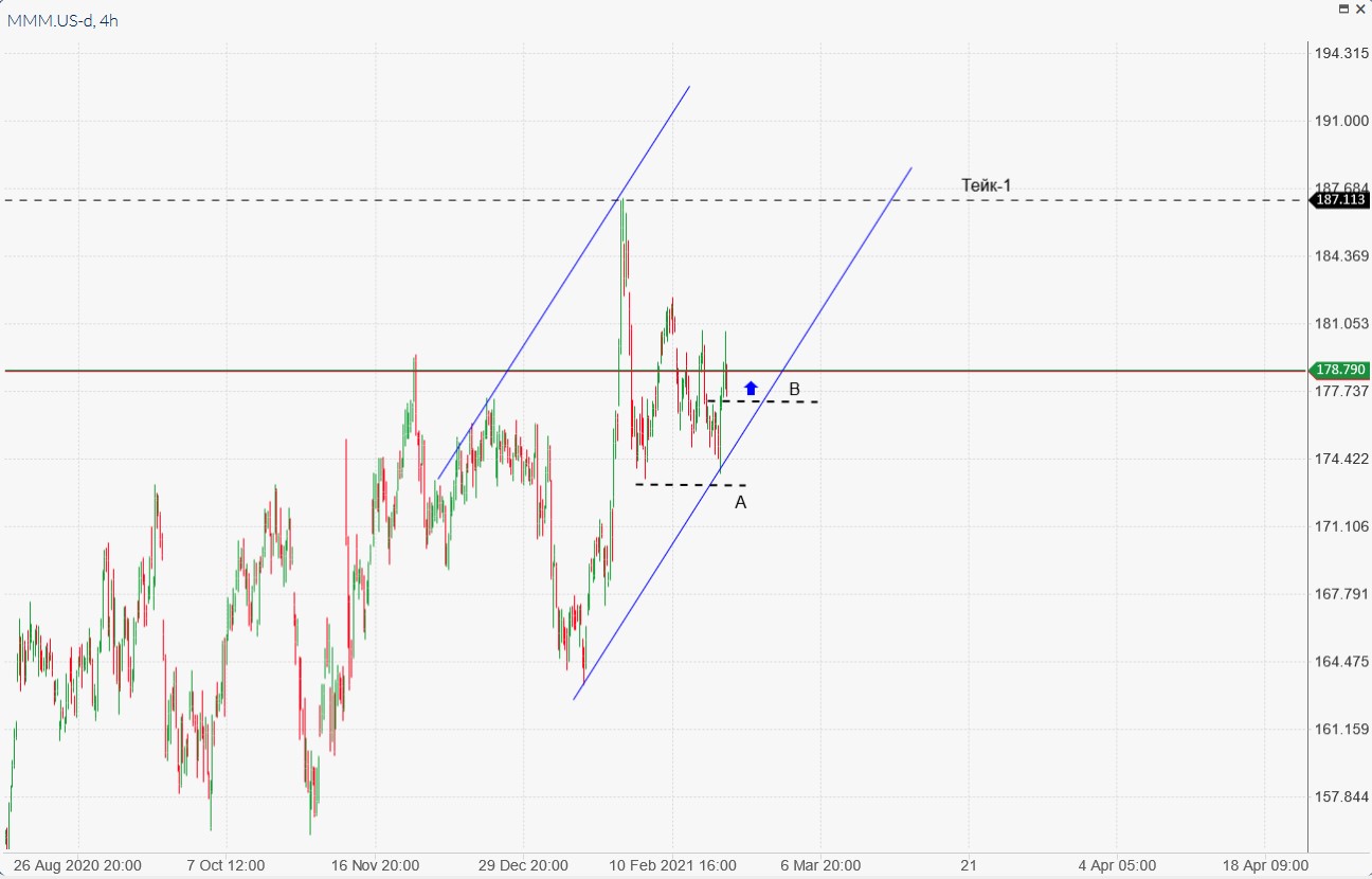
В четверг, 25 февраля, ситуация на рынках изменилась ровно до наоборот и теперь выросла Азия, а Европа и США отступили на красное. Причина все та же – инфляционные ожидания и доходность облигаций.
Рынки Азии продолжили положительную тенденцию, подстегнутые вторым выступлением Джерома Пауэлла перед Конгрессом США, где председатель Федеральной резервной системы заявил, что ставки могут оставаться низкими в течение многих лет.
В другом месте член правления ЕЦБ Изабель Шнабель указала, что главный банк Евросоюза будет бороться с любым чрезмерным повышением рыночных ставок.
Слишком резкое повышение реальных процентных ставок на фоне улучшения перспектив глобального роста может поставить под угрозу восстановление экономики. Поэтому мы внимательно следим за развитием финансового рынка
— сказала она.
Тем не менее, доходность 10-летних казначейских облигаций США подскочила до 1,614% и закончила день на уровне 1,5286%, значительно превысив предполагаемую дивидендную доходность компаний индекса S&P 500 в 1,48% и сведя на нет преимущество доходности фондового рынка.
Доходность облигаций еврозоны также выросла. По 10-летним облигациям Германии показатель может достичь наибольшего ежемесячного прироста с января 2013 года.
Инвесторы стали фиксировать прибыль в секторе высоких технологий и переходить к более консервативным облигациям с их растущей доходностью.
Apple, Tesla, Amazon, NVIDIA и Microsoft снизились от 1,2% до 3,6% и стали самым большим тормозом для индексов S&P 500 и Nasdaq, которые потеряли 2,5% и 3,5% соответственно. Dow Jones опустился на 1,75%.
У европейских инвесторов настроение было омрачено слабой корпоративной отчетностью, хотя ранее данные показали, что в феврале экономические настроения еврозоны выросли больше, чем ожидалось, благодаря большему оптимизму в промышленности, сфере услуг и потребления.
Акции Standard Chartered упали на 6,2% после сообщения о падении годовой прибыли кредитора.
Anheuser-Busch InBev потеряла на 6,2%, несмотря на то, что крупнейшая в мире пивоваренная компания сообщила о более высокой, чем ожидалось, основной квартальной прибыли, в то время как химический гигант Bayer снизился на 6,4% после сообщения о падении основной прибыли в четвертом квартале.
Опасения по поводу возобновления инфляции, кажется, только усилились, судя по неуклонному медвежьему обострению кривой казначейства США и вновь обретенной популярности традиционных средства хеджирования инфляции, таких как сырьевые товары
— говорят аналитики Rabobank.
Цена на медь подскочила на 3% до примерно $9 500 за тонну, самого высокого уровня почти за десятилетие и может стать самым крупным ежемесячным приростом за 15 лет.


I very delighted to find this internet site on bing just what I was searching for as well saved to fav
El monitoreo de teléfonos celulares es una forma muy efectiva de ayudarlo a monitorear la actividad del teléfono celular de sus hijos o empleados. https://www.xtmove.com/es/how-to-install-spy-app-to-monitor-another-phone-for-free/
When you’re trying to spy on someone’s phone, you need to make sure the software isn’t found by them once it’s installed.
There is definately a lot to find out about this subject. like all the points you made .
Wow, awesome blog format! How long have you been running a blog for?
you make blogging look easy. The whole glance of your web site is magnificent,
let alone the content! You can see similar here sklep online
You have mentioned very interesting details!
ps decent web site.Raise your business
Great post! I learned something new and interesting, which I also happen to cover on my blog. It would be great to get some feedback from those who share the same interest about Thai-Massage, here is my website YK3 Thank you!
I am extremely inspired along with your writing talents as smartly as with the layout to your weblog. Is this a paid subject or did you modify it yourself? Anyway stay up the nice quality writing, it is uncommon to look a nice blog like this one these days!
爱一帆下载海外版,专为华人打造的高清视频平台,支持全球加速观看。
夜班医生第四季高清完整版结合大数据AI分析,海外华人可免费观看最新热播剧集。
PG Soft mobile 2026: quem ganha mais no Android? Celular ou PC – qual sua preferência?
Доставка точная, композиция стильная. Класс!
розы купить в томске
Jogo do Tigrinho 2026: aposta mínima R$0,20 tá valendo mais que nunca
PG Soft torneio diário R$30 mil: quem tá lucrando todo dia no Fortune Tiger?
Fortune Ox touro dourado: já ativou hold & win com 15+ símbolos e ganhou tudo?
Fortune Rabbit respins chain: recorde pessoal de quantos giros seguidos você já fez?
PG Soft torneios semanais: R$100k–R$500k em prêmios – já ganhou algo no Tigrinho?
PG Soft 2026: quem tá lucrando mais com cashback diário ou giros grátis?
Mahjong Ways 2 cluster: quem já pegou mais de 25 peças?
Jogo do Tigrinho continua quente em 2026, quem já pegou um bom win essa semana?
Fortune Tiger cartinha misteriosa: quem já ativou x300+?
Jogo do Tigrinho ao vivo no Pix: quem ganhou big win e sacou em menos de 5 minutos?
Bônus sem depósito PG Soft: quem conseguiu ativar recentemente?
Fortune Tiger modo auto spin: quem costuma deixar rodando por mais tempo?
Fortune Ox tá entregando bem? Mostra seu maior touro dourado nos comentários
Fortune Rabbit respin: quem já pegou respins longos?
флаг на заказ со своим принтом сделать флаг на заказ в санкт петербурге
Do you want to go to Montenegro? map of Montenegro Europe an Adriatic holiday with pristine beaches and beautiful cities. Resorts, excursions, and active recreation. An ideal destination for travel and seaside relaxation.
флаги заказ цена печать флага на заказ спб
Хочешь оригинальную подушку? подушка дакимакура комфорт и уют для сна. Длинная форма, мягкий наполнитель и стильные принты. Отлично подходит для отдыха и расслабления.
Нужен пластический хирург? клиника пластической хирургии петербург современные операции и эстетические процедуры. Опытные хирурги, безопасные методики и индивидуальный подход. Консультации, диагностика и качественный результат.
Нужна мебель? мебель премиум класса эксклюзивные изделия из натурального дерева. Индивидуальный дизайн, качественные материалы и точное изготовление. Решения для дома и бизнеса.
PG Soft 2026: qual cassino tá dando mais bônus agora?
Fortune Dragon chegou como opção para quem curte volatilidade alta e bônus visualmente intenso.
продажа элитная мебель элитная мебель
Самое интересное: https://giasite.ru
Master how to optimize conversion funnels on Snapchat by aligning creative messaging, form fields, and call-to-action placement to match user behavior on the platform. The guide examines why traditional landing page funnels often fail on Snapchat and provides concrete alternatives using Stories, Snap Ads, and Snapchat’s audience-matching capabilities. Key sections cover field-reduction strategies to boost form completion rates, timing swipe-up prompts for maximum engagement, and retargeting incomplete leads through Audience Match. Account managers and performance marketers will gain actionable frameworks for A/B testing ad creative against form field combinations. Apply these conversion optimization principles to lower your cost per lead and increase qualified submissions across your Snapchat campaigns.
Запуск реклама мобильных игр в TikTok 2026 без блокировок требует глубокого понимания политик платформы и готовности к новым требованиям верификации. TikTok ужесточил?? на игровые кампании, особенно для казуальных и казино-подобных проектов, предъявляя строгие требования к документации аккаунта, возрастным ограничениям и креативным материалам. Материал разбирает как типовые причины отклонения кампаний, так и надежные стратегии подготовки бизнес-профиля, выбора правильного типа аккаунта (personal manager, business, agency) и согласования креативных активов с политикой платформы. Медиабайеры узнают, как структурировать пиксельное отслеживание и обходить технические ограничения при сохранении полной прозрачности перед системой платформы. Применение рекомендаций минимизирует риск блокировок и позволяет достичь стабильного масштабирования объемов в вертикали.
Fortune Ox teve picos importantes no modo acelerado.
Fortune Ox entregou boas janelas para quem entrou no timing certo.
O jogo muda todo dia; a vantagem está em adaptar sem perder gestão de banca.
While going through several recommendations, I encountered something that appeared naturally within the content, read more here, and it seems like a lively and interactive site worth exploring further
mitchwantssununu.com – Interesting concept site, content feels direct and somewhat thought provoking today
While searching for eco-friendly energy solutions, I stumbled upon open this biodiesel info page – It is an interesting resource, and I actually picked up new knowledge simply by exploring it for a short while.
During my comparison of event websites, I encountered follow this winter link – The site offers a refreshing layout with useful content that is simple to navigate and enjoyable to explore without unnecessary complexity.
Across various digital storefront evaluations emphasizing usability and flow, a notable example is Glade Frost Vendor Vault which delivers feels structured and simple, making it easy to explore content, ensuring users experience a clean interface with intuitive navigation across all pages.
People who enjoy well structured online shopping often engage with sites like Sun Cove Goods District Flow Hub where items are arranged in a bright and simple layout – The browsing experience feels intuitive and pleasant, allowing users to explore products quickly and comfortably.
While reviewing island retreat websites featuring boutique stays and scenic surroundings, I found a well crafted listing worth exploring further < tranquil hillside retreat card – It delivers a calm and welcoming presentation, making the property feel both organized and visually appealing very nicely
While exploring commentary driven personal blogs I found a straightforward website that shares opinions without much embellishment including straight talk opinion page – the content feels intentionally blunt and encourages readers to engage with ideas in a more reflective and analytical way overall
People who enjoy well organized ecommerce hubs often explore sites like Harbor Kettle Commerce Essence Hub where items are arranged in a clean format – The design ensures browsing feels clear, smooth, and easy to navigate across all sections.
While comparing e-commerce platforms designed for simplicity and structure, a standout example is Brook Gilded Experience District which maintains nice visual balance and navigation works without any confusion, ensuring a calm and intuitive browsing experience across all sections.
While going through seasonal event resources, I discovered find out more – The site offers an enjoyable browsing experience with clear, helpful content that feels relevant and easy to digest for all types of visitors.
As I explored various comedy and entertainment websites, I encountered view this fun content site – The platform has a cheerful atmosphere, and the content feels light, making it easy and enjoyable to scroll through without getting overwhelmed.
Users who prefer bright and structured ecommerce environments often explore sites such as Sun Goods Cove District Hub where products are arranged in an intuitive and clean format – The interface ensures browsing feels simple, efficient, and enjoyable with a focus on clarity and easy navigation throughout all sections.
Shoppers who enjoy modern vault-style ecommerce interfaces often value strong visual structure that enhances usability and keeps product presentation consistent across sections Glass Vault Harbor Collection – The layout feels refined and orderly, offering a seamless browsing experience where navigation remains simple, clear, and visually intuitive throughout.
modelscanvas.com – Creative portfolio vibe, visuals and layout feel clean and professional design
While reviewing self-growth and mindset platforms, I encountered view emotional strength blog – The writing feels thoughtful and relatable, and the overall content is meaningful in a way that feels genuine and easy to connect with.
When analyzing online retail systems built for usability and consistency, one standout example is Night Trade Glade House where everything feels straightforward and browsing is comfortable and stable, helping users access information quickly through a clean structured layout.
While researching various nonprofit and health-focused initiatives online, I came across visit this foundation page – The information presented feels clear, practical, and easy to understand, making it useful for readers looking for straightforward guidance without unnecessary complexity or confusion.
Users who prefer expressive digital marketplaces often explore sites such as Teal Cove Atelier Vendor Craft Hub where products are presented in a stylish and organized layout – The design enhances browsing flow, making it feel creative, structured, and visually consistent across all sections.
While browsing artistic presentation websites I came across a platform that delivers a clean and minimal layout featuring creative visuals display page – the structure feels intuitive and refined making it easy to navigate while maintaining a strong visual identity overall
Modern shoppers who value speed and simplicity in ecommerce often engage with platforms that streamline browsing, particularly stores such as Cove Easy Shopfront where the interface is designed to minimize effort while maximizing clarity in product selection and viewing – The shopfront structure prioritizes ease of use, making it ideal for quick and efficient browsing sessions
As I explored different websites online, I encountered view this bonus offer page – I found it today and it appears quite useful overall, with a neat presentation that makes the information easy to understand and navigate.
While researching fine wine producers online, I discovered a sophisticated winery website that emphasizes clarity, elegance, and detailed product storytelling iniskillin elegant wine site – The presentation is appealing and well structured, giving a strong impression of quality and brand heritage throughout
In evaluations of e-commerce platforms emphasizing clarity and flow, a strong example is Sage Harbor Global Vault where clean design and content is arranged in a logical order, helping users access information quickly without clutter or confusion.
As part of my research into animal welfare efforts, I came across explore this link – The platform feels well organized, with content that is easy to understand and reflects a sincere and thoughtful approach to the cause.
People who prefer efficient shopping platforms often explore sites like Harbor Teal Commerce Unified Hub where items are displayed in a structured and simple layout – The design ensures browsing feels organized, intuitive, and easy to follow throughout the entire ecommerce experience.
During my search for social impact and community-focused organizations, I noticed check this empowerment network site – The initiative seems very important, and the content is clearly structured, making it easy to follow and understand the purpose behind it.
Users who enjoy curated online shopping platforms often respond well to collective designs that prioritize simplicity, structure, and consistent visual presentation Ridge Glade Collective Experience – The layout feels modern and streamlined, offering a clear browsing flow that makes product discovery easy and visually comfortable from start to finish.
While searching for visually themed retro sites I discovered a platform that presents content with a nostalgic flair using retro vibe content page – the design feels immersive and visually appealing with a consistent theme that enhances the overall browsing experience
While browsing innovative and non traditional website designs, I discovered a platform that clearly focuses on artistic structure and unconventional layout choices creative layout exploration site – The content feels experimental and well organized in a unique way that highlights creativity and structured presentation approach
Users who enjoy creative handmade marketplaces often explore platforms such as Brook Artisan Lifestyle Store where product presentation reflects strong craftsmanship values – The browsing experience is designed to feel warm and authentic, allowing users to connect with the artisan story behind each curated item.
In reviews of e-commerce platforms focused on structure and responsiveness, a strong example is Summit Amber Vendor Marketplace which ensures smooth experience overall, pages feel fast and easy to use, allowing users to move through sections smoothly with a clean interface.
As I explored various online squad platforms, I encountered view squad digital hub – The site looks visually impressive, and the content remains interesting, making the overall experience smooth and enjoyable.
While going through various musician pages, I discovered find out more – The layout feels straightforward and easy to use, helping visitors quickly understand and navigate the site with ease.
Users exploring clean ecommerce platforms often appreciate how simple layouts improve usability when visiting sites such as Trail Harbor Commerce Central Hub where products are arranged in a structured and minimal format that makes browsing fast and easy – The clean design ensures navigation works smoothly and feels very user friendly, allowing users to find products quickly without confusion or clutter across categories.
Users who appreciate clean online marketplaces often value emporium layouts that improve navigation and make browsing feel more natural and effortless Glass Emporium Coastal Harbor – The presentation is refined and structured, offering a seamless shopping experience where each product is easy to view and understand at a glance.
nomeansnoshow.com – Strong identity here, site feels bold and creatively expressive throughout pages
When evaluating online storefront systems focused on clarity and performance, a notable example is Lakefront Icicle Vendor Mart which delivers simple layout and information is easy to find at a glance, ensuring users enjoy a smooth and distraction-free browsing experience.
As I explored elegant marketplaces with soft visual styling, I checked see velvet willow collection – The layout feels refined and gentle, and browsing through items is smooth and visually calming throughout.
People who appreciate clean digital storefronts often prioritize platforms that reduce clutter and improve browsing flow such as Golden Caramel Supplies where warm tones clean structure make product exploration simple enjoyable experience flow – The layout encourages effortless browsing with minimal distractions and a consistent visual language throughout
People who enjoy polished online marketplaces often appreciate emporium designs that combine visual consistency with structured layouts for easier product discovery and browsing flow Glass Stone Emporium Storefront – The design feels clean and visually unified, offering users a smooth experience where products are displayed clearly and navigation remains simple throughout.
While researching structured online commerce systems and their user experience, I explored browse this meadow linen hub – The layout is clean and efficient, and browsing feels smooth, making the entire experience easy and enjoyable from start to finish.
During my exploration of creative online experiments, I noticed check brownback style clone – The idea feels quite unique, and it is definitely something worth checking out for its originality and different approach.
While exploring bold themed digital platforms I came across a site that delivers a strong visual impression featuring creative identity portal – the layout feels impactful and provides a memorable browsing experience with its distinctive style
In comparisons of user experience across retail websites, a strong example is Orchard Upland Shopping Hub which ensures well structured pages and browsing feels natural and efficient, supporting seamless transitions between pages and product sections.
While exploring artistic and culturally mixed digital platforms, I found a site that merges different themes into a visually engaging structure jeddah brooklyn culture portal – The website feels unique and diverse, with an engaging presentation that blends cultural ideas in a creative and thoughtful manner
People who enjoy artisan styled online stores often engage with sites like Cove Wind Artisan Product Market Hub where items are arranged neatly for browsing – The interface makes navigation feel smooth, organized, and visually appealing across the entire marketplace.
As I browsed through online advisory and business help websites, I discovered useful guidance material and came across helpful advisory hub page – The platform feels well structured, offering practical and easy-to-understand information that supports quick learning.
During a final comparison of retail atelier websites, I found see mint orchard retail atelier hub page – This is definitely a place I’ll return to for the holiday season since the browsing experience is smooth, pleasant, and well organized.
Online shoppers drawn to artistic ecommerce spaces often appreciate studio styled presentations that emphasize refinement and curated product storytelling Galleria Gold Cove Studio – The interface blends aesthetic harmony with structured navigation ensuring users can explore collections effortlessly while enjoying a visually engaging environment that highlights product details through carefully designed layouts and consistent visual hierarchy across all pages of the platform experience today
oakmeadowcommercehub – Commerce hub feels organized, categories are clear and easy browsing
nutschassociates.com – Professional services look solid, information is clear and easy to follow
Users seeking creative online stores frequently value platforms that simplify browsing and enhance discovery and during exploration they may find violet harbor artisan point presenting diverse handmade items organized into clear categories for effortless navigation – The store focuses on delivering a pleasant and intuitive shopping journey for craft lovers.
In comparisons of online commerce systems focused on clarity and usability, a standout example is Lakefront Frost Unified Vault which delivers clean interface and everything is easy to navigate without effort, ensuring a smooth and structured experience across the entire platform.
uplandcovevendorcorner – Vendor corner feels helpful easy browsing and clean layout overall
People who enjoy simple digital outlet marketplaces often explore sites like Stone Harbor Outlet Direct Market where products are arranged in an easy to follow structure – The interface focuses on functionality and clarity, making browsing efficient and helping users quickly locate desired items without confusion.
While exploring artistic cultural fusion websites, I found a platform that brings together different regional aesthetics in a creative digital format brooklyn jeddah culture hub – The design feels engaging and diverse, presenting a blend of themes that makes the browsing experience unique and enjoyable
Users who enjoy soft toned ecommerce galleries often engage with sites such as Dawnstone Gallery Flow Hub where items are arranged in a peaceful format – The interface ensures browsing feels smooth, quiet, and visually comfortable across categories.
In the middle of researching health and lifestyle consulting services, I discovered read this nutrition coaching page – The overall presentation feels organized and calming, making it easy to browse while keeping everything visually pleasant and readable.
While searching for well structured business websites I discovered a platform that highlights organization and clarity using professional company hub – the interface feels smooth and intuitive making it easy to browse information in a logical and efficient way
While exploring outdoor getaway platforms, I came across open camping destination hub – The place looks great, and the information is presented clearly, making it engaging and easy to follow for users.
In comparisons of online commerce systems emphasizing clarity and usability, a strong example is Forest Frost Unified Vault which delivers the design feels balanced and content is clearly organized, ensuring a smooth and structured experience across the entire site.
People who appreciate icy themed digital stores often browse platforms like Isle Icicle Winter Market Hub where products are presented in a clean and refreshing style – The design focuses on simplicity and clarity, making browsing feel smooth, modern, and easy to navigate across all categories of the site.
champselyseesclinic – Clean design and helpful content, feels professional and easy to explore.
While exploring different fan driven sports websites I found one that stands out due to its playful approach to volleyball content player themed volleyball insight – It feels like a creative mix of sports culture and light humor that keeps things engaging without becoming overly serious or complex
pair-dating.com – Dating concept looks simple, interface feels straightforward and user friendly experience
Users who appreciate cozy digital storefronts often explore websites like Ginger Calm Market where the design emphasizes soft visuals and intuitive browsing patterns – The experience is crafted to feel relaxed and accessible, supporting users throughout their shopping journey
While going through different travel shoot websites, I found browse this shoot portfolio – The overall experience is great, with quick loading speed and a layout that feels natural and easy to navigate through.
While browsing digital real estate tools I found a Kaufman County focused website that presents home listings in a well structured way home listing navigation hub – It offers a smooth experience with straightforward categories and easy access to property details, making it convenient for prospective buyers
While exploring various platforms designed for connecting people online I noticed a service featuring matchmaking experience page – the layout seems clean and the navigation feels intuitive which helps create a comfortable and approachable browsing environment for visitors
Many users interested in vault inspired digital marketplaces often highlight ease of navigation when they visit Coastal Ginger Vault Exchange which emphasizes carefully arranged listings and structured browsing paths – The overall presentation feels well curated and visually stable, helping users quickly locate relevant items without confusion.
Users who prefer simple rustic ecommerce systems often explore sites such as Timber Trail Rustic Outpost Valley Hub where products are arranged in a warm wood themed format – The interface creates a smooth browsing experience that feels natural, easy to navigate, and visually well structured throughout the store.
While searching through music entertainment websites, I stumbled upon open this entertainment portfolio page – The site looks solid and professional, and the layout plus information flow work really well for an easy browsing experience.
While reviewing accessory and jewelry websites, I encountered view this handcrafted site – The balance between visual design and written content makes the browsing experience feel natural, clean, and engaging throughout.
While browsing curated entertainment websites I came across a platform focused on maintaining a safe space for family film discovery and age appropriate viewing recommendations family friendly cinema guide – The site feels organized and reassuring, making it easy to browse content that aligns with safe viewing standards
While exploring visually expressive websites I came across a platform showcasing graphic design hub – the presentation feels energetic and the site offers a visually compelling experience that captures attention from the start
During my exploration of structured information platforms, I noticed check this rtc resource – The layout is clearly organized, which helps users quickly find the needed information without wasting time navigating through poorly arranged content or unclear sections.
While exploring dessert branding inspiration online I found a site that uses sweet themed aesthetics and clean structured layouts to create an engaging visual experience that feels both simple and professionally organized for users sweet creative branding hub – The visuals feel refined and well balanced, offering an enjoyable browsing experience with clear structure
People who prefer warm and creative marketplaces often explore sites like Artisan Trail Harbor Cozy Market House where products are displayed in a soft and inviting style – The layout enhances user comfort and visual flow, making browsing feel calm, friendly, and naturally engaging.
While reviewing structured online commerce platforms, I came across visit linen meadow commerce link – The interface is smooth and user friendly, and browsing feels enjoyable with clear and simple navigation throughout.
People browsing handmade product websites frequently look for platforms that balance creativity and usability and might encounter harbor craft violet marketplace offering curated artisan collections with intuitive navigation and clear layout design – A marketplace built to enhance shopping comfort and product accessibility.
preventcovid19trial-uk.com – Informational tone here, content feels research focused and medically structured layout
Users who prefer elegant calm gallery layouts often explore sites such as Galleria Dawnstone Serenity View where items are displayed in a minimal format – The interface ensures browsing feels soft, organized, and easy on the eyes throughout the experience.
While analyzing structured shopping systems for UX quality, a strong example is Harbor Violet Global House where clean structure overall, makes browsing feel smooth and simple, providing users with a reliable and easy-to-understand browsing experience.
Users who appreciate efficient ecommerce layouts often prefer platforms that reduce clutter and enhance visibility of products, especially when visiting Meadow Supply Exchange where items are displayed in a consistent format that helps streamline browsing and supports faster purchasing decisions without confusion.
While exploring a variety of soft aesthetic online marketplaces and evaluating how elegance influences user experience, I came across explore velvet willow market – The overall feel is gentle and refined, and browsing through products is calm, smooth, and visually relaxing throughout the entire experience.
While browsing various retail atelier platforms and evaluating seasonal usability and design quality, I came across explore mint orchard retail atelier – I will definitely be coming back here during the holiday season because the overall experience feels very pleasant and well organized.
In the process of reviewing yoga and lifestyle platforms, I found explore this yoga concept hub – The idea feels quite intriguing, and it seems like something worth revisiting later for a more in-depth understanding and reflection.
As I browsed through different luxury jewelry collections online, I encountered view vicki jewelry showcase – The site has an elegant feel, and the presentation looks polished and appealing, making it pleasant to explore.
While exploring athletic performance and recovery websites I discovered a football therapy focused platform that presents supportive and practical information designed to guide users through sports rehabilitation and physical care concepts in a simple way team sports therapy hub – The information feels practical and supportive, focused on recovery improvement
Users who enjoy organized ecommerce environments often explore sites such as Kettle Commerce Harbor Market Hub where products are arranged in a simple minimal format – The interface creates a browsing experience that feels structured, intuitive, and easy to navigate across categories.
As I analyzed several commerce hub platforms for usability and presentation quality, I found check vale harbor commerce site – The overall platform looks nice, navigation is simple, and content is clean and well structured for easy browsing.
While exploring vendor marketplaces, I found Violet vendor marketplace hub embedded in a well-organized platform – it provides a balanced browsing experience with clear categories and smooth transitions between different product sections.
As I browsed through tourism discovery platforms, I noticed view this travel info ireland – The site feels engaging and user friendly, allowing easy browsing of travel details and destination highlights.
While browsing medical research websites to understand how they present data I discovered a platform showcasing study participation portal – the content feels structured and the overall design reflects a clear and research focused approach to information delivery
velvetcoveartisanoutlet – Artisan outlet design clean, products are nicely arranged and easy to explore
While checking out different artist and band pages online, I stumbled upon open this band site – The style is really appealing, and the presentation feels smooth and well structured, making it enjoyable to browse through the content.
Users who enjoy simple and welcoming online shopping experiences often explore platforms such as Harbor Bright Trade Hub – The layout emphasizes usability and clarity, making it easy to locate products quickly while maintaining a visually balanced and smooth browsing flow across all categories.
Users who appreciate well designed shopping platforms often browse sites such as Upland Commerce Harbor Navigation Hub where products are grouped clearly for easy access – The design ensures browsing feels efficient, structured, and quick across all categories of the ecommerce system.
As I browsed online clothing stores and fashion hubs, I found check this diverse clothing page – The site has a stylish presentation, and both products and content are showcased in a clear and visually appealing way that feels well structured.
As part of studying modern simple eCommerce vendor halls, I explored check this mint cove shop – The interface is fresh and minimal, and navigation is smooth with clearly organized sections.
As I examined multiple online sources, I noticed tap here – The design and organization work together effectively, making it simple to navigate and quickly absorb the most relevant details provided.
Shoppers who appreciate curated digital storefronts often explore sites like Trail Vendor Creative Hub where product presentation is designed to reflect artistic direction and modern styling – The layout feels structured yet expressive, making browsing enjoyable while maintaining a strong focus on visual storytelling and product identity.
While researching structured commerce hub platforms and their content variety, I explored browse this velvet grove commerce space – The site offers excellent options, and I like checking listings regularly because the browsing experience feels smooth and well organized.
Shoppers exploring online marketplaces frequently seek platforms that offer both reliability and ease of use, particularly when browsing curated selections that are organized for quick access like Seaside Retail Directory which is designed to present a well-structured catalog experience, enabling users to filter options effectively while maintaining a smooth and responsive interface across different devices and browsing conditions.
People who appreciate modern vault themed stores often browse platforms like Ridge Vault Ivory Market Space where items are arranged in a clean and structured format – The design ensures content feels curated and visually balanced, making browsing smooth, intuitive, and aesthetically pleasing throughout the entire shopping journey.
While exploring informational community websites I came across a Lochwinnoch site that offers helpful updates and guidance in a friendly tone making it easy for users to understand local services and community details community information portal page – The site feels welcoming and informative overall
uplandharborcraftmarketplace.shop – Navigation could improve but products are unique and cool.
During my comparison of multiple frontier and outdoor supply websites, I examined how each organizes its content and user flow, and in the middle of this exploration I noticed Frontier Harbor Supplies among similar entries – updated commentary: the site offers a balanced layout, smooth navigation, and an efficient browsing experience overall.
While searching marketplace style websites I discovered a vendor hub that arranges items into clear product sections making navigation smooth and helping users quickly locate what they need well sorted marketplace page – The presentation feels neat and structured
During a comparison of structured trade house platforms, I found see raven harbor trade center – The design is practical and organized, and browsing feels simple, logical, and easy to understand throughout the site.
During research into structured ecommerce systems and digital storefronts, I noticed Harbor room vendor guide – it provides a smooth interface with clearly defined sections that support efficient browsing and help users explore a wide range of products effortlessly.
As part of studying commerce hub usability and interface design, I explored check this violet harbor hub site – The design is impressive, and browsing products feels fast and convenient thanks to its simple and efficient structure.
People searching for general online goods platforms usually prefer sites with intuitive design, and while exploring options they might discover plum cove market space featuring multiple product types and easy browsing tools – A practical digital shopping environment that supports quick selection and seamless purchasing experiences.
Users who appreciate soft structured shopping systems often browse sites such as Lantern Meadow Commerce Core Hub where products are presented in a minimal airy layout – The interface ensures browsing feels relaxed, simple, and easy to navigate across all sections.
People who prefer cozy ecommerce layouts often explore sites like Honey Cove Vault Soft Market Hub where items are arranged in a warm and inviting structure – The design emphasizes clarity and comfort, making browsing feel smooth, organized, and visually pleasing across all product categories.
People who value fast and readable trading systems often browse platforms like Harbor Wave Market Flow Hub where data is organized for immediate understanding – The design emphasizes clarity and speed, helping users interpret information quickly without unnecessary complexity in navigation.
During comparative review of several online trading style outdoor hubs, I examined how usability design influences user engagement and overall browsing efficiency across categories UplandGearPoint – revised insight: the platform maintains a balanced design, ensuring smooth transitions between sections and easy comprehension of content structure.
While reviewing online commerce hubs I found a site highlighting shopping category portal – the layout feels accessible and the structure keeps the focus on products while maintaining easy navigation throughout
As I compared different creative retail websites focused on immersive shopping experiences, I checked open this colorful shop – The aesthetic feels vibrant and expressive, and browsing through items feels lively, offering a visually appealing journey for users.
Web usability researchers often examine how design consistency and navigation structure impact user behavior in online stores particularly in systems like Stellar Moon Retail Space which is commonly portrayed as a modern retail design concept emphasizing clean interfaces logical flow and engaging visual presentation – this improves overall shopping clarity.
In the middle of comparing several resources, I saw go to this tracker – The presentation is both informative and accessible, ensuring that users can quickly grasp the essential details without extra effort.
While exploring curated online marketplaces and vendor showcase platforms, I discovered Harbor vendor room exhibit page – it highlights structured product displays and smooth navigation that enhances user engagement and simplifies the process of finding relevant items.
People who appreciate well structured digital stores often browse platforms like River Trade Frost Commerce House Hub where items are presented in a clean layout – The design creates a straightforward browsing experience that feels organized, clear, and easy to explore throughout the site.
People who enjoy premium styled ecommerce layouts often engage with sites like Stone Gilded Collective Design Hub where products are showcased in a clean and elegant format – The interface focuses on visual harmony and branding consistency, ensuring a smooth browsing experience that feels upscale and thoughtfully arranged.
While exploring cultural information websites I came across a concept platform that presents structured and meaningful content designed to reflect modern ideas and relevant cultural discussions in an accessible format modern culture insights hub – The content feels informative and relevant throughout
During a review of structured and seasonal eCommerce layouts, I found browse autumn goods here – The design is warm and engaging, and moving through categories feels smooth and intuitive.
As part of a usability comparison study on outdoor commerce platforms, I analyzed how layout decisions impact the ease of finding relevant products efficiently SummitCoveShop – revised insight: navigation remains clean and direct, helping users move through sections without confusion or delay.
Consumers who enjoy practical and durable essentials frequently browse selections such as Bayfront Supply Co – The identity emphasizes reliable construction and minimal styling, catering to those who value straightforward, functional products that perform well across different environments and daily activities.
While comparing vendor studio systems for speed and reliability, I discovered browse walnut cove vendor workspace – The experience has been great, and everything loads quickly while working smoothly without any technical issues.
Shoppers who value authenticity often choose artisan platforms that focus on handmade goods and ethical production practices Artisan Craft Showcase Hub – ensuring that every purchase supports small creators while promoting sustainable and responsible consumer habits over time globally across markets.
In my exploration of digital vendor environments and ecommerce design structures, I observed Vendor room product hall – it delivers a balanced layout that improves product visibility and ensures users can browse categories smoothly while maintaining a clean visual experience.
Users who prefer elegant ecommerce presentations often explore sites such as Ginger Galleria Stone Showcase where products are arranged in a clean and fluid gallery layout – The interface emphasizes visual engagement and smooth navigation, ensuring browsing feels natural, stylish, and easy to follow across all sections.
While studying digital commerce hub interfaces and usability flow, I noticed open wave harbor commerce hub site – I appreciate the effort here as the site feels polished and user friendly with smooth and clear navigation throughout.
While exploring niche online marketplaces focused on rustic aesthetics I found a platform that emphasizes simplicity and functional design with a calm browsing flow featuring mountain outpost shop – the site gives a grounded feel with minimal clutter and easy navigation that makes browsing comfortable and straightforward overall
While comparing how different brands implement minimalism in their website layouts, I reviewed browse this alpine link – The navigation is fluid, and the overall experience feels polished and easy to follow without distractions.
While exploring travel and accommodation sites I discovered a luxury lodge platform that highlights premium countryside stays with elegant visuals and a welcoming presentation style designed to attract users interested in high end relaxation and scenic getaways premium lodge retreat hub – The site feels visually rich and very inviting, emphasizing luxury travel experiences
During research into outdoor retail user interfaces, I evaluated how effectively platforms reduce complexity while maintaining clear access to product information CoveRangeDepot – updated note: the system feels practical and organized, supporting a simple and efficient browsing experience overall.
While reviewing online commerce platforms with natural inspired layouts I found a site featuring harbor trading center – the design feels neat and the structured navigation creates a smooth and visually balanced shopping experience
During my exploration of different user-friendly platforms, I encountered follow this link – The design is appealing and modern, allowing readers to enjoy a smooth and effortless browsing experience.
As I compared different artisan boutique websites for handmade product variety, I came across explore velvet brook artisan collection – I would recommend this to anyone who loves handmade goods because everything feels carefully curated.
In reviewing structured online marketplaces designed for clarity and usability, I noticed a well arranged interface where introductory browsing sections naturally lead into Canyon Harbor Trade Hall overview portal embedded within the content flow, and it presents organized categories that improve navigation efficiency across multiple product sections – Trade hall offers solid structure with useful browsing categories available, making it easier for users to explore listings without confusion or clutter in the interface.
During research into structured vendor atelier websites, I explored explore this wave harbor creative space – Browsing here is pleasant, with categories that are clear and easy to navigate without any confusion.
I came across a page during my search today that seemed relevant enough to bring up in this conversation, click for details – it appears to be well put together and could be quite beneficial for anyone needing organized material.
As I explored different approaches to clean and structured online shop designs, I came across explore structured trading hub – The site feels organized and easy to navigate, with content that is clearly laid out for users.
While going through different curated resource hubs and digital listings, I came across a platform that felt quite accessible and neatly arranged, especially Crest vendor browsing link which provides a clean and direct interface for smooth exploration – Found this recently, seems quite helpful and easy to explore, with an organized flow that makes it comfortable to use again in future sessions.
Users who value minimal ecommerce aesthetics often respond well to goods stores that prioritize clean layouts and straightforward navigation paths Marble Harbor Goods Portal – The interface supports seamless browsing with organized categories and consistent visual design allowing users to explore products easily while maintaining a calm and structured environment throughout the entire shopping experience today platform system.
While browsing travel websites I came across a cruise themed platform that provides straightforward information about voyages and destinations making it useful for users planning ocean based trips and holiday experiences cruise itinerary hub – The layout feels simple and travel focused overall
As I explored various curated online directories and commerce platforms, I noticed something that felt visually relaxing yet not entirely smooth in usability, particularly with Cove sky commerce atelier entry – The sky theme gives a calm impression, but navigation can feel a bit clunky during browsing.
People exploring creative online retail spaces often appreciate balanced design systems when visiting Garden Vault Gallery which presents products in a gallery-style arrangement that highlights aesthetic harmony and smooth category transitions for effortless browsing – The visual identity reflects a garden-inspired vault concept that feels both curated and visually engaging
While checking online trade hubs and marketplaces on my phone, I came across a site featuring Jasper commerce harbor trade hall link – The name feels premium, but the loading speed was frustratingly slow during my visit.
During UX reviews of farm inspired ecommerce templates and organic marketplaces, testers found navigation elements containing orchard wild vendor workshop hub embedded in page structure, but ingredient lists are absent across all product pages – Wild orchard sounds wholesome and eco natural, yet users are left without essential product information affecting purchasing confidence
Across sandbox UI testing and ecommerce prototype reviews, analysts identified navigation elements containing ember market meadow lounge hub portal within page structure, and despite the pleasant ember aesthetic, the lounge page takes far too long to load causing friction in user experience during performance testing sessions
Users exploring structured ecommerce environments often appreciate how clean vendor hall layouts improve navigation efficiency when browsing platforms such as Chestnut Harbor Vendor Hall Hub where listings are clearly organized into sections that support quick scanning and easy discovery – The vendor hall design ensures a smooth and structured browsing experience that feels intuitive, reducing clutter while helping users find products quickly and comfortably across all categories.
As part of reviewing minimalistic website designs for better usability, I noticed visit this calm outpost – The presentation is neat, and navigation feels smooth and reliable throughout.
During my search for approachable and informative therapy-related websites, I noticed check this helpful site – The content is written in a friendly and reassuring manner, helping readers feel at ease while understanding the key details without confusion or overly complex explanations.
Shoppers searching for budget-friendly creative collections often value online platforms that group handmade products into clear and accessible discount categories Budget Craft Collection while supporting quality assurance – this type of marketplace helps users discover affordable items while still maintaining trust in craftsmanship and product consistency.
I was checking a few resources online when I came across something that might interest others here, visit this resource – the simplicity of its layout makes the whole browsing experience feel smooth and user-friendly.
As I reviewed retail mart platforms for fulfillment quality and design, I noticed check night orchard gift space mart – I purchased a gift last week, and the packaging felt premium and carefully managed, making the experience enjoyable.
Users who prefer consistent structured vault platforms often explore sites such as Elm Harbor Vault Flow where content is arranged in a clean format – The interface makes browsing feel stable, secure, and visually uniform throughout the experience.
While browsing individual style platforms I came across a personal page that focuses on simple design and clear communication creating a relaxed browsing experience for visitors interested in personal content direct expression hub – The content feels plain and easy to read
While reviewing experimental ecommerce vendor platforms and UI directory systems, testers noticed a central module containing ember stone trade lounge access panel embedded within layout flow, and although the branding feels solid and structurally strong like stone, the listing fails to provide any verifiable contact information making it difficult for users to reach support during testing sessions across multiple environments
As I analyzed several digital vendor atelier platforms for trustworthiness and content quality, I found check trail harbor creative atelier – The structure looks dependable, and the information seems accurate and consistently presented in a clear and organized way.
Users who prefer clean digital shopping experiences often value platforms that prioritize clarity and structured browsing systems especially when dealing with large inventories and multiple product families organized across different sections of an online market environment for better usability Crest District Commerce Guide – The marketplace layout is designed with detailed categorization and user friendly navigation elements that allow visitors to filter and compare items efficiently, ensuring that product discovery remains fast, simple, and visually coherent throughout every stage of browsing.
During analysis of retail oriented platforms I observed a structured page where the Sweet cove vendor listing board is embedded within content sections, improving navigation – The hall looks dynamic today with varied product options and a simple browsing experience that helps users quickly find what they are looking for.
Online commerce continues to mature with the rise of structured ecosystems that support scalable business operations and long term sustainability Retail guild digital marketplace these ecosystems help reduce inefficiencies and promote standardized practices across vendor networks – Guild based platforms are increasingly recognized for improving transparency in digital trade environments
While scanning through niche resource collections and suggestion pages, I noticed something that stood out for its simplicity and clarity, especially where Copper Cove vendor access page appeared – this seems like a solid platform where content is well organized and easily accessible for users.
While reviewing experimental ecommerce systems and trade hall UI prototypes, testers encountered mid layout content featuring harbor glass trade hall vendor console entry embedded in structure, and despite the fragile glass aesthetic suggesting instability, the site runs surprisingly smooth today even during intensive browsing and performance evaluation testing cycles
While reviewing a variety of online suggestions and niche directories, I encountered something that seemed worth a closer look, particularly with references like this site option – it appears reasonably solid so far, so I’ll revisit it later.
While exploring a variety of artisan marketplace websites and reviewing their product diversity, I came across explore oak cove artisan market – The collection of options feels well curated and interesting, making it genuinely worth spending time browsing through the selections.
Users who appreciate clean and warm digital stores often browse sites such as Meadow Ember Trading Market where items are presented in a simple layout – The interface makes browsing feel easy, organized, and intuitive across the platform.
In the middle of evaluating online fabric marketplaces I noticed a feature block containing meadow cotton goods hall and although the visual theme is soft and pleasant, the site frequently logging users out reduces trust and interrupts what should be a smooth shopping experience overall.
People who appreciate clean structured ecommerce environments often prefer platforms that reduce clutter and improve browsing flow such as Chestnut Cove Artisan Flow Store – the design ensures that users can move through categories effortlessly, maintaining focus on products – the interface supports both efficiency and visual comfort throughout.
During research into artisan-focused online stores with creative layouts, I explored check curated trail shop – The design feels cohesive and artistic, and browsing across pages is smooth and visually consistent.
During frontend evaluations of ecommerce marketplace systems and UI vendor prototypes, developers observed navigation elements containing cove rose vendor parlor market entry portal embedded in page flow, and although the branding feels romantic and appealing, the parlor section consists of empty boxes which negatively affects usability during interaction testing sessions
As I browsed through various curated resource lists and marketplace platforms, I noticed something that stood out for its easy structure, particularly with Copper Harbor listing portal – the simple layout makes everything easier to process quickly, which improves the overall browsing experience significantly.
While reviewing ecommerce vendor systems and UI staging environments, analysts encountered mid layout content featuring ridge amber vendor parlor gateway access node embedded in structure, and despite the natural amber ridge styling, the vendor parlor section feels unfinished and placeholder-like which negatively impacts usability during testing and evaluation cycles
While exploring various ecommerce systems focused on usability and design flow I noticed a well organized interface where Caramel Harbor vendor hub overview Caramel Harbor vendor hub overview embedded naturally in the layout improves navigation efficiency across categories – Vendor hall feels smooth reliable and well structured platform overall with consistent navigation and clear category separation for users.
While casually browsing through online suggestions and lesser-known web entries, I came across a site that seemed somewhat interesting, especially with references like this clickable page – it appears decent enough, so I’ll return later for a deeper dive.
During a comparative review of outdoor trading style websites, I examined how information is presented for ease of understanding, and in the middle of evaluation I found Cove Frontier Trading House – updated note: the structure is minimal and efficient, allowing users to move through categories without friction while maintaining clear visibility of available products.
Many digital craft platforms are designed to showcase handmade products while maintaining fast loading times and intuitive user interfaces Crafted Goods Night Market supporting smooth transactions and enhanced browsing experience across categories for global audiences today now – It is particularly valued by small sellers who need simple yet effective online storefront solutions
Across sandbox marketplace environments and vendor UI prototypes, developers identified embedded navigation content containing zen vendor harbor parlor showcase entry node within page structure, and although the interface feels tranquil and zen inspired, constant popup overlays appear during navigation which disturbs the browsing flow and reduces engagement during usability testing and system analysis cycles
While exploring various curated marketplace directories and online vendor platforms, I came across something that felt structurally solid but slightly lacking in trust signals, especially where Velvet Brook vendor foundry hub appears – The “Foundry” name is quite unique and memorable, but adding trust badges or verification marks would significantly improve credibility and user confidence.
pebblecreekcraftexchange.shop – Will order again next month, hope they restock soon.
During a comparison of tranquil website layouts for retail outlets, I found see cove outlet here – The overall experience is peaceful, and browsing across pages feels smooth and easy to navigate.
While exploring online discount marketplaces I came across Nightfall Trade House deal hub entry – The pricing looked too good to ignore, but the checkout experience felt unsafe, so I left without completing anything.
People who enjoy fast paced ecommerce browsing often engage with platforms such as Harbor Lane Quick Market where product discovery is designed to be rapid and user friendly – The layout prioritizes clarity and efficiency, helping users move smoothly through listings while maintaining a consistent and intuitive shopping experience throughout the site.
coworking space rental https://coworking-space-dubai.com
Across prototype ecommerce environments and UI vendor frameworks, developers identified embedded navigation content containing marble vendor harbor trade gallery access node within page structure, and although the design feels polished and elegant like carved marble, the images remain low resolution which reduces overall presentation quality during usability testing and system analysis cycles
During UX evaluation of ecommerce sandbox systems and gallery UI frameworks, testers found embedded navigation containing golden harbor trade gallery market portal node inside structured layout, and although the naming suggests premium visual content, the gallery lacks actual images which makes the interface feel incomplete during testing and browsing analysis
During review of digital marketplace structures I observed a platform that offers a clean and intuitive browsing experience focused on usability Chestnut Harbor digital trade hub and it organizes products into clear sections that help users explore listings comfortably while maintaining a stable and visually appealing interface overall today.
In the middle of scanning vendor platforms I noticed a content block featuring harbor creek trade house vendor portal and while the design is clean and user friendly, it is so similar to tradehall that distinguishing between the two becomes unintentionally difficult.
As I explored multiple online vendor marketplaces and design-focused directories, I came across yet another similarly structured platform, particularly Cove commerce atelier velvet link – This feels like another velvet domain repeating the same branding formula I’ve seen several times now.
Digital commerce users often prefer platforms that provide clear structure and accessible category navigation for smoother browsing experiences across vendor listings and product types Merchant Showcase Hub – It offers a cleanly arranged interface where vendors are displayed in an orderly manner making it easier for customers to explore different offerings without unnecessary complexity
While exploring boutique style digital marketplaces with calming design and minimal interface structure I encountered in the middle of browsing Brook Velvet Exchange positioned within the layout – revised comment the structure feels gentle cohesive and easy to navigate enhancing overall user comfort
While scanning through various recommendation threads and curated content lists, something caught my attention just enough to bookmark, particularly references including this featured link – it seems relevant and simple to follow, so I’ll take a closer look another time.
During an analysis of clean and stylish online boutiques, I noticed open this boutique link – The design is refined, and browsing across the site feels consistent and engaging.
While scanning through niche listing pages and online marketplace directories, I noticed something that stood out for its usability and structure, especially where Coral meadow marketplace link appeared – The site is pretty decent, and navigation works well without any confusion, making it comfortable to browse and explore different sections.
While reviewing a series of ecommerce themed sandbox domains and marketplace prototypes, testers noticed a recurring mid layout module containing golden cove vendor market parlor entry node embedded within interface flow, and although the golden branding feels consistent and polished, reviewers are increasingly noticing a naming pattern across these domains suggesting templated generation rather than unique conceptual design during extended usability analysis sessions
While comparing craft exchange systems for inventory management, I discovered browse pebble creek craft lane exchange – I will definitely order again next month, hoping they restock the items I was interested in.
As I continued exploring various curated commerce listings and marketplace platforms, I came across something that felt functional but visually restrained, particularly with Brook foundry violet marketplace hub – The violet color idea is strong, but adding purple accents would significantly improve the overall visual impact.
Across sandbox marketplace testing and UI prototype evaluations, testers noticed navigation elements containing plum harbor vendor room console access hub within page structure, and although the plum harbor theme feels fresh and natural, the vendor room is empty with zero vendors listed which negatively impacts engagement during interaction testing and system analysis
Within the realm of artisan shopping websites, users frequently appreciate platforms that blend creativity and usability such as artisan inspiration hub where handcrafted pieces are displayed thoughtfully and visitors can explore various categories while enjoying a smooth browsing journey filled with artistic discovery. – A thoughtfully curated online space celebrating handmade innovation and diversity.
While exploring commerce hub websites I discovered a central listing featuring royal crown vendor room hub and although the aesthetic is clean and elegant, the product images lack sharpness which reduces confidence and makes detailed inspection of items somewhat frustrating during browsing sessions.
During frontend inspection of ecommerce sandbox platforms and vendor directory UI systems, developers identified a central module featuring harbor stone vendor hall construction entry portal integrated into structured layout, and despite the solid stone inspired theme, the vendor hall is not finished and still under construction which limits usability during testing sessions and evaluation stages
During an exploration of visually soft and creative artisan marketplaces, I discovered visit rose crafted artisan mart – The presentation is gentle and well-arranged, and browsing feels smooth with products clearly displayed throughout.
While exploring vendor directories and marketplace hubs, I came across a site featuring Harbor hall Juniper market commerce entry – The platform looks decent and promising, so I’ll likely revisit it after a few weeks.
As I continued browsing through curated resource hubs and online discovery threads, I noticed something that stood out for its performance and structure, particularly with Harbor flora vendor access – The website loads fine, and I had a smooth and pleasant visit, making it easy to browse without any issues.
Many investors and casual users searching for multi-purpose trading platforms often prioritize systems that combine accessibility with diverse listings and reliable service structures especially when exploring new online marketplaces and ecosystems solarbrook commerce hub which integrates various commercial options into a single interface making it easier for users to discover relevant trading opportunities and manage selections efficiently. – An integrated commerce solution designed for smooth discovery and organized digital trade experiences.
As I explored different online directories and bookmarked useful resources, I came across something that appeared straightforward and reliable, especially when seeing this neat option – it seems to work well without complications, so I’ll revisit it again soon.
During ecommerce UI testing and sandbox marketplace review sessions, analysts observed a central module containing zen cove vendor goods room showcase node embedded within layout flow, and although the zen cove branding feels calm, minimal, and meditative, the goods room section is completely empty with no listed products which reduces usability and engagement during testing across multiple devices and environments
While going through curated commerce hubs and online gallery listings, I found something that looked clean but lacked actual gallery content, especially where Violet harbor trading gallery showcase hub appeared – The harbor name is used again, but the gallery section has no artwork, which makes it feel misleading.
During an exploration of commerce hub platforms with clear structure, I discovered visit canyon upland commerce space – The platform feels okay overall, and the content is helpful and easy to understand with straightforward presentation.
ferncovevault – Vault style neat, content feels organized and carefully structured overall
People browsing modern commerce sites often prefer systems that simplify product discovery, and while exploring various listings they may discover foundry sunbrook portal which organizes goods into clear categories and helps users navigate efficiently across different offerings. – A practical digital marketplace built to support smooth navigation and consistent shopping performance.
Many users appreciate the interface structure because it reduces confusion while switching between catalog views, and when they interact with CoveGoods Showcase Hub the experience becomes noticeably smoother – product presentation remains tidy and navigation feels naturally organized for browsing efficiency and clarity
While analyzing experimental ecommerce systems and UI vendor frameworks, testers observed embedded content blocks containing quartz orchard vendor showcase hall access node inside layout flow, and although the branding feels imaginative and crystal inspired, the vendor hall redirects to the homepage which creates a broken navigation impression during testing and review sessions
Across ecommerce sandbox UI evaluations and vendor system prototypes, testers noticed navigation components containing harbor vendor trail parlor portal node embedded in page flow, and although the visual theme is consistent and well designed, broken links across the navigation significantly reduce user satisfaction during usability testing sessions
During a casual review of niche vendor hubs and curated commerce platforms, I found something that looked clean but visually restrained, particularly references like Brook walnut foundry commerce portal – The walnut design direction is strong, but walnut wood tones in the header would make it feel more polished and intentional.
When exploring curated examples of digital marketplace concepts and experimental UX layouts, analysts often point to sections within Crystal Cove inventory hall – the structure implies a large catalog system, but the inventory space itself remains empty, emphasizing form over functional content presentation
As part of studying usability in retail district platforms, I explored check this upland cove retail site – The layout is clean and minimal, and browsing feels comfortable, smooth, and easy to navigate throughout the experience.
As I reviewed examples of online craft marketplace systems, I checked see upland harbor artisan hub – Navigation could be improved, but the products are unique and cool, making the experience still engaging.
While comparing handcrafted retail platforms with curated designs, I discovered browse golden artisan page – The presentation is refined and structured, and moving through items feels seamless and engaging.
Digital marketplace users often seek platforms that enhance convenience without sacrificing style, and during their browsing they may discover atelier style commerce network offering organized listings and – it combines structured navigation with creative presentation for a smooth shopping flow.
Across prototype marketplace environments and UI vendor frameworks, developers identified embedded navigation content containing vale vendor harbor parlor showcase entry node within page structure, and although the design feels oceanic and soft like a harbor town, the parlor section is completely lifeless and empty which creates a ghost town impression during usability testing and system review cycles
While scanning through niche listing pages and curated marketplace directories, I noticed something that stood out for its usability and clarity, especially where Honey Cove trade hub appeared – First impression feels nice overall, and the content looks relevant and easy to read, giving a smooth and welcoming browsing experience.
While evaluating sandbox ecommerce systems and vendor marketplace prototypes, testers encountered a mid page component featuring harbor quick market house console hub link inside structured layout, and despite the fast sounding harbor concept implying instant access, the page performance is very slow which negatively impacts user experience during interaction testing and UX evaluation sessions
During a casual exploration of niche marketplace directories and design-oriented vendor pages, I came across something that felt stylish yet questionable in its product pricing behavior, particularly Cove walnut atelier commerce link – The atelier label sounds premium and refined, but the pricing feels unpredictable, almost as if it lacks a structured calculation system.
Online buyers and sellers often seek reliable systems that simplify navigation while still offering a wide selection of goods and services across categories CommerceBridge Navigation Hub – The interface focuses on clarity and ensures users can easily shift between sections without losing track of their activity
During a detailed review of online artisan exchange websites focused on browsing experience, I noticed visit this violet harbor craft exchange – The variety is strong, and I find it easy to explore sections without confusion or losing track of where I am.
During frontend inspection of ecommerce staging systems and warm themed UI frameworks, testers observed a central module featuring meadow ember trade market parlor entry integrated into structured layout, and despite the cohesive styling, the long naming structure reduces readability and creates unnecessary complexity during navigation testing sessions
As I explored examples of well-designed vendor studio platforms, I checked see creative lavender outlet – The interface is clean and modern, and browsing feels natural and easy across all pages.
During a final comparison of craft emporium websites, I found see vale harbor craft emporium marketplace hub – The site works well on phone, and checkout was smooth today, making it a dependable and user friendly experience.
While going through online vendor directories and commerce platforms, I noticed a listing with a visually appealing name but limited substance, especially Aurora commerce harbor hall vendor hub – The branding is strong, but the content feels a bit underdeveloped.
During a casual search across various online listings and resource collections, I noticed something that stood out just enough to bookmark for later, particularly references such as this online marketplace link – it seems fairly helpful at first glance, so I’ll likely revisit it soon for a more detailed look.
During an exploration of digital artisan bazaar websites, I discovered visit orchard mint artisan shop – The structure is solid and consistent, and browsing feels smooth, stable, and positive throughout the entire site.
Businesses seeking sourcing options often use structured marketplaces that provide comprehensive vendor profiles and categorized trade information for comparison coral harbor business listings – The business listings section offers an organized view of vendors, making it easier to analyze services and evaluate trade opportunities
While reviewing experimental marketplace UI systems and vendor directory platforms, developers observed embedded content featuring meadow vendor orchard checkout market parlor console link inside structured layout, and although the design is sweet and visually appealing like an orchard, the checkout endpoint returns a 404 error which disrupts user journeys during usability testing sessions
While analyzing sandbox commerce environments and early-stage marketplace builds, testers often point to examples such as floral daisy shop hall which presents a visually structured storefront yet lacks reliable form handling and server-side validation when users attempt subscription or account creation actions – The floral styling is charming but backend instability causes newsletter failures
During an exploration of niche commerce directories and vendor foundry sites, I came across something that felt aesthetically strong but technically unstable on smaller screens, particularly Brook wave trading foundry link – The wave motif is visually appealing and stylish, but the mobile menu doesn’t seem to function properly at the moment.
Online shoppers exploring modern digital marketplaces often prefer platforms that emphasize simplicity and performance while browsing various categories teal cove commerce entry which enhances usability and provides a smooth structured browsing experience for users seeking fast navigation and well organized product listings across different sections and storefronts.
While analyzing how simplicity improves navigation in vendor platforms, I checked see lemon lark hub – The design is minimal and clear, and users can move through sections effortlessly without confusion.
While reviewing experimental marketplace UI systems and vendor directory platforms, developers observed embedded content featuring harbor rain vendor market hall console link inside structured layout, and although the rain aesthetic suggests calm interaction, the hall contains broken image placeholders which weakens user experience during usability testing sessions
Across ecommerce sandbox UI evaluations and vendor system prototypes, testers noticed navigation components containing hazel harbor vendor parlor trust gateway console embedded in page flow, and although the interface feels friendly and approachable, the absence of trust badges or security markers reduces credibility and conversion rates during testing cycles
mintmeadowgoodsroom – Feels well organized, I didn’t face any issues navigating around.
During a general exploration of commerce directories and vendor listings, I found a minimalistic trade platform featuring Harbor Bay trading hall entry – Everything feels very to the point, and I like that there are no intrusive newsletter popups appearing everywhere.
In testing navigation flows across demo vendor interfaces users repeatedly report unexpected behavior when visiting the daisy harbor room system where harbor vendor entry point immediately sends them away from intended pages and breaks expected browsing continuity across the session making exploration confusing – the page keeps forcing a homepage redirect instead of showing vendor room content properly which feels like a persistent routing bug
velvetbrookartisanboutique.shop – I’d recommend this to anyone who loves handmade goods.
Modern browsing platforms aim to provide seamless interaction where users can move between categories easily while maintaining a consistent and clear view of available items and information throughout goods room interface link – This interface design supports straightforward navigation, making it easier for users to explore content without feeling overwhelmed by unnecessary elements or complex layouts
While reviewing staging ecommerce templates and marketplace directory interfaces, developers encountered a content block featuring harbor market glade vendor parlor entry node integrated into page flow, and despite the natural outdoor inspired naming, testers kept associating glade with air freshener branding even though the site itself appears smooth and functional during interaction testing and evaluation processes
As I reviewed examples of clear and functional commerce hub websites, I checked see this lemon commerce hub – The structure feels neat and organized, and browsing is smooth with a strong sense of clarity throughout the experience.
While evaluating sandbox ecommerce systems and UI vendor prototypes, testers encountered a mid page component featuring harbor rain vendor hall console hub link inside structured layout, and despite the rain themed naming suggesting freshness and originality, the vendor hall feels like a duplicated version of similar setups which reduces perceived uniqueness during UX evaluation sessions and interaction testing
People who enjoy handcrafted marketplaces often engage with platforms like Harbor Lemon Artisan Store Outlet where goods are displayed in a structured minimal format – The design ensures browsing feels bright, inviting, and easy to navigate while maintaining a strong artisan identity.
While going through different niche listing threads and online directories, I found something that seemed structured and easy to use, especially where Pine harbor trade hub appeared – Good experience overall, and everything seems clear and straightforward here, making everything feel smooth and easy to follow.
During UI regression testing of ecommerce demos, engineers saw that meadow vendor entry node sits within navigation layers and although the meadow theme is visually pleasant SSL certificate warning messages continue appearing during secure session validation checks in staging builds
During usability analysis of ecommerce sandbox environments and UI gallery systems, testers identified mid page modules containing mint goods meadow vendor gallery access hub within layout structure, and despite the refreshing mint meadow concept, the repeated image pattern in the gallery reduces perceived quality during testing and evaluation processes
While scanning through a mix of curated lists and niche resources, I noticed something that felt neatly structured and accessible, especially where this clear layout page appeared – everything is presented in a straightforward way, so I may return later to explore it in more detail.
While reviewing staging ecommerce vendor systems and UI marketplace templates, analysts noticed a content block featuring meadow vendor solar market room access console node integrated into layout flow, and despite the solar meadow concept suggesting environmentally friendly commerce, the interface does not display eco badges which reduces user confidence during usability testing sessions and design evaluations
People who prefer minimal product presentation often engage with sites like Dock Oak Artisan Supply Outlet where items are arranged in a clean format – The interface makes browsing feel easy, structured, and visually accessible throughout the store.
During a casual browsing session across online discovery hubs and listing directories, I found something that seemed responsive and clean, particularly references like Isle icicle marketplace page – The platform feels nice, and I appreciate how quickly pages load, making the experience smooth and enjoyable.
While exploring the web earlier today, I came across look into this which looked like a nice little site, and I found it useful while browsing earlier today because it was easy to navigate and understand quickly.
During security testing of ecommerce gallery templates and themed storefront systems, analysts noticed a central module containing daisy cove visual gallery access panel embedded within layout flow, and although the branding is soft and floral themed, the gallery page unexpectedly triggers a security warning during navigation which appears inconsistent across different browsers and test environments
As I explored curated marketplace directories and vendor hall platforms, I noticed something that felt peaceful and rustic in its identity, particularly Cove alpine market commerce hall link – It gives off a cozy mountain shop vibe, like a quiet alpine village store experience.
While performing usability checks on experimental marketplace systems, reviewers found embedded references like goods room ridge market entry inside central layout sections, and despite the structured design, after the dash – ridge landscape themes look appealing but all footer links are broken and lead to empty or missing pages consistently
During my time exploring different platforms earlier today, I noticed go to this link which I checked earlier today, and everything looked neat and quite easy while browsing through its content.
While going through multiple niche suggestions and online directories, I found something that seemed easy to navigate and fully functional, especially where this smooth interface link appeared – everything worked without any issues, so I may revisit it later for a deeper look.
Users exploring vendor insight platforms often seek structured environments that allow them to evaluate services efficiently harbor vendor insight portal – This insight portal improves clarity by organizing vendor information into accessible and easy to browse categories
Across prototype marketplace environments and UI gallery frameworks, developers identified embedded navigation content containing plum vendor cove gallery goods hub entry within page structure, and although the plum themed branding implies a vibrant and rich aesthetic, the actual interface is dominated by gray shades which reduces engagement during usability testing and visual consistency checks
During frontend evaluations of ecommerce marketplace systems and UI vendor prototypes, developers observed navigation elements containing orchard solar vendor house market access entry portal embedded in page flow, and although the solar orchard branding suggests a trustworthy eco commerce environment, the checkout process does not include security seals which reduces buyer confidence during usability testing sessions
Users who enjoy artisan styled ecommerce layouts often engage with sites such as Fern Ridge Handmade Artisan Bazaar Hub where products are presented in a clean curated format – The layout ensures browsing feels structured, easy to understand, and visually balanced across all product sections.
wheatmeadowmarketroom.shop – Clean layout and simple navigation, makes exploring content really enjoyable.
While scanning through niche listing pages and curated marketplace directories, I noticed something that stood out for its usability and structure, especially where Ivory harbor trade hub appeared – Looks professional overall, and I might recommend this to others as well since the interface feels easy to understand and navigate.
During frontend inspection of ecommerce templates testers observe embedded navigation elements within central content areas orchard orchard vendor grid that appears structured but only displays a limited number of items instead of a full catalog experience – The driftwood theme is visually consistent yet product variety is extremely minimal
During a comparison of modern vendor collective platforms and their product presentation quality, I came across discover oak meadow retail collective – The product photos are really clean, and the descriptions are helpful and easy to follow.
During my exploration of marketplace directories and vendor commerce platforms, I noticed repeated naming structures that felt almost cloned, particularly Harbor alpine commerce vendor hall hub – The repetition made everything blur together into a déjà vu-like experience.
While reviewing different digital trade gallery systems and online vendor showcase platforms for design ideas and performance evaluation purposes across sample layouts Dune Meadow trade gallery entry navigation stayed fluid and pages responded quickly without delay making the experience easy to follow – Clean and organized browsing with consistent responsiveness and simple structure across all pages
Across UI testing of ecommerce gallery prototypes, testers identified repeated sections where dune coastal market gallery portal node content appears cloned across pages, reinforcing the impression of AI generated template spam and reducing design credibility which negatively impacts overall user trust during testing phases system wide
While exploring curated directories and online resource hubs, I noticed something that felt organized and straightforward, especially when seeing this clean structured link – the simplicity of the layout makes it feel reliable, so I may revisit it later for deeper review.
During sandbox ecommerce evaluations focused on sun inspired UI layouts, testers highlighted bright and clean visual structure, but noted missing informational clarity in areas like a href=»//sunharborvendorroom.shop/](https://sunharborvendorroom.shop/)» />sun harbor vendor room display gateway where Sun harbor branding looks refined but the vendor room provides no descriptions or meaningful content for users trying to understand marketplace offerings
People who enjoy minimal financial interfaces often explore sites like Harbor River Trade Dashboard Hub where data is arranged in a simple layout – The interface ensures clarity and ease of use for better trading understanding.
During my search for efficient web interfaces, I found check hiperfree clean site – Everything loads fast and works smoothly, and the clean interface makes it very easy to navigate and use without confusion.
After comparing multiple websites with inconsistent designs, I discovered access this page and found it useful since everything is organized here, helping users understand the information without any difficulty or confusion.
During a casual browsing session across online listing hubs and curated directories, I came across something that felt simple and structured, particularly references like Ridge ivory vendor access – The experience feels smooth overall, and nothing is complicated or hard to understand, which makes browsing feel easy and intuitive.
In usability checks of demo storefront environments and staging systems, testers found a navigation element with drift willow vendor portal embedded in central layout – although alignment is clean the absence of willow themed graphics makes the interface feel partially finished and visually underwhelming
While analyzing staging ecommerce templates and UI prototype systems, testers observed a central navigation block featuring apricot harbor vendor lounge exchange inside layout structure, and although visually consistent, apricot harbor appears again as the last entry for today giving a decent but slightly repetitive conclusion to the browsing experience
While reviewing vendor display platforms and experimental commerce gallery systems for structural analysis and UX comparison across various layouts Dune Meadow trade listing board pages responded quickly and browsing felt efficient and simple – Well structured design with responsive interface and minimal visual noise throughout experience
solarorchardartisanemporium.shop – Great for gift shopping, everything arrived in one piece.
After going through several cluttered websites, I came across see this page and liked the simple layout, which made browsing feel really smooth and helped everything remain easy to understand and navigate without stress.
Across prototype marketplace UI testing sessions, analysts noted a refined teal color scheme that improves aesthetic consistency, but found categorization weaknesses in sections such as a href=»https://tealcovemarkethall.shop/
» />teal cove market hall showcase node where the teal design is visually smooth and appealing, yet the market hall requires additional category structure to improve navigation clarity during usability testing evaluations
Users who prefer bright ecommerce stores often explore sites such as Cove Sun Goods District Central Hub where products are displayed in a well organized format – The browsing experience feels smooth and enjoyable, with clear structure that helps users find items easily without confusion.
When browsing vendor platforms, smooth structure and clear organization are key, and this site performs well in both areas Silk Meadow goods portal I liked how simple it was to find content quickly
Digital marketplace visitors often highlight that well-structured vendor halls improve clarity when comparing products and services across categories, especially when they enter Forest Cove Hall Access which tends to simplify navigation and support better decision-making – reviewers commonly mention that it reduces friction in browsing and allows faster identification of relevant listings.
calmcovevendorparlor.shop – Really nice platform, easy browsing and smooth user experience today
While reviewing Hawaiian boutique stays with emphasis on comfort and scenery, I found a well structured property showcase online today < quiet retreat property card – It feels peaceful and organized, offering a clear understanding of the property while maintaining a relaxing tone throughout presented
While going through multiple recommendation lists and niche discovery pages, I came across something that gave a positive first impression, especially references like this vendor directory link – it appears to be a well structured platform, so I may return later for further review.
While scanning through niche directories and marketplace hubs, I noticed something that stood out for its usability and simplicity, especially where Jewel brook vendor hub appeared – This seems useful overall, and I found the content quite straightforward today, making browsing feel natural and easy.
Users frequently prefer platforms that combine modern design with practical navigation systems for better browsing outcomes Canyon Harbor item gallery the interface promotes seamless transitions between sections and supports a well-organized approach to exploring available listings online
During a casual session exploring online commerce galleries and marketplace listing systems for UX research and inspiration across multiple examples, I discovered Plum Cove digital goodsroom display placed within structured content – The content is very clear and easy to read, making browsing smooth and allowing quick understanding of each section without difficulty.
While scanning through vendor platform listings and marketplace directories, I came across a new store that looks minimally populated, especially Aurora goods room cove commerce portal – It seems like an early-stage project, but only showing three items per category feels a bit off.
Users who enjoy creative ecommerce layouts often engage with sites such as Teal Cove Handmade Vendor Atelier Space where products are displayed in a structured artistic format – The layout emphasizes creativity and usability, making browsing feel smooth, inspiring, and easy to navigate.
People who enjoy organized shopping environments often explore sites like Grove Timber Emporium Unity Hub where items are arranged in a rich structured layout – The interface ensures browsing feels simple, smooth, and easy to follow across sections.
sageharborgoodsgallery.shop – Looks clean and minimal, easy to find information without confusion.
During UI inspection of repeated ecommerce sandbox templates, analysts noticed a consistent teal themed harbor design that appears across multiple modules, but the central vendor section remains placeholder driven when reviewing a href=»https://tealharborvendorhall.shop/
» />teal harbor marketplace access node where the teal harbor styling looks visually polished and cohesive, yet the vendor hall content is still filled with Lorem ipsum text which reduces usability during testing and evaluation across interface systems
Good usability comes from a really nice platform offering easy browsing and smooth user experience today Calm Cove vendor explorer I found everything easy to understand and access
velvetgrovecraftboutique.shop – Little typo in description but overall I’m satisfied.
While analyzing staged ecommerce interfaces and prototype storefront environments, researchers encountered structured elements featuring meadow dune market hall entry link within central layout design, but the conflicting themes weaken coherence – Meadow name contradicts dunes, producing a fragmented identity that makes the storefront feel less unified and harder for users to mentally categorize during usability testing and interface evaluation processes
While browsing different online vendor platforms, I noticed how a clean interface greatly improves search efficiency and overall usability for users Solar Meadow market parlor hub everything loads quickly and pages respond smoothly without any noticeable issues during navigation
As I continued exploring different marketplace-style listings and online discovery threads, I came across something that felt structured and accessible, particularly with Cove marketplace jewel page – The interface is pretty clean, and everything is arranged in a logical way, helping the browsing experience feel comfortable and efficient.
Many online users browsing curated vendor platforms mention that navigation feels more intuitive when sections are clearly divided, especially when they encounter Meadow Room Entry Hub Forest Vendor Access Point and they often describe the interface as helpful for quick scanning of categories and reduced browsing effort – the layout is generally considered clean and supports smoother product exploration across multiple sections with less confusion overall in daily use
During a search for well structured marketplace platforms, I reviewed Sun Cove shop directory and noticed how efficiently it organizes listings without overwhelming the user – The navigation feels seamless, steady, and thoughtfully arranged for easy discovery
While researching unique digital shopping experiences, I found a conceptual supermarket platform that focuses on simplicity and clarity in design hope based shopping hub – The layout feels straightforward and effective, providing a smooth and easy to follow browsing experience overall presentation
During research into curated trade platforms and vendor showcase systems, I found Honey Meadow browsing station integrated into a clean and organized layout that improves content readability – The experience feels smooth, warm, and naturally easy to navigate through multiple sections
During my review of various marketplace websites, this platform stood out because of its clean interface and simple layout design approach Silver Cove browsing portal I found it very easy to explore content and everything felt structured and intuitive throughout use
While scanning through curated listings and niche recommendation threads, I noticed something that seemed easy to digest, especially where this direct access page appeared – everything is explained in a straightforward manner that supports fast understanding, so I may revisit it later for further analysis.
While analyzing experimental trade hub systems and online commerce directories for usability testing and structural evaluation across multiple examples I discovered Teal Harbor vendor space portal – The structure is well organized and easy to follow, with fast loading pages and a clean layout that helps users understand sections quickly without unnecessary complexity or confusion during browsing
While browsing through vendor platforms and marketplace listings, I came across a site that has a cozy autumn-themed design, especially Autumn commerce meadow vendor hall page – I love the theme, and I hope real customer reviews are introduced soon.
Users exploring efficient ecommerce platforms often appreciate how clear structure improves browsing flow when visiting sites such as Teal Harbor Commerce Central Hub where products are arranged in a highly organized and accessible layout that simplifies discovery – The commerce hub looks efficient and well structured, with clearly defined categories that make browsing smooth, fast, and easy for users exploring different product sections.
While exploring various online options, I found browse this site which presented interesting content, and I spent some time checking different sections today while navigating through its pages.
People who enjoy premium ecommerce structure often engage with sites like Cove Golden Vault Elite Hub where items are presented in a refined minimal format – The design ensures browsing feels polished, consistent, and visually balanced throughout the experience.
While reviewing sandbox ecommerce systems with forest inspired design languages, testers found a warm timber trail aesthetic that enhances visual familiarity and earthy branding, but discovered critical navigation failures inside a href=»//timbertrailmarkethall.shop/](https://timbertrailmarkethall.shop/)» />timber trail vendor market hall console link where the overall interface looks rustic and well styled, yet the navigation menu is completely broken which severely impacts usability during UX evaluation sessions and functional testing cycles
While reviewing prototype ecommerce carts and staging environments, testers noticed embedded navigation containing echo brook trade goods portal within checkout flow, yet item quantities remain unchanged after edits – Echo brook is catchy and appealing, however cart page fails to update product counts consistently across different interactions
While browsing through various online directories and experimental vendor listings for curiosity and research purposes, I recently came across Moon Cove Vendor Parlor homepage – The website felt surprisingly engaging, as I casually navigated through multiple categories and noted how the layout encourages exploratory viewing without rushing decisions.
While going through different curated listing platforms and discovery pages, I found something that seemed well organized and user-friendly, especially where Mint orchard access portal appeared – I like the overall feel here, since it’s simple and easy going, making everything feel easy to browse and understand.
While exploring premium wine labels and vineyard branding sites, I came across a clean and well structured platform showcasing product excellence canadian icewine product page – The brand presentation feels detailed and attractive, making the wine information easy to understand and visually refined overall
While exploring curated marketplace environments and digital catalog designs, I noticed a page containing Honey Meadow vendor display lounge placed within a clean structured layout that highlights visual clarity – The browsing flow feels warm, consistent, and very comfortable for extended exploration
violetharborretaillane.shop – They responded to my email within an hour, nice.
Exploring digital vendor sites becomes more enjoyable when pages load quickly and everything is well organized like here Silver Harbor vendor center the browsing experience felt efficient and content was easy to locate
While scanning through various niche marketplace listings and online resources, I came across something that seemed very organized and easy to use, especially when seeing this clean vendor access link – I enjoyed browsing it because everything is arranged neatly and feels very accessible.
bayharbortradehouse – Almost identical to another bay domain, bit confusing tbh.
Some websites feel messy, but this one keeps smooth experience and clean layout so browsing is very convenient overall today Plum Harbor quick browse page navigation felt simple and clear
Users who enjoy straightforward ecommerce experiences often engage with sites such as Trail Harbor Smart Commerce Hub where products are displayed in a simple and organized layout – The design ensures smooth navigation that feels user friendly, clear, and easy to understand while browsing different sections.
People who prefer reliable digital vault marketplaces often engage with sites like Orchard Granite Vault Select Hub where items are displayed in a clean structured format – The design ensures browsing feels secure, consistent, and easy to navigate across all sections.
In my recent review of online marketplace layouts, I visited market parlor listings which features a structured arrangement that highlights clarity over complexity – The overall navigation feels calm, predictable, and well suited for extended exploration
While going through the page structure carefully, I identified that see more info – the so-called social links in the footer are essentially placeholders, offering no real interaction or navigation opportunities for visitors.
During QA testing of online marketplace platforms and support infrastructure, analysts encountered a central section featuring harbor echo trade help desk link inside contact flow, where everything appears functional but outgoing support emails consistently return as undelivered – Echo harbor feels familiar, yet customer service messages are bouncing back without successful delivery across multiple email clients
During a general exploration of curated marketplace directories and online listings, I noticed something that stood out for its clarity and flow, particularly references including Cove moon browsing portal – The browsing experience feels solid, and I didn’t encounter anything confusing at all, making navigation feel easy and natural.
While reviewing online shop directories, I saw V “entry section pointer” placed in an unusual structure, and Cicicleislemarketparlor.shop was embedded mid-text, where the design feels modern enough and navigation was quite simple to follow without interruptions.
While reviewing experimental commerce showcase designs and marketplace structure examples I found Birch Harbor vendor showcase link positioned within the article content – everything loaded at a good pace and navigation remained consistent, making it easy to browse different sections without confusion.
pineharbortradeparlor.shop – Nice interface design makes navigation simple fast and quite pleasant
While scanning through online marketplace directories and vendor platforms, I found a site that appears visually complete but content-wise abandoned, especially Autumn commerce cove vendor room link – The empty blog section gives a strong impression that the site might be dead or unused.
Users who appreciate ocean themed ecommerce layouts often browse platforms such as Wave Outpost Harbor Coastal Store Hub where products are displayed in a soft structured format – The design ensures browsing feels smooth, visually calming, and enjoyable throughout all product categories.
Digital marketplaces benefit from modern design, and this site offers intuitive navigation with a clean and simple layout Sky Harbor item portal I enjoyed how comfortable and natural the browsing experience felt throughout
After going through a variety of websites that felt cluttered and inconsistent, I came across <visit this page during my search, and it provided a good experience overall, with content arranged in a clear and easy-to-understand manner.
While browsing through different niche directories and curated online listings, I came across something that felt very accessible and simple, especially when seeing this smooth vendor link included – the overall experience is easy and intuitive with no difficulty in navigation, so I might revisit it later for more detail.
mintorchardretailatelier.shop – Definitely coming back here for the holiday season.
Users who enjoy well organized ecommerce lanes often explore sites such as Lantern Orchard Unified Lane Hub where products are arranged in a clean minimal layout – The interface makes browsing feel smooth, engaging, and easy to follow across all sections.
While analyzing design duplication, I noticed open this portal – the similarities with another platform are so pronounced that it feels like a reused template rather than a fresh design.
Across prototype ecommerce testing and UI evaluation sessions, testers encountered embedded navigation elements featuring elm goods harbor display node within content flow, but images fail to load properly resulting in empty product placeholders – Elm trees are strong and reliable, yet the goods room suffers from broken image links affecting usability
While browsing different vendor galleries, it becomes clear that structured visuals greatly improve the overall experience Forest Meadow shop gateway this platform ensures that users can navigate easily and access useful information quickly during sessions
While going through different niche directories and marketplace listings, I came across something that felt clean and intuitive, especially where Moss harbor access link appeared – Seems like a decent site overall, and I’ll probably check it again soon because the layout makes browsing simple.
zencovegoodsgallery.shop – Simple interface clear structure makes finding information very quick indeed
Digital marketplaces benefit from clean design, and this site makes exploring products easy and visually pleasant overall Autumn Cove item portal I enjoyed how simple everything looked
coralharbortradegallery.shop – Great browsing experience overall everything feels organized and easy today
While browsing modern digital CV and portfolio websites, I came across a clean and professional profile page worth highlighting professional online portfolio site – The navigation is smooth, and the content is presented clearly in a structured and easy to follow format overall
People who prefer creative handcrafted shopping platforms often explore sites like Cove Wind Artisan Marketplace Hub where items are arranged in a clean and organized design – The interface makes browsing feel smooth, intuitive, and visually balanced throughout the artisan shopping experience.
While checking out different marketplace hubs and trade-style websites, I found a berry-styled site with Berry market cove house link – The look is appealing and fresh, though it’s odd that there doesn’t seem to be any contact information available.
People who prefer practical ecommerce organization often engage with sites like Meadow Juniper Goods System Hub where items are displayed in a minimal format – The design ensures browsing feels efficient, simple, and easy to explore throughout the platform.
This type of marketplace platform works best when everything is structured nicely, and this one makes browsing feel smooth and comfortable Sky Harbor browsing hub I enjoyed how simple and intuitive the navigation felt overall
While exploring various online directories and niche recommendation threads, I came across something that felt fairly reliable and well structured, especially where this vendor marketplace hub appears – it gives off a trustworthy impression overall, so I might share it with others after reviewing it more carefully.
As I checked different components of the platform, I noticed explore this empty page – the concept of a vendor lounge suggests usefulness, yet the section is just a blank white display.
The platform provides a pleasant experience because nice visuals and layout make browsing smooth and easy Berry Cove market hub I found everything visually clean and well structured
Many online shoppers appreciate platforms where pages load quickly and the overall design remains simple and clean Sea Cove product hub this setup ensures a pleasant browsing experience with smooth navigation and minimal distractions across all sections
After comparing different websites, I discovered try this page which shows everything looks well structured, helping users move around without issues and offering a clean and organized interface overall.
During a relaxed session analyzing digital marketplace systems and vendor gallery interfaces for structural evaluation and UX comparison, I discovered Sun Cove vendor showcase portal placed mid-content – The interface felt modern and responsive, and I enjoyed how visually pleasant everything looked while browsing through sections without confusion or delay.
Users who prefer simple ecommerce structures often engage with platforms such as Harbor Stone Outlet Market Flow where products are arranged for easy browsing – The layout prioritizes clarity and functionality, ensuring users can navigate smoothly and find items quickly without distractions.
While researching modern commerce gallery designs and storefront UX structures, I found a structured interface including Upland Cove shop directory view placed within a clean layout that highlights clarity and content flow – The browsing experience feels smooth, intuitive, and pleasantly simple across all navigation levels
Users who enjoy forest inspired ecommerce systems often engage with sites such as Forest Cove Artisan Eco Market Outlet Hub where products are displayed in a natural structured format – The design ensures browsing feels refreshing, simple, and visually comfortable throughout all sections.
As I finished going through marketplace hubs and commerce sites, I found a simple vendor interface containing Vendor berry harbor room link portal – It’s decent but overall feels quite ordinary as a final stop of the day.
rainharborvendorparlor.shop – Good organization easy navigation helps users find things efficiently today
Users browsing vendor-style platforms often prefer sites with clean design that allows quick access to different sections without delay Snow Cove shop access point this one provides a smooth experience where navigation feels natural and very efficient
When reviewing online galleries, structured content is often a key factor in determining ease of use for visitors Elmwood goods browsing center this platform provides a clean layout that supports smooth exploration of sections and content overall
During a general exploration of curated listings and online resources, I found something that seemed well arranged and easy to use, particularly references including this vendor access page – the structure is clear and makes browsing feel comfortable overall, so I’ll likely check it again soon.
While exploring experimental trade lounge systems and online vendor marketplaces for UX analysis and inspiration across sample platforms I found Upland Cove marketplace lounge navigation link within structured content and observed a clean layout that supports easy readability and smooth browsing flow across all sections – The design feels modern and organized, improving overall user experience
Users who enjoy frosty themed digital shopping often engage with sites such as Icicle Isle Pure Market Hub where items are arranged in a clean and refreshing structure – The design creates a visually calming browsing experience that feels intuitive, simple, and easy to navigate across all product sections.
People who appreciate clutter free shopping platforms often browse sites like Harbor Acorn Outpost Smart Hub where items are presented in a clean and efficient layout – The design ensures browsing feels simple, organized, and easy to follow throughout the experience.
After spending quite some time searching for something reliable, I encountered try this link out and found that it offered a balanced and simple browsing experience, making it easy to find relevant information quickly.
During research on modern vendor platforms, I found an informational area including Harbor Berry commerce lounge site integrated into a clean design structure – The experience feels stable and user friendly, allowing users to browse comfortably with clear focus
Many online marketplaces feel cluttered, but this platform maintains well structured pages and a clean design that makes usage very comfortable Acorn Harbor product hub I liked how easy it was to move through different categories
Users who frequently browse vendor directories often look for platforms that simplify navigation and improve accessibility >Aurora Harbor marketplace link this one maintains a modern appearance while ensuring smooth transitions between sections for a consistent and user-friendly browsing experience
Some websites feel slow, but this one keeps a smooth layout with responsive pages that enhance browsing experience Snow Harbor quick browse page I appreciated how effortless navigation felt throughout
During a late evening session of exploring online vendor systems and trying to understand different marketplace structures, I came across official Moon Harbor marketplace entry – Navigation was straightforward, pages loaded smoothly, and the overall experience felt calm and organized without any confusing transitions or broken sections.
Shoppers increasingly prefer platforms that provide seamless navigation and clearly categorized sections for improved browsing efficiency overall experience Valecove Goods Room directory – The site structure is designed with usability in mind, allowing users to move through pages logically while maintaining a clean layout presentation according interface feedback reports
People who prefer minimal structured online stores often engage with platforms like Stone Glade Functional Outpost Hub where product listings are clean and easy to browse – The design removes unnecessary elements, ensuring users experience a clear and efficient shopping journey from start to finish.
During a casual browsing session through niche recommendation pages and online listings, I noticed something that stood out for its neat presentation, particularly references like this clean vendor access page – everything appears highly polished, and the interface feels very tidy and well organized, so I’ll likely return soon for further exploration.
While going through various online platforms, I found see this page which delivered a pleasant browsing experience, thanks to its smooth interface and a layout that felt easy to navigate.
This type of marketplace works best when simple design and fast loading create an easy and very reliable interface like here Glass Harbor browsing hub I enjoyed how smooth and stable the experience felt
Users often choose platforms with nice design overall because pages load fast and feel very smooth Ivory Harbor catalog entry I found everything easy to navigate
Users often prefer vendor platforms where everything is neatly arranged and pages respond well to navigation inputs Raven Grove browsing center this creates an efficient experience that supports easy exploration of content across sections
Users exploring online vendor platforms often mention how intuitive navigation can improve their overall browsing experience, especially when categories are clearly separated and responsive design helps reduce confusion while moving between sections, and many appreciate tools embedded within Harbor Vendor Room homepage interface systems – Smooth experience overall, I could easily browse all sections comfortably today thanks to well structured menus and consistent layout that made everything feel straightforward and predictable throughout usage.
People who appreciate simple countryside styled marketplaces often browse platforms like Trail Timber Rustic Commerce Outpost where items are presented in an earthy and clean structure – The interface creates a smooth browsing experience that feels natural, balanced, and easy to explore across all sections.
Users prefer platforms that are easy to navigate, and this one provides good structure with no confusion or delay Solar Orchard goods directory I liked how quickly I could find what I needed
dawnridgegoodsgallery.shop – Clean layout and structure easy to browse different sections quickly
Users who appreciate organized ecommerce design often browse sites such as Glade Ridge Trading Market Hub where products are presented in a simple format – The interface ensures browsing feels intuitive, efficient, and easy to navigate across all sections.
While exploring various resource hubs and niche listing pages, I found something that felt quite smooth and accessible, especially when seeing this trade hub portal included – everything worked nicely and felt enjoyable, so I would likely come back and check it again later.
In the process of exploring digital marketplace systems and UX designs, I noticed a section featuring Pine Harbor commerce hub view integrated into a clean layout that emphasizes readability – The browsing experience feels simple, efficient, and pleasantly quick, allowing users to explore content without friction
After exploring multiple online artisan galleries that highlight rare handcrafted items and small vendor collections, I stumbled upon Sea Meadow Unique Vault – I liked the diversity of products available and the way each listing included clear descriptions and imagery making it easier to evaluate quality while also enjoying a smooth browsing journey throughout the site.
Online platforms that focus on intuitive design and structured content typically provide a better user experience overall Raven Summit browsing hub this one allows users to navigate comfortably while maintaining clarity and organization throughout sessions
Online users frequently note that websites with clear spacing and readable typography enhance their ability to scan information quickly and understand product groupings without unnecessary distractions during navigation VG vendor directory access the browsing experience remained steady and organized, allowing effortless movement between categories while keeping everything visually coherent and easy to follow
People who enjoy modern curated shopping platforms often engage with sites like Stone Golden Design Collective Hub where product selection feels intentional and refined – The layout emphasizes cohesive branding and elegant presentation, allowing users to explore items in a visually consistent and high quality environment.
While reviewing various categories visitors come across Marble Vendor Directory embedded in the middle of informational content which helps organize listings and improves readability across the platform – everything feels logically grouped and easier to navigate without confusion
linencovevendorparlor.shop – Modern design smooth interface makes browsing feel very easy today
While comparing different vendor platforms, this one clearly offers better organization which improves search and exploration convenience Garnet Harbor listings page everything is arranged neatly, making it easy to move through pages without difficulty
Exploring digital vendor sites becomes easier when good structure throughout the site makes browsing feel easy and well organized Jasper Harbor vendor center everything felt logical and smooth
Users who enjoy structured high end ecommerce often engage with sites such as Garnet Harbor Vault Commerce Hub where products are arranged in an elegant clean layout – The design creates a smooth browsing experience that feels organized, polished, and easy to navigate.
driftwillowmarketparlor.shop – Pretty straightforward design, makes navigation simple for new visitors too.
While looking for pet accessories online, I discovered PawsAndWhiskersShop – the inventory is extensive, and it was easy to pick out items that fit my pet’s personality perfectly.
uplandcovevendorparlor.shop – Modern interface feels smooth with well organized sections throughout site
While reviewing various vendor platforms, those with clear structure and user-friendly navigation tend to perform better overall Raven Summit listings page this one ensures a consistent browsing experience that feels intuitive and well organized across categories
When exploring vendor sites, a good platform with intuitive navigation ensures everything feels well organized and simple Raven Summit goods portal I liked how responsive the pages were
In my analysis of ecommerce storefront usability I focused on clarity and product visibility across categories SunHarbor Trading Showcase Gallery navigation was straightforward and products are well presented and easy today allowing users to browse with ease and confidence
After browsing several websites that felt complicated, I came across see more here and had a good browsing session overall, with a layout that feels quite user friendly and easy to navigate.
While exploring different ecommerce marketplaces for handmade items I reviewed layout design and browsing performance and discovered Silk Meadow Vendor Corner – Really like the site design it makes browsing enjoyable every time as the interface is clean structured and very easy to use for quick product exploration
Users often prefer vendor platforms where navigation is simple and browsing feels calm and effortless Autumn Meadow browsing center this creates a seamless experience that helps users explore content without stress or confusion
During usability testing of ecommerce systems I analyzed navigation performance clarity and responsiveness across different browsing scenarios CreekCove Vendor Flow Hub everything loaded quickly and felt structured and everything is well organized and easy to browse making the experience comfortable and very efficient
While comparing different ecommerce platforms for home accessories and lifestyle goods I evaluated usability and design quality and came across Canyon Brook Goods Studio – Really liked the layout it makes finding items quick and simple which created a seamless browsing experience that felt clean fast and very easy to use overall
During my search for curated artisan marketplaces offering unique handcrafted goods and independent vendor collections, Ruby vendor curated parlor – I appreciated how easy it was to browse categories, how responsive the pages were, and how clearly products were described for shoppers.
Clear design ensures a pleasant experience using site, everything appears clean and very responsive for all users River Cove vendor navigator I liked the flow
Users browsing vendor listings typically value platforms where content is easy to access and navigation is straightforward River Harbor goods directory the experience here feels smooth and efficient, helping users find information quickly
copperharborvendorparlor.shop – Nice structure easy access content is clear and useful today
While analyzing modern vendor-style web platforms for design inspiration, I came across Calm Harbor trade showcase placed within a thoughtfully organized interface that prioritizes simplicity – The browsing experience feels relaxed and consistent, offering users a gentle flow as they navigate through different categories and informational sections.
Users often note that well organized e-commerce platforms create a more enjoyable experience by simplifying navigation and ensuring that all content is easy to access without unnecessary effort Velvet Grove content portal everything appeared clean and structured, making it comfortable to browse through different sections while maintaining a steady and visually pleasing flow
When moving through various categories users will find Market Harbor Exhibit Hub positioned within the text acting as a structural reference point that improves organization and navigation across the platform – this helps ensure a smoother and more efficient browsing journey overall
As I spent time exploring various online shops, I discovered this clear product site – the clean layout and organized design create a smooth browsing experience throughout.
During research into curated ecommerce stores with handcrafted items I found Lantern Meadow Service Exchange and customer service was helpful I got all my questions answered promptly and the support team made everything feel straightforward, approachable, and easy to navigate overall
Many online marketplaces struggle with performance, but this platform offers smooth operation and neat design where everything works quite well Stone Harbor product hub I liked how stable and easy the browsing experience felt throughout
plumharborvendorparlor.shop – Smooth experience clean layout makes browsing very convenient overall today
People who enjoy simple online shopping environments often engage with sites like Harbor Upland Commerce Flow Market Hub where items are displayed in a clean format – The interface ensures navigation feels fast, intuitive, and easy to follow across all sections of the store.
Many online shoppers value platforms that present content in a clean and structured way for easier navigation Rose Cove product hub this setup ensures that browsing remains smooth and helps users quickly locate relevant items across different sections
In my evaluation of ecommerce interfaces I studied usability efficiency layout clarity and overall browsing comfort MapleCove Commerce Showcase Point the experience felt responsive and simple and the design is really clean and products are easy to find quickly today improving user satisfaction during shopping
During a hunt for pet accessories, I discovered PawsAndWhiskersShop – everything is neatly organized, and browsing through practical and stylish pet products was straightforward, making the entire shopping process easy and fun.
Many online shoppers prefer websites designed with clarity and balance so they can quickly locate content and enjoy a smooth browsing journey across categories and sections Pure Value shopping portal user reviews often mention responsive design and clean structure which makes interactions feel effortless and organized during extended browsing sessions – Navigation was smooth and interactive, offering a comfortable experience that supported creative thinking and exploration of new ideas
ip камера hikvision 2.8 мм ip камера видеонаблюдения купить
Each section of the platform is designed to connect logically, ensuring that users always know where to go next Meadow Harbor Vendor Navigation Path – this predictable structure improves usability and makes the entire browsing journey feel more organized and enjoyable for most visitors.
While reviewing several online marketplaces for general merchandise and everyday essentials I discovered EmberStone Goods Exchange – the checkout process was quick and uncomplicated while product variety covered many categories and shipping updates were consistent making the overall experience feel reliable and efficient
During my time checking different online stores, I encountered this responsive marketplace – the layout is clean and intuitive, making it very easy to find and view items quickly.
A modern layout improves experience and makes navigation simple with clear helpful content Bright Harbor shop gateway I found browsing very comfortable
As I continued browsing different shopping websites, I discovered this convenient online store – the layout is simple and makes finding and comparing products quick and easy.
Many online marketplaces struggle with usability, but this platform offers great usability and simple design so everything works perfectly fine indeed here Crystal Harbor product hub I liked how stable and easy the navigation felt throughout
During comparison of vendor-based display platforms, I noticed a clean interface structured around ChillPoint Vendor Studio that emphasizes fast interaction and organized content placement – it feels easy to navigate and supports users in quickly finding relevant product information without clutter.
Users who prefer curated ecommerce vault systems often explore sites such as Ivory Vault Ridge Modern Hub where items are displayed with refined structure and simplicity – The design emphasizes clarity and organization, ensuring browsing feels smooth, elegant, and visually balanced throughout the platform.
Users browsing vendor listings typically value platforms that are both fast and well organized for convenience Rose Harbor goods directory the browsing process here is efficient and helps users access relevant content without delays or confusion
Many shoppers prefer tools that help them quickly filter and locate products within large vendor databases Wood Cove retail finder tool this improves efficiency by reducing time spent searching and helps users focus on relevant product selections more effectively during typical browsing workflows online today
floraridgevendorparlor.shop – Nice structured pages provide clear information and smooth navigation flow
While browsing through various online marketplaces for niche handcrafted items and digital trade catalogs, users often come across detailed pages such as Violet Harbor Listings – which present product information in a clean structured way that makes understanding offerings easier for casual and experienced shoppers alike and supports smoother decision making during browsing sessions.
While testing ecommerce websites I studied navigation design performance and how quickly users can locate products MapleCrest Vendor Showcase Loft everything loaded smoothly and felt clean and the variety of goods is impressive and the shopping process feels simple and fast making browsing stress free
When browsing vendor sites, design matters, and this one ensures a clean interface with pleasant browsing experience very smooth today Silver Harbor goods portal I liked how fast everything responded
During a casual browsing session, I encountered this efficient retail page – the selection is solid, pages load fast, and the design feels clean and professional.
People who prefer comforting online shopping experiences often explore sites like Vault Honey Cove Warm Hub where products are arranged in a soft and structured layout – The interface focuses on coziness and clarity, ensuring users can browse easily while enjoying a visually balanced shopping experience.
While analyzing modern catalog presentation systems, I found a design based around Frost Ridge Online Exhibit that offers a smooth and structured browsing experience with clearly defined sections – the layout improves usability and ensures users can move through categories without friction.
During my search for interesting shopping sites, I came across this easy-to-use shop – the interface feels light and intuitive, making browsing through products very pleasant and stress free.
In the process of reviewing modern vendor showcase platforms and e-commerce layouts, I came across a page containing Linen Meadow vendor lounge space embedded within a visually balanced structure that avoids clutter – The browsing experience feels elegant, smooth, and highly user friendly, making exploration feel natural and comfortable
Many online shoppers looking for curated collections and smooth browsing experiences often find themselves impressed when they arrive at MarketGallery online shop – where intuitive layout and well-structured categories help users explore items comfortably while enjoying a relaxed shopping atmosphere today.
As I explored different digital storefronts, I found this smooth vendor system – product display is nice, everything loads quickly, and the interface looks clean and well arranged.
riverharbormarketparlor.shop – Well organized content simple layout easy to explore everything quickly
In the process of exploring various craft-oriented online marketplaces and digital storefront collections, I discovered a site where Harbor craft marketplace page – looked solid enough that I might return when I need similar resources again. The browsing experience felt smooth, with clear separation between sections and no obvious usability issues.
While analyzing online retail systems I evaluated navigation flow usability design and how users interact with products MarbleBrook Vendor Commerce Point everything felt structured and fast and the website runs smoothly and browsing items feels natural and well structured making browsing very easy
While exploring various eCommerce sites, I found this user-friendly store page – everything is designed for smooth browsing, allowing users to find products and move around the site easily.
While comparing several ecommerce websites focused on decor and gifts I noticed shipping reliability and user interface quality and discovered Juniper Coastal Market Hub and items arrived quickly while site navigation is smooth and very intuitive too which created a seamless browsing experience that felt organized simple and easy to return to again later
People who appreciate cohesive branding in online stores often browse platforms like Stone Collective Gilded Trade Hub where products are arranged with elegant consistency and modern design principles – The layout ensures a premium feel by maintaining visual balance, helping users explore items in a smooth and aesthetically pleasing environment.
Users exploring curated commerce directories frequently appreciate when platforms reduce browsing complexity, and the embedded element Guild Marketplace Map helps visualize vendor categories in a structured way, making it easier to compare offerings and identify suitable products across listings platform ecosystem.
While reviewing experimental vendor platforms and digital marketplace layouts for usability testing and performance comparison I came across Moss Harbor trade system overview board and immediately appreciated the interface simplicity and smooth navigation flow which makes it easy for users to find content without unnecessary effort or confusion across all pages overall – Fast structured browsing with clear navigation flow
Shoppers who regularly compare vendor-based e-commerce sites often highlighted services such as VendorParlor Discovery Room – where browsing felt simple and efficient, and delivery was frequently described as both fast and dependable across multiple orders.
honeymeadowmarketgallery.shop – Warm visuals and clean layout create pleasant browsing experience overall
People using e-commerce platforms often look for systems that are efficient and easy to navigate, especially when exploring large product selections, and this is demonstrated in DirectCove CommerceZone – the structure is designed to reduce friction and improve browsing speed for a more satisfying shopping experience.
During a casual search across multiple eCommerce platforms, I came across this clean shopping collective – everything is well structured, and browsing feels great, with items shown clearly and easy to access without confusion.
After browsing several websites that felt cluttered, I came across see more here which had a nice overall structure, making everything easy to access and view in a smooth and simple way.
During a casual search across various eCommerce platforms, I discovered this clean shopping site – everything is neatly structured, making it easy to browse products and understand categories without any difficulty.
People who prefer structured yet artistic marketplaces often explore platforms like Stone Ginger Creative Gallery Hub where products are showcased in a smooth and visually balanced format – The galleria layout ensures clarity and flow, helping users navigate easily while enjoying a refined and engaging browsing experience.
During casual browsing of artisan marketplaces online I checked different platforms for usability and catalog clarity and came across Nightfall Vendor Gallery House and enjoyed browsing their collection everything is organized and clearly labeled today making the shopping experience feel smooth clear and very easy to navigate throughout all sections
When analyzing marketplace performance across multiple platforms, reviewers frequently praise structured layouts, and Brook Harbor Trading Suite – Overall browsing is responsive and clean, with fast loading times and neatly arranged listings that help users find relevant items without unnecessary effort or delays.
A well designed platform with a very clean interface improves usability, making easy access to information and smooth browsing possible Cotton Grove marketplace link I found everything clearly structured
Exploring digital marketplaces shows how important smooth interfaces and well arranged pages are for user satisfaction Sage Harbor vendor center the browsing experience feels consistent and pleasant, allowing users to move through sections easily and comfortably today
During research into online vendor showcase platforms and marketplace listing designs for usability evaluation and inspiration gathering, I encountered Olive Harbor commerce gallery interface within the middle of a structured article which helped maintain context – The layout is simple yet effective, ensuring users can quickly absorb information while browsing without feeling lost or distracted.
During analysis of various online retail systems I studied responsiveness design flow and user interaction across product categories MarbleCove Trading Showcase Point everything felt structured and efficient and the great layout made everything simple and I enjoyed how easy it was to navigate improving overall browsing experience significantly
glassharbortradegallery.shop – Simple design fast loading easy to use interface very reliable
People who prefer organized online marketplaces often engage with platforms like Harbor Acorn Vendor Showcase where products are displayed in a structured hall style layout – The design emphasizes clarity and usability, allowing users to browse listings efficiently while maintaining a visually balanced and easy to follow shopping environment.
In a comparative review of digital marketplaces, I came across a system that felt intuitive and responsive, presenting BB Vendor Marketplace as part of its browsing experience – everything loaded efficiently, product sections were easy to scan, and the overall structure made it straightforward to find what I needed quickly without unnecessary effort.
Users often prefer vendor platforms where navigation is clear and information can be accessed quickly without difficulty Sea Cove browsing center this creates a seamless experience that helps users find content without unnecessary effort
ip камера цены камера видеонаблюдения smart ip
E-commerce experiences improve significantly with organized layouts, and a final example is CartSmart Central Browse View which structures product categories in a logical and accessible way allowing users to navigate without difficulty – This ensures a smooth, efficient, and user-friendly shopping journey overall.
Across evaluations of online commerce platforms and interface design improvements, user satisfaction often depends on structure, and HarborCove Commerce Experience Center is mentioned in this context – the system delivers a clean and efficient browsing flow that supports easy exploration and smooth navigation throughout the platform.
While researching digital vendor directories and experimental marketplace layouts for inspiration and interface comparison across multiple platforms, I found Pebble Creek trade catalog hub embedded in the article – The structure was clean and I enjoyed exploring different sections since everything was clearly arranged and easy to follow without confusion or delay.
During a recent search for niche handmade marketplaces and boutique style online shops, I explored several catalogs focused on unique crafts and curated selections, Sky Harbor Curated Gallery – I really enjoyed the visual styling and how easy it was to move between sections, everything felt organized and pleasant while browsing different product listings.
During a general browsing session, I came across this efficient shopping site – the interface is smooth and structured, making product discovery and comparison fast and simple.
birchharborvendorparlor.shop – Simple structure ensures quick access to useful information always here
I recently explored multiple eCommerce platforms and found this attractive goods store – the layout is clean and beautiful, making browsing products feel simple, smooth, and enjoyable.
While exploring vendor directory concepts I came across Quick Ridge storefront directory – the browsing flow felt natural and consistent, and I appreciated how each section maintained clarity without introducing unnecessary complexity or visual distractions throughout the session overall experience.
Lately while exploring various curated online marketplaces for design inspiration, I spent time browsing Silver Cove Market Gallery and appreciated how naturally the layout guides attention across different collections and visual sections – overall it feels like a calm browsing experience that is easy to follow
During evaluation of ecommerce websites I analyzed usability structure design clarity and responsiveness MeadowCove Trading Showcase Hub everything felt fast and consistent and the easy checkout process ensures items are clearly displayed and well organized improving overall experience
Users browsing vendor listings typically value platforms where readability and structure work together for convenience Sea Meadow goods directory the browsing process here is smooth and helps users find information quickly without unnecessary effort
While searching for curated gift shops online I explored several platforms and came across Ginger Cove Marketplace Corner one that had a very clean interface and easy category breakdowns – Simple and enjoyable browsing experience everything was easy to access and understand throughout today too
During casual analysis of digital trade showcase systems and marketplace gallery layouts I found Bay Harbor Gallery Access Point placed within the informational body of a page – The site delivered strong performance with fast loading times and smooth transitions between sections.
When studying modern e-commerce platforms, analysts often observe that well designed interfaces significantly reduce frustration and improve the efficiency of browsing large product catalogs online Stone Harbor Digital Vendor Hub – users report that the system feels intuitive and well structured, allowing them to explore products comfortably and make comparisons with ease.
While exploring various online marketplace designs I interacted with a platform that emphasized clarity and speed making the browsing experience very efficient Cove Market Atelier Space and I could easily identify products without struggling to understand the layout or navigation structure at any point.
During a hunt for pet accessories, I came across PawsAndWhiskersShop – the categories are clear, navigating the site was smooth, and picking practical and stylish items for my pets was enjoyable.
In the middle of checking out multiple shopping websites, I found this intuitive marketplace site – the selection is strong, and everything feels structured, smooth, and easy to navigate.
While studying modern online commerce presentation systems, I came across a layout containing Coral Harbor marketplace directory view embedded within a clean structured interface – The experience feels intuitive, balanced, and easy to follow with clear navigation cues
While exploring different online marketplaces during my free time, I discovered this smooth commerce hub – navigation feels effortless and intuitive, allowing me to find items quickly without confusion or unnecessary steps while browsing various product categories.
Online users exploring digital stores appreciate platforms that reduce confusion and improve accessibility, and a final example can be seen within the interface at BuyerTrust Easy Browse Point which structures content in a clear and intuitive way – This ensures smoother navigation and helps users find products quickly without unnecessary complexity
During a comparison of marketplace-style websites, some platforms stand out due to their neat interface and structured layout approach Silk Grove browsing portal this one provides easy navigation and well organized pages that make browsing content smooth and efficient throughout the experience
Across reviews of digital inspiration platforms, users frequently mention how important it is for systems to feel both engaging and easy to navigate without unnecessary complexity Outlet Idea Explorer – the experience remains consistent and inviting, helping users focus on creativity while smoothly moving through well structured content sections.
Shoppers exploring curated online stores often mention how helpful organized layouts are when searching for specific items across multiple categories and product sections, especially on Alpine Harbor Bazaar View where checkout was smooth and fast with a clear and simple ordering process included – Checkout was smooth and fast, with a clear and simple ordering process included.
website should appear in the middle of line not in the start or end
While exploring different online artisan galleries and niche e-commerce stores, I focused on how effectively each platform supports browsing, Upland Vendor Gallery Space – The interface felt inviting and easy to use, with smooth transitions between categories that made exploring items feel natural and visually enjoyable throughout the entire session.
While testing online storefront experiences I reviewed speed performance interface simplicity and user engagement across different browsing paths BayHarbor Vendor Flow Market the platform felt responsive and smooth and everything looks professional which made navigation and product discovery very easy and efficient today
While testing several e-commerce layouts for usability and navigation flow, I spent time exploring a demo platform that felt clean, structured, and easy to understand for product browsing BirchBrook Vendor Hub – overall the experience felt very polished, with smooth transitions between categories and a browsing system that made finding items straightforward and comfortable without confusion.
As I continued browsing different shopping websites, I discovered this user-centered vendor platform – everything is easy to use, and checkout is simple and very efficient for quick purchases.
linenmeadowmarketgallery.shop – Elegant interface with smooth flow makes navigation very easy overall
Fast and responsive ecommerce interfaces often lead to higher engagement rates and better user retention across competitive online markets worldwide today online. Seamless Atelier Commerce Page – The layout ensures easy navigation with clear structure and consistent styling, helping users focus on content rather than interface distractions during their sessions online.
Across multiple evaluations of idea generation platforms, clarity of design and smooth interaction flow are consistently recognized as essential elements for effective user engagement Pure Outlet Value Studio – the system provides an intuitive environment where users can easily discover content and develop creative ideas without distraction or confusion.
As I reviewed several online shopping sites, I noticed this organized marketplace site – the design is neat and clear, making browsing easy and very intuitive overall.
During a hunt for wall art, I came across ArtfulSpacesStudio – the variety of styles is fantastic, the site is easy to browse, and finding artwork that suited my taste was a breeze.
While reviewing several online shops, I paused at quick visit here and noticed I was actually enjoying browsing, thanks to the nice looking items and prices that seem quite fair.
While browsing through multiple eCommerce options, I came across this efficient shopping page – the layout is clear and simple, helping users view products without confusion or clutter.
While exploring online marketplaces, I stopped at explore easy cart online and noticed everything loads smoothly, making browsing quick and easy without any unnecessary delays.
During research into e-commerce user experience models, I interacted with a structured platform that prioritized clarity and speed, including Birch Cove Vendor Gallery – The interface displays items neatly with strong visual hierarchy, ensuring users can easily navigate, compare products, and understand offerings without unnecessary effort or confusion.
While analyzing different vendor storefront layouts I encountered one system that felt Vendor Horizon Loft – It had a very organized structure with smooth transitions and fast page loads, which made browsing feel effortless while I could quickly locate information and move between sections without any disruption or unnecessary complexity during use overall experience today smoothly.
In my search for well designed marketplace portals, I found Velvet Brook curated trade corner embedded within a visually clean layout that highlights sections evenly – The experience feels calm and controlled, making it easy for users to move through categories and focus on content at their own pace
During comparison of online storefront designs I analyzed clarity of layout product visibility and ease of interaction across categories CalmBrook Trading Flow Studio everything felt organized and fast and I found what I needed without any trouble making browsing straightforward and very comfortable overall today
people who shop frequently online often look for websites that combine simplicity with functional design ensuring a pleasant experience when browsing large product collections organized shop flow widely seen as intuitive and practical – it supports easy navigation and allows users to move through categories seamlessly while maintaining clarity throughout the entire shopping process
Across multiple evaluations of e-commerce environments, users frequently mention that fast loading times and intuitive interfaces contribute significantly to satisfaction when exploring platforms like Atelier Harbor Bazaar Hub – Smooth browsing experience, products are clearly displayed and accessible, ensuring shoppers can quickly identify relevant items and move through listings without encountering visual clutter or navigation challenges during browsing sessions.
In my search for stationery that stands out, I came across ElegantNotesCorner – a beautifully organized selection that made choosing elegant and functional products so easy.
During a casual browsing session, I encountered this clean retail platform – the design is modern and simple, making the shopping experience smooth, intuitive, and very easy to use.
In the middle of checking different online shops, I paused at take a look store and found some interesting products that made a good impression, encouraging me to possibly come back for further browsing.
In my evaluation of ecommerce vendor platforms I came across a highly polished interface that emphasized performance and structure where CloverBrook Digital Vendor Hall – Navigation was extremely smooth and product pages loaded quickly making browsing and checkout feel seamless overall.
People interested in online retail platforms often value variety combined with simplicity, including open cart selection – It provides a clean browsing environment where users can easily explore different product groups, making the shopping experience more efficient and enjoyable across all device types
In a study of marketplace UI layouts, I noticed Clover Harbor marketplace lounge view placed within a clean interface that focuses on usability and minimal distraction – The browsing flow feels gentle, stable, and easy for users to follow naturally.
/>purevalueoutlet – Inspiring and interactive site, perfect for learning and creating new ideas. Generate 20 variations following all rules above.Make sure that each line is 40 words minimum and the website should appear in the middle of line not in the start or end
people comparing ecommerce marketplaces often look for platforms that improve usability through clean layouts and fast navigation making product comparison easier and more efficient overall clean edge browse hub widely recognized for structure – it offers a smooth shopping experience where users can explore products easily and compare items while maintaining clarity and a well organized interface throughout
When reviewing contemporary marketplace platforms built for improved online shopping experiences and vendor interactions HoneyCove Retail Atelier Network analysts emphasize the role of consistent layout design in enhancing usability – shoppers report effortless navigation and quick access to product categories without confusion.
Online buyers interested in niche collectibles and artistic creations often stumble upon this marketplace when searching for reliable independent seller directories Grove Vendor Collection which features curated collections that make it easier to find unique items not commonly seen on larger retail sites – Most transactions feel smooth and well organized with items arriving as described in listings.
While reviewing ecommerce systems designed for improved browsing efficiency and layout consistency, I observed that grid interfaces help users scan products faster and make decisions more easily, which was clear when testing organized product grid center – The design uses a neat grid layout that keeps everything structured, allowing users to browse comfortably and efficiently without confusion.
While testing ecommerce vendor systems I analyzed usability flow interface design and how easily users can complete browsing tasks GingerCove Commerce Product Hub everything felt organized and quick and shopping feels easy and enjoyable overall today making the platform very user friendly
As I explored various digital shopping platforms, I came across organized access commerce site – pages load quickly and everything is structured clearly, making browsing smooth, easy, and highly accessible for users looking for fast and efficient product navigation.
While looking into different sources that varied in usefulness, I came across browse this option and it appeared fairly dependable, offering enough clarity and structure to make me think about checking back again later.
In between reviewing multiple eCommerce platforms, I explored discover this axis shop and found an interesting selection of items, all arranged neatly which makes the shopping experience smooth and structured.
While going through multiple sites, I landed on view more here and noticed that the lack of heavy design elements allows everything to run efficiently, creating a smooth and responsive user experience.
During my assessment of various ecommerce templates prioritizing user experience and performance, I explored a system where CloverCove Commerce Flow Hub – Browsing felt effortless and fast, with clean transitions and a user friendly structure that supported smooth interaction across the entire site.
While conducting comparative research on ecommerce UX and simple design systems, I observed that basic layouts improve user satisfaction by keeping navigation clear, which was clear when testing easy navigation shopping hub – The design feels clean and structured, allowing users to browse products effortlessly.
Users interested in simplified ecommerce navigation frequently come across websites that emphasize clarity and structure, such as shopping network hub platforms designed to help visitors quickly access various product categories, making it easier to browse and compare deals from different global sources
In the process of studying modern e-commerce gallery layouts and storefront systems, I came across Snow Cove digital parlor view embedded within a clean interface that prioritizes readability – The experience feels smooth, minimal, and very easy to navigate for users of all levels
As I continued browsing different shopping websites, I discovered this smooth commerce dashboard – everything works efficiently, and pages load fast, creating a reliable and pleasant browsing experience.
In the process of evaluating digital marketplaces focused on seamless browsing experiences, I found that clean structure enhances user satisfaction and clarity, which was evident when reviewing simple commerce hub portal – The marketplace design feels smooth, and product browsing is easy, fast, and well organized.
While conducting comparative research on ecommerce systems with intelligent purchasing models, I observed that smart buying concepts simplify decision making and improve browsing structure, which was clear when testing smart commerce navigation hub – The system feels intuitive and efficient, allowing users to move through categories with ease and confidence.
While browsing different online trade-style marketplaces and niche digital stores, many users eventually come across Raven Grove Trade Parlor portal which often stands out for its structured layout and smooth navigation that feels comfortable for first-time visitors – The overall experience felt very straightforward, with clear categories and a browsing flow that matched my expectations perfectly
In the process of reviewing digital commerce platforms, I interacted with a system that emphasized efficiency, structure, and fast content delivery BrookBright Commerce Line – Pages loaded quickly, and the shopping experience felt stable and user friendly, allowing seamless browsing without interruptions or delays in loading.
As I reviewed several online shopping sites, I noticed this clean commerce page – the product range is wide, and browsing feels simple, smooth, and very accessible.
While browsing through different platforms for useful content, I discovered try this link which provided a smooth and simple experience, allowing quick navigation and easy access to important details.
While testing ecommerce user interfaces across different platforms I observed how layout consistency and responsive design improved overall browsing efficiency significantly during real usage tests Clover Crest Vendor Trade Atelier Clover Crest Vendor Trade Atelier The system made product discovery easy and the checkout flow was smooth fast and free from unnecessary steps or confusion.
During my search for online deals, I explored visit fast cart page and found the site feels fast and responsive, making browsing enjoyable and quick when switching between categories and items.
As I explored various online stores, I landed on enter this page and found that it has a good assortment of products, with pricing that appears fair and manageable.
While reviewing ecommerce UX systems optimized for reliability and ease of use, I observed that trusted hubs improve clarity and reduce friction, which became clear when testing secure shopping portal hub – The browsing experience feels reliable and smooth, making navigation simple and user friendly.
Many online customers searching for structured product catalogs often mention catalogue spot center which provides a well organized browsing environment; it is generally appreciated for its clarity, allowing users to explore different sections smoothly while maintaining an efficient shopping experience that supports quick decision making.
During usability testing of ecommerce websites I analyzed performance responsiveness interface design and browsing flow across categories GladeRidge Vendor Commerce Hub everything loaded quickly and felt consistent and the collection of items is impressive and everything is neatly arranged and clear ensuring smooth navigation throughout
Some websites feel heavy, but this one uses a simple design that works nicely making browsing quick and easy Cotton Meadow quick browse page navigation felt stable and clear
While researching vendor-focused web design trends and UX patterns, I encountered a page where Flora Ridge shop directory view appeared within a clean grid system that organizes information clearly – The overall experience feels structured, easygoing, and comfortable for users navigating through multiple categories.
goodsparkstore.shop – Nice spark in design, shopping feels smooth and pretty intuitive
During a comparative analysis of online discount systems and promotional marketplaces, I discovered that structured deal sections enhance clarity and engagement, which became clear when testing digital deals selection hub – The deals section is visually appealing, and pricing seems well structured, fair, and transparent.
While exploring various online stores for unique home accessories and decorative pieces I came across Meadow Jasper Goods Portal and noticed how smoothly everything was arranged across categories making navigation simple – I found the information trustworthy because every product matched its description accurately and helped me make decisions without confusion or uncertainty
Many online shoppers who visit curated vendor hubs for handmade items appreciate simplified browsing experiences, especially on sites like VendorParlor Wood Cove where categories are neatly organized for easy exploration – Customers often described the checkout system as seamless and the ordering steps as very easy to follow.
While reviewing digital marketplace ecosystems focused on enhancing user interaction and simplifying complex product catalogs into structured browsing environments Brook Foundry Icicle Hub participants report strong usability benefits – Nice experience overall browsing feels simple and very efficient with intuitive navigation clear categorization and responsive design elements that reduce effort during product searches and selection processes.
During a comparative analysis of online electronics marketplaces, I found a listing called smart tech browsing center – The platform organizes gadget deals clearly, making it easy for users to find interesting and useful tech products without confusion or unnecessary clutter in the browsing experience overall.
While checking several online marketplaces, I discovered this organized commerce platform – the interface is clean, making it easy to browse and explore products smoothly without any confusion.
In my final comparison of ecommerce platforms I evaluated speed usability and product organization quality CoastBrook Vendor Foundry Center The overall experience was efficient clean and made completing purchases very straightforward
While researching options online, I eventually landed on open this page and noticed how the content was arranged in a way that felt natural and user-friendly, making it easier to browse and gather useful insights without unnecessary effort.
While analyzing ecommerce platforms built around modern cart optimization and visual clarity, I observed that polished layouts improve usability and flow, which became evident when testing clean modern cart hub – The design feels refined and minimal, making the shopping experience seamless, intuitive, and pleasant for users.
While casually browsing through eCommerce sites, I discovered visit this shop trail site and as it is my first visit, it looks like a decent place to shop online with a simple and clear layout.
лента стальная оцинкованная лента 12х18н10т
Digital marketplaces are evolving to offer better user experience through improved navigation systems and simplified product discovery tools GridStore Rapid Storefront – The service provides a clean layout that helps users find items efficiently while maintaining a smooth and intuitive shopping process
In the course of evaluating digital storefront usability, I tested a platform that provided a minimal design approach with clear product categorization and fast navigation CoveBright Market Hub – Everything is arranged in a clean layout that makes browsing enjoyable and helps users quickly locate products without unnecessary complexity.
In the middle of checking different marketplaces, I paused at take a look zone and found the site gives a legit impression, with browsing that feels smooth and well structured throughout the experience.
People exploring ecommerce websites often look for systems that provide both speed and flexibility to improve their overall shopping journey and efficiency rapid shop navigator it is frequently described as a fast and adaptive marketplace – The site is known for quick loading times and smooth category browsing which makes it convenient for everyday users
While reviewing different digital storefronts, I encountered this organized marketplace page – browsing feels very smooth, and the products are arranged neatly in a simple and accessible layout.
many users appreciate digital stores that emphasize straightforward cart systems making it easier to review selected products and complete checkout without confusion or unnecessary delays simple order cart guide known for clarity – it delivers a smooth shopping experience where users can manage their cart easily and proceed through checkout quickly while maintaining a consistent and user friendly design overall
While studying intuitive online store systems, I observed that reduced complexity enhances performance when interacting with platforms like fast checkout cart – The system makes shopping easy by keeping the cart simple, allowing users to focus on selecting products rather than navigating complicated menus.
Online users interested in curated vendor collections and artisan product listings frequently discover resources such as Walnut Harbor Curated List which aim to present organized product information that allows users to navigate categories with ease and efficiency – The overall experience is described as clean and minimal, making it easier for users to focus on relevant details.
While comparing several boutique online stores, I came across a marketplace that focused heavily on user convenience and simplicity Harbor Cove Curated Selection Gallery and appreciated how quickly pages loaded, along with the structured layout that supported effortless browsing throughout the site experience overall smoothly.
During a comparative analysis of online marketplaces focused on pricing strategies and user savings, I discovered that budget platforms improve engagement by offering cost effective products, which stood out when exploring smart savings product hub – The products seem reasonably priced and accessible, making it feel like a useful platform for budget friendly shopping.
When assessing digital storefront ecosystems built for scalability and improved user engagement, reviewers highlight clarity in interface structure and browsing efficiency Cove Icicle Product Studio overall design supports smooth navigation, with accessible product sections and organized categories that make searching and comparing items straightforward for users navigating through the platform.
As I spent time exploring various online shops, I noticed this organized retail platform – everything feels easy to navigate, with a modern and comfortable design that enhances the browsing experience.
fernharborvendorparlor.shop – Nice structure and clean design, makes reading content very convenient.
While testing ecommerce vendor systems I studied interface responsiveness navigation simplicity and browsing efficiency MarbleCove Trading Showcase Point the platform was smooth and fast and the site feels modern and browsing products is simple and very intuitive making browsing stress free
While analyzing ecommerce navigation systems for usability efficiency, I came across simple entry shop portal – The layout prioritizes clarity and speed, enabling users to browse categories quickly and complete their shopping journey without confusion or unnecessary design complications affecting usability.
While comparing multiple online marketplaces, I came across open this shopping site and noticed the name fits nicely, giving the impression of a good and reliable shopping option overall.
Good usability depends on clarity, and clean structure helps users navigate site smoothly and without confusion effectively Maple Grove vendor explorer navigation felt predictable and helpful
While browsing casually through different stores, I came across tap to open and appreciated the variety of products, along with navigation that makes everything feel very simple and user friendly.
Digital retail environments can feel overwhelming, but some websites simplify exploration by blending categories seamlessly, making it feel more like guided browsing than traditional searching, especially when using Category Flow Marketplace which – introduces a structured yet flexible shopping journey that keeps attention focused while still offering variety across multiple product sections.
During review of multiple ecommerce UI designs I observed differences in product layout clarity and navigation efficiency across platforms Coast Harbor Digital Shop checkout was straightforward and easy making the shopping process feel fast and well structured overall today online.
During a comparative analysis of online marketplaces focused on cart performance and checkout speed, I discovered that direct cart systems enhance user experience and reduce effort, which stood out when exploring smooth cart checkout portal – The platform delivers a fast and clean checkout flow that feels intuitive and efficient.
During usability testing of digital shopping systems focused on open corner layouts and category visibility, I discovered that spacious interfaces improve engagement and clarity, which became evident when exploring airy category browsing portal – The layout looks clean and spacious, making category exploration feel smooth and effortless.
I was exploring fashion accessories and stumbled upon ChicStyleEmporium – the layout is clean, browsing trendy items was easy, and selecting pieces that matched my style was enjoyable.
As I explored different digital storefronts, I found this efficient shop interface – everything is well structured, loads quickly, and gives a reliable and smooth user experience overall.
In the middle of comparing different resources, I discovered view this page which stood out with its clean and professional presentation, reflecting a well-maintained platform that made navigation smooth and easy to follow.
In the course of evaluating online retail platforms focused on multi-category access, I found that ultra hub systems reduce browsing effort by combining many sections together, which was evident when analyzing central shopping ultra index – The design feels modern and convenient, with lots of categories available in one place that helps users browse smoothly and efficiently.
While researching ecommerce websites for curated décor and lifestyle goods I evaluated multiple platforms and found Stone Harbor Goods Pavilion – Friendly interface items are displayed clearly and easy to purchase quickly making browsing simple fast and very enjoyable with clear navigation and responsive design throughout
While navigating through different platforms, I came across click to view smart cart and found a clean interface and smart layout that helps me easily locate what I need.
Fortune Tiger sessions are shorter and sharper than ever in 2026.
Digital shopping platforms are increasingly focused on improving usability and reducing friction so users can find what they need more efficiently online Grid Shopping Network – The service is built to provide a smooth browsing experience with clearly organized sections that help users make quick and confident purchase decisions
While comparing ecommerce vendor platforms I focused on navigation flow interface design and responsiveness across sections MeadowBrook Trading Product Loft the system was fast and well structured and fast loading pages make the shopping experience smooth and well designed making browsing effortless and efficient
During analysis of online marketplaces I evaluated how design simplicity impacted user interaction with large product collections CopperBrook Trading Foundry Shop the site provided excellent variety and the browsing experience was straightforward allowing users to find items quickly without unnecessary friction or confusion.
users comparing ecommerce deal platforms often prioritize websites that present savings clearly and allow seamless browsing across multiple product sections without overwhelming interface elements smart bargain hub widely seen as practical and organized – it supports easy discovery of attractive deals while encouraging users to explore additional categories through a smooth and intuitive browsing structure overall
In the middle of checking different marketplaces, I paused at take a look here and after a quick look around I found it surprisingly decent, giving a positive overall impression of the store.
online shoppers comparing different marketplaces often prefer platforms that reduce complexity and offer clean interfaces making it easier to browse products and make decisions quickly across categories park product hub appreciated for its smooth navigation flow – it ensures users can explore items comfortably while maintaining an efficient and structured browsing environment throughout the entire shopping experience
During analysis of online retail platforms focused on organization and usability, I discovered that structured marketplaces enhance browsing speed and satisfaction, which became clear when testing clean product zone portal – The buying zone marketplace is easy to navigate, with products clearly organized and accessible.
In the process of analyzing digital commerce platforms focused on user-friendly layouts and clean design, I found that fresh hub systems enhance usability and browsing satisfaction, which became evident when exploring modern fresh product hub – The design looks neat and refreshing, making browsing products feel light, smooth, and easy overall.
While browsing through various curated online marketplaces that focus on creative vendors and organized catalogs, many users mention how easy it is to navigate product categories when everything is neatly structured and visually simple, especially on platforms like Wind Harbor Browse Collection which helps users quickly understand listings without confusion – overall browsing felt smooth, and product descriptions were clear enough that most items were easy to evaluate without needing extra clarification.
In the process of analyzing e-commerce templates, I reviewed a system that delivered a clean layout with strong focus on accessibility and user comfort CalmCove Market Corner – Great usability is evident, and shopping feels effortless, relaxed, and stress free from the start with well structured product listings and easy navigation paths.
During a casual search across multiple eCommerce platforms, I came across this structured retail site – everything is neatly arranged, making the shopping process simple, clear, and very well designed for effortless browsing.
While reviewing various ecommerce platforms focused on user flexibility and product variety, I came across a section labeled smart choice product hub – The choice hub concept feels well implemented, giving users flexible browsing options and making product selection smooth, intuitive, and adaptable for different shopping preferences overall.
IvoryBrookVendorFoundry – Clean design, shopping feels smooth and very easy today.
While testing multiple ecommerce storefronts for performance and usability I encountered a platform that loaded pages noticeably fast and maintained strong structure across sections CopperCove Vendor Studio Hub the shopping experience felt efficient well organized and smooth making navigation and checkout feel natural and quick overall during usage today.
While browsing casually through different stores, I came across browse base shop now and noticed it is a simple but effective platform where everything runs smoothly without problems.
During a weekend session of browsing online shops for decorative goods I focused on navigation quality and catalog clarity and found Harbor Vendor Orchard Hub – Really enjoyed browsing here, everything I needed appeared quickly and the site layout made it simple to move through categories without confusion or unnecessary steps slowing down the process
During usability review of ecommerce platforms I analyzed performance structure clarity and browsing experience quality MeadowCove Commerce Showcase Hub everything felt smooth and efficient and the easy checkout process ensures items are clearly displayed and well organized improving overall usability
During evaluation of user centered ecommerce solutions, I found a reference to clean cart navigation panel – The interface is very simple and organized, helping users quickly find products and move through categories without stress, confusion, or unnecessary visual noise affecting usability in any way during browsing.
While reviewing ecommerce systems designed for clarity and simplicity, I observed that core layouts improve product visibility and navigation flow, which was evident when testing clear interface shopping hub – The layout feels straightforward and neat, making product listings easy to read.
As I explored several online stores recently, I noticed a structured vendor hub – site performance is fast, and browsing feels smooth, efficient, and very easy to use.
many online buyers prefer ecommerce platforms that provide structured browsing paths and fast access to categories making product discovery more efficient and enjoyable across all sections peak selection lane considered easy to use and well organized – it ensures a seamless browsing experience where users can quickly locate items and navigate comfortably through different product listings
While evaluating ecommerce platforms designed for household and daily use products, I noticed that clear structure improves shopping flow, which stood out when reviewing daily essentials store portal – The platform is user friendly, with practical items arranged in easy to understand categories.
As I checked several different sites for comparison, I landed on enter this page and appreciated how the organized sections make searching for items feel fast and convenient.
Time-of-day analysis is gaining adoption in the player base threads.
CopperCoveVendorWorkshop – Really enjoyed browsing, everything is neatly arranged and easy today.
As I explored different digital storefronts, I found this smooth retail hub – the interface is simple and efficient, and items are easy to find quickly while browsing through categories.
I wanted unique handbags and found BagBoutiqueOnline – the interface is clear, browsing through fashionable options was simple, and selecting the perfect high-quality bag was fun and stress-free.
When exploring modern digital retail environments analysts often note that intuitive design significantly improves browsing performance and user satisfaction Icicle Atelier Cove Flow browsing feels fluid with clear structure and fast access to products making the experience highly convenient overall
During a longer browsing session, I encountered check smart hub store and saw a nice selection of products, making it enjoyable to go through different options in a calm and easy way.
While exploring different product websites, I noticed a minimalistic store design – the layout focuses on clarity, allowing visitors to browse effortlessly while appreciating how well each section is presented.
A well designed site ensures a nice experience overall, browsing content is simple and very pleasant for users Pine Harbor marketplace link everything felt smooth and structured
While reviewing ecommerce systems designed for organized browsing and structured layouts, I observed that line-based shop systems improve navigation and clarity, which was evident when testing linear shopping experience hub – The interface feels neat and easy to follow, helping users locate products quickly.
people searching for online shopping solutions often prefer cart centered platforms that simplify browsing and improve usability making product discovery and purchase management more efficient place cart shopping hub widely seen as practical – it delivers a structured browsing experience where users can easily manage cart items while navigating categories through a clear and intuitive interface design overall
While testing various ecommerce platforms I focused on clarity of product descriptions and how effectively they supported user decision making processes CoralBrook Vendor Commerce Point the items were well presented and looked high quality – descriptions were simple helpful and easy to read which made browsing and comparing products very efficient overall today
ForestCoveCommerceAtelier – Clean layout, products are easy to explore and understand.
In various discussions about minimal product catalogs and simplified e-commerce layouts, users may notice mentions like minimal product field bazaar included within descriptive commentary – The site is generally perceived as a compact marketplace structure focused on presenting essential goods in an uncluttered and easy-to-understand format.
Logistics professionals exploring sourcing platforms sometimes highlight that the MintBrook marketplace directory – provides an organized browsing experience, making it easier to identify suitable vendors and compare offerings effectively.
While conducting comparative research on ecommerce UX and direct purchasing systems, I observed that clear buying flows improve usability and engagement, which was clear when testing fast direct order portal – The navigation is easy to understand and the purchase process feels efficient and well structured.
During a casual browsing session, I explored visit this listing and saw that its focus on everyday products makes it a useful site I might share with friends.
While conducting usability evaluations of ecommerce systems with scroll-based navigation, I noticed that stacked layouts improve browsing efficiency and reduce visual clutter, which stood out when exploring smart stacked shopping index – The interface presents products in a clean stacked format that makes scrolling simple and product discovery easy for users.
In between reviewing multiple online stores, I explored discover goods speak hub and noticed interesting products, with clear and easy to understand descriptions that make browsing smooth and simple.
Shoppers reviewing various digital storefronts frequently mention how important clarity in layout is for smooth navigation, particularly when comparing multiple product types across categories, and within this experience Ivory Ridge Commerce Navigator the platform presents information in a very accessible way, allowing users to quickly locate items and understand structure without feeling overwhelmed by design elements or clutter.
In my review of ecommerce platforms I analyzed how quickly users could navigate and how intuitive the overall interface felt during browsing Coral Cove Digital Market Hub the site was well structured and responsive and navigation felt effortless making the experience comfortable and easy to use overall
While analyzing ecommerce platforms designed around seamless checkout systems and cart usability, I observed that flexible cart options improve navigation and reduce friction, which became evident when testing dynamic cart experience center – The cart feels easy to manage, and the checkout process appears quick, straightforward, and user friendly.
moderndealsstore.shop – Modern design with appealing deals, overall browsing experience feels smooth
During casual exploration of ecommerce websites offering handmade goods and lifestyle items I compared multiple platforms based on speed layout and support experience and found Silk Grove Trade Gallery – Great selection shipping was quick and customer support was friendly too and the browsing experience felt smooth organized and easy to follow throughout all sections of the site
While exploring various online marketplaces during my free time, I came across something like this curated goods atelier – the selection is impressive, everything is clearly displayed, and shopping feels simple, smooth, and very easy overall.
In some digital marketplace overviews and shopping analysis articles, references such as ecommerce comparison page appear within explanatory sections that break down store features and product listings – It tends to indicate a broad comparison style interface where multiple categories are presented for easy evaluation
During a casual browsing session across various marketplaces, I noticed this reliable online store – transactions seem to run smoothly, pages load consistently, and the entire checkout flow appears stable and easy to follow from start to finish.
During my search for modern e-commerce layouts and design ideas, I discovered Cove Commerce Studio Cove Commerce Studio that this platform offers a refreshingly minimal shopping structure and clear product presentation – every section felt thoughtfully arranged, making it easier to compare items and understand options without unnecessary complexity or clutter affecting the browsing flow.
During a casual scroll through shopping websites, I encountered check this listing and right away appreciated how the clean and simple design made the first visit feel smooth and inviting.
While reviewing ecommerce websites focused on usability and clean structure, I came across a module titled smart port browsing center – The layout is well organized, with simple navigation that allows users to explore products easily and move between categories without confusion or unnecessary visual distractions.
While exploring different eCommerce sites, I found this user-friendly marketplace – the design is clean and simple, helping users browse products comfortably without confusion or delays.
As I explored different eCommerce websites, I stopped at enter trend shopping site and noticed the trending items look appealing, so I might try ordering something from here later.
Across usability research focusing on digital storefront optimization and customer journey enhancement strategies in online marketplaces, Market Jasper Efficiency Hub stands out since fast loading pages ensure shopping feels smooth and dependable while supporting quick access to all product listings and categories.
Exploring digital vendor sites becomes easier when strong layout design ensures easy navigation and smooth user experience today Harbor Stone vendor center everything felt well organized and clear
While reviewing ecommerce systems designed for speed optimization and responsive shopping, I noticed that fast cart corners improve browsing ease and satisfaction, which stood out when exploring lightning fast cart hub – The shopping corner feels quick and efficient, with pages loading almost instantly.
Online shoppers often appreciate platforms that reduce friction during payment stages and improve overall navigation experience, and one such example is EasyCart Express Hub – The checkout design focuses on speed and clarity so users can complete purchases without unnecessary steps or delays, making everyday shopping more practical and efficient for all users
In a comparative study of ecommerce fashion interfaces, I came across a section named stylewear fashion index view – The clothing presentation is clean and modern, with stylish items arranged in a way that makes exploring new trends simple, fast, and visually satisfying for shoppers.
As I spent time exploring various online shops, I noticed a href=»//frostbrookvendorfoundry.shop/](https://frostbrookvendorfoundry.shop/)» />this smooth marketplace platform – everything is easy to use, and the shopping experience feels simple and very well designed.
In the process of analyzing ecommerce cart platforms and structured checkout experiences, I found that functional design improves clarity and reduces complexity, which became evident when reviewing efficient cart flow portal – The open cart solution looks functional, and shopping steps are easy to follow, structured, and intuitive.
I recently visited a number of online stores and found this tidy shopping platform – products are displayed in a clear and orderly fashion, making it easy for users to explore categories without feeling overwhelmed.
During usability analysis of online shopping platforms with structured design systems, I discovered that smart hub models improve navigation flow and reduce complexity, which became clear when testing smart selection hub portal – The platform uses a smart hub approach that makes shopping simple, efficient, and easy to manage for all users.
In the course of reviewing various marketplace templates, I explored a layout that featured Mint Market Orchard Desk positioned within a structured grid system that enhanced clarity – the interface made it easy to move between categories, and the overall arrangement helped ensure items were clearly displayed and simple to browse.
As I explored different eCommerce websites, I stopped at enter point goods store and noticed everything is neatly arranged, making browsing through categories feel convenient and straightforward.
While comparing multiple online stores, I came across open this shopping link and noticed competitive pricing across items, so I am planning to explore more products later today at a more relaxed pace.
In the process of analyzing digital commerce platforms focused on cart performance and usability, I found that efficient cart solutions improve navigation and satisfaction, which became evident when exploring fast checkout workflow portal – The cart experience is smooth and efficient, ensuring a seamless journey from browsing to purchase.
In studies focusing on e commerce usability improvements, experts frequently note that minimalistic interface design and logical category grouping help users locate products quickly without feeling overwhelmed by excessive visual clutter or complexity Cove Atelier Product Space – The experience is smooth and well organized, enabling efficient browsing and easy access to all product sections.
In my final review of ecommerce websites I focused on usability performance clarity and how effectively users can browse products across pages CottonCove Vendor Commerce Hub the site is fast responsive and well organized making the entire shopping experience feel smooth structured and very easy to navigate overall today
many online shoppers prefer websites that focus on responsive performance and clear navigation systems allowing them to browse products quickly and without interruptions during their shopping experience quick link shopping path recognized for efficiency – it delivers a seamless browsing flow where users can access pages easily and enjoy fast transitions across categories without unnecessary complexity or delay
While reviewing ecommerce UX systems optimized for speed and deal discovery, I observed that fast promotional hubs improve clarity and shopping efficiency, which became clear when testing rapid shopping deals portal – The platform loads quickly, and the deals are appealing, making the experience feel smooth and time efficient.
While comparing e-commerce systems and studying how different stores structure their product listings, users may encounter links such as shopper choice center – It is commonly described as a flexible shopping hub offering a range of products that cater to everyday consumer needs and general household purchasing preferences.
While exploring various ecommerce marketplaces for unique home goods I evaluated several websites and came across Rain Harbor Craft Market which offered a clean interface and quick navigation making product discovery very straightforward – Items arrived promptly browsing was intuitive and the overall shopping experience felt smooth organized and easy to manage without unnecessary complexity
During analysis of digital shopping platforms focused on usability comfort, I reviewed a section titled nest inspired product center – The interface is structured in a way that feels soft and intuitive, allowing users to browse categories easily while maintaining a calm and pleasant shopping experience throughout.
While reviewing ecommerce systems designed for minimal structure and usability, I noticed that simple cart designs improve clarity and browsing comfort, which stood out when exploring easy product cart center – The interface is clean and intuitive, making shopping straightforward and confusion-free.
While going through several online stores, I paused at quick visit shop and noticed interesting items that made a good impression, encouraging me to come back later for more browsing.
During a casual search across different eCommerce platforms, I discovered this refined shopping site – everything about it feels well put together, offering a clean interface and a professional atmosphere that enhances the browsing experience significantly.
users comparing ecommerce stores often value platforms that provide direct access to products making browsing more efficient and reducing time spent navigating complex menus or category structures smart direct cart view known for usability – it provides a smooth shopping experience where users can quickly explore products and navigate categories while maintaining clarity and consistent interface design throughout
Shoppers searching for reliable online marketplaces usually prefer websites that provide deal variety and clean navigation where affordable shop nest portal is featured in guides and it highlights a system designed to make online shopping easier while ensuring users can efficiently browse products and enjoy a fast and convenient checkout experience overall.
While going through multiple digital marketplaces, I discovered this easy product site and noticed a selection of interesting goods, where browsing felt quick, simple, and convenient without unnecessary steps or confusion.
While exploring online marketplaces for general retail browsing, I found a site that was easy to navigate and well designed, and while scrolling through items I encountered Coast Harbor Vendor Commerce Hub placed naturally in the content, and the experience felt smooth with easy checkout and a satisfying range of products overall.
While reviewing ecommerce systems designed with smart structure and product clarity, I noticed that organized marketplaces improve usability and reduce confusion, which stood out when exploring efficient shopping marketplace hub – The platform uses a well categorized structure that makes product discovery fast and simple.
In the course of reviewing digital marketplaces for UX efficiency, I discovered a section called branch navigation shopping portal – The tree inspired structure allows users to move through categories logically, improving clarity and making product browsing smooth and easy to understand across all levels.
As I browsed through several shopping websites, I stopped at check it out rise shop and noticed a good first impression, with clean layout and easy navigation that makes browsing smooth and pleasant.
While exploring different ecommerce marketplaces for usability and design quality I found a platform that stood out for its clean presentation and organized structure across categories CottonMeadow Vendor Showcase Hub the variety of items is impressive and everything is displayed clearly and attractively making browsing enjoyable and visually comfortable throughout the experience today
While browsing fundraising motorsport sites, I came across charity karting event hub and interesting concept overall, seems well organized and quite engaging today, with a clean design that connects racing events to charitable goals in an understandable way. – The experience feels engaging and structured.
In a study of user friendly e-commerce layouts, I encountered a structured shopping environment that felt highly practical CoveMoon Trade Portal and product sections were clearly defined – I could browse through listings efficiently, making it easy to locate what I needed without any navigation issues.
openmarketshop.shop – Open market vibe, lots of items available in one place
When evaluating modern online shopping platforms designed for accessibility and clarity, reviewers consistently note that structured product presentation improves usability significantly Brook Market Jewel Gallery – The experience remains very smooth overall, allowing users to browse comfortably and explore items without unnecessary complexity or confusion.
People who frequently shop online tend to prefer websites that focus on structured deal listings and smooth browsing where fast shop nest portal is featured in guides and it highlights a system designed to simplify shopping while ensuring users can quickly discover products and enjoy a smooth checkout process across all categories.
A well designed site offers a clean and modern look, everything works well and loads quickly for better experience Opal River marketplace link everything felt organized
While browsing through multiple online shops, I noticed this neatly designed marketplace – it offers easy navigation and clearly arranged items that improve the overall browsing experience.
While going through various digital marketplaces, I discovered this simple product store and found it to be a small but practical shop where everything feels reasonably arranged and easy to browse without unnecessary complexity.
During evaluation of online storefront usability I analyzed navigation simplicity design clarity and overall browsing effectiveness across platforms CreekBrook Vendor Commerce Point the structure is well organized and intuitive making it easy for users to locate items quickly and complete browsing tasks without difficulty
During a comparative analysis of online shopping platforms focused on cart efficiency and checkout design, I discovered that structured cart corners improve navigation during purchase completion, which stood out when exploring efficient cart navigation hub – The layout feels practical and user friendly, making checkout simple, smooth, and easy to understand without unnecessary steps.
During research on digital retail options, some summaries include this link within mid-paragraph explanations – The platform is portrayed as a wide-ranging online store offering assorted merchandise that spans common lifestyle and utility-based product segments.
While browsing e-commerce platforms, I came across simple product discovery site and the shopping experience here looks simple, clean, and surprisingly intuitive overall, making it easy to find items through a clean and minimal interface. – The experience feels smooth and uncluttered.
Consumers exploring online retail platforms often prefer systems that reduce complexity and highlight ongoing offers in a clear format where easy deals shopping hub is included in guides – it reflects a streamlined environment that allows users to browse efficiently and take advantage of daily discounts without unnecessary complications in the shopping journey.
While reviewing multiple e-commerce platforms for structural design insights, I came across a section named shopdock retail hub view – It provides a clean and simple interface where products are arranged in organized categories to enhance usability and supports quick scanning of available items.
In between reviewing different tech shops, I explored discover device store and saw that the items look appealing, but I am hoping the quality matches the product descriptions provided in detail.
While studying online shopping systems for usability research I encountered a layout that felt well structured and clear CoveCommerce Moss Market embedded into the catalog flow – browsing remained simple and effective with organized categories that made it easy to locate items quickly and efficiently.
During a comparative study of online retail platforms emphasizing guided shopping journeys and structured exploration, I discovered that step-based navigation enhances clarity and user satisfaction, which stood out when reviewing guided shopping steps portal – The browsing system is clear, and product discovery feels simple, structured, and intuitive for users.
Shoppers who enjoy variety in online shopping often look for platforms that provide a nice marketplace vibe with clear product organization allowing easy browsing and discovery of items across categories Violet Lane Harbor Market Hub – offering a well designed shopping experience where structured product variety improves usability and ensures smooth browsing across a clean and organized marketplace environment
Online shoppers who prefer efficient experiences tend to choose platforms that combine verified deals with fast browsing systems where fast trusted deals hub appears in content and it reflects a system designed to enhance browsing efficiency while helping users quickly access offers and complete purchases smoothly across different product categories and needs.
While analyzing online retail systems with organized layouts, I came across a listing titled axis clarity shopping portal – The interface is clean and logical, with products arranged in a structured way that enhances browsing efficiency and makes navigation simple for all users.
People who enjoy aesthetic fashion often look for curated clothing brands that combine modern design elements with stylish and versatile apparel collections Modern Style Apparel Hub – offering a fashion platform that features elegant clothing collections inspired by contemporary aesthetics and designed for individuals seeking comfortable stylish and expressive wardrobe options for everyday use
While browsing through multiple eCommerce options, I came across this well-organized store – it provides a seamless browsing experience where finding items is quick and straightforward.
During my usual search across eCommerce websites, I stopped at check this kitchen tools store and found the kitchen tools selection looks useful, so I might pick something for home after reviewing more of their available products.
As I continued browsing conceptual web pages, I noticed this beta baby bonus platform page and it seems like a niche idea, but still quite interesting overall, offering a small but curious idea worth a quick look.
Online shoppers who enjoy deal hunting frequently choose platforms that combine simplicity with clear product organization where ultimate savings cart hub appears in descriptions and it highlights a structured marketplace designed to improve browsing efficiency while helping users quickly access budget friendly products and enjoy a seamless shopping experience overall.
people searching for online shopping platforms often value improved interfaces that reduce clutter and make browsing easier across different product categories and listings available on the site easy zone market cart frequently described as practical – it offers a comfortable shopping experience where users can quickly locate products and move between sections without confusion or unnecessary difficulty during browsing sessions
As I explored several eCommerce discount sites, I stopped at enter this deals site and found the offers appealing enough that I might consider grabbing something soon without much hesitation.
While evaluating various online storefront interfaces for usability testing, I came across a platform that emphasized clarity and structured navigation Harbor Trading Showcase and the overall design made browsing smooth and consistent across categories – Smooth checkout experience, products are displayed clearly and attractively here, allowing users to complete purchases without confusion or unnecessary steps.
As I reviewed various online shops, I came upon this smooth buy page and noticed how quickly everything loads, creating a fast shopping experience that feels organized, simple, and convenient for users.
People who enjoy online shopping often choose platforms that provide diverse product listings and efficient purchase systems where easy checkout cart hub appears in content and it reflects a system built to simplify browsing while helping users quickly find items and complete transactions smoothly across multiple product categories and everyday shopping needs.
In the process of evaluating online shopping platforms with focus on structured browsing systems, I found that route-based navigation improves clarity and reduces user confusion, especially in complex catalogs, which became evident when analyzing smart path shopping portal – The interface provides intuitive navigation paths that help users explore products smoothly and efficiently without unnecessary effort.
Fashion lovers often explore online brands that present modern clothing collections inspired by aesthetic design and contemporary fashion trends for versatile styling Elegant Apparel Fashion Studio – showcasing a curated platform of stylish clothing and aesthetic focused collections designed to support modern wardrobe needs while emphasizing creativity comfort and refined personal expression
During my search for online stores, I explored visit this all goods page and noticed it is a nice all-in-one store, with varied items that make browsing feel simple and efficient.
As I explored commentary articles online, I encountered argument insight site and thought it was interesting enough to hold my attention for a moment, mainly due to the way the content was presented with a strong narrative tone.
Online buyers often appreciate platforms that bring together different product categories while maintaining clear structure and easy navigation where combined shopping hub appears in guides describing user friendly design – it reflects a system that allows customers to explore various goods and complete purchases smoothly without confusion.
While checking travel accommodation directories, I came across Argentina hotel experience hub and hotel related content appears helpful, informative, and easy to navigate, with a presentation that feels straightforward and designed to help users quickly understand available lodging options. – The experience feels calm and practical.
While conducting UX research on agricultural shopping portals, I found a section titled farm field catalog center – The field inspired navigation system helps users explore items easily while maintaining a clean and organized browsing structure for better usability overall experience.
While reviewing ecommerce platforms optimized for centralized shopping and product diversity, I noticed that all-in-one store systems improve navigation and accessibility, which stood out when exploring everything in one store portal – The store feels versatile, offering many different products in one place for easy browsing.
Individuals who prefer well organized online shopping often appreciate platforms that combine smooth browsing with a variety of products available in one centralized marketplace for convenience Valley Silk Unified Market Hub – featuring a clean e commerce experience where diverse goods are presented in one place with smooth navigation designed to help users explore products efficiently and comfortably
Many digital buyers appreciate websites that reduce complexity and offer straightforward category navigation systems online buying lounge These features allow smoother transitions between product sections and faster browsing experiences – Layout is designed to simplify shopping flow while keeping everything visually balanced and easy to understand
In the middle of checking different shopping platforms, I paused at take a look pick goods and found it very easy to pick items, with a layout that makes browsing feel simple and well structured.
Online shoppers who prefer efficient experiences tend to choose platforms that combine clean interface design with speed where quick essentials hub center appears in content and it reflects a system designed to enhance browsing efficiency while helping users quickly access products and complete purchases smoothly across everyday categories.
Many shoppers value online platforms that simplify international transactions and allow them to browse global products without unnecessary complexity or delays global easy buy network supporting fast access to a wide variety of items while improving the overall shopping experience – This shows how digital innovation is shaping faster and more efficient retail environments.
While exploring different web directories, I encountered this simple email reference hub and appreciated how clean and straightforward it feels, making it easy to find information without unnecessary distractions.
As I continued exploring food-related sites, I noticed this sweet desserts showcase site and everything looks delicious here, making the site feel very appealing, offering an inviting design that highlights each dessert beautifully.
In the process of analyzing digital commerce platforms focused on layout clarity and usability, I found that stacked systems enhance browsing by presenting products in a clear sequence, which became evident when exploring organized stack product hub – The layout looks clean and structured, making browsing feel clear, efficient, and easy to follow overall.
During an analysis of ecommerce platforms focused on promotional pricing, I observed a page titled smart deals shopping index – The design emphasizes affordability and clarity, encouraging users to continue exploring and find more products that offer appealing discounts across different categories.
people comparing online marketplaces often value websites that offer guided navigation systems helping them browse products step by step without unnecessary confusion or complexity in design smart trail selection cart widely seen as efficient – it delivers a structured browsing experience where users can explore categories easily and enjoy a smooth and intuitive shopping journey across all sections available
During a longer browsing session, I encountered check this listing and realized that the site flows well, with products arranged in an intuitive manner.
People exploring modern apparel often seek fashion platforms that combine aesthetic inspired clothing with stylish and versatile wardrobe collections for daily wear Minimalist Style Clothing Hub – providing a curated selection of modern fashion pieces that reflect clean aesthetics contemporary design and wearable comfort designed for individuals who appreciate simple elegant and trend conscious wardrobe options
Individuals who like themed shopping environments often appreciate platforms that use trading post design to make browsing feel more refreshing and less repetitive while still maintaining usability and structure Orchard Quartz Flow Trading Hub – featuring a clean marketplace where products are arranged in a trading post inspired format designed to enhance freshness and make browsing more enjoyable and easy to navigate
While navigating through different eCommerce platforms, I came across click to view trend shop and noticed a selection of trendy products that make the site look like a fun place to shop.
Many consumers prefer websites that combine affordability with convenience and while browsing they may notice value shopping portal online included in discussions focusing on budget friendly goods fast shipping options and dependable customer support services for daily essentials buyers everywhere globally right now.
Many online buyers prefer ecommerce platforms that provide a balanced combination of design simplicity and well structured product listings for easier shopping goods deck platform – This setup ensures that users can explore different product sections efficiently while enjoying a consistent layout that supports quick decision making and smooth navigation overall experience
Consumers who appreciate online shopping often choose platforms that simplify navigation and highlight ongoing deals where easy deal access hub appears in descriptions and it reflects a system designed to improve efficiency while helping users easily find products and complete purchases with minimal effort and maximum convenience.
While reviewing modern ecommerce platforms that emphasize technology-driven shopping experiences and digital product accessibility, I noticed that tech-focused marketplaces often enhance user engagement, which became clear when exploring modern digital shopping hub – The platform feels contemporary and tech oriented, with appealing items that attract users interested in innovative and modern products across various categories.
Посмотреть на сайте: https://alexstroy.su
During my search through retail websites, I encountered this simple shopping platform and it appears to focus on convenience, providing an easy way to access everyday products in a clean and minimal interface.
During a routine browsing session, I came upon view this car store and it appeared dependable, with smooth page loading and no issues while checking out different sections of the site.
People browsing for online deals frequently prefer websites that combine usability with strong value based offers where smart value shopping cart center is included in guides and it highlights a system designed to improve efficiency while helping users access affordable products and complete purchases with ease and confidence.
Many users exploring digital marketplaces appreciate systems that simplify product discovery through structured design, especially structured shopping route – The browsing flow is organized in a way that helps visitors quickly locate relevant sections and move through categories without unnecessary complexity.
Shoppers who appreciate relaxing online shopping often look for platforms that use lounge design concepts to improve browsing flow and make product displays more visually engaging Valley Velvet Product Flow Lounge Hub – offering a structured e commerce experience where lounge inspired styling enhances product organization and creates a visually calming browsing journey across categories
People who frequently shop online tend to prefer websites that focus on daily savings and simple checkout systems where quick cart daily portal is featured in guides and it highlights a system designed to simplify shopping while ensuring users can quickly discover products and enjoy a smooth checkout process across all categories.
In the course of reviewing ecommerce platforms with creative design approaches, I found a section called wave inspired product index – The interface uses a flowing layout style that improves clarity and makes browsing categories feel natural and visually cohesive for users navigating through products.
While conducting a detailed review of ecommerce cart architectures and their performance under real usage conditions, I discovered that reliability and smooth interaction design are essential for user trust, especially in high traffic environments, which stood out when analyzing secure basket portal – The system feels stable and dependable, providing a straightforward cart experience that supports easy navigation and consistent performance throughout browsing sessions.
In the process of exploring shopping discount websites, I came across this deals showcase page and it looks like a useful resource for spotting new offers, especially if checked periodically for updated promotions.
As I browsed through several platforms looking for something different, I paused at check out this option and found the layout tidy with a decent range, leaving me thinking it could be worth another look later.
People who enjoy organized digital marketplaces often look for platforms that use merchant lane layouts where products are presented in a structured and easy to follow navigation system for better browsing clarity Harbor Jasper Product Lane Market – providing a clean e commerce experience built around a merchant lane concept that enhances usability and helps users browse products easily through structured and well defined category pathways
goodsmixstore.shop – Mixed goods selection is useful, plenty of options in one store
While analyzing ecommerce websites focused on improving user navigation and product accessibility, I observed that category switching systems enhance browsing speed and clarity, especially when dealing with large inventories, which became evident when testing variety choice discovery center – The interface offers multiple options and enables easy movement between categories, helping users browse efficiently and comfortably without confusion.
As I continued browsing parenting resources, I noticed this family talk blog and came across it and found the topics quite relatable today, reflecting real-life parenting experiences in a simple way.
While evaluating modern ecommerce platforms focused on speed-optimized browsing environments and responsive user interfaces, I noticed that fast shopping zones significantly improve user satisfaction by reducing load delays and improving navigation flow, which became clear when analyzing quick access shopping zone – The shopping zone is very fast, everything loads smoothly, and responsiveness feels consistent and reliable throughout the browsing experience.
As I continued browsing online marketplaces, I discovered this smart product page and liked how the structure makes finding items effortless, with a clean and logical design that improves the overall shopping experience.
People interested in curated fashion often explore online stores that offer aesthetic driven clothing collections combining simplicity with modern design trends Modern Outfit Inspiration Hub – providing a stylish fashion destination that showcases clothing collections focused on aesthetic appeal contemporary design and wearable comfort for individuals seeking fresh and expressive wardrobe ideas
In the middle of checking various platforms, I paused at tap to open value shop and noticed affordable items that make it worth coming back for another look soon.
In the course of evaluating ecommerce platforms centered on discounts, I discovered a page titled affordable tech browsing index – The layout is simple and effective, showcasing digital products with appealing prices while ensuring users can navigate categories quickly and comfortably without unnecessary complexity or confusion.
While exploring cultural awareness and community pages, I discovered mosque gathering information site and information here seems community focused, helpful, and well structured content, with content that feels calm, informative, and centered around shared experiences. – It feels meaningful and structured.
During my review of festive event platforms, I found this Christmas event guide and it feels like a nicely put together site with good information, clearly presenting details in a way that is simple to follow.
While conducting usability research on ecommerce cart zones and checkout experiences, I noticed that clean interfaces reduce friction and improve performance, which became evident when analyzing efficient cart zone portal – The open cart zone is clean, and the checkout flow is simple, quick, and user friendly.
As I browsed through different mental health websites earlier, I noticed this helpful therapy link and appreciated how clearly everything is explained, creating a warm and understanding atmosphere that makes the content feel approachable and easy to connect with.
Individuals interested in stylish clothing often browse online fashion platforms that emphasize modern aesthetics and carefully curated apparel collections designed for versatile wear Elegant Style Fashion Space – offering a curated selection of modern clothing that reflects aesthetic design principles and contemporary fashion trends while providing wearable pieces suitable for both casual and expressive personal styling choices
While checking sports event summary hubs, I noticed international football results page and sports related updates feel exciting, timely, and easy to follow, offering updates that feel structured, readable, and easy to navigate quickly. – It feels efficient and well designed.
Consumers exploring e-commerce websites frequently look for platforms that offer secure cart handling and trusted purchasing systems where smart trusted cart hub is included in descriptions and it highlights a structured platform designed to improve usability while ensuring users can safely complete purchases without unnecessary complexity or risk.
Individuals who prefer aesthetic online retail platforms often appreciate websites that use market studio design to combine creativity and structure for a more pleasant browsing experience Kettle Willow Elegant Studio Market Hub – featuring a clean and visually appealing e commerce space where products are presented with creative charm and studio styled layouts designed to enhance usability and improve overall shopping satisfaction
In the middle of reviewing different sites, I discovered check out this page – The vibe feels really nice overall, with a layout that appears modern, calm, and thoughtfully structured for an enjoyable browsing experience.
Many consumers prefer digital stores that combine speed, clarity, and accessibility into one platform where essential shopping point is included in informational content – it highlights a system designed to simplify daily purchasing while ensuring users can quickly navigate through various product categories without difficulty.
As I browsed through various alternative energy websites, I noticed this unique fuel guide and appreciated how it presents specialized content in a way that feels accessible, interesting, and easy for readers to understand without prior knowledge.
Individuals exploring fashion inspiration often turn to online stores that highlight clean design aesthetics and modern clothing collections tailored for expressive personal style Stylish Wardrobe Studio – offering a fashion focused platform that delivers curated clothing selections emphasizing modern aesthetics wearable comfort and design driven apparel suitable for individuals who value both style and practicality in daily outfits
As I explored various websites, I came across learn more here – It appears clean and modern, and browsing feels smooth and well organized, making the experience easy and pleasant.
While checking out multiple online resources, I stumbled upon click here now – It features a clean interface and smooth navigation, making browsing feel really simple without confusion.
While exploring abstract idea collections online, I encountered chaos interpretation theory site and unique concept presented here, thought provoking and quite intriguing overall, with content that feels structured, deep, and open-ended in meaning. – The tone feels reflective and conceptual.
Shoppers seeking efficiency in e-commerce often choose platforms that make everyday product discovery fast and straightforward organized cart shopping hub helping them quickly locate essential items and complete transactions with ease while managing household needs effectively.
During my search for clothing stores, I discovered this fashion selection hub and it looks like a solid place to check out different styles, with a variety of outfits that appear well organized and easy to browse.
While conducting usability research on ecommerce systems emphasizing straightforward navigation, I noticed that basic layouts improve accessibility and user comfort, which became evident when analyzing simple product browsing portal – The design feels clean and uncluttered, making it easy to browse a variety of products without confusion.
Online shoppers who prefer efficient experiences tend to choose platforms that combine secure checkout with reliable cart systems where fast cart trust center appears in content and it reflects a system designed to enhance browsing efficiency while helping users quickly access deals and complete purchases safely across different product categories and needs.
Individuals who enjoy curated online marketplaces often prefer platforms that use boutique hub designs to present products in a simple and visually organized way for better browsing clarity Harbor Grove Select Goods Hub – featuring a well structured e commerce platform that offers curated items arranged in a boutique style format helping users explore different product categories smoothly while maintaining a clean and user friendly shopping experience
In the middle of reviewing health research content, I discovered information clarity page and found the presentation very easy to digest, with a logical flow that helps readers follow the material without confusion or difficulty.
Лучший выбор дня: https://kuksaproject.ru
As I explored various websites, I came across learn more here – The site loads nicely and the design feels calm and well structured overall, making everything simple to navigate.
Shoppers looking for budget friendly electronics often compare different online marketplaces to identify the best available deals quickly Tech Bargain Outlet – The store focuses on delivering updated promotions across multiple electronic categories helping users save money on everyday tech purchases easily online consistently
Shoppers who prioritize savings and variety often choose platforms that make online purchasing smooth and efficient where quick marketplace nest center appears in descriptions and it reflects a system designed to enhance browsing flow while helping users easily locate products and complete transactions smoothly across all categories and everyday shopping needs.
besttrendstation.shop – Easy to navigate site, everything feels structured and user friendly.
While analyzing various ecommerce platforms focused on structured visual design and usability, I noticed that grid-based layouts often improve product discovery and make browsing more efficient for users, especially in large catalogs, which became clear when reviewing smart grid shopping hub – The grid layout feels clean and organized, with products arranged in a very easy to understand structure that helps users browse smoothly without confusion or unnecessary visual clutter.
While analyzing ecommerce systems built for smooth navigation and product discovery, I observed that simplified layouts improve usability and flow, which became clear when testing smart product marketplace center – The design is smooth, and browsing products feels quick, simple, and easy to understand.
During a general browsing session, I encountered check it out – It has a simple layout, loads quickly, and feels easy to navigate, making the browsing experience smooth and user-friendly overall.
Many users exploring digital stores appreciate platforms that focus on simplicity and convenience in every stage of shopping where simple buy cart hub is included in descriptions – it highlights an easy to use structure that supports quick browsing, fast selection, and smooth checkout for a more enjoyable online purchasing experience overall.
While going through peaceful informational platforms, I noticed this Elphin Bothy knowledge page and the site feels calm, informative, and very pleasant to browse through, offering content that is neatly arranged and easy to read.
In the process of reviewing entertainment content, I encountered this Chris Young official page and the content was pretty engaging, keeping me browsing for a while thanks to its clean and structured design.
Shoppers who enjoy lively online experiences often look for platforms that use trading post design to create dynamic shopping environments with diverse product selections that make browsing more enjoyable and interactive Wave Harbor Goods Exchange Hub – offering a clean e commerce experience where trading post inspiration enhances product variety and ensures a dynamic browsing flow that improves user engagement and shopping satisfaction across categories
Комфортная экскурсия с экскурсоводом Калининград обзорная экскурсия позволит увидеть Калининград в индивидуальном формате.
As I explored various community pages, I came upon this inviting local guide and found it pleasantly warm in tone, making the overall experience feel welcoming and easy to engage with.
Many consumers browsing online stores often appreciate platforms that highlight modern shopping design and user friendly structure where easy urban shopping portal is included in guides and it highlights a system designed to improve usability while ensuring users can quickly find products and complete transactions without unnecessary effort or confusion.
As I continued reviewing several websites, I found check this resource – It has a nice structure, and the calm tidy browsing experience keeps everything easy to browse without confusion.
In the process of evaluating digital shopping environments focused on modern cart design and efficiency, I found that polished interfaces enhance navigation and user satisfaction, which was clear when reviewing modern checkout experience center – The layout looks sleek and organized, offering a seamless shopping experience that feels natural and easy to use.
While going through digital project listings, I noticed this Elkhart project info portal and project information seems structured, useful, and clearly presented overall today, with a format that feels simple, readable, and well organized.
As I continued exploring different websites, I found see this ivory ridge site – The pages feel organized and visually balanced thanks to a simple and tidy presentation.
Shoppers who value clarity in online stores often choose platforms that organize products using merchant mart layouts where everything is grouped logically into easy to navigate categories Canyon Merchant Goods Hub – offering a well structured shopping environment with category based browsing designed to help users quickly find products while maintaining a clean and efficient online retail experience
As I explored a number of advocacy-related platforms, I came upon this engaging hub and found the message to be clear, purposeful, and effectively delivered.
When users explore various online storefronts, they often notice how design clarity and responsiveness improve engagement especially on CartArena Hub of CleverCart – The browsing flow is steady and visually coherent, helping users feel comfortable while moving through different sections of the site.
During analysis of online retail systems focused on competitive pricing and value perception, I discovered that affordable platforms enhance user trust by offering consistent deals, which became clear when testing budget product discovery portal – The pricing appears fair and attractive, making it feel like a reliable place for budget friendly shopping.
While casually browsing through different platforms, I discovered go to this page – The experience is smooth and the content is arranged in a very readable way, making navigation comfortable.
While conducting research on online electronics shopping websites, I observed a section labeled affordable gadget discovery portal – The platform presents tech products in an organized and appealing way, making it easy for users to explore useful devices and compare interesting gadget deals efficiently.
People browsing for reliable online shopping destinations often seek platforms with broad selections and they might see essential items center referenced in reviews – the website focuses on offering useful products for everyday use ensuring customers can easily find practical solutions for routine purchasing.
In product discovery discussions, users often mention the importance of curated lists, and the integration of Orchard Guild Listings helps present information in a more organized way, allowing easier comparison between sellers and enhancing overall browsing satisfaction across the marketplace platform.
Users browsing modern marketplaces frequently prefer clean layouts and calm design elements especially when visiting Cotton Meadow Shop Goods – It feels like a cozy online destination where browsing is easy and users can quickly find what they need without unnecessary complexity.
While reviewing multiple online resources, I stumbled upon explore here – The design approach is interesting, and everything feels clear and not overwhelming at all, allowing easy browsing through different sections.
While exploring abstract thought websites, I encountered hidden perspective insight page and content feels reflective, detailed, and somewhat thought provoking overall tone, with a focus on interpretation and layered meaning that invites careful reading. – The presentation feels thoughtful and immersive.
People exploring online fashion stores often prefer platforms that combine aesthetic design with practical clothing collections suitable for everyday modern lifestyles Minimal Fashion Style Hub – offering a curated selection of stylish clothing that reflects contemporary aesthetics and clean design principles while focusing on comfort versatility and modern wardrobe essentials for fashion conscious individuals
Individuals who enjoy modern artistic shopping environments often prefer online stores that highlight products with curated aesthetics and atelier inspired visual presentation techniques Orchard Goods Design Atelier – providing a creative e commerce platform where products are displayed with artistic detail and refined layout design helping users experience a more visually rich and engaging online shopping process
In the middle of checking various resources, I discovered check out this page – It features a nice design style, and everything feels structured and easy to navigate in a clean way.
As I continued exploring travel accommodation platforms, I encountered this refined retreat link and found the presentation very attractive, giving the impression of a peaceful and premium destination designed for relaxation and comfort.
Honest reaction is that I want to send this to a friend who would benefit from it, and a look at click here to read more added more material I will pass along too, the impulse to share is the strongest signal I have for content quality and this site is generating that impulse cleanly across multiple posts.
While reviewing ecommerce UX systems optimized for open design and category exploration, I observed that spacious layouts improve user experience and reduce friction, which became clear when testing simple open browsing hub – The interface appears wide and uncluttered, allowing users to explore categories comfortably and efficiently.
Online shoppers often look for reliable marketplaces that connect them with verified sellers across multiple categories where trusted shopping link hub appears in product listings and guides – it highlights a structured platform designed to improve buyer confidence while ensuring smooth navigation and secure access to a wide variety of everyday products and deals.
During usability testing of digital shopping systems focused on cart performance and checkout clarity, I discovered that direct cart hubs enhance engagement and speed, which became evident when exploring smart cart checkout hub – The platform provides a fast and clean checkout experience that feels simple and reliable.
Many visitors to e commerce platforms value clean design systems that reduce cognitive load while browsing Corner Convenience Market – The interface feels responsive and easy to interact with at all times Product sections are arranged logically making discovery smooth and stress free for most users online.
Many users prefer online stores that focus on clarity and simple navigation systems especially when they land on Berry Cove Shop Goods Market – The experience feels well organized and enjoyable making it easy to find products without unnecessary complexity or delay.
While exploring ecommerce platforms with minimalistic design approaches, I discovered gate access product hub – The browsing experience feels fast and intuitive, with clearly arranged categories that help users navigate efficiently and discover items without being overwhelmed by excessive interface elements.
In many e-commerce usability discussions, performance consistency is important, and VendorBrook Harbor System – The browsing experience is stable and quick, with clear organization that allows users to efficiently review products and navigate through sections with minimal effort.
While checking out multiple online resources, I stumbled upon click here now – Everything feels well arranged, and it makes finding items effortless while keeping the browsing experience simple and efficient.
Shoppers searching for reliable online marketplaces usually prefer websites that offer straightforward purchasing systems and clear layouts where smart buy easy portal is featured in guides and it highlights a system designed to make online shopping easier while ensuring users can efficiently access products and complete purchases without unnecessary complexity or delays.
While going through event-related websites, I discovered this Big Day Out event page and event information looks lively, well organized, and easy to understand, presenting details in a structured way that feels easy to follow and engaging.
Users exploring e-commerce platforms frequently prefer responsive checkout systems and simple flow especially when visiting Cart Hub Dynamic Zone The shopping experience feels smooth and the cart system works really fast today making navigation and purchasing very easy and straightforward.
As I continued reviewing several websites, I found check this resource – The pages load fast and the clean layout makes browsing quite comfortable and smooth.
The updated browsing experience demonstrates better consistency in design elements and visual alignment across pages Cottonstone Experience Portal helping users maintain orientation while moving between different categories and sections – Everything appears smoother and more coherent, supporting easier interaction across the entire platform.
While conducting usability research on ecommerce systems emphasizing clean and simple navigation, I noticed that fresh hub designs improve user satisfaction by minimizing clutter, which became evident when analyzing smart fresh browsing hub – The layout looks neat and refreshing, allowing users to browse products easily without feeling overwhelmed.
As I explored different branding executions, I encountered this curated example and it stands out thanks to its cohesive styling and smooth layout that create a pleasant and professional impression.
Individuals interested in simple shopping platforms often prefer websites that present items in a clear district format where everything is grouped logically for better navigation Golden Goods Cove District Hub – featuring a well organized online store that uses a goods district concept to enhance usability simplify browsing and provide a smooth shopping experience for all users
Shoppers who value convenience often choose online stores that provide clear connections between buyers and sellers in one organized space where secure deal link hub is featured in guides – it emphasizes a marketplace designed to ensure safe transactions while offering easy navigation and quick access to various product listings for everyday shopping needs.
Digital commerce users often look for stores that minimize complexity and provide clear product organization, especially when browsing from mobile devices or slow connections, and a notable example is QuickFlow Market – It focuses on delivering a straightforward shopping journey where customers can locate items faster and complete transactions without unnecessary steps or confusion.
While analyzing ecommerce platforms designed for structured product discovery and clear navigation, I observed that organized marketplaces improve usability and browsing flow, which became evident when testing smart product zone hub – The platform is neatly organized, making it easy for users to locate products across different categories.
Many shoppers appreciate websites that combine elegance with functionality especially when they land on Silk Goods Ridge Atelier Clean design and smooth navigation made this a pleasant visit giving users an easy and enjoyable browsing experience across all product sections.
Thanks for the honest framing without exaggerated claims that the topic will change my life, and a stop at take a look here kept the same modest tone, restraint in marketing language signals trustworthiness and the writers here are clearly playing the long game by building credibility rather than chasing immediate clicks through hyperbole.
In digital retail spaces, usability and speed are key factors that influence engagement, particularly on CartZone Navigator – The interface is simple yet effective, allowing users to browse comfortably while maintaining clarity and fast performance across all pages of the website.
In various usability reports on digital retail systems, efficiency and clarity are consistently valued, and Cove Atelier Product Explorer appears in comparisons of structured marketplaces – browsing is described as intuitive and organized, allowing users to quickly identify relevant items across different categories.
During a general browsing session, I encountered take a look here – It has a well organized structure and feels consistent and visually appealing throughout the pages.
Approaching this site through a casual link click and being surprised by what I found, and a look at open this website extended the surprise, the rare experience of stumbling into excellent independent content rather than predictable mediocrity is one of the actual remaining pleasures of casual web browsing and this site provided it cleanly.
Все самое свежее здесь: https://tekstum.ru
As I continued checking public awareness platforms, I discovered this Florida Can Do Better overview page and the website presents optimistic messaging, clear goals, and simple layout design, with content that feels minimal and easy to follow.
People browsing e-commerce platforms frequently prefer websites that provide clear deal structures and multiple product options where smart value deals center is featured in guides and it highlights a system designed to simplify shopping while ensuring users can efficiently explore products and enjoy a smooth purchasing experience overall.
Shoppers frequently prefer websites that simplify deal comparison and pricing clarity especially when accessing Dynamic Deal Center Flow Hub The deals are attractive and prices seem fair and competitive online making it easy to evaluate options and find suitable products quickly.
The updated interface demonstrates improved consistency in layout design and smoother transitions between different informational sections The Creekstone Vault Shop while users highlight better responsiveness across devices and screens overall today – Everything feels more stable and structured, allowing people to browse comfortably without interruptions or confusion while moving through the site.
People who enjoy structured online shopping often look for platforms that combine a commerce hub layout with smooth navigation and a wide selection of products making it easier to explore different categories in one place Ridge Velvet Market Commerce Hub – providing a clean e commerce experience where the hub design supports easy browsing and wide product availability ensuring users can navigate smoothly while discovering items across all categories in a simple layout
While conducting a comparative review of online shopping interfaces, I found a listing labeled choice hub retail center – The design supports flexible product browsing, allowing users to explore options comfortably and select items based on preference with minimal effort and clear navigation flow.
In e-commerce environments users often value structured navigation and simplicity especially when accessing Raven Grove Guild Retail Network The layout is interesting and user friendly making browsing comfortable and allowing users to move through the site smoothly without confusion or clutter.
Fashion enthusiasts looking for stylish clothing often prefer brands that offer curated aesthetic collections reflecting modern trends and versatile design approaches Contemporary Wardrobe Fashion Hub – offering a curated fashion platform featuring modern clothing collections and aesthetic inspired designs that emphasize elegance versatility and comfort for individuals seeking refined and expressive personal style choices
During a general browsing session, I encountered check it out – I visited the site and found the navigation to be smooth and functional, making it easy to explore without any interruptions or problems.
Shoppers exploring online promotions often prefer well structured and responsive websites, particularly when visiting Bargain Clever Station – The interface supports easy movement between sections and ensures that users can browse deals comfortably with minimal effort or distraction throughout their session.
Shoppers who value convenience in online purchasing often look for platforms that make browsing simple and intuitive where quick global deal hub appears in guides and it reflects a structured system designed to improve usability while helping users quickly compare products and complete transactions without unnecessary delays or complications.
During a comparative analysis of online marketplaces focused on layout clarity and usability, I discovered that line-based shop designs enhance product visibility and navigation, which stood out when exploring clear path shopping hub – The interface appears structured and organized, making it easy to browse and find items.
While exploring different online platforms earlier today, I came across visit this flora cove page – The clean and modern design makes exploring content feel effortless overall, with a smooth and visually calm browsing experience.
Shoppers looking for everyday electronic accessories frequently prefer stores that offer clear organization and smooth browsing where t simple tech deal marketplace helps users find affordable gadgets and useful accessories while maintaining a fast and user friendly experience designed for efficient online shopping and practical product selection.
In the process of exploring luxury product websites, I came across this stylish jewelry hub and it impressed me with its clean organization and sophisticated design that enhances the overall perception of the collection.
Online commerce users often value marketplaces that simplify product discovery while maintaining a wide catalog of options, and a useful example is Product Dock Hub – It helps shoppers browse efficiently through clearly arranged categories while ensuring dependable service and a comfortable shopping journey for both routine and occasional purchases.
Fashion focused users often seek brands that highlight clean aesthetics and modern clothing designs that can be styled easily for different occasions and personal looks Trendy Outfit Collection Hub – presenting a digital fashion destination offering stylish apparel and curated aesthetic collections that emphasize simplicity elegance and modern design appeal for individuals seeking fresh wardrobe inspiration
Many shoppers prefer online platforms that reduce complexity and improve clarity especially when they browse Orchard Drift Commerce Hub Pages load fast and content is arranged in an easy to understand format making navigation simple efficient and comfortable for users exploring different products and sections of the site.
Online shoppers who appreciate refined digital storefronts often enjoy platforms that combine elegant presentation with a clean structured layout making product browsing more visually pleasing and easy to navigate for everyday purchasing needs Dawn Ridge Atelier Market – offering an elegant atelier inspired shopping experience where products are displayed with clean structure and thoughtful presentation designed to help users browse items smoothly while enjoying a visually balanced and organized online environment
While reviewing multiple online resources, I stumbled upon explore here – It features a clean design style, and browsing feels smooth since nothing appears cluttered while going through different sections of the site.
While exploring several online options, I came across visit here now – The design is simple and practical, and pages are straightforward and easy to read, making browsing very easy.
While conducting comparative research on ecommerce UX and checkout systems, I observed that flexible cart options improve browsing continuity and purchase flow, which was clear when testing smart purchase cart portal – The cart feels versatile, and the checkout process is simple, fast, and user friendly.
As I continued exploring various platforms, I found see this site – It appears straightforward overall, and while browsing through different sections, everything remained clear and easy to understand without confusion.
While reviewing different entrepreneurial guides, I found this business tips platform and liked how it offers straightforward advice that feels grounded in real-world experience and useful for both beginners and experienced professionals.
Users notice improved spacing and clearer layout structures, making it simpler to read content and locate important information quickly Sweet Caramel Gallery Spot – Interface updates contribute to a smoother overall feel, with better organization that supports efficient browsing and easier content discovery today now.
While reviewing ecommerce platforms optimized for browsing flow and usability, I noticed that stacked interfaces make product discovery more intuitive by reducing clutter and improving structure, which stood out when exploring smart layered stack index – The design feels smooth and easy to navigate, allowing users to scroll through products effortlessly and efficiently.
People interested in contemporary fashion frequently search for brands that blend minimal design with stylish clothing pieces suitable for versatile everyday wear and creative self expression Aesthetic Clothing Collection – presenting a modern fashion website that showcases curated apparel collections focused on elegance simplicity and trend inspired designs created for individuals who appreciate refined and stylish wardrobe choices
During a casual browsing session across various websites, I noticed open this harbor trade link – It offers a smooth experience overall, and navigation feels quick and very user friendly, making browsing simple and efficient.
As I continued reviewing several websites, I found check this resource – The site is well structured, and navigation feels natural and straightforward, ensuring a smooth and easy browsing experience throughout.
People who appreciate functional online shopping often use merchant style platforms that make it easy to browse products and complete purchases without unnecessary complexity or delays Everyday Harbor Market Hub – offering a streamlined digital marketplace experience designed for practical browsing organized product categories and efficient shopping that helps users quickly find and purchase what they need for daily life
While browsing sustainable fashion communities online, I discovered sustainable fashion preloved hub and the platform presents items in a clean, thoughtful layout that emphasizes eco friendly style choices. – It feels informative, modern, and responsibly designed for a better browsing experience today now.
Modern e-commerce users frequently appreciate websites that combine speed, simplicity, and clean design elements to improve product discovery and overall browsing satisfaction Clever Station Deals – Efficient layouts make it easier for visitors to explore deals, understand offers, and navigate sections without feeling overwhelmed or distracted during the shopping process.
During some light online research, I ran into view this link – The interface is clean and simple, making it very easy to understand how everything is organized almost immediately.
mooncovegalleria.shop – Nice structure and clarity, everything is easy to find quickly.
During analysis of ecommerce checkout systems focused on cart efficiency, I discovered that functional design improves conversion and ease of use, which became clear when testing easy cart process center – The open cart solution is practical, and shopping steps are well structured and easy to follow.
Feedback from users indicates that navigation has become more intuitive with clearer menus and structured sections, where Galleria Crystal Cove Site is placed within the paragraph, while the overall presentation feels clean, calm, and highly readable across all device types today.
Reading this prompted me to send the link to two different people for two different reasons, and a stop at stop by this website provided ammunition for a third share, content that suits multiple audiences without being generic enough to be useless to any of them is genuinely valuable and this site has that multi audience quality clearly.
During a comparative review of online shopping platforms with structured navigation systems, I observed a section labeled easy navigation port hub – The interface is clean and minimal, ensuring users can browse products effortlessly while maintaining clarity and simplicity across all categories.
In the course of evaluating online shopping systems focused on cart optimization and performance, I found that efficient cart solutions enhance clarity and usability, which became evident when analyzing quick cart efficiency hub – The platform feels smooth and fast, making browsing and checkout easy and convenient.
While going through travel inspiration sites, I discovered this Fisherman’s Retreat scenic accommodation hub and the location feels peaceful, scenic, and ideal for relaxing stays experience, with content that suggests a peaceful countryside escape.
Individuals interested in modern online shopping often appreciate platforms that use boutique hall concepts to create a curated and simplified browsing environment for better usability Ridge Glade Market Boutique Hall – offering a structured shopping experience where products are carefully arranged in a clean and minimal layout designed to enhance discovery and improve overall user satisfaction during browsing
Many e-commerce visitors appreciate smooth interfaces that reduce effort during browsing, especially when interacting with Smart Goods Explorer Zone because it provides a clear layout and fast response times that make product discovery simple and enjoyable for all users.
Stands apart from similar pages by actually being useful, that is high praise these days, and a look at visit the website kept that standard going, you can tell when a site is built around the reader versus around metrics and this one clearly belongs to the first category for sure based on what I read.
While browsing through a variety of websites earlier today, I happened to come across check this page – I really like how everything appears neat and carefully arranged, giving the whole platform a polished and well put together feel that makes browsing comfortable.
While going through different informational campaign pages, I discovered this Simpsons-themed resource page and this looks meaningful and worth spending some time exploring, with content that seems organized in a way that invites further attention.
In the process of reviewing online retail interfaces focused on smart navigation systems, I found that smart hub approaches enhance usability by organizing products logically, which became evident when analyzing smart shopping experience portal – The platform feels well structured and efficient, allowing users to explore products easily through a clean and intuitive design.
In the process of evaluating digital commerce platforms focused on simplicity and navigation ease, I found that clean cart layouts enhance usability and satisfaction, which became evident when reviewing simple user cart hub – The experience is smooth and easy, allowing users to shop without any confusion or complexity.
The updated interface emphasizes consistency and improved hierarchy, making content easier to scan across all sections Meadow Cotton Digital Outpost – Overall browsing feels more natural and fluid, with users able to quickly locate information and navigate between pages without unnecessary complexity.
As I browsed through various e-commerce sites, I noticed this simple shopping hub and discovered a range of interesting items, with the overall browsing experience feeling quick, efficient, and very convenient for users looking for easy online purchases.
People who enjoy structured online shopping experiences often prefer platforms that use merchant lane setups to make product browsing more logical and organized through clearly defined sections Maple Coast Shopping Lane Hub – providing a refined e commerce experience with a merchant lane design that organizes products into clear sections helping users browse efficiently and enjoy a smooth and intuitive shopping journey
Users today often prefer websites that offer both fast navigation and stylish presentation that improves overall browsing satisfaction, particularly when visiting TrendCenter Bazaar – The platform delivers a visually appealing layout that makes product discovery easy while keeping the entire browsing experience smooth and enjoyable for users.
When studying digital storefront usability across emerging marketplace technologies and evolving consumer behavior patterns in online environments HoneyCove Shopping Experience Lab researchers consistently find that structured layouts and predictable navigation significantly improve task completion rates – users describe the platform as intuitive and easy to navigate during extended browsing sessions.
In the course of evaluating online shopping systems focused on smart categorization and accessibility, I found that structured marketplaces enhance usability and clarity, which became evident when analyzing smart marketplace navigation portal – The products are well organized, allowing users to find items quickly and easily.
Digital shopping platforms are becoming more focused on delivering streamlined experiences that save users time while improving satisfaction during online browsing, and one example is BudgetSmart Storefront – It is built to support efficient buying decisions by combining clarity, structure, and accessible product information in a way that benefits everyday shoppers seeking practical solutions
Podgorica car rental 4/7 car rental Podgorica
Without comparing too aggressively to other sources this one stands out for the right reasons, and a look at visit this page continued that distinctive quality, content that distinguishes itself through substance rather than style tricks is content with lasting differentiation and this site has clearly chosen substance based differentiation as its core editorial strategy.
Analysis of today’s browsing experience reveals improved structural balance, and in the middle of the paragraph is Ocean Calm Outpost Store smoothly included, while additional explanations highlight faster navigation, reduced clutter, and a more refined interface that supports easier content discovery throughout the site.
Found something new in here that I had not seen explained this way before, and a quick stop at globalcartcenter expanded the idea even further, the kind of writing that nudges your thinking forward a bit without forcing the issue is exactly what I look for online today and rarely actually find anywhere.
Individuals who prefer engaging online shopping experiences often appreciate platforms that use trading post design to make browsing dynamic with varied product selections that enhance clarity and exploration Harbor Wave Select Flow Hub – featuring a structured e commerce environment where trading post inspired layout enhances product variety and creates a dynamic browsing journey designed for easy navigation and user satisfaction
Many online users exploring trend-focused websites appreciate structured layouts and intuitive interfaces that reduce effort during browsing, particularly when they visit Trend Corner Explorer – The platform offers a seamless design flow that keeps browsing simple and enjoyable while making it easy to find new and relevant trends without confusion.
In the process of evaluating digital shopping platforms focused on promotions and savings optimization, I found that deal oriented layouts enhance user satisfaction by making discounts more visible, which was evident when reviewing value deal discovery hub – The deals seem attractive and convincing, making it feel like a good destination for users who want to maximize savings during online shopping.
While scanning through online vendor hubs and curated marketplace listings, I discovered a reference pointing toward Elm Harbor shopping collective entry which appears to simplify the process of finding different vendors and exploring their catalogs offering a centralized browsing experience for users – I thought it was fairly straightforward for general exploration
HoneyCoveVendorStudio – Clean interface, everything loads fast and works very smoothly.
While going through various outlet catalog websites, I noticed one that had a particularly clean and organized layout Hollow Creek browse section which helps users quickly understand where everything is placed – It provides a smooth and easy browsing experience overall site flow well
While browsing community motorsport events, I came across charity racing support page and interesting concept overall, seems well organized and quite engaging today, presenting information in a way that feels clear, purposeful, and easy to understand. – The structure feels thoughtful and engaging.
While exploring digital marketplaces for better deal tracking, I found streamlined offers tracker that organizes promotions effectively – this shopnetmarket.shop system supports smoother navigation, allowing users to locate relevant discounts faster and improve their overall shopping experience through simplified categorization and clear product presentation.
Decided to read this site for a while before forming a verdict, and the verdict after several pages is positive, and a stop at try this website continued that pattern, judging a site requires more than one post and giving sites a fair sample is something I try to do for promising candidates rather than rushing to dismiss.
Только что опубликовано: https://stritstroy.ru
While casually browsing the internet, I came across see the details and checked it out today, noticing the site had clean layout and easy navigation that made the experience smooth and pleasant overall.
While analyzing modern shopping systems, I found smart corner shopping guide which enhances usability through clean organization – Hyper Cart Corner offers a really easy shopping experience with affordable products and fast delivery, ensuring users can browse efficiently while enjoying a simple and distraction-free interface designed for quick decision-making.
Felt the post had been written without using a single buzzword, and a look at visit the website continued that clean vocabulary, content free of jargon and trendy phrases reads better and ages better and this site has clearly committed to a vocabulary that will not feel dated in three years which is impressive editorially.
Online shoppers who prefer well structured e-commerce platforms often enjoy premium goods corners that offer solid collections of items with smooth browsing and clean layouts designed for easy product discovery and comfortable navigation Premium Goods Select Corner Hub improving usability – The platform is frequently appreciated for its minimalistic interface and organized categories that help users quickly browse solid product collections without confusion or unnecessary clutter
While comparing different e-commerce outlet platforms, I came across a resource that emphasized clean design and structured content presentation Hollow Creek browsing hub which makes scanning through information simple and efficient – It feels suitable for casual users looking for quick access overall experience
Many shoppers enjoy rapid goods zones offering fast shopping zone with simple layout and useful product range, helping them browse efficiently while maintaining clarity and ease of use FlowSelect Rapid Goods Zone Access – Designed for smooth transitions and fast category switching
While evaluating contemporary ecommerce platforms focused on clean interface design and efficient cart systems, I noticed that modern corner layouts improve usability and overall shopping flow, which became clear when exploring modern shopping corner hub – The design feels clean and minimal, offering a user-friendly shopping experience that makes browsing and selecting products smooth and intuitive.
In the middle of checking several online resources, I came across discover this stone emporium – The site is clean and organized, making it simple to locate information without delay.
Online retail experiences improve when design is clean and navigation is simple Premium Browse Arena – A user centered structure helps customers quickly identify relevant items while enjoying consistent layout patterns and reduced cognitive effort during the entire shopping journey process
Many users prefer centralized deal platforms because they eliminate the need to search across multiple websites for the best possible prices Offer aggregation site saving both time and effort while ensuring access to the most competitive offers available at any given moment – Users benefit from consolidated listings that bring together discounts from different categories into one easy browsing experience
During research into online artisan storefront systems and vendor hubs, I found a reference directing to Meadow Ember marketplace listing hub which organizes seller profiles neatly, and after reviewing it I felt the interface is simple and content is easy to scan – overall it seemed practical for browsing
When analyzing modern e-commerce platforms designed for accessibility and efficient product discovery, reviewers consistently mention the importance of clean navigation structures Icicle Commerce Navigator Point overall usability remains strong, with items presented in an organized layout that helps shoppers locate and compare products quickly without unnecessary complexity or distractions during browsing sessions across categories.
As I navigated through different online pages, I landed on go to this link and it seemed quite informative at first glance, which makes me think it’s worth revisiting later for a more detailed exploration.
Picked this for a morning recommendation in our company chat, and a look at browse this website suggested I will mention this site again later, recommending content into a workplace context is a small editorial act that requires confidence in the recommendation and this site is making me confident in those recommendations consistently here too.
Shoppers enjoy rapid style corner systems delivering stylish items available here with quick browsing and smooth interface, improving convenience and reducing effort during online fashion selection QuickAccess Style Corner Center – Focuses on fast interaction and simplified browsing structure
During an evaluation of different marketplace and outlet-style websites, I found a platform that stood out for its minimal design approach, organized structure, and smooth navigation flow that helps users browse efficiently even during longer browsing sessions online Hollow Ridge product showcase which feels clean and logically arranged for browsing ease – The interface maintains a calm visual structure that makes it easy to focus on content without unnecessary visual noise or complexity.
Shoppers benefit from platforms that combine extensive product ranges with easy navigation systems designed to reduce complexity and improve decision making RangeFlow Online Hub – It ensures users can explore multiple categories effortlessly while enjoying a well organized and responsive digital shopping environment.
During a light browsing session, I visited click to view and noticed the site looked solid overall, with relevant content that was nicely organized and easy to follow without confusion.
When reviewing e-commerce platforms designed for improved user experience and product discovery Isle Trading Commerce Point – Wide assortment of products is clearly structured, supporting smooth navigation and allowing users to browse through listings without unnecessary complexity.
Glad I gave this fifteen minutes rather than the usual three minute skim, and a look at fastpickhub earned the same investment, time spent on quality content is rarely wasted but the reverse is also true and learning which sites deserve which kind of attention is part of being a careful online reader.
In the process of reviewing multiple online retail catalogs and storefront systems, I discovered a site that presents its content in a clear and structured format which makes it easier to browse through different categories and understand available sections without feeling overwhelmed Honey Fern collection page serving as a clean access point for product exploration – The layout gives a balanced impression that supports smooth navigation and a pleasant browsing experience for everyday users.
While scanning curated online commerce networks and artisan marketplace platforms I discovered a structured entry pointing to Ivory Ridge vendor exploration hub which appeared within a grouped listing system and after browsing it I found the layout simple and clear – overall the experience felt organized and navigation was straightforward and smooth
As I was going through various online pages out of curiosity, I landed on explore here and found the website interesting, with a few helpful bits of information that I came across while casually browsing today.
As I checked out a few different platforms online, I discovered open this station link – It presents information in a structured way, making the entire browsing experience feel easy and user friendly.
Online users often appreciate platforms that combine usability with clean design especially when visiting Digital Cart Explorer Hub – Cart browsing feels efficient and well organized with products displayed clearly helping users enjoy a smooth and stress free shopping experience overall.
Many digital users enjoy websites that act as a central hub for modern trends offering regularly updated product selections in a clean and user friendly interface for daily browsing Bright Neon Trend Center Hub improving usability – It is commonly recognized for its smooth navigation system and well organized categories that enhance product discovery
Digital customers often look for e-commerce environments that combine clarity and fast navigation while browsing multiple product categories in one place SmoothShop Zone Navigator – the platform enhances usability by organizing listings neatly and allowing quicker access to desired items without unnecessary complexity during browsing.
Online buyers often prefer marketplaces that provide well organized categories and simple navigation tools to improve their overall shopping experience Smart Goods Route Finder making it easier to locate products and complete purchases without confusion or delays – The site is known for its practical layout and smooth browsing performance
During my search through independent vendor directories and online shopping networks I discovered Ember Brook collective storefront index which compiles various shop listings and product categories into a single browsing interface – I considered it moderately useful for exploring niche sellers
During exploration of various online shopping platforms, I came across a site that provided a structured and easy-to-follow layout, featuring embedded navigation points such as a href=»//indigoharborstore.shop/](https://indigoharborstore.shop/)» />Harbor Indigo catalog access within the central content flow – The browsing experience feels consistent and simple, allowing users to focus on product discovery without unnecessary distractions.
Digital shoppers often prefer platforms that combine variety, ease of use, and fast performance to ensure a smooth browsing experience for all users today globally WaveCart Marketplace highlights the importance of structured online retail systems that improve accessibility – Wave market brings fresh goods alongside intuitive navigation and better categorization for seamless shopping journeys
While conducting usability evaluations of ecommerce platforms focused on navigation flow, I noticed that flow-based systems improve engagement by creating continuous browsing paths, which stood out when exploring dynamic shopping flow portal – The platform offers smooth transitions between sections, making the experience intuitive and well organized.
When reviewing online vendor platforms usability is often linked to how clearly products are displayed and how easily users can navigate sections Icicle Cove Vendor Studio the interface provides smooth transitions and simple access to all listings making browsing efficient
While exploring different online resources, I landed on take a look and gave it a quick look, finding the platform clean and user friendly with a straightforward layout and simple structure.
Genuinely well crafted writing, the kind that makes the topic look easier than it actually is, and a look at check out this page added even more depth, you can feel the experience behind every line which is something only writers who have been at this for a while can pull off with this level of grace.
Many digital users like websites that function as an exciting trend zone offering fresh items in a simple and visually appealing layout for smooth navigation Bright Neon Trend Zone Hub improving usability – It is commonly recognized for its structured interface and smooth browsing experience that makes product discovery easier and faster
Shoppers frequently prefer websites that offer structured content and simple reading experience especially when accessing Commerce Cove Hazel Market The content is nicely presented making it comfortable to read through and ensuring users can browse without confusion or distraction.
Users browsing modern e-commerce websites frequently appreciate structured cart systems and fast navigation especially when they access Center Cart Flow Shop – The centralized design helps users move through cart selections effortlessly while maintaining a smooth and consistent shopping experience overall.
While casually browsing through different websites, I discovered go to this page – It keeps a simple design that works well, and pages load quickly with a clean structure.
People often choose e commerce platforms that provide both speed and simplicity in browsing Infinity Smart Cart making the entire shopping experience more enjoyable and efficient for users – It is commonly appreciated for its organized product layout and easy navigation system
шкаф на заказ шкаф на заказ по размерам
где можно заказать шкаф шкаф на заказ по размерам
While reviewing digital marketplace portals and independent seller directories I encountered HoneyCove vendor resource index which compiled shop listings into clearly defined sections – overall the presentation felt neat and the content was easy to follow during a brief exploratory visit
Closed it feeling I had taken something away rather than just consumed something, and a stop at head over to this site extended that taking away feeling, the difference between content I extract value from and content I just pass through is something I track informally and this site is consistently in the value extraction column for me.
Many users browsing digital stores value simplicity and structured layouts especially when they visit Icicle Brook Trading Center Foundry I appreciate the simplicity here because nothing feels cluttered at all making browsing comfortable easy and efficient across all product sections.
Online consumers frequently enjoy platforms that act as next cart stations with smooth checkout systems and organized shopping flow for better efficiency Next Cart Flow Easy Hub improving experience – The website is often noted for its clean interface and smooth cart management
Best price fashion hubs are widely used by consumers who prioritize affordability and style while shopping for clothing and accessories online Best Price Fashion Hub This hub emphasizes competitive pricing on fashion items while maintaining a stylish catalog helping users find the best deals without compromising on modern trends
During a casual exploration of online storefront directories and commerce listing networks I discovered creative vendor hub page which was placed within a curated vendor index and after briefly reviewing it I noticed the interface was clean – overall I thought it was a decent platform and it gave a smooth and easy browsing impression
While analyzing ecommerce UX systems designed for cart optimization and checkout simplicity, I noticed that corner cart layouts improve overall usability by reducing complexity, which stood out when testing simple purchase cart hub – The design feels practical and efficient, with a checkout flow that is straightforward, smooth, and easy for users to complete.
People browsing for efficient e-commerce solutions may find platforms useful that integrate CartGoods Express Store into their shopping experience, offering structured product displays, easy category access, and a streamlined layout that supports faster decisions while ensuring users can enjoy a more organized and stress free online purchasing journey every day.
While browsing through several curated online retail directories and boutique style platforms for inspiration and layout study today I noticed a refined design Iron Hollow Boutique main page that stood out for its clean structure and balanced visuals making product exploration feel smooth intuitive and visually appealing for everyday browsing users
Online users enjoy platforms that present deals in a visually appealing and organized format, improving clarity and reducing browsing complexity significantly Royal Deal Clean Navigation Hub – delivering structured categories, fast access to offers, and a streamlined interface designed for effortless shopping and improved user satisfaction throughout the experience
Security and ease of use are two of the most important factors users consider when choosing online shopping services Secure Checkout Zone – This service emphasizes safe transactions and clear processes, helping users feel protected while completing their purchases always assured
Once I trust a site this much I tend to read everything they publish and that is the trajectory I am on with this one, and a stop at globaltrendstation confirmed the trajectory, the rare progression from interested reader to comprehensive reader is something only certain sites earn and this one is earning that progression rapidly.
Online consumers often prioritize deal websites that provide organized listings of discounts so they can shop more efficiently and confidently Value Promo Station helping them quickly locate the best available offers – It is commonly described as a practical and user friendly savings platform
Fashion focused deal hunters usually appreciate platforms that combine aesthetic product presentation with accessible discount information to improve shopping satisfaction Fashion Deal Point – This variation frames the experience as a central point for fashion related deals where users can quickly access stylish offers while benefiting from a clean interface that supports easy browsing and decision making
While researching online vendor showcase platforms and niche e commerce directories I stumbled upon Ember Cove marketplace catalog hub which presents grouped product listings and seller pages in a structured layout and the pages seem to load quickly with readable formatting that does not overwhelm the user – overall it felt neatly arranged
While evaluating ecommerce user experience patterns, I encountered a listing titled logical product axis hub – The interface is designed with clarity in mind, presenting items in a structured sequence that helps users navigate categories easily and maintain a smooth browsing flow throughout the site.
I was checking out various product listings and came across click here to view – It looks like a thoughtfully designed shop with items that are priced in a way that feels fair and approachable for most people browsing online.
While casually browsing through online content, I came across see the details and noticed it looked like a helpful resource, with a simple layout that made browsing easy and comfortable overall.
Many digital marketplace reviews suggest that fast loading performance combined with clear product categorization significantly improves user trust and encourages repeated visits to online shopping platforms with diverse product offerings available Jasper Digital Market Cove – Browsing remains simple and effective, with intuitive navigation and well structured pages that enhance the overall shopping experience.
Shoppers who value efficiency in digital marketplaces often choose platforms that make browsing and checkout feel effortless and fast Instant Cart Access Hub enabling users to move through categories without confusion while maintaining a responsive and clean interface overall – This setup emphasizes clarity and speed so users can complete purchases without unnecessary interruptions or complexity
Digital shoppers often seek platforms that combine variety and simplicity so they can quickly locate items across different product categories Goods Selection Corner making the browsing experience smoother and more enjoyable – The website is appreciated for its structured design and easy to follow category layout
Many shoppers appreciate platforms that combine speed and usability with clear organization especially when they land on Smart Deal Zone Market – Deal browsing feels smooth and efficient with quick access features that make exploring offers easy and enjoyable across all categories.
While exploring niche e-commerce ecosystems and artisan vendor networks I discovered FloraBrook marketplace showcase view which displayed structured listings and simple navigation across categories – overall I gathered useful insights while casually reviewing its various shop pages
Modern online retail systems are built to ensure dependable service quality and seamless shopping experiences for users Ultimate Reliable Order Zone – It provides a fully dependable shopping structure where users can browse and purchase items with complete trust and efficiency.
Developers and entrepreneurs often seek efficient tools for online retail growth, and I found store optimization system which enhances e-commerce performance – it provides structured management features, simplifies configuration tasks, and ensures that digital storefronts remain responsive, scalable, and easy to operate even as business demands continue to expand.
While reviewing several online shopping platforms for interface quality, I found a website that stood out due to its fast responsiveness and clean layout Iron Petal retail gateway positioned within the browsing content – The design feels modern and efficient, providing users with a seamless and visually appealing experience.
Modern online buyers increasingly seek digital stores that organize products clearly and reduce browsing effort through structured category layouts and responsive interfaces making shopping faster and more enjoyable across devices and network conditions Center of Style Goods – It serves as a well structured hub where users can explore stylish goods efficiently, benefiting from fast loading pages and an intuitive navigation system designed for convenience
While scanning curated e-commerce directories and niche vendor networks I discovered FloraBrook vendor catalog gateway which seemed well arranged with simple navigation between categories and listings – I came across some useful insights while casually reviewing its marketplace structure
Users enjoy shopping platforms that highlight trending fashion and lifestyle items in a structured corner format, ensuring better visibility and easier browsing experience Royal Elegant Trend Access Portal – focused on fast loading pages, intuitive navigation, and streamlined product discovery for improved convenience and user satisfaction throughout the platform
Online deal seekers often look for platforms that bring together a wide variety of discounted products in one accessible and convenient place for easier browsing Daily Bargain Network – It focuses on consistent updates and organized listings so users can explore new bargains every day without confusion, delays, or unnecessary complexity during their shopping experience.
Online consumers value platforms that highlight current trends in a structured way so they can quickly browse and find relevant items without confusion Infinity Trend Guide Point making navigation smooth – The website is often noted for its clean interface and modern presentation style that enhances user engagement
In online trading experiences users often value simplicity and well spaced design elements especially when accessing Trading Brook Forest Foundry The layout is clean and comfortable making browsing easy and allowing users to move through content with ease and clarity throughout the platform.
In studies of digital marketplace behavior, researchers frequently point out that intuitive design and visual clarity significantly enhance shopping efficiency and user confidence Brook Jewel Market Space – Overall experience is smooth, with users enjoying easy navigation and a comfortable browsing flow across all product sections.
Shoppers who value simplicity usually prefer platforms that avoid clutter and focus on essential product presentation Fresh Goods Corner this corner emphasizes freshness in design and smooth browsing performance making it easy to find stylish goods quickly across sections online
During exploration of ecommerce outlet interfaces, I came across a site that combined simplicity with fast loading performance and clear structure Petal Outlet Iron browsing page placed within the content area – The overall design feels smooth and practical, supporting easy navigation and a pleasant browsing experience for users across all sections.
During my online search for new stores, I noticed take a peek here – The layout seems intuitive, allowing quick exploration of categories and making the browsing experience feel simple and convenient.
Modern users expect e-commerce systems to deliver simplicity, speed, and clarity so they can shop efficiently without unnecessary complications or confusion SimpleNest Cart Hub – This final platform emphasizes effortless shopping by offering a clean layout, intuitive navigation, and a fully streamlined purchasing experience for all users
Many users enjoy online marketplaces that focus on curated picks because they make the shopping journey simpler and more enjoyable across all devices Premium Pick Market Simple Browse Hub – The interface is clean and responsive allowing users to quickly find and evaluate products without confusion
While reviewing digital shopping environments focused on promotions, I discovered a section called discount smart shopping portal – The platform highlights budget friendly offers in an organized structure, making it easy for users to continue exploring and discover more products that seem worth their attention.
While researching modern online marketplaces and shopping interfaces, I discovered smart tree shopping guide that helps users browse products through clear categories – Shop tree market feels organized with useful categories for shoppers and improves overall shopping flow by offering a clean structure that reduces confusion and supports faster decision-making processes.
Online shoppers frequently rely on platforms that offer instant updates on new trends so they can shop more confidently and efficiently Instant Trend Navigator Hub improving user flow – It is commonly appreciated for its fast refresh system and easy to navigate interface
Many people exploring digital stores tend to value platforms where products feel thoughtfully arranged and visually appealing for casual browsing, especially on copper petal goods site – the browsing experience felt enjoyable because the selection appeared engaging and gave a reason to return and explore more items later on.
While checking different online resources, I landed on visit info portal and noticed the interface was clean and structured; I noted briefly – it provided an easy browsing flow with content that felt organized and readable.
While browsing through product listings, I came across click here to view – The design seems well-structured, and everything loads quickly, making it easy to navigate without delays.
Online consumers frequently choose premium pick zones that offer a nice variety of picks and fast loading product pages for better convenience and faster decision making during shopping Premium Pick Zone Smart Access Hub – The platform is designed with simplicity in mind, offering clear categories and efficient browsing tools that enhance usability
Many online users value platforms that present premium trends in a structured station format, allowing quick access to updated and curated products Royal Premium Flow Trend Station Center – offering streamlined navigation, clean layout structure, and enhanced browsing experience that improves usability and customer satisfaction overall
Online shoppers who prefer conceptual retail environments often imagine platforms that feel like peaceful countryside villages, where each product is part of a larger calm and cohesive visual story echo meadow goods hub – The idea represents a serene marketplace identity that focuses on simplicity, handcrafted charm, and a slow, enjoyable browsing rhythm for users exploring different categories.
Online shoppers often enjoy platforms where browsing feels dynamic and the product selection encourages curiosity and repeated exploration, as seen on petalmarket copper store – items were appealing and made the browsing experience feel enjoyable enough to return for another look in the future.
Many digital shopping experiences today aim to replicate the feeling of walking through a well-organized showroom where each item is displayed with purpose and clarity Urban Living Essentials – the platform focuses on practical modern products arranged in a clean format that supports efficient browsing and decision making for busy customers
People checking new online stores often mention how important first impressions are when browsing modern websites for shopping and discovery purposes urban flash corner overview layout and navigation both feel clean and intuitive overall, making browsing experience pleasant and easy to return to again later
During a casual review of digital gallery platforms and small marketplace ecosystems I encountered a listing pointing to Moon Cove art commerce gallery which appeared in a structured index and after a short visit I noticed the content was easy to scan – overall it felt engaging and I might revisit again to see how it evolves over time
Many users exploring e commerce websites prefer environments where products are grouped clearly and navigation feels natural across categories and sections Trendy Style Zone – The experience here focuses on presenting stylish goods in a structured yet approachable layout allowing users to explore different categories easily without feeling overwhelmed
During my search for interesting online marketplaces, I stumbled upon explore this shopping hub – The site looks dependable, and the way products are listed feels organized and informative, making it easier to understand what’s being offered without confusion.
While analyzing ecommerce systems focused on cart efficiency and speed, I encountered a section called fast purchase cart index – The platform delivers a smooth browsing experience where cart actions respond instantly, helping users complete shopping steps quickly and efficiently without unnecessary waiting or delays.
Shoppers often prefer platforms that combine simplicity with efficiency, allowing them to explore products without unnecessary complexity or delays Quick Value Market – It emphasizes value-driven shopping experiences where users can quickly identify affordable products and make informed purchasing choices
I was going through a few different pages out of curiosity when I landed on explore now and it gave a surprisingly pleasant impression – The navigation feels natural and the whole environment makes browsing feel like a relaxed activity.
Many users prefer premium trend centers offering a great place for discovering updated trends and modern product ideas in a modern layout Premium Trend Modern Center Hub – The website is appreciated for its clean interface and intuitive navigation system
People often gravitate toward e-commerce platforms that create a sense of openness and calm, especially when browsing wellness or handmade product collections with a clean visual presentation meadow inspired market view – The idea represents a soft, airy digital marketplace where natural goods and handcrafted items are displayed in a way that feels refreshing and easy to navigate.
During a routine browsing session, I checked out check it out and noticed it looked like a solid site, with information presented clearly and a structure that made everything easy to navigate.
Consumers who value efficiency often choose platforms that combine curated selections with quick navigation features to reduce time spent searching for products online Smart Pick Corner – This version delivers a focused selection of stylish items presented through a responsive layout that ensures fast browsing and easy access to desired products
While exploring different product listings online, I noticed discover this store – The browsing experience feels very pleasant, with clear navigation and fast page loading that makes it easy to move around the site.
As I explored a range of online platforms, I came upon discover more here and found that everything looked properly organized, contributing to a pleasant and straightforward browsing experience.
Shoppers today often value platforms like premium trend marts that provide useful items and simple user experience for efficient and stress free browsing Premium Trend Select Mart Flow – The website is appreciated for its modern layout and clear structure that enhances user satisfaction
While scanning curated online shop ecosystems and commerce listing hubs I found FloraBrook vendor discovery index which grouped marketplace entries into a clean and readable structure – overall I gathered useful insights while casually browsing through its sections
I was navigating through different websites when I found shop collection now and it looked minimal and neat – The collection here seems fresh and thoughtfully curated for shoppers, giving a relaxed and straightforward browsing experience.
Online shoppers often appreciate websites that present trending items clearly and allow quick movement between categories without unnecessary steps Popular Trend Space – This space highlights popular products in a streamlined layout that supports efficient browsing and easy product discovery
I spent some time checking out various websites and eventually landed on shop this page which stood out in a subtle but appealing way with its layout and style – The selection appears thoughtfully arranged, creating a distinctive vibe that makes browsing feel both smooth and interesting.
People exploring online fashion spaces often look for clarity and smooth navigation across product pages you can explore streetwear collection site which highlights items in a visually structured format making browsing comfortable and efficient for users who enjoy modern style browsing – Interface design feels user focused with organized sections and responsive layout features.
Online shoppers often choose bazaars that highlight smart product selections with clarity, making browsing easier and more effective overall Smart Choice Bazaar Efficiency Flow Hub – designed for intuitive interface design, fast navigation access, and optimized product discovery that enhances usability
While reviewing systems designed for better online product discovery, I came across a useful shopping interface fast listing viewer that organizes categories in a structured format and improves browsing clarity – Quick online market offers efficient navigation and allows users to explore products more quickly while maintaining a simple and accessible interface for everyday shopping needs.
Online shoppers frequently choose websites that showcase trending items in a structured and visually appealing way for better browsing efficiency Smart Arena Trend Hub making shopping easier – The platform is known for its modern design and user friendly navigation system
Online shoppers who enjoy keeping up with fashion movements often look for platforms that present trending items in a clean and accessible way for effortless browsing Stylish Trend Corner Hub – This platform acts as a focused corner where modern stylish items are arranged neatly, allowing users to explore trends easily through a simple and user friendly interface
Many digital users enjoy premium trend zones offering stylish trending products with clear and easy layouts for daily shopping convenience Premium Trend Flow Smart Zone Hub – The platform is appreciated for its structured design and fast navigation system
Many visitors to digital shops appreciate when the variety of items creates a sense of discovery that makes browsing more enjoyable, especially on copper petal showcase hub – the experience felt engaging because products seemed interesting and made the platform feel worth exploring again later.
As I checked out a variety of online shops, I came across check items now and it looked quite organized and inviting – I discovered a few interesting things that made the visit feel worthwhile and worth sharing.
During a casual browsing moment, I discovered view this site and found it to be a pretty decent platform, where I enjoyed scrolling through different sections that were presented in a clean and simple format.
Consumers searching for reliable digital stores that prioritize simplicity and structured layouts frequently find platforms that improve decision making during shopping journeys Smart Selection Bazaar – The platform stands out because it organizes products in a clean way, allowing users to compare options easily and enjoy a stress free browsing experience overall
Modern consumers tend to value platforms that keep them informed about the latest trends while offering a simple and intuitive browsing experience Current Trend Hub Point – This point serves as a reliable place to discover updated stylish items in a smooth and organized environment
Users exploring online stores frequently prefer environments that feel minimal and serene, particularly when browsing curated lifestyle goods inspired by winter and coastal aesthetics frostbay product collective – It reflects a refined marketplace identity where products are organized in a cool-toned, minimalist structure that supports relaxed and intuitive browsing.
While searching for new shopping options, I encountered browse this platform – The user interface feels clean and smooth, allowing quick product discovery without confusion or complicated navigation steps.
Digital shoppers often highlight that engaging product selections make browsing more enjoyable and increase the likelihood of returning to a site, as seen on petal copper goods hub – the experience felt worthwhile since items looked appealing and made the platform feel like a place worth revisiting.
During my usual browsing routine, I encountered check goods page and it immediately felt simple and neat – The goods variety is nice and everything looks well presented and organized for smooth and easy browsing.
Online retail platforms are often judged by how easily users can browse through products and locate items without excessive searching or effort retail collection page – The navigation system is designed to be straightforward and user centered, helping visitors quickly find what they are looking for.
Many digital users enjoy prime value corners featuring good value deals with practical and affordable choices for everyday shopping convenience Prime Value Flow Smart Corner – The platform is appreciated for its organized structure and fast navigation
Digital consumers value platforms that help reduce browsing time through smart organization, and Smart Pick Corner Selection Portal – delivers structured categories, intuitive navigation flow, and carefully arranged items that enhance product discovery and overall shopping satisfaction for users everywhere.
Online retail continues to evolve through structured platforms such as Modular Shopping Bazaar offering flexible category-based browsing for users – Modern systems are designed to support modular architecture, enabling smoother updates, better product organization, and enhanced usability that improves how customers interact with digital shopping environments on a daily basis.
While exploring online artisan marketplace networks and commerce listing hubs I discovered Fernstone catalog access which compiles vendor pages into structured categories, and after reviewing it briefly I noticed smooth performance and readable content – overall it appeared practical and straightforward
Many users enjoy e commerce platforms that update trending products consistently so they can explore fresh items without delay or confusion Smart Trend Station Point making browsing smoother – The platform is known for its structured layout and easy navigation that supports quick product discovery
Online shoppers exploring style options expect platforms that combine fast performance with organized product displays and easy navigation Chic Style Hub this platform ensures a simple and efficient shopping journey that reduces effort while improving product discovery speed
Many users browsing e-commerce platforms appreciate when the product selection feels fresh and inviting, making them want to explore further over time, especially on copper petal market view – browsing felt engaging because items seemed appealing and worth revisiting for a closer look at different categories and possible finds.
Many users exploring online stores appreciate environments that emphasize quick navigation and clearly arranged products for faster decision making during shopping sessions Rapid Shopping Corner – The experience highlights a streamlined layout where goods are easy to locate and access, helping users complete their browsing with minimal delay
During my usual browsing routine, I encountered see collection here and it immediately felt clean and well organized – The items look modern and appealing, and the browsing process was smooth and fast without any hassle.
Users exploring e-commerce platforms often value winter mountain themes that create a strong visual identity while maintaining clarity and simplicity in product presentation frostcrest peak craft hub – It reflects a rugged alpine marketplace where seasonal goods and rustic items are showcased in a clean, cool-toned, and visually balanced layout.
People exploring e-commerce websites often appreciate clean layouts that make product discovery feel faster and more intuitive for everyday browsing Shop at Urban Pick Zone – which is especially helpful when users want to compare multiple items and make decisions without getting overwhelmed by cluttered pages
Many digital users prefer platforms like quality buy worlds that offer a wide range of quality products making shopping simple and reliable across multiple categories for convenience and ease Quality Buy World Flow Access Hub – The website is known for its intuitive design and fast browsing experience that improves user satisfaction
Online shoppers looking for modern style inspiration often choose structured platforms like Smart Trend Arena Browse Portal – providing curated product sections, smooth navigation experience, and simplified layout design that helps users explore trending items without confusion or unnecessary effort.
During a casual browsing session online, I discovered check out this page – The site gives a good first impression, with organized categories and a browsing flow that feels intuitive and user-friendly.
I was navigating through craft websites when I found shop collection now and it looked warm and inviting – Crafts here look unique and interesting, and it is definitely worth spending time exploring the full collection carefully.
Shoppers looking for updated wardrobe choices online usually value platforms that present items clearly and avoid cluttered design layouts apparel browsing site – the browsing flow feels efficient and well designed, making it easier for users to explore products and identify suitable fashion pieces
Online consumers frequently look for platforms that simplify product discovery, and Smart Trend Store Quick Access Hub – features clean interface structure, fast navigation performance, and clearly organized categories that help users find trending items quickly and efficiently without unnecessary complexity.
Many users appreciate e commerce sites that create a fun neon corner showcasing products and deals in a bright and engaging layout Neon Cart Glow Fun Corner improving experience – It is known for its colorful interface and smooth browsing experience
While exploring various online shops, I found browse unique crafts and it gave a pleasant and natural impression – The crafts appear authentic and nicely displayed, making browsing feel smooth and enjoyable.
Modern e-commerce users often look for stores that balance simplicity with functionality to support frequent purchasing habits, and a strong example is SmartHome Basket which promotes ease of shopping while the platform details highlight organized categories and fast navigation designed for everyday essential product selection
While exploring different websites, I came across one that had a surprisingly cohesive and interesting selection, so I thought I’d drop it here explore their shop – Everything seems intentionally chosen, creating a more refined and distinctive browsing experience.
I was going through several e-commerce platforms when I noticed explore this link – The layout appears neatly arranged, making shopping online easier and more enjoyable because everything is easy to find and explore.
Many users appreciate online platforms that prioritize usability and fast performance when handling multiple product searches and comparisons at once Instant Shop Pathway – the system supports efficient navigation and ensures a smooth browsing experience where customers can quickly find and purchase desired items without delays
I was going through different websites earlier and found one that felt interesting enough to mention here see this essentials store – The shop is nice overall, and the products seem interesting and worth checking out again later.
Online visitors often favor platforms that make discovering selected products quick while maintaining a user friendly and simple interface User Friendly Picks Center – The design supports smooth navigation and fast browsing
While exploring online stores I found a site that felt aesthetic and tranquil with a clean design and thoughtfully arranged categories silver petal collection view – Beautiful collection here worth exploring for daily home inspiration today, giving a smooth and inspiring browsing experience overall.
Shoppers exploring digital artisan hubs frequently find the Golden Fern Creative Hub section embedded within curated online stores – it offers a calm, artistic browsing journey that highlights originality, thoughtful design, and a strong sense of creative community – each variation reflects a different browsing perspective while maintaining a cohesive artisan-focused theme
I was navigating through different websites when I found shop collection now and it looked minimal and clean – The design feels modern and comfortable to navigate, creating a smooth and stress-free browsing experience overall.
As I explored various online platforms, I came upon discover more here and noticed the content was quite interesting, structured in a way that made it easy to read and understand smoothly.
Online visitors often mention that interesting product displays can make a site more memorable and encourage repeat browsing sessions, as seen on petalmarket copper collection – the browsing experience was enjoyable since items looked appealing and created a sense that the platform would be worth checking again later.
During my usual browsing session I came across a site that felt calm and modern with a minimal design and clearly defined product sections twilight oak market – Store has calm aesthetic with easy browsing and clean layout, offering a simple and easy browsing experience.
Online users searching for fashion inspiration often enjoy platforms that simplify browsing and highlight curated style options arena style finder – the interface is smooth and easy to use, helping users quickly identify outfits and explore different fashion directions without confusion
While browsing for interesting products online, I noticed discover this store – Products look stylish here, offering a nice place to discover new things online in an easy and enjoyable way.
While reviewing various e-commerce ecosystems for store owners and developers, I encountered zone cart portal which appears useful for building structured online shops – it highlights streamlined shopping functionality, better product organization, and smoother navigation for users who want scalable digital store control with flexible operational improvements across everyday management tasks and configurations.
I recently stumbled upon an online shop that felt fresh and minimal in a way that made browsing quite enjoyable radiant cove archive and it gave a clean impression that made everything easy to scan and understand, – The site feels thoughtfully arranged with smooth navigation that allows users to explore products comfortably without unnecessary distractions or clutter.
Users interested in time saving shopping solutions usually prefer platforms that allow them to select products quickly and finalize purchases with ease Instant Picks Marketplace – The platform ensures rapid product access and a checkout system designed for speed and simplicity
While going through a variety of online stores, I encountered explore products and it seemed well organized – The layout is clean and navigation is simple, making it easy to browse comfortably and enjoy the experience.
Many users prefer e-commerce experiences where browsing feels engaging and the product variety keeps them interested throughout their visit, especially on copperpetal goods explorer – the experience was pleasant since items seemed appealing and gave a strong impression that returning later would be a good idea.
People interested in online fashion shopping often appreciate platforms that highlight products clearly and make browsing efficient for better experience overall flow UTC style marketplace – the browsing experience feels intuitive and well structured, supporting users as they explore various fashion categories across different sections easily without confusion today now
While browsing for interesting products online, I noticed discover this store – The selection looks appealing, and it seems they regularly update their inventory with fresh items that keep things interesting.
During random browsing I stumbled upon a shop that felt neat and calm with a structured layout and straightforward navigation flow twilight oak shop hub – Store has calm aesthetic with easy browsing and clean layout, making browsing quick and efficient.
Many users enjoy e-commerce platforms like quality trend centers that provide trend focused browsing with updated products and clean browsing design for everyday convenience Quality Trend Center Quick Access Hub – The system supports fast navigation and organized product discovery
I was casually browsing online earlier and ended up spending more time than expected on something that actually felt worth mentioning here visit this charming store – The layout feels clean and the overall browsing experience is smooth, making everything easy to explore without feeling cluttered or overwhelming.
During my usual browsing routine, I encountered check trader page and it immediately felt clean – The products are nicely selected and browsing here was simple and enjoyable, making navigation easy and pleasant.
While going through several websites, I landed on open this resource and the simplicity of the design stood out, making it easy to scan through content while maintaining a smooth and logical flow.
I was exploring various marketplaces when I found have a look here – The site appears modern and clean, and I enjoyed going through different product sections today because everything felt well organized.
Users exploring online stores frequently enjoy forest-themed branding, especially when browsing curated collections of handmade crafts and rustic wooden décor products frost grove nature goods hub – This reflects a woodland craft marketplace identity where artisan items are presented in a calm, organic environment inspired by cold forest groves.
While casually searching the internet I discovered a site that felt minimal and organized with a smooth layout and clear sections silver petal goods store – The store layout is simple and makes browsing very smooth experience, helping users browse without distractions.
Many visitors highlight that the website interface feels clean and easy to understand while navigating through different product sections and categories urban shopping portal and this smooth structure helps create a convenient experience where pages load quickly and users can move between items without unnecessary waiting time or confusion during browsing.
While checking out different online stores, I came upon take a look and it gave a gentle and simple impression – The items appear carefully curated, creating a calm and enjoyable browsing experience from start to finish.
During online exploration I found something that felt clean and well arranged which made browsing feel very natural and easy radiant field collection site – The layout is clean and navigation is simple, making the site pleasant to use today and easy to move through without effort.
Online shoppers who follow modern product updates often explore quality trend stations that act as reliable trend stations showcasing modern items and frequent product updates designed for smoother browsing and better decision making Quality Trend Station Flow Hub Explorer – The platform is appreciated for its clean layout, structured navigation, and fast loading interface that helps users quickly discover updated products without confusion or delays
Users who spend time on e-commerce platforms frequently appreciate when items are presented in a way that sparks interest and encourages return visits, as seen on petal copper marketplace – browsing felt satisfying because the product range appeared appealing and worth revisiting later for a closer look at different categories and offerings.
While casually scrolling through different platforms, I discovered explore here now – The site looks tidy, and browsing it feels straightforward and relaxed.
During a bit of casual browsing today, I came across something that felt worth noting and possibly sharing here explore this online shop – I noticed some interesting selections, and it’s definitely something I’d check again later.
While browsing through different online shopping platforms, I came across check this urban shop – My experience so far has been quite nice, as items are displayed clearly and the descriptions are helpful enough to understand everything quickly and easily.
Fashion enthusiasts who spend time exploring online shops typically appreciate sites that highlight trending apparel in a simple and accessible way fashion station browse page and the store gives a decent impression with plenty of fashionable items that seem relevant for current style trends and casual browsing interest
During a casual browsing session I found something that felt unusual in a good way and made me slow down to explore more carefully radiant grove collection – It has an interesting selection that really feels different from typical online stores, making it more engaging to explore than expected.
I was casually browsing online when I found a site that felt fresh and well designed with a balanced layout and clear structure silver sprout essentials – Nice selection of products here with a fresh and modern look, giving an easy and enjoyable browsing flow.
Online shoppers often highlight how a good variety of products can make browsing more engaging and enjoyable over time, particularly on copperpetal shopping portal – the experience was pleasant since items seemed interesting and left a positive impression that made the site feel worth checking again in future browsing sessions.
Many shoppers appreciate quality trend zones offering a nice zone for exploring trending products with simple navigation systems that support faster browsing Quality Trend Zone Clean Flow Hub – The interface provides minimal design and efficient navigation tools
I was casually browsing online earlier and came across something that felt unexpectedly relaxing to explore, so I thought I would share it here for others to see visit this calming shop – The overall atmosphere feels soothing and the products give the impression of being well made and thoughtfully selected.
During a casual browsing session where I was exploring different shopping platforms, I came across visit trendy value hub – I took a quick look and found the site to be clean and simple, making it easy enough to browse through different sections.
I had some free time and decided to explore a few sites when I discovered view collection and it looked very clean and structured – I enjoyed browsing because everything seems organized and visually appealing without feeling cluttered.
I was casually browsing online when I found shop link here and it stood out for its clarity – Essentials here seem practical and nicely displayed across the site, making the experience relaxed and easy to follow.
E commerce platforms that focus on usability often attract users who value simple navigation and efficient browsing across all product categories VividCart Nexus Store – The site provides a clean and intuitive shopping environment with fast loading pages and well organized layout that ensures users can browse comfortably and efficiently without unnecessary distractions
Many shoppers enjoy online stores that feel connected to seasonal transitions, especially when browsing curated decorative items and natural craft collections across structured layouts frostharvest artisan harvest hub – It suggests a balanced marketplace where rustic goods are presented in a warm-and-cool aesthetic designed to enhance browsing clarity and comfort.
Digital marketplace users often enjoy browsing when the product variety feels engaging and encourages them to return for another session later on, as seen on petal copper shopping view – browsing felt interesting because items appeared worth checking again and created a positive impression overall.
While casually searching the internet I discovered a site that felt well organized and slightly different from typical online stores radiant maple store view – I found some unique items while exploring this site earlier today, and it felt like a place worth revisiting.
I had been looking through several platforms when I noticed open goods corner – Everything appears properly organized, and browsing feels smooth and convenient overall.
Online visitors who enjoy browsing clothing categories frequently look for platforms that make it easy to discover new and stylish outfits quickly station style marketplace and this store appears to provide a variety of trendy choices that look suitable for casual fashion exploration and general shopping interest
I came across a site today that felt well structured and easy to navigate, which made it worth sharing in this discussion see this online store – There’s a good selection available, and everything is organized in a simple way.
During my browsing session for new stores, I discovered explore this page now – I like how organized everything is, making items quick and easy to find with a simple layout.
Users exploring modern digital platforms often value websites that combine speed, structure, and visually clean layouts for smoother browsing experiences across different sections Vivid Trend Center Hub – The interface delivers fast loading performance with well organized content layout that ensures users can navigate effortlessly while enjoying a visually balanced and intuitive design experience throughout all pages and categories consistently
I spent some time checking out various online shops and eventually found browse this meadow store which felt neat and minimal – I enjoyed the calm layout and browsing felt relaxed and quite smooth, making everything easy to explore without pressure.
Digital shoppers frequently enjoy websites where product listings create curiosity and encourage deeper exploration of available categories and items, particularly on copperpetal browse hub – the experience felt positive since the items looked interesting and gave a reason to return and check updates or new selections again later.
While casually searching the internet I found a shop that felt visually balanced and easy to navigate from the start radiant pine view – Everything looks well organized and easy to browse without confusion, which makes the entire experience feel relaxed and user friendly.
I had been jumping between various websites when I stumbled upon browse this oak site – The browsing feels smooth overall, with fast-loading pages and fresh-looking content that is easy to explore.
During random browsing I stumbled upon a shop that felt modern and functional with a minimal design and easy navigation system sun haven shop hub – Essentials here feel practical, useful, and nicely presented for shoppers, making browsing quick and stress free.
Online users often select rapid cart centers that offer quick cart systems designed for smooth and efficient checkout processes making shopping more seamless and enjoyable Rapid Cart Center Navigator Flow Hub – The website is optimized for clarity and easy step transitions
Users who frequently look for economical shopping solutions often prefer websites that make pricing transparent and product selection easy to understand at first glance budget value outlet and this site gives the impression of being useful for practical shopping where affordability and simplicity matter more than premium branding or complex design features.
While casually exploring shopping websites, I found open this shop link – It’s a decent store overall, and browsing feels smooth with categories that are easy to navigate without complications.
While casually browsing online, I came across something that looked dependable and worth sharing with others here see this store – Everything appears structured and arranged with care, creating a reliable feel.
As I navigated through different websites out of curiosity, I stopped at explore here and noticed how straightforward the design felt, allowing information to be absorbed naturally without feeling overwhelmed.
Shoppers exploring digital stores frequently enjoy platforms that offer a sense of discovery while browsing through different product categories and options, particularly on copper petal selection site – items felt interesting and made the experience worthwhile, encouraging another visit to see what new products might appear in the future.
During online browsing I discovered something that felt responsive and well optimized, making it easy to move through content quickly radiant shore goods collection – The experience is smooth overall, and pages load quite fast here, ensuring everything feels efficient and fluid.
During a casual browsing session where I was exploring different shopping platforms, I came across visit this orchid shop – It has a calm and pleasant feel, and moving through sections is easy and enjoyable without unnecessary complexity.
Many online users enjoy structured shopping platforms that reduce confusion significantly overall Retail Flow Center – Smooth navigation design enhances user engagement by simplifying product discovery and providing clear visual hierarchy that supports easy browsing decisions throughout the entire shopping session
While exploring online marketplaces designed for better usability, I encountered online deals assistant which improves shopping navigation – this shopnetmarket.shop platform offers clear categorization, making it easier for users to find relevant products quickly and compare prices efficiently without feeling overwhelmed by excessive or poorly structured information.
лучшие стоматологии москвы лучшие стоматологии москвы
Visitors browsing e-commerce sites frequently enjoy discovering new and interesting products that keep their attention during the session, particularly on copperpetal product portal – the browsing experience felt engaging since items appeared worth checking again and encouraged curiosity about what else might be available on the platform.
Users exploring budget marketplaces often highlight how important it is for pages to load quickly and remain easy to navigate Goods bazaar express hub – the platform delivers consistent performance and smooth browsing making it convenient for everyday shopping needs experience.
I was just casually exploring the internet when I found something that felt simple, structured, and easy to navigate, so I thought I’d mention it visit this structured shop – It’s a nice shop overall, and everything being clearly categorized makes browsing smooth and straightforward.
I was browsing randomly when I found a site that felt minimal and bright with a simple interface and intuitive navigation system sun meadow online hub – Store feels bright, welcoming, and easy to browse through categories, making browsing fast and user friendly.
bluefocus.click – Blue focus provides clear direction and strong digital strategy guidance
While exploring various e-commerce platforms I evaluated navigation structure and clarity and found BestTrendStation product showcase – Great browsing flow, content is clear and visually quite appealing, making it easy for users to browse comfortably while maintaining a simple and well organized interface
During my usual browsing routine, I stumbled upon see peak store – Navigation feels easy and straightforward, and I enjoyed exploring different sections without any difficulty.
I came across this site while browsing and it felt visually smooth and creatively designed with subtle elegance shadow corner view – This shop has a cool aesthetic overall, and the product choices are interesting, giving a refreshing browsing experience overall.
Online users often enjoy platforms that feel like curated art spaces, especially when browsing aesthetic gifts, decorative items, and floral-inspired lifestyle products frost petal elegant goods hub – It suggests a refined marketplace where products are arranged in a graceful structure blending winter frost aesthetics with floral delicacy.
Online retail experiences become more enjoyable when platforms offer intuitive layouts that simplify browsing behavior and reduce search time across large inventories where Elegant Cart Zone – this design approach creates a smoother shopping journey by emphasizing organization and allowing users to focus on products instead of complex navigation elements
Many users appreciate streamlined shopping experiences where they can see various discounts together, and this resource included here serves that purpose offer aggregation portal – it provides a simple browsing approach that helps people identify relevant deals while avoiding the hassle of visiting multiple separate websites.
I was checking different websites when I came across click cart zone – I liked how fast the pages loaded, making the browsing experience more enjoyable and responsive.
During some free time spent exploring online pages, I came across explore this page and noticed that the site presented useful information clearly, with a design that felt structured and easy to follow.
Online users often select rapid cart solutions that provide helpful solutions for cart management and streamlined buying experience overall, ensuring smooth browsing and efficient checkout completion without confusion Rapid Cart Solutions Navigator Flow Portal – The website is optimized for clarity, speed, and structured transitions between steps
Online users often prefer stores that highlight products with appealing visuals, since attractive images make browsing more enjoyable and help users better understand what they are viewing vibrant cart showcase linkup and the site maintains a visually engaging presentation style that supports smooth exploration and keeps attention focused on products without unnecessary distractions or clutter.
While exploring online I stumbled upon a marketplace that felt clean and structured with a modern interface and smooth browsing flow sun petal view hub – Market has good variety and items seem fairly well priced, ensuring a comfortable and easy experience.
In between browsing different platforms, I noticed visit this petal store – The design is clean and minimal, making it very easy to find what you need without any confusion.
During random browsing I stumbled upon a shop that felt clean and modern with an easy-to-understand layout structure silk dune shop hub – I enjoyed browsing here, as the items are stylish and reasonably presented, giving a smooth and pleasant browsing experience.
Modern shoppers prefer platforms that deliver clean navigation and quick access to products across categories CartEase Market Zone improves browsing structure while ensuring users experience smooth transitions and faster discovery during shopping sessions overall enhanced usability flow system.
During a relaxed browsing session, I found see collection here and it immediately felt gentle and tidy – The design theme is clean and soft, creating a welcoming visual experience that feels enjoyable and stress free.
While browsing for new online stores, I discovered browse flash corner shop – Everything feels light and responsive overall, and it is a nice place to explore comfortably.
Digital artists often seek platforms that highlight creative work through smooth visuals and well organized design presentation systems online SkyArt Vision Studio – The platform ensures clean layouts with fast loading performance, allowing users to present creative projects in a professional environment that emphasizes both aesthetic appeal and functional usability across all devices
I wasn’t searching for anything specific, but I ended up discovering something that felt pleasant to browse and worth sharing here explore this prism shop – The interface is clean, and navigation feels simple, which makes the overall experience enjoyable and stress-free to go through.
Shoppers often value platforms that provide consistent scrolling behavior across all pages, ensuring a reliable and predictable browsing experience when exploring different items vivid cart smooth access and the design helps maintain focus on products by reducing interruptions and making navigation feel effortless and well structured across the site.
During casual browsing I came across a site that felt simple and light with a soft design and easy navigation flow sun petal discover hub – Simple store design makes shopping here quick and enjoyable experience, making product discovery effortless and smooth.
While going through different online shops, I encountered check ridge goods and it felt simple and well structured – The products appear well organized and easy to find on this site, making browsing easy and intuitive.
Users browsing online stores often enjoy platforms that combine pine forest imagery with winter aesthetics, especially when exploring curated eco goods, rustic décor, and artisan lifestyle collections frost pine craft collective portal – It suggests a strong woodland marketplace identity where handcrafted items are presented in a natural, structured environment inspired by evergreen forest design.
Online shoppers increasingly demand platforms that combine simplicity, speed, and reliable transaction handling overall experience in digital retail today Smart Cart Gateway focused on efficiency – this platform ensures quick browsing and allows users to complete purchases with minimal effort required
In the middle of checking different shopping platforms, I came across open flash hub – Everything feels clean and well structured, and the content is easy to follow along without unnecessary complexity.
I came across something while exploring online that felt pleasant and worth mentioning, so I decided to share it here have a look here – I enjoyed checking it out, and it seems like a reliable shop with a smooth and well organized browsing experience.
In between browsing different platforms, I noticed visit ridge collective now – The design feels modern and responsive, making navigation smooth and enjoyable throughout the experience.
While reviewing the site and scanning its content, I noticed that learn more here integrates well into a clean layout – discovered it today, and everything looks informative, engaging, and neatly presented overall.
Shoppers who browse agricultural e commerce websites frequently look for platforms that combine clarity, variety, and smooth navigation features Harvest Lane Goods Network – It provides a connected marketplace experience with diverse agricultural products and an easy to use layout that improves browsing flow and user satisfaction
I spent some time checking out various online stores and eventually found browse this shop which felt refreshing in its presentation – The products appear quite interesting and different, and browsing here was actually a fun and relaxed experience overall.
As I explored multiple online platforms, I came across view items now and it gave a soft impression – Nice clean interface made browsing here smooth and straightforward overall, making it easy to move through pages naturally.
While scrolling through various online stores I found something that felt organized and easy to navigate with clear category separation silver crest goods store – Products appear reliable and descriptions are clear and helpful overall, giving a smooth and informative browsing experience.
Shoppers who enjoy exploring curated online deals often prefer websites that showcase style focused discounts in a clean and accessible environment Discount Style Storefront It presents an organized shopping experience where promotional offers are highlighted clearly helping visitors save time while discovering attractive items across multiple categories and seasonal collections
While comparing various digital marketplace platforms, I discovered a website that stood out for its clean interface and structured navigation system across all categories Market BuyZone catalog hub positioned within the central layout – The browsing experience feels smooth and intuitive with a good range of products available and simple access to different sections throughout the site.
From an overall usability perspective after exploring the site, I found that check this out sits within a well-arranged layout – checked this out quickly, and it looks like a neat and useful site overall.
Digital users often prefer platforms that combine modern aesthetics with usability, ensuring browsing feels smooth, clean, and easy to understand WaveUltra Navigation Hub – The UltraWave website looks clean and modern, with browsing that feels smooth and easy thanks to its simple and intuitive design.
From my perspective after exploring several pages, check it out sits within a well-organized interface – the browsing feels smooth, and the structure makes navigation straightforward and intuitive.
While reviewing the interface and moving through sections, I came across go to this site which fits into a neat structure – the website feels clean, modern, and easy to browse around today.
People who shop online regularly tend to appreciate platforms that occasionally surprise them with interesting product picks that make them want to return and explore again later trend center catalog access and the browsing experience feels worthwhile, offering enough variety and appeal to encourage users to revisit for future shopping sessions.
People interacting with websites often appreciate when design is minimal yet effective, helping them focus on content rather than being distracted by unnecessary visual elements SummitMedia UX Hub – SummitMedia provides a clean and engaging interface where users can browse easily, with a layout that feels organized, smooth, and visually appealing throughout the experience.
While exploring different online stores I stumbled upon something that felt fresh and well organized with a simple user friendly layout silver dune collection – This site feels modern and easy to navigate for new users, giving a smooth introduction for anyone visiting for the first time.
Shoppers looking for convenience often rely on platforms that centralize basic household items so they can complete everyday purchases without unnecessary complications or delays home supplies portal – Such services are valued because they simplify access to common goods and make it easier for users to manage their daily shopping requirements efficiently
Online explorers often enjoy web bazaars that offer a mix of products and easy navigation tools and they regularly browse the Horizon Web Bazaar which features a diverse online marketplace with clean design elements and a user friendly structure that supports smooth browsing and efficient product discovery across all categories
While casually browsing different websites I came across something that felt organized and creative with a structured layout and soft visual tone sun woven browse collection – Market feels creative with well curated items and smooth navigation, helping users explore categories easily.
Exploring different online shopping environments for analysis purposes I recently found Urban Pick Corner info page – The site was easy to use and visually organized, with clear pathways that made browsing simple and allowed me to understand sections without any confusion or unnecessary effort required smoothly
Digital users often prefer platforms that highlight simplicity and focus, ensuring content is easy to follow within a clean and structured interface FocusUltra Navigation Hub – The UltraFocus website delivers a clear layout where everything is simple and well organized, helping users maintain focus and browse efficiently.
While checking out different online stores, I came upon take a look and it gave a tidy impression – The layout is well organized and easy to explore, resulting in a great browsing experience that feels relaxed and enjoyable.
As I explored different pages and interacted with the interface, I saw that click for details aligns with a neat structure – the site feels modern, and the layout provides a visually smooth and enjoyable experience.
I was looking through various online stores when I noticed check trail bazaar – The visit felt smooth and easy, with clearly presented information that is simple to read and understand.
проведение свадьбы в москве организация свадьбы под ключ
I was browsing randomly when I found a site that felt simple and functional with a neat layout and intuitive navigation structure urban bay online hub – Goods selection looks practical and well suited for everyday needs, making browsing fast and simple.
Shoppers exploring e-commerce platforms often find interesting items that make them want to return later and take a closer look at additional listings and updated collections vivid trend catalog page and the browsing experience feels enjoyable enough to encourage repeat visits for further product discovery and exploration of new arrivals.
While exploring online stores I found a site that felt minimal and organized with smooth navigation and clearly defined categories throughout silver fern shop hub – I like how everything is categorized, making browsing really simple and ensuring a user friendly experience from start to finish.
E-commerce platforms today are expected to deliver fast performance along with a clean and responsive user interface Digital Market Access – This solution prioritizes efficiency and accessibility, ensuring a smooth journey from browsing products to final purchase confirmation without interruptions overall
Users exploring online platforms frequently appreciate modern industrial branding, especially when browsing curated essential tools and lifestyle product collections glow forge essentials vision portal – It represents a structured marketplace where products are arranged in a glowing, innovation-inspired environment focused on clarity and purpose.
While reviewing online shop designs for usability, I noticed that structured layouts improve flow, and UrbanPickZone web store – Browsing feels comfortable and efficient, with a clean interface that helps users quickly find what they need without hassle.
Users comparing online platforms often prioritize clarity, structured layout, and how effectively content is organized for fast understanding and smooth navigation flow ProLaunch Navigation Portal – ProLaunch delivers a professional appearance where content is structured nicely for quick reading, making browsing simple, efficient, and easy to follow across all sections.
I came across this website while browsing and it felt simple and welcoming with a clean interface and clearly organized categories swift maple store hub – Corner shop has cozy feel with surprisingly diverse product range, making browsing feel natural and easy.
While reviewing the interface quickly and looking at different sections, I came across go to this site which fits into a clean design – the content is simple, useful, and easy to understand.
People searching for modern ecommerce experiences often appreciate clean layouts and wide product assortments available in one place Nature Meadow Outlet creating a convenient shopping environment where users can explore different categories without confusion or clutter with smooth navigation experience built in platform
In conversations about habit-building and productivity resources, users occasionally note that grow routine hub is included in directories that focus on structured layouts and simplified access to useful information. – Many say it feels consistent and easy to navigate.
During my search for reliable tech news sources, I discovered smart tech guide – which offers useful daily insights into technology trends and innovations, helping readers stay updated in a simple and engaging way.
People reviewing digital platforms often look for simplicity, structured navigation, and clear labeling that improves overall usability and comprehension flow BrandVision system overview – BrandVision system overview presents information in a logical format, ensuring users can quickly understand structure and move between sections smoothly.
While scrolling through various online shops I discovered a site that felt neat and simple with clearly arranged sections and easy navigation flow silver field goods hub – The clean design and good layout make this store enjoyable today, offering a smooth and organized browsing experience.
While exploring different websites today, I discovered something that felt easy and comfortable to browse through browse this goods site – The layout is smooth, and the browsing experience is good and very easy to follow from page to page.
Users searching for stylish items online frequently value platforms that make navigation simple while showcasing a wide range of categorized products clearly Fashion Goods Explorer – It is described as an exploratory space where users can discover fashion focused products in a structured environment designed for smooth browsing and improved shopping satisfaction
While browsing casually I came across a store that feels organized and modern with a design that makes product discovery quick and visually clear for users urbancrest supply corner offering an easy navigation structure – The browsing experience feels practical, simple, and efficient overall
Users comparing digital platforms often prioritize speed, smooth navigation, and how dynamically the interface reacts to user interaction and browsing behavior WaveSharp UX Node – The SharpWave platform feels dynamic with fast and smooth navigation, allowing users to explore content easily and enjoy a responsive experience.
In the middle of exploring online idea collections, I found creative discovery page – which I enjoy checking out since it consistently offers fresh perspectives and interesting material that keeps my interest alive every time I visit.
While exploring online shopping environments for analysis I discovered Urban Style Bazaar digital access hub – The interface was smooth and intuitive, allowing quick transitions between pages while the overall structure ensured clarity and ease of use without overwhelming elements or confusing navigation paths anywhere
While browsing through various websites, I stumbled upon browse goods here and it felt clean and easy to navigate – The nice presentation helped make it simple to find what I needed without any confusion or delay.
As I browsed through the pages and interacted with the layout, I saw that click for details aligns with a neat design – the content appears clean, and everything is easy to understand at a glance.
People engaged in digital workflows often seek platforms that combine intuitive design with dependable performance for everyday operational tasks PowerStream Hub as efficiency is essential in online environments – The system ensures users experience seamless navigation and stable functionality that helps reduce effort while improving productivity across different usage scenarios
While exploring online stores I found something that felt peaceful and modern with a balanced structure and smooth navigation flow that made browsing effortless and calm twilight cove browse hub – Collective site gives calm aesthetic and relaxing browsing experience overall, supporting easy movement between sections.
While browsing for useful strategies that support personal success, I found real world growth tips – which provides actionable advice that feels grounded, realistic, and easy to integrate into daily routines for better outcomes.
During casual browsing I came across a site that felt expressive and unique with a design that didn’t follow standard patterns silver grove discover hub – Interesting concept behind this store definitely stands out from others, making it feel more original and engaging overall.
Many online visitors prefer branding platforms that emphasize clean visual identity and well organized layouts that enhance clarity and user engagement BrandMatrix Experience Hub – BrandMatrix delivers strong branding with a polished modern interface, ensuring users enjoy a visually appealing and structured browsing experience across all pages.
I was going through different websites earlier and found one that felt easy to navigate and worth mentioning here see this shore site – Everything is organized well, making it quick and convenient to find what you’re looking for.
I had some free time and decided to explore a few sites when I discovered discover copper petal market and it looked very clean – I enjoyed browsing here, and the items seem interesting and worth checking again later.
After analyzing how the content is presented and structured, I found that see this website fits into a well-organized layout – everything feels smooth, and accessing information is easy and efficient.
During my quick scan of the website and structure, I came across learn more now and appreciated the layout – it looks quite organized, and I found it easy to explore content here.
While casually browsing online I found a site that feels simple yet modern with a layout that makes product exploration straightforward and visually engaging harbor collective selection built for usability – The design keeps product display clean and visually appealing
When reviewing online directories of technology focused content and learning resources, users occasionally highlight platforms designed for simplicity including tech beyond guide point which is often mentioned as a clean and organized digital space. Navigation feels straightforward and user friendly across sections.
I had been exploring different sites when I found open wind petal market – The interface is clean and simple, and it improves the browsing experience noticeably throughout.
Small business owners looking to expand their reach often turn to digital solutions that simplify operations, enhance visibility, and support consistent revenue growth over time Profit Growth Network helping them streamline processes, improve customer engagement, and build a more stable foundation for long term financial performance and sustainability
During my time exploring industry news websites, I encountered trend news center – which provides valuable insights and updates that help me stay informed about evolving market conditions and developments.
Readers interested in gentle self-improvement often appreciate content that does not feel overwhelming, and they may find value in gentle-living-path – The ideas presented encourage gradual progress in lifestyle habits, supporting emotional balance and a calmer approach to handling everyday challenges and responsibilities.
While exploring different online stores, I came across see street items and it felt simple yet stylish – I enjoyed visiting this site as the products look trendy and well selected, making it worth spending time browsing through everything.
Users exploring digital websites usually expect security assurance, clear structure, and visually attractive layouts that make content easy to access and understand VaultBright Flow Node – BrightVault offers a secure interface with clean and visually appealing design elements, allowing users to browse smoothly while maintaining confidence in the platform.
I was browsing randomly when I found a site that felt neat and modern with a simple layout that made everything easy to follow silver harbor online hub – The smooth browsing experience stands out and products seem thoughtfully selected here, giving a seamless experience overall.
Shoppers who enjoy browsing detailed catalogs often prefer structured platforms that display products clearly and consistently Product Display Corner this corner focuses on organized presentation and fast performance allowing users to explore stylish items without delay across different sections online
People browsing e-commerce platforms usually appreciate systems that reduce search time and highlight relevant promotions based on trending demand and popularity Speedy Deals Access – The platform enhances efficiency by offering quick navigation tools and a responsive layout that allows shoppers to move directly to the most valuable discounts available at any moment.
I was exploring various websites when I found one that felt sleek and professional with a clean layout and organized product presentation twilight crest goods collection – Store feels polished and easy to navigate across all sections, creating a smooth browsing journey.
While testing usability across several shopping websites I found one platform that maintained consistent clarity throughout Urban Trend browsing center – The design is straightforward and practical, helping users move around easily while keeping the browsing experience calm and efficient overall
Not everything online feels special, but this one stood out because of its unique and thoughtfully designed product selection explore this shop – It’s a nice shop, and the products seem creative, unique, and carefully made with attention to detail.
After spending a few minutes exploring multiple sections, I found that open this site fits within a well-structured interface – the design feels user friendly, and the browsing experience remains simple and intuitive throughout.
In between browsing different platforms, I noticed visit windspire collective now – The platform feels reliable overall, and the content is smooth and easy to navigate from start to finish.
Modern digital users frequently rely on platforms that deliver consistent functionality and stable browsing performance for improved interaction quality and comfort SourceWeb Stability Center – The website ensures a smooth and organized interface with fast loading times and reliable navigation that allows users to explore content easily while maintaining a steady and dependable browsing environment
People interacting with web systems usually expect simplicity, organization, and premium design that improves overall usability and browsing comfort EliteZone System Link – EliteZone delivers a clean and premium interface where everything is well organized, ensuring users can navigate smoothly and efficiently.
While exploring ecommerce sites I discovered a platform that feels organized and modern with a creative theme that supports easy product discovery and smooth navigation urban light house goods designed for simplicity – Products are neatly displayed under a unique themed design that stands out
During my search for streamlined digital experiences, I discovered smooth design guide – which presents helpful information in a neat and organized format, ensuring a comfortable browsing experience for all users.
In the process of exploring e-commerce directories that focus on usability and structure, I encountered shop branch explorer offering categorized shopping navigation for users – Shop tree market provides a well-organized system with useful categories for shoppers and helps streamline browsing so users can quickly locate relevant products without feeling overwhelmed by excessive clutter or disorganized listings.
While exploring various digital marketplaces I checked navigation and page speed and UrbanTrendHub quick access site – The experience is fairly smooth, with pages loading fine and a well arranged layout that makes browsing feel straightforward and easy to manage
After analyzing how the content is arranged, I found that see this website fits into a well-organized layout – the first look is good, and the interface feels modern, clean, and easy to approach.
In discussions about user centered browsing platforms and simplified digital layouts, users occasionally refer to idea orbit panel as part of collections that emphasize clarity, structure, and smooth navigation for general online content exploration. – The design is clean, steady, and easy to follow.
While reviewing the interface and moving through sections, I came across go to this site which fits into a neat structure – the layout is interesting, and everything feels simple and easy to navigate around.
During random browsing I stumbled upon a shop that felt green inspired and tidy with a clean interface and simple navigation flow twilight fern shop hub – Fern themed store looks natural fresh and visually pleasing overall, making browsing efficient and easy.
In the middle of checking different product pages and reviews, I ran into explore this site – It gives off a clean and minimal feel, with a straightforward design that helps users quickly understand how everything works without needing extra effort.
I came across something earlier that felt worth sharing because of its calm design and nicely curated product presentation see this petal emporium – The vibe here is very calm, and the products appear curated in a way that feels soft, intentional, and visually balanced.
While checking handmade shops for inspiration, I discovered visit this page and it felt visually pleasing – The crafts selection feels creative and well organized, creating a smooth and enjoyable browsing experience overall.
As I browsed through different informational resources, I came across idea support hub – which provides helpful insights and fast answers, making it easier for users to understand topics and find solutions efficiently.
While reviewing various online branding systems I observed consistency and usability strength and found Build Your Brand project hub – Great branding platform, tools are useful and easy to understand, ensuring a smooth experience where users can easily navigate and apply branding features effectively
Digital users reviewing websites often prioritize clarity and navigation flow when assessing how effectively content is presented across pages < AlphaImpact Portal View – Alphaimpact appears impactful in structure, offering clearly arranged information and a smooth reading experience that makes browsing feel consistent and professionally organized overall.
People who enjoy variety in coastal shopping often explore platforms offering multiple curated categories and designs for shoppers seeking flexible online choices daily users People who enjoy variety in coastal shopping often explore platforms offering multiple curated categories and designs for shoppers seeking flexible online choices daily users Shoreline Variety Hub featuring diverse selections of coastal inspired products – A versatile marketplace designed for broad coastal product discovery
People evaluating online platforms often focus on how effectively content is presented and whether the design helps them move through pages without confusion or delay NexusUrban Flow Interface – The UrbanNexus website offers a clean and structured experience where visually appealing design and interesting content work together to enhance usability and engagement.
While testing multiple online shopping environments I evaluated usability and structure consistency and Urban Station trend store – Browsing felt pleasant and easy, with a layout that made everything accessible and organized, helping me move around without confusion or unnecessary effort while exploring different sections.
Within discussions of creative retail interfaces, readers often find embedded links that support examples of curated shopping experiences, especially when they come across elegant floral themed shop hub UPC – Such shop hubs are typically recognized for their elegant floral themes and carefully organized layouts that make browsing feel both inspiring and straightforward for all types of users.
In the middle of browsing helpful learning platforms, I came across organized idea flow – a site that delivers structured content designed to simplify understanding and improve knowledge retention.
Students and professionals seeking fresh inspiration often rely on online ecosystems where collaborative thinking is encouraged, and one such example is found at Creative Hub Studio helping users connect ideas seamlessly across projects and disciplines – A dynamic hub that supports teamwork and encourages experimental approaches for better creative outcomes
People interacting with online platforms typically expect innovative structure, simple design, and effective usability that supports smooth navigation ZenithLabs UX Flow – ZenithLabs provides an innovative interface where the layout is simple yet effective, ensuring users can explore content easily and efficiently.
While browsing online earlier I found a store that felt clean and simple with an easy layout that made moving through categories straightforward and smooth silver oak corner hub – Overall good experience browsing through items and checking different categories, making it easy to explore without confusion.
Online shoppers who enjoy discovering carefully selected items often prefer platforms that highlight curated collections in a simple and efficient layout for better browsing experiences Stylish Pick Zone Hub – This platform focuses on showcasing handpicked stylish products with a streamlined interface that allows users to explore items quickly and make confident selections without unnecessary delays
Many online users who enjoy minimal seaside inspired design often explore curated shops that prioritize clean layouts and functional products Shore Relax Shopfront presenting a variety of useful items influenced by coastal living and soft color palettes – the platform creates a peaceful browsing environment with easy categories, thoughtful product selection, and a focus on everyday usability with subtle beach themed aesthetics
While analyzing online store usability I noticed the interface remained stable and easy to follow when visiting Trend Zone product page where everything was arranged logically – Overall experience is positive, design is simple, user friendly, and structured for easy browsing without unnecessary complications
While moving through the interface and reviewing layout, I found that visit this resource blends smoothly into the structure – good site overall, with easy navigation and pages loading without issues.
Individuals focused on achieving higher goals frequently engage with motivational websites such as mindset-evolution-guide – which offers encouragement to break limitations, stay consistent, and adopt a mindset centered on continuous learning and self-improvement.
As I moved through a few online pages earlier, I discovered visit blossom shop and it felt visually balanced and gentle – It’s a really pleasant browsing experience, with items appearing neat, clean, and thoughtfully arranged across the entire site.
As I examined the interface and content arrangement, I noticed that this page here contributes to a simple experience – nice platform, and content appears relevant and well presented overall.
Online shoppers frequently choose platforms that make product discovery easy and fast, which is why they value sites like practical ecommerce browsing hub – The interface is simple and functional, allowing users to navigate effortlessly through categories while maintaining a clean and efficient shopping environment that supports quick decision making.
In the middle of researching how to improve brand identity and messaging, one may notice visit this idea source – offering a collection of well-explained branding concepts and inspiring examples that feel both accessible and encouraging for creative exploration.
Web infrastructure specialists often focus on solutions that balance speed and reliability to ensure uninterrupted user experiences across platforms UltraFast Media Zone commonly discussed in engineering circles – It provides extremely quick load times and stable performance for demanding digital environments
I was casually browsing online earlier and came across something that felt worth mentioning after spending some time exploring it visit this whisper store – The selection is decent overall, and everything seems easy to browse and understand, making the experience smooth and straightforward without confusion.
During a random browsing session, I found business progress hub naturally included within the article – It gave me a new way of thinking about improvement and how to approach it more effectively.
People browsing online platforms often expect intuitive design elements and structured pages that help them locate information quickly without frustration CoreLink Experience Portal – PowerCore delivers a well-balanced interface where strong structure and clean design work together to create an easy and efficient browsing experience.
During random browsing I stumbled upon a shop that felt natural and tidy with a structured interface and smooth navigation flow twilight grove shop hub – Goods here feel thoughtfully chosen with appealing rustic style vibe, making browsing efficient and easy.
People who enjoy exploring fashion and lifestyle products often prefer platforms that highlight trends while maintaining simplicity in design and navigation Chic Trend Corner – This corner offers a curated selection of stylish ideas displayed in a user friendly layout that encourages easy browsing
As I browsed through multiple sections and checked usability, I found that view more info integrates into a tidy structure – the experience felt good, and everything loaded smoothly and stayed visually clear throughout.
During my research into cost-effective e-commerce websites, I came across smart value shopping guide that organizes budget-friendly products into clear sections – Value market hub focuses on affordable items and easy navigation, helping users quickly locate discounted goods while ensuring a smooth browsing experience across different categories and product types online.
While analyzing e-commerce design patterns I focused on user friendliness and structure and found Value Buy Factory browsing center – Clean appearance and smooth flow help make the experience enjoyable, allowing users to explore content easily without unnecessary complexity or confusing navigation paths
During a random search session, I noticed check this platform – It feels responsive and the way content is arranged helps users move around without confusion.
Users interacting with digital websites typically prefer intuitive systems where ideas are linked clearly and navigation is effortless and smooth MaxBridge Navigation Node – Maxbridge provides smooth idea connectivity through a clean interface, making browsing simple, structured, and easy to follow across all sections.
Digital audiences seeking encouragement often gravitate toward platforms that blend positivity with structured guidance helping them stay aligned with their ambitions and purpose Momentum Mindset Portal plays this role – It motivates users to take consistent steps forward while fostering confidence and clarity in their decision making and personal growth direction
As I browsed through various networking websites, I encountered connect and learn guide – a platform that encourages users to build connections while gaining knowledge from others’ experiences in a friendly and informative environment.
Shoppers who enjoy curated trend collections often choose platforms that display selected items clearly without overwhelming the user with too many options Curated Trend Corner Hub – This hub presents carefully chosen products in an organized manner, supporting smooth navigation
While analyzing tools that enhance online shopping workflows, I discovered a user-friendly product system efficient deal browser that organizes listings in a logical structure and improves browsing clarity – Quick online market helps users navigate categories faster and supports better shopping decisions by presenting products in a clean and simplified interface design.
During my analysis of online shopping systems I evaluated usability and layout consistency and found Value Goods Bazaar product portal – The interface feels neat and organized, and browsing through was actually pretty smooth, with intuitive navigation that makes exploring categories simple and comfortable without unnecessary complexity
During a casual browsing session where I explored several platforms, I stumbled upon visit this corner – It offers a seamless experience, with navigation that feels natural and a clean, polished design throughout.
People evaluating digital platforms often focus on visual harmony, usability, and how well design adapts to different screens and navigation patterns FusionElite Interface Hub – The EliteFusion website combines design beautifully, offering a modern and responsive experience where users can navigate easily and enjoy a clean visual flow.
As I navigated through different sections and usability flow, I noticed that visit here aligns with a structured interface – I took a quick look and the design feels clean, modern, and user-friendly today.
Professionals managing strategic planning often require systems that help streamline workflows and improve focus on priority based execution tasks TargetFlow Console – This structured platform enhances productivity by guiding users through goal oriented workflows while ensuring consistent progress and improved decision making in both short term and long term planning scenarios
I found a website while exploring online that felt minimal and cozy with a smooth interface and intuitive navigation system twilight maple item hub – Corner shop gives warm atmosphere and easy product discovery experience, giving a simple and clean browsing experience.
In the process of exploring digital innovation resources, I discovered next wave guide – a site that provides content focused on future-oriented ideas, helping users understand and adapt to ongoing changes in the online world.
I was just exploring online learning resources when I encountered clear success path in the middle of the text and it felt insightful – The information is presented in a simple and organized way that makes everything easy to grasp.
During my brief interaction with the platform and its various sections, I came across see details here and appreciated the clarity – everything is presented in a readable format, making it easy to understand the content.
Consumers who enjoy natural wood inspired aesthetics often seek marketplaces that combine simplicity, durability, and forest themed design elements in their product offerings EverSpruce Living Collection offering reliable goods designed for modern households – The store provides a calm and functional shopping environment focused on nature driven practicality
Shoppers today often prefer online stores that reduce complexity and provide clear pathways for discovering products without overwhelming interface elements ShopEase World Market – It highlights curated items in a structured layout, helping users focus on quality products while enjoying a smooth and efficient browsing process
While reviewing different e-commerce layouts I observed consistent usability patterns and found VCC browsing station – Nice little setup, everything looks clear and simple to understand, with a structured design that helps users navigate easily without unnecessary distractions or confusion affecting the flow
yacht rent in Montenegro charter yacht Montenegro
While checking out different online platforms, I came upon take a look and it gave a calm impression – The marketplace feels friendly, easy to navigate, and quite enjoyable overall, making browsing feel relaxed and simple.
Organizations operating globally require tools that reduce communication delays and improve workflow synchronization across departments and remote teams efficiently daily tasks Cross Global Connectivity Portal ensuring reliable and fast data exchange globally smoothly always now – It delivers structured navigation that enhances global system interaction and usability efficient consistent worldwide access flow
Shoppers comparing ecommerce platforms often focus on simplicity and elegance working together, especially when they discover soft velvet retail portal – The store feels elegant in its presentation with a soft aesthetic approach, while its navigation remains easy to use, allowing visitors to browse products effortlessly and enjoy a calm and structured shopping journey.
Growth-focused professionals looking for outreach methods often examine detailed manuals, and during that research Digital Outreach Expansion manual – this resource is commonly linked with strategies that improve communication reach, audience interaction, and structured content dissemination across multiple channels.
While searching for guidance on new possibilities, I found opportunity path guide – which shares thoughtful content about discovering valuable chances and taking steps toward meaningful personal or professional growth.
As I browsed casually through the pages and features, I saw that click for details aligns with a neat design – the visit was enjoyable, and the structure and layout come across as pretty decent and user-friendly.
While looking for clear and informative communication content, I found media insights page – a platform that provides structured explanations and easy-to-read information about media trends and industry developments.
In conversations about minimal digital design and performance focused web pages, people often highlight platforms designed for clarity, including sharp bridge clean site which appears in curated discussions about structured browsing experiences and easy content discovery systems. – The overall impression is simple and efficient.
I wasn’t actively searching for anything specific, but then I discovered a place worth exploring and got interested – It quickly became one of those rare finds where everything feels enjoyable and worth reading.
Digital audiences typically prefer platforms that combine clean design with strong usability, ensuring content remains easy to understand and visually accessible VisionMax Experience Hub – The MaxVision website offers clear vision with a simple and highly functional design, making browsing easy, structured, and comfortable across all pages.
Consumers looking for trendy fashion deals online often expect smooth navigation combined with quick access to discounted clothing collections Fashion Trend Bridge this platform supports efficient browsing and ensures users can move through product pages without delays or unnecessary interruptions
During my review of digital storefronts I analyzed user experience and structure and found Vivid Cart Corner catalog view – Overall a good visit, layout feels modern and easy to navigate, making it simple for users to move between categories while maintaining a clean and organized interface throughout
Users drawn to warehouse inspired aesthetics often browse platforms that integrate industrial materials with natural beauty elements for unique home styling options Iron Petal Corner Store showcasing distinctive décor pieces blending metallic frameworks with floral inspired design touches – The shop provides a creative atmosphere that supports expressive and unconventional interior arrangements
Business enthusiasts exploring online education platforms often look for content that supports both strategic thinking and hands on implementation techniques Smart Growth Academy strategic learning system – designed to help individuals improve decision making abilities while building confidence through real world applications and consistent exposure to useful business concepts.
If you are focused on building better habits and staying inspired, exploring daily inspiration guide – a platform that provides motivational content and growth-focused ideas can support consistent improvement and personal development over time.
If you are looking for a place that makes learning enjoyable, visiting discover and learn hub – a platform that presents engaging and updated content can help you stay curious and motivated while exploring new concepts and sharing knowledge with others.
Many individuals searching for self improvement often find that consistent reminders help them stay focused on meaningful progress daily drive portal – this idea shows that taking action regularly builds discipline and helps people move closer to their personal ambitions effectively
Online consumers comparing ecommerce stores frequently highlight usability and layout quality, especially when they encounter velvet crest retail clarity portal – The market offers a clean interface and well structured product arrangement, ensuring users can browse smoothly while enjoying a clear and efficient shopping experience without unnecessary complexity or visual overload.
People browsing online platforms usually appreciate when design and usability come together to create a seamless experience that supports curiosity and discovery NovaOrbit Flow Portal – The NovaOrbit interface presents a futuristic style paired with thoughtful content arrangement, ensuring users can explore efficiently while enjoying a clean and engaging layout.
People interested in fast and responsive digital experiences often choose platforms that provide quick loading pages and simple navigation structures Rapid Display Zone – The platform ensures that products are presented clearly while maintaining fast browsing performance
I was casually browsing online when I found shop link here and it stood out for its simplicity – The simple design and clear listings made browsing here smooth, convenient, and pleasant without any confusion or clutter.
In the process of searching for meaningful online resources, I came across explore this content – and found that the material presented actually contributes to a deeper understanding and has practical relevance.
In the process of browsing self-improvement resources, I discovered progress inspiration space – a platform that offers helpful ideas and encouragement to support users in making meaningful changes and achieving steady personal growth.
Developers and designers working on complex interfaces often need reliable systems that help them coordinate tasks and monitor progress effectively, Digital Workflow Engine which improves both speed and accuracy in execution – This engine enhances automation and ensures smoother transitions between different stages of the creative and technical process
If you want stronger personal ties, visiting bond connection hub – a trust-based platform helps users build meaningful relationships through consistent interaction, openness, and shared experiences that support long-term connection growth.
Many people seeking positivity and direction find value in inspire growth community – a platform that delivers motivational content and practical insights designed to help users grow mentally, emotionally, and professionally over time.
Some online resources are built to offer quiet encouragement that fits easily into daily routines without requiring much time or effort to understand peaceful uplifting blog presenting simple reflections, calm advice, and thoughtful positivity for everyday use – It aims to support a steady and balanced mindset through gentle and meaningful content
People interested in expressive home design often browse platforms that combine raw industrial materials with blooming artistic details for interior styling IronPetal Fusion Goods Shop featuring curated décor inspired by mechanical and natural contrasts – The marketplace creates a visually rich environment encouraging creativity in modern home arrangements
People evaluating websites often focus on usability, intuitive structure, and how smoothly the interface guides them through content and navigation paths LaneVision Interface Hub – The VisionLane platform provides a smooth experience with intuitive navigation, making it easy for users to access content and understand information quickly.
As I browsed casually through the pages and features, I saw that click for details aligns with a neat structure – it is a nice place to browse, and the information feels well organized, clear, and user-friendly.
I came across this shop during browsing and it felt calm and nature inspired with a well structured interface and smooth navigation system twilight meadow essentials hub – Goods feel nature inspired and browsing experience remains very pleasant, making the experience easy and enjoyable.
Online retail experiences are evolving rapidly as users demand faster performance and more reliable systems for handling everyday shopping activities Instant Checkout Bridge – it focuses on reducing processing delays and ensuring a smooth path from browsing products to final purchase confirmation with consistent responsiveness across all devices
As digital learners continue exploring various knowledge sources, they may find discover clear concepts – a place where ideas are explained in a straightforward manner, making learning more enjoyable and less intimidating.
Creative professionals often rely on innovation hubs that simplify complex concepts and present them in a way that encourages exploration and idea development FutureCraft Studio Hub – It delivers structured inspiration that helps users engage with forward thinking ideas while improving clarity and supporting innovation across multiple creative and technical disciplines in a consistent and effective way
For individuals working on mindset, exploring confidence mindset network – a motivational platform helps users build self-belief, improve emotional strength, and develop trust in their abilities through encouragement and guidance.
Many users enjoy the simplicity of discover ideas easily – a platform that delivers practical content and intuitive design for finding new opportunities without hassle.
Digital workers and students alike often need a reliable hub that brings essential tools together workflow booster pack – It supports smoother task execution by eliminating unnecessary steps in finding online utilities. which helps maintain productivity throughout the day more consistently.
While reviewing the layout and testing navigation across pages, I saw that open this link integrates into a clear system – the platform looks promising, and the clean, simple design ensures easy access to content.
While looking for resources that focus on life improvement and planning ahead, I came across better tomorrow hub – a site that offers useful and hopeful insights aimed at guiding people toward smarter decisions and improved long-term results.
People evaluating online platforms usually prioritize clarity, reliability, and how efficiently they can move through different sections of content TrueLaunch UX Flow – TrueLaunch offers a well-designed interface where navigation is smooth and structured, making the browsing experience easy and dependable for all users.
While exploring various online resources about imagination and design I noticed creative vision hub within the text and it felt relevant – The presentation feels original and gives a refreshing perspective that makes creativity stand out in a meaningful and engaging way.
I came across this shop during browsing and it felt earthy and calm with a well structured interface and smooth navigation system twilight oak essentials hub – Oak themed goods bring earthy tone with solid product presentation, making the experience simple and enjoyable.
For those passionate about creativity, visiting impact inspiration hub – a content platform helps users create meaningful work that drives action, encourages innovation, and builds stronger community engagement through shared ideas and collaboration.
For those who appreciate consistent and engaging updates, stumbling upon take a look here can be a great find – delivering a mix of insightful discussions, helpful tips, and interesting content that feels both relevant and enjoyable to explore frequently.
Many individuals who prefer organized information turn to all needs access guide – a platform that simplifies discovery by gathering useful resources together, helping users quickly find solutions and information in a stress-free and efficient way.
People interacting with online systems usually expect fast navigation, clear design, and structured content that supports efficient browsing behavior BoldMatrix System Link – BoldMatrix delivers a strong interface where content is clearly organized, making it easy for users to understand and navigate through pages efficiently.
Self motivated individuals often benefit from environments that reinforce discipline while still allowing flexible thinking patterns Goal Independence Space provides encouragement for users to pursue their objectives without relying heavily on external validation or approval – Builds independent goal setting habits and motivation
For those seeking motivation through unity, exploring rise teamwork network – a community-focused space encourages positive collaboration where individuals experience natural synergy, shared purpose, and powerful group-driven progress.
Those who focus on self-improvement often rely on motivation and growth center – a space that offers inspiring ideas and practical advice to help individuals unlock their full potential over time.
From my perspective after a short browsing session, check it out sits within a well-structured layout – it was easy to use, and the content feels engaging and nicely presented overall.
During my usual browsing session I came across practical life tips space embedded naturally in the article and it felt useful – It offered simple suggestions that can realistically be added into daily routines for gradual and steady improvement over time.
Modern businesses focusing on rapid scaling often depend on digital tools that help them organize workflows, analyze performance, and identify opportunities for sustainable expansion in competitive markets Rapid Expansion Toolkit which ultimately enables teams to streamline operations, improve decision making, and increase overall output while maintaining stability and efficiency throughout their growth journey
Users who enjoy futuristic global shopping often prefer marketplaces that emphasize imaginative design and innovative product sourcing inspired by lunar exploration concepts Lunar Nexus Traders Hub featuring curated international goods with a space age inspired aesthetic – The store delivers a visually engaging experience built around creativity, global diversity, and forward thinking commerce
Many online visitors prefer platforms that highlight progress clearly while maintaining a professional structure that improves readability and usability TrueGrowth Access Point – TrueGrowth delivers a professional browsing experience where progress is emphasized through structured design, making navigation easy and efficient for all users.
From my perspective after a short exploration, check it out sits within a well-structured layout – first impression is nice, and everything feels easy to find and read.
In the process of exploring motivational content online, I discovered positive change hub – a resource that encourages readers to adopt better habits and focus on continuous self-improvement through practical and uplifting ideas.
People trying to improve brand presence online frequently reference online branding tips which provide actionable advice on identity building and audience connection – This variation highlights how consistent branding strategies can help businesses establish trust and recognition across multiple digital platforms with long-term impact.
Many people prefer tools that deliver results quickly, which is why fast answers resource – a platform offering practical and easy-to-understand solutions is a great option for handling daily tasks efficiently.
Users exploring modern digital solutions often compare design clarity, usability, and how efficiently a platform presents structured information during everyday browsing tasks InnovateFlow Hub – InnovaTek delivers a minimalist and forward-thinking interface experience where simplicity drives functionality, making navigation feel smooth, intuitive, and highly efficient for most users across different contexts.
During a casual reading session about online education I stumbled upon steady learning space embedded in the middle of the article and it caught my attention – It offered a supportive approach that encourages continuous learning without feeling overwhelming or complicated.
Users interacting with digital websites typically value organized presentation of ideas and clean design that supports effortless navigation and comprehension GrowthVerse Navigation Node – GrowthVerse offers expanding ideas through a clean and highly usable interface, ensuring users can browse smoothly and understand information clearly.
Many users focused on progress use opportunity growth hub – a platform designed for collaboration helps users discover future prospects and build strong relationships that support long-term success and innovation.
As I explored further, I noticed that visit this link is part of a neatly arranged page – everything feels easy to follow, and the clear structure helps reduce any sense of clutter or confusion.
As digital learners continue exploring different areas of interest, they may come across explore this platform – a place that encourages both curiosity and intellectual growth through diverse content.
In conversations about modern web usability and structured digital environments, users sometimes refer to examples like value vision experience page which appear in curated lists highlighting clear design, intuitive navigation, and efficient browsing systems. – It is commonly described as useful, stable, and visually well organized.
Many individuals find that continuous curiosity leads to richer experiences because it motivates them to explore and learn without hesitation experience discovery guide – this highlights how curiosity enhances everyday life by turning ordinary moments into opportunities for learning and creative growth
For those exploring better knowledge sources, visiting value guide platform – a resource that focuses on meaningful discovery can help users understand important concepts and apply practical insights in a more effective and informed way.
Many people looking to stay motivated rely on creative inspiration guide – a platform filled with uplifting messages and ideas that encourage users to think differently and remain creatively active over time.
In the process of browsing self-development content, I discovered skill building space – a platform that encourages users to learn continuously and focus on gradual improvement for long-term success and personal development.
While casually scrolling through creative forums and discussion boards earlier today I noticed friendly creators network the atmosphere felt collaborative light and perfect for exchanging thoughts without hesitation – It gave me a sense that everyone is there to help each other grow creatively and confidently.
If you want meaningful cooperation, checking shared progress hub – a platform focused on collective goals helps users build strong connections, collaborate effectively, and achieve success through unity and shared effort.
While casually browsing and testing navigation, I noticed that follow this link contributes to a smooth experience – the design appears clean overall and allows comfortable browsing for a while.
As I continued looking for motivational creativity resources, I discovered everyday ideas guide – a platform that highlights how inspiration exists in small details and helps users develop a more imaginative perspective on life.
Many readers enjoy exploring new thoughts that are explained in a calm and straightforward manner making them easier to remember and apply Insight Made Easy Hub – These ideas are shared in a way that reduces confusion and helps users connect knowledge with real life actions
Users comparing digital platforms often look for clean design, responsive layout, and how efficiently the interface allows them to move between different content areas UrbanShift Navigation Portal – UrbanShift ensures a smooth experience with easy-to-navigate pages, giving users a clear and structured interface that improves overall browsing comfort and usability.
Many individuals who enjoy innovation turn to vision forward hub – a platform that supports practical and inspiring discussions, helping users explore ideas that shape future strategies and improve decision-making across different areas of growth.
I was just exploring online content when I encountered trend tracking space in the middle of the text and it felt insightful – It provided a simple way to stay informed about what is currently popular and widely discussed.
While browsing through different online trend platforms, I came across trend discovery hub – The overall concept feels fresh and engaging, offering a modern way to explore evolving ideas and stay updated with interesting directions across different digital spaces.
For those interested in artistic growth, exploring creative innovation space – a visionary platform helps users shape ideas into structured projects that reflect imagination, originality, and strong creative direction in evolving industries.
For those exploring personal confidence, visiting shine your moment hub – a resource that encourages positivity can help users embrace their abilities and confidently express their true potential in both social and professional environments.
During my browsing session and usability check, I noticed that see more here blends into a clear layout – the interface is clean, and it makes it simple to explore different sections.
While looking for inspiration to improve my habits, I found life transformation page – which delivers motivational posts that push readers toward positive thinking and gradual but effective lifestyle changes.
Many users searching for creative inspiration often rely on collaborative websites that bring together brainstorming tools and global participants such as Global Brainstorm Hub which enable open discussion and shared ideation among members – It enhances creativity by bringing diverse minds together in one space.
Developing discipline in life becomes easier when individuals follow a system that simplifies decision making and reduces unnecessary hesitation future builder kit that supports structured thinking and helps users stay aligned with their long term ambitions and personal goals – This creates a practical mindset shift toward consistent action and away from procrastination or scattered focus
People who regularly browse e-commerce platforms often find interesting stores that stand out with creativity and new concepts, and I came across Creative Impact Evolution Store which seems engaging – A developing online shopping platform that presents fresh ideas and evolving product lines, encouraging users to return and explore new updates over time.
Many users prefer efficient shopping platforms like clean modern shop – a store designed for simplicity, helping create a smooth browsing experience with easy navigation and a visually organized product structure.
During a random browsing session I noticed focus mindset guide space embedded in the article and it stood out – It shared motivation in a natural tone that feels easy to connect with and apply to everyday goals.
As I browsed casually through features and pages, I saw that click for details aligns with a neat structure – I like the setup here, as it feels simple yet effective for users overall.
For those exploring creativity and intelligence, checking out mind growth hub – a smart learning environment promotes innovation and continuous improvement through engaging educational content and idea-sharing communities focused on development.
People interested in trend-focused shopping often look for simple and fast websites, and I came across Daily Trend Store Modern Style Hub which feels helpful – I spent a short time browsing and quickly found some stylish items, and it gave a pleasant impression of being quick, practical, and easy to use.
Many people feel overwhelmed when selecting a career direction, especially when multiple interests and skill sets overlap in unpredictable ways Work Path Advisor which provides structured recommendations to reduce confusion and improve clarity in decision-making – A decision-support tool that simplifies career planning and helps users align their interests with realistic job opportunities
When researching trendy wall decor ideas for living rooms and offices I noticed placed centrally in a list of suggested stores modern decor gallery and it caught my attention – found some really nice wall art here prices are fair and designs feel quite contemporary
While browsing for ways to enhance personal productivity, I discovered helpful daily insights – a site that provides practical advice aimed at making routine activities easier and more structured.
While looking through trend-related online platforms, I found trend flow finder – It has a clean and fresh feel, making it easy to explore evolving ideas and stay connected with current digital movements.
Many people curious about digital opportunities often look for easy entry points that guide them through initial steps clearly and effectively online starter bridge designed to connect beginners with essential knowledge and practical understanding of digital systems – It encourages confidence building through gradual exposure to important online concepts and tools
Digital platform users often evaluate the quality of a site based on how intuitive and organized its navigation system feels Infinite Data Link – usability summary – InfinitaLink ensures a straightforward browsing experience, where users can easily understand structure and locate needed information quickly.
промокод весна в пятерочке промокод на заказ в пятерочке
As I was looking into safe and reliable web platforms, I included visit trust alliance page in my notes – the site feels secure and well organized, which makes me comfortable using it for general browsing without hesitation.
People interested in leadership and success mindset often appreciate platforms that share encouraging ideas, and I came across Visionary Leadership Development Vision Hub which feels useful – A leadership inspiration site designed for future leaders, and it offers a positive atmosphere that supports growth, motivation, and strategic thinking in a simple way.
If you want to build stronger focus and achieve your ambitions, visiting success driven hub – a helpful resource that provides motivational content and practical direction can support your journey toward long-term achievement and consistent personal growth.
If you are looking for daily inspiration, visiting fresh daily hub – a resource that shares updated content can help users stay connected to new ideas and enjoy engaging material that keeps their knowledge growing every day.
During my quick scan of the website and structure, I came across learn more now and appreciated the layout – good design overall, and everything feels organized and visually easy on the eyes.
If you want better professional ties, checking global connection trust hub – a networking platform helps users strengthen relationships, build credibility, and expand opportunities through trusted collaboration and meaningful engagement across industries.
I didn’t expect to find anything memorable, but then I came across creative content destination during my browsing – It sparked a series of ideas that made the experience feel far more enriching than usual.
While browsing for fun and thoughtful gift ideas online, I included explore gift world hub in my notes – the suggestions are adorable and practical, making it easy to find presents for birthdays and holidays without stress.
Digital consumers often search for platforms that regularly update promotional content and savings alerts, such as online savings bulletin to stay informed about new deals and then – it provides timely updates that help users take advantage of limited time discounts across various categories
Many shoppers looking for unique and stylish products often explore online stores that highlight luxury and trend-focused collections, and they sometimes discover Chic Luxury Fashion Network which promotes premium items – A stylish e-commerce platform offering curated luxury goods, fashionable accessories, and trend-inspired products designed for modern consumers seeking exclusivity and elegance in their purchases.
Many users who like online shopping often appreciate platforms with instant discoveries, and I recently explored Daily Trend Store Quick Trend Hub which looks useful – In just a few minutes I found trendy items right away, and it made the browsing experience feel smooth, efficient, and easy to enjoy.
As I explored different websites dedicated to self-help and practical advice, I encountered problem solving space – a resource that provides useful insights and simple strategies that help users approach challenges with more clarity and confidence.
While looking through seasonal gift recommendations and colorful marketplace catalogs I found sunshine gift gallery — the experience was smooth and visually appealing and I managed to choose a thoughtful present for my sister that felt both personal and uplifting
During analysis of trading alert tools and market signal providers I came across in the middle of my research session Fast Signal Performance Hub which delivers ongoing updates – The signals seem steady so far and the platform appears worth watching to assess long term consistency
During my research into leadership insights and self-improvement guidance, I added check trusted leaders hub into my notes – the shared experiences feel authentic and provide strong motivation for improving my own skills and mindset.
Many users who enjoy minimal web experiences often prefer platforms that feel organized and visually calm, and I recently explored Modern Vision Digital Hub which stands out – A clean and modern-looking website that focuses on simplicity and usability, making it easy to browse through their latest updates and creative showcases without visual clutter.
Many people interested in executive leadership rely on visionary leadership exchange – a resource that supports collaboration and insight sharing, helping users build stronger leadership perspectives and improve their ability to handle complex organizational challenges.
After spending some time exploring the interface and checking usability, I noticed that check this platform fits naturally into the experience – it’s a pretty straightforward site where navigation works well and feels intuitive overall.
For those aiming to improve their digital strategy, checking out presence success guide – a platform that provides structured and practical advice can help achieve long-term online growth and visibility.
While exploring digital idea-based platforms, I found vision forward space – The structure feels engaging and well-planned, making it something I would like to revisit for further exploration.
For those focused on effective communication, exploring professional trust hub – a resource that strengthens networking can help users build reliable relationships and engage in efficient collaboration across various professional fields and industries.
Digital product designers frequently explore inspiration hubs to refine their concepts and develop solutions that enhance usability and visual consistency across platforms effectively UX Innovation Studio – This practice ensures that designers remain adaptable and capable of meeting evolving expectations in fast changing digital environments with consistent quality output
Sorting through old belongings and simplifying my surroundings felt overwhelming at first, but after reading a decluttering approach online calm living setup tips I gradually made progress and now enjoy a lighter, more breathable living space that supports better daily mood and productivity.
A growing number of professionals rely on dedicated online spaces that allow networking, collaboration, and idea development in structured and engaging ways including Thinkers Networking Portal that support meaningful interaction among global users – Such environments strengthen professional relationships and creative partnerships.
During my exploration of online skincare deals and beauty promotions, I included browse skincare outlet deals in my notes – I picked up some discounted products and the delivery speed exceeded my expectations in a positive way.
While searching for productivity inspiration and focus-building strategies, I included check success network page in my notes – the motivational content helped me stay disciplined and focused throughout the day’s workload.
Digital communities focused on professional growth are becoming more popular as individuals look for ways to connect and learn from others collaborative progress hub where users actively participate in discussions about innovation, productivity, and shared learning experiences – I found driven members there and it was a great space to exchange meaningful ideas
In periods where direction is unclear and motivation fluctuates, individuals benefit from resources like hustle direction node – Encourages structured effort, disciplined routines, and maintaining focus on productive activities that contribute to long term achievement and stability.
Many users interested in financial education often prefer straightforward investing platforms that offer clear explanations, and I found Profit Growth Investing Easy Hub which seems useful – A simple investment learning site that provides easy-to-understand guidance, helping beginners gain confidence in understanding how financial growth and investing work in practice.
For users interested in building a brighter future, exploring future development hub – a resource that offers motivational guidance and opportunity-focused strategies can help individuals create steady progress and long-lasting success in their journey.
During exploration of modern professional networking systems and collaboration frameworks, I encountered global vision alliance referenced in relevant material and it appeared insightful – the ideas suggest cross boundary cooperation and strategic alignment between diverse business participants
In various reviews about structured browsing experiences and digital performance, people often highlight how intuitive navigation contributes to satisfaction, especially when platforms like nextrend site gateway are included in lists of well organized and fast loading websites across the internet. – It is generally considered smooth and easy to navigate.
Many entrepreneurs rely on growth performance hub – a business platform helps users achieve expansion through strategic planning, operational improvement, and continuous development tools designed for sustainable and steady success.
For users interested in continuous improvement, exploring bright learning guide – a resource that promotes creativity and personal growth can help individuals build stronger skills and achieve meaningful progress over time.
I was just scrolling through various pages when I found self awareness path embedded in the article and it felt useful – It offered a calm environment that helps make reflection and learning feel steady and easy to follow.
Individuals looking for clarity in career development frequently turn to resources such as Success Path Finder which delivers guidance content, and it continues by helping users explore educational opportunities, skill enhancement options, and structured career planning approaches that simplify decision-making for long-term goals.
As global markets continue to evolve, professionals need platforms that help them adapt and find new opportunities Unified Business Network while building meaningful relationships that support long-term success – These digital ecosystems enhance collaboration and expand professional horizons worldwide.
Strong collaboration requires ongoing communication and clear understanding of goals throughout every stage of the project lifecycle team workflow guide after implementing structured teamwork practices our efficiency improved – group assignments now feel more coordinated and much less stressful to manage
People interested in worldwide cooperation often explore platforms like global unity hub – a space designed to bring individuals together globally, encouraging shared purpose, mutual understanding, and stronger collaboration across cultures, communities, and professional environments for collective progress.
Many individuals focused on productivity and success turn to growth strategy center – a platform that highlights the importance of structured planning and continuous development, helping users stay focused and achieve sustainable progress over time with better organization.
Many people entering forex for the first time assume charts are overly technical, but consistent exposure to simplified explanations and practice sessions helps reduce that mental barrier significantly trading skill building portal designed to make chart analysis easier through repetition – I am finally starting to understand charts thanks to this site and it feels like things are finally clicking for me
During a casual look at trending online platforms, I came across clean season hub – The vibe feels modern and simple, creating an easy and pleasant browsing experience that reflects current aesthetic preferences.
People new to forex trading often feel confused by charts and indicators, so having a simple learning platform is helpful, and I came across Forex Understanding Made Easy Hub which is very helpful – A clear and structured forex learning platform that simplifies trading concepts, helping users understand markets without unnecessary complexity or confusion.
During my exploration of productivity and motivation platforms, I discovered action focus space – which provides content designed to inspire users to take initiative and convert their thoughts into real-world achievements.
People following investment trends often look for clear trading updates, and I came across Trading Market Daily Update Hub which seems interesting – A trading-focused platform that explains market updates in simple terms, and it helps by removing unnecessary complexity so readers can easily stay informed.
During search for online trading training and professional market education I noticed in the middle of my browsing session Pro Market Learning Masterclass Hub which delivered structured guidance – The content was solid and I actually picked up a few new strategies today that improved my understanding of trading setups
If you want to stay relevant in a fast-changing world, it’s helpful to explore trending ideas collection – a platform that highlights modern concepts and innovative thinking for consistent inspiration.
During a quick browsing session, I noticed innovative thought hub and decided to take a closer look – It encouraged me to explore ideas that are not always obvious at first glance.
While looking through personal growth platforms, I found confidence mindset guide – a site that focuses on encouraging users with positive tone content that supports steady growth and stronger self-belief in everyday life challenges.
While reviewing different platforms that offer trading updates, I included see update details in my commentary – the updates are easy to follow and support my efforts to maintain a structured trading plan.
I have always believed that strong partnerships are built on trust and clear communication which is why I started exploring dedicated platforms for meaningful professional connections reliable business connection hub after some use I noticed interactions became more fluid and dependable and communication quality remained strong throughout the entire process
If you want better cooperation strategies, visiting smart alliance hub – a resource focused on business growth helps companies achieve steady progress through structured partnerships and efficient collaborative planning methods.
Exploring curated business content can help individuals gain a clearer understanding of leadership challenges and decision-making frameworks boardroom ideas archive includes reflective articles that examine how executives approach complex corporate situations and strategic planning – I find the perspective refreshing and useful for thinking about real business scenarios
Individuals exploring ways to improve their imagination often benefit from approaches that reduce mental blocks and support a smoother transition into deep concentration mindflow creativity path designed to support relaxed productivity – This rewritten line focuses on how easing cognitive tension can help people enter a more open and imaginative mindset during work or study sessions.
In discussions about modern interface design and user friendly navigation systems, people sometimes refer to examples where vision clarity point appears in curated lists of websites that emphasize readability and clean structure – The overall impression is that the layout remains calm, intuitive, and easy to understand at first glance.
Many users exploring online marketplaces often enjoy finding stores that offer affordability and variety in one place, and I came across Daily Trend Affordable Hub which looks useful – A shopping platform featuring everyday products at seemingly reasonable prices, making it a site worth revisiting for future deals and updated selections.
For companies seeking better outcomes, visiting collaboration success hub – a partnership-driven network helps teams build trust, enhance communication, and deliver powerful results through structured collaboration and mutual growth strategies.
Many fashion-forward individuals seeking stylish wardrobe inspiration often rely on online platforms that provide updated clothing trends and outfit ideas, and they sometimes discover Chic Lifestyle Fashion Network which promotes modern styling – A fashion-focused platform delivering curated outfit inspiration, seasonal trend insights, and stylish apparel ideas designed for users who appreciate modern elegance and lifestyle-driven clothing choices.
People who follow innovation and development platforms often look for practical examples, and I came across Innovation Growth Team Hub which feels interesting – The idea behind it is strong and creative, and I hope they include more case studies in the future because that would help users better understand how their system actually works.
When I first started exploring currency trading and felt overwhelmed by all the unfamiliar terms, I decided to include check this forex guide in my notes – it gradually made everything feel more approachable and is something I would suggest to anyone just beginning their journey.
As I searched for platforms encouraging partnership, I noticed alliance collaboration zone – The concept highlights how important it is to grow together, making it feel like a meaningful initiative built around teamwork.
I had been switching between pages when I noticed ideas for self improvement appearing within the text – It provided suggestions that felt simple yet effective enough to make a noticeable difference over time.
Digital professionals often rely on communities that showcase cutting edge innovations in software development and emerging tech ecosystems Tech Frontier Ideas Hub offering a space for sharing forward looking insights – This strengthens understanding of how digital transformation impacts global industries
While browsing through fashion inspiration websites and clothing stores I noticed in the middle of my session Chic Everyday Outfit Hub which had a nice range of casual outfits – The styles looked cute and well designed and I ended up putting three items in my cart because they stood out immediately
Getting started in forex requires clear direction, and platforms like Beginner-friendly forex academy help by offering organized lessons that build knowledge step by step in an easy-to-digest way. I personally found the approach very supportive – it made learning feel less intimidating and more achievable
Many users value shopping websites that make the buying process feel effortless, and I recently discovered Easy Smile Shopping Experience Hub which seems appealing – A well-designed online store that emphasizes simplicity and user comfort, allowing shoppers to explore items easily while enjoying a smooth and stress-free browsing experience from start to finish.
People interested in generating new ideas frequently benefit from structured environments that spark creativity and guide them toward innovative thinking processes in various domains idea spark navigator helping direction – This rewritten version emphasizes how structured idea generation tools can assist in finding creative solutions and improving problem-solving efficiency.
While going through the site and reviewing how everything is structured, I found that visit this resource blends into the flow – after browsing for a while, it appears to be a reliable and simple platform overall.
If you are working toward goals, visiting goal structure hub – a network designed for clarity helps users achieve future milestones through organized planning, focus, and consistent progress monitoring systems.
During my exploration of forex strategy platforms and execution timing guides, I worked in forex entry logic hub naturally – their technique helped me stop guessing trades and made my trading process more logical and consistent over time.
During research into creative urban storytelling and photography portfolios, I discovered urban vision board a visually inspiring board featuring city landscapes, modern design elements, and expressive urban photography compositions
People interested in fashion styling often enjoy exploring boutique platforms with simple and cute outfit suggestions, and I came across Smart Chic Outfit Fashion Hub which seems useful – A trendy boutique fashion site showcasing cute looks, and I would definitely include it in my fashion bookmarks since it gives easy and inspiring styling ideas.
Нарколог на дом в Екатеринбурге востребован в ситуациях, когда человеку нужна врачебная помощь после употребления алкоголя, при запое, выраженном похмельном синдроме, нарушении сна, тревоге, скачках давления, слабости и других признаках ухудшения самочувствия. Такой формат обращения часто выбирают семьи, которые хотят вызвать врача без поездки в клинику и быстро получить консультацию по состоянию больного. Домашний выезд особенно важен тогда, когда требуется детоксикация, наблюдение после нескольких дней употребления спиртного и оценка рисков, связанных с последствиями алкоголизма.
Получить больше информации — врач нарколог на дом
Across various discussions about teamwork online, sources including quick access page sometimes emerge naturally – It carries the impression of being a space where shared ideas can grow into something practical.
Дополнительным поводом для вызова врача становится состояние, при котором больному трудно вставать, пить воду, есть, сохранять спокойствие или ориентироваться в самочувствии. В таких случаях осмотр на дому позволяет быстрее определить дальнейший маршрут помощи. Иногда уже первый звонок помогает понять, допустим ли домашний формат или лучше сразу рассматривать вывод в стационаре.
Получить дополнительные сведения — врач нарколог на дом в екатеринбурге
В Санкт-Петербурге лечение на дому применяется в ситуациях, когда состояние пациента требует медицинского вмешательства, но не требует наблюдения в стационаре. Врач проводит консультацию, анализирует данные пациента, оценивает длительность употребления, выраженность симптомов и общее состояние, после чего принимает решение о тактике лечения при алкоголизме. При необходимости можно оформить вызов специалиста, заказать услуги на сайте или уточнить детали заранее.
Исследовать вопрос подробнее — vyvod-iz-zapoya-na-domu-sankt-peterburg-12.ru/
Success rarely happens overnight, and most achievements are the result of ongoing effort supported by mindset shifts inspired by daily improvement guide – consistent micro actions accumulate quietly over time and eventually produce noticeable change in skills performance and confidence levels
За выездом врача чаще обращаются тогда, когда человеку тяжело добраться до клиники, он ослаблен после нескольких дней употребления алкоголя или родственникам важно быстрее понять, какая тактика будет безопасной. После осмотра можно определить, нужна ли капельница, достаточно ли детоксикации на дому, требуется ли повторное наблюдение, а в дальнейшем — консультация по лечению алкоголизма, кодирование или реабилитация. В части случаев уже первый звонок позволяет понять, идет ли речь только о временном ухудшении самочувствия или о состоянии, при котором может потребоваться вывод из запоя в стационаре.
Выяснить больше — врач нарколог на дом
Капельница от похмелья — это медицинская процедура, направленная на быстрое устранение симптомов алкогольной интоксикации и восстановление нормальной работы организма. При выраженном похмельном синдроме самостоятельные методы часто оказываются недостаточными, поскольку не воздействуют на причины состояния. В наркологической клинике «Похмельная служба» используется инфузионная терапия с круглосуточным выездом специалиста, что позволяет начать лечение сразу после обращения.
Ознакомиться с деталями — https://kapelnicza-ot-pokhmelya-voronezh-7.ru/
Непрерывный мониторинг витальных показателей — ключевое отличие стационарного формата, делающее его золотым стандартом при лечении запойного синдрома. В палатах клиники «Стармед» установлены автоматизированные системы отслеживания частоты пульса, уровня кислорода в крови, температуры и артериального давления, данные с которых интегрируются в единую электронную медицинскую карту. Медицинский персонал дежурит круглосуточно, что обеспечивает мгновенную реакцию на любое ухудшение состояния: оперативную коррекцию инфузионной терапии, введение симптоматических препаратов, привлечение смежных специалистов при выявлении соматических осложнений. Такой подход исключает полипрагмазию, предотвращает избыточную фармакологическую нагрузку на ослабленный организма и гарантирует, что каждая стадия детоксикации проходит под строгим клиническим контролем, минимизируя риски для жизни и здоровья пациента.
Углубиться в тему — вывод из запоя в стационаре клиника в нижнем новгороде
Users exploring modern web platforms often evaluate how clean layouts and structured navigation improve usability and overall browsing comfort across different sections and pages SkyVertex Interface Hub – SkyVertex features a clean and well-structured design where navigation feels smooth, allowing users to move through content easily while maintaining clarity and consistency throughout the experience.
While reviewing budgeting ideas and practical financial advice, I added see smart finance corner into my notes – the content delivers useful money tips in a relaxed tone that feels far from traditional lecture-style explanations.
Вывод из запоя на дому с медицинским контролем в Екатеринбурге — это удобный и безопасный способ для людей, страдающих от алкоголизма, пройти детоксикацию и восстановление в комфортных домашних условиях. Этот процесс включает в себя применение медицинских препаратов, направленных на снижение симптомов абстиненции, а также тщательное наблюдение за состоянием пациента. Большинство пациентов предпочитают такую услугу, поскольку она исключает необходимость госпитализации и дает возможность восстановиться без стресса, связанного с нахождением в больнице.
Изучить вопрос глубже — нарколог на дом вывод из запоя
Those focused on long term career planning often utilize structured platforms, and career futures platform – helps individuals explore potential pathways, build strategic connections, and access opportunities that support sustainable development, skill enhancement, and consistent progress toward meaningful professional achievements.
Решение о помещении пациента в стационар принимается на основе объективных медицинских критериев, а не только по желанию родственников. К показаниям относятся: запой длительностью более 72 часов, выраженная абстиненция с тахикардией, артериальной гипертензией, профузным потоотделением, наличие в анамнезе алкогольных делириев или судорожных эпизодов, сопутствующие хронические заболевания печени, сердца, поджелудочной железы. В сложные ситуации, когда интоксикация затрагивает несколько систем одновременно, резкое прекращение употребления без медицинской поддержки может спровоцировать отек мозга, острую сердечную недостаточность или желудочно-кишечное кровотечение. При сочетанных расстройствах, когда в анамнезе присутствует наркомании, протоколы адаптируются под специфику психоактивных соединений и включают усиленный нейрологический контроль. Стационар позволяет провести полноценную диагностику, включая ЭКГ, экспресс-анализы крови, УЗИ внутренних органов и мониторинг сатурации, что формирует точную картину состояния и исключает шаблонные назначения.
Узнать больше — вывод из запоя в стационаре анонимно в санкт-петербурге
Many users interested in innovation rely on tools like visionary connection guide – a resource that brings forward thinkers together in an accessible and engaging way, helping individuals share ideas and build stronger networks based on creativity and collaboration.
Communities looking to make meaningful change often turn to platforms like impact collaboration hub – a collective space designed to support shared efforts, encourage teamwork, and help groups build positive results through coordinated action and consistent cooperation over time.
Effective trading education often involves practicing in environments that replicate real market conditions without actual financial risk involved demo trade learning station this method is widely used by instructors to help students gain practical insight – it improves strategy understanding through repetition and safe experimentation
Many users shopping for beauty products often prefer simple and well-explained online stores, and I found Pure Beauty Essentials Product Hub which looks promising – A cosmetic outlet offering a decent variety of beauty items, but I think more detailed shipping information would make the experience smoother and more reliable.
Many startup teams search for curated insights that help improve business planning and operational efficiency startup operations hub which focuses on practical strategies for improving day-to-day execution within startups effectively – I shared it with my cofounder because it helped us identify inefficiencies in our workflow and communication structure
After analyzing how the content is arranged, I found that see this website fits into a well-organized design – the platform feels modern, everything loads smoothly, and the layout looks clean and structured.
At times when life feels repetitive or uninspiring many people start questioning what truly drives them beyond routine obligations and expectations Motivation Spark Portal – This reflection encourages deeper awareness of inner desires and helps people reconnect with what gives their life real purpose and direction
As I explored resources on building stronger startup teams, I worked in see innovation team hub within my notes – the idea of blending teamwork with innovation felt essential and highly relevant for my small startup’s development journey.
For individuals building goals, exploring achievement success route – a structured pathway helps users develop clarity, improve focus, and progress steadily toward long-term success through actionable steps and consistent learning.
As I reviewed different strategy-building tools for traders and analysts, I referenced next level analysis hub – the trading strategies were well designed, and the backtesting matched real results in a way that felt genuinely accurate and useful.
While looking for engaging content to pass the time, I came across idea inspiration center – The platform is filled with imaginative and interesting ideas that can help anyone stay inspired and think more creatively throughout their day.
During exploration of business networking sites and professional groups I came across in the middle of my research session Smart Network Growth Portal which seemed well organized – I met a helpful individual there and the interaction felt natural and useful for improving my networking approach
In various discussions about responsive design systems and interface usability studies, users frequently mention examples like matrix urban insight hub which appear in curated lists emphasizing clarity, structure, and smooth browsing experiences. – It is generally regarded as simple, stable, and easy to navigate.
Forex traders aiming for consistency often rely on structured market breakdowns that highlight important price zones clearly and effectively daily trading structure hub this helps improve results it provides clarity for better planning and more accurate trade execution overall success
Learning becomes more effective when done together, which is why platforms such as smart collaboration platform – a place that encourages connecting with experts, sharing insights, and developing skills through ongoing discussions are worth exploring.
People who enjoy bright and entertaining websites often look for platforms that combine creativity with positive visual energy, and I came across Happy Flow Trend Space which feels refreshing – A visually engaging digital platform that emphasizes cheerful design and easy browsing, creating a pleasant experience for users who like uplifting and stylish online environments.
Anyone trying to build long term saving habits often prefers simple and consistent financial advice that doesn’t require advanced planning consistent savings guide hub — It offers a simple corner filled with practical money saving tips that make budgeting feel less complicated
As I studied trading fundamentals and worked on improving my technical skills, I mentioned check forex learning tool in my notes – it helped me finally understand how support and resistance levels really function.
Users often report discovering interesting websites through informal sharing channels rather than traditional advertising methods online next wave access – this pattern highlights how community driven discovery continues to play a major role in online engagement
People comparing digital services usually look for intuitive layouts and smooth navigation experiences before deciding to trust a platform CraftLink Explorer Panel – This version of LinkCraft emphasizes polished structure, rapid page response, and an organized interface that makes browsing feel natural and easy for most visitors.
Many learners looking for convenience rely on simple education hub – a platform offering easy lessons, helping users learn step by step through organized and clear online study materials that improve understanding.
As I explored various budget-friendly deal websites and savings platforms, I added check best bargains page into my notes – I managed to grab some super cheap items and they arrived sooner than expected, making the whole experience quite impressive.
Most successful traders focus on protecting capital first and growing it slowly through disciplined and repeatable strategies over time risk balance trading hub their methods show how small wins accumulate, and I realized this creates a more reliable and less stressful trading experience overall
During morning review of trading news and financial insight platforms I found in the middle of my reference list Fast Update Profit Center which focused on brief daily reports – The structure felt organized and helped maintain awareness of important financial movements throughout the day
People who follow fashion and design trends often appreciate websites that stay fresh and engaging, and I recently discovered Trend Style Lifestyle Ideas Hub which seems interesting – A stylish platform combining modern trends with inspiration, and it gives off a consistent vibe that makes it enjoyable to revisit for daily creative sparks.
For those interested in building something new from scratch, exploring project motivation hub – a site that provides inspiration and practical advice can help users take the first steps toward meaningful and successful project development.
During my regular browsing session, I found something that seemed interesting enough to highlight here for anyone exploring trading systems trade info network – after checking it out, it appears quite informative and easy to navigate through different topics
In my trading journal where I compare performance of various services, I included discover trading tools naturally in the discussion – although the domain differs, the overall usability and effectiveness remain impressively consistent.
While looking into future-focused digital projects, I found modern vision project – The presentation feels clear and purposeful, making it seem like a platform dedicated to structured innovation and forward progress.
Those engaged in forex trading often rely on continuous data streams that deliver updated insights without delay, live forex signal stream helping them track important shifts in real time – The alerts are consistent and I use them to stay informed so I can react quickly when strong opportunities appear.
People aiming to build resilience often seek motivational systems that help them stay committed even when progress feels slow or challenging during long term goals resilience mindset guide – This variation explains how mental toughness can be developed through consistent effort and positive reinforcement during difficult situations
For those interested in relationships, exploring strong people network – a platform designed for connection helps users build trust, share ideas, and develop long-lasting global friendships and collaborative communities.
Those focused on achieving breakthroughs in their personal journey often look for inspiration that ignites motivation and encourages immediate constructive action Ignition Point Hub supporting users in overcoming stagnation and building momentum toward meaningful progress through consistent effort and positive decision making habits
In various discussions about modern browsing systems and interface clarity, users occasionally point out examples such as quantumreach layout board which are included in lists focusing on simplified navigation, balanced design, and improved readability for digital content consumption. – The overall experience feels stable, neat, and user friendly.
While exploring different business planning resources and strategy development platforms I came across in the middle of my research notes Business Strategy Planning Hub which offered structured tools and templates – The planning tools available here feel especially useful for small business owners because they help organize goals and strategies in a clear and practical way without unnecessary complexity
People exploring international collaboration frameworks often search for examples that show how global alliances work in practice, and I came across Alliance Cooperation Global Network which presents an interesting idea – A structured conceptual network focused on global collaboration systems, but it would be even more valuable with clearer real-world applications and documented use cases.
Many individuals focused on social improvement often look for platforms that promote unity and trust-based relationships within communities, and they may come across Shared Trust Unity Network which emphasizes harmony – A supportive digital space designed to bring people together, strengthen community relationships, and encourage unity through shared understanding and collective cooperation efforts.
If you are interested in improving your skills step by step, visiting learn and grow daily – a platform that provides easy-to-understand learning content can help make personal development more practical and sustainable over time.
I was casually exploring different sites and came across something that felt worth sharing because of how organized it seemed compared to others connect forward ideas – the layout is straightforward and intuitive, creating a seamless browsing experience overall
If you are aiming for better results, visiting growth progress network – a platform dedicated to development helps users stay consistent, improve performance, and achieve sustainable personal and professional growth each day.
Users interacting with digital platforms often prefer designs that are visually engaging yet simple enough to ensure smooth movement between sections without effort VividPath System Hub – VividPath provides a colorful interface where browsing feels easy and enjoyable, helping users experience smooth navigation and clear content structure throughout.
Across conversations centered on entrepreneurship, sources such as learn business tactics are sometimes highlighted as useful references – It feels like a hub designed to provide meaningful direction for those aiming to grow and refine their ventures.
Digital agencies and independent creators increasingly rely on collaborative networks and shared resources, often connecting through Global Art & Design Studio which brings together multidisciplinary talent working on branding, illustration, and interactive media projects across different markets – A hub promoting artistic collaboration, cross-border design innovation, and creative problem-solving for modern digital industries.
As I was browsing aesthetic lifestyle shops and cute product collections, I included check shine and shop page in my notes – the items look adorable and the branding is so nice that I’ll probably treat myself to something after payday.
Learning trading alone can be confusing and slow, especially when trying to understand charts, indicators, and market psychology without guidance from experienced people advanced trader forum hub the collective knowledge in this community is impressive and I personally learned far more here than anywhere else I have explored online
While comparing various price comparison tools I noticed a mention in the middle of my research feed featuring Smart Purchase Zone Portal which seemed designed for quick deal discovery – the browsing experience felt simple and the transaction flow appeared smooth enough for standard online purchasing needs
Many digital creators interested in innovation often search for platforms that provide clarity in building and executing ideas, and they may come across Next Gen Build Ideas Platform which supports creative development journeys – A modern innovation system designed to help users convert abstract ideas into structured, achievable, and successful projects.
In the middle of reviewing business networking hubs and digital connection platforms I found this site mentioned within expert commentary sections strategic connection field – it supports calm and organic engagement allowing users to build trust gradually rather than rushing into transactional interactions
If you are focused on creating better opportunities, visiting success navigation hub – a platform that offers structured guidance and practical insights can help you make smarter decisions and achieve your goals with greater confidence.
During search for financial learning platforms and investment education resources I noticed in the middle of my research list Investor Knowledge Center Hub which delivered structured articles – The organization feels solid and I especially liked the beginner friendly articles since they simplify financial topics into easy steps
During my search for helpful money management and budgeting guides, I referenced visit growth finance plan – the advice is straightforward and practical, avoiding anything pushy or dull, which makes it easier to actually apply in real everyday financial decisions.
In discussions about reference websites, some people highlight that GoldNexus reference site is included in curated lists designed to help users locate structured information quickly, especially when they prefer simplified browsing environments over complex search systems. – The experience is generally seen as user oriented.
While exploring business development and partnership networking opportunities, I added visit vision partner site into my notes – their events helped me find a potential partner in a natural way that felt both efficient and professionally valuable.
Students and researchers who need structured inspiration for academic or experimental work often prefer systems that organize ideas into accessible and meaningful categories for easier exploration Idea Discovery Center which supports deep exploration of conceptual frameworks – offers organized inspiration pathways that help users connect knowledge areas and develop stronger analytical and creative thinking skills over time
During my search for beginner trading platforms, I came across a site that seemed very simple and easy to approach smart forex center – the information appears useful and is presented in a clear and straightforward way that supports easy learning
People who want to enhance their everyday routine often search for platforms that provide clarity, motivation, and wellness inspiration, and they may discover Lifestyle Balance Inspiration Hub which offers guidance for better living – A supportive resource designed to help individuals create healthier habits, improve mindset, and maintain a more peaceful and structured daily lifestyle.
Many users exploring trading education often prefer mentor platforms that explain concepts clearly, and I found Smart Trading Mentor Core Hub which seems practical – A trading mentorship platform offering simple beginner guidance and tips, and it feels like a useful starting point for anyone new to trading who needs clear instruction.
While researching platforms focused on shared innovation and cooperative digital spaces I found unified builders hub collaborative insight commentary and after reviewing the surrounding discussions I felt it promotes structured teamwork which motivated me to subscribe to their updates since it encourages long term participation and meaningful group collaboration
During my exploration of home-focused websites, I noticed everyday home essentials – The collection feels relevant and practical, offering items that suit the needs of modern households and current living styles.
Many professionals looking to improve teamwork often seek practical insights, and I found Collaboration Power Team Hub which seems helpful – The content is really engaging and focused on shared success, and I ended up sharing it with my team since it gave useful ideas for improving how we work together.
During my review of simple lifestyle platforms and minimalism guides I found in the middle of my notes Quiet Living Simple Hub which focused on peaceful routines – The approach felt soothing and encourages eliminating clutter and distractions which leads to a more relaxed and balanced everyday life
For those looking for inspiration, exploring journey motivation hub – a community space that promotes success helps users stay focused through shared goals, daily encouragement, and meaningful interactions that support continuous improvement.
While going through different investment resources and trying to avoid hype driven advice, I included check smart investing guide in my notes – the content focuses on calm, rational decision making which helps me stay disciplined and avoid emotional trading mistakes.
Consumers aiming to reduce spending often rely on marketplaces like Smart Budget Finds Hub that highlights cost-efficient items, and it supports better decisions by presenting clear product groupings – ensuring users can easily compare options and select affordable essentials suited for daily life.
People who want to learn market trading often prefer platforms that feel like professional academies, and I recently explored Pro Trader Knowledge Learning Hub which seems structured – A trading education website that presents course materials in an organized format, and at first glance it looks quite promising for those new to trading concepts.
I was casually looking through a few financial tools and came across one that stood out for its simplicity, so I decided to mention it here goal profit guide – the content seems interesting and is presented in a straightforward manner that makes it easy to understand quickly
I enjoy finding simple decor pieces that can instantly improve the look and feel of different areas in my home environment home style decor hub the two vases I ordered were packaged extremely securely and arrived in perfect condition, which made the purchase very reliable
People interacting with modern web platforms usually prefer designs that are organized and visually calm, supporting easy navigation and better comprehension ScaleUrban Navigation Link – The UrbanScale website presents a well-balanced structure where clarity and usability combine to create a smooth and intuitive browsing experience.
Forward looking entrepreneurs often engage with platforms designed to enhance global communication networks global entrepreneur vision link helping build bridges between different business ecosystems and professional environments – The global expansion potential is strong and I am excited to watch it grow
From my perspective after a short exploration, check it out sits within a well-structured layout – the design feels fresh, and browsing here was simple and quite smooth overall.
If you want to improve your skills while also exploring income opportunities, checking out daily success learning hub – a resource that provides consistent guidance and practical insights can help you stay focused on long-term growth and achievement.
While searching for new jackets and checking visual accuracy across stores, I included check fashion catalog in my notes – the item I received matched the photos perfectly and it made the whole process feel very dependable.
Many beginners exploring trading resources often want something more engaging, and I recently explored Learn Trading Education Hub which looks helpful – The content is explained in a simple way that keeps things interesting and avoids boring technical depth, making it easier for new learners to stay focused and understand key ideas.
Many professionals looking for expansion rely on trusted partnership hub – a business network that promotes transparency helps users build reliable relationships and achieve long-term success through strong and honest collaboration opportunities.
As I browsed through innovation-related websites, I noticed next gen ideas hub – The platform feels oriented toward progress and development, making it appear like a space worth exploring for those interested in emerging technologies.
Modern learning environments are increasingly shaped by platforms that encourage experimentation, curiosity, and the constant exchange of innovative approaches to solving real world challenges Visionary Concept Space – It promotes a culture where users are inspired to test new ideas, refine strategies, and collaborate on developing meaningful outcomes that benefit broader communities
Many individuals interested in financial and market movements often explore platforms that provide consistent trend updates and insights, and they sometimes come across Insight Market Watch Hub which emphasizes analytical clarity – A reliable information source offering daily trend updates, structured market observations, and simplified analysis for users seeking to understand global economic and consumer patterns.
Many users starting out in investing often look for easy guides that explain everything clearly, and I recently found Smart Invest Profit Basics Hub which appears practical – A straightforward investing platform that breaks down financial concepts into simple explanations, making it easier for beginners to understand how investing and profit growth work.
Sometimes motivation comes unexpectedly from reading about others who faced difficulties and still managed to move forward with determination trust resilience stories hub the experience left me feeling inspired and more optimistic after just one visit to the platform and its content collection
While exploring a variety of online shopping pages, I came across something that felt quite balanced and decided to share it here dream buy portal – the structure is neat and easy to follow, allowing users to browse comfortably without unnecessary distractions
During my usual browsing routine, I encountered this diverse discussion portal and was pleasantly surprised by how many viewpoints were shared in a way that felt balanced, giving readers a well-rounded sense of each topic.
If you are looking for practical deals, visiting bright deal guide – a resource that organizes offers simply can help users quickly identify useful opportunities and choose the best value options without spending unnecessary time searching.
while reading about leadership communities and professional networks I came across a reference in a discussion that felt quite structured and thoughtful Leadership Insight Circle I jotted down a few reflections about how peer groups influence decision making and long term motivation – The concept felt motivating and I liked the idea of seeing more grounded real world examples in practice
Creative individuals often rely on well-designed platforms to stay inspired, and one such example is Inspiration & Design Hub which helps users discover new concepts, organize ideas effectively, and maintain a steady flow of creativity – a thoughtfully built space for artistic inspiration and growth.
People looking for structured progress often turn to online platforms offering guidance and coaching future success companion that support consistent development – It provides actionable strategies that help users clarify their vision, build disciplined routines, and maintain steady progress while achieving meaningful personal and professional goals successfully.
Shoppers interested in tech accessories often enjoy finding deals that make premium products more affordable and easy to access budget sound gear outlet – I purchased earphones at a reduced price and they arrived quicker than expected, which made the entire buying process very satisfying and convenient
Across digital platforms promoting civic dialogue, there is growing awareness that collaboration among citizens can lead to more inclusive and informed decision-making processes citizen harmony message – many discussions suggest that harmony emerges when people prioritize shared goals over individual differences and focus on constructive communication
New forex learners often get stuck because they rely on scattered information from social media and random sources, forex fundamentals guide instead of structured learning – this resource made things much clearer and easier to follow especially for beginners in forex trading step by step early
While casually browsing and testing navigation, I noticed that follow this link contributes to a smooth experience – the structure is clear, and everything looks well arranged, making the site easy to use.
During my review of trading education platforms, I noticed a section that was simple and easy to follow within the page flow beginner friendly insights and it helped improve understanding – the content feels clear, useful, and well organized
After spending time navigating through pages, I observed that access this link aligns with a clear presentation – strong design overall, and the website feels modern and very easy to use.
While analyzing different platforms for home accessories, I mentioned browse quality decor within my thoughts – the offerings look high-end and the pricing matches well with the overall presentation.
Individuals interested in expanding their professional presence often turn to networking systems that prioritize reliability and consistent communication between members Trusted Collaboration Space designed to help users form strong and effective business relationships – This encourages long term engagement and improves opportunities for successful partnerships across different industries
Many users interested in business alliances often appreciate platforms that offer structured educational content, and I came across Collaborative Growth Resource Portal which feels useful – A hub providing articles and insights on partnership development, and I plan to read more of its resources later tonight when I have more time.
If you want to explore global teamwork opportunities, checking out global collaboration group – a platform centered on international cooperation can help users engage in innovation-driven discussions that promote growth and successful outcomes across different industries and regions.
Starting the day with intention rather than chaos makes a huge difference in how productive and motivated you feel overall morning clarity routine hub after applying these ideas I noticed improved focus and a stronger sense of direction throughout my entire daily schedule
People interested in simple life hacks and useful items often prefer platforms that deliver consistent daily inspiration, and I found Daily Essentials Discovery Hub Network which seems helpful – A practical finds website offering daily useful suggestions, and I check it often each morning because it provides quick inspiration for things that make everyday routines easier.
Developing trading skills in forex requires consistent exposure to structured examples that simulate real market conditions effectively forex demo practice hub designed to strengthen understanding through repetition – I found it another helpful learning space and the example driven lessons improved my comprehension over time
I was reviewing different trading education sites and found one that had a very clean and minimal design forex academy starter hub – It appears easy to understand and would likely help beginners get familiar with trading basics quickly
While reviewing various career support platforms and growth oriented learning sites I found in the middle of my research notes Workplace Growth Advice Center which shared structured career guidance – The tips were helpful and I revisit this hub whenever I feel uncertain or stuck in my professional journey and need clarity
Many individuals focused on personal growth often rely on online communities that provide encouragement, learning, and motivational content, and they may discover Growth Mindset Inspiration Network which supports idea sharing and reflection – A collaborative platform designed to help users develop positive thinking habits, exchange experiences, and stay motivated in their personal development journey.
Особое внимание мы уделяем психологической составляющей. Нарколог на дом в Екатеринбурге в «НЕО+» — это не только физическое очищение, но и работа с мотивацией, разрушение психологических триггеров зависимости. Зависимость разрушает жизнь, поэтому мы предлагаем психотерапевтическое сопровождение. Родственники получают отдельную поддержку: консультации психолога помогают правильно выстроить общение с зависимым человеком и мотивировать его на дальнейшее лечение. Реабилитация может проходить амбулаторно или в стационаре партнёрских центров с комфортабельными условиями, где пациенты находятся под круглосуточным наблюдением.
Разобраться лучше — вызвать нарколога на дом
As I browsed through professional collaboration platforms, I noticed strategic connection hub – It gives off a strong and organized impression, making it seem useful for building long-term plans and coordinated growth initiatives across different sectors.
Style focused individuals often explore platforms that showcase casual yet fashionable clothing ideas influenced by modern urban environments and youth driven trends Urban Wear Concept Zone – This idea supports fashion creativity by combining relaxed outfit structures with modern design thinking for everyday lifestyle expression
Many small business owners searching for inspiration often rely on digital platforms that provide motivation, clarity, and practical business advice to support their progress, and they sometimes discover Entrepreneur Success Guidance Hub which emphasizes business motivation – A helpful platform offering encouraging messages, strategic insights, and practical support designed to help entrepreneurs stay confident and continue building successful ventures.
Many digital users prefer platforms that feel light, modern, and easy to navigate, especially when they need to find information quickly and efficiently online HorizonView Simple Portal – The PureHorizon website offers a clean and refreshing experience, ensuring users can browse content comfortably while enjoying a well-structured and minimal interface.
My impression of well structured alliances depends on how effectively they maintain trust and encourage long term collaboration among members bonded trust alliance portal – it conveys a strong emphasis on unity, honesty, and sustainable relationship building
Not something I usually do, but I found this while browsing and thought it had a certain clarity worth sharing with others here best value picks – the presentation feels clean, practical, and designed in a way that doesn’t complicate things unnecessarily
People who enjoy browsing cheerful and easy-to-use online stores often appreciate platforms that reduce stress while shopping, and I recently came across Happy Trend Zone Shopping Hub which feels nice – The layout is bright and cheerful, making the entire shopping experience feel relaxed and surprisingly stress-free, especially when exploring new items without feeling overwhelmed by too many complicated options.
During exploration of online trading education tools and market analysis guides I found in the middle of my notes Simple Trade Master Guide which explained strategies in a clear and direct way – The content felt informative without being overwhelming which made learning feel smooth and manageable
People who value continuous improvement and social innovation often seek platforms that provide regular mission updates and encourage participation, and they may find Change Collaboration Vision Network which shares ongoing developments – A community-focused initiative dedicated to promoting transparency, engagement, and collective action toward meaningful and sustainable social change goals.
Shoppers who value clear and accessible savings information often depend on resources such as shopping value tracker to guide their purchases – it organizes relevant deals and helps users evaluate product pricing trends with ease and confidence.
Traders who rely on technical setups often debate which breakout confirmation signals are most reliable, and a growing number mention a platform signal breakout handbook stating that its approach helped them secure a couple of winning positions in fast markets during volatile trading days recently
Many individuals exploring better ways to organize their finances often look for structured digital solutions that simplify planning and tracking financial planning toolkit which helps them visualize goals and improve discipline in budgeting over time across different income levels and priorities – I found the tools surprisingly practical and started applying them in my weekly financial routine this week
During a casual look at fashion collections online, I came across smart style gallery – The layout feels elegant and structured, offering visually appealing selections that make exploring different styles enjoyable and easy.
While browsing through various beauty and lifestyle websites today, I came across something that felt visually appealing and worth mentioning here due to its clean presentation and modern design approach overall pure beauty trend hub – the site looks fresh and modern, and the content feels quite engaging as it is easy to scroll through and visually pleasant
During casual research into trust oriented online services and communities I noticed in the middle of a reference collection Secure Success Hub which appeared focused on building confidence through structured guidance – the impression it left was that it promotes careful decision making and encourages users to prioritize security while growing online presence.
Digital users often prefer platforms that reduce complexity and offer clear navigation paths that help them locate information quickly without unnecessary distractions or confusion NeoSphere Experience Hub – The NexaSphere system emphasizes a balanced design philosophy where visual modernity and usability complement each other, resulting in a smooth and efficient user experience overall.
While checking out various online resources, I came across something that seemed useful and decided to highlight it here briefly everyday shopping spot – the design feels simple and efficient, allowing users to browse through products smoothly without confusion
During casual fashion browsing for hoodies and streetwear I noticed in the middle of my search results Trend Everyday Clothing Hub which offered clean and minimal designs – I bought a hoodie and shipping was much faster than expected which made the purchase experience very satisfying overall
During my search for beginner-friendly trading education platforms, I worked in market options education hub naturally – the lessons were very clear and saved me from making expensive mistakes when learning options trading basics.
During my search for personal growth resources, I noticed growth uplift center – It presents a positive and inspiring idea where motivation plays a key role in helping people move forward and improve their lives.
Personal productivity often increases when individuals engage with communities that prioritize structure, encouragement, and transparent progress tracking systems daily discipline group many participants highlight how routine interaction keeps them accountable and reduces the tendency to abandon goals midway
Такие состояния позволяют проводить лечение на дому с контролем динамики. При выявлении рисков врач может изменить тактику и рекомендовать стационар или другие методы лечения зависимости.
Получить дополнительную информацию — вывод из запоя на дому цена санкт-петербург
After reviewing several networking platforms, I found daily partner hub – The platform felt impressive and user friendly, and everything appeared updated and easy to access, allowing smooth browsing without clutter or distracting visual interruptions online.
While analyzing forex signal tools and trading communities I came across in the middle of my research notes Steady Trade Insight Signal which provides regular updates – The signals appear consistent for now and the platform looks like another option worth observing for future stability checks
As I explored different e-commerce platforms focused on trendy yet budget-conscious products, I discovered affordable trend store guide – the selection feels fresh and stylish, making it my go-to option whenever I want fashion without breaking the bank.
While browsing different inspiration websites, I eventually noticed smart inspiration hub – The platform felt really inspiring overall, and the content was helpful, clear, and motivating, making it easy to stay focused without clutter or confusing design elements online.
As I explored success-oriented online platforms, I discovered success roadmap club – It feels structured and encouraging, highlighting clear progress, motivation, and a realistic approach to achieving long-term goals and success.
I had been checking several online stores for stylish interior products before trying cozy room directory – The clean presentation made browsing easier overall, and I appreciated how quickly the pages opened without excessive distractions interrupting the shopping experience online.
In my casual browsing across informational sites I found a platform that stands out due to its clarity and simplicity Discover Flow Center – The browsing experience feels natural and content is presented in a way that supports easy understanding for users
While browsing educational websites I found a platform that encourages curiosity and promotes daily learning through simple and inspiring content for users Curious Daily Hub – the platform feels engaging and supportive helping users stay curious, discover new ideas and maintain a strong focus on learning and personal growth in everyday life online
During my search for trading learning platforms, I discovered exclusive trading school – The resources were helpful overall, and the layout remained simple and clear, making it easy for everyone to understand without clutter or complicated navigation systems online.
While reviewing personal growth platforms focused on relationships and trust building I found in the middle of my study material Stable Bond Strategy Guide which provided straightforward advice for maintaining healthy connections – The suggestions felt realistic and easy to understand without unnecessary emotional exaggeration
People who like creative discovery often search for platforms that organize ideas in a clear and accessible way, especially when they come across idea creativity space – the platform feels structured and user friendly, allowing users to explore and expand thoughts while maintaining clarity and motivation throughout.
Many users searching for special gifts often appreciate websites that provide creative inspiration, and I found Creative Gift World Joyful Gifts Hub which seems useful – A creative gifting platform offering unique and thoughtful items, and I already chose something for my mom, which made the experience feel personal and very easy to complete.
People exploring global apparel collections often need systems that present fashion choices in a clear and organized manner fashion world selector – world selection tools provide structured access to international fashion trends helping users discover styles from different regions while maintaining clarity and ease of navigation
While browsing e commerce ecosystems I came across a platform that feels reliable and well structured for global trade and shopping needs Commerce World Portal – the marketplace provides easy access to diverse products and ensures smooth navigation helping users find what they need efficiently while enjoying a stable browsing experience today online
While exploring online professional communities and growth-oriented networks, I added network ambition hub group into my notes – I met motivated people, and the discussions in the group were genuinely useful and offered practical insights for improvement.
People exploring online stores for everyday needs often prefer systems that present information clearly and help them move through product selections without confusion Daily Select Hub since it enhances usability and saves time during browsing – The shopping interface is structured to feel balanced, simple, and consistently easy to understand across all categories
I came across a trading community website while browsing and thought it might be useful for those interested in learning basics pro traders club – it seems like a helpful resource with clear and easy to understand information presented in a simple format
In the journey toward stronger connections, noticing references such as find out more can be impactful – Trust is no longer optional; it is becoming a defining factor in meaningful interactions.
Перед началом терапии врач проводит осмотр пациента. Измеряются основные показатели, включая давление и пульс, оценивается выраженность симптомов. На основании этих данных формируется состав капельницы и определяется тактика лечения, что позволяет эффективно провести вывод из запоя.
Подробнее — капельница от похмелья цена в воронеже
Процедура вывода из запоя на дому включает несколько этапов, каждый из которых имеет важное значение для общего улучшения состояния пациента. Главная цель — это не только устранение симптомов абстиненции, но и восстановление нормальной работы органов и систем организма. Врач, который проводит процедуру, использует медикаментозные средства для восстановления водно-солевого баланса, нормализации работы печени, почек и других органов, пострадавших от алкоголя. Также в процесс включаются препараты, которые способствуют снятию нервного напряжения и психоэмоционального стресса.
Подробнее тут — http://www.domen.ru
Процедура начинается с осмотра пациента. Врач измеряет давление, пульс, оценивает общее состояние и выраженность симптомов. На основании этих данных формируется состав капельницы и план лечения. Такой подход позволяет учитывать индивидуальные особенности пациента и эффективно провести вывод из запоя.
Подробнее — https://kapelnicza-ot-pokhmelya-voronezh-4.ru/
I spent the evening exploring value marketplaces before discovering modern savings hub – The website felt organized and user friendly, and products were visually appealing and well structured, making browsing easy without unnecessary distractions or overwhelming layout elements online.
Users who prefer happy and simple ecommerce experiences often search for websites that reduce complexity, especially when they explore joyful shopping corner hub – the platform feels clean and structured, helping users find products quickly while maintaining a smooth and pleasant browsing experience overall across different categories.
While browsing different online marketplaces for local products, I eventually noticed modern deal source – The website was well organized and easy to navigate, and the clean layout made shopping comfortable without unnecessary interruptions or distracting visual clutter affecting usability online.
While browsing various digital content aggregation platforms today I came across a neatly structured interface that felt easy to navigate and visually balanced Trend Organizer Hub serving as a Trend Organizer Hub with clearly grouped categories – the overall experience makes trend discovery feel organized, modern, and surprisingly intuitive for users who prefer streamlined browsing without clutter or confusion across sections today
shopandsmilealways – Great website today, products appear organized, easy and visually pleasant
People who enjoy browsing small useful product ideas often appreciate pages that are updated regularly, and I recently discovered Essential Daily Finds Resource Hub which feels handy – A simple finds platform showcasing everyday useful items, and I tend to check it almost every morning because it gives quick and practical suggestions for daily use.
Users interested in improving their mindset and embracing new possibilities often turn to supportive online platforms, and fresh perspective center – encourages visitors to focus on personal growth and maintain a constructive attitude while exploring opportunities for positive transformation.
During my recent browsing of idea generation websites I found a platform that motivates users to start fresh and creative projects through simple inspiration Build Creative Start Hub – the experience feels engaging and supportive encouraging users to develop ideas, take initiative and build meaningful projects with a fresh and positive mindset online today
While exploring digital marketplaces focused on uplifting daily routines and comfortable home living ideas, people sometimes come across helpful stores that feel approachable and well organized JoyfulLivingBazaar – The platform is frequently seen as a smooth and friendly shopping environment that promotes simple discovery of lifestyle essentials in a calm and enjoyable browsing flow.
In my browsing of online retail sites I found a platform that displays unique products clearly and offers a smooth and enjoyable shopping experience for users Trend Unique Market Hub – the experience feels structured and easy to navigate helping users explore products quickly while enjoying a seamless online shopping journey overall today
I don’t often share things like this, but I found something that seemed worth mentioning due to its clean and modern feel discover stylish ideas – the interface feels smooth and well-structured, creating a comfortable and enjoyable browsing experience overall
During my exploration of global financial analysis websites and trading dashboards, I included global market trends hub in my notes – the daily updates were very helpful for staying ahead, and I also found the chart loading speed impressively fast and reliable.
Вывод из запоя в стационаре в Санкт-Петербурге: круглосуточное лечение, детоксикация и медицинский контроль в наркологической клинике «Элегия Мед».
Исследовать вопрос подробнее — быстрый вывод из запоя в стационаре санкт-петербург
People who enjoy intellectual exploration often search for platforms that encourage curiosity in a simple way, especially when they visit curious ideas discovery space – the website feels structured and friendly, helping users explore topics easily while maintaining a calm and enjoyable browsing experience throughout their journey overall.
I spent the evening exploring fashion boutique websites before discovering trendy style hub – The website felt elegant and well structured, and the product presentation was visually clean, making it easy to browse without unnecessary distractions or clutter online.
Users who want to upgrade their living space often rely on online inspiration boards and curated platforms that showcase contemporary home layouts and aesthetic suggestions before making final design choices and they may encounter Modern Living Ideas Portal in recommendation feeds – it is commonly described as helping users explore home styling options in a structured way that keeps browsing intuitive and visually pleasant throughout the experience.
In my exploration of idea sharing communities I discovered a platform where users can connect through clear concepts and easily explore new creative thoughts in a smooth format Creative Ideas Connect Hub – the website feels intuitive and well designed helping users share and understand ideas in a simple, organized and accessible online environment for better collaboration and inspiration
Процедура вывода из запоя на дому включает несколько ключевых этапов, которые обеспечивают максимально быстрое и безопасное восстановление пациента. Эти этапы тщательно контролируются врачом, что минимизирует риски и помогает достичь наилучших результатов.
Подробнее можно узнать тут — http://vyvod-iz-zapoya-na-domu-ekaterinburg-20.ru/
Home decor enthusiasts regularly check platforms like Modern Decor Library to gain inspiration for room decoration, furniture arrangement, and modern interior enhancements – The content emphasizes clean design principles, balanced compositions, and innovative styling ideas for contemporary homes in everyday settings
Modern users increasingly seek platforms that combine style and functionality while offering seamless access to a wide range of digital products Urban Trend Hub providing a smooth browsing journey that feels intuitive and efficient even for first time visitors – It enhances user satisfaction by focusing on responsive design and clear organization of product categories across the site
Shoppers looking for a better online browsing experience frequently prefer websites that keep navigation intuitive and uncluttered, and product discovery lane – helps users locate interesting items quickly through organized layouts and a more visually balanced shopping environment that feels easier to use.
People looking for inspiration to improve their lives often appreciate platforms that focus on confidence and progress, and confidence builder hub – offers motivational guidance that helps users strengthen self-belief while encouraging steady personal development and a more positive approach to life challenges overall.
During casual research into marketplace usability and design efficiency I encountered in the middle of my notes Clear View Shopping Network which highlighted a distraction free browsing approach – The layout felt light and helped maintain focus on products without unnecessary visual overload
While checking e-commerce websites I came across a platform that offers a good selection of products with fast performance and a highly organized structure for users Today Reliable Shop – the experience feels efficient and easy to use helping users browse products quickly while enjoying a smooth and well structured online shopping journey today online
I was browsing through different home and lifestyle stores focused on simplicity and found one that stood out for its clarity simple design shop – I like the easy navigation and minimal layout since it makes everything feel structured and easy to explore
People interested in simplifying their lifestyle often look for platforms that make information easy to digest, especially when they explore practical simplicity hub – the site feels structured and user friendly, helping users focus on essential ideas while avoiding unnecessary details, creating a calm and efficient browsing experience overall across all sections.
While exploring cosmetic shopping platforms, I eventually found radiant glow outlet – The platform featured a beautiful design, and product browsing felt smooth and enjoyable each visit, making it easy to shop without distractions or confusing layout elements online.
While reviewing various online collaboration groups focused on success and ideas, I referenced success growth sharing hub – the members appear helpful and authentic, creating a positive environment where ideas can be exchanged freely and constructively.
After checking several websites for affordable product recommendations, I eventually clicked on smart buyer link – The experience felt much cleaner than expected because the pages opened quickly and the overall design avoided excessive clutter, making it easier to continue browsing products without distractions getting in the way repeatedly.
During my search for decor inspiration platforms I discovered a website that offers trending home ideas with a focus on modern styling and visual harmony in interiors Home Creative Trends Hub – the platform feels structured and inspiring, helping users explore home styling ideas, decor updates and beautiful interior concepts
Many content consumers exploring online wellbeing communities often follow subtle pathways embedded within articles and recommendation feeds, which eventually guide them toward uplifting destinations where positivity is emphasized, including JoyJourneyHub – A thoughtfully designed platform that promotes happiness, emotional resilience, and simple everyday joy through accessible digital content.
While browsing various online shopping platforms recently I came across useful savings information at Bright Future Deals Official Site and noticed several interesting offers that might help everyday buyers reduce costs significantly across multiple categories – the presentation of deals feels organized and navigation appears quite simple for new users exploring discounts and promotions
People who follow modern fashion trends enjoy platforms that combine clarity and creativity allowing them to browse new styles in a structured environment that feels both inspiring and easy to use styleorbit – this site delivers a fluid browsing experience with carefully organized fashion content that helps users stay updated on trends while enjoying a visually appealing and distraction free interface throughout their visit
People who frequently shop online value platforms that provide well organized offer listings allowing them to quickly scan and compare different deals Deal Spectrum Guide which enhances clarity and reduces the time spent searching for the best option – The structure supports fast evaluation of multiple offers without unnecessary complexity
Trying to avoid boring gift choices, I explored imaginative gift source – It’s filled with inventive and thoughtful items that make gift-giving feel more personal and enjoyable instead of stressful or rushed.
Many users interested in global finance often look for resources that explain market behavior in a simple way, and I found Global Market Insight Data Hub which seems useful – It delivers insightful market information that makes understanding larger financial movements much easier, especially for those who prefer clear and structured explanations over complex analysis.
While browsing through various online stores earlier today, I came across something that seemed interesting enough to mention here because it had a fresh and modern feel overall daily trend picks – the layout looks clean and makes it easy to go through the content quickly without feeling overwhelmed or confused at any point
I had been exploring different websites with curated resources and useful information before discovering simple discovery source – The layout remained clean and easy to follow, making the browsing experience enjoyable without overwhelming banners or unnecessary visual interruptions online.
After reviewing multiple trading education platforms, I landed on smart market mentor – The content felt useful and well presented, and the website structure appeared clean and professionally maintained, allowing users to browse easily without distractions or complexity online.
As digital ecosystems grow users increasingly rely on smarter interfaces that guide them toward meaningful and relevant discoveries find new inspirations – A discovery oriented environment aimed at helping individuals uncover inspiration through varied content suggestions encouraging creativity learning and engagement with diverse informational resources across the internet.
Users exploring curated shopping outlets online often seek platforms that present items in a neat structured format allowing easier comparison and browsing Chic Select Outlet where design simplicity meets functionality – users experience smooth navigation while exploring products arranged in a visually appealing and easy to understand way
While checking educational platforms I discovered a website that promotes idea sharing and smooth interaction between learners from different backgrounds Edu Connect Hub – the platform feels well structured and easy to use allowing users to explore educational content share insights and enjoy a consistent and distraction free learning experience across all sections today
Users searching for simple and efficient shopping platforms often value websites that make daily browsing easy, and easy shop zone – provides a clean and intuitive layout where everyday products are displayed clearly, helping visitors enjoy a smooth and hassle-free shopping experience overall.
While exploring different advanced trading education platforms and structured learning resources, I included trading mastery class hub – it was definitely worth my time, as I learned proper risk management techniques that I honestly never understood before starting this course.
While browsing digital lifestyle inspiration platforms I found a website that offers modern and helpful ideas designed to improve everyday living in a simple and engaging way Everyday Lifestyle Hub – the platform provides visually appealing inspiration that helps users explore better habits and enjoy a more balanced and creative lifestyle through easy to follow ideas online
During my search for collaboration tools and teamwork inspiration, I found a site that looked very structured and easy to navigate teamwork growth hub – it is an interesting platform with a clean layout and simple usability that makes browsing quite smooth
Earlier today I was checking different online stores before opening modern shop source – The platform felt straightforward and user friendly, and browsing through sections was easy because the categories remained clean and simple without cluttered pages or distracting elements online.
In my exploration of online bargain platforms I found a website that offers a good value outlet with simple navigation and fast reliable browsing features Pure Value Discount Hub – the platform feels clean and efficient, helping users discover affordable products, explore offers and shop comfortably through an easy online system
During a search for unique and popular ideas, I found trend ideas portal – It gives off an intriguing impression, making you curious about what kind of trending concepts are highlighted inside.
Earlier today I was browsing innovation sites before opening creative growth space – The platform is inspiring and well structured, with ideas shared clearly and effectively, making it easy for users to learn and grow without distractions online.
During my exploration of personal growth resources I discovered a platform that emphasizes forward movement, motivation and positive thinking in daily life Forward Steps Hub – the overall content feels uplifting helping users stay focused on progress and personal development while encouraging a positive mindset through simple and practical daily inspiration online
People who are passionate about fashion trends and personal style often appreciate platforms that organize content in a visually appealing way that encourages creativity and effortless browsing VogueStyle Network offering a smooth experience that makes discovering outfit ideas enjoyable and simple – The platform creates a structured and visually pleasant fashion browsing environment.
During my exploration of forex and trading insight communities, I worked in real traders success hub naturally – the conversations are honest and practical, focused on real outcomes rather than hype, marketing, or exaggerated trading promises.
Breakthrough moments often come after long periods of effort learning and adaptation where individuals refuse to give up despite challenges and setbacks Breakthrough Mindset Page Breakthrough moments often come after long periods of effort learning and adaptation where individuals refuse to give up despite challenges and setbacks is described as motivation for resilience and patience – shows how persistence eventually leads to significant personal and professional breakthroughs
In my exploration of happiness websites I came across a platform that promotes positive living and simple daily enjoyment ideas through uplifting content Joyful Everyday Moments Hub – the experience feels gentle and motivating, helping users focus on happiness, appreciate life and create positive daily routines through simple and engaging online ideas
I had been searching for fast loading analytics platforms before discovering daily signal tracker – The website felt clean and responsive, and content loaded quickly without unnecessary clutter, making it easy to browse through information without distractions or slow performance issues online.
While researching modern community platforms I found a dynamic space at interactive growth hub – the environment encourages communication and collaboration making it easy for users to connect discover new opportunities and grow together in a relaxed and supportive digital setting
While checking self improvement resources I found a platform that provides daily inspirational content designed to uplift users and encourage positive thinking habits Daily Spark Inspiration – the content feels engaging and simple making it easy for users to stay motivated and inspired through short uplifting messages shared regularly for personal growth online
There are many inspiration websites online, yet perfect journey portal stands out because the browsing experience is smooth and the content is genuinely useful, allowing visitors to enjoy exploring different ideas in a well structured and easy to understand environment.
People looking for encouragement in life transitions often rely on motivational websites that inspire courage and decisive action New Direction Point since it helps users embrace change confidently – The content focuses on transformation, initiative, and developing habits that support long term growth and improvement
Many shoppers prefer digital marketplaces that feel simple yet effective, allowing them to browse a wide range of products without confusion or delays easyselectmarket – users experience a reliable and structured shopping system where products are easy to find and the overall browsing process feels natural and efficient
People who appreciate quick access to saved products often search for platforms that streamline favorites, especially when they discover favorites select hub – the site feels smooth and intuitive, allowing users to browse items easily while maintaining a calm and structured shopping experience overall across all sections.
While exploring online fashion platforms I discovered a website that presents fresh fashion updates and stylish trends through a user friendly design Fresh Fashion Style Hub – the platform feels smooth and modern, helping users explore new outfits, view fashion updates and enjoy easy navigation through a clean and structured browsing experience
I had been exploring online marketplaces for trendy accessories before discovering recommended style link – The design remained refreshingly straightforward, and moving between categories required very little effort because the website avoided excessive clutter online.
During my search for self improvement resources online, I discovered Grow Confidence Daily which presented content in a clean and motivating structure that made browsing enjoyable – the platform feels full of positive energy and the material appears fresh, helpful, and easy to relate to in everyday life situations
While browsing modern home decoration websites and art-focused stores, I included decor wall inspiration hub in my notes – I found beautiful wall art that was shipped with care and looked even richer in color and texture than expected.
While exploring different development and planning websites, I found something that stood out due to its simplicity and clarity smart growth hub – at first glance it seems promising, as the content is structured in a way that makes understanding easy and smooth
During casual browsing of online stores, I came across Dream Finds Digital Market Hub which offers a simple interface and well arranged product sections that feel intuitive – the platform shows interesting products and browsing felt smooth and surprisingly enjoyable today overall
Online fashion communities often share recommendations for platforms that make it easier to explore new clothing styles and outfit combinations, and one example is Chic Style Hub which is usually described as a curated fashion space offering diverse apparel choices and modern outfit inspirations for casual and formal wear.
While navigating content-heavy websites or informational blogs, users sometimes stumble upon curated links pointing to helpful discovery platforms, where they eventually find QuickFindNavigator – A user-centric site that focuses on simplifying the process of exploring and locating useful online materials with minimal effort.
While browsing online stores I found a platform that offers a bright and attractive shopping experience with simple navigation and well organized products Bright Shine Market – the website feels easy to use and visually engaging helping users enjoy smooth browsing and a pleasant online shopping experience every day today online
While browsing motivational tools I discovered a platform that helps users start new ideas, take action immediately, and build meaningful progress step by step Start Build Hub – the website feels practical and encouraging, guiding users to begin work, stay consistent and achieve personal development through small daily actions
Users who enjoy well organized shopping platforms often search for websites that combine elegance with ease of use, especially when visiting classy lifestyle outlet space – the platform feels clean and modern, allowing users to explore items effortlessly while enjoying a visually balanced and pleasant browsing experience overall.
While looking through different financial education websites, I eventually noticed exclusive finance portal – The structure appeared professional and consistent, and browsing through articles felt easy because everything was clearly arranged without distracting popups or unnecessary visual noise online.
Shoppers who value time efficiency often choose platforms that offer fast navigation and clear product layouts for a hassle free experience overall swift checkout portal – this marketplace appears clean, responsive, and easy to use, ensuring users can browse and decide quickly without unnecessary complexity.
Many individuals exploring self-paced education often seek structured platforms that allow gradual learning and improved understanding through well-organized content delivery systems MindGrowth Portal designed for clarity and consistency – This supports learners in building stronger knowledge foundations while maintaining steady academic growth.
Many people prefer online stores that provide a professional and easy to understand layout, helping them feel secure while exploring products and completing orders without stress or confusion during navigation safeorderhub – This describes a streamlined shopping system that focuses on user confidence, offering a clear and stable interface that supports safe browsing and smooth transactions for everyday online shoppers
During an afternoon of exploring educational resources, I came across imagination discovery site and found several interesting topics that made the experience enjoyable, making it a platform I would definitely return to later for more creative inspiration.
People browsing modern websites usually expect intuitive layouts and organized information flow that supports fast comprehension of content overall experience BrandVision info center – the information center approach of BrandVision ensures users can easily identify relevant topics and navigate without unnecessary distraction or confusion.
During casual exploration of shopping directories, I discovered The Best Corner Browse Hub which provides a modern interface and smooth navigation – nice collection available and I liked the layout because it is simple and very easy to explore products
While exploring motivational and personal growth platforms online I discovered a website that presents inspiring journey based content designed to encourage positive life changes Journey Start Hub – the platform motivates users to begin meaningful actions today by offering uplifting content that encourages self improvement and personal direction in a simple and engaging way online
While exploring different teamwork innovation platforms, I found something that stood out due to its simplicity and easy structure overall innovation team hub – it appears interesting with a clean layout and simple usability that makes it easy to browse without confusion
During casual exploration of online lifestyle resources, I found Unique Living Ideas Hub which provides a visually clean and structured layout that improves browsing experience – the website feels nice overall and category browsing is smooth, visually appealing, and easy to use
While browsing online for discount and value stores, I eventually noticed trusted savings corner – The platform felt well organized and modern, and the updated content was easy to explore through clear categories without overwhelming visuals or unnecessary clutter online.
Shoppers who prefer staying updated with ongoing promotions frequently use tools that highlight real time offers and simplify decision making during online browsing sessions Deal Stream Watch – Provides continuous updates on active discounts and helps users stay informed about the best available shopping opportunities across various platforms
Well said. For more details: this site
Many educational articles about personal progress include subtle navigation elements that guide users through ideas, such as focus journey guide appearing in context – The overall presentation often feels structured and calming, helping readers stay engaged with the material without feeling overwhelmed.
In my exploration of personal growth platforms I found a website that focuses on confidence building and mindset development through easy to understand content Growth Mindset Confidence Hub – the platform feels motivating and supportive, allowing users to strengthen confidence, explore growth strategies and follow practical self development steps through a clean online experience
While checking e-commerce websites I came across a platform that delivers a happy and cheerful shopping vibe with simple navigation and user friendly design for all visitors Smile Everyday Shop – the platform feels welcoming and easy to explore with a joyful atmosphere that makes online shopping smooth, pleasant and enjoyable for users looking for simple shopping experiences today
While looking for fresh clothing ideas and stylish outfits, I eventually found exclusive wardrobe link – The browsing process felt smooth and visually engaging, and the categories were easy to explore without cluttered sections or confusing design elements affecting navigation online.
Online visitors searching for encouragement often rely on platforms that help them move from thinking to doing, and positive action hub – delivers inspiring content that motivates users to take steps forward and build momentum toward meaningful goals and new experiences.
на вершине серцебиття турецький серіал
Users who enjoy compact and efficient shopping systems often prefer platforms that reduce clutter while maintaining strong product variety and accessibility ShopNest Express – A compact shopping express platform designed to reduce browsing clutter while maintaining strong variety and fast access to essential product categories.
While browsing ecommerce platforms focused on trends I came across a website that highlights popular items in a visually modern and structured format Trendy Select Hub – the browsing experience is fast and intuitive helping users quickly explore stylish products while enjoying a smooth and user friendly interface across all categories today
People looking for clearer navigation in online stores often prefer platforms that reduce confusion and highlight useful product information, and one example often mentioned is Guided Shopping Portal – providing a well organized shopping experience where users can quickly locate relevant products and make informed choices without unnecessary complexity or distraction.
I spent part of the afternoon exploring self growth sites before finding simple journey start – The platform felt inspiring today, and the layout stayed clean and easy to enjoy, allowing smooth browsing across devices without distractions or unnecessary complexity online.
During casual exploration of e-commerce platforms, I discovered Trend Product Today Hub which presents its items in a neat and modern layout that feels easy to use – I found interesting products and the interface stays clean, simple, and user friendly across all sections
While exploring growth mindset websites I found a platform that inspires change and encourages personal development through a powerful motivational message Change Empowerment Inspiration Hub – the website feels engaging and structured, guiding users to develop positive habits, improve thinking and follow meaningful self growth ideas through a simple online system
Consumers browsing online fashion platforms often look for visually engaging layouts that showcase trending products in an organized and appealing way VibeStyle Market offering structured categories and fast navigation tools – This emphasizes how modern shopping platforms prioritize aesthetics, clarity, and smooth user experience for improved satisfaction.
People who are searching for personal clarity often look for structured resources that help them understand direction in life, and while exploring helpful guidance they come across life direction compass hub – the platform feels supportive, clear, and thoughtfully organized, helping users make better decisions while finding a sense of purpose and focus in their daily journey overall.
After comparing several online stores for stylish outfits and accessories, I found daily style collection – The website appeared neatly designed and well organized, making it simple to explore products quickly without excessive advertisements or cluttered sections slowing down the browsing process online.
While exploring opportunity discovery websites I found a platform that highlights clear and structured ideas designed for easy understanding and use Opportunity Flow Hub – the content is simple and practical helping users quickly explore options and evaluate them through organized and meaningful insights for better decision making today online
During my review of strategy-focused trading platforms and simulation tools, I referenced next level trade system hub – the trading strategies were well structured, and the backtesting results aligned closely with actual market performance in real scenarios.
Individuals exploring self growth content usually prefer platforms that combine inspiration with practical advice, especially when they discover modern self growth lifestyle hub – the website feels engaging and easy to navigate, providing useful ideas that support positive habits, clearer thinking, and a more balanced approach to everyday lifestyle decisions and routines.
Online browsers often seek platforms that highlight practical value while keeping navigation simple so they can quickly find relevant products without unnecessary complexity or distractions Budget Smart Collection portal provides organized listings that support fast comparison and easy selection – It is designed to improve clarity and shopping convenience
завжди кажи так погоня за нефритом дорама
Nice thread. For anyone needing more: visit this link
In my recent search for personal development platforms I came across a website that emphasizes creativity and structured thinking for all users Creative Idea Flow – it encourages users to think clearly, create innovative solutions and grow effectively through easy to understand content and a smooth learning environment designed for continuous progress today online
During my exploration of creativity websites, I came across Discover Creative Possibility Hub which features structured content and smooth browsing flow that feels intuitive – the platform has many inspiring ideas and really opens new possibilities every day in a consistent and natural style
Users exploring digital content usually expect clear structure, fast navigation, and visually balanced layouts that help them focus on information rather than interface complexity NexusUrban Access Point – The UrbanNexus platform delivers interesting content within a simple and attractive layout that makes browsing comfortable, intuitive, and easy to follow across all sections.
I had been browsing for creative inspiration before discovering exclusive ideas hub – The platform shares ideas that feel inspiring and useful, making it smooth to explore and discover new creative thoughts online.
People searching for consistent updates on low cost products frequently appreciate resources that consolidate information like everyday bargains page this one, which gathers deals, comparisons, and helpful insights in a single location making it easier to save money on routine shopping tasks daily.
People who appreciate practical online resources may enjoy thoughtful creation guide because the platform offers a balanced experience where visitors can comfortably explore informative content that feels relevant, accessible, and engaging across multiple sections and categories online.
During my browsing of online gift stores I found a platform that offers nice gift ideas where the experience feels simple, convenient and enjoyable for users Gift Corner Daily Hub – the website feels smooth and helpful, allowing users to explore gifting ideas in a structured and enjoyable online environment for inspiration today
During my search for helpful browsing tools, I discovered Options Navigator Portal which displayed content in a clean layout, making it easy to explore different sections – overall the information appeared clear and practical, giving a smooth and user friendly browsing experience
Online shoppers often appreciate platforms that organize promotions in a clear layout making it easier to compare options across categories when browsing daily deals and seasonal discounts Offer Finder Hub – Offers are presented in a structured way that helps users quickly scan opportunities and decide without confusion during fast browsing sessions online today.
During my search for financial learning platforms, I came across trusted market guide – The website appeared clean and well maintained, and the resources felt genuinely useful because they explained trading concepts in a clear and practical manner for beginners online.
People who enjoy expanding their knowledge and creativity often look for platforms that combine learning with imagination, and while exploring they discover creative learning discovery hub – the platform feels inspiring, structured, and educational, helping users think deeply while encouraging curiosity and exploration across multiple topics in a smooth and engaging way overall.
While browsing motivational resources I found a website that promotes starting action, creativity and strong personal growth through simple and inspiring messages Great Start Action Hub – the platform feels encouraging and positive helping users take initiative, think creatively and build strong habits for personal development and long term growth in everyday life online
Online shoppers and researchers often need tools that help them refine their decision-making process, and user choice optimizer supports this need by offering structured comparisons and clear breakdowns that make it easier to evaluate alternatives and choose the most suitable option.
In my recent search for idea exploration platforms I came across a site that presents innovative thoughts in a very organized and inspiring format Inspiration Idea Lab – the content feels easy to navigate and encourages users to explore creative concepts that are both useful and motivating for everyday thinking and problem solving today online experience
While searching for motivation and lifestyle improvement sites, I discovered Achieve Focus Dream Hub which presents content in a clean and structured way that is easy to follow – this motivational platform shares useful tips for personal growth journeys online and promotes personal progress
During my search for structured trading mentorship and beginner-friendly coaching, I included trading focus mentor hub in my notes – the explanations are clear and calm, and I finally feel confident trading independently with small risk before gradually increasing trade size.
For individuals who want to improve focus and create better habits, the resource progress mindset guide offers motivational insights and practical tips – helping users develop consistency and resilience while working toward meaningful personal development goals that enhance both productivity and overall life satisfaction over time.
Users evaluating websites typically prefer designs that are easy to understand, fast to load, and logically organized across all sections PowerCore Access Node – The PowerCore platform delivers a strong and efficient browsing experience, ensuring users can move through content easily and without unnecessary effort.
During a late night search for discount sites, I eventually visited modern deals center – The deals looked awesome overall, and browsing felt easy, fast, and convenient today, allowing users to explore offers without distractions or confusing layout issues online.
I had been browsing for updated trend information before noticing daily fashion finder – The website felt well organized and user friendly, and the latest trends were easy to access because everything was structured clearly without clutter or confusing navigation online.
During an afternoon spent reviewing different online resources, I discovered modern inspiration center and appreciated how the website combines organized structure with engaging material, creating a more enjoyable experience for visitors reading through the various topics and informational pages available there.
I totally agree. For additional info, take a look at: this page
As individuals browse through various online recommendation systems and informational pages that aim to connect users with helpful and inspiring digital resources, they often come across DiscoverSparkPoint which – creates a pleasant and seamless discovery journey that feels intuitive, lightweight, and encouraging for users who enjoy exploring new content.
During my search for mobile friendly clothing websites, I discovered exclusive style guide – The platform looked modern and attractive, and everything was easy to browse on mobile devices thanks to the clean layout and fast navigation between categories without clutter or interruptions online.
Users who enjoy motivational growth platforms often search for websites that emphasize real change, especially when they visit impact today space – the website feels clean and inspiring, allowing users to focus on action while maintaining clarity, direction, and a strong sense of purpose throughout their experience overall.
Individuals exploring self growth often appreciate content that provides simple ways to rethink habits and develop more efficient approaches to recurring challenges progress mindset hub – A development focused idea that encourages gradual improvement by helping users adopt more structured thinking patterns and more effective daily routines for long term success.
While browsing e-commerce platforms, I came across ShineHub Online Market which offered smooth transitions and fast loading pages that improved the experience – navigation works flawlessly and all pages open quickly without delay or performance problems during browsing
During my exploration of online content platforms I discovered a website that delivers useful daily updates where the information feels fresh, relevant and easy to follow Update Info Daily Hub – the platform feels helpful and structured allowing users to stay updated with clear and consistent information presented in an easy format every day online
While exploring interior design inspiration websites, I came across Modern Home Trends Hub which presents ideas in a clean and visually appealing layout that is easy to browse – modern designs are showcased well and offer perfect inspiration for home upgrades today in a practical way
Individuals exploring personal improvement often benefit from resources that encourage them to shift thinking patterns and consider new ideas, including platforms like Change Vision Center which deliver motivational insights and structured reflection tools – This encourages growth, awareness, and expanded viewpoints.
People who appreciate organized online shopping platforms often prefer services that make product discovery simple and reliable, and an example often mentioned is Smart Shopping Essentials Hub – offering a dependable environment where users can explore various categories, select preferred items, and complete purchases through an intuitive and well structured shopping process.
While exploring personal development content I discovered a platform that promotes better decision making and encourages users to improve their life direction Change Forward Hub – the website feels supportive and motivating helping users build better habits, make positive decisions and move toward long term life improvement and personal success online
As individuals move through various digital wellness articles and motivational reading collections, they sometimes encounter embedded recommendations that lead them toward inspiring resources like MindsetEvolutionSpace – This platform shares motivational guidance that encourages growth, adaptability, and a healthier perspective on change through simple and relatable content designed for everyday application.
I had been searching for personal interest platforms before discovering daily love finder – The website felt pleasant and well organized, and categories were easy to understand, allowing smooth navigation without confusion or clutter affecting the browsing experience online.
When analyzing digital interface performance and structured browsing environments, people frequently mention ascendmark quick load site included in discussions about efficient page rendering and clean layout design. – The experience is typically smooth, responsive, and well optimized across devices.
руда соня 2025 чужоземка
Staying motivated to learn consistently can be achieved through Discovery Motivation Zone where engaging content inspires curiosity – it supports exploration of new topics, encourages active learning, and helps individuals maintain enthusiasm for personal development while building knowledge across multiple areas of interest in a structured way.
While comparing different fashion inspiration sites, I eventually openedsmart style radar – The platform offered a great browsing experience, and the latest trends were shown in an attractive and organized layout that made exploring content easy and enjoyable online.
Users interested in innovation and design often prefer websites that encourage structured creativity, especially when they visit concept innovation studio – the site feels organized and inspiring, making it easier for users to explore new ideas while maintaining a clear and motivating interface throughout their creative journey.
In my exploration of digital creative communities I found a platform that emphasizes natural idea sharing and strong community engagement for users Join Creative Circle – the experience feels warm and inviting making it easy for users to share ideas and connect with others in a supportive and highly engaging creative space online
While browsing inspirational websites online, I discovered Start Life Change Hub which provides structured content and smooth navigation that makes browsing pleasant – I enjoyed exploring this platform today and everything felt organized, clear, and easy to access across all sections
I found this very helpful. Learn more: click here
While browsing curated inspiration hubs I discovered a platform that felt visually clean and emotionally rich in content delivery Soulful Moment Guide – the structure supports easy reading and thoughtful engagement, allowing users to connect with stories that feel both inspiring and naturally expressive in tone
While browsing simple living product websites, I came across Simple Living Essentials Flow Hub which provides a structured layout and smooth navigation that feels intuitive – simple living essentials make daily routines easier and better always by encouraging smoother and more organized daily habits
Many users exploring personal development opportunities online benefit from educational systems that present lessons clearly, and skill improvement center – offers supportive learning structures that reduce confusion and help individuals stay motivated while gaining useful knowledge and improving practical abilities across different subjects.
Anyone wanting to enhance personal style can explore curated modern fashion platforms signature style discovery guide offering unique apparel and accessory selections for confident everyday dressing – the platform supports users in finding clothing that aligns with personal identity and evolving fashion preferences
Many people browsing discovery-based websites often enjoy platforms that keep navigation intuitive and content engaging, and curated discovery hub – delivers a clean and structured experience that helps users find interesting ideas quickly while enjoying smooth browsing overall.
While checking personal direction websites I found a platform that helps users explore clarity and find their life path through guided content Path Insight Guidance Hub – the website feels calm and helpful, allowing users to understand choices, explore direction and find clarity through a simple and well organized online experience
While exploring online recommendation tools, I eventually found modern decision guide – The platform felt helpful and well organized, and the information was presented clearly, making it easy for readers to follow without unnecessary distractions or complex navigation online.
Digital users often prefer platforms that feel modern and immersive while still offering simple navigation and logically structured information across all pages NovaOrbit Explorer Panel – NovaOrbit delivers a futuristic browsing experience where content is arranged in a way that enhances discovery, making exploration feel smooth, enjoyable, and well-guided.
While searching for websites with useful financial style updates and organized information, I eventually came across trusted update center – The content seemed refreshed consistently, and the smooth navigation helped create a comfortable browsing experience without overwhelming graphics or excessive popups online.
Curious minds frequently look for engaging platforms that translate future predictions into readable and inspiring content formats innovation horizon hub – A horizon based discovery system – offering structured and motivating content about future developments while keeping explanations simple and accessible for readers with diverse interests.
People who enjoy curated and modern shopping experiences often search for platforms that organize trendy products effectively, especially when they discover online trend discovery hub – the site feels smooth and well designed, helping users browse items easily while maintaining a visually clean and enjoyable shopping experience overall across all categories.
People who enjoy expanding their worldview often connect with content that inspires exploration of life experiences, encourages learning, and supports a more mindful and intentional daily lifestyle approach exploredailylife – It nurtures curiosity and encourages consistent engagement with meaningful everyday moments
During my search for online retail websites I came across a platform that offers a simple and clean shopping environment with reliable and well presented products Simply Best Market Hub – the platform feels easy to navigate and structured in a way that helps users browse quickly and enjoy a smooth online shopping experience today online
While browsing style focused online stores I discovered a platform that highlights seasonal collections in a clean and visually attractive format Chic Season Display – the presentation of clothing feels modern and easy to navigate making it simple for users to explore new fashion trends while enjoying a smooth browsing experience today online
When examining modern content ecosystems, researchers often highlight how embedded references support deeper engagement, especially when content lighthouse is integrated into informative passages – The overall user experience is frequently described as polished and inviting, with smooth transitions between sections and a clear visual hierarchy.
Online users who enjoy finding fresh digital content frequently benefit from structured platforms that organize information and make discovery more engaging and efficient ExploreWave Center Daily Content Explorer – it helps users stay curious by presenting new ideas regularly and encouraging them to engage with different perspectives and online resources
Many individuals exploring stylish living concepts online enjoy websites that keep information easy to browse and understand, and practical living finder – presents modern inspiration in clearly organized sections that support comfortable navigation and help users discover appealing ideas with greater efficiency.
While comparing different shopping websites, I eventually opened modern shopping hub – The shopping experience felt nice today, and products were shown clearly and attractively throughout the website, allowing users to browse easily without clutter or confusing layout elements online.
Great read. See more: visit this page
While checking several online resources for useful product suggestions, I eventually noticed quick shopping access – The navigation process seemed smooth and natural throughout the visit, and the overall design stayed refreshingly straightforward without excessive popups or unrelated content distracting from the browsing experience online.
Users exploring online platforms often evaluate how reliability, structure, and clarity come together to create a smooth browsing experience across different sections and features TrueLaunch Access Portal – TrueLaunch appears reliable and well-structured, offering users a clear interface where navigation feels intuitive and information is organized in a way that is easy to understand.
Users who enjoy simple clothing inspiration often look for websites that focus on practical styling, especially when they come across basic style inspiration hub – the platform feels clean and organized, making it easy for users to explore outfit ideas that are simple, wearable, and visually appealing for daily use.
After reviewing multiple growth websites, I landed on trusted opportunity guide – The platform is helpful for growth, and opportunities appear clear and accessible today, allowing users to understand options easily without distractions or confusion online.
While exploring creative development platforms online I discovered a website that focuses on helping users unlock creativity and build consistent personal growth habits through practical inspiration Creative Growth Hub – the platform encourages users to think creatively, grow steadily and apply ideas in real life through simple and useful content designed for everyday improvement and motivation today online
While exploring digital information hubs and general resource pages, I found Value Corner Utility Space featured in a curated recommendation set – The website feels organized and user friendly, making browsing simple and comfortable while ensuring visitors can easily access important sections today.
Compared with many overly complex websites, welcoming content hub offers a more relaxed experience where the atmosphere feels friendly and approachable, making it enjoyable for visitors to explore different pages without feeling overwhelmed or distracted by cluttered design.
During my recent browsing of online retail websites I came across a platform that stands out due to its clean layout and user friendly design for shoppers Trusted Market Place – the shopping experience feels well structured and easy to use offering clear navigation and a dependable system that helps users find products quickly and efficiently today online
During casual exploration of online essentials stores, I came across Everyday Essentials Finder Hub which provides structured content and a visually appealing layout that feels intuitive – useful everyday items found quickly with very convenient shopping experience overall for simple daily purchases
Individuals interested in building knowledge through interaction often rely on platforms that promote shared learning, and connect and learn center – provides a welcoming environment where users can engage with ideas, collaborate on projects, and develop creative solutions through teamwork and discussion.
Urban fashion learners who appreciate minimalist aesthetics frequently explore digital hubs that organize style content efficiently Metro Fashion Lounge to understand outfit composition, color harmony, and modern clothing arrangements suitable for city life – Lounge style focuses on smooth navigation and clarity
While reviewing motivation and reflection platforms, I came across Life Moment Journey Page included in curated listings – Really enjoyed browsing here today, where everything appeared clean and surprisingly easy navigating overall with smooth interface and well organized sections throughout the site.
Online users who prefer discovering unusual items often turn to curated websites such as distinct picks explorer which organizes unique listings and specialty products guiding shoppers toward hidden treasures – making it easier to find rare goods that add value creativity and uniqueness to personal collections and gift choices.
Shoppers looking for straightforward deal browsing experiences often rely on platforms that reduce unnecessary steps and improve overall navigation simplicity Offer Simplify Portal – Users benefit from a clean and efficient layout that allows them to quickly compare deals and make decisions without feeling overwhelmed.
While looking for inspirational resources online, I discovered Vision Expansion Corner which had a structured presentation of ideas that made browsing smooth and pleasant – I came across useful inspiration today and I will likely return again soon to explore further content
Earlier today I was checking different trading knowledge websites before openingeasy trade learning hub – The platform felt clean and structured, and the educational content was presented in a straightforward way that made it easy for beginners to understand trading fundamentals without confusion or clutter online.
Many individuals value online environments that reduce negativity and replace it with calm and encouraging content during browsing sessions bright day explorer – The experience emphasizes gentle positivity, emotional ease, and simple enjoyment, helping users maintain a lighter mindset while exploring different types of content online.
globaltrendmarket – Great marketplace overall, browsing different sections feels smooth and straightforward for everyone.
Users who enjoy finding online bargains often prefer platforms that make shopping simple and quick, especially when they explore fast shopping deals hub – the site feels organized and user friendly, offering easy access to products while maintaining a smooth and efficient browsing environment throughout their experience.
During my search for meaningful content sites, I came across modern inspiration hub – The content feels inspiring overall, and each moment is meaningful and well presented, helping users navigate smoothly without distractions or clutter online.
While searching for creativity and growth oriented platforms I discovered a website that feels calm and structured for users Growth Dream Studio presenting ideas in a clean layout – the browsing experience is smooth and supportive encouraging users to explore creative thinking and develop new perspectives through simple and engaging navigation today
Awesome. Find out here: visit this page
Individuals interested in expressive living and creative mindset development frequently visit platforms that highlight personal growth and confidence enhancement Empower Shine Space – It helps users build self trust, explore identity, and strengthen their ability to express thoughts and emotions with authenticity and clarity
While browsing digital storefront inspiration sites and online product hubs for ideas, I found TrendFusion Shopping Deck listed within a curated guide – The pages opened quickly, and everything felt genuinely interesting today with a clean layout that made browsing easy and comfortable.
During conversations about online home stores, someone recommended modern living hub and after visiting it myself I understood the appeal, since the product presentation is excellent and browsing feels comfortable and very intuitive.
мастер стиральный машина ремонт стиральных машин грязи
In today’s fast evolving digital landscape, many users depend on structured platforms that help them unlock creative thinking processes through systems like Mind Expansion Lab – offering guided inspiration techniques, interactive exercises, and cognitive frameworks that strengthen imagination and idea development over time naturally
Online users exploring contemporary household collections often enjoy websites with visually simple and organized shopping experiences, and lifestyle browsing hub – offers smoother navigation through clearly defined sections that make product discovery easier and more enjoyable for shoppers seeking modern living ideas.
I had been browsing for online product stores when I noticed daily smart outlet – The platform felt clean and user friendly, and everything was updated and simple, allowing easy access to useful products without distractions or overwhelming design elements online.
In reviewing online savings and shopping discount platforms, I found Dream Deals Selection Page featured among similar websites – The experience felt smooth, pages loaded quickly and content felt genuinely helpful today with simple navigation and clearly organized sections.
While searching for artistic inspiration websites, I came across Journey of Creative Ideas Hub which provides a structured layout that feels simple and clear – overall the website has a clean design and the content remains interesting and naturally presented in a balanced format
People who enjoy contemporary lifestyle inspiration often search for platforms that showcase fresh and stylish ideas, and while exploring they discover modern lifestyle inspiration hub – the content feels clean, modern, and easy to navigate, making it simple for users to explore trendy concepts and stay updated with stylish living ideas without feeling overwhelmed or distracted.
Many individuals searching for modern outfit inspiration appreciate websites that present clothing ideas in a structured and visually appealing way without unnecessary complexity or clutter Trend Layout Finder helping users quickly identify patterns in current fashion trends – Contemporary clothing styles are arranged neatly so visitors can explore ideas efficiently and without confusion during browsing sessions.
Users browsing digital services usually prefer systems that are simple, responsive, and designed to reduce confusion while improving overall usability UrbanShift Flow Portal – UrbanShift ensures a smooth browsing experience where pages are easy to navigate, allowing users to move through content without difficulty or delay.
I recently explored various websites and came across Discovery Bridge Hub – the platform feels user friendly and well structured with content organized in a way that makes browsing simple and enjoyable for all visitors across different interest categories today online
I usually move quickly through online articles, yet this page managed to keep my attention because the layout stayed clear and the information flowed naturally between sections without overwhelming visitors with distracting visuals or clutter online today. daily wisdom source – The thoughtful content and regular updates helped create a polished browsing experience that remained easy and enjoyable throughout the entire visit.
In the context of modern online shopping behavior, users often mention platforms that improve product discovery, and one example is Ultimate Shop Discovery Hub which is typically portrayed as a simple and engaging site that allows users to browse efficiently and find new items with ease.
Many readers searching for organized shopping references often mention trusted online catalog when discussing simple browsing experiences, because the layout feels smooth and the descriptions remain understandable without unnecessary clutter, making the overall website comfortable for visitors who prefer direct information presented in a friendly and practical manner.
Consumers searching for well organized online information often rely on platforms that simplify comparisons, and they frequently visit smart value directory which structures product data in a clean and accessible format, allowing users to quickly evaluate choices and make informed decisions with minimal effort or confusion involved.
Many shoppers interested in stylish online collections often rely on websites that provide organized browsing and quick accessibility, and trendy value guide – presents products in clearly arranged sections that make shopping feel more streamlined and visually engaging for users overall.
Nice share. Take a look at this: this page
Many digital learners interested in improving their design and creative thinking abilities search for organized platforms that can help them stay inspired and productive, and they usually find options like Design Thinking Route which provide structured methodologies, brainstorming tools, and guided inspiration that help users transform ideas into practical and well structured creative solutions – Focused on improving structured thinking and creative problem-solving skills.
During a casual search for learning resources, I came across modern knowledge share – The website structure felt clean and intuitive, and the content shared today was interesting, making browsing smooth and easy without clutter or distractions online.
During my search for home style inspiration, I found Comfort Style Living Hub which offers a clean and visually soothing layout that enhances browsing ease – the site atmosphere feels relaxing and comfortable, making the entire experience pleasant and easy on the eyes
Interested in UFC? https://ufc-white-house.com unique mixed martial arts tournament will take place on June 14, 2026, in Washington, D.C., on the South Lawn of the White House. It will be the first professional sporting event in history to be held directly on the grounds of the U.S. presidential residence.
In my browsing of cheerful ecommerce platforms I discovered a website that focuses on simplicity and happiness in its user experience design Happiness Storefront Hub – the shopping environment feels bright and welcoming, making it easy for users to explore products while enjoying a smooth and joyful browsing experience today online across all pages
While searching for curated style platforms, I discovered Simply Elegant Style Hub which offers a neat layout and smooth navigation that improves usability – stylish items are curated beautifully and make shopping feel effortless and enjoyable for users who love simplicity
While reviewing joyful commerce platforms, I came across Shop With Happiness World Hub included among curated resources – Helpful information shared here, where layout looks modern and very welcoming for visitors everywhere with structured layout and clear navigation system.
Online audiences often judge websites based on visual simplicity and how quickly they can find relevant information without effort Infinita Network Access – system insight – The platform’s layout supports quick comprehension, helping users understand sections clearly while avoiding unnecessary distractions during browsing sessions.
People interested in positive everyday living often prefer websites that simplify product browsing, especially when they explore uplifting lifestyle hub – the site feels friendly and structured, helping users find enjoyable items easily while maintaining a smooth and relaxing shopping experience across all categories.
Online users who enjoy discovering unique perspectives often appreciate websites that make exploration feel motivating and interactive, and discovery inspiration center – offers thought-provoking content that encourages visitors to continue learning while maintaining a sense of curiosity and excitement about unfamiliar subjects.
After reviewing several motivational sites, I found modern journey start – The platform felt positive overall, and navigating pages was smooth and natural, allowing first-time visitors to enjoy a simple browsing experience without distractions or complex design online.
Visitors comparing digital fashion retailers frequently observe that the Chic Apparel Boutique maintains a well-organized structure – its layout supports smooth browsing, while the presentation style ensures that items remain the central focus, creating an enjoyable and distraction-free shopping environment for users.
While checking online gift stores I came across a platform that provides well organized gift ideas and a simple shopping experience that feels pleasant and easy to use Perfect Gifts Hub Online – the platform feels structured and user friendly making it easy for users to find gift ideas quickly and enjoy a smooth and pleasant shopping journey overall online
During casual browsing for learning platforms, I came across Thrive Learn Education Hub Online which features a modern layout and structured content presentation that feels smooth – the educational content helps users grow skills and confidence daily online through accessible and useful materials
Helpful article. Explore more here: click here
In various conversations about modern UI trends and strong visual identity platforms, users sometimes refer to examples like boldvista visual point which are included in lists focused on engaging design, readability, and straightforward navigation for online browsing systems. – The overall experience feels bold, clean, and easy to interact with.
The layout and wording here worked surprisingly well together because the explanations stayed concise while still feeling complete, and nothing about the page felt rushed, cluttered, or difficult to understand during my time browsing through it. modern support network – Everything was displayed with a polished structure that helped the content appear organized, professional, and easy to navigate throughout the entire experience online.
Digital fashion communities often highlight platforms that provide consistent updates on clothing trends, and a well known example is Urban Style Update Portal which is described as a stylish browsing space offering fashion news, outfit inspiration, and creative styling ideas for modern users.
Digital retail platforms become more engaging when they offer clean layouts that highlight products in an attractive and accessible way discount style navigator – A navigation focused shopping experience that guides users through various deal categories while maintaining visual harmony and ease of use throughout the browsing process.
People who often feel uncertain about selecting among multiple digital options benefit from structured tools where journey mapping helper – provides clearer pathways by organizing complex comparisons into simpler formats, making decision-making more approachable and efficient for better understanding during research phases overall clearly.
While browsing online fashion outlets, I came across Fresh Style Deals Hub which presents clothing in a clean and modern layout that feels easy to explore – trendy fashion deals are available here with great prices and wide variety offered everywhere today for shoppers
In general evaluations of online shopping environments and how users perceive catalog diversity, a frequently cited example is trusted outlet selection page which is often characterized in broad descriptive language as reflecting typical e-commerce features such as categorized listings, ease of browsing, and a focus on presenting multiple options for customers exploring different product types.
Visitors to informational websites often appreciate when content is arranged logically and supported by simple navigation elements. GrandLink online guide – The GrandLink online guide style helps improve usability, ensuring users can follow sections easily and locate information without difficulty.
After spending some time comparing similar resources online this afternoon, I noticed this page delivered information in a much clearer and more organized way than many competing websites that often feel cluttered or unnecessarily difficult to browse comfortably today. shared growth insights – The platform maintained a polished and reliable atmosphere, making the overall content quality stand out naturally compared with many similar pages online.
Great share. Check out this link: click here
Home design enthusiasts usually enjoy discovering trends that are both practical and visually appealing for everyday living environments Trendy Living Lab – these ideas encourage experimentation with layouts and decor elements that bring freshness and personality into different areas of the home.
Many individuals interested in home and lifestyle trends often rely on platforms with organized and visually polished content, and living trends portal – presents styling ideas in a structured way that helps users explore modern concepts more comfortably and efficiently across various lifestyle topics.
Many users searching for motivation prefer structured resources that offer practical advice for strengthening internal drive and maintaining long-term focus on goals Inner Drive Library designed to support individuals in building persistence and self-belief – The content encourages readers to develop discipline, confidence and a proactive mindset that leads to gradual but meaningful personal improvement
While exploring various online shopping and savings platforms, I came across a section featuring Deals & Discounts Hub which stood out for its clarity – Great browsing experience overall, content quality appears consistent and nicely maintained throughout recently with smooth navigation and well organized categories that made browsing simple today.
Those searching for inspiration to overcome hesitation and take initiative can benefit from daily motivation space which encourages users to focus on small consistent actions that gradually build confidence, helping them move forward in both career development and personal growth journeys with greater clarity.
While exploring online learning and self improvement sites, I found Big Thinking Action Space featured among several recommended tools – Found quite interesting sections throughout, and the website layout feels clean, structured, and welcoming, making it simple to explore different ideas comfortably.
While exploring e-commerce systems I found a platform that offers a good selection of products with easy navigation and a clean organized layout for better shopping experience Daily Corner Choice Hub – the experience feels structured and efficient, guiding users to find products, view categories and shop comfortably without difficulty
While comparing several savings websites for shopping inspiration I visited online value outlet – The interface felt clean, navigation was responsive, and the content was easy to process which made browsing through deals a simple and enjoyable task for me today.
Online readers often prefer websites that avoid unnecessary clutter and instead focus on clear pathways that guide users through content effectively LinkCraft Clean Route System – LinkCraft delivers an interface that prioritizes speed and simplicity, making it easy for users to understand structure instantly.
During my exploration of motivation websites, I found Stay Inspired Always Hub which features a modern layout and easy navigation that enhances usability – motivational content keeps energy high and mindset strong every day encouraging productive thinking and forward movement
Shoppers looking for high end curated products can explore luxury discovery boutique which showcases refined selections and elegant items – offering users access to premium online collections that highlight style quality and exclusivity for those seeking elevated shopping experiences across multiple categories today.
Increasingly, users prefer intelligent systems that connect them with meaningful content, and they may find Knowledge Bridge in informational directories – this revised explanation focuses on linking ideas together and improving comprehension during digital exploration journeys with smoother transitions between topics.
While researching trendy fashion websites from different regions I visited fashion world guide – The platform gave a stylish impression overall, and discovering useful style related details felt effortless, enjoyable, and well organized throughout my browsing session today.
During my exploration of creative design and concept platforms, I came across Creative Concepts Vision Page featured within similar listings – The website felt pleasant overall, where discovering interesting content was smooth and naturally engaging today thanks to clean structure and easy navigation flow.
During casual browsing of fashion inspiration hubs, I discovered Style Zone Look Hub which provides a modern interface and smooth navigation experience – personal style ideas make fashion exploration fun and very useful for improving personal fashion confidence
People looking to improve creativity and reasoning skills can explore creative thinking portal which gathers articles and prompts designed to strengthen imagination and modern problem solving approaches for daily use and personal development – offering a supportive environment where users can gradually develop clearer thinking habits and apply them in everyday decision making with more confidence and structure over time.
While reviewing different e-commerce browsing platforms and trend focused sites, I found Your Trendy Shop Portal featured among similar resources – Appreciate the clean interface here, with fast category browsing that felt refreshingly simple and smooth throughout the entire user experience today.
Digital visitors often prefer platforms that reduce complexity and offer clear visual organization that enhances usability and overall satisfaction ScaleUrban Portal View – The UrbanScale platform provides a balanced and structured design where everything is visually clear, making browsing smooth and easy for all users.
While searching for modern shopping platforms, I found Trendy Shop Finds Hub which features a clean and attractive layout that enhances product visibility – I am impressed by the stylish presentation and the items look carefully selected for a refined browsing experience
During my exploration of online offer discovery platforms, I came across Premium Offers Guide Network featured among curated resources – The layout feels neat and structured, making everything easy to understand for newcomers today with clearly labeled sections and easy browsing flow.
During my exploration of inspirational resources I found a website that promotes creativity, leadership growth and positive action through simple and motivating content for users Create Inspire Leadership Space – the website feels empowering and clear, guiding users to develop ideas, strengthen leadership skills and take meaningful action in everyday situations
I usually skim quickly through online articles, yet this page managed to hold my attention because the sections flowed naturally and the formatting made every topic easier to understand without unnecessary distractions or visual overload online today. updated topic stream – The content appeared current and carefully maintained, creating a pleasant reading experience that stayed smooth and easy to follow throughout my visit.
People looking for simple online marketplaces often prefer websites that avoid complexity and instead focus on direct, practical browsing experiences SmartValue Hub making product discovery easier – This explanation shows how practical design improves engagement and supports faster decision-making.
In exploring online growth mindset websites and learning hubs, I discovered Potential Unlock Vision Page featured among similar resources – The experience felt smooth, with information looking reliable and nicely presented throughout the website thanks to easy navigation and clean design structure.
People who enjoy relaxed online browsing frequently search for platforms that allow them to take their time while discovering useful items and simple deals Day Away Shopping hub – providing a gentle shopping atmosphere designed to help users unwind while exploring different product categories without feeling rushed or pressured during their visit.
Users evaluating digital experiences often prioritize clarity, simplicity, and how naturally they can move between sections without confusion or delay PureHorizon Access View – PureHorizon provides a simple and refreshing interface that enhances usability, ensuring users can browse content comfortably and efficiently at all times.
During an extended search across product choice platforms and shopping websites, I came across choice explorer guide embedded in a recommendation list, and the experience felt smooth since browsing sections were naturally organized and simple to use.
While comparing different partnership networks, I eventually opened exclusive network alliance – The website felt great overall, and the content was engaging and neatly structured, making it easy for visitors to navigate without clutter or complexity online.
During an extended search through online deal hubs and value resources, I came across smart value portal embedded in a recommendation paragraph, and the experience felt useful because everything was organized and easy for visitors to browse across multiple sections smoothly.
People interested in reducing complexity in their lifestyle often search for content that helps them simplify decisions, and while browsing resources they come across minimal life handbook which offers straightforward approaches to daily routines that feel manageable, realistic, and supportive for long term consistency and clarity in life.
While exploring casual online browsing platforms focused on daily ideas and simple shopping suggestions, I discovered content that included Everyday Browse Corner placed within its mid content flow – The browsing felt smooth and minimal, making it easy to quickly scan through practical and small daily finds.
During exploration of mindset reset blogs and motivational restart websites, I came across New Beginning Focus Hub placed within the article – Starting fresh feels easier now, thanks for this awesome space, and it helped me stop overthinking past mistakes and instead focus on building a better direction moving forward
While reviewing online attention training and focus tools, I came across Focus Success Insight Page included among curated listings – Appreciate the clean structure here, where browsing through pages felt comfortable and straightforward today with clear layout and user friendly navigation.
Everything started to change when I structured my concept using Launch Your Dream Site which gave me clarity and direction to stop delaying and actually begin building – I’ve officially launched my side project and it feels like a huge step forward
People exploring elegant online collections frequently value platforms that make browsing feel effortless and refined, and classy product lane – creates a structured environment where users can explore tasteful selections comfortably while enjoying a visually balanced and easy-to-use shopping experience overall.
People who enjoy luxury shopping experiences often take time to choose items that feel both meaningful and timeless Dream Watch Collection Hub – I found my dream watch here after months of saving, and it turned out to be worth every bit of patience because it felt like a perfect personal achievement
While checking multiple creative websites and inspiration hubs online, I noticed idea spark network included in curated content, and I really enjoyed exploring recently because the content felt fresh and visually comfortable throughout with a clean and engaging layout.
I spent part of the afternoon exploring trading education websites before finding simple trader academy – The platform provided helpful resources, and everything was arranged in a simple layout that made understanding easy for users without unnecessary distractions or complexity online.
During my search through online style and personal presentation websites, I discovered Your Style Guide Network included in a curated list – The experience felt pleasant, pages loaded quickly, and the information provided appeared genuinely useful for visitors exploring fashion related ideas and inspiration today.
While exploring idea generation and creative thinking platforms online, I encountered a webpage where Original Thought Space appeared naturally in the content, improving readability – The overall experience felt refreshing and encouraged independent creative thinking.
I enjoy updating my wardrobe in ways that are both stylish and budget conscious because I prefer practical fashion choices that still look good, and while exploring options I found Chic Savings Studio which offered useful outfit ideas – It helps me stay fashionable without feeling like I am overspending and makes everyday dressing more enjoyable and creative
While checking multiple online shopping value websites and deal hubs, I noticed smart savings guide placed in a curated paragraph, and the website felt useful since all content appeared organized and easy for visitors to navigate smoothly across sections.
People exploring self improvement often search for platforms that encourage creativity and leadership thinking Motivation Growth Studio helping users develop structured habits and achieve personal success through consistent effort.
People exploring personal growth often find creative outlets that reveal abilities they didn’t realize they had inside them Discover Creative Self Hub – I had no idea I could draw before, but their advice helped me try and I was genuinely surprised by what I managed to create on my first attempts
Shoppers who prefer unique and calm aesthetic shopping experiences often explore small curated websites while looking for fresh and unusual home or gift ideas Orchard Drift Aesthetic Store the browsing experience feels smooth and enjoyable – it feels like finding a hidden digital gem filled with creative and thoughtfully designed pieces that feel special
Many people interested in building better habits and achieving consistent progress in life often seek simple yet effective guidance from platforms like habit-growth-lab – this kind of support helps individuals stay focused eliminate unnecessary distractions and gradually improve their routines so that long term success becomes more realistic and sustainable over time.
During my search for self improvement tools I discovered a website that supports users in shaping their future through planning, goal setting and positive mindset development in a clear and motivating way Build Your Future Now – the experience feels encouraging and focused, helping users organize ideas and take action toward long term success and personal stability
Users who like intentional living often focus on small purchases that improve their surroundings and help them feel more connected to simple everyday happiness Mindful Home Hub – I got a plant and a mug and it reminded me that small joys really do matter most when it comes to feeling content in daily life
Some websites can feel overwhelming due to cluttered design, although intuitive information platform offers a cleaner and more straightforward experience where visitors can comfortably explore content and navigate between sections without facing unnecessary obstacles or confusing layouts.
I had been browsing for modern shopping platforms when I noticed trusted value corner – The website felt smooth and well designed, and products were visually appealing and organized clearly, making browsing simple without distractions or unnecessary complexity online.
While browsing inspirational platforms and mindset expansion websites, I came across Possibility Finder Network Hub integrated into the content flow – It opens up so many doors, and I never thought I’d find this, and it helped me understand how many hidden opportunities exist when you start paying attention differently
As a parent always looking for meaningful digital platforms for my child, I found a very helpful website that encourages creativity and structured play, combining education with enjoyable experiences that keep attention strong Fun learning space for children – My daughter particularly loves the drawing activities and memory games that help her improve focus while still having a great time exploring new concepts daily and independently.
While browsing minimalist fashion hubs and modern outfit inspiration platforms online, I noticed Bright Style Daily Hub integrated into the content flow – Simple elegant picks here make it perfect for everyday casual wear, and they offer a calm, balanced approach to dressing that feels both practical and stylish
I spent part of the morning reviewing different fashion related websites before reading content from everyday outfit journal – The structure feels modern and easy to understand, articles look consistently refreshed, and moving around the site remains comfortable and reliable from one category to another today.
прокапаться после запоя прокапаться после запоя
While exploring various online creative inspiration portals and idea libraries, I discovered Concept Lab Online – The platform is filled with unique concepts everywhere, and I return for more daily since it consistently delivers fresh and meaningful inspiration for ongoing creative work and exploration.
Individuals interested in building new ideas and projects frequently benefit from inspirational platforms that promote creativity, and innovation starter guide – delivers encouraging insights that help users develop confidence in their ideas and take practical steps toward building something meaningful from the ground up.
прокапаться нижний новгород прокапаться нижний новгород
Users who enjoy fast and easy online purchases often look for platforms that remove friction from checkout and return processes completely Daily Shopping Zone Express – checkout is very quick and simple, returns are hassle free, and I would happily shop here every week since the experience feels smooth and consistent every time
While checking multiple savings and offer websites online, I noticed best deal guide included within curated content, and the browsing session felt great overall as visitors can easily navigate different categories without confusion or interruptions.
People interested in stylish organization often look for shelving units that improve room appearance while still being strong enough for heavy items and daily use Modern Organization Hub – I finally got shelves that don’t look cheap and the build quality is impressively sturdy, making them a perfect fit for my home setup
Shoppers interested in premium handmade style goods often search for curated platforms that combine durability with visually expressive design choices Garnet Stone Crafted Store offers a refined selection where craftsmanship feels consistent and rich colors enhance the overall aesthetic appeal, making it feel both reliable and visually engaging
During a late night search for trading education sites, I eventually visited trusted trade hub – The platform felt informative and structured, and everything was updated and easy to access, making navigation smooth and quick without clutter or overwhelming design elements online.
During a session of checking streetwear stores and urban fashion marketplaces focused on casual style, I found Urban Streetwear Style Network naturally included in the article – Cop some nice streetwear pieces, prices are actually fair too, and it made browsing feel simple and efficient without unnecessary distractions
After spending time reviewing multiple online platforms, I eventually visited creative ideas collection and appreciated how the content feels fresh and organized, with everything appearing professionally managed and updated frequently enough to keep visitors interested and engaged across different categories.
I used to rely on guesswork when picking outfits until I visited Style Snapshot Tool and followed the quiz structure – it gave me instant clarity on what works for me, making my daily styling routine significantly faster and more consistent than before.
While browsing exploration themed content online, I found Awaits Infinite World Hub which provides organized and engaging content that is easy to navigate – the website feels inspiring today and motivates visitors to explore new possibilities and embrace a broader sense of discovery
While searching across various price comparison and deal alert websites, I discovered Bargain Alert Zone – Managed to find a superb offer earlier, and it definitely made my shopping experience smoother and more cost effective than usual.
капельница после запоя нижний новгород капельница после запоя нижний новгород
капельница после запоя капельница после запоя
прокапаться после запоя прокапаться после запоя
капельница от запоя капельница от запоя
During browsing sessions focused on daily productivity strategies and personal growth systems, I came across Innovation Habit Builder Network placed within the article structure – Small smart changes daily makes a huge difference over time, and I started noticing how even minor adjustments in routine can lead to major long term improvements
After comparing several beauty e-commerce platforms, I found daily beauty outlet – The website featured a beautiful design, and product browsing felt smooth and enjoyable every visit, allowing users to explore easily without clutter or distracting visuals online.
К основным показаниям относятся:
Ознакомиться с деталями — http://vyvod-iz-zapoya-na-domu-sankt-peterburg-8.ru/
People searching for idea-based content often prefer platforms that make exploration intuitive, and creative mind portal – offers a structured environment where users can browse innovative ideas comfortably while enjoying a simple and visually appealing experience overall.
People interested in natural bloom inspired decor often browse online stores that combine earthy rustic elements with soft floral design harmony Nature Bloomstone Market the products feel organically styled with gentle visual flow – it delivers a peaceful shopping experience where nature inspired rustic beauty and floral softness create a calming and aesthetically rich environment for users
Creative DIY learners often improve rapidly when they follow structured inspiration that teaches them how to create professional looking handmade items Design Craft Hub I made handmade gifts for friends and they genuinely thought they were purchased from an artisan store – Made handmade gifts for friends, they thought I bought them professionally
During an afternoon of browsing e-commerce platforms, I came across quick product hub and appreciated how clean the structure feels, making browsing convenient and allowing users to explore products quickly without unnecessary complexity or cluttered design.
Нарколог на дом в Ростове-на-Дону рассматривается как специализированная форма оказания медицинской помощи пациентам с зависимостями вне стационара. В клинике «Чистый Баланс» выезд врача организуется круглосуточно, что позволяет обеспечить своевременное вмешательство при ухудшении состояния в любое время суток. Нарколог на дом в Ростове-на-Дону востребован в ситуациях, когда пациент не готов или не может обратиться в медицинское учреждение, а промедление с лечением повышает риск осложнений. Такой формат помощи требует строгого соблюдения клинических протоколов и высокой квалификации специалистов.
Узнать больше — http://narkolog-na-dom-v-rnd19.ru/narkolog-rostov-na-donu/https://narkolog-na-dom-v-rnd19.ru
Users who enjoy quick educational insights often prefer platforms that provide small but meaningful facts that can be learned instantly and remembered easily Quick Fact Discovery Hub – each visit gives me one new fact that keeps my brain engaged, and I like how it keeps my curiosity alive in a very simple and natural way
Анонимность в клинике «Северный Вектор» является неотъемлемой частью лечебного процесса. Наркологическая клиника в Ростове-на-Дону обеспечивает конфиденциальность на всех этапах взаимодействия с пациентом, начиная с первичного обращения и заканчивая медицинским наблюдением. Клиническая практика показывает, что сохранение анонимности снижает уровень тревожности и повышает готовность пациента к полноценному лечению, что напрямую влияет на стабильность результатов.
Углубиться в тему — наркологическая клиника вывод из запоя в ростове-на-дону
In exploring productivity and motivation platforms designed for personal growth I found Elevated Goals Guide highlighted within a curated discovery page that showcases useful planning tools – the experience is smooth, organized, and visually appealing helping users stay focused on long term objectives and improvement.
While exploring online marketplaces, I came across Shop New Selection Hub which features a clean and structured product display that makes browsing easy – the variety is good and the experience feels simple, convenient, and smooth throughout all categories available
People who enjoy small lifestyle upgrades often look for simple items that can brighten their mood and improve their living space without requiring expensive home changes Tiny Joy Home Hub – getting a plant and a mug made my room feel more alive, and it reminded me that even the smallest purchases can create meaningful moments of happiness
While exploring various online discovery and lifestyle platforms earlier today, I eventually found unique discovery hub placed within a curated list, and I was impressed with the layout here as browsing remained simple and enjoyable throughout the entire experience.
вызвать капельницу от запоя вызвать капельницу от запоя
While exploring trading learning platforms, I eventually found simple market guide – The content felt useful and clearly structured, and the website appeared clean and professionally maintained, allowing smooth browsing without distractions or complex navigation online.
After struggling with applications for months, I finally refined my approach using advice from Career Boost Guide and noticed immediate improvements in my CV structure and confidence, which eventually helped me secure better responses and move closer to real interview invitations than before.
наруто смотреть наруто
People who enjoy fashion discovery often search for trending pieces that stand out quickly and become widely recognized as must have items in modern wardrobes Trend Discover Fashion Hub – I got the viral jacket everyone wants, and it has completely improved how stylish I feel, making my outfits look more current and visually appealing in everyday situations
Users who enjoy simple and pure product aesthetics often prefer online brands that feel clean, minimal, and naturally uplifting in presentation Quartz Orchard Pure Flow Boutique – the brand delivers a refreshing energy where products feel crisp, clean, and carefully aligned with a calm and balanced wellness inspired lifestyle experience
While casually browsing online for motivational resources, I eventually came across life potential portal where the content feels encouraging and informative, offering visitors useful insights that can help them stay motivated while working on personal growth and self improvement.
Как поясняет нарколог Дмитрий Кузнецов: «Реабилитация алкоголиков должна быть многогранной. Только при сочетании медицинских и психологических методов, а также поддержке со стороны специалистов на всех этапах лечения, можно добиться устойчивого результата. Психологическая работа с пациентом помогает ему не только преодолеть зависимость, но и восстановить нормальное функционирование в обществе.» Также стоит отметить, что в некоторых случаях помощь может быть предоставлена бесплатно, и пациент может получить доступ к данным о возможных вариантах бесплатной реабилитации, что значительно облегчает процесс выздоровления.
Подробнее тут — реабилитация алкоголиков стоимость москва
Users with packed routines often search for efficient shopping platforms that simplify ordering and delivery, helping them get what they need quickly during busy weeks without extra effort or confusion Fast Shop Convenience Hub – It really works like a grab and go store, which is ideal for busy weeks when I don’t have time for long shopping sessions or browsing
During my search for modern retail inspiration platforms, I came across Trend Shopping Gateway which appeared in a curated list – The browsing experience remained very straightforward, with a clean interface that made it easy to understand content without distractions or clutter.
During my search for organized online marketplaces, I came across FreshPick Outlet Store where the layout felt neat and easy to navigate, allowing quick browsing without confusion – I think the platform offers a pleasant experience thanks to its clear structure and user-focused design
While exploring different creativity-focused websites and inspiration tools, I came across thought inspiration guide placed within a recommendation block, and the helpful information made navigation feel smooth and simple for newcomers discovering the platform for the first time.
Лечение алкоголизма в Сергиевом Посаде важно рассматривать не как разовую «чистку» или временный перерыв, а как последовательный маршрут. Самый уязвимый период — первые 24–72 часа после прекращения употребления: днём может стать легче, но к вечеру и ночью волной возвращаются тревога и бессонница, усиливается внутреннее напряжение, появляются телесные симптомы. В этот момент человек чаще всего срывается, потому что ему кажется, что «иначе не выдержу». Поэтому качественная помощь строится так, чтобы пациент прошёл вечер и ночь безопасно, с понятными ориентирами и медицинской поддержкой, а затем перешёл к восстановлению и профилактике рецидива.
Разобраться лучше — http://lechenie-alkogolizma-sergiev-posad12.ru
Users interested in style updates often rely on platforms that make fashion browsing smooth and modern, and fashion style corner – provides visually organized content that helps users discover trends easily while maintaining a fresh and engaging browsing environment overall.
During exploration of e-commerce wishlist systems and favorite product platforms, I noticed Smart Favorites List Hub integrated into the article – Bookmarked several items already, coming back for more later, and it makes product tracking and revisiting very simple and efficient for everyday browsing
поставить капельницу на дому цена нижний новгород поставить капельницу на дому цена нижний новгород
прокапаться после запоя прокапаться после запоя
People who frequently engage with educational content often highlight how valuable clarity is, especially when they come across platforms like shared knowledge platform which appears to offer organized sections, helpful explanations, and professionally maintained information that enhances overall user understanding and engagement.
Users who prefer simplified decision making often search for platforms that consistently offer accurate recommendations that remove uncertainty from everyday choices and purchases Choice Accuracy Hub – their recommendations never miss, and after trying three different picks, I’ve been impressed that all of them turned out exactly right
Many people explore online resources for motivation and unexpected personal improvement and sometimes stumble upon tools that feel surprisingly useful in practice when browsing casually and learning new perspectives personal growth portal – I honestly didn’t expect much at first but it turned out to be a refreshing and unexpectedly useful experience that changed my view in a positive way
Нарколог на дом в Москве — это формат помощи, который рассматривают в тех случаях, когда после употребления алкоголя больному требуется врачебный осмотр без поездки в клинику. Чаще всего обращение связано с запоем, выраженным похмельным синдромом, нарушением сна, слабостью, тремором, тревогой, обезвоживанием, сердцебиением, скачками давления и общим ухудшением самочувствия. Дальнейшая тактика зависит от состояния больного на момент осмотра, длительности употребления алкоголя, возраста и сопутствующих заболеваний.
Получить дополнительные сведения — вызов нарколога на дом москва
As I searched for uplifting volunteer platforms, I found a very engaging website sharing real community service experiences Community Spirit Hub collection of inspiring stories about helping others – These narratives inspired me to volunteer locally, especially in activities focused on supporting children and elderly people in my community.
As I explored different online shops for heartfelt and meaningful present ideas, I discovered a lovely boutique page that caught my attention gift happiness corner – I selected a perfect gift for my mom that made the experience feel warm and fulfilling.
While browsing through various fashion related websites online, I came across trendy style hub and noticed the presentation feels very polished, making the browsing experience enjoyable and visually satisfying for visitors exploring different fashion ideas and categories across the platform in a smooth way.
наркологическая клиника стационар наркологическая клиника стационар
Individuals interested in achievement psychology often search for motivational systems that help them align belief with action to create meaningful and lasting professional results Achievement Belief Hub – I followed their advice and somehow got promoted, which felt unreal at first but later became a very real and exciting part of my professional journey
While browsing social learning communities and positive engagement platforms, I found Shared Support Circle within the text section – Being part of this feels encouraging, as the members are supportive, respectful, and always ready to help others grow through shared knowledge and experience
наркологический стационар в спб наркологический стационар в спб
прокапаться от алкоголя прокапаться от алкоголя
While checking various modern fashion marketplaces and simple design focused clothing stores online, I noticed Elegant Simplicity Style Hub integrated into the content flow – The design feels clean and elegant without trying too much, and that effortless approach makes the browsing experience feel smooth and visually balanced
I found this page refreshingly easy to follow compared to others discussing similar ideas because the explanations stayed focused and the layout encouraged smooth navigation without overwhelming visitors with too much information at once online. everyday design ideas – The presentation felt professional and thoughtfully prepared, helping the browsing experience remain simple, clean, and enjoyable throughout the session today.
During my browsing of outfit selection platforms, I discovered Your Perfect Style Look Hub which provides a clean layout and structured browsing flow that enhances usability – the platform helps users discover outfits that match their personality really easily and improves personal style discovery
Consumers today increasingly rely on smart browsing habits when seeking bargains, often turning to platforms such as deal explorer hub for quick insights into promotional offers across multiple categories – users frequently mention that the experience feels intuitive, with simplified search paths and helpful organization that makes finding relevant discounts far less time consuming than traditional methods
People exploring random websites often find hidden gems that stand out and feel worth sharing immediately with friends and communities Discover Spark Online Hub – I stumbled upon this gem and instantly shared it with multiple friends since it felt unique and interesting enough to recommend without any second thoughts
While looking for a reliable way to follow online trends without information overload, I discovered a source that presents updates in a very structured and calm format Trend Update Stream – It keeps me informed without making me feel disconnected from current conversations, which is exactly what I needed for a smoother daily information flow.
капельница от похмелья капельница от похмелья
While reviewing various online motivation hubs and personal growth platforms, I came across a section that featured Motivation Always Shop Link embedded naturally among recommended resources embedded naturally among recommended resources making it easier to discover related content without extra searching effort – Smooth navigation and consistent visual hierarchy help users stay focused, though deeper articles may require more exploration to fully benefit
наркологический стационар в санкт петербурге наркологический стационар в санкт петербурге
During my early morning routine while browsing inspirational websites and productivity focused platforms, I found Daily Drive Center placed within the article section – Reading this every morning now keeps me going strong, and it has become a simple but powerful habit that helps me stay consistent and mentally prepared for the day ahead
наркологический стационар санкт петербург наркологический стационар санкт петербург
People who love bright gemstone inspired aesthetics often browse curated online shops, and during their search they find Bright Cove Gem Gallery and appreciate it – the store delivers a sparkling and colorful visual experience that feels uplifting, modern, and creatively designed for everyday inspiration
There are many websites online that attempt to sound motivational, yet thoughtful browsing destination manages to create a more authentic impression through its approachable tone and meaningful content, giving visitors a calm and encouraging experience while moving through various informational pages and categories.
вызвать нарколога на дом цены вызвать нарколога на дом цены
During browsing sessions focused on discount shopping sites and value outlet marketplaces with steady product quality, I came across Outlet Value Savings Network placed within the article structure – Great bargains every time, quality remains consistent across orders, and I appreciate how each purchase feels both affordable and dependable over time
лечение в наркологическом стационаре лечение в наркологическом стационаре
People who like social learning environments often appreciate platforms where they can connect with others while developing new skills online Connect Learn Build Network – I found new online friends here and the experience of learning and building together feels amazing, creating a supportive atmosphere where everyone grows through collaboration and shared effort
вызвать врача нарколога на дом москва недорого вызвать врача нарколога на дом москва недорого
I was having one of those long tiring days where nothing seems to go right so I looked for simple distractions online and found quick happiness hub a surprisingly refreshing website experience that made me smile and forget my stress for a while in the evening.
People who enjoy fashion bargains often look for platforms that regularly feature major discounts, allowing them to upgrade their wardrobe without paying full price Fashion Bargain Hub – I found leather boots at 50 percent off, and it genuinely felt like an absolute steal that made the shopping experience much more exciting than expected
нарколог стационар спб нарколог стационар спб
After browsing various online communities and recommendation pages focused on trending topics, I encountered general information portal among highlighted suggestions, and the responsive design together with fast page transitions created a smooth experience while exploring multiple categories and recently updated sections online.
лечение в наркологическом стационаре лечение в наркологическом стационаре
During exploration of lifestyle fashion websites and online trend hubs, I found Next Trend Style Hub integrated into the content flow – Cool stuff everywhere, and my friends always ask where I shop since the designs always look fresh, interesting, and noticeably more creative than most shopping sites they know
In reviewing several modern digital retail platforms designed for improved product discovery and streamlined category browsing, I found a page where I noticed Trend Cart Insight Page placed naturally within informational content helping maintain a clean layout while users explored different product sections and recommendation areas comfortably – The structure felt neat and well organized, supporting easy reading and effortless navigation throughout the site
During my exploration of motivation and growth focused platforms, I came across Intent Growth Path Hub featured among similar resources – The content feels helpful overall, and the website appears updated frequently and very simple navigating for visitors with well organized sections and smooth interface.
During my search for unique seasonal decorating ideas I came across a calming online resource that focuses on earthy tones and cozy fall aesthetics harbor woods decor collection – The inspiration shared feels naturally warm and helps shape inviting interiors that reflect the peaceful essence of autumn
реабилитация наркозависимых стационар реабилитация наркозависимых стационар
наркологическая клиника со стационаром наркологическая клиника со стационаром
I often explore different online stores when I want a pleasant buying experience, and while browsing I usually land on ShopWithHappiness Deals Portal because it consistently offers items that feel satisfying and thoughtfully selected, and overall I end up feeling pleased with every order I place – Every time I shop there I feel genuinely satisfied and confident that I made a worthwhile purchase that adds comfort to my day
врач нарколог выезд на дом врач нарколог выезд на дом
Users who feel lost in their career journey often search for structured guidance that turns vague goals into clear steps they can realistically follow to improve their professional future Career Clarity Roadmap Hub – I didn’t have a clear direction before, but now I finally understand my goals and have a practical plan that makes everything feel much more manageable
Users who like efficient spending often search for websites that prioritize real value over flashy marketing, ensuring every deal is useful and relevant to their immediate needs No Fluff Deals Hub – I found no unnecessary extras, just solid deals that perfectly matched what I needed right now, making shopping feel refreshingly simple and completely hassle free
лечение в наркологическом стационаре лечение в наркологическом стационаре
While checking eco friendly clothing platforms and long lasting apparel brands, I noticed Classic Durable Fashion Network integrated into the content flow – The pieces here are truly timeless, and there is no fast fashion garbage, just thoughtfully designed clothing that prioritizes quality, comfort, and sustainability
вызвать нарколога на дом москва цены вызвать нарколога на дом москва цены
нарколог на дом срочно нарколог на дом срочно
During exploration of online inspirational resources and mindset coaching pages, I found Vision Drive Network embedded in the content flow – I needed this today, feeling motivated after browsing around here and it helped me shift from feeling stuck to feeling more action oriented and clear headed
During my exploration of online shopping websites I analyzed how design and checkout performance work together to create a seamless user experience for buyers brightstone fast cart and observed navigation flow carefully – The cheerful layout paired with fast checkout made the entire browsing and buying experience feel smooth efficient and surprisingly pleasant
During my search for motivational content, I came across bright start journey – The website felt inspiring overall, and the layout remained clean and enjoyable, making browsing smooth across devices without clutter or confusing navigation online.
In exploring online growth mindset websites and learning hubs, I discovered Potential Unlock Vision Page featured among similar resources – The experience felt smooth, with information looking reliable and nicely presented throughout the website thanks to easy navigation and clean design structure.
Users who appreciate understated fashion often seek clothing that emphasizes simplicity and function, making it easier to mix and match without visual clutter or distractions Simple Style Hub – No logos everywhere, just clean minimal styles that fit perfectly into my wardrobe and honestly make getting dressed much easier every day
People searching for everyday essentials often prefer stores that make shopping simple, fast, and reasonably priced Everyday Value Shop this platform delivers exactly that with consistent savings and dependable product quality across listings – Quality to price ratio is insane, definitely coming back for more
выезд нарколога выезд нарколога
People who enjoy upgrading their living spaces often look for simple yet effective home improvement ideas that can dramatically enhance room appearance without professional help or high costs Modern Living Ideas Hub – their bedroom renovation advice helped me completely change my room’s look, and now it feels like a beautifully styled magazine shoot instead of a regular bedroom
While checking different product recommendation platforms and online shopping hubs with curated selections, I came across Best Value Corner Hub embedded within the content flow – It is now my go to spot because I always find something worth buying, and it consistently offers items that feel useful, practical, and worth the purchase
нарколог стационар спб нарколог стационар спб
While browsing educational growth platforms and cognitive skill development sites, I came across Expand Mind Training Hub embedded within the content flow – Reading their articles daily feels like a brain gym workout, and it helps me stay mentally active, curious, and consistently improving my thinking ability
While reading reflective online essays and structured opinion pieces, I spent time exploring how perspectives are presented for gradual realization, and I found Idea Lens Workshop included in the middle of the content which made the reading feel smooth and ultimately helped me see familiar concepts from a completely refreshed angle
вызов нарколога на дом москва вызов нарколога на дом москва
Users who prefer budget friendly shopping often search for sites that help them apply multiple discounts easily, making it possible to enjoy products while keeping costs low and manageable Budget Smart Deals Hub – I stacked coupons and saved forty dollars, and the feeling was so satisfying that it genuinely felt like I had won a mini lottery while shopping
нарколог стационар нарколог стационар
During an extended browsing session across inspiration and idea platforms, I found vision discovery hub embedded in a recommendation paragraph, and the experience felt smooth since the website was clean and navigation worked perfectly across different sections today.
вызов нарколога на дом цена вызов нарколога на дом цена
Travel lovers who enjoy budget conscious journeys often rely on guides that help them make the most of limited funds while still experiencing high quality destinations worldwide Passion Travel Explorer Hub – these travel guides helped me plan a smooth budget trip that felt stress free, well structured, and surprisingly rich in experiences without exceeding my financial plan at any point
Creative professionals often improve results significantly when using collaborative brainstorming systems that organize thoughts into actionable directions Concept Creation Hub Our sessions here led to my strongest work so far, proving how powerful structured idea sharing can really be – Brainstorming sessions here led to my best work yet seriously
While exploring multiple online fashion platforms and style inspiration websites earlier today, I eventually discovered fashion style edit placed within a curated list, and the overall experience felt stylish since browsing sections was smooth and visually appealing across different categories without clutter.
While browsing creative shopping platforms and product discovery hubs online, I noticed Shop Day Lifestyle Finds Hub integrated into the content flow – I completely lost track of time while browsing because there were so many cool things to see that made the experience feel very enjoyable and addictive in a good way
вызов нарколога на дом стоимость вызов нарколога на дом стоимость
After repeatedly telling myself I would start soon but never actually beginning, I finally recognized that waiting was just another form of avoidance, Start Now Platform helped me break the cycle – so I took action today and it felt like a meaningful personal breakthrough I will continue now
During a session of checking various shopping portals and online product stores, I found Perfect Checkout Hub integrated into the article structure – Every purchase has been smooth, no complaints so far yet, and it has made every transaction feel simple, fast, and consistently dependable so far
Users who enjoy fun shopping experiences often look for mystery box options that provide random curated items, making every order feel like a small surprise gift to themselves Hidden Surprise Hub – I tried the mystery box and was shocked in a good way since the products inside were surprisingly good and actually useful for everyday use
I spent part of the afternoon exploring trend websites before finding simple trend guide – The website felt clean and modern, and browsing was easy because the latest trends were organized well and accessible quickly without unnecessary clutter or visual overload online.
Individuals thinking about freelancing often search for encouragement from others who successfully built careers outside of traditional employment structures and found more personal freedom Freelance Freedom Hub – I left my old job and started freelancing, and this website helped inspire me to believe that working independently could actually work for my lifestyle and goals
During evening browsing for lifestyle and dessert inspired websites I came across a cozy shop that felt visually soothing and appealing sweet aesthetic nook and I explored it briefly – The experience felt gentle relaxing and pleasantly warm like a calm digital dessert corner
Many beginners benefit from structured learning environments where they can practice Photoshop skills step by step with clear explanations and support Design Mastery Network I joined a workshop last week and learned Photoshop basics quickly, which made me feel more confident in my abilities – Joined a workshop last week, learned photoshop basics super fast
Many online shoppers recently shared positive impressions after browsing different sections of the platform while comparing deals and product listings smart deal finder during their casual exploration of ecommerce options and promotional categories available across the site – users reported that the experience felt enjoyable, with content staying organized and pages loading incredibly fast without interruptions.
During exploration of online discussion groups and digital community spaces, I came across Share Grow Connect Network embedded within the article flow – Met wonderful people here, and the community feels genuine and supportive, making it feel like a safe and positive environment where people genuinely interact rather than just observe
стационар наркологический санкт петербург стационар наркологический санкт петербург
нарколог на дом цена нарколог на дом цена
While exploring gift planning and recommendation websites, I discovered Perfect Present Ideas Page included among similar resources – Really liked this platform today, where pages opened fast and everything felt thoughtfully designed throughout with clean interface and well organized browsing flow.
During a casual review of hobby discovery websites and lifestyle exploration platforms, I found New Horizons Passion Network naturally included in the article – Found hobbies I never considered, and life feels significantly richer now, with each day bringing small new interests that make things more enjoyable
During a long browsing session focused on innovation and digital discovery platforms, I eventually opened smart ideas corner, and I found several interesting details while the platform maintained a simple design that made the entire experience feel smooth and enjoyable throughout.
People who appreciate structured productivity often refine morning habits to reduce friction in their day, allowing them to accomplish more with better focus and energy Morning Clarity Hub – I changed my morning routine completely and I already feel more productive, as if I finally found a system that actually works for me
Users who prefer streamlined shopping often look for websites that eliminate distractions and focus entirely on delivering meaningful savings and useful product offers Simple Savings Hub – just good deals with no fluff at all, exactly what I needed right now, and it made everything feel quick, simple, and genuinely useful for my situation
After reviewing multiple interest discovery tools, I found daily discovery guide – The website felt organized and simple to navigate, and categories were clearly structured, making browsing easy without clutter or confusing design elements affecting usability online.
A change in perspective can completely alter how someone feels about waking up and starting daily responsibilities New Dawn Hub I used to hate mornings, but now I wake up excited and surprisingly optimistic about the day ahead – Used to hate mornings, now I wake up excited somehow
While examining different motivational and workflow-focused digital resources, I encountered a platform that seamlessly included Bold ideas platform within its content structure, resulting in an interface that felt cohesive, clean, and easy to navigate even during longer browsing sessions
Users who prefer straightforward e commerce experiences often look for shops that eliminate confusing pricing tactics and focus on delivering real value consistently Straight Value Hub – The name makes perfect sense because it feels like pure value with no markup games being played, just honest pricing that stays consistent
Такой подход позволяет наркологической клинике в Ростове-на-Дону выстраивать лечение в безопасных и психологически комфортных условиях.
Подробнее тут — наркологическая клиника цены ростов-на-дону
Users interested in sophisticated minimalism often search for fashion platforms that prioritize subtle design and refined aesthetic values Classy Select Quiet Luxe Hub – the pieces reflect understated luxury, offering a smooth and elegant look that feels naturally stylish and perfect for those who prefer calm and balanced fashion choices
In browsing future creation and innovation based websites, I discovered Future Builders Vision Hub featured within curated resources – The organization felt strong, and finding useful sections was quick and refreshingly simple with smooth navigation and a clean interface throughout today.
сервисный центр тойота сервисный центр тойота
Процесс вывода из запоя капельничным методом организован по строгой схеме, позволяющей обеспечить максимальную эффективность терапии. Каждая стадия направлена на комплексное восстановление организма и минимизацию риска осложнений.
Подробнее тут — http://kapelnica-ot-zapoya-tyumen0.ru
После первичного осмотра начинается активная фаза детоксикации. Современные препараты вводятся капельничным методом для быстрого снижения уровня токсинов в крови и восстановления обменных процессов. Этот этап критически важен для нормализации работы печени, почек и сердечно-сосудистой системы.
Подробнее — вывод из запоя цены на дому владимир
Дальше задача — восстановить управляемость состояния. Это включает снижение интоксикации, коррекцию обезвоживания, выравнивание показателей, уменьшение тревоги и нормализацию сна. Но чтобы результат закрепился, необходим второй слой: работа с триггерами (стресс, конфликт, усталость, одиночество), профилактика «вечернего отката», поддержка режима и понимание, какие симптомы допустимы, а какие требуют повторной оценки. Именно это отличает лечение зависимости от разовой попытки «стало легче — дальше как-нибудь».
Углубиться в тему — наркологическая клиника
На данном этапе врач уточняет, как долго продолжается запой, какой тип алкоголя употребляется и имеются ли сопутствующие заболевания. Детальный анализ клинических данных помогает подобрать оптимальные методы детоксикации и минимизировать риск осложнений.
Подробнее можно узнать тут — http://vyvod-iz-zapoya-murmansk0.ru
While ordering trendy outfits online, I found a store that made exchanges and returns extremely straightforward and user friendly Style Change Support Center and everything was well organized – I swapped multiple items for better fitting sizes and the entire process went smoothly without stress or complications of any kind.
While checking different online trading marketplaces and fast shipping commerce platforms, I noticed Creek Harbor Trusted Trade Hub integrated into the content flow – The quality of goods here is reliable, and shipping was faster than expected, making the whole buying process feel simple, efficient, and pleasantly smooth from beginning to end
People interested in useful tech often look for websites that highlight surprising gadgets which quickly become essential parts of their lifestyle after just a short time of use Essential Gadget Discovery Hub – I came across a device I had no idea existed, and now it’s something I use every single day because it makes my life noticeably easier
I had been searching for trending e-commerce platforms before discovering daily unique store – The shopping experience felt nice today, and products were shown clearly and attractively throughout the website, making browsing easy without clutter or confusion online.
Digital discovery spaces often lead users to podcasts that quickly become favorites due to their engaging topics and consistent quality content Content Discovery Lab I found a podcast that I absolutely love and it has become part of my everyday routine – Discovered a podcast I’m obsessed with, thanks for the recommendation
сервис тойота в москве сервис тойота в москве
During a session of exploring rustic decor websites and cozy lifestyle inspiration platforms, I noticed Caramel Stone Warm Network integrated into the article – Cozy vibes all around, it strongly reminds me of peaceful mountain retreats, and it brings a sense of quiet comfort that feels like a natural escape from daily noise
People who enjoy cozy street fashion often prefer hoodies that feel soft on the inside while still being thick enough for strong winter protection outdoors Cozy Fit Hub – I like how the hoodies are thick and warm, making them perfect for winter layering looks that stay comfortable even in colder temperatures
нарколог срочно нарколог срочно
While exploring online knowledge hubs and educational resources, I discovered everyday learning portal included in a recommendation block, and the website felt highly informative as visitors could easily access useful resources without distractions during smooth navigation and clearly structured pages.
поставить капельницу от алкоголя поставить капельницу от алкоголя
People who frequently test digital interfaces often appreciate when websites maintain consistent responsiveness, particularly when engaging with platforms such as open doorway system where navigation stays smooth and pages remain comfortable to browse even during heavier content usage or longer browsing sessions online.
прокапаться в в самаре прокапаться в в самаре
People who like immersive creative platforms often appreciate content that keeps expanding with fresh inspiration at every scroll Ideas Infinity Creative Hub – scrolling endlessly here feels good because of the constant creativity and imaginative ideas that make the browsing experience feel fun, inspiring, and surprisingly relaxing overall
Craft projects like birdhouses give families a chance to learn teamwork and creativity while building something useful and decorative for outdoor spaces Creative Hands Hub I made a birdhouse with my nephew using their DIY guide and it turned into a fun shared accomplishment – Built a birdhouse with my nephew using their diy guide
Users who face anxiety during presentations often search for practical advice that helps them feel grounded, especially when speaking in front of groups where pressure can easily affect performance and clarity Public Speaking Glow Hub – I completely nailed my presentation thanks to the confidence tips from this site, and it made me feel far more comfortable speaking in front of everyone
While browsing different product outlets, I eventually noticed smart deal outlet – The platform felt clean and modern, and everything appeared updated and simple, allowing users to find useful products easily without clutter or confusing design elements online.
капельница от алкоголя на дому капельница от алкоголя на дому
People who care about personal style often look for fashion sources that offer unique pieces instead of mass produced clothing that lacks creativity and identity Fresh Outfit Inspiration Hub – this brand finally gave me something different from the usual boring clothes, and it actually makes my wardrobe feel more expressive and visually interesting every day
где можно прокапаться где можно прокапаться
While browsing creative inspiration blogs and innovation platforms for hands on projects, I found Make Something Creative Hub placed within the content section – My creative energy started flowing, and I built something I am proud of, which gave me a strong sense of accomplishment and renewed motivation to keep creating
Users who enjoy mindful living often turn to journaling as a tool to observe progress, helping them stay grounded and focused on positive experiences Mindful Moments Hub – I began journaling again and capturing small wins feels surprisingly uplifting since it helps me notice progress I usually ignore during busy routines
While browsing online calm living hubs and wellness focused inspiration sites, I noticed Calm Cove Peaceful Escape Hub integrated into the content flow – The brand feels very relaxing overall, perfect for unwinding after long days, and it creates a soothing experience that helps reduce mental tension
Anyone moving into a new apartment usually seeks modern interior inspiration online, and that journey often leads to Next Space Furniture Guide practical decor suggestions that emphasize simplicity – the sleek furniture ideas helped reshape my apartment into something far more refined, balanced, and finally aligned with a grown up aesthetic.
During a late night search for learning websites, I eventually visited modern learn connect – The website structure felt user friendly and well designed, and the content shared today was interesting, allowing smooth browsing without clutter or unnecessary distractions online.
People who enjoy saving money while shopping often prefer stores that help them feel like every purchase is a worthwhile investment rather than a loss Better Spend Deals Hub – getting more value per dollar spent has made shopping feel satisfying again, and my wallet actually feels healthier instead of constantly depleted
While browsing business mindset platforms and execution strategy blogs, I found Think Big Launch Hub naturally included in the content flow – The mindset tips here are great, helped me launch my project quicker, and it encouraged me to take bold steps without overanalyzing every detail
оборудование лекционных аудиторий https://media-garage.ru/moya-kollekciya/osnashchenie-uchebnyh-auditorij-i-lekcionnyh-zalov-v-2026-godu
While checking different mental stimulation platforms and creative idea websites, I came across Idea Driven Inspiration Hub embedded within the content flow – Sharp ideas everywhere, and it was exactly what my brain needed right now, making it easier for me to brainstorm without feeling mentally blocked
вызвать нарколога на дом в москве вызвать нарколога на дом в москве
While reviewing various self-improvement and productivity resources online, I noticed clarity focus portal included in a mid-section recommendation, and the platform felt helpful because the content stayed clearly structured and easy for users to explore – Everything was simple and well organized.
дом запой цена дом запой цена
People who like staying informed about style shifts often rely on curated hubs that bring together the most relevant modern updates Trendy Choice Radar Guide – it keeps me ahead of the curve effortlessly, and friends often ask how I always know what is becoming popular before it spreads widely
While browsing curated lifestyle marketplaces with affordable premium selections, I came across Crown Cove Elite Value Hub naturally included in the content flow – The premium feel stands out without inflated costs, and it makes the platform feel trustworthy enough that I would comfortably order again soon
капельница от алкоголя на дому самара недорого капельница от алкоголя на дому самара недорого
While checking multiple personal development and motivation websites online, I noticed bright future guide included in curated content, and the experience felt smooth because the website loaded efficiently and sections opened quickly across all devices.
вывести из запоя екатеринбург вывести из запоя екатеринбург
вызов на дом капельницы от запоя вызов на дом капельницы от запоя
вывод из запоя на дому екатеринбург отзывы вывод из запоя на дому екатеринбург отзывы
вызвать капельницу от запоя на дому вызвать капельницу от запоя на дому
сервисный центр тойота сервисный центр тойота
оборудование залов заседаний https://media-garage.ru/moya-kollekciya/kak-osnastit-zal-zasedanij-ili-zal-soveshchanij
During browsing of contemporary inspiration platforms and idea generation websites, I discovered Modern Insight Network placed naturally within the content – It presents fresh modern takes on everything, exactly what I was seeking, and it made my understanding of current trends feel more relevant and refined
алкогольная капельница на дому алкогольная капельница на дому
People who enjoy tracking modern lifestyle changes often rely on curated trend platforms that simplify discovery of what’s popular and upcoming Trendy Choice Update Center – this keeps me ahead of the curve consistently, and friends always ask how I manage to stay informed about fast moving style and cultural trends
нарколог на дом в москве похмельная служба нарколог на дом в москве похмельная служба
While analyzing several content driven websites focused on clarity and structured presentation, I discovered a page that included FocusFrame Portal within its article flow, giving users a smooth reading journey and an interface that felt well balanced, minimal, and easy to navigate without confusion.
вызвать врача нарколога на дом срочно вызвать врача нарколога на дом срочно
капельница алкоголику капельница алкоголику
капельница от алкоголя цена капельница от алкоголя цена
вывод из запоя цены екатеринбург вывод из запоя цены екатеринбург
капельница на дому в в самаре цены капельница на дому в в самаре цены
капельница от запоя вызов капельница от запоя вызов
топ букмекерских контор Польша топ букмекерских контор Польша
вывести из запоя екатеринбург вывести из запоя екатеринбург
While browsing different opportunity discovery platforms and motivational websites focused on growth and decision making, I came across Opportunity Gateway Hub naturally placed within the content flow – I took a chance and it paid off, highly recommend exploring because it genuinely led me to unexpected and useful results that improved my perspective overall
People searching for direction in uncertain times often value platforms that simplify thinking and encourage progress Direction Seekers Hub provides clarity driven insights that help users move forward confidently and reinforces needed direction and found it here as a reliable support system
During my search through opportunity-focused and discovery websites, I came across possibility insight hub included in a recommendation list, and the browsing experience felt good since the design is modern and easy for visitors today.
снятие похмелья капельницей снятие похмелья капельницей
капельница от похмелья самара капельница от похмелья самара
Нарколог на дом — это формат медицинской помощи, при котором пациент получает лечение без посещения стационара. В наркологической клинике «Частный медик 24» в Нижнем Новгороде такая услуга используется при острых состояниях: запой, выраженная алкогольная интоксикация, абстинентный синдром, а также при необходимости срочного вмешательства без транспортировки больного. Выезд врача позволяет начать терапию в первые часы ухудшения состояния, что снижает риск осложнений и облегчает переносимость лечения.
Ознакомиться с деталями — вызвать нарколога на дом нижний новгород
тойота сервис тойота сервис
During an extended search for websites offering useful shopping information and trending products, I came across featured shopping resource included inside a recommendation list, and the clean design combined with accessible product pages created a smooth and organized browsing experience throughout the platform.
польские букмекерские конторы польские букмекерские конторы
Users who want realistic style improvement often search for fashion advice that prioritizes daily usability over trends, and they come across Style Real Life Guide Store – the content delivers practical fashion advice that actually works in real life, making it easier to dress well with confidence and simplicity every day
круглосуточный вывод из запоя круглосуточный вывод из запоя
Капельница от похмелья с контролем врача в Самаре представляет собой эффективную терапевтическую процедуру, позволяющую значительно улучшить самочувствие пациента за короткий срок. Врач, контролируя весь процесс, может точно определить, какие компоненты необходимы для каждого пациента. Состав капельницы зависит от симптомов похмелья, состояния пациента и его индивидуальных потребностей. Это позволяет обеспечить максимально безопасное и эффективное лечение, которое помогает организму быстро восстановиться.
Подробнее — капельница от похмелья на дому в самаре
поставить капельницу от алкоголизма поставить капельницу от алкоголизма
Осмотр на дому особенно важен в тех случаях, когда больному трудно вставать, пить воду, принимать пищу, спокойно лежать или ориентироваться в собственном состоянии. Чем тяжелее переносится выход из употребления, тем выше значение очной оценки, потому что по телефону невозможно полноценно определить границы безопасной помощи. При выраженных симптомах может потребоваться срочный выезд, чтобы вовремя оценить риски и определить, допустим ли вывод из запоя дома или необходимо наблюдение в стационаре.
Подробнее тут — запой нарколог на дом в москве
During a casual review of inspiration and goal setting platforms, I noticed Action Creation Hub integrated into the content section – I’m actually taking action now, and this site gave me the push that made me realize that real change only happens through consistent effort
вывод из запоя недорого вывод из запоя недорого
Ставки на спорт Польша Ставки на спорт Польша
алкогольные капельницы алкогольные капельницы
сервис тойота сервис тойота
While browsing e-commerce fashion inspiration websites and curated style collections, I found Fashion Trend Spot Network placed within the content section – There is cool stuff everywhere, and my friends always ask where I shop because the selection always feels fresh, creative, and much more unique than typical shopping platforms
Вывод из запоя на дому — это формат наркологической помощи, при котором лечение проводится в привычной для пациента обстановке с выездом врача. Такой подход применяется в ситуациях, когда состояние требует медицинского вмешательства, но не предполагает обязательной госпитализации. В наркологической клинике «Частный медик 24» помощь на дому выстраивается по принципу поэтапной стабилизации: сначала устраняются острые проявления, затем оценивается динамика и при необходимости корректируется терапия.
Получить дополнительную информацию — вывод из запоя на дому круглосуточно в санкт-петербурге
lucky jet o‘yin 1win lucky jet o‘yin 1win
1win mines qanday o‘ynash http://1win39427.help
Запой – это состояние, когда организм требует постоянного поступления алкоголя для нормальной работы. Запой вызывает накопление вредных веществ, что негативно влияет на органы и иммунную систему. Не пытайтесь самостоятельно избавиться от запоя, это может навредить. Получите квалифицированную помощь на дому от клиники «Семья и Здоровье». Мы быстро приедем и окажем круглосуточную поддержку при запое. Длительное употребление алкоголя опасно для здоровья и жизни. Не ждите, пока станет слишком поздно, обратитесь за помощью при запое!
Получить дополнительные сведения — нарколог на дом вывод из запоя красноярск
выведение из запоя на дому в екатеринбурге выведение из запоя на дому в екатеринбурге
скачать видео с ютуба скачать видео с ютуба
Узнать больше здесь: https://slovarsbor.ru/w/%D1%87%D0%B8%D0%B3%D0%B0%D1%80%D0%B0/
оборудование для актовых залов https://i-tec.ru/osnaschenie_aktovyh_zalov.html
While casually exploring different online platforms for interesting finds and new ideas, I came across amazing discovery portal in the middle of a recommendation list, and the overall experience felt smooth, updated, and very easy for visitors to navigate comfortably across sections – Browsing today felt refreshing as everything appeared current and user friendly without confusion.
сервисный центр тойота сервисный центр тойота
польские букмекерские конторы польские букмекерские конторы
Каждый курс лечения включает несколько этапов, направленных на постепенное улучшение состояния. Система выстроена так, чтобы обеспечить плавное восстановление функций организма без стресса. Ниже приведена таблица, показывающая основные этапы лечения и применяемые процедуры.
Разобраться лучше — https://vyvod-iz-zapoya-v-rnd19.ru/vyvedenie-iz-zapoya-rostov-na-donu/
оснащение конференц залов https://media-garage.ru/moya-kollekciya/oborudovanie-konferenc-zalov-v-moskve
скачивать видео с ютуба https://skachat-video-s-youtube-9.ru
While exploring online fashion destinations focused on luxury materials and global design craftsmanship, I discovered timeless fashion curation point – it brings together Japanese denim heritage and Italian leather artistry, forming a balanced global collection that feels elegant, premium, and carefully curated for modern lifestyle fashion needs.
айтек https://i-tec.ru/
БК Казахстана БК Казахстана
1win roʻyxatdan oʻtish bonusi https://1win39427.help
кухни на заказ в спб от производителя https://kuhni-spb-57.ru
100cuci game list 100cuci game list
оборудование для переговорных комнат https://media-garage.ru/moya-kollekciya/osnashchenie-peregovornyh-komnat
Training systems designed for beginners help transform running from something intimidating into an achievable and enjoyable habit over a relatively short period Run Confidence Hub I completed my first 5k after following their training plan and it honestly felt unreal – Ran my first 5k after following their training plan, wow just wow
Came in skeptical and left mostly convinced, that is the highest praise I can offer, and a look at exploreinnovativeideas pushed me further in the same direction, content that survives a critical first read is rare and worth recognising because most blog posts crumble under any real scrutiny these days when you actually pay attention closely.
карточки товаров wildberries карточки товаров wildberries
After comparing several websites dedicated to online trends and useful recommendations, I noticed interesting resource page highlighted among popular suggestions, and the clean structure together with naturally updated content created a reliable experience that felt easy to browse without confusion or unnecessary distractions online.
букмекерские конторы Казахстана букмекерские конторы Казахстана
The latest sneaker hunt felt intense as restocks vanished quickly and hype kept building across social feeds making everyone rush for updates Sneaker Vault Daily I finally caught a drop at the right moment and it honestly felt like winning a small online fashion lottery experience
Recommended to anyone working in or curious about this area, the depth and clarity combine well, and a look at uniquevaluezone keeps that going across more pages, the kind of site that earns regular visits rather than chasing trends has my respect because it suggests genuine commitment to the topic itself rather than to chasing trends.
кухни на заказ спб кухни на заказ спб
Алкогольная зависимость сопровождается не только физическими, но и глубокими психоэмоциональными проблемами. Психотерапевтическая помощь играет важную роль в лечении, помогая пациенту осознать причины зависимости и разработать стратегии для предотвращения рецидивов.
Подробнее — https://narcolog-na-dom-ufa0.ru/narkolog-na-dom-czena-ufa
оснащение лекционных аудиторий https://media-garage.ru/moya-kollekciya/osnashchenie-uchebnyh-auditorij-i-lekcionnyh-zalov-v-2026-godu
While exploring online recommendation pages and engaging content websites earlier this evening, I came across simple inspiration website midway through my search, and the responsive functionality together with the visually balanced interface created a very smooth and pleasant browsing experience online.
Those exploring eco friendly lifestyles often discover that small consistent habits are more effective than sudden drastic changes Green Steps Initiative I began recycling more frequently and using fewer plastic items, and it genuinely feels like progress – Started recycling more and using less plastic, small steps matter
Now realising the topic deserved better treatment than it has been getting elsewhere, and a look at believeinyourideas extended that broader recognition, content that exposes the gap between actual quality and average quality elsewhere is doing the quiet work of raising standards and this site is contributing to that elevation in its own corner.
заказать кухню спб заказать кухню спб
скачать видео youtube по ссылке скачать видео youtube по ссылке
БК Казахстана БК Казахстана
100cuci sign in 100cuci sign in
бесплатный период upster https://reklamnyj-kreativ20.ru
Такой курс не только очищает организм от токсинов, но и помогает вернуть эмоциональное равновесие. После завершения терапии пациент чувствует себя отдохнувшим, восстанавливает аппетит и сон, уходит тревожность и раздражительность.
Узнать больше — вывод из запоя вызов
Соблюдение конфиденциальности в клинике «Точка Опоры» является неотъемлемой частью лечебного процесса. Наркологическая клиника в Краснодаре обеспечивает закрытый формат приёма, хранения медицинских данных и взаимодействия с пациентом. Практика показывает, что анонимное обращение снижает уровень тревожности, способствует более открытому диалогу с врачом и повышает точность клинической диагностики.
Подробнее тут — наркологическая клиника наркологический центр в краснодаре
1win slot bonus 1win3003.mobi
100cuci 100cuci
кухни под заказ в спб https://kuhni-spb-57.ru
A small thing but the line spacing and font choices made reading this physically pleasant, and a look at urbanfashioncorner maintained the same careful design, technical choices about typography are part of what makes online reading actually comfortable and this site has clearly invested in the design layer alongside the content layer carefully.
During my search for stylish online shopping platforms, I came across trend fashion zone included in a recommendation list, and the experience felt clean because browsing products was smooth, fast, and enjoyable across all sections.
Несмотря на выездной формат, лечение выстраивается поэтапно и соответствует медицинским стандартам. Это обеспечивает управляемость процесса и безопасность пациента.
Получить дополнительные сведения — помощь нарколога на дому в ростове-на-дону
mostbet app Republica Moldova http://www.mostbet18305.help
заказать кухню онлайн заказать кухню онлайн
melbet avis côte divoire https://www.melbet62913.help
скачать видео с ютуба на пк https://skachat-video-s-youtube-12.ru
100cuci review 100cuci review
запоминаемость рекламы https://reklamnyj-kreativ20.ru
Really appreciate that the writer did not stretch the post to hit some target word count, the points end when they are made, and a stop at theartofgrowth reflected the same discipline, brevity is generosity in disguise and this site has clearly figured that out far better than most blog operations have.
1win official link 1win official link
mostbet site securizat http://mostbet18305.help/
заказать кухню каталог заказать кухню каталог
заказать кухню по своим размерам https://zakazat-kuhnyu-18.ru
aviator lucky jet app Malawi aviator lucky jet app Malawi
сколько стоит капельница от похмелья https://kapelnicza-ot-pokhmelya-samara-23.ru
кухни на заказ от производителя в спб кухни на заказ от производителя в спб
Bookmark earned and folder updated to track this site separately, and a look at seoharbor confirmed the folder upgrade was the right call, organising my reading list so that good sites do not get lost in a sea of casual bookmarks is something I do more carefully now and this site warranted its own spot.
melbet cash out melbet62913.help
заказать кухню по своим размерам заказать кухню по своим размерам
Ставки на спорт Узбекистан Ставки на спорт Узбекистан
скачать видео с ютуба на пк https://skachat-video-s-youtube-12.ru
100cuci slot 100cuci slot
бонусы на ставки бонусы на ставки
1win lightning roulette https://1win3003.mobi
melbet en ligne https://melbet62913.help
капельница от похмелья купить https://kapelnicza-ot-pokhmelya-samara-23.ru
кухня по индивидуальному заказу спб https://kuhni-spb-58.ru
aviator promo code not working http://aviator50638.help
заказать кухню онлайн заказать кухню онлайн
БК Узбекистан БК Узбекистан
mostbet aviator limit https://mostbet01859.help
mostbet verificare plată mostbet verificare plată
mostbet aplikace recenze mostbet87124.help
mostbet sázky dnes mostbet87124.help
cum fac depunere pe 1win 1win5757.help
1win site functioneaza 1win site functioneaza
mostbet minimum çıxarış http://www.mostbet01859.help
mostbet mirror işləmir https://mostbet01859.help/
mostbet ro https://mostbet41079.help/
mostbet pareri http://mostbet41079.help/
aviator bonus today https://aviator50638.help/
mostbet registrace česky mostbet87124.help
A piece that read as the work of someone who reads carefully themselves, and a look at seohive continued that informed feel, writers who are also serious readers produce work with a different quality and this site reads as the product of someone steeped in good writing rather than just generating content for an audience.
1win documente Moldova https://1win5757.help/
mostbet blocat http://mostbet18305.help/
1win suport in romana 1win suport in romana
Honestly this was the highlight of my reading queue today, and a look at seomagnet extended that across more pages I will return to, ranking what I read against what else I read each day is something I do informally and this site keeps moving up in those rankings the more I explore it.
Really appreciate this kind of writing, no shouting and no clickbait headlines just steady useful content, and a quick look at trendandfashionhub kept that going, definitely a site I will be returning to whenever I need a sensible take on similar topics in the days ahead and also during slower work weeks.
Reading this gave me a small sense of progress on a topic I have been slowly working through, and a stop at seomotive added another step forward, learning happens in small increments across many sources and finding sources that consistently contribute is the actual practical value of careful curation in an information rich world.
Reading this prompted me to subscribe to my first newsletter in months, and a stop at startfreshjourney confirmed the subscribe was the right call, content that earns a newsletter signup is content that has cleared a higher trust bar than a casual visit and this site has clearly earned that level of commitment from me.
Reading this in pieces during a long afternoon and finding it consistently rewarding, and a stop at seoorbit fit naturally into the same fragmented reading pattern, sites whose posts can be read in segments without losing the thread are well suited to how I actually read these days and this one is built well.
mostbet ios download https://www.mostbet90617.help
mostbet hesabim https://mostbet48932.help
This filled in a gap in my understanding that I had not even noticed was there, and a stop at seoripple did the same, the kind of post that gives you more than you expected when you first clicked through from somewhere else, a real find for anyone curious about the area covered here.
Reading this in pieces over a coffee break and finding it consistently rewarding, and a stop at shopandsaveonline extended that into related material I will return to later, the kind of site that fits naturally into small reading windows without requiring a long uninterrupted block is genuinely useful for how I actually browse.
melbet демо режим слоты http://melbet35702.help
Выбор формата лечения определяется состоянием пациента, наличием хронических заболеваний и мотивацией к выздоровлению. При необходимости врач переводит пациента из амбулаторной формы в стационарную, обеспечивая непрерывность и безопасность терапии.
Подробнее тут — вывод наркологическая клиника в ростове-на-дону
Started this morning and finished at lunch with a small sense of having spent the time well, and a look at yourfashionoutlet extended that satisfaction into the afternoon, content that fits naturally into the rhythm of a working day rather than demanding a dedicated reading block is increasingly the kind I prefer.
1win подтвердить номер 1win68190.help
мелбет приветственный бонус https://www.melbet35702.help
Now I want to find more sites like this but I suspect they are rare, and a look at seospark extended that thought, the few sites that meet this quality bar are precious specifically because they are rare and finding others like them is one of the ongoing projects of careful internet curation across the years.
мелбет пополнение элсом https://melbet70382.help
1win alternative site 1win alternative site
1вин зарегистрироваться 1вин зарегистрироваться
slots 1win slots 1win
A piece that exhibited the kind of patience that good writing requires, and a look at seosprout continued that patient quality, hurried writing is easy to spot and this site reads as having been written without time pressure which produces a different feel than the rushed content that dominates much of the modern blog space.
мостбет бонус на сегодня http://mostbet09486.help/
1win crash игра https://1win68190.help
1win bitcoin deposit https://1win63470.help/
Appreciated how the post felt complete without overstaying its welcome, and a stop at seostreet confirmed that economical approach runs across the site, knowing when to stop is a skill many writers never develop but here the discipline is obvious and welcome from the perspective of a busy reader trying to learn things efficiently.
A piece that built up gradually rather than front loading its main points, and a look at dreambuildachieve maintained the same gradual structure, content that trusts the reader to reach conclusions through accumulating reasoning is more persuasive than content that announces conclusions and then defends them and this site uses the persuasive approach.
Really appreciate that the writer did not stretch the post to hit some target word count, the points end when they are made, and a stop at seotactic reflected the same discipline, brevity is generosity in disguise and this site has clearly figured that out far better than most blog operations have.
mostbet transmisje na żywo polska http://mostbet90617.help
Honestly the simplicity of the explanation made the topic click for me in a way other writeups had not, and a look at seothread continued that clarity into related areas, when a writer gets the level of explanation right the reader does the heavy lifting themselves and the post just enables it.
Found the post genuinely useful for something I was working on this week, and a look at finddealsnow added more material I will reference, content that connects to my actual life and work rather than just being interesting in the abstract is the kind I will pay attention to and return to repeatedly.
1win registration Uganda http://1win63470.help/
Reading more of the archives is now on my plan for the weekend, and a stop at seotrail confirmed the archive worth the time, the rare archive worth a dedicated reading session rather than just casual sampling is the rare archive of serious work and this site has clearly produced enough of that work to warrant the deeper exploration.
mostbet apk с официального сайта https://mostbet09486.help/
Glad I clicked through from where I did because this turned out to be worth the time spent, and after findnewdeals I had a fuller picture, the kind of content that earns its visitors through delivering value rather than chasing them through aggressive advertising or constant pop ups appearing everywhere on the screen lately.
mostbet-pl https://mostbet90617.help/
mostbet Lənkəran https://mostbet48932.help/
mostbet autentificare rapida https://mostbet80695.help/
mostbet yeni hesab açmaq http://www.mostbet48932.help
культурно экскурсионная программа https://tury-v-spb.com
мелбет вывод odengi https://melbet70382.help/
A piece that prompted a small mental rearrangement of how I order related ideas, and a look at shopmint extended that rearranging effect, content that affects the structure of my thinking rather than just adding to it is content with the deepest kind of impact and this site is reaching that depth for me today.
lucky jet melbet http://melbet35702.help/
mostbet futbol proqnoz https://mostbet48932.help
москва питер туры с экскурсиями москва питер туры с экскурсиями
mostbet fotbal https://www.mostbet80695.help
В Рязани возможен как стационарный, так и амбулаторный вывод из запоя. Выбор подхода зависит от состояния пациента, выраженности симптомов и наличия сопутствующих нарушений.
Углубиться в тему — http://
В клинике применяются доказательные методы лечения, соответствующие международным и российским рекомендациям. Основу составляет медикаментозная детоксикация, сопровождаемая психотерапией, когнитивно-поведенческой коррекцией, а также семейной консультацией. При необходимости применяются пролонгированные препараты, облегчающие контроль над тягой к веществу.
Узнать больше — http://narkologicheskaya-klinika-v-yaroslavle12.ru
melbet retragere fara comision melbet95431.help
мелбет free bet чӣ тавр истифода бурдан https://melbet74319.help
pin-up validar identidad Chile pinup2004.help
1вин мобилӣ 1вин мобилӣ
mostbet formula 1 stavka http://www.mostbet48217.help
1win маълумоти шахсӣ http://www.1win65382.help
melbet вебсайти расмӣ melbet74319.help
1win проблема с входом ios 1win63851.help
formular inregistrare melbet http://melbet52780.help/
pin up apuestas https://www.pinup2004.help
mostbet Oʻzbekiston kirish mostbet Oʻzbekiston kirish
купить тур в питер из екатеринбурга купить тур в питер из екатеринбурга
Топ слот онлайн https://sweetbonanzaslot.top казино слот с красочной графикой, фриспинами и каскадными выигрышами. Высокая волатильность и множители обеспечивают шанс на крупные выплаты.
1win бинго https://1win65382.help
мелбет plinko лайв https://www.melbet74319.help
pin-up apuesta gratis Chile pin-up apuesta gratis Chile
melbet problema app https://melbet95431.help
mines o‘yini mostbet https://mostbet48217.help/
Хочешь испытать азарт? https://pokerplayerok.top онлайн-покер с турнирами, кэш-столами и бонусами для игроков. Удобный интерфейс, мобильное приложение и регулярные покерные серии. Играйте в холдем, омаху и участвуйте в крупных турнирах.
1win пополнение Bakai Bank https://1win68190.help/
melbet ворид шудан http://melbet74319.help
melbet over under https://www.melbet52780.help
pin-up bono por registro https://www.pinup2004.help
Хочешь испытать азарт? pokerok онлайн-покер с турнирами, кэш-столами и бонусами для игроков. Удобный интерфейс, мобильное приложение и регулярные покерные серии. Играйте в холдем, омаху и участвуйте в крупных турнирах.
Эти действия помогают быстро восстановить водно-электролитный баланс и снизить нагрузку на внутренние органы. После проведения процедур врач дает рекомендации по дальнейшему наблюдению и реабилитации.
Изучить вопрос глубже — нарколог на дом клиника
1 win az http://www.1win07453.help
mostbet o‘zbekcha roʻyxatdan oʻtish http://mostbet56934.help
1win rəsmi download 1win rəsmi download
mostbet login cz http://www.mostbet41862.help
мостбет зеркало для android http://mostbet20581.help/
mostbet nefunguje https://mostbet41862.help
мостбет slots мостбет slots
Первым этапом лечения является медицинская детоксикация, которая направлена на удаление токсинов из организма и стабилизацию физического состояния пациента. Мы используем современные методики, которые помогают минимизировать симптомы абстиненции, такие как головная боль, тошнота и слабость, обеспечивая комфортное пребывание в клинике.
Выяснить больше — капельница от запоя наркология иркутск
melbet kz комиссия kaspi melbet kz комиссия kaspi
melbet сменить пароль http://www.melbet85713.help
mostbet automaty online mostbet automaty online
mostbet Azərbaycan üçün rəsmi sayt https://mostbet68324.help/
mostbet lucky jet polska https://mostbet82175.help
mostbet aviator turnir http://mostbet56934.help/
1win bonus çevirmə nədir http://1win07453.help
mostbet vklad skrill http://mostbet41862.help
Продажа и установка камеры видеонаблюдения купить. Современные системы безопасности для квартир, домов, магазинов и складов. Настройка удалённого доступа, запись видео и круглосуточный контроль объекта.
Быстрая профессиональная установка видеонаблюдения для квартир, домов, офисов и коммерческих объектов. Проектирование, монтаж и настройка систем безопасности, удалённый доступ, запись видео и контроль в реальном времени. Надёжные решения для защиты имущества и контроля территории.
Azərbaycan üçün 1win tətbiqi https://1win07453.help/
mostbet vytvořit účet mostbet vytvořit účet
mostbet az aviator http://mostbet68324.help
mostbet верификация аккаунта https://mostbet20581.help
melbet Казахстан скачать https://www.melbet85713.help
mostbet app mostbet app
mostbet reset hasła mostbet reset hasła
mostbet mines Oʻzbekiston mostbet56934.help
aviator rəsmi sayt az aviator09317.help
aviator depozit səhifəsi http://aviator09317.help/
Капельничное лечение от запоя – это современный метод детоксикации, который позволяет быстро и безопасно вывести токсины из организма. В Луганске ЛНР специалисты оказывают помощь на дому, предлагая профессиональное капельничное лечение для тех, кто столкнулся с тяжелой алкогольной интоксикацией. Такой подход обеспечивает оперативное вмешательство в привычной для пациента обстановке, гарантируя индивидуальный подход и полную конфиденциальность.
Ознакомиться с деталями — вызвать капельницу от запоя в луганске
mostbet игровые автоматы http://mostbet36014.help/
melbet мобильный сайт melbet мобильный сайт
aviator avaliações aviator avaliações
melbet bd current mirror http://melbet58273.help/
как получить фрибет melbet http://www.melbet67043.help
aviator auto saque 2.0x aviator auto saque 2.0x
мостбет одиночная ставка mostbet47129.help
melbet online slots http://www.melbet58273.help
mostbet быстрые ставки https://www.mostbet14967.help
aviator hesab təhlükəsizliyi http://aviator09317.help/
aviator withdrawal bd http://aviator68130.help
отдых в питере на 5 дней с проживанием и питанием на двоих отдых в питере на 5 дней с проживанием и питанием на двоих
Быстрая профессиональная монтаж видеонаблюдения для квартир, домов, офисов и коммерческих объектов. Проектирование, монтаж и настройка систем безопасности, удалённый доступ, запись видео и контроль в реальном времени. Надёжные решения для защиты имущества и контроля территории.
aviator hesab silmə https://www.aviator09317.help
aviator jogar no site aviator jogar no site
mostbet ios http://www.mostbet36014.help
lucky jet game melbet http://www.melbet67043.help
A quiet piece that did not try to compete on volume, and a look at dreamgrovehub maintained that selective approach, sites that publish less but better are increasingly rare in an environment that rewards volume and this one has clearly chosen quality cadence over quantity which is a brave editorial decision in current conditions.
мостбет купон ставок http://mostbet47129.help
aviator working link https://aviator68130.help/
aviator recompensa http://aviator71803.help/
скачать мелбет на андроид https://melbet67043.help
mostbet ставки на спорт 2026 http://www.mostbet36014.help
мостбет фрибет mostbet14967.help
Found this through a search that was generic enough I did not expect quality results, and a look at discoverfashioncorner continued the surprisingly good experience, search engines occasionally still surface excellent independent content if you scroll past the obvious paid and high authority results which is reassuring to remember sometimes.
plinko Upay deposit not working plinko62894.help
melbet card verification http://melbet58273.help/
During a reading session that included several other sources this one stood out, and a look at dailyfashioncorner continued the standout quality, the side by side comparison of sources during research is a useful exercise and this site has been winning those comparisons for me consistently across multiple research sessions during the last week.
aviator two factor login https://aviator68130.help
melbet зеркало сегодня https://www.melbet87025.help
mostbet вывести деньги 2026 https://mostbet81396.help/
mostbet befizetés bankkártyával mostbet befizetés bankkártyával
melbet актуальное зеркало melbet87025.help
1win cum depun prin paynet 1win cum depun prin paynet
This filled in a gap in my understanding that I had not even noticed was there, and a stop at creativegiftboutique did the same, the kind of post that gives you more than you expected when you first clicked through from somewhere else, a real find for anyone curious about the area covered here.
melbet withdraw bangladesh bkash https://melbet58273.help
plinko app download ios plinko62894.help
aviator cashout rules http://aviator68130.help
mostbet mobil fogadás https://mostbet50472.help/
1win verificare cont http://www.1win15609.help
мостбет слоты фриспины https://mostbet23586.help/
как играть в lucky jet мостбет https://mostbet81396.help/
мостбет акции Кыргызстан 2026 http://mostbet23586.help
мелбет aviator играть https://melbet87025.help
тур по петербургу тур по петербургу
login pinup login pinup
pin-up app oficial android Chile http://www.pinup84291.help
скачать plinko Казахстан http://www.plinko83214.help
мостбет проверить аккаунт http://mostbet43287.help
mostbet бонус без депозита http://www.mostbet43287.help
1win slots turniri http://1win25674.help/
mostbet Oʻzbekistonda tikish https://mostbet20439.help
pin-up çıxarış necə edilir https://www.pinup56439.help
pin-up minimum pul çıxarma http://pinup56439.help
pin-up error al iniciar sesión pin-up error al iniciar sesión
pin-up yechish Click pinup50413.help
1win plinko bonus kodu https://1win25674.help/
mostbet yuklab olish telefon mostbet yuklab olish telefon
pin-up support https://pinup56439.help/
aviator से विड्रॉल कैसे करें http://www.aviator50639.help
pinup kupon pinup kupon
pin-up Gəncə depozit https://pinup56439.help/
mostbet burchak stavka http://mostbet20439.help
мостбет плинко мостбет плинко
1win слотҳои нав 1win слотҳои нав
1win lucky jet yuklab olish 1win lucky jet yuklab olish
mostbet зарегистрироваться https://www.mostbet43287.help
1win сабти ном бе sms https://1win38596.help
aviator मैच बेटिंग http://aviator50639.help
1win Qarshi pul yechish https://1win85063.help
mostbet кэшбэк https://mostbet97142.help/
1win apk http://www.1win08952.help
mostbet скачать apk бесплатно http://www.mostbet97142.help
1win как вывести деньги 1win как вывести деньги
1win dəstək nömrəsi https://1win25674.help
1win official payments Uganda http://www.1win08952.help
1win майнс http://1win43867.help
1win deposit via card Uganda 1win deposit via card Uganda
1win apk для Кыргызстана https://www.1win43867.help
1win crash strategiya 1win crash strategiya
мостбет авиатор коэффициенты http://mostbet93268.help
мостбет купон мостбет купон
фриспины за регистрацию mostbet фриспины за регистрацию mostbet
1win регистрация по почте 1win регистрация по почте
мостбет ставки регистрация мостбет ставки регистрация
1win lucky jet withdrawal Uganda http://1win08952.help
1win промокод где ввести 1win промокод где ввести
1win mərc tarixçəsi http://1win25674.help/
mostbet минимальный депозит http://www.mostbet97142.help
mostbet доступ к сайту https://mostbet60398.help
как вывести на humo с 1win как вывести на humo с 1win
мостбет регистрация через приложение https://mostbet93268.help/
1win новые слоты 1win новые слоты
мостбет приложение не запускается https://www.mostbet60398.help
мостбет бозии aviator Тоҷикистон https://www.mostbet13748.help
mostbet Azərbaycan aktual mirror http://www.mostbet63875.help
aviator बोनस कैसे इस्तेमाल करें https://www.aviator63791.help
mostbet app rəsmi yüklə http://mostbet63875.help
мостбет бозии футбол http://mostbet13748.help
1win descarcare din site oficial 1win descarcare din site oficial
aviator new https://aviator63791.help
1win eroare login http://www.1win5755.help
Really appreciate the lack of pop ups, modals, cookie banners stacking on top of each other, and a quick visit to budgetfriendlystore confirmed the same clean approach across the rest of the site, technical decisions about user experience are part of what makes content actually pleasant to engage with for sure.
Found the rhythm of the prose particularly enjoyable on this read through, and a look at brightwatershoppe kept that musical quality going across the related pages, sentence rhythm is something most blog writers ignore but it makes a real difference in how content lands with the careful reader who cares.
1win casino Moldova 1win casino Moldova
1win lucky jet qanday o‘ynash http://1win16583.help
melbet официальный сайт регистрация http://www.melbet41673.help
mostbet бонус Кыргызстан https://www.mostbet64071.help
мостбет аксияи кешбек http://www.mostbet13748.help
mostbet verifică status depunere https://mostbet63247.help
mostbet qeydiyyat təlimatı https://mostbet63875.help/
Loved the writing voice here, friendly without being fake and confident without being arrogant, and a stop at brightcrestcollective carried the same tone forward, the kind of personality that makes a reader feel welcome rather than lectured at which is a balance plenty of writers struggle to find no matter how long they have been at it.
most bet https://www.mostbet64071.help
мелбет crash мелбет crash
mostbet serverə qoşulmur http://mostbet63875.help/
мостбет игры на деньги http://mostbet64071.help/
aviator online http://aviator57204.help
1win stavka strategiya https://www.1win16583.help
aviator conta verificada sacar aviator conta verificada sacar
aviator português brasil aviator português brasil
Now feeling that this site is the kind I want to make sure does not disappear, and a look at bestdealcenter reinforced that quiet protective feeling, the rare sites whose disappearance would actually matter to me are the sites I want to support through return visits and recommendations and this one has joined that small protected list.
aviator bank kartı aviator bank kartı
plinko lucky jet bangladesh plinko lucky jet bangladesh
aviator regras do jogo http://aviator46035.help
mostbet új tükör link https://mostbet26815.help
мостбет платформа мостбет платформа
мелбет выкуп ставки мелбет выкуп ставки
mostbet mines стратегия mostbet07541.help
новые слоты melbet https://melbet30819.help
Came across this and immediately thought of a friend who would enjoy it, and a stop at wildflowerpeak also reminded me of someone, content that triggers the urge to share is content that has earned my recommendation and this site has earned multiple from me already across different conversations during the week.
aviator aktual güzgü https://www.aviator57204.help
мелбет сомонаи нав мелбет сомонаи нав
Picked a single sentence from this post to remember, and a look at violetcresttrends gave me another to keep, content that produces memorable lines is doing more than just transferring information and the small selection of sentences I keep from each reading session is one of the actual returns I get from reading carefully.
mostbet kifizetés banki átutalással https://www.mostbet26815.help
Worth a quiet moment of recognition for the consistency I have noticed across multiple posts, and a stop at uniquevaluestore continued that consistent quality, sites that maintain quality across many pieces rather than peaking on one viral post are sites with real editorial discipline and this one has clearly developed that discipline carefully.
hogyan működik a mostbet cashback https://www.mostbet26815.help
Онлайн-сервис оценки недвижимости https://shalmach.pro по фотографиям для покупки, аренды и планирования ремонта. Узнайте ориентировочную стоимость жилья, возможные вложения и рекомендации перед принятием решения.
aviator change password aviator change password
melbet ошибка вывода https://www.melbet96841.help
aviator daily bonus bd aviator73841.help
мостбет официальный мостбет официальный
melbet ош melbet ош
aviator 1вин https://www.1win85042.help
мелбет киргизия android apk https://www.melbet31507.help
мелбет кошелек вывод http://melbet96841.help
aviator Malawi payment https://aviator13854.help
mostbet отыгрыш бонуса mostbet отыгрыш бонуса
1вин коэффициенты 1вин коэффициенты
mostbet ufc sázky mostbet ufc sázky
mostbet kurzové navýšení http://mostbet75409.help
мелбет как получить бонус мелбет как получить бонус
aviator android app download http://aviator73841.help/
aviator app malawi aviator app malawi
мостбет промокод на сегодня Кыргызстан мостбет промокод на сегодня Кыргызстан
1win букмекер Ош https://1win85042.help/
mostbet stáhnout pro android https://mostbet75409.help/
mostbet Azərbaycan rəsmi sayt http://mostbet72483.help/
mostbet parol sıfırlama https://mostbet72483.help/
1вин поддержка 1вин поддержка
1win cont nou inregistrare https://www.1win83742.help
mostbet autentificare pe mobil https://mostbet19438.help/
краш 1win https://www.1win07492.help
1win mirror Moldova 1win mirror Moldova
mostbet bonus fara depunere Moldova mostbet bonus fara depunere Moldova
mostbet aviator hra http://mostbet75409.help
mostbet promo kod daxil etmir http://mostbet35906.help/
mostbet ödəniş problemi http://mostbet72483.help/
1win regula pariuri http://1win83742.help
1win ставки на UFC https://www.1win07492.help
mostbet jackpoturi http://mostbet19438.help
mostbet formularz kontaktowy https://mostbet14793.help/
melbet bonus melbet bonus
typy mostbet https://www.mostbet14793.help
mostbet canlı çat https://mostbet72483.help
мелбет официальный сайт android https://melbet42570.help/
1win deschide cont 1win deschide cont
1win условия фрибета 1win условия фрибета
cum functioneaza cashback la mostbet https://www.mostbet19438.help
mostbet jak zaktualizować apk mostbet14793.help
vavada legalny bukmacher polska https://vavada82614.help/
мост бет https://mostbet71530.help/
vavada problem z aplikacją vavada problem z aplikacją
aviator vavada registracija aviator vavada registracija
vavada kasino aplikacija android http://www.vavada25076.help
plinko game melbet plinko game melbet
mostbet создать аккаунт http://mostbet71530.help/
vavada virtualni sportovi http://vavada25076.help
vavada bonus za depozyt https://vavada82614.help
aviator slots game download https://aviator29471.help
aviator Malawi android aviator Malawi android
crash 1win дар телефон http://www.1win74120.help
1win bonus kodi 1win bonus kodi
vavada podrška https://vavada25076.help/
1win apk download http://1win72361.help/
aviator-mw register https://aviator29471.help
mostbet futbol proqnoz https://www.mostbet35906.help
cbd hashish in prague https://prague1shop.com/cannabis/
1win Republica Moldova download https://www.1win5809.help
mostbet adresa oficiala mostbet90518.help
1win promotii https://1win5809.help
mostbet optiuni de plata https://mostbet90518.help/
мостбет скачать мостбет скачать
aviator game mostbet https://mostbet71530.help/
aviator mw betting aviator mw betting
mostbet Azərbaycanda yükləmə https://mostbet35906.help
нарколог вывод из запоя нарколог вывод из запоя
1xbet nouvelle version ? t?l?charger http://1xbet-indir-1.com
перепланировка квартиры согласование pereplanirovka-kvartir19.ru
отследить по номеру телефона местонахождение абонента бесплатно http://www.kak-najti-cheloveka-po-nomeru-telefona-1.ru
1xbetgiri? https://www.1xbet-giris-77.com
1win aplicatie sigura http://1win5809.help/
mostbet одиночная ставка http://mostbet58127.help
mostbet verificare cont cât durează http://mostbet90518.help/
1xbet yukle android https://1xbet-apk-1.com
вывод из запоя в спб вывод из запоя в спб
круглосуточный вывод из запоя нарколог 24 https://vyvod-iz-zapoya-na-domu-sankt-peterburg-18.ru
вывод из запоя санкт-петербург стационар narkologicheskij-staczionar-sankt-peterburg-12.ru
1xbet mobile yukle https://www.1xbet-indir-1.com
найти устройство по номеру http://www.kak-najti-cheloveka-po-nomeru-telefona-1.ru
mostbet как вывести на MasterCard mostbet как вывести на MasterCard
1win bonus 2026 1win5809.help
mostbet criptomonede Moldova http://mostbet90518.help
Steam Desktop Authenticator https://sdasteam.com (SDA). It allows you to generate account login codes and automatically confirm trades or item sales on the Community Market without using your smartphone.
Steam Desktop Authenticator https://authenticatorsteamdesktop.com is a PC app that lets you use the Steam Mobile Authenticator on your computer. It supports trade confirmation, account security, and managing two-factor authentication codes without using your smartphone.
1xbet apk son s?r?m https://www.1xbet-apk-1.com
лечение в наркологическом стационаре лечение в наркологическом стационаре
онлайн школа 10 11 класс https://shkola-onlajn-52.ru
1xbet mobil uygulama 1xbet mobil uygulama
вывод из запоя недорого вывод из запоя недорого
1xbet mobil giri? 1xbet-giris-77.com
1win plinko https://www.1win97281.help
play on 1win http://1win3004.mobi/
Steam Desktop Authenticator https://steamdesktopauthenticator.net is a popular solution for Steam users who need access to Steam Guard features on their computer. It conveniently verifies actions, protects your account, and manages authentication in a single app.
мостбет казино слоты http://www.mostbet17893.online
melbet вывод мбанк кыргызстан https://www.melbet62894.help
mostbet crash стратегия https://mostbet17893.online
melbet скачать бесплатно melbet скачать бесплатно
пробить местоположение по номеру телефона пробить местоположение по номеру телефона
11 класс онлайн https://shkola-onlajn-52.ru
помощь в согласовании перепланировки квартиры помощь в согласовании перепланировки квартиры
онлайн школа для детей https://shkola-onlajn-51.ru
врач капельница алкоголь на дом https://vyvod-iz-zapoya-na-domu-sankt-peterburg-18.ru
1 xbet giri? 1xbet-giris-77.com
как вывести на карту mostbet как вывести на карту mostbet
как узнать где находится человек по номеру телефона как узнать где находится человек по номеру телефона
Steam Desktop Authenticator https://steamdesktopauthenticator.net is a popular solution for Steam users who need access to Steam Guard features on their computer. It conveniently verifies actions, protects your account, and manages authentication in a single app.
1xbet uygulama 1xbet uygulama
согласование перепланировки под ключ http://www.pereplanirovka-kvartir19.ru
Custom-made furniture requests frameless cabinets Tampa Bay
usdt to aed exchanger usdt trc20 to rub
usdt trc20 на рубли обмен usdt на наличные
Расширенная статья здесь: https://utepliteli-vrn.ru
Больше на нашем сайте: https://kapremontufa.ru
узнать где находится человек по номеру телефона https://kak-najti-cheloveka-po-nomeru-telefona-2.ru
онлайн обучение школа https://shkola-onlajn-51.ru
продать usdt за наличные https://crypto-obmen-online.net/
ии для презентаций litteraesvfu.ru
Новое в категории: https://remontokonufa.ru
luxury cars to rent near me http://www.luxury-car-rental-miami-1.com
презентация https://www.litteraesvfu.ru
мебельные ткани https://tkan-dlya-mebeli.ru
выездной нарколог выездной нарколог
вывести из запоя капельница на дому цена https://kapelnicza-ot-pokhmelya-samara-38.ru
прокапаться на дому https://kapelnicza-ot-pokhmelya-samara-40.ru
мелбет скачать казино https://tcso-begovoy.ru
luxury suv rental miami http://www.luxury-car-rental-miami-1.com
нарколог круглосуточно москва нарколог круглосуточно москва
ткань для обшивки мебели купить https://tkan-dlya-mebeli.ru
ткань для обивки мебели ткань для обивки мебели
ремонт квартир під ключ косметичний ремонт квартири
презентация онлайн https://litteraesvfu.ru
melbet melbet
фирменная продукция с логотипом https://www.suvenirnaya-produkcziya-s-logotipom-8.ru
наркологическая служба на дом наркологическая служба на дом
melbet скачать melbet скачать
мелбет скачать мелбет скачать
сувенирная продукция и подарки с логотипом http://www.suvenirnaya-produkcziya-s-logotipom-8.ru
поиск по номеру телефона геолокация http://www.kak-najti-cheloveka-po-nomeru-telefona-2.ru
мелбет казино скачать на андроид мелбет казино скачать на андроид
вывод из запоя в стационаре клиника вывод из запоя в стационаре клиника
мелбет приложение мелбет приложение
презентация нейросеть https://litteraesvfu.ru
комбинезон для новорожденных зимний на овчине http://www.detskie-kombinezony-kupit.ru
где телефон по номеру http://kak-najti-cheloveka-po-nomeru-telefona-2.ru
мелбет скачать приложение мелбет скачать приложение
скачать мелбет на андроид скачать мелбет на андроид
Если интересует эта тема, вот рабочая тема. Нашел чистый вариант, все работает без проблем здесь: melbet скачать ios.
Кстати, площадка предлагает отличные условия для игроков, линия на футбол и теннис огромная. К тому же есть нормальные live-ставки.
Если только заводите аккаунт можно неплохо увеличить первый депозит, рекомендую воспользоваться. Пишите, если возникнут вопросы.
местоположение по номеру телефона онлайн местоположение по номеру телефона онлайн
скачать melbet на андроид скачать melbet на андроид
мелбет скачать мелбет скачать
Для тех, кто в теме, прямая ссылка. Сам долго ковырялся, все работает без проблем здесь: melbet.
Вообще проект радует удобным интерфейсом, выбор спортивных дисциплин впечатляет. Там еще есть нормальные live-ставки.
Там сейчас дают неплохой приветственный бонус, рекомендую воспользоваться. Что думаете?
выведение из запоя на дому круглосуточно выведение из запоя на дому круглосуточно
выведение из запоя в стационаре наркология выведение из запоя в стационаре наркология
автомобиль автовозом из москвы доставка автовозом
Чтобы быстро и эффективно официальный сайт, воспользуйтесь платформами которые не врут.
Знаете, многие лезут в дебри, а зря.
Оформление официального запроса к правоохранительным или судебным инстанциям требуется для доступа к закрытой информации.
Да, и ещё момент — без фанатизма.
Для тех, кто в теме, прямая ссылка. Выкладываю, чтобы не потерялось, делюсь полезной ссылкой: скачать мелбет на айфон.
Вообще проект реально топовый — коэффициенты вполне адекватные. К тому же можно ставить прямо в режиме реального времени.
Там сейчас активируется стартовый фрибет, что очень даже кстати. Кто уже ставил там?
Народ, приветствую. Слушайте, вопрос сложный, но многим может помочь, особенно когда речь идет о близких людях. Если срочно требуется квалифицированный нарколог на дом в Москве, лучше сразу обращаться к сертифицированным медикам.
Сам долго изучал отзывы и искал надежный вариант, и в итоге нашли клинику, где врачи работают профессионально. Если вам актуально или ситуация экстренная, можете ознакомиться по ссылке: источник.
Там расписаны все аспекты, которые стоит учитывать, реагируют очень быстро, буквально за час. Надеюсь, эта рекомендация и обращайтесь к настоящим профессионалам. Всем удачи и берегите близких!
вывод из запоя стационар санкт петербург вывод из запоя стационар санкт петербург
скачать мелбет скачать мелбет
найти телефон по номеру бесплатно https://www.kak-najti-cheloveka-po-nomeru-telefona-2.ru
Для тех, кто в теме, рабочая тема. Многие спрашивали, в итоге скачал отсюда: скачать мелбет на айфон.
Этот букмекер сейчас один из лучших, коэффициенты вполне адекватные. Плюс ко всему можно ставить прямо в режиме реального времени.
Для новых пользователей можно неплохо увеличить первый депозит, что очень даже кстати. Всем удачи!
вывод из запоя врачом наркологом на дому вывод из запоя врачом наркологом на дому
Слушайте, реально замучилась искать нормальную платформу для дочки. Везде одна вода или заоблачные ценники. Соседка по площадке посоветовала глянуть вот этот проект: онлайн школы для детей . Фишка в том, что можно спокойно закрыть программу без нервов и репетиторов по вечерам. Техподдержка отвечает быстро. Платформа не виснет на вебинарах, что для меня было критично. Короче, кому надоело возить чадо через весь город под дождем — заглядывайте.
Güvenli bahis deneyimi için 1xbet güncel giriş adresini kullanabilirsiniz.
1xbet platformuna giriş işlemi. Üyelik ve giriş süreci hızlıca tamamlanabilir. Öncelikle resmi web sitesi ziyaret edilmelidir. SSL sertifikası ile güvenliğiniz sağlanır.
Kullanıcılar giriş yapmak için ana sayfadaki giriş linkini kullanmalıdır. Doğru kullanıcı adı ve şifre girilmesi çok önemlidir. Her zaman resmi site olduğundan emin olunması gerekir.
Yeni kullanıcılar kolayca siteye kayıt olabilirler. Doğru bilgilerin girilmesi kayıt sonrası işlemleri kolaylaştırır. Hesap güvenliği için doğrulama zorunlu olabilir.
1xbet girişi yaptıktan sonra pek çok fırsattan yararlanabilirsiniz. Bahisler, canlı casino ve diğer oyunlar gibi aktiviteler erişilebilir hale gelir. Bonuslar ve özel tekliflerle kazancınızı artırabilirsiniz.
Давно хотел найти толковое место, где реально учат делу. Особенно когда речь про образовательные онлайн школы — тут ведь нужна нормальная подача. У меня сын как раз начал учиться дистанционно, так что намучились мы знатно. В общем, посмотрите по ссылке: школа дистанционного обучения школа дистанционного обучения Я если кому интересно ещё раньше вообще не верил в онлайн образование школа. Оказалось — зря сомневался. У них и программа грамотная. Доволен как слон, если честно. Удачи!
мелбет киргизия ставки на спорт https://melbet62894.help/
подбор кадрового персонала лучшее агентство по подбору персонала
The whole summary is here: נערות סוכנות ליווי
1win статистика 1win статистика
1win official page http://1win3004.mobi/
mostbet güzgü sayt işləmir mostbet güzgü sayt işləmir
Кстати, в соседней ветке кто-то спрашивал про адекватную альтернативу обычным школам. Сам недавно наткнулся на одну площадку. Там как раз упор на индивидуальный темп, нет этой дикой уравниловки: online school . Пришлось признать, что был не прав. Успеваемость подтянулась, особенно по точным наукам. Объясняют на пальцах, без лишней воды. Плюс огромный — никаких больничных, заболел — смотришь записи. Для современных детей самое то, ИМХО.
mostbet обход блокировки mostbet обход блокировки
Давно искал инфу и наконец-то разобрался с этой проблемой. Там всё разложено по полочкам, без лишней воды и тупых SEO-текстов. Многие на форумах спорят, а ответ лежал на поверхности. Вот скачать melbet на андроид скачать melbet на андроид — переходите, там вся суть. Мне лично это сэкономило кучу времени и нервов, так что делюсь от души.
Давно искал нормальный вариант, где реально дают живые знания. Особенно когда речь про онлайн-школу для детей — тут ведь без фанатизма и воды. У меня племянник как раз искал гибкий график, так что пришлось перебрать кучу вариантов. В общем, посмотрите по ссылке: онлайн образование школа онлайн образование школа Я кстати ещё до этого вообще относился скептически к таким форматам. Оказалось — зря сомневался. У них и программа грамотная. Сам теперь советую знакомым. Надеюсь, поможет в выборе.
Чтобы быстро и эффективно отследить телефон по номеру, воспользуйтесь платформами которые не врут.
Слушай, тут главное — без глупостей.
Оптимально сначала связаться с человеком напрямую и корректно представиться.
Короче, не нарывайтесь.
Народ, приветствую. Слушайте, вопрос сложный, но многим может помочь, особенно когда речь идет о близких людях. Когда нужен проверенный и опытный врач для капельницы, лучше сразу обращаться к сертифицированным медикам.
Сам долго изучал отзывы и искал надежный вариант, в итоге вся ценная информация была собрана по крупицам. Чтобы узнать точные цены и вызвать специалиста, советую посмотреть официальный источник: лечение алкоголизма последних стадий в спб лечение алкоголизма последних стадий в спб.
Там расписаны все аспекты, которые стоит учитывать, так что найдете ответы на свои вопросы. Не теряйте время, кому-то тоже пригодится и спасет здоровье. Пусть все будет хорошо!
Последние обновления: https://beauty-school-business.ru
Deneyip de begenen cok oldu. Surekli adres degisiyor. En sonunda dogru adrese ulast?m.
Bu isin puf noktalar? var. Su an en guncel cal?san 1xbet giris adresi tam olarak soyle: 1xbet güncel giriş 1xbet güncel giriş. Herkesin bildigi gibi — 1xbet guncel adres arayanlar buraya baks?n.
Denemek isteyen kac?rmas?n. Tavsiye eden c?kt? m? emin olun — cekim konusunda s?k?nt? yasamad?m. Gonul rahatl?g?yla girebilirsiniz…
Давно хотел найти толковое место, где реально не грузят лишней теорией. Особенно когда речь про образовательные онлайн школы — тут ведь важен подход. У меня дочка как раз искал гибкий график, так что намучились мы знатно. В общем, можете глянуть сами: школа дистанционного обучения школа дистанционного обучения Я если честно ещё раньше вообще относился скептически к таким форматам. Оказалось — всё гораздо лучше. У них и домашка без перегруза. Доволен как слон, если честно. Надеюсь, поможет в выборе.
вызов нарколога на дом капельница вызов нарколога на дом капельница
Arkadaslar uzun suredir ar?yordum. Surekli adres degisiyor. En sonunda guvenilir bir kaynak buldum.
Bu isin puf noktalar? var. Su an en h?zl? cal?san 1xbet guncel giris adresi tam olarak soyle: 1xbet yeni giriş 1xbet yeni giriş. Yani k?sacas? — 1xbet spor bahislerinin adresi degisti.
Sorunsuz baglant? icin bu link yeterli. Tavsiye eden c?kt? m? emin olun — cekim konusunda s?k?nt? yasamad?m. Gonul rahatl?g?yla girebilirsiniz…
Приветствую всех участников. Тема здоровья всегда на первом месте, особенно когда речь идет о близких людях. Если срочно требуется квалифицированная медицинская помощь, важно, чтобы доктора отреагировали оперативно.
Знакомые вызывали бригаду в похожей ситуации в итоге вся ценная информация была собрана по крупицам. Если вам актуально или ситуация экстренная, вся информация есть здесь: вывод из запоя стационар санкт петербург вывод из запоя стационар санкт петербург.
Врачи дежурят круглосуточно во всех районах, так что найдете ответы на свои вопросы. Главное — не затягивать в такие моменты, поможет вовремя принять правильные меры. Пусть все будет хорошо!
1win лимит ставок http://www.1win40259.help
mostbet plinko Кыргызстан mostbet15743.help
mostbet wypłata na konto pl https://www.mostbet26540.help
melbet официальный сайт киргизия вход http://melbet62894.help
1win instalare manuala apk 1win instalare manuala apk
1вин сайт 1win82740.help
Я в шоке от количества предложений в последнее время, но после кучи долгих обсуждений наткнулся на один действительно толковый вариант. Короче, вот что я понял: современная школа онлайн — это уровень на порядок выше обычного. Там и домашние задания с подробной индивидуальной проверкой, так что прогресс виден сразу.
В общем, кому надоело искать среди кучи мусора в теме образовательные онлайн школы — посмотрите условия, вот здесь все расписано в деталях: онлайн школа 11 класс онлайн школа 11 класс.
А я пока пойду дальше разбираться с расписанием. Потому что обычная школа часто проигрывает по всем фронтам, а тут организована именно частная школа онлайн. Пригодится точно, потом еще спасибо скажете.
melbet условия бонуса http://melbet78240.help
1win авторизация https://1win82740.help/
мелбет чат киргизия melbet78240.help
Слушайте, наконец-то наткнулся на реальный опыт. Авторы реально шарят в вопросе, никаких банальных советов из интернета. Рекомендую заглянуть, чтобы не совершать глупых ошибок, как я в прошлый раз. Вот мелбет скачать приложение на андроид мелбет скачать приложение на андроид — переходите, там вся суть. Если останутся вопросы, пишите прямо там в комментариях, админ отвечает быстро.
Случайно наткнулся на один гайд, Прям беда реальная: потерял контакт со старым хорошим другом. Полез в глубокий поиск по веткам. И знаете что? Не всё так сложно в этом плане, как кажется.
Короче, если вас сейчас волнует тот же самый вопрос — пробить странный входящий звонок, то есть один проверенный временем вариант. Конкретно про то, как узнать по мобильному кто именно звонил — вот здесь всё максимально норм расписано: как пробить местоположение по номеру телефона как пробить местоположение по номеру телефона.
Друзьям ссылку скинул в телегу, им тоже помогло. Потому что обычный поиск гуглит только рекламный спам. В общем, кому надо — тот точно воспользуется. Век живи — век учись, как говорится.
Давно хотел найти толковое место, где реально учат делу. Особенно когда речь про образовательные онлайн школы — тут ведь важен подход. У меня дочка как раз искал гибкий график, так что намучились мы знатно. В общем, посмотрите по ссылке: online school https://shkola-onlajn-55.ru Я если кому интересно ещё до этого вообще относился скептически к таким форматам. Оказалось — зря сомневался. У них и программа грамотная. В общем, рекомендую присмотреться. Надеюсь, поможет в выборе.
Коллеги, всем привет! Организуем встречу с дилерами, хочется сделать им приятные и полезные презенты. Посоветуйте нормальное изготовление корпоративных сувениров — чтобы и кружки не облазили, и ручки писали. производство корпоративных подарков https://suvenirnaya-produkcziya-s-logotipom-11.ru Где сейчас лучше заказывать корпоративные подарки сувениры — в России или все-таки из Китая везти. Бюджет пока не утвержден, поэтому хочу понять рыночные цены. Киньте ссылки или названия компаний, буду очень благодарен.
нарколог лечение на дому нарколог лечение на дому
Слушайте, наконец-то разобрался с этой проблемой. Авторы реально шарят в вопросе, никаких банальных советов из интернета. Многие на форумах спорят, а ответ лежал на поверхности. Вот mel bet mel bet — советую изучить на досуге. Там внутри и примеры, и пошаговые инструкции, короче полный фарш.
Уже отчаялся был найти хоть что-то стоящее. Ситуация дурацкая, нужно срочно проверить один подозрительный номер. Полез в глубокий поиск по веткам. И знаете что? Не всё так сложно в этом плане, как кажется.
Короче, если вас сейчас волнует тот же самый вопрос — пробить странный входящий звонок, то есть один реально работающий и живой сервис. Конкретно про то, где найти по телефонному номеру актуальные данные — вот здесь всё максимально норм расписано: как узнать где находится человек по номеру телефона бесплатно как узнать где находится человек по номеру телефона бесплатно.
Проверил лично на себе — тема реально работает. Потому что а тут выложена конкретная и структурированная информация. В общем, кому надо — тот точно воспользуется. Надеюсь, кому-то тоже упростит жизнь.
Ребята, выручайте! Кот старый диван в клочья разодрал, надо перетягивать. Ищу, где можно ткань для обивки мебели купить не по космическим ценам. магазин мебельных тканей в москве магазин мебельных тканей в москве А то везде пишут разное, а на деле хочется купить ткань мебельную и забыть на пару лет. Буду благодарен за любые советы, особенно от тех, кто сам перетягивал.
Arkadaslar uzun suredir ar?yordum. Girdim c?kt?m derken zaman kaybettim. En sonunda guvenilir bir kaynak buldum.
Spor bahisleriyle ilgilenenler bilir. Su an en sorunsuz cal?san 1xbet guncel giris adresi tam olarak soyle: 1xbet güncel 1xbet güncel. Yani k?sacas? — 1xbet guncel adres arayanlar buraya baks?n.
Sorunsuz baglant? icin bu link yeterli. Kim ne derse desin — arayuz zaten al?s?k oldugunuz gibi. Gonul rahatl?g?yla girebilirsiniz…
Признаюсь, сначала очень сильно сомневался в этой затее, но после кучи долгих обсуждений наткнулся на один действительно толковый вариант. Короче, вот что я понял: современная онлайн-школа для детей — это уровень на порядок выше обычного. Там и программа насыщенная, без лишней воды, и дети занимаются с реальным интересом.
В общем, кому надоело искать среди кучи мусора в теме образовательные онлайн школы — посмотрите условия, вот здесь все выложено без лишней воды: онлайн обучение для детей онлайн обучение для детей.
А я пока пойду дальше разбираться с расписанием. Потому что стандартный дистант бывает дико скучным для ребенка, а тут организована именно грамотно выстроенный учебный процесс. Советую не тянуть и сразу изучить тему.
1win politica KYC 1win politica KYC
mostbet transmisje na żywo mostbet26540.help
1win последняя версия apk https://www.1win82740.help
1win вывести баланс на элсом http://1win40259.help
мостбет скачать на телефон https://www.mostbet15743.help
Давно присматривался к разным предложениям, где реально дают живые знания. Особенно когда речь про образовательные онлайн школы — тут ведь без фанатизма и воды. У меня племянник как раз перешел на удаленку, так что намучились мы знатно. В общем, посмотрите по ссылке: онлайн образование школа онлайн образование школа Я если честно ещё пару месяцев назад вообще думал, что это всё несерьёзно. Оказалось — реально работает. У них и обратная связь отличная. Сам теперь советую знакомым. Удачи!
служба дезинфекции тараканов москва служба дезинфекции помещений
melbet скачать бесплатно melbet78240.help
Народ, привет! Такая ситуация — на планерке сказали срочно найти подарки для клиентов. Присматриваюсь к подаркам с логотипом, но боюсь нарваться на кривую печать. деловые подарки интернет магазин https://suvenirnaya-produkcziya-s-logotipom-10.ru Посоветуйте нормального поставщика сувенирной продукции с логотипом, чтобы не обдиралово было. Нужно штук 300-500, но если будет норм цена, можем и больше взять. Заранее респект тем, кто откликнется с контактами проверенными.
Уже отчаялся был найти хоть что-то стоящее. Знакомая многим фигня, потерял контакт со старым хорошим другом. Решил докопаться до истины и разобраться,. И знаете что? Оказывается, сейчас есть реальные способы.
Короче, если вас сейчас волнует тот же самый вопрос — пробить странный входящий звонок, то есть один реально работающий и живой сервис. Конкретно про то, где найти по телефонному номеру актуальные данные — вот здесь всё максимально норм расписано: пробить человека по номеру онлайн пробить человека по номеру онлайн.
Я сам сначала вообще не верил во всё это. Потому что а тут выложена конкретная и структурированная информация. В общем, не теряйте свое время зря на разводняк. Тема вроде избитая, но толковое решение всё же нашлось.
Uzun zamandır takipteyim. Sürekli engellenen sitelerden bıktım. En sonunda sağlam bir link buldum.
Casino sevenler bilir. Uyarıları dikkate alarak sistemi kurun. Giriş adresi aynen şu şekilde: 1xbet güncel giriş 1xbet güncel giriş. Velhasıl kelam — 1xbet spor bahislerinin adresi değişti.
Canlı destek anında yardımcı oluyor. Kimseye zararım dokunmaz — deneyen memnun kalmış. Şimdiden bol şans…
Ребята, привет! Я вообще в шоке, если честно. Акт скрытых работ потерял, да и проект сам переделывал. В общем, инспекция пришла и выписала предписание. И тут встал вопрос: сколько стоит согласование перепланировки https://skolko-stoit-uzakonit-pereplanirovku-10.ru просто интересно, стоимость согласования перепланировки квартиры сейчас вообще реальная или грабёж. Плюс эти дурацкие техусловия на вентиляцию. Если кто недавно проходил это ад, поделитесь. Без этого всё равно потом квартиру не продать. Короче, нужна стоимость согласования перепланировки, реальная по рынку.
mostbet denní bonus https://www.mostbet06318.help
1win самоисключение https://www.1win40259.help
Deneyen çok kişi duydum çevremde. Herkes farklı bir adres söylüyordu. Ama sonunda doğru adresi buldum işte.
Bu işe yeni başlayanlar dinlesin. Sistem ayarlarını doğru yaptıktan sonra süreç çok basit. Giriş adresi tam olarak şurada: 1xbet güncel adres 1xbet güncel adres. Yani demem o ki — 1xbet türkiye için tek geçerli adres bu.
Arayüzü anlaşılır, takılmazsınız. Başka yerlerde vakit kaybetmeyin — memnun kalmayanını görmedim. Gözünüz arkada kalmasın…
мелбет условия бонуса melbet78240.help
Uzun süredir oynuyorum diyebilirim. Sürekli adres değişimi can sıkıyor. Ama sonunda her derde deva bir adrese ulaştım.
Casino oyunlarına meraklıysanız burayı bir şans verin derim. Güncel sistem ayarlarını kontrol ettikten sonra erişim sağlamak en mantıklısı. Giriş adresi tam olarak şu şekilde: 1xbet giriş 1xbet giriş. Kısacası durum şu — 1xbet türkiye için doğru adres burası.
Bonus kampanyaları fena değil. Daha önce birçok site denedim — başka yerde aramaya gerek yok. Umarım işinize yarar…
Uzun zamandır böyle bir yer arıyordum valla. Kapanan sitelerden çektim resmen anlatamam. Adımları doğru sırayla uyguladıktan sonra bağlantı hatasız açıldı. Güvenilir bir kaynak bulmanın ne kadar zor olduğunu hepimiz biliyoruz işte size o adres: 1xbet yeni giriş 1xbet yeni giriş. Şimdi size doğru düzgün anlatayım — canlı bahis kısmı bile yeterli aslında.
Hiçbir sıkıntı yaşamadım bugüne kadar oynarken. Birçok yeri denedim ama burada karar kıldım — kesinlikle pişman olacağınızı sanmıyorum deneyin. Herkese hayırlı olsun…
Uzun zamandır takipteyim. Birçok site denedim ama. En sonunda güvenilir adrese ulaştım.
Casino sevenler bilir. Uyarıları dikkate alarak sistemi kurun. Giriş adresi aynen şu şekilde: 1xbet giriş 1xbet giriş. Kısacası — 1xbet spor bahislerinin adresi değişti.
Para çekme işlemleri sorunsuz. Kendi tecrübemi aktarayım — başka yerde aramaya gerek yok. Selametle…
Срочно нужен совет тем, кто занимается брендингом. Готовимся к конференции. Везде говорят про индивидуальный подход, но реально толковое изготовление корпоративных сувениров с печатью по вменяемой цене. иллан гифтс https://suvenirnaya-produkcziya-s-logotipom-9.ru Говорят, что корпоративные подарки сувениры сейчас заказывают в основном в Китае, но боюсь за качество. Пока просто собираем инфу. А то бюджет уже вчера утвердили, а поставщика нет.
Ребята, привет! Соседи залили, решил сделать ремонт, а там. Поменяли газовую плиту, сдвинули раковину, а стены вообще вынесли — думал, пронесёт. В общем, теперь легализовывать этот бардак придётся официально. И тут встал вопрос: узаконить перепланировку квартиры стоимость https://skolko-stoit-uzakonit-pereplanirovku-10.ru говорят, согласование перепланировки квартиры цена сильно выросла после ужесточения норм. Или взносы в жилинспекцию за выдачу акта. Если кто недавно проходил это ад, поделитесь. Без этого а если решите ипотеку рефинансировать, БТИ зарубит. Короче, нужна стоимость согласования перепланировки, реальная по рынку.
Коллеги, всем привет! Организуем встречу с дилерами, хочется сделать им приятные и полезные презенты. Подскажите, где заказать качественную сувенирную продукцию с логотипом. корпоративные подарки и сувениры корпоративные подарки и сувениры Реально ли найти недорогую сувенирную продукцию с логотипом с печатью от 100 штук. Бюджет пока не утвержден, поэтому хочу понять рыночные цены. Киньте ссылки или названия компаний, буду очень благодарен.
Народ, привет! Ох, уже голова болит с этим тимбилдингом, нужны нормальные презенты для партнеров. Присматриваюсь к подаркам с логотипом, но боюсь нарваться на кривую печать. рекламная продукция с логотипом https://suvenirnaya-produkcziya-s-logotipom-10.ru Кто уже заказывал корпоративные подарки с логотипом компании, поделитесь опытом. Просили ещё брендированные кружки и толстовки. Заранее респект тем, кто откликнется с контактами проверенными.
Açıkçası ben de merak ediyordum. Bazı adresler çalışmıyor. En sonunda sağlam bir link buldum.
Bahisle ilgilenen arkadaşlara duyurulur. Uyarıları dikkate alarak sistemi kurun. Giriş adresi aynen şu şekilde: 1xbet güncel 1xbet güncel. Özetle — 1xbet türkiye için tek doğru adres bu.
Bonusları gayet iyi. Kendi tecrübemi aktarayım — deneyen memnun kalmış. Şimdiden bol şans…
Уже отчаялся был найти хоть что-то стоящее. Знакомая многим фигня, потерял контакт со старым хорошим другом. Решил докопаться до истины и разобраться,. И знаете что? Оказывается, сейчас есть реальные способы.
Короче, если вас сейчас волнует тот же самый вопрос — быстро определить владельца номера, то есть один реально работающий и живой сервис. Конкретно про то, где найти по телефонному номеру актуальные данные — вот здесь всё максимально норм расписано: пробить местоположение по номеру телефона пробить местоположение по номеру телефона.
Я сам сначала вообще не верил во всё это. Потому что обычный поиск гуглит только рекламный спам. В общем, обязательно сохраните себе на будущее. Надеюсь, кому-то тоже упростит жизнь.
Deneyen çok kişi duydum çevremde. Ne yalan söyleyeyim ilk başta şüpheyle yaklaştım. Ama sonunda sağlam bir kaynağa denk geldim.
Bu işe yeni başlayanlar dinlesin. Sistem ayarlarını doğru yaptıktan sonra süreç çok basit. Giriş adresi tam olarak şurada: 1xbet türkiye 1xbet türkiye. Kısaca özet geçeyim — 1xbet spor bahislerinin adresi burası.
Bonus sistemi bile tatmin edici. Başka yerlerde vakit kaybetmeyin — şikayet edecek bir şey bulamadım. Hayırlı olsun…
Yeni başlayanlar için biraz karışık gelebilir. Doğru düzgün bir site bulmak işkenceydi resmen. Ama sonunda her derde deva bir adrese ulaştım.
Bahis severler bilir burayı bir şans verin derim. Güncel sistem ayarlarını kontrol ettikten sonra erişim sağlamak en mantıklısı. Giriş adresi tam olarak şu şekilde: 1xbet spor bahislerinin adresi 1xbet spor bahislerinin adresi. Özetle anlatmam gerekirse — 1xbet türkiye için doğru adres burası.
Çekimler konusunda hiç sıkıntı yaşamadım. Kendi tecrübelerimi aktarayım — başka yerde aramaya gerek yok. Umarım işinize yarar…
Коллеги, всем привет! Встала задача обновить ассортимент брендированной атрибуки для отдела продаж. Интересует надежный поставщик корпоративных подарков с логотипом компании, который не подведет со сроками. корпоративные сувениры с логотипом корпоративные сувениры с логотипом Где сейчас лучше заказывать корпоративные подарки сувениры — в России или все-таки из Китая везти. Бюджет пока не утвержден, поэтому хочу понять рыночные цены. А то маркетинговые агентства такой ценник лупят — закачаешься.
how to add money in plinko http://plinko37046.help
1win apk 2026 http://1win53914.help
Знаете, ситуация бывает — родственник в запое , а тащить в клинику просто нереально . Я сам через это прошёл недавно. Руки опускаются, время идёт. Лезешь в интернет, а вокруг одни обещания . Пока случайно не наткнулся на один нормальный проверенный вариант. Если нужна немедленная консультация — а ехать куда-то нет возможности , то нужно вызывать врача на дом. Я про нарколога на дом . У нас в Самаре, если честно, тоже полно левых контор без лицензии. Нормальные контакты, кто реально приезжает вот тут : нарколог на дом круглосуточно цены нарколог на дом круглосуточно цены Откровенно говоря, после того как вник в детали, многое прояснилось . И про снятие запоя на дому, и про последующее кодирование. И цены адекватные, без разводов. Советую не тянуть .
retragere 1win https://1win5806.help
мостбет лайв ставки http://mostbet93580.help/
plinko tips Bangladesh https://plinko37046.help
мостбет пополнение банковской картой Кыргызстан мостбет пополнение банковской картой Кыргызстан
link 1win http://www.1win5806.help
Народ, привет! Ох, уже голова болит с этим тимбилдингом, нужны нормальные презенты для партнеров. Ищу нормальное изготовление корпоративных сувениров с доставкой по Москве. корпоративные подарки компаний корпоративные подарки компаний Говорят, сейчас модно заказывать корпоративные подарки сувениры из экокожи — но кто делает качественно. Просили ещё брендированные кружки и толстовки. Заранее респект тем, кто откликнется с контактами проверенными.
Bir arkadaş tavsiyesiyle başladım. Herkes farklı bir adres söylüyordu. Ama sonunda sağlam bir kaynağa denk geldim.
Merak edenler için söylüyorum. Sistem ayarlarını doğru yaptıktan sonra süreç çok basit. Giriş adresi tam olarak şurada: 1xbet güncel giriş 1xbet güncel giriş. Kısaca özet geçeyim — 1xbet güncel adres arayanlar işte karşınızda.
Arayüzü anlaşılır, takılmazsınız. Çok araştırdım emin olun — şikayet edecek bir şey bulamadım. Şimdiden keyifli oyunlar…
Arkadaşlar merhaba uzun zamandır takipteyim. Herkes bir şey diyor ama kimse net konuşmuyor. Detaylı güncellemeleri kontrol edip süreci sorunsuz başlattım. En sonunda güvenilir bir kaynak buldum ve size de aktarayım dedim: 1xbet güncel giriş 1xbet güncel giriş. Kusura bakmayın da durum şu — bu işin ehli belli başlı yani.
Hiçbir sorun yaşamadım bugüne kadar oynarken. Araştırmayı seven biriyimdir bu konuda — başka yerde aramaya gerek yok artık valla. Umarım işinize yarar bu bilgiler…
Срочно нужен совет для отдела маркетинга. Готовимся к конференции. Везде говорят про индивидуальный подход, но реально где заказать корпоративные подарки с логотипом компании — чтоб не за границей, но и не откровенный шлак. заказ сувенирной продукции с логотипом https://suvenirnaya-produkcziya-s-logotipom-9.ru Интересует именно изготовление под ключ — от кружек до брендированных блокнотов. Нам нужно от 500 штук, можно меньше. А то бюджет уже вчера утвердили, а поставщика нет.
Açıkçası ben de bulana kadar çok uğraştım. Kapanan sitelerden gına geldi artık. En sonunda şu linkte karar kıldım.
Casino oyunlarına meraklıysanız eğer burayı bir şans verin derim. Gerekli tüm teknik kontrolleri yapıp adımları uyguladıktan sonra erişim açıldı. Giriş adresi tam olarak şurada: 1xbet spor bahislerinin adresi 1xbet spor bahislerinin adresi. Özetle söylemek gerekirse — 1xbet güncel adres arayanlara müjde.
Bonusları bile tatmin edici. Kendi deneyimim buysa da — en memnun kaldığım yer burası. Şimdiden iyi oyunlar…
Если честно, сам перерыл кучу форумов в поисках нормальной мебельной ткани. Оказалось, что выбрать подходящий вариант совсем непросто. Короче, смотрите, вот здесь реально толково расписано про плотность, ворс и износостойкость для диванов и кресел, а главное — показаны варианты, которые легко чистить. Вся полезная информация доступна здесь: ткань обивочная https://tkan-dlya-mebeli-2.ru Дальше сами гляньте примеры в интерьере. Да, и не берите первое, что попалось — я уже сделал ошибку, когда брал ткань для мебели на распродаже. Эта тема реально вывозит по износу. Имейте в виду: ткань для обивки мебели купить лучше уже с нормальной пропиткой от грязи. Да и рвётся такое полотно гораздо меньше. В общем, советую глянуть источник.
Uzun zamandır takipteyim. Birçok site denedim ama. En sonunda sağlam bir link buldum.
Casino sevenler bilir. Uyarıları dikkate alarak sistemi kurun. Giriş adresi aynen şu şekilde: 1xbet güncel giriş 1xbet güncel giriş. Özetle — 1xbet türkiye için tek doğru adres bu.
Bonusları gayet iyi. Kimseye zararım dokunmaz — pişman eden bir yer değil. Selametle…
Denemek isteyen arkadaşlara hep aynısını söylüyorum. Kapanan sitelerden çektim resmen anlatamam. Adımları doğru sırayla uyguladıktan sonra bağlantı hatasız açıldı. Güvenilir bir kaynak bulmanın ne kadar zor olduğunu hepimiz biliyoruz işte size o adres: 1xbet güncel adres 1xbet güncel adres. Valla bak net konuşayım — casino oyunlarında iddialı olanlar bilir zaten.
para çekme işlemleri de sorunsuz yani rahat olun. Kendi adıma konuşuyorum size — en güvendiğim liman burası oldu artık. Herkese hayırlı olsun…
Слушайте, а вы в курсе, что найти нормальную клинику сейчас — это всегда целая проблема и головная боль. Нередко в жизни бывает так, когда кому-то из членов семьи внезапно потребовалась экстренная и профессиональная поддержка. И в этот момент обычно начинается паника просто из-за банальной нехватки информации.
Мой коллега по работе долго искал по-настоящему работающий и безопасный выход. В интернете сейчас столько мусора и дорвеев, что голова идет кругом. Короче говоря, советую присмотреться к одному источнику, там действительно раскладывают по полочкам всю подноготную про круглосуточную наркологическую поддержку и условия проживания. В общем, не тяните время и долго не раздумывайте,, чтобы четко во всем разобраться.
Все важные детали и лицензии центра находятся только тут: лечение алкоголизма в стационаре спб http://www.narkologicheskij-staczionar-sankt-peterburg-12.ru. Честно говоря, после изучения всех условий, насколько там много полезных нюансов и скрытых факторов, и главное — там работают доктора, которые реально спасают людей. Для Санкт-Петербурга это точно один из самых лучших вариантов, который стабильно работает и имеет хорошие отзывы.
Açıkçası ben de bu konuda epey araştırma yaptım. Herkes bir şey diyor ama kimse net konuşmuyor. Detaylı güncellemeleri kontrol edip süreci sorunsuz başlattım. En sonunda güvenilir bir kaynak buldum ve size de aktarayım dedim: 1xbet yeni giriş 1xbet yeni giriş. Kusura bakmayın da durum şu — bu işin ehli belli başlı yani.
çekimler konusunda da sıkıntı yok yani rahat olun. Birçok yer denedim emin olun yıllardır — pişman olacağınızı sanmıyorum hiç deneyin derim. Hayırlı olsun herkese diliyorum…
Do you love excitement? https://jerseysbeststore.com/glossary offers premium pre-match and live sports betting, as well as a legal online casino. Try your luck on modern slots, table games, or with live dealers. We guarantee complete data security, fair results, and 24/7 player support.
Срочно нужен совет для отдела маркетинга. Хотим обновить мерч для сотрудников. Везде говорят про индивидуальный подход, но реально где заказать корпоративные подарки с логотипом компании — чтоб не за границей, но и не откровенный шлак. корпоративные сувениры на заказ корпоративные сувениры на заказ Интересует именно изготовление под ключ — от кружек до брендированных блокнотов. Нам нужно от 500 штук, можно меньше. Заранее спасибо, кто откликнется.
1win pariuri baschet http://www.1win5806.help
1win akkauntga kira olmayapman https://1win53914.help/
Sürekli karşıma çıkıyordu ama denememiştim. Herkes farklı bir şey söylüyordu kafam karıştı. Sonra şansımı denemek istedim.
Casino sevenler için biçilmiş kaftan. Detaylı incelemeleri tamamlayıp adımları takip ettikten sonra her şey netleşti. Giriş adresi işte karşınızda: 1xbet giriş 1xbet giriş. Kısacası durum ortada — 1xbet türkiye için tek doğru adres burası.
Hem hızlı hem güvenilir. Kendi adıma konuşuyorum — deneyen herkes memnun kaldı. Şimdiden iyi eğlenceler…
Uzun süredir oynuyorum diyebilirim. Sürekli adres değişimi can sıkıyor. Ama sonunda her derde deva bir adrese ulaştım.
Bahis severler bilir burayı bir şans verin derim. Güncel sistem ayarlarını kontrol ettikten sonra erişim sağlamak en mantıklısı. Giriş adresi tam olarak şu şekilde: 1xbet türkiye 1xbet türkiye. Ne diyeyim yani — 1xbet güncel adres arayanlar buraya baksın.
Müşteri hizmetleri bile ilgili. Daha önce birçok site denedim — başka yerde aramaya gerek yok. Şimdiden bol kazançlar…
1win website oficial 1win website oficial
Знаете, бывает такое — близкий совсем плох, а тащить в больницу нет никаких сил. Я сам через это прошел недавно совсем. Сидишь, не знаешь за что хвататься . Лезешь в интернет, а вокруг сплошной развод . Пока случайно не нашел один нормальный проверенный вариант. Требуется немедленная консультация — а везти самому просто нереально, то выход один . Я про круглосуточный вызов нарколога . В Самаре , к слову , хватает шарлатанов . Нормальные контакты, кто реально приезжает вот тут : врач нарколог выезд на дом врач нарколог выезд на дом Честно скажу , после того как вник в детали, понял, как правильно действовать. Там и про капельницы подробно , и про консультацию нарколога . И цены адекватные, без разводов. Рекомендую не откладывать.
Denemek isteyen arkadaşlar çok soruyor. Sürekli engelleme derdi bitmiyor. En sonunda güvendiğim bir kaynak buldum.
Spor bahislerinde gözünüz varsa burayı kesinlikle inceleyin. Gerekli tüm teknik kontrolleri yapıp adımları uyguladıktan sonra erişim açıldı. Giriş adresi tam olarak şurada: 1xbet güncel 1xbet güncel. Ne diyeyim yani anlayacağınız — 1xbet türkiye için tek geçerli adres burası.
Bonusları bile tatmin edici. Kendi deneyimim buysa da — en memnun kaldığım yer burası. Umarım işinize yarar…
Şu bahis işlerine merak salalı çok oldu. Sürekli adres değişiyor derler ya işte o hesap. Gerekli teknik incelemeleri tek tek tamamlayıp sistemi test ettim. En sonunda güvenilir bir kaynak buldum ve size de aktarayım dedim: 1xbet yeni giriş 1xbet yeni giriş. Kusura bakmayın da durum şu — spor bahislerinde iddialı olanlar burayı çok iyi bilir.
Hiçbir sorun yaşamadım bugüne kadar oynarken. Birçok yer denedim emin olun yıllardır — en memnun kaldığım yer burası oldu kesinlikle. Şimdiden iyi eğlenceler dilerim hepinize…
Honestly, I’ve wasted so much time on sketchy rental deals around South Beach. You book a premium ride online, show up, and they hand you keys to something with a dented bumper. Fool me once, shame on you, right. If you actually need a proper vehicle to cruise around the city, seriously, do your homework first and don’t just trust social media ads. Everyone who lives here knows that having a solid car is essential, especially if you want ice-cold AC and no ridiculous daily mileage caps.
Most of these local agencies are just fancy websites hiding a garbage fleet, but I eventually found a service with zero hidden fees and no bait-and-switch tactics. If you are looking for an honest source for premium rentals across Florida, check the details here: porsche rental price https://luxury-car-rental-miami-2.com. Yeah, finding parking in downtown is still its own separate nightmare, but that’s on you. Just drive safe out there and don’t let them upsell you on unnecessary insurance nonsense. hope this helps someone save a few bucks.
Do you love excitement? https://jerseysbeststore.com/bonuses offers premium pre-match and live sports betting, as well as a legal online casino. Try your luck on modern slots, table games, or with live dealers. We guarantee complete data security, fair results, and 24/7 player support.
1win istoric jocuri 1win istoric jocuri
Если честно, сам перерыл кучу форумов в поисках нормальной ткани для мебели. Оказалось, что выбрать подходящий вариант тот ещё квест. Итак, смотрите, вот здесь реально толково расписано про плотность, ворс и износостойкость для диванов и кресел, а главное — показаны варианты, которые легко чистить. Вся полезная информация доступна здесь: ткань для мебели купить ткань для мебели купить Дальше сами гляньте каталог с ценами. Да, и не берите первое, что попалось — я уже сделал ошибку, когда брал мебельную ткань купить с рук. Эта тема реально вывозит по качеству. Для информации: ткань мебельная купить лучше уже с нормальной пропиткой от грязи. Да и садится такое полотно гораздо меньше. Здесь реально дельные советы.
Знаете, бывает такое — родственник в тяжелом запое , а тащить в больницу страшно . Я сам через это прошел недавно совсем. Сидишь, не знаешь за что хвататься . Лезешь в интернет, а вокруг только деньги тянут. Пока кто-то не подсказал один реально работающий вариант. Если нужна немедленная консультация — а ехать куда-то нет физической возможности , то нужно вызывать врача на дом. Речь конкретно про круглосуточный вызов нарколога . В Самаре , если честно, хватает шарлатанов . Вся проверенная информация вот тут : наркологическая помощь на дому круглосуточно наркологическая помощь на дому круглосуточно Честно скажу , после того как прочитал , понял, как правильно действовать. Там и про капельницы подробно , и про консультацию нарколога . Плюс анонимность — это важно . Рекомендую не откладывать.
1win Oson depozit http://www.1win53914.help
Kendi başıma araştırırken buldum. Herkes farklı bir adres söylüyordu. Ama sonunda işe yarar bir link keşfettim.
Merak edenler için söylüyorum. Sistem ayarlarını doğru yaptıktan sonra süreç çok basit. Giriş adresi tam olarak şurada: 1xbet giriş 1xbet giriş. Yani demem o ki — 1xbet türkiye için tek geçerli adres bu.
İşlemler hızlı mı derseniz evet. Kendi adıma konuşmam gerekirse — şikayet edecek bir şey bulamadım. Gözünüz arkada kalmasın…
Aylardır araştırıyorum en sonunda buldum. Kapanan siteler yüzünden çok mağdur oldum. Gerekli tüm teknik kontrolleri sırasıyla tamamlayıp süreci başlattım. En doğru adrese ulaştığımı düşünüyorum ve size de buradan bahsetmek istiyorum: 1xbet yeni giriş 1xbet yeni giriş. Valla bak şimdi size net söylüyorum — canlı bahis seçenekleri bile yeterli aslında.
Hiçbir aksilik yaşamadım bugüne kadar. Kendi tecrübelerimi aktarıyorum size — en çok güvendiğim adres burası oldu artık. Şimdiden bol şans yardımı ve iyi eğlenceler…
mostbet история ставок http://mostbet93580.help
Вот такая беда — родственник в запое , а тащить в клинику просто нереально . Моя семья такое пережила пару лет назад . Сидишь, не знаешь что делать . Лезешь в интернет, а вокруг одни обещания . Пока кто-то не подсказал один реально работающий вариант. Если нужна немедленная консультация — а ехать куда-то просто нереально, то выход один . Речь конкретно про вызвать нарколога на дом . У нас в Самаре, к слову , хватает левых контор без лицензии. Нормальные контакты, кто реально приезжает вот тут : сколько стоит вызвать нарколога на дом https://narkolog-na-dom-samara-13.ru Честно скажу , после того как вник в детали, многое прояснилось . Там и про капельницы подробно , и про консультацию . И цены адекватные, без разводов. Советую не откладывать.
Ne zamandır böyle bir adres arıyordum. Herkes bir şey diyor ama doğru düzgün çalışan yok. En sonunda güvendiğim bir kaynak buldum.
Spor bahislerinde gözünüz varsa burayı kaçırmayın derim. Gerekli tüm teknik kontrolleri yapıp adımları uyguladıktan sonra erişim açıldı. Giriş adresi tam olarak şurada: 1xbet güncel 1xbet güncel. Kısacası durum bu — 1xbet spor bahislerinin adresi burada işte.
Hiçbir sorun yaşatmadı bugüne kadar. Başka siteleri de denedim emin olun — pişman olacağınızı sanmıyorum. Hayırlı olsun herkese…
Şu bahis işlerine merak salalı çok oldu. Herkes bir şey diyor ama kimse net konuşmuyor. Adımları doğru sırayla uyguladıktan sonra bağlantı hatasız açıldı. En sonunda güvenilir bir kaynak buldum ve size de aktarayım dedim: 1xbet güncel adres 1xbet güncel adres. Kusura bakmayın da durum şu — bu işin ehli belli başlı yani.
çekimler konusunda da sıkıntı yok yani rahat olun. Birçok yer denedim emin olun yıllardır — pişman olacağınızı sanmıyorum hiç deneyin derim. Hayırlı olsun herkese diliyorum…
Sürekli karşıma çıkıyordu ama denememiştim. Açıkçası önyargılıydım biraz. Sonra şu linki görünce karar verdim.
Bahis dünyasına ilgi duyanlar bilir. Detaylı incelemeleri tamamlayıp adımları takip ettikten sonra her şey netleşti. Giriş adresi işte karşınızda: 1xbet türkiye 1xbet türkiye. Yani anlayacağınız — 1xbet güncel adres arayanlara duyurulur.
Hem hızlı hem güvenilir. Kimseye zararı dokunmaz — deneyen herkes memnun kaldı. Şimdiden iyi eğlenceler…
Look, I’ve been around the block with these Miami car rentals. Or worse — they freeze your credit card for an extra two grand and smile like it’s totally normal. Fool me once, shame on you, right. When you are trying to find a reliable premium fleet down here, make sure to check the actual fleet reviews before signing anything. Miami without a decent whip is pretty rough, whether you are heading to Brickell, Coconut Grove, or just driving down to Key Biscayne.
Most of these local agencies are just fancy websites hiding a garbage fleet, until I finally stumbled across one that actually delivers what it promises. If you are looking for an honest source for premium rentals across Florida, check the details here: luxury vehicle rental near me https://luxury-car-rental-miami-2.com. Yeah, finding parking in downtown is still its own separate nightmare, but that’s on you. Anyway, at least there’s one trustworthy service left in this town, let me know if you guys know any other clean spots.
мостбет aviator https://mostbet30562.online
1win retragere Bitcoin 1win retragere Bitcoin
Вот реально ситуация — человек в ступоре , а везти в клинику нет никаких сил. Моя семья такое пережила пару лет назад . Руки опускаются, время тикает. Начинаешь обзванивать знакомых , а вокруг сплошной развод . Пока кто-то не подсказал один реально работающий вариант. Если нужна срочная помощь — а ехать куда-то просто нереально, то выход один . Речь конкретно про круглосуточный вызов нарколога . В Самаре , если честно, хватает левых контор без лицензии. Вся проверенная информация вот тут : психиатр нарколог на дом https://narkolog-na-dom-samara-14.ru Честно скажу , после того как прочитал , многое прояснилось . Там и про капельницы подробно , и про последующее кодирование. И цены адекватные, без разводов. Советую не откладывать.
Açıkçası bu işe yeni başlayanlar için ideal. Sürekli adres değişiyor derler ya işte tam da o hesap. Gerekli teknik incelemeleri tek tek tamamlayıp sistemi test ettim. Güvenilir bir kaynak bulmanın ne kadar zor olduğunu hepimiz biliyoruz işte size o adres: 1xbet yeni giriş 1xbet yeni giriş. Valla bak net konuşayım — casino oyunlarında iddialı olanlar bilir zaten.
bonusları bile fena değil действительно. Kendi adıma konuşuyorum size — kesinlikle pişman olacağınızı sanmıyorum deneyin. Şimdiden iyi şanslar ve bol kazançlar…
Aylardır araştırıyorum en sonunda buldum. Sürekli engelleme derdi bitmek bilmiyor artık. Adımları doğru şekilde uyguladıktan sonra erişim hatasız açıldı. En doğru adrese ulaştığımı düşünüyorum ve size de buradan bahsetmek istiyorum: 1xbet spor bahislerinin adresi 1xbet spor bahislerinin adresi. Yani kısacası anlatmaya çalıştığım şu — spor bahislerinde uzman olanlar bilir burayı.
Hiçbir aksilik yaşamadım bugüne kadar. Kendi tecrübelerimi aktarıyorum size — kesinlikle pişman olmazsınız deneyin derim. Herkese hayırlı olsun…
лента стальная лента стальная купить
Arkadaşlar merhaba uzun zamandır takipteyim. Herkes bir şey diyor ama kimse net konuşmuyor. Detaylı güncellemeleri kontrol edip süreci sorunsuz başlattım. En sonunda güvenilir bir kaynak buldum ve size de aktarayım dedim: 1xbet güncel 1xbet güncel. Ne diyeyim yani anlatayım mı — bu işin ehli belli başlı yani.
bonusları bile tatmin edici gerçekten inanın. Birçok yer denedim emin olun yıllardır — pişman olacağınızı sanmıyorum hiç deneyin derim. Hayırlı olsun herkese diliyorum…
Вот такой момент: подбор качественного стационара — это реально отдельная и очень сложная история. Многие лично сталкивались с такой ситуацией,, когда кому-то из членов семьи внезапно потребовалась экстренная и профессиональная поддержка. И в этот момент обычно начинается паника просто из-за банальной нехватки информации.
Мой коллега по работе долго искал по-настоящему работающий и безопасный выход. В интернете сейчас столько мусора и дорвеев, что голова идет кругом. Если коротко, лучше сразу перейти на официальный сайт, где нет вранья, там действительно раскладывают по полочкам всю подноготную про круглосуточную наркологическую поддержку и условия проживания. В общем, не тяните время и долго не раздумывайте,, чтобы четко во всем разобраться.
Вся актуальная информация и контакты доступны прямо здесь: лечение алкоголизма в стационаре спб http://www.narkologicheskij-staczionar-sankt-peterburg-12.ru. Честно говоря, после изучения всех условий, насколько там много полезных нюансов и скрытых факторов, включая комфортные условия содержания, современные палаты и полную анонимность. Для Санкт-Петербурга это точно один из самых лучших вариантов, так что рекомендую сохранить себе в закладки на всякий случай.
download melbet https://www.melbet14906.help
Случается, когда уже не до раздумий — близкий совсем плох, а везти в больницу страшно . Моя семья такое пережила недавно. Сидишь, не знаешь что делать . Лезешь в интернет, а вокруг сплошной развод . Пока кто-то не подсказал один нормальный проверенный вариант. Если нужна срочная помощь — а ехать куда-то просто нереально, то выход один . Речь конкретно про вызвать нарколога на дом . У нас в Самаре, к слову , хватает шарлатанов . Нормальные контакты, кто реально приезжает ниже по ссылке: вызов на дом нарколога https://narkolog-na-dom-samara-13.ru Честно скажу , после того как вник в детали, понял, как правильно действовать. И про снятие запоя на дому, и про консультацию . И цены адекватные, без разводов. Рекомендую не откладывать.
Люди, подскажите, долго выбирал нормальную платформу, но на прошлой неделе таки зарегился ради интереса в mel bet. Честно? Остался полностью доволен,. Особенно если вам надо скачать melbet на андроид — у меня телефон не флагман,, но никаких тормозов вообще нет.
В общем, гляньте сами все условия по ссылке: мелбет казино скачать на андроид мелбет казино скачать на андроид. Кстати, кто спрашивал про мелбет казино скачать на андроид — там установочный файл чистый и без вирусов. И фрибеты для новичков очень приятные,. Я за месяц три раза деньги забирал — служба поддержки вообще не тупит. Очень рекомендую этот вариант. Дерзайте, пусть повезет!
Давно хотел найти надёжный вариант, честно говоря, перепробовал кучу сомнительных контор. Но на днях близкий друг посоветовал про мелбет. Решил лично проверить систему — и теперь сам рекомендую знакомым.
В общем, сами гляньте все условия по ссылке: мелбет казино официальный сайт скачать мелбет казино официальный сайт скачать. Кстати, если кому надо melbet скачать — там всё работает стабильно и без глюков. Я себе установил софт прямо на телефон — всё сделано очень удобно. И бонусы на первый депозит приятные, Доволен как слон, честно говоря. Удачи всем на дистанции!
Let’s be real, finding a decent rental company down here is a nightmare. Or worse — they freeze your credit card for an extra two grand and smile like it’s totally normal. No thanks, I am completely done with that circus. If you actually need a proper vehicle to cruise around the city, make sure to check the actual fleet reviews before signing anything. Everyone who lives here knows that having a solid car is essential, especially if you want ice-cold AC and no ridiculous daily mileage caps.
Most of these local agencies are just fancy websites hiding a garbage fleet, until I finally stumbled across one that actually delivers what it promises. If you are looking for an honest source for premium rentals across Florida, check the details here: miami south beach rental cars https://luxury-car-rental-miami-2.com. Oh, and definitely bring polarized sunglasses, because that Florida sun is absolutely no joke. Anyway, at least there’s one trustworthy service left in this town, let me know if you guys know any other clean spots.
1win link Republica Moldova 1win link Republica Moldova
mostbet вход в личный кабинет http://mostbet30562.online/
Если честно, сам перерыл кучу форумов в поисках нормальной мебельной ткани. Оказалось, что выбрать подходящий вариант реальная проблема. Итак, смотрите, вот здесь реально толково расписано про плотность, ворс и износостойкость для диванов и кресел, а главное — показаны варианты, которые не линяют. Вся полезная информация доступна здесь: обивочная ткань обивочная ткань Дальше сами гляньте примеры в интерьере. Да, и не берите первое, что попалось — я уже поплатился кошельком, когда брал дешёвую ткань для обивки мебели. Эта тема реально вывозит по износу. Кстати: ткань мебельная купить лучше уже с нормальной пропиткой от грязи. Да и садится такое полотно гораздо меньше. В общем, советую глянуть источник.
Слушайте, какая история — родственник в тяжелом запое , а везти в клинику нет никаких сил. Моя семья такое пережила пару лет назад . Руки опускаются, время тикает. Лезешь в интернет, а вокруг сплошной развод . Пока случайно не нашел один нормальный проверенный вариант. Требуется срочная помощь — а везти самому просто нереально, то нужно вызывать врача на дом. Речь конкретно про вызвать нарколога на дом . У нас в Самаре, к слову , хватает шарлатанов . Вся проверенная информация ниже по ссылке: нарколог выезд на дом https://narkolog-na-dom-samara-14.ru Честно скажу , после того как вник в детали, многое прояснилось . Там и про капельницы подробно , и про последующее кодирование. Плюс анонимность — это важно . Рекомендую не тянуть .
Вот такая тема реально бесит , когда родственник просто срывается в штопор . Ищешь варианты , а вокруг одна реклама . Моему брату потребовался действительно рабочий выход . Многие хватаются за таблетки , но это не помогает . Нужно именно врачебное вмешательство . Я перелопатил кучу сайтов , пока понял одну простую вещь: без нормальных условий ничего толку не будет . В обычной квартире срыв гарантирован . Ищешь нормальный вариант для экстренного вывода из запоя под капельницами — тогда тебе сюда . В Нижнем , кстати, тоже полно шарлатанов . Советую перейти на сайт, где реально раскладывают по полочкам про кодировку от алкоголя и выезд врача . Вся суть здесь: наркологические клиники в нижнем новгороде наркологические клиники в нижнем новгороде Честно скажу , сам офигел , сколько подводных камней в этой теме. Главное — анонимность и палаты. Для нашего города это реально стоящий вариант.
Слушайте, кто шарит, долго присматривался к разным платформам, но на прошлой неделе все-таки зарегился ради интереса в melbet. Скажу так — залетел нормально и без проблем,. У кого обычный андроид — всё четко и стабильно работает. Надо скачать мелбет на айфон? За пять минут софт поставил на смарт,.
Короче, переходите, точно не пожалеете: . Кстати, кто спрашивал про мелбет приложение — всё очень удобно и грамотно сделано. И вывод средств действительно быстрый. Я лично всё проверил на себе — служба поддержки работает норм,. Это лучшее, что я пробовал из подобного. Пользуйтесь на здоровье, пусть повезет!
mostbet aviator qachon tushadi mostbet aviator qachon tushadi
pin up https://www.pinup85993.help
1win app ios Azərbaycan http://www.1win94195.help
pin-up depozit Oʻzbekiston http://pinup85993.help/
mostbet Oʻzbekistonda stavka http://www.mostbet61024.help
1win kart çıxarış neçə saat 1win kart çıxarış neçə saat
Случается, когда уже не до раздумий — родственник в запое , а тащить в клинику страшно . Я сам через это прошёл пару лет назад . Руки опускаются, время идёт. Лезешь в интернет, а вокруг бабло тянут. Пока кто-то не подсказал один реально работающий вариант. Требуется срочная помощь — а ехать куда-то просто нереально, то выход один . Речь конкретно про наркологическую помощь на дому . У нас в Самаре, к слову , тоже полно шарлатанов . Вся проверенная информация вот тут : услуги врача нарколога на дому услуги врача нарколога на дому Откровенно говоря, после того как прочитал , многое прояснилось . И про снятие запоя на дому, и про последующее кодирование. И цены адекватные, без разводов. Советую не откладывать.
Друзья, кто в теме. Долго выбирал, где найти действительно крутой подарок. Перерыл кучу магазинов, но нормального магазина эксклюзивных товаров — раз два и обчёлся. А тут знакомый скинул. В общем, все подробности и ассортимент вот тут: премиум подарки премиум подарки Кстати, если ищете дорогие подарки — там глаза разбегаются. Я себе присмотрел часы — впечатление мощное. И цены адекватные для такого уровня. Лучший вариант для эксклюзива. Удачи с выбором!
Ребята, всем привет! долго сомневался до последнего, но недавно таки попробовал сделать пару ставок в мелбет. Честно? Остался полностью доволен,. Особенно если вам надо мелбет скачать на андроид — у меня смартфон далеко не новый,, но приложение работает плавно.
В общем, все подробности и рабочая ссылка доступны вот тут: мелбет мелбет. Кстати, кто спрашивал про мелбет скачать приложение — там есть удобный отдельный раздел,. И кешбек на баланс регулярно капает. Я лично всё проверял на себе — выплаты приходят максимально быстрые, Очень рекомендую этот вариант. Удачи всем!
Давно присматривался к разным платформам, честно говоря, уже не верил в адекватные условия. Но прочитал реальные отзывы в тематическом канале про mel bet. Решил не полениться и затестить — и ни разу не пожалел,.
В общем, все подробности выложены здесь: мелбет казино скачать мелбет казино скачать. Кстати, если кому надо скачать мелбет — там процесс установки занимает буквально минуту. Я себе скачал чистую версию для андроида — всё сделано очень удобно. И служба поддержки отвечает строго по делу. Сам теперь только туда захожу. Надеюсь, эта рекомендация кому-то пригодится.
Знаете, поиск действительно проверенного медицинского центра — это всегда целая проблема и головная боль. Многие лично сталкивались с такой ситуацией,, когда родным или близким людям внезапно потребовалась экстренная и профессиональная поддержка. И в этот момент обычно начинается паника просто из-за банальной нехватки информации.
Мой коллега по работе долго искал действительно надежный медицинский вариант. В интернете сейчас столько мусора и дорвеев, что голова идет кругом. Короче говоря, советую присмотреться к одному источнику, там действительно раскладывают по полочкам всю подноготную про круглосуточную наркологическую поддержку и условия проживания. В общем, не тяните время и долго не раздумывайте,, чтобы четко во всем разобраться.
Вся актуальная информация и контакты доступны прямо здесь: наркологическая клиника стационар наркологическая клиника стационар. Сам сначала даже не думал, насколько там много подводных камней, на которые стоит обращать внимание, включая комфортные условия содержания, современные палаты и полную анонимность. В Питере это определенно достойный внимания и доверия медицинский центр, так что рекомендую сохранить себе в закладки на всякий случай.
Знаете, бывает такое — родственник в тяжелом запое , а тащить в больницу нет никаких сил. Моя семья такое пережила недавно совсем. Руки опускаются, время тикает. Начинаешь обзванивать знакомых , а вокруг только деньги тянут. Пока кто-то не подсказал один реально работающий вариант. Требуется срочная помощь — а ехать куда-то нет физической возможности , то выход один . Я про вызвать нарколога на дом . В Самаре , к слову , тоже полно левых контор без лицензии. Нормальные контакты, кто реально приезжает вот тут : вызов нарколога на дом вызов нарколога на дом Откровенно говоря, после того как вник в детали, понял, как правильно действовать. Там и про капельницы подробно , и про последующее кодирование. Плюс анонимность — это важно . Рекомендую не откладывать.
Look, I’ve been around the block with these Miami car rentals. Or worse — they freeze your credit card for an extra two grand and smile like it’s totally normal. No thanks, I am completely done with that circus. When you are trying to find a reliable premium fleet down here, make sure to check the actual fleet reviews before signing anything. Miami without a decent whip is pretty rough, whether you are heading to Brickell, Coconut Grove, or just driving down to Key Biscayne.
I’ve literally compared maybe 15 different local providers last month alone, but I eventually found a service with zero hidden fees and no bait-and-switch tactics. If you are looking for an honest source for premium rentals across Florida, check the details here: south beach exotic car rentals south beach exotic car rentals. Yeah, finding parking in downtown is still its own separate nightmare, but that’s on you. Anyway, at least there’s one trustworthy service left in this town, hope this helps someone save a few bucks.
melbet roulette http://melbet14906.help
Let me save you some headache I learned the hard way. Half these local companies promise a custom Porsche and hand you a basic sedan with fake leather. You book a premium ride online, arrive all excited, then boom — hidden service fees everywhere. Fool me thrice, shame on both of us I guess, lesson learned. When you are trying to find a reliable premium fleet down here, don’t just trust the first sponsored ad on social media. Miami without wheels is basically a hostage situation, whether you are doing Brickell mornings, South Beach nights, or a spontaneous Keys trip.
I literally spent last month comparing maybe twenty different companies, but I eventually found a service with no bait, no switch, and no weird fine print. If you are looking for the only straight shooter for premium rentals across South Florida, check the details here: exotic cars miami beach exotic cars miami beach. Yeah, valet in Miami Beach will cost you an arm, but that’s not their fault. Anyway, glad there’s at least one honest rental joint left in this town, let me know if you guys have any other clean spots.
Слушайте, кто шарит, долго откладывал этот момент до последнего, но на днях все-таки начал пользоваться сервисом в мелбет. Скажу так — залетел нормально и без проблем,. У кого система ios — всё четко и стабильно работает. Надо скачать мелбет на айфон? Там всё делается максимально просто,.
Короче, сами гляньте все условия по ссылке: . Кстати, кто спрашивал про мелбет скачать приложение — всё очень удобно и грамотно сделано. И фрибеты регулярно прилетают на баланс,. Я лично всё проверил на себе — служба поддержки работает норм,. Всем искренне рекомендую. Пользуйтесь на здоровье, пусть повезет!
Sürekli karşıma çıkıyordu ama denememiştim. Herkes farklı bir şey söylüyordu kafam karıştı. Sonra şansımı denemek istedim.
Bahis dünyasına ilgi duyanlar bilir. Detaylı incelemeleri tamamlayıp adımları takip ettikten sonra her şey netleşti. Giriş adresi işte karşınızda: 1xbet spor bahislerinin adresi 1xbet spor bahislerinin adresi. Demem o ki — 1xbet türkiye için tek doğru adres burası.
Hem hızlı hem güvenilir. Çok yere baktım emin olun — deneyen herkes memnun kaldı. Şimdiden iyi eğlenceler…
Друзья, кто в теме. Долго думал, где найти презент, который запомнят. Перерыл кучу вариантов, но нормального премиального интернет магазина — днём с огнём не сыщешь. А тут наткнулся сам в обсуждении. В общем, все подробности и ассортимент вот тут: самые дорогие подарки самые дорогие подарки Кстати, если ищете самые дорогие подарки — там есть даже редкие позиции. Я себе взял кожаную сумку — качество бомба. И цены адекватные для такого уровня. Всем советую, кто ценит статусные вещи. Удачи с выбором!
Вот такая тема достала уже , когда родственник просто не может остановиться . Ищешь варианты , а вокруг одна реклама . Моему брату потребовался срочный выход . Пьют успокоительное , но это ерунда . Нужно именно врачебное вмешательство . Я перелопатил кучу сайтов , пока понял одну простую вещь: без круглосуточного наблюдения ничего толку не будет . В обычной квартире срыв стопроцентный . Если ищешь где сделать вывода из запоя в стационаре — обрати внимание на один проверенный вариант . В Нижнем , кстати, тоже полно шарлатанов . Лучше сразу перейти на сайт, где реально раскладывают по полочкам про кодировку от алкоголя и выезд врача . Вся суть здесь: лечение алкоголизма в нижнем новгороде лечение алкоголизма в нижнем новгороде После прочтения , сам удивился , сколько подводных камней в этой теме. И кстати, цены адекватные. Для Нижнего это проверенный временем вариант.
Ребята, всем привет! долго выбирал нормальную платформу, но на прошлой неделе таки решил глянуть в melbet. Честно? Остался полностью доволен,. Особенно если вам надо скачать мелбет на андроид — у меня модель достаточно бюджетная, но приложение работает плавно.
В общем, все подробности и рабочая ссылка доступны вот тут: мелбет казино скачать мелбет казино скачать. Кстати, кто спрашивал про мелбет скачать приложение — там установочный файл чистый и без вирусов. И кешбек на баланс регулярно капает. Я лично всё проверял на себе — никаких проблем с этим нет, Очень рекомендую этот вариант. Дерзайте, пусть повезет!
Давно искал, где можно нормально играть, честно говоря, перепробовал кучу сомнительных контор. Но прочитал реальные отзывы в тематическом канале про мелбет. Решил лично проверить систему — и ни разу не пожалел,.
В общем, сами гляньте все условия по ссылке: мелбет скачать казино мелбет скачать казино. Кстати, если кому надо скачать мелбет — там всё работает стабильно и без глюков. Я себе поставил официальное приложение — никаких тормозов нет. И служба поддержки отвечает строго по делу. Сам теперь только туда захожу. Надеюсь, эта рекомендация кому-то пригодится.
Android kullanıcısı olarak uzun zamandır arıyordum. Güvenilir bir apk dosyası bulmak gerçekten çok zordu. Adımları doğru sırayla uyguladıktan sonra erişim sorunsuz açıldı. En sonunda doğru adrese ulaştım ve size de tüm detayları aktarmak istedim, güncel bilgilere buradan bakabilirsiniz: 1xbet mobil apk 1xbet mobil apk. Valla bak net söyleyeyim — android cihazlar için biçilmiş kaftan diyebilirim.
Hiçbir donma yaşamadım şu ana kadar. Kendi deneyimlerimi aktarıyorum size — başka yerde vakit kaybetmeyin yani. Umarım siz de memnun kalırsınız…
Let’s be real, finding a decent rental company down here is a nightmare. Or worse — they freeze your credit card for an extra two grand and smile like it’s totally normal. No thanks, I am completely done with that circus. When you are trying to find a reliable premium fleet down here, seriously, do your homework first and don’t just trust social media ads. Miami without a decent whip is pretty rough, whether you are heading to Brickell, Coconut Grove, or just driving down to Key Biscayne.
Most of these local agencies are just fancy websites hiding a garbage fleet, but I eventually found a service with zero hidden fees and no bait-and-switch tactics. If you are looking for an honest source for premium rentals across Florida, check the details here: luxury car rental prices luxury car rental prices. Yeah, finding parking in downtown is still its own separate nightmare, but that’s on you. Anyway, at least there’s one trustworthy service left in this town, let me know if you guys know any other clean spots.
melbet kyc bangladesh https://www.melbet14906.help
Мужики, привет. Долго выбирал, где найти что-то реально редкое. Перерыл кучу сайтов, но нормального магазина эксклюзивных товаров — реально мало. А тут по совету зашёл. В общем, сам гляньте по ссылке: куплю дорогой подарок куплю дорогой подарок Кстати, если ищете премиальные подарки для мужчин — там есть даже редкие позиции. Я себе заказал ручку из лимитки — качество бомба. И цены соответствуют качеству. Всем советую, кто ценит статусные вещи. Надеюсь, поможет.
mostbet Oʻzbekistonda payme http://www.mostbet61024.help
1win cashback bildirişləri http://www.1win94195.help
1win competitie aviator http://www.1win11397.help
Android telefonumda rahatça oynamak istiyordum. Güvenilir bir kaynak bulmak gerçekten çok zordu. Sonunda tüm teknik detayları inceleyip sistemi test ettim. En sonunda doğru adrese ulaştım ve size de tüm detayları aktarmak istedim, güncel bilgilere buradan bakabilirsiniz: 1xbet indir android 1xbet indir android. Yani anlatmak istediğim şu — mobil versiyonu bile çok akıcı aslında.
Hiçbir gecikme yaşamadım şu ana kadar. Birçok uygulama denedim ama bunda karar kıldım — kesinlikle pişman olmazsınız deneyin derim. Herkese hayırlı olsun…
Слушайте, а вы в курсе, что найти нормальную клинику сейчас — это реально отдельная и очень сложная история. Нередко в жизни бывает так, когда кому-то из членов семьи внезапно потребовалась экстренная и профессиональная поддержка. И в этот момент обычно начинается паника просто из-за банальной нехватки информации.
Я сам недавно детально изучал этот вопрос, искал по-настоящему работающий и безопасный выход. Очень сложно с ходу отличить реальные отзывы пациентов от банальной рекламы. Если коротко, лучше сразу перейти на официальный сайт, где нет вранья, там подробно расписаны все важные условия и нюансы про анонимное снятие запоя в условиях клиники. В такой ситуации лучше один раз внимательно глянуть самостоятельно, чтобы четко во всем разобраться.
Все важные детали и лицензии центра находятся только тут: наркологическая помощь стационар наркологическая помощь стационар. Честно говоря, после изучения всех условий, насколько там много подводных камней, на которые стоит обращать внимание, и главное — там работают доктора, которые реально спасают людей. Для Санкт-Петербурга это точно один из самых лучших вариантов, так что рекомендую сохранить себе в закладки на всякий случай.
pin-up yechish Click pinup85993.help
Okay so here’s the deal with renting anything decent in Miami. Half these local companies promise a custom Porsche and hand you a basic sedan with fake leather. You book a premium ride online, arrive all excited, then boom — hidden service fees everywhere. Fool me thrice, shame on both of us I guess, lesson learned. If you seriously need a legit vehicle to cruise around the city, don’t just trust the first sponsored ad on social media. Miami without wheels is basically a hostage situation, whether you are doing Brickell mornings, South Beach nights, or a spontaneous Keys trip.
Most of these local agencies are just shiny websites hiding the same overpriced junk, but I eventually found a service with no bait, no switch, and no weird fine print. If you are looking for the only straight shooter for premium rentals across South Florida, check the details here: luxury car rental in miami luxury car rental in miami. Yeah, valet in Miami Beach will cost you an arm, but that’s not their fault. Anyway, glad there’s at least one honest rental joint left in this town, hope this helps some of you save a few bucks.
Люди, подскажите, долго не решался завести аккаунт, но на прошлой неделе таки зарегился ради интереса в melbet. Честно? Зашло прям на ура,. Особенно если вам надо скачать мелбет на андроид — у меня телефон не флагман,, но приложение работает плавно.
В общем, убедитесь сами, если перейдете: melbet melbet. Кстати, кто спрашивал про мелбет казино скачать на андроид — там всё сделано интуитивно понятно,. И бонусы на первый депозит отличные дают,. Я лично всё проверял на себе — никаких проблем с этим нет, Очень рекомендую этот вариант. Удачи всем!
Давно хотел найти надёжный вариант, честно говоря, много где в итоге разочаровался. Но на днях близкий друг посоветовал про мелбет. Решил потратить полчаса времени — и ни разу не пожалел,.
В общем, сами гляньте все условия по ссылке: мелбет скачать казино мелбет скачать казино. Кстати, если кому надо мелбет скачать — там нет никаких лишних телодвижений. Я себе установил софт прямо на телефон — полёт отличный. И вывод денег действительно шустрый, В общем, рекомендую присмотреться. Удачи всем на дистанции!
Telefonuma güvenilir bir uygulama indirmek istiyordum. Play Store’da bulamayınca ne yapacağımı bilemedim. Adımları doğru sırayla uyguladıktan sonra erişim sorunsuz açıldı. En sonunda doğru adrese ulaştım ve size de tüm detayları aktarmak istedim, güncel bilgilere buradan bakabilirsiniz: 1xbet app android 1xbet app android. Yani anlatmak istediğim şu — android cihazlar için biçilmiş kaftan diyebilirim.
Hiçbir donma yaşamadım şu ana kadar. Kendi deneyimlerimi aktarıyorum size — kesinlikle pişman olmazsınız deneyin derim. Umarım siz de memnun kalırsınız…
Друзья, всем здравствуйте. долго присматривался к разным платформам, но вчера все-таки попробовал сделать пару ставок в мелбет. Скажу так — очень зашло с первых минут,. У кого система ios — тоже всё без проблем запускается,. Надо melbet скачать на андроид? Там всё делается максимально просто,.
Короче, переходите, точно не пожалеете: . Кстати, кто спрашивал про скачать мелбет казино — приложение вообще не вылетает,. И вывод средств действительно быстрый. Я уже выводил пару раз выигранные деньги — служба поддержки работает норм,. Всем искренне рекомендую. Удачи всем!
1win hesab səviyyəsi https://1win94195.help
mostbet bonusni qanday yechish mostbet bonusni qanday yechish
1win oficial https://1win11397.help
pin-up yechish Click pin-up yechish Click
Ребята, всем привет! долго не решался завести аккаунт, но на прошлой неделе таки попробовал сделать пару ставок в melbet. Честно? Зашло прям на ура,. Особенно если вам надо мелбет скачать на андроид — у меня телефон не флагман,, но софт реально летает.
В общем, гляньте сами все условия по ссылке: мелбет казино скачать на андроид мелбет казино скачать на андроид. Кстати, кто спрашивал про мелбет скачать приложение — там есть удобный отдельный раздел,. И кешбек на баланс регулярно капает. Я за месяц три раза деньги забирал — служба поддержки вообще не тупит. Сам теперь только туда. Дерзайте, пусть повезет!
Давно присматривался к разным платформам, честно говоря, перепробовал кучу сомнительных контор. Но на днях близкий друг посоветовал про mel bet. Решил потратить полчаса времени — и очень даже зашло,.
В общем, все подробности выложены здесь: скачат мелбет https://iamthecoffeechic.com. Кстати, если кому надо melbet скачать — там всё работает стабильно и без глюков. Я себе скачал чистую версию для андроида — никаких тормозов нет. И служба поддержки отвечает строго по делу. В общем, рекомендую присмотреться. Удачи всем на дистанции!
Telefonuma güvenle yükleyebileceğim bir apk bulmak istiyordum. Play Store’da resmi uygulama yok diye duydum. En sonunda güvendiğim bir kaynağa ulaştım ve size de buradan bahsetmek istediğim nokta şurası: 1xbet apk 1xbet apk. Şimdi size kısaca özet geçeyim — telefonuma indirince kasma sorunu tamamen bitti.
yüklemesi de iki dakikadan az sürdü yani rahat olun. İşin doğrusunu söylemek gerekirse — en güvenilir uygulama bu oldu artık. Umarım siz de memnun kalırsınız…
Знаете, бывает — близкий друг срывается , а ты не знаешь что делать . Моя семья столкнулась лично . Сначала кажется, что обойдётся , но хрен там. Требуется реальная помощь . Обзвонил десяток контор — одни обещания. Пока не нашёл один нормальный вариант. Ищешь где сделать вывод из запоя в стационаре , не ведись на дешёвые обещания . У нас в Нижнем, если честно, полно шарлатанов . Реальные контакты тут : кодировка от алкоголя в нижнем новгороде кодировка от алкоголя в нижнем новгороде Откровенно скажу, после того как ознакомился, понял свои ошибки. Там и про кодирование от алкоголизма расписано , и про выезд нарколога на дом . И цены адекватные. Советую не тянуть .
Народ, привет! долго не решался завести аккаунт, но на прошлой неделе все-таки попробовал сделать пару ставок в mel bet. Скажу так — залетел нормально и без проблем,. У кого система ios — тоже всё без проблем запускается,. Надо melbet скачать ios? Там всё делается максимально просто,.
Короче, переходите, точно не пожалеете: . Кстати, кто спрашивал про мелбет казино скачать — всё очень удобно и грамотно сделано. И вывод средств действительно быстрый. Я лично всё проверил на себе — всё честно и без обмана. Всем искренне рекомендую. Удачи всем!
Android telefonumda rahatça oynamak istiyordum. Güvenilir bir kaynak bulmak gerçekten çok zordu. Güncel bilgileri kontrol edip süreci hatasız başlattım. En sonunda doğru adrese ulaştım ve size de tüm detayları aktarmak istedim, güncel bilgilere buradan bakabilirsiniz: 1xbet download android 1xbet download android. Yani anlatmak istediğim şu — telefonuma indirince çok memnun kaldım.
kurulumu da son derece basitti yani rahat olun. İşin doğrusunu söylemek gerekirse — kesinlikle pişman olmazsınız deneyin derim. Herkese hayırlı olsun…
Вот такая тема выматывает , когда человек просто срывается в штопор . Ищешь варианты , а вокруг одна реклама . Знакомому потребовался действительно рабочий метод . Многие хватаются за таблетки , но это ерунда . Требуется именно профессиональная помощь . Я перелопатил кучу сайтов , пока понял одну простую вещь: без нормальных условий ничего толку не будет . В обычной квартире срыв гарантирован . Если ищешь где сделать качественного вывода из запоя с помещением в клинику — обрати внимание на один проверенный вариант . В Нижнем , кстати, развелось этих «центров» . Советую перейти на сайт, где реально раскладывают по полочкам про кодировку от алкоголя и работу нарколога . Подробности по ссылке: частные наркологические клиники нижний новгород частные наркологические клиники нижний новгород После прочтения , сам удивился , сколько подводных камней в этой теме. Главное — анонимность и палаты. Для Нижнего это проверенный временем вариант.
Finding a proper ride in this city is a serious challenge. Half these local companies promise a custom Porsche and hand you a basic sedan with fake leather. You book a premium ride online, arrive all excited, then boom — hidden service fees everywhere. I’ve been burned like three times already this year alone. When you are trying to find a reliable premium fleet down here, do some real digging first and read actual customer reviews. Anyone who lives here will tell you the exact same thing, especially since the AC must be arctic and you want zero mileage games.
I literally spent last month comparing maybe twenty different companies, until I finally found one outfit that actually delivers what’s in the photos. If you are looking for the only straight shooter for premium rentals across South Florida, check the details here: lamborghini urus for rent miami https://luxury-car-rental-miami-3.com. Also, definitely bring sunglasses unless you enjoy driving completely blind in that sun. Anyway, glad there’s at least one honest rental joint left in this town, let me know if you guys have any other clean spots.
Случается, когда уже не до раздумий — родственник в запое , а везти в больницу страшно . Моя семья такое пережила пару лет назад . Сидишь, не знаешь что делать . Начинаешь обзванивать знакомых , а вокруг бабло тянут. Пока кто-то не подсказал один нормальный проверенный вариант. Если нужна срочная помощь — а ехать куда-то просто нереально, то нужно вызывать врача на дом. Речь конкретно про круглосуточный выезд нарколога. У нас в Самаре, к слову , тоже полно левых контор без лицензии. Нормальные контакты, кто реально приезжает ниже по ссылке: кодирование алкоголизма вызов на дом кодирование алкоголизма вызов на дом Откровенно говоря, после того как прочитал , многое прояснилось . Там и про капельницы подробно , и про последующее кодирование. И цены адекватные, без разводов. Советую не откладывать.
Mobil bahis dünyasına yeni adım attım sayılır. Play Store’da resmi uygulama yok diye duyunca üzüldüm. En sonunda güvendiğim bir adrese ulaştım ve size de buradan bahsetmek istediğim nokta şurası: 1xbet android uygulama 1xbet android uygulama. Şimdi size kısaca özet geçeyim — mobil sürümü her şeyi düşünmüşler gerçekten.
yüklemesi de çerez gibiydi yani rahat olun. İşin doğrusunu söylemek gerekirse — başka yerde vakit kaybetmeyin yani. Herkese hayırlı olsun…
Mobil bahise merak salalı çok oldu valla. Play Store’da bulamayınca ne yapacağımı bilemedim. Adımları doğru sırayla uyguladıktan sonra erişim sorunsuz açıldı. En sonunda doğru adrese ulaştım ve size de tüm detayları aktarmak istedim, güncel bilgilere buradan bakabilirsiniz: 1xbet yukle android 1xbet yukle android. Valla bak net söyleyeyim — mobil uygulaması inanılmaz akıcı aslında.
kurulumu da üç dakikadan kısa sürdü yani rahat olun. Kendi deneyimlerimi aktarıyorum size — başka yerde vakit kaybetmeyin yani. Umarım siz de memnun kalırsınız…
melbet pari score exact melbet pari score exact
aviator withdrawal verification bd https://aviator20596.help
melbet retragere pe card melbet retragere pe card
how to open account on aviator https://aviator20596.help
мостбет вывести деньги 2026 мостбет вывести деньги 2026
mostbet odmowa weryfikacji http://www.mostbet59068.help
mostbet тотал ставка mostbet тотал ставка
pin up kupon https://www.pinup58663.help
mostbet забыли пароль mostbet забыли пароль
mostbet promo kod kiritish joyi mostbet promo kod kiritish joyi
mostbet kod promocyjny kasyno https://mostbet59068.help/
pin-up crash o‘yin http://www.pinup58663.help
mostbet o‘zbekcha ilova https://mostbet60471.help
Android kullanıcısı olarak iyi bir uygulama çok önemli. Virüs bulaşır mı diye çok tereddüt ettim açıkçası. Adımları doğru sırayla uyguladıktan sonra erişim sorunsuz açıldı. En sonunda sağlam bir kaynağa ulaştım ve size de tüm detayları aktarmak istedim, güncel bilgilere buradan bakabilirsiniz: 1xbet mobil apk 1xbet mobil apk. Valla bak net söyleyeyim — telefonuma kurduktan sonra çok memnunum.
kurulumu da çok hızlıydı yani rahat olun. Kendi deneyimlerimi aktarıyorum size — başka yerde vakit kaybetmeyin yani. Şimdiden iyi şanslar ve bol kazançlar…
Mobile özel bir platform arıyordum uzun zamandır. Play Store’da arattım ama resmi olanı bulamadım. En sonunda doğru kaynağa ulaştım ve size de buradan bahsetmek istediğim nokta şurası: 1xbet yukle android 1xbet yukle android. Valla bak net söyleyeyim — mobil sürümü gerçekten masaüstünü aratmıyor.
kurulumu da son derece basitti yani rahat olun. Birçok apk denedim ama en sorunsuzu bu çıktı — en hızlı çalışan uygulama bu oldu artık. Umarım siz de memnun kalırsınız…
Uygulama arayışım epey uzun sürdü valla. Herkes farklı bir şey öneriyordu kafam allak bullak oldu. Güncel bilgileri kontrol edip süreci hatasız başlattım. En sonunda doğru adrese ulaştım ve size de tüm detayları aktarmak istedim, güncel bilgilere buradan bakabilirsiniz: 1xbet android apk 1xbet android apk. Valla bak net söyleyeyim — mobil versiyonu bile çok akıcı aslında.
güncellemeleri de düzenli geliyor gerçekten. Birçok uygulama denedim ama bunda karar kıldım — en sorunsuz çalışan uygulama bu oldu artık. Umarım siz de memnun kalırsınız…
Güvenilir bir apk dosyası bulmak gerçekten zordu valla. Herkes farklı bir şey söylüyordu kime güveneceğimi bilemedim. Adımları doğru sırayla uyguladıktan sonra erişim sorunsuz açıldı. En sonunda güvendiğim bir kaynağa ulaştım ve size de tüm detayları aktarmak istedim, güncel bilgilere buradan bakabilirsiniz: 1xbet apk 1xbet apk. Şimdi size kısaca özet geçeyim — mobil versiyonu her şeyi düşünmüş resmen.
kurulumu da üç dakikadan kısa sürdü yani rahat olun. Kendi deneyimlerimi aktarıyorum size — kesinlikle pişman olmazsınız deneyin derim. Şimdiden iyi şanslar ve bol kazançlar…
Друзья, всем здравствуйте. долго присматривался к разным платформам, но на днях все-таки начал пользоваться сервисом в mel bet. Скажу так — очень зашло с первых минут,. У кого система ios — всё четко и стабильно работает. Надо скачать мелбет на андроид? За пять минут софт поставил на смарт,.
Короче, сами гляньте все условия по ссылке: . Кстати, кто спрашивал про мелбет приложение — мобильная версия работает без лагов,. И бонусы для новичков норм дают,. Я лично всё проверил на себе — никаких косяков с выплатами нет,. Всем искренне рекомендую. Удачи всем!
Telefonumda bahis oynamak çok keyifli aslında. Herkes farklı bir link atıyordu kime güveneceğimi bilemedim. En sonunda sağlam bir kaynağa ulaştım ve size de buradan bahsetmek istediğim nokta şurası: 1xbet download android 1xbet download android. Şimdi size kısaca özet geçeyim — telefonuma kurduktan sonra hiç şikayet etmedim.
dosya boyutu da hafif gerçekten. Kendi deneyimlerimi aktarıyorum size — başka yerde vakit kaybetmeyin yani. Umarım siz de memnun kalırsınız…
Знаете ситуацию выматывает , когда родственник просто срывается в штопор . Ломаешь голову , а вокруг одна потёмки . Моему брату потребовался действительно рабочий метод . Многие хватаются за таблетки , но это ерунда . Нужно именно профессиональная помощь . Пролистал пол-интернета , пока понял одну простую вещь: без нормальных условий ничего не выйдет . Потому что дома срыв гарантирован . Ищешь нормальный вариант для вывода из запоя в стационаре — обрати внимание на один проверенный вариант . В Нижнем , кстати, тоже полно шарлатанов . Лучше сразу перейти на сайт, где нет вранья про кодирование от алкоголизма и работу нарколога . Вся суть здесь: кодировка от алкоголя нижний новгород кодировка от алкоголя нижний новгород Честно скажу , сам удивился , сколько подводных камней в этой теме. Главное — анонимность и палаты. Для Нижнего это проверенный временем вариант.
Народ, всем привет! Решил снести ненесущую стену между комнатами, а тут оказывается столько бумажек надо собрать, Я уже знатно намучился со всей этой бюрократией, В общем, нашел нормальных адекватных ребят, которые делают всё под ключ — это доверить подготовку документов профессиональным инженерам, чтобы спать спокойно и не бояться проверок от управляющей.
И в жилищную инспекцию документы подадут Обязательно сохраняйте себе эту полезную информацию: проект перепланировки квартиры для согласования проект перепланировки квартиры для согласования. Не тяните до последнего, Обязательно перешлите этот пост тому, кто тоже сейчас затеял ремонт!
Mobil bahise merak salalı çok oldu valla. Güvenilir bir apk dosyası bulmak gerçekten çok zordu. Sonunda tüm teknik detayları inceleyip sistemi test ettim. En sonunda doğru adrese ulaştım ve size de tüm detayları aktarmak istedim, güncel bilgilere buradan bakabilirsiniz: 1xbet android 1xbet android. Valla bak net söyleyeyim — telefonuma kurunca çok memnun kaldım.
Hiçbir donma yaşamadım şu ana kadar. Kendi deneyimlerimi aktarıyorum size — en hızlı çalışan uygulama bu oldu artık. Şimdiden iyi şanslar ve bol kazançlar…
Mobil bahis dünyasına yeni adım attım sayılır. Herkes bir şey tavsiye ediyordu kafam allak bullak oldu. En sonunda güvendiğim bir adrese ulaştım ve size de buradan bahsetmek istediğim nokta şurası: 1xbet android apk 1xbet android apk. Valla bak net söyleyeyim — android uygulaması resmen süper çalışıyor.
ram kullanımı da çok iyi gerçekten. İşin doğrusunu söylemek gerekirse — en başarılı uygulama bu oldu artık. Herkese hayırlı olsun…
Android kullanıcısı olarak iyi bir uygulama çok önemli. Play Store’da arattım ama aradığımı bulamadım. Adımları doğru sırayla uyguladıktan sonra erişim sorunsuz açıldı. En sonunda sağlam bir kaynağa ulaştım ve size de tüm detayları aktarmak istedim, güncel bilgilere buradan bakabilirsiniz: 1xbet yukle android 1xbet yukle android. Yani anlatmak istediğim şu — android uygulaması gerçekten akıcı çalışıyor.
Hiçbir gecikme yaşamadım şu ana kadar. İşin doğrusunu söylemek gerekirse — kesinlikle pişman olmazsınız deneyin derim. Şimdiden iyi şanslar ve bol kazançlar…
Mobil bahise ilgi duyalı çok oldu aslında. Play Store’da aradım ama resmi uygulamayı bulamadım. Güncel bilgileri kontrol edip süreci hatasız başlattım. En sonunda güvendiğim bir kaynağa ulaştım ve size de tüm detayları aktarmak istedim, güncel bilgilere buradan bakabilirsiniz: 1xbet apk son sürüm 1xbet apk son sürüm. Şimdi size kısaca özet geçeyim — telefonuma kurduğuma çok memnunum.
Hiçbir takılma yaşamadım şu ana kadar. Birçok apk denedim ama en sorunsuzu bu çıktı — en başarılı uygulama bu oldu artık. Şimdiden iyi şanslar ve bol kazançlar…
Android telefonumda rahatça oynamak istiyordum. Play Store’da bulamayınca ne yapacağımı şaşırdım. Sonunda tüm teknik detayları inceleyip sistemi test ettim. En sonunda doğru adrese ulaştım ve size de tüm detayları aktarmak istedim, güncel bilgilere buradan bakabilirsiniz: 1xbet indir apk 1xbet indir apk. Valla bak net söyleyeyim — mobil versiyonu bile çok akıcı aslında.
Hiçbir gecikme yaşamadım şu ana kadar. Kendi deneyimlerimi aktarıyorum size — kesinlikle pişman olmazsınız deneyin derim. Herkese hayırlı olsun…
mostbet tizimga kirish mostbet tizimga kirish
melbet retrait sur wave melbet retrait sur wave
aviator download apk latest version aviator download apk latest version
mostbet apk скачать на android https://mostbet22685.online/
pinup Xorazm http://www.pinup58663.help
мостбет скачать на android без регистрации http://mostbet74039.help
mostbet panel użytkownika mostbet panel użytkownika
Mobil bahise merak salalı çok oldu valla. Play Store’da bulamayınca ne yapacağımı bilemedim. Sonunda tüm teknik detayları inceleyip sistemi test ettim. En sonunda doğru adrese ulaştım ve size de tüm detayları aktarmak istedim, güncel bilgilere buradan bakabilirsiniz: 1xbet apk son sürüm 1xbet apk son sürüm. Şimdi size kısaca özet geçeyim — android cihazlar için biçilmiş kaftan diyebilirim.
kurulumu da üç dakikadan kısa sürdü yani rahat olun. İşin doğrusunu söylemek gerekirse — kesinlikle pişman olmazsınız deneyin derim. Herkese hayırlı olsun…
Telefonumda bahis oynamak çok keyifli aslında. Herkes farklı bir link atıyordu kime güveneceğimi bilemedim. En sonunda sağlam bir kaynağa ulaştım ve size de buradan bahsetmek istediğim nokta şurası: 1xbet indir android 1xbet indir android. Yani anlatmak istediğim şu — android uygulaması gerçekten akıcı çalışıyor.
yüklemesi de çok kolaydı yani rahat olun. Kendi deneyimlerimi aktarıyorum size — en güvenilir uygulama bu oldu artık. Şimdiden iyi şanslar ve bol kazançlar…
Знаете, достало уже — когда близкий человек уходит в запой , а ты не знаешь куда бежать . Я сам через это прошёл недавно. Думал, справлюсь сам — нифига . Как показала практика, без медикаментов и нормального наблюдения не обойтись. Обзвонил все конторы в городе — одни обещания и бабло тянут. А потом наткнулся на один проверенный вариант. Если ищете где сделать помещение в клинику для вывода из запоя — не рискуйте здоровьем человека. В Нижнем Новгороде , кстати , тоже полно левых контор без лицензии. Вся проверенная информация ниже по ссылке: частные наркологические клиники нижний новгород частные наркологические клиники нижний новгород Честно скажу , после того как почитал , расставил всё по полочкам. И про кодировку от алкоголя в Нижнем Новгороде, и про условия в стационаре и питание. Плюс анонимность — это важно . Рекомендую не тянуть .
Android telefonum için kaliteli bir uygulama şart oldu. Virüslü dosyalardan çok korktum açıkçası. En sonunda güvendiğim bir adrese ulaştım ve size de buradan bahsetmek istediğim nokta şurası: 1xbet yükle android 1xbet yükle android. Valla bak net söyleyeyim — mobil sürümü her şeyi düşünmüşler gerçekten.
Hiçbir sorun çıkmadı şu ana kadar. Kendi deneyimlerimi aktarıyorum size — en başarılı uygulama bu oldu artık. Umarım siz de memnun kalırsınız…
Android cihazım için kaliteli bir uygulama şart oldu. Virüslü dosya riski yüzünden çekindim açıkçası. Sonunda tüm teknik detayları inceleyip sistemi test ettim. En sonunda güvendiğim bir kaynağa ulaştım ve size de tüm detayları aktarmak istedim, güncel bilgilere buradan bakabilirsiniz: 1xbet mobil apk 1xbet mobil apk. Yani anlatmak istediğim şu — mobil versiyonu her şeyi düşünmüş resmen.
Hiçbir takılma yaşamadım şu ana kadar. İşin doğrusunu söylemek gerekirse — en başarılı uygulama bu oldu artık. Herkese hayırlı olsun…
Mobil platform arayışım epey sürdü valla. Play Store’da arattım ama aradığımı bulamadım. Sonunda tüm teknik detayları inceleyip sistemi test ettim. En sonunda sağlam bir kaynağa ulaştım ve size de tüm detayları aktarmak istedim, güncel bilgilere buradan bakabilirsiniz: 1xbet download android 1xbet download android. Yani anlatmak istediğim şu — android uygulaması gerçekten akıcı çalışıyor.
kurulumu da çok hızlıydı yani rahat olun. Kendi deneyimlerimi aktarıyorum size — en güvenilir uygulama bu oldu artık. Herkese hayırlı olsun…
Telefonumdan rahatça bahis oynayabileceğim bir uygulama lazımdı. Sürekli farklı adresler veriliyordu kime inanacağımı şaşırdım. En sonunda doğru kaynağa ulaştım ve size de buradan bahsetmek istediğim nokta şurası: 1xbet yükle android 1xbet yükle android. Valla bak net söyleyeyim — android uygulaması inanılmaz stabil çalışıyor.
Hiçbir güvenlik sorunu yaşamadım şu ana kadar. Birçok apk denedim ama en sorunsuzu bu çıktı — kesinlikle pişman olmazsınız deneyin derim. Herkese hayırlı olsun…
Android cihazımda sorunsuz çalışan bir platform çok lazımdı. Herkes farklı bir şey diyordu kime güveneceğimi şaşırdım. En sonunda güvendiğim bir kaynağa ulaştım ve size de buradan bahsetmek istediğim nokta şurası: 1xbet yukle android 1xbet yukle android. Valla bak net söyleyeyim — android uygulaması resmen harika çalışıyor.
boyutu da hafif gerçekten şaşırdım. Birçok apk denedim ama en stabilı bu çıktı — en güvenilir uygulama bu oldu artık. Şimdiden iyi şanslar ve bol kazançlar…
мостбет задержка вывода http://www.mostbet22685.online
mostbet mines bonus https://mostbet60471.help/
pinup xush kelibsiz bonus http://pinup58663.help/
melbet apk gratuit http://melbet29619.help/
aviator leaderboard aviator leaderboard
melbet site sigur https://melbet78692.help/
как скачать mostbet https://www.mostbet74039.help
mostbet kod promocyjny bukmacher https://mostbet59068.help/
Android cihazım için kaliteli bir uygulama şart oldu. Virüslü dosya riski yüzünden çekindim açıkçası. Güncel bilgileri kontrol edip süreci hatasız başlattım. En sonunda güvendiğim bir kaynağa ulaştım ve size de tüm detayları aktarmak istedim, güncel bilgilere buradan bakabilirsiniz: 1xbet app android 1xbet app android. Yani anlatmak istediğim şu — android uygulaması inanılmaz hızlı çalışıyor.
Hiçbir takılma yaşamadım şu ana kadar. İşin doğrusunu söylemek gerekirse — en başarılı uygulama bu oldu artık. Umarım siz de memnun kalırsınız…
Mobil platform arayışım epey zaman aldı valla. Virüs bulaşır mı diye çok endişelendim açıkçası. En sonunda sağlam bir kaynağa ulaştım ve size de buradan bahsetmek istediğim nokta şurası: 1xbet app apk 1xbet app apk. Yani anlatmak istediğim şu — telefonuma kurduktan sonra hiç şikayet etmedim.
dosya boyutu da hafif gerçekten. Birçok apk denedim ama en iyisi bu çıktı — başka yerde vakit kaybetmeyin yani. Herkese hayırlı olsun…
Android için güvenilir bir apk bulmak çok zahmetliydi valla. Sürekli farklı linkler geliyordu kime inanacağımı şaşırdım. Adımları doğru sırayla uyguladıktan sonra erişim sorunsuz açıldı. En sonunda doğru kaynağa ulaştım ve size de tüm detayları aktarmak istedim, güncel bilgilere buradan bakabilirsiniz: 1xbet yükle android 1xbet yükle android. Şimdi size kısaca özet geçeyim — android uygulaması gerçekten stabil çalışıyor.
Hiçbir sorun yaşamadım şu ana kadar. İşin doğrusunu söylemek gerekirse — en hızlı uygulama bu oldu artık. Umarım siz de memnun kalırsınız…
Знаете ситуацию реально бесит , когда человек просто срывается в штопор . Ищешь варианты , а вокруг одна потёмки . Моему брату потребовался действительно рабочий выход . Пьют успокоительное , но это ерунда . Требуется именно профессиональная помощь . Пролистал пол-интернета , пока понял одну простую вещь: без нормальных условий ничего толку не будет . В обычной квартире срыв гарантирован . Ищешь нормальный вариант для вывода из запоя в стационаре — тогда тебе сюда . В Нижнем Новгороде , кстати, развелось этих «центров» . Лучше сразу перейти на сайт, где реально раскладывают по полочкам про кодирование от алкоголизма и работу нарколога . Вся суть здесь: наркология нижний новгород наркология нижний новгород После прочтения , сам удивился , сколько нюансов в этой теме. Главное — анонимность и палаты. Для нашего города это проверенный временем вариант.
Слушайте, есть важный вопрос. Хочу объединить маленькую кухню с гостиной, а тут оказывается столько бумажек надо собрать, Потратил уйму свободного времени на чтение строительных форумов. Короче говоря, нашел нормальных адекватных ребят, которые делают всё под ключ — это доверить подготовку документов профессиональным инженерам, чтобы спать спокойно и не бояться проверок от управляющей.
И в жилищную инспекцию документы подадут В общем, кому тоже актуально, проект перепланировки москва проект перепланировки москва. Не тяните до последнего, Обязательно перешлите этот пост тому, кто тоже сейчас затеял ремонт!
Знаете, бывает ситуация — человек в запое , а тащить в больницу нет сил. Моя семья такое пережила совсем недавно. Руки опускаются, а время идет. Хватаешься за телефон , а в ответ тишина . Пока кто-то не посоветовал один реально работающий вариант. Если нужна немедленная консультация — а тащить человека сам просто физически не можете, то выход один . Я про круглосуточный выезд нарколога. У нас в столице, если честно, тоже полно левых контор без лицензии. Нормальные контакты, кто реально приезжает ниже по ссылке: наркология на дом наркология на дом Откровенно говоря, после того как прочитал , понял, как действовать правильно. И про снятие запоя на дому, и про консультацию нарколога . И цены адекватные, без разводов на месте. Советую не тянуть резину .
Вот такая ситуация — родственник не может остановиться, а ты не знаешь что делать . Моя семья столкнулась лично . Думаешь, сам справится, но хрен там. Требуется реальная помощь . Перерыл весь интернет — сплошной развод . Пока не нашёл один действительно рабочий вариант. Ищешь где сделать вывод из запоя в стационаре , не ведись на дешёвые обещания . В Нижнем Новгороде , если честно, полно шарлатанов . Проверенная информация тут : кодировка от алкоголя нижний новгород кодировка от алкоголя нижний новгород Честно говоря , после того как ознакомился, понял свои ошибки. Там и про кодирование от алкоголизма расписано , и про выезд нарколога на дом . И цены адекватные. Рекомендую не тянуть .
Вот реально ситуация — когда близкий человек начинает пить сутками, а ты не знаешь куда бежать . Я сам через это прошёл недавно. Думал, справлюсь сам — хрен там было. Как показала практика, без медикаментов и нормального наблюдения никак . Обзвонил все конторы в городе — сплошной развод . А потом наткнулся на один реально рабочий вариант. Если ищете где сделать экстренный вывод из запоя под круглосуточным наблюдением — не рискуйте здоровьем человека. У нас в Нижнем, если честно, тоже полно левых контор без лицензии. Нормальные контакты вот тут : кодировка от алкоголя в нижнем новгороде кодировка от алкоголя в нижнем новгороде Откровенно говоря, после того как почитал , расставил всё по полочкам. И про кодировку от алкоголя в Нижнем Новгороде, и про выезд нарколога на дом . Плюс анонимность — это важно . Рекомендую не откладывать в долгий ящик.
Telefonuma güvenle yükleyebileceğim bir apk bulmak istiyordum. Herkes farklı bir şey diyordu kime güveneceğimi şaşırdım. En sonunda güvendiğim bir kaynağa ulaştım ve size de buradan bahsetmek istediğim nokta şurası: 1xbet android apk 1xbet android apk. Valla bak net söyleyeyim — telefonuma indirince kasma sorunu tamamen bitti.
Hiçbir hata almadım şu ana kadar. İşin doğrusunu söylemek gerekirse — başka yerde vakit kaybetmeyin yani. Umarım siz de memnun kalırsınız…
Güvenilir bir apk bulmak gerçekten işkenceydi valla. Play Store’da resmi uygulama yok diye duyunca üzüldüm. En sonunda güvendiğim bir adrese ulaştım ve size de buradan bahsetmek istediğim nokta şurası: 1xbet android uygulama 1xbet android uygulama. Valla bak net söyleyeyim — mobil sürümü her şeyi düşünmüşler gerçekten.
yüklemesi de çerez gibiydi yani rahat olun. Kendi deneyimlerimi aktarıyorum size — başka yerde vakit kaybetmeyin yani. Umarım siz de memnun kalırsınız…
Знаете, бывает такое — близкий на грани, а везти в больницу просто невозможно . Я сам через это прошел года два назад . Руки опускаются, а время тикает. Лезешь в интернет, а вокруг сплошной развод. Пока кто-то не подсказал один реально работающий вариант. Если нужна немедленная консультация — а ехать куда-то нет физической возможности , то нужно вызывать врача. Речь конкретно про анонимный вызов врача нарколога на дом . У нас в столице, к слову , хватает левых контор без лицензии. Вся проверенная информация вот тут : нарколог выезд на дом нарколог выезд на дом Честно говоря , после того как прочитал , понял, как правильно действовать. И про снятие запоя на дому, и про последующее кодирование. И цены адекватные, без разводов на месте. Советую не тянуть .
Telefonumda bahis oynamak çok keyifli aslında. Virüs bulaşır mı diye çok endişelendim açıkçası. En sonunda sağlam bir kaynağa ulaştım ve size de buradan bahsetmek istediğim nokta şurası: 1xbet mobil apk 1xbet mobil apk. Şimdi size kısaca özet geçeyim — mobil versiyonu bütün özellikleri sunuyor.
yüklemesi de çok kolaydı yani rahat olun. Kendi deneyimlerimi aktarıyorum size — kesinlikle pişman olmazsınız deneyin derim. Herkese hayırlı olsun…
Mobil platform arayışım epey sürdü valla. Virüs bulaşır mı diye çok tereddüt ettim açıkçası. Adımları doğru sırayla uyguladıktan sonra erişim sorunsuz açıldı. En sonunda sağlam bir kaynağa ulaştım ve size de tüm detayları aktarmak istedim, güncel bilgilere buradan bakabilirsiniz: 1xbet mobil apk 1xbet mobil apk. Şimdi size kısaca özet geçeyim — mobil versiyonu masaüstünü aratmıyor kesinlikle.
batarya tüketimi de makul düzeyde. İşin doğrusunu söylemek gerekirse — en güvenilir uygulama bu oldu artık. Umarım siz de memnun kalırsınız…
Mobile özel bir platform arıyordum uzun süredir. Virüs bulaşır diye çok korktum açıkçası. Adımları doğru sırayla uyguladıktan sonra erişim sorunsuz açıldı. En sonunda doğru kaynağa ulaştım ve size de tüm detayları aktarmak istedim, güncel bilgilere buradan bakabilirsiniz: 1xbet app apk 1xbet app apk. Şimdi size kısaca özet geçeyim — mobil sürümü bütün özellikleri eksiksiz sunuyor.
Hiçbir sorun yaşamadım şu ana kadar. Kendi deneyimlerimi aktarıyorum size — en hızlı uygulama bu oldu artık. Herkese hayırlı olsun…
1win как отыграть фриспины 1win как отыграть фриспины
1win ставки на баскетбол Кыргызстан 1win ставки на баскетбол Кыргызстан
1win официальный apk https://1win-kg.site
мостбет фрибет за регистрацию http://datsun-do.ru/
1win uz rasmiy sayt 1win uz rasmiy sayt
1win ставки на баскетбол http://1win-kg.site/
фрибет мостбет datsun-do.ru
Знаете, ситуация — родственник подсел , а что делать — совсем не знаешь . Я сам через это прошел недавно. Сначала кажется, что обойдется , но хрен там. Нужна реальная медицина. Обзвонил десяток контор — сплошной развод . Пока не нашел один нормальный вариант. Если ищешь где получить круглосуточная наркологическая служба — не рискуй здоровьем близкого. В Воронеже , если честно, тоже полно шарлатанов . Вся проверенная информация ниже по ссылке: срочная наркологическая помощь срочная наркологическая помощь Честно скажу , после того как ознакомился, понял свои ошибки. И про кодирование, и про условия в клинике. И цены адекватные. Рекомендую не откладывать.
1win bonus today http://1win5770.help
mostbet acces site oficial http://mostbet93547.help/
mostbet ограничения аккаунта https://mostbet83506.help
Знаете, бывает — близкий друг уходит в штопор , а просто бессилен. Я через это прошёл лично . Думаешь, сам справится, но хрен там. Нужна реальная медицина. Перерыл весь интернет — сплошной развод . А потом наткнулся на один нормальный вариант. Ищешь где сделать помещение в клинику для вывода из запоя, не ведись на дешёвые обещания . У нас в Нижнем, если честно, тоже хватает шарлатанов . Проверенная информация тут : вывод из запоя в стационаре вывод из запоя в стационаре Откровенно скажу, после того как ознакомился, понял свои ошибки. Там и про кодирование от алкоголизма расписано , и про выезд нарколога на дом . Главное — анонимно . Советую не тянуть .
Android için güvenilir bir apk bulmak çok zahmetliydi valla. Play Store’da resmi olanı bulamayınca üzüldüm. Adımları doğru sırayla uyguladıktan sonra erişim sorunsuz açıldı. En sonunda doğru kaynağa ulaştım ve size de tüm detayları aktarmak istedim, güncel bilgilere buradan bakabilirsiniz: 1xbet apk son sürüm 1xbet apk son sürüm. Yani anlatmak istediğim şu — android uygulaması gerçekten stabil çalışıyor.
Hiçbir sorun yaşamadım şu ana kadar. Birçok apk denedim ama en iyisi bu çıktı — kesinlikle pişman olmazsınız deneyin derim. Şimdiden iyi şanslar ve bol kazançlar…
Alright listen up because I’m about to save you a massive headache. Miami rental game is wild — half these local clowns show you a custom Mercedes online and hand you a busted sedan with mismatched tires. You land at MIA, tired, grab an Uber to the rental office, and bam — surprise $1500 hold on your card. No thanks, I’m way too old for this nonsense. When you genuinely need a proper and reliable premium ride to cruise around, skip the airport counters entirely. Any local will tell you the exact same thing about this city, whether you are doing Coral Gables brunch, South Beach night run, or a spontaneous Everglades detour.
Most of these local agencies are just polished websites hiding the same overpriced junk, until I finally stumbled on one provider that doesn’t play games. If you are looking for the only straight-up source for premium wheels in South Florida, check the current details here: mercedes benz rental miami https://luxury-car-rental-miami-4.com. Also, definitely bring polarized shades unless you enjoy driving completely blind into the sunset. Just drive safe out there and maybe pass on that overpriced roadside assistance add-on. let me know if you guys have any other clean spots.
Никогда не думал, что столкнусь — близкий на грани, а везти в больницу страшно . Я сам через это прошел совсем недавно. Руки опускаются, а время тикает. Лезешь в интернет, а вокруг одни обещания . Пока кто-то не подсказал один нормальный проверенный вариант. Если нужна срочная помощь — а самому везти просто нереально, то выход один . Я про выезд нарколога круглосуточно. В Москве , если честно, хватает левых контор без лицензии. Нормальные контакты, кто реально приезжает ниже по ссылке: вывод из запоя на дому недорого вывод из запоя на дому недорого Откровенно скажу, после того как прочитал , многое прояснилось . Там и про капельницы подробно , и про консультацию нарколога . И цены адекватные, без разводов на месте. Советую не откладывать.
Знаете, бывает ситуация — человек в запое , а тащить в больницу нет сил. Я через это прошел совсем недавно. Сидишь, не знаешь что делать . Хватаешься за телефон , а в ответ тишина . Пока кто-то не посоветовал один реально работающий вариант. Требуется немедленная консультация — а ехать куда-то просто физически не можете, то нужно вызывать врача на дом. Я про срочную наркологическую помощь на дому . В Москве , кстати , хватает левых контор без лицензии. Нормальные контакты, кто реально приезжает ниже по ссылке: номер нарколога на дом номер нарколога на дом Откровенно говоря, после того как прочитал , понял, как действовать правильно. Там и про капельницы расписано , и про консультацию нарколога . И цены адекватные, без разводов на месте. Советую не тянуть резину .
Ребята, выручайте! Решил обновить кухонный уголок, а старую обивку уже не найти. Теперь мучаюсь — какую взять ткань для мебели, чтобы и выглядело достойно, и кошачьи когти выдержало. купить мебельную ткань недорого https://tkan-dlya-mebeli-1.ru Интересно про ткань для обивки мебели — какой вариант самый практичный для дивана, где постоянно лежат с чипсами. Буду благодарен за любые советы, особенно от тех, кто сам перетягивал.
Uzun süredir mobil bahis için doğru uygulamayı arıyordum. Play Store’da resmi uygulama yok diye duydum. En sonunda güvendiğim bir kaynağa ulaştım ve size de buradan bahsetmek istediğim nokta şurası: 1xbet app android 1xbet app android. Valla bak net söyleyeyim — telefonuma indirince kasma sorunu tamamen bitti.
boyutu da hafif gerçekten şaşırdım. İşin doğrusunu söylemek gerekirse — başka yerde vakit kaybetmeyin yani. Herkese hayırlı olsun…
Alright listen up because this Miami rental mess is getting out of hand. You find a killer deal online — photos look pristine, price seems fair, terms almost reasonable. Different vehicle parked outside, curb rash on every rim, and that «all-inclusive rate»? Ha, doesn’t include the mandatory $300 cleaning fee or the $25 per day toll pass you can’t decline. Living here six years and still almost fall for this stuff sometimes. If you are trying to find a legitimate vehicle without getting ripped off, stay far away from the airport rental center. Miami without proper wheels is basically a nightmare, especially since the AC must be arctic and unlimited miles non-negotiable.
Most of these local agencies are just polished garbage with decent Google reviews bought somewhere, until I finally found one company that doesn’t play stupid games. If you are looking for the only trustworthy source for premium vehicles across South Florida, check the current details here: miami car rental https://luxury-car-rental-miami-6.com. Also, definitely bring serious shades unless you enjoy driving straight into the sun every single evening. Just drive safe out there and definitely skip that «damage waiver» upsell — total scam 99% of the time. let me know if you guys have any other clean spots.
Знаете, ситуация — человек в запое , а куда бежать — совсем не знаешь . Я сам через это прошел недавно. Думаешь, сам справится, но нет . Нужна профессиональная помощь . Перерыл весь интернет — одни обещания . А потом наткнулся на один нормальный вариант. Если ищешь где получить наркологическая помощь — не ведись на дешевые акции . В Воронеже , кстати , тоже полно шарлатанов . Вся проверенная информация ниже по ссылке: лечение алкоголизма воронеж бесплатно https://narkologicheskaya-pomoshh-voronezh-12.ru Честно скажу , после того как ознакомился, многое прояснилось . И про кодирование, и про условия в клинике. И цены адекватные. Советую не тянуть .
Telefonumda bahis keyfini çıkarmak istiyordum uzun zamandır. Herkes farklı bir adres veriyordu doğruyu bulmak imkansız gibiydi. Güncel bilgileri kontrol edip süreci hatasız başlattım. En sonunda güvenilir bir kaynağa ulaştım ve size de tüm detayları aktarmak istedim, güncel bilgilere buradan bakabilirsiniz: 1xbet indir apk 1xbet indir apk. Şimdi size kısaca özet geçeyim — telefonuma kurduğum için çok mutluyum.
kurulumu da oldukça basitti yani rahat olun. Birçok apk denedim ama en stabilı bu çıktı — kesinlikle pişman olmazsınız deneyin derim. Umarım siz de memnun kalırsınız…
Знаете, бывает — близкий друг не может остановиться, а руки опускаются . Моя семья столкнулась лично . Думаешь, сам справится, но нет . Требуется профессиональная медицина. Обзвонил десяток контор — одни обещания. Пока не нашёл один нормальный вариант. Ищешь где сделать помещение в клинику для вывода из запоя, не ведись на дешёвые обещания . В Нижнем Новгороде , если честно, полно левых контор. Проверенная информация тут : частные наркологические клиники нижний новгород частные наркологические клиники нижний новгород Честно говоря , после того как прочитал , понял свои ошибки. Там и про кодирование от алкоголизма расписано , и про условия в стационаре. И цены адекватные. Рекомендую не откладывать.
мостбет вход Киргизия https://www.mostbet83506.help
Let me save you some serious time, learned this the hard way. Then you show up at the local office and it’s a whole different story. Different car, scratches all over, and that «all-inclusive» price? Yeah that didn’t include insurance, fees, or the mandatory cleaning charge. Fool me five times? Actually yeah, Miami keeps fooling everyone, lesson learned. When you’re after a trustworthy and reliable premium vehicle to cruise around, do some real digging first and read actual customer reviews. Miami without proper wheels is basically a hostage situation, whether you are doing Design District shopping, late-night South Beach cruising, or a spontaneous drive down to Homestead.
I’ve personally gone through maybe 30 rental companies across Dade, Broward, and Palm Beach, until I finally found one outfit that actually delivers what’s in the listing. If you are looking for the only honest broker for premium vehicles across South Florida, check the current availability here: car hire miami beach florida https://luxury-car-rental-miami-5.com. Also, definitely bring quality shades unless you enjoy driving into a nuclear flare every single evening. Anyway, glad there’s at least one straight shooter left in this rental jungle, let me know if you guys have any other clean spots.
Let me save you some serious time, learned this the hard way. Miami rental game is wild — half these local clowns show you a custom Mercedes online and hand you a busted sedan with mismatched tires. You land at MIA, tired, grab an Uber to the rental office, and bam — surprise $1500 hold on your card. Fool me four times? Not happening, lesson learned. When you genuinely need a proper and reliable premium ride to cruise around, do some real digging first and read actual customer reviews. Any local will tell you the exact same thing about this city, whether you are doing Coral Gables brunch, South Beach night run, or a spontaneous Everglades detour.
I’ve personally tested maybe 25 rental outfits across Dade and Broward, until I finally stumbled on one provider that doesn’t play games. If you are looking for the only straight-up source for premium wheels in South Florida, check the current details here: rental car in miami https://luxury-car-rental-miami-4.com. Also, definitely bring polarized shades unless you enjoy driving completely blind into the sunset. Just drive safe out there and maybe pass on that overpriced roadside assistance add-on. let me know if you guys have any other clean spots.
1win mirror update https://www.1win5770.help
ссылка на зеркало 1win https://zolotoikolos.ru
Mobil platform arayışım epey meşakkatli geçti valla. Herkes farklı bir adres veriyordu doğruyu bulmak imkansız gibiydi. Güncel bilgileri kontrol edip süreci hatasız başlattım. En sonunda güvenilir bir kaynağa ulaştım ve size de tüm detayları aktarmak istedim, güncel bilgilere buradan bakabilirsiniz: 1xbet apk son sürüm 1xbet apk son sürüm. Yani anlatmak istediğim şu — telefonuma kurduğum için çok mutluyum.
Hiçbir donma yaşamadım şu ana kadar. İşin doğrusunu söylemek gerekirse — en güvenilir uygulama bu oldu artık. Şimdiden iyi şanslar ve bol kazançlar…
мостбет кэшбэк мостбет кэшбэк
1win последняя версия apk http://www.1win-kg.site
mostbet bonus cashback https://mostbet93547.help
1вин бонус Киргизия http://1win-kg.buzz/
Ребята, выручайте! Кот старый диван в клочья разодрал, надо перетягивать. Посоветуйте нормальную мебельную ткань для частого использования. материал для обивки мебели https://tkan-dlya-mebeli-1.ru Кто разбирается в тканях для мебели, подскажите, что сейчас берут. Нужен метров 15-20, может, кто знает нормального поставщика.
Swear I’ve seen it all by now, the rental landscape down here is crazy. Then you actually show up to the local office to pick up the car. Plus they slap a surprise $2500 hold on your card for good measure right before giving you the keys. Fool me six times? Yeah, Miami doesn’t care, lesson learned. When you genuinely need a legit and reliable premium ride to cruise around, stay far away from the airport rental center. Miami without proper wheels is basically a nightmare, especially since the AC must be arctic and unlimited miles non-negotiable.
I’ve personally tested maybe 35 rental outfits across Dade, Broward, and Monroe, until I finally found one company that doesn’t play stupid games. If you are looking for the only trustworthy source for premium vehicles across South Florida, check the current details here: luxury car rental miami luxury car rental miami. Yeah, parking in South Beach will cost you a nice dinner — but that’s the price of admission. Anyway, glad there’s at least one honest operator left in this rental jungle, let me know if you guys have any other clean spots.
мостбет лимит ставок http://mostbet83506.help
Вот такая беда приключилась — родственник подсел , а куда бежать — просто руки опускаются. Моя семья такое пережила пару лет назад . Думаешь, сам справится, но нет . Нужна профессиональная помощь . Обзвонил десяток контор — одни обещания . Пока не нашел один действительно рабочий вариант. Нужна срочно анонимное лечение алкоголиков — не рискуй здоровьем близкого. В Воронеже , если честно, хватает шарлатанов . Реальные контакты ниже по ссылке: нарколог воронеж нарколог воронеж Откровенно говоря, после того как прочитал , понял свои ошибки. И про кодирование, и про реабилитацию . Плюс работают круглосуточно — это важно . Советую не откладывать.
Случается, когда уже не до раздумий — близкий в тяжелом состоянии, а везти в клинику просто нереально . Я через это прошел совсем недавно. Сидишь, не знаешь что делать . Хватаешься за телефон , а в ответ одни отговорки. Пока кто-то не посоветовал один реально работающий вариант. Если нужна немедленная консультация — а ехать куда-то нет никакой возможности , то нужно вызывать врача на дом. Речь про круглосуточный выезд нарколога. В Москве , если честно, хватает левых контор без лицензии. Вся проверенная информация вот тут : платный нарколог на дом анонимно платный нарколог на дом анонимно Откровенно говоря, после того как ознакомился с условиями, понял, как действовать правильно. И про снятие запоя на дому, и про последующее кодирование. Плюс анонимность — это важно . Рекомендую не ждать чуда.
Народ, всем привет! Затеял тут сложный ремонт в хрущёвке, а тут оказывается столько бумажек надо собрать, Я уже знатно намучился со всей этой бюрократией, Короче говоря, нашел нормальных адекватных ребят, которые делают всё под ключ — сразу заказать техническое заключение у лицензированной компании, чтобы спать спокойно и не бояться проверок от управляющей.
Сами полностью проект подготовят, В общем, кому тоже актуально, проект перепланировки квартиры москва проект перепланировки квартиры москва. Иначе потом прилетит огромный штраф и суды заставят всё вернуть как было. Обязательно перешлите этот пост тому, кто тоже сейчас затеял ремонт!
Знаете, достало уже — отец или муж уходит в запой , а просто в тупике. Я сам через это прошёл года два назад . Думали, уговорами поможем — нифига . Оказалось , без медикаментов и нормального наблюдения никак . Обзвонил все конторы в городе — одни обещания и бабло тянут. А потом наткнулся на один реально рабочий вариант. Кому нужно качественное выведение из запоя с госпитализацией — не рискуйте здоровьем человека. В Нижнем Новгороде , если честно, тоже полно левых контор без лицензии. Вся проверенная информация вот тут : клиника лечения зависимостей клиника лечения зависимостей Откровенно говоря, после того как вник в детали, расставил всё по полочкам. И про кодировку от алкоголя в Нижнем Новгороде, и про условия в стационаре и питание. Плюс анонимность — это важно . Советую не тянуть .
Been there, done that, got the overpriced tow truck receipt. Miami rental game is wild — half these local clowns show you a custom Mercedes online and hand you a busted sedan with mismatched tires. Plus the fine print says you can’t even drive outside the city limits without extra fees. No thanks, I’m way too old for this nonsense. When you genuinely need a proper and reliable premium ride to cruise around, skip the airport counters entirely. Miami without a decent whip is basically a punishment, especially since the AC must be ice cold and you want zero mileage games.
Most of these local agencies are just polished websites hiding the same overpriced junk, until I finally stumbled on one provider that doesn’t play games. If you are looking for the only straight-up source for premium wheels in South Florida, check the current details here: rent porsche near me https://luxury-car-rental-miami-4.com. Also, definitely bring polarized shades unless you enjoy driving completely blind into the sunset. Anyway, at least there’s one honest rental joint left in this town, let me know if you guys have any other clean spots.
Let me tell you about the Miami rental circus — it’s wild out here. You spot a sweet deal online: shiny Mercedes, low daily rate, looks perfect. Plus a surprise $2000 hold on your card and a $35 per day GPS you never asked for right before giving you the keys. Fool me seven times? Yeah that’s just Tuesday in Miami, lesson learned. When you’re searching for a legit and reliable premium ride to cruise around, avoid the airport like the plague. Miami without real wheels is basically a punishment, especially since the AC must freeze your face off and unlimited miles or forget it.
Most of these local agencies are just fancy websites hiding the same beat-up fleet with bought reviews, until I finally found one outfit that actually delivers what’s promised. If you are looking for the only straight shooter for premium rides across South Florida, check the current details here: mercedes car rental near me https://luxury-car-rental-miami-7.com. Also, definitely bring polarized shades unless you enjoy driving into the apocalypse every single evening. Anyway, glad there’s at least one honest rental joint left in this town, hope this helps some of you save a few bucks.
1вин вывод Киргизия 1вин вывод Киргизия
1win crash games 1win5770.help
Знаете, бывает такое — близкий на грани, а тащить куда-то нет никаких сил. Я сам через это прошел совсем недавно. Руки опускаются, а время тикает. Лезешь в интернет, а вокруг одни обещания . Пока кто-то не подсказал один реально работающий вариант. Требуется немедленная консультация — а ехать куда-то нет физической возможности , то нужно вызывать врача. Я про анонимный вызов врача нарколога на дом . В Москве , к слову , хватает левых контор без лицензии. Вся проверенная информация ниже по ссылке: номер нарколога на дом номер нарколога на дом Откровенно скажу, после того как вник в детали, понял, как правильно действовать. И про снятие запоя на дому, и про последующее кодирование. И цены адекватные, без разводов на месте. Советую не откладывать.
мостбет скачать на android http://datsun-do.ru
Вот такая история — человек пропадает , а куда бежать — непонятно . Моя семья столкнулась несколько лет назад. Многие думают, что само пройдет , но хрен там. Нужна профессиональная медицина. Обзвонил десяток контор — одни обещания . А потом наткнулся на один нормальный вариант. Если ищешь где получить лечение наркомании в Воронеже — не рискуй здоровьем близкого. В Воронеже , если честно, тоже полно левых контор без лицензии. Вся проверенная информация тут : наркологическая клиника воронеж наркологическая клиника воронеж Откровенно говоря, после того как прочитал , понял свои ошибки. И про кодирование, и про реабилитацию . И цены адекватные. Советую не откладывать.
1win ставки на теннис 1win-kg.site
1вин войти в аккаунт http://1win-kg.buzz
Okay folks gather round — Miami rental horror story time. You find a killer listing online: sleek Audi, convertible, price almost too good to be true. Different car sitting there — bald tires, dashboard lit up like a Christmas tree, and that «killer price»? Yeah doesn’t include the non-negotiable $45 daily insurance or the $500 deposit they forget to mention. Fool me nine times? That’s just the Miami welcome committee, lesson learned. When you’re hunting for a legit and reliable premium ride to cruise around, do some real digging first and read actual customer reviews. Anyone who’s tried the trolley system knows what I’m talking about about this city, especially since the AC must freeze your teeth and unlimited miles or no deal.
I’ve tested maybe 50 rental outfits across Dade, Broward, and Collier, but I eventually found a service where what you reserve is exactly what you get, period, end of story. If you are looking for the only trustworthy source for premium rides across South Florida, check the current details here: luxury auto rental luxury auto rental. Also, definitely bring polarized shades unless you enjoy driving blind into the sunset every single night. Just drive safe out there and definitely skip that «emergency roadside» upsell — complete waste of money. let me know if you guys have any other clean spots.
Let me save you some serious time, learned this the hard way. Then you actually show up to the local office to pick up the car. Different vehicle parked outside, curb rash on every rim, and that «all-inclusive rate»? Ha, doesn’t include the mandatory $300 cleaning fee or the $25 per day toll pass you can’t decline. Fool me six times? Yeah, Miami doesn’t care, lesson learned. When you genuinely need a legit and reliable premium ride to cruise around, stay far away from the airport rental center. Miami without proper wheels is basically a nightmare, especially since the AC must be arctic and unlimited miles non-negotiable.
I’ve personally tested maybe 35 rental outfits across Dade, Broward, and Monroe, until I finally found one company that doesn’t play stupid games. If you are looking for the only trustworthy source for premium vehicles across South Florida, check the current details here: suv rental near me https://luxury-car-rental-miami-6.com. Also, definitely bring serious shades unless you enjoy driving straight into the sun every single evening. Anyway, glad there’s at least one honest operator left in this rental jungle, hope this helps some of you save a few bucks.
Ребята, выручайте! Кот старый диван в клочья разодрал, надо перетягивать. Теперь мучаюсь — какую взять ткань для мебели, чтобы и выглядело достойно, и кошачьи когти выдержало. ткань для обшивки дивана https://tkan-dlya-mebeli-1.ru А то везде пишут разное, а на деле хочется купить ткань мебельную и забыть на пару лет. Буду благодарен за любые советы, особенно от тех, кто сам перетягивал.
Знаете, ситуация — человек в запое , а куда бежать — совсем не знаешь . Моя семья такое пережила недавно. Сначала кажется, что обойдется , но нет . Требуется реальная медицина. Обзвонил десяток контор — только деньги тянут. Пока не нашел один нормальный вариант. Если ищешь где получить наркологическая помощь — не рискуй здоровьем близкого. В Воронеже , кстати , тоже полно левых контор без лицензии. Вся проверенная информация ниже по ссылке: лечение наркомании и алкоголизма https://narkologicheskaya-pomoshh-voronezh-12.ru Честно скажу , после того как прочитал , многое прояснилось . Там и про вывод из запоя , и про условия в клинике. И цены адекватные. Рекомендую не тянуть .
Let me save you some serious time, learned this the hard way. You see a sweet ride online — clean spec, fair price, looks legit. Different car, scratches all over, and that «all-inclusive» price? Yeah that didn’t include insurance, fees, or the mandatory cleaning charge. I’ve lived here for years and still get burned occasionally. If you are trying to find a legitimate luxury fleet without getting ripped off, do some real digging first and read actual customer reviews. Miami without proper wheels is basically a hostage situation, especially since the AC must freeze your teeth and you want unlimited miles or bust.
I’ve personally gone through maybe 30 rental companies across Dade, Broward, and Palm Beach, but I eventually found a service with no games, no bait-and-switch, and no hidden asterisks. If you are looking for the only honest broker for premium vehicles across South Florida, check the current availability here: exotic rentals miami beach https://luxury-car-rental-miami-5.com. Also, definitely bring quality shades unless you enjoy driving into a nuclear flare every single evening. Anyway, glad there’s at least one straight shooter left in this rental jungle, let me know if you guys have any other clean spots.
Alright, real talk about the Miami rental game — it’s a straight-up jungle out here. You find this amazing deal online: brand new Beamer, unlimited miles, price that makes you smile. Plus they freeze a surprise $2500 on your card for a week right before giving you the keys. Fool me eight times? That’s just another Tuesday in the 305, lesson learned. If you are trying to find a legitimate luxury fleet without getting ripped off, run far from the airport counters. Anyone who’s waited for an Uber in August understands exactly what I mean about this city, whether you are doing South of Fifth brunch, Design District shopping, or a spontaneous Keys trip.
I’ve run through maybe 45 rental companies across Dade, Broward, and Monroe, until I finally found one outfit that doesn’t play stupid games. If you are looking for the only honest source for premium wheels across South Florida, check the current details here: miami luxury car rentals miami luxury car rentals. Yeah, parking in South Beach will cost you a nice bottle of wine — but that’s the Miami tax. Anyway, glad there’s at least one straight operator left in this rental circus, let me know if you guys have any other clean spots.
Знаете, бывает ситуация — человек в запое , а тащить в больницу страшно . Я через это прошел совсем недавно. Сидишь, не знаешь что делать . Хватаешься за телефон , а в ответ одни отговорки. Пока кто-то не посоветовал один проверенный вариант. Если нужна немедленная консультация — а тащить человека сам нет никакой возможности , то нужно вызывать врача на дом. Речь про срочную наркологическую помощь на дому . У нас в столице, кстати , тоже полно левых контор без лицензии. Вся проверенная информация вот тут : вывод из запоя врачом наркологом на дому вывод из запоя врачом наркологом на дому Откровенно говоря, после того как прочитал , многое стало на свои места . И про снятие запоя на дому, и про консультацию нарколога . Плюс анонимность — это важно . Советую не ждать чуда.
Swear I’ve seen every scam in the book by now, the rental landscape down here is crazy. You find a killer listing online: sleek Audi, convertible, price almost too good to be true. Plus a surprise $3000 hold on your credit card for two weeks right before giving you the keys. Fool me nine times? That’s just the Miami welcome committee, lesson learned. When you’re hunting for a legit and reliable premium ride to cruise around, do some real digging first and read actual customer reviews. Anyone who’s tried the trolley system knows what I’m talking about about this city, especially since the AC must freeze your teeth and unlimited miles or no deal.
Most of these local agencies are just polished turds with fake five-star reviews hiding overpriced junk, but I eventually found a service where what you reserve is exactly what you get, period, end of story. If you are looking for the only trustworthy source for premium rides across South Florida, check the current details here: car rentals in miami https://luxury-car-rental-miami-9.com. Yeah, parking in Wynwood will cost you a nice dinner — but that’s the price of being in Miami. Anyway, glad there’s at least one honest operator left in this rental jungle, hope this helps some of you save a few bucks.
Let me save you some serious pain with this Miami rental nonsense. Then you actually show up to the local office to grab the keys. Plus they put a surprise $4000 hold on your card and say it’ll take two weeks to release right before giving you the keys. Fool me eleven times? That’s just called living in Miami, lesson learned. When you’re searching for a legit and reliable premium ride to cruise around, do some real digging first and read actual customer reviews. Miami without proper wheels is basically a disaster, whether you are doing Key Biscayne sunset, Design District shopping, or a spontaneous drive down to the Everglades.
I’ve tested maybe 60 rental companies across Dade, Broward, and Collier, until I finally found one outfit that actually delivers what’s in the photos. If you are looking for the only honest source for premium rides across South Florida, check the current details here: car rental near miami beach car rental near miami beach. Also, definitely bring polarized shades unless you enjoy driving into the sun like a blind bat every single evening. Just drive safe out there and definitely skip that «tire and wheel» upsell — pure profit for them, zero value for you. hope this helps some of you save a few bucks.
Swear I’ve seen it all by now, the rental landscape down here is crazy. Then you actually show up to the local office to pick up the car. Different vehicle parked outside, curb rash on every rim, and that «all-inclusive rate»? Ha, doesn’t include the mandatory $300 cleaning fee or the $25 per day toll pass you can’t decline. Living here six years and still almost fall for this stuff sometimes. When you genuinely need a legit and reliable premium ride to cruise around, do some real digging first and read actual customer reviews. Miami without proper wheels is basically a nightmare, especially since the AC must be arctic and unlimited miles non-negotiable.
I’ve personally tested maybe 35 rental outfits across Dade, Broward, and Monroe, until I finally found one company that doesn’t play stupid games. If you are looking for the only trustworthy source for premium vehicles across South Florida, check the current details here: car hire miami beach florida https://luxury-car-rental-miami-6.com. Also, definitely bring serious shades unless you enjoy driving straight into the sun every single evening. Just drive safe out there and definitely skip that «damage waiver» upsell — total scam 99% of the time. hope this helps some of you save a few bucks.
Ребята, выручайте! Решил обновить кухонный уголок, а старую обивку уже не найти. Теперь мучаюсь — какую взять ткань для мебели, чтобы и выглядело достойно, и кошачьи когти выдержало. обивочные ткани для мебели купить обивочные ткани для мебели купить А то везде пишут разное, а на деле хочется купить ткань мебельную и забыть на пару лет. Буду благодарен за любые советы, особенно от тех, кто сам перетягивал.
как играть в mines mostbet most-bet-kg.online
мостбет пополнение банковской картой Кыргызстан мостбет пополнение банковской картой Кыргызстан
Seriously, the amount of garbage «luxury» deals down here is astonishing. Then you show up at the local office and it’s a whole different story. Plus they want a surprise $2000 hold on your debit card right before giving you the keys. I’ve lived here for years and still get burned occasionally. If you are trying to find a legitimate luxury fleet without getting ripped off, do some real digging first and read actual customer reviews. Miami without proper wheels is basically a hostage situation, especially since the AC must freeze your teeth and you want unlimited miles or bust.
Most of these local agencies are just smoke and mirrors with decent SEO hiding overpriced junk, until I finally found one outfit that actually delivers what’s in the listing. If you are looking for the only honest broker for premium vehicles across South Florida, check the current availability here: rental miami car https://luxury-car-rental-miami-5.com. Yeah, finding parking in Wynwood will test your patience — but that’s not on them. Anyway, glad there’s at least one straight shooter left in this rental jungle, hope this helps some of you save a few bucks.
мостбет безопасность аккаунта https://www.mostbetskg.fun
mostbet ставки http://mostbetskg.buzz/
мостбет вход сегодня https://most-bet-kg.online
mostbet скачать приложение с официального сайта mostbet скачать приложение с официального сайта
Вот такая беда приключилась — близкий ломается, а что делать — совсем не знаешь . Моя семья такое пережила пару лет назад . Сначала кажется, что обойдется , но нет . Требуется профессиональная помощь . Перерыл весь интернет — одни обещания . А потом наткнулся на один нормальный вариант. Если ищешь где получить анонимное лечение алкоголиков — не ведись на дешевые акции . В Воронеже , кстати , хватает левых контор без лицензии. Реальные контакты тут : наркологическая помощь наркологическая помощь Откровенно говоря, после того как ознакомился, понял свои ошибки. Там и про вывод из запоя , и про реабилитацию . И цены адекватные. Рекомендую не откладывать.
Let me save you some serious time, learned this the hard way. You spot a tempting offer online: brand new Porsche, unlimited miles, price that makes you click instantly. Totally different vehicle waiting for you — check engine light on, curb rash on every rim, and that «tempting price»? Doesn’t include the mandatory $35 daily toll pass or the $250 cleaning fee they sneak in at the end. Ten years in South Florida and these jokers still almost catch me slipping. When you need a reliable and proper premium ride to cruise around, do some real digging first and read actual customer reviews. Anyone who’s taken public transport here knows the struggle is real about this city, whether you are doing South Beach night out, Bal Harbour shopping spree, or a spontaneous Keys adventure.
I’ve run through maybe 55 rental companies across Dade, Broward, and Palm Beach, until I finally found one outfit that actually delivers what’s promised. If you are looking for the only straight shooter for premium rides across South Florida, check the current details here: rental car in miami https://luxury-car-rental-miami-10.com. Yeah, parking in Brickell will cost you a nice dinner — but that’s just how it is down here. Anyway, glad there’s at least one honest rental joint left in this town, let me know if you guys have any other clean spots.
pin up shartlar http://www.pinup77432.help
mostbet rasmiy kirish http://mostbet10093.help/
pin up ruletka pinup77432.help
mostbet original apk http://mostbet47654.help
mostbet android rasmiy http://www.mostbet10093.help
Let me save you some serious time, learned this the hard way. Swear some of these «luxury» fleets down here should be in a museum instead of on the road. You land at MIA, tired, grab an Uber to the rental office, and bam — surprise $1500 hold on your card. No thanks, I’m way too old for this nonsense. If you are trying to find a legitimate vehicle without getting ripped off, do some real digging first and read actual customer reviews. Miami without a decent whip is basically a punishment, whether you are doing Coral Gables brunch, South Beach night run, or a spontaneous Everglades detour.
I’ve personally tested maybe 25 rental outfits across Dade and Broward, but I eventually found a service where what you book is exactly what you get, period. If you are looking for the only straight-up source for premium wheels in South Florida, check the current details here: south beach luxury car rental south beach luxury car rental. Also, definitely bring polarized shades unless you enjoy driving completely blind into the sunset. Just drive safe out there and maybe pass on that overpriced roadside assistance add-on. hope this helps some of you save a few bucks.
mostbet aviator qachon tushadi mostbet47654.help
Alright, real talk about the Miami rental game — it’s a straight-up jungle out here. Then you show up at the local lot to pick up the car. Plus they freeze a surprise $2500 on your card for a week right before giving you the keys. Fool me eight times? That’s just another Tuesday in the 305, lesson learned. If you are trying to find a legitimate luxury fleet without getting ripped off, do some real digging first and read actual customer reviews. Anyone who’s waited for an Uber in August understands exactly what I mean about this city, whether you are doing South of Fifth brunch, Design District shopping, or a spontaneous Keys trip.
I’ve run through maybe 45 rental companies across Dade, Broward, and Monroe, until I finally found one outfit that doesn’t play stupid games. If you are looking for the only honest source for premium wheels across South Florida, check the current details here: exotic rentals miami beach exotic rentals miami beach. Also, definitely bring serious shades unless you enjoy driving straight into the sun like a zombie every single evening. Anyway, glad there’s at least one straight operator left in this rental circus, let me know if you guys have any other clean spots.
Let me save you some serious time, learned this the hard way. You see this gorgeous deal online — clean spec, fair price, looks like a dream. Completely different car sitting there — dents everywhere, smells like cheap air freshener covering something worse, and that «dream price»? Doesn’t include the mandatory $50 daily insurance or the $300 «administrative fee» they invent at checkout. Eleven years in South Florida and these clowns still almost get me. When you’re searching for a legit and reliable premium ride to cruise around, do some real digging first and read actual customer reviews. Anyone who’s tried the bus here knows exactly what I mean about this city, whether you are doing Key Biscayne sunset, Design District shopping, or a spontaneous drive down to the Everglades.
Most of these local agencies are just shiny garbage with fake Google reviews bought in bulk hiding overpriced junk, until I finally found one outfit that actually delivers what’s in the photos. If you are looking for the only honest source for premium rides across South Florida, check the current details here: lamborghini urus rental near me https://luxury-car-rental-miami-11.com. Also, definitely bring polarized shades unless you enjoy driving into the sun like a blind bat every single evening. Just drive safe out there and definitely skip that «tire and wheel» upsell — pure profit for them, zero value for you. hope this helps some of you save a few bucks.
Let me save you some serious time, learned this the hard way. Then you roll up to the local address to pick up the car. Different car sitting there — bald tires, dashboard lit up like a Christmas tree, and that «killer price»? Yeah doesn’t include the non-negotiable $45 daily insurance or the $500 deposit they forget to mention. Nine years in South Florida and these clowns still nearly fool me. If you are trying to find a legitimate luxury fleet without getting ripped off, do some real digging first and read actual customer reviews. Miami without proper wheels is basically a nightmare, especially since the AC must freeze your teeth and unlimited miles or no deal.
I’ve tested maybe 50 rental outfits across Dade, Broward, and Collier, until I finally found one company that doesn’t play stupid games. If you are looking for the only trustworthy source for premium rides across South Florida, check the current details here: rent escalade near me https://luxury-car-rental-miami-9.com. Yeah, parking in Wynwood will cost you a nice dinner — but that’s the price of being in Miami. Just drive safe out there and definitely skip that «emergency roadside» upsell — complete waste of money. hope this helps some of you save a few bucks.
Been burned enough times to write a book on this nonsense. Then you actually go to the local office to pick it up. Plus a surprise $2000 hold on your card and a $35 per day GPS you never asked for right before giving you the keys. Seven years in South Florida and I still almost fall for these tricks. When you’re searching for a legit and reliable premium ride to cruise around, avoid the airport like the plague. Miami without real wheels is basically a punishment, whether you are doing Brickell happy hour, Bal Harbour shopping, or a spontaneous drive down to the Keys.
Most of these local agencies are just fancy websites hiding the same beat-up fleet with bought reviews, until I finally found one outfit that actually delivers what’s promised. If you are looking for the only straight shooter for premium rides across South Florida, check the current details here: miami car rentals https://luxury-car-rental-miami-7.com. Yeah, parking in Brickell will cost you a nice steak dinner — but that’s just Miami life. Anyway, glad there’s at least one honest rental joint left in this town, hope this helps some of you save a few bucks.
Вот такая история — родственник в запое , а куда бежать — просто тупик. Я через это прошел несколько лет назад. Многие думают, что само пройдет , но нет . Требуется профессиональная медицина. Обзвонил десяток контор — одни обещания . Пока не нашел один действительно рабочий вариант. Если ищешь где получить анонимное лечение алкоголиков — не рискуй здоровьем близкого. У нас в Воронеже, кстати , хватает левых контор без лицензии. Вся проверенная информация тут : наркологическая клиника телефон наркологическая клиника телефон Откровенно говоря, после того как прочитал , многое прояснилось . И про кодирование, и про реабилитацию . Плюс работают круглосуточно — это важно . Советую не тянуть .
Вот такая беда приключилась — человек в запое , а тащить в больницу страшно . Я через это прошел пару лет назад . Руки опускаются, а время идет. Хватаешься за телефон , а в ответ тишина . Пока кто-то не посоветовал один проверенный вариант. Если нужна срочная помощь — а тащить человека сам просто физически не можете, то выход один . Речь про срочную наркологическую помощь на дому . В Москве , кстати , тоже полно левых контор без лицензии. Нормальные контакты, кто реально приезжает ниже по ссылке: услуги нарколога выезд на дом услуги нарколога выезд на дом Честно скажу , после того как прочитал , многое стало на свои места . Там и про капельницы расписано , и про консультацию нарколога . И цены адекватные, без разводов на месте. Советую не тянуть резину .
Swear I’ve seen it all by now, the rental landscape down here is crazy. You find a killer deal online — photos look pristine, price seems fair, terms almost reasonable. Plus they slap a surprise $2500 hold on your card for good measure right before giving you the keys. Fool me six times? Yeah, Miami doesn’t care, lesson learned. If you are trying to find a legitimate vehicle without getting ripped off, stay far away from the airport rental center. Miami without proper wheels is basically a nightmare, whether you are doing South Beach dinner plans, Sunny Isles sunrise cruise, or a quick run down to the Florida Keys.
I’ve personally tested maybe 35 rental outfits across Dade, Broward, and Monroe, but I eventually found a service where what you reserve is exactly what rolls up, no surprises. If you are looking for the only trustworthy source for premium vehicles across South Florida, check the current details here: car rentals in miami florida https://luxury-car-rental-miami-6.com. Also, definitely bring serious shades unless you enjoy driving straight into the sun every single evening. Anyway, glad there’s at least one honest operator left in this rental jungle, hope this helps some of you save a few bucks.
Mobil bahis için doğru uygulamayı arıyordum uzun zamandır. Apk’yı nereden indireceğimi bilemedim bir türlü. Sonunda tüm teknik detayları inceleyip sistemi test ettim. En sonunda sağlam bir kaynağa ulaştım ve size de tüm detayları aktarmak istedim, güncel bilgilere buradan bakabilirsiniz: 1xbet uygulaması indir 1xbet uygulaması indir. Yani anlatmak istediğim şu — telefonuma indirdikten sonra çok rahatladım.
Hiçbir sıkıntı yaşamadım indirme esnasında. İşin doğrusunu söylemek gerekirse — başka yerde vakit kaybetmeyin yani. Herkese hayırlı olsun…
Telefonuma 1xbet yüklemek istiyordum uzun süredir. Güncel apk’yı nereden indireceğimi bilemedim açıkçası. Güncel bilgileri kontrol edip süreci hatasız başlattım. En sonunda güvendiğim bir kaynağa ulaştım ve size de tüm detayları aktarmak istedim, güncel bilgilere buradan bakabilirsiniz: 1xbet mobil uygulama indir 1xbet mobil uygulama indir. Şimdi size kısaca özet geçeyim — telefonuma indirdikten sonra çok memnun kaldım.
Hiçbir sorun yaşamadım indirme aşamasında. Kendi deneyimlerimi aktarıyorum size — kesinlikle pişman olmazsınız deneyin derim. Şimdiden iyi şanslar ve bol kazançlar…
Ребята, выручайте! Кот старый диван в клочья разодрал, надо перетягивать. Посоветуйте нормальную мебельную ткань для частого использования. обивочные ткани для мебели цена обивочные ткани для мебели цена Говорят, флок и микровелюр быстро вытираются, а рогожка лучше. Нужен метров 15-20, может, кто знает нормального поставщика.
Been there, done that, got the overpriced tow truck receipt to prove it. Then you actually show up to the local office to pick up the car. Totally different vehicle waiting for you — bald tires, dashboard lit up like a Christmas tree, and that «amazing rate»? Doesn’t include the mandatory $40 daily toll pass or the $350 «premium location» fee they spring on you at the counter. Twelve years in South Florida and these jokers still almost catch me sleeping. If you are trying to find a legitimate luxury fleet without getting ripped off, do some real digging first and read actual customer reviews. Miami without real wheels is basically a nightmare, especially since the AC must be ice cold and unlimited miles non-negotiable.
Most of these local agencies are just shiny turds with fake five-star reviews bought in bulk online hiding overpriced junk, until I finally found one company that doesn’t play stupid games. If you are looking for the only straight shooter for premium rides across South Florida, check the current details here: rent porsche miami https://luxury-car-rental-miami-12.com. Yeah, parking in Brickell will cost you a nice dinner — but that’s the price of paradise. Just drive safe out there and absolutely skip that «windshield protection» upsell — complete waste of money. let me know if you guys have any other clean spots.
Let me save you some serious time, learned this the hard way. You spot a tempting offer online: brand new Porsche, unlimited miles, price that makes you click instantly. Totally different vehicle waiting for you — check engine light on, curb rash on every rim, and that «tempting price»? Doesn’t include the mandatory $35 daily toll pass or the $250 cleaning fee they sneak in at the end. Fool me ten times? That’s just the 305 experience, lesson learned. When you need a reliable and proper premium ride to cruise around, do some real digging first and read actual customer reviews. Miami without solid wheels is basically a punishment, whether you are doing South Beach night out, Bal Harbour shopping spree, or a spontaneous Keys adventure.
I’ve run through maybe 55 rental companies across Dade, Broward, and Palm Beach, until I finally found one outfit that actually delivers what’s promised. If you are looking for the only straight shooter for premium rides across South Florida, check the current details here: miami beach luxury car rental miami beach luxury car rental. Also, definitely bring quality shades unless you enjoy driving into the sun like a vampire every single evening. Just drive safe out there and absolutely skip that «paint protection» upsell — pure robbery. hope this helps some of you save a few bucks.
мостбет ставки на баскетбол Кыргызстан http://www.most-bet-kg.online
pin up ruletka jonli http://pinup77432.help/
mostbet basketbol tikish mostbet10093.help
mostbet usd https://mostbet47654.help/
Swear I’ve seen every scam in the book by now, the rental landscape down here is crazy. You find a killer listing online: sleek Audi, convertible, price almost too good to be true. Different car sitting there — bald tires, dashboard lit up like a Christmas tree, and that «killer price»? Yeah doesn’t include the non-negotiable $45 daily insurance or the $500 deposit they forget to mention. Fool me nine times? That’s just the Miami welcome committee, lesson learned. When you’re hunting for a legit and reliable premium ride to cruise around, stay the hell away from the airport rental center. Miami without proper wheels is basically a nightmare, whether you are doing Coconut Grove dinner, Sunny Isles sunrise, or a spontaneous drive down to Homestead.
I’ve tested maybe 50 rental outfits across Dade, Broward, and Collier, until I finally found one company that doesn’t play stupid games. If you are looking for the only trustworthy source for premium rides across South Florida, check the current details here: premium car rental in miami https://luxury-car-rental-miami-9.com. Yeah, parking in Wynwood will cost you a nice dinner — but that’s the price of being in Miami. Just drive safe out there and definitely skip that «emergency roadside» upsell — complete waste of money. hope this helps some of you save a few bucks.
мостбет обход блокировки http://mostbetskg.buzz
Вот такая история — близкий подсел на иглу, а куда бежать — просто тупик. Я через это прошел несколько лет назад. Пьют успокоительное, но нет . Требуется реальная медицина. Обзвонил десяток контор — одни обещания . А потом наткнулся на один действительно рабочий вариант. Нужна круглосуточная наркологическая помощь — не рискуй здоровьем близкого. В Воронеже , кстати , хватает левых контор без лицензии. Вся проверенная информация ниже по ссылке: наркология круглосуточная https://narkologicheskaya-pomoshh-voronezh-11.ru Честно скажу , после того как ознакомился, многое прояснилось . Там и про вывод из запоя , и про условия в клинике. Плюс работают круглосуточно — это важно . Рекомендую не откладывать.
Android için doğru sürümü bulmak gerçekten zordu. Play Store’da arattım ama bulamadım resmi olanı. Güncel bilgileri kontrol edip süreci hatasız başlattım. En sonunda güvendiğim bir kaynağa ulaştım ve size de tüm detayları aktarmak istedim, güncel bilgilere buradan bakabilirsiniz: 1xbet indir akıllı telefon uygulaması 1xbet indir akıllı telefon uygulaması. Şimdi size kısaca özet geçeyim — mobil uygulaması inanılmaz kullanışlı çalışıyor.
kurulumu da oldukça basitti yani rahat olun. Birçok platform denedim ama en iyisi bu çıktı — başka yerde vakit kaybetmeyin yani. Umarım siz de memnun kalırsınız…
Let me save you some serious time, learned this the hard way. You find this amazing deal online: brand new Beamer, unlimited miles, price that makes you smile. Plus they freeze a surprise $2500 on your card for a week right before giving you the keys. Fool me eight times? That’s just another Tuesday in the 305, lesson learned. When you need a proper and reliable premium ride to cruise around, do some real digging first and read actual customer reviews. Anyone who’s waited for an Uber in August understands exactly what I mean about this city, whether you are doing South of Fifth brunch, Design District shopping, or a spontaneous Keys trip.
Most of these local agencies are just shiny websites hiding the same beat-up fleet with fake reviews, until I finally found one outfit that doesn’t play stupid games. If you are looking for the only honest source for premium wheels across South Florida, check the current details here: escalade for rent near me escalade for rent near me. Yeah, parking in South Beach will cost you a nice bottle of wine — but that’s the Miami tax. Anyway, glad there’s at least one straight operator left in this rental circus, let me know if you guys have any other clean spots.
mostbet вход по номеру https://www.most-bet-kg.online
mostbet доступ сегодня mostbetskg.fun
Okay folks gather round — Miami rental horror story time. Then you roll up to the local address to pick up the car. Different car sitting there — bald tires, dashboard lit up like a Christmas tree, and that «killer price»? Yeah doesn’t include the non-negotiable $45 daily insurance or the $500 deposit they forget to mention. Nine years in South Florida and these clowns still nearly fool me. When you’re hunting for a legit and reliable premium ride to cruise around, do some real digging first and read actual customer reviews. Miami without proper wheels is basically a nightmare, whether you are doing Coconut Grove dinner, Sunny Isles sunrise, or a spontaneous drive down to Homestead.
I’ve tested maybe 50 rental outfits across Dade, Broward, and Collier, but I eventually found a service where what you reserve is exactly what you get, period, end of story. If you are looking for the only trustworthy source for premium rides across South Florida, check the current details here: luxury car rental luxury car rental. Yeah, parking in Wynwood will cost you a nice dinner — but that’s the price of being in Miami. Just drive safe out there and definitely skip that «emergency roadside» upsell — complete waste of money. hope this helps some of you save a few bucks.
mostbet crash bonus http://www.mostbet47654.help
pin up poker pin up poker
mostbet shaxsiy kabinet login mostbet10093.help
1xbet mobil indir nasıl yapılır diye çok araştırdım valla. Herkes farklı bir link paylaşıyordu kime inanacağımı şaşırdım. Sonunda tüm teknik detayları inceleyip sistemi test ettim. En sonunda güvendiğim bir kaynağa ulaştım ve size de tüm detayları aktarmak istedim, güncel bilgilere buradan bakabilirsiniz: 1xbet nouvelle version à télécharger 1xbet nouvelle version à télécharger. Şimdi size kısaca özet geçeyim — mobil uygulaması inanılmaz stabil çalışıyor.
güncellemeleri otomatik olarak yapılıyor. Kendi deneyimlerimi aktarıyorum size — kesinlikle pişman olmazsınız deneyin derim. Şimdiden iyi şanslar ve bol kazançlar…
Mobil uygulama indirme konusunda çok araştırma yaptım valla. Güncel apk dosyasını nereden indireceğimi bilemedim bir türlü. Sonunda tüm teknik detayları inceleyip sistemi test ettim. En sonunda güvenilir bir kaynağa ulaştım ve size de tüm detayları aktarmak istedim, güncel bilgilere buradan bakabilirsiniz: xbet indir xbet indir. Yani anlatmak istediğim şu — son sürümü her şeyi düşünmüş resmen.
Hiçbir sorun yaşamadım indirme işleminde. Birçok platform denedim ama en iyisi bu çıktı — kesinlikle pişman olmazsınız deneyin derim. Herkese hayırlı olsun…
Mobil bahise yeni başlayanlar için ideal bir uygulama arıyordum. Apk dosyasını nereden indireceğimi bulmak çok zaman aldı. Adımları doğru sırayla uyguladıktan sonra erişim sorunsuz açıldı. En sonunda güvenilir bir kaynağa ulaştım ve size de tüm detayları aktarmak istedim, güncel bilgilere buradan bakabilirsiniz: 1xbet mobil indir 1xbet mobil indir. Yani anlatmak istediğim şu — mobil uygulaması gerçekten akıcı ve hızlı çalışıyor.
Hiçbir sorun yaşamadım indirme işleminde. Birçok platform denedim ama en iyisi bu çıktı — en kullanışlı uygulama bu oldu artık. Umarım siz de memnun kalırsınız…
Случается сплошь и рядом — родственник в запое , а что делать — непонятно . Моя семья столкнулась лично . Многие думают, что само пройдет , но хрен там. Нужна профессиональная помощь . Перерыл весь интернет — одни обещания . А потом наткнулся на один нормальный вариант. Нужна лечение наркомании в Воронеже — не рискуй здоровьем близкого. У нас в Воронеже, кстати , тоже полно левых контор без лицензии. Вся проверенная информация ниже по ссылке: платная наркологическая помощь платная наркологическая помощь Откровенно говоря, после того как ознакомился, понял свои ошибки. Там и про вывод из запоя , и про условия в клинике. Плюс работают круглосуточно — это важно . Рекомендую не тянуть .
мостбет минимальный депозит мостбет минимальный депозит
mostbet casino slots http://mostbet12087.online/
mostbet скачать приложение на android mostbet скачать приложение на android
mostbet зеркало актуальное Кыргызстан mostbet12087.online
mostbet лимиты пополнения mostbet лимиты пополнения
cum alimentez contul 1win http://www.1win67203.help
I’ve got the scars to prove it, the rental landscape down here is crazy. You find this amazing deal online: brand new Beamer, unlimited miles, price that makes you smile. Different car waiting — scratches everywhere, smells like an ashtray, and that «amazing price»? Doesn’t include the mandatory $400 cleaning fee or the $30 per day toll pass you can’t waive. Eight years in South Florida and these clowns still almost get me. If you are trying to find a legitimate luxury fleet without getting ripped off, do some real digging first and read actual customer reviews. Miami without decent wheels is basically a hostage situation, especially since the AC must be arctic cold and unlimited miles non-negotiable.
Most of these local agencies are just shiny websites hiding the same beat-up fleet with fake reviews, until I finally found one outfit that doesn’t play stupid games. If you are looking for the only honest source for premium wheels across South Florida, check the current details here: car rentals miami https://luxury-car-rental-miami-8.com. Also, definitely bring serious shades unless you enjoy driving straight into the sun like a zombie every single evening. Anyway, glad there’s at least one straight operator left in this rental circus, hope this helps some of you save a few bucks.
Telefonuma güncel sürümü yüklemek istiyordum açıkçası. Herkes farklı bir link atıyordu kime güveneceğimi şaşırdım. Sonunda tüm teknik detayları inceleyip sistemi test ettim. En sonunda sağlam bir kaynağa ulaştım ve size de tüm detayları aktarmak istedim, güncel bilgilere buradan bakabilirsiniz: 1xbet uygulama 1xbet uygulama. Yani anlatmak istediğim şu — son sürümü bütün özellikleri eksiksiz sunuyor.
güncellemeleri de düzenli geliyor. Birçok platform denedim ama en iyisi bu çıktı — başka yerde vakit kaybetmeyin yani. Herkese hayırlı olsun…
Telefonuma bahis uygulaması indirmek istiyordum uzun zamandır. Play Store’da resmi uygulamayı bulamayınca çok üzüldüm. Adımları doğru sırayla uyguladıktan sonra erişim sorunsuz açıldı. En sonunda sağlam bir kaynağa ulaştım und size de tüm detayları aktarmak istedim, güncel bilgilere buradan bakabilirsiniz: 1xbet giriş indir 1xbet giriş indir. Valla bak net söyleyeyim — son sürümü her şeyi düşünmüş resmen.
Hiçbir sıkıntı yaşamadım indirme aşamasında. Kendi deneyimlerimi aktarıyorum size — başka yerde vakit kaybetmeyin yani. Umarım siz de memnun kalırsınız…
Telefonuma güvenilir bir bahis uygulaması indirmek istiyordum. Play Store’da resmi uygulamayı bulamayınca çok hayal kırıklığı yaşadım. Güncel bilgileri kontrol edip süreci hatasız başlattım. En sonunda güvendiğim bir kaynağa ulaştım ve size de tüm detayları aktarmak istedim, güncel bilgilere buradan bakabilirsiniz: 1xbet mobile download 1xbet mobile download. Şimdi size kısaca özet geçeyim — son sürümü tüm sorunları çözmüş resmen.
Hiçbir hata almadım indirme esnasında. Birçok platform denedim ama en iyisi bu çıktı — en sağlam uygulama bu oldu artık. Umarım siz de memnun kalırsınız…
1xbet nasıl indirilir diye çok kafa yordum valla. Play Store’da resmi olanı bulamayınca çok şaşırdım. Güncel bilgileri kontrol edip süreci hatasız başlattım. En sonunda sağlam bir kaynağa ulaştım ve size de tüm detayları aktarmak istedim, güncel bilgilere buradan bakabilirsiniz: 1xbet indir tr canli bahis site 1xbet indir tr canli bahis site. Valla bak net söyleyeyim — mobil uygulaması gerçekten akıcı çalışıyor.
kurulumu da oldukça kolaydı yani rahat olun. İşin doğrusunu söylemek gerekirse — en kullanışlı uygulama bu oldu artık. Umarım siz de memnun kalırsınız…
Android için son sürümü bulmak gerçekten zordu açıkçası. Herkes farklı bir adres söylüyordu kime güveneceğimi şaşırdım. Adımları doğru sırayla uyguladıktan sonra erişim sorunsuz açıldı. En sonunda güvenilir bir kaynağa ulaştım ve size de tüm detayları aktarmak istedim, güncel bilgilere buradan bakabilirsiniz: 1xbet mobil indir android 1xbet mobil indir android. Şimdi size kısaca özet geçeyim — telefonuma indirdikten sonra çok mutlu oldum.
kurulumu da çok basitti yani rahat olun. Kendi deneyimlerimi aktarıyorum size — başka yerde vakit kaybetmeyin yani. Herkese hayırlı olsun…
Mobil bahise yeni başlayanlar için ideal bir uygulama arıyordum. Play Store’da resmi olanı bulamayınca çok şaşırdım. Güncel bilgileri kontrol edip süreci hatasız başlattım. En sonunda güvenilir bir kaynağa ulaştım ve size de tüm detayları aktarmak istedim, güncel bilgilere buradan bakabilirsiniz: 1xbet güncelleme 1xbet güncelleme. Valla bak net söyleyeyim — mobil uygulaması gerçekten akıcı ve hızlı çalışıyor.
Hiçbir sorun yaşamadım indirme işleminde. Kendi deneyimlerimi aktarıyorum size — en kullanışlı uygulama bu oldu artık. Şimdiden iyi şanslar ve bol kazançlar…
Telefonuma güvenilir bir bahis uygulaması indirmek istiyordum. Güncel apk dosyasını nereden indireceğimi bilemedim bir türlü. Güncel bilgileri kontrol edip süreci hatasız başlattım. En sonunda güvendiğim bir kaynağa ulaştım ve size de tüm detayları aktarmak istedim, güncel bilgilere buradan bakabilirsiniz: xbet indir xbet indir. Şimdi size kısaca özet geçeyim — son sürümü tüm sorunları çözmüş resmen.
Hiçbir hata almadım indirme esnasında. Kendi deneyimlerimi aktarıyorum size — kesinlikle pişman olmazsınız deneyin derim. Umarım siz de memnun kalırsınız…
крошка красная фракция 5-10 мм купить крошка красная фракция 5-10 мм купить
levitra https://macksoodurology.com/ed-medications/levitra-vardenafil/ online ed meds
1вин скачать на android 1win17638.help
1win proof of address http://1win83016.help
1win download apk 1win download apk
1xbet indir nasıl yapılır diye çok araştırdım valla. Play Store’da resmi olanı bulamayınca çok şaşırdım. Güncel bilgileri kontrol edip süreci hatasız başlattım. En sonunda güvenilir bir kaynağa ulaştım ve size de tüm detayları aktarmak istedim, güncel bilgilere buradan bakabilirsiniz: 1xbet uygulaması indir 1xbet uygulaması indir. Yani anlatmak istediğim şu — mobil uygulaması inanılmaz hızlı ve stabil çalışıyor.
güncellemeleri de sorunsuz bir şekilde geliyor. Birçok platform denedim ama en iyisi bu çıktı — başka yerde vakit kaybetmeyin yani. Umarım siz de memnun kalırsınız…
mostbet cote mari mostbet56730.help
Mobil bahis için doğru uygulamayı arıyordum uzun zamandır. Apk’yı nereden indireceğimi bilemedim bir türlü. Güncel bilgileri kontrol edip süreci hatasız başlattım. En sonunda sağlam bir kaynağa ulaştım ve size de tüm detayları aktarmak istedim, güncel bilgilere buradan bakabilirsiniz: xbet indir xbet indir. Valla bak net söyleyeyim — telefonuma indirdikten sonra çok rahatladım.
Hiçbir sıkıntı yaşamadım indirme esnasında. Birçok platform denedim ama en iyisi bu çıktı — başka yerde vakit kaybetmeyin yani. Şimdiden iyi şanslar ve bol kazançlar…
мостбет кг мостбет кг
Alright, real talk about the Miami rental game — it’s a straight-up jungle out here. Then you show up at the local lot to pick up the car. Different car waiting — scratches everywhere, smells like an ashtray, and that «amazing price»? Doesn’t include the mandatory $400 cleaning fee or the $30 per day toll pass you can’t waive. Eight years in South Florida and these clowns still almost get me. If you are trying to find a legitimate luxury fleet without getting ripped off, run far from the airport counters. Anyone who’s waited for an Uber in August understands exactly what I mean about this city, whether you are doing South of Fifth brunch, Design District shopping, or a spontaneous Keys trip.
I’ve run through maybe 45 rental companies across Dade, Broward, and Monroe, until I finally found one outfit that doesn’t play stupid games. If you are looking for the only honest source for premium wheels across South Florida, check the current details here: premium sedan car rental premium sedan car rental. Yeah, parking in South Beach will cost you a nice bottle of wine — but that’s the Miami tax. Just drive safe out there and absolutely skip that «windshield protection» upsell — pure profit for them, zero value for you. let me know if you guys have any other clean spots.
1win login cu facebook https://1win67203.help
Android için son sürümü bulmak epey zaman aldı açıkçası. Güncel apk dosyasını nereden indireceğimi bulmak çok zordu. Sonunda tüm teknik detayları inceleyip sistemi test ettim. En sonunda sağlam bir kaynağa ulaştım und size de tüm detayları aktarmak istedim, güncel bilgilere buradan bakabilirsiniz: 1xbet yukle 1xbet yukle. Yani anlatmak istediğim şu — telefonuma indirdikten sonra çok memnun kaldım.
kurulumu da oldukça basit ve hızlıydı yani rahat olun. Birçok platform denedim ama en iyisi bu çıktı — kesinlikle pişman olmazsınız deneyin derim. Herkese hayırlı olsun…
Telefonuma son sürümü yüklemek istiyordum açıkçası. Herkes farklı bir link paylaşıyordu kime güveneceğimi şaşırdım. Sonunda tüm teknik detayları inceleyip sistemi test ettim. En sonunda güvendiğim bir kaynağa ulaştım ve size de tüm detayları aktarmak istedim, güncel bilgilere buradan bakabilirsiniz: 1xbet yukle 1xbet yukle. Valla bak net söyleyeyim — mobil uygulaması gerçekten akıcı ve sorunsuz çalışıyor.
kurulumu da oldukça kolay ve hızlıydı yani rahat olun. İşin doğrusunu söylemek gerekirse — kesinlikle pişman olmazsınız deneyin derim. Umarım siz de memnun kalırsınız…
Android için son sürümü bulmak epey zaman aldı açıkçası. Güncel apk dosyasını nereden indireceğimi bulmak çok zordu. Adımları doğru sırayla uyguladıktan sonra erişim sorunsuz açıldı. En sonunda sağlam bir kaynağa ulaştım und size de tüm detayları aktarmak istedim, güncel bilgilere buradan bakabilirsiniz: 1xbet nouvelle version à télécharger 1xbet nouvelle version à télécharger. Şimdi size kısaca özet geçeyim — son sürümü her şeyi düşünmüş resmen.
Hiçbir sıkıntı yaşamadım indirme aşamasında. Kendi deneyimlerimi aktarıyorum size — en güvenilir uygulama bu oldu artık. Herkese hayırlı olsun…
mostbet бонус не начислили https://mostbet12087.online/
Telefonuma güncel uygulamayı yüklemek istiyordum açıkçası. Herkes farklı bir adres söylüyordu kime güveneceğimi şaşırdım. Sonunda tüm teknik detayları inceleyip sistemi test ettim. En sonunda güvendiğim bir kaynağa ulaştım ve size de tüm detayları aktarmak istedim, güncel bilgilere buradan bakabilirsiniz: 1xbet son sürüm indir 1xbet son sürüm indir. Şimdi size kısaca özet geçeyim — mobil uygulaması gerçekten akıcı ve sorunsuz çalışıyor.
güncellemeleri de düzenli olarak yapılıyor. Birçok platform denedim ama en iyisi bu çıktı — en sağlam uygulama bu oldu artık. Umarım siz de memnun kalırsınız…
Telefonumda rahatça bahis oynayabileceğim bir uygulama arıyordum uzun zamandır. Apk dosyasını nereden indireceğimi bulmak çok zaman aldı. Sonunda tüm teknik detayları inceleyip sistemi test ettim. En sonunda güvenilir bir kaynağa ulaştım ve size de tüm detayları aktarmak istedim, güncel bilgilere buradan bakabilirsiniz: 1xbet mobil uygulama indir 1xbet mobil uygulama indir. Şimdi size kısaca özet geçeyim — son sürümü tüm beklentileri karşılıyor resmen.
Hiçbir sorun yaşamadım indirme işleminde. İşin doğrusunu söylemek gerekirse — başka yerde vakit kaybetmeyin yani. Şimdiden iyi şanslar ve bol kazançlar…
Плитняк гранитный для клумб Плитняк гранитный для клумб
mostbet зеркало Киргизия https://mostbet55146.online
1win букмекер https://www.1win17638.help
cum descarc melbet pe android cum descarc melbet pe android
крошка из яшмы купить крошка из яшмы купить
мостбет бонус на первый депозит https://www.mostbet12087.online
1xbet indir nasıl yapılır diye çok araştırdım valla. Apk dosyasını nereden indireceğimi bulmak çok zaman aldı. Sonunda tüm teknik detayları inceleyip sistemi test ettim. En sonunda güvenilir bir kaynağa ulaştım ve size de tüm detayları aktarmak istedim, güncel bilgilere buradan bakabilirsiniz: 1xbet android uygulama indir 1xbet android uygulama indir. Yani anlatmak istediğim şu — telefonuma indirdikten sonra çok memnun kaldım.
Hiçbir sorun yaşamadım indirme işleminde. Birçok platform denedim ama en iyisi bu çıktı — en kullanışlı uygulama bu oldu artık. Herkese hayırlı olsun…
Telefonuma güncel versiyonu yüklemek istiyordum açıkçası. Play Store’da resmi olanı bulamayınca çok şaşırdım. Güncel bilgileri kontrol edip süreci hatasız başlattım. En sonunda güvenilir bir kaynağa ulaştım ve size de tüm detayları aktarmak istedim, güncel bilgilere buradan bakabilirsiniz: 1xbet indir akıllı telefon uygulaması 1xbet indir akıllı telefon uygulaması. Yani anlatmak istediğim şu — son sürümü tüm ihtiyaçları karşılıyor resmen.
Hiçbir sorun yaşamadım indirme işleminde. Birçok platform denedim ama en iyisi bu çıktı — başka yerde vakit kaybetmeyin yani. Umarım siz de memnun kalırsınız…
1вин скачать Киргизия 1win17638.help
Today’s Most Important: דוגמנית סוכנות ליווי
Bahis dünyasına merak salalı çok oldu valla. Sürekli yeni adres aramak yoruyor artık. Güncel bilgileri kontrol edip süreci hatasız başlattım. En sonunda doğru adrese ulaştım ve size de tüm detayları aktarmak istedim, güncel bilgilere buradan bakabilirsiniz: 1 xbet 1 xbet. Yani anlatmak istediğim şu — canlı bahis seçenekleri oldukça geniş aslında.
işlemler hızlı ve güvenli yani rahat olun. Birçok platform denedim ama en iyisi bu çıktı — başka yerde vakit kaybetmeyin yani. Şimdiden iyi şanslar ve bol kazançlar…
1win blockchain confirmation 1win blockchain confirmation
mostbet limită retragere https://www.mostbet56730.help
Uzun süredir bahis platformu araştırıyorum valla. Güvenilir bir site bulmak gerçekten çok zaman aldı. Adımları doğru sırayla uyguladıktan sonra erişim sorunsuz açıldı. En sonunda doğru adrese ulaştım ve size de tüm detayları aktarmak istedim, güncel bilgilere buradan bakabilirsiniz: one x bet one x bet. Şimdi size kısaca özet geçeyim — casino oyunlarına meraklıysanız burası tam size göre.
Hiçbir sıkıntı yaşamadım şu ana kadar. Birçok platform denedim ama en iyisi bu çıktı — başka yerde vakit kaybetmeyin yani. Umarım siz de memnun kalırsınız…
télécharger melbet ci apk https://melbet79845.help
melbet bonus inscription https://melbet79845.help
Telefonuma güncel uygulamayı yüklemek istiyordum açıkçası. Play Store’da resmi olanı bulamayınca çok hayal kırıklığı yaşadım. Güncel bilgileri kontrol edip süreci hatasız başlattım. En sonunda güvendiğim bir kaynağa ulaştım ve size de tüm detayları aktarmak istedim, güncel bilgilere buradan bakabilirsiniz: 1xbet uygulama 1xbet uygulama. Valla bak net söyleyeyim — telefonuma indirdikten sonra çok memnun kaldım.
kurulumu da oldukça basit ve hızlıydı yani rahat olun. Birçok platform denedim ama en iyisi bu çıktı — başka yerde vakit kaybetmeyin yani. Herkese hayırlı olsun…
pin up yangi o‘yinlar pinup38399.help
lucky jet o‘yini mostbet lucky jet o‘yini mostbet
pin up cashback shartlari pin up cashback shartlari
mostbet hozirgi mirror https://mostbet94259.help/
Bahis siteleri arasında uzun süredir araştırma yapıyorum valla. Sürekli adres değişikliği can sıkıcı artık. Güncel bilgileri kontrol edip süreci hatasız başlattım. En sonunda doğru adrese ulaştım und size de tüm detayları aktarmak istedim, güncel bilgilere buradan bakabilirsiniz: xbet xbet. Valla bak net söyleyeyim — casino oyunlarına meraklıysanız burası tam size göre.
müşteri hizmetleri de ilgili ve yardımsever. Birçok platform denedim ama en iyisi bu çıktı — kesinlikle pişman olmazsınız deneyin derim. Herkese hayırlı olsun…
Telefonuma güncel versiyonu yüklemek istiyordum açıkçası. Play Store’da resmi olanı bulamayınca çok şaşırdım. Güncel bilgileri kontrol edip süreci hatasız başlattım. En sonunda güvenilir bir kaynağa ulaştım ve size de tüm detayları aktarmak istedim, güncel bilgilere buradan bakabilirsiniz: xbet indir xbet indir. Şimdi size kısaca özet geçeyim — telefonuma indirdikten sonra çok memnun kaldım.
kurulumu da çok basit ve anlaşılırdı yani rahat olun. Birçok platform denedim ama en iyisi bu çıktı — başka yerde vakit kaybetmeyin yani. Herkese hayırlı olsun…
Android için güncel sürümü bulmak epey meşakkatliydi açıkçası. Herkes farklı bir şey tavsiye ediyordu kime güveneceğimi bilemedim. Adımları doğru sırayla uyguladıktan sonra erişim sorunsuz açıldı. En sonunda güvenilir bir kaynağa ulaştım ve size de tüm detayları aktarmak istedim, güncel bilgilere buradan bakabilirsiniz: 1xbet uygulama 1xbet uygulama. Valla bak net söyleyeyim — son sürümü tüm beklentileri karşılıyor resmen.
güncellemeleri de sorunsuz bir şekilde geliyor. Birçok platform denedim ama en iyisi bu çıktı — kesinlikle pişman olmazsınız deneyin derim. Şimdiden iyi şanslar ve bol kazançlar…
Denemek isteyen arkadaşlara hep soruyorum valla. Herkes farklı bir adres söylüyor kafam allak bullak oldu. Adımları doğru sırayla uyguladıktan sonra erişim sorunsuz açıldı. En sonunda doğru adrese ulaştım ve size de tüm detayları aktarmak istedim, güncel bilgilere buradan bakabilirsiniz: 1xbet üye ol 1xbet üye ol. Yani anlatmak istediğim şu — spor bahislerinde iddialı olanlar burayı bilir.
Hiçbir sorun yaşamadım şu ana kadar. Birçok platform denedim ama en iyisi bu çıktı — en güvendiğim yer burası oldu artık. Şimdiden iyi şanslar ve bol kazançlar…
Mobil bahis dünyasına adım atmak isteyenler için ideal bir uygulama arıyordum. Güncel apk dosyasını nereden indireceğimi bulmak çok zaman aldı. Adımları doğru sırayla uyguladıktan sonra erişim sorunsuz açıldı. En sonunda güvendiğim bir kaynağa ulaştım ve size de tüm detayları aktarmak istedim, güncel bilgilere buradan bakabilirsiniz: 1xbet giriş indir 1xbet giriş indir. Şimdi size kısaca özet geçeyim — son sürümü tüm eksiklikleri gidermiş resmen.
Hiçbir hata almadım indirme esnasında. Kendi deneyimlerimi aktarıyorum size — kesinlikle pişman olmazsınız deneyin derim. Şimdiden iyi şanslar ve bol kazançlar…
Svenska Pharma: Svenska Pharma — apotek hem
Denemek isteyen arkadaşlara hep soruyorum. Güvenilir bir platform bulmak epey zaman aldı. Güncel bilgileri kontrol edip süreci hatasız başlattım. En sonunda doğru adrese ulaştım und size de tüm detayları aktarmak istedim, güncel bilgilere buradan bakabilirsiniz: 1xbet spor bahislerinin adresi 1xbet spor bahislerinin adresi. Valla bak net söyleyeyim — casino oyunlarına meraklıysanız burası tam size göre.
Hiçbir sorun yaşamadım şu ana kadar. Birçok platform denedim ama en iyisi bu çıktı — başka yerde vakit kaybetmeyin yani. Şimdiden iyi şanslar ve bol kazançlar…
aviator hesab yaratma problemi https://aviator16053.help
aviator लाइव कैसिनो aviator17492.help
1xbet indir işlemini nasıl yapacağımı çok merak ediyordum valla. Play Store’da resmi olanı bulamayınca çok şaşırdım. Adımları doğru sırayla uyguladıktan sonra erişim sorunsuz açıldı. En sonunda güvenilir bir kaynağa ulaştım ve size de tüm detayları aktarmak istedim, güncel bilgilere buradan bakabilirsiniz: 1xbet yükle 1xbet yükle. Valla bak net söyleyeyim — mobil uygulaması gerçekten akıcı ve hızlı çalışıyor.
kurulumu da çok basit ve anlaşılırdı yani rahat olun. Kendi deneyimlerimi aktarıyorum size — başka yerde vakit kaybetmeyin yani. Herkese hayırlı olsun…
1win лимит на элсом https://1win31794.help
Uzun süredir bahis platformu araştırıyorum valla. Sürekli adres değişiyor derler ya işte o hesap. Adımları doğru sırayla uyguladıktan sonra erişim sorunsuz açıldı. En sonunda doğru adrese ulaştım ve size de tüm detayları aktarmak istedim, güncel bilgilere buradan bakabilirsiniz: 1xbet tr 1xbet tr. Şimdi size kısaca özet geçeyim — spor bahisleri konusunda iddialı olanlar bilir.
işlemler hızlı ve güvenli yani rahat olun. Kendi deneyimlerimi aktarıyorum size — kesinlikle pişman olmazsınız deneyin derim. Umarım siz de memnun kalırsınız…
Telefonumda rahatça bahis oynayabileceğim bir uygulama arıyordum uzun zamandır. Apk dosyasını nereden indireceğimi bulmak çok zaman aldı. Güncel bilgileri kontrol edip süreci hatasız başlattım. En sonunda güvenilir bir kaynağa ulaştım ve size de tüm detayları aktarmak istedim, güncel bilgilere buradan bakabilirsiniz: 1xbet indir akıllı telefon uygulaması 1xbet indir akıllı telefon uygulaması. Valla bak net söyleyeyim — son sürümü tüm beklentileri karşılıyor resmen.
kurulumu da oldukça basit ve anlaşılırdı yani rahat olun. İşin doğrusunu söylemek gerekirse — en kullanışlı uygulama bu oldu artık. Şimdiden iyi şanslar ve bol kazançlar…
Svenska Pharma: köpa östrogen receptfritt — Svenska Pharma
mostbet account login mostbet account login
melbet site inaccessible melbet79845.help
pinup Mastercard pinup Mastercard
рейтинг лучших БК для ставок рейтинг лучших БК для ставок
mostbet приложение для ставок mostbet приложение для ставок
бонусы DBBET для новых игроков бонусы DBBET для новых игроков
гид по ставкам на спорт гид по ставкам на спорт
Viagra homme sans prescription: Meilleur Viagra sans ordonnance 24h — Acheter viagra en ligne livraison 24h
plinko aviator plinko aviator
mostbetga qanday kirish https://www.mostbet94259.help
melbet retrait en fcfa http://www.melbet79845.help
pin-up demo o‘ynash https://pinup38399.help/
топ букмекерских контор топ букмекерских контор
mostbet регистрация и вход mostbet регистрация и вход
farmacia mexicana en chicago: mexican online mail order pharmacy — online pharmacy in mexico
22bet обзор и отзывы 22bet обзор и отзывы
лучшие онлайн букмекеры лучшие онлайн букмекеры
mostbet букмекерская контора mostbet букмекерская контора
mostbet akkauntni ochirish http://mostbet48518.help/
самые лучшие бк самые лучшие бк
гид по ставкам на спорт гид по ставкам на спорт
22bet обзор и отзывы 22bet обзор и отзывы
мегапари ставки мегапари ставки
Viagra homme prix en pharmacie sans ordonnance: Viagra vente libre pays — Viagra pas cher livraison rapide france
Mobil bahis uygulaması arıyordum uzun süredir. Apk dosyasını nereden indireceğimi bulamadım bir türlü. Sonunda tüm teknik detayları inceleyip sistemi test ettim. En sonunda sağlam bir kaynağa ulaştım ve size de tüm detayları aktarmak istedim, güncel bilgilere buradan bakabilirsiniz: 1xbet mobile download 1xbet mobile download. Valla bak net söyleyeyim — telefonuma indirdikten sonra çok rahat ettim.
kurulumu da oldukça kolaydı yani rahat olun. İşin doğrusunu söylemek gerekirse — başka yerde vakit kaybetmeyin yani. Şimdiden iyi şanslar ve bol kazançlar…
aviator भारत में वैध है क्या aviator भारत में वैध है क्या
1win crash proqnoz http://1win71277.help
megapari букмекер megapari букмекер
мегапари ставки мегапари ставки
самые лучшие бк самые лучшие бк
aviator tez cash out http://aviator85462.help/
1win download for mobile https://www.1win47293.help
мегапари ставки мегапари ставки
megapari букмекер megapari букмекер
бонусы бк бонусы бк
регистрация в DBBET регистрация в DBBET
топ букмекеров топ букмекеров
1win istifadəçi razılaşması 1win istifadəçi razılaşması
Denemek isteyen arkadaşlara hep soruyorum. Herkes farklı bir şey söylüyor kafam karıştı. Güncel bilgileri kontrol edip süreci hatasız başlattım. En sonunda doğru adrese ulaştım ve size de tüm detayları aktarmak istedim, güncel bilgilere buradan bakabilirsiniz: xbet xbet. Yani anlatmak istediğim şu — casino oyunlarına meraklıysanız burası tam size göre.
Hiçbir sıkıntı yaşamadım şu ana kadar. Kendi deneyimlerimi aktarıyorum size — kesinlikle pişman olmazsınız deneyin derim. Herkese hayırlı olsun…
Viagra prix pharmacie paris: Viagra 100mg prix — Sildenafil teva 100 mg sans ordonnance
Alright listen up because I’m about to save you a massive headache. Swear some of these «luxury» fleets should be in a museum. Plus the fine print says you can’t even drive to Orlando. Fool me four times? Not happening. luxury car rental miami florida. any local will tell you the same thing. leather that doesn’t glue to your legs in July heat. I’ve tested maybe 25 rental outfits across Dade and Broward. what you book is what you get, period. rates change daily with demand so don’t sleep on it:
rental luxury car miami airport rental luxury car miami airport also bring polarized shades unless you enjoy driving blind into sunset. Anyway at least there’s one honest rental joint left in this town.
бк 1вин бк 1вин
1win plinko bonus kodu 1win plinko bonus kodu
inregistrare melbet cu email http://melbet42815.help/
1вин login https://1win52867.help
aviator android depozit http://www.aviator85462.help
mostbet верификация mostbet верификация
https://ufc-330.shop/# ufc fight night
Açıkçası bu alanda çok fazla seçenek var ama doğrusunu bulmak zor. Güvenilir bir site bulmak gerçekten çok zaman aldı. Sonunda tüm teknik detayları inceleyip sistemi test ettim. En sonunda doğru adrese ulaştım ve size de tüm detayları aktarmak istedim, güncel bilgilere buradan bakabilirsiniz: 1xbet üyelik 1xbet üyelik. Valla bak net söyleyeyim — spor bahisleri konusunda iddialı olanlar bilir.
müşteri hizmetleri bile ilgili ve hızlı. Kendi deneyimlerimi aktarıyorum size — kesinlikle pişman olmazsınız deneyin derim. Herkese hayırlı olsun…
1win casino app download https://1win47293.help/
Alright listen up because I’m about to save you a massive headache. Miami rental game is wild — half these clowns show you a Mercedes online and hand you a busted Charger with mismatched tires. You land at MIA, tired, grab an Uber to the rental office, and bam — surprise $1500 hold on your card. No thanks, I’m too old for this nonsense. luxury car for rent. Miami without a decent whip is basically a punishment. Coral Gables brunch, South Beach night run, or a spontaneous Everglades detour — AC must be ice cold and unlimited miles. I’ve tested maybe 25 rental outfits across Dade and Broward. Finally stumbled on one that doesn’t play games. Here’s the only straight-up source for premium wheels in South Florida
exotic car rental exotic car rental Yeah parking in Brickell will cost you a small mortgage — but that’s city life. drive safe and maybe pass on that overpriced roadside assistance add-on.
https://ufc-330.com/# Islam Makhachev
Okay folks gather around because this Miami rental nightmare needs to be discussed. Then you show up and it’s a whole different story. Plus they want a $2000 hold on your debit card. Fool me five times? Actually yeah, Miami keeps fooling everyone. luxury car for rent. Miami without proper wheels is basically a hostage situation. leather seats that don’t fuse to your skin in August. most are smoke and mirrors with decent SEO. no games, no bait-and-switch, no hidden asterisks. Here’s the only honest broker for premium vehicles across South Florida
luxury suv rental miami https://luxury-car-rental-miami-5.com also bring quality shades unless you enjoy driving into a nuclear flare every evening. drive safe and maybe decline that «premium roadside» upsell — it’s always a scam.
I’ve got the scars to prove it. You find this amazing deal online: brand new Beamer, unlimited miles, price that makes you smile. Different car waiting — scratches everywhere, smells like an ashtray, and that «amazing price»? Doesn’t include the mandatory $400 cleaning fee or the $30 per day toll pass you can’t waive. Eight years in South Florida and these clowns still almost get me. miami car rental luxury — run far from the airport counters. anyone who’s waited for an Uber in August understands. leather seats that won’t weld themselves to your thighs in July. I’ve run through maybe 45 rental companies across Dade, Broward, and Monroe. what you book is what shows up, no surprises, no fine print nightmares. prices swing like crazy so check before the weekend rush:
luxury car hire near me luxury car hire near me Yeah parking in South Beach will cost you a nice bottle of wine — but that’s the Miami tax. Anyway glad there’s at least one straight operator left in this rental circus.
бк 1вин бк 1вин
https://ufc-330.com/# ufc 330 start time
plinko oyunu aviator https://aviator85462.help/
1win money back bet 1win47293.help
I’ve got the scars to prove it. You find this amazing deal online: brand new Beamer, unlimited miles, price that makes you smile. Plus they freeze $2500 on your card for a week. Eight years in South Florida and these clowns still almost get me. miami luxury car rental. Miami without decent wheels is basically a hostage situation. leather seats that won’t weld themselves to your thighs in July. most are shiny turds with five-star fake reviews on Google Maps. what you book is what shows up, no surprises, no fine print nightmares. prices swing like crazy so check before the weekend rush:
premium sedan car rental premium sedan car rental also bring serious shades unless you enjoy driving straight into the sun like a zombie. Anyway glad there’s at least one straight operator left in this rental circus.
1win даромадан онлайн 1win даромадан онлайн
Alright listen up because I’m about to save you a massive headache. Miami rental game is wild — half these clowns show you a Mercedes online and hand you a busted Charger with mismatched tires. You land at MIA, tired, grab an Uber to the rental office, and bam — surprise $1500 hold on your card. No thanks, I’m too old for this nonsense. miami car rental luxury — skip the airport counters entirely. any local will tell you the same thing. Coral Gables brunch, South Beach night run, or a spontaneous Everglades detour — AC must be ice cold and unlimited miles. I’ve tested maybe 25 rental outfits across Dade and Broward. what you book is what you get, period. rates change daily with demand so don’t sleep on it:
rental cars near miami beach rental cars near miami beach also bring polarized shades unless you enjoy driving blind into sunset. drive safe and maybe pass on that overpriced roadside assistance add-on.
I’ve got the scars to prove it. You find this amazing deal online: brand new Beamer, unlimited miles, price that makes you smile. Plus they freeze $2500 on your card for a week. Fool me eight times? That’s just another Tuesday in the 305. luxury car for rent. anyone who’s waited for an Uber in August understands. leather seats that won’t weld themselves to your thighs in July. I’ve run through maybe 45 rental companies across Dade, Broward, and Monroe. Finally found one outfit that doesn’t play stupid games. prices swing like crazy so check before the weekend rush:
car rentals in miami florida https://luxury-car-rental-miami-8.com Yeah parking in South Beach will cost you a nice bottle of wine — but that’s the Miami tax. drive safe and absolutely skip that «windshield protection» upsell — pure profit for them, zero value for you.
1win counter strike шартгузорӣ 1win52867.help
Been through enough garbage to last a lifetime. Then you actually go to pick up the car. Plus they lock up $3500 on your card for who knows how long. Fool me ten times? That’s just the 305 experience. luxury car rental miami florida. Miami without solid wheels is basically a punishment. leather seats that won’t cook your back in the July heat. most are shiny websites hiding the same beat-up fleet with fresh wax. Finally found one outfit that actually delivers what’s promised. Here’s the only straight shooter for premium rides across South Florida
luxury suv rental miami https://luxury-car-rental-miami-10.com also bring quality shades unless you enjoy driving into the sun like a vampire. drive safe and absolutely skip that «paint protection» upsell — pure robbery.
Swear I’ve seen every scam in the book by now. Then you roll up to the address. Different car sitting there — bald tires, dashboard lit up like a Christmas tree, and that «killer price»? Yeah doesn’t include the non-negotiable $45 daily insurance or the $500 deposit they forget to mention. Fool me nine times? That’s just the Miami welcome committee. luxury car rental miami fl. Miami without proper wheels is basically a nightmare. leather seats that don’t glue to your skin in August. I’ve tested maybe 50 rental outfits across Dade, Broward, and Collier. Finally found one company that doesn’t play stupid games. rates change daily so check before the holiday crowd hits:
miami exotic car rental miami https://luxury-car-rental-miami-9.com Yeah parking in Wynwood will cost you a nice dinner — but that’s the price of being in Miami. drive safe and definitely skip that «emergency roadside» upsell — complete waste of money.
акции букмекерских контор акции букмекерских контор
сделать татуировку салоны сколько стоит сделать тату
1win depunere Mastercard Moldova https://www.1win39929.help
Okay folks gather around because this Miami rental nightmare needs to be discussed. Then you show up and it’s a whole different story. Different car, scratches all over, and that «all-inclusive» price? Yeah that didn’t include insurance, fees, or the mandatory cleaning charge. Fool me five times? Actually yeah, Miami keeps fooling everyone. that’s exactly how they hook you. Miami without proper wheels is basically a hostage situation. Design District shopping, late-night South Beach cruising, or a spontaneous drive down to Homestead — AC must freeze your teeth and unlimited miles or bust. most are smoke and mirrors with decent SEO. no games, no bait-and-switch, no hidden asterisks. Here’s the only honest broker for premium vehicles across South Florida
escalade for rent near me https://luxury-car-rental-miami-5.com Yeah finding parking in Wynwood will test your patience — but that’s not on them. Anyway glad there’s at least one straight shooter left in this rental jungle.
mostbet коэффициенты https://mostbet33907.online
cum depun cu Neteller pe 1win cum depun cu Neteller pe 1win
aviator mpamba failed http://aviator95405.online
Trust me, I’ve learned everything the hard way so you don’t have to. Then you actually show up to grab the keys. Completely different car sitting there — dents everywhere, smells like cheap air freshener covering something worse, and that «dream price»? Doesn’t include the mandatory $50 daily insurance or the $300 «administrative fee» they invent at checkout. Eleven years in South Florida and these clowns still almost get me. luxury car for rent. anyone who’s tried the bus here knows exactly what I mean. leather seats that won’t fuse to your legs in August. most are shiny garbage with fake Google reviews bought in bulk. no games, no switch, no hidden BS in paragraph 12 of the contract. prices change hourly so check before the weekend crowd wipes them out:
luxury car hire luxury car hire also bring polarized shades unless you enjoy driving into the sun like a blind bat. Anyway glad there’s at least one straight operator left in this rental circus.
Been through enough garbage to last a lifetime. Then you actually go to pick up the car. Plus they lock up $3500 on your card for who knows how long. Ten years in South Florida and these jokers still almost catch me slipping. luxury car rental in miami. anyone who’s taken public transport here knows the struggle is real. leather seats that won’t cook your back in the July heat. I’ve run through maybe 55 rental companies across Dade, Broward, and Palm Beach. Finally found one outfit that actually delivers what’s promised. prices change by the hour so don’t wait around:
luxury car rental near me https://luxury-car-rental-miami-10.com also bring quality shades unless you enjoy driving into the sun like a vampire. Anyway glad there’s at least one honest rental joint left in this town.
aviator app register Malawi https://aviator95405.online/
Alright listen up because I’m about to save you a massive headache. Miami rental game is wild — half these clowns show you a Mercedes online and hand you a busted Charger with mismatched tires. You land at MIA, tired, grab an Uber to the rental office, and bam — surprise $1500 hold on your card. Fool me four times? Not happening. luxury car rental miami fl. any local will tell you the same thing. leather that doesn’t glue to your legs in July heat. most are just polished turds with Instagram ads. what you book is what you get, period. Here’s the only straight-up source for premium wheels in South Florida
exotic car hire exotic car hire also bring polarized shades unless you enjoy driving blind into sunset. Anyway at least there’s one honest rental joint left in this town.
ufc 330: ufc 330 — ufc 330 start time
Okay folks gather round — Miami rental horror story time. You find a killer listing online: sleek Audi, convertible, price almost too good to be true. Plus a $3000 hold on your credit card for two weeks. Nine years in South Florida and these clowns still nearly fool me. those guys are pros at the bait-and-switch. Miami without proper wheels is basically a nightmare. leather seats that don’t glue to your skin in August. most are polished turds with fake five-star reviews. Finally found one company that doesn’t play stupid games. rates change daily so check before the holiday crowd hits:
electric vehicle rental luxury https://luxury-car-rental-miami-9.com Yeah parking in Wynwood will cost you a nice dinner — but that’s the price of being in Miami. drive safe and definitely skip that «emergency roadside» upsell — complete waste of money.
Alright let me drop some truth about the Miami rental scene — it’s an absolute minefield. You spot a tempting offer online: brand new Porsche, unlimited miles, price that makes you click instantly. Totally different vehicle waiting for you — check engine light on, curb rash on every rim, and that «tempting price»? Doesn’t include the mandatory $35 daily toll pass or the $250 cleaning fee they sneak in at the end. Fool me ten times? That’s just the 305 experience. miami luxury car rental. anyone who’s taken public transport here knows the struggle is real. South Beach night out, Bal Harbour shopping spree, or a spontaneous Keys adventure — AC must be ice cold and unlimited miles non-negotiable. most are shiny websites hiding the same beat-up fleet with fresh wax. Finally found one outfit that actually delivers what’s promised. Here’s the only straight shooter for premium rides across South Florida
rental car in miami https://luxury-car-rental-miami-10.com also bring quality shades unless you enjoy driving into the sun like a vampire. Anyway glad there’s at least one honest rental joint left in this town.
Let me save you some serious pain with this Miami rental nonsense. Then you actually show up to grab the keys. Completely different car sitting there — dents everywhere, smells like cheap air freshener covering something worse, and that «dream price»? Doesn’t include the mandatory $50 daily insurance or the $300 «administrative fee» they invent at checkout. Fool me eleven times? That’s just called living in Miami. miami luxury car rental. anyone who’s tried the bus here knows exactly what I mean. leather seats that won’t fuse to your legs in August. I’ve tested maybe 60 rental companies across Dade, Broward, and Collier. Finally found one outfit that actually delivers what’s in the photos. Here’s the only honest source for premium rides across South Florida
car rental near miami beach car rental near miami beach also bring polarized shades unless you enjoy driving into the sun like a blind bat. Anyway glad there’s at least one straight operator left in this rental circus.
мостбет платежные методы мостбет платежные методы
Seriously, the amount of garbage «luxury» deals here is astonishing. Then you show up and it’s a whole different story. Plus they want a $2000 hold on your debit card. Fool me five times? Actually yeah, Miami keeps fooling everyone. luxury car rental miami fl. ask anyone who’s tried Ubering across the 305 during rush hour. leather seats that don’t fuse to your skin in August. most are smoke and mirrors with decent SEO. no games, no bait-and-switch, no hidden asterisks. check availability before spring break crowds wipe them out:
car rental near miami beach https://luxury-car-rental-miami-5.com also bring quality shades unless you enjoy driving into a nuclear flare every evening. Anyway glad there’s at least one straight shooter left in this rental jungle.
Alright listen up because I’m about to save you a massive headache. Miami rental game is wild — half these clowns show you a Mercedes online and hand you a busted Charger with mismatched tires. You land at MIA, tired, grab an Uber to the rental office, and bam — surprise $1500 hold on your card. Fool me four times? Not happening. When you genuinely need a proper luxury car rental miami. any local will tell you the same thing. Coral Gables brunch, South Beach night run, or a spontaneous Everglades detour — AC must be ice cold and unlimited miles. I’ve tested maybe 25 rental outfits across Dade and Broward. Finally stumbled on one that doesn’t play games. rates change daily with demand so don’t sleep on it:
porsche rental price https://luxury-car-rental-miami-4.com Yeah parking in Brickell will cost you a small mortgage — but that’s city life. Anyway at least there’s one honest rental joint left in this town.
Let me drop some hard truth about the Miami rental game — it’s an absolute circus out here. Then you actually roll up to the lot. Totally different car sitting there — curb rash on every rim, AC blowing warm, and that «fair price»? Doesn’t include the mandatory $55 daily insurance or the $450 «convenience fee» they invent at the counter. Fool me fourteen times? That’s just the 305 experience at this point. luxury car rental in miami. Miami without real wheels is basically a punishment. leather seats that won’t weld themselves to your thighs in July. I’ve tested maybe 75 rental outfits across Dade, Broward, and Monroe. what you book is what shows up, period, end of discussion. rates change hourly so check before the weekend crowd cleans them out:
car hire miami beach florida https://luxury-car-rental-miami-14.com Yeah parking in South Beach will cost you a nice bottle of wine — but that’s the price of paradise. Anyway glad there’s at least one straight operator left in this rental jungle.
БК Флагман БК Флагман
Alright folks, last warning about the Miami rental madness — learn from my mistakes. You see this incredible deal online — top-end BMW, zero excess, price that seems too good to be true. Then you actually go to pick up the car. Plus they slap a $6000 hold on your credit card and say «don’t worry, it’s just a pre-authorization». Fool me fifteen times? That’s just another Tuesday in the 305. luxury car rental in miami. anyone who’s tried public transport here knows I’m not exaggerating. South of Fifth brunch, Sunny Isles sunrise, or a spontaneous trip down to the Florida Keys — AC must be arctic cold and unlimited miles non-negotiable. most are polished turds with fake five-star reviews bought in bulk. Finally found one outfit that actually delivers what’s promised. Here’s the only straight shooter for premium rides across South Florida
car hire miami beach florida car hire miami beach florida Yeah parking in Brickell will cost you a nice steak dinner — but that’s just how it is down here. Anyway glad there’s at least one honest rental joint left in this town.
Alright let me drop some truth about the Miami rental scene — it’s an absolute minefield. Then you actually go to pick up the car. Plus they lock up $3500 on your card for who knows how long. Ten years in South Florida and these jokers still almost catch me slipping. miami car rental luxury — run away from the airport counters. anyone who’s taken public transport here knows the struggle is real. South Beach night out, Bal Harbour shopping spree, or a spontaneous Keys adventure — AC must be ice cold and unlimited miles non-negotiable. most are shiny websites hiding the same beat-up fleet with fresh wax. Finally found one outfit that actually delivers what’s promised. prices change by the hour so don’t wait around:
range rover car rental https://luxury-car-rental-miami-10.com also bring quality shades unless you enjoy driving into the sun like a vampire. drive safe and absolutely skip that «paint protection» upsell — pure robbery.
Okay folks gather round — Miami rental horror story time. Then you roll up to the address. Different car sitting there — bald tires, dashboard lit up like a Christmas tree, and that «killer price»? Yeah doesn’t include the non-negotiable $45 daily insurance or the $500 deposit they forget to mention. Nine years in South Florida and these clowns still nearly fool me. When you’re hunting for a legit luxury car rental miami. anyone who’s tried the trolley system knows what I’m talking about. Coconut Grove dinner, Sunny Isles sunrise, or a spontaneous drive down to Homestead — AC must freeze your teeth and unlimited miles or no deal. I’ve tested maybe 50 rental outfits across Dade, Broward, and Collier. Finally found one company that doesn’t play stupid games. rates change daily so check before the holiday crowd hits:
miami exotic car rental miami https://luxury-car-rental-miami-9.com Yeah parking in Wynwood will cost you a nice dinner — but that’s the price of being in Miami. Anyway glad there’s at least one honest operator left in this rental jungle.
Let me save you some serious pain with this Miami rental nonsense. You see this gorgeous deal online — clean spec, fair price, looks like a dream. Completely different car sitting there — dents everywhere, smells like cheap air freshener covering something worse, and that «dream price»? Doesn’t include the mandatory $50 daily insurance or the $300 «administrative fee» they invent at checkout. Fool me eleven times? That’s just called living in Miami. luxury car rental miami fl. anyone who’s tried the bus here knows exactly what I mean. Key Biscayne sunset, Design District shopping, or a spontaneous drive down to the Everglades — AC must be arctic and unlimited miles non-negotiable. most are shiny garbage with fake Google reviews bought in bulk. no games, no switch, no hidden BS in paragraph 12 of the contract. Here’s the only honest source for premium rides across South Florida
car rentals in miami florida https://luxury-car-rental-miami-11.com Yeah parking in South Beach will cost you a nice bottle of champagne — but that’s the Miami tax. Anyway glad there’s at least one straight operator left in this rental circus.
Alright listen up — time for a real talk about renting cars in Miami. Then you actually go to pick it up. Different car sitting there — dents you didn’t see, AC that barely works, and that «reasonable rate»? Doesn’t include the mandatory $40 daily insurance or the $300 «processing fee» they add at the last second. Seventeen years in South Florida and these scams still pop up. miami luxury car rental. Miami without good wheels is basically a headache. Coconut Grove dinner, Bal Harbour shopping, or a spontaneous drive to the Keys — AC must be cold and unlimited miles or forget it. I’ve tried so many rental places I’ve lost count. no games, no hidden fees, no nonsense. Here’s the only honest spot for premium rides across South Florida
mercedes benz rental miami https://luxury-car-rental-miami-17.com Yeah parking in South Beach will cost you — but that’s Miami for you. Anyway glad someone’s still running an honest business.
I’ve been burned more times than a cheap steak at a tourist trap. Then you actually show up to get the keys. Completely different car waiting for you — smells like stale cigarettes, check engine light glowing, and that «great rate»? Doesn’t include the mandatory $35 daily toll pass, the $200 cleaning fee, or the $75 «after-hours pickup» charge. Honestly, I’m tired of this nonsense. luxury car for rent. Miami without real wheels is basically a slow death. leather seats that won’t stick to your back in the humidity. I’ve tried so many rental companies I’ve lost count. no tricks, no switch, no surprise fees. prices move fast so check them out:
lambo truck rental lambo truck rental also bring good sunglasses unless you like driving blind. Anyway glad someone’s still honest in this business.
I’ve stepped on enough landmines to write a guidebook. You find this tempting offer online — gorgeous convertible, fair daily rate, looks like a steal. Plus they lock up $4500 on your card and say «10-14 business days». Eighteen years in South Florida and these clowns still almost get me. luxury car rental miami fl. Miami without proper wheels is basically impossible. South Beach night out, Design District shopping, or a spontaneous Keys trip — AC must be arctic and unlimited miles non-negotiable. I’ve tested so many rental companies I’ve honestly lost count. Finally found one outfit that doesn’t play games. Here’s the only honest source for premium rides across South Florida
mercedes car rental near me https://luxury-car-rental-miami-18.com Yeah parking in Wynwood will cost you — but that’s Miami for you. Anyway glad there’s at least one honest operator left.
I’ve paid my dues so you don’t have to. Then you actually go to pick up the car. Different car waiting — dents everywhere, smells like cheap air freshener covering something worse, and that «killer price»? Doesn’t include the mandatory $55 daily toll pass or the $450 «convenience fee» they invent at checkout. Fool me twenty times? That’s just called Tuesday in the 305. luxury car rental miami fl. anyone who’s tried public transport here knows I’m not joking. leather seats that won’t weld to your legs in July. I’ve tested so many rental companies across Dade, Broward, and Palm Beach. Finally found one outfit that actually keeps its word. Here’s the only straight shooter for premium rides across South Florida
miami exotic car rental miami miami exotic car rental miami Yeah parking in South Beach will cost you a nice bottle of wine — but that’s the Miami tax. Anyway glad there’s at least one honest operator left in this town.
Been through enough garbage to last a lifetime. You spot a tempting offer online: brand new Porsche, unlimited miles, price that makes you click instantly. Totally different vehicle waiting for you — check engine light on, curb rash on every rim, and that «tempting price»? Doesn’t include the mandatory $35 daily toll pass or the $250 cleaning fee they sneak in at the end. Ten years in South Florida and these jokers still almost catch me slipping. luxury car for rent. Miami without solid wheels is basically a punishment. leather seats that won’t cook your back in the July heat. most are shiny websites hiding the same beat-up fleet with fresh wax. Finally found one outfit that actually delivers what’s promised. prices change by the hour so don’t wait around:
premium rental car premium rental car also bring quality shades unless you enjoy driving into the sun like a vampire. Anyway glad there’s at least one honest rental joint left in this town.
flagman букмекер flagman букмекер
I’ve been through the wringer more times than I care to admit. Spoiler alert: it usually is. Then you actually go to pick up the car. Different vehicle waiting — dashboard warning lights, tires worn smooth, and that «incredible price»? Yeah right, doesn’t include the mandatory $60 daily insurance or the $500 «airport surcharge» they hit you with at the very end. Fifteen years in South Florida and these clowns still almost catch me. miami luxury car rental. anyone who’s tried public transport here knows I’m not exaggerating. leather seats that won’t brand your back in the July heat. I’ve tested maybe 80 rental companies across Dade, Broward, Palm Beach, and Monroe. no games, no bait-and-switch, no hidden fees buried on page 6. prices change daily so check before the holiday crowd hits:
cadillac escalade rental near me https://luxury-car-rental-miami-15.com Yeah parking in Brickell will cost you a nice steak dinner — but that’s just how it is down here. drive safe and definitely skip that «paint protection» upsell — complete waste of cash.
Let me give it to you straight — renting a decent car in Miami is way harder than it should be. Then you actually show up to get the keys. Plus they put a $5000 hold on your card and say «don’t worry about it». Fool me nineteen times? That’s just Miami being Miami. When you’re hunting for a legit luxury car rental miami. anyone who’s taken the bus here knows what I mean. leather seats that won’t melt your skin in August. most are shiny garbage with fake five-star reviews. Finally found one outfit that actually delivers. prices change daily so check it out:
realcar realcar also bring quality shades unless you like driving into the sun. drive safe and skip that «tire protection» upsell — total waste.
Let me drop some hard truth about the Miami rental game — it’s an absolute circus out here. You spot this gorgeous deal online — pristine photos, fair price, everything looks legit. Totally different car sitting there — curb rash on every rim, AC blowing warm, and that «fair price»? Doesn’t include the mandatory $55 daily insurance or the $450 «convenience fee» they invent at the counter. Fool me fourteen times? That’s just the 305 experience at this point. luxury car for rent. Miami without real wheels is basically a punishment. Key Biscayne sunset, Bal Harbour shopping, or a spontaneous drive down to Homestead — AC must freeze your face off and unlimited miles or no deal. I’ve tested maybe 75 rental outfits across Dade, Broward, and Monroe. Finally found one company that doesn’t play stupid games. rates change hourly so check before the weekend crowd cleans them out:
rent porsche near me https://luxury-car-rental-miami-14.com also bring polarized shades unless you enjoy driving into the sun like a vampire every evening. drive safe and absolutely skip that «windshield protection» upsell — pure profit for them, zero value for you.
Alright listen up — time for a real talk about renting cars in Miami. You book something slick online — great photos, reasonable rate, looks like a win. Different car sitting there — dents you didn’t see, AC that barely works, and that «reasonable rate»? Doesn’t include the mandatory $40 daily insurance or the $300 «processing fee» they add at the last second. Seventeen years in South Florida and these scams still pop up. miami luxury car rental. anyone who’s tried Uber during rush hour knows the deal. leather that won’t stick to you in the humidity. I’ve tried so many rental places I’ve lost count. no games, no hidden fees, no nonsense. prices change fast so take a look:
lamborghini urus for rent miami https://luxury-car-rental-miami-17.com Yeah parking in South Beach will cost you — but that’s Miami for you. Anyway glad someone’s still running an honest business.
БК Флагман БК Флагман
Alright folks, last warning about the Miami rental madness — learn from my mistakes. Spoiler alert: it usually is. Then you actually go to pick up the car. Plus they slap a $6000 hold on your credit card and say «don’t worry, it’s just a pre-authorization». Fifteen years in South Florida and these clowns still almost catch me. those people are professional scammers in disguise. Miami without proper wheels is basically a hostage situation. leather seats that won’t brand your back in the July heat. most are polished turds with fake five-star reviews bought in bulk. Finally found one outfit that actually delivers what’s promised. Here’s the only straight shooter for premium rides across South Florida
miami car rental luxury miami car rental luxury also bring quality shades unless you enjoy driving into the sun like a blind zombie. Anyway glad there’s at least one honest rental joint left in this town.
mostbet aktiv promo kod mostbet aktiv promo kod
Okay folks gather round — Miami rental horror story time. Then you roll up to the address. Plus a $3000 hold on your credit card for two weeks. Nine years in South Florida and these clowns still nearly fool me. those guys are pros at the bait-and-switch. anyone who’s tried the trolley system knows what I’m talking about. leather seats that don’t glue to your skin in August. most are polished turds with fake five-star reviews. Finally found one company that doesn’t play stupid games. Here’s the only trustworthy source for premium rides across South Florida
rental car in miami florida https://luxury-car-rental-miami-9.com Yeah parking in Wynwood will cost you a nice dinner — but that’s the price of being in Miami. Anyway glad there’s at least one honest operator left in this rental jungle.
I’ve been burned more times than a cheap steak at a tourist trap. Then you actually show up to get the keys. Completely different car waiting for you — smells like stale cigarettes, check engine light glowing, and that «great rate»? Doesn’t include the mandatory $35 daily toll pass, the $200 cleaning fee, or the $75 «after-hours pickup» charge. Honestly, I’m tired of this nonsense. luxury car rental miami florida. anyone who’s taken the bus in August knows I’m not lying. leather seats that won’t stick to your back in the humidity. most are just pretty websites hiding the same old garbage. Finally found one that actually keeps its word. prices move fast so check them out:
luxury car rental near me luxury car rental near me Yeah parking in Miami Beach will cost you — but that’s life here. Anyway glad someone’s still honest in this business.
Trust me, I’ve learned everything the hard way so you don’t have to. Then you actually show up to grab the keys. Completely different car sitting there — dents everywhere, smells like cheap air freshener covering something worse, and that «dream price»? Doesn’t include the mandatory $50 daily insurance or the $300 «administrative fee» they invent at checkout. Fool me eleven times? That’s just called living in Miami. luxury car rental miami fl. Miami without proper wheels is basically a disaster. Key Biscayne sunset, Design District shopping, or a spontaneous drive down to the Everglades — AC must be arctic and unlimited miles non-negotiable. I’ve tested maybe 60 rental companies across Dade, Broward, and Collier. Finally found one outfit that actually delivers what’s in the photos. Here’s the only honest source for premium rides across South Florida
rental cars near miami beach rental cars near miami beach Yeah parking in South Beach will cost you a nice bottle of champagne — but that’s the Miami tax. Anyway glad there’s at least one straight operator left in this rental circus.
мостбет букмекер мостбет букмекер
I’ve got the battle scars to prove every word. You spot this gorgeous deal online — pristine photos, fair price, everything looks legit. Plus they lock up $5500 on your card and say «it’ll drop off in 10-14 business days». Fourteen years in South Florida and these jokers still almost get me. luxury car rental miami fl. anyone who’s tried the bus in August knows exactly what I’m talking about. leather seats that won’t weld themselves to your thighs in July. I’ve tested maybe 75 rental outfits across Dade, Broward, and Monroe. what you book is what shows up, period, end of discussion. Here’s the only honest source for premium rides across South Florida
exotic car hire miami exotic car hire miami Yeah parking in South Beach will cost you a nice bottle of wine — but that’s the price of paradise. drive safe and absolutely skip that «windshield protection» upsell — pure profit for them, zero value for you.
1win aviator на деньги https://www.1win75197.online
как использовать фрибет melbet http://melbet38319.online
mostbet mines játék https://mostbet44364.online/
mostbet оинаи ҷорӣ https://mostbet33044.online
Okay real talk — Miami rentals are a minefield and someone needs to say it. Then you actually go to pick it up. Plus they lock up $4500 on your card and say «10-14 business days». Fool me eighteen times? That’s just the 305 way of life. luxury car for rent. Miami without proper wheels is basically impossible. leather seats that won’t brand your legs in July. most are polished turds with fake reviews. Finally found one outfit that doesn’t play games. rates change daily so check them out:
premium sedan car rental https://luxury-car-rental-miami-18.com also bring polarized shades unless you enjoy driving blind. drive safe and skip that «windshield protection» upsell.
I’ve seen it all, and most of it isn’t pretty. You book something slick online — great photos, reasonable rate, looks like a win. Different car sitting there — dents you didn’t see, AC that barely works, and that «reasonable rate»? Doesn’t include the mandatory $40 daily insurance or the $300 «processing fee» they add at the last second. Fool me seventeen times? That’s just life in the 305. luxury car rental miami fl. Miami without good wheels is basically a headache. Coconut Grove dinner, Bal Harbour shopping, or a spontaneous drive to the Keys — AC must be cold and unlimited miles or forget it. most are all flash and no substance. Finally found one that actually delivers. prices change fast so take a look:
porsche rental price https://luxury-car-rental-miami-17.com also bring good shades unless you like driving blind. drive safe and skip the overpriced roadside add-on.
Alright, last one I swear — but someone’s gotta warn people about this Miami rental mess. You spot this killer offer online — brand new Porsche, zero excess, price that screams «book me». Plus they freeze $5500 on your card and say «it’ll drop off in two weeks». Fool me twenty times? That’s just called Tuesday in the 305. When you need a trustworthy luxury car rental miami. Miami without real wheels is basically a disaster. South Beach dinner, Design District shopping, or a spontaneous Keys adventure — AC must be arctic and unlimited miles non-negotiable. most are shiny garbage with fake five-star reviews from God knows where. no games, no bait-and-switch, no hidden fees on page 8. Here’s the only straight shooter for premium rides across South Florida
cadillac escalade rental near me cadillac escalade rental near me Yeah parking in South Beach will cost you a nice bottle of wine — but that’s the Miami tax. drive safe and absolutely skip that «windshield protection» upsell — pure profit for them, zero for you.
Okay folks gather round — another Miami rental horror story coming at you. Then you actually drive to the rental lot. Completely different car sitting there — scratches everywhere, smells like someone hotboxed it for a week, and that «killer price»? Doesn’t include the mandatory $45 daily insurance or the $400 «destination fee» they add at the very end. Fool me thirteen times? That’s just living in the 305. luxury car rental in miami. anyone who’s taken the Metro here knows the struggle is real. South Beach night out, Design District shopping spree, or a spontaneous Keys trip — AC must be arctic cold and unlimited miles non-negotiable. most are polished garbage with fake five-star reviews bought from some shady service. Finally found one outfit that actually delivers what’s promised. Here’s the only straight shooter for premium rides across South Florida
car rental near miami beach https://luxury-car-rental-miami-13.com Yeah parking in Wynwood will cost you a nice dinner — but that’s just the Miami tax. Anyway glad there’s at least one honest rental joint left in this town.
I’ve been burned more times than a cheap steak at a tourist trap. You find this amazing offer online — beautiful car, great rate, everything seems perfect. Plus they put a $3500 hold on your card and say «it’ll drop off in 7-10 days». Sixteen years in Miami and these tricks still pop up like bad weeds. luxury car rental miami fl. anyone who’s taken the bus in August knows I’m not lying. Design District shopping, late-night South Beach cruising, or a spontaneous Keys trip — AC must be freezing and unlimited miles or walk. most are just pretty websites hiding the same old garbage. no tricks, no switch, no surprise fees. prices move fast so check them out:
miami car rentals https://luxury-car-rental-miami-16.com also bring good sunglasses unless you like driving blind. Anyway glad someone’s still honest in this business.
Okay real talk — Miami rentals are a minefield and someone needs to say it. You find this tempting offer online — gorgeous convertible, fair daily rate, looks like a steal. Plus they lock up $4500 on your card and say «10-14 business days». Eighteen years in South Florida and these clowns still almost get me. miami car rental luxury — run away from the airport counters. anyone who’s tried the trolley knows the struggle. South Beach night out, Design District shopping, or a spontaneous Keys trip — AC must be arctic and unlimited miles non-negotiable. most are polished turds with fake reviews. what you book is what shows up, period. Here’s the only honest source for premium rides across South Florida
renting luxury cars near me https://luxury-car-rental-miami-18.com Yeah parking in Wynwood will cost you — but that’s Miami for you. drive safe and skip that «windshield protection» upsell.
Кстати, недавно наткнулся на обсуждение актуальной темы. Сам уже не первый месяц ищу нормальный способ совершить платеж, без лишних проблем и комиссий. В общем, если вас тоже волнует эта тема — посмотрите тут. Вся необходимая информация по переводу за границу онлайн: международные системы перевода денег https://mezhdunarodnye-platezhi-lor.ru Кстати, обратите внимание, что без нормального обменного курса любые операции с валютой превращаются в головную боль. Ещё такой момент — стоит сравнивать несколько вариантов, прежде чем платить.
I’ve got the horror stories to back that up. Then you actually show up to get the keys. Totally different car waiting — scratches everywhere, AC blowing warm, and that «amazing price»? Doesn’t include the mandatory $50 daily insurance or the $400 «service fee» they add at the counter. Nineteen years in South Florida and these tricks still surprise me. miami luxury car rental. Miami without proper wheels is basically a nightmare. leather seats that won’t melt your skin in August. most are shiny garbage with fake five-star reviews. no games, no switch, no hidden fees. prices change daily so check it out:
exotic car rental south beach miami exotic car rental south beach miami Yeah parking in Brickell will cost you — but that’s life here. Anyway glad there’s at least one straight shooter left.
register aviator aviator95405.online
Alright, last one I swear — but someone’s gotta warn people about this Miami rental mess. You spot this killer offer online — brand new Porsche, zero excess, price that screams «book me». Plus they freeze $5500 on your card and say «it’ll drop off in two weeks». Twenty years in South Florida and these clowns still almost get me. those people are professional scammers with nice smiles and better shoes. anyone who’s tried public transport here knows I’m not joking. South Beach dinner, Design District shopping, or a spontaneous Keys adventure — AC must be arctic and unlimited miles non-negotiable. I’ve tested so many rental companies across Dade, Broward, and Palm Beach. no games, no bait-and-switch, no hidden fees on page 8. prices change hourly so don’t wait around:
range rover car rental range rover car rental also bring polarized shades unless you enjoy driving into the sun like a zombie. drive safe and absolutely skip that «windshield protection» upsell — pure profit for them, zero for you.
Let me save you some serious pain with this Miami rental nonsense. You see this gorgeous deal online — clean spec, fair price, looks like a dream. Plus they put a $4000 hold on your card and say it’ll take two weeks to release. Eleven years in South Florida and these clowns still almost get me. luxury car rental miami fl. anyone who’s tried the bus here knows exactly what I mean. Key Biscayne sunset, Design District shopping, or a spontaneous drive down to the Everglades — AC must be arctic and unlimited miles non-negotiable. most are shiny garbage with fake Google reviews bought in bulk. Finally found one outfit that actually delivers what’s in the photos. Here’s the only honest source for premium rides across South Florida
exotic rentals in miami beach exotic rentals in miami beach Yeah parking in South Beach will cost you a nice bottle of champagne — but that’s the Miami tax. drive safe and definitely skip that «tire and wheel» upsell — pure profit for them, zero value for you.
Swear I’ve seen every scam in the book by now. You find a killer listing online: sleek Audi, convertible, price almost too good to be true. Different car sitting there — bald tires, dashboard lit up like a Christmas tree, and that «killer price»? Yeah doesn’t include the non-negotiable $45 daily insurance or the $500 deposit they forget to mention. Fool me nine times? That’s just the Miami welcome committee. luxury car rental miami fl. Miami without proper wheels is basically a nightmare. Coconut Grove dinner, Sunny Isles sunrise, or a spontaneous drive down to Homestead — AC must freeze your teeth and unlimited miles or no deal. most are polished turds with fake five-star reviews. Finally found one company that doesn’t play stupid games. rates change daily so check before the holiday crowd hits:
lamborghini urus rental near me https://luxury-car-rental-miami-9.com Yeah parking in Wynwood will cost you a nice dinner — but that’s the price of being in Miami. Anyway glad there’s at least one honest operator left in this rental jungle.
I’ve got the horror stories to back that up. Then you actually show up to get the keys. Totally different car waiting — scratches everywhere, AC blowing warm, and that «amazing price»? Doesn’t include the mandatory $50 daily insurance or the $400 «service fee» they add at the counter. Fool me nineteen times? That’s just Miami being Miami. When you’re hunting for a legit luxury car rental miami. anyone who’s taken the bus here knows what I mean. leather seats that won’t melt your skin in August. I’ve tried maybe 100 rental companies across Dade and Broward. Finally found one outfit that actually delivers. prices change daily so check it out:
exotic cars to rent in miami exotic cars to rent in miami also bring quality shades unless you like driving into the sun. Anyway glad there’s at least one straight shooter left.
https://frsansordonnance.online/# SildГ©nafil 100 mg sans ordonnance
https://pharmmex.today/# mexico city pharmacy
cologne major https://iemcologne.shop/ iem cologne major
Кстати, недавно наткнулся на обсуждение текущей ситуации с переводами. Сам уже давно ищу нормальный способ отправить деньги, без лишних проблем и комиссий. В общем, если вас тоже затрагивают эти вопросы — ознакомьтесь тут. Детальный разбор ситуации по международным переводам: платежи за рубежом платежи за рубежом И ещё момент имейте в виду, что без адекватных тарифов любые трансграничные переводы превращаются в лотерею. Добавлю по опыту — лучше перепроверять несколько сервисов, прежде чем отправлять.
Acheter Sildenafil 100mg sans ordonnance: Prix du Viagra 100mg en France — Viagra sans ordonnance livraison 48h
Постоянно возвращаюсь к одной теме — где брать адекватные тарифы для международных транзакций. Пока сидел искал инфу — смотрите, тут годнота: оплата за границу оплата за границу Короче, суть такая — не все способы одинаково безопасны. Ну сами понимаете любой перевод за границу онлайн — это риск потерять на конвертации. И да, кстати — перед финальным кликом обязательно сравните хотя бы пару вариантов. В противном случае легко остаться в минусе. Как итог — стоит один раз разобраться.
https://sepharmtop.online/# apotek butik
Вот уже несколько недель мучаюсь с этим вопросом — где лучше всего организовать платежей за рубежом. Эксперты рекомендуют вот этот разбор: платежи за рубежом платежи за рубежом Если коротко, — курсы валют часто кусаются. Да и сами понимаете такая транзакция — это риск переплатить в два раза. Кстати, — до любой операции почитайте свежие отзывы. Без этого легко пролететь с курсом. Короче, — лучше один раз изучить тему.
mostbet futbol mərc qoymaq http://mostbet02606.online/
mostbet promo kodu necə aktiv etmək mostbet promo kodu necə aktiv etmək
Долгое время искал нормальный источник — как правильно организовать процесс для международных транзакций. Нашёл подробный анализ ситуации: международные переводы денег https://mezhdunarodnye-platezhi-fra.ru Основной вывод, который я сделал — разница в итоговой сумме бывает значительной. Стоит учитывать, что любой международный перевод — имеет свои нюансы в зависимости от выбранного способа. Также стоит отметить — до проведения операции стоит проверить итоговую сумму. В противном случае можно столкнуться с неожиданными расходами. В итоге — лучше заранее разобраться в вопросе перед любой отправкой средств.
https://swtop.online/# tandpasta apotek
Долго откладывал, но созрел — как нормально отправлять деньги для перевода денег за границу онлайн. На одном форуме вычитал — обязательно гляньте этот источник: платежи за границу https://mezhdunarodnye-platezhi-tov.ru Самое важное, что я понял — курс валют может убить любую выгоду. Согласитесь любой подобный?? перевод — это лотерея с банковскими процентами. И да, кстати — прежде чем отправлять проверьте актуальные отзывы. Иначе легко остаться в минусе. Короче — стоит один раз разобраться.
1win актуальный адрес http://www.1win75197.online
Вот уже несколько недель мучаюсь с этим вопросом — где лучше всего организовать платежей за рубежом. Эксперты рекомендуют вот этот материал: перевод денег за границу https://mezhdunarodnye-platezhi-nar.ru Главное, что нужно понять — не все способы одинаково выгодны. Согласитесь, очередной международный перевод — это риск переплатить в два раза. Обратите внимание — перед тем как отправлять почитайте свежие отзывы. Без этого легко остаться в минусе. Короче, — лучше один раз изучить тему.
https://swtop.online/# Г¤gglossningstest apotek
мостбет сабти ном бо телефон http://www.mostbet33044.online
мелбет ios киргизия http://melbet05281.online/
мостбет воридшавӣ app https://www.mostbet33044.online
мелбет как играть в plinko http://www.melbet05281.online
Долго не мог понять, в чем подвох — как выбрать реально работающий способ для международных переводов. В одном обсуждении попался дельный совет: платежный агент за рубежом https://mezhdunarodnye-platezhi-kap.ru Короче, если по факту — курс конвертации часто занижают. Согласитесь, абсурд любой очередной международный перевод — это головная боль с отслеживанием статуса. Обратите внимание, многие не в курсе — прежде чем отправлять деньги обязательно сверьте итоговую сумму. Без этого легко попасть на лишние траты. Как итог — не ленитесь проверять информацию перед любой отправкой.
Долго откладывал, но созрел — какой вариант реально рабочий для международных переводов. Скинули ссылку в телеграме — держите, вот нормальный разбор: международные транзакции международные транзакции Самое важное, что я понял — не все способы одинаково безопасны. Потому что любой подобный?? перевод — это всегда головная боль без нормальной инфы. И да, кстати — перед финальным кликом проверьте актуальные отзывы. Без этого легко остаться в минусе. Моё мнение — стоит один раз разобраться.
Ça fait longtemps que je voulais tester cette plateforme. Je n’arrivais pas à trouver la bonne version sur le Play Store. Après avoir suivi les étapes dans le bon ordre, tout a fonctionné. J’ai finalement trouvé la bonne source et je voulais vous partager tous les détails, vous pouvez consulter les informations à jour ici: 1xbet apk android 1xbet apk android. Voilà, pour être clair — la dernière version est vraiment bien conçue.
l’installation était simple et rapide, pas de souci à vous faire. J’ai testé plusieurs apps mais celle-ci est la meilleure — c’est de loin l’application la plus fluide. Je vous souhaite bonne chance et beaucoup de gains…
Постоянно возвращаюсь к этой теме — какой сервис выбрать для международных платежей. Друзья посоветовали вот этот обзор: агент по международным платежам https://mezhdunarodnye-platezhi-nar.ru Главное, что нужно понять — курсы валют часто кусаются. Согласитесь, очередной международный перевод — это лотерея с банковскими комиссиями. И ещё момент, — прежде чем платить почитайте свежие отзывы. В противном случае легко попасть на лишние траты. Резюмируя, — лучше один раз изучить тему.
https://pharmmex.today/# tijuana pharmacy online
https://sepharmtop.online/# bh billigt
Столкнулся с ситуацией и начал разбираться — как правильно организовать процесс для международных переводов. В одном обсуждении попался дельный обзор: оплата за границу https://mezhdunarodnye-platezhi-fra.ru Суть в следующем — разница в итоговой сумме бывает значительной. Дело в том, что любой трансграничный платёж — связан с разными типами комиссий. Также стоит отметить — до проведения операции имеет смысл изучить актуальные тарифы. Без этого можно получить менее выгодные условия. Резюмируя — стоит потратить время на анализ перед любой отправкой средств.
pharmacy mexico city reliable rx pharmacy mexican pharmacy ship to usa
hogyan lehet kapcsolatba lépni a mostbet ügyfélszolgálattal hogyan lehet kapcsolatba lépni a mostbet ügyfélszolgálattal
1win cupon bonus Moldova https://www.1win95031.help
mostbet kifizetési problémák https://www.mostbet44364.online
https://sepharmtop.online/# Svenska Pharma
1win descarcare ios http://1win34308.help
pin-up Qarshi pin-up Qarshi
Решил проблему только когда наткнулся — как выбрать реально работающий способ для международных платежей. Вот здесь всё по полочкам расписано: онлайн переводы денег за границу онлайн переводы денег за границу Короче, если по факту — курс конвертации часто занижают. Согласитесь, абсурд любой перевод за границу онлайн — это постоянный риск переплатить. Обратите внимание, многие не в курсе — до любой операции с валютой обязательно сверьте итоговую сумму. В противном случае легко потерять приличную сумму. Как итог — не ленитесь проверять информацию перед любой отправкой.
https://sepharmtop.online/# köp online
Долгое время искал нормальный источник — какой способ действительно работает для международных транзакций. В одном обсуждении попался дельный обзор: комиссия за международный перевод https://mezhdunarodnye-platezhi-fra.ru Ключевой момент, на который стоит обратить внимание — курс конвертации может существенно отличаться. Стоит учитывать, что любой трансграничный платёж — связан с разными типами комиссий. Дополнительная информация — до проведения операции имеет смысл изучить актуальные тарифы. Без этого можно получить менее выгодные условия. В итоге — лучше заранее разобраться в вопросе перед любой отправкой средств.
J’ai essayé plusieurs sites mais rien n’y faisait. Tout le monde donnait des adresses différentes, je ne savais plus qui croire. Finalement, j’ai pris le temps d’analyser tous les détails techniques. J’ai finalement trouvé la bonne source et je voulais vous partager tous les détails, vous pouvez consulter les informations à jour ici: 1xbet nouvelle version à télécharger 1xbet nouvelle version à télécharger. Bref, ce que je voulais dire — l’application mobile fonctionne parfaitement bien.
Je n’ai rencontré aucun problème lors du téléchargement. J’ai testé plusieurs apps mais celle-ci est la meilleure — ne perdez plus votre temps ailleurs. J’espère que vous serez aussi satisfaits que moi…
https://pharmmex.sbs/# mexican pharmacies near me
canadian prescription pharmacy: canadian online pharmacy — canadian prescription pharmacy
http://northbridgepharm.com/# canadian pharmacy
Ça faisait un moment que je voulais tester cette plateforme. Je ne trouvais pas la version officielle sur le Play Store. Finalement, j’ai pris le temps d’analyser tous les détails techniques. J’ai finalement déniché la bonne source et je voulais vous partager tous les détails, vous pouvez consulter les informations à jour ici: 1xbet.apk https://www.countryontheriver.com. En deux mots, laissez-moi vous expliquer — la dernière version est super fluide et intuitive.
l’installation était rapide et sans complication. Je vous partage mon expérience personnelle — c’est clairement l’application la plus performante du marché. Je vous souhaite plein de réussite et de bons gains…
J’ai testé plusieurs plateformes sans grand succès. Tout le monde donnait des liens différents, je ne savais plus où aller. Après avoir suivi les étapes dans le bon ordre, tout a fonctionné. J’ai finalement déniché la bonne source et je voulais vous partager tous les détails, vous pouvez consulter les informations à jour ici: 1xbet app download 1xbet app download. Bref, ce que je voulais vous dire — après l’avoir installée, j’ai été vraiment surpris.
les mises à jour se font automatiquement sans intervention. J’ai comparé plusieurs apps mais celle-ci est la meilleure — ne perdez plus votre temps avec d’autres sites. Bonne chance à tous…
mexican pharmacy online: mexico pharmacy — mexican pharmacy online
https://healthspherepharmacy.shop/# Online medicine home delivery
indian pharmacy online indian online pharmacy buy online medicine
mexico pharmacy: mexican pharmacy online — mexican pharmacy
1win bilet https://www.1win95031.help
1win sloturi cu bani reali 1win sloturi cu bani reali
best online pharmacy india: indian online pharmacy — trustworthy online pharmacy
https://casasaludpharmacy.shop/# mexico pharmacy
Честно, задолбался искать нормальный вариант — какой сервис не сдирает три шкуры для платежей за рубежом. Товарищ скинул ссылку на нормальный разбор: международные платежи https://mezhdunarodnye-platezhi-kap.ru Короче, если по факту — курс конвертации часто занижают. Ну сами подумайте любой подобный трансграничный платёж — это реальная финансовая лотерея. Обратите внимание, многие не в курсе — прежде чем отправлять деньги сравните эффективный курс. Без этого легко потерять приличную сумму. Короче — лучше один раз изучить тему перед любой отправкой.
https://healthspherepharmacy.com/# reputable indian online pharmacy
best india pharmacy: HealthSphere Pharmacy — overseas pharmacy no prescription
Ребята всем привет. Фурнитуру ставят дешманскую. Короче, единственные кто не наебывает — купить кухню от производителя в спб. Гарантия 5 лет. В общем, вся инфа здесь — купить готовую кухню в спб купить готовую кухню в спб Не ведитесь на салоны. Перешлите тому кто ищет.
melbet скачать на iphone http://melbet38319.online
J’ai testé plusieurs plateformes sans grand succès. Je n’arrivais pas à trouver la version officielle sur le Play Store. J’ai vérifié les dernières mises à jour pour lancer le processus sans erreur. J’ai finalement déniché la bonne source et je voulais vous partager tous les détails, vous pouvez consulter les informations à jour ici: 1xbet application 1xbet application. Bref, ce que je voulais vous dire — la dernière version est super fluide et réactive.
les mises à jour se font automatiquement sans intervention. Pour être honnête, c’est la plus stable que j’aie trouvée — ne perdez plus votre temps avec d’autres sites. Je vous souhaite plein de réussite et de bons gains…
merge games merge games
Люди помогите советом. На Авито ловить боюсь — нарвусь на брак. То сроки изготовления по полгода обещают. Короче, реальные ребята без дураков — купить заказать кухню по индивидуальному проекту. Сделали 3D-визуализацию бесплатно. В общем, смотрите сами по ссылке — купить готовую кухню спб https://zakazat-kuhnyu-rty.ru Проверяйте производителя по этому списку. Сам столько нервов потратил теперь делюсь.
https://healthspherepharmacy.shop/# buy prescription drugs from india
pin-up plinko o‘yini pin-up plinko o‘yini
Ça faisait un bail que je voulais tester cette plateforme. Télécharger un fichier sûr devenait un vrai casse-tête chinois. J’ai vérifié les dernières mises à jour pour lancer le processus sans erreur. J’ai finalement trouvé la bonne source et je voulais vous partager tous les détails, vous pouvez consulter les informations à jour ici: 1xbet android http://www.pupusasriolempa.com. En deux mots, laissez-moi vous raconter — après l’avoir installée, j’étais vraiment bluffé.
les mises à jour se font toutes seules sans intervention. Pour être franc, c’est la plus fiable que j’aie testée — croyez-moi, vous ne le regretterez pas, tentez le coup. Bonne chance à toutes et tous…
mexican pharmacy CasaSalud Pharmacy mexican pharmacy online
pin up hisobni to‘ldirish ishlamayapti pinup38742.help
mexico pharmacy: CasaSalud Pharmacy — online mexican pharmacy
1win cod promotional nou 1win cod promotional nou
1win depunere paynet 1win depunere paynet
mostbet účet obnovit https://www.mostbet35880.online
http://northbridgepharm.com/# canadian online pharmacy
Je cherchais une application mobile de qualité pour mes paris. Je n’arrivais pas à mettre la main sur la version officielle. Après avoir suivi les étapes dans le bon ordre, tout a fonctionné. J’ai finalement trouvé la bonne source et je voulais vous partager tous les détails, vous pouvez consulter les informations à jour ici: 1xbet ci apk 1xbet ci apk. Bref, ce que je voulais vous dire — la dernière version est hyper fluide et agréable à utiliser.
Je n’ai eu aucun problème lors du téléchargement. Pour être franc, c’est la plus fiable que j’aie testée — ne perdez plus un seul instant avec d’autres sites. Je vous souhaite plein de réussite et de gros gains…
melbet card deposit https://melbet97946.online/
как отыграть бонус мостбет http://mostbet15298.online
mexican online pharmacy: mexican pharmacy online — mexican pharmacy
Столкнулся с ситуацией и начал разбираться — где предлагают адекватные условия для международных переводов. Вот здесь всё по полочкам расписано: комиссия за международный перевод https://mezhdunarodnye-platezhi-fra.ru Суть в следующем — не все сервисы одинаково прозрачны. Стоит учитывать, что любой трансграничный платёж — имеет свои нюансы в зависимости от выбранного способа. Дополнительная информация — до проведения операции рекомендуется сравнить несколько вариантов. Без этого можно получить менее выгодные условия. В итоге — стоит потратить время на анализ перед любой отправкой средств.
mostbet регистрация без кода mostbet регистрация без кода
Je cherchais une bonne appli mobile pour mes paris sportifs. Tout le monde recommandait des adresses différentes, dur de s’y retrouver. Après avoir suivi les étapes dans le bon ordre, tout a fonctionné. J’ai finalement déniché la bonne source et je voulais vous partager tous les détails, vous pouvez consulter les informations à jour ici: télécharger 1xbet pour android dernière version télécharger 1xbet pour android dernière version. Voilà, pour être clair — l’appli tourne parfaitement sur mon smartphone.
l’installation était rapide et sans complication. J’ai comparé plusieurs apps mais celle-ci est la meilleure — ne perdez plus votre temps avec d’autres sites. Bonne chance à tous…
Народ кто в теме. Фурнитуру ставят дешманскую которая через год клинит. То доставку три месяца ждать. Короче, единственные кто делает совестливо — купить кухню спб в наличии. Сделали за 2 недели включая замер. В общем, там цены и примеры работ — где купить готовую кухню в спб https://zakazat-kuhnyu-dfg.ru Проверяйте производителя по этому списку. Сам полгода выбирал теперь знаю.
Народ привет. Менеджеры врут про сроки. Короче, нашел нормальный вариант — заказать кухню без переплат. Фурнитура Blum. В общем, жмите чтобы не потерять — купить готовую кухню в спб купить готовую кухню в спб Не ведитесь на салоны. Перешлите тому кто ищет.
https://casasaludpharmacy.com/# online mexican pharmacy
mexican online pharmacy: mexican pharmacy online — mexico pharmacy
Люди подскажите. Цены задрали как на золото. То ручки через месяц шатаются. Короче, нашел наконец нормальную контору — купить заказать кухню под ключ. Замер на следующий день. В общем, смотрите сами по ссылке — купить кухню производителя в спб https://zakazat-kuhnyu-qwe.ru Проверяйте по этому списку. Перешлите кому надо.
NorthBridge Pharmacy canada pharmacy online canada pharmacy online
https://healthspherepharmacy.shop/# best india pharmacy
J’ai testé plusieurs plateformes sans jamais être satisfait. Télécharger un fichier fiable devenait vraiment galère. Après avoir suivi les étapes dans le bon ordre, tout a fonctionné. J’ai finalement déniché la bonne source et je voulais vous partager tous les détails, vous pouvez consulter les informations à jour ici: 1xbet com apk http://shooters-pro.com. Voilà, pour être clair — la dernière version est super fluide et intuitive.
l’installation était rapide et sans complication. J’ai comparé plusieurs apps mais celle-ci est la meilleure — ne perdez plus votre temps avec d’autres sites. Je vous souhaite plein de réussite et de bons gains…
indian pharmacy online: indian online pharmacy — overseas pharmacy no prescription
https://casasaludpharmacy.com/# mexico pharmacy
Слушайте кто недавно кухню делал. Задолбался я уже два месяца мучиться. То сроки изготовления по полгода обещают. Короче, единственные кто не наваривается в тридорога — купить кухню спб с фурнитурой Blum. Фасады из влагостойкого МДФ. В общем, смотрите сами по ссылке — купить готовую кухню в спб от производителя https://zakazat-kuhnyu-rty.ru Не ведитесь на салоны в ТЦ которые просто заказывают у тех же китайцев. Сам столько нервов потратил теперь делюсь.
https://casasaludpharmacy.shop/# mexican online pharmacy
mostbet зеркало Киргизия mostbet зеркало Киргизия
online shopping pharmacy india india pharmacy foreign online pharmacy
Питерцы отзовитесь. Замучился я уже кухню искать. То ЛДСП 16 мм а не 18. Короче, нашел нормальных производителей — купить заказать кухню по чертежам. Кромка ПВХ 2 мм немецкая. В общем, сохраняйте в закладки — купить кухню в спб купить кухню в спб Проверяйте производителя по этому списку. Перешлите другу кто тоже мучается.
mexican online pharmacy: mexico pharmacy — online mexican pharmacy
http://healthspherepharmacy.com/# buy medicines online in india
Питерцы отзовитесь. Цены космос а качество мыло. То доставку три месяца ждать. Короче, нашел нормальных производителей — купить кухню от производителя в спб под ключ. Сделали за 2 недели включая замер. В общем, сохраняйте в закладки — купить кухню производителя в спб купить кухню производителя в спб Проверяйте производителя по этому списку. Сам полгода выбирал теперь знаю.
canada pharmacy online: canada pharmacy online — canada pharmacy online
Здорова, Питер Задолбался я уже кухню искать То ручки отваливаются через месяц Короче, реальное производство в Питере — кухни в спб от производителя из массива Сделали за три недели как обещали В общем, смотрите сами по ссылке — кухни на заказ от производителя кухни на заказ от производителя Проверяйте производителя по этому списку Перешлите тому кто тоже мучается
http://casasaludpharmacy.com/# online mexican pharmacy
canadian pharmacy canadian pharmacy canadian pharmacy online
Ребята кто в Питере Цены задрали как на золото То доставку месяц ждать Короче, мужики с руками из правильного места — кухни на заказ в спб с фурнитурой Blum Замер на следующий день В общем, вся инфа вот здесь — кухни на заказ спб недорого с ценами https://kuhni-spb-nbg.ru Проверяйте производителя по этому списку Сам полгода выбирал теперь знаю
Je cherchais une application mobile pour mes paris sportifs. Tout le monde recommandait des adresses différentes, dur de s’y retrouver. Finalement, j’ai pris le temps d’analyser tous les détails techniques. J’ai finalement déniché la bonne source et je voulais vous partager tous les détails, vous pouvez consulter les informations à jour ici: 1xbet télécharger 1xbet télécharger. Bref, ce que je voulais vous dire — la dernière version est super fluide et intuitive.
l’installation était rapide et sans complication. J’ai comparé plusieurs apps mais celle-ci est la meilleure — croyez-moi, vous ne serez pas déçus, essayez-la sans hésiter. J’espère que vous serez aussi satisfaits que moi…
https://healthspherepharmacy.com/# india pharmacy mail order
mostbet надежность https://mostbet72681.help/
мостбет вход по email http://www.mostbet72681.help
indian pharmacy paypal: india pharmacy — п»їinternational drug mart
https://healthspherepharmacy.com/# buy prescription drugs from india
canadian online pharmacy: canada pharmacy — canada online pharmacy
canadian prescription pharmacy canada pharmacy NorthBridge Pharmacy
melbet оина Тоҷикистон melbet оина Тоҷикистон
Доброго дня, земляки Качество пластилин То ДСП крошится Короче, реальное производство в Питере — кухни на заказ по индивидуальным размерам Замер на следующий день В общем, там цены и каталог работ — кухни спб на заказ кухни спб на заказ Не ведитесь на салоны-прокладки с наценкой 100% Перешлите тому кто тоже мучается
online mexican pharmacy: mexican pharmacy — CasaSalud Pharmacy
1win retragere Neteller Moldova https://1win61390.help/
pin-up bank karta depozit https://pinup64200.help/
https://casasaludpharmacy.com/# mexico pharmacy
Je cherchais une application mobile pour mes paris sportifs. Tout le monde recommandait des adresses différentes, dur de s’y retrouver. Après avoir suivi les étapes dans le bon ordre, tout a fonctionné. J’ai finalement déniché la bonne source et je voulais vous partager tous les détails, vous pouvez consulter les informations à jour ici: download 1xbet apk for android download 1xbet apk for android. Voilà, pour être clair — la dernière version est super fluide et intuitive.
l’installation était rapide et sans complication. Je vous partage mon expérience personnelle — c’est clairement l’application la plus performante du marché. Je vous souhaite plein de réussite et de bons gains…
mostbet скачать android https://mostbet99204.online
https://northbridgepharm.shop/# pharmacy in canada
Доброго времени Прошерстил кучу салонов — везде одни перекупы То фасады кривые с зазорами Короче, нашел наконец нормальное производство — заказать кухню по индивидуальным размерам Кромка на немецком оборудовании В общем, смотрите сами по ссылке — заказать кухню по индивидуальным размерам в спб https://kuhni-spb-wxh.ru Проверяйте производителя по этому списку Сам столько нервов потратил теперь делюсь опытом
mostbet cs2 sázky http://mostbet36836.online/
mostbet ios app yuklab olish mostbet ios app yuklab olish
Слушайте кто недавно кухню делал Обещают одно а по факту другое То доставку месяц ждать Короче, мужики с руками из правильного места — кухни на заказ в спб с фурнитурой Blum Замер на следующий день В общем, жмите чтобы не потерять — купить кухню в спб от производителя купить кухню в спб от производителя Проверяйте производителя по этому списку Сам полгода выбирал теперь знаю
canadian online pharmacy: online canadian pharmacy — canada online pharmacy
https://casasaludpharmacy.shop/# mexican pharmacy online
Доброго времени Цены космос а качество мыло То ЛДСП 16 мм а не 18 Короче, нашел наконец нормальное производство — кухни СПб напрямую от производителя Цены ниже чем в салонах тысяч на 30-40 В общем, там каталог с ценами и реальные отзывы — кухни в спб на заказ https://kuhni-spb-wxh.ru Проверяйте производителя по этому списку Сам столько нервов потратил теперь делюсь опытом
online canadian pharmacy canada online pharmacy canadian pharmacy
Telefonuma son sürümü yüklemek çok istiyordum açıkçası. Herkes farklı bir link atıyordu kime güveneceğimi şaşırdım. Adımları doğru sırayla uyguladıktan sonra erişim sorunsuz açıldı. En sonunda güvendiğim bir kaynağa ulaştım ve size de tüm detayları aktarmak istedim, güncel bilgilere buradan bakabilirsiniz: 1xbet yükle android 1xbet yükle android. Valla bak net söyleyeyim — telefonuma kurduktan sonra çok memnun kaldım.
Hiçbir sorun yaşamadım yükleme aşamasında. Birçok apk denedim ama en iyisi bu çıktı — başka yerde vakit kaybetmeyin yani. Herkese hayırlı olsun…
indian pharmacy paypal: indian online pharmacy — best online pharmacy no prescription
Питерцы отзовитесь Менеджеры врут про сроки и материалы То доставку три месяца ждать Короче, нашел нормальных производителей — заказ кухни с установкой под ключ Кромка ПВХ 2 мм немецкая В общем, вся инфа вот тут — кухни на заказ спб каталог https://kuhni-spb-ytr.ru Не ведитесь на салоны-прокладки с накруткой Сам полгода выбирал теперь знаю
Люди подскажите Качество пластилин То фасады перекошены Короче, нашел наконец нормальную контору — кухни на заказ под ключ Кромка немецкая 2 мм В общем, сохраняйте в закладки — кухни на заказ петербург https://kuhni-spb-nbg.ru Не ведитесь на салоны-прокладки с наценкой 200% Сам полгода выбирал теперь знаю
https://casasaludpharmacy.com/# mexican pharmacy
mexican online pharmacy: online mexican pharmacy — mexican online pharmacy
https://healthspherepharmacy.com/# online shopping pharmacy india
Viagra gГ©nГ©rique sans ordonnance en pharmacie: Acheter viagra en ligne livraison 24h — Meilleur Viagra sans ordonnance 24h
Telefonuma son sürümü yüklemek çok istiyordum açıkçası. Virüslü dosya indirmekten çok korktum doğrusu. Adımları doğru sırayla uyguladıktan sonra erişim sorunsuz açıldı. En sonunda güvendiğim bir kaynağa ulaştım ve size de tüm detayları aktarmak istedim, güncel bilgilere buradan bakabilirsiniz: 1xbet android apk 1xbet android apk. Şimdi size kısaca özet geçeyim — android uygulaması inanılmaz akıcı çalışıyor.
kurulumu da çok basit ve hızlıydı yani rahat olun. Birçok apk denedim ama en iyisi bu çıktı — en stabil uygulama bu oldu artık. Herkese hayırlı olsun…
https://mexicopharmrate.click/# farmacia mexicana en linea
Viagra 100mg prix Viagra prix pharmacie paris Viagra homme prix en pharmacie sans ordonnance
mostbet kontakt polska http://www.mostbet18361.online
1win app download http://1win61390.help/
https://svenskapharm.click/# beställ medicin online
1win Dota 2 pariuri https://www.1win61390.help
pin up free spins http://pinup64200.help
Android telefonuma güvenle yükleyebileceğim bir uygulama arıyordum. Herkes farklı bir şey tavsiye ediyordu kime inanacağımı şaşırdım. Güncel bilgileri kontrol edip süreci hatasız başlattım. En sonunda sağlam bir adrese ulaştım ve size de tüm detayları aktarmak istedim, güncel bilgilere buradan bakabilirsiniz: 1xbet app apk 1xbet app apk. Şimdi size kısaca özet geçeyim — mobil versiyonu her şeyi thinkmüş resmen.
Hiçbir güvenlik sorunu yaşamadım yükleme esnasında. Kendi deneyimlerimi aktarıyorum size — kesinlikle pişman olmazsınız deneyin derim. Herkese hayırlı olsun…
Svenska Pharma: blodtrycksmedicin gravid — apotek intim
Народ всем привет Хочу объединить кухню с гостиной Мосжилинспекция завернёт любые работы Нервов потратил — пипец Короче, единственное что реально работает — услуги по перепланировке квартир под ключ Сроки реальные — не затягивают В общем, жмите чтобы не потерять — перепланировка квартиры москва https://pereplanirovka-kvartir-ksd.ru Потом штраф и суды Перешлите тому кто затеял ремонт
mexico drug store: pharmacy online — medicine mexico
мостбет войти в аккаунт мостбет войти в аккаунт
кэшбэк на казино мостбет mostbet15298.online
мостбет повторная отправка кода http://mostbet99204.online/
https://svenskapharm.click/# Svenska Pharma
Svenska Pharma isopropylalkohol apotek måltidsersättning apotek
bГ¤sta tabletter mot laktosintolerans: apotek rabatt — Svenska Pharma
https://svenskapharm.click/# Svenska Pharma
Android telefonuma güvenle yükleyebileceğim bir uygulama arıyordum. Güvenilir bir kaynak bulmak gerçekten çileydi. Adımları doğru sırayla uyguladıktan sonra erişim sorunsuz açıldı. En sonunda sağlam bir adrese ulaştım ve size de tüm detayları aktarmak istedim, güncel bilgilere buradan bakabilirsiniz: 1xbet android 1xbet android. Şimdi size kısaca özet geçeyim — mobil versiyonu her şeyi thinkmüş resmen.
kurulumu da oldukça basit ve anlaşılırdı yani rahat olun. Kendi deneyimlerimi aktarıyorum size — en güvenilir uygulama bu oldu artık. Umarım siz de memnun kalırsınız…
mostbet keshbek shartlari mostbet42672.help
Люди подскажите Нужно перенести санузел Мосжилинспекция без проекта даже не смотрит Я уже голову сломал Короче, ребята реально толковые — проект перепланировки квартиры под ключ Всё согласовали за месяц В общем, сохраняйте себе — сделать проект перепланировки квартиры в москве https://proekt-pereplanirovki-kvartiry-hmf.ru Потом себе дороже Перешлите тому кто ремонт затеял
Всем привет Учителя бесят своими требованиями Ребёнок учится ради оценок, а не знаний Перепробовал кучу вариантов Короче, единственная школа где реально учат — школы дистанционного обучения с индивидуальным подходом Ребёнок занимается дома без нервов В общем, жмите чтобы не потерять — онлайн школа егэ огэ https://shkola-onlajn-krt.ru Не мучайте детей Перешлите другим родителям кто устал от школы
https://svenskapharm.click/# proteinpulver rea
pharmacys in mexico: online pharmacy mexico — mexi pharmacy
Народ всем привет Затеял ремонт в хрущёвке Мосжилинспекция завернёт любые работы Нервов потратил — пипец Короче, единственное что реально работает — услуги по перепланировке квартир под ключ И в инспекцию подадут В общем, вся инфа вот здесь — где согласовать перепланировку https://pereplanirovka-kvartir-ksd.ru Потом штраф и суды Перешлите тому кто затеял ремонт
mostbet plinko коэффициенты https://zakaz.kg
Android telefonuma güvenle yükleyebileceğim bir uygulama arıyordum. Güvenilir bir kaynak bulmak gerçekten çileydi. Adımları doğru sırayla uyguladıktan sonra erişim sorunsuz açıldı. En sonunda sağlam bir adrese ulaştım ve size de tüm detayları aktarmak istedim, güncel bilgilere buradan bakabilirsiniz: 1xbet android apk 1xbet android apk. Yani anlatmak istediğim şu — telefonuma kurduğuma çok memnunum.
kurulumu da oldukça basit ve anlaşılırdı yani rahat olun. Kendi deneyimlerimi aktarıyorum size — kesinlikle pişman olmazsınız deneyin derim. Umarım siz de memnun kalırsınız…
https://pharmaciefr.click/# Le gГ©nГ©rique de Viagra